spss instruction chapter 3 - moravian...
TRANSCRIPT

SPSS INSTRUCTION – CHAPTER 3
The descriptive statistics described throughout Chapter 3 can be presented in various
contexts. For simple analyses, in which you need only to summarize the data that you have
collected, you might present descriptive information alone. But, the descriptive statistics
and illustrations that describe data also often precede explanations of the inferential
analyses described in upcoming chapters.
Due to the many ways in which researchers may wish to use descriptive statistics, the SPSS
program contains many commands to obtain them. The following sections provide
instructions for some of the most frequently used protocols, based upon the types of
analyses that researchers commonly perform. You should know, though, that other
methods of requesting these descriptive statistics and illustrations exist as well.
Preparing Continuous Data in SPSS Regardless of how you take obtain the desired values or illustrations, you should always
organize your data in SPSS the same way. Entering continuous data values actually takes
less effort than entering categorical data. Because continuous data points have numerical
value, you do not need to input a coding frame, as described in Chapter 2’s instructions for
inputting categorical values. Unless you must change the format of the data points (e.g. to
specify the number of decimals shown on screen, the units, etc.), you need only to enter
each variable’s name on SPSS’s Variable View screen.
You should enter the data, itself, in the Data View Screen. Each row in the Data View screen
pertains to an individual subject and each column pertains to a particular variable.
Example 3.28 –SPSS Data View Screen for Continuous Data Analyses
So, for the data first presented in Section 3.1, one column would contain values for the
number of teeth lost by each third-grade student and one column would contain values for
the number of times per day each student estimates that he or she wiggles loose teeth. The
Data View Screen would contain 40 rows, one pertaining to each student. Figure 3.22
shows a portion of this screen.

FIGURE 3.22 – CONTINUOUS DATA ARRANGEMENT IN SPSS
Each row pertains to a particular subject. The first two columns contain the continuous values that refer to
the number of teeth lost by each subject and the number of times he or she estimates wiggling loose teeth per
day.
Although Figure 3.22 shows only continuous data, a single Data View screen can contain
both categorical and continuous values. To indicate each subject’s sex (referenced in some
of Chapter 3’s examples) or some other categorization factor, along with the tooth loss and
wiggles data, a third column can contain relevant codes, as described in Chapter 2.
Including this data would expand Figure 3.22 to contain three columns. Reading across
each row, one would see the number of teeth lost, the estimated number of wiggles, and the
sex code (1=male; 2=female) for each subject. ▄
Histograms Explanations from other chapters and in the SPSS Preview of this chapter have already
introduced you to two procedures for creating histograms. The “Legacy Dialogues” option
in the Graphs pull-down menu, used to create the bar graphs and pie charts described in
Chapter 2, contains a prompt for histograms. Alternately, selecting “Explore” within the
Analyze menu’s “Descriptive Statistics” options leads you to a window in which you can
request a histogram.
The Graphs method and the Descriptive Statistics method produce identical basic
histograms. You could use either of these methods to create Figure 3.1, which provides
frequencies for the tooth loss data.
Graphs Method Output from SPSS’s graphs function contains only the histogram, mean, standard deviation,
and sample size. (These descriptive statistics are the most commonly reported.) To create
a basic or a paneled histogram, you should begin by selecting “Legacy Dialogues,” from
SPSS’s Graphs pull-down menu. From this point, creating a basic histogram involves only
three steps.

1. From the listing of graphs available through “Legacy Dialogues,” select “Histogram.” A
window entitled Histogram should appear.
FIGURE 3.23 – SPSS HISTOGRAM WINDOW
The user identifies the variable for which he or she wishes to acquire a histogram by moving its name
from the list of variables on the left side of the window to the box labeled “Variable” on the right side
of the window. To do so, highlight the appropriate variable and click on the arrow next to the
“Variable” box.
2. Identify the relevant variable by moving its name from the box on the left to the box
labeled “Variable.”
3. Click “OK.”
In addition to producing basic histograms, Legacy Dialogues can also produce paneled and
stacked histograms. If you wish to create a paneled histogram, you must simply insert the
name of the relevant categorical variable into the Histogram window’s “Columns” box
before clicking “OK.” This process created Figure 3.2. Creating a stacked histogram such as
the one shown in Figure 3.3, however, requires a somewhat different procedure. You must
use SPSS’s “Chart Builder,” rather than “Legacy Dialogues” function. (The “Chart Builder”
can also create basic histograms, but requires a bit more user input than the “Legacy
Dialogues” method does.) The following steps instruct SPSS to create a stacked histogram.
1. Select “Chart Builder” from the options in SPSS’s Graphs pull-down menu. A window
entitled, Chart Builder should appear.
2. The bottom of the Chart Builder window contains a list of all graphs available through
the application. Highlight “Histogram.”

FIGURE 3.24 – SPSS CHART BUILDER WINDOW
The user identifies the variable for which he or she wishes to acquire a histogram by highlighting its
name from those listed on the bottom left of the window. Upon doing so, pictures of the various
histograms available through the Chart Editor should appear in the bottom center of the window.
3. Double click on the picture that shows a stacked histogram (the second from the left
in Figure 3.24.). A picture of a generic stacked histogram should appear in the large
box toward the top of the window.

FIGURE 3.25 – SPSS CHART BUILDER WINDOW FOR STACKED HISTOGRAM
After selecting a stacked histogram, the user provides additional information in the upper portion of
the Chart Builder window. The area labeled “Stack: set color” should contain name of the variable
used to categorize subjects. The area labeled “X Axis?” should contain the name of the variable for
which the user desires frequencies.
4. Be sure that you have defined the categorical as a string in SPSS’s Variable View
Screen. Drag the name of this variable to the area of the box labeled “Stack: Set
Color.”
5. Drag the name of the continuous variable for which you would like frequencies to
the area of the box labeled “X Axis?”
6. Click “OK.”
By default, SPSS uses different colors to distinguish between the groups of the categorical
variable. The example of a stacked histogram based upon tooth loss data that appears in
Section 3.1, however, uses different patterns to distinguish between males and females.
This format works better than color does for black and white documents such as a textbook
page. You can make such adjustments to the histogram through SPSS’s Chart Editor.
Information about using the Chart Editor appears under the heading “Formatting
Histograms.”
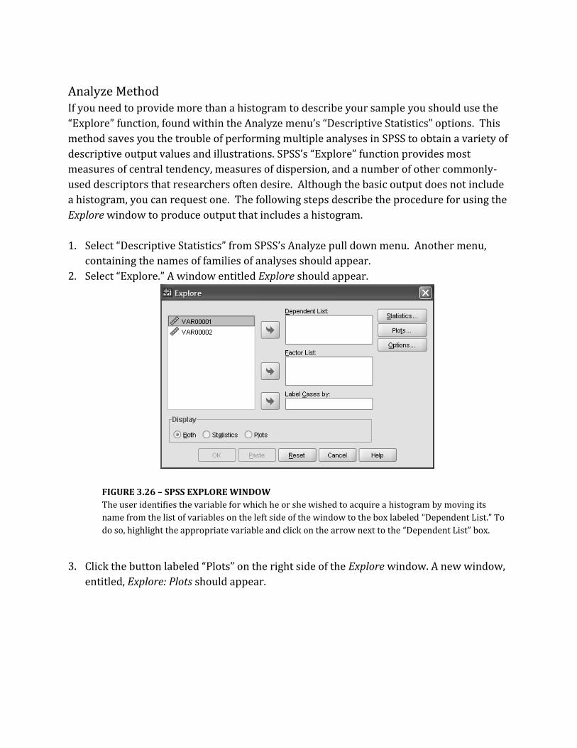
Analyze Method If you need to provide more than a histogram to describe your sample you should use the
“Explore” function, found within the Analyze menu’s “Descriptive Statistics” options. This
method saves you the trouble of performing multiple analyses in SPSS to obtain a variety of
descriptive output values and illustrations. SPSS’s “Explore” function provides most
measures of central tendency, measures of dispersion, and a number of other commonly-
used descriptors that researchers often desire. Although the basic output does not include
a histogram, you can request one. The following steps describe the procedure for using the
Explore window to produce output that includes a histogram.
1. Select “Descriptive Statistics” from SPSS’s Analyze pull down menu. Another menu,
containing the names of families of analyses should appear.
2. Select “Explore.” A window entitled Explore should appear.
FIGURE 3.26 – SPSS EXPLORE WINDOW
The user identifies the variable for which he or she wished to acquire a histogram by moving its
name from the list of variables on the left side of the window to the box labeled “Dependent List.” To
do so, highlight the appropriate variable and click on the arrow next to the “Dependent List” box.
3. Click the button labeled “Plots” on the right side of the Explore window. A new window,
entitled, Explore: Plots should appear.

FIGURE 3.27 – SPSS EXPLORE: PLOTS WINDOW
The user specifies that he or she would like the Explore window’s output to include a histogram by
marking the “Histogram” prompt within the box labeled “Descriptive.”
4. Request the desired graph by clicking next to its name in the box labeled “Descriptive.”
5. Click “Continue.” The Explore: Plots window should disappear.
6. Click “OK.”
Formatting Histograms Once you have obtained the basic histogram, you can use SPSS’s Chart Editor to change its
appearance. The Chart Editor window appears when you double click on any graph in SPSS
output. It contains the graph as well as a somewhat complex menu bar that allows you to
format the graphs, axes, colors and patterns, as well as to add elements to and remove
elements from the standard graph.
Example 3.29
Figure 3.28 shows the Chart Editor window for the histogram first shown as Figure 3.1.

FIGURE 3.28 – SPSS CHART EDITOR
The main portion of the Chart Editor contains the graph to be formatted, in this case, the histogram for
various numbers of teeth lost by third-graders. The basic graph appears slightly different that the graph in
Figure 3.1 does because it has not undergone the formatting changes that Figure 3.1 has. ▄
You can make such changes by using the pull-down menus available from the top row of
the menu bar. When you select one of these menus and then a desired option from it, the
appropriate formatting window appears on the screen. (Some of these formatting windows
also appear when you select its icon from the other rows of the menu bar or when you
double click on the area of the graph that you wish to change. However, for the sake of
simplicity, this introduction on formatting focuses upon the pull-down menus.)
Common changes to a graph’s appearance include altering the axis scales and the color or
patterns within the graph. The processes for making both of these changes begins with the
selection of the Edit menu from the Chart Editor’s menu bar. You can use the Edit menu’s
“Select X Axis” and the “Select Y Axis” prompts to request the formatting windows for the
axes. Boxes within these windows allow you to alter aspects such as the axes’ scales, the
maximum and minimum values shown on the axes, and the labels and tics for the axes.
The Edit menu’s “Properties” prompt can also be used to format the axes. One you select
“Properties,” you must identify the portion of the graph that you wish to alter by

highlighting it (so that it appears surrounded in blue on the computer screen). The
formatting box that appears depends upon the area of the graph that you have highlighted.
So, if you highlight a particular axis, you will see the formatting box for that axis. If you
highlight the bars on the histogram, you will see the formatting box for altering the fill and
the border of the bars on the histogram. You can use this function to change the color of
the histogram’s bars or to use patterns rather than colors.
Measures of Central Tendency and Measures of Dispersion The histogram output, as shown in Figure 3.28, includes the mean, standard, deviation, and
sample size. Researchers provide these descriptive statistics more than any others in their
research reports. So, their presence in this output may save you the trouble of obtaining
them separately.
But, many analyses call for more descriptors than just these values. In such situations,
SPSS’s Explore window becomes very useful. The Explore window’s basic output contains
most measures of central tendency values and measures of dispersion values. In addition, it
provides you with a stem and leaf plot and a box and whisker plot.
Example 3.30 – Basic Explore Window Output
Instructing SPSS, within the Explore window, to perform descriptive analyses on the tooth loss
values from Section 3.1 results in the following output.
Case Processing Summary
Cases
Valid Missing Total
N Percent N Percent N Percent
Teethlost 30 100.0% 0 .0% 30 100.0%
Descriptives
Statistic Std. Error
teethlost Mean 4.93 .507
95% Confidence
Interval for Mean
Lower Bound 3.90
Upper Bound 5.97
5% Trimmed Mean 4.93
Median 5.00

Variance 7.720
Std. Deviation 2.778
Minimum 0
Maximum 10
Range 10
Interquartile Range 4
Skewness .012 .427
Kurtosis -.755 .833
teethlost Stem-and-Leaf Plot
Frequency Stem & Leaf
3.00 0 . 001
7.00 0 . 2222333
7.00 0 . 4445555
8.00 0 . 66677777
3.00 0 . 889
2.00 1 . 00
Stem width: 10
Each leaf: 1 case(s)

TABLE 3.4, TABLE 3.5, TABLE 3.6 AND FIGURE 3.29 – BASIC “EXPLORE” OUTPUT
Output from SPSS’s Explore window contains a Case Processing Summary, Table 3.4, which verifies the
sample size, a table for descriptive statistics values and two plots. Table 3.5, labeled “Descriptives,” provides
most measures of central tendency and measures of dispersion. The Stem and Leaf plot, Table 3.6, and the
Box and Whisker plot, 3.29 provide visual representations of the data’s distribution. . ▄
You do not need to make any special requests within the Explore window to obtain the
tables and figures from Example 3.30. However, many other types of output are available
through this window as well. The section of this website entitled, “Analyze Method,” for
instance, explains how to use the Explore window’s “Plots” button to create a histogram.
The window’s “Statistics” and “Options” buttons further expand the choices of analyses
available
Conversely, the Explore window’s output does not include the mode or quartile values.
Various other SPSS functions can supply these values individually. However, the Frequency
window’s “statistics” utility can provide all three measures of central tendency, most
measures of dispersion, and quartile values at the same time.
The companion website for Chapter 2 described how to use the Frequencies window to
obtain category frequencies, but does not address the window’s “Statistics” button.
Although most functions of the “Statistics” utility cannot analyze categorical variables, the
“Statistics” utility becomes useful when you have continuous data. The following steps
present the process for obtaining descriptive statistics through the Frequencies: Statistics
window.
1. Select “Frequencies” from the “Descriptive Statistics” option of SPSS’s Analyze pull
down menu. A window entitled Frequencies should appear.
FIGURE 3.30 – SPSS FREQUENCIES WINDOW

The user begins the process of obtaining descriptive statistics by selecting appropriate variables from
those listed in the box above. Then, he or she clicks on the “Statistics” button, on the right side of the
window.
2. Indicate the variable for which you would like descriptive statistics by clicking on its
name and then clicking the arrow to the right of the box. The name of the variable
should disappear from its original location and appear in the box labeled “Variable(s).”
3. Click on the “Statistics” button, located on the right side of the window. A new window,
entitled, Frequencies: Statistics should appear.
FIGURE 3.31 – SPSS FREQUENCIES: STATISTICS WINDOW
This window allows the user to supplement the basic frequencies output with measures of central
tendency, measures of dispersion, and quartile values. To request these values, the user must simply click
on the box next to the desired statistic’s name.
4. Identify the desired measures of central tendency, measures of dispersion, and
percentile values by selecting (with a check mark) their names in the appropriate
boxes.
5. Click “Continue” to return to the Frequencies window.
6. Click “OK.”
Example 3.31 – Frequencies: Statistics
One who needs to know the mode or the quartile values for the tooth loss variable in the
chapter’s mock data set could not obtain this information from the output in Example 3.30.
The Frequencies: Statistics window, however, provides these values. When instructed to

include them in the output, SPSS includes a Statistics table along with the frequency table
that normally appears in the “Frequency” output.
Statistics
Teethlost
N Valid 30
Missing 0
Mode 7
Percentiles 25 2.75
50 5.00
75 7.00
TABLE 3.7 – SPSS FREQUENCIES: STATISTICS OUTPUT
The Frequencies: Statistics window output always contains information about the sample size. The user
determines what additional information it provides. In this case, the output contains the mode and
quartile values. One might request only these values because they do not appear in the Explore window’s
output.
Table 3.7 contains only the mode and quartile values. Within the Frequencies: Statistics
window, though, one can request other percentile values and measures of central tendency
as well as measures of dispersion. These values, when requested, also appear in the table.
▄
Although the Explore and the Frequencies: Statistics windows provide relatively
comprehensive descriptive analyses, you may find that other SPSS functions better suit
your purposes for specific projects. For instance, output from the Descriptives window,
accessed from the “Descriptive Statistics” option on the Analyze pull-down menu, includes
only the sample size, the maximum, the minimum, the mean, and the standard deviation.
Also, output for inferential statistical tests often include the descriptive values that they
compare. (See Chapter 5 through Chapter 7.) You should use whichever SPSS application
provides you with the desired values in the most appropriate context for your analysis.