statistical quality control and designweb4.uwindsor.ca/users/b/baki fazle/73-305.nsf... ·...
TRANSCRIPT

1
1
STATISTICAL QUALITY CONTROL AND DESIGN
Content
• Quality
• Control charts
• Process capability
• Acceptance sampling
• Reliability
• Quality costs
• product liability
• Quality systems
• Benchmarking and
auditing
2
• Text (Donna C.S. Summers, 3rd Edition)
• Website: overheads, assignments, solutions, computer lab documents, midterm and exam information, and other announcements and information
• Lecture Notes (purchase or download)• Computer Lab• Background material: probability, statistical tests
• Grading– Assignments – Midterm– Comprehensive Final
COURSE INTRODUCTION

2
3
A WORD ABOUT CONDUCT
• Basic principles
1. Every student has the right to learn as well as responsibility not to deprive others of their right to learn.
2. Every student is accountable for his or her own actions.
4
In order for you to get the most out of this class, please consider the following:
a. Attend all scheduled classes and arrive on time. Late arrivals and early departures are very disruptive and violate the first basic principle.
b. Please do not schedule other activities during this class time. I will try to make class as interesting and informative as possible, but I can’t learn the material for you.
c. Please let me know immediately if you have a problem that is preventing you from performing satisfactorily in this class.

3
5
CHAPTER 1: QUALITY BASICS
Outline
• Definitions of quality• The evolution of quality
– Inspection, quality control, statistical quality control, statistical process control, total quality management
• Processes, variation, specification and tolerance limits
6
Quality and Education
Business has made progress toward quality over the past several years. But I don’t believe we can truly make quality a way of life … until we make quality a part of every student’s education
Edwin Artzt, Chairman and CEO, Proctor & Gamble Co., Quality Progress, October 1992, p. 25

4
7
Quality and Competitive Advantage
• Better price– The better customers judge the quality of a
product, the more they will pay for it• Lower production cost
– It is cheaper to do a job right the first time than do it over
• Faster response– A company with quality processes for handling
orders, producing products, and delivering them can provide fast response to customer requests
8
Quality and Competitive Advantage
• Reduced Inventory– When the production line runs smoothly with
predictable results, inventory levels can be reduced
• Improved competitive position in the marketplace– A customer who is satisfied with quality will tell 8
people about it; a dissatisfied customer will tell 22(A.V. Feigenbaum, Quality Progress, February 1986, p. 27)
5
9
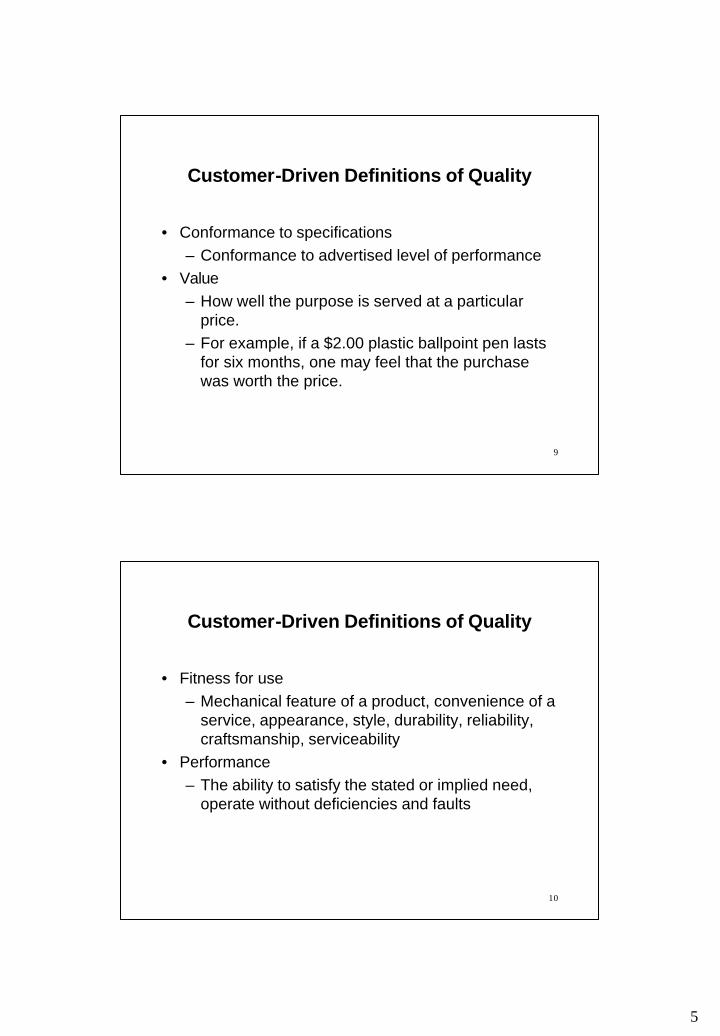
Customer-Driven Definitions of Quality
• Conformance to specifications– Conformance to advertised level of performance
• Value– How well the purpose is served at a particular
price. – For example, if a $2.00 plastic ballpoint pen lasts
for six months, one may feel that the purchase was worth the price.
10
Customer-Driven Definitions of Quality
• Fitness for use– Mechanical feature of a product, convenience of a
service, appearance, style, durability, reliability, craftsmanship, serviceability
• Performance– The ability to satisfy the stated or implied need,
operate without deficiencies and faults
6
11
Customer-Driven Definitions of Quality
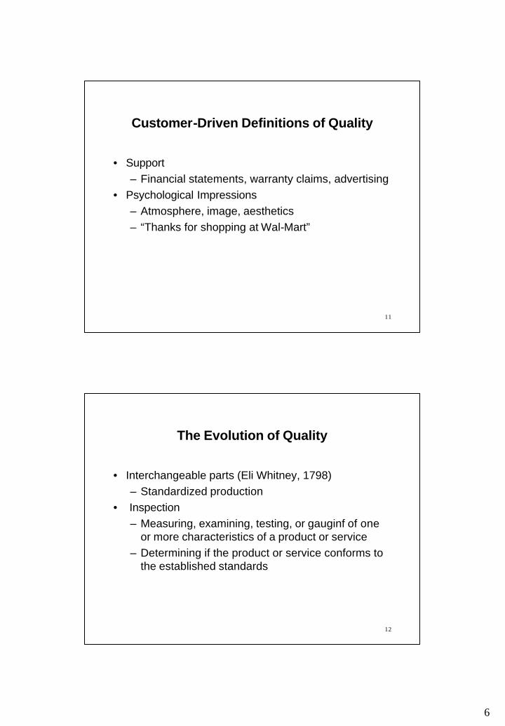
• Support– Financial statements, warranty claims, advertising
• Psychological Impressions– Atmosphere, image, aesthetics– “Thanks for shopping at Wal-Mart”
12
The Evolution of Quality
• Interchangeable parts (Eli Whitney, 1798)– Standardized production
• Inspection– Measuring, examining, testing, or gauginf of one
or more characteristics of a product or service– Determining if the product or service conforms to
the established standards

7
13
The Evolution of Quality
• Quality control– Establishing standards– Ensuring conformance to the standards– Corrective measures– Preventive measures
14
The Evolution of Quality
• Statistical quality control– Shewart control chart uses the concepts of
statistics to detect systematic problems that must be fixed in order to prevent the production of a large number of defective items
– Acceptance sampling eliminates the need for 100% inspection
8
15
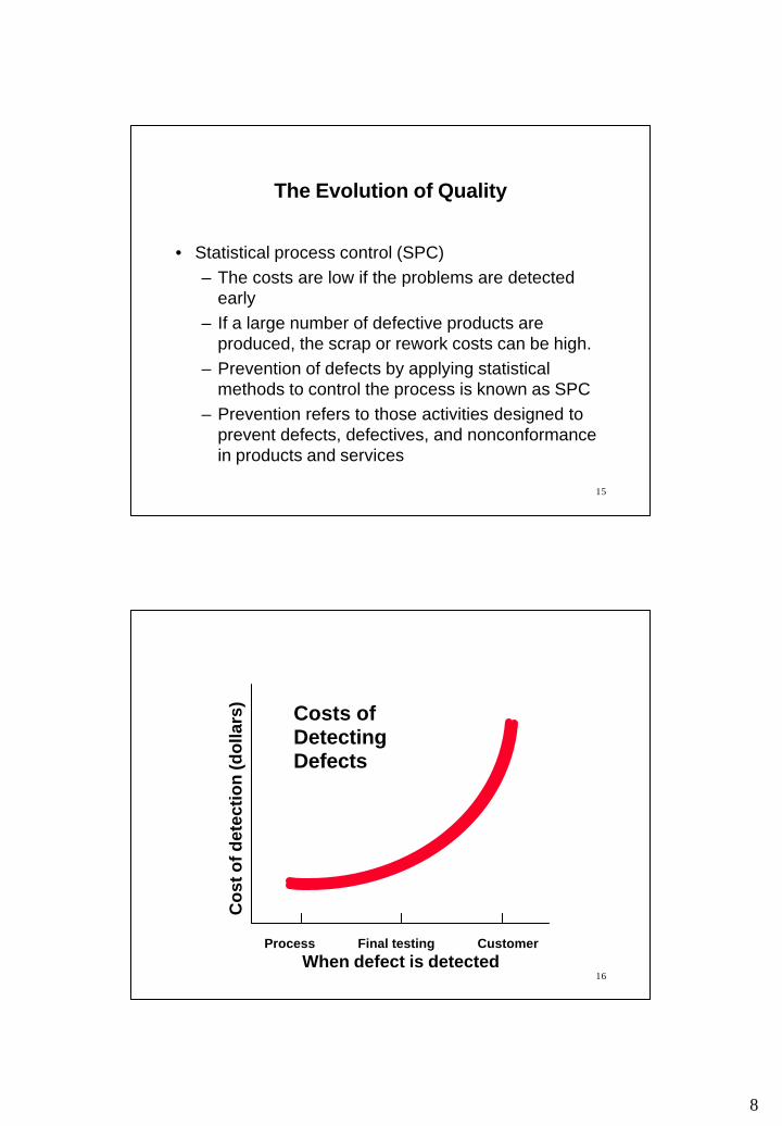
The Evolution of Quality
• Statistical process control (SPC)– The costs are low if the problems are detected
early– If a large number of defective products are
produced, the scrap or rework costs can be high.– Prevention of defects by applying statistical
methods to control the process is known as SPC– Prevention refers to those activities designed to
prevent defects, defectives, and nonconformance in products and services
16
Costs of Detecting Defects
Co
st o
f det
ecti
on
(do
llars
)
Process Final testing CustomerWhen defect is detected

9
17
The Evolution of Quality
• Total quality management (TQM)– A management approach that places emphasis on
continuous process or system improvement– Based on the participation of all members of an
organization to continuously improve the processes
– Utilizes the strengths and expertise of all the employees as well as the statistical problem-solving and charting methods of SPC
18
TQMWheel
Customer
satisfaction

10
19
Reading
• Chapter 1: – Reading pp. 2 -17 (2nd ed.), pp. 2 -21 (3rd ed.)
20
CHAPTER 3: QUALITY IMPROVEMENT
Outline
• Process improvement – PDSA cycle– Process improvement steps– Tools
11
21
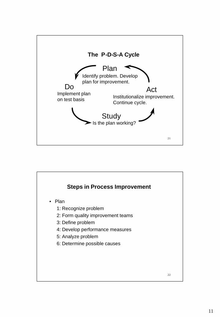
The P-D-S-A Cycle
Identify problem. Develop plan for improvement.
Institutionalize improvement. Continue cycle.
Is the plan working?
Plan
Act
Study
DoImplement plan on test basis
22
• Plan1: Recognize problem2: Form quality improvement teams3: Define problem4: Develop performance measures5: Analyze problem6: Determine possible causes
Steps in Process Improvement

12
23
• Do7: Implement solution
• Study8: Evaluate solution
• Act9: Ensure performance10: Continuous improvement
Steps in Process Improvement
24
1: Recognize problem– Existence of the problem is outlined – In general terms, specifics are not clearly defined– Solvability and availability of resources are
determined
2: Form quality improvement teams– Interdisciplinary– Specified time frame– Quality circle
Plan: Steps 1 and 2
13
25
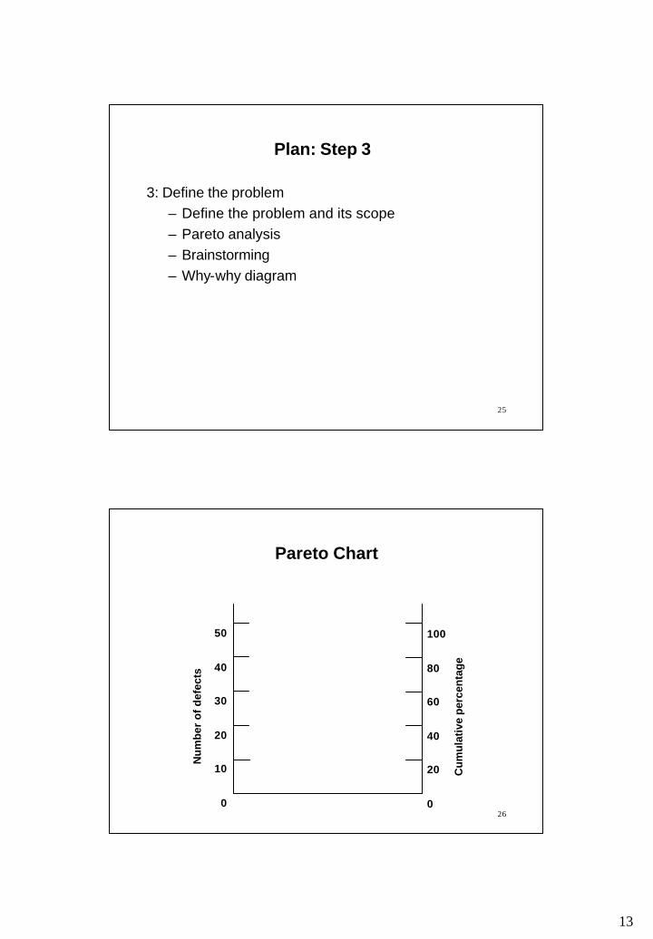
3: Define the problem– Define the problem and its scope – Pareto analysis– Brainstorming– Why-why diagram
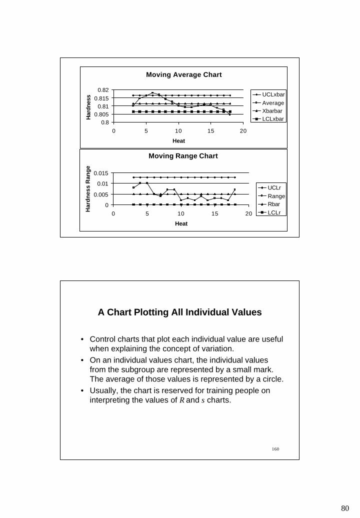
Plan: Step 3
26
Pareto Chart
Nu
mb
er o
f d
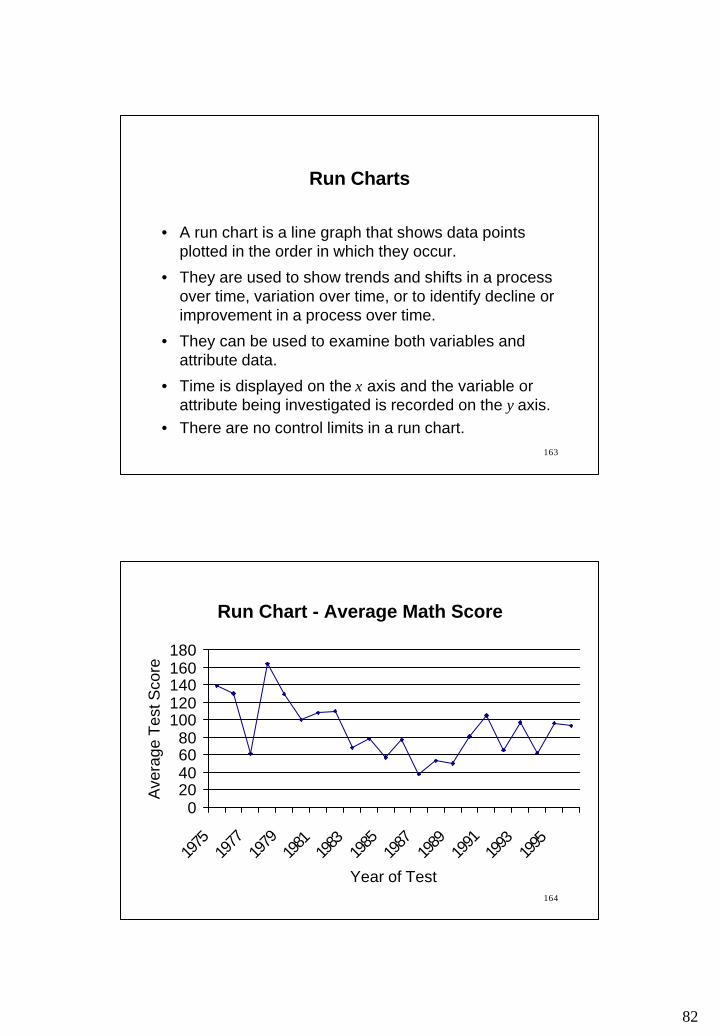
efec
ts
100
80
60
40
20
0
50
40
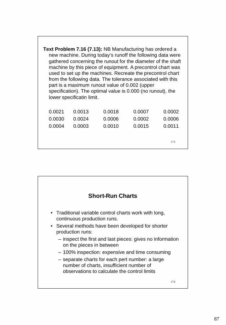
30
20
10
0
Cu
mu
lativ
e p
erce
nta
ge

14
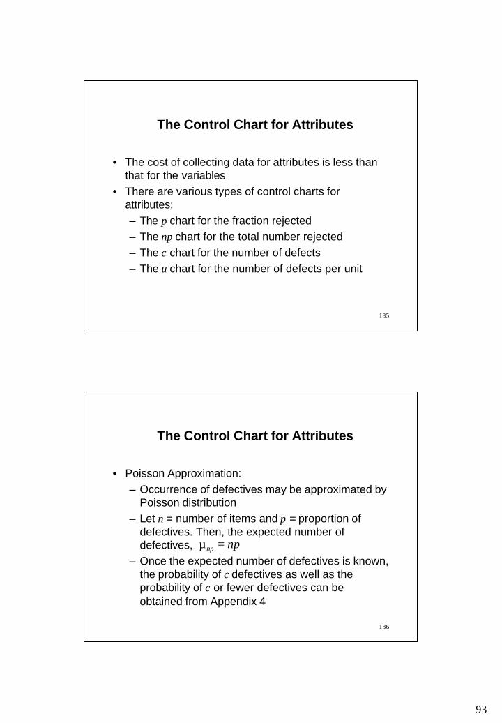
27Defect type
C
DA B
Nu
mb
er o
f d
efec
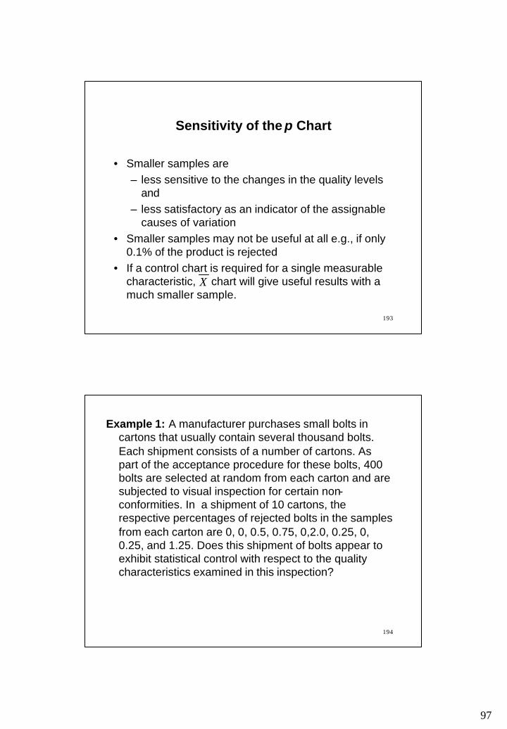
ts
100
80
60
40
20
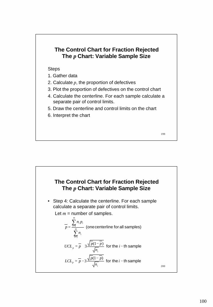
0
50
40
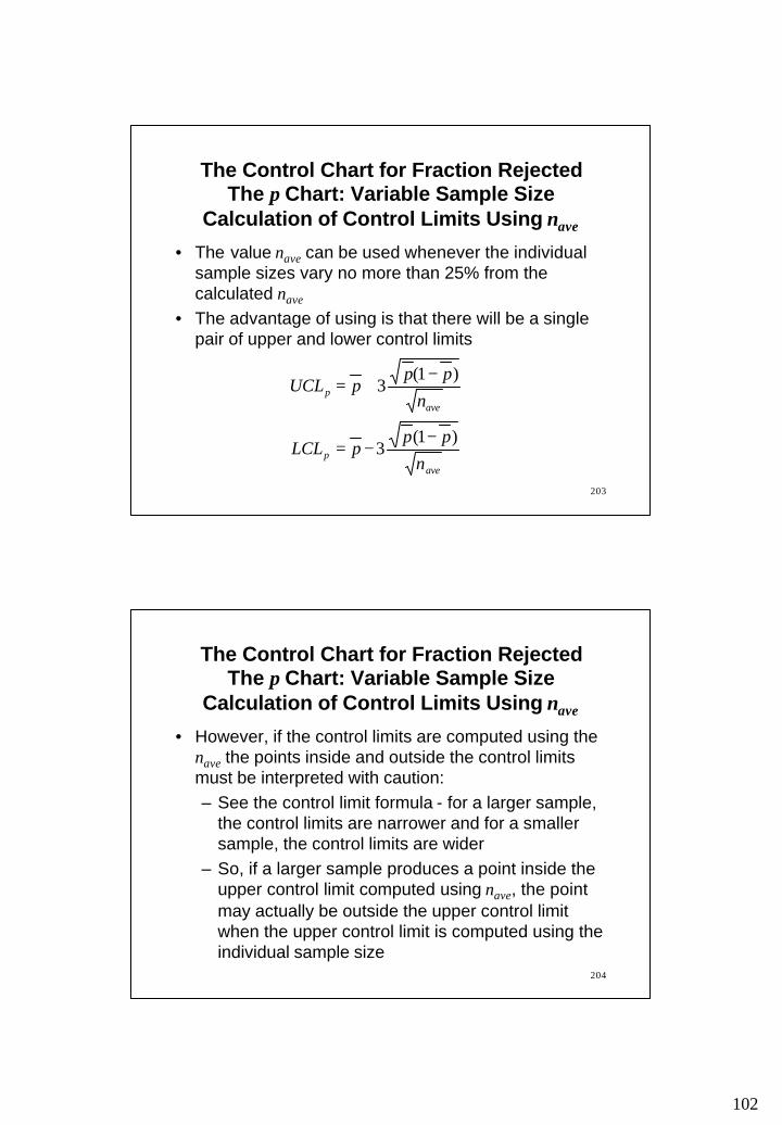
30
20
10
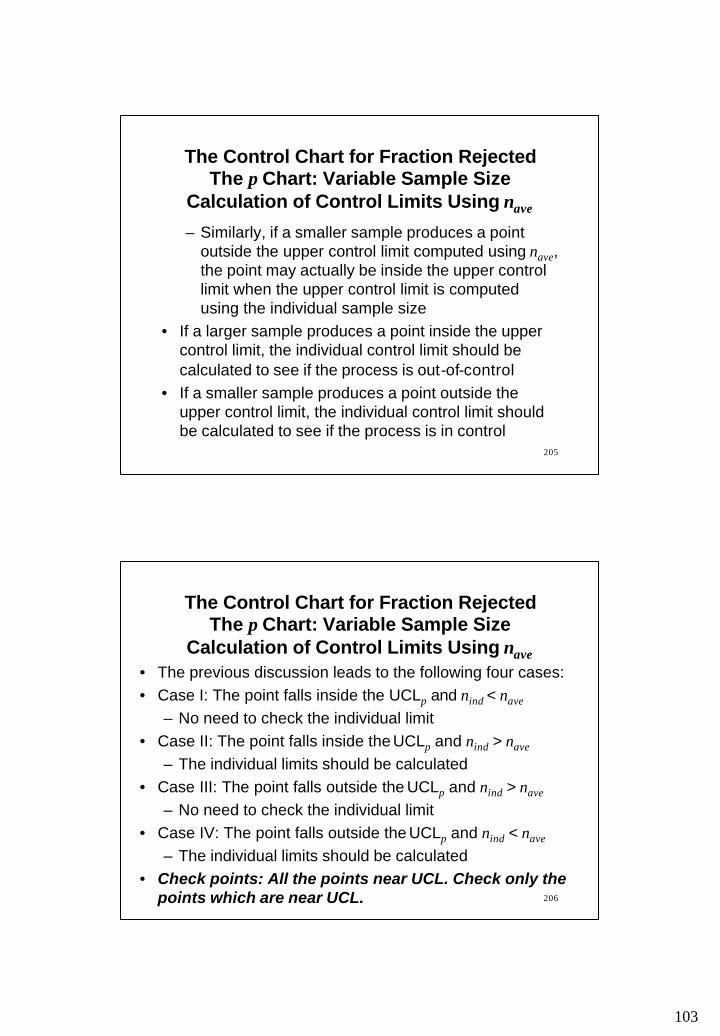
0
Cu
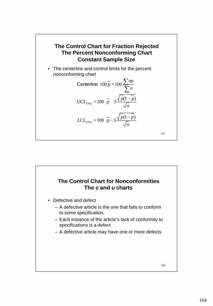
mu
lativ
e p
erce
nta
ge
Pareto Chart
28
Nu
mb
er o
f d
efec
ts
100
80
60
40
20
0
50
40
30
20
10
0
Cu
mu
lativ
e p
erce
nta
ge
Defect type
C
DA B
Pareto Chart

15
Per
cent
from
eac
h ca
use
Causes of poor quality
Machin
e calib
ration
s
Defectiv
e part
s
Wron
g dim
ensio
ns
Poor
Desig
n
Operat
or err
orsDefe
ctive m
ateria
lsSu
rface a
brasio
ns
0
10
20
30
40
50
60
70 (64)
(13)(10)
(6)(3) (2) (2)
Pareto Chart
30
• A technique to understand the problem• Does not locate a solution• The process leads to many reasons the original
problem occurred• Example: A mail-order company has a goal or
reducing the amount of time a customer has to wait in order to place an order. Create a why-why diagram about waiting on the telephone.
Why-Why Diagram

16
31
Why-Why Diagram
Waiting onthe
phone to placean order
Many customers calling at the same time
All catalogs shipped at the same
time
Insufficient operatorsavailable
Low pay
Workers not scheduled at peak times
Why?
Why?
Why?
Why?
Why?
32
4: Develop performance measures– Set some measurable goals which will indicate
solution of the problem– Some financial measures: costs, return on
investment, value added, asset utilization – Some customer-oriented measures: response
times, delivery times, product or service functionality, price
– Some organization-oriented measures: employee retention, productivity, information system capabilities
Plan: Step 4

17
33
5: Analyze problem– List all the steps involved in the existing process
and identify potential constraints and opportunities of improvement
– Flowchart
6: Determine possible causes– Determines potential causes of the problem– Cause and effect diagrams, check sheets,
histograms, scatter diagrams, control charts, run charts
Plan: Steps 5 and 6
Flowchart
Operation
Storage
Inspection
Delay
Transportation
Decision

18
FlowchartEnter emergency room
Fill out patient history
Walk totriage room
Nurse inspects
injury
Return towaitingroom
Wait for ER bed
Wait for
doctor
Doctor inspects
injury
Walk toER bed
Walk toRadiology
FlowchartWalk to radiology
TechnicianX-rayspatient
Return toER bed
Wait fordoctor to
return
Doctorprovidesdiagnosis
CheckoutPickup
prescription
Return to
Waiting
LeaveBuilding
Walk topharmacy
19
37
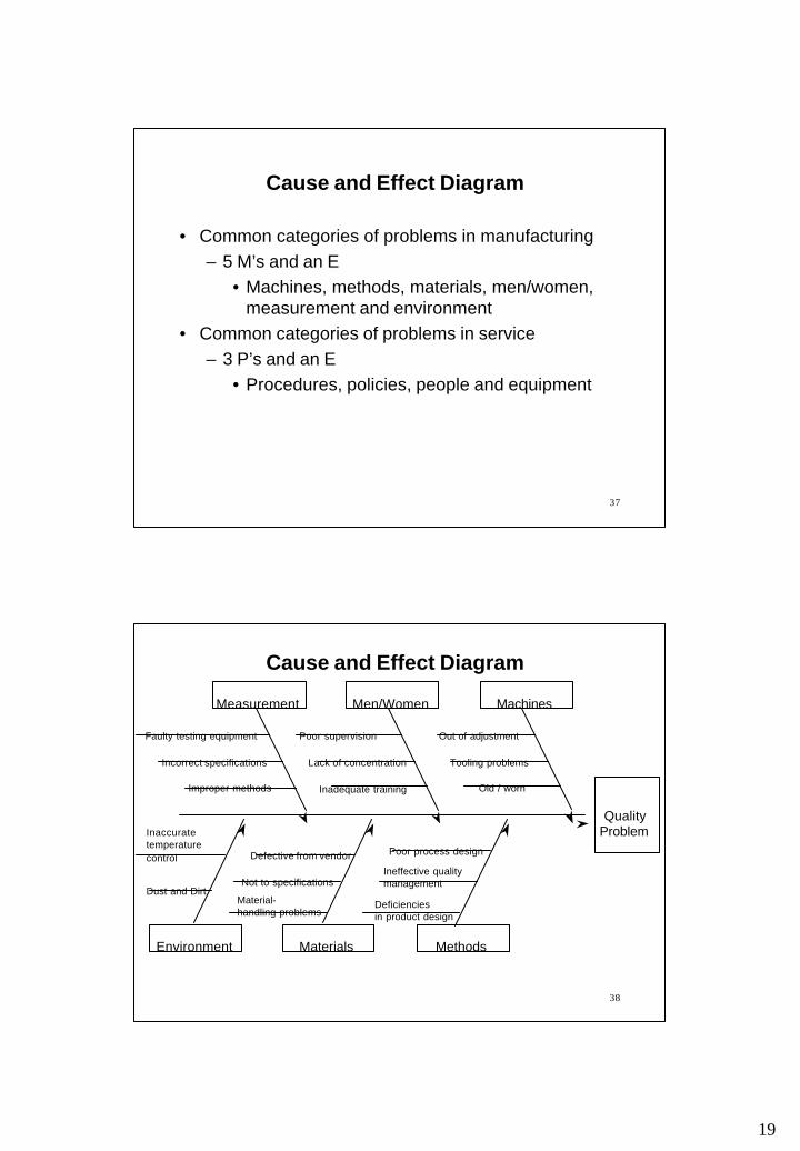
• Common categories of problems in manufacturing – 5 M’s and an E
• Machines, methods, materials, men/women, measurement and environment
• Common categories of problems in service– 3 P’s and an E
• Procedures, policies, people and equipment
Cause and Effect Diagram
38
Cause and Effect Diagram
QualityProblem
MachinesMeasurement Men/Women
MethodsEnvironment Materials
Faulty testing equipment
Incorrect specifications
Improper methods
Poor supervision
Lack of concentration
Inadequate training
Out of adjustment
Tooling problems
Old / worn
Defective from vendor
Not to specifications
Material-handling problems
Deficienciesin product design
Ineffective qualitymanagement
Poor process design
Inaccuratetemperature control
Dust and Dirt
20
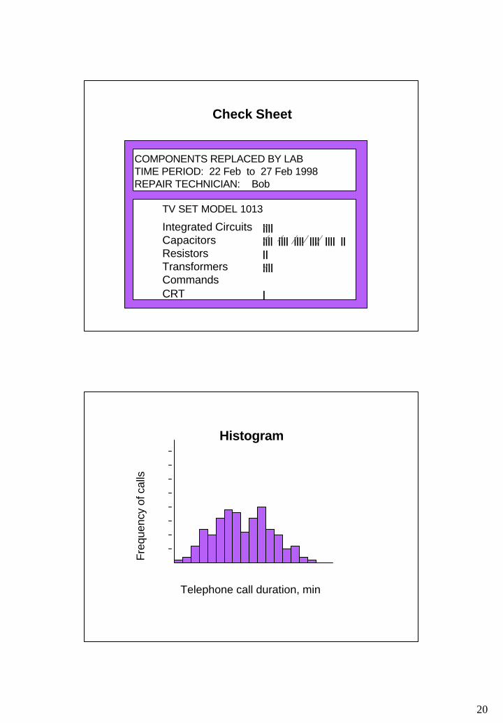
Check Sheet
COMPONENTS REPLACED BY LABTIME PERIOD: 22 Feb to 27 Feb 1998REPAIR TECHNICIAN: Bob
TV SET MODEL 1013
Integrated Circuits ||||Capacitors |||| |||| |||| |||| |||| ||Resistors ||Transformers ||||CommandsCRT |
Histogram
05
10152025303540
1 2 6 13 10 16 19 17 12 16 20 17 13 5 6 2 1
Telephone call duration, min
Fre
quen
cy o
f cal
ls
21
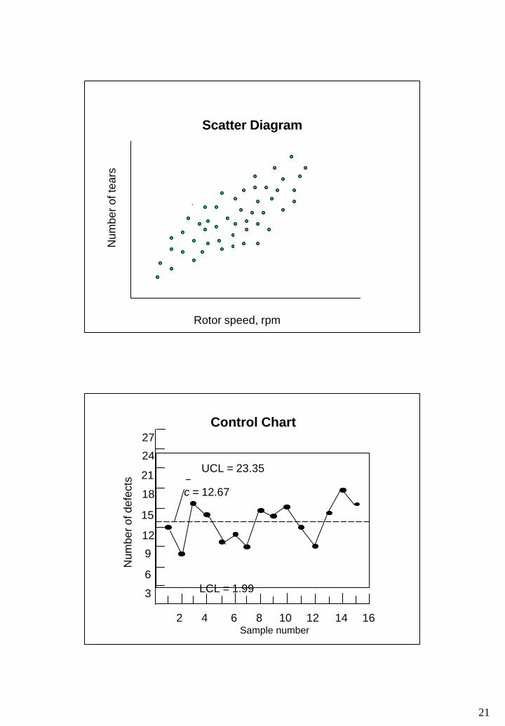
Scatter Diagram
.
Rotor speed, rpm
Num
ber
of te
ars
Control Chart
18
12
6
3
9
15
21
24
27
2 4 6 8 10 12 14 16Sample number
Num
ber o
f def
ects
UCL = 23.35
LCL = 1.99
c = 12.67
22
43
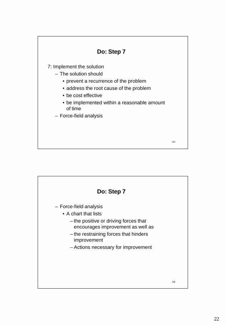
7: Implement the solution– The solution should
• prevent a recurrence of the problem• address the root cause of the problem• be cost effective• be implemented within a reasonable amount
of time– Force-field analysis
Do: Step 7
44
– Force-field analysis• A chart that lists
– the positive or driving forces that encourages improvement as well as
– the restraining forces that hinders improvement
– Actions necessary for improvement
Do: Step 7

23
45
Example: create a force-field diagram for the following problem: – Bicycles are being stolen at a local campus.
Campus security is considering changes in the bike rack design, bike parking restrictions and bike registration to try to reduce thefts. Thieves have been using hacksaws and bolt cutters to remove locks from the bikes
Do: Step 7
46
Reading
• Chapter 3: – Reading pp. 64-97 (2nd ed.), pp. 52-102 (3rd ed.)
24
47
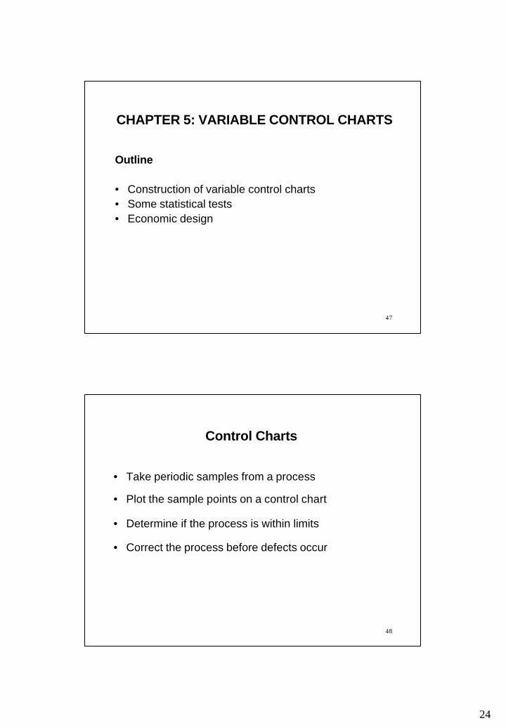
CHAPTER 5: VARIABLE CONTROL CHARTS
Outline
• Construction of variable control charts• Some statistical tests• Economic design
48
Control Charts
• Take periodic samples from a process
• Plot the sample points on a control chart
• Determine if the process is within limits
• Correct the process before defects occur

25
49
Types of Data
• Variable data• Product characteristic that can be measured
• Length, size, weight, height, time, velocity
• Attribute data• Product characteristic evaluated with a discrete
choice• Good/bad, yes/no
50
Process Control Chart
1 2 3 4 5 6 7 8 9 10
Sample number
Uppercontrollimit
Processaverage
Lowercontrollimit
26
51
Variation
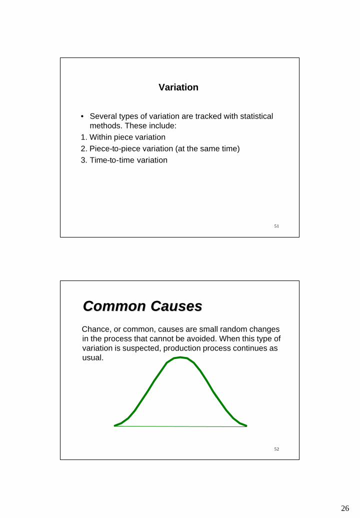
• Several types of variation are tracked with statistical methods. These include:
1. Within piece variation2. Piece-to-piece variation (at the same time)3. Time-to-time variation
52
Common CausesCommon CausesChance, or common, causes are small random changes in the process that cannot be avoided. When this type of variation is suspected, production process continues as usual.
27
53
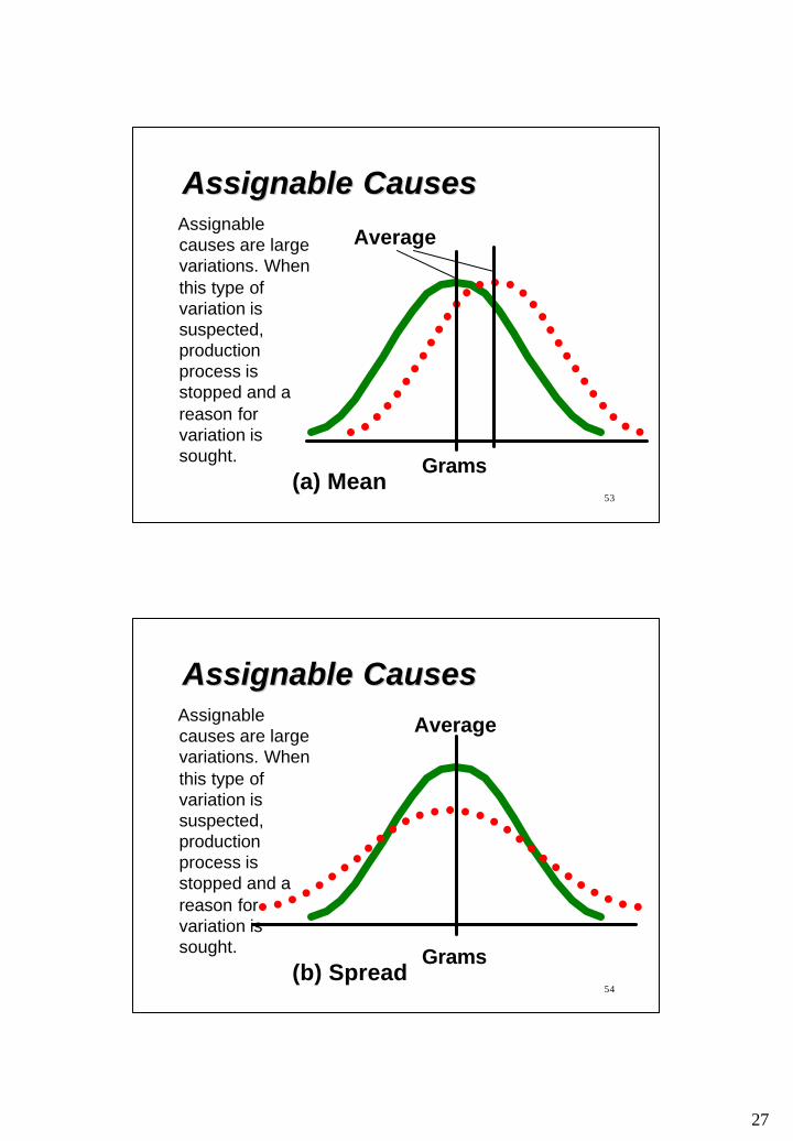
Assignable CausesAssignable Causes
(a) Mean
AverageAssignable causes are large variations. When this type of variation is suspected, production process is stopped and a reason for variation is sought. Grams
54
Assignable CausesAssignable Causes
Grams
Average
(b) Spread
Assignable causes are large variations. When this type of variation is suspected, production process is stopped and a reason for variation is sought.

28
55
Assignable CausesAssignable Causes
Grams
Average
(c) Shape
Assignable causes are large variations. When this type of variation is suspected, production process is stopped and a reason for variation is sought.
56
The NormalThe NormalDistributionDistribution
-3σ -2σ -1σ +1σ +2σ +3σMean
68.26%95.44%99.74%
σ = Standard deviation

29
57
Control ChartsControl Charts
UCL
Nominal
LCL
Assignable causes likely
1 2 3Samples
58
Control Chart ExamplesControl Chart Examples
Nominal
UCL
LCL
Sample number
Var
iatio
ns

30
59
Control Limits and ErrorsControl Limits and Errors
LCL
Processaverage
UCL
(a) Three-sigma limits
Type I error:Probability of searching for a cause when none exists
60
Control Limits and ErrorsControl Limits and ErrorsType I error:Probability of searching for a cause when none exists
UCL
LCL
Processaverage
(b) Two-sigma limits

31
61
Type II error:Probability of concludingthat nothing has changed
Control Limits and ErrorsControl Limits and Errors
UCL
Shift in process average
LCL
Processaverage
(a) Three-sigma limits
62
Type II error:Probability of concludingthat nothing has changed
Control Limits and ErrorsControl Limits and Errors
UCL
Shift in process average
LCL
Processaverage
(b) Two-sigma limits
32
63
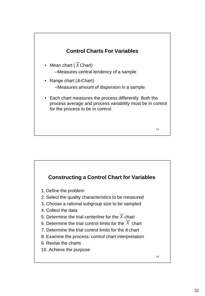
Control Charts For Variables
• Mean chart ( Chart)–Measures central tendency of a sample
• Range chart (R-Chart)–Measures amount of dispersion in a sample
• Each chart measures the process differently. Both the process average and process variability must be in control for the process to be in control.
X
64
Constructing a Control Chart for Variables
1. Define the problem2. Select the quality characteristics to be measured3. Choose a rational subgroup size to be sampled4. Collect the data5. Determine the trial centerline for the chart6. Determine the trial control limits for the chart7. Determine the trial control limits for the R chart8. Examine the process: control chart interpretation9. Revise the charts10. Achieve the purpose
XX

33
Example: Control Charts for Variables
Slip Ring Diameter (cm)Sample 1 2 3 4 5 X R
1 5.02 5.01 4.94 4.99 4.96 4.98 0.082 5.01 5.03 5.07 4.95 4.96 5.00 0.123 4.99 5.00 4.93 4.92 4.99 4.97 0.084 5.03 4.91 5.01 4.98 4.89 4.96 0.145 4.95 4.92 5.03 5.05 5.01 4.99 0.136 4.97 5.06 5.06 4.96 5.03 5.01 0.107 5.05 5.01 5.10 4.96 4.99 5.02 0.148 5.09 5.10 5.00 4.99 5.08 5.05 0.119 5.14 5.10 4.99 5.08 5.09 5.08 0.15
10 5.01 4.98 5.08 5.07 4.99 5.03 0.1050.09 1.15
66
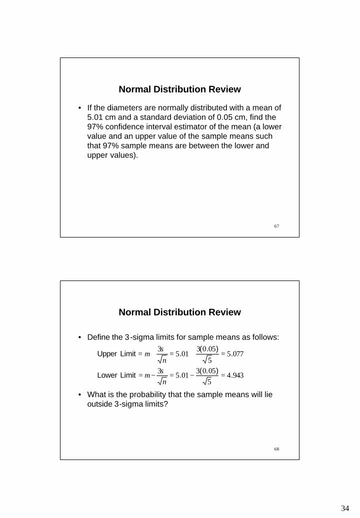
Normal Distribution Review
• If the diameters are normally distributed with a mean of 5.01 cm and a standard deviation of 0.05 cm, find the probability that the sample means are smaller than 4.98 cm or bigger than 5.02 cm.
34
67
Normal Distribution Review
• If the diameters are normally distributed with a mean of 5.01 cm and a standard deviation of 0.05 cm, find the 97% confidence interval estimator of the mean (a lower value and an upper value of the sample means such that 97% sample means are between the lower and upper values).
68
• Define the 3-sigma limits for sample means as follows:
• What is the probability that the sample means will lie outside 3-sigma limits?
Normal Distribution Review
9434505030153
077550503
0153
.).(. Limit Lower
.).(
. Limit Upper
=−=−=
=+=+=
n
nσµ
σµ

35
69
Normal Distribution Review
• Note that the 3-sigma limits for sample means are different from natural tolerances which are at σµ 3±
70
Determine the Trial Centerline for the Chart
10subgroups of number where ==m
X
01.510
09.501 ===∑
=
m
XX
m
i
i

36
71
94341150580015
07751150580015
2
2
.).(.).(LCL
.).(.).(UCL
X
X
=−=−=
=+=+=
RAX
RAX
2A of value the for 2 Appendix Text or 27 p. See
Determine the Trial Control Limits for the ChartX
115.01015.11 ===
∑=
m
RR
m
ii
Note: The control limits are only preliminary with 10 samples.It is desirable to have at least 25 samples.
72
).)((LCL
.).)(.(UCL
R
R
011500
4321150112
3
4
===
===
RD
RD
43 DD , of values the for 2 Appendix Text or 27 p. See
Determine the Trial Control Limits for the R Chart
37
73
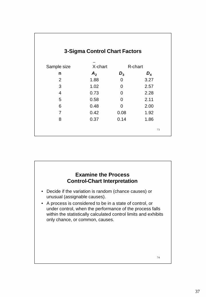
3-Sigma Control Chart Factors
Sample size X-chart R-chartn A2 D3 D4
2 1.88 0 3.273 1.02 0 2.574 0.73 0 2.285 0.58 0 2.116 0.48 0 2.007 0.42 0.08 1.928 0.37 0.14 1.86
74
Examine the Process Control-Chart Interpretation
• Decide if the variation is random (chance causes) or unusual (assignable causes).
• A process is considered to be in a state of control, or under control, when the performance of the process falls within the statistically calculated control limits and exhibits only chance, or common, causes.
38
75
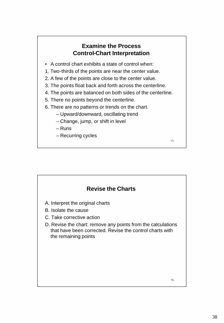
Examine the Process Control-Chart Interpretation
• A control chart exhibits a state of control when:1. Two-thirds of the points are near the center value.2. A few of the points are close to the center value.3. The points float back and forth across the centerline.4. The points are balanced on both sides of the centerline.5. There no points beyond the centerline.6. There are no patterns or trends on the chart.
– Upward/downward, oscillating trend– Change, jump, or shift in level– Runs– Recurring cycles
76
Revise the Charts
A. Interpret the original chartsB. Isolate the causeC. Take corrective actionD. Revise the chart: remove any points from the calculations
that have been corrected. Revise the control charts with the remaining points
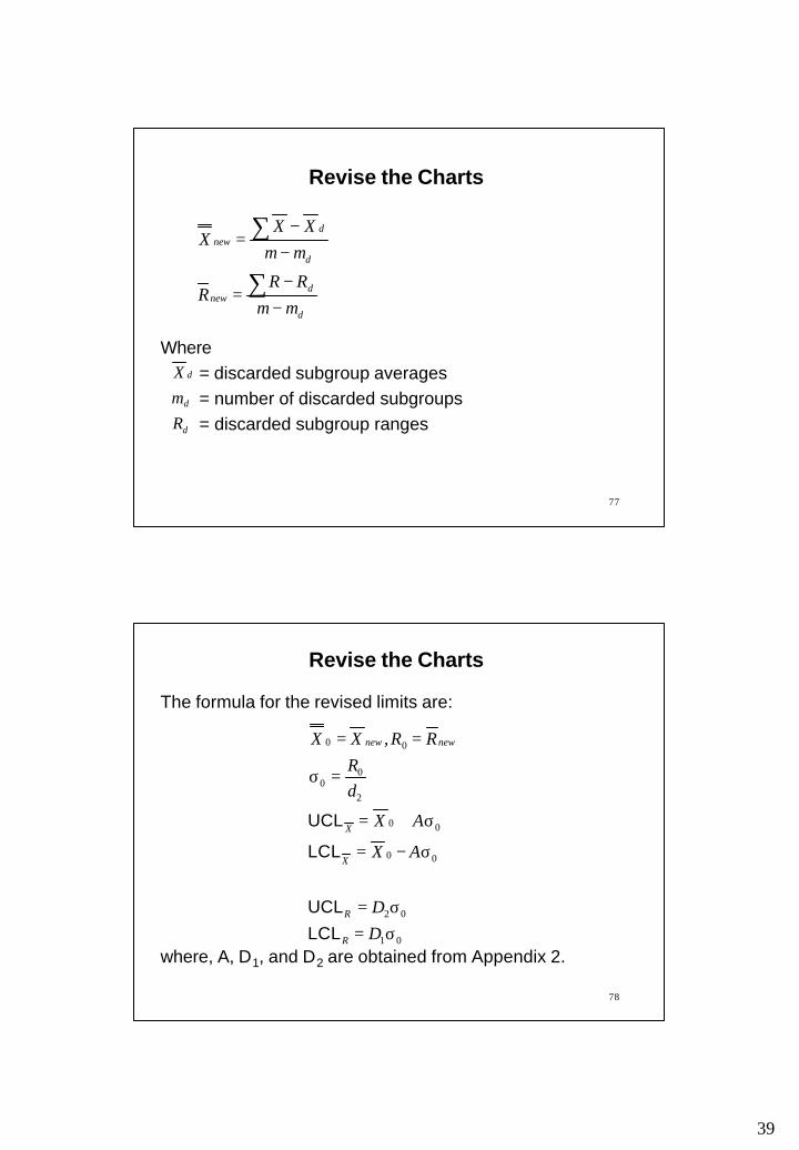
39
77
Revise the Charts
d
dnew
d
dnew
mmRR
R
mmXX
X
−−
=
−−
=
∑
∑
Where= discarded subgroup averages= number of discarded subgroups= discarded subgroup rangesd
d
d
RmX
78
Revise the Charts
The formula for the revised limits are:
where, A, D1, and D2 are obtained from Appendix 2.01
02
00
00
2
00
00 ,
σ=σ=
σ−=
σ+=
=σ
==
DD
AX
AX
dR
RRXX
R
R
X
X
newnew
LCLUCL
LCL
UCL

40
79
Reading and Exercises
• Chapter 5: – Reading pp. 192-236, Problems 11-13 (2nd ed.)– Reading pp. 198-240, Problems 11-13 (3rd ed.)
80
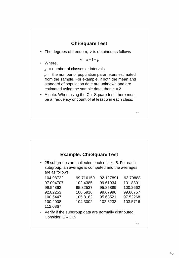
CHAPTER 5: CHI-SQUARE TEST
• Control chart is constructed using periodic samples from a process
• It is assumed that the subgroup means are normally
distributed
• Chi-Square test can be used to verify if the above
assumption

41
81
Chi-Square Test
• The Chi-Square statistic is calculated as follows:
• Where,= number of classes or intervals= observed frequency for each class or interval= expected frequency for each class or interval
= sum over all classes or intervals
( )∑ −=χ
k
e
e
fff 2
02
k
0f
ef
∑k
82
Chi-Square Test
• If then the observed and theoretical distributions match exactly.
• The larger the value of the greater the discrepancy between the observed and expected frequencies.
• The statistic is computed and compared with the tabulated, critical values recorded in a table. The critical values of are tabulated by degrees of freedom, vs. the level of significance,
,02 =χ
,2χ
2χ2χ
2χν α

42
83
Chi-Square Test
• The null hypothesis, H0 is that there is no significant difference between the observed and the specified theoretical distribution.
• If the computed test statistic is greater than the tabulated critical value, then the H0 is rejected and it is concluded that there is enough statistical evidence to infer that the observed distribution is significantly different from the specified theoretical distribution.
2χ2χ
84
Chi-Square Test
• If the computed test statistic is not greater than the tabulated critical value, then the H0 is not rejected and it is concluded that there is not enough statistical evidence to infer that the observed distribution is significantly different from the specified theoretical distribution.
2χ2χ
43
85
Chi-Square Test
• The degrees of freedom, is obtained as follows
• Where,= number of classes or intervals= the number of population parameters estimated
from the sample. For example, if both the mean and standard of population date are unknown and are estimated using the sample date, then p = 2
• A note: When using the Chi-Square test, there must be a frequency or count of at least 5 in each class.
ν
kp
pk −−=ν 1
86
Example: Chi-Square Test
• 25 subgroups are collected each of size 5. For each subgroup, an average is computed and the averages are as follows:104.98722 99.716159 92.127891 93.79888 97.004707 102.4385 99.61934 101.8301 99.54862 95.82537 95.85889 100.2662 92.82253 100.5916 99.67996 99.66757 100.5447 105.8182 95.63521 97.52268 100.2008 104.3002 102.5233 103.5716 112.0867
• Verify if the subgroup data are normally distributed. Consider 05.0=α
44
87
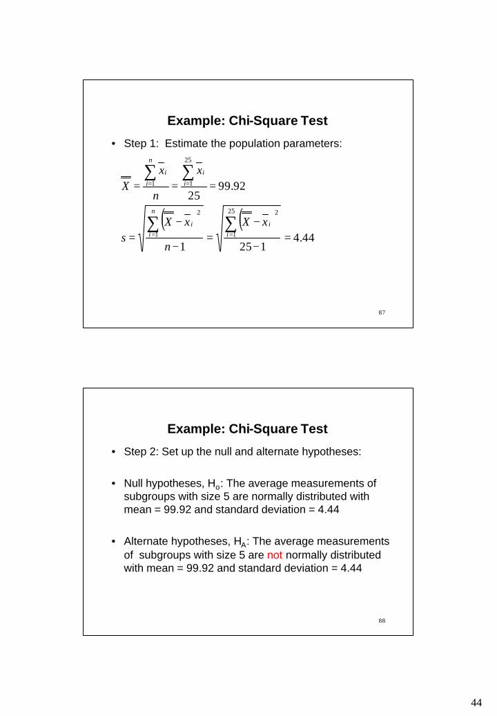
Example: Chi-Square Test
• Step 1: Estimate the population parameters:
( ) ( )44.4
1251
92.9925
25
1
2
1
2
25
11
=−
−=
−
−=
===
∑∑
∑∑
==
==
ii
n
ii
i
i
n
i
i
xX
n
xXs
x
n
xX
88
Example: Chi-Square Test
• Step 2: Set up the null and alternate hypotheses:
• Null hypotheses, Ho: The average measurements of subgroups with size 5 are normally distributed with mean = 99.92 and standard deviation = 4.44
• Alternate hypotheses, HA: The average measurements of subgroups with size 5 are not normally distributed with mean = 99.92 and standard deviation = 4.44
45
89
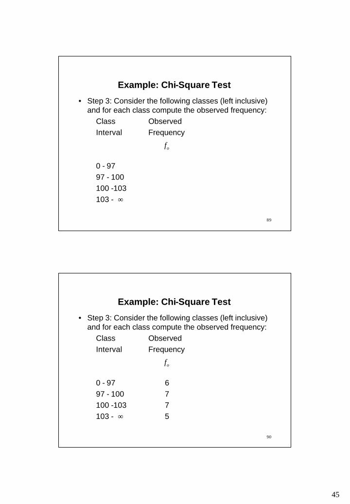
Example: Chi-Square Test
• Step 3: Consider the following classes (left inclusive) and for each class compute the observed frequency:
Class Observed Interval Frequency
0 - 9797 - 100100 -103103 - ∞
of
90
Example: Chi-Square Test
• Step 3: Consider the following classes (left inclusive) and for each class compute the observed frequency:
Class Observed Interval Frequency
0 - 97 697 - 100 7100 -103 7103 - 5∞
of
46
91
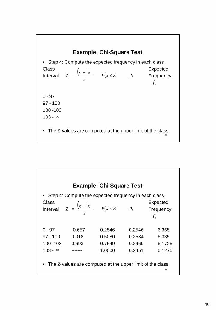
Example: Chi-Square Test
• Step 4: Compute the expected frequency in each classClass ExpectedInterval Frequency
0 - 9797 - 100100 -103103 -
• The Z-values are computed at the upper limit of the class
( )s
xxZ
−= ( )ZxP ≤
efip
∞
92
Example: Chi-Square Test
• Step 4: Compute the expected frequency in each classClass ExpectedInterval Frequency
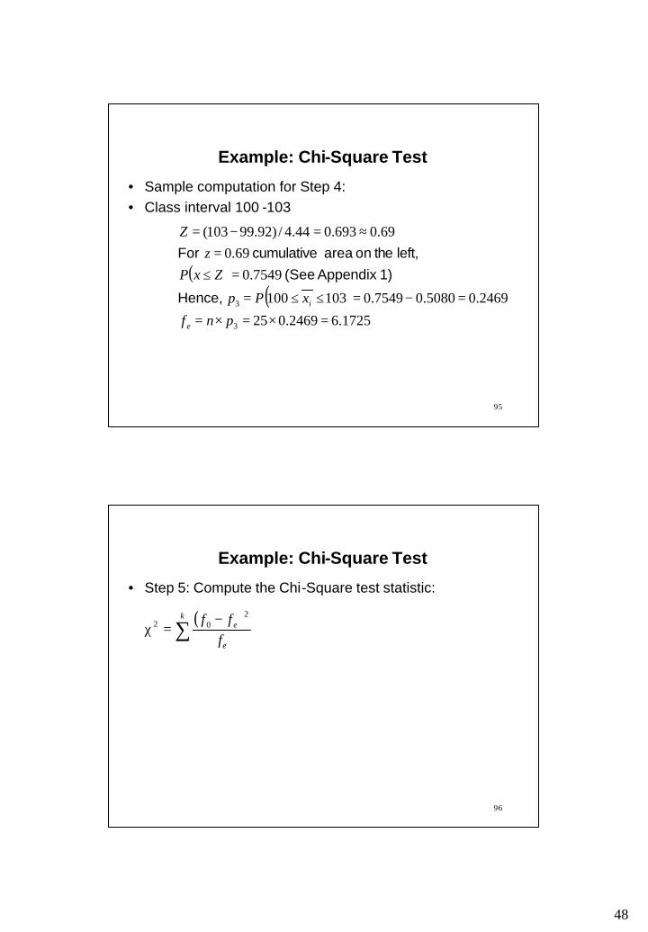
0 - 97 -0.657 0.2546 0.2546 6.36597 - 100 0.018 0.5080 0.2534 6.335100 -103 0.693 0.7549 0.2469 6.1725103 - ------- 1.0000 0.2451 6.1275
• The Z-values are computed at the upper limit of the class
∞
( )s
xxZ
−= ( )ZxP ≤
efip

47
93
Example: Chi-Square Test
• Sample computation for Step 4:• Class interval 0-97
( )( )
365.62546.025
2546.0970
2546.066.0
66.0657.044.4/)92.9997(
1
1
=×=×=
=≤≤=
=≤−=
−≈−=−=
pnf
xPp
ZxPz
Z
e
i Hence,
1) Appendix (See left, the on area cumulative For
94
Example: Chi-Square Test
• Sample computation for Step 4:• Class interval 97-100
( )( )
335.62534.025
2534.02546.05080.010097
5080.002.0
02.0018.044.4/)92.99100(
2
2
=×=×=
=−=≤≤=
=≤=
≈=−=
pnf
xPp
ZxPz
Z
e
i Hence,
1) Appendix (See left, the on area cumulative For
48
95
Example: Chi-Square Test
• Sample computation for Step 4:• Class interval 100 -103
( )( )
1725.62469.025
2469.05080.07549.0103100
7549.069.0
69.0693.044.4/)92.99103(
3
3
=×=×=
=−=≤≤=
=≤=
≈=−=
pnf
xPp
ZxPz
Z
e
i Hence,
1) Appendix (See left, the on area cumulative For
96
Example: Chi-Square Test
• Step 5: Compute the Chi-Square test statistic:
( )∑ −=χ
k
e
e
fff 2
02

49
97
Example: Chi-Square Test
• Step 5: Compute the Chi-Square test statistic:
( )
( ) ( ) ( ) ( )
4091.02075.01109.00698.00209.0
1275.61275.65
1725.61725.67
335.6335.67
365.6365.66 2222
202
=+++=
−+
−+
−+
−=
−=χ ∑
k
e
e
fff
98
Example: Chi-Square Test
• Step 6: Compute the degrees of freedom, and the critical value
– There are 4 classes, so k = 4– Two population parameters, mean and standard deviation are estimated, so p = 2– Degrees of freedom,
– From Table, the critical
ν
=−−=ν pk 1
2χ
2χ=χ2
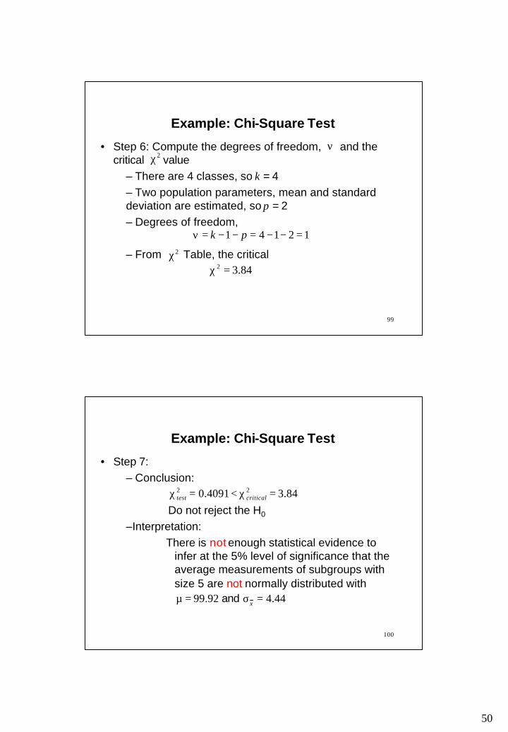
50
99
Example: Chi-Square Test
• Step 6: Compute the degrees of freedom, and the critical value
– There are 4 classes, so k = 4– Two population parameters, mean and standard deviation are estimated, so p = 2– Degrees of freedom,
– From Table, the critical
ν
12141 =−−=−−=ν pk
2χ
2χ84.32 =χ
100
Example: Chi-Square Test
• Step 7: – Conclusion:
Do not reject the H0
–Interpretation: There is not enough statistical evidence to
infer at the 5% level of significance that the average measurements of subgroups with size 5 are not normally distributed with
84.34091.0 22 =χ<=χ criticaltest
44.492.99 =σ=µ x and
51
101
Reading and Exercises
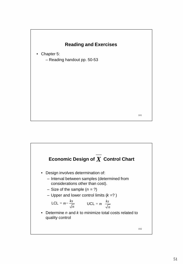
• Chapter 5: – Reading handout pp. 50-53
102
Economic Design of Control Chart
• Design involves determination of: – Interval between samples (determined from
considerations other than cost).– Size of the sample (n = ?)– Upper and lower control limits (k =? )
• Determine n and k to minimize total costs related to quality control
X
nkσµ −=LCL
n
kσµ +=UCL

52
103
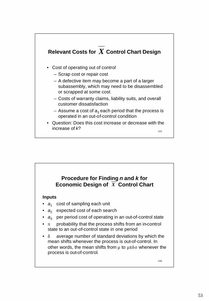
Relevant Costs for Control Chart Design
• Sampling cost– Personnel cost, equipment cost, cost of item etc– Assume a cost of a1 per item sampled. Sampling
cost = a1 n
X
104
Relevant Costs for Control Chart Design
• Search cost (when an out-of-control condition is signaled, an assignable cause is sought)– Cost of shutting down the facility, personnel cost for
the search, and cost of fixing the problem, if any – Assume a cost of a2 each time a search is required
• Question: Does this cost increase or decrease with the increase of k?
X
53
105
Relevant Costs for Control Chart Design
• Cost of operating out of control– Scrap cost or repair cost– A defective item may become a part of a larger
subassembly, which may need to be disassembled or scrapped at some cost
– Costs of warranty claims, liability suits, and overall customer dissatisfaction
– Assume a cost of a3 each period that the process is operated in an out-of-control condition
• Question: Does this cost increase or decrease with the increase of k?
X
106
Inputs• a1 cost of sampling each unit• a2 expected cost of each search • a3 per period cost of operating in an out-of-control state• π probability that the process shifts from an in-control
state to an out-of-control state in one period • δ average number of standard deviations by which the
mean shifts whenever the process is out-of-control. In other words, the mean shifts from µ to µ±δσ whenever the process is out-of-control.
Procedure for Finding n and k for Economic Design of Control ChartX

54
107
Procedure for Finding n and k for Economic Design of Control ChartX
The Key Step • A trial and error procedure may be followed• The minimum cost pair of n and k is sought• For a given pair of n and k the average per period cost is
where)(
)]()[(πβ
ππαπβ−−
+−+−+
1111 32
1aa
na
108
α is the type I error = β is the type two error = andΦ(z) is the cumulative standard normal distribution function
Approximately,
Φ(z) may also be obtained from Table A1/A4 or Excel function NORMSDIST
)( k−Φ2)()( nknk δδ −−Φ−−Φ
8289420685291
083882
041111051701980
21215905002320..
.
..
..)(
zz
zz
++
−=Φ
Procedure for Finding n and k for Economic Design of Control ChartX

55
109
A Trial and Error Procedure using Excel Solver
• Consider some trial values of n• For each trial value of n, the best value of k may be
obtained by using Excel Solver:– Write the formulae for α, β and cost– Set up Excel Solver to minimize cost by changing k
and assuming k non-negative
Procedure for Finding n and k for Economic Design of Control ChartX
110
• Expected number of periods that the system remains in control (there may be several false alarms during this period) following an adjustment
• Expected number of periods that the system remains out of control until a detection is made
• Expected number of periods in a cycle, E(C) = E(T)+E(S)
Notes
ππ−
=1
)(TE
β−=
11
)(SE

56
111
• Expected cost of sampling per cycle =• Expected cost of searching per cycle = • Expected cost of operating in an out-of-control state
= per cycle • To get the expected costs per period divide expected
costs per cycle by E(C)
Notes
)(CnEa1
)]([ TEa α+12
)(SEa3
112
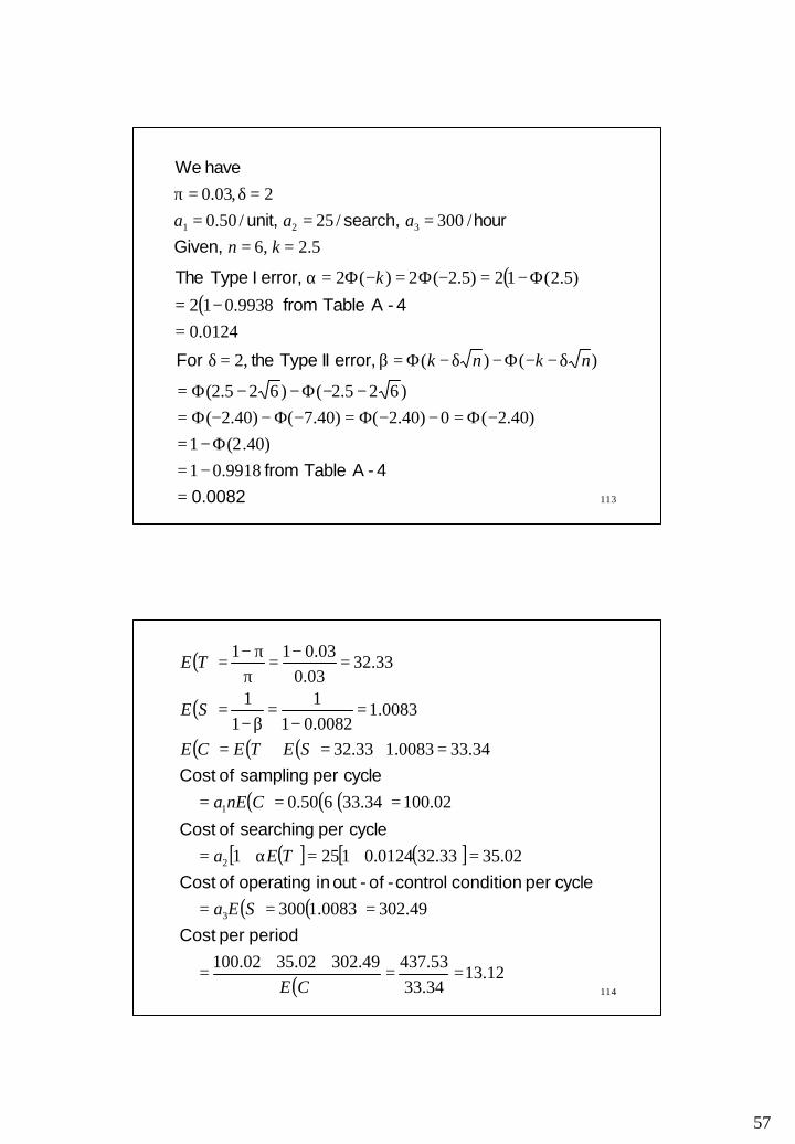
Problem 10-23 (Handout): A quality control engineer is considering the optimal design of an chart. Based on his experience with the production process, there is a probability of 0.03 that the process shifts from an in-control to an out-of-control state in any period. When the process shifts out of control, it can be attributed to a single assignable cause; the magnitude of the shift is 2σ. Samples of n items are made hourly, and each sampling costs $0.50 per unit. The cost of searching for the assignable cause is $25 and the cost of operating the process in an out-of-control state $300 per hour.
a. Determine the hourly cost of the system when n=6 and k=2.5.
b. Estimate the optimal value of k for the case n=6.c. determine the optimal pair of n and k.
X
57
113
5.2,6/300/25/50.0
2,03.0
321
=====
=δ=π
knaaa
Given,hour search, unit,
have We
( )( )0124.0
9938.012
)5.2(12)5.2(2)(2
=−=
Φ−=−Φ=−Φ=α
4- ATable from
error, I Type The k
0.00824- ATable from
error, II Type the For
=−=
Φ−=−Φ=−−Φ=−Φ−−Φ=
−−Φ−−Φ=
δ−−Φ−δ−Φ=β=δ
9918.01)40.2(1
)40.2(0)40.2()40.7()40.2()625.2()625.2(
)()(,2 nknk
114
( )
( )
( ) ( ) ( )
( ) ( )( )
( )[ ] ( )[ ]
( ) ( )
( )12.13
34.3353.43749.30202.3502.100
49.3020083.1300
02.3533.320124.01251
02.10034.33650.0
34.330083.133.32
0083.10082.011
11
33.3203.0
03.011
3
2
1
==++
=
===
=+=α+=
===
=+=+=
=−
=β−
=
=−
=π
π−=
CE
SEa
TEa
CnEa
SETECE
SE
TE
period per Cost
cycle per condition control-of-out in operating of Cost
cycle per searching of Cost
cycle per sampling of Cost
58
115
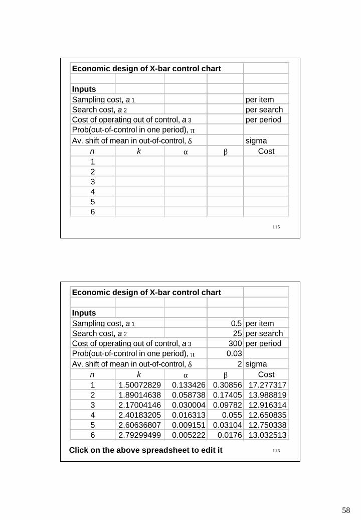
Economic design of X-bar control chart
InputsSampling cost, a 1 per itemSearch cost, a 2 per searchCost of operating out of control, a 3 per periodProb(out-of-control in one period), πAv. shift of mean in out-of-control, δ sigma
n k α β Cost123456
116Click on the above spreadsheet to edit it
Economic design of X-bar control chart
InputsSampling cost, a 1 0.5 per itemSearch cost, a 2 25 per searchCost of operating out of control, a 3 300 per periodProb(out-of-control in one period), π 0.03Av. shift of mean in out-of-control, δ 2 sigma
n k α β Cost1 1.50072829 0.133426 0.30856 17.2773172 1.89014638 0.058738 0.17405 13.9888193 2.17004146 0.030004 0.09782 12.9163144 2.40183205 0.016313 0.055 12.6508355 2.60636807 0.009151 0.03104 12.7503386 2.79299499 0.005222 0.0176 13.032513
59
117
Reading
• Reading: Nahmias, S. “Productions and Operations Analysis,” 4th Edition, McGraw-Hill, pp. 660-667.
118
and s Chart X
• The chart shows the center of the measurements and the R chart the spread of the data.
• An alternative combination is the and s chart. The chart shows the central tendency and the s chart the dispersion of the data.
X
X X

60
119
and s Chart X
• Why s chart instead of R chart?– Range is computed with only two values, the
maximum and the minimum. However, s is computed using all the measurements corresponding to a sample.
– So, an R chart is easier to compute, but s is a better estimator of standard deviation specially for large subgroups
120
and s Chart X
• Previously, the value of σ has been estimated as:
• The value of σ may also be estimated as:
where, is the sample standard deviation and is as obtained from Appendix 2
• Control limits may be different with different estimators of σ (i.e., and )
s 4c
2dR
R s
4cs

61
121
and s Chart
• The control limits of chart are
• The above limits can also be written as Where
X
X
ncs
Xn
X4
33 ±=σ
±
sAXAX 3±σ± or,
check) , and of values the gives 2(Appendix so,
,
343
43
33
AAcAAnc
An
A
=
==
122
LCL
UCL
s
S
sB
sB
3
4
=
=
sAX
sAX
3
3
−=
+=
X
X
LCL
UCL
and s Chart: Trial Control Limits X
• The trial control limits for charts are:
Where, the values of are as obtained from Appendix 2
sX and
433 BBA and ,
subgroups of number the =
==∑∑
==
mm
ss
m
XX
m
ii
m
ii
11 ,

62
123
• For large samples:
nB
nB
nAc
23
123
1
31
43
34
+≈−≈
≈≈
,
,
and s Chart: Trial Control Limits X
124
and s Chart: Revised Control Limits X
d
dnew
d
dnew
mmss
ss
mmXX
XX
−−
==
−−
==
∑
∑
0
0
Where= discarded subgroup averages= number of discarded subgroups= discarded subgroup rangesd
d
d
RmX
• The control limits are revised using the following formula:
Continued…
63
125
and
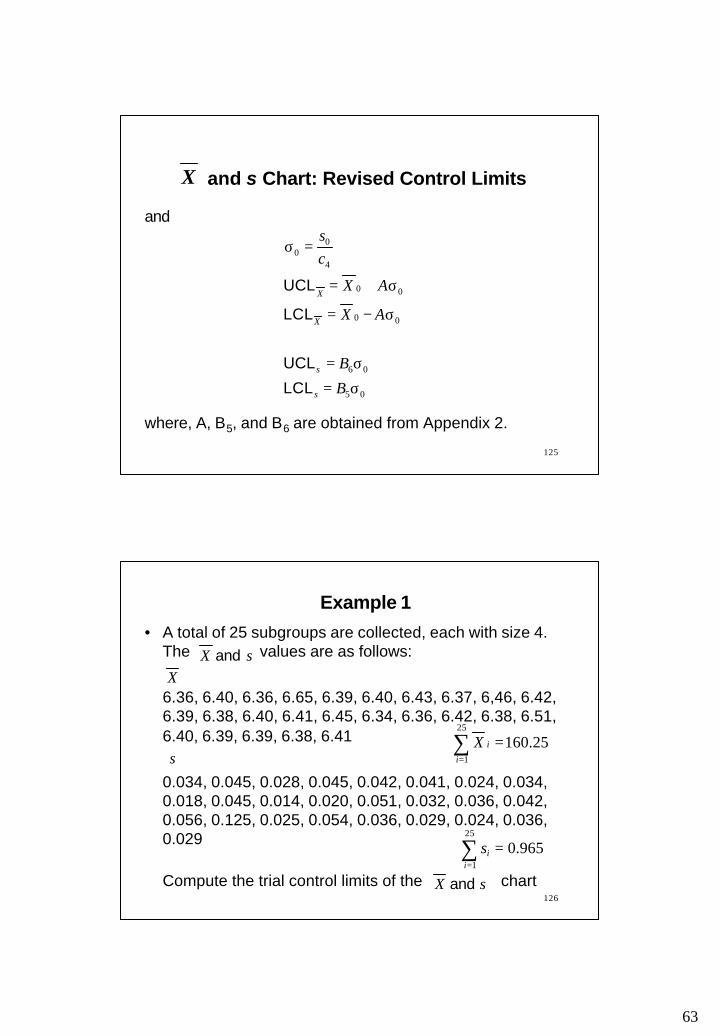
where, A, B5, and B6 are obtained from Appendix 2.
05
06
00
00
4
00
σ=
σ=
σ−=
σ+=
=σ
B
B
AX
AX
cs
s
s
X
X
LCL
UCL
LCL
UCL
and s Chart: Revised Control Limits X
126
• A total of 25 subgroups are collected, each with size 4. The values are as follows:
6.36, 6.40, 6.36, 6.65, 6.39, 6.40, 6.43, 6.37, 6,46, 6.42, 6.39, 6.38, 6.40, 6.41, 6.45, 6.34, 6.36, 6.42, 6.38, 6.51, 6.40, 6.39, 6.39, 6.38, 6.41
0.034, 0.045, 0.028, 0.045, 0.042, 0.041, 0.024, 0.034, 0.018, 0.045, 0.014, 0.020, 0.051, 0.032, 0.036, 0.042, 0.056, 0.125, 0.025, 0.054, 0.036, 0.029, 0.024, 0.036, 0.029
Compute the trial control limits of the chart
Example 1
∑=
=25
1
25.160i
iX
sX and X
s
sX and
∑=
=25
1
965.0i
is

64
127
• Compute the revised control limits of the chartobtained in Example 1.
Example 2
sX and
128
Reading and Exercises
• Chapter 5– Reading pp. 236-242, Exercises 15, 16 (2nd ed.)– Reading pp. 240-247, Exercises 15, 16 (3rd ed.)
65
129
CHAPTER 6: PROCESS CAPABILITY
Outline
• Process capability: individual values and specification limits
• Estimation of standard deviation• The 6σ spread versus specification limits• The process capability indices
130
Process CapabilityIndividual Values and Specification Limits
• Specifications are set by the customer. These are the “wishes.”
• Control limits are obtained by applying statistical rules on the data generated by the process. These are the “reality.”
• Process capability refers to the ability of a process to meet the specifications set by the customer or designer

66
131
Process CapabilityIndividual Values and Specification Limits
• Process capability is based on the performance of individual products or services (not the subgroup averages) against specifications set by the customer or designer (not the statistically computed control limits)
• Process capability is different from the state of process control which is determined by control charts and based on the average performances of subgroups against statistically computed control limits
132
• The difference between process capability and the state of process control– When measurement of an individual item does not meet
specification, the item is called defective– When subgroup averages are compared with control limits
and the comparison shows some unpredictable amount of variation, an out-of-control state is assumed
– A process in statistical control does not necessarily follow specifications. A capable process is not necessarily in control. A process may be out of control and within specification or under control and out of specification.
Process CapabilityIndividual Values and Specification Limits

67
133
Process cannot meet specifications Process can meet specifications
Process capability exceeds specifications
PR
OC
ES
S
PR
OC
ES
S
PR
OC
ES
SNaturalcontrollimits
Naturalcontrollimits
Naturalcontrollimits
Designspecs
Designspecs
Process CapabilityIndividual Values and Specification Limits
134
Estimation of Standard Deviation
• The population standard deviation, can be estimated from the sample standard deviation, s or range, R as follows:
• Note: The population standard deviation is denoted by σ. However, the estimate of the population standard deviation is denoted by
)24
2
^
4
^
dcdR
cs
and of values the for 2 Appendix (See
or, =σ=σ
^
σ
^σ
68
135
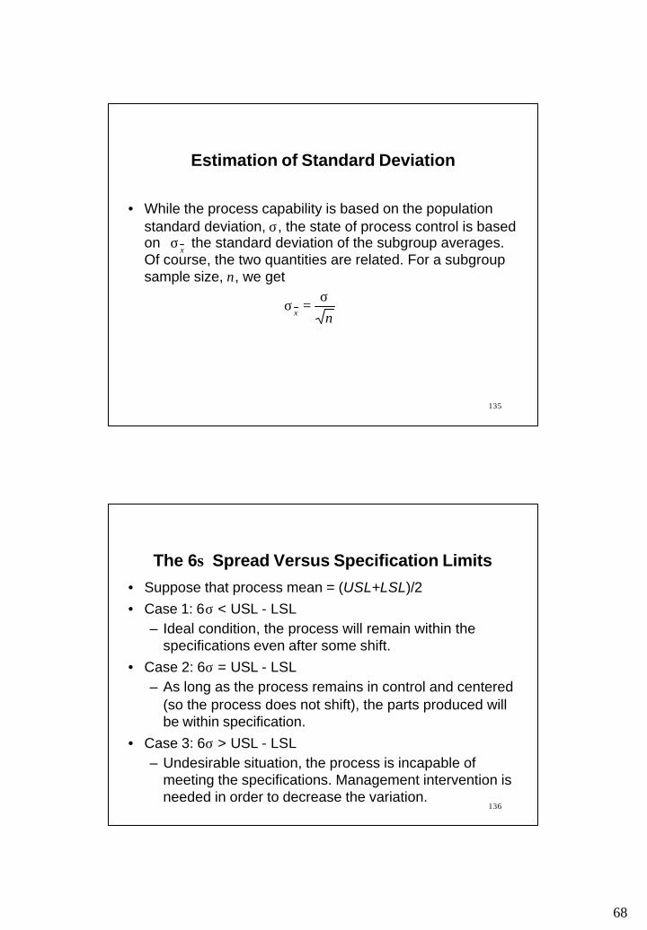
Estimation of Standard Deviation
• While the process capability is based on the population standard deviation, σ, the state of process control is based on the standard deviation of the subgroup averages. Of course, the two quantities are related. For a subgroup sample size, n, we get
xσ
nx
σ=σ
136
The 6σ Spread Versus Specification Limits
• Suppose that process mean = (USL+LSL)/2 • Case 1: 6σ < USL - LSL
– Ideal condition, the process will remain within the specifications even after some shift.
• Case 2: 6σ = USL - LSL– As long as the process remains in control and centered
(so the process does not shift), the parts produced will be within specification.
• Case 3: 6σ > USL - LSL– Undesirable situation, the process is incapable of
meeting the specifications. Management intervention is needed in order to decrease the variation.
69
137
The 6σ Spread Versus Specification Limits
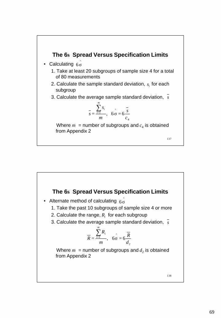
• Calculating 1. Take at least 20 subgroups of sample size 4 for a total
of 80 measurements2. Calculate the sample standard deviation, for each
subgroup3. Calculate the average sample standard deviation,
Where m = number of subgroups and c4 is obtained from Appendix 2
^6 σ
is
s
4
^1 66,
cs
m
ss
m
ii
=σ=∑
=
138
The 6σ Spread Versus Specification Limits
• Alternate method of calculating 1. Take the past 10 subgroups of sample size 4 or more2. Calculate the range, Ri for each subgroup3. Calculate the average sample standard deviation,
Where m = number of subgroups and d2 is obtained from Appendix 2
^6 σ
s
2
^1 66,
dR
m
RR
m
ii
=σ=∑
=

70
139
• Capability index
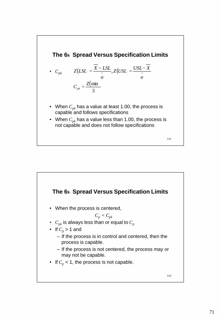
• If the capability index is larger than 1.00, a Case 1 situation exists. This is desirable. The greater this value, the better. The process will remain capable even after a slight shift of the process mean.
• If the capability index is equal to 1.00, a Case 2 situation exists. This is not the best. However, if the process is in control and the mean is centered, the process is capable.
σ6LSLUSLC p
−=
The 6σ Spread Versus Specification Limits
140
• If the capability index is less than 1.00, a Case 3 situation exists. This is undesirable and the process is not capable to meet the specifications.
• The capability ratio:
• The capability ratio is the inverse of the capability index and interpreted similarly. A capability ratio of less than 1 is the most desirable situation.
• The values do not reflect process centering.
The 6σ Spread Versus Specification Limits
LSLUSLCr −
σ=
6
rp CC or
71
141
• Cpk
• When Cpk has a value at least 1.00, the process is capable and follows specifications
• When Cpk has a value less than 1.00, the process is not capable and does not follow specifications
( ) ( )
( )3min
, ^^
ZC
XUSLUSLZ
LSLXLSLZ
pk =
σ
−=σ
−=
The 6σ Spread Versus Specification Limits
142
• When the process is centered, Cp = Cpk
• Cpk is always less than or equal to Cp
• If Cp > 1 and– If the process is in control and centered, then the
process is capable. – If the process is not centered, the process may or
may not be capable.• If Cp < 1, the process is not capable.
The 6σ Spread Versus Specification Limits

72
143
• A hospital is using charts to record the time it takes to process patient account information. A sample of 5 applications is taken each day. The first four weeks’ (20 days’) data give the following values:
If the upper and lower specifications are 21 minutes and 13 minutes, respectively, calculate
and interpret the indices.
RX and
min and min 16X 7== R
pkp CC and ,,6^
σ
Example 3
144
Example 4
• A certain manufacturing process has been operating in control at a mean µ of 65.00 mm with upper and lower control limits on the chart of 65.225 and 64.775 respectively. The process standard deviation is known to be 0.15 mm, and specifications on the dimensions are 65.00±0.50 mm.
(a) What is the probability of not detecting a shift in the mean to 64.75 mm on the first subgroup sampled after the shift occurs. The subgroup size is four.
(b) What proportion of nonconforming product results from the shift described in part (a)? Assume a normal distribution of this dimension.
(c) Calculate the process capability indices Cp and Cpk for this process, and comment on their meaning relative to parts (a) and (b).
73
145
Reading and Exercises
• Chapter 6– Reading pp. 280-303, Exercises 3, 4, 11, 13 (2nd ed.)– Reading pp. 286-309, Exercises 3, 4, 9, 13 (3rd ed.)
146
CHAPTER 7: OTHER VARIABLE CONTROL CHARTS
Outline
• Individual and moving-range charts• Moving-average and moving-range charts• A chart plotting all individual values• Median and range charts• Run charts• A chart for variable subgroup size• Pre-control charts• Short-run charts

74
147
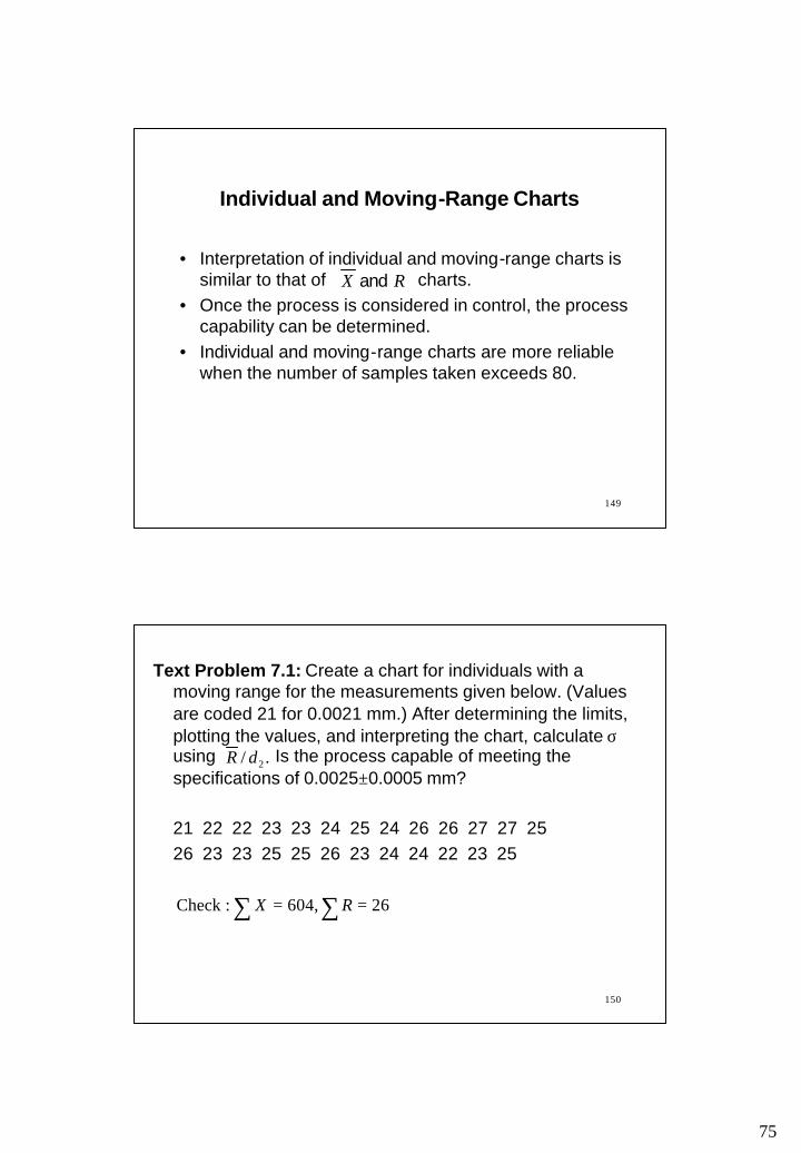
Individual and Moving-Range Charts
• This chart is useful when number of products produced is too small to form traditional charts and data collection occurs either once a day, or on a week-to-week or month-to-month basis
• The individual measurements are taken and plotted on the individual chart
• Two consecutive individual data -point values are compared and the absolute value of their difference is recorded on the moving-range chart. The moving-range is usually placed on the R chart between the space designated for a value and its preceding value.
RX and
iX
148
Individual and Moving-Range Charts
• Formula:
027.3
66.2
66.21128.1
3
33
1 ,
values ofnumber theLet
4
2
===
−=
+=+=
+=σ
+=
−==
=
∑∑
R
R
iX
ii
iiX
iii
i
LCLRRDUCL
RXLCL
RXR
X
ndR
Xn
XUCL
mR
Rm
XX
Xm
i
i
75
149
Individual and Moving-Range Charts
• Interpretation of individual and moving-range charts is similar to that of charts.
• Once the process is considered in control, the process capability can be determined.
• Individual and moving-range charts are more reliable when the number of samples taken exceeds 80.
RX and
150
Text Problem 7.1: Create a chart for individuals with a moving range for the measurements given below. (Values are coded 21 for 0.0021 mm.) After determining the limits, plotting the values, and interpreting the chart, calculate σusing Is the process capable of meeting the specifications of 0.0025±0.0005 mm?
21 22 22 23 23 24 25 24 26 26 27 27 2526 23 23 25 25 26 23 24 24 22 23 25
./ 2dR
∑ ∑ == 26,604 :Check RX
76
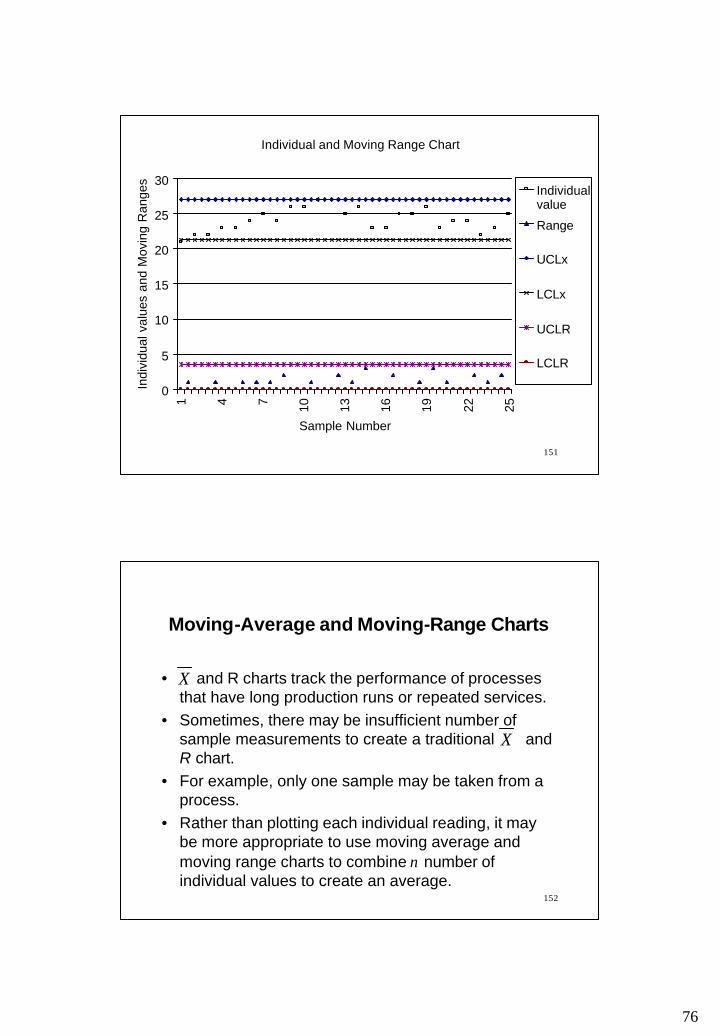
151
Individual and Moving Range Chart
0
5
10
15
20
25
301 4 7 10 13 16 19 22 25
Sample Number
Indi
vidu
al v
alue
s an
d M
ovin
g R
ange
s
Individualvalue
Range
UCLx
LCLx
UCLR
LCLR
152
• and R charts track the performance of processes that have long production runs or repeated services.
• Sometimes, there may be insufficient number of sample measurements to create a traditional and R chart.
• For example, only one sample may be taken from a process.
• Rather than plotting each individual reading, it may be more appropriate to use moving average and moving range charts to combine n number of individual values to create an average.
X
X
Moving-Average and Moving-Range Charts

77
153
• When a new individual reading is taken, the oldest value forming the previous average is discarded.
• The range and average are computed from the most recent n observations.
• This is quite common in continuous process chemical industry, where only one reading is possible at a time.
Moving-Average and Moving-Range Charts
154
• Use for continuous process chemical industry:The moving average is particularly appropriate in continuous process chemical manufacture. The smoothing effect of the moving average often has an effect on the figures similar to the effect of the blending and mixing that take place in the remainder of the production process.
• Use for seasonal products: By combining individual values produced over time, moving averages smooth out short term variations and provide the trends in the data. For this reason, moving average charts are frequently used for seasonal products.
Moving-Average and Moving-Range Charts

78
155
• Interpretation:– a point outside control limits
• interpretation is same as before - process is out of control
– runs above or below the central line or control limits
• interpretation is not the same as before - the successive points are not independent of one another
Moving-Average and Moving-Range Charts
156
Text Problem 7.6 (7.4): Eighteen successive heats of a steel alloy are tested for RC hardness. The resulting data are shown below. Set up control limits for the moving-average and moving-range chart for a sample size of n=3.
Heat Hardness Average Range Heat Hardness Average Range1 0.806 10 0.8092 0.814 11 0.808 3 0.810 12 0.8104 0.820 13 0.8125 0.819 14 0.8106 0.815 15 0.8097 0.817 16 0.8078 0.810 17 0.8079 0.811 18 0.800

79
157
Example: Eighteen successive heats of a steel alloy are tested for RC hardness. The resulting data are shown below. Set up control limits for the moving-average and moving-range chart for a sample size of n=3.
Heat Hardness Average Range Heat Hardness Average Range1 0.806 10 0.809 0.810 0.0022 0.814 11 0.808 0.809 0.0033 0.810 0.810 0.008 12 0.810 0.809 0.0024 0.820 0.815 0.010 13 0.812 0.810 0.0045 0.819 0.816 0.010 14 0.810 0.811 0.0026 0.815 0.818 0.005 15 0.809 0.810 0.0037 0.817 0.817 0.004 16 0.807 0.809 0.0038 0.810 0.814 0.007 17 0.807 0.808 0.0029 0.811 0.813 0.007 18 0.800 0.805 0.007
1580)005.0)(0(
013.0)005.0)(57.2(
806.0)005.0)(02.1(811.0
816.0)005.0)(02.1(811.0
005.016
007.0010.0010.0008.0
811.016
805.0816.0815.0810.0
3
4
2
2
===
===
=−=−=
=+=+=
=
=++++
==
=++++
==
∑
∑
RD
RD
RAX
RAX
Xm
mR
R
m
XX
R
R
X
X
i
LCL
UCL
LCL
UCL
readings of number where
L
L
80
159
Moving Average Chart
0.80.805
0.810.815
0.82
0 5 10 15 20
Heat
Har
dnes
s UCLxbarAverageXbarbarLCLxbar
Moving Range Chart
0
0.005
0.01
0.015
0 5 10 15 20
Heat
Har
dn
ess
Ran
ge
UCLrRangeRbarLCLr
160
A Chart Plotting All Individual Values
• Control charts that plot each individual value are useful when explaining the concept of variation.
• On an individual values chart, the individual values from the subgroup are represented by a small mark. The average of those values is represented by a circle.
• Usually, the chart is reserved for training people on interpreting the values of R and s charts.

81
161
Median and Range Charts
• When a median chart is used, the median of each subgroup is calculated and plotted
• The centerline of the median chart is the average of the subgroup medians.
• The control limits of the median chart is determined using the formula shown in the next slide.
• The procedure of construction of the range chart is the same as before.
• The median chart is easy to compute. However, some sensitivity is lost.
162
Median and Range Charts
• Formula:
)class/exam in covered (not 334-330 pp. see formula, of set ealternativ an For
Median
subgroups of number the Let
MdMd
MdMd
MdMd
MdMd
MdMd
RDLCL
RDUCL
RAXLCL
RAXUCLm
RR
mX
m
ii
3
4
5
6
,
=
=
−=
+=
==
=
∑∑
82
163
Run Charts
• A run chart is a line graph that shows data points plotted in the order in which they occur.
• They are used to show trends and shifts in a process over time, variation over time, or to identify decline or improvement in a process over time.
• They can be used to examine both variables and attribute data.
• Time is displayed on the x axis and the variable or attribute being investigated is recorded on the y axis.
• There are no control limits in a run chart.
164
Run Chart - Average Math Score
020406080
100120140160180
1975
1977
1979
1981
1983
1985
1987
1989
1991
1993
1995
Year of Test
Ave
rage
Tes
t Sco
re

83
165
Run Chart - Shrink Wrap Usage
0
2
4
6
8
10
12
0 5 10 15 20
Day
Num
ber o
f rol
ls o
f shr
ink-
wra
p us
ed
166
Run Charts
A run chart is constructed in five steps:
1. Determine the time increments.
2. Scale the y axis to reflect the values that the measurements or attributes data will take.
3. Collect the data.
4. Record the data on the chart.
5. Interpret the chart.
84
167
A Chart for Variable Subgroup Size
• Traditional variable control charts are constructed using a constant subgroup sample size.
• If the subgroup size varies, it is necessary to recalculate the control limits for every subgroup size. Each subgroup with a different sample size will have its own control limits plotted on the chart.
• If the subgroup size increases, the control limits will be closer to the centerline. The gap between two control limits will be narrower.
168
Precontrol Charts
• Precontrol charts do not use the process data to calculate the control limits. The control limits are calculated using specifications.
• Precontrol charts– are simple to set up and use.– can be used with either variable and attribute data.– useful during setup operations - can determine if the
process setup is producing product within tolerances– can identify if the process center has shifted or the
spread has increased

85
169
Precontrol Charts
• Precontrol charts cannot be used to study process capability.
• Precontrol charts may generate more false alarms or missed signals than the control charts
170
Precontrol Charts
1. Create the zones:Red zone: Outside specification limits.Yellow zone: Inside specification limits. One of the
specification limits is closer than the center of the specification.
Green zone: Inside specification limits. The center of the specification is closer than both the specification limits.
86
171
Precontrol Charts
2. Take measurements and apply the setup rules:– Point in green zone: continue until five successive pieces
are in the green zone– Point in yellow zone: check another piece– Two points in a row in the same yellow zone: reset the
process– Two points in a row in opposite yellow zone: stop, reduce
variation, reset the process– Point in the red zone: stop, make correction and reset
the process
172
Precontrol Charts
3. Apply the precontrol sampling plan:– Once five successive points fall in the green zone,
discontinue 100% inspection and start sampling. – Randomly select two pieces at interval:
• A point in the red zone: stop, adjust process to remove variation, reset
• Two points in the opposite yellow zone: stop, adjust process to remove variation
• Two points in the same yellow zone: adjust process to remove variation
• Otherwise: Continue
87
173
Text Problem 7.16 (7.13): NB Manufacturing has ordered a new machine. During today’s runoff the following data were gathered concerning the runout for the diameter of the shaft machine by this piece of equipment. A precontrol chart was used to set up the machines. Recreate the precontrol chart from the following data. The tolerance associated with this part is a maximum runout value of 0.002 (upper specification). The optimal value is 0.000 (no runout), the lower specificatin limit.
0.0021 0.0013 0.0018 0.0007 0.00020.0030 0.0024 0.0006 0.0002 0.00060.0004 0.0003 0.0010 0.0015 0.0011
174
Short-Run Charts
• Traditional variable control charts work with long, continuous production runs.
• Several methods have been developed for shorter production runs:– inspect the first and last pieces: gives no information
on the pieces in between– 100% inspection: expensive and time consuming– separate charts for each pert number: a large
number of charts, insufficient number of observations to calculate the control limits
88
175
Short-Run Charts
• Short-run charts include multiple part numbers on the same chart.
• As the short-run charts display multiple part numbers, it is possible to visualize the variation in the process.
• The data are coded so that all the data, regardless of the part number, are scaled to a common denominator. So, there is common set of control limits for all the parts numbers.
• The nominal and charts use coded measurements based on nominal dimension.
• Coded measurement = Actual measurement - nominal value
X R
176
Short-Run Charts
Use the following steps to create a nominal and chart:1. Determine parts that will be monitored with the same chart.
– parts made by the same operator, machine, methods, materials and measurement techniques
2. Determine the nominal specification for each part number.3. Collect data - use the same subgroup sample size for all part
numbers.4. For each measurement, compute coded value = actual
measurement - nominal value. Compute average measurement for each subgroup.
X R
X
89
177
Short-Run Charts
5. Plot the average measurements from step 4 on the chart.6. Continue to calculate, code, and plot measurements for the
entire run of the same part number.7. When another part number is to be run, repeat steps 1 to 6.8. When 20 subgroups have been plotted from any combination
of parts, calculate control limits.Use the formula on the next slide.
9. Draw the centerline and control limits on the chart.10. Interpret the chart.
178
Short-Run Charts
RDRDm
RR
RRARA
mX
X
RR
i
XX
34
22
,
,
==
=
−=+=
=
∑
∑
LCL UCL
chart NominalcenterlineLCL centerlineUCL
coded Centerline
chart Nominal
:8 Step

90
179
Text Problem 7.19 (7.16): A series of pinion gears for a van set recliner are fine-blanked on the same press. The nominal part diameters are small (50.8 mm), medium (60.2 mm), and large (70.0 mm). Create a short-run control chart for the data shown on the next slide:
180
60.1 70.0 50.860.2 70.1 50.960.4 70.1 50.8
60.2 70.2 51.0
60.3 70.0 51.060.2 69.9 50.9
60.1 69.8 50.960.2 70.0 50.760.1 69.9 51.0
60.4 50.960.2 50.960.2 50.8

91
181
Reading and Exercises
• Chapter 7– Reading pp. 316-48 (2nd ed.)– Exercises 2, 5, 6, 7, 14, 15 (2nd ed.)– Reading pp. 322-55 (3rd ed.)– Exercises 2, 7, 8, 9, 17, 18 (3rd ed.)
182
The Control Chart for Attributes
Topic• The Control charts for attributes• The p and np charts• Variable sample size• Sensitivity of the p chart
92
183
Types of Data
• Variable data• Product characteristic that can be measured
• Length, size, weight, height, time, velocity
• Attribute data• Product characteristic evaluated with a discrete
choice• Good/bad, yes/no
184
The Control Chart for Attributes
• In a control chart for variables, quality characteristic is expressed in numbers. Many quality characteristics (e.g., clarity of glass) can be observed only as attributes, i.e., by classifying into defectives and non-defectives.
• If many quality characteristics are measured, a separate control chart for variable will be needed for each quality characteristic. A control chart for attribute is a cheaper alternative. It records an item defective if any specification is not met and non-defective if all the specifications are met.
93
185
The Control Chart for Attributes
• The cost of collecting data for attributes is less than that for the variables
• There are various types of control charts for attributes:– The p chart for the fraction rejected– The np chart for the total number rejected– The c chart for the number of defects– The u chart for the number of defects per unit
186
The Control Chart for Attributes
• Poisson Approximation:– Occurrence of defectives may be approximated by
Poisson distribution– Let n = number of items and p = proportion of
defectives. Then, the expected number of defectives,
– Once the expected number of defectives is known, the probability of c defectives as well as the probability of c or fewer defectives can be obtained from Appendix 4
npnp =µ

94
187
Steps1. Gather data2. Calculate p, the proportion of defectives3. Plot the proportion of defectives on the control chart4. Calculate the centerline and the control limits (trial)5. Draw the centerline and control limits on the chart6. Interpret the chart7. Revise the chart
The Control Chart for Fraction Rejected The p Chart: Constant Sample Size
188
The Control Chart for Fraction Rejected The p Chart: Constant Sample Size
• Step 4: Calculating trial centerline and control limits for the p chart
npp
pLCL
npp
pUCL
nnp
p
p
p
)1(3
)1(3
−−=
−+=
=∑∑

95
189
• Step 6: Interpretation of the p chart – The interpretation is similar to that of a variable
control chart. there should be no patterns in the data such as trends, runs, cycles, or sudden shifts in level. All of the points should fall between the upper and lower control limits.
– One difference is that for the p chart it is desirable that the points lie near the lower control limit
– The process capability is the centerline of the pchart
,p
The Control Chart for Fraction Rejected The p Chart: Constant Sample Size
190
• Step 7: Revised centerline and control limits for the pchart
n
pppLCL
n
pppUCL
nnnpnp
p
p
p
d
d
)1(3
)1(3
newnewnew
newnewnew
new
−−=
−+=
−−
=∑
∑
The Control Chart for Fraction Rejected The p Chart: Constant Sample Size

96
191
The Control Chart for Fraction Rejected The np Chart
)1(3
)1(3
ppnpnLCL
ppnpnUCL
mm
nppn
np
np
−−=
−+=
=
= ∑
subgroups of number where,
Centerline
• The np chart construction steps are similar to those of the p chart. The trial centerline and control limits are as follows:
192
Variable Sample SizeChoice Between the p and np Charts
• If the sample size varies, p chart is more appropriate• If the sample size is constant, np chart may be used
97
193
Sensitivity of the p Chart
• Smaller samples are – less sensitive to the changes in the quality levels
and – less satisfactory as an indicator of the assignable
causes of variation• Smaller samples may not be useful at all e.g., if only
0.1% of the product is rejected• If a control chart is required for a single measurable
characteristic, chart will give useful results with a much smaller sample.
X
194
Example 1: A manufacturer purchases small bolts in cartons that usually contain several thousand bolts. Each shipment consists of a number of cartons. As part of the acceptance procedure for these bolts, 400 bolts are selected at random from each carton and are subjected to visual inspection for certain non-conformities. In a shipment of 10 cartons, the respective percentages of rejected bolts in the samples from each carton are 0, 0, 0.5, 0.75, 0,2.0, 0.25, 0, 0.25, and 1.25. Does this shipment of bolts appear to exhibit statistical control with respect to the quality characteristics examined in this inspection?

98
195
Example 2: An item is made in lots of 200 each. The lots are given 100% inspection. The record sheet for the first 25 lots inspected showed that a total of 75 items did not conform to specifications.
a. Determine the trial limits for an np chart.b. Assume that all points fall within the control limits.
What is your estimate of the process average fraction nonconforming ?
c. If this remains unchanged, what is the probability that the 26th lot will contain exactly 7 nonconforming units? That it will contain 7 or more nonconforming units? (Hint: use Poisson approximation and Appendix 4)
pµ
pµ
196
Example 3: A manufacturer wishes to maintain a process average of 0.5% nonconforming product or less. 1,500 units are produced per day, and 2 days’ runs are combined to form a shipping lot. It is decided to sample 250 units each day and use an np chart to control production.
(a) Find the 3-sigma control limits for this process.(b) Assume that the process shifts from 0.5 to 4%
nonconforming product. Appendix 4 to find the probability that the shift will be detected as the result of the first day’s sampling after the shift occurs.
(c) What is the probability that the shift described in (b) will be caught within the first 3 days after it occurs?

99
197
The Control Chart for Attributes
Topic• The p chart for the variable sample size• Calculating p chart limits using nave
• Percent nonconforming chart• The c chart• The u chart with constant sample size• The u chart with variable sample size
198
• When the number of items sampled varies, the pchart can be easily adapted to varying sample sizes
• If the sample size varies– the control limits must be calculated for each
different sample size, changing the n in the control-limit formulas each time a different sample size is taken.
– calculating the centerline and interpreting the chart will be the same
The Control Chart for Fraction Rejected The p Chart: Variable Sample Size
100
199
Steps1. Gather data2. Calculate p, the proportion of defectives3. Plot the proportion of defectives on the control chart4. Calculate the centerline. For each sample calculate a
separate pair of control limits.5. Draw the centerline and control limits on the chart6. Interpret the chart
The Control Chart for Fraction Rejected The p Chart: Variable Sample Size
200
• Step 4: Calculate the centerline. For each sample calculate a separate pair of control limits. Let m = number of samples.
sample th the for
sample th the for
samples) all for centerline (one
−−
−=
−−
+=
=
∑
∑
=
=
in
pppLCL
in
pppUCL
n
pnp
ip
ip
m
ii
m
iii
)1(3
)1(3
1
1
The Control Chart for Fraction Rejected The p Chart: Variable Sample Size
101
201
• Step 6: Interpretation of the p chart – The interpretation is similar to that of a variable
control chart. there should be no patterns in the data such as trends, runs, cycles, or sudden shifts in level. All of the points should fall between the upper and lower control limits.
– One difference is that for the p chart it is desirable that the points lie near the lower control limit
– The process capability is the centerline of the pchart
,p
The Control Chart for Fraction Rejected The p Chart: Variable Sample Size
202
• The calculation of control limits for the p chart with variable sample size can be simplified with the use of nave
• The value nave can be found by summing up the individual sample sizes and dividing by the total number of times samples were taken:
The Control Chart for Fraction Rejected The p Chart: Variable Sample Size
Calculation of Control Limits Using nave
samples of number where, =
=∑
=
mm
nn
m
ii
ave1
102
203
• The value nave can be used whenever the individual sample sizes vary no more than 25% from the calculated nave
• The advantage of using is that there will be a single pair of upper and lower control limits
The Control Chart for Fraction Rejected The p Chart: Variable Sample Size
Calculation of Control Limits Using nave
avep
avep
n
pppLCL
n
pppUCL
)1(3
)1(3
−−=
−+=
204
• However, if the control limits are computed using the nave the points inside and outside the control limits must be interpreted with caution:– See the control limit formula - for a larger sample,
the control limits are narrower and for a smaller sample, the control limits are wider
– So, if a larger sample produces a point inside the upper control limit computed using nave, the point may actually be outside the upper control limit when the upper control limit is computed using the individual sample size
The Control Chart for Fraction Rejected The p Chart: Variable Sample Size
Calculation of Control Limits Using nave
103
205
– Similarly, if a smaller sample produces a point outside the upper control limit computed using nave, the point may actually be inside the upper control limit when the upper control limit is computed using the individual sample size
• If a larger sample produces a point inside the upper control limit, the individual control limit should be calculated to see if the process is out-of-control
• If a smaller sample produces a point outside the upper control limit, the individual control limit should be calculated to see if the process is in control
The Control Chart for Fraction Rejected The p Chart: Variable Sample Size
Calculation of Control Limits Using nave
206
• The previous discussion leads to the following four cases: • Case I: The point falls inside the UCLp and nind < nave
– No need to check the individual limit• Case II: The point falls inside the UCLp and nind > nave
– The individual limits should be calculated• Case III: The point falls outside the UCLp and nind > nave
– No need to check the individual limit• Case IV: The point falls outside the UCLp and nind < nave
– The individual limits should be calculated• Check points: All the points near UCL. Check only the
points which are near UCL.
The Control Chart for Fraction Rejected The p Chart: Variable Sample Size
Calculation of Control Limits Using nave
104
207
• The centerline and control limits for the percent nonconforming chart
−−=
−+=
=∑∑
n
pppLCL
n
pppUCL
n
npp
p
p
)1(3100
)1(3100
100100
100
100
Centerline
The Control Chart for Fraction Rejected The Percent Nonconforming Chart
Constant Sample Size
208
The Control Chart for NonconformitiesThe c and u charts
• Defective and defect – A defective article is the one that fails to conform
to some specification.– Each instance of the article’s lack of conformity to
specifications is a defect– A defective article may have one or more defects
105
209
The Control Chart for NonconformitiesThe c and u charts
• The np and c charts– Both the charts apply to total counts– The np chart applies to the total number of defectives in
samples of constant size– The c chart applies to the total number of defects in
samples of constant size• The p and u charts
– The p chart applies to the proportion of defectives– The u chart applies to the number of defects per unit– If the sample size varies, the p and u charts may be used
210
• The number of nonconformities, or c, chart is used to track the count of nonconformities observed in a single unit of product of constant size.
• Steps1. Gather the data2. Count and plot c, the count of nonconformities, on the
control chart.3. Calculate the centerline and the control limits (trial)4. Draw the centerline and control limits on the chart5. Interpret the chart6. Revise the chart
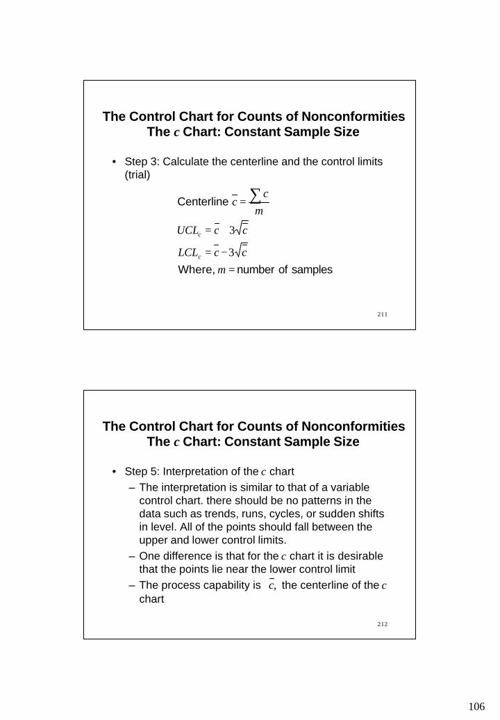
The Control Chart for Counts of Nonconformities The c Chart: Constant Sample Size
106
211
The Control Chart for Counts of Nonconformities The c Chart: Constant Sample Size
• Step 3: Calculate the centerline and the control limits (trial)
samples of number Where,
Centerline
=−=
+=
= ∑
mccLCL
ccUCL
mc
c
c
c
3
3
212
• Step 5: Interpretation of the c chart – The interpretation is similar to that of a variable
control chart. there should be no patterns in the data such as trends, runs, cycles, or sudden shifts in level. All of the points should fall between the upper and lower control limits.
– One difference is that for the c chart it is desirable that the points lie near the lower control limit
– The process capability is the centerline of the cchart
,c
The Control Chart for Counts of Nonconformities The c Chart: Constant Sample Size
107
213
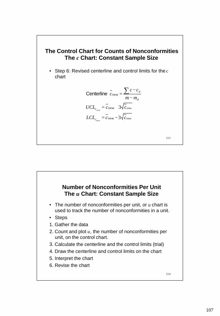
• Step 6: Revised centerline and control limits for the cchart
enwc
enwc
d
d
ccLCL
ccUCL
mm
ccc
new
new
3
3
−=
+=
−
−= ∑
new
new
new Centerline
The Control Chart for Counts of Nonconformities The c Chart: Constant Sample Size
214
• The number of nonconformities per unit, or u chart is used to track the number of nonconformities in a unit.
• Steps1. Gather the data2. Count and plot u, the number of nonconformities per
unit, on the control chart.3. Calculate the centerline and the control limits (trial)4. Draw the centerline and control limits on the chart5. Interpret the chart6. Revise the chart
Number of Nonconformities Per Unit The u Chart: Constant Sample Size
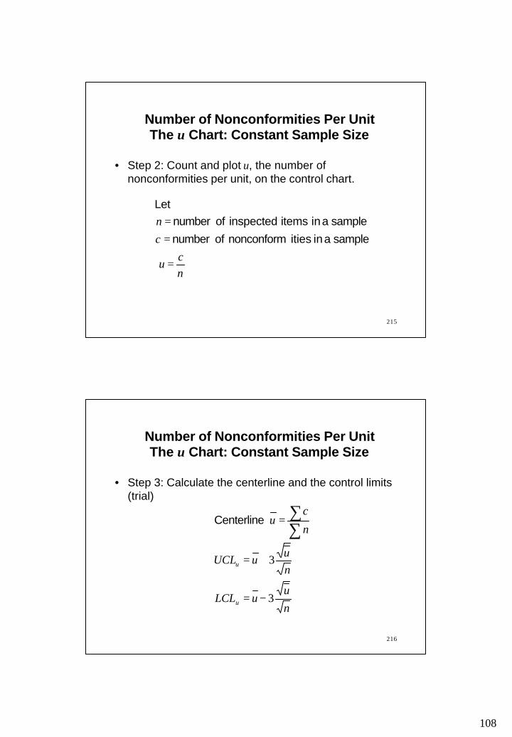
108
215
• Step 2: Count and plot u, the number of nonconformities per unit, on the control chart.
nc
u
c
n
=
==
sample a in itiesnonconform of number
sample a in items inspected of number Let
Number of Nonconformities Per Unit The u Chart: Constant Sample Size
216
• Step 3: Calculate the centerline and the control limits (trial)
nu
uLCL
nuuUCL
n
cu
u
u
3
3
−=
+=
=∑∑ Centerline
Number of Nonconformities Per Unit The u Chart: Constant Sample Size
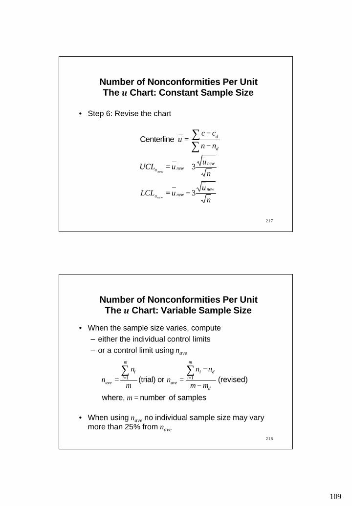
109
217
• Step 6: Revise the chart
nu
uLCL
nuuUCL
nn
ccu
newnewu
newnewu
d
d
new
new
3
3
−=
+=
−
−=
∑∑ Centerline
Number of Nonconformities Per Unit The u Chart: Constant Sample Size
218
• When the sample size varies, compute– either the individual control limits – or a control limit using nave
• When using nave no individual sample size may vary more than 25% from nave
Number of Nonconformities Per Unit The u Chart: Variable Sample Size
samples of number where,
(revised) or (trial)
=
−
−==
∑∑==
m
mm
nnn
m
nn
d
m
idi
ave
m
ii
ave11

110
219
• As the Poisson distribution is not symmetrical, the upper and lower 3 -sigma limits do not correspond to equal probabilities of a point on the control chart falling outside limits. To avoid the problem with asymmetry, the use of 0.995 and 0.005 limits has been favored
• If the distribution does not follow Poisson law, actual standard deviation may be greater than and, therefore, 3-sigma limit may actually be greater than limit obtained from the formula
The Control Chart for NonconformitiesThe c and u charts
cc3
220
Example 4: The following are data on 5-gal containers of paint. If the color mixture of the paint does not match the control color, then the entire container is considered nonconforming and is disposed of. Since the amount produced during each production run varies, use nave to calculate the centerline and control limits for this set of data. Carry calculations to four decimal places. Remember to Round nave to a whole number; you can’t sample part of a 5-gal pail.
Production run 1 2 3 4 5 6Number inspected 2,524 2,056 2,750 3,069 3,365 3,763Number defective 30 84 76 108 54 29Production run 7 8 9 10 11 12Number inspected 2,675 2,255 2,060 2,835 2,620 2,250Nunmber defective 20 25 48 10 86 25

111
221
Production Number Number Proportion CheckRun Inspected Defective Defective Point?
n np p1 2,524 30 0.01192 2,056 84 0.04093 2,750 76 0.02764 3,069 108 0.03525 3,365 54 0.01606 3,763 29 0.00777 2,675 20 0.00758 2,255 25 0.01119 2,060 48 0.0233
10 2,835 10 0.003511 2,620 86 0.032812 2,250 25 0.0111
222
Example 5: A c chart is used to monitor the number of surface imperfections on sheets of photographic film. The chart presently is set up based on of 2.6.
(a) Find the 3-sigma control limits for this process.(b) Use Appendix 4 to determine the probability that a
point will fall outside these control limits while the process is actually operating at a µc of 2.6.
(c) If the process average shifts to 4.8, what is the probability of not detecting the shift on the first sample taken after the shift occurs?
c

112
223
Example 6: A shop uses a control chart on maintenance workers based on maintenance errors per standard worker-hour. For each worker, a random sample of 5 items is taken daily and the statistic c/n is plotted on the worker’s control chart where c is the count of errors found in 5 assemblies and n is the total worker-hours required for the 5 assemblies.
(a) After the first 4 weeks, the record for one worker is ∑c=22 and ∑n=54. Determine the central line and the 3-sigma control limits.
(b) On a certain day during the 4-week period, the worker makes 2 errors in 4,3 standard worker-hour. Determine if the point for this day falls within control limits.
224
Reading and Exercises
• Chapter 9: – Reading pp. 404-447 (2nd ed.)– Problems 5, 10 (solve with and without nave), 11, 13, 14, 19, 20, 23, 25 (2nd ed.)–Reading pp. 414-453 (3rd ed.)– Problems 5, 10 (solve with and without nave), 11, 13, 14, 19, 20, 23, 25 (2nd ed.)
113
225
Acceptance Sampling
Outline
• Sampling• Some sampling plans• A single sampling plan• Some definitions• Operating characteristic curve
226
Necessity of Sampling
• In most cases 100% inspection is too costly.• In some cases 100% inspection may be impossible.• If only the defective items are returned, repair or
replacement may be cheaper than improving quality. But, if the entire lot is returned on the basis of sample quality, then the producer has a much greater motivation to improve quality.

114
227
Some Sampling Plans
• Single sampling plans: – Most popular and easiest to use– Two numbers n and c– If there are more than c defectives in a sample of
size n the lot is rejected; otherwise it is accepted• Double sampling plans:
– A sample of size n1 is selected. – If the number of defectives is less than or equal to
c1 than the lot is accepted. – Else, another sample of size n2 is drawn. – If the cumulative number of defectives in both
samples is more than c2 the lot is rejected; otherwise it is accepted.
228
– A double sampling plan is associated with four numbers:
– The interpretation of the numbers is shown by an example:
1. Inspect a sample of size 202. If the sample contains 3 or less defectives, accept
the lot3. If the sample contains more than 5 defectives,
reject the lot.
2121 ccnn and ,,
531020 2121 ==== ccnn ,,, Let
Some Sampling Plans

115
229
4. If the sample contains more than 3 and less than or equal to 5 defectives (i.e., 4 or 5 defectives), then inspect a second sample of size 10
5. If the cumulative number of defectives in the combined sample of 30 is not more than 5, then accept the lot.
6. Reject the lot if there are more than 5 defectives in the combined lot of 30
• Double sampling plans may be extended to triple sampling plans, which may also be extended to higher order plans. The logical conclusion of this process is the multiple or sequential sampling plan.
Some Sampling Plans
230
• Multiple sampling plans– The decisions (regarding accept/reject/continue)
are made after each lot is sampled. – A finite number of samples (at least 3) are taken
• Sequential sampling plans– Items are sampled one at a time and the
cumulative number of defectives is recorded at each stage of the process.
– Based on the value of the cumulative number of defectives there are three possible decisions at each stage:
• Reject the lot• Accept the lot• Continue sampling
Some Sampling Plans
116
231
Some Sampling Plans
• Multiple sampling and sequential sampling are very similar. Usually, in a multiple sampling plan the decisions (regarding accept/reject/continue) are made after each lot is sampled. On the other hand, in a sequential sampling plan, the decisions are made after each item is sampled. In a multiple sampling, a finite number of samples (at least 3) are taken. A sequential sampling may not have any limit on the number of items inspected.
232
Some Definitions
• Acceptable quality level (AQL) Acceptable fraction defective in a lot
• Lot tolerance percent defective (LTPD) Maximum fraction defective accepted in a lot
• Producer’s risk, αType I error = P(reject a lot|probability(defective)=AQL)
• Consumer’s risk, βType II error = P(accept a lot| probability(defective)=LTPD)

117
233
A Single Sampling Plan
Consider a single sampling plan with n = 10 and c = 2• Compute the probability that a lot will be accepted
with a proportion of defectives, p = 0.10
• If a producer wants a lot with p = 0.10 to be accepted, the sampling plan has a risk of _______________
• This is producer’s risk, α and AQL = 0.10
234
A Single Sampling Plan
• Compute the probability that a lot will be accepted with a proportion of defectives, p = 0.30
• If a consumer wants to reject a lot with p = 0.30, the sampling plan has a risk of _____________
• This is consumer’s risk, β and LTPD = 0.30
118
235
Approximation to Binomial Distribution
Under some circumstances, it may be desirable to obtain α and β by an approximation of binomial distribution
• Poisson distribution: When p is small and n is moderately large (n>25 and np<5)
• Normal distribution: When n is very large, np(1-p)>5
236
Example: Samples of size 50 are drawn from lots 200 items and the lots are rejected if the number of defectives in the sample exceeds 4. If the true proportion of defectives in the lot is 10 percent, determine the probability that a lot is accepted using
a. The Poisson approximation to the binomial
b. The normal approximation to the binomial
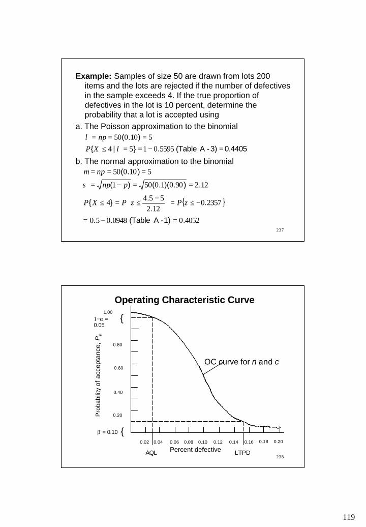
119
237
Example: Samples of size 50 are drawn from lots 200 items and the lots are rejected if the number of defectives in the sample exceeds 4. If the true proportion of defectives in the lot is 10 percent, determine the probability that a lot is accepted using
a. The Poisson approximation to the binomial
b. The normal approximation to the binomial
0.4405 3)- A(Table .}|{
).(
=−==≤===
55950154510050
λλ
XPnp
{ }
405200948050
23570122
5544
12290010501
510050
.1)- A(Table ..
..
.}{
.).)(.()(
).(
=−=
−≤=
−≤=≤
==−=
===
zPzPXP
pnp
np
σ
µ
238
Operating Characteristic Curve
AQL LTPD
β = 0.10
1−α = 0.05
Pro
babi
lity
of a
ccep
tanc
e, P
a
{
0.60
0.40
0.20
0.02 0.04 0.06 0.08 0.10 0.12 0.14 0.16 0.18 0.20
0.80
{
Percent defective
1.00
OC curve for n and c
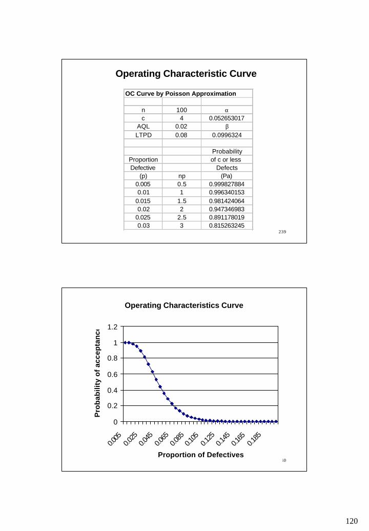
120
239
Operating Characteristic Curve
OC Curve by Poisson Approximation
n 100 αc 4 0.052653017
AQL 0.02 βLTPD 0.08 0.0996324
ProbabilityProportion of c or less Defective Defects
(p) np (Pa)0.005 0.5 0.9998278840.01 1 0.996340153
0.015 1.5 0.9814240640.02 2 0.947346983
0.025 2.5 0.8911780190.03 3 0.815263245
240
Operating Characteristics Curve
0
0.2
0.4
0.6
0.8
1
1.2
0.005
0.025
0.045
0.065
0.085
0.105
0.125
0.145
0.165
0.185
Proportion of Defectives
Pro
bab
ility
of
acce
pta
nce

121
241
OC Curve of an Ideal Sampling Plan
• Suppose that 2% is the maximum tolerable proportion defective in a lot
• So, an ideal sampling scheme would reject all lots that were worse than 2% defective and accepted all lots 2% defective better
• The OC Curve of such an ideal scheme would be vertical at p=0.02
• However, no sampling plan can give such an ideal OC curve
242
Effect of Changing the Sampling Plan
• The larger the sample size, the steeper the slope of the OC Curve– Note that this statement is true if both n and c are
increased proportionately.• If only n increases, every Pa decreases and the curve
shifts downward - so, producer’s risk increases and consumer’s risk decreases
• If only c increases, every Pa increases and the curve shifts upward - so, producer’s risk decreases and consumer’s risk increases

122
243
Reading
• Acceptance Sampling – Reading: Nahmias, S. “Productions and Operations Analysis,” 4th Edition, McGraw-Hill, pp. 668-675
244
Average Outgoing Quality
Outline• Average Outgoing Quality (AOQ)• Average Outgoing Quality Limit (AOQL)
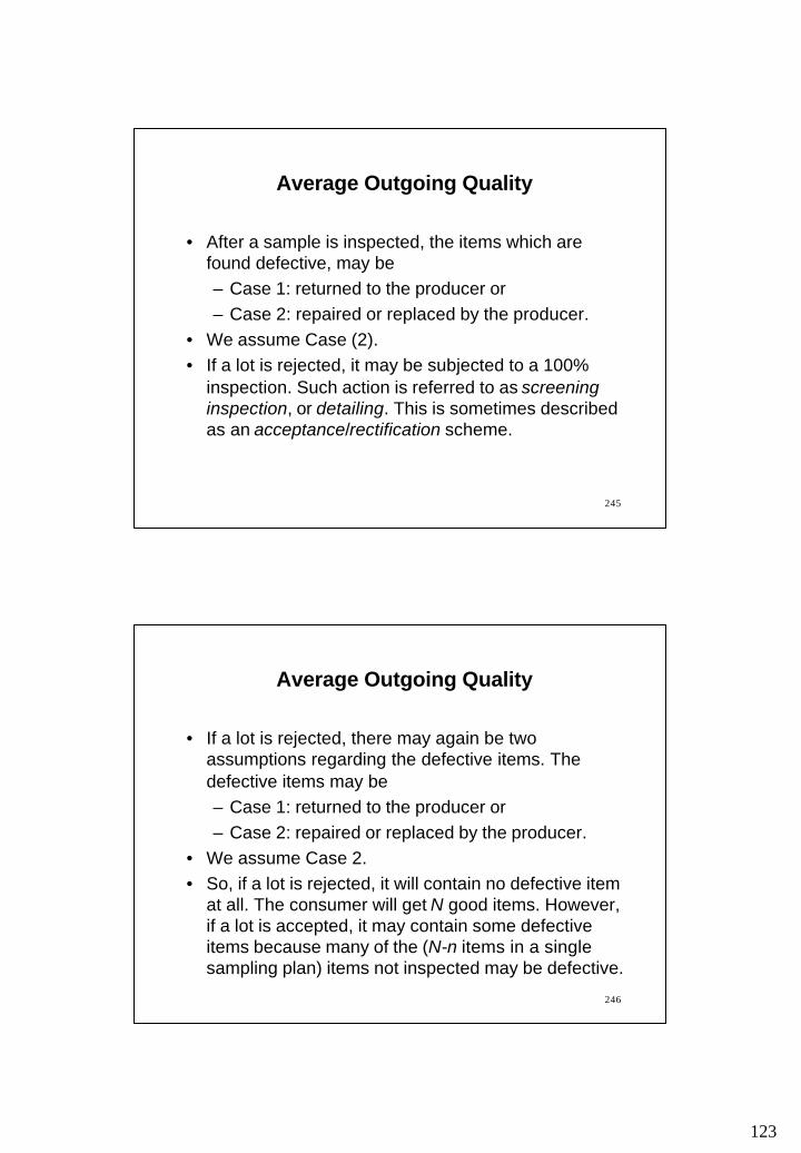
123
245
Average Outgoing Quality
• After a sample is inspected, the items which are found defective, may be – Case 1: returned to the producer or – Case 2: repaired or replaced by the producer.
• We assume Case (2).• If a lot is rejected, it may be subjected to a 100%
inspection. Such action is referred to as screening inspection, or detailing. This is sometimes described as an acceptance/rectification scheme.
246
Average Outgoing Quality
• If a lot is rejected, there may again be two assumptions regarding the defective items. The defective items may be – Case 1: returned to the producer or – Case 2: repaired or replaced by the producer.
• We assume Case 2. • So, if a lot is rejected, it will contain no defective item
at all. The consumer will get N good items. However, if a lot is accepted, it may contain some defective items because many of the (N-n items in a single sampling plan) items not inspected may be defective.
124
247
Average Outgoing Quality
• Thus, if there is an average of 2% defective items, the accepted lots will contain little less than 2% defective items and rejected lots will contain no defective item at all. On average, the consumer will receive less than 2% defective items.
• Given a proportion of defective, p the Average Outgoing Quality (AOQ) is the proportion of defectives items in the outgoing lots. More precise definition is given in the next slide.
248
Average Outgoing Quality
items} ofnumber {Outgoing}defectives ofnumber {Outgoing
AOQE
E=
sample in the items ofNumber lot in the items ofNumber
} defectives of proportion|accepted is{lot
Let
==
==
nN
pPPa

125
249
Average Outgoing Quality
)1(1
,))(1(
)(
a
a
a
a
PppP
nNnNPpnpN
pnNP
−−=
−−−−−
=
AOQ
than larger much is If
AOQ
replaced not are items Defective 1: Case
Case 1 is not discussed in class
250
Average Outgoing Quality
pPnN
NpnNP
a
a
=
−=
AOQ than larger much is If
AOQ
replaced are items Defective :2 Case
,
)(

126
251
Average Outgoing Quality
• Given a proportion of defective, we can compute the Average Outgoing Quality (AOQ)
• As p increases from 0.0, the AOQ values increases up to a limit called Average Outgoing Quality Limit (AOQL), after which the AOQ values descend continuously to 0.0. This is shown in the next slide.
252
AOQ Curve
0.015
0.010
0.005
0.01 0.02 0.03 0.04 0.05 0.06 0.07 0.08 0.09 0.10
AOQL
AverageOutgoingQuality
(Incoming) Percent Defective
AQL LTPD
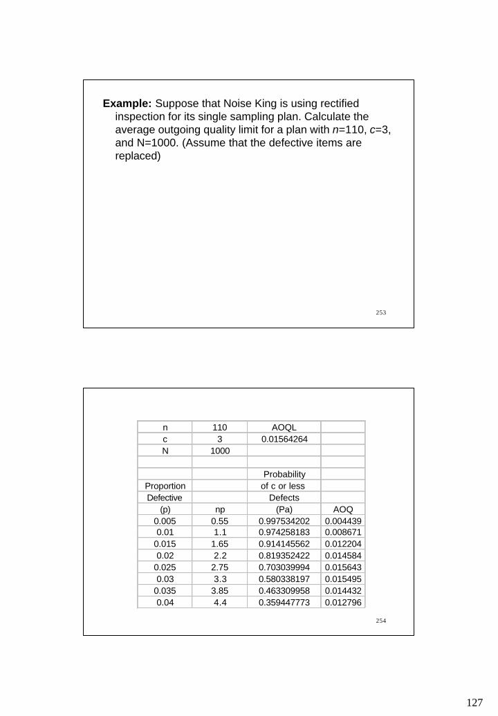
127
253
Example: Suppose that Noise King is using rectified inspection for its single sampling plan. Calculate the average outgoing quality limit for a plan with n=110, c=3, and N=1000. (Assume that the defective items are replaced)
254
n 110 AOQLc 3 0.01564264N 1000
ProbabilityProportion of c or less Defective Defects
(p) np (Pa) AOQ0.005 0.55 0.997534202 0.0044390.01 1.1 0.974258183 0.008671
0.015 1.65 0.914145562 0.0122040.02 2.2 0.819352422 0.014584
0.025 2.75 0.703039994 0.0156430.03 3.3 0.580338197 0.015495
0.035 3.85 0.463309958 0.0144320.04 4.4 0.359447773 0.012796
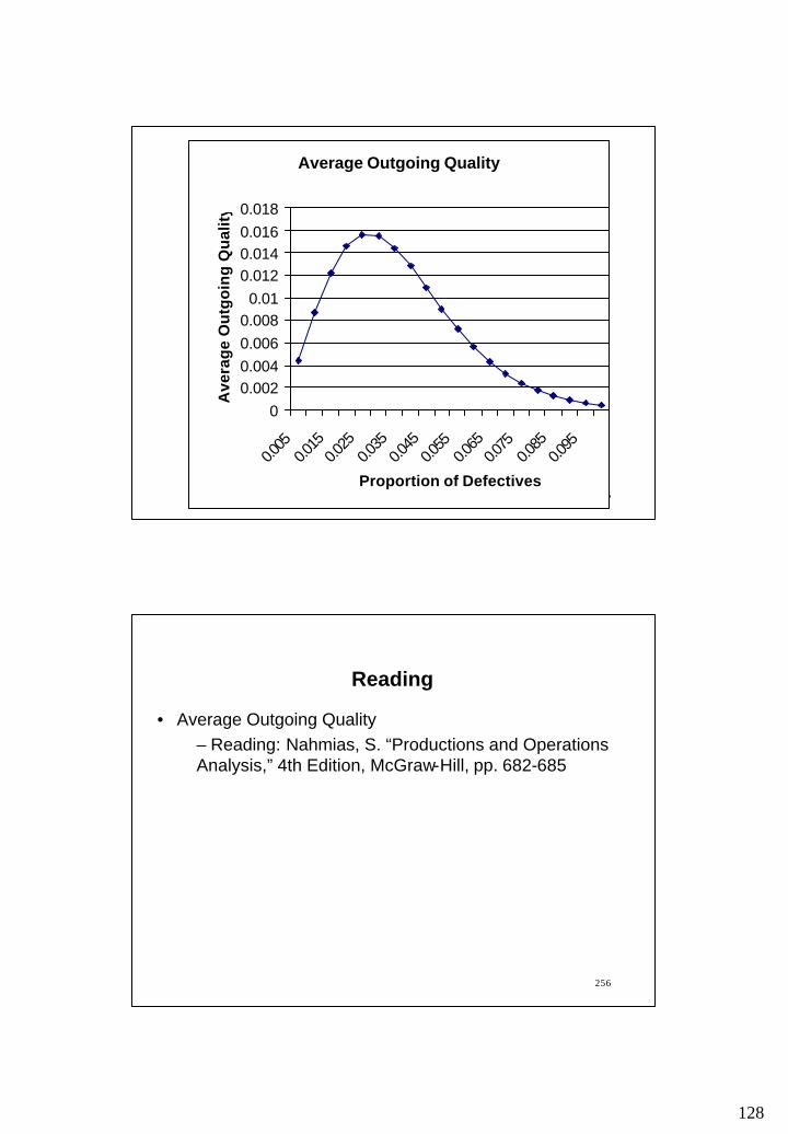
128
255
Average Outgoing Quality
00.0020.0040.0060.008
0.010.0120.0140.0160.018
0.005
0.015
0.025
0.035
0.045
0.055
0.065
0.075
0.085
0.095
Proportion of Defectives
Ave
rag
e O
utg
oin
g Q
ual
ity
256
Reading
• Average Outgoing Quality – Reading: Nahmias, S. “Productions and Operations Analysis,” 4th Edition, McGraw-Hill, pp. 682-685

129
257
• Failure rates • Reliability • Constant failure rate and exponential distribution• System Reliability
– Components in series– Components in parallel– Combination system
CHAPTER 10RELIABILITY
258
Failure Rate Curve
Time
Failu
re r
ate
Earlyfailurea.k.a.Infantmortalityperiod
Normaloperatingperiod
Wearoutperiod
130
259
Reliability
• Reliability provides a numerical measure of “degree of excellence” through time. – Failure: the inability of an equipment to perform its
required function– Reliability: the probability of no failure throughout
a prescribed operating period.
260
Constant Failure Rate Assumption and the Exponential Distribution
Example 1: Suppose that there is a 0.001 probability that a light bulb will fail in one hour. What is the probability that the light bulb will survive
a. 2 hours
b. 3 hours
c. 1000 hours
131
261
Constant Failure Rate Assumption and the Exponential Distribution
Example 2: Suppose that the probability that a light bulb will fail in one hour is λ. What is the probability that the light bulb will survive at least t hours?
a. Use conditional probabilities (as in Example 1)
b. Use Exponential distribution
262
Constant Failure Rate Assumption and the Exponential Distribution
Justification of the use ofExponential Distribution to estimate reliabilityFailure rate, λ 0.02Maximum difference 0.004
Age, t (1−λ) t̂ exp(-λt ) difference0 1 1 01 0.980 0.980 0.0002 0.960 0.961 0.0003 0.941 0.942 0.0014 0.922 0.923 0.0015 0.904 0.905 0.001
Probability of survival at least t periods
Click to edit
132
263
Constant Failure Rate Assumption and the Exponential Distribution
• The difference of probabilities computed in two methods (conditional probabilities and exponential distribution) is small for – small values of λ and – large values of t
• The use of conditional probabilities is correct for an artificial experiment in which t can be only integers
• Exponential distribution is widely used to represent the constant failure rate
• Weibull distribution is used to represent increasing/ constant/ decreasing failure rates
264
Failure Rate and Average Life
• Failure rate, λ, the probability of a failure during a stated period is calculated as follows:
• The average life, θ is calculated as follows:cycles or times test of sum
observed failures of number=λ
λθ
1==
observed failures of numbercycles or times test of sum

133
265
Failure Rate and Average Life
Example 3: Determine the failure rate for a 80-hour test of 10 items where 2 items fail at 40 and 70 hours, respectively. What is the mean life of the product?
266
Availability
• The average life, θ is also called as – Mean Time Between Failure (MTBF) if the system
is repairable– Mean Time To Failure (MTTF) if the system is
non-repairable
Availability(MTTR) Repair To Time MeanMTBF
MTBF+
=

134
267
Availability
Example 4: A copier machine has a mean time between failures of 475 operating hours. Repairs typically require an average of 25 hours from the time that the repair call is received until service is completed. Determine the availability of the copier.
268
An OC Curve For An Acceptance Sampling Plan Based on Mean Life
• Previously, we discussed an OC curve that– corresponds to a given sampling plan, say n and c and– shows probability of acceptance as a function of
proportion of defective items
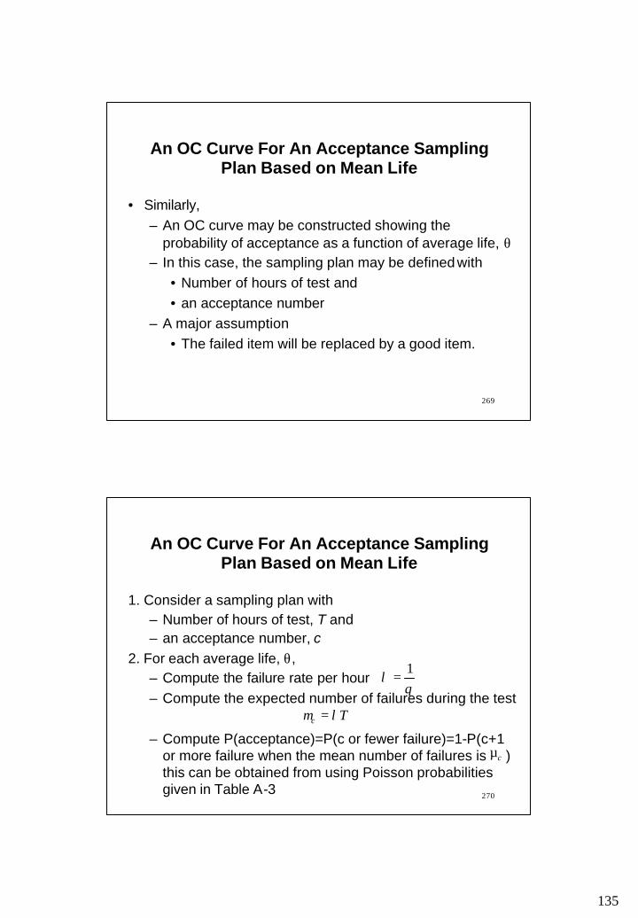
135
269
An OC Curve For An Acceptance Sampling Plan Based on Mean Life
• Similarly,– An OC curve may be constructed showing the
probability of acceptance as a function of average life, θ– In this case, the sampling plan may be defined with
• Number of hours of test and • an acceptance number
– A major assumption• The failed item will be replaced by a good item.
270
An OC Curve For An Acceptance Sampling Plan Based on Mean Life
1. Consider a sampling plan with– Number of hours of test, T and – an acceptance number, c
2. For each average life, θ, – Compute the failure rate per hour– Compute the expected number of failures during the test
– Compute P(acceptance)=P(c or fewer failure)=1-P(c+1 or more failure when the mean number of failures is ) this can be obtained from using Poisson probabilities given in Table A-3
θλ
1=
Tc λµ =
cµ
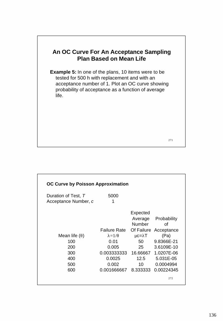
136
271
Example 5: In one of the plans, 10 items were to be tested for 500 h with replacement and with an acceptance number of 1. Plot an OC curve showing probability of acceptance as a function of average life.
An OC Curve For An Acceptance Sampling Plan Based on Mean Life
272
OC Curve by Poisson Approximation
Duration of Test, T 5000Acceptance Number, c 1
Expected Average ProbabilityNumber of
Failure Rate Of Failure AcceptanceMean life (θ) λ=1/θ µc=λT (Pa)
100 0.01 50 9.8366E-21200 0.005 25 3.6109E-10300 0.003333333 16.66667 1.0207E-06400 0.0025 12.5 5.031E-05500 0.002 10 0.0004994600 0.001666667 8.333333 0.00224345

137
273
An OC Curve Based On Average Life
-0.2
0
0.2
0.4
0.6
0.8
1
1.2
0 20000 40000 60000
Average Life
Pro
bab
ility
of
Acc
epta
nce
274
System Reliability
• Most products are made up of a number of components• The reliability of each component and the configuration
of the system consisting of these components determines the system reliability (i.e., the reliability of the product).
• The components may be in – series: system operates if all components operate– parallel: system operates is any component operates– combination of series and parallel

138
275
Components in Series
• If the components are in series, the system operates if all the components operate
• If there are n components in series, where the reliability if the i-th component is denoted by ri , the system reliability is
)())(( ns rrrR L21=
A B C
276
Components in Series
Example 6: A module of a satellite monitoring system has 500 components in series. The reliability of each component is 0.999. Find the reliability of the module. If the number of components is reduced to 200, what is the reliability?
81909990
60609990200
20021
50050021
.).()())(( ,components 200 With
.).()())(( ,components 500 With
===
===
rrrR
rrrR
s
s
L
L
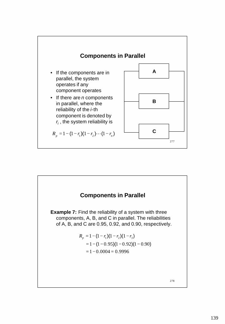
139
277
Components in Parallel
• If the components are in parallel, the system operates if any component operates
• If there are n components in parallel, where the reliability of the i-thcomponent is denoted by ri , the system reliability is
)())(( np rrrR −−−−= 1111 21 L
B
C
A
278
Components in Parallel
Example 7: Find the reliability of a system with three components, A, B, and C in parallel. The reliabilities of A, B, and C are 0.95, 0.92, and 0.90, respectively.
999600004019001920195011
1111 321
.. ).)(.)(.(
))()((
=−=−−−−=
−−−−= rrrRp

140
279
Redundant Systems and Backup Components
• If a system contains a backup or spare components, it can be treated as the one with components in parallel.The following formula
is equivalent to
PowerSource
Battery
)( 11 1 rrrR bb −+=
))(( bp rrR −−−= 111 1
280
Combination System
Example 8: Find the reliability of of the following system
0.99
0.89
0.89
0.98 0.95
0.95
141
281
Reading and Exercises
• Chapter 10:– Reading pp. 478-495, Problems 4,5,8 (2nd ed.)– Reading pp. 484-501, Problems 4,5,8 (3rd ed.)