ten website mistakes and how to fix them
TRANSCRIPT

Ten Website Mistakes and How to Fix Them
Michael Newman Consulting

In this Session We Will Look at… 10 Website issues that cause problems
Solutions to the problems
Industry examples of techniques that work
No examples of bad websites will be shown – we’re keeping this session focused on the positive…
…But we will explain the problems and demonstrate solutions
Presentation available on my site and NAMM U

Define Your Objectives Before Anything Else
Put serious effort into documenting your site objectives
Start with your overall business goals and work out the site details with your developer (unless you are the developer)
No details are too minor – last minute site changes that appear minor can cause huge delays

Define Your Objectives Sequentially prioritize your objectives – You may want to introduce site components in phases
Make a list of websites you like and specifically why
Review your current site before you start on the new one: will you need new product images and revised copy? Images of staff and store? New logo? Need a new hosting service?
Have your developer create a site spec document so everyone is on the same page!

Website User Behavior – Quick Review Jakob Nielsen research provides important guidelines
The two second window of opportunity
People don’t read – they scan and look for familiar triggers, if they don’t find them… goodbye!
If someone gets confused, they leave
If something is hard to find, they leave
If you don’t answer their questions, they leave
Purpose of a Home Page (Jakob Nielsen definition)
A homepage has two main goals:
deliver users information about your business
provide top-level navigation to additional information inside the site
“A third important homepage goal is to tell users the site's purpose and where they are relative to the Web as a whole. Sites typically accomplish this using a logo and a tagline.”
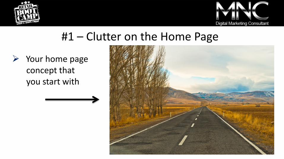
#1 – Clutter on the Home Page
Your home page concept that you start with

#1 – Clutter on the Home Page
Your home page when you launch!
The Home Page Yard Sale Phenomenum You feel obligated to make changes because you can
You use phrases that provide little or no direction: “it needs more pop”, “it should be more elegant”.
You try to put everything on the home page
You go down the rabbit hole – you get microscopic about the design and forget the priorities
You bring in others who have no training in website usability and now you have multiple distinct opinions

The Clutter Solution Your plan is your roadmap – use your prioritized list!
Easy to use (self evident) is MUCH better than fewer clicks (Nielsen studies have verified this)
Keep it simple & use destination pages for the details
Guide the eye with visual cues
Use space to simplify, think of your oldest demographic
Loose the happy talk and get to the point – too much copy to read = people bouncing

#2 – Confusing Navigation Means Lost Revenue
“What does this mean?”
“Where am I?”
“Is this clickable?

#2 – Confusing Navigation Means Lost Revenue People expect instant cues to guide them through your site – they use visual and word triggers they are familiar with (Jakob Nielsen research)
Use terms and navigation styles people expect – don’t get cute or use personal favorites people don’t understand
If it looks “clickable” make it clickable (images, product references, support, email addresses)
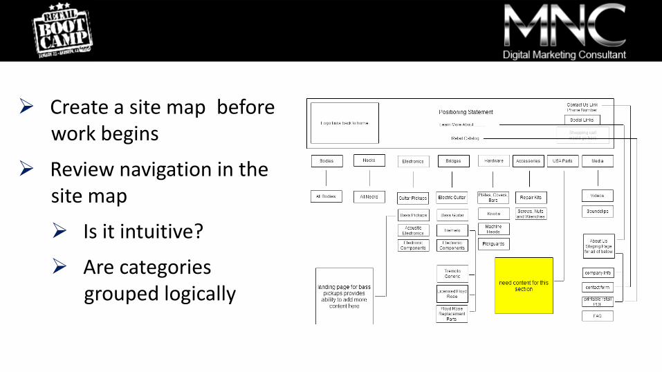
Create a site map before work begins
Review navigation in the site map
Is it intuitive?
Are categories grouped logically
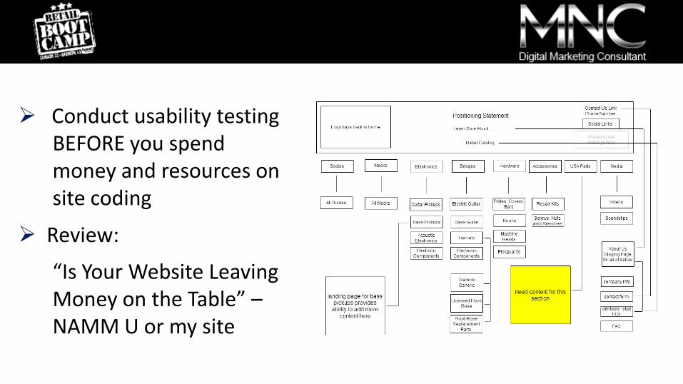
Conduct usability testing BEFORE you spend money and resources on site coding
Review:
“Is Your Website Leaving Money on the Table” – NAMM U or my site

Clean navigation provides intuitive cues that keep people exploring
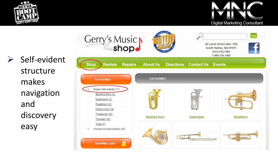
Self-evident structure makes navigation and discovery easy

Clean layout guides the eye to clickable content

Don’t try to cram too many navigation headers into your navigation banner (your main links in the banner)
This causes site confusion and mobile clutter
Think of logical groups – review your goals
Leave room for new headers if you can – saves you lots of work in the future
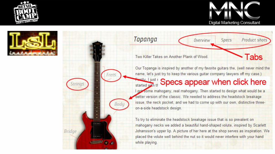
Improving Your Site Navigation

Minimalist design reduces clutter & enhances navigation

“Easy on the Eye” Invites Exploration
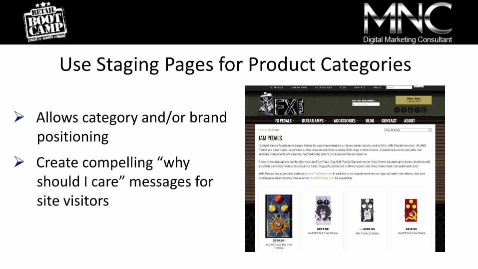
Use Staging Pages for Product Categories
Allows category and/or brand positioning
Create compelling “why should I care” messages for site visitors
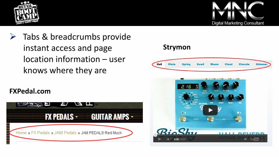
Tabs & breadcrumbs provide instant access and page location information – user knows where they are
FXPedal.com
Strymon

#3 – Your Site is Not Mobile Friendly At least 25-30% of your traffic RIGHT NOW is coming from phone or tablet
If your site doesn’t display correctly someone may never visit again!
Tablet sales to outpace all desktop and mobile computers in 20141
1http://techcrunch.com/2013/03/27/idc-tablet-growth-2012-2017/
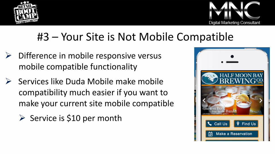
#3 – Your Site is Not Mobile Compatible Difference in mobile responsive versus mobile compatible functionality
Services like Duda Mobile make mobile compatibility much easier if you want to make your current site mobile compatible
Service is $10 per month

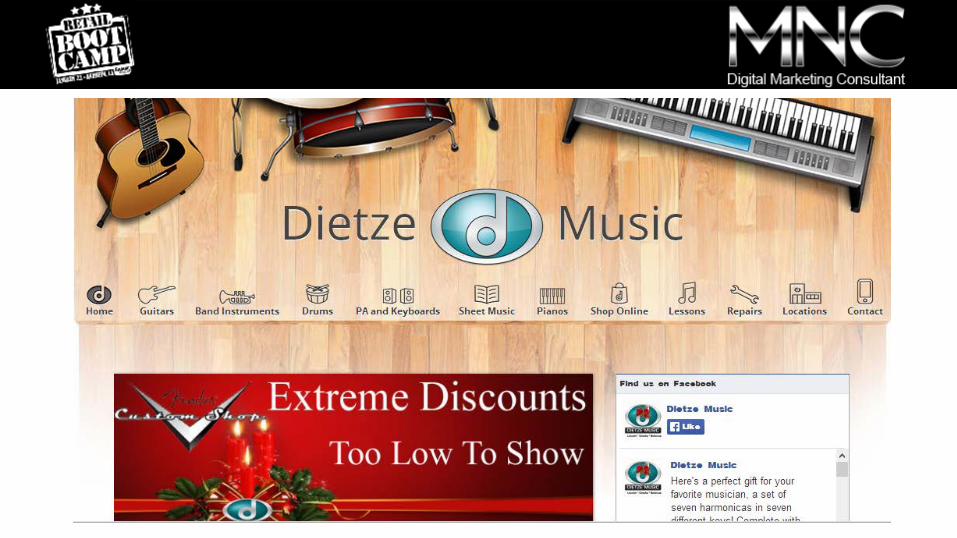
Desktop version of site – lots of display space
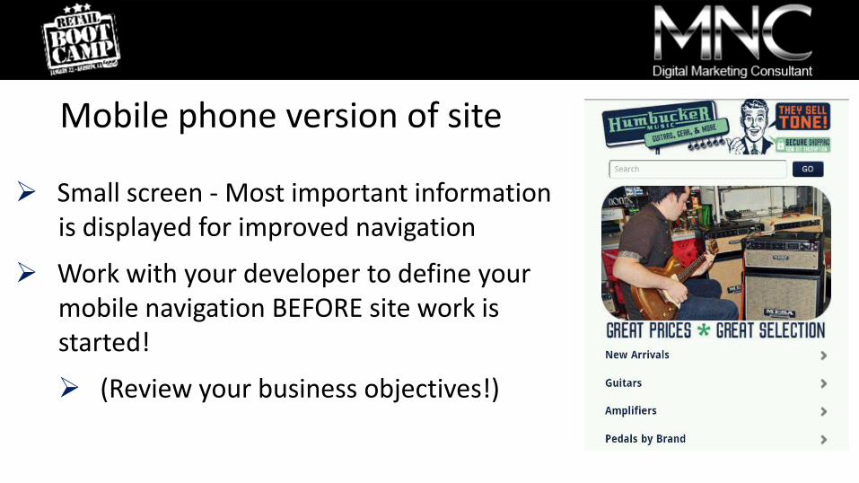
Mobile phone version of site
Small screen - Most important information is displayed for improved navigation
Work with your developer to define your mobile navigation BEFORE site work is started!
(Review your business objectives!)

#4 –Business Questions You Don’t Answer Unanswered questions sends people packing
Anticipate all those ecommerce and shipping questions and answer them online
Think of all your business components: store hours, repair hours, clinics, lessons, in store music events
Keep a log of support/buyer/store questions that employees contribute to and add them to your site

FAQ section has: guitar care, insurance, international shipments, payment options, return policy, etc.

#5 – New Site Visitors Don’t Know Who You Are
Positioning is as important for a reseller as a brand
What is your company story, passions, commitments?
Answer the “Why Should I Care?” question your site visitors will always ask themselves
Make it personal – include employee images and stories

Fun images emphasize the personal touch
When people come to the store they recognize you or your employees from the site images

Multi-media helps tell the story Create a video tour of your store, lesson rooms, repair shop
Include customer testimonials from social posts

Artisan Guitars 360 degree tour of all the rooms
Interactive with user controls

Create an inviting atmosphere so people will visit

#6 – Your Site Graphics & Copy Need Improving People use their eyes to make credibility decisions
Going simple with graphics looks great and costs less to develop
Create the look before you develop the site (start with logo changes if needed – this is your graphic centerpiece)
Insure your store photos & videos are high quality with good lighting (cameras provide great quality these days)

Simple graphics and use of colors provides elegance

#6 – Your Site Graphics & Copy Need Improving Write professionally and answer those musician questions
Find good industry copy writers if you need them – there are many looking for work
Make detailed notes about what you DO NOT want on the new site that is on your current site!
Don’t wait until you launch your new site or your will be paying to remove and change content

#7 – No Educational Content Don’t think of it as a blog or you’ll get hung up on that term – it’s the company voice (different than social posting)
Create educational documents that are interesting to musicians
Millions of hits and views on educational content
Drive people to content with newsletters and social posts
Educational content shows up in search, YOU keep showing up for musicians on the internet

People Search Looking for Answers Search term: “how to buy a PA” MF #1 in Google results
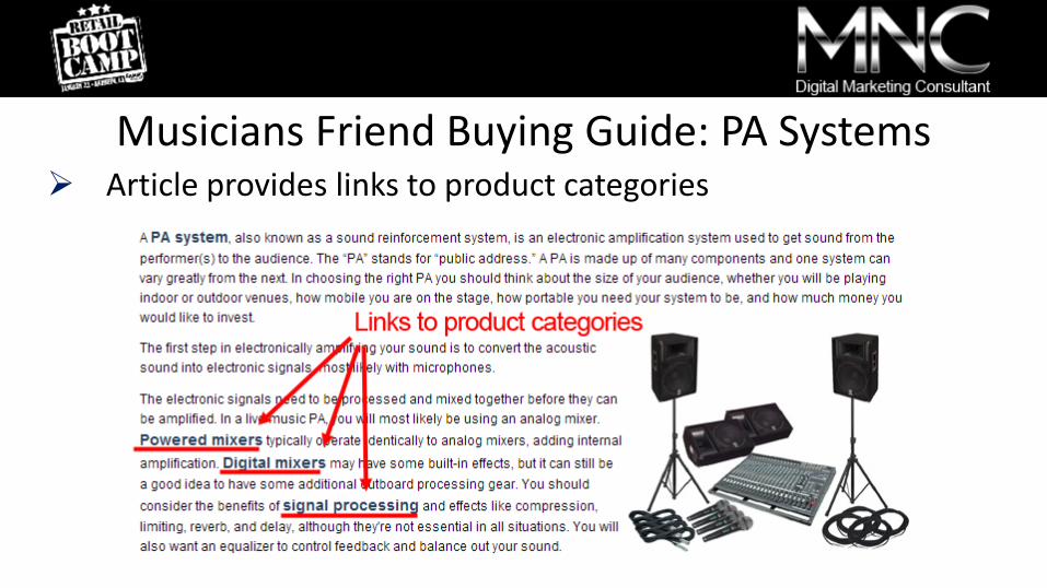
Musicians Friend Buying Guide: PA Systems Article provides links to product categories

How to Choose a Personal Monitoring System

Google Search on “How to Tune a Guitar”
Basic tuning video has the #3 search spot


#8 – No Call to Action for Newsletter Sign Up A simple field to enter an email address does not work
Provide a call to action and an image that motivates
Give them a reason to sign up!
Mention sweeps and sale announcements, educational content they can consume from your newsletter

#8 – No Call to Action for Newsletter Sign Up

Use Pages Tested for Conversions (Leadpages.net)

#9 – Your Website Pages Are Inconsistent People may enter your site from any publicly viewable page
Design every page with the basics: consistent navigation, breadcrumbs, visual cues to continue navigating
Answer the question “where am I?” for every page (except final purchase or lead capture pages)
If using Wordpress off of your site, include navigation to your website in your blog
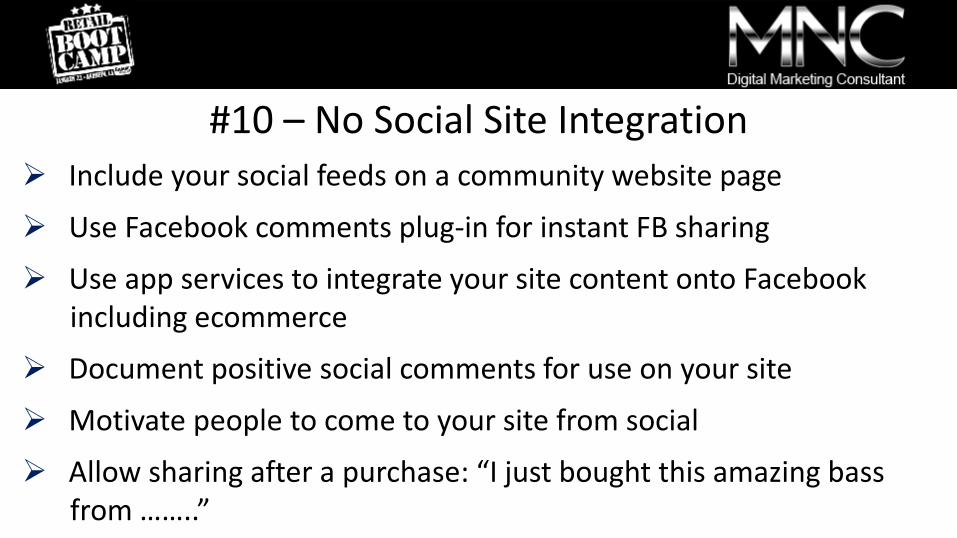
#10 – No Social Site Integration Include your social feeds on a community website page
Use Facebook comments plug-in for instant FB sharing
Use app services to integrate your site content onto Facebook including ecommerce
Document positive social comments for use on your site
Motivate people to come to your site from social
Allow sharing after a purchase: “I just bought this amazing bass from ……..”

Add social sharing buttons to your ecommerce thank you page

Sample Facebook post after purchase

Summary Document your objectives first and prioritize them
Keep your home page clean and uncluttered
Self evident is more important than fewer clicks
Make your navigation clean and use traditional terms
Insure you site is mobile friendly right now!
Anticipate questions visitors have and answer them
Summary Position your company and discuss your story and passions
Insure graphics and copy reflect a professional environment
Create educational content that drives musicians to your website
Insure you have a call to action for your email sign up area
Create website pages that are consistent and self evident
Integrate your social sites into your website

Have a successful NAMM Show!
Thank You!
www.michaelnewmanconsulting.com