the distribution of wealth between households
TRANSCRIPT
1
The distribution of wealth between households
Research note 11/2013
Employment, Social Affairs & Inclusion The distribution of wealth between households
December 2013 I 2
SOCIAL SITUATION MONITOR
APPLICA (BE), ATHENS UNIVERSITY OF ECONOMICS AND BUSINESS (EL),
EUROPEAN CENTRE FOR SOCIAL WELFARE POLICY AND RESEARCH (AT), ISER – UNIVERSITY OF ESSEX (UK) AND TÁRKI (HU)
THE DISTRIBUTION OF WEALTH BETWEEN HOUSEHOLDS
RESEARCH NOTE 11/2013
Eva Sierminska (CEPS/INSTEAD, DIW and IZA)
with Márton Medgyesi (TÁRKI, Social Research Institute)
December 2013
This research note was financed by and prepared for the use of the European
Commission, Directorate-General for Employment, Social Affairs and Inclusion. The
information contained in this publication does not necessarily reflect the position or
opinion of the European Commission. Neither the Commission nor any person acting
on its behalf is responsible for the use that might be made of the information
contained in this publication.
Employment, Social Affairs & Inclusion The distribution of wealth between households
December 2013 I 3
Table of Contents
Abstract ........................................................................................................... 4 Introduction ...................................................................................................... 5 Data sources ..................................................................................................... 5
Household Finance and Consumption Survey ...................................................... 5 HFCS versus EU-SILC ...................................................................................... 6
Wealth levels and income levels .......................................................................... 7 Wealth inequality ............................................................................................... 9
Gini and other measures .................................................................................. 9 Decomposition by factor components ...............................................................11 Wealth and income inequality ..........................................................................12
Liquid versus illiquid wealth ...............................................................................13 Collection periods .............................................................................................16 Comparison of income distribution in the HFCS and EU-SILC ..................................20
Methodology .................................................................................................20 Comparison of income inequality and income structure .......................................20 Comparison of income distribution by income types ...........................................23
Concluding remarks ..........................................................................................25 References.......................................................................................................26 Appendix .........................................................................................................27
Employment, Social Affairs & Inclusion The distribution of wealth between households
December 2013 I 4
Abstract This research note examines wealth-holding information collected by the new
Household Finance and Consumption Survey (HFCS) managed by the European
Central Bank (ECB), the first results of which were published in April 2013.
First, it compares the extent of inequality in holdings of wealth against the extent of
inequality of income, and discusses how this varies across countries.
Next, wealth inequality is decomposed into different components, in order to try to
identify the main factors underlying the results.
In the next part of the research note, the division between liquid and illiquid wealth is
examined and compared across household types. This is of considerable importance in
respect of the ability to maintain consumption in the event of a drop in income. It is,
therefore, a significant factor that should be taken into account when assessing the
effects of the crisis on living standards.
In the following section, the timing of the data collection is considered and possible
impacts are discussed. Since the survey was carried out at different times in different
countries, the substantial variations that have occurred in recent years in both house-
price and stock-market indices are likely to have had a major effect on the
measurement of wealth and its distribution between households within countries, as
well as between countries. This needs to be taken explicitly into account in any
analysis.
In the final section, income as recorded by the ECB survey is compared with that
recorded by EU-SILC. This is done by first reviewing the differences in the collection
methodology and then by comparing the distribution of gross household income and
its components.
Employment, Social Affairs & Inclusion The distribution of wealth between households
December 2013 I 5
Introduction The new Household Finance and Consumption Survey (HFCS) for the eurozone
countries, managed by the European Central Bank (ECB), enables analysis to be
carried out that was previously not possible. Traditional analysis – which considers
income and labour market variables alone – can now be extended to other dimensions
in the group of eurozone countries. Great attention has been devoted to collecting
complete – and comparable – information on assets and liabilities, as well as on other
factors contributing to well-being.
In this research note our focus will be on the results of analysis using the data
collected in the first wave of the HFCS survey, during 2008–2011. First, we describe
the data, and outline some methodological differences between the HFCS and the EU-
SILC, particularly with respect to income. Next, we compare wealth levels and country
rankings with rankings based on income. In the following section, we examine wealth
inequality across countries and try to gauge the relationship with pension provisions.
We also identify the wealth portfolio component that contributes most to inequality,
and compare wealth inequality and income inequality.
The next section takes a look at the composition of the portfolio in a different way. It
identifies the share of wealth that is more liquid and less liquid, and seeks to establish
how this varies across households. The share of liquid assets in the portfolio is of
considerable importance in terms of ability to maintain consumption in the face of a
drop in income. It is, therefore, a significant factor that should be taken into account
when assessing the effects of the crisis on living standards.
Our note also looks at two other important aspects of the HFCS survey. The first is the
collection period: since countries collect data on income and wealth components at
different times, stock-market and house-price fluctuations may need to be taken into
account for comparability purposes. The second aspect is the reliability of income data
in the HFCS, compared to EU-SILC.
Data sources
Household Finance and Consumption Survey
The data used in this research note comes from Eurosystem’s Household Finance and
Consumption Survey (HFCS).1 This is a joint project run by the eurozone’s central
banks and national statistical institutes, and it provides harmonized information for 15
eurozone members on household balance sheets and related economic and
demographic variables, including income, private pensions, employment, measures of
consumption, gifts and inheritances. The sample contains over 62,000 households.
The first wave was conducted between the end of 2008 and the middle of 2011,
though most countries carried out data collection in 2010. (We discuss this later in the
research note.) Each country covered by the dataset provides nationally
representative information, and the surveys follow common methodological guidelines.
This concerns, in particular, definition of the variables, imputations and the
preparation of the data for analysis.
Since the main focus of the HFCS study is household wealth, most participating
countries apply oversampling of wealthy households. The distribution of wealth is
skewed in most societies; consequently it is important to have a relatively high
proportion of wealthy households in the sample, in order to ensure adequate
representation of the full wealth distribution. Nine countries used some type of
1 Information about the survey can be found at
http://www.ecb.europa.eu/home/html/researcher_hfcn.en.html
Employment, Social Affairs & Inclusion The distribution of wealth between households
December 2013 I 6
oversampling procedure in the HFCS study (the exceptions were Italy, the
Netherlands, Malta, Slovakia, Austria and Slovenia), but countries applied different
strategies to oversample wealthy households, based on data availability. In Spain and
France, oversampling was based on wealth data; while in Finland and Luxembourg,
individual-level income data was used. In Cyprus, household-level electricity
consumption was used as a proxy for wealth; in Belgium and Germany, the proxy for
wealth was regional-level income; and in Greece it was regional real estate prices. Full
details of the sampling methodology can be found in HFCN (2013a).
In the definition of wealth (or net worth) we include assets and liabilities. Assets
consist of both financial and non-financial assets. Financial assets include assets used
in transactions (e.g. sight and saving accounts), as well as those that form part of an
investment portfolio (e.g. financial investment products such as bonds, shares and
mutual funds, and insurance-type products such as voluntary private pension plans
and whole life insurance). Five different categories of non-financial assets can be
distinguished: main residence, other real estate property, vehicles, valuables and self-
employment businesses.
For income, we use the HFCS-defined gross income measure (net income is not
available), which consists of employee income, self-employment income, income from
public, occupational and private pension plans, regular social and private transfers,
rental income, income from financial investments, income from private businesses
other than self-employment, and gross income from other sources.
All values are in euros and the collection dates are listed in the section below on
“Collection periods”.
HFCS versus EU-SILC
In terms of comparison of the HFCS and EU-SILC, both data sources use ex-ante
harmonized data collections; both apply similar household definitions; and both collect
data on gross household income. Given these basic similarities, the distribution of
household income can be compared using these two studies. Despite the similarities,
there are important methodological differences between the studies, which
presumably must affect estimates of income distribution as well. In the following, a
few of these methodological differences are highlighted.
First of all, unlike the HFCS, no oversampling of wealthy households takes place in EU-
SILC.
Second, we need to look at the use of register data. Both EU-SILC and the HFCS allow
for data-collection methods other than a survey, if it is thought they will provide
better-quality data. Although most countries collect data on most variables through
surveys, there are some that use administrative data sources for some of the required
variables – e.g. in the case of the HFCS, Finland uses various types of register data, in
combination with survey data from Statistics Finland’s income and living conditions
survey. Register data on income from the tax authorities is also combined with survey
data in the case of France. These two countries also provide combined survey and
register data for EU-SILC, but in EU-SILC the group of countries using register data is
wider, and includes the Netherlands and Slovenia.
One issue to do with the comparability of register and survey data is that income
concepts and definitions used in administrative registers might not match exactly
those commonly applied in surveys. But even if income definitions do coincide
perfectly, the two methods are still likely to give a different picture of household
income. Register data provides more accurate information on taxable income than

Employment, Social Affairs & Inclusion The distribution of wealth between households
December 2013 I 7
does survey data, since the latter is subject to recall bias.2 Some income types are
especially difficult to remember, e.g. income from financial investments or income
from an unincorporated business might be more susceptible to recall error. The result
is that capital income is typically less accurately measured in household surveys, and
aggregate estimates for capital income from household surveys are typically lower
than those obtained from macro data. This difference in data-collection methods might
affect comparability, especially for income types that are more susceptible to recall
bias (such as capital income). Registers tend to record even small income values, but
in personal interviews only the larger amounts are likely to be recorded. To conclude,
the method of data collection used is likely to influence estimates of the distribution of
income. This could raise issues of comparability in the case of the Netherlands and
Slovenia, which use different data-collection methodologies in the two studies.
Another methodological issue is whether income data has been collected gross or net
of tax. In both studies, some countries actually collect data on net income, and then
net income is converted to gross using some simulation method. Countries in the
HFCS study which collect income data fully or partly net of tax include Italy (all income
net), Greece (employee income net), Austria and Slovenia (possibility for respondents
to provide net data). In the case of EU-SILC, all the Southern European countries
collect income data partly or wholly net of tax.
Wealth levels and income levels In our previous research notes we provided a comparison of wealth levels based on
whatever data was available from various summary statistics covering a handful of
countries. The preparation of this data was a time-consuming undertaking, requiring
harmonization and identification of the components collated. This time we were lucky
enough to have a dataset that is already harmonized, collated and imputed in a
comparable way, as far as possible.
In what follows, we compare wealth levels in the eurozone countries; then, by
comparing income levels, we try to determine whether there are any group patterns.
As was discussed in Research Note no. 9/2012, although the mean is a common way
of presenting summary information on wealth, in fact the median may be a more
appropriate measure, as it is not sensitive to outliers.
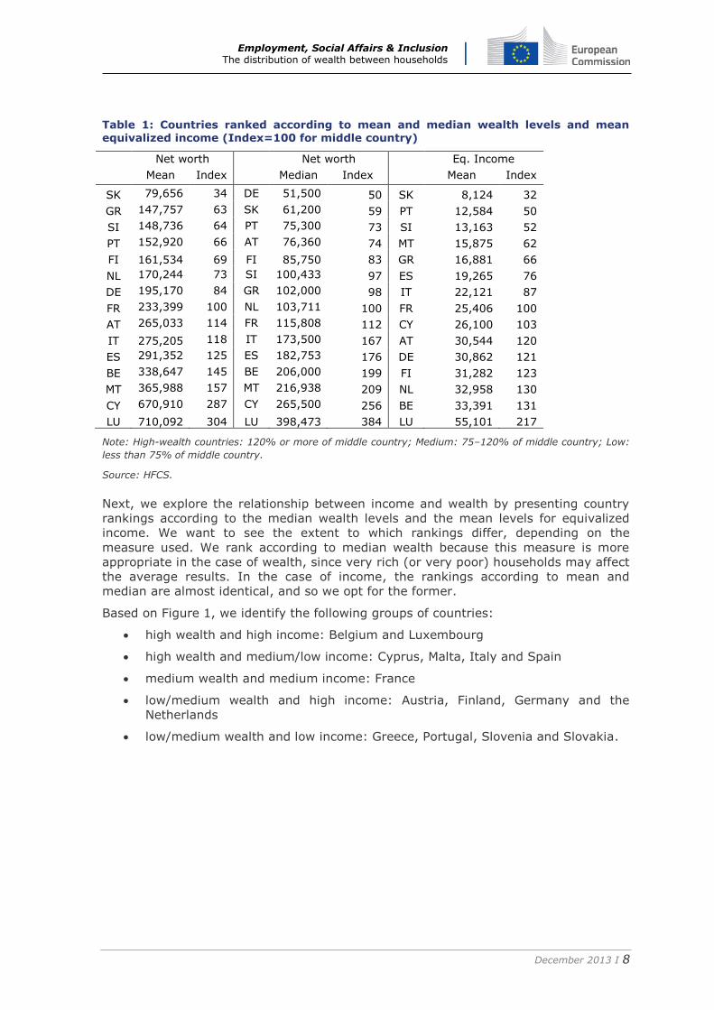
Table 1 presents the mean and median wealth levels for the eurozone. In each case,
the countries are ranked according to their wealth level. In addition, their wealth
levels are expressed relative to the middle country (i.e. with an index set to 100). In
the case of median wealth, the Netherlands is the middle-wealth country (it, Finland,
Slovenia, Greece and France represent the medium-wealth countries). Belgium, Italy,
Spain, Malta, Cyprus and Luxembourg have at least 50% more than the median
wealth of the middle country. Low-wealth countries would be Austria, Portugal,
Slovakia and Germany, which have less than 75% of the wealth of the middle-wealth
country. Using the mean as the summary statistic, the rankings change a bit, but
mostly for the low-wealth countries. The most striking difference lies in the result for
Germany (and Austria, to a lesser extent), which now becomes a middle-wealth
country if we switch to using the mean, suggesting that it is a high-inequality country
when it comes to wealth.
2 On the other hand, tax registers provide no information on non-taxable income or households’ undeclared income; in these cases, survey data might be the only source of information.
Employment, Social Affairs & Inclusion The distribution of wealth between households
December 2013 I 8
Table 1: Countries ranked according to mean and median wealth levels and mean equivalized income (Index=100 for middle country)
Net worth
Net worth
Eq. Income
Mean Index Median Index Mean Index
SK 79,656 34 DE 51,500 50 SK 8,124 32
GR 147,757 63 SK 61,200 59 PT 12,584 50
SI 148,736 64 PT 75,300 73 SI 13,163 52
PT 152,920 66 AT 76,360 74 MT 15,875 62
FI 161,534 69 FI 85,750 83 GR 16,881 66
NL 170,244 73 SI 100,433 97 ES 19,265 76
DE 195,170 84 GR 102,000 98 IT 22,121 87
FR 233,399 100 NL 103,711 100 FR 25,406 100
AT 265,033 114 FR 115,808 112 CY 26,100 103
IT 275,205 118 IT 173,500 167 AT 30,544 120
ES 291,352 125 ES 182,753 176 DE 30,862 121
BE 338,647 145 BE 206,000 199 FI 31,282 123
MT 365,988 157 MT 216,938 209 NL 32,958 130
CY 670,910 287 CY 265,500 256 BE 33,391 131
LU 710,092 304 LU 398,473 384 LU 55,101 217
Note: High-wealth countries: 120% or more of middle country; Medium: 75–120% of middle country; Low:
less than 75% of middle country.
Source: HFCS.
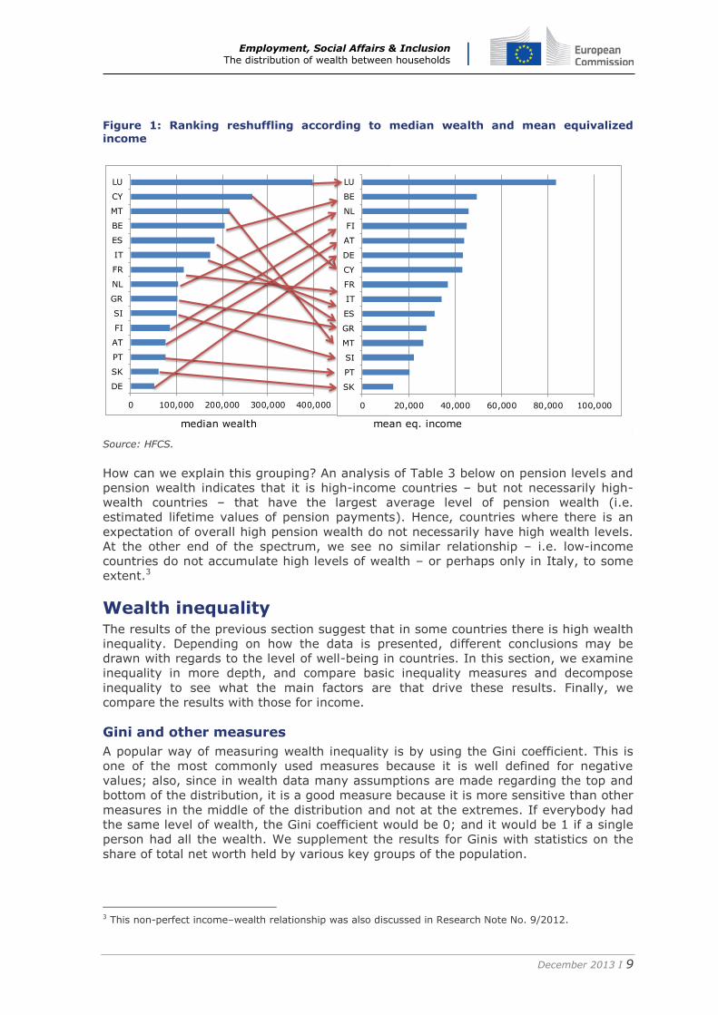
Next, we explore the relationship between income and wealth by presenting country
rankings according to the median wealth levels and the mean levels for equivalized
income. We want to see the extent to which rankings differ, depending on the
measure used. We rank according to median wealth because this measure is more
appropriate in the case of wealth, since very rich (or very poor) households may affect
the average results. In the case of income, the rankings according to mean and
median are almost identical, and so we opt for the former.
Based on Figure 1, we identify the following groups of countries:
high wealth and high income: Belgium and Luxembourg
high wealth and medium/low income: Cyprus, Malta, Italy and Spain
medium wealth and medium income: France
low/medium wealth and high income: Austria, Finland, Germany and the
Netherlands
low/medium wealth and low income: Greece, Portugal, Slovenia and Slovakia.
Employment, Social Affairs & Inclusion The distribution of wealth between households
December 2013 I 9
Figure 1: Ranking reshuffling according to median wealth and mean equivalized income
Source: HFCS.
How can we explain this grouping? An analysis of Table 3 below on pension levels and
pension wealth indicates that it is high-income countries – but not necessarily high-
wealth countries – that have the largest average level of pension wealth (i.e.
estimated lifetime values of pension payments). Hence, countries where there is an
expectation of overall high pension wealth do not necessarily have high wealth levels.
At the other end of the spectrum, we see no similar relationship – i.e. low-income
countries do not accumulate high levels of wealth – or perhaps only in Italy, to some
extent.3
Wealth inequality The results of the previous section suggest that in some countries there is high wealth
inequality. Depending on how the data is presented, different conclusions may be
drawn with regards to the level of well-being in countries. In this section, we examine
inequality in more depth, and compare basic inequality measures and decompose
inequality to see what the main factors are that drive these results. Finally, we
compare the results with those for income.
Gini and other measures
A popular way of measuring wealth inequality is by using the Gini coefficient. This is
one of the most commonly used measures because it is well defined for negative
values; also, since in wealth data many assumptions are made regarding the top and
bottom of the distribution, it is a good measure because it is more sensitive than other
measures in the middle of the distribution and not at the extremes. If everybody had
the same level of wealth, the Gini coefficient would be 0; and it would be 1 if a single
person had all the wealth. We supplement the results for Ginis with statistics on the
share of total net worth held by various key groups of the population.
3 This non-perfect income–wealth relationship was also discussed in Research Note No. 9/2012.
median wealth mean eq. income
0 100,000 200,000 300,000 400,000
DE
SK
PT
AT
FI
SI
GR
NL
FR
IT
ES
BE
MT
CY
LU
Median
0 20,000 40,000 60,000 80,000 100,000
SK
PT
SI
MT
GR
ES
IT
FR
CY
DE
AT
FI
NL
BE
LU
Employment, Social Affairs & Inclusion The distribution of wealth between households
December 2013 I 10
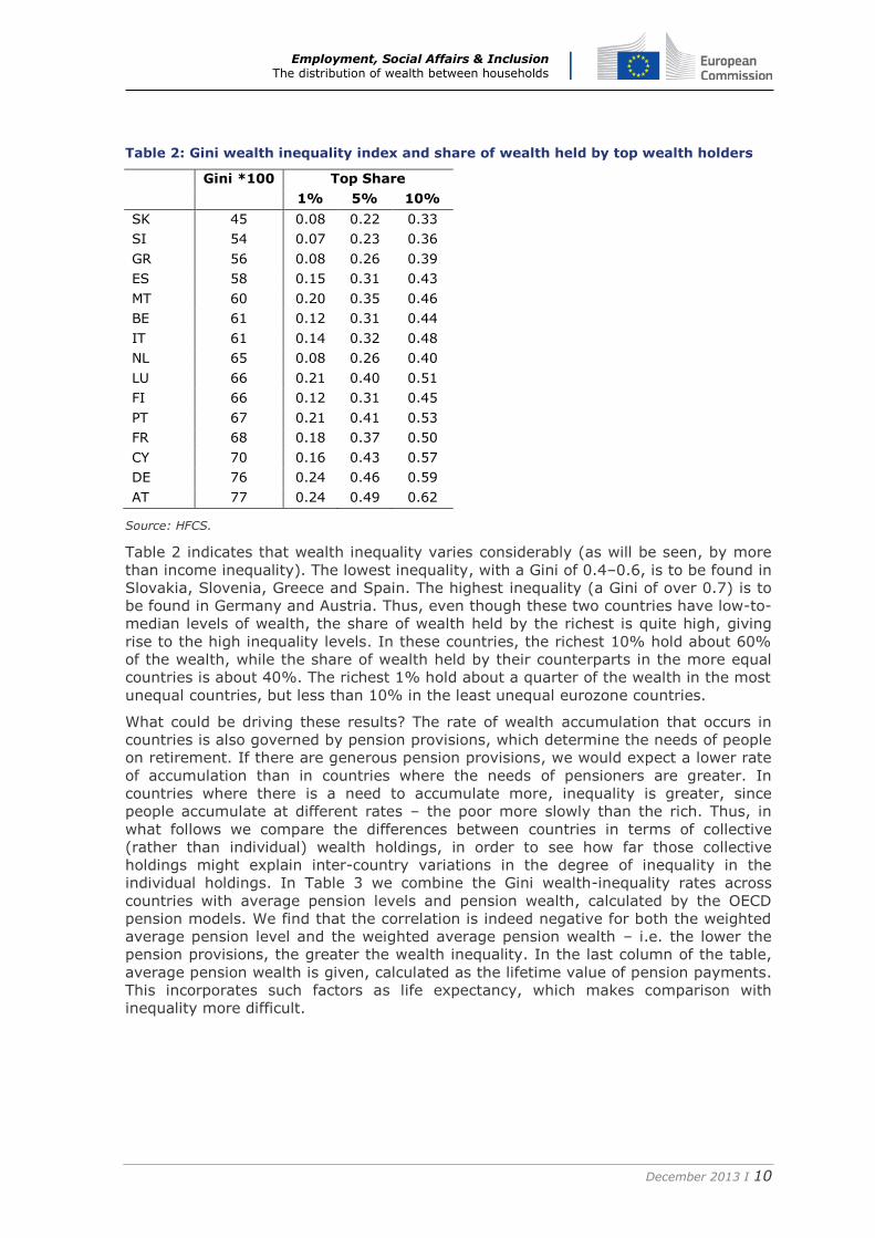
Table 2: Gini wealth inequality index and share of wealth held by top wealth holders
Gini *100 Top Share
1% 5% 10%
SK 45 0.08 0.22 0.33
SI 54 0.07 0.23 0.36
GR 56 0.08 0.26 0.39
ES 58 0.15 0.31 0.43
MT 60 0.20 0.35 0.46
BE 61 0.12 0.31 0.44
IT 61 0.14 0.32 0.48
NL 65 0.08 0.26 0.40
LU 66 0.21 0.40 0.51
FI 66 0.12 0.31 0.45
PT 67 0.21 0.41 0.53
FR 68 0.18 0.37 0.50
CY 70 0.16 0.43 0.57
DE 76 0.24 0.46 0.59
AT 77 0.24 0.49 0.62
Source: HFCS.
Table 2 indicates that wealth inequality varies considerably (as will be seen, by more
than income inequality). The lowest inequality, with a Gini of 0.4–0.6, is to be found in
Slovakia, Slovenia, Greece and Spain. The highest inequality (a Gini of over 0.7) is to
be found in Germany and Austria. Thus, even though these two countries have low-to-
median levels of wealth, the share of wealth held by the richest is quite high, giving
rise to the high inequality levels. In these countries, the richest 10% hold about 60%
of the wealth, while the share of wealth held by their counterparts in the more equal
countries is about 40%. The richest 1% hold about a quarter of the wealth in the most
unequal countries, but less than 10% in the least unequal eurozone countries.
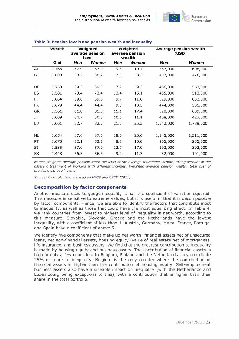
What could be driving these results? The rate of wealth accumulation that occurs in
countries is also governed by pension provisions, which determine the needs of people
on retirement. If there are generous pension provisions, we would expect a lower rate
of accumulation than in countries where the needs of pensioners are greater. In
countries where there is a need to accumulate more, inequality is greater, since
people accumulate at different rates – the poor more slowly than the rich. Thus, in
what follows we compare the differences between countries in terms of collective
(rather than individual) wealth holdings, in order to see how far those collective
holdings might explain inter-country variations in the degree of inequality in the
individual holdings. In Table 3 we combine the Gini wealth-inequality rates across
countries with average pension levels and pension wealth, calculated by the OECD
pension models. We find that the correlation is indeed negative for both the weighted
average pension level and the weighted average pension wealth – i.e. the lower the
pension provisions, the greater the wealth inequality. In the last column of the table,
average pension wealth is given, calculated as the lifetime value of pension payments.
This incorporates such factors as life expectancy, which makes comparison with
inequality more difficult.
Employment, Social Affairs & Inclusion The distribution of wealth between households
December 2013 I 11
Table 3: Pension levels and pension wealth and inequality
Wealth Weighted
average pension level
Weighted
average pension wealth
Average pension wealth
(USD)
Gini Men Women Men Women Men Women
AT 0.766 67.9 67.9 9.8 10.7 557,000 608,000
BE 0.608 38.2 38.2 7.0 8.2 407,000 476,000
DE 0.758 39.3 39.3 7.7 9.3 466,000 563,000
ES 0.581 73.4 73.4 13.4 15.1 455,000 513,000
FI 0.664 59.6 59.6 9.7 11.6 529,000 632,000
FR 0.679 44.4 44.4 9.3 10.5 444,000 501,000
GR 0.561 81.8 81.8 15.1 17.4 528,000 609,000
IT 0.609 64.7 50.8 10.6 11.1 408,000 427,000
LU 0.661 82.7 82.7 21.8 25.3 1,542,000 1,789,000
NL 0.654 87.0 87.0 18.0 20.6 1,145,000 1,311,000
PT 0.670 52.1 52.1 8.7 10.0 205,000 235,000
SI 0.535 57.0 57.0 12.7 17.0 293,000 392,000
SK 0.448 56.3 56.3 9.2 11.3 82,000 101,000
Notes: Weighted average pension level: the level of the average retirement income, taking account of the
different treatment of workers with different incomes. Weighted average pension wealth: total cost of
providing old-age income.
Source: Own calculations based on HFCS and OECD (2011).
Decomposition by factor components
Another measure used to gauge inequality is half the coefficient of variation squared.
This measure is sensitive to extreme values, but it is useful in that it is decomposable
by factor components. Hence, we are able to identify the factors that contribute most
to inequality, as well as those that could have the most equalizing effect. In Table 4,
we rank countries from lowest to highest level of inequality in net worth, according to
this measure. Slovakia, Slovenia, Greece and the Netherlands have the lowest
inequality, with a coefficient of less than 1. Austria, Germany, Malta, France, Portugal
and Spain have a coefficient of above 5.
We identify five components that make up net worth: financial assets net of unsecured
loans, net non-financial assets, housing equity (value of real estate net of mortgages),
life insurance, and business assets. We find that the greatest contribution to inequality
is made by housing equity and business assets. The contribution of financial assets is
high in only a few countries: in Belgium, Finland and the Netherlands they contribute
25% or more to inequality. Belgium is the only country where the contribution of
financial assets is higher than the contribution of housing equity. Self-employment
business assets also have a sizeable impact on inequality (with the Netherlands and
Luxembourg being exceptions to this), with a contribution that is higher than their
share in the total portfolio.
Employment, Social Affairs & Inclusion The distribution of wealth between households
December 2013 I 12
Table 4: Inequality and contribution to inequality by factor components
SK SI GR NL BE IT FI CY LU AT DE MT FR PT ES
Coefficient of variation (½ CV2)
0.56 0.69 0.82 0.98 1.33 1.83 1.84 3.07 3.31 5.03 5.76 6.10 6.50 7.10 8.28
Contribution to inequality of:
Fin. assets (net)
0.04 0.02 0.04 0.11 0.34 0.15 0.19 0.14 0.30 0.76 0.92 0.66 0.68 0.82 0.68
Non-fin. assets (net)
0.03 0.03 0.04 0.05 0.05 0.09 0.11 0.07 0.14 0.24 0.28 0.20 0.34 0.39 0.28
Housing equity
0.45 0.57 0.69 0.59 0.81 1.41 1.44 2.04 2.69 2.65 3.33 3.69 4.34 4.86 6.35
Life insurance 0.01 0.01 0.00 0.19 0.07 0.02 0.03 0.09 0.08 0.08 0.37 0.14 0.54 0.10 0.14
Business assets
0.03 0.07 0.04 0.03 0.06 0.16 0.07 0.73 0.11 1.30 0.86 1.41 0.61 0.94 0.83
Proportional contribution to inequality of: Fin. assets (net)
6 4 8 25 45 9 29 3 4 5 7 1 17 10 7
Non-fin. assets (net)
5 2 2 2 2 2 2 0 2 1 1 1 1 1 1
Housing equity
70 65 81 60 39 55 47 36 89 29 38 13 31 23 46
Life insurance 1 1 1 10 3 0 1 1 0 0 2 0 7 1 0
Business assets
18 28 9 3 12 34 21 60 5 65 52 85 44 65 46
100 100 100 100 100 100 100 100 100 100 100 100 100 100 100
Share in total portfolio of: Fin. assets (net)
7 3 5 12 25 8 10 5 9 15 16 11 10 12 8
Non-fin. assets (net)
6 4 5 5 3 5 6 2 4 5 5 3 5 5 3
Housing equity
81 83 84 60 61 77 78 66 81 53 58 60 67 68 77
Life insurance 1 1 1 19 5 1 2 3 2 2 6 2 8 1 2
Business assets
5 10 5 3 5 9 4 24 3 26 15 23 9 13 10
100 100 100 100 100 100 100 100 100 100 100 100 100 100 100
Note: The ranking for the least unequal countries is similar to the ranking done according to the Gini.
Source: HFCS.
Housing is the biggest component in the wealth portfolio in all countries, yet its
contribution to inequality is lower than its share in the portfolio. Thus housing has, in
fact, an equalizing effect, compared to its contribution in the portfolio. This is true of
all countries bar one: Luxembourg, which has very high house prices. One reason for
this is that not only does housing provide a flow of services to households, but it is
also a way for them to save, and thus to accumulate wealth. Thus if wealth inequality
is of concern, one way of reducing inequality would be to encourage homeownership
throughout the wealth distribution.
Wealth and income inequality
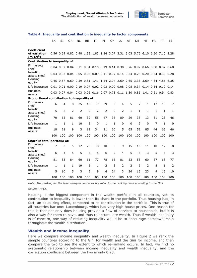
Here we compare income inequality and wealth inequality. In Figure 2 we rank the
sample countries according to the Gini for wealth and the Gini for income, and then
compare the two to see the extent to which re-ranking occurs. In fact, we find no
systematic relationship between income inequality and wealth inequality, and the
correlation coefficient between the two is only 0.23.
Employment, Social Affairs & Inclusion The distribution of wealth between households
December 2013 I 13
Figure 2: Comparison of Gini indices for wealth and income
Source: HFCS.
Liquid versus illiquid wealth Wealth can be more or less liquid. More-liquid wealth can be more easily converted
into a stream of income and used to maintain consumption in the event of a sudden
drop in regular income. The ability to use less-liquid wealth in order to smooth
consumption will depend heavily on the institutional country environment and the
availability of appropriate financial instruments to extract collateral. In this section, we
explore the division between liquid and illiquid wealth and how this varies across
households. This can be a significant factor that should be taken into account when
assessing the effects of the crisis on living standards.
We use two definitions and compare the results across household types. In the first
case, we take a more aggregated look at wealth. We define liquid wealth as financial
assets (including deposit accounts, stocks, bonds, mutual funds and life insurance)
less liabilities; and illiquid wealth as housing (principal residence and investment real
estate) less mortgages and other home-secured debt, plus self-employment business.
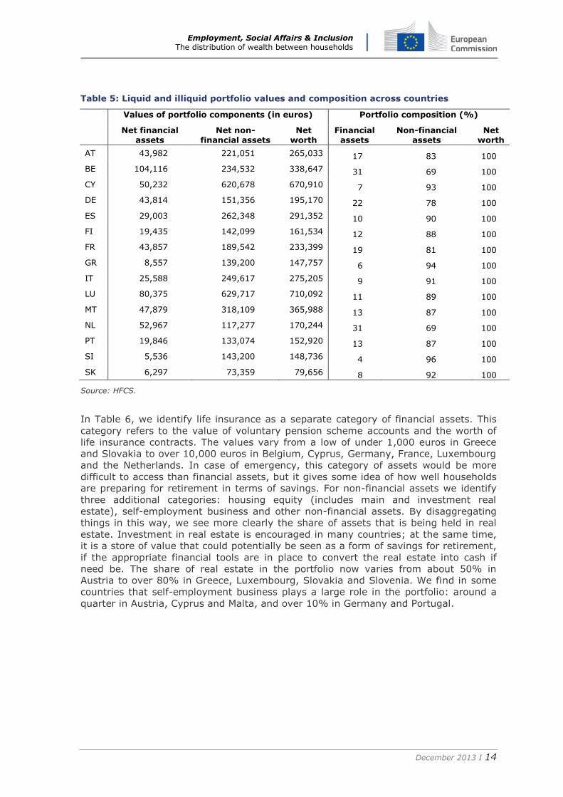
The picture in Table 5 is quite uniform. Most wealth is held in the form of non-financial
assets (the proportion varies across countries from 69% to 96%). The share of
financial assets in the total portfolio is 10% or less in countries such as Cyprus, Spain,
Greece, Italy, Slovenia and Slovakia. This may be for two reasons. First, the absolute
value held may be low (as in the case of Greece, Slovenia and Slovakia – less than
10,000 euros) or else home values may be very high (and there may be a large share
of self-employment business) giving the impression of low financial assets. This is the
case in Cyprus, Spain and Italy: in Cyprus, 50,000 euros in financial assets is less
than 10% of the average value of non-financial assets; in Spain and Italy, 29,000
euros and 26,000 euros, respectively, are about 10% of average non-financial assets.
We examine this in more detail by disaggregating household portfolios in Table 6.
Gini wealth Gini income
0.000 0.200 0.400 0.600 0.800 1.000
SK
SI
GR
ES
MT
BE
IT
NL
LU
FI
PT
FR
CY
DE
AT
Wealth
0.000 0.200 0.400 0.600 0.800 1.000
SK
NL
FI
MT
FR
GR
IT
AT
ES
DE
LU
CY
SI
PT
BE
Employment, Social Affairs & Inclusion The distribution of wealth between households
December 2013 I 14
Table 5: Liquid and illiquid portfolio values and composition across countries
Values of portfolio components (in euros) Portfolio composition (%)
Net financial
assets Net non-
financial assets Net
worth Financial
assets Non-financial
assets Net
worth
AT 43,982 221,051 265,033 17 83 100
BE 104,116 234,532 338,647 31 69 100
CY 50,232 620,678 670,910 7 93 100
DE 43,814 151,356 195,170 22 78 100
ES 29,003 262,348 291,352 10 90 100
FI 19,435 142,099 161,534 12 88 100
FR 43,857 189,542 233,399 19 81 100
GR 8,557 139,200 147,757 6 94 100
IT 25,588 249,617 275,205 9 91 100
LU 80,375 629,717 710,092 11 89 100
MT 47,879 318,109 365,988 13 87 100
NL 52,967 117,277 170,244 31 69 100
PT 19,846 133,074 152,920 13 87 100
SI 5,536 143,200 148,736 4 96 100
SK 6,297 73,359 79,656 8 92 100
Source: HFCS.
In Table 6, we identify life insurance as a separate category of financial assets. This
category refers to the value of voluntary pension scheme accounts and the worth of
life insurance contracts. The values vary from a low of under 1,000 euros in Greece
and Slovakia to over 10,000 euros in Belgium, Cyprus, Germany, France, Luxembourg
and the Netherlands. In case of emergency, this category of assets would be more
difficult to access than financial assets, but it gives some idea of how well households
are preparing for retirement in terms of savings. For non-financial assets we identify
three additional categories: housing equity (includes main and investment real
estate), self-employment business and other non-financial assets. By disaggregating
things in this way, we see more clearly the share of assets that is being held in real
estate. Investment in real estate is encouraged in many countries; at the same time,
it is a store of value that could potentially be seen as a form of savings for retirement,
if the appropriate financial tools are in place to convert the real estate into cash if
need be. The share of real estate in the portfolio now varies from about 50% in
Austria to over 80% in Greece, Luxembourg, Slovakia and Slovenia. We find in some
countries that self-employment business plays a large role in the portfolio: around a
quarter in Austria, Cyprus and Malta, and over 10% in Germany and Portugal.
Employment, Social Affairs & Inclusion The distribution of wealth between households
December 2013 I 15
Table 6: Disaggregated portfolio values and composition across countries
AT BE CY DE ES FI FR GR IT LU MT NL PT SI SK
Value of portfolio components (in thousand euros)
Net-financial assets 40 86 31 31 24 17 24 8 23 64 39 20 18 4 6
Life insurance 4 18 19 13 5 3 19 1 3 17 9 33 2 1 1
Housing equity 140 207 446 113 223 126 156 124 213 576 221 103 105 123 65
Other non-financial assets 13 11 15 9 10 9 12 7 13 30 12 9 8 6 5
Self-employment business 68 16 159 29 29 7 22 8 24 24 85 6 20 14 4
Net worth 265 339 671 195 291 162 233 148 275 710 366 170 153 149 80
Portfolio composition (%)
Net-financial assets 15 25 5 16 8 10 10 5 8 9 11 12 12 3 7
Life insurance 2 5 3 6 2 2 8 1 1 2 2 19 1 1 1
Housing equity 53 61 66 58 77 78 67 84 77 81 60 60 68 83 81
Other non-financial assets 5 3 2 5 3 6 5 5 5 4 3 5 5 4 6
Self-employment business 26 5 24 15 10 4 9 5 9 3 23 3 13 10 5
Net worth 100 100 100 100 100 100 100 100 100 100 100 100 100 100 100
Source: HFCS.
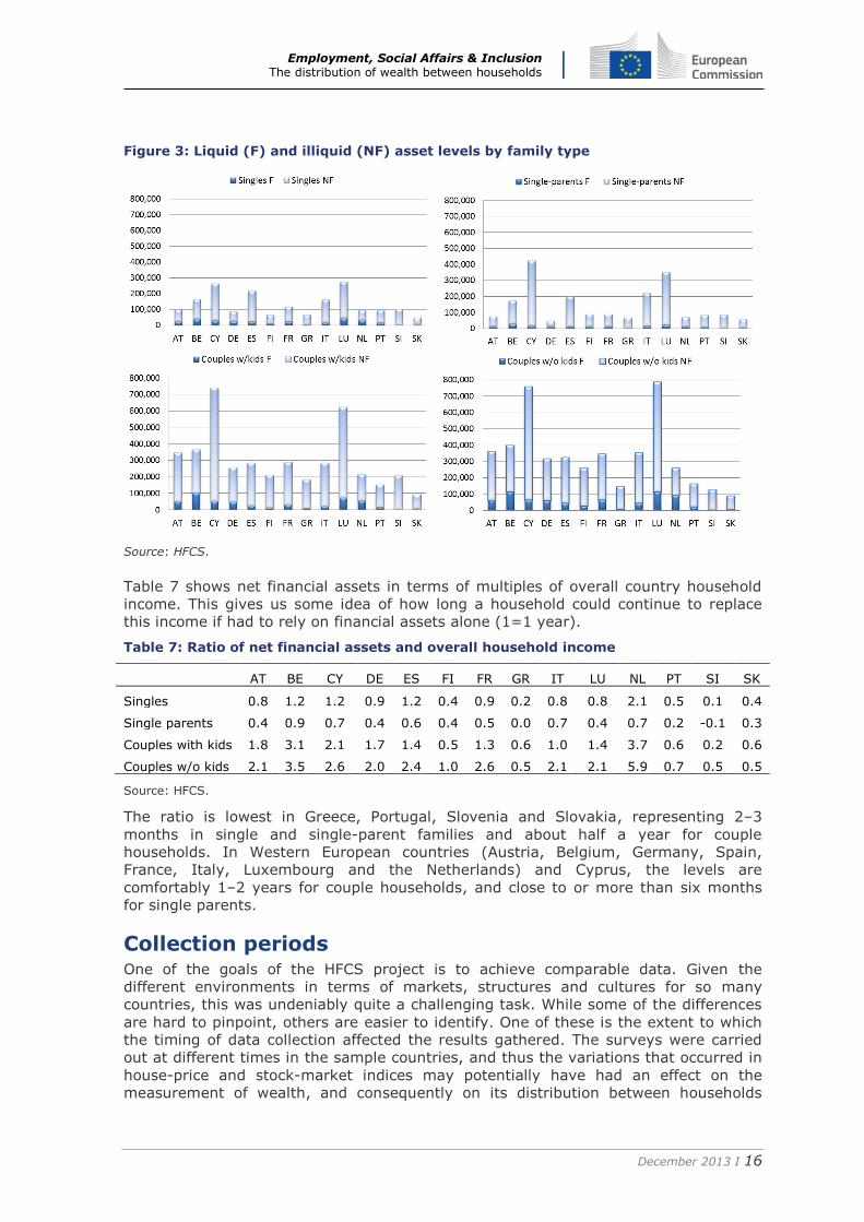
We now compare different household types and the share they hold in more-liquid and
less-liquid assets. Here we look at the more aggregated categories, as in Table 5: net
financial assets and net non-financial assets. The household types include singles
(one-person households), single-parents, couple households with children, and couple
households without children (two-person households).4
Figure 3 shows that the highest wealth levels are for couples without children, and the
lowest are for single households (or in some countries for single parents). Belgium,
Cyprus, Finland, Italy, Luxembourg and Slovakia are the countries where single
parents have slightly more wealth than one-person households. These are countries
where there is adequate provision for single-parent families or where divorce laws
provide parents with adequate wealth. That said, a comparison of the wealth levels of
couples with children and of single parents shows that one-parent households are at a
big disadvantage.
Wealth levels of single parents are not necessarily the lowest of the household types,
but their portfolio is not very liquid: single parents have the lowest levels of liquid
wealth in all countries. This could be problematic if there is a need to supplement
income using wealth. Couples without children, on the other hand, have the highest
levels of liquid assets – some 50,000 to 100,000 euros, except in Finland, Greece,
Portugal, Slovakia and Slovenia. Couples with children are not far behind (with similar
exceptions). When we compare these levels across household types in terms of
multiples of income (as in Table 7) the results are more striking.
4 Those over 65 and multi-family households (with or without children) are not included. Their asset ownership may become more complicated, as we might find a young family living with one set of parents. We are then unable to distinguish whether the home is owned by it or by the parents, as assets are recorded at the household level. The share of these types of households could potentially be quite extensive – and even larger as a result of the crisis.
Employment, Social Affairs & Inclusion The distribution of wealth between households
December 2013 I 16
Figure 3: Liquid (F) and illiquid (NF) asset levels by family type
Source: HFCS.
Table 7 shows net financial assets in terms of multiples of overall country household
income. This gives us some idea of how long a household could continue to replace
this income if had to rely on financial assets alone (1=1 year).
Table 7: Ratio of net financial assets and overall household income
AT BE CY DE ES FI FR GR IT LU NL PT SI SK
Singles 0.8 1.2 1.2 0.9 1.2 0.4 0.9 0.2 0.8 0.8 2.1 0.5 0.1 0.4
Single parents 0.4 0.9 0.7 0.4 0.6 0.4 0.5 0.0 0.7 0.4 0.7 0.2 -0.1 0.3
Couples with kids 1.8 3.1 2.1 1.7 1.4 0.5 1.3 0.6 1.0 1.4 3.7 0.6 0.2 0.6
Couples w/o kids 2.1 3.5 2.6 2.0 2.4 1.0 2.6 0.5 2.1 2.1 5.9 0.7 0.5 0.5
Source: HFCS.
The ratio is lowest in Greece, Portugal, Slovenia and Slovakia, representing 2–3
months in single and single-parent families and about half a year for couple
households. In Western European countries (Austria, Belgium, Germany, Spain,
France, Italy, Luxembourg and the Netherlands) and Cyprus, the levels are
comfortably 1–2 years for couple households, and close to or more than six months
for single parents.
Collection periods One of the goals of the HFCS project is to achieve comparable data. Given the
different environments in terms of markets, structures and cultures for so many
countries, this was undeniably quite a challenging task. While some of the differences
are hard to pinpoint, others are easier to identify. One of these is the extent to which
the timing of data collection affected the results gathered. The surveys were carried
out at different times in the sample countries, and thus the variations that occurred in
house-price and stock-market indices may potentially have had an effect on the
measurement of wealth, and consequently on its distribution between households
Employment, Social Affairs & Inclusion The distribution of wealth between households
December 2013 I 17
within countries, as well as between countries. Below we examine the extent to which
this could be the case.
Table 8: Collection and reference periods, by country
Abbreviation Fieldwork
Length in months
Reference period
Wealth Income
Austria AT Sept 10–May 11 9 Time of interview 2009
Belgium BE Apr 10–Oct 10 7 Time of interview 2009
Cyprus CY Apr 10–Jan 11 10 Time of interview 2009
Finland FI Jan 10–May 10 5 31 Dec 2009 2009
France FR Oct 09–Feb 10 5 Time of interview 2009
Germany DE Sept 10–Jul 11 11 Time of interview 2009
Greece GR Jun 09–Sept 09 4 Time of interview Last 12 months
Italy IT Jan 11–Aug 11 8 31 Dec 2010 2010
Luxembourg LU Sept 10–Apr 11 8 Time of interview 2009
Malta MT Oct 10–Feb 11 5 Time of interview Last 12 months
Netherlands NL Apr 10–Dec 10 9 31 Dec 2009 2009
Portugal PT Apr 10–Jul 10 4 Time of interview 2009
Slovakia SK Sept 10–Oct 10 2 Time of interview Last 12 months
Slovenia SI Oct 10–Dec 10 3 Time of interview 2009
Spain ES Nov 08–Jul 09 9 Time of interview 2007
Source: HFCS.
The fieldwork took place between 2008 and 2011 and the timing for measuring assets
and liabilities differed from country to country. In addition, the reference period for
income differed. Information on income usually referred to income earned by the end
of the previous year, while asset information was most often collected at the time of
the interview. As Table 8 shows, in only three countries did the information collected
on assets refer to the situation at the end of the previous December. The fieldwork
took anywhere from 1 month to 11 months; thus if there were serious stock-market
fluctuations or changes in house prices, that would affect the values collected for the
purposes of the survey.
In order to check the extent to which this happened, we collated the stock-market and
house-price indices for all the eurozone countries to plot the price trends against the
collection periods.
In Figure 4, we plot the stock-market index from 2008 to 2012. The shaded area
indicates the data-collection period. A close examination indicates that in most
countries the index fluctuated by between 10% and 20% during the collection period.
In Italy, the stock market dropped by over 20%, but the data on assets referred to
the position at the end of the previous year, and so the reported values should not
have been affected by the different collection periods. In Spain, during the fieldwork
there was a dip of over 20% in the index, followed by a rise. The extent to which
these changes will have affected the aggregate wealth values depends for the most
part on the share of financial assets in the whole portfolio. In countries where financial
assets – and riskier assets in particular – play no great role (such as Cyprus, Greece,
Slovakia, Slovenia, Portugal or Finland), the effect will be quite small.
Employment, Social Affairs & Inclusion The distribution of wealth between households
December 2013 I 18
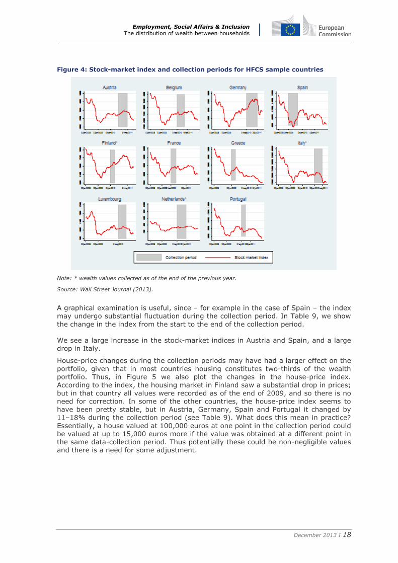
Figure 4: Stock-market index and collection periods for HFCS sample countries
Note: * wealth values collected as of the end of the previous year.
Source: Wall Street Journal (2013).
A graphical examination is useful, since – for example in the case of Spain – the index
may undergo substantial fluctuation during the collection period. In Table 9, we show
the change in the index from the start to the end of the collection period.
We see a large increase in the stock-market indices in Austria and Spain, and a large
drop in Italy.
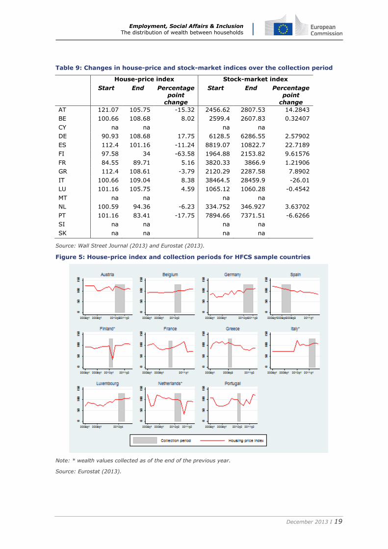
House-price changes during the collection periods may have had a larger effect on the
portfolio, given that in most countries housing constitutes two-thirds of the wealth
portfolio. Thus, in Figure 5 we also plot the changes in the house-price index.
According to the index, the housing market in Finland saw a substantial drop in prices;
but in that country all values were recorded as of the end of 2009, and so there is no
need for correction. In some of the other countries, the house-price index seems to
have been pretty stable, but in Austria, Germany, Spain and Portugal it changed by
11–18% during the collection period (see Table 9). What does this mean in practice?
Essentially, a house valued at 100,000 euros at one point in the collection period could
be valued at up to 15,000 euros more if the value was obtained at a different point in
the same data-collection period. Thus potentially these could be non-negligible values
and there is a need for some adjustment.
Employment, Social Affairs & Inclusion The distribution of wealth between households
December 2013 I 19
Table 9: Changes in house-price and stock-market indices over the collection period
House-price index Stock-market index
Start End Percentage point
change
Start End Percentage point
change
AT 121.07 105.75 -15.32 2456.62 2807.53 14.2843
BE 100.66 108.68 8.02 2599.4 2607.83 0.32407
CY na na na na
DE 90.93 108.68 17.75 6128.5 6286.55 2.57902
ES 112.4 101.16 -11.24 8819.07 10822.7 22.7189
FI 97.58 34 -63.58 1964.88 2153.82 9.61576
FR 84.55 89.71 5.16 3820.33 3866.9 1.21906
GR 112.4 108.61 -3.79 2120.29 2287.58 7.8902
IT 100.66 109.04 8.38 38464.5 28459.9 -26.01
LU 101.16 105.75 4.59 1065.12 1060.28 -0.4542
MT na na na na
NL 100.59 94.36 -6.23 334.752 346.927 3.63702
PT 101.16 83.41 -17.75 7894.66 7371.51 -6.6266
SI na na na na
SK na na na na
Source: Wall Street Journal (2013) and Eurostat (2013).
Figure 5: House-price index and collection periods for HFCS sample countries
Note: * wealth values collected as of the end of the previous year.
Source: Eurostat (2013).
Employment, Social Affairs & Inclusion The distribution of wealth between households
December 2013 I 20
Comparison of income distribution in the HFCS and EU-SILC
Methodology
Income reference years in the HFCS survey vary by country (see Table 8 and HFCN
2013a). In the majority of countries, it was 2009, and for these we used data from
EU-SILC user database (UDB) 2010 for comparison. In the case of Spain, the income
reference year in the HFCS was 2007, so we used EU-SILC UDB 2008 as the
comparison sample. In the case of Italy, Malta and Slovakia, the income reference
year was 2010, so we used EU-SILC 2011 for comparison. We compared the
distribution of equivalized gross household income and its components, where the
number of consumption units in the household was calculated as Ne (N=household
size) with e=0.73 parameter. Income inequality indicators were calculated for positive
income values. No top coding was applied.
Comparison of income inequality and income structure
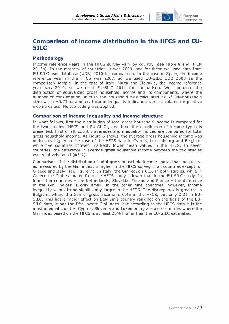
In what follows, first the distribution of total gross household income is compared for
the two studies (HFCS and EU-SILC), and then the distribution of income types is
presented. First of all, country averages and inequality indices are compared for total
gross household income. As Figure 6 shows, the average gross household income was
noticeably higher in the case of the HFCS data in Cyprus, Luxembourg and Belgium,
while five countries showed markedly lower mean values in the HFCS. In seven
countries, the difference in average gross household income between the two studies
was relatively small (±5%).
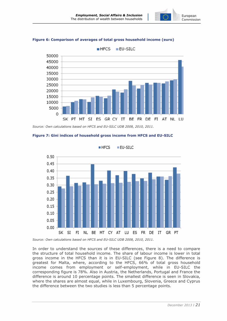
Comparison of the distribution of total gross household income shows that inequality,
as measured by the Gini index, is higher in the HFCS survey in all countries except for
Greece and Italy (see Figure 7). In Italy, the Gini equals 0.36 in both studies, while in
Greece the Gini estimated from the HFCS study is lower than in the EU-SILC study. In
four other countries – the Netherlands, Slovakia, Finland and France – the difference
in the Gini indices is only small. In the other nine countries, however, income
inequality seems to be significantly larger in the HFCS. The discrepancy is greatest in
Belgium, where the Gini of gross income is 0.45 in the HFCS, but only 0.31 in EU-
SILC. This has a major effect on Belgium’s country ranking: on the basis of the EU-
SILC data, it has the fifth-lowest Gini index, but according to the HFCS data it is the
most unequal country. Cyprus, Slovenia and Luxembourg are also countries where the
Gini index based on the HFCS is at least 20% higher than the EU-SILC estimates.
Employment, Social Affairs & Inclusion The distribution of wealth between households
December 2013 I 21
Figure 6: Comparison of averages of total gross household income (euro)
Source: Own calculations based on HFCS and EU-SILC UDB 2008, 2010, 2011.
Figure 7: Gini indices of household gross income from HFCS and EU-SILC
Source: Own calculations based on HFCS and EU-SILC UDB 2008, 2010, 2011.
In order to understand the sources of these differences, there is a need to compare
the structure of total household income. The share of labour income is lower in total
gross income in the HFCS than it is in EU-SILC (see Figure 8). The difference is
greatest for Malta, where, according to the HFCS, 66% of total gross household
income comes from employment or self-employment, while in EU-SILC the
corresponding figure is 78%. Also in Austria, the Netherlands, Portugal and France the
difference is around 10 percentage points. The smallest difference is seen in Slovakia,
where the shares are almost equal, while in Luxembourg, Slovenia, Greece and Cyprus
the difference between the two studies is less than 5 percentage points.
Employment, Social Affairs & Inclusion The distribution of wealth between households
December 2013 I 22
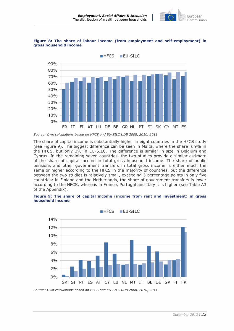
Figure 8: The share of labour income (from employment and self-employment) in gross household income
Source: Own calculations based on HFCS and EU-SILC UDB 2008, 2010, 2011.
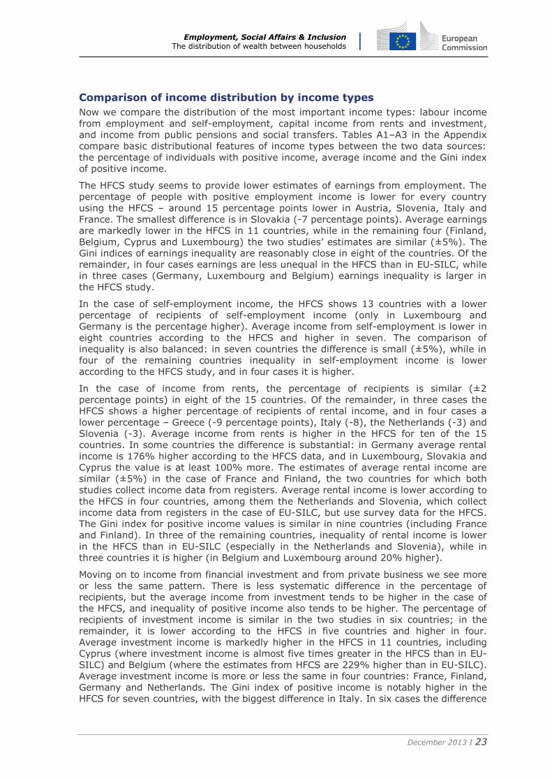
The share of capital income is substantially higher in eight countries in the HFCS study
(see Figure 9). The biggest difference can be seen in Malta, where the share is 9% in
the HFCS, but only 3% in EU-SILC. The difference is similar in size in Belgium and
Cyprus. In the remaining seven countries, the two studies provide a similar estimate
of the share of capital income in total gross household income. The share of public
pensions and other government transfers in total gross income is either much the
same or higher according to the HFCS in the majority of countries, but the difference
between the two studies is relatively small, exceeding 3 percentage points in only five
countries: in Finland and the Netherlands, the share of government transfers is lower
according to the HFCS, whereas in France, Portugal and Italy it is higher (see Table A3
of the Appendix).
Figure 9: The share of capital income (income from rent and investment) in gross
household income
Source: Own calculations based on HFCS and EU-SILC UDB 2008, 2010, 2011.
Employment, Social Affairs & Inclusion The distribution of wealth between households
December 2013 I 23
Comparison of income distribution by income types
Now we compare the distribution of the most important income types: labour income
from employment and self-employment, capital income from rents and investment,
and income from public pensions and social transfers. Tables A1–A3 in the Appendix
compare basic distributional features of income types between the two data sources:
the percentage of individuals with positive income, average income and the Gini index
of positive income.
The HFCS study seems to provide lower estimates of earnings from employment. The
percentage of people with positive employment income is lower for every country
using the HFCS – around 15 percentage points lower in Austria, Slovenia, Italy and
France. The smallest difference is in Slovakia (-7 percentage points). Average earnings
are markedly lower in the HFCS in 11 countries, while in the remaining four (Finland,
Belgium, Cyprus and Luxembourg) the two studies’ estimates are similar (±5%). The
Gini indices of earnings inequality are reasonably close in eight of the countries. Of the
remainder, in four cases earnings are less unequal in the HFCS than in EU-SILC, while
in three cases (Germany, Luxembourg and Belgium) earnings inequality is larger in
the HFCS study.
In the case of self-employment income, the HFCS shows 13 countries with a lower
percentage of recipients of self-employment income (only in Luxembourg and
Germany is the percentage higher). Average income from self-employment is lower in
eight countries according to the HFCS and higher in seven. The comparison of
inequality is also balanced: in seven countries the difference is small (±5%), while in
four of the remaining countries inequality in self-employment income is lower
according to the HFCS study, and in four cases it is higher.
In the case of income from rents, the percentage of recipients is similar (±2
percentage points) in eight of the 15 countries. Of the remainder, in three cases the
HFCS shows a higher percentage of recipients of rental income, and in four cases a
lower percentage – Greece (-9 percentage points), Italy (-8), the Netherlands (-3) and
Slovenia (-3). Average income from rents is higher in the HFCS for ten of the 15
countries. In some countries the difference is substantial: in Germany average rental
income is 176% higher according to the HFCS data, and in Luxembourg, Slovakia and
Cyprus the value is at least 100% more. The estimates of average rental income are
similar (±5%) in the case of France and Finland, the two countries for which both
studies collect income data from registers. Average rental income is lower according to
the HFCS in four countries, among them the Netherlands and Slovenia, which collect
income data from registers in the case of EU-SILC, but use survey data for the HFCS.
The Gini index for positive income values is similar in nine countries (including France
and Finland). In three of the remaining countries, inequality of rental income is lower
in the HFCS than in EU-SILC (especially in the Netherlands and Slovenia), while in
three countries it is higher (in Belgium and Luxembourg around 20% higher).
Moving on to income from financial investment and from private business we see more
or less the same pattern. There is less systematic difference in the percentage of
recipients, but the average income from investment tends to be higher in the case of
the HFCS, and inequality of positive income also tends to be higher. The percentage of
recipients of investment income is similar in the two studies in six countries; in the
remainder, it is lower according to the HFCS in five countries and higher in four.
Average investment income is markedly higher in the HFCS in 11 countries, including
Cyprus (where investment income is almost five times greater in the HFCS than in EU-
SILC) and Belgium (where the estimates from HFCS are 229% higher than in EU-SILC).
Average investment income is more or less the same in four countries: France, Finland,
Germany and Netherlands. The Gini index of positive income is notably higher in the
HFCS for seven countries, with the biggest difference in Italy. In six cases the difference
Employment, Social Affairs & Inclusion The distribution of wealth between households
December 2013 I 24
between the estimates from the two studies remains small (±5%), and in only two
cases do we see markedly lower inequality of investment income in the HFCS.
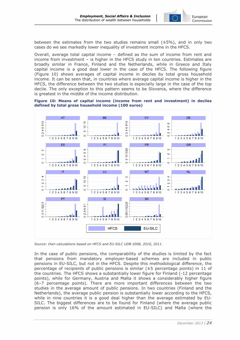
Overall, average total capital income – defined as the sum of income from rent and
income from investment – is higher in the HFCS study in ten countries. Estimates are
broadly similar in France, Finland and the Netherlands, while in Greece and Italy
capital income is a good deal lower in the case of the HFCS. The following figure
(Figure 10) shows averages of capital income in deciles by total gross household
income. It can be seen that, in countries where average capital income is higher in the
HFCS, the difference between the two studies is especially large in the case of the top
decile. The only exception to this pattern seems to be Slovenia, where the difference
is greatest in the middle of the income distribution.
Figure 10: Means of capital income (income from rent and investment) in deciles defined by total gross household income (100 euros)
Source: Own calculations based on HFCS and EU-SILC UDB 2008, 2010, 2011.
In the case of public pensions, the comparability of the studies is limited by the fact
that pensions from mandatory employer-based schemes are included in public
pensions in EU-SILC, but not in the HFCS. Despite this methodological difference, the
percentage of recipients of public pensions is similar (±5 percentage points) in 11 of
the countries. The HFCS shows a substantially lower figure for Finland (-12 percentage
points), while for Germany, Austria and Malta it shows a considerably higher figure
(6–7 percentage points). There are more important differences between the two
studies in the average amount of public pensions. In two countries (Finland and the
Netherlands), the average public pension is substantially lower according to the HFCS,
while in nine countries it is a good deal higher than the average estimated by EU-
SILC. The biggest differences are to be found for Finland (where the average public
pension is only 16% of the amount estimated in EU-SILC) and Malta (where the
Employment, Social Affairs & Inclusion The distribution of wealth between households
December 2013 I 25
average public pension is 41% higher in the HFCS study. In terms of inequality of
public pensions, the HFCS shows a significantly lower Gini index for ten countries,
while in the remaining five the difference is relatively small. The biggest difference is
seen in the case of the Netherlands, where the Gini index is 41% lower in the HFCS
than in EU-SILC.
In the case of social transfers (other than public pensions), the HFCS records a lower
percentage of recipients and lower averages than does EU-SILC in the majority of
countries. The percentage of individuals living in households that receive some form of
social transfer is lower in the HFCS in 13 countries. The biggest difference is observed
in Malta, where the percentage of those receiving social transfers is 53 percentage
points lower in the HFCS. The average amount of social transfers is significantly lower
in the HFCS in 11 countries, and higher in only one (Spain), with the remaining three
having similar averages in the two studies. The biggest difference is found in Italy,
where the average amount of social transfers is only 17% of that measured in EU-
SILC. The two studies are also different in terms of inequality of social transfers in 11
countries: the Gini index is markedly lower in the HFCS in five countries and notably
higher in six. The biggest differences are to be seen in Slovakia, where the Gini index
is 23% lower in the HFCS, and Austria, where it is 30% higher.
Concluding remarks Examining wealth and income measures using a new eurozone survey, we find a great
deal of variation in terms of levels and inequality. We are able to distinguish different
types of country groupings, based on wealth and income levels. In all likelihood, these
can at least partially be explained by pension wealth. The country rankings based on
wealth measures do not correspond to the rankings based on income measures.
We find housing and business assets to be a large contributor to inequality in almost
all countries. Housing is also the main component of wealth for many household types.
Thus, whether a household owns its home outright or has a mortgage may prove
important in determining whether it can rely on assets to smooth consumption in the
case of a sudden drop in income.
For some countries, we find that data-collection periods may have had an impact on
the collected asset, particularly in Austria, Germany and Portugal for housing wealth
and in Austria and Spain for stock-market wealth. That said, in the case of the latter
component the impact may not be substantial, due to the small proportion of stocks in
the overall portfolio.
Comparison of the distribution of gross household income in the HFCS and EU-SILC
reveals important differences between the two studies. In nine of the 15 eurozone
countries, income inequality as measured by the Gini index is significantly larger in the
HFCS, while in the other six countries the estimates are more or less equal. The
analysis also shows differences in the structure of gross income between the two
studies: the share of labour income in total gross income is lower in the HFCS than in
EU-SILC in almost all countries. By contrast, the share of capital income tends to be
higher in the HFCS study. The difference in the share of government transfers (public
pensions and other transfers) is less pronounced.
A comparison by income type shows that the HFCS study provides lower estimates for
the percentage of recipients of earnings from employment and for average earnings.
There seems to be no systematic difference between the two studies in terms of the
inequality of earnings from employment. In the case of income from rents and
investment, average income tends to be higher in the HFCS and inequality of positive
income also tends to be higher. Public pensions tend to be higher in the HFCS, and
show less inequality, while other social transfers tend to be higher in EU-SILC.
Employment, Social Affairs & Inclusion The distribution of wealth between households
December 2013 I 26
References Eurostat (2013). House price index: quarterly data.
http://epp.eurostat.ec.europa.eu/portal/page/portal/hicp/methodology/hps/house_
price_index
Household Finance and Consumption Network (HFCN) (2013a). “The Eurosystem
Household Finance and Consumption Survey: Methodological report for the first
wave”, Statistics Paper Series No. 1, April.
http://www.ecb.europa.eu/home/html/researcher_hfcn.en.html
Household Finance and Consumption Network (HFCN) (2013b). “The Eurosystem
Household Finance and Consumption Survey: Results from the first wave”,
Statistics Paper Series No. 2, April.
http://www.ecb.europa.eu/home/html/researcher_hfcn.en.html
OECD (2011). Pensions at a Glance, Paris.
Wall Street Journal (2013). Stock market quotes (e.g. for Austria
http://quotes.wsj.com/AT/XWBO/ATX/index-historical-prices).
27
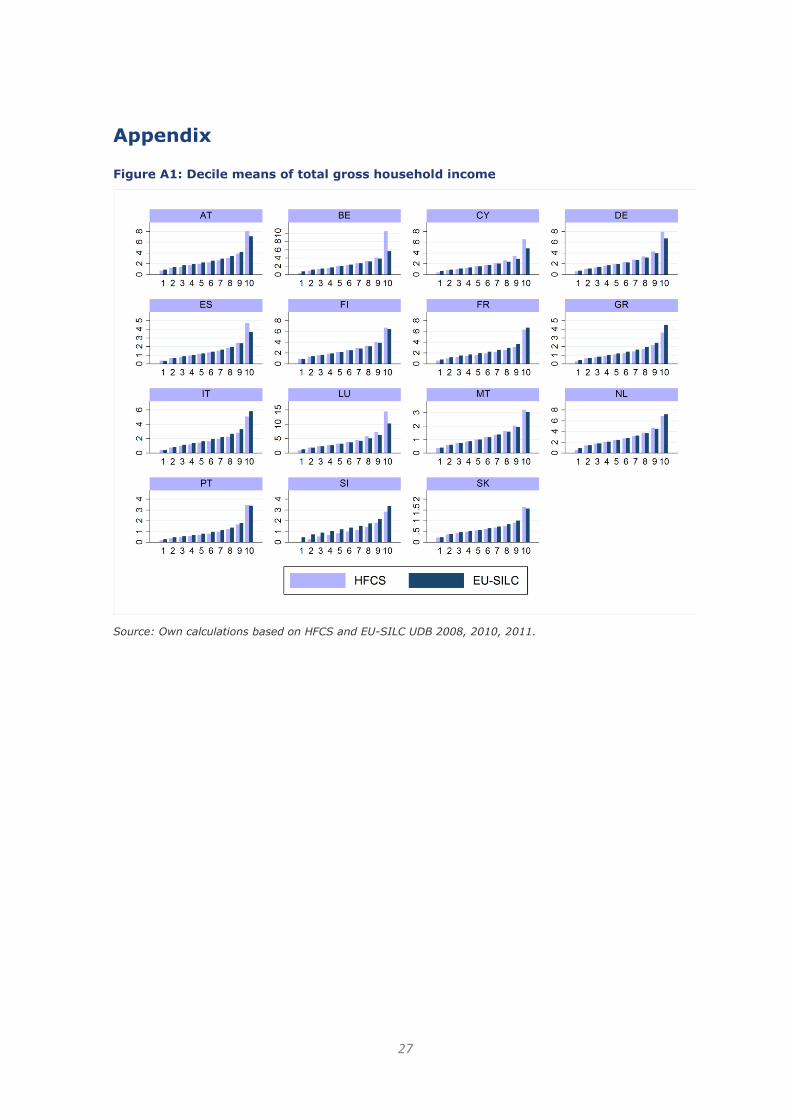
Appendix Figure A1: Decile means of total gross household income
Source: Own calculations based on HFCS and EU-SILC UDB 2008, 2010, 2011.
Employment, Social Affairs & Inclusion The distribution of wealth between households
December 2013 I 28
Table A1: Distribution of earnings from employment and self-employment income
% with positive income
Average income
Gini index of positive income
HFCS EU-SILC HFCS EU-SILC HFCS EU-SILC
Earnings AT 60.8 76.3 13387 16794 0.378 0.398
BE 61.8 70.3 16680 15939 0.462 0.339
CY 69.0 82.6 13337 12731 0.390 0.374
DE 62.5 71.2 14597 16302 0.410 0.378
ES 67.1 77.9 9020 10534 0.366 0.363
FI 69.0 78.9 16046 17131 0.395 0.382
FR 61.4 76.5 10085 13980 0.401 0.381
GR 54.0 63.7 6614 7810 0.347 0.382
IT 55.3 69.3 8249 10295 0.350 0.401
LU 71.4 81.2 28197 26853 0.422 0.383
MT 65.5 76.8 7100 8550 0.354 0.358
NL 65.8 78.1 17196 19809 0.342 0.362
PT 61.6 74.0 5379 7272 0.439 0.422
SI 64.5 81.0 6879 9824 0.383 0.367
SK 74.0 80.6 3833 4644 0.274 0.349
Self-employment income
AT 17.0 23.6 2667 2806 0.597 0.593
BE 9.0 12.4 2177 1640 0.661 0.439
CY 14.1 30.1 1967 2092 0.570 0.520
DE 13.4 9.7 2377 1558 0.599 0.666
ES 15.6 17.1 2117 1169 0.521 0.419
FI 14.7 18.6 1217 1417 0.696 0.666
FR 6.9 10.6 1075 1298 0.614 0.591
GR 27.8 35.7 2953 3659 0.465 0.546
IT 17.9 30.8 3265 4302 0.491 0.536
LU 10.3 8.8 3427 1890 0.605 0.637
MT 18.9 20.4 1386 1277 0.455 0.457
NL 12.7 19.5 1273 2111 0.534 0.677
PT 17.2 18.9 1187 1053 0.550 0.505
SI 8.8 26.8 623 793 0.612 0.612
SK 12.7 16.0 1089 586 0.463 0.454
Source: Own calculations based on HFCS and EU-SILC UDB 2008, 2010, 2011.
Employment, Social Affairs & Inclusion The distribution of wealth between households
December 2013 I 29
Table A2: Distribution of income from rent, investment and total capital income
% with positive income Average income Gini index of positive income
HFCS EU-SILC HFCS EU-SILC HFCS EU-SILC
Income from rent
AT 4.8 6.7 516 379 0.777 0.703
BE 7.5 9.8 572 393 0.599 0.506
CY 12.9 9.2 722 337 0.537 0.538
DE 13.3 9.4 1022 370 0.591 0.668
ES 5.1 6.2 272 220 0.572 0.564
FI 7.6 8.6 282 268 0.596 0.596
FR 12.2 13.0 607 629 0.664 0.621
GR 8.4 17.3 289 592 0.550 0.535
IT 4.8 12.7 334 547 0.564 0.594
LU 13.3 9.6 1874 702 0.666 0.547
MT 6.6 5.6 137 86 0.630 0.733
NL 1.1 4.1 47 122 0.390 0.518
PT 4.8 4.5 203 136 0.638 0.599
SI 2.6 6.0 28 72 0.459 0.690
SK 1.9 3.1 28 11 0.673 0.769
Investment income
AT 73.9 77.0 856 331 0.886 0.782
BE 39.7 66.8 1593 484 0.903 0.767
CY 25.0 10.7 1060 221 0.785 0.698
DE 41.6 82.7 647 591 0.788 0.770
ES 32.9 32.9 336 120 0.823 0.846
FI 75.5 80.0 814 906 0.922 0.931
FR 90.8 84.1 2047 2125 0.845 0.811
GR 8.1 8.2 127 74 0.823 0.697
IT 82.5 36.0 220 166 0.818 0.672
LU 45.2 59.3 756 578 0.844 0.851
MT 96.7 100.0 1018 316 0.653 0.813
NL 36.7 88.1 832 821 0.695 0.804
PT 18.7 10.6 224 98 0.805 0.710
SI 44.5 32.2 239 130 0.859 0.820
SK 2.9 16.9 9 6 0.740 0.672
Capital income: investment and rents
AT 74.7 77.8 1371 710 0.907 0.858
BE 42.9 69.6 2165 877 0.878 0.788
CY 32.5 18.0 1782 558 0.720 0.633
DE 45.9 83.1 1669 961 0.780 0.813
ES 35.4 35.9 607 340 0.819 0.849
FI 75.9 80.5 1096 1174 0.908 0.915
FR 89.6 84.5 2654 2754 0.845 0.806
GR 15.5 22.6 416 666 0.694 0.596
IT 82.8 41.8 553 713 0.893 0.769
LU 49.6 61.3 2630 1280 0.858 0.852
MT 96.7 100.0 1155 402 0.664 0.830
NL 37.1 88.4 878 944 0.691 0.806
PT 21.2 13.9 427 234 0.795 0.715
SI 45.1 35.2 267 202 0.843 0.819
SK 4.6 19.2 37 17 0.773 0.829
Source: Own calculations based on HFCS and EU-SILC UDB 2008, 2010, 2011.

Employment, Social Affairs & Inclusion The distribution of wealth between households
December 2013 I 30
Table A3: Distribution of social transfers and total gross income of households
% with positive income Average income Gini index of positive income
HFCS EU-SILC HFCS EU-SILC HFCS EU-SILC
Public pensions
AT 41.6 35.6 6964 5905 0.330 0.373
BE 33.6 30.7 5401 3901 0.315 0.354
CY 31.4 28.5 2983 2686 0.391 0.455
DE 38.0 32.1 5803 4611 0.334 0.355
ES 28.8 34.0 2349 2407 0.361 0.356
FI 23.0 34.7 734 4596 0.399 0.393
FR 41.1 35.9 6320 5223 0.332 0.397
GR 43.8 40.2 3407 3225 0.314 0.373
IT 48.0 42.7 6037 5195 0.333 0.381
LU 34.6 31.2 9393 7426 0.374 0.391
MT 43.3 36.7 2489 1767 0.286 0.317
NL 30.0 32.0 3266 5083 0.258 0.435
PT 45.1 39.8 2767 2258 0.447 0.441
SI 39.4 43.1 2267 2530 0.364 0.394
SK 42.4 43.4 1433 1382 0.268 0.346
Social transfers (pensions not included)
AT 32.5 63.2 998 1731 0.482 0.371
BE 38.5 64.7 1432 2063 0.556 0.497
CY 28.4 69.9 500 1000 0.546 0.564
DE 39.4 57.5 1204 1625 0.469 0.463
ES 26.6 25.6 1003 449 0.466 0.545
FI 61.8 70.4 2393 2274 0.504 0.483
FR 54.3 62.8 1659 1831 0.521 0.476
GR 8.7 35.2 110 328 0.481 0.523
IT 5.7 48.5 98 707 0.545 0.643
LU 41.7 64.7 1677 3194 0.477 0.427
MT 34.2 87.4 199 596 0.617 0.597
NL 60.0 65.0 1586 1624 0.639 0.595
PT 37.0 52.4 344 473 0.662 0.589
SI 26.4 68.6 261 978 0.470 0.507
SK 15.4 63.1 113 300 0.423 0.549
Total gross household income
AT 99.3 100.0 26459 28150 0.370 0.316
BE 97.2 100.0 28543 24660 0.448 0.307
CY 98.8 100.0 21202 19296 0.404 0.314
DE 99.0 100.0 26919 25410 0.388 0.342
ES 99.1 99.3 15687 15014 0.379 0.328
FI 99.1 100.0 27043 26830 0.315 0.297
FR 99.8 100.0 21913 25181 0.348 0.330
GR 96.6 99.4 13698 15910 0.337 0.363
IT 99.2 99.3 18471 21344 0.360 0.360
LU 99.3 99.8 46619 40929 0.400 0.323
MT 100.0 99.9 12831 12666 0.331 0.310
NL 98.7 99.9 29014 30020 0.319 0.305
PT 98.7 100.0 10292 11371 0.425 0.382
SI 94.4 100.0 10522 14424 0.366 0.292
SK 99.8 100.0 6597 6974 0.290 0.277
Source: Own calculations based on HFCS and EU-SILC UDB 2008, 2010, 2011.