the moment perfected gq magazines
TRANSCRIPT

UNIVERSITY OF VAASA
Faculty of Philosophy
English Studies
Miia Kontteli
“The Moment Perfected”
Alcohol Advertising in GQ and Men’s Health Magazines
Master’s Thesis
Vaasa 2017


1
TABLE OF CONTENTS
DIAGRAMS 2
ABSTRACT 3
1 INTRODUCTION 5
2 ALCOHOL, CULTURE AND ADVERTISING 10
2.1 Alcohol and Culture 10
2.2 Alcohol and Print Advertising 16
2.3 The Visual and the Verbal in Advertisements 19
3 REPRESENTATIONS OF ALCOHOL IN MEN’S HEALTH AND GQ 30
3.1 Exquisiteness 32
3.2 Lifestyle 41
3.3 Relationship 48
3.4 Tradition 56
4 CONCLUSIONS 61
WORKS CITED 64
APPENDICES
Appendix 1. Grey Goose Le Melon Vodka 68
Appendix 2. Markham Vineyards Merlot 69
Appendix 3. Michelob Ultra Light Beer 70
Appendix 4. Hennessy Very Special Cognac 71
Appendix 5. Santa Margherita Prosecco 72
Appendix 6. Chopin Vodka 73
Appendix 7. Josh Cellars Cabernet Sauvignon 74

2
Appendix 8. Ketel One Vodka 75
DIAGRAMS
Diagram 1. The percentual share of each category in the alcohol advertisements of
Men’s Health and GQ magazines. 32

3
______________________________________________________________________
UNIVERSITY OF VAASA
Faculty of Philosophy
Discipline: English Studies
Author: Miia Kontteli
Master’s Thesis: “The Moment Perfected”
Alcohol Advertising in GQ and Men’s Health Magazines
Degree: Master of Arts
Date: 2017
Supervisor: Tiina Mäntymäki
______________________________________________________________________
ABSTRACT
Tämä pro gradu -tutkielma käsittelee alkoholin representaatioita alkoholimainonnassa.
Aineistona käytettiin alkoholimainoksia vuonna 2014 julkaistuissa amerikkalaisissa
GQ- ja Men’s Health -aikakauslehdissä. Materiaali sisälsi 10 Men’s Health -lehden ja
11 GQ-lehden numeroa, joissa esiintyneistä mainoksista 41 otettiin mukaan
tutkimusaineistoon. Tarkoituksena oli tutkia minkälaisia alkoholin representaatioita
mainoksista löytyy ja miten nämä representaatiot on luotu. Toisin sanoen: kuinka
mainosten tietyt elementit ja konnotaatiot luovat erilaisia alkoholin representaatioita?
Mainoksiin sovellettiin laadullista sisällönanalyysia, ja tämän lisäksi muutamia
tutkimukselle keskeisiä lukuja käytettiin havainnollistamaan aineistoa paremmin. Ensin
erilaiset representaatiokategoriat muodostettiin aineiston pohjalta, jonka jälkeen
mainokset jaettiin kategorioihin. Kustakin kategoriasta valittiin kaksi
esimerkkimainosta, joiden sisältö analysoitiin tutkielmassa. Tutkimuksen pohjana
käytettiin konnotaation ja representaation käsitteitä sekä erilaisia visuaalisen analyysin
käsitteitä.
Mainokset voitiin jakaa selvästi neljään eri kategoriaan, joita ovat erityisyys,
elämäntyyli, ihmissuhteet ja perinteisyys. Tutkimuksen tulokset osoittivat, että
erityisyys on selvästi useimmin mainoksissa esiintyvä kategoria. Siihen kuuluvat
mainokset korostavat alkoholijuomien hyviä puolia, ja pyrkivät näin antamaan niistä
jollain tavalla erityisen vaikutelman. Elämäntyylimainoksissa tuotteet liitetään jonkin
tietyn elämäntyylin osaksi, ja luodaan konnotaatioita siitä, että katsoja voisi saavuttaa
tietyn elämäntyylin juomalla kyseessä olevaa tuotetta. Ihmissuhteiden kategorian
mainoksissa luodaan representaatioita erilaisista sosiaalisista tilanteista ja ihmisten
välisistä suhteista, jotka liitetään alkoholijuomien kulutukseen. Perinteisyyttä esille
tuovissa mainoksissa alkoholituotteet esitetään nostalgisessa valossa tai pitkiä perinteitä
niiden valmistuksessa korostetaan, jotta tuotteet saadaan vaikuttamaan luotettavilta ja
arvostetuilta. Lisäksi mainosten analyysi osoitti muun muassa sen, että mainokset
korostavat alkoholijuomien positiivisia puolia, eikä alkoholin haittoja tuoda esille.
______________________________________________________________________
KEYWORDS: alcohol advertising, print advertising, men’s magazines,
representations, connotations

4

5
1 INTRODUCTION
Nowadays advertising is such a ubiquitous and important part of culture that it is
difficult to avoid coming into contact with it. Advertisements can typically be found on
the radio, internet, television, busses, billboards and in newspapers and magazines.
Advertising does not even always follow the forms of traditional and clearly
distinguishable advertisements, such as advertisements on television and magazines. An
example of this could be films and TV-series that contain product placement so that the
products will gain more exposure. This is a more subtle technique that could also be
called subliminal advertising, since a viewer might not regard it as advertising. The
overall aim of advertisers is, naturally, to promote the sales of their products and
services but also to inform people about new products, remind them of already existing
ones and to change their attitudes towards brands and products. This can be achieved by
creating needs and desires within the target audience, by making people feel imperfect
and indicating that a product could improve the quality of their lives. Marcel Danesi
(2002) claims that advertising tries to appear as persuasive as possible in order to
influence our attitudes and lifestyle behaviours. This is done by showing us how we
could satisfy our deepest needs and wishes through consumption. (Danesi 2002: 178)
Danesi (2002: 179) writes that the term advertising derives from the medieval Latin
verb advertere, which means to direct one’s attention to. Advertisements often tend to
be eye-catching, even sensational, in order to attract interest. This conspicuous impact is
created by producing advertisements that are large in size, colourful, erotic, provoking
and so forth. Advertising is abundantly dependent on connotations. We form
conceptions of different brands and products and learn to categorise them by their
qualities, whether something is cheap, luxurious, upper-class, hipster, environmentally
friendly, healthy, sporty and so on. As we purchase certain products we send messages
to others about our status, lifestyle and affluence. Buying certain products and thus
making a connection between those goods and ourselves is also a way of constructing
our identities.

6
Magazines are filled with advertising. When you scan through a magazine, it is quite
usual that it begins with many, sometimes dozens, of spreads of advertisements.
Advertising in magazines is quite certainly profitable because both advertisements and
magazines play important parts in consumer culture. Magazines usually aim at giving
people advice on, for example, how to dress and what equipment to use, so the
advertisements support the rest of the contents in them by giving the reader information
and options on what to purchase. A large amount of their contents is usually related to
consuming. Advertisements are carefully selected for each type of magazines in order to
share and support their style and to promote a similar lifestyle. The number of
magazines that are sold each year is also great, which communicates that they are very
popular. Magazines are also very easily at hand. They can be found at hairdressers,
waiting rooms, libraries and of course, stores. They give us information about fashion,
health, nutrition, relationships, celebrities, business and career related issues, sports,
entertainment, hobbies and so forth.
In this study, the alcohol advertisements in two American magazines Men’s Health and
GQ (Gentlemen’s Quarterly) are analysed. The question that I wish to answer is: what
kinds of representations of alcohol can be found in the advertisements and how are these
representations created? In other words, how do specific elements and connotations in
the advertisements produce different representations of alcohol? The different types of
representations are first identified and then further divided into categories in order to
clarify how frequently they occur. Two examples of each category are introduced and
analysed by using qualitative content analysis. It is useful to study this topic because of
the notable cultural significance of alcohol. Another reason for choosing this topic also
stems from a personal interest in alcohol advertising, since I have worked at Alko1 for
several years.
According to their media kit (2017) Men’s Health is said to be the number one source of
information for and about men. It is described as “the brand for active, successful,
1 Alko Inc. is a company owned by the Finnish State that retails alcoholic beverages. Alko has the
monopoly of the retail sale of beverages containing more than 4.7 percent alcohol by volume. (Alko
2017)

7
professional men who want greater control over their physical, mental and emotional
lives.” It is said to give men the tools to improve the quality of their lives by informing
them about all the necessary things such as fashion, grooming, health, nutrition,
entertainment and so on. With 37 editions worldwide, Men’s Health is the world’s
largest men’s magazine. The latest number of the total audience of the magazine is
13,575,000 and the circulation rate 1,852,715. (Men’s Health 2017) GQ is described as
a magazine that provides information of style and culture: “With its unique and
powerful design, work from the finest photographers and a stable of award-winning
writers, GQ reaches millions of leading men each month” (Condé Nast 2017).
According to Condé Nast International (2017), there are 18 international editions of
GQ. The total audience of the magazine is reported to be 7,000,000 and the circulation
rate 964,534 (Condé Nast 2017).
These two magazines differ from each other by style to some extent, which makes them
a good pair for studying alcohol advertising. Men’s Health mostly covers topics such as
training, nutrition, sex, relationships and so forth, whereas GQ concentrates more on
style, fashion, culture and current matters. There are similarities in these magazines, but
one could roughly claim that Men’s Health focuses more on health and GQ on style.
Men’s Health could be described as men’s Cosmopolitan while GQ appears to wish to
attract the type of men that could be defined slightly older, upper-class career men,
interested in style and culture. The advertisements in these two magazines also differ
from each other, but one common factor for them is that they both contain alcohol
advertising.
A great deal of research has been done on alcohol advertising but most of it has
concentrated on the effects of the advertising on people and their health, for instance,
whether alcohol advertising affects teenagers and their drinking habits. In addition to
the health perspective of alcohol advertising there are also studies conducted about the
contents of alcohol advertisements and media representations of alcohol. An example of
recent studies on the topic could be for instance Kimmo Kortelainen’s Master’s thesis
(2015), in which he has studied the associations that Finnish beer advertising in
television creates. The results show that associations on sociability, humour,

8
masculinity and nature and naturalness occur the most. Another example is a study
conducted by A-Reum Jung and Roxanne Hovland (2016) that aimed at finding what
advertising strategies appeal to men and what to women in alcohol advertisements in
magazines. They found out that the messages of the advertisements aimed at men and
women were similar, but they were presented differently. The most commonly used
strategies aim at affecting the viewer’s emotions. According to Marjatta Montonen
(1996), content analyses on alcohol advertising in the 1970s and 1980s showed that
most of the appeals in the advertisements were based on wealth, prestige and success or
other desirable values. In the 1990s the same features could still be found in the
advertisements and it appeared that the prevalence of lifestyle advertising and the
themes that were utilised in advertising varied depending on the medium and beverage
type in question. (Montonen 1996: 73) The analysis chapter of this thesis shows that this
is still commonly the case with alcohol advertising today.
The material used in this study consists of alcohol advertisements in Men’s Health and
GQ magazines. 10 issues of Men’s Health and 11 issues of GQ are included in the
study. The magazines are from the year 2014. The material lacks one issue of GQ
magazine which is the issue of March 2014, since it is not available either at Finnish
libraries anymore or in electronic form. Thus the material consists of all the other GQ
issues published in 2014 and all the issues of Men’s Health magazine published in 2014.
These particular magazines have been chosen because of their popularity; both of them
have a wide reach which means that also the alcohol advertisements in them are seen by
a large audience.
The magazines also contain many alcohol advertisements, which is the reason why they
have been chosen for instance over women’s magazines that do not seem to contain that
much alcohol advertising. The alcohol advertisements in these two magazines differ to
some extent since Men’s Health only contains advertisements of mild beverages
whereas GQ contains advertising for both mild and strong alcoholic beverages. This
particular year has been chosen on one hand because the material should preferably be
recent and on the other hand because all of the magazines of the year 2014 had been
published at the time when the material was collected. These magazines contain 51

9
advertisements altogether, but since some of the advertisements are the same, 41 of
them will be taken into consideration. 12 of the advertisements appear in Men’s Health
and 29 in GQ. As mentioned before, the advertisements in the magazines should support
the rest of the contents. This is probably the reason for the difference in the amount of
the alcohol advertisements in these two magazines. Men’s Health concentrates more on
health so it would be controversial if it was filled with alcohol advertisements. It should
be noted that Advertorials2 are not included in this study.
This study draws on qualitative content analysis. However, the numbers that relate to
the study are also briefly discussed in the analysis chapter but since the material is not
sufficient for a quantitative analysis they are not discussed on a large scale. According
to Rose (2001), content analysis, particularly earlier, meant quantitative analysis that
was thought to provide a scientific and objective approach to analysing mass media.
Nowadays the idea of content analysis is that it can be both quantitative and qualitative
and that these two are not mutually exclusive. (Rose 2001: 54–55) My aim is to analyse
the advertisements in detail by using qualitative content analysis. The qualitative
content analysis will mostly be based on the semiotic concepts of connotation and
representation. There are also tools that are useful when analysing images that will be
utilised in this study, such as the concepts of salience and distance. These concepts and
tools should provide a good understanding of the material.
2 An advertorial is an advertisement in the form of an editorial. Advertorials appear for instance in
features mentioning or recommending brands. (Brierley 1995: 85)

10
2 ALCOHOL, CULTURE AND ADVERTISING
In this chapter the theoretical background for this thesis is discussed. First the role of
alcohol in different cultures and situations is covered. The chapter also deals with
alcohol advertising in print magazines and how the contents of these advertisements can
be analysed. Thus, the terms and concepts that are utilised in this study are introduced.
2.1 Alcohol and Culture
As David Goodman Mandelbaum (1965) claims, there are many substances that people
are familiar with and consume in order to get different kinds of bodily sensations, and
alcohol is culturally by far the most important one. It has been a widely used chemical
already in ancient times in ritual and societal situations. (Mandelbaum 1965: 281)
According to Schivelbusch (1986), during the Middle Ages alcohol was seen both as a
source of pleasure and nutrition. Before the cultivation of potato, beer and wine were
regarded as food, and the skill of brewing beer was a normal part of housekeeping in
Central and Northern Europe. It was common to have beer already for breakfast in the
form of soup. (Schivelbusch 1986: 30)
Alcohol is an important part of our culture and some see it as a positive and others as a
negative matter. In some countries it is also a taboo, and an object of restrictions and
even prohibition. For example, the age at which one is permitted to buy alcohol varies
between different countries depending on how alcohol is perceived in them. In America
it was prohibited to manufacture, distribute and sell alcoholic beverages during 1918–
1933 (Pennock & Kerr 2005: 383). According to Heath (2000), many other countries
have tried to ban alcohol as well, but most attempts have been quite short-lived. Other
kinds of limitations in many countries have included measures such as high pricing and
taxation, sales limitations, health warnings and advertising control. (Heath 2000: 39)
11
If one posed the question “when is it suitable to drink?”, the answers would vary
considerably. Someone might claim that the answer is whenever one wishes to drink,
whereas for instance Muslims, Mormons and other people choosing to abstain from
drinking, would probably reply that there is no occasion when it would be suitable
(Heath 2000: 31). In some societies beer and wine are regarded as gifts of the gods, a
belief that is similar to the ones in ancient Babylonia, Egypt, Greece, Rome and Aztec
Mexico, while in some societies drinking is illegal, such as in Saudi Arabia and
Afghanistan (Heath 2000: 37). This shows that there are very different attitudes
towards alcohol usage.
Alcohol, just as any other substance that has an intoxicating effect, can cause problems,
such as addiction. Drinking has a different effect on different individuals, and whereas
others might become cheerful, some become aggressive or depressed. It is well-known
that if consumed too much, it also has a deteriorating effect on one’s health and might
even cause death. According to the World Health Organization (2014: 4), excessive use
of alcohol might lead to violence, injury or alcohol poisoning. This is the reason to why
many countries try or have tried to constrain the consumption and selling of alcohol
with different measures.
Alcohol is strongly connected to culture, and different cultures have different rules and
customs concerning the consumption of alcoholic beverages. Mandelbaum (1965)
claims that it varies greatly what kind of beverages are consumed, when and where, at
what pace and how much, and whether there are any accompanying activities that
people do while drinking. The age, sex, behaviour and roles of drinkers are also culture
bound. (Mandelbaum 1965: 281) According to Heath (2000), in some countries it is
acceptable and normal to drink wine or beer with food in the middle of the day, in the
middle of the week, or even in the morning, while in some cultures that kind of
behaviour might be frowned upon. Many North Americans and Northern Europeans
would consider drinking in the morning wrong and perhaps a sign of alcoholism, but
some cultures indeed consider the drink food or otherwise an essential part of the diet.
For instance in Chile, Spain, Portugal, Italy and Greece it is acceptable to consume
alcohol in the morning. (Heath 2000: 13–14)

12
Similar to the aforementioned way in which people in ancient times viewed alcohol,
most people also today associate it with festive and social situations. Alcohol is widely
connected to different celebratory occasions such as birthdays, weddings, New Year’s
Eve, anniversaries, holidays and different initiation rites (Heath 2000: 168). Drinking is
often considered a social act that increases the sense of solidarity or affinity, helps
people to relax, gives them something to do with their hands and possibly something to
discuss (Heath 2000: 172). Sometimes having a drink feels itself celebratory and can
turn different situations into a celebration (Heath 2000: 169). As Heath (2000) claims, it
is, however, very interesting to note that the amount of drinking and the state of
intoxication that people wish to attain varies greatly between cultures. In some cultures
people are accustomed to drinking often but without ever being drunk. Some people
might not drink that often but connect drinking automatically with being intoxicated and
even with becoming oblivious, and could not imagine it being any other way. (Heath
2000: 125)
For many people drinking with others is a positive shared experience that often takes
place in a setting that the drinkers have chosen themselves. Toasting represents one of
the social aspects of drinking and it is commonly seen as an act of expressing social
unity and as a sign of acceptance from the group that one is drinking with. (Heath 2000:
172–173) “Buying rounds” in a bar is also a highly social form of drinking, with each
member of the group buying drinks for everyone by turns (Heath 2000: 15). Drinking is
widely considered such a communal activity that non-drinkers might be treated with
suspicion. Abstaining could be regarded as a deviant form of behaviour, and a non-
drinker is sometimes considered a tedious person who judges others for enjoying
drinking. An abstainer might even be perceived as an unreliable person who does not
drink in order to be able to take advantage of others while they are in a state of
intoxication or oblivion. (Heath 2000: 100)
Reasons for abstaining are diverse. As mentioned earlier, in some cultures drinking is
forbidden or at least frowned upon due to religious reasons. Heath (2000) notes that one
reason might be the mood altering effect of alcohol, although some people also
experience that as a positive thing. One might be afraid of losing control over oneself or

13
experiencing feelings that are unpleasant such as aggression or depression. Drinking
might also fortify a person’s depression or aggression if he or she has suffered from
these earlier. (Heath 2000: 171) Others might simply not be that fond of the taste of
alcohol and some claim that they dislike the burning sensation in the mouth or throat
that alcohol might cause (Heath 2000: 168).
The reasons for drinking are not, however, only bound to social situations. Alcohol is
also closely connected to relaxation and enjoyment in peace. A glass of red wine at
home after a day at work might function as a way of relaxing and being able to clear
one’s head of all the work related issues. This is how drinking marks when a person’s
working time changes to leisure (Heath 2000: 14). To some people drinking alcohol
might even function as a vehicle of escapism if they are encountering difficulties in their
lives. Alcohol might make it easier to change one’s mood, trying to stay in a positive
state of mind and forgetting hardships or becoming numb (Heath 2000: 170).
Where one decides to drink depends on the situation and culture in question. In some
countries pubs and bars are visited on a regular basis and drinking there is a communal
and social event also on weekdays after work. Drinking at someone’s home could be
described as a more intimate occasion. In some countries it is usual to have pre-parties
at someone’s home before going to a bar. A host/hostess serving alcoholic beverages is
closely connected to hospitability when visiting someone’s home, but when it comes to
pre-parties, all of the guests are usually expected to bring their own beverages with
them. (Garvey 2005: 87–106)
Another aspect relating to the consumption of alcohol is the culture of, for instance,
wine or beer tastings and combining alcoholic beverages with food. In this way alcohol
might also act as a hobby to some people. This sort of lifestyle also communicates
sophistication because we tend to connect especially wine with high class. The
consumption of alcoholic products in this manner does not aim at intoxication but
emphasises the enjoyment and appreciation of the beverages, tasting and trying to
identify the characteristic features of each product by using one’s vision, sense of smell

14
and sense of taste. These tasting events do not courage the participants to consume the
beverages but instead the drinks are spat.
What people drink is a matter of culture, gender, age and class. Different brands and
types of drinks are associated with different things and we have certain perceptions of
them. For example, it is very likely that beer is commonly associated with men who
consume it while watching sports, and champagne is considered a drink of wealthy
people. Sweet beverages and cocktails are considered to be more feminine whereas for
example vodka appears to be more masculine. These conceptions cannot, however, be
called universal because they are culture bound. Different individuals might naturally
also have different views on the matter. A study conducted by de Visser and McDonnell
(2012: 627) on university students supports the view by showing that beer, especially
pints, and spirits are considered masculine drinks while sweet or colourful drinks, such
as cocktails and mild, flavoured alcoholic beverages that are referred to in their study as
‘alcopops’, are connected to femininity.
The study also revealed that drinking is generally regarded as more masculine, and for
instance heavy episodic drinking (‘binge drinking’) and public drunkenness are seen as
especially masculine and thus quite inappropriate for women (de Visser & McDonnell
2012: 636). There were, however, no significant differences in women’s and men’s
drinking in the study which indicates that the traditional idea of men drinking more than
women is no longer accurate (de Visser & McDonnell 2012: 624–625). The results of
the study also showed that being able to drink great quantities and to ‘hold one’s drink’
(not vomiting or in other ways showing inability to continue drinking) are important to
the idea of masculinity and linked to traits that are considered masculine, such as risk
taking, physical resilience and aggression (de Visser & McDonnell 2012: 619). One
reason for associating certain alcohol products with femininity or masculinity is most
certainly advertising. As an example, when we consider beer, it is very often connected
to sports and men in the media. Beer brands also commonly act as sponsors for different
sports events, which only reinforces the image. This kind of image marketing affects the
ways in which people connect certain types of alcoholic beverages or brands with
certain things.

15
Alcohol can be said to play a part in self-presentation and in constructing our identities,
including our national identities. If a person would, for instance, drink only champagne
and refuse to drink anything else because he/she wants to consume only the best, that
person would want to identify himself/herself as a champagne drinker and thus perhaps
also as a wealthy person. Our drinking behaviour is a part of our identities whether you
were a person who drinks on a regular basis or an abstainer. Our decisions to drink, or
not to drink, and what beverages we prefer to consume always communicate something
to other people.
According to Thomas M. Wilson (2004), national identity consists of different features
that we connect to nationalities, and what we eat and drink form an important part of it.
As an example, if someone asked you what things you associated with France, wine and
cuisine, such as baguettes and cheese, would probably be at the top of your list. These
are factors that set nationalities apart from others and construct socially meaningful
identities. (Wilson 2004) What we drink and eat is important to our national identities
partly because of the tradition and heritage that we connect to it. We feel pride in stating
that something has been consumed already by our ancestors or earlier generations and
that we, too, consume it even nowadays.
When one learns to know a foreign culture, it is usually quite important to become
acquainted with its culinary culture and delicacies in order to obtain a better
understanding of the culture in question. These kinds of national features construct
national identity, create a feeling of belonging to a certain nationality and differentiate
‘us’ from ‘others’. This means that the characteristics of our drinking play a part in
defining who we are, were and want to be. Wilson (2005: 12) claims that at the end of
the day drinking may be as important to nations as are their myths, heroes and grand
narratives. The origin of an alcoholic product matters to consumers because we value
them on the grounds of where they are from. Thus, nationality is a key factor in alcohol
advertising as well, and it also shows in the material of this study since the
advertisements tend to communicate where the products are from.

16
2.2 Alcohol and Print Advertising
Alcohol advertising has faced restrictions in many countries in order to prevent the
negative effects of alcohol consumption, but according to Marjatta Montonen (1996),
there have been many studies that question the efficiency of the restrictions. The results
of these studies have been controversial, and even though some have shown that the
advertisements tend to be seen as attractive, promoting drinking and communicating
only the pleasures and lifestyles linked to the beverages without communicating the
actual qualities of the alcohol products, alcohol advertising has not disappeared
anywhere. (Montonen 1996: 66–68) Alcohol products, in the same manner as other
products, need to be advertised in order to make them known and to induce people to
buy them.
When targeting consumers, advertisers, including alcohol advertisers, have to decide on
the medium or media that will be used. Are they going to use the radio, television,
internet, newspapers, magazines, billboards, direct mail or perhaps the cinema as a
vehicle for their advertisements and commercials? In deciding this, the advertisers have
to take into account some important questions, such as who are the target consumers
and how could we get the greatest amount of coverage at the lowest price while
reducing the degree of wastage (Brierley 1995: 107–108)? In other words, how can the
advertisers reach as many people as possible belonging to the target audience, with the
lowest possible costs and so that there will be as little as possible of those exposed who
do not belong to the target consumers? All media have their advantages and
disadvantages, and nowadays it is usual that advertisers do not settle for only one, but
use combinations of different media in order to reach a large number of people. As an
example, it has been proven that combining television and magazine advertising for
fast-moving consumer goods (products that are sold quickly at a low price, such as
food, certain alcohol products, and personal hygiene products) increases sales (White
2000: 136).
Men’s Health and GQ, and many other magazines, contain advertisements in large
quantities. According to Anna Gough-Yates (2010), many magazines get a remarkable

17
proportion of their revenue through consumer advertising. The number is estimatedly
around 30 per cent. (Gough-Yates 2010: 158) Print advertising does indeed have many
advantages. First of all, it has the advantage of a physical presence, which makes it
possible for people to re-read magazines and cut things out if they please (Brierley
1995: 113). Magazines are also often read alone in peace, so the reader has time to
immerse himself/herself to the contents. The pace of the reading of magazines is
something that the reader can decide himself/herself. Magazines are easy to take along
and they can be read in many places such as at the beach, in the bathroom while taking a
bath, in the toilet, on public transport and so on (Brierley 1995: 113). People are
presumably more receptive to magazine advertising because of these reasons and also
because they have chosen and purchased the magazines on their own initiative.
Magazines are also easily available in several public places, which increases the
chances of people reading them. Nowadays when a great deal of information and
entertainment is in a digital form and most of us are accustomed to that, the value of
concrete print magazines might increase in a surprising way. Getting a magazine in
one’s hands might feel refreshing compared to the constant contemplating of all of the
digital devices that people are encompassed about. As a result, magazines might be
experienced as luxurious products that are connected to self-indulgence and leisure.
Many magazines are marketed as and considered luxury products, which is due to their
rather high prices, high quality of paper and contents that communicate exquisiteness.
Gough-Yates (2010: 163) comments on the issue by stating that “the combination of
sensory experience, portability, and high quality design in the glossy print magazine are
going to be impossible for publishers to replicate online”.
According to Iain MacRury (2010: 259), the results of a comparison conducted by
World Advertising Research Center in 2007, show that the largest amount of money is
spent on advertising on print media and television. White (2000) claims that magazines
are attractive to advertisers because of their specificity. The audiences of different
magazines are quite clearly defined as based on their interests, age and sex, which
makes it easier for advertisers to make their products known for the right groups. The
variety of different types of magazines is great and thus advertisers can easily choose

18
the ones that fit their purposes. For instance, a TSE/Rightscom study conducted in 2005
showed that in the UK there were over 3000 consumer magazines and over 5000
business and professional publications (Gough-Yates 2010: 154). Magazines also tend
to have a broad reach since they are often borrowed between friends, passed on, or read
at libraries and waiting rooms. This means that one copy of a magazine might have
several readers. (White 2000: 170–178) All magazines have their own distinct style and
the contents convey a certain image of how the editors picture their readers. The
advertisements in the magazines are not just coincidentally selected, but they support
the same message that the magazines are sending of how the readers should be like and
live. According to Gough-Yates (2010), all of the contents of a magazine, including the
covers, photographs and articles, are coherent with how the publishers view their
audience. The carefully defined style of a magazine also wishes to attract advertisers
who target a similar audience as the magazine. Gough-Yates (2010: 159)
All media have their limitations, and magazine advertising is no exception. Since there
is a large amount of different magazines, the competition is hard. Electronic media are
also posing a threat to the traditional print media, and Gough-Yates (2010) states that
the overall sales figures of magazines are falling these days. The ways in which we use
media is changing and fragmenting, and the lifestyles of people seem to be so hectic
that there is not that much time for reading magazines anymore. (Gough-Yates 2010:
161) Many people prefer reading magazines and newspapers in an electronic form and,
for example different types of internet blogs are gaining popularity providing their
readers similar contents as magazines. Magazine readers are able to skip and ignore
whole sections and only scan through an issue, paying attention only to certain things
(Brierley 1995: 113). Magazines also have the disadvantage of being able to offer only
the visual dimension of communication. Television, however, gives its audience an
audiovisual experience that has more ways of affecting the viewer, but of course
television also has its own disadvantages. As an example, people might find television
commercials very intrusive because they interrupt the programmes which they are
watching (Brierley 1995: 114).

19
2.3 The Visual and the Verbal in Advertisements
The contents of advertisements vary greatly depending on the media used. They can be
constructed of sound, pictures, film and text. As for this thesis, sound and film are
irrelevant because the material consists of print advertisements in magazines. These
advertisements construct meaning by using images and written text, which makes them
multimodal texts. According to Anders Björkvall (2009), texts that employ more than
one single communication channel are called multimodal texts. In this context the term
text does not mean only written text but also images, illustrations, layout and other
visual elements that are intended to communicate. Thus, we may regard paintings and
songs as texts just as much as articles and other written work. (Björkvall 2009: 7–8)
Advertisements have different styles with which they try to appeal to the consumer.
According to Martín-Santana and Beerli-Palacio (2013), one common technique used in
advertising is the testimonial style which includes the use of famous, unknown or expert
endorsers. These characters might be for instance celebrities, ordinary people who are
claimed to use a certain product, experts that recommend products, such as doctors, and
created characters. (Martín-Santana & Beerli-Palacio 2013: 140) The use of endorsers
might also contain risks, since people react to them in individual ways and might not
always identify themselves with the given endorsers. The results of a study conducted
by Zhang and Buda (1999: 9) support this, since they showed that the amount of an
individual’s need for cognition effects on how he/she sees the credibility of an
advertisement with different endorsers. In the material of this thesis most of the
advertisements do not depict endorsers or spokespersons but use only images of the
products and written text. The advantages for employing this kind of advertising style
could very likely be avoiding unwanted associations and lack of identification.
Advertisements in print media can be particularly impressive because vision is an
important sense to us, and it has been an important part of most of our lives since we
were born, even before our verbal abilities developed. As John Berger (1972: 7–8) puts
it “Seeing comes before words. The child looks and recognizes before it can speak.” He
goes on claiming that seeing is what establishes our place in the world and that actually

20
seeing something is very different from just knowing or believing in something. Berger
also claims that what we know or believe affects the way we see and that seeing can
never be quite covered by words.
As an example he presents a picture of a painting called ‘The Key of Dreams’ (1930) by
René Magritte. The painting depicts a sequence of images in frames portraying a horse,
a clock, a jug and a valise. Some of the images have been labelled incorrectly, and
beneath the image of a horse we read the door, beneath the clock the wind and beneath
the jug the bird. The fourth image of a valise, however, has been labelled correctly as
the valise. In this painting the conflict between words and images is presented to the
viewer reminding him/her that images can be more trustworthy than words and that the
viewer should always be alert. (Berger 1972: 8) Images can, however, also be deceitful
since they are not always what they appear to be. Manipulation of images is very
common these days which makes it difficult for the viewer to know whether a picture
depicts its subjects in an authentic way or not.
Mirzoeff (1999: 1) claims that ”human experience is now more visual and visualized
than ever before from the satellite picture to medical images of the interior of the human
body.” Poster (2002), on the contrary, states that what Mirzoeff says cannot be true. He
seizes on Mirzoeff’s claim that proposes that humans nowadays are more visual. He
enquires if Mirzoeff perhaps suggests that we now use our eyes more than before or
whether we have begun to translate experience from other senses into our visual sense.
He gives an example of how people already in the Middle Ages expressed measures of
distance by using visual terms such as how far one could see a certain object. This quite
specific way of measuring shows that people now are not more visual than people
before, but only that the visual regimes are different nowadays. (Poster 2002: 67–68)
What Berger (1972: 10) especially emphasizes is that every image presents a way of
seeing. This means that for example a photographer has to select from a great variety
what he/she wishes to photograph and how to present it, and in the end this person also
has to make the decision of which one(s) of all the images in the camera he/she is going
to use for his/her purposes. When studying images we always have to keep in mind that

21
they are someone’s view of the world and that person’s attitudes, thoughts and
ideologies affect the images. In the same way the viewer interprets an image in an
individual way that might not always correspond to the interpretation of the
photographer.
According to Schroeder (2002: 121), it is very common that meaning is constructed
through pictures in advertisements. Many advertisements contain little information
about the products advertised, and some of them contain only the brand name and an
image. The consumer is thus expected to make a connection between what is presented
in the image and the brand or product advertised. Judith Williamson (1978) is a
frequently cited scholar who has studied the semiotics and meaning in advertisements
already in the 1970s. One of her well-known examples of the construction of
connections between images and products is the perfume advertisement for Chanel No.
5 depicting the famous French actress Catherine Deneuve (Williamson 1978: 25).
The advertisement contains no narratives about why she appears in it, there are only the
images of her and the perfume bottle. There is no real connection between Deneuve and
the perfume but the advertisement aims at creating one that would make the viewer link
these two. This way Deneuve’s qualities are being transferred into the product making it
appear glamorous and beautiful, just as Deneuve. (Williamson 1978: 25) Although there
is no real connection between Deneuve and the perfume, they are seen as the same, as
parallels in the advertisement, because products and brands need to have certain features
connected to them. This is called differentiation. Brands need to have a certain image in
order to differ from other similar brands and products, even though in reality there
might be only a little difference between these brands. (Williamson 1978: 24–25) The
consumer is, thus, lured to think that these certain attributes that are connected to a
product, transfer to him/her, too. This is how advertising and consumption are
connected to our identities and how products and brands are seen as representing a
certain lifestyle.
It is very interesting to think that when it comes to perfumes their most important
attribute to the consumers is the character of their scent. However, the scent is usually

22
not described verbally in the advertisements. The character of the scent is only signalled
to the viewer through images and their perceptions. How do we know how Chanel No. 5
smells like if we are only provided the image of a famous person and of the perfume
bottle? This same advertising technique is commonly used in alcohol advertising. Most
of the advertisements in the material do not contain any information about the taste of
the beverages and if they do, the taste is only referred to with a few words even though
the taste is probably very important to the consumer who is contemplating which
product to purchase. According to Julie Sedivy and Greg Carlson (2011: 19–20),
products such as perfumes are typically not advertised or sold by highlighting their
inherent and functional features, whereas when advertising for instance washing
machines or tools these properties are usually emphasised. The price of the products is
also seldom mentioned in fashion or perfume advertisements but we tend to expect that
in advertisements for tools the price should be included.
The concept of representation plays an important role when analyzing different media.
Seppänen (2005) points out that any image, including the advertising image is a
representation. This means that it represents something from someone’s point of view,
in a certain way. With the concept of representation we are able to analyse, for example,
how different media produce and present reality. (Seppänen 2005: 77) For example,
different presentations in the media in a way recreate the objects that they are
presenting, so they become representations. Thus, an image of a famous person in an
advertisement is a representation of that person. Hall (1997) defines representation as
follows: ”Representation means using language to say something meaningful about, or
to represent, the world meaningfully, to other people”. It involves the use of language of
signs and images which represent different things. Representations might be reflective
(simply reflecting an already existing meaning), intentional (expressing only what for
example the speaker, writer or painter intends to say) or constructionist (constructing
meaning in and through language). (Hall 1997: 15) All viewers make their own
interpretations of representations. These interpretations may be studied further with the
help of the concepts of denotation and connotation.

23
In semiotics, the concepts of denotation and connotation are central. van Leeuwen
(2001) states that in the visual semiotics of Roland Barthes, the meaning consists of
layers. Denotation is the first layer, when the viewer sees what or who is being depicted,
what he/she does, and so forth. Denotation could be described as the literal and evident
meaning. Connotation, then, is the second layer that reveals broader concepts, ideas,
beliefs and values. Thus, connotations function on a more individual level since
different people create and form different connotations in their minds. When seeing an
advertising image one could for instance consider what the represented people or
objects in the image stand for, and what kinds of messages does the image convey? For
someone an image of a rose, for instance, might bear connotations of love, romance and
elegance, while the rose itself in the image is the denotation. (van Leeuwen 2001: 94–
96) Certain connotative meanings become myths, as Barthes has called them. A myth is
a certain kind of shared knowledge of things. Myths are concepts that deal with widely
known phenomena such as being blond-haired. There is a well-known myth about
blond-haired people that claims that they are not as intelligent as others. (van Leeuwen
2001: 97)
In semiotics, the concept of signs enables the meaningful communication of our
thoughts to other people, and thus also the production of representations. According to
Hall, sign is a term that means words, sounds, objects or images that carry meaning
(Hall 1997: 18).
These signs stand for or represent the concepts and the conceptual relations
between them which we carry around in our heads and together they make up
the meaning-systems of our culture. Signs are organized into languages and it
is the existence of common languages which enable us to translate our thoughts
(concepts) into words, sounds or images, and then to use these, operating as a
language, to express meanings and communicate thoughts to other people.
(Hall 1997: 18)
Hall notes that the Swiss linguist Ferdinand de Saussure divided signs further into two
elements that are called the signifier and the signified. Signifier is the form and signified
is the meaning of that form. An example of this could be, for instance, the word tree that
in this case is the signifier. The image that is created in our minds after seeing or

24
hearing that word, then, is the signified; an image of a tall plant that consists of a trunk,
branches and leaves. (Hall 1997: 31) Gunther Kress and Theo van Leeuwen (2006) view
that, for instance, advertising is sign-making where signifiers such as colours and
perspective create meanings (signifieds). Representation, then, is a process in which
sign-makers aim at representing an object or entity and this process is affected by their
culture and experiences (Kress & van Leeuwen 2006: 6–7)
Lister and Wells (2001) claim that when it comes to the analysis of images, there are
certain conventional operations that one needs to be aware of and pay attention to. One
of them is framing that basically means the way a subject is placed in an image, what
the environment or moment that the subject is depicted in is, and what is shown and
what is not. The frames are the edges or boundaries of pictures. For example if we see a
portrait of a person where there is only a black background, we cannot draw that many
conclusions of that person’s location or any other details that might reveal something
about him/her based on the background, because the image offers us very few clues.
Lighting also directs the gaze of the viewer and highlights or fades out certain objects in
an image. The camera position gives the viewer a certain viewing position which could
for instance be face-to-face with a subject in the image or above that subject. These
positions can also create power relations such as the feeling of looking down on or up to
someone. All of these factors also contribute to the sense of proximity, meaning the
feeling of physical closeness to a subject in an image. These conventions operate
together in images, forming a photographic code. This code consists of signs that,
working together, provide a meaning to us. (Lister & Wells 2001: 75–81)
In addition to the above-mentioned properties there are also others a viewer should pay
attention to when analyzing images. Kress and van Leeuwen (2006) discuss the term
composition which means the placement of objects and elements in an image and the
way the image interacts and what it represents. Composition does not, however, only
apply to pictures but also, for example, to visuals that combine text and image, such as
advertisements, and graphics on televisions and computers. Composition covers
information value, salience and framing which I have already dealt with in the previous
paragraph. Information value means the way in which elements have been placed in an

25
image for example to the left, right, top or bottom, and what information this placing
gives to the viewer. Salience, then, tells how eye-catching an element is in an image. An
element can be made more or less salient by its size, the amount of light and differences
in sharpness, colour, by the placing of elements, and so on. A subject that is in the
foreground of an image appearing to look straight at the viewer tends to be more salient
than a subject not facing the viewer and that has been placed in the background. (Kress
& van Leeuwen 2006: 175–177)
The size of the frame determines whether an image appears to be a close shot, medium
shot or long shot. This affects the feeling of distance between the objects in an image
and the viewer (Kress & van Leeuwen 2006: 124). A close shot means that the distance
is intimate or personal, a medium shot signals social distance and a long shot
communicates impersonal distance (Kress & van Leeuwen 2006: 148). Kress and van
Leeuwen, quoting Edward Hall (1964), state that at intimate distance the viewer is able
to see the head or face, and at close personal distance the head and shoulders of a
person. At far personal distance the viewer can see a person from the waist up, at close
social distance the whole figure, at far social distance the whole figure and some space
around it, and at public distance the torso of at least four or five people. (Kress & van
Leeuwen 2006: 125) These distances are based on the same distances that we tend to
have in social interaction in the real world as well.
In the Western world we are used to reading from left to right and top to bottom, and
many compositions take advantage of this. However, when it comes to for example
advertisements, the case is not that simple. According to Kress and van Leeuwen
(2006), the code for reading them is not that strict and the salience in them affects
greatly to how they are read. People tend to look at the most salient element first and
then move to the next most salient element and so forth. Sometimes the hierarchy of
salience is not that clear and the viewer might look at different things in an arbitrary
order. (Kress & van Leeuwen 2006: 204–208)
Colours also have an important role in images and advertisements as a whole, forming a
channel with which advertisements aim at affecting their viewers. According to White

26
(2000: 102), colours add to salience, create contrast or emphasis and evoke different
feelings and associations. We connect different feelings and things with colours, such as
red as a colour that signals love or warmth, white signaling purity, blue referring to
coldness and so forth. In images colours can indeed be used to create salience since
especially bright colours tend to get our attention. Using colours can also create
coherence if there is a certain colour-coordination or theme. One typical technique is to
use the same colors that are connected to the product in the advertisements as well.
Colours also affect the memorability of advertisements and the brands in them. As
White (2000: 102) states, a colour can become a characteristic that is always connected
to a certain brand by consumers, such as Marlboro cigarettes and the colour red.
Advertisements aim at affecting the viewer with how they contact him/her. Based on
Michael Halliday’s (1985) thoughts, Kress and van Leeuwen divide images into
“demands” and “offers”. A demand is an image that demands something from the
viewer. For instance, a person depicted in it might with his/her gaze, and possibly also
with accompanying gestures, invite the viewer into forming an imaginary relation with
him/her. The image might also contain written text that addresses the viewer directly
and for example asks him/her to do something. There are also offer pictures that speak
to us indirectly. In these there is no contact made with the viewer, but he/she is in a role
of an invisible beholder who is allowed to peep. (Kress & van Leeuwen 2006: 117–119)
Sedivy and Carlson (2011) also discuss the different ways of addressing a viewer and
state that the use of personal pronouns, especially you, is a technique that aims at
making the viewer feel like he/she is addressed directly, as if he/she is engaged in a
conversation with an advertisement and thus expected to do something. This technique
is based on the way in which communication functions in social situations. In these
situations we are accustomed in greeting and being greeted, being asked and answering
and so forth. This type of action and reaction way of communication is thus expected to
transfer into advertisement as well, so that the viewer would feel like he/she is obliged
to respond or react just like in real life situations with other people. (Sedivy & Carlson
2011: 164–167)

27
In alcohol ads, alcohol is always represented in a positive light and problems are not
presented. The ads analysed in this thesis even tend to imply that something good will
happen as a result of drinking certain products, such as men getting female company or
people having pleasant moments with friends. They are also often connected to a
luxurious lifestyle that makes them appear very appealing. This is of course not
surprising since the aim of advertising is to promote the sales of products and to affect
people’s opinions about them. There is usually only a warning text somewhere in the
corner of the advertisements in a small font saying “enjoy responsibly” or something
similar. Other than that the advertisements do not refer to any negative sides or effects
of drinking alcohol but emphasise the positive associations instead.
Knowledge of nonverbal communication is also useful when analysing advertisements
in which there are people depicted. Nonverbal communication is a way of expressing
ourselves to others either consciously or subconsciously and it can reveal a great deal
about us. In communicative situations, nonverbal messages are usually more important
than verbal messages. If one says he/she is in a good mood but shows a sad face, we
tend to believe that person’s nonverbal signals. Thus, in a way those signals are more
effective. As Desmond Morris (2002) claims, we are frequently unaware of many of our
actions, which makes them very revealing to others. We concentrate on speaking to
such a great extent that we sometimes might forget that our movements, postures and
expressions are also important in communication. (Morris 2002: 16) Michael Argyle
(1988: 1) divides nonverbal channels and signals into following categories: facial
expression, gaze, gestures and other bodily movements, posture, bodily contact, spatial
behavior, clothes and other aspects of appearance, nonverbal vocalizations and smell.
However, for this thesis smell and nonverbal vocalizations are not relevant, so they will
be left out.
According to Argyle (1988), the face is the most important channel when it comes to
nonverbal communication. With our faces we are able to express a large quantity of
emotions and feelings towards other people. They play an important role in social
interaction because they change rapidly and are closely observed by gaze directed to
faces. Faces and their expressions are also closely related to our personalities and

28
uniqueness, which can make it difficult to identify different expressions. We are able to
make a great quantity of faces, but not all can be recognized with a certainty. An
experiment by Osgood (1966) showed that even though fifty performers were asked to
pose forty different faces, only eight emotions could be discriminated, and different
studies have shown that only six emotions have been found by all who have
investigated the problem (Ekman 1982). These emotions are: happiness, surprise, fear,
sadness, anger and disgust/contempt. (Argyle 1988: 121) As presented by Argyle,
another very important nonverbal channel, and also a signal, in social behavior is the
gaze which shows for instance how much we are interested in others. The gaze is a
signal for the recipient and a channel for the gazer. The duration of a gaze can also tell
things about our attitudes and emotions; glancing and staring come across very
differently. Eyes can also be said to have different expressions for example by how far
they are opened. Our eyes may signal staring, looking ‘intently’, ‘looking daggers’,
‘looking through’ and so forth. (Argyle 1988: 153–154)
The next category by Argyle (1988) is the bodily movements and gestures, possibly
connected with speech, which are important during social interaction. Gestures mean
voluntary bodily actions by hands, head or other parts of the body, which are intended
to communicate, such as nodding your head to express understanding or moving your
hands while explaining something. Argyle divides gestures into three minor categories:
emblems, illustrators and self-touching. Emblems are the nonverbal acts, usually hand-
movements, which have a commonly known direct verbal translation, such as the
hitchhike sign. Illustrators are movements directly tied to speech, serving to illustrate
what is being said. Self-touching or ‘body-focused movement’, then, means the way
that we touch ourselves in different situations. Examples of these could be keeping
warm, covering the eyes, grooming and expressing or trying to hide our emotions.
(Argyle 1988: 188–199)
Argyle divides human postures to three main categories: 1) standing, 2) sitting,
squatting and kneeling, 3) lying. Postures can also reveal very much of our attitudes and
feelings. For example if someone is not sitting or standing straight, it could send a
message of being lethargic. Postures are also culture-bound, and there are correct

29
postures for different occasions such as eating, riding a horse, sunbathing and giving a
lecture in different cultures. (Argyle 1988: 203–204) Bodily contact and touch are the
most primitive forms of social communication. Examples of these could be touching a
person while talking to him/her, embracing, kissing and grooming. “Bodily contact is
involved in some of the most basic types of social contact – sex, feeding, fighting – as
well as in sheer affiliative behaviour, such as grooming and play in primates.” (Argyle
1988: 214)
Spatial behavior means for instance how much space someone needs in order to feel
comfortable, how close to other people does he/she feel good being and so on. The
amount of space a person has can tell us something about power and hierarchy, as in the
sizes of offices of people with different amount of power; managers usually have bigger
office rooms than people in lower positions. Spatial behavior also relates to how close
to other people we feel comfortable being, because we usually choose to sit and be near
to people whom we know or are fond of. Spatial behavior can be said to be a very
straightforward signal, since it can easily be measured of distance or orientation.
(Argyle 1988: 168) When a person takes a great deal of space, for instance when sitting,
it is regarded as masculine behaviour. This is why girls are commonly taught to sit in ‘a
lady-like’ and ‘pretty’ way.
When you encounter a new person, you probably pay additional attention to his/her
appearance. Some aspects of physique can be changed only little, but still the way
someone appears can define what we think about his/her personality, and we make a
great deal of assumptions based on appearance. People communicate with others,
intentionally or not, through the way they dress and how they look like in other ways.
There are different parts in our appearance that signal different things, such as our
physique, style of clothing, use of make-up and so forth. (Argyle 1988: 232) Smell has
also been mentioned as one channel that can affect the way in which others see us.
Then, finally, there are also nonverbal vocalizations which mean that we can produce
sound without any verbal features, such as sighs, laugh and so on.

30
3 REPRESENTATIONS OF ALCOHOL IN MEN’S HEALTH AND GQ
In this chapter the alcohol advertisements in Men’s Health and GQ magazines chosen
for this study are analysed. The analysis is qualitative content analysis. However, the
quantitative results of the categorisation of the material are also briefly discussed. This
should provide a better understanding of the material as a whole. The aim is to find out
what kinds of representations of alcohol can be found in the advertisements and how
these representations are created. In other words, how do specific elements and
connotations in the advertisements produce different representations of alcohol? The
different types of representations are first identified and then further divided into
categories in order to clarify how frequently they occur. The magazines contain 41
different alcohol advertisements of which 12 appear in Men’s Health and 29 in GQ. The
different representational categories that were identified are 1) exquisiteness, 2)
lifestyle, 3) relationship and 4) tradition. These categories relate to the theory chapter of
this thesis in the following ways: alcohol tends to be marketed as a great product that
does not have any negative attributes (exquisiteness), our alcohol consumption
communicates many things about our lifestyle and wealth to other people (lifestyle),
alcohol is closely connected to celebration and social situations (relationship) and lastly,
we tend to appreciate the heritage and traditions of our culture and what we drink and
eat form an important part of it (tradition).
The features of the exquisiteness category consist of how a product is marketed as being
extraordinary, fine or special by its qualities in order to attract attention and to
differentiate it from other similar products. An advertisement belonging to this type
could for instance claim that a product is the best to ever have existed and emphasise the
high quality of it. In the lifestyle category a product is connected to a certain lifestyle,
such as sporty, healthy or luxurious way of living, which could be pursued by buying
that product. Further, in the relationship category products are connected to friendship,
love, kinship and encounters that are based on socialising or relationships. Tradition
refers to elements in the advertisements in which tradition is emphasised, for instance, a
long tradition in the making of a product or other ways in which tradition or nostalgia
relate to the product. These categories have been chosen since they appear to be the

31
ones recurring the most in the advertisements, and they could be clearly identified and
named. After the advertisements have been categorised into these, two representatives
of each category are chosen for a more thorough qualitative analysis.
When analysing the material one soon notices that the categories are not mutually
exclusive but overlap in many cases. One advertisement might represent many of these
categories while another fits into only one. Placing advertisements in categories is not
always absolutely clear since analysing them is to some extent always subjective.
Representations are always experienced and interpreted individually, and connotations
are subjective and might appear very different among different individuals. In this thesis
the advertisements were, however, strictly divided into categories in a way that one
advertisement was always placed into one category only. The results show that
exquisiteness is clearly the most frequently appearing category in the material. Lifestyle
and relationship are the second most frequent ones and the prevalence of these
categories is quite similar in quantity. Tradition shows to be the rarest of these
categories since both magazines contain only a few advertisements signalling this
attribute. In Men’s Health’s 12 alcohol advertisements 2 were categorised as containing
elements of tradition, 5 exquisiteness, 3 lifestyle and 2 relationship. In GQ there are 29
alcohol advertisements of which 1 was placed into the category of tradition, 22 into
exquisiteness, 4 into lifestyle and 2 into the relationship category. One should bear in
mind that the prevalence of some of the categories was more frequent than the results
show due to the fact that the advertisements were each placed in one category only. In
many cases the advertisements, however, could have been placed into several of them.
The following diagram presents the shares of each category percentually.

32
Diagram 1. The percentual share of each category in the alcohol advertisements of
Men’s Health and GQ magazines.
3.1 Exquisiteness
This representational category is the most frequently appearing one in the material of
this thesis. The advertisements that belong to the category represent alcoholic beverages
in a way that emphasises their exquisiteness and superiority. Usually these types of
connotations are created by indicating that a certain product is of high quality and class
and contains some extraordinary qualities that make it appear better than the competing
brands.
One advertisement that belongs to this category is an advertisement for the French Grey
Goose Le Melon Vodka (appendix 1.), a melon flavoured vodka. It appears in GQ’s
issue of June of 2014. This advertisement does not portray people but only material
objects. It is perhaps surprising that this is actually the case with most of the
16,67 %
3,45 %
41,67 %
75,86 %
25,00 %
13,79 % 16,67 %
6,90 %
0,00 %
10,00 %
20,00 %
30,00 %
40,00 %
50,00 %
60,00 %
70,00 %
80,00 %
Men's Health GQ
Tradition
Exquisiteness
Lifestyle
Relationship
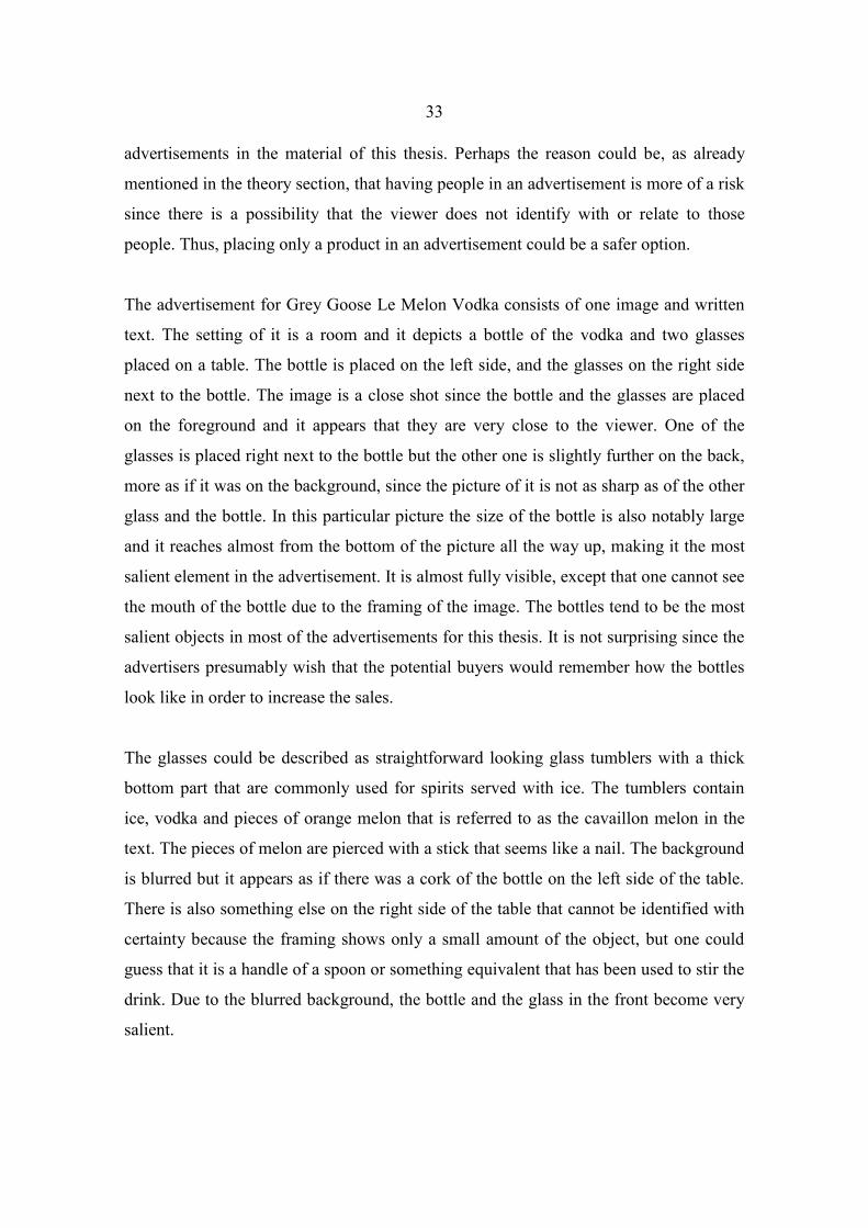
33
advertisements in the material of this thesis. Perhaps the reason could be, as already
mentioned in the theory section, that having people in an advertisement is more of a risk
since there is a possibility that the viewer does not identify with or relate to those
people. Thus, placing only a product in an advertisement could be a safer option.
The advertisement for Grey Goose Le Melon Vodka consists of one image and written
text. The setting of it is a room and it depicts a bottle of the vodka and two glasses
placed on a table. The bottle is placed on the left side, and the glasses on the right side
next to the bottle. The image is a close shot since the bottle and the glasses are placed
on the foreground and it appears that they are very close to the viewer. One of the
glasses is placed right next to the bottle but the other one is slightly further on the back,
more as if it was on the background, since the picture of it is not as sharp as of the other
glass and the bottle. In this particular picture the size of the bottle is also notably large
and it reaches almost from the bottom of the picture all the way up, making it the most
salient element in the advertisement. It is almost fully visible, except that one cannot see
the mouth of the bottle due to the framing of the image. The bottles tend to be the most
salient objects in most of the advertisements for this thesis. It is not surprising since the
advertisers presumably wish that the potential buyers would remember how the bottles
look like in order to increase the sales.
The glasses could be described as straightforward looking glass tumblers with a thick
bottom part that are commonly used for spirits served with ice. The tumblers contain
ice, vodka and pieces of orange melon that is referred to as the cavaillon melon in the
text. The pieces of melon are pierced with a stick that seems like a nail. The background
is blurred but it appears as if there was a cork of the bottle on the left side of the table.
There is also something else on the right side of the table that cannot be identified with
certainty because the framing shows only a small amount of the object, but one could
guess that it is a handle of a spoon or something equivalent that has been used to stir the
drink. Due to the blurred background, the bottle and the glass in the front become very
salient.

34
On the right side on the top of the image there is the text section. An utterance “fly
beyond” is written in white upper case letters and big font. On the upper part of the
letter ‘o’ there is a white bird that is a symbol of Grey Goose’s brand and thus it
presumably portrays a goose. It is, however, interesting that even though the name of
the brand is ‘grey goose’ the colour of the geese in the advertisement and on the bottle
is white. This same goose occurs on the bottle in the same place on the ‘o’ letter but this
time the location of it is the first ‘o’ on “grey goose”. Under the text “fly beyond” there
is a text “presenting Grey Goose Le Melon” on one line and “the fruit of kings” on
another line in white upper case letters but in a smaller font than the previous utterance.
The last sentences, then, are the smallest ones in size and not written in upper case
letters. They read “The precious Cavaillon melon of France. Exceptionally sweet and so
extraordinarily delicious, kings are said to have traded royal treasure for a taste”. On the
bottom of the page on the left there is a text “sip responsibly” and the Grey Goose web
address.
One thing that should be noted about the bottle is that it does not have a label. Instead,
everything has been printed directly on the surface of the bottle. There is also a larger
goose above the name of the product on it. The glass of the bottle is cloudy except on
the spot where this big goose is portrayed, which makes the encounter of these two
surfaces of the glass form the silhouette of the bird. Thus, there is actually no picture of
the bird or it has not been drawn except for its eye and one curve of its beak. Since this
part of the glass is clear, one is able to see an image that has been printed on the inner
back side of the bottle, portraying slices of cavaillon melon served on a plate and behind
that there is one half of a melon. In the background of these appears to be some sort of a
green landscape and a cloudy sky. In addition to the big goose there is also a flock of
geese next to it on the bottle and on the capsule of the bottle.
The advertisement evidently represents the category of exquisiteness. First of all their
slogan “fly beyond” already signals a certain superiority by suggesting that by drinking
Grey Goose Le Melon Vodka you will be flying beyond others. This slogan refers to the
high quality of the product and the aim of it is to persuade the viewer to think that the
properties of the quality and superiority transfer to him/her as well if consuming the

35
product. The rest of the text also supports the beverage’s exquisiteness by claiming that
the vodka is flavoured with Cavaillon melon that has an astonishingly delicious taste.
The fruit is described as such high quality melon that it is called the fruit of kings and
that kings were willing to trade royal treasure for a taste of it. These are all very
laudatory words and descriptions of the melon that flavours the product; hence the
viewer is made to think that the product has to be as fine and desirable, too. There are
drops of water on the surface of the bottle, so it appears to be ‘sweating’. This is also a
matter that affects the allurement of it since it communicates that the beverage is cooled.
This makes the viewer imagine what the drink would taste like when served in this
temperature which is the ideal temperature for it.
What adds even more attractiveness to the advertisement is that since the product is
French, the melon is called Cavaillon melon. This creates exotic connotations and
makes the product appear desirable and special even though apparently Cavaillon melon
and Cantaloupe melon are basically the same fruit. This particular melon might only be
called a Cavaillon if it comes from France. This is the same situation as with
champagne or cognac, since they both have to be produced in certain areas in France
and made according to a certain method of certain ingredients in order to be entitled to
be called these. France is commonly connected to delicious and high quality food and
drink culture that appeals to many people, so this product might appear especially
tempting to people who value this country and its culture. In addition to mentioning the
country of origin on the bottle, Frenchness is also highlighted with including the French
flag on it in a cropped form.
This brand utilises geese as the symbol of it to a great extent both verbally and visually.
The connotation of these birds appears to be freedom and the ability to fly, which makes
the viewer connect the vodka with being free and able to do what one wants. Drinking
the vodka apparently also makes the drinker “fly beyond” which creates connotations of
not being equivalent or on the same level with others but somehow above or ahead of
them. The colours of the image are consistent with the colours of the bottle. The colour
of the writing is white which matches with the colour of the geese. It creates
connotations of purity and freshness. The background of the image is not single-

36
coloured. It seems to be a room that has lighter and darker spots due to the amount of
natural light reflecting on different parts of it. The overall appearance, however, seems a
warm orange that is similar to the colour of the melon in the glasses and on the bottle.
The part “le melon” on the bottle has also been printed in orange. This colour seems
appealing and pleasant to the eye and reminds of honey which is also very sweet like
the melon is said to be.
The pieces of the melon in the glasses still have some of the green peel on them in a
similar way to the pieces in the picture on the bottle. This green matches with the colour
of the landscape on the bottle. Green is presumably used in order to make the viewer
think of nature and freshness. The table in the image is black which matches with the
text on the bottle, and is usually connected to elegance and style. The lighting of the
advertisement is pleasant because it is warm-toned and not too bright. It appears that
there is a window at the back of the room and a chandelier hanging from the ceiling
where a brighter light is coming from. The bottle and the glass on the front are naturally
well-lit because of their importance.
As mentioned in the theory chapter, images can be divided into “demands” and “offers”
on the grounds of whether they speak to the viewer directly or indirectly. This
advertisement is a demand image because of the utterance “fly beyond”. This slogan
attempts to influence the viewer by its imperative mood that sounds appealing. Of
course all of the alcohol advertisements that contain the warning text saying “drink
responsibly” could be regarded as demand advertisements but since this text is an
obligatory part of all of them, it is not included in the features that define in which one
of these two groups an advertisement belongs in this thesis.
Since this beverage is marketed at men in a men’s magazine, one could assume that it is
regarded as a masculine drink. This is not, however, that simple since it is presumably a
little sweet and tastes like Cavaillon melon. These are known to be the qualities
connected to feminine drinks, but on the contrary it is also a strong alcoholic beverage
containing 40 percent alcohol by volume. Strong beverages tend to be perceived as
masculine. Even though a product is advertised in a men’s magazine, it is not said that it

37
should necessarily be consumed by the man who sees the advertisement.
Advertisements can also be placed in the magazines in order to suggest that some
product could be for instance a good present for someone else. This shows in the
material for this thesis, since in the magazines that were published in or for December,
the amount of the alcohol advertisements peaked. This suggests that alcoholic beverages
are also perceived as potential Christmas presents.
In the issue of September of 2014 of Men’s Health, there is an advertisement for an
American red wine Markham Vineyards Merlot (appendix 2.) that is also a
representative of the exquisiteness category. The advertisement basically consists of two
layers. The bottom layer is white and on it there is a logo of Terlato Wines, which is the
marketer of this wine, with the words ‘Terlato’ on the left side of the logo and ‘Wines’
on the right side of it. Under this there is a phrase “always exceptional”, which
communicates that Terlato Wines only markets exceptional wines, such as the wine in
question. On the upper part of the left side there are five words printed vertically and
separated by dash lines. From top to bottom these read “winemaker”, “reds”, “whites”,
“winery” and “vineyards”. They could be seen as interleaves of the brand; different
things connected to their products and wine production. It could be concluded that this
same list of their features is used in their other advertisements as well because now that
it concerns one of their red wines the word “reds” has been highlighted with a burgundy
red colour while the others attract no additional attention.
The uppermost layer seems to be some kind of old and to some extent darkened
notepaper that is used when writing letters. The colour of the paper sheet is light brown
or beige which creates connotations of it being old. There is a bottle of the wine
depicted in the centre of it. The image of the bottle is large, taking almost all of the
vertical space in the middle of the page. The image of it is a close shot making it the
most salient object in the advertisement. On the right upper corner there are four
horizontal lines that could also signal that the paper is a paper for writing letters since
they might have lines for the name and address of the receiver like this paper does.
These lines contain writing that states “The anatomy of a superb merlot” with the words
anatomy, superb and merlot written in uppercase letters. This statement highlights the

38
exquisiteness of the red wine by using the word superb to describe its excellence. This
is a rather laudatory adjective and the connotations of it communicate that it is notably
better than other Merlot wines and it also makes the wine appear completely superior.
As for the word ‘anatomy’, it makes the viewer connect the advertisement with the
medical concept of anatomy. Here that concept has been applied for presenting the
structure of the wine by using a similar kind of way of demonstrating its anatomy that is
commonly used in school books for biology when illustrating the structure of a human
body. Under this it says “sleek and well-focused, with rich flavours of cherry, espresso
and mocha”. This gives the viewer an image of what the wine is like in a manner that is
typical for a professional describing of wines. On the left upper corner of the
advertisement there is a faded-looking stamp of the Markham Vineyards that goes over
both of the layers. The use of the stamp is likely to arouse feelings of professionalism
and reliability, since they are usually used by authoritative officials. Around the image
of the bottle there are different facts about the wine and its production to show its
anatomy and to support the claim of its ‘superbness’. These are numbered from one to
five and each of them points at something on the label or bottle with an arrow. The
names of them are written in uppercase letters and under the names short explanations
are given about the facts.
Number one is named “quality heritage” and it states “crafting exceptional wines for
over 130 years” while the arrow points at the name of the wine on the label. This is a
way of emphasising the exceptionality and high quality of the product and the long
traditions in their winemaking. Crafting also communicates that the wine has been made
carefully in small badges, similar to the way in which the Ketel One vodka
advertisement (appendix 8.), that will be analysed in the tradition chapter, promotes the
product in question. The second section goes by the name “premium vineyard location”
and the elaborative text says “a true blend of vineyards from Napa Valley’s best
growing regions” and the arrow points at the label where the region Napa Valley stands.
This emphasises the area where the grapes are grown. When marketing wines this is an
issue that matters since different regions produce different wines and some consumers
might purchase wines merely on the grounds of where they come from. Complimentary

39
expressions such as ‘premium’ and ‘best growing’ add exquisiteness and highlight the
fact that the wine has been made with consideration and careful combining of different
elements. Blending of grapes from different vineyards and even blending different
vintages of wine are done to improve the taste and to avoid vintages tasting remarkably
different from each other.
The third point is “outstanding ratings” that is explained by telling that “knowledge and
experience combine with consistent quality to produce award-winning wines year after
year”. Here the arrow indicates a badge that has been placed over the image of the bottle
saying that the wine is a “smart buy” and that in 2008 it has scored 91 points out of 100
by Wine Spectator. Wine Spectator is a magazine that focuses on wine and food and
gives wine ratings. These kinds of expert sources are usually trusted which makes the
wine appear more appealing and brings more value to the exquisiteness of the product.
It does not even appear to be an impediment of using the score that it has been achieved
six years prior to the advertisement. This is interesting since when it comes to wines the
vintages of the product change and might differ from each other greatly. Thus, the
review given six years before this advertisement might not be current or right anymore.
When considering the title “outstanding ratings” after these observations also gets one
to contemplate whether the product has gained any more recent awards or reviews. Does
it only refer to this review in question and older ones, since the plural in “ratings” and
the part “award-winning wines year after year” give the impression of many positive
accomplishments? The 91 points from Wine Spectator might be the best merit that the
wine has reached, which could be the reason for using it. “Knowledge”, “experience”
and “consistent quality” refer to expertise and skilfulness in the production of the wine.
The fourth point reads “trusted varietals” and under that “hand-selected grapes from
diverse microclimates to achieve balanced and rich wines”. In this section the arrow
points at the word ‘merlot’ on the label. One sign of a high-quality wine is always if the
grapes have been picked by hand. Compared to machine-picking this enables the better
observation and control of which grapes end up in the wine-making process and thus
only the best ones are picked which naturally has an effect on the outcome. This
together with the “trusted varietals” makes the product appear trustworthy because the

40
viewer gets the impression that he/she will not be disappointed if purchasing the bottle.
The part “grapes from diverse microclimates” is similar to some extent with part
number two by referring to the location of the vineyards and blending the grapes.
Climate also greatly affects the nature and character of wines, such as the acidity and
sweetness in them, so referring to microclimates the advertisement perhaps indicates
that this wine combines the best grapes of different microclimates. Finally, referring to
their wines as “balanced and rich” certainly affects the image of the product.
The fifth part is named “established 1879” and it is elaborated on stating “the stone
cellar, a historic landmark built by Bordeaux native, Jean Laurent, is now the heart of
the present day winery”. This has been linked with the logo of the Markham Vineyards
on the label of the bottle. The logo consists of a golden capital letter ‘M‘on a burgundy
red background with a golden outlining on the edges and the text “established 1879”.
The fifth point, again, refers to the long tradition and heritage of the Markham
Vineyards. In addition to this it tells about the stone cellar in the winery and uses the
expressions “a historic landmark” and “the heart of the present day winery” to
emphasise its significance. These really make the cellar sound like a remarkable
construction, maybe even an equivalent to a tourist attraction. Calling the cellar “the
heart” of the winery creates connotations of a warm and important place. This section
also mentions the builder of the cellar to be a “Bordeaux native” in order to add value to
the winery because France is an appreciated and old wine producer country and
Bordeaux is one of its most well-known wine regions. This suggests that the builder has
brought some of the French, professional and traditional, style to the cellar which
affects the image of the winery and brand in a positive way.
The colours of this advertisement are similar in style with the Josh Cabernet Sauvignon
advertisement (appendix 7) that will be analysed in the tradition chapter. They both
contain an old looking light brown paper sheet as a background. The purpose of the use
of the paper seems to be to signal a spirit of ‘good old times’ and tradition. These kinds
of connotations give the viewer an impression of a trustworthy brand with great
amounts of experience. The advertisements also make use of the burgundy red colour
because it is also the colour of the product in question. The Josh wine advertisement

41
utilises the colour to a great extent whereas the equivalent of the Markham Merlot uses
burgundy more sparingly. In this advertisement the burgundy colour can be seen on the
capsule which is the metal wrapping around the closure on the neck of the bottle and as
the colour of the word ‘merlot’, which is a grape variety, on the label. The same colour
can also be seen in the stripes of the logo of Terlato Wines, as the colour of highlighting
the word ‘red’ in the left side of the page, on the logo of Markham Vineyards and as the
background colour of the Wine Spectator badge. Gold has been used as a decorative
colour on the label and on the capsule, and white is a background colour for the whole
advertisement and the label of the bottle. Black, then, seems to be the main colour of the
written texts. The logo of Terlato Wines is the only object in the advertisement that
differs from the rest of the colours used, since it contains yellow and blue as well.
This advertisement differs from the Grey Goose Le Melon Vodka advertisement in that
this is an offer image. It is not communicating directly with the viewer but makes it in
an indirect way. This means that it does not speak to or address the viewer directly. It
only describes the wine in different ways and makes the viewer an onlooker who can
safely familiarise himself/herself with the advertisement in peace. What is common for
these two advertisements is that they both depict only material objects instead of people.
They both utilise image and written text but it is the text that expresses their
exquisiteness the most and the image acts as a supporting element. When considering
the Grey Goose advertisement, it appears quite clear that it represents exquisiteness. The
Markham advertisement, then, also highlights tradition but the dominant theme in the
advertisement still is exquisiteness. In this case the representations of tradition are used
to support the impressions of exquisiteness in it.
3.2 Lifestyle
In this chapter two representatives of the advertisements that belong to the lifestyle
category are analysed. The advertisements that can be put in this category represent
alcoholic beverages in a manner that emphasises a certain lifestyle and connects the

42
products to it. The most common representations in the material are an active, sporty
lifestyle and a lifestyle that communicates success or a luxurious way of living.
An advertisement for the American Michelob Ultra Light Beer (appendix 3.) appears in
GQ magazine’s issue of December of 2014. It consists of the image of the product and
two other images of different situations next to it. These images portray scenes of
downhill skiing somewhere in the mountains. On the uppermost picture there is the
slogan of Ultra Beer that says “superior light beer” and in between the words “light”
and “beer” there is a red symbol of the brand that could be described as a piece of a
ribbon. The text is written in white upper case letters and the word “superior” is also in
a bold font and underlined. In the picture there are four people doing downhill skiing
on a sunny winter day. They have been depicted from a public distance since they are
wholly visible and there is also space around them. From this distance the viewer cannot
even tell with certainty whether a person in the image is a man or a woman. The two
skiers who are closest to the viewer appear to be wearing dark coloured trousers. One
wears a yellow jacket and the other one a red jacket or shirt and a light blue quilted vest.
It can only be concluded that the other two further back appear to be wearing dark
coloured skiing clothes.
In the image below there is a man and a woman both holding a bottle of Michelob Ultra
Light Beer in their hands. This is presumably an after-ski picture where they are shown
to relax after downhill skiing. The framing has been done in a way that it portrays the
couple only from the waist height up and excludes the tops of their heads. This means
that the distance is a far personal distance. The nonverbal communication in this picture
signals that the couple are feeling comfortable in each other’s company. They are both
smiling and they are close to each other. They are also looking into each other’s
direction to some extent. The viewer gets the impression that they have just been talking
or joking about something that makes them laugh. The fact that they are depicted being
in a positive mood communicates that the beer is also pleasant to them. The nonverbal
communication of the people in the upper picture signals that they are downhill skiing
with their knees slightly bent. The fact that they are skiing quite close to each other as a
group might communicate that they know each other. The age of the people in the upper

43
image cannot be concluded with certainty, but it is likely that they are of the same age
as the couple in the lower image, which is presumably in their thirties or forties.
The woman is wearing a warm looking light blue shirt or jacket, a darker blue quilted
vest and a red knit cap. The man is wearing a dark sweater or jacket and a dark coloured
knit cap. Although not much of the background is visible to the viewer and it is made to
appear blurry, one can conclude that there seems to be two tents and a pile of snow in
front of them. There are two bottles of Michelob Ultra Light Beer stuck in the snow to
cool and presumably also some skiing equipment next to the bottles. In the foreground
of the right side of the advertisement there is a picture of the bottle and below it a
written text “drink responsibly”. On the bottom of the advertisement on the right side
there is also a reference to their Facebook page where the viewer can “explore more” as
the text suggests.
This advertisement belongs first and foremost to the lifestyle category, but it also
contains features signalling exquisiteness and relationship. The advertisement promotes
a certain lifestyle. It comes across very sporty which speaks for an energetic and active
lifestyle. It is placed outdoors and physical activity and sports are the main themes in it.
In the advertisement this kind of lifestyle is connected to the product, the Michelob
Ultra Light Beer, and this is quite coherent if we consider it. The product is a light beer
which sets it apart from other “ordinary” beers. On the label of the bottle it says that this
beer contains only 2,6 grams of carbohydrates, 95 calories and 4,2 percent of alcohol. In
other words it is a healthier beer option and this is why it is marketed to people who
lead a healthy and active life. Sometimes in alcohol advertisements alcohol is connected
to people who are watching sports but in this advertisement people are taking part in
doing sports. The advertisement signals that it is acceptable to drink this beer even
though one is living in a healthy and athletic way.
In this advertisement beer is depicted as a drink of both men and women, and not
stereotypically as a masculine drink only. Perhaps it affects this depiction that the beer
is a light beer, so it can be regarded as a feminine beverage as well. As mentioned
earlier, in addition to the representations of a certain lifestyle, the advertisement also

44
contains other representations. The exquisiteness of the product comes across in the
sentence “superior light beer” which emphasises the superiority of it. Through this
statement the purpose is to say that the qualities of this beer are of high class and that it
is better than the competing brands. The advertisement also represents relationships. In
the upper image it portrays a group of friends downhill skiing and in the lower one there
is a couple enjoying the beer and socialising. Thus, this product is also connected to a
social lifestyle. The relationship of the couple could be a relation between friends or
lovers. This way the advertisement aims at creating positive connotations of friendship
or love that might be attained when consuming Ultra Beer.
The most salient elements in the advertisement are the image of the bottle, the couple
and the Ultra Beer slogan. The bottle is placed on the right side and since it is on the
foreground it overlaps with the two other images. The picture is sharp, well lit and the
bottle is represented in a large size. What makes it even more appealing is the fact that it
is “sweating” which means that there are droplets of water all over it. This gives the
viewer an idea of a bottle that has just been taken out from the refrigerator into the room
temperature causing this effect. The text that says “superior light beer” is also a very
eye-catching element, since it is written in a big font, upper case letters, and because it
has been placed on the centre of the upper image. The fact that the word “superior” is
also written in bold typing and that it is underlined makes it stand out even more.
Another salient element in the advertisement is the picture of the woman and the man.
This is because they are at the foreground of the picture and the image is a fairly close
shot. The people in the upper picture are not as salient as these since they appear to be
further from the viewer, and their faces, for instance, cannot be distinguished. All the
people in the advertisement function as unknown endorsers who are depicted as
consumers of the product. They represent the people whose lifestyle Ultra Beer belongs
to.
The colours of the advertisement seem to be in coherence with the colours of the
product. On the bottle there is mostly blue and white which is the case also in the rest of
the advertisement. It is as if the blue sky and the white snow were represented on the
label of the bottle as well. Here white creates connotations of lightness, purity and

45
perhaps healthiness. Blue can be connected to freshness and superiority. This could be
something that the designer of this bottle had in mind since the statement “superior light
beer” is on blue background while the reference to the low amount of carbohydrates,
calories and alcohol is written on white background. It also appears that the woman’s
red knit cap and the red jacket of one of the skiers are not a coincidence but they match
the red symbol that has been placed on the bottle and among the text “superior light
beer”. Two of the people are also wearing blue that matches the bottle. The colours of
the advertisement create connotations of freshness and purity which has an impact on
the perceptions of the viewer.
This advertisement is an offer since it does not address the viewer directly in the image
or in the text on the image. There are only the phrases “enjoy responsibly”, which
cannot really be included in the demands, and a text that advises to “explore more” on
their Facebook page. This, then, is a more complicated case and it in a way does make
the advertisement a demand type on its part. However, since it has been placed in the
lowest corner of the advertisement in a small font, it does not seem to be enough to
make the advertisement into a demand.
A Hennessy very special cognac advertisement (appendix 4.) is also an example of the
lifestyle category. This advertisement for the French liquor appears in GQ’s issue of
November of 2014. It consists of a one page image with written text and an image of the
bottle placed in the foreground of the right bottom corner. The setting of this
advertisement is a beach. The most central elements have been placed on the sand and
there is water, presumably a sea, behind them and a foggy horizon. This particular
advertisement differs from the rest of the material for this thesis by utilising a celebrity
endorser, an American hip-hop artist Nas. The fact that this is the only advertisement of
such kind could suggest that famous endorsers are not that common in alcohol
advertising targeted at men or alcohol advertising in general. This is an interesting
observation since according to Martín-Santana and Beerli-Palacio (2013) the use of
celebrities to endorse a brand is usually a common practice in the field of advertising. It
has also been noted to be prevalent in women’s magazines. (Martín-Santana & Beerli-
Palacio 2013: 139–140) The use of Nas as an endorser is an attempt to link him to the

46
cognac and to get the viewer to make the same connection. The result is that Hennessy
V.S appears more glamorous since it is suggested to be consumed by a well-known
artist. Even though he does not consume it in the advertisement the viewer assumes that
he does so in the real world, outside the advertisement. Thus, he stands behind the brand
and the product because he has agreed on appearing in it. One of the aims of this is
making the viewer think that if he/she drinks the cognac the lifestyle and qualities of
Nas become available for him/her as well.
In addition to Nas, who is depicted in the image, the advertisement also uses another
famous person but in a different way. The story of Malcolm Campbell, who was a well-
known British race driver in the 20th
century, is the most important theme for the
advertisement. According to hennessy.com (2013), Campbell was “the greatest land
speed record chaser of all time, and the first human to break 300 mph” and he used to be
known as the fastest man on earth. Campbell is not, however, portrayed in the picture
but there are other elements that form a link between him and the advertisement.
First of all, there is a racing car on the left side that, according to Hennessy’s webpage
(2013), is a replica of Campbell’s famous car called “Bluebird”. There is a written text
on the right upper corner that reads “Malcolm Campbell didn’t race for cash or fame.
He just wanted to go faster. To go beyond my dreams, like he did. That’s my Wild
Rabbit.” Under this in upper case letters it says “Nas” and “What’s your wild rabbit?”
The advertisement also connects Nas and Malcolm Campbell by speaking about
Campbell in Nas’s voice. Nas also expresses that he has the same attitude towards life
as Campbell had because he as well pursues his dreams and wants to surpass himself.
In the image Nas is depicted standing on the beach casually with his hands in his
pockets. His posture signals an attitude that is confident and relaxed. The racing car has
been placed on the left side of the image and he is looking at it. He is dressed in a fine
way, wearing a dress shirt, black suit trousers, black leather shoes and a watch on his
left wrist. The uppermost button of his shirt is also not buttoned which creates
connotations of casualness. Nas has been depicted from a far social distance which
means that his whole figure is visible and there is also space around him. This means

47
that the advertisement does not aim at making him appear too close to the viewer. His
figure and the figure of the race car do, however, appear to be the most salient elements
in the advertisement because they are the largest elements in it. On the left side of the
Hennessy cognac bottle there is a text “Never stop. Never settle.” and on a slightly
smaller font “Since 1765”. The mottos of Nas and Malcolm Campbell, of course,
support this slogan of Hennessy. Mentioning the year when Hennessy’s production and
history began brings the aspect of tradition into the advertisement to highlight
experience and expertise. Since all these arguments exist in the advertisement it
suggests that Hennessy is connected to this kind of lifestyle and perhaps even enables or
at least supports it. It gives the viewer an impression of him/her being able to reach this
kind of a lifestyle by drinking the cognac.
In the left bottom corner it says “Learn more about Malcolm Campbell at
Hennessy.com”. On their website there is more information about him and the
advertising campaign has also covered video commercials with the same story. The
picture of the bottle is fully coloured, but in all other parts the advertisement is a black
and white one. It is also worth noting that the Hennessy bottle is surprisingly small
when comparing it with the other bottles in the advertisements in the material of this
thesis. The only thing that increases its salience is that it is placed on the other image as
an additional layer and depicted in full colours whereas the rest of the advertisement is
in black and white. The advertisement wishes to create connotations of a lifestyle that is
unyielding, glamorous and exciting. The sea in the background is heaving which could
symbol that it is also unsettled or restless and in constant movement in a similar way
that Nas and Campbell have been described to be. As for the foggy horizon, it creates
connotations of something unknown in the future. The nose of the race car has been
headed towards the sea which indicates that it is ready to drive into the fog and into the
future towards new challenges and dreams.
This advertisement also appears to be targeted at men only. First of all cognac is
considered a masculine beverage since it is a strong drink that also tastes strong.
Featuring two men and connecting the product with them also gives the male viewers
something to identify themselves with. The lifestyle that the advertisement promotes is

48
also traditionally regarded as masculine since hard work is connected to it rather than to
femininity. Race driving is also connected to masculine culture and the car in the image
is supposedly depicted in it to attract men’s attention. The advertisement, however,
seems to be distancing Nas and the race car from the viewer since they are not portrayed
that close. The reason for this might be that the advertiser wishes to make these subjects
appear harder to attain and perhaps through this also more interesting and desirable.
The advertisement can be classified as a demand because it contacts the viewer directly
by asking “what’s your wild rabbit”. This way the viewer gets the feeling that he/she is
expected to react. It invites the viewer into a dialogue with Nas. The slogan “Never
stop. Never settle” also demands or suggests the viewer to act in a certain way. There is
also the text that tells the viewer to learn more about Malcolm Campbell at their web
site.
3.3 Relationship
The category of relationship contains advertisements in which relations and social
interactions between people are in a dominant role. This impression of a relationship
can be created between people in the advertisements or between them and the viewer.
Usually advertisements that belong to this category represent relations between lovers
or friends. The following two advertisements are examples of representatives of this
category.
An advertisement for Santa Margherita Prosecco (appendix 5.), which is an Italian
sparkling wine, appears in Men’s Health’s issue of December of 2014. The
advertisement consists of two images. The uppermost image portrays a situation where
the sparkling wine is consumed, whereas the lower one is a picture of the product itself.
The upper image depicts a situation where a man is standing in front of a house where a
celebratory occasion takes place. The door is open and there is a woman leaning against
the doorframe, holding a glass of sparkling wine, supposedly Santa Margherita
Prosecco, in her hands. Since the woman is the one who has opened the door for the

49
man we can assume that she is the hostess, and the house where the occasion takes place
is hers.
The viewer is allowed to have a look inside the house through the open door. One man
and two women can be seen, but the image suggests that there are also other people
inside, since one of the women is discussing with someone who cannot be seen from
this angle, while the other woman and the man are engaged in a conversation with each
other. The people inside also seem to be holding glasses in their hands, which can
additionally be concluded from the position of their hands. The age of all of the people
cannot be indicated with certainty since the man arriving is not facing the viewer and
the image is slightly blurry on the background where the other people stand. However,
the hostess appears to be in her thirties or forties and since it looks like the man has
some grey in his hair, he might also be described to be in his forties or middle-aged. The
fact that especially advertising images are commonly processed also makes it more
difficult for the viewer to conclude the ages of subjects in them.
The occasion appears to be quite fancy and festive, which can be concluded from the
clothing of the people in the advertisement. The woman on the door is wearing an
expensive looking glittery gown and jewellery, the man is wearing a black jacket and a
white scarf and all the guests inside are also dressed in a fancy way. One of the women
is wearing a red/burgundy dress and the other one a darker dress the colour of which
cannot be defined with certainty, and the man is wearing a light coloured dress shirt.
The man entering is portrayed from behind so the viewer is able to see that he is holding
a bottle of Santa Margherita Prosecco in his left hand behind his back. There is a
red/burgundy ribbon tied around the bottle which suggests that it is a present for the
hostess.
The occasion is presumably connected to Christmas season since there is snow and
candle lanterns on the ground and a Christmas garland with Christmas lights hanging
over the entrance. Note that the issue in which this advertisement appears is December,
which shows that the season or occasion of publishing an advertisement also has to be
taken into consideration. Anticipating consumers’ needs is central in advertising. In

50
front of the door there is a carpet that also functions as a welcoming element and in that
way affects to the overall atmosphere. There is a written text “the moment perfected” in
the image next to the woman at the door. Beneath this image and in the foreground of
the advertisement there is a picture of a bottle of Santa Margherita Prosecco, the brand
name and the producer’s name on a light background. The ribbon around the bottle in
the upper image is of the same colour as the brand name that has been written next to
the bottle and on the bottle in the lower image. One of the women inside the house is
also wearing a dress that is of the same colour. This way the ribbon and the dress match
the colour that is related to the brand, creating coherence. This particular red or perhaps
burgundy colour could be said to create a warm, elegant and romantic atmosphere and
associations.
This advertisement represents mostly the category of relationship by depicting a social
situation where people encounter and spend time together. The relationship between the
man and the woman in the foreground is not explicitly expressed but some nonverbal
cues indicate that they have a close relationship. The woman is smiling and looking at
him, and even though the viewer cannot see the man’s whole face, he seems to be
looking at her and smiling as well. The woman’s posture is also a significant indicator
of her attitude towards the man since she is facing him and her body is turned to his
direction, she is leaning against the doorframe with her left shoulder, her left knee is
slightly bent and her hip is pushed to the right. The nonverbal communication of the
people inside the house implies that they know each other and feel comfortable in each
other’s company. First of all they appear to be looking at each other, smiling and
chatting. Their spatial behaviour also signals closeness since they are close to one
another, facing and their bodies turned towards the person they are discussing with. All
this can be concluded by looking at the other fully visible couple inside. There is also
another woman inside but since the person she is talking to cannot be seen, their
relationship cannot be analysed in the same way. The fact that the visible couple and the
other woman next to them talking to someone else are so close to each other, could
signal that there are quite many people inside the house so that they have less room.

51
The advertisement also bespeaks exquisiteness to some extent. It suggests that Santa
Margherita Prosecco is a beverage that one can serve at a sophisticated and fancy
occasion and that it is also a suitable gift for a guest to bring. This highlights the quality
of the product by connecting it to elegant celebration. The text “the moment perfected”
also creates a connotation of this sparkling wine turning a nice occasion perfect with its
exquisite qualities. The advertisement also signals a certain high-class lifestyle that
includes fine occasions of fine people. These people drink exquisite sparkling wine,
dress up flamboyantly and live in nice houses.
The hostess of the occasion is clearly the main character in the image. She is facing the
viewer and her whole figure is visible. In other words she is one of the most salient
elements in the image. The amount of light is just right in order to drag the viewer’s
attention to her. She is also wearing a light coloured gown that sparkles, which makes
her more noticeable. The man arriving is portrayed from the behind and we can only see
his back, the back of his head and a part of his right cheek, arms and left hand holding
the bottle. This suggests that his identity in the advertisement is not that important since
we cannot even see his face. Although the figure of the man is quite dark due to his
clothes and the lighting, his hand behind his back and the bottle he is holding are well
lit. The lighting in this case is very important since the bottle needs to be seen by the
viewer even though the man is standing in a darker spot in the picture. Even though the
man’s identity is not in a key role, he is depicted from a far personal distance which is
closer than the other people in the image. They can be seen in a way that signals public
distance. The man arriving is also a salient character in the advertisement and related to
the information value of the advertisement since he appears in the foreground of the
upper image. He is also the largest subject in size in the picture due to where he has
been placed.
The guests inside are at the background of the image, and the background is slightly
blurred and not so sharp so we cannot see their faces properly. This suggests that their
roles in the advertisement are not that important. The bottle depicted in the foreground
also plays a central role and is very salient since it is placed in the very front of the
picture and the image of it is very clear, highlighted and sharp. The background is light

52
coloured which makes the bottle truly stand out. The bottle also overlaps the image to
some extent, which emphasises its meaning even more.
In the advertisement alcohol is connected to celebration and societal situations. As the
written text in the image suggests, this Prosecco ‘perfects’ the moment. The beverage is
of such a high quality that it turns even the fanciest occasions fancier, in fact perfect, as
the caption reads. Sparkling wine is commonly connected to celebration and high-class
lifestyle, and this advertisement reinforces that image. The viewer is made to think of
this Prosecco as a product that could turn his/her occasions as fine and perfect as in the
image in the advertisement. The atmosphere in the image is warm and inviting since the
lighting and colours are not too bright. The house also looks appealing even though
there is not much of it visible. There is a warm welcoming light, the house looks stylish
and the guests appear to be enjoying themselves. The outside of the house also appeals
to the viewer with all the decorations.
This advertisement is an offer instead of a demand. It does not in any way contact the
viewer or address him/her directly. The people depicted in it do not either make any
contact with him/her. The advertisement only indirectly indicates that the product is
worth buying and consuming, giving the viewer a role of an onlooker.
Another advertisement that belongs to the category of relationship is for the Polish
Chopin vodka (appendix 6.). This advertisement appears in GQ’s issue of December
2014. It includes an image of a scene that takes place at a nightclub, an image of the
bottle and written text. The nightclub picture is the largest element and takes over fifty
percent of the advertisement’s space. There is a young woman estimatedly in her
twenties or thirties in the middle of the image, holding a cocktail in her hands. She is
surrounded by men and one woman who are all staring at their phones in their hands.
The woman is depicted from a far personal distance since one can see her approximately
from the waist up.
Under the image there is a text “Do you want to be the guy looking at his phone or into
her eyes?” with the part “or into her eyes” written on bold typing and also on bigger

53
font to create salience. This communicates that it is intended to be the most important
part of the advertisement. There is also a picture of the bottle and under that it reads
“Life’s fast. Sip slowly”. The bottle has been placed horizontally in the ad, so it lies on
its side instead of standing vertically which is the common way of depicting bottles in
the material. The writing on the bottle that says “Chopin Potato Vodka” is vertical so
when it has been portrayed horizontally the viewer is able to read the text more
effortlessly. The designer of the bottle has presumably decided on this type of layout
since it enables the use of more space for the brand or product name which creates more
salience (cf. the advertisement for Ketel One vodka, appendix 8.). It has also been
mentioned on the bottle that the product is Polish.
The most salient element in the advertisement is the woman. She is facing the viewer
and looking straight at him/her. The lighting also gives the viewer an unrestricted view
of her whereas other people in the image appear to be in the shadows, with only the
screens of their phones slightly lighting their faces. The one woman in the background
has been portrayed in a different way, and instead of her face, one can only see a part of
her legs and arms and that she is wearing a short dress or skirt. This kind of
segmentation of the human body is also a tool that in a way objectifies it by not showing
it as a whole but only parts of it, signalling that a person is seen as an outcome of
different body parts. In this advertisement the intentional framing has led to this kind of
angle of view.
The fact that the woman is shown this way wearing a short skirt or a dress, adds sexual
appeal to the advertisement. She is depicted sitting, unlike the men, and also holding a
phone in her hand. Sitting in this case could signal passiveness whereas standing signals
activity. The activity levels of these people are presumably not that high since they are
staring at their phones, but sitting could still signal that the person is not actively
looking for social interacting unlike it could be when standing. These characters
surrounding the main character have been blurred and thus they could be described only
as figures of people, which decreases their salience. The text also draws attention to the
most salient woman by asking the viewer whether he wants to stare at his phone or look
into her eyes. This advertisement is clearly aimed at men only, not just because it

54
appears in a men’s magazine and depicts an inviting woman but also because it
addresses the viewer as a ‘guy’.
The colours of the image are fairly dark which results mostly from the location of the
scene. In addition to the setting being dim the woman is wearing a black dress and her
hair is also dark. The people around her also appear to be wearing dark-coloured
clothing. The advertisement clearly combines the colours of the vodka bottle that are
black text on a white background. The bottle has been depicted against a white
background and all the text on it has been written in black font. The bottle appears to be
quite elegant and simplified, and the rest of the advertisement follows this style. Black
and white are regarded as stylish colours and in clothing especially black is viewed as
such a colour. The image is not, however, stylish in a traditional, classic way but
contains some modern, perhaps even ‘rock style’, audaciousness.
The woman’s dress exposes a large area of her cleavage which adds another sexual
factor to the image. She is also wearing a substantial amount of bracelets and at least
one of them appears to have metallic spikes on it. There is also a black ring on her right
index finger and she wears several black necklaces. She seems to be standing or
walking towards the viewer. The nonverbal communication of her face is quite subtle
and perhaps slightly mysterious since she is not really smiling but her facial expression
still makes her appear approachable. The main reason is her gaze which is in a way very
piercing. The fact that she is also wearing a skin-revealing dress is a measure of
catching the viewer’s attention and attracting his interest towards her. Dressing this way
creates connotations of confidence. The fact that she is depicted from far personal
distance communicates that her relationship to the viewer is not particularly close, yet.
It aims at making the viewer want to shorten this distance by getting interested in her
and feeling like he should react to the advertisement.
The advertisement is modern also because of the way it depicts people’s behaviour at
the occasion. Everybody else except the woman is occupied looking at their phones
even though nightclubs are regarded as sociable places. This is a typical scene for the
smart phone era we live in. The question “do you want to be the guy looking at his

55
phone or into her eyes” also draws attention to the issue by making the latter option
sound better. “Life’s fast. Sip slowly” also communicates the hectic lifestyle people are
commonly surrounded by in which they should always be contactable and uploading
information and pictures of themselves to social media. This impedes interacting with
others face-to-face, which is the theme that this advertisement utilises.
Since the advertisement is targeted at men it also implicates that Chopin vodka, and
perhaps vodka in general is a drink of men. The woman in the advertisement is having a
cocktail that appears to be a Martini. This could be concluded of the shape of the glass,
the colour of the cocktail and the green olives it is garnished with. Because the product
advertised is vodka, it probably is a vodka Martini. Nevertheless, it is indicated that she
is having a cocktail instead of drinking the vodka as such without any mixers, ice and so
forth. Thus, the stereotypical division of masculine and feminine drinks seems to be
contributed by this particular advertisement as well. What should be noted is that vodka
Martini is known to be the cocktail that the film character James Bond drinks. In this
case it raises a question of vodka Martini being a masculine drink, even though
cocktails in general are not regarded as such. Thus, does the advertisement aim at
creating connotations that signal that the woman is modern and equal when consuming
a masculine drink?
This advertisement is clearly a demand since it speaks directly to the viewer visually
and verbally. One of these ways is the question “do you want to be the guy looking at
his phone or into her eyes?” The text contacts the viewer by addressing him with the
personal pronoun “you” and also calling him a “guy”. The advertisement also poses a
question to the viewer and thus expects him to react. In addition, the woman is depicted
in a way that makes her appear as if trying to communicate with the viewer. She is not
interacting with anyone in the picture but looks directly at the viewer, presumably
waiting for his reaction. Hence, the advertiser aims at creating a connection between the
product and the woman, signalling that drinking this vodka enables the interaction
between the viewer and her, or women in general. This is the reason why the woman is
the most salient element in the advertisement. The fact that she is portrayed being alone
and not with friends, or at least that is not highlighted in the ad, also signals that she

56
might be looking for male company. She is standing in a very straight posture holding
the cocktail in her left hand while her right thumb and index finger are holding the
toothpick of her olive garnish suggesting that she might eat an olive. The utterance “sip
slowly” also tells the viewer how he should drink this beverage. This text belongs to the
slogan of Chopin and thus it is a part of the advertisement in a different way than in the
other advertisements. In addition to this utterance there is also the obligatory warning
text on a small font in the lowest corner of the advertisement.
The advertisement utilises the information value by placing the most important elements
in the same line with each other. These consist of the woman, the bottle and the written
text. The prerequisite of the wanted effect of the ad is that the viewer perceives the
woman attractive. This means that if it does not happen the advertisement loses some of
its effect. Thus, this advertisement is an example of the importance of the use of right
kind of endorsers. The woman in this advertisement represents the type of an unknown
endorser who is portrayed as a consumer of the product.
3.4 Tradition
The advertisements that belong to this category represent alcohol in a manner that puts
emphasis on long traditions in the production of a beverage. These advertisements
might contain old images that create nostalgia or they might verbally highlight the
tradition and expertise that the producers have attained. The aim of this type of
advertising is to create trust towards the brand.
An advertisement for the American red wine Josh Cabernet Sauvignon (appendix 7.)
appears in Men’s Health’s issue of December of 2014. It consists of an image and
written text and in the foreground on the right side of the advertisement there is a
picture of the bottle, just like in the Prosecco advertisement (appendix 5.), overlapping
the bigger image. There is an image of a man who appears to be sitting on or leaning
against a bonnet of a car. His position is not entirely clear because of the framing that
leads to his legs not being visible all the way down. This makes the distance of this

57
picture a far personal distance. His right hand seems to be resting on his hip while his
left hand is placed against his upper thigh. His posture comes across quite relaxed and
masculine since he is taking rather much space and his arms are outspread to the sides
so that his elbows are far from each other.
He is wearing a long-sleeved shirt and trousers. The uppermost button of his shirt has
not been buttoned, which also signals that he is relaxed and casual in his style. He also
seems to be wearing a cap of some kind. The image is not that sharp and clear but he
seems to be looking at the viewer and his mouth is slightly open as if there was a slight
smile on his face. The picture is steeped in old times. First of all, it is not an ordinary
modern photograph of the man, but looks as if it could be a processed photograph but
also a drawn picture. It appears to be slightly faded and burgundy coloured. The car is
an old one, probably from the beginning of the 20th
century.
Above the picture there is a written text in upper case letters and big font that reads
“What do you give the man who taught you the value of hard work? A labor of love.”
Under that it says in notably smaller font “My dad always believed in working hard and
following your dream. His name was Josh and he was my hero. I made this wine in his
honor. It’s big and vibrant but always approachable, like him.” Under the text there is
an indication that these are the thoughts of Joseph Carr who is a son and a founder of
the Josh Cellars wine company. Thus, the man in the image is his father, Josh, after
whom he has named the company and the wine. In addition to the upper text being
written in upper case letters, the parts “hard work” and “love” have been written in bold
typing which emphasises them even more. On the left side of the wine bottle it reads
“long live” which together with the name of the wine forms “long live Josh”. There is
also an address to their web page. On the image of the father, there is a text “Josh Carr,
circa 1948” signalling the father’s identity and the year the picture has been taken in.
The background of the advertisement appears like an old paper sheet that is light brown
and has red wine stains on it. There are two burgundy circles, one clear wine spot and
other a bit more blurrier burgundy coloured marks on it that suggest that there has been
a glass or glasses of wine on it and that the wine has been spilled. In addition to these

58
wine marks, all the other colours in the advertisement are burgundy as well. The only
exceptions are the wine bottle in the foreground and the assumed paper sheet in the
background. However, the background also contains some burgundy colour because of
the stains on it. All the writing and the image of the man and the car in the
advertisement are in the same colour. This particular colour has been chosen because it
symbolises the colour of the wine. It also radiates warmth and old times.
This wine advertisement represents first and foremost the category of tradition. The son
Joseph, who is the wine maker, claims that his father has considered working hard and
following ones dreams important and he has also taught his son the same values. Since
his father was Joseph’s hero, he wants to be able to show that he can work hard as well
and thus he has made a wine in his father’s honour. Wine making is not easy so this way
he shows how much his father meant to him and honours his values. He compares the
wine to his father by stating that the wine is big and vibrant but always approachable,
just like his father had been. The picture of his father does support this description as he
is sitting in a manly posture but still looking gentle. Working hard in a goal-oriented
way has traditionally been regarded as a masculine attribute. In this way the
advertisement establishes also a masculine intergenerational relation.
The text “long live Josh” also refers to his father’s memory as continuing to live in the
form of the wine that has been made and named after him, and the making of which has
demanded a great deal of hard work. The fact that the upper text is written in a bigger
font than the lower one, and in upper case letters, and that the parts “hard work” and
“love” have been written in bold typing, creates salience and tells the viewer something
about what the advertisement wants to emphasise. Hard work and love are the key
expressions in this advertisement and they do represent the theme of it quite well. The
most salient elements in this advertisement are the pictures of the father and the wine
bottle, and the text written in upper case letters, especially the expressions written in
bold typing. The bottle truly stands out since it is the only element of different colour
with its bright white label and the lighting is also bright on it. It is also the closest
element to the viewer in addition to the text that draws attention to it because of its size.

59
The father is also eye-catching inasmuch as he is looking at the viewer and facing
him/her with his whole posture, and also since he is in the foreground of the image.
This advertisement is a demand because it speaks to the viewer directly by posing a
question. However, it is not an open question but there is also an answer provided under
it. Regardless of this answer the aim of placing this question in the advertisement is to
attract attention and to make the viewer contemplate on it. The father in the image is
also looking straight at the viewer which increases the feeling of the viewer being in a
communicative situation with the advertisement.
An advertisement for the Dutch Ketel One vodka (appendix 8.) that appears in GQ’s
issue of December 2014 also represents the category of tradition. This advertisement
consists of one picture that covers the whole page and written text that has been placed
over the image. The image depicts a bottle of the vodka and a glass containing vodka
with ice cubes. The image is a close shot of these two and makes them the most salient
elements in the advertisement. They have both been placed on an amplifier. Next to the
glass there is a piece of paper with writing on it. Taking the amplifier into account, the
paper could be a list of songs to be played in a certain order, a ‘set list’, since there are
consecutive numbers in front of each line. On the right side of the bottle there is a text
written on capital letters that reads “Conviction doesn’t take shortcuts.” On the bottom
of the advertisement there is the brand name in a big font making it also a very salient
part of it. Under that it says “Vodka inspired by 300 years of craftsmanship.” and under
that a phrase on capital letters “Gentlemen, this is vodka.” In the right upper corner
there is a partial stamp of the Nolet distillery that produces the vodka.
The advertisement underlines tradition by stating that the vodka is “inspired by 300
years of craftsmanship”. This makes the product appear trustworthy and of a high
quality. The word craftsmanship itself signals expertise and meticulousness. In fact, it
gives the impression that each bottle of the vodka has been made carefully and
individually instead of using an assembly line of a big factory. The text “conviction
doesn’t take shortcuts” also bears connotations of believing in what one is doing, in this
case making vodka, and that it should be made properly by following the same old

60
recipe and not hastening the process. It also signals believing in your own product and
standing behind it. The label of the bottle also sends similar messages by claiming that
the vodka is “inspired by small batch craftsmanship” and under that in a smaller font
“from over 10 generations of family distilling expertise”. The label adds the word
‘family’ into their sales speech, which creates many positive connotations, such as
warmth, trust and safety. All of these phrases emphasising the craftsmanship,
experience and dedication highlight that tradition is the most important mean for this
brand and product in its advertising.
This advertisement is also one that is clearly targeted at men only by addressing the
viewers as ‘gentlemen’. And since the advertisement calls the viewers gentlemen, this
advertisement belongs to the category of demands. It tells these gentlemen viewers that
it is the one and only real vodka that these men should be consuming. Thus, it leaves the
viewer with the feeling that he should react. The fact that their choice of word has been
‘gentlemen’ communicates that their target audience consists of elegant, well-behaving
and perhaps also wealthy men. ‘Gentlemen’ creates very different connotations
compared to ‘men’ or ‘guys’. The picture is a black and white image on all other parts
except for the bottle that contains a little amount of red as a background colour for the
letter ‘k’ on the label and on the neck. These colours are coherent with the word
‘gentlemen’ by creating a stylish impression. The framing does not give many clues
about the location or setting of the advertisement. All that one can distinguish are the
amplifier and the set list which suggest that the scene might be a band rehearsal or a
concert venue.

61
4 CONCLUSIONS
The aim of this thesis was to find out what kinds of representations of alcohol can be
found in the advertisements and how these representations are created. In other words,
how do specific elements and connotations in the advertisements produce different
representations of alcohol? The different types of representations were first identified
and then further divided into categories in order to clarify how frequently they occur.
The material of this study consists of the alcohol advertisements in Men’s Health and
GQ magazines published in 2014, and the analysis was performed on these
advertisements. The material was analysed in a qualitative method but some relevant
numbers were also taken into account.
In this thesis the advertisements were strictly divided into categories, so that one
advertisement was always placed into one category only. The results show that
exquisiteness is the most frequent one of the categories, since it occurs in 41,67 % of
Men’s Health’s and 75,86 % of GQ’s advertisements. The second most frequent one is
lifestyle with 25 % in Men’s Health and 13,79 % in GQ. For the relationship category
the numbers are 16,67 % (MH) and 6,90 % (GQ) and lastly, for tradition 16,67 % (MH)
and 3,45 % (GQ).
As mentioned earlier, the categories tend to overlap to some extent and it is not always
clear in which category the advertisements belong the most. In some cases it depends on
one’s individual interpretation in which categories the advertisements should be placed.
There were, however certain features that recurred in the advertisements. The categories
were formed on the grounds of these different features. These features relate to the
cultural aspects of alcohol that have been discussed in the theory chapter.
In the exquisiteness category the advertisements aim at emphasising the good sides and
qualities of a product in order to try to differentiate it from other similar products. The
lifestyle category contains advertisements that connect their products to a certain
lifestyle that might be attained when consuming the beverage advertised. The
advertisements that belong to the relationship category represent their products as

62
essential parts of social encounters and relationships. This makes the viewer regard
these products as prerequisites or otherwise as important parts of these kinds of
situations. The tradition category aims at affecting the viewer with connotations of trust
and high quality that relate to the long traditions of the production of a beverage. The
advertisements belonging to this category might also try to appeal to the viewer by
using nostalgic elements in them.
The alcohol advertisements tend to imply that alcoholic beverages can be a part of
different lifestyles, whether you were a person who leads a healthy and active life or
someone who enjoys socialising with others and celebrating. The advertisements aim at
creating positive connotations towards the products and the negative sides of drinking
are not mentioned. There is usually only a small warning text that advises the viewer to
drink responsibly or moderately.
In the advertisements, the picture of a product in question tends to be the most or one of
the most salient elements. If an advertisement depicts people, they are also commonly
portrayed in a way that makes them the most salient ones. This kind of salience is
created for instance by placing these elements in the foreground close to the viewer,
making them large in size and using eye-catching colours and lighting. The significance
of a slogan or a brand name is usually also highlighted in the advertisements by writing
these in a font that is large in size and in bold typing.
The advertisements that were analysed make use of both demand and offer type. Both of
these types are connected to certain elements that produce certain connotations and
representations. The demands contact the viewer directly by using images or words that
create the impression of a communicative situation where the viewer is expected to
participate. The offers do not contact the viewer directly but only indirectly implicate
that a product advertised is worth purchasing by putting the viewer in the role of an
onlooker or peeper who gets to observe without taking any part himself/herself. The
offer advertisements tend to be more subtle whereas the demand advertisements come
across quite straightforward and more intrusive.

63
Most of the beverages advertised in the material could be regarded as masculine drinks,
which is not surprising since they occur in men’s magazines. Some of the
advertisements, however, contain products that cannot be regarded as clearly masculine,
such as red wine or sparkling wine. These beverages could be considered beverages of
both men and women since they are usually connected to social encounters, such as
dinners and celebratory situations. Wine in general also tends to be connected to a
sophisticated way of living and high class, so perhaps it could be interpreted as a
beverage that communicates lifestyle more than gender.
As for further research, it would be interesting to study the alcohol advertisements in
men’s and women’s magazines in comparison to find out, for example, how often the
beverages advertised for women tend to be considered feminine compared to the
beverages advertised for men being masculine. As it was mentioned in the theory
chapter of this thesis, the drinking habits of men and women seem to be shifting
towards each other, so perhaps this also has an effect on alcohol advertising.

64
WORKS CITED
Alko Inc. (2017). “Responsible Sale of Alcoholic Beverages” [Web address]. [Cited
23rd
April 2017]. Available at: https://www.alko.fi/en/alko-inc/about-
alko/responsible-sale-of-alcoholic-beverages
Argyle, Michael (1988). Bodily Communication. 2nd
edition. London: Routledge.
Berger, John (1972). Ways of Seeing. London: Penguin.
Björkvall, Anders (2009). Den Visuella Texten: Multimodal Analys i Praktiken. [The
Visual text: Multimodal Analysis in Practice.] Stockholm: Hallgren &
Fallgren.
Brierley, Sean (1995). The Advertising Handbook. London: Routledge.
Condé Nast (2017). “GQ Media Kit” [Web address]. [Cited 5th
March 2017]. Available
at: http://cn-prd-web1d.conde-dev.us/brands/gq/media-kit
Condé Nast International (2017). “Brand” [Web address]. [Cited 5th
March 2017].
Available at: http://www.condenastinternational.com/brand/?b=gq#gq
Danesi, Marcel (2002). Understanding Media Semiotics. London: Arnold.
de Visser, Richard O. & Elizabeth J. McDonnell (2012). “That's OK. He's a guy. A
mixed-methods study of gender double-standards for alcohol use.” Psychology
& Health [Electronic journal] 27:5, [Cited 6th
February 2017] 618–639.
Restrictedly available at:
http://www.tandfonline.com/doi/full/10.1080/08870446.2011.617444
Ekman, P. (1982). Emotion in the Human Face. 2nd
edition. Cambridge: Cambridge
University Press.
Garvey, Pauline (2005). “Drunk and (Dis)Orderly: Norwegian Drinking Parties in the
Home.” In Drinking Cultures. Ed. Thomas M. Wilson. Oxford: Berg. 87–106.
Gough-Yates, Anna (2010). “Magazines.” In The Media: An Introduction. 3rd
edition.
Eds. Daniele Albertazzi and Paul Cobley. Harlow: Pearson Education Limited.
153–164.
Hall, Stuart (1997). “The Work of Representation.” In Representation: Cultural
Representations and Signifying Practices. Ed. Stuart Hall. London: Sage. 13–
64.
Heath, Dwight B. (2000). Drinking Occasions: Comparative Perspectives on Alcohol
and Culture. Philadelphia: Brunner/Mazel.

65
Hennessy (2013). “Behind the Scenes – Making the ‘Malcolm’ Spot” [Web address].
[Cited 19th
February 2017]. Available at:
http://www.hennessy.com/us/news/behind-scenes-making-malcolm-spot/
Jung, A-Reum & Roxanne Hovland (2016). “Targeting Gender: A Content Analysis of
Alcohol Advertising in Magazines.” Health Marketing Quarterly [Electronic
journal] 33:3, [Cited 23rd
April 2017] 221–238. Restrictedly available at:
http://www.tandfonline.com/doi/full/10.1080/07359683.2016.1199210
Kortelainen, Kimmo (2015). Suomalaisen Television Olutmainonnan Mielikuvat:
Hauska, Sosiaalinen, Maskuliininen ja Luonnollinen Nautinto. [Images of Beer
Commercials in Finnish Television: Funny, Social, Masculine and Natural
Enjoyment]. Unpublished Master’s Thesis. University of Helsinki. Consumer
Economics.
Kress, Gunther & Theo van Leeuwen (2006). Reading Images: The Grammar of Visual
Design. 2nd
edition. London: Routledge.
Lister, Martin & Liz Wells (2001). ”Seeing Beyond Belief. Cultural Studies as an
Approach to Analysing the Visual.” In Handbook of Visual Analysis. Eds. Theo
van Leeuwen and Carey Jewitt. London: Sage. 61–91.
MacRury, Iain (2010). “Advertising.” In The Media: An Introduction. 3rd
edition. Eds.
Daniele Albertazzi and Paul Cobley. Harlow: Pearson Education Limited. 258–
275.
Mandelbaum, David G. (1965). ”Alcohol and Culture.” Current Anthropology
[Electronic journal] 6: 3, [Cited 12th
November 2015] 281–293. Available at:
http://www.jstor.org/stable/2739922
Martín-Santana, Josefa D. & Asunción Beerli-Palacio (2013). ”Magazine Advertising:
Factors Influencing the Effectiveness of Celebrity Advertising.” Journal of
Promotion Management [Electronic journal] 19: 2, [Cited 19th
February 2017]
139–166. Restrictedly available at:
http://www.tandfonline.com/doi/abs/10.1080/10496491.2013.769471
Men’s Health (2017). “Men’s Health” [Web address]. [Cited 5th
March 2017]. Available
at: http://www.menshealthmediakit.com
Mirzoeff, Nicholas (1999). An Introduction to Visual Culture. London: Routledge.
Montonen, Marjatta (1996). Alcohol and the Media. Copenhagen: World Health
Organization.
Morris, Desmond (2002). People Watching: The Desmond Morris Guide to Body
Language. London: Vintage Books.

66
Osgood, C.E. (1966). “Dimensionality of the Semantic Space for Communication via
Facial Expression.” Scandinavian Journal of Psychology. 7: 1–30.
Pennock, Pamela E. & Austin K. Kerr (2005). ”In the Shadow of Prohibition. Domestic
American Alcohol Policy since 1933.” Business History [Electronic journal]
47: 3, [Cited 17th
February 2016] 383–400. Restrictedly available at:
http://dx.doi.org/10.1080/00076790500056002
Poster, Mark (2002). “Visual Studies as Media Studies.” Journal of Visual Culture
[Electronic journal] 1: 1, [Cited 11th
February 2016] 67–70. Restrictedly
available at:
http://vcu.sagepub.com.proxy.tritonia.fi/content/1/1/67.full.pdf+html
Schivelbusch, Wolfgang (1983/1986). Nautintoaineiden Kulttuurihistoria. [The Cultural
History of Stimulants.] (Das Paradies, der Geschmack und die Vernunft:eine
Geschichte der Genussmittel, transl. by Raija Sironen.) Helsinki: Otava.
Schroeder, Jonathan E. (2002). Visual Consumption. London: Routledge.
Sedivy, Julie & Greg Carlson (2011). Sold on Language: How Advertisers Talk to You
and What This Says About You. Chichester: John Wiley & Sons Ltd.
Seppänen, Janne (2005). Visuaalinen Kulttuuri: Teoriaa ja Metodeja Mediakuvan
Tulkitsijalle. [Visual Culture: Theory and Methods for Interpreting Media
Images.] Tampere: Vastapaino
van Leeuwen, Theo (2001). “Semiotics and Iconography.” In Handbook of Visual
Analysis. Eds. Theo van Leeuwen and Carey Jewitt. London: Sage. 92–118.
White, Roderick (2000). Advertising. 4th
edition. London: McGraw-Hill.
Williamson, Judith (1978). Decoding Advertisements: Ideology and Meaning in
Advertising. London: Marion Boyars
Wilson, Thomas M. (2005). “Drinking Cultures: Sites and Practices in the Production
and Expression of Identity.” In Drinking Cultures. Ed. Thomas M. Wilson.
Oxford: Berg. 1–24.
Wilson, Thomas M. (2004). “Globalization, Differentiation and Drinking Cultures, an
Anthropological Perspective.” Anthropology of Food: Wine and Globalization
[Electronic journal] [Cited 17th
November 2015]. Available at:
http://aof.revues.org/261
World Health Organization (2014). Global Status Report on Alcohol and Health. [Web
document]. [Cited 7th
February 2017]. Available at:
http://www.who.int/substance_abuse/publications/global_alcohol_report/en/

67
Zhang, Yong & Richard Buda (1999). “Moderating Effects of Need for Cognition on
Responses to Positively versus Negatively Framed Advertising Messages.”
Journal of Advertising [Electronic journal] 28: 2, [Cited 19th
February 2017] 1–
15. Restrictedly available at:
http://www.tandfonline.com/doi/abs/10.1080/00913367.1999.10673580

68
Appendix 1. Grey Goose Le Melon Vodka

69
Appendix 2. Markham Vineyards Merlot

70
Appendix 3. Michelob Ultra Light Beer

71
Appendix 4. Hennessy Very Special Cognac

72
Appendix 5. Santa Margherita Prosecco

73
Appendix 6. Chopin Vodka

74
Appendix 7. Josh Cellars Cabernet Sauvignon

75
Appendix 8. Ketel One Vodka