the non-designer’s design book from the book by robin williams
TRANSCRIPT
The Non-Designer’s
Design BookFrom the book by
Robin Williams

The Overview

The Four Basic Principles
• 1. Contrast
The idea behind contrast is to avoid elements
on the page that are merely similar. If the the
elements (type, colour, size, line, thickness,
shape, space, etc.) are not the same, than
make them VERY DIFFERENT

The Four Basic Principles
• Contrast
Contrast is often the most important visual
attraction on a page - it’s what makes a reader
look at the page in the first place
The Four Basic Principles
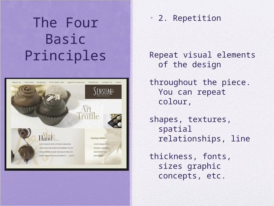
• 2. Repetition
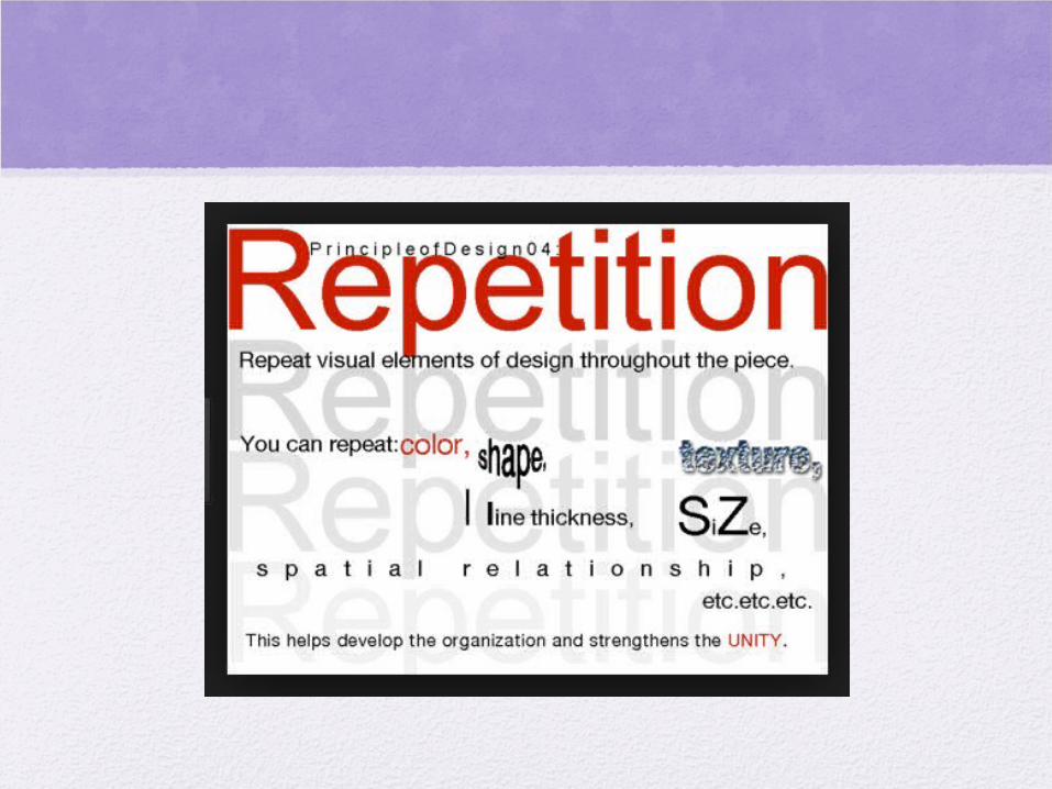
Repeat visual elements of the design
throughout the piece. You can repeat colour,
shapes, textures, spatial relationships, line
thickness, fonts, sizes graphic concepts, etc.

The Four Basic Principles
• Repetition
This develops the organization and strengthens
the unity

The Four Basic Principles
• 3. Alignment
Nothing should be placed on the page arbitrarily. Every element should have some visual connection with another element on the page. This creates a clean, sophisticated, fresh look

The Four Basic Principles
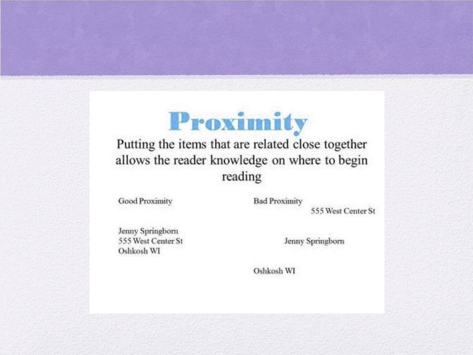
• 4. Proximity
Items relating to each other should be grouped close together. When several items are in close proximity to each other, they become one visual unit rather than several separate units.

The Specifics

#1 “C”
• Contrast

Summary of Contrast
• Contrast on a page draws our eyes to it; our eyes like contrast. If you are putting two elements on the page that are not the same (such as two typefaces or two line widths), they cannot be similar - for contrast to be effective, the two must be very different.

Summary of Contrast
• Contrast is kind of like matching wall paint when you need a spot paint - you can’t sort of match the colour; either you match it exactly, or you repaint the entire wall.
Contrast - The Purpose
• Contrast has two purposes, and they’re inextricable from each other. One purpose is to create an interest on the page - if the page is interesting to look at, it more likely to be read.
Contrast - The Purpose
• The other is to aid in the organization of the information. A reader should be able to instantly understand the way the information is organized, the logical flow from one item to another.

Contrast - How to Get It
• Add contrast through your type-face choices, line thickness, colours, shapes, sizes, space, etc. It is easy to find ways to add contrast, and it’s probably the most fun and satisfying way to add visual interest. The important thing is to be strong

Contrast - What to Avoid
• Don’t be a wimp. If you’re going to contrast, do it with strength. Avoid contrasting a sort-of heavy line with a sort-of heavier line. Avoid contrasting brown text with black headlines. Avoid using two or more typefaces that are similar. If the items are not exactly the same, make them different!

#2 “R”
• Repetition
Repetition - The Purpose
• The purpose of repetition is to unify and to add visual interest. Don’t underestimate the power of the visual interest of a page - if a piece looks interesting, it is more likely to be read.
Repetition - How to Get It
• Think of repetition as being consistent, which I’m sure you do already. Then pust the existing consistencies a little further - can you turn some of those consistant elements into part of the conscious graphic design as with the headline? Make your repetition strong and dramatic with your font selection and size.

Repetition - How to Get It
• Repetition is like accenting your clothes. If a woman is wearing a lovely black evening dress with a chic black hat, she might accent her dress with red heels, red lipstick, and a tiny red corsage.
Repetition - What to Avoid
• Avoid repeating the element so much that it becomes annoying or overwhelming. Be conscious of the value of contrast.

Summary of Repetition
• A repetition of visual elements throughout the design unifies and strengthens a piece by tying together otherwise separate parts. Repetition is very useful on the one-page pieces, and is critical in multi-page documents (where we often just call it being consistent).

#3 “A”
• Alignment

Summary of Alignment
• Nothing should be randomly placed on a page. Every element should have some visual connection with another element on a page.
• Unity is an important concept in design. To make all the elements on the page appear to be unified, connected, and interrelated, there needs to be some visual tie between the separate elements.

Alignment - The Purpose
• The basic purpose of alignment is to unify and organize the page. The result is simular to what happens when you (or your dog) pick up all the dog toys that were strewn around living room floor and put them all into one toy box.
• It is often a strong element that creates a sophisticated look, a formal look, a fun look, or a serious look

Alignment - How to Get It
• Be conscious of where you place elements. Always find something else on the page to align with, even if the two objects are physically far away from each other.
Alignment - What to Avoid
• Avoid using more than one text alignment on the page (that is, don’t center some text and right-align other text).
• And please try very hard to break away from a centred alignment unless you are consciously trying to create a more formal , sedate presentation. Choose a centred alignment consciously, not by default.
#4 “P”
• Proximity
The Four Basic Principles
• Proximity
This helps organize information, reduces clutter, and gives the reader a clear structure

Summary of Proximity
• When several items are in close proximity to each other, they become one visual unit rather than several separate units. Items relating to each other should be grouped together.

Summary of Proximity
• Be conscious of where your eye is going: where do you end up; after you’ve read it, where does your eye go next? You should be able to follow a logical progression through the piece, from a definite beginning to a definite end.

Proximity - The Purpose
• The basic purpose of proximity is to get organized. By grouping related elements together, automatically things seem organized.
• http://www.webdesignerdepot.com/2010/01/the-principle-of-proximity-in-web-design/

Proximity - The Purpose
• If the info is organized, it is more likely to read and more likely to be remembered. As a by-product of organizing the communication, you also create more appealing white space (a designers’ favourite thing).
Proximity - How to Get It
• Squint your eyes slightly and count the number of visual elements on a page by counting the number of times your eye stops. If there are more than 3 - 5 items on a page, see which of the separate elements can be grouped together into closer proximity to become one visual unit.
Proximity - What to Avoid
• Don’t stick things in the corners or in the middle just because the space is empty.
• Avoid too many separate elements on a page.
• Avoid leaving equal amounts of white space between elements unless each group is part of a subset.
Proximity - What to Avoid
• Avoid even a split second of confusion over whether a headline, subhead, caption, graphic, etc., belongs with its related material. Create a relationship among elements with close proximity.
Proximity - What to Avoid
• Don’t create relationships with elements that don’t belong together! If they are not related, move them apart from each other.
