the unicorn of map projections - tableau software
TRANSCRIPT

This is an Accepted Manuscript of an article published by Taylor & Francis in International Journal of Cartography on 26 April 2021. Available online: https://www.tandfonline.com/doi/full/10.1080/23729333.2021.1911593
Sarah Battersby (2021): The unicorn of map projections, International Journal of Cartography, DOI: 10.1080/23729333.2021.1911593
The Unicorn of Map Projections AKA, the most accurate map ever! This article has been accepted for publication in International Journal of Cartography, published by Taylor & Francis. Author:
Sarah Battersby Principal Research Scientist Tableau Research 1621 N 34th Street Seattle, WA 98103 [email protected]
Keywords: Map projection, equal area, distortion, unicorns

This is an Accepted Manuscript of an article published by Taylor & Francis in International Journal of Cartography on 26 April 2021. Available online: https://www.tandfonline.com/doi/full/10.1080/23729333.2021.1911593
Sarah Battersby (2021): The unicorn of map projections, International Journal of Cartography, DOI: 10.1080/23729333.2021.1911593
1
The Unicorn of Map Projections AKA, the most accurate map ever! The unicorn of map projections is the one that preserves all the spatial relationships from the globe. Topologically, we know this projection doesn’t exist, as it is impossible to preserve both areal and angular relationships from the sphere when projected to the flat map, so we make do the best that we can by balancing distortions to areal and angular relationships to suit the needs of specific mapping projects. Balancing these distortions is a challenge that we all face in spatial analytics or cartographic design. However, people don’t tend to like inaccuracies, at least once they have been pointed out to them. Combine this with little to no interest in, or ability to, understand / compensate for map projection distortion (e.g., Battersby 2009), and the lure of a single ‘perfect map’ is strong enough to draw many away from the vital consideration of selecting a specific map projection to match the intended purpose of the map. In recent years, there have been numerous map projections proposed that have received significant media attention for their potential to solve our global-scale mapping problems. Even as I was writing this article, yet another entry to the “unicorn club” was proposed! The maps that I discuss in this paper have individually been referred to with terms such as “the world’s most accurate map,” (Todd 2019) and the “most accurate flat map of Earth yet” (Gott et al. 2021). In this paper, I discuss these projection unicorns, their characteristics, limitations, and how they may help, or hinder us, in making better maps to understand the world around us. Since the impact of distortion for global-scale mapping is the most challenging, I will focus on what makes maps work (or not), and some solutions, at this scale. Why care? First, why do we even care? All flat maps introduce distortions to spatial relationships. The cartographic community – and others – have long discussed the inappropriate use of projections and how they may influence our understanding of the world. Likely, the most notable of these conversations is with respect to the Mercator projection for use as a general-purpose world map (see Monmonier 2004), as it presents gross distortion of areas farther away from the equator. Scholars have suggested that the gross exaggeration of areas of non-equatorial regions in the Mercator projection may lead to distorted world views. While some might suggest that this is just an unintended miscommunication challenge from properties of this particular projection (e.g., Robinson 1990; 2004), others have seen it as a more sinister and intentional attempt to manipulate world views (Peters 1983). The typical response to finding a better projection to alleviate the challenges of Mercator’s distortion to area has been to identify maps where the property of area is preserved, at the expense of distortion to other spatial relationships. There are myriad equal area, or near equal area, projections to choose from, but not all have been elevated to unicorn-candidate status. Largely, I would say that in recent years this is due to the creator’s lack of Twitter followers or advertising budget (perhaps because the projection was developed centuries ago). Maybe this is too cynical of a perspective, but equal area projections all have the same general property of preserving area (a commonality of the unicorns discussed here); they simply compromise in different ways to address other forms of distortion.

This is an Accepted Manuscript of an article published by Taylor & Francis in International Journal of Cartography on 26 April 2021. Available online: https://www.tandfonline.com/doi/full/10.1080/23729333.2021.1911593
Sarah Battersby (2021): The unicorn of map projections, International Journal of Cartography, DOI: 10.1080/23729333.2021.1911593
2
Meet the unicorns Let’s start out with a quick look at some of the maps that have been proposed to solve all our mapping problems. Note that these are not the only unicorns that have been proposed over the years – just a few from discussion in the recent past. Fuller’s Dymaxion, Goode Homolosine, and others would likely also fall into this category if we expand the scope of the discussion. Gall-Peters. (figure 1) In the early 1970’s, a historian named Arno Peters proposed an equal area projection as a “fairer” representation over the conformal Mercator projection common in world maps. The projection had previously been introduced by James Gall in 1855; the projection is now often referred to as Gall-Peters. Over the years, the Gall-Peters projection has cropped up repeatedly as a suggestion of a “more accurate” and better projection than seen in common rectangular maps (e.g., Mercator projection) due to its characteristic of preserving area. Most recently, there was a media splash with the Boston (USA) public school system switching to the more “culturally proficient” Gall-Peters projection for world maps (Boston Public Schools, 2017).
Figure 1. Gall‐Peters (image by author; created in Geocart™)
Cahill-Keyes. (figure 2) The Cahill-Keyes projection is a compromise projection designed to minimize distortion in both areal and angular measurements. It was first proposed by Gene Keyes in 1975, however, its notoriety increased in 2013-2014 with media highlights on Keyes’ work to create “the perfect map” (Stockton 2013), and with a map using the Cahill-Keyes projection winning an honorable mention in the Cartography and Geographic Information Society 2014 map competition. Cahill-Keyes is based on Cahill’s butterfly map, using eight equilateral triangle components with interruptions in the oceans.
Figure 2. Cahill‐Keyes (image by Justin Kunimune, CC BY‐SA 4.0, https://en.wikipedia.org/wiki/Cahill%E2%80%93Keyes_projection#/media/File:Cahill‐Keyes_projection.jpg)
AuthaGraph. (figure 3) AuthaGraph is a rectangular map projection developed by Hajime Narukawa in 1999, however, like Cahill-Keyes, it’s notoriety also occurred several years later with increased media attention after winning the 2016 Good Design Grant Award from the Japan Institute of Design Promotion. The projection is approximately equal area. It has been advertised

This is an Accepted Manuscript of an article published by Taylor & Francis in International Journal of Cartography on 26 April 2021. Available online: https://www.tandfonline.com/doi/full/10.1080/23729333.2021.1911593
Sarah Battersby (2021): The unicorn of map projections, International Journal of Cartography, DOI: 10.1080/23729333.2021.1911593
3
as the “world’s most accurate map” (Todd 2019) and has the bonus property of being “so crazily accurate it actually folds into a globe” (MacDonald 2018).
Figure 3. AuthaGraph (Image courtesy of Hajime Narukawa)
Equal Earth. (figure 4) Equal Earth is an equal-area pseudocylindrical projection introduced in 2018 (Šavrič, Patterson, and Jenny 2018). It is reminiscent of the compromise Robinson projection and aims to be more aesthetically pleasing than other equal area projection options – Šavrič et al. note the media surrounding the Boston Public School’s adoption of Gall-Peters as a key motivator in development of this projection. Like the other projections highlighted in this paper, Equal Earth has been pitched as an optimal solution for mapping as it “meets cartographic needs and desires.” (ArcUser 2019). It likely has the widest adoption in commercial mapping tools of the projections discussed in this paper.
Figure 4. Equal Earth (image by author; created in Geocart™)
This is an Accepted Manuscript of an article published by Taylor & Francis in International Journal of Cartography on 26 April 2021. Available online: https://www.tandfonline.com/doi/full/10.1080/23729333.2021.1911593
Sarah Battersby (2021): The unicorn of map projections, International Journal of Cartography, DOI: 10.1080/23729333.2021.1911593
4
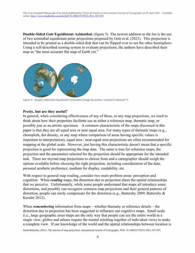
Double-Sided Gott Equidistant Azimuthal. (figure 5) The newest addition to the list is the use of two azimuthal equidistant polar projections proposed by Gott et al. (2021). This projection is intended to be printed as a double-sided disk that can be flipped over to see the other hemisphere. Using a self-described scoring system to evaluate projections, the authors have described their map as “the most accurate flat map of Earth yet.”
Figure 5. Double‐sided Gott Equidistant Azimuthal (image by author; created in Geocart™)
Pretty, but are they useful? In general, when considering effectiveness of any of these, or any map projections, we need to think about how their properties facilitate use as either a reference map, thematic map, or possibly just as an artistic specimen. A common characteristic of the maps discussed in this paper is that they are all equal area or near equal area. For many types of thematic maps (e.g., choropleth, dot density, or any map where comparison of areas having specific values is important to interpretation), equal area / near-equal area projections are often recommended for mapping at the global scale. However, just having this characteristic doesn't mean that a specific projection is good for representing the map data. The same is true for reference maps; the projection and the parameters selected for the projection should be appropriate for the intended task. There are myriad map projections to choose from and a cartographer should weigh the options available before choosing the right projection, including consideration of the data, personal aesthetic preference, medium for display, readability, etc.
With respect to general map reading, consider two main problem areas: perception and cognition. When reading maps, the distortion due to projection alters the spatial relationships that we perceive. Unfortunately, while some people understand that maps all introduce some distortions, and possibly can recognize common map projections and their general patterns of distortion, people can rarely compensate for the distortion (e.g., Battersby 2009; Battersby & Kessler 2012). When remembering information from maps – whether thematic or reference details – the distortion due to projection has been suggested to influence our cognitive maps. Small-scale (i.e., large geographic area) maps are the only way that people can see the entire world in a single view; globes and atlases require the mental stitching together of individual views to make a complete view. If our knowledge of the world and the spatial relationships between location is

This is an Accepted Manuscript of an article published by Taylor & Francis in International Journal of Cartography on 26 April 2021. Available online: https://www.tandfonline.com/doi/full/10.1080/23729333.2021.1911593
Sarah Battersby (2021): The unicorn of map projections, International Journal of Cartography, DOI: 10.1080/23729333.2021.1911593
5
formed from our memories of maps, or from stitching together isolated views from globes and atlases, the distortions or inaccuracies of the views that we see are likely to be reflected in our resulting cognitive maps. How do these projections stack up when we think about how they represent the world? How might they help or hinder us with critical tasks such as navigation or routing, understanding spatial relationships, and assessing general patterns in how data occur and change across space? How are they better – or worse – than other projection choices? Spatial relationships. The best projection for any map is the one with properties that improve a reader’s ability to understand spatial patterns (Kessler and Battersby 2019). For many, but not all, general purpose thematic maps or reference maps, minimal distortion of area is often a good choice, so in that sense, these projections each succeed just fine. But, if it is important to assess distances, directions, or shortest paths between locations, the preservation of area is less critical. However, this is still not the entire story with spatial relationships. Just because a map projection preserves a specific characteristic, doesn’t mean that it makes it easier for a map reader to interpret. Mental stitching of views / interruptions. A prime benefit of a flat world map over a globe or atlas is that it can present a view of the entire world without the reader needing to stitch together multiple views. While the projections discussed here each show the entire world, one requires mental stitching of multiple views (Double-sided Gott), and one uses multiple interruptions (Cahill-Keyes). While the interruptions are beneficial for minimizing distortion, they make it significantly more difficult for map readers to assess distance-based spatial relationships. In the case of the Double-sided Gott (figure 5), the map shown notably splits Africa and South America into separate pieces. It is silly to expect that the average map reader will be successful in mentally piecing together disparate parts of maps to create a whole. The benefit of preserving area does not trump importance of being able to see the entirety of regions of interest, or to estimate distances or directions between locations of interest. With respect to minimization of mental stitching of views, another notable concern, regardless of projection, is the question of what happens at the “edge.” For any selected projection parameters some regions may be split at the periphery so that the parts end up on opposite sides of the map. While splitting in this way is unavoidable in global-scale maps, unless they are digital maps that wrap continuously, care can be taken to minimize the impact on regions of interest. Aesthetics and looking “right.” In addition to general spatial relationships, attention to aesthetics and familiarity are important. Numerous research efforts have demonstrated preferences for certain shapes and arrangements in projections, such as the use of elliptical over rectangular graticule, having more “rounded,” compact shapes, and representing the poles as lines instead of points (see review in Battersby & Kessler 2019). Additionally, people also tend to have preconceived notions of “rightness” associated with particular projection shapes or styles, as well as with specific arrangements (e.g., Pacific- or Atlantic-centered, etc.) which can influence our perception of distortion in different projections – and alter whether or not we see the map as being correct or not (e.g., Battersby & Kessler 2012). While novelty of projection design introduces an aspect of graphical interesting-ness, it may either distract the reader from
This is an Accepted Manuscript of an article published by Taylor & Francis in International Journal of Cartography on 26 April 2021. Available online: https://www.tandfonline.com/doi/full/10.1080/23729333.2021.1911593
Sarah Battersby (2021): The unicorn of map projections, International Journal of Cartography, DOI: 10.1080/23729333.2021.1911593
6
the thematic message of the map or discourage trust in the map’s accuracy. Or, it may just be unattractive – a complaint that has long been lodged against Gall-Peters (noted as being reminiscent of “wet, ragged, long winter underwear hung out to dry on the Arctic Circle;” Robinson 1985). Of the projections discussed here, the Equal Earth was designed specifically with user familiarity and aesthetic preference in mind (Šavrič et al. 2018). Usability and flexibility. Assuming a map projection is appropriate for your project, a specific projection is only a good choice if you can actually use it. Unless you plan to write your own custom transformation, the projection needs to be accessible with common mapping tools, such as a GIS or a programming library that includes map projections such as D3. The AuthaGraph equations are not publicly available, and the Gall-Peters projection may require licensing (though you can just customize parameters on a cylindrical equal area to create an equivalent). However, the remainder are sufficiently documented that they can be generated. Equal Earth seems to have the greatest availability across commercial mapping products. Ability to apply the projection for your map is just one aspect of the problem. It is important to consider how the projections might be transformed for static or dynamic maps. While Mercator and web Mercator are often critiqued, there are benefits to rectangular projections such as web Mercator for interactive, online mapping (e.g., Battersby et al. 2014). Gall-Peters is rectangular and maintains some of the good properties of web Mercator, for instance seamless panning across the “periphery.” Though the other projections can be adjusted on-the-fly to facilitate panning around the projection, their utility for interactive web mapping may be more limited without requiring significant user modification / coding. Bling factors. Finally, consider the “bling factor,” or flashy artistic nature, for the projections. Does it fold into a globe (e.g., AuthaGraph or Cahill-Keyes)? Will it look good on a self-released LP record from my garage band (perhaps the Double-sided Gott)? Will this make a nice tattoo? Though, this honor might best be reserved for the Strebe equal area (Zimmer 2011), which I haven’t discussed here. Will this look awesome on the wall in my map cave? Probably yes, for all but the Gall-Peters. The flat map will never preserve all of the spatial relationships of the Earth. This is a topological truth. All flat maps will introduce some error. At the global-scale this will be particularly notable. Our goal as cartographers is to minimize the errors as appropriate for the specific map type, data, and purpose. There is no projection unicorn; no single map projection will be ideal in all cases. When selecting a map projection for any reference or thematic mapping project we need to carefully consider the intended use of the map and how it might help or hinder with interpretation. Let’s stop pretending that there is a single perfect map projection that fulfils all of our mapping needs.
This is an Accepted Manuscript of an article published by Taylor & Francis in International Journal of Cartography on 26 April 2021. Available online: https://www.tandfonline.com/doi/full/10.1080/23729333.2021.1911593
Sarah Battersby (2021): The unicorn of map projections, International Journal of Cartography, DOI: 10.1080/23729333.2021.1911593
7
References ArcUser. 2019. New map projection meets cartographic needs and desires. Winter 2019,
viewed 22 February 2021. https://www.esri.com/about/newsroom/arcuser/equal-earth/
Battersby, S.E. 2009. The effect of global-scale map-projection knowledge on perceived land area. Cartographica, 44(1): 33-44, doi: 10.3138/carto.44.1.33
Battersby, S.E., Finn, M., Usery, E., and Yamamoto, K. 2014. Implications of web Mercator and its use in online mapping. Cartographica, 49(2): 85-101, doi:10.3138/carto.49.2.2313
Battersby, S.E. and Kessler, F.C. 2012. Cues for Interpreting Distortion in Map Projections, Journal of Geography, 111(3), 93-101, doi: 10.1080/00221341.2011.609895
Boston Public Schools. 2017. Boston Public Schools Unveils Culturally Proficient Maps in Several Classrooms, viewed 22 February 2021. https://www.bostonpublicschools.org/site/default.aspx?PageType=3&DomainID=4&ModuleInstanceID=14&ViewID=047E6BE3-6D87-4130-8424-D8E4E9ED6C2A&RenderLoc=0&FlexDataID=11934&PageID=1
Monmonier, Mark S. 2004. Rhumb lines and map wars: a social history of the Mercator projection. Chicago: University of Chicago Press.
Gott, J.R., Goldberg, D.M., and Vanderbei, R.J. 2021. Flat maps that improve on the Winkel Tripel. arXiv:2102.08176 [astro-ph.IM] https://arxiv.org/abs/2102.08176
Kessler, F.C. and Battersby, S.E. 2019. Working with Map Projections: A Guide to Their Selection. Boca Raton, Florida: CRC Press.
MacDonald, F. 2018. This bizarre world map is so crazily accurate, it actually folds into a globe. Science Alert, viewed 22 February 2021. https://www.sciencealert.com/world-map-authagraph-origami-globe-hajime-narukawa
Peters, A. 1983. Die neue Kartographie/The new cartography (in German and English). Klagenfurt, Germany: Carinthia University; New York: Friendship Press.
Robinson, A. 1985. Arno Peters and his new cartography. The American Cartographer. 12(2): 103-111. doi:10.1559/152304085783915063.
Robinson, A. 1990. Rectangular world maps – no! Professional Geographer. 42(1):101-104. Doi:10.1111/j.0033-0124.1990.00101.x
Stockton, N. 2013. Get to know a projection: Gene Keyes’ 40-year quest for the perfect map. Wired, viewed 22 February 2021. https://www.wired.com/2013/12/gene-keyes-quest-for-the-perfect-map/
Todd, A. 2019. The AuthaGraph is the world’s most accurate map. Discovery, viewed 22 February 2021. https://www.discovery.com/science/AuthaGraph-World-Accurate-Map
Šavrič, B., Patterson, T., Jenny, B. 2018. The Equal Earth map projection. International Journal of Geographical Information Science. 33 (3):454-465. doi:10.1080/13658816.2018.1504949.
Zimmer, C. 2011. Science Ink: Tattoos of the Science Obsessed. New York: Sterling.