trapping and the split infinitive
TRANSCRIPT
TH E MAK E R EADY ARC H IVEColumn 13 of 77
Trapping and theSplit InfinitiveTopic: An explanation of the basic concepts of trapping.
Column first appeared: August 1995, Computer Artist magazine.
Source of this file: A revised and expanded version of the column, as itappeared in Dan’s 1996 book Makeready.
This archive, to be released over several years, collects the columns that Dan Marguliswrote under the Makeready title between 1993 and 2006. In some cases the columnsappear as written; in others the archive contains revised versions that appeared in laterbooks.
Makeready in principle could cover anything related to graphic arts production, but it is best known for its contributions to Photoshop technique, particularly in the field of color correction. In its final years, the column was appearing in six differentmagazines worldwide (two in the United States).
Dan Margulis teaches small-group master classes in color correction. Information is available at http://www.ledet.com/margulis, which also has a selection of other arti-cles and chapters from Dan’s books, and more than a hundred edited threads fromDan’s Applied Color Theory e-mail list.
Copyright© 1995, 1996, 2007 Dan Margulis. All rights reserved.
Trapping and the Split InfinitiveTrapping and the Split InfinitiveTrapping and the Split InfinitiveTrapping and the Split Infinitive
Trapping and the Split InfinitiveTrapping and the Split InfinitiveTrapping and the Split InfinitiveTrapping and the Split Infinitive
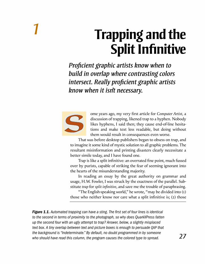
Trapping andtheSplit Infinitive
Proficient graphic artists know when tobuild in overlap where contrasting colorsintersect. Really proficient graphic artistsknow when it isn’t necessary.
ome years ago, my very first article for Computer Artist, a
discussion of trapping, likened trap to a hyphen. Nobody
likes hyphens, I said then; they cause end-of-line hesita-
tions and make text less readable, but doing without
them would result in consequences even worse.
That was before desktop publishers began to obsess on trap, and
to imagine it some kind of mystic solution to all graphic problems. The
resultant misinformation and printing disasters clearly necessitate a
better simile today, and I have found one.
Trap is like a split infinitive: an overrated fine point, much fussed
over by purists, capable of striking the fear of seeming ignorant into
the hearts of the misunderstanding majority.
In reading an essay by the great authority on grammar and
usage, H.W. Fowler, I was struck by the exactness of the parallel. Sub-
stitute trap for split infinitive, and save me the trouble of paraphrasing.
“The English-speaking world,” he wrote, “may be divided into (1)
those who neither know nor care what a split infinitive is; (2) those
1
27
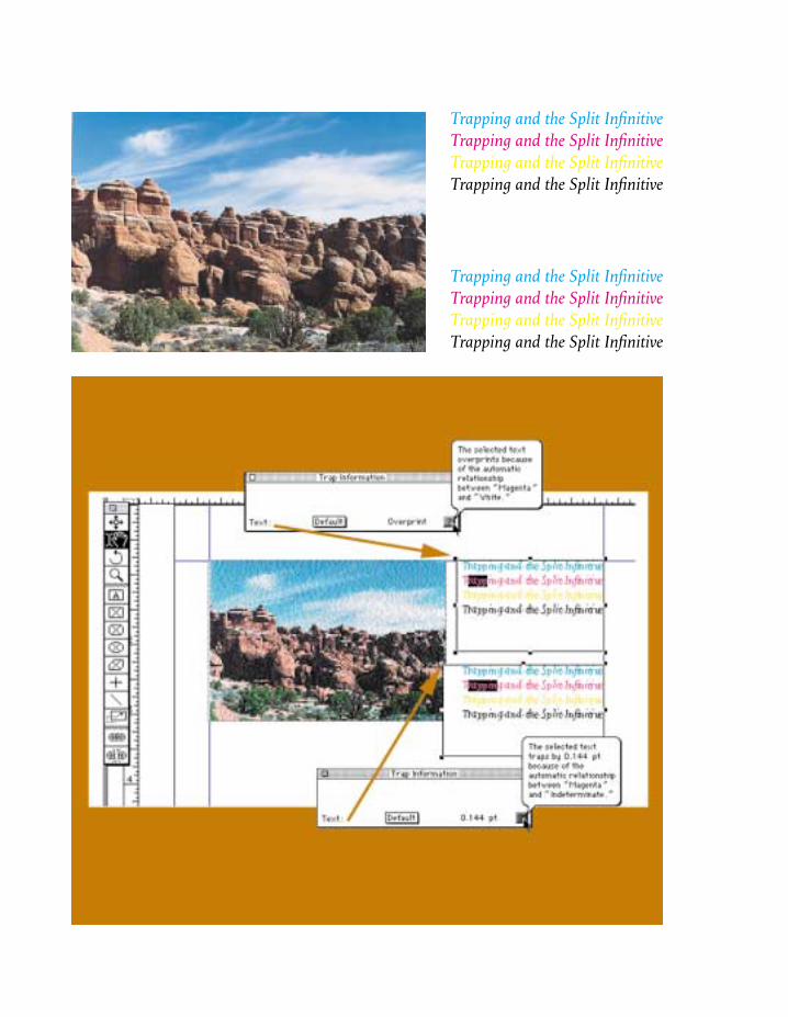
Figure 1.1. Automated trapping can have a sting. The first set of four lines is identicalto the second in terms of proximity to the photograph, so why does QuarkXPress fattenup the second four with an ugly attempt to trap? Answer, below, a slightly misplacedtext box. A tiny overlap between text and picture boxes is enough to persuade QXP thatthe background is “Indeterminate.” By default, no doubt programmed in by someonewho should have read this column, the program causes the colored type to spread.
who do not know, but care very much; (3) those who know &
condemn; (4) those who know & approve; & (5) those who know
& distinguish.”
A Happy Folk,To Be EnviedAlthough readers of this magazine may be presumed to have
more of an interest in trap than does the graphic arts community
at large, overall Fowler is right again: “Those who neither know
nor care are the vast majority, & are a happy folk, to be envied by
most of the minority classes.”
Indeed, despite all the palaver about how mastery of trap is
the distinguishing mark of the professional, there is a case to be
made for neither knowing nor caring what it is. If you are deter-
mined to ignore trap, here is all you need to know to be able to
defend your decision:
• Trap is a means of disguising problems of press registration,
but in real life, most jobs do not have such problems.
• If your job is nonetheless misregistered, knowledgeable
observers will see the misregistration easily whether you
employ trap or not. On the other hand, a layperson may very
well ignore the ugly white lines that expose a failure to trap.
So, exactly who benefits here?
• The page layout programs that most professionals use take
care of most simple trapping situations by default, without
the operator knowing or caring what is going on.
• As discussed below, trap merely substitutes one kind of
defect for another. Often enough, that kind of trade doesn’t
help much.
The Deliberate DefectBefore opening fire on those who do not know what it is, but
who care very much, I ask your patience while we define trap
and briefly discuss when it should be used.
Trap is the willful introduction of a defect into a job, as an
insurance policy against the possibility that an even worse kind
of defect may occur.
In printing, each ink is laid down separately, each by a
different press unit. At press speeds, it is quite difficult to keep
the inks perfectly aligned with respect to one another, although
good operators can keep the misregistration down to a twentieth
of a millimeter or so.
Figure 1.2. Spreads,shrinks, and othertrapping options(highly exaggerated)aimed at avoiding thewhite line in the “T.”
When the design of a job calls for two colors that don’t have
much in common to touch each other, such misregistration can
be very offensive. If a cyan object is butting something magenta,
and they have no undercolor in common, then if the plates are
misaligned the objects will miss.
The result is shown in Figure 1.2. In the T, the cyan plate is
deliberately misregistered, causing an unsightly white line on one
side, and a less noticeable dark one on the other.
If we are afraid that something like this will occur on press
(and we should be) there is an elegant solution. If we make the
cyan T slightly larger than the hole in the magenta background,
there should be an area of overlap everywhere. Even if the job is
misregistered there will be enough safety margin that the white
line will not appear.
That is a nifty dodge, a skillful way of eliminating a bad
problem in favor of a much smaller one—in an isolated case. It
is not an excuse for prostrating oneself before the altar of trap.
Pure cyan and pure magenta don’t hit each other that often.
Before deciding that trap is needed, ask yourself what defect you
are trying to insure yourself against. Then ask if doing so is really
worth building in a different defect. It will be only if one of the
potential defects is far worse than the other, as it was in the T.
The R is defined as 70C60M25Y. As the background is solid
magenta, a white line is impossible: there is at least 60 percent
magenta everywhere. The worst possible case, obviously, would
be a line of 60M falling between the blue foreground and the
magenta background. Such a prospect does not seem sufficiently
fearsome to me to make matters worse by trapping.
The A is even clearer. It is now 100C100M. There is no hole
in the magenta plate at all. One of the plates could be a quarter
of a mile out of register for all we care. Wherever the cyan ink
falls on the background, there we will get a perfect A, no white
lines, no dark lines, no problem, unless, of course, we are using
some kind of automated trapping program that decides to take
action against this phantom foe.
The two Ps are prepared once with trap, once without.
Which looks better? This is a challenge for the printer of this
book. Will the dreaded white line appear?
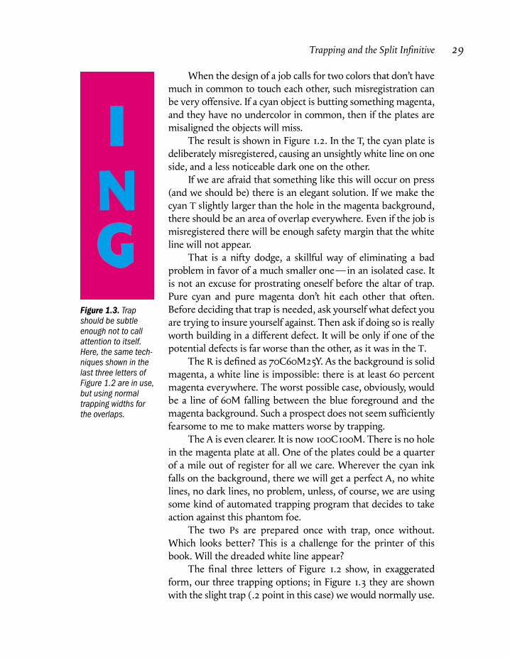
The final three letters of Figure 1.2 show, in exaggerated
form, our three trapping options; in Figure 1.3 they are shown
with the slight trap (.2 point in this case) we would normally use.
Trapping and the Split Infinitive 29
Figure 1.3. Trapshould be subtleenough not to callattention to itself.Here, the same tech-niques shown in thelast three letters ofFigure 1.2 are in use,but using normaltrapping widths forthe overlaps.
This is in addition to
the two obvious alterna-
tives: no trap at all (a knock-out) or the brute-force
method of ignoring the
background and printing
the foreground color right
on top of it (an overprint,generally used when the
foreground color is black or
something else very dark.)
The I shows a spread. That is, the letter expands so that the
overlap is in the background. This is the correct approach when,
as here, the background is darker than the letter. We’d like to
hide the overlap, so we conceal it in the darker of the two colors.
The N is a shrink (or choke); the hole in the background gets
smaller as the letter stays the same. This should be used when the
background is the lighter of the two colors, but it is wrong here.
Traditionally, trapping was done in film by strippers, and the
options were limited to the above two. The electronic age has
given us some others, one of which is shown in G. The trap is
divided between the two objects. This can help if neither is much
darker than the other. Also, the colors are toned down in the
overlap area, making the trapping line seem less obtrusive.
The sad truth is that around half of all professional strippers
do not understand when to trap. Considering the amount of
verbiage wasted on trapping nowadays, one might think
electronic artists would do better. Not so. To verify the level of
knowledge on the subject, I selected at random three of the many
general books on QuarkXPress, which has a much-ballyhooed
automated trapping feature. I reasoned that, in view of all the
fuss, the authors would have to try to explain trap, but that, in
doing so, they might betray some white holes, as it were, in their
own experience.
The Naked EmperorsIf you are a novice QXP user, and expect to learn from a book
what this trapping stuff is all about, here is what’s in store for you.
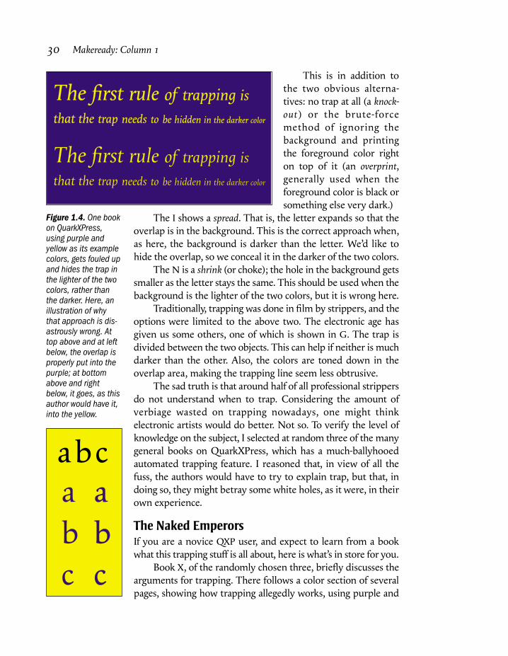
Book X, of the randomly chosen three, briefly discusses the
arguments for trapping. There follows a color section of several
pages, showing how trapping allegedly works, using purple and
30 Makeready: Column 1
Figure 1.4. One bookon QuarkXPress,using purple andyellow as its examplecolors, gets fouled upand hides the trap inthe lighter of the twocolors, rather thanthe darker. Here, anillustration of whythat approach is dis-astrously wrong. Attop above and at leftbelow, the overlap isproperly put into thepurple; at bottomabove and rightbelow, it goes, as thisauthor would have it,into the yellow.
The first rule of trapping is
that the trap needs to be hidden in the darker color
The first rule of trapping is
that the trap needs to be hidden in the darker color
abc
a
b
c
a
b
c
yellow as the two colors, which, since they have nothing in
common, are just as good a choice as magenta and cyan.
All of the example traps printed in this book are backwards.
Everything that spread should have shrunk, and vice versa.
Instead of hiding his traps in the purple, the author “hid” them
in the yellow, as in Figure 1.4. This is an example of the cure
being worse than the disease. No trap at all would have been
better, much better, than putting the overlap in the yellow.
Book Y makes more sense. We’re back to magenta and cyan;
the reader is invited to create a large magenta headline on a cyan
background. The author then explains that, as cyan is the lighter
of the two colors, QXP will shrink, rather than spread, the type.
That is certainly what we would like it to do, but as QXP is
unable to shrink type (it can shrink other objects) it would treat
magenta on cyan exactly as it would cyan on magenta: it would,
incorrectly, spread the trap equally between them. The author
should have advised readers to make the headline in an illustra-
tion program, where one can assign an overprinting cyan stroke
to the magenta text. Import such a headline into the page-layout
program, and the problem goes away.
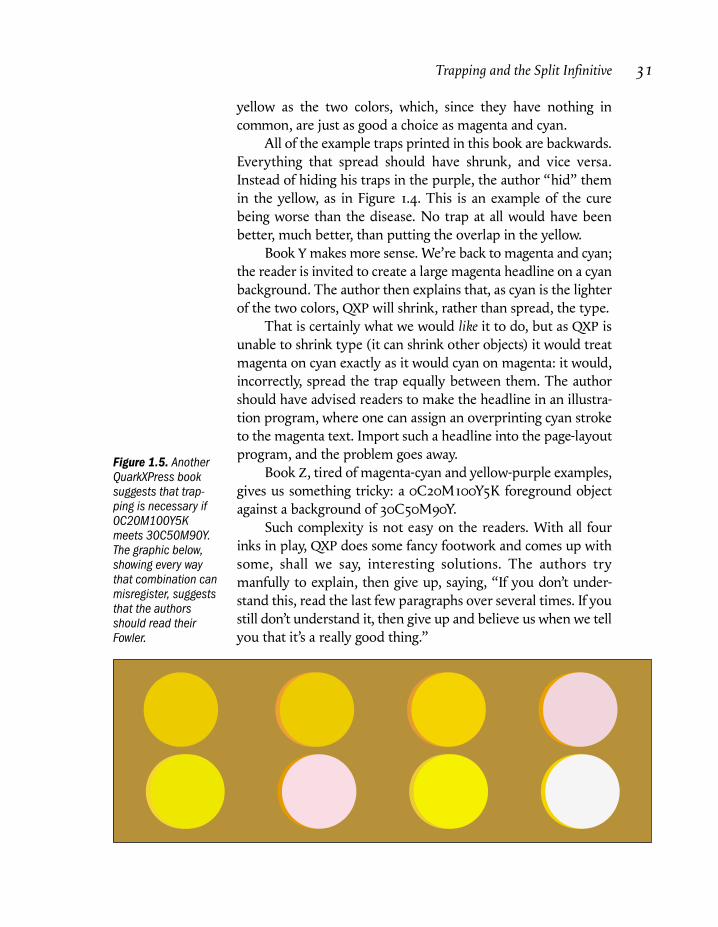
Book Z, tired of magenta-cyan and yellow-purple examples,
gives us something tricky: a 0C20M100Y5K foreground object
against a background of 30C50M90Y.
Such complexity is not easy on the readers. With all four
inks in play, QXP does some fancy footwork and comes up with
some, shall we say, interesting solutions. The authors try
manfully to explain, then give up, saying, “If you don’t under-
stand this, read the last few paragraphs over several times. If you
still don’t understand it, then give up and believe us when we tell
you that it’s a really good thing.”
Trapping and the Split Infinitive 31
Figure 1.5. AnotherQuarkXPress booksuggests that trap-ping is necessary if0C20M100Y5Kmeets 30C50M90Y.The graphic below,showing every waythat combination canmisregister, suggeststhat the authorsshould read theirFowler.
Personally, I could read those paragraphs several hundredtimes before understanding why trapping these two colors is a
good thing. Think about it. The lightest color that can possibly
appear is 20M90Y. Ergo, nothing terrible can happen, trap or no.
An artificial overlap is a Maginot Line erected against a pacific
and weaponless enemy.
Figure 1.5 shows why: although mis-
registration always results in two separate
defects, trap will not be a palliative unless
one of the defects is far worse than the
other. There are seven different ways that
this combination can misregister, but none
of them meet this test.
Rather than the paragraph quoted
above, the authors might have considered
the following substitute, from Fowler.
“Those who do not know but do care, who would as soon
be caught putting their knives in their mouths as splitting an
infinitive, but have hazy notions of what constitutes that
deplorable breach of etiquette…betray by their practice that
their aversion to the split infinitive springs not from instinctive
good taste, but from tame acceptance of the misinterpreted
opinion of others; for they will subject their sentences to the
queerest distortions, all to escape imaginary split infinitives.”
To Know and Approve…Such is the public appetite for trapping “solutions” that all five of
the major DTP programs (QXP, PageMaker, Illustrator, Free-
Hand, and Photoshop) now have automated methods. Left to
their own devices, all except Photoshop overtrap considerably,
yet all have their uses.
Until recently, art generated in one of the illustration
programs had to be trapped manually, using strokes on objects.
That is still a good way if, unlike the authors cited above, you
know what you’re doing, since it avoids pointless traps and gives
greater control. Automatic trapping filters do, however, make it
easier when one object abuts several different backgrounds.
Such multiple backgrounds pose a particular problem for
QXP and PageMaker. If one background is darker and one lighter
than the foreground, both programs give up, but QXP gives up in
a ridiculous way, by spreading the foreground object. Worse,
32 Makeready: Column 1
Although misregistrationalways results in two
separate defects, trap willnot be a palliative unlessone of the defects is farworse than the other.
considering the amount of artwork we need to place, the pres-
ence of any graphic behind a QXP object will provoke a spread.
Suppose we want a line of type in some color or another and
that we set it in a text box with no background. If we are precise,
nothing will go wrong, because QXP ignores white backgrounds.
But let the text box drift a little, so that a point or two of it inad-
vertently overlaps a picture box, as shown in Figure 1.1, and pre-
pare to be punished. Although the background is still white, QXP
doesn’t know it. It calls it “indeterminate,” and spreads the type
to compensate. Which is, incidentally, usually wrong. If the type
actually were to knock out of the image in Figure 1.1 the yellow
type should probably spread to the extent that it intersects the
blue sky, but the others should not, and even the yellow is an
exceptional case. An intelligent user can and should turn this
absurd default feature off.
Three expensive, compute-intensive standalone trapping
applications, aimed at service bureaus and other volume users,
also have a presence. Luminous Corp.’s TrapWise, Scitex’s Full
AutoFrame, and DK&A Trapper are currently the only methods
Trapping and the Split Infinitive 33
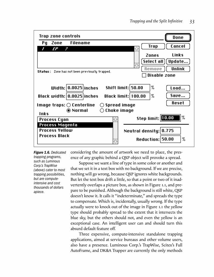
Figure 1.6. Dedicatedtrapping programs,such as LuminousCorp.’s TrapWise(above) cater to mosttrapping possibilities,but are compute-intensive and costthousands of dollarsapiece.
by which one can trap to a vignette. They also, as you can see in
Figure 1.6, have the controls over thickness of trap, shrinking vs.
spreading, weight of the overlap, and minimum difference
between the two colors, that a thinking artist might want.
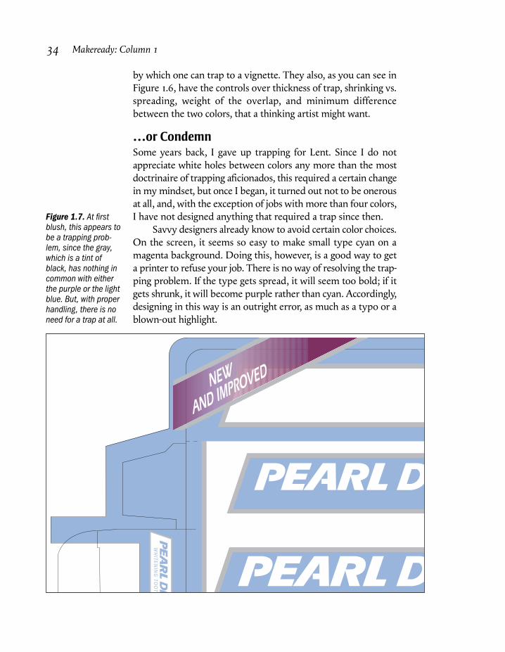
…or CondemnSome years back, I gave up trapping for Lent. Since I do not
appreciate white holes between colors any more than the most
doctrinaire of trapping aficionados, this required a certain change
in my mindset, but once I began, it turned out not to be onerous
at all, and, with the exception of jobs with more than four colors,
I have not designed anything that required a trap since then.
Savvy designers already know to avoid certain color choices.
On the screen, it seems so easy to make small type cyan on a
magenta background. Doing this, however, is a good way to get
a printer to refuse your job. There is no way of resolving the trap-
ping problem. If the type gets spread, it will seem too bold; if it
gets shrunk, it will become purple rather than cyan. Accordingly,
designing in this way is an outright error, as much as a typo or a
blown-out highlight.
34 Makeready: Column 1
Figure 1.7. At firstblush, this appears tobe a trapping prob-lem, since the gray,which is a tint ofblack, has nothing incommon with eitherthe purple or the lightblue. But, with properhandling, there is noneed for a trap at all.
WH
ITEN
ING
TOO
T
Similarly, unless you or your service bureau has access to
TrapWise or one of its competitors, you can’t use a gradation that
collides with some radically different color.
In Figure 1.7, you will perceive either a major trapping
problem, or an opportunity to use common sense.
There are three colors here, including a gradation. The blue
color is mostly cyan with a little magenta. The purple is mostly
magenta with a little cyan. If these two colors were butting one
another, trap would be unnecessary, but, as the devil would have
it, each one butts a gray that is almost entirely composed of
black.
In accord with the aforementioned religious practice, I have
left the thing untrapped here, hoping the printer would get it
right. If I had decided to trap, I would have had to face four major
problems:
• It is far from obvious whether the gray border should spread
into the blue background, or vice versa.
• Because the blue and gray are both so light, any trapping line
will seem relatively obvious. I might have to use some sort of
semi-trap, making the overlap consist of toned-down versions
of both colors.
• Whatever method I use to trap the blue-gray intersections in
the larger logos may not work for the smaller one at the
bottom left of Figure 1.7: it may make the gray rule around
that one seem smaller than it should be.
• The purple gradient needs to spread in some areas where it
hits the gray and shrink in others.
With the help of TrapWise and a reasonably powerful computer,
these problems can be solved by brute force. If you would rather
use finesse (or if you have given up trapping for Lent) the
following approach may seem more appealing.
The gray is currently defined as 7C4M0Y30K, accounting
for its bluish tinge. In Photoshop, open a small LAB file and fill it
with this color. Go to Edit: Preferences>Separation Setup and
change Black Generation to None. Set the Info palette to read
CMYK, and read the value of the filled color to see how Photo-
shop would construct it without the use of any black. It’s still the
same gray—but now the numbers are 35C24M20Y.
Armed with this information, we can now throw the Photo-
shop file away and substitute the three-color gray values for the
predominantly black ones in our art file.
Trapping and the Split Infinitive 35

The purple color has more of both cyan and magenta than
the gray does, so where the two colors hit, the minimum shared
color is 35C24M. The blue color has only 20 percent magenta, so
the minimum is a few points lower. Either way, the minimum is
so close to the gray that it would make no sense to build in
artificial overlaps to guard against its appearance.
The inexperienced artist recoils from a graphic with as
many potential problems as this one. This is trap at its most
terrifying. And yet, with a little forethought, this file does not haveto be trapped at all.
To Know and DistinguishThe theme of substituting the CMY colors for black is a recurrent
one in trap avoidance. This is especially so when designers
specify process equivalents of PMS colors. The Pantone Matching
System, as a rule, favors the use of black ink when possible.
Often, that will cause trapping problems that can be eliminated
with the dodge described above.
Many such maneuvers exist, provided we are not intimi-
dated. As long as we remember that trap is not neat or keen in
and of itself, but is instead a dreary desirability in a few isolated
situations, we will be safe.
Before burying your artwork under an avalanche of useless
traps, look at the minimum values of each color, and ask yourself,
what is the worst that can possibly happen if I don’t trap? If the
worst that can happen is white, or is a color vastly lighter than
either of the two colors that are butting, then ask yourself, is
there a way of reorganizing the colors? If the answer is no, you
may well have found a situation where it pays to accept the
technical defect that trapping is.
If you work with QuarkXPress, be careful when large text
overprints a picture box, as in Figure 1.1. Ordinarily, QXP will
spread such type, and ordinarily, it is wrong to do so, though this
will depend on the character of the picture. The offending type
can manually be set to overprint or to knock out using QXP’s
Trap Information dialog box.
Be aware that trap is not the only misregistration problem
that can plague unwary designers. Attempting to print small
light-colored or white type on a multicolor background is a lot
worse than printing without trap: it is too likely that mis-
registration will result in the type becoming illegible.
36 Makeready: Column 1
It is hard to know whether editors or printers are the more
dangerous and unpredictable group. Prudence dictates not hand-
ing either one a stick of dynamite in the belief they are unlikely
to decide to light the fuse.
As writer, I happen to be one of those who knows and
approves of split infinitives. I split them freely in Computer Artist.But with an unknown editor, I avoid not only split infinitives but
anything that might be mistaken for one. As designers, when
dealing with an unknown printer, similar caution is advisable.
After all, if we meet someone who doesn’t know what trapping is,
but cares very much about it, the last thing we need is to tempt
that person to start tinkering with our files.•
In one of the Ps in Figure 1.2, I flouted
good practice when I left it untrapped.
Obviously, I can’t predict whether the
printer of this book will have such good
control of register that no white line will
appear. For what it’s worth, when it
appeared in Computer Artist I got away
with it, as I would expect to in most
professional contexts.
The fact that one normally gets
away with it does not, as some service
bureaus who make a lot of money run-
ning their clients’ files through TrapWise
think, mean that I am anti-trap. Quite
the contrary. If you are the art director of
Wired magazine, or otherwise are in the
habit of having radically different colors
butt one another, I certainly advocate
trapping them. Furthermore, except in
rare instances I advocate doing it your-
self, rather than letting an automated
program have at it.
Lack of trap alone will not ruin a
job. Half-baked measures may. If you
“hide” your traps in the wrong half of a
yellow-purple combination, as the
author did in Figure 1.4, you will be far
worse off than if you throw up your
hands and ignore trap altogether.
Similarly, if you don’t understand
why black type should overprint a color
background, some day you are going to
try to take yellow type and overprint it
on a purple background, and then you
will have a ruined job and a printer who
is going to insist on being paid for it.
In addition to the screams from ser-
vice bureaus, I took grief about this col-
umn from those who thought I should
have included specific rules for when to
trap and how wide to make the overlaps.
That might have been nice, but if readers
get a basic understanding of the topic,
that will eliminate the huge majority of
trapping disasters. Like so many of the
concepts in this book, the idea of trap is
simple, as long as you realize it is neither
a panacea nor a bogeyman.•
Trapping and the Split Infinitive 37
Afterword
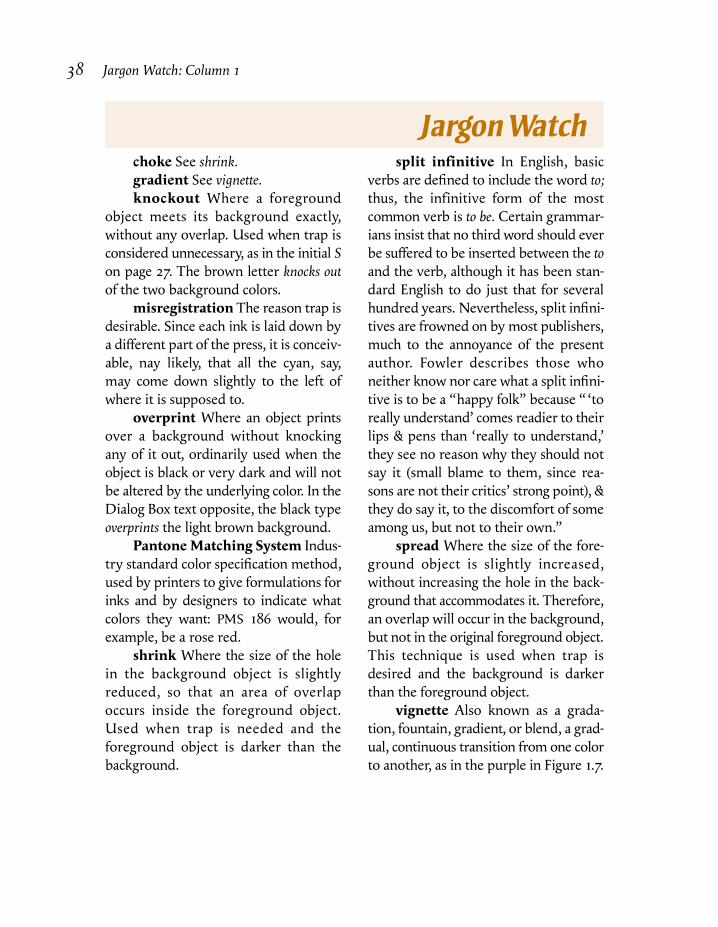
choke See shrink.gradient See vignette.knockout Where a foreground
object meets its background exactly,
without any overlap. Used when trap is
considered unnecessary, as in the initial Son page 27. The brown letter knocks outof the two background colors.
misregistration The reason trap is
desirable. Since each ink is laid down by
a different part of the press, it is conceiv-
able, nay likely, that all the cyan, say,
may come down slightly to the left of
where it is supposed to.
overprint Where an object prints
over a background without knocking
any of it out, ordinarily used when the
object is black or very dark and will not
be altered by the underlying color. In the
Dialog Box text opposite, the black type
overprints the light brown background.
Pantone Matching System Indus-
try standard color specification method,
used by printers to give formulations for
inks and by designers to indicate what
colors they want: PMS 186 would, for
example, be a rose red.
shrink Where the size of the hole
in the background object is slightly
reduced, so that an area of overlap
occurs inside the foreground object.
Used when trap is needed and the
foreground object is darker than the
background.
split infinitive In English, basic
verbs are defined to include the word to;thus, the infinitive form of the most
common verb is to be. Certain grammar-
ians insist that no third word should ever
be suffered to be inserted between the toand the verb, although it has been stan-
dard English to do just that for several
hundred years. Nevertheless, split infini-
tives are frowned on by most publishers,
much to the annoyance of the present
author. Fowler describes those who
neither know nor care what a split infini-
tive is to be a “happy folk” because “‘to
really understand’ comes readier to their
lips & pens than ‘really to understand,’
they see no reason why they should not
say it (small blame to them, since rea-
sons are not their critics’ strong point), &
they do say it, to the discomfort of some
among us, but not to their own.”
spread Where the size of the fore-
ground object is slightly increased,
without increasing the hole in the back-
ground that accommodates it. Therefore,
an overlap will occur in the background,
but not in the original foreground object.
This technique is used when trap is
desired and the background is darker
than the foreground object.
vignette Also known as a grada-
tion, fountain, gradient, or blend, a grad-
ual, continuous transition from one color
to another, as in the purple in Figure 1.7.
38 Jargon Watch: Column 1
JargonWatch
Trapping and the Split Infinitive 39
For a concept as simple as trapping is, it certainly has been
able to delude a lot of people, including some of my fellow
authors, into thinking that it is unfathomably deep. Accordingly,
this column’s revelation that trapping can be understood by the
intelligent layperson, and in fact is frequently unnecessary, was
treated by many readers as a revelation. This piece generated
more positive response than any I have ever written, save the one
on correcting a Photo CD image, Column 4 in this book.
The more one gets into trapping, though, the more sticky a
subject it can become. To balance things a bit, let’s visit with a
couple of users who deal with scenarios more troublesome than
those mentioned in the column.
First, a look at a trapping problem that has become more and
more common. Nowadays we frequently print with fifth and/or
sixth inks in addition to the normal CMYK on press. Often this is
because the extra color is that of a corporate logo or some other
known color. But more and more, art directors are using the extra
spot colors in significant design elements, creating screen angling
and trapping problems, among others.
As the column points out, CMYK images, at least photo-
graphic ones, are normally self-trapping, in that the picture will
have enough in common with whatever touches it that no artificial
overlap will be needed. But what if it has nothing whatsoever in
common with the thing that touches it? The following correspon-
dent is wrestling with a silhouetted CMYK image that has to rest
on a fifth-color background.
If you are sophisticated enough to take in all that follows, you
may well be capable of raising a different objection. If I am that
good, you may sneer, why can’t I avoid trap altogether by seam-
lessly incorporating the fifth ink into the CMYK image, using color
replacement principles?
Well, as a matter of fact, I can, and have, done so, but it isn’t
always possible. So, let’s assume that, in the following case, the
writer has twelve different versions of his job, and has to paste his
silhouetted photo on top of twelve different spot colors. So there!
Now, down to business.
Dialog Box
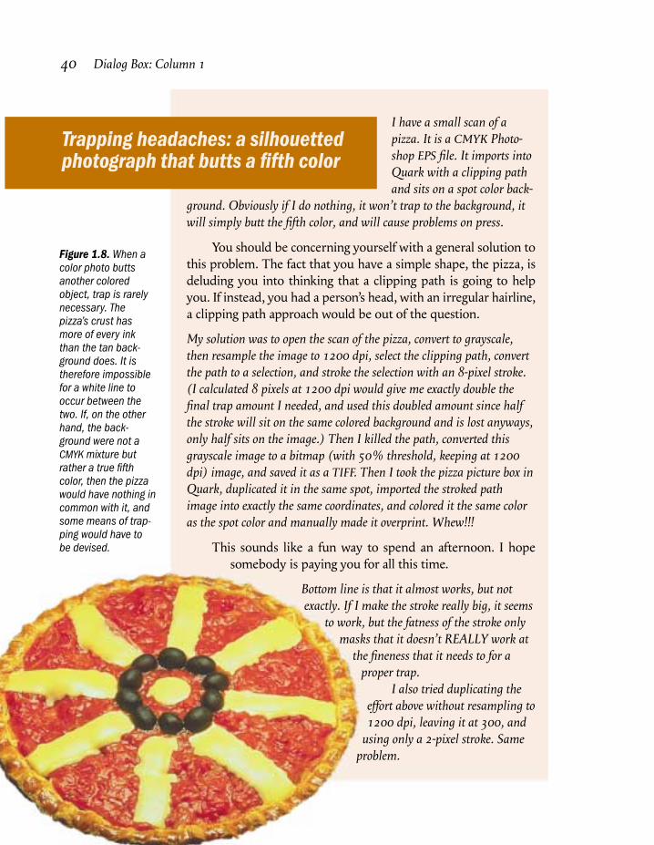
I have a small scan of apizza. It is a CMYK Photo-shop EPS file. It imports intoQuark with a clipping pathand sits on a spot color back-
ground. Obviously if I do nothing, it won’t trap to the background, itwill simply butt the fifth color, and will cause problems on press.
You should be concerning yourself with a general solution to
this problem. The fact that you have a simple shape, the pizza, is
deluding you into thinking that a clipping path is going to help
you. If instead, you had a person’s head, with an irregular hairline,
a clipping path approach would be out of the question.
My solution was to open the scan of the pizza, convert to grayscale,then resample the image to 1200 dpi, select the clipping path, convertthe path to a selection, and stroke the selection with an 8-pixel stroke.(I calculated 8 pixels at 1200 dpi would give me exactly double thefinal trap amount I needed, and used this doubled amount since halfthe stroke will sit on the same colored background and is lost anyways,only half sits on the image.) Then I killed the path, converted thisgrayscale image to a bitmap (with 50% threshold, keeping at 1200dpi) image, and saved it as a TIFF. Then I took the pizza picture box inQuark, duplicated it in the same spot, imported the stroked pathimage into exactly the same coordinates, and colored it the same coloras the spot color and manually made it overprint. Whew!!!
This sounds like a fun way to spend an afternoon. I hope
somebody is paying you for all this time.
Bottom line is that it almost works, but notexactly. If I make the stroke really big, it seems
to work, but the fatness of the stroke onlymasks that it doesn’t REALLY work at
the fineness that it needs to for aproper trap.
I also tried duplicating theeffort above without resampling to1200 dpi, leaving it at 300, and
using only a 2-pixel stroke. Sameproblem.
40 Dialog Box: Column 1
Trapping headaches: a silhouettedphotograph that butts a fifth color
Figure 1.8. When acolor photo buttsanother coloredobject, trap is rarelynecessary. Thepizza’s crust hasmore of every inkthan the tan back-ground does. It istherefore impossiblefor a white line tooccur between thetwo. If, on the otherhand, the back-ground were not aCMYK mixture butrather a true fifthcolor, then the pizzawould have nothing incommon with it, andsome means of trap-ping would have tobe devised.
Trapping and the Split Infinitive 41
What appears on film is a nicely stroked path which seems to fitthe image, but isn’t in registration. If I line up the films by eye andignore the registration marks, I can pretty much make it fit. But if Iline up the register marks, or (since our imagesetter punches the film)I lay it on the pins, it winds up being out by about a point.
When dealing with photographic images, we rarely have to
worry about trap. Figure 1.8 illustrates why. The background box
behind the type is 0C8M10Y2K. The crust of the pizza varies but
it always has around twice as much yellow and magenta as the
background. Therefore, no matter how far out of register this gets,
the absolutely lightest color that can possibly appear is the color of
the background. There are people in this world who’d look at it
and panic and send it to their service bureau to run through Trap-
Wise. We will leave them to their phobia and their checkwriting.
If the background is not composed of CMYK inks and instead
is a true fifth color—and that is happening more and more these
days—then we indeed have a trapping problem, a white line
waiting to arise and bite us.
The following is the method I have used and if it is cumber-
some (though not as much so as the method you are now using
without success) at least it works. It relies on replacing part of the
fifth-color background with a new Photoshop file. As long as
Photoshop names the color exactly the same as the page layout
program, this will be seamless and invisible to the viewer. This
also eliminates the need for a clipping path.
The best way by far to handle this is with a plug-in, such as
PlateMaker, ICISS, or Co-Co, that allows Photoshop to save a five-
channel file. Then, all one need do is create a fifth plate in the
manner described below, and place the file.
In the absence of such a plug-in, you can still make it work
with the following kludgy technique, illustrated in Figure 1.9. This
will cause the background to shrink into the image, which is
normally correct. It can, however, easily be adjusted to make the
image spread into the background, if that is desired.
1. Save a copy of the silhouetted file. Select the entire yellow
channel and delete it. You should now have a picture of a blue
pizza (top left of Figure 1.9).
2. Load the path and select the pizza. Apply a curve to it that
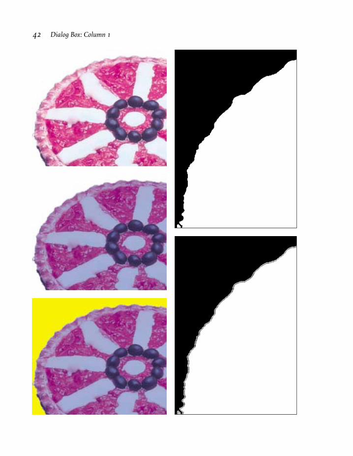
42 Dialog Box: Column 1
Trapping and the Split Infinitive 43
forces the minimum value of magenta and cyan to 25 percent, so
that the edges of the silhouette become very hard and pro-
nounced. (Center of Figure 1.9.)
3. Deselect the foreground. Set the magic wand tool to a
tolerance of 32, and click into the background. This should result
in a selection that is a perfect butt to the hard silhouette edges, yet
also hits any stray light pixels on the edge.
4. Replace the selected area with solid yellow, so that the
pizza is a muddy blue and the background is yellow.
5. Run this document through Photoshop’s Trap filter. This
will give a nice, soft trap that will vary in darkness with the dark-
ness of the pizza’s crust—not that objectionable stroking path.
6. The resulting yellow channel is now a perfect rendition of
what you want your fifth-color plate to look like. If you have one
of the plug-ins that allows a fifth Photoshop plate, simply copy this
channel into your fifth channel of the original CMYK document,
place and print. If not, the kludgy workaround continues as
follows.
7. Take the trapped yellow channel and paste it into a new
grayscale document of the same size. You can now throw away the
CMYK file with the blue pizza.
8. Change the document from Mode: Grayscale to Mode:
Duotone. Whatever the two colors are that come up as defaults,
change the names of one of them to Black and the other to Back-
ground Color or whatever the name of the color in your page
layout document is. Change the curve for the black plate to null,
i.e. all values become zero. Change the curve for the Background
Color plate to default, so that this plate will be identical to the
original grayscale channel. Save this duotone document as EPS.
9. Take the original CMYK document and paste it, without a
clipping path, in your page layout document in whatever position
you have chosen for it. Note the exact parameters, and now place
the duotone document, again without a clipping path in exactly
those same parameters.
10. Bring the CMYK file to the front, hiding the duotone, and
save.
11. Print the CMYK plates only, without the fifth color.
12. Delete the CMYK image (but do not save the file) and
print the Background Color plate only.•
Figure 1.9. Oppo-site, procedure fortrapping a silhouet-ted image to a lighterfifth color. Startingwith the pizza ofFigure 1.8, Top left:all yellow is deletedfrom the image.Center left: cyan andmagenta areincreased through-out, so as to make aharder edge on thepizza. Bottom left:the white back-ground is selectedand replaced withsolid yellow. Topright, an enlargedlook at the newyellow channel, witha hard edge where ithits the pizza. At thispoint, the bottom leftimage is run throughPhotoshop’s Trapfilter. This creates asoft-edged overlap inthe yellow channel,shown bottom right.The ridiculous-looking blue pizza atbottom left can nowbe discarded, exceptfor its yellowchannel, which willeventually becomethe fifth color.

I LOVE your articles—BUUUUT...When you didthe article on trapping youdidn’t take the final step andgive a couple of suggested,
ballpark, trap amounts. I know it’s a can of worms, but people wanthard NUMBERS.
Well, I can hardly have done that without explaining how to
trap in the various programs, which I wasn’t inclined to do. I saw
it as more of a basic-concept article. The problem I’ve been seeing
so much of recently is not people like yourself who have good
ideas of what to do, but people who are so buffaloed by the whole
concept that they assume that any multicolor job has to go to a
service bureau and be run through TrapWise.
Yes, I design so there are screens in common. Yes, I send it through theScitex [for Full AutoFrame trapping] if it’s complex. But yes, I stillneed manual trapping when I send simple 2- and 3-color jobs straightthrough the imagesetter.
Here are various suggestions I’ve gathered over the years: The amount of trap needed for a funky quick print shop working
on offset paper is .4 point. The amount needed for your basic 2 color press is .23 point.(I took the difference between a service bureau that says their
standard default on the Scitex is .22 point. or .08 mm, and a good2-color printer who told me .25 point.)
For coated stock on a great press with good operators, I suggest.15 point.
(This is the difference between the .16 point that my color housenormally uses and several magazines that use .144 point.)
Flexographic printers and silk screeners may want as much as 1point trap.
These are basically very reasonable numbers. Personally I like
to use slightly smaller traps than what you are indicating, but
both of us favor values slightly lower than the figures that are most
frequently recommended.
And don’t forget to double all amounts if you’re doing overprintingstrokes in Illustrator.
44 Dialog Box: Column 1
Concepts are fine, but how about giving us some hard numbers?
Trapping and the Split Infinitive 45
Correct. Vector-art programs such as Illustrator and FreeHand
center their strokes on the outside border of the object, so only
half of the stroke will fall in the area where we are trying to create
overlaps.
Some advice I got from a service bureau about trapping in Quark yearsago is still good: Turn trapping OFF in your Quark preferences, andtrap only the items you really need to through the dialog box. That waythere are no accidentally fat letters.
There is a case to be made for that, though in a complicated
job I find it easier to just go in and correct the few things that are
wrong.
A magazine I read recommended varying trap thickness with linescreen as follows:
Line screen Trap Amount
85 line .5 point100 .35 point133 .3 point150 .25 point200 .2 point
There is no technical reason to vary thickness with screen
ruling, except the inferential one that a higher line screen implies
better printing conditions and better printing conditions imply
less misregistration. Therefore, I am rather skeptical (for a change)
of incorporating this complication.•