typography: art or science? - university of st....
TRANSCRIPT

■■ Typography once was a craft practiced by trade specialist. ■■ Computer has democratized typography.■■ But computers should come with a label, “Knowledge not included.”■■ Designing type for the most common purpose, reading, takes deep knowledge of how type works.
Typography: Art or science?

Three requirements of typography
Personality■■ The key requirement for posters, advertisements, packaging, web-page headers.
Legibility■■ Required for radically informative documents, such as phone books, forms, schedules, information graphics, box scores, street signs.
Readability■■ Required for “long-distance reading,” according to Erik Spiekermann, in documents such as books, newspapers, magazines.
Attention-getting designs need high personality; ease of reading is less of an issue.

■■ Legibility means how easily we can tell letters apart for a given typeface. The typeface at the top has less legibility than the example at the bottom.■■ Legibility is an attribute of the type, or of the alphabet of a typeface. It concerns the shapes of the letters.
Legibility
hb Garamond Italic
hb Century
Schoolbook Italic

TYPE SPACING 4
Legibility
■■ Legibility is important in documents such as tables or infographics. ■■ Legibility is a quality found in “workhorse fonts.” These fonts make up type families with four qualities:■● A good regular weight.■● At least one bold weight with good contrast.■● Economy of width.■● Legibility, especially numbers.

TYPE SPACING 5
Legibility
In 1966 New York’s Metropolitan Transit Authority hired Bob Noorda and Massimo Vignelli of Unimark International to developed a modular sign system and later a complete graphic standards manual. Noorda and Vignelli’s work is now the very identity of the MTA.
■■ Legibility is a requirement for typography used in signage.

■■ English designer Phil Baines attacks the basic notion of legibility as presenting “information as facts rather than as experience.” ■■ But type must fit a purpose. The highly legible Helvetica used in MTA signs would be out of place where a visually exciting display is wanted.
Phil Baines-designed cover for Penguin Great Ideas series of books.
Personality

■■ Some type uses do not require the same kind of readability as long-distance text. These include provocative display type in magazines and newspapers, ads, brochures, and “subjective typography,” made up of “grunge,” post-modern or “deconstructivist” typography.
Personality

■■ In many cases, readability or even legibility is not important or even desirable.■■ For many display uses, type is the design, the main visual element — type for type’s sake.
Personality

■■ Readability is a quality of type as it is set, how easy it is to read in long stretches.■■ Readability is enhanced by the choice of an appropriate typeface, as well as:■● Type size■● Spacing■● Column measure (width)■● Line height, or “ledding”■● Page layout
Readability
DEARBORN — You’d have a hard time finding proof that Ford Motor Co.’s J. Mays is qualified to join the top rank of automotive designers.
Evidence is just as scant that he can achieve the elusive goal of creating cars that are beautiful and affordable.
Unless you ask him. What sets this Oklahoma farm boy apart is a deep
personal conviction that he’s different from hundreds of other auto designers. That’s understandable for someone who went from the Midwest to the famed auto design studios of Europe, decided to step off the corporate ladder and then abruptly found himself at its top rung.
This conviction now spills over into a determination to make Ford the world’s styling leader.
“By the turn of the century, I would like Ford to be considered at the top of the heap,” he says.
That is an ambitious goal coming from a designer whose biggest claim to fame is his work on the concept car that inspired the creation of Volkswagen’s
New Beetle and who has only spent little more than six months as Ford’s top designer.
But Mays, 43, claims he is a designer and a corporate strategist, a blend of both creativity and discipline that he considers unique in the auto industry. His ultimate goal: transform Fords and Mercurys and Lincolns into well-known brand names every bit as recognizable as Levis and Coca-Cola.
“Most designers have traditionally been trained at art schools that said, ‘Express yourself and do the best design and they will come,’” Mays said. “My approach is to say, ‘All right, let’s try to set that aside and all think strategi-cally.’”
Mays is Ford’s answer to one of its biggest weaknesses: styling.

■■ “If the columns of a newspaper or magazine or pages of a book can be read for many minutes at a time without strain or difficulty, then we can say the type has good readability. ■■ “The term describes the quality of visual comfort — an important requirement in the comprehension of long stretches of text, but paradoxically not so important in such things as telephone directories or airline time tables.”
— Walter Tracy, Letters of Credit: A View of Type Design
Readability

TYPE SPACING 11
■■ For long-distance reading —books, magazines — a more transparent typography is needed. Beatrice Warde called it the “crystal goblet.”■■ “Printing demands a humility of mind,” Warde wrote. “There is nothing simple or dull in achieving the transparent page. Vulgar ostentation is twice as easy as discipline.”
Beatrice Warde, 1925
Readability

Can readability be mea-sured? How do we know what is “readable”?■■ Scientific studies measure reading speed, as the “most valid technique for studying the legibility of printed material,” according to Miles Tinker, who has conducted much
Readability
research on type himself.■■ Other considerations include comprehension and retention, qualities that are much more difficult to measure.

Two important dis-coveries:1. We read whole
words, not single characters.
2. We read by moving our eyes in leaps called saccades, French for the “flick of a sail.” We jump and then pause at regular intervals called fixations.
Readability
FIXATIONSACCADE

TYPE SPACING 14
■■ Eye-Trac equipment has identified two main errors in reading poorly set type:■● Regression. The reader returns to text already read.■● Doubling. The reader drops down a line instead of reading straight ahead.
■■ Spacing is the key to reducing these errors.
Televisual news claims to provide an up-to-the-minute (now) narrative which, in turn, projects for the viewer a particular place (here) from which she or he may ‘make sense’ of the significance of certain ‘newsworthy’ events for their daily lives. This process of representation, far from being a neutral reflection of ‘the world out there’, works to reaffirm a network of conventionalized rules by which social life is to be interpreted. Accordingly, I argue that tele-visual news accounts encourage us to accept as natural, obvious or nonsensical certain preferred definitions of reality,
Televisual news claims to provide an up-to-the-minute (now) narrative which, in turn, projects for the viewer a particular place (here) from which she or he may ‘make sense’ of the significance of certain ‘newsworthy’ events for their daily lives. This process of representation, far from being a neutral reflection of ‘the world out there’, works to reaffirm a network of conventionalized rules by which social life is to be interpreted. Accordingly, I argue that tele-visual news accounts encourage us to accept as natural, obvious or nonsensical certain preferred definitions of reality,
Regression
Doubling

■■ Type is measured in points.■● 72 points = 1 inch■● 1 pica = 12 points,■● 6 picas = 1 inch.
■■ Type size is stated by height. ■■ 12-point type is nominally 12 points tall. This point size or nominal size (x) is slightly more than the actual height.■■ Actual height, measured from the top of an ascender the bottom of a descender, is also called k-p height (y)
The Basics of Type Measurement
kpxa b c
Picas
meanline
ascender line
baseline
descender line
a
b
f
g
e
c
d
a. FACE
b. SHOULDER
c. SHANK
d. NICK to identify front of type
e. GROOVE
f. FOOT
g. POINT SIZEor
NOMINAL SIZE
■■ Because of the difference between actual size and nominal size, we cannot discover the nominal size of a piece of type with a ruler.
x y

Proportional vs. Monospace Type
Mindgloves
Mindgloves■■ Typewriters used monospaced typefaces. Each letter had the same amount of horizontal space, regardless of its shape.■■ Two common sizes of a typewriter font:
■● 10-pitch (10 characters to the inch), also known as elite.■● 12-pitch with 12 characters to the inch, also known as pica.
■■ Monospaced typefaces are still used for design effects. A common one is Courier.
Courier 10-pitch (elite)
Courier 12-pitch (pica)

■■ Typefaces for printing are proportional; each letter takes up more or less horizontal space depending on its width. ■■ Proportional type width is measured using a system based on the em — the width of the captal M. Letter widths, word spaces, letter spaces and indents are stated in ems. ■■ For practical purposes, an em equals the nominal letter size.
M M M M M
Proportional type Mindgloves
24 36 48 60 72Baskerville
Proportional spacing
TYPE SPACING 18
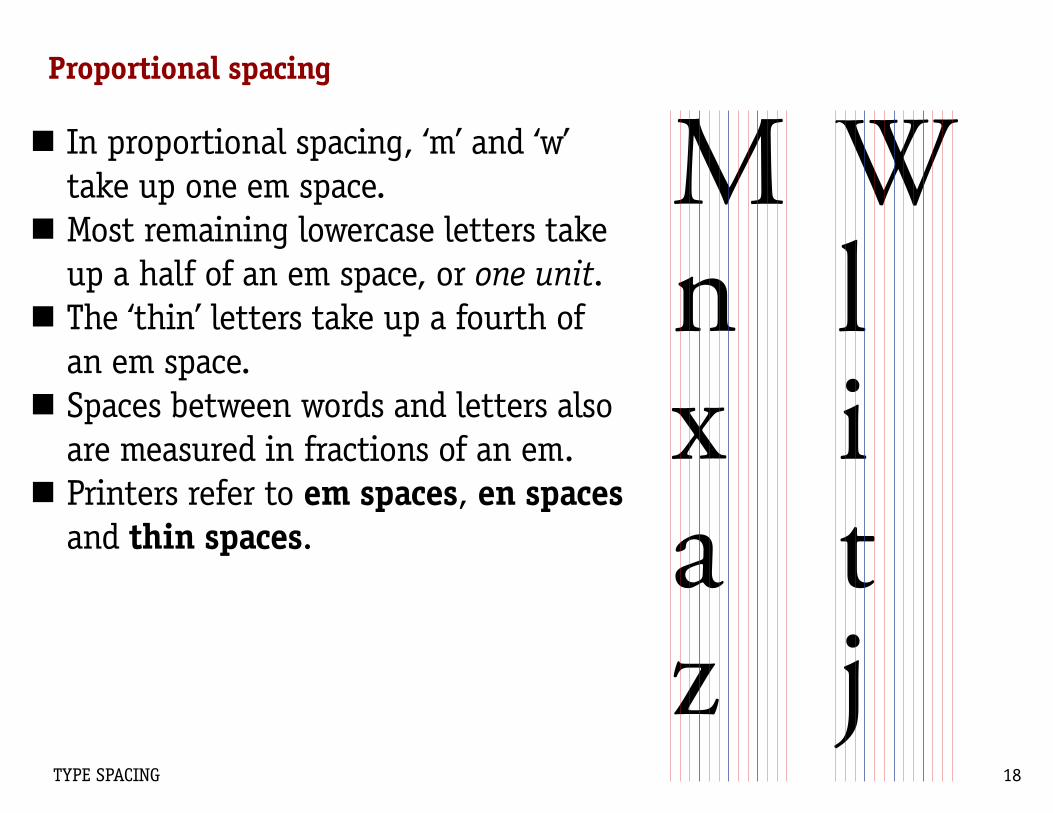
Mnxaz
W litj
Proportional spacing
■■ In proportional spacing, ‘m’ and ‘w’ take up one em space.■■ Most remaining lowercase letters take up a half of an em space, or one unit.■■ The ‘thin’ letters take up a fourth of an em space. ■■ Spaces between words and letters also are measured in fractions of an em. ■■ Printers refer to em spaces, en spaces and thin spaces.

■■ The Golden Rule of Spacing is simple: Longer lines of text need more generous spacing. Stated another way, a wider column needs more generous spacing.■■ Spiekermann writes: “Long texts require a setting not unlike the way a marathon is run. Everything has to be comfortable — once you’ve found your rhythm, nothing must disturb it again.” ■■ Rhythm depends to a large part on spacing.
The Golden Rule of Type SpacingAt the Juilliard School a few weeks ago, a young violinist entered
the studio of Dorothy DeLay, the school’s preeminent teacher of virtuosos—her ex-students include Itzhak Perlman, Nigel Kennedy, Gil Shaham, Midori, and Sarah Chang—and unpacked her instru-ment, a three-quarter-size Rocca, dating from 1852. The student, Rachel Lee, a Korean-American born in Chicago, is about four feet seven inches tall. She was wearing a brown jumper with white and orange flowers printed on it, a white shortsleeved shirt, white socks, and white sandals. After greeting Miss DeLay, she nodded at the accompanist and, without hesitation, without excuses or ritual self-deprecation—without any of the stalling that most of us do when we have to perform something or even make a presentation at the office— launched into the first movement, marked adagio, of Bach’s Sonata in E Major for violin and harpsichord. Planting her feet, Ra-chel swayed slightly as she played and kept her eyes downcast and her face expressionless. Her arms are not long enough to play a full-sized instrument, but even with her Rocca she produced a rich, perfectly centered tone; she also produced a boldly incisive shaping of Bach’s long-limbed phrases, such that the music seemed to leap out at the listener. The performance was technically secure and almost disturb-ingly intense. Rachel is a child prodigy. She is eleven years old.
“Thank you, Rachel. I love what you do with that,” Miss DeLay said, and then Rachel played the next piece she had prepared, a shortened version of the first movement of the Paganini Violin Concerto No. 1, a nineteenth-century bravura display complete with double-stopping, skittering sixteenth notes, and some honeyed melo-dies. “Very good,” Miss DeLay said, “but I think the cadenza might sound better a little slower. That way, we can hear your fingers pop on every note.” Rachel played it slower, so you could hear her ar-ticulate each note. Since she had played both pieces without music, I asked her how long it had taken her to memorize the Paganini. “Oh, a few days,” she said. “Less than a week.” She speaks in a soft voice—a tiny voice with a slight but brilliant smile, and, after she says what she has to say, she remains silent.
When the lesson was over, I spoke to Dorothy DeLay, who was sitting at a desk with musical scores and a box of tissues and a tea-pot arrayed before her. DeLay, who is eighty-two, is a large person, majestic but informal, who wears black boots and has a full head of gray hair and beautiful eyes. She has been teaching violin at Juilliard since 1948, and her manner with Rachel, who clearly loves to play, is extremely benevolent. DeLay has led many such children through the difficulties of adolescence and sudden fame; she has also had students who have known disappointment and worse. “They have the capacities of an adult but the emotional development of a child,” DeLay said of her young students. “I don’t want them to feel that they are on trial, so they have to make their mothers feel good-that’s death. The people who play well know this.

TYPE SPACING 20
■■ Letters must have enough space to be distinguishable, but not so far apart that they become ‘separate, unrelated signs.’ ■■ Word spaces and letter spaces must allow the reader to see individual words but also group them for quick comprehension.■■ Space between lines of type has to be generous enough to prevent doubling and regression.■■ This example is spaced for comfortable long-distance reading.
The Golden Rule of Type SpacingAt the Juilliard School a few weeks ago, a young violinist entered
the studio of Dorothy DeLay, the school’s preeminent teacher of virtuosos—her ex-students include Itzhak Perlman, Nigel Kennedy, Gil Shaham, Midori, and Sarah Chang—and unpacked her instru-ment, a three-quarter-size Rocca, dating from 1852. The student, Rachel Lee, a Korean-American born in Chicago, is about four feet seven inches tall. She was wearing a brown jumper with white and orange flowers printed on it, a white shortsleeved shirt, white socks, and white sandals. After greeting Miss DeLay, she nodded at the accompanist and, without hesitation, without excuses or ritual self-deprecation—without any of the stalling that most of us do when we have to perform something or even make a presentation at the office— launched into the first movement, marked adagio, of Bach’s Sonata in E Major for violin and harpsichord. Planting her feet, Ra-chel swayed slightly as she played and kept her eyes downcast and her face expressionless. Her arms are not long enough to play a full-sized instrument, but even with her Rocca she produced a rich, perfectly centered tone; she also produced a boldly incisive shaping of Bach’s long-limbed phrases, such that the music seemed to leap out at the listener. The performance was technically secure and almost disturb-ingly intense. Rachel is a child prodigy. She is eleven years old.
“Thank you, Rachel. I love what you do with that,” Miss DeLay said, and then Rachel played the next piece she had prepared, a shortened version of the first movement of the Paganini Violin Concerto No. 1, a nineteenth-century bravura display complete with double-stopping, skittering sixteenth notes, and some honeyed melo-dies. “Very good,” Miss DeLay said, “but I think the cadenza might sound better a little slower. That way, we can hear your fingers pop on every note.” Rachel played it slower, so you could hear her ar-ticulate each note. Since she had played both pieces without music, I asked her how long it had taken her to memorize the Paganini. “Oh, a few days,” she said. “Less than a week.” She speaks in a soft voice—a tiny voice with a slight but brilliant smile, and, after she says what she has to say, she remains silent.
When the lesson was over, I spoke to Dorothy DeLay, who was sitting at a desk with musical scores and a box of tissues and a tea-pot arrayed before her. DeLay, who is eighty-two, is a large person, majestic but informal, who wears black boots and has a full head of gray hair and beautiful eyes. She has been teaching violin at Juilliard since 1948, and her manner with Rachel, who clearly loves to play, is extremely benevolent. DeLay has led many such children through the difficulties of adolescence and sudden fame; she has also had students who have known disappointment and worse. “They have the capacities of an adult but the emotional development of a child,” DeLay said of her young students. “I don’t want them to feel that they are on trial, so they have to make their mothers feel good-that’s death. The people who play well know this.”

TYPE SPACING 21
Word and letter spaces
■■ Word spaces and letter spaces are built into every font according to its design.■■ In flush left type, all word and letter spaces are the optimum width according to the font design.■■ In justified type, the word and letter spaces shrink or expand to fill the width of the column.
At the Juilliard School a few weeks ago, a young violinist entered the stu-dio of Dorothy DeLay, the school’s preeminent teacher of virtuosos—her ex-students include Itzhak Perlman, Nigel Kennedy, Gil Shaham, Midori, and Sarah Chang—and unpacked her instrument, a three-quarter-size Rocca, dating from 1852. The stu-dent, Rachel Lee, a Korean-American born in Chicago, is about four feet seven inches tall. She was wearing a brown jumper with white and orange flowers printed on it, a white short-sleeved shirt, white socks, and white sandals. After greeting Miss DeLay, she nodded at the accompanist and, without hesitation, without excuses or ritual self-deprecation—without any of the stalling that most of us do when we have to perform something or even make a presentation at the of-fice— launched into the first move-ment, marked adagio, of Bach’s So-nata in E Major for violin and harp-sichord. Planting her feet, Rachel swayed slightly as she played and kept her eyes downcast and her face ex-pressionless.
At the Juilliard School a few weeks ago, a young violinist entered the stu-dio of Dorothy DeLay, the school’s preeminent teacher of virtuosos—her ex-students include Itzhak Perlman, Nigel Kennedy, Gil Shaham, Midori, and Sarah Chang—and unpacked her instrument, a three-quarter-size Rocca, dating from 1852. The stu-dent, Rachel Lee, a Korean-American born in Chicago, is about four feet seven inches tall. She was wearing a brown jumper with white and orange flowers printed on it, a white short-sleeved shirt, white socks, and white sandals. After greeting Miss DeLay, she nodded at the accompanist and, without hesitation, without excuses or ritual self-deprecation—without any of the stalling that most of us do when we have to perform some-thing or even make a presentation at the office— launched into the first movement, marked adagio, of Bach’s Sonata in E Major for violin and harpsichord. Planting her feet, Rachel swayed slightly as she played and kept her eyes downcast and her face ex-pressionless.
JUSTIFIED FLUSH LEFT

TYPE SPACING 22
■■ Kerning is the method used to adjust letter spacing between individual letter pairs.■■ Every font comes with a kerning table that sets the space between each letter pair in a typeface.■■ Kerning makes text easier to read by adding cohesion to word shapes.■■ At very small sizes, 6 points or less, most computers turn off kerning, and every letter pair gets the same space in between.
Kerning
KernedYou can’t stay in your corner of the Forest waiting for others to come to you. You have to go to them sometimes.Kerning turned offYou can’t stay in your corner of the Forest waiting for others to come to you. You have to go to them sometimes.
Wo Wo Te Te F. F.

TYPE SPACING 23
■■ Tracking is the practice of removing or adding space in equal amounts between all the letters in a block, such as a paragraph. ■■ Tracking often is used in newspapers for economic reasons, to squeeze in more type.■■ But too much tracking can hurt readability; a common limit is -5 tracking, meaning no more than 5/1000ths of an em can be removed.
Tracking No trackingYou can’t stay in your corner of the Forest waiting for others to come to you. You have to go to them sometimes.-10 trackingYou can’t stay in your corner of the Forest waiting for others to come to you. You have to go to them sometimes.-40 trackingYou can’t stay in your corner of the Forest waiting for others to come to you. You have to go to them sometimes.

Fouriscoreiandiseveniyearsiago Four score and seven years ago
Any honest examination of the national life proves how far we are from the standard of human freedom with which we began. The recovery of this standard demands of everyone who loves this country a hard look at himself, for the greatest achievements must begin somewhere, and they always begin with the person. If we are not capable of this examination, we may yet become one of the most distinguished and monumental fail-ures in the history of nations.
Any honest examination of the national life proves how far we are from the standard of human freedom with which we began. The recovery of this stan-dard demands of everyone who loves this country a hard look at himself, for the greatest achieve-ments must begin somewhere, and they always begin with the person. If we are not capable of this examination, we may yet become one of the most distin-guished and monumental fail-ures in the history of nations.
Word Spaces
ABOVE: Word spacing is at 100 percent of the default value for InDesign.
LEFT: Word spacing is at 85 percent of the default value.
■■ Think of a word space as a character, just like any other letter.■■ The default word space is a thin space, about the width of the letter ‘i’ (above). ■■ When tracking is applied to a block of type, the space between words will shrink, too. Words can run together.

■■ The Justification panel is in the pulldown menu on InDesign’s Paragraph palette.■■ Slight adjustments can improve readability in justified text■■ Adjusted settings can be saved as part of a paragraph style. ■■ First set up text in a column.■■ Decide if more aggressive hyphenation is needed. ■■ Word spacing sets the optimum, minimum and maximum spaces between words when type is justified. ■■ Letter spacing does the same for space between letters.
A woman came up to
me and said, “Young
man, take that banana
out of your mouth when
speaking to a lady.” I
A woman came up to me
and said, “Young man,
take that banana out of
your mouth when speak-
ing to a lady.” I said,
A woman came up to me
and said, “Young man,
take that banana out of
your mouth when speak-
A woman came up to me
and sa id , “Young man,
take that banana out of
your mouth when speaking
Adjusting Word and Letter Spaces
A B
C D
Word space of 100% min, 100% opt 150% max Letter space 0% min, 0% opt and 5% max
Word space of 90% min, 100% opt 120% max Character space -5% min, 0% opt and 10% max

Comfortable Letter and Word Spacing
■ The examples at top right illustrate the Golden Rule of Spacing.
■ Letter spaces, tracking and word spaces all increase as the lines widen from 6 picas to 10p6 to 16p6.
■ One way to judge letter spacing is through the con-sistency of type color. Dark spots or white spots attract the eye and distract readers, interrupting their rhythm.
Any hon-est exami-nat ion o f the national l i fe proves how far we are from the standard of human free-dom wi th wh i ch we began.
Any honest exami-nation of the national life proves how far we are from the standard of human freedom with which we began.
Any honest examination of the national life proves how far we are from the standard of human free-dom with which we began.
Variable, and therfore miserable condition of Man; this minute I was well, and am ill, this min-ute. I am surpriz‚ and with a sodaine change, and alteration to worse, and can impute it to no cause, nor call it by any name. We study Health, and we deliberate upon our meats, and drink, and ayre, and exercises, and we hew, and wee polish every stone, that goes to that building; and so our Health is a long and regular work; But in a minute a Canon batters all, overthrowes all, demolishes all; a Sicknes unprevented for all our diligence, unsuspected for all our curiositie; nay, undeserved, if we consider only disorder, summons us, seizes us, possesses us, destroyes us in an instant. O miserable condition of Man, which was not imprinted by God, who as hee is immortall himselfe, had put a coale, a beame of Immortalitie into us, which we might have blowen into a flame, but blew it out, by our first sinne; wee beggard our selves by hearkning after false riches, and infatuated our selves by hearkning after false knowledge. So that now, we doe not onely die, but
die upon the Rack, die by the torment of sicknesse; nor that onely, but are preafflicted, super-afflicted with these jelousies and suspitions, and apprehen-sions of Sicknes, before we can cal it a sicknes; we are not sure we are ill; one hand askes the other by the pulse, and our eye asks our urine, how we do. O multiplied misery! we die, and cannot enjoy death, because wee die in this torment of sicknes; we art tormented with sicknes, and cannot stay till the torment come, but preapprehensions and presages, prophecy those torments, which induce that death before either come; and our dissolution is conceived in these first changes, quickned in the sicknes it selfe, and borne in death, which beares date from these first changes. Is this the honour which Man hath by being a litle world, That he hath these earthquakes in him selfe, sodaine shakings; these lightnings, sodaine flashes; these thunders, sodaine noises; these Eclyps-es, sodain offuscations, and darknings of his senses; these Blazing stars, sodaine fiery exhalations; these Rivers of blood, sodaine red waters? Is he a world

TYPE SPACING 27
Comfortable Letter and Word Spacing
Eugen Rosenstock was born in Berlin on July 6, 1888, the son of Theodor and Paula Rosenstock. Theodor was a banker who had entered that profession to support his widowed stepmother and stepsister; if he had been able to choose, he would have pursued a scholarly education. In due course, however, he became a member of the prestigious Berlin Stock Exchange. Paula Rosenstock was the daughter of the head of a well-known Jewish school in Wolfenbüttel. Eugen was the fourth child among six sisters.
After his first years in a school for wealthy families, Eugen Rosenstock transferred to the Joachimsthaler Gymnasium, a school known for its rigorous academic standards, particularly in the classics. Following his father’s wish, Eugen went on from there to study law at the uni-versities of Zürich, Heidelberg, and Berlin. At age 17 he joined the Protestant Church, which did not seem much of a conversion to him because Christian habits had already become a part of family life. Gradually, however, his faith became central for his work. In 1909, at the age of 21, he received a doctorate in law from the University of Heidelberg. Studying history would have been one of his first choices, and philology (language) was his abiding passion from early on. In 1912, he began to teach con-stitutional law and the history of law at the University of Leipzig, the youngest Privatdozent at the time.
Early in 1914, Rosenstock went to Florence to conduct historical research with his brother-in-law, Ernst Michel, then editor of the German encyclopedia Brockhaus. There, he met a young Swiss woman, Margrit Hüssy, who was studying the history of art in Florence. They married that same year, just before the outbreak of World War I. Drafted at once as a lieutenant in the mounted artillery, he was stationed at or near the Western front throughout the war, including 18 months at Verdun. During this period he organized courses for the troops, replacing the limited instruction in patriotism with broader topics. In 1916, he and his friend, the Jewish philosopher Franz Rosenzweig, also on active duty, exchanged letters on Judaism and Christianity. That correspondence has since become well known, and much of it is now contained in Judaism Despite Christianity.
Rosenstock was keenly aware that World War I was an historical watershed. At the end of the war, not wishing to
Eugen Rosenstock was born in Berlin on July 6, 1888, the son of Theodor and Paula Rosenstock. Theodor was a banker who had entered that profes-sion to support his widowed stepmother and stepsis-ter; if he had been able to choose, he would have pur-sued a scholarly education. In due course, however, he became a member of the prestigious Berlin Stock Exchange. Paula Rosenstock was the daughter of the head of a well-known Jewish school in Wolfenbüttel. Eugen was the fourth child among six sisters.
After his first years in a school for wealthy families, Eugen Rosenstock transferred to the Joachimsthaler Gymnasium, a school known for its rigorous academ-ic standards, particularly in the classics. Following his father’s wish, Eugen went on from there to study law at the universities of Zürich, Heidelberg, and Berlin. At age 17 he joined the Protestant Church, which did not seem much of a conversion to him because Christian habits had already become a part of family life. Gradually, however, his faith became central for his work. In 1909, at the age of 21, he received a doctorate in law from the University of Heidelberg. Studying history would have been one of his first choices, and philology (language) was his abiding passion from early on. In 1912, he began to teach constitutional law and the history of law at the University of Leipzig, the youngest Privatdozent at the time.
Early in 1914, Rosenstock went to Florence to conduct historical research with his brother-in-law, Ernst Michel, then editor of the German encyclope-dia Brockhaus. There, he met a young Swiss woman, Margrit Hüssy, who was studying the history of art in Florence. They married that same year, just before the outbreak of World War I. Drafted at once as a lieutenant in the mounted artillery, he was stationed at or near the Western front throughout the war, including 18 months at Verdun. During this period he organized courses for the troops, replacing the lim-ited instruction in patriotism with broader topics. In 1916, he and his friend, the Jewish philosopher Franz Rosenzweig, also on active duty, exchanged letters on Judaism and Christianity. That correspondence has since become well known, and much of it is now
A B
Eugen Rosenstock was born in Berlin on July 6, 1888, the son of Theodor and Paula Rosen-stock. Theodor was a banker who had entered that profession to support his widowed stepmoth-er and stepsister; if he had been able to choose, he would have pursued a scholarly education. In due course, however, he became a member of the prestigious Berlin Stock Exchange. Paula Rosenstock was the daughter of the head of a well-known Jewish school in Wolfenbüttel. Eugen was the fourth child among six sisters.
After his first years in a school for wealthy families, Eugen Rosenstock transferred to the Joachimsthaler Gymnasium, a school known for its rigorous academic standards, particularly in the classics. Following his father’s wish, Eugen went on from there to study law at the univer-sities of Zürich, Heidelberg, and Berlin. At age 17 he joined the Protestant Church, which did not seem much of a conversion to him because Christian habits had already become a part of family life. Gradually, however, his faith became central for his work. In 1909, at the age of 21, he received a doctorate in law from the Univer-sity of Heidelberg. Studying history would have been one of his first choices, and philology (lan-guage) was his abiding passion from early on. In 1912, he began to teach constitutional law and the history of law at the University of Leipzig, the youngest Privatdozent at the time.
Early in 1914, Rosenstock went to Florence to conduct historical research with his brother-in-law, Ernst Michel, then editor of the German encyclopedia Brockhaus. There, he met a young Swiss woman, Margrit Hüssy, who was studying the history of art in Florence. They married that same year, just before the outbreak of World War I. Drafted at once as a lieutenant in the mounted artillery, he was stationed at or near the Western front throughout the war, including 18 months at Verdun. During this period he organized cours-es for the troops, replacing the limited instruc-tion in patriotism with broader topics. In 1916, he and his friend, the Jewish philosopher Franz
C

■■ Line height, or ledding, is the space between lines of type. Line height is measured from one baseline to the next and is stated as the size of the type plus white space between lines. ■■ In InDesign, line height is set in the Character panel or in the control panel. You can specify line height two ways:■■ Absolute line height is set to a specific value in points regardless of type size. ■■ With auto line height, InDesign adds a percent of the font size as line height. Type auto in the line height box. The percentage is specified in the Justification panel.
Line Spacing or ‘Ledding’
kpkp
Baselines66 pts.
60 pt. type on 66 ledding (60/66

Line Spacing or ‘Ledding’
■■ A wider column means more line height is needed. ■■ Column A: 12p wide, for an average of about 29 characters a line. The ledding is slight: 10/10.5■■ Column B: 17p6 wide, yielding about 45 characters per line, closer to the optimum. Ledding was increased to 10/12.■■ Column C: 32 picas wide, with about 78 characters per line. It’s set 10/16.
Eugen Rosenstock was born in Berlin on July 6, 1888, the son of Theodor and Paula Rosenstock. Theodor was a banker who had entered that profession to sup-port his widowed stepmother and stepsister; if he had been able to choose, he would have pursued a scholarly education. In due course, however, he became a member of the prestigious Berlin Stock Exchange. Paula Rosenstock was the daughter of the head of a well-known Jewish school in Wolfen-büttel. Eugen was the fourth child among six sisters.
After his first years in a school for wealthy families, Eugen Rosen-stock transferred to the Joachimst-haler Gymnasium, a school known for its rigorous academic standards, particularly in the classics. Follow-ing his father’s wish, Eugen went on from there to study law at the universities of Zürich, Heidelberg, and Berlin. At age 17 he joined the
Eugen Rosenstock was born in Berlin on July 6, 1888, the son of Theodor and Paula Rosenstock. Theodor was a banker who had entered that pro-fession to support his widowed stepmother and stepsister; if he had been able to choose, he would have pursued a scholarly education. In due course, however, he became a member of the prestigious Berlin Stock Exchange. Paula Rosenstock was the daughter of the head of a well-known Jewish school in Wolfenbüttel. Eugen was the fourth child among six sisters.
After his first years in a school for wealthy fami-lies, Eugen Rosenstock transferred to the Joachim-sthaler Gymnasium, a school known for its rigorous academic standards, particularly in the classics. Fol-lowing his father’s wish, Eugen went on from there to study law at the universities of Zürich, Heidel-berg, and Berlin. At age 17 he joined the Protestant Church, which did not seem much of a conversion to him because Christian habits had already become a part of family life. Gradually, however, his faith became central for his work. In 1909, at the age of
Eugen Rosenstock was born in Berlin on July 6, 1888, the son of Theodor and Paula Rosen-
stock. Theodor was a banker who had entered that profession to support his widowed step-
mother and stepsister; if he had been able to choose, he would have pursued a scholarly educa-
tion. In due course, however, he became a member of the prestigious Berlin Stock Exchange.
Paula Rosenstock was the daughter of the head of a well-known Jewish school in Wolfenbüttel.
Eugen was the fourth child among six sisters.
After his first years in a school for wealthy families, Eugen Rosenstock transferred to the
Joachimsthaler Gymnasium, a school known for its rigorous academic standards, particularly in
the classics. Following his father’s wish, Eugen went on from there to study law at the universi-
ties of Zürich, Heidelberg, and Berlin. At age 17 he joined the Protestant Church, which did
not seem much of a conversion to him because Christian habits had already become a part of
family life. Gradually, however, his faith became central for his work. In 1909, at the age of 21,
A B
C

■■ Some typefaces take up more space than others.■■ An ideal column width for a font and size is determined through copy fitting.■■ The basic guidelines are easy to remember:■● The minimum average characters per line (including spaces, punctuation) is 40.■● The ideal is about 65.■● The max is about 80.
Matching the Type to the Column
0POINTS
12 24 36 48 60 72 84 96 108 120 132 144
0POINTS
12 24 36 48 60 72 84 96 108 120 132 144
Baskerville 10: 118 points
abcdefghijklmnopqrstuvwxyz
Excelsior 10: 143 points
abcdefghijklmnopqrstuvwxyz
This diagram com-pares New Basker-ville 10 point, with an alphabet length of 126 points, with Excelsior 10 point, with an alphabet length of 142 points. Examine the type samples below.
Eugen Rosenstock was born in Berlin on July 6, 1888, the son of Theodor and Paula Rosenstock. Theodor was a banker who had entered that pro-fession to support his widowed stepmother and stepsister; if he had been able to choose, he would have pursued a scholarly education. In due course, however, he became a member of the prestigious Berlin Stock Exchange. Paula Rosenstock was the daughter of the head of a well-known Jewish school in Wolfenbüttel. Eugen was the fourth child among six sisters.
After his first years in a school for wealthy fami-lies, Eugen Rosenstock transferred to the Joachim-sthaler Gymnasium, a school known for its rigorous academic standards, particularly in the classics. Fol-lowing his father’s wish, Eugen went on from there to study law at the universities of Zürich, Heidel-berg, and Berlin. At age 17 he joined the Protestant Church, which did not seem much of a conver-sion to him because Christian habits had already become a part of family life. Gradually, however, his faith became central for his work. In 1909, at the age of 21,
Eugen Rosenstock was born in Berlin on July 6, 1888, the son of Theodor and Paula Rosenstock. Theodor was a banker who had entered that profession to sup-port his widowed stepmother and stepsis-ter; if he had been able to choose, he would have pursued a scholarly education. In due course, however, he became a member of the prestigious Berlin Stock Exchange. Paula Rosenstock was the daughter of the head of a well-known Jewish school in Wolfenbüt-tel. Eugen was the fourth child among six sisters.
After his first years in a school for wealthy families, Eugen Rosenstock trans-ferred to the Joachimsthaler Gymnasium, a school known for its rigorous academic standards, particularly in the classics. Fol-lowing his father’s wish, Eugen went on from there to study law at the universities of Zürich, Heidelberg, and Berlin. At age 17 he joined the Protestant Church, which did not seem much of a conversion to him because Christian habits had already become a part of family life. Gradually, however, his faith became central for his work. In 1909, at the age of 21,
Baskerville 10/12 Excelsior 10/12

10 12 14 16 18 20 22 24 26 28 30 32 34 36 38 40
80 40 48 56 64 72 80 88 96 104 112 120 128 136 144 152 160
85 38 45 53 60 68 76 83 91 98 106 113 121 129 136 144 151
90 36 43 50 57 64 72 79 86 93 100 107 115 122 129 136 143
95 34 41 48 55 62 69 75 82 89 96 103 110 117 123 130 137
100 33 40 46 53 59 66 73 79 86 92 99 106 112 119 125 132
105 32 38 44 51 57 63 70 76 82 89 95 101 108 114 120 127
110 30 37 43 49 55 61 67 73 79 85 92 98 104 110 116 122
115 29 35 41 47 53 59 64 70 76 82 88 94 100 105 111 117
120 28 34 39 45 50 56 62 67 73 78 84 90 95 101 106 112
125 27 32 38 43 48 54 59 65 70 75 81 86 91 97 102 108
130 26 31 36 41 47 52 57 62 67 73 78 83 88 93 98 104
135 25 30 35 40 45 50 55 60 65 70 75 80 85 90 95 100
140 24 29 34 39 44 48 53 58 63 68 73 77 82 87 92 97
145 23 28 33 37 42 47 51 56 61 66 70 75 80 84 89 94
150 23 28 32 37 41 46 51 55 60 64 69 74 78 83 87 92
155 22 27 31 36 40 45 49 54 58 63 67 72 76 81 85 90
160 22 26 30 35 39 43 48 52 56 61 65 69 74 78 82 87
165 21 25 30 34 38 42 46 51 55 59 63 68 72 76 80 84
170 21 25 29 33 37 41 45 49 53 57 62 66 70 74 78 82
10 12 14 16 18 20 22 24 26 28 30 32 34 36 38 40
175 20 24 28 32 36 40 44 48 52 56 60 64 68 72 76 80
180 20 23 27 31 35 39 43 47 57 55 59 62 66 70 74 78
185 19 23 27 30 34 38 42 46 49 53 57 61 65 68 72 76
190 19 22 26 30 33 37 41 44 48 52 56 59 63 67 70 74
195 18 22 25 29 32 36 40 43 47 50 54 58 61 65 68 72
200 18 21 25 28 32 35 39 42 46 49 53 56 60 63 67 70
210 17 20 23 27 30 33 37 40 43 47 50 53 57 60 63 67
220 16 19 22 25 29 32 35 38 41 45 48 51 54 57 60 64
230 15 18 21 24 27 30 33 36 40 43 46 49 52 55 58 9
240 15 17 20 23 36 39 32 35 38 41 44 46 49 52 55 58
250 14 17 20 22 25 28 31 34 36 39 42 45 48 50 53 56
260 14 16 19 22 24 27 30 32 35 38 41 43 46 49 51 54
270 13 16 18 21 23 26 29 31 34 36 39 42 44 47 49 52
280 13 15 18 20 23 25 28 30 33 35 38 40 43 45 48 50
290 12 15 17 20 22 24 27 29 32 34 37 39 41 44 46 49
300 12 14 17 19 21 24 26 28 31 33 35 38 40 42 45 47
320 11 13 16 18 20 22 25 27 29 31 34 36 38 40 43 45
340 10 13 15 17 19 21 23 25 27 29 32 34 36 38 40 42
360 10 12 14 16 18 20 22 24 26 28 30 32 34 36 38 40
Line Length ChartRead down in the left column for the length of the lowercase alphabet in points. Read across the top row for line length in picas.Bold numbers indicate the acceptable range for line length. The italic numbers indicate the ideal line lengths.
Columnwidth
(picas)
Alpha-bet
length(points
Columnwidth
(picas)
Alpha-bet
length(points