typography · bodoni and didot. times. switzerland. switzerland the founder of the “new...
TRANSCRIPT
Typography“The last secret weapon”
Typography
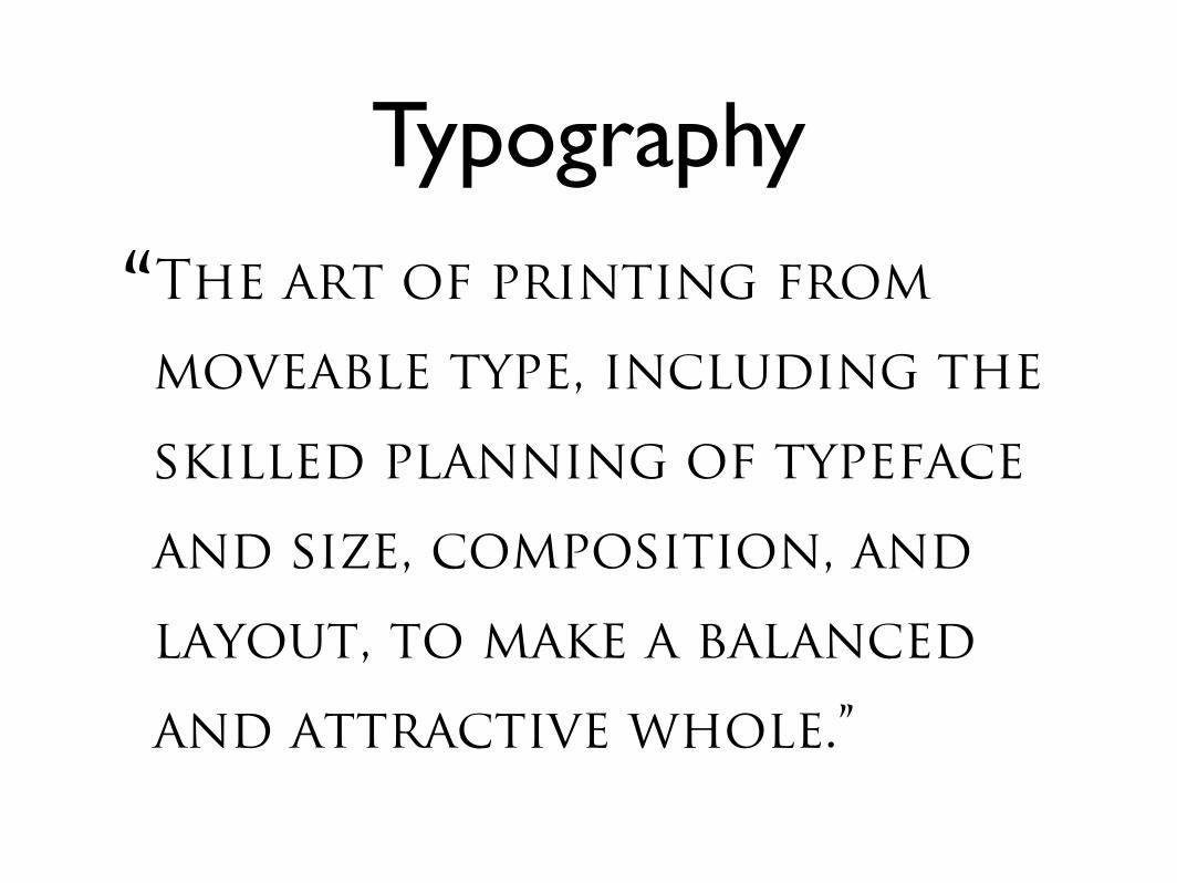
Typography
“The art of printing from
moveable type, including the
skilled planning of typeface
and size, composition, and
layout, to make a balanced
and attractive whole.”
Previously...
Previously...
• We learned that the first typefaces were based on the handwriting used by monks to copy books
Previously...
• We learned that the first typefaces were based on the handwriting used by monks to copy books
• Gutenberg used the “gothic” style which was in common use at the time
Previously...
• We learned that the first typefaces were based on the handwriting used by monks to copy books
• Gutenberg used the “gothic” style which was in common use at the time
• The printers of the Italian Renaissance instead chose to use an earlier, more legible, style of lettering as the model.
Alphabets
Alphabets
• We actually use several distinct alphabets
Alphabets
• We actually use several distinct alphabets
• CAPITAL LETTERS are also known as majuscules or upper case
Alphabets
• We actually use several distinct alphabets
• CAPITAL LETTERS are also known as majuscules or upper case
• Lower case letters are also known as minuscules
Together… at last!
Together… at last!
• It was actually printers who first thought to join together majuscules & minuscules.
Together… at last!
• It was actually printers who first thought to join together majuscules & minuscules.
• So you can blame the printers of the Italian Renaissance for making you put a capital letter at the beginning of a sentence!
Upper and Lower
The terms “upper case” and “lower case” date from the earliest days of printing, when the different alphabets were kept in different parts of the printer’s case of letters
CAPITALS
CAPITALS
• The early printers copied their capital letters from inscriptions carved in stone
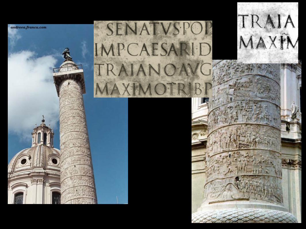
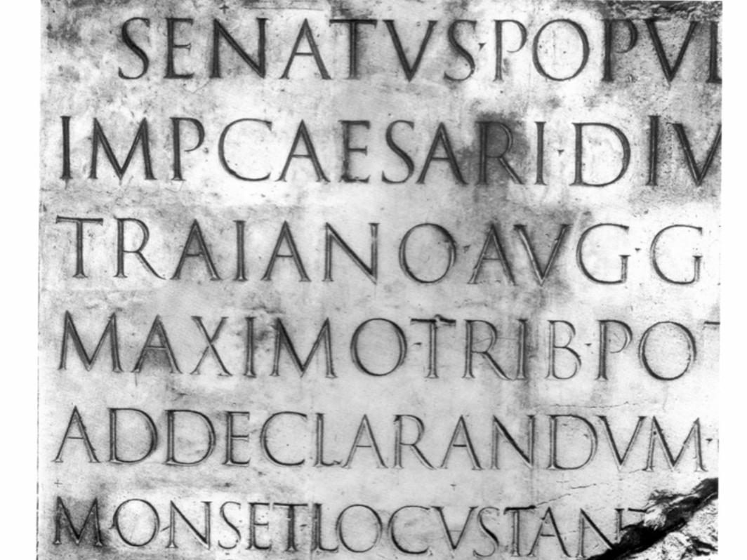
CAPITALS
• The early printers copied their capital letters from inscriptions carved in stone
• The letters from TRAJAN’S COLUMN in Rome (113 a.d.) are the classic model for Roman typefaces
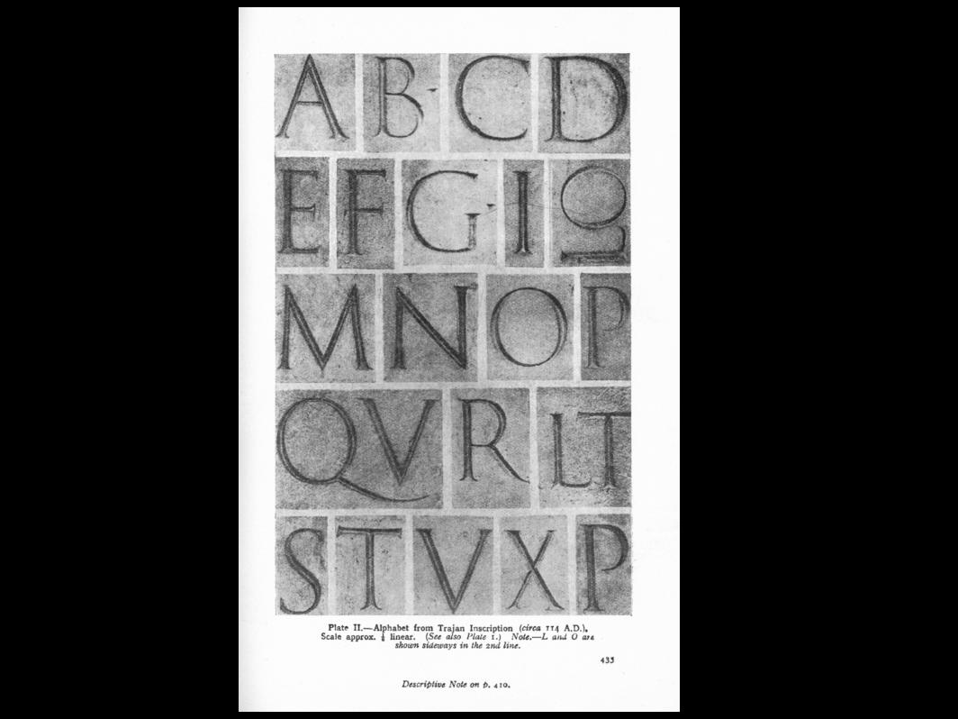
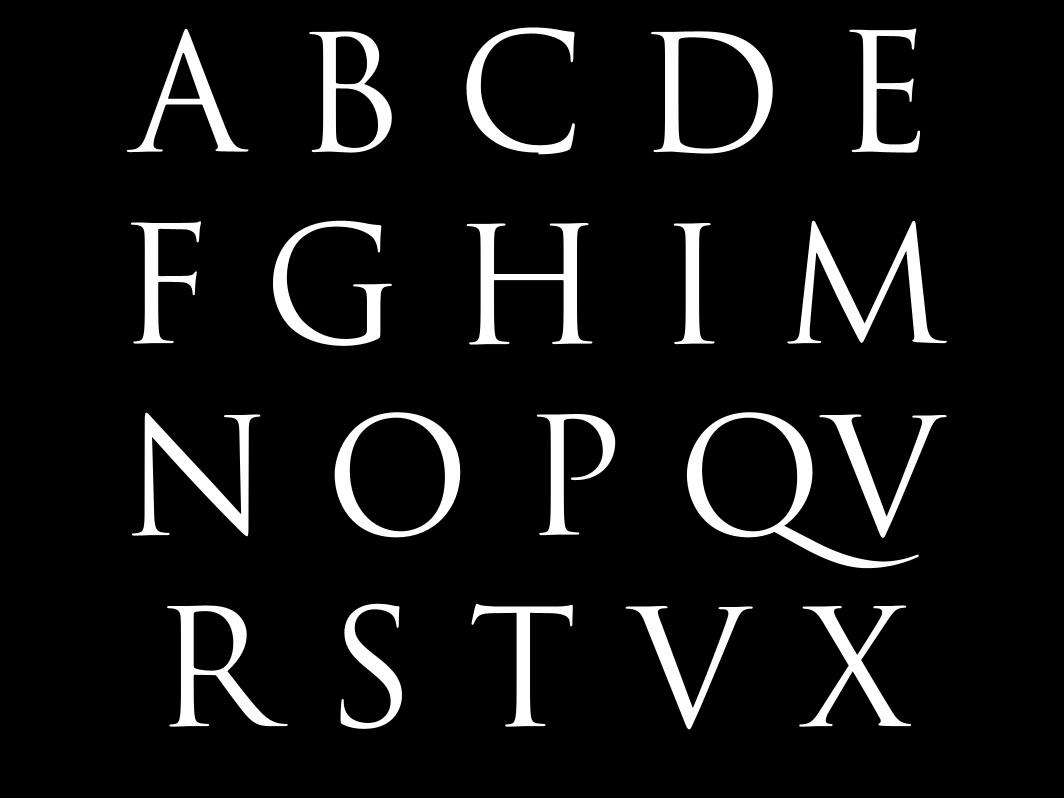
A B C D E F G H I M N O P QV R S T V X
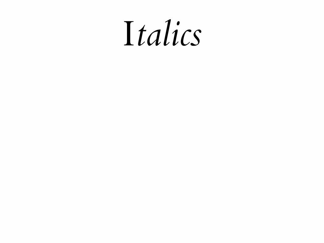
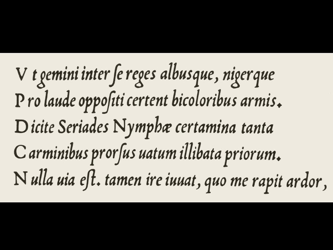
Italics
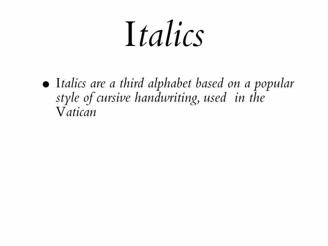
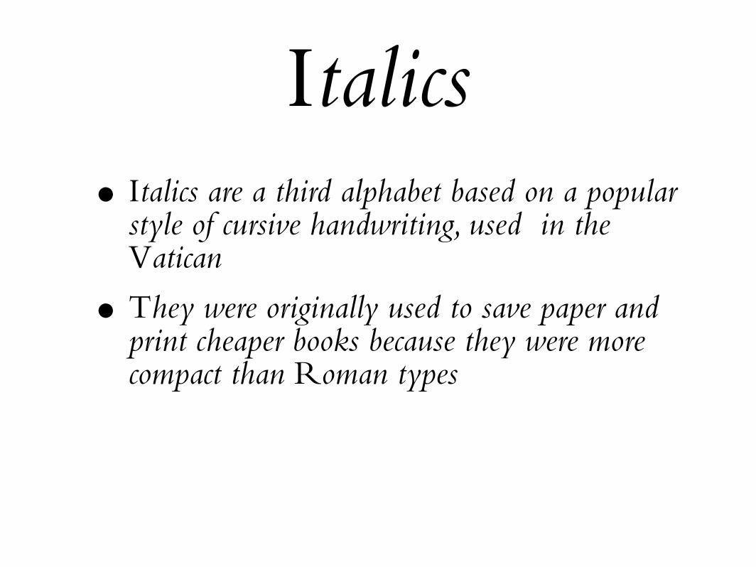
Italics• Italics are a third alphabet based on a popular
style of cursive handwriting, used in the Vatican
Italics• Italics are a third alphabet based on a popular
style of cursive handwriting, used in the Vatican
• They were originally used to save paper and print cheaper books because they were more compact than Roman types
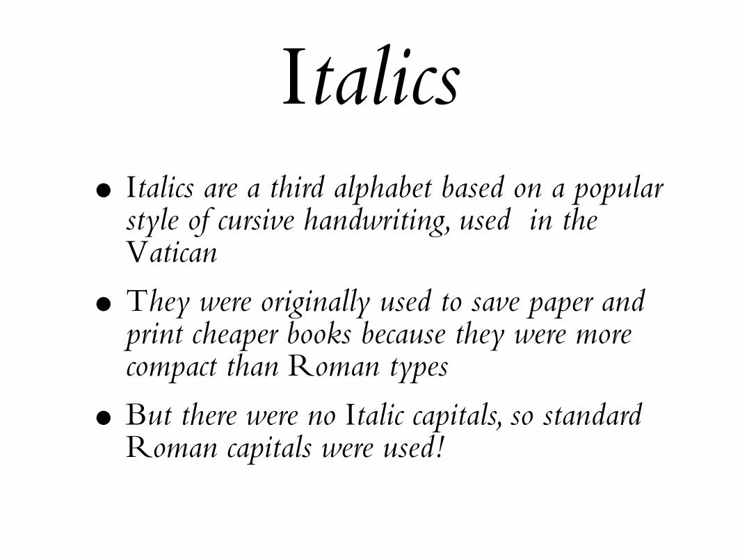
Italics• Italics are a third alphabet based on a popular
style of cursive handwriting, used in the Vatican
• They were originally used to save paper and print cheaper books because they were more compact than Roman types
• But there were no Italic capitals, so standard Roman capitals were used!
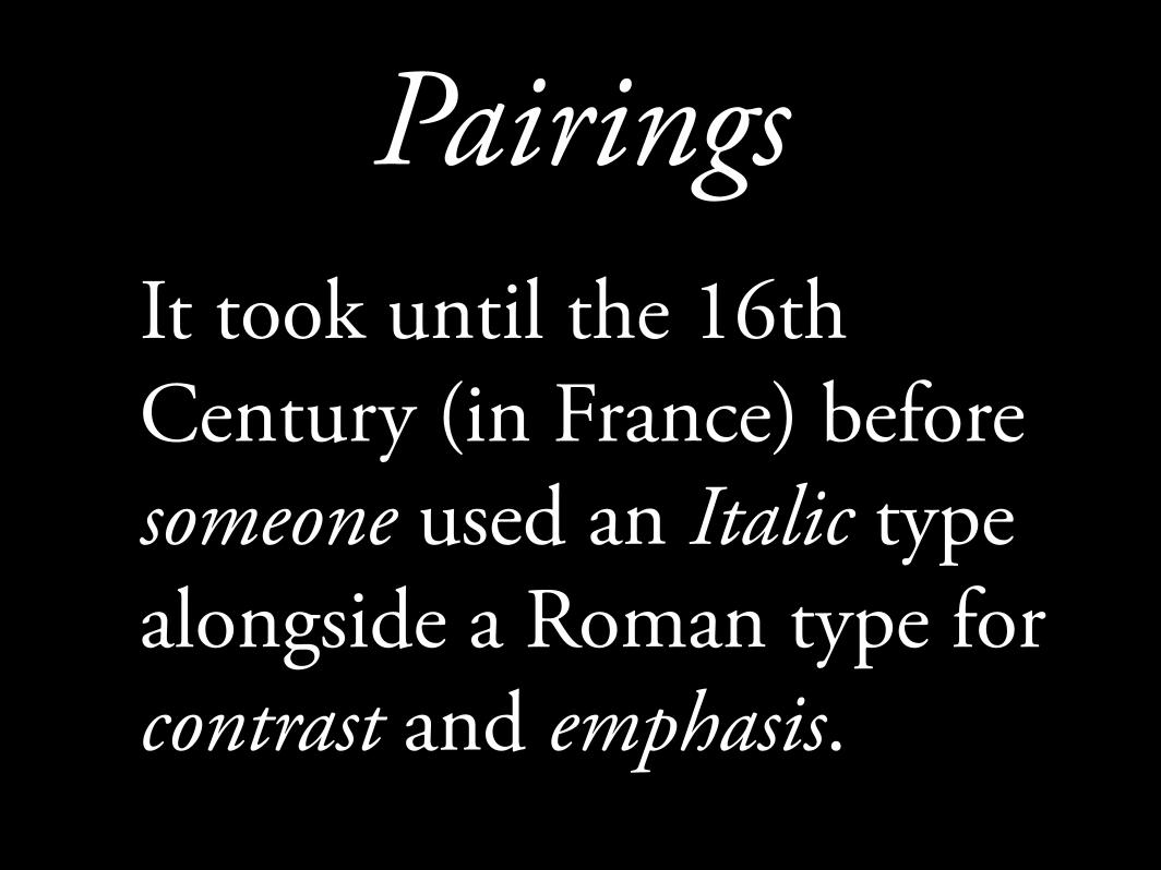
PairingsIt took until the 16th Century (in France) before someone used an Italic type alongside a Roman type for contrast and emphasis.
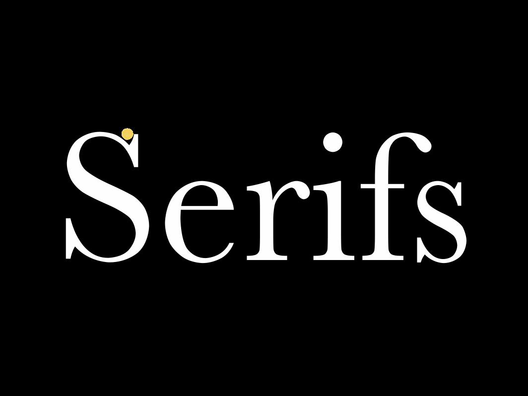
Serifs
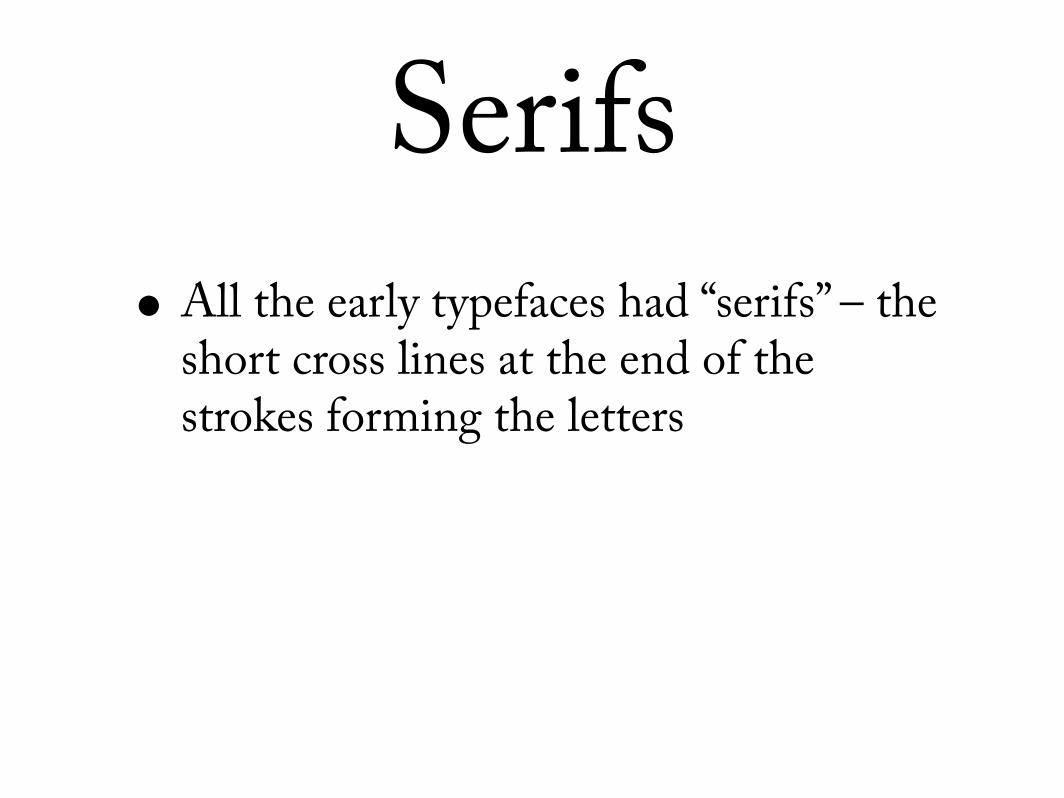
Serifs• All the early typefaces had “serifs” – the
short cross lines at the end of the strokes forming the letters
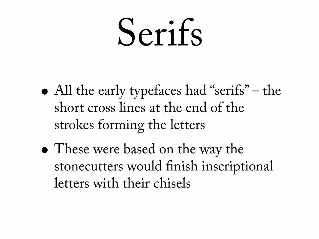
Serifs• All the early typefaces had “serifs” – the
short cross lines at the end of the strokes forming the letters
• These were based on the way the stonecutters would finish inscriptional letters with their chisels
Serifs
Serifs

Serifs
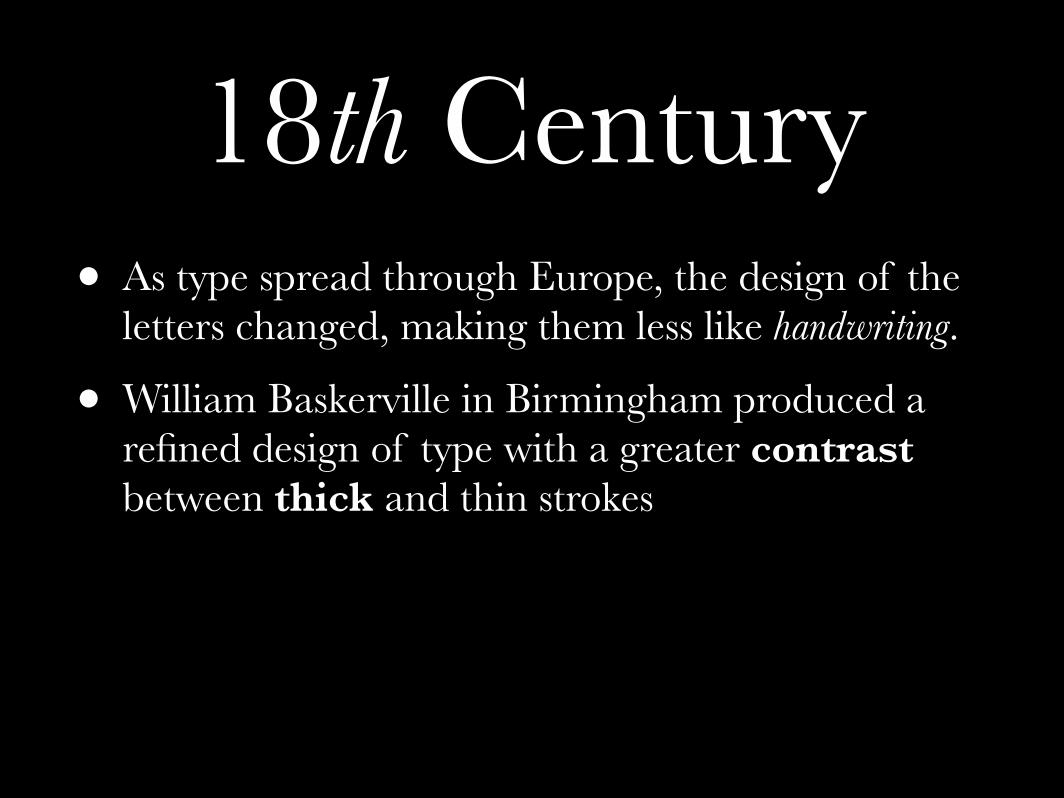
18th Century
18th Century• As type spread through Europe, the design of the
letters changed, making them less like handwriting.
18th Century• As type spread through Europe, the design of the
letters changed, making them less like handwriting.
• William Baskerville in Birmingham produced a refined design of type with a greater contrast between thick and thin strokes
18th Century• As type spread through Europe, the design of the
letters changed, making them less like handwriting.
• William Baskerville in Birmingham produced a refined design of type with a greater contrast between thick and thin strokes
• He also perfected the use of a truly black ink...
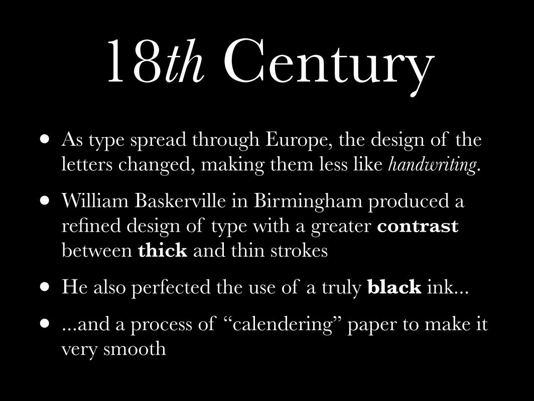
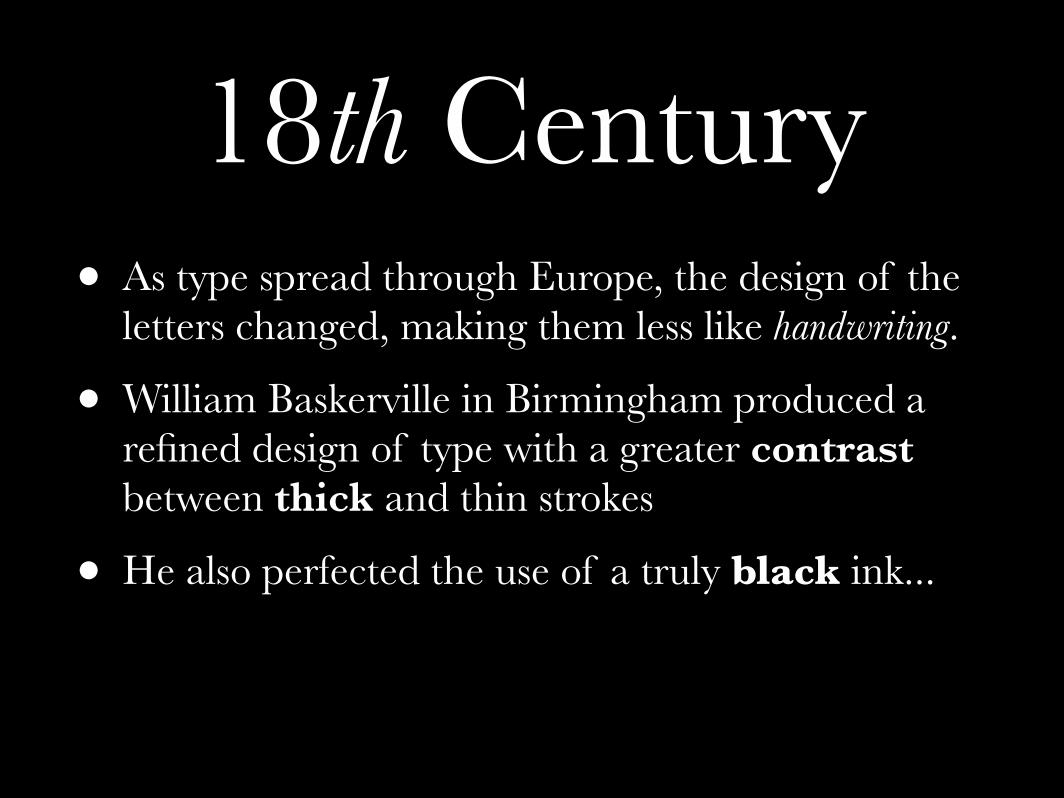
18th Century• As type spread through Europe, the design of the
letters changed, making them less like handwriting.
• William Baskerville in Birmingham produced a refined design of type with a greater contrast between thick and thin strokes
• He also perfected the use of a truly black ink...
• ...and a process of “calendering” paper to make it very smooth
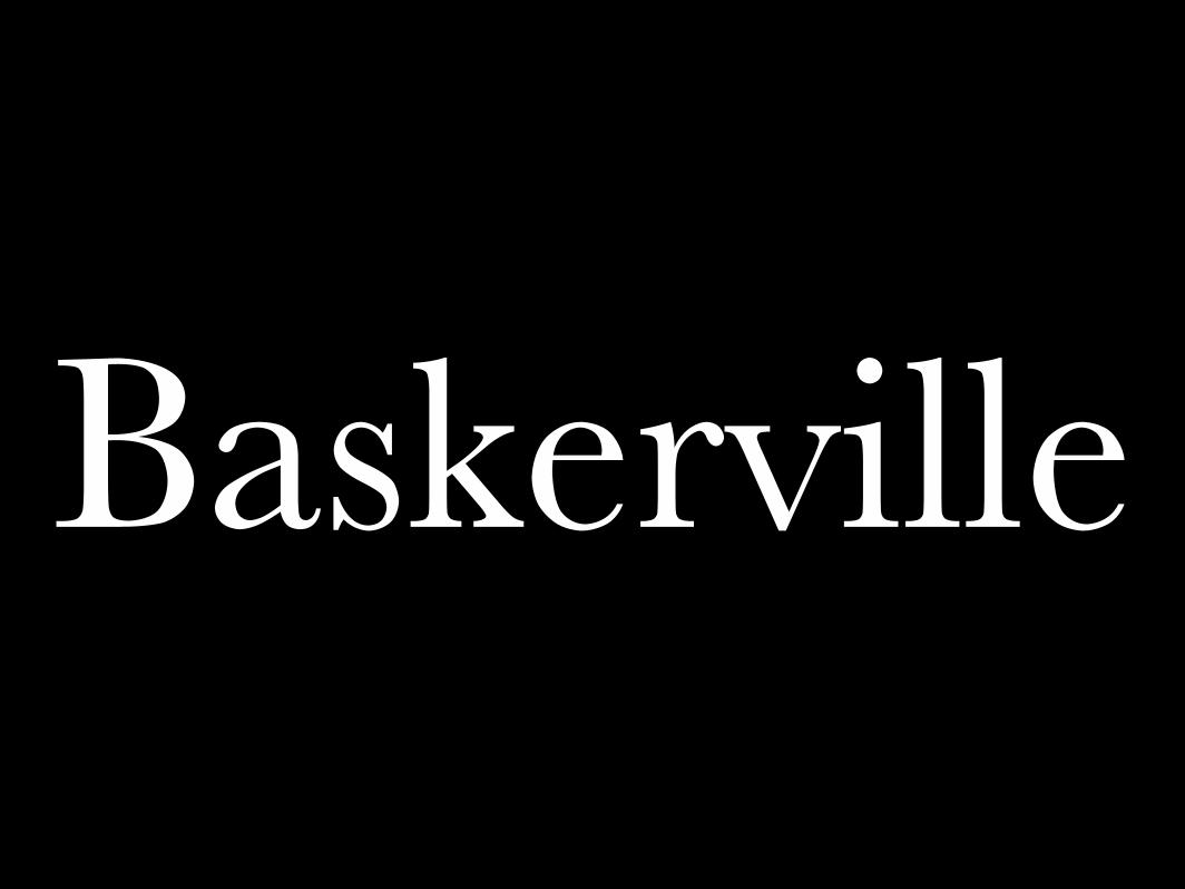
Baskerville
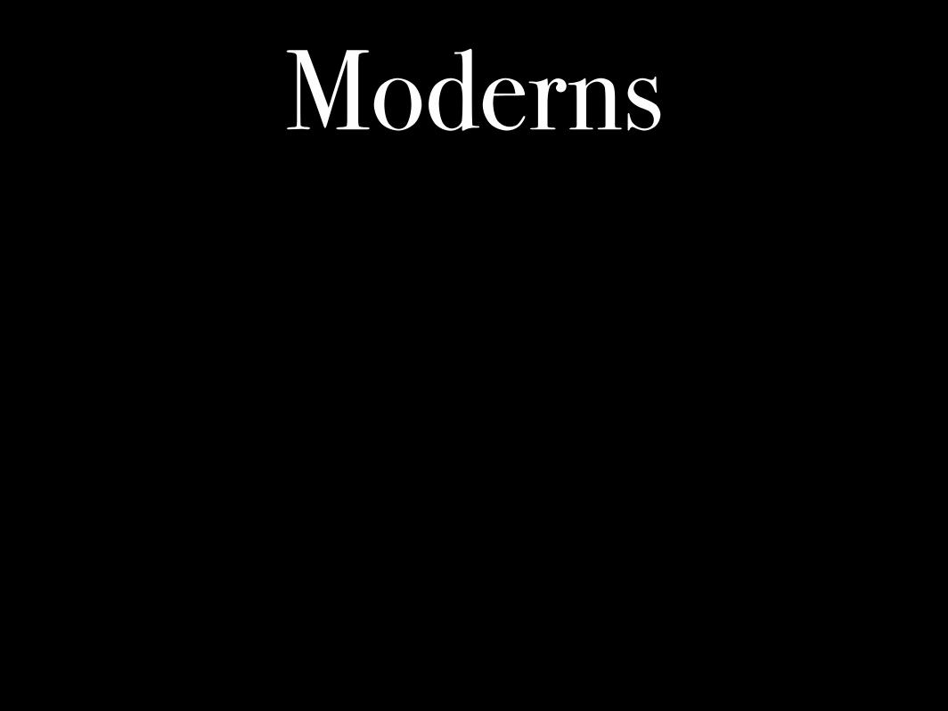
Moderns
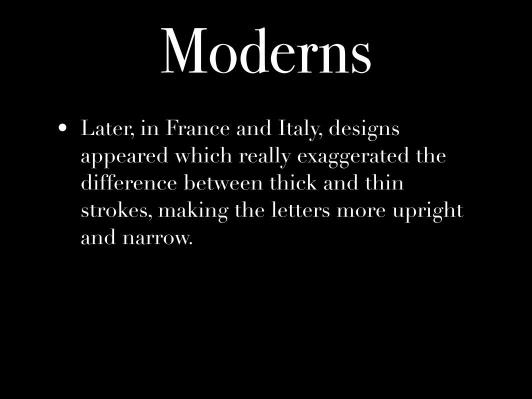
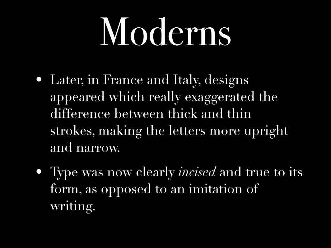
Moderns• Later, in France and Italy, designs
appeared which really exaggerated the difference between thick and thin strokes, making the letters more upright and narrow.
Moderns• Later, in France and Italy, designs
appeared which really exaggerated the difference between thick and thin strokes, making the letters more upright and narrow.
• Type was now clearly incised and true to its form, as opposed to an imitation of writing.
BodoniDidot
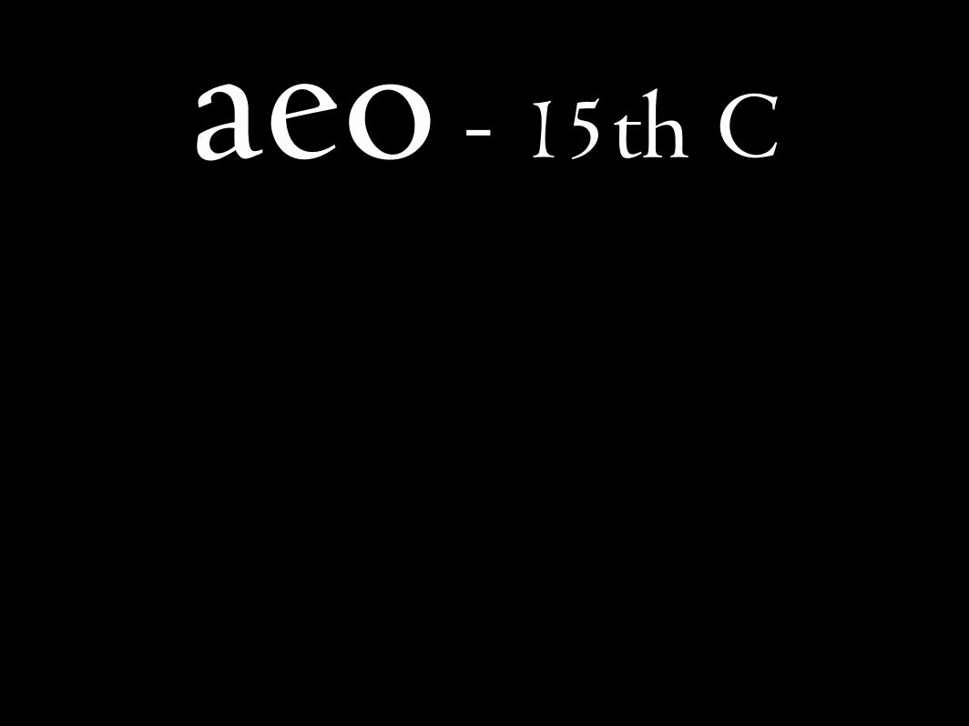
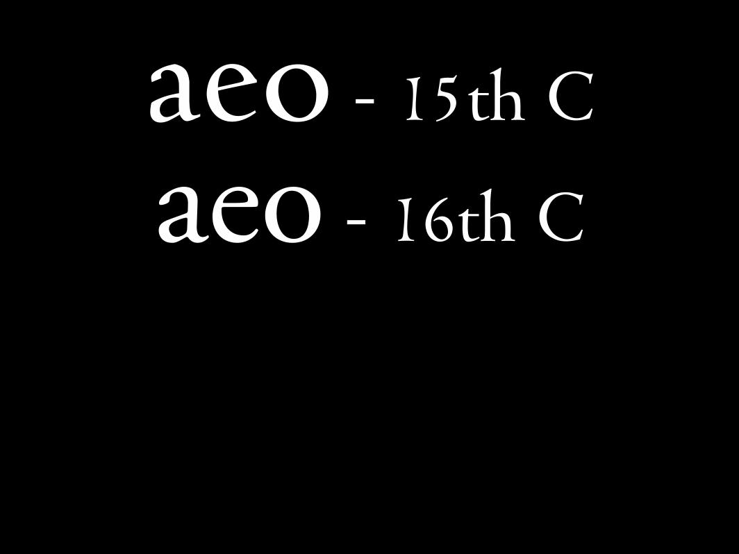
aeo - 15th C
aeo - 15th C
aeo - 16th C
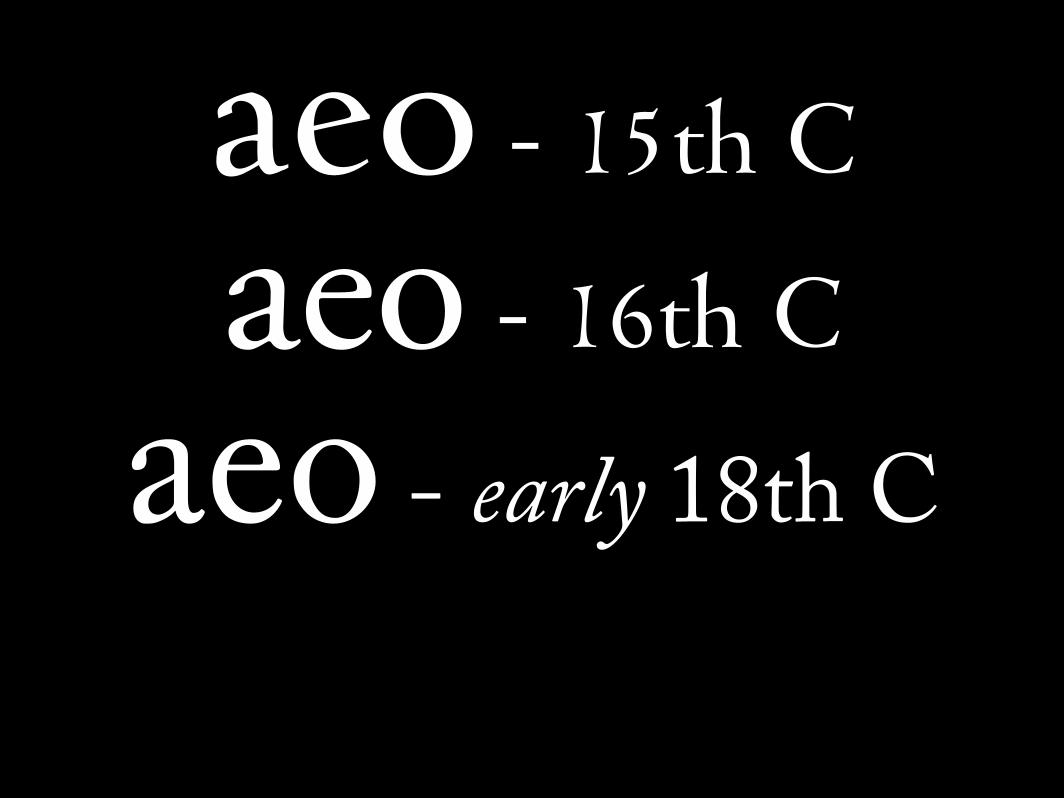
aeo - 15th C
aeo - 16th C
aeo - early 18th C
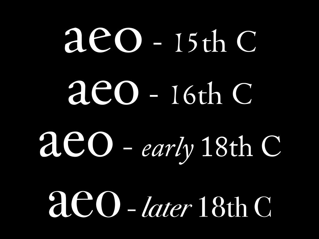
aeo - 15th C
aeo - 16th C
aeo - early 18th Caeo - later 18th C
Pinnacle
Pinnacle
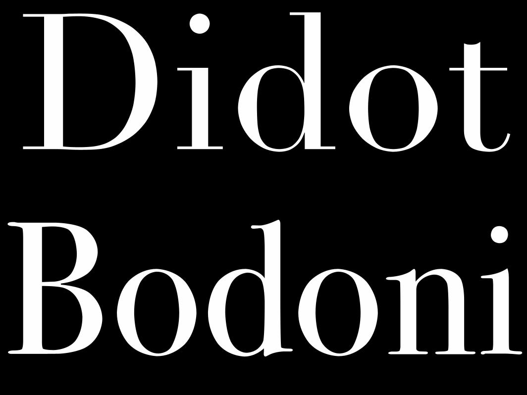
• The 18th Century was in many ways the pinnacle of letterpress printing.
Pinnacle
• The 18th Century was in many ways the pinnacle of letterpress printing.
• In the 19th Century, mechanisation offered greater speed at a lower quality
Pinnacle
• The 18th Century was in many ways the pinnacle of letterpress printing.
• In the 19th Century, mechanisation offered greater speed at a lower quality
• The fine types of Didot and Bodoni couldn’t survive the poor conditions

“Grots”
“Grots”
• In the 19th Century, a new form of letter appeared, without serifs.
“Grots”
• In the 19th Century, a new form of letter appeared, without serifs.
• These were called sans-serif typefaces
“Grots”
• In the 19th Century, a new form of letter appeared, without serifs.
• These were called sans-serif typefaces
• They were also called “grotesques” or “grots” because some thought them ugly
“Grots”
• In the 19th Century, a new form of letter appeared, without serifs.
• These were called sans-serif typefaces
• They were also called “grotesques” or “grots” because some thought them ugly
• They were also (ironically) called “Gothics”
Explosion
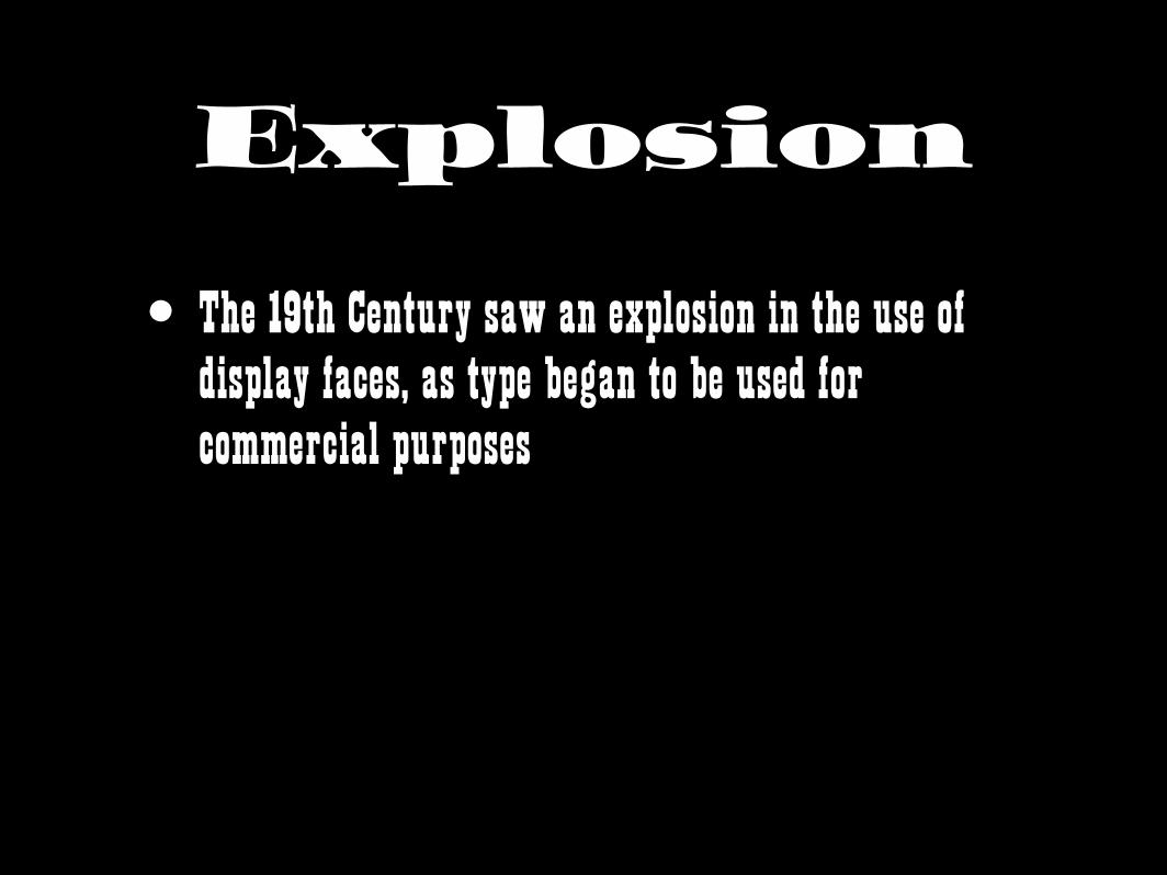
Explosion
• The 19th Century saw an explosion in the use of display faces, as type began to be used for commercial purposes
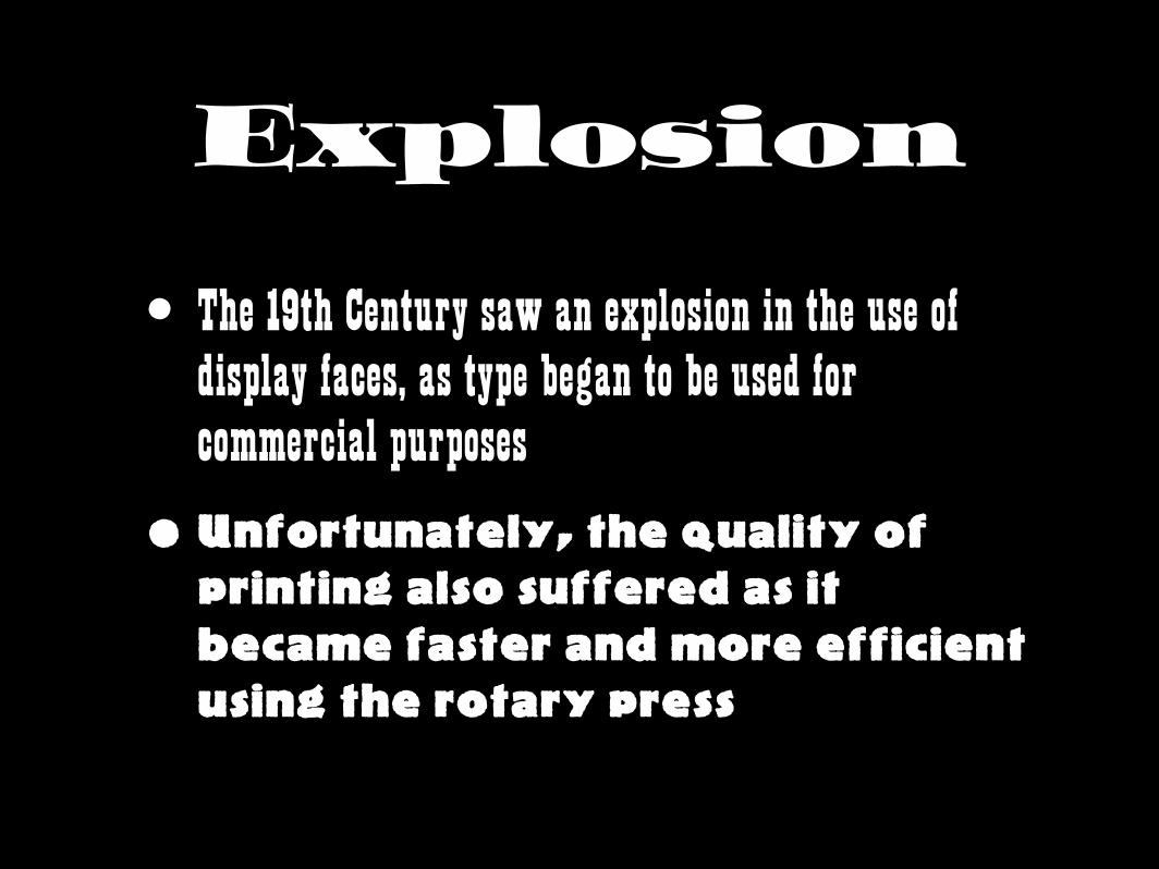
Explosion
• The 19th Century saw an explosion in the use of display faces, as type began to be used for commercial purposes
• Unfortunately, the quality of printing also suffered as it became faster and more efficient using the rotary press
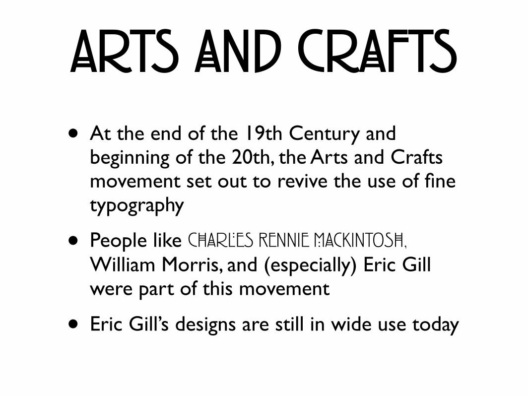
Arts and Crafts• At the end of the 19th Century and
beginning of the 20th, the Arts and Crafts movement set out to revive the use of fine typography
• People like Charles Rennie Mackintosh, William Morris, and (especially) Eric Gill were part of this movement
• Eric Gill’s designs are still in wide use today
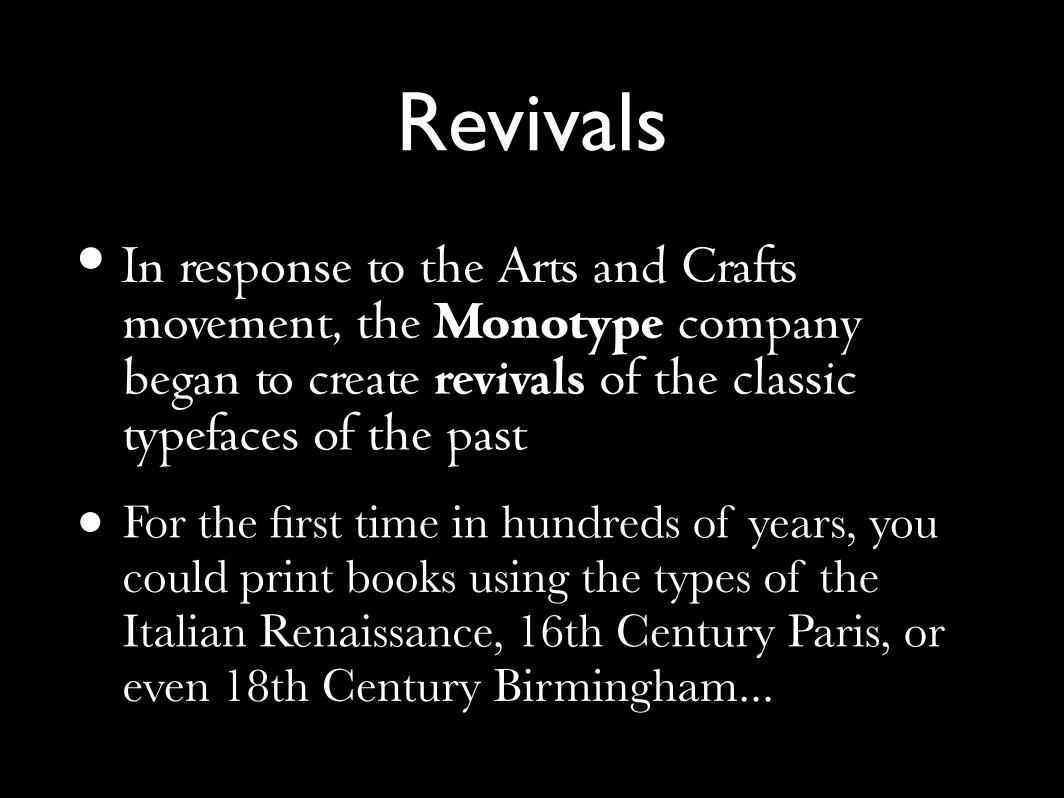
Revivals
• In response to the Arts and Crafts movement, the Monotype company began to create revivals of the classic typefaces of the past
• For the first time in hundreds of years, you could print books using the types of the Italian Renaissance, 16th Century Paris, or even 18th Century Birmingham...
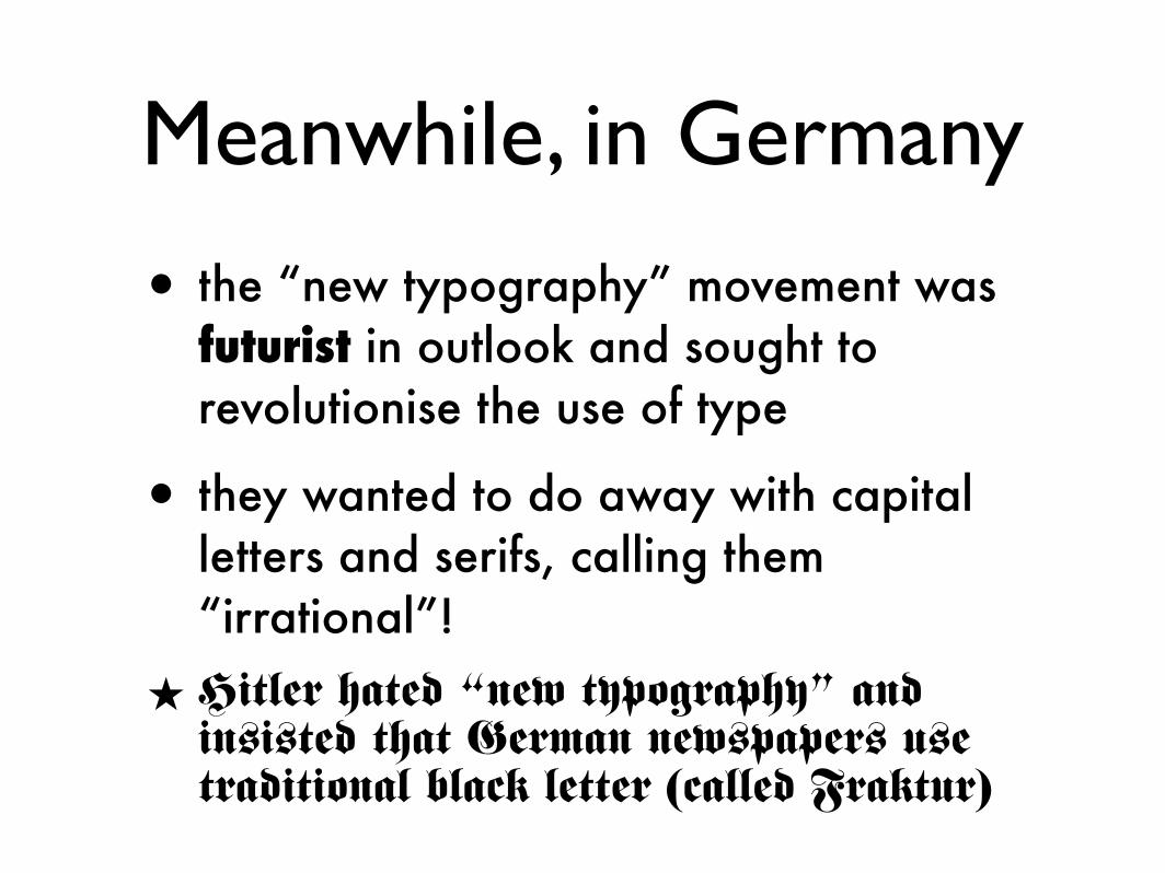
Meanwhile, in Germany
• the “new typography” movement was futurist in outlook and sought to revolutionise the use of type
• they wanted to do away with capital letters and serifs, calling them “irrational”!
★ Hitler hated “new typography” and insisted that German newspapers use traditional black letter (called Fraktur)

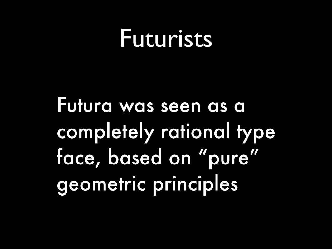
futura
Futurists
Futura was seen as a completely rational type face, based on “pure” geometric principles
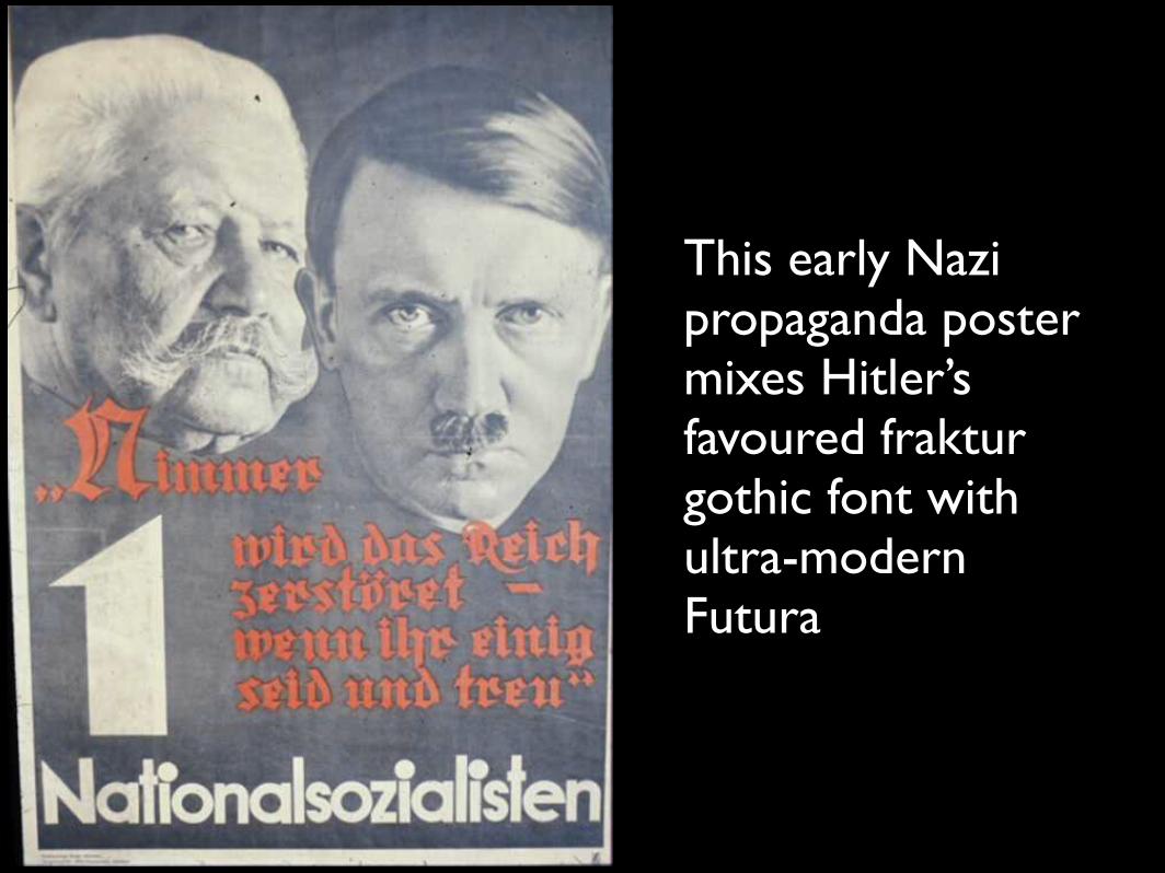
This early Nazi propaganda poster mixes Hitler’s favoured fraktur gothic font with ultra-modern Futura
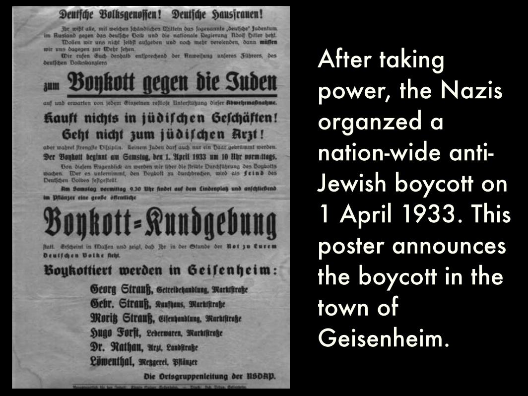
After taking power, the Nazis organzed a nation-wide anti-Jewish boycott on 1 April 1933. This poster announces the boycott in the town of Geisenheim.
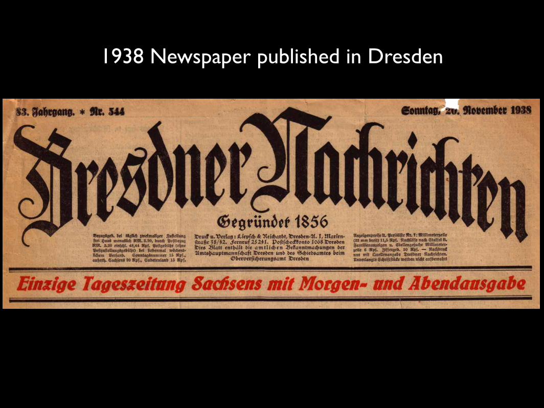
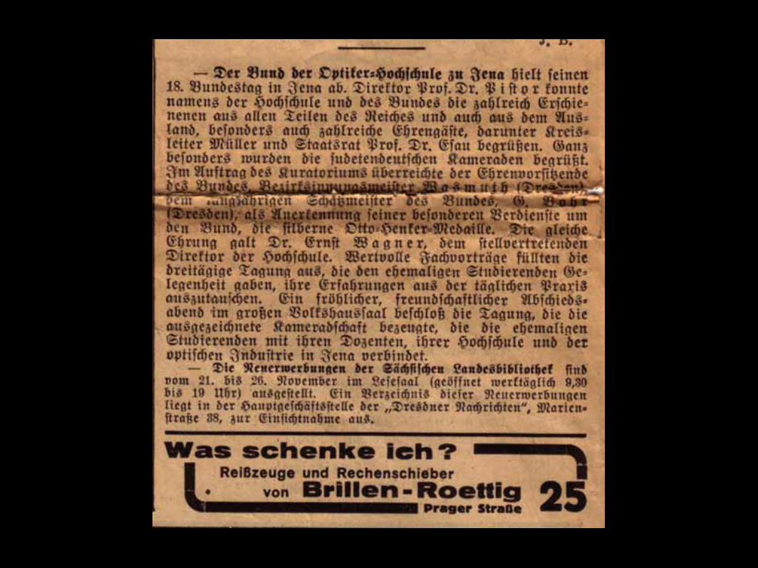
1938 Newspaper published in Dresden
• In 1943, Hitler completely changed his mind and declared that Roman types should be used in preference to the Frakturs.
• He realised that – if he won the war – people in his conquered countries would find his propaganda easier to read in a more legible type.
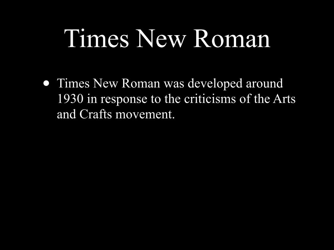
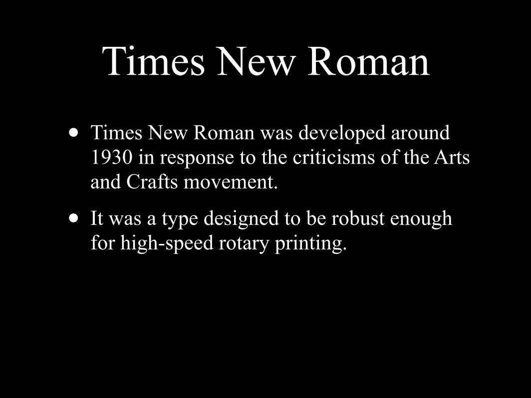
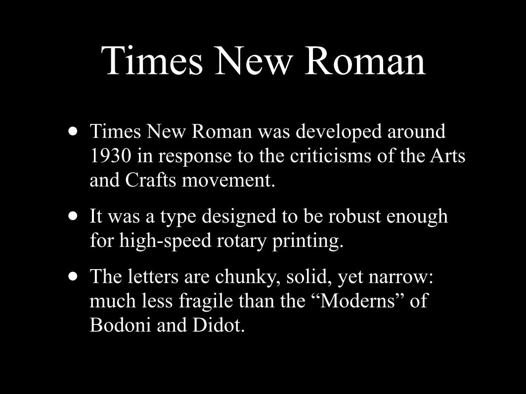
Times New Roman
Times New Roman
• Times New Roman was developed around 1930 in response to the criticisms of the Arts and Crafts movement.
Times New Roman
• Times New Roman was developed around 1930 in response to the criticisms of the Arts and Crafts movement.
• It was a type designed to be robust enough for high-speed rotary printing.
Times New Roman
• Times New Roman was developed around 1930 in response to the criticisms of the Arts and Crafts movement.
• It was a type designed to be robust enough for high-speed rotary printing.
• The letters are chunky, solid, yet narrow: much less fragile than the “Moderns” of Bodoni and Didot.

Times

Switzerland
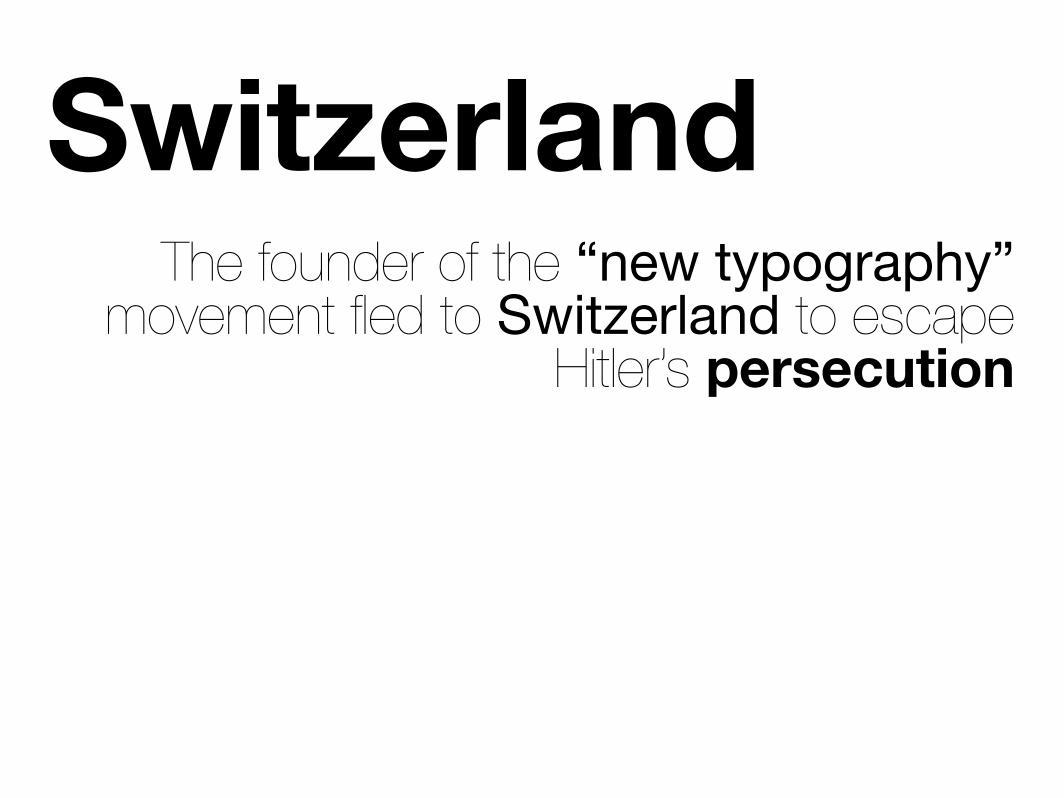
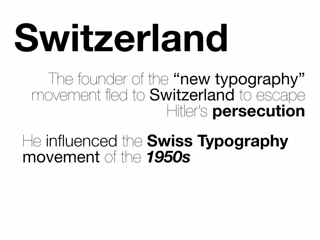
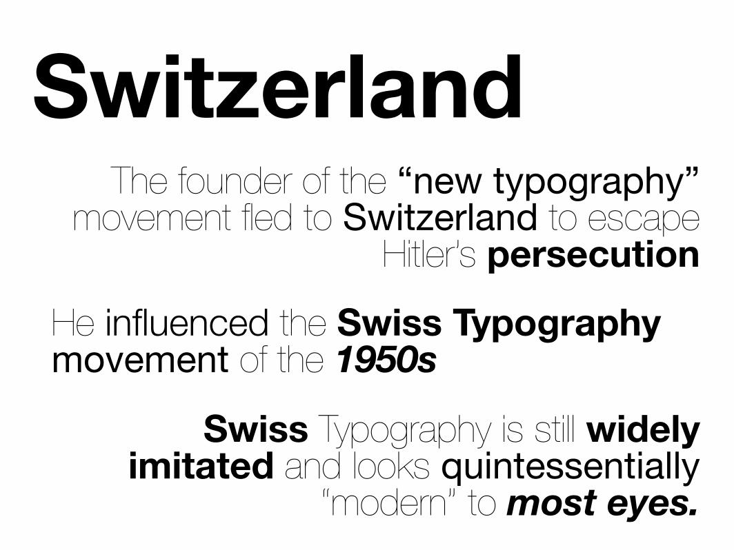
SwitzerlandThe founder of the “new typography”
movement fled to Switzerland to escape Hitler’s persecution
SwitzerlandThe founder of the “new typography”
movement fled to Switzerland to escape Hitler’s persecution
He influenced the Swiss Typography movement of the 1950s
SwitzerlandThe founder of the “new typography”
movement fled to Switzerland to escape Hitler’s persecution
He influenced the Swiss Typography movement of the 1950s
Swiss Typography is still widely imitated and looks quintessentially
“modern” to most eyes.
SwissTypes
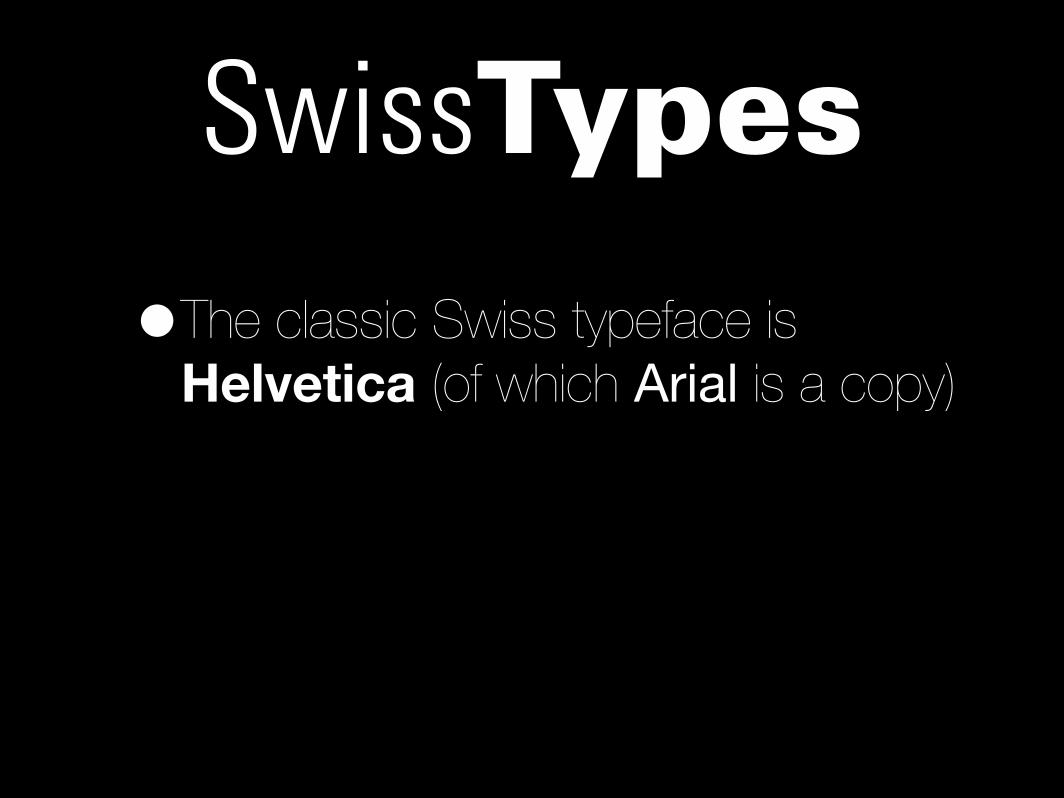
SwissTypes•The classic Swiss typeface is
Helvetica (of which Arial is a copy)
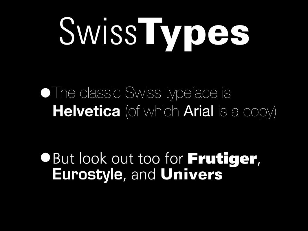
SwissTypes•The classic Swiss typeface is
Helvetica (of which Arial is a copy)
•But look out too for Frutiger, Eurostyle, and Univers

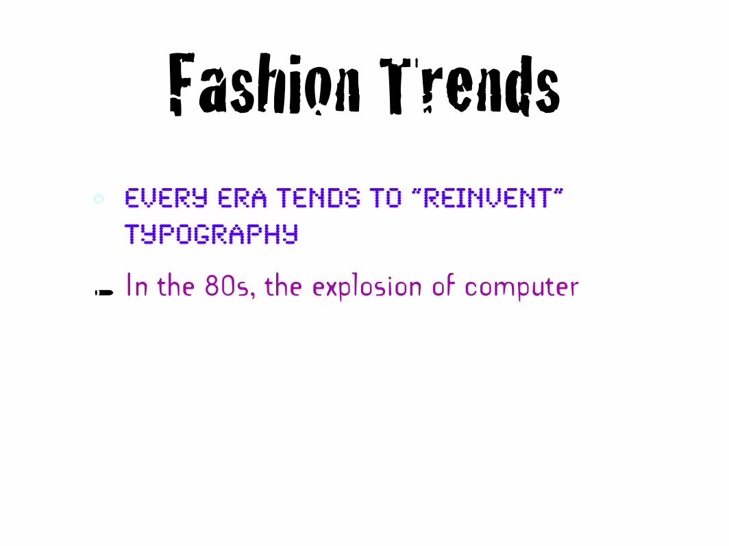
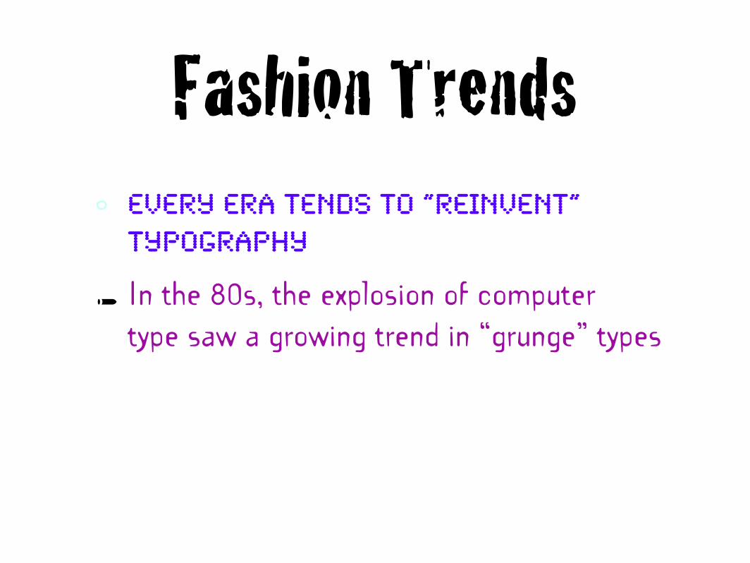
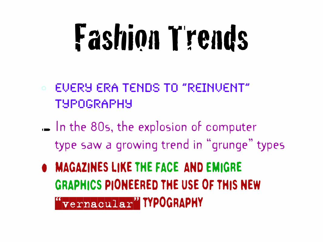
Fashion Trends
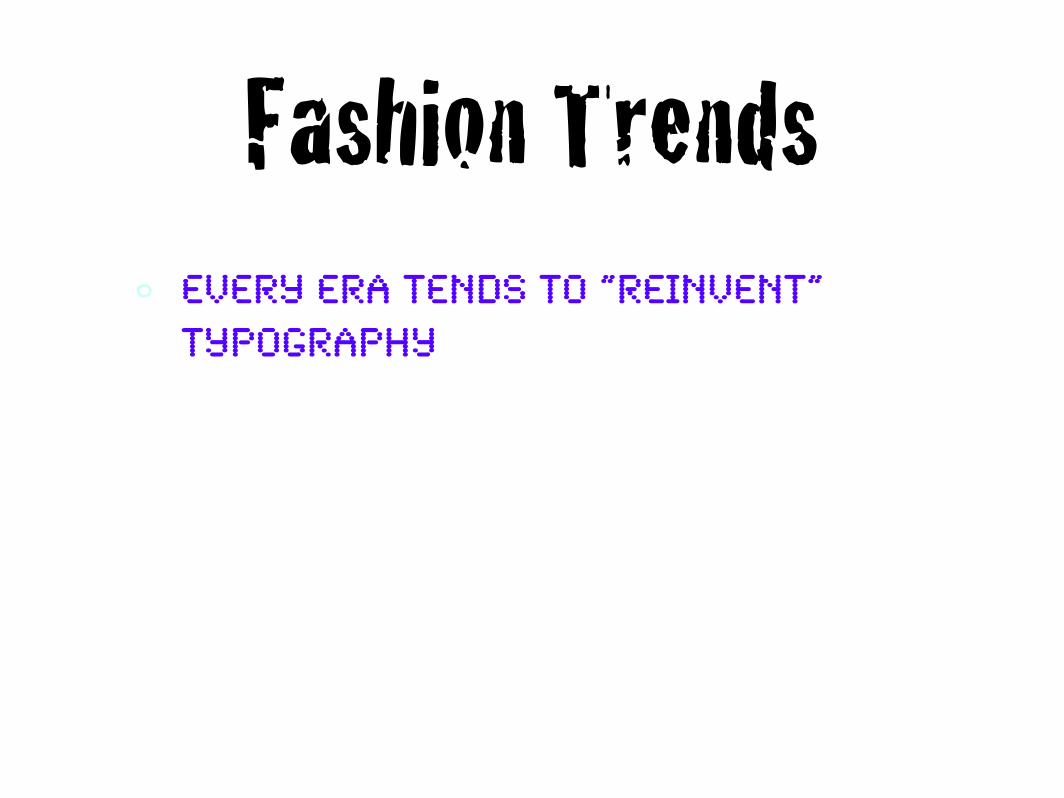
Fashion Trends• Every era tends to “reinvent”
typography
Fashion Trends• Every era tends to “reinvent”
typography
• In the 80s, the explosion of computer
Fashion Trends• Every era tends to “reinvent”
typography
• In the 80s, the explosion of computertype saw a growing trend in “grunge” types
Fashion Trends• Every era tends to “reinvent”
typography
• In the 80s, the explosion of computertype saw a growing trend in “grunge” types
• Magazines like The Face and Emigre Graphics pioneered the use of this new “vernacular” typography
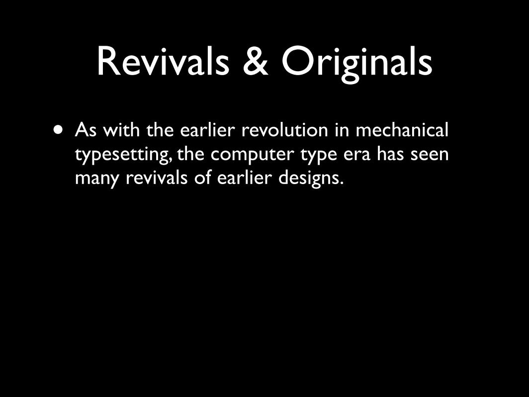
Revivals & Originals
Revivals & Originals
• As with the earlier revolution in mechanical typesetting, the computer type era has seen many revivals of earlier designs.
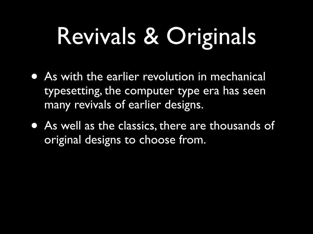
Revivals & Originals
• As with the earlier revolution in mechanical typesetting, the computer type era has seen many revivals of earlier designs.
• As well as the classics, there are thousands of original designs to choose from.
Revivals & Originals
• As with the earlier revolution in mechanical typesetting, the computer type era has seen many revivals of earlier designs.
• As well as the classics, there are thousands of original designs to choose from.
• Professional typefaces can cost as much as $200 per package (e.g. regular, italic, bold etc.), but there are also plenty available for free on the internet.
Review
• What are the three alphabets commonly combined in typography?
• What are the short cross lines at the end of the strokes in Roman letters called? And what is a grot?
• Name two of the major typographical movements of the 20th Century
• What typeface would you use in your magazine?
Homework
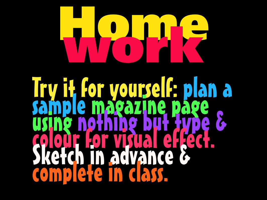
HomeworkTry it for yourself: plan a sample magazine page using nothing but type & colour for visual effect. Sketch in advance & complete in class.