uncanny subjects
TRANSCRIPT


“Just an uneven pot we had to draw in class.” - Gerardo Martinez
Crooked Pot
This is a line drawing made in Adobe Illustrator. It is a one hundred line drawing of a pot. I drew lines from left to right and from the bottom to the top of the pot while observing the actual pot in front of me. I ad-justed the size and the speed of my stroked lines to carefully form the structure of the entire object. After I have formed the basic structure of the pot, I drew additionl lines from the leftover lines I have I still have in making this a one hundred line drawing to form the small details of shape of the object such as the lid of the pot.
The idea of this drawing is to teach myself how to pre-pare drawing any figure by first learning how to draw the basic structure of the object. Also, the drawing would teach me how to draw the object with stroked lines which would teach me about consistancy in lines and similarities to the object itself.
I want the audience to see how my lines begin to be-come consistant after each line from the bottom to the top. I also want the audience to be able to see the re-semblence of a pot formed from all the lines drawn in this artwork.
A one hundred line drawing of a pot.
Uncanny Subjects - 32 - Uncanny Subjects

“Just a spray bottle I found in the classroom.” - Gerardo Martinez
Spray Bottle
This is a line drawing made in Adobe Illustrator. It is a one hundred line drawing of a spray bottle. I drew the lines from left to right and from the bottom to the top of the spray bottle while observing the actual spray bottle in front of me. I adjusted the size and the speed of my stroked lines to carefully form the structure of the entire object. After I have formed the basic struc-ture of the spray bottle, I drew additionl lines from the leftover lines I still have in making this a one hundred line drawing to form the small details of shape of the object such as the spray cap of the spray bottle.
The idea of this drawing is to teach myself how to prepare drawing any figure by first learning how to draw the basic structure of the object. Also, the drawing would teach me how to draw the object with stroked lines which would teach me about consistancy in lines and similarities to the object itself. I believe my line drawing skills is getting better based on the comparison of this spraybottle line drawing to the pre-vious pot line drawing.
I want the audience to see how my lines begin to be-come consistant after each line from the bottom to the top and the improvement of my line drawing in com-parison to the previous line drawing. I also want the audience to be able to see the resemblence of a spray bottle formed from all the lines drawn in this artwork.
A one hundred line drawing of a spray bottle.
Uncanny Subjects - 54 - Uncanny Subjects

“Just a wine bottle an empty wine bottle I found in class.” - Gerardo Martinez
Wine Bottle
This is a line drawing made in Adobe Illustrator. It is a one hundred line drawing of a wine bottle. I drew lines from left to right and from the bottom to the top of the wine bottle while observing the actual wine bot-tle in front of me. I adjusted the size and the speed of my stroked lines to carefully form the structure of the entire object. After I have formed the basic structure of the wine bottle. I drew additionl lines from the left-over lines I still have in making this a one hundred line drawing to form the small details of the shape of the object such as the cork and front label of the wine bottle.
The idea of this drawing is to teach myself how to pre-pare drawing any figure by first learning how to draw the basic structure of the object. Also, the drawing would teach me how to draw the object with stroked lines which would teach me about consistancy in lines and similarities to the object itself. I believe my line dawing skill have improved much more based on com-parison of this line drawing to the previous two line drawings.
I want the audience to see how my lines begin to be-come consistant after each line from the bottom to the top and my consistancy is improved from the previous line drawings. I also want the audience to be able to see the resemblence of a pot formed from all the lines drawn in this artwork.
A one hundred line drawing of a wine bottle.
Uncanny Subjects - 76 - Uncanny Subjects

Glass Cup“Lighting of the cup was very enjoyable to observe, draw and shade.” - Gerardo Martinez
This is a value drawing made in Adobe Illustrator. It is a value of drawing of a glass cup. While observing the glass cup, first I made a one hundred line drawing of the glass cup to form the base structure of the cup. Then, I used the lighting in the same room as the cup as the light source in the drawing. Because the light is shining from the right, I began with the lightest shade of gray on the right sides of the cup. While observing the glass cup again but now with the source shining on it, I drew a series of x’s on the cup with the select-ed gray color shade to form each levels of darks and lights accurately. Also, I focused on the different parts of the cup that formed their own levels of value such as the bottom base and the stem of the cup.
The idea of this value drawing is to practice my skill to distinguish the different values of light and darks formed on an object by a light source and shade in each level accurately.
I want the audience to be able to determine where the light source is located and the object being illuminated is a glass cup. Also, I want the audience to see how I drew the values of the cup based on the shadings I made on the cup in the light source .
A value drawing of a glass cup with a light source shining o the cup.
Uncanny Subjects - 98 - Uncanny Subjects
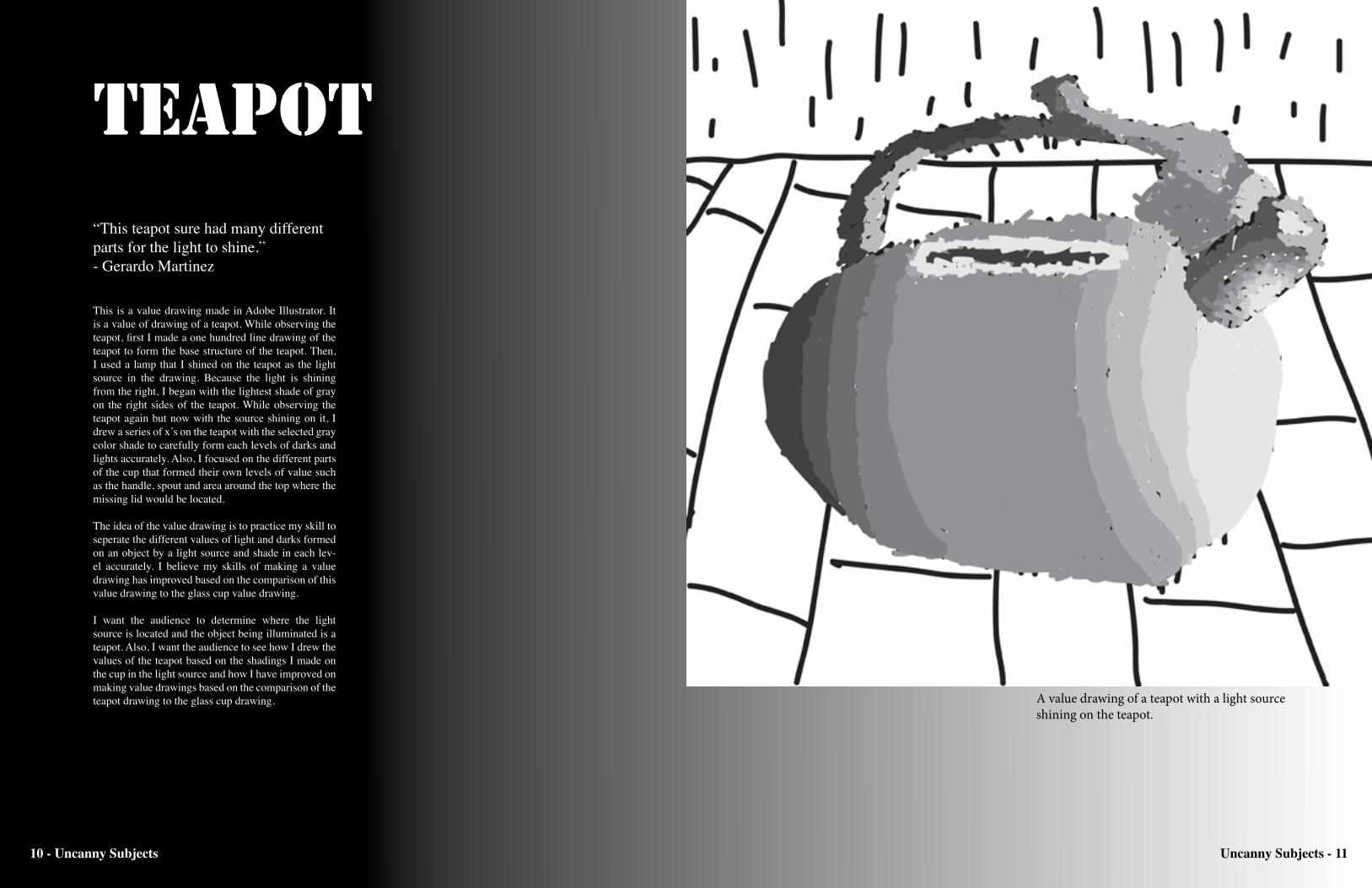
Teapot“This teapot sure had many different parts for the light to shine.” - Gerardo Martinez
This is a value drawing made in Adobe Illustrator. It is a value of drawing of a teapot. While observing the teapot, first I made a one hundred line drawing of the teapot to form the base structure of the teapot. Then, I used a lamp that I shined on the teapot as the light source in the drawing. Because the light is shining from the right, I began with the lightest shade of gray on the right sides of the teapot. While observing the teapot again but now with the source shining on it, I drew a series of x’s on the teapot with the selected gray color shade to carefully form each levels of darks and lights accurately. Also, I focused on the different parts of the cup that formed their own levels of value such as the handle, spout and area around the top where the missing lid would be located.
The idea of the value drawing is to practice my skill to seperate the different values of light and darks formed on an object by a light source and shade in each lev-el accurately. I believe my skills of making a value drawing has improved based on the comparison of this value drawing to the glass cup value drawing.
I want the audience to determine where the light source is located and the object being illuminated is a teapot. Also, I want the audience to see how I drew the values of the teapot based on the shadings I made on the cup in the light source and how I have improved on making value drawings based on the comparison of the teapot drawing to the glass cup drawing. A value drawing of a teapot with a light source
shining on the teapot.
Uncanny Subjects - 1110 - Uncanny Subjects

Iphone 4“Loved drawing my own precious iphone.” - Gerardo Martinez
This is a value drawing made in Adobe Illustrator. It is a value of drawing of my iphone. While observing the iphone, first I made a one hundred line drawing of the iphone to form the structure of the device. Then, I used a lamp that I shined on the iphone as the light source in the drawing. Because the light is shining from the right, I began with the lightest shade of gray on the right sides of the iphone. While observing the iphone again but now with the source shining on it, I drew a series of x’s on the device with the selected gray color shade to carefully form each levels of darks and lights accurately. Also, I focused on the different parts of the iphone that formed their own levels of value such as the screen, speakers, buttons and metal border around the device.
The idea of this value drawing is to practice my skill to distinguish the different values of light and darks formed on an object by a light source and shade in each level correctly. I believe my skills of making a value drawing has improved based on the comparison of this value drawing to the glass cup and teapot value drawing.
I want the audience to be able to determine where the light source is located and the object being illuminat-ed is a teapot. Also, I want the audience to see how I drew the values of the iphone based on the shadings I made on the device in the light source and how I have improved on making value drawings based on the comparison of the iphone drawing to the glass cup and teapot drawing.
A value drawing of my iphone 4 with a light source shining o the iphone.
Uncanny Subjects - 1312 - Uncanny Subjects

This artwork was made in Adobe Illustrator. It is a drawing of a bottle using monochromatic colors of green. By making this a monochromatic artwork, I used the different levels of lights and darks of the color green. The bottle is being illuminated by a light source that shines on it from the left side of the bottle. The light causes to cast a shadow of the bottle from behind and form on the ground and the wall in the area. I used the lighter shades of green to form the lights of the bottle. Then, I used the darker shades of green to form the darks of the bottle. With both lights and darks, it forms a 3rd dimensional figure of a bottle.
The idea of this artwork is to visually show the details of the monochromatic color of green through the lights and shadows created by a light source in the artwork. Also, I wanted to show the difference of using lighter and darker shades of green when there is a light source in the artwork.
I want the audience to detemine where the light source would be located from light shining on the bottle and the location of the bottle’s shadow formed in the art-work. Also, I want the audience to see how used the color green to create the values of the bottle when it is illuminated by a light.
Illuminated Bottle“Even as the artist of this drawing, I do not know what the bottle is or what the bottle contains.” - Gerardo Martinez
Green bottle in an unknown green area with a light source shining on the bottle against a wall.
Uncanny Subjects - 1514 - Uncanny Subjects

This drawing was made in Adobe Illustrator. It is a complementary color drawing of a gecko in a grassy field. By making this a complementary drawing, I used the colors green and red which are opposites of each other in the color wheel. While using the colors red and green, I used the qualities of values within the art-work. The light source that shines on the gecko, rock, and grass field is the sun. The values in the grass are shown through the level changes of the color red from bottom to the top. The rock shows its value through the changing of the levels of red across it. The gecko itself shows the values of green through the different parts of the body formed from the light.
The idea of the drawing is to show how the comple-mentary colors green and red can form a piece of art. Also, it shows how the different levels and values of the colors red and green are formed when a light source is present. The drawing uses green because I had to make three different color based drawings which are monochramatic, complementary and analogous while using one same color throughout all the drawings.
I want the audinece to see the blends of the two colors through the lights and shadows in the artwork. Also, I want to see how I used the color green in this comple-mentary drawing and in the previous monochromatic drawing. By doing this, I want to share there opinions of what vibes do these two different artworks express.
Gecko in the Reds
“This gecko resembles my own pet gecko although it is not the same color as this gecko.” - Gerardo Martinez
Green gecko on a rock within a field of red grass with a light source shining on the gecko and field.
Uncanny Subjects - 1716 - Uncanny Subjects

This drawing was made in Adobe Illustrator. It is an analogous color drawing of a robed figure. By making this an analogous artwork, I used the colors green and blue which are beside each other in the color wheel. It a robed figure in an unknown location with an unseen light source shining on the figure. As the robed figure is shined by the light, I used the color green to form the values of the figure. I used the lighter shades of green to form the lights of the figure, Then, I used the darker shades of green to form the darks of the figure. Also, made a shadow of the figure that forms behind it on the floor and wall that is created by the light source.
The idea of this artwork is to show the attributtes of us-ing analogous colors as the shadows and lights formed from a light source.Also, it is to show the values of blue and green created in this artwork from a light source. The drawing uses green as the two previous drawings to show how the color green is used in a monochromat-ic, complementary, and this analogous drawing.
I want the audience to see how the light source has ex-istance from the lights, shadows, and different shades of both colors formed in the artwork. Also, I want the audience to see how I used the color green in this anal-ogous drawing and in the previous monochromatic and complementary drawings. By doing this, I want to share there opinions of what vibes do these three different artworks express.
Mysterious Robed Figure“Not only does does this robed figure raises questions about itself, it raises a variety of ansers to those questions.” - Gerardo Martinez
Green robed figure in a blue area with a light source shining on the figure against the wall.
Uncanny Subjects - 1918 - Uncanny Subjects

Uncanny Subjects - 2120 - Uncanny Subjects

In this video, I made an artwork using the procre-ate application on the ipad. It is a robed figure in an unknown space, pointing to a direction to no where while an aura forms around the figure. First, I made in white line derawing in a black background to form the structure of the figure. Using the color red as my value color, I drew a series of x’s to form the levels of darks and lights of the figure. I used an unknown light source to shine the figure from the left side where the lighter shades of red are located. Also, I focused on specific details of the figure that contain their own levels of lights and darks such as the arms, robe and in-side of the robe. Then, I colored the whole background blue while coloring with opacity and size levels of the brush which produced the blue wave-like image. Also, I used the brush to color in an aura-like outline around the figure.
The idea of this drawing is to invite the audience to speculate and share thier opinions of what purpose does this figure have and where it could be located.
I want the audience to be curious of the figure’s pur-pose and share their variety of opinions. Also, I want the audience to see what I drew based on the shape, lights and darks of the figure.
“Would you follow the direction it is pointing in the strange area where it resides?” - Gerardo Martinez
A red robed figure pointing in a direction in a strange in a strange background.
Uncanny Subjects - 2322 - Uncanny Subjects
The Unknown Guider
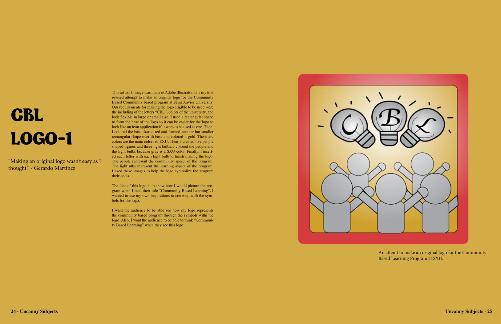
CBL LOGO-1
“Making an original logo wasn’t easy as I thought.” - Gerardo Martinez
This artwork image was made in Adobe Illustrator. It is my first revised attempt to make an original logo for the Community Based Community based program at Saint Xavier University. Our requirements for making the logo eligible to be used were the including of the letters “CBL”, colors of the university, and look flexible in large or small size. I used a rectangular shape to form the base of the logo so it can be easier for the logo to look like an icon application if it were to be used as one. Then, I colored the base skarlet red and formed another but smaller rectangular shape over th base and colored it gold. These are colors are the main colors of SXU. Then, I created five people shaped figures and three light bulbs. I colored the people and the light bulbs because gray is a SXU color. Finally, I insert-ed each letter with each light bulb to finish making the logo. The people represent the community apesct of the program. The light ulbs represent the learning aspect of the program. I used these images to help the logo symbolize the program their goals.
The idea of this logo is to show how I would picture the pro-gram when I read their title “Community Based Learning”. I wanted to use my own inspirations to come up with the sym-bols for the logo.
I want the audience to be able see how my logo represents the community based program through the symbols withi the logo. Also, I want the audience to be able to think “Communi-ty Based Learning” when they see this logo.
An attemt to make an original logo for the Community Based Learning Program at SXU.
24 - Uncanny Subjects Uncanny Subjects - 25
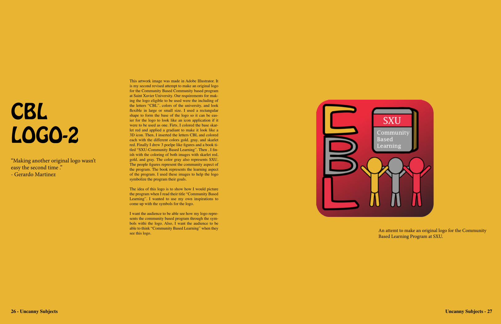
CBL LOGO-2“Making another original logo wasn’t easy the second time .” - Gerardo Martinez
This artwork image was made in Adobe Illustrator. It is my second revised attempt to make an original logo for the Community Based Community based program at Saint Xavier University. Our requirements for mak-ing the logo eligible to be used were the including of the letters “CBL”, colors of the university, and look flexible in large or small size. I used a rectangular shape to form the base of the logo so it can be eas-ier for the logo to look like an icon application if it were to be used as one. Firts, I colored the base skar-let red and applied a gradiant to make it look like a 3D icon. Then, I inserted the letters CBL and colored each with the different colors gold, gray, and skarlet red. Finally I drew 3 poelpe like figures and a book ti-tled “SXU-Community Based Learning”. Then , I fin-ish with the coloring of both images with skarlet red, gold, and gray. The color gray also represents SXU. The people figures represent the community aspect of the program. The book represents the learning aspect of the program. I used these images to help the logo symbolize the program their goals.
The idea of this logo is to show how I would picture the program when I read their title “Community Based Learning”. I wanted to use my own inspirations to come up with the symbols for the logo.
I want the audience to be able see how my logo repre-sents the community based program through the sym-bols withi the logo. Also, I want the audience to be able to think “Community Based Learning” when they see this logo. An attemt to make an original logo for the Community
Based Learning Program at SXU.
26 - Uncanny Subjects Uncanny Subjects - 27

Grim after Fritz Eichenburg
“Grim reaper is always my favorite character to draw and to make in variations.” - Gerardo Martinez
This is a drawing I made using a mechani-cal pencil. It is a drawing of the grim reap-er using techniques after the artist, Fritz Eichenburg. This was an assignment in my art portfolio seminar class where we had make a drawing after any artist, as long as it is your original artwork and not a copy of any of the artist’s work. I chose Eichen-burg because he make very detailed black and white artwork, mostly in ink and pen-cil, which is my preferred style of drawing and utensil for making my artworks. I tried to incorporate Eichenburg into my artwork by making the entire drawing shaded and letting the lights and lighter shades of gray form the main image of the drawing which is the grim reaper. It is the grim reaper standing in a dark environment. I chose to draw the grim reaper because it is person-ally my favorite character to draw.
The idea of this drawing is to show my at-tempt to create an original artwork using inspiations from another artist who share similiar preferences of making artwork as myself.
I want the audience to see how I tried to incorporate Eichenburg’s style of drawing into my artwork by comparing this draw-ing to one of Eichenburg’s drawing. Also, I want the audinece to see how I treat my levels of darks and lights to form the de-tails of the character such as the scythe, robe and skeletol body.
This is a variation of the drawing ‘Grim af-ter Fritz Eichenburg” made in coral paint-er. In this variation, I used colors instead of using my preferred style of black and white only. Also, I used electronical replicas of different art utencils such as charcoal and paintbrush instead of using my prefered utensil of pencil and ink. I recolored the artwork to make a variation of the draw-ing that involves techniques I have never used in my artworks. I used the colored the reaper’s robe purple which is traditional color used for death’s robe. The pole of the scythe is colored brown to make look like a wooden scythe. I colored the skeletol body black an the inside of the robe white and gray because it would be to similiar to the original drawing.
The idea of this drawing is to be an alter-nate or an inverse variation of my original drawing. I wanted to make this artwork look very different from from my original and other drawings.
I want the audience to see how attempted to recreate my drawing using colors in-stead of black and white. Also, I want the audience to judge the different vibes given from the same but different artworks and decide whether one is better than the other based on the different techniques used to create these artworks.
Uncanny Subjects - 2928 - Uncanny Subjects
Uncanny Subjects - 31
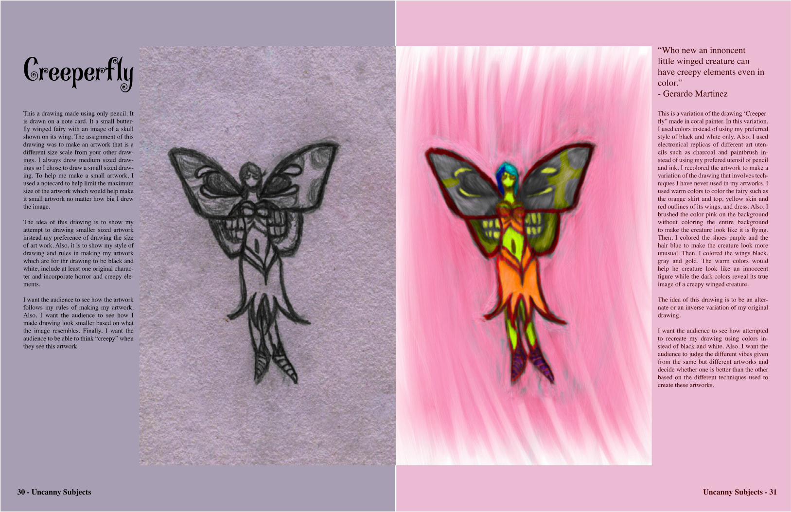
Creeperf1y“Who new an innoncent little winged creature can have creepy elements even in color.” - Gerardo Martinez
This a drawing made using only pencil. It is drawn on a note card. It a small butter-fly winged fairy with an image of a skull shown on its wing. The assignment of this drawing was to make an artwork that is a different size scale from your other draw-ings. I always drew medium sized draw-ings so I chose to draw a small sized draw-ing. To help me make a small artwork, I used a notecard to help limit the maximum size of the artwork which would help make it small artwork no matter how big I drew the image.
The idea of this drawing is to show my attempt to drawing smaller sized artwork instead my preference of drawing the size of art work. Also, it is to show my style of drawing and rules in making my artwork which are for thr drawing to be black and white, include at least one original charac-ter and incorporate horror and creepy ele-ments.
I want the audience to see how the artwork follows my rules of making my artwork. Also, I want the audience to see how I made drawing look smaller based on what the image resembles. Finally, I want the audience to be able to think “creepy” when they see this artwork.
This is a variation of the drawing ‘Creeper-fly” made in coral painter. In this variation, I used colors instead of using my preferred style of black and white only. Also, I used electronical replicas of different art uten-cils such as charcoal and paintbrush in-stead of using my prefered utensil of pencil and ink. I recolored the artwork to make a variation of the drawing that involves tech-niques I have never used in my artworks. I used warm colors to color the fairy such as the orange skirt and top, yellow skin and red outlines of its wings, and dress. Also, I brushed the color pink on the background without coloring the entire background to make the creature look like it is flying. Then, I colored the shoes purple and the hair blue to make the creature look more unusual. Then, I colored the wings black, gray and gold. The warm colors would help he creature look like an innoccent figure while the dark colors reveal its true image of a creepy winged creature.
The idea of this drawing is to be an alter-nate or an inverse variation of my original drawing.
I want the audience to see how attempted to recreate my drawing using colors in-stead of black and white. Also, I want the audience to judge the different vibes given from the same but different artworks and decide whether one is better than the other based on the different techniques used to create these artworks.
30 - Uncanny Subjects

Mutant Beast Warrior
“I made one really ugly beast in color.” - Gerardo Martinez
This is a drawing made on a canvas using a pencil. It is a mutant creature with dif-ferent parts of different species that make up the whole body. The legs are the legs of a horse. The torso is the torso of the hu-man body with bird wings on its back. The head is the head of the snake. I made this drawing based on my three rules of making artwork for my art portfolio seminar class. The three rules involve the artwork to be in pencil only, include at least one character, and inspire horror and creepy elements.
The idea of this drawing is draw a another type artwork that I enjoy drawing which are creepy characters. I wanted to make a unique hybrid like creature with details I thought of as original. I wanted to make a creature that has the most original qualities in comparison to other creatures produced by art.
I want the audience to observe from the drawing what aspects are in the drawing that correlates to my three rules of making the artwork. Also, I want the audience to think “Creepy” when they see this draw-ing.
This is an artwork made in coral painter. It is a variation of the artwork “Mutant Beast Warrior”. In this variation, I used the colored pencil tool of the coral painter program to recolor the whole drawing. Instead of leaving the drawing with only pencil, I used color instead over the different parts of the creature and the background. Instead of using colors that would cooperate together like analogous and complementary colors, I used random colors to add more strange details to the creature to make it look more creepy.
The idea of this variation is to give my original a new original look in color. I wanted try an alte-nate style of making art by using the coral painter program and using colors and tools than just us-ing only pencil.
I want the audience to observe the difference of the artwork when it was changed in coral painter and color. Also, I want the audience to think what are the effects of using color in comparison to only black and white based on the original draw-ing and its variation.
32 - Uncanny Subjects Uncanny Subjects - 33

The Unknown Sword“Just an unknown sword in an unknown forest. Could be real or could be fake. I don’t know. Do you?”- Gerardo Martinez
It is a painting made in coral painter. It is a sword placed in a rock in a forest. I used the properties of lights and shadows by using the sunlight shinung on the sword as the light source of the image. I used light-er levels of the colors on the left side of the image and darker levels on the right side of the image to show that the light is shining from the left.. I used many things to express lighting effects of the sunlight such as the grass, trees, rock and the sword.
The idea of this artwork is to show my attempt to create an original artwork using the coral painter program. As my first time using this program, I wanted to make a simple image with some details and not too much. I wanted to become familiar with the tools of the pro-gram and how the program produces the artwork.
I want the audience to see how I performed in making this artwork as my first try using painter. Also, I want the audience to how I used darks and lights within the artwork based on the contrast used within the different colors. Also, I want the audience to share their opin-ions of the purpose of the sword and its location and how does the colors used in the artwork affect their reasoning.
34 - Uncanny Subjects Uncanny Subjects - 35
Uncanny Subjects - 3736 - Uncanny Subjects
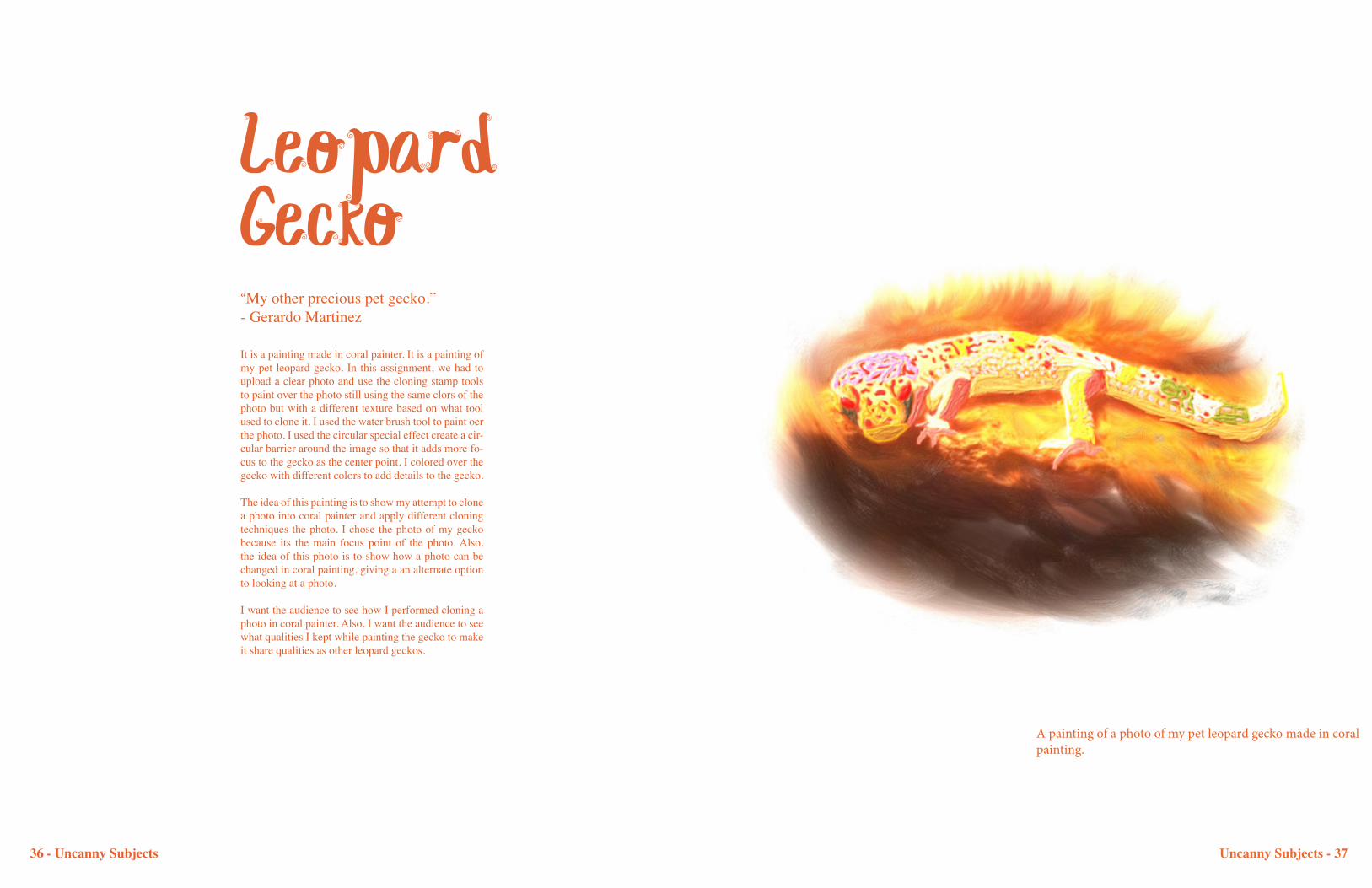
Leopard Gecko“My other precious pet gecko.”- Gerardo Martinez
It is a painting made in coral painter. It is a painting of my pet leopard gecko. In this assignment, we had to upload a clear photo and use the cloning stamp tools to paint over the photo still using the same clors of the photo but with a different texture based on what tool used to clone it. I used the water brush tool to paint oer the photo. I used the circular special effect create a cir-cular barrier around the image so that it adds more fo-cus to the gecko as the center point. I colored over the gecko with different colors to add details to the gecko.
The idea of this painting is to show my attempt to clone a photo into coral painter and apply different cloning techniques the photo. I chose the photo of my gecko because its the main focus point of the photo. Also, the idea of this photo is to show how a photo can be changed in coral painting, giving a an alternate option to looking at a photo.
I want the audience to see how I performed cloning a photo in coral painter. Also, I want the audience to see what qualities I kept while painting the gecko to make it share qualities as other leopard geckos.
A painting of a photo of my pet leopard gecko made in coral painting.
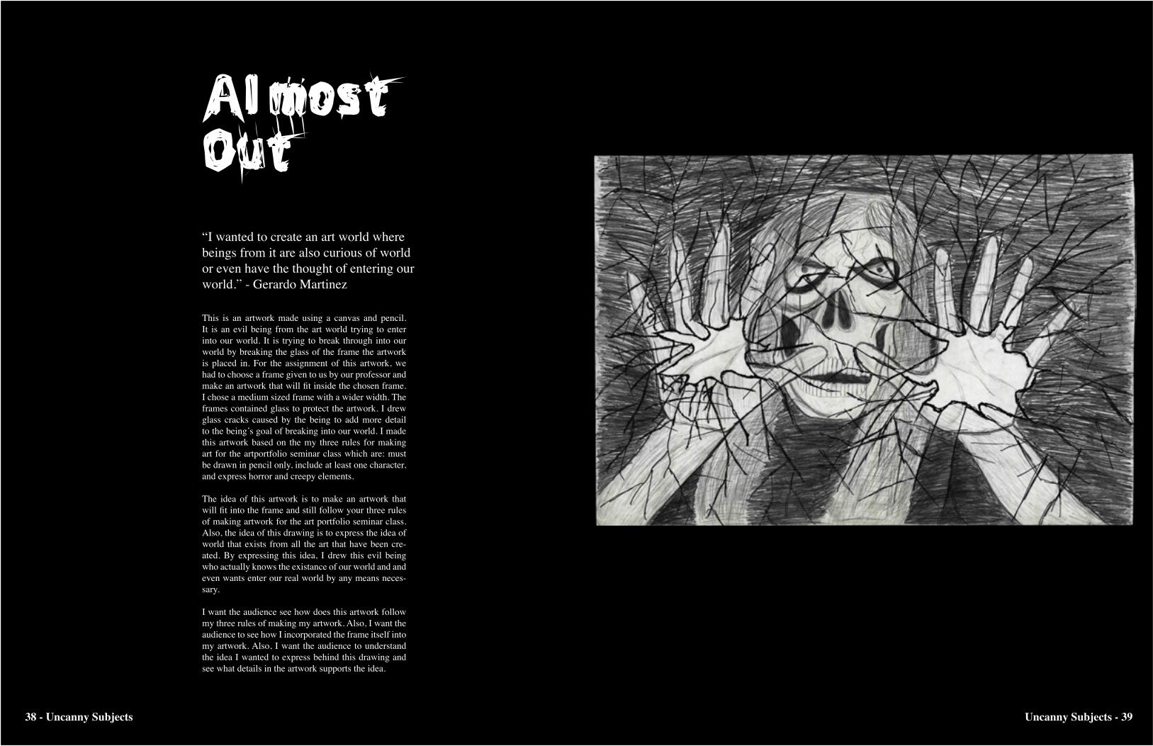
Al most Out“I wanted to create an art world where beings from it are also curious of world or even have the thought of entering our world.” - Gerardo Martinez
This is an artwork made using a canvas and pencil. It is an evil being from the art world trying to enter into our world. It is trying to break through into our world by breaking the glass of the frame the artwork is placed in. For the assignment of this artwork, we had to choose a frame given to us by our professor and make an artwork that will fit inside the chosen frame. I chose a medium sized frame with a wider width. The frames contained glass to protect the artwork. I drew glass cracks caused by the being to add more detail to the being’s goal of breaking into our world. I made this artwork based on the my three rules for making art for the artportfolio seminar class which are: must be drawn in pencil only, include at least one character, and express horror and creepy elements.
The idea of this artwork is to make an artwork that will fit into the frame and still follow your three rules of making artwork for the art portfolio seminar class. Also, the idea of this drawing is to express the idea of world that exists from all the art that have been cre-ated. By expressing this idea, I drew this evil being who actually knows the existance of our world and and even wants enter our real world by any means neces-sary.
I want the audience see how does this artwork follow my three rules of making my artwork. Also, I want the audience to see how I incorporated the frame itself into my artwork. Also, I want the audience to understand the idea I wanted to express behind this drawing and see what details in the artwork supports the idea.
38 - Uncanny Subjects Uncanny Subjects - 39

About the Artist:My name is Gerardo Martinez. I’m a freshman student of Saint Xavier University. My major is Graphic Design. I’m taking the computer graphics course to learn and expand the knowledge of my major. I have taken and passed the digital imagery and art portfolio seminar courses. By taking the computer graphics, my skills as an artist will increase and new knowledge of programs from computers will begin.
40 - Uncanny Subjects