unit- 2 getting started with vbsvbitce2010.weebly.com/uploads/8/4/4/5/8445046/controls.pdf · s h a...
TRANSCRIPT

S h a n k e r s i n h V a g h e l a B a p u I n s t . o f T e c h . P a g e | 1
Prepared By:- Ankit Shah
Unit- 2 Getting Started with VB.NET
Q.1) What is Control? Give common properties, methods and events of the controls.
A control is an object that can be drawn on to the Form.
Mainly controls are visible object.
The controls are to enable or enhance user interaction with the application.
Ex. Label, TextBox, Button, CheckBox, etc.
All the controls have properties, methods, and events.
Public properties of Control objects.
Property Means
BackColor Sets/gets the background color of this control.
BackgroundImage Sets/gets the background image in the control.
Cursor Sets/gets the cursor displayed when the user moves the mouse pointer over
this control.
Enabled Sets/gets a value specifying if the control is enabled.
Font Sets/gets the current font for the control.
ForeColor Sets/gets the foreground color of the control.
Height Sets/gets the height of the control.
Left Sets/gets the x-coordinate of a control's left edge in pixels.
Locked Sets/gets the resize or move the control at design time.
Name Sets/gets the control's name.
Right Returns the distance between the right edge of the control and the left edge of
its container.
Size Sets/gets the height and width of the control.
TabIndex Sets/gets the tab order of this control in its container.
TabStop Sets/gets a value specifying if the user can tab to this control with the Tab
key.
Text Sets/gets the text connected to this control.
Top Sets/gets the top coordinate of the control.
Visible Sets/gets a value specifying if the control is visible.
Width Sets/gets the width of the control.
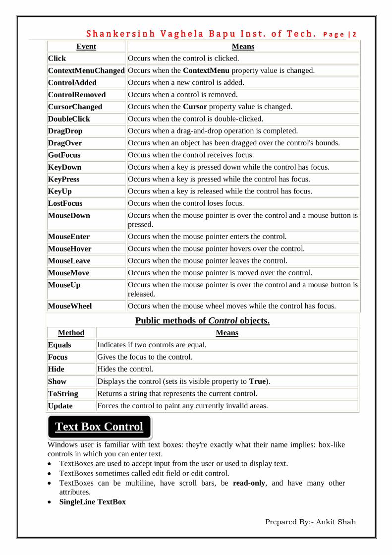
Public events of Control objects.
S h a n k e r s i n h V a g h e l a B a p u I n s t . o f T e c h . P a g e | 2
Prepared By:- Ankit Shah
Public methods of Control objects.
Method Means
Equals Indicates if two controls are equal.
Focus Gives the focus to the control.
Hide Hides the control.
Show Displays the control (sets its visible property to True).
ToString Returns a string that represents the current control.
Update Forces the control to paint any currently invalid areas.
Windows user is familiar with text boxes: they're exactly what their name implies: box-like
controls in which you can enter text.
TextBoxes are used to accept input from the user or used to display text.
TextBoxes sometimes called edit field or edit control.
TextBoxes can be multiline, have scroll bars, be read-only, and have many other
attributes.
SingleLine TextBox
Event Means
Click Occurs when the control is clicked.
ContextMenuChanged Occurs when the ContextMenu property value is changed.
ControlAdded Occurs when a new control is added.
ControlRemoved Occurs when a control is removed.
CursorChanged Occurs when the Cursor property value is changed.
DoubleClick Occurs when the control is double-clicked.
DragDrop Occurs when a drag-and-drop operation is completed.
DragOver Occurs when an object has been dragged over the control's bounds.
GotFocus Occurs when the control receives focus.
KeyDown Occurs when a key is pressed down while the control has focus.
KeyPress Occurs when a key is pressed while the control has focus.
KeyUp Occurs when a key is released while the control has focus.
LostFocus Occurs when the control loses focus.
MouseDown Occurs when the mouse pointer is over the control and a mouse button is
pressed.
MouseEnter Occurs when the mouse pointer enters the control.
MouseHover Occurs when the mouse pointer hovers over the control.
MouseLeave Occurs when the mouse pointer leaves the control.
MouseMove Occurs when the mouse pointer is moved over the control.
MouseUp Occurs when the mouse pointer is over the control and a mouse button is
released.
MouseWheel Occurs when the mouse wheel moves while the control has focus.
Text Box Control

S h a n k e r s i n h V a g h e l a B a p u I n s t . o f T e c h . P a g e | 3
Prepared By:- Ankit Shah
Password Cacher TextBox
Multiline Textbox
Public properties of TextBox objects.
Property Means
AutoSize Sets/gets a value specifying if the height of the control automatically
adjusts when the font in the control is changed.
BackColor Sets/gets the background color of the control.
BorderStyle Sets/gets the border type of the text box control.
CharacterCasing We can set the case of the TextBox to Lower, Upper or Normal Case.
Enable Sets/gets a value specifying if the control is enabled.
ForeColor Sets/gets the foreground color.
Multiline Sets/gets a value specifying if this is a multiline text box control.
PasswordChar Sets/gets the character used to a password in a single-line text box.
ReadOnly Sets/gets a value specifying if text in the text box is read-only.
ScrollBars Sets/gets what scroll bars should appear in a multiline text box.
Text Sets/gets the current text in the text box.
TextAlign Sets/gets how text is aligned in a text box control.
TextLength Gets the length of text in the control.
WordWrap Indicates if a multiline text box control automatically wraps words.
Public methods of TextBox objects.
Methods Means
AppendText Appends text to the current text in the text box.
Clear Clears all text from the text box.
ClearUndo Clears information about the most recent operation of the text box.
Copy Copies the selected text in the text box to the Clipboard.
Cut Moves the selected text in the text box to the Clipboard.
Paste Replaces the selected text in the text box with the contents of the Clipboard.
Select Selects text in the text box.
SelectAll Selects all text in the text box.
Undo Undoes the last edit operation in the text box.
Public events of TextBox objects.
Event Means
AutoSizeChanged Occurs when the value of the AutoSize property is changed.
Click Occurs when the text box is clicked.
ReadOnlyChanged Occurs when the value of the ReadOnly property is changed.
Rich Text Boxes

S h a n k e r s i n h V a g h e l a B a p u I n s t . o f T e c h . P a g e | 4
Prepared By:- Ankit Shah
The Windows forms RichTextBox control is used for displaying, entering, and
manipulating rich text with formatting.
The RichTextBox control does everything the TextBox control does, but in addition, it
can display fonts, colors, and links; load text and embedded images from a file; undo
and redo editing operations; and find specified characters.
Rich text format (RTF) text supports a variety of formats.
For example, you can color text in a rich text box, underline it, bold it, or make it italic.
You can select fonts and fonts sizes, as well as write the text out to disk or read it back in.
Rich text boxes also can hold a great amount of data, unlike standard text boxes.
As with the TextBox control, the text displayed is set by the Text property. The
RichTextBox control has many properties to format text, and we'll explore them here.
You can set font attributes, set indents, create hanging indents, create bulleted paragraphs,
and more. To work with files, you can use the LoadFile and SaveFile methods.
You can even use a RichTextBox for Web-style links by setting the DetectUrls property
to True and writing code to handle the LinkClicked event.
And you can undo and redo most edit operations by calling the Undo and Redo methods;
the CanRedo method will let you know if the last operation the user has undone can be
reapplied.
It is one of the most popular control in Windows Base Application.
It is also known as a Command Button.
The prefix of the Button is either “btn” or “cmd”.
Some Properties of Button are Name, Text, BackColor, ForeColor, etc.
We can set Accelator key for the Button and Menu.
Accelator key are also known as a mnemonics.
Accelator keys are represented by the underlined characters.
We can define accelator keys on menus and command buttons by placing the ampersand
character (&) somewhere in the text of the menu or button.
For example set text property of the btnAns (button) as &Ans. It will display underline
under the character so now we can call btnAns as ALT + A. Ans
The default event of the Button is the Click event. When a Button is clicked it responds
with the Click Event.
You also can support images in labels with the Image property.
It is used to display text.
Runtime we cannot edit the text of label.
The prefix of the Label is “lbl”.
Mostly the Label control is used for displaying the answers and meaningful notation.
The common property of the Label is Text.
The TextAlign (formerly Alignment) property allows you to set the alignment of the text
within the label.
Button Control
Labels
Link Labels

S h a n k e r s i n h V a g h e l a B a p u I n s t . o f T e c h . P a g e | 5
Prepared By:- Ankit Shah
Besides functioning as a full label control, you can display multiple hyperlinks in a single
link label control, and use the LinkColor, VisitedLinkColor, and ActiveLinkColor
properties to set the colors of the link, as you would in a Web page in a browser.
The LinkArea property sets the area of the text that activates a link, and the LinkClicked
event determines what happens when the link is clicked
Public properties of LinkLabel objects.
Property Means
ActiveLinkColor Sets/gets the color for an active link.
DisabledLinkColor Sets/gets the color for a disabled link.
LinkArea Sets/gets the range in the text to treat as a link.
LinkBehavior Sets/gets a value that represents the behavior of a link.
LinkColor Sets/gets the color for a normal link.
Links Gets the collection of links in the LinkLabel control.
LinkVisited Sets/gets a value specifying if a link should be displayed as though it
had been visited.
VisitedLinkColor Sets/gets the color used for links that that have been visited.
Public events of LinkLabel objects.
Event Means
LinkClicked Occurs when a link is clicked inside the link label.
A checkbox is clicked to select and clicked again to deselected some option.
When a checkbox is checked a check (a tick mark) appears indicating a selection.
We can use CheckBox control is groups display multiple choices from which the user can
select one or more.
You use a checkbox to give the user an option, such as true/false or yes/no. The checkbox
control can display an image or text or both.
The difference between CheckBox and RadioButton is: Any number of CheckBox control
on a form can be selected and only one RadioButton in a group can be selected.
The prefix of the CheckBox control is “chk”.
Some Properties of the CheckBox:
Text :- Caption of the CheckBox.
Checked :- True or False, which indicates the state of the CheckBox whether the
CheckBox is Checked or Unchecked.
CheckedState:- There are 3 options as given below:
CheckState Display
CheckBox Control

S h a n k e r s i n h V a g h e l a B a p u I n s t . o f T e c h . P a g e | 6
Prepared By:- Ankit Shah
Checked The check box displays a check mark.
Unchecked The check box is empty.
Indeterminate The box displays a check mark and is shaded.
Public properties of Checkbox objects.
Property Means
Appearance Gets/sets the appearance of a checkbox.
AutoCheck Specifies if the Checked or CheckState values and the checkbox's
appearance are automatically changed when the checkbox is clicked.
CheckAlign Gets/sets the horizontal and vertical alignment of a checkbox in a checkbox
control.
Checked Gets/sets a value indicating if the checkbox is in the checked state.
CheckState Gets/sets the state of a three-state checkbox.
FlatStyle Gets/sets the flat style appearance of the checkbox.
Image Gets/sets the image that is displayed in a checkbox.
ImageAlign Gets/sets the alignment of the image on the checkbox.
ImageIndex Gets/sets the image list index value of the image displayed in the checkbox.
ImageList Gets/sets the ImageList that contains the image displayed in a checkbox.
ThreeState Specifies if the checkbox will allow three check states rather than two.
Public events of Checkbox objects.
Event Means
AppearanceChanged Occurs when the Appearance property changes.
CheckedChanged Occurs when the Checked property changes.
CheckStateChanged Occurs when the CheckState property changes.
Radio buttons, also called option buttons.
Are similar to checkboxes—the user can select and deselect them—except for two things:
they are round where checkboxes are square, and you usually use radio buttons together
in groups.
The functional difference between checkboxes and radio buttons—checkboxes can work
independently, but radio buttons are intended to work in groups.
When the user selects one radio button in a group, the others clear automatically. All
radio buttons in a given container, such as a form, make up a group. To create multiple
groups on one form, you place each additional group in its own container, such as a group
box or panel control.
The prefix of the RadioButton is either “opt” or “rad”.
We can take RadioButton on the form when multiple options are there and selection is
only one. Like gender, etc.
When you select one radio button in a group, the others are automatically deselected.
RadioButton Control

S h a n k e r s i n h V a g h e l a B a p u I n s t . o f T e c h . P a g e | 7
Prepared By:- Ankit Shah
The Checked property to get or set the state of a radio button. Radio buttons can display
text, an image, or both. Also, a radio button's appearance may be altered to appear as a
toggle-style button or as a standard radio button by setting the Appearance property.
Properties of RadioButton objects.
Property Means
Appearance Gets/sets the value that determines the appearance of the radio button.
AutoCheck Gets/sets a value indicating whether the Checked value and the appearance of
the | control automatically change when the radio button is clicked.
Checked Gets/sets a value indicating whether the radio button is checked.
FlatStyle Gets/sets the flat style appearance of the radio button.
Image Gets/sets the image that is displayed in a radio button.
ImageAlign Gets/sets the alignment of the image in a radio button.
ImageIndex Gets/sets the image list index value of the image displayed in a radio button.
ImageList Gets/sets the ImageList that contains the image displayed in a radio button.
TextAlign Gets/sets the alignment of the text in a radio button.
Public methods of RadioButton objects.
Method Means
PerformClick Generates a Click event for the radio button, simulating a click by a user.
Public events of RadioButton objects.
Event Means
AppearanceChanged Occurs when the Appearance property changes.
CheckedChanged Occurs when the value of the Checked property changes.
Panel and GroupBox controls are that contains other controls.
They both work as a Container of other controls.
Use GroupBox and Panel to logically group a collection of the controls on a form.
The typical use for a GroupBox and Panel is to contain a logical group of RadioButton
controls.
GroupBox And Panel (Container)

S h a n k e r s i n h V a g h e l a B a p u I n s t . o f T e c h . P a g e | 8
Prepared By:- Ankit Shah
If we have two group boxes, each containing several radio buttons, each group of buttons
is mutually exclusive, setting one option value per group.
By default Panel control is displayed without any borders.
Panel control does not have any Text property.
Differences
GroupBox Panel
No Have BorderStyle property
No scrollbar Have the capacity to scroll by setting its AutoScroll property to True
Has ability to set title Does not have ability to set title or caption.
No Have TabStop property
A list boxes display a list of items from which the user can select one or more. List boxes are best used for displaying large number of choices. If there are too many items to display at once, a scroll bar automatically appears to let the
user scroll through the list. The prefix of the ListBox is “lst”. CheckBox control occupies space in the form. For example, If we give 50 chices to the
user and if we use checkboxes for it then our form will be filled with checkboxes only
moreover, it occupies more space. Instead we give 50 choices in the ListBox then it will
look better and neat. A scroll bar automatically appears when many items in the ListBox. By default we can select only one item from the ListBox.
Properties of ListBox objects.
Property Means
ColumnWidth Gets/sets column width; use with multicolumn list boxes.
HorizontalScrollbar Gets/sets if a horizontal scroll bar is displayed in the list box.
Items Returns a collection of the items of the list box.
MultiColumn Gets/sets if the list box supports multiple columns.
SelectionMode Gets/sets the mode with which items are selected.
Sorted Gets/sets if the items in the list box are sorted. The sort is alphabetical.
Panel
ListBox Control

S h a n k e r s i n h V a g h e l a B a p u I n s t . o f T e c h . P a g e | 9
Prepared By:- Ankit Shah
Public events of ListBox objects.
Event Means
SelectedIndexChanged Occurs when the SelectedIndex property has changed
ComboBox control is used to display data in a drop-down combo box. The combo box is made up of two parts: TextBox and a ListBox. The ComboBox displays an editing field (TextBox) combined with a ListBox allowing us
to select from the list or to enter new text. RunTime user can enter new data to the ComBox control but new data store in it
temporary. ComboBox displays data in a drop-down style format. The prefix of ComboBox is “cmb”. User can select only one item from the given list. You can allow the user to select an item from the list, or enter their data. For example, use ComboBox for list of cities, list of countries, etc. We can add items, remove, items and check items, etc are same as ListBox control. The combo box has three different DropDown Style (Property): Simple, drop down,
and drop-down list.
Simple:
The combo box has TextBox + ListBox
The text portion is editable. The list portion is always visible.
The list doesn’t have drop down effect.
Public methods of ListBox objects.
Methods Means
ClearSelected Unselects all the items in a list box.
FindString Finds the first item in the list box that begins with the indicated string.
FindStringExact Finds the first item in the list box that matches the indicated string exactly.
GetItemHeight Returns the height of a list box item.
GetSelected Returns True if the indicated item is selected.
SetSelected Selects or deselects the indicated item in a list box.
ComboBox Control
DropDownList

S h a n k e r s i n h V a g h e l a B a p u I n s t . o f T e c h . P a g e | 10
Prepared By:- Ankit Shah
DropDown (By default):
The text portion is editable.
The user must click the arrow button to display the list portion.
DropDownList:
User can not type in the ComboBox.
ComboBox is like Listox.
The user can only choose an item in the list.
Public properties of ComboBox objects.
Property Means
DropDownStyle Gets/sets the style of the combo box.
DropDownWidth Gets/sets a combo box's drop-down part's width.
Focused Gets a value specifying if the combo box has the focus.
IntegralHeight Gets/sets if the combo box should resize so it doesn't show partial
items.
ItemHeight Gets the height of an item in a combo box.
Items Gets a collection of the items in this combo box.
MaxDropDownItems Gets/sets the maximum number of items visible in the drop-down part
of a combo box.
MaxLength Gets/sets the maximum number of characters in the combo box's text
box.
SelectedIndex Gets/sets the index of the currently selected item.
SelectedItem Gets/sets currently selected item in the combo box.
SelectedText Gets/sets the selected text in the text box part of a combo box.
Sorted Gets/sets if the items in the combo box are sorted.
Public methods of ComboBox objects.
Method Means
FindString Finds the first item in the combo box that begins with the indicated string.
FindStringExact Finds the item that matches the indicated string exactly.
GetItemText Gets an item's text.
Select Selects a range of text.
SelectAll Selects all the text in the text box of the combo box.
Public events of ComboBox objects.
Event Means
DropDown Occurs when the drop-down portion of a combo box is shown.
DropDownStyleChanged Occurs when the DropDownStyle property has changed.
SelectedIndexChanged Occurs when the SelectedIndex property has changed.

S h a n k e r s i n h V a g h e l a B a p u I n s t . o f T e c h . P a g e | 11
Prepared By:- Ankit Shah
It is very common control for any Windows base application.
In Microsoft Word or Excel we can see left and bottom side Scrollbar.
There are 2 types of ScrollBar : HScrollBar and VScrollBar.
User selects a value between the 2 ends of the ScrollBar.
The left end of the ScrollBar corresponds to its minimum value; the other end is the
ScrollBar’s maximum value.
Public properties of HScrollBar and VScrollBar objects.
Property Means
LargeChange Gets/sets the value added to or subtracted from to the Value property when
the scroll bar itself is clicked (outside the scroll box).
Maximum Gets/sets the upper limit of the scrollable range.
Minimum Gets/sets the lower limit of the scrollable range.
SmallChange Gets/sets the value added to or subtracted from to the Value property when
the user clicks an arrow button.
Value Gets/sets a value corresponding to the current position of the scroll box.
Public events of HScrollBar and VScrollBar objects.
Event Means
Scroll Occurs when the scroll box is moved (either by the mouse or the keyboard).
ValueChanged Occurs when the Value property has changed, either by a Scroll event or
programmatically.
Scrollbars Control
SmallChange
LargeChange

S h a n k e r s i n h V a g h e l a B a p u I n s t . o f T e c h . P a g e | 12
Prepared By:- Ankit Shah
Timers are also very useful controls, because they let you create periodic events. Strictly
speaking, timers are no longer controls but components, and they do not appear in a
window at run time. At design time, they appear in the component tray underneath the form you've added
them to. There's a timer at work behind the scenes in the Timers example in Figure, which shows a
clock (using a label control) and lets the user set an alarm setting—as soon as the current
time matches the alarm setting, the program will start to beep until you click the "Alarm
off" radio button.
Public properties of Timer objects.
Property Means
Enabled Gets/sets whether the timer is running.
Interval Gets/sets the time (in milliseconds) between timer ticks.
Public methods of Timer objects.
Method Means
Start Starts the timer.
Stop Stops the timer.
Public events of Timer objects.
Event Means
Tick Occurs when the timer interval has elapsed (and the timer is enabled).
Timer Control
S h a n k e r s i n h V a g h e l a B a p u I n s t . o f T e c h . P a g e | 13
Prepared By:- Ankit Shah
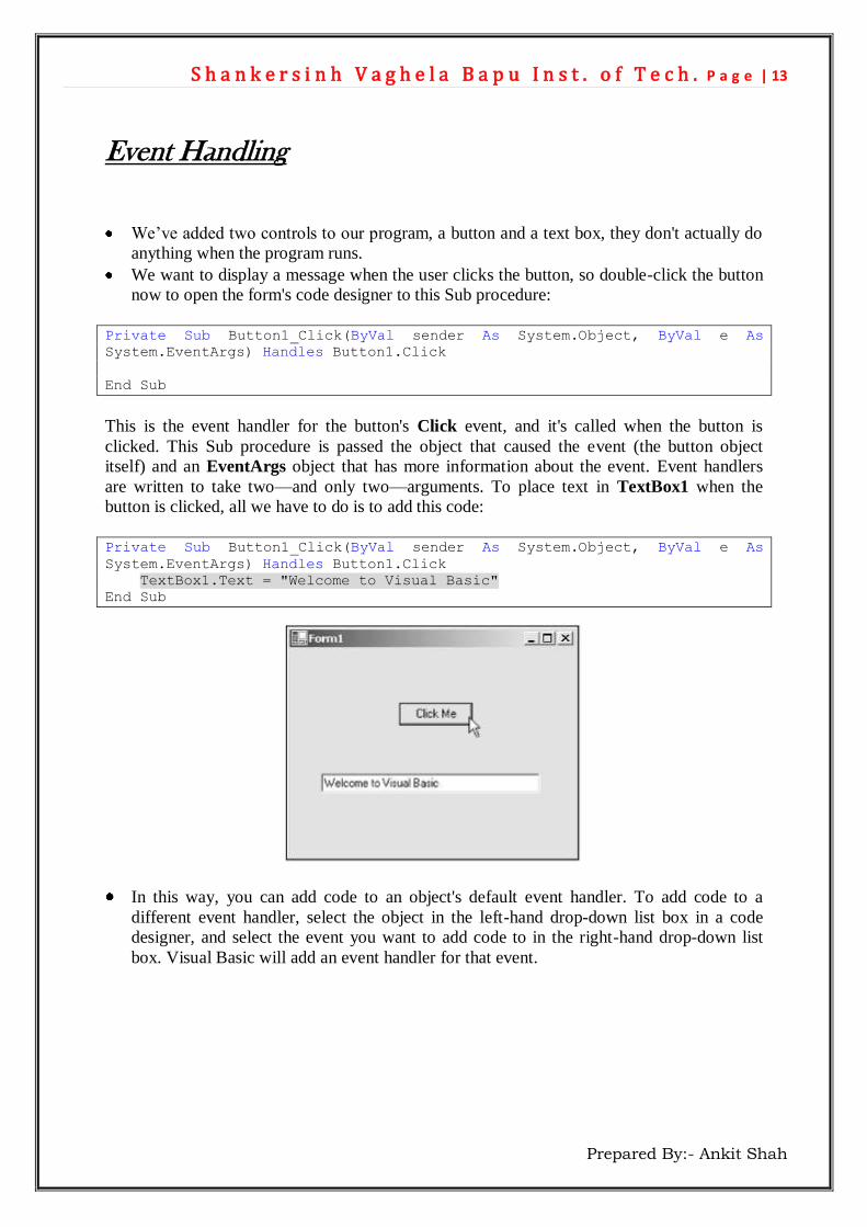
Event Handling
We’ve added two controls to our program, a button and a text box, they don't actually do
anything when the program runs.
We want to display a message when the user clicks the button, so double-click the button
now to open the form's code designer to this Sub procedure:
Private Sub Button1_Click(ByVal sender As System.Object, ByVal e As
System.EventArgs) Handles Button1.Click
End Sub
This is the event handler for the button's Click event, and it's called when the button is
clicked. This Sub procedure is passed the object that caused the event (the button object
itself) and an EventArgs object that has more information about the event. Event handlers
are written to take two—and only two—arguments. To place text in TextBox1 when the
button is clicked, all we have to do is to add this code:
Private Sub Button1_Click(ByVal sender As System.Object, ByVal e As
System.EventArgs) Handles Button1.Click
TextBox1.Text = "Welcome to Visual Basic"
End Sub
In this way, you can add code to an object's default event handler. To add code to a
different event handler, select the object in the left-hand drop-down list box in a code
designer, and select the event you want to add code to in the right-hand drop-down list
box. Visual Basic will add an event handler for that event.