visualization faster insights for everyone
TRANSCRIPT

Visualizationfaster insights for eVeryone


future bright
Visualization faster insights for eVeryone


5 Foreword by Karel Kinders
6 SAS vision
Decision leadership calls for visual analytics
10 Vision interview
Russ Cobb and Jeroen Dijkxhoorn (SAS) - Analytics, the key to Decision Leadership
18 Interview
Rijk Boerma (Mijksenaar wayfinding experts) - Image is defining
Professor Jos Roerdink (Groningen University) - Visualization is an art
26 Interview
Aart Jochem (NCSC) - Fighting cybercrime with data analysis
34 5 questions to …
Colin Nugteren (DirectPay) - Knowledge, data and insight are crucial for DirectPay
38 Interview
Paul Melis and Machiel Jansen (SURFsara) - SURFsara helps with big data research
42 5 questions to …
Peter Wijers (Euramax) - Data vizualization gives Euramax a stronger grip on the future
46 Interview
Carlo van de Weijer (TomTom) - TomTom visualizes the situation on the roads
50 5 questions to …
Rik Eding (Ziekenhuis Gelderse Vallei ) - Ziekenhuis Gelderse Vallei brings data analysis
to the workplace
54 Guest lecture
Edwin Peters (SAS) - Visual analytics guest lecture tour
59 About SAS
60 Colophon
Table of ConTenTs


Foreword
The ability to quickly adapt processes and strategies to customer needs and market developments has never been more important. Today’s complex ques-tions can no longer be addressed based on “gut feel” alone, and require sound decisions based on facts. Above all, the relevant data must be readily available, and decision makers should not be too dependent on IT to access information when it is needed.
What’s different today? For starters, the amount of structured and unstructured data within an organization
is exploding! There is a growing need to get more out of this (big) data and a growing awareness that it
can be invaluable to organizations. Decision makers need to anticipate change quickly. This is why new
solutions are needed that can quickly produce a professional report or better yet, provide insight. Cumber-
some methods of plowing through information just don’t work anymore.
A simple, static report isn’t enough to reveal the answers locked inside the data. On the other hand, analy-
ses that only econometrists can understand are useless for decision makers who don’t have that expertise.
Business users need easy, straightforward analyses in order to be smarter, quicker and more direct when
anticipating change. Making adjustments on time is crucial. Visual analytics bridges this gap and brings the
magic of the analysts’ tools within reach of the business user.
We often hear, “there is no time for analyses, because all of our time goes into making reports.” Or, “every
report we make brings new questions.” Those are exactly the problems that are addressed with visual ana-
lytics. It helps interdepartmental teams come up with solid analyses and forecasts, without the need for
lengthy preparations. By using mobile technologies (such as tablets), users even have direct access to visu-
ally presented insights generated on the fly. This means decisions can be made quickly by the user.
The power of visualization plays an important role in decision making. This book answers the questions of
why visualization is so important in the interpretation of large amounts of data, and how different compa-
nies use data to make decisions. Visual analytics is the way to decision leadership.
Karel Kinders
Managing Director
SAS Netherlands

6
SAS viSion

7
Search “big data” and you get close to 2 billion hits. It would seem that every-body is doing something with big data, but not everybody is getting the most out of it. In fact, many companies have taken some significant steps in the area of information management to get a better grip on their data. The next step for most organizations is to extract value from that data more effectively and effi-ciently. This calls for a new approach.
Until now, the emphasis for organizations and companies has been on optimizing the costs of the
IT infrastructure. Technology was primarily aimed at efficiency and lowering operational costs. This
provides results but is no longer good enough to stay ahead of the competition. Large volumes of
data that come from social media, online transactions, and the growth of data sources demand a
new approach from companies and organizations in order to reach target groups more directly. In
the transparent world, where not only the actions of the customer but the practices of companies
are quite visible, existing business views are turned upside down. Data can no longer be seen as a
byproduct of doing business. Rather, it is core to the business and crucial to building a healthy busi-
ness model. All this new insight from data should provide opportunities to innovate and steer toward
better results. In order to make the most of the developments in the market, however, decisions
within an organization need to be made closer to the operational processes. Decision management is
the next step, in which available data, together with analytical models, reach the people who actually
manage those processes. To accomplish this goal, visual analytics is an indispensable asset.
DeciSion leADerShip cAllS for viSuAl AnAlyticS
New approach briNgs decisioN makiNg closer to the process
“the role of the decision maker is to become an architect of the decision making process”

Traditionally, tactical and strategic decisions are made by people who come together and examine the
state of the business. An action list is drawn up, and perhaps two weeks later the next meeting gets
planned to discuss the steps that will follow, which may or may not lead to a revision of the strat-
egy. Under pressure from the market, there is often no time for extended meetings and discussions.
And besides, this way of making decisions is too far removed from operational matters. Traditional
decision-making processes are not designed to fully take advantage of self-service analytics. With
visual analytics, however, it is possible to provide data for all departments in different variations. This
way, relevant answers can be found to questions that arise on the spot. What-if scenarios can then be
calculated strategically. By sharing these visualizations with stakeholders, business leaders can explain
why a certain choice was made. This way, a database marketer and a business owner can interact
and discuss different scenarios, even on mobile technology. The role of the decision maker within an
organization, therefore, changes to become that of an architect of a decision-making process. Instead
of making every decision himself, he coaches his or her team toward a decision.
8

9
Quality of models If the traditional decision maker in an organization becomes a facilitator, he or she would be more
immersed in governing the processes than in actually making the decisions. The decisions would
then be made on the ground level, and this would create a new type of hierarchy that looks more
like a network model. The quality of the analytical models is important in this transition because the
impact of the model is quite large. Constant monitoring and governance ensures the original assump-
tions and the questions are still valid. By monitoring results, you can experiment in a more controlled
manner. Changes to a business process can then be examined holistically instead of bit by bit, as is
too often the case. The client can immediately appreciate the results instead of waiting for validation
from internal departments that have little connection with the business reality. Continuous marginal
improvements made to processes are also faster and easier.
No questions It isn’t always a well-defined model that can be applied to a data set. Sometimes the initial question
isn’t complete for the simple reason that it is just too hard to imagine. Visual interaction with the data
by people who understand the business can, however, lead to new discoveries and breakthroughs
from the available information. It is precisely this interaction with the data that generates ideas and
leads users to ask the right questions to carry out improvements.
Mountains of gold The general promise of big data is that it makes big changes possible in process and earnings. This
is why traditional organizations immediately attempt far-reaching changes that often do not lead to
the results they anticipated. Instead, new-economy companies try to apply a steady flow of marginal
changes to their processes in order to control the improvements. Without adequate tools like visual
analytics, the new dynamic complexity of big data is almost impossible to grasp. Big data and deci-
sion making techniques don’t always produce the ultimate results all at once. They are, however,
extremely well-suited for gradually improving current processes, within a certain a margin, step by
step. By automating these improvement paths, a great many steps can be taken simultaneously and
in a controlled way, so as a whole the organization can make great strides. ■
“Without adequate tools like visual analytics, the dynamic complexity of big data is almost impossible to grasp”

Jeroen Dijkxhoorn
Regional Head of Coe infoRmation management & analytiCs at sas
10
AnAlytics, the key to decision leAdership
SAS vision on the opportunities and stumbling blocks connected with analyzing data
INTERVIEW

11
“Creating the analytics advantage” was one of the topics discussed during a decision leadership conference in Amsterdam in 2013. Russ Cobb and Jeroen Dijkxhoorn of SAS brought visionary leaders Malcolm Gladwell, Lynda Gratton, Magnus Lindkvist, Tomáš Sedlácek onstage to talk about the possibilities for analytics to address a broad range of management and decision leadership challenges. The group also shared advice on taking concrete steps forward with analytics.
Russ Cobb
ViCe PResident of allianCes and PRoduCt maRketing at sas

“When we look at how we deal with the enormous quantities of information today, it isn’t all that
different from how we did things when we had far less data to process,” Jeroen Dijkxhoorn says. “In
the past, we could manage data in a completely structured manner quite accurately, and we were in
complete control. We need to let go of this way of thinking and focus instead on what we really need
to know from the data. The problem starts when we don’t define beforehand what it is we are look-
ing for; then we start to drown in the data.”
Magnus Lindkvist, expert on current and future trends, says, “We suffer from ‘infobesity’ on a global
scale.” We are addicted, he says, to the consumption of too much data.
Russ Cobb does not see the information overload necessarily as a new phenomenon. He illustrates
his point by talking about books in a library. If you set out to read all the books in a library and then
decide what you want to know, you will probably suffer from information overload. But if you go to
the library with the right questions, you will quickly and efficiently find answers to the problems you
want to solve. “That is also the way companies and organizations need to look at the big data prob-
lem, because then the pieces of the puzzle, of what data and what kind of technology to use, will fall
into place all by themselves,” says Cobb. “If the preplanning doesn’t happen, no data set or technol-
ogy will help you move forward.” As SAS, we try to build software that will help people achieve this.
12
magnus lindkvist is a trend-spotter who lives in stockholm, sweden. He acquired his msc
in economics at the stockholm school of economics and studied at uCla, specializing in
film. He now combines measurable data with imagination and emotional ideas. His primary
goal is to explore the cutting edge between business logic and human emotion. He began in
2005 with his own company, Pattern Recognition, and now employs numerous trend-spot-
ters. He is an active member of ted and an avid blogger. He also teaches at the only aca-
demic program for trend-spotting and futurology, the stockholm school of entrepreneurship.
an important topic is that the world is suffering from “infobesity,” a parallel with obesity that
illustrates the world’s harmful consumption of information. the problem is not that there is
too much data, but that we consume it in the wrong ways. He illustrates this with an ex-
ample from a study that points out that, on average, a smartphone user will look at his device up to 150
times a day to see if anything new is happening; this, he calls “infobesity.”
later it turned out that the findings of the study had been wrong, it had been picked up widely on social
media anyway, which according to him is another fine example of this phenomenon. this is why he argues
for discipline when it comes to the use of data and that there is an important role for parents to play by
putting their children on an “information diet.” everybody talks about big data, but according to lindkvist
there are only a handful of companies that are actually serious about it – or work with it in a somewhat
structured manner. the rest of us confuse what is urgent with what is important. “they answer emails in-
stead of thinking about important changes and procrastinate on making decisions.”
Magnus Lindkvist MScexpert on present and future trends
“A data diet is needed against infobesity”

13
We hold sessions with our clients on a regular basis to identify the issues we can help them address
with our high-performance analytics technology and visual analytics. But we also talk with the cus-
tomer about the knowledge and skills that are needed in their organization in order to maximize the
use of our software.”
Jeroen Dijkxhoorn: “For years, our message has been that analytics can be a great contribution to
management and therefore to the results. That message has now reached the top of many organiza-
tions, where executives do see the importance of this. The next step is raising awareness and educat-
ing leaders about the best uses of analytics. Not only are the tools important, but governance plays a
big part as well. In order to succeed, it’s important to ask questions like: How do my questions look?
What’s the shape of my research? How are the models being built, the process being executed and
managed? Making models just for the sake of making models is pointless. You have to test whether
they really work. Experienced analysts will be familiar with this process. But now that executives have
the ability to query data sets as well, they too need to understand this process.”
Test, test and test againMalcolm Gladwell, British-Canadian journalist, author and speaker, posed that data analysis tools can,
in fact, be dangerous. He even goes so far as to compare them with guns. In the hands of the police,
guns are safe, but a criminal obviously has other motives. He therefore argues that companies should
be very cautious when using these tools.
as a writer, gladwell looks for interesting stories, collects research and seeks out
those topics that overlap. in his first book, the tipping Point (2005), he sets out to
find the cause for a sudden drop in the crime rate in new york City, and from there
explains how a turning point occurs.
gladwell discusses the subject of “expert failure” and illustrates his point with the
story of the battle of Chancellorsville, during the united states’ Civil War. general
Hooker was infinitely confident in the large amounts of information he was able to
gather through his spy network. By misinterpretation and overestimating himself, gen-
eral Hooker made the wrong decisions with disastrous consequences, allowing gen-
eral lee to turn the battle to his advantage.
the lesson gladwell draws from this example is that the amount of information is not
necessarily what will make the difference and certainly does not always lead to a more
accurate decision. at best, what it does is provide a feeling of safety. in this vein, he uses the terms
“miscalibration” and “expert failure.” He even goes so far as to classify the overestimation of oneself
as an “expert disease.” and that, according to gladwell, is quite scary.
Malcolm T. GladwellBritish-Canadian journalist, author and speaker
“Overestimating oneself is a great danger”
“We suffer from infobesity on a global scale”

14
lynda gratton is a professor of management practice at the london Business school.
in 2006 she founded the Hot spot movement, a community of thousands of people
who share her passion for bringing energy and innovation to the workplace.
gratton elucidates the spread of technology with an experience she had in tanzania.
she had been walking there with a local maasai, having a conversation, when unexpect-
edly a mobile phone went off. at first she thought her son was calling at an inoppor-
tune time, but it turned out it was the maasai who received a call from his brother,
saying he had spotted a good patch of grass for their goats.
according to gratton, one of the effects of the spread of technology and being able to
go online everywhere is worldwide education. mit, for example makes online education accessible to
everyone. this causes the globalization of “human capital,” and in the future, this will lead to a com-
plete shift in the worldwide spread of talent. Companies would, therefore, be wise to utilize their
experience in understanding their customers to understand their employees and encourage their own
people to optimize their performance.
Lynda Grat-tonProfessor of management Practice at london Business school
“Also analyze your own organization”
Cobb: “Mark Twain once said that there are lies, damned lies and statistics. In big data, you can find
any pattern you want to verify. Without the right training, structure and understanding of the direction
a company wants to go, any analyst can support a vision. However, if you apply analytics strategically
and in line with the company’s business – or, as Gladwell says, if you deal with analytics in a police-
like way – it can be very useful. We see a lot of companies that double test. They analyze a series of
hypotheses on one data set and then another to see if the results coincide.”
Dijkxhoorn: “Every business analytics model is based on assumptions. That’s just the nature of math-
ematics and statistics. So, if the assumptions are wrong, you can make big mistakes. This is why you
need to test small parts of the model within all business divisions and spread out from there. This is
new for many companies that have used traditional methods, where just internal testing was done.
We have to find a way to turn this around to do experimental testing on ‘live’ situations. Experiment-
ing and testing is a critical component. If you don’t do this, analytics can indeed be a dangerous
weapon.”
“Experimenting and testing is a critical component”

15
at 24, he was economic advisor to Václav Havel. in 2006, he was named one of the
five “Hot minds in economics.” now tomáš sedlácek is Chief macroeconomic strate-
gist at Czech bank ČsoB, publishes, writes columns, is a media commentator and lec-
tures at Charles university.
sedlácek says he is a strong believer in the “seven fat and seven lean years” theory.
He urges companies to save up for the seven lean years, saying that this will give them
the opportunity to push the organizational reset button. He does not believe in more
economic models, because it was those models that drove us into a recession in the
first place.
“We believe our own myths,” says sedlácek, and it is useless to try to build a perfect system for
growth, because those systems were precisely what caused the crisis. free enterprise is not a
natural system, because it was invented by people and people are flawed. He reinforces his point with
the question: “from time to time, computer programs crash; why would it be different with society?”
according to sedlácek, economic growth always happens at the expense of stability. He wonders if
it is economists who are going to solve our problems, while it was they who caused them to begin
with. He concludes by advising that we should, therefore, not rely too much on the assumptions
and models when plotting out strategies.
Tomáš Sedlácekeconomist and univer-sity lecturer
“Don’t trust models blindly”
Analyzing the company itself According to Gratton, thorough business analytics companies know more about their customers than
they do about their own organizations and employees. She argues that companies should not only
point their analytics tools outward, but also in.
Dijkxhoorn: “We have to be critical when we look at internal processes, but I don’t think that is going
make a very big difference. We already see companies that have made the choice of utilizing the
same tools they use to serve their customers to improve their own organizations. But it is hard to do
both at the same time. We see that in a rising market, everything is pointed toward the outside and
there is no focus on the internal organization. In the case of mergers or acquisitions, however, the
focus is primarily on the internal organization and less on the customer. It’s almost a natural cycle.”
Cobb: “If we look at all the information an employee is bombarded with, in the form of email, tele-
phone calls and other communications, in the same way we do the customer, then we would have
a better view of the level of performance. And if we would look at this through analytical tools, we
could get a better understanding of where improvements could be made. But we don’t do this yet.
The question of what would happen if we did is very interesting – and it begs the question of why we
don’t. But, how would you feel as employee? Instead of being evaluated every six months on perfor-
mance, every internal transaction, every email, telephone conversation, who you had lunch with and

16
all your other contacts would continuously be monitored. On that basis, you would be told what your
performance was and what your position in the organization will be. I don’t think many employees
would be very happy about that. Of course, this is a bit exaggerated, but I think that if we apply this
with some measure, we could help people to optimize their performance. However, there are some
pitfalls. Most companies cannot offer their employees the same broad range of flexible options that
customers experience after their behavior has been analyzed. An unintended side effect could be that
an employer following this business model might not be able offer adequate employment options.
The question then becomes whether businesses would want to do this, given the possible negative
consequences."
Dijkxhoorn feels that when analyzing data, you should always seek a balance in how far you can go:
“How much should I know about my customers, and can I use that information without infringing on
their privacy? Where is the balance between how much customers reveal about themselves and the
benefits this gives them? The customer decides. But there is a huge grey area. Ask too much and you
might lose customers; ask too little and the competition could gain on you. It’s a delicate matter.”
“Always seek a balance in how far you can go”
Not on a pedestalTomáš Sedlácek, economist and university lecturer, says that assumptions and models are fine, but
don’t trust them blindly. “When you make models, you begin with making assumptions,” says Dijkx-
hoorn, “And when doing so, you consciously take a step away from reality, in order to structure your
modeling process. The point Sedlácek makes is that in the financial world this was happening at a lev-
el where assumptions were seen as reality. This is exactly why you need a data specialist and a highly
qualified analyst, so you do not make those mistakes. Interpretation is the only way to approach data
analysis, but you will always have to look back to see if the original assumptions built into the models
are still valid. The real danger, I feel, lies in overestimating yourself, thinking you already know every-
thing, and basing your decisions on that. The best decision maker is not the one making decisions but
the one who defines the decision-making process. This is the one that makes sure all considerations
are included, who looks at the initial assumptions, and comes to a prudent decision together with the
team."
“It could be that there is a shortage of good data scientists. But in my opinion, this is a bit exagger-
ated. With much of the current technology, the existing data scientist can be made much more pro-
ductive. The real shortage is in analytically skilled managers, who can really achieve results.”
Cobb: “As long as you keep testing your models and assumptions to see if they still fit with reality,
and you are not afraid to admit mistakes – and adjust accordingly – there won’t be any problems. As
long as companies and researchers don’t put analysts on a pedestal, saying they cannot be wrong,
models and assumptions can be used quite effectively. When we talk about a shortage in analytical
talent, we always look at the students that universities are delivering, and this is what is holding com-

17
panies back. What I am curious about is whether company leaders are prepared for a world in which
data and analytically driven decisions are in the hands of people who are specialized in doing so. The
role of company leaders will change because of this, and so will the way companies are run.”
Managers must facilitateDijkxhoorn summarizes that, coming from managers, more decision-making authority should be
placed at the lower levels within the organization, preferably at levels that have the real contact with
the business. “The role of managers should be more in support of the decision-making process rather
than in defining it, by taking on the job of experimenting and monitoring results. One way to do this
would be to make sure data management and data quality are aligned and analytical management
is well organized. In the end, this should result in the right implementation of it on the ground level,
where decisions should be made. In summary, you could say that the thread running through all the
discussions today is a warning not to be too quick in trusting the research. The lesson learned is that
you have to continuously test your models and assumptions, and that if the results seem too good to
be true, they probably are.”
Cobb clearly sees two points coming forward in the day’s presentations. “There are questions you
can anticipate and those you cannot. There are operational and strategic decisions. We have to give
organizations the insight on the types of data, processes and academic skills that are needed to move
toward the right questions that will provide the right answers. We speak too often about trends in big
data and analytics, and everything that surrounds it. But we have to help determine what is needed
to support operational or production processes. The analytical approach needed to optimize a produc-
tion process will be completely different from the one needed to establish why a competitor is sud-
denly growing spectacularly.”
Cobb’s second point is the question of how important it is to hold on to the Western company model.
“With a top-down structure, the top makes the decisions about what is to happen within the rest of
the company, as opposed to a structure that is more like a network or an orb. In the latter example,
different parts with different influence levels come together. Influence comes from knowledge, and
the decision-making process runs all across the organization. The idea is that data gets analyzed and
decisions are made where they have the most influence. The question is whether we, as organiza-
tions, have the skills to make sure these transformations happen correctly. In my opinion, these are
the two big questions businesses need to address in the near future.” ■
“A shortage of analytically competent managers emerges”

18
Rijk Boerma
partner atMijksenaar wayfinding experts
INTERVIEW

19
Image is defining
The visualization of information is everywhere around us. Take any random product package and you
will find several icons that provide information about its contents, its use and what to do with the
package when it is empty. This is so common and broadly accepted by now that we hardly pay atten-
tion to it.
When asked what is needed for successful data visualization, Rijk Boerma, partner at Mijksenaar way-
finding experts, says: “We start by collecting information about the subject that needs to be visual-
ized. We then combine that information, making the subject really come alive. It is important to crawl
into the skin of the user, whom we must assume knows little or nothing about the subject. We try to
establish what it is people are familiar with. These are important references.”
As an example, he shows the icon his team developed to warn against combining certain types of
liquids. “Based on a case dating from the 1980s, when someone died after mixing bleach with some
other liquid, a warning had to be put on the bottle. We collected all the material we could find on
the subject and looked at existing warnings, from traffic signs to warnings for operating machinery
and tried to filter out what was important for this assignment. We were looking for an
image that was telling and that people would readily understand. And because it
didn’t already exist, we needed to come up with something new that also drew
from things that are familiar at the same time.” A winner emerged from the five
designs that were tested, and ultimately the choice was a danger triangle with
two pouring bottles inside it, one of which was partly crossed out.
Good visualization makes the difference
To convey a message using pictures is the most basic definition of visualization. Now, which aspects of visualization are actually most important, not even research can really tell. In this article, visualization specialists from Mijksenaar wayfinding experts, known worldwide for its “wayfinding” signs and maps in and around Schi-phol airport, explain what it requires to properly tell a story with visualization.

Do not patronizeBut what actually happens inside the heads of people when they react to a certain image? “That isn’t
an exact science,” says Boerma. “We work primarily from a ‘gut feeling.’ Our visualizations are based
on a lot of research and experience of what works and what doesn’t. Everything around us tells us we
are moving ever deeper into an image-driven culture. People just do not have – or allow themselves –
the time to read. And this makes images all the more important, but not less ambiguous.”
Studies have repeatedly shown that people experience the wayfinding at Schiphol airport as clear and
positive. “We visually take people by the hand as it were. You really would have to make an effort
to lose your way at Schiphol, and that without the feeling of being patronized. Those who might feel
patronized are the frequent travelers, who already know where everything is. But they do not look
at the signs anymore, and you don’t have to look at them if you don’t want to.” The wayfinding at
Schip hol is the showpiece at Mijksenaar and serves as an example for many other airports.
20
“The power of visualization really lies in the big picture.”

21
Visualization is an art
Evaluating visualization methods
the science of visualization is still in full development. and the question of why certain visualizations work and
others do not is still an important part of that research. professor jos roerdink of groningen University is a
researcher in the area of visualizing large information clusters (“big data”). He works with scientists in many
fields, including astronomy, where large volumes of data are generated and answers to questions are quick-
ly desired. “in order to spot unexpected phenomena, such as stars that flare up and then extinguish them-
selves, you have to search a sea of data with an efficient algorithm,” says roerdink. “this has led to a com-
bination of visualization that involves data mining, statistics, perception and visual interfaces that we call
visual analytics. it is the latest development, where we link visualization to an array of different techniques.”
Making choices
with visualization it is important to first determine which part of the data needs to be displayed and for which
target group. when the data sets are particularly large, it is very important to find a balance in what has to
be visualized and what does not. too much information leads to crowding or clutter. Using several visualiza-
tions at the same time often solves that problem. another solution is animation. Of course, most people who
work with animation-visualization at some point will want to stop the image for a better look. therefore, ani-
mation plus interaction is used, allowing the user to influence the presentation. this leads to all kinds of hy-
brid forms. another option when presenting large data sets is 3-d visualization. this works particularly well
using objects with a spatial aspect, like the structure of the brain or the construction of a car. it is less ef-
fective for displaying abstract information, however, because there is no intuitive connection with the spatial
3-d structure. think, for instance, of a 3-d social network diagram. the connections between the elements
of the network get in the way and there are text labels that hinder the view. it gets quite messy. and besides,
not everybody has the same ability for spatial visualization. another challenge with animation is the differ-
ences in each person’s ability to interpret the information correctly.
Practical test
“in our current understanding of visualization, there are a couple of rules of thumb that need mentioning,”
says roerdink. “some of them are well supported and others are less substantiated.” Visualization research-
ers can make use of theories taken from other fields to come to an objective judgement, but they also evalu-
ate visualization methods using groups of volunteers as subjects, explains roerdink. to prepare, the re-
searchers take a close look at the target group and what it is they want to measure. “you have to look
closely at what you are evaluating,” says roerdink. “for example, we might observe how fast the visualization
allows the subjects to draw information from a data set after performing several tasks. you can measure this
and establish which visualization works best.” roerdink explains another protocol, in which subjects speak out
loud as they work with the visualization system. “we register everything that is said and afterwards the sub-
jects are interviewed about how they experienced the visualization.” since visualization touches on the cogni-
tive sciences, roerdink sometimes also works with scientists in the areas of psychology and artificial intel-
ligence.
jos roerdink is a computer sciences professor at groningen University. His areas of expertise include scien-
tific visualization, computer graphics, image manipulation, neuroimaging and bioinformatics.

22

The power of visualizationThe power of visualization really lies in the big picture. And the attractiveness of that big picture is
very important. “If the big picture looks boring, for example if there is a large amount of data that
needs to be read, it will be hard to remain focused on the message,” says Boerma. “But, if you can
make the picture look interesting, by making sure that it fits the subject matter, you will be quicker to
understand it and it will not have to be explained. It will grab and stay with you.”
Colors play an important role, as well. According to Boerma, red and yellow are great attention grab-
bers. While text that is lighted red is easily distinguishable for the human eye, blue light is harder to
sharpen your focus on. “Try it, the next time you see letters lit in red, you will be able to distinguish
them from a great distance, while letters lit blue will quickly become fuzzy. Colors hold clear meaning,
too: Most people will associate red with danger and green with, ‘OK, go ahead.’”
Icon most important When it comes to visualization, for Mijksenaar wayfinding experts, icons are the most important. Color
is merely secondary. “For us it is important to consider that some people are color blind. They have
trouble seeing the color red, or do not see it at all,” says Boerma. Eight percent of all males have
some degree of color blindness, and the perception of color varies between men and women. Men
receive red better, while women have a higher sensitivity to a blue-green scheme. “This means that
in our color choices, we need to lean more toward colors that are bright and clear.”
In addition, there also seems to be a difference in how younger and older people perceive color.
“Research shows that color perception changes with age, in a way that everything appears redder
than it actually is. The elderly may see a certain color as orange, while those in a younger age group
might perceive it as yellow,” says Boerma. “So, with visualization, you have to take into account
which colors you use, to make sure your audience will understand faster what is being communi-
cated. But above all, do not lose sight of what the problem is you want to solve, and try to find an
uncomplicated and effective solution for it. Keep it simple!” ■
23
“The visualization of information is everywhere around us.”

24
NOTES

2525

The power of visualization is to tell an entire story with one single picture. The famous saying “a picture is worth a thousand words” didn’t come out of no-where, but draws on real-life experience. To demonstrate the power of visualiza-tion, the following interview with Aart Jo-chem, Manager of Monitoring and Re-sponse at the Dutch National Cyber Security Centre (NCSC), will be present-ed in both text and pictures. An artist
attended the interview and drew a visual representation on paper.
It is a practical experiment to show how a message can be communicated in a short amount of time with visualization. A quick glance at the illustration gives the general idea and the message quick-ly becomes clear, as opposed to reading the full text of the interview, which takes longer to provide the same information.
National Cyber Security Centre builds transparency
FIghTINg CybeRCRIMe wITh DATA ANAlySIS
The National Cyber Security Centre has been in operation since Jan. 1, 2012. Its mission is to help the Dutch community stand strong within the digital domain, and contribute to a safer, open and stable information society. The NCSC is part of the Ministry of Security and Justice, and falls under the direct auspice of the National Security and Anti-Terrorism Coor-dinator. It is a governmental organization, driven by collaboration between the private and public sector.
26
A test: the power of images

27
Aart Jochem
manager monitoring and responseat ncsc

28
Aart Jochem, Manager of Monitoring and Response, explains what the NCSC does: “We monitor risks
and threats that come at us inside the digital space and inform all parties concerned.” The NCSC will
assist in solving incidents and if need be, will turn out with specially equipped vehicles to provide
assistance on-site. “People sometimes refer to us as the ‘digital fire brigade.’ The only difference is
that not everybody has to step aside to let us put out fires. We just don’t have that authority. What we
do is provide mostly practical assistance.” Another part of this mission is to be a liaison with the inter-
national community in the area of cybercrime, and gathering and bundling information for local use.
In the event of a crisis, such as the DigiNotar incident, the NCSC coordinates IT matters. “We do not
intervene directly with the systems of the jeopardized parties but advise them instead from the side-
lines. Even so, it is sometimes more efficient to be on-site. We are constantly evaluating security risks
and we are not alone in doing this. In the Netherlands, there are approximately 20 incident-response
organizations, within telecom providers, banks and medical centers, that we work with. Internation-
ally, we work with about 300 different organizations to make sure things stay safe,” Jochem says.
“We chase after criminals, but not too far behind.”

29
Catching upConsistent with the role of digital fire brigade, the tasks of educating organizations about prevention
and cautioning them when there is trouble ahead are also important. “When this happens, we issue
an alert, either on our website or, when it is particularly urgent, via text messages. When it involves
direct attacks, we will focus our alerts accordingly. In these cases, we work closely with police and the
intelligence community,” Jochem says. While laws and regulations tend to lag behind developments,
in the world of cybercrime things are developing fast, explains Jochem. “Once you finally figure out
how criminals operate, three months later this will be old news, because by then they will employ
other methods. At the moment, the law just can’t keep up. But because we are part of an agency that
makes the laws and at the same is responsible for the enforcement of them, we are gaining ground.
That we lag is inherent to what we do. We chase after criminals, but not too far behind.” Prevention
in the form of information, as well as securing information systems properly, is very important. But
this is challenging, both organizationally and financially. According to Jochem, prevention is becom-
ing critical. “In the past, those who would have been most active in this area were students. Now we
find it is primarily criminals who are involved in these types of activities, and they are making a lot of
money doing so. Since 2007, we have found that many more governmental organizations are taking
part, not in the area of prevention, but in directly hindering criminal activity,” Jochem explains. “There
is a clear shift there. The Internet has had such a huge impact on our daily lives that we cannot afford

30

31
the power of visualization
becomes most evident with
an example. the drawing
illustrates the broad lines
derived from the interview
with aart Jochem.

32
not to patrol it from all sides. This may sound like a cliché, but the Internet is part of the very fiber
of our society. Sometimes the comparison is made with water from a faucet: There are more people
today walking around with Internet access than with bottles of drinking water.”
Data analysis becomes crucial “Processing data at the NCSC requires great manpower. Current measurements are limited and quite
manual for technicians to process and analyze. We have come to the conclusion that if we want to
know more, we will have to start applying more advanced analytics. We plan to partner with several
private and public parties to build a cyberdetection network. This network will automate the calcula-
tion of threats and visualize them to gain insight faster. Because we have to report to our partners in
government and other vital sectors, data has to be clear, especially when making comparisons with
previous years,” according to Jochem. The way threats are detected now is through a network of so-
called “honeypots.” These are systems that are intentionally made vulnerable for viruses and other
forms of attacks, in order to collect information about the viruses and the perpetrators. “We can actu-
ally measure the background noise of the Internet – not the acute threats and the directed attacks,

33
but the general menace of whatever is out there in the form of malware. With the honeypots we can
observe the international parties that perform scans through networks, to see if there are gaps in the
security and if there are computers that are particularly susceptible to malware and could be taken
over. These honeypots collect a great variety of malware that has been put on the Internet. We also
look at when weak spots in certain Web applications are going to be taken advantage of by dishonest
parties.” All the information that is collected gets documented, together with the information from
NCSC partners, and is reported once a year in a National Cyber Security View report. The purpose is to
offer more quantitative information. “Later, with the national detection network, we want to measure
much more data, so we can provide more actionable information,” says Jochem. “From interpreting
raw data we can offer a clear picture that will immediately show how things stand. We call this ‘situ-
ational awareness,’ which will not only give the public sector but also vital industries like water and
electrical companies a clear view of possible cyberthreats. ” The way this information is gathered and
reported in the Netherlands is different from how it is done in the US or in the UK, where enormous
budgets are made available. “This doesn’t mean that over here the organizations have to be respon-
sible for their own security. We might make large investments to guard against cyberattacks, but we
have to start taking a better look at what is going on. The trend clearly shows that in the future we
will need to analyze and visualize more data.” ■
“From interpreting raw data we can offer a clear picture that will immediately show how things stand.”

INTERVIEW
Colin Nugteren
operational manager at Directpay

35
DirectPay in Barendrecht, South Holland, specializes in debtor and credit man-agement. The company has a strong focus on managing and collecting receiv-ables from debtors, while also staying focused on the needs of debtholders.
The scope of services includes credit management, collection guarantees, credit information and debt
monitoring. DirectPay customers maintain great influence on the collection policies regarding their
debtholders. Additionally, the company offers extensive reporting capabilities and expertise within
all collection processes, making DirectPay a valued extension of its customers’ organizations. This
involves two specific activities: forward-flow factoring and debt collection. An example of forward-
flow factoring is taking care of the entire cash flow process of a telecom provider and helping to
finance its growth by acquiring its payables. Forward-flow collection involves the acquisition of long-
term and overdue debt. Colin Nugteren, an Operations Manager at DirectPay, answers the following
five questions:
How important is data to your organization?
“Data, knowledge and insight make the difference between profit and loss. We have a lot of data
from both our customers and their customers. We process all this information into accurate and timely
reports regarding creditworthiness, risks and payment behavior. The information needs to be available
at the right time and for the right people.”
5Five questions toColin Nugteren
DaTa, kNoWlEDgE aND INsIghT aRE CRuCIal FoR DIRECTPay

Who uses the information – and for what?
“With this information, we can increase returns and it also allows us to develop a solution for doing
credit checks. We have been using these models, along with our own credit ratings on different
domains within our organization for three years now. Since we have a better understanding of
debtholders, we are far more knowledgeable of the risks we run. Essentially, with our analyses and
reports we provide services for three different groups. Our operational people primarily want informa-
tion about debtholders, our own production results, the viability of portfolios and our customer dos-
siers. For our client managers, who interact with our clients on a daily basis, we provide information
regarding the state and quality of their debtholders – like if those debtholders are right for them – and
about emerging trends that might be relevant to them. A third group focuses on information regard-
ing payment behavior, revenue, risks and portfolio scoring.”

37
What role does visualization play in the decision-making process?
“In the past, we had to rely on standard reporting and specific requests to IT for our information. It
was time consuming to have to turn to them for relatively small changes. Thanks to SAS® Visual
Analytics, this is no longer the case. It was challenging to visualize our data, because our numbers are
based on a great many debtholders and because you can approach the data in many different ways.
After all, an image does say more than endless rows in an Excel spreadsheet.”
What results has DirectPay achieved with visual analytics?
“When we discuss risks and debtholders with a customer, it is often at the level of individual cases.
Thanks to SAS Visual Analytics, we can now dive right into the data and explore it on a deeper
level, to take appropriate action based on facts. This saves us time, increases our efficiency and
ultimately improves the results and satisfaction of our customers. When it comes to credit risk, you
want to stay ahead of problematic situations and be able to see changes occurring in payment
behavior within specific groups of debtholders. We have been able to greatly improve our estima-
tion of risks and payment potential. A great many predictions have now been automated, but it is
still people who look at them.
With SAS Visual Analytics, we are now in a position to visualize timely information, make predictions
and communicate them in a clear way. It is practical and gives us a clear, total scope so that manag-
ers can work faster. Within minutes, our system provides us with a list of addresses where a visit
might be warranted, making it easier to plan this more efficiently. Additionally, we can now provide
managers with reports on an iPad®, which they can then share with others in real time.”
What additional steps do you plan to take with visual analytics?
“Continuing to increase the efficiency of our planning for viable field visits is an opportunity worth
pursuing. In the future we also want to be able to advise our customers’ marketing managers on
which geographical areas they could best target with their campaigns. These are interesting topics we
would like to discuss with SAS consultants in the future.” ■
“Payments collection is like marketing. how do you convince somebody to give you money?”

38
SURFsara helps with big data research
At the heart of e-Science lies the processing and visualization of very large amounts of research data.
For most SURFsara customers, this type of research cannot be conducted fast enough or in a manner
that is sufficiently detailed. In recent years, big data processing has become a part of this challenge,
where huge amounts of structured and unstructured data, as well as volatile information from dispa-
rate sources, are processed in near-real time. Within these data sources, clients will look for relevant
correlations that can be of interest for their research, decision making models or simulations.
Field of workBig data processing and the visualization of data is a very broad operational scope. We encounter it
both in scientific and commercial environments. For Paul Melis, SURFsara’s group leader of Visualiza-
tion, and Machiel Jansen, the group leader of e-Science and Cloud Services, big data is a versatile field
that touches on a number of disciplines. “Our organization has traditionally been known for high-
performance computing – with supercomputers, which we have often deployed in the areas of space
research and soil and water analysis,” explains Jansen. “This is still an important part of the work
SURFsara does, as well as installing and using large computational clusters and grid computing. We
utilize these mainly for large customers like research institutes, universities and medical centers.
“But the developments around big data are moving forward on all fronts, now that smaller organiza-
tions are also beginning to work with it,” continues Jansen. “Our services are therefore geared toward
support in choosing adequate hardware and upscaling existing information processing capabilities into
the large systems that we use. Many companies currently dispose of large amounts of unused data.
Keeping in mind the goals of a particular company, we help to determine if their data can indeed be
used and how to best go about doing that.”
SURFsara supports Dutch researchers, both in academia and in business, with an advanced ICT research infrastructure, as well as services in the domains of information processing, data storage and visualization, network and cloud computing. The company also provides a specialty e-Science ser-vice, where the “e” stands for “enhanced.”
“Innovative ICT also offers researchers in small companies opportunities in the use of big data”

39
Approach“It’s actually not that difficult to do something with the data. The added value of it will become evi-
dent sooner or later,” explains Jansen. “However, we find that those who have never worked with
large amounts of data can really use our help.” For this, SURFsara uses the largest Hadoop cluster in
The Netherlands, which is partly based on Google findings. “It is a platform housed within our organi-
zation. It is not only relatively cheap and simple but also quite different. The Hadoop file system can
be seen as a no-SQL environment suited for storing unstructured data.”
According to Jansen, because of this, business and science are moving ever closer together: “A new
kind of research emerges. Where once the work of the researcher used to be highly hypothetical,
starting from a premise that might say something like, ‘This gene causes this particular disease…’
now we can just hustle around large amounts of data to discover correlations.” Instead of hypothesis-
driven research, in which the focus is on certain assumptions and discoveries and observations of very
specific aspects, scientists can conduct research that is more dynamic.
“By continuously adapting parameters, we can now create different simulations of processes inside
the human body on a microscopic level,” explains Jansen. “By running those simulations next to each
other, we can see what the influence is of those changed parameters.”
DiscoveryThere are so many interesting examples of the use of big data. Paul Melis describes one: “Take the
astronomical sensor project, Lofar [Low-frequency array for radio astronomy], in Dwingeloo. In 2013
it was used to discover a gigantic, yet unknown radio frequency in outer space. Numerous sensors
spread all across The Netherlands and the rest of Europe provided an enormous, nonstop stream of
data. Continuous analyses of this data led to this important discovery.”
Paul Melis Machiel Jansen

40
VisualizationDisplaying great amounts of data on a small computer screen can be difficult. A broad view lacks
detail, while a detailed picture will not provide much of an overview. And sometimes you need to
have both, in order to spot deviations. This problem led to the construction of the Collaboratorium at
SURFsara, a visualization and presentation space for analysis that provides a detailed, real-time ren-
dering of big data. “By installing multiple large, linked, high-resolution screens to display all the rel-
evant information, a view of the big picture and the smallest detail is now possible,” Melis explains.
It is an impressive wall-to-wall megascreen (see photo). Behind it there is a large conference table
where teams of researchers can meet and discuss.
“Another example is a large project involving the visualization of ocean streams,” says Melis. “By
displaying several simulations at the same time on this megascreen, you can carefully compare differ-
ent scenarios. In addition, multitouch interaction offers the opportunity to engage with the displayed
data in a more natural way. The high resolution makes it possible to visualize even the smallest
detail, applied in many different fields, like biometric simulations, investigating criminal networks and
indeed, the origins of the universe.”
To this Jansen adds the following: “Advanced big data research is possible thanks to the application
of ICT technology in a whole new way. Many researchers are not yet comfortable with it and do not
yet recognize the enormous potential. This preconception of what constitutes ‘conventional science’
will at times even hinder their own research due to ignorance. Keeping an open mind to the newest
research methods – such as big data exploration – from the very start of a research project could pro-
vide some surprising results.”
In the Collaboratorium at SURFsara,
highly detailed animations and vari-
ous parameters – if needed – can be
visualized simultaneously.

Synergy This big data framework was also used for research done on bird migration patterns across Europe.
Researchers at the Institute for Biodiversity and Ecosystem Dynamics (IBED) at the University of
Amsterdam have adopted a whole new approach for their research, which used to involve tracking
birds by hand. They have explored the possibilities of all kinds of new technologies, like attaching
small GPS receivers to certain bird populations. Not only is the data about migrations and where the
birds stop used, but their research also considers other data sources, like weather patterns and radar
images. The aviation industry also uses the data to make risk models around air traffic.
Big data research not only provides interesting value to seemingly unrelated data but also creates
synergy between different disciplines. In this vein, SURFsara offers its support to an ever-growing
group of small companies, not only in setting up big data research itself but also visualizing the data
when necessary. ■
41
What is Big Data?
In SAS’ view, the term big data applies when “the amount, speed or variety of data exceeds an organization’s capacity to properly store and process it.” This undermines the organization’s ability to make sound decisions in a timely fashion. Another good definition of big data is when “The needed use and processing of data takes you out of your comfort zone.” While stories you hear about big data are often about the amount of data, size is hardly the most important aspect. The
essence of big data is the merging of growing and complex data volumes. Think about unstructured data stemming from social media and call center re-ports. The challenge is to not only pro-cess structured data quickly, so that bet-ter decision can be made, but to process unstructured and semi-structured data alongside it. The variety of data streams, the complexity that this brings with it and the ability to distill relevant insights from them is at the very core of the challenge.

42
INTERVIEW
Peter Wijers
business supportmanager ateuramax

43
Euramax Coated Products in Roermond is a leading producer of coil-coated alu-minum, supplying some 15,000 kilometers of this pre-coated metal annually, in many colors and designs, to roof and housing facade producers worldwide. In addition to various solid and metallic colors, the company’s “design coatings” offer an array of new possibilities for projects in pre-coated aluminum.
“Color your world with Euramax” is the company’s slogan. Euramax wants to give color to the world
and currently does this in three different areas: building architecture, the transport industry and the
recreation vehicle market. In the past three years, great effort has been put into innovation in prod-
ucts, as well as services and markets. For example, in 2013 Euromax produced an exterior durable*
printing on aluminium sheets with the dimension of 10 meters by 2.6 meters – the largest in the
world. These extra-large prints have definitely brought the era of the “white caravan” to a close. Inte-
rior architecture is a new market for Euramax as well, which it started supplying this year under the
name of “Aluphant.”
Euramax uses SAS Visual Analytics for operational reporting around quality, material and the financial
aspects of its production processes. Peter Wijers, Euramax Business Support Manager, elaborates on
the role of SAS Visual Analytics at Euramax.
How important is data for your company?
“Euramax has been active with data warehousing since 2007. Screening and enhancing our data gives
us the opportunity to generate information better and faster. This information is extremely important,
in part so we can detect flaws in our processes – production being one of them – analyze them and, in
turn, test our analyses.”
5Five questions toPeter Wijers
Data visualization gives Euramax a stronger grip on the future
“Trust in the quality of our data leads us to make faster and better decisions. ”

Who uses the obtained insights – and for what?
“In addition to management reports that are available on mobile devices, SAS Visual Analytics pro-
vides flexible insight into large data sets. The intuitive report screens offer the user an array of selec-
tion and drill-down possibilities. Business analysts can then supplement these with detailed explora-
tions for the analysis of trends and deviations. They can also do ad hoc analyses. Our solution connects
both by combining flexible self-service in data exploration and analytics.”
What role does visualization play in decision making within the company?
“It allows us to decide faster regarding adjustments in the processes and therefore limit potential
losses. Ultimately, we want to do everything we can to support our colleagues in their daily activities
by providing them with all means possible for data exploration and reporting. Conventional business
intelligence focuses on information that is readily available but does not necessarily provide the infor-
mation that is necessary to make decisions. With SAS Visual Analytics we can identify possible causes
sooner and more intuitively, and make adjustments in a more timely fashion.”
What results has Euramax achieved with visual analytics?
“Thanks to the fast information from SAS Visual Analytics and its intuitive interface, our analysts are
able to find answers to almost all their questions much faster. And with this, making decisions based
on gut feeling – which too often proved inaccurate – is definitely a thing of the past. By adding filters
and zooming in on certain information, we now arrive at the core of the problems in our processes
44

45
much sooner, and thanks to the dynamic reports and the possibilities for analysis, we can investigate
broader and deeper problems. For a safe accessibility structure, the reports have also been designed
for the level of individual users, and they are available on mobile devices, so that they can be shared
on tablets with customers on location. By having the information available everywhere and at any
time, our decision-making ability has increased greatly. Euramax now uses SAS Visual Analytics in sev-
eral countries for clear reporting, improving our processes and broadening our research.”
What steps does Euramax hope to take next with visual analytics?
“A new direction in the future will be in the area of innovation, design and architecture. A very tan-
gible example is the world’s largest pre-coated aluminum roof at Ferrari World, in Abu Dhabi. This
enormous roof structure in the form of the famous logo lies rather strikingly in the middle of the huge
desert. Another example of innovation are the new XXL printing lines with exterior durable qualities.
To be able to make accurate estimations about future developments is important for defining Eura-
max’s success. The exploration and analysis of information helps both our analysts and our decision
makers in following the dynamics of our industry. We are constantly pushing forward in the pursuit of
improving our processes, by becoming faster and more accurate in finding possible causes for devia-
tions from our expected results.” ■
the largest pre-coated
aluminium roof is that of
Ferrari World in abu Dhabi
* Exterior durability is the measure in which a material or layer of coating retains its quality when exposed to the elements.
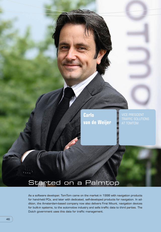
Started on a Palmtop
As a software developer, TomTom came on the market in 1998 with navigation products for hand-held PCs, and later with dedicated, self-developed products for navigation. In ad-dition, the Amsterdam-based company now also delivers First Mount, navigation devices for built-in systems, to the automotive industry and sells traffic data to third parties. The Dutch government uses this data for traffic management.
46
Carlo van de Weijer
Vice presidenttraffic solutionsat tomtom

47
TomTom visualizes the situation on the roads
From above, during traffic peaks, our network of roads looks like a teeming colony of ants, with heavy
traffic going in all different directions. Parts of the network are structured along clear paths and parts
of it flow in more erratic patterns. Except ants don’t seem to experience the phenomenon of traf-
fic jams. As road users, people function as individuals. We all have our own destinations and hardly
communicate with each other. This is why we rely on our navigation systems to help us get to where
we are going as fast or as efficiently as possible. Next to fixed information like maps of our road
networks, dynamic information like temporary changes and hindrances on the roads, congestion and
traffic speed all play an increasingly important role.
Traffic data is big dataThe data points mentioned above involve large amounts of rapidly changing information, and all of
it gets stored, which means this enormous stream of data creates a rapidly growing data set. Vice
President of Traffic Solutions at TomTom, Carlo van de Weijer says, “for its navigation calculations,
TomTom uses the data from billions of historical and current measurements. Those measurements are
the information we receive from the 80 million navigation systems we have delivered to our custom-
ers worldwide. A great many of them generate a constant data stream resulting in billions of reports
every day. Their navigation systems are connected directly with our back office, and with our built-in
‘connected navigation sharing,’ we monitor information about the traveling speed of our users on the
road.”
Quality traffic information is something we just can’t do without. Based on traffic reports, we decide the time of our departure, which route to take, whether to take public transportation or car, and even if we should travel at all. The information we use to make these decisions comes from a mixture of experience, traffic and weather predictions, and up-to-date information about traffic jams. ”Knowledge is power,” and the data that TomTom’s navigation system generates continuously means this company plays a vital role in supplying that knowledge. We’re talking huge amounts of dynamic, up-to-date information. In other words: big data.
The complex, dynamic process of visualizing traffic navigation data

These automatic, user-generated data streams tell TomTom a lot about congestion at specific loca-
tions. Also, users themselves can make improvements on the map, which TomTom then adapts for
general use, so other travelers can use the information too. “This gives us thousands of corrections
every day,” explains Van de Weijer. “Together with the billions of speed measurements we receive,
we are automatically able to see - and apply - small infrastructural changes in our maps. For example,
if a crossing has become a traffic circle or the opening of a new overpass, we see this immediately
through our community.”
Many sourcesThe most interesting information comes from “connected” navigation systems. More than 6 million
of these systems, equipped with their own SIM cards, transmit “floating car data” every one to three
minutes, sharing information about the average speed on the road. “All this traffic data - already from
28 countries - we process in our back office. The information is analyzed and then goes back to the
users in those countries to help the people better navigate their way through traffic,” says Van de
Weijer.
Traffic information doesn’t come from TomTom’s own sources alone. “In several countries we work
closely with Vodafone, and process the locations of phones that are active in those areas,” explains
Van de Weijer. “In some countries we also acquire information from companies that own floating car
data themselves. Here again we are talking about large amounts of data that have to combined and
managed for quality. Obviously, we want to avoid reporting a traffic jam for a location where just one
car happens to be driving slowly or stops to make a phone call,” says Van de Weijer.
After a successful collaboration with Nike in the development of sports watches, TomTom is forging a path of its own. With the introduction of two sports watches - designed for running, cycling and swimming - the company plans to broaden its reach in this market.As with its navigation systems, the goal is to produce watches that are user-friendly, functional and well-designed. TomTom’s watches feature large screens and one-button controls. The
focus of the sports watches is not so much navigation, but on measuring per-formance. There are three modes the user can display for set objectives and measured values: a race mode, an ob-jective mode or a zone mode.The watches do not yet communicate with TomTom’s data systems. For the time being, the functionality will focus on the needs of the growing market of Dutch sports enthusiasts.
TomTom turns onto a different road
48

49
Government data“In new countries, where there are still relatively few connected systems on the road, we temporar-
ily use government data,” says van de Weijer. “In these cases, open standards are often used, so
that data collection becomes increasingly simple. By combining all this data, in the future, the use of
detection loops on the pavement will be unnecessary.”
Other important data points include news reports about either the cause of a traffic jam or traveler
reports that a specific lane has been closed off. “After all, people not only want to know about delays
but also what has caused them, not just out of curiosity but also to calculate how long the delay will
be. In the Netherlands we get journalistic data from the road service, ANWB [The Royal Dutch Touring
Club], police and the infrastructure agency, Rijkswaterstaat,” says Van de Weijer.
Sources like Twitter are helpful but difficult to use because filtering that information is hard to auto-
mate, explains Van de Weijer. “Even if we do look at the potential of social media, we still prefer to
focus on passively generated information. While on the road, people should concentrate on traffic and
not on their Twitter accounts. It goes without saying that our mission is to get people from A to B in a
manner that is fast, comfortable and also safe.”
Influence of the weather“It is hard to include weather forecasts in a navigation device, says Van de Weijer. “Obviously, after
a heavy rain or snowfall, the average driving speed will decrease and travel times will be longer for
everybody. But we will observe this effect anyway from our measurements of traffic flow. Weather
forecasts are often inaccurate and can vary greatly between locations. What you do have to consider
is that in many countries the maximum speed differs between when it is raining and when the roads
are dry. So, when we collect data and look to add value, we need to be very critical.”
Visualizing dataVisualizing all of this traffic information happens in many different ways. First, all information is
immediately visible in the TomTom processing center, where the stream of traffic can be seen live.
Additionally, in the Netherlands, TomTom shares information with other parties like the ANWB
and Rijkswaterstaat that concentrate, among other things, on the flow of traffic in the country.
“By comparing our information with their own observations, Rijkswaterstaat displays information
about maximum speeds and lane closures on large LED and matrix screens along the highway,”
says Van de Weij er. And, there is the display of relevant route information to the user on the navi-
gation system itself.
“Navigation advice is becoming more reliable, not only due to the continuous processing of the ever-
growing amount of traffic-stream data, but also the constant improvements, additions and refine-
ments done to our mapping material. This is a development we can attribute in part to the big data
efforts of the people in our back office and to the TomTom users, who want to share their information
with us.” ■

Rik Eding
data specialistat ziekenhuisgelderse vallei

51
Like many modern hospitals, Ziekenhuis Gelderse Vallei has implemented an organizational structure that is based on results, with a system that measures performance for individual profit centers or units. This means that business decisions are made at lower levels within the organization. In order to provide these units with a way to measure performance and plan for the future, Zieken-huis Gelderse Vallei implemented SAS® Visual Analytics. In five questions, Rik Eding gives an impression of the importance of this technology has and how it affects his organization.
How important is data for your organization?
“In 2005, health care in Norway was liberalized. In that same year, we started building a data ware-
house and implementing business intelligence (BI). In those early days, we used SAS only in the
finance department. But throughout the years, we collected more and more care-related information
in our data warehouse so we could examine our primary processes. Analyzing care data also helps
us interact better with the insurance companies. After all, the hospital has a much better view of
the market share than the insurer. Whenever necessary and relevant, we can also add external data
sources to our data warehouse. One example is information from the Institute of Social Research,
about the social background of patients. It is commonly known among doctors that people of a lower
socioeconomic standing have a higher mortality rate. One of our doctors wanted to link patient diag-
noses with socioeconomic backgrounds, to better understand mortality risks. This way, we can better
treat each patient based on his or her individual situation.”
Who uses the obtained insights – and what for?
“The entire hospital uses the information. As indicated earlier, we started with BI in the finance
department and steadily started adding new sources to our data warehouse, so we could do more
analyses. We have now invested in SAS Visual Analytics, so we can provide our units with timely infor-
mation. Previously, our colleagues on the floor could not produce reports or generate analyses. They
used to ask us to do that for them. In our experience, every report we make generates 10 subsequent
questions. With SAS Visual Analytics we give them the tools to create these reports themselves – and
find the answers.”
5Five questions toRik Eding
Ziekenhuis Gelderse Vallei hospital brings analytics to the workplace


53
How do analytics and visualization help with decision making in your hospital?
“It helps in many ways. We analyze logistical processes around patients, and this allows us to identify
potential bottlenecks. An example is a recent discovery that the average period patients had to wait
to get treated for hernias had gone up. When we looked closer at the data, however, we found that
two patients had postponed their operations due to holidays. When we left those two cases out, it
turned out that the average waiting period had in fact gone down. This is meaningful information.
Another example is a request from one of our lung specialists to include data from the Royal Meteo-
rological Institute in our data warehouse. Based on that data, we can better predict which patients are
going to have physical complaints and adapt the treatment accordingly. This is fantastic, of course.”
What results has Gelderse Vallei achieved with visual analytics?
“We are currently in the middle of rolling out the solution, and we still look forward to reaping real,
measurable results. We are not worried, though. There is plenty of low-hanging fruit. Analytics has
come a long way from being just the tool of the finance department it once was. It has long since
become a part of the care process itself, initially to monitor the KPIs, such as the waiting lists, length
of hospital stay and the number of treatments. Now, it is used increasingly in medical areas. As a
result, we are able to really improve the quality of care, and the financial people are happy with that
as well. It often means a reduction in costs. It goes both ways.”
What do you still hope to achieve with analytics and visualization?
“I’d like for everybody to catch the analytics bug. As a BI team, we can provide reports, but the units
know which information they need the most. This is also the reason why my role keeps moving more
from data specialist toward information analyst. I help the individual cost centers along and stimulate
them to generate their own ideas for possible analyses. It’s a fun job, because with a tool like SAS
Visual Analytics it is easy get people excited. It looks great and it is easy to use. Whenever I explain,
users start beaming with creativity, and they will ask, “Can I do this or that, too?” There is a danger
in that, though. I notice with me, that it’s pretty addictive to dig deeper and deeper all the time.
Once you have established the broad lines, you keep going to find new correlations. It’s hard to stop.
Before you know it, our psychiatrists are going to be working overtime, treating their own colleagues
from this new form of addiction [laughter]. When that happens I will have reached my goal.” ■
“My role keeps moving more from data specialist toward information analyst.”

Visual analytics guest lecture tour
Peters’ lecture focuses on the application of the analytical life cycle, which describes how
users prepare data, do research, make models, monitor the models and finally report results.
Using a variety of examples, Peters shows that complicated issues that may require complex
functionality can actually be solved with relative ease by users. Once the rules of the busi-
ness are clear, high-performance analysis techniques then offer a framework that will quickly
provide answers. For instance, visual analytics allows a marketer to quickly run through dif-
ferent “what-if” scenarios.
Applicable everywhereOne thing that becomes clear during the lectures is that there aren’t any real limitations
in the application of visual analytics. In the financial world, it gives quick insight into credit
risks. In health care, patient records can quickly be analyzed to offer the best possible treat-
ment. Also, safety risks can be estimated to guarantee general security.
On a regular basis, Edwin Peters, Manager of Technology Solu-tions at SAS Netherlands, is guest lecturer at several univer-sities. His goal is to inspire beginning business intelligence students with visual analytics. Using striking examples, Peters shows how data visualization provides answers to today’s rel-evant questions. In order to quickly explain his lecture, an artist has illustrated it in the form of a comic strip. In this way, the power of visualization is not only part of the lecture itself, but also of this article.
Inspiring business intelligence students with visual analytics
54

55
EdwinPeters
managertechnology solutionsat sas

56
1
2
3
4

57
Big data is almost everywhere, but it is not always possible to unlock the value inside it. The
issues companies and organizations need to address are enormous. How do you reach new cus-
tomers and hold on to existing ones? Which products should or should you not offer? Traditional
reporting tools do not answer these questions. Advanced analytics tools do, by providing solutions
with direct measures that can be applied even on customer subsegments. With a small invest-
ment, great results can be achieved.
With advanced analytics, a lot of knowledge can be gained from transaction data and purchase
behavior. Analytics makes it possible to provide customers with fitting offers and suggestions for
additional purchases. This can be done with both products and services.
The analytics life cycle provides a map for structuring data exploration. It all starts with formulat-
ing the question or problem. The data is then be prepared for the process, followed by selecting
the most relevant data. A model is then built and tested, and applied under continuous monitor-
ing of the data.
Peters’ guest lectures give insight into the far-reaching possibilities that visual analytics has
to offer. Different kinds of users, from different parts of the organization and with a variety of
information needs, can all help themselves by querying the data. Visual analytics clears the
path to the right decision.
1
2
3
4


59
about SaS
Every day CEOs, CFOs, CMOs, Risk Officers, directors and managers make decisions that will impact an organi-
zation permanently, both short and long term. SAS delivers software that gives them the insight to make
those critical decisions. SAS takes the decision maker from - far too often – making decisions based on gut
feeling to decisions based on facts. From data to information and from information to insight.
SAS specializes in Business Analytics software and services, and is the largest independent supplier of busi-
ness intelligence. With innovative solutions within its integrated framework, SAS helps its customers at more
than 65,000 locations to improve their performance and create value by making better decisions faster. SAS
also helps customers to comply to laws and regulations, do pioneering research and develop the most inno-
vative products.
SAS offers not only industry-specific solutions, but also generic ones and leads the way in the areas of data
integration, data storage, advance business intelligence and business analytics applications, from a broad,
company-wide intelligence framework. SAS has been giving its customers The Power to Know since 1976.
High Performance Analytics
With the experience of over 36 years in the area of business analytics, SAS also offers innovation on high-
performance platforms, so that its customers will have at their disposal, from an ever growing amount of
data that is becoming increasingly complex and highly volatile (big data), the necessary insights faster. SAS
High-Performance Analytics is based on SAS’ own in-memory computing technology and provides answers
in minutes or seconds instead of days, so that managers and administrators can make their decision in a
timely fashion.
The business has seen a steady growth and has been profitable since its foundation. Every year, SAS invests
24 percent of its revenue in Research & Development; more than double what its competitors invest.
More than 13,000 people work at SAS worldwide, out of 400 locations in 55 countries. SAS has been active
in The Netherlands since 1986. The Dutch office is located in Huizen, with more than 170 employees work-
ing at the site of the ‘Oud-Bussem’ estate. Around the world, SAS is well known as one of the best employ-
ers. This is why every year, since its foundation, SAS has scored quite high in several ‘best companies to
work for’ rankings. In The Netherlands, SAS was chosen as the Best Company to Work For of 2013.
More information can be found at www.sas.com/nl

60
Realization:
SAS Nederland
Editors:
Wouter de WijnSusan Roos
Photography:
Eric FeckenSenta de Vries
Authors:
Ward van BeekDick de BruijnHans DoornMirjam Hulsebos
Jacket:
Philip van Tol, Amsterdam
Il lustrations:
Jongens van de tekeningen, Tomas Pasma
Design:
Alain Cohen
Printing:
Sdu Uitgevers, Den Haag
Project Management:
SAS Nederland
Translation Dutch-English:
Claudio Tapia
The book, Future Bright – Seeing is believing – was commissioned by SAS Netherlands. Content from the book can only be either copied or reproduced onto print, photo copy, film, Internet and any other medium, with the explicit permission of SAS Netherlands and its management, with proper acknowledgement. SAS Netherlands is not responsible for the statements made by the inter-viewed parties in this book.
colophon

