wakanda studio ref guide v1 beta
TRANSCRIPT

Wakanda StudioReference Guide
This preliminary documentation does not reflect the final content and design.
©2012 4D SAS. All rights reserved.

Wakanda Studio Reference Guide – Wakanda v1 beta – December 15, 2011 Page 2 / 249
Table of Contents Table of Contents ......................................................................................................................... 2
Welcome to Wakanda .................................................................................................................. 7 Wakanda Features ...................................................................................................................................................... 8 Wakanda Server .......................................................................................................................................................... 8 Wakanda Solutions and Projects ................................................................................................................................. 8 Wakanda Studio .......................................................................................................................................................... 9 Wakanda APIs ........................................................................................................................................................... 10 System Requirements ............................................................................................................................................... 10 Installation ................................................................................................................................................................ 11
Solution Manager ....................................................................................................................... 12 Overview ................................................................................................................................................................... 12
Solutions .............................................................................................................................................................. 22 Creating a New Solution ............................................................................................................................................ 22 Default Files for a Solution ........................................................................................................................................ 24 Closing a Solution ...................................................................................................................................................... 28
Projects ................................................................................................................................................................ 29 Default Project .......................................................................................................................................................... 29 Creating a New Project .............................................................................................................................................. 29 Adding an Existing Project to the Solution ................................................................................................................ 35 Removing a Project from the Solution ...................................................................................................................... 35 Running and Debugging the Default Project ............................................................................................................. 36
Directory .............................................................................................................................................................. 36 Users ......................................................................................................................................................................... 36 Groups ....................................................................................................................................................................... 39
Additional Tools ................................................................................................................................................... 41 Find and Replace ....................................................................................................................................................... 41 Importing Files and Folders ....................................................................................................................................... 43 Edit Shortcuts ............................................................................................................................................................ 43 Using Images from the Media Library ....................................................................................................................... 45 Source Control ........................................................................................................................................................... 46 Starting and Stopping Wakanda Server .................................................................................................................... 46 Opening the Debugger .............................................................................................................................................. 48 Debugging on a Remote Server ................................................................................................................................. 48 Server Administration ............................................................................................................................................... 49 Restore Default Preferences ..................................................................................................................................... 50
Wakanda Studio Preferences ............................................................................................................................... 51 general Element ........................................................................................................................................................ 51 outline Element ......................................................................................................................................................... 51 method_editor Element ............................................................................................................................................ 52 Background Color Elements ...................................................................................................................................... 53
Datastore Model Designer .......................................................................................................... 54 Overview ................................................................................................................................................................... 54
Model .................................................................................................................................................................. 60 Model Properties ...................................................................................................................................................... 60
Datastore Classes ................................................................................................................................................. 62 Datastore Class Title Bar ........................................................................................................................................... 62 Creating a Datastore Class ........................................................................................................................................ 64 Datastore Class Properties ........................................................................................................................................ 65 Datastore Class Events .............................................................................................................................................. 66

Wakanda Studio Reference Guide – Wakanda v1 beta – December 15, 2011 Page 3 / 249
Datastore Class Methods .......................................................................................................................................... 67 Extending a Datastore Class ...................................................................................................................................... 67 Deleting a Datastore Class ......................................................................................................................................... 69
Datastore Class Methods ..................................................................................................................................... 70 Adding a Datastore Class Method ............................................................................................................................. 70 Editing a Datastore Class Method ............................................................................................................................. 72 Deleting a Datastore Class Method ........................................................................................................................... 72
Attributes ............................................................................................................................................................ 73 Attribute Categories .................................................................................................................................................. 73 Creating a Storage Attribute ..................................................................................................................................... 74 Creating an N-‐>1 Relation Attribute .......................................................................................................................... 81 Creating a 1-‐>N Relation Attribute ............................................................................................................................ 82 Creating an N-‐>N Relation Attribute ......................................................................................................................... 83 Creating a Recursive Relation Attribute .................................................................................................................... 84 Deleting a Relation Attribute .................................................................................................................................... 85 Creating an Alias Attribute ........................................................................................................................................ 85 Creating a Calculated Attribute ................................................................................................................................. 86 Reordering Attributes ............................................................................................................................................... 87 Deleting an Attribute ................................................................................................................................................. 88
GUI Designer .............................................................................................................................. 89 Overview ................................................................................................................................................................... 89
Interface Page ...................................................................................................................................................... 95 Designing an Interface Page ...................................................................................................................................... 95 Viewing the Source for the Interface Page .............................................................................................................. 102
Widget Overview ............................................................................................................................................... 103 Setting the Properties for a Widget ........................................................................................................................ 103 Manipulating Widgets on the Designer Workspace ................................................................................................ 113 Error Handling ......................................................................................................................................................... 116
Form .................................................................................................................................................................. 118 Designing a Form ..................................................................................................................................................... 118 Viewing the Source for a Form ................................................................................................................................ 119 Publishing a Form .................................................................................................................................................... 120
Grid .................................................................................................................................................................... 120 Designing a Grid ...................................................................................................................................................... 120 Viewing the Source for a Grid ................................................................................................................................. 127 Publishing a Grid ..................................................................................................................................................... 128
Auto Form .......................................................................................................................................................... 129 Designing an Auto Form .......................................................................................................................................... 129 Viewing the Source for an Auto Form ..................................................................................................................... 134 Publishing an Auto Form ......................................................................................................................................... 134
Query Form ........................................................................................................................................................ 135 Designing a Query Form .......................................................................................................................................... 136 Viewing the Source for a Query Form ..................................................................................................................... 138 Publishing a Query Form ......................................................................................................................................... 139
Button ............................................................................................................................................................... 139 Creating a Button .................................................................................................................................................... 139 Viewing the Source for a Button ............................................................................................................................. 143 Publishing a Button ................................................................................................................................................. 143
Checkbox ........................................................................................................................................................... 143 Creating a Checkbox ................................................................................................................................................ 143 Viewing the Source for a Checkbox ......................................................................................................................... 145 Publishing a Checkbox ............................................................................................................................................. 145
Text ................................................................................................................................................................... 146 Creating a Text Widget ............................................................................................................................................ 146

Wakanda Studio Reference Guide – Wakanda v1 beta – December 15, 2011 Page 4 / 249
Viewing the Source for a Text Widget ..................................................................................................................... 149 Publishing a Text Widget ......................................................................................................................................... 149
Display Error ...................................................................................................................................................... 149 Creating a Display Error ........................................................................................................................................... 149 Viewing the Source for a Display Error Widget ....................................................................................................... 150 Publishing a Display Error ........................................................................................................................................ 151
Radio Button Group ........................................................................................................................................... 151 Creating a Radio Button Group ............................................................................................................................... 151 Viewing the Source for a Radio Button Group Widget ............................................................................................ 155
Menu Bar ........................................................................................................................................................... 155 Creating a Menu Bar ............................................................................................................................................... 156 Creating a Menu Item ............................................................................................................................................. 158 Viewing the Source for a Menu Bar Widget ............................................................................................................ 161
Combo Box ........................................................................................................................................................ 161 Creating a Combo Box ............................................................................................................................................. 161 Viewing the Source for a Combo Box ...................................................................................................................... 166 Publishing a Combo Box .......................................................................................................................................... 166
Slider ................................................................................................................................................................. 167 Creating a Slider ...................................................................................................................................................... 167 Viewing the Source for a Slider ............................................................................................................................... 170 Publishing a Slider ................................................................................................................................................... 170
Text Input .......................................................................................................................................................... 170 Creating a Text Input ............................................................................................................................................... 170 Viewing the Source for a Text Input ........................................................................................................................ 175 Publishing a Text Input ............................................................................................................................................ 175
Progress Bar ....................................................................................................................................................... 175 Creating a Progress Bar ........................................................................................................................................... 175 Viewing the Source for a Progress Bar .................................................................................................................... 178 Publishing a Progress Bar ........................................................................................................................................ 178
Login Dialog ....................................................................................................................................................... 178 Creating a Login Dialog ............................................................................................................................................ 178 Viewing the Source for a Login Dialog Widget ........................................................................................................ 180
Container ........................................................................................................................................................... 181 Creating a Container ............................................................................................................................................... 181 Splitting a Container ................................................................................................................................................ 183 Joining a Split Container .......................................................................................................................................... 184 Viewing the Source for a Container ........................................................................................................................ 184
Matrix ................................................................................................................................................................ 185 Creating a Matrix ..................................................................................................................................................... 185 Viewing the Source for a Matrix .............................................................................................................................. 188 Publishing a Matrix .................................................................................................................................................. 188
Image ................................................................................................................................................................. 189 Creating an Image ................................................................................................................................................... 189 Viewing the Source for an Image Widget ................................................................................................................ 192 Publishing an Image Widget .................................................................................................................................... 192
Component ........................................................................................................................................................ 192 Adding a Component to your Interface Page .......................................................................................................... 192 Previewing a Component on an Interface Page ...................................................................................................... 194 Creating a Component ............................................................................................................................................ 195 Component Structure .............................................................................................................................................. 196 Testing a Component .............................................................................................................................................. 199 Loading a Component ............................................................................................................................................. 200
Chart .................................................................................................................................................................. 200 Creating a Chart ...................................................................................................................................................... 201

Wakanda Studio Reference Guide – Wakanda v1 beta – December 15, 2011 Page 5 / 249
Viewing the Source for a Chart Widget ................................................................................................................... 205 Publishing a Chart ................................................................................................................................................... 205
Google Maps ...................................................................................................................................................... 206 Creating a Google Maps Widget ............................................................................................................................. 206
Yahoo! Weather ................................................................................................................................................. 210 Creating a Yahoo! Weather Widget ........................................................................................................................ 210 Publishing a Yahoo! Weather Widget ..................................................................................................................... 212
Datasources ....................................................................................................................................................... 213 Creating a Datasource ............................................................................................................................................. 213 Duplicating a Datasource ........................................................................................................................................ 214 Deleting a Datasource ............................................................................................................................................. 214
Datastore Class Datasources .............................................................................................................................. 214 Creating a Datastore Class Datasource ................................................................................................................... 215 Duplicating a Datastore Class Datasource ............................................................................................................... 215 Deleting a Datastore Class Datasource ................................................................................................................... 215 Datastore Class Datasource Properties ................................................................................................................... 215 Datastore Class Datasource Events ......................................................................................................................... 216 HTML Code for a Datastore Class Datasource ......................................................................................................... 217
Relation Attribute Datasources .......................................................................................................................... 217 Creating a Relation Attribute Datasource ............................................................................................................... 218 Duplicating a Relation Attribute Datasource .......................................................................................................... 218 Deleting a Relation Attribute Datasource ............................................................................................................... 218 Relation Attribute Datasource Properties ............................................................................................................... 219 Relation Attribute Datasource Events ..................................................................................................................... 219 Using a Relation Attribute Datasource .................................................................................................................... 220 HTML Code for a Relation Attribute Datasource .................................................................................................... 221
Variable Datasources ......................................................................................................................................... 222 Creating a Variable Datasource ............................................................................................................................... 222 Duplicating a Variable Datasource .......................................................................................................................... 222 Deleting a Variable Datasource ............................................................................................................................... 222 Variable Datasource Properties .............................................................................................................................. 223 Variable Datasource Events .................................................................................................................................... 223 HTML Code for a Variable Datasource .................................................................................................................... 223
Array Datasources .............................................................................................................................................. 223 Creating an Array Datasource ................................................................................................................................. 224 Duplicating an Array Datasource ............................................................................................................................. 224 Deleting an Array Datasource ................................................................................................................................. 224 Array Datasource Properties ................................................................................................................................... 224 Array Datasource Events ......................................................................................................................................... 225 HTML Code for an Array Datasource ....................................................................................................................... 225
Object Datasources ............................................................................................................................................ 226 Creating an Object Datasource ............................................................................................................................... 226 Duplicating an Object Datasource ........................................................................................................................... 226 Deleting an Object Datasource ............................................................................................................................... 226 Object Datasource Properties ................................................................................................................................. 226 Object Datasource Events ....................................................................................................................................... 227 HTML Code for an Object Datasource ..................................................................................................................... 227
Code Editor ............................................................................................................................... 228 Overview ................................................................................................................................................................. 228 Breakpoints ............................................................................................................................................................. 236 Auto Complete Feature ........................................................................................................................................... 237 Find and Replace ..................................................................................................................................................... 238 Using the Free Form Edition Mode ......................................................................................................................... 241
Debugger .................................................................................................................................. 243 Overview ................................................................................................................................................................. 243

Wakanda Studio Reference Guide – Wakanda v1 beta – December 15, 2011 Page 6 / 249
Appendix ................................................................................................................................... 246 Terminology ............................................................................................................................................................ 246 Naming Conventions ............................................................................................................................................... 249

Wakanda Studio Reference Guide – Wakanda v1 beta – December 15, 2011 Page 7 / 249
Welcome to Wakanda Wakanda is an integrated, complete and open development platform, making it possible to design, build and release business-‐oriented Web applications or Business Internet Applications (BIAs). Business Internet Applications are desktop-‐like applications that are hosted on a server and accessible through a web browser, tablet, or smartphone.
The Wakanda platform consists of three main components:
• Wakanda Server, a Web application server tied to a database engine (datastore), • Wakanda Studio, a desktop application providing an IDE, • A JavaScript framework.
The fully integrated Wakanda platform provides the necessary tools to create and run your Web applications. While other development environments require various technologies and tools (application server, HTTP server, database server, a framework, etc.) that must work together through layers of code, Wakanda provides an all-‐in-‐one environment, thus eliminating the intermediary code and hazards of inter-‐application interfacing. Both the server and the Web applications use the same language: JavaScript with a touch of Ajax.
The application's logical structures (entities) are available as directly editable objects through JavaScript code, making the accessing of data instant and natural. Building Wakanda applications is done using business logic, found at all stages of the creation process, making the application easy to design and maintain.
Wakanda Studio Reference Guide – Wakanda v1 beta – December 15, 2011 Page 8 / 249
The Wakanda application’s data structure is inspired from the Entity-‐relationship model. Information and relations are defined using datastore classes. That datastore classes make it possible to define the database structure in a natural way, befitting the user's needs and letting go of the conceptual constraints of the Relational model.
Wakanda Features Wakanda provides you with an end-‐to-‐end JavaScript platform, where you get:
• A zero-‐configuration server with built-‐in HTTP services, • A client proxy that automatically replicates the logic and services from the server, • Client-‐side access to all the data objects, • Multi-‐layered architecture, • Datastore classes in the domain layer (with XML model file), • Robust infrastructure with integrated database, • Server-‐side JavaScript, • REST data services with automatic JSON transport using JSON-‐RPC, • Fully evolutionary by inheritance to add behaviors and events, and • Dynamic behaviors: no static code generation.
Wakanda Server Wakanda Server is a faceless application intended to run on Windows, Mac and Linux, comprised of the two principal components of the platform:
• Data server: Wakanda Server benefits from a complete, robust and powerful Object Data Storage engine, on top of which is built the concept of entity-‐relationship model, allowing the developer to formalize the hierarchical data structures in a simple and efficient manner using datastore classes, staying as close as possible to the constraints of application logic.
• Web server: Facilitating and optimizing the interactions between the user interface and data by way of the technologies implemented by the development environment (datastore classes, Server-‐Side JavaScript, RESTful Data Services, etc.), Wakanda’s Web server offers a platform dedicated to deploying powerful and evolutionary Business Internet Applications, conforming to the latest standards in effect.
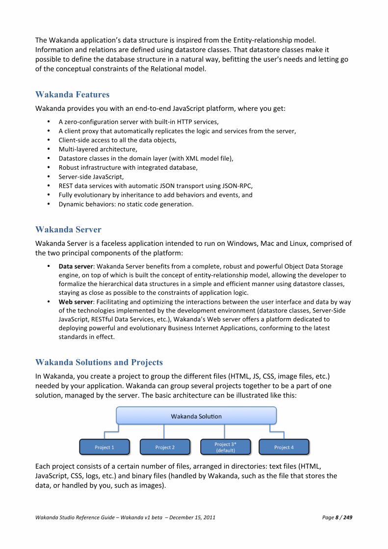
Wakanda Solutions and Projects In Wakanda, you create a project to group the different files (HTML, JS, CSS, image files, etc.) needed by your application. Wakanda can group several projects together to be a part of one solution, managed by the server. The basic architecture can be illustrated like this:
Each project consists of a certain number of files, arranged in directories: text files (HTML, JavaScript, CSS, logs, etc.) and binary files (handled by Wakanda, such as the file that stores the data, or handled by you, such as images).

Wakanda Studio Reference Guide – Wakanda v1 beta – December 15, 2011 Page 9 / 249
Wakanda Studio The Wakanda Studio is the place where you can design all the parts of your Web applications. It is made up of the following components:
• Solution Manager • Datastore Model Designer • GUI Designer • Code Editor • In addition, you can benefit from a full-‐featured JavaScript Debugger that will help you to validate
your code, as well as administration tools for managing your web applications on the server.
Solution Manager The Solution Manager is the main area in Wakanda that allows you to manage your solutions, projects, and various files (Interface pages, HTML, JS, CSS, JSON, XML, Text, images, etc.) in each project.
Datastore Model Designer The Datastore Model Designer is where you create the model for your Wakanda project. Models are broken down into datastore classes, containing attributes and methods.
GUI Designer The GUI Designer allows you to design your Interface pages with powerful widgets to view and edit the data in your Wakanda application. Besides many built-‐in widgets, you can also create your own widgets that you can include in your projects.
Code Editor The Code Editor is where you write your JavaScript code for specific events for datastore classes, attributes, Interface pages, widgets, and much more. It can also handle files written in XML, JSON, PHP, and CSS.

Wakanda Studio Reference Guide – Wakanda v1 beta – December 15, 2011 Page 10 / 249
Wakanda APIs A Wakanda solution relies on several JavaScript APIs available on both the server-‐side and client-‐side that allow built-‐in editors or interfaces from any other application to connect and use the business model. The current architecture of Wakanda data access APIs is shown here:
Server-‐side JavaScript APIs provide you with all the necessary tools to manage files, folders, services, and so on.
For more information about Wakanda JavaScript APIs, please refer to the APIs documentation.
System Requirements The Wakanda platform requires the minimum following requirements:
Wakanda Server • Windows Server 2008, Vista and windows 7, 32-‐ or 64-‐bit • Mac OS X 10 • Linux 2.6 -‐ Ubuntu
(*) To check if you are running a 32-‐bit or a 64-‐bit processor, refer to the reference table provided by Apple on the following page: http://support.apple.com/kb/HT3696
Wakanda Studio • Windows Vista and Windows 7, 32-‐ and 64-‐bit • Mac OS X 10.6
Web Browsers • Internet Explorer 9 • Firefox 3.6+ • Google Chrome 3.0+ • Safari 5.0+ • For other browsers: You can use WAF low-‐level routines to create widgets.

Wakanda Studio Reference Guide – Wakanda v1 beta – December 15, 2011 Page 11 / 249
Installation Install Wakanda Server and Wakanda Studio onto your hard disk using the tools provided online.
Generally Wakanda Studio and Wakanda Server are in the same folder/directory; however, you can install the Wakanda Server and Wakanda Studio in different places. If they are side by side, Wakanda Studio will be able to launch the server automatically. If Wakanda Studio does not find the server, it will display the standard Open File dialog, allowing you to select the Wakanda Server to open.
Once Wakanda Server and Wakanda Studio are installed on your machine, double-‐click on the Wakanda Studio icon. You don’t have to launch Wakanda Server because Wakanda Studio will automatically launch it when needed or as defined in your solution’s settings. You can also start the server by clicking on Wakanda Studio’s Start toolbar button if it is not started.

Wakanda Studio Reference Guide – Wakanda v1 beta – December 15, 2011 Page 12 / 249
Solution Manager Overview The Solution Manager is the main area of Wakanda Studio where you manage your solutions and the project(s) they contain. From the Solution Manager, you can open the different Wakanda editors to create Interface pages, design the model for your project, and write your business rules in JavaScript.
A Wakanda solution is a collection of projects, each of which contains a single model and an active Web folder where all the files that can be viewed from the browser are stored.
A solution can contain one or more projects, all of which are published immediately by the server; however, only one project in the solution is defined as the default project. For more information about defining one project as the default one, please refer to the “Projects” section.
When you open one solution containing two projects with Wakanda Studio, it appears as shown below:

Wakanda Studio Reference Guide – Wakanda v1 beta – December 15, 2011 Page 13 / 249
The Solution Manager is made up of the following areas:
• Menu Bar • Toolbar • Tabs • Solution Explorer • Workspace • Footer
Menu Bar The Solution Manager’s menu bar offers you many options available throughout Wakanda even when other editors are open:
• File: This menu allows you to create a new solution or project, open existing ones, save the currently opened file, save all open files, and close the current solution. You can also import an external file or folder, rename the selected file in the Solution Explorer, and quit Wakanda.
• Edit: Standard edit menu that allows you to cut, copy, paste, and delete files, folders, and other objects listed. From this menu, you can also edit Wakanda Studio’s keyboard equivalents for menu items throughout the program by selecting Edit Shortcuts.
• Run: From this menu, you can run or debug the main Interface page of your default project or a JavaScript file, start and stop the Solution Server, start and stop the Wakanda Debugger, and connect to another Server to debug.
• Tools: This menu allows you to find and replace a value in all the projects in your solution, in a specific project, or in files of the same type, and then view the results in a list. From this menu, you can also launch the Administration page.
• Source Control: When multiple developers are working on the same project, you can manage the source control through this menu. (*Not yet implemented)
Toolbar The Solution Manager’s toolbar allows you to quickly access many key functions in Wakanda. You can also customize the toolbar by selecting which options to display, how to display them (text only, text and icon or icon only), and if you prefer to display small icons or the larger ones.
The toolbar contains the following functions by default:
• New: From this menu item, you can create a new solution, project, model, Interface page, file (JavaScript, JSON, HTML, CSS, XML, PHP, or Text), and folder. The Interface page will be saved directly in your default project’s WebFolder. By default, files of type HTML, CSS, XML, PHP, and Text will be saved in the WebFolder for the default project while JavaScript and JSON files will be created at the root level of the default project. You can also select a folder before selecting a file to create so that it will be created inside of it.
Note: Remember that an HTML page that doesn’t include the proper Wakanda tag will only be editable with the Code Editor. For more information, please refer to the “GUI Designer” chapter.
• Edit: Allows you to cut, copy, paste, and delete text in files as well as files, folders, and objects depending on the context.
• New Project…: Opens the New Project from Template window, allowing you to select a template or create a new project. The project will be added automatically to the current solution.

Wakanda Studio Reference Guide – Wakanda v1 beta – December 15, 2011 Page 14 / 249
• New Page: Creates a new Interface page for Desktop, Smartphone, or Tablet in your current project, and places it in your project’s WebFolder (defined in the webApp element in the project’s settings). Please refer to the “webApp Element” section in the “Project Settings” section.
§ Desktop: This option allows you to create an Interface page that will be used for desktops and located in your project’s WebFolder.
§ Smartphone: This option creates an Interface page to be used for smartphones. These Interface pages will be created in a folder named “smartphone” in your project's WebFolder.
§ Tablet: This option allows you to create an Interface page that will be used for tablets. These Interface pages will be created in a folder named “tablet” in your project's WebFolder. Note: Once you have selected one of these items from the menu, it will be the active type for New Page. The selected type is the default time of the new page will be created. Note: To modify the role for the folder containing the different Interface pages, please refer to "Explorer Area Action Menu" in the "Solution Manager" section.
Note: The different types of Interface pages are available only in the Development Branch for Wakanda.
• New JS: Creates a new JavaScript file in your current project and places it in the currently selected folder.
Note: You can add other toolbar buttons from the Display menu to create a new model and different files besides JavaScript and Interface pages, like JSON, HTML, CSS, XML, PHP, and Text files.
• Model: Opens the model for the current project in the Datastore Model Designer. • Main Page: Opens the main Interface page (“index.html” by default as defined in the webApp
element in the project’s settings) in your current project. Please refer to the “webApp Element” section in the “Project Settings” section.
• Directory: Opens an editor in which you can add, modify, and delete users and groups for your solution.
• Find in Files: Displays an editor where you can enter a string to find and replace, if you'd like, in the files in the opened files, current project, or entire solution..
• Start/Stop: Starts and/or stops the selected Wakanda Server (or the default one if none has been previously selected).
• Run Project: Opens the currently selected project’s main Interface page (“index.html”) in your default Web browser. If the server has not been started, Wakanda will try to start it when you click on this button.
• Debugger: Displays the Debugger window. • Breakpoints: Enables/disables the breakpoints in the JavaScript files that are used in the Debugger. • Reload Models: Allows you to reload any modified models you have in your solution to the server.
This button is only enabled if one of your project’s models has been modified and saved. The server must be started for this option to be available.
• Administration: Opens the Administration page in your default browser. The server must be started for this option to become available. For more information on the Administration, please refer to the “Server Administration” section in the “Additional Tools” section.
• Media: This option allows you to view the built-‐in Media library or your own Images folder for the selected project.
• Media Library: Displays the Media Library in the Thumbnails tab of the Solution Explorer. • Images Folder: Displays your current project’s “Images” folder (located in the “WebFolder”) in the
Thumbnails tab of the Solution Explorer. If there is no current project, this option is disabled. • Display: This menu allows you to modify the options displayed in the toolbar. The following two
menu items allow you to modify how the toolbar is displayed: § Toolbar Preferences: Allows you to set the display of the toolbar items (text only, text and
icon or icon only) as well as the size of the icons.

Wakanda Studio Reference Guide – Wakanda v1 beta – December 15, 2011 Page 15 / 249
§ Toolbar Content: Allows you to select which options you’d like to display in the toolbar as well as reset to the default options.
§ Skins: Skins you can apply to the Solution Manager main window to change its appearance.
If all the items in the toolbar cannot be displayed due to lack of space, the icon appears in the toolbar. When you click on it, the missing toolbar icons appear in a hierarchical menu.
Tabs A tab is displayed below the Solution Manager toolbar for each open file in your Wakanda project. If you click a tab, you can view the contents of that file in the Datastore Model Designer (for a model), in the GUI Designer (for Interface pages), or in the Code Editor (for files of type JavaScript, JSON, HTML, CSS, XML, PHP, and Text). For image files, a preview of the image is displayed in the workspace.
Ctrl-‐Tab (Windows) or Command-‐Tab (Macintosh) to navigate the tabs regardless of the type of file it contains forward (from left to right) or Ctrl-‐Shift-‐Tab (Windows) or Command-‐Shift-‐Tab (Macintosh) to navigate them backward (from right to left).
If you double-‐click a tab, you can show or hide the Solution Explorer and view only the current file in its corresponding editor.
Ctrl-‐W (Windows) or Command-‐W (Macintosh) allows you to close the current tab.
Once you modify a file, an asterisk, “*”, will appear at the end of its name. For example, if you modify the “index.html” file, it will appear as “index.html*”. The asterisk disappears once you save the file.
The contextual menu for a tab allows you to execute the following actions:
• Save Automatically: Specify if you want the file to be saved automatically or not. If you select this option, Wakanda will save the file in the current tab each time it is modified.
• Close: Closes the tab. • Close Others: Closes all other tabs except this one. • Close All: Closes all the open tabs. • Next: Goes to the next tab. This option only appears if there is a next tab to go to. • Previous: Goes to the previous tab. This option only appears if there is a previous tab to go to. • Run File: Runs the file in the tab. This option only appears if the file can be executed (e.g., an
Interface page or a JavaScript file). • Move to New Window: Opens this tab in a new window. • Reveal in Solution Explorer: Selects the current file/folder in the Explorer tab when you go to it
from the List and Thumbnails tabs. • Open Enclosing Folder: Opens the enclosing folder (on your computer) for the file currently
displayed in the tab. • Copy File Path: Copies the path to the file opened in the tab and places it in your Clipboard. • Copy File Name: Copies the filename of the file opened in the tab and places it in your Clipboard.
At the bottom of the contextual menu is a list of the open tabs with their corresponding icons in the order of how they are displayed in Wakanda from left to right. The currently visible tab is shown with a checkmark next to it. To sort them alphabetically, hold down the Shift key.

Wakanda Studio Reference Guide – Wakanda v1 beta – December 15, 2011 Page 16 / 249
Note: The contextual menu appears over a tab when you right-‐click on it. You can view the contextual menu over a tab that is not the one currently open in the GUI Designer, Datastore Model Designer, or Code Editor; however, the Save option only works on the file in the tab that is currently visible.
A similar contextual menu is available on the icon to the right if all the tabs do not fit:
If you hold down the Shift key, the files will be sorted in alphabetical order.
When you hover over a tab, a help tip appears indicating the file path:
Opening External Files
You can also drag a file from your desktop and drop it in the Tabs area. It will then be opened in a new tab in the appropriate editor, like the GUI Designer or the Code Editor.
Solution Explorer The Solution Explorer allows you to view your solution, its projects, and the files contained in each project in three different ways: hierarchical menu (Explorer tab), list (List tab), or thumbnails (Thumbnails tab).
When you double-‐click on a folder in the Explorer tab, it either collapses or expands to hide or show its contents. Double-‐clicking on all other files in the Explorer, List, or Thumbnails tab opens the appropriate editor and places the file in a new tab above the workspace. Wakanda opens the Datastore Model Designer (for a model, the “{Project Name}.waModel” file), the GUI Designer (for Interface pages), or the Code Editor (for files of type HTML, JSON, PHP, CSS, XML, JavaScript, and Text). If you double-‐click on an image file, it will be displayed in the workspace.
Note: The project’s model can be expanded to view the datastore classes it contains; however, double-‐clicking on each one does nothing.
If you double-‐click the solution at the top of the Explorer tab, the Code Editor will open the XML file named “{Solution Name}.waSolution”.

Wakanda Studio Reference Guide – Wakanda v1 beta – December 15, 2011 Page 17 / 249
You can toggle the Solution Explorer by either double-‐clicking on the splitter to the right of the area or by double-‐clicking on one of the tabs.
Explorer Tab
When you view your solution in the Explorer tab, all the projects in your solution are displayed along with all the files and folders each project contains. Below your project(s) is the Media Library folder.
You can specify to display folders at the top and then files by selecting Folders on Top from the Solution Explorer’s contextual menu. When you do so, folders are placed at the top, then the files.
In the Explorer tab, there are four buttons that allow you to navigate the selection of files/folders:
• To select the solution in the Explorer, click the icon.
• After you have selected a file/folder, click the icon to go back to the previously selected file/folder.
• After you have selected a file/folder and gone to the previously selected one, you can come back to
the file/folder that was selected next by clicking the icon.
• If you want to select the parent folder of the currently selected file/folder, click on the icon.
To open the selected file in a new tab with the appropriate editor, double-‐click on it. If you want to open the selected file in a new window, hold down the Alt (Windows) or Option (Macintosh) key when you double-‐click on it. If the file is already open in a tab, you will have to close it first or select Move to New Window from the tab’s contextual menu.

Wakanda Studio Reference Guide – Wakanda v1 beta – December 15, 2011 Page 18 / 249
If you want to copy a file or folder to another location, hold down the Ctrl (Windows) or Option (Macintosh) key when dropping it to its new location. The original file or folder will remain in its location and a copy will be created in the new location.
List and Thumbnails Tabs
Clicking on the List or Thumbnails tab, the contents of the selected folder or the selected file(s) in the Explorer tab are displayed in a flat list or as thumbnails:
You can open the selected file in a new tab in its corresponding editor by double-‐clicking on it.
If you want to rename a file in the list or thumbnails tabs, simply click on its name and choose Rename from the selected file’s contextual menu.
You can filter the files displayed in the List tab by selecting one of the predefined types or by entering some text in the File Filter field:
Enter a text value to search in the filenames listed. You can also search for a text value contained in the filename by adding an asterisk (*) before and after the text. For example, if you want to find “dex” contained in a filename, enter “*dex*”.
The files displayed are those that correspond to the filter you selected or text you entered:
In the drop-‐down list to the right of the File Filter field, you can navigate up one or more levels to different folders up to the solution. Once you select a folder, project, or solution, the files it contains are displayed:

Wakanda Studio Reference Guide – Wakanda v1 beta – December 15, 2011 Page 19 / 249
By default, only the Name column is displayed in the List tab. You can toggle the Name, Project, Type, and Modification (containing date and time) columns from the contextual menu of the column header:
You can sort the files by name, project, type, or modification by clicking on the corresponding header. An arrow appears indicating ascending or descending sort order:
You can also drag a column to another location in the list to display the columns in a different order.
Explorer Area Action Menu
From the menu as well as the contextual menu on the selected file/folder in the Explorer tab:
• Close Solution: Closes the selected solution. This same option is also available from the solution’s contextual menu.
• Open this Solution at Startup: Opens the selected solution at startup by default when you launch Wakanda. This same option is also available from the solution’s contextual menu.
• Start Server when Opening Solution: Starts the server when you open the solution. This value can be found in your solution’s “{Solution Name}.{User Name}.waPreferences” file. This option is only available if you have clicked the “Do not ask me again” checkbox in the dialog that asks you “Do you want to start Wakanda Server when opening this solution?”
• Stop Server when Closing Solution: Stops the server when you close the selected solution. This value can also be modified in your solution’s “{Solution Name}.{User Name}.waPreferences” file. This option is only available if you have clicked the “Do not ask me again” checkbox in the dialog that asks you “Do you want to stop Wakanda Server when closing this solution?”
• New: This option allows you to create a new solution, project, model file (i.e., Page for Desktop, Page for Smartphone, Page for Tablet, Web Component, JavaScript, JSON, HTML, CSS, XML, PHP, and Text file), or folder.
• Add an Existing Project to Solution: This menu allows you to add an existing project to your current solution. The project must be a valid Wakanda project and have the “.waProject” extension. Only the

Wakanda Studio Reference Guide – Wakanda v1 beta – December 15, 2011 Page 20 / 249
reference to the project is added to the solution; the files are not copied or moved. To remove it, use the Remove from Solution option in this menu.
• Import: This menu allows you to import a file or folder into your current project by copying it directly into the location you choose (for example, in your project or a folder of your project).
• Set as Default Project: Sets the currently selected project in the solution as the one to open when Wakanda is launched. The project defined as the default project appears in bold in the Explorer. For more information, please refer to the “Projects” section.
• Rename: Renders the name of the file, folder, or project editable so you can rename it. • Open in New Window: Opens the selected file in a new window. Depending on the file type, the
appropriate editor opens: the Datastore Model Designer for a model, the GUI Designer for Interface pages, or the Code Editor for files of type JavaScript, JSON, HTML, CSS, XML, PHP, and Text. Images are displayed directly in the Workspace.
• Open in New Tab: Opens the selected file in a new tab. Depending on the file type, the appropriate editor opens: the Datastore Model Designer for a model, in the GUI Designer for Interface pages, or in the Code Editor for files of type JavaScript, JSON, HTML, CSS, XML, PHP, and Text. Images are displayed directly in the Workspace. By default, when you double-‐click a file, it is opened in a new tab by the appropriate editor for the file.
• Remove from Solution: Removes the selected project from the solution without touching the files it contains.
• Open Enclosing Folder: Opens the enclosing folder for the selected file or folder on your hard disk. • Folders on Top: In the Solution Explorer, the folders are placed on top and listed in alphabetical
order, then the files in alphabetical order. • Reveal Parent in Solution Explorer: Reveals the parent folder of the selected file/folder in the
Explorer when you go to that tab. This option is the same as the icon in the Explorer tab. • Role: You can define a role to specific files in your project when in the Explorer tab. In the table
below are the roles, the files and/or folders that you can select for that role, and a brief description of the roles:
Role File/Folder Description Active Model A Wakanda Model file (an
XML file with the “.waModel” extension)
The project’s active model. By default, it is the one created when you create the project, but you can create multiple models per project.
Active Data A Wakanda Data file (an XML file with the “.waData” extension)
The project’s data file in the “data” folder.
Settings File A Wakanda Settings file (an XML file with the “.waSettings” extension)
The project’s settings file.
Bootstrap File A JavaScript file The first JavaScript file to be executed when the server launches the project.
Web Folder A folder inside the Project folder
The folder that contains the files sent to the browser, like the HTML files, images, and client-‐side JavaScript files.
Smartphone A folder inside Web Folder This folder contains all the files to be sent to any smartphone requests.
Tablet A folder inside Web Folder This folder contains all the files to be sent to any tablet requests.
RPC Functions File
A JavaScript file per project A JavaScript file containing one or more RPC functions.
RPC Catalog An RPC catalog (a JSON file with the “.waRpc” extension)
A JSON file contains the list of RPC functions exposed to the client.

Wakanda Studio Reference Guide – Wakanda v1 beta – December 15, 2011 Page 21 / 249
Note: The different types of Interface pages are available only in the Development Branch for Wakanda.
One additional option, Reveal Parent in Solution Explorer, is available from the contextual menu for the selected file/folder in the List and Thumbnails tabs, allowing you to reveal the parent folder of the selected file/folder in the Explorer when you go to either of those tabs.
Workspace The workspace is where you view and edit files in your project. Wakanda opens the Datastore Model Designer (for a model), the GUI Designer (for Interface pages), and the Code Editor (for files of type JavaScript, JSON, HTML, CSS, XML, PHP, and Text). For image files, the workspace simply displays the image.
Note: For more information about each editor, please refer to its corresponding chapter in the Wakanda Studio Reference Guide.
Footer The footer of the Solution Manager indicates the status of the Server, Debugger, and Source Control. Wakanda may also display a message in the footer when an action needs to be taken.
The following icons appear to show the status of the Server, Debugger, and Source Control:
• : On • : Warning (only for Server). A message appears to the right indicating what action to take: either
the model needs to be reloaded or the server needs to be started. • : Off

Wakanda Studio Reference Guide – Wakanda v1 beta – December 15, 2011 Page 22 / 249
Solutions A Wakanda solution is a collection of projects, each of which contains one active model and a Web folder. A solution can contain one or more projects that are all accessible at the same time. In the current version of Wakanda, you can open only one solution at a time.
Creating a New Solution When you launch Wakanda Studio and no solution is opened automatically, the Solution Manager appears as shown below:
To create a new solution, you can click on New Solution in the side panel or select New-‐>Solution
from the File menu or select Solution from the drop-‐down menu.
You will first be prompted to name the solution and select a location on your hard disk where you want to store it. Once you do so, your solution appears in the Solution Explorer:

Wakanda Studio Reference Guide – Wakanda v1 beta – December 15, 2011 Page 23 / 249
A new solution automatically generates the solution’s directory file (whose name is “{SolutionName}.waDirectory”) and settings file (whose name is “{SolutionName}.waSettings”). Also in the list is the Media Library folder containing images you can use in your projects.
The directory file contains the users and groups for your solution. To edit it, you can either double-‐click on it or click on the Directory button in the toolbar. For more information, please refer to the “Directory” section in this chapter.
The settings file is an XML file that contains the settings for your solution. For more information, please refer to the “Solution Settings File” paragraph below.
Once you have an open solution, you can add new or existing projects to it.
It is not required to create a solution first: you can also create a project and let Wakanda automatically create a solution with the same name as your new project for you. For more information about creating a new project, please refer to the “Projects” section.
Selecting Wakanda Server Location To define which Wakanda Server to open for a particular solution, choose Select Wakanda Server Location… from the solution’s contextual menu:
When the following dialog appears, you can select the Default Server, browse the network for an available Local Server, or enter the address to a Wakanda Server to be used as the Remote Server.
The Default Server is the version of Wakanda Server in the same folder as Wakanda Studio. If the Wakanda Server indicated by either the Local or Remote Server, you will be prompted to locate it. The newly selected server will not be defined as the Local or Remote Server, and you must re-‐enter the new address in this dialog.
Wakanda Studio Reference Guide – Wakanda v1 beta – December 15, 2011 Page 24 / 249
Default Files for a Solution For each solution, the files listed below are created automatically. Some of them are not visible in the Solution Explorer, but are visible from your hard disk.
• {Solution Name}.breakpoints: This XML file includes an element for each breakpoint. • {Solution Name}.waDirectory: This XML file defines users and groups for your solution. • {Solution Name}.{User Name}.waPreferences: This XML file defines the preferences for your
solution. • {Solution Name}.waSettings: This XML file defines the settings for your solution. • {Solution Name}.waSolution: This XML file defines the main properties of your solution. • Logs: The first time you run your Wakanda solution to the web, this folder is created. The
“HTTPServer.waLog” file contains the HTTP log for the project. It is updated automatically each time the Wakanda Server sends a page to the browser.
Breakpoints File “{Solution Name}.breakpoints” is an XML file defining any breakpoints you added to the JavaScript file(s) in your solution. This file is managed by the Wakanda Debugger, and is updated each time you close your solution.
Directory File “{Solution Name}.waDirectory” is an XML file defining the users and groups for your solution. More information regarding this file will be provided soon.
Solution Preferences File The “{Solution Name}.{User Name}.waPreferences” file is saved each time you close your solution and contains the preferences, like how it’s configured, the opened tabs, and the last window position, for your solution.
configuration Root Element <configuration RIAServerLocation="Mac:Wakanda:Wakanda Server.app:" startRIAServerOnOpen="true" stopRIAServerOnClose="true"> … </configuration>
The “configuration” root element has three attributes:
Attribute Default Description RIAServerLocation Path to the Wakanda Server chosen from the “Select Wakanda
Server Location” option in the solution’s contextual menu. stopRIAServerOnClose false Stop the Wakanda Server when closing the solution. startRIAServerOnOpen false Start the Wakanda Server when opening the solution.
You can specify the first preference in the solution’s contextual menu and the other two from the Solution Explorer’s menu.

Wakanda Studio Reference Guide – Wakanda v1 beta – December 15, 2011 Page 25 / 249
Note: For more information, please refer to the “Starting and Stopping the Server” section in the “Additional Tools” section.
solutionExplorer and lastWindowPos Element
These two elements store information about configuration of the tabs and windows currently opened when closing the solution.

Wakanda Studio Reference Guide – Wakanda v1 beta – December 15, 2011 Page 26 / 249
Solution Settings File The “{Solution Name}.waSettings” file is an XML file defining the settings for your solution.
<solution> <serverStartup stopIfProjectFails="true" /> <directory authenticationType="basic" />
<database adaptiveCache="false" memoryForOtherApplications="512" memoryForCache="50" minimumSize="100" maximumSize="400" fixedSize="200" keepCacheInMemory="true" flushDataInterval="15"/>
</solution>
The “solution” root element has a “serverStartup” element with one attribute:
Attribute Default Description stopIfProjectFails true Defines if server should be stopped when Wakanda fails to open one of
the projects in the solution. Accepted values: “true” or “false”.
The “directory” element has one attribute:
Attribute Default Description authenticationType basic Defines the authentication mode for your solution. The accepted values
are: “basic,” “digest,” “kerberos,” or “”. If you pass an empty string, you will be in custom mode. For more information, please refer to the “Authenticating Users” chapter in the “Data Security and Access Control” manual.
The “settings” root element has one child element, “database” with the following attributes:
Attribute Default Description adaptiveCache false Activation of the server’s adaptive cache. Accepted values:
“true” or “false”. If it is set to “false,” the fixedSize will be used. memoryForOtherApplications 512 Memory to be reserved for other applications and system (in
MB) memoryForCache 50 Percentage of the remaining memory allocated to the cache by
default minimumSize 100 Minimum amount of memory reserved for the cache (in MB) maximumSize 400 Maximum amount of memory that can be used by the cache (in
MB) fixedSize 200 Fixed size of memory to be used by the cache when
adaptiveCache is false (in MB) keepCacheInMemory true Allows you to force the cache to be kept in the physical memory
of the machine. Accepted values: “true” or “false” flushDataInterval 15 Specifies the time period between each automatic saving of the
data cache (in seconds)

Wakanda Studio Reference Guide – Wakanda v1 beta – December 15, 2011 Page 27 / 249
Solution .waSolution File You can view the contents of the “{Solution Name}.waSolution” file by double-‐clicking on the solution name in the Explorer tab. Inside the “solution” root element are two elements “project” and “file.” For each project in your solution, there is a “project” element with the following attributes:
Attribute Description path Path to the project startupProject Defines the default project for the solution and sets it to “true”. By default, this attribute
is not specified.
Note: For more information about defining a default project, please refer to the “Default Project” section in the “Projects” section.
In the two “file” elements, the paths to the settings and directory files are defined.
Logs Folder The Logs folder contains one or more “{Solution Name}_log_n” files (where n is a number, starting with “1”). The log file contains an entry each time a project in the solution is opened or closed, when the server is started, if any errors occurred, and anything else regarding the solution.

Wakanda Studio Reference Guide – Wakanda v1 beta – December 15, 2011 Page 28 / 249
Closing a Solution To open a solution or create a new one, you must close the current one. To do so, select Close Solution from the File menu or from the menu in the Solution Explorer.
If any files that are open in tabs have been modified and you haven’t saved them yet, the following dialog appears:
You can select/deselect a file listed by Ctrl-‐clicking (Windows) or Command-‐clicking (Macintosh) on it. To save the selected files, click the Save Selected button. If you click the Cancel button, the solution will remain open and none of the files will be saved.

Wakanda Studio Reference Guide – Wakanda v1 beta – December 15, 2011 Page 29 / 249
Projects A Project in Wakanda contains one datastore (made up of one or more models) and a Web folder that contains the Interface pages. When a solution is published on the web, all the projects will be published with one defined as the default project. Projects can also communicate between one another through the code.
Default Project The default project is the one that is published on the main TCP/IP port, served by default by Wakanda Server. You can access the datastore of the default project through the API (by using the “ds” object). Wakanda Studio also automatically expands the project in the Explorer panel of the Solution Explorer.
You can set a project as the default project by selecting Set as Default Project in the project’s contextual menu:
Creating a New Project
To create a new project for your solution, click the button in the toolbar. The New Project from Template dialog appears. Select a template or “Blank” to have an empty project and click on the Create button. Once the project is created, you must restart the server if it is running.

Wakanda Studio Reference Guide – Wakanda v1 beta – December 15, 2011 Page 30 / 249
After selecting a location on your hard disk and entering a new name in the dialog box that appears, the new project appears in the Explorer area under your solution:
If you have not already opened a solution, Wakanda will create a solution with the same name as the project and will contain this new project.
Note: For more information regarding how to create a new solution, please refer to the “Solutions” section.
Wakanda Files/Folders for a Project For your projects, Wakanda will create many files and folders by default that you can view in the Explorer tab. The project is represented by this icon to show that it’s a project folder.

Wakanda Studio Reference Guide – Wakanda v1 beta – December 15, 2011 Page 31 / 249
Below is a description of each of the files and folders that Wakanda creates for a project:
• data: This folder is created after you have created at least one datastore class in your model. It contains a file called {Project Name}.waData, containing the data, and another file called {Project Name}.waIndx, containing the indexes.
• Logs: The first time you run your Wakanda solution to the web, this folder is created. The “HTTPServer.waLog” file contains the HTTP log for the project. It is updated automatically each time the Wakanda Server sends a page to the browser.
• {Project Name}.waBackup: This file is created automatically once you create a datastore class in your model.
• {Project Name}.waModel.js: This JavaScript file is automatically created as soon as you add an event to an attribute or datastore class in your model or create a datastore class method.
• {Project Name}.waModel: This file contains the datastore classes you create for your Wakanda solution. If you click on the Model button in the toolbar or double-‐click on this file, it will open the Datastore Model Designer. Once you create a datastore class, an item corresponding to it is added to this file.
• {Project Name}.waPerm: This file contains the permissions for your project. • {Project Name}.waSettings: Customizable settings file for your project.
Note: For more information about this XML file, refer to the “Project Settings File” section.
• WebFolder: This folder contains all the files that Wakanda will send to the Web. Wakanda Studio processes the files located in this folder and Wakanda Server executes all other files outside of this folder. “WebFolder” is the default name, which you can change in the webApp element in the project’s settings file. Please refer to the “webApp Element” section.
§ favicon.ico: This icon, provided by Wakanda by default, can be modified. The default icon is displayed in your browser’s address bar, links bar, bookmarks, tabs, and as an icon
dragged to your desktop (depending on your browser). § index.html: This Interface page is defined as your project’s main Interface page. If you click
on the Main Interface page button in the toolbar, this page will be opened in the GUI Designer. You can change the name of your project’s main Interface page by modifying an attribute in the webApp element. Please refer to the “webApp Element” section.
§ scripts: As soon as you add an event to a widget or to the Interface page itself, this folder is created (if it doesn’t already exist). A “{Interface Page Name}.js” file will be created for the Interface page.
§ styles: This folder is automatically created in the WebFolder as soon as you modify an Interface page. One CSS file, named “{Interface Page Name}.css,” is created for each Interface page and inserted into this folder.
§ {Interface Page Name}.html: Each Interface page you create will be included in the WebFolder.
§ smartphone: This folder contains the files that will be sent for requests from smartphones. § tablet: This folder contains the files that will be sent for requests from tablets.
• Note: The different types of Interface pages are available only in the Development Branch for Wakanda.
You can also include other HTML files in your WebFolder; however, if you want to open it up in the GUI Designer, you must include the following tag in the header of your HTML file:
<meta name="generator" content="Wakanda GUIDesigner"/>
Other Files/Folders in a Project You can also create other folders inside the WebFolder, like an “images” folder to organize your images. Since all image files must be placed in the WebFolder, you can place them in another folder to better organize your project.

Wakanda Studio Reference Guide – Wakanda v1 beta – December 15, 2011 Page 32 / 249
Each time you create a new Interface page, it will be placed in the WebFolder. The Interface page’s CSS file, named “{Interface Page}.css”, will be automatically created and placed in a “styles” folder in the WebFolder and its JavaScript file, named “{Interface Page}.js”, will be automatically placed in a “scripts” folder in the WebFolder.
Note: The Interface page’s CSS file is automatically listed as an external CSS file for the Interface page even if it has not yet been created. The Interface page’s JavaScript file is also automatically created, but is not defined as an external JS file for the Interface page.
required.js File If you place a file named “required.js” at the root of the project folder, it will be loaded for each request sent to the server. You can use this file to load other JavaScript functions that you might need. This file could be a good place to put JavaScript “CommonJS” modules, for example, to load depending on the request.
Project .waProject File This file “{Project Name}.waProject” is an XML file, not visible in the Solution Explorer, defining the following attributes:
<project><folder path="./WebFolder/"><tag name="webFolder"/></folder><folder path="./WebFolder/smartphone/"><tag name="smartphone"/></folder><folder path="./WebFolder/tablet/"><tag name="tablet"/></folder><file path="./MyProject.waModel"><tag name="catalog"/></file><file path="./MyProject.waSettings"><tag name="settings"/></file>><file path="./MyProject.waPerm"><tag name="permissions"/></file></project>
The “project” root element has three elements:
Element Attribute Description Tag Description folder path “./WebFolder/” name=”WebFolder” Path to Web folder folder path “./smartphone/” name=” smartphone” Path to smartphone
folder folder path “./tablet/” name=” tablet” Path to tablet folder catalog path “./{Project Name}.waModel” name=”catalog” Path to model file path “./{Project Name}.waSettings” name=”settings” Path to project’s
settings file file path “./{Project Name}.waPerm” Name=”permissions” Path to project’s
permissions file
Note: From the contextual menu in the Solution Explorer, you can define the role for any folder in your project as the Web, Smartphone, and Tablet folder.
Note: The “{Project Name}.waBackup” file contains the same information as the “{Project Name}.waProject” file.
Note: The different types of Interface pages are available only in the Development Branch for Wakanda.
Project Permissions File The project’s permissions file “{Project Name}.waPerm” is an XML file defining the permissions for your project. More information regarding this file will be provided soon.

Wakanda Studio Reference Guide – Wakanda v1 beta – December 15, 2011 Page 33 / 249
Project Settings File The project’s settings file “{Project Name}.waSettings” is an XML file defining the settings for your project. This file contains internal settings as well as other ones that you can modify:
<project publicName="" listen="0" hostName="localhost" responseFormat="json" administrator="false"> <servers> <http started="true"/> </servers> </project>
project Element
The “project” root element has the following attributes:
Attribute Default Description publicName listen 0 The IP addresses for the corresponding project. The server can
listen to several IP for one project (=application). On localhost this value is “0”.
hostName localhost Hostnames may be simple names consisting of a single word. This hostName is assigned to a device connected to a computer network.
responseFormat json Format of the response from the server, can be “JSON”, “text”, or “XML.”
administrator false Set this value to “true” if you want to use the current project as the administration project for the current solution. The “Administration” tool provided by Wakanda will be used if none of the projects in the solution have this attribute set to “true.”
servers Element
The “servers” child element in the “project” root element has one element, “http”:
Attribute Default Description started true Allows you to enable/disable the HTTP server for the current
project. Accepted values: true/false
http Root Element
The “http” element appears as shown below in the Settings file: <http port="8081" SSLCertificatePath="" allowSSL="false" SSLMandatory="false" SSLPort="443" SSLMinVersion="3" useCache="false" pageCacheSize="5192" maximumProcess="100" maximumRequestsByConnection="100" maximumTimeout="15" inactiveProcessTimeout="5" acceptKeepAliveConnections="true" sendExtendedCharacterSetDirectly="false" standardSet="UTF-‐8" logFormat="ELF" logPath="Logs/" logMaxSize="10000"/>
The “http” element has the following attributes:
Attribute Default Description port 8081 The TCP/IP port to be used when the HTTP server is
started. This value will be incremented by one for each project added to the solution.
SSLCertificatePath Path to the SSL certificate allowSSL false Allows you to activate/deactivate the SSL protocol usage
for the current application (“true” or “false”) SSLMandatory false Force the use of the SSL protocol for all resources in
application (“true” or “false”) SSLPort 443 Sets the TCP/IP port used by the HTTP server for secured
HTTP connections over SSL (HTTPS protocol).

Wakanda Studio Reference Guide – Wakanda v1 beta – December 15, 2011 Page 34 / 249
SSLMinVersion 3 The minimum version allowed for the SSL protocol. useCache false Use Wakanda’s cache pageCacheSize 5192 Page cache size (in Kb) maximumProcess 100 Maximum process number maximumRequestsByConnection 100 Maximum number of requests by connection maximumTimeout 15 Maximum timeout (in seconds) inactiveProcessTimeout 5 Inactive process timeout (in minutes) acceptKeepAliveConnections true Allows you to enable/disable the keep-‐alive connections
(“true” or “false”) sendExtendedCharacterSetDirectly false By default, the Wakanda converts the extended characters
in the Web pages according to HTML standards before sending them. This option is set to “false” so that they are converted automatically.
standardSet UTF-‐8 Defines the standard character-‐set defined by International Standards Organization (ISO), such as UTF-‐8, ISO-‐8859-‐1, and ISO-‐2022-‐JP.
logFormat ELF Allows you to set the log format. This value can be “ELF” (Extended log format), “CLF” (Common log format), and “DLF” (Combined log format).
logPath Logs/ Path to the log file logMaxSize 10000 Maximum log file size in bytes.
webApp Element
The “webApp” element defines the settings for the Web application: <webApp enabled="true" pattern="/" documentRoot="./WebFolder" directoryIndex="index.html"/>
It has the following attributes:
Attribute Default Description enabled true Allows you to enable/disable the WebApp service for the current
project. Either “true” or “false”. pattern / The pattern used for the Web application server. documentRoot ./WebFolder The folder containing the Interface pages, JavaScript files, CSS
files, and images to send to the browser. directoryIndex index.html The default Interface page for your Wakanda web application.
Logs Folder The Logs folder for the project contains a file named “HTTPServer.waLog”. The following table lists the fields available for each format (in alphabetical order) and describes its contents:
Field ELF WLF Value BYTES_RECEIVED X Number of bytes received by the server BYTES_SENT X X Number of bytes sent by the server to the client C_DNS X X IP address of the DNS (ELF: field identical to the C_IP field) C_IP X X IP address of the client (for example 192.100.100.10) CONNECTION_ID X Connection ID number CS(COOKIE) X X Information about cookies contained in the HTTP request CS(HOST) X X Host field of the HTTP request CS(REFERER) X X URL of the page pointing to the requested document CS(USER_AGENT) X X Information about the software and operating system of the client

Wakanda Studio Reference Guide – Wakanda v1 beta – December 15, 2011 Page 35 / 249
CS_SIP X X IP address of the server CS_URI X X URI on which the request is made CS_URI_QUERY X X Request query parameters CS_URI_STEM X X Part of request without query parameters
DATE X X DD: day, MMM: 3-‐letter abbreviation for month (Jan, Feb, etc.), YYYY: year
METHOD X X HTTP method used for the request sent to the server PATH_ARGS X CGI parameters: string located after the “$” character SC-‐STATUS X X Reply provided by the server TIME X X Time the request was made. HH: hour, MM: minutes, SS: seconds TIME-‐TAKEN X X Time the request took. HH: hour, MM: minutes, SS: seconds URL X URL requested by the client
USER X X User name if authenticated; otherwise -‐ (minus sign). If the user name contains spaces, they are replaced by _ (underlines)
Adding an Existing Project to the Solution If you have an existing Wakanda project that is not in your current solution and you want to add it to it, you can do so by selecting Add an Existing Project to the Solution from the contextual menu that appears for a solution or from the menu in the Solution Explorer.
Select the “{Project Name}.waProject” file and click Open. The selected project folder will be included in your solution. A new icon, representing the project, will be added to your solution, but by default it is not expanded in the Explorer.
Removing a Project from the Solution To remove a project from the solution, click on the project and select Remove from Solution in the project’s contextual menu. The following dialog appears asking you to confirm your choice:
Note: The files and folders will be left intact on your computer, but the reference to the project will be removed from the solution.
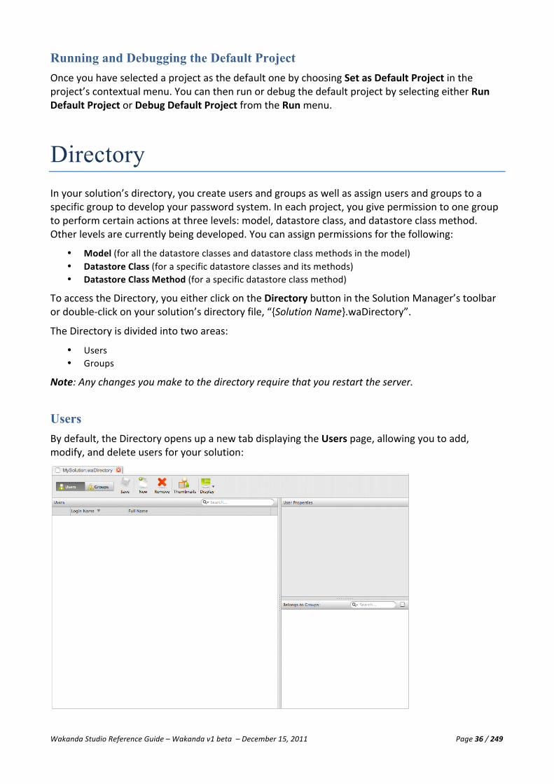
Wakanda Studio Reference Guide – Wakanda v1 beta – December 15, 2011 Page 36 / 249
Running and Debugging the Default Project Once you have selected a project as the default one by choosing Set as Default Project in the project’s contextual menu. You can then run or debug the default project by selecting either Run Default Project or Debug Default Project from the Run menu.
Directory In your solution’s directory, you create users and groups as well as assign users and groups to a specific group to develop your password system. In each project, you give permission to one group to perform certain actions at three levels: model, datastore class, and datastore class method. Other levels are currently being developed. You can assign permissions for the following:
• Model (for all the datastore classes and datastore class methods in the model) • Datastore Class (for a specific datastore classes and its methods) • Datastore Class Method (for a specific datastore class method)
To access the Directory, you either click on the Directory button in the Solution Manager’s toolbar or double-‐click on your solution’s directory file, “{Solution Name}.waDirectory”.
The Directory is divided into two areas:
• Users • Groups
Note: Any changes you make to the directory require that you restart the server.
Users By default, the Directory opens up a new tab displaying the Users page, allowing you to add, modify, and delete users for your solution:

Wakanda Studio Reference Guide – Wakanda v1 beta – December 15, 2011 Page 37 / 249
The search area in the Users area allows you to type one or more letters to filter the users displayed in the list below.
Adding a New User Click the New button in the toolbar to create a new User. Enter the Login Name and Full Name in the list:
Then, go to the User Properties area to add a password for the new user:
When you click in the Password field, another password field appears along with the Save and Cancel buttons.
The password entered must be equal in both the New Password and Confirm Password for you to be able to save it.
A representation of the hash key created for the password entered is then displayed:

Wakanda Studio Reference Guide – Wakanda v1 beta – December 15, 2011 Page 38 / 249
Adding a Thumbnail to a User Add a thumbnail to a user by either clicking on the thumbnail and selecting one from the Open File dialog or by dragging and dropping an image file from your computer to the thumbnail. The chosen image will appear in the User Properties as shown below:
A smaller version of the thumbnail will be displayed for the user in the list as well as in the Thumbnails view.
Note: The thumbnail image that you choose will be copied into the “{solutionName}_userThumbnails” folder.
Editing a User You can edit the user’s information either by double-‐clicking the thumbnail in the thumbnail view, by double-‐clicking the Login Name or Full Name from the list so they become enterable, or by selecting the user in the list and editing the values in the User Properties panel. To edit a user’s password, click on the password in the Password field and enter the password twice and click Done.
Assigning a User to a Group To assign a user to a group, you must first create at least one group. Select the checkbox next to the group name in the Belongs to Groups area. The search area in the title bar allows you to filter the groups displayed in this area.
Displaying Groups in Common If you select more than one user, the lower right area, which is renamed Groups in Common, contains the groups the selected users have in common:

Wakanda Studio Reference Guide – Wakanda v1 beta – December 15, 2011 Page 39 / 249
If you want to see only the selected groups in common, check the checkbox in the top right corner of the Groups in Common section.
To select multiple users, hold down the Alt key (Windows) or Option key (Macintosh) when you click on each one.
Displaying Users in Thumbnail View Click the Thumbnails icon in the toolbar to view users in the Directory by their thumbnail:
Note: The Thumbnails button becomes List to allow you to return to the list view.
In the Thumbnails view, you can add, edit, and remove user(s) from the Directory.
Deleting a User To delete one or more users, select the users to delete and click on the Remove button in the toolbar.
Groups You can add, modify, and delete groups as well as include users and groups to a specific group by clicking on the Groups button in the toolbar.

Wakanda Studio Reference Guide – Wakanda v1 beta – December 15, 2011 Page 40 / 249
If you want to see only the selected users in the Includes Users section or the selected groups in the Includes Groups section, check the checkbox in the section’s header.
To select multiple groups, hold down the Alt key (Windows) or Option key (Macintosh) when you click on each one. When you do so, the Includes Users and Includes Groups sections display only those users and groups in common to the selected groups.
Adding a New Group You create a new group by clicking on the New button in the toolbar. You enter its name directly in the list.
Editing a Group To edit the name of the group, double-‐click on its name in the Groups list.
Including Users in a Group All the users appear in the Includes Users area. To include a user, click on the checkbox next to each user’s name.
Including Groups in a Group All the groups (excluding the currently selected one) appear in the Includes Groups area. To include a group into the currently selected group, click on the checkbox next to its name.
Deleting a Group To delete one or more groups, select them and click on the Remove button in the toolbar.

Wakanda Studio Reference Guide – Wakanda v1 beta – December 15, 2011 Page 41 / 249
Additional Tools Wakanda provides you with other tools to better manage your solutions and projects. The following features are available in Wakanda:
• Find and replace, • Import files and folders, • Use images from the Media Library, • Edit shortcuts, • Control the source code, • Start and stop the server, • Open the debugger, • Debug your solution on a remote server, • Administer the server, and • Restore the default preferences.
Find and Replace If you select Find… from the Tools menu, the following dialog appears, allowing you to find and replace a string value in all the files in the open documents (in tabs or windows), a specific project, a selected folder on disk, or all the projects in your solution:
This dialog has the following fields:
• Find: Either enter a value or select a recently entered value in the drop-‐down list to find. • Replace by: Either enter a value or select a recently entered value in the drop-‐down list to replace. • Search in: Define where you want to execute the search: the whole solution (by default), all opened
documents, the current project, or one of the projects listed at the bottom of the drop-‐down list.
You can also click on the icon to select a folder in which to execute the search.
• Include subdirectories: This checkbox is only available if you have chosen a directory from your hard disk. Select this option to search in the subdirectories.
By default, the search is done using “plain text” and the file types are js, json, xml, html, and css. Both of these settings can be modified in the Advanced search dialog as shown below:

Wakanda Studio Reference Guide – Wakanda v1 beta – December 15, 2011 Page 42 / 249
• Find using: By default, the find is done in “Plain text;” however, you can also choose “Wildcards” or
“Regular Expression.” • Match case: Match the case of the value entered in the Find and Replace by fields. • Match whole word: The value entered in the Find field is searched as a whole word and not a part of
a word. • File types: A modifiable field where you can modify the file types. By default, all file types in
Wakanda are searched: js, json, xml, html, and css. • Keep modified files open after replace: This option keeps the modified files open after a replace is
done. Otherwise, the files are not opened at all and saved to disk.
When you click Find all, the following window appears displaying all the occurrences of what you were searching for:
From this dialog, you can refresh the list (in case you made other changes to one or more of your files), open the selected one, or open all those listed.
You can also retrieve this list (after completing a search) by selecting Search Results from the Tools menu. (*Not yet implemented)
You can also quickly find a value in your JavaScript file by using the Find References option from the contextual menu after selecting a value in the value.

Wakanda Studio Reference Guide – Wakanda v1 beta – December 15, 2011 Page 43 / 249
Importing Files and Folders You can import files and folders into your project either by selecting File or Folder from the Import menu item in the solution’s contextual menu or from the menu in the Solution Explorer. You can also select Import File… or Import Folder… from the File menu.
You can also import files by dragging and dropping them from your hard disk to the Solution Explorer into the location you want them to be added.
The imported file or folder is copied into the currently selected folder or project.
Edit Shortcuts When you select Edit Shortcuts… from the Edit menu, the following dialog appears, allowing you to edit all the available shortcuts, organized by section, in Wakanda:

Wakanda Studio Reference Guide – Wakanda v1 beta – December 15, 2011 Page 44 / 249
Modifying a Shortcut
To modify a shortcut, click on the menu item or click on the icon for that menu item. The dialog box on the left appears for Macintosh and on the right for Windows:
The main shortcut key is predefined by platform: Cmd (Command) on Macintosh and Ctrl on Windows.
Press the key you want to change the equivalent to and it will be updated in the dialog:
To add one or more modifiers, Shift, Alt, or Ctrl (only on Macintosh), you hold down each one when typing a letter in the Key field. If you click a key that is not a letter, like tab or any of the F keys, you can select the modifier checkbox manually instead of holding it down when typing a letter into the Key field.
When you want to save your changes, click on the Done button.
If you click on the Clear button, the definition (key and modifiers) for the shortcut will be removed.
If you create a shortcut that already exists for another entry, the duplicates will be highlighted as shown below:
Deleting a Shortcut
To delete a shortcut, hover over the shortcut and click on the icon. After confirming your choice, the shortcut will be deleted.
Restoring Wakanda’s Default Shortcuts To restore Wakanda’s default shortcuts, select Restore Shortcuts from the toolbar. After confirming your choice, the shortcuts you defined will be replaced by Wakanda’s default shortcuts.

Wakanda Studio Reference Guide – Wakanda v1 beta – December 15, 2011 Page 45 / 249
Using Images from the Media Library To access the Media Library, click on the Media Library button in the toolbar or select the “Media Library” folder in the Explorer tab and click on Thumbnails tab. Below is the display of the Media Library images displayed in the Thumbnails tab. Please note that the Solution Explorer must be visible to see the image files.
You can do one of the following:
• Drag and drop an image to your Interface page or • Drag and drop an image onto a widget.
Dragging and Dropping an Image to Your Interface Page If you drag and drop an image from the Media Library to an empty space on your Interface page, it will be copied to your project’s “Images” folder. If your project doesn’t have an “Images” folder yet, Wakanda will create it for you. An Image widget is also created with the copied image from the Media Library as the Src and the size fit to the image.
Dragging and Dropping an Image onto a Widget If you drag and drop an image from the Media Library to a widget on your Interface page, it will be copied to your project’s “Images” folder. If your project doesn’t have an “Images” folder yet, Wakanda will create it for you. For most widgets, this image will be used as its background and it is also repeated by default. You can change these settings in the Styles tab for the widget.
However, for a Button widget, the image will be defined as the default images for the four states, which you can view in the Styles tab for the widget:

Wakanda Studio Reference Guide – Wakanda v1 beta – December 15, 2011 Page 46 / 249
Checkbox widgets do not allow background images, so the image will be copied to your project’s “Images” folder, but not assigned to the background of the widget.
For a Container widget, an Image widget will be created with the Media Library’s image.
Previewing an Image To preview an image from the Media Library, you can either double-‐click on it or select it and then choose Open in New Tab from the contextual menu.
Source Control When multiple developers are working on the same project, you can manage the source control through this menu. (*Not yet implemented).
Starting and Stopping Wakanda Server Depending on your solution’s settings, the Wakanda Server may already be started when you open
a solution. If not, you can start the Wakanda Server, by clicking the button in the toolbar or by selecting Start Solution Server in the Run menu.
To stop the Wakanda Server, click the button or deselect Stop Solution Server in the Run menu. The first time you close your solution, Wakanda displays the following message so that you can choose to automatically stop Wakanda Server when you close this solution:
If you are connecting to a remote server, the Start and Stop buttons become Connect and Disconnect.

Wakanda Studio Reference Guide – Wakanda v1 beta – December 15, 2011 Page 47 / 249
Solution Settings You can specify the following three settings for a solution in the contextual menu:
• Open this Solution at Startup: When starting up Wakanda Studio, open this solution by default. • Start Server when Opening Solution: When opening this solution, start the server. • Stop Server when Closing Solution: When closing this solution, stop the server.
Open this Solution at Startup
If you select this option, this solution will be opened when you start Wakanda Studio. The “startRIAServerOnOpen” attribute (in the “{Solution Name}.{User Name}.waPreferences” file) is set to “true” if you select this option.
Start Server when Opening Solution
If you have not set the preferences beforehand, the following dialog appears when you open your solution:
If you select “Yes”, the “startRIAServerOnOpen” attribute (in the “{Solution Name}.{User Name}.waPreferences” file) will also be set to “true.”
Stop Server when Opening Solution
If you have not already defined if Wakanda Server should be stopped when you close the solution, the following dialog appears:
If you select “Yes”, the “stopRIAServerOnClose” attribute (in the “{Solution Name}.{User Name}.waPreferences” file) will be set to “true.”
Note: For more information regarding the preferences file, please refer to “Solution Preferences File” in the “Solutions” section.

Wakanda Studio Reference Guide – Wakanda v1 beta – December 15, 2011 Page 48 / 249
Opening the Debugger The debugger is automatically launched with the Wakanda Server. You can view the status of the Debugger in the Solution Manager footer. If you try to run a JavaScript file with the server off, the Debugger will be launched. You can also start the Debugger by selecting Start Debugger in the Run menu. To turn it off, just deselect Start Debugger in the Run menu.
To open the Debugger, click the button:
Note: For more information about the Debugger, please refer to the Debugger chapter.
Debugging on a Remote Server Besides debugging your project on a local Wakanda Server, you can also debug your server-‐side JavaScript files on a remote server. The local project and the remote project must be identical because when you choose to run the local JavaScript file, the version of the file with the same name is executed remotely.
To debug on a remote server, select Connect to Other Server from the Run menu:
Select the server containing the same project (running on the same port) or enter in the address of a Wakanda Server running the same project, and click Connect.

Wakanda Studio Reference Guide – Wakanda v1 beta – December 15, 2011 Page 49 / 249
Server Administration The following administration area appears in your default browser (Wakanda v1) or in a new tab in Wakanda Studio (development branch for Wakanda) when you select Administration from the Tools menu:
One panel appears for each of the projects in your solution. At the bottom of the area is the Server Log for the solution.
In each project’s panel, you can execute the following functions:
Icon Action Description
Go to Application
The default Interface page is opened in a new browser tab.
Go to Model View a new web page that contains REST links to the model:
Each REST link opens a new web page to show you the structure and data for that datastore class.

Wakanda Studio Reference Guide – Wakanda v1 beta – December 15, 2011 Page 50 / 249
Flush Database*
Flushes the database cache.
Lock/Unlock* By default, the project panel is locked. To unlock it, click on the icon. To lock it again, click on the icon. When the panel is unlocked, you can enter values in the fields and select/deselect the checkboxes to start and stop the different services:
Note: The items “Flush Database” and “Lock/Unlock” are only available in the development branch for Wakanda.
Note: More information about the Wakanda Server Admin will be provided in a future version of the Wakanda Studio Reference Guide.
Note: For more information about using REST in Wakanda, refer to the “REST API” documentation.
Restore Default Preferences If you select Restore Default Preferences… from the Edit menu, your Wakanda Studio preferences file will be erased. Refer to the “Wakanda Studio Preferences” section, for more information about what is stored in this file.

Wakanda Studio Reference Guide – Wakanda v1 beta – December 15, 2011 Page 51 / 249
Wakanda Studio Preferences You can modify the Wakanda Studio preferences in the “Wakanda Studio.interface.waPreferences” file, which is located at the following locations depending on your operating system:
Windows C:\Users\{User Name}\AppData\Roaming\Wakanda Studio
Macintosh Users/{User Name}/Library/Application Support/Wakanda Studio
The first element “window” in the XML file concerns the different editors and windows that open in Wakanda. There are two other elements in the “com.wakanda” element that you can modify in the preferences file: “general,” “outline,” and “method_editor.”
general Element The “general” element defines the default solution to open when starting up Wakanda Studio:
<general defaultSolution="file:///C:/Users/{User Name}/Desktop/MyFinalSolution/MyFinalSolution.waSolution" serverPath="MyMac:Users:userName:Library:Favorites:Wakanda:Wakanda Server.app:"/>
The “general” element has one attribute:
Attribute Description defaultSolution Path to the default solution to open when starting up Wakanda Studio serverPath Path to the Wakanda Server application
outline Element The “outline” element defines how the outline in the Code Editor is displayed. By default, the outline is sorted by line number, but you can also choose to sort it by name:
<outline sorting="byLineNumber"/>
The “outline” element has one attribute:
Attribute Description sorting Defines how the outline in the Code Editor is sorted: “byLineNumber” or “byName”
In the Code Editor, the Outline appears as shown below for a sample JavaScript file:
The “outline” element automatically updated when you click on the button. Each time the outline is updated and sorted either by line number or alphabetically.

Wakanda Studio Reference Guide – Wakanda v1 beta – December 15, 2011 Page 52 / 249
method_editor Element The “method_editor” element allows you to define the colors and font styles for each of the five aspects of the Code Editor:
<method_editor><general font_name="Monaco"/> <syntax_style syntax="wakanda"> <syntax kind="keywords"><style bold="true" italic="false" underline="false"/>
<color alpha="255" blue="255" green="0" red="0"/></syntax> <syntax kind="comments"><style bold="false" italic="false" underline="false"/>
<color alpha="255" blue="153" green="153" red="153"/></syntax> <syntax kind="numbers"><style bold="false" italic="false" underline="false"/>
<color alpha="255" blue="0" green="0" red="255"/></syntax> <syntax kind="strings"><style bold="true" italic="true" underline="false"/>
<color alpha="255" blue="0" green="128" red="0"/></syntax> <syntax kind="names"><style bold="false" italic="false" underline="false"/>
<color alpha="255" blue="0" green="0" red="0"/></syntax> </syntax_style> </method_editor>
The “general” element has one attribute:
Attribute Description font_name The chosen font for the text in the Code Editor. By default, it is “Monaco.”
The “syntax” element defines the “kind” for each part of the syntax:
Value Description keywords The keywords in the Code Editor. comments Comments in the Code Editor. numbers Numbers in the Code Editor. strings String values in the Code Editor written between quotation marks. names All other text in the Code Editor.
Define the font style in the “style” element:
Attribute Description bold Specifies whether the text is bold: “true” or “false” italic Specifies whether the text is in italics: “true” or “false” underline Specifies whether the text is underlined: “true” or “false”
Note: For monospace fonts, like Monaco, “italic” and “underline” are not supported.
Define the font color in the “color” element defined in RGBA:
Attribute Description alpha Alpha channel (integer ranging from 0 to 255) blue Blue (integer ranging from 0 to 255) green Green (integer ranging from 0 to 255) red Red (integer ranging from 0 to 255)
Note: You can modify these attributes in the Code Editor using the contextual menu in the editable area. For more information, please refer to “Modifying Font, Font Colors, and Font Styles.”

Wakanda Studio Reference Guide – Wakanda v1 beta – December 15, 2011 Page 53 / 249
Background Color Elements You can define the background color for each file type in the Code Editor. Here are the script types and the elements that they correspond to:
• Page script: gui_script_back_color • Model script: em_back_color • Server-‐Side execution: server_side_back_color • Client-‐Side execution: client_side_back_color • All other files (e.g., CSS or HTML): back_color
The XML code that defines the background colors is shown below: <gui_script_back_color><color red="130" green="130" blue="130"/></gui_script_back_color> <back_color><color red="123" green="111" blue="0"/></back_color> <em_script_back_color><color red="0" green="255" blue="0"/></em_script_back_color> <server_side_back_color><color red="0" green="0" blue="255"/></server_side_back_color> <client_side_back_color><color red="255" green="0" blue="0"/></client_side_back_color>
The color element has the following properties:
Attribute Description red Red (integer ranging from 0 to 255) green Green (integer ranging from 0 to 255) blue Blue (integer ranging from 0 to 255)
Note: You can modify the background color in the Code Editor using the contextual menu in the editable area. For more information, please refer to “Customizing the Editable Area.”

Wakanda Studio Reference Guide – Wakanda v1 beta – December 15, 2011 Page 54 / 249
Datastore Model Designer Overview The Datastore Model Designer allows you to define the datastore model for your Wakanda application. A model is a description of how data will be accessed and stored into structures called “datastore classes.” In each datastore class, you create attributes that store or calculate data, or refer to data in other datastore classes.
To open the Datastore Model Designer, click on the Model button in the Wakanda Studio toolbar. The Datastore Model Designer opens your project’s model, named “{Project Name}.waModel.” You can also double-‐click it from the Solution Explorer.
The Datastore Model Designer is made up of the following areas:
• Toolbar • Workspace • Datastore Classes Area • Properties Area (Properties, Events, and Methods tabs) • Miniature Overview Area
Toolbar The Datastore Model Designer toolbar allows for easy access to many key functions that you’ll be using when defining the structure for your Wakanda project. You can also customize the toolbar by selecting which options to display, how to display them (text only, text and icon, or icon only), and if you prefer to display small icons or the larger ones.
Wakanda Studio Reference Guide – Wakanda v1 beta – December 15, 2011 Page 55 / 249
The Datastore Model Designer toolbar contains the following items (by default all the items are not displayed):
• Save: Saves all the changes made to the datastore model. • Run Project: Launches your project’s main Interface page (attached to the current model you’re
editing in the Datastore Model Designer) in your default browser. • Reload Model: Reloads the model to the server after you have made changes to it and saved them.
For this option to be available, the server must have already been started. • New Class: Creates a new datastore class in your datastore model. • New Attribute: Creates a new attribute for the selected datastore class. • New Method: Creates a new method for the selected datastore class. • Relations: Defines how to view the links between datastore classes displayed in the workspace (once
an option is selected, it will be displayed in the toolbar): § Off: Hide all the links. § See All (by default): View all the links between the datastore classes. § See From Selected Datastore Class Only: View the links to other datastore classes from the
currently selected one. This is the value selected by default. • Unlock Script: This option allows you to switch to “Free Form Edition” mode for scripting instead of
the default “Guided Mode.” Once you select this option, you cannot go back to the “Guided Mode.” For more information about this mode, please refer to the “Using the Free Form Edition” section in the “Code Editor” chapter.
• Display: This menu allows you to modify the options displayed in the Datastore Model Designer toolbar as well as toggle methods, alias attributes, related attributes, inherited attributes, and storage attributes for all the datastore classes. You can also close all the currently opened panels from this menu.
The following two menu items allow you to modify how the Datastore Model Designer toolbar is displayed:
§ Toolbar Preferences: Allows you to set the display of the toolbar items (text only, text and icon or icon only) as well as the size of the icons.
§ Toolbar Content: Allows you to select which options you’d like to display in the toolbar as well as reset to the default options.
Note: For the item that you toggle, once it is hidden, the next time you click on the Display menu bar, it will be visible again.
If all the items in the toolbar cannot be displayed due to lack of space, the icon appears in the toolbar. When you click on it, the missing toolbar icons appear in a hierarchical menu.
Toggle Between the Model and Script File
To open the JavaScript file associated to your model, click on the button in the toolbar.
Once you open the model’s JavaScript file, you can then click on the button in the toolbar to return to the Model.
Toggle Panel Display
The left and right panels can be hidden and displayed by clicking the button in the toolbar to allow you more room for the workspace.

Wakanda Studio Reference Guide – Wakanda v1 beta – December 15, 2011 Page 56 / 249
Tabs
For each document opened in Wakanda, it will be placed in a tab. For more information about the tabs, please refer to the “Solution Manager” chapter.
Workspace In the workspace, you create a datastore model for your Wakanda project. A datastore model is made up of one or more datastore classes containing attributes where data is stored (either actual data or references to data). The datastore model is written in XML and graphically displayed in the Datastore Model Designer. In the workspace, you can also create relation attributes, which are links between datastore classes. Below is a sample datastore model for a simple structure of employees and the companies:
You can identify the currently selected datastore class by its highlighted border in the workspace. In our example, the Company datastore class is selected. To select more than one datastore class, Ctrl-‐click (Windows) or Command-‐click (Macintosh) each datastore class.
You can move one or more datastore classes in the Workspace by Ctrl-‐clicking (Windows) or Command-‐clicking (Macintosh) each one beforehand.
By default, the workspace opens in Design mode. To view the datastore model of your project in XML, click on the Source button in the toolbar:
The XML source for your datastore model opens in the Wakanda Code Editor:

Wakanda Studio Reference Guide – Wakanda v1 beta – December 15, 2011 Page 57 / 249
You can toggle the left and right panels by clicking the button in the toolbar on the right to allow you more room in the workspace. Even if both panels are hidden, the Properties panel on the right reappears automatically when you click on a datastore class, an attribute, or a datastore class method.
If only the Properties area is visible, you can display both panels again by clicking twice on the
button. The first time you click on the button, the Properties panel will be hidden.
Note: When you delete a datastore class, the Properties panel will be hidden since no datastore class is currently selected.
Datastore Classes Area All the datastore classes in your datastore model are listed in this area:
From this area, you can execute one of the following actions on a datastore class:
• Hide it so it no longer appears in the workspace, • Show it (if it is hidden) and select it in the workspace, • Extend the datastore class, or • Delete it from the datastore model.
Properties Area In this area, you can customize the properties, events, and methods for the datastore classes, attributes, and datastore class methods in your project. This area varies depending on the selected object.
Datastore Class Properties Area
For a datastore class, the Properties, Events, and Methods tabs are displayed.
Datastore Class Method Properties Area
The Properties tab is available for datastore class methods.

Wakanda Studio Reference Guide – Wakanda v1 beta – December 15, 2011 Page 58 / 249
Attribute Properties Area
For an attribute, the Properties and Events tabs are active (the properties available differ depending on the attribute type).
Miniature Overview Area The Miniature Overview Area allows you to view more of the workspace. This feature is especially useful when you have a large quantity of datastore classes.
Dragging the red rectangle changes the view in the workspace and is the same as clicking on an empty space in the workspace and dragging it.
You can also drag a datastore class (not underneath the red rectangle) in this area to another location so that its placement is subsequently modified in the workspace:
Note: The size and shape of the red rectangle depends on the area displayed for your datastore model in the workspace.

Wakanda Studio Reference Guide – Wakanda v1 beta – December 15, 2011 Page 59 / 249
When you click on the icon, an enlarged view of the datastore model appears in front of the workspace, allowing you to move the datastore classes:
You can select a datastore class and drag it to another location in this window.
Its placement will be updated in the workspace once you click on the icon at the top of this area to close this view.
You can also move one or more datastore classes by Ctrl-‐clicking (Windows) or Command-‐clicking (Mac) each datastore class that you want to move and dragging them to another location in the Workspace.
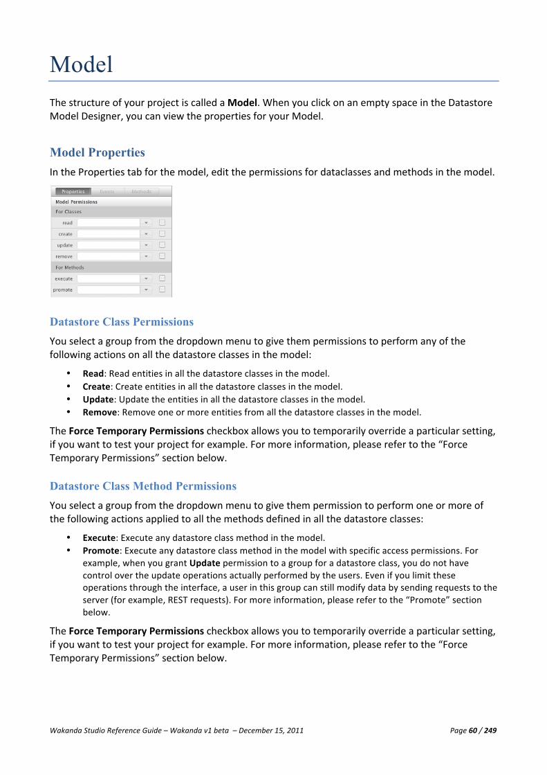
Wakanda Studio Reference Guide – Wakanda v1 beta – December 15, 2011 Page 60 / 249
Model The structure of your project is called a Model. When you click on an empty space in the Datastore Model Designer, you can view the properties for your Model.
Model Properties In the Properties tab for the model, edit the permissions for dataclasses and methods in the model.
Datastore Class Permissions You select a group from the dropdown menu to give them permissions to perform any of the following actions on all the datastore classes in the model:
• Read: Read entities in all the datastore classes in the model. • Create: Create entities in all the datastore classes in the model. • Update: Update the entities in all the datastore classes in the model. • Remove: Remove one or more entities from all the datastore classes in the model.
The Force Temporary Permissions checkbox allows you to temporarily override a particular setting, if you want to test your project for example. For more information, please refer to the “Force Temporary Permissions” section below.
Datastore Class Method Permissions You select a group from the dropdown menu to give them permission to perform one or more of the following actions applied to all the methods defined in all the datastore classes:
• Execute: Execute any datastore class method in the model. • Promote: Execute any datastore class method in the model with specific access permissions. For
example, when you grant Update permission to a group for a datastore class, you do not have control over the update operations actually performed by the users. Even if you limit these operations through the interface, a user in this group can still modify data by sending requests to the server (for example, REST requests). For more information, please refer to the “Promote” section below.
The Force Temporary Permissions checkbox allows you to temporarily override a particular setting, if you want to test your project for example. For more information, please refer to the “Force Temporary Permissions” section below.

Wakanda Studio Reference Guide – Wakanda v1 beta – December 15, 2011 Page 61 / 249
Promote
In order to maintain complete control over the user's actions, you can associate a group (without users) to the Promote action so that operations that you want to control (adding and/or deleting entities, for example) are handled by code in a datastore class method. Only users in the group assigned the Execute action can run the method. But when this method is executed, it acquires the Promote group permissions (and not those of the Execute group). Of course, you must associate appropriate permissions (Create and Delete) with the Promote action group. With this setup, users cannot perform actions directly on data and are obliged to pass through the authorized methods.
For example, if you want the members of the “Accounting” group to be able to create, modify, and delete invoices in a controlled framework:
You create a blank group, for example "Update_Access", that you associate with the create, update, and remove actions for the Invoice class.
You create a class method (named, for example, updateInvoices) that contains functions to add and modify invoices according to your business logic.
You associate the Execute action to the Accounting group and the Promote action to the Update_Access group.
When a user in the Accounting group executes the method, this method acquires the rights of the Update_Access group so that it can be executed.
Note: Usually, a group used for a Promote action should not have any users since it is a “technical” group.
Force Temporary Permissions
The Force Temporary Permissions option temporarily modifies the inheritance of permissions associated with a resource or a group of resources for testing or functional implementation without changing the overall access rights of your project. When this option is checked for an action at one level, all lower-‐level objects take on the access rights of this level and the individual setting is ignored.
For example, if you want the “Test” group to be able to create entities in the datastore model temporarily, you check the Force Temporary Permissions option at the datastore model level for the create action. You can then be sure that no user can perform this action unless they belong to this group.

Wakanda Studio Reference Guide – Wakanda v1 beta – December 15, 2011 Page 62 / 249
Datastore Classes Wakanda describes business data in datastore classes. The datastore class is a type of structure that can contain attributes and relation attributes (links between datastore classes) in order to conceptually describe its data and how they all interact with each other as well as methods to interact with the data in your model.
Datastore Class Title Bar When working in the workspace, the datastore class has a title bar at the top offering you many options to define how it is displayed without modifying the datastore class itself.
The toolbar contains three icons:
• The and icons toggle the attribute type names column in the datastore class. • The icon modifies the display settings for the datastore class. • The icon hides the datastore class in the workspace.
You can rename the datastore class name by double-‐clicking the title bar.
Toggling the Type Names Column The and icons allow you to toggle the type names column, containing the names of the attribute types as well as the Applies To drop-‐down list for datastore class methods. The datastore class, when the third column is hidden, appears in the workspace as shown below:

Wakanda Studio Reference Guide – Wakanda v1 beta – December 15, 2011 Page 63 / 249
Modifying the Display Settings Clicking on the icon displays the following menu:
• Extend {Datastore Class Name}: This button allows you to extend the datastore class. For more
information, refer to the “Extending a Datastore Class” section. • Panel Color: This button allows you to modify the color of the datastore class’s title bar. When you
click on it, the following window appears allowing you to select a color:
You can also enter a color in the Hex field by entering a color’s hexadecimal value.
The icon next to the datastore class name in the Datastore Classes Area also displays the selected color:
• Expand/Collapse Panel: Expands and collapses the panel. When the panel is collapsed, only the
datastore class’s title bar appears:
• Fit Panel to Content: Readjusts the size of the datastore class panel so that when you reduce its size, it will be enlarged to show its contents. If the panel appears as the one below, this option allows you to see the panel in its entirety:
• Show/Hide Storage, Calculated, Alias, or Relation Attributes: Toggles the different attributes
(storage, calculated, alias, or related) in the datastore class. • Show/Hide Methods: Toggles the datastore class methods displayed at the bottom of the datastore
class in the workspace. When they are hidden, the datastore class appears as such:
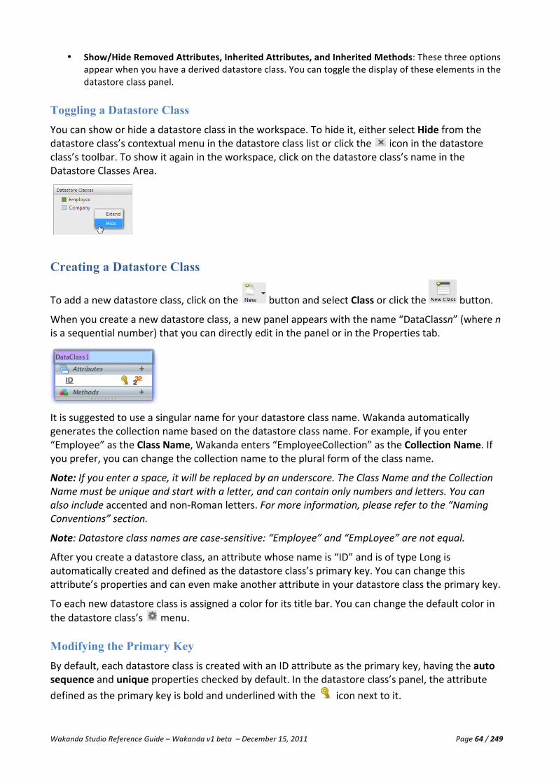
Wakanda Studio Reference Guide – Wakanda v1 beta – December 15, 2011 Page 64 / 249
• Show/Hide Removed Attributes, Inherited Attributes, and Inherited Methods: These three options appear when you have a derived datastore class. You can toggle the display of these elements in the datastore class panel.
Toggling a Datastore Class You can show or hide a datastore class in the workspace. To hide it, either select Hide from the datastore class’s contextual menu in the datastore class list or click the icon in the datastore class’s toolbar. To show it again in the workspace, click on the datastore class’s name in the Datastore Classes Area.
Creating a Datastore Class
To add a new datastore class, click on the button and select Class or click the button.
When you create a new datastore class, a new panel appears with the name “DataClassn” (where n is a sequential number) that you can directly edit in the panel or in the Properties tab.
It is suggested to use a singular name for your datastore class name. Wakanda automatically generates the collection name based on the datastore class name. For example, if you enter “Employee” as the Class Name, Wakanda enters “EmployeeCollection” as the Collection Name. If you prefer, you can change the collection name to the plural form of the class name.
Note: If you enter a space, it will be replaced by an underscore. The Class Name and the Collection Name must be unique and start with a letter, and can contain only numbers and letters. You can also include accented and non-‐Roman letters. For more information, please refer to the “Naming Conventions” section.
Note: Datastore class names are case-‐sensitive: “Employee” and “EmpLoyee” are not equal.
After you create a datastore class, an attribute whose name is “ID” and is of type Long is automatically created and defined as the datastore class’s primary key. You can change this attribute’s properties and can even make another attribute in your datastore class the primary key.
To each new datastore class is assigned a color for its title bar. You can change the default color in the datastore class’s menu.
Modifying the Primary Key By default, each datastore class is created with an ID attribute as the primary key, having the auto sequence and unique properties checked by default. In the datastore class’s panel, the attribute defined as the primary key is bold and underlined with the icon next to it.

Wakanda Studio Reference Guide – Wakanda v1 beta – December 15, 2011 Page 65 / 249
To change the primary key, you can do so by either clicking on the icon next to the new attribute name or by selecting an attribute in the Primary Key drop-‐down menu in the datastore class’s Properties tab. Only the attributes with valid types (Longint, Long64, Number, String, or UUID) are displayed in the drop-‐down menu.
You can also remove the primary key from your datastore class by clicking on the icon next to the attribute; however, at least one attribute must be defined as the primary key in your datastore class
Note: It is not mandatory to have a primary key, but it is standard that each datastore class has one. Remember, however, that many Wakanda functions rely on the primary key.
Datastore Class Properties In the Properties tab, you can modify the datastore class’s properties:
• Primary Key: Defines one of the attributes as the primary key for the datastore class. From the drop-‐
down list, you can select another valid attribute in the datastore class. For more information, please refer to the “Modifying the Primary Key” section.
• Class Name: Datastore class name. • Collection Name: Collection for the datastore class. You can modify the default value, however it
cannot be left blank.
• Scope: Modifies the scope (public or public on server ( )) of the datastore class. A public datastore class can be accessed from anywhere. A public on server datastore class can be accessed only from the server.
• Restricting Query: A query that restricts the entities returned for a datastore class. Every time data is requested from the datastore class, this query is executed first. You can also use Wakanda’s system placeholders (:$userID, :$userName, or :$currentDate) in your queries. For example, you could write “employee.ID=:$userID” as the restricting query. For more information about the system variables, please refer to the “:$ Placeholders for System Variables” section in the “Defining Queries (Server-‐side)” chapter.
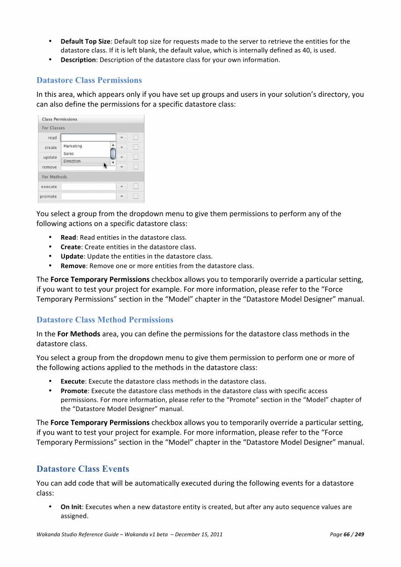
Wakanda Studio Reference Guide – Wakanda v1 beta – December 15, 2011 Page 66 / 249
• Default Top Size: Default top size for requests made to the server to retrieve the entities for the datastore class. If it is left blank, the default value, which is internally defined as 40, is used.
• Description: Description of the datastore class for your own information.
Datastore Class Permissions In this area, which appears only if you have set up groups and users in your solution’s directory, you can also define the permissions for a specific datastore class:
You select a group from the dropdown menu to give them permissions to perform any of the following actions on a specific datastore class:
• Read: Read entities in the datastore class. • Create: Create entities in the datastore class. • Update: Update the entities in the datastore class. • Remove: Remove one or more entities from the datastore class.
The Force Temporary Permissions checkbox allows you to temporarily override a particular setting, if you want to test your project for example. For more information, please refer to the “Force Temporary Permissions” section in the “Model” chapter in the “Datastore Model Designer” manual.
Datastore Class Method Permissions In the For Methods area, you can define the permissions for the datastore class methods in the datastore class.
You select a group from the dropdown menu to give them permission to perform one or more of the following actions applied to the methods in the datastore class:
• Execute: Execute the datastore class methods in the datastore class. • Promote: Execute the datastore class methods in the datastore class with specific access
permissions. For more information, please refer to the “Promote” section in the “Model” chapter of the “Datastore Model Designer” manual.
The Force Temporary Permissions checkbox allows you to temporarily override a particular setting, if you want to test your project for example. For more information, please refer to the “Force Temporary Permissions” section in the “Model” chapter in the “Datastore Model Designer” manual.
Datastore Class Events You can add code that will be automatically executed during the following events for a datastore class:
• On Init: Executes when a new datastore entity is created, but after any auto sequence values are assigned.

Wakanda Studio Reference Guide – Wakanda v1 beta – December 15, 2011 Page 67 / 249
• On Load: Executes just after a datastore entity is accessed and before it is delivered to the calling routine.
• On Validate: Executes when a datastore entity is validated, which also occurs during save, and can reject the validation if needed.
• On Save: Executes before a datastore entity is saved and can reject the save if necessary. • On Remove: Executes before a datastore entity is deleted and can reject the deletion if necessary.
When you click the icon next to an event, the “{Project Name}.waModel.js” JavaScript file opens in a new tab in the Code Editor. If this file does not already exist, it will be created and placed at the top level of your project, next to the datastore model. A highlighted comment indicates where to add your code:
To open this JavaScript file again, click on the icon to go directly to it. To delete the code for a specific event, click on the icon.
Note: For more information regarding datastore class events, please refer to the “Wakanda Server-‐Side API Reference.”
Datastore Class Methods You can define a method for a datastore class either in the Datastore Class’s Methods tab or at the bottom of the datastore class displayed in the workspace:
To edit the code for the method, click on the icon. The “{Project Name}.waModel.js” JavaScript file is automatically opened in a new tab.
You can define to which object class (entity, entity collection, or datastore class) the method is applied by selecting it from the drop-‐down menu. In the code, the datastore class method will be available as a property of the corresponding object class.
Note: For more information, please refer to the “Datastore Class Methods” section.
Extending a Datastore Class When you extend a datastore class, a new datastore class is created that includes not only its attributes, but also its methods. This new datastore class is called the “derived” datastore class and its attributes and methods are “inherited” from the extended datastore class.
This concept allows you to build applications using basic datastore classes that can be extended to allow for specialized data schemes. For example, if we create a “Person” datastore class, it can be

Wakanda Studio Reference Guide – Wakanda v1 beta – December 15, 2011 Page 68 / 249
extended into other datastore classes, like “Student” and “Teacher” because many of the same attributes are in all three of these datastore classes.
To extend a datastore class, choose Extend {Datastore Class Name} from the datastore class’s contextual menu or from the datastore class’s settings menu:
A new panel appears in the workspace, allowing you to rename the derived datastore class. Enter a name and exit the enterable area:
The inherited attributes and methods are displayed under the title “From {Derived Datastore Class Name }”. All the alias, calculated, and relation attributes are included. If there are any datastore class methods in the extended datastore class, they too are added in the Methods section with the same title, “From {Derived Datastore Class Name }”.
You can add relation attributes to your derived datastore class and remove inherited attributes. A removed attribute is grayed out and has a line through its name and type (as shown in the section below).
You can toggle the display of the inherited attributes by clicking the icon next to the “From {Derived Datastore Class Name}” title.
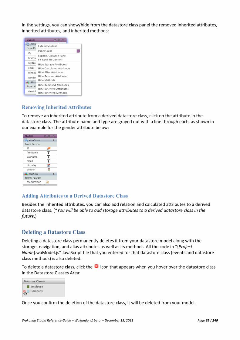
Wakanda Studio Reference Guide – Wakanda v1 beta – December 15, 2011 Page 69 / 249
In the settings, you can show/hide from the datastore class panel the removed inherited attributes, inherited attributes, and inherited methods:
Removing Inherited Attributes To remove an inherited attribute from a derived datastore class, click on the attribute in the datastore class. The attribute name and type are grayed out with a line through each, as shown in our example for the gender attribute below:
Adding Attributes to a Derived Datastore Class Besides the inherited attributes, you can also add relation and calculated attributes to a derived datastore class. (*You will be able to add storage attributes to a derived datastore class in the future.)
Deleting a Datastore Class Deleting a datastore class permanently deletes it from your datastore model along with the storage, navigation, and alias attributes as well as its methods. All the code in “{Project Name}.waModel.js” JavaScript file that you entered for that datastore class (events and datastore class methods) is also deleted.
To delete a datastore class, click the icon that appears when you hover over the datastore class in the Datastore Classes Area:
Once you confirm the deletion of the datastore class, it will be deleted from your model.

Wakanda Studio Reference Guide – Wakanda v1 beta – December 15, 2011 Page 70 / 249
If you have a relation attribute in the datastore class you want to delete or the datastore class was extended, a warning message appears asking you if you want to proceed in deleting the datastore class along with any relation attributes or inherited attributes and methods that might be in other datastore classes.
Datastore Class Methods Datastore class methods allow you to execute code that can be applied to the datastore class, the entity collection, or an individual entity.
Datastore class methods are displayed in two locations: in the datastore class’s Methods tab in the Properties area and at the bottom of the datastore class.
Adding a Datastore Class Method
To add a datastore class method, click on the icon either in the Methods tab in the Properties area of the datastore class or in the Methods area at the bottom of the datastore class itself. The following drop-‐down list appears, allowing you to select to which object the datastore class method will be applied:
Datastore class methods can be applied to three different objects:
• Entity: applies only to a datastore entity • Collection: applies only to the entity collection • Class: applies to all the entities stored in the datastore class
Once you add a new method, it appears below any existing methods with a unique name you can modify:
Note: If you enter a space, it will be replaced by an underscore. The datastore class method’s name must be unique and start with a letter, and can contain only numbers and letters. You can also

Wakanda Studio Reference Guide – Wakanda v1 beta – December 15, 2011 Page 71 / 249
include accented and non-‐Roman letters. For more information, please refer to the “Naming Conventions” section.
Note: Datastore class method names are case-‐sensitive: “CheckEmployee” and “CheckEMPloyee” are not equal.
Datastore Class Method Attributes Datastore class methods have two attributes:
• Scope: Modifies the scope (public, private ( ), public on server ( ), or protected ( )) of the datastore class method. A public datastore class method can be used from anywhere. A private datastore class method can only be used inside the datastore class. A public on server datastore class method can be used only from the server. A protected datastore class method can be used from datastore classes as well as from derived datastore classes. By default, the scope is “public on server”.
• Return Type: Select a datastore class, entity, or data type for the return value of your datastore class method. The value itself will be returned from your method by using the JavaScript command “return.” The drop-‐down list shows you all the available options:
Datastore Class Method Permissions In this area, which appears if you have set up groups and users in your solution’s directory, you can define the permissions for a specific datastore class method:
You select a group from the dropdown menu to give them permission to perform one or more of the following actions applied to a specific method in the datastore class:
• Execute: Execute the datastore class method in the datastore class. • Promote: Execute the datastore class method with specific access permissions. For more
information, please refer to the “Promote” section in the “Model” chapter of the “Datastore Model Designer” manual.
The Force Temporary Permissions checkbox allows you to temporarily override a particular setting, if you want to test your project for example. For more information, please refer to the “Force Temporary Permissions” section in the “Model” chapter of the “Datastore Model Designer” manual.

Wakanda Studio Reference Guide – Wakanda v1 beta – December 15, 2011 Page 72 / 249
Editing a Datastore Class Method
To edit the code for the datastore class method, click on the icon. The Code Editor opens your datastore model’s JavaScript file “{Project Name}.waModel.js” in a new tab, indicating where to add the code for your datastore class method:
Deleting a Datastore Class Method To delete a datastore class method, select the method and then click on the icon that appears:
Once you confirm the deletion of the datastore class method, it will be removed from the datastore class panel.
The datastore class method is removed from the datastore model along with its code in the “{Project Name}.waModel.js” JavaScript file.
Note: If the datastore class method you’re deleting is in an extended datastore class, it will be deleted from the derived datastore classes as well.

Wakanda Studio Reference Guide – Wakanda v1 beta – December 15, 2011 Page 73 / 249
Attributes An attribute is an object that stores information or represents a value in the datastore class. Once you create a datastore class, you can add attributes to it. By default, the datastore class is created with an attribute of type Longint named “ID,” which is defined as its primary key.
You can modify a few of the attribute’s properties when you select it in the datastore class:
• Delete: Deletes the attribute from the datastore class.
• Scope: Modifies the scope— public, private ( ), public on server ( ), or protected ( )—of the attribute. A public attribute can be used from anywhere. A private attribute can only be used inside the datastore class. A public on server attribute can only be accessed from the server. A protected attribute can be used from datastore classes as well as from extended datastore classes.
• Name: Attribute name that you can change by double-‐clicking on it to render the area enterable. • Primary Key: Defines the attribute as the primary key for the datastore class.
Note: Refer to the “Modifying the Primary Key” section in the “Datastore Classes” chapter. • Type Icon: Displays the datastore entity type as an icon. • Type: Attribute type that you can change by double-‐clicking on it to render the area enterable.
Attribute Categories There are five categories of attributes in Wakanda:
• Storage attributes: Storage attributes allow you to store information in the datastore class. • Relation attributes: A relation attribute is relationship between two datastore classes that can be
either N-‐>1 or 1-‐>N. From those two types, you can then create an N<-‐>N relationship between three datastore classes.
• Calculated attributes: A calculated attribute does not store information; instead, it determines its value based on other values from the same entity or from other entities, attributes or datastore class methods. When a calculated attribute is referenced, the underlying “calculation” is evaluated to determine the value. You can also assign values to other attributes in the datastore class during data entry. For example, if you have an enterable “fullName” attribute, you can assign the values entered in the “fullName” attribute into two separate attributes, like “firstName” and “lastName.”
• Alias attributes: An alias attribute is built upon a relation attribute. Once an N -‐> 1 Relation Attribute is defined, any of the attributes within the “parent” datastore class can be directly referenced as attributes within the “child” datastore class. The result is what appears to be de-‐normalized data without the overhead of duplicating information. Alias attributes can reference any available attributes further up the relational tree. An alias attribute may reference either a scalar attribute or a relation attribute.
• Inherited attributes: Attributes inherited from an extended datastore class. For example, if we extend a Person datastore class and name the derived datastore class Student, the attributes from the Person datastore class are the inherited ones in the new datastore class.

Wakanda Studio Reference Guide – Wakanda v1 beta – December 15, 2011 Page 74 / 249
Creating a Storage Attribute
To add a storage attribute to your datastore class, select a datastore class and click on the icon
in the Attributes bar of the Datastore Class or click the button in the toolbar.
Note: If you enter a space, it will be replaced by an underscore. The attribute name must be unique and start with a letter, and can contain only numbers and letters. You can also include accented and non-‐Roman letters. For more information, please refer to the “Naming Conventions” section.
Note: Attribute names are case-‐sensitive: “firstName” and “firstNAME” are not equal.
When the attribute is added to the datastore class, it is given a default name that is highlighted so you can edit it. Once you enter a name, you can hit the Tab or Return key to select the attribute type. By default, “string” is selected.
The following list appears containing datastore classes (displayed in green), collections (displayed in blue), predefined data types, and relation attributes at the end of the list:
To add another attribute to the datastore class, hit the Tab or Return key. A new attribute will be created in the next row of the datastore class.
Note: If the attribute types in the datastore class are hidden, they will reappear so that you can select one from the list for the new attribute.
Storage Attribute Types Wakanda manages the following data types: Data Type Icon Description Default Value Range blob A "binary large object" containing binary data. Empty bool A Boolean value: either true or false. false false -‐ true byte A sequence of 8 bits. 0 date A date value including the time in the
following format: YYYY-‐MM-‐DDTHH:MM:SSZ (e.g., "2010-‐10-‐05T23:00:00Z") for October 5, 2010.
duration A duration between two dates. image A reference to an image file or an actual
image.
long A whole number, greater than or equal to a standard number.
0 -‐2,147,483,648 to 2,147,483,647
long64 A whole number, greater than or equal to a standard number.
0 −9,223,372,036,854,775,808 to +9,223,372,036,854,775,807
number A numeric value, corresponding either to a Real, and Integer or Long Integer.
0 ±1.7e±308 (real), -‐32,768 to 32,767 (integer), -‐2^31 to (2^31)-‐1 (long)
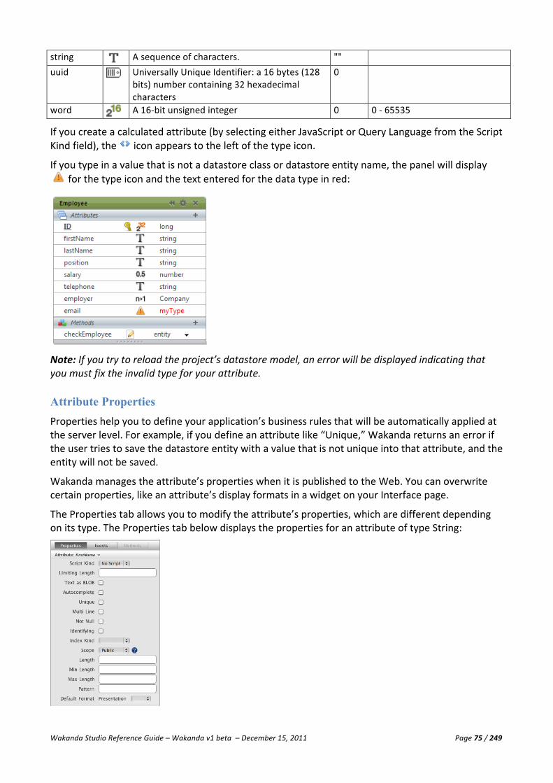
Wakanda Studio Reference Guide – Wakanda v1 beta – December 15, 2011 Page 75 / 249
string A sequence of characters. "" uuid Universally Unique Identifier: a 16 bytes (128
bits) number containing 32 hexadecimal characters
0
word A 16-‐bit unsigned integer 0 0 -‐ 65535
If you create a calculated attribute (by selecting either JavaScript or Query Language from the Script Kind field), the icon appears to the left of the type icon.
If you type in a value that is not a datastore class or datastore entity name, the panel will display for the type icon and the text entered for the data type in red:
Note: If you try to reload the project’s datastore model, an error will be displayed indicating that you must fix the invalid type for your attribute.
Attribute Properties Properties help you to define your application’s business rules that will be automatically applied at the server level. For example, if you define an attribute like “Unique,” Wakanda returns an error if the user tries to save the datastore entity with a value that is not unique into that attribute, and the entity will not be saved.
Wakanda manages the attribute’s properties when it is published to the Web. You can overwrite certain properties, like an attribute’s display formats in a widget on your Interface page.
The Properties tab allows you to modify the attribute’s properties, which are different depending on its type. The Properties tab below displays the properties for an attribute of type String:

Wakanda Studio Reference Guide – Wakanda v1 beta – December 15, 2011 Page 76 / 249
You can modify the attribute’s name and type by double-‐clicking on it in the panel.
All the attribute types have the following properties:
• Script Kind: Can be “No Script” or “JavaScript.” For attributes of type Boolean, a third option is available: “Query Language.” When you select “JavaScript,” you are defining this attribute as a calculated attribute; therefore, you can execute code for the following events:
§ On Get: When the attribute is retrieved from the server.
§ On Set: When the attribute is set on the server.
§ On Query: When the attribute is queried.
§ On Sort: When the attribute is sorted.
Note: For more information about calculated attributes, please refer to the “Calculated Attributes” section. For more information about the “Query Language” option for Boolean attributes, please refer to the “Properties for Boolean Attributes” section.
• Not Null: Specifies if the attribute accepts null values.
• Identifying: A field to help better identify a datastore entity when searching relation attributes. The identifying property allows you to more easily identify an attribute in some of the Wakanda widgets. The name of the attribute (in this example, city) is in italics:
• Index Kind: Defines the type of index for the attribute: B-‐tree, Cluster, Keywords, or Auto. If
you select an Index Kind, the attribute name will be displayed in bold.
§ B-‐tree: Standard B-‐Tree type index. This multipurpose index type meets most indexing requirements.
§ Cluster: B-‐Tree type index using clusters. This architecture is more efficient when the index does not contain a large number of keys, i.e., when the same values occur frequently in the data.
§ Keywords: This index is only available for Alpha and Text type attributes, and is intended to facilitate fast searching of individual words inside of these attributes.
§ Auto: Wakanda automatically selects an index according to the attribute type.

Wakanda Studio Reference Guide – Wakanda v1 beta – December 15, 2011 Page 77 / 249
• Scope: Defines the scope of the attribute: Public, Private ( ), Public on Server ( ) or Protected ( ). A public attribute can be used from anywhere. A private attribute can only be used by code called from inside the datastore class, including calculated attribute events, datastore class methods, and events. A protected attribute can be used from datastore classes as well as from derived datastore classes. By default, the scope is public. You can also modify this property in the datastore class by clicking on the icon to the left of the attribute name:
Properties for Boolean Attributes
For attributes of type Boolean, there are no additional properties apart from those listed above; however, there is another Script Kind, “Query Language”:
In the Query field that appears, enter a query based on an attribute in the datastore class that returns True or False. In our example above, if the “spouse” attribute is not blank, the “married” attribute is set to True.
Properties for Word and Byte Attributes
For attributes of type Word and Byte, there are no additional properties apart from those listed above: script kind, not null, identifying, index kind, and scope.
Properties for String Attributes
For attributes of type String, you can set the following properties in addition to the common attributes (script kind, not null, identifying, index kind, and scope):
• Limiting Length: Limits the length of the text entered in the attribute. If you define the limiting length to be 10, any longer text entered will be truncated to contain 10 characters.
• Text as BLOB: Text will be stored externally as a BLOB.
• Autocomplete: Displays a list during data entry of a Text Input widget based on previously entered values for the same attribute.
• Unique: Verifies that the value entered be unique. If not, an error is returned.
• Multi Line: Select this option so that the attribute by default will appear as a multi-‐line Text Input widget when you create a Text Input widget for the attribute (*not yet implemented).

Wakanda Studio Reference Guide – Wakanda v1 beta – December 15, 2011 Page 78 / 249
• Length: The length of the attribute.
• Min Length: Minimum length allowed for the attribute. If the text entered is shorter than the value defined for this property, an error is returned.
• Max Length: Maximum length allowed for the attribute. If the text entered is longer than the value defined for this property, an error is returned.
• Pattern: A RegEx to help ensure proper data entry.
• Default Format Presentation: Text only for now.
§ Format: Default display format for this attribute in all the widgets defined in the same project. Please refer to the “Display Formats for Attributes” section for more information.
• Locale: The locale for the region to format the data in the attribute. Please refer to the “Locale Formatting” section for more information.
Properties for Number, Long, and Long64 Attributes
For attributes of type Number, Long, and Long64, you can set the following properties in addition to the others for all attributes (script kind, not null, identifying, index kind, and scope):
• Autosequence: A sequence number that Wakanda automatically generates for each new datastore entity.
• Unique: Verifies that the value entered be unique. If not, an error is returned.
• Min Value: Minimum value allowed for the attribute. If the value entered is less than this property, an error is returned.
• Max Value: Minimum value allowed for the attribute. If the value entered is more than this property, an error is returned.
• Default Value: Default value for the attribute.
• Default Format Presentation: Text, Slider, or Text and Slider.
§ Format: Default display format for the text presentation. Please refer to the “Display Formats for Attributes” section for more information.
§ Slider Min: Minimum value for the Slider widget (when you select “slider” or “text and slider”). (*not yet implemented)
§ Slider Max: Maximum value for the Slider widget (when you select “slider” or “text and slider”). (*not yet implemented)
§ Slider Step: Steps in the values defined for the Slider widget (when you select “slider” or “text and slider”). (*not yet implemented)
• Locale: The locale for the region to format the data in the attribute. Please refer to the “Locale Formatting” section for more information.
Properties for Date and Duration Attributes
For attributes of type Date and Duration, you can set the following properties in addition to the others for all attributes (script kind, not null, identifying, index kind, and scope):
• Default Format Presentation: Text only.

Wakanda Studio Reference Guide – Wakanda v1 beta – December 15, 2011 Page 79 / 249
• Format: Default display format. Please refer to the “Display Formats for Attributes” section for more information.
• Locale: The locale for the region to format the data in the attribute. Please refer to the “Locale Formatting” section for more information.
Properties for UUID Attributes
For attributes of type UUID (universally unique identifier), you can set the following property in addition to the others for all attributes (script kind, not null, identifying, index kind, and scope):
• Autogenerate: Automatically generates a UUID by default. If you do not select this option, you must generate a UUID in your code or else the attribute will not be valid.
Display Formats for Attributes Display formats are “templates” used to represent data visually on your Interface page. They do not affect the way the data is stored internally. These display formats are automatically used by some of the widgets, like Auto Forms, Grids, and Text Inputs.
Formats can be applied to attributes of type String, Number (Long, Long64, and Number), and Date.
For strings, like a telephone number, you can include characters that will be used for the data entered. For example, if you have “(###) ###-‐####” for a US telephone number, when the user enters in 4085551212, it will be formatted as “(408) 555-‐1212”.
For numbers, each placeholder character has a different effect on the display of leading or trailing zeros. A leading zero is a zero that starts a number before the decimal point; a trailing zero is a zero that ends a number after the decimal point. Suppose you use the format ##0 to display three digits. If the user enters nothing in the field, the field displays 0. If the user enters 26, the field displays 26.
The table below explains the effect of each placeholder on leading and trailing zeros:
Placeholder Effect for leading or trailing zero # Displays nothing 0 Displays 0
Note: Wakanda uses the “,” to delimit thousands and “.” as the decimal point for formatting numbers; however, when the value is displayed via the web browser, it will appear with the thousands separator and decimal point defined by the browser.
For percentages, enter “0%”.
For dates: the following formats are available:
• d -‐ day of month (no leading zero) • dd -‐ day of month (two digit) • o -‐ day of the year (no leading zeros) • oo -‐ day of the year (three digit) • D -‐ day name short • DD -‐ day name long • m -‐ month of year (no leading zero) • mm -‐ month of year (two digit) • M -‐ month name short • MM -‐ month name long • y -‐ year (two digit) • yy -‐ year (four digit)

Wakanda Studio Reference Guide – Wakanda v1 beta – December 15, 2011 Page 80 / 249
For example, to create a date that appears as “March 1, 2011,” you would enter “MM d, yy” in the date attribute’s format field.
For attributes of type Date, the Format field has a drop-‐down list that appears, assisting you in entering the appropriate date format
For attributes of type String, you will see the following drop-‐down menu:
Locale Formatting
By defining the Locale for an attribute, the browser's language will be automatically detected client-‐side and data for that attribute will be displayed in the locale's format.

Wakanda Studio Reference Guide – Wakanda v1 beta – December 15, 2011 Page 81 / 249
Attribute Events Besides the available events for calculated attributes (On Get, On Set, On Query, and On Sort), You can execute the following events for all attributes:
• On Init: Executes when a new datastore entity is created after the entity's onInit event.
• On Load: Executes the first time the attribute is accessed after the datastore entity is loaded. If the attribute is not accessed, this event is not executed.
• On Set: Executes after an attribute’s value is set. In server-‐side code, this executes when the value is set. In client-‐side code, this event executes for each attribute that was modified when the datastore entity is saved or validated, or when the method serverRefresh is called.
• On Validate: Executes just before the datastore entity's onValidate event executes and can fail the validation if needed.
• On Save: Executes just before the datastore entity's onSave event executes and can stop the save if necessary.
• On Remove: Executes just before the datastore entity's onRemove event and can stop the deletion if necessary.
Note: For more information regarding attribute events, please refer to the Server-‐Side API Reference.
When you click the icon next to an event, the “{Project Name}.waModel.js” JavaScript file opens in a new tab in the Wakanda Code Editor. If it does not already exist, it will be generated and placed at the top level of your project, next to the Datastore model. A highlighted comment indicates where to add your code in the JavaScript file.
To modify the script for an event, click on the icon to go directly to the code in the “{Project Name}.waModel.js” JavaScript file. The file will open in a new tab in the Wakanda Code Editor.
To delete the code for the specific event, click on the icon.
Creating an N->1 Relation Attribute An N-‐>1 relation attribute relates one entity in a datastore class to one entity in another datastore class. In our case, each employee has only one employer.
To create an N-‐>1 relation attribute:
• Create a new attribute. • Enter a name for the relation attribute. • Select the Datastore Class.

Wakanda Studio Reference Guide – Wakanda v1 beta – December 15, 2011 Page 82 / 249
In our case, we want to have an employer for each Employee that is stored in the Company datastore class:
Once we select “Company,” a matching 1-‐>N relation attribute is created automatically in the Company datastore class:
By default, the 1-‐>N relation attribute is named “employeeCollection.” In the following example, we named the same relation attribute “staff.”
Creating a 1->N Relation Attribute A 1-‐>N relation attribute is created to have one entity in a datastore class that relates to multiple entities in another datastore class. In our case, each company has one or more employees.
To create a 1-‐>N relation attribute:
• Create a new attribute. • Enter a name for the relation attribute. • Select the Collection Name.
In our case, we want to have multiple employees per company:

Wakanda Studio Reference Guide – Wakanda v1 beta – December 15, 2011 Page 83 / 249
You are prompted to create the N-‐>1 relation attribute in the other datastore class:
We typed in “employer” instead of “company” for our N-‐>1 relation attribute, which was automatically created in the Employee datastore class as shown below:
Properties for a 1->N Relation Attribute The following properties are specific to 1-‐>N relation attributes:
• Composition: Generates an array for the related entities instead of a datastore entity
collection. By default, this option is not selected.
• Reverse Path: This option must be selected for a 1-‐>N relation attribute.
• Scope: The scope property is the same as for storage attributes.
Creating an N->N Relation Attribute An N-‐>N relation attribute allows you to have complex data structures. To create an N-‐>N relation attribute you must have three datastore classes and do the following:
• Create a new attribute. • Enter a name for the relation attribute. • Create a 1>N relation attribute in one datastore class. • Select a datastore class where you want the N-‐>1 relation attribute to be automatically created. • Repeat the same steps from a different datastore class, but select the same datastore class where
you want the N-‐>1 relation attribute to be automatically created.
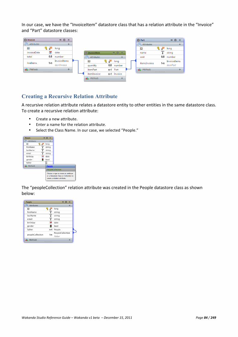
Wakanda Studio Reference Guide – Wakanda v1 beta – December 15, 2011 Page 84 / 249
In our case, we have the “InvoiceItem” datastore class that has a relation attribute in the “Invoice” and “Part” datastore classes:
Creating a Recursive Relation Attribute A recursive relation attribute relates a datastore entity to other entities in the same datastore class. To create a recursive relation attribute:
• Create a new attribute. • Enter a name for the relation attribute. • Select the Class Name. In our case, we selected “People.”
The “peopleCollection” relation attribute was created in the People datastore class as shown below:

Wakanda Studio Reference Guide – Wakanda v1 beta – December 15, 2011 Page 85 / 249
Deleting a Relation Attribute When you choose to delete an N-‐>1 relation attribute, a confirmation dialog appears to ask you if you are certain that you want to delete the N-‐>1 relation attribute along with the 1-‐>N relation attribute in the related datastore class:
Note: In our example above, we also have an alias attribute that uses the same relational attribute, “Employer.”
If, however, you delete an N-‐>1 relation attribute, the 1-‐>N relation attribute is not mentioned because you can leave the 1-‐>N relation attribute:
If you click on the Delete button, only the N-‐>1 relation attribute is deleted.
Creating an Alias Attribute An alias attribute is a reference to a value in a related datastore class without storing the data in another attribute. An alias attribute requires that an N-‐>1 relation attribute already be defined in the same datastore class. To create an alias attribute, add an attribute and enter the relation attribute’s name as the type. In our example, we selected “employer”:

Wakanda Studio Reference Guide – Wakanda v1 beta – December 15, 2011 Page 86 / 249
Type a “.” after the relation attribute’s name to display the list of attributes in the related datastore class and select the attribute you want to display:
Select one of the attributes proposed (from the related datastore class) as the value you want to display. If you choose an N-‐>1 relation attribute in the parent datastore class, you can enter another “.” and choose another attribute in the parent datastore class.
Creating a Calculated Attribute To create a calculated attribute, you must first create a new attribute. In our example, we created an attribute named “fullName,” which is an attribute of type String. It will contain the values from two fields: “firstName” and “lastName.”
In the Properties tab, select “JavaScript” from the Script Kind drop-‐down list:
Click on the icon to open the Wakanda Code Editor for the On Get event and enter your code:
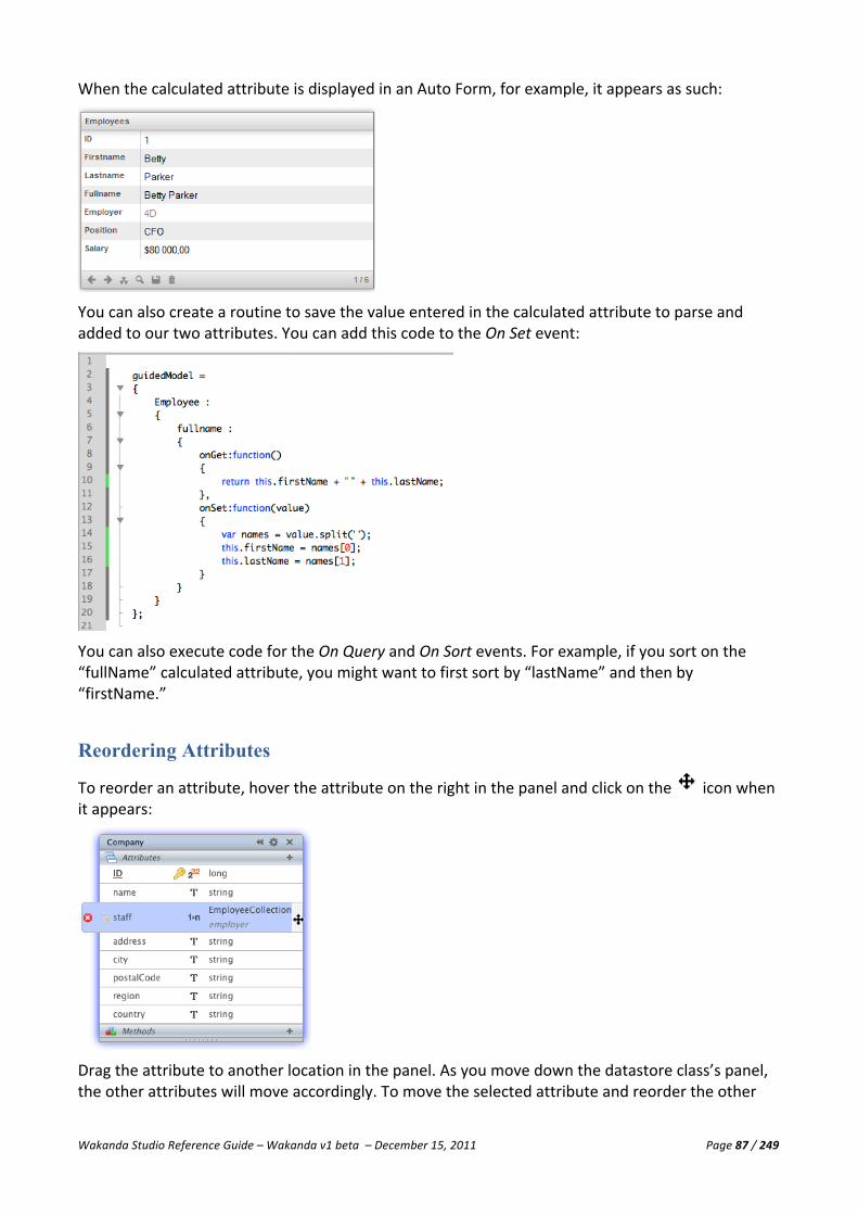
Wakanda Studio Reference Guide – Wakanda v1 beta – December 15, 2011 Page 87 / 249
When the calculated attribute is displayed in an Auto Form, for example, it appears as such:
You can also create a routine to save the value entered in the calculated attribute to parse and added to our two attributes. You can add this code to the On Set event:
You can also execute code for the On Query and On Sort events. For example, if you sort on the “fullName” calculated attribute, you might want to first sort by “lastName” and then by “firstName.”
Reordering Attributes
To reorder an attribute, hover the attribute on the right in the panel and click on the icon when it appears:
Drag the attribute to another location in the panel. As you move down the datastore class’s panel, the other attributes will move accordingly. To move the selected attribute and reorder the other

Wakanda Studio Reference Guide – Wakanda v1 beta – December 15, 2011 Page 88 / 249
attributes in the panel, drop the attribute in its new location. In our example, we moved the “staff” relation attribute to the bottom of the panel.
Deleting an Attribute To delete an attribute, first select the attribute and then click on the icon next to it:
Once you confirm the deletion, the attribute will be deleted from the datastore class.
Note: If the attribute you are deleting was extended, it will be deleted from the derived datastore classes as well.
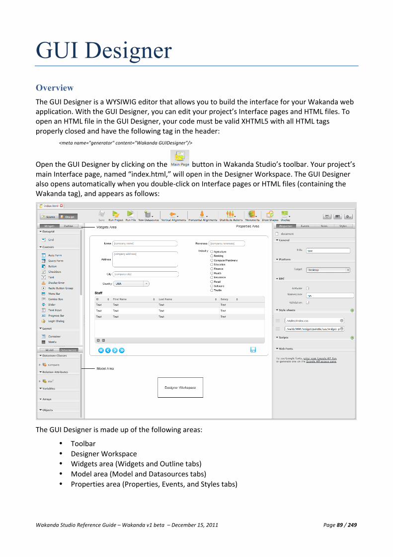
Wakanda Studio Reference Guide – Wakanda v1 beta – December 15, 2011 Page 89 / 249
GUI Designer Overview The GUI Designer is a WYSIWIG editor that allows you to build the interface for your Wakanda web application. With the GUI Designer, you can edit your project’s Interface pages and HTML files. To open an HTML file in the GUI Designer, your code must be valid XHTML5 with all HTML tags properly closed and have the following tag in the header:
<meta name="generator" content="Wakanda GUIDesigner"/>
Open the GUI Designer by clicking on the button in Wakanda Studio’s toolbar. Your project’s main Interface page, named “index.html,” will open in the Designer Workspace. The GUI Designer also opens automatically when you double-‐click on Interface pages or HTML files (containing the Wakanda tag), and appears as follows:
The GUI Designer is made up of the following areas:
• Toolbar • Designer Workspace • Widgets area (Widgets and Outline tabs) • Model area (Model and Datasources tabs) • Properties area (Properties, Events, and Styles tabs)

Wakanda Studio Reference Guide – Wakanda v1 beta – December 15, 2011 Page 90 / 249
Toolbar With the GUI Designer toolbar, you can easily access many key functions. A few options are available allowing you to customize the toolbar.
The toolbar has the following options:
• Save: This option allows you to save all the changes made to the Interface page open in the current tab. This option is also available in the action menu in the toolbar.
• Run Project: Launches your project’s main Interface page in your default browser. • Run File: Launches the Interface page opened in the current tab in your default browser. If
Wakanda Server is not already running, it will be launched. If the Interface page has been modified, it will be saved before it is published to your browser. If you select this option for an Interface page’s main script page (the one whose name is the same, i.e., “index.js” is the JavaScript file for “index.html”), the Interface page will be published to your browser and not the JavaScript file.
• New Datasource: Creates a new datasource of type Datastore Class, Relation Attribute, Variable, Array, or Object. You can also create these datasources from the action menu in the toolbar. Once you select one of the options, it will be displayed as the button text.
• Vertical/Horizontal Alignments: These menus align the selected widgets vertically or horizontally on your Interface page.
• Distribute Actions: The Distribute Actions menu allows you to distribute them vertically or horizontally.
• Movements: This menu allows you to change the stacking order (z-‐Index) of the selected widget(s) on your Interface page. These options are also available from the action menu
in the toolbar as well as in the Size & Position section of the Styles tab for each widget.
• Show/Hide Shapes: Toggles the outlines of all the widgets and their text labels, if they have one, on the Designer Workspace. This is especially useful for Text and Matrix widgets that
have no visible outline. To hide them again, click the button. • Display: This menu allows you to modify the GUI Designer toolbar:
§ Toolbar Preferences: Sets the display of the toolbar icons with or without text, the size of the icons, and to display or hide the icons.
§ Toolbar Content: Allows you to select which options you’d like to display in the toolbar as well as reset to the default options.
If all the items in the toolbar cannot be displayed due to lack of space, the icon appears in the toolbar. When you click on it, the missing toolbar items appear in a hierarchical menu.
Toggling between Source and Design
By default, an Interface page opens in the Design view. To view the HTML of your Interface page,
click the button next to the toolbar. You can also toggle between the two views by clicking Ctrl-‐D (Windows) or Command-‐D (Macintosh). You can return to the GUI Designer, by
clicking the button.

Wakanda Studio Reference Guide – Wakanda v1 beta – December 15, 2011 Page 91 / 249
Please remember that any HTML code you add to your Interface pages must be valid XHTML5 with all the HTML tags properly closed.
Other Toolbar Buttons
In the toolbar area, there are also other buttons for your convenience. To open the JavaScript file
associated to your Interface page, click on the button in the toolbar. Once you are in the Code
Editor, you can click the button to return to the GUI Designer.
The left and right panels can be hidden and displayed by clicking the button in the toolbar to allow you more room for the Designer Workspace.
The action menu allows you to save the current Interface page open in the tab, create new datasources, and change the stacking order for the selected widgets.
Tabs
For each document opened in Wakanda, it will be placed in a tab. For more information about the tabs, please refer to the “Solution Manager” chapter.
Designer Workspace The Designer Workspace is where you customize your Interface pages. Depending on the file open in the active tab, a different editor appears in this same area: the GUI Designer for your Interface pages, the Datastore Model Designer for your project’s model, and the Code Editor for the source of your Interface pages as well as all JavaScript, JSON, XML, Text, PHP, and CSS files.
Widgets Area This area in the GUI Designer displays all the widgets that you can add to your web interface: Grids, Controls, Layouts, and Images. Wakanda is delivered with a few Experimental widgets to demonstrate a variety of powerful features you can add to your Interface pages.
To create a widget, you can select a widget and drag it to an empty space on the Designer Workspace, double-‐click on it, or draw it to the size you’d like on the Designer Workspace.
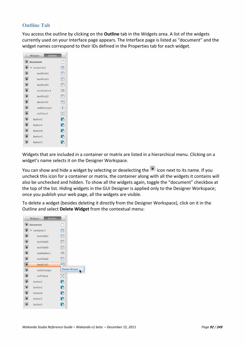
Wakanda Studio Reference Guide – Wakanda v1 beta – December 15, 2011 Page 92 / 249
Outline Tab You access the outline by clicking on the Outline tab in the Widgets area. A list of the widgets currently used on your Interface page appears. The Interface page is listed as “document” and the widget names correspond to their IDs defined in the Properties tab for each widget.
Widgets that are included in a container or matrix are listed in a hierarchical menu. Clicking on a widget’s name selects it on the Designer Workspace.
You can show and hide a widget by selecting or deselecting the icon next to its name. If you uncheck this icon for a container or matrix, the container along with all the widgets it contains will also be unchecked and hidden. To show all the widgets again, toggle the “document” checkbox at the top of the list. Hiding widgets in the GUI Designer is applied only to the Designer Workspace; once you publish your web page, all the widgets are visible.
To delete a widget (besides deleting it directly from the Designer Workspace), click on it in the Outline and select Delete Widget from the contextual menu:

Wakanda Studio Reference Guide – Wakanda v1 beta – December 15, 2011 Page 93 / 249
Model Area The Model area of the GUI Designer displays the datastore classes defined in your current project’s model. You can expand the datastore class to view its attributes by clicking either on the icon or its name. To collapse it, click on the icon.
The datastore classes are listed in alphabetical order. In the Filter area, you can enter the first letter(s) of a datastore class to display those that correspond to the text entered.
From this area, you can create a Form, Grid, or Auto Form by dragging a datastore class or selected attribute(s) from the same datastore class to an empty space on the Designer Workspace. Ctrl-‐click (Windows) or Command-‐click (Macintosh) attributes you want to select. When you drop the attributes onto the empty space of the Designer Workspace, the Auto Generated Widgets dialog appears:
If you select multiple attributes from the same datastore class, the Auto Generated Widgets dialog appears containing the attributes you selected:
Once you click on the Create button, the Form, Grid, or Auto Form you selected will be created on your Interface page. Either a datasource is created with the same name as your datastore class or an existing datasource with the same name as the datastore class will be used for the widget(s).
Note: The Form, Grid, and Auto Form are discussed in further detail in their respective areas.

Wakanda Studio Reference Guide – Wakanda v1 beta – December 15, 2011 Page 94 / 249
Datasources Tab This area displays all the datasources representing the datastore classes and relation attribute classes in your model along with all their attributes as well as user-‐defined JavaScript variables, arrays, and objects:
Data class and relation attribute datasources are automatically created when you generate a Grid, Auto Form, Form, or any other widget that uses a datastore class or a relation attribute as its datasource. Its name is the same as the datastore class or relation attribute; however, the first letter is put in lowercase if it is in uppercase. For example, if you have a datastore class named “Employee,” the datasource will be “employee.”
Variables are created automatically if you type a source name in the Properties tab for a widget that is not a datastore class, relation attribute, or existing datasource. It is suggested to start all datasources with a lowercase letter.
Array and object datasources are created when you select the type either from the button or from the action menu in the toolbar. Array datasources are created automatically when you enter a source name for a Grid or Auto Form that is not an existing datastore class.
Like the Model, you can create a Form, Grid, or Auto Form by dragging the datasource (a datastore class or one or more attributes from a datastore class) to an empty space in the Designer Workspace. The Auto Generated Widgets dialog displays the selected attributes or all the attributes of a datastore class to include in the widget.
To create another copy of a datasource, select Copy the datasource from the datasource’s contextual menu. If you want to delete it, select Delete the datasource from the datasource’s contextual menu.
If you delete a datasource that is being used in a widget, you will get the following warning:
However, if you delete a widget that uses a datasource, the reference to that datasource will remain in the list.
Note: For more information regarding Datasources, please refer to the Datasources section.

Wakanda Studio Reference Guide – Wakanda v1 beta – December 15, 2011 Page 95 / 249
Properties, Events, and Styles Tabs In this area, you define the properties, events, and styles for the Interface page, widgets, and datasources. The options available on these tabs differ for each one and are discussed in detail in its corresponding section.
Interface Page An interface page is an HTML file that you created either by selecting New Page from the Wakanda Studio menu bar or by creating an HTML file with the proper Wakanda tag. Each page has its own set of properties, events, and styles that you can define in the Properties tab.
Designing an Interface Page One Interface page, whose name is “index.html,” is automatically created when you create a new
Wakanda project. To create more pages, select Page from the New menu or click on the button in the Wakanda Studio toolbar.
A new Interface page with the name you entered will be created and placed in your project’s WebFolder. You can also create HTML pages (through Wakanda) and include them in your project, but they must be valid XHTML5 with all HTML tags properly closed and have the following tag:
<meta name="generator" content="Wakanda GUIDesigner"/>
Interface Page Properties To view the information for the Interface page, make sure the word “document” is displayed in the top left corner of the Properties tab. To select your interface page, either click on any empty space in the Designer Workspace or click on “document” in the Outline area.

Wakanda Studio Reference Guide – Wakanda v1 beta – December 15, 2011 Page 96 / 249
The value you enter in the Title field is the title of your Interface page that appears in the browser’s title bar as well as in the browser window’s tab as shown below:
Platform
The Target drop-‐down list allows you to change the target for the Interface page. You can select from one of the three options:
• Auto: By selecting this option, the correct JavaScript code will be loaded depending on the platform where the Interface page is published.
• Desktop: This Interface page is stored at the root of the WebFolder. • Smartphone: An Interface page for these devices is stored in the “smartphone” folder in the
WebFolder. • Tablet: An Interface page for these devices is stored in the “tablet” folder in the WebFolder.
The selected value is shown in the <body> tag of the Interface Page in the “data-‐platform” attribute:
<body id="waf-‐body" data-‐type="document" data-‐theme="default" data-‐rpc-‐validation="false" data-‐rpc-‐namespace="rpc" data-‐rpc-‐activate="false" data-‐platform="desktop" data-‐lib="WAF" class="default" style="visibility:hidden;">
If the Target is not “Desktop,” the following tag is also added to the Interface page (in our example with “Smartphone” selected):
<meta name="WAF.config.modules" content="smartphone"/>
RPC
You can configure Remote Procedure Call (RPC) methods to be called from your Interface page.
• Activate: Activates RPC in the document. When this option is checked, you can access the RPC-‐defined methods located in a server-‐side folder.
• Namespace: Sets the namespace for the RPC methods. By default, the “rpc” namespace is provided; however, you can enter any name you wish.
• Validation: Activates a mechanism that checks the number and type of parameters passed to RPC methods.
Note: You can also set the role of a file in the Solution Explorer to “RPC Functions File.” For more information, please refer to the “Solution Manager” chapter.
Note: For more information, go to the “Calling methods using an RPC” in the Client-‐Side Developer Guide. < http://doc.wakanda.org/Client-‐Side-‐Developer-‐Guide-‐1/Using-‐JSON-‐RPC-‐services/Calling-‐methods-‐using-‐an-‐RPC.300-‐306631.en.html>

Wakanda Studio Reference Guide – Wakanda v1 beta – December 15, 2011 Page 97 / 249
Style sheets
By default, there are two CSS files automatically displayed in this area. One is the CSS file (whose name is the same as your Interface page) for your Interface page and the other one is the CSS file that defines the palette for an Interface page. Your interface page’s CSS file is placed in a folder named “styles” in your project’s WebFolder and is updated dynamically each time you modify the styles or placement of any widget on the page or the styles for the Interface page itself.
In the Style Sheets area, you can include other CSS files to your Interface page that you can manage and whose contents you can freely modify.
To add a CSS file, click on the icon. A blank area appears and you can click on the icon to select a CSS file located in your project’s WebFolder:
If the CSS file you choose is not in your project’s WebFolder, it will be copied into the “styles” folder in your project’s WebFolder. If the “styles” folder does not exist, it will be created.
To remove a CSS file from your Interface page, click the icon next that appears next to the file you want to delete. To choose another file, you don’t need to remove the file, but you can select another CSS file by clicking on the icon again.
To change the order of the CSS files, drag the icon above or below one or more of the other CSS files listed.
Note: Even if you change your Interface page’s name, the CSS file that was created by default for the Interface page (whose names are the same as the Interface page) will remain unchanged and still linked to the Interface page.
Scripts
By default, Wakanda automatically generates a JavaScript file (whose name is the same as your Interface page) when you create an event for your Interface page or any of the widgets on your Interface page. This file is automatically placed in a “scripts” folder, but is not included in the Scripts area. You can use the Scripts area in the Properties tab to add one or more JavaScript files to your Interface page:
To add a JavaScript file, click on the icon. A blank area appears and you can click on the icon to select a JavaScript file located in your project’s WebFolder:

Wakanda Studio Reference Guide – Wakanda v1 beta – December 15, 2011 Page 98 / 249
If the JavaScript file you choose is not in your project’s WebFolder, it will be copied into the “scripts” folder in your project’s WebFolder. If the “scripts” folder does not exist, it will be created.
To remove a JavaScript file from your Interface page, click the icon next that appears next to the file you want to delete. To choose another file, you don’t need to remove the file, but you can select another JavaScript file by clicking on the icon again.
To change the order of the JavaScript files, drag the icon above or below one or more of the other JavaScript files listed.
Note: Even if you change your Interface page’s name, the JavaScript file that was created by default for the Interface page (whose names are the same as the Interface page) will remain unchanged and still linked to the Interface page.
Web Fonts
In this section, you can add Google fonts to your Interface page that you can use for any of the widgets it contains.
Note: For more information about using Google's free open-‐source fonts, please refer to Google Web Fonts <http://www.google.com/webfonts>.
To begin, you must enter your Google API Key after clicking on Enter your Google API Key in the Google API Key area that appears:
Once you enter a valid Google API Key, the Google Font dropdown (containing all Google’s web fonts) appears in the Web Fonts area:
Once you select a Google Font, a preview of the font appears above the dropdown. To load it to your interface, click the icon:

Wakanda Studio Reference Guide – Wakanda v1 beta – December 15, 2011 Page 99 / 249
The font will then be listed in the Loaded Fonts area. Once you have one or more web fonts loaded to your Interface Page, they will be available from the Font dropdown as shown below:
The fonts are added to the source of your Interface page as shown below:
<link id="waf-‐fonts-‐web-‐google" rel="stylesheet" type="text/css" href="http://fonts.googleapis.com/css?family=Alike+Angular|GFS+Didot|Odor+Mean+Chey"/>
To delete any of the loaded fonts, click on the icon to the right of the font:
Interface Page Events From the Interface page, you can execute code in the On Load event, which occurs when the web page is first loaded by the browser.
When you click the icon, a JavaScript file with the same name as your Interface page opens in a new tab. It will be generated and automatically placed in a “scripts” folder in your project’s WebFolder if it doesn’t already exist. The JavaScript file will appear in the Code Editor with a highlighted comment indicating where to add your code.
To open the JavaScript file for your Interface page, click on the button in the toolbar or the icon next to the event to go directly to the code for that event.
To delete the code for the specific event in your Interface page’s JavaScript file, click on the icon next to the event.
Interface Page Skins This tab allows you to define the class, theme, and color palette for your Interface page.

Wakanda Studio Reference Guide – Wakanda v1 beta – December 15, 2011 Page 100 / 249
Class
In this section, you can define a CSS class for your Interface page to be included in the <body> tag of the HTML file.
Theme
From this drop-‐down menu, you can choose one of Wakanda’s predefined themes or a custom one if you have created it. If you select a Theme for a widget that is different from the one you select for the Interface page, the widget’s theme will take precedence.
Color Palette
In this section, you can select a color palette for the selected theme. Each palette displays a selection of colors defined in the header of the palette’s CSS file, which is called manual mode. If no colors are defined in the header, Wakanda automatically selects the colors used in the palette's CSS file. The chosen palette is then used for all the widgets for which you can select a theme: Grid, Auto Form, Query Form, Button, Text, Slider, Text Input, Progress Bar, and Container widgets as well as the Menu Bar.
Texture
In the Texture section, you can define a texture for the header and/or footer of widgets with a header or footer, like the Grid, Auto Form, and Query Form widgets. The Theme and Color Palette you choose for your Interface page can further modify the appearance for the header and footer.
You can either select a texture from the Header or Footer dropdown menu, which are from the Media Library’s “texture” folder, or upload your own image file.
To upload a texture, click on the icon. Once you select an image file from your hard disk, the file is copied into your WebFolder’s images folder and is listed in the dropdown menu as shown below for the Footer:
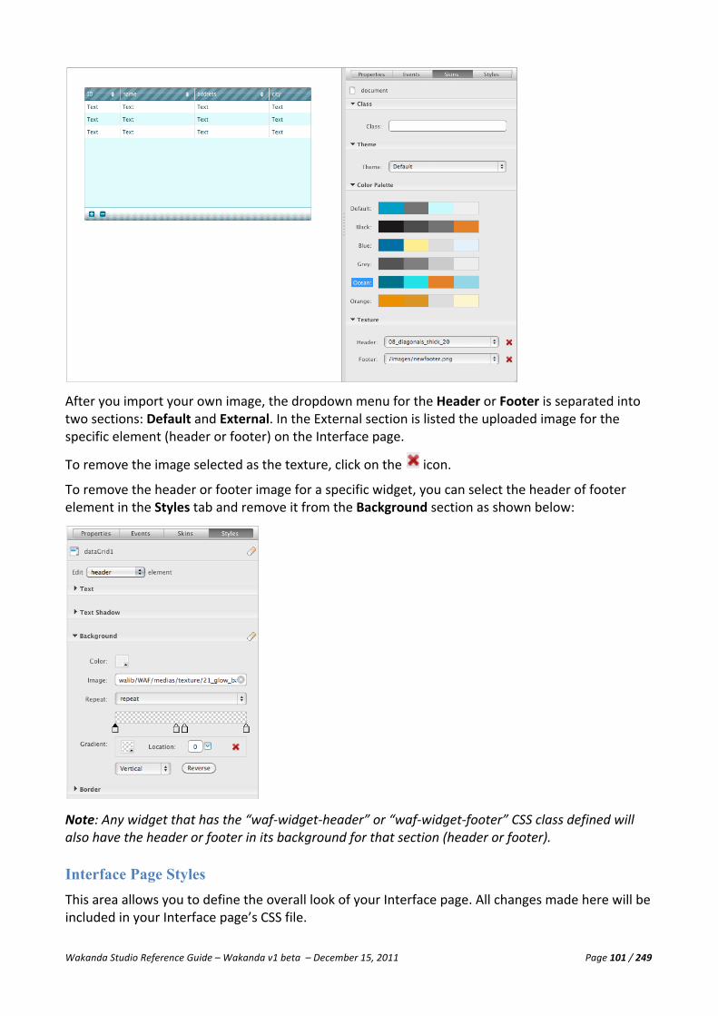
Wakanda Studio Reference Guide – Wakanda v1 beta – December 15, 2011 Page 101 / 249
After you import your own image, the dropdown menu for the Header or Footer is separated into two sections: Default and External. In the External section is listed the uploaded image for the specific element (header or footer) on the Interface page.
To remove the image selected as the texture, click on the icon.
To remove the header or footer image for a specific widget, you can select the header of footer element in the Styles tab and remove it from the Background section as shown below:
Note: Any widget that has the “waf-‐widget-‐header” or “waf-‐widget-‐footer” CSS class defined will also have the header or footer in its background for that section (header or footer).
Interface Page Styles This area allows you to define the overall look of your Interface page. All changes made here will be included in your Interface page’s CSS file.
Wakanda Studio Reference Guide – Wakanda v1 beta – December 15, 2011 Page 102 / 249
Note: Any changes you manually make to the source of the Interface page’s CSS file will not be saved. For this reason, if you want to edit your own CSS file, you must create another file and add it to your Interface page by using the Style Sheets area on the Properties tab.
For more information about the Style tab, please refer to the “Widget Styles” section.
Background
For more information about the Background section, please refer to the “Background” paragraph in the “Widget Overview” section.
Viewing the Source for the Interface Page Wakanda adds by default a number of meta tags for the Interface page of which two important ones are the following:
<meta name="generator" content="Wakanda GUIDesigner"/> <meta name="build" content="97613"/>
These two meta tags contain the following information:
Attribute Description generator By default, “Wakanda GUIDesigner” is added to the Interface page to signal to Wakanda
that it can open the HTML page as its own Interface page in the GUI Designer. build Wakanda build number used to create Interface page.

Wakanda Studio Reference Guide – Wakanda v1 beta – December 15, 2011 Page 103 / 249
Widget Overview In Wakanda, you can create widgets in the following three ways:
n Drag and drop the widget from the Widgets area onto an empty space in the Designer Workspace.
n Draw the widget to a specific size on the Designer Workspace. n Double-‐click on the widget so that it is automatically created and appears on the Designer
Workspace.
To automatically generate Grid and Auto Form widgets, you can also drag and drop either a datastore class or a datasource to an empty space on the Designer Workspace. When you do so, the Auto Generated Widgets window appears, allowing you to select which attributes to include in one of the three types of controls:
From here, you can select one of the following:
n Form n Grid n Auto Form
Form is a selection of widgets while Grid and Auto Form are widgets.
Setting the Properties for a Widget In the Properties area to the right, you can set the properties for each widget. The area is broken up into four tabs: Properties, Events, Skins, and Styles.
Widget Properties This section varies depending on the widget. Every widget has an ID, which is generated automatically by Wakanda. You can, of course, modify it if you’d like. It must begin with a letter and can contain letters, digits, hyphens, and underscores.
The ID is equivalent to the ID in HTML and can be passed to JavaScript routines, such as getElementById. You can also include accented and non-‐Roman letters. For more information, please refer to the “Naming Conventions” section.
Source Properties
For all widgets that have a Source property (Source, Source In, and Source Out), only those datastore classes and attributes that have “Public” chosen as their scope will appear.

Wakanda Studio Reference Guide – Wakanda v1 beta – December 15, 2011 Page 104 / 249
Label Property
For widgets that have a value entered in the Label property, an additional HTML tag of type “label” is added:
<label id="label1" for="textField1" data-‐valign="middle" data-‐type="label" data-‐lib="WAF" data-‐constraint-‐top="true" data-‐constraint-‐right="false" data-‐constraint-‐left="true" data-‐constraint-‐bottom="false" class="waf-‐widget waf-‐label light inherited">Name</label>
To delete the label, you can either:
• Erase the contents of the Label property or • Ctrl-‐click on the widget’s label and select Delete from the contextual menu.
Widget Events Each widget has its own events that you can intercept by writing JavaScript code.
Adding an Event
If no code exists for an event, you can click on the icon to add it. The JavaScript file with the same name as your Interface page will open up with a highlighted comment indicating where to add your code.
In the callback, you can use this to refer to the current object. If you want to access the domNode directly, you can write this.domNode.
Modifying an Existing Event
To open the JavaScript file linked to your Interface page, click on the button above the panel
or click on the icon next to the event to go directly to the event.
Deleting an Existing Event
To delete the code for the specific event in the JavaScript file, click on the icon next to the event.
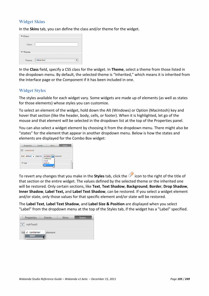
Wakanda Studio Reference Guide – Wakanda v1 beta – December 15, 2011 Page 105 / 249
Widget Skins In the Skins tab, you can define the class and/or theme for the widget.
In the Class field, specify a CSS class for the widget. In Theme, select a theme from those listed in the dropdown menu. By default, the selected theme is “Inherited,” which means it is inherited from the Interface page or the Component if it has been included in one.
Widget Styles The styles available for each widget vary. Some widgets are made up of elements (as well as states for those elements) whose styles you can customize.
To select an element of the widget, hold down the Alt (Windows) or Option (Macintosh) key and hover that section (like the header, body, cells, or footer). When it is highlighted, let go of the mouse and that element will be selected in the dropdown list at the top of the Properties panel.
You can also select a widget element by choosing it from the dropdown menu. There might also be “states” for the element that appear in another dropdown menu. Below is how the states and elements are displayed for the Combo Box widget:
To revert any changes that you make in the Styles tab, click the icon to the right of the title of that section or the entire widget. The values defined by the selected theme or the inherited one will be restored. Only certain sections, like Text, Text Shadow, Background, Border, Drop Shadow, Inner Shadow, Label Text, and Label Text Shadow, can be restored. If you select a widget element and/or state, only those values for that specific element and/or state will be restored.
The Label Text, Label Text Shadow, and Label Size & Position are displayed when you select "Label" from the dropdown menu at the top of the Styles tab, if the widget has a "Label" specified.

Wakanda Studio Reference Guide – Wakanda v1 beta – December 15, 2011 Page 106 / 249
Text
This section allows you to customize the text for the widget.
If you have entered a Google API Key to use Google Fonts for your solution, this section appears as shown below:
If you click on the More fonts button, you will be directed to the Interface page's properties where you can load one or more Google Web Fonts.
You can define the font family, font size, font color, font style (bold, italic, or underline), left align, centered, right align, or justified.
You can choose from any of the font families listed in the drop-‐down menu:
Text Shadow
In this section, you can define the widget's text shadow in the Color, Angle, Distance, Blur, and Size fields:
Here is an example of how the Text Shadow appears when it’s published:
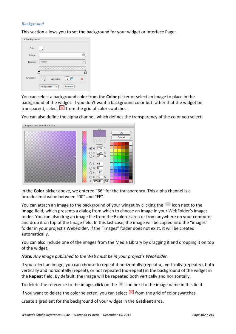
Wakanda Studio Reference Guide – Wakanda v1 beta – December 15, 2011 Page 107 / 249
Background
This section allows you to set the background for your widget or Interface Page:
You can select a background color from the Color picker or select an image to place in the background of the widget. If you don't want a background color but rather that the widget be transparent, select from the grid of color swatches.
You can also define the alpha channel, which defines the transparency of the color you select:
In the Color picker above, we entered “66” for the transparency. This alpha channel is a hexadecimal value between “00” and “FF”.
You can attach an image to the background of your widget by clicking the icon next to the Image field, which presents a dialog from which to choose an image in your WebFolder’s images folder. You can also drag an image file from the Explorer area or from anywhere on your computer and drop it on top of the Image field. In this last case, the image will be copied into the “images” folder in your project’s WebFolder. If the “images” folder does not exist, it will be created automatically.
You can also include one of the images from the Media Library by dragging it and dropping it on top of the widget.
Note: Any image published to the Web must be in your project’s WebFolder.
If you select an image, you can choose to repeat it horizontally (repeat-‐x), vertically (repeat-‐y), both vertically and horizontally (repeat), or not repeated (no-‐repeat) in the background of the widget in the Repeat field. By default, the image will be repeated both vertically and horizontally.
To delete the reference to the image, click on the icon next to the image name in this field.
If you want to delete the color selected, you can select from the grid of color swatches.
Create a gradient for the background of your widget in the Gradient area.

Wakanda Studio Reference Guide – Wakanda v1 beta – December 15, 2011 Page 108 / 249
To do so, click on the color stop to select it ( ) and choose a color either by double-‐clicking on the color stop or by clicking on the icon. Once you have selected a color from the color picker dialog, the gradient color will be modified and all subsequent color stops will have that same color by default.
You can either drag the color stop to change its location or define it by selecting a percentage value from the dropdown in the Location area.
You can add another color stop to the gradient, by clicking on the gradient area when the icon appears.
There must always be two color stops in the gradient area; however, you can add as many as you’d like and delete those you don’t want by selecting the color stop and clicking the icon.
Select Horizontal to display the gradient horizontally or Vertical to display it vertically.
Click on the Reverse button to reverse the gradient completely.
Border
In this section, you can define the color, width, and type of line for the border of the widget in the Color, Style, and Size fields. The Size field only appears if you have selected a style for the border.
For some widgets, the Radius and Corners properties are available to you so that you can also define the radius of each of the four corners:
Select each corner individually by clicking on one of the corners in the square. The corner is selected when it is blue, as shown above. By default, they are all selected. To deselect a corner, just click on it.
Below is an example of a Button widget with a different radius for the top corners:

Wakanda Studio Reference Guide – Wakanda v1 beta – December 15, 2011 Page 109 / 249
Below is an example of a Container widget with different radiuses for the four corners to create an oval:
Drop Shadow
In this section, you can define the widget's drop shadow in the Color, Angle, Distance, Blur, and Size fields:
Below is an example of a drop shadow for an Image widget:
Inner Shadow
In this section, you can define the widget's inner shadow in the Color, Angle, Distance, Blur, and Size fields:

Wakanda Studio Reference Guide – Wakanda v1 beta – December 15, 2011 Page 110 / 249
Below is an example of a Container with an inner shadow:
Size & Position
The fields in this section allow you to define the size, position, and stack order (z-‐Index) of the widget. In the Constraints area, you can define the constraints of a widget by highlighting the grey bar (so it becomes red) of two, three, or four of the following options: top, bottom, left, or right.
The Top, Bottom, Left, and Right field allow you to define the value from the edge of either the page (in the case of a widget on the Interface page) or the Container (if the widget is inside of it).
If you select two sides, for example top and right, the widget will remain “attached” to the top and right edge with the pixel values defined in the fields for the top and right corner (of the page or Container widget). If you select four sides, the widget will be resized to always have the four settings (top, bottom, left, and right) be true relative to the Container or Interface page.
The settings below are for the Combo Box, which sets it to always be 15 pixels from the top and 84 pixels from the right.
These settings are for the Grid so it is always 50 pixels from the top, 28 pixels from the bottom, 80 pixels from the left, and 78 pixels from the right. In this way when the page is resized, the Combo Box will move and the Grid will grow.

Wakanda Studio Reference Guide – Wakanda v1 beta – December 15, 2011 Page 111 / 249
Note: The four values (top, bottom, left, and right) are automatically adjusted depending on the Wakanda workspace area and the widget you are modifying the constraints for.
When the page is published, the widgets initially appears as follows in this small browser window:
When the page is resized, the Combo Box moves to the top right corner and the Grid is resized to fit the page:
You can also manually adjust the size and position of the widget directly on the Designer Workspace. Below is an example of the parameters when you modify the size and position of a widget:

Wakanda Studio Reference Guide – Wakanda v1 beta – December 15, 2011 Page 112 / 249
Label Text
This section only appears if there is a label for your widget. You can define the font family, font size, font color, font style (bold, italic, or underline), letter spacing, left align, centered, right align, or justified, as well as top align, center align, or bottom align for labels displayed on either side of the widget.
You can choose from any of the font families listed in the drop-‐down menu:
Label Text Shadow
In this section, you can define the widget's label text shadow in the Color, Angle, Distance, Blur, and Size fields:
Label Size & Position
In this section, you can define the size and position of the widget’s label.
• Min Width: Defines the minimum width of the text area allowed for your widget’s label. • Max Width: Defines the maximum width of the text area allowed for your widget’s label.
The widget’s label can be displayed on any of the four sides of the widget by selecting the appropriate radio button.
Icon
Specify an icon to be displayed for any of the different states of the widget (e.g., Checkbox and Radio Button Group). You can select an icon for these states of the checkbox and radio button: Default, Hover, Active, and Focus.

Wakanda Studio Reference Guide – Wakanda v1 beta – December 15, 2011 Page 113 / 249
You can select an image by clicking the icon, which presents a dialog from which to choose an image in your WebFolder’s images folder. You can also drag an image file from the Explorer area or from anywhere on your computer and drop it on top of the Source property. In this last case, the image will be copied into the “images” folder in your project’s WebFolder. If the “images” folder does not exist, it will be created automatically.
You can also include one of the images from the Media Library by dragging it and dropping it on top of the Source property.
Note: Any image published to the Web must be in your project’s WebFolder.
To delete the reference to the image, click on the icon next to the image name in this field.
Manipulating Widgets on the Designer Workspace On the Designer workspace, you can select, move, group, and resize any of the widgets (together or separately) that you have included on your page.
Selecting Multiple Widgets You can select multiple widgets either by drawing a box around the widgets with the mouse or by pressing Command (Macintosh) or Ctrl (Windows) on each of the widgets you want to select.
To select all of the widgets on a page, you can choose Select All from the Edit menu or press Command-‐A (Macintosh) or Ctrl-‐A (Windows).
At the top of the Properties panel, the number of widgets selected is displayed:
Moving Widgets You can move one or more selected widgets by using the arrow keys on your keyboard, dragging it to another location, or by modifying the X and Y parameters in the Size & Position section of the Style tab in the Properties panel.

Wakanda Studio Reference Guide – Wakanda v1 beta – December 15, 2011 Page 114 / 249
Grouping Widgets You can group and ungroup multiple widgets together so that you can move them on the Interface page:
Even grouped, you can still select each widget separately to modify its properties:
To do so, select a few widgets and select Group from the contextual menu:
To ungroup them, select the same widgets and select Ungroup.
Note: This feature is only available in the development branch for Wakanda.
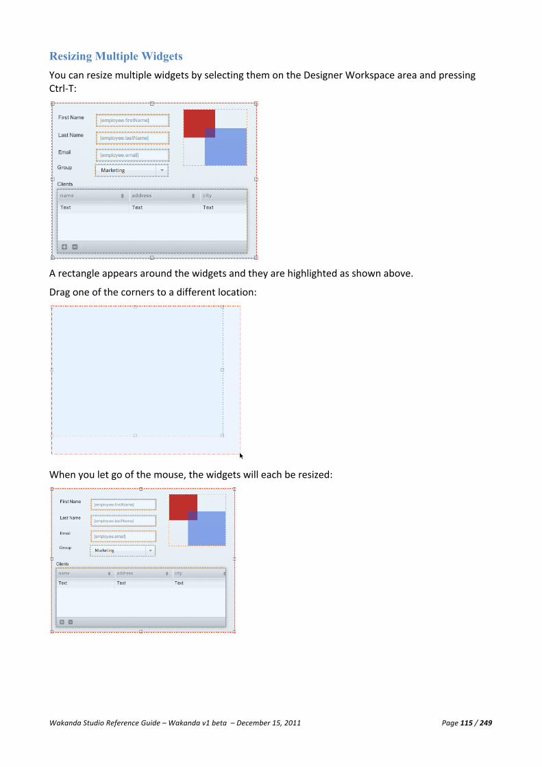
Wakanda Studio Reference Guide – Wakanda v1 beta – December 15, 2011 Page 115 / 249
Resizing Multiple Widgets You can resize multiple widgets by selecting them on the Designer Workspace area and pressing Ctrl-‐T:
A rectangle appears around the widgets and they are highlighted as shown above.
Drag one of the corners to a different location:
When you let go of the mouse, the widgets will each be resized:

Wakanda Studio Reference Guide – Wakanda v1 beta – December 15, 2011 Page 116 / 249
Assigning a Datasource to a Widget with Multiple Sources If a widget, like the Combo Box and Radio Button Group widgets, has more than one datasource, you will be prompted to select for which datasource you want to affect the datastore class (or datasource class attribute) or datasource when you drag and drop it onto the widget. The following dialog appears for you to select the appropriate datasource property:
Error Handling Certain widgets allow you to handle errors if one occurs. In the Properties tab, you can define how you want to handle errors:
§ Let Wakanda display the errors in a new window. § Display the errors in your own Text, Container, or Display Error widget. § Manage the errors yourself programmatically.
Automatically Display Standard Error Message To display Wakanda’s error message, select the Display Error option in the Error Handling section on the Properties tab (as we show below for a Grid):
When an error occurs, it appears as shown below:

Wakanda Studio Reference Guide – Wakanda v1 beta – December 15, 2011 Page 117 / 249
You can move the window by dragging the grey bar at the top or resize it by dragging the bottom right corner. To close the window, click on the button.
Automatically Custom Standard Error Message To display Wakanda’s error message, select the Display Error option and enter in the widget’s ID (which can be of type Container, Text, or Display Error) in the Place holder for the error’s description property in the Error Handling section:
The same error as above displayed in a Container with a yellow background appears as shown below:
Manage Errors Programmatically If you’d like to manage the errors that occur yourself without displaying the standard or custom error messages, deselect the Display Error option and make sure the value in Place holder for the error’s description property is blank.
By intercepting the error in the On Error Handler event on the widget’s Events tab.

Wakanda Studio Reference Guide – Wakanda v1 beta – December 15, 2011 Page 118 / 249
Form The Form allows you to quickly create complex forms composed of multiple widgets. With the Form widget, if you select one or more storage and/or relation attributes, Wakanda creates a widget for each one and groups them in a Container widget as shown below:
Designing a Form You create a Form by dragging and dropping a datasource—a datastore class or one or more attribute(s) from the same datastore class —onto an open space in the Designer Workspace to open the Auto Generated Widgets window. To select multiple attributes from the same datastore class before opening the Auto Generated Widgets window, Ctrl-‐click (Windows) or Command-‐click (Macintosh) each attribute before dragging and dropping them to an empty space in the Designer Workspace.
In the Auto Generated Widgets dialog, you can select the attribute, insert the widget label, and select a widget for each attribute. The proposed widget is based on the attribute type. The following widgets are proposed in this dialog:
• Grid: The Grid widget for the selected datasource based on a relation attribute. • Auto Form: An Auto form in the same container for the selected datasource based on a
relation attribute. • Query Form: A Query form in the same container for the selected datasource based on a
relation attribute. • Checkbox: For attributes of type Boolean. • Text: A static text widget for attributes of type Date, Duration, Long, Long64, Number,
String, UUID, and Word. • Image: An Image widget for an attribute of type Image.

Wakanda Studio Reference Guide – Wakanda v1 beta – December 15, 2011 Page 119 / 249
• Radio Button Group: An Radio Button Group widget for all attribute types except Images. • Combo Box: A Combo Box for all attribute types except Images and relation attributes. • Slider: A Slider widget for a numeric attribute (Long, Long64, and Number). • Text Input: An input area for attributes of type Date, Duration, Long, Long64, Number,
String, UUID, and Word.
To add another attribute, click on the icon at the top of the dialog. A new attribute is automatically added to the end of the list, which you can modify by selecting an attribute from the Attribute drop-‐down menu, entering another label for it, and selecting a widget type.
To change the order of the attributes, drag the icon next to the attribute above or below the other attributes. To delete an attribute before creating the Form, click on the icon that appears to the right of the attribute when you hover over it.
If you select only one attribute, Wakanda will generate the widget selected, but will not create a Container widget around it.
Form Properties
This Form is not a widget, but rather a compilation of different widgets in a Container. It doesn’t have any of its own properties, but each individual widget does. Please refer to each widget for the properties.
Form Events
Please refer to each widget separately to manage its events.
Form Skins
Please refer to each widget separately to manage its class and theme.
Form Styles
This Form doesn’t have any styles to modify; however, you can set the styles for each widget separately.
Viewing the Source for a Form In the source of your Interface page, you can view the HTML code for a Form. The code for each widget is inside the <div> tag for the Container widget:
<div id="container0" data-‐type="container" data-‐lib="WAF" class="waf-‐widget waf-‐container " data-‐theme="metal inherited"><label id="label1" data-‐type="label" data-‐lib="WAF" data-‐linked="textField0" data-‐theme="metal inherited" class="waf-‐widget waf-‐label">ID</label><input id="textField0" data-‐type="textField" data-‐lib="WAF" type="text" data-‐binding="companies.ID" class="waf-‐widget waf-‐textField " data-‐label="ID" data-‐label-‐position="left" data-‐theme="metal inherited" data-‐multiline="false"/><label id="label2" data-‐type="label" data-‐lib="WAF" data-‐linked="textField1" data-‐theme="metal inherited" class="waf-‐widget waf-‐label" >name</label><input id="textField1" data-‐type="textField" data-‐lib="WAF" type="text" data-‐binding="companies.name" class="waf-‐widget waf-‐textField " data-‐label="name" data-‐label-‐position="left" data-‐theme="metal inherited" data-‐multiline="false" /><label id="label3" data-‐type="label" data-‐lib="WAF" data-‐linked="textField2" data-‐theme="metal inherited" class="waf-‐widget waf-‐label">city</label><input id="textField2" data-‐type="textField" data-‐lib="WAF" type="text" data-‐binding="companies.city" class="waf-‐widget waf-‐textField " data-‐label="city" data-‐label-‐position="left" data-‐theme="metal inherited" data-‐multiline="false"/><label id="label4" data-‐type="label" data-‐lib="WAF" data-‐linked="dataGrid0" data-‐theme="metal inherited" class="waf-‐widget waf-‐label">staff</label><div id="dataGrid0" data-‐type="dataGrid" data-‐lib="WAF" data-‐binding="staff" data-‐theme="metal inherited" class="waf-‐widget waf-‐dataGrid " data-‐label="staff" data-‐label-‐position="top" data-‐column="[{'sourceAttID':'ID','colID':'ID','width':'70','title':'ID'},{'sourceAttID':'firstName','colID':'firstName','width':'150','title':'firstName'},{'sourceAttID':'lastName','colID':'lastName','width':'150','title':'lastName'},{'sourceAttID':'position','colID':'position','width':'150','title':'position'},{'sourceAttID':'salary','colID':'salary','width':'90','title':'salary'},{'sourceAttID':'telephone','colID':'telephone','width':'150','title':'telephone'}]"></div></div>

Wakanda Studio Reference Guide – Wakanda v1 beta – December 15, 2011 Page 120 / 249
Publishing a Form This type of form places all the widgets you selected in the Auto Generated Widgets dialog in a Container. Since there are no automatic actions associated to this type of Form, you can add your own through Button widgets or events you code for each widget or the Interface page. An example of a published form is shown at the beginning of this section.
Grid The Grid widget gives you an efficient way to present the data from a datasource, complete with column sorting, ability to add and delete rows of data, resizable columns, total number of entities in the entity collection displayed at the bottom, and tabbable data entry.
Designing a Grid Besides the standard ways of creating a widget in Wakanda, you can use one of the following two methods to create a Grid on your Interface page:
n Drag and drop (or draw) the Grid widget onto an empty space in the Designer Workspace. n Drag and drop a datastore class or one or more attribute(s) in the same datastore class from
the Model or Datasources area onto an empty area in the Designer Workspace and select Grid from the Auto Generated Widgets dialog.

Wakanda Studio Reference Guide – Wakanda v1 beta – December 15, 2011 Page 121 / 249
Drag and drop (or Draw) a Grid: If you drag and drop, or draw, a Grid widget in the Designer Workspace, an empty Grid is created:
Dragging a datasource and dropping it onto the Grid automatically adds all the attributes that can be displayed in columns. If you drag a datastore class from the model, a datasource with the same name as the datastore class is created. However, if it already exists, the datasource with the same name as the datastore class will be used.
Otherwise, you can enter the name of an existing datasource in the Source field of the Properties tab. The Source field has an auto-‐complete feature, which displays a list of datasources in your Interface page corresponding to the letter(s) you type. If the datasource whose name you entered doesn’t exist, an array datasource will be created automatically with that name.
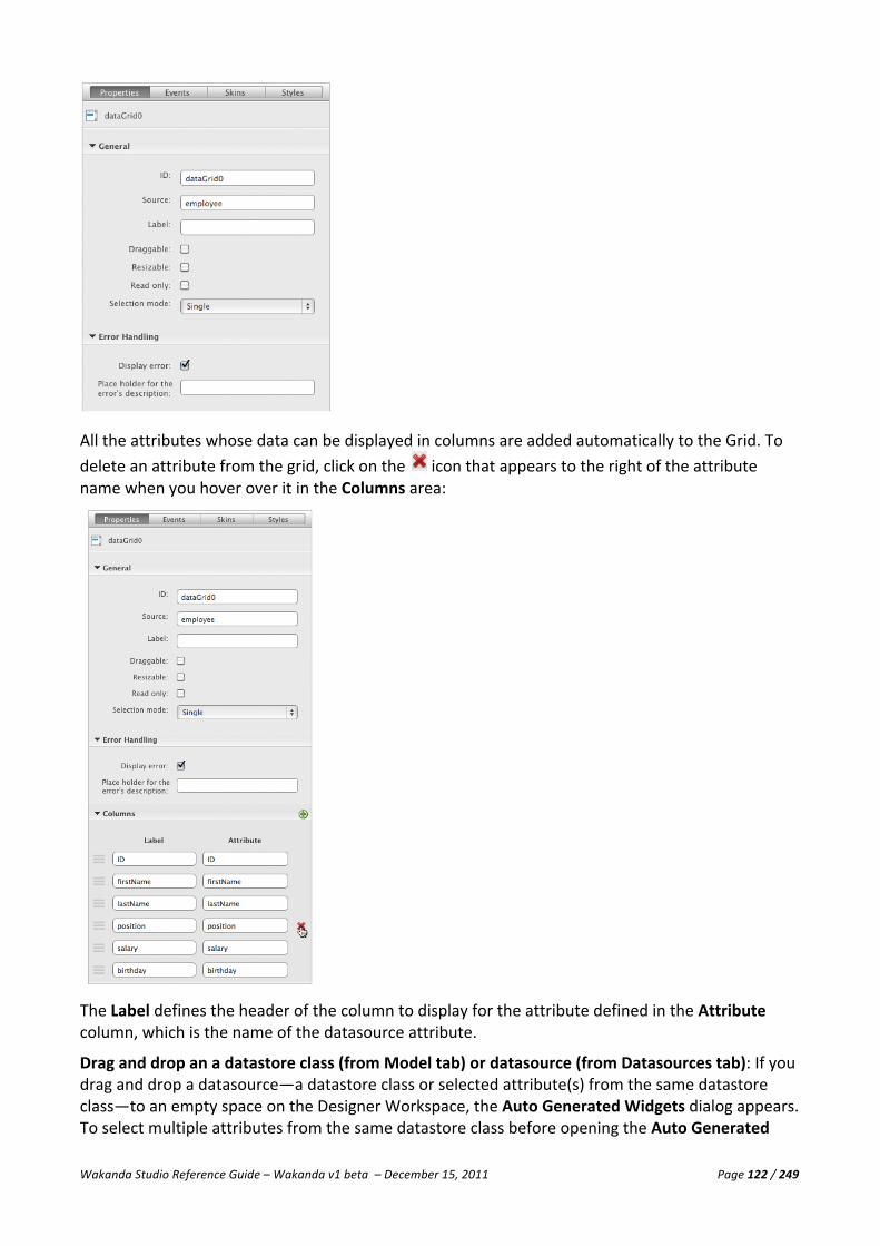
Wakanda Studio Reference Guide – Wakanda v1 beta – December 15, 2011 Page 122 / 249
All the attributes whose data can be displayed in columns are added automatically to the Grid. To delete an attribute from the grid, click on the icon that appears to the right of the attribute name when you hover over it in the Columns area:
The Label defines the header of the column to display for the attribute defined in the Attribute column, which is the name of the datasource attribute.
Drag and drop an a datastore class (from Model tab) or datasource (from Datasources tab): If you drag and drop a datasource—a datastore class or selected attribute(s) from the same datastore class—to an empty space on the Designer Workspace, the Auto Generated Widgets dialog appears. To select multiple attributes from the same datastore class before opening the Auto Generated

Wakanda Studio Reference Guide – Wakanda v1 beta – December 15, 2011 Page 123 / 249
Widgets dialog, Ctrl-‐click (Windows) or Command-‐click (Macintosh) each attribute before dragging and dropping them to an empty space in the Designer Workspace.
In the Auto Generated Widgets dialog, select the Grid radio button at the top, choose which attributes to include, and edit their labels (which will be the column headers).
From the Auto Generated Widgets dialog, you can add another attribute by clicking on the icon at the top. A new attribute is automatically added at the end of the list, which you can modify by selecting an attribute from the Attribute drop-‐down menu and by entering another label for it.
To change the order of the attributes, drag the icon next to the attribute above or below the other attributes. To delete an attribute from the Grid, click on the icon that appears to the right of the attribute when you hover over it.
Grid Properties The Grid widget has the following properties:

Wakanda Studio Reference Guide – Wakanda v1 beta – December 15, 2011 Page 124 / 249
• ID: Wakanda automatically generates this unique ID; however, you can modify it. It must begin with a letter and can contain letters, digits, hyphens, and underscores. This ID is equivalent to the ID in HTML and can be passed to JavaScript routines, such as getElementById. You can also include accented and non-‐Roman letters. For more information, please refer to the “Naming Conventions” section.
• Source: Name of the datasource. You can either enter the name of an existing datasource or assign it automatically by dragging and dropping the datasource onto the widget. If the datasource whose name you entered doesn’t exist, an array datasource will be created automatically.
• Label: Title displayed outside of the Grid. By default, it appears on top, but you can position it in the Styles tab. This property can be left empty to display the Grid without a title.
• Draggable: Selecting this checkbox allows your Grid to be draggable on the page when it is published.
• Resizable: Allow your users to resize the Grid when it is published to the Web. • Read only: Defines if the Grid is in read only mode. If you select this checkbox, the and
the buttons, which allow you to add and remove attributes from the Grid, in the footer are removed.
• Selection mode: Choose between Single (by default) selection mode and Multiple. To select multiple lines, hold down the Shift key.
Error Handling
In this section, you can define how errors are handled for the Grid:
• Display Error: By selecting this option, you signal to Wakanda that you want to display any error that occurs either in Wakanda's automatic error display window or in the widget whose ID you specify in the following property.
• Place holder for the error’s description: The Text, Container, or Display Error widget ID in which the error will be displayed.
Note: For more information, please refer to the “Error Handling” section in the “Widget Overview” chapter.
Columns Area
In the Columns area, you can add, modify, and delete attributes in the Grid as well as define a display format and width for each column in the Format and Width fields that appear when you click on a column:
Note: For more information on display formats, please refer to the “Display Formats” paragraph in the “Text Input” section.

Wakanda Studio Reference Guide – Wakanda v1 beta – December 15, 2011 Page 125 / 249
The Read only option allows you to make a column read only, which means that you cannot enter data into that column.
To change the order of the columns, drag the icon above or below one of the other columns listed.
Once the Grid is on your Interface page, you can also modify the width of the columns manually per column as shown below:
Note: You cannot include a relation attribute directly in the Grid; however, you can include a dynamic alias attribute by including the attribute as “{Relation Attribute}.{Attribute from other Datastore Class}”. In our example, for the “Employer” column we have inserted “employer.name” where “employer” is the relation attribute in the “Employee” datastore class and “name” is an attribute in the “Company” datastore class.
Grid Events In the Events tab, you can customize two events for the Grid:
• On Row Click: When the user clicks on a row in the Grid. • On Row Draw: When a row in the Grid is drawn. • On Error Handler: When an error occurs during data entry in the Grid. • On Header Click: When the user clicks on the header of the Grid
For more information about how to add, modify, and delete events, please refer to the “Widget Events” paragraph in the “Widget Overview” section.
Grid Skins In the Skins tab, you can define the theme and class for the widget. For more information, please refer to the “Widget Skins” paragraph in the “Widget Overview” section.

Wakanda Studio Reference Guide – Wakanda v1 beta – December 15, 2011 Page 126 / 249
Grid Styles The Styles tab allows you to set the styles of the entire widget as well as its components: header, header / cell, body, row, row / even, row / odd, cell, and footer as well as the header and body of the individual columns per attribute. You can select the widget or its components in the pop-‐up menu at the top:
Note: The styles selected for the different elements of the widget override the styles chosen for the widget.
You can modify the Grid widget’s following elements: container, cells, header, header / cells, rows / even, rows / odd, rows, body, footer, and label as well as the header and body columns for the attributes.
• Container: For the container, you can modify its Text, Background, Border, Drop Shadow, Size & Position, Label Text, Label Text Shadow, and Label Size & Position.
• Cells: For the cells of the Grid, you can modify: Text, Text Shadow, Background, and Border. • Header: For the header of the Grid, you can modify: Text, Text Shadow, Background, and Border. • Header/Cells: For the header/cells of the Grid, you can modify: Text, Text Shadow, Background, and
Border. • Rows/Even: For the focus state, you can modify: Text, Text Shadow, Background, and Border. • Rows/Odd: For the focus state, you can modify: Text, Text Shadow, Background, and Border. • Rows: For the rows of the Grid, you can modify the following styles for the default, hover, and active
states: Text, Text Shadow, Background, and Border. • Body: For the body, you can modify: Text, Text Shadow, Background, and Border. • Footer: For the footer, you can modify: Text, Text Shadow, Background, and Border. • Label: If a label has been specified, you can modify: Label Text, Label Text Shadow, and Label Text &
Size. • Header columns: For the header columns of each attribute, you can modify: Text and Background. • Body columns: For the header columns of each attribute, you can modify: Text and Background.
Note: You can also select a texture to affect the header and footer for all the Grids on the same Interface page. Refer to the “Texture” section in the “Interface Page” chapter.
Text
For more information about the Text section, please refer to the “Text” paragraph in the “Widget Overview” section.

Wakanda Studio Reference Guide – Wakanda v1 beta – December 15, 2011 Page 127 / 249
Text Shadow
For more information about the Text Shadow section, please refer to the “Text Shadow” paragraph in the “Widget Overview” section.
Background
For more information about the Background section, please refer to the “Background” paragraph in the “Widget Overview” section.
Border
For more information about the Border section, please refer to the “Border” paragraph in the “Widget Overview” section.
Drop Shadow
For more information about the Drop Shadow section, please refer to the “Drop Shadow” paragraph in the “Widget Overview” section.
Size & Position
For more information about the Size & Position section, please refer to the “Size & Position” paragraph in the “Widget Overview” section.
Label Text
For more information about the Label Text section, please refer to the “Label Text” paragraph in the “Widget Overview” section.
Label Text Shadow
For more information about the Label Text Shadow section, please refer to the “Label Text Shadow” paragraph in the “Widget Overview” section.
Label Size & Position
For more information about the Label Size & Position section, please refer to the “Label Size & Position” paragraph in the “Widget Overview” section.
Viewing the Source for a Grid In the source of your Interface page, you can view the corresponding HTML code for a Grid widget:
<div id="dataGrid1" data-‐type="dataGrid" data-‐selection-‐mode="multiple" data-‐lib="WAF" data-‐theme="metal inherited" class="waf-‐widget waf-‐dataGrid " data-‐label-‐position="top" datacolumn="[{'sourceAttID':'firstName','colID':'firstName','width':'150','title':'firstName'}, {'sourceAttID':'lastName','colID':'lastName','width':'150','title':'lastName'},{'sourceAttID':'telephone','colID':'telephone','width':'150','title':'telephone'},{'sourceAttID':'salary','colID':'salary','format':'%24%23%23%23%2C%23%230.00','title':'salary'}]" data-‐binding="employee" data-‐label="" data-‐readOnly="true"></div>

Wakanda Studio Reference Guide – Wakanda v1 beta – December 15, 2011 Page 128 / 249
Publishing a Grid Many automatic features are available when you publish your Grid:
• Column sorting: Clicking on the arrow in the column header allows you to sort the data in that column in ascending or descending order depending on the arrow.
• Add: Using the button at the bottom of the Grid allows you to add a new row (a new datastore entity) to your Grid. This button can be hidden if you select the Read only property for the Grid.
• Delete: The button allows you to delete the currently selected datastore entity. This button can be hidden if you select the Read only property for the Grid.
• Entity collection total: The number at the bottom of the Grid represents the number of entities displayed.
• Resizing columns: Users can resize the columns in the Grid. • Tabbable data entry: Users can tab to the next cell or Shift-‐tab to the previous cell of a Grid.
Data is saved automatically when you tab out of the field. • Draggable: When this option is selected in the Properties tab, users can drag the Grid along
with its title (if defined) anywhere on the page. • Resizable: If you select this option in the Properties tab, you allow users to resize the Grid.
For attributes of type Date, a button appears to the right allowing you to display the Calendar and select a date:

Wakanda Studio Reference Guide – Wakanda v1 beta – December 15, 2011 Page 129 / 249
Auto Form The Auto Form is a powerful tool that allows you to view each datastore entity in your datasource’s entity collection one by one. It allows you to navigate the entity collection by going to the previous and next datastore entity. You can also add a new datastore entity or search in the datasource as well as save or delete the current datastore entity. Below are the two ways the Auto Form can be displayed on your Interface page.
Designing an Auto Form Besides the standard ways of creating a widget in Wakanda, you can use one of the following two methods to create an Auto Form on your Interface page:
n Drag and drop (or draw) the Auto Form widget onto an empty space in the Designer Workspace.
n Drag and drop a datastore class or one or more attribute(s) in the same datastore class from the Model or Datasources area onto an empty area in the Designer Workspace and select Auto Form from the Auto Generated Widgets dialog.
Drag and drop (or Draw) an Auto Form: If you drag and drop, or draw, an Auto Form in the Designer Workspace, an empty Auto Form is created:
To attach a datasource to it, you can either drag and drop a datasource into the Auto Form or go to the Properties tab in the right panel and enter the name of an existing datasource in Source. If the datasource doesn’t exist, an array datasource will be created automatically with the name entered.
If you drag and drop a datasource onto the Auto Form, all the attributes of the datasource are added automatically. You can add or remove the attributes in the Properties tab.

Wakanda Studio Reference Guide – Wakanda v1 beta – December 15, 2011 Page 130 / 249
Otherwise you can enter the datasource name in the Source field. The Source field has an auto-‐complete feature, which displays the list of the datasources on your page corresponding to the first letters you typed.
A row for each attribute in the selected datasource appears in the Rows area of the Properties tab:
The Label is the header of the attribute displayed to the left of the data entry area in the Auto Form. The Attribute is the name of the attribute of your datasource.

Wakanda Studio Reference Guide – Wakanda v1 beta – December 15, 2011 Page 131 / 249
To delete an attribute from the Auto Form, click on the icon that appears to the right of the attribute when you hover over it.
Drag and drop a datastore class (from Model tab) or a datasource (from Datasources tab): If you drag and drop a datasource—a datastore class or one or more attribute(s) from the same datastore class—onto an open space in the Designer Workspace, the Auto Generated Widgets dialog appears. To select multiple attributes from the same datastore class before opening the Auto Generated Widgets dialog, Ctrl-‐click (Windows) or Command-‐click (Macintosh) each attribute before dragging and dropping them to an empty space in the Designer Workspace.
To create an Auto Form, select the Auto Form radio button at the top.
To add another attribute, click on the icon at the top of the dialog. A new attribute is automatically added at the end of the list, which you can modify by selecting an attribute from the Attribute name dropdown menu and entering another label for it.
To change the order of the attributes, drag the icon next to the attribute above or below the other attributes. To delete an attribute before creating the Auto Form, click on the icon that appears to the right of the attribute when you hover over it.
Even after you have created the Auto Form, you can modify the attributes (which ones and their order in the form) in the Properties tab.
Auto Form Properties The Auto Form widget has the following properties:
• ID: Wakanda automatically generates this unique ID; however, you can modify it. It must begin with a letter and can contain letters, digits, hyphens, and underscores. This ID is equivalent to the ID in HTML and can be used in JavaScript routines, such as getElementById. You can also include accented and non-‐Roman letters. For more information, please refer to the “Naming Conventions” section.
• Source: This is the name of the datasource used. You can either enter a datasource name or assign it automatically by dragging and dropping the datasource onto the widget.
• Draggable: Selecting this checkbox allows for your Auto Form to be draggable on the page when it is published.
• Resizable: To allow your users to resize the Auto Form, select this checkbox. • With included widgets: Selected by default, this option transforms the attributes in the
Auto Form to individual widgets. Otherwise, they are displayed in two columns (title and value).
• Allow to resize each widget: When the “With included widgets” option is selected, the individual widgets can be resized when the Interface page is published.
Wakanda Studio Reference Guide – Wakanda v1 beta – December 15, 2011 Page 132 / 249
Error Handling
In this section, you can define how errors are handled for the Auto Form:
• Display Error: By selecting this option, you signal to Wakanda that you want to display any error that occurs either in Wakanda's automatic error display window or in the widget whose ID you specify in the following property.
• Place holder for the error’s description: The Text, Container, or Display Error widget ID in which the error will be displayed.
Note: For more information, please refer to the “Error Handling” section in the “Widget Overview” chapter.
Rows Area
In the Rows area, you can add, modify, and delete the attribute displayed in the Auto Form.
To add another attribute, click on the icon at the top of the area. A new attribute is automatically added at the end of the list, which you can modify by selecting an attribute from the Attribute name dropdown menu and entering another label for it.
To change the order of the attributes, drag the icon next to the attribute above or below the other attributes. To delete an attribute, click on the icon that appears to the right of the attribute when you hover over it.
Auto Form Events You can write JavaScript code for the following event that occurs for an Auto Form:
• On Error Handler: When an error occurs during data entry in the Auto Form.
The Auto Form also has resize events that are triggered when it is resized:
• On Start Resize: This event is called when you begin resizing the Auto Form. • On Resize: This event occurs while you resize the Auto Form. • On Stop Resize: After you’ve stopped resizing the Auto Form.
For more information about how to add, modify, and delete events, please refer to the “Widget Events” paragraph in the “Widget Overview” section.
Auto Form Skins For more information, please refer to the “Widget Skins” paragraph in the “Widget Overview” section.

Wakanda Studio Reference Guide – Wakanda v1 beta – December 15, 2011 Page 133 / 249
Auto Form Styles The Styles tab allows you to set the style of the entire widget, the header, the body, or the footer of the Auto Form:
You can modify the styles for the widget’s following elements: Container, Header, Body, and Footer.
• Container: Modify the Text, Background, Border, Drop Shadow, and Size & Position settings. • Header: Modify the Text, Text Shadow, Background, and Border settings. • Body: Modify the Text, Text Shadow, and Background settings. • Footer: Modify the Text, Text Shadow, and Background settings.
Note: You can also select a texture to affect the header and footer for all the Auto Forms on the same Interface page. Refer to the “Texture” section in the “Interface Page” chapter.
Text
For more information about the Text section, please refer to the “Text” paragraph in the “Widget Overview” section.
Text Shadow
For more information about the Text Shadow section, please refer to the “Text Shadow” paragraph in the “Widget Overview” section.
Background
For more information about the Background section, please refer to the “Background” paragraph in the “Widget Overview” section.
Border
For more information about the Border section, please refer to the “Border” paragraph in the “Widget Overview” section.

Wakanda Studio Reference Guide – Wakanda v1 beta – December 15, 2011 Page 134 / 249
Drop Shadow
For more information about the Drop Shadow section, please refer to the “Drop Shadow” paragraph in the “Widget Overview” section.
Size & Position
For more information about the Size & Position section, please refer to the “Size & Position” paragraph in the “Widget Overview” section.
Viewing the Source for an Auto Form In the source of your Interface page, you can view the HTML code for an Auto Form:
<div id="autoForm0" data-‐type="autoForm" data-‐lib="WAF" data-‐theme="metal inherited" class="waf-‐widget waf-‐autoForm " data-‐binding="employee" data-‐columns="ID,firstName,lastName,position,salary,telephone,employer,married,employerName" data-‐column-‐attribute="ID,firstName,lastName,salary,employerName" data-‐column-‐name="ID,firstName,lastName,salary,employerName"></div>
Publishing an Auto Form Many automatic features are available when you publish your Auto Form:
• Previous: The left arrow allows you to go to the previous datastore entity in your entity collection.
• Next: The right arrow allows you to go to the next datastore entity in your entity collection. • Clear: The icon allows you to clear the values in the Auto Form without affecting the
current datastore entity. To create a new datastore entity, you must click on this button first before entering values into the Auto Form.
• Find: By clicking on the magnifying glass icon, you can search your datasource by attribute. • Save: Save a modified or new datastore entity. • Delete: Delete the current datastore entity displayed in the Auto Form. • Entity collection number/total: The number of the datastore entity in the entity collection
as well as the total number of entities in the entity collection is displayed in the lower right corner.
• Draggable: When this option is selected in the Properties tab, users can drag the Auto Form anywhere on the page.
• Resizable: If you select this option in the Properties tab, you allow users to resize the Auto Form.
If your Auto Form has a relation attribute in it, you can search for and assign the datastore entity to the relation attribute. For example, in our Employees Auto Form, we have the “employer” relation attribute:

Wakanda Studio Reference Guide – Wakanda v1 beta – December 15, 2011 Page 135 / 249
The included Auto Form has the following functionality:
• Clears the current values displayed and creates a new datastore entity by clicking the icon.
• Click the icon to search on one of the attributes to find a datastore entity. • Click the icon to assign the current datastore entity to the relation attribute.
If we have an Auto Form for the “Companies” datastore class with the relation attribute “Staff” included, it will appear as shown below:
In this case, you can add a new datastore entity by clicking the icon or delete a datastore entity by selecting it and clicking the icon.
For attributes of type Date, the Calendar appears automatically for you to select a date:
Query Form The Query Form is an automated form that allows users to search the entity collection of your datasource by the selected attributes.

Wakanda Studio Reference Guide – Wakanda v1 beta – December 15, 2011 Page 136 / 249
Designing a Query Form To create a Query Form on your Interface page, you can drag and drop the Query Form widget onto an empty space in the Designer Workspace, double-‐click on it, or draw it to a specific size directly on the Designer Workspace. When you do so, an empty Query Form is created:
If you drag and drop a datastore class on top of it, all the attributes are added automatically to the Query Form. You can subsequently add or remove attributes in the Properties tab. You can also select multiple attributes from the same datastore class by Ctrl-‐clicking (Windows) or Command-‐clicking (Macintosh) each attribute before dragging and dropping them onto the Query Form.
To assign a datasource name to the Query Form, you can enter it in the Source field of the Properties tab. The Source field has an auto-‐complete feature, which displays the list of the datasources on your page corresponding to the first letters you typed.
A row for each of the attributes in your datasource appear automatically in the Rows area of the Properties tab:

Wakanda Studio Reference Guide – Wakanda v1 beta – December 15, 2011 Page 137 / 249
You define the header of the attribute in the Query form, by specifying its Label. The Attribute field specifies the attribute in your datasource.
You can add a row by clicking the icon at the top of the Rows area. A new row that you can modify is automatically added to the end of the list. To delete a row, click on the icon that appears to the right of the attribute when you hover over it.
To change the order of the rows, drag the icon above or below one of the other rows.
Even after you have created the Query Form, you can modify the attributes (which ones to display and their order in the form) in the Rows area of the Properties tab.
Query Form Properties The Query Form widget has the following properties:
• ID: Wakanda automatically generates this unique ID; however, you can modify it. It must begin with a letter and can contain letters, digits, hyphens, and underscores. This ID is equivalent to the ID in HTML and can be used in JavaScript routines, such as getElementById. You can also include accented and non-‐Roman letters. For more information, please refer to the “Naming Conventions” section.
• Source: Name of the datasource. You can either enter the name of the datasource or assign it automatically by dragging and dropping the datasource onto the widget.
• Show operators: Select this option to show the standard search operators in a dropdown list.
• Draggable: Selecting this checkbox allows for your Query Form to be draggable on the page. • Resizable: To allow your users to resize the Query Form when it is published, check this
checkbox.
Query Form Events You can write JavaScript code for any of the following events that occur for a Query Form:
• On Start Resize: This event is called when you begin resizing the Query Form. • On Resize: This event occurs while you resize the Query Form. • On Stop Resize: After you’ve stopped resizing the Query Form.
For more information about how to add, modify, and delete events, please refer to the “Widget Events” paragraph in the “Widget Overview” section.
Query Form Skins For more information, please refer to the “Widget Skins” paragraph in the “Widget Overview” section.

Wakanda Studio Reference Guide – Wakanda v1 beta – December 15, 2011 Page 138 / 249
Query Form Styles The Styles tab allows you to set the styles of the Query Form:
The Query Form widget has the following styles: Text, Background, Border, Drop Shadow, and Size & Position.
Note: You can also select a texture to affect the header and footer for all the Query Forms on the same Interface page. Refer to the “Texture” section in the “Interface Page” chapter.
Text
For more information about the Text section, please refer to the “Text” paragraph in the “Widget Overview” section.
Background
For more information about the Background section, please refer to the “Background” paragraph in the “Widget Overview” section.
Border
For more information about the Border section, please refer to the “Border” paragraph in the “Widget Overview” section.
Drop Shadow
For more information about the Drop Shadow section, please refer to the “Drop Shadow” paragraph in the “Widget Overview” section.
Size & Position
For more information about the Size & Position section, please refer to the “Size & Position” paragraph in the “Widget Overview” section.
Viewing the Source for a Query Form In the source of your Interface page, you can view the HTML code for a Query Form:
<div id="queryForm1" data-‐type="queryForm" data-‐theme="metal inherited" data-‐lib="WAF" data-‐columns="ID,name,city,country " data-‐column-‐name="ID,name,city,country" data-‐column-‐attribute="ID,name,city,country" data-‐binding="company" class="waf-‐widget waf-‐queryForm "></div>

Wakanda Studio Reference Guide – Wakanda v1 beta – December 15, 2011 Page 139 / 249
Publishing a Query Form Many automatic features are available when you publish your Query Form:
• Auto-‐Complete: Once the user types in a few letters of a text field, a menu appears showing possible options for the query.
• Operators: Depending on the type of your attribute, a pre-‐defined list of operators is
displayed to simplify the query process, such as begins with, equals, not equals, greater than, greater than or equal to, less than, less than or equal to, contains, or contains keyword for attributes of type String.
• Clear: The icon allows you to clear the values entered in your Query Form. • Find: By clicking on the magnifying glass icon, you can search your datasource by the criteria
entered in the Query Form. The results can be displayed in another widget with the same datasource. The first datastore entity found is shown in the Query Form.
• Draggable: When this option is selected in the Properties tab, users can drag the Query Form anywhere on the page.
• Resizable: If you select this option in the Properties tab, you allow users to resize the Query Form.
• Entity collection number/total: In the lower right corner, the “0/0” will be updated after a query is performed to indicate the number of entities found as well as the first one displayed directly in the Query Form.
Button The Button widget allows you to include buttons on your Interface pages with automatic actions or your own code in JavaScript.
Creating a Button You create a button either by dragging and dropping it onto an empty space on the Designer Workspace, double-‐clicking on it, or drawing it to a specific size directly on the Interface page. You can assign a datasource to it (which is only necessary if you select one of the automatic actions like save, next, and previous) by dragging and dropping it on top of the widget. If you enter a datasource name that doesn’t exist, a Variable datasource will be created automatically with the same name.

Wakanda Studio Reference Guide – Wakanda v1 beta – December 15, 2011 Page 140 / 249
Button Properties Buttons have the following properties:
• ID: Wakanda automatically generates this unique ID; however, you can modify it. It must
begin with a letter and can contain letters, digits, hyphens, and underscores. This ID is equivalent to the ID in HTML and can be used in JavaScript routines, such as getElementById. You can also include accented and non-‐Roman letters. For more information, please refer to the “Naming Conventions” section.
• Source: Name of a datasource to be used with automatic events like create, save, next, previous, last and first. You can either enter the name of the datasource or assign it automatically by dragging and dropping the datasource onto the widget. It is not mandatory to define a source for a button.
• Text: The title of the button. This value can also be edited by double-‐clicking on the Button on the Designer Workspace. If you select an automatic action for a button, the name of that action will be used as the button’s title (if no text was previously entered in this field). You can still edit the value in this field.
• Action: Automated functions for the button, such as: create, simple, save, next, previous, last, and first. Select “Simple” when you want to write your own code. If you select an action, its name will be inserted by default as the label for the widget. For any of the automatic actions, you must specify a datasource.
• Link: Defines the URL to go to when included. You can include any type of link into the Link field, e.g., a URL (“http://www.wakanda.org/”), an email address (“mailto:[email protected]”), or an Interface page (“/employees.html”). You can drag and drop an Interface page onto the widget and it will be automatically inserted as the link.
• Target: Select “_blank” to open the URL defined in the “Link” property in a new page or “_self” to remain on the same page.
• Tabindex: Defines the tab order of the widget on the Interface page. When tabbing, you begin with the object with the lowest Tabindex and go to the highest.
Button Events You can write JavaScript code for any of the following mouse events that occur for a Button:
• On Click: The user clicks on the Button. • On Double Click: The user double-‐clicks the Button. • On Mouse Down: The user holds down the mouse button on the Button. • On Mouse Out: The user is no longer hovering over the cursor over the Button. • On Mouse Over: The user places the mouse cursor over the Button. • On Mouse Up: The user releases the mouse button after clicking on the Button.

Wakanda Studio Reference Guide – Wakanda v1 beta – December 15, 2011 Page 141 / 249
For more information about how to add, modify, and delete events, please refer to the “Widget Events” paragraph in the “Widget Overview” section.
Button Skins For more information, please refer to the “Widget Skins” paragraph in the “Widget Overview” section.
Button Styles You can customize the look of each Button by making changes in the Styles tab:
You can modify the Button widget’s following four states: Default, Hover, Active, and Focus.
• Default: The default state of the Button widget. You can modify its Text, Text Shadow, Background,
Border, Drop Shadow, Size & Position, and Images. • Hover: For the hover state, you can modify: Text, Text Shadow, Background, Border, and Drop
Shadow. • Active: For the active state, you can modify: Text, Text Shadow, Background, Border, and Drop
Shadow. • Focus: For the focus state, you can modify: Text, Text Shadow, Background, Border, and Drop
Shadow.

Wakanda Studio Reference Guide – Wakanda v1 beta – December 15, 2011 Page 142 / 249
Text
For more information about the Text section, please refer to the “Text” paragraph in the “Widget Overview” section.
Background
For more information about the Background section, please refer to the “Background” paragraph in the “Widget Overview” section.
Border
For more information about the Border section, please refer to the “Border” paragraph in the “Widget Overview” section.
Drop Shadow
For more information about the Drop Shadow section, please refer to the “Drop Shadow” paragraph in the “Widget Overview” section.
Inner Shadow
For more information about the Inner Shadow section, please refer to the “Inner Shadow” paragraph in the “Widget Overview” section.
Size & Position
For more information about the Size & Position section, please refer to the “Size & Position” paragraph in the “Widget Overview” section.
Images
You can choose an image for the four states of the Button (Default, Over, Active, and Disabled) by clicking on the green arrow and selecting an image in your project’s WebFolder.
You can attach an image by clicking the icon, which presents a dialog from which to choose an image in your WebFolder’s images folder. You can also drag an image file from the Explorer area or from anywhere on your computer and drop it on top of the Image field. In this last case, the image will be copied into your WebFolder’s images folder.
You can also include one of the images from the Media Library by dragging it and dropping it on top of the widget.
However, if you want any of the images to be the same as the Default image, click on the Same as default checkbox above the state.
To delete the reference to the image, click on the icon next to the image path.

Wakanda Studio Reference Guide – Wakanda v1 beta – December 15, 2011 Page 143 / 249
Viewing the Source for a Button In the source of your Interface page, you can view the HTML code for a Button:
<button id="button1" data-‐type="button" data-‐theme="metal inherited" data-‐lib="WAF" data-‐binding="companies" data-‐action="next" class="waf-‐widget waf-‐button " data-‐text="next"></button>
Publishing a Button The Button widget appears as it does on the Designer Workspace; however, its behavior is dependent on the actions you selected or defined in the Events and Properties tabs for the Button.
Checkbox The Checkbox widget allows you to create a checkbox on your Interface page.
Creating a Checkbox You create a Checkbox either by dragging and dropping it in an empty space on the Designer Workspace, double-‐clicking on it, or drawing it to the size you want directly on the Designer Workspace. You can assign the datasource (for example, an attribute of type Boolean) by dragging and dropping it on top of the widget. When you do so, the label field inserted automatically becomes the name of the datasource. If you enter a datasource name that doesn’t exist, a Variable datasource will be created automatically with the same name.
Checkbox Properties Checkboxes have the following properties:
• ID: Wakanda automatically generates this unique ID; however, you can modify it. It must
begin with a letter and can contain letters, digits, hyphens, and underscores. This ID is equivalent to the ID in HTML and can be used in JavaScript routines, such as getElementById. You can also include accented and non-‐Roman letters. For more information, please refer to the “Naming Conventions” section.
• Source: Name of a datasource, like a Boolean attribute. You can either enter the name of the datasource or assign it automatically by dragging and dropping the datasource onto the widget.
• Display Error: When you include the ID of a Display Error widget, a message for an error that occurred with the Checkbox widget will be displayed in that Display Error widget.

Wakanda Studio Reference Guide – Wakanda v1 beta – December 15, 2011 Page 144 / 249
• Checked: Defines if the checkbox is checked by default. • Label: The checkbox label. • Tabindex: Defines the tab order of the widget on the Interface page. When tabbing, you
begin with the object with the lowest Tabindex and go to the highest.
Checkbox Events You can write JavaScript code for any of the following focus and mouse events that occur for a Checkbox:
• On Blur: When the Checkbox loses focus. • On Change: When the value of the Checkbox is changed. • On Focus: When the Checkbox gets the focus. • On Click: When the Checkbox is clicked. • On Mouse Down: If the user holds the mouse button down on the Checkbox. • On Mouse Move: When the user moves the mouse in the Checkbox widget. • On Mouse Out: Once the user is no longer hovering over the Checkbox. • On Mouse Over: If the user places the mouse button over the Checkbox. • On Mouse Up: Once the user lets go of the mouse button after clicking on the Checkbox.
For more information about how to add, modify, and delete events, please refer to the “Widget Events” paragraph in the “Widget Overview” section.
Checkbox Skins For more information, please refer to the “Widget Skins” paragraph in the “Widget Overview” section.
Checkbox Styles The styles proposed for a Checkbox can be found on the Styles tab:
The Checkbox widget is made up of three elements: Container, Box, and Label.
• Container: The entire Checkbox widget. You can modify its Background and Size & Position. • Box: The actual checkbox portion of the widget. For this element, you can also customize its
different states: default, hover, active, and selected. For all four states, you can modify the Background, Border, and Icon.
• Label: If a label has been specified, you can modify: Label Text, Label Text Shadow, and Label Text & Size.

Wakanda Studio Reference Guide – Wakanda v1 beta – December 15, 2011 Page 145 / 249
Background
For more information about the Background section, please refer to the “Background” paragraph in the “Widget Overview” section.
Border
For more information about the Border section, please refer to the “Border” paragraph in the “Widget Overview” section.
Drop Shadow
For more information about the Drop Shadow section, please refer to the “Drop Shadow” paragraph in the “Widget Overview” section.
Size & Position
For more information about the Size & Position section, please refer to the “Size & Position” paragraph in the “Widget Overview” section.
Label Text
For more information about the Label Text section, please refer to the “Label Text” paragraph in the “Widget Overview” section.
Label Text Shadow
For more information about the Label Text Shadow section, please refer to the “Label Text Shadow” paragraph in the “Widget Overview” section.
Label Size & Position
For more information about the Label Size & Position section, please refer to the “Label Size & Position” paragraph in the “Widget Overview” section.
Viewing the Source for a Checkbox In the source of your Interface page, you can view the HTML code for a Checkbox:
<input id="checkbox1" data-‐type="checkbox" data-‐lib="WAF" type="checkbox" class="waf-‐widget waf-‐checkbox " data-‐label="married" data-‐label-‐position="right" data-‐binding="employee.married"/>
Publishing a Checkbox The Checkbox widget appears as it does on the Designer Workspace; however, its behavior is dependent on the actions you selected or defined in the Events and Properties tabs for the Checkbox.
When a Checkbox is bound to a Boolean or byte attribute, its value is automatically saved with the datastore entity.
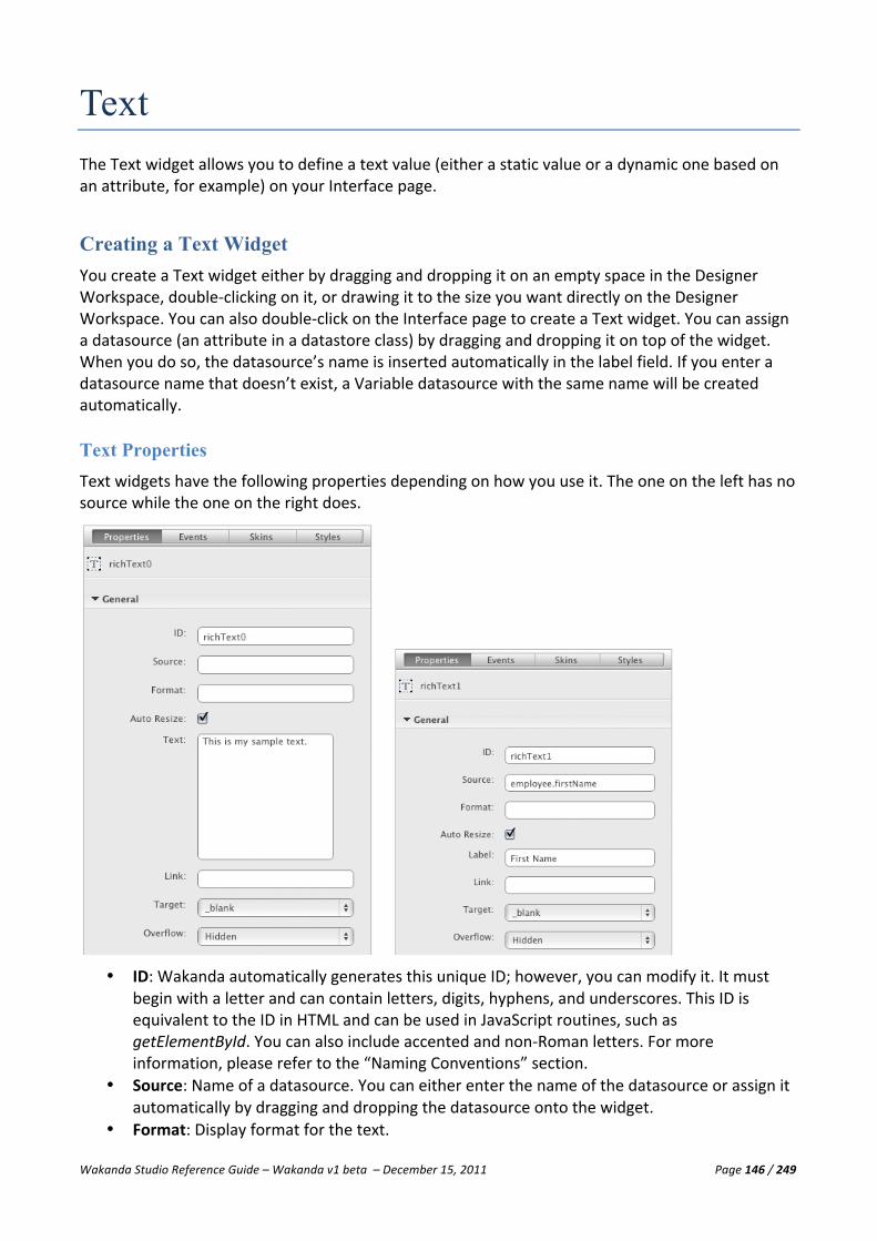
Wakanda Studio Reference Guide – Wakanda v1 beta – December 15, 2011 Page 146 / 249
Text The Text widget allows you to define a text value (either a static value or a dynamic one based on an attribute, for example) on your Interface page.
Creating a Text Widget You create a Text widget either by dragging and dropping it on an empty space in the Designer Workspace, double-‐clicking on it, or drawing it to the size you want directly on the Designer Workspace. You can also double-‐click on the Interface page to create a Text widget. You can assign a datasource (an attribute in a datastore class) by dragging and dropping it on top of the widget. When you do so, the datasource’s name is inserted automatically in the label field. If you enter a datasource name that doesn’t exist, a Variable datasource with the same name will be created automatically.
Text Properties Text widgets have the following properties depending on how you use it. The one on the left has no source while the one on the right does.
• ID: Wakanda automatically generates this unique ID; however, you can modify it. It must
begin with a letter and can contain letters, digits, hyphens, and underscores. This ID is equivalent to the ID in HTML and can be used in JavaScript routines, such as getElementById. You can also include accented and non-‐Roman letters. For more information, please refer to the “Naming Conventions” section.
• Source: Name of a datasource. You can either enter the name of the datasource or assign it automatically by dragging and dropping the datasource onto the widget.
• Format: Display format for the text.

Wakanda Studio Reference Guide – Wakanda v1 beta – December 15, 2011 Page 147 / 249
Note: For more information on display formats, please refer to the “Display Formats” paragraph in the “Text Input” section.
• Auto Resize: Resizes the Text widget automatically based on the text displayed. • Text: The static text to include in the Text widget if Source is not specified. You can also
enter a value here by double-‐clicking on the Text widget on the Designer Workspace. • Link: Defines the URL to go to when included. You can include any type of link into the Link
field, e.g., a URL (“http://www.wakanda.org/”), an email address (“mailto:[email protected]”), or an Interface page (“/employees.html”). You can drag and drop an Interface page onto the widget and it will be automatically inserted as the link.
• Target: Select “_blank” to open the URL defined in the “Link” property in a new page or “_self” to remain on the same page.
• Label: Add a label to the Text widget. This property only appears if you have defined a Source instead of a value in the Text field.
• Scrollbar: Define where scrollbars will be displayed in Text field when the text overflows the widget’s area defined on the Interface Page. The scrollbars will, when necessary, either be hidden or displayed horizontally, vertically, or both (horizontally and vertically) depending on the option you choose. For this option to work, the Auto Resize option must be unchecked.
Text Events A Text widget has the On Click event that occurs when a user clicks on the Text widget.
For more information about how to add, modify, and delete events, please refer to the “Widget Events” paragraph in the “Widget Overview” section.
Text Skins For more information, please refer to the “Widget Skins” paragraph in the “Widget Overview” section.
Text Styles The styles proposed for a Text widget can be found on the Styles tab:

Wakanda Studio Reference Guide – Wakanda v1 beta – December 15, 2011 Page 148 / 249
The Text widget is made up of two elements: Container and Label (only if a label has been specified for the widget).
• Container: The entire Text widget. You can modify its Text, Text Shadow, Background, Border, Drop
Shadow, Inner Shadow, and Size & Position. • Label: If a label has been specified, you can modify: Label Text, Label Text Shadow, and Label Size &
Position.
Text
For more information about the Text section, please refer to the “Text” paragraph in the “Widget Overview” section.
Text Shadow
For more information about the Text Shadow section, please refer to the “Text Shadow” paragraph in the “Widget Overview” section.
Background
For more information about the Background section, please refer to the “Background” paragraph in the “Widget Overview” section.
Border
For more information about the Border section, please refer to the “Border” paragraph in the “Widget Overview” section.
Drop Shadow
For more information about the Drop Shadow section, please refer to the “Drop Shadow” paragraph in the “Widget Overview” section.
Inner Shadow
For more information about the Inner Shadow section, please refer to the “Inner Shadow” paragraph in the “Widget Overview” section.
Size & Position
For more information about the Size & Position section, please refer to the “Size & Position” paragraph in the “Widget Overview” section.

Wakanda Studio Reference Guide – Wakanda v1 beta – December 15, 2011 Page 149 / 249
Viewing the Source for a Text Widget In the source of your Interface page, you can view the HTML code for the two variations of the Text widget:
<div id="richText0" data-‐type="richText" data-‐lib="WAF" class="waf-‐widget waf-‐richText " data-‐autoWidth="true" data-‐label-‐position="left" data-‐theme="metal inherited" data-‐label="">This is my sample text to display.</div> <div id="richText1" data-‐type="richText" data-‐lib="WAF" class="waf-‐widget waf-‐richText " data-‐autoWidth="true" data-‐label-‐position="left" data-‐theme="metal inherited" data-‐binding="companies.name" data-‐label="name"></div<label id="label5" data-‐type="label" data-‐lib="WAF" data-‐linked="richText1" data-‐theme="metal inherited" class="waf-‐widget waf-‐label">name</label>
Publishing a Text Widget The Text widget appears as it does on the Designer Workspace unless you assign a datasource (i.e., an attribute) that changes the text displayed depending on the current datastore entity.
Display Error The Display Error widget allows you to display any errors returned by Wakanda on your Interface page for certain widgets, like Checkbox, Slider, and Text Input widgets.
Creating a Display Error You create a Display Error widget either by dragging and dropping it in an empty space on the Designer Workspace, double-‐clicking on it, or drawing it to the size you want directly on the Designer Workspace. The Display Error’s ID is what you enter in the Display Error field on the Properties tab for the Checkbox, Slider, and Text Input widgets to tell Wakanda to display any errors that occur in that Display Error widget.
Display Error Properties This widget doesn’t have any properties.
Display Error Events This widget doesn’t have any events.
Display Error Skins For more information, please refer to the “Widget Skins” paragraph in the “Widget Overview” section.
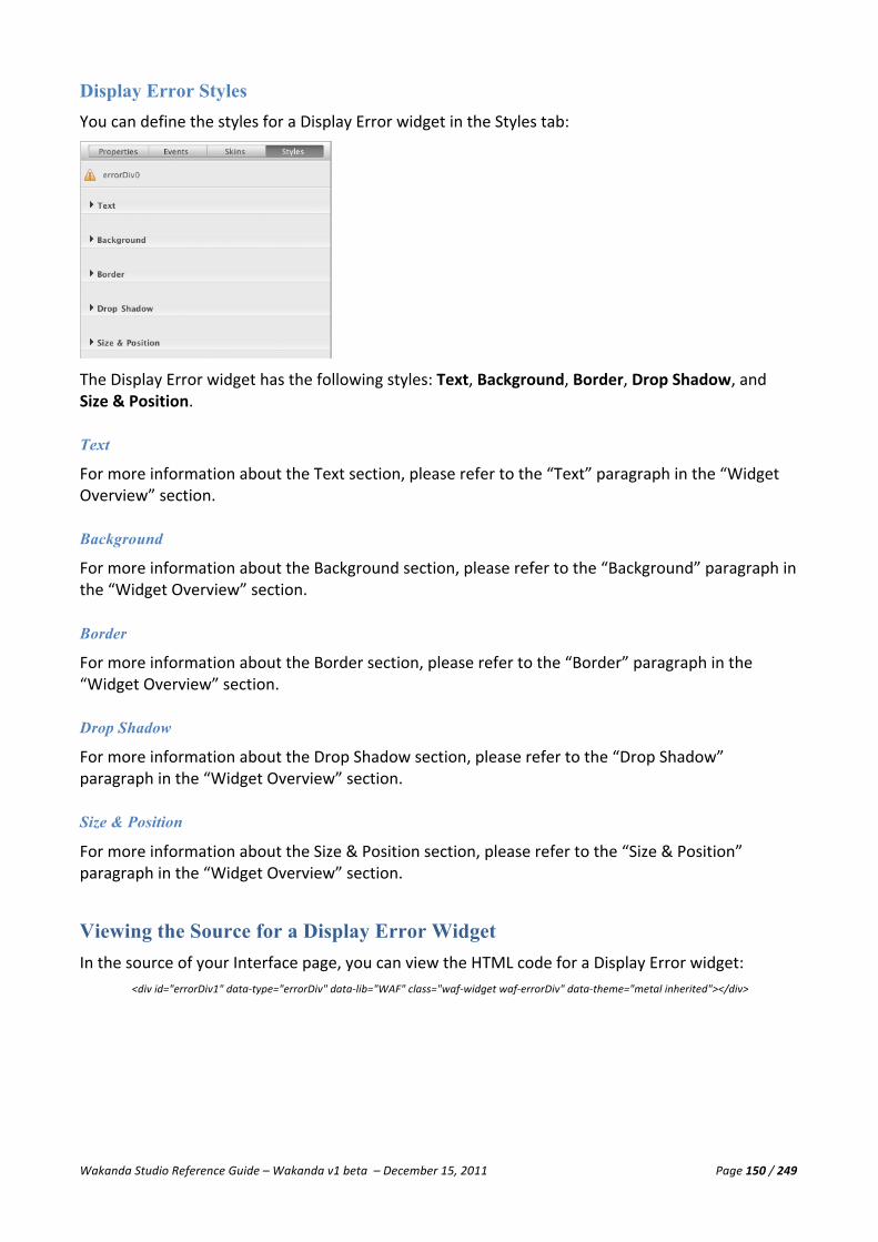
Wakanda Studio Reference Guide – Wakanda v1 beta – December 15, 2011 Page 150 / 249
Display Error Styles You can define the styles for a Display Error widget in the Styles tab:
The Display Error widget has the following styles: Text, Background, Border, Drop Shadow, and Size & Position.
Text
For more information about the Text section, please refer to the “Text” paragraph in the “Widget Overview” section.
Background
For more information about the Background section, please refer to the “Background” paragraph in the “Widget Overview” section.
Border
For more information about the Border section, please refer to the “Border” paragraph in the “Widget Overview” section.
Drop Shadow
For more information about the Drop Shadow section, please refer to the “Drop Shadow” paragraph in the “Widget Overview” section.
Size & Position
For more information about the Size & Position section, please refer to the “Size & Position” paragraph in the “Widget Overview” section.
Viewing the Source for a Display Error Widget In the source of your Interface page, you can view the HTML code for a Display Error widget:
<div id="errorDiv1" data-‐type="errorDiv" data-‐lib="WAF" class="waf-‐widget waf-‐errorDiv" data-‐theme="metal inherited"></div>

Wakanda Studio Reference Guide – Wakanda v1 beta – December 15, 2011 Page 151 / 249
Publishing a Display Error You can place the Display Error widget on the Designer Workspace to show any errors that may occur.
Radio Button Group The Radio Button Group widget allows you to create a set of one or more radio buttons to display on your Interface page.
Creating a Radio Button Group You create a Radio Button Group widget either by dragging and dropping it in an empty space on the Designer Workspace, double-‐clicking on it, or drawing it to the size you want directly on the Designer Workspace.
This widget can be used in two different ways: bound to a datasource (datastore class or array) or defined by a set of fixed values. You can assign a datasource (an attribute in a datastore class) by dragging and dropping it on top of the widget. When you do so, the datasource name is inserted automatically in the label field and its attributes are added to the Radio Button Group widget.
Binding a Datasource to the Radio Button Group In the Properties tab, you can define how to bind a datasource to the Radio Button Group widget. In our example, we have a datastore class “department,” which we defined as the Source In. For the Source Out, we included an attribute in the “Employee” datastore. We included “employee.department.” We selected “name” from the “Department” datastore class as the Key. To automatically update the attribute in the datasource, we select the Auto Dispatch checkbox.

Wakanda Studio Reference Guide – Wakanda v1 beta – December 15, 2011 Page 152 / 249
Defining the Values of a Radio Button Group When you set the values for a Radio Button Group widget, you set its values in the Properties tab without entering anything in the Source In field:
In our example, we defined the Source Out field so that the value is automatically inserted into the “company.city” attribute.
Radio Button Group Properties The Radio Button Group widget has the following properties by default (see the screenshots above):
• ID: Wakanda automatically generates this unique ID; however, you can modify it. It must begin with a letter and can contain letters, digits, hyphens, and underscores. This ID is equivalent to the ID in HTML and can be used in JavaScript routines, such as

Wakanda Studio Reference Guide – Wakanda v1 beta – December 15, 2011 Page 153 / 249
getElementById. You can also include accented and non-‐Roman letters. For more information, please refer to the “Naming Conventions” section.
• Source In: Name of the datasource (datastore class or array). You can either enter the name of the datasource or assign it automatically by dragging and dropping the datasource onto the widget.
• Source Out: Name of the attribute to receive the selected value of the widget. You can either enter the name of the datasource or assign it automatically by dragging and dropping the datasource onto the widget.
• Display: Display the radio buttons in a list (vertical) or one after the other like text (horizontal).
• Key: The attribute from the datasource defined in Source In to be returned. You can select either an attribute or a datastore entity by selecting the datastore class name from the list. This property only appears if you have a value in Source In.
• Format: Display format for the data in the Radio Button Group widget. Note: For more information on display formats, please refer to the “Display Formats” paragraph in the “Text Input” section.
• Label: The title of the Radio Button Group widget. • Auto Dispatch: When checked, Wakanda automatically sends the query to modify the entity
collection. • Tabindex: Defines the tab order of the widget on the Interface page. When tabbing, you
begin with the object with the lowest Tabindex and go to the highest.
Radio Button Group Events You can execute code during the following focus and mouse events for the Radio Button Group widget:
• On Blur: When the Radio Button Group widget loses focus. • On Change: When the value of the Radio Button Group widget has changed. • On Focus: When the Radio Button Group widget gets the focus. • On Click: Once the Radio Button Group widget has been clicked. • On Mouse Down: If the user holds the mouse down on the Radio Button Group widget. • On Mouse Move: When the user moves the mouse in the Radio Button Group widget. • On Mouse Out: Once the user is no longer hovering over the Radio Button Group widget. • On Mouse Over: If the user places the mouse over the Radio Button Group widget. • On Mouse Up: Once the user lets go of the mouse after clicking on the Radio Button Group
widget.
For more information about how to add, modify, and delete events, please refer to the “Widget Events” paragraph in the “Widget Overview” section.
Radio Button Group Skins For more information, please refer to the “Widget Skins” paragraph in the “Widget Overview” section.
Radio Button Group Styles The styles proposed for a Radio Button Group widget can be found on the Styles tab:

Wakanda Studio Reference Guide – Wakanda v1 beta – December 15, 2011 Page 154 / 249
You can modify the styles for the widget’s following elements: Container, Box, and Label.
• Container: Modify the Text, Text Shadow, Background, Border, Drop Shadow, Inner Shadow and Size
& Position settings. • Box: Modify the Background, Border, and Icon settings for the default, hover, active, and selected
states for this widget. • Label: If a label has been specified, you can modify: Label Text, Label Text Shadow, and Label Size &
Position.
Text
For more information about the Text section, please refer to the “Text” paragraph in the “Widget Overview” section.
Text Shadow
For more information about the Text Shadow section, please refer to the “Text Shadow” paragraph in the “Widget Overview” section.
Background
For more information about the Background section, please refer to the “Background” paragraph in the “Widget Overview” section.
Border
For more information about the Border section, please refer to the “Border” paragraph in the “Widget Overview” section.
Drop Shadow
For more information about the Drop Shadow section, please refer to the “Drop Shadow” paragraph in the “Widget Overview” section.

Wakanda Studio Reference Guide – Wakanda v1 beta – December 15, 2011 Page 155 / 249
Inner Shadow
For more information about the Inner Shadow section, please refer to the “Inner Shadow” paragraph in the “Widget Overview” section.
Size & Position
For more information about the Size & Position section, please refer to the “Size & Position” paragraph in the “Widget Overview” section.
Label Text
For more information about the Label Text section, please refer to the “Label Text” paragraph in the “Widget Overview” section.
Label Text Shadow
For more information about the Label Text Shadow section, please refer to the “Label Text Shadow” paragraph in the “Widget Overview” section.
Label Size & Position
For more information about the Label Size & Position section, please refer to the “Label Size & Position” paragraph in the “Widget Overview” section.
Viewing the Source for a Radio Button Group Widget In the source of your Interface page, you can view the HTML code for a Radio Button Group widget:
<ul id="radioGroup0" data-‐type="radioGroup" data-‐lib="WAF" class="waf-‐widget waf-‐radioGroup default inherited" data-‐display="vertical" data-‐label="City" data-‐label-‐position="left" data-‐autoDispatch="true" data-‐binding-‐out="company.city"><li><input type="radio" value="New York" name="radioGroup0" id="radioGroup0-‐0"/><label for="radioGroup0-‐0">New York</label></li><li><input type="radio" value="Paris" name="radioGroup0" id="radioGroup0-‐1"/><label for="radioGroup0-‐1">Paris</label></li><li><input type="radio" value="Sydney" name="radioGroup0" id="radioGroup0-‐2"/><label for="radioGroup0-‐2">Sydney</label></li><li><input type="radio" value="Hong Kong" name="radioGroup0" id="radioGroup0-‐3"/><label for="radioGroup0-‐3">Hong Kong</label></li></ul>
<ul id="radioGroup1" data-‐type="radioGroup" data-‐lib="WAF" class="waf-‐widget waf-‐radioGroup default inherited" data-‐display="vertical" data-‐label="Department" data-‐label-‐position="left" data-‐autoDispatch="true" data-‐binding="department" data-‐binding-‐options="[name] " data-‐binding-‐key="ID" data-‐binding-‐out="employee.department"><li><input type="radio" value="name" radioGroup1="radioGroup1-‐0"/><label for="radioGroup1-‐0">[name] </label></li></ul>
Menu Bar The Menu Bar widget allows you to display a menu bar with multiple menu items (as well as hierarchical menu items attached to the menu items) on your Interface pages:

Wakanda Studio Reference Guide – Wakanda v1 beta – December 15, 2011 Page 156 / 249
Creating a Menu Bar You create a Menu Bar widget either by dragging and dropping it in an empty space on the Designer Workspace, double-‐clicking on it, or drawing it to the size you want directly on the Designer Workspace.
When you create a new, it is made up of two distinct widgets:
• Menu Bar: The actual menu bar itself. • Menu Item: One widget per menu item in the Menu Bar widget.
You can create a hierarchical menu by adding multiple menu items to a Menu Bar or Menu Item widget.
Menu Bar Properties Menu Bar widget has the following properties:
• ID: Wakanda automatically generates this unique ID; however, you can modify it. It must
begin with a letter and can contain letters, digits, hyphens, and underscores. This ID is equivalent to the ID in HTML and can be used in JavaScript routines, such as getElementById. You can also include accented and non-‐Roman letters. For more information, please refer to the “Naming Conventions” section.
• Display: Menu bars can be displayed horizontally (by default) or vertically. Choose “Horizontal” or “Vertical” from this dropdown menu.
• Show Submenus: If you have defined submenus for your Menu Bar, you can select “on mouse over” to show them when the user hovers over the menu bar item or “on mouse click” to show them when the user clicks on the menu bar item.
Menu Items
In the Menu Items section of the Properties tab, you can add menu items to your Menu Bar widget by clicking on the icon. You can also add menu items (i.e., submenu items) to a Menu Item by going to the Properties tab for the Menu Item widget and clicking the icon in the “Menu Items” section.

Wakanda Studio Reference Guide – Wakanda v1 beta – December 15, 2011 Page 157 / 249
You can also click on the icon, which is located at the end of the Menu Bar widget, to create new menu items:
Note: The ability to add a new menu item with the icon is only available in the development branch for Wakanda.
To edit the menu item, either click the icon or double-‐click the menu item in the Menu Bar widget.
To change the order of the menu items, drag the icon above or below the other menu items listed.
To delete a menu item, click on the icon that appears when you hover over the menu item.
Menu Bar Events You can execute code during the following focus and mouse events for the Menu Bar widget:
• On Click: Once the Menu Bar widget has been clicked. • On Mouse Down: If the user holds the mouse down on the Menu Bar widget. • On Mouse Move: When the user moves the mouse in the Menu Bar widget. • On Mouse Out: Once the user is no longer hovering over the Menu Bar widget. • On Mouse Over: If the user places the mouse over the Menu Bar widget. • On Mouse Up: Once the user lets go of the mouse after clicking on the Menu Bar widget.
For more information about how to add, modify, and delete events, please refer to the “Widget Events” paragraph in the “Widget Overview” section.
Menu Bar Skins For more information, please refer to the “Widget Skins” paragraph in the “Widget Overview” section.
Menu Bar Styles The styles proposed for a Menu Bar widget can be found on the Styles tab:
The Menu Bar widget has the following styles: Text, Background, Border, Drop Shadow, and Size & Position.
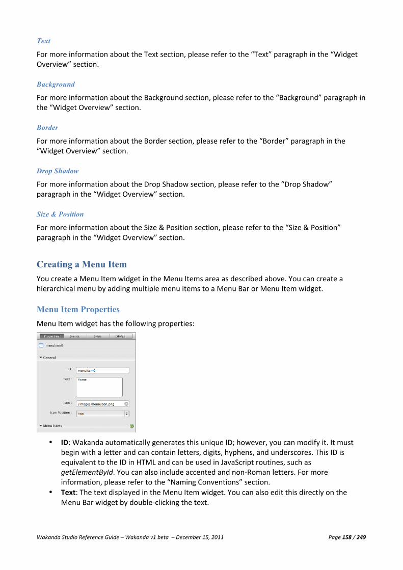
Wakanda Studio Reference Guide – Wakanda v1 beta – December 15, 2011 Page 158 / 249
Text
For more information about the Text section, please refer to the “Text” paragraph in the “Widget Overview” section.
Background
For more information about the Background section, please refer to the “Background” paragraph in the “Widget Overview” section.
Border
For more information about the Border section, please refer to the “Border” paragraph in the “Widget Overview” section.
Drop Shadow
For more information about the Drop Shadow section, please refer to the “Drop Shadow” paragraph in the “Widget Overview” section.
Size & Position
For more information about the Size & Position section, please refer to the “Size & Position” paragraph in the “Widget Overview” section.
Creating a Menu Item You create a Menu Item widget in the Menu Items area as described above. You can create a hierarchical menu by adding multiple menu items to a Menu Bar or Menu Item widget.
Menu Item Properties Menu Item widget has the following properties:
• ID: Wakanda automatically generates this unique ID; however, you can modify it. It must
begin with a letter and can contain letters, digits, hyphens, and underscores. This ID is equivalent to the ID in HTML and can be used in JavaScript routines, such as getElementById. You can also include accented and non-‐Roman letters. For more information, please refer to the “Naming Conventions” section.
• Text: The text displayed in the Menu Item widget. You can also edit this directly on the Menu Bar widget by double-‐clicking the text.
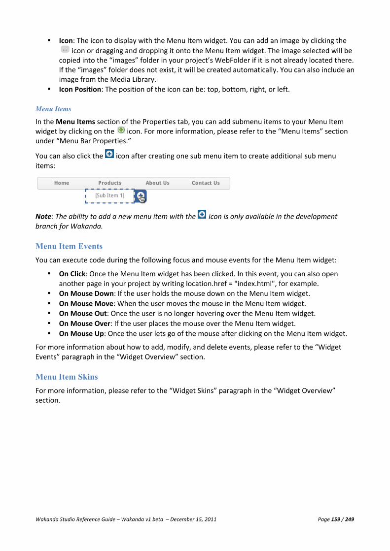
Wakanda Studio Reference Guide – Wakanda v1 beta – December 15, 2011 Page 159 / 249
• Icon: The icon to display with the Menu Item widget. You can add an image by clicking the icon or dragging and dropping it onto the Menu Item widget. The image selected will be
copied into the “images” folder in your project’s WebFolder if it is not already located there. If the “images” folder does not exist, it will be created automatically. You can also include an image from the Media Library.
• Icon Position: The position of the icon can be: top, bottom, right, or left.
Menu Items
In the Menu Items section of the Properties tab, you can add submenu items to your Menu Item widget by clicking on the icon. For more information, please refer to the “Menu Items” section under “Menu Bar Properties.”
You can also click the icon after creating one sub menu item to create additional sub menu items:
Note: The ability to add a new menu item with the icon is only available in the development branch for Wakanda.
Menu Item Events You can execute code during the following focus and mouse events for the Menu Item widget:
• On Click: Once the Menu Item widget has been clicked. In this event, you can also open another page in your project by writing location.href = "index.html", for example.
• On Mouse Down: If the user holds the mouse down on the Menu Item widget. • On Mouse Move: When the user moves the mouse in the Menu Item widget. • On Mouse Out: Once the user is no longer hovering over the Menu Item widget. • On Mouse Over: If the user places the mouse over the Menu Item widget. • On Mouse Up: Once the user lets go of the mouse after clicking on the Menu Item widget.
For more information about how to add, modify, and delete events, please refer to the “Widget Events” paragraph in the “Widget Overview” section.
Menu Item Skins For more information, please refer to the “Widget Skins” paragraph in the “Widget Overview” section.

Wakanda Studio Reference Guide – Wakanda v1 beta – December 15, 2011 Page 160 / 249
Menu Item Styles The styles proposed for a Menu Item widget can be found on the Styles tab:
You can modify the styles for the widget’s following states: Default, Hover, and Active.
• Default: The default state of the Menu Item widget. You can modify its Text, Text Shadow,
Background, Border, Inner Shadow, and Size. • Hover: For the hover state, you can modify: Text, Text Shadow, Background, and Border. • Active: For the active state, you can modify: Text, Text Shadow, Background, and Border.
Text
For more information about the Text section, please refer to the “Text” paragraph in the “Widget Overview” section.
Text Shadow
For more information about the Text Shadow section, please refer to the “Text Shadow” paragraph in the “Widget Overview” section.
Background
For more information about the Background section, please refer to the “Background” paragraph in the “Widget Overview” section.
Border
For more information about the Border section, please refer to the “Border” paragraph in the “Widget Overview” section.
Inner Shadow
For more information about the Inner Shadow section, please refer to the “Inner Shadow” paragraph in the “Widget Overview” section.

Wakanda Studio Reference Guide – Wakanda v1 beta – December 15, 2011 Page 161 / 249
Size
The Width field allows you to define the width and the Height field allows you to define the height of the Menu Item widget. If the selected Menu Item widget is a horizontal submenu item, you can define the height and width. If it is a vertical submenu item, you can only define the height.
Viewing the Source for a Menu Bar Widget In the source of your Interface page, you can view the HTML code for a Menu Bar widget containing Menu Item widgets:
<ul id="menuBar1" data-‐type="menuBar" data-‐lib="WAF" class="waf-‐widget waf-‐menuBar " data-‐display="horizontal" data-‐subMenuShow="hover" data-‐theme="metal inherited"><li id="menuItem1" data-‐type="menuItem" data-‐lib="WAF" class="waf-‐widget waf-‐menuItem " data-‐theme="metal inherited"><p class="waf-‐menuItem-‐text waf-‐menuItem-‐icon-‐left"><img src="/images/homeicon.png"/><span> Home</span></p><ul id="menuBar2" data-‐type="menuBar" data-‐lib="WAF" class="waf-‐widget waf-‐menuBar " data-‐display="vertical" data-‐subMenuShow="hover" data-‐theme="metal inherited"><li id="menuItem2" data-‐type="menuItem" data-‐lib="WAF" class="waf-‐widget waf-‐menuItem " data-‐theme="metal inherited"><p class="waf-‐menuItem-‐text waf-‐menuItem-‐icon-‐top"><span>First</span></p></li><li id="menuItem3" data-‐type="menuItem" data-‐lib="WAF" class="waf-‐widget waf-‐menuItem " data-‐theme="metal inherited"><p class="waf-‐menuItem-‐text waf-‐menuItem-‐icon-‐top"><span>Second</span></p></li></ul></li><li id="menuItem4" data-‐type="menuItem" data-‐lib="WAF" class="waf-‐widget waf-‐menuItem " data-‐theme="metal inherited"><p class="waf-‐menuItem-‐text waf-‐menuItem-‐icon-‐top"><span>Products</span></p></li><li id="menuItem5" data-‐type="menuItem" data-‐lib="WAF" class="waf-‐widget waf-‐menuItem " data-‐theme="metal inherited"><p class="waf-‐menuItem-‐text waf-‐menuItem-‐icon-‐top"><span>About Us</span></p><ul id="menuBar3" data-‐type="menuBar" data-‐lib="WAF" class="waf-‐widget waf-‐menuBar " data-‐display="vertical" data-‐subMenuShow="hover" data-‐theme="metal inherited"></ul></li><li id="menuItem7" data-‐type="menuItem" data-‐lib="WAF" class="waf-‐widget waf-‐menuItem " data-‐theme="metal inherited"><p class="waf-‐menuItem-‐text waf-‐menuItem-‐icon-‐top"><span>Contact Us</span></p></li></ul>
Combo Box The Combo Box widget allows you to display a combo box on your Interface page that can contain static values or can be bound to a datasource. When a value is selected in the Combo Box widget, it will either select the entity in the entity collection or modify the entity collection based on the value selected (when the datasource is a 1-‐>N relation attribute) in another widget as shown in our example below:
Creating a Combo Box You create a Combo Box widget either by dragging and dropping it in an empty space on the Designer Workspace, double-‐clicking on it, or drawing it to the size you want directly on the Designer Workspace. This widget can be used in two different ways: bound to a datasource (attribute, datastore class, or array) or defined by a set of options with fixed values. You can assign a datasource (attribute or datastore class) by dragging and dropping it on top of the widget. When

Wakanda Studio Reference Guide – Wakanda v1 beta – December 15, 2011 Page 162 / 249
you do so, the name of the datastore class is inserted automatically in the Source In field and its attributes are added in the Attributes area. If the object you dragged was an attribute, the datastore class that it belongs to is inserted automatically into the Source In field with the attribute selected in the Key field.
Binding a Datasource to the Combo Box In the Properties tab, you can define how to bind a datasource to the Combo Box widget. In our case, we have a relation attribute “staff” that is the 1-‐>N relation attribute in “company” that links it to “employee.” Our grid uses the datasource “staff,” which displays the attributes from the “employee” datastore class. In our Combo Box widget, we use “company” as the Source In, the N-‐>1 relation attribute in “employee.employer” as the Source Out, and the ID from the “company” datastore class as the Key. To automatically update the entity collection of our Grid widget, we check the Auto Dispatch checkbox. When we select a company, the Grid is updated with the employees who work for that company.
You could also display all the entities from a datastore class in a Combo Box. In our example below, we display the “city” datastore class containing all the cities in a Combo Box so that when the user selects one it is saved in an attribute. In our example, we are saving the selected value from the Combo Box in the “company.city” attribute.

Wakanda Studio Reference Guide – Wakanda v1 beta – December 15, 2011 Page 163 / 249
Defining Options for a Combo Box When you set the options for a Combo Box widget, you set its values in the Properties tab without entering anything in the Source In field:
Combo Box Properties The Combo Box widget has the following properties:
• ID: Wakanda automatically generates this unique ID; however, you can modify it. It must begin with a letter and can contain letters, digits, hyphens, and underscores. This ID is equivalent to the ID in HTML and can be used in JavaScript routines, such as getElementById. You can also include accented and non-‐Roman letters. For more information, please refer to the “Naming Conventions” section.
• Source In: Name of the datasource (datastore class or array). You can either enter the name of the datasource or assign it automatically by dragging and dropping the datasource onto the widget.
• Source Out: Name of the attribute to receive the selected value of the widget. You can either enter the name of the datasource or assign it automatically by dragging and dropping the datasource onto the widget.
• Key: The attribute from the datasource defined in Source In to be returned. You can select either an attribute or a datastore entity by selecting the datastore class name from the list. This property only appears if you have a value in Source In.
• Format: Display format for the data in the Combo Box widget. Note: For more information on display formats, please refer to the “Display Formats” paragraph in the “Text Input” section.
• Label: The title of the Combo Box widget. • Auto Dispatch: When checked, Wakanda automatically sends the query to modify the entity
collection. • Tabindex: Defines the tab order of the widget on the Interface page. When tabbing, you
begin with the object with the lowest Tabindex and go to the highest. • Autocomplete: When checked, during runtime you can type a few letters directly in the
Combo Box to return values that correspond to the text entered.

Wakanda Studio Reference Guide – Wakanda v1 beta – December 15, 2011 Page 164 / 249
Attributes
If you have defined a datasource in the Source In property, you can add attributes from the source’s datastore class to your Combo Box widget, by clicking the icon and selecting an attribute from the dropdown menu in the Attributes section. If you have defined a datasource (e.g., a datastore class), the attributes you can display are the attributes of the datastore class.
To change the order of the attributes, drag the icon above or below the other attributes listed.
To delete an attribute, click on the icon that appears when you hover over the attribute.
Options
If you have not defined a datasource in the Source In field for the Combo Box widget, you can add options to it in the Options section by clicking the icon. You must enter both a value and a label for each option.
You can define which of the options will be displayed by default by selecting the Selected radio button to the right.
To change the order of the options, drag the icon above or below the other options listed.
To delete an option, click on the icon that appears when you hover over it.
Combo Box Events For the Combo Box widget, you can execute code during the following focus and mouse events:
• On Blur: When the Combo Box widget loses focus. • On Change: When the value of the Combo Box widget has changed. • On Focus: When the Combo Box widget gets the focus. • On Click: Once the Combo Box widget has been clicked. • On Mouse Down: If the user holds the mouse down on the Combo Box widget. • On Mouse Move: When the user moves the mouse in the Combo Box widget. • On Mouse Out: Once the user is no longer hovering over the Combo Box widget. • On Mouse Over: If the user places the mouse over the Combo Box widget. • On Mouse Up: Once the user lets go of the mouse after clicking on the Combo Box widget.
For more information about how to add, modify, and delete events, please refer to the “Widget Events” paragraph in the “Widget Overview” section.

Wakanda Studio Reference Guide – Wakanda v1 beta – December 15, 2011 Page 165 / 249
Combo Box Skins For more information, please refer to the “Widget Skins” paragraph in the “Widget Overview” section.
Combo Box Styles The styles proposed for a Combo Box widget can be found on the Styles tab:
You can modify the styles for the widget’s following elements: Container, Input, Button, List, and Label.
• Container: You can modify the styles for the three states (default, hover, and active) of the container
of the widget. You can modify its Text, Background, Border, Drop Shadow, and Size & Position. • Input: The input element of the Combo Box widget has three states (default, hover, and active) for
which you can modify its Text, Text Shadow, Background, and Border. • Button: The button element of the Combo Box widget has three states (default, hover, and active)
for which you can modify its Background and Border. • List: You can modify the following styles for the list element of the Combo Box widget: Text, Text
Shadow, Background, and Border. • Label: If a label has been specified, you can modify: Label Text, Label Text Shadow, and Label Size &
Position.
Text
For more information about the Text section, please refer to the “Text” paragraph in the “Widget Overview” section.
Background
For more information about the Background section, please refer to the “Background” paragraph in the “Widget Overview” section.

Wakanda Studio Reference Guide – Wakanda v1 beta – December 15, 2011 Page 166 / 249
Border
For more information about the Border section, please refer to the “Border” paragraph in the “Widget Overview” section.
Drop Shadow
For more information about the Drop Shadow section, please refer to the “Drop Shadow” paragraph in the “Widget Overview” section.
Size & Position
For more information about the Size & Position section, please refer to the “Size & Position” paragraph in the “Widget Overview” section.
Label Text
For more information about the Label Text section, please refer to the “Label Text” paragraph in the “Widget Overview” section.
Label Text Shadow
For more information about the Label Text Shadow section, please refer to the “Label Text Shadow” paragraph in the “Widget Overview” section.
Label Size & Position
For more information about the Label Size & Position section, please refer to the “Label Size & Position” paragraph in the “Widget Overview” section.
Viewing the Source for a Combo Box In the source of your Interface page, you can view the HTML code for a Combo Box widget with a defined datasource:
<div id="combobox0" data-‐type="combobox" data-‐lib="WAF" class="waf-‐widget waf-‐combobox metal inherited" data-‐binding="company" data-‐binding-‐options="[name] " data-‐binding-‐key="ID" data-‐label="Employer" data-‐label-‐position="left" data-‐autoDispatch="true" data-‐editable="true" data-‐binding-‐out="employee.employer"><select><option value="">[name] </option></select></div><script type="text/javascript" src="/waLib/WAF/Loader.js"></script><label id="label2" data-‐type="label" data-‐lib="WAF" data-‐linked="combobox0" class="waf-‐widget waf-‐label metal inherited">Employer</label>
In the source of your Interface page, you can view the HTML code for a Combo Box widget with fixed values:
<div id="combobox0" data-‐type="combobox" data-‐lib="WAF" class="waf-‐widget waf-‐combobox default inherited" data-‐label="City" data-‐label-‐position="left" data-‐autoDispatch="true" data-‐editable="true" data-‐binding-‐out="company.city"><select><option value="New York">New York</option><option value="Paris">Paris</option><option value="Sydney">Sydney</option><option value="Hong Kong">Hong Kong</option></select></div>
Publishing a Combo Box When you bind the Combo Box widget with a datasource (and the Auto Dispatch option is selected), a new entity collection will be displayed based on the value selected from the Combo Box widget.

Wakanda Studio Reference Guide – Wakanda v1 beta – December 15, 2011 Page 167 / 249
For example, when “Apple” is selected, the employees at Apple are displayed:
However, when “4D” is selected, the entity collection is modified to show the employees at 4D:
For a Combo Box widget with a static set of values, it appears as it does in the Designer workspace.
When you select the Autocomplete option for a Combo Box, you can enter one or more letters in the editable area to display only the corresponding values (either entities or options) in the Combo Box:
Slider The Slider widget allows you to graphically represent a numeric datasource, like a Number attribute in a datastore class or a variable of type Number.
Creating a Slider You create a Slider either by dragging and dropping it in an empty space on the Designer Workspace, double-‐clicking on it, or drawing it to the size you want directly on the Designer
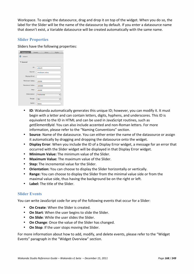
Wakanda Studio Reference Guide – Wakanda v1 beta – December 15, 2011 Page 168 / 249
Workspace. To assign the datasource, drag and drop it on top of the widget. When you do so, the label for the Slider will be the name of the datasource by default. If you enter a datasource name that doesn’t exist, a Variable datasource will be created automatically with the same name.
Slider Properties Sliders have the following properties:
• ID: Wakanda automatically generates this unique ID; however, you can modify it. It must
begin with a letter and can contain letters, digits, hyphens, and underscores. This ID is equivalent to the ID in HTML and can be used in JavaScript routines, such as getElementById. You can also include accented and non-‐Roman letters. For more information, please refer to the “Naming Conventions” section.
• Source: Name of the datasource. You can either enter the name of the datasource or assign it automatically by dragging and dropping the datasource onto the widget.
• Display Error: When you include the ID of a Display Error widget, a message for an error that occurred with the Slider widget will be displayed in that Display Error widget.
• Minimum Value: The minimum value of the Slider. • Maximum Value: The maximum value of the Slider. • Step: The incremental value for the Slider. • Orientation: You can choose to display the Slider horizontally or vertically. • Range: You can choose to display the Slider from the minimal value side or from the
maximal value side, thus having the background be on the right or left. • Label: The title of the Slider.
Slider Events You can write JavaScript code for any of the following events that occur for a Slider:
• On Create: When the Slider is created. • On Start: When the user begins to slide the Slider. • On Slide: While the user slides the Slider. • On Change: Once the value of the Slider has changed. • On Stop: If the user stops moving the Slider.
For more information about how to add, modify, and delete events, please refer to the “Widget Events” paragraph in the “Widget Overview” section.

Wakanda Studio Reference Guide – Wakanda v1 beta – December 15, 2011 Page 169 / 249
Slider Skins For more information, please refer to the “Widget Skins” paragraph in the “Widget Overview” section.
Slider Styles You can customize the appearance of this widget, its range, and its handle by modifying the parameters in the Styles tab:
You can modify the styles for the widget’s following elements: Container, Range, Handle, and Label.
• Container: You can modify the Background, Border, and Size & Position of the widget’s container. • Range: You can modify the Background for the range of the Slider. • Handle: You can modify the Background for the three states (default, hover, and active) of the
Slider’s handle. • Label: If a label has been specified, you can modify: Label Text, Label Text Shadow, and Label Size &
Position.
Background
For more information about the Background section, please refer to the “Background” paragraph in the “Widget Overview” section.
Border
For more information about the Border section, please refer to the “Border” paragraph in the “Widget Overview” section.
Size & Position
For more information about the Size & Position section, please refer to the “Size & Position” paragraph in the “Widget Overview” section.
Label Text
For more information about the Label Text section, please refer to the “Label Text” paragraph in the “Widget Overview” section.
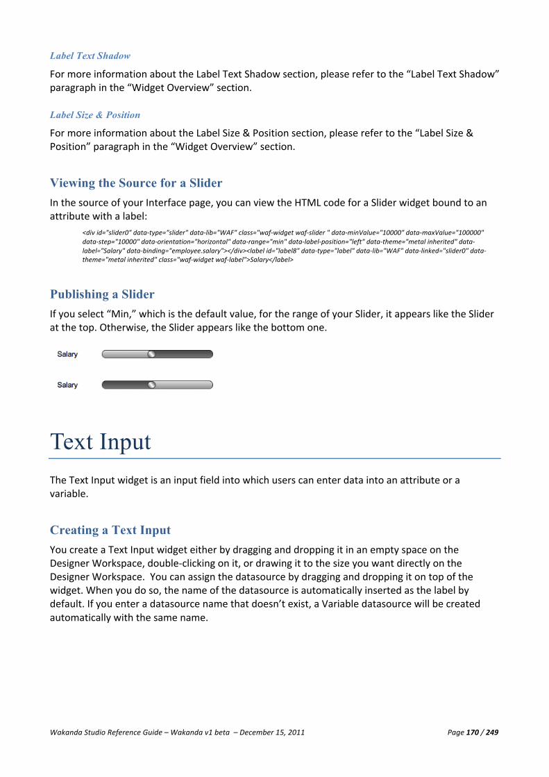
Wakanda Studio Reference Guide – Wakanda v1 beta – December 15, 2011 Page 170 / 249
Label Text Shadow
For more information about the Label Text Shadow section, please refer to the “Label Text Shadow” paragraph in the “Widget Overview” section.
Label Size & Position
For more information about the Label Size & Position section, please refer to the “Label Size & Position” paragraph in the “Widget Overview” section.
Viewing the Source for a Slider In the source of your Interface page, you can view the HTML code for a Slider widget bound to an attribute with a label:
<div id="slider0" data-‐type="slider" data-‐lib="WAF" class="waf-‐widget waf-‐slider " data-‐minValue="10000" data-‐maxValue="100000" data-‐step="10000" data-‐orientation="horizontal" data-‐range="min" data-‐label-‐position="left" data-‐theme="metal inherited" data-‐label="Salary" data-‐binding="employee.salary"></div><label id="label8" data-‐type="label" data-‐lib="WAF" data-‐linked="slider0" data-‐theme="metal inherited" class="waf-‐widget waf-‐label">Salary</label>
Publishing a Slider If you select “Min,” which is the default value, for the range of your Slider, it appears like the Slider at the top. Otherwise, the Slider appears like the bottom one.
Text Input The Text Input widget is an input field into which users can enter data into an attribute or a variable.
Creating a Text Input You create a Text Input widget either by dragging and dropping it in an empty space on the Designer Workspace, double-‐clicking on it, or drawing it to the size you want directly on the Designer Workspace. You can assign the datasource by dragging and dropping it on top of the widget. When you do so, the name of the datasource is automatically inserted as the label by default. If you enter a datasource name that doesn’t exist, a Variable datasource will be created automatically with the same name.

Wakanda Studio Reference Guide – Wakanda v1 beta – December 15, 2011 Page 171 / 249
Text Input Properties The Text Input widget has the following properties:
• ID: Wakanda automatically generates this unique ID; however, you can modify it. It must
begin with a letter and can contain letters, digits, hyphens, and underscores. This ID is equivalent to the ID in HTML and can be used in JavaScript routines, such as getElementById. You can also include accented and non-‐Roman letters. For more information, please refer to the “Naming Conventions” section.
• Source: Name of the datasource. You can either enter the name of the datasource or assign it automatically by dragging and dropping the datasource onto the widget.
• Display Error: The ID of the Display Error widget to display any eventual errors. • Default Value: The default value for the Text Input widget. • Format: In this field, you can define a display format for the data in the Text Input widget for
datasources of type Date, String, and Number. • Label: The title of the Text Input widget. • Auto-‐complete: To benefit from an auto complete feature based on the attribute’s values
while entering data in the widget. • Multiline: The widget is displayed with scrollbars for better visibility of longer texts. • Password field: This option changes the type of the Text Input widget to a Password field.
When checked, each letter typed into the widget is displayed as a bullet “•”. • Allow calendar for dates: Automatically display the calendar when a user tabs into this Text
Input widget for an attribute of type Date. • Display calendar when icon is clicked: If this option is checked, the calendar appears only if
the user clicks on the icon displayed next to the Text Input widget. The “Allow calendar for dates” must also be checked for this option to work.
• Tabindex: Defines the tab order of the widget on the Interface page. When tabbing, you begin with the object with the lowest Tabindex and go to the highest.
Wakanda Studio Reference Guide – Wakanda v1 beta – December 15, 2011 Page 172 / 249
Display Formats
Display formats are “templates” used to represent data visually on your Interface page. They do not affect the way the data is stored internally. The display formats defined in the model are automatically used by widgets like Auto Forms, Grids, and Text Inputs.
Formats can be applied to attributes of type String, Number (Long, Long64, and Number), and Date.
For strings, like a telephone number, you can include characters that will be used for the data entered. For example, if you have “(###) ###-‐####” for a US telephone number, when the user enters in 4085551212, it will be formatted as “(408) 555-‐1212”.
For numbers, each placeholder character has a different effect on the display of leading or trailing zeros. A leading zero is a zero that starts a number before the decimal point; a trailing zero is a zero that ends a number after the decimal point. Suppose you use the format ##0 to display three digits. If the user enters nothing in the field, the field displays 0. If the user enters 26, the field displays 26.
The table below explains the effect of each placeholder on leading and trailing zeros:
Placeholder Effect for leading or trailing zero # Displays nothing 0 Displays 0
Note: Wakanda uses the “,” to delimit thousands and “.” as the decimal point for formatting numbers; however, when the value is displayed via the web browser, it will appear with the thousands separator and decimal point defined by the browser.
For percentages, enter “0%”.
For dates: the following formats are available:
• d -‐ day of month (no leading zero) • dd -‐ day of month (two digit) • o -‐ day of the year (no leading zeros) • oo -‐ day of the year (three digit) • D -‐ day name short • DD -‐ day name long • m -‐ month of year (no leading zero) • mm -‐ month of year (two digit) • M -‐ month name short • MM -‐ month name long • y -‐ year (two digit) • yy -‐ year (four digit)
For example, to create a date that appears as “March 1, 2011,” you would enter “MM d, yy” in the date attribute’s format field.
Text Input Events You can execute code during the following focus and mouse events for a Text Input widget:
• On Blur: When the Text Input widget loses focus. • On Change: When the value of the Text Input widget is changed. • On Focus: When the Text Input widget gets the focus. • On Click: When the Text Input widget is clicked. • On Double Click: When the Text Input widget is double-‐clicked.

Wakanda Studio Reference Guide – Wakanda v1 beta – December 15, 2011 Page 173 / 249
• On Mouse Down: If the user holds the mouse down on the Text Input widget. • On Mouse Move: When the user moves the mouse in the Text Input widget. • On Mouse Out: Once the user is no longer hovering over the Text Input widget. • On Mouse Over: If the user places the mouse over the Text Input widget. • On Mouse Up: Once the user lets go of the mouse after clicking on the Text Input widget. • On Key Down: When the user presses a key down in the Text Input widget. • On Key Up: When the keyboard key is released in the Text Input widget. • On Select: When text is selected in the Text Input widget.
For more information about how to add, modify, and delete events, please refer to the “Widget Events” paragraph in the “Widget Overview” section.
Text Input Skins For more information, please refer to the “Widget Skins” paragraph in the “Widget Overview” section.
Text Input Styles You can customize the Text Input widget by using the Styles tab:
You can modify the styles for the widget’s following elements: Container and Label (if one has been specified for the widget).
• Container: You can modify its Text, Text Shadow, Background, Border, Drop Shadow, Inner
Shadow, and Size & Position settings for the following states: Default, Hover, and Focus. • Label: If a label has been specified, you can modify: Label Text, Label Text Shadow, and Label Size &
Position.
Wakanda Studio Reference Guide – Wakanda v1 beta – December 15, 2011 Page 174 / 249
Text
For more information about the Text section, please refer to the “Text” paragraph in the “Widget Overview” section.
Text Shadow
For more information about the Text Shadow section, please refer to the “Text Shadow” paragraph in the “Widget Overview” section.
Background
For more information about the Background section, please refer to the “Background” paragraph in the “Widget Overview” section.
Border
For more information about the Border section, please refer to the “Border” paragraph in the “Widget Overview” section.
Drop Shadow
For more information about the Drop Shadow section, please refer to the “Drop Shadow” paragraph in the “Widget Overview” section.
Inner Shadow
For more information about the Inner Shadow section, please refer to the “Inner Shadow” paragraph in the “Widget Overview” section.
Size & Position
For more information about the Size & Position section, please refer to the “Size & Position” paragraph in the “Widget Overview” section.
Label Text
For more information about the Label Text section, please refer to the “Label Text” paragraph in the “Widget Overview” section.
Label Text Shadow
For more information about the Label Text Shadow section, please refer to the “Label Text Shadow” paragraph in the “Widget Overview” section.
Label Size & Position
For more information about the Label Size & Position section, please refer to the “Label Size & Position” paragraph in the “Widget Overview” section.

Wakanda Studio Reference Guide – Wakanda v1 beta – December 15, 2011 Page 175 / 249
Viewing the Source for a Text Input In the source of your Interface page, you can view the HTML code for a Text Input widget bound to an attribute with a label:
<input type="text" id="textField1" data-‐type="textField" data-‐theme="metal inherited" data-‐multiline="false" data-‐lib="WAF" data-‐label-‐position="left" data-‐label="Name" data-‐binding="employee.firstName" class="waf-‐widget waf-‐textField"/> <label id="label1" data-‐type="label" data-‐theme="metal inherited" data-‐linked="textField1" data-‐lib="WAF" class="waf-‐widget waf-‐label">Name</label>
Publishing a Text Input For a datasource of type Date, a calendar automatically appears when you enter the Text Input widget:
If you have selected the Multiline checkbox, the Text Input widget appears as follows:
All other Text Input widgets appear as shown below:
Progress Bar The Progress Bar widget allows you to visually show the progression of a server-‐side action.
Creating a Progress Bar You create a Progress Bar by selecting the widget from the Widgets area either by dragging and dropping it in an empty space on the Designer Workspace, double-‐clicking on it in the Widgets area, or drawing it to the size you want directly on the Designer Workspace.

Wakanda Studio Reference Guide – Wakanda v1 beta – December 15, 2011 Page 176 / 249
Progress Bar Properties The properties for a Progress Bar are as follows:
• ID: Wakanda automatically generates this unique ID; however, you can modify it. It must
begin with a letter and can contain letters, digits, hyphens, and underscores. This ID is equivalent to the ID in HTML and can be used in JavaScript routines, such as getElementById. You can also include accented and non-‐Roman letters. For more information, please refer to the “Naming Conventions” section.
• Progress Reference: A unique reference that you use in your JavaScript code. If you leave it blank, Wakanda will give a unique reference to it each time it is called.
• Show Stop Button: Displays a Stop button on the Progress bar, allowing the user to interrupt the progression. Refer to the Developer guide to learn more about managing this event.
• Hide if Inactive: This option keeps the Progress Bar hidden until it is active.
Progress Bar Events This widget doesn’t have any events.
Progress Bar Skins For more information, please refer to the “Widget Skins” paragraph in the “Widget Overview” section.
Progress Bar Styles The styles proposed for a Progress Bar widget can be found on the Styles tab. You can modify the style of the entire widget (including its label) or the range.
Here are the Styles panels for the Progress Bar widget:

Wakanda Studio Reference Guide – Wakanda v1 beta – December 15, 2011 Page 177 / 249
You can modify the styles for the widget’s following elements: Container, Range, and Label.
• Container: You can modify the container’s Background, Border, Drop Shadow, and Size & Position. • Range: For the Progress Bar’s range, you can modify the Text and Background. • Label: You can modify the following settings for the Progress Bar's label: Label Text, Label Text
Shadow, and Label Size & Position.
Text
For more information about the Text section, please refer to the “Text” paragraph in the “Widget Overview” section.
Background
For more information about the Background section, please refer to the “Background” paragraph in the “Widget Overview” section.
Border
For more information about the Border section, please refer to the “Border” paragraph in the “Widget Overview” section.
Drop Shadow
For more information about the Drop Shadow section, please refer to the “Drop Shadow” paragraph in the “Widget Overview” section.
Size & Position
For more information about the Size & Position section, please refer to the “Size & Position” paragraph in the “Widget Overview” section.
Label Text
For more information about the Label Text section, please refer to the “Label Text” paragraph in the “Widget Overview” section.
Label Text Shadow
For more information about the Label Text Shadow section, please refer to the “Label Text Shadow” paragraph in the “Widget Overview” section.
Label Size & Position
For more information about the Label Size & Position section, please refer to the “Label Size & Position” paragraph in the “Widget Overview” section.

Wakanda Studio Reference Guide – Wakanda v1 beta – December 15, 2011 Page 178 / 249
Viewing the Source for a Progress Bar In the source of your Interface page, you can view the HTML code for a Progress Bar:
<div id="progressBar0" data-‐type="progressBar" data-‐lib="WAF" class="waf-‐widget waf-‐progressBar " data-‐showstop="false" data-‐no-‐empty-‐display="false" data-‐messagepos="top" data-‐theme="metal inherited"></div>
Publishing a Progress Bar The Progress Bar appears automatically to inform users of the progress of an action that is taking place on the server:
Login Dialog With the Login Dialog widget, you can allow a user to enter his/her username and password to log into your Wakanda application.
Afterwards, the user can see that he/she has logged in successfully and can also log out.
Creating a Login Dialog You create a Login Dialog by selecting the widget from the Widgets area either by dragging and dropping it in an empty space on the Designer Workspace, double-‐clicking on it in the Widgets area, or drawing it to the size you want directly on the Designer Workspace.

Wakanda Studio Reference Guide – Wakanda v1 beta – December 15, 2011 Page 179 / 249
Login Dialog Properties The properties for a Login Dialog are as follows:
• ID: Wakanda automatically generates a unique ID for each Login Dialog widget. • Password label: Label for the Password field in the Login dialog that appears when the user
clicks Login. • Login button: Label for the Login button in the Login dialog. • Login dialog title: Label for the title of the Login dialog. • Current user display: The message that appears after a user has logged in successfully. The
user’s full name will be added to the end of the message inserted here. • Not logged in display: The message that is displayed before the user logs in. • Login text: Label for the link that opens the Login dialog. • Logout text: Label for the link that allows the user to log out.
Login Dialog Events You can execute code during the following events for a Login Dialog widget:
• On Login: When the Login button in the dialog has been clicked (an attempt to login was made).
• On Logout: When the user logs out by clicking the Logout link.
Login Dialog Skins For more information, please refer to the “Widget Skins” paragraph in the “Widget Overview” section.

Wakanda Studio Reference Guide – Wakanda v1 beta – December 15, 2011 Page 180 / 249
Login Dialog Styles The styles proposed for a Container widget can be found on the Styles tab:
The Login Dialog widget has four styles: Text, Background, Border, Drop Shadow, Inner Shadow, and Size & Position.
Text
For more information about the Text section, please refer to the “Text” paragraph in the “Widget Overview” section.
Background
For more information about the Background section, please refer to the “Background” paragraph in the “Widget Overview” section.
Border
For more information about the Border section, please refer to the “Border” paragraph in the “Widget Overview” section.
Drop Shadow
For more information about the Drop Shadow section, please refer to the “Drop Shadow” paragraph in the “Widget Overview” section.
Size & Position
For more information about the Size & Position section, please refer to the “Size & Position” paragraph in the “Widget Overview” section. This property is not visible for a section of a split Container widget.
Viewing the Source for a Login Dialog Widget In the source of your Interface page, you can view the HTML code for the Login Dialog widget:
<div id="login1" data-‐type="login" data-‐lib="WAF" data-‐user-‐label="User: " data-‐password-‐label="Password: " data-‐login-‐button="Login" data-‐login-‐title="Login Dialog" data-‐user-‐display="Signed in as " data-‐login-‐action="Login" data-‐logout-‐action="Logout" class="waf-‐widget waf-‐login default inherited" data-‐constraint-‐left="true" data-‐constraint-‐top="true" data-‐no-‐user-‐display="Welcome! Please login to continue."></div>

Wakanda Studio Reference Guide – Wakanda v1 beta – December 15, 2011 Page 181 / 249
Container The Container widget allows you to place one or more widgets inside of it so that they are grouped together. A Container is created automatically when you build a Form. The Container widget is the equivalent of a <div> in HTML and therefore can be manipulated in your JavaScript code as a single object.
Creating a Container You create a Container either by dragging and dropping it in an empty space on the Designer Workspace, double-‐clicking on it in the Widgets area, or drawing it to the size you want directly on the Designer Workspace.
Note: If you select the Container and delete it, all the widgets it contains will also be deleted.
You know when a widget has been included into the container when the Container is highlighted as you hover over it:
Container Properties The properties for a Container are the following:
• ID: Wakanda automatically generates this unique ID; however, you can modify it. It must
begin with a letter and can contain letters, digits, hyphens, and underscores. This ID is equivalent to the ID in HTML and can be used in JavaScript routines, such as getElementById. You can also include accented and non-‐Roman letters. For more information, please refer to the “Naming Conventions” section.
• Draggable: Selecting this checkbox allows for your Container to be draggable on the page. This property is not visible for a section of a split Container widget.
• Resizable: To allow your users to resize the Container when it is published, select this checkbox for your Container. The widgets in the Container will not be resized along with it. This property is not visible for a section of a split Container widget.
• Hide Splitters: Hide the Container’s splitters by selecting this option. This option is only available if you have created vertical or horizontal splitters for the Container.
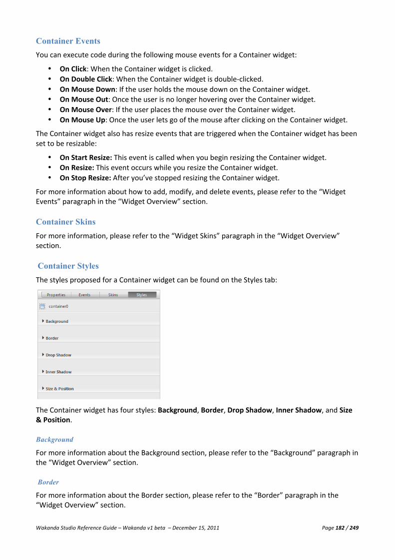
Wakanda Studio Reference Guide – Wakanda v1 beta – December 15, 2011 Page 182 / 249
Container Events You can execute code during the following mouse events for a Container widget:
• On Click: When the Container widget is clicked. • On Double Click: When the Container widget is double-‐clicked. • On Mouse Down: If the user holds the mouse down on the Container widget. • On Mouse Out: Once the user is no longer hovering over the Container widget. • On Mouse Over: If the user places the mouse over the Container widget. • On Mouse Up: Once the user lets go of the mouse after clicking on the Container widget.
The Container widget also has resize events that are triggered when the Container widget has been set to be resizable:
• On Start Resize: This event is called when you begin resizing the Container widget. • On Resize: This event occurs while you resize the Container widget. • On Stop Resize: After you’ve stopped resizing the Container widget.
For more information about how to add, modify, and delete events, please refer to the “Widget Events” paragraph in the “Widget Overview” section.
Container Skins For more information, please refer to the “Widget Skins” paragraph in the “Widget Overview” section.
Container Styles The styles proposed for a Container widget can be found on the Styles tab:
The Container widget has four styles: Background, Border, Drop Shadow, Inner Shadow, and Size & Position.
Background
For more information about the Background section, please refer to the “Background” paragraph in the “Widget Overview” section.
Border
For more information about the Border section, please refer to the “Border” paragraph in the “Widget Overview” section.

Wakanda Studio Reference Guide – Wakanda v1 beta – December 15, 2011 Page 183 / 249
Drop Shadow
For more information about the Drop Shadow section, please refer to the “Drop Shadow” paragraph in the “Widget Overview” section.
Inner Shadow
For more information about the Inner Shadow section, please refer to the “Inner Shadow” paragraph in the “Widget Overview” section.
Size & Position
For more information about the Size & Position section, please refer to the “Size & Position” paragraph in the “Widget Overview” section. This property is not visible for a section of a split Container widget.
Splitting a Container The Container widget allows you to split the Container or a section of a Container (previously split) in half, either horizontally or vertically. To do so, just select the Container widget and choose either Split-‐>Horizontally or Split-‐>Vertically from the contextual menu:
You can split a Container widget as many times as you’d like.
You click on each split Container to select it. Each section of the Container that is created is a Container widget; however, you cannot define it to be Draggable or Resizable in the Properties tab and you cannot modify the Size & Position settings in the Styles tab.

Wakanda Studio Reference Guide – Wakanda v1 beta – December 15, 2011 Page 184 / 249
You can also resize the split Containers by dragging the resize icon that appears:
Joining a Split Container You can join split Containers by Command-‐clicking (Mac) or Ctrl-‐Clicking (Windows) the horizontal-‐split or vertical-‐split sections and selecting Join from the contextual menu:
Note: You can only join sections of the Container that were previously split.
Viewing the Source for a Container In the source of your Interface page, you can view the HTML code for a Progress Bar:
<div id="container1" data-‐type="container" data-‐lib="WAF" class="waf-‐widget waf-‐container" data-‐theme="metal inherited"></div>
Note: If there are any widgets located in the Container, they will be listed before the </div> tag.

Wakanda Studio Reference Guide – Wakanda v1 beta – December 15, 2011 Page 185 / 249
Matrix The Matrix widget allows you to place one or more widgets inside of it. They are automatically duplicated in the space allocated for the Matrix created on your Interface page. Each widget, like in the case of a form, displays a datastore entity in the entity collection that goes from left to right and from top to bottom in the Matrix.
Creating a Matrix To create a Matrix, select the widget from the Widgets area and either drag and drop it onto the Designer Workspace, double-‐clicking on it in the Widgets area, or drawing it to the size you want directly on the Designer Workspace. A Matrix accepts only widgets of type Button, Checkbox, Text, Slider, Text Input, and Container. You can link events to any of the widgets included in the Matrix, and they will be valid for the current entity in the Matrix, if your datasource is a datastore class.
To include a widget in the matrix, you have to drag it into the Matrix as shown below in our example with a form:
Once you do so, the Matrix decides how many forms it can fit inside of it and duplicates the form as shown in the first screenshot.
If you resize the Matrix, the number of widgets duplicated inside of it will be modified. The larger the Matrix is, the more widgets will fit inside of it, and the smaller it is, the fewer number of

Wakanda Studio Reference Guide – Wakanda v1 beta – December 15, 2011 Page 186 / 249
widgets will fit. The number of widgets inside the Matrix depends also on the Margin and the Auto Fit properties.
Note: If you delete a Matrix that contains another widget, it will also be deleted.
Matrix Properties The properties for a Matrix are the following:
• ID: Wakanda automatically generates this unique ID; however, you can modify it. It must
begin with a letter and can contain letters, digits, hyphens, and underscores. This ID is equivalent to the ID in HTML and can be passed to JavaScript routines, such as getElementById. You can also include accented and non-‐Roman letters. For more information, please refer to the “Naming Conventions” section.
• Margin: Define the margin around each widget in the Matrix (as if each instance were a cell in a table).
• Auto Fit: This option resizes the Matrix according to its contents so that the widget(s) included can be duplicated in its entirety.
• Scrolling: You can define how the widget inside the Matrix is scrolling: vertically or horizontally.
• Scrollbar: Defines whether the scrollbar for a Matrix is displayed or not. If it’s not displayed, you can use the Matrix’s functions to navigate through the pages of the Matrix.
• Draggable: Selecting this checkbox allows for your Matrix to be draggable on the page. • Resizable: This option, when checked, allows your users to resize the Matrix.
Matrix Events You can execute code during the following mouse events for a Matrix widget:
• On Click: When the Matrix widget is clicked. • On Double Click: When the Matrix widget is double-‐clicked. • On Mouse Down: If the user holds the mouse down on the Matrix widget. • On Mouse Out: Once the user is no longer hovering over the Matrix widget. • On Mouse Over: If the user places the mouse over the Matrix widget. • On Mouse Up: Once the user lets go of the mouse after clicking on the Matrix widget. • On Draw: This event occurs for each element (e.g., a widget bound to a datasource)
displayed plus the next two that are temporarily hidden from view.
The Matrix widget also has resize events that are triggered when the Matrix widget has been set to be resizable:
• On Start Resize: This event is called when you begin resizing the Matrix widget. • On Resize: This event occurs while you resize the Matrix widget.

Wakanda Studio Reference Guide – Wakanda v1 beta – December 15, 2011 Page 187 / 249
• On Stop Resize: After you’ve stopped resizing the Matrix widget.
For more information about how to add, modify, and delete events, please refer to the “Widget Events” paragraph in the “Widget Overview” section.
Matrix Skins In the Skins tab, you can define a CSS class for the Matrix widget in the Class field.
Matrix Styles The styles proposed for a Matrix widget can be found on the Styles tab:
The Matrix widget has four styles: Background, Border, Drop Shadow, Inner Shadow, and Size & Position.
Background
For more information about the Background section, please refer to the “Background” paragraph in the “Widget Overview” section.
Border
For more information about the Border section, please refer to the “Border” paragraph in the “Widget Overview” section.
Drop Shadow
For more information about the Drop Shadow section, please refer to the “Drop Shadow” paragraph in the “Widget Overview” section.
Inner Shadow
For more information about the Inner Shadow section, please refer to the “Inner Shadow” paragraph in the “Widget Overview” section.
Size & Position
For more information about the Size & Position section, please refer to the “Size & Position” paragraph in the “Widget Overview” section.

Wakanda Studio Reference Guide – Wakanda v1 beta – December 15, 2011 Page 188 / 249
Matrix Methods The following methods allow you to scroll through a Matrix widget when the scrollbar is inactive:
• goToNext: Goes to the next page of the Matrix. • goToPrevious: Goes to the previous page of the Matrix. • goToFirst: Goes to the first page of the Matrix. • goToLast: Goes to the next page of the Matrix.
You can call these methods during the On Click event of a Button widget, for example, as shown below:
$$('matrix1').goToNext();
Viewing the Source for a Matrix In the source of your Interface page, you can view the HTML code for a Matrix:
<div id="matrix1" data-‐type="matrix" data-‐scrolling="vertical" data-‐scrollbar="true" data-‐lib="WAF" data-‐fit="false" class="waf-‐widget waf-‐matrix "> {widgets included in the matrix are listed here} </div>
Publishing a Matrix When you publish the Matrix on the Web, it appears as it does in the workspace. In the case of a form in the Matrix, each form in the Matrix shows a datastore entity from the entity collection:
Below is the same entity collection in a Grid to show the order of the entities displayed above in the Matrix:

Wakanda Studio Reference Guide – Wakanda v1 beta – December 15, 2011 Page 189 / 249
Image The Image widget allows you to include an image either directly from your WebFolder or from an attribute to publish on your Interface page.
Creating an Image To create an Image, select the widget from the Widgets area and either drag and drop it in an empty space on the Designer Workspace, double-‐clicking on it in the Widgets area, or drawing it to the size you want directly on the Designer Workspace. To automatically create the Image widget and define the reference (Src) at the same time, drag the image (located in your project’s WebFolder) directly onto your Interface page.
You can also assign a datasource (an attribute in a datastore class) by dragging and dropping it on top of the widget. When you do so, the datasource’s name is inserted automatically in the label field.
If you drag and drop the image into Wakanda, the following message appears:
If you do not already have an “images” folder, it will be created and the following message will appear:
You can also include one of the images from the Media Library by dragging it and dropping it to an empty space on the workspace, which not only copies the image to your “images” folder, but also creates the Image widget.
Image Properties The properties for an Image are the following:
• ID: Wakanda automatically generates this unique ID; however, you can modify it. It must
begin with a letter and can contain letters, digits, hyphens, and underscores. This ID is equivalent to the ID in HTML and can be used in JavaScript routines, such as getElementById. You can also include accented and non-‐Roman letters. For more information, please refer to the “Naming Conventions” section.

Wakanda Studio Reference Guide – Wakanda v1 beta – December 15, 2011 Page 190 / 249
• Source: Name of the datasource. You can either enter the name of an existing datasource or assign it automatically by dragging and dropping the datasource onto the widget. If the datasource doesn’t exist, a Variable datasource will be created automatically with the name entered.
• Src: In this field, you can set the path to an image in your WebFolder by selecting a file after you click on the icon. You can also drag and drop the image (located in your project’s WebFolder from the Solution Explorer) onto the image. If you drag and drop an image from your computer or from the Media Library, it will be copied into a folder named “images” located in your WebFolder. If the “images” folder doesn’t exist, Wakanda will create it automatically. To remove the image referenced, click on the icon.
• Link: Defines the URL to go to when included. You can include any type of link into the Link field, e.g., a URL (“http://www.wakanda.org/”), an email address (“mailto:[email protected]”), or an Interface page (“/employees.html”). You can drag and drop an Interface page onto the widget and it will be automatically inserted as the link.
• Target: Select “_blank” to open the URL defined in the “Link” property in a new page or “_self” to remain on the same page.
• Label: The label associated to the Image widget that is displayed if you enter a text value in this field.
• Fit: This option resizes the image widget to the container (proportionately or not), to the width of the image, to the height of the image, or the container is resized based on the image.
Image Events An Image widget has the following mouse events:
• On Click: When the Image widget is clicked. • On Double Click: When the Image widget is double-‐clicked. • On Mouse Down: If the user holds the mouse down on the Image widget. • On Mouse Move: If the user moves the mouse over the Image widget. • On Mouse Out: Once the user is no longer hovering over the Image widget. • On Mouse Over: If the user places the mouse over the Image widget. • On Mouse Up: Once the user lets go of the mouse after clicking on the Image widget.
For more information about how to add, modify, and delete events, please refer to the “Widget Events” paragraph in the “Widget Overview” section.
Image Skins In the Skins tab, you can define a CSS class for the Image widget in the Class field.

Wakanda Studio Reference Guide – Wakanda v1 beta – December 15, 2011 Page 191 / 249
Image Styles The styles proposed for an Image widget can be found on the Styles tab:
You can modify the styles for the widget’s following elements: Container and Label.
• Container: You can modify the container’s Background, Border, Drop Shadow, and Size & Position. • Label: If a label has been specified, you can modify: Label Text, Label Text Shadow, and Label Size &
Position.
Background
For more information about the Background section, please refer to the “Background” paragraph in the “Widget Overview” section.
Border
For more information about the Border section, please refer to the “Border” paragraph in the “Widget Overview” section.
Drop Shadow
For more information about the Drop Shadow section, please refer to the “Drop Shadow” paragraph in the “Widget Overview” section.
Size & Position
For more information about the Size & Position section, please refer to the “Size & Position” paragraph in the “Widget Overview” section.
Label Text
For more information about the Label Text section, please refer to the “Label Text” paragraph in the “Widget Overview” section.

Wakanda Studio Reference Guide – Wakanda v1 beta – December 15, 2011 Page 192 / 249
Label Text Shadow
For more information about the Label Text Shadow section, please refer to the “Label Text Shadow” paragraph in the “Widget Overview” section.
Label Size and Position
For more information about the Label Size & Position section, please refer to the “Label Size & Position” paragraph in the “Widget Overview” section.
Viewing the Source for an Image Widget In the source of your Interface page, you can view the HTML code for an Image widget:
<div id="image1" data-‐type="image" data-‐lib="WAF" class="waf-‐widget waf-‐image " data-‐label="Photo" data-‐label-‐position="left" data-‐fit="0" data-‐src="/images/daisy.jpg"></div>
Below is the HTML code for an Image widget bound to a datasource: <div id="image1" data-‐type="image" data-‐lib="WAF" data-‐label-‐position="left" data-‐label="Photo" data-‐fit="0" class="waf-‐widget waf-‐image " data-‐binding="employee.photo"></div>
Publishing an Image Widget Publishing an Image on the Web is exactly as it is shown on the Designer Workspace. If the datasource selected is an attribute, the image will change depending on the current datastore entity.
Component The Component widget can contain any number of widgets as well as another component that you can include on different Interface pages and in different projects. In a multi-‐developer project, each developer can work on a different Component and integrate it into one or more projects. For example, you can create a Component that contains your web application’s header (e.g., a menu bar and login area) and add the Component to all of your Interface pages. In this way, you modify only once the header Component to show the changes throughout your web application.
You can also use the Component widget to create a one-‐page application in which you have one Component widget on an Interface page and you load different ones depending on your needs.
Adding a Component to your Interface Page To add a Component to your page, you can do one of the following:
• Drag the “Component” widget and drop it in an empty space on your Interface page, • Double-‐click the Component widget and assign the Component to it, or • Draw the Component Widget on your Interface page and assign the Component to it.
When assigning the name of the component to the Component widget, you just need to enter the first letters in the Path field of the Properties tab and Wakanda will find those available to your project.

Wakanda Studio Reference Guide – Wakanda v1 beta – December 15, 2011 Page 193 / 249
Once you have a Component on your Interface page, you can open the Component’s HTML file in the GUI Designer by selecting Edit from the contextual menu as shown below:
Component Properties The Component widget has the following properties:
• ID: Wakanda automatically generates this unique ID; however, you can modify it. It must
begin with a letter and can contain letters, digits, hyphens, and underscores. This ID is equivalent to the ID in HTML and can be used in JavaScript routines, such as getElementById. You can also include accented and non-‐Roman letters. For more information, please refer to the “Naming Conventions” section.
• Path: Path to the Component relative to the project, i.e., “/{Component Name}.waComponent”.
• Draggable: Selecting this checkbox allows for your Component to be draggable on the page. • Resizable: Select this checkbox for your Component to allow users to resize the Component
when it is published. The widgets in the Component will not be resized along with the component unless you have selected this checkbox for those widgets that can be resized.
Component Events You can execute code during the following mouse events for a Component:
• On Click: When the Component is clicked. • On Double Click: When the Component is double-‐clicked. • On Mouse Down: If the user holds the mouse down on the Component. • On Mouse Out: Once the user is no longer hovering over the Component. • On Mouse Over: If the user places the mouse over the Component. • On Mouse Up: Once the user lets go of the mouse after clicking on the Component.
For more information about how to add, modify, and delete events, please refer to the “Widget Events” paragraph in the “Widget Overview” section.

Wakanda Studio Reference Guide – Wakanda v1 beta – December 15, 2011 Page 194 / 249
Component Skins A Component is its own entity and the class and theme you define here will not be overwritten by the class or theme defined for the Interface Page in which the Component is located.
For more information, please refer to the “Widget Skins” paragraph in the “Widget Overview” section.
Component Styles The styles proposed for a Component can be found on the Styles tab. A Component is its own entity and the styles you define here will not be overwritten by those defined for the Interface Page in which the Component is located.
The Component widget has the following styles: Background, Border, Drop Shadow, and Size & Position.
Background
For more information about the Background section, please refer to the “Background” paragraph in the “Widget Overview” section.
Border
For more information about the Border section, please refer to the “Border” paragraph in the “Widget Overview” section.
Drop Shadow
For more information about the Drop Shadow section, please refer to the “Drop Shadow” paragraph in the “Widget Overview” section.
Size & Position
For more information about the Size & Position section, please refer to the “Size & Position” paragraph in the “Widget Overview” section.
Previewing a Component on an Interface Page Once you include a component on your Interface page, you can preview its content to better situate it. Below is an example of a login component:

Wakanda Studio Reference Guide – Wakanda v1 beta – December 15, 2011 Page 195 / 249
Here is the same component included on an Interface page:
Creating a Component Before including a component on an Interface page, you must first create it.
To create a Component, make sure a project is active in the Solution Explorer and select Component from the New menu in the action menu or the project’s contextual menu. You will be prompted to enter a filename, which will be the name of your Component. In our example, we have named the Component, “myComponent.”
The “myComponent.waComponent” folder appears in your project as shown below:

Wakanda Studio Reference Guide – Wakanda v1 beta – December 15, 2011 Page 196 / 249
Component Structure The structure for a Component is constructed as follows:
• A folder whose name is {ComponentName}.waComponent. • An HTML file containing the HTML5 code needed to display the component without body or head
tags, {ComponentName}.html. • A JSON file named “manifest.json” that contains the description of the component. • A JavaScript file associated to the component whose name is {ComponentName}.js or as defined in
the Component’s JSON file. • A CSS file containing the styles associated to the Component, {ComponentName}.css. This file is
generated once you modify the Component’s HTML file.
Component Folder The Component’s folder can be copied into another Wakanda project either in the same solution or a different one.
HTML File You can edit the Component’s HTML file (which is an Interface Page) and can include any of Wakanda’s built-‐in widgets or your own custom widgets. The HTML file is the same as an Interface page with the same Properties, Skins, and Styles tabs except the following sections on the Properties tab are not available: General, Platform, and RPC. You can only include Style sheets (CSS files) or Scripts (JavaScript files):
Style Sheets and Scripts
All CSS style sheets and JavaScript files must be located in (or in a subfolder of) the Component folder.
By default, the Component’s CSS and JavaScript files are already attached to the component’s Interface Page properties.
Note: Please refer to the “Style Sheets” and “Scripts” paragraphs in the Interface Page section for more information on how to add, delete, and order these files for the Interface Page.
Events
On the Events tab, the On Load event is not available. To write code in the Component’s “On Load” event, you can include it in the “this.load” function.
The ID of the tags for the widgets are prefixed with the Component’s ID, i.e., “{id}textField0”. You can add your own HTML code to this file; however, we suggest that you do not touch the ID of the widget tags by leaving the “{id}” intact.

Wakanda Studio Reference Guide – Wakanda v1 beta – December 15, 2011 Page 197 / 249
Skins and Styles
Both the Skins and Styles tabs are identical to those of an Interface page. For more information, please refer to the “Interface Page” section of the manual.
Datasource Properties
When you use a datasource (either a datastore class or a relation attribute) in a Component that has the same name as a datasource referenced on the Interface page with the Component, it can either be the same datasource or a unique one.
In the Properties of the datasource, you can select the Scope for your datasource so that it is either Local (default value) or Global. If you select Local, Wakanda will create another instance of this datasource for you when the page is published. If you select Global and the Interface page has a datasource with the same name, the one in your Component will be the same one (with, of course, the same ID).
JSON File In the “manifest.json” file, you define the different properties for the Component as well as the scripts or stylesheets needed by the component. These files cannot be included in the Interface page from the Properties tab and must be included in the JSON file. Here is an example of the code of a Component:
{ "name" : "myComponent", "html" : "myComponent.html", "styles" : ["myComponent.css"], "scripts" : ["myComponent.js"] }
The properties for the Component are the following:
Property Type Description name String Name of the Component html String Component’s HTML page styles Array CSS file(s) associated to the Component’s HTML page. The first one listed must
be the one Wakanda defines by default, i.e., “{Component Name}.css”. scripts Array JavaScript file(s) associated to the Component’s HTML page. The first one listed
must be the one Wakanda defines by default, i.e., “{Component Name}.js”.

Wakanda Studio Reference Guide – Wakanda v1 beta – December 15, 2011 Page 198 / 249
CSS File The style information related to the widgets in your Component can be found in its CSS file. The styles are prefixed with the Component’s ID by using the following notation: “#{id}textField0”. You can add your own CSS information, but the automatically generated class names with our “{id}” should be left intact.
JavaScript File In the JavaScript file, you define the Component’s events and methods. The base JavaScript file generated by default is shown below. When you add scripts to the component widget on your Interface Page, they appear in the load parameter:
(function Component (id) { // Add the code that needs to be shared between components here function constructor (id) { // @region beginComponentDeclaration var $comp = this; this.name = 'componentName'; // @endregion this.load = function (data) { // @region namespaceDeclaration // @endregion // eventHandlers // @region eventManager // @endregion }; } return constructor; })();
Constructor
In the declarations section of the constructor, we define a private instance of the Component in the $comp variable. The name of the component you created is defined in the name property.
In the code for your widgets, you reference the component by using $comp because the keyword this is used in the widget’s callback. In the callback, the keyword this refers to the widget and not the component.
this.load
All widget events (callbacks) are inserted automatically in this section of the constructor. If you want to include an On Load event for your Interface Page, you can include the code directly in this section. You can also initialize variables for your component as well as retrieve information from data. Data contains all the component’s HTML tag’s parameters and values (e.g., id, data-‐type, data-‐lib, class, and data-‐path).
Internal Methods
At runtime, all the widget and datasource IDs are prefixed with the component ID, i.e., “myComponent1_button0”.

Wakanda Studio Reference Guide – Wakanda v1 beta – December 15, 2011 Page 199 / 249
To retrieve a widget’s ID in the component, you can use the getHtmlId() method. The value returned is the component ID, underscore, and the widget ID, i.e., “myComponent1_button0”. In the example below, we retrieve the widget's full ID by passing it the widget ID:
var myWidgetID; myWidgetID = getHtmlId('button0');
To retrieve a widget’s jQuery object, you can use the getHtmlObj() method. This method allows you to make changes similar to the one below to your component’s widgets:
getHtmlObj('button0').css('background-‐color' , 'red');
To retrieve the value entered in a widget in your component, you can write the following: var username; username=getHtmlObj('username').val();
Scope
The scope is defined not only by the location in the class, but also in the way a variable is defined. The “private static” space is in the component’s class just before the constructor. Inside the constructor is where you define variables and functions that can be either public or private depending on how you declare them.
Public
You define all private functions and variables in the constructor of your component by using this. For example, there are two default public functions (this.load and this.init) and five variables (id, data-‐type, data-‐lib, class, and data-‐path).
You declare a public function by using the following syntax: this.myFunction = function () {}
When you define a public function, you can then call that function from the Interface page where your Component widget is included.
Private Static
All “private static” functions and variables are declared before the constructor. The functions and variables declared in this section are shared among all the instances of the same component on the same Interface page.
Private
You define all private functions and variables in the constructor of your component, which will be used for each individual instance of your component.
All private members must be declared using var in the constructor.
You declare a private function by the following syntax: var myFunction = function () {}
A private function cannot be called from the Interface page where your Component widget is included.
Testing a Component To test your Component, press the Run File button in the GUI Designer toolbar or select the same option from the Run menu. The Interface page is published to your browser. The URL generated is:
{URL}/walib/WAF/Component/test/test.html?component=/{Component Name}.waComponent
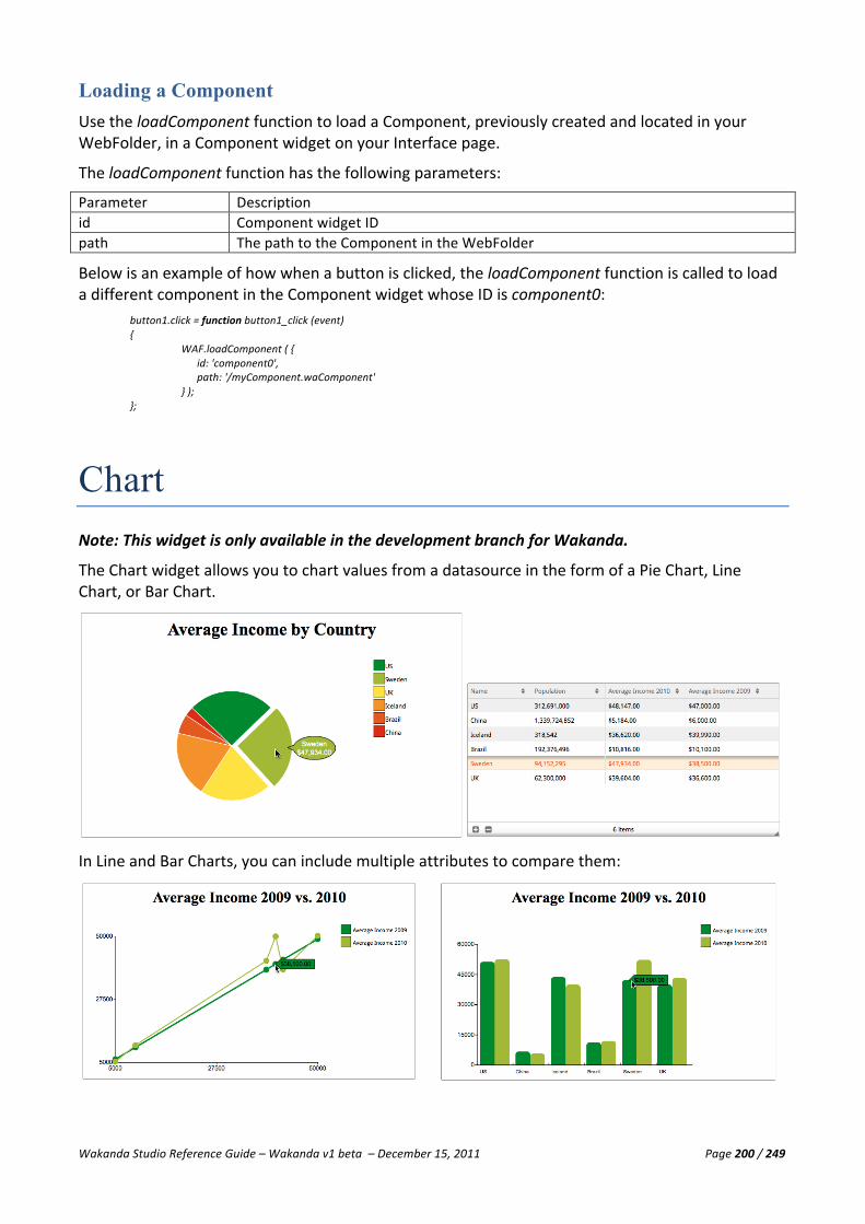
Wakanda Studio Reference Guide – Wakanda v1 beta – December 15, 2011 Page 200 / 249
Loading a Component Use the loadComponent function to load a Component, previously created and located in your WebFolder, in a Component widget on your Interface page.
The loadComponent function has the following parameters:
Parameter Description id Component widget ID path The path to the Component in the WebFolder
Below is an example of how when a button is clicked, the loadComponent function is called to load a different component in the Component widget whose ID is component0:
button1.click = function button1_click (event) { WAF.loadComponent ( {
id: 'component0', path: '/myComponent.waComponent' } ); };
Chart Note: This widget is only available in the development branch for Wakanda.
The Chart widget allows you to chart values from a datasource in the form of a Pie Chart, Line Chart, or Bar Chart.
In Line and Bar Charts, you can include multiple attributes to compare them:

Wakanda Studio Reference Guide – Wakanda v1 beta – December 15, 2011 Page 201 / 249
Creating a Chart You create a Chart widget either by dragging and dropping it in an empty space on the Designer Workspace, double-‐clicking on it, or drawing it to the size you want directly on the Designer Workspace. The Chart widget is created along two other widgets in a container: chart-‐title (Text widget) and chart-‐legendary.
Next, you drop a datasource (either a datastore class or a datasource of type datastore class) onto the Chart widget. Once you do so, the Chart widget will appear as follows:
The datasource name is automatically added to the chart title and the legendary displays the datasource name for each of the example entity titles.
At this point, you can change the chart type, modify the attributes to display, and much more. All these modifications can be done in the Properties tab described below.
Chart Properties The Chart widget has the following properties for each type of Chart. Below are the properties for the Pie, Line, and Bar Chart:

Wakanda Studio Reference Guide – Wakanda v1 beta – December 15, 2011 Page 202 / 249
• ID: Wakanda automatically generates this unique ID; however, you can modify it. It must
begin with a letter and can contain letters, digits, hyphens, and underscores. This ID is equivalent to the ID in HTML and can be used in JavaScript routines, such as getElementById. You can also include accented and non-‐Roman letters. For more information, please refer to the “Naming Conventions” section.
• Source: Name of the datasource. You can either enter the name of an existing datasource or assign it automatically by dragging and dropping the datasource onto the widget.
• Limit length: Limit the number of entities to display in the chart. • Draggable: Selecting this checkbox allows your Chart to be draggable when it is published. • Type: Define which type of chart to display: Pie Chart, Line Chart, or Bar Chart. • Data Series: This section allows you to add, move, and delete one or more attributes of type
Number (Long, Long64, and Number) to be used for the chart. To add an attribute, click on the icon. To change the order of the attributes, drag the
icon above or below the other attribute(s) listed. To delete an attribute, click on the icon that appears when you hover over it. The Data Series section has the following two properties for each attribute:
§ Label: Label of the attribute to be used in the legendary for Line and Bar Charts. § Attribute: Name of the attribute in the datasource assigned to the chart.
For each attribute, you can also add a display format, by inserting it in the Format area that appears when you click on the Label or Attribute:

Wakanda Studio Reference Guide – Wakanda v1 beta – December 15, 2011 Page 203 / 249
• Tooltip: This section allows you to specify certain properties with the tooltip.
§ Display: Select this checkbox to display the tooltip, which are the values in the Data Series section.
§ Type: For the Bar and Line Charts, you can also define the type of tooltip that appears: tag, flag, blob, popup, and label. Type Icon Description tag The tag tooltip can be placed at any angle around the point on the chart.
flag The flag tooltip can be placed at any angle around the point on the chart.
blob The blob tooltip, which is the default type, can be placed at any angle around the point on the chart.
popup The popup tooltip can be placed at one of four directions (see Direction property below) around the point on the chart.
label The label tooltip can be placed at any angle around the point on the chart.
§ Angle: Define at what angle the tooltip should appear. This property is applicable to all types of tooltips except the “popup” type (see below).
§ Direction: For the “popup” type, you can select in which direction it is displayed: North, South, East, or West.
• Axis: For each of the chart types, there are different values that appear in this section.
For Pie Charts § Axis Labels: Select the attribute whose values will be displayed at the top of the
tooltip and in legendary. For Line Charts
§ Axis Labels: Select the attribute whose values will be displayed along the x-‐axis. § Vertical Step Count: Number of steps on the y-‐axis. § Horizontal Step Count: Number of steps on the x-‐axis.
For Bar Charts
§ Axis Labels: Select the attribute to display in the legendary and at the top of the tooltip.
§ Label Angle: Define at what angle the tooltip should appear. § Label Anchor: Depending on the angle, the x-‐axis label is displayed either at the
start, middle, or end. § ymin: Minimum value on the y-‐axis. § ymax: Maximum value on the y-‐axis. § Step Count/Range: Either the number of steps or the range.

Wakanda Studio Reference Guide – Wakanda v1 beta – December 15, 2011 Page 204 / 249
Chart Events You can execute code during the following mouse events for a Chart:
• On Click: When the Chart is clicked. • On Double Click: When the Chart is double-‐clicked. • On Mouse Down: If the user holds the mouse down on the Chart. • On Mouse Move: When the user moves the mouse while over the Chart. • On Mouse Out: Once the user is no longer hovering over the Chart. • On Mouse Over: If the user places the mouse over the Chart. • On Mouse Up: Once the user lets go of the mouse after clicking on the Chart.
For more information about how to add, modify, and delete events, please refer to the “Widget Events” paragraph in the “Widget Overview” section.
Chart Skins For more information, please refer to the “Widget Skins” paragraph in the “Widget Overview” section.
Chart Styles The styles proposed for a Chart can be found on the Styles tab.
The Chart widget has two elements: Container and Legendary.
• Container: You can modify the following styles: Background, Border, Drop Shadow, and Size & Position.
• Legenddary: You can modify the following styles: Background, Border, Drop Shadow, Inner Shadow, and Size & Position.
Background
For more information about the Background section, please refer to the “Background” paragraph in the “Widget Overview” section.
Border
For more information about the Border section, please refer to the “Border” paragraph in the “Widget Overview” section.

Wakanda Studio Reference Guide – Wakanda v1 beta – December 15, 2011 Page 205 / 249
Drop Shadow
For more information about the Drop Shadow section, please refer to the “Drop Shadow” paragraph in the “Widget Overview” section.
Inner Shadow
For more information about the Inner Shadow section, please refer to the “Inner Shadow” paragraph in the “Widget Overview” section.
Size & Position
For more information about the Size & Position section, please refer to the “Size & Position” paragraph in the “Widget Overview” section.
Viewing the Source for a Chart Widget In the source of your Interface page, you can view the HTML code for a Chart widget. The example below is for the Pie Chart displayed at the beginning of this section:
<div id="chart1-‐container" data-‐type="container" data-‐lib="WAF" data-‐constraint-‐top="true" data-‐constraint-‐left="true" class="waf-‐widget waf-‐container default inherited"> <div id="chart1-‐title" data-‐type="richText" data-‐target="_blank" data-‐overflow="_blank" data-‐lib="WAF" data-‐label-‐position="left" data-‐label="" data-‐constraint-‐top="true" data-‐constraint-‐right="false" data-‐constraint-‐left="true" data-‐constraint-‐bottom="false" data-‐autoWidth="false" class="waf-‐widget waf-‐richText default inherited">Average Income by Country</div> <div id="chart1-‐legendary" data-‐type="container" data-‐lib="WAF" data-‐constraint-‐top="true" data-‐constraint-‐right="false" data-‐constraint-‐left="true" data-‐constraint-‐bottom="false" class="waf-‐widget waf-‐container default inherited"></div> <div id="chart1" data-‐yinterval="Step Count" data-‐type="chart" data-‐tooltipType="blob" data-‐tooltipDisplay="true" data-‐tooltipAngle="90" data-‐oldSource="country" data-‐linkedWidgets="%7B%22container%22:%22chart1-‐container%22,%22title%22:%22chart1-‐title%22,%22subTitle%22:%22chart1-‐subTitle%22,%22legendary%22:%22chart1-‐legendary%22%7D" data-‐limitlength="100" data-‐lib="WAF" data-‐labelAngle="90" data-‐labelAlign="start" data-‐draggable="false" data-‐constraint-‐top="true" data-‐constraint-‐right="false" data-‐constraint-‐left="true" data-‐constraint-‐bottom="false" data-‐column="[{'sourceAttID':'average','colID':'average','format':'%24%23%23%23%2C%23%23%23%2C%23%230.00','title':'Average%20Income'}]" data-‐chartType="Pie Chart" data-‐binding="country" data-‐axisLabel="name" class="waf-‐widget waf-‐chart default inherited"></div> </div>
Publishing a Chart When you hover a piece (in the pie chart), a point (on the line chart), or a bar (in the bar chart), the tooltip will be displayed as shown in our examples at the beginning of this section.
For the Pie Chart, if you click on an item in the legendary, that piece of the pie chart will pop out of the pie as shown below:
If the elements in the legendary surpass the height of the widget, a scrollbar will appear allowing you to navigate the elements:

Wakanda Studio Reference Guide – Wakanda v1 beta – December 15, 2011 Page 206 / 249
Google Maps Note: This widget is only available in the development branch for Wakanda.
The Google Maps widget, which is an experimental widget, allows you to create a map with either an address or with specific latitude and longitude coordinates. Below is a hybrid, which is the default type, Google map:
Creating a Google Maps Widget You create a Google Maps widget either by dragging and dropping the widget in an empty space on the Designer Workspace, double-‐clicking on it, or drawing it to the size you want directly on the Designer Workspace.
The Google Maps widget appears as shown below on your interface page’s Designer Workspace:

Wakanda Studio Reference Guide – Wakanda v1 beta – December 15, 2011 Page 207 / 249
Google Maps Widget Properties The Google Maps widget has the following properties:
• ID: Wakanda automatically generates this unique ID; however, you can modify it. It must
begin with a letter and can contain letters, digits, hyphens, and underscores. This ID is equivalent to the ID in HTML and can be used in JavaScript routines, such as getElementById. You can also include accented and non-‐Roman letters. For more information, please refer to the “Naming Conventions” section.
• Source: Name of the datasource. You can either enter the name of an existing datasource or assign it automatically by dragging and dropping the datasource onto the widget. If the datasource whose name you entered doesn’t exist, a variable datasource will be created automatically. The datasource should provide either an address or a location’s latitude and longitude coordinates.
• Position: If you do not define a datasource, you can enter an address or a location’s latitude and longitude coordinates in this property. Note: Latitudes and longitudes are defined using numerals within a comma-‐separated text string that have a precision to 6 decimal places, e.g., “40.747840,-‐73.985463”. The address in the form of a string can either be expressed as “Empire State Building, New York, NY” or “Empire+State+Building,New+York,NY.”
• Type: Select one of the proposed types: Hybrid, Roadmap, Satellite, or Terrain. • Zoom: A value between 0 and 18. The larger the value, the higher the zoom. • Label: Label of the Google Maps widget. • Color: Select a color for the marker. • Size: Define which size you want the marker to be on the Google Maps widget. • Label: The marker can either have a dot or a number or letter. Select the value you’d like to
display in this dropdown menu.
Google Map Types
Here are examples of the four types:
Hybrid

Wakanda Studio Reference Guide – Wakanda v1 beta – December 15, 2011 Page 208 / 249
Roadmap
Satellite
Terrain
Google Map Events You can execute code during the following mouse events for a Google Maps widget:
• On Click: When the widget is clicked. • On Double Click: When the widget is double-‐clicked. • On Mouse Down: If the user holds the mouse down on the widget. • On Mouse Move: When the user moves the mouse while over the widget.
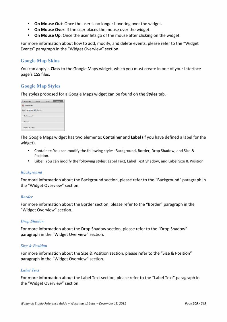
Wakanda Studio Reference Guide – Wakanda v1 beta – December 15, 2011 Page 209 / 249
• On Mouse Out: Once the user is no longer hovering over the widget. • On Mouse Over: If the user places the mouse over the widget. • On Mouse Up: Once the user lets go of the mouse after clicking on the widget.
For more information about how to add, modify, and delete events, please refer to the “Widget Events” paragraph in the “Widget Overview” section.
Google Map Skins You can apply a Class to the Google Maps widget, which you must create in one of your Interface page’s CSS files.
Google Map Styles The styles proposed for a Google Maps widget can be found on the Styles tab.
The Google Maps widget has two elements: Container and Label (if you have defined a label for the widget).
• Container: You can modify the following styles: Background, Border, Drop Shadow, and Size & Position.
• Label: You can modify the following styles: Label Text, Label Text Shadow, and Label Size & Position.
Background
For more information about the Background section, please refer to the “Background” paragraph in the “Widget Overview” section.
Border
For more information about the Border section, please refer to the “Border” paragraph in the “Widget Overview” section.
Drop Shadow
For more information about the Drop Shadow section, please refer to the “Drop Shadow” paragraph in the “Widget Overview” section.
Size & Position
For more information about the Size & Position section, please refer to the “Size & Position” paragraph in the “Widget Overview” section.
Label Text
For more information about the Label Text section, please refer to the “Label Text” paragraph in the “Widget Overview” section.

Wakanda Studio Reference Guide – Wakanda v1 beta – December 15, 2011 Page 210 / 249
Label Text Shadow
For more information about the Label Text Shadow section, please refer to the “Label Text Shadow” paragraph in the “Widget Overview” section.
Label Size and Position
For more information about the Label Size & Position section, please refer to the “Label Size & Position” paragraph in the “Widget Overview” section.
Yahoo! Weather Note: This widget is only available in the development branch for Wakanda.
The Yahoo! Weather widget, which is an experimental widget, allows you to retrieve the current weather conditions along with the forecast for the current day and next day for a specific U.S. zip code. The image is published to your web page as shown below:
Creating a Yahoo! Weather Widget You create a Yahoo! Weather widget either by dragging and dropping the widget in an empty space on the Designer Workspace, double-‐clicking on it, or drawing it to the size you want directly on the Designer Workspace.
The Yahoo! Weather widget appears as shown below on your Interface page’s Designer Workspace:
Yahoo! Weather Widget Properties The Yahoo! Weather widget has the following properties:

Wakanda Studio Reference Guide – Wakanda v1 beta – December 15, 2011 Page 211 / 249
• ID: Wakanda automatically generates this unique ID; however, you can modify it. It must
begin with a letter and can contain letters, digits, hyphens, and underscores. This ID is equivalent to the ID in HTML and can be used in JavaScript routines, such as getElementById. You can also include accented and non-‐Roman letters. For more information, please refer to the “Naming Conventions” section.
• Source: Name of the datasource. You can either enter the name of an existing datasource or assign it automatically by dragging and dropping the datasource onto the widget. If the datasource whose name you entered doesn’t exist, a variable datasource will be created automatically. The datasource should contain a U.S. zip code.
• Label: Label of the Yahoo! Weather widget.
Yahoo! Weather Events You can execute code during the following mouse events for a Yahoo! Weather widget:
• On Click: When the widget is clicked. • On Double Click: When the widget is double-‐clicked. • On Mouse Down: If the user holds the mouse down on the widget. • On Mouse Move: When the user moves the mouse while over the widget. • On Mouse Out: Once the user is no longer hovering over the widget. • On Mouse Over: If the user places the mouse over the widget. • On Mouse Up: Once the user lets go of the mouse after clicking on the widget.
For more information about how to add, modify, and delete events, please refer to the “Widget Events” paragraph in the “Widget Overview” section.
Yahoo! Weather Skins You can apply a Class to the Yahoo! Weather widget, which you must create in one of your Interface page’s CSS files.
Yahoo! Weather Styles The styles proposed for a Yahoo! Weather widget can be found on the Styles tab.

Wakanda Studio Reference Guide – Wakanda v1 beta – December 15, 2011 Page 212 / 249
The Yahoo! Weather widget has two elements: Container and Label (if you have defined a label for the widget).
• Container: You can modify the following styles: Background, Border, and Size & Position. • Label: You can modify the following styles: Label Text, Label Text Shadow, and Label Size & Position.
Background
For more information about the Background section, please refer to the “Background” paragraph in the “Widget Overview” section.
Border
For more information about the Border section, please refer to the “Border” paragraph in the “Widget Overview” section.
Size & Position
For more information about the Size & Position section, please refer to the “Size & Position” paragraph in the “Widget Overview” section.
Label Text
For more information about the Label Text section, please refer to the “Label Text” paragraph in the “Widget Overview” section.
Label Text Shadow
For more information about the Label Text Shadow section, please refer to the “Label Text Shadow” paragraph in the “Widget Overview” section.
Label Size and Position
For more information about the Label Size & Position section, please refer to the “Label Size & Position” paragraph in the “Widget Overview” section.
Publishing a Yahoo! Weather Widget Once you have published the Yahoo! Weather widget, as shown at the top of this section, you can change the setting by clicking on the icon. The following area appears, allowing you to select either Fahrenheit (default) or Celsius:
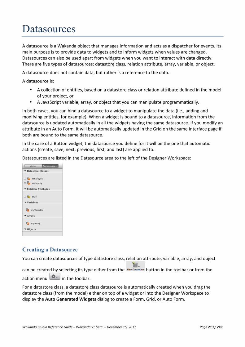
Wakanda Studio Reference Guide – Wakanda v1 beta – December 15, 2011 Page 213 / 249
Datasources A datasource is a Wakanda object that manages information and acts as a dispatcher for events. Its main purpose is to provide data to widgets and to inform widgets when values are changed. Datasources can also be used apart from widgets when you want to interact with data directly. There are five types of datasources: datastore class, relation attribute, array, variable, or object.
A datasource does not contain data, but rather is a reference to the data.
A datasource is:
• A collection of entities, based on a datastore class or relation attribute defined in the model of your project, or
• A JavaScript variable, array, or object that you can manipulate programmatically.
In both cases, you can bind a datasource to a widget to manipulate the data (i.e., adding and modifying entities, for example). When a widget is bound to a datasource, information from the datasource is updated automatically in all the widgets having the same datasource. If you modify an attribute in an Auto Form, it will be automatically updated in the Grid on the same Interface page if both are bound to the same datasource.
In the case of a Button widget, the datasource you define for it will be the one that automatic actions (create, save, next, previous, first, and last) are applied to.
Datasources are listed in the Datasource area to the left of the Designer Workspace:
Creating a Datasource You can create datasources of type datastore class, relation attribute, variable, array, and object
can be created by selecting its type either from the button in the toolbar or from the
action menu in the toolbar.
For a datastore class, a datastore class datasource is automatically created when you drag the datastore class (from the model) either on top of a widget or into the Designer Workspace to display the Auto Generated Widgets dialog to create a Form, Grid, or Auto Form.
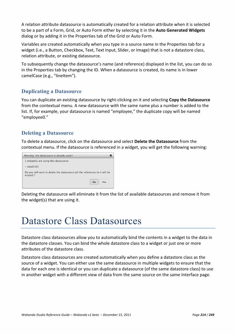
Wakanda Studio Reference Guide – Wakanda v1 beta – December 15, 2011 Page 214 / 249
A relation attribute datasource is automatically created for a relation attribute when it is selected to be a part of a Form, Grid, or Auto Form either by selecting it in the Auto Generated Widgets dialog or by adding it in the Properties tab of the Grid or Auto Form.
Variables are created automatically when you type in a source name in the Properties tab for a widget (i.e., a Button, Checkbox, Text, Text Input, Slider, or Image) that is not a datastore class, relation attribute, or existing datasource.
To subsequently change the datasource’s name (and reference) displayed in the list, you can do so in the Properties tab by changing the ID. When a datasource is created, its name is in lower camelCase (e.g., "lineItem").
Duplicating a Datasource You can duplicate an existing datasource by right-‐clicking on it and selecting Copy the Datasource from the contextual menu. A new datasource with the same name plus a number is added to the list. If, for example, your datasource is named “employee,” the duplicate copy will be named “employee0.”
Deleting a Datasource To delete a datasource, click on the datasource and select Delete the Datasource from the contextual menu. If the datasource is referenced in a widget, you will get the following warning:
Deleting the datasource will eliminate it from the list of available datasources and remove it from the widget(s) that are using it.
Datastore Class Datasources Datastore class datasources allow you to automatically bind the contents in a widget to the data in the datastore classes. You can bind the whole datastore class to a widget or just one or more attributes of the datastore class.
Datastore class datasources are created automatically when you define a datastore class as the source of a widget. You can either use the same datasource in multiple widgets to ensure that the data for each one is identical or you can duplicate a datasource (of the same datastore class) to use in another widget with a different view of data from the same source on the same Interface page.

Wakanda Studio Reference Guide – Wakanda v1 beta – December 15, 2011 Page 215 / 249
Creating a Datastore Class Datasource A datastore class datasource is automatically created when you drag a datastore class from the Model on top of a widget to bind it to it. If a datastore class datasource, whose name is the same as the datastore class already exists, it will be reused. Otherwise, a new one will be created.
You can also create a datastore class by selecting Datastore Class either from the button in the toolbar or from the action menu in the toolbar. When you do so, the following dialog appears allowing you to select an existing datastore class in your model:
Duplicating a Datastore Class Datasource You can duplicate an existing datastore class datasource in the list by selecting Copy the Datasource from its contextual menu. A new datasource with the same name plus a number is added to the list. If your datasource is named “employee,” the duplicate copy will be named “employee0.” The ID will have this new name, but the source will be the same as the duplicated datasource.
Deleting a Datastore Class Datasource To delete a datastore class datasource, right-‐click on the datasource and select Delete the Datasource. If the datasource is referenced in a widget, you will get the following warning:
Deleting the datasource will eliminate it from the list of available datasources and remove it from the widget(s) that are using it.
Datastore Class Datasource Properties To access the datastore class datasource’s properties, select the datasource in the Datasources tab. The datasource’s properties appear in the Properties tab:

Wakanda Studio Reference Guide – Wakanda v1 beta – December 15, 2011 Page 216 / 249
Properties for datastore class datasources are the following:
• ID: Name of the datastore class datasource. Wakanda generates a unique ID for datasources created through the New Datasource menu item or those that are duplicated; however, you can modify it. The ID must begin with a letter and can contain letters, digits, hyphens, and underscores. You can also include accented and non-‐Roman letters. For more information, please refer to the “Naming Conventions” section.
• Datastore Class: The name of the datastore class. When typing into this area, dropdown menus appear to assist you in entering the correct information.
• Initial Query: When checked, Wakanda queries the data from the datasource for a widget when it is displayed on an Interface page. By default, this checkbox is selected thus returning all the entities in the datastore class.
• Initial Query String: The initial query executed for this datasource with the following syntax: {Attribute Name} {Comparator} {Value}, such as firstName = “a*” to find all the entities whose attribute firstName starts with “a”. For more information regarding the query syntax, please refer to “Defining Queries (Client-‐side)” in the Dataprovider API.
• Initial Order By String: Include an Order By statement for your datasource so that the first time the datasource is displayed, the data will be sorted according to the attribute and order defined in this field. The syntax is {Attribute Name} Sort Order, which can be blank, ASC, or DESC. You can include more than one attribute, such as “lastName ASC, firstName DESC”. For more information regarding the order by syntax, please refer to “Defining Queries (Client-‐side)” in the Dataprovider API.
• Auto-‐generated ID: This property only appears for datasources used in a Web Component. Please refer to the Web Component widget for more information.
Datastore Class Datasource Events You can add code to the following events for your datastore class datasource:
• On Before Current Element Change: Before the current element (in this case a datastore entity) changes. You can use this event to get the current value of an attribute just before it changes.
• On Current Element Change: When the current element (in this case a datastore entity) changes.
• On Element Saved: When an element (in this case a datastore entity) has been saved on the server.
• On Collection Change: When the collection changes.
Note: For more information on datasource events, please refer to the addListener method description in the Datasource API doc.

Wakanda Studio Reference Guide – Wakanda v1 beta – December 15, 2011 Page 217 / 249
You can also create events on all the attributes, by selecting the attribute from the pop-‐up menu and clicking on the icon:
The event added for the attribute is displayed in the Attributes section:
When you click the icon, the JavaScript file associated to your Interface page opens up in a new tab above the toolbar, indicating where to add your code for the specific event in the Code Editor. To delete the code for the specific event in the JavaScript file, click on the icon next to the event.
HTML Code for a Datastore Class Datasource In the header of your Interface page, you can view the HTML code for a datastore class datasource:
<meta data-‐type="dataSource" data-‐lib="WAF" data-‐source="Company" data-‐source-‐type="dataClass" data-‐dataType="string" data-‐autoLoad="true" name="WAF.config.datasources" data-‐id="company" content="company"/>
Relation Attribute Datasources A relation attribute datasource is a datasource based upon a relation attribute in another datasource. It can be created automatically by dragging a relation attribute in an existing datasource onto a widget.
Relation attribute datasources allow you to create entities that are automatically related to an entity in the parent datastore class. In our example of companies and employees, we have the relation attribute “staff.” If we have two Grid widgets, one with the “company” datastore class datasource and another with the “company.staff” relation attribute datasource, on an Interface page, you can assign employees to a company by selecting a company in the first Grid and adding new entities to the “company.staff” Grid.

Wakanda Studio Reference Guide – Wakanda v1 beta – December 15, 2011 Page 218 / 249
Creating a Relation Attribute Datasource A relation attribute datasource is automatically created when you drag the relation attribute from the Model on top of a widget (e.g., a Grid, Auto Form, or Form) to bind it to it. If a relation attribute datasource already exists, it will be reused.
You can also create a relation attribute by selecting Relation Attribute either from the
button in the toolbar or from the action menu in the toolbar. When you do so, the following dialog appears, containing all the datastore classes and datasources defined on your Interface page. You can click on the datastore class or datasource to view its relation attributes and select one to create a new relation attribute datasource:
Duplicating a Relation Attribute Datasource You can duplicate an existing relation attribute datasource in the list by selecting Copy the Datasource from its contextual menu. A new datasource with the same name plus a number is added to the list. If your datasource is named “staff,” the duplicate copy will be named “staff0.” The ID will have this new name, but the source will be the same as the duplicated datasource.
Deleting a Relation Attribute Datasource To delete a relation attribute datasource, right-‐click on the datasource and select Delete the Datasource. If the datasource is referenced in a widget, you will get the following warning:
Deleting the datasource will eliminate it from the list of available datasources and remove it from the widget(s) that are using it.

Wakanda Studio Reference Guide – Wakanda v1 beta – December 15, 2011 Page 219 / 249
Relation Attribute Datasource Properties To access the relation attribute datasource’s properties, select the datasource in the Datasources tab. The datasource’s properties appear in the Properties tab:
Properties for relation attribute datasources are the following:
• ID: Name of the relation attribute datasource. Wakanda generates a unique ID for datasources created through the New Datasource menu item or those that are duplicated; however, you can modify it. The ID must begin with a letter and can contain letters, digits, hyphens, and underscores. You can also include accented and non-‐Roman letters. For more information, please refer to the “Naming Conventions” section.
• Relation Attribute: Name of the relation attribute written as “{Datastore Class Datasource Name}.{Relation Attribute Name}”.
• Initial Query: When checked, Wakanda queries the data from the datasource for a widget when it is displayed on an Interface page. By default, this checkbox is selected thus returning all the entities in the relation attribute.
• Initial Query String: Write a query that will be used for this datasource with the following syntax: {Attribute Name} Comparator Value, such as staff.firstName = “a*” to find all the entities whose attribute firstName starts with “a”. For more information regarding the query syntax, please refer to “Defining Queries (Client-‐side)” in the Dataprovider API.
• Initial Order By String: Include an Order By statement for your datasource so that the first time the datasource is displayed, the data will be sorted according to the attribute and order defined in this field. The syntax is {Attribute Name} Sort Order, which can be blank, ASC, or DESC. You can include more than one attribute, such as “staff.lastName ASC, staff.firstName DESC”. For more information regarding the order by syntax, please refer to “Defining Queries (Client-‐side)” in the Dataprovider API.
• Auto-‐generated ID: This property only appears for datasources used in a Web Component. Please refer to the Web Component widget for more information.
Relation Attribute Datasource Events You can add code to the following events for your relation attribute datasource:
• On Before Current Element Change: Before the current element (in this case a datastore entity) changes. You can use this event to get the current value of an attribute just before it changes.
• On Current Element Change: When the current element (in this case a datastore entity) changes.

Wakanda Studio Reference Guide – Wakanda v1 beta – December 15, 2011 Page 220 / 249
• On Element Saved: When an element (in this case a datastore entity) has been saved on the server.
• On Collection Change: When the collection changes.
You can also create events on all the attributes of the relation attribute, by selecting the attribute from the pop-‐up menu in the Attributes area and clicking on the icon:
The event added for the attribute is displayed in the Attributes section:
When you click the icon, the JavaScript file associated to your Interface page opens up in a new tab above the toolbar, indicating where to add your code for the specific event in the Code Editor. To delete the code for the specific event in the JavaScript file, click on the icon next to the event.
Note: For more information on datasource events, please refer to the addListener method description in the Datasource API doc.
Using a Relation Attribute Datasource Using our structure with two datastore classes, company and employee, you can automatically relate employees to a current company entity. To do so, you just need one widget whose datasource is the parent datastore class, “company,” and another widget whose datasource is a relation attribute in the parent datastore class, “company.staff”.
For example, we have two Text widgets on our Interface page with the same datastore class datasource “company” whose datasources are company.name and company.url. For each current entity in the “company” datasource, we can add, modify, delete, and display entities in the Grid widget whose relation attribute datasource is “company.staff”.

Wakanda Studio Reference Guide – Wakanda v1 beta – December 15, 2011 Page 221 / 249
When we display our Interface page, the first entity is displayed and with it the related entities in the “Staff” Grid whose relation attribute datasource is “company.staff”.
By navigating to the next entity in the “company” datasource, the Grid widget is also updated:
HTML Code for a Relation Attribute Datasource In the header of your Interface page, you can view the HTML code for a relation attribute datasource:
<meta data-‐type="dataSource" data-‐lib="WAF" data-‐source="company.staff" data-‐source-‐type="dataClass" data-‐dataType="string" data-‐autoLoad="true" name="WAF.config.datasources" data-‐id="staff" content="staff"/>

Wakanda Studio Reference Guide – Wakanda v1 beta – December 15, 2011 Page 222 / 249
Variable Datasources A variable datasource is one that uses as its underlying data a JavaScript variable. Variable datasources are objects whose contents are defined by a JavaScript variable. Note that when you create and use such a datasource in your interface, you need to manage the synchronization between the datasource and the JavaScript variable through your code.
Creating a Variable Datasource Variables are automatically created when you insert a source name that is different from any already existing datasource (of any type) in the Source field for most widgets: button, checkbox, text, text input, slider, or image. For example, when you insert a name like “myVariable” into the Source field of a widget, the variable “myVariable” is automatically created.
You can also create a variable by selecting Variable either from the button in the toolbar or from the action menu in the toolbar.
Duplicating a Variable Datasource You can duplicate an existing variable datasource in the list by selecting Copy the Datasource from its contextual menu. A new datasource with the same name plus a number is added to the list. If your datasource is named “myVariable,” the duplicate copy will be named “myVariable0.” The ID will have this new name, but the source will be the same as the duplicated datasource.
Deleting a Variable Datasource To remove a variable datasource, right-‐click on the datasource and select Delete the Datasource. If the datasource is referenced in a widget, you will get the following warning:
Deleting this datasource will eliminate it from the list of available datasources and remove it from the widget(s) that are using it.
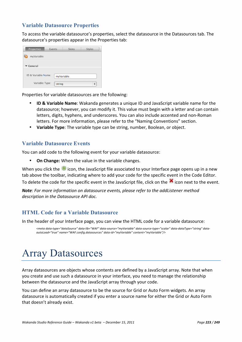
Wakanda Studio Reference Guide – Wakanda v1 beta – December 15, 2011 Page 223 / 249
Variable Datasource Properties To access the variable datasource’s properties, select the datasource in the Datasources tab. The datasource’s properties appear in the Properties tab:
Properties for variable datasources are the following:
• ID & Variable Name: Wakanda generates a unique ID and JavaScript variable name for the datasource; however, you can modify it. This value must begin with a letter and can contain letters, digits, hyphens, and underscores. You can also include accented and non-‐Roman letters. For more information, please refer to the “Naming Conventions” section.
• Variable Type: The variable type can be string, number, Boolean, or object.
Variable Datasource Events You can add code to the following event for your variable datasource:
• On Change: When the value in the variable changes.
When you click the icon, the JavaScript file associated to your Interface page opens up in a new tab above the toolbar, indicating where to add your code for the specific event in the Code Editor. To delete the code for the specific event in the JavaScript file, click on the icon next to the event.
Note: For more information on datasource events, please refer to the addListener method description in the Datasource API doc.
HTML Code for a Variable Datasource In the header of your Interface page, you can view the HTML code for a variable datasource:
<meta data-‐type="dataSource" data-‐lib="WAF" data-‐source="myVariable" data-‐source-‐type="scalar" data-‐dataType="string" data-‐autoLoad="true" name="WAF.config.datasources" data-‐id="myVariable" content="myVariable"/>
Array Datasources Array datasources are objects whose contents are defined by a JavaScript array. Note that when you create and use such a datasource in your interface, you need to manage the relationship between the datasource and the JavaScript array through your code.
You can define an array datasource to be the source for Grid or Auto Form widgets. An array datasource is automatically created if you enter a source name for either the Grid or Auto Form that doesn’t already exist.

Wakanda Studio Reference Guide – Wakanda v1 beta – December 15, 2011 Page 224 / 249
The attributes of an array datasource can be bound to widgets that are usually bound to an attribute, like an Input Text widget. In this case, the source would be as follows: {Array Name}.{Attribute Name}.
Note: An array used as a datasource is an array of objects: each element of the array is an object. All the objects in the array have the same attributes. For example, here, we have an array of objects that have two attributes, name and salary:
[{name: ’John Doe’, salary:12345}, … {name:’Jean Dupont’, salary:34567}]
Creating an Array Datasource
You can create an array by selecting Array either from the button in the toolbar or
from the action menu in the toolbar.
Duplicating an Array Datasource You can duplicate an existing array datasource in the list by selecting Copy the Datasource from its contextual menu. A new datasource with the same name plus a number is added to the list. If your datasource is named “myArray,” the duplicate copy will be named “myArray0.” The ID will have this new name, but the source will be the same as the duplicated datasource.
Deleting an Array Datasource To delete an array datasource, right-‐click on the datasource and select Delete the Datasource. If the datasource is referenced in a widget, you will get the following warning:
Deleting this datasource will delete it from the list of available datasources and remove it from the widget(s) that are using it.
Array Datasource Properties To access the array datasource’s properties, select the datasource in the Datasources tab. The datasource’s properties appear in the Properties tab:

Wakanda Studio Reference Guide – Wakanda v1 beta – December 15, 2011 Page 225 / 249
Properties for array datasources are the following:
• ID & Variable Name: Wakanda generates a unique ID and JavaScript variable name for the datasource; however, you can modify it. This value must begin with a letter and can contain letters, digits, hyphens, and underscores. You can also include accented and non-‐Roman letters. For more information, please refer to the “Naming Conventions” section.
Attributes You can add attributes to your array, by clicking Add an Attribute in the Attributes area in the Properties tab. The attributes defined correspond to the attributes of each object in the array.
In the Name and Property fields, you insert the name of your attribute and its property (string, number, Boolean, or object).
To change the order of the attributes, drag the icon next to the attribute above or below the other attributes. To delete an attribute, click on the icon that appears when you hover over the attribute.
Array Datasource Events You can add code to the following events for your array datasource:
• On Before Current Element Change: Before the current element changes. You can use this event to get the current value of an attribute just before it changes.
• On Current Element Change: When the current element changes. • On Collection Change: When the collection changes.
Note: For more information on datasource events, please refer to the addListener method description in the Datasource API doc.
HTML Code for an Array Datasource In the header of your Interface page, you can view the HTML code for an array datasource:
< meta data-‐type="dataSource" data-‐lib="WAF" data-‐source-‐type="array" data-‐dataType="string" data-‐autoLoad="true" name="WAF.config.datasources" data-‐id="myArray" data-‐source="myArray" data-‐attributes="Cities:string" content="myArray"/>

Wakanda Studio Reference Guide – Wakanda v1 beta – December 15, 2011 Page 226 / 249
Object Datasources Object datasources are objects whose contents are defined by a JavaScript object. Note that when you create and use such a datasource in your interface, you need to manage the relationship between the datasource and the JavaScript object through your code.
Object datasources can be the source for Grid or Auto Form widgets. Its attributes can be bound to widgets that are usually bound to an attribute, like an Input Text widget. In this case, the source would be as follows: {Object Name}.{Attribute Name}.
Note: An object used as a datasource is similar to an array; however, the object must be defined by curly brackets, “{…}” instead of brackets, “[…].”
Creating an Object Datasource
You can create an object by selecting Object either from the button in the toolbar or from the action menu in the toolbar.
Duplicating an Object Datasource You can duplicate an existing object datasource in the list by selecting Copy the Datasource from its contextual menu. A new datasource with the same name plus a number is added to the list. If your datasource is named “myObject,” the duplicate copy will be named “myObject0.” The ID will have this new name, but the source will be the same as the duplicated datasource.
Deleting an Object Datasource To delete an object datasource, right-‐click on the datasource and select Delete the Datasource. If the datasource is referenced in a widget, you will get the following warning:
Deleting this datasource will eliminate it from the list of available datasources and remove it from the widget(s) that are using it.
Object Datasource Properties To access the object datasource’s properties, select the datasource in the Datasources tab. The datasource’s properties appear in the Properties tab:

Wakanda Studio Reference Guide – Wakanda v1 beta – December 15, 2011 Page 227 / 249
Properties for object datasources are the following:
• ID & Variable Name: Wakanda generates a unique ID and JavaScript variable name for the datasource; however, you can modify it. This value must begin with a letter and can contain letters, digits, hyphens, and underscores. You can also include accented and non-‐Roman letters. For more information, please refer to the “Naming Conventions” section.
Attributes You can add attributes to your object datasource, by clicking Add an Attribute in the Attributes area in the Properties tab.
In the Name and Property fields, insert the name of your attribute and its property (string, number, Boolean, or object).
To change the order of the attributes, drag the icon next to the attribute above or below the other attributes. To delete an attribute, click on the icon that appears when you hover over the attribute.
Object Datasource Events You can add code to the following events for your object datasource:
• On Before Current Element Change: Before the current element changes. You can use this event to get the current value of an element just before it changes.
• On Current Element Change: When the current element changes. • On Collection Change: When the collection changes.
Note: For more information on datasource events, please refer to the addListener method description in the Datasource API doc.
HTML Code for an Object Datasource In the header of your Interface page, you can view the HTML code for an object datasource:
<meta data-‐type="dataSource" data-‐lib="WAF" data-‐source-‐type="object" data-‐dataType="string" data-‐autoLoad="true" name="WAF.config.datasources" data-‐id="myObject" data-‐source="myObject" data-‐attributes="Cities:string" content="myObject"/>

Wakanda Studio Reference Guide – Wakanda v1 beta – December 15, 2011 Page 228 / 249
Code Editor Overview Wakanda’s Code Editor is a powerful editor where you can write your JavaScript code for events and functions in datastore classes, attributes, Interface pages, widgets, and much more. Besides JavaScript, you can also edit files in XML, JSON, PHP, and CSS.
When you open any script file or edit an event in a datastore class or Interface page, the Code Editor appears as shown below:
The Code Editor is made up of the following areas:
• Toolbar • Editable Area • Results Area • Status Bar • Outline
Toolbar The Code Editor toolbar allows quick access to many key functions that you will be using. You can customize the toolbar by selecting which options to display, how to display them (text only, text and icon or icon only), and if you prefer to display small icons or the larger ones.

Wakanda Studio Reference Guide – Wakanda v1 beta – December 15, 2011 Page 229 / 249
The toolbar contains the following default functions:
• Save: Saves the current file opened in the Code Editor. • Project: Runs the default project’s main Interface page (e.g., “index.html”) in your default Web
browser. (The default project is defined in the Solution Explorer). If the server has not yet been started, Wakanda will start it when you click on this button.
• File: Runs the file currently open in the Code Editor. This button is useful for server-‐side JavaScript files. The results area will show the results for your server-‐side JavaScript file (which is not located in your WebFolder). If the server has not yet been started, Wakanda will start it when you click on this button.
• Blocks: This dropdown menu allows you to select multiple items, such as Select Block, Start of Block, and End of Block.
• Bookmarks: This dropdown menu contains multiple items that allow you to manage bookmarks by either toggling one, going to the previous or next one, or removing all of the bookmarks in the file.
• Collapse: Collapses the selection, current level, or all the blocks. • Expand: Expands the selection, current level, or all the blocks. • Comments: Comments or uncomments the current line or the selected lines of code. • Find: Displays a Find area above the editable area where you can find and replace a text string in
your file.
• Display: This menu allows you to modify the options displayed in the toolbar. The following two
menu items allow you to modify how the toolbar is displayed: § Toolbar Preferences: Allows you to set the display of the toolbar items (text only, text and
icon or icon only) as well as the size of the icons. § Toolbar Content: Allows you to select which options you’d like to display in the toolbar as
well as reset to the default options.
Note: For the item that you toggle, once it is hidden, the next time you click on the Display menu bar, it will be visible again.
The toolbar also contains the following functions that you can add by toggling them in the Toolbar Content menu:
• Move Line Up: Moves the current line up in the editable area. • Move Lines Down: Moves the current line down in the editable area. • Previous Error or Warning: Goes to the previous error or warning in your code. The icon appears
next to the line number as well. • Next Error: Goes to the next error or warning in your code. The icon appears next to the line
number as well. • Select Block: Selects the block where your cursor is currently located. • Start of Block: Places your cursor at the beginning of the block where your cursor is currently
located. • End of Block: Places your cursor at the end of the block where your cursor is currently located. • Toggle Bookmark: Toggle a bookmark at the line where your cursor is currently located. • Previous Bookmark: Goes to the previous bookmark in the file. • Next Bookmark: Goes to the next bookmark in the file. • Remove all Bookmarks: Removes all bookmarks in the file.
If all the items in the toolbar cannot be displayed due to lack of space, the icon appears in the toolbar. When you click on it, the missing toolbar icons appear in a hierarchical menu.
The icon opens your project’s catalog in the Datastore Model Designer if the JavaScript file is attached either to your model or to an Interface page.

Wakanda Studio Reference Guide – Wakanda v1 beta – December 15, 2011 Page 230 / 249
The icon allows you to toggle the Outline area to the right of the editable area.
A menu appears when you click on the button displays many of the same options as in the toolbar as well as a few others:
• Save: Saves the current file opened in the Code Editor. • Run: Runs the current file. • Edit: This menu allows you to cut, copy, and paste text, move a line up or down (Command-‐Option-‐
Up Arrow/Command-‐Option-‐Down Arrow on Mac), shift the line to the left or right, comment/uncomment a line, or render the text uppercase, lowercase, or camel case.
• Navigation: This menu allows you to go to a definition, search references, go to a specific line, go to the previous or next error or warning, toggle a bookmark or go to the next or previous bookmark.
• View: Select to show or hide the status bar, outline panel, line numbers, and white spaces. This menu also allows you to increase or decrease the font size in the editable area.
• Find: This menu offers all the features in the Find and Replace dialog, allowing you to search in multiple files, along with bookmarking all the occurrences of what you searched on.
• Blocks: This menu allows you to select the block or to go to the start or end of the block. You can also collapse or expand the current level, selection, or all the levels.
• Encoding: With this menu, you can change the line ending or the text encoding with standard options in Unicode, Macintosh, Windows, ISO, or a few others.
• Automatic Insertion: You can select or deselect three options: Tabs, Blocks, and Closing Characters. Tabs allows you to auto-‐indent based on the previous line. Blocks completes block statements (i.e., While loops, For loops, and If…Else statements). Closing Characters completes all opening characters, like quotes, parenthesis, brackets, and braces.
Editable Area The editable area has many features that you can use to write and debug your JavaScript code. Wakanda automatically checks the syntax of your code as soon as you finish writing one line and hit return to go to the next line.
Colored Bar
The colored bar to the left of the line numbers indicates the status of the line:
• Dark grey: Indicates non-‐modifiable lines, which were inserted automatically by Wakanda. • Green: Line of code that was modified and saved. • Yellow: Line of code that was modified, but not yet saved. • No color: Line of code not modified.
When you collapse a level, the image appears, indicating that there is code in the level:
Wakanda Studio Reference Guide – Wakanda v1 beta – December 15, 2011 Page 231 / 249
Colorized Text for JavaScript
Wakanda automatically colorizes your JavaScript code. Most text is in black; however, there are a few other colors for specific items you type into your file:
• Blue: JavaScript keywords as well as parenthesis (), curly brackets {} and brackets [] when your cursor is inside of them.
• Red: All numbers except those in names. • Green: All quotes and double-‐quotes as well as the text, which is italicized as well, inside of them. • Gray: Commented text, written with either “//” or in between “/*…*/”.
Colorized Text for HTML
Wakanda automatically colorizes your HTML files. Most text is in black; however, there are a few other colors for specific items you type into your file:
• Blue: The <> characters when your cursor is inside of them. • Red: HTML tag names.
Colorized Text for CSS
Wakanda automatically colorizes your CSS files. Most text is in black; however, there are a few other colors for specific items you type into your file:
• Blue: Curly brackets {} when your cursor is inside of them. • Red: All numbers and values beginning with the pound sign, “#”. • Gray: Commented text, written with either “//” or in between “/*…*/”.
Colorized Text for PHP
Wakanda automatically colorizes your PHP code. Most text is in black; however, there are a few other colors for specific items you type into your file:
• Blue: Some PHP keywords as well as parenthesis (), curly brackets {} and brackets [] when your cursor is inside of them.
• Red: All numbers and values beginning with the pound sign, “#”. • Green: Certain keywords like “function” and “return.” All quotes and double-‐quotes as well as the
text, which is italicized as well, inside of them. • Gray: Commented text, written with either “//” or in between “/*…*/”.
Colorized Text for XML
Wakanda automatically colorizes your XML files. Most text is in gray; however, there are a few other colors for specific items you type into your file:
• Blue: XML element names as well as “<>” when your cursor is inside of them. • Green: Attribute values inside of quotes and double-‐quotes. • Red: All numbers and values beginning with the pound sign, “#”. • Gray: Commented text, written with either “//” or in between “/*…*/”.
Customizing the Editable Area You can modify the background color and font, font colors, and font styles for the editable area in the Code Editor. If you want to modify these values directly in the Wakanda Studio Preferences, please refer to the “Background Color Elements” and the “method_editor Element” paragraphs.

Wakanda Studio Reference Guide – Wakanda v1 beta – December 15, 2011 Page 232 / 249
Modifying Background Color
From the contextual menu in the editable area, you can modify the background color for file that you are modifying. There are five different types:
• Page script • Model script • Server-‐Side execution • Client-‐Side execution • All other files (e.g., CSS or HTML)
Modifying Font, Font Colors, and Font Styles
You can modify the font, font color, and font style in the Code Editor by selecting each element (keywords, comments, numbers, strings, and other text) individually in the following menu items:
• Font: Select the font from this menu item. The font applies to all elements in the Code Editor. • Style: This menu has four items that you can use to modify the font styles. • Font Color: Select the color of the font you’d like to use. • Bold: Make the font bold. • Italic: Make the font italic. • Underline: Underline the font.
Note: For monospace fonts, like Monaco, “italic” and “underline” are not supported.
Contextual Menu The contextual menu in the editable area offers many of the options available to you in the toolbar and standard Edit menu as well as the following two:
• Goto Definition: Allows you to go to the definition of a JavaScript symbol either in the same JavaScript file or in another file in the Code Editor.
• Find References: Allows you to find the highlighted/selected value in the Code Editor in all the JavaScript, HTML, CSS, and XML files in the project and display them in the Find Results dialog
Goto Definition
The Goto Definition feature allows you to go directly to the definition of a JavaScript symbol (i.e., a variable, object, array, datastore class, attribute, or method -‐-‐ anything you defined in Wakanda Studio) in one or more JavaScript files in your current project. You access this feature by either putting your cursor in the name of the JavaScript variable or by highlighting it completely and then you can select Goto Definition from the contextual menu.
If your JavaScript variable is named “obj.element1,” you can find its definition either by highlighting it in its entirety or by placing your cursor somewhere in the property “element1.”
If no definition was found, the following alert appears:

Wakanda Studio Reference Guide – Wakanda v1 beta – December 15, 2011 Page 233 / 249
If one definition was found, your cursor will go to that line either in the same JavaScript file or will open the JavaScript file that contains the JavaScript variable’s definition. If you choose to go to the definition of a datastore class or attribute, the Datastore Model Designer is opened in a new tab to show you the definition.
If multiple definitions were found in your project, the following pop-‐up menu appears, allowing you to select which one:
Note: The icons next to the entry are the same as those in the Outline. For more information, please refer to the Outline section below.
Find References
You can highlight text or a word in the Code Editor and select Find References from the contextual menu, Wakanda searches all the JavaScript, HTML, CSS, and XML files in the project and returns the results in the Find Results dialog:

Wakanda Studio Reference Guide – Wakanda v1 beta – December 15, 2011 Page 234 / 249
Results Area The Results Area displays the result of your server-‐side JavaScript file when you execute it in the Code Editor. The result of your function, which is returned by the “Return” function, appears after
you hit the button in the toolbar:
Status Bar The status bar indicates the location of your cursor and appears in the footer of the Code Editor:
• Ln: Line number • Col: Column number • Ch: Character number in the line
The four JavaScript file types are also indicated in the status bar:
• Server-‐side Execution • Client-‐side Execution • Model Script • Page Script
In the status bar, is also indicated any errors for the line where your cursor is located:
Note: No file type is indicated in the status bar for non-‐JavaScript files (e.g., CSS or HTML).

Wakanda Studio Reference Guide – Wakanda v1 beta – December 15, 2011 Page 235 / 249
Outline Area
If you click on the icon, you can toggle the Outline area to the right of the editable area. You can quickly navigate your JavaScript file by clicking on the item in the outline.
In this area, you can view your JavaScript methods, functions, arrays, and variables in outline form:
Return values for functions are displayed along with the different data types for each object using the following icons:
Icon Type
Array
Argument
Boolean
Function
Number
Object
Property
RegEx
String
Variable
By default, the outline displays your code as it appears. If you click on the icon, the outline is sorted alphabetically.
Click on the icon to collapse the outline and the icon to expand it again.
The Code Editor also parses certain JSDoc commands, like @param, @return, and @deprecated. When you include them in your code, the outline will display them accordingly.
For more information about JSDoc, please refer to http://code.google.com/p/jsdoc-‐toolkit/.
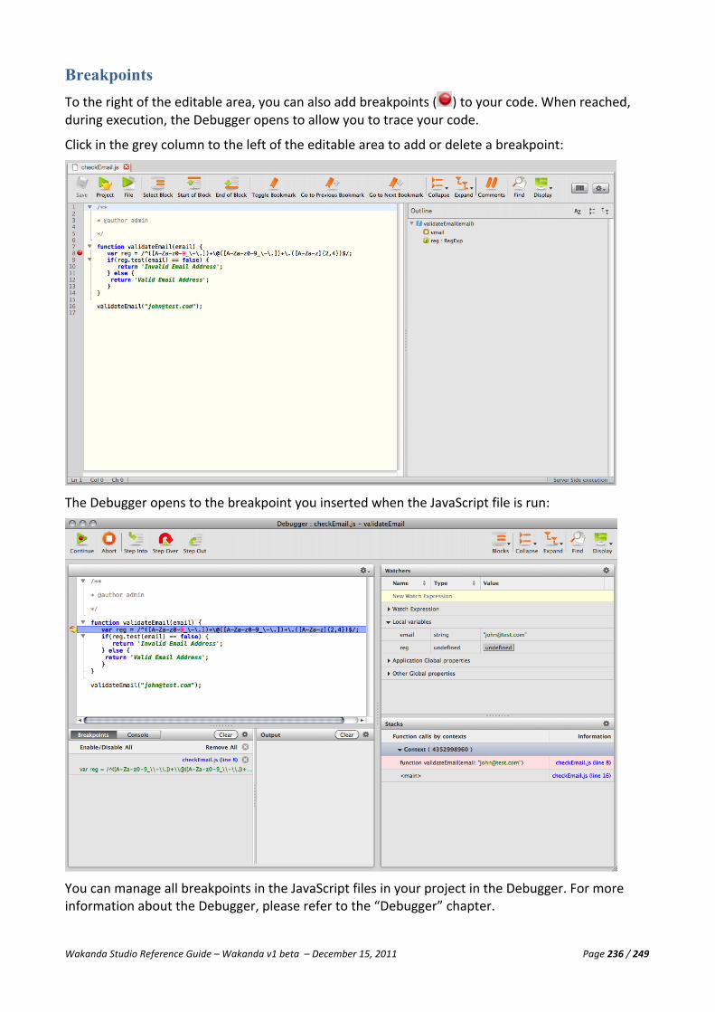
Wakanda Studio Reference Guide – Wakanda v1 beta – December 15, 2011 Page 236 / 249
Breakpoints To the right of the editable area, you can also add breakpoints ( ) to your code. When reached, during execution, the Debugger opens to allow you to trace your code.
Click in the grey column to the left of the editable area to add or delete a breakpoint:
The Debugger opens to the breakpoint you inserted when the JavaScript file is run:
You can manage all breakpoints in the JavaScript files in your project in the Debugger. For more information about the Debugger, please refer to the “Debugger” chapter.

Wakanda Studio Reference Guide – Wakanda v1 beta – December 15, 2011 Page 237 / 249
Auto Complete Feature The Auto Complete feature works in two ways for JavaScript files:
• a drop-‐down menu that appears when you hit tab or • text that appears after you enter a few letters.
When you are writing code, you can view the drop-‐down menu with possible options by hitting tab. Along with possible options proposed based on the file type (see below), variables, properties, and functions you defined in your current JavaScript file are also proposed to you.
Wakanda also proposes options while you are typing. To accept its proposition, hit the Tab key:
Depending on the type of file—Client-‐side JavaScript file (located in the WebFolder) or Server-‐side JavaScript (located in your project, but not the WebFolder)—different options are available to you. A JavaScript file can also be both client-‐side and server-‐side and in this case, it will contain lists provided for both.
For example, if you type “c” and hit tab, the following lists are displayed depending on the file/script type.

Wakanda Studio Reference Guide – Wakanda v1 beta – December 15, 2011 Page 238 / 249
Client-‐side JavaScript file or Page script:
Server-‐side JavaScript file or Model script:
Also when you write the opening tags, like parenthesis, curly brackets, brackets, and less than “<” or greater than “>” characters depending on the file type, the ending tag is added automatically.
The Code Editor parses JSDoc commands, like @param, @return, and @deprecated. When you include them in your code, they will be suggested accordingly. If you use the @deprecated command, it will not be suggested by the auto complete feature.
For more information about JSDoc, please refer to http://code.google.com/p/jsdoc-‐toolkit/.
Find and Replace Once you click on the Find button in the toolbar, the Find area appears above the editable area:

Wakanda Studio Reference Guide – Wakanda v1 beta – December 15, 2011 Page 239 / 249
The pop-‐up menu on the left allows you to do a simple find or a find and replace. Once you enter a value and hit the Return key, the text you searched on appears highlighted in yellow:
If you click on the button (Ctrl-‐G on Windows or Command-‐G on Mac), the next occurrence is selected and highlighted in pink:
To select the previous occurrence, click on the button.
You can also bookmark the occurrences by clicking the button. The bookmarks appear to the left:
From the dropdown menu in the Find text area, you can define the search:
• Case-‐sensitive: Search for the text value based on the case of the value entered. • Whole word: Find the text value in whole words only. • Wrap: Allows you to wrap to the top of the file for the search. • Recent Searches: Displays a list of values recently searched on that you can choose again. • Clear Recent Searches: Clears the recent search values listed under Recent Searches.

Wakanda Studio Reference Guide – Wakanda v1 beta – December 15, 2011 Page 240 / 249
To hide the Find area, click on the icon to the right.
If you select Find and Replace form the dropdown button, the Replace area appears below the Find area, allowing you to enter a Replace by value.
You can either click on the Replace All button to replace all the values in the file that have the Find field with the value in the Replace by field. If you click on the Replace & Find button, it will replace the current occurrence and highlight the next occurrence.

Wakanda Studio Reference Guide – Wakanda v1 beta – December 15, 2011 Page 241 / 249
Using the Free Form Edition Mode Wakanda Studio now supports two different script modes:
• Guided Mode: This default mode allows you to write code in the authorized areas. The parameters can be updated from the Datastore Model Designer and one single JavaScript file is linked to your model.
• Free Form Edition Mode: In this mode, the JavaScript files are only editable from the Datastore Model Designer. You cannot add or delete datastore class methods or calculated attribute scripts through the interface; you must do so in the model’s JavaScript file directly. You can directly access the calculated attribute script or datastore class method in the
JavaScript file by clicking on the button. Note: Once you switch to this mode by clicking on the Unlock Script button, you cannot revert back to the Guided Mode.
Guided Mode All the examples in the Wakanda Studio Reference Guide use the Guided Mode. As you can see in the code below, the Guided Mode is indicated:
Free Form Edition Mode
To switch to the Free Form Edition mode, click on the button in the Datastore Model Designer toolbar. Once you have made the switch, all the existing scripts will be updated. In our example above, the only change is that “guidedModel” becomes “model.”
Free Form Syntax
In the Free Form Edition mode, you use the following syntax per object and must also declare the objects you use beforehand.
Syntax for a method applied to an entity: model.className.entityMethods.method1 = function (); model.className.entityMethods.method2 = function (); model.className.entityMethods.method3 = function ();

Wakanda Studio Reference Guide – Wakanda v1 beta – December 15, 2011 Page 242 / 249
Syntax for a method applied to a collection: model.className.collectionMethods.method1 = function (); model.className.collectionMethods.method2 = function (); model.className.collectionMethods.method3 = function ();
Syntax for a method applied to a datastore class: model.className.methods.method1 = function (); model.className.methods.method2 = function (); model.className.methods.method3 = function ();
Syntax for the scope of a datastore class: model.className.scope =”public” model.className.scope =”publicOnServer”
Syntax for the scope of a datastore class method: model.className.methods.methodName.scope =”private” model.className.methods.methodName.scope =”protected” model.className.methods.methodName.scope =”public” model.className.methods.methodName.scope =”publicOnServer”
Syntax for an attribute event: model.className.attributeName.events.onInit = function() model.className.attributeName.events.onLoad = function() model.className.attributeName.events.onSet = function() model.className.attributeName.events.onValidate = function() model.className.attributeName.events.onSave = function() model.className.attributeName.events.onRemove = function()
Syntax for the scope of an attribute: model.className.attributeName.scope =”private” model.className.attributeName.scope =”protected” model.className.attributeName.scope =”public” model.className.attributeName.scope =”publicOnServer”
Syntax for a datastore class event: model.className.events.onInit = function() model.className.events.onLoad = function() model.className.events.onSet = function() model.className.events.onValidate = function() model.className.events.onSave = function() model.className.events.onRemove = function()
Syntax for a calculated attribute: model.className.attributeName.onGet = function() model.className.attributeName.onSet = function() model.className.attributeName.onQuery = function() model.className.attributeName.onSort = function()
If we rewrite the two scripts above using the Free Form syntax, it becomes:
Including External JavaScript Files
You can also add your scripts into any JavaScript file by passing the file’s relative path to the include() method in the datastore model’s JavaScript file:
include("/myScripts.js"); //the myScripts.js file is located at the same level as the model

Wakanda Studio Reference Guide – Wakanda v1 beta – December 15, 2011 Page 243 / 249
Debugger Overview Along with all of its other powerful tools, Wakanda also has a step-‐by-‐step Debugger to help you trace through your JavaScript code.
There are three ways the Debugger opens in its own window:
1. When you click on the button in the toolbar, 2. When you run a JavaScript file with one or more breakpoints defined, and 3. When you run a JavaScript file that has an error in it.
If the Debugger window is open in the background, it will move to the foreground once you run a
JavaScript file by clicking the button in the Code Editor toolbar.
The Debugger is made up of the following areas:
• Toolbar • Code Panel • Breakpoints/Console Area • Output Area • Watchers Area • Stacks Area

Wakanda Studio Reference Guide – Wakanda v1 beta – December 15, 2011 Page 244 / 249
Toolbar The Debugger toolbar allows quick access to many key functions that you will be using. You can customize the toolbar by selecting which options to display, how to display them (text only, text and icon or icon only), and if you prefer to display small icons or the larger ones.
The toolbar contains the following default functions:
• Continue: Continues execution to the end or to the next breakpoint. The skipped statements are executed, but not stepped through.
• Abort: Stops the debugging. • Step Into: Executes the current statement, then stops at the next statement. If the current
statement is a function or script call, the debugger steps into that function or script, otherwise it stops at the next statement.
• Step Over: Executes the current statement, then stops at the next statement. If the current statement is a function or script call, the debugger executes the whole function or script and stops at the next statement after the function call.
• Step Out: Steps out of the current function and up one level if the function is nested. If in the main body, the script is executed to the end, or to the next breakpoint. The skipped statements are executed, but not stepped through.
• Blocks: This button becomes a menu containing the three options: Select Block, Start of Block, and End of Block.
• Collapse: Collapses the selection, current level, or all the blocks. • Expand: Expands the selection, current level, or all the blocks. • Find: Displays a Find area above the editable area where you can find a text string in your file.
• Display: This menu allows you to modify the options displayed in the toolbar. The following two
menu items allow you to modify how the toolbar is displayed: § Toolbar Preferences: Allows you to set the display of the toolbar items (text only, text and
icon or icon only) as well as the size of the icons. § Toolbar Content: Allows you to select which options you’d like to display in the toolbar as
well as reset to the default options.
Note: For the item that you toggle, once it is hidden, the next time you click on the Display menu bar, it will be visible again.
If all the items in the toolbar cannot be displayed due to lack of space, the icon appears in the toolbar. When you click on it, the missing toolbar icons appear in a hierarchical menu.
To close the Debugger, click on the Close Window button in the window’s title bar.
Contextual Menu in the Code Panel The contextual menu in the Code Panel is similar to the editable area in the Code Editor. It offers you all the same options as well as the following two:
• Goto Definition: Allows you to go to the definition of a JavaScript symbol either in the same JavaScript file or in another file in the Code Editor.
• Find References: Allows you to find the highlighted/selected value in the Code Editor in all the JavaScript, HTML, CSS, and XML files in the project and display them in the Find Results dialog

Wakanda Studio Reference Guide – Wakanda v1 beta – December 15, 2011 Page 245 / 249
Goto Definition
The Goto Definition feature allows you to go directly to the definition of a JavaScript symbol (i.e., a variable, object, array, datastore class, attribute, or method -‐-‐ anything you defined in Wakanda Studio) in one or more JavaScript files in your current project. You access this feature by either putting your cursor in the name of the JavaScript variable or by highlighting it completely and then you can select Goto Definition from the contextual menu.
If your JavaScript variable is named “obj.element1,” you can find its definition either by highlighting it in its entirety or by placing your cursor somewhere in the property “element1.”
If no definition was found, the following alert appears:
If one definition was found, your cursor will go to that line either in the same JavaScript file or will open the JavaScript file that contains the JavaScript variable’s definition. If you choose to go to the definition of a datastore class or attribute, the Datastore Model Designer is opened in a new tab to show you the definition.
If multiple definitions were found in your project, the following pop-‐up menu appears, allowing you to select which one:
Note: The icons next to the entry are the same as those in the Outline. For more information, please refer to the Outline section below.
Find References
You can highlight text or a word in the Code Panel and select Find References from the contextual menu, Wakanda searches all the JavaScript, HTML, CSS, and XML files in the project and returns the results in the Find Results dialog:

Wakanda Studio Reference Guide – Wakanda v1 beta – December 15, 2011 Page 246 / 249
A more in-‐depth description of the Debugger is in progress.
Appendix Terminology Wakanda has its own terminology that is used throughout the documentation:
Wakanda Description
Solution A Wakanda solution is a collection of projects, each of which contains a single datastore model. A solution can contain any number of projects, all of which can be accessible at the same time.
Project A Wakanda project is a design time concept that houses a single datastore model along with the other files that make up a single Wakanda application.
Application A Wakanda application is the runtime entity of a single Wakanda project. Datastore Model A complete set of all datastore classes for a single Wakanda project is referred to
as a Model and is roughly equivalent to the relational concept of a single database structure. Model is the top-‐level term for a Wakanda application’s datastore and incorporates all of the datastore classes for the project/application.
Datastore Class The Wakanda datastore class is similar to a database table except a datastore class can be inherited and can contain many other types of properties (attributes & methods). In this document and elsewhere, datastore classes are sometimes referred to as classes.
Datastore Entity
In traditional relational databases a record is the logical unit of storage within a table that holds a value for each field in the table. In a SQL database, a row is one of the results of a query, which may not correspond directly to a record.

Wakanda Studio Reference Guide – Wakanda v1 beta – December 15, 2011 Page 247 / 249
Since a Wakanda datastore entity can represent any level of denormalization without its accompanying shortcomings, it fulfills both of these roles. In this document and elsewhere, datastore entities are often referred to as entities.
Entity Collection An entity collection is a set of entities. Attributes An attribute is the smallest storage cell in a relational database. It is sometimes
referred to as a column. However, the term “column” is more often associated with the results of a query where it may or may not be the value of a field. In Wakanda the collective term attribute is used to describe fields where information is stored as well as several other items that can return a value.
Storage Attribute A storage attribute (sometimes referred to as a scalar attribute) is the most basic type of attribute in a Wakanda datastore class and most directly corresponds to a field in a relational database. A storage attribute holds a single value for each entity in the class.
Calculated Attribute
A calculated attribute doesn’t actually store information. Instead, it determines its value based on other values from the same entity or from other entities, attributes or methods. When a calculated attribute is referenced, the underlying “calculation” is evaluated to determine the value. Calculated attributes may even be assigned values where user-‐defined code determines what to do during the assignment.
Scalar Attribute A scalar attribute is a collective term to denote any attribute that returns a single value. All storage and most calculated attributes are scalar.
Relation Attribute
Relation attribute is a collective term that exposes a relationship between two datastore classes and can be either N-‐>1 or 1-‐>N. Since they are attributes, they can be named and therefore become available as properties of the corresponding class. A relation attribute can result in an entity or an entity collection.
Primary Relation Attribute
A primary relation attribute is not dependent upon another relation attribute. Primary relation attributes are created by adding an attribute to a datastore class that refers to another class and either creates a new relationship between the classes or reverses the path of an existing N-‐>1 primary attribute. Only primary relation attributes can be designated as a composition relationship.
Dependent Relation Attribute
A dependent relation attribute is one that is reliant on another relation attribute in the same datastore class.
Alias Attribute An alias attribute builds upon a relation attribute. Once an N-‐>1 relation attribute is defined, any of the attributes within the “parent” class can be directly referenced as attributes within the “child” class. The result is what appears to be denormalized data without the overhead of duplicating information. Alias attributes can reference any available attributes further up the relational tree.
Property A general term for either an attribute or a method associated with a datastore class.
Relationship Two datastore classes are associated via a relationship, which is an artifact of a datastore model. A relationship’s existence results in either one or two relation attributes, one in each of the related classes. Relation attributes are named and become a property of their respective classes.
Composition Relationship
A special relationship that allows for bundling child entities with parents.
Method A collective term for a discreet portion of programming in Wakanda. Calculated attribute methods, class methods and event methods are all examples.
Datastore Class Method
In addition to attributes, each datastore class may also include methods. There are three different scopes to datastore class methods: Class,

Wakanda Studio Reference Guide – Wakanda v1 beta – December 15, 2011 Page 248 / 249
Collection, and Entity. Calculated Attribute Method
A method that substitutes programming behavior in place of standard behavior for an attribute. There are four aspects to calculated attribute methods: On Get, On Set, On Sort and On Query.
Event Method A method triggered by either a datastore class event or an attribute event. These methods are sometimes referred to as simply events.
Events Any of several built-‐in trigger points in a Wakanda datastore model. Events are available for both attributes and datastore classes. Wakanda supports five different events: On Init, On Load, On Set, On Validate, On Save, On Remove.
Inheritance Similar to the like-‐named concept found in object oriented programming, a datastore class can inherit from another. The newly defined (derived) class may add additional properties or hide inherited properties. Datastore class inheritance may be defined by a query stored in a project’s datastore model.
Query A query in a traditional database typically returns a row set, which can be thought of as a grid of values (rows and columns). A Wakanda query returns an entity collection, which is a bundle of entities, each of which “remembers” where it exists in the data.
Datastore The Wakanda term datastore is used to reference a single application’s set of data.

Wakanda Studio Reference Guide – Wakanda v1 beta – December 15, 2011 Page 249 / 249
Naming Conventions Since Wakanda solutions, projects, datastore classes, collections, datastore class methods, datasources, and attributes are handled through JavaScript, they must comply with JavaScript’s naming rules: names and IDs must begin with a letter (A-‐Z, a-‐z) and can contain letters (A-‐Z, a-‐z), digits (0-‐9), and underscores. Accented and non-‐Roman characters are accepted; however, the following characters are not: !@#$%^&*()+=-‐[]';,./{}|\":<>?~.
Widgets must follow the standard HTML specifications: widget IDs must begin with a letter (A-‐Z, a-‐z) and can contain letters (A-‐Z, a-‐z), digits (0-‐9), and underscores. Characters, such as !@#$%^&*()+=-‐[]';,./{}|\":<>?~, as well as accented and non-‐Roman characters are not allowed for the ID of a widget.
Spaces in any of the names or IDs are also not allowed. If you include one, the Datastore Model Designer and GUI Designer will automatically replace it with either an underscore or a hyphen.
Following JavaScript’s conventions, variables and functions begin with a lowercase letter while constructors and class names begin with an uppercase letter and the rest in camel case (i.e., all the spaces in the words are removed and each word is capitalized). In Wakanda, we have defined a few of our own naming conventions along these same lines:
• Datastore Class: The first letter must be capitalized to follow the logic of the datasource whose first letter must be lowercase. For the “LineItem” datastore class, the datasource is named “lineItem,” by default. Generally, the class name is singular.
• Collection: Collection names follow the same rule as datastore class names. If you have a datastore class named “LineItem,” Wakanda generates “LineItemCollection” as its collection name. You can also rename it to “LineItems” (the plural form of the datastore class name), if you prefer.
• Attribute: It is suggested that the first letter of an attribute be lowercase so that you can easily distinguish datastore classes/collections from attributes. For example, “firstName.” Although allowed, avoid naming attributes the same as datastore classes.
• Datastore Class Method: It is suggested that the name of a datastore class method be written in camel case and can begin with either a lowercase or an uppercase letter. For example, “checkEmployee” or “checkEmployee.”
• Widget: It is suggested that the first letter of the widget ID be lowercase. For example, “myGrid.” • Datasource: The first letter of a datsource name must be lowercase to follow the logic of the
datastore class whose first letter must be in uppercase. For the “LineItem” datastore class, the datasource is named “lineItem,” by default.