what doesn’t kill you makes you weaker: prenatal pollution
TRANSCRIPT

What Doesn’t Kill you Makes you Weaker:Prenatal Pollution Exposure and Educational Outcomes∗
Nicholas J. Sanders, Stanford University
January 2011
Abstract
I examine the impact of prenatal suspended particulate pollution on educationaloutcomes, using ambient total suspended particulates (TSPs) as a measure of partic-ulate exposure and standardized test scores of exposed individuals as a measure ofeducational achievement. I focus on individuals born between 1979 and 1985 to exploitthe shock of the industrial recession of the early 1980s. This variation helps separatethe causal effects of pollution reduction from general time trends. Considering the7-year time period as a whole yields statistically insignificant results, but focusing onthe 3-year period around the recession (1981-1983) yields negative and statistically sig-nificant results, suggesting that the relationship is subtle enough to require large-scalechanges to be detectable. My findings suggest a standard deviation decrease in themean pollution level in a student’s year of birth is associated with 1.87% of a standarddeviation increase in test scores in high school. I also employ an instrumental variablesstrategy, using changes in relative manufacturing employment driven by the recessionas an instrument for TSP levels. Instrumental variables results are approximately 3.7times the size of the OLS results, suggesting the potential presence of measurementerror in ambient pollution. Results are robust to the inclusion of school fixed effects,year of birth and year of test fixed effects, and various demographic and economiccovariates. I also investigate the potential bias sources of migration and selection intomotherhood, and show these are unlikely to explain my results.
∗I thank Hilary Hoynes, Christopher R. Knittel, Douglas L. Miller, Jed T. Richardson, and participantsin the All University of California Labor Conference, the University of California, Davis Seminar Series,the Sacramento State Brownbag Symposium, the Sonoma State Brownbag Symposium, the AtmosphericAerosols & Health Lead Campus Fall Seminar Series, the NBER Summer Institute, and the SIEPR PostdocConference.
1

1 Introduction
Early-life pollution exposure may have negative impacts beyond those measured by standard
observable physical indicators of health. The concept of “fetal origins”, recently discussed in
TIME magazine, suggests that the “kind and quality of nutrition [we] received in the womb;
the pollutants, drugs and infections [we] were exposed to during gestation [. . . ] shape our
susceptibility to disease, our appetite and metabolism, our intelligence and temperament.”1
If the effects of pollution exposure effects extend to cognitive development, they could carry
long-term consequences such as decreased performance in school, lower educational attain-
ment, and reduced earnings and lifespan. It is important that we understand the lasting
cognitive impacts of prenatal pollution exposure, as policy decisions made solely on the ba-
sis of avoiding physically observable damages may underestimate costs of ambient pollution.
There is growing evidence on the contemporaneous negative impacts of pollution on infant
health (e.g., Chay and Greenstone (2003a), Chay and Greenstone (2003b), Currie and Nei-
dell (2005), Currie, Neidell, and Schmieder (2009), Currie and Walker (2011), Currie and
Schmieder (2009), Knittel, Miller, and Sanders (2009)), but little is known about whether
impacts extend further in the life cycle. I speak to these potential consequences by con-
sidering how prenatal pollution exposure impacts high school test performance. I do so by
combining several data sets containing economic, demographic, weather, pollution, and test
information from the state of Texas. I exploit a period of industrial recession in Texas from
1981-1983, and its dramatic impact on manufacturing production, as a source of variation
in ambient pollution in the form of total suspended particulate matter (TSPs).
The economy of Texas underwent a sectoral shift as a result of the recession in the early
1980s. The manufacturing sector saw decreases in both employment and capacity utilization,
and employment shifted to sectors such as retail and services (Pia M. Orrenius and Caputo
1“How the First Nine Months Shape the Rest of Your Life”, TIME, 22 September 2010 (available onlineat http://www.time.com/time/health/article/0,8599,2020815,00.html, adapted from Paul (2010)).
2

2005). This led to a sharp drop in statewide TSPs in a short period of time. Average
TSP levels exhibited the greatest changes between 1981-1983, as shown in Figure 1, when
state average TSP levels fell by almost 10 micrograms per cubic meter (µg/m3), a change
of approximately 14%. This is the largest decrease in Texas in such a short period since
the early 1970s.2 The magnitudes of these TSP changes varied by county, where counties
with greater shares of their pre-recession economy in manufacturing saw greater relative
decreases in pollution. I use this source of plausibly exogenous variation to better identify
the causal impacts of prenatal pollution on high school test performance. I further account
for issues such as measurement error in pollution by using this variation and instrumenting for
ambient pollution levels, using the relative share of county-level manufacturing employment
as an instrument for pollution. In alternate specifications, I use a “shift-share” instrument
where statewide changes in relative manufacturing are allocated to counties based on their
pre-recessionary levels of relative manufacturing employment. This instrument is weaker in
the first stage, but second stage estimates remain statistically similar. To account for the
strong correlation between the recession, TSPs and changes in income, I also instrument for
per capita income using changes in national oil prices.
Ordinary least squares (OLS) results suggest that, during the recessionary period, a
within-county standard-deviation decrease in the mean pollution level in a child’s year of
birth is associated with 1.9% of a within-county standard deviation increase in high school
test performance. Instrumental variables (IV) results are larger, suggesting an identical
change is associated with approximately 7% of a within-county standard deviation increase
in test performance. Based on the ambient pollution reductions seen in Texas over the
period of interest, the IV results suggest that around 10% of the score gain seen over the
2From 1977 to 1978, the annual geometric mean dropped by approximately 8 µg/m3, which is likelyattributable to the sizable temporary spike in pollution levels seen in 1977. This may have been caused bydust storms that took place in February and March of that year. Unfortunately, test data are not availableback far enough to use the storms as an additional source of exogenous variation in this analysis.
3

1979-1985 birth cohorts in my sample could be attributed to the rapid reduction in ambient
TSPs in their respective years of birth, and that prenatal pollution exposure can have an
impact on outcomes beyond those measured by standard health indicators.3 These results
are statistically detectable only in the years of greatest pollution variation, suggesting that
the effect may be too subtle to identify out using only mild changes in ambient pollution
caused by time variation or making across-county cross-sectional comparisons.
My results are robust to the inclusion of covariates for weather and income, population
density, income in the year of the test, school-level measures of school quality and overall
demographic makeup, and individual level student demographics, as well as the inclusion
of school fixed effects and year of birth by year of test effects, which allow each year of
birth/year of test cohort to have their own baseline. This additional flexibility controls
for annual statewide testing variations driven by factors such as test difficulty as well as
statewide year of birth specific shocks. Though my results are found using cohorts born
in the late 1970s and early 1980s, the suggested policy implications remain relevant today.
Particulate matter is a common pollutant still monitored by the Environmental Protection
Agency (EPA), and it remains a frequent atmospheric problem.4
The rest of this paper is organized as follows. Section 2 provides the background motiva-
tion of the analysis. Section 3 describes the data. Section 4 describes the empirical methods
used. Section 5 presents OLS results. Section 6 presents IV results. Section 7 considers
potential confounders to identifying the effects of pollution, including selective migration
and selection into motherhood. Section 8 provides some discussion of my findings. Section
9 concludes.
3Test score increases use only students included in the main analysis.4Information on the current nationwide state of particulate matter pollution can be found at
http://www.epa.gov/oar/particlepollution.
4

2 Pollution, health, and educational outcomes
Recently, economists have given substantial attention to the health effects of three EPA
monitored criteria pollutants: carbon monoxide (CO), ozone (O3), and particulate matter
(PM).5 All three have been tied to negative physical health impacts on children. CO ap-
pears to increase infant mortality rates, negative birth outcomes, and school absences and
asthma rates in children, O3 has been associated with increased asthma rates and respiratory
conditions, and PM has been shown to increase infant mortality rates.6
Recent findings suggest that pollution can have longer-run psychological and cognitive
impacts as well. For example, higher lead levels have been associated with lower IQ scores
and increased deviant behavior (Reyes 2007), and elevated prenatal radiation exposure has
been linked to lower test scores (Almond, Edlund, and Palme 2009). A recent medical
study followed a sample of nonsmoking black and Dominican-American women in New York
who wore personal air monitoring systems during pregnancy and found that higher prenatal
pollution exposure was associated with lower IQ scores at age 5 (Perera et al. 2009). I further
the research on prenatal effects by considering the impacts of particulate matter on long run
outcomes, specifically educational achievement in high school.
I focus on airborne TSPs, the measure of airborne particulate pollution used by the EPA
in the earlier years of the Clean Air Act, as my pollutant of interest.7 The term TSPs refers
to all suspended, airborne liquid or solid particles smaller than 100 micrometers in size.8
5The term criteria pollutants refers to six commonly found air pollutants that are regulated by developinghealth-based and/or environmentally-based criteria for allowable levels. The current criteria pollutants are:particular matter, ground-level ozone, carbon monoxide, sulfur oxides, nitrogen oxides and lead.
6See for example Wang et al. (1997), Ritz and Yu (1999), Friedman et al. (2001), Maisonet et al. (2001),Chay and Greenstone (2003a), Chay and Greenstone (2003b), Neidell (2004), Currie and Neidell (2005),Ponce et al. (2005), Lleras-Muney (2010), Neidell (2009), Currie et al. (2009), Currie, Neidell, and Schmieder(2009), Currie and Walker (2011), Knittel, Miller, and Sanders (2009), Moretti and Neidell (2011), and Currieand Walker (2011).
7The full text of the original Clean Air Act and all following amendments can be found athttp://www.epa.gov/air/caa. For a discussion of the impacts of the Clean Air Act and ambient TSP levels,see Chay, Dobkin, and Greenstone (2003).
8As monitoring technology has advanced, regulatory attention has shifted to finer sizes of particulate
5

Suspended particulates can be both naturally occurring (e.g., dust, dirt, and pollen) and a
by-product of common economic activities such as fuel combustion (e.g., coal, gasoline and
diesel), fires, and industrial activity. Particulates are the cause of a number of environmental
problems, including decreased visibility, increased acidity of both water and soil, and plant
death. Inhaled particulates have been associated with a number of health problems including
difficulty breathing, decreased lung function, aggravated asthma, and cardiac difficulties.
Smaller particulates can be transferred from the lungs into the bloodstream, causing further
internal damage.9
Exposure to particulate matter may impact fetal development in a number of ways. The
mother’s health may be compromised via any of the above listed problems, which in and
of itself could hinder or alter fetal development. In addition, particulate matter could alter
fetal development independent of mother health conditions. Associations have been found
between polycyclic aromatic hydrocarbons (PAHs), a byproduct of fuel burning and one
type of particulate matter, and a number of pre- and early post-natal developmental prob-
lems including damage to the immune system, hindered neurological development, reduced
birth weight and smaller head circumference, and impairment of neuron behavior associated
with long-term memory formation.10 Due to the number of potential pathways through
which particulate matter might cause harm, I am unable to tease out the specific physiolog-
ical mechanism that impacts the individuals in my sample. Regardless of the mechanism,
however, exposure to particulate matter presents a danger to both mother and fetus alike.
matter, with much of the attention now on two size classifications: particulate matter smaller than 10micrometers (PM10) and particulate matter smaller than 2.5 micrometers (PM2.5). Both of these sizeclassifications are contained with the older TSP measure.
9For greater discussion of particulate matter and health, see World Health Organization 1979, availableat http://www.inchem.org/documents/ehc/ehc/ehc008.htm.
10For a brief review of findings on the potential consequences of PAH exposure, see Perera et al. (2009).
6

3 Data
I combine several data sets on pollution, weather, school quality, economic conditions, demo-
graphics, test scores, and data on racial population makeup and motherhood characteristics.
In this section I describe each data source. Due to availability of data, weather, economic
covariates, mother characteristics, demographics, and ambient TSPs are all calculated at the
county level, and in my main results I collapse all outcomes and student covariates to the
demographic group by year of birth by school by year of test level and weight by the number
of students in each cell.
The EPA maintains an online database of historical air quality data.11 The system
includes readings from all EPA monitors for a variety of pollutants. I use data on mean
TSP values, which are measured in micrograms per cubic meter. The EPA reports annual
geometric means, the total number of valid measurements made, and the location of the
pollution monitor by latitude and longitude.12 Monitors sometimes turn on and off, and in
order to avoid interpreting such activation or deactivation as a change in pollution levels, I
use a balanced panel of monitors by keeping only those that were active during the entire
period of analysis and two years prior to the beginning of my sample to allow for the inclusion
of lags in Section 5.1. In Section 8, I relax this constraint to include all monitors active during
the period of greatest pollution variation (1981-83).13
I employ a strategy similar to that of Neidell (2004), Currie and Neidell (2005), and
Knittel, Miller, and Sanders (2009) in forming county-level pollution measures. First, I
calculate the distance between each county centric and each pollution monitor. I keep all
pollution monitors within 20 miles of a centroid and weight each monitor’s value by the
11http://www.epa.gov/aqspubl1/.12The EPA uses the geometric mean in determining county-level Clean Air Act attainment. As such, I
use the geometric mean in this analysis as well. All results are similar when using the arithmetic mean.13TSP monitors take a varied number of samples per year. I currently keep sensors that take at least
an average of one reading every two weeks (26 readings per year) to avoid means be influenced by singularextreme events.
7

inverse of the distance from the centroid.14 I use the population centroid, as reported by the
Census, rather than the geographic centroid. I do this for two primary reasons: exposure to
the areas of greater population is the factor of interest, and this increases the total number
of counties available for analysis. Twenty-nine counties have population centroids within 20
miles of at least one balanced panel pollution monitor. In Section 7, I repeat my analysis
using distances of 10 and 30 miles — results are largely similar across mileage choice.
My preferred specifications exclude Harris County (county FIPS 48201). According to
recent census estimates, Harris is the most populous county in Texas, and the third most
populous county in the United States. It also appears to have had the largest migration
changes, presenting a potential confounder to identifying the true effects of prenatal pollution
exposure. In addition, its substantial population meant that overall (student weighted)
results would be driven largely by results within one county. I relax this restriction in
Section 7. The remaining 28 counties in my analysis include approximately 49% of the 1979
population of the state.
Weather is a potential confounder in the regression of student test outcomes on prenatal
pollution exposure levels as weather factors have been associated with health outcomes such
as birth weight and mortality.15 Recent work also suggests extreme weather conditions may
have long run mental development consequences (Stoecker 2010). Weather effects are also a
concern in my first stage regression of ambient TSPs on manufacturing employment changes.
Rainfall has been found to impact ambient pollution levels by clearing the air, and particulate
matter pollution levels are often higher in colder temperatures.16 Therefore, I include mean
annual temperature and the number of days with rainfall.17 Weather data come from the
14When calculating county annual means, prior to collapsing to county-level readings I expand each monitormean observation by the total number of readings taken during the year so as to provide greater weight tomonitors that were active more frequently.
15See Deschenes and Greenstone (2007), Bantje and Niemeyer (2008), Barreca (2008), Shukla et al. (2008),and Deschenes, Greenstone, and Guryan (2009).
16In prior drafts, I have included average yearly humidity, days with snow, days with fog, and averageyearly windspeed,. Results were similar and are available in Table A-1.
17Annual values are calculated by collapsing daily measurements to the yearly monitor level. I keep only
8

National Climatic Data Center Global Surface Summary of the Day, a collection of data from
weather stations throughout the world. I create county-level annual weather measures using
a method similar to my calculations for pollution. Due to the limited number of weather
stations active during this period, I expand the distance cutoff to include all counties within
50 miles of at least one weather station.
To control for changes in school quality I include school by year pupil-to-teacher ratios
using data from the Common Core of Data (CCD).18 To help control for peer effects, I also
include the fraction of the school population who are black, the fraction who are Hispanic,
and the fraction that receive free or discounted lunch, also from the CCD.
To account for the potential relationship between income, birth outcomes and test scores,
I include county-level per capita income from the Bureau of Economic Analysis Regional
Economic Information System (REIS) in both the year of birth and the year of the test. 19
All values are inflated to 2009 dollars using the Consumer Price Index from the Bureau of
Labor Statistics. Industry level employment estimates are also from the REIS. To account
for differences in both pollution and test outcomes related to urban development, I use
population estimates from the REIS and land area estimates from the Census to calculate
population density in both the year of birth and the year of the test.
The industrial recession undoubtedly had effects on the population beyond those identi-
fied by changes in pollution and economic conditions. Of particular concern are systematic
changes to population makeup, which would then impact the composition of the student pop-
ulation. In addition, Lleras-Muney and Dehejia (2004) show that economic conditions can
impact the composition of mothers, which could also confound the attempt to identify the
monitors with readings for at least 95% of days for both weather factors. Average daily temperature is theminimum and maximum daily values divided by two, as in Deschenes, Greenstone, and Guryan (2009).
18I drop schools with pupil-teacher ratios that are likely “coding errors”, where I call any given year acoding error if that year’s pupil-teacher ratio is at least 3 times the size of the average of all other years atthat school.
19Per capita income values include wages as well as income from all other sources including all forms ofgovernment transfers.
9

true effects of pollution on test scores. In Section 7, I consider how the recession potentially
changed both the overall racial makeup of counties and the makeup of mothers. Here, pop-
ulation estimates are from the National Cancer Institute (due to richer racial information),
as derived using intercensus population estimates provided by the Census Bureau. Mother
characteristics are taken from the natality data files provided by the National Bureau of
Economic Research.
Table 1 compares counties included and excluded from the analysis for the years 1980
and 1985 as points of comparison before and after the recession (I do not use the 1979 base
year because population and natality data are missing for many counties). On average,
included counties had higher income per capita and larger shares of their employment in
manufacturing. Mothers are older and more likely to be black in the included counties, the
population is more likely to be black overall, and average density is substantially higher.
Finally, note that the counties do not sum to the total (254) due to omitting counties with
missing demographic data from the summary.
Test score data come from Texas Education Agency (TEA) monitored Texas Assessment
of Academic Skills (TAAS) high school exit exams. TAAS standardized exams began in
Texas in 1990 and were replaced by the Texas Assessment of Knowledge and Skills (TAKS)
in the 2002/2003 school year. From 1994 to 2002, tenth graders were required to exhibit
competency on both a TAAS math exam and reading exam before being allowed to graduate
high school. Competency is a score of 70 or higher on the Texas Learning Index (TLI), an
annually adjusted score intended to equate difficulty of passing across test years.20,21
A number of factors make the TAAS data well-suited for this analysis. First, while the
test is rewritten each year with different questions, the basic structure of the exit exam has
20See Martorell (2004) for a more detailed discussion of the TAAS exit exams, and Haney 2000 for discus-sion of difficulty of the exam across test years.
21See http://ritter.tea.state.tx.us/student.assessment/resources/techdigest/2008/chapter 18.pdf for fur-ther discussion of the TLI calculation mechanisms.
10

remained consistent throughout its administration, making comparison across years more
valid.22 Second, the TAAS data have a wealth of information on each student, including
race, ethnicity, gender, free lunch status, and special education status, which I use as student
controls. Assuming that the student population somewhat reflects the overall population,
these controls also stand in for the population makeup of the counties and partially control
for differences in outcomes spanning from variation in overall racial and ethnic makeup across
regions.
I observe the absolute number of questions correct and the TLI-adjusted scores for both
the math and reading exams (the two tests are scored independently), school of attendance
at the time of each exam, the year and month in which the exams were taken, and whether
the student has taken either exam multiple times. In this analysis, I focus solely on the
math portion of the exam as an outcome variable, as math scores are often considered more
informative of learning when discussing standardized exams and used more frequently in the
education literature. Most importantly, the TAAS tenth grade exit exam cohorts have years
of birth that span the industrial recession period of 1981-1983, which I use as a source of
exogenous variation in pollution. Specifically, the majority of students taking exit exams
between 1994 and 2002 have years of birth between 1979 and 1985, allowing me to view
birth cohorts in a period before the recession (1979-1981), during the recession (1981-1983),
and very briefly after the recession during a period of recovery (1983-1985).
I begin with 1,755,857 tenth grade students with valid student identification numbers
taking at least one of the exit exams between 1994-2002. I then drop all students with a
year of birth outside of the range of the analysis (522,444), those with missing test scores,
exempt testing status, or nonstandard test administration (430,274), students who have
22The TLI score is calculated using the number of correct responses on each test. The reading test has50 questions. The math test has 60 questions. It appears test difficulty has remained largely constant — asnoted in Klein et al. (2000), “the format and content of the questions in one year are very similar to thoseused the next year.”
11

taken the exam more than once or have duplicate observations (14,291), and those with
missing covariates (30,118).23 I also drop students listed as limited English proficient, English
language learners, or migrant students, as these are most likely subject to migration bias,
and students who have a year of birth that indicates they are unusually young or unusually
old when they take the exam, as they are likely coding errors (73,746).24 Finally, I drop
students with TLI scores under 20 as they are unlikely to represent a true student effort
(728). After merging with CCD data, a total of 1,120,115 observations remain.
After matching students to counties for which I have economic, pollution, and weather
covariates, and creating a balanced panel in both pollution and schools, the remaining sample
consists of 572,438 students in 28 counties (omitting Harris county as discussed above).
Figure 2 shows the distribution of the student test scores used in the primary analysis, with
an indicator line for the passing score of 70. It appears the TAAS has a very high passage
rate. In Section 5 I consider not just the overall score but also the passage rate as an outcome.
To conduct my analysis, I match individuals to prenatal pollution exposure. The TAAS
data do not contain information on the student’s region of birth. In order to assign pollution,
I first match schools to counties using information from the CCD. I then assume that the
county in which I observe a student taking the exam is the county in which they were born
(similar to Ludwig and Miller 2007). If individuals migrate between birth and taking the
exam, there will be measurement error in the assignment of pollution. An advantage of
23Though I focus on math scores, I omit students with missing reading scores as well. If schools “selected”individuals to miss the exam as a strategic way to increase passage rates, this could bias my results. Thereare two factors that make this less of a concern: (1) students have to pass this exam in order to graduate,and as such they are going to be less likely to be willing to skip the exam (and administrators are probablyless likely to encourage them to do so), and (2) selection into missing the exam is unlikely to be correlatedwith prior TSP levels.
24Due to student confidentiality concerns, publicly available TAAS data do not have specific date of birth,only year of birth. In order to remove students whose year of birth (or test) is likely a coding error, I calculatea student’s “age at test taking” by subtracting their year of birth from the year of the exam. Beginning in1994, all first-time exams were administered in the spring of the tenth grade year. The majority of studentshave “ages” of 16 and 17 — I keep all students with calculated ages between 15 and 18. Texas has anenrollment birthday cutoff of September 1st, meaning students could begin 1st grade if they were age 6 bySeptember 1st of the enrollment year.
12

using high school test scores as a measured outcome is that assignment of pollution based on
region of school attendance is less subject to such measurement error or bias than measures
taken later in the life cycle (e.g., total educational attainment).25 If the measurement error is
classical in that it is unrelated to the error term, results will be biased toward zero. Section
7.1 addresses the concern of potential non-random error in pollution assignment.
Table 2 shows means and standard deviations for student data across all included years.
Included schools have a higher relative population of black and Hispanic students, and stu-
dents receiving free or reduced price lunch or classified as special education. Average TLI
scores and math test passage rates slightly lower in the included counties. All of these factors
are likely attributable to the included counties being, on average, more urban than excluded
counties (see Table 1).
4 Identification strategy and instrument construction
Similar to Chay and Greenstone (2003b), I exploit variation in TSP levels caused by the
industrial recession of the early 1980s as a source of exogenous identification. Figure 3 shows
the progression of TLI scores over time for the 28 counties by tercile, where counties are
grouped by relative change in TSPs. The “Low” group contains 10 counties with an average
increase of 1% in TSPs over the 1981-1983 period. The “Middle” group contains 9 counties,
with an average ambient TSP decrease of 11%. The “High” group contains the remaining 9
counties, which saw an average TSP decrease of 16% across the recessionary period. Only
the Middle and High groups appear to have experienced a deviation from prior growth in
test scores.
The use of the industrial recession as a quasi-experimental strategy, combined with the
25Longer lifetime outcomes are of interest, but the further into the life cycle, the more likely it becomesthat individuals have migrated, and the greater the probability that migration is not random. For example,students who go on to college are probably more likely to end up living in regions different than those inwhich they were born. Any tie between outcomes and mobility will cause error in pollution assignment thatmay be systematic in such a way as to bias the results.
13

region- and time-specific fixed effects allowable in panel data, help to alleviate the identi-
fication concerns associated with basic time series or cross-sectional analysis. Even after
controlling for a number of covariates and regional and time effects, basic OLS results could
still suffer from econometric difficulties. County pollution levels are likely measured with
error due to factors such as variation in proximity to sensors, number of sensors in an area,
and geographic surroundings. TSPs are measured infrequently, and individual measure-
ments might be influenced by ambient conditions or unusual, unobservable circumstances
(e.g., measurements taken on a particularly windy day). In addition, the method of pol-
lution assignment means that the variation in between-county annual pollution levels may
not appear as great as it truly is. For example, two different counties, each within 20 miles
of the same pollution monitor, will be assigned the same ambient levels despite potential
differences in true levels. To address such issues, I employ an instrumental variables strategy.
My preferred instrument is built using the relative share of manufacturing employment
present in a county in any given year. Given that ambient pollution variation is correlated
with manufacturing production, using a county-specific manufacturing-based instrument al-
lows for a greater level of between-county variation in ambient TSPs — each county now
has a unique source of variation. As a further consideration, I also employ a shift-share
instrument in manufacturing employment, which, while weaker, yields similar second-stage
results.
4.1 The model
The basic OLS estimation model is:
ys,b,t = βTSPc,b + αs + θb,t + δXs,t + ωBc,b + ψTc,t + γWc,b + εs,b,t, (1)
where s, b, and t refer to school, year of birth, and year of the test, respectively. The
parameter β is the estimated achievement impact of an additional unit of TSP exposure in
14

the child’s year of birth, αs is a vector of school fixed effects, θb,t is a vector of year of birth
by year of test fixed effects, Xs,t is a vector of (collapsed individual) school-level student
and school covariates, Bc,b is a vector of economic and demographic covariates in the year
of birth, Tc,t is a vector of economic and demographic covariates in the year of the test,
Wc,b is a vector of county-level weather covariates in the year of birth, and ε is an error
term.26 As noted in Section 3, weather and economic covariates and pollution are measured
at the county level to allow me to use the REIS county-level data for controls and to build
my instrument. When collapsing data, student characteristics, school quality measures, and
student outcomes are all measured at the school level to limit potential omitted variables
bias caused by higher levels of aggregation (see Hanushek, Rivkin, and Taylor 1996).
A good instrument will be correlated with county-level pollution but be appropriately
excludable from the second stage in that it does not impact test outcomes independent of
its effect on pollution. Manufacturing was responsible for a large portion of ambient TSPs
during the period of interest. Almost 50% of all national particulate emissions in 1976
came from industrial production (EPA 1985). Also important for my instrumental variables
identification strategy, the decrease in TSPs seen nationwide during the industrial recession
correlated strongly with a decrease in industrial and manufacturing production, and by 1985
industry’s contribution to total national particulates was down to approximately 37% (EPA
1985, Chay and Greenstone 2003b).
I model TSPs as a function of all workers in a county employed in the manufacturing
industry (SIC code 400) over total county employment levels in a given year. Given a linear
relationship where Π is defined as the marginal impact of changes in relative manufacturing
26As the source of pollution and instrument variation is the county/year level, I cannot include county-by-year fixed effects.
15

employment, this can be written as:
TSPc,t = Π ∗ manufacturingc,tallc,t
∗ 100, (2)
where both TSPc,t and the instrument are what remains after partialling out fixed effects
and other relevant covariates of interest, and the result is multiplied by 100 to make Π
interpretable as percentage changes.
One potential concern is that the instrument in (2) may be correlated with the second-
stage errors. For example, changes in the sectoral makeup of a county may be associated
with migratory factors, which drive later test results. I address this issue to some degree in
Section 8 by demonstrating that the instrument is not related in a statistically significant
fashion to the demographic makeup of the student population. I also show that, even after
controlling for manufacturing employment levels and total employment levels, the effects
remain approximately the same, suggesting that individual level changes in either factor are
not driving my results.
As an alternative I also explore the use of a shift-share instrument. Shift-share in-
struments first appeared in immigration literature, where a macro-scale influx of immi-
grants is dispersed to regions based on earlier shares of each particular immigrant group
(for example, see Card (2001), Ottaviano and Peri (2006), and Saiz (2007)). I assign the
statewide relative manufacturing employment rate to each individual county weighted by
the county pre-recession relative manufacturing ratios, using the average of 1976-1978 as
the “pre-recession” period. This helps alleviate the concern of county-specific annual mi-
gration factors, as changes are now driven by macro-level variation. Let county-level and
state-level relative manufacturing rates be county ratioc,t = manufacturingc,t/allc,t and
state ratiot = manufacturingt/allt, respectively. The basis for the instrument (again after
16

partialling out other relevant covariates) is
TSPc,t = Ω ∗ county ratioc,pre−recession
state ratiopre−recession
∗ state ratiot ∗ 100 (3)
As income is likely to be strongly correlated with both pollution levels and the recession,
I treat it as endogenous and instrument for per capita income as well. To do so I exploit
the drastic changes in national oil prices over the period and the substantial link between
national oil prices and local income, particularly in Texas. In the mid 1970s, oil prices
were relatively stable. But in 1979, revolution in Iran led to drops in oil supply and a
rapid growth in price. Rising oil prices helped Texas partially avoid the earlier stages of
the industrial recession, but by 1981, oil-producing countries both inside and outside of
the Organization of the Petroleum Exporting Countries increased oil supply substantially,
leading to an equally rapid decrease in the real price of oil (see Figure 4). I use this variation,
combined with the assumption that counties with larger oil extraction sectors would have
their per capita incomes change more drastically with oil price, to instrument for per capita
income. Due to the limited availability of specific oil extraction employment, I use the more
general mining employment (SIC code 200), which contains within it petroleum extraction,
drilling, and other similar oil-mining employment sources. My final income instrument is
the annual inflation-adjusted price of oil weighted by the fraction of county employment in
the mining and extraction industry prior to the recession (again using a weighted average of
1976-1978)27:
incomec,t = Γ ∗ miningc,baselineallc,baseline
∗ oilpricet.
In Section 6 I repeat my regressions treating income as exogenous and using only the single
27For a similar design using coal reserves and variations in annual coal prices as an instrument for countywages bills see Black, Daniel, and Sanders (2002).
17

manufacturing instrument for TSPs — results are largely unchanged.
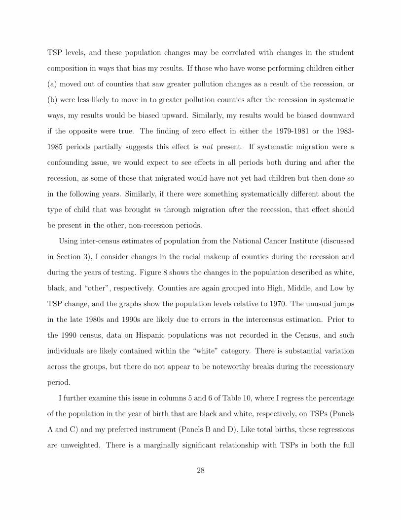
5 OLS Results: TSPs and educational achievement
As noted in Section 3, my measure of educational performance is the TLI difficulty-adjusted
standardized test score for the math portion of the Texas high school exit exams.28 My
primary analysis is done at the demographic group by year of birth by school by year of test
level.29 I weight all regressions by the number of students in each cell. I also perform this
analysis at the individual level and unweighted at the collapsed level (Tables A-2 and A-3
in the Appendix) to verify that results are not driven by weighting or oversampling of one
particular county — results are similar in both cases. All standard errors are clustered on
county to allow for county-specific correlated errors over time. In the remaining discussion,
the term “standard deviation” refers to a within-county standard deviation.
As noted above, my sample consists of individuals born between 1979 and 1985. Con-
sidering the average effect over time appears to mask the true relationship between test
scores and ambient pollution levels in the year of birth. Column 1 of Table 3 shows the esti-
mated impact of TSPs are not statistically different from zero. This identification difficulty
may be due to the subtle relationship between pollution and ambient TSPs. Specifically,
the relationship may be undetectable when analyzing mild variations in TSPs, or gradual
changes driven by long-run trends. For this reason, I focus on the period of the largest, most
drastic variation, the recession period of 1981-1983. This is similar to Chay and Greenstone
(2003b), who exploit a similar methodology to identify the effects of pollution exposure on
infant mortality, though they use a first-differences approach.30 Columns 2, 3, and 4 show
28Earlier versions of this paper used the absolute number of questions answered correctly as an outcome,as well as scores normalized by test year. Not surprisingly, these results are very similar to those for TLIscores and omitted for simplicity.
29For example, one cell would be non-special education white students on free lunch at campus c born inyear b taking the exam in year t.
30Chay and Greenstone (2003b) focus on the 1980-1982 period, which is the timeframe of the greatestvariation on a nationwide level. Texas, however, had the recession hit slightly later due to the oil price
18

OLS results for a sample restricted to those born in the periods spanning 1979-1981, 1981-
1983, and 1983-1985, respectively (note this causes some overlap in students across samples).
The results are statistically insignificant for 1979-1981 and 1983-1985. However, for 1981-
1983 the coefficient is statistically significant and has the anticipated negative sign. The
OLS coefficient suggests that a standard deviation decrease in average pollution levels in the
year of birth is associated with 1.87% of a standard deviation increase in test scores.
Table 4 shows that the 1981-1983 result is robust to various specifications. Starting with
simple OLS with only school and year of birth by year of test fixed effects, the following
columns add economic and demographic covariates (column 2), weather effects (column 3),
student covariates (column 4), and school level covariates (column 5). The estimated effects
of a standard deviation drop in pollution range from 1.45% to 2.06% of a standard deviation
increase in test scores.
The mean effects of pollution exposure and total test scores provide some insight into
the potential link between ambient conditions and long run outcomes. Of particular policy
interest, however, is the impact on the fraction of students passing the standardized exit
exams and being granted the ability to graduate.31 I consider the impact of prenatal pollution
exposure on the probability of obtaining a passing math score (a TLI score greater than 70)
on the first try. The outcome variable is now a 0-1 binary variable on the student level, and
becomes the fraction of the student cohort passing once data are collapsed.
Table 5 shows the results from regressing cohort passage rates on ambient pollution in
the year of birth for the entire period and the three birth periods discussed above. Again,
results are significant for only the 1981-1983 birth cohorts, and now suggest that a standard
deviation decrease in ambient pollution in the year of birth is associated with an approximate
changes discussed in Section 4.1.31While some students that fail the test on the first attempt undoubtedly take the exam over and pass at
a later date, failing the exit exams on the first attempt may drive changes in future student behavior, thoughprior research suggest such effects are not present for the Texas exams taken in tenth grade (Martorell 2004).
19

1 percentage point increase in the cohort passage rate on the first attempt (approximately
1.8% of a standard deviation).
5.1 Causal effects vs. general trends?
When considering time related variation, the researcher must watch for the presence of
secular background trends. For example, over time pollution is decreasing (though not
steadily, as was shown in Figure 1) as test scores are increasing, and the two need not be
causally related. While the shock of the recession and its varied effect on pollution levels
across counties somewhat addresses this concern, other issues such as migration remain.
Perhaps the recession led to a particular type of parent moving their child out of certain
counties and into others, or longer-run effects caused a certain type of parent to move in to
Texas. Here I address the issue of general background time correlations. Potential migration
effects are discussed in Section 7.
The varied effect across periods helps to assuage trend concerns. If results were driven
by long-run background trends, we would expect to see similarly signed (and similarly sig-
nificant) effects across all time periods. Table 3 shows statistically significant effects are only
present during the 1981-1983 period. As a further check into the presence of background
trends, I run regressions similar to those in Table 3, but including one and two year lags and
leads of TSPs. Table 6 shows the results for the three individual time periods. For simplicity
I report only the coefficients on TSPs in all periods. Column 1 covers the 1979-1981 period,
column 2 the 1981-1983 period, and column 3 the 1983-1985 period. Note that data con-
straints prevent the use of TSP values beyond 1985, and as such including the lead values is
not possible in the 1983-1985 period.
In the 1979-1981 period, the addition of lags and leads has a substantial impact on
both the size and significance of the impacts of current pollution. All lags and leads are
economically and statistically significant as well. The coefficients exhibit a clear pattern,
20

with lags being negative and leads being positive. This suggests the presence of background
effects that may be correlated with both pollution and future test scores, which makes
identification of the impacts of pollution problematic.
During the period of the most drastic pollution change, however, the results appear to
be robust to the inclusion of both lags and leads. Though the one-year lagged value is
statistically significant, this is not in itself problematic. The TAAS data only allow me to
identify year of birth, and for some individuals the pollution exposure in the prior year is
actually the most relevant. For example, a student born on January 1st of year t was more
exposed to the pollution in year t− 1. All other lags and leads are insignificant, suggesting
that the sharp break in pollution caused by the recession was sufficiently drastic so as to
deviate from background factors that may confound the estimates of pollution on test scores
in the full sample. Chay and Greenstone (2003b) note a similar time variation across pre,
during, and post-recession periods. Though they focus on 1980-1982 (when the recession had
its largest impacts nationwide), they note that the recession period is most useful as “there
appears to be greater potential for confounding in cross-sectional analyses and analysis of
changes in the surrounding nonrecession years.” It appears the quasi-experimental nature of
the recession provides an identification strategy for this relationship beyond general trends.
6 Instrumental variables results
The shock of the recession, however, is unable to overcome the potential complication of
measurement error. Such error, if classical, will bias OLS estimates toward zero. This
problem can be addressed to some extent by using an instrumental variables strategy. There
are three main types of measurement error that may be present in this analysis. First,
pollution is measured with error at the monitor location — monitors are in different ambient
surroundings, and unusual readings can bias the mean in the presence of few annual readings.
Second, pollution information from air monitors is assigned by using the weighted distance
21

formula as described in Section 3. If two counties are similarly located from the same
monitors, those two counties will receive similar, if not identical, assignment of pollution
levels, thus reducing the variation in county pollution levels beyond its true value. Finally,
I assign pollution levels to students by assuming the county in which they take the exam
is the county in which they were born, which may not be the case for some students. My
instrument can help with the first and second error sources, but unfortunately cannot impact
the third.
As a demonstration of the first stage, I first present the relationship between the relative
manufacturing instrument shown in equation (2) and ambient TSP levels. I then show IV
results for test scores on the mathematics TAAS exam. Instrumental variables results are in
the same direction as OLS, and are approximately 4 times larger, suggesting the presence of
measurement error or potential omitted variables bias.
Counties with higher levels of relative manufacturing employment experienced different
changes in TSPs both due to their economies being driven by dirtier industries and by facing
a greater manufacturing employment shock induced by the recession. This effect is shown
in Figure 5, which splits counties into terciles based on the (absolute) change in relative
manufacturing employment counties experienced during the recessionary period. The groups
with the greatest decrease in relative manufacturing (the “High” group in Figure 5) ended
up with greater proportional drops in their ambient TSP levels by the end of the recession.
As further support of the relationship between the changes in the manufacturing sector and
ambient pollution, Figure 6 plots the mean TSP level and the mean instrument value for all
counties in the analysis across birth cohort years. Visually, the instrument is correlated with
pollution, particularly so during and after the recessionary period.
To further illustrate this relationship, I regress mean annual county TSP levels on my
primary instrument discussed in Section 4. Coefficients and robust standard errors, clustered
on county, are shown in Table 7. Column 1 includes only the primary instrument. I then
22

add county fixed effects, year fixed effects, weather controls, and demographic covariates in
Columns 2, 3, 4, and 5, respectively. After adding fixed effects, the instrument shows a
positive and statistically significant relationship at the 1% level in all specifications. Column
5 is similar to my preferred first stage specification, minus year-of-test effects, second stage
covariates and per capita income, for which I will instrument in the IV specifications. Using
values from column 5, a predicted 1 percentage point change in county-level manufacturing
share of employment is associated with a mean annual ambient TSP level increase of 0.85
µg/m3, or approximately 12% of a within-county standard deviation.
Table 8 compares OLS and IV results for the full sample and for 1981-1983.32 I use
limited information maximum likelihood in all estimations due to its greater robustness to
weak instruments. In order to assess the strength of the first stage, I report a variety of
test statistics. Standard errors are clustered on county, and basic Cragg-Donald Wald tests
assume that errors are i.i.d. Baum, Schaffer, and Stillman (2007) suggest the Kleibergen-
Paap F-statistic (Kleibergen and Paap 2006) as a cluster-robust test, which I include in
my primary tables. Angrist and Pischke (2009) suggest that, in a model with multiple
endogenous regressors and multiple instruments, the overall equation test statistic is not
as useful.33 I report the “Angrist-Pischke” multivariate F-test as described in Angrist and
Pischke (2009) and as reported by the user-written xtivreg2 (Shaffer 2010). Finally, I report
the p-value for the Stock-Wright S-statistic as described in Stock and Wright (2000), which
tests for joint significance of endogenous regressors in the case of weak-instrument robust
inference.
32In the 1979-1981 and 1983-1985 periods, the first stage is substantially weaker, and thus results arenot shown here. This suggests that, similar to the subtlety of the effects of pollution on test scores, therelationship between manufacturing production and pollution is harder to discern in the presence of mildlevels of variation.
33Consider the case where one instrument very strongly predicts both endogenous regressors, while theother instrument is weak and provides little explanatory power. Using the overall F-statistic can cause theeconometrician to assume the first stage is well identified when, in fact, one instrument is carrying the weightof both endogenous regressors.
23

Columns 1-4 use the TLI score as the outcome of interest. In the full sample, the IV
(column 2), like the OLS (column 1), is statistically insignificant, but is now negative and of
economically significant magnitude. For the 1981-1983 sample, the IV result (column 4) is
statistically significant and approximately 3.7 times the size of the OLS result (column 3),
suggesting a standard deviation decrease in pollution is associated with 7% of a standard
deviation increase in test scores. Columns 5-8 use TLI passage rates as the outcome variable,
as in Table 5. Similar to TLI scores, the full sample remains statistically insignificant for
both OLS and IV, but both are significant in the 1981-1983 period. IV results suggest that
a standard deviation decrease in pollution is associated with a 2.5 percentage point increase
in countywide passage rates, or 6.6% of a standard deviation.
In both time periods, the Angrist-Pischke F-values for both endogenous regressors are
close to the classic, single endogenous variables F = 10 region for TSPs, and are substan-
tially larger for income. In the 1981-1983 period, the Stock-Wright S statistic rejects at the
1% level. Finally, a comparison of the Kleibergen-Paap F statistic to the Stock-Yogo weak
identification critical values as reported in Stock and Yogo (2002) indicates that the instru-
ments clear the 10% maximal size threshold when using LIML estimation in the 1981-1983
period.34 All tests suggest that income and TSPs are well defined and significant in the
second stage results for the period of greatest variation.
I next explore the robustness of the IV results. First, I rerun my regressions treating only
pollution as endogenous to test if treating multiple variables as endogenous is driving my
results. I then repeat the original IV specifications, but include the additional controls of
manufacturing employment levels and total county employment levels. This helps to address
the concern that effects of manufacturing of total employment beyond those related to TSPs
drive my IV results. Finally, I use the alternate shift-share instrument based on equation 3.
34The maximal critical values provided in Stock and Yogo (2002) are used to bound asymptotic bias andtrue rejection rates in the presence of potentially weak instruments. See Baum, Schaffer, and Stillman (2007)for a discussion of LIML weak identification values and the use of the Kleibergen-Paap F statistic.
24

Table 9 compares the original OLS and IV results for the 1981-1983 period with the
results from the alternative specifications discussed above. I focus on TLI scores as the
outcome of interest (results for passage rates are quantitatively similar). Column 1 reports
the standard instrument as used in Table 8 for comparison. Column 2 treats income as
exogenous and instruments for only TSPs, using only the manufacturing instrument. This
lowers the strength of the first stage, as income is highly correlated with pollution. However,
the coefficient on TSPs remains significant at the 10% level, and similar in magnitude.
Column 3 is similar to column 1, but adds county-level manufacturing as a control. Column
4 adds total county employment as well, where all first-stage exogenous variation now comes
from the relationship between manufacturing and total employment after controlling for
individual levels — results are unchanged. Finally, column 5 shows results similar to column
1 but using the shift-share instrument specified in equation 3. As with column 2, the first
stage is not as well identified, but the coefficient is again of similar magnitude and remains
statistically significant at the 10% level. In summary, the impacts of TSPs appear robust
across specifications, being of similar magnitude and significant for at least the 10% level in
all models discussed.
7 Further considerations
Both the OLS and IV results find negative, statistically significant impacts of prenatal pol-
lution exposure on high school test performance. In this section, I expand on these results
by considering how migration and selection into motherhood may impact my findings. I also
expand the number of counties used and vary the cutoff distance for calculating pollution
levels by county. My results do not appear to be driven by migration or selection, and are
robust to all variations considered.
25

7.1 Migration and motherhood
Variation in pollution used in my analysis is driven by recessionary changes in the makeup of
the Texas economy, and other factors correlated with both recessions and student outcomes
are of concern. As noted by Lleras-Muney and Dehejia (2004), babies born in periods of high
unemployment are more likely to have better birth outcomes. This could be attributable
to behavior modification during recessions or a selection into motherhood effect. I do not
have the necessary means to address the issue of behavior modification. However, using
the natality birth records from Texas during the period of my analysis, I can consider how
the composition of mothers may have changed. This selection into motherhood effect might
change the makeup of students I see in my sample in a way that is related to the recession or
my instrument, but not through TSPs, thus causing me to erroneously assign motherhood
effects to pollution. Note, however, that there are two factors that help indicate that selection
into motherhood is not driving my results. First, the majority of the jobs lost as a result
of the recession were in the manufacturing sector, an employment source that was largely
male dominated, and as such it is unlikely that many women saw a decrease in the cost of
childbearing as a result. This is particularly true given that the findings of Lleras-Muney and
Dehejia (2004) suggest that positive effects are present largely for black women of higher
education. Second, any choice to engage in childbearing behavior must come with a lag.
Even if a mother were to become pregnant the instant the recession began (around 1981-
1982), there would still be a lag between that period and birth, and the compositional change
in students should appear in the post-recession period.
Maternal education level would be a good indicator of selection factors. Unfortunately,
during the period around the recession Texas did not record the education level of either the
mother or father in the natality data. Instead I consider other factors that are commonly
related to socioeconomic status and child outcomes — maternal age and race, and when
26

prenatal care began.35 I also consider the total number of births. Figure 7 shows the
movement of these factors over time by county groups, with separation into High, Middle,
and Low relative 1981-1983 TSP changes as in Figure 3. Only the month in which prenatal
care began and the total number of births appear to have substantial differences across
groups, with the variation coming largely in how the middle group deviates from trend in
1982.
As a more analytical check, I regress mother characteristics on TSPs, year fixed effects,
county fixed effects, and per capita income to see if changes in pollution are systematically
correlated with any of the mother characteristics described above. All regressions are done
at the county by year level and weighted by the total number of births. I also repeat this
process using my instrument in lieu of TSPs to see if changes in employment makeup are
strongly correlated with changes in the population of birthing mothers. Results are displayed
in columns 1-3 of Table 10. Panels A through D show results for the full period using TSPs,
the full period using my preferred instrument, the 1981-1983 period using TSPs, and the
1981-1983 period using my preferred instrument, respectively. Neither ambient TSP levels
nor the instrument appear to be statistically significant predictors of mother characteristics in
either period. In column 4, I also consider total births (note this regression is not weighted).
Neither TSPs nor the instrument are statistically significant predictors of the number of
births.
The recession may also be correlated with migration. Changes in job composition may
have altered the makeup of families at the time of birth (families of poorer performing
children move out, or families of higher performing children move in). Similarly, counties hit
by the recession in different ways may have seen different migration patterns later, perhaps
bringing in students from other locations in ways that are systematically related to prior
35In prior drafts I considered the proportion of mothers who are married and the number of prenatal visitsas well. Data from 1979 for both variables had a large number of missing values and/or errors, makinganalysis difficult, and thus both are omitted here. No differences in trends were visible.
27
TSP levels, and these population changes may be correlated with changes in the student
composition in ways that bias my results. If those who have worse performing children either
(a) moved out of counties that saw greater pollution changes as a result of the recession, or
(b) were less likely to move in to greater pollution counties after the recession in systematic
ways, my results would be biased upward. Similarly, my results would be biased downward
if the opposite were true. The finding of zero effect in either the 1979-1981 or the 1983-
1985 periods partially suggests this effect is not present. If systematic migration were a
confounding issue, we would expect to see effects in all periods both during and after the
recession, as some of those that migrated would have not yet had children but then done so
in the following years. Similarly, if there were something systematically different about the
type of child that was brought in through migration after the recession, that effect should
be present in the other, non-recession periods.
Using inter-census estimates of population from the National Cancer Institute (discussed
in Section 3), I consider changes in the racial makeup of counties during the recession and
during the years of testing. Figure 8 shows the changes in the population described as white,
black, and “other”, respectively. Counties are again grouped into High, Middle, and Low by
TSP change, and the graphs show the population levels relative to 1970. The unusual jumps
in the late 1980s and 1990s are likely due to errors in the intercensus estimation. Prior to
the 1990 census, data on Hispanic populations was not recorded in the Census, and such
individuals are likely contained within the “white” category. There is substantial variation
across the groups, but there do not appear to be noteworthy breaks during the recessionary
period.
I further examine this issue in columns 5 and 6 of Table 10, where I regress the percentage
of the population in the year of birth that are black and white, respectively, on TSPs (Panels
A and C) and my preferred instrument (Panels B and D). Like total births, these regressions
are unweighted. There is a marginally significant relationship with TSPs in both the full
28

sample and the 1981-1983 period, where a standard deviation decrease in TSPs is associated
with approximately 3% of a standard deviation decrease in the share of the population who
are black and a 4% of a standard deviation increase in the share that are white. However,
there is no statistically significant relationship with the instrument in either period.
As a final check for how the recession might have changed the composition of students, I
consider changes in the student covariates. Similar to Table 10, in Table 11 I run regressions
with each of my demographic covariates as an outcome variable, controlling now for school
and year of birth fixed effects, per capita income, and TSPs (Panels A and C) or my instru-
ment (Panels B and D). In the full sample, both the instrument and TSPs appear correlated
with the fraction of students who are male. There also appears to be a statistically strong
correlation between TSPs in year of birth and a later Hispanic student presence, and the
instrument appears correlated with the fraction of students at a given campus who are classi-
fied as special education. However, when considering the period of interest, only the fraction
of the school population that is black remains correlated with TSPs, and no covariates are
statistically correlated with the instrument. Once again, the shock of the recession appears
to have sufficiently separated pollution effects from general trends.
7.2 Balanced panels from 1981-1983 and the addition of Harris County
I now restrict my analysis to the 1981-1983 period, the time of greatest variation in pollution
levels. In doing so, I can expand the total number of counties in the analysis to cover a larger
portion of the student population by using all pollution sensors that were present and active
from 1981-1983 rather than 1977-1985. This increases the total number of usable counties to
41, though it introduces few additional students, as the original sample contained the more
populous counties in Texas. Table 12 repeats the preferred OLS and IV specifications for
TLI scores (columns 1 and 2) and math passage rates (columns 3 and 4) using this expanded
sample of counties (note that this sample still lacks Harris county). Though the results
29

are similar, there are changes in the new sample. Both findings are now significant at the
1% level, and have increased in size. The IV results in particular are substantially larger,
approximately 1.5 times the results in Table 8.
Why do IV results increase by approximately 50% over the original 28 counties? It may
be that counties close to sensors that were active only for a shorter time frame around the
recession may have had more sensitive populations. However, there is little change in the
OLS results. This may again be attributable to the error in the assignment of pollution.
Adding 13 additional counties creates 13 independent sources of variation in the IV, but
not so in the OLS due to commonly shared pollution readings among counties. Regardless,
these results should not be interpreted as “more accurate” than the results found in the
longer, balanced sample. Rather, they illustrate that the original effects found are likely not
a byproduct of the particular counties within the more balanced panel.
Table 13 repeats column 1 of Table 3 and column 3 of Table 8 but now includes Harris
County. OLS results, while of similar magnitude, are now only marginally significant. The
IV result, however, remains significant at the 5% level and is larger than prior results, though
the first stage, particularly for TSPs, is substantially weaker. The Kleibergen-Paap statistic
is now 3.04, below the cutoff for the 25% maximal bias size calculated by Stock and Yogo
(2002). It appears that the relationship between manufacturing production and pollution is
substantially weaker in Harris County, which is not surprising given that it is the third most
populous county in the United States and no doubt has a larger amount of other ambient
factors impacting pollution (e.g., automobile traffic).
7.3 Varying the pollution calculation distance
Throughout this analysis, I have defined county pollution using all pollution censors within
a 20-mile distance of a county population centroid. In order to verify that my results are not
driven by distance choice, I repeat the analysis using cutoffs of 10 miles (13 counties) and
30

30 miles (47 counties). I include the TLI results from Tables 3 and 8 for comparison. At
a distance of 10 miles, the OLS results are larger and much closer to the IV findings. At a
distance of 30 miles, the OLS results have decreased and are no longer statistically significant,
though they remain negatively signed. If the probability of incorrectly assigning pollution to
counties increases with distance from the pollution sensors, these findings support the earlier
hypothesis that OLS results are subject to attenuation toward zero caused by measurement
error.
In all three cases, the IV results remain statistically significant and negative. The results
for the 20-mile cutoff are within one standard error of both the 10 and 30-mile results, sug-
gesting stability in the coefficient, though in the 30-mile case the coefficient is approximately
a third again as large. Similar to the 1981-1983 sample findings above, this may be due
to a difference between counties located close to and further away from regularly running
pollution monitors.
8 Discussion
There remain additional considerations when determining how to interpret my results. Since
the exit exams were first administered, math exam passage rates increased from 57% in 1994
to 83% in 2002.36 This increase may be due to improved schooling, decreases in ambient
pollution levels, or other, less socially productive changes such as “teaching to the test,”
where class time is spent specifically preparing students for the standardized tests rather
than working on general education.37 In order for such effects to bias my results, such
practices must vary across counties over time in a manner that is correlated with TSPs as
well as my instrument, and present only during the 1981-1983 birth cohorts. The test is
written and graded on a state level, which removes the concern of different regions facing
36Average passage rates are calculated using all first time test-takers.37For example, see Giroux and Schmidt (2004) and Haney (2000) for a summary of the controversy over
the TAAS scores and Klein et al. (2000) for a comparison of the gains in TAAS scoring vs. the NationalAssessment of Educational Progress.
31

more difficult grading, and by including year of test fixed effects I control for any such factors
that are constant across regions by year. Jacob (2007) notes that, particularly for eighth
graders, differences in performance gains across the National Assessment of Educational
Progress (NAEP) and the TAAS cannot be explained by skill or format differences, further
raising concerns about factors such as student effort, cheating, or test exclusion. While I
cannot categorically exclude any of these possible effects, the plausibly exogenous nature of
the earlier recession shock provides some safeguard against such confounders, and a RAND
report on gains seen on the NAEP tests found that Texas saw NAEP test score improvements
during this period as well, which further suggests general improved performance and that at
least some of the TAAS score gains were from productive factors (Grissmer et al. 2000).
There were two important testing policy changes during the period of analysis. First,
school accountability rankings were instituted starting in the first year of the TAAS tenth
grade exit exams. This could explain my findings only if a school’s ranking causes it to
respond by increasing effort to raise test scores is such a way that is correlated with changes
in pollution that occurred in years prior, and that only appeared in the 1981-1983 period.
Second, Texas changed how special education students were treated in the 2000 test year.
Prior to 2000, special education students did not have their test scores used in the calculation
of school-wide passage rates, which were then used to grade schools and determine sanctions.
After the 1999-2000 school year, special education scores were included. This could have
caused schools/districts to change which population of students were classified as special
education, and the relevant policy change occurs during the testing timeframe associated
with birth cohorts during the recessionary period.38 Richardson (2010) notes that the policy
change may have more generally influenced how teachers allocated their time, and caused
them to focus on lower achieving students they may have ignored before due to exempt status.
38This policy change means that considering the probability of a student being special education as anadditional outcome is infeasible.
32

In my specifications I include indicators for special education students to help control for
any changes this may have had in the school’s performance, but this forces the effect to
be constant across time. In prior drafts I allowed the special education effect to vary by
year of test, and results were unchanged. There remains the issue of peer effects noted by
Richardson (2010), though again the quasi-experimental nature of the research design helps
to negate such problems.
TAAS data lack specific birth date. My approximation of prenatal pollution exposure
is to assign students the average TSP level for their current county of residence in the year
of their birth. There is potential misuse of the term “prenatal” to describe the pollution
exposure seen by these students, which I have used throughout for simplicity. As noted
above, a student born in January of year t is not exposed to year t pollution prenatally, but
rather year t− 1. Perhaps a more general term would be “perinatal” exposure, which covers
later stages of pregnancy and the early weeks of life. Mental development may continue early
after birth, so such exposure is still of concern. A better interpretation of my results may be
that early life pollution exposure, spanning both the pre- and early postnatal periods, has
lasting cognitive effects.
Finally, a likely administrative data error means the number of students on free or reduced
price lunch increases substantially in 1999 and then returns to trend after one year. This can
be problematic in that the effect of the free lunch covariate might vary over time. Similar to
the special education situation, in prior drafts I allowed the effect of free lunch to vary by
year of test and results were unchanged.
8.1 Pinning down the mechanism
Prior work has found that increased TSP levels are associated with a higher probability of
being of low birth weight (Wang et al. 1997; Chay and Greenstone 2003b; Currie and Walker
2011). Other work suggests a link between low birth weight and long run outcomes such
33

as education (Behrman, Rosenzweig, and Taubman 1994; Behrman and Rosenzweig 2004;
Almond, Chay, and Lee 2005; Currie and Moretti 2007). This means prenatal pollution might
impact educational outcomes through at least two channels: (1) pollution may cause lower
birth weight, which in itself somehow causes students to perform worse, and (2) pollution
might have a direct and separate impact beyond birth weight. I am unable to separate
these effects from one another, as birth weight is not an available variable in my data set.
Regardless of the mechanism, the lifelong negative impacts remain a concern.
Prenatal TSP levels also have an impact on fetal and infant death, which is shifting the
distribution of surviving infants that take the exam. That is, lower TSP levels result in a
higher number of marginal infants surviving who then go on to take the exam. For instance,
Chay and Greenstone (2003b) found that 2,500 fewer infants died nationwide as a result of
the TSP reductions in the early 1980s. The number of additional survivors is unlikely to be
sufficient to drive my results. In addition, it seems unlikely that newfound survivors would
be more heavily from the upper tail of the testing distribution, which would be the only
manner in which this would bias my estimates in the direction of negative impacts. More
believable is that the marginal students that survive fall more heavily in the lower portion
of the distribution which, if anything, biases my results toward zero and suggests that my
estimates are a lower bound of the true mean impact.
9 Conclusion
I find a statistically significant relationship between prenatal pollution exposure and edu-
cational outcomes, specifically performance on standardized high school exit exams. These
effects are present even after controlling for student characteristics, county economic and
demographic variables, weather variables, and school, and year of birth by year of test fixed
effects. Results are statistically significant only in the periods of the most drastic pollution
variation, suggesting a subtle relationship that may be difficult to separate from background
34

trends using minor differences in pollution across counties or gradual changes driven by time.
Ordinary least squares results suggest a negative link between educational performance and
prenatal pollution exposure, where a within-county standard deviation decrease in the av-
erage annual ambient TSP level during the year of birth is associated with an increase of
1.87% of a within-county standard deviation in test scores, and just under 1 percentage
point increase in countywide test passage rates. Instrumental variables results suggest the
same drop in TSPs is associated with 6.95% of a within-county standard deviation increase
in test performance and an increase in county passage rates of over 2 percentage points. As
an additional frame of reference, consider the recent finding in Rockoff (2004) — moving
one standard deviation up in the distribution of teacher quality raises same-year test scores
by approximately 10% of a standard deviation. Though the one-time impact of this finding
makes it less directly comparable to the long-run effects found with pollution reduction, the
magnitudes are nevertheless an interesting comparison. These results do not appear to be
driven by selection into motherhood, selective migration, or factors unique to the 28 counties
used in the main analysis.
My findings introduce an additional consideration for designing environmental policy
beyond those found in the previous literature. Infants that survive in higher pollution envi-
ronments may not escape the consequences of exposure simply because they avoid becoming
mortality statistics. Instead, they continue to suffer the effects years later in the form of
reduced educational performance. Given that such performance may impact their total
educational attainment, lifetime earnings, health, and longevity, there are substantial pol-
icy implications. For example, if we believe that socially marginalized groups are more
likely to grow up in polluted environments, pollution exposure may help to partially explain
differences in test scores seen across races and socioeconomic groups, and environmental
improvement may help to close such gaps. As noted by Reyes (2007), environmental policy
and social policy may sometimes be one and the same.
35
References
Almond, Douglas, Kenneth Y. Chay, and David S. Lee. 2005. “The Costs of Low BirthWeight.” Quarterly Journal of Economics 120 (3):1031–1083.
Almond, Douglas, Lena Edlund, and Marten Palme. 2009. “Chernobyl’s Subclinical Legacy:Prenatal Exposure to Radioactive Fallout and School Outcomes in Sweden*.” QuarterlyJournal of Economics 124 (4):1729–1772.
Angrist, Joshua D. and Jorn-Steffen Pischke. 2009. Mostly harmless econometrics: an em-piricist’s companion. Princeton University Press.
Bantje, Han and Rudo Niemeyer. 2008. “Rainfall and birthweight distribution in ruralTanzania.” Journal of Biosocial Science 16 (03):375–384.
Barreca, Alan. 2008. “Climate Change, Humidity, and Mortality in the United States.”Mimeo.
Baum, Christopher F., Mark E. Schaffer, and Stillman Stillman. 2007. “Enhanced routinesfor instrumental variables/generalized method of moments estimation and testing.” StataJournal 7 (4):465–506.
Behrman, Jere R. and Mark R. Rosenzweig. 2004. “Returns to birthweight.” The Review ofEconomics and Statistics 86 (2):586–601.
Behrman, Jere R., Mark R. Rosenzweig, and Paul Taubman. 1994. “Endowments and theallocation of schooling in the family and in the marriage market: the twins experiment.”The Journal of Political Economy 102 (6):1131–1174.
Black, Dan, Kermit Daniel, and Seth Sanders. 2002. “The impact of economic conditions onparticipation in disability programs: Evidence from the coal boom and bust.” AmericanEconomic Review 92 (1):27–50.
Card, David. 2001. “Immigrant inflows, native outflows, and the local labor market impactsof higher immigration.” Journal of Labor Economics 19 (1):22–64.
Chay, Kenneth Y., Carlos Dobkin, and Michael Greenstone. 2003. “The Clean Air Act of1970 and adult mortality.” Journal of Risk and Uncertainty 27 (3):279–300.
Chay, Kenneth Y. and Michael Greenstone. 2003a. “Air quality, infant mortality, and theClean Air Act of 1970.” NBER Working Paper No. 10053.
———. 2003b. “The Impact of Air Pollution on Infant Mortality: Evidence from GeographicVariation in Pollution Shocks Induced by a Recession.” Quarterly Journal of Economics118 (3):1121–1167.
36

Currie, Janet, Eric A. Hanushek, E. Megan Kahn, Matthew Neidell, and Steven G. Rivkin.2009. “Does Pollution Increase School Absences?” The Review of Economics and Statistics91 (4):682–694.
Currie, Janet and Enrico Moretti. 2007. “Biology as destiny? Short-and long-run deter-minants of intergenerational transmission of birth weight.” Journal of Labor Economics25 (2):231–264.
Currie, Janet and Matthew Neidell. 2005. “Air Pollution and Infant Health: What CanWe Learn From California’s Recent Experience?” Quarterly Journal of Economics120 (3):1003–1030.
Currie, Janet, Matthew Neidell, and Johannes F. Schmieder. 2009. “Air pollution and infanthealth: Lessons from New Jersey.” Journal of Health Economics 28 (3):688–703.
Currie, Janet and Johannes F. Schmieder. 2009. “Fetal Exposures to Toxic Releases andInfant Health.” The American Economic Review 99 (2):177–183.
Currie, Janet and Reed Walker. 2011. “Traffic Congestion and Infant Health: Evidence fromE-ZPass.” American Economic Journal: Applied Economics 3 (1):65–90.
Deschenes, Olivier and Michael Greenstone. 2007. “Climate Change, Mortality, and Adap-tation: Evidence from Annual Fluctuations in Weather in the US.” NBER Working PaperNo. 13178.
Deschenes, Olivier, Michael Greenstone, and Jonathan Guryan. 2009. “Climate Change andBirth Weight.” The American Economic Review 99 (2):211–217.
EPA. 1985. “National Air Quality and Emissions Trends Report, 1985.” EnvironmentalProtection Agency.
Friedman, Michael S., Kenneth E. Powell, Lori Hutwagner, LeRoy M. Graham, and W. Ger-ald Teague. 2001. “Impact of changes in transportation and commuting behaviors duringthe 1996 Summer Olympic Games in Atlanta on air quality and childhood asthma.” TheJournal of the American Medical Association 285 (7):897.
Giroux, Henry A. and Michele Schmidt. 2004. “Closing the achievement gap: a metaphorfor children left behind.” Journal of Educational Change 5 (3):213–228.
Grissmer, David W., Ann Flanagan, Jennifer H. Kawata, and Stephanie Williamson. 2000.Improving Student Achievement: What State NAEP Test Scores Tell Us. RAND.
Haney, Walt. 2000. “The Myth of the Texas Miracle in Education.” Education PolicyAnalysis Archives 8.
Hanushek, Eric A., Steven G. Rivkin, and Lori L. Taylor. 1996. “Aggregation and theestimated effects of school resources.” The Review of Economics and Statistics 78 (4):611–627.
37

Jacob, Brian. 2007. “Test-Based Accountability and Student Achievement: An Investigationof Differential Performance on Naep and State Assessments.” NBER Working Paper No.12817.
Kleibergen, Frank and Richard Paap. 2006. “Generalized reduced rank tests using the sin-gular value decomposition.” Journal of Econometrics 133 (1):97–126.
Klein, Stephen P., Laura S. Hamilton, Daniel F. McCaffrey, and Brian M. Stecher. 2000.“What do test scores in Texas tell us.” Education Policy Analysis Archives 8 (49):1–22.
Knittel, Christopher R., Douglas L. Miller, and Nicholas J. Sanders. 2009. “Caution, drivers!Children present. Traffic, pollution, and infant health.” Mimeo.
Lleras-Muney, Adriana. 2010. “The needs of the Army: using compulsory relocation in themilitary to estimate the effect of air pollutants on children’s health.” Journal of HumanResources 45 (3):549.
Lleras-Muney, Adriana and Rajeev Dehejia. 2004. “Booms, Busts, and Babies’ Health.”Quarterly Journal of Economics 119 (3):1091–1130.
Ludwig, Jens and Douglas L. Miller. 2007. “Does Head Start Improve Children’s LifeChances? Evidence from a Regression Discontinuity Design.” Quarterly Journal of Eco-nomics 122 (1):159–208.
Maisonet, Mildred, Timothy J. Bush, Adolfo Correa, and Jouni J.K. Jaakkola. 2001. “Re-lation between ambient air pollution and low birth weight in the Northeastern UnitedStates.” Environmental Health Perspectives 109 (Suppl 3):351.
Martorell, Francisco. 2004. “Do high school graduation exams matter? A regression discon-tinuity approach.” Mimeo.
Moretti, Enrico and Matthew J. Neidell. 2011. “Pollution, Health, and Avoidance Behavior:Evidence from the Ports of Los Angeles.” Journal of Human Resources (forthcoming).
Neidell, Matthew. 2009. “Information, Avoidance Behavior, and Health: The Effect of Ozoneon Asthma Hospitalizations.” Journal of Human Resources 44 (2):450.
Neidell, Matthew J. 2004. “Air pollution, health, and socio-economic status: the effect ofoutdoor air quality on childhood asthma.” Journal of Health Economics 23 (6):1209–1236.
Ottaviano, Gianmarco I.P. and Giovanni Peri. 2006. “The economic value of cultural diver-sity: evidence from US cities.” Journal of Economic Geography 6 (1):9.
Paul, Annie Murphy. 2010. Origins: How the Nine Months Before Birth Shape the Rest ofOur Lives. Free Press.
38

Perera, Frederica P., Zhigang Li, Robin Whyatt, Lori Hoepner, Shuang Wang, David Ca-mann, and Virginia Rauh. 2009. “Prenatal Airborne Polycyclic Aromatic HydrocarbonExposure and Child IQ at Age 5 Years.” Pediatrics 124 (2):e195–e202.
Pia M. Orrenius, Jason L. Saving and Priscilla Caputo. 2005. “Why did Texas have a joblessrecovery?” Federal Reserve Bank of Dallas.
Ponce, Ninez A., Katherine J. Hoggatt, Mmichelle Wilhelm, and Beate Ritz. 2005. “Pretermbirth: the interaction of traffic-related air pollution with economic hardship in Los Angelesneighborhoods.” American Journal of Epidemiology 162 (2):140.
Reyes, Jessica Wolpaw. 2007. “Environmental Policy as Social Policy? The Impact ofChildhood Lead Exposure on Crime.” The BE Journal of Economic Analysis & Policy7 (1):51.
Richardson, Jed T. 2010. “Accountability Incentives and Academic Achievement: The Ben-efit of Setting Standards Low.” Mimeo.
Ritz, Beate and Fei Yu. 1999. “The effect of ambient carbon monoxide on low birth weightamong children born in southern California between 1989 and 1993.” Environmental HealthPerspectives 107 (1):17.
Rockoff, Jonah E. 2004. “The impact of individual teachers on student achievement: Evi-dence from panel data.” American Economic Review 94 (2):247–252.
Saiz, Albert. 2007. “Immigration and housing rents in American cities.” Journal of UrbanEconomics 61 (2):345–371.
Shaffer, Mark E. 2010. “xtivreg2: Stata module to perform extended IV/2SLS,GMM and AC/HAC, LIML and k-class regression for panel data models.”http://ideas.repec.org/c/boc/bocode/s456501.html.
Shukla, JB, AK Misra, S. Sundar, and R. Naresh. 2008. “Effect of rain on removal of agaseous pollutant and two different particulate matters from the atmosphere of a city.”Mathematical and Computer Modelling 48 (5-6):832–844.
Stock, J.H. and J.H. Wright. 2000. “GMM with weak identification.” Econometrica68 (5):1055–1096.
Stock, J.H. and M. Yogo. 2002. “Testing for Weak Instruments in Linear IV Regression.”NBER Technical Working Paper No. 0284.
Stoecker, Charles. 2010. “Chill Out, Mom: The Long Run Impact of Cold Induced MaternalStress In Utero.” Mimeo.
Wang, X., H. Ding, L. Ryan, and X. Xu. 1997. “Association between air pollution and lowbirth weight: a community-based study.” Environmental Health Perspectives 105 (5):514.
World Health Organization. 1979. “Sulfur oxides and suspended particulate matter.”
39

Table 1Means of Excluded vs. Included Counties in 1979 and 1985
Excluded Counties Included Counties
1980
Per Capita Income 21,145 25,311(3,723) (5,397)
% Mothers Black 9.89 10.35(10.53) (9.56)
% Mothers White 89.55 88.64(10.60) (9.97)
Avg. Mother Age 2403.33 2463.53(65.11) (72.22)
Month Prenatal Began 3.11 2.92(0.32) (0.30)
% Population Black 8.58 8.64(8.83) (7.23)
% Population White 90.82 90.37(8.81) (7.47)
Population Density 37.44 284.67(108.56) (373.81)
Manufacturing Ratio 10.29 15.08(8.39) (7.23)
Share of Texas Population 0.51 0.48
Total Counties 202 28
1985
Per Capita Income 23,291 27,564(3,904) (5,988)
% Mothers Black 8.67 9.72(9.79) (8.93)
% Mothers White 90.72 88.99(9.91) (9.53)
Avg. Mother Age 2447.77 2523.07(70.01) (74.53)
% Population Black 7.76 8.63(8.33) (7.45)
% Population White 91.53 89.94(8.36) (7.96)
Population Density 39.83 328.03(119.01) (424.58)
Manufacturing Ratio 8.75 12.10(7.74) (5.48)
Share of Texas Population 0.50 0.49
Total Counties 208 28
Note: Standard deviations shown in parenthesis. Included counties are thosewith a population centroid within 20 miles of a pollution sensor with at least26 valid readings per year and non-missing covariates, excepting Harris countyas noted in Section 3. All results shown are for a balanced panel of countiesfrom 1979-1985. Population shares do not sum to 1 due to counties withoutdata.
40

Table 2Means of Excluded vs. Included Student Population (All Years)
Excluded Counties Included Counties
Male 48.24 48.31(49.97) (49.97)
Black 11.57 13.64(31.99) (34.33)
Hispanic 26.22 28.00(43.98) (44.90)
Special Ed 3.02 3.81(17.10) (19.14)
Free/Reduced Lunch 23.43 23.02(42.36) (42.09)
Pupil/Teacher Ratio 15.04 16.03(2.39) (2.10)
% School Black 12.72 13.82(15.56) (18.57)
% School Hispanic 29.87 30.69(27.40) (28.33)
% School Free Lunch 25.17 22.16(17.42) (19.00)
TLI Math 79.17 78.59(11.32) (11.85)
Math Passage Rate 82.66 81.04(37.86) (39.20)
Students 550,611 572,438
Note: Standard deviations shown in parenthesis. Included counties are thosewith a population centroid within 20 miles of a pollution sensor with at least26 valid readings per year and non-missing covariates, excepting Harris countyas noted in Section 3. All results shown are for a balanced panel of countiesfrom 1979-1985.
41
Table 3Estimated Impact of Prenatal Pollution Exposure on Standardized Test Performance: TLI Scores
(1) (2) (3) (4)1979-1985 1979-1981 1981-1983 1983-1985
TSP 0.0058 0.0181 −0.0297∗∗ 0.0032(0.0081) (0.0122) (0.0119) (0.0126)
Income (YOB) 0.2650 2.2627 0.3255 −1.1600(0.6668) (2.1129) (0.7640) (0.8756)
Income (YOT) −2.3760∗∗∗ −6.0868∗∗∗ −1.7849∗∗∗ −1.1694∗∗∗
(0.4080) (1.3612) (0.4950) (0.3087)Male 1.8079∗∗∗ 2.3791∗∗∗ 1.8231∗∗∗ 1.1885∗∗∗
(0.0730) (0.0859) (0.0803) (0.0594)Black −8.2951∗∗∗ −10.1865∗∗∗ −8.0857∗∗∗ −6.3416∗∗∗
(0.1941) (0.2518) (0.2205) (0.2304)Hispanic −4.2938∗∗∗ −5.5098∗∗∗ −4.0730∗∗∗ −3.1068∗∗∗
(0.1728) (0.2262) (0.1818) (0.1389)Asian 2.0853∗∗∗ 2.9931∗∗∗ 1.9241∗∗∗ 1.4905∗∗∗
(0.1697) (0.2388) (0.1769) (0.2206)Special Ed −13.7079∗∗∗ −16.6712∗∗∗ −13.6415∗∗∗ −10.7161∗∗∗
(0.3868) (0.3700) (0.4408) (0.4641)Free/Reduced Lunch −1.8519∗∗∗ −2.4270∗∗∗ −1.8638∗∗∗ −1.3302∗∗∗
(0.2074) (0.2645) (0.1892) (0.1814)Pupil/Teacher Ratio −0.0432 0.0042 −0.0455 −0.0426
(0.0638) (0.0513) (0.0669) (0.0439)% School Black −4.8721 −3.3184 −0.7736 −2.1388
(2.8715) (6.2430) (4.0771) (3.5846)% School Hispanic −2.1213 −2.7380 2.9755 −3.7574
(4.4319) (7.2358) (4.4696) (2.5781)% School Free Lunch 0.0297 1.4948 −1.1013 0.5673
(1.1118) (2.2078) (1.0878) (1.1079)Days with Rain −0.0072 −0.0012 −0.0080∗ −0.0042
(0.0045) (0.0047) (0.0044) (0.0066)Avg. Yearly Temp. 0.0452 −0.1407 −0.1656 0.0856
(0.0906) (0.1097) (0.1545) (0.0755)Pop. Density (YOB) 1.7190∗∗∗ 1.5492∗∗ 0.6173 0.2576
(0.2972) (0.6101) (0.3770) (0.1985)Pop. Density (YOT) −1.9584∗∗∗ −1.6560∗ −0.8288∗∗ 0.1036
(0.3077) (0.9265) (0.3495) (0.3154)
Result of 1 SD Change 0.36 1.14 -1.87 0.20
Observations 56,816 24,455 26,692 23,116Total Students 572,438 245,408 252,366 240,751
Notes: Data are collapsed on school, year of birth, year of test, and studentdemographic cells and weighted accordingly (see Section 5). All regressionscontrol for school and year of birth by year of test fixed effects. Covariatesare described in Section 3. Estimated standard errors, clustered on county,are displayed in parentheses. Results are for a balanced panel of schools corre-sponding to birth cohorts 1979-1985 and test years 1994-2002. Included coun-ties are those with a population centroid within 20 miles of a pollution sensorwith at least 26 valid readings per year and non-missing covariates, exceptingHarris county as noted in Section 3. Total number of counties is 28. YOBand YOT indicate “year of birth” and “year of test”, respectively. Per capitaincome is in tens of thousands of dollars, and density is in hundreds of peopleper square mile. The line “Result of 1 SD change” refers to the percentage ofa within-county standard deviation change in TLI scores associated with a onewithin-county standard deviation increase in TSPs.
* significant at 10%; ** significant at 5%; *** significant at 1%
42

Table 4Robustness of 1981-1983 TLI effects across model specifications
(1) (2) (3) (4) (5)
TSP −0.0230 −0.0260 −0.0328∗∗ −0.0303∗∗ −0.0297∗∗
(0.0162) (0.0161) (0.0152) (0.0122) (0.0119)Income (YOB) −0.0173 0.3012 0.0964 0.3427 0.3255
(0.9407) (0.9673) (0.8674) (0.7620) (0.7640)Income (YOT) −2.6409∗∗∗ −2.2592∗∗∗ −2.4881∗∗∗ −1.8147∗∗∗ −1.7849∗∗∗
(0.6156) (0.5977) (0.5410) (0.5337) (0.4950)Pop. Density (YOB) 0.0946 0.0584 0.6277 0.6173
(0.5630) (0.4700) (0.3767) (0.3770)Pop. Density (YOT) −0.5700 −0.3721 −0.8216∗∗ −0.8288∗∗
(0.5052) (0.4274) (0.3646) (0.3495)Days with Rain −0.0099∗ −0.0085∗ −0.0080∗
(0.0057) (0.0044) (0.0044)Avg. Yearly Temp. −0.1880 −0.1552 −0.1656
(0.1733) (0.1578) (0.1545)Male 1.8232∗∗∗ 1.8231∗∗∗
(0.0802) (0.0803)Black −8.0858∗∗∗ −8.0857∗∗∗
(0.2187) (0.2205)Hispanic −4.0703∗∗∗ −4.0730∗∗∗
(0.1814) (0.1818)Asian 1.9245∗∗∗ 1.9241∗∗∗
(0.1774) (0.1769)Special Ed −13.6419∗∗∗−13.6415∗∗∗
(0.4407) (0.4408)Free/Reduced Lunch −1.8686∗∗∗ −1.8638∗∗∗
(0.1869) (0.1892)Pupil/Teacher Ratio −0.0473 −0.0455
(0.0659) (0.0669)% School Black −0.7736
(4.0771)% School Hispanic 2.9755
(4.4696)% School Free Lunch −1.1013
(1.0878)
Notes: See Table 3. Total number of observations is 26,692, representing252,366 students.
* significant at 10%; ** significant at 5%; *** significant at 1%
43

Table 5Estimated Impact of Prenatal Pollution Exposure on Standardized Test Performance: Passage
Rates
(1) (2) (3) (4)1979-1985 1979-1981 1981-1983 1983-1985
TSP 0.0002 0.0006 −0.0010∗∗ 0.0003(0.0003) (0.0004) (0.0004) (0.0004)
Income (YOB) −0.0001 0.0449 0.0094 −0.0283(0.0198) (0.0534) (0.0267) (0.0272)
Income (YOT) −0.0631∗∗∗ −0.1788∗∗∗ −0.0596∗∗∗ −0.0198∗∗
(0.0136) (0.0357) (0.0190) (0.0092)Male 0.0458∗∗∗ 0.0698∗∗∗ 0.0477∗∗∗ 0.0202∗∗∗
(0.0027) (0.0030) (0.0030) (0.0021)Black −0.2182∗∗∗ −0.2912∗∗∗ −0.2182∗∗∗ −0.1410∗∗∗
(0.0057) (0.0073) (0.0065) (0.0067)Hispanic −0.1056∗∗∗ −0.1577∗∗∗ −0.1008∗∗∗ −0.0554∗∗∗
(0.0045) (0.0060) (0.0054) (0.0033)Asian 0.0271∗∗∗ 0.0552∗∗∗ 0.0232∗∗∗ 0.0112∗∗
(0.0037) (0.0056) (0.0052) (0.0048)Special Ed −0.3620∗∗∗ −0.4388∗∗∗ −0.3650∗∗∗ −0.2813∗∗∗
(0.0114) (0.0081) (0.0131) (0.0175)Free/Reduced Lunch −0.0453∗∗∗ −0.0656∗∗∗ −0.0463∗∗∗ −0.0276∗∗∗
(0.0056) (0.0080) (0.0048) (0.0048)Pupil/Teacher Ratio −0.0012 −0.0001 −0.0012 −0.0006
(0.0022) (0.0016) (0.0023) (0.0016)% School Black −0.1513 −0.1042 −0.0203 0.0054
(0.0956) (0.1654) (0.1307) (0.1110)% School Hispanic 0.1199 0.0673 0.2232∗ 0.0119
(0.1594) (0.2147) (0.1273) (0.0936)% School Free Lunch 0.0094 0.0777 −0.0445∗ 0.0395
(0.0354) (0.0712) (0.0233) (0.0389)Days with Rain −0.0001 0.0002 −0.0002 −0.0003
(0.0002) (0.0002) (0.0002) (0.0002)Avg. Yearly Temp. −0.0014 −0.0068∗ −0.0042 0.0008
(0.0036) (0.0035) (0.0053) (0.0028)Pop. Density (YOB) 0.0653∗∗∗ 0.0381∗ 0.0172 0.0218∗∗
(0.0115) (0.0194) (0.0123) (0.0082)Pop. Density (YOT) −0.0725∗∗∗ −0.0432∗ −0.0266∗∗ −0.0147
(0.0107) (0.0251) (0.0103) (0.0108)
Result of 1 SD Change 0.34 1.14 –1.82 0.55
Observations 56,814 24,455 26,692 23,116Total Students 572,438 245,408 252,366 240,796
Notes: See Table 3. Passage rate is for first time taking the exam only.
* significant at 10%; ** significant at 5%; *** significant at 1%
44

Table 6Estimated Impact of Prenatal Pollution Exposure on Standardized Test Performance: TLI Score
with Lags and Leads in Pollution
(1) (2) (3)1979-1981 1981-1983 1983-1985
Two-Year Lagged TSP −0.0179∗ −0.0057 0.0125(0.0093) (0.0127) (0.0094)
One-Year Lagged TSP −0.0331∗∗ −0.0305∗∗ 0.0012(0.0127) (0.0117) (0.0099)
Current TSP 0.0314∗∗∗ −0.0488∗∗ 0.0069(0.0104) (0.0184) (0.0125)
One-Year Lead TSP 0.0207∗ −0.0060(0.0109) (0.0173)
Two-Year Lead TSP 0.0652∗∗∗ −0.0121(0.0179) (0.0157)
See Table 3. Regressions include all variables in Table 3 aswell as lags and leads in pollution. Leads are not availablefor birth years where the lead value extends beyond 1985due to pollution data limitations.
* significant at 10%; ** significant at 5%; *** significant at 1%
45

Table 7The Relationship Between Ambient TSPs and Relative Manufacturing Employment
(1) (2) (3) (4) (5)
Manufacturing Ratio 0.1161 1.5618∗∗∗ 0.8952∗∗∗ 0.8266∗∗∗ 0.8236∗∗∗
(0.1381) (0.2909) (0.2259) (0.2192) (0.2252)Days with Rain −0.1308∗∗ −0.1297∗∗
(0.0575) (0.0578)Avg. Yearly Temp. 0.3633 0.3385
(0.3904) (0.4144)Population Density 3.9232∗∗
(1.4856)
County Effects X X X X
Year Effects X X X
F-stat 0.71 28.83 15.70 14.22 13.38Observations 196 196 196 196 196
Notes: Estimated standard errors, clustered on county, are displayed in parentheses.Results are for a balanced panel of counties from 1979-1985. Included counties arethose with a population centroid within 20 miles of a pollution sensor with at least26 valid readings per year and non-missing covariates, excepting Harris county asnoted in Section 3. Population density is in hundreds of people per square mile.
* significant at 10%; ** significant at 5%; *** significant at 1%
46

Table 8Estimated Impact of Prenatal Pollution Exposure on Standardized Test Performance: IV Results
(1) (2) (3) (4) (5) (6) (7) (8)OLS 79-85 IV 79-85 OLS 81-83 IV 81-83 OLS 79-85 IV 79-85 OLS 81-83 IV 81-83
TSP 0.0058 −0.0477 −0.0297∗∗ −0.1104∗∗ 0.0002 −0.0008 −0.0010∗∗ −0.0035∗∗
(0.0081) (0.0718) (0.0119) (0.0418) (0.0003) (0.0019) (0.0004) (0.0015)Income (YOB) 0.2650 0.2602 0.3255 1.2820 −0.0001 0.0043 0.0094 0.0403
(0.6668) (1.1461) (0.7640) (0.8724) (0.0198) (0.0297) (0.0267) (0.0314)Income (YOT) −2.3760∗∗∗ −2.3237∗∗∗ −1.7849∗∗∗ −1.7217∗∗∗ −0.0631∗∗∗ −0.0619∗∗∗ −0.0596∗∗∗ −0.0577∗∗∗
(0.4080) (0.3755) (0.4950) (0.4459) (0.0136) (0.0131) (0.0190) (0.0178)Male 1.8079∗∗∗ 1.8074∗∗∗ 1.8231∗∗∗ 1.8233∗∗∗ 0.0458∗∗∗ 0.0458∗∗∗ 0.0477∗∗∗ 0.0477∗∗∗
(0.0730) (0.0728) (0.0803) (0.0803) (0.0027) (0.0027) (0.0030) (0.0030)Black −8.2951∗∗∗ −8.2949∗∗∗ −8.0857∗∗∗ −8.0838∗∗∗ −0.2182∗∗∗ −0.2182∗∗∗ −0.2182∗∗∗ −0.2182∗∗∗
(0.1941) (0.1942) (0.2205) (0.2208) (0.0057) (0.0057) (0.0065) (0.0065)Hispanic −4.2938∗∗∗ −4.2932∗∗∗ −4.0730∗∗∗ −4.0716∗∗∗ −0.1056∗∗∗ −0.1056∗∗∗ −0.1008∗∗∗ −0.1007∗∗∗
(0.1728) (0.1722) (0.1818) (0.1822) (0.0045) (0.0045) (0.0054) (0.0054)Asian 2.0853∗∗∗ 2.0849∗∗∗ 1.9241∗∗∗ 1.9250∗∗∗ 0.0271∗∗∗ 0.0271∗∗∗ 0.0232∗∗∗ 0.0232∗∗∗
(0.1697) (0.1703) (0.1769) (0.1778) (0.0037) (0.0037) (0.0052) (0.0052)Special Ed −13.7079∗∗∗−13.7100∗∗∗−13.6415∗∗∗−13.6416∗∗∗ −0.3620∗∗∗ −0.3620∗∗∗ −0.3650∗∗∗ −0.3650∗∗∗
(0.3868) (0.3876) (0.4408) (0.4406) (0.0114) (0.0114) (0.0131) (0.0130)Free/Reduced Lunch −1.8519∗∗∗ −1.8495∗∗∗ −1.8638∗∗∗ −1.8644∗∗∗ −0.0453∗∗∗ −0.0452∗∗∗ −0.0463∗∗∗ −0.0463∗∗∗
(0.2074) (0.2066) (0.1892) (0.1895) (0.0056) (0.0055) (0.0048) (0.0048)Pupil/Teacher Ratio −0.0432 −0.0452 −0.0455 −0.0616 −0.0012 −0.0012 −0.0012 −0.0017
(0.0638) (0.0668) (0.0669) (0.0695) (0.0022) (0.0022) (0.0023) (0.0024)% School Black −4.8721 −4.6598 −0.7736 −0.0676 −0.1513 −0.1484 −0.0203 0.0016
(2.8715) (2.7715) (4.0771) (3.8928) (0.0956) (0.0936) (0.1307) (0.1251)% School Hispanic −2.1213 −1.7502 2.9755 2.7598 0.1199 0.1246 0.2232∗ 0.2162
(4.4319) (4.4569) (4.4696) (4.6256) (0.1594) (0.1611) (0.1273) (0.1368)% School Free Lunch 0.0297 0.0211 −1.1013 −0.9446 0.0094 0.0096 −0.0445∗ −0.0395
(1.1118) (1.0807) (1.0878) (1.0620) (0.0354) (0.0348) (0.0233) (0.0235)Days with Rain −0.0072 −0.0143∗ −0.0080∗ −0.0120∗∗ −0.0001 −0.0003 −0.0002 −0.0003∗
(0.0045) (0.0074) (0.0044) (0.0051) (0.0002) (0.0002) (0.0002) (0.0002)Avg. Yearly Temp. 0.0452 0.0699 −0.1656 −0.1862 −0.0014 −0.0010 −0.0042 −0.0047
(0.0906) (0.1074) (0.1545) (0.1595) (0.0036) (0.0040) (0.0053) (0.0053)Pop. Density (YOB) 1.7190∗∗∗ 1.6676∗∗∗ 0.6173 0.2598 0.0653∗∗∗ 0.0649∗∗∗ 0.0172 0.0059
(0.2972) (0.2707) (0.3770) (0.4621) (0.0115) (0.0109) (0.0123) (0.0183)Pop. Density (YOT) −1.9584∗∗∗ −1.7485∗∗∗ −0.8288∗∗ −0.7948∗∗ −0.0725∗∗∗ −0.0701∗∗∗ −0.0266∗∗ −0.0256∗∗
(0.3077) (0.3401) (0.3495) (0.3498) (0.0107) (0.0107) (0.0103) (0.0101)
Result of 1 SD Change 0.36 -3.01 -1.87 -6.95 0.34 -1.42 -1.82 -6.61
Angrist-Pischke F for TSPs 8.36 18.60 8.36 18.60Angrist-Pischke F for Income 52.29 186.00 52.29 186.00Kleibergen-Paap F 3.81 9.63 3.81 9.63Stock-Wright p-value 0.8092 0.0024 0.9237 0.0068
Notes: See Table 3. Angrist-Pischke, Kleibergen-Paap, and Stock-Wright statistics discussed in Section 6.
* significant at 10%; ** significant at 5%; *** significant at 1%
47

Table 9Robustness of IV results with respect to model choice: 1981-1983
(1) (2) (3) (4) (5)Base IV Only TSP IV Add Man. IV Add Emp. IV Shift Share
TSP −0.1104∗∗ −0.1058∗ −0.0857∗∗ −0.1068∗∗ −0.0851∗
(0.0418) (0.0601) (0.0382) (0.0512) (0.0477)Income (YOB) 1.2820 1.1886 1.5606 1.4037 1.5783
(0.8724) (0.9789) (0.9598) (0.9741) (0.9636)Income (YOT) −1.7217∗∗∗ −1.7184∗∗∗ −1.3963∗∗∗ −1.4889∗∗∗ −1.8444∗∗∗
(0.4459) (0.4507) (0.4873) (0.5044) (0.4906)Male 1.8233∗∗∗ 1.8232∗∗∗ 1.8236∗∗∗ 1.8234∗∗∗ 1.8234∗∗∗
(0.0803) (0.0804) (0.0803) (0.0804) (0.0804)Black −8.0838∗∗∗ −8.0839∗∗∗ −8.0843∗∗∗ −8.0845∗∗∗ −8.0849∗∗∗
(0.2208) (0.2208) (0.2211) (0.2211) (0.2204)Hispanic −4.0716∗∗∗ −4.0716∗∗∗ −4.0711∗∗∗ −4.0711∗∗∗ −4.0723∗∗∗
(0.1822) (0.1824) (0.1825) (0.1825) (0.1822)Asian 1.9250∗∗∗ 1.9249∗∗∗ 1.9266∗∗∗ 1.9279∗∗∗ 1.9250∗∗∗
(0.1778) (0.1778) (0.1776) (0.1781) (0.1772)Special Ed −13.6416∗∗∗ −13.6416∗∗∗ −13.6410∗∗∗ −13.6404∗∗∗ −13.6411∗∗∗
(0.4406) (0.4406) (0.4405) (0.4404) (0.4406)Free/Reduced Lunch −1.8644∗∗∗ −1.8643∗∗∗ −1.8650∗∗∗ −1.8648∗∗∗ −1.8648∗∗∗
(0.1895) (0.1894) (0.1893) (0.1896) (0.1893)Pupil/Teacher Ratio −0.0616 −0.0606 −0.0601 −0.0585 −0.0578
(0.0695) (0.0695) (0.0689) (0.0680) (0.0697)% School Black −0.0676 −0.0898 −0.1807 −0.4142 −0.5496
(3.8928) (3.9565) (3.9684) (4.0824) (4.2054)% School Hispanic 2.7598 2.7806 2.6309 1.6618 2.6978
(4.6256) (4.5137) (4.5965) (4.5641) (4.6490)% School Free Lunch −0.9446 −0.9553 −0.9329 −0.9247 −0.9648
(1.0620) (1.0662) (1.0274) (1.0534) (1.0464)Days with Rain −0.0120∗∗ −0.0117∗∗ −0.0167∗∗∗ −0.0162∗∗ −0.0117∗∗∗
(0.0051) (0.0056) (0.0053) (0.0068) (0.0040)Avg. Yearly Temp. −0.1862 −0.1892 −0.1219 −0.1489 −0.1186
(0.1595) (0.1590) (0.1477) (0.1509) (0.1721)Pop. Density (YOB) 0.2598 0.2812 −0.7283 −2.2021∗ 0.3519
(0.4621) (0.5044) (0.6971) (1.2547) (0.4361)Pop. Density (YOT) −0.7948∗∗ −0.7923∗∗ −0.7872∗∗ −0.6834∗∗ −0.8719∗∗
(0.3498) (0.3449) (0.3410) (0.3221) (0.3891)Manufacturing Emp. −0.0001∗ −0.0001∗
(0.0000) (0.0000)Total County Emp. 0.0000
(0.0000)
Observations 26,692 26,692 26,692 26,692 26,692
Angrist-Pischke F for TSPs 18.60 4.95 18.08 12.65 5.34Angrist-Pischke F for Income 186.00 . 153.39 113.87 16.90Kleibergen-Paap F 9.63 4.95 9.43 6.33 2.18Stock-Wright p-value 0.0024 0.0270 0.0029 0.0039 0.0217
Notes: See Table 3. Angrist-Pischke, Kleibergen-Paap, and Stock-Wright statistics discussed inSection 6. Instruments are described in Section 6.
* significant at 10%; ** significant at 5%; *** significant at 1%
48

Tab
le10
Th
eR
elat
ion
ship
Bet
wee
nT
SP
s,th
eIn
stru
men
t,an
dM
oth
eran
dP
opu
lati
onC
har
act
eris
tics
(1)
(2)
(3)
(4)
(5)
(6)
Moth
erA
ge
Pre
nata
lV
isit
%M
oth
erB
lack
Tota
lB
irth
s%
Pop
.B
lack
%P
op
.O
ther
Panel
A:1979-1985(N
=196)
TS
P−
0.0
029
−0.0
003
−0.0
010
2.6
022
−0.0
001∗
0.0
001∗
(0.0
034)
(0.0
002)
(0.0
029)
(8.2
912)
(0.0
000)
(0.0
001)
Res
ult
of
1S
DC
han
ge
−0.3
5−
0.5
7−
0.3
32.2
1−
2.9
13.7
9
Panel
B:1981-1983(N
=196)
Man
f.R
ati
o−
0.0
529
0.0
013
−0.0
540
−67.7
166
−0.0
009
0.0
019
(0.0
414)
(0.0
019)
(0.0
325)
(166.0
327)
(0.0
016)
(0.0
024)
Res
ult
of
1S
DC
han
ge
−0.0
10.0
0−
0.0
1−
11.2
0−
5.7
711.7
1
Panel
C:1979-1985(N
=84)
TS
P0.0
012
−0.0
003
0.0
005
−8.3
603
−0.0
001∗
0.0
001∗
(0.0
038)
(0.0
002)
(0.0
050)
(7.9
452)
(0.0
000)
(0.0
001)
Res
ult
of
1S
DC
han
ge
0.1
5−
0.4
90.1
9−
7.1
1−
3.0
84.4
6
Panel
D:1981-1983(N
=84)
Man
f.R
ati
o0.0
172
−0.0
009
−0.0
156
38.0
779
−0.0
006
0.0
011
(0.0
345)
(0.0
021)
(0.0
264)
(86.7
077)
(0.0
009)
(0.0
013)
Res
ult
of
1S
DC
han
ge
0.4
0−
0.3
3−
1.0
56.3
0−
3.6
36.5
0
Note
s:R
egre
ssio
ns
incl
ud
ep
erca
pit
ain
com
ean
dyea
ran
dco
unty
fixed
effec
tsas
contr
ols
.O
utc
om
evari
ab
leis
as
note
din
each
colu
mn
hea
der
.R
egre
ssio
ns
are
wei
ghte
dby
tota
lb
irth
sin
colu
mn
s1-3
.E
stim
ate
dst
an
dard
erro
rs,
clu
ster
edon
cou
nty
,are
dis
pla
yed
inp
are
nth
eses
.N
ata
lity
an
dp
op
ula
tion
data
are
as
des
crib
edin
Sec
tion
3.
Manu
fact
uri
ng
rati
ois
as
des
crib
edin
Sec
tion
4.1
.T
he
lin
e“R
esu
ltof
1S
Dch
an
ge”
refe
rsto
the
per
centa
ge
of
aw
ith
in-c
ou
nty
stan
dard
dev
iati
on
chan
ge
inT
LI
score
sass
oci
ate
dw
ith
aon
ew
ith
in-c
ou
nty
stan
dard
dev
iati
on
incr
ease
inT
SP
s.
*si
gn
ifica
nt
at
10%
;**
sign
ifica
nt
at
5%
;***
sign
ifica
nt
at
1%
49

Tab
le11
Th
eR
elat
ion
ship
Bet
wee
nT
SP
s,th
eIn
stru
men
t,an
dS
tud
ent
Ch
arac
teri
stic
s
(1)
(2)
(3)
(4)
(5)
(6)
Male
%B
lack
%H
isp
an
ic%
Asi
an
%S
pec
ial
Ed
.%
Fre
eL
un
ch
Panel
A:1979-1985(N
=7,522)
TS
P0.0
012
0.0
001
0.0
008
0.0
000
−0.0
002
0.0
006
(0.0
006)∗
(0.0
004)
(0.0
004)∗
(0.0
002)
(0.0
002)
(0.0
005)
Res
ult
of
1S
DC
han
ge
1.4
80.1
81.3
70.1
1−
0.5
70.9
2
Panel
B:1981-1983(N
=7,522)
Man
f.R
ati
o−
0.2
729
−0.1
129
0.0
438
−0.0
523
−0.2
645
−0.0
571
(0.1
326)∗∗
(0.0
793)
(0.1
598)
(0.0
393)
(0.1
039)∗∗
(0.2
614)
Res
ult
of
1S
DC
han
ge
−1.0
9−
0.6
90.2
3−
0.6
4−
2.7
7−
0.2
9
Panel
C:1979-1985(N
=3,363)
TS
P−
0.0
007
0.0
015
−0.0
005
−0.0
004
−0.0
004
−0.0
004
(0.0
008)
(0.0
006)∗∗
(0.0
009)
(0.0
003)
(0.0
004)
(0.0
011)
Res
ult
of
1S
DC
han
ge
−0.8
62.9
0−
0.9
0−
1.4
1−
1.2
0−
0.7
0
Panel
D:1981-1983(N
=3,363)
Man
f.R
ati
o−
0.2
001
0.1
365
−0.2
068
0.1
160
−0.1
078
−0.0
764
(0.4
323)
(0.2
034)
(0.2
748)
(0.1
291)
(0.2
601)
(0.2
810)
Res
ult
of
1S
DC
han
ge
−0.8
00.8
3−
1.0
91.4
2−
1.1
3−
0.3
9
Reg
ress
ion
sin
clu
de
per
cap
ita
inco
me
an
dsc
hoolan
dyea
rof
bir
thfi
xed
effec
tsas
contr
ols
an
dare
per
form
edat
the
sch
ool/
yea
rof
bir
th/yea
rof
test
level
an
dw
eighte
dby
the
nu
mb
erof
stu
den
tsin
each
cell.
Ou
tcom
evari
ab
leis
as
note
din
each
colu
mn
hea
der
.E
stim
ate
dst
an
dard
erro
rs,
clu
ster
edon
cou
nty
,are
dis
pla
yed
inp
are
nth
eses
.S
tud
ent
data
are
as
des
crib
edin
Sec
tion
3.
Manu
fact
uri
ng
rati
ois
as
des
crib
edin
Sec
tion
4.1
.T
he
lin
e“R
esu
ltof
1S
Dch
an
ge”
refe
rsto
the
per
centa
ge
of
aw
ith
in-c
ou
nty
stan
dard
dev
iati
on
chan
ge
inT
LI
score
sass
oci
ate
dw
ith
aon
ew
ith
in-c
ou
nty
stan
dard
dev
iati
on
incr
ease
inT
SP
s.
*si
gn
ifica
nt
at
10%
;**
sign
ifica
nt
at
5%
;***
sign
ifica
nt
at
1%
50

Table 12Results for Balanced Panel of Pollution Sensors in 1981-1983 Period Only
(1) (2) (3) (4)TLI OLS TLI IV Passrate OLS Passrate IV
TSP −0.0314∗∗∗ −0.1670∗∗∗ −0.0011∗∗∗ −0.0057∗∗∗
(0.0103) (0.0433) (0.0003) (0.0017)Income (YOB) 2.9689 6.4838∗∗∗ 0.0995 0.2197∗∗
(2.3174) (2.2051) (0.0801) (0.0856)Income (YOT) −9.2032∗∗∗−12.4488∗∗∗ −0.3013∗∗∗ −0.4117∗∗∗
(1.9133) (2.5963) (0.0649) (0.0917)Male 1.7686∗∗∗ 1.7703∗∗∗ 0.0454∗∗∗ 0.0455∗∗∗
(0.0763) (0.0764) (0.0028) (0.0028)Black −8.0595∗∗∗ −8.0549∗∗∗ −0.2172∗∗∗ −0.2170∗∗∗
(0.2151) (0.2156) (0.0065) (0.0065)Hispanic −4.1125∗∗∗ −4.1058∗∗∗ −0.1015∗∗∗ −0.1013∗∗∗
(0.1784) (0.1786) (0.0053) (0.0053)Asian 1.8744∗∗∗ 1.8739∗∗∗ 0.0216∗∗∗ 0.0216∗∗∗
(0.1703) (0.1714) (0.0050) (0.0051)Special Ed −13.9656∗∗∗−13.9573∗∗∗ −0.3740∗∗∗ −0.3737∗∗∗
(0.4169) (0.4166) (0.0121) (0.0120)Free/Reduced Lunch −1.9755∗∗∗ −1.9771∗∗∗ −0.0500∗∗∗ −0.0500∗∗∗
(0.1868) (0.1869) (0.0048) (0.0049)Pupil/Teacher Ratio −0.0386 −0.0576 −0.0009 −0.0015
(0.0591) (0.0593) (0.0020) (0.0020)% School Black −1.5013 −0.3884 −0.0252 0.0126
(4.3274) (4.2002) (0.1341) (0.1308)% School Hispanic −1.3232 −1.4023 0.0863 0.0836
(4.3994) (4.6086) (0.1270) (0.1381)% School Free Lunch −0.3861 0.0915 −0.0256 −0.0093
(0.8918) (0.8405) (0.0247) (0.0298)Days with Rain −0.0088∗ −0.0194∗∗ −0.0002 −0.0006∗∗
(0.0051) (0.0074) (0.0002) (0.0003)Avg. Yearly Temp. −0.1395 −0.3866∗∗∗ −0.0036 −0.0120∗∗
(0.1253) (0.1406) (0.0046) (0.0053)Pop. Density (YOB) 1.6821∗∗∗ 1.4447∗∗∗ 0.0505∗∗∗ 0.0424∗∗
(0.3173) (0.4080) (0.0112) (0.0181)Pop. Density (YOT) −2.0608∗∗∗ −1.8013∗∗∗ −0.0633∗∗∗ −0.0545∗∗∗
(0.2666) (0.2383) (0.0085) (0.0076)
Observations 30,583 30,583 30,583 30,583Total Students 283,803 283,803 283,803 283,803
Angrist-Pischke F for TSPs 14.56 14.56Angrist-Pischke F for Income 90.45 90.45Kleibergen-Paap F 6.97 6.97Stock-Wright p-value 0.0015 0.0009
Data are collapsed on school, year of birth, year of test, and student demo-graphic cells and weighted accordingly (see Section 5). All regressions controlfor school and year of birth by year of test fixed effects. Covariates are describedin Section 3. Estimated standard errors, clustered on county, are displayed inparentheses. Results are for a balanced panel of schools corresponding to birthcohorts 1981-1983 and test years 1996-2001. Included counties are those witha population centroid within 20 miles of a pollution sensor with at least 26valid readings per year and non-missing covariates, excepting Harris county asnoted in Section 3. Total number of counties is 28. YOB and YOT indicate“year of birth” and “year of test”, respectively. Per capita income is in tens ofthousands of dollars, and density is in hundreds of people per square mile.
* significant at 10%; ** significant at 5%; *** significant at 1%
51

Table 13Results Including Harris County
(1) (2) (3) (4)TLI OLS TLI IV Passrate OLS Passrate IV
TSP −0.0194∗ −0.1507∗ −0.0006∗ −0.0048∗
(0.0100) (0.0740) (0.0003) (0.0024)Income (YOB) −0.0000 0.0001 −0.0000 0.0000
(0.0001) (0.0001) (0.0000) (0.0000)Income (YOT) −0.0002∗∗∗ −0.0002∗∗ −0.0000∗∗∗ −0.0000∗∗
(0.0000) (0.0001) (0.0000) (0.0000)Male 1.8224∗∗∗ 1.8225∗∗∗ 0.0474∗∗∗ 0.0474∗∗∗
(0.0614) (0.0616) (0.0023) (0.0023)Black −7.9248∗∗∗ −7.9222∗∗∗ −0.2102∗∗∗ −0.2101∗∗∗
(0.2118) (0.2117) (0.0079) (0.0079)Hispanic −3.9916∗∗∗ −3.9913∗∗∗ −0.0989∗∗∗ −0.0989∗∗∗
(0.1516) (0.1514) (0.0043) (0.0043)Asian 2.0159∗∗∗ 2.0190∗∗∗ 0.0237∗∗∗ 0.0238∗∗∗
(0.1419) (0.1445) (0.0034) (0.0035)Special Ed −13.5538∗∗∗−13.5507∗∗∗ −0.3618∗∗∗ −0.3617∗∗∗
(0.3499) (0.3503) (0.0105) (0.0105)Free/Reduced Lunch −1.5562∗∗∗ −1.5542∗∗∗ −0.0379∗∗∗ −0.0378∗∗∗
(0.2648) (0.2661) (0.0072) (0.0073)Pupil/Teacher Ratio −0.0298 −0.0390 −0.0005 −0.0008
(0.0530) (0.0541) (0.0018) (0.0019)% School Black −2.4734 −0.9828 −0.0664 −0.0195
(3.7524) (3.7197) (0.1143) (0.1167)% School Hispanic 8.3926∗ 8.5699∗ 0.3748∗∗∗ 0.3803∗∗
(4.6902) (4.8333) (0.1295) (0.1380)% School Free Lunch −0.5510 −0.4868 −0.0226 −0.0205
(1.0806) (1.0575) (0.0297) (0.0290)Days with Rain −0.0069 −0.0111 −0.0001 −0.0003
(0.0056) (0.0073) (0.0002) (0.0002)Avg. Yearly Temp. −0.1742 −0.3291 −0.0047 −0.0096
(0.1545) (0.2521) (0.0052) (0.0081)Pop. Density (YOB) 0.0011 −0.0109 0.0000 −0.0004
(0.0024) (0.0104) (0.0001) (0.0003)Pop. Density (YOT) −0.0049 0.0006 −0.0002∗ 0.0000
(0.0029) (0.0071) (0.0001) (0.0002)
Angrist-Pischke F for TSPs 7.62 7.62Angrist-Pischke F for Income 29.58 29.58Kleibergen-Paap F 3.51 3.51Stock-Wright p-value 0.0064 0.0098
Notes: Data are collapsed on school, year of birth, year of test, and studentdemographic cells and weighted accordingly (see Section 5). All regressionscontrol for school and year of birth by year of test fixed effects. Covariatesare described in Section 3. Estimated standard errors, clustered on county,are displayed in parentheses. Results are for a balanced panel of schools cor-responding to birth cohorts 1979-1985 and test years 1994-2002. Includedcounties are those with a population centroid within 20 miles of a pollutionsensor with at least 26 valid readings per year and non-missing covariates. To-tal number of counties is 29. YOB and YOT indicate “year of birth” and “yearof test”, respectively. Per capita income is in tens of thousands of dollars, anddensity is in hundreds of people per square mile.
* significant at 10%; ** significant at 5%; *** significant at 1%
52

Table 14Robustness of 1981-1983 findings to distance cutoff choice
(1) (2) (3) (4) (5) (6)OLS 10 miles IV 10 miles OLS 20 miles IV 20 miles OLS 30 miles IV 30 miles
TSP −0.0455∗∗∗ −0.0913∗∗ −0.0297∗∗ −0.1104∗∗ −0.0138 −0.1442∗∗
(0.0093) (0.0361) (0.0119) (0.0418) (0.0105) (0.0647)Income (YOB) 2.9523∗∗∗ 5.6969∗∗∗ 0.3255 1.2820 0.6502 1.9789∗
(0.7866) (1.4968) (0.7640) (0.8724) (0.7356) (1.1192)Income (YOT) −2.4266∗∗ −2.9878∗∗ −1.7849∗∗∗ −1.7217∗∗∗ −1.6525∗∗∗ −1.9991∗∗∗
(0.9183) (1.0064) (0.4950) (0.4459) (0.5144) (0.6551)Male 1.8797∗∗∗ 1.8808∗∗∗ 1.8231∗∗∗ 1.8233∗∗∗ 1.7940∗∗∗ 1.7940∗∗∗
(0.1017) (0.1017) (0.0803) (0.0803) (0.0712) (0.0714)Black −8.1580∗∗∗ −8.1555∗∗∗ −8.0857∗∗∗ −8.0838∗∗∗ −7.9977∗∗∗ −7.9971∗∗∗
(0.2659) (0.2659) (0.2205) (0.2208) (0.2209) (0.2211)Hispanic −4.0442∗∗∗ −4.0420∗∗∗ −4.0730∗∗∗ −4.0716∗∗∗ −4.0566∗∗∗ −4.0578∗∗∗
(0.2204) (0.2205) (0.1818) (0.1822) (0.1738) (0.1737)Asian 1.8770∗∗∗ 1.8793∗∗∗ 1.9241∗∗∗ 1.9250∗∗∗ 1.8849∗∗∗ 1.8853∗∗∗
(0.2035) (0.2053) (0.1769) (0.1778) (0.1647) (0.1656)Special Ed −13.9950∗∗∗ −13.9934∗∗∗ −13.6415∗∗∗ −13.6416∗∗∗ −13.7106∗∗∗ −13.7118∗∗∗
(0.6054) (0.6046) (0.4408) (0.4406) (0.3801) (0.3805)Free/Reduced Lunch −1.8608∗∗∗ −1.8636∗∗∗ −1.8638∗∗∗ −1.8644∗∗∗ −1.8276∗∗∗ −1.8280∗∗∗
(0.2195) (0.2202) (0.1892) (0.1895) (0.1607) (0.1609)Pupil/Teacher Ratio −0.0724 −0.0937 −0.0455 −0.0616 −0.0564 −0.0594
(0.0799) (0.0783) (0.0669) (0.0695) (0.0594) (0.0612)% School Black 2.0622 2.8797 −0.7736 −0.0676 −1.9277 −0.9195
(3.7821) (3.6728) (4.0771) (3.8928) (4.1352) (3.8147)% School Hispanic 8.3588∗ 8.1291∗ 2.9755 2.7598 3.6323 3.0550
(3.9827) (4.1054) (4.4696) (4.6256) (4.1646) (4.3411)% School Free Lunch −0.8179 −0.7171 −1.1013 −0.9446 −1.3127 −1.4893
(1.0788) (1.0796) (1.0878) (1.0620) (1.0170) (1.1235)Days with Rain −0.0085∗ −0.0108∗∗ −0.0080∗ −0.0120∗∗ −0.0075 −0.0156∗
(0.0040) (0.0038) (0.0044) (0.0051) (0.0051) (0.0081)Avg. Yearly Temp. −0.0029 0.1172 −0.1656 −0.1862 −0.0271 0.0606
(0.1521) (0.1829) (0.1545) (0.1595) (0.1440) (0.2282)Pop. Density (YOB) −0.4234 −0.8779∗∗ 0.6173 0.2598 0.9287∗∗ 0.5741
(0.3922) (0.3555) (0.3770) (0.4621) (0.4091) (0.4603)Pop. Density (YOT) −0.4544 −0.5248 −0.8288∗∗ −0.7948∗∗ −1.0666∗∗∗ −0.8371∗∗
(0.3852) (0.3762) (0.3495) (0.3498) (0.3282) (0.3966)
Angrist-Pischke F for TSPs 5.79 18.60 11.17Angrist-Pischke F for Income 9.07 186.00 79.35Kleibergen-Paap F 2.82 9.63 5.85Stock-Wright p-value 0.0986 0.0024 0.0053
Counties 13 13 28 28 47 47Observations 20,165 20,165 26,692 26,692 32,637 32,637Total Students 187,271 187,271 252,366 252,366 303,715 303,715
Notes: Data are collapsed on school, year of birth, year of test, and student demographic cells and weighted accordingly(see Section 5). All regressions control for school and year of birth by year of test fixed effects. Covariates are describedin Section 3. Estimated standard errors, clustered on county, are displayed in parentheses. Results are for a balancedpanel of schools corresponding to birth cohorts 1979-1985 and test years 1994-2002. Included counties are those witha population centroid within 10, 20, or 30 miles of a pollution sensor with at least 26 valid readings per year andnon-missing covariates, excepting Harris county as noted in Section 3. YOB and YOT indicate “year of birth” and“year of test”, respectively. Per capita income is in tens of thousands of dollars, and density is in hundreds of peopleper square mile. Angrist-Pischke, Kleibergen-Paap, and Stock-Wright statistics discussed in Section 6.
* significant at 10%; ** significant at 5%; *** significant at 1%
53

Figure 1Average Texas Total Suspended Particulates Levels Over Time
50
60
70
80
90
Sta
tew
ide
An
nu
al T
SP
Le
ve
ls
1971 1973 1975 1977 1979 1981 1983 1985
Year
Notes: Graph is the annual geometric mean TSP level for an unbalanced panelof all sensors in the state of Texas, with quadratic fitted lines done separately forall years prior to 1983 and for 1983 and forward.
54

Figure 2Kernel Density for Texas Learning Index Math Scores
0.0
2.0
4.0
6T
LI
Ma
th T
est
Ke
rne
l D
en
sity
20 40 60 80 100TLI Math Score
Notes: Kernel density calculated using a bandwidth of 2. Dashed line indicatesthe passing cutoff of 70.
55

Figure 3Texas Learning Index Math Scores By Pollution Change Tercile
11
.05
1.1
1.1
5R
ela
tive
to
19
79
1979 1980 1981 1982 1983 1984 1985Year
Low (−1%) Middle (11%) High (16%)
Notes: Counties are grouped into terciles by percentage change in total suspendedparticulates from 1981-1983 (see Section 4.1).
56

Figure 4National Real price of Oil Over Time
40
50
60
70
80
Price
of
Oil in
20
09
Do
lla
rs
1979 1981 1983 1985
Year
Notes: National oil price data are from United States Energy Information Ad-ministration. Oil prices adjusted to 2009 dollars using the Consumer Price Index.
57

Figure 5Total Suspended Particulate Levels Relative to 1979 by Absolute Change in Manufacturing
Employment Ratio.7
.8.9
11
.1R
ela
tive
to
19
79
1979 1980 1981 1982 1983 1984 1985Year
Low (0%) Middle (2%) High (5%)
Notes: Data are the mean TSP and calculated instrument for a balanced panelof the 28 counties included in the analysis as described in Sections 3 and 4.1.Counties are grouped into terciles by absolute change in relative manufacturingemployment from 1981-1983.
58

Figure 6Mean Total Suspended Particulates vs. Mean Manufacturing Percentages
.12
.13
.14
.15
Re
lative
Ma
nu
factu
rin
g E
mp
loym
en
t L
eve
ls
50
55
60
65
TS
P L
eve
ls
1979 1980 1981 1982 1983 1984 1985Year
TSP Relative Manufacturing
Notes: Data are the mean TSP and calculated instrument for a balanced panelof the 28 counties included in the analysis as described in Sections 3 and 4.1.
59
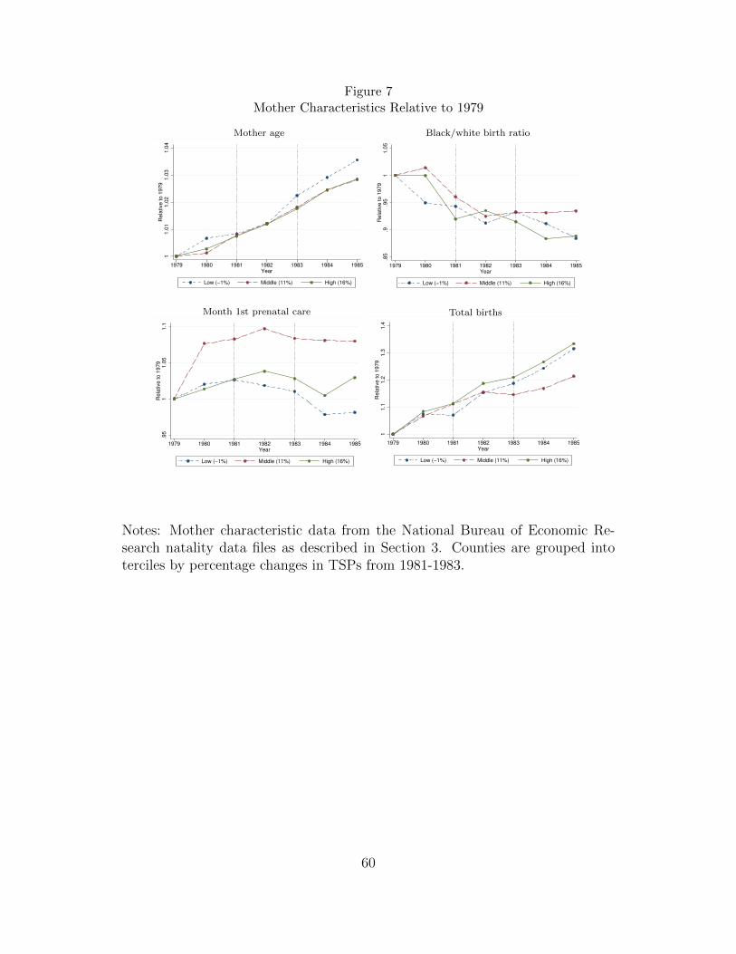
Figure 7Mother Characteristics Relative to 1979
Mother age
11.0
11.0
21.0
31.0
4R
ela
tive to 1
979
1979 1980 1981 1982 1983 1984 1985Year
Low (−1%) Middle (11%) High (16%)
Black/white birth ratio
.85
.9.9
51
1.0
5R
ela
tive to 1
979
1979 1980 1981 1982 1983 1984 1985Year
Low (−1%) Middle (11%) High (16%)
Month 1st prenatal care
.95
11.0
51.1
Rela
tive to 1
979
1979 1980 1981 1982 1983 1984 1985Year
Low (−1%) Middle (11%) High (16%)
Total births
11.1
1.2
1.3
1.4
Rela
tive to 1
979
1979 1980 1981 1982 1983 1984 1985Year
Low (−1%) Middle (11%) High (16%)
Notes: Mother characteristic data from the National Bureau of Economic Re-search natality data files as described in Section 3. Counties are grouped intoterciles by percentage changes in TSPs from 1981-1983.
60

Figure 8Population Characteristics Relative to 1979
% white
.94
.96
.98
11.0
2R
ela
tive to 1
970
1970
1972
1974
1976
1978
1980
1982
1984
1986
1988
1990
1992
1994
1996
1998
2000
Year
Low (−1%) Middle (11%) High (16%)
% black
.6.8
11.2
Rela
tive to 1
970
1970
1972
1974
1976
1978
1980
1982
1984
1986
1988
1990
1992
1994
1996
1998
2000
Year
Low (−1%) Middle (11%) High (16%)
% other
02
46
810
Rela
tive to 1
970
1970
1972
1974
1976
1978
1980
1982
1984
1986
1988
1990
1992
1994
1996
1998
2000
Year
Low (−1%) Middle (11%) High (16%)
Notes: Population characteristic data from the National Cancer Institute, andare derived from intercensus population estimates provided by the Census Bureau(see Section 3). Counties are grouped into terciles by percentage changes in TSPsfrom 1981-1983.
61

Table A-1Ambient TSPs and Relative Manufacturing Employment: Additional Weather Variables
(1) (2) (3) (4) (5)
Manufacturing Ratio 0.8236∗∗∗ 0.8461∗∗∗ 0.8395∗∗∗ 0.7734∗∗∗ 0.7220∗∗∗
(0.2252) (0.2315) (0.2250) (0.2451) (0.2320)Population Density 3.9232∗∗ 4.0325∗∗∗ 3.8979∗∗ 3.5422∗∗ 2.8236∗∗
(1.4856) (1.4323) (1.4961) (1.3165) (1.3719)Days with Rain −0.1297∗∗ −0.1238∗ −0.1170∗ −0.1056∗ −0.1063∗
(0.0578) (0.0611) (0.0580) (0.0538) (0.0536)Avg. Yearly Temp. 0.3385 0.3762 0.2803 −0.5869 −0.9263
(0.4144) (0.3968) (0.4154) (0.6601) (0.6999)Avg. Yearly Humidity −2.1047 −1.9771 0.2847 0.2751
(1.5931) (1.6125) (2.2899) (2.3158)Days with Snow −0.1082 −0.1126 −0.1334
(0.1301) (0.1327) (0.1408)Days with Fog −0.0782∗ −0.0874∗
(0.0425) (0.0444)Avg. Yearly Windspeed 1.7915∗
(0.9827)
Observations 196 196 196 196 196
Notes: Estimated standard errors, clustered on county, are displayed in parentheses.Results are for a balanced panel of counties from 1979-1985. Included counties arethose with a population centroid within 20 miles of a pollution sensor with at least26 valid readings per year and non-missing covariates, excepting Harris county asnoted in Section 3. Total number of counties is 28. Weather data are assigned tocounties based on the methodology discussed in Section 3.
* significant at 10%; ** significant at 5%; *** significant at 1%
A-1

Table A-2OLS and IV of TLI Math Score Using Student-level, Uncollapsed Data
(1) (2) (3) (4)TLI OLS TLI IV Passrate OLS Passrate IV
TSP −0.0297∗∗ −0.1104∗∗ −0.0010∗∗ −0.0035∗∗
(0.0119) (0.0418) (0.0004) (0.0015)Income (YOB) 0.3255 1.2820 0.0094 0.0403
(0.7637) (0.8720) (0.0267) (0.0314)Income (YOT) −1.7849∗∗∗ −1.7217∗∗∗ −0.0596∗∗∗ −0.0577∗∗∗
(0.4948) (0.4457) (0.0190) (0.0178)Male 1.8231∗∗∗ 1.8233∗∗∗ 0.0477∗∗∗ 0.0477∗∗∗
(0.0802) (0.0803) (0.0030) (0.0030)Black −8.0857∗∗∗ −8.0838∗∗∗ −0.2182∗∗∗ −0.2182∗∗∗
(0.2204) (0.2207) (0.0065) (0.0065)Hispanic −4.0730∗∗∗ −4.0716∗∗∗ −0.1008∗∗∗ −0.1007∗∗∗
(0.1817) (0.1822) (0.0054) (0.0054)Asian 1.9241∗∗∗ 1.9250∗∗∗ 0.0232∗∗∗ 0.0232∗∗∗
(0.1768) (0.1777) (0.0052) (0.0052)Special Ed −13.6415∗∗∗−13.6416∗∗∗ −0.3650∗∗∗ −0.3650∗∗∗
(0.4406) (0.4404) (0.0131) (0.0130)Free/Reduced Lunch −1.8638∗∗∗ −1.8644∗∗∗ −0.0463∗∗∗ −0.0463∗∗∗
(0.1891) (0.1894) (0.0047) (0.0048)Pupil/Teacher Ratio −0.0455 −0.0616 −0.0012 −0.0017
(0.0668) (0.0695) (0.0023) (0.0024)% School Black −0.7736 −0.0676 −0.0203 0.0016
(4.0753) (3.8910) (0.1306) (0.1251)% School Hispanic 2.9755 2.7598 0.2232∗ 0.2162
(4.4676) (4.6236) (0.1272) (0.1368)% School Free Lunch −1.1013 −0.9446 −0.0445∗ −0.0395
(1.0873) (1.0615) (0.0233) (0.0235)Days with Rain −0.0080∗ −0.0120∗∗ −0.0002 −0.0003∗
(0.0044) (0.0051) (0.0002) (0.0002)Avg. Yearly Temp. −0.1656 −0.1862 −0.0042 −0.0047
(0.1545) (0.1594) (0.0053) (0.0053)Pop. Density (YOB) 0.6173 0.2598 0.0172 0.0059
(0.3769) (0.4619) (0.0123) (0.0183)Pop. Density (YOT) −0.8288∗∗ −0.7948∗∗ −0.0266∗∗ −0.0256∗∗
(0.3493) (0.3497) (0.0103) (0.0101)
Observations 572,438 245,408 252,366 240,751
Angrist-Pischke F for TSPs 18.61 18.61Angrist-Pischke F for Income 186.16 186.16Kleibergen-Paap F 9.63 9.63Stock-Wright p-value 0.0024 0.0068
Notes: Data are collapsed on school, year of birth, year of test, and studentdemographic cells and weighted accordingly (see Section 5). All regressionscontrol for school and year of birth by year of test fixed effects. Covariates aredescribed in Section 3. Estimated standard errors, clustered on county, are dis-played in parentheses. Results are for a balanced panel of schools correspond-ing to birth cohorts 1979-1985 and test years 1994-2002. Included counties arethose with a population centroid within 20 miles of a pollution sensor with atleast 26 valid readings per year and non-missing covariates, excepting Harriscounty as noted in Section 3. Total number of counties is 28. YOB and YOTindicate “year of birth” and “year of test”, respectively. Per capita income isin tens of thousands of dollars, and density is in hundreds of people per squaremile.
* significant at 10%; ** significant at 5%; *** significant at 1%
A-2
Table A-3OLS and IV of TLI Math Score Using Collapsed Data Without Weights
(1) (2) (3) (4) (5)OLS 1979-1985 OLS 1979-1981 OLS 1981-1983 IV 1981-1983 OLS 1983-1985
TSP 0.0056 0.0066 −0.0556∗∗∗ −0.1812∗∗∗ 0.0151(0.0126) (0.0117) (0.0167) (0.0511) (0.0263)
Income (YOB) 0.1481 1.1116 0.2372 2.2085∗∗∗ −0.7779(0.7023) (3.1508) (0.7987) (0.7679) (1.8306)
Income (YOT) −3.0521∗∗∗ −9.3105∗∗∗ −1.0864 −1.1868 −0.5134(0.4771) (2.1349) (1.1554) (1.1114) (0.4104)
Male 2.3468∗∗∗ 3.0533∗∗∗ 2.4348∗∗∗ 2.4346∗∗∗ 1.5781∗∗∗
(0.0893) (0.1027) (0.1021) (0.1026) (0.1028)Black −7.8485∗∗∗ −9.6615∗∗∗ −7.6298∗∗∗ −7.6263∗∗∗ −5.9194∗∗∗
(0.2222) (0.2315) (0.2543) (0.2558) (0.2533)Hispanic −3.7465∗∗∗ −4.9064∗∗∗ −3.4633∗∗∗ −3.4640∗∗∗ −2.6384∗∗∗
(0.2043) (0.2741) (0.2120) (0.2115) (0.1825)Asian 2.4561∗∗∗ 3.2276∗∗∗ 2.3626∗∗∗ 2.3601∗∗∗ 1.9702∗∗∗
(0.1550) (0.2762) (0.1592) (0.1585) (0.2400)Special Ed −13.1852∗∗∗ −15.8753∗∗∗ −12.9707∗∗∗ −12.9712∗∗∗ −10.5202∗∗∗
(0.3981) (0.3689) (0.4684) (0.4688) (0.4699)Free/Reduced Lunch −1.7206∗∗∗ −2.0981∗∗∗ −1.7203∗∗∗ −1.7198∗∗∗ −1.3802∗∗∗
(0.1611) (0.1994) (0.1765) (0.1764) (0.2094)Pupil/Teacher Ratio −0.0551 0.0306 −0.0985 −0.1164 −0.0565
(0.0709) (0.1116) (0.1000) (0.1016) (0.0685)% School Black −2.9793 −3.2261 −2.8720 −2.3403 −8.5417
(2.7836) (9.9386) (5.9358) (5.9795) (6.7719)% School Hispanic −6.5354∗∗ −4.4887 4.6727 4.2318 1.0747
(2.6129) (7.1703) (5.3513) (5.3697) (7.3993)% School Free Lunch 0.0479 0.3157 −0.0818 0.0379 −2.0068
(1.0975) (1.8310) (1.9572) (1.9474) (1.6632)Days with Rain −0.0108 −0.0317∗∗∗ −0.0141∗∗ −0.0227∗∗ 0.0187
(0.0068) (0.0092) (0.0063) (0.0099) (0.0121)Avg. Yearly Temp. 0.0463 −0.2225 −0.1042 −0.1114 0.1433
(0.1068) (0.2176) (0.1736) (0.2097) (0.1466)Pop. Density (YOB) 1.7953∗∗∗ 2.4160∗∗ −0.2347 −0.7416 0.1529
(0.4819) (1.1676) (0.4796) (0.8360) (0.5814)Pop. Density (YOT) −2.1182∗∗∗ −2.2374 −0.8490 −0.8294 −0.2699
(0.4656) (1.4009) (0.5466) (0.5084) (0.4461)
Observations 56,816 24,455 26,692 26,692 23,116
Angrist-Pischke F for TSPs 14.20Angrist-Pischke F for Income 136.35Kleibergen-Paap F 7.23Stock-Wright p-value 0.0589
Notes: Data are collapsed on school, year of birth, year of test, and student demographic cells (see Section5) but regressions are done without weights. All regressions control for school and year of birth by year oftest fixed effects. Covariates are described in Section 3. Estimated standard errors, clustered on county,are displayed in parentheses. Results are for a balanced panel of schools corresponding to birth cohorts1979-1985 and test years 1994-2002. Included counties are those with a population centroid within 20 milesof a pollution sensor with at least 26 valid readings per year and non-missing covariates, excepting Harriscounty as noted in Section 3. Total number of counties is 28. YOB and YOT indicate “year of birth” and“year of test”, respectively. Per capita income is in tens of thousands of dollars, and density is in hundredsof people per square mile.
* significant at 10%; ** significant at 5%; *** significant at 1%
A-3