wings + horns brand redesign guidelines
DESCRIPTION
This is part of a brand redesign I did as a class project.TRANSCRIPT


BRAND GUIDELINES

OU
R M
ISSI
ON
“To provide quality menswear that integrates innovative fabrics with a Japa-nese approach to detail”

We take pride in the recognition we receive.
It is vital that we maintain brand consistency in order to keep our supporters.

THE
LOG
O

The wings+horns logo is representative of the company’s past history, and aims to highlight the modern aesthetics we create.
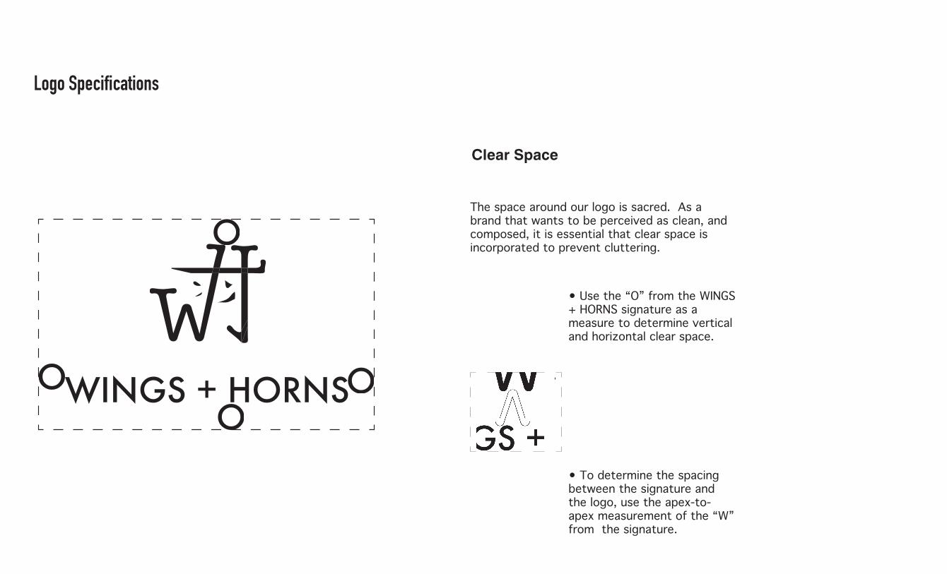
Logo Specifications
Clear Space
The space around our logo is sacred. As a brand that wants to be perceived as clean, and composed, it is essential that clear space is incorporated to prevent cluttering.
• Use the “O” from the WINGS + HORNS signature as a measure to determine vertical and horizontal clear space.
• To determine the spacing between the signature and the logo, use the apex-to-apex measurement of the “W” from the signature.

Minimum Size
To maintain brand integrity, the logo may not be less than1.5” in width from the “W” to the end of the “S” in the signature.
1.5”
Logo Colour
CYMK: 90, 30, 95, 30RGB: 0, 104, 56 PMS: Uncoated 7729 UP
CYMK: 98, 60, 33, 47RGB: 0, 60, 86 PMS: Uncoated 296 UP
Most of the time, our logo is to remain black or white. However, occasionally a coloured logo may be used. The only part of the logo that is to be coloured are the 4 strokes beneath the crossbar of the “H”.
* Do not place the colour logo on a colour background

Logo Donts
1. Black logo on a colour background
2. Slanting the logo 3. Placing a stroke on the logo
4. Colouring the logo 5. Placing the logo on a busy image

Logo Variations......(Yes we have more than one)
WINGS + HORNS WINGS + HO
RNS W
ING
S + HORNS WINGS + HORNS
WIN
GS
+ H
ORN
S
1. 2. 3. 4.
The badge is an alternate logo used on occasion for special projects or items that aesthetically need the logo to be enclosed by a circle.
Our standalone WH graphic is to be used on embroidery, stickers, advertising, and other promotional material.
The “WINGS + HORNS” signature is to be used on packaging and accessories that cannot accommodate our traditional graphic.
This is our standard WINGS + HORNS logo that is to be used for most branding. Treat it well.

CO
LOU
R PA
LETT
E

Colours to Abide By, Dude
Although much of our branding is expressed through black and white, we do however utilize colour in some of our graphics.
The colours listed above are presented in accordance with the frequency you should use them.
Keep it sophisticated, no rainbows or gradients.
CYMK: 0, 0, 0, 100RGB: 0, 0, 0 PMS: Uncoated Black
CYMK: 0, 0, 0, 0RGB: 255, 255, 255PMS: Uncoated P 1-1 U
CYMK: 90, 30, 95, 30RGB: 0, 104, 56 PMS: Uncoated 7729 UP
CYMK: 98, 60, 33, 47RGB: 0, 60, 86 PMS: Uncoated 296 UP
CYMK: 27, 93, 99, 26RGB: 148, 44, 31 PMS: Uncoated P 50-15 U
CYMK: 31, 68, 33, 100, 23RGB: 147, 86, 36 PMS: Uncoated P 29-14 U

OU
R TY
PEFA
CES

These are our Print Typefaces
FUTURA MEDIUM
abcdefghijklmnopqrstuvwxyzABCDEFGHIJKLMNOPQRSTUVWXYZ1234567890
• Use Futura Medium for headings. • It is the font we use for our signature. • Legible, and strong, it is us.

DIN CONDENSED
abcdefghijklmnopqrstuvwxyzABCDEFGHIJKLMNOPQRSTUVWXYZ1234567890
• Use Din Condensed for subheadings. • Its condensed form draws the eye down towards the body copy.• We use this because it is modern and youthful.
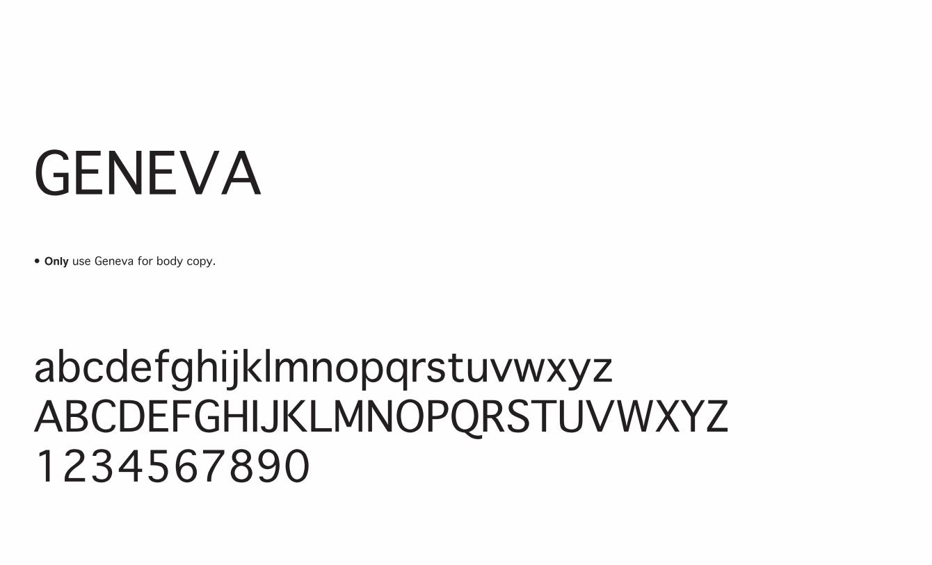
GENEVA
abcdefghijklmnopqrstuvwxyzABCDEFGHIJKLMNOPQRSTUVWXYZ1234567890
• Only use Geneva for body copy.

These are our Web Typefaces
OPEN SANS
abcdefghijklmnopqrstuvwxyzABCDEFGHIJKLMNOPQRSTUVWXYZ1234567890
•The web-equivalent of Futura Medium.

ABEL
abcdefghijklmnopqrstuvwxyzABCDEFGHIJKLMNOPQRSTUVWXYZ1234567890
•The web-equivalent of DIN Condensed.
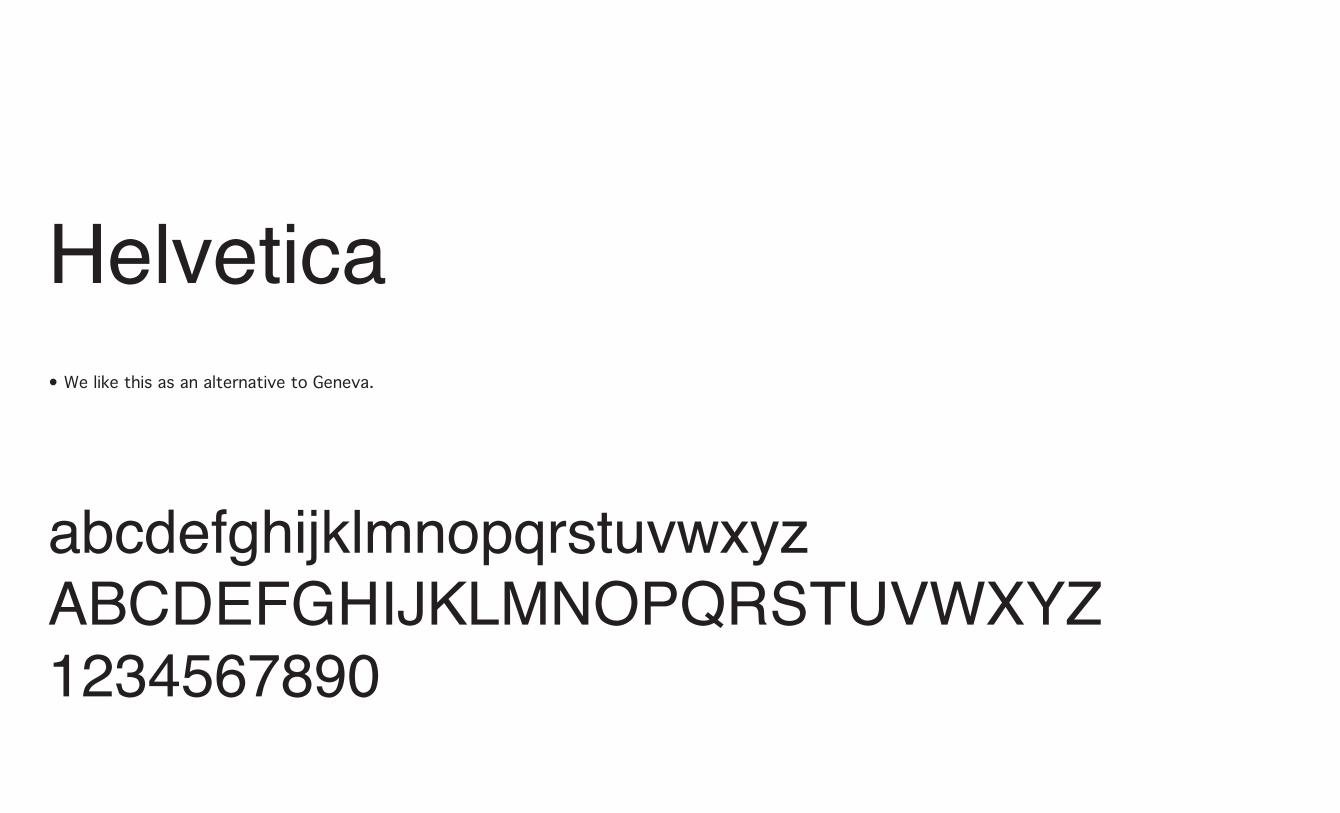
Helvetica
abcdefghijklmnopqrstuvwxyzABCDEFGHIJKLMNOPQRSTUVWXYZ1234567890
• We like this as an alternative to Geneva.

USI
NG
IM
AG
ERY
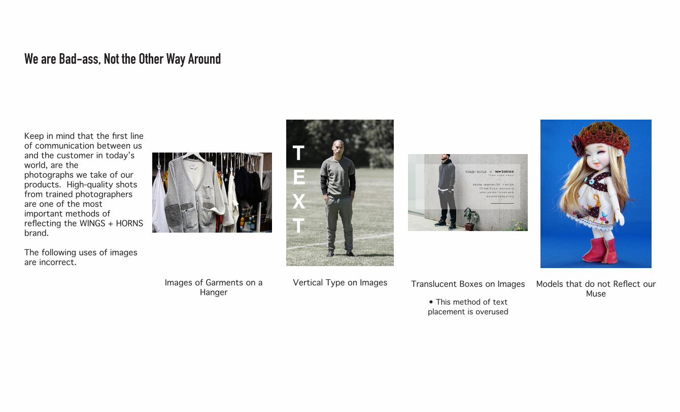
We are Bad-ass, Not the Other Way Around
Keep in mind that the first line of communication between us and the customer in today’s world, are the photographs we take of our products. High-quality shots from trained photographers are one of the most important methods of reflecting the WINGS + HORNS brand.
The following uses of images are incorrect.
Translucent Boxes on Images
• This method of text placement is overused
Images of Garments on a Hanger
Models that do not Reflect our Muse
T E X T
Vertical Type on Images

FIN
AL
WO
RDS
WINGS + HORNS has been growing exponentially over recent years, and with this growth comes change. It is with your help, by following the previous branding requests that we continue this growth into the distant future.
Thank you for your work.
