writing copy research 1
TRANSCRIPT

Factual Writing Copy - Research
Shania Carter

LeafletsThis leaflet is for public information, it is written openly and not targeted at one age group, or gender and not honing on audience specifics.
Due to the fact that this leaflet is for health benefits, there are more facts than opinions and the accuracy of the leaflet is suitable as drinking is such a heavy subject at all ages. For this leaflet and the subject avoiding ambiguity is another area that is clear, the facts cannot be misinterpreted as the information is coming across to people who may be struggling. The clarity of the leaflet is strong, it has to be clear and easy to read as it is displaying facts that are important to people’s lives.
This leaflet isn’t concise as it has big paragraphs with justifications, although there is text to picture ratio, the leaflet needs to hone in on the bigger important aspects, rather than filling the page – especially if written for public information. The conciseness of the FAQ’s can be forgiven as some of the questions do need long answers dealing with the subject. The way the leaflet is concise can also link with clarity – the information has to be straight to the point and relatively simple to follow.
There can be bias in this leaflet as it is intended for public information and not in favor of political situations. However, the leaflet clearly has an agenda of showing the downside of drinking and tells the reader the rules of drinking alcohol, this more points to regular drinking. When displaying information that could interfere with our lives, there is no need to display bias opinions, there is also two sides to every story, there could be anchorage on the images which then leads back to ambiguity and creates a vicious circle. I.e. people will ignore the information.
The register of this leaflet has a purpose of giving out information regarding the health warnings of alcohol on young persons as well as adults. The leaflet isn’t written formally but also not too informal, there are abbreviations used for ‘what is’ and ‘it is’. The register of this leaflet is to also make sense to a range of people and use language of what they would speak in generally.
This leaflet is for alcohol awareness which is going to raise some arguments, there are questions to be asked also which require evidence to back up the answers. Because there is two sides to everything there needs to be enough evidence to support the facts especially when on an agenda of a heavy subject.

The main issue when looking at legal constraints and alcohol is the ASA guidelines to advertising – most of the restrictions include being irresponsible and showing seduction. This leaflet doesn’t show seduction however we do notice the child in the forefront being singled out by his parents, the agenda is to still raise awareness of alcohol consumption but can be seen that the child is neglected by his parents for alcohol.
The type of color used in the leaflet is pink – stereotypically this is more of a feminine color and can suggest that the leaflet is more appealing to women than men the colour pink is relaxing and doesn’t show signs of danger like red would. The leaflet also features more illustrations of women. I think that is because women are more likely to read through the information, again this could be down to stereotypes. The questions are in bold as it separates the question from the answer and brings clarity the boldness also helps the reader to distinguish the key points and bring the evidence of arguments to the public as alcohol awareness is a touchy subject. In the text there are words to highlight the importance of the answers. The font choice is also key in this instance – the font that is used here looks like it appeals to younger people as the font also looks like text, the font is easy to read.
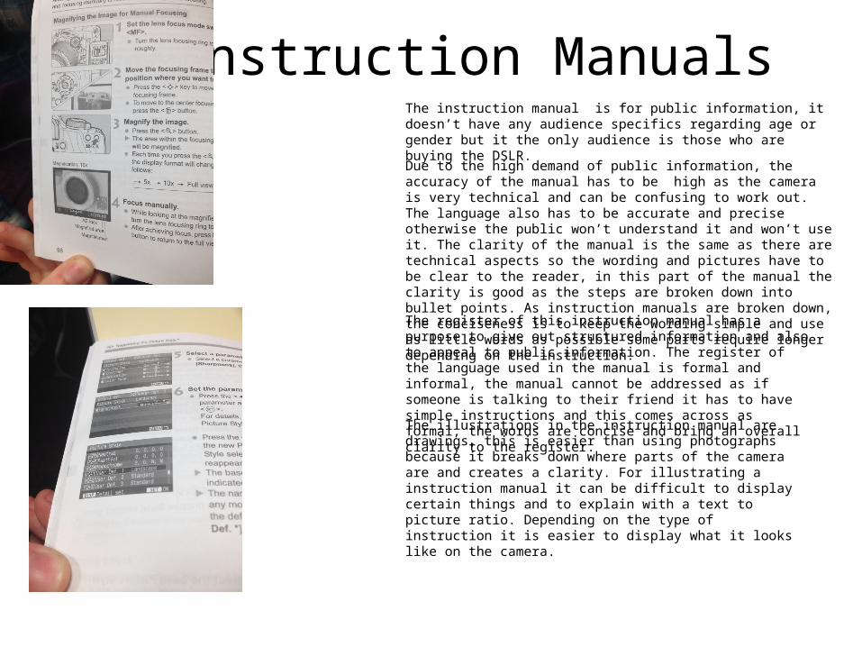
Instruction ManualsThe instruction manual is for public information, it doesn’t have any audience specifics regarding age or gender but it the only audience is those who are buying the DSLR.
Due to the high demand of public information, the accuracy of the manual has to be high as the camera is very technical and can be confusing to work out. The language also has to be accurate and precise otherwise the public won’t understand it and won’t use it. The clarity of the manual is the same as there are technical aspects so the wording and pictures have to be clear to the reader, in this part of the manual the clarity is good as the steps are broken down into bullet points. As instruction manuals are broken down, the conciseness is to keep the wording simple and use as little words as possible some parts require longer depending on the instruction.
The register of this instruction manual has a purpose to give out structured information and also to appeal to public information. The register of the language used in the manual is formal and informal, the manual cannot be addressed as if someone is talking to their friend it has to have simple instructions and this comes across as formal, the words are concise and bring an overall clarity to the register.
The illustrations in the instruction manual are drawings, this is easier than using photographs because it breaks down where parts of the camera are and creates a clarity. For illustrating a instruction manual it can be difficult to display certain things and to explain with a text to picture ratio. Depending on the type of instruction it is easier to display what it looks like on the camera.

The choice of colour for the instruction manual is a simple black and white, the colors don’t signify anything but are frequently used throughout step by step guides and manuals to be clear. The font selected is also a mainstream font, therefore the clarity is brought together, the instruction manual has selected this font and color because they are easy to read and the words are not bunched up, if the manual had used a serif font it would distract the key points and would be hard to focus on. The manual has also used sub headings which are in bold to depict which follows on from the previous, if the bold wasn’t used the information would be mixed up and it would become more confusing. The font choice for the instruction manual is easy to read and appeals in a formal register to help the steps go smoother.

How to guideOnce again, this how to guide is used for public information, the how to guide is in the form of a poster rather than a book type. The guide can be for anyone as it is not a complex task. How to guides are general in terms of their topic and can range from something minor to major, they are a little different to instruction manuals in the manner they are more relaxed and don’t have much information in them.
This how to guide on painting doesn’t hold data facts and therefore doesn’t have to be so precise on being accurate. There are safety concerns with paint so when somebody is applying paint the facts have to be accurate.
The clarity of this how to guide is good as the work is clear and easy to make out, the clarity is important for painting a pole in this instance as there is health and safety warnings it is also essential if someone has never painted a pole.
The conciseness is to keep the how to guide simple with as few words as possible, the steps don’t have to be complicated and this how to guide completes the steps with one word or simple instructions.
The register of this how to guide is informal, the first informal register is the smiley face and the explanation marks, compared to the instruction manual, the steps are different and the wording too. The register of the language shows more informal using ‘pop’ this is a tone of someone that would be chatting rather than professional.
For painting a pole there isn’t any gagging orders or contempt of court however the company would have to keep the paint out of the reach of children and not to inhale the paint in large amounts.
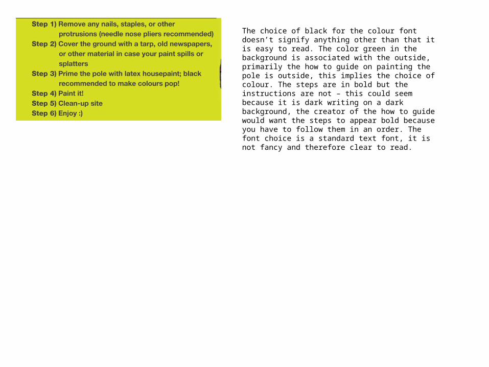
The choice of black for the colour font doesn’t signify anything other than that it is easy to read. The color green in the background is associated with the outside, primarily the how to guide on painting the pole is outside, this implies the choice of colour. The steps are in bold but the instructions are not – this could seem because it is dark writing on a dark background, the creator of the how to guide would want the steps to appear bold because you have to follow them in an order. The font choice is a standard text font, it is not fancy and therefore clear to read.

Factual JournalismThis piece of factual journalism is sensitive as it is dealing with peoples lives. The accuracy of this journalistic piece has to be pin point, the extract is taken from the Hillsborough inquests and all quotes and reports have to be exact to run the case to the judge and the public.
The extract also has to avoid ambiguity, there have been stories regarding this incident that have been ambiguous but with the truth coming out there is no room for interpretation and the facts have to be legit as they are coming from high sources such as police officers.
The clarity means that the piece has to be clear to read, it can also mean that it has to be clear with facts the clarity of this extract is high as reiterating that it is dealing with people’s lives and is still continuing today.
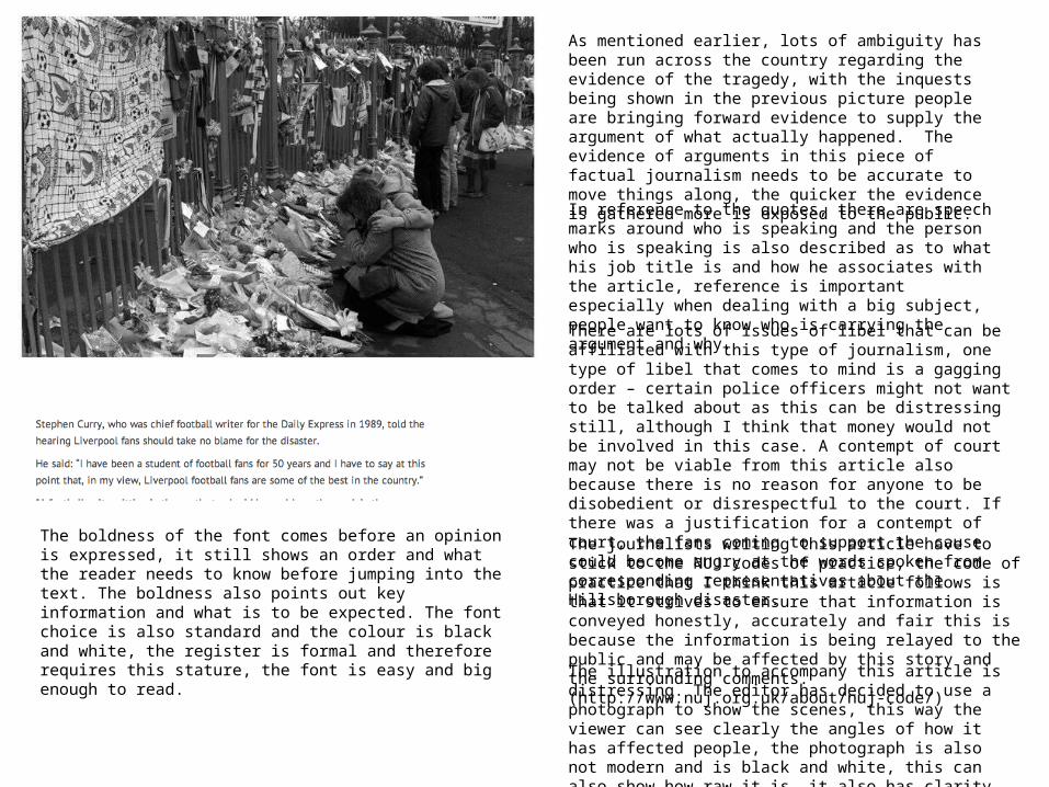
I don’t think this extract shows any bias as it is reporting live from an inquest with quotes there and then, the story is dedicated to the Liverpool families. If it was to be bias it would signify the detail of how the Liverpool fans – that died were the best in the country.
The register of this story is formal as well informal. The formal part of this piece describes who said what at the inquest and what would be spoken about next. The informal part of this piece is when people are speaking as it is their voice and the tone they say things in can’t be changed as this would bring up ambiguity.
As mentioned earlier, lots of ambiguity has been run across the country regarding the evidence of the tragedy, with the inquests being shown in the previous picture people are bringing forward evidence to supply the argument of what actually happened. The evidence of arguments in this piece of factual journalism needs to be accurate to move things along, the quicker the evidence is gathered more is exposed to the public.
In reference to the quotes, there are speech marks around who is speaking and the person who is speaking is also described as to what his job title is and how he associates with the article, reference is important especially when dealing with a big subject, people want to know who is carrying the argument and why.
There are lots of issues of libel that can be affiliated with this type of journalism, one type of libel that comes to mind is a gagging order – certain police officers might not want to be talked about as this can be distressing still, although I think that money would not be involved in this case. A contempt of court may not be viable from this article also because there is no reason for anyone to be disobedient or disrespectful to the court. If there was a justification for a contempt of court, the fans coming to support the cause could become angry at the words spoken from corresponding representatives about the Hillsborough disaster.
The journalists writing this article have to stick to the NUJ codes of practice, the code of practice that I think this article follows is that it strives to ensure that information is conveyed honestly, accurately and fair this is because the information is being relayed to the public and may be affected by this story and the surrounding comments. (http://www.nuj.org.uk/about/nuj-code/)
The illustration to accompany this article is distressing. The editor has decided to use a photograph to show the scenes, this way the viewer can see clearly the angles of how it has affected people, the photograph is also not modern and is black and white, this can also show how raw it is, it also has clarity to it.
The boldness of the font comes before an opinion is expressed, it still shows an order and what the reader needs to know before jumping into the text. The boldness also points out key information and what is to be expected. The font choice is also standard and the colour is black and white, the register is formal and therefore requires this stature, the font is easy and big enough to read.