x10 comics: reimagining the sequential narrative
TRANSCRIPT

Rochester Institute of Technology Rochester Institute of Technology
RIT Scholar Works RIT Scholar Works
Theses
5-15-2015
X10 Comics: Reimagining the Sequential Narrative X10 Comics: Reimagining the Sequential Narrative
Sten E. McKinzie
Follow this and additional works at: https://scholarworks.rit.edu/theses
Recommended Citation Recommended Citation McKinzie, Sten E., "X10 Comics: Reimagining the Sequential Narrative" (2015). Thesis. Rochester Institute of Technology. Accessed from
This Thesis is brought to you for free and open access by RIT Scholar Works. It has been accepted for inclusion in Theses by an authorized administrator of RIT Scholar Works. For more information, please contact [email protected].

1 |

| 2

3 |
Peter Byrne
| 4
At its core a comic book is a narrative told using a sequence of images or a sequential art narrative. There are a number of conventions, established early in the history of comics, which make the comic panel format a powerful tool for visual communication. My thesis project examines these conventions and attempt to distinguish which ones are results of the unique nature of sequential art and which began as a byproduct of technological limitations. By doing so my goal is to take advantage of current technology by creating a new comic book format that integrates digital media while celebrating the comic book as a sequential art narrative.

5 |
Before we had written language, humans were communicating with pictures. In fact, most of the letter forms in most of the languages we write today came from some form of pictography. Prior to the 15th century, examples of sequential art could be found in any number of mediums: stone Egyptian hieroglyphs, Greek friezes and Roman columns of stone, medieval tapestries of cloth, Japanese scrolls of rice paper and many others. When the written word was established, it was considered the purview of the wealthy and clergy. However, Johannes Gutenberg’s invention of the printing press brought print media to the masses. The first political comics came in the form of medieval broadsheet that often contained cartoonish renderings of public executions and caricatures of public figures. By the early years of the 20th century, comic strips were appearing in newspapers. Due to the humorous content, these strips became known as “the comics” or “the funnies.” They were packaged and resold as reprinted volumes and represent the first actual comic books. In the late 1930s comic books came into their own. New genres like war, western and super hero comics expanded sequential art past political cartoons and the funnies. The Golden Age of Comics started in the late thirties and with every generation and well into the Modern Age, it was clear that sequential art, in its primary form, the comic book, is integrally connected to the technology of printing. In the late 1990s publishers experimented with new digital technologies. The motion comic, for example, featured limited animation, within and between panels, intended to enhance the narrative. These could only be viewed on a computer. That limited the market and they were never embraced by the wider public. It is only now that technology has provided new channels of distribution for the sequential narrative. Publishers are looking to tablet devices and the web to expand readership. To offer the same on-the-go convenience of e-books, major publishers now offer their comics both in print and digital versions for mobile devices. Even so, comic books are treated no differently than any other scanned page. Major publishers have not pushed the technology to embrace the unique nature of the sequential narrative. Comic book conventions, established for print over a hundred years ago, remain relatively the same. There are a number of conventions used in comic books that contribute to its success as a visual communication tool.
Continuity: This is basically the world the comic book’s narrative lives in. It is often shared with a number of titles. Major events that happen in one title generally have an effect on or are at least acknowledged in other titles within the continuity. An example of this would be the Marvel Comics Universe
Title or series: This is the larger narrative. It is usually specific to a person, group of people or location. It is a consistent thematic stream that is broken into smaller chapters through serialization.
Serialization: This breaks the larger story arc of the title or series into smaller chunks that are delivered in to readers in regular intervals (i.e. monthly). A comic book series can be limited or continue indefinitely with many story arcs that progress over a long period of time. Detective Comics is one of the longest running comic book series. It spanned over 700 issues and ran from 1936 until 2011.
Page layout: This is how panels are laid out on a single page. The artist must
History
Comic Book Conventions

| 6
consider the amount of page real-estate against the size, number and composition of the panels and how it furthers the narrative in the most effective way
Panel composition: Each panel is like a small movie set in a box. It contains environment, props, lighting, actors and effects. It also contains chunks of text that can represent narration, speech and even sound effects. Finding a balanced composition for this Interplay of words and pictures, that fits with in a series of other panels in the page layout, while effectively furthering the narrative, is a true art form unique to comic books.
Continuity, title and serialization, are all common to other mediums like film, television and books. However, page layout, panel composition and the interplay of words and pictures, all function in ways unique to comics. These aspects are not only used to convey the narrative but also to inform the reader on unconscious levels. The panel is a container, usually a bordered box that contains the words and pictures that represent a moment in the narrative. Panels are similar to film and television in that they reside in a frame that allows the creator to reveal only what they wish. These frames are composed in ways that lead the viewer (reader) down the specific path of the narrative. Unlike the film frame, comic panels can be any shape or size and this allows the panels to organize and control time and space. The panel represents a moment in time allowing the reader to not just experience a moment but to examine it. Layout of the panel, for example, the position of a subject in relation to the shape of a panel, can affect the reader’s perception of time, within the panel. This makes time within the panel malleable. In Understanding Comics: The Invisible Art by Scott McCloud, an example is shown in the comparison of two similar panels. In one the subject is positioned centered in a small panel when he responds to a question. In the next the same subject gives the same response but this time the subject is placed at the right side of a long panel. The long space on left side of the subject communicates a pause in the subjects response as if they are considering their answer.
1
The gutter is the empty space between panels. In many ways the reader creates the relationship between the two panels. Through a process called closure, according to McCloud, as the reader moves from panel to panel on a comic page, it is over these gutters that the readers mind considers what they’ve read, build expectation and incorporates their own experience to connect the panels in meaningful way. In another example from Understanding Comics: The Invisible Art, McCloud shows this effect. In this example there are two panels. The first shows a man cringing in fear as a maniac swings an axe down on him, yelling “…and now you die!” The next panel shows a scream echoing over a nighttime city skyline. The reader connects the two and assumes, through closure, that the axe has fallen and the scream comes from the victim.
McCloud points out the readers involvement
when he says, “I may have drawn the axe being raised …, but I am not the one who let it drop or decided how hard the blow, or who screamed or why. That dear reader was your special crime. Each of you committing it in your own style.”
2
__________________________________________________________________________
1. McCloud, Scott. Understanding Comics: The Invisible Art. New York: HarperPerennial, 1994, 101.
2. McCloud, Scott. Understanding Comics: The Invisible Art. New York: HarperPerennial, 1994, 66-68.

7 |
The page is the organizing structure that holds panels and gutters. It is a predetermined rectangular space, that the creator must consider when he designs the flow of the narrative across panels and between pages. While a page change sometimes depends only on the amount of content that fits on the previous page, an artist tries to use a page change to further the narrative. A transition to a new scene is often signified by a page change. The new page begins with a larger panel that represents an establishing panel to define time and place. Ultimately, to determine the layout, the creator must strike a delicate balance between page size, the size and number of panels, the reading flow and the narrative. While the page seems to be integral to the experience, it is important to remember that there was sequential art before there was the page. While panels need to have an organization that connects their meanings, the page is a direct result of the printing process and the nature of the page was determined, early on, by the limits of print technology. Digital technology brings a wealth of possibilities for enhancing the comic reader’s experience. There were many things to consider in determining not only what could be done, but what was appropriate to the nature of comics. My initial thought was to design an app for mobile devices. What I found most interesting about tablet devices was the possibilities of touch interaction. However, after a couple of iterations of the project, I realized it would be more effective to create a prototype that could work in any digital environment. This way I could launch on tablets, consoles or computers. It would also allow me to develop it as a web app accessible to anyone. Adding sound and animation to the panels would allow me to minimize text and open more real estate for imagery. It would also provide more ways to quickly convey more information to the reader. Over all, it could create a dynamic presentation. However, this was an addition that many of the web comics researched had tried. So it was not unique. Also, by minimizing text I drifted away from the picture and word interplay innate to comic books. I wanted this to be a reading experience that could happen anywhere. By adding sound it limited that capability. Most importantly, however, was what it would do to a comic books unique relationship with time. Dialogue, music, sound effects and animation all happen in real time. Adding them would tie the panels to real time as well, effectively discarding the comic panel’s ability to mold time. A large part of my goal was to add interaction to the comic reader experience. Adding mini-games to certain panels was an initial consideration. I considered everything from in panel word puzzles, seek n’ find and matching games to dream sequences with full platform levels. All of these, once again tied the panels to real time. More importantly, it distracted from the narrative and felt too much like a gaming experience rather than a reading experience. The interaction should support the narrative. It should provide background, context and information specific to the character, locations and story. Thesis Statement By reexamining print based comic book conventions and current digital technology, can a user experience be designed that leverages that technology while delivering an engaging narrative and a sense of discovery?
Current Technology
Sound and Animation
Gamification

| 8
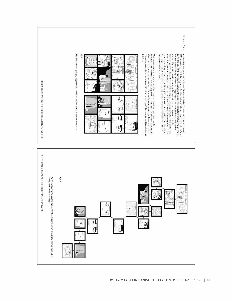
In designing my app, I wanted to preserve the aspects of comic books that made them unique and effective. Of the conventions I chose to focus on, I found the page layout restrictive. My first iterations of the narrative attempted to follow the standard vertical page format. The image below (Fig. 1), below is an example of one of my early attempts.
I struggled to strike the balance needed in the page and panel layout until I realized I didn’t need it. The page/panel format readers have become accustomed to is a holdover from the process of printing. It was an analogue restriction that I was struggling to fit into a digital format. I could pull the panels off the page. This allowed me to base my panel groups on scenes instead of pages. This created larger panel groups that provided a better contextual space for each scene. My original navigation concept used a road or tourist map as the backdrop for each scene panel group. Scene panel group would float above, using the map as a backdrop. The map focused on the location of the current scene, then moved to a new location for each new scene, leaving the previous scene’s panels behind. This gave each scene a temporal and spatial relationship to the others to further connect them to the narrative reality. The panels within the scenes remained as framed boxes and use many of the traditional aspects of panel composition. As the reader progresses through the narrative each panel is display full screen, with the previous and next panel visible. Also, all dialogue, narration and sound would be conveyed as they are in traditional comics, word bubbles, narration boxes, etc. I feel that panels and their function represent what is unique about comics so it is important to keep them consistent.
Thesis Parameters
Figure 1: early comic page layout
Panel Arrangement

9 |
The arrangement of the panels was different. I felt that it was also limited by what was established early on. Since comics are printed and read, it was only natural that they followed the reading direction of books, left to right, top to bottom. In my research, I had seen many examples of sequential art that spiraled down columns, read many different directions and even followed a zigzag order. I wanted to create panel vectors; the readers’ path of progression through the panels that followed what best fit the context of the narrative. If a character looks to their right, the next panel was to the right. If something fell, the panels that followed it would follow a downward trajectory, below (Fig. 2) is an early test of this new format.
Figure 2: early panel vector layout

| 10
Early in the design process, I decided against in-panel animation and sound. I decided to use only panel interactivity to give the reader contextual information that contributed to the narrative. I developed the following list of possible interactive options:
Live Bio: Access a biography for important characters which updated as the reader progressed through the narrative
Character Intros: Subtle popups that introduce important characters and signals the reader that their live bios are available
Word Links: An embedded link to a pop-up that explained the meaning of obscure words or concepts
Mag Glass: Links that would magnify areas or objects in the panels to reveal more information
Parallel Narratives: A group of panels that tell a subordinate narrative and contribute to the overall context of the main narrative
Scene Overview: A button that shows all of the panels in the current scene. As the story progresses, only viewed panels are revealed. This serves as a quick reference to the content of the scene and as a navigational device to move to specific panels in the scene.
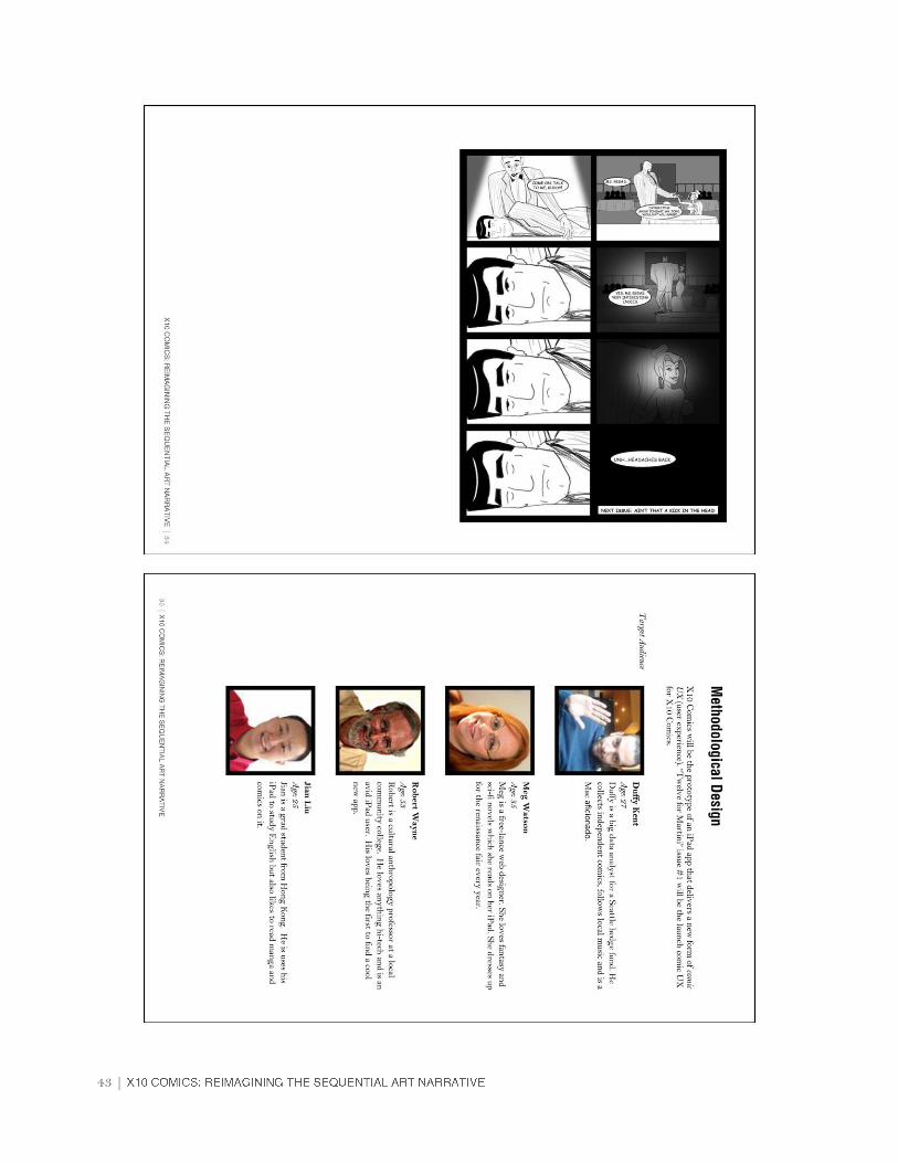
I developed a short narrative for the app called “Twelve for Marini” (Fig. 3). It is based on a story I came up with a number of years ago while at a conference in Las Vegas. The story, set in 1960s Las Vegas, is about Dirk Martini, a lounge singer, who through a series of bizarre events, realizes that he is the reincarnation of the Greek demi-god, Heracles, and that the mob family he works for is actually Zeus and the pantheon of Greek gods. Years before, they took control of the Las Vegas strip and now use the tourists as their personal playthings. Martini is must work through twelve tasks similar to the labors of Heracles, but with a twist of Vegas flavor. The specific story arc for this prototype involves Martinis first encounter with a divine creature, the Nemean Lion.
Interactivity
Narrative
Figure 3: “Twelve for Martini” original cover
11 |
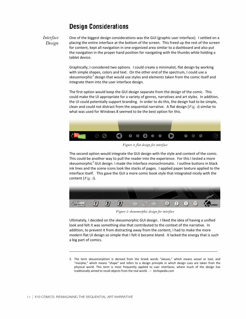
One of the biggest design considerations was the GUI (graphic user interface). I settled on a placing the entire interface at the bottom of the screen. This freed up the rest of the screen for content, kept all navigation in one organized area similar to a dashboard and also put the navigation in the proper hand position for navigating with the thumbs while holding a tablet device. Graphically, I considered two options. I could create a minimalist, flat design by working with simple shapes, colors and text. On the other end of the spectrum, I could use a skeuomorphic
3 design that would use styles and elements taken from the comic itself and
integrate them into the user interface design. The first option would keep the GUI design separate from the design of the comic. This could make the UI appropriate for a variety of genres, narratives and art styles. In addition, the UI could potentially support branding. In order to do this, the design had to be simple, clean and could not distract from the sequential narrative. A flat design (Fig. 4) similar to what was used for Windows 8 seemed to be the best option for this.
The second option would integrate the GUI design with the style and content of the comic. This could be another way to pull the reader into the experience. For this I tested a more skeuomorphic
3 GUI design. I made the interface monochromatic. I outline buttons in black
ink lines and the scene icons look like stacks of pages. I applied paper texture applied to the interface itself. This gave the GUI a more comic book style that integrated nicely with the content (Fig. 5).
Ultimately, I decided on the skeuomorphic GUI design. I liked the idea of having a unified look and felt it was something else that contributed to the context of the narrative. In addition, to prevent it from distracting away from the content, I had to make the more modern flat UI design so simple that I felt it became bland. It lacked the energy that is such a big part of comics. __________________________________________________________________________ 3. The term skeuomorphism is derived from the Greek words "skeuos," which means vessel or tool, and
"morphe," which means "shape" and refers to a design principle in which design cues are taken from the physical world. This term is most frequently applied to user interfaces, where much of the design has traditionally aimed to recall objects from the real world. . – techopedia.com
Interface Design
Figure 4: flat design for interface
Figure 5: skeuomorphic design for interface

| 12
I wanted to give the reader some kind of environmental context in which to experience the narrative. The original concept was a flat rectangular road or tourist map (Fig. 6) that served as a back drop to the comic panels that would. As I tested each design it became apparent that the straight map edges conflicted with the panel shapes and the simple map graphics were too abstracted to give any real information.
Leveraging my experience with 3D graphics, I reworked the map to be a rounded convex shape with exaggerated versions of the Las Vegas Strip casinos cartoon buildings across the surface of it. I used 3D camera moves that could fly up to display the entire map and then fly down to show a single bar or casino in full frame. The map took a form that was somewhere between a stylized tourist map and an actual game environment (Fig. 7). This gave me additional options such as moving across the map between scenes and using each location to replace the establishing shot panel at the beginning of each scene. This established the setting and since the panels played over this 3d representation of the scene location, it help to place the reader inside the narrative.
In addition the contrast between the 2D panels and the 3D map worked really well. Overall, it was much more effective than the original flat map.
Figure 6: flat rectangular map design
Figure 7: flat rectangular map design
Environmental Design
13 |
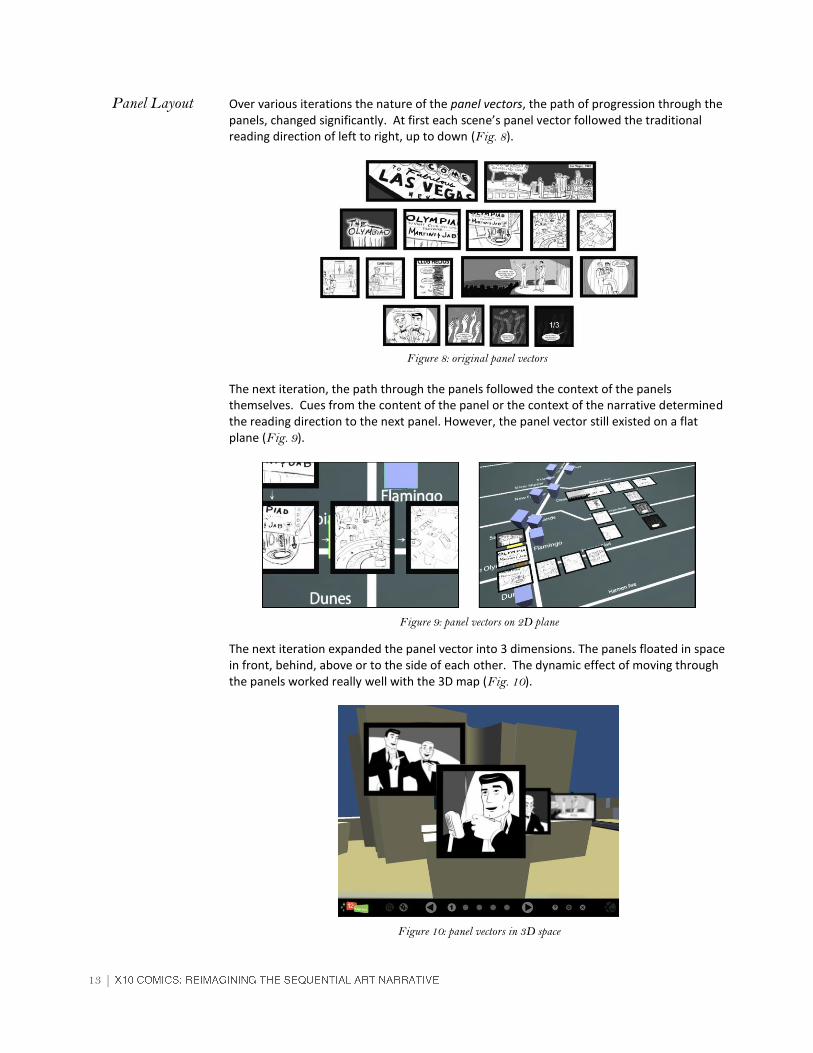
Over various iterations the nature of the panel vectors, the path of progression through the panels, changed significantly. At first each scene’s panel vector followed the traditional reading direction of left to right, up to down (Fig. 8).
The next iteration, the path through the panels followed the context of the panels themselves. Cues from the content of the panel or the context of the narrative determined the reading direction to the next panel. However, the panel vector still existed on a flat plane (Fig. 9).
The next iteration expanded the panel vector into 3 dimensions. The panels floated in space in front, behind, above or to the side of each other. The dynamic effect of moving through the panels worked really well with the 3D map (Fig. 10).
Panel Layout
Figure 9: panel vectors on 2D plane
Figure 10: panel vectors in 3D space
Figure 8: original panel vectors

| 14
At this point the project was nearly complete. The interface was finished. Every scene was laid out and functioning. The panel navigation had a nice flow. The map a night scene of the 1960s Las Vegas strip with multicolored neon signs on the streets and casinos (Fig. 11).
Unfortunately, when the panels were layered over the map, the colorful neon drew the eye away from the panels. This is when I made the decision that would pull everything into fully integrated successful design (Fig. 12).
Final Touches
Figure 11: full color version of The Olympiad Casino
Figure 11: test panel over full color map

15 |
Early on, I had decided to keep my panel artwork monochromatic. To test an idea, I made a few screengrabs of the app and completely de-saturated them. I found that by making everything black and white, including the map, it gave the artwork a retro feel that was appropriate to the time period. This brought the entire design together into one cohesive experience. The panels below are taken from the final design (Fig. 12).
Figure 12: screen grabs from final design

| 16
Technology became an interesting challenge. My original intention was to develop my app on the Adobe Flash platform. I had done a number of large projects using Adobe Flash and was comfortable with its scripting language, ActionScript3. Unfortunately, soon after I began production, it became increasingly obvious that the developer community at large was losing interest in Adobe Flash. Then Adobe itself made changes to Flash that lead me to believe it was minimizing its support of the product. These factors, coupled with Apple’s choice to not support Flash based websites on their mobile device, encouraged me to look for a more viable development option for my application. In researching viable replacements for Adobe Flash I found the Unity 3D game engine. The capabilities of the Unity 3D engine far exceeded those of Adobe Flash. This opened up many opportunities to take the design farther than originally anticipated. All of my research for this was in the tutorial pages on the Unity website or the websites for plugins used in conjunction with Unity 3D. The decision use the Unity 3D engine instead of Adobe Flash created some difficulty. Adobe Flash used ActionScript 3 as a programming language, which I knew fairly well. Unity 3D uses either JavaScript or C sharp (C#) as a language, I was unfamiliar with both. I was able to find a plug-in for Unity 3D called Playmaker, a powerful visual scripting device by Hutong Games. The Playmaker plugin is ideal for creating quick application prototypes. It allows you to creating almost any interactive functionality by simple creating finite state machines or FSMs
4 and transitioning between them.
Using this tool, I broke my narrative into four scenes. I then created FSMs for each panel and used the transition tool to move between them. I was also able to program the GUI to control them through a series of global FSMs, inside the GUI object. The image on next page shows the network of finite state machines needed to control the interactivity of one of my scenes (Fig. 14). __________________________________________________________________________
4. A finite-state machine (FSM) … is a mathematical model of computation used to design both computer programs and sequential logic circuits. It is conceived as an abstract machine that can be in one of a finite number of states. … It can change from one state to another when initiated by a triggering event or condition; this is called a transition. – Wikipedia.com
Figure 13: visual scripting using FSMs
Programming

17 |
Figure 14: FSM network for scene 1 of Twelve for Martini

| 18
Another issue that came up was the size of the map texture. The texture is a bitmap image. This means the texture cannot be stretched and you cannot zoom to close to it without losing resolution (Fig. 15).
The largest pixel dimension (the size of a bitmap image measured by the number of pixels) on a bitmap texture that Unity 3D allows for a texture is 4096 x 4096 pixels. I calculated that I would need a pixel dimension of over 10,000 x 10,000, for the map to stay crisp even when zoomed in. I was able to work around these restrictions by dividing the map into over fifty textures of various sizes (Fig. 16).
Each texture is 1024 x 1024 pixels. The size of the section varies based on the expected proximity of the camera. Those chunks that will always be at a distance are much larger. Those that the camera will zoom close to are smaller. By taking this into account I was able to optimize both the size and number of images needed to texture the entire map
Map Textures
Figure 15: close up of map texture
Figure 16: layout of map sections used to generate each of the final textures.

19 |
Using the 3D map as a backdrop for the panels created some issues with readability. The panels didn’t pop. Panels in comic books usually don’t have an issue standing out. Due to the format, panels don’t overlap and backgrounds for panels are generally plain. In addition to having a detailed background, I also had panels floating in 3D space and at times there was overlap (Fig. 17).
I tried a number of different solutions including blacking out or darkening panels other than the current one, applying a fog to the scene so farther panels were less visible and creating a larger panel that darkened the background. Each of these had aesthetic issues. Using the blackout panels felt cheap. Using the fog also diminished the background visibility. I even experimented with depth of field. The depth of field effect worked very well on the panels and the background. By changing the focal length of the camera I was able to rack focus as the panels dropped into place. This blurred out the back drop and any recessed panels while keeping the current one crisp. Unfortunately, due to how this filter for Unity 3D calculates it’s depth of field, it created strange patterns on the popup word bubbles and proved unusable.
As is often the case, there was a very simple and elegant solution, a spot light. By focusing and aiming the cone of a spotlight on to the current panel, it kept the other panels in shadow until they each moved into the light and became the current focus (Fig. 18).
Panel Clarity
Figure 17: panel from scene 2 of Twelve for Martini
Figure 18: final version of scene 2 panel
| 20
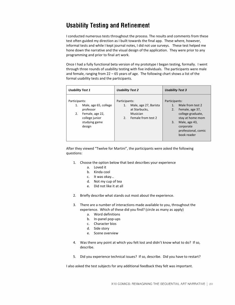
I conducted numerous tests throughout the process. The results and comments from these test often guided my direction as I built towards the final app. These where, however, informal tests and while I kept journal notes, I did not use surveys. These test helped me hone down the narrative and the visual design of the application. They were prior to any programming and prior to final art work. Once I had a fully functional beta version of my prototype I began testing, formally. I went through three rounds of usability testing with five individuals. The participants were male and female, ranging from 22 – 65 years of age. The following chart shows a list of the formal usability tests and the participants.
Usability Test 1 Usability Test 2 Usability Test 3
Participants:
1. Male, age 65, college professor
2. Female, age 22, college junior studying game design
Participants:
1. Male, age 27, Barista at Starbucks, Musician
2. Female from test 2
Participants:
1. Male from test 2 2. Female, age 37,
college graduate, stay at home mom
3. Male, age 43, corporate professional, comic book reader
After they viewed “Twelve for Martini”, the participants were asked the following questions:
1. Choose the option below that best describes your experience a. Loved it b. Kinda cool c. It was okay… d. Not my cup of tea e. Did not like it at all
2. Briefly describe what stands out most about the experience.
3. There are a number of interactions made available to you, throughout the
experience. Which of these did you find? (circle as many as apply) a. Word definitions b. In-panel pop-ups c. Character bios d. Side story e. Scene overview
4. Was there any point at which you felt lost and didn’t know what to do? If so,
describe.
5. Did you experience technical issues? If so, describe. Did you have to restart?
I also asked the test subjects for any additional feedback they felt was important.

21 |
A number of minor bugs were found in the first round of testing. There were two bugs that were very distracting. The first was a timing issue with the state machine transitions. It delayed panel moves and if the next button was clicked too soon the panels would move backwards or disappear altogether. This was fixed by reordering certain FSMs in the script. The second was a collision conflict between clickable panels and the GUI. In this version the panels were navigable by either using the GUI or clicking directly on the panels themselves. When any panels landed behind the GUI, clicking on the GUI became impossible. Initially I fixed this by placing a shape behind the GUI that blocked any interaction with overlapping panels. As it turned out the direct panel navigation was not very useful for full screen panels; therefore, I deleted it from the main navigation and only used it for the overviews. The male participant loved the experience, especially liked the 3D map and commented favorably on the story. However, he got stuck at the first interactivity after the open. He did not notice the navigation and was waiting for it to start playing again. He needed to be coached to click on the first button. The female participant thought it was really cool. She did not identify with the narrative. However, she was drawn in by the 3D movement of the map and panels. Of this she said, “It really made me want to stick with it to see what happened next…” Both missed the majority of the in-panel links. As a result of this test, along with many technical tweaks, I also implemented word balloon instructions at appropriate times to make interaction options more apparent. For all of the tests I tried to have at least one participant repeat. I knew that they would be looking for issues they had experienced the first time they tested and it would be a good way to check that everything was fixed. In this round there were still a few minor technical issues but for the most part ran smoothly. Both participants found most of the in-panel links without coaching. The female participant like the story better the second time. After finding and clicking on the text links, she picked up on the connection to the Greek gods. The male participant thought the presentation dragged. He had an issue with clicking all the time and felt it slowed the story and diminished the energy. He liked the story but was happy when it finally ended. As a result of this test I reworked the timing on the panel moves. I tweaked the speed and nature of the moves to follow the narrative, slow at times, but speeding up with the pace of the action. I also added automatic navigation between panels when it was appropriate. Usability test 3 went very well technically. There was only a few small bugs found and easily fixed.I specifically asked the male from test 2 to participate in order to see if he noticed a difference in the tempo of the piece. He felt it was an enormous improvement. He especially enjoyed Lucky’s side story. He had not seen it the first time. He liked it so much that he cued one of the other participants before I could stop him. The other male participant spent the most time with the app. He went through it twice and hunted down all of the in-panel links. He noticed the references to Greek mythology on the
Highlights and Results of
Usability Test 1
Highlights and Results of
Usability Test 2
Highlights and Results of
Usability Test 3

| 22
different casino marquees and suggested a free roam mode so the reader could actually explore the map. The female participant felt it wasn’t her cup of tea. She liked the overall concept but could not connect with the narrative. She did say that with a “different look and story” she probably would have liked it more.
The goal of this thesis project was to test my concepts in a prototype. I feel I have satisfied that goal and I am prepared to take this idea to the next step. I want to publish but in order to do so I need to generate awareness and capitol for the project. To generate awareness, my goal is to submit this prototype into a minimum of ten interactive media competitions in the next year. Three of these competitions are listed below. I continue to research other competitions.
Creativity International Awards (www.creativityawards.com)
Communication Arts Interactive Competition (www.commarts.com)
Adobe Design Achievement Awards (www.adobe.com/education/adaa) Generating capital is not as crucial, although funding would help to offset the cost of self-publishing and marketing. My first idea is crowd funding through Kickstarter (www.kickstarter.com). I have done some research and found that a Kickstarter campaign will be more successful if there is some awareness of the project and I create an engaging video promo to post on the Kickstarter page. Another resource I am currently investigating is the MAGIC Center at Rochester Institute of Technology. One of the functions of the MAGIC Center is to help students and faculty to bring industry polish and commercial scale to their projects. I think my project is a good fit because it leverages technology and design in a unique way.

23 |
This has to be one of the most challenging projects I have ever done. After twenty years in industry that is saying a lot. One of the first things I learned was the difference between creating for a client and creating for yourself. I have always believed that constraints are vital to creative development. Constraints give you boundaries to work within. They give you challenges to overcome. When you are creating for a client those constraints are budgets and deadlines. When you create for yourself you must find ways to establish constraints. If you don’t, constraints will be imposed in ways outside of your control. This project took me over two years to complete. This isn’t to say that I worked for two solid years. My production time was broken between long periods of distraction. There was always something that took precedence. Sometimes it was legitimate like working and providing for my family. Many times it was just procrastination, “I’ll work on it tomorrow. I still have ten weeks, plenty of time.” Often I was simply did not feel it. I wanted to make progress but I would end up staring blankly at a problem or worse I would try solution after solution that felt forced and didn’t fit. Then there were moments of supreme clarity. Moments when wildly spinning gears suddenly connected and worked in perfect concert. The stars align, something clicks, the clouds break and a beam of light shines on a crystal clear path. Interestingly enough these almost always happened at the eleventh hour, when time was running out and I stood to lose something important. I think that is the key, at least for me. I needed the constraint. It forced me to make a decision and more often than not the solution worked. Thankfully, I had the support and patience of my wife, my family and my thesis committee. I hope these moments clarity rewarded their faith. I know, for me, those moments are what kept me going and made it all worth it. My core idea was to use the interactive digital environment to enhance the experience of reading a comic book. By not taking the obvious route of adding sound or animation, I was able to retain the unique nature of time within comic book panels. Breaking the panels off of the page and placing them in a 3D virtual setting, places the reader inside the narrative world. Restricting the interactivity to navigation and access to supplemental information about the characters, places and overall story gives the reader an opportunity to further explore the context of the narrative. However, there are limitations. While, the nostalgic visual style unifies the interface, the setting and the narrative completely, it also contributes so much to the readability and clarity of the imagery that I question whether this presentation could work for any narrative or genre. Could it work as well for an action packed space pirate thriller or a court drama where the entire story is based on twelve strangers in a jury room? Can this version of the sequential art narrative be available to many artist and writers or is the technology required to reproduce this type of presentation, prohibitive? Is this a new medium or just a unique way to present this specific narrative? What is the potential? I want to explore going into a limited free roam mode after completing an issue. I think that adding this along with more contextual detail on the map and the ability to access individual scenes at any time could really add to the experience.

| 24
I want to explore creating 3D art for the panels as well as the map. Seeing the parallax changes in the panels as they move will make them feel like windows into the narrative. It could give an opportunity to add hidden gems that are revealed by tilting the panels. I would like to further explore these ideas using touch interaction and motion sensors of mobile devices. I can even see a future using this in a virtual reality simulation giving the reader the ability to walk through the narrative in the same way they walk through a museum. I also see strong possibilities in education. I imagine transporting the reader to the time and location of an important historical event and describing that event using comic panels. Giving access to many historical events by presenting timeline and an entire globe on which events wait to be accessed by interested readers. Language could be handled in much the same way. It would provide an alternative learning tool that could engage and interact with the reader. Before I wrote this conclusion I went back and read my original proposal. It is really long. I am amazed at how overly complicated my concept was in its original form. The long detailed descriptions, predictions and assumptions read more like a desperate search for focus than a real proposal. I am amused by my belief that I had the solution to a problem that the comic book industry didn’t even know it had and that I would somehow revolutionize the medium. So what did I do? I figured out that comic books are really hard to make. I gained a new respect for comic book creators, past and present. I also created something really cool. I found a new way to present an old idea, the sequential art narrative and, of that, I am really proud.

25 |
1. McCloud, Scott. Understanding Comics: The Invisible Art. New York: HarperPerennial, 1994, 101.
2. McCloud, Scott. Understanding Comics: The Invisible Art. New York: HarperPerennial, 1994, 66-68.
3. The term skeuomorphism is derived from the Greek words "skeuos," which means vessel
or tool, and "morphe," which means "shape" and refers to a design principle in which design cues are taken from the physical world. This term is most frequently applied to user interfaces, where much of the design has traditionally aimed to recall objects from the real world. . – techopedia.com
4. A finite-state machine (FSM) … is a mathematical model of computation used to design
both computer programs and sequential logic circuits. It is conceived as an abstract machine that can be in one of a finite number of states. … It can change from one state to another when initiated by a triggering event or condition; this is called a transition. – Wikipedia.com
| 26
Thesis Proposal

27 |

| 28

29 |
| 30
31 |

| 32
33 |
| 34

35 |

| 36

37 |

| 38

39 |

| 40

41 |

| 42
43 |

| 44

45 |

| 46

47 |
| 48
49 |
| 50

51 |
Eisner, Will, and Will Eisner. Comics and Sequential Art: Principles and Practices from the Legendary Cartoonist. New York: W.W. Norton, 2008. McCloud, Scott. Understanding Comics: The Invisible Art. New York: HarperPerennial, 1994. McCloud, Scott. Making Comics: Storytelling Secrets of Comics, Manga and Graphic Novels. New York: Harper, 2006. Giannetti, Louis D. Understanding Movies. Englewood Cliffs, N.J.: Prentice-Hall, 1972. Wroblewski, Luke. Mobile First. New York: Book Apart, 2011. Krug, Steve. Don't Make Me Think!: A Common Sense Approach to Web Usability. 2nd ed. Berkeley, Calif: New Riders Pub., 2006. Hard, Robin. The Library of Greek Mythology. Oxford: Oxford University Press, 1997. Campbell, Joseph. The Hero with a Thousand Faces. 2d ed. Princeton, N.J.: Princeton University Press, 1972. Wells, Paul. Scriptwriting. Lausanne, Switzerland: AVA Pub. ;, 2007. Watkins, Adam. Creating Games with Unity and Maya How to Develop Fun and Marketable 3D Games. Burlington, MA: Focal Press/Elsevier, 2011. "Gambling Town Pushes It’s Luck." Life Magazine, June 20, 1955, 20-27. Rat Pack: The True Stories of the Original Kings of Cool. A & E Home Video ;, 2001. DVD. Frank Sinatra, Dean Martin, Sammy Davis, Jr., Peter Lawford, Angie Dickinson in "Ocean's 11" .. Warner Bros., 1960. DVD. "Tutorials." Unity. Accessed April 18, 2013. http://unity3d.com/learn/tutorials/modules "PlayMaker." PlayMaker. Accessed July 6, 2013. http://www.hutonggames.com/tutorials_game_design_with_playmaker.php "Interactive Comic - NAWLZ - Season 1 and Season 2." Interactive Comic - NAWLZ - Season 1 and Season 2. Accessed April 6, 2015. http://www.nawlz.com
Books
Periodicals
Video/DVD
Websites

| 52
Never Mind the Bullets Interactive Comic Accessed April 6, 2015. http://www.nevermindthebullets.com "Dead On Arrival Interactive Comic." Dead On Arrival. Accessed April 6, 2013. http://www.dead-on-arrival.co.uk "Soul Reaper - HTML5 Scroll Book." Soul Reaper - HTML5 Scroll Book. Accessed April 6, 2013. http://www.soul-reaper.com