zoll medical corporation website guidelines
TRANSCRIPT
ZOLL Medical Corporation Website Guidelines April 2021
1
Contents Overview .................................................................................................................................. 2
Page Layout ............................................................................................................................. 2
Homepage ........................................................................................................................... 2
Product Pages ...................................................................................................................... 5
Product Overview Page................................................................................................... 5
Product Details Page........................................................................................................ 6
Market Pages ...................................................................................................................10
Overview pages ..................................................................................................................14
ZOLL in the News ..............................................................................................................16
Featured Stories ...............................................................................................................17
Rescue Stories ..................................................................................................................18
Typography .............................................................................................................................20
Primary Color .......................................................................................................................21
Header and Paragraph Text ..............................................................................................21
Global Accent Color ..........................................................................................................21
Colors .......................................................................................................................................21
Calls to Action and Buttons ...................................................................................................22
Contact CTAs ......................................................................................................................22
Asset CTAs ............................................................................................................................22
Forms ........................................................................................................................................24
Photo, Video, and Audio Guidelines ....................................................................................25

2
Overview The zoll.com website consists of 11 global properties for various global regions from the U.K. to Asia Pacific. With over 7,000 pages indexed by search engines globally, it's essential to ensure the look and feel is globally consistent to allow for continued traction of the website and a lower bounce rate. This document outlines not only the look and feel of the website but essential guidelines to adhere to when creating new web pages.
Page Layout Homepage Each homepage is divided into five separate sections: main navigation (with a primary and secondary navigation to the right of the logo), homepage carousel, product announcement callout boxes, company overview, and a news and events callout box.
Main Navigation The main navigation consists of menu elements to point website visitors to information on products, markets, service & support, and about us.
The product drop-down helps prospects and customers navigate to various ZOLL® products. The top-level element points visitors to the product overview pages; the second level of navigation brings them to top-tier product pages.

3
The additional navigation elements drive visitors to an overview page allowing them to drill down further into those pages.
Homepage Carousel The homepage carousel consists of photo-based imagery on auto-scroll. The images act as calls to action to drive visitors to deeper pages within the ZOLL website.
Photography Guidelines The image should consist of two different sizes for responsive design:
• Small — 640 pixels wide and 496 pixels tall • Large — 1920 pixels wide and 667 pixels tall
Call to Action — Content Guidelines The call to action (CTA) on the image consists of text (in initial caps) to entice users to click deeper into the website. The text must not exceed 75 characters including spaces. Depending on the coloration of the photography, the text background can change to highlight the CTA text. The options are:
• Light • Medium • Dark
4
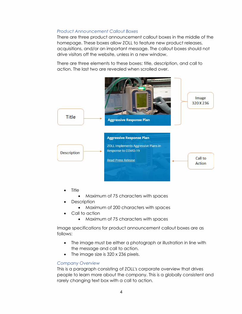
Product Announcement Callout Boxes There are three product announcement callout boxes in the middle of the homepage. These boxes allow ZOLL to feature new product releases, acquisitions, and/or an important message. The callout boxes should not drive visitors off the website, unless in a new window.
There are three elements to these boxes: title, description, and call to action. The last two are revealed when scrolled over.
• Title • Maximum of 75 characters with spaces
• Description • Maximum of 200 characters with spaces
• Call to action • Maximum of 75 characters with spaces
Image specifications for product announcement callout boxes are as follows:
• The image must be either a photograph or illustration in line with the message and call to action.
• The image size is 320 x 236 pixels.
Company Overview This is a paragraph consisting of ZOLL's corporate overview that drives people to learn more about the company. This is a globally consistent and rarely changing text box with a call to action.
5
News and Events Callout The news and events callout section highlights upcoming events and news. It includes the following information:
• Title • Date • URL
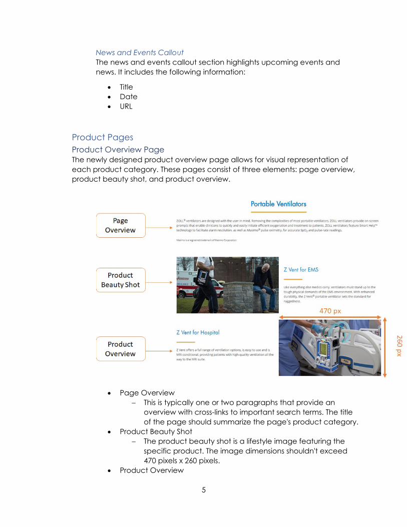
Product Pages Product Overview Page The newly designed product overview page allows for visual representation of each product category. These pages consist of three elements: page overview, product beauty shot, and product overview.
• Page Overview − This is typically one or two paragraphs that provide an
overview with cross-links to important search terms. The title of the page should summarize the page's product category.
• Product Beauty Shot − The product beauty shot is a lifestyle image featuring the
specific product. The image dimensions shouldn't exceed 470 pixels x 260 pixels.
• Product Overview

6
− This section features a title and text that links to the product details web page. The text is limited to 350 characters including spaces.
Product Details Page This page provides information on each specific ZOLL product.
The product details page consists of seven main areas: carousel image, callout text, featured product callout, featured product content, right-side navigation, right-side call to action, and featured products.
Carousel Image The carousel image is a beauty shot spanning the top of the web page. The image size is 900 pixels x 410 pixels. This carousel can have up to three images to scroll through. Unlike the homepage carousel, which is a clickable image that draws users further into the site, this image is non-clickable.
7
Callout Text The callout text consists of one paragraph of text to highlight the product. The character count including spaces shouldn't exceed 500. These are the callout text specifications:
• Font family: "Futura Std," "Futura W02 Book," "Open Sans," sans-serif • Font size: 20 pixels • Color: #707070
Featured Product Callout The featured product callout includes an image and text. The image is left aligned with the text floating to the right. The character count with spaces included shouldn't exceed 150. The image background is transparent, consisting of 232 pixels x 185 pixels. Images can consist of lifestyle images or product silhouettes; it's not recommended to mix and match the photography types.
These are the featured product callout text specifications:
• Font family: "Futura Std," "Futura W02 Book," "Open Sans," sans-serif • Font size: 14 pixels • Color: #333333
Featured Product Content This section should feature a brief headline and a bulleted list of product features and benefits.
Right-Side Navigation The right-side navigation includes a title and relevant click-through links on the ZOLL website. These links should only open a page that drives the user deeper into the website. For example, a PDF can't be linked in the right-side navigation.
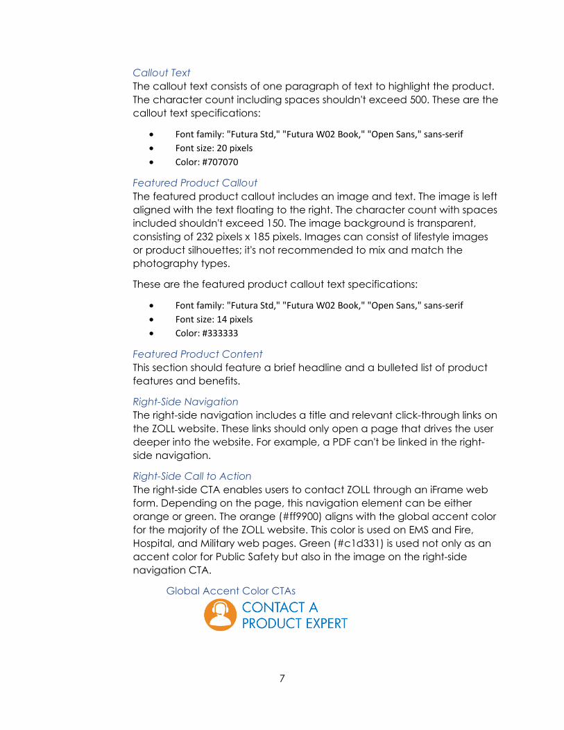
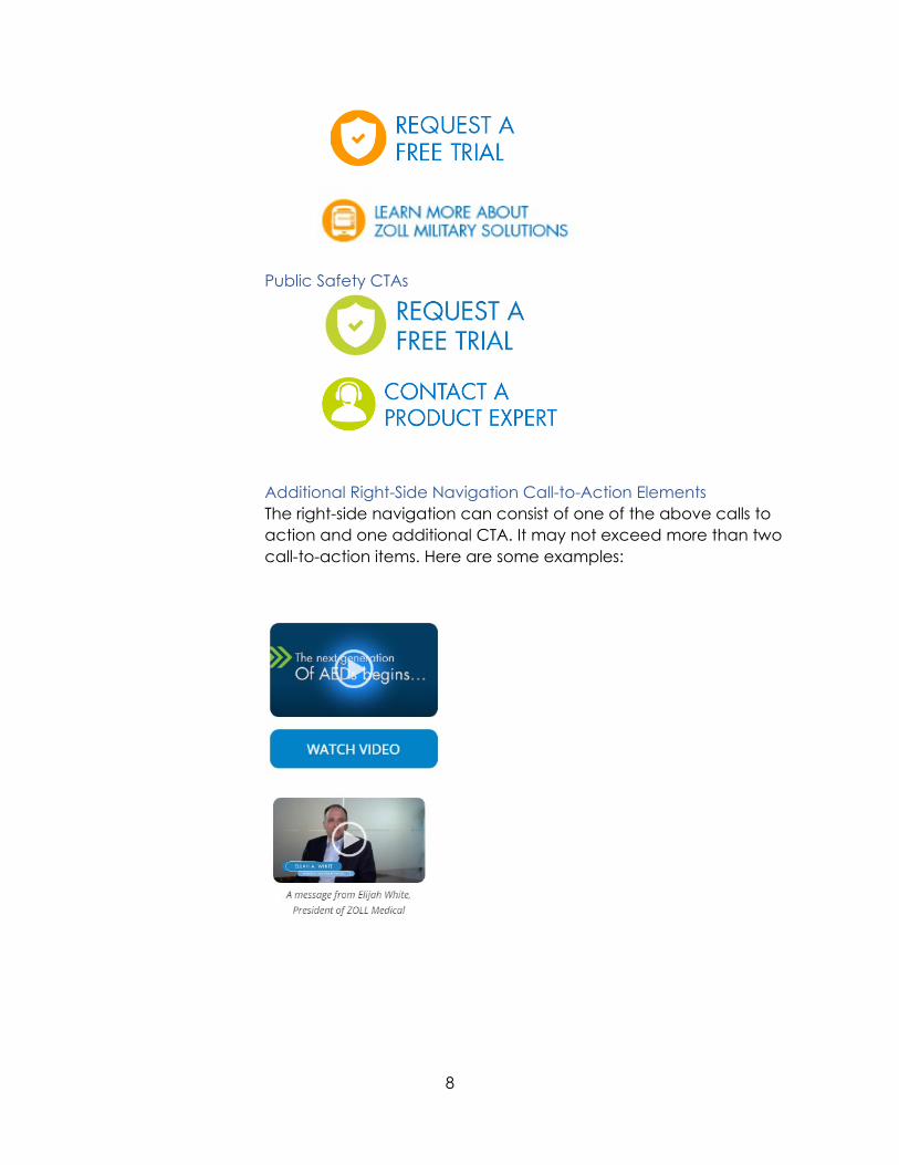
Right-Side Call to Action The right-side CTA enables users to contact ZOLL through an iFrame web form. Depending on the page, this navigation element can be either orange or green. The orange (#ff9900) aligns with the global accent color for the majority of the ZOLL website. This color is used on EMS and Fire, Hospital, and Military web pages. Green (#c1d331) is used not only as an accent color for Public Safety but also in the image on the right-side navigation CTA.
Global Accent Color CTAs
8
Public Safety CTAs
Additional Right-Side Navigation Call-to-Action Elements The right-side navigation can consist of one of the above calls to action and one additional CTA. It may not exceed more than two call-to-action items. Here are some examples:
9
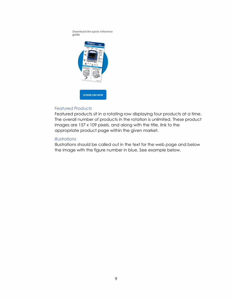
Featured Products Featured products sit in a rotating row displaying four products at a time. The overall number of products in the rotation is unlimited. These product images are 157 x 109 pixels, and along with the title, link to the appropriate product page within the given market.
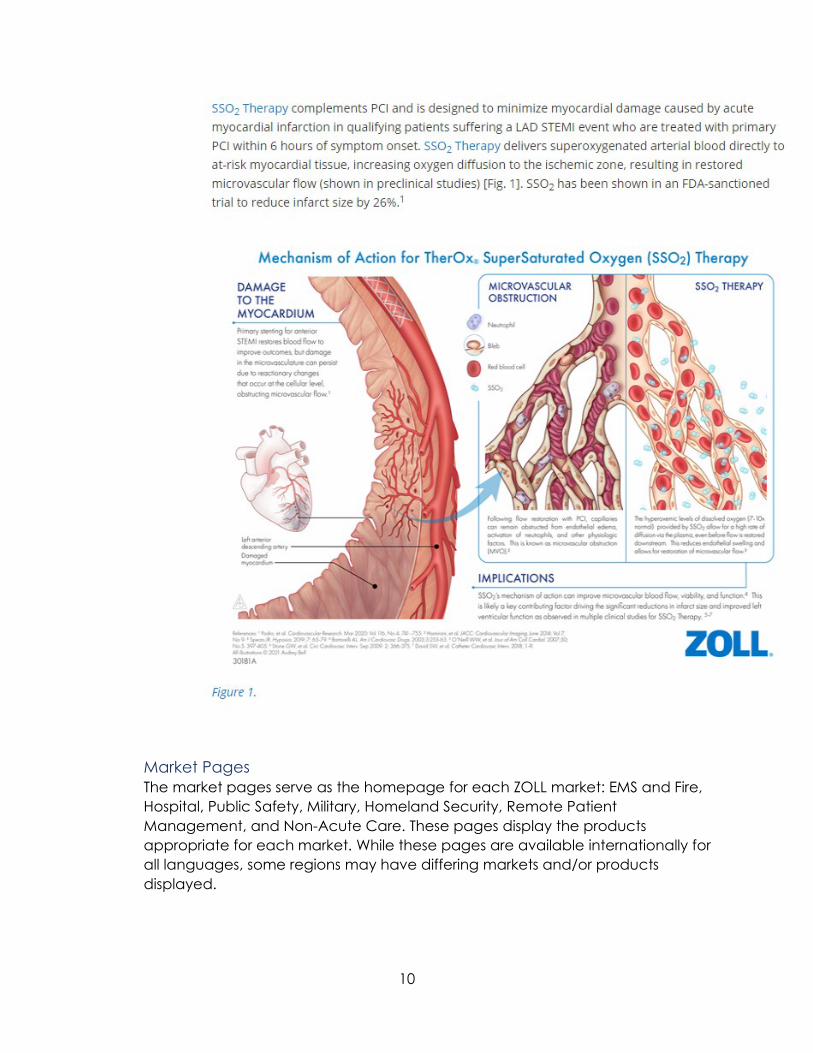
Illustrations Illustrations should be called out in the text for the web page and below the image with the figure number in blue. See example below.
10
Market Pages The market pages serve as the homepage for each ZOLL market: EMS and Fire, Hospital, Public Safety, Military, Homeland Security, Remote Patient Management, and Non-Acute Care. These pages display the products appropriate for each market. While these pages are available internationally for all languages, some regions may have differing markets and/or products displayed.
11
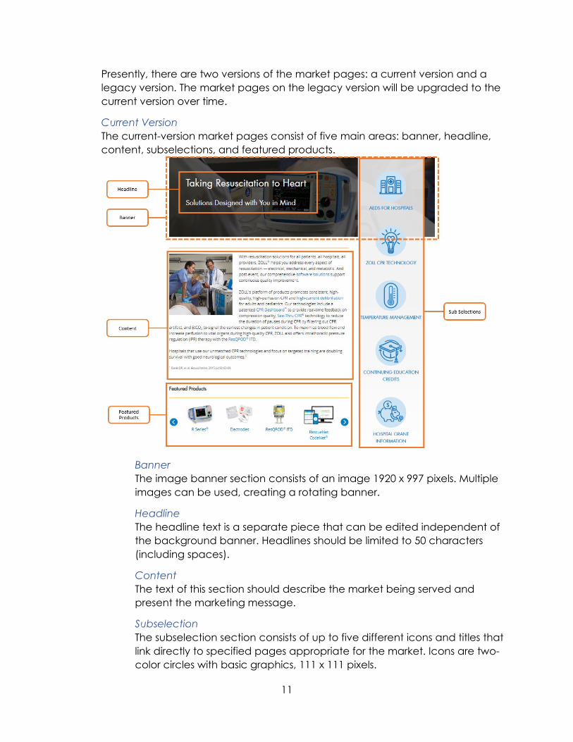
Presently, there are two versions of the market pages: a current version and a legacy version. The market pages on the legacy version will be upgraded to the current version over time.
Current Version The current-version market pages consist of five main areas: banner, headline, content, subselections, and featured products.
Banner The image banner section consists of an image 1920 x 997 pixels. Multiple images can be used, creating a rotating banner.
Headline The headline text is a separate piece that can be edited independent of the background banner. Headlines should be limited to 50 characters (including spaces).
Content The text of this section should describe the market being served and present the marketing message.
Subselection The subselection section consists of up to five different icons and titles that link directly to specified pages appropriate for the market. Icons are two-color circles with basic graphics, 111 x 111 pixels.
12
Featured Products Featured products sit in a rotating row displaying four products at a time. The overall number of products in the rotation is unlimited. These product images are 157 x 109 pixels and along with the title, link to the appropriate product page within the given market.
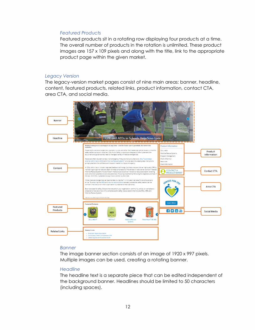
Legacy Version The legacy-version market pages consist of nine main areas: banner, headline, content, featured products, related links, product information, contact CTA, area CTA, and social media.
Banner The image banner section consists of an image of 1920 x 997 pixels. Multiple images can be used, creating a rotating banner.
Headline The headline text is a separate piece that can be edited independent of the background banner. Headlines should be limited to 50 characters (including spaces).
13
Content The text of this section should describe the market being served and present the marketing message.
Featured Products Featured products sit in a rotating row displaying four products at a time. The overall number of products in the rotation is unlimited. These product images are 122 x 91 pixels and along with the title, link to the appropriate product page within the given market.
Related Links Additional related hyperlinks can be placed on the page for additional information on third party sites such as the American Heart Association or YouTube. Links must open in a new browser window/tab.
Product Information Links to important or related product information can be placed on the right-side section of the page to direct users to resources, accessories, or services.
Contact CTA The contact CTA is a button users can click to contact a product expert. Clicking the CTA button will bring up a contact form. Icon color is dependent on market.
Area CTA The area CTA is an area allocated for a second call to action. The area CTA requires an image and a CTA button.
Social Media Social media icons link directly to the market's identified social media profiles. If no profiles exist, this section will remain blank. Icons are 32 x 51 pixels.
14
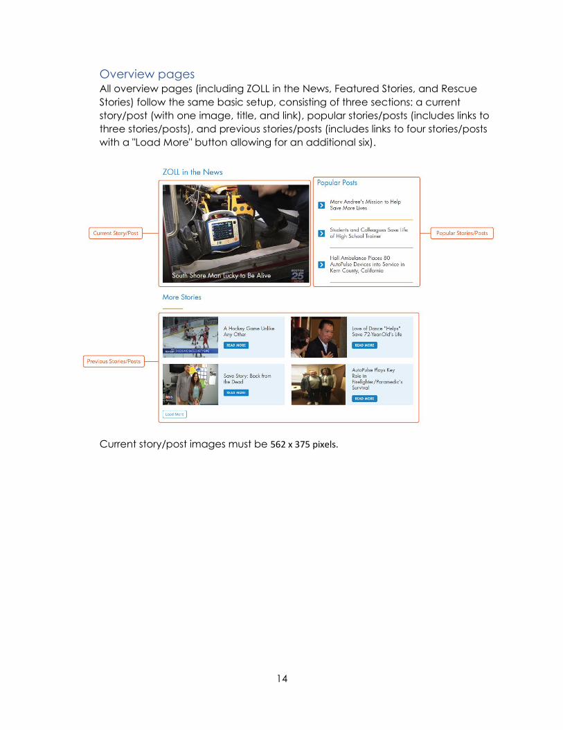
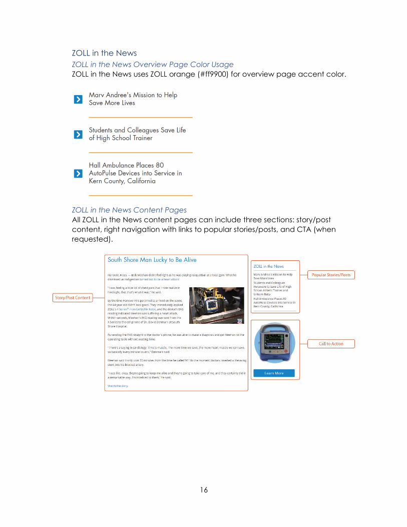
Overview pages All overview pages (including ZOLL in the News, Featured Stories, and Rescue Stories) follow the same basic setup, consisting of three sections: a current story/post (with one image, title, and link), popular stories/posts (includes links to three stories/posts), and previous stories/posts (includes links to four stories/posts with a "Load More" button allowing for an additional six).
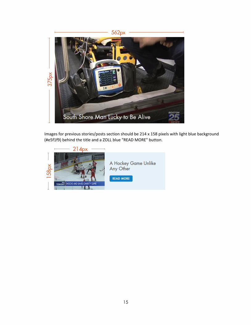
Current story/post images must be 562 x 375 pixels.
15
Images for previous stories/posts section should be 214 x 158 pixels with light blue background (#e5f1f9) behind the title and a ZOLL blue "READ MORE" button.
16
ZOLL in the News ZOLL in the News Overview Page Color Usage ZOLL in the News uses ZOLL orange (#ff9900) for overview page accent color.
ZOLL in the News Content Pages All ZOLL in the News content pages can include three sections: story/post content, right navigation with links to popular stories/posts, and CTA (when requested).
17
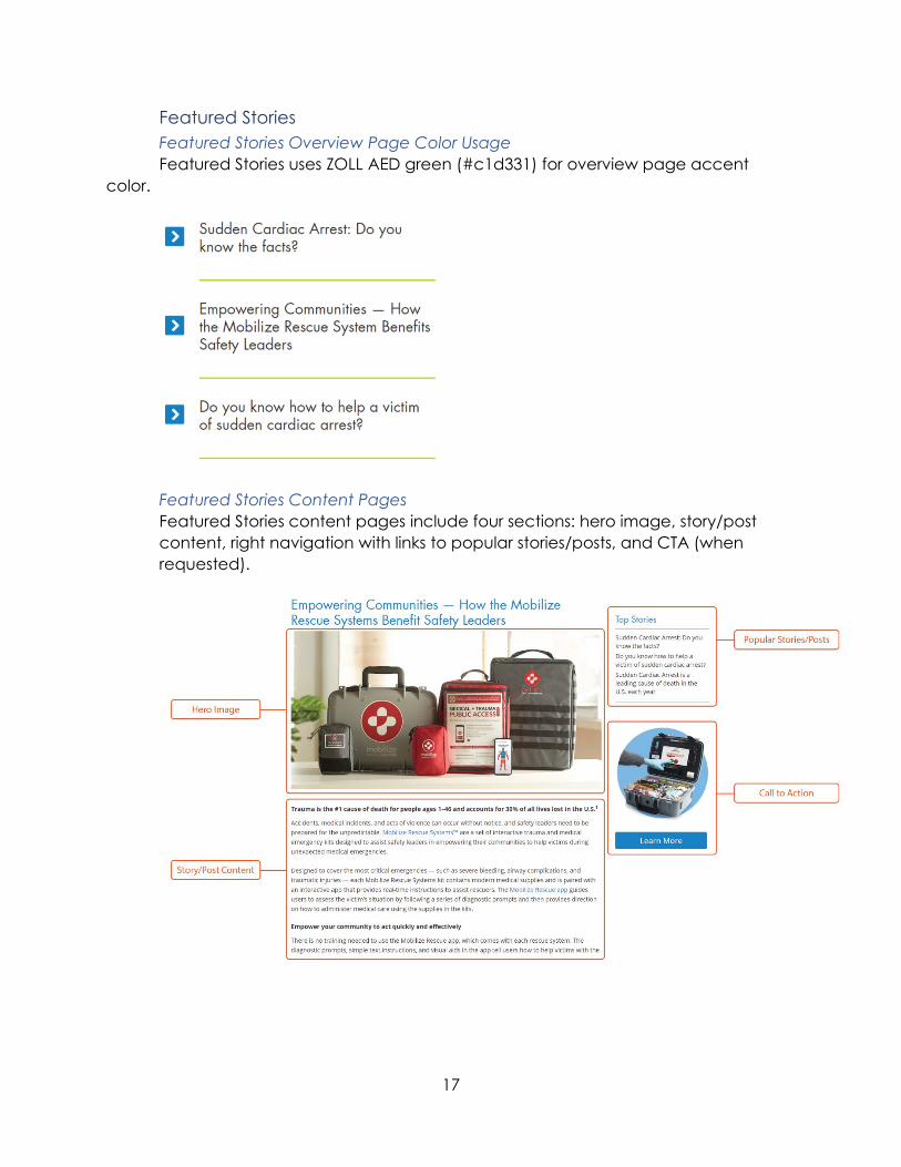
Featured Stories Featured Stories Overview Page Color Usage Featured Stories uses ZOLL AED green (#c1d331) for overview page accent
color.
Featured Stories Content Pages Featured Stories content pages include four sections: hero image, story/post content, right navigation with links to popular stories/posts, and CTA (when requested).

18
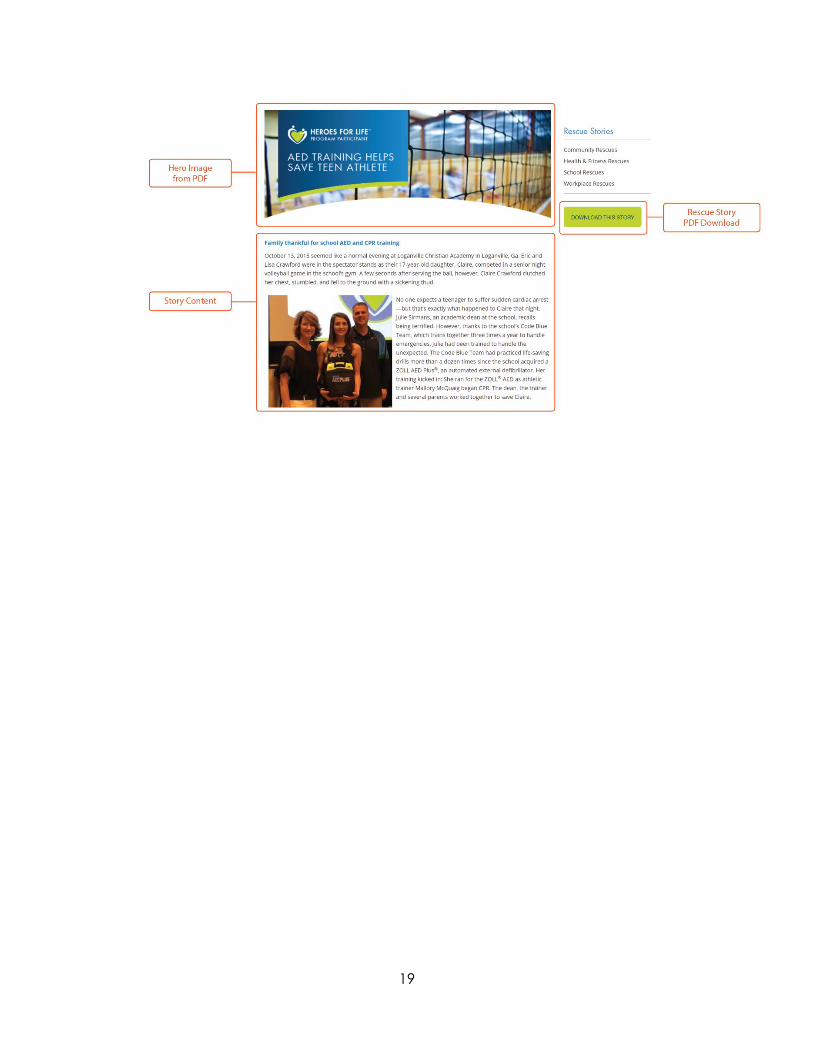
Rescue Stories Rescue Stories Overview Page Color Usage Rescue Stories uses ZOLL AED green (#c1d331) for overview page accent color.
Rescue Stories Category Pages Rescue Stories category pages feature thumbnails of story pdfs with titles. Thumbnails that link to a pdf will have a PDF icon; thumbnails that link to content pages will not have a PDF icon.
Thumbnail sizes should be 216 x 279 pixels.
Rescue Stories Content Pages Rescue Stories content pages contain four sections: hero image (from story pdf), story content, right navigation with links to recent stories, and CTA to download the story pdf.
19
20
Typography The typography for ZOLL's websites consists of the following fonts:
• Futura (major heads, navigation heads, and subheads) • Open Sans (body copy and navigation links)
Visit the ZOLL Brand Guidelines to learn more.
Note: Do NOT use the condensed version of Futura.
21
Colors
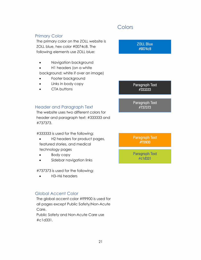
Primary Color The primary color on the ZOLL website is ZOLL blue, hex color #0074c8. The following elements use ZOLL blue: • Navigation background • H1 headers (on a white background; white if over an image) • Footer background • Links in body copy • CTA buttons
Header and Paragraph Text The website uses two different colors for header and paragraph text: #333333 and #737373. #333333 is used for the following: • H2 headers for product pages, featured stories, and medical technology pages • Body copy • Sidebar navigation links
#737373 is used for the following: • H3–H6 headers
Global Accent Color The global accent color #ff9900 is used for all pages except Public Safety/Non-Acute Care. Public Safety and Non-Acute Care use #c1d331.
22
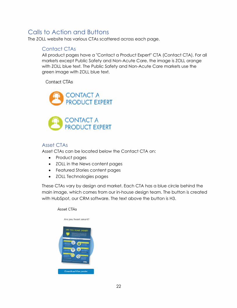
Calls to Action and Buttons The ZOLL website has various CTAs scattered across each page.
Contact CTAs All product pages have a "Contact a Product Expert" CTA (Contact CTA). For all markets except Public Safety and Non-Acute Care, the image is ZOLL orange with ZOLL blue text. The Public Safety and Non-Acute Care markets use the green image with ZOLL blue text.
Asset CTAs Asset CTAs can be located below the Contact CTA on:
• Product pages • ZOLL in the News content pages • Featured Stories content pages • ZOLL Technologies pages
These CTAs vary by design and market. Each CTA has a blue circle behind the main image, which comes from our in-house design team. The button is created with HubSpot, our CRM software. The text above the button is H3.
23
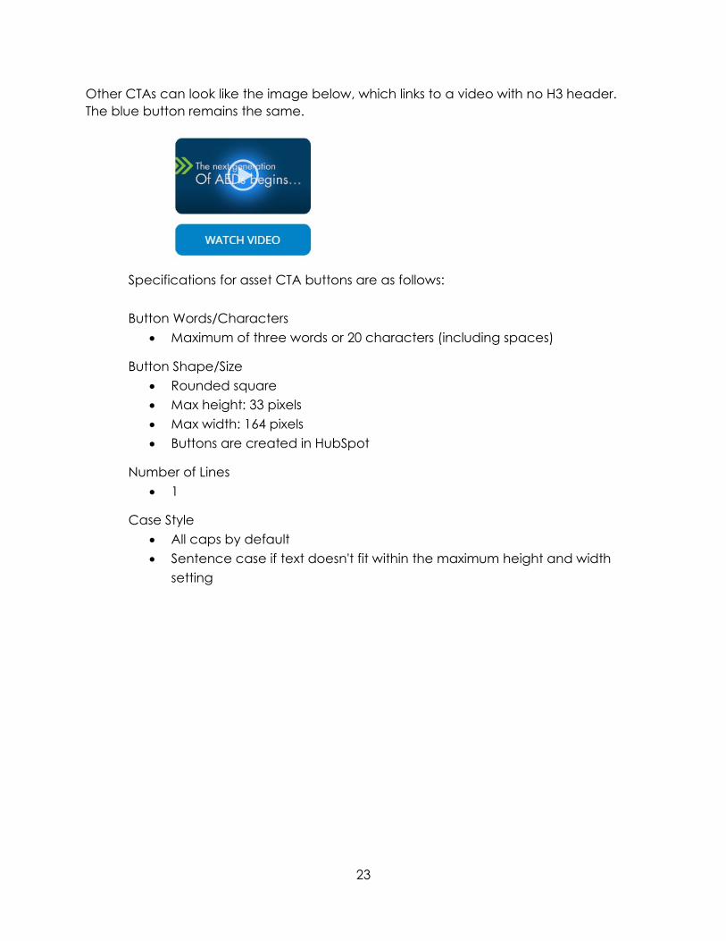
Other CTAs can look like the image below, which links to a video with no H3 header. The blue button remains the same.
Specifications for asset CTA buttons are as follows: Button Words/Characters
• Maximum of three words or 20 characters (including spaces)
Button Shape/Size • Rounded square • Max height: 33 pixels • Max width: 164 pixels • Buttons are created in HubSpot
Number of Lines • 1
Case Style • All caps by default • Sentence case if text doesn't fit within the maximum height and width
setting
24
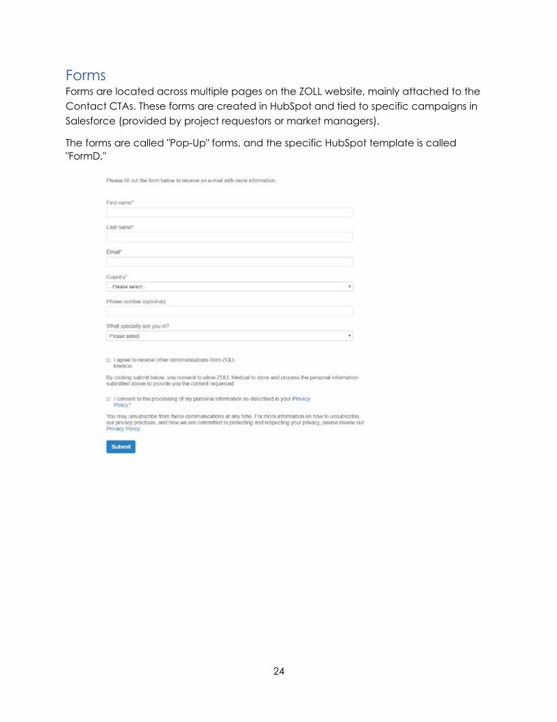
Forms Forms are located across multiple pages on the ZOLL website, mainly attached to the Contact CTAs. These forms are created in HubSpot and tied to specific campaigns in Salesforce (provided by project requestors or market managers).
The forms are called "Pop-Up" forms, and the specific HubSpot template is called "FormD."
25
Photo, Video, and Audio Guidelines Never use an image, illustration, photograph, video, or audio without first researching to determine its copyright status since online content (e.g., obtained from Google, YouTube, Facebook, Instagram, etc.) is often protected by copyright.
USE ZOLL PHOTOS, VIDEOS, AND IMAGES WHENEVER POSSIBLE • Whenever possible, use ZOLL photography and imagery that can be
found on zollimages.dphoto.com • Request original photography or videos by contacting our in-house
services team at ZOLL. • Contracted photography, audio (e.g., music, voice-over), and videos
should include unlimited use license • Obtain a model release from any persons in ZOLL photography or videos.
This isn't a copyright issue, but a privacy/publicity issue.
USE ROYALTY-FREE IMAGES, STOCK FOOTAGE, AND AUDIO FROM STOCK PHOTO AGENCIES Purchase images from stock photo agencies and follow the license terms. You're not buying an image outright from a stock agency, but instead paying for certain usage rights. If the media is subject to a license, read the specific terms and conditions, and reach out to ZOLL's intellectual property counsel if there are any questions.
RESTRICTED USES • No Unlawful Use. You may not use content in a pornographic,
defamatory, or another unlawful manner or in violation of any applicable regulations.
• No Commercial Use of Editorial Content. You may not use content marked "editorial" for any commercial, promotional, advertorial, endorsement, advertising or merchandising purpose
CONFIRM WHO OWNS THE COPYRIGHT OF THE PHOTO, AUDIO, OR VIDEO Always verify that ZOLL has received rights and permissions prior to using on ZOLL websites, social media, print, and other mediums. Ask the owner if they still have the rights to the photograph, audio, or video and can provide you with permission to use it.