a guide to understanding the maclean-fogg component ...€¦ · a guide to understanding the...
TRANSCRIPT
A GUIDE TO UNDERSTANDING THE MACLEAN-FOGG COMPONENT SOLUTIONS BRAND
For every complex challenge, there is a viable solution. Our quest, to help manufacturers find and develop the solutions they need, began in 1925. MacLean-Fogg set out with a single product, a simple goal, and two men who shared a proud respect for forming solutions. That pride continues to this day.

Brand Philosophy 6
Living the Brand 8
Mission Statement 22
Commitment to Excellence 24
Our Brandmark 26
What It Stands For 28
Brandmarks 30
Brandmark Clear Zone 32
Unapproved Clear Zone Usage 34
Approved Brandmark Usage 36
Unapproved Brandmark Usage 38
Brand Identity Components 42
Tagline 44
Tagline Clear Zone 46
Unapproved Clear Zone Usage 48
Approved Tagline Usage 50
Unapproved Tagline Usage 52
Primary Brand Colors 54
Secondary Brand Colors 56
Primary Typography 58
Secondary Typography 60
Infographics 62
Product Photography 64
Plant Photography 66
People Photography 68
Industry Photography 70
Contents
Brand Philosophy 6
Living the Brand 8
Mission Statement 22
Commitment to Excellence 24
Our Brandmark 26
What It Stands For 28
Brandmarks 30
Brandmark Clear Zone 32
Unapproved Clear Zone Usage 34
Approved Brandmark Usage 36
Unapproved Brandmark Usage 38
Brand Identity Components 42
Tagline 44
Tagline Clear Zone 46
Unapproved Clear Zone Usage 48
Approved Tagline Usage 50
Unapproved Tagline Usage 52
Primary Brand Colors 54
Secondary Brand Colors 56
Primary Typography 58
Secondary Typography 60
Infographics 62
Product Photography 64
Plant Photography 66
People Photography 68
Industry Photography 70
Internal Initiatives 72
Communicating Internally 74
EHS Brandmark 76
EHS Tagline 80
Atlas Brandmark 84
OT Brandmark 88
TPM Brandmark 92
Looking Forward 96

6 Brand Philosophy
Brand PhilosophyWe do more than form components. We form industry relationships and connections. We understand the manufacturing challenges our customers face and deliver component solutions tailored to their needs. And, we do it all through ingenuity.
That’s why we wake up each morning and come to work. It’s the legacy that we pass on to future generations. And, it’s at the heart of everything we do.

8 Brand Philosophy
Living the Brand
The MacLean-Fogg Component Solutions brand is about more than a new look.
It’s about how we work and how we communicate. We communicate our message
in a confident, realistic tone. Rather than take a hard-sell approach, we simply
deliver facts of proven science as it relates to our work; and we use our industry
expertise to help each customer meet their specific needs. We work according to
our key attributes. They are not just words on a page; they are the qualities we live
every day. They make us who we are.
heritage connections fair resolve acumen ingenious
10 Brand Philosophy
heritage
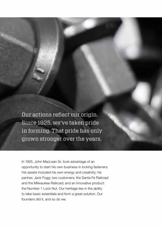
In 1925, John MacLean Sr. took advantage of an
opportunity to start his own business in locking fasteners.
His assets included his own energy and creativity; his
partner, Jack Fogg; two customers: the Santa Fe Railroad
and the Milwaukee Railroad; and an innovative product:
the Number 1 Lock Nut. Our heritage lies in the ability
to take basic essentials and form a great solution. Our
founders did it, and so do we.
Our actions reflect our origin. Since 1925, we’ve taken pride in forming. That pride has only grown stronger over the years.
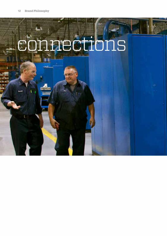
12 Brand Philosophy
connections
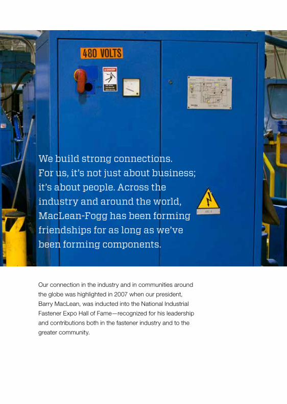
Our connection in the industry and in communities around
the globe was highlighted in 2007 when our president,
Barry MacLean, was inducted into the National Industrial
Fastener Expo Hall of Fame—recognized for his leadership
and contributions both in the fastener industry and to the
greater community.
We build strong connections. For us, it’s not just about business; it’s about people. Across the industry and around the world, MacLean-Fogg has been forming friendships for as long as we’ve been forming components.
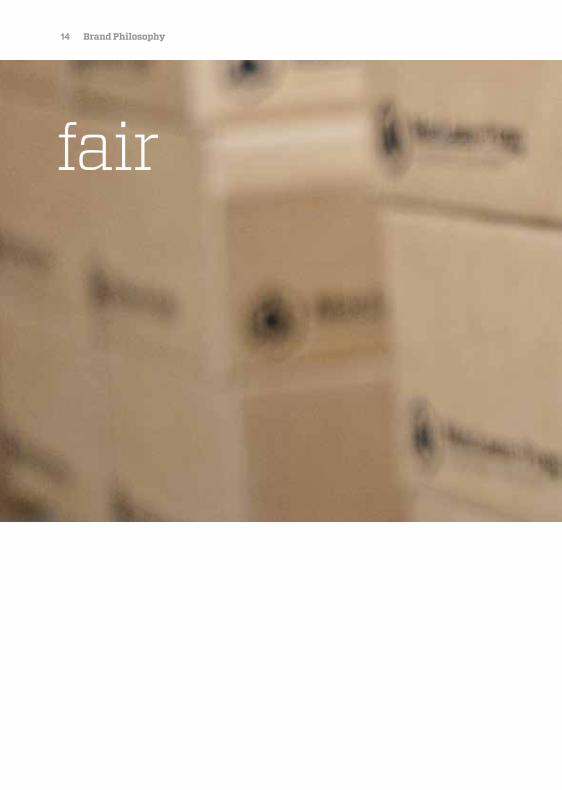
14 Brand Philosophy
fair
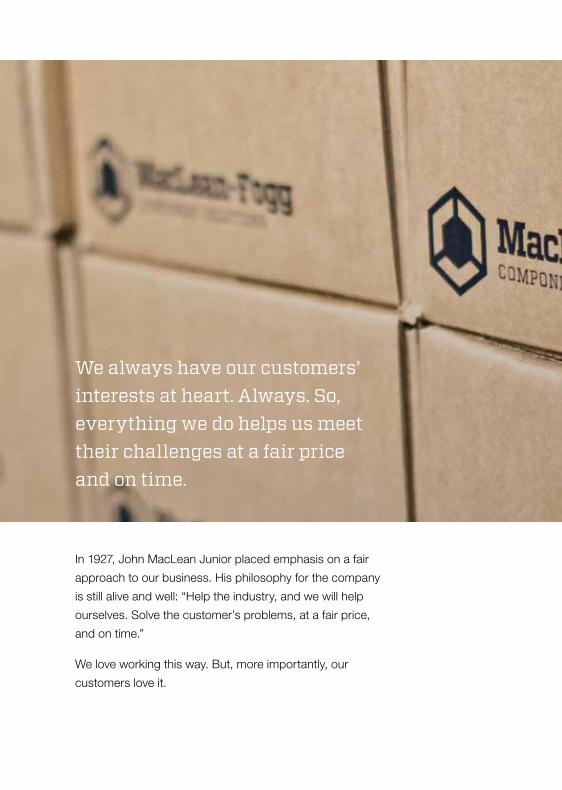
We always have our customers’ interests at heart. Always. So, everything we do helps us meet their challenges at a fair price and on time.
In 1927, John MacLean Junior placed emphasis on a fair
approach to our business. His philosophy for the company
is still alive and well: “Help the industry, and we will help
ourselves. Solve the customer’s problems, at a fair price,
and on time.”
We love working this way. But, more importantly, our
customers love it.
16 Brand Philosophy
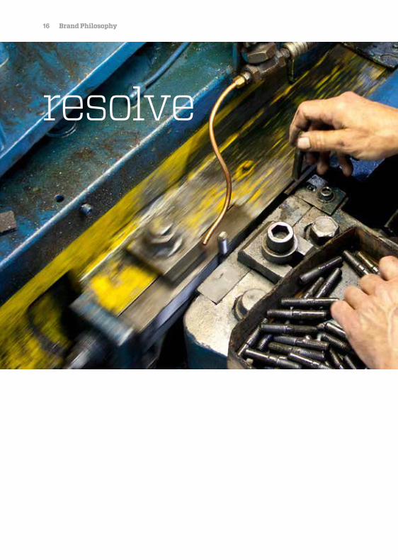
resolve
Despite a global economic downturn early in this
21st century, we have proven our determination
by supporting new industries, new technology,
and new team members, while proving true to our
time-tested values. That kind of resolve is hard to
find anywhere else.
Our determination to succeed keeps us standing strong even in the face of serious challenges. We never stop working for our customers.

18 Brand Philosophy
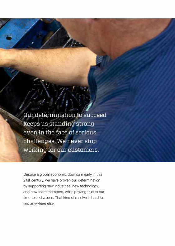
acumen
Our business acumen began with one lock nut offered
to North America’s railroads. Through innovative product
development and selected acquisitions, the business
has grown into a worldwide enterprise with sales of
nearly $800 million annually by the early 2000s.
Our uncanny ability to see the world through the eyes of our customers gives us the insight needed to deliver solutions tailored to their needs.
20 Brand Philosophy
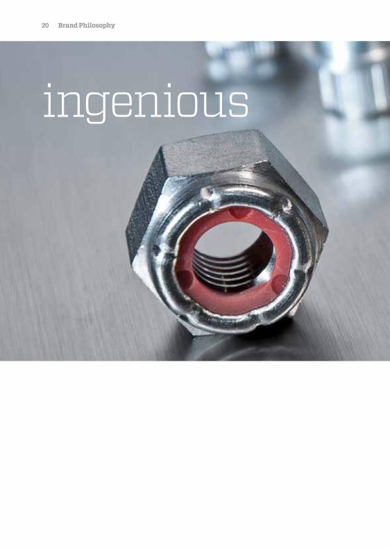
ingenious
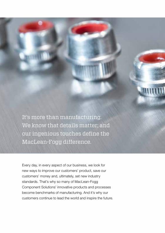
It’s more than manufacturing. We know that details matter; and our ingenious touches define the MacLean-Fogg difference.
Every day, in every aspect of our business, we look for
new ways to improve our customers’ product, save our
customers’ money and, ultimately, set new industry
standards. That’s why so many of MacLean-Fogg
Component Solutions’ innovative products and processes
become benchmarks of manufacturing. And it’s why our
customers continue to lead the world and inspire the future.

22 Brand Philosophy
Mission Statement
Mission Statement
MacLean-Fogg Component Solutions is a leading supplier of Fasteners, Engineered Components, and Engineered Plastics serving many diverse industries.
Our Mission is to become the premier, worldwide supplier of value-
added, engineered, and customer-focused solutions that leverage our
material-forming expertise in our three product fields.
The keys to our success are the engagement of our dynamic and
adaptive employees, along with the MacLean-Fogg entrepreneurial
culture. Our goals are supported by a robust performance management
process and commitment to operational excellence.
Through our “Commitment to Excellence,” we will achieve the growth
and profitability that will fuel our continued success.

24 Brand Philosophy
Commitment to Excellence
These basic principles are fundamental to MacLean-Fogg’s success.
Quality is our highest priority: Our products and services must always be the very best attainable.
As our products and services are seen, so are we evaluated.
Customers are the focus of everything we do: Our work must always be done with the goal of anticipating and satisfying
our customer’s need.
People are our most important resource: Employee development, involvement and teamwork provide our strength and
vitality. We must create a culture that stresses respect, openness, personal
growth and entrepreneurship.
Continuous improvement is our way of life: We must strive for ongoing improvement focusing on increased efficiency
and the prevention of errors.
Integrity is never compromised: Our conduct must command respect for its integrity and for its positive
contributions to society.
Safety and environmental consciousness will be a prime objective: We are citizens of the earth and have a responsibility to put forward our best
efforts to preserve and protect our personal and collective quality of life.
26 Our Brandmark
Our BrandmarkThe image that represents who we are. Our brandmark is our badge of honor, our seal of ingenuity.

28 Brand Philosophy
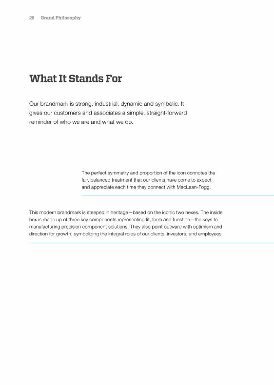
What It Stands For
Our brandmark is strong, industrial, dynamic and symbolic. It
gives our customers and associates a simple, straight-forward
reminder of who we are and what we do.
The perfect symmetry and proportion of the icon connotes the fair, balanced treatment that our clients have come to expect and appreciate each time they connect with MacLean-Fogg.
This modern brandmark is steeped in heritage—based on the iconic two hexes. The inside hex is made up of three key components representing fit, form and function—the keys to manufacturing precision component solutions. They also point outward with optimism and direction for growth, symbolizing the integral roles of our clients, investors, and employees.
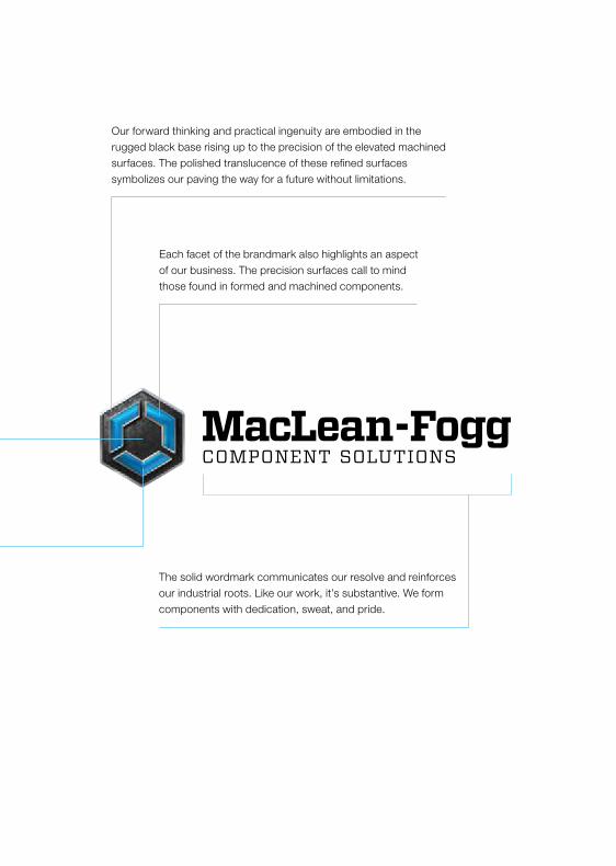
Our forward thinking and practical ingenuity are embodied in the rugged black base rising up to the precision of the elevated machined surfaces. The polished translucence of these refined surfaces symbolizes our paving the way for a future without limitations.
Each facet of the brandmark also highlights an aspect of our business. The precision surfaces call to mind those found in formed and machined components.
The solid wordmark communicates our resolve and reinforces our industrial roots. Like our work, it’s substantive. We form components with dedication, sweat, and pride.
30 Our Brandmark
Brandmarks
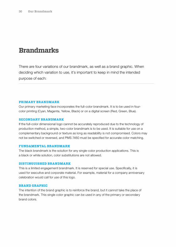
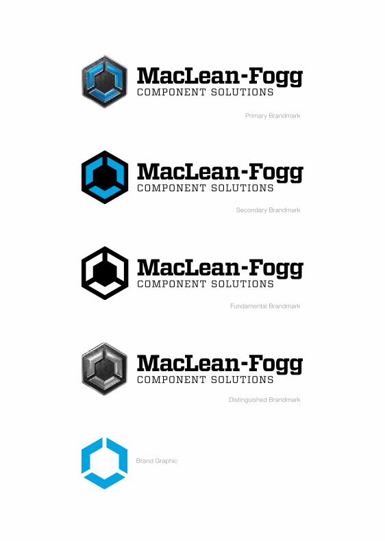
There are four variations of our brandmark, as well as a brand graphic. When
deciding which variation to use, it’s important to keep in mind the intended
purpose of each:
PRIMARY BRANDMARK Our primary marketing face incorporates the full-color brandmark. It is to be used in four-color printing (Cyan, Magenta, Yellow, Black) or on a digital screen (Red, Green, Blue).
SECONDARY BRANDMARK If the full-color dimensional logo cannot be accurately reproduced due to the technology of production method, a simple, two-color brandmark is to be used. It is suitable for use on a complementary background or texture as long as readability is not compromised. Colors may not be switched or reversed, and PMS 7460 must be specified for accurate color matching.
FUNDAMENTAL BRANDMARK The black brandmark is the solution for any single-color production applications. This is a black or white solution, color substitutions are not allowed.
DISTINGUISHED BRANDMARK This is a limited engagement brandmark. It is reserved for special use. Specifically, it is used for executive and corporate material. For example, material for a company anniversary celebration would call for use of this logo.
BRAND GRAPHIC The intention of the brand graphic is to reinforce the brand, but it cannot take the place of the brandmark. This single color graphic can be used in any of the primary or secondary brand colors.
Primary Brandmark
Secondary Brandmark
Fundamental Brandmark
Distinguished Brandmark
Brand Graphic
32 Our Brandmark
Brandmark Clear Zone
The MacLean-Fogg Component Solutions brandmark must be surrounded
by a fixed amount of open space based on the MacLean “M” height within
the brandmark. This is to ensure the brandmark does not compete with
typography or any graphic element.
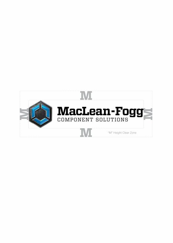
“M” Height Clear Zone
M
M
M M
34 Our Brandmark
Unapproved Clear Zone Usage
All copy, images and graphics must clear the brandmark by the height of
the MacLean “M” within the brandmark. Any element within the “M” space
infringes on the legibility and prominence of the brandmark.
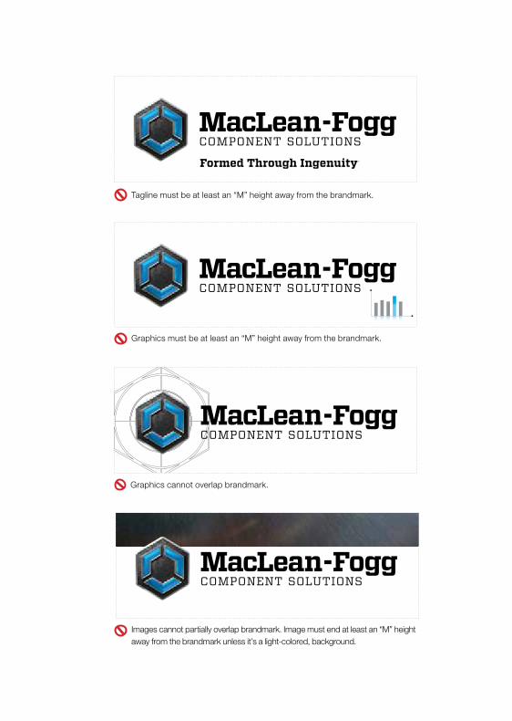
Tagline must be at least an “M” height away from the brandmark.
Graphics must be at least an “M” height away from the brandmark.
Images cannot partially overlap brandmark. Image must end at least an “M” height away from the brandmark unless it’s a light-colored, background.
Graphics cannot overlap brandmark.
36 Our Brandmark
Approved Brandmark Usage
The brandmark is best used on a white background; but if it is applied
over an image, ensure that the image is light in color to maximize
contrast. If there is a need for use on black, the wordmark must be
white. The brandmark must be legible at all times.
A single-color version is the solution for production application where
contrast or readability on a dark background is a concern.
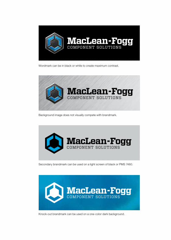
Wordmark can be in black or white to create maximum contrast.
Background image does not visually compete with brandmark.
Secondary brandmark can be used on a light screen of black or PMS 7460.
Knock-out brandmark can be used on a one-color dark background.
38 Our Brandmark
Unapproved Brandmark Usage
Readability is an important aspect of the brandmark. The brandmark
should never appear on a dark background, as it loses legibility.
The secondary brandmark is used in two-color print technologies, not
in conjunction with a four-color image.
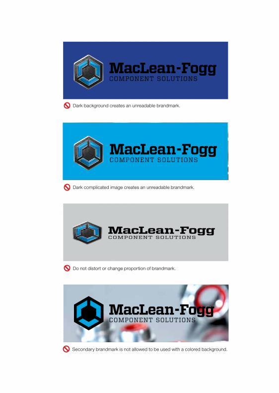
Dark background creates an unreadable brandmark.
Dark complicated image creates an unreadable brandmark.
Do not distort or change proportion of brandmark.
Secondary brandmark is not allowed to be used with a colored background.

40 Our Brandmark
Unapproved Brandmark Usage
Recognition is another important aspect when identifying a brandmark.
The primary and secondary brandmark should never appear simplified
or broken in any way, as it loses it’s significance.
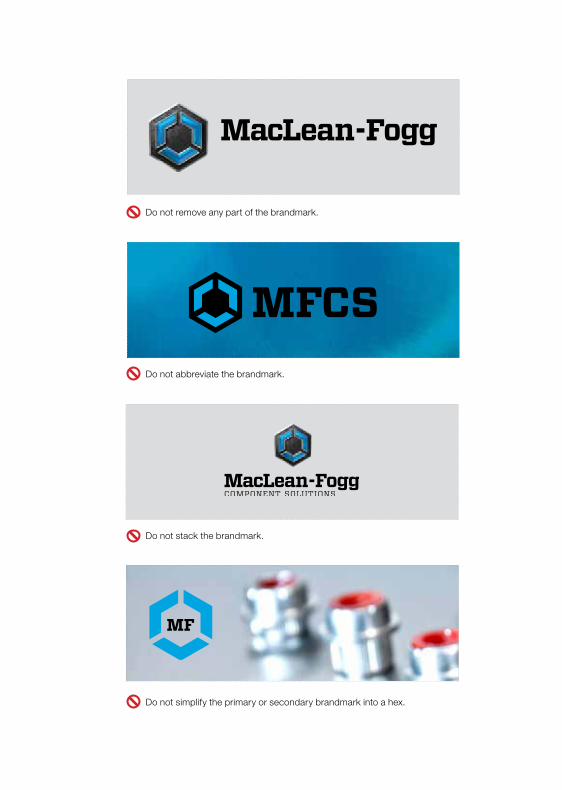
Do not abbreviate the brandmark.
MFCS
Do not simplify the primary or secondary brandmark into a hex.
MF
Do not remove any part of the brandmark.
Do not stack the brandmark.
42 Brand Identity Components
Brand Identity ComponentsMore than eighty percent of what we know about the world is perceived by what we see.
These are the essential aesthetic details that help us express our message. When used appropriately and creatively, these principles will communicate much of what an audience needs to know about our brand, simply by what they see.

44 Brand Identity Components
Tagline
Used primarily in print advertising, our tagline should appear at the end
of advertising copy. It should always be set in Vitesse Bold. In order to
complement the brandmark, the tagline should always be smaller in size.
The two elements should not be placed directly next to each other, but
there should be an alignment relationship visually connecting them.
It takes skill, imagination and ingenuity to understand the manufacturing challenges our customers face and deliver solutions tailored to their needs… every time.
Whether it’s a formed component or a formed relationship, we take pride in forming it with great care and infinite detail.
46 Brand Identity Components
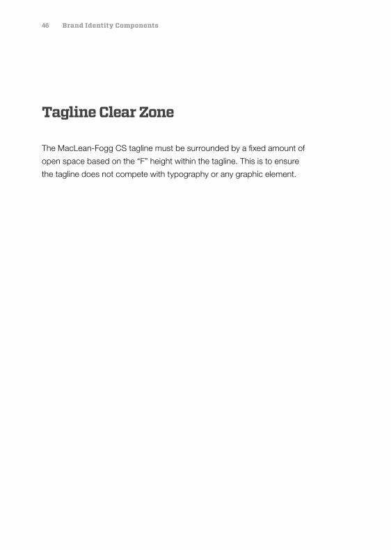
Tagline Clear Zone
The MacLean-Fogg CS tagline must be surrounded by a fixed amount of
open space based on the “F” height within the tagline. This is to ensure
the tagline does not compete with typography or any graphic element.
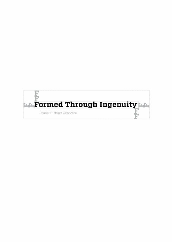
Double “F” Height Clear Zone
F
FF
FF FF
F
48 Brand Identity Components
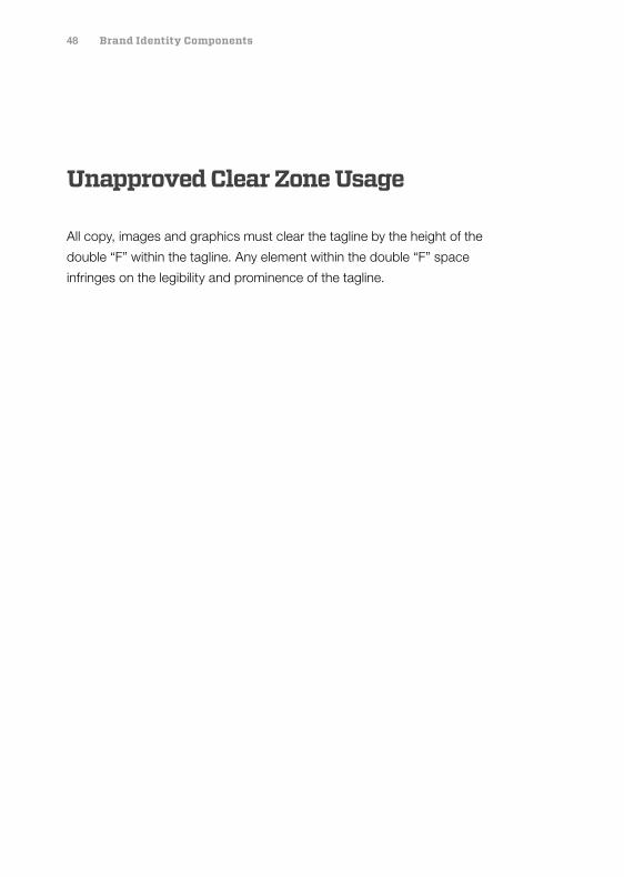
Unapproved Clear Zone Usage
All copy, images and graphics must clear the tagline by the height of the
double “F” within the tagline. Any element within the double “F” space
infringes on the legibility and prominence of the tagline.
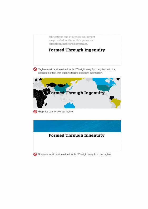
Automatic splices and bolted connectors, silicone rubber non-ceramic insulators, hollow core insulators, surge arresters, guy and foundation anchors, pole line hardware, aluminum and ductile clamps, fiberglass brackets and guy strains, steel fabrications and grounding equipment are provided for the world’s power and telecommunications companies.
Tagline must be at least a double “F” height away from any text with the exception of text that explains tagline copyright information.
Graphics cannot overlap tagline.
Graphics must be at least a double “F” height away from the tagline.
50 Brand Identity Components
Approved Tagline Usage
The tagline is best used on a single-color background; but if it is applied
over an image, ensure that the image does not visually compete with the
tagline. The tagline must be legible at all times.
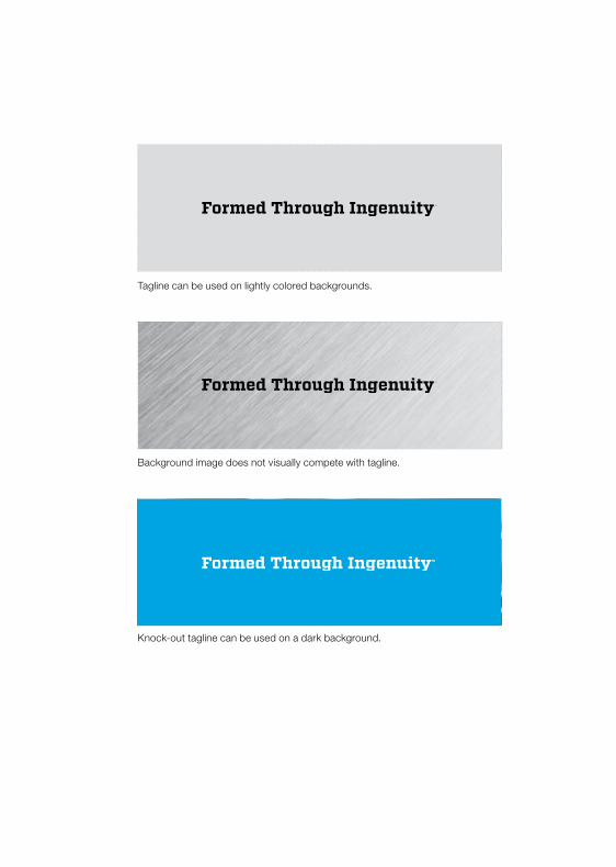
Background image does not visually compete with tagline.
Knock-out tagline can be used on a dark background.
Tagline can be used on lightly colored backgrounds.
52 Brand Identity Components
Unapproved Tagline Usage
Readability is an important aspect of the tagline. Each word of the tagline
must appear on the same line.
The tagline cannot be used in colors outside of the primary color palette.
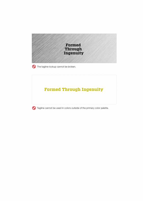
Tagline cannot be used in colors outside of the primary color palette.
The tagline lockup cannot be broken.
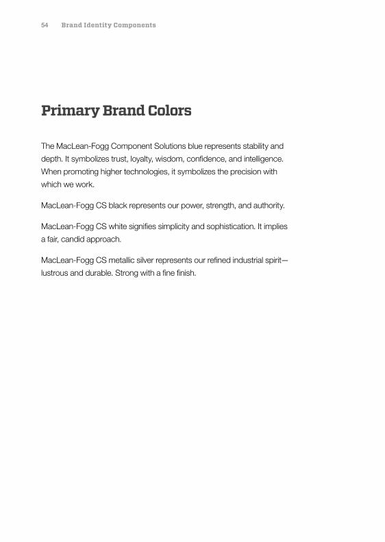
54 Brand Identity Components
Primary Brand Colors
The MacLean-Fogg Component Solutions blue represents stability and
depth. It symbolizes trust, loyalty, wisdom, confidence, and intelligence.
When promoting higher technologies, it symbolizes the precision with
which we work.
MacLean-Fogg CS black represents our power, strength, and authority.
MacLean-Fogg CS white signifies simplicity and sophistication. It implies
a fair, candid approach.
MacLean-Fogg CS metallic silver represents our refined industrial spirit—
lustrous and durable. Strong with a fine finish.
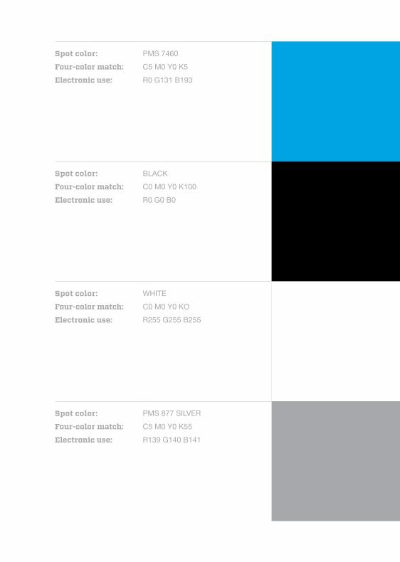
Spot color:
Four-color match:
Electronic use:
WHITEC0 M0 Y0 KOR255 G255 B255
Spot color:
Four-color match:
Electronic use:
BLACKC0 M0 Y0 K100R0 G0 B0
Spot color:
Four-color match:
Electronic use:
PMS 7460 C5 M0 Y0 K5R0 G131 B193
Spot color:
Four-color match:
Electronic use:
PMS 877 SILVER C5 M0 Y0 K55R139 G140 B141
56 Brand Identity Components
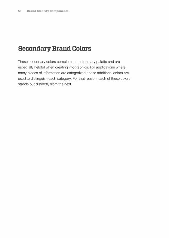
Secondary Brand Colors
These secondary colors complement the primary palette and are
especially helpful when creating infographics. For applications where
many pieces of information are categorized, these additional colors are
used to distinguish each category. For that reason, each of these colors
stands out distinctly from the next.
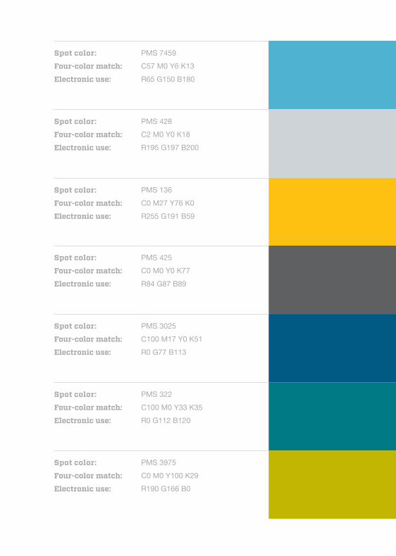
Spot color:
Four-color match:
Electronic use:
PMS 7459 C57 M0 Y6 K13R65 G150 B180
Spot color:
Four-color match:
Electronic use:
PMS 428 C2 M0 Y0 K18R195 G197 B200
Spot color:
Four-color match:
Electronic use:
PMS 136 C0 M27 Y76 K0R255 G191 B59
Spot color:
Four-color match:
Electronic use:
PMS 425 C0 M0 Y0 K77R84 G87 B89
Spot color:
Four-color match:
Electronic use:
PMS 3025 C100 M17 Y0 K51R0 G77 B113
Spot color:
Four-color match:
Electronic use:
PMS 322 C100 M0 Y33 K35R0 G112 B120
Spot color:
Four-color match:
Electronic use:
PMS 3975 C0 M0 Y100 K29R190 G166 B0

58 Brand Identity Components
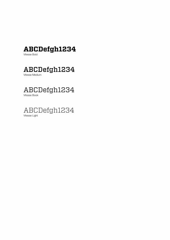
Primary Typeface: Vitesse Family
Vitesse is our primary typeface providing the brand voice. It is used for
headlines, section headers and to draw attention to important words and
ideas. It is bold and mechanical in style—an expression of confidence and
pride in forming.
Like all software, typefaces are licensed for a specific number of computers.
The Vitesse typeface must be purchased for each computer usage. When
sending a read-only file to an outside customer, only a PDF file will allow for
the Vitesse typeface to be automatically embedded. This ensures that the
file can be viewed and printed as it was created by the designer.
ABCDefgh1234Vitesse Bold
ABCDefgh1234Vitesse Medium
ABCDefgh1234Vitesse Book
ABCDefgh1234 Vitesse Light
60 Brand Identity Components
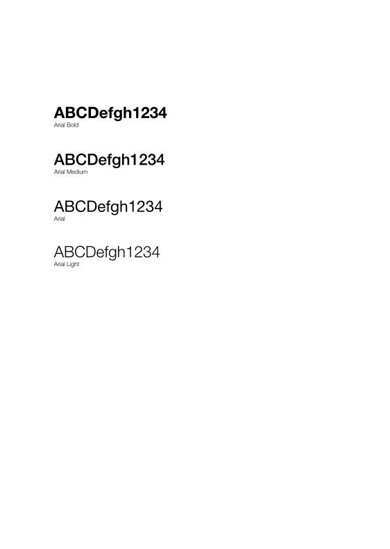
Secondary Typeface: Arial Family
This secondary typeface is used for content, information and body
copy. Its style is candid—well-suited for sharing straight-forward
information in a clear, concise, confident manner.
Like all software, typefaces are licensed for a specific number of
computers. The Arial family of fonts must be purchased for each
computer usage.
Italic versions of the typeface can be used for accents where
Vitesse is not possible to use.
ABCDefgh1234Arial Bold
ABCDefgh1234Arial Medium
ABCDefgh1234Arial
ABCDefgh1234Arial Light
62 Brand Identity Components
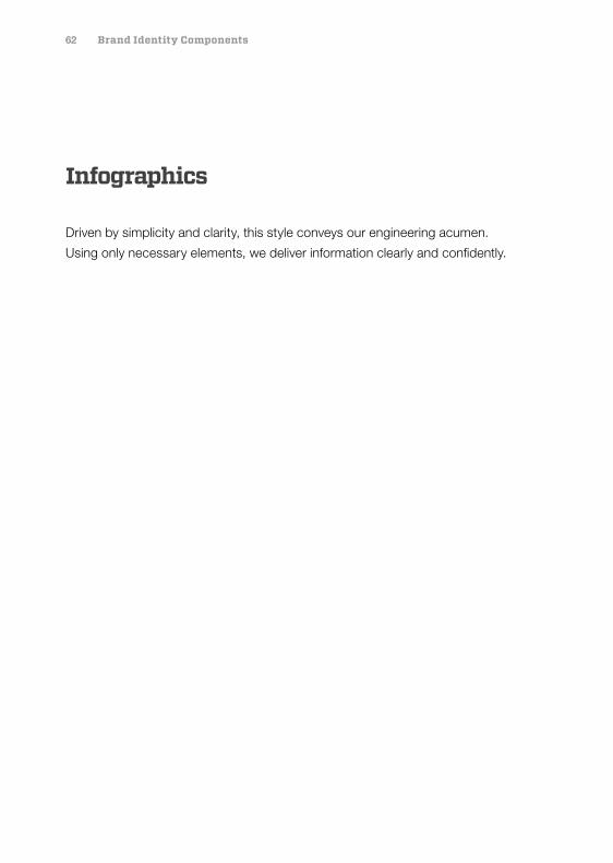
Infographics
Driven by simplicity and clarity, this style conveys our engineering acumen.
Using only necessary elements, we deliver information clearly and confidently.
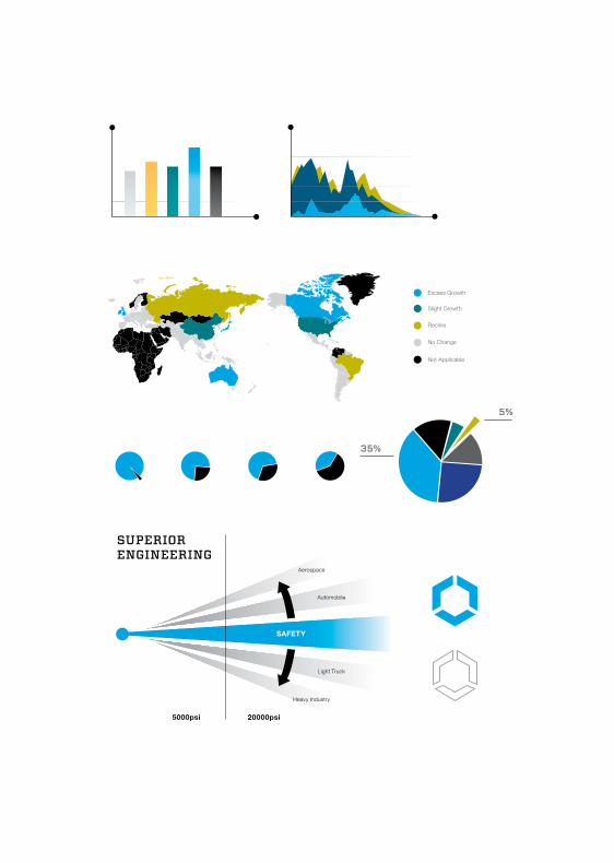
SUPERIORENGINEERING
5000psi 20000psi
SAFETY
Automobile
Light Truck
Heavy Industry
Aerospace
5%
35%
Excess Growth
Slight Growth
Recline
Not Applicable
No Change
64 Brand Identity Components
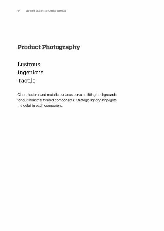
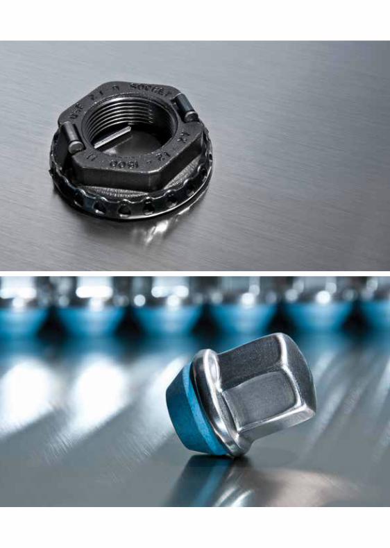
Product Photography
Lustrous Ingenious Tactile
Clean, textural and metallic surfaces serve as fitting backgrounds
for our industrial formed components. Strategic lighting highlights
the detail in each component.
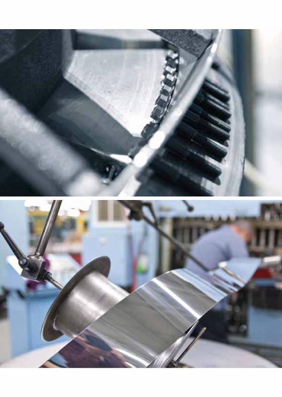
66 Brand Identity Components
Plant Photography
Industrial Focused Well-equipped
Our plant photography includes wide shots of well-lit open spaces along with
textural close-ups of up-to-date machinery, products, and process material.
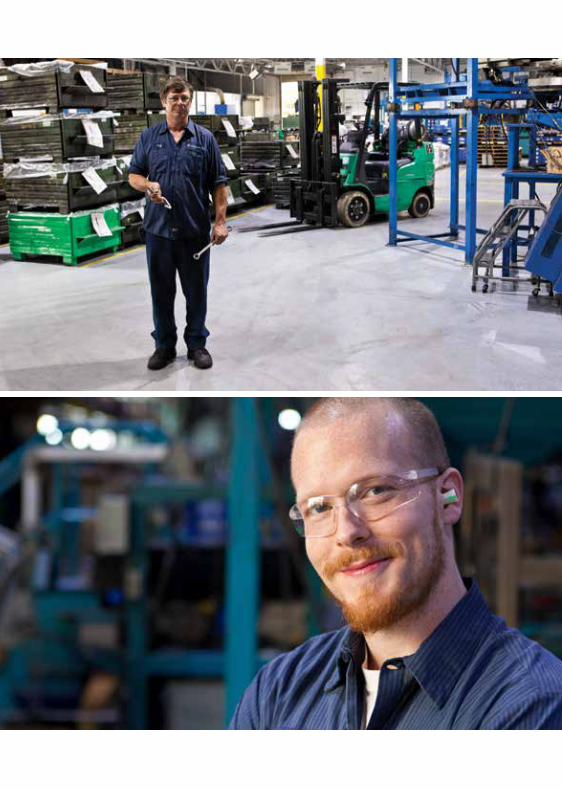
68 Brand Identity Components
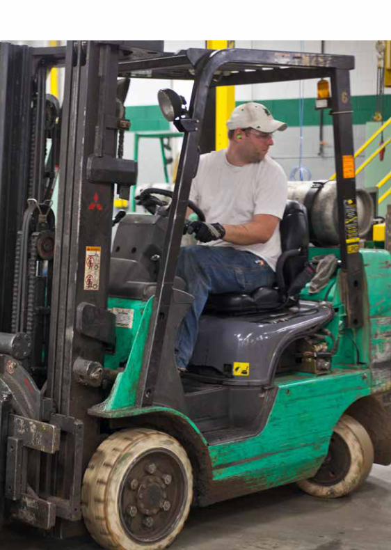
People Photography
Candid Authentic Dynamic
Our people photography accurately depicts our propensity for rolling
up our sleeves to get the job done right. Every time. Whether we’re
engineering the details or building the final product, we take great pride
in our craft. Our photography style captures that dignity. It’s not always
posed, but it’s always real.

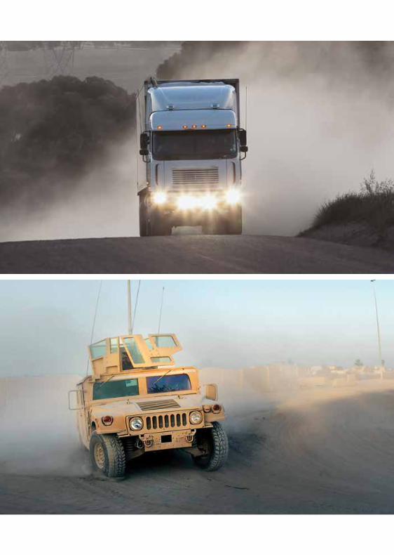
70 Brand Identity Components
Industry Photography
Heroic Bold Lively
Photography of the industries we serve often feature “hero shots” of our
customers’ products. We focus on the importance of each industry in the
world around us, and we’re careful not to imply specific customer brands.
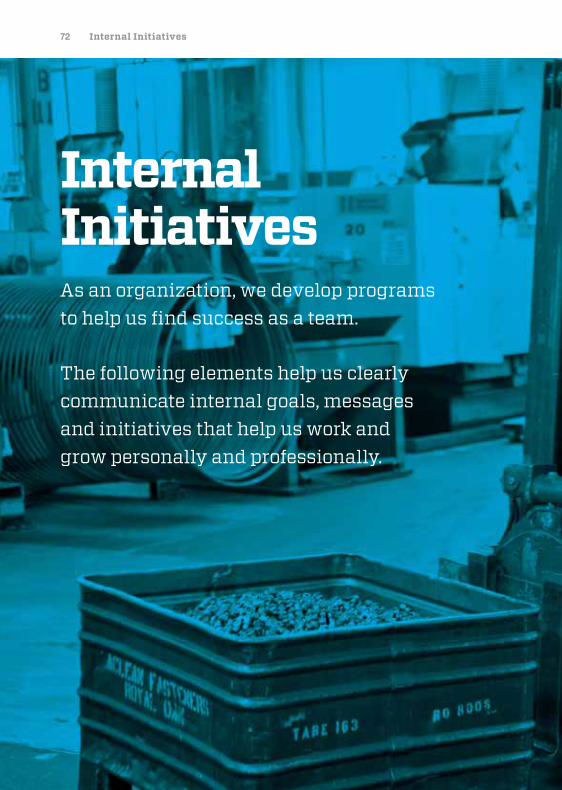
72 Internal Initiatives
Internal InitiativesAs an organization, we develop programs to help us find success as a team.
The following elements help us clearly communicate internal goals, messages and initiatives that help us work and grow personally and professionally.
74 Internal Initiatives
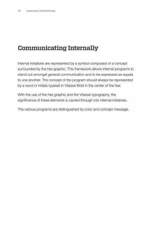
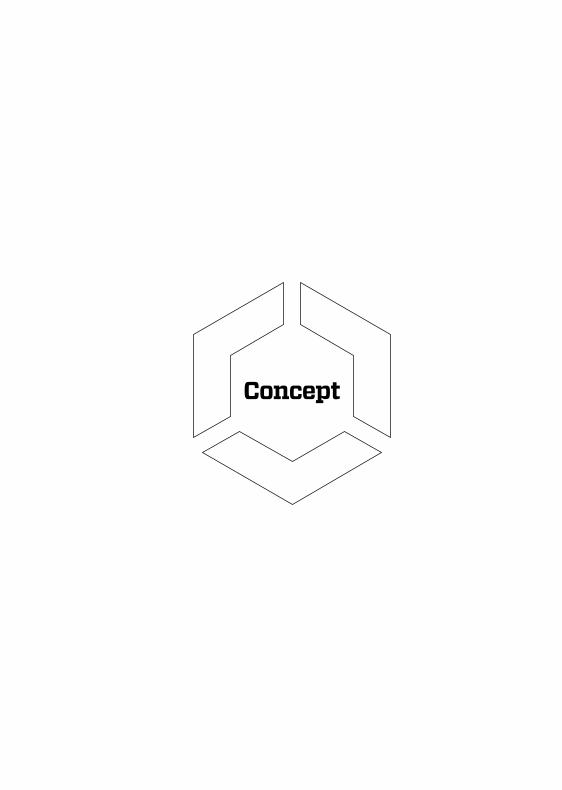
Communicating Internally
Internal initiatives are represented by a symbol composed of a concept
surrounded by the hex graphic. This framework allows internal programs to
stand out amongst general communication and to be expressed as equals
to one another. The concept of the program should always be represented
by a word or initials typeset in Vitesse Bold in the center of the hex.
With the use of the hex graphic and the Vitesse typography, the
significance of these elements is carried through into internal initiatives.
The various programs are distinguished by color and concept message.
Concept
76 Internal Initiatives
EHS Brandmark: What It Stands For
The Environmental, Health and Safety (EHS) initiative is meant to bring
awareness to the necessity of cautiousness in the workplace in an effort
to drive down accidents in the workplace.
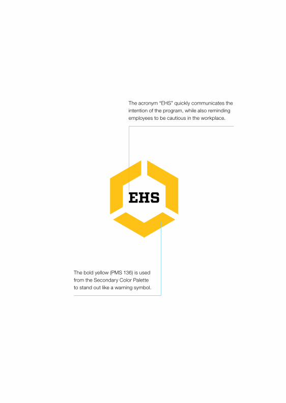
The bold yellow (PMS 136) is used from the Secondary Color Palette to stand out like a warning symbol.
The acronym “EHS” quickly communicates the intention of the program, while also reminding employees to be cautious in the workplace.
78 Internal Initiatives
Safety Brandmark
There are four variations of the Safety brandmark. The primary color for use is
Yellow (PMS 136). Alternative colors are available for use, when needed.
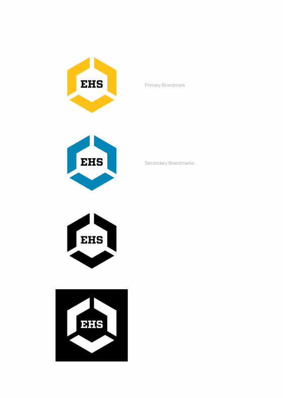
Primary Brandmark
Secondary BrandmarksEHS
EHS
EHS
80 Internal Initiatives
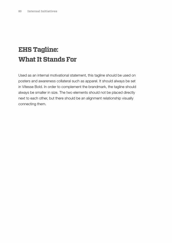
EHS Tagline: What It Stands For
Used as an internal motivational statement, this tagline should be used on
posters and awareness collateral such as apparel. It should always be set
in Vitesse Bold. In order to complement the brandmark, the tagline should
always be smaller in size. The two elements should not be placed directly
next to each other, but there should be an alignment relationship visually
connecting them.
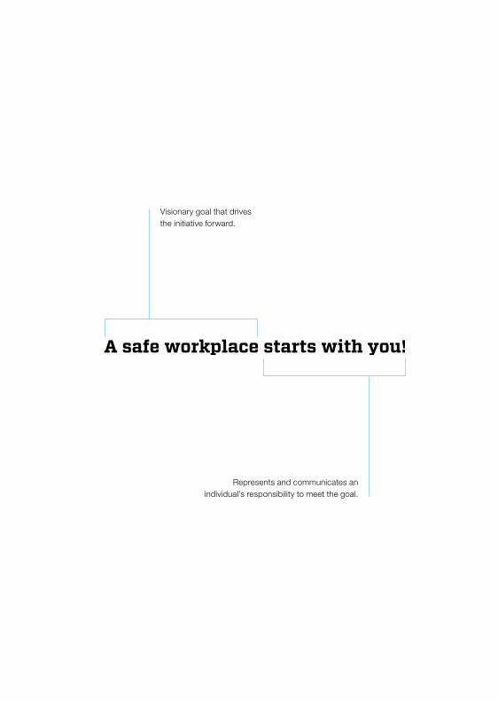
Represents and communicates an individual’s responsibility to meet the goal.
Visionary goal that drives the initiative forward.
82 Internal Initiatives
EHS Tagline
There are four variations of the Safety Tagline. When deciding which variation
to use, it’s important to keep in mind the space allowed, scale and color of
the other graphics used near the tagline. The tagline should contrast, but not
visually overpower the Safety Brandmark.
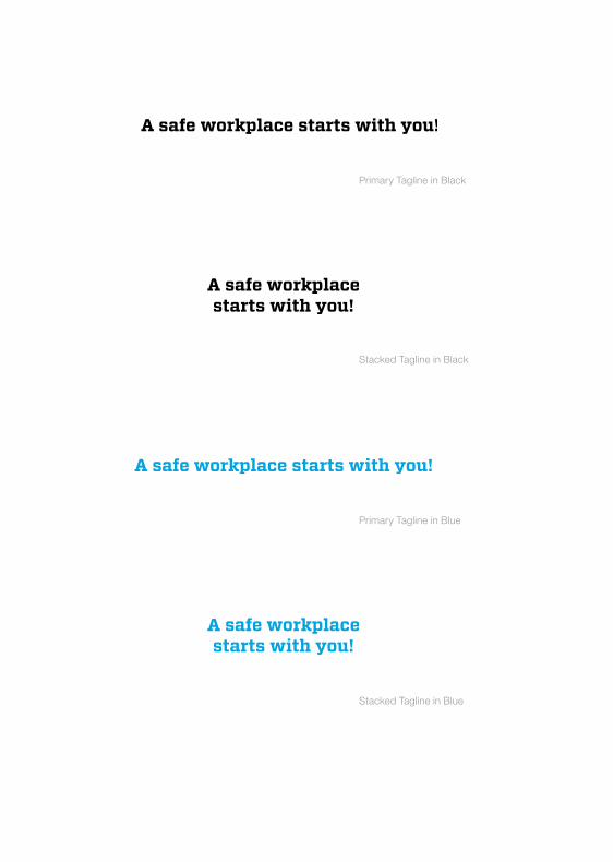
Primary Tagline in Blue
Stacked Tagline in Blue
Primary Tagline in Black
Stacked Tagline in Black
84 Internal Initiatives
Atlas Brandmark: What It Stands For
This brandmark is used to represent the company-wide implementation
of the new ERP (Enterprise Resource Planning) system.
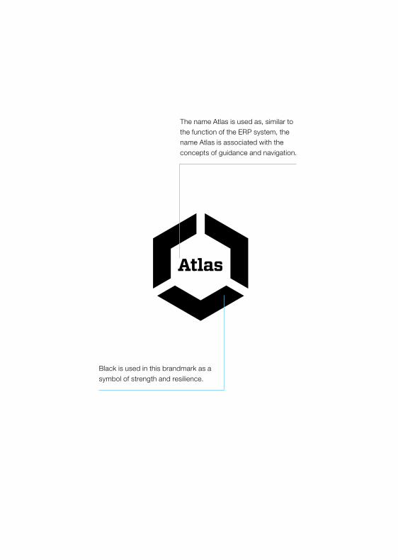
Black is used in this brandmark as a symbol of strength and resilience.
The name Atlas is used as, similar to the function of the ERP system, the name Atlas is associated with the concepts of guidance and navigation.
86 Internal Initiatives
Atlas Brandmark
This brandmark should be used in black, or in white over a
background color, as needed.
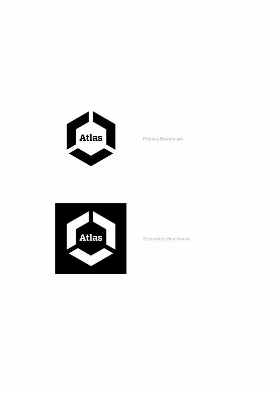
Primary Brandmark
Secondary Brandmark

88 Internal Initiatives
OT Brandmark: What It Stands For
Operational Transformation is an initiative that is introducing strategies to
build morale, increase efficiency and cut waste company-wide. The goal
is to optimize effort and materials.
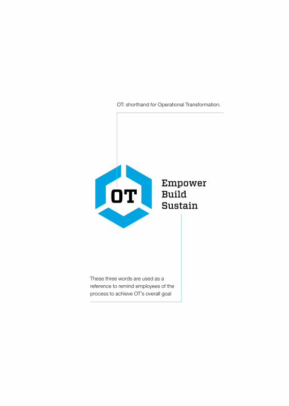
EmpowerBuildSustain
These three words are used as a reference to remind employees of the process to achieve OT’s overall goal
OT: shorthand for Operational Transformation.
90 Internal Initiatives
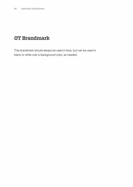
OT Brandmark
This brandmark should always be used in blue, but can be used in
black or white over a background color, as needed.
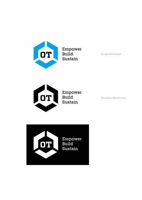
Primary Brandmark
Secondary Brandmarks
EmpowerBuildSustain
92 Internal Initiatives
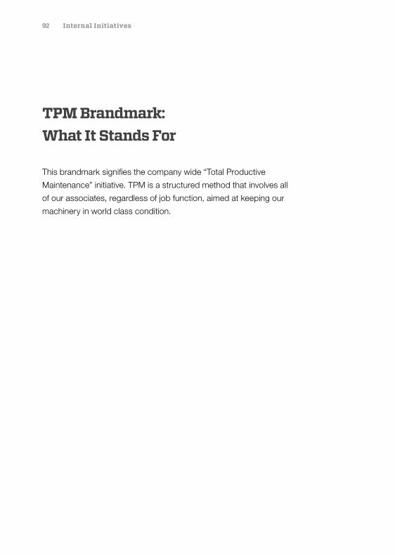
TPM Brandmark: What It Stands For
This brandmark signifies the company wide “Total Productive
Maintenance” initiative. TPM is a structured method that involves all
of our associates, regardless of job function, aimed at keeping our
machinery in world class condition.
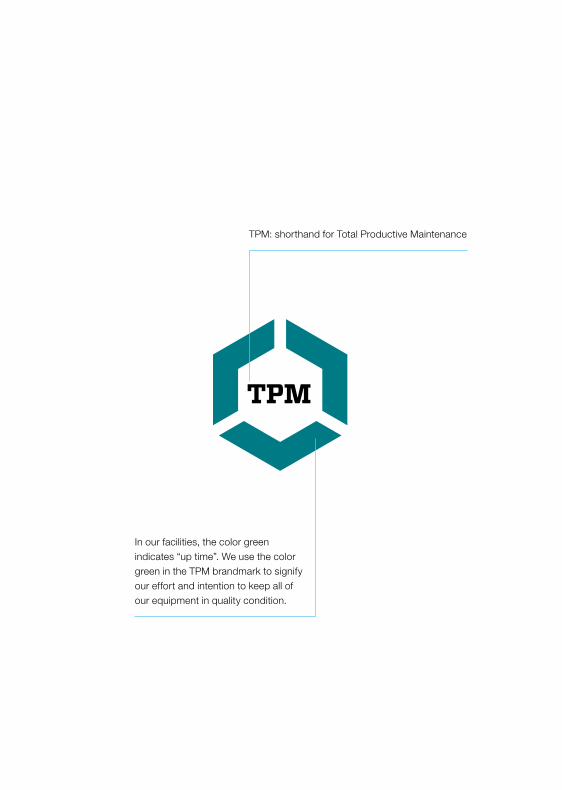
TPM: shorthand for Total Productive Maintenance
In our facilities, the color green indicates “up time”. We use the color green in the TPM brandmark to signify our effort and intention to keep all of our equipment in quality condition.
94 Internal Initiatives
TPM Brandmark
This brandmark should always be used in green, but can be used in
black or white over a background color, as needed.
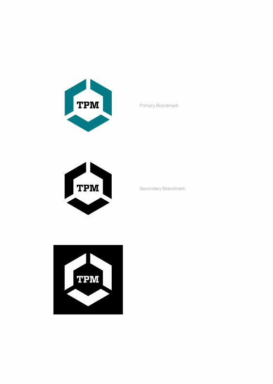
Primary Brandmark
Secondary Brandmark
96
Looking ForwardLooking Forward
With manufacturing, distribution and sales facilities around the globe, we deliver world-class solutions on a worldwide scale. In recent years, our global expansion has added an exciting new dimension to our company culture, and this advancement is reflected in our new brand.
It shows in how we work. It shows in how we look. And it shows in how we look forward.
We are now forming the world. And our future is brighter than ever.

97 Chapter Name Section Name
©2016 MacLean-Fogg Component Solutions
Tomorrow’s challenges are yet to be seen. And the solutions are waiting to be formed. This is why MacLean-Fogg Component Solutions employs some of the most ingenious people in the world to fulfill our brand promise. What began as pride in forming has now evolved into a global mission: building a future formed through ingenuity.
Since 1925, we have been passionately manufacturing the components used by our customers to build the world around us. We were founded with the belief that by solving our customers’ problems, we
take care of our industry, our community, and ourselves. This philosophy has
served us well and helped our company grow to the enterprise it is today.
In order to build on our long history, and to position ourselves for future growth,
we decided to take a thorough look at our company through the eyes of our
customers, our investors, and most importantly, our employees. Our research
and ongoing self-examination revealed a need for clearer focus and better
communication of what makes MacLean-Fogg unique.
With a commitment to building on our past successes and to create our
future legacy, we are happy to announce an exciting change to our brand:
MacLean Vehicle Systems has become MacLean-Fogg Component Solutions.
Additionally, MacLean-Fogg Component Solutions will be divided into three
groups: Fastener Components, Engineered Components and Linkage &
Suspension Components. These changes enable our various constituents to
more easily navigate our company.
The pages to follow serve as an outline and as a revitalization of the purpose
and personality behind MacLean-Fogg Component Solutions. As we each
champion our brand for years to come, we help support new industries, new
technology, and new team members—while proving true to our time-honored
heritage of ingenuity.
Thanks for your continued support.
Duncan MacLean, President MacLean-Fogg Component Solutions