access ability 2 - rgd
TRANSCRIPT

2ACCESS ABILITY A Practical Handbook on Accessible Graphic Design
REVISED + SUPERSIZED SECOND EDITION
This handbook was produced by the Association of Registered Graphic Designers with support from the Government of Ontario.
The Accessibility for Ontarians with Disabilities Act, 2005 is the foundation for making Ontario more accessible. The Act establishes authority for the government of Ontario to supervise and review the legislation. The government also conducts outreach and education about accessibility laws and promotes the benefits of hiring people with disabilities.
facebook.com/ONaccessibilityyoutube.com/ONgovtwitter.com/ONaccessibilityontario.ca/accessibility
© 2019 The Association of Registered Graphic Designers (RGD) 96 Spadina Avenue, Suite 210, Toronto ON M5V 2J6 Canada
No part of this book may be reproduced in any form or by electronic or mechanical means, including information storage and retrieval systems, without the written permission the The Association of Registered Graphic Designers, the designers or any individual or corporate entity holding the copyright to this work.
All work reproduced in this book has been accepted on the condition that it is reproduced with the knowledge and prior consent of the actual owner of the image; consequently no responsibility is accepted by The Association of Registered Graphic Designers for any infringement of copyright arising out of publication thereof.
VERSION 2.0.1 Made in Canada.

· · · ·
.Access Ability 2A Practical Handbook on Accessible Graphic Design.
Revised + Supersized Second Edition.
Adam Rallo RGD Eric Forest RGD James Kuo RGD Randal Boutilier RGD Edmund Li RGD

.
ACCESS ABILITY 2 | A PRACTICAL HANDBOOK ON ACCESSIBLE GRAPHIC DESIGN2
. . .
. .
.
. .
.
.
.
.
.
.
.
.
.
.
.
.
.
.
.
.
.
.
.
.
Contents3. Introduction
5. Planning & Management
6. Start a Conversation
9. Design Fundamentals
10. Design for Outliers
13. Language Usage
15. Colour Usage
19. Typography
20. Typographic Accessibility
21. Typeface Selection
27. Typesetting
33. Digital Media
34. Digital Accessibility
36. Semantic Structure
37. Non-Text Content
41. Principles of Web Accessibility
43. Practice of Web Accessibility
56. Testing for Web Accessibility
60. Office Documents
62. Accessible PDFs
67. Physical Media
68. Print Design
71. Environmental Graphic Design
77. Resources
78. Publications
82. Websites
83. Tools
85. Credits

3
ACCESSIBLE GRAPHIC DESIGN1
ACCESSIBLE GRAPHIC DESIGN
.
.
.
IntroductionHow do we plan a graphic design project to help ensure it is as accessible as possible for the intended audience? What special considerations do we need to make for accessibility across various media, including digital, print, and environmental applications? And how does our desire to communicate effectively with people of varying abilities and potential impairments translate into specific design decisions?
Who is this book for?This book is meant for anyone involved in the process of designing communication materials. This is a broad group of individuals, including professional graphic designers, clients, educators, students, and many others. Some of you are accessibility experts. Some of you have never even heard of the term accessible design until now.
Virtually all of us will experience disability at some point in our lives. It may be a condition that we are born with, a temporary ailment, the inevitable changes that come with age, or something else altogether. Today more than 15% of Ontario residents have some form of disability. As the population ages, the number of people who have a disability or require assistive technologies in some area of their lives will only increase. Beyond what we might call disability, accessible design must also consider the wide range of human diversity in how we think, what we sense, and how we move our bodies. Human beings exist on a wide spectrum of ability and circumstances.
Running Glossary
For readers who may be less familiar with design terminology and concepts, an ongoing glossary of supplemental background information is provided as a sidebar.
Assistive Technology
Assistive technologies are devices, processes, and software that enable people to overcome a disability barrier to effectively access and utilize a product or service.

↑
ACCESS ABILITY 2 | A PRACTICAL HANDBOOK ON ACCESSIBLE GRAPHIC DESIGN4
Accessible design is for everyone. It is designing for the users who are outliers or edge-case scenarios. When we design for those groups, we are designing for the disabled, we are designing for our parents and grandparents, and we are designing for those we may have never met or considered. Ultimately, we are also designing for ourselves, as we define the level of accessibility that we will eventually come to experience as our lives change in unexpected ways.
Why does this book exist?This handbook is part of a broader initiative devoted to fostering accessibility across the province of Ontario. The Accessibility for Ontarians with Disabilities Act (AODA), aims to make the province accessible to people with disabilities in key areas of daily living by 2025. There is an urgent need to provide Canada’s design sector with the information, guidelines, education, and tools required to make accessibility a key measure of success for every project.
Ensuring accessibility is not just a matter of legal compliance. Accessible design improves people’s quality of life. It helps organizations compete by delivering superior services. And it helps designers pursue the ideals that likely influenced them to choose their careers in the first place. We hope that this handbook will help move our profession closer to the day when careful consideration for accessibility is an integral part of everything we do. Northern Lights. This interactive installation
at the Canada Science and Technology Museum allows visitors to alter the colours emanating from the overhead light. It’s controlled through large, easy to reach touch panels, that are accessible to a wide range of people. Design by Reich + Petch Design International.
5
SECTION 1
Planning & ManagementDesigners are key in helping clients understand the need and processes for accessible design.

ACCESS ABILITY 2 | A PRACTICAL HANDBOOK ON ACCESSIBLE GRAPHIC DESIGN6
ACCESSIBLE DESIGN PLANNING & MANAGEMENT1
Start a ConversationAccessibility should not be considered an add-on or feature. It works best and is the most cost effective when it is a core consideration from the beginning of project planning.
Designers who are well-versed in accessible design practices can engage their client to reveal additional opportunities that will increase the positive impact of a project. Some project briefs specifically request accessible design, but many clients don’t know the full implication of the request. Before preparing an estimate and plan, start a conversation with the client to understand their level of experience with accessible design. A lack of experience or fear of accessible design can be a challenge, and it increases the need to guide the client through the process. Actively involving clients in the planning and management of an accessible design project can help foster a positive relationship, and deliver successful results.
Share KnowledgeIt’s important to help clients understand what accessibility is, and why it matters. Start by describing the wide range of disabilities their audience might face, including cognitive, motor, and sensory impairments. Describe the supporting range of assistive technologies that the client’s audience may rely on. Explain to clients how accessible design benefits the aging population, and that nearly all of us will experience disability at some point in our lives.
Clients also need to be aware of the legal requirements for accessible design. The AODA applies to print, digital materials, and signage, but websites are under particular scrutiny. Organizations must ensure that new or redesigned websites meet legal standards for accessibility compliance. Encourage your clients to visit the Government of Ontario’s webpages on Accessibility Laws at ontario.ca/page/accessibility-laws.

↑
7PLANNING & MANAGEMENT
Patient Ombudsman 2016 / 17 Annual Report. The Patient Ombudsman office investigates complaints and facilitates resolutions in patient care issues. This print document was designed to communicate complex information to a diverse audience of people including medical patients and policymakers. English and French versions were created, along with accessible PDFs. Throughout the process, design decisions were made to guide the project towards AODA compliance. Accessibility testing was done through verification software, as well as manual review by a wide range of studio members. The design team worked closely with the client during the revision stages, to ensure that feedback was incorporated without compromising accessibility. Design by Context Creative.
Designers should be able to explain to clients how accessible design is good for business. For example, accessibility compliance is one of the criteria that search engines use to rank search results, which can result in increased website traffic and sales. Explain to clients how creating materials with increased accessibility will expand their potential client base, and more effectively communicate with their entire audience. Genuine and visible attempts to increase the accessibility of communication materials influence the audience’s perception of an organization’s commitment to social responsibility.

↑
ACCESS ABILITY 2 | A PRACTICAL HANDBOOK ON ACCESSIBLE GRAPHIC DESIGN8
. .Help Clients PrioritizeSome clients may not have a sufficient budget or the time to undertake a fully accessible design project within their desired scope. In this scenario, the designer should propose a realistic scope that meets the client’s legal obligations. The client may wish to gradually phase-in accessible design features with their communications. The AODA outlines a schedule for accessibility compliance, which can help prioritize accessibility goals. Identify for the client what they need to do now, and what they can address later.
InvestingIntroduction.ca. The Ontario Securities Commission’s Investor Office sought to demystify the process of investing through this new website. Accessibility was considered from the onset while scoping the goals and technical functionality of the system. The client’s preferred colour palette reflects their brand guidelines (shown top left), however this does not provide enough colour contrast for accessibility compliance. The design team addressed this by allowing the user to easily switch to a high contrast colour scheme (shown bottom right) that meets the highest level of accessibility compliance. Design by Context Creative.
Manage Client ExpectationsHelp your client understand what is and isn’t possible. Be honest and direct with your client, and let them know when a particular design request presents an accessibility challenge. Communicate to them that it’s your job as a designer to provide a solution that meets their needs while satisfying accessibility requirements. Let the client know that compliance constraints can sometimes impact the look and feel of a project, but it doesn’t mean you can’t create something spectacular.
Making any design project 100% accessible is an elusive goal. Try to make a project as accessible as possible, but never promise perfect accessibility to a client. At a bare minimum, a professional graphic design should be able to promise and deliver results that meet the AODA requirements. Help your client understand that accessible design also requires active ongoing commitment and evaluation. A designer is key in showing their client that there is always room for improvement and learning.
Ensure that your client understands that best practices in accessible design are constantly evolving and debated. There is a plethora of information and misinformation on accessibility, and even some of the best information can be contradictory. Furthermore, despite your best efforts, someone may still identify accessibility limitations in the design that you didn’t notice. You and your client should decide together how you will address such concerns.
Working collaboratively with your client on an accessibility project gives you an opportunity to establish a relationship of trust and respect that will carry over into all your work with them.

9
SECTION 2
Design FundamentalsIn order to design for greater accessibility, we need to better identify and understand the diverse range of people who may need to access our design.

↑
ACCESS ABILITY 2 | A PRACTICAL HANDBOOK ON ACCESSIBLE GRAPHIC DESIGN10
ACCESSIBLE DESIGN FUNDAMENTALS2
Design for OutliersMany of the graphic design fundamentals, principles, and best practices have an appreciable impact on the accessibility of a design.
For instance, if we were designing a business card, we would test it with the longest and shortest possible names and email addresses that the card may have to accommodate. This kind of consideration is second nature for professional graphic designers when designing to accommodate information. We need to take this exact type of thinking and extend it to designing to accommodate people.
Design for the outliers. It is impossible to consider the individual characteristics of every person on earth in a design. In order to design for accessibility, we should focus our efforts on the outliers at the extremes of human diversity. By considering their needs, we can triangulate to address a much larger audience. This often has the added effect of increasing the quality of the design for everyone.
Sensory ConsiderationsAt its core, graphic design is concerned with communication. It is critical that designers consider diverse sensory abilities and preferences of their audience. The following list of sensory characteristics should be a bare minimum of consideration for all graphic design projects.
Graphic Design Fundamentals
It’s beyond the scope of this book to cover the necessary fundamentals of graphic design. If these concepts and principles are unfamiliar to you, there is a wealth of resources listed at the end of this book in the Resources section. If you are completely new to this field, Ellen Lupton’s book Graphic Design: The New Basics is a good place to start.
Information Rail in the “Artifact Alley.” These inforails at the Canada Science and Technology Museum use accessible typography, Braille, and tactile imagery to provide a shared experience for a diverse range of people. Design by Reich + Petch Design International.

⯈
⯈
⯈
⯈
⯈
⯈
⯈
⯈
⯈
⯈
⯈
⯈
⯈
⯈
⯈
⯈
⯈
⯈
11DESIGN FUNDAMENTALS
.
.
.
Eyesight
Consider people who are hypersensitive to light.
Consider people who are colour blind, ranging from those who cannot see colour at all, to those who cannot discern between certain hues.
Consider people who have severely diminished vision, but still rely on their eyesight to see images or read.
Consider people who are blind, or who have eyesight diminished to the point that it is impossible for them to read images or text visually.
Hearing
Consider people who are hypersensitive to sound.
Consider people who have severely diminished hearing, but still rely on it for communication.
Consider people who cannot hear at all.
Consider people who cannot hear or see at all.
Multi-Modality
Design that is limited to a single sensory modality will likely be inaccessible to many people. Successful accessible graphic design reaches across many sensory limitations, and communicates through multiple modalities. Semantically structured text is often utilized as the basis for modal translations, as it can be robustly interpreted by various assistive technologies.
Cognitive ConsiderationsConsider people with conditions that affect their ability to process, understand, and communicate information. There are a multitude of conditions that can affect cognitive function, and they can cause difficulty with any number of the following tasks.
Distinguishing sounds from background noise.
Focusing or staying on task.
Memorizing and recalling information.
Understanding and following directions.
Understanding complex logic.
Understanding abstract ideas.
Understanding language usage.
Communicating in speech or writing.
Working with numbers.
Keeping expected pace in any number of cognitive tasks.
Consider the interaction between multiple conditions, and consider how these might also interact with the sensory limitations listed previously.

↑
ACCESS ABILITY 2 | A PRACTICAL HANDBOOK ON ACCESSIBLE GRAPHIC DESIGN12
Cognitive Load
There is a finite amount of new information we can process, memorize, and recall at any given time. These operations take up capacity in our working memory, and the mental effort used to maintain this working memory is called the cognitive load. In order to maximize the accessibility of a design, we need to minimize the cognitive load it demands from the user. Consider the following ways in which cognitive load can be reduced.
Grouping. Group pieces of content in a manner that optimizes utility to the reader, and clarifies understanding.
Chunking. Avoid large, overwhelming blocks of information by breaking up content into smaller sections with meaningful groupings or headings.
Hierarchy. Clearly differentiate the relative importance of each piece of content in the design. When possible, maintain a pyramidal hierarchical structure within a page.
Anchors. Do not demand that a user reads the entire piece, or must read it all in one sitting. Use headings and other anchors to allow the reader to jump around, and easily find their place in the content.
Consistency. Consistency helps decrease distractions and increase predictability in a design, while breaking with this consistency will help draw attention to a novel element.
Grid. The visual structure afforded by a well-implemented underlying grid provides additional consistency and predictability for the reader.
Avoid organizing content in any manner that requires the user to cross-reference, as this necessitates memorization and recall leading to increased cognitive load. Never require the user to cross reference a guide or table, and avoid using legends whenever possible. Mississauga.ca Website. The City of
Mississauga has embarked on an initiative to create people-centred digital services that are fast, clear, and easy to use for people of all abilities. Designers have worked closely with content and development teams to ensure accessibility throughout the website. Design by the City of Mississauga.

←
13
ACCESSIBLE DESIGN FUNDAMENTALS2
DESIGN FUNDAMENTALS
Language UsageAccessibility issues in a design project can often start with the language usage. The more complex your language usage, the higher the cognitive load is on the reader. Communicate content in the plainest possible language, especially when addressing complex content. Aim for clarity and economy while avoiding needless complexity.
Writing for AccessibilityMake it Scannable
In order for text content to be scannable, it needs to be written with an understandable and predictable structure and hierarchy. Implement a clear linear progression of ideas, and avoid needlessly complex sentence and paragraph structures. Break up long passages of text into smaller sections with meaningful subheadings. Provide plain language summaries of complex content.
Short is Sweet
If a shorter word can replace a longer word without detrimentally altering the meaning of the text, do it. If a word can be cut without altering the meaning, do it. With every bit and byte of information removed, the signal to noise ratio improves, and the cognitive load diminishes.
Literally be Literal
Avoid using idioms. Write everything as if it will be processed by a Google Translate afterwards, and you need it to maintain its meaning after any machine translation. Not only is this a practical consideration since online translation services are used by people around the world, this self-imposed limitation can train you to write with greater clarity, precision, and ultimately, accessibility.
Insider Knowledge
Avoid needlessly relying on words or phrases that could be considered insider knowledge. This includes, but is not limited to abbreviations, acronyms, jargon, and scientific terms. If you need the economy or precision that these terms can provide, define or explain them upon their first instance of usage in a body of text.
Language usage. This sign uses an internationally recognized raised symbol, raised lettering, braille, and a high degree of colour contrast, yet it’s an accessibility failure because of the language usage.

⯈
⯈
⯈
⯈
⯈
⯈
ACCESS ABILITY 2 | A PRACTICAL HANDBOOK ON ACCESSIBLE GRAPHIC DESIGN14
Don’t Deceive their Ears
There are words that sound nearly identical, but have different meanings, such as “all” and “awl,” “bare” and “bear,” or “to,” “too,” “two,” and “tutu.” For readers who rely on text to speech technology, these homonyms can sometimes cause confusion. In order to avoid this problem, consider the following.
Ensure that the context or usage of the homonym makes the intended meaning unambiguous.
Avoid using homonyms if they are not necessary.
If the homonym is both necessary and cannot be clarified by context, provide a mechanism that will draw attention to the homonym and spell it out for the reader.
Don’t Deceive their Eyes
There are different words that are spelled identically, but their meaning is clarified in speech by differentiated pronunciation. For instance, in the statement “he put a sticker of a bass on the body of the bass,” how do we know if the sticker depicted a fish or a musical instrument? And what exactly did he put the sticker on? Exercise care when using heteronyms.
Ensure that the context or usage of the heteronyms makes the intended meaning unambiguous.
Avoid using heteronyms if they are not necessary.
If the heteronym is both necessary and cannot be clarified by context, provide a mechanism that will draw attention to the heteronym and annotate the pronunciation for the reader.
One Language at a Time
Avoid incorporating foreign words into your language usage, unless there really is no equivalent word or expression. Native English speakers often needlessly incorporate foreign words or phrases, and this can be very confusing for non-native English readers and anyone using a text to speech mechanism.
Check your References
Pop culture references can be fun and illustrative for those in the know, but for others they can be alienating and confusing. They may also age poorly, decreasing their communicative value and accessibility over time. Never use a cultural reference that your audience might not understand, unless its meaning can be gleaned from context, or it is otherwise explicitly explained.
Explain the Unexpected
If a word or phrase is being used that may be unknown to your reader, provide a mechanism to integrate definitions for these terms. Conversely, if you are using a well-known word or phrase with an unusual, limited, or particularly specific definition, you need to clearly define that term’s usage for your reader as well.
Keep it on the Level
In some cases, despite our best efforts, a text may still require a reading ability more advanced than a lower secondary school education level. In these cases, provide either a plain language summary of the complex content, or an alternate version that does not require such a high reading level.
“Make everything as simple as possible, but not simpler.” — Albert Einstein.

↑
↑
↑
15
ACCESSIBLE DESIGN FUNDAMENTALS2
DESIGN FUNDAMENTALS
Colour UsageThere are many models for describing colour, but for accessibility purposes we are interested in systems that correlate to how human beings perceive colour. These systems define colour using three parameters: hue, chroma / saturation, and tonal value / lightness.
Hue
Hue is the degree to which a colour can be described as red, green, blue, yellow, or some combination thereof. This is the qualitative descriptor we usually give a colour, such as “yellow” or “purple.”
Chroma / Saturation
Saturation refers to the intensity of this coloration. A colour with no saturation would be in grayscale or black & white. A colour with full saturation would be as vivid as it could possibly be.
Tonal Value / Lightness
Tonal value refers to the light or dark character of a colour. Think of this as how the colour would appear if it were converted to grayscale. The tonal value can range from pure white to pure black.
Hue variation, with incidental variation in saturation, and no variation in tonal value.
Saturation variation, with incidental variation in hue, and no variation in tonal value.
Tonal value variation, with incidental variation in saturation, and no variation in hue.

↑
ACCESS ABILITY 2 | A PRACTICAL HANDBOOK ON ACCESSIBLE GRAPHIC DESIGN16
Perceiving ColourIt is critical that hue or chroma is never used as the only distinguishing factor in conveying information, indicating an action, prompting a response, or distinguishing a visual element.
People’s perception of colour can be affected by congenital vision problems or the effects of age, injury, or the environment. Approximately 5% of people have some form of colour blindness. Many people with colour blindness have difficulty distinguishing between two hues, such as red and green, or yellow and blue, while others cannot distinguish between hues at all.
Designers sometimes achieve contrast through the use of complementary colours. If a pair of complementary colours’ saturation and tonal value are too similar, the optical illusion of colour vibration can occur. This may cause eyestrain, and make the design unpleasant, if not inaccessible to some people.
Complementary Colours
Complementary colours are a pair of colours that appear on opposite sides of the colour wheel in a given colour model. They have the highest possible degree of hue contrast, and when used together they both emphasize each other. If complementary colours are combined into one colour, they neutralize each other’s hue.
While no two people likely experience colour in exactly the same way, it is people’s perceptions of hue and chroma / saturation that can vary the most from one person to the next. The least variance in human perception of colour is in how we see tonal contrast. Therefore, when designing with colour, maintaining sufficient tonal contrast is essential for accessible communication. Adequate tonal contrast can eliminate most problems with colour vibration, and can ensure that a design transcends any colour blindness.
Spark. This Hospital for Sick Kids project enables children who are undergoing treatment for cancer to track symptoms and communicate them with their doctor. Carefully considered hue and tonal relationships reinforce the communication of symptom urgency between patients and their health care providers, regardless of any colour blindness. The original image is shown top left, while the image to the bottom right is shown in grayscale. Design by Catalyst Workshop.

.
.
.
⯈
⯈
⯈
↑
17DESIGN FUNDAMENTALS
Tonal ContrastIn order to design work with optimal tonal contrast, you have to think of your work in terms of grayscale. There are numerous ways that the results can be tested.
You can do a quick check for tonal contrast by switching your display to grayscale mode, or printing your work in black & white on a printer.
You can preview your work with software that approximates colour blindness on your computer screen. Adobe Photoshop’s colour proofing feature can be configured to simulate Deuteranopia or Protanopia, two of the more common forms of colour blindness. This can give you the insight to make adjustments to an image so that it can effectively communicate regardless of these conditions.
You can use a colour contrast analyzer to more precisely measure the amount of tonal contrast, and verify this against accessibility standards. There are physical scanners that can do this, but most designers prefer to use the desktop software, browser plugins, and website based services that can perform this analysis.
Tonal Contrast & Typography
While tonal contrast is important in all elements of a design, it is critical in typography. A minimum 10:1 contrast ratio is recommended. Many people find that black text on a cream coloured background offers the best readability, while others prefer off-white text on a black background. In any case, a colour contrast analyzer can help you ensure that there is enough differentiation between text and background colours.
Desktop Software for Analyzing Colour ContrastA desktop based colour contrast analyzer can help determine the contrast ratio of any visual elements that appear on the computer screen. The Paciello Group’s Color Contrast Analyzer (CCA) is a recommended tool that is available for macOS & Windows. This free software has an integrated colour picker / eyedropper, as well as a colour blindness simulator. developer.paciellogroup.com/resources/contrastanalyser/
Adobe Photoshop. The software being used to simulate how an image would appear to someone with Deuteranopia.
↑
ACCESS ABILITY 2 | A PRACTICAL HANDBOOK ON ACCESSIBLE GRAPHIC DESIGN18
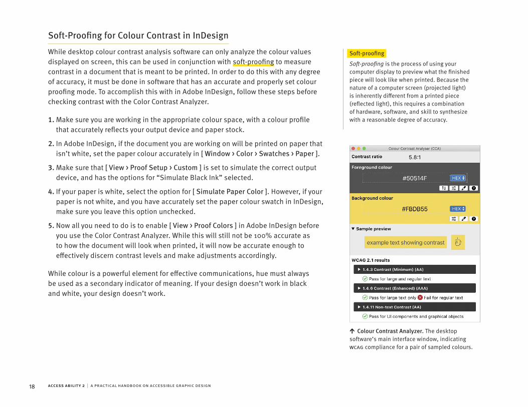
Soft-Proofing for Colour Contrast in InDesign
While desktop colour contrast analysis software can only analyze the colour values displayed on screen, this can be used in conjunction with soft-proofing to measure contrast in a document that is meant to be printed. In order to do this with any degree of accuracy, it must be done in software that has an accurate and properly set colour proofing mode. To accomplish this with in Adobe InDesign, follow these steps before checking contrast with the Color Contrast Analyzer.
Soft-proofing
Soft-proofing is the process of using your computer display to preview what the finished piece will look like when printed. Because the nature of a computer screen (projected light) is inherently different from a printed piece (reflected light), this requires a combination of hardware, software, and skill to synthesize with a reasonable degree of accuracy.1. Make sure you are working in the appropriate colour space, with a colour profile
that accurately reflects your output device and paper stock.
2. In Adobe InDesign, if the document you are working on will be printed on paper that isn’t white, set the paper colour accurately in [ Window > Color > Swatches > Paper ].
3. Make sure that [ View > Proof Setup > Custom ] is set to simulate the correct output device, and has the options for “Simulate Black Ink” selected.
4. If your paper is white, select the option for [ Simulate Paper Color ]. However, if your paper is not white, and you have accurately set the paper colour swatch in InDesign, make sure you leave this option unchecked.
5. Now all you need to do is to enable [ View > Proof Colors ] in Adobe InDesign before you use the Color Contrast Analyzer. While this will still not be 100% accurate as to how the document will look when printed, it will now be accurate enough to effectively discern contrast levels and make adjustments accordingly.
While colour is a powerful element for effective communications, hue must always be used as a secondary indicator of meaning. If your design doesn’t work in black and white, your design doesn’t work.
Colour Contrast Analyzer. The desktop software’s main interface window, indicating WCAG compliance for a pair of sampled colours.
19
SECTION 3
TypographyTypography is predicated on increasing the accessibility of written language. Good typography is accessible typography.

ACCESS ABILITY 2 | A PRACTICAL HANDBOOK ON ACCESSIBLE GRAPHIC DESIGN20
ACCESSIBLE TYPOGRAPHY3
Typographic AccessibilityTypographyTypography is the visual form for communicating written language. Many of the principles of what is considered good typesetting will also increase the accessibility of a text. For the uninitiated, typography is a deep field of study and practice, and its basic principles and practices are far beyond the scope of this book. Instead this section focuses on specific accessibility concerns, beyond what would be considered best practices in typography.
Typography
If you are unfamiliar with the basic principles of typography, we recommend reading Ellen Lupton’s Thinking With Type.
Reading Using EyesightReading requires recognition and familiarity with the language, letters, and letterforms being used.
Letters
The alphabet is made up of letters, like A, B, C, which are conceptual constructs. A letter can be communicated many ways, including sound, a hand gesture, a Unicode value, and through a visual letterform.
Letterform
A letterform is the visual manifestation of a letter. For instance, the letter “O” is indicated by a letterform made up of a stroke in the shape of a circle or oval enclosing a round negative space (counter). Variations in letterforms and spacing differentiate one font from another.
Stroke
Letterforms are defined by positive and negative shapes. The positive shape is called the form, and the bulk of the form is made up of straight or curved lines called strokes.
Counters
The negative space shapes that make up a letterform are called the counterforms or counters.
Legibility
Legibility refers to the degree to which letters can be recognized from specific letterforms.

⯈
⯈
⯈
⯈
⯈
⯈
21TYPOGRAPHY
Learning to Read
When people begin to learn to read using their eyes, they work through the text one letter at a time, gradually assembling a word out of its component letters. As their skill increases, they start to recognize common pairings of letters, such as “th,” and then larger patterns of letters, such as “tters.” Eventually this pattern recognition allows the reader to quickly parse entire sequences of words.
As reading speed increases, the eyes are looking ahead, moving in quick short jumps (called saccades) at approximately seven to nine letters at a time. In-between saccades, they pause to take a snapshot called a fixation, for approximately 250 millisecond. The brain analyzes these fixations as shapes, instead of individual letterforms.
As this process accelerates, these fixations focus disproportionately on the top half of these shapes. Most people are eventually able to take in approximately 15 letters per fixation, although we are typically only able to accurately recognize the first one to seven characters at a time.
Readability
Readability refers to the accuracy and speed with which content can be consumed over an expanse of text. Readability is affected by numerous factors including the following.
Typeface selection
Font size
Spacing
Line length
Alignment
Formatting
Typeface SelectionWhat Typefaces Should I Use?This is actually a really big question. Do you want the short answer? Here it is: commonly used typefaces such as Arial, Calibri, Helvetica, Times New Roman, and Verdana are often rated as the most readable, and the most preferred by those with vision or reading difficulties.
Does this mean that these are the best designed most legible typefaces? No, not likely. What it means is that our familiarity with a font is one of, if not the single most important factor in making a font legible and readable to us. Whether we like it or not, the more we read text typeset in Arial, the better we get at reading text typeset in Arial. If you can use these familiar typefaces for your design project, do it! If you can’t use these familiar typefaces for a project, you should carefully consider the characteristics of any alternatives in order to assess the potential legibility and readability of a font.

🡭
🡭
🡭
ACCESS ABILITY 2 | A PRACTICAL HANDBOOK ON ACCESSIBLE GRAPHIC DESIGN22
.
.
.
.
.
Style
Most fonts can be classified into one of two categories: text fonts, which are designed for readability and versatility, and display fonts, which are more decorative and designed for expression and style. For our purposes we are only considering fonts which are obviously designed for body text.
Display Fonts
Display fonts refers to typefaces which are overtly decorative or ornate. They are only intended for use at larger sizes, and never for passages of text longer than a title or heading.
Stance
Fonts with a Roman (upright) stance are preferred over Obliques (slanted), and highly preferred over Italics or Scripts.
Stance. From left to right, Arial Regular (which is roman), Arial Italic (which is actually oblique), Times New Roman Italic, and Caflisch Script. Width
Typefaces with letterform designs that are too wide or too narrow will have decreased legibility. The relative width of a font can be measured by comparing the width of the letter “O” to the length of the letter “I.” The width of an uppercase “O” should be within 75% and 105% of the height of an uppercase “I.”
Width. Compare the relative width to height ratios of Meta Normal (80%) and Gotham Regular (102%). The ratios are visualized by transposing the height of the “I” across the width of the “O.”
Character Width Variation
Some typefaces such as Futura have letterforms with widths that vary an excessive amount. This impedes legibility on some of the narrowest characters, and the overall unevenness hinders readability. Avoid fonts with such extreme shifts in character widths. Typefaces such as Adobe Garamond have more moderate differences in width between the various letterforms, which increases readability.
Character width variation. Futura and Adobe Garamond. Note the extreme differences in narrow and wide letterforms in Futura, while these differences are less pronounced in Adobe Garamond.

🡭
🡭
🡭
23TYPOGRAPHY
Stroke Contrast
The stroke contrast of a letterform is defined by its thick to thin stroke ratio. This is discerned by comparing the thickest part of a letterforms’ stroke with the thinnest part of the letterforms’ stroke. The lowercase “h” is a good letterform to assess. Look for a thick to thin stroke ratio lower than 3:1 but greater than 1.5:1. Fonts with a low thick to thin stroke ratio are generally preferred for accessibility. Stroke contrast. Compare the thick to thin stroke contrast ratios of the “h”
letterform in Bodoni (4:1), Adobe Garamond (2.7:1), and Helvetica (1.6:1). Weight
The weight of a typeface refers to the relative thickness of its stroke. This is measured by the stroke weight to character height ratio. If you are choosing a typeface for readability, consider fonts with a stroke weight to character height ratio less than 1:10. The smaller the font, the heavier this ratio should be. Fonts heavier than a 1:5 stroke weight to character height ratio may be uncomfortably heavy for extended text reading. Weight. Compare the stroke weight to character height ratios of the “R”
letterform in Gotham (1:9.1), Adobe Caslon (1:7.25), and Arial Bold (1:5). Counterforms
A well-balanced proportional relationship between stroke and counter will make letterforms more legible. If a letterform has overly thick strokes and small counters, the letterform can become indistinct, and this impedes legibility. Conversely, if a letterform has overly large counters, these counterforms tend to become distracting shapes, de-emphasizing the form of the strokes, and again reducing legibility. The most legible fonts have a well-balanced proportion between stroke and counter that avoids these issues.
Counterforms. Compare the counters of the “d” letterform in Century Gothic, Verdana, and Arial Black. Note how the moderately sized Verdana has the most distinct counter form.

🡭
🡭
ACCESS ABILITY 2 | A PRACTICAL HANDBOOK ON ACCESSIBLE GRAPHIC DESIGN24
Apertures
Typefaces with narrow apertures, such as Arial or Helvetica, can cause the counter to appear fully enclosed to some readers with vision impairment. Not surprisingly, this decreases legibility. Conversely, wider apertures can increase the legibility of a font by better emphasizing the unique shape of the open counter. To increase accessibility, look to use fonts with wider apertures.
Aperture
Some letterforms have open counters, which are counters that are not fully enclosed. The opening to this counterform is called the aperture.
Apertures. Compare the closed apertures of Helvetica with the more open apertures of Benton Sans, and the much more open apertures of Calibri.
X-Height
The ratio of the height difference between uppercase and lowercase letterforms is critical in determining overall legibility. A typeface with a tall x-height usually appears larger than comparable type with a lower x-height. This difference is more pronounced at smaller font sizes, where a high x-height can be particularly advantageous. X-height. Compare the relative x-heights of Adobe Caslon (60% x-height),
Times New Roman (67% x-height) and Verdana (75% x-height).
X-Height
The x-height refers to the height of the lowercase letters in a font, commonly determined by the height of the lowercase “x.” Whether an x-height is considered tall or short depends on the x-height ratio, which is measured by comparing the height of the capital “X” and the lowercase “x.”
Look for fonts with an x-height of 2/3 (67%) to 3/4 (75%) of the cap height. While many accessibility experts advocate for using fonts with a higher than average x-height, it should be noted that some dyslexic readers conversely find fonts with longer ascenders and descenders to be the most comprehensible.
Cap Height
The cap-height refers to the height of most capital letters in a font, measured from the baseline to the top of the capital letter “M.”
Baseline
The baseline is the imaginary line on which letterforms are bottom aligned and appear to stand. Some letterforms such as “gjpqy” have descenders which go below the baseline.

🡭
🡭
🡭
25TYPOGRAPHY
Confusing Letterform DesignsThere are many potentially confusing letterforms. A more accessible typeface will avoid potential confusion with more overtly distinct letterform designs. Here are a few of the most common issues to avoid.
Imposters
Avoid typefaces that have letterform designs that are virtually identical for multiple letters. The letters “I1l” are often the worst offenders for this. To avoid this problem, choose a font with noticeable serifs on both the top and the bottom of the capital “I,” and a short but noticeable arm on the top of the number “1.”
Imposters. Compare the differentiation of the characters “I1l” in Gill Sans, Times New Roman, Calibri, and APHont.
Mirrors
Avoid typefaces that use mirrored or reflected letterform designs. The lowercase letterforms “dbpq” can be particularly confusing from some people, especially those with dyslexia.
Mirrors. Compare the potentially confusing mirrored and rotated letterforms in Arial, to the better differentiated characters in Meta Pro and Times.
Needlessly Similar
Avoid typefaces that have needlessly similar letterform designs. The lowercase letterforms “aog” in particular can sometimes be designed without enough clarifying differentiation.
Needlessly similar. Compare the lack of distinction between letterforms in ITC Avant Garde Gothic, with the more distinct letterforms in APHont, and the much more distinct letterforms in Meta Pro.
Please note, there are many more specific letterforms that can be misunderstood by various readers.
This linked article by Thomas Bohm provides an in-depth look at these potential issues. typography.guru/journal/letters-symbols-misrecognition/

↑
ACCESS ABILITY 2 | A PRACTICAL HANDBOOK ON ACCESSIBLE GRAPHIC DESIGN26
Specialist TypefacesMany typefaces have been designed to specifically address the needs of dyslexic readers. This includes the extensive Sassoon typeface family for children, Sylexiad, Read Regular, Lexie Readable, Dyslexie, and OpenDyslexic. Unfortunately, there is inconclusive and mixed evidence regarding the efficacy of many of these typefaces.
There are also some typefaces that have been designed specifically for readers with low vision, such as APHont (shown previously), as well as Tioga and Tiresias. While research seems to indicate that APHont is an effective option, the research supporting the efficacy of the latter two fonts is less convincing. If you come across claims that a specific font has superior performance in a specific scenario or with a certain segment of the population, be vigilant in critically assessing the supporting research for these claims.
One last thing about typeface selection. Some of the most legible typefaces are not necessarily highly readable, and some highly readable typefaces are not necessarily highly legible. When selecting a font, consider the nature of the text, and how it is to be read or seen. The longer the text, the more important it is to prioritize readability over legibility. However, for short text identifiers (such as licence plates, promo codes, serial numbers), it is more important to prioritize legibility over readability.
FS Me Font Specimen. Fontsmith’s Me font was designed with a goal of providing superior legibility for people with a learning disability. It was researched and developed with the Royal Mencap Society (Mencap), the UK’s leading charity and advocate for people with a learning disability. © FONTSMITH.

27
ACCESSIBLE TYPOGRAPHY3
TYPOGRAPHY
TypesettingHow Big Does it Need to Be?Dictating a specific font size as the standard for accessibility is difficult, if not impossible. Each typeface is unique. Different fonts at the exact same point size will have letterforms of differing sizes. Even if the cap-height of the letterforms is exactly the same in two fonts, one may look larger or smaller based on a number of factors including x-height and weight. Furthermore, output quality, viewing distance, lighting, and other environmental factors will also have an effect. Lastly, point size must also be considered in relationship to the line length.
Font Size
The size of a font does not indicate the size of the letterforms. The font size indicates the size of the entire “block” that a letterform resides on. This includes the fixed negative space above and below the letterforms. Furthermore, it is possible that a letterform can actually extend past the edges of this “block” in a digital font.
Point Size
A font is traditionally measured by its point size. One point is 1/72 of an inch.
Digital
When typesetting for digital media, the single most important size consideration is to design in such a way that the user can easily increase the text size to their own liking. Use the standard font sizes for the platform or system you are working on, and test to make sure the user can increase the size of every text element without compromise.
When typesetting for printed media, the text size cannot be made changeable for the user, and so extra care and consideration need to be taken. Most printed material has body text that has been typeset between 8 to 12 pt, yet organizations advocating for the visually impaired often recommend anywhere from 12 to 24 pt body copy. If you are designing for an audience that includes the elderly, avoid using any fonts with an x-height smaller than 1.5 mm even for fine print. As a point of reference, consider that “large print” publications typically have an x-height that measures from 3 to 5 mm on the printed page.

⯈
⯈
⯈
⯈
↑
ACCESS ABILITY 2 | A PRACTICAL HANDBOOK ON ACCESSIBLE GRAPHIC DESIGN28
Character SpacingEven a small adjustment to tracking (letter-spacing) will have an effect on legibility, and in turn, readability.
Tracking
Tracking (or letter-spacing) refers to the equal horizontal spacing of characters throughout a range of text. Kerning refers to the spacing between only a pair of characters.Negative Tracking
While tighter tracking may be an appealing aesthetic for some people, it will almost certainly decrease readability. Letterforms will become less distinct, and may start to optically blend together. Avoid negative tracking unless it is clearly necessary.
Positive Tracking
Slightly looser tracking will often increase the legibility of a font. In fact, many of the typefaces that are considered highly legible (such as APHont and Verdana) have looser than average tracking. Like most things however, any widening of tracking should be done in moderation. A tiny bit of extra tracking can increase the legibility and readability. Too much tracking will over-emphasize the space between the letters, and start to make the word shapes less distinct and more difficult to read. Consider adding some extra tracking in the following circumstances.
The font has tighter than average tracking.
The text is typeset in ALL CAPS.
The font is bold or heavy in weight.
The text is in a light colour on a dark background.
Tracking. The examples on the left have default tracking, while the examples on the right have additional tracking as notated in 1 / 1000 em units. Note how small increases in tracking can improve legibility for condensed fonts, bold fonts, text in ALL CAPS, and light coloured text on a dark background.

↑
29TYPOGRAPHY
Line, Paragraph, & Column SpacingLine Spacing
Most typesetting software will set a default leading of 120% of the font size (e.g. a 10 pt font would be set with a default 12 pt leading). This amount of leading is rarely adequate for accessibility purposes. Organizations advocating for the visually impaired usually recommend leading between 125 to 150% of the font size. It is difficult to prescribe an exact amount of leading, since every typeface is proportioned differently, and other aspects of the design may necessitate the use of more or less leading.
Leading
Leading (or line spacing) is the vertical spacing between lines of text, measured from baseline to baseline. It must always be noticeably greater than the word spacing.
Too little leading will overly emphasize word-spacing and in effect reduce readability. Too much leading will give readers difficulty in tracking from one line of text to the next, and may also increase strain on the neck. Aim for a comfortable balance, and if in doubt, err on the side of slightly more leading.
Paragraph Spacing
Increase the amount of space after each paragraph to be noticeably greater than the line spacing. Aim for a minimum of 50% more space between paragraphs than between lines.
Using indents to delineate paragraphs is usually considered less accessible. If you must delineate paragraphs through indentation, make sure that the indent size is a usefully noticeable amount in relation to the line length.
Column Spacing
If you are working with columns, the space between columns must be noticeably greater than the paragraph spacing, but less than the distance from the margin to the edge of the page.
Ontario Medical Association (OMA) Website. The OMA website is designed to help members find relevant content with ease. Clear information architecture is supported by a visual presentation with excellent typographic spacing, increasing the accessibility of content. Design by Akendi.

↑
ACCESS ABILITY 2 | A PRACTICAL HANDBOOK ON ACCESSIBLE GRAPHIC DESIGN30
Line Length & ColumnsLine length should be between 45 to 90 characters, including spaces. Some research has indicated that people prefer line lengths on the shorter side of this range, but read more quickly with line lengths on the longer side of this range. In any case, line lengths that are too short or too long will reduce the readability of a text.
Shorter Line Lengths
Shorter line lengths increase the cognitive load on the reader by forcing them to jump to a new line of text more often. If a line length is too short, the reader will also be faced with the distractions posed by either the uneven rag, or gaps made by justification.
Longer Line Lengths
Longer line lengths make it more difficult to find the starting point for each new line of text. If a line length is too long, it will also cause difficulties for those with neck mobility issues. Ideally, only the eyes should need to move in order to read a passage of text.
Columns
Line lengths beyond 100 characters should almost certainly be split into two columns. However, it should be noted that multi-column layouts can impede accessibility. Only utilize columns when necessary, and only implement the minimum amount to avoid readability issues.
Partnering for a Greener Future: 2018 Going Greener Report. Ontario’s Universities annual environmental report was designed for cross-media accessibility from the start. The project began with consideration for accessible writing, and this focus on clear accessible communication was continued throughout the design and typesetting process. Design by Ashley Kirk RGD.
31TYPOGRAPHY
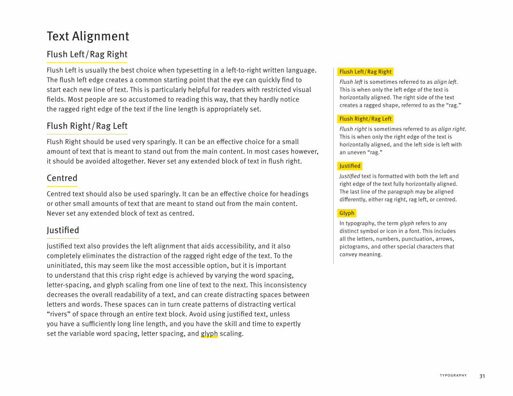
Text AlignmentFlush Left / Rag Right
Flush Left is usually the best choice when typesetting in a left-to-right written language. The flush left edge creates a common starting point that the eye can quickly find to start each new line of text. This is particularly helpful for readers with restricted visual fields. Most people are so accustomed to reading this way, that they hardly notice the ragged right edge of the text if the line length is appropriately set.
Flush Left / Rag Right
Flush left is sometimes referred to as align left. This is when only the left edge of the text is horizontally aligned. The right side of the text creates a ragged shape, referred to as the “rag.”
Flush Right / Rag Left
Flush Right should be used very sparingly. It can be an effective choice for a small amount of text that is meant to stand out from the main content. In most cases however, it should be avoided altogether. Never set any extended block of text in flush right.
Flush Right / Rag Left
Flush right is sometimes referred to as align right. This is when only the right edge of the text is horizontally aligned, and the left side is left with an uneven “rag.”
Centred
Centred text should also be used sparingly. It can be an effective choice for headings or other small amounts of text that are meant to stand out from the main content. Never set any extended block of text as centred.
Justified
Justified text also provides the left alignment that aids accessibility, and it also completely eliminates the distraction of the ragged right edge of the text. To the uninitiated, this may seem like the most accessible option, but it is important to understand that this crisp right edge is achieved by varying the word spacing, letter-spacing, and glyph scaling from one line of text to the next. This inconsistency decreases the overall readability of a text, and can create distracting spaces between letters and words. These spaces can in turn create patterns of distracting vertical “rivers” of space through an entire text block. Avoid using justified text, unless you have a sufficiently long line length, and you have the skill and time to expertly set the variable word spacing, letter spacing, and glyph scaling.
Justified
Justified text is formatted with both the left and right edge of the text fully horizontally aligned. The last line of the paragraph may be aligned differently, either rag right, rag left, or centred.
Glyph
In typography, the term glyph refers to any distinct symbol or icon in a font. This includes all the letters, numbers, punctuation, arrows, pictograms, and other special characters that convey meaning.
↑
ACCESS ABILITY 2 | A PRACTICAL HANDBOOK ON ACCESSIBLE GRAPHIC DESIGN32
Typographic FormattingLetter Case
People generally find text set in ALL CAPITAL LETTERS to be more difficult to read than text set in mixed-case, or Title Case. Typesetting in ALL CAPS should only be used sparingly for purposeful differentiation or emphasis. Avoid using it for any text longer than a few words.
Formatting
Typographic formatting such as bold, italic, and especially underline should be used sparingly, as they create visual distraction. Only use this type of formatting when it genuinely enhances communication for all readers. Avoid using italics and underline for emphasis, as they tend to reduce legibility and readability.
Hyphenating
Avoid hyphenating lines of text, as remembering partial words can add to a reader’s cognitive load. If you absolutely must hyphenate, make sure it is done so that the meaning of the entire word is strongly implied by the first part of the word shown before the hyphen.
Never manually insert a hyphen in order to hyphenate a line of text. Some screen readers will read the hyphen as an intrusive part of the text. For example, “he is bald-ing” may be read as “he is bald dash ing.” Only use soft-hyphens or discretionary hyphens, if you must hyphenate lines at all.
Small Vertical Dividers
If you are using a small vertical dividing line in your typography, ensure that it cannot be confused with any letters or numbers. Format it in such a way as to avoid this potential confusion, particularly if you are using a sans serif font.
Backgrounds
Avoid background images or other graphic elements behind text. The legibility and readability of a text benefit from the clarity provided by a clean, consistent background.
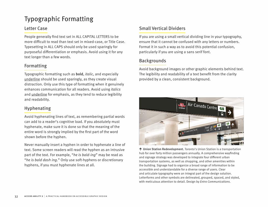
Union Station Redevelopment. Toronto’s Union Station is a transportation hub for over forty million passengers annually. A comprehensive wayfinding and signage strategy was developed to integrate four different urban transportation systems, as well as shopping, and other amenities within the building. Signage had to organize a broad range of information to be accessible and understandable for a diverse range of users. Clear and articulate typography were an integral part of the design solution. Letterforms and other symbols are delineated, grouped, spaced, and styled, with meticulous attention to detail. Design by Entro Communications.

33
SECTION 4
Digital MediaAt its absolute best, digital media offers the possibility to provide every single user a unique experience tailored to their individual needs and preferences.

↑
ACCESS ABILITY 2 | A PRACTICAL HANDBOOK ON ACCESSIBLE GRAPHIC DESIGN34
ACCESSIBLE DIGITAL MEDIA4
Digital AccessibilityDigital media is quickly becoming the preferred media for accessibility because of its potential for adaptability. However, it should be noted that digital media is not inherently more accessible. Like anything else, it has to be designed with accessibility in mind. An accessible design is one that every user can adapt to their personal ability, experience, perception, understanding, and technological requirements.
Assistive TechnologyOne of the key technological requirements for accessible design is robust compatibility with assistive technology. There are a myriad of technologies that a user may employ to support their usage of digital media. Screen Readers and Braille Displays are two of the most important technologies for designers to consider.
Refreshable Braille Display. A braille terminal with an integrated keyboard and customizable navigation controls. © ZLIKOVEC | DREAMSTIME
Screen Readers
Screen readers are an assistive software that is relied on by many users with severely diminished eyesight. The technology takes the text of a document and uses voice synthesis to read it aloud. The most popular screen readers are the expensive JAWS for Windows and the free NVDA for Windows, followed by the built-in VoiceOver for Apple products. If you haven’t already, you should seriously practice using screen reader software yourself. The hands-on experience is invaluable.
Braille Displays
Refreshable Braille displays (or Braille terminals) are an assistive hardware relied on by some users with both severely diminished eyesight and hearing. The technology takes the text of a document and displays it as Braille, utilizing round tipped pins which are raised or lowered through holes in a flat surface. This allows the user to read constantly updated content with their fingers, one line at a time.

↑
35DIGITAL MEDIA
Using Assistive TechnologiesSighted users can look at the entirety of the screen’s content at once. This persistent visual model of the information allows them to explore the page in a non-linear manner with relative ease. Assistive technologies, like screen readers, cannot communicate an image of the entire screen at once. They are limited to reading the content in a linear manner, one word at a time. Users of these technologies will often skip from one heading or section to another, as soon as they have read enough to determine its relevance. This linear reading imposes a certain amount of unwanted content on the user, who has to remember the order of content to build a mental model for navigating the page. The result is a high cognitive load. This process takes additional time, energy, and skill. An accessible digital design minimizes these demands on the user.
Input DevicesAnother key technological requirement for accessible design is robust compatibility with input devices. Users without eyesight are unlikely to use a mouse or other pointer device. Some people may use voice-recognition software to direct their computer with spoken commands, or word-prediction software to enhance their typing speed. Others may use hardware devices such as a single-handed keyboard, foot switches in place of a mouse, or eye gaze tracking technology. In most cases, ensuring full compatibility with the keyboard will accommodate adaptation to other input devices.
Beyond the diverse array of input devices that need to be supported, assume a wide variance in users’ ability to operate their devices. Regardless of the input device, people with limited motor control may face challenges in filling out forms or operating other user interface elements. An accessible digital design minimizes the requirements for dexterity or motor control.
Calgary Arts Development Website. This site has been designed for full keyboard compatibility. The client and the creative team are committed to ongoing accessibility testing while increasing the scope of the site. A detailed accessibility plan is used to prioritize the introduction of future features. Design by GOOD Company.

⯈
⯈
↑
⯈
⯈
ACCESS ABILITY 2 | A PRACTICAL HANDBOOK ON ACCESSIBLE GRAPHIC DESIGN36
ACCESSIBLE DIGITAL MEDIA4
Semantic StructureHow does a screen reader know what to communicate to the user? How can a screen reader user navigate from one heading to another? And how can a Braille display describe an image?
Semantic MarkupThe backbone of accessible digital media is a robust semantic structure. This means that the following should be able to be programmatically determined by the computing device.
Programmatically Determined
The term programmatically determined refers to information that can be automatically determined by the computing device, because the information is explicitly defined within the source file in a manner that the computing device understands.
The purpose of each page element.
The reading order of the content.
The hierarchical structure of the content.
The content itself.
Most of this is accomplished by semantic markup. Every element on a page should be marked-up to describe its function, purpose, role, etc. Semantic markup is an intrinsic part of HTML, JSON, and XML. It can also be applied to many other digital formats, including DOCX, INDD, and PDF. The ordering of these semantically defined elements is part of the semantic structure of the document.
Semantic TextThe content within this semantic structure should be formatted as machine-readable semantic text. Just like the page elements, the semantic text should be marked-up as well. Furthermore, semantic text should have semantically correct character usage.
Machine-readable
Machine-readable data, sometimes referred to as computer-readable data, refers to data that can easily be processed by a computer. Machine-readable data can automatically be transformed for human-readability across various formats.
Semantic Markup. An excerpt from this page marked up as semantic HTML.
37DIGITAL MEDIA
Semantic Character Usage
Most glyphs in a font have a clearly established name and semantic meaning. For instance, the “x” character has the semantic value of the letter x, while the “×” character has the semantic value of a multiplication sign. If we were to use the “x” character instead of a multiplication sign in a visual presentation, it would be unlikely to cause confusion for sighted readers. However, if a screen reader is processing the text, it doesn’t base its reading on the visual appearance of the characters. Its reading is based on the semantic values of the characters.
In semantic text, you should never use a character or symbol for its visual appearance. Specify characters for their meaning. Non-semantic character usage like this “Λ¢¢Є§§!ߣ€” is not ACCESSIBLE, no matter how it may visually appear. Always specify the most semantically correct characters for your communication intent. Non-semantic character usage can lead to confusion for assistive device users.
This doesn’t mean that designers have to make compromises in their visual presentation of semantic text. Designers should make full use of the mechanisms available to style semantic text to communicate visually as well.
Non-Text ContentText AlternativeAny non-text content needs to be supplemented with a text alternative (alt-text). This text can be converted by assistive technologies into whatever format the reader needs, including Braille or speech.
Non-text Content
Non-text content includes, but is not limited to, images, audio, video, and synchronized audio and video that comprise part of the meaning or utility of a webpage.
Whenever possible, this text-alternative should serve an equivalent purpose for the end-user. There are cases where this might be impossible, such as an audio-based test, or an audio-visual sensory experience. In these cases, the alt-text should at least provide a descriptive identification of the non-text content.
Non-Content
Some non-text elements aren’t really content at all. If an element is purely decorative, does not convey useful information, or provides visual formatting that does not affect the meaning of the content, it should not have any alt-text set. These non-content elements must instead be implemented in such a way that they will be ignored by assistive technology.

ACCESS ABILITY 2 | A PRACTICAL HANDBOOK ON ACCESSIBLE GRAPHIC DESIGN38
Writing Effective Alt-TextEffective alt-text doesn’t just provide useful descriptions of non-text content. It also respects the users time and is written with clarity, economy and structure.
Functionality
First and foremost, consider the function of the non-text content. What is it meant to communicate to the reader? For instance, if an image of the Twitter logo is being used as a link to the organization’s Twitter feed, the alt text could simply read:
Twitter feed.
When using an image as a link, the alt-text should specify where the user will be directed.
Relevance
Always consider the audience, context and intent of non-text content. What relevant information is this content intended to communicate? Sometimes a literal description is warranted, but often times describing the communication intent is more useful. Consider the following text alternative for an image.
Logo for the Registered Graphic Designers, comprised of a red rectangle containing the capital letters RGD in white, set in the typeface Classic Grotesque.
A description like this might be useful if the image was appearing in a book about logo design. However in most cases, a logo is used to communicate an entity’s name, and so the following alt-text would be more appropriate.
Registered Graphic Designers.
Embedded Text
If there’s text in the image, it needs to be included in the alt-text if it provides important information, or context for understanding the content. Here is an example:
The front page of the Globe and Mail Newspaper from July 21 1969 with the headline “MAN ON MOON.” The text continues: ‘‘’It’s pretty up here… a fine, soft surface.’ Talking Neil Armstrong into taking a first step.”
There is of course more text on the front page of this newspaper. Use your discretion to discern how much text is required to communicate the necessary message in the image.
Length
Effective alt-text is written with economy. It is usually one or two sentences long. However, there may be cases where only a couple words are needed, and other cases where more than a couple sentences are necessary. If a shorter description cannot communicate all of the relevant information being conveyed by an image, a longer description is warranted.
Structure
When writing a longer description, start with a concise alt-text to help the reader decide if they are interested in the longer description or not. Whenever possible, structure your alt-text writing to mention the most important details first. Ideally, details should be arranged in descending importance, so the reader can continue if they want to know more, or skip ahead when they’ve had enough.

39DIGITAL MEDIA
Objectivity
Avoid subjective judgements or opinions when writing alt-text. There is a fine line between making a useful inference about the intended meaning, and providing an assumptive subjective opinion. When you write alt-text, try to think of yourself as an objective and neutral journalist, giving the reader what they want to know in order to make up their own mind about the content.
Redundancy
When writing alt-text, avoid redundancy. Don’t repeat content that is already present on the page. For instance, if the text from The Globe and Mail newspaper from July 21 1969, is already included in the content of the page, the alt-text could simply read as follows.
Front page of The Globe and Mail Newspaper from July 21 1969.
Note that even this is redundant. A better approach might be to include no alt-text at all, and to instead format the image to remove it from the screen readers view.
Unnecessary Words
Don’t start your alt-text with the words “image of,” “picture of,” “video of,” “link to,” or any other similarly generic description that should be self-evident from the semantic structure. For instance, consider the following alt-text for an image.
Image of the Loch Ness Monster emerging from the water in daylight.
The first two words are extraneous, and they delay the user from reading the relevant meaning.
Necessary Words
In some cases however, describing the media more specifically could give additional important context. Consider the following two examples of alt-text.
Drawing of the Loch Ness Monster emerging from the water in daylight.
Photograph of the Loch Ness Monster emerging from the water in daylight.
In these cases, describing the form of the media makes a meaningful difference in how it might be considered.
Finish It
Lastly, always end your text with a period to provide a pause between elements.

↑
ACCESS ABILITY 2 | A PRACTICAL HANDBOOK ON ACCESSIBLE GRAPHIC DESIGN40
Time-Based MediaTime-based media refers to media that automatically changes its content and meaning over time, such as audio or video content. For this content, there are some additional considerations that need to be made.
Audio Video Content
For pre-recorded synchronized audio video content, both descriptive audio and timed captions should be provided. It may be tempting to rely on auto-transcription services to generate captions. In most cases these services will not provide anything that could reasonably be considered “equivalent content” for WCAG compliance.
To truly go above and beyond, consider providing captions for live synchronized audio video content as well.
Speech Based Audio Content
For speech based audio content, avoid having any background music or sounds that distract from the message being communicated. If there are ongoing background sounds, they should be at least 20 dB lower than the foreground speech content. If you wish to include background sounds that are typically louder than this, you should give the user the ability to turn off these sounds altogether. Furthermore, provide transcripts and captions for speech based audio content. Honda in Canada Website. Honda Canada’s website makes extensive use
of imagery and video. Underneath these non-text elements, full screen reader compatibility is delivered. Images that convey content have useful alt-text, while decorative images and animations are coded so that they are ignored by screen readers. Videos can all be paused and restarted, and have full subtitles whenever applicable. Videos without sound have the ‘muted’ attribute set in the code, and screen reader users are presented equivalent content through descriptive text. Design by Deloitte Digital.

⯈
⯈
⯈
⯈
41
ACCESSIBLE DIGITAL MEDIA4
DIGITAL MEDIA
Principles of Web AccessibilityThe Internet provides an unprecedented opportunity for humanity to connect and communicate. In order to realize this vision, we must design sites that are fully accessible to all users, regardless of their physical or cognitive abilities, technological requirements, education and experience.
The Law of the LandDesigning accessible websites is not only good business. In the province of Ontario, and a growing list other places, it is a legal requirement for websites to comply with the W3C’s WCAG 2.0. This internationally accepted standard has three levels of accessibility: A, AA and AAA.W3C
The W3C refers to the World Wide Web Consortium, an international community where member organizations, staff, and the public work together to develop open standards for the long-term growth of the World Wide Web.
WCAG
WCAG is the acronym for the Web Content Accessibility Guidelines. This document covers a wide range of recommendations for making web content more accessible. These guidelines are utilized in most web accessibility standards and compliance.
Currently in Ontario, all public sector organizations and any businesses or non-profit organizations with fifty or more employees (including all full-time, part-time, seasonal and contract employees within a calendar year) must meet WCAG 2.0 Level A for the following.
New websites.
Existing websites with a new web address.
Existing websites with significantly refreshed content, navigation, or look and feel.
Any web content posted after January 1, 2012.
Web Content
Web content refers to any information that may be found on a webpage, including but not limited to text, images, audio, video, and forms.
January 1, 2021 this standard is raised to WCAG 2.0 Level AA for all websites and any web content posted after January 1, 2012.
The WCAG 2.0 is available at w3.org/tr/wcag20/. Consult this official document when assessing legal compliance.

⯈
⯈
⯈
⯈
⯈
ACCESS ABILITY 2 | A PRACTICAL HANDBOOK ON ACCESSIBLE GRAPHIC DESIGN42
Four Principles of AccessibilityThe WCAG is organized around four principles of accessibility: Perceivable, Operable, Understandable, and Robust. Under each of these principles the WCAG lists guidelines and success criteria. Understanding these overarching principles can help a designer achieve more accessible results in any medium, even when no specific guidelines or criteria are available.
Perceivable
Information and user interface components must be presentable to users in ways they can perceive.
Most critically, this includes people who are blind, deaf, or both. This means that no content or functionality can be communicated through sound or visuals alone. Semantic text is a mandatory supplement for all elements, and it should ideally deliver equivalent functionality and information.
Operable
User interface components and navigation must be operable.
User interface components and navigation must be operable, regardless of the user’s physical abilities and the input device. Users must not just be able to operate the interface components, they should feel in control and well oriented at all times as well.
Understandable
Information and the operation of user interface must be understandable.
This means that content and interface must be understandable to all people including those with cognitive or perceptual limitations, and linguistic or other cultural differences. Furthermore, diversity of users’ education, experience, and skill should also be taken into account in the design.
Robust
Content must be robust enough that it can be interpreted by a wide variety of user agents, including assistive technologies.
Consider the wide range of abilities, circumstances, and environments that your users may potentially inhabit, and then consider the wide range of displays, browsers, input devices, and assistive technologies that they may rely on. Design for interoperability with the following.
Older technology including under-powered devices, outdated browsers, and low-bandwidth network connections.
Display sizes ranging from the smallest mobile device to the largest screen.
Screen magnifiers and the built-in zoom feature in most web browsers, often relied on by low-vision users.
Assistive technologies including Braille readers and screen readers.
Input devices ranging from mouse, to keyboard, to voice command software, and beyond.
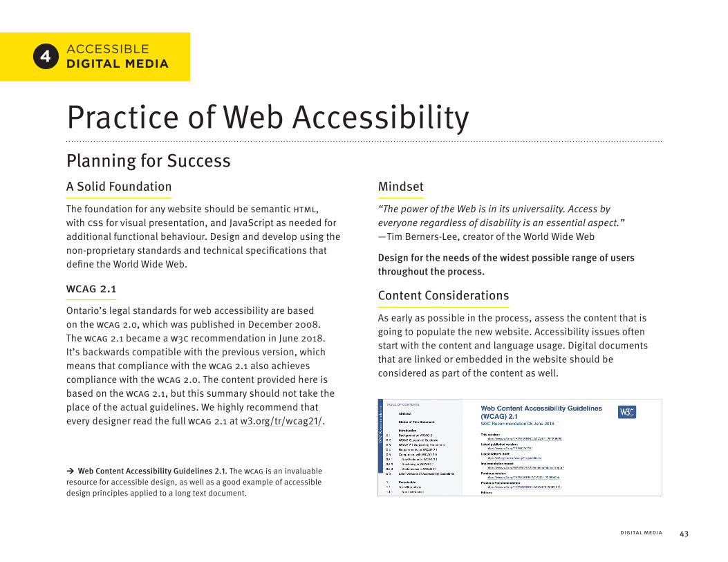
→
43
ACCESSIBLE DIGITAL MEDIA4
DIGITAL MEDIA
Practice of Web AccessibilityPlanning for SuccessA Solid Foundation
The foundation for any website should be semantic HTML, with CSS for visual presentation, and JavaScript as needed for additional functional behaviour. Design and develop using the non-proprietary standards and technical specifications that define the World Wide Web.
WCAG 2.1
Ontario’s legal standards for web accessibility are based on the WCAG 2.0, which was published in December 2008. The WCAG 2.1 became a W3C recommendation in June 2018. It’s backwards compatible with the previous version, which means that compliance with the WCAG 2.1 also achieves compliance with the WCAG 2.0. The content provided here is based on the WCAG 2.1, but this summary should not take the place of the actual guidelines. We highly recommend that every designer read the full WCAG 2.1 at w3.org/tr/wcag21/.
Mindset
“The power of the Web is in its universality. Access by everyone regardless of disability is an essential aspect.” — Tim Berners-Lee, creator of the World Wide Web.
Design for the needs of the widest possible range of users throughout the process.
Content Considerations
As early as possible in the process, assess the content that is going to populate the new website. Accessibility issues often start with the content and language usage. Digital documents that are linked or embedded in the website should be considered as part of the content as well.
Web Content Accessibility Guidelines 2.1. The WCAG is an invaluable resource for accessible design, as well as a good example of accessible design principles applied to a long text document.

ACCESS ABILITY 2 | A PRACTICAL HANDBOOK ON ACCESSIBLE GRAPHIC DESIGN44
Redesigns & RenovationsMany web design projects are some form of redesign or renovation. Before any serious work has started, ask the client if there is any content than can be decommissioned and removed altogether. The saves everyone time and money.
Next, perform an accessibility audit. Consider classifying issues into the following four categories.
1. Critical. A serious problem that will prevent people with disabilities from using the site.
2. Serious. A very frustrating problem that might prevent people with disabilities from using the site.
3. Moderate. A mildly frustrating problem that will not likely prevent people with disabilities from using the site.
4. Minor. An accessibility issue that is unlikely to cause problems for anyone.
Once accessibility issues are identified and classified, look at addressing critical issues in the site templates and reusable components. Focus on the elements that have the highest degree of usage and the most serious accessibility issues. Also consider prioritizing any forms or mechanisms that enable users to either provide feedback or ask for assistance.
The next phase of work might focus on individual pages and content. Use traffic analysis tools to identify the most visited content, and the paths that users take both within pages and throughout the site. Prioritize the most critical issues on the content with the highest impact.
Semantic StructureThe semantic structure of HTML 5 makes up the backbone for delivering an accessible experience. It is crucial that this code is valid according to current specifications. Non-standard, invalid or broken code can disproportionally affect those who rely on assistive technologies.
Language
Ensure that a website has been coded so that the default human language of the content in each page, passage, or phrase, can be programmatically determined.
Semantics
Utilize the full range of HTML 5’s semantic tags wherever appropriate. Avoid needlessly using <div> or <span> tags if a more semantically correct tag could be used.
Conversely, never specify a tag based on its visual appearance. For instance, there are many tags that will format text in italic, such as <cite> <dfn> <em> <i>, but each of these tags indicate a different semantic meaning. Only use a tag for the semantic meaning it represents.
If for some reason you want to format content without any semantic meaning, this is when you should use <div> and <span> tags styled with CSS.
Sequence
The sequence of content in the code should be the clearest most semantically correct order for the reader. Furthermore, the correct reading order of content must be able to be programmatically determined.

↑
45DIGITAL MEDIA
Headings
A page should be organized into sections, and further subdivided with semantic headings. These headings should describe the relevant topic or purpose of each subsection.
Links
The purpose of each link should be understandable from the link text alone. Don’t ever call a link something like “click here,” as this superfluous information will not help screen reader users identify the purpose of the link.
Describe clearly and succinctly where the link leads, or what its function is on the page. It can be more descriptively clear to use nouns within link text. Think carefully about the relationship between the link and its context, and try to prioritize using specific nouns in link names.
Component Names
The purpose of all user interface components should be able to be programmatically determined. All user interface components must also be named within the code. If the component has a visual presentation that includes text, then the name in the code must contain that text.
Non-Standard Interface Components
If you are using non-standard interface components, ensure that the name and role of all elements can be programmatically determined. Consider using WAI-ARIA to clarify this functionality.
WAI-ARIA
ARIA is the acronym for the Accessible Rich Internet Applications suite. This technical specification defines a way to make web applications more accessible to people with disabilities. It helps with dynamic content and advanced user interface controls developed with Ajax, HTML, JavaScript, and related technologies.
The state, properties, and values that are recorded by these user interface elements should be able to be programmatically set. Notifications of those changes should be available to all user agents. These status messages should be presented to the user without receiving focus.
Focus
In computing, the focus refers to the user interface element which is currently selected, and would receive any input actions from the user.Calgary Reads Website. This site features user-centric language and
semantic structure with clearly labeled links. Design by GOOD Company.
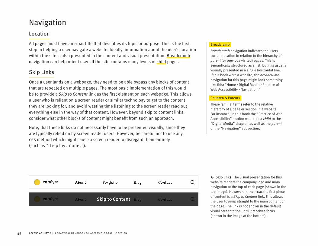
←
ACCESS ABILITY 2 | A PRACTICAL HANDBOOK ON ACCESSIBLE GRAPHIC DESIGN46
NavigationLocation
All pages must have an HTML title that describes its topic or purpose. This is the first step in helping a user navigate a website. Ideally, information about the user’s location within the site is also presented in the content and visual presentation. Breadcrumb navigation can help orient users if the site contains many levels of child pages.
Breadcrumb
Breadcrumb navigation indicates the users current location in relation to the hierarchy of parent (or previous visited) pages. This is semantically structured as a list, but it is usually visually presented in a single horizontal line. If this book were a website, the breadcrumb navigation for this page might look something like this: “Home > Digital Media > Practice of Web Accessibility > Navigation.”
Children & Parents
These familial terms refer to the relative hierarchy of a page or section in a website. For instance, in this book the “Practice of Web Accessibility” section would be a child to the “Digital Media” chapter, as well as the parent of the “Navigation” subsection.
Skip Links
Once a user lands on a webpage, they need to be able bypass any blocks of content that are repeated on multiple pages. The most basic implementation of this would be to provide a Skip to Content link as the first element on each webpage. This allows a user who is reliant on a screen reader or similar technology to get to the content they are looking for, and avoid wasting time listening to the screen reader read out everything else in the way of that content. However, beyond skip to content links, consider what other blocks of content might benefit from such an approach.
Note, that these links do not necessarily have to be presented visually, since they are typically relied on by screen reader users. However, be careful not to use any CSS method which might cause a screen reader to disregard them entirely (such as “display: none;”).
Skip links. The visual presentation for this website renders the company logo and main navigation at the top of each page (shown in the top image). However, in the HTML the first piece of content is a Skip to Content link. This allows the user to jump straight to the main content on the page. The link is not shown in the default visual presentation until it receives focus (shown in the image at the bottom).
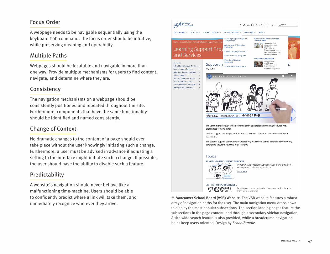
↑
47DIGITAL MEDIA
Focus Order
A webpage needs to be navigable sequentially using the keyboard tab command. The focus order should be intuitive, while preserving meaning and operability.
Multiple Paths
Webpages should be locatable and navigable in more than one way. Provide multiple mechanisms for users to find content, navigate, and determine where they are.
Consistency
The navigation mechanisms on a webpage should be consistently positioned and repeated throughout the site. Furthermore, components that have the same functionality should be identified and named consistently.
Change of Context
No dramatic changes to the content of a page should ever take place without the user knowingly initiating such a change. Furthermore, a user must be advised in advance if adjusting a setting to the interface might initiate such a change. If possible, the user should have the ability to disable such a feature.
Predictability
A website’s navigation should never behave like a malfunctioning time-machine. Users should be able to confidently predict where a link will take them, and immediately recognize wherever they arrive.
Vancouver School Board (VSB) Website. The VSB website features a robust array of navigation paths for the user. The main navigation menu drops down to display the most popular subsections. The section landing pages feature the subsections in the page content, and through a secondary sidebar navigation. A site-wide search feature is also provided, while a breadcrumb navigation helps keep users oriented. Design by SchoolBundle.

↑
ACCESS ABILITY 2 | A PRACTICAL HANDBOOK ON ACCESSIBLE GRAPHIC DESIGN48
Input MechanismsAll functionality on a website must be operable through the keyboard. This is the most robustly adaptable input mechanism, relied on by many users with disabilities and those who require the use of assistive technology. In order to ensure that this keyboard access is truly accessible, a few key considerations need to be made.
Focus
The keyboard focus indicator must always be visible. Do not customize it unless the modification increases the focus’ noticeability.
Focus Indicator
The element in focus has a visual focus indicator applied to it by the web browser. Often this looks like a halo or outline. The focus indicator is critical for sighted users who rely on the keyboard for operation.
Traps
If the keyboard focus can be moved onto an element, then the focus must also be able to be moved off of that element using the keyboard. Ideally this should use the unmodified arrow or tab key commands. If a special keyboard command is required, that must be made clear to the user. When this criteria is not met, the end result is the dreaded “keyboard trap,” where the user becomes stuck on a page element, and cannot navigate away.
Shortcuts
If a page component utilizes keyboard shortcuts comprised of only standard printable characters, then those shortcuts should only be active when that page component has keyboard focus. Otherwise, the user needs to have the ability to turn these shortcuts off, or to re-map them to non-printable keyboard characters, such as [Ctrl], [Alt], etc.
Timings
In order to maintain keyboard accessibility, never require the user to perform keystrokes with specific timings. A good user interface should never feel like a test of skill.
Multiple Input Mechanisms
It’s important to note that although keyboard access is prioritized for accessibility, it shouldn’t be the only input mechanism that is supported. Furthermore, whenever possible allow the user to concurrently use more than one input mechanism at a time.
Focus indication. The browser’s focus indicator can be difficult to see in some circumstances. The image on the top shows the default state of a button. The image at the bottom left shows the focus state in Google Chrome, and the image at the bottom centre shows the focus state in Mozilla Firefox. The image on the bottom right shows the latter focus state styled to augment its visibility.

↑
49DIGITAL MEDIA
InteractionsHover & Focus
The hover and focus states of an element should be used to clarify the position of the mouse pointer or the keyboard focus. In some cases, the hover or focus states may also be used to reveal additional content, such as sub-menus, custom tooltips, and other non-modal popups. If hover or focus is used to reveal additional content, the following considerations needs to be made.
Hover & Hover State
Hover refers to when the mouse pointer is positioned on an element, but has not clicked on it or dragged it. The hover state refers to the visual state of that element when the hover event has been triggered.
Hoverable. If the additional content is triggered by a hover event, then the user must be able to continue to move their pointer around over the hover area, without the additional content disappearing. Keep in mind that hover events may not trigger on a touch screen, so you should design contingencies for revealing this additional content.
Dismissible. If the additional content obscures existing content on a page, the user must be able to dismiss the additional content without moving the hover or focus.
Persistent. The additional content revealed on the hover or focus event must remain persistently visible, until the user dismisses it.
While a hover or focus state may be used to reveal additional information, it must not have any major change or impact on the rest of the page content. The effect of a hover or focus event should always be localized, so as not to overwhelm or confuse the user.
Pointer Events
Up Events. When using the pointer to click on an element, the functionality of the element should be executed on the up-event. This is the standard behaviour most of us are familiar with, and it gives the user the ability to abort the function by moving the pointer off of the element before releasing the click.
Down Events. If an action is executed on the down event, a mechanism must be made available for the user to abort or undo the function.
Ontario Trails Website. The site is designed so that the hover triggered drop-down menu only obscures the decorative header image. As a user scrolls down the page, the drop down menu scrolls away so that it never interferes with the site content or functionality. Design by Context Creative.

↑
ACCESS ABILITY 2 | A PRACTICAL HANDBOOK ON ACCESSIBLE GRAPHIC DESIGN50
Target Size
The size of the target for pointer inputs should ideally be at least 44 by 44 CSS pixels. If multiple instances of the same link are present on a page, only one instance would need to be this large. Text links that are integrated into a sentence or block of text are exempt from this requirement.
Gestures
All functionality that is controlled by the user making a multi-point or path based gesture must also be operable without these gestures. For example, a map interface that allows the user to drag or pan in order to view a different portion of the map, could also have directional buttons that perform the same function. Of≈course this functionality would also have to be operable though keyboard input.
Movements
Whenever possible, any functionality that utilizes the user’s body or device motion for input should also be operable without these movements. Furthermore, users must have the ability to disable motion or movement based input altogether, in order to prevent any accidental or otherwise unwanted input.
The new Scotiabank Mobile App. Throughout the development of the app, inclusive usability testing was conducted regularly. Customers with various disabilities were invited to Scotiabank to try prototypes, and their valuable insights and feedback guided future iterations. The app features dynamic text resizing, sound and haptic feedback to confirm user action, a layout that minimizes hand reach, tappable areas that are at least 48 by 48 px, and screen reader compatibility for TalkBack and VoiceOver. The Help Centre has been redesigned to provide contextual help and support that’s understandable for users with a wide range of cognitive abilities. Design by Scotiabank.

↑
51DIGITAL MEDIA
.
.
.
.
FormsForm Fields
Any input form collecting information about the user must have its purpose clearly identified to both the user, and the underlying user-agent.
User Agent
In computing, a user agent is the software that is acting on behalf of the user. On the Internet this typically refers to the web browser, although it may also refer to other software and technologies.
It is preferable to have the visual label for input fields to be positioned above the field. Never rely on the hint text in a text input field as the only means to communicate the purpose of the input field to the user.
User Error
Nobody likes making mistakes. A poorly designed website can leave the user feeling frustrated or incompetent, while a well designed website can make the user feel like an efficient expert. Implement the following mechanisms to help users avoid and correct mistakes when entering form data.
Error Prevention. First and foremost, use clear instructions and form field labels so that the user knows what is expected of them. Next, keep the user’s input data visible to them, so that they can identify and correct any potential error with ease. If the data is hidden from the user (as is common for a password entry field), allow the user to be able to toggle the visibility of this information if possible.
Error Detection. Whenever possible, detect all input errors automatically.
Error Correction. If an input error can be automatically corrected without the user’s attention, do it! An example of this would be an input field for entering a phone number, that automatically corrects the formatting of the number to meet the form’s requirements.
Error Identification. If an input error can’t be corrected without the user’s attention, clearly identify the error to the user, and explain it in text form. Do not require the user to input all information again, and if possible, provide suggested corrections for the user.
WestJet.com Accessibility Redesign Project. The WestJet website is an exceptional example of accessible web design. Its flight booking form makes extensive use of error prevention techniques. Design by the WestJet.
ACCESS ABILITY 2 | A PRACTICAL HANDBOOK ON ACCESSIBLE GRAPHIC DESIGN52
Failsafe Mechanisms
It is not always possible to detect user errors in form fields. For this reason, it is necessary to implement one of the following two mechanisms.
Undo. The user must be able to undo or reverse the form submission.
Confirm. Upon initiating the submission of the form, the user must be given the opportunity to review, correct, and confirm information.
This is good practice in any form design, but it’s critical when a form submission could have serious ramifications for the user, such as deleting their data, or agreeing to financial or legal commitments.
CAPTCHAs
Do you think you hate CAPTCHAs now? Please go and try one with your eyes closed and your speakers off. Come back when you figure it out. Go ahead, I’ll wait for you here…
CAPTCHA
CAPTCHA is an acronym for “Completely Automated Public Turing test to tell Computers and Humans Apart.” These usually involve asking the user to type in text is displayed in an obscured image or audio file.
If you must verify that a user is a human, make sure that you are indeed testing for bots, and not testing for disability. All CAPTCHAs must accommodate a suitably diverse array of input and output modalities, so that any human being can pass through them without discrimination.
Help!
Whenever possible, provide context-sensitive help for the user during any form input process.
Timed ElementsDifferent people can require dramatically different amounts of time to engage with content. If an element has a time limit of less than twenty hours, the user should have access to at least one of the following mechanisms.
Disable. Before encountering the time limit, the user can disable it altogether.
Adjust. Before encountering the time limit, the user can adjust it to be at least ten times longer than the default setting.
Extend. Before the time limit expires, the user is given at least twenty seconds to extend the time limit by performing a simple action. The user must be able to extend the time limit this way at least ten times.
Ideally, a time limit should not be made a part of any element unless it is absolutely essential.
Timeouts
A user must be warned in advance if exceeding a time limit may result in a data loss, unless the data is preserved for at least twenty hours of user inactivity. Ideally, if a timeout occurs, a user should be able to continue their activity with all data intact when they login again.

↑
53DIGITAL MEDIA
Visual PresentationGo with the Flow
The visual presentation shouldn’t require any specific screen size, orientation, device, browser, or any other limitations on the part of the user. Instead, the design and content should gracefully reflow and wrap from one viewport to another, regardless of the size or zoom level. This is sometimes referred to as responsive or liquid design, and this flexibility is at the core of an accessible visual presentation.
Viewport
The viewport is the area of the web browser window that displays the rendered content of the webpage. The viewport frames and constrains the content on the users display.
Orientation
Don’t restrict functionality or the display of content to a single viewport orientation, such as portrait or landscape, unless this is necessary.
Minimum Size
Design to reflow to a minimum viewport size of 320 CSS pixels wide, and 256 CSS pixels high. At this size, there must be no loss of content or functionality, and scrolling must not be required in more than one direction. This ensures that a website is responsive for a wide array of devices, including small low resolution smartphones. Furthermore, this also increases accessibility for users with impaired eyesight. When a user zooms in to resize content so that it may be more easily read, this changes the effective resolution of their viewport. If the user has a 1280 by 1024 pixel viewport and zooms in 400%, content will now be reflowed for an effective viewport of, you guessed it, 320 by 256 pixels.
Scrolling
Whenever possible, scrolling should be confined to a single axis only. Never require the user to scroll both vertically and horizontally unless it’s necessary to accommodate desirable functionality. Horizontal scrolling should generally be avoided, and should not be applied to long text as this can add to cognitive load.
Hillsdale Investment Management Website. This Hillside site is designed to be accessible to a broad range of existing and prospective clients. It features WCAG compliant animation, and clear navigation throughout. The design is fully responsive, and the layout stacks and resizes text and imagery as necessary for small screens. Design by Hambly & Woolley.

↑
ACCESS ABILITY 2 | A PRACTICAL HANDBOOK ON ACCESSIBLE GRAPHIC DESIGN54
Text Justification
Don’t use full justified text in web design. Ever.
Text Re-Formatting
The user needs to be able to resize and reformat text to meet their personal accessibility needs, without the page layout “breaking.” The following independent adjustments should be possible without loss of content, functionality, or visual quality. Furthermore, these adjustments should not require additional horizontal scrolling on the part of the user.
Font Size. Accommodate font sizes increased by at least 200%.
Line-Height. Accommodate line-height set to at least 1.5 times the font size.
Paragraph Spacing. Accommodate paragraph spacing set to at least 2 times the font size.
Letter Spacing. Accommodate character tracking set to at least 0.12 times the font size.
Word Spacing. Accommodate word spacing set to at least 0.16 times the font size.
Text Contrast
Most text should have a minimum contrast ratio of 4.5:1, while large-scale text can have a contrast ratio as low as 3:1. Text that is part of branding, decoration, or inactive user interface components has no contrast requirement.
If you are looking to do more than the bare minimum, aim for a text contrast ratio of 4.5:1 for large-scale text, and 7:1 for smaller text elements.
Consider providing a mechanism that will allow foreground and background colours to be selected by the user. In order to more easily achieve this, you could use an existing framework such as Infusion, which allows for the user to customize the visual presentation of text and save their individual preferences. More information on Infusion is provided in the resources section of this book.
Infusion. The implemented framework being used to increase font size, line spacing, and colour contrast.

→
55DIGITAL MEDIA
Non-Text Contrast
User interface components and other graphical objects required to operate functionality or to understand content must have a contrast ratio of at least 3:1 against adjacent colours. Inactive user interface components are exempt from this requirement.
Animation
First and foremost, nothing on a page should ever flash more than three times in a one second period. This is critically important to stay safely below the threshold that may induce seizures for some people.
Any inessential moving, blinking, scrolling, or auto-updating information that runs while other content is presented to the user can diminish accessibility. For this reason, if the animation starts automatically and lasts for more than five seconds, it must have clearly visible user controls to either pause, stop, or hide the element.
Carousels, Sliders, and Slideshows are considered inessential, and therefore require the aforementioned controls.
Preloader animations that occur when functionality is not available, can be considered essential, and are exempt from this criteria.
Ideally, an accessible user interface should allow the user to disable any animation that is triggered by user interaction.
Audio
Any audio that plays automatically for more than three seconds requires clearly perceptible controls. The user needs to be able to adjust the volume of that audio element, or to be able to pause or stop the audio altogether.
Visual Equivalency
Information or instruction for understanding or operating content can never be communicated through visual presentation alone. Any information, structure, or relationship conveyed through the visual presentation must be able to be programmatically determined, or is otherwise communicated in the text. When visual spatial indicators such as shape, size, location, or orientation are used to communicate information, there must also be non-visual equivalents provided. This supplemental representation will increase accessibility and clarity for all users.
Animation controls. Ensure that any carousels, sliders, and slideshows have clear controls to stop the motion or changing content. If the controls are located in front of the content, ensure that the buttons are designed to have enough colour contrast against any content that might appear in the background.

↑
ACCESS ABILITY 2 | A PRACTICAL HANDBOOK ON ACCESSIBLE GRAPHIC DESIGN56
ACCESSIBLE DIGITAL MEDIA4
Testing for Web AccessibilityDiverse User TestingNothing can take the place of usability testing by real users. When you conduct usability testing, always include people with a diverse range of disabilities. If possible, have them use their own preferred technology, settings, and environment. This often varies considerably from one user to the next.
Usability Testing
Usability testing is a method of evaluating a product, service, or system by testing it with people who are representative of the user group.
If you are providing the testing environment, consider the accessibility of the facility and any included accommodations. Are there adequate elevators and ramps? Wheelchair accessible bathrooms? Adequate room to accommodate mobility devices? Time and space for any necessary breaks? A nice bowl of water and a place to rest for any service animals? Always remember to ensure that the user testing environment and procedures themselves are accessible.
Test Early, and Test Often
Accessibility testing should be a part of the ongoing testing of any interactive project. While the importance of real user testing probably can’t be overstressed, you should address any known accessibility barriers before you have users with disabilities test a project. Consider using the following methods to detect accessibility issues yourself.
Manual Accessibility Testing MethodsWhen manually testing a website, always test everything with keyboard input. This will help ensure robust compatibility with a wide variety of input devices, as keyboard inputs can be remapped to various other input mechanisms.
Usability testing. A person with cerebral palsy using a computer through a combination of preferred input technologies, including touch screen and voice command. © BELAHOCHE | DREAMSTIME

↑
57DIGITAL MEDIA
Disable Technologies
Try selectively disabling the following technologies to quickly assess the potential accessibility of a webpage.
Disable Scripting and verify that all content is still available.
Disable CSS and verify that the content has a logical reading flow and informative hierarchy. Furthermore, verify that no background or decorative images are rendering.
Disable Images and verify that the content is still understandable, and that missing images are sufficiently described.
Pay special attention to any applets, plug-ins, or other novel elements that may not conform perfectly to web standard. Test everything with keyboard input.
Screen Reader Testing
Test with dedicated screen reader software. When testing for screen reader compatibility, be aware that not all screen readers function in the same way, or provide the identical output.
Most desktop screen reader users utilize the Windows environment with either JAWS or NVDA. Most mobile screen reader users utilize the iOS environment with VoiceOver.
While a website should be equally accessible to all devices and browsers, it may be useful to note that Firefox (in Windows) is the most commonly used browser with assistive technologies.
Look at things Differently
Mozilla Firefox Accessibility Inspector. The Firefox web browser has a powerful built-in feature called the Accessibility Inspector. It previews how the code of a webpage will be translated into objects for assistive technologies.
NoCoffee Vision Simulator. This web browser plugin for Chrome simulates impaired vision within the browser viewport. accessgarage.wordpress.com/2013/02/09/458
NoCoffee Vision Simulator. The browser plugin being used to blur and reduce the contrast of the visual presentation.

ACCESS ABILITY 2 | A PRACTICAL HANDBOOK ON ACCESSIBLE GRAPHIC DESIGN58
Software Based Accessibility TestingTools that Validate Code
Always ensure that your code is valid. When validating code, always validate markup first, and style second.
W3C Markup Validation Service. This site provides a validator for the markup of Web documents in HTML, XHTML, SMIL, MATHML, and more. validator.w3.org
W3C CSS Validation Service. This site provides a validator for Cascading Style Sheets (CSS) and XHTML documents with embedded styles. jigsaw.w3.org/css-validator
Tools that only assess Colour Contrast
While most accessibility compliance software will also check for colour contrast issues, dedicated colour contrast analysis software can provide advanced functionality and more powerful remediation features.
Colour Contrast Analyser. This desktop application for macOS & Windows can be used to analyze the colour contrast of any elements that appears on a computer screen. developer.paciellogroup.com/resources/contrastanalyser/
Kontrast. This web browser plugin for Chrome & Firefox can be used to check the colour contrast of a webpage, and then adjust those colours in real-time within the browser. getkontrast.now.sh
Tanaguru Contrast Finder. This webpage can help you adjust colour pairings in order to meet WCAG compliance. contrast-finder.tanaguru.com
Tools that assess Colour Contrast & Accessibility Compliance
While software cannot ensure that something is effectively accessible to a real person, it can help quickly detect some issues with compliance.
AChecker. This site checks single HTML pages for conformance with accessibility standards to ensure that the content can be accessed by everyone. achecker.ca/checker
WAVE Web Accessibility Evaluation Tool. This site provides an excellent web accessibility evaluation tool for manually reviewing a pages accessibility compliance. wave.webaim.org
WAVE Web Accessibility Evaluation Tool Browser Extensions. This browser plugin for Chrome or Firefox provides WAVE accessibility analysis technology directly in the browser. wave.webaim.org/extension/
Axe Developer Tools. These accessibility testing tools can be integrated into Chrome & Firefox using browser plugins, and can also be accessed through Android and iOS apps. deque.com/axe
Dynolitics. This enterprise level accessibility reporting service will scan and review an entire website for accessibility problems using WAVE accessibility analysis technology. dinolytics.com

↑
59DIGITAL MEDIA
Maintaining AccessibilityMany websites are a continuous work in progress. Content is updated and expanded, and new features and functionality are added over time. It is entirely possible for a highly accessible website to gradually become less and less accessible over time. Plan, design, and train for the ongoing maintenance of the site and its accessibility standards.
1. Make sure that accessibility has been openly discussed with key stakeholders throughout the process, starting from the beginning.
2. Choose development tools, frameworks, platforms, and technologies that are conducive to supporting accessibility.
3. Implement technology that will automatically update the site map or other navigational mechanisms as the site evolves.
4. Comment code, and annotate the back-end interface with any relevant instructions for maintaining accessibility.
5. Create a style guide for stakeholders who will be working with the site. Set policies and develop training.
6. Make sure there are highly accessible mechanisms in place for users to report any potential issues.
7. Ensure that there is adequate ongoing accessibility testing included as part of the post-launch maintenance program. Always include people with disabilities in the testing process.
WAVE Browser Extension. This browser plugin analyzes a webpage and notates accessibility errors, alerts, features, structural elements, and relevant HTML and ARIA elements. It provides descriptions of accessibility criteria as well as recommendations for addressing issues.

ACCESS ABILITY 2 | A PRACTICAL HANDBOOK ON ACCESSIBLE GRAPHIC DESIGN60
ACCESSIBLE DIGITAL MEDIA4
Office DocumentsDigital documents can be read on screen, or printed on paper. As a result, they need to incorporate accessibility practices from both print and digital design.
Digital document accessibility is also affected by how the authoring application is used to format and structure the document. The software’s built-in tools must be used for their intended communication function. For specific details on how to achieve this with various applications, we recommend referencing the Accessible Digital Office Document (ADOD) Project at adod.idrc.ocad.ca. This site provides instructions on how to create accessible office documents across a wide variety of software. It also provides recommendations for choosing accessible office applications for your organization.
All Office DocumentsWhether a document is a presentation, spreadsheet, or word processor document, a number of common considerations apply.
Alt-Text
All the principles of good digital design apply to office documents, including the need for non-text content to be described with effective alt-text.
Charts & Graphs
Never manually draw a chart or graph. Data visualizations should be created with the built-in tools dedicated to this purposes. Ensure that all chart or graph titles, axis titles, and data labels, are properly defined using the dedicated features.
Markup
Accessible office documents require semantic markup. This is accomplished in part by using paragraph styles. Use the full range of built-in default styles to add the needed markup for accessibility. Avoid creating custom styles if possible. You can edit the appearance of these paragraph styles without affecting their semantic utility.
Paragraph Styles
Paragraph styles are attributes that are applied to blocks of text. Some common styles include Title, Subtitle, Heading 1, Heading 2, Paragraph, etc. Rather than formatting a heading in bold or a larger font size, simply choose the correct style attribute for the element instead.

↑
61DIGITAL MEDIA
Word Processor DocumentsWord processor documents also require the following considerations. Whether you are working in Apple’s Pages, Google Docs, LibreOffice Writer, Microsoft Word, or any other major word processing software, the basic principles are the same.
Anchor Images
When placing an image in a document, always set the image to display as an inline object. You will then need to anchor the image to a specific place in the text. This will help ensure that a screen reader will read the content in the correct order.
Structure
Use the built-in features when structuring document content. This includes, but is not limited to breaks, columns, footers, lists, and more.
Tables
Never manually draw a table. Tables should be created with the dedicated table tools. Ensure that the table title and header cells are all properly defined using the dedicated features.
Paragraphs Styles. Applying paragraph styles in Google Docs.
Spreadsheet DocumentsSpreadsheet documents also require the following considerations. Whether you are working in Apple’s Numbers, Google Sheets, LibreOffice Calc, Microsoft Excel, or any other major spreadsheet software, the basic principles are the same.
Define the Cells
Ensure that the title, header cells, and all other cells with a special function are properly defined using the built-in features. If this type of information is presented in regular table cells, assistive technologies will not be able to interpret it properly.
Describe the Functionality
Add a description to the top of the spreadsheet that explains how to navigate the document. A brief plain language explanation will provide additional context for all users, especially those reliant on a screen reader. An example of this might read like the following: “This spreadsheet contains three data tables. The first begins at cell A3 and lists rental revenue. The second begins at cell A17 and lists addresses. The third begins at cell A34 and lists landlord names.”

↑
ACCESS ABILITY 2 | A PRACTICAL HANDBOOK ON ACCESSIBLE GRAPHIC DESIGN62
ACCESSIBLE DIGITAL MEDIA4
Accessible PDFsIn order for a PDF to be accessible, the fonts cannot be converted to outlines. The content needs to be ordered with a hierarchical structure, and the reading flow must follow in a linear path. All document content needs to be correctly tagged, and any non-text content needs to have descriptive alt-text specified.
Accessible Reading OrderA PDF has both a Tag Order and a Reading Order. The Reading Order reflects the underlying XML structure of the document, but paradoxically it is no longer the dominant technology used to set the reading order for assistive technologies. When we talk about setting the reading order for a PDF, we are more concerned with the Tag Order which has become the dominant standard for setting the reading order for assistive technology.
Some legacy technologies continues to rely on the underlying XML structure for the reading order of a PDF. In order to maximize compatibility, the order of this structure should still be considered. The XML structure is set through the Structure panel in InDesign, and testable in the Reading Order panel in Acrobat Pro. However, since the Tag Order is now mandated by ISO PDF standards for setting the reading order, this is the method we will be reviewing here in detail.
Tag order. Reviewing the document tag reading order in Acrobat Pro.

63DIGITAL MEDIA
Working in InDesignThe majority of the work needed to ensure a PDF is accessible can be accomplished within InDesign itself. Please note, you will need to be using InDesign CS6 or later.
Tagging
Similar to an HTML page, the semantic structure of PDF needs to be outlined and tagged for screen readers.
Artifacts. In PDFs, Artifacts are page elements that are not part of the content, such as decorative elements, backgrounds, running headers, or page numbers. When these elements are tagged as Artifact, screen readers will know to ignore them. The Artifact tag should also be used to remove any non-semantic character usage from the reading flow.
Running Headers or Footers. These page elements are recommended in order to help sighted users orient themselves within a document. However, these elements are intrusive for screen reader users, and should be kept out of the reading flow. Tag them as Artifact so that they are skipped by screen readers.
Figures. In PDFs, Figures are visual elements that are not purely decorative, and are meant to convey content, such as an illustrative photo or diagram. These items should be tagged as Figure and have alt-text set for them.
Objects. Text objects should be tagged as either Article or Story. The story tag denotes a section within an Article. Non-text objects should be tagged as either Artifact or Figure.
Styles. For designers who already use Paragraph Styles, this process does not add much extra work at all. In the Style Option dialog box, go to the last section called Export Tagging. Under the subheading PDF you can specify the PDF tag from drop-down menu of P, H, H1, H2, H3, H4, H5, H6, or Artifact.
Lists & Tables. For creating semantically tagged lists, use InDesign’s built-in list features. For tables, use InDesign’s built-in table features, and be sure to properly label all columns and rows etc. This is all that is required to ensure that InDesign tags these items correctly upon export.
Additional Information
Beyond simply setting tags, some elements need additional properties to be specified.
Alt-Text. Always specify Alt-Text for every item that has been tagged as a Figure. In order to set the alt-text for objects, open the [ Object > Object Export Options ] panel.
Hyperlinks. Write descriptive names for each hyperlink that clearly indicate where the link will lead.
Metadata. The document title must be set in the document metadata. Consider also setting the metadata for the document description and other information that may be useful to the reader.

ACCESS ABILITY 2 | A PRACTICAL HANDBOOK ON ACCESSIBLE GRAPHIC DESIGN64
Designing for Reading Flow
Text Content. The text of your document makes up the backbone of the reading flow. The easiest way to set the flow of text is by simply threading all text frames on a page. Even better, ensure that as much of the document as possible is threaded as a continuous story. Avoid using any extraneous objects or text frames. The closer you can structure your document to this ideal state, the easier it will be to correct any flow issues later.
Within the Text. Do not use soft returns / forced line breaks for visual aesthetics. Only use them when you want to indicate that a line of text is finished. Otherwise, use discretionary line breaks, non-breaking spaces, the No-Break property, and other non-semantic elements, in order to achieve the same visual effect.
Non-Text Content. All non-text objects (such as images and diagrams) that are part of the content of the document need to be anchored inline within the text flow. When a screen reader encounters an anchor for a non-text object, it will read the alt-text that has been set for that object. Make sure that the anchor is positioned in the exact spot within the text flow where the alt-text would make the most sense.
Adjusting the Reading Flow
You can adjust the reading order by setting the Tag Order using the Articles panel. On-screen objects can be dragged into the panel, where they can be grouped and arranged into the desired reading order. The visual layout is not affected by changes ↑made in the Articles panels. In the Articles submenu, make sure that Use For Reading Order In Tagged PDF is enabled, in order for the reading order to export properly.
Additional Navigation
While internal navigation links are not a mandatory part of an accessible PDF, they can make an appreciable difference in improving the document’s accessibility. Consider adding bookmarks, cross-references, and a table of contents. These navigational mechanisms can allow a screen reader user to jump around and explore outside of the linear flow of the document. Ensure that any navigational mechanisms also allow the reader to return to their previous place within the content.
Articles panel. Setting the reading order of tags in InDesign’s Articles panel.

⯈
⯈
⯈
⯈
⯈
→
65DIGITAL MEDIA
Exporting from InDesignPDF Settings
When exporting a PDF from InDesign, ensure the following options are set.
In the General options, enable Create Tagged PDF.
In the Advanced options, Display Title should be set to Document Title, and the Language must be set accurately for compatibility with screen readers.
If the export format has been specified as an Adobe PDF (Interactive), the following options will need to be set.
In the General options, ensure that Forms and Media is set to Include All, and enable Use Structure for Tab Order.
If the export format has been specified as an Adobe PDF (Print), the following options will need to be set.
Set the Compatibility to Acrobat 6 (PDF 1.5)
In the General options, enable both Bookmarks, and Hyperlinks.
Note that animation, audio, video, interactive buttons, and form fields, will not be exported if Adobe PDF (Print) has been selected.
PDF Compression
File size plays a role in the accessibility of a PDF. Not everyone has equal access to computing power and high bandwidth Internet connections. At the same time, a PDF with highly compressed low-resolution imagery is less accessible to those with vision difficulties. Your PDF should display clearly when zoomed in up to 200%.
PDF Compression Settings
Optimize for file size by resampling images over 150 ppi to 144 ppi, and select the Medium Image Quality setting. This should provide a minimum image quality for accessibility.
Optimize for image quality by resampling images over 300 ppi to 288 ppi, and select either the Medium or High Image Quality setting. Consider providing users the option of both a minimum image quality and a higher image quality version.
Image compression. Recommended settings for the smallest file size with a minimum image quality for accessibility.

←
ACCESS ABILITY 2 | A PRACTICAL HANDBOOK ON ACCESSIBLE GRAPHIC DESIGN66
Finishing in Acrobat ProSet the Tab Order
If the document was exported as an Adobe PDF (Print), the Tab Order must now be manually set in order for users to be able to navigate the document with a keyboard as expected. With the PDF open in Acrobat Pro, follow these steps.
1. Open the Page Thumbnails and select all the pages in the document.
2. With those pages still selected, open the Page Properties… dialog box.
3. Set the Tab Order to Use Document Structure.
4. Press OK, and Save the document.
Accessibility Check
Always perform Acrobat Pro’s automated Full Check for accessibility. Fix any issues it detects. It is important to note that this check cannot verify if a document is effectively accessible or not, but it can detect some common types of accessibility problems. Beyond this check, manual verification is required for the following items.
Interactivity & Form Fields. All interactivity and form fields should be tested.
Tags Panel. Enable the Tags panel to see how the document structure will be interpreted by a screen reader or other assistive technology.
Most problems can be fixed using Acrobat Pro’s Accessibility Tools. However, you might find it more efficient to fix issues in InDesign, and then re-export the PDF to Acrobat Pro for testing.
Keep it Clean
Make sure that the PDF contains no extraneous data. PDFs created in InDesign and Acrobat Pro are usually very efficient, but PDFs created in Adobe Illustrator and other software can contain data that needlessly increases the file size by a significant amount. Use Acrobat Pro to clean out any extraneous data, but be sure not to remove any of the information you have added for accessibility.
Accessibility testing. Running Acrobat Pro’s Accessibility Checker.

67
SECTION 5
Physical MediaAccessible design requires careful consideration of the physical objects we create, the environments we build, and the people who will use them.
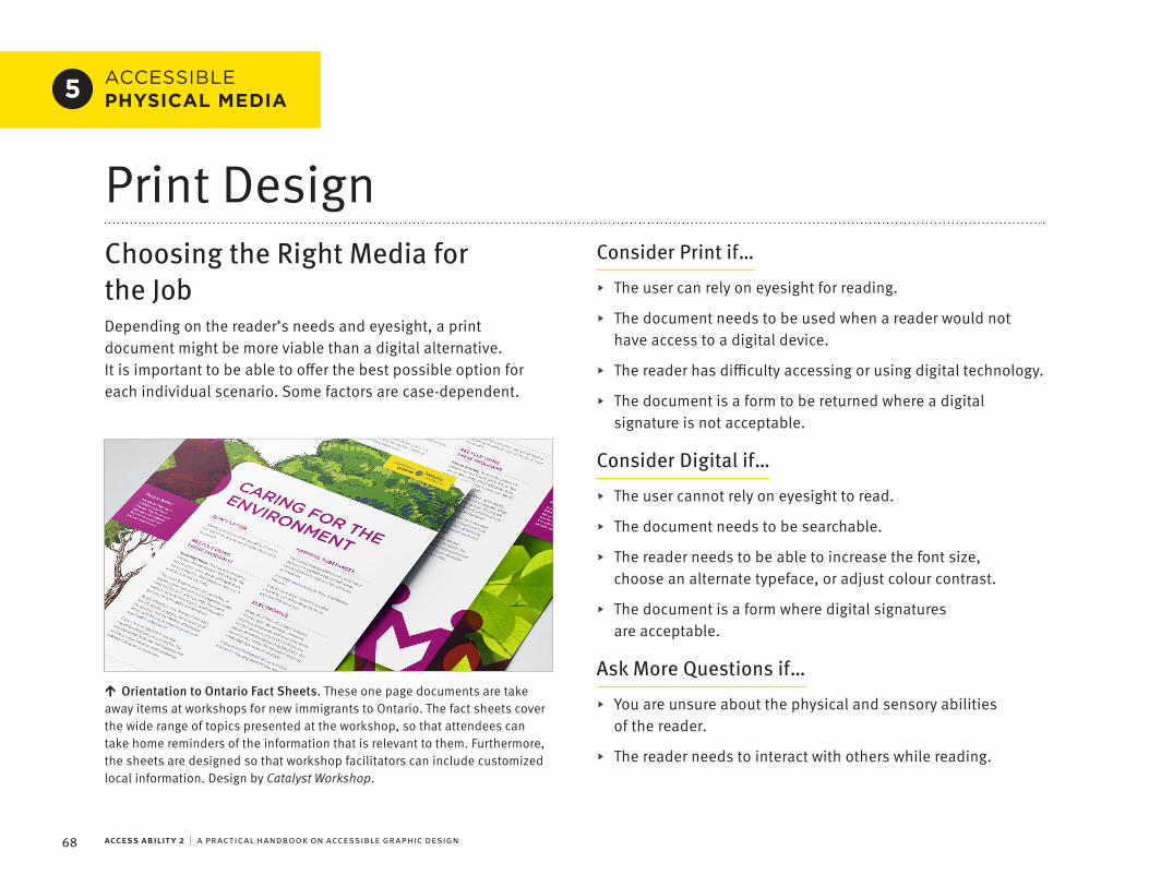
⯈
⯈
⯈
⯈
⯈
⯈
⯈
⯈
⯈
⯈
↑
ACCESS ABILITY 2 | A PRACTICAL HANDBOOK ON ACCESSIBLE GRAPHIC DESIGN68
ACCESSIBLE PHYSICAL MEDIA5
Print DesignChoosing the Right Media for the JobDepending on the reader’s needs and eyesight, a print document might be more viable than a digital alternative. It is important to be able to offer the best possible option for each individual scenario. Some factors are case-dependent.
Consider Print if…
The user can rely on eyesight for reading.
The document needs to be used when a reader would not have access to a digital device.
The reader has difficulty accessing or using digital technology.
The document is a form to be returned where a digital signature is not acceptable.
Consider Digital if…
The user cannot rely on eyesight to read.
The document needs to be searchable.
The reader needs to be able to increase the font size, choose an alternate typeface, or adjust colour contrast.
The document is a form where digital signatures are acceptable.
Ask More Questions if…
You are unsure about the physical and sensory abilities of the reader.
The reader needs to interact with others while reading.
Orientation to Ontario Fact Sheets. These one page documents are take away items at workshops for new immigrants to Ontario. The fact sheets cover the wide range of topics presented at the workshop, so that attendees can take home reminders of the information that is relevant to them. Furthermore, the sheets are designed so that workshop facilitators can include customized local information. Design by Catalyst Workshop.

↑
69PHYSICAL MEDIA
Typography in PrintText Size
In a digital document, the user can usually increase the text size to match their personal vision needs. Printed media cannot be scaled by the user, and so extra care and consideration is necessary for accessibility.
As mentioned previously most printed material has body text that has been typeset between 8 to 12 pt, yet organizations advocating for the visually impaired recommend anywhere from 12 to 24 pt body copy. If you cannot accommodate these larger type sizes in your document, it is important that you ensure that every other aspect of the typesetting is as accessible as possible. Consider producing an accessible digital partner piece as well.
Margins
Ensure that there are adequate margins, at least one inch on each side of the page for letter sized documents. If the document is bound, ensure that the side of the pages with the bound edge has an even larger margin.
Typesetting
If display fonts are used for any content, it may be advisable to repeat that content in a more accessible typeface elsewhere in the document.
At body text sizes, avoid typesetting any important information in superscript or subscript, as this relies on the user being able to read substantially smaller letterforms. Consider the following examples of how superscript and subscript can be avoided.
Less accessible 15th January He asked “to be, or not to be?”¹ CO₂ 4³ = 64
More accessible 15th January He asked “to be, or not to be?” (note 1) CO2 4^3 = 64
Orientation to Ontario Workbook. This workbook is provided to all new immigrants to Ontario. This is a very culturally diverse audience, many of whom read and speak English as a second language. High colour contrast helps increase legibility, while ample margins and typographic spacing helps increase readability. Design by Catalyst Workshop.

ACCESS ABILITY 2 | A PRACTICAL HANDBOOK ON ACCESSIBLE GRAPHIC DESIGN70
Printing SurfaceTo accommodate varying vision abilities, it’s important to choose paper or printing processes that minimize glare and enhance contrast and clarity, especially for text-heavy documents.
Colour
Glare can be reduced with stock colour. Whenever a slightly off-white paper can be used to reduce glare, it is preferred to pure white. However, off-white paper should never be so dark as to substantially reduce contrast with the black ink.
Stock
The term stock refers to the material that will be printed on. This is usually paper, but could also be a myriad of other paper-like materials.
Finish
To reduce glare, use papers with a matte or uncoated finish, rather than glossy stock.
Weight
First and foremost, the paper-stock should be thick enough to prevent any distracting ink show-through. The content on the opposite side of the page shouldn’t show through at all. At the same time, be careful not to choose a paper-stock that is so heavy it becomes unwieldy. Choose a paper weight and binding that allows the page to lay flat when open, to reduce optical distortions and decrease reading difficulty.
Dot-gain
Dot-gain can also decrease the legibility and readability of printed text, as it has a tendency to blur details in the letterforms. Choose a printing process and stock with minimum gain, and verify that the prepress service has adequately compensated for any unavoidable dot gain.
Dot-gain
Dot-gain is the phenomena of the ink spreading on the printing surface. This negatively affects clarity, detail, and legibility.
Proof
As any designer experienced in print will tell you, even the best soft-proofing system cannot 100% predict what a printed piece will look like. If possible, consider asking your printer to run a colour proof sample for you, and verify that contrast and clarity are more than adequate.
Digital ConsiderationsIn any case, consider supplementing the print version of a document with an accessible digital version. Get in the habit of formatting your print document with digital export in mind. If you ensure that your content order, paragraph styles, image anchors, alt text, navigation mechanisms and metadata are properly set, you may be able to export an accessible PDF or Word Document with a minimal amount of additional effort.

⯈
⯈
↑
71
ACCESSIBLE PHYSICAL MEDIA5
PHYSICAL MEDIA
.
.
Environmental Graphic DesignAccessible SpacesEnvironmental graphic design provides people with information in a physical space. This information can be categorized in two ways: wayfinding and exhibition. Wayfinding information helps people orient themselves and navigate within a physical space. Exhibition and interpretive signage communicate an idea or tell a story to the audience. In either case, this requires a wide range of considerations including human ergonomics, accessibility standards, building codes, and safety requirements. Accessible environmental graphic design accommodates the diverse needs of people with sensory and cognitive impairments, as well as physical motor limitations.
The AODA establishes certain requirements for accessible environmental graphic design. These standards are articulated in the Integrated Accessibility Standards, which are a Regulation under the Act. Of the five areas addressed by the standards, two are particularly relevant to environmental graphic design.
Transportation Standards provides requirements for public transit signage.
Design of Public Spaces Standards provides requirements for outside a building.
In addition to the Integrated Accessibility Standards under the AODA, designers are required to follow the Ontario Building Code, or the building code that governs the project’s jurisdiction.
These standards leave some gaps in guidance for accessible design. This book supplements those gaps with information from the Americans with Disabilities Act (ADA), the Canada Science and Technology Museums Accessibility Standards for Exhibitions, and the Smithsonian Guidelines for Accessible Exhibition Design.Deadly Skies. This Canadian War Museum special exhibit combines
elements of audio, video, and touchable artifacts. Design by Reich + Petch Design International. © CANADIAN WAR MUSEUM.

ACCESS ABILITY 2 | A PRACTICAL HANDBOOK ON ACCESSIBLE GRAPHIC DESIGN72
Wayfinding SystemsNobody likes feeling lost. A comprehensive wayfinding plan does more than help people find their way. It helps build confidence and trust with the users of the system.
To create an effective wayfinding plan, begin by conducting a thorough analysis of the existing or proposed physical environment. Identify and assess a full range of anticipated needs, problems and opportunities. Create a comprehensive plan detailing all the techniques and tools that can be deployed in the space so that people can orient and direct themselves.
Spatial Wayfinding
Spatial wayfinding is a method by which people make route decisions to get to their destination without the assistance of directional signs. This is how we typically travel through familiar spaces, as we form mental maps of the environment using familiar landmarks in order to orient ourselves.
Within large sprawling facilities it can be difficult for users, especially infrequent ones, to develop a strong spatial orientation. To assist with this process, architects and designers purposely create distinctive landmarks, such as facades, gateways, images, landscaping, lighting, pathways, sculpture, with distinctive patterns and material usage. They also establish defined routes through a facility, and support them with directory maps. All of these elements and features help people orient to their environment.
Linear Wayfinding
Linear wayfinding is a method by which people follow a series of directional signs in order to get to their destination. As the name suggests, it is a linear design system, and each message is dependent on what came before. It differs from simply following a list of directions as linear wayfinding directions are not grouped together, but spaced out along a route with strategically placed signs. Airports are often highly reliant on linear wayfinding systems.
An effective linear wayfinding system must be complete, accurate, understandable, and consistently applied. Signage must use commonly understood terminology, and all information must be kept current. While too many signs can create unwanted clutter, it is better that any linear pathway should err on the side of thoroughness. Furthermore, the amount of information presented on a single sign must be adequate, without overwhelming the user. A sign with too many destinations and arrows pointing in many directions increases cognitive load.
Visitors must be able to quickly find the information they need, and then easily follow that information to their intended destination.

⯈
⯈
⯈
⯈
↑
73PHYSICAL MEDIA
Signage Design
The accessible design and typography considerations detailed in this book are an essential part of signage design. Building on this, accessible signage design must also consider materials, placement, viewing distance, and technological enhancements.
Accessibility guidelines generally classify wayfinding signage into two categories: directional signs, and identification signs. The specific standards for these types of signage can vary considerably by jurisdiction. The following guidelines are based on some of the most common recommendations.
Visual MessagingAccessible typography is critical to accessible signage design. Designers should also consider the following additional criteria when designing signage.
Contrast. A contrast ratio of 70% is generally considered the minimum for all messaging on signage.
Finish. A non-glare or matte finish should be used for both the lettering and background surfaces.
Pictograms. Always comply with international standards for pictogram usage. The field around a pictogram should be at least 150 mm in height.
Letterform Width. For fonts used on signage, the width of an uppercase letter “O” must be within 55% and 110% of the height of an uppercase “I.”
Font Size
Type size needs to be calculated by its relationship to viewing distance. A suggested guideline is a linear relationship of 25 mm cap height for every 750 mm of distance. However, some designers find this formula incomplete, as it doesn’t take into consideration the height of the information display or the mounting height of the sign.
In any case, a minimum type size of 16 mm cap-height should be observed whenever possible.
La Tour Deloitte. Deloitte’s Montreal office had a mandate for an accessible and agile work environment. The goal of the project was to develop a comprehensive and accessible wayfinding strategy for all seven floors occupied by Deloitte. The solution needed to bring a layer of personality, build a sense of community, and complete Deloitte’s vision of an engaging and welcoming work environment. Extensive consultation, experimentation, and testing were integral to developing a flexible and robust design system that exceeded accessibility requirements. Design by Reich + Petch Design International.

⯈
⯈
⯈
⯈
⯈
⯈
⯈
ACCESS ABILITY 2 | A PRACTICAL HANDBOOK ON ACCESSIBLE GRAPHIC DESIGN74
Tactile MessagingTactile messaging can include raised pictograms, raised text, and Braille. The placement and spacing for any tactile messaging is critically important.
Depth. Tactile lettering should be raised 0.8 mm above the sign surface.
Spacing. There should be at least 10 mm clearance between any tactile messaging and graphic elements to help ensure readability.
Placement. Tactile messaging should be placed precisely between 1200 mm and 1500 mm from the finished floor.
Reading a tactile message by touch typically takes longer than reading a visual message. The safety of the person reading the sign must be taken into consideration in the design process. For this reason, signs should be placed on the latch side of any doors.
Consistency in placement is an important consideration to meet the expectations of visually impaired users.
Raised Text
When typesetting raised text, the following additional considerations need to be made.
Type Case. In Canada, mixed case lettering is recommended for raised text. It should be noted that the U.S. and several other countries have mandated the use of ALL CAPS for raised text.
Typeface. The typeface used for raised text should be sans-serif, as these letterforms are more readable with fingers.
Font size. The cap-height of raised text should be between 16 mm and 50 mm, measured by the uppercase “X.”
Tracking. Character spacing should be no less than 3 mm, and no greater than four times the stroke width.
Braille
Braille should be placed directly below corresponding raised text. It is important to note that Braille standards vary by region. In Canada, the widely accepted standard is Grade 1 Braille, while the U.S. and several other countries have adopted Grade 2 Braille (contracted English).
Directional SignageSigns providing directions, such as directional signs, directories, or maps, are only required to provide visual messaging. Designers should consider eye-level and viewing distance when determining mounting height. Overhead and flag-mounted signage should not be lower than 2 metres from the floor.

⯈
⯈
⯈
⯈
⯈
⯈
⯈
75PHYSICAL MEDIA
Identification SignageFloor Level Identification
In multi-level facilities, people need to be able to easily orient themselves within the vertical structure of the space. Floor levels need to be indicated at the entrances to both elevators and stairs.
Elevators. Floor level identification must be provided on both sides of the elevator entrance in Braille and raised text with a minimum cap-height of 50 mm.
Stairs. In Ontario, floor level identification must be provided at the stairwell entrance using raised text with a cap-height of 60 mm. While most jurisdictions do not require Braille for this application, it is highly recommended in order to provide accessibility and consistency to all floor level identifiers.
Room Identification
All permanent rooms must be identified with raised lettering and Braille. Non-permanent information about the room may be communicated visually without tactile messaging. For instance, the room number of an office would be considered permanent information, while the person occupying the office would not.
Permanent Rooms
Rooms with a prescribed function that is unlikely to change over time, such as a washroom, are considered permanent rooms.
Numeric Sequencing. If rooms are identified with numbers in the tactile messaging, this numeric sequence should be logical and easily understood.
Placement. Room identification signs must be placed on the wall adjacent to the latch side of doors.
Pictograms. When a pictogram is used to identify the function of a room, tactile messaging is also required.
Exhibition Graphics and Interactive ItemsExhibition graphics typically provide content-related or interpretive information for the user. When compared to wayfinding messaging, this type of information is longer, more complex, and requires much more time for users to read. People tend to read this type of information up close, particularly if artifacts are displayed or interactive activities are provided. This requires consideration for people with a wide range of body dimensions and physical needs, including the use of a cane or a wheelchair.
Clearance. Information rails must provide a minimum knee clearance of 610 mm in height and 610 mm in depth.
Information Rails
Information rails, also referred to as inforails, reader rails, or museum rails, are a type of interpretive signage typically used in front of a display case or scenic view. They are formed by a continuous, horizontal, inclined graphic surface, with information printed on top. The rail is positioned at a height so that is can be read without obstructing the view in front.
Protrusions. Any object protruding over 100mm from the wall requires cane detectable warnings.

⯈
⯈
⯈
⯈
⯈
ACCESS ABILITY 2 | A PRACTICAL HANDBOOK ON ACCESSIBLE GRAPHIC DESIGN76
Content-related & Interpretive Information
Content-related and interpretive information is typically read within 1 metre from an information rail, graphic panel, or wall. In order to accommodate this behaviour, design with the following considerations.
Font Size. Text should have a minimum x-height of 5 mm.
Vertical Placement. Text on a wall or graphic panel should be displayed between 1090 mm to 1700 mm from the floor.
Interactive Items
Hands-on interactive items, such as flip panels, rotating drums, or other touchable objects, need to be placed in such a way as to be accessible to all users. These same considerations apply to touch screens, and the controls for any digital media.
Forward Reach. Objects should be placed within a maximum forward reach distance of 635 mm.
Side Reach. Objects should be placed within a maximum side reach distance of 254 mm.
Vertical Reach. Objects should be placed within a distance of between 380 mm to 1220 mm from the floor.

77
SECTION 6
ResourcesThe following resources have been selected to offer continued learning, support, and tools for designers of all education and experience levels.

ACCESS ABILITY 2 | A PRACTICAL HANDBOOK ON ACCESSIBLE GRAPHIC DESIGN78
RECOMMENDED RESOURCES6
PublicationsAbout Face: The Essentials of Interaction Design (4th Edition)Alan Cooper, Robert Reimann, Dave Cronin, Christopher Noessel Wiley, 2014
This book is a highly in-depth resource on practical and theoretical concerns in interaction design. Fanatically thorough and highly respected, this is an excellent reference for a wide array of best practices in interaction design.
Accessible Signage GuidelinesJen Goulden, Cheryl Roberts-Dupasquier, Bruce Toews, Betty Nobel Braille Literacy Canada 2016
This document provides recommended best practice for utilizing Braille in signage design. Note that these guidelines were adapted from the Accessible Signage Guidelines, Second Edition, 2013, published by the The Royal New Zealand Foundation of the Blind.
Clear Print: An evidence-based review of the research on typeface legibility for readers with low visionElizabeth Russell-Minda, Jeffrey Jutai, Graham Strong VREBR Project Team and CNIB Research, 2006
This literature review covers research on typeface legibility for readers with low vision. This review offers an excellent starting point for designers who want to know more about the testing criteria and parameters often used to discern the effectiveness of a typeface.
Creating Accessible PDF Document with Adobe® InDesign CS6adobe.com/content/dam/acom/en/products/indesign/pdfs/creating-accessible-pdf-documentw-with-adobe-indesign-cs6-v3.pdf
This white paper provides detailed methodology for creating accessible PDFs with InDesign CS6 and Acrobat Pro. The in-depth methods described here are accurate for the latest versions of InDesign and Acrobat.
79RESOURCES
CSTMC Accessibility Standards for Exhibitionsdocuments.techno-science.ca/documents/IngeniumAccessibilityStandardsMarch2018.pdf
This document describes the accessibility standards for the Canada Science and Technology Museums. These guidelines are an essential reference for exhibition designers working in Canada.
The Design of Everyday things (Revised and Expanded Edition)Don Norman MIT Press, 2013
This book is an excellent primer on how design principles correlate with everyday experiences. This is an important read for interaction designers, and a worthwhile read for anyone involved in the design process.
Designing Information: Human Factors and Common Sense in Information DesignJoel Katz Wiley, 2012
This book is a colourful and thoroughly illustrated primer on information design. Suitable for beginner and intermediate designers alike, this resource examines the ideas and processes integral to visually communicating information.
Don’t Make Me Think, Revisited: A Common Sense Approach to Web Usability (3rd Edition)Steve Krug New Riders, 2014
This book is a great introduction to usability in interaction design. It is accessibly aimed at providing beginners and non-professional designers with only essential information, presented in a short, engaging, and easy to understand format.
Elements of Typographic Style (4th Edition)Robert Bringhurst Hartley & Marks, 2012
This book is often considered the most authoritative style guide for typography. It is a dense, highly detailed read, combining the practical, theoretical, and historical. The principles contained in this text are critical to effective typesetting.
Inclusive Designing: Joining Usability, Accessibility, and InclusionEdited by P. M. Langdon, J. Lazar, A. Heylighen, H. Dong Springer, 2014
This book contains the best reviewed papers submitted for the 2014 Cambridge Workshops on Universal Access and Assistive Technology. It’s an excellent sampling of the current research, theory, and practice in the fields of usability, accessibility, and inclusion in design across a wide range of media.

ACCESS ABILITY 2 | A PRACTICAL HANDBOOK ON ACCESSIBLE GRAPHIC DESIGN80
Information Design: Research and PracticeEdited by Alison Black, Paul Luna, Ole Lund, Sue Walker Routledge, 2014
This book offers a multidisciplinary guide to information design research and practice for the experienced designer. It also gives special consideration to multi-modal accessibility, and has chapters devoted to design considerations for both young people and the elderly.
Signage and the 2010 ADA Standards for Accessible Design v2.1PDF luminantdesign.com/downloads/Signage%20and%20the%202010%20ADA%20SAD%20v2_1.pdf
Web luminantdesign.com/ada.html
This document provides an illustrated guide to the American with Disabilities Act (ADA) 2010 standards for accessible signage. It provides exceptional visual explanations, and includes additional reference material on visual contrast and typography for accessible signage design.
Signage Requirements in the 2010 Standard for Accessible Design: SEGD 2012 ADA White Paper UpdateKen Ethridge et al. Society for Environmental Graphic Design, 2012
This white-paper builds on the American with Disabilities Act (ADA) 2010 standards for accessible signage. It is a comprehensive and clearly articulated resource for anyone working in the field of environmental graphic design.
Smithsonian Guidelines for Accessible Exhibition DesignPDF www.sifacilities.si.edu/ae_center/pdf/Accessible-Exhibition-Design.pdf
Web www.si.edu/Accessibility/SGAED
This document contains standards and methods for designing accessible exhibitions that work for people with disabilities and the rest of the public. These guidelines are the foundation of most North American museum standards.
Thinking with Type (2nd Edition)Ellen Lupton Princeton Architectural Press, 2010
This book is an excellent primer for those with limited education and experience with typography. It’s a well considered introduction to the subject, presented in an approachable and illustrative manner.
Typography Guru: Letter and symbol mis-recognition in highly legible typefaces for general, children, dyslexic, visually impaired and ageing readers, 2018 third editionThomas Bohm typography.guru/journal/letters-symbols-misrecognition/
This online paper identifies commonly confused letters and symbols in otherwise legible typefaces, with special consideration for children, dyslexic, visually impaired and ageing readers. It’s a highly up-to-date review of the research on this subject matter.
81RESOURCES
Typography Guru: What makes letters legible? July 31, 2011Ralf Herrmann typography.guru/journal/what-makes-letters-legible-r37/
This online piece offers a succinct look at legibility from the perspective of extreme vision degradation.
Universal Methods of Design: 100 Ways to Research Complex Problems, Develop Innovative Ideas, and Design Effective SolutionsBruce Hanington & Bela Martin O’Reilly, 2012
This book details a hundred different methodologies that can be applied to the design process. It’s a practical catalogue of research and design methods for every phase of a design project, with considerations for accessibility and inclusivity.
Universal Principles of Design (2nd Edition): 125 Ways to Enhance Usability, Influence Perception, Increase Appeal, Make Better Design Decisions, and Teach through DesignWilliam Lidwell, Kristina Holden, Jill Butler O’Reilly 2010
This book details over a hundred different principles that are relevant for human-centric design. It provides research based insights into human behaviour and perception.
Web Content Accessibility Guidelines (WCAG) 2.0w3.org/TR/WCAG20/
This 2008 document is the version of the Web Content Accessibility Guidelines utilized in most web accessibility standards and compliance. It covers a wide range of recommendations for making web content more accessible.
Web Content Accessibility Guidelines (WCAG) 2.1w3.org/TR/WCAG21/
This 2018 document is the most up-to-date version of the Web Content Accessibility Guidelines. These guidelines are backwards compatible, which means that content that conforms to WCAG 2.1 also conforms to WCAG 2.0.
A Web for Everyone: Designing Accessible User ExperienceSarah Horton & Whitney Quesenbery Rosenfeld Media, 2013
This book gives an introductory overview to the process of accessible and inclusive web design. It has a very user-centric focus, with special considerations for the diverse range of people who may be considered outliers.
ACCESS ABILITY 2 | A PRACTICAL HANDBOOK ON ACCESSIBLE GRAPHIC DESIGN82
WebsitesAccessible Digital Office Document (ADOD) Projectadod.idrc.ocad.ca
This site provides instructions on how to create accessible office documents across a wide variety of software. It also provides recommendations for choosing accessible office applications for your organization.
Accessibility for Ontarians with Disabilities Actaoda.ca
This site provides the most extensive set of resources on issues of accessibility pertaining to the Accessibility for Ontarians with Disabilities Act (AODA).
Adobe Accessibility Centreadobe.com/accessibility
This section of the Adobe website is the hub for the company’s accessibility resources. It has a growing body of instructional support for creating accessible media with Adobe products.
Canadian National Institute for the Blindcnib.ca
This site is home to the Canadian National Institute for the Blind (CNIB), which provides resources for people with visual impairments. It is also an excellent benchmark for accessible website design.
Inclusive Design Research Centreidrc.ocadu.ca
This site is home to the Inclusive Design Research Centre (IDRC). It provides a wealth of information on the subject of adaptive technology, ranging from research papers to user tutorials.
Ontario Accessibility Lawsontario.ca/page/accessibility-laws
This section of the Ontario website is the hub for learning about the province’s accessibility laws. It provides critical information about the standards and reporting deadlines for complying with accessibility requirements.
Web Accessibility in Mind (WebAIM)webaim.org
This site is an exceptional resource for accessible design. WebAIM offers complete web accessibility services, and their website also provides practical articles and unique research on the subject.
W3C Web Accessibility Initiativew3.org/wai
This site acts as a hub for the World Wide Web Consortium (W3C)’s extensive accessibility initiatives, strategies, standards, and resources.

83RESOURCES
ToolsACheckerachecker.ca/checker
This tool checks single HTML pages for conformance with accessibility standards to ensure that the content can be accessed by everyone.
Axe Developer Toolsdeque.com/axe
These accessibility testing tools can be integrated into Chrome & Firefox using browser plugins, and can also be accessed through Android and iOS apps. This open-source library is completely self-contained, allowing its highly accurate accessibility testing engine to be used in offline testing environments.
Colour Contrast Analyserdeveloper.paciellogroup.com/resources/contrastanalyser/
This desktop application for macOS & Windows can be used to analyze the colour contrast of any elements that appear on a computer screen. It provides WCAG 2.1 compliance indicators, as well as a colour blindness simulator.
Dynoliticsdinolytics.com
This enterprise level accessibility reporting service will scan and review an entire website for accessibility problems. It utilizes webAIM’s WAVE engine to identify issues, assess potential impact on users, and make suggestions for remediation.
Infusionfluidproject.org/infusion.html
This web framework allows visitors to a website to customize the visual presentation and save their individual preferences. It includes ready-to-use components that enable a website to provide individualized visual accessibility.
Kontrastgetkontrast.now.sh
This web browser plugin for Chrome & Firefox can be used to check the colour contrast of a webpage, and then adjust those colours in real-time within the browser. It has a free version with limited utility, while the full $5 version is a robust tool for analyzing and correcting colour contrast problems on webpages.
. .
.
.
.
.
.
.
ACCESS ABILITY 2 | A PRACTICAL HANDBOOK ON ACCESSIBLE GRAPHIC DESIGN84
Mozilla Firefox Accessibility Inspectordeveloper.mozilla.org/en-US/docs/Tools/Accessibility_inspector
The Firefox web browser has a powerful built-in feature called the Accessibility Inspector. It previews how the code of a webpage will be translated into objects for assistive technologies. The webpage linked above provides documentation for using this tool.
NoCoffee Vision Simulatoraccessgarage.wordpress.com/2013/02/09/458
This web browser plugin for Chrome simulates impaired vision within the browser viewport. It’s a useful tool for quickly identifying which page elements may be particularly difficult to perceive or understand for low-vision users.
NVDA Screen Readernvaccess.org/download
This site provides the free and open-source NVDA screen reader for Windows. It’s a useful tool for accessibility testing, and a life-changing technology for people around the world who previously could not afford screen reader software.
Tanaguru Contrast Findercontrast-finder.tanaguru.com
This webpage can help you adjust colour pairings in order to meet WCAG compliance. It will analyze a pair of colours, and if the colour combination does not have adequate contrast, it will generate multiple WCAG compliant variations which are as similar as possible to the original colours.
W3C CSS Validation Servicejigsaw.w3.org/css-validator
This site provides a validator for Cascading Style Sheets (CSS) and XHTML documents with embedded styles. It will flag syntax issues, and provide suggestions for potential remediation.
W3C Markup Validation Servicevalidator.w3.org
This site provides a validator for the markup of web documents in HTML, XHTML, SMIL, MATHML, and more. It will flag syntax issues, and provide suggestions for potential remediation.
WAVE Web Accessibility Evaluation Toolwave.webaim.org
This site provides an excellent web accessibility evaluation tool for manually reviewing the accessibility compliance of a webpage. It performs a multitude of accessibility related analyses, and annotates potential issues directly on the page itself.
WAVE Web Accessibility Evaluation Tool Browser Extensionswave.webaim.org/extension/
This browser plugin for Chrome or Firefox provides webAIM’s WAVE accessibility analysis technology directly in the browser. It extends the functionality of WAVE to be able to be used to check intranet, password-protected, or dynamically-generated generated content.

•
•
•
•
•
•
•
•
• .
•
•
•
•
•
•
•
•
•
•
•
•
•
•
•
•
•
•
•
•
•
•
•
•
•
•
•
•
. .
. . .
. .
. .
.
. .
.
. .
.
. .
.
. .
.
. .
.
. .
.
. .
.
.
.
.
.
.
.
.
.
..
.
.
.
CreditsLead AuthorAdam Rallo RGD
Co-Authors.
Edmund Li RGDEric Forest RGDJames Kuo RGDRandal Boutilier RGD
CollaboratorsChristina Whitfield RGDEnakshi GuptaGrazyna Antoszek
ConsultantsEmilio Genovese RGDMichael J. Young RGD Michelle Hopgood RGD
ContributorsAkendiAshley Kirk RGDCarolina Taylor RGDCatalyst WorkshopContext CreativeEntro CommunicationsGOOD CompanyGord HenningHambly & WoolleyLionel Gadoury RGDMonica AckermannReich + Petch Design InternationalSchoolBundleWestJet Digital & Innovation Team
Thank-youAiann OishiChris WhartonGillian HickieJulie DoKatherine McCurdy-Lapierre RGDLana MilleyMegan Oldfield RGDStephen Boake RGDStephanie Strawbridge RGDThomas Bohm
Special Thank-youHilary AshworthJutta Treviranus
RGD 2019 Partners

.
.
About RGDThrough the Association of Registered Graphic Designers (RGD), Canadian designers exchange ideas, educate and inspire, set professional standards, and build a strong, supportive community dedicated to advocating for the value of design.
RGD was created by government legislation to grant designers, design educators, and design managers who qualify the right to use the designation ‘RGD’. RGD Certification offers the assurance of hiring an experienced and qualified professional committed to the highest ethical standards. Certified RGDs have documented levels of relevant, professional education and experience, along with demonstrated competence in design, strategy, business, accessibility, research, and ethics.
Representing over 4,000 designers, managers, educators, and students, RGD advocates on behalf of the profession, communicating the invaluable contributions of graphic designers to commerce, culture, and society. RGD programming includes the annual DesignThinkers Conference, the bi-annual Creative Earners National Survey, the So(cial) Good Design Awards, the DesignThinker of the Year Award, a Student Awards Program, a Mentorship Program, extensive virtual professional development / resources for Members, and more.
For more, visit rgd.ca
RGD Accessibility SponsorsPrinted by Flash Reproductions, on Lynx 80lb Text, and 100lb Cover. Typeset in FF Meta Pro, designed by Erik Spiekermann and released in 1991 through the FontFont foundry. Numerous typefaces that met accessibility criteria were tested for this book, and elderly readers with diminished eyesight (including my grandparents) expressed a preference for reading mockups in this typeface.