annual benchmarking report - aer 2018 distribution...this benchmarking report measures the...
TRANSCRIPT
Annual Benchmarking
Report
Electricity distribution network
service providers
November 2018

© Commonwealth of Australia 2018
This work is copyright. In addition to any use permitted under the Copyright Act 1968,
all material contained within this work is provided under a Creative Commons
Attributions 3.0 Australia licence, with the exception of:
the Commonwealth Coat of Arms
the ACCC and AER logos
any illustration, diagram, photograph or graphic over which the Australian
Competition and Consumer Commission does not hold copyright, but which may
be part of or contained within this publication. The details of the relevant licence
conditions are available on the Creative Commons website, as is the full legal code
for the CC BY 3.0 AU licence.
Requests and inquiries concerning reproduction and rights should be addressed to the:
Director, Corporate Communications
Australian Competition and Consumer Commission
GPO Box 4141, Canberra ACT 2601
Inquiries about this publication should be addressed to:
Australian Energy Regulator
GPO Box 520
Melbourne Vic 3001
Tel: (03) 9290 1444
Fax: (03) 9290 1457
Email: [email protected]
Contents
Shortened Forms ............................................................................................ 1
Glossary........................................................................................................... 2
Executive Summary ......................................................................................... i
1 Introduction ............................................................................................... 1
2 Why we benchmark electricity networks ................................................ 5
3 The productivity of electricity distribution as a whole .......................... 8
4 The relative productivity of service providers ..................................... 11
4.1 Economic benchmarking results.................................................... 12
4.2 Key observations about changes in productivity ......................... 18
4.3 The impact of differences in operating environments .................. 23
4.4 Power and Water Corporation ........................................................ 30
5 Other supporting benchmarking techniques ....................................... 31
5.1 Modelling of operating expenditure efficiency .............................. 31
5.2 Partial performance indicators ....................................................... 34
5.2.1 Total cost PPIs ............................................................................. 34
5.2.2 Cost category PPIs ...................................................................... 37
A References and further reading ............................................................ 43
B Benchmarking models and data ........................................................... 45
B.1 Benchmarking techniques .............................................................. 45
B.2 Benchmarking data .......................................................................... 46
B.2.1 Outputs ........................................................................................ 48
B.2.2 Inputs ........................................................................................... 54
B.3 Updated output weights for productivity models ......................... 56
C Map of the National Electricity Market .................................................. 61

Shortened Forms
Shortened form Description
AEMC Australian Energy Market Commission
AER Australian Energy Regulator
AGD Ausgrid
AND AusNet Services (distribution)
Capex Capital expenditure
CIT CitiPower
DNSP Distribution network service provider
END Endeavour Energy
ENX Energex
ERG Ergon Energy
ESS Essential Energy
EVO Evoenergy (previously ActewAGL)
JEN Jemena Electricity Networks
MW Megawatt
NEL National Electricity Law
NEM National Electricity Market
NER National Electricity Rules
Opex Operating expenditure
PCR Powercor
RAB Regulatory asset base
SAPN SA Power Networks
TND TasNetworks (Distribution)
UED United Energy Distribution

Glossary
Term Description
Efficiency
A Distribution Network Service Provider’s (DNSP) benchmarking results relative
to other DNSPs reflect that network's relative efficiency, specifically their cost
efficiency. DNSPs are cost efficient when they produce services at least
possible cost given their operating environments and prevailing input prices.
Inputs
Inputs are the resources DNSPs use to provide services. The inputs we
measure in our benchmarking models are operating expenditure and capital
assets.
LSE
Least squares econometrics. LSE is an econometric modelling technique that
uses 'line of best fit' statistical regression methods to estimate the relationship
between inputs and outputs. Because they are statistical models, LSE operating
cost function models with firm dummies allow for economies and diseconomies
of scale and can distinguish between random variations in the data and
systematic differences between DNSPs.
MPFP
Multilateral partial factor productivity. MPFP is a PIN technique that measures
the relationship between total output and one input. It allows partial productivity
levels as well as growth rates to be compared.
MTFP
Multilateral total factor productivity. MTFP is a PIN technique that measures the
relationship between total output and total input. It allows total productivity levels
as well as growth rates to be compared between businesses.
Network services
opex
Operating expenditure (opex) for network services. It excludes expenditure
associated with metering, customer connections, street lighting, ancillary
services and solar feed-in tariff payments.
OEFs Operating environment factors. OEFs are factors beyond a DNSP’s control that
can affect its costs and benchmarking performance.
Outputs Outputs are quantitative or qualitative measures that represent the services
DNSPs provide.
PIN Productivity index number. PIN techniques determine the relationship between
inputs and outputs using a mathematical index.
PPI Partial performance indicator. PPIs are simple techniques that measure the
relationship between one input and one output.
Ratcheted maximum
demand
Ratcheted maximum demand is the highest value of maximum demand for each
DNSP, observed in the time period up to the year in question. It recognises
capacity that has been used to satisfy demand and gives the DNSP credit for
this capacity in subsequent years, even though annual maximum demand may
be lower in subsequent years.
SFA Stochastic frontier analysis. SFA is an econometric modelling technique that
uses advanced statistical methods to estimate the frontier relationship between

inputs and outputs. SFA models allow for economies and diseconomies of scale
and directly estimate efficiency for each DNSP relative to estimated best
performance.
TFP
Total factor productivity is a PIN technique that measures the relationship
between total output and total input over time. It allows total productivity growth
rates to be compared across networks but does not allow productivity levels to
be compared across networks. It is used to decompose productivity change into
its constituent input and output parts.
i
Executive Summary
Economic benchmarking is a quantitative or data driven approach used widely by
governments, regulators, businesses and consumers around the world to measure
how efficient firms are at delivering services over time and compared with their peers.
This benchmarking report measures the productivity and efficiency of distribution
network service providers (DNSPs), and the electricity distribution industry as a whole.
We focus on the productive efficiency of the DNSPs. DNSPs are productively efficient
when they produce their goods and services at least possible cost given their operating
environments and prevailing input prices. The relative productivity of the DNSPs
reflects their efficiency.
This is our fifth benchmarking report and covers the 2006–17 period. This report is
informed by expert advice provided by Economic Insights.
What is a distribution network service provider (DNSP)?
The electricity industry in Australia is divided into four parts — generation, transmission,
distribution and retail. As electricity generators (i.e. coal, gas, hydro, wind etc.) are usually
located near fuel sources and often long distances from electricity consumers, extensive
networks of poles and wires are required to transport power from the generators to end use
consumers. These networks include:
High voltage transmission lines operated by transmission network service providers which
transport electricity from generators to distribution networks in urban and regional areas.
Transformers, poles and wires operated by DNSPs which convert electricity from the high
voltage network into medium and low voltages to transport electricity to residential and
business consumers.
Distribution network costs typically account for between 30 and 40 per cent of what consumers
pay for their electricity as part of their retail electricity bill.
This benchmarking provides consumers with useful information about the relative
efficiency of distribution networks that transport electricity to their door. It also helps
them better understand how the performance of these networks has improved over
time, and how it compares to the businesses that distribute electricity to consumers in
other regions and states.
Benchmarking also provides managers and investors with information on the relative
efficiency of network businesses, and provides the governments who set regulatory
standards with information about the impacts of regulation on network efficiency,
charges and ultimately electricity prices.
Benchmarking is one of the key tools the Australian Energy Regulator (AER) draws on
when setting the maximum revenues networks can recover through consumers' bills. It
helps us understand why network productivity is increasing or decreasing, how efficient
service providers are, and where best to target our expenditure reviews.

ii
1. Distribution network productivity has grown since 2015
The primary benchmarking technique we use to measure the productivity of the
electricity distribution industry is total factor productivity. This is a technique that
measures the productivity of businesses over time by measuring the relationship
between the inputs used and the outputs delivered. Where businesses are able to
deliver more outputs for a given level of inputs, this reflects an increase in productivity.
Our analysis indicates that electricity distribution productivity grew by 2.7 per cent over
2016–17, exceeding productivity growth for the overall economy and the utility sector
(covering electricity, gas, water and waste services (EGWWS)).
Figure 1 Electricity distribution industry, utility sector, and economy
productivity indices, 2006–17
We have now observed two consecutive years of growth in electricity distribution
industry productivity. This is a change from the historical productivity decline over the
2007–15 period. The primary reason for the decline in productivity over this period was
rising capital and operating expenditure (opex) for distribution networks.
Our analysis indicates that reductions in opex, as well as fewer minutes in which
customers were without electricity supply, were the primary factors driving growth in
industry productivity. This suggests that the distribution industry, at an overall level,
has been able to deliver energy more reliably to more customers and at a lower cost.
2. Falling network costs are putting downward pressure on consumers' bills
Distribution network costs typically account for between 30 and 40 per cent of what
consumers pay for their electricity (with the remainder covering generation costs,
transmission and retailing, as well as regulatory programs). Increases and decreases
in network charges can have a material impact on consumers’ electricity bills.

iii
Figure 2 shows that network revenues (and consequently network charges) across the
NEM significantly increased over the past decade. This led to increases in consumers’
retail electricity bills.1 However, since 2015, distribution revenues have declined due to
lower operating costs, as well as lower borrowing costs. These falling costs are
reflected in the growth in industry productivity.
Consumers should benefit from the improvement in distribution network productivity
through downward pressure on network charges and customer bills.
Figure 2 Indexes of network revenue changes by jurisdiction, 2006–17
3. Eight distribution service providers improved their productivity in 2017
Multilateral total factor productivity (MTFP) is the headline technique we use to
measure and compare the relative productivity of jurisdictions and individual DNSPs.
This technique allows us to compare total productivity levels between DNSPs and
informs our assessment of the relative efficiency of each service provider.
Table 1 presents MTFP results for each individual DNSP and how they have changed
between 2016 and 2017. This shows that in 2017:
AusNet Services (13 per cent), Ergon Energy (7 per cent) and Endeavour Energy
(6 per cent) were the most improved DNSPs in the NEM.
CitiPower (3 per cent), Powercor (3 per cent) United Energy (4 per cent), Ausgrid (5
per cent), and Energex (1 per cent) also noticeably improved their productivity.
1 AER State of the Market Report 2017, p. 135.

iv
SA Power Networks (–6 per cent) and TasNetworks (–8 per cent) experienced
relatively large decreases in productivity, while Essential Energy (–3 per cent) and
Evoenergy (–4 per cent) experienced moderate decreases in productivity.
Table 0.1 Individual DNSP MTFP rankings and scores, 2016 to 2017
DNSP 2017
Rank
2016
Rank 2017 Score 2016 Score
Change
(%)
CitiPower (Vic) 1 1 1.500 1.456 3%
SA Power Networks 2 2 1.304 1.391 –6%
United Energy (Vic) 3 4 1.267 1.211 4%
Powercor (Vic) 4 3 1.254 1.219 3%
Energex (QLD) 5 5 1.156 1.140 1%
Ergon Energy (QLD) 6 8 1.106 1.026 7%
Jemena (Vic) 7 6 1.100 1.101 0%
Endeavour Energy (NSW) 8 9 1.094 1.025 6%
AusNet Services (Vic) 9 12 1.056 0.927 13%
Evoenergy (ACT) 10 7 1.016 1.056 –4%
Essential Energy (NSW) 11 11 0.953 0.981 –3%
TasNetworks 12 10 0.927 1.000 –8%
Ausgrid (NSW) 13 13 0.860 0.821 5%
4. Improved performance of the frontier distribution service providers
Figure 3 shows that CitiPower, Powercor, United Energy and SA Power Networks have
consistently been the most efficient distribution service providers in the NEM. These
networks are amongst those service providers that are on the productivity frontier, as
measured by MTFP.
The productivity of these service providers declined between 2006 and 2014 due to
increasing operating costs, including in response to new regulatory obligations.
However, since 2015, all four service providers have increased their MTFP score. This
is one of the reasons for the productivity growth in the electricity distribution industry.
SA Power Networks’ productivity declined in 2017, although it retained its ranking of
second in terms of productivity levels. This reduction in MTFP was in part due to a
number of abnormal weather events that contributed to higher than normal emergency
response costs and guaranteed service levels (GSL) payments to customers in 2017.

v
Figure 3 Multilateral total factor productivity by individual DNSP, 2006–17
vi
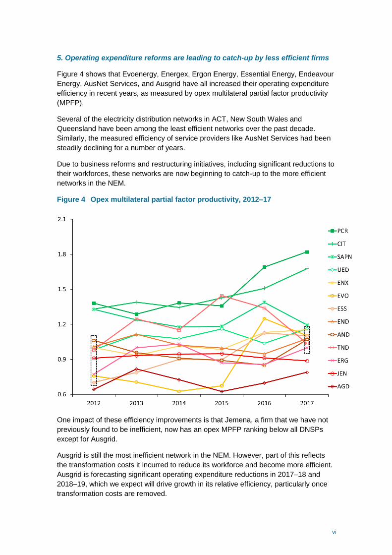
5. Operating expenditure reforms are leading to catch-up by less efficient firms
Figure 4 shows that Evoenergy, Energex, Ergon Energy, Essential Energy, Endeavour
Energy, AusNet Services, and Ausgrid have all increased their operating expenditure
efficiency in recent years, as measured by opex multilateral partial factor productivity
(MPFP).
Several of the electricity distribution networks in ACT, New South Wales and
Queensland have been among the least efficient networks over the past decade.
Similarly, the measured efficiency of service providers like AusNet Services had been
steadily declining for a number of years.
Due to business reforms and restructuring initiatives, including significant reductions to
their workforces, these networks are now beginning to catch-up to the more efficient
networks in the NEM.
Figure 4 Opex multilateral partial factor productivity, 2012–17
One impact of these efficiency improvements is that Jemena, a firm that we have not
previously found to be inefficient, now has an opex MPFP ranking below all DNSPs
except for Ausgrid.
Ausgrid is still the most inefficient network in the NEM. However, part of this reflects
the transformation costs it incurred to reduce its workforce and become more efficient.
Ausgrid is forecasting significant operating expenditure reductions in 2017–18 and
2018–19, which we expect will drive growth in its relative efficiency, particularly once
transformation costs are removed.

vii
6. Ongoing development of economic benchmarking
We operate an ongoing program to review and incrementally refine elements of the
benchmarking methodology and data. This year our report includes a number of
incremental additions that provide stakeholders with useful information about the
relative efficiency of electricity distribution networks. These include:
more information about material differences in operating environments
additional partial performance indicators at the cost category level, and
additional econometric modelling results.
We have also undertaken a periodic update of the output weights used in our
productivity index models.
These additions reflect some of the development work we have been pursuing over the
past two years, including in response to comments and suggestions from the
Australian Competition Tribunal and submissions from stakeholders to our
benchmarking reports and regulatory determinations.
Submissions to a draft version of this report raised a number of important issues that
we will consider as part of our ongoing development program. These include:
The implications of differences in cost allocation and capitalisation approaches
between DNSPs on our benchmarking results
Further review of our analysis of differences in operating environment factors (we
consider this in section 4.3)
The data we use to calculate our partial performance indicators (specifically our
new category level indicators)
The impact of increases in distributed energy resources (e.g. solar photovoltaics)
and demand management activities across the industry on our benchmarking
results, including how they are captured by the inputs and outputs that we measure
in our benchmarking models.
We are currently reviewing our benchmarking development priorities for the next
twelve months. We will consult with all stakeholders as part of our ongoing program.

1
1 Introduction
Productivity benchmarking is a quantitative or data driven approach used widely by
governments and businesses around the world to measure how efficient firms are at
producing outputs over time and compared with their peers.
The National Electricity Rules (NER) require the AER to publish benchmarking results
in an annual benchmarking report. This is our fifth benchmarking report for distribution
network service providers (DNSPs). This report is informed by expert advice provided
by Economic Insights.2
National Electricity Rules reporting requirement
6.27 Annual Benchmarking Report
(a) The AER must prepare and publish a network service provider performance report (an
annual benchmarking report) the purpose of which is to describe, in reasonably plain language,
the relative efficiency of each Distribution Network Service Provider in providing direct control
services over a 12 month period.
Our benchmarking report considers the efficiency and productivity of individual network
service providers. We focus on the productive efficiency of the DNSPs. DNSPs are
productively efficient when they produce their goods and services at least possible cost
given their operating environments and prevailing input prices.
Our benchmarking report presents results from three types of 'top-down' benchmarking
techniques:3
Productivity index numbers (PIN). These techniques use a mathematical index to
determine the relationship between multiple outputs and inputs, enabling
comparisons of productivity levels over time and between networks.
Econometric opex cost function models. These model the relationship between
opex (as the input) and outputs to measure opex efficiency.
Partial performance indicators (PPIs). These simple ratio methods relate one
input to one output.
The primary benchmarking techniques we use in this report to measure the relative
productivity of each DNSP in the NEM are multilateral total factor productivity (MTFP)
2 The supplementary Economic Insights report outlines the full set of results for this year's report, the data we use
and our benchmarking techniques. It can be found on the AER's benchmarking website. 3 Top down techniques measure a network's efficiency based on high-level data aggregated to reflect a small
number of key outputs and key inputs. They generally take into account any synergies and trade-offs that may
exists between input components. Alternative bottom up benchmarking techniques are much more resource
intensive and typically examine very detailed data on a large number of input components. Bottom up techniques
generally do not take into account potential efficiency trade-offs between input components of a DNSP’s
operations.

2
and multilateral partial factor productivity (MPFP). The relative productivity of the
DNSPs reflects their efficiency. MPFP examines the productivity of either opex or
capital in isolation.
Each benchmarking technique cannot readily incorporate every possible exogenous
factor that may affect a DNSP's costs. Therefore, the performance measures are
reflective of, but do not precisely represent, the underlying efficiency of DNSPs. For
this benchmarking report, our approach is to derive raw benchmarking results and
where possible, explain drivers for the performance differences and changes. These
include those operating environment factors that may not have been accounted for in
the benchmarking modelling.
What is multilateral total factor productivity?
Total factor productivity is a technique that measures the productivity of businesses over time
by measuring the relationship between the inputs used and the outputs delivered. Where a
business is able to deliver more outputs for a given level of inputs, this reflects an increase in
its productivity. Multilateral total factor productivity allows us to extend this to compare
productivity levels between networks.
The inputs we measure for DNSPs are:
Five types of physical capital assets DNSPs invest in to replace, upgrade or expand their
networks.
Operating expenditure (opex) to operate and maintain the network.
The outputs we measure for DNSPs (and the relative weighting we apply to each) are:
Customer numbers. The number of customers is a significant driver of the services a
DNSP must provide. (31 per cent weight)
Circuit line length. Line length reflects the distances over which DNSPs deliver electricity to
their customers. (29 per cent weight)
Ratcheted maximum demand. DNSPs endeavour to meet the demand for energy from
their customers when that demand is greatest. RMD recognises the highest maximum
demand the DNSP has had to meet up to that point in the time period examined. (28 per
cent weight)
Energy delivered (MWh). Energy throughput is a measure of the amount of electricity that
DNSPs deliver to their customers. (12 per cent weight)
Reliability (Minutes off-supply). Reliability measures the extent to which networks are able
to maintain a continuous supply of electricity. (Minutes off-supply enters as a negative
output and is weighted by the value of consumer reliability).
The November 2014 Economic Insights report referenced in Appendix A details the rationale
for the choice of these inputs and outputs. This year Economic Insights has updated the
weights applied to each output and these are reflected in this report. We discuss this further in
Appendix B.
Appendix A provides reference material about the development and application of our
economic benchmarking techniques. Appendix B provides more information about the
specific models we use and the data required.

3
Refinements in this year's report
We operate an ongoing program to review and incrementally refine elements of the
benchmarking methodology and data. The aim of this work is to maintain and
continually improve the reliability of the benchmarking results we publish and use in
our network revenue determinations.
This year our report includes a number of incremental additions or changes:
More information about material differences in operating environments that may
explain differences in measured productivity (section 4.3).
Additional benchmarking models and techniques, which aligns with our broader
strategy of relying on a broad range of techniques to assess the prudency and
efficiency of individual service providers. These include additional econometric
modelling results (section 5.1) and partial performance indicators at the cost
category level (section 5.2).
Updated output weightings for productivity index models. Five years have passed
since we originally estimated the output weights, and there are longer-term benefits
of providing results that reflect the most recent data. Our updated weights do not
materially change the productivity index number scores of most DNSPs. Appendix
B.3 includes further explanation for the updated output weights and reports our
benchmarking results using the original output weights. This allows stakeholders to
assess the impact this change has on the productivity results.
These reflect some of the development work we have been pursuing over the past two
years. The additions to this year’s report address some of the concerns raised by the
Australian Competition Tribunal4 and reflect our consideration of submissions from
stakeholders to our benchmarking reports and regulatory determinations.
We consulted with DNSPs on a draft version of this report. We received submissions
from Ausgrid, AusNet Services, Endeavour Energy, Energy Queensland (Energex and
Ergon Energy), Essential Energy, Jemena, SA Power Networks and TasNetworks.
These submissions are available on our website.
To the extent possible, we have addressed the issues raised by submissions in this
report. Submissions also raised a number of important issues that we will consider as
part of our ongoing development program. These include:
The implications of changes in cost allocation and capitalisation approaches
between DNSPs (e.g. corporate overheads) on our benchmarking results.
4 In May 2017, the Full Federal Court ruled on the AER's appeal of a 2016 Australian Competition Tribunal (the
Tribunal) decision on revenue determinations made for NSW and ACT electricity distribution networks covering the
2014-19 regulatory control period. The Tribunal considered that we relied too heavily on the results of a single
benchmarking model to derive our alternative opex forecasts for the NSW and ACT distribution networks. In
coming to this decision, it made a number of observations about our economic benchmarking models.

4
Further review of our analysis of differences in operating environment factors (we
consider this in section 4.3).
The data we use to calculate our partial performance indicators (specifically our
new category level indicators).
The impact of increases in distributed energy resources (e.g. solar photovoltaics)
and demand management activities across the industry on our benchmarking
results, including how they are captured by the inputs and outputs that we measure
in our benchmarking models.
We are currently reviewing our benchmarking development priorities for the next
twelve months. We will consult with all stakeholders as part of our ongoing program.

5
2 Why we benchmark electricity networks
Electricity networks are 'natural monopolies' that do not face the typical commercial
pressures experienced by firms in competitive markets. They do not need to consider
how and whether or not rivals will respond to their prices. Without appropriate
regulation, network operators could increase their prices above efficient levels and
would face limited pressure to control their operating costs or invest efficiently.
Consumers pay for electricity network costs through their retail electricity bills.
Distribution network costs typically account for between 30 and 40 per cent of what
consumers pay for their electricity (with the remainder covering the costs of generating,
transmitting and retailing electricity, as well as various regulatory programs). Figure 2.1
provides an overview of the typical electricity retail bill.
Figure 2.1 Network costs as a proportion of retail electricity bills, 2017
Source: AEMC, AER analysis.
Under the National Electricity Law (NEL) and the NER, the AER regulates electricity
network revenues with the goal of ensuring that consumers pay no more than
necessary for the safe and reliable delivery of electricity services. Because network
costs account for such a high proportion of consumers electricity bills, AER revenue
determinations have a significant impact on consumers.

6
The AER determines the revenues that an efficient and prudent network business
would require at the start of each five-year regulatory period. The AER determines
network revenues through a ‘propose-respond’ framework.5 Network businesses
propose the costs they believe they need during the regulatory control period to
provide safe and reliable electricity and meet predicted demand. The AER responds to
the networks' proposals by assessing, and where necessary, amending them to reflect
‘efficient’ costs.
The NER requires the AER to have regard to network benchmarking results when
assessing and amending network capex and opex expenditures, and to publish the
benchmarking results in this annual benchmarking report.6 The AEMC added these
requirements to the NER in 2012 to:
reduce inefficient capital and operational network expenditures so that electricity
consumers would not pay more than necessary for reliable energy supplies, and
to provide consumers with useful information about the relative performance of their
electricity NSP to help them participate in regulatory determinations and other
interactions with their NSP.7
Economic benchmarking gives us an additional source of information on the efficiency
of historical network opex and capex expenditures and the appropriateness of using
them in forecasts. We also use benchmarking to understand the drivers of trends in
network efficiency over time and changes in these trends. As we have done in this
year's report, this can help us understand why network productivity is increasing or
decreasing and where best to target our expenditure reviews.8
The benchmarking results also provide network owners and investors with useful
information on the relative efficiency of the electricity networks they own and invest in.
This information, in conjunction with the financial rewards available to businesses
under the regulatory framework and business profit maximising incentives, can
facilitate reforms to improve network efficiency that can lead to lower network costs
and retail prices.
Benchmarking also provides government policy makers (who set regulatory standards
and obligations for networks) with information about the impacts of regulation on
5 The AER assesses the expenditure proposal in accordance with the Expenditure Forecast Assessment Guideline
which describe the process, techniques and associated data requirements for our approach to setting efficient
expenditure allowances for network businesses, including how the AER assesses a network business’s revenue
proposal and determines a substitute forecast when required. See: https://www.aer.gov.au/networks-
pipelines/guidelines-schemes-models-reviews/expenditure-forecast-assessment-guideline-2013. 6 NER cll. 6.27 (a), 6.5.6 (e),(4) and 6.5.7 (e)(4). 7 AEMC final rule determination 2012, p. viii. 8 AER Explanatory Statement Expenditure Forecast Assessment Guideline November 2013:
https://www.aer.gov.au/system/files/Expenditure%20Forecast%20Assessment%20Guideline%20-
%20Explanatory%20Statement%20-%20FINAL.pdf, p. 78-79.

7
network costs, productivity and ultimately electricity prices. Additionally, benchmarking
can provide information to measure the success of the regulatory regime over time.
Finally, benchmarking provides consumers with accessible information about the
relative efficiency of the electricity networks they rely on. The breakdown of inputs and
outputs driving network productivity in particular, allow consumers to better understand
what factors are driving network efficiency and network charges that contribute to their
energy bill. This helps to inform their participation in our regulatory processes and
broader debates about energy policy and regulation.
Since 2014, the AER has used benchmarking in various ways to inform our
assessments of network expenditure proposals. The AER's 2015 revenue
determinations for DNSPs in QLD (Ergon and Energex), NSW (Ausgrid, Essential and
Endeavour) and the ACT (Evoenergy) were the first to use economic benchmarking to
assess the efficiency of network costs. Our economic benchmarking analysis has been
one contributor to the reductions in network costs and revenues for these DNSPs, and
the retail prices faced by consumers.
Figure 2.2 shows that network revenues (and consequently network charges paid by
consumers) have fallen in all jurisdictions in the NEM since 2015. This reversed the
increase in network costs seen across the NEM over 2007 and 2013, which led to the
large increases in retail electricity prices.9 This highlights the potential impact on retail
electricity charges of decreases in network revenues flowing from AER network
revenue determinations, including those informed by benchmarking.
Figure 2.2 Indexes of network revenue changes by jurisdiction, 2006–17
Source: Economic Benchmarking RIN.
9 AER State of the Market Report 2017, p. 135.

8
3 The productivity of electricity distribution as
a whole
Key points
Electricity distribution productivity, as measured by total factor productivity (TFP), increased by
2.7 per cent over 2016–17. Reductions in opex and improvements in reliability drove this
productivity growth.
Productivity growth in the electricity distribution industry has exceeded that in the overall
Australian economy and the electricity, gas, water and waste services (EGWWS) utilities sector
since 2015.
Distribution network productivity improved over 2016–17 in Victoria, New South Wales and
Queensland, while it declined in ACT, Tasmania and South Australia.
This chapter presents total factor productivity (TFP) results at the electricity distribution
industry level. This is our starting point for examining the relative productivity and
efficiency of individual service providers.
Figure 3.1 presents total factor productivity for the electricity distribution industry over
the period 2006–17. This shows that industry-wide productivity increased by 2.7 per
cent over 2016–17. We have now observed two consecutive years of growth in
electricity distribution industry productivity. This provides some evidence to suggest
there has been a turn-around in distribution productivity, compared to the historical
decline between 2007 and 2015.
Figure 3.1 Electricity distribution total factor productivity (TFP), 2006–17
Source: Economic Insights.
Figure 3.2 compares the total factor productivity of the electricity distribution industry
over time relative to estimates of the overall Australian economy and utility sector

9
(electricity, gas, water and waste services (EGWWS)) productivity. Since 2015,
productivity growth in the electricity distribution industry has exceeded both the overall
economy and the utilities sector.
Figure 3.2 Electricity distribution and economy productivity indices,
2006–17
Source: Economic Insights; Australian Bureau of Statistics.
Note: The productivity of the Australian economy and the EGWWS industry is from the ABS indices within
5260.0.55.002 Estimates of Industry Multifactor Productivity, Australia, Table 1: Gross value added based
multifactor productivity indexes (a). We have rebased the ABS indices to one in 2006.
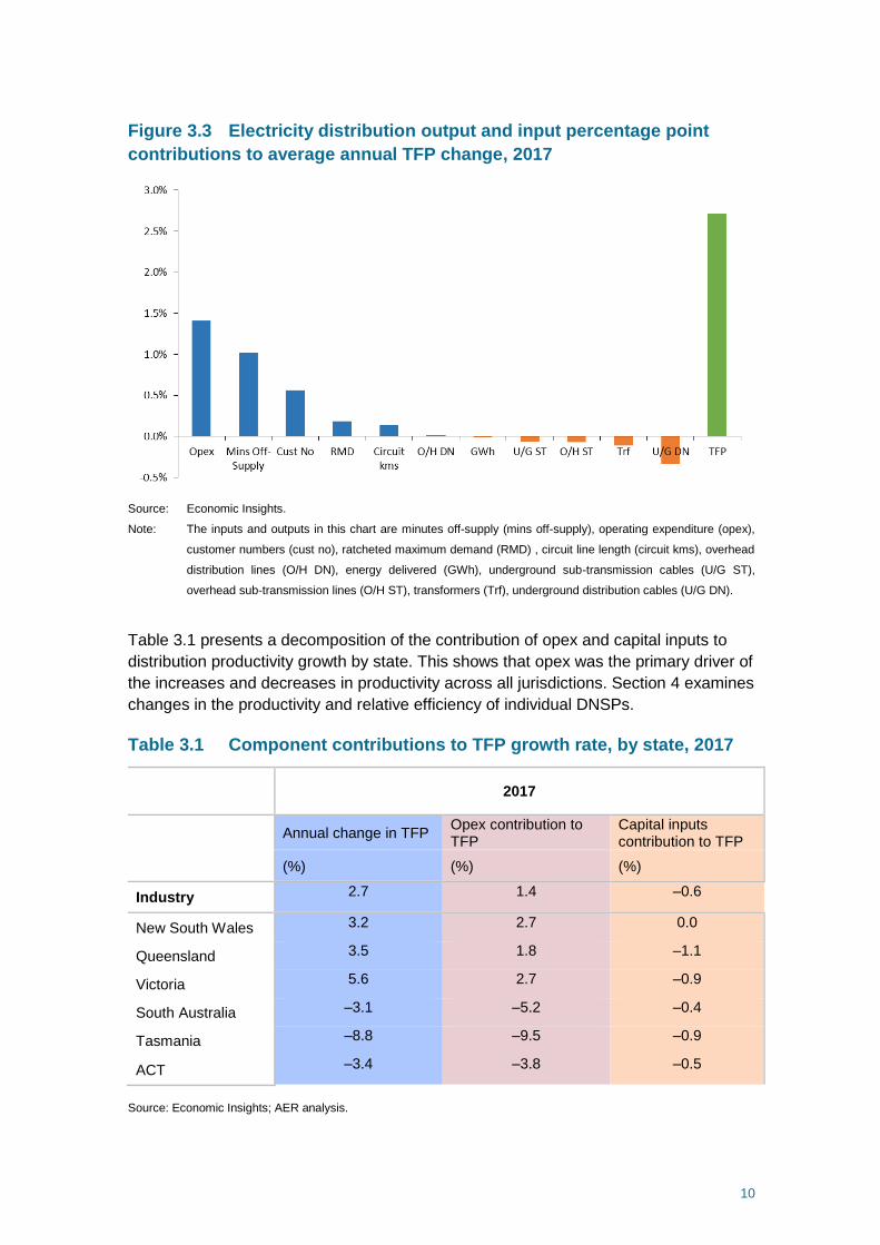
Figure 3.3 helps us understand the drivers of change in electricity distribution
productivity by showing the contributions of each output and each input to the average
annual rate of change in total factor productivity in 2017. This shows that reductions in
opex and the number of minutes off supply, in addition to growth in customer numbers,
drove distribution productivity growth in 2016–17. This suggests that electricity
distribution, at an overall level, has been able to deliver energy more reliably to more
customers and at a lower opex cost.
Changes in the quantity of physical capital assets did not have a significant impact on
changes in productivity in 2017. However, consistent with the trend to underground
power supply in new developments, networks invested in relatively more underground
distribution cables in 2017. This had a small negative effect on overall productivity.
10
Figure 3.3 Electricity distribution output and input percentage point
contributions to average annual TFP change, 2017
Source: Economic Insights.
Note: The inputs and outputs in this chart are minutes off-supply (mins off-supply), operating expenditure (opex),
customer numbers (cust no), ratcheted maximum demand (RMD) , circuit line length (circuit kms), overhead
distribution lines (O/H DN), energy delivered (GWh), underground sub-transmission cables (U/G ST),
overhead sub-transmission lines (O/H ST), transformers (Trf), underground distribution cables (U/G DN).
Table 3.1 presents a decomposition of the contribution of opex and capital inputs to
distribution productivity growth by state. This shows that opex was the primary driver of
the increases and decreases in productivity across all jurisdictions. Section 4 examines
changes in the productivity and relative efficiency of individual DNSPs.
Table 3.1 Component contributions to TFP growth rate, by state, 2017
2017
Annual change in TFP
Opex contribution to TFP
Capital inputs contribution to TFP
(%) (%) (%)
Industry 2.7 1.4 –0.6
New South Wales 3.2 2.7 0.0
Queensland 3.5 1.8 –1.1
Victoria 5.6 2.7 –0.9
South Australia –3.1 –5.2 –0.4
Tasmania –8.8 –9.5 –0.9
ACT –3.4 –3.8 –0.5
Source: Economic Insights; AER analysis.

11
4 The relative productivity of service providers
Key points
Despite a decline in 2017, South Australia retained the highest distribution total productivity
level, as measured by MTFP. This was followed by Victoria, Queensland, the ACT and New
South Wales. Tasmania’s distribution total productivity level fell to the lowest of the included
jurisdictions in 2017.
CitiPower, SA Power Networks, Powercor and United Energy have consistently been amongst
the most productive service providers in the NEM over the last eleven years.
While CitiPower, Powercor and United Energy experienced a decline in productivity between
2006 and 2014, their productivity growth has been positive since 2015. All three businesses
further improved their productivity in 2017 by between 3 and 4 per cent.
Similarly, SA Power Networks experienced a decline in productivity between 2006 and 2014
before two years of consecutive productivity growth. Its productivity then fell by 6 per cent in
2017. This has been driven by increases in its costs of responding to abnormal storms and
other weather events.
Significant operating efficiency reforms and business restructuring have improved the
measured productivity of a number of DNSPs. Ergon Energy, Essential Energy and Evoenergy
in particular have been relatively inefficient in the past, but are now beginning to catch-up to the
more efficient frontier networks. This is most apparent in the improvements to their opex MPFP
results.
AusNet Services improved its productivity by 13 per cent in 2017, the most of any DNSP in the
NEM. AusNet Services was relatively productive over 2006 to 2011. However, from 2012 its
productivity declined and its ranking was overtaken by other DNSPs. Its improvement in 2017
means that it is now amongst the middle group of networks.
TasNetworks experienced some of the largest improvements in productivity of any DNSP
between 2012 and 2015, due to improvements in its opex efficiency. However, large increases
in opex in 2016 and 2017 have now eroded most of these prior gains. In 2017, TasNetworks’
productivity declined by 8 per cent. TasNetworks states this is due to mitigation measures
aimed at reducing bushfire and asset-related risks that were realised to be higher than
previously understood. It expects to again improve its efficiency over the next several years.
It is desirable to take into account how differences in operating environment conditions not
included in the benchmarking models can affect the benchmarking results. In September 2018,
we published a report from Sapere Research Group and Merz Consulting about the most
material operating environment factors (OEFs) driving apparent differences in estimated
productivity and operating efficiency between the distribution networks in the NEM. Sapere-
Merz’s report identified a limited number of OEFs that materially affect the relative costs of each
DNSP in the NEM. These are set out in section 4.3.
We will consult with the distribution industry as part of our next steps in refining the assessment
and quantification of OEFs not included directly in the benchmarking models.

12
This chapter presents economic benchmarking results and provides our key
observations on the reasons for changes in relative productivity of each DNSP in the
NEM. Our website contains the full benchmarking results.
4.1 Economic benchmarking results
MTFP is the headline technique we use to measure and compare the relative
productivity of jurisdictions and individual DNSPs.
Figure 4.1 presents relative distribution productivity levels by state, as measured by
MTFP over the period 2006 to 2017. This shows that, despite a decline in 2017, South
Australia retained the highest distribution total productivity level, followed by Victoria,
Queensland, the ACT and New South Wales. Tasmania’s distribution total productivity
level fell to the lowest of the included jurisdictions in 2017.
Figure 4.1 Electricity distribution MTFP levels by state, 2006–17
Source: Economic Insights.
The remainder of this section examines the relative productivity of individual DNSPs.
Table 4.1 presents the MTFP rankings for individual DNSPs in the NEM in 2017 and
the change in rankings between 2016 and 2017.

13
Table 4.1 Individual DNSP MTFP rankings and scores, 2016 to 2017
DNSP 2017
Rank
2016
Rank
2017
Score
2016
Score
Change
(%)
CitiPower (Vic) 1 1 1.500 1.456 3%
SA Power Networks 2 2 1.304 1.391 –6%
United Energy (Vic) 3 4 1.267 1.211 4%
Powercor (Vic) 4 3 1.254 1.219 3%
Energex (QLD) 5 5 1.156 1.140 1%
Ergon Energy (QLD) 6 8 1.106 1.026 7%
Jemena (Vic) 7 6 1.100 1.101 0%
Endeavour Energy (NSW) 8 9 1.094 1.025 6%
AusNet Services (Vic) 9 12 1.056 0.927 13%
Evoenergy (ACT) 10 7 1.016 1.056 –4%
Essential Energy (NSW) 11 11 0.953 0.981 –3%
TasNetworks 12 10 0.927 1.000 –8%
Ausgrid (NSW) 13 13 0.860 0.821 5%
Source: Economic Insights, AER analysis.
Note: All scores are calibrated relative to the 2006 Evoenergy score which is set equal to one.
Figure 4.2 presents MTFP results for each DNSP from 2006 to 2017.

14
Figure 4.2 MTFP indexes by individual DNSP, 2006–17
0.8
0.9
1.0
1.1
1.2
1.3
1.4
1.5
1.6
1.7
2006 2007 2008 2009 2010 2011 2012 2013 2014 2015 2016 2017
CIT
SAPN
UED
PCR
ENX
ERG
JEN
END
AND
EVO
ESS
TND
AGD
Source: Economic Insights, AER analysis.

15
In addition to MTFP, we also present the results of two MPFP models:
Opex MPFP. This considers the productivity of the DNSPs’ operating expenditure.
Capital MPFP. This considers the productivity of the DNSPs’ use of overhead lines
and underground cables (each split into distribution and sub-transmission
components) and transformers.
These partial approaches assist in interpreting the MTFP results by examining the
contribution of capital assets and operational expenditure to overall productivity. They
use the same output specification as MTFP but provide more detail on the contribution
of the individual components of capital and opex to changes in productivity. However,
they do not account for synergies between capex and opex like the MTFP model.
These results are only indicative of the DNSPs' relative performance. While the impact
of network density and some system structure OEFs which are beyond a DNSP’s
control are included in the analysis, additional OEFs can affect a DNSP's costs and
benchmarking performance. Section 4.3 provides more information about some of
these additional factors.
Figure 4.3 and Figure 4.4 presents opex MPFP and capital MPFP results, respectively,
for all DNSPs over the 2006 to 2017 period.

16
Figure 4.3 DNSP opex multilateral partial factor productivity indexes, 2006–17
Source: Economic Insights, AER analysis.

17
Figure 4.4 DNSP capital multilateral partial factor productivity indexes, 2006–17
Source: Economic Insights, AER analysis.

18
4.2 Key observations about changes in productivity
This section describes some of our key observations about changes in the relative
productivity of DNSPs, based on the results of our benchmarking techniques.
Improved performance of the frontier distribution service providers
CitiPower, Powercor, United Energy and SA Power Networks have consistently been
the most productive distribution service providers in the NEM. These networks are
among those service providers that are on the productivity frontier, as measured by
MTFP.
Figure 4.2 shows that these service providers have experienced a gradual decline in
productivity since 2006. This is primarily due to increasing operating costs as a result
of new regulatory obligations, among other things. However, there has since been a
turnaround in productivity for these four firms from 2014.
In 2017, Citipower and Powercor further improved their productivity. This was primarily
driven by reductions in opex, which significantly increased their opex MPFP results.
CitiPower provided us with some reasons for their reductions in opex in 2017 and
recent years:10
Efficiency savings within CitiPower and Powercor's corporate and network
overheads in 2017 and 2016.
Re-contracting of vegetation management services by CitiPower and Powercor in
2015, which led to lower unit costs.
SA Power Networks is still the second most productive network in the NEM. However,
its productivity fell sharply in 2017 after two years of consecutive productivity growth in
2015 and 2016. SA Power Networks stated that its decline in productivity in 2017 was
primarily due to abnormal and uncontrollable weather events, which led to:11
An increase in Guaranteed Service Level (GSL) reliability payments to customers
of $22.1 million. This far exceeded GSL payments in prior years.
A consequent increase in emergency response costs of $10.2 million to make
network repairs and restore supply following the severe weather events.
Industry reforms are leading to catch-up by the less efficient DNSPs
Several of the electricity distribution networks in ACT, New South Wales, and
Queensland have been among the least efficient networks over the past decade.
Similarly, the measured efficiency of service providers like AusNet Services has been
steadily declining for a number of years. However, in recent years, these networks
10 CitiPower email response to AER questions, 8 August 2018. 11 SA Power Networks email response to AER questions, 15 June 2018.

19
have been improving their opex efficiency as measured by opex MPFP. This is in part
due to reforms and business restructuring initiatives, which included firms in ACT,
NSW and Queensland significantly reducing their workforces.
With these opex reductions, some networks are now beginning to catch-up to the more
efficient networks in the NEM. This is most evident from the improvements in the opex
MPFP results of Ausnet Services, Ergon Energy, Endeavour Energy and Ausgrid in
2017 and the improvement of Essential Energy and Evoenergy since 2015, as shown
in Figure 4.5. As a result of these improvements, Evoenergy, Energex, Ergon Energy,
Essential Energy, Endeavour Energy and AusNet Services are now all among the
middle group of opex MPFP networks in 2017.
Figure 4.5 Opex multilateral partial factor productivity, selected DNSPs, 2012–
17
Source: Economic Insights; AER analysis.
It may take longer for the MTFP scores of some of these firms to improve significantly
due to the impact of lower capital productivity and the long-lived nature of distribution
capital assets and their relative immobility. Essential Energy, Evoenergy and
TasNetworks in particular are the least productive in the NEM in terms of capital
MPFP, and hence will likely take longer to catch-up to the networks that are most
productive across both opex and capital.
One impact of these efficiency improvements is that Jemena, a firm that we have not
previously found to be inefficient, now has an opex MPFP ranking below all DNSPs
except for Ausgrid. Jemena’s productivity has somewhat declined over the past

20
decade. However, Jemena remains amongst the middle group of networks as
measured by MTFP in 2017, and over the past six years, due to its relatively high
capital productivity.
NSW reforms
The NSW DNSPs have restructured to improve opex efficiency and reduce staffing
levels since 2015. This followed the AER's April 2015 revenue determinations for the
2014–19 regulatory period which found that Ausgrid and Essential Energy were
materially inefficient in 2012–13. Workforce numbers for each business was
rationalised under reforms initiated under Networks NSW and in response to the partial
privatisation of Ausgrid and Endeavour.
Since our April 2015 decisions, Ausgrid, Essential Energy and Endeavour Energy have
each made inroads into reducing their costs. In particular:
Essential Energy reduced its network services opex by 26 per cent between 2012–
13 and 2016–17, and reduced its workforce by 38 per cent. This contributed to an
8.7 per cent improvement in its opex MPFP.
Ausgrid increased its network services opex by 4 per cent between 2012–13 and
2016-17. However, Ausgrid incurred substantial transformation costs over this
period to reduce its workforce by 37 per cent. Ausgrid is forecasting opex
reductions in 2017–18 and 2018–19.
Endeavour Energy increased its opex between 2012–13 and 2015–16. However,
since 2015–16, Endeavour Energy’s opex has declined and is forecast to decrease
significantly more in 2017–18 and 2018–19 (based on its regulatory proposal for
the 2019–24 period). Endeavour has reduced its workforce by 29 per cent.
We are currently finalising our remade April 2015 revenue decisions for the 2014–19
period, following successful appeals by the NSW DNSPs with the Australian
Competition Tribunal. As part of remaking our decisions each of the DNSPs has met,
or is proposing to meet, our April 2015 forecast levels of efficient opex during the
2014–19 period.
These DNSPs appear to have responded to the strong incentives imposed by the
regulatory regime and our use of economic benchmarking. As outlined in their recent
regulatory proposals for the upcoming 2019–24 regulatory period, Essential Energy,
Ausgrid and Endeavour Energy have stated they expect to be able to sustain their
opex savings into the next regulatory period.
Queensland reforms
Energex and Ergon Energy improved their opex MPFP levels in 2017. Ergon Energy
and Energex are amongst the middle group of networks in terms of opex efficiency in
2017 and over the past six years. Energex is at the top of the group, while in the most
recent years Ergon has been towards the bottom of this group.
The two Queensland DNSPs have gone through a number of reforms over the past
five years. In 2012, the Queensland State Government established the Independent

21
Review Panel (IRP) on Network Costs to develop options to address the impact of
rising network costs on electricity prices in Queensland. In May 2013, the IRP found
that through a series of reforms, Energex and Ergon could together achieve an
estimated $1.4 billion reduction in operational costs over the 2015−20 regulatory
control period. As a result of these reviews, Energex and Ergon Energy regulatory
proposals to the AER in 2015 included a series of efficiency adjustments to base opex
and over the forecast period, including workforce reductions.12
In 2016–17, Energex and Ergon merged under the parent company Energy
Queensland. Recently, Energex and Ergon Energy released a fact sheet that outlined
the efficiency savings they have already achieved and their expectations for the
future:13
In addition to savings enabled specifically by the merger, Energex and Ergon
Energy (the entities which were brought together under the Energy Queensland
banner) also achieved reductions prior to the completion of the merger
transaction. Energy Queensland expects to achieve total savings against the
regulatory allowances for the current five year period (net of implementation
costs) of approximately $735 million across the two businesses.
Energex and Ergon Energy are due to submit their regulatory proposals for the 2020–
25 period to the AER in January 2019.
AusNet Services
AusNet Services was relatively productive over 2006 to 2011. However, since 2012 its
productivity results and its relative ranking declined among the DNSPs in the NEM.
Notably, in 2016, AusNet Services had the second lowest productivity ranking as
measured by both MTFP and opex MPFP.
In 2017, AusNet Services reduced its opex by 13 per cent and this led to a material
improvement in its opex MPFP results. AusNet Services stated its decreases in opex
was due to:14
Reduced emergency response, maintenance and GSL costs from favourable
weather conditions and improvements in network reliability.
Operating efficiencies in maintenance, IT and corporate costs due to business
restructuring, cost savings initiatives and outsourcing.
AusNet Services is now amongst the middle group of networks in 2017.
12 AER, Final Decision Ergon Energy preliminary determination 2015-20 - Attachment 7 - Operating expenditure,
October 2015, p. 7-51 to 7- 53. 13 Energex and Ergon Energy, Fact Sheet - Savings against the 2015-2020 AER allowance (incorporating merger
savings). 14 AusNet Services, AusNet Services response to questions raised by the AER, 14 June 2018, p. 1.

22
Reduction in TasNetworks' productivity result and ranking
TasNetworks's MTFP fell by 8 per cent in 2016–17, the largest reduction for any
DNSP. This was due to a significant increase in opex and a consequent 27 per cent
decrease in its opex MPFP performance.
In our 2017 annual benchmarking report, we noted that the turnaround in Tasmania's
productivity growth rates between 2006–12 and 2012–16 was one of the largest in any
jurisdiction.15 TasNetworks noted that decreases in opex due to the merger of the
Tasmanian distribution and transmission businesses drove this improvement in
productivity.16
TasNetworks increase in opex in 2016–17 has eroded most of these productivity gains.
TasNetworks provided some reasons for the increase in opex in 2016–17:17
Our increased expenditure has been necessary to address emerging risks on
our distribution network, such as the bushfire risks posed by vegetation,
especially in light of experiences interstate.
As better information became available, we concluded that bushfire and asset-
related risks were higher than previously understood. Therefore, we acted
prudently to address these risks by increasing operating expenditure which
meant we exceeded our allowance, this was at the expense of the return to our
shareholders rather than our customers.
There were also increases in uncontrollable expenditure, such as GSL
payments and the associated costs towards emergency response resulting
from major weather events.
However, TasNetworks stated that it expects its efficiency will again improve:18
While we believe that distribution operating expenditure can return to lower
levels, it will take time to do so without compromising network safety and
performance. Our view is that this lower level of operating expenditure can only
be achieved if it is supported by improved processes, practices and business
platforms to offset the range of new obligations and increased complexity
associated with providing distribution services to a diverse and changing
customer and generation base. We are striving to deliver the required efficiency
improvements over the course of the current and forthcoming regulatory period.
15 AER, 2017 Annual DNSP Benchmarking Report, November 2017, p. 53. 16 TasNetworks, TasNetworks response to 2017 AER draft benchmarking report for distribution networks, 11 October
2017, p.4. 17 TasNetworks, TasNetworks response to questions raised by the AER, 4 June 2018, p. 5. 18 TasNetworks, TasNetworks response to questions raised by the AER, 4 June 2018, p. 6.

23
4.3 The impact of differences in operating environments
This section outlines the impact of differences in operating environments not directly
included in our benchmarking models. This gives stakeholders more information to
interpret the benchmarking results and assess the efficiency of DNSPs.
Service providers do not all operate under exactly the same operating environments.
When undertaking a benchmarking exercise, it is desirable to take into account how
OEFs can affect the relative expenditures of each service provider when acting
efficiently. This ensures we are comparing like with like to the greatest extent possible.
By considering these operating conditions, it also helps us determine the extent to
which differences in measured performance are affected by exogenous factors outside
the control of each business.
When the AEMC added the requirement for the AER to publish annual benchmarking
results, it stated that:
The intention of a benchmarking assessment is not to normalise for every
possible difference in networks. Rather, benchmarking provides a high level
overview taking into account certain exogenous factors. It is then used as a
comparative tool to inform assessments about the relative overall efficiency of
proposed expenditure. 19
Our economic benchmarking techniques account for differences in operating
environments to a significant degree. In particular:
The benchmarking models (excluding partial performance indicators) account for
differences in customer density, energy density and demand density through the
combined effect of the customer numbers, network length, energy throughput and
ratcheted peak demand output variables. These are material sources of differences
in operating costs between networks.
The econometric models also include a variable for the proportion of power lines
that are underground. Service providers with more underground cables will face
less maintenance and vegetation management costs, and fewer outages.
Benchmarking opex is limited to the network service activities of DNSPs. This
means we exclude costs related to metering, connections, street lighting and other
negotiated services, which can differ across jurisdictions or are outside the scope
of regulation. This helps us compare networks on a similar basis.
The capital inputs for MTFP and capital MPFP exclude sub-transmission
transformer assets that are involved in the first stage of two stage transformation
from high voltage to distribution voltage, for those DNSPs that have two stages of
19 AEMC, Rule Determination, National Electricity Amendment (Economic Regulation of Network Service Providers)
Rule 2012, November 2012, pp 107-108.

24
transformation. These are mostly present in NSW, QLD and SA, and hence we
remove them to enable better like-for-like comparisons with other DNSPs.
However, our benchmarking models do not directly account for differences in
legislative or regulatory obligations, climate and geography. These may materially
affect the operating costs in different jurisdictions and hence may have an impact on
our measures of the relative efficiency of each DNSP in the NEM.
In 2017, we engaged Sapere Research Group and Merz Consulting (‘Sapere-Merz’) to
provide us with advice on material OEFs driving apparent differences in estimated
productivity and operating efficiency between the distribution networks in the NEM.
Sapere-Merz provided us with a final report in August 2018, which is available on our
website.
Based on its analysis, Sapere-Merz identified a limited number of OEFs that materially
affect the relative operating expenditure of each DNSP in the NEM. Sapere-Merz
consulted with the electricity distribution industry in identifying these factors. 20 It also
had regard to previous AER analysis of OEFs within our regulatory determinations for
the NSW, ACT and QLD DNSPs.
The OEFs Sapere-Merz identified are:
The higher operating costs of maintaining sub-transmission assets.
Differences in vegetation management requirements.
Jurisdictional taxes and levies.
The costs of planning for, and responding to, cyclones.
Backyard reticulation (in the ACT only).
Termite exposure.
The following box outlines the criteria Sapere-Merz considered when identifying the
relevant OEFs. These are criteria that we also considered when previously analysing
OEFs in our regulatory decisions.
20 The Sapere-Merz report includes more detail about the information and data it used, our consultation with the
distribution industry, and the method for identifying and quantifying these OEFs. See Sapere Research Group and
Merz Consulting, Independent review of Operating Environment actors used to adjust efficient operating
expenditure for economic benchmarking, August 2018, pp. 20-21.

25
Criteria for identifying relevant OEFs
1. Is it outside of the service provider's control? Where the effect of an OEF is within the
control of service provider's management, adjusting for that factor may mask inefficient
investment or expenditure.
2. Is it material? Where the effect of an OEF is not material, we would generally not provide
an adjustment for the factor. Many factors may influence a service provider’s ability to
convert inputs into outputs.
3. Is it accounted for elsewhere? Where the effect of an OEF is accounted for elsewhere
(e.g. within the benchmarking output measures), it should not be separately included as an
operating environment factor. To do so would be to double count the effect of the operating
environment factor. 21
In addition to identifying a limited number of OEFs that satisfied these conditions, the
report from Sapere-Merz also provided:
preliminary quantification of the incremental operating expenditure of each OEF on
each DNSP in the NEM, or a method for quantifying these costs
illustration of the effect of each OEF on our measure of the relative efficiency of
each DNSP, in percentage terms, using a single year of opex.22
The remainder of this section provides a brief overview of each of the material factors
identified by Sapere-Merz.
Sub-transmission operating costs (including licence conditions)
Sub-transmission assets relate to the varying amounts of higher voltage assets (such
as transformers and cables) DNSPs are responsible for maintaining. The distinction
between distribution and sub-transmission assets is primarily due to the differing
historical boundaries drawn by state governments when establishing distribution and
transmission businesses. In addition, DNSPs in NSW and QLD have also historically
faced licence conditions that mandated particular levels of redundancy and service
standards for network reliability on their sub-transmission assets. DNSPs have little
control over these decisions.
Sub-transmission assets cost more to maintain than distribution assets. This is
because sub-transmission transformers are more complex to maintain and maintaining
21 For example, our models capture the effect of line length on opex by using circuit length as an output variable. In
this context, an operating environment adjustment for circuit length would double count the effect of route line
length on opex. Another example is that we exclude metering services from our economic benchmarking data. In
this case, an operating environment adjustment would remove the metering services from services providers'
benchmarked opex twice. 22 See Sapere Research Group and Merz Consulting, Independent review of Operating Environment actors used to
adjust efficient operating expenditure for economic benchmarking, August 2018, p. 35.

26
higher voltage lines more often require specialised equipment and crews. 23 However,
our benchmarking techniques do not directly account for these differences in costs.
This is because our circuit line length and ratcheted demand output metrics do not
capture the incremental costs to service sub-transmission assets compared to
distribution assets. It is necessary to consider these relative costs when evaluating the
relative efficiency of DNSPs using our benchmarking results.
Sapere-Merz's analysis of sub-transmission costs suggests that the NSW and QLD
DNSPs require between 4 and 6 per cent more opex to maintain their sub-transmission
assets, compared to a reference group of efficient DNSPs. This is because they have
relatively more sub-transmission assets than the rest of the NEM. Conversely,
TasNetworks requires 4 per cent less opex because they have far fewer sub-
transmission assets.
More detailed information and analysis is available in the Sapere-Merz report and the
supporting modelling.
Vegetation management
Vegetation management is another potentially significant factor identified by Sapere-
Merz. DNSPs are obliged to ensure the integrity and safety of overhead lines by
maintaining adequate clearances from any vegetation that could interfere with lines or
supports. Several factors drive the costs of managing vegetation that are beyond the
control of DNSPs:
Different climates and geography affect vegetation density and growth rates, which
may affect vegetation management costs per overhead line kilometre and the
duration of time until subsequent vegetation management is again required.
State governments, through enacting statutes, decide whether to impose bushfire
safety regulations on DNSPs and how to divide responsibility for vegetation
management between DNSPs and other parties.
Predominately rural DNSPs may be exposed to a greater proportion of lines
requiring active vegetation management than urban DNSPs.
Vegetation management costs accounts for between 10 and 20 per cent of total opex
for most DNSPs. Hence, differences in vegetation management costs potentially have
a material impact on the relative opex efficiency of DNSPs.24
Our economic benchmarking models largely account for differences in vegetation
management opex between DNSPs. Overhead line length is a potential driver for
vegetation management costs, as vegetation management obligations relate to
23 Sapere Research Group and Merz Consulting, Independent review of Operating Environment actors used to adjust
efficient operating expenditure for economic benchmarking, August 2018, p.48. 24 Sapere Research Group and Merz Consulting, Independent review of Operating Environment actors used to adjust
efficient operating expenditure for economic benchmarking, August 2018, p.65.

27
maintaining clearance between overhead lines and surrounding vegetation. However,
Sapere-Merz’s analysis of Category Analysis RIN and economic benchmarking data
found that the overhead line variable does not fully explain variations in regulatory
obligations, and vegetation density and growth rates across times and between
different locations. 25
Sapare-Merz's report identified a number of information sources and methodologies
that could be used to quantify the effect of regulatory obligations and vegetation
density. Sapere-Merz’ preferred method was to calculate the total combined effect of
these various factors on differences in vegetation management costs. However, under
its preferred method, it could not quantify this operating environment factor based on
currently available data. Its report provides some recommendations and options for
quantifying this factor in the future and the additional data required for this
assessment.26
Cyclones
Cyclones require a significant operational response including planning, mobilisation,
fault rectification and demobilisation. Service providers in tropical cyclonic regions may
also have higher insurance premiums and/or higher non-claimable limits. Ergon Energy
is the only DNSP in the NEM that regularly faces cyclones. Sapere-Merz estimated
that Ergon Energy requires up to five per cent more opex than other DNSPs in the
NEM to account for the costs of cyclones.27
Taxes and levies
A number of jurisdictions require the payment by DNSPs of state taxes and levies such
as licence fees and electrical safety levies. As they are state-based, any such taxes or
levies could vary between jurisdictions and hence DNSPs. These are outside the
control of DNSPs.
Sapere-Merz provided a preliminary quantification of the impact of taxes and levies on
each DNSP. This was based on information provided by each DNSP in its RINs and in
response to information requests. The impact of differences in taxes and levies
generally do not have a significant impact on the relative costs of DNSPs (i.e. beyond 1
per cent). However, Sapere-Merz estimated that TasNetworks requires 5 per cent
more opex than other DNSPs due to significant costs imposed by the Tasmanian
Electrical Safety Inspection Levy.
25 Sapere Research Group and Merz Consulting, Independent review of Operating Environment actors used to adjust
efficient operating expenditure for economic benchmarking, August 2018, p.62. 26 Sapere Research Group and Merz Consulting, Independent review of Operating Environment actors used to adjust
efficient operating expenditure for economic benchmarking, August 2018, pp. 65-68. 27 Sapere Research Group and Merz Consulting, Independent review of Operating Environment actors used to adjust
efficient operating expenditure for economic benchmarking, August 2018, p.77.

28
Backyard reticulation in the ACT
Historical planning practices in the ACT mean that in some areas overhead distribution
lines run along a corridor through backyards rather than the street frontage as is the
practice for other DNSPs. Although landowners are theoretically responsible for
vegetation management along the majority of these corridors, Evoenergy has a
responsibility to ensure public safety, which includes inspecting backyard lines and
issuing notices when vegetation trimming is required. Sapere-Merz estimated that
Evoenergy requires 1.6 per cent more opex than other DNSPs in the NEM to manage
backyard power lines in the ACT.28
Termite exposure
DNSPs incur opex when carrying out termite prevention, monitoring, detecting and
responding to termite damage to assets. These costs depend on the number of a
DNSP’s assets that are susceptible to termite damage and the prevalence of termites
within the regions where the DNSP’s assets are located. Termite exposure is the
smallest of the material OEFs identified by Sapere-Merz. Preliminary analysis suggests
that termite exposure primarily affects Ergon Energy and Essential Energy, where they
require 1 per cent more opex to manage termites.29
Next steps
Sapere-Merz acknowledged the findings and conclusions in its final report are based
on the currently available information, and on a number of assumptions. Sapere-Merz
suggested potential improvements to our data sources that we should consider as part
of our continuous improvement of our economic benchmarking techniques and
quantifying the impact of material OEFs.
The Sapere-Merz report also considered that two other OEFs have the potential to be
material and we need further information to examine whether this is the case:
Differences in DNSP terrain and topology (e.g. differences in the proportion of
radial and meshed network configurations).
Differences in the obligations and value of payments under Guaranteed Service
Levels schemes in different jurisdictions.
We also received submissions from DNSPs to our draft benchmarking report that
provided further information and suggestions about the findings in the Sapere-Merz
report and the data relied upon.
28 Sapere Research Group and Merz Consulting, Independent review of Operating Environment actors used to adjust
efficient operating expenditure for economic benchmarking, August 2018, p.77. 29 Sapere Research Group and Merz Consulting, Independent review of Operating Environment actors used to adjust
efficient operating expenditure for economic benchmarking, August 2018, p.74.

29
We will consult with stakeholders as part of our next steps in refining the assessment
and quantification of OEFs. As part of this, we will also take into account the
submissions to our draft benchmarking report.

30
4.4 Power and Water Corporation
Under section 6.27A of the NER (Northern Territory), Power and Water Corporation
(‘Power and Water’) is now a relevant service provider for our annual benchmarking
report. Power and Water is the DNSP in the Northern Territory. Power and Water has
just transitioned to the NER and has not been included in our previous annual
benchmarking reports.
We are still in the process of examining Power and Water's benchmarking and
regulatory data, which it reported to us in March 2018. This is to ensure that its
benchmarking data is fit for purpose. This review is an integral stage of economic
benchmarking that we have previously conducted for all DNSPs.
We are also mindful of the challenges of Power and Water’s potentially unique
operating environment in assessing its efficiency relative to the rest of the NEM. We
have not undertaken a detailed assessment of the impact of Power and Water’s
operating environment on its costs. However, preliminary qualitative analysis from
Sapere-Merz (as part of our review of OEFs outlined in section 4.3) identified a number
of unique factors that are likely to drive materially higher electricity distribution costs in
the Northern Territory relative to other jurisdictions in the NEM:
Cyclones likely have material impact on Power and Water's opex and
benchmarking performance. Part of Power and Water's network (Darwin) is
situated in the tropical north of Australia and subject to cyclones during the wet
season, requiring a significant emergency response operation. Service providers in
cyclonic regions may also have higher insurance premiums.
Extreme heat and humidity in the Northern Territory may have a material impact on
workability. For example, how it manages overhead assets that may be subject to
lightning strikes, or manages water ingress from high humidity and a wet
environment may affect its measured productivity.
Power and Water may be required to pay a cost premium to attract and retain
certain types of labour, or to acquire and transport necessary materials.
In the absence of quantification of Power and Water’s OEFs, as well as a better
understanding of Power and Water's cost data, we do not consider that the economic
benchmarking of Power and Water is currently at a stage where we can use it to
assess its efficiency relative to other service providers in the NEM. For these reasons,
we have not included Power and Water in this year's report.
We intend to undertake an assessment of the impact of Power and Water’s operating
environment for future benchmarking reports.

31
5 Other supporting benchmarking techniques
5.1 Modelling of operating expenditure efficiency
This section presents the results of four econometric models that compare the relative
opex efficiency of service providers in the NEM. These results reflect an average
efficiency score for each DNSP over a specified period.
The four econometric models presented in this section are:30
Cobb-Douglas stochastic frontier analysis (SFA).
Cobb-Douglas least squares econometrics (LSE).
Translog SFA.
Translog LSE.
Figure 5.1 presents average efficiency scores for these four models (plus opex MPFP)
over the period 2012–17. Citipower and Powercor have the highest efficiency scores
on the majority of metrics, followed by United Energy, SA Power Networks, and
TasNetworks. Ausgrid and Evoenergy (ACT) have the lowest scores over this period.
Figure 5.1 Econometric modelling and opex MPFP, (2012–17 average)
Source: Economic Insights.
30 You can find more details about these econometric models in Economic Insights 2014 and 2018 reports.

32
The average efficiency scores shown in Figure 5.1 are new additions to our annual
benchmarking report. We have previously reported efficiency scores over the full
benchmarking period 2006–17 (which is below in Figure 5.2). Efficiency scores over
the 2012–17 period should provide stakeholders with more information to assess the
recent efficiency performance of DNSPs, including the impact of the efficiency reforms
and other changes in opex over the past six years.
This year we have also included the results of an additional econometric model — the
Translog SFA model. Economic Insights originally considered this model in our initial
benchmarking development program in 2013–14, but we did not implement it at the
time. This year Economic Insights has recommended that this model is now suitable
and is statistically robust over the 2012–17 dataset.31 You can find a more technical
explanation in Economic Insights' 2018 report.
Figure 5.2 presents the average efficiency of each DNSP over the entire benchmarking
period (2006–17). This provides a more long-term picture of relative efficiency of
DNSPs in the NEM.
Figure 5.2 Econometric modelling and opex MPFP, (2006–17 average)
Source: Economic Insights.
Note: This does not include SFA TLG. Economic Insights 2018 report notes that the SFA TLG model is statistically
robust over the 2012–17 dataset, but does not produce useable results over the entire 2006–17 sample.
This is because it violates statistical monotonicity requirements (see Economic Insights, Economic
Benchmarking Results for the Australian Energy Regulator’s 2018 DNSP Annual Benchmarking Report, 9
31 Economic Insights, Economic Benchmarking Results for the Australian Energy Regulator’s 2018 DNSP Annual
Benchmarking Report, 9 November 2018, p. 19

33
November 2018, p. 19) to a much greater extent over the full period. We will be mindful of these statistical
sensitivities as we review of our economic benchmarking models over time.
While the efficiency results are similar between the longer-term average (2006–17) and
the more recent period (2012–17), there are some notable differences. Measured
relative to the efficiency frontier, Essential Energy and Ergon Energy are becoming
more efficient over the 2012–17 period, whereas CitiPower, SA Power Networks and
Jemena are getting less efficient. This is consistent with the changes in opex MPFP as
shown in Figure 4.3.
How we use average efficiency scores to assess relative efficiency in a specific year
The econometric models produce average opex efficiency scores for the period over which the
models are estimated. The results we are using in this section reflect average efficiency scores
over the 2012–17 period and the 2006–17 period. Where there are rapid increases or
decreases in opex, it may take some time before the average efficiency scores reflect these
changes, in particular for the longer period average results. This means that in some
circumstances the efficiency scores will not reflect a DNSP’s relative efficiency in the most
recent year.
To use the econometric results to assess the efficiency of opex in a specific year, we can
estimate the efficient costs of a benchmark efficient service provider operating in the target
DNSP's circumstances. We do this by first averaging the DNSP’s actual opex and calculating its
efficiency score over the relevant period. We then compare the DNSP’s efficiency score against
a benchmark comparison score adjusted for potential differences in operating environments.
Where the DNSP’s efficiency score is below the adjusted benchmark score, we adjust the
DNSP’s opex by the difference between the two efficiency scores. This results in an estimate of
average opex that is not materially inefficient. We then roll forward this period-average opex to
a specific year using a rate of change that reflects changes in outputs, OEFs and technology
between the average year and the specific year.
Appendix A and B provides more information about our econometric models.

34
5.2 Partial performance indicators
PPI techniques are a simpler form of benchmarking that compare one input to one
output. This contrasts with the MTFP, MPFP and econometric techniques that relate
inputs to multiple outputs.
The PPIs used here support the other benchmarking techniques because they provide
a general indication of comparative performance of the DNSPs in delivering a specific
output. While PPIs do not take into account the interrelationships between outputs (or
the interrelationship between inputs), they are informative when used in conjunction
with other benchmarking techniques.
We note that on a 'per customer' metric, large rural DNSPs will perform poorly relative
to DNSPs in suburban and metropolitan areas. Typically, the longer and sparser a
DNSP’s network, the more assets it must operate and maintain per customer. The 'per
MW' metric exhibits a similar pattern. Conversely, on 'per km' metrics, large rural
DNSPs will perform better because their costs are spread over a longer network.
Where possible, we have plotted PPIs against customer density, to enable readers to
visualise and account for these effects when interpreting the results.
5.2.1 Total cost PPIs
This section presents total cost PPIs. These compare DNSPs' total costs (opex and
asset cost)32 against a number of outputs, including customer numbers, maximum
demand and circuit length.
Total cost per customer
Figure 5.3 shows each DNSP’s total cost per customer. Customer numbers are
arguably the most significant output DNSPs provide because the number of customers
connected to the network drives demand and the infrastructure required to meet that
demand.33
Broadly, this metric should favour DNSPs with higher customer density because they
are able to spread their costs over a larger customer base. However, it is worth noting
that there is a large spread of results across the lower customer density networks. In
particular, Ergon Energy and Essential Energy have relatively higher cost per customer
32 Asset cost is the sum of annual depreciation and return on investment. This measure has the advantage of
reflecting the total cost of assets for which customers are billed on an annual basis, using the average return on
capital over the period. 33 The customer numbers output carries the largest weight (in terms of per cent share of gross revenue) in the MTFP
and MPFP indices. It also carries the largest weight (in terms of the magnitude of coefficient estimates) in the
opex cost function models. See Economic Insights, Economic benchmarking assessment of operating expenditure
for NSW and ACT electricity DNSPs, November 2014, pp. 16, 21, 33-36.

35
relative to SA Power Networks, Powercor and AusNet Services, who share similar
levels of customer density.
Figure 5.3 Total cost per customer ($2017) against customer density
(average 2013–17)
Source: AER analysis, Economic Benchmarking RINs.
Total cost per kilometre of circuit line
Figure 5.4 presents each DNSP’s total cost per km of circuit line length. Circuit line
length reflects the distance over which DNSPs must deliver electricity to their
customers. Broadly, this measure favours DNSPs with lower customer density as it
spreads their costs over a longer network. However, Ausgrid is an outlier with higher
costs per kilometre relative to networks with similar customer density.

36
Figure 5.4 Total cost per kilometre of circuit line length ($2017) against
customer density (average 2013–2017)
Source: AER analysis, Economic Benchmarking RINs.
Total cost per MW of maximum demand
Figure 5.5 shows each DNSP’s total cost per MW of maximum demand. DNSPs install
assets to meet maximum demand. Maximum demand is also an indirect driver of opex,
as installed assets require maintenance (opex). Similar to total cost per customer, the
measure of total cost per MW of maximum demand favours DNSPs with higher
customer density. However, the spread of results tends to be narrower than that of the
other metrics.

37
Figure 5.5 Total cost per MW of maximum demand ($2016) against
customer density (average 2013–17)
Source: AER analysis, Economic Benchmarking RINs.
5.2.2 Cost category PPIs
This section presents category level cost PPIs over the 2013–17 period. These
compare a DNSP’s category level opex (vegetation management, maintenance,
emergency response, and total overheads) against a relevant output.34 The data for
these PPIs are from the category analysis RIN and economic benchmarking RIN
reported to the AER.35 This is the first time we have included category level PPIs in the
annual benchmarking report.
When used in isolation, these category level PPI results should be interpreted with
caution at this early stage in their development. This is because reporting differences
between DNSPs may limit like-for-like category level comparisons. For example,
34 We have considered a number of possible output measures such as the length of lines, the energy delivered, the
maximum demand and the number of customers served by the service provider. Each of these output measures
have advantages and disadvantages. We have selected the output measures in this report that are most related to
the cost category in question. 35 We have used the category analysis RIN for category level expenditure data, and the economic benchmarking RIN
for non-expenditure data (i.e route line length, number of interruptions etc.). The expenditure data reported in the
category analysis RIN reflects the cost allocation methodology, service classification and reporting requirements in
place at the time the RIN was submitted.

38
DNSPs may allocate and report opex differently due to different ownership structures,
and the policies it has in place at the time of reporting. There may also be differences
in the interpretation and approaches taken by DNSPs in preparing their RIN data.36
Further, a number of DNSPs have reported balancing items that may distort its relative
category level efficiency.37 However, while these factors may impact category level
opex, we have not previously found it to drive material differences in total opex.
We use category level PPIs as supporting benchmarking techniques in our distribution
determinations to identify potential areas of DNSP inefficiency.
Vegetation management
Vegetation management expenditure includes tree trimming, hazard tree clearance,
ground clearance, vegetation corridor clearance, inspection, audit, vegetation
contractor liaison, and tree replacement costs. We chose vegetation management per
kilometre of overhead route line length because overhead line length is a proxy of
vegetation management costs.38
Figure 5.6 shows that Endeavour Energy and United Energy has the highest
vegetation management expenditure per kilometre of overhead route line length
relative to other DNSPs in the NEM. It also shows that Evoenergy benchmarks
relatively better compared to DNSPs with similar customer densities. One contributor
to Evoenergy’s performance may be due to the ACT Government having responsibility
to undertake vegetation management in the urban areas of the ACT up until 2018.
36 Energy QLD – Energex and Ergon submission on draft distribution benchmarking report 2018, 18 October
2018p.6. 37 A DNSP reports a balancing item when the sum of its category level expenditure (e.g. vegetation management,
maintenance, overheads) does not reconcile with the total amount of expenditure it has incurred. Over the 2012–
17 period, a number of DNSPs have reported positive balancing items (where its category level costs are
understated) and negative balancing items (where its category level costs are overstated) in both opex and capex. 38 We note that route line length contains lengths of lines that are not vegetated. Vegetation maintenance spans is a
better indicator of the length of vegetated spans. However, we have used overhead line length instead of
vegetation maintenance span length due to DNSPs' estimation assumptions affecting maintenance span length
data.

39
Figure 5.6 Vegetation management opex per km of route line length
($2017)
Source: AER analysis, Category Analysis RINs, Economic Benchmarking RINs.
Maintenance
Maintenance expenditure relates to the direct operating costs incurred in maintaining
poles, cables, substations, and protection systems. It excludes vegetation
management costs and costs incurred in responding to emergencies. We chose
maintenance per circuit kilometre because assets and asset exposure are important
drivers of maintenance costs.39 We used circuit length because it is easily
understandable and a more intuitive measure of assets than transformer capacity or
circuit capacity.
While Citipower is one of the best performers in our opex MPFP analysis, Figure 5.7
shows that it has highest maintenance opex spend per km of circuit length in the NEM.
However, we note this circuit kilometre measure favours rural service providers who
have longer circuit lines.
39 Circuit line length includes both overhead and underground cables.

40
Figure 5.7 Average maintenance opex spend per circuit km against
customer density ($2017)
Source: AER analysis, Category Analysis RINs, Economic Benchmarking RINs.
Emergency response
Emergency response expenditure is the direct operating cost incurred in responding to
network emergencies. We excluded major event day emergency response costs
because major events only occur occasionally and can significantly alter individual
DNSP results in any given year.40
We chose emergency response costs per unplanned interruption because the number
of supply interruptions is likely to drive emergency response costs. Where there is an
interruption, there is likely to be expenditure to correct it. We did not use emergency
response per route line length because while it may account for further travel distance
of rural DNSPs to get to its feeders, urban DNSPs may face longer travel time due to
congestion.
Figure 5.8 shows that SA Power Networks, Endeavour Energy, Ausgrid and Energex
have higher emergency response cost per interruption relative to other DNSPs of
40 A major event day is defined in the Institute of Electrical and Electronics Engineers standard 1366–2003, Guide for
Electric Power Distribution Reliability Indices.

41
similar customer density, and in the NEM. In comparison, Evoenergy has relatively
lower emergency response expenditure per interruption. This may partly be due to it
sharing the responsibility of emergency response associated with fallen vegetation in
the urban areas of the ACT with the ACT Government.
Figure 5.8 Average emergency response spend per interruption
against customer density ($2017)
Source: AER analysis, Category Analysis RINs, Economic Benchmarking RINs.
Note: Jemena’s data point reflects its 2013 and 2017 category analysis (CA) RIN. Jemena claimed confidentiality
on its emergency response data in between these years.
Total overheads
Total overheads are the sum of corporate and network overheads allocated to
standard control services. We have used total overheads allocated to both capex and
opex to ensure that differences in a DNSP's capitalisation policy does not affect the
analysis. It also mitigates the impact of a DNSP's choice in allocating their overheads
to corporate or network services.
We have examined total overheads by customer numbers, because it is likely to be a
driver of overhead costs. Figure 5.9 shows that Ergon has higher overhead costs
compared to all other DNSPs in the NEM. While the ‘per customer’ measure may
favour DNSPs with higher customer density, we do not consider this explains Ergon’s
relative performance. This is because it has higher costs relative to DNSPs of similar
customer densities.

42
Figure 5.9 Total Overheads – average total overheads per customer
against average customer density ($2017)
Source: AER analysis, Category Analysis RINs, Economic Benchmarking RINs.
Category level PPI developments
As part of our ongoing development program, we will continue to develop our category
level PPIs. As we noted above, reporting differences between DNSPs may limit
category level comparisons.
Energy Queensland and SA Power Networks has expressed concern that there are
differences in approaches and interpretations applied by DNSPs when reporting their
data. This related to vegetation management41, major event day42, and interruptions
data.43
We acknowledge that differences in how DNSPs interpret and report category level data will impact the category level benchmarking results. We will consider data consistency issues and the materiality of this as part of our ongoing benchmarking development program.
41 Energy QLD – Energex and Ergon submission on draft distribution benchmarking report 2018, 19 October 2018,
p.6. 42 Energy QLD – Energex and Ergon submission on draft distribution benchmarking report 2018, 19 October 2018,
p.9. 43 SA Power Networks – Submission on draft distribution benchmarking report 2018, 17 October 2018, p.3.

43
A References and further reading
Several sources inform this benchmarking report. These include ACCC/AER research
and expert advice provided by Economic Insights.
Economic Insights publications
The following publications explain in detail how Economic Insights developed and
applied the economic benchmarking techniques used by the AER.
Economic Insights, Economic Benchmarking Results for the Australian Energy
Regulator’s 2018 DNSP Benchmarking Report, 9 November 2018
Economic Insights, Economic Benchmarking Results for the Australian Energy
Regulator’s 2017 DNSP Benchmarking Report, 31 October 2017
Economic Insights, Memorandum – DNSP Economic Benchmarking Results
Report, November 2016
Economic Insights, Memorandum – DNSP MTFP and Opex Cost Function Results,
13 November 2015
Economic Insights, Response to Consultants’ Reports on Economic Benchmarking
of Electricity DNSPs, 22 April 2015 (link).
Economic Insights, Economic Benchmarking Assessment of Operating Expenditure
for NSW and ACT Electricity DNSPs, 17 November 2014 (link).
Economic Insights, Economic Benchmarking of Electricity Network Service
Providers, 25 June 2013
ACCC/AER publications
These publications provide a comprehensive overview of the benchmarking
approaches used by overseas regulators.
ACCC/AER, Benchmarking Opex and Capex in Energy Networks – Working Paper
no. 6, May 2012 (link).
ACCC/AER, Regulatory Practices in Other Countries – Benchmarking opex and
capex in energy networks, May 2012 (link).
WIK Consult, Cost Benchmarking in Energy Regulation in European Countries,
December 2011 (link).
AER distribution determinations
In each of the following determinations, the AER applied economic benchmarking to
determine efficient total forecast opex.
AER, Jemena distribution determination 2016 to 2020, Attachment 7 – Operating
Expenditure, May 2016, p. 7-22 (link).

44
AER, SA Power Networks distribution determination 2015–16 to 2019–20,
Attachment 7 – Operating Expenditure, October 2015 (link).
AER, Final decision, Endeavour Energy distribution determination 2015–16 to
2018–19, Attachment 7 – Operating Expenditure, April 2015 (link).
AER, Draft decision, Endeavour Energy distribution determination 2015–16 to
2018–19, Attachment 7 – Operating Expenditure, November 2014 (link).
AER, Preliminary decision, Energex determination 2015–16 to 2019–20,
Attachment 7 – Operating Expenditure, April 2015 (link).
AER, Preliminary decision, Ergon Energy determination 2015–16 to 2019–20,
Attachment 7 – Operating Expenditure, April 2015 (link).

45
B Benchmarking models and data
This appendix contains further information on our economic benchmarking models,
and the output and input data used in the benchmarking techniques.
B.1 Benchmarking techniques
This report presents results from three types of 'top-down' benchmarking techniques.
1. PIN. These techniques use a mathematical index to determine the relationship between
outputs and inputs, enabling comparison of productivity levels and trends over time.
TFP relates total inputs to total outputs and provides a measure of overall
productivity growth for a single entity (a network or the whole industry). It allows
total productivity growth rates to be compared across networks but does not allow
productivity levels to be compared across networks. It is used to decompose
productivity change into its constituent input and output parts.
MTFP relates total inputs (opex and capital) to total outputs and can provide a
measure of overall network efficiency. It allows total productivity levels to be
compared between networks.44 It is applied to combined time-series, cross-section
(or 'panel') data.
MPFP is a partial efficiency measure, which uses the same output specification as
MTFP but separately examines the productivity of opex and capex against total
output.
2. Econometric opex models. These model the relationship between opex (as the input) and
outputs, and so measure partial efficiency. The report presents two econometric opex
models —LSE and SFA.
3. PPIs. These techniques, also partial efficiency measures, relate one input to one output
(contrasting with the above techniques that relate one or all inputs to total outputs). PPIs
measure the average amount of an input (such as total cost) used to produce one unit of a
given output (such as total customer numbers, megawatts of maximum electricity demand
or kilometres of circuit length).
There are a number of important differences across the various models. In particular:
Operating environment factors. The productivity index and econometric models
include allowance for the key network density differences (e.g. customer density,
maximum demand density). The econometric models also account for the degree
of network undergrounding.
Output variables. The econometric models include three outputs whereas the
productivity index models includes five outputs (the three outputs in the
44 There may be minor differences in MTFP and TFP growth rates for a particular firm due to differences in the
properties of the indices.

46
econometric models plus energy delivered and reliability). The PPIs only include
one output variable per indicator.
Estimation technique:
o The econometric models estimate two types of cost functions. The LSE opex
cost function models use least squares estimation, whereas the SFA models
use frontier estimation methods. The econometric models also estimates two
different types of functional form — Cobb-Douglas and translog.
o The opex MPFP model uses a non–parametric method.
Data. The productivity index models and the PPIs use Australian data only,
whereas the econometric models use Australian data and overseas data.
Notwithstanding the differences in the features and data requirements of each model,
the opex efficiency scores of each model are broadly consistent with each other
(although there is some variation in individual DNSP results and the relative rankings
of DNSPs). The similarity between the results from the opex MPFP model and the
econometric models is particularly noteworthy, given the very different approaches.
This reinforces the confidence in the results from each model.45
Economic Insights 2018 report provides more detail on the econometric methodology
and modelling results. The Economic Insights November 2014 report referenced in
Appendix A also provide more information about each model, and the rationale
supporting the choice of input and output specifications used in this report.
B.2 Benchmarking data
This appendix contains further information about the benchmarking data used in the
benchmarking techniques (specifically the outputs and inputs data).
Inputs include a mix of the infrastructure assets needed to distribute electricity to end
users and the network opex to run and maintain the network. DNSPs primarily exist to
provide customers with access to a safe and reliable supply of electricity and a range
of outputs have been selected to reflect this goal.46
45 Economic Insights, Economic benchmarking assessment of operating expenditure for NSW and ACT electricity
DNSPs, November 2014, pp. 46–47. 46 The November 2014 Economic Insights referenced in Appendix A details the input and output weights applied to
constructing the productivity index numbers. The November 2018 Economic Insights report contains further
information on the updated output weights.

47
Categories of inputs and outputs used in benchmarking
Inputs:
Capital stock (assets) is the physical assets DNSPs invest in to replace, upgrade or expand
their networks. Electricity distribution assets provide useful service over a number of years
or even several decades. We split capital into:
o overhead distribution (below 33kV) lines
o overhead sub-transmission (33kV and above) lines
o underground distribution cables (below 33kV)
o underground sub-transmission (33kV and above) cables
o transformers and other capital
Operating expenditure (opex) is expenditure needed to operate and maintain a network.
Opex is an immediate input into providing services and is fully consumed within the
reporting year.
Outputs:
Customer numbers. The number of customers is a significant driver of the services a DNSP
must provide. We measure the number of customers as the number of active connections
on a network, represented by each energised national metering identifier.
Circuit length. This reflects the distances over which DNSPs deliver electricity to their
customers.
Ratcheted maximum demand (RMD). DNSPs endeavour to meet the demand for energy
from their customers when that demand is greatest. This means that they must build and
operate their networks with sufficient capacity to meet the expected peak demand for
electricity.47
Energy delivered (MWh). Energy throughput is a measure of the amount of electricity that
DNSPs deliver to their customers.
Reliability (Minutes off-supply). Reliability measures the extent to which networks are able
to maintain a continuous supply of electricity. Minutes off-supply enters as a negative output
and is weighted by the value of consumer reliability.
The November 2014 Economic Insights referenced in Appendix A details the rationale for the
choice of these inputs and outputs.
The econometric modelling differs from the other benchmarking techniques in that it
uses Australian and overseas data. The data intensive nature of the econometric
techniques means that sufficiently robust results cannot be produced with Australian
DNSP data alone. Economic Insights incorporated comparable data from electricity
47 The economic benchmarking techniques use 'ratcheted' maximum demand as an output rather than observed
maximum demand. Ratcheted maximum demand is the highest value of peak demand observed in the time period
up to the year in question for each DNSP. It recognises capacity that has been used to satisfy demand and gives
the DNSP credit for this capacity in subsequent years, even though annual maximum demand may be lower in
subsequent years.

48
DNSPs in Ontario and New Zealand to increase the size of the dataset and enable
robust estimation of the opex cost function models. Sensitivity analysis of the
econometric benchmarking results (using cost functions generated with and without the
overseas data) indicates that the addition of the overseas data improves the
robustness of the econometric model (by allowing better estimation of the opex cost
function parameters) without distorting the estimation of individual DNSP’s efficiency
results. Appendix A contains references to further reading on how Economic Insights
incorporated overseas data into the econometric models and the sensitivity analyses.
To prepare this year's report, each DNSP provided the AER with input and output data
from their businesses as defined in standardised economic benchmarking regulatory
information notices (EB RINs). The EB RINs require all DNSPs to provide a consistent
set of data, which is verified by each DNSP’s chief executive officer and independently
audited. We separately tested and validated the data provided by the networks.
Economic Insights prepared the benchmarking results using the set of agreed
benchmarking techniques.48 We provided the DNSPs with a draft version of the
benchmarking report to allow each network to provide feedback on the results before
we publically release the final benchmarking report.49
The complete data sets for all inputs and outputs from 2006 to 2017, along with the
Basis of Preparation provided by each DNSP, are published on our website.50
B.2.1 Outputs
The techniques in the report measure output using some or all of customer numbers,
circuit line length, maximum demand, energy throughput and reliability.
Customer numbers
The primary function of a distribution network is providing its customers with access to
electricity. Regardless of how much electricity a customer consumes, infrastructure is
required to connect every customer to the network. The number of customers,
therefore, reflects a significant driver of the services a DNSP provides.51
Figure B.1 shows the average customer numbers of each DNSP over the five-year
period from 2013 to 2017.
48 The Economic Insights report outlining the results for this year's report and the data and benchmarking techniques
used can be found on the AER's benchmarking website. 49 NER, 8.7.4 (c) (1) (2). 50 This dataset is available at: https://www.aer.gov.au/node/483. 51 We measure the number of customers as the number of active connections on a network, represented by each
energised national metering identifier.
49
Figure B.1 Five year average customer numbers by DNSP (2013–17)
Source: Economic Benchmarking RIN.
Circuit line length
Line length reflects the distances over which DNSPs deliver electricity to their
customers. To provide their customers with access to electricity, DNSPs must transport
electricity from the transmission network to their customers' premises. DNSPs will
typically operate networks that transport electricity over thousands of kilometres.
In addition to measuring network size, circuit length also approximates the line length
dimension of system capacity. System capacity represents the amount of network
assets a DNSP must install and maintain to supply consumers with the quantity of
electricity demanded at the places where they are located.
Figure B.2 shows each DNSP’s circuit length, on average, over the five years from
2013 to 2017.

50
Figure B.2 Five year average circuit line length by DNSP (2013–17)
Source: Economic Benchmarking RIN.
For PPI metrics, we use route length to calculate customer density because it is a
measure of a DNSP’s physical network footprint (because it does not count multiple
circuits on the same route). Figure B.3 demonstrates that, for all DNSPs, route length
is shorter than circuit length but there is no change in DNSP rankings.

51
Figure B.3 Five year average route line length by DNSP (2013–17)
Source: Economic Benchmarking RIN.
Maximum demand and energy throughput
DNSPs are required to meet and manage the demand of their customers. This means
that they must build and operate their networks with sufficient capacity to meet the
expected peak demand for electricity. Maximum demand is a measure of the overall
peak in demand experienced by the network. The maximum demand measure we use
is non-coincident summated raw system annual maximum demand, at the transmission
connection point.
The economic benchmarking techniques use 'ratcheted' maximum demand as an
output rather than observed maximum demand. Ratcheted maximum demand is the
highest value of peak demand observed in the time period up to the year in question
for each DNSP. It thus recognises capacity that has actually been used to satisfy
demand and gives the DNSP credit for this capacity in subsequent years, even though
annual peak demand may be lower in subsequent years.
Energy throughput is a measure of the amount of electricity that DNSPs deliver to their
customers. While energy throughput is not considered a significant driver of costs
(distribution networks are typically engineered to manage maximum demand rather
than throughput) energy throughput reflects a service provided directly to customers.
Table B.1 presents maximum demand and energy delivered for each of the DNSPs, on
average, for the five years between 2013 and 2017.

52
Table B.1 Maximum demand and energy throughput (2013–17
average)
Maximum demand (MW) Energy throughput (MWh)
Evoenergy (ACT) 693 2,871,402
Ausgrid (AGD) 5,659 26,490,798
AusNet Services (AND) 1,877 7,557,905
CitiPower (CIT) 1,373 5,961,412
Endeavour Energy (END) 3,651 16,183,271
Energex (ENX) 4,678 21,079,133
Ergon Energy (ERG) 3,124 13,661,402
Essential Energy (ESS) 2,713 12,151,630
Jemena (JEN) 949 4,230,686
Powercor (PCR) 2,415 10,600,461
SA Power Networks (SAP) 2,848 10,665,511
TasNetworks (TND) 1,047 4,221,291
United Energy (UED) 1,965 7,869,031
Source: Economic Benchmarking RIN.
Reliability
Another dimension of the outputs of DNSPs is the reliability of their electricity supply.
This is commonly measured as the average number of minutes off supply per
customer (per annum) or the average number of interruptions per customer. Figure B.4
presents the average number of minutes off supply per customer, excluding the effects
of major events, planned outages and transmission outages.

53
Figure B.4 Average minutes off supply per customer (2013–2017)
Source: Economic Benchmarking RIN.
Figure B.5 presents the average number of interruptions to supply per customer,
excluding the effects of major events, planned outages and transmission outages.
There are other measurements of reliability but the frequency and duration of
interruptions to supply per customer are the Institute of Electrical and Electronics
Engineers (IEEE) standard measures for DNSPs.

54
Figure B.5 Average number of interruptions per customer (2013–2017)
Source: Economic Benchmarking RIN.
B.2.2 Inputs
The inputs used in this report are assets and opex. DNSPs use a mix of assets and
opex to deliver services. Electricity assets can provide useful service over several
decades. However, benchmarking studies typically focus on a shorter period of time.
For our MTFP analysis we use physical measures of capital inputs. Using physical
values for capital inputs has the advantage of best reflecting the physical depreciation
profile of DNSP assets. Our MTFP analysis uses five physical measures of capital
inputs: the capacity of transformers, overhead lines above 33kV, overhead lines below
33kV, underground cables above 33kV and underground cables below 33kV. The
MTFP analysis also uses constant dollar opex as an input. The November 2014
Economic Insights report referred to in Appendix A provides further detail on the capital
inputs for MTFP.
For the purpose of PPI analysis we use the real value of the regulatory asset base as
the proxy for assets as the starting point in deriving the real cost of using those assets.
To be consistent with Economic Insights' MTFP analysis, and in response to a
submission by Ausgrid,52 we have adjusted the PPI analysis to remove assets
associated with the first-stage of the two-step transformation at the zone substation
52 Ausgrid, Submission on the DNSP annual benchmarking report 2016, 14 October 2016, p. 3.

55
level for those DNSPs with more complex system structures. This allows better like-
with-like comparisons to be made across DNSPs.
Asset cost is the sum of annual depreciation and return on investment.53 This measure
has the advantage of reflecting the total cost of assets for which customers are billed
on an annual basis, using the average return on capital over the period. This accounts
for variations in the return on capital across DNSPs and over time.
Table B.2 presents measures of the cost of network inputs relevant to opex and assets
for all DNSPs. We have presented the average annual network costs over five years in
this table to moderate the effect of any one-off fluctuations in cost.
Table B.2 Average annual input costs for 2012–17 ($m, 2017)
Opex RAB Depreciation Asset cost
Evoenerg (ACT) 64.54 930 55.43 89.07
Ausgrid (AGD) 584.72 13794 517.00 1015.93
AusNet Services (AND) 61.30 3400 156.06 279.05
CitiPower (CIT) 287.86 1464 76.36 129.31
Endeavour Energy (END) 387.08 5051 215.55 398.25
Energex (ENX) 359.74 8091 303.35 596.00
Ergon Energy (ERG) 384.63 7732 327.69 607.35
Essential Energy (ESS) 78.09 7027 304.67 558.83
Jemena (JEN) 198.02 1031 65.12 102.42
Powercor (PCR) 245.66 2765 142.40 242.41
SA Power Networks (SAP) 203.85 3637 232.20 363.75
TasNetworks (TND) 78.40 1528 79.94 135.21
United Energy (UED) 130.60 2005 119.48 191.99
Note: Data for the Victorian distributors is for calendar years whereas the data for the other DNSPs is for financial
years. RAB values are the average of opening and closing values.
53 To calculate asset costs relevant to PPIs, MTFP and Capital MPFP, where possible we have applied annual
weighted average cost of capital values calculated in accordance with the AER's approach to setting rate of return
in the most recent determination. These include a market risk premium of 6.5 per cent, and a risk free rate based
on the yield of ten year CGS (noting we use a 365 day averaging period for each year in the benchmarking report).
For this benchmarking report, we choose to continue to use the approach in previous benchmarking reports that
use the Bloomberg BBB fair value curve (365 day averaging period) to calculate the debt risk premium. The AER's
present approach averages ten year maturity BBB yields from the RBA and Bloomberg (appropriately extrapolated
out to ten years where necessary). However, historical data going back to 2006 is not available for the RBA curve.
Given this, we have continued to rely solely on estimates based on the Bloomberg fair value curve data. Where
relevant, the tax component uses gamma of 0.4.

56
B.3 Updated output weights for productivity models
The MTFP and MPFP index techniques relate inputs (opex and/or capital) to total
outputs. The relevant inputs and outputs are discussed in Appendix B.2.
Economic Insights uses econometric techniques to estimate the weights to apply to
each output used by these productivity index models. The weighting for each output
reflects an estimate of the share of total cost attributable to that output using Australian
DNSP data.
This year Economic Insights has updated the weighting applied to each output
measure used by the productivity index models. This is the first time it has updated
these output weightings since they were originally determined in 2014. These weights
have so far been held constant so that changes in productivity scores from year to year
directly reflect changes in DNSP performance.54
There needs to be an appropriate balance between maintaining consistency in the
approach to measuring the productivity of firms, and updating the models with better
data when it becomes available. On balance, we and Economic Insights consider it is
now an appropriate time to update the output weights.55 Five years have passed since
the original estimation was undertaken, and there are longer-term benefits of providing
results that reflect the most recent data. Economics Insights specifically notes that:56
Only 7 observations per DNSP were available to support estimation of the
Leontief cost functions reported in Economic Insights (2014). As more data
becomes available over time, it should be possible to obtain better and more
current estimates of these output cost shares and to use more alternative
functional forms to corroborate the estimates. We now have 12 observations
available per DNSP – an increase of more than 50 per cent in the size of the
Australian database – and there have also been some data revisions made
since the original Leontief cost functions were estimated.
Consistent with our current approach, we will only update our output weights
periodically (e.g. every five years) going forward to provide consistency in the
benchmarking scores over time.
This appendix reports the productivity results estimated under the original output
weights to allow stakeholders to assess the impact of this update.
Figure B.6, Figure B.7 and Figure B.8 below show the MTFP, opex MPFP and capex
MPFP indexes of DNSPs using the previous set of output weights.
54 Economic Insights, Economic Benchmarking Results for the Australian Energy Regulator’s 2018 DNSP Annual
Benchmarking Report, 10 August 2018, p. 1. 55 Economic Insights, Economic Benchmarking Results for the Australian Energy Regulator’s 2018 DNSP Annual
Benchmarking Report, 10 August 2018, p. 1. 56 Economic Insights, Economic Benchmarking Results for the Australian Energy Regulator’s 2018 DNSP Annual
Benchmarking Report, 10 August 2018, p. 1.

57
Figure B.6 MTFP indexes by individual DNSP, previous weights, 2006–17
Source: Economic Insights, AER analysis.
Figure B.7 Opex MPFP indexes by individual DNSP, previous weights,
2006–17
Source: Economic Insights, AER analysis.

58
Figure B.8 Capital MPFP indexes by individual DNSP, previous weights,
2006–17
Source: Economic Insights, AER analysis.
These productivity results broadly align with the results presented in section 5 of this
report. DNSPs that are relatively more or less efficient than other DNSPs have largely
retained these positions across the two sets of productivity results.
While the updated weights do not materially change the MTFP scores of most DNSPs,
there are some small but significant improvements to Ergon Energy’s relative MTFP
efficiency (a predominantly rural DNSP). This is because the updated output weights
reduces the share applied to customer numbers and increases the shares applied to
ratcheted maximum demand and circuit length. Economic Insights observes that:57
The updated weights shift around 10 percentage points from customers to
RMD and around 5 percentage points from customers to circuit length. It is
likely that customer numbers were initially acting as a proxy for relatively fixed
infrastructure–related costs as well as for directly customer–related costs. The
expanded database allows the models to attribute infrastructure–related costs
more directly.
57 Economic Insights, Economic Benchmarking Results for the Australian Energy Regulator’s 2018 DNSP Annual
Benchmarking Report, 10 August 2018, p. 2.

59
Table B.3 outlines the changes to each DNSP’s MTFP ranking from updating the
output weights. A value of +1 means the DNSP increased its MTFP ranking by one in
that year under the new output weights compared to our previous output weights.
Table B.3 Changes in DNSP MTFP ranking with updated output
weights, 2006–17
Change
in MTFP
ranking
2006 2007 2008 2009 2010 2011 2012 2013 2014 2015 2016 2017
EVO – – –3 –2 –2 –2 –2 – – –1 – –1
AGD –1 –3 – – –1 –2 –1 – – – – –1
CIT – – – –1 – – – – – – – –
END – +1 – – –1 +1 – – –1 –1 –1 –1
ENX – +1 – –1 – –1 – –2 –2 – +1 +1
ERG +1 +3 +3 +2 +2 +4 +1 +5 +4 +3 +3 +4
ESS +1 – – – – +1 +1 – +1 +1 +1 +2
JEN –3 –2 –1 – –2 –1 –1 –2 –2 –1 –1 –2
PCR +3 – +1 +1 +4 +2 +2 – +1 +1 +1 –
SAPN – – – +1 +1 – – +1 +1 +1 – +1
AND – – – – –1 – – –1 – –2 –2 –1
TND –1 – – – +1 –1 +1 – –1 – –1 –1
UED – – – – –1 –1 –1 –1 –1 –1 –1 –1
Source: AER analysis of Economic Insights benchmarking results.
Ausgrid, Endeavour, SA Power Networks and Essential Energy provided submissions
on our updated output weights. Ausgrid and Endeavour expressed concern on the
update, noting the increased weighting on ratcheted maximum demand,58 and that
amending how measures are calculated can inhibit a distributor’s ability to establish
long term plans.59 In contrast, SA Power Networks stated it welcomed this change.
Essential Energy submitted a report from Frontier Economics that stated the AER
should, among other things, update our weights with recent data.60
58 Ausgrid – Submission on draft distribution benchmarking report 2018, 17 October 2018, p.5. 59 Endeavour Energy – Submission on draft distribution benchmarking report 2018, 18 October 2018, p.2. 60 Essential Energy – Frontier Economics benchmarking analysis, April 2018, p.24.

60
We note the increasing role distributed generation is expected to play in the electricity
industry, and its consequent impact on ratcheted maximum demand. However, we
consider this is best considered as part of our ongoing development program. We also
acknowledge there needs to be an appropriate balance between maintaining
consistency in our approach, and updating our models with better data when it
becomes available. For the reasons stated above, we consider that on balance, it is
now an appropriate time to update the output weights.

61
C Map of the National Electricity Market
This benchmarking report examines the efficiency of the 13 DNSPs in the National
Electricity Market (NEM). The NEM connects electricity generators and customers from
Queensland through to New South Wales, the Australian Capital Territory, Victoria,
South Australia and Tasmania. Figure C.1 illustrates the network areas for which the
DNSPs are responsible.
Figure C.1 Electricity distribution networks within the NEM