brand guidelines v2 - it’ · pdf fileour brand guidelines. ... nemo enim ipsam...
TRANSCRIPT
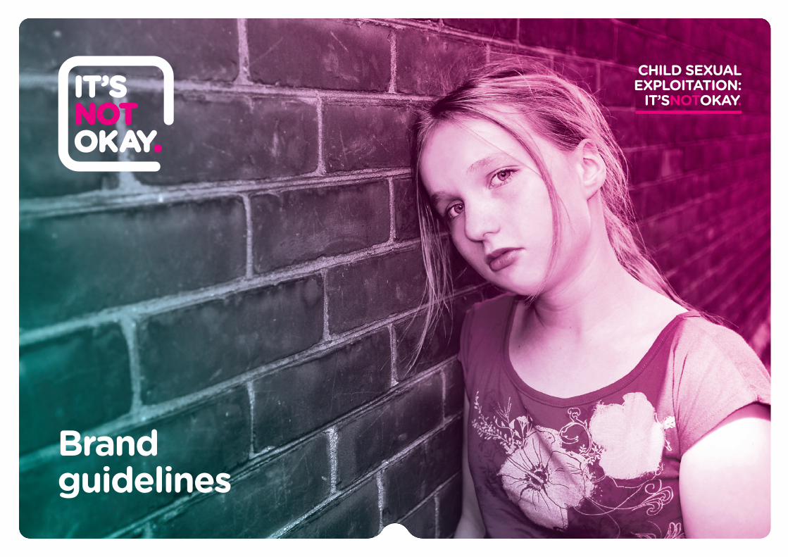
Brand guidelines
CHILD SEXUALEXPLOITATION:
IT’SNOTOKAY.
Welcome
www.itsnotokay.co.uk < 02 >
This document is a guide to the brand communication style for ‘It’s not okay’. It explains what our brand stands for, how it’s expressed, and how the creative elements fit together in all our communications. The guide should be followed when commissioning, designing or delivering any kind of communications.
A strong brand is one of the most valuable assets an organisation owns. To make it truly powerful it needs to be applied consistently so anyone dealing with ‘It’s not okay’ knows who we are and what we stand for. Everyone has a part to play in doing this and bringing our brand to life. These guidelines are to help you represent our brand consistently.
Welcome to our brand guidelines
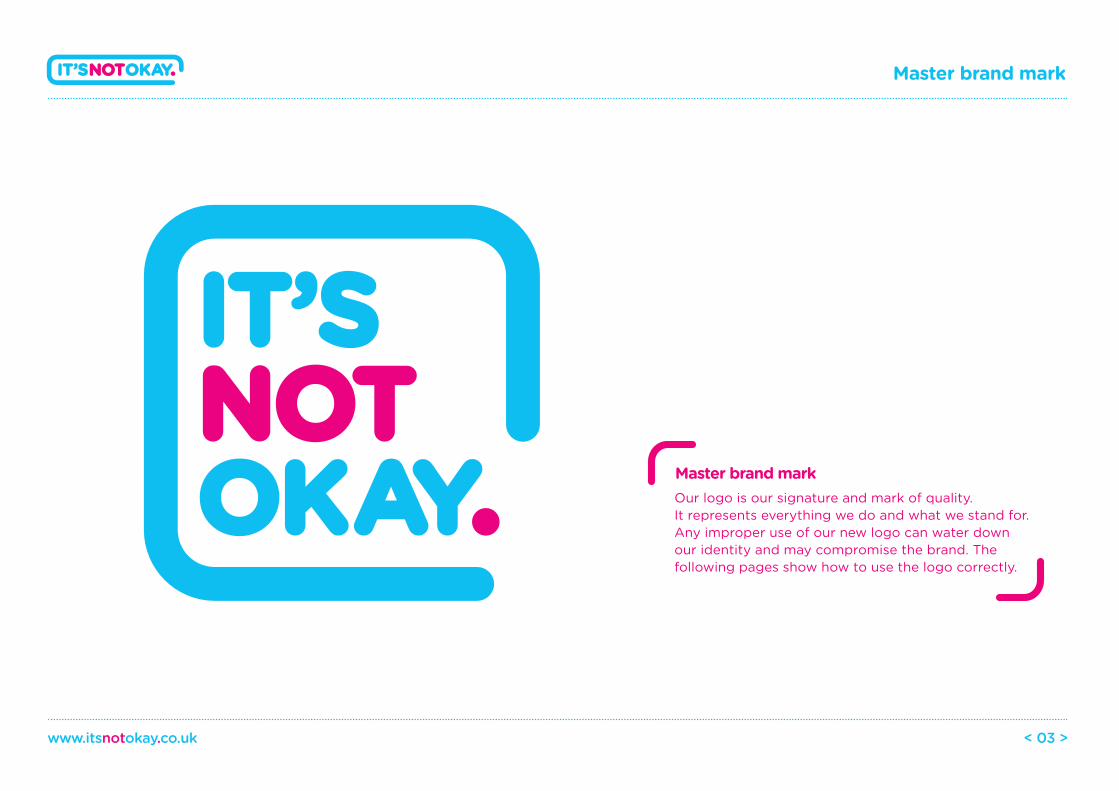
Master brand mark
www.itsnotokay.co.uk < 03 >
Our logo is our signature and mark of quality. It represents everything we do and what we stand for. Any improper use of our new logo can water down our identity and may compromise the brand. The following pages show how to use the logo correctly.
Master brand mark
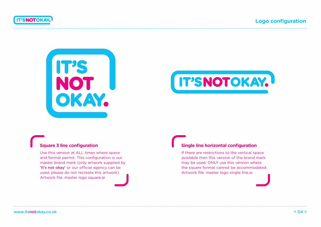
Use this version at ALL times where space and format permit. This configuration is our master brand mark (only artwork supplied by ‘It’s not okay’ or our o�cial agency can be used, please do not recreate this artwork).Artwork file: master logo square.ai
Logo configuration
www.itsnotokay.co.uk < 04 >
Square 3 line configuration If there are restrictions to the vertical space available then this version of the brand mark may be used. ONLY use this version where the square format cannot be accommodated.Artwork file: master logo single line.ai
Single line horizontal configuration
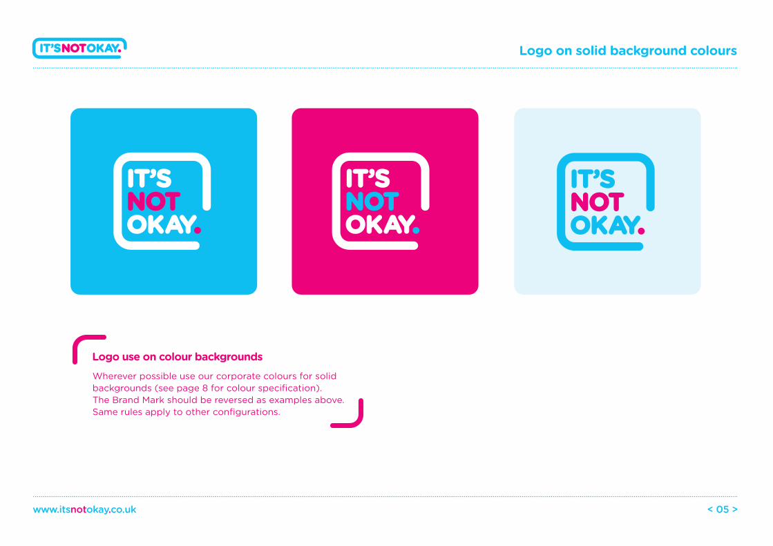
Logo on solid background colours
www.itsnotokay.co.uk < 05 >
Wherever possible use our corporate colours for solid backgrounds (see page 8 for colour specification). The Brand Mark should be reversed as examples above. Same rules apply to other configurations.
Logo use on colour backgrounds
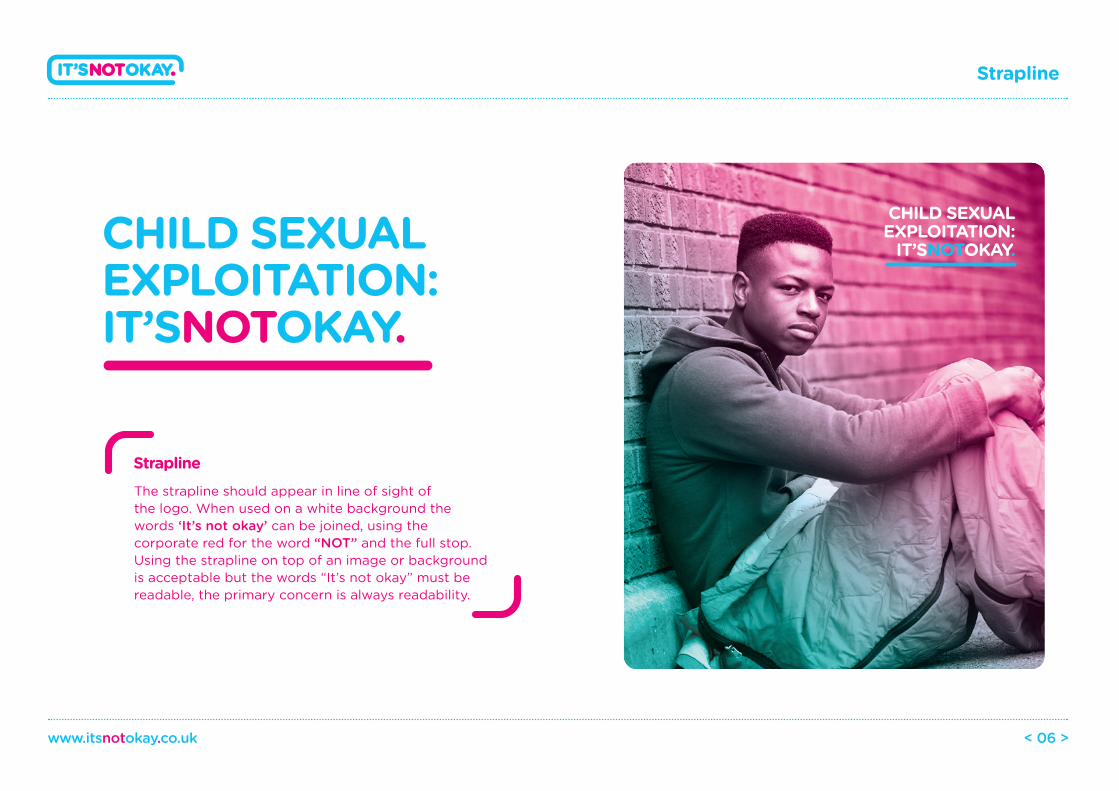
Strapline
www.itsnotokay.co.uk < 06 >
The strapline should appear in line of sight of the logo. When used on a white background the words ‘It’s not okay’ can be joined, using the corporate red for the word “NOT” and the full stop. Using the strapline on top of an image or background is acceptable but the words “It’s not okay” must be readable, the primary concern is always readability.
Strapline
CHILD SEXUALEXPLOITATION:IT’SNOTOKAY.
CHILD SEXUALEXPLOITATION:
IT’SNOTOKAY.
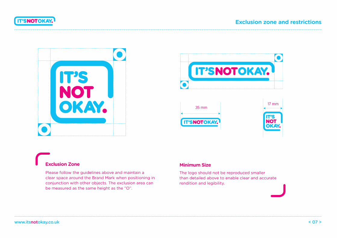
Exclusion Zone Minimum SizePlease follow the guidelines above and maintain a clear space around the Brand Mark when positioning in conjunction with other objects. The exclusion area can be measured as the same height as the “O”.
The logo should not be reproduced smaller than detailed above to enable clear and accurate rendition and legibility.
Exclusion zone and restrictions
www.itsnotokay.co.uk < 07 >
35 mm17 mm
Brand colours
www.itsnotokay.co.uk < 08 >
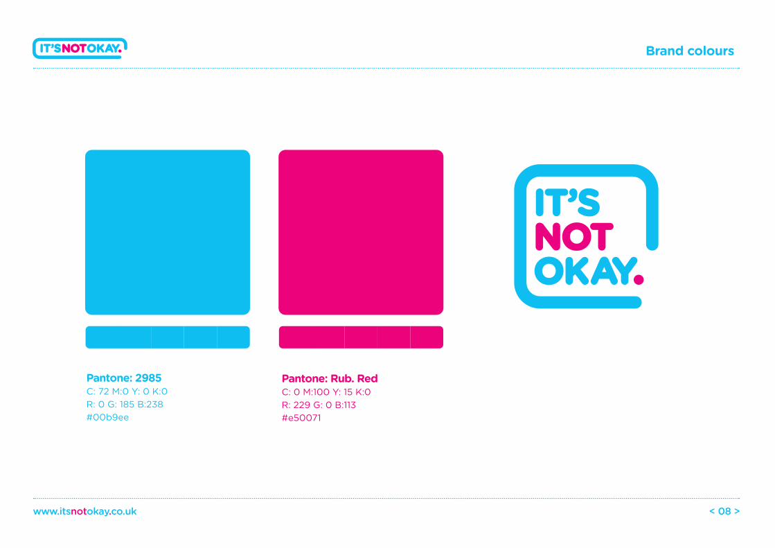
Pantone: Rub. RedC: 0 M:100 Y: 15 K:0R: 229 G: 0 B:113#e50071
Pantone: 2985C: 72 M:0 Y: 0 K:0R: 0 G: 185 B:238#00b9ee
Project Phoenix
www.itsnotokay.co.uk < 09 >
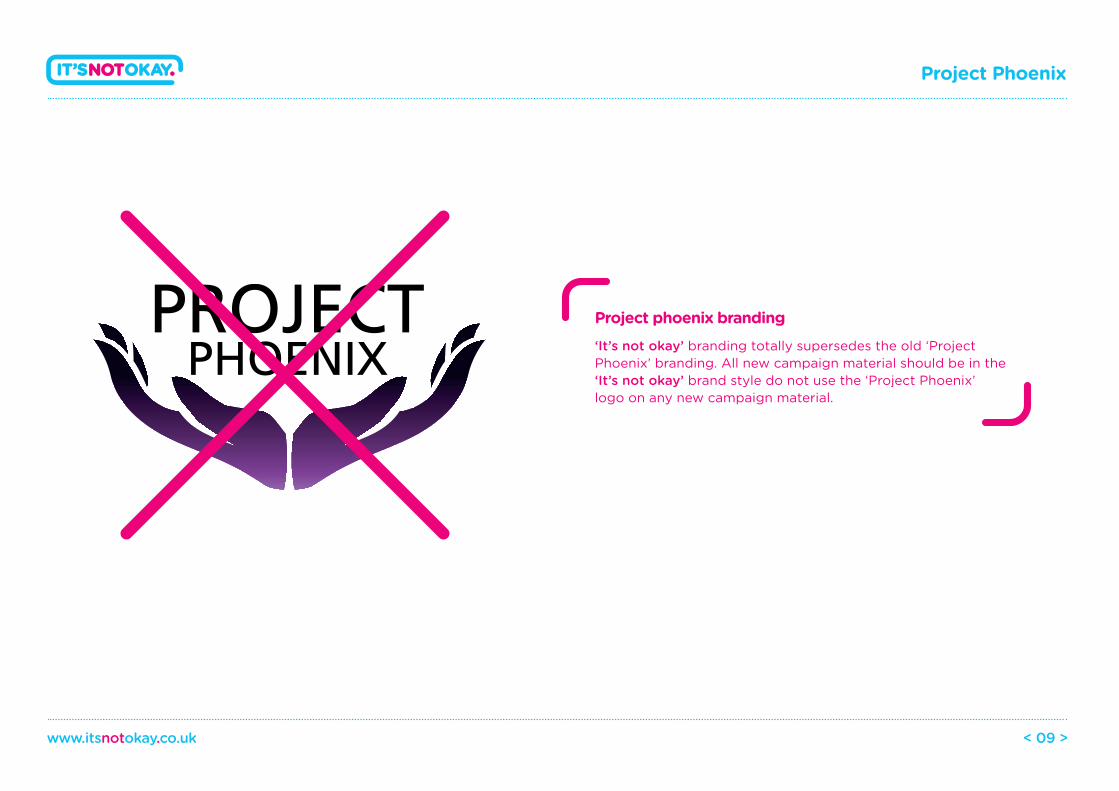
‘It’s not okay’ branding totally supersedes the old ‘Project Phoenix’ branding. All new campaign material should be in the ‘It’s not okay’ brand style do not use the ‘Project Phoenix’ logo on any new campaign material.
Project phoenix branding
Gatham rounded light
Lorem ipsum dolor sit amet, consectetur adipisicing elit, sed do eiusmod tempor incididunt ut.
Light BookGatham rounded book
Lorem ipsum dolor sit amet, consectetur adipisicing elit, sed do eiusmod tempor incididunt ut.
Gatham rounded medium
Lorem ipsum dolor sit amet, consectetur adipisicing elit, sed do eiusmod tempor incididunt ut.
Med BoldGatham rounded bold
Lorem ipsum dolor sit amet, consectetur adipisicing elit, sed do eiusmod tempor incididunt ut.
Typography
www.itsnotokay.co.uk < 10 >
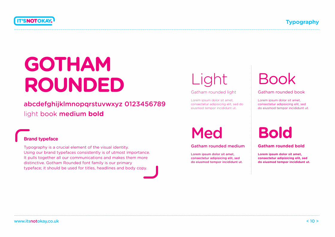
GOTHAM ROUNDEDabcdefghijklmnopqrstuvwxyz 0123456789light book medium bold
Typography is a crucial element of the visual identity. Using our brand typefaces consistently is of utmost importance. It pulls together all our communications and makes them more distinctive. Gotham Rounded font family is our primary typeface; it should be used for titles, headlines and body copy.
Brand typeface
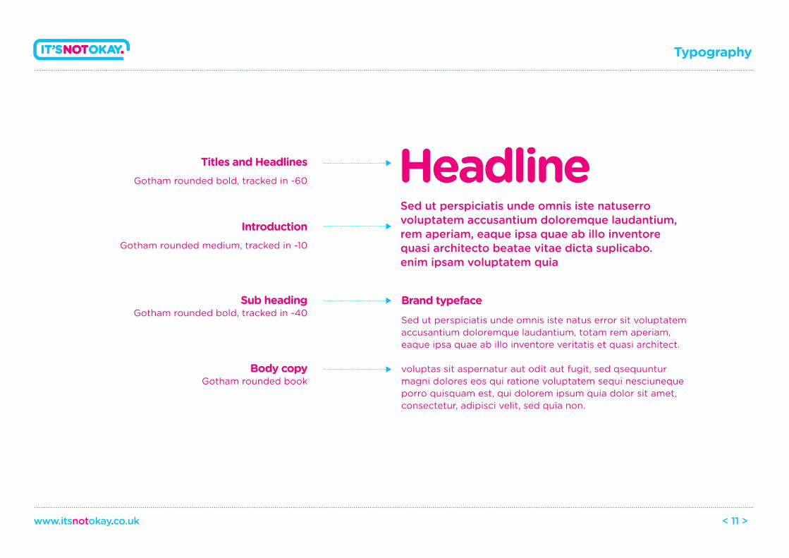
Titles and HeadlinesGotham rounded bold, tracked in -60
IntroductionGotham rounded medium, tracked in -10
Sub headingGotham rounded bold, tracked in -40
Body copyGotham rounded book
Sed ut perspiciatis unde omnis iste natuserro voluptatem accusantium doloremque laudantium,rem aperiam, eaque ipsa quae ab illo inventore quasi architecto beatae vitae dicta suplicabo. enim ipsam voluptatem quia
Typography
www.itsnotokay.co.uk < 11 >
Headline
Sed ut perspiciatis unde omnis iste natus error sit voluptatem accusantium doloremque laudantium, totam rem aperiam, eaque ipsa quae ab illo inventore veritatis et quasi architect.
voluptas sit aspernatur aut odit aut fugit, sed qsequuntur magni dolores eos qui ratione voluptatem sequi nesciuneque porro quisquam est, qui dolorem ipsum quia dolor sit amet, consectetur, adipisci velit, sed quia non.
Brand typeface
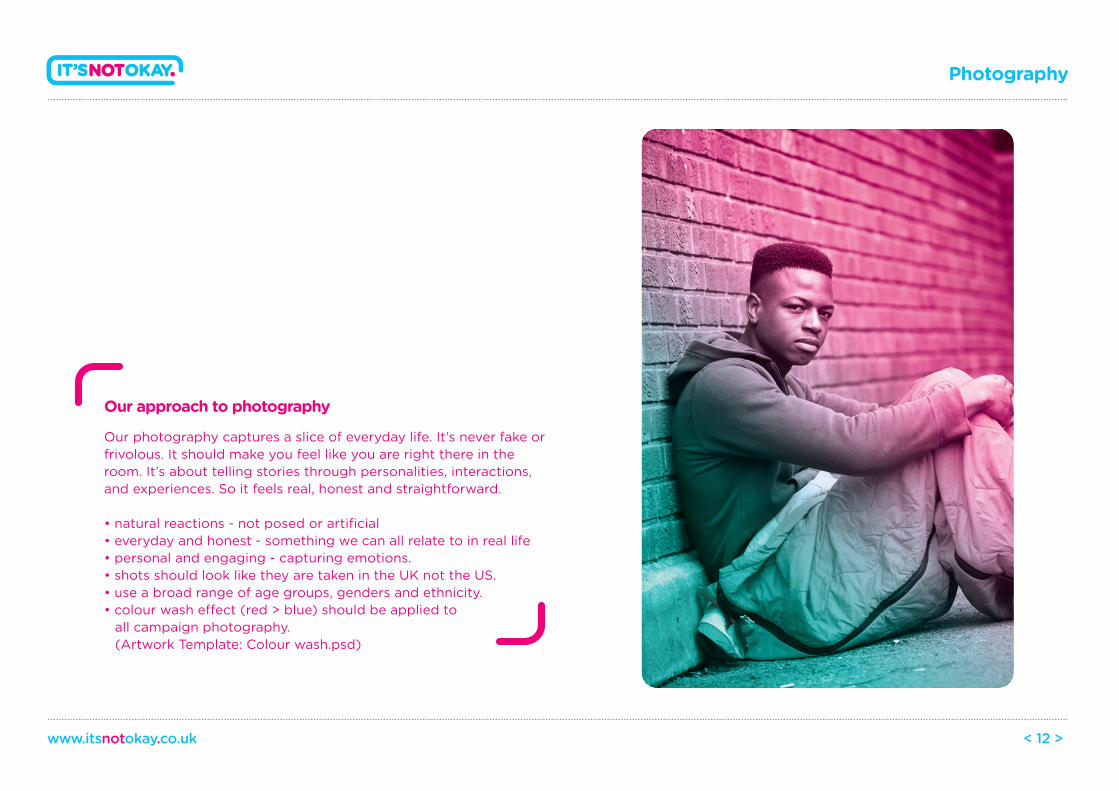
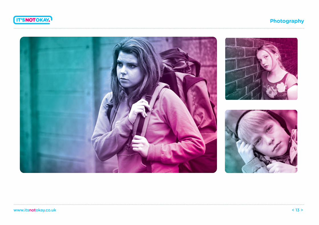
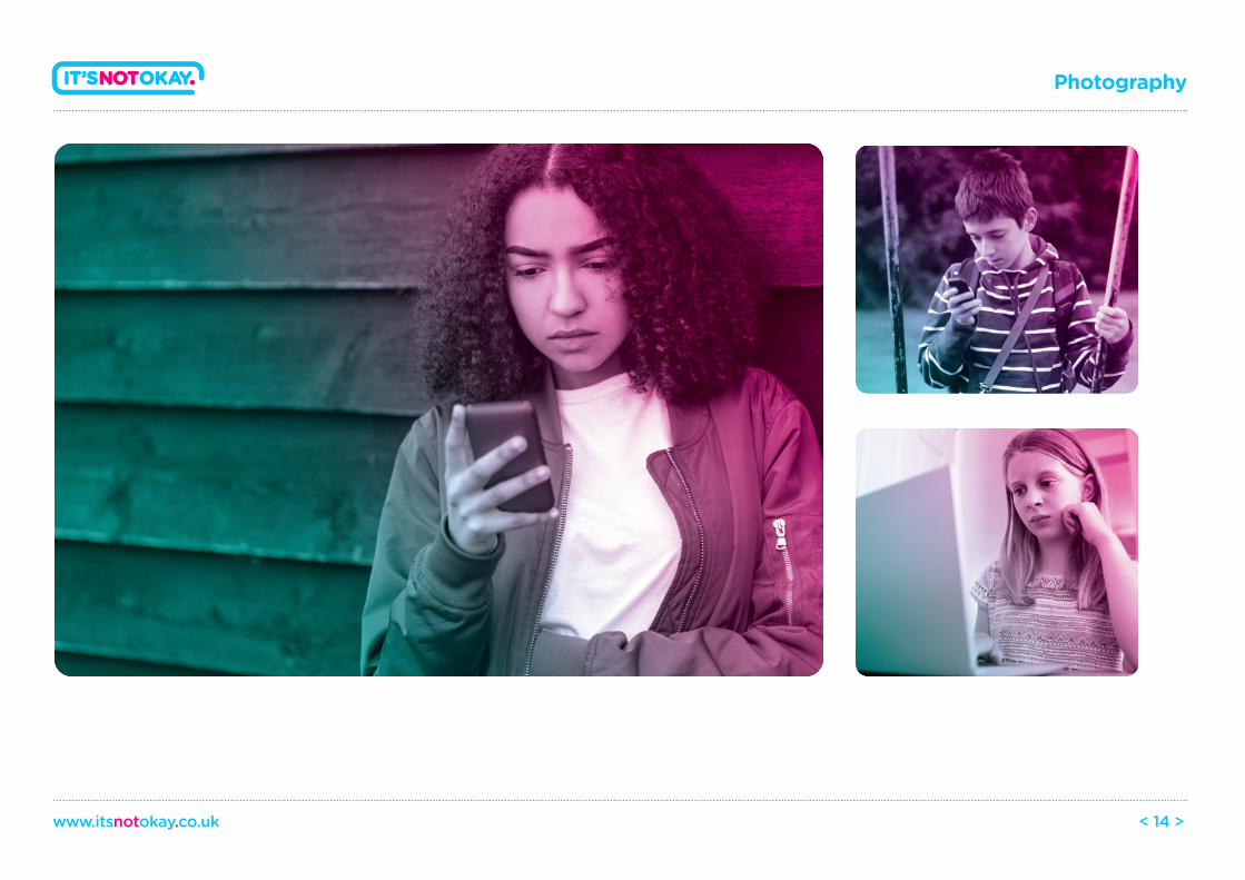
Our approach to photography
Our photography captures a slice of everyday life. It’s never fake or frivolous. It should make you feel like you are right there in the room. It’s about telling stories through personalities, interactions, and experiences. So it feels real, honest and straightforward.
• natural reactions - not posed or artificial• everyday and honest - something we can all relate to in real life • personal and engaging - capturing emotions.• shots should look like they are taken in the UK not the US.• use a broad range of age groups, genders and ethnicity.• colour wash e�ect (red > blue) should be applied to all campaign photography. (Artwork Template: Colour wash.psd)
Photography
www.itsnotokay.co.uk < 12 >
Photography
www.itsnotokay.co.uk < 13 >
Photography
www.itsnotokay.co.uk < 14 >
Photography
www.itsnotokay.co.uk < 15 >
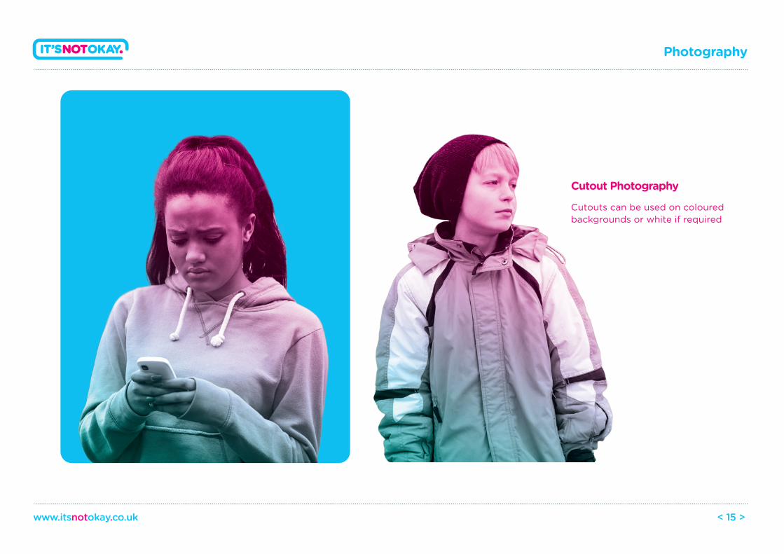
Cutout Photography
Cutouts can be used on colouredbackgrounds or white if required
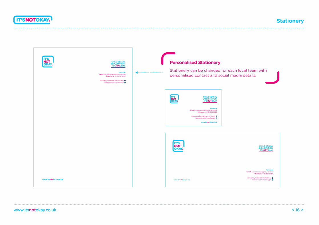
Stationery
www.itsnotokay.co.uk < 16 >
Stationery can be changed for each local team with personalised contact and social media details.
Personalised Stationery
TamesideEmail: [email protected]
Telephone: 0161 856 5880
@notokayTameside #itsnotokayfacebook.com/notokaygm
CHILD SEXUALEXPLOITATION:
IT’SNOTOKAY.
www.itsnotokay.co.uk
TamesideEmail: [email protected]
Telephone: 0161 856 5880
@notokayTameside #itsnotokayfacebook.com/notokaygm
CHILD SEXUALEXPLOITATION:
IT’SNOTOKAY.
www.itsnotokay.co.uk
www.itsnotokay.co.uk
TamesideEmail: [email protected]
Telephone: 0161 856 5880
@notokayTameside #itsnotokayfacebook.com/notokaygm
CHILD SEXUALEXPLOITATION:
IT’SNOTOKAY.
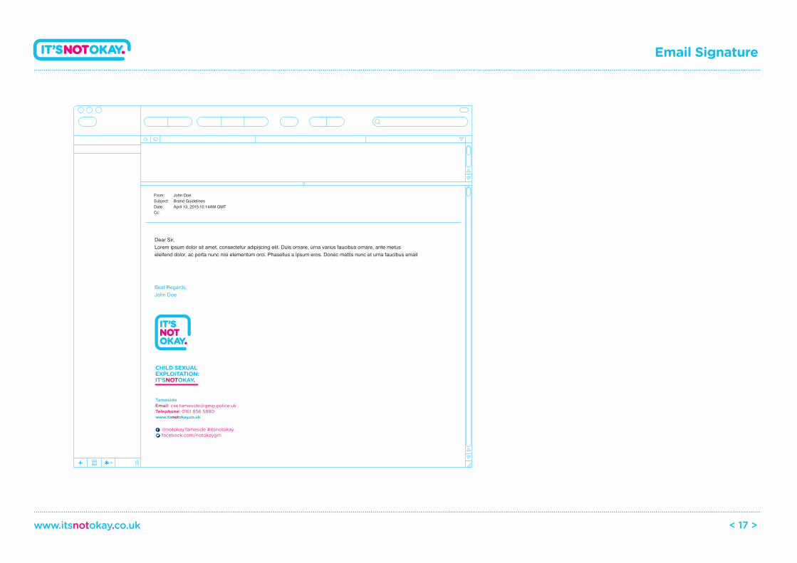
Email Signature
www.itsnotokay.co.uk < 17 >
Dear Sir,Lorem ipsum dolor sit amet, consectetur adipiscing elit. Duis ornare, urna varius faucibus ornare, ante metus eleifend dolor, ac porta nunc nisi elementum orci. Phasellus a ipsum eros. Donec mattis nunc et urna faucibus email
Best Regards,John Doe
From: John DoeSubject: Brand GuidelinesDate: April 13, 2015 10:14AM GMTCc:
TamesideEmail: [email protected]: 0161 856 5880
@notokayTameside #itsnotokayfacebook.com/notokaygm
CHILD SEXUALEXPLOITATION:IT’SNOTOKAY.
www.itsnotokay.co.uk
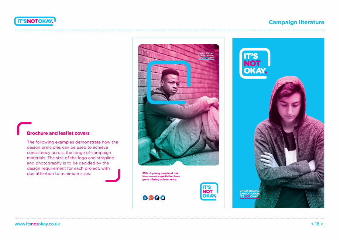
Brochure and leaflet covers
The following examples demonstrate how the design principles can be used to achieve consistency across the range of campaign materials. The size of the logo and strapline and photography is to be decided by the design requirement for each project, with due attention to minimum sizes.
Campaign literature
www.itsnotokay.co.uk < 18 >
CHILD SEXUALEXPLOITATION:
IT’SNOTOKAY.
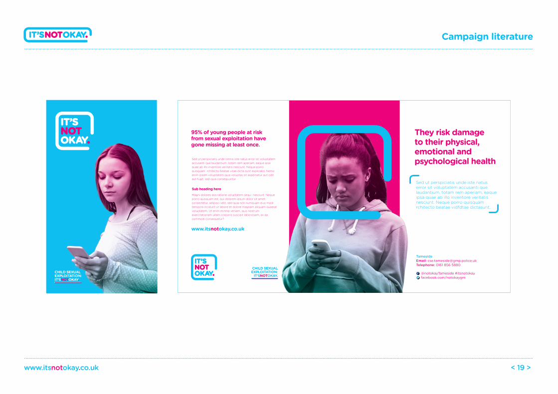
95% of young people at risk from sexual exploitation have gone missing at least once.
CHILD SEXUALEXPLOITATION:IT’SNOTOKAY.
Campaign literature
www.itsnotokay.co.uk < 19 >
95% of young people at risk from sexual exploitation have gone missing at least once.
They risk damage to their physical,emotional andpsychological healthSed ut perspiciatis unde omnis iste natus error sit voluptatem
accusanti que laudantium, totam rem aperiam, eaque ipsa quae ab illo inventore veritatis nesciunt. Neque porro quisquam rchitecto beatae vitae dicta sunt explicabo. Nemo enim ipsam voluptatem quia voluptas sit aspernatur aut odit aut fugit, sed quia consequuntur
Sub heading hereMagni dolores eos ratione voluptatem sequi nesciunt. Neque porro quisquam est, qui dolorem ipsum dolor sit amet, consectetur, adipisci velit, sed quia non numquam eius modi tempora incidunt ut labore et dolore magnam aliquam quaerat voluptatem. Ut enim minma veniam, quis nostrum exercitationem ullam corporis suscipit laboriosam, ex ea commodi consequatur?
Sed ut perspiciatis unde iste natus error sit voluptatem accusanti que laudantium, totam rem aperiam, eaque ipsa quae ab illo inventore veritatis nesciunt. Neque porro quisquam rchitecto beatae vidfdtae dictasunt.
www.itsnotokay.co.uk
TamesideEmail: [email protected]: 0161 856 5880
@notokayTameside #itsnotokayfacebook.com/notokaygm
CHILD SEXUALEXPLOITATION:
IT’SNOTOKAY.CHILD SEXUALEXPLOITATION:IT’SNOTOKAY.
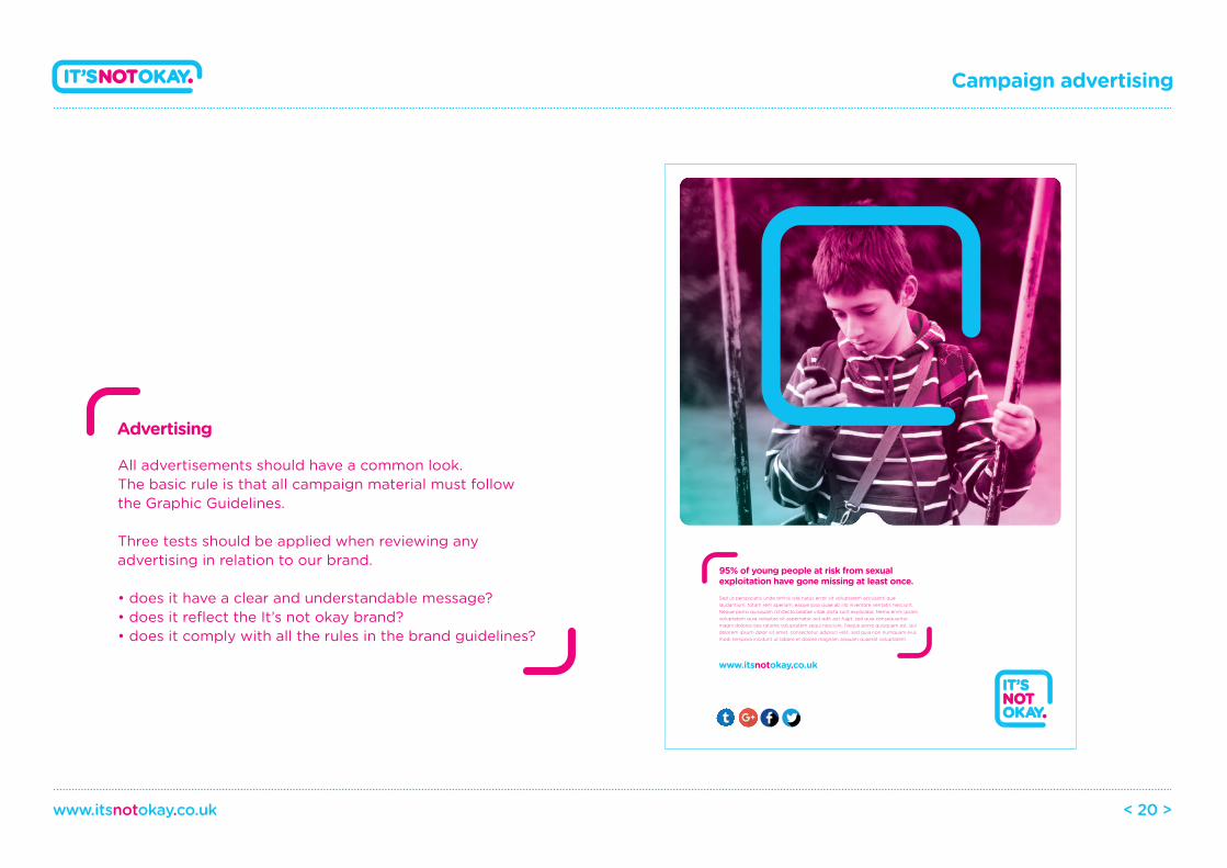
Advertising
All advertisements should have a common look. The basic rule is that all campaign material must follow the Graphic Guidelines.
Three tests should be applied when reviewing any advertising in relation to our brand.
• does it have a clear and understandable message?• does it reflect the It’s not okay brand?• does it comply with all the rules in the brand guidelines?
Campaign advertising
www.itsnotokay.co.uk < 20 >
CHILD SEXUALEXPLOITATION:IT’S NOT OKAY.
Sed ut perspiciatis unde omnis iste natus error sit voluptatem accusanti que laudantium, totam rem aperiam, eaque ipsa quae ab illo inventore veritatis nesciunt. Neque porro quisquam rchitecto beatae vitae dicta sunt explicabo. Nemo enim ipsam voluptatem quia voluptas sit aspernatur aut odit aut fugit, sed quia consequuntur magni dolores eos ratione voluptatem sequi nesciunt. Neque porro quisquam est, qui dolorem ipsum dolor sit amet, consectetur, adipisci velit, sed quia non numquam eius modi tempora incidunt ut labore et dolore magnam aliquam quaerat voluptatem.
95% of young people at risk from sexual exploitation have gone missing at least once.
www.itsnotokay.co.uk
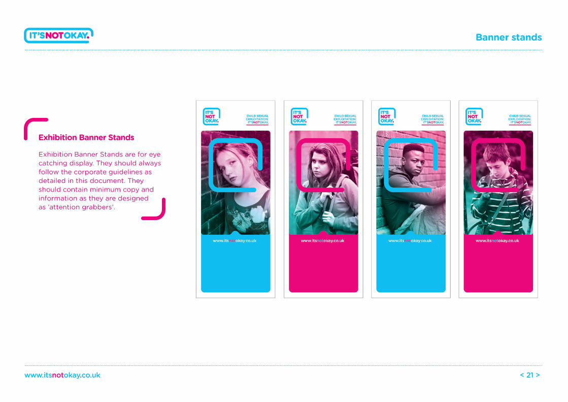
Exhibition Banner Stands
Exhibition Banner Stands are for eye catching display. They should always follow the corporate guidelines as detailed in this document. They should contain minimum copy and information as they are designed as ‘attention grabbers’.
Banner stands
www.itsnotokay.co.uk < 21 >
Powerpoint Template
Divider slide Image slide
Copy and image slide Copy slide
CHILD SEXUALEXPLOITATION:IT’SNOTOKAY.
CHILD SEXUALEXPLOITATION:IT’SNOTOKAY.
They risk damage to their physical,emotional andpsychological health
Powerpoint templates
www.itsnotokay.co.uk < 22 >
CHILD SEXUALEXPLOITATION:IT’SNOTOKAY.
CHILD SEXUALEXPLOITATION:IT’SNOTOKAY.
95% of young people at risk from sexual exploitation have gone missing at least once.
Sed ut perspiciatis unde omnisnatus error sit voluptatem accusanti que laudantium, totam rem aperiam, eaque ipsa quae ab illo inventore veritatis nesciunt. Neque porro quisquam rchitecto beatae vitae dicta sunt
95% of young people at risk from sexual exploitation have gone missing at least once.
Sed ut perspiciatis unde omnisnatus error sit voluptatem accusanti que laudantium, totam rem aperiam, eaque ipsa quae ab illo inventore veritatis nesciunt. Neque porro quisquam rchitecto beatae vitae dicta sunt
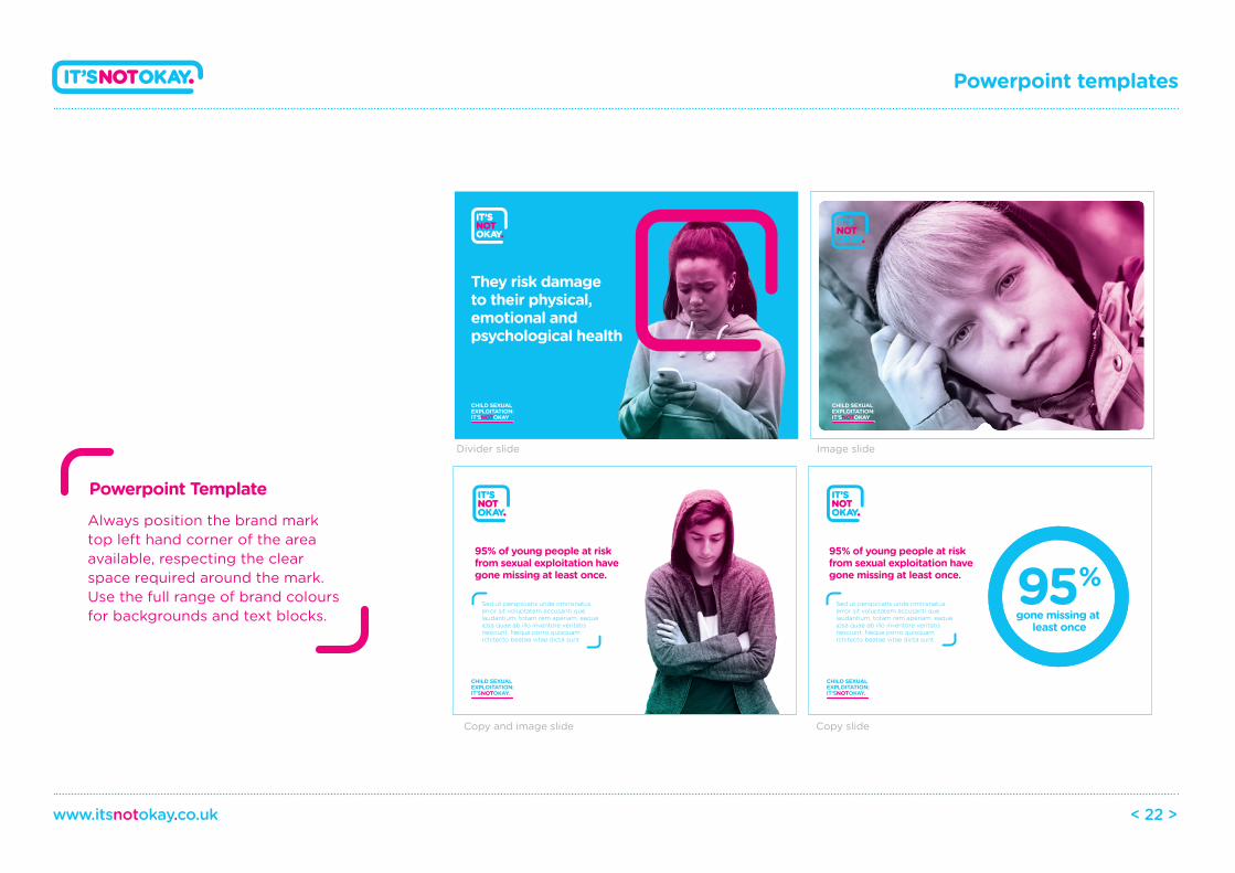
Always position the brand mark top left hand corner of the area available, respecting the clear space required around the mark. Use the full range of brand colours for backgrounds and text blocks. gone missing at
least once
95%
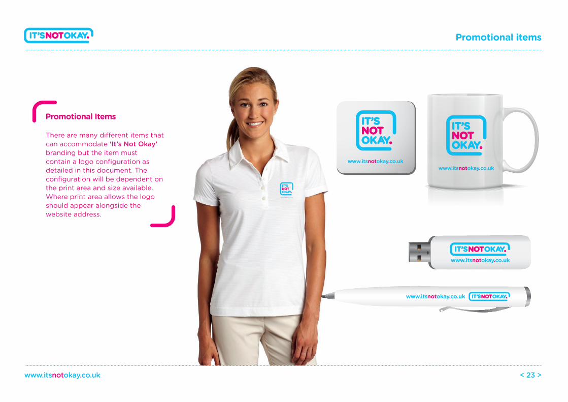
There are many di�erent items that can accommodate ‘It’s Not Okay’ branding but the item must contain a logo configuration as detailed in this document. The configuration will be dependent on the print area and size available. Where print area allows the logo should appear alongside the website address.
Promotional Items
Promotional items
www.itsnotokay.co.uk < 23 >
www.itsnotokay.co.ukwww.itsnotokay.co.uk
www.itsnotokay.co.uk
www.itsnotokay.co.uk
www.itsnotokay.co.uk
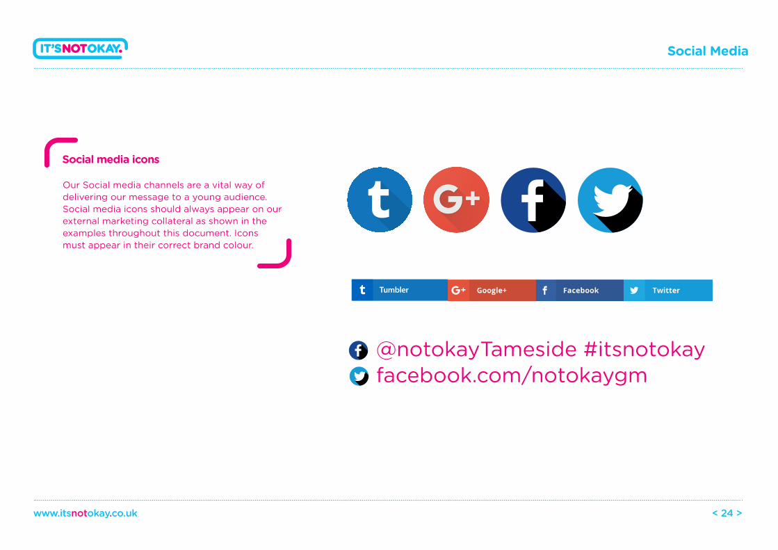
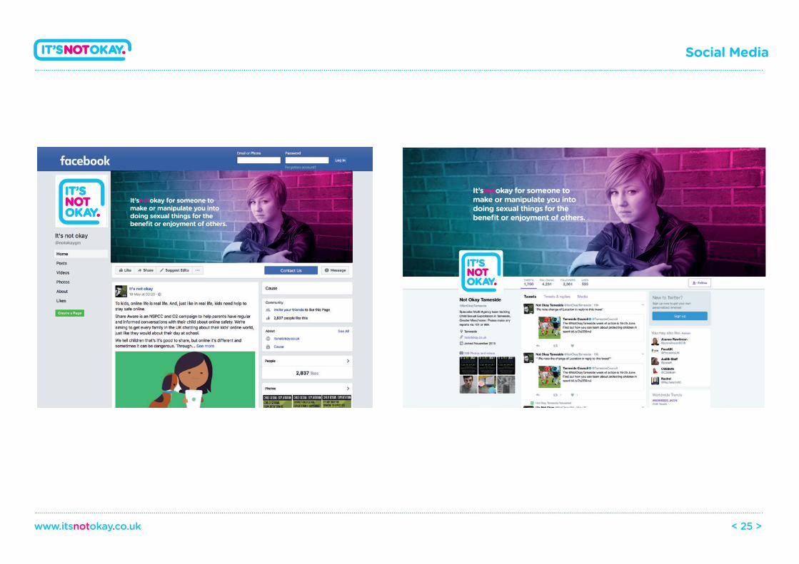
Our Social media channels are a vital way of delivering our message to a young audience. Social media icons should always appear on our external marketing collateral as shown in the examples throughout this document. Icons must appear in their correct brand colour.
Social media icons
Social Media
www.itsnotokay.co.uk < 24 >
Tumbler
@notokayTameside #itsnotokayfacebook.com/notokaygm
Social Media
www.itsnotokay.co.uk < 25 >
It’snotokay for someone to make or manipulate you into doing sexual things for the benefit or enjoyment of others.
It’snotokay for someone to make or manipulate you into doing sexual things for the benefit or enjoyment of others.