contents page annotations
TRANSCRIPT

Contents page annotations
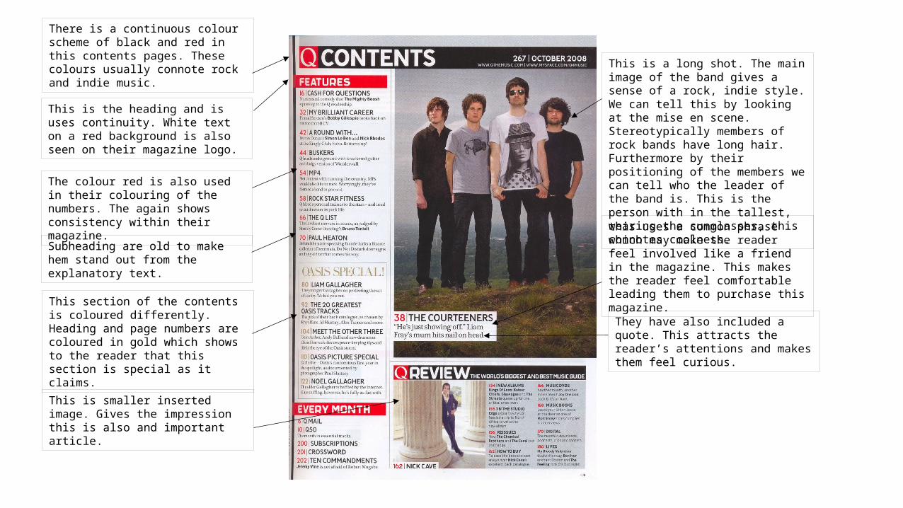
This is a long shot. The main image of the band gives a sense of a rock, indie style. We can tell this by looking at the mise en scene. Stereotypically members of rock bands have long hair. Furthermore by their positioning of the members we can tell who the leader of the band is. This is the person with in the tallest, wearing the sunglasses, this connotes coolness.
This is the heading and is uses continuity. White text on a red background is also seen on their magazine logo.
The colour red is also used in their colouring of the numbers. The again shows consistency within their magazine.
There is a continuous colour scheme of black and red in this contents pages. These colours usually connote rock and indie music.
Subheading are old to make hem stand out from the explanatory text.
This section of the contents is coloured differently. Heading and page numbers are coloured in gold which shows to the reader that this section is special as it claims.
this uses a common phrase which may make the reader feel involved like a friend in the magazine. This makes the reader feel comfortable leading them to purchase this magazine.
They have also included a quote. This attracts the reader’s attentions and makes them feel curious.
This is smaller inserted image. Gives the impression this is also and important article.
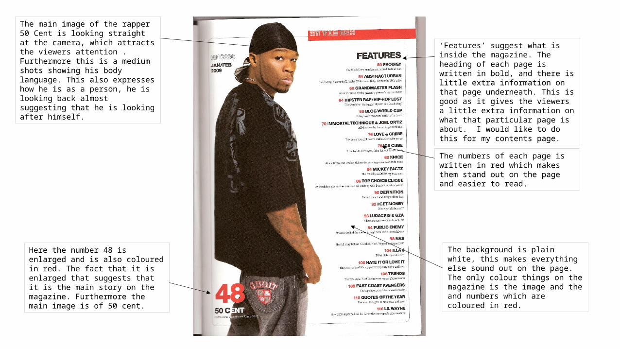
The main image of the rapper 50 Cent is looking straight at the camera, which attracts the viewers attention . Furthermore this is a medium shots showing his body language. This also expresses how he is as a person, he is looking back almost suggesting that he is looking after himself.
‘Features’ suggest what is inside the magazine. The heading of each page is written in bold, and there is little extra information on that page underneath. This is good as it gives the viewers a little extra information on what that particular page is about. I would like to do this for my contents page.
The numbers of each page is written in red which makes them stand out on the page and easier to read.
Here the number 48 is enlarged and is also coloured in red. The fact that it is enlarged that suggests that it is the main story on the magazine. Furthermore the main image is of 50 cent.
The background is plain white, this makes everything else sound out on the page. The only colour things on the magazine is the image and the and numbers which are coloured in red.