annotations of contents pages
TRANSCRIPT
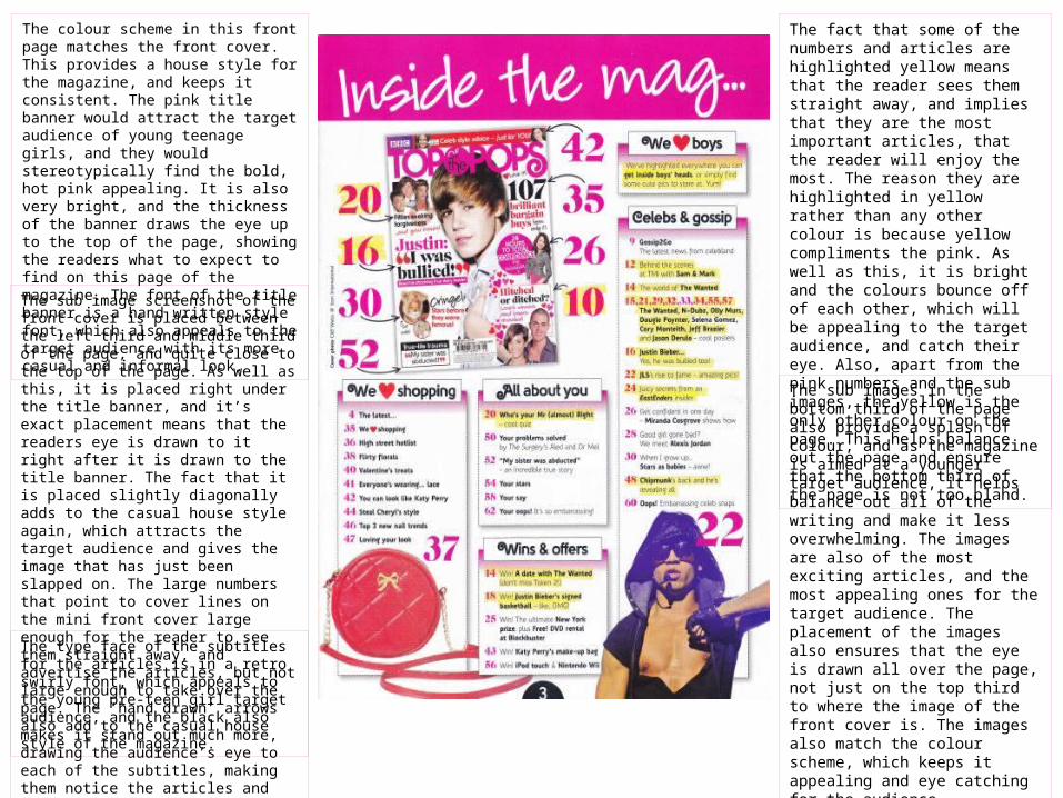
The colour scheme in this front page matches the front cover. This provides a house style for the magazine, and keeps it consistent. The pink title banner would attract the target audience of young teenage girls, and they would stereotypically find the bold, hot pink appealing. It is also very bright, and the thickness of the banner draws the eye up to the top of the page, showing the readers what to expect to find on this page of the magazine. The font of the title banner is a hand written style font, which also appeals to the target audience with its more casual and informal look.
The sub image screenshot of the front cover is placed between the left third and middle third of the page, and quite close to the top of the page. As well as this, it is placed right under the title banner, and it’s exact placement means that the readers eye is drawn to it right after it is drawn to the title banner. The fact that it is placed slightly diagonally adds to the casual house style again, which attracts the target audience and gives the image that has just been slapped on. The large numbers that point to cover lines on the mini front cover large enough for the reader to see them straight away, and advertise the articles, but not large enough to take over the page. The ‘hand drawn’ arrows also add to the casual house style of the magazine.
The fact that some of the numbers and articles are highlighted yellow means that the reader sees them straight away, and implies that they are the most important articles, that the reader will enjoy the most. The reason they are highlighted in yellow rather than any other colour is because yellow compliments the pink. As well as this, it is bright and the colours bounce off of each other, which will be appealing to the target audience, and catch their eye. Also, apart from the pink numbers and the sub images, the yellow is the only other colour on the page. This helps balance out the page and ensure that the bottom third of the page is not too bland.
The sub images in the bottom third of the page also provide a splash of colour, and as the magazine is aimed at a younger target audience, it helps balance out all of the writing and make it less overwhelming. The images are also of the most exciting articles, and the most appealing ones for the target audience. The placement of the images also ensures that the eye is drawn all over the page, not just on the top third to where the image of the front cover is. The images also match the colour scheme, which keeps it appealing and eye catching for the audience. The type face of the subtitles for the articles is
in a retro swirly font, which appeals to the young pre-teen girl target audience, and the black also makes it stand out much more, drawing the audience’s eye to each of the subtitles, making them notice the articles and want to read them more.
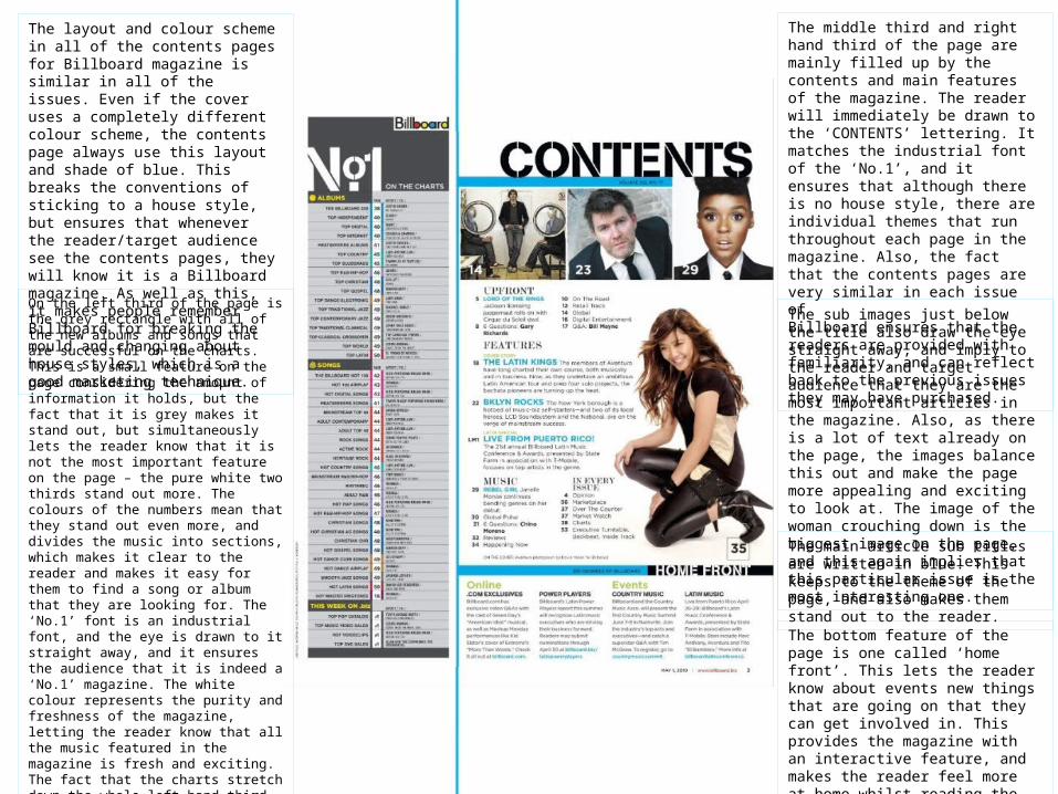
The layout and colour scheme in all of the contents pages for Billboard magazine is similar in all of the issues. Even if the cover uses a completely different colour scheme, the contents page always use this layout and shade of blue. This breaks the conventions of sticking to a house style, but ensures that whenever the reader/target audience see the contents pages, they will know it is a Billboard magazine. As well as this, it makes people remember Billboard for breaking the mould and changing about house styles, which is a good marketing technique.
On the left third of the page is the grey rectangle with all of the new albums and songs that are successful on the charts. This is a small feature on the page considering the amount of information it holds, but the fact that it is grey makes it stand out, but simultaneously lets the reader know that it is not the most important feature on the page – the pure white two thirds stand out more. The colours of the numbers mean that they stand out even more, and divides the music into sections, which makes it clear to the reader and makes it easy for them to find a song or album that they are looking for. The ‘No.1’ font is an industrial font, and the eye is drawn to it straight away, and it ensures the audience that it is indeed a ‘No.1’ magazine. The white colour represents the purity and freshness of the magazine, letting the reader know that all the music featured in the magazine is fresh and exciting. The fact that the charts stretch down the whole left hand third of the page shows that the magazine is jam packed full of music reviews and information, and implies that the target audience always look for an issue with lots of information in, and their needs are being satisfied.
The middle third and right hand third of the page are mainly filled up by the contents and main features of the magazine. The reader will immediately be drawn to the ‘CONTENTS’ lettering. It matches the industrial font of the ‘No.1’, and it ensures that although there is no house style, there are individual themes that run throughout each page in the magazine. Also, the fact that the contents pages are very similar in each issue of Billboard ensures that the readers are provided with familiarity, and can reflect back to the previous issues they may have purchased.
The sub images just below the title also draw the eye straight away, and imply to the reader and target audience that they are the most important articles in the magazine. Also, as there is a lot of text already on the page, the images balance this out and make the page more appealing and exciting to look at. The image of the woman crouching down is the biggest image on the page, and this again implies that this particular issue is the most interesting one.
The main article sub titles are written in blue. This keeps to the theme of the page, and also makes them stand out to the reader.
The bottom feature of the page is one called ‘home front’. This lets the reader know about events new things that are going on that they can get involved in. This provides the magazine with an interactive feature, and makes the reader feel more at home whilst reading the magazine, as well as welcomed into the Billboard community.
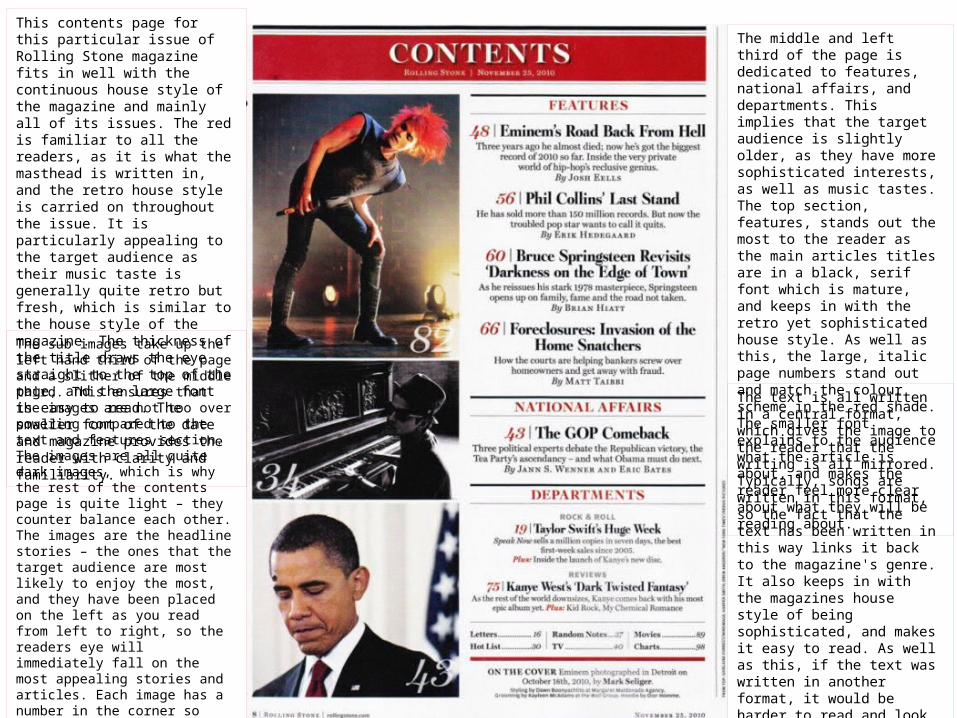
This contents page for this particular issue of Rolling Stone magazine fits in well with the continuous house style of the magazine and mainly all of its issues. The red is familiar to all the readers, as it is what the masthead is written in, and the retro house style is carried on throughout the issue. It is particularly appealing to the target audience as their music taste is generally quite retro but fresh, which is similar to the house style of the magazine. The thickness of the title draws the eye straight to the top of the page, and the large font is easy to read. The smaller font of the date and magazine provides the reader with clarity and familiarity.
The middle and left third of the page is dedicated to features, national affairs, and departments. This implies that the target audience is slightly older, as they have more sophisticated interests, as well as music tastes. The top section, features, stands out the most to the reader as the main articles titles are in a black, serif font which is mature, and keeps in with the retro yet sophisticated house style. As well as this, the large, italic page numbers stand out and match the colour scheme in the red shade. The smaller font explains to the audience what the article is about, and makes the reader feel more clear about what they will be reading about.
The sub images take up the left hand third of the page and a slither of the middle third. This ensures that the images are not too over powering compared to the text and features section. The images are all quite dark images, which is why the rest of the contents page is quite light – they counter balance each other. The images are the headline stories – the ones that the target audience are most likely to enjoy the most, and they have been placed on the left as you read from left to right, so the readers eye will immediately fall on the most appealing stories and articles. Each image has a number in the corner so that the reader can locate the whereabouts of the article straight away. It is in the same font as the other numbers, which links both sides of the pages together, ensuring they are in sync and the house style runs throughout the whole page.
The text is all written in a central format, which gives the image to the reader that the writing is all mirrored. Typically, songs are written in this format, so the fact that the text has been written in this way links it back to the magazine's genre. It also keeps in with the magazines house style of being sophisticated, and makes it easy to read. As well as this, if the text was written in another format, it would be harder to read and look like to much information on the page, whereas in this case, it balances the page out and doesn't look too overwhelming.
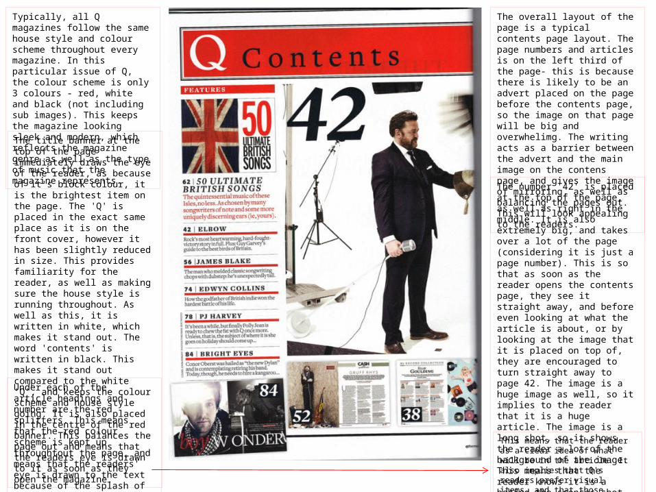
Typically, all Q magazines follow the same house style and colour scheme throughout every magazine. In this particular issue of Q, the colour scheme is only 3 colours - red, white and black (not including sub images). This keeps the magazine looking sleek and modern, which reflects the magazine genre as well as the type of music that the magazine represents.
The overall layout of the page is a typical contents page layout. The page numbers and articles is on the left third of the page- this is because there is likely to be an advert placed on the page before the contents page, so the image on that page will be big and overwhelimg. The writing acts as a barrier between the advert and the main image on the contens page, and gives the image of mirroring, as well as balancing the pages out. This will look appealing to the readers.
The title banner at the top of the page immediately draws the eye of the reader, as because of it's block colour, it is the brightest item on the page. The 'Q' is placed in the exact same place as it is on the front cover, however it has been slightly reduced in size. This provides familiarity for the reader, as well as making sure the house style is running throughout. As well as this, it is written in white, which makes it stand out. The word 'contents' is written in black. This makes it stand out compared to the white 'Q', and keeps the colour scheme and house style going. It is also placed in the centre of the red banner. This balances the page out and means that the readers eye is drawn to it as soon as they open the magazine.
The number '42' is placed at the top of the page, as well as right in the middle. It is also extremely big, and takes over a lot of the page (considering it is just a page number). This is so that as soon as the reader opens the contents page, they see it straight away, and before even looking at what the article is about, or by looking at the image that it is placed on top of, they are encouraged to turn straight away to page 42. The image is a huge image as well, so it implies to the reader that it is a huge article. The image is a long shot, so it shows the reader a lot of the background of the image. This means that the reader knows it is a behind the scences shot, which means that the artist looks more relatable to the reader, ensuring they are more likely to read the article.
Under each of the article headings and number are the red splitters. This means that the red colour scheme is kept up throughtout the page, and means that the readers' eye is drawn to the text because of the splash of colour. The sub images below the articles are of double page spreads in this issue.
This means that the reader as a clear idea of what will be in the article. It also implies that Q's readers prefer visual items, and that those features are more appealing to them.