deconstruction of magazines
TRANSCRIPT
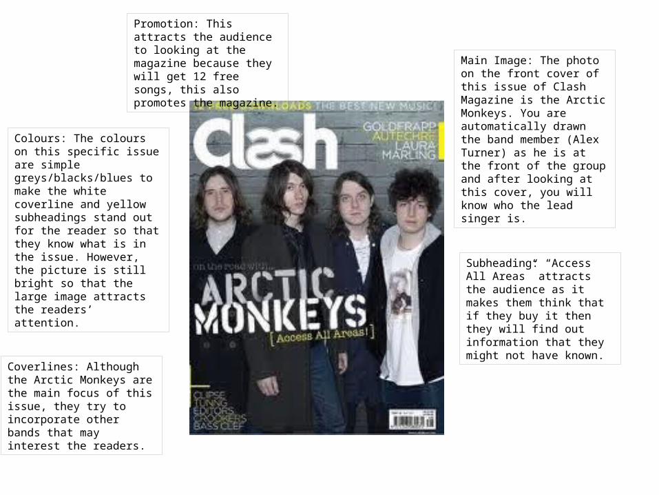
Main Image: The photo on the front cover of this issue of Clash Magazine is the Arctic Monkeys. You are automatically drawn the band member (Alex Turner) as he is at the front of the group and after looking at this cover, you will know who the lead singer is.
Colours: The colours on this specific issue are simple greys/blacks/blues to make the white coverline and yellow subheadings stand out for the reader so that they know what is in the issue. However, the picture is still bright so that the large image attracts the readers’ attention.
Subheading: “Access All Areas” attracts the audience as it makes them think that if they buy it then they will find out information that they might not have known.
Promotion: This attracts the audience to looking at the magazine because they will get 12 free songs, this also promotes the magazine.
Coverlines: Although the Arctic Monkeys are the main focus of this issue, they try to incorporate other bands that may interest the readers.

Main Image: The photo on the front cover of this issue of NME is Brandon Flowers who is the main singer in The Killers. The fact that his face is over the other images on this magazine would suggest that they are trying to attract the audience of the band rather than the magazine.
Masthead: The masthead is the only writing in red and so attracts the attention of the reader because it doesn’t blend in with anything else on the page.
Subheading: The subheading here as been used to attract the audience because you want to know what is wrong with Brandon Flowers.
Colours: The contrast between Brandon’s top and the huge white writing makes the name of the band stand out, attracting the listeners of his music. The background behind him is also white which is different to the black behind the masthead. The yellow on the black stands out so that the readers are also attracted to the subheadings which ensures that readers who do not like The Killers still buy the magazine.

Main Image: The photo on the front cover of this issue of Q is Cheryl Cole. The use of the darkness and rain has caused the image to have a seductive appeal. This would suggest that Q magazine tries to attract the male audience.
Colours: The subheadings are highlighted in red and white to allow the audience to read them over the black writing.
Subheading: The magazine has used the subheading “3 words” which links to the name of Cheryl Cole’s album “3 words”. This attracts the listeners of her album.
Masthead: This is a bright read square which overlaps the main image. This shows that the magazine are more interested in promoting the magazine through the title than the image. The caption “The UK’s biggest music magazine” is trying to sell the magazine through the success of its past.