do you see what i mean?: measuring consensus of agreement
TRANSCRIPT

University of South FloridaScholar Commons
Graduate Theses and Dissertations Graduate School
2007
Do you see what I mean?: Measuring consensus ofagreement and understanding of a NationalWeather Service informational graphicLorna M. GeggisUniversity of South Florida
Follow this and additional works at: http://scholarcommons.usf.edu/etd
Part of the American Studies Commons
This Thesis is brought to you for free and open access by the Graduate School at Scholar Commons. It has been accepted for inclusion in GraduateTheses and Dissertations by an authorized administrator of Scholar Commons. For more information, please contact [email protected].
Scholar Commons CitationGeggis, Lorna M., "Do you see what I mean?: Measuring consensus of agreement and understanding of a National Weather Serviceinformational graphic" (2007). Graduate Theses and Dissertations.http://scholarcommons.usf.edu/etd/2184

Do You See What I Mean?
Measuring Consensus of Agreement and Understanding of a
National Weather Service Informational Graphic
by
Lorna M. Geggis
A thesis submitted in partial fulfillment of the requirements for the degree of
Master of Arts School of Mass Communications
College of Arts and Sciences University of South Florida
Major Professor: Derina R. Holtzhausen, Ph.D. Kenneth C. Killebrew, Ph.D. Kimberly Golombisky, Ph.D.
Date of Approval: July 16, 2007
Keywords: Coorientation model, NWS, visual communication, cone of uncertainty, tropical storm prediction, hurricanes, trust
© Copyright 2007, Lorna M. Geggis

Dedication
This is dedicated to my father who taught me that the sign of an educated person was the
ability to talk to anyone and to Kathy for her infectious enthusiasm for the joy of
learning.
Special thank you to my mother for her unending support and practical advice and an
enormous amount of gratitude to my classmates and all the doctors it took to get me
through.

i
Acknowledgements
I would like to thank the members of the NWS and the NHC, both past and present,
whose dedication and expertise have saved countless lives. An especially heartfelt thank
you to Mr. Scott Kiser, Tropical Cyclone Program Leader, for his encouragement and
support for this study.

ii
Table of Contents
List of Tables iii List of Figures iv Abstract v Chapter One: Introduction 1 The Problem 8 Purpose of the Study 10 Organization of the Study 13 Chapter Two: Literature Review 15 Introduction 15 Reality as a Social Construction 15 Science in the News 17 Communicating Risk in the News 21 Media Systems Dependency 27 Visual Perception 28 Media Aesthetics 30 National Weather Service and Public Relations 36 Relationship and Crisis Communications 38 Public Relations Measurement – Coorientation Model 43 Chapter Three: Methods 51 Research Design 51 Selection of Subjects 52 Instrumentation 54 General Public Questionnaire 54 Broadcaster Meteorologist Questionnaire 55 Assumptions and Limitations 55 Research Questions 57 Definitions 57 Procedures 61 Data Processing and Analysis 64 Measurements 65 Model 68 Organizational Trust National Weather Service 69

iii
Chapter Four: Results 71 Public Respondents Survey Data 71 Demographics 72 Weather Information 73 Knowledge of Weather Terms 74 Visual Conventions 76 Understanding Hurricane Graphics 79 Factor Analysis 81 ANOVA Interpretation 83 Cross Tabulation Analysis 84 Media Habits 84 Knowledge of NWS and Weather Terminology 85 Correlations 90 Broadcast Meteorologists Survey Data 91 Coorientation Perceptions 98 Chapter Five: Discussion 105 Discussion 105 Research Questions 109 Coorientation Model 115 Chapter Six: Conclusions 117 Conclusions 117 Recommendations 121 References 124 Appendices 131 Appendix A: Alternative Tropical Cyclone Graphics: Solicitation for Comments 132 Appendix B: NOAA Press Release (April 9, 2005) 135 Appendix C: General Public Questionnaire 136 Appendix D: Broadcast Meteorologist Questionnaire 152

iv
List of Tables
Table 1 Demographic Frequencies - General Public 73 Table 2 Weather Information Sources Frequencies - General Public 74 Table 3 Weather Information Seeking Frequencies - General Public 74 Table 4 Knowledge of Weather Related Terms Frequencies - General Public 76 Table 5 Understanding of Visual Conventions Frequencies - General Public 78 Table 6 Understanding of Hurricane Graphic Frequencies - General Public 80 Table7 Means and Standard Deviations for Trust for NWS and Local Media 82 Table 8 Demographic Frequencies - Broadcast Meteorologists 92 Table 9 Opinions of Severe Weather Forecasting - Broadcast Meteorologists 93 Table 10 Knowledge of Weather Related Terms Frequencies - Broadcast Meteorologists 95 Table 11 Understanding of Visual Conventions Frequencies– Broadcast Meteorologists 96 Table 12 Understanding of Hurricane Graphic Frequencies - Broadcaster Meteorologists 97 Table 13 Understanding of Hurricane Graphic Frequencies 99 Comparison - Public & Broadcasters Table 14 Understanding of Visual Convention Frequencies Comparison - Public & Broadcasters 101

v
Table 15 Understanding of Hurricane Graphic Frequencies Comparison – Public & Broadcasters 103

vi
List of Figures Figure 1. Tropical Cyclone Track and Watch/Warning Graphic 12 Figure 2. Corporate-Public Consensus of Understanding Model 46 Figure 3. NWS-Public Consensus of Agreement - Understanding Model 69 Figure 4. NWS-Public Consensus of Agreement - Understanding Model Results 115

vii
Do You See What I Mean?
Measuring Consensus of Agreement and Understanding of a National Weather Service Informational Graphic
Lorna M. Geggis
ABSTRACT
Media use of hurricane graphics to apprise populations vulnerable to severe
weather provides a persuasive demonstration of the importance and complexity of visual
communication. Surprisingly little research, however, has explored how audiences
interpret weather graphics. This study examined whether the general public and the
National Weather Service share a common understanding of selected weather related
terms and meaning of a NWS informational graphic. Using a coorientation model,
general public responses to a questionnaire were compared to definitions prescribed by
the NWS. Additionally, the public were asked questions to measure trust of the NWS as a
credible and reliable source of severe weather information. Selected broadcast
meteorologists were surveyed to measure their opinions of the NWS as well as to
measure their perceptions of how the general public would respond to questions relating
to knowledge of weather terms and graphics.
Results revealed discrepancies between the intent of such graphics and audience
interpretations. While the vast majority of respondents recognized the Tropical Cyclone
Track Watch/Warning Graphic and understood much of the information it conveyed,

viii
study respondents did not seem to remember or understand the meaning of the terms
Watch and Warning. While these terms or conditions are only one aspect of the graphic
they represent critical information for populations at risk. Additionally, the results of this
study indicate that weather forecasting professionals’ perceptions of the public’s
understanding of the graphic are inaccurate. Results also show respondents generally rate
the NWS as a reliable and competent agency but they do not consistently rate their local
weather providers as well.
Weather scientists’ foremost concern may be the accuracy of their forecasts, but
they also must consider the accuracy of the perceptions of those forecasts if they are to
be effective in warning populations at risk of severe weather. These results have sobering
implications for both governmental and private sources of emergency communication.

1
CHAPTER ONE: INTRODUCTION
Four hurricanes made landfall in Florida in 2004 and ultimately left 167 dead and
caused more than $35 billion of damage in the U.S. (Infoplease, 2006). That season
marked the beginning of what some scientists are calling a new weather pattern that will
continue to produce devastating storms.
Since that remarkable year, warnings of impending disaster and reports of
devastation seem to dominate our morning television. However, many of us pay scant
attention unless the prediction or aftermath affects us personally (J. Grunig, 1997) or the
magnitude of the event reaches new levels of devastation. Exploring how we view these
phenomena and their inherent risks is important especially in the face of predicted
increases in both natural and manmade disasters (Sellnow & Seeger, 2001).
Understanding the science of weather will help us make better decisions to protect both
our lives and property.
Our perception of these events, whether they are real or not, is often shaped by
our social experiences and institutions (Berger & Luckmann, 1966). One institution that
has a considerable effect on our perceptions of reality is the media, especially in times of
crisis. When other avenues of information are not available or sufficient to help us during
times of crisis, we often look to the media to keep us informed of issues and occurrences
such as natural disasters that are beyond our immediate environment (Ball-Rokeach &
DeFluer, 1976).

2
Mass media have dual roles as mass communicators during disasters: “first, as
reporters of events and second, as major organizational actors in preparing for, and
responding to, disaster” (Quarantelli, 1989, p. 5). They must report the news as well as
warn and inform their audiences. These two roles of news reporters are juxtaposed and
intermingled during the dramatic crescendo of tension prior to a storm’s landfall. It is
during this time that the broadcast stations and newspapers switch from the narrative of
past storms to the rhetoric of preparedness (Quarantelli, 1989).
Preparing populations at risk from both man-made and natural disasters is the
major challenge for public safety experts. These specialists must identify tools and
management techniques that mitigate risk; however, their quest is challenged by the
complexity of changing communication technology, population demographics, and
psychographics. While radio, television, and now the World Wide Web offer vast
avenues for the dissemination of information, they also can be liabilities unless their use
and effectiveness is understood. One area of inquiry that sheds light on the effects of
media concerns the processes involved in how the media create news and how these
social constructions contribute to our perceptions of our world (Tuchman, 1978).
One aspect of news construction is the visual graphic, which is often used to
explain or highlight scientific information. A common element of tropical storm coverage
is the graphical depiction of a storm and its projected path. These graphics, used by both
electronic and print media, are new technology products that use sophisticated hardware,
software, and historical information to identify the formation of storms, track their
development, and predict storm path (National Weather Service, 2005, Tropical
Prediction Service). Like much scientific information, these graphical depictions of

3
storms are end products of professional routines and only come to the public as a result of
the interaction of two social institutions, science and the press (Nelkin, 1987).
For many news outlets, primary sources of scientific data relevant to tropical
storm information are the National Weather Service (NWS) and the National Hurricane
Center (NHC). The NWS not only supplies the data on weather systems, but it also
provides text forecasting and graphics. Viewed from this perspective, the National
Weather Service could be seen as performing a significant communication function for its
parent organization, the National Oceanic and Atmospheric Administration (NOAA). It is
through the development and dissemination of weather related “products,” that the
National Weather Service (NWS) functions “to issue forecast and warnings to minimize
loss of life property and enhance the Nation’s economy” (NWS, 2005, p.ii). However, for
that information to be useful, it must be accessible and understandable by their wide and
varied audiences. To that end the NWS also has moved to increase the public’s
environmental literacy. “Our outreach and education activities are aimed at making sure
the public understands the information we provide and can use it effectively in the
decisions they make” (p. ii).
Deciding if and when to evacuate in advance of a storm depends on a multitude of
factors. While the NWS and NHC concentrate their efforts on the collection and analysis
of scientific information of severe weather, they must also ensure that their messages are
understood by populations at risk. It is relatively easy to measure the accuracy of the
NWS and NHC predictions against their own models, but measuring the level of their
audience’s understanding of those predictions is another matter. Continually working to
develop new tools and “products” the NWS and NHC have historically relied upon

4
attitudinal responses from their audiences as well as anecdotal information to measure
understanding (Holleman,2004; NWS, Customer Survey, 2005). NOAA, NWS, and
NHC, like many governmental organizations, also operate within an environment that has
political, monetary, and legal constraints. While organizations within the U.S.
government are prohibited from formally performing the function of public relations
(Lee, 2002), they can and must follow some basic public relations and communication
tenets to be successful.
One prime example of successfully communicating with the public is the
interaction that the NWS and NHC had with its public audiences during the 2004 and
2005 hurricane seasons. Additionally, these organizations were two of only a few
governmental agencies to be lauded for their performance during Hurricane Katrina. Both
agencies ably performed their missions of collecting information about what began as a
tropical disturbance and informed the public of its development and potential danger. The
NWS and NHC, unlike FEMA, demonstrated behaviors in line with tenets of “Excellent
Public Relations” as described by Grunig, Grunig, and Dozier, (2002); and Mayfield,
(2005). Of particular note, however, were the organization’s efforts the previous year to
redesign one graphic in response to concerns and complaints raised in the aftermath of
Hurricane Charley in 2004.
In an unpublished report to the International Hurricane Research Center, the
results of fieldwork and interviews of Punta Gorda, Port Charlotte and Arcadia, Florida
residents were detailed and analyzed (Morrow, 2004). The research was initiated the
week following the Florida landfall of Hurricane Charley and its intent “was to capture a
snapshot of experiences and attitudes in the immediate aftermath” of the storm (p. 8).

5
Data were drawn from a convenience sample and included 100 interviews and 92
completed surveys by area residents as well as interviews from others including
emergency managers and area meteorologists. While the data are not generalizable, it
provided insight into the actions and thoughts of “some of the storm’s most affected
citizens” (p. 3). Although many themes emerged from analysis of the data, one primary
conclusion cited in the report was a lack of attention paid by residents to hurricane
watches and warnings which may have contributed to the seemingly reduced sense or
perception of danger. “They did not believe Hurricane Charley posed much danger as it
approached the coast of Florida” (p. 9). The researchers suggest that the reduced sense of
danger could be partially explained by Hurricane Charley’s development and slight track
change prior to landfall, however, many of the respondents expressed opinions that the
storm was headed north of them. “Nearly everyone interviewed said they thought the
storm was going to hit the Tampa area” (p. 10). The perception that the storm was headed
elsewhere was in contrast, according the author, to the accurate forecasts by the NHC.
The author reported NOAA data which concluded that the forecast at 24 hours, 48 hours
and 72 hours prior to landfall of Hurricane Charley was from 9% - 43% better than the
average 10 year forecasting error rate (Morrow, 2004). To further emphasize the
difference between perceptions of danger and the actual forecast, the authors note that at
the time of landfall Punta Gorda, and neighboring areas, “had been:
o In the cone of uncertainty for almost 4 days
o Under a Hurricane Watch for almost 35 hours
o Under a Hurricane Warning for almost 23 hours and
o In the 50% probability of the striking area about 11 hours.” (p. 10)

6
The report concluded that two factors played a role in residents’ perceptions of
threat. One was “a long history of warnings with no serious impact, and too much
attention to the center of the forecast track” (Morrow, 2004, p. 10) also referred to as the
center forecast line. Another conclusion was that “people still do not understand
hurricane track probabilities and pay too little attention to the entire cone of uncertainty”
(p. 5).
The assessment that area residents paid too much attention to the center line of the
hurricane track graphic was echoed by meteorologist interviewed for the 2004 study.
While the author argues that “most television visualizations of the storm had the cone
marked with the center line and mentioned Tampa as the probable [emphasis added]
landfall point over and over in the days preceding the storm” (Morrow, 2004, p. 11)
meteorologists seemed to put the onus of errant focus on the viewers. Despite
broadcasters’ self-reported efforts to shift viewer focus away from the line to the wider
area of the cone graphic, the authors quote study participants as having “heard” the storm
was headed north, or forecasters “said” the storm was supposed to hit Tampa. This
apparent emphasis on “hearing” versus “seeing” the forecasted area of landfall suggest
the narrative was more influential than the visual. However, this highlighting of the audio
cues could be the result of the author’s choice of quotes or just linguistic preference by
respondents.
In a later report, Hurricane Ivan Behavioral Analysis (2005) which examined
another of the 2004 storms, researchers analyzed evacuation behavior. Respondents
represented a random sampling of 3200 households from Louisiana, Alabama,
Mississippi, and the Florida panhandle and Florida Keys. The assessment examined

7
storm impact as well as behaviors such as mitigation and preparation. Of special interest
was an analysis of evacuation activities. “It is crucial for emergency managers and other
officials to understand, not only who will or will not evacuate, but the factors involved in
household evacuation decisions (FEMA, 2005, p. 12). The post-storm assessment
reported findings were consistent with earlier research and concluded that “household
evacuation decision-making tends to be a complex process in which more than one factor
is considered” (p. 62).
The study supported previous research citing television as a primary information
source. “The vast majority of households first heard about the evacuation on television.
What is different is that , while still small, a growing number are turning to the internet
for additional information, and this is particularly true in the Florida Keys” (p. 63).
However, regardless of region or medium, respondents valued information issued from
the National Weather Service (NWS). The majority, from “78-85% of respondents
reported that the NHC watches and warnings were an important factor in their evacuation
decision” (p. 27). That the NWS and the NHC are viewed as trusted sources of
information is a positive for emergency planners, but it is a concern “there is still
considerable confusion about the meaning of hurricane watches and warnings” (p. 63).
Respondents from all five study areas were asked to define both terms by
choosing from multiple choice questions that asked how many hours before expected
landfall does the National Hurricane Center issue a Hurricane Warning and the choices
were 12 hours, 24 hours, 36 hours, and Don’t Know. The question was then repeated for
Hurricane Watch. Of the total sample, 62% chose the correct definition for hurricane
watch, and only 40% knew the definition for hurricane warning (p. 27).

8
The study also examined respondents’ recollection of the hurricane track
graphics. A remarkable “95-97% said they saw the hurricane’s track on television and
about 90% said it was an important factor in their evacuation decisions: (p. 27). When
asked to identify separate elements of the graphic, “64% reported seeing a cone, 12% a
line and 24% both” (p. 28). The question probed respondents by asking if the graphic
showed a line with “exactly where the storm was predicted to go, or did it show a wider
area, like a cone, saying the storm would go someplace in the large area, but you couldn’t
tell exactly where?’” (p. 28) These results indicate a positive emphasis, supported by
NHC (Mayfield, 2005) on the track as an area of potential landfall rather than a single
point of landfall. The report concluded the results “may be explained in part by the
attention given to this issue after Hurricane Charley. It is interesting to note that those
who reported seeing only the forecast track line were less likely to evacuate” (p. 64).
In slide show entitled “2004 Post Storm Assessments” posted to the Army Corps
of Engineer’s web site, (FEMA & USACE, 2005) recommendations for assisting
residents in making evacuation decisions were listed. These recommendations resulted
from the 9000 surveys conducted after the 4 large hurricanes in 2004. The first two of
seven recommendations were “Evaluate and improve evacuation order communication
techniques to optimize public response” and the second was “Work with NOAA to
increase watch and warning public awareness” (slide 6).
The Problem
Graphical depictions of impending storms are used to warn populations at risk.
While the graphics are products of significant scientific measurements and prediction
models, the graphics themselves have not been extensively examined for how they are

9
interpreted or what they mean to the general public. The search for meaning implies a
“…recognition that there is an intention on the part of the producing agent” (Barbatsis,
2005, p. 273). The first part of the equation is how the creator wishes his or her verbal or
visual text to be read or understood. The second part is what the viewer constructs from
the text. For example, both the intention and reception of the meaning of certain graphics
are tacitly accepted in the world of science. In what Kostelnick and Hassett (2003) refer
to as discourse communities, both creators and viewers of scientific information are
familiar with the rules or conventions used to visually present concepts or ideas.
Understanding of conventions is often gained through professional education and helps to
build agreement between creators and viewers of how concepts are visually displayed.
Public relations practitioners and organizational communicators often use
standardized conventions of layout and design in their communication products.
Additionally, they use graphics to highlight points or to explain concepts. It is assumed
that the graphics add clarity to an issue, but can we be sure without examining what the
author/designer intends to convey and what the audience interprets? Agencies must go
beyond merely tracking how their informational products are used and even how they are
perceived. If communication is to be truly effective for organizations such as the NWS in
fulfilling their mission, they must find a way to measure whether their publics understand
the particular storm information they receive. Specifically, the NWS must be cognizant of
whether there is a consensus between the agency and the public on the intended meaning
and public understanding of NWS graphical products.
During the 2004 hurricane season, there were indications that one NWS forecast
product was misunderstood by the public. In response to customer requests to “modify its

10
Tropical Storm Track and Watch/Warning Graphic,” the NWS queried nearly 1,000
product users on their preference for two alternative graphical designs (Appendix A). The
new graphics were rejected because the “majority of respondents prefer to maintain the
current format” (NOAA Press Release, April 9, 2005, Appendix B). This survey, and
others, seems to indicate that NWS’ focus has been on the customer perceived
effectiveness, ease of use, and feature preference of the new graphics. In an effort to
measure customer acceptance of proposed watch/warning graphics, it appears the NWS
outreach efforts have centered on customer satisfaction rather than the basic measurement
of understanding – specifically relating to the center or forecast track line.
Purpose of the Study
During the 2004 hurricane season the news coverage of the storms was intense,
and three Florida papers were nominated for their staff work and coverage of Hurricane
Charley (Pulitzer Prize Board, 2005). Some Florida television stations received good
marks for their coverage as well. However, many of the same stations were also criticized
for later use of overwrought graphic images. It was one commonly used graphic, the
NWS Tropical Cyclone Track and Watch/Warning Graphic, though that raised particular
concern.
The graphic in question had been used for a number of years and is a “cone” that
depicts the area where the storm is located and where it may go. This graphic has been
referred to as the “cone of uncertainty” (Stone, 2004). In 2004, the design and use of this
graphic (see Figure 1) was reexamined by the National Weather Service (NWS) and its
parent organization the National Oceanographic and Atmospheric Administration. It
came under scrutiny because, according to some, it has been misinterpreted by the public

11
and failed to “warn” residents of Punta Gorda of the probability of Hurricane Charley’s
landfall (Holleman, 2004). Although the graphic clearly showed Punta Gorda within the
“cone of uncertainty,” many residents relied and focused on only one aspect of the
graphic, the center black line that indicated a more westerly and northerly landfall – “they
just hadn’t understood” (Holleman, p. 1). However, the media were blamed as well
(Holleman, 2004). Newscasters had predicted a landfall in the Tampa, Florida, area, but
“the hurricane suddenly changed course and headed inland just north of Ft. Myers,
devastating the barrier islands of Sanibel and Captiva (and splitting North Captiva into
two islands) and churning up Charlotte harbor to wreak havoc in Punta Gorda” (Radio
Business Report, 2004, p.1). It seems broadcasters were focused on the center black line,
as well.
The thin black line in the center of the cone (Figure 1) represents the most
probable path of a particular storm based upon a combination of computer projections
and the activity of past storms (NWS, 2004, National Hurricane Center Forecast
Verification). However, the NWS considered removing the black center line in 2004
because, as Stone (2004) reported, they were “concerned that too many people focus on
that narrow corridor and don’t adequately consider the more wide-ranging impacts of
tropical storms and hurricanes” (Stone, 2004, p. 1) That “line of deception” (Stone, 2004)
however, remains in use even after receiving public comment on two alternative NWS
graphics without the center line.

12
Figure 1. Tropical Cyclone Track and Watch/Warning Graphic
From Alternative Tropical Cyclone Graphics: Solicitation for Comments (2004). NOAA National Weather Service. Retrieved March 1, 2005. http://www.nhc.noaa.gov/ graphicsprototypes.shtml.
If the NWS had conducted research oriented on understand and meaning, would it
have spent the time and money designing the alternative graphics that were eventually
rejected by the majority of their users? This study is an examination of whether the NWS
designers and their publics are in fact in agreement about the meaning of the tropical
cyclone graphic. Using two graphics and two questionnaires, this study used instruments
that attempted to measure several variables including whether the general public trusts
the NWS. It also sought to measure if the public has the general knowledge of weather-
related terms and the ability to discern graphic conventions that are implicitly assumed by

13
the NWS graphic designers. This research also sought to determine if the NWS and the
general public agree in their interpretation of the graphics, if they think they share an
understanding, and if they know it.
Organization of the Study
This study begins with a discussion of the panoply of theories that seek to explain
how the media help us make sense of our world. Opening with the theory of reality as a
social construction, the literature review follows with the premise that the news media act
as one social institution that shapes our reality – specifically through its depiction of
scientific information. This discussion spotlights a few of the myriad factors that may
affect our perceptions of reality and risk. By highlighting these confounding influences,
this review will illustrate how difficult it is for organizations such as the NWS to either
predict or measure the effects of their warnings. However, before working to determine
which of these theories might be used to explain how we understand these warnings, this
study seeks to demonstrate that it may be better to first determine whether there is a
consensus of understanding. This first practical step could be an alternative for
organizations seeking to measure audience cognitions and sense making. Measuring
levels of consensus also could provide a better basis for later analysis and also prevent
misunderstandings.
The intent of this study is to examine how the use of graphic design conventions
impact the public’s interpretation and understanding of scientific information, specifically
as it relates to the probability of the landfall of a tropical storm or cyclone. It is possible
that the visual conventions used in the creation of a hurricane graphic are not interpreted
by the general public as they are intended by the designers.

14
It is only with the “inclusion of data from both sides of the relationship” (Broom,
1977, p. 118) that the effectiveness of communication can be measured. Considering that
the NWS is “the sole U.S. official voice for issuing warnings during life-threatening
weather situations (NWS Strategic Plan, 2005, p. 1), it is imperative that it understands
the information needs of their customers. NWS products must be understood as they are
intended by designers if populations at risk are to fully understand critical information
relevant to their immediate situation.
By applying a coorientation measurement model (Broom, 1977) to the
understanding and intended meaning of storm graphics, this study aims to assess whether
there is a consensus in understanding between the makers and viewers of two graphical
depictions of a tropical cyclone and its path. By isolating and measuring consensus of
understanding of aspects of graphic conventions such as map reading and scale, this study
seeks to offer insight into the foundations of the NWS/public consensus or disagreement.

15
CHAPTER TWO: LITERATURE REVIEW
Introduction
It seems incredible that a graphic drawing consisting of a cone-shaped figure
superimposed over an outline of a landmass can provide enough information to convince
people of a dangerous future occurrence and motivate them into action. However, the
National Weather Service and mass communication media use such a graphic tool every
summer to warn citizens of impending hurricanes. What makes believers out of viewers
is a complicated and not completely understood process. Myriad communication
constructs, including cognitive theory, narrative theory, media aesthetics, and reception
theory, may explain how we create, see, interpret, and derive meaning from words,
sounds, and pictures such as the cone. This study operates from the premise that the
construction of the graphic and the context in which it is presented affect peoples’
perceptions.
Reality as a Social Construction
In their seminal work, The social construction of reality, Berger and Luckmann
(1966) posit that we base our beliefs of how the world works and what is real upon what
we are taught as children through a variety of cultural institutions and adult experiences.
One very important aspect of this common reality, according to Berger and
Luckmann (1966), is that it is continually shaped by a dialogue that navigates between an
individual’s perception of the world and that of others. “The reality of everyday life is

16
taken for granted as reality. It does not require additional verification over and beyond its
simple presence” (p. 23). This reality may be questioned or challenged, the authors argue,
but suspension of belief only occurs with a deliberate effort. In the case of severe
weather, convincing a population to evacuate may be more difficult when the same
population previously survived or thought they survived a hurricane conditions.
More often however, hurricanes and other potentially devastating phenomenon
represent a reality that is beyond our everyday existence. These enclaves of existence are
often the realm of the scientists and they use language and symbols to help bring to us
regions that are otherwise unavailable to us (Berger & Luckmann, 1966). Satellite images
and vector graphics are such symbols and the mass media is often the vehicle that
connects our world to the world of science.
The mass media, however, is not a benign medium. According to Tuchman,
(1978) news is also a social construction. When the media present information as news it
is the result of personal and professional routines and influences. According to McNair
(1998) the presentation of facts only becomes journalism “when they are given meaning
and context – when they are transformed into a story or narrative – by an author” (p. 5).
The presentation of thermometer and barometer readings, according to McNair, “tell us
something about weather on a given day, but does not tell us a story (and is not
journalism)” (p. 5). It becomes storytelling and journalism when those readings are
offered in context around a “set of assumptions, beliefs and values” (p. 5). When weather
is presented in a narrative as either ‘good’ or ‘bad’ value judgments are introduced. They
then become part of a framework that aids us in giving meaning and context to events

17
beyond our immediate sensory experience (McNair, 1998). Extending his argument,
McNair (1998) suggests that:
a hurricane is news not because it exists but because it threatens the social
organization of human beings somewhere on the planet. The natural world is
newsworthy only in its interaction with the social. It is only when the natural
world intervenes in or interferes with the social worlds of human beings does it
become the subject of news as opposed to the preserve of science (p. 8).
Journalism, McNair (1998) claims “is revealed truth, mediated reality, an account
of the existing, real world as appropriated by the journalist and processed in accordance
with the particular requirements of the journalistic medium through which it will be
disseminated to some section of the public” (p. 8). This argument supports Tuchman’s
premise that news production is a social construction of reality. An implication of
McNair’s perspective of journalism is that the reporting of hurricanes is a mediated
reality for those who see, hear, and read news reports.
Science in the News
Despite five days of warning, many Floridians were surprised by Hurricane
Charley. Three days after the August 13, 2004, landfall in Punta Gorda, a USA Today
headline proclaimed that the “Storm’s course, force catch many Floridians unprepared”
(Storm’s Course, 2004, p. 1). The Category 4 storm that pounded homes with 145-mile-
per-hour winds was expected to hit Tampa, approximately 100 miles to the north. One
resident, quoted in the article said, “I was surprised it hit here….They all said it was
going to hit Tampa. Then it turned” (p. 1). She was not the only one to cite newscasters’
predictions as the reason for surprise but members of the National Hurricane Center

18
claimed that the last minute shift in the direction was not abrupt and that it was still
within the “cone of uncertainty” forecasters use to predict storm tracks.
How can there be such a difference of opinion between forecasters and residents?
What is obvious to scientists is often oversimplified by newscasters and ultimately
misunderstood by the public. The presentation of scientific and technical information in
the news is subject to the same pressures as other areas but, Nelkin (1987) purports,
science has a special place in America.
Nelkin (1987) suggests that “fair, critical and comprehensive reporting about
science and technology is extremely important in a society increasingly dependent on
technological expertise” (p. ix). The author contends that media coverage of science falls
short of that measure and points to the “relationship between the two influential social
institutions of science and the press” (p. x) as one area that needs analysis. One area of
analysis is particularly significant, namely, the link between story selection and the
financial benefits this can bring (Bliss, 1991; Nelkin, 1987).
Even though science and technology are receiving more coverage, Nelkin (1987)
argues that the public has a distorted view of science and technology. Homogeneity in
science journalism may be one culprit for the lack of understanding because “most
articles on a given subject focus on the same issues, use the same sources of information
and interpret the material in similar terms” (p. 9). This is another example of
institutionalization of news in that “journalists are bound by similar cultural biases and
professional constraints.” (p. 9). Scientists themselves are part of the mix in how science
is portrayed in the press. “The images of science and technology conveyed to the public
reflect the characteristics of the journalistic profession, the judgments of editors, and
19
above all, the controls exercised by the scientific community” (p. 12). Both professions
seek to “control the agenda of public communication” (p. 12).
Nelkin (1987) traced the history of press coverage of a number of medical
products and techniques including lobotomies and estrogen therapies for menopause. In
each of the cases, Nelkin cited the initial “uncritical enthusiasm” (p. 47) of the topic by
science writers. For example, reliance on a limited number of experts resulted in early
stories that characterized lobotomy as “no worse than removing a tooth” (p. 48). This
style of reporting, Nelkin contends, is the result of the aggressive marketing efforts of
sources combined with a reporter’s desire to deliver good news. “Academic, industrial,
and research institutions are eager to promote the latest technologies and therapeutic
techniques, and many reporters simply convey their stories of success - especially if they
fit with prevailing hopes or beliefs” (p. 52). This heralding of new technologies without
discussion of their limitations can be seen in the television promotion of weather
forecasting tools such as Doppler radar and vector graphics. These tools might illustrate
more storm information; however, without adequate explanation, they can be confusing
to viewers (Van Wagener, 2004).
Proclaiming technological success, Nelkin (1987) suggests, is easier than
explaining the downside of the risk. “Norms of objectivity and fairness encourage
reporters to balance different views - to give a technology’s critics and proponents equal
time - but such efforts expose them to criticisms from both sides” (p. 54). Some coverage
of issues, such as that of fluorocarbons in the 1960’s, was characterized by industry as
“biased” and “sensational” (Nelkin, 1987). “Yet, with some notable exceptions, we
seldom read about the scientific issues involved in risk disputes or methods of risk

20
analysis. Thus we are left with no basis for making meaningful judgments about
competing claims” (p. 54). Until the recent surge in the number of weather related
websites such as weather.com and intellicast.com viewers had far fewer outlets to gain
information about approaching storms. While these websites provide more venues with
better graphics, much of the content is based upon the same information sources as radio
and television news, the NWS and the National Hurricane Center.
We want science to decide for us, to give us a definitive answer to our dilemmas.
This desire is the result of characterizations of science as an institution that “can provide
definitive answers about risk, that ‘facts’ speak for themselves rather than being open to
interpretation and that decisions about what risks are socially acceptable are scientific
rather than political judgments” (Nelkin, 1987, p. 59). Nelkin (1987) points to the word
choices and metaphors used by journalists for affecting how we view technology and
science. These word choices, Nelkin (1987) argues, results in the conveyance of beliefs
about institutions like science by “investing them with social meaning and shaping public
conceptions of limits and possibilities” (p. 11). The lack of general information about
what constitutes a particular risk leaves many citizens dependant upon the coverage an
issue may receive. In the case of an approaching hurricane, how viewers perceive the
treatment of an imminent storm may be the result of how it is characterized in a newscast.
This characterization of a storm, as powerful or non-threatening, may have an even larger
impact on viewer perception of risk since, according to Kreimer (1980) many people do
not have an understanding of the concepts or terms used by weather forecasters. Many,
Kreimer (1980) suggests, fail to even understand the differences between common
weather terms, such as watch and warning or scientists’ use of the word bulletin. “In

21
esoteric areas of science and technology where readers have little direct information on
preexisting knowledge to guide an independent evaluation (e.g., the effect of
fluorocarbons on the ozone in the atmosphere), the press, as a major source of
information, in effect defines the reality of the situation for them” (Nelkin, 1987, p. 77).
Unless we hear from someone who is currently experiencing a storm predicted to
visit us, we must rely upon the media and organizations such as the National Weather
Service to warn us of the potential of severe weather. While few would question the
reporting of the measures of wind speed and barometric pressure, not everyone would
agree on how those measures will affect us.
Communicating Risk in the News
Media are an important source of information about risk. “Most perceptions of
risk are mediated by one of three sources: personal experience, direct contact with other
people, and indirect contact by way of mass media” (Singer & Endreny, 1993, p. 2). The
media affect the perception of risk through story selection and content. According to the
authors, the “media select for emphasis hazards that are relatively serious and relatively
rare” (p. 82). Risk is not covered as a separate issue but, according to Singer and Endreny
(1993) is included as a part of other types of stories. This treatment, the authors assert,
results in news stories about hazards that “ordinarily do not provide enough information
for rational decisions” (p. 40).
In their 1988 study of media coverage of hazards and the coverage of risk in the
news, Singer and Endreny (1993) found a number of discrepancies in the reporting of
hazard stories based upon sources such as scholarly journal articles. One reason for these

22
discrepancies, the authors argue, is because the routines of publication simplify science
and render it more authoritative than it really is.
The adaptation of information results in an atmosphere where “scientists come
across as more authoritative than they really are …[and]… scientific findings are
regarded with more confidence than may be warranted” (Singer & Endreny, 1993 p. 158).
When these findings are found to be in error or is not confirmed “it may undermine the
credibility of the whole structure; and that confidence in the press, as well as in science,
may suffer as a result” (p. 158).
When Hurricane Charley seemingly veered off course, many citizens faulted
forecasters, but the director of the National Hurricane Center, Max Mayfield, placed the
blame on the tendency of viewers to focus on the center black line of the center’s graphic
“cone of uncertainty.” Mayfield is quoted in a Virginia Pilot online story:
The black line in the graphic places too great an emphasis on the iffy computer
analysis of a storm’s potential path, which is especially problematic when it
shows landfall several days in advance. Too many people take that as gospel
when all such forecasts have a margin of error. (Stone, 2004, p. 1)
Another area of inconsistency in disaster coverage is in the attribution of blame
(Singer & Endreny, 1993). The coverage varied according to the type of hazard reported.
“For example, stories about natural hazards were particularly unlikely to include explicit
attributions of blame” (p. 166). The authors found this tendency to be constant over time
and across media. This finding supports Steinberg’s (2000) argument that there are
issues, such as unrestricted growth along coastlines, that contribute to increased losses
but are rarely discussed.

23
Singer and Endreny (1993) make clear that their hypothesis that media influence
audience perceptions of risk is only one instance in the paradigm of media effects on
cognitions and attitudes. However, they do assert that “knowledge and attitudes towards
certain hazards are influenced by news coverage” (p. 4).
In their survey of risk perception research, Wahlberg and Sjoberg (2000) report
that many scholars share the belief that the media influence risk perception. However, the
authors conclude that the media’s role in risk perception may be less than previously
thought. “Although many take media’s influence for granted, the evidence points the
other way: even for heavy media users, media are probably not a strong causal factor in
(especially not personal) risk perception” (p. 31). Wahlberg and Sjoberg (2000) contend
that risk perception may be affected by the amount of information viewed but that those
effects are mitigated by personal experience. They differentiate between personal and
general risk perception and posit that “general risk perception is more easily changed
than personal risk perception” (p. 35). The authors reviewed studies that refer to third
person effect as well as a variety of other mass communication and related theories and
hypotheses. Their content review also examined risk perception through the lens of social
amplification theory, impersonal impact hypothesis, and cultivation theory. Wahlberg and
Sjoberg (2000) summarized the results of their review:
(1) Media content: The content of the media is far from objective when it comes
to risks, but it is also far from being as biased as has often been thought, both in
frequency of reporting about and in presentation of hazards. One of the certain
shortcomings of media is that they often present facts outside their contexts, and
leave to the public to evaluate them.

24
(2) Media influence: Yes, the media do influence (some of) our risk perceptions,
but they are only one factor among many.
(3) Availability: Media’s most fundamental way of altering people’s risk
perception is possibly by number and vividness of articles/features. As risk almost
always carries some notion of probability and people use availability to
estimate this probability, this notion is central to the effect of media on risk
perception.
(4) General and personal risk: Media can have an influence on general risk
perception, but personal risk judgments appear to be very resistant to change
from this source. Direct information from people about their experiences is a
much stronger factor, as is personal experience. (p. 44)
Included in Wahlberg and Sjoberg’s (2000) review is a comparison of risk
perception by type of communication. “When it comes to risk communication, it is
uncertain whether intentional information and media campaigns have an impact on risk
perception that differs from that of the unintentional risk information that news and
entertainment supply” (p. 44). Understanding the difference between these two delivery
formats may be of importance to Florida broadcasters who produce hurricane preparation
guides and seminars. Although Wahlberg and Sjoberg warn against equating risk
perception with resultant behaviors, they highlight some interesting cases such as the
1992 study by Soumerai et al. The study dealt with the media warnings linking aspirin to
Reye’s syndrome in children. Soumerai, et al., (1992) found:
the incidence of the disease went down to almost zero, and remained that way
while the interest of mass media faded. What happened was presumably that

25
people reacted to the risk and changed their behaviour, e.g. they no longer gave
aspirin to youngsters with a viral disease, the ‘at-risk’ group. The main risk
communicator in this instance must have been the media, as warning labels did
not appear on aspirin bottles until after the change, and there were no other mass
communication channels at work. (p. 42).
Among these studies and findings, Wahlberg and Sjoberg (2000) highlight a
popular concept that the media are only one source of information that we use to form our
opinions and make decisions. However, Wahlberg and Sjoberg (2000) do support Singer
and Endreny’s (1993) argument that the public does not get all the information it needs to
make rational decisions. “The media report about different hazards without putting them
in a context or perspective, and often without explaining technical terminology used. The
public is left to form its own opinion about the risk based on rather scarce information”
(Wahlberg & Sjoberg , 2000, p. 34). In the case of hurricanes, viewers may not remember
storm specific terminology such as watch or warnings, and without the aid of map
legends or explanations are left to guess at their meanings.
In addition to a scarcity of information about hazards, some disaster researchers
have accused the media of perpetuating myths. Quarantelli (1989) argues that while
“journalistic accounts seem to stress the negative about individual behavior, there is a
tendency to focus on the positive about organizational behavior” (p. 7). Many
organizations that come to assist in a disaster, the author argues, often add to the
problems at hand. “In fact, one point more often stressed in the literature is that the
organizations that converge to help in the emergency situation are frequently not only the
locus, but also the source of the problem” (p. 6). This reluctance to point out negative

26
aspects of organizational behavior could lead to a belief, by those without direct personal
experience, that our governmental organizations such as Federal Emergency Management
Agency (FEMA) are effective and efficient when responding to the needs of populations
in crisis - even if that is not the case.
Another theme Quarnetelli (1989) identified in his review of disaster literature is
that story content “in media reports of disaster do not reflect reality but are a matter of
social construction in the sense that Tuchman (1978) and Altheide (1976) argue is true of
most news” (p. 14). While many scholars (Quarantelli, 1989; Wahlberg & Sjoberg, 2000)
agree that disaster stories are more factually accurate than previously believed, there is
also agreement that the media tend to focus on the most extreme cases of disaster and
injury. This inclination to highlight the more graphic examples of pain and destruction
may skew our perceptions of what happens in a disaster situation. This tendency also may
affect our perceptions of what constitutes a disaster as well. “In fact, many researchers
working in the area appear to believe that the definitional process of mass media
considerably determines what comes to be or not to be defined as a potential or actual
disaster” (Quarantelli, 1989, p.14).
News room routines, including print’s news holes and broadcast time restraints
are only two of a multitude of factors that determine what is printed or aired. If a storm is
not due to hit a station’s coverage area, it will probably be relegated to a less prominent
spot. The decreased coverage does not lessen the size or strength of the storm, but its
definition as a threat to life and property will be diminished for the local viewing
audience. Risk is relative and its coverage is as well. Whether we heed a media warning
also will have to do with how much influence mass media have in our lives.

27
Media Systems Dependency
How important a role the media play in the development of our sense of reality or
our perception of potential threat is affected by how dependent we are on the media for
information about our world. Media systems dependency theory is broadly defined as an
“idea that the more a person depends on having needs gratified by media use, the more
important the media’s role will be in the person’s life and, therefore, the more influence
those media will have” (Baron & Davis, 2003, p. 320). The theory looks at dependency
from both a societal and individual point of view. At the macro level the dependency can
be explained as a result of increasing social complexity (Perry, 1996). “As societies
increase in complexity, the media theoretically tend to perform a greater number of
unique functions. Many of these functions differ according to how central they are to
society or to groups of its members” (p.60).
This dependency also can be seen from an individual point of view where people
make use of media to help them make sense of the world. Media systems dependency
theory, however, measures dependency or importance in one’s life as a factor of its
impact (Baron & Davis, 2003). While “it has not been conclusively demonstrated that the
experience of media dependency by average people is strongly related to a broad range of
effects” (p. 321), the theory is useful to examine media use and effects during times of
turmoil or change. During uncertain times people can become more dependent upon
media because people’s existing social networks are unable or unavailable to deliver
necessary information (Perry, 1996).
“During a severe social disruption there is an unusually high need for information
and sense-making by individuals. According to media systems dependency theory, the

28
mass media are generally perceived to best satisfy these needs” (Wilson, 2004, p. 339).
Although many scholars cite an increase in media usage and dependency during uncertain
times (Baran & Davis, 2003; Hindman, 2004; Quarantelli, 1989), Wilson found, in a
2004 pilot study, that although “the degree that people rely on the media for information
is heightened during crises, this is not constant across individuals” (p. 339). In his study
that examined dependencies on media after the September 11, 2001, terrorist attacks,
Wilson found that “perceived threat and age are the key predictors of overall media
dependency, and threat is a particularly important predictor on interpersonal
communication about the event” (p. 339).
Whether we are old or young, our perception of reality is bound by both our
physical being and our emotional history. How we see things is no exception.
Visual Perception
How we process information depends on how we receive it. Some researchers
purport that we receive approximately 80 percent of our information visually (Berger,
2002, p. 1). Many think that the eyes are merely lenses that record images of reality, but
scientific evidence indicates that we first process visual information through an emotional
part of our brain (Barry, 2005). Vision becomes perception, “the process by which we
derive meaning from what we see, is an elaborate symphony that is played first and
foremost through the unconscious emotional system” (p. 46). Barry (2005) argues that
this emotional processing is “essential for meaning” and is often affected by traumatic
events. It remembers past experiences and uses them to react quickly to the similar
stimuli. “The greater the impact of the emotional experience, the more deeply the
emotional memory is etched” (p. 59). Repetition also works to affect the unconscious

29
memory. “Because our mammalian brain interprets media images as reality and responds
emotionally according to the circumstances presented to it, understanding perceptual
processing has significant implications for media effects” (p. 59).
In addition to cognitive explanations of visual communication, narrative theory
also argues that past experience is the key to media consumers finding media content
credible. “Television is the most important storyteller in contemporary life” (Zhou, 2004,
p. 237). In a good news story we learn about a significant event. It explains that event in a
context that gives readers something to connect the salience of the event to meaning in
their lives. Storytelling or narrative “is a way of making sense of the world” (Barbatsis,
2005, p. 329). Television, newspapers, and the WWW, use both narrative and visual texts
to explain events. However, to believe the information these media provide, that
information must fit with people’s preconceived ideas of the world. “[A] good story
makes good sense if its arguments fit with what we know of experience” (p. 333).
However, Zhou (2004) points to past studies that “paint a very dismal picture of
television as a journalistic and informational medium” (p. 237). Part of the problem lies
in how stories are constructed and information is presented. As Messaris and Mariarty
(2005) note:
Understanding a visual image occurs on two levels. On a more fundamental level,
understanding involves applying a constellation of basic perceptual principles to
the acquisition of meaning from what we see, whether it be a sign, an image, or a
graphic representation. On a different, perhaps higher, level, understanding
involves deconstruction of the intended meaning in terms of techniques used by
the producer of the image to simulate or manipulate certain responses. (p. 483)

30
Whether residents of Florida and other hurricane-prone areas will evacuate in
advance of a predicted storm is dependent upon a number of factors - one of which is
how information is processed (Ledingham & Walters, 1989). According to authors, the
answer is “related to many variables, including information source and credibility, media
use, perceived media accuracy, differing functions of different kinds of communication,
the effect of past experience, evacuation decision making, and ethnicity” (p. 35).
Other factors, such as how information is packaged on the news, can also affect
viewers’ perceptions. In an online article, Poynter Institute Design Editor Van Wagener
(2004) pondered the effect of constantly watching radar graphics during the 2004
hurricane season in St. Petersburg. “The difficulty with many of the local graphics was
that they lacked context and explanation. For instance, one could assume that the arrows
illustrated wind direction or speed. However, in a high-stress situation, important
information could get lost.” Van Wagener worried that the graphics were hard to
understand and that they could distract from information vital for survival. Though less
noticeable than the high-tech weather graphics, other production techniques also can
affect our perceptions.
Media Aesthetics
Applied media aesthetics examines effects of media production techniques on
perception (Zettl, 1998). Media variables of lighting, camera movements, types and
angles of shots, and sound have effects on how we “see” the world through television and
film. Variables such as font, typeface, and paper thickness and texture are most
commonly related to print media. However, photo composition variables such as depth of
field, cropping, and color balance are also used in television and film. Audio effects such

31
as echoes, channel separation, and channel balance affect quality in radio, television, and
film production. Many of these variables generally go unnoticed by the reader or viewer
but both producers and audience need to be cognizant of how these techniques can shape
our perception of a news item. These media effects, such as the repetition of quick-cut
video showing past storm devastation, could act to capture viewer attention, but they also
may increase stress in an already nervous audience. “A growing literature reveals that
people's ability to learn and recall information is negatively affected by stress”
(Thompson, Williams, & Cornelius, 2001, p. 611).
Other factors contribute to what we see. According to Chandler (1997), there are
key factors to reflect on when considering visual perception. Two of these factors are the
distinctiveness of human vision and the importance we place on our sense of sight.
Humans see the world differently from other animals because of the structure of our eyes
and the percentage of our brain that is dedicated to processing that information. The
importance or primacy we give to sight can be traced to Plato and Aristotle and is
evidenced by such expressions as seeing is believing and our desire to make sense of
what we see. This desire to make meaning, according to Chandler (1997), is fundamental
to our visual perception. We look to make patterns out of essentially meaningless visuals
and make judgments as to our “reading” of them.
Some images are more open to interpretation than others. Most of us would see no
'intended reading' in such natural phenomena as flames and clouds (though this
wouldn't stop us seeing meaningful patterns in them). We would generally accept
that there is typically less openness to interpretation when it comes to images
deliberately designed by human beings. The declaration that a road sign is 'open

32
to interpretation' is not likely to be much of a difference for ignoring its intended
meaning in the eyes of the law! On the other hand, we would usually feel free to
be fairly free-ranging in our interpretation of an image which we knew to be
intended as a work of art. (Chandler, 1997, p. 1)
Weather scientists’ foremost concern is the accuracy of their forecasts, but they
also must consider the accuracy of the perceptions of those forecasts. If a weather
graphic is to be disseminated outside of professional communities, a primary concern
should be that viewers and readers get the message that officials consider important.
Determining what variables can contribute to this “sense-making” is central to reception
theory, which suggests that instead of looking at what something means we should look
at “how something means” (Barbatsis, 2001, p. 273) as a result of interaction between the
reader/viewer and producer. “A question of how something means implies, instead,
recognition that there is intention on the part of the producing agent –a painter, a director,
a photographer – about how she wants a text – her painting, film photograph –to be read”
(p. 273). The second part of the equation is what the viewer constructs from the text.
The literature offers a number of theories for why people perceive the graphic
differently. How and what a NWS designer decides to include in graphic depictions of
hurricanes and their paths, in what context the graphic is presented, whether there is an
explanation by the announcer, the context of its presentation, or even which fonts are
used to describe the content can all have an effect on the meaning viewers or readers
make. However, even if the presentation of a graphic were standardized, there is still the
matter of the viewer.

33
How people “read” the graphic will be related to their previous experiences
(Barbatsis, 2005). Those past experiences are shaped by factors such as age and sex, as
well as where they live and the work they perform. Learning to read certain types of
graphical representations is often the result of acceptance of conventions or rules. These
devices or techniques are akin to rhetorical ones and provide an “…interpretive safety net
for readers and designers” (p. 193). Kostelnick and Hassett (2003) call for an
understanding of visual language that relies on codes to normalize its meaning.
… visual vocabulary is acquired by users - both the designers who deploy
conventional codes and the readers who interpret them. Users are socialized in
conventional practices, sometimes through formal training, oftentimes through a
process of informal enculturation, until the conventions become habits of mind.
Once learned, conventions perform an invaluable service for users by supplying
the cohesion that makes visual language familiar, accessible, and imitable. For
designers they supply a wealth of ready-made forms that can be adapted to
specific situations; for readers, they supply interpretive short-cuts to making
meaning. (p. 23)
These conventions are easily identified by users in what Kostelnick and Hassett
(2003) refer to as “visual discourse communities” (p. 26). These community members are
often trained in the methods of their professions. Engineers easily navigate construction
plans, and electricians understand the intricacies of an electrical diagram. But these users
have come to their understanding through education and experience.
…students in agronomy learn how to read soil diagrams; in forestry tree plots and
maps and in meteorology, color-enhanced satellite photos. Conventions codified

34
within disciplines provide a cohesive visual language because the group members
share interpretive frameworks that result from their shared learning. (Kostelnick
& Hassett 2003, p. 26)
A disconnect can occur, however, when these conventions are used visually to
communicate with members outside their communities. Many a parent can attest to the
Christmas Eve frustrations of navigating unintelligible assembly instructions based upon
engineer drawings. Yet, we depend upon and follow information conveyed by visual
design conventions every day. International signs depicting restrooms, two-way
roadways, and the yellow triangle of danger are easily understood by many of us. Trouble
occurs when we have not been exposed to and learned what these conventions represent.
Conventions “serve readers by providing a collective shorthand for interpreting
information” (p. 180). Within discourse communities, the designer and the reader develop
what Kostelnick and Hassett (2003) refer to as a quasi-social contract. When conventions
are ignored or misused, readers are often confused. A letter typed in all capital letters
without punctuation or a telephone book listing numbers numerically will unsettle us or
lead us to give up on the reading. Other printing conventions, such as headings help us
discern an article’s organization and spot color, help readers scan for important
information.
The context in which we view visual information is extremely varied. Kostelnick
and Hassett (2003) note that “readers seldom encounter visual language in perceptual,
social, or historical vacuums” (p. 3). To achieve mutual understanding, the authors
suggest, there must be a cooperative relationship among designers and readers. It is this
social contract beneath design conventions, Kostelnick and Hassett (2003) contend, that

35
allows readers to “reliably use their prior experiences as compasses for interpreting
conventions” (p. 180). While some interpretations of visuals may be outside of a
designer’s control, there is also an opportunity for the misuse of conventions. This can
happen, according to Kostelnick and Hassett (2003), when conventions are used “as if
they were a neutral, unmediated display of the facts [that] may lead readers to mistake the
artificial for the natural, skewing their interpretations” (p. 182). It is this shaping of
information for rhetorical ends that makes visual communication a powerful vehicle.
Kostelnick and Hassett (2003) point to the simple pie chart as an example of how
design conventions can be used to affect perceptions. If used to display the character and
incidence of workplace injuries with the number of serious accidents displayed as a small
dark slice, then the design conventions equating size to significance
removes the reader from the gruesome reality of the situation…..Because the
conventional display portrays the problem of accidents causing long-term
disabilities as only a marginal, thin slice of all workplace accidents, the design
implies that the problem must barely exist. (p. 183).
It is not the data but how data are displayed in the genre of pie chart that determines the
visibility of the problem. “Depending upon the rhetorical stance of those deploying the
pie chart, the thin slice either protects them from having to address the problem or
weakens their argument that it must be solved” (p. 184).
Understanding the processes involved in visual communication can help
institutions like the mass media develop methods to prevent miscommunication. Others,
who rely on the media to disseminate their messages, should be cognizant of their effects
as well.

36
National Weather Service and Public Relations
The NWS 20005-2010 strategic plan motto is Working Together to Save Lives. In
that document the NWS claims the role as the “sole U.S. official voice for issuing
warnings during life-threatening weather situations” (p. 1). From a public relations
perspective these two activities place the NWS in the realm of relationship manager and
crisis communicator. While a vast amount of its work is in the formation of a database for
public and private entities, it is its role as the provider of weather, water, and climate
forecasts that is of primary interest for this study. It is also in the performance of is crisis
communication function that it is most visible to the general public.
Identifying and defining publics may be central to public relations practice, but
relations and relationships are what separate public relations from marketing and
advertising. According to Ledingham (2003), “the appropriate domain of public relations
is, in fact, relationships” (p. 194). How organizations interact and communicate with
people inside and outside of their organization will characterize their relationships. In
public relations practice one goal is to identify, manage, and measure these relationships.
Theoretically, they are dissected and examined, and new and better ways to build them
are proffered. Ledingham believes this relationship management perspective deserves to
be a general theory of public relations that can be used as a foundation for research. The
author’s proffered theory of relationship management is based upon the premise that
“public relations balances the interests of organizations and publics through the
management of organization-public relationships” (p. 181). Ledingham (2003) contends
that “effectively managing organizational-public relationships around common interests
and shared goals, over time, results in mutual understanding and benefit for interacting

37
organizations and publics” (p.190). That management, however, extends beyond
communication and must include behaviors of both the public and organization
(Ledingham, 2003). These behaviors include “public relations functions such as special
events, public affairs, development, and press relations,” which Ledingham distinguishes
from the communication production of news releases and annual reports.
This community interaction and the quality of relationships are key to 21st century
corporate success (Wilson, 2001). Wilson predicts that “relationship building will be a
strategic function directed by public relations but engaged in by key corporate leaders
who participate in building productive relationships emphasizing communities of mutual
support and cooperation” (p. 524). This communitarian perspective calls for practitioners
to view “all of the organization’s publics in terms of the communities we have in
common” (p. 525) and follows Moffit’s (2001) collapse model where the search is for
shared attitudes and behavior. Communitarian philosophy “asserts that the provision of
[individual] rights requires responsibility on the part of all members of the community”
(p. 523), and businesses must be a player in solving society’s problems. For this to
happen in the United States, Wilson (2001) argues, businesses would need to “shift from
typically bottom-line thinking and evaluation to a more communitarian approach to
business and society” (p. 521). Public relations professionals are in the best position to
“counsel management on making this shift in strategy” (p. 524). Through their efforts to
encourage corporate participation in the community because it is the “morally
responsible” course, “public relations counselors will become the organization’s
conscience in ways never before imagined” (p. 525). Maintaining the moral high road can
38
have dramatic effects on the reputation and viability of organizations, especially in time
of trouble.
The NWS and especially the National Hurricane Center, an operational arm of the
agency, are all too familiar with the challenges of communicating in times of trouble.
They must take the information from their computerized models and deliver the official
tropical cyclone forecasts and advisories. They must balance the “science” of forecasting
with the propensity of some viewers to focus on a particular model (see NHC/TPC
Forecast Model Background and Info, p. 1). The NWS releases only selected material
because “our past experience indicates such plots have confused users and detracted from
our final message…”(p. 1). Continuous environmental scanning and benefiting from
lessons learned pays dividends for organizations like the NWS, especially in times of
crisis.
Relationships and Crisis Communications
In times of crisis, established positive relationships, help organizations. According
to Fearn-Banks (2001), Johnson and Johnson’s 1982 Tylenol crisis could have been much
worst for the company. However, its established relationships with its publics prevented
loss of its good reputation. “All of the stakeholders stood by Johnson & Johnson and
remained loyal. .. .and this case remains one of the prime examples of how relationships
and honesty can help an organization through difficult times” (p. 482). This crisis also
ignited an interest in crisis communication planning and identification of best practices
often based upon the excellence theory of public relations (L. Grunig, J. Grunig, &
Dozier, 2002). These ongoing organizational best practices range from including public

39
relations managers as members of the dominant coalition to developing strong media
relationships.
These types of practices have been found, according to Fearn-Banks (2001), to
help organizations in measurable ways. Organizations are more likely to “suffer less
financial and reputation damage” and “are in a better position to prevent a crisis” or “will
suffer less and recover more rapidly from a crisis (p. 481). What constitutes a crisis,
however, is often viewed from the position of the organization. The literature seems to
offer fewer suggestions for how an organization should or could be ready to respond to a
crisis from the perspective of its publics or stakeholders, which could be seen as the
critical ingredient of Johnson & Johnson’s 1982 success. “At the time, [Johnson &
Johnson] did not have crisis communication preparations, although it did live by the
company credo that served as a crisis guideline” (p. 484). That credo, according to Fearn-
Banks (2001), “spelled out the company’s priorities in order – consumers (including
medical personnel, employees, communities, and stockholders” along with the
company’s “already … strong relationships with all their publics helped the company
through the crisis ” (p. 482).
Not all crisis situations can be predicted, but some general themes about how
people react to crisis or disaster can offer more support to an organization spending time
developing relationships and multiple modes of communication. In a survey of literature
examining citizen response to disasters, Helsloot and Ruitenberg (2004) identified factors
that affect how people respond. The perception of risk of disaster, the character of the
threat, and a community’s previous experience all play roles in citizen response.
However, the authors contend, “the best predictor of behaviour in emergency situations is

40
the behaviour prior to the emergency situation” (p. 105). In times of crisis, they
recommend organizations use existing structures to their fullest. The implication for
public relations activities is that building redundant and formalized means of
communication with an organization’s publics will serve well in times of emergency.
While reliance on existing systems may help organizations on a practical level,
understanding the complexity of a disaster or crisis better can be understood by applying
concepts of chaos theory. Chaos theory “attempts to understand the behavior of systems
that do not unfold in a linearly predictable, conventional cause and effect manner over
time” (Murphy, 1996, p. 96). By definition alone, chaos theory appears as a perfect
model to study our rapidly changing world, and it also “provides a particularly good
model for crisis situations” (p. 105). Seeger (2002) agrees with that assessment and
argues that chaos theory is becoming “increasingly popular as a meta-theoretical
framework in the social sciences” that provides a “unifying framework that reaches
across disciplinary lines” and spans fields from education and psychology, to economics
and disaster management (p. 330). As a meta-theory for organizational crisis, chaos
theory does not offer “the promise of simplistic black and white explanations and
predictions” (Seeger, 2002, p. 336), but it does provide a more “realistic view of these
disrupting, complex, and change inducing events.” As the “scientific version of
postmodernism” (Murphy, 1996, p. 96) chaos theory embraces the complexity of the
world but also can provide a framework for issues managers to “show the interplay
between factors as diverse as social concerns, news events, cultural values, and corporate
goals, an approach which demands a high level of context sensitivity” (p. 103).

41
Berkowitz and Turnmire (1994) agree that identification of public issues does not
always follow simple demographic characteristics and requires an organization to
“proactively build an understanding of a community's issue orientations. This becomes
challenging because segmentation does not always follow demographic characteristics
alone and because the views of latent publics are difficult to detect” (p. 105). Issues
management is “an ongoing two-way symmetrical program handled by the public
relations department” (Fearn-Banks, 2001, p. 480). It seeks to “understand both the
internal and external environments in which an organization operates” (Pratt, 2001, p.
337) and should provide an organization with an “early warning system” for emerging
issues. However, scanning the environment for potential problems and formulating a plan
to change or alter a public’s opinion is not the only end product of issues management.
The intent also should be “to change an organization’s practices, making them more
responsive to the public interest” (p. 336).
Responding to a public interest or need is often the role of nonprofit or
governmental organizations such as the NWS. The Nonprofit Resource Center defines
nonprofit organizations as corporations “formed for the purpose of serving a purpose of
public or mutual benefit other than the pursuit or accumulation of profits”
(http://www.not-for-profit.org/ para 1). A public benefit or mutual benefit implies
“public” “relations” and, according to Dyer, Buell, Harrison and Weber (2002), nonprofit
organizations have public relations whether they know it or not. However, the authors
also claim that “the role of public relations in non-profit organizations is not well
developed” (p. 13). In their study of nonprofit PR practitioners, the authors found many

42
of the practitioners often performed a variety of non-public affairs type tasks. But many
respondents in their study:
believed that all employees made large contributions in support of public
relations. In other words, everyone in the organization has a public relations
responsibility. We believe this is true in the for-profit sector as well, but it is
especially true in the non-profit sector because of the nature of their social service
delivery and the constraints imposed by scarce organizational resources. (p. 20)
While the NHC/TPC does have a full time public affairs representative, the
conferences, news releases, interviews, and weather center open houses attended and
supported by NHC/TPC staff attest to a broad based support of public relations activities.
These actions also show support for long-term NOAA and NWS educational goals of
environmental literacy. To that end, the NWS conducts “outreach and education activities
[that] are aimed at making sure the public understands the information we provide and
can use it effectively in the decisions they make” (NWS, 2005, p. 1). These efforts, along
with promoting myriad partnerships in government and private and public industry
worldwide support good organizational relationships. Outreach efforts provide audiences
or publics with explanations of NWS processes and products; however, they probably do
not provide the specific feedback necessary to evaluate the effectiveness of their
communications. “Public relations practitioners typically use public opinion survey
results to assess the effectiveness of messages…” (Broom, 1977, p. 110). However,
Broom (1977) argues that measurement must go beyond measuring levels of agreement
on issues between audiences and organizations if “all the information needed to

43
adequately describe corporate-public relationships on issues of mutual concern” is to be
collected (p. 111).
According to Grunig and Hon (1999), “the fundamental goal of public relations is
to build and then enhance on-going or long-term relationships with an organization’s key
constituencies” (p. 2). They proposed that it was only through the measurement of
relationships that organizations can garner information that goes beyond particular public
relations programs or events. To that effect, they proposed measuring relationships using
six items; trust, control mutuality, satisfaction, commitment, and communal and
exchange relationships (p. 26).
Thus, measuring the effectiveness of the NWS communications must go beyond
measuring simple agreement of the issues relating to severe weather forecasts. It is also
necessary that there are measures for levels of understanding of concepts and whether the
NWS is seen as a competent, dependable, and principled organization. To adequately
warn populations at risk, the NWS must know if they and their audiences share a
common understanding of hazardous weather advisories and warnings. They also must
know if their publics trust them to be up to the challenge of predicting and
communicating that information.
Public Relations Measurement – Coorientation Model
While much communication theory and its practical applications in public
relations examine the factors affecting how we communicate, it is the process of
cognition and understanding that sets apart one theoretical approach. As first proffered by
Newcomb (1953) and later Mcleod and Chaffee (1972), coorientation theory posits that
“…people and organizations relate to one another successfully to the extent they think

44
similarly about ideas” (Austin & Pinkleton, 2001, p. 271). The coorientation model
allows for the measurement of those attitudes or impressions. Two parties reach a
consensus of understanding when “both parties agree and know they agree” (Austin &
Pinkelton, p. 63). Based on the presumption of two-way communication, coorientation is
one research tradition in public relations (Botan & Hazleton, 1989). It is particularly
salient for public relations practice, according to Grunig (1989), because it allows for the
measurement of relationships.
The coorientation theory and model traces to Newcomb (1953) who posited that
“communication among humans performs the essential function of enabling two or more
individuals to maintain simultaneous orientation toward one another as communicators
and toward objects of communication” (p. 393). Thus, coorientation is a relational term,
and communication is the process by which it is achieved. From this perspective
consensus must be studied as an interaction between people rather than as a property of a
single individual. This type of interaction is evident in our everyday lives when we ask
one another, “Did you see what I just saw?” The resulting conversation that flows back
and forth with descriptions and impressions would be an example of two-way
communication taken to the next level when, ideally, a consensus of understanding
results.
Consensus of understanding takes into account actual agreement as well as the
parties’ perceptions of agreement (Broom, 1977). Approaches to measuring consensus,
according to Botan and Hazleton (1989), were developed by Laing, Phillipson and Lee
(1966); McLeod and Chaffee, (1972, 1973); and Scheff, 1967) and were based upon
Newcomb’s 1953 model. These models focused on interpersonal communication, but

45
Broom (1977) suggested their application for public relations professionals in the
identification of public relation problems as well as in the planning and measurement of
program effects. Broom (1977) based his model on Chaffee and McLeod’s (1973)
Coorientation Measurement Model. That model, according to Botan and Hazleton (1989),
is built upon a foundation of the concept of social reality and its associated process of
social validation and a common value system.
Broom’s 1977 model uses the same three variables of understanding or
agreement, congruency, and accuracy and applies them to the measurement of corporate-
public consensus. “So rather than measuring simple agreement on the definition of issues,
the task becomes one of measuring the relationships between a corporation and its
various publics in a consensual framework” (p. 112). Broom (1977) developed a
Corporate-Public Consensus of Understanding Model (p. 113) and proposed it as a
framework for the organization of data collected by asking four questions:
1. How does corporate management define the issue?
2. How does corporate management think Public A defines the issue?
3. How does Public A define the issue?
4. How does Public A think corporate management defines the issue?
The relationships among these measures are the three variables common to
coorientation models and are defined by Broom (1977, p. 114) as:
1. Mutual understanding represents the extent to which the corporate definition of
the issue is similar to a public’s definition of the same issue (agreement-disagreement on
the definition of the issue).

46
2. Congruency represents the extent to which one group’s definition of the issue
is similar to its estimate of the other group’s definition (perceived agreement-
disagreement on the definition of the issue).
3. Accuracy represents the extent to which one group’s estimate of the other’s
definition is similar to the other’s actual definition of the issue.
Figure 2: Corporate-Public Consensus of Understanding Model
Broom (1977) Corporate-Public Consensus of Understanding Model. Figure 2 (p. 115)
While the variables of accuracy and agreement or understanding are relational
(Botan & Hazleton, 1989), Broom (1977) contends that congruency is not. Congruency is
not about the relationship between the public and an organization but “describe sets of
expectations brought to the relationship by the two interacting groups” (p. 115).

47
It is important for an organization and its public to agree on definitions of an issue
or concept, but it does not mean they share the same evaluations. “For example,
coorienting parties generally may recognize the same elements in a public relations
problem, in which case there is understanding, but they may not agree on their respective
roles and the appropriate responses” (Botan & Hazleton, 1989, p. 252). In the case of the
NWS, the designers of the graphics and the public may agree on the definitions of the
essential elements of the tropical cyclone track graphic, but may not share or extrapolate
the designer’s intended meaning.
Disagreement is one thing, miscommunication is another. People or organizations
and their publics can “agree to disagree” on an issue, but danger lurks in areas of
misunderstanding. According to Broom (1977), there are two dimensions of agreement
between parties; the first is actual agreement and the other is the perception of agreement.
These two states are not necessarily in synch, however, and each combination of these
conditions can create very different situations. When people agree and know they agree
there is consensus. When they disagree and know it, there is dissensus. The more
troubling situation is when there is agreement, but the parties do not believe they agree,
called pluralistic ignorance, or if they disagree but think they agree, called false
consensus. The coorientation model follows Grunig’s prescriptions for the importance of
two-way communications for public relations by taking into account both sides of the
communication equation.
The coorientation model as a research tool is an especially “good way to diagnose
the potential for miscommunication that can hurt attempts at building consensus and
damage an organization’s reputation” (Austin & Pinkleton, 2001, p. 62). In the case of

48
the outcry over misunderstanding of the projected path of Hurricane Charley in 2004, it
seems that regardless of the anecdotal information that was supplied to the NWS, there
was really no verification of whether the culprit was the “center black line” or if other
elements were to blame.
New technologies can enhance or confuse communications (Grunig, J. E. &
Grunig, L.A., 1989). This may be particularly true in the dissemination of scientific
information where the processes of data collection and its analysis are functions of other
sciences and technologies. In the case of weather forecasting, engineers from diverse
disciplines come together to build systems that monitor the environment, analyze the
data, and convert the information into narratives and graphics. How and through what
mediums that information is conveyed to the public, may enlighten or confound the
reader.
For the NWS it may mean that newer weather surveillance and modeling tools
may confuse rather than assist in the communication of weather information. The
possibility that prediction tools may not serve as good communication products is
evidenced by NWS’ reluctance to release graphics of its storm track models. They made
this decision because “some users have also become too reliant in the individual forecast
scenarios presented by the many model forecast lines, some of which have little or no
chance of being correct. This is not the message the NHC wants to send” (NWS, April
2006). Another example of how conventions can be confusing to the viewer is in the
recent introduction of the wind vector and vapor models used by some television outlets.
A September 19, 2006 weather forecast aired on NBC-2, Ft. Myers showed a Doppler

49
radar image with the color red representing the heaviest rainfall while the next new vapor
map depicted an area of dry air also coded as red.
If successful communication depends upon “accurate perceptions from all parties
involved” (Austin & Pinkleton, 2001, p. 62), then the best way to measure success is to
evaluate the levels of accuracy and agreement of those perceptions. The NWS has a vast
number and variety of relationships with organizations that use their products. For the
tropical cyclone graphic alone, the NWS listed its audiences as a continuum starting with
federal agencies and the media and ending with the general public. Additionally, each
person in these audiences looks through his or her own perceptual looking glass. To add
to the complexity is NWS’ multifarious communication environment with its mix of
scientific, governmental, and corporate organizational cultures.
While many of us might like to think a visual or graphic representation is fairly
straightforward, Kosttelnick and Hassett (2003) remind us that “readers seldom encounter
visual language in perceptual, social, or historical vacuums” (p. 3). While designers have
little or no control over how their visuals are used, they can work to develop relationships
with their publics through the development and use of visual conventions. For NWS
graphic designers to efficiently communicate with visual language it will require
“constant cooperation among designers and readers” (Kosttelnick & Hassett, 2003, p. 3).
In 2004 when the National Weather Service queried visitors to its website about
two alternative versions of the Tropical Storm and Hurricane Warning/Watch graphic,
questions centered on opinions about usability, technical accuracy, and preference. The
survey did not specifically ask about how constructs such as “potential” or “probable”
might be represented or if viewers and designers did share a common meaning.

50
Measuring understanding of the applicable weather terms is less problematic than
measuring understanding of or agreement for their graphic representation.

51
CHAPTER THREE: METHODOLOGY
Research Design
Pauly and Hutchinson (2001) posit that “to a remarkable degree, the profession of
public relations understands itself through case studies” (p. 381) and argue for the
importance of using these professional stories as a basis for documenting the history,
lessons learned and future study of the profession. The authors further suggest that case
studies not only should be demonstrations of “professional distinctions” like community
relations or crisis communication but also should work to examine public relations more
holistically as in studying one agency across a number of campaigns or one function
across a number of organizations.
This study focuses on the NWS and its efforts to redesign a weather product. It is
an examination of one process, of the public vetting of experimental products, and one
case of the product known as the Tropical Cyclone Watch/Warning graphic. Specifically,
this study is an examination of whether the NWS designers and their publics are in fact in
agreement about the meaning of the tropical cyclone graphic. Through the measurement
of several variables using both quantitative and qualitative data gathering techniques, this
research seeks to determine if the NWS and the general public agree in their
interpretation of the graphics, if they share an understanding, and if they know it.

52
Selection of Subjects
The research subjects for this study are classified in two categories – residents of
Florida (general public) and Southwest area broadcast meteorologists. The population for
the general public questionnaire was initially a convenience sampling of residents of
Punta Gorda Metropolitan Statistical Area which encompasses Charlotte County Florida.
Using a Public Hearing Contact List supplied by the Punta Gorda City Clerk Office,
residents were contacted through their condominium or homeowners association. Even
numbered association entries of the contact list were chosen. The city’s listing contained
136 associations. One additional association was added by the researcher because of the
obvious oversight of such a large homeowner group which resulted in a total of cluster of
137. Association members were contacted primarily through association points of contact
and/or boards of directors. Condominium associations, civic associations, and
homeowner associations were unable or unwilling to contact membership via email to
request participation in the survey. However, one quasi-government group , Team Punta
Gorda, showed interest in this research and assisted the investigator by sending out a
broadcast email to their 500 plus members which ultimately expanded the sample to what
became a snowball sample of Florida residents. All 135 respondents participated by
completing an online survey hosted on the University of South Florida website. The 135
respondents were less than the 384 required number for a population-corrected sample
size necessary for generalization.
The rationale for initially selecting Charlotte County residents as participants
stems from Florida’s history of severe tropical weather. During the period between 1851
and 2004, Florida sustained 110 of the 273 (or more than 40 percent) of the direct

53
hurricane hits on the mainland U.S. coastline from Maine to Texas. (U.S. Mainland
Hurricane Strikes by State, 1851-2004 http://www.nhc.noaa.gov/paststate.shtml). This
history also makes Florida a particularly fertile state in which to study risk and crisis
communication. The population demographics provide another unique opportunity to
measure attitudes of one population since Florida (as of July, 2003) led all states with
percentage of residents aged 65 and older at 17%. Charlotte County, Florida, where
Hurricane Charley made landfall, had the highest proportion in the nation with 34% of
its population 65 and older (U.S. Census, 2004).
Both the location and demographics of this area mark its residents as a vulnerable
population. This combination of older citizens in a state with a long history of tropical
cyclone activity provides a research population in which to measure both the attitudes of
this population towards the NWS and their perceptions of what should be a familiar
graphic. This study seeks to specifically measure the levels of coorientation or mutual
understanding between Florida (with special emphasis on Punta Gorda) residents and the
designers of the NWS tropical cyclone graphic.
A second population to participate in this research was Southwest Florida
broadcast meteorologists. A census sampling of broadcast meteorologists, taken from a
listing of local and regional stations that are available through the local Comcast Cable
Service, was compiled using television station websites.
Invitations to participate in the survey were emailed to all broadcasters listed on
the websites as meteorologists. After a second email invitation and a third request to
participate, the investigator collected qualitative and quantitative information from 7 (out
of a total of 19) broadcast meteorologists/weather forecasters. Information collected

54
included broadcaster attitudes relative to the NWS graphic, broadcaster perceptions of
public understanding of weather-related constructs and graphics, and the meteorologists’
perceptions of the NWS. Rationale for selecting this group of participants relates to their
unique position in the dissemination of NWS products to the general public. The
investigator explored the possibility that meteorologists’ attitudes towards the NWS and
its products, as well as their perceptions of the general public’s understanding of tropical
storm graphics, may provide insights into the public’s perception of forecasts information
and trust of the NWS.
Instrumentation
This research used two instruments – a quantitative questionnaire used to measure
public knowledge and understanding of tropical storm graphics and a combination
qualitative/quantitative questionnaire for broadcast meteorologists. The quantitative
instrument was administered to a snowball sampling of Florida residents. The other
instrument was administered to a census sampling of broadcast meteorologists whose
stations can be viewed in the Charlotte County area.
General Public Questionnaire (Appendix C)
Members of the general public were asked to complete a two-section
questionnaire designed primarily to capture information about the respondent’s
knowledge and understanding of tropical storm graphics. Section one contained
demographic questions related to the respondent’s age, primary residence, sex, and
education. Section two of the questionnaire contained 35 questions relative to the
respondent’s general media usage, understanding of weather and map constructs or
conventions, interpretation of graphics, knowledge of weather-related terms, and

55
organizational trust. Questions relating to weather and map constructs were multiple
choice. Participants were directed to select one correct response (“pick one”) or select all
that apply. Questions relating to trust used a Likert-like scale ranging from one to seven
with one being completely disagree and seven being completely agree. These questions
also provided the respondent to select a no opinion option.
Broadcast Meteorologist Questionnaire (Appendix D)
The broadcaster instrument contained 5 sections and a total of 51 questions of
closed and open ended type. Section one of the instrument contained questions relating to
education and professional experience. Section two contained questions related to the
broadcasters’ perception of the public’s understanding of weather-related constructs and
graphics, and the meteorologist’s perception of the NWS and their products. Section three
contained questions measuring familiarity and attitudes toward the tropical storm graphic.
In section four, broadcasters were asked to predict the general public’s responses to
questions relating to weather and map constructs. These questions mirrored the public
questionnaire and followed the multiple choice format. Questions relating to trust used a
Likert-like scale. The last section contained open-ended and closed questions relative to
meteorologist opinions about the public interpretation of the tropical storm graphic.
Assumptions and Limitations
It is an assumption of this study that this sample is more familiar with the
hurricane track graphic because of their Florida residence has made them more attentive
to the forecasts (J. Grunig, 1997). Additionally, the large number of boaters and boat
owners in Florida and Charlotte County are more likely than others to be familiar with
the NWS, which may have an effect on the study outcomes. The assumption that this

56
sample will be more familiar with the graphic is also a limitation of the study. The
residents of Charlotte County have been exposed to the graphic when, in the instance of
Hurricane Charley, the storm did not follow what some residents argued was the
televised predicted path. This seemingly faulty prediction could have an effect on study
results, especially in measures of trust of the NWS because many felt they were not
afforded sufficient preparation time.
Another assumption, and possible limitation of this study is that residents of Punta
Gorda are representative of the Charlotte County. Although it is the central urban center
of the Punta Gorda SMA, differences in demographics such as income and education may
affect the study outcomes. However, if residents are better educated, have higher
incomes, and more time to watch weather because of a retirement status, their perception
of the graphic and other weather related factors, it is assumed they should be more
informed than the rest of the Charlotte County population in respect to weather-related
terms and concepts.
Another limitation of this study was the online delivery of the questionnaire.
Although print copies were offered, no requests were received. Participation may have
been reduced for older generations or for those without easy access to the Internet.
Additionally, the researcher was made aware, through inquiries, that many of the
respondents were academics or professional communicators. A large number of these
participants may skew results because they might view the questions differently due to
their familiarity with research instruments.
Finally, there is a possible limitation that respondents may not understand the
intended meaning of the questions contained in the instrument.

57
Research Questions
Using a case study research design, this study includes both quantitative and
qualitative data gathering techniques to answer the following five research questions:
RQ1: Does the general public’s knowledge of basic weather terms and concepts match
the level necessary to understand the meaning of the hurricane graphic?
RQ2: Are the visual conventions used in the creation of the hurricane graphic understood
by the general public as they were intended by the designers?
RQ3: Does the general public understand the meaning of the hurricane graphic?
RQ4: Does the general public trust the NWS and its graphical products such as forecasts?
RQ5: Does the public’s understanding of the meaning of the hurricane graphic match the
broadcasters’ perceptions of the public’s understanding of the meaning of the
hurricane graphic?
Definitions
For the purposes of the study the Tropical Cyclone Track and Watch/Warning
graphic will be used to measure coorientation between the general public and the NWS. It
would be difficult to measure coorientation of all elements of the graphic because it is
presented to the public in a variety of modes and media. However, it is the premise of this
study that there can be a measure of understanding of constructs or conventions that are
used in this particular design. For this study, the constructs to be measured are scale,
time, power, probability and institutional trust. The constructs are defined as follows
using in part definitions published by US Geological Survey (USGS, 2002). They are:
Scale, relative location, direction and distance: Scale for the purposes of this
study will refer to the relative size elements of the cone graphic. This researcher posits

58
that one assumption made by the designers is that viewers will recognize outlines of land
mass as particular locations and will have some understanding of its size. If viewers are
to extrapolate the distance of the storm from landmass, as well as area that is covered by
the actual cone area, they must have some notion of its scale. Populations are also
interested in the size of the storm. Although the cone does not depict the size of the storm
it may be assumed. Size is a function of scale.
Time: One element of the cone graphic is the display of predicted storm location
over time. These indicators, whether they are black dots or overlapping circles provide a
gauge for speed of the storm since they indicate the distance the storm has moved or is
predicted to move over time.
Probability: The shaded cone of the graphic is perhaps the most important
element of the graphic because it indicates the potential area where the center of the
storm could make landfall. The level of accuracy for forecasting the location of the center
of the storm diminishes over time. The cone is neither an indicator of size nor the force of
the storm.
Strength or Power: The graphic indicates the force of the storm by a letter within
the time hack dots. The letter D is used to indicate a tropical depression, S for tropical
storm, and H for hurricane. The legend provides a scale of wind speeds for the each of
these designations but does not quantify hurricanes by Saffir-Simpson Scale on the
graphic. It also does not indicate size of wind bands or area covered by the storm.
Current status: The current location of the storm center, its location as a function
of latitude and longitude, wind speed and speed of current movement

59
Trust: As defined by J. Grunig and Hon (1999) it is a measure of “one party’s
confidence and willingness to open oneself to the other party. There are three dimensions
to trust:
integrity: the belief that an organization is fair and just…
dependability: the belief that an organization will do what is says it will do and
competence: the belief that an organization has the ability to do what is says it
will do” (p. 3).
The constructs of scale, time, power, probability, were be measured using
multiple choice questions relating to two NWS graphics. The “correct” answers were
taken directly from the graphic legend, or from common map reading definitions (USGS,
2002). In addition the questionnaire measured the general population’s understanding of
other terms currently used by the NWS in the graphic legend without the benefit of full
definition. Understanding of these terms were measured by multiple choice questions and
the “correct” answers were taken from NWS products, glossary (NWS, July 21, 2006)
and other published definitions provided in a hurricane awareness brochure produced by
WINK News (Wink, 2006). These terms are defined for this study as:
Hurricane: storm with sustained winds greater than 73 miles per hour; a
pronounced low-circulation that is given a proper name
Tropical Storm: A low-pressure circulation with highest sustained winds of 39-
73 mph and a warm center
Warning: Warning is issued when hurricane or tropical storm conditions are
expected within 24 hours

60
Watch: Watch is issued when hurricane or tropical storm conditions are possible
within 36 hours.
Measurement of the construct of trust of the NWS by members of the public
followed measurements suggested by Grunig, J. & Hon (1999). Respondents were asked
to rate their levels of agreement/disagreement on a scale of one to seven for statements
related to their relationship with the NWS and other weather organizations. The questions
were patterned after and related to dimensions of integrity, competence and dependability
that have been proposed by J. Grunig, and Hon (1999) as measures of the concept of
trust.
Tropical Cyclone Track and Watch/Warning Graphic: See Appendix A for
technical definition.
The NWS and its parent organization, NOAA, have worked toward building
consensus through a variety of outreach efforts. They have also responded to feedback
from their customers. One notable occasion was their effort to offer alternatives to the
Tropical Cyclone Track and Watch/Warning graphic.
In late 2004, the NWS offered two experimental designs for the cone because
some viewers had expressed concern over its “message” prior to the landfall of
Hurricane Charley in Punta Gorda, FL. While the NWS believed their predictions were
correct, comments indicated that the visual “…might overly focus the user on an exact
forecast track (the line) and not on the larger potential track area” (NWS, 2004, p. 2).
This perception by the NWS, that their graphic was being misunderstood, led them to
offer two alternative graphics and queried their views in an on line survey. The public did
not vote to accept the new designs but the exercise demonstrated a serious attempt by the

61
NWS to correct any design flaws in the graphic. What the questionnaire failed to
measure, however, was if in fact people “misunderstood” the original graphic. Or, if
viewers did not perceive the graphic in the same manner, did they know it.
To that end, this study used the corrientation model to measure both the quality of
the relationship between the public and the NWS as well as provide a measure of
consensus of meaning of the cone graphic. This use of the model for the NWS is in line
with Broom’s (1977) suggestion that “coorientational measures can serve three purposes
in public relations planning and programming” (p. 117). By measuring the levels of
understanding of particular elements of the graphic, as well as some basic scientific
assumptions made by the designers, this study will attempt to uncover either the error in
the NWS thinking or the disparity of understanding. One area of particular interest is the
level of mutual understanding of design conventions used to relate scientific related
concepts such as probability or risk.
This type of inquiry is especially important for organizations that are responsible
for warning populations at risk. When organizations convey safety related information,
intended to help audiences make better decisions, it is vital that the organizations and
their audiences understand each other and know that they do. “Without accurate
information about the true beliefs of external publics, dangerous misunderstanding can
occur” (Cameron, Mitrook, & Sallot, 1997, p. 47). It is also important that the
organization enjoys a level of trust with their publics.
Procedures
The visual nature of this study precluded the use of telephone interviews as a
manner of data collection. Offering the survey via the World Wide Web was the

62
preferred method. However, due to the common belief that older populations are less
likely to use the World Wide Web, the researcher offered the questionnaire in both
electronic and print mediums. Although delivery of the survey in two very different
formats may confound any results, there were no print surveys completed. A pilot study
using both questionnaires was conducted with a limited population (three general public
respondents and one former weather professional).
General Public Questionnaire (Appendix C)
Participants for this questionnaire were recruited through a snowball sample
method of Florida residents with emphasis on Charlotte County residents. The Punta
Gorda Metropolitan Statistical Area (MSA) 39460 encompasses all of Charlotte County
and Punta Gorda is its Principal City. According to the definitions and standards of an
MSA (OMB, 2005), a Metropolitan Statistical Area is “an area containing a recognized
population nucleus and adjacent communities that have a high degree of integration with
that nucleus” (p. 82228) and as a “concept has been successful as a statistical
representation of the social and economic linkages between urban cores and outlying,
integrated areas,’ (p. 82228). The population nucleus for Charlotte County is Punta
Gorda. It has the highest concentration of population with 1208 persons per square mile
(Census, 2002). Using the 2000 U.S. Census figures it was calculated that Punta Gorda
City had 11.17% of the housing units and 10.13% of Charlotte County’s population. The
number of single-family owner-occupied homes in Punta Gorda City is also
approximately 11.5% of the county’s total. The proportion of male/female populations is
nearly identical at 47% male and 52% female. The number of single-family owner-
occupied homes in Punta Gorda City is also approximately 11.5% of the county’s total.

63
The median age of Punta Gorda City residents is nine years older than the county
median of 54 and the percentage of population in the labor force is significantly less at
28.8% versus 43.0% of the county residents. The differences in age and participation in
the workforce may impact the findings of this study, however, it is assumed that an older
population who may spend more time at home is more likely to be familiar with weather
graphics and terms.
The initial sampling frame for Punta Gorda was resident members and owners of
condominiums and homeowner associations. Given that many did not allow solicitation,
this study used a listing of condominium contacts supplied by the Punta Gorda City
Clerks Office. The list is not exhaustive and contact information was out of date.
Selected associations were contacted either telephonically or email with an
explanation of the research. Contacts were asked for permission to disseminate cards and
or emails to their membership inviting participation in the online survey. A total of four
associations were contacted. Alternatively, permission was sought to be included in
association publications and or posted to common areas in three associations. Due to low
participation, the investigator produced and disseminated 200 business cards printed with
the survey title and URL at a senior expo held in Charlotte County as well as selected
businesses in the Punta Gorda area.
Posted flyers instructed participants where to access the questionnaire online
(URL of the website) and how to complete the questionnaire online. These instructions
were similar to the ones that reside on top of the questionnaire. A written, hardcopy
version of the questionnaire was made available but not requested.

64
Broadcast Meteorologist Questionnaire (Appendix D)
Participants were selected from a group of meteorologists whose broadcast area
included Charlotte County. Selected meteorologists were contacted by email first to
request their participation in the study. If the meteorologist wished to participate, they
were provided with the hyperlink to access the questionnaire electronically. Participation
was limited to those who are practicing meteorologists in the state of Florida.
Data Processing and Analysis
Both instruments resided on the Internet using a URL provided by Academic
Computing of the University of South Florida. Data from both instruments were collected
by Academic Computing and formatted in required fields as specified by the researcher.
Results were exported into MS Excel or SPSS version 14.0 as needed.
Results of the public questionnaire were analyzed through conduct of an
exploratory factor analysis, crosstabulations, correlations, and a series of one-way
ANOVAs. The quantitative results of the meteorologist questionnaire were reported as
descriptive statistics and compared to the corresponding public questionnaire results. The
qualitative data were analyzed for trends and insights relevant to perceptions of the
general public’s understanding of weather related constructs, storm graphics, as well as
meteorologist perceptions of the NWS.
Both the public and broadcaster instruments yielded information on the
understanding of weather related terms as well as the perceived meaning of the storm
graphic. This information was compared to the intended meaning as purported by the
NWS. What the NWS thinks the graphic means was be taken from their official website
description of the graphic and the information contained in the legend. It was not possible

65
to discern what the NWS as an organization thinks of the perceptions of the general
public, but some assumptions of its position on the public’s knowledge was taken from
official documents and news reports. Because NOAA and the NWS list promotion of
environmental literacy as a goal in their strategic plan, the researcher made the
assumption that the NWS and NOAA have some indications that the general population
lacks some fundamental knowledge necessary to understand their work and the resultant
products. However, the investigator determined that what broadcasters “think” about the
public knowledge of weather-related terms would be useful, informative, and contribute
to the findings of this research.
Measurements
Residents look to answer some fundamental questions when faced with severe
weather. Hurricanes are often forecasted up to five days from landfall. As part of that
forecast residents often look to have a number of questions answered. Some of these
questions are:
• What are the chances that it will affect me? How will I know if it’s
coming here?
• How long will it take to get here? How long do I have to get ready?
• How strong will the storm be when it arrives?
• How big is it? How long will I be affected?
The NWS produces a large number of textural forecasts that aim to answer these
questions. Their graphics take much of that information and display it visually.

66
The Graphic
One element the news media uses to define potential disasters is the tropical
cyclone graphic. It is often the first time viewers see themselves in the path of
destruction. Produced by the NWS it is known to the public as the “Cone of Uncertainty.”
Its technical name is the Tropical Cyclone Track and Watch/Warning graphic. It is
described by the NWS as follows (Figure 1):
The Tropical Cyclone Track and Watch/Warning graphic contains the storm's
forecast track, a cone along the track based upon the average area of uncertainty for the
position of the center, and coastal tropical storm and hurricane watches/warnings.
The coastal watches and warnings display shows an approximate representation of
coastal areas under a hurricane warning (red), hurricane watch (pink), tropical storm
warning (blue) and tropical storm watch (yellow). The orange circle indicates the current
position of the center of the tropical cyclone. The black line and dots show the NHC
forecast track of the center at the times indicated. The NHC forecast tracks of the center
can be in error, and the white areas indicate the increasing average area of uncertainty for
the position of the center as a function of time. This product is also issued for subtropical
storms.
The primary audience is the general public but the graphic is used extensively by
public as well as governmental planners, the media, and local emergency personnel.
While this explanation highlights the particular elements of the graphic and offers an
explanation of the designers’ intent, it does not give notice to the considerable
assumptions and designer/viewer agreements in the design. Much of the above
information, about the meaning of particular elements, is contained in the legend of the
67
NWS version of the graphic. However, to fully understand the graphic, viewers must also
be armed with some basic map reading skills as well as a familiarity with graphic
conventions such as scale. The first step is to measure the public’s acceptance of the
graphic as a representation of a tropical cyclone/storm followed by measuring each of the
elements of the graphic. By comparing the information provided by the NWS (cognition
or definition of the graphic) and that of respondents, levels of respondent knowledge of
weather-related terms and concepts were identified. This section included knowledge of
the NWS as well as specific tropical/storm terms such as definitions of a hurricane and
Saffir-Simpson Hurricane Scale.
The second step measured whether the public understood basic map reading and
graphic design conventions used in the design of the tropical storm/hurricane graphic.
This knowledge was measured by asking respondents to correctly identify common
conventions such as map direction and use of color coding.
The third step measured the perception of what the public believes to be the
meaning of the graphic as designed by the NWS. This will be measured by using the
graphic and asking questions that will require some extrapolation of the data provided.
While the current graphic products provide additional explanation of the white area and
cautions that a storm/hurricane are not points but areas of disturbance, those explanations
were not provided when the NWS queried stakeholders about the proposed alternative
graphic designs.
The fourth step was the attempted measure of the trust the public has for the
NWS. Through questions adapted from Grunig, and Hon (1999) measurement of trust the
questionnaire was designed to measure not only the levels of trust (integrity, competence,

68
and dependability) held by the public for the NWS, but it also highlighted those levels in
contrast to local media. While the other six factors proposed by Grunig and Hon (1999)
are essential to measuring relationships, it is trust that this researcher believes is most
important for this study. Although the collection of other measures will provide a more
holistic picture of the relationship the NWS has with the public, for the purposes of
predicting and communicating the path of a tropical storm or cyclone, trust seems to be
the most important element. Moreover, to restrict the instrument’s length, it was decided
that the demographic information and convention questions needed to be fully covered.
The Model
The coorientation model used for this study was patterned after both McLeod and
Chaffee’s (1973) and Broom’s (1977) coorientation models (Figure 3). The boxes on the
top refer to measures of the NWS’ definition and understanding of their tropical cyclone
graphic and the public’s definition and understanding of the same graphic. The bottom
boxes are measures of the perceptions held by each group of the others’
definition/understanding of the graphic. Comparisons of these states are labeled as
understanding/agreement and accuracy. Accuracy relates to how closely the public’s
perceptions of the graphic match the NWS’ understanding of the graphic. Congruency
relations to how closely the public and the NWS’ understanding of the graphic matches
what they perceive to be the other’s.
1. Mutual understanding represents the extent to which the NWS’
definition/intended meaning of The Tropical Cyclone Track and Watch/Warning graphic
is similar to a public’s definition/understanding of the same graphic (understanding &
agreement-disagreement on the meaning of the graphic).
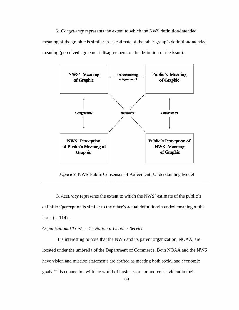
69
2. Congruency represents the extent to which the NWS definition/intended
meaning of the graphic is similar to its estimate of the other group’s definition/intended
meaning (perceived agreement-disagreement on the definition of the issue).
Figure 3: NWS-Public Consensus of Agreement -Understanding Model ________________________________________________________________________
3. Accuracy represents the extent to which the NWS’ estimate of the public’s
definition/perception is similar to the other’s actual definition/intended meaning of the
issue (p. 114).
Organizational Trust – The National Weather Service
It is interesting to note that the NWS and its parent organization, NOAA, are
located under the umbrella of the Department of Commerce. Both NOAA and the NWS
have vision and mission statements are crafted as meeting both social and economic
goals. This connection with the world of business or commerce is evident in their

70
descriptions of audiences as customers and their weather predictions as products. But
their communication activities are more in the line of good public relations practice.
Measurement of the construct of trust of the NWS by members of the public
followed measurements suggested by Grunig & Hon (1999). Respondents were asked to
rate their levels of agreement/disagreement on a scale of 1-to-7 for statements related to
their relationship with the NWS and other weather organizations. The questions were
patterned after and relate to dimensions of integrity, competence and dependability that
have been proposed by Grunig and Hon (1999) as measures of the concept of trust.

71
CHAPTER FOUR: RESULTS
This chapter contains the results of data collection, statistical tests, and data
analysis as outlined in Chapter Three. Results from two online questionnaires are
reported in separate sections. The first section consists of findings from data gathered
from the general public questionnaire. The second contains the data collected from
broadcast meteorologists. Both sections contain a summary of findings and include
distribution frequencies and descriptive statistics. A third section compares the public’s
responses to those of the broadcast meteorologists.
This study is an examination of whether the NWS designers and their publics are
in agreement about the meaning of the tropical cyclone graphic. Levels of understanding
were measured through isolation of several variables, including understanding of weather
related terms, interpretation of graphic conventions, and the public’s level of trust of the
NWS. Specifically, this study proposed the following research questions:
RQ1: Does the general public’s knowledge of basic weather terms and concepts match
the level necessary to understand the meaning of the hurricane graphic?
RQ2: Are the visual conventions used in the creation of the hurricane graphic understood
by the general public as they were intended by the designers?
RQ3: Does the general public understand the meaning of the hurricane graphic?
RQ4: Does the general public trust the NWS and its graphical products such as forecasts?

72
RQ5: Does the public’s understanding of the meaning of the hurricane graphic match the
broadcasters’ perceptions of the public’s understanding of the meaning of the
hurricane graphic?
Public Respondents Survey Data
Demographics
Of the 135 people surveyed 76 (56.3%) were female and 57 (42.2%) were male.
In terms of age 56 (41.5%) were born between 1925 and 1945, 50 (37%) were born
between 1946 and 1964, 17 (12.6%) were born between 1965 and 1977, 9 (6.7%) were
born between 1978 and 1988, and 3 (2.2%) were born between 1911 and 1924. A total of
59 (43.7%) of respondents were age 62 or older. An additional 50 (37.0 %) were between
the ages of 43 and 61.
A total of 125 respondents or 92.2% reported completion of at least some college
while 97 (71.9%) reported completion of a postsecondary degree. One hundred twenty
one (89.6%) of respondents claimed Florida as their primary residence with 72
respondents (53.3%) of the sample residing in Charlotte County (see Table 1).

73
Table 1
Demographic Frequencies General Public Item N % I was born between: 1925-1945 56 41.5 1946-1964 50 37.0 1965-1977 17 12.6 1978-1988 9 6.7 1911-1924 3 2.2 Sex Female 76 56.3 Male 57 42.2 No Response 2 1.5 Education level completed Bachelors Degree 36 26.7 Some college 28 20.7 Graduate School 18 13.3 Some Graduate School 17 12.6 Doctorate 11 8.1 Post Graduate 9 6.7 High School or GED 7 5.2 Associates Degree 6 4.4 Some High School 3 2.2 My primary residence is located Charlotte County, FL 72 53.3 Other, FL 49 36.3 Other, US 14 10.4 Note. N=135.
Weather Information
The majority of the respondents, 82 (60.7%), reported “generally” getting their
weather information from television while 38 (28.1%) “generally” used the internet for
their weather needs. Only .7% selected newspapers for their weather forecasts (see Table
2).

74
As per Table 3 the majority of respondents, 102 (75.6%), increase their weather
information seeking behaviors when they are aware of an approaching storm. When they
know of an approaching storm, a large majority, 107 (79.3%), “usually” go to the internet
for forecast information.
Table 3 Weather Information Seeking Frequencies - General Public
Item N % When I hear about an approaching storm I usually… (Pick ALL that apply):
Check the internet for forecasts 107 79.3 Increase my viewing to include other stations or papers 102 75.6 Talk to my family or friends about it 62 45.9 Stay with my regular television viewing or reading habits 40 29.6 Note. N>135 – respondents checked all responses that applied
Knowledge of Weather Terms
The publics’ responses to questions relating to weather terms and concepts were
graded as correct or incorrect using a key provided by the NWS (see Table 4). The
majority of respondents chose the “correct” answer to all 6 items. The majority, 129
Table 2 Weather Information Sources Frequencies - General Public
Item N % I generally get information about the weather from: Television 82 60.7 Internet 38 28.1 Radio AM or FM 6 4.4 Weather Radio 4 3.0 Other 2 1.5 Desktop Radio Florida Division of Emergency Management Newspaper 1 .7 Other people 1 .7 No answer 1 .7 Note. N=135.

75
(95.6%), indicated that hurricane and tropical storm watches and warnings are issued by
the NWS. Most respondents 124 (91.9%) identified hurricanes as storm with winds of
more than 73 mph. and the majority, 110 (81.5%) correctly equated the Saffir-Simpson
Hurricane Scale with the intensity of the storm. The public (n=105, 77.8%) correctly
indicated that probable, possible, and potential do not basically mean the same thing and
84 respondents (62.2%) correctly indicated that a hurricane warning meant hurricane
conditions are expected within 24 hours. While the majority of respondents (n=70,
51.9%) chose the same answer, to the item relating to the meaning of a tropical storm
watch as the one the NWS supplied, the veracity of the answer is questionable because an
error in the construction of the correct answer which should have read 36 rather than 24
hours for a watch.

76
Table 4 Knowledge of Weather Related Terms Frequencies - General Public
Item N %Probable, possible and potential all basically mean the same thing...(pick ONE) False 105 77.8 True 26 19.3 Unsure 3 2.2 No answer 1 .7 A tropical storm watch for my area means...(pick ONE) Tropical storm conditions including winds of 39 to 73 mph are possible within the next 24 hours
70 51.9
Conditions in my area are conducive to the development of a tropical storm 52 38.5 A tropical storm is likely to hit my area within the next 24 hours 11 8.1
Unsure 1 .7 No answer 1 .7 A hurricane warning for my area means…(pick ONE) Hurricane conditions are expected in my area within the next 24 hour 84 62.2 A hurricane will likely hit my area within the next 2 days 26 19.3 Conditions in my area are conducive to hurricane development 24 17.8 No answer 1 .7 Hurricane and tropical storm watches and warnings are… (check ALL that apply) Issued by the National Weather Service 129 95.6 Are official designations 54 40.0 Issued by local emergency planners 25 18.53 Determined by my local media 3 2.2 Unsure 3 2.2 The Saffir/Simpson Hurricane Scale…(pick ONE) Is a scale ranging from 1-5 based on the intensity of the hurricane 110 81.5 Unsure 20 Categorizes storms as tropical depressions, storms or hurricanes 2 1.5 Is a scale used to indicated the size of a storm 1 .7 No answer 2 1.5 A hurricane is characterized by…(check ALL that apply) Winds of more than 73 mph 124 91.9 A pronounced low-pressure circulation 80 59.3 A proper name 55 40.7 Unsure 3 2.0 Note. Answers in italics and bolded are considered “correct””
Visual Conventions
Table 5 shows respondents’ responses to question testing their understanding of
visual conventions. The vast majority of the respondents, (n=131, 97%), correctly

77
indicated that the Figure 1 graphic represented the path of a hurricane. A majority,
(n=128, 94.8%) know that maps shown in the news are usually oriented to the North and
122 respondents (90.4%) correctly matched the red area of the graphic with that of area
under a hurricane warning. Respondents (n=119, 88.1%) indicated correctly that the
white area represented the “area of uncertainty.” Respondents were less successful in
choosing the correct (n=81, 60%) response that equated the pink area with the definition
of a hurricane watch and only (n=53, 39.3%) chose the correct answer to the item related
to size of the state of Florida.
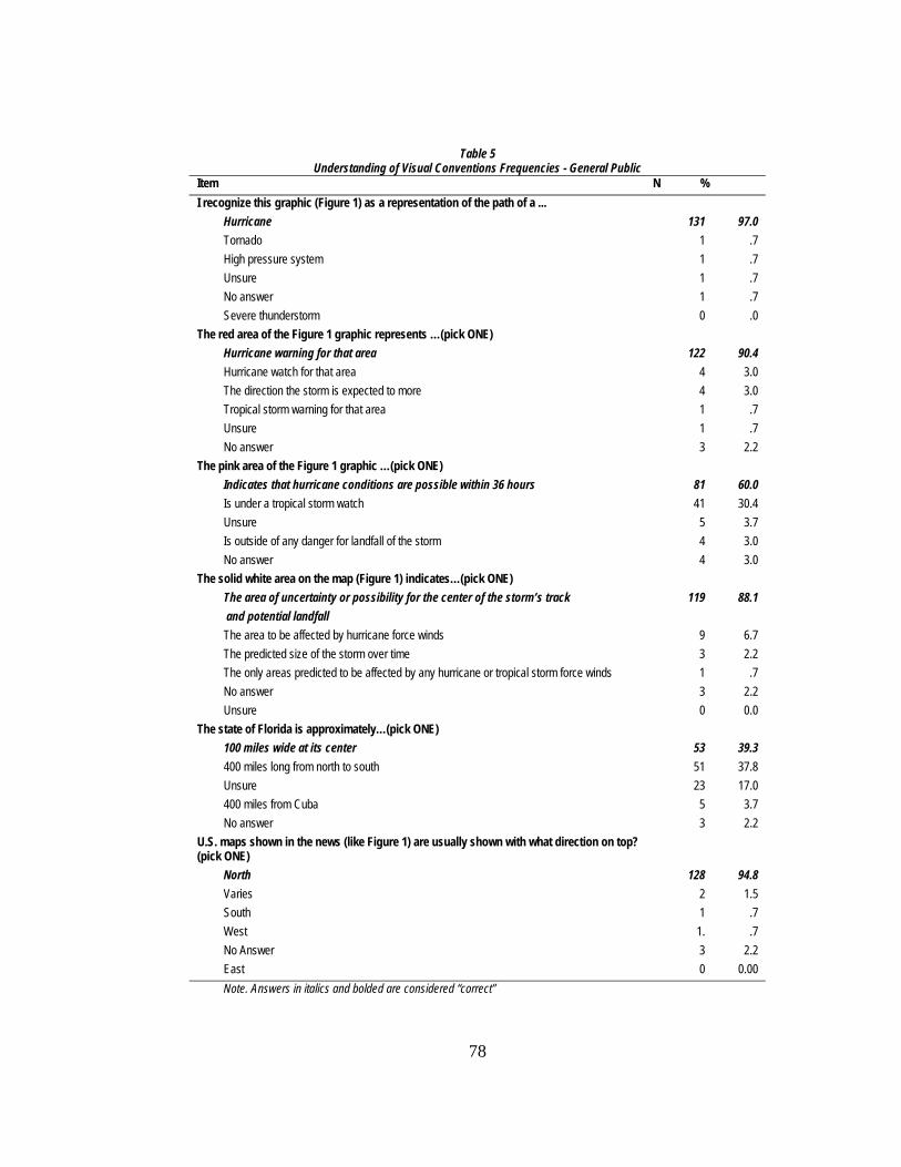
78
Table 5 Understanding of Visual Conventions Frequencies - General Public
Item N % I recognize this graphic (Figure 1) as a representation of the path of a ... Hurricane 131 97.0 Tornado 1 .7 High pressure system 1 .7 Unsure 1 .7 No answer 1 .7 Severe thunderstorm 0 .0 The red area of the Figure 1 graphic represents …(pick ONE) Hurricane warning for that area 122 90.4 Hurricane watch for that area 4 3.0 The direction the storm is expected to more 4 3.0 Tropical storm warning for that area 1 .7 Unsure 1 .7 No answer 3 2.2 The pink area of the Figure 1 graphic …(pick ONE) Indicates that hurricane conditions are possible within 36 hours 81 60.0 Is under a tropical storm watch 41 30.4 Unsure 5 3.7 Is outside of any danger for landfall of the storm 4 3.0 No answer 4 3.0 The solid white area on the map (Figure 1) indicates…(pick ONE) The area of uncertainty or possibility for the center of the storm’s track and potential landfall
119 88.1
The area to be affected by hurricane force winds 9 6.7 The predicted size of the storm over time 3 2.2 The only areas predicted to be affected by any hurricane or tropical storm force winds 1 .7 No answer 3 2.2 Unsure 0 0.0 The state of Florida is approximately…(pick ONE) 100 miles wide at its center 53 39.3 400 miles long from north to south 51 37.8 Unsure 23 17.0 400 miles from Cuba 5 3.7 No answer 3 2.2 U.S. maps shown in the news (like Figure 1) are usually shown with what direction on top? (pick ONE)
North 128 94.8 Varies 2 1.5 South 1 .7 West 1. .7 No Answer 3 2.2 East 0 0.00 Note. Answers in italics and bolded are considered “correct”

79
Understanding Hurricane Graphics
Table 6 shows participants’ understanding of hurricane graphics. The majority of
respondents (n=131, 97.0%) correctly indicated that the Figure 1 graphic represented the
path of a hurricane and its design conveyed information of the storms path. Item 33, a
measure of the graphics meaning contained four correct choices. Respondents correctly
identified key elements of the graphic design with a majority (n=119, 88.1%) indicating
that the graphic was an important indicator of the storm’s path; 118 respondents (87.4%)
indicated that the graphic tells them where and (n=108) and 83.3% of respondents
indicated that the graphic tells them when a tropical storm or hurricane is expected.
Additionally, 103 (76.3%) of respondents correctly indicated the graphic contained
information about the speed of the storm’s movement. Of note is the number of
respondents (n=37, 27.4%) who incorrectly indicated that the graphic showed the size of
a storm and the small percentage (n=22, 16.3%) who believe the graphic represents a
“very reliable forecast.”
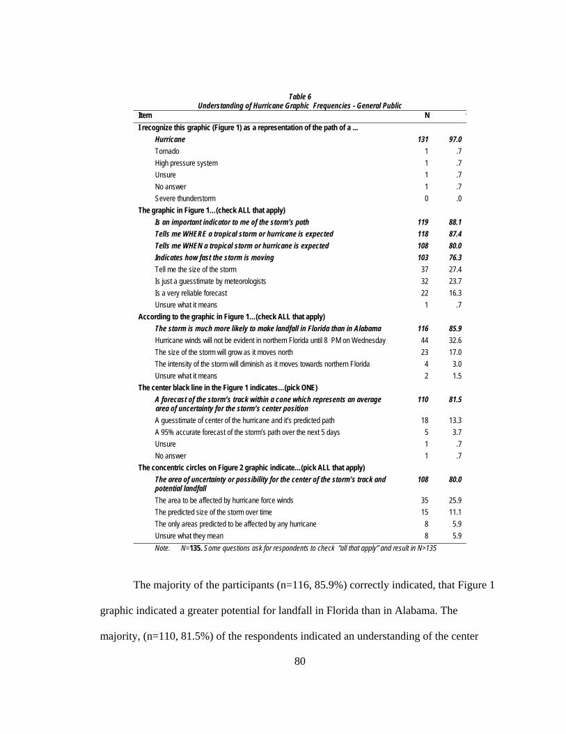
80
The majority of the participants (n=116, 85.9%) correctly indicated, that Figure 1
graphic indicated a greater potential for landfall in Florida than in Alabama. The
majority, (n=110, 81.5%) of the respondents indicated an understanding of the center
Table 6 Understanding of Hurricane Graphic Frequencies - General Public
Item N %I recognize this graphic (Figure 1) as a representation of the path of a ... Hurricane 131 97.0 Tornado 1 .7 High pressure system 1 .7 Unsure 1 .7 No answer 1 .7 Severe thunderstorm 0 .0 The graphic in Figure 1…(check ALL that apply) Is an important indicator to me of the storm’s path 119 88.1 Tells me WHERE a tropical storm or hurricane is expected 118 87.4 Tells me WHEN a tropical storm or hurricane is expected 108 80.0 Indicates how fast the storm is moving 103 76.3 Tell me the size of the storm 37 27.4 Is just a guesstimate by meteorologists 32 23.7 Is a very reliable forecast 22 16.3 Unsure what it means 1 .7 According to the graphic in Figure 1…(check ALL that apply) The storm is much more likely to make landfall in Florida than in Alabama 116 85.9 Hurricane winds will not be evident in northern Florida until 8 PM on Wednesday 44 32.6 The size of the storm will grow as it moves north 23 17.0 The intensity of the storm will diminish as it moves towards northern Florida 4 3.0 Unsure what it means 2 1.5 The center black line in the Figure 1 indicates…(pick ONE) A forecast of the storm’s track within a cone which represents an average
area of uncertainty for the storm’s center position 110 81.5
A guesstimate of center of the hurricane and it’s predicted path 18 13.3 A 95% accurate forecast of the storm’s path over the next 5 days 5 3.7 Unsure 1 .7 No answer 1 .7 The concentric circles on Figure 2 graphic indicate…(pick ALL that apply) The area of uncertainty or possibility for the center of the storm’s track and potential landfall
108 80.0
The area to be affected by hurricane force winds 35 25.9 The predicted size of the storm over time 15 11.1 The only areas predicted to be affected by any hurricane 8 5.9 Unsure what they mean 8 5.9 Note. N=135. Some questions ask for respondents to check “all that apply” and result in N>135

81
black line to be a track within an area of uncertainty, and slightly fewer, (n=108. 80.0%)
correctly indicated the concentric circles of the NWS alternative graphic, Figure 2,
represented an area of uncertainty for the storm center track.
Factor Analysis
The instrument for the public survey was conceptualized, in part, using items
from the Grunig and Hon (1999) Trust scale. Questions from the short scale were
reworded to measure the public’s perceptions relating to integrity, competence and
dependability of NWS and the local media. Grunig and Hon (1999) published reliability
of this scale for five organizations with an average Cronbach’s Alpha of .86. Only
selected items from the scale were chosen and edited to focus on the NWS as a
governmental organization and as the designer and provider of weather forecast products.
To determine if any of these 13 opinion variables relating to trust could be
grouped into composite variables a factor analysis was conducted using principal factors
with iterations rotated to a Varimax solution using a minimum Eigenvalue of 1.0 on the
13 variables representing organizational trust of the NWS and local media. A Rotated
Component Matrix revealed two components. A Cronbach coefficient alpha was
computed to determine internal consistency and reliability on the first factor’s five items.
The second component consisted of two items and to test reliability the Pearson
coefficient was computed. Table 7 presents the two factor solution, with variable names,
factor loadings, communalities, means and standard deviations. The Cronbach’s alpha is
also listed as a measure of internal reliability of the measures. The analysis also allowed
the grouping of questions 9, 10, 12, 14 and 15 and questions 19 and 20 into two
composite variables.

82
The four-factor solution explains 64.23% of the variance. Factor 1, Trust in NWS
has the strongest loading factors and explains 29.23% of the variance and contains five of
the items from the trust scale. Factor 2, Trust in Local Media contains two items from the
trust scale and explains 14.97% of the variance. The Pearson Correlation of the two items
in Factor 2 are statistically significant with a moderate relationship (r=.49, p<.001).
Subsequently the two factors were collapsed into single indices measuring Trust in the
NWS and Trust in Local Media respectively. Descriptive statistics indicated the mean for
Trust in the NWS was 5.53 and for Trust in Local Media M=4.26. The results of Factor 3
were not statistically significant and Factor 4 contained only one item.
Table 7
Means and Standard Deviations for Trust for NWS and Local Media Factor 1: Trust in NWS (64.23% of variance) M=5.53; SD=.77 α= .78 Factor Loadings* Commonalities** The National Weather Service is one organization that I can count on to make important
decisions that may affect people like me .725 .615
I think the National Weather Service does a good job of predicting hurricanes and other severe weather
.711 .613
I feel very confident in the National Weather Service’s ability to make storm predictions .725 ..604 I am familiar with the National Weather Service and what it does .732 .582 The National Weather Service keeps its promises to warn the public about severe storms. .757 .664 Factor 2: : Trust in Local Media M=4.26; SD=.1.35, r =.49, p<.001 If I had to choose between the National Weather Service and my local media, I’d rely on my
local forecast .822 .718
My local weather forecasts are generally accurate .830 .786 *Factor loadings indicate how much weight is assigned to each factor **Communalities are the portion of variance in each variable explained by underlying factors.

83
ANOVA Interpretation
To assist in the explanation of the sources of variance in the relationship of
several demographic variables with levels of trust and attitudes about weather forecasts
and graphics, the researcher used one-way analysis of variance (ANOVA). The
dependent variables were Trust in the NWS; Trust in Local Media; Item 7, which related
to understanding of television graphics; and Item 8, which related to emotional response
to hurricane forecasts. The independent variables were generation, sex and education.
There was no statistically significant relationship between the three independent
variables and levels of Trust in the NWS. However, generation was found to be
statistically significant in levels of Trust of the Local Media (F=2.711, p<.05). The
youngest of the respondents, Generation Y were far less likely (M=2.88) to “trust” their
local media than respondents from the Silent Generation (M=4.44). Generation Y
(M=2.88) was also less likely to trust the local media than Baby Boomers (M=4.36).
For the two questions relating to attitudes about weather graphics and forecasts,
there were only statistically significant differences between the sexes (F=5.820, p<.05) In
their responses to question 7, which asked if tropical storm track graphics were
informative and easy to understand, men (M=6.12) reported more confidence in their
understanding than women (M=5.64). Men and women were also significantly different
in their choices relating to their emotional response to hurricane forecasts with men
indicating that forecasts made them less “nervous” (M=3.55) than they did women,
(M=4.58).

84
Cross Tabulation Analysis
To determine any significant differences between groups in terms of their media
habits cross tabulation with chi square analysis was conducted. To determine the
direction of the statistically significant differences the expected count had to equal or
exceed the observed count. Of the 22 items used in the cross tabulation only three were
found to not be statistically significant. Of the remaining 19 items, significant differences
in observed frequencies were most notable by generations and educational levels, with
sex accounting for the fewest cases.
Media Habits
The results from this study indicate (χ2df=24 =58.482, p<.01) that television is
more likely to be the primary source of weather information for the Silent (n=37, 67.3%)
and the Baby Boom (n=34, 68.0%) generations while the Internet appears more likely to
be the routine source of weather information for the youngest respondents, namely,
Generation X (n=6, 35.3%) and Generation Y (n=8, 88.9%).
Respondents who have completed a Batchelor’s degree and higher levels of
formal education are more likely (χ2df=48 =74.063, p<.01) to use the Internet than those
reporting less formal education: BA (n=12, 33.3%), Some Graduate School (n=9, 52.9%),
Graduate School (n=6, 33.3%), Post Graduate School (n=3, 33.3%), Doctorate (n=4,
36.4%). Respondents with High School (n=4, 66.7%), Some College (n=23, 82.1%) and
those reporting Associates Degrees (n=6, 100%) are more likely to get their weather
information from television.
There were also generational differences in media use when there is an
approaching storm (χ2df=4 =12.151, p<.05). Respondents from the WWII generation (n=2,

85
66.7%) and the Silent generation (n=24, 42.9%) indicated a preference for staying with
their regular viewing or reading habits. This was also the case for respondents (χ2df=8
=24.295, p<.01) with lesser formal education, i.e. Some High School (n=3, 100%), High
School or GED (n=4, 57.1%), and Some college (n=14, 50.0%). There also were
generational differences in the propensity to talk to family and friends as a storm
approaches (χ2df=4 =11.015, p<.05), with Baby Boomers (n= 29, 58.0%) and Generation
Xs (n=11, 64.7%) more likely to display this behavior than other generations.
Knowledge of NWS and Weather Terminology
The majority (85%) of respondents indicated that the NWS is a federal agency
and part of NOAA but men (93.0%) were more likely than women (78.9%) to make that
choice.(χ2df=1=5.022, p<.05). When asked if the words probable, possible and potential
mean the same thing, the majority of respondents (n=103, 79.8%) disagreed but while the
results between the sexes (p=.058) and generations (p=.058) were not statistically
significant they may be noteworthy for communicators. Women accounted for 73.1% of
the wrong answers and they were twice as likely (n=19, 26.0%) as men (n=7, 12.5%) to
incorrectly indicate the terms meant basically the same thing. Older respondents, the
WWII (n=2, 100%) and Silent generation (n=12, 28%) were also more likely to equate
the terms while 81.6% of Boomers, 87.5% of Gen X’s and 88.9% of Gen Y’s indicated
that the words do not basically mean the same thing. The results were statistically
significant, however, for differences between levels of education (χ2df=8 =18.617, p<.05).
Respondents with some high school, some college and a Bachelor’s degree were more
likely to agree that the terms mean the same thing and accounted for 77% of positive
responses.
86
Question 23, which asked for the meaning of a tropical storm watch, was not
analyzed because of an error in the construction of answers. The researcher erred in the
editing of the preferred answer which should have stated that the conditions were
possible within the next 36 not 24 hours. That said, only 70 (52%) of respondents chose
the “correct” response or the one chosen by a weather professional.
There were statistically significant differences between generations in response to
the meaning of a hurricane warning (χ2df=8 =18.690, p<.05). While the three youngest
generations were more likely to answer the question correctly only 84 (62.2%) of the
respondents chose the correct answer that hurricane warning meant that hurricane
conditions are expected within 24 hours. The majority (95.6%) of respondents did,
however, correctly indicate that watches and warnings were issued by the NWS. There
was a statistically significant difference between the sexes in response to this question
(χ2df=1 =3.896, p<.05). Men (100%) were more likely than women (93.4%) to correctly
answer the question.
Items 18 and 26 were inadvertent repetitions of the same questions but the results
were very close with question 26 having 4 more correct responses. Question 18 was not
analyzed. For question 26, men (93.0%) were significantly more likely than women
(78.9%) to correctly choose answer 26A (χ2df=1 =5.022, p<.05), identifying NWS as part
of NOAA. There were statistically significant differences between generations (χ2df=4
=11.708, p<.05) with the youngest respondents more likely to correctly choose answer
26B, identifying NWS as part of the Department of Commerce. Generation X (47.1%)
and Generation Y (55.6%) were more likely to make the right choice. Men (38.6%) were
also more likely than women (15.8%) to know of the NWS connection to Department of

87
Commerce (χ2df=1 =8.904, p<.01). Respondents with some graduate school (64.7%),
graduate school (50.0%) and those with doctorates (45.5%) also were more likely to
know of the NWS connection to Department of Commerce (χ2df=8 =35.721, p<.05).
Questions 29, 30 and 31 asked respondents to choose an answer that matched the
intended meaning of a colored portion of the map. These questions aimed to measure
agreement/understanding of map design conventions that use color coding to indicate
gradations of intensity or other specified information. Question 29 asked what the “red
area of the Figure 1 graphic represents” and 122 (90.4%) of the respondents chose the
correct answer. The correct answer was “hurricane warning for that area” and it was
clearly stated in the map’s legend. Question 30 asked respondents to choose an answer
relating to the pink area of the graphic. Only 81 (60.0%) of the respondents chose the
correct answer, indicates that hurricane conditions are possible within 36 hours. In this
instance, selecting the correct answer requires respondent knowledge of the definition of
a hurricane watch, because that information is not included in the legend. The three
youngest generations were significantly more likely to choose the correct answer (χ2df=8
=29.052, p<.01): Baby Boomers (n=34. 70.8%), Generation X (n=14, 82.4%), and
Generation Y (n=9, 100%). There were also statistically significant differences in the
answers to this question (χ2df=16=31.095, p<.05) for those claiming an Associates degree
(n=4, 66.7%), Bachelors degree (n=26, 76.5%), Some Graduate school (n=15, 93.8%),
and Graduate school (n=12, 75%) were more likely to answer correctly.The majority of
respondents (n=119, 88.2%) correctly identified the white area of the graphic as the area
of uncertainty for the storm track. Younger respondents from Generation X (n=16,

88
94.1%) and Generation Y (n=9, 100%) respectively were more likely to make the correct
choice (χ2df=12 =28.020, p<.05 ).
When asked where respondents remembered seeing the graphic, the majority sited
television (n=114, 84.4%) but results showed a statistically significant difference among
generations (χ2df=4 =13.902, p<.01). The Silent Generation (n=50, 89.3%) and Generation
X (n=16, 94.1%) were more likely to choose television. The second most cited outlet for
recall of the graphic was the Internet with 98 (73%) of the respondents making that
choice. Among those choosing the Internet, there was a statistically significant difference
between generations (χ2df=4 =26.934, p<.01) with the three youngest groups more likely
to make that choice [Baby Boomers (n=43, 84.0%), Generation Xs (94.1%), and
Generation Y, 100%].
Question 33 offered respondents seven alternatives (pick all that apply) and was
designed as an attempt to measure what meaning viewers derived from the graphic, both
as a representation of specific storm information, as well as subjective assessment of its
accuracy. The majority of respondents chose the four correct answers relating to the
storm’s expected track and speed. Of those four there were significant differences
between respondents by generations (χ2df=4 =9.728, p<.05) and education (χ2
df=8 =17.515
p<.05) in associating the graphic with where a storm is expected. The three youngest
groups were more likely to choose this correct answer [Baby Boomers (n=45, 90.0%),
Generation Xs (n=15, 88.2%) and Generation Y, (n=9, 100%]. Those with some high
school (n=2, 66.7%), some college (n=7, 25.0%) and those that completed graduate
school (n=3, 16.7%) were all more likely to miss this answer. The correct answer to the
graphic indicating how fast the storm is moving, was chosen by smallest number of

89
respondents (n=103, 76.3%) and pointed to statistically significant differences between
generations (χ2df=8=17.168, p<.05). Again the youngest respondents [Baby Boomers
(n=42, 84.0 %) Generation X, (n=16, 94.1%) and Generation Y, (n=8, 88.9%)] were most
likely to choose the correct answer.
For the 16.3% of respondents who indicated that the graphic represented a very
reliable forecast, those with a high school/GED (n=2, 28.6%) along with those with a
Some graduate school (n=3, 17.6%), Graduate school (n=7, 38.9%), Post graduate (n=3,
33.3%, and those with Doctorate degrees (n=3, 27.3%) were significantly more likely to
have faith in the graphic as an accurate depiction of a storm forecast (χ2df=8 =17.168,
p<.05).
Question 36 asked respondents to choose answers that would not be easily
gleaned from the legend. The majority of respondents (n=116, 85.9%) chose the correct
answer, that the storm was much more likely to make landfall in Florida than Alabama,
but the more interesting results are from the incorrect choices. Nearly a third (n=44,
32.6%) of the respondents indicated that hurricane winds would not be evident in Florida
until 8 p.m. on Wednesday. According to the graphic, at 8 p.m. on Wednesday the
storm’s center is forecasted to be located on the Florida/Alabama line. While these results
were significant across generations (χ2df=8 =23.753, p<.01) there did not seem to be trends
or generalizations from the data. Another incorrect answer is the choice made by 23
(17%) of the respondents who incorrectly indicated that the graphic showed the size of
the storm would grow as it moves north. The only statistically significant difference of
note was between men and women (χ2df=1=5.064, p<.05). While only 17% of the
respondents incorrectly indicated that the size of the storm will grow as it moves north, it

90
was statistically significant and interesting that 18 (78.3%) of these incorrect answers
were from women.
Although only 18.5% (n=25) of the respondents did not choose the correct answer
relating to the graphic’s center black line (Question 38), it was significant (χ2df=8
=24.944, p<.01) that all of the WWII generation (n=3, 100%) chose the answer that
indicated the line was a “guesstimate” of the storm’s location. The “correct” answer was
that the line was a forecast of the storm’s track within a cone which represents an
average area of uncertainty for the storm’s center position.
The WWII (66.7%) and the Silent (37.5%) generations also departed from the
majority of respondents on Question 39 relating to the meaning of the concentric circles
on Figure 2. Both of these groups were statistically different (χ2df=4=12.265, p<.05) than
others in interpreting the concentric circles as an area to be affected by hurricane winds
rather than an area of uncertainty.
Correlations
To determine possible relationships between Factors of Trust for NWS and Trust
of Local Media and questions relating to ease of understanding of graphics and nervous
emotional response to severe weather forecasts, a simple correlation statistical test was
performed. There were two statistically significant correlations found. Both were weak
associations between Question 7, related to the informative nature and ease of
understanding of tropical storm graphics, and Trust for NWS (r=.34, p<.01) and Trust of
Local Media (r=.19, p<.05). An additional correlation statistical test was performed to
determine if an association was evident between Question 19 and Question 20. Question
19 asked respondents if they had to choose between the NWS and my local media, I’d

91
rely on my local forecast. Question 20 asked respondents if their local forecasts are
generally accurate. There was a statistically significant correlation found with a moderate
relationship between the two questions (r=.503, p<.01).indicating the reponses are related
but did not provide information as how they are related.
Broadcast Meteorologists Survey Data
A meteorologist, according to the American Meteorological Society, is a person
with specialized education, “who uses scientific principles to explain, understand,
observe, or forecast the earth's atmospheric phenomena and/or how the atmosphere
affects the earth and life on the planet (AMS, 2007, para #3). For many residents of
tropical storm regions, the television’s meteorologist or weather reader is often the face
of broadcast meteorology. For many viewers these broadcasters are often the first and
foremost purveyor of critical weather information. Many stations use NWS graphics and
information in their severe weather forecasts.
As Table 8 indicates, seven working broadcast meteorologists from southwest
Florida stations responded to the 51-item online questionnaire. All of the respondents
have some college education and three (48%) have completed graduate school or post
graduate work. All reported at least six years of weather forecasting experience and all
but one had at least six years of weather broadcasting experience. Two of the
broadcasters reported more than 20 years involvement in weather broadcasting. Three of
the broadcasters reported professional designations afforded by the American
Meteorological Society (AMS). Two hold the AMS Seal of Approval and one the CBM.
One respondent listed receipt of an Emmy for weather graphics.

92
Table 8 Demographic Frequencies - Broadcast Meteorologists
Item N %
Education level completed Bachelors Degree 2 28.6 Graduate School 2 28.6 Some College 1 14.3 Some Graduate School 1 14.3 Post Graduate 1 14.3 I have been involved in weather forecasting for… 6-10 years 2 28.6 16-20 years 2 28.6 11-15 years 1 14.3 21-25 years 1 14.3 26+ years 1 14.3 I have been involved in weather broadcasting for… 6-10 years 2 28.6 1-5 years 1 14.3 11-15 years 1 14.3 16-20 years 1 14.3 21-25 years 1 14.3 26+ years 1 14.3 N=7
The broadcasters who responded to the survey indicated they believe the media do
a good job in preparing the public for severe weather (M=5.71) and their station’s
forecasts are extremely important to the public in their decision making (M=6.57). As a
group they think visuals and graphics are important tools (M=6.86) for preparing
populations at risk. The Broadcasters indicated the NWS provides them accurate
(M=5.71) and important forecast information (M=6.29) that is easily understood by
meteorologists (M=6.71).

93
Table 9 Broadcast Meteorologist Opinions of Severe Weather Forecasting
Item M SD The media do a good job in preparing the general public for severe weather like hurricanes.
5.71 .488
I am happy with the current status of broadcast coverage of severe weather.
5.00 .816
My station's tropical storm/hurricane forecasts are extremely important to the public in their decisions to make storm preparations or plans to evacuate.
6.57 1.134
I think visuals and graphic representations of weather such as radar and tropical storm track graphics are important tools for preparing populations at risk.
6.86 .378
I think the general public understands the basics of meteorology.
4.29 1.496
I think most people rely upon what they hear during a weather forecast.
5.29 .756
I think most people rely upon what they see during a weather forecast.
5.29 1.254
My station has adequate systems to measure audience satisfaction of severe weather forecasts and coverage.
4.14 1.069
I think the information provided by the National Weather Service (NWS) and the National Hurricane Center (NHC) is accurate.
5.71 .488
I think the information/products provided by the National Weather Service and the National Hurricane Center is easily understood by reporters.
3.43 1.512
I think the information/products provided by the National Weather Service and the National Hurricane Center is easily understood by meteorologists
6.71 .488
The NWS/NHC tropical storm and hurricane forecasts are very important to what I broadcast or predict.
6.29 .756
I think the information and graphic products provided by the National Weather Service and the National Hurricane Center are easily understood by members of the general public.
3.71 1.380
The NWS products, such as the tropical storm track, provide the information the general population needs to make better preparation decisions.
4.57 1.397
If the general public had to choose between the National Weather Service and my local media, they rely on their local forecast
5.17 1.722
The general public will say their local weather forecasts are generally accurate
5.43 .976
N=7 Respondents were asked to rate their level of agreement of agreement with the statements on a scale to 1 to 7, with 1 indicating complete disagreement and 7 complete agreement.
94
The broadcast meteorologists were much less confident, however, about the
general public’s understanding of meteorology (M=4.29); the public’s ability to easily
understand information and graphics supplied by NWS and NHC (M=3.71); and were
even less positive of other reporters’ ease of understanding of NWS informational
products (M=3.43).
Meteorologists seemed to believe the public has some confidence in accuracy of
local forecasting (M=5.43) and that the public would prefer their local forecast to a NWS
forecast (M=5.17). Broadcasters seemed ambivalent about whether viewers rely on what
they hear (M=5.29) versus what they see during a weather forecast (M=5.29)
Broadcasters indicated (n=5, 71.4%) that the public would consider the terms
probable, possible and potential to basically mean the same thing and expected the public
to remember the Saffir-Simpson Hurricane Scale was a measure of hurricane intensity
(n=6, 85.7%) to measure. Broadcasters were unanimous in their expectations (n=7,
100%) that the public would know a hurricane packed winds of more than 73 mph but
were less confident in the public’s correct choice regarding hurricane warning (n=5,
71.4%).
(See Tables 10, 11 and 12 for broadcasters’ responses and Tables 4, 5, and 6 for the
respective public responses to these questions.)
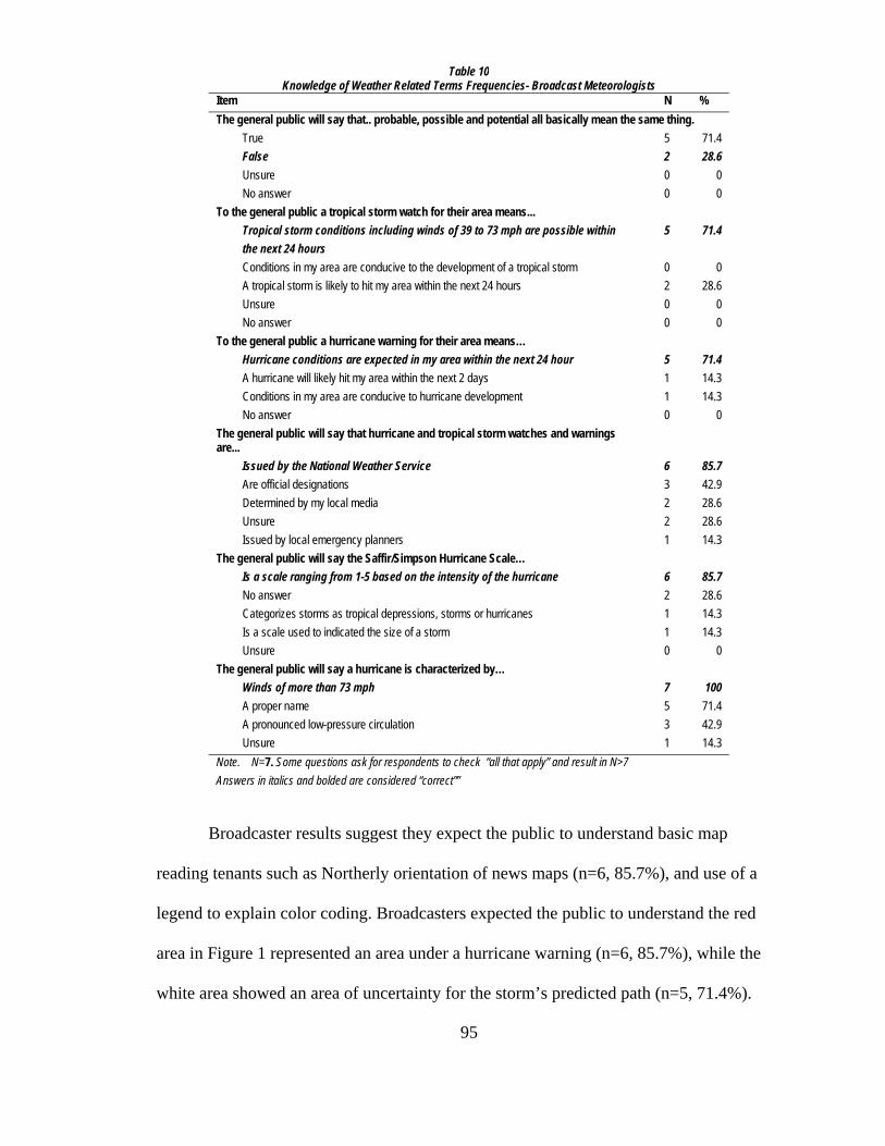
95
Broadcaster results suggest they expect the public to understand basic map
reading tenants such as Northerly orientation of news maps (n=6, 85.7%), and use of a
legend to explain color coding. Broadcasters expected the public to understand the red
area in Figure 1 represented an area under a hurricane warning (n=6, 85.7%), while the
white area showed an area of uncertainty for the storm’s predicted path (n=5, 71.4%).
Table 10 Knowledge of Weather Related Terms Frequencies- Broadcast Meteorologists
Item N % The general public will say that.. probable, possible and potential all basically mean the same thing. True 5 71.4 False 2 28.6 Unsure 0 0 No answer 0 0 To the general public a tropical storm watch for their area means... Tropical storm conditions including winds of 39 to 73 mph are possible within the next 24 hours
5 71.4
Conditions in my area are conducive to the development of a tropical storm 0 0 A tropical storm is likely to hit my area within the next 24 hours 2 28.6
Unsure 0 0 No answer 0 0 To the general public a hurricane warning for their area means… Hurricane conditions are expected in my area within the next 24 hour 5 71.4 A hurricane will likely hit my area within the next 2 days 1 14.3 Conditions in my area are conducive to hurricane development 1 14.3 No answer 0 0 The general public will say that hurricane and tropical storm watches and warnings are...
Issued by the National Weather Service 6 85.7 Are official designations 3 42.9 Determined by my local media 2 28.6 Unsure 2 28.6 Issued by local emergency planners 1 14.3 The general public will say the Saffir/Simpson Hurricane Scale… Is a scale ranging from 1-5 based on the intensity of the hurricane 6 85.7 No answer 2 28.6 Categorizes storms as tropical depressions, storms or hurricanes 1 14.3 Is a scale used to indicated the size of a storm 1 14.3 Unsure 0 0 The general public will say a hurricane is characterized by… Winds of more than 73 mph 7 100 A proper name 5 71.4 A pronounced low-pressure circulation 3 42.9 Unsure 1 14.3 Note. N=7. Some questions ask for respondents to check “all that apply” and result in N>7 Answers in italics and bolded are considered “correct””

96
Table 11 Understanding of Visual Conventions Frequencies– Broadcast Meteorologists
Item N % The general public will recognize this graphic (Figure 1)as a representation of the path of a ... Hurricane 7 100.0 Tornado 0 0 High pressure system 0 0 Unsure 0 0 No answer 0 0 Severe thunderstorm 0 0 To the general public the red area of the Figure 1 graphic represents... Hurricane warning for that area 6 85.7 Tropical storm warning for that area 1 14.3 Hurricane watch for that area 0 0 The direction the storm is expected to more 0 0 Unsure 0 0 No answer 0 0 To the general public, the pink area of the Figure 1 graphic... Indicates that hurricane conditions are possible within 36 hours 2 28.6 Is under a tropical storm watch 2 28.6 Is outside of any danger for landfall of the storm 2 28.6 Unsure 1 14.3 No answer 0 3.0 To the general public, the solid white area on the map (Figure 1) indicates... The area of uncertainty or possibility for the center of the storm’s track and potential landfall
5 71.4
The only areas predicted to be affected by any hurricane or tropical storm force winds
1 14.3
No answer 1 14.3 The area to be affected by hurricane force winds 0 0 The predicted size of the storm over time 0 0 Unsure 0 0 The general public will indicate that the state of Florida is approximately…. 400 miles long from north to south 3 42.9 Unsure 2 28.6 100 miles wide at its center 1 14.3 No answer 1 14.3 400 miles from Cuba 0 0 The general public will say that US maps shown in the news (like Figure 1) are usually shown with what direction on top?
North 6 85.7 No Answer 1 14..3 Varies 0 0 South 0 0 West 0 0 East 0 0 Unsure 0 0 Answers in italics and bolded are considered “correct”

97
When asked to predict the public’s responses to items related to understanding of the
Figure 1 graphic, broadcasters fully expected the public to recognize the graphic as a
representation of a hurricane path (n=7, 100%) but expected fewer public respondents to
understand it as a prediction of the storm’s location (n=5, 71.4%) or it’s speed (n=3,
Table 12 Understanding of Hurricane Graphic Frequencies – Broadcast Meteorologists
Item N % The general public will recognize this graphic (Figure 1)as a representation of the path of a ... Hurricane 7 100 Tornado 0 0 High pressure system 0 0 Unsure 0 0 No answer 0 0 Severe thunderstorm 0 0 The general public will indicate that the graphic in Figure 1... Is an important indicator to me of the storm’s path 5 71.4 Tells me WHERE a tropical storm or hurricane is expected 5 71.4 Tells me WHEN a tropical storm or hurricane is expected 4 57.2 Indicates how fast the storm is moving 3 42.9 Is just a guesstimate by meteorologists 3 42.9 Tell me the size of the storm 1 14.3 Unsure what it means 1 14.3 Is a very reliable forecast 0 0 To the general public the graphic (Figure 1)indicates….. The storm is much more likely to make landfall in Florida than in Alabama 6 85.7 Hurricane winds will not be evident in northern Florida until 8 PM on Wednesday 3 42.9 The size of the storm will grow as it moves north 1 14.3 The intensity of the storm will diminish as it moves towards northern Florida 0 0 Unsure what it means 0 0 To the general public the center black line in the Figure 1 graphic indicates... A guesstimate of center of the hurricane and it’s predicted path 3 42.9 A forecast of the storm’s track within a cone which represents an average
area of uncertainty for the storm’s center position 2 28.6
A 95% accurate forecast of the storm’s path over the next 5 days 1 14.3 Unsure 1 14.3 No answer 0 0 The general public will say the concentric circles on Figure 2 graphic indicate.. The area of uncertainty or possibility for the center of the storm’s track and potential landfall
4 57.2
Unsure what they mean 3 42.9 The predicted size of the storm over time 2 28.6 The area to be affected by hurricane force winds 1 14.3 The only areas predicted to be affected by any hurricane 1 14.3 Note. N=7. Some questions ask for respondents to check “all that apply” and result in N>7

98
42.9%). Most notably the broadcasters did not expect the public to understand the
meaning of the graphic’s center black line as a forecast line within a cone of uncertainty.
Only 2 (28.6%) of the respondents predicted the public to answer that question correctly
while 3 (42.9%) expected the public to consider the line a guesstimate of the storm’s
path. Additionally, many broadcasters did not expect the public to understand the
concentric circles in Figure 2 to represent an area of uncertainty with only 4 (57.2%)
indicating the public would be able to understand an unfamiliar graphic (see Table 12).
Broadcasters were asked what they thought (open comment section) were the
most effective tools or methods to assist public understanding of weather forecasts. Six of
the seven respondents said a combination of graphics and clear and easy to understand
explanations were necessary.
Six of the seven Broadcasters also indicated they use the same weather graphics
vendor with some also listing the NWS, NHC, and some universities as suppliers. When
asked what changes they might make to the NWS Tropical Storm Track graphic, three of
the six recommended the removal of the center line.
Coorientation Perceptions
When compared question by question, broadcast meteorologists closely predicted
many of the public’s responses relating to their knowledge of weather related terms with
the exception of the question regarding the terms probable, possible and potential (see
Table 13).

99
Table 13 Knowledge of Weather Related Terms Frequencies- Comparison Public and Broadcasters Item N………% ….. N……...% Probable, possible and potential all basically mean the same thing..(pick ONE) False 105 77.8 2 28.6 True 26 19.3 5 71.4 Unsure 3 2.2 0 0 No answer 1 .7 0 0 A tropical storm watch for my area means...(pick ONE)
Tropical storm conditions including winds of 39 to 73 mph are possible within
the next 24 hours
70 51.9 5 71.4
Conditions in my area are conducive to the development of a tropical storm
52 38.5 0 0
A tropical storm is likely to hit my area within the next 24 hours 11 8.1 2 28.6 Unsure 1 .7 0 0
No answer 1 .7 0 0 A hurricane warning for my area means…(pick ONE) Hurricane conditions are expected in my area within the next
24 hour 84 62.2 5 71.4
A hurricane will likely hit my area within the next 2 days 26 19.3 1 14.3 Conditions in my area are conducive to hurricane development 24 17.8 1 14.3 No answer 1 .7 0 0 Hurricane and tropical storm watches and warnings are… (check ALL that apply)
Issued by the National Weather Service 129 95.6 6 85.7 Are official designations 54 40.0 3 42.9 Issued by local emergency planners 25 18.53 2 28.6 Determined by my local media 3 2.2 2 28.6 Unsure 3 2.2 1 14.3 The Saffir/Simpson Hurricane Scale…(pick ONE)
Is a scale ranging from 1-5 based on the intensity of the hurricane
110 81.5 6 85.7
Unsure 20 2 28.6 Categorizes storms as tropical depressions, storms or hurricanes 2 1.5 1 14.3 Is a scale used to indicated the size of a storm 1 .7 1 14.3 No answer 2 1.5 0 0 A hurricane is characterized by…(check ALL that apply) Winds of more than 73 mph 124 91.9 7 100 A pronounced low-pressure circulation 80 59.3 5 71.4 A proper name 55 40.7 3 42.9 Unsure 3 2.0 1 14.3 Note. N=135. Some questions ask for respondents to check “all that apply” and result in N>135 Answers in italics and bolded are considered “correct””

100
Five of the seven broadcasters (71.4%) incorrectly predicted the public’s response would
indicate that they believed the terms have the same meaning when previously reported
results indicated that 77.8% of the public did not believe the terms have the same
meaning. For other terms, such as definition of Saffir-Simpson Hurricane Scale,
definition of a hurricane as winds of more than 73 mph, and hurricane warning as
conditions expected within 24 hours, the meteorologists predicted that more of the
general public would answer correctly. However, the public outperformed the
meteorologists’ predictions when asked questions regarding visual conventions and
hurricane graphics (Tables 14 and 15).

101
Table 14 Understanding of Visual Conventions Frequencies–Comparison Public and Broadcasters Item N % N % I recognize this graphic (Figure 1) as a representation of the path of a ... Hurricane 131 97.0 7 100.0 Tornado 1 .7 0 0 High pressure system 1 .7 0 0 Unsure 1 .7 0 0 No answer 1 .7 0 0 Severe thunderstorm 0 .0 0 0 The red area of the Figure 1 graphic represents …(pick ONE) Hurricane warning for that area 122 90.4 6 85.7 Hurricane watch for that area 4 3.0 1 14.3 The direction the storm is expected to more 4 3.0 0 0 Tropical storm warning for that area 1 .7 0 0 Unsure 1 .7 0 0 No answer 3 2.2 0 0 The pink area of the Figure 1 graphic …(pick ONE) Indicates that hurricane conditions are possible within 36 hours 81 60.0 2 28.6 Is under a tropical storm watch 41 30.4 2 28.6 Unsure 5 3.7 2 28.6 Is outside of any danger for landfall of the storm 4 3.0 1 14.3 No answer 4 3.0 0 3.0 The solid white area on the map (Figure 1) indicates…(pick ONE) The area of uncertainty or possibility for the center of the storm’s track and potential landfall
119 88.1 5 71.4
The area to be affected by hurricane force winds 9 6.7 1 14.3 The predicted size of the storm over time 3 2.2 1 14.3 The only areas predicted to be affected by any hurricane or tropical storm force winds
1 .7 0 0
No answer 3 2.2 0 0 Unsure 0 0.0 0 0 The state of Florida is approximately…(pick ONE) 100 miles wide at its center 53 39.3 3 42.9 400 miles long from north to south 51 37.8 2 28.6 Unsure 23 17.0 1 14.3 400 miles from Cuba 5 3.7 1 14.3 No answer 3 2.2 0 0 U.S. maps shown in the news (like Figure 1) are usually shown with what direction on top? (pick ONE)
North 128 94.8 6 85.7 Varies 2 1.5 1 14..3 South 1 .7 0 0 West 1. .7 0 0 No Answer 3 2.2 0 0 East 0 0.00 0 0 Unsure 0 0.00 Note. N=135. Answers in italics and bolded are considered “correct

102
When asked to predict the public’s responses to items related to understanding of the
Figure 1 graphic, broadcasters fully expected the public to recognize the graphic as a
representation of a hurricane path (n=7, 100%) versus the public (n=131, 97%) but
expected fewer to understand it as a prediction of the storm’s location (n=5, 71.4%)
versus the public (n=118, 87.%) when it was expected (n=4, 57.2%), versus the public
(n=108, 80.0%), or it’s speed (n=3, 42.9%) versus the public (n=103, 76.3%). Most
notably the broadcasters did not expect the public to understand the meaning of the
graphic’s center black line as a forecast line within a cone of uncertainty. Only two or
28.6% of the respondents predicted the public to answer that question correctly versus the
110 or 85.9% who did. The broadcasters (n=3, 42.9%) also expected the public to
consider the line a guesstimate of the storm’s path versus the 18 or 13.3% who did.

103
Table 15 Understanding of Hurricane Graphic Frequencies Comparison - Public and Broadcasters Item N % N % I recognize this graphic (Figure 1) as a representation of the path of a ... Hurricane 131 97.0 7 100 Tornado 1 .7 0 0 High pressure system 1 .7 0 0 Unsure 1 .7 0 0 No answer 1 .7 0 0 Severe thunderstorm 0 .0 0 0 The graphic in Figure 1…(check ALL that apply) Is an important indicator to me of the storm’s path 119 88.1 5 71.4 Tells me WHERE a tropical storm or hurricane is expected 118 87.4 5 71.4 Tells me WHEN a tropical storm or hurricane is expected 108 80.0 4 57.2 Indicates how fast the storm is moving 103 76.3 3 42.9 Tell me the size of the storm 37 27.4 3 42.9 Is just a guesstimate by meteorologists 32 23.7 1 14.3 Is a very reliable forecast 22 16.3 1 14.3 Unsure what it means 1 .7 0 0 According to the graphic in Figure 1…(check ALL that apply) The storm is much more likely to make landfall in Florida than in Alabama 116 85.9 6 85.7 Hurricane winds will not be evident in northern Florida until 8 PM on Wednesday 44 32.6 3 42.9 The size of the storm will grow as it moves north 23 17.0 1 14.3 The intensity of the storm will diminish as it moves towards northern Florida 4 3.0 0 0 Unsure what it means 2 1.5 0 0 The center black line in the Figure 1 indicates…(pick ONE) A forecast of the storm’s track within a cone which represents an average area of uncertainty for the storm’s center position
110 81.5 3 42.9
A guesstimate of center of the hurricane and it’s predicted path 18 13.3 2 28.6 A 95% accurate forecast of the storm’s path over the next 5 days 5 3.7 1 14.3 Unsure 1 .7 1 14.3 No answer 1 .7 0 0 The concentric circles on Figure 2 graphic indicate…(pick ALL that apply) The area of uncertainty or possibility for the center of the storm’s track and potential landfall
108 80.0 4 57.2
The area to be affected by hurricane force winds 35 25.9 3 42.9 The predicted size of the storm over time 15 11.1 2 28.6 The only areas predicted to be affected by any hurricane 8 5.9 1 14.3 Unsure what they mean 8 5.9 1 14.3 Note. N=135. Some questions ask for respondents to check “all that apply” and result in N>135
In general, the results seem to indicate that the broadcasters expected the public to
be more conversant with particular severe weather terms but less able to understand the

104
graphic of Figure 1. Many members of the public (M=5.52) considered the storm
graphics to be informative and easy to understand, but this contrasts with some of the
results, particularly with the aforementioned responses regarding watches and warnings
Most dangerous of the levels of coorientation according to Broom (1977) is
dissensus, where parties think they agree but do not. If the public thinks they understand
the graphic but in fact do not and the users of the graphic think the public does not, but
for the wrong reasons, then future efforts to alleviate the difference may exacerbate rather
than cure the problems.

105
CHAPTER FIVE: DISCUSSION
It is only through communication that we as individuals, publics and
organizations can come to understand each other. Understanding comes not from a single
engagement but through a continuous process. In 1953 Newcomb posited coorientation as
a relational term to describe a state of “simultaneous orientation toward one another” that
required two–way communication. According to Broom (1977) this coorientation results
in a consensus of understanding that takes into account actual agreement as well as the
parties’ perceptions of agreement. This common understanding depends upon “accurate
perceptions from all parties involved” (Austin & Pinkleton, 2001, p. 62). To know if we
reach a consensus of understanding we must measure the levels of accuracy and
agreement of those perceptions.
In all communication work, especially in the realm of public relations, we must
strive to verify a common understanding. In a world that is rapidly changing, with
emphasis on diversity and inclusion, verifying a common understanding is vital to
creating shared meaning. For organizations such as the National Weather Service (NWS)
simply communicating their forecasts is not sufficient. To be effective, they must know
people understand their warnings.
The NWS has a vast number and variety of relationships with organizations that
use their products. For the tropical cyclone graphic alone, the NWS listed their audiences
as a continuum starting with federal agencies and the media and ending with the general

106
public. Additionally, each person in these audiences looks through his or her own
perceptual looking glass. To add to the complexity is NWS’ multifarious communication
environment with its mix of scientific, governmental, and corporate organizational
cultures.
While many of us might like to think a visual or graphic representation is fairly
straightforward, Kosttelnick and Hassett (2003) remind us that “…readers seldom
encounter visual language in perceptual, social or historical vacuums” (p. 3). While
designers have little or no control over how their visuals are used, they can work to
develop a relationship with their publics through the development and use of visual
conventions. For NWS graphic designers to efficiently communicate with visual
language it will require “constant cooperation among designers and readers” (Kosttelnick
and Hassett, 2003, p. 3).
This research was an effort to use one graphical product of the NWS and query
the public for their perceptions of its meaning. Selected broadcasters were also asked for
their opinions about severe weather forecasts as well as their perceptions of the public’s
understanding of forecast products. The instruments were designed to answer five
research questions and to see if the graphic’s construction holds any clues to those
perceptions.
RQ1: Does the general public’s knowledge of basic weather terms and concepts
match the level necessary to understand the meaning of the hurricane graphic?
The results of this study, as well as the many which preceded it (FEMA &
USACE, 2005; Morrow, 2004) lead to the conclusion that the terms watch and warning
are problematic for the general public as well as professionals. Respondents in this study

107
did well (80% or better correct response) with weather-related vocabulary, concepts, and
graphic interpretations except when it came to the terms watch and warning. When one
considers the majority of this study’s population to be mature, well educated, and
predominately residents of a hurricane prone state, these results are especially
noteworthy. In view of the errors made in construction of question 23 and the number of
incorrect choices made by both professionals and laymen alike, the problem with the
terms may point to an issue beyond definition alone. With both words beginning with a
“w” and being relatively close in length, it may be possible that visually they may be too
alike as well.
The confusion over these terms may have a substantial impact on levels of
understanding of the graphic. If one of the central messages of the tropical cyclone
graphic is to warn residents of an impending storm landfall, then viewers must
understand from the graphic where and when it is forecasted to occur. “Reading” the
graphic without the benefit of a narrative would be difficult if residents do not remember
the definition of a watch as a “conditions are possible within 36 hours” or warning that
indicates conditions are expected within 24 hours or less.
Levels of knowledge were not consistent, however, across demographic segments.
The results of this study revealed that there were differences in levels of knowledge of
weather related terms and concepts with the youngest respondents scoring significantly
better in some of the knowledge questions. This result may be linked to their significantly
higher percentage of Internet use, where graphics can be examined longer, have legends,
are sometimes accompanied by a narrative forecast, and in some cases can be enlarged.

108
RQ2: Are the visual conventions used in the creation of the hurricane graphic understood
by the general public as they were intended by the designers?
Overwhelmingly, the respondents recognized Figure 1 as a graphic depiction of a
hurricane path (n=131, 97.0%). They overwhelmingly understand (95.8%) that in most
news products, U.S. maps are oriented to the North. They seem to understand that colors
are used to represent different sectors of information such as tropical watch and warning
areas and were used to differentiate landmass from water. Other information may have
been gleaned from the graphic and as a result correct answers to questions may not be a
measure of knowledge of the graphic components. For instance the title of the legend was
“Hurricane Ivan” and explanation of the pink, red and white areas of the graphic were
also explained in the legend. However, there was neither compass rose (an indicator of
direction such as north or south) nor scale (indicator of distance on the map relative to
distance on the ground) evident. The NOAA insignia was prominent on the graphic as
was the National Weather Service Logo.
The graphic does not indicate the size of the storm nor does it utilize perspective,
to indicate size relative to position, but the results of questions 33 and 36 may indicate
some interpreted the graphic that way. Respondents (27.4%) indicated the graphic “tells
me the size of the storm” and 17% answered “the size of the storm will grow as it moves
north,” which may indicate two distinct or related misinterpretations. The first
misinterpretation is that some graphic element shows the size of the storm (possibly the
orange center location marker or white area). The second misinterpretation may be a
result of misunderstanding of the white area or cone of uncertainty. Instead of
interpreting the widening cone, as an increasingly larger area of statistical uncertainty for

109
the storm track, it may be confused with perspective that would indicate “the size of the
storm will grow as it moves north.”
RQ3: Does the general public understand the meaning of the hurricane graphic?
Question 33 was intended to determine whether the public understood Figure 1
graphic as a forecast product detailing storm specific information. As reported,
respondents correctly identified key elements of the graphic design with a majority
(n=119, 88.1%) indicating that the graphic was an important indicator of the storm’s path.
Respondents also (n=118, 87.4%) indicated that the graphic tells them where and (n=118,
87.4%) and the majority of respondents (n= 108, 80.0%) indicated that the graphic tells
them when a tropical storm or hurricane is expected. Additionally, 103 (76.3%) of
respondents correctly indicated the graphic contained information about the speed of the
storm’s movement. Question 36 asked respondents storm specific questions and was
intended to require respondents to extrapolate meaning from the graphical conventions
used in Figure 1 - to conclude where and when the hurricane would most likely make
landfall. With 116 or 85.9% of the respondents correctly indicating that the storm was
much more likely to make landfall in Florida than in Alabama, it may indicate that the
majority of respondents understood the white area overlapping the outline of the state of
Florida as the potential landfall area. However, the seeming misinterpretation of the time
hacks indicating the storm’s center location with arrival of hurricane winds (n=44,
32.6%) is an indicator that those who incorrectly choose that option have not considered
the size of the storm as a factor. Additionally, 23 respondents (17%) of the respondents
incorrectly indicated that the graphic showed the storm “grow as it moves north.” Of

110
those respondents there were a larger percentage of women than men who made that
choice.
The answer to this research question is probably a relative one. With so much
information included in the graphic it may be a subjective determination that depends
upon how much of the “necessary” information included in the graphic is processed and
understood. To answer this question definitively would require some benchmarks from
the designers, as to what information was critical to understand the graphic, as well as
consideration of the informational needs of the viewer. In the case of Figure 1, a viewer
living in Miami may understand the graphic enough or get sufficient information to
dismiss the storm as a threat. A resident of Punta Gorda, however, may not fully satisfy
her or his information needs without further information. To decide if the storm is a threat
to Punta Gorda, residents may need to more closely examine the graphic for information.
To fully understand the forecast, viewers may need additional information such as a map
scale to determine the relative proximity of the cone and as well as an idea of the size of
the storm.
As an attempt to measure understanding of another NWS graphic, the last question
asked the public to examine a previously offered alternative watch/warning graphic that
was likely to be unfamiliar to respondents. Almost as many respondents -- 80% for
Figure 2 versus 81% for Figure 1 -- answered the question correctly. This result could
point to the importance of a clear legend to understanding of a graphic. This conclusion
could also be supported by comparison of the number of correct responses to Questions
29, and Question 30. The first asked for an answer which was explicitly provided in the
legend, and 90.4% (n=122) of the respondents chose the correct answer. In contrast,

111
Question 30 asked respondents to answer without all the necessary information available
in the legend and only 81 or 61% of the respondents correctly chose -hurricane conditions
are possible within 36 hours - as an answer.
Although there were significant differences between groups in a large number of
the questions, the results of the public questionnaire seem to indicate that the respondents
do give meaning to the graphic in ways consistent with the designers’ (NWS) intent. The
public looks to the graphic, as evidenced by the results of Question 33, with an
expectation of learning the predicted path of a storm and when it was expected to make
landfall. While they may understand what the graphic should tell them, they may not do
as well in gleaning storm specific information. This may be compounded by some
respondents’ attitudes about the forecast behind the graphic with only 22 (16.3%) of
respondents indicating that they believe the graphic to be a very reliable forecast.
The oldest respondents seemed to choose more incorrect answers to the graphics
questions than other groups. This may be related to their reported reliance on television
weather where graphics are only shown for a limited time, and sometimes without the
benefit of verbal or textural explanation.
RQ4: Does the general public trust the NWS and its graphical products such as
forecasts?
The respondents to this survey, regardless of sex, education or age, are familiar
with the NWS (M=5.58), believe the NWS does a good job of predicting hurricanes and
other severe weather (M=5.59) and is an organization that I can count on to make
important decisions that may affect people like me (M=5.38). Respondents indicated that
they would rely more on a NWS than local forecast and in general held the NWS to a

112
higher level of trust (M=5.52) than the local media (M=4.28). Although levels of trust of
the NWS were level across generations, there was a statistically significant difference
between generations in levels of trust of local stations with the youngest generation
expressing the least amount of trust. Generation Ys were far less likely (M=2.88) to
“trust” their local media than respondents from the Silent Generation (M=4.44).
Generation Y (M=2.88) was also less likely to trust the local media than Baby Boomers
(M=4.36). This result could be related to a much higher Internet usage level for weather
information among this group. Levels of trust did not seem to be related to accuracy of
forecasts. While competence is a factor of the Grunig and Hon’s (1999) trust scale,
weather prediction may be still be viewed by respondents as a difficult and inexact
science and thus NWS is given some leeway for accuracy of its predictions.
RQ5: Does the public’s understanding of the meaning of the hurricane graphic
match the broadcasters’ perceptions of the public’s understanding of the meaning
of the hurricane graphic?
Although a major focus of this study is the visual components of a hurricane
graphic, it seems that the accompanying voice track on broadcasts and explanatory text
included in graphic legends are critical to the communication of severe weather
information. Six of the seven broadcasters cited the importance of knowledgeable
explanations by broadcasters, but both the public and meteorologists, as groups, seemed
ambivalent in their responses regarding the primacy of visual or audio information from a
broadcast forecast.
Considering this uncertainty, one of the more surprising and interesting results
was the difference between the professionals’ expectations and the general public’s

113
responses regarding the terms probable, potential and possible. The majority of
broadcasters predicted that the terms were interchangeable as far as the public was
concerned while 78% of the public disagreed. This result is interesting because it seems
to indicate that broadcasters may need to be as precise in their word choices as they are in
their graphic depictions. This dichotomy of emphasis on verbal versus visual
explanations is evident when study results from Hurricane Charley are examined.
When broadcasters were asked in this study to choose a cause for the public’s
confusion of Charley’s landfall, 71% chose the public’s misinterpretation of the NWS’
track graphic as the culprit while 14.3% said it was the public’s misinterpretation of the
local forecast. One respondent placed the miscues on “poor communication by NHC.”
These results are interesting when compared to the results of Morrow’s (2004) field
research in the aftermath of the storm.
In a study (Morrow, 2004) conducted in the aftermath of Hurricane Charley’s
landfall in Punta Gorda, “nearly everyone interviewed said they thought the storm was
going to hit Tampa” (p. 10) and a number of meteorologists placed the blame on the
public’s misplaced emphasis on the graphic’s center line. However, in four of the five
exemplary quotes chosen by the researcher, the interviewees were quoted using the words
“they said,’ “we kept hearing” and “I heard” when referring to the storm’s predicted
landfall in Tampa rather than “I saw.” The author goes on to say that the residents’
complaints regarding the predictions were in contrast to the reality of the accuracy of the
NHC’s forecast and that “in reality, the National Hurricane Center did an excellent job of
forecasting the storm” (p. 10). Morrow (2004) suggests the disconnect may be the
public’s response to a history of warnings (cry-wolf effect) with no serious impact or “too

114
much attention to the center of the forecast track” (p. 10). Perhaps the misunderstanding
can be traced to word choices of the meteorologists to explain the predicted path rather
than in the forecast graphic details.
From results of this study, meteorologists seemed to believe the public has more
confidence in accuracy of local forecasting (M=5.43) than the public reported (M=4.82).
The broadcasters (M=5.17) also overestimated the public’s preference (M=3.68) for local
versus NWS weather forecasts.
While it seems that the general public does not recall hurricane related definitions
and concepts as well as predicted by the meteorologists, it appears the respondents to this
study do understand aspects of the hurricane graphic better than meteorologists expected.
Respondents understand the graphic as a representation of a hurricane track and look to it
for information of its speed and forecasted landfall. Of particular note is the number of
correct responses to the meaning of the graphic’s center black line. Broadcasters expected
only 42.9% of the public to correctly answer that question while 81.5% of the
respondents answered correctly. This may be more significant than some of the other
results because the legend does not directly address the meaning of the line.
Since Hurricane Charley, several scholars and meteorologists have expressed
concern over the effects of the graphic’s center black line on viewers’ expectations of
storm tracks. This study’s results may indicate that, when it comes to the public’s
understanding of the graphic, there is what Bloom (1977) refers to as false consensus
(when parties disagree but think they agree) between broadcasters and the NWS and the
public regarding their understanding of the graphic

115
While the public (M=5.84) indicated that the graphics are informative and easy to
understand, broadcasters (M=3.43) indicate that they are not well understood by the
public.
Figure 4: NWS-Public Consensus of Agreement - Understanding Model Results ________________________________________________________________________
Coorientation Model
Applying the coorientation model to this study’s results indicate that there are
areas of misunderstanding that impact levels of agreement between the NWS and the
public. Results also indicate that there are problems with congruency as well as accuracy
of perceptions.

116
According to Broom (1997) these results indicate that there is a lack of consensus
between the NWS and the public regarding the meaning of the Tropical Cyclone Track
Watch/Warning Graphic. It appears that the public thinks they understand (as indicated
by the few unsure responses to the survey) the graphic as intended by the NWS but
answers to the questionnaire indicate the public does not understand many items
including the critical terms Watch and Warning. Additionally, the NWS’ believes the
public misinterprets the meaning of the graphic because of a focus on the center black
line while results indicate the public does understand the meaning of the line but misreads
the graphic’s indication of watches and warnings. It seems the public easily uses the
graphic legend to determine where the watches and warnings are in effect, but they do not
seem to understand the meaning of these designations, particularly when it comes to time
frames for possible or probable landfall.
These results indicate there is disagreement between the NWS and the public on
the meaning of the graphic, but more troubling is the possibility of a state of false
consensus. With such dire consequences resulting from misunderstanding of severe storm
warnings, it is important that the NWS, emergency planners, and broadcast
meteorologists know if there is disagreement among them. They also must know and
agree on why they disagree if efforts to improve consensus are to be effective.

117
CHAPTER SIX: CONCLUSIONS
The results of this study are important to providers of emergency information
must be aware of how their messages are interpreted and understood. Misunderstanding
of critical information can lead to loss of life. Results of this study indicate that the
general public and the National Weather Service do not share a common understanding
of selected weather related terms and meaning of a NWS informational graphic. While
the vast majority of respondents recognized the Tropical Cyclone Track Watch/Warning
Graphic and understood much of the information it conveyed, 38% of study respondents
did not seem to remember or understand the meaning of the terms Watch and Warning.
These results indicate that too many members of the public would be subject to
unnecessary risk due to a preventable misunderstanding. While these terms or conditions
are only one aspect of the graphic they represent critical information for populations at
risk. Additionally, the results of this study indicate that weather forecasting professionals’
perceptions of the public’s understanding of the graphic are inaccurate. Their perceptions
that the publics’ misunderstanding of the graphic is the result of misinterpretation of the
center black line may not be correct. That the NWS, and the broadcast meteorologists
seemingly share this presumption may result in misplaced efforts to improve public
understanding.
The results of this study indicate an overwhelming majority of the public
recognized the Figure 1 graphic as a representation of a path of a hurricane. Respondents

118
readily (relatively few “unsure” responses) answered questions regarding the
meteorological constructs of tropical storms and hurricanes as well as ones aimed at their
associated traits of wind and movement. Respondents seemed to accept the graphic as
representation of a storm that could or had existed outside of their immediate
environment and seemed to agree with the representations of many of the conventions
used by map makers such as color coding, scale, and cardinal direction.
Although only seven broadcasters responded to the second questionnaire, and it is
unknown as to how many stations they represent, it is notable that six of the seven
reported using the same graphic package vendor for their station’s graphics. Many also
reported that the information they receive from the NWS and the NHC is used in the
development of their forecasts. These limited resources for graphics and forecast
information appears to support Nelkin’s (1987) contention that much of what we hear
from the media about risk and scientific information is often the result of few
authoritative sources.
The results of this study support others (FEMA, 2005) that report most people still
initially hear about severe weather from television. The majority of respondents from this
study generally rely upon television for their weather information. As active audiences
who become information seeking (Grunig, J. E., 1997) an even larger majority increase
their viewing to include other stations or papers in light of an approaching storm while a
large majority reported checking the internet for forecasts. Additionally many
respondents reported talking to friends or family about an approaching storm, which
supports Singer and Endreny’s (1993) assertion that perceptions of risk are mediated by
more than a single factor.

119
The results of this study indicate that the National Weather Service enjoys a good
reputation among respondents and is trusted by the public and meteorologists alike. What
is also evident is that both the NWS and meteorologists believe there is a difference
between their understanding of the hurricane graphic and those of the public. It is
interesting to note that the fault of the misunderstanding is often left at the feet of the
receivers rather than the senders of the information. As long as the NWS and the NHC
continue efforts to engage their publics in product design and delivery, the organizations
may be able to maintain their high levels of public trust. But diligence on the part of
designers and scientists alike must be maintained if a consensus of understanding is to be
built and maintained among forecasters and their critical audiences of emergency
planners and the general public.
While respondents generally rate the NWS as a reliable and competent agency,
they do not consistently rate their local weather providers as well. What is not known,
and is probably worthy of further investigation, is what, if any, relationship the loss of a
familiar NHC director, Mr. Max Mayfield will have on the public’s levels of trust for the
center. It seems NHC staffers are aware acutely aware of the possibility that
spokespersons do effect public trust. In an unusual move in a governmental organization,
the staff publicly revolted against Maxfield’s replacement and precipitated his recent
removal (July 2007).
In addition to changes in leadership, private sector competition may challenge the
NHC and NWS as well. With the advent of newer technologies and more private weather
prediction entities, it will be interesting to see if the NWS can maintain its position as a
trusted purveyor of severe weather forecasting. As local media begin to do more of their

120
own forecasting and present more detailed and dramatic graphic displays, the NWS’
reputation may suffer.
Local media, however, may take a page from the NWS’ public outreach efforts
and their policy of limiting public access to some of their forecast models. While a
number of southwest Florida media outlets spend considerable time and money on
hurricane awareness campaigns, they may also need to examine how their forecasts are
perceived. Research, by either the stations or the vendors of broadcast graphics, might
benefit public understanding if broadcasters and viewers are both prepared for new
graphics packages before substantive format changes are made. One recent case is the
adoption of a new graphic package that is intended to show moisture levels. This new
model uses red to represent dry air. This can be confusing to viewers who are used to red
meaning high levels of disturbances as in the case of thunderstorms, which are often
accompanied by large amounts of rain.
Confusion in communication between generations has always been fraught with
difficulties. New communication technologies are exacerbating the problem. Email,
blogs, and text messaging are indicators of a growing communication culture that relies
on abbreviated and informal content. Coupled with the use of hyperbole and sensational
media content this de-formalization of language my affect understanding of technical
language and may be an area of concern for emergency communicators, especially in the
descriptions of potential risk. While weather scientists’ foremost concern may be the
accuracy of their forecasts, they also must consider the accuracy of the perceptions of
those forecasts if they are to be effective in warning populations at risk of severe weather.

121
Recommendations
Results from this study indicate that the National Weather Service should
continuously endeavor to thoroughly research the clarity and understanding of the
communiqués. This study particularly recommends that the NWS should clarify and or
change its use of the terms of Watch and Warning. The NWS may also look to
deconstruct and prioritize the ideas or concepts it wishes to convey in their
Watch/Warning Track graphic especially as appears to the general public. As evidenced
by the seemingly large difference between responses to questions 29 and 30, perhaps the
Watch/Warning graphic as well as broadcasted and written forecasts could be changed as
an interim step to improve understanding. If the NWS considers time to be a critical
element of watches and warnings then the addition of the time frames of 24 and 36 hours
to graphic legends and textural or broadcasted forecasts might focus viewers on time
considerations in their decisions to evacuate or prepare in advance of for severe weather.
Another area worthy of research may be in the examination of the words, such as
probable and possible, used to explain severe weather forecasts. Not only could the
words used by broadcast meteorologists be examined for their effects but the text version
of forecasts supplied by the NWS may yield insight into public perceptions as well.
According to the National Weather Service, forecasts were formerly developed using
atmospheric data measures, which were then prepared in narrative form. The written
forecasts were used as the basis for graphic development. Today, forecasts are first
developed graphically and then converted by computer program into textural versions for
dissemination (S. Kiser, personal communication, January 31, 2007). This would indicate

122
that the language used is consistent across similar type storms and could provide a good
opportunity to examine how choices might affect perceptions of forecasts
This study explores an area of communication research that has not been evident
in much of the work done in the area of disaster studies and risk communication. If we
must rely upon graphic depictions of risk to guide our behaviors, then the graphics must
make sense to us. This study identifies areas that deserve further research and provides at
least a start in the cross discipline work that will be necessary for the development of
measures that can contribute to the building and maintenance of consensus between
organizations and their publics.
This study is limited by the lack of probability sampling, self reporting by
respondents, no restrictions to participation, and the exclusionary effects on participation
due to its online delivery. It is also limited by the presentation of only one storm track of
an actual storm, which was fairly straightforward and may have been familiar to
respondents. Examining viewer perceptions of visuals, like this graphic, is confounded by
the nature of the instrument which cannot replicate an actual broadcast nor induce the
emotional state of the viewers who may be facing a natural disaster. Additionally,
forecasts are often “heard” over time and perceptions of storm tracks could be
significantly different depending upon where viewers see graphics. Perceptions of storm
track could also be effected by other information viewers may have heard or read about
the storm prior to viewing the graphics.
The use of the coorientation model seems to an effective tool in measuring levels
of consensus of meaning when it comes to visual communication. However, the addition
of diverse focus groups, experimental design to test new graphic options, and

123
presentation of alternative modes of delivery would add to understanding of how graphics
are perceived. Understanding of viewers perceptions many help designers develop new
and better ways to communicate concepts as complex as risk.
124
REFERENCES
Altheide D. L. (1976). Creating reality: How TV news distorts events. Beverly Hills, CA: Sage Publications.
Austin, E. & & Pinkleton, B. (2001). Strategic public relations management: Planning
and managing effective communication programs. Mahwah, NJ: Lawrence Erlbaum.
Ball-Rokeach, S. J., & DeFleur, M. L. (1976). A dependency model of mass-media
effects. Communication Research, 3, 3–21. Ball-Rokeach S. & Cantor, M. (1986) (Eds.). Media, audience and social structure. Newbury Park: Sage. Barbatsis, G. (2005). Narrative theory. In K. Smith, S. Moriarty, G. Barbatsis, & K.
Kenney (Eds.), Handbook of visual communication: Theory, methods, and media (pp. 329-349). Mahwah, NJ: Lawrence Erlbaum.
Baran, S. & Davis, D. (2003) Mass Communication Theory: Foundations, Ferment, and Future. (3rd ed.) Belmont, California: Thomas Wadsworth. Barry, A. (2005). Perception theory. In K.Smith, S. Moriarty, G. Barbatsis, & K. Kenney
(Eds.), Handbook of visual communication: Theory, methods, and media (pp.45-62). Mahwah, New Jersey: Lawrence Erlbaum.
Berger, A. (2002). Seeing is believing: An introduction to visual communication.
Mountain View, CA: Mayfield Publishing. Berger, P. & Luckmann (1966). The social construction of reality: A treatise in the sociology of knowledge. Garden City, NY: Doubleday. Berkowitz, D. & Turnmire, K. (1994). Community relations and issues management: An
issue orientation approach to segmenting publics. Journal of Public Relations Research, 6(2), 105-123.
Bliss, E. (1991). Now the news: The story of broadcast journalism. New York: Columbia University Press.

125
Broom, G. (1977). Coorientational measurement of public issues. Public Relations Review, 3(4), 110-119.
Botan, C. & Hazleton Jr., V. (Eds.) (1989). Public relations theory. Hinsdale, NJ: Lawrence Erlbaum Associates. Cameron, G., Mitrook, M., & Sallot, L. (1997). It depends: A contingency theory of accommodation in public relations. Journal of Public Relations Research, 9, 31- 59. Chaffee, S. H., & McLeod, J. M. (1968). Sensitization in panel design: A coorientational experiment. Journalism Quarterly, 45, 661-669. Chandler, D. (1997). Visual Perception 1 [ONLINE]. Retrieved July 3, 2007, from http://www.aber.ac.uk/media/Modules/MC10220/visindex.html. Dyer, S., Buell, T., Harrison, M. & Weber, S. (2002). Managing public relations in nonprofit organizations, Public Relations Quarterly, 47, 13-18. Fearn-Banks. (2001). Crisis communication: A review of some best practices. In R. Heath (Ed), Handbook of Public Relations, (Chapter 40). Thousand Oaks, CA: Sage Publications FEMA & U.S. Army Corps of Engineers (USACE) (September, 2005). Hurricane Ivan behavioral analysis. Retrieved July 3, 2007, from http://chps.sam.usace.army.mil/USHESdata/Assessments/2004Storms/2004_hurri cane_season_page.htm retrieved 24 feb 07. Grunig, L. A.(1996). Public Relations. In Salwen, M. B. & Stacks, D. W. (Eds.). (1996).
An integrated approach to communication theory and research. Mahwah, NJ: Lawrence Erlbaum Associates.
Grunig, J. E. (1997). A situational theory of publics: Conceptual history recent challenges and new research. In D Moss T. MacManus, & D. Vercic (Eds), Public relations research: An international perspective (pp. 3-48). London: International Thompson Business Press. Grunig, J. E., & Grunig, L.A. (1989). Public relations research annual Vol. 3. Mahwah,
NJ: Lawrence Erlbaum. Grunig, J.E., (1989). Symmetrical presuppositions as a framework for public relations
theory. In C.H. Botan & V. Hazleton, Jr. (Eds.) Public Relations Theory. Grunig, L. A., Grunig, J. E., & Dozier, D. M. (2002). Excellent Public Relations and
Effective Organizations: A Study of Communication Management in Three Countries. Mahwah, NJ: Lawrence Erlbaum Associates.

126
Grunig, J.E., & Hon, L. (1999). Guidelines for measuring relationships in public relations. The Institute for Public Relations [Online]. Retrieved July 3, 2007, from http://www.instituteforpr.org/ipr_info/guidelines_measuring_trust/.
Helsloot I. & Ruitenberg, A. (2004). Citizen Response to Disasters: a survey of literature and some practical implications. Journal of Contingencies and Crisis Management, 12 (3), 98-111.
Hindman, D. (2004). Media system dependency and public support for the press and
president. Mass Communication & Society, 2004, 7(1), 29–42. Holleman, J. (Sept 1, 2004). Tracking Hurricane Frances - Watch the cone, not the line.
Retrieved March 10, 2005, from The State.com http://www.thestate.com/mld/state/2004/09/01/news/local/9549722.htm?template=content.
Infoplease, (2006). U.S. Hurricanes. Retrieved August, 29, 2006, from http://www.infoplease.com/ipa/A0001443.html. Kreimer, A. (1980). Disaster response: Principals of preparation and coordination. Retrieved July 14, 2007 from http://orgmail2.coe-dmha.org/dr/PDF/Chapter09.pdf. Kostelnick C. & Hassett, M. (2003). Shaping information: The rhetoric of visual
conventions. Carbondale, IL: Southern Illinois University Press. Laing R. D., Phillipson H., & Lee A. R. ( 1966). Interpersonal perception: A theory and
method of research. New York: Springer. Ledingham, J.A. & Walters, L.M. (1989). The sound and the fury: Mass media and
hurricanes. In L. Walters, T. Walters, & L. Wilkins (Eds), Bad tidings: Communication and catastrophe, (Chapter 3). Hillsdale, NJ: Lawrence Erlbaum.
Lee, M. (2002). The federal public relations administration: History’s near miss. Public Relations Review 28(1), 87-98. Lowrey, W. (2004). Media dependency during a large-scale social disruption: The case of September 11. Mass Communication & Society, 7(3), 339–357. Mayfield, M. (2005). The lifesaving role of accurate hurricane prediction. Proceedings of
the Committee on Commerce, Science and Transportation Subcommittee on Disaster Prevention and Prediction United States Senate. Retrieved July 3, 2007 from http://www.legislative.noaa.gov/Testimony/mayfieldfinal092005.pdf.

127
McLeod, J., & Chaffee, S. (1973). Interpersonal approaches to communication research. American Behavioral Scientist, 16, 471-473.
McNair, B. (1998). The sociology of journalism. New York: Oxford University Press.
Messaris, P. & Mariarty, S. (2005). Visual literacy theory. In K.Smith, S. Moriarty, G. Barbatsis, & K. Kenney (Eds.), Handbook of visual communication: Theory, methods, and media (pp. 479-502). Mahwah, New Jersey: Lawrence Erlbaum.
Moffit, M. (2001). Using the collapse model of corporate image for campaign message design. In R. Heath (Ed), Handbook of Public Relations, (Chapter 27). Thousand Oaks, CA: Sage Publications. Morrow, B.H. (2004). Hurricane Charley: Field research in the immediate aftermath.
Unpublished manuscript. Murphy. P. (1996). Chaos theory as a model for managing issues and crises. Public Relations Review, 22(2): 95-113. National Oceanic and Atmospheric Administration (NOAA). (2005). Press release:
NOAA’s National Weather Service to continue existing track map for tropical cyclones Retrieved on March 10, 2005 from http://www.nhc.noaa.gov.
National Oceanic and Atmospheric Administration (NOAA). (2006). Official Products,
Tropical Cyclone Track and Watch/Warning Graphic. Retrieved September 19, 2006, from http://products.weather.gov/report-o.php?page=10.
National Oceanic and Atmospheric Administration (NOAA). (2006). Strategic plan.
Retrieved April 20, 2006, from http://www.spo.noaa.gov/pdfs/NOAA%20Strategic%20Plan.pdf.
National Weather Service (NWS). (2004), National Weather Service, National Hurricane Center forecast verification. Retrieved March 30, 2005 from http://www.nhc.noaa.gov/verification/. National Weather Service (NWS). (Jan. 2005). NWS Strategic Plan. Retrieved April 20, 2006, from http://www.weather.gov/sp/NWS_strategic_plan_01-03-05.pdf. National Weather Service (NWS). (November, 2005). U.S. Mainland Hurricane strikes
by state, 1851-2004. Retrieved May 4, 2006, from http://www.nhc.noaa.gov/paststate.shtml.
National Weather Service (NWS). (2006). NWS customer survey for experimental
products/services. Retrieved September 20, 2006, from http://www.weather.gov/survey/nws-survey.php?code=rss-cap-wwa.

128
National Weather Service (NWS). (April, 2006). National Weather Service, National Hurricane Center, Tropical Prediction Center: NHC/TPC forecast model background and information. Retrieved September 18, 2006, from http://www.nhc.noaa.gov/aboutmodels.shtml.
National Weather Service (NWS). (July, 2006). National Weather Service, National
Hurricane Center, Tropical Prediction Center. Glossary of NHC/TPC terms. Retrieved September 18, 2006, from http://www.nhc.noaa.gov/aboutgloss.shtml?
Newcomb, T. M. ( 1953). An approach to the study of communicative acts.
Psychological Review, 60, 393-404. Nelkin, D. (1987). Selling science: How the press covers science and technology. New
York, NY: W.H. Freeman. Office of Management and Budget (OMB) (December 5, 2005), OMB BULLETIN NO.
06 – 01 Corrected: Update of Statistical Area Definitions and Guidance on Their Uses. Retrieved November 9, 2006 from http://www.whitehouse.gov/omb/bulletins/fy2006/b06-01 rev 2.pdf.
Pauly, J. & Hutchinson, L. (2001). Case studies and their use in public relations. In R.L.
Heath, (Ed.), Handbook of public relations (pp. 381-388). Thousand Oaks, CA: Sage Publications, Inc.
Perry, D. (1996). Theory and Research in Mass Communication: Context and
Consequences. Mahwah, NJ, Lawrence Erlbaum Associates. Pratt C. (2001). Issues management: The paradox of the 40-year U.S. tobacco wars. In R. Heath (Ed), Handbook of Public Relations, (Chapter 26). Thousand Oaks, CA: Sage Publications. Pulitzer Prize Board (2005). New Release: News Release: List of Winners and
Nominated Finalists (with citations) Retrieved July 25, 2005 http://www.pulitzer.org.
Quarantelli, E. (1989). The social science study of disasters and mass communication in
Bad Tidings: Communication and catastrophe, (Chapter 1). L.M. Walters, T. Walters, and L. Wilkins. (Eds.). Hillsdale, NJ, Lawrence Erlbaum Associates.
Radio Business Report (2004). Broadcasters responded to changing Charley. Retrieved
April 20, 2005, from http://www.rbr.com/epaper/pages/august04/04-159_news1.html.
Scheff T. J. ( 1967). Toward a sociological model of consensus. American Sociological
Review, 32, 32-46.

129
Seeger, M. (2002). Chaos and crisis: propositions for a general theory of crisis communication. Relations Review, 28, 329-337. Sellnow T. & Seeger, M. (2001). Exploring the boundaries of crisis communication: The
case of the 1997 Red River Valley flood. Communication Studies, 52(2), 153-167. Singer, E. & Endreny P. (1993). Reporting on risk: How the mass media portray
accidents, diseases, disasters and other hazards. NY: Russell Sage Foundation. Steinberg, T. (2000) Acts of God: The unnatural history of natural disasters in America.
Oxford: Oxford University Press. Stone, S. (2004, December 7). ''Cone of possibility'' may mark storms. The Virginia-Pilot, Retrieved March 9, 2005 from http://home.hamptonroads.com/stories/story.cfm?story=79037&ran=135501. Storm’s Course. (2004, August 17). USA Today, p. 1. Thompson, L., Williams, K., & Cornelius, J. (2001). Context-dependent memory under stressful conditions: The case of skydiving. Human Factors, 43(4), 611+. Tuchman, G. (1978). Making News. NY: Free Press.
U.S. Census Bureau. (2005). Charlotte County, Florida: General demographic characteristics, 2005. Retrieved October 6, 2006, from http://factfinder.census.gov/servlet/ADPTable?_bm=y&-geo id=05000US12015&-qr name=ACS 2005 EST G00 DP1&-ds name=ACS 2005 EST G00 &-redoLog=false.
USGS. (2002). What do maps show? Some things you need to know to read a map.
(lesson 2). Retrieved September 18, 2006, from http://interactive2.usgs.gov/learningweb/teachers/mapsshow lesson2.htm.
Van Wagener, A.(August 17, 2004), Radar love?, Covering Hurricanes. Poynteronline, Retrieved March 10, 2005, from http://www.poynter.org/column.asp?id=68&aid=70121. Wahlberg A. & Sjoberg, L. (2000). Risk perception and the media. Journal of Risk Research 3(1), 31–50. Wilson, L. (2001). Relationships within communities: Public relations fro the new century. In R. Heath (Ed), Handbook of Public Relations, (Chapter 44). Thousand Oaks, CA: Sage Publications.

130
Zettl, H. (2005). Aesthetics. In K. Smith, S. Moriarty, G. Barbatsis, & K. Kenney (Eds.).
Handbook of visual communication: Theory, methods, and media (pp.365-384). Mahwah, NJ: Lawrence Erlbaum.
Zhou, S. (2004). Effects of visual intensity and audiovisual redundancy in bad news. Media Psychology, 6, 237-256.

131
Appendices

132
Appendix A
Alternative Tropical Cyclone Graphics: Solicitation for Comments

133
134

135
Appendix B NOAA Press Release (April 9, 2005)

136
Appendix C General Public Questionnaire
Tropical Storm and Hurricane Forecast Questionnaire
This questionnaire is sponsored by the University of South Florida School of Mass Communications. It is an effort to garner your opinion about terms and graphics used by the mass media to warn residents of severe weather. Your comments are important and your voluntary participation is appreciated. No personal information will be collected and your answers and comments will remain confidential.
Please take a few moments to fill out this survey. If you would prefer to fill out a hand written survey, please contact L.M. Geggis at [email protected] and we will send you a copy. You may also use that email address to provide any additional comments.
The results of this questionnaire will be published in a master’s thesis and its findings may contribute to the understanding of visual communication. Please answer every question, including those that require a short written response. Thank you in advance for your valuable input.
SECTION I
This first section will allow us to get to know a little bit about you.
I was born between:
1911-1924
1925-1945
1946-1964
1965-1977
1978-1988 My primary residence is located in...(FILL in the blanks)
State:
County:

137
I am
male female I have completed the following level of education
Some High School
High School or GED
Some college
Associates Degree
Bachelors Degree
Some Graduate School
Graduate School
Post Graduate
Doctorate
SECTION II
In this next we will ask about how and where you get your weather related information and how you would rate it.
I generally get information about the weather from...(pick one)
Television
Newspaper
Radio AM or FM
Other people
Weather Radio
Internet
Other: When I hear about an approaching storm I usually..(check ALL the boxes that apply)
Stay with my regular television viewing or reading habits
Increase my viewing to include other stations or papers
Check the Internet for forecasts
Talk to my family or friends about it
Unsure

138
In this section we will ask you to rate your level of agreement with the following statements.
Please choose an answer from a scale of 1 to 7, with 1 indicating totally disagree and 7 completely agree.
The graphics used on television and the Internet to show tropical storm/hurricane tracts are informative and easy to understand.
7. Completely Agree
6.
5.
4.
3.
2.
1. Completely Disagree
No opinion Weather forecasts about hurricanes make me nervous.
7. Completely Agree
6.
5.
4.
3.
2.
1. Completely Disagree
No opinion The National Weather Service is one organization that I can count on to make important decisions that may affect people like me.
7. Completely Agree
6.
5.
4.
3.
2.
1. Completely Disagree
No opinion

139
I think the National Weather Service does a good job of predicting hurricanes and other severe weather.
7. Completely Agree
6.
5.
4.
3.
2.
1. Completely Disagree
No opinion I think the news media uses the hurricane season as a way to improve their audience size.
7. Completely Agree
6.
5.
4.
3.
2.
1. Completely Disagree
No opinion I feel very confident in the National Weather Service's ability to make storm predictions.
7. Completely Agree
6.
5.
4.
3.
2.
1. Completely Disagree
No opinion

140
The National Weather Service is more interested in commercial ventures than they are about people like me.
7. Completely Agree
6.
5.
4.
3.
2.
1. Completely Disagree
No opinion I am familiar with the National Weather Service and what it does.
7. Completely Agree
6.
5.
4.
3.
2.
1. Completely Disagree
No opinion The National Weather Service keeps its promises to warn the public about severe storms.
7. Completely Agree
6.
5.
4.
3.
2.
1. Completely Disagree
No opinion

141
The National Weather Service is twice as good at predicting big storms, like hurricanes, as they were ten years ago.
7. Completely Agree
6.
5.
4.
3.
2.
1. Completely Disagree
No Opinion The National Weather Service treats people like me fairly and justly.
7. Completely Agree
6.
5.
4.
3.
2.
1. Completely Disagree
No Opinion The National Weather Service is ...(check ALL that apply)
a federal agency that is part of NOAA - the National Oceanic and Atmospheric Administration
part of the Department of Commerce
a private organization that produces the Weather Channel
unsure

142
If I had to choose between the National Weather Service and my local media, I'd rely on my local forecast.
7. Completely Agree
6.
5.
4.
3.
2.
1. Completely Disagree
No opinion My local weather forcasts are generally accurate.
7. Completely Agree
6.
5.
4.
3.
2.
1. Completely Disagree
No Opinion
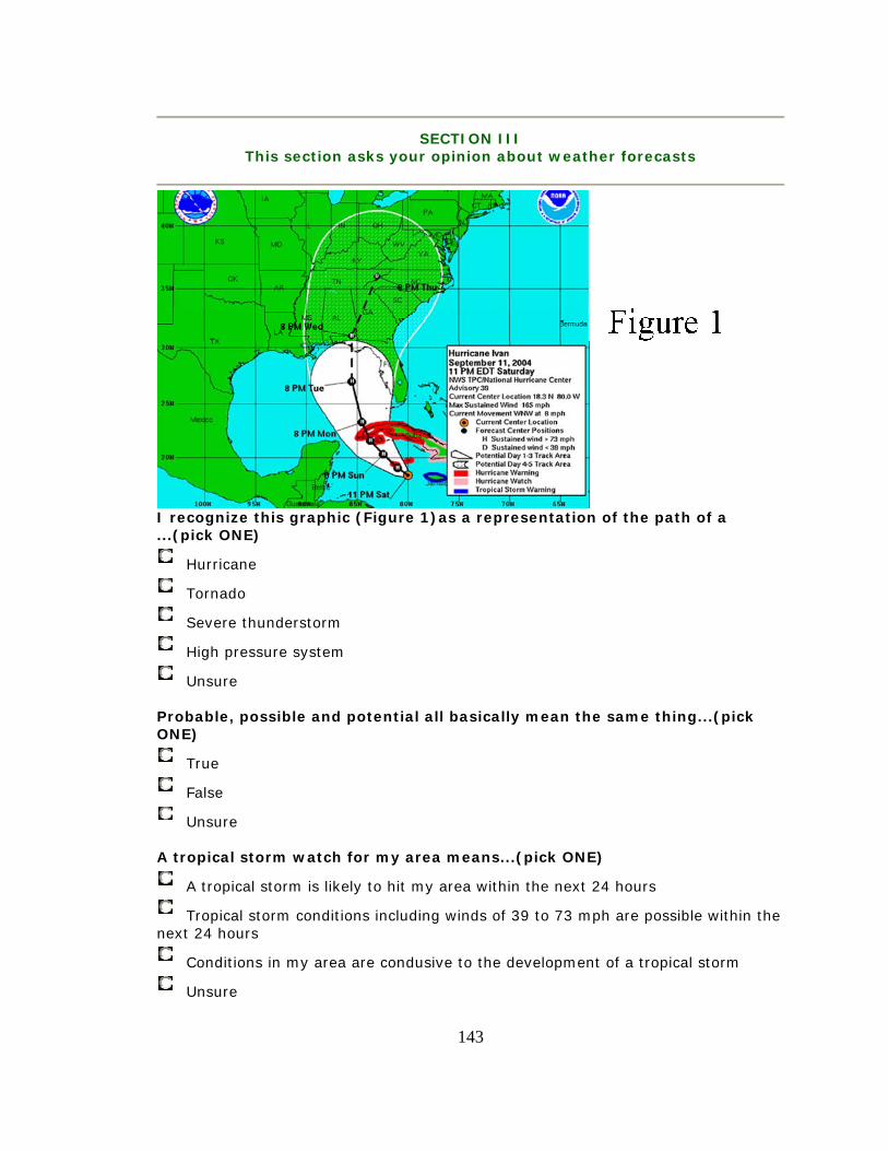
143
SECTION III
This section asks your opinion about weather forecasts
I recognize this graphic (Figure 1)as a representation of the path of a ...(pick ONE)
Hurricane
Tornado
Severe thunderstorm
High pressure system
Unsure Probable, possible and potential all basically mean the same thing...(pick ONE)
True
False
Unsure A tropical storm watch for my area means...(pick ONE)
A tropical storm is likely to hit my area within the next 24 hours
Tropical storm conditions including winds of 39 to 73 mph are possible within the next 24 hours
Conditions in my area are condusive to the development of a tropical storm
Unsure

144
A hurricane warning for my area means...(pick ONE)
Hurricane conditions are expected in my area within the next 24 hours
Conditions in my area are conducive to hurricane development
A hurricane will likely hit my area within the next 2 days
Unsure Hurricane and tropical storm watches and warnings are...(check ALL that apply)
Issued by the National Weather Service
Are official designations
Determined by my local media
Issued by local emergency planners
Unsure The National Weather Service is...(check ALL that apply)
a federal agency that is part of NOAA - the National Oceanic and Atmospheric Administration
part of the Department of Commerce
a private organization that produces the Weather Channel
Unsure The Saffir/Simpson Hurricane Scale...(pick ONE)
is a scale ranging from 1-5 based on the the intensity of the hurricane
is a scale used to indicate the size of a storm
categorizes storms as tropical depressions, storms or hurricanes
Unsure A hurricane is characterized by...(check ALL that apply)
a pronounced low-pressure circulation
winds of more than 73 mph
a proper name
Unsure

145
The red area of the Figure 1 graphic represents...(pick ONE)
hurricane warning for that area
tropical storm warning for that area
hurricane watch for that area
the direction the storm is expected to move
Unsure

146
The pink area of the Figure 1 graphic...(pick ONE)
is under a tropical storm watch
indicates that hurricane conditions are possible within 36 hours
is outside of any danger for landfall of the storm
Unsure
The solid white area on the map (Figure 1) indicates...(pick ONE)
the area to be affected by hurricane force winds
the predicted size of the storm over time
the area of uncertainty or possibility for the center of the storm's track and potential landfall
the only areas predicted to be affected by any hurricane or tropical storm force winds
Unsure

147
I remember seeing this graphic on... (check ALL that apply)
television
newspapers
Internet
I do not recognize it

148
The graphic in Figure 1...(check ALL that apply)
tells me WHEN a tropical storm or hurricane is expected
tells me WHERE tropical storm or hurricane is expected
is a very reliable forecast
is just a guesstimate by meteorologists
is an important indicator to me of the storm's path
tells me the size of the storm
indicates how fast the storm is moving
Unsure what it means The state of Florida is approximately...(pick ONE)
100 miles wide at it's center
400 miles long from north to south
400 miles from Cuba
Unsure US maps shown in the news (like Figure 1) are usually shown with what direction on top? (pick ONE)
North
South
East
West
Varies
Unsure

149
According to the graphic Figure 1..(check ALL that apply)
the storm is much more likely to make landfall in Florida than in Alabama
hurricane winds will not be evident in northern Florida until 8 PM on Wednesday
the size of the storm will grow as it moves north
the intensity of the storm will diminish as it moves towards northern Florida
Unsure what it means I pay more attention to the weather forecaster than I do to any graphics I see. (choose ONE answer that matches your level of agreement)
1. Totally disagree
2.
3.
4.
5.
6.
7. Completely agree
No Opinion

150
The center black line in the Figure 1 graphic indicates... (pick ONE)
a 95% accurate forecast of the storms' path over the next 5 days
a forecast of the storm's track within a cone which represents an average area of uncertainty for the storm's center position
a guesstimate of center of the hurricane and its predicted path
Unsure

151
The concentric circles on Figure 2 graphic indicate..(pick ALL that apply)
the area to be affected by hurricane force winds
the predicted size of the storm over time
the area of uncertainty or possibility for the center of the storm's track and potential landfall
the only areas predicted to be affected by any hurricane
Unsure what they mean

152
Appendix D Broadcast Meteorologist Questionnaire
Severe Weather Forecasts
Broadcast Meteorologists' Perceptions of Public
Understanding This questionnaire is sponsored by the University of South Florida’s School of Mass Communications. It is an effort to garner your opinion about the general public's understanding of tropical storm forecasts. It also seeks to obtain your opinion of two National Weather Service graphical products.
Your comments are important and your voluntary participation is appreciated. No personal information will be collected and your answers and comments will remain confidential. Please take a few moments to fill out this survey. If you would prefer to fill out a hand written survey, please contact L.M. Geggis at [email protected] and we will send you a copy. You may also use that email address to provide any additional comments you may have.
The results of this questionnaire will be published, along with a results of second questionnaire aimed at the general public, in a master’s thesis. Please answer every question.
Thank you in advance for your valuable input.

153
SECTION I This first section will allow us to get to know a little bit about you.
I have completed the following level of education...(pick ONE)
Some High School
High School or GED
Some college
Associates Degree
Bachelors Degree
Some Graduate School
Graduate School
Post Graduate
Doctorate
I have been involved in weather forecasting for...(pick ONE)
1-5 years
6-10 years
11-15 years
16-20 years
21-25 years
26+ years
other: I have been involved in weather broadcasting for...(pick ONE)
1-5 years
6-10 years
11-15 years
16-20 years
21-25 years
26+ years

154
Please list any professional designations you hold.
SECTION II This next section asks for your opinion of severe weather forecasting. In
some cases we will ask you to rate your level of agreement with the statements. For those questions please choose an answer from a scale to 1 to 7, with 1 indicating complete disagreement and 7 complete agreement.
Other questions will ask you to fill in your comments and opinions.
The media do a good job in preparing the general public for severe weather like hurricanes.
7. Completely Agree
6.
5.
4.
3.
2.
1. Completely Disagree
No Opinion

155
I am happy with the current status of broadcast coverage of severe weather.
7. Completely Agree
6.
5.
4.
3.
2.
1. Completely Disagree
No Opinion My station's tropical storm/hurricane forecasts are extremely important to the public in their decisions to make storm preparations or plans to evacuate.
7. Completely Agree
6.
5.
4.
3.
2.
1. Completely Disagree
No Opinion I think visuals and graphic representations of weather such as radar and tropical storm track graphics are important tools for preparing populations at risk.
7. Completely Agree
6.
5.
4.
3.
2.
1. Completely Disagree

156
No Opinion
I think the general public understands the basics of meteorology.
7. Completely Aagree
6.
5.
4.
3.
2.
1. Completely Disagree
No Opinion
In your opinion what are the most effective tools or methods that can be used to help the public understand weather forecasts?
I think most people rely upon what they hear during a weather forecast.
7. Completely Agree
6.
5.
4.

157
3.
2.
1. Completely Disagree
No Opinion
I think most people rely upon what they see during a weather forecast.
7. Completely Agree
6.
5.
4.
3.
2.
1. Completely Disagree
No Opinion
My station has adequate systems to measure audience satisfaction of severe weather forecasts and coverage.
7. Completely Agree
6.
5.
4.
3.
2.
1. Completely Disagree
No Opinion
What kind of feedback have you or your station received about severe weather forecasts or coverage? Please note both positive and negative comments from the public and other sources.

158
I think the information provided by the National Weather Service (NWS) and the National Hurricane Center (NHC) is accurate
7. Completely Agree
6.
5.
4.
3.
2.
1. Completely Disagree
No Opinion

159
I think the information/products provided by the National Weather Service and the National Hurricane Center is easily understood by reporters.
7. Completely Agree
6.
5.
4.
3.
2.
1. Completely Disagree
No Opinion I think the information/products provided by the National Weather Service and the National Hurricane Center is easily understood by meteorologists.
7. Completely Agree
6.
5.
4.
3.
2.
1. Completely Disagree
No Opinion What "suppliers" of weather data or products do/did you rely upon for your forecasts? Do you prefer any one over another? If so, why?

160
The NWS/NHC tropical storm and hurricane forecasts are very important to what I broadcast or predict.
7. Completely Agree
6.
5.
4.
3.
2.
1. Completely Disagree
No Opinion

161
I think the information and graphic products provided by the National Weather Service and the National Hurricane Center are easily understood by members of the general public.
7. Completely Agree
6.
5.
4.
3.
2.
1. Completely Disagree
No Opinion The NWS products, such as the tropical storm track, provide the information the general population needs to make better preparation decisions.
7. Completely Agree
6.
5.
4.
3.
2.
1. Completely Disagree
No. Opinion
Section III
This section of the questionnaire concerns the National Weather Service (NWS) Tropical Cyclone Track and Watch/Warning
Graphic.

162
I am familiar with the NWS Tropical Cyclone Track and Watch/Warning graphic (Figure 1) often referred to as the "Cone of Uncertainty"
Yes
No
Unsure What do you consider to be the key information contained in the NWS (Figure 1) graphic?

163
Are there any changes to the components of this graphic (Figure 1) that you have adopted or would like the NWS to consider (i.e. color, shading, etc.)?
If you could invent or design a graphic that described the path of a tropical storm or hurricane, what information would you include for the general
public?
164
Section IV This section is intended to capture your perceptions
of the general public's understanding of weather related terms and graphics.
Please answer the following questions as you think the general public will answer them.
If the general public had to choose between the National Weather Service and my local media, they'd rely on their local forecast.
7. Completely Agree
6.
5.
4.
3.
2.
1. Completely Disagree
No opinion
The general public will say their local weather forecasts are generally accurate.
7. Completely Agree
6.
5.
4.
3.
2.
1. Completely Disagree
No Opinion

165
The general public will recognize this graphic (Figure 1)as a representation of the path of a ...(pick ONE)
Hurricane
Tornado
Severe thunderstorm
High pressure system
Unsure
The general public will say that..probable, possible and potential all basically mean the same thing...(pick ONE)
True
False
Unsure To the general public a tropical storm watch for their area means...(pick ONE)
A tropical storm is likely to hit my area within the next 24 hours
Tropical storm conditions including winds of 39 to 73 mph are expected within the next 24 hours
Conditions in my area are conducive to the development of a tropical storm
Unsure

166
To the general public a hurricane warning for their area means...(pick ONE)
Hurricane conditions are expected in my area within the next 24 hours
Conditions in my area are conducive to hurricane development
A hurricane will likely hit my area within the next 2 days
Unsure The general public will say that hurricane and tropical storm watches and warnings are...(check ALL that apply)
Issued by the National Weather Service
Are official designations
Determined by my local media
Issued by local emergency planners
Unsure
The general public will say the Saffir/Simpson Hurricane Scale...(pick ONE)
is a scale ranging from 1-5 based on the intensity of the hurricane
is a scale used to indicate the size of a storm
categorizes storms as tropical depressions, storms or hurricanes
Unsure
The general public will say a hurricane is characterized by...(check ALL that apply)
a pronounced low-pressure circulation
winds of more than 73 mph
a proper name
Unsure

167
To the general public the red area of the Figure 1 graphic represents...(pick ONE)
hurricane warning for that area
tropical storm warning for that area
hurricane watch for that area
the direction the storm is expected to move
Unsure

168
To the general public, the pink area of the Figure 1 graphic...(pick ONE)
is under a tropical storm watch
indicates that hurricane conditions are possible within 36 hours
is outside of any danger for landfall of the storm
Unsure
To the general public, the solid white area on the map (Figure 1) indicates...(pick ONE)
the area to be affected by hurricane force winds
the predicted size of the storm over time

169
the area of uncertainty or possibility for the center of the storm's track and potential landfall
the only areas predicted to be affected by any hurricane or tropical storm force winds
Unsure
Members of the general public will say they remember seeing this graphic (Figure 1) on... (check ALL that apply)
television
newspapers
world wide web
I do not recognize it

170
The general public will indicate that the graphic in Figure 1...(check ALL that apply)
tells them WHEN a tropical storm or hurricane is expected
tells them WHERE tropical storm or hurricane is expected
is a very reliable forecast
is just a guesstimate by meteorologists
is an important indicator to them of the storm's path
tells them the size of the storm
indicates how fast the storm is moving
Unsure what it means
The general public will indicate that the state of Florida is approximately...(pick ONE)
100 miles wide at it's center
400 miles long from north to south
400 miles from Cuba
Unsure

171
The general public will say that US maps shown in the news (like Figure 1) are usually shown with what direction on top? (pick ONE)
North
South
East
West
Varies
Unsure
To the general public the graphic (Figure 1)indicates..(check ALL that apply)
the storm is much more likely to make landfall in Florida than in Alabama
hurricane winds will not be evident in northern Florida until 8 PM on Wednesday
the size of the storm will grow as it moves north
the intensity of the storm will diminish as it moves towards northern Florida
Unsure what it means
The general public will say they pay more attention to the weather forecaster than they do to any graphics they see. (choose ONE answer that matches your level of agreement)
1. Totally disagree
2.
3.
4.

172
5.
6.
7. Completely agree
No Opinion
To the general public the center black line in the Figure 1 graphic indicates... (pick ONE)
a 95% accurate forecast of the storms' path over the next 5 days
a forecast of the storm's track within a cone which represents an average area of uncertainty for the storm's center position
a guestimate of center of the hurricane and its predicted path
Unsure

173
The general public will say the concentric circles on Figure 2 graphic indicate..(pick ALL that apply)
the area to be affected by hurricane force winds
the predicted size of the storm over time
the area of uncertainty or possibility for the center of the storm's track and potential landfall
the only areas predicted to be affected by any hurricane
Unsure what they mean If the general public had to choose between the National Weather Service and their local media, they'd rely on their local forecast.
7. Completely Agree
6.
5.
4.
3.
2.
1. Completely Disagree
No Opinion
SECTION V
This last section asks for your opinions about the the NWS Tropical Cyclone Track Watch/Warning graphic.

174
Do you think the general public interprets this graphic (Figure 1) in the same way that you do? Why or why not?
What do you think people miss, if anything, when they see weather graphics like the tropical storm/hurricane track graphic?

175
Are you familiar with this (Figure 2)previously proposed alternative to the tropical cyclone graphic?
Yes
No
Unsure
Do you believe one of these graphics (Figure 1, Figure 2) conveys storm track and watch warning information better than the other? If so, which one and why.

176
In your opinion was the confusion over where Hurricane Charley (2004)would make landfall the result of:
local meteorologist’s forecasting errors
local meteorologists misinterpretation of the NWS's tropical storm/hurricane graphic
public's misinterpretation of the NWS's tropical storm/ hurricane track graphic
forecasting errors by NWS
public's misinterpretation of local meteorologist’s forecast
no opinion/unfamiliar with issues of confusion about Hurricane Charley forecast
other: