gr m10 module 3: should design communicate?redsparrow.org/design-and-society/modulethree.pdfgr m10...
TRANSCRIPT

GR M10 Module 3: Should Design Communicate?
Graphic design has a dual role: to build the form and to convey the message. In order to fully appreciate the design work, viewers have to “read” this message and understand its meaning. Graphic design is a creative process that combines art and technology to communicate ideas. The designer works with a variety of communica-tion tools in order to convey a message from a client to a particular audience. The main tools are type and images .
Effective speech, per Aristotle uses “all the available means of persuasion in any given situation either to inform (rational appeal), to delight and win over (ethical ap-peal) or to move (emotional appeal) an audience”. Designers should not ignore the vocabulary of rhetoric, for rhetoric actually defines many communication techniques used daily by graphic designers to solve problems.Figures of speech that show relationship or resemblance are most important and have graphic parallels in visual communications. Meaningful graphics are the powerful tool that aid in the understanding and memory of key concepts and ideas. Visual analogies that the reader can quickly identify with may not always be easy to fabricate, but when on-target, can be a lighting-strike for instant comprehension and meaning.
1. SIMILE The comparison or parallel between two unlike things, that share some attribute or feature. Webster defines simile as a figure of speech comparing two unlike things. These sentences contain simile: “The grade on the term paper was like a slap in the face”; and “His heart is as hard as a rock”. Perhaps the most well known contempo-rary visual simile is that of the computer “mouse” so-named because of its a “mouse like” shape. (1)A visual simile was created to introduce fragrance “Organza” by Givenchy. This simile compares the product and its supposed consumer. Model is stylized to look like the fragrance bottle. (2)
2. METAPHORA Metaphor also points out resemblance, but does so by substitution. Webster de-fines metaphor as a figure of speech in which a word or phrase literally standing for one kind of object or idea is used in place of another to suggest a likeness or analogy between them. “A ship moves through the ocean like a plow through the field” is a simile. “The ship plows the sea” is a metaphor. The “She’s Got Your Eyes” ad (3) was created by the Vancouver-based Adbusters Media Foundation to promote responsible viewing, and the increasingly popular In-ternational TV Turnoff Week. In this poster, the TV becomes metaphor for an eye, and
(1)
(2)
(3)
(4)
signifies the consequences of the excessive TV-watching (childhood obesity and poor school performance among others).
“Quench Your Thirst” (4) is a UCLA Extension catalog cover designed by Margo Chase.She builds a metaphor by presenting our desire for knowledge as thirst.
“Stop The Plant” (5) is a grass roots campaign to prevent the construction of a mam-moth, 1,800 acre cement plant, pit and mine in New York’s scenic Hudson Valley. Area resident Woody Pirtle designed a poster that uses the plant’s monolithic 40 story stack as a powerful image of blight against the blue sky. The poster is being sold as a fund-raiser for the group, and the image has been adapted into storefront cards, lawn signs, benefit invites and other materials to rally support.
“Peace Wave” (6) is a promotional design and advertising campaign by Brigham Young University Graphics.
3. PERSONIFICATIONPersonification gives human characteristics to non-human or inanimate objects. Web-ster defines personification as attribution of personal qualities; especially : representa-tion of a thing or abstraction as a person or by the human form.
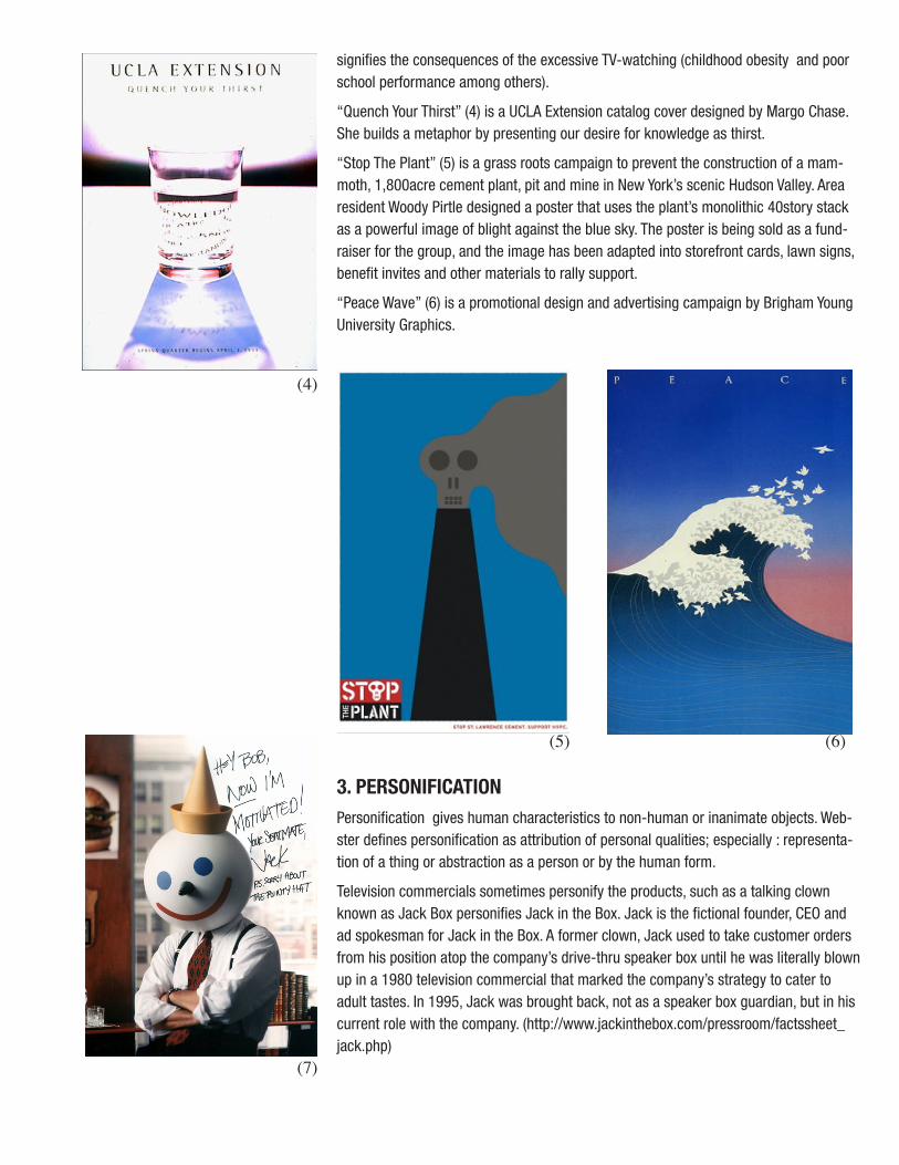
Television commercials sometimes personify the products, such as a talking clown known as Jack Box personifies Jack in the Box. Jack is the fictional founder, CEO and ad spokesman for Jack in the Box. A former clown, Jack used to take customer orders from his position atop the company’s drive-thru speaker box until he was literally blown up in a 1980 television commercial that marked the company’s strategy to cater to adult tastes. In 1995, Jack was brought back, not as a speaker box guardian, but in his current role with the company. (http://www.jackinthebox.com/pressroom/factssheet_jack.php)
(5) (6)
(7)

4. METONYMYMetonymy is using the name of one thing to stand for another related thing. For example: “We don’t know how India will respond”. Here, India is used to represent the government of India. In this ad of Absolut Vodka the beverage is substituted by its container (the bottle). The city of Geneva has been associated with the Swiss watch, from which the bottle is a piece. (8)
Synecdoche is particular type of metonymy where a part is used to represent the whole. For example, “The White House” means the American president or the American Government. (metonymy only, as the building is related to the president/government but is neither of those things) In “We need as many hands as we can get.” “Hands” means workers ( (synedoche and metonymy, because hands are parts of the workers.) In the poster commemorating Philip Johnson’s honor award from the American Institute of Architects, Pentagram design created an image that combines Johnson’s signature round glasses and the AIA initials. (9)
6. PUNA visual pun deliberately exploits confusion between objects for humorous or rhetori-cal effect. Creating an artwork in which several visual forms which look alike are connected and combined so as to bring out two or more possible meaningful ideas in a humorous way. Because of the obviously separate nature of the two forms being humorously combined, visual puns are a lower form of visual metaphor.
In his second book “Shoe Fleur”, Michel Tcherevkoff’s visual puns are compositions of shoes created by accumulating different kinds of flowers.(10)This poster was created by Pentagram (New York) for an initiative by Amnesty Inter-national to abolish the use of child soldiers worldwide. The image was inspired by the common “Caution: Children at Play” street signs. This is also an example of parody - which is a work imitating the work of some other work, with the satirical effect.(11)
7. HYPERBOLEHyperbole is exaggeration or overstatement for the sake of emphasis. The immea-surable increase of the characteristics of something or somebody (its size, weight, force, etc.) is called hyperbole. It may be used to evoke strong feelings or to create
(8)
(9)
(10)
(11)
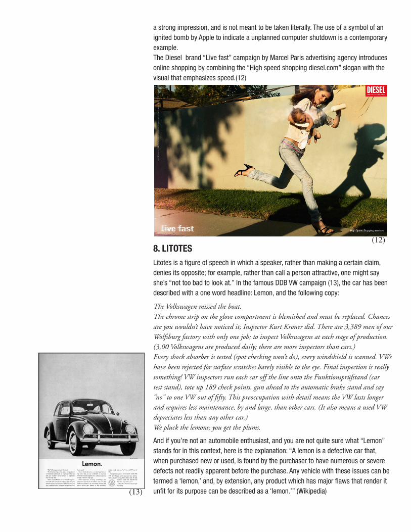
a strong impression, and is not meant to be taken literally. The use of a symbol of an ignited bomb by Apple to indicate a unplanned computer shutdown is a contemporary example. The Diesel brand “Live fast” campaign by Marcel Paris advertising agency introduces online shopping by combining the “High speed shopping diesel.com” slogan with the visual that emphasizes speed.(12)
8. LITOTESLitotes is a figure of speech in which a speaker, rather than making a certain claim, denies its opposite; for example, rather than call a person attractive, one might say she’s “not too bad to look at.” In the famous DDB VW campaign (13), the car has been described with a one word headline: Lemon, and the following copy:
The Volkswagen missed the boat. The chrome strip on the glove compartment is blemished and must be replaced. Chances are you wouldn’t have noticed it; Inspector Kurt Kroner did. There are 3,389 men of our Wolfsburg factory with only one job; to inspect Volkswagens at each stage of production. (3,00 Volkswagens are produced daily; there are more inspectors than cars.)Every shock absorber is tested (spot checking won’t do), every windshield is scanned. VWs have been rejected for surface scratches barely visible to the eye. Final inspection is really something! VW inspectors run each car off the line onto the Funktionsprüfstand (car test stand), tote up 189 check points, gun ahead to the automatic brake stand and say “no” to one VW out of fifty. This preoccupation with detail means the VW lasts longer and requires less maintenance, by and large, than other cars. (It also means a used VW depreciates less than any other car.) We pluck the lemons; you get the plums.
And if you’re not an automobile enthusiast, and you are not quite sure what “Lemon” stands for in this context, here is the explanation: “A lemon is a defective car that, when purchased new or used, is found by the purchaser to have numerous or severe defects not readily apparent before the purchase. Any vehicle with these issues can be termed a ‘lemon,’ and, by extension, any product which has major flaws that render it unfit for its purpose can be described as a ‘lemon.’” (Wikipedia)
(12)
(13)

9. IRONYIrony is a deliberate contrast, presenting the opposite of what would be expected. Graffiti artist Banksy made a trip to the West Bank, where he painted massive images on the 25-foot high security wall the Israeli government built to divide Israel from the Palestinian territories. (14)The pieces show: scissors cutting the wall, ladders, windows that look out at idyllic scenery, and more. The tropical scene he painted at first look poignant, then weird: they are a Western fantasy of escape.
“”You make the wall look beautiful,” said an old man. The artist said thanks but the man replied: “We don’t want it to be beautiful. We hate this wall. Go home.” To his credit Banksy put the exchange in a book, along with a letter from a man protest-ing that Banksy’s wall art was making his working-class area chic, driving up house prices and threatening to force him out.” (http://www.theage.com.au)
10. ALLEGORYAn allegory is a symbolic representation. A literal device or character is used as a symbol for an idea or principle. The Statue of Liberty is an allegorical figure for free-dom. This poster for the announcement for Earth Day 1991 (15), an environmental event in New York, was designed by The Pushpin Group. It was printed on recycled paper with vegetable inks. In order to save paper further, it was printed on the back of leftover posters from 1990. Its crude design was meant as a visual antidote to slick, over produced design that would not be perceived as environmentally sensitive.
SUMMARY:In order to fully appreciate the design work, viewers have to “read” this message and understand its meaning. Designers should not ignore the vocabulary of rhetoric, for rhetoric actually defines many communication techniques used daily by graphic designers to solve problems. Visual figures of speech include, but are not limited to: simile, metaphor, personification, metonymy, synecdoche, pun, hyperbole, litotes, irony and allegory.
EXERCISE:In the following exercise you will explore and discuss the effectiveness of design communication. View the following eight images in the:http://redsparrow.org/gr10/week3/in_mainframeT3.phpgallery.
1. Leo Burnett Co. - Marlboro, The Marlboro Man campaign, 1955 2. Seymor Chwast - poster protesting the bombing of Hanoi, 1968 (MHGD p432)3. El Lissitzky - Beat the Whites with the Red Wedge, 1918 (MHGD p290)4. Lester Beal - poster for the Rural Electrification Administration, 1937 (MHGD p338)5. Ogilvy & Mather Frankfurt - WWF campaign, 2005 6. Paul Rand - cover for Direction magazine, 1940 (MHGD p374) 7. Saatchi and Saatchi - Buenos Aires ZOO campaign, 2004 8. Kirshenbaum Bond + Partners - Target “Fashion/Housewares” ad, 2000
(14)
(15)

For each of these works, write a brief explanation about what you think designer is trying to tell the audience. Look for visual clues to help you add specific details to your explanation.
For the second part of the exercise, search for the background information in the Meggs’ History of Graphic Design (MHGD) and/or the web sites under the URL sec-tion of the enlarged image description, and answer the following questions: (Give specific reasons for your answers)
Which designer seems the most interested in sending a message? Which one seems to be more open to interpretation? How do these designers convey the message in their work? Try to identify each figure of speech (if any) are they using?Which work is the most interesting to you? Which is the most challenging?
Once you write your response, upload it to the Discussions: Module Three: Should Design Communicate? Read at least thirty other students’ responses and comment at least two of them. Keep the discussion about your post going. The most active/ in depth discussion gets 5 additional points.