introduction to origin 8.0 data analysis and plotting · pdf filenumerical data used to...
TRANSCRIPT
1
INTRODUCTION TO ORIGIN 8.0 DATA ANALYSIS AND PLOTTING SOFTWARE
(UPDATED 08/2011)
Origin (Originlab Corporation, Inc., One Roundhouse Plaza, Northhampton, MA 01060) is one of several software packages designed specifically for plotting and analyzing quantitative data. You will be using Origin for a variety of applications in this course. The purpose of this document is to introduce you to two of the primary capabilities of ORIGIN software, namely plotting and curve-fitting capabilities, and to illustrate applications of Origin in conjunction with spread-sheet programs such as Microsoft EXCEL.
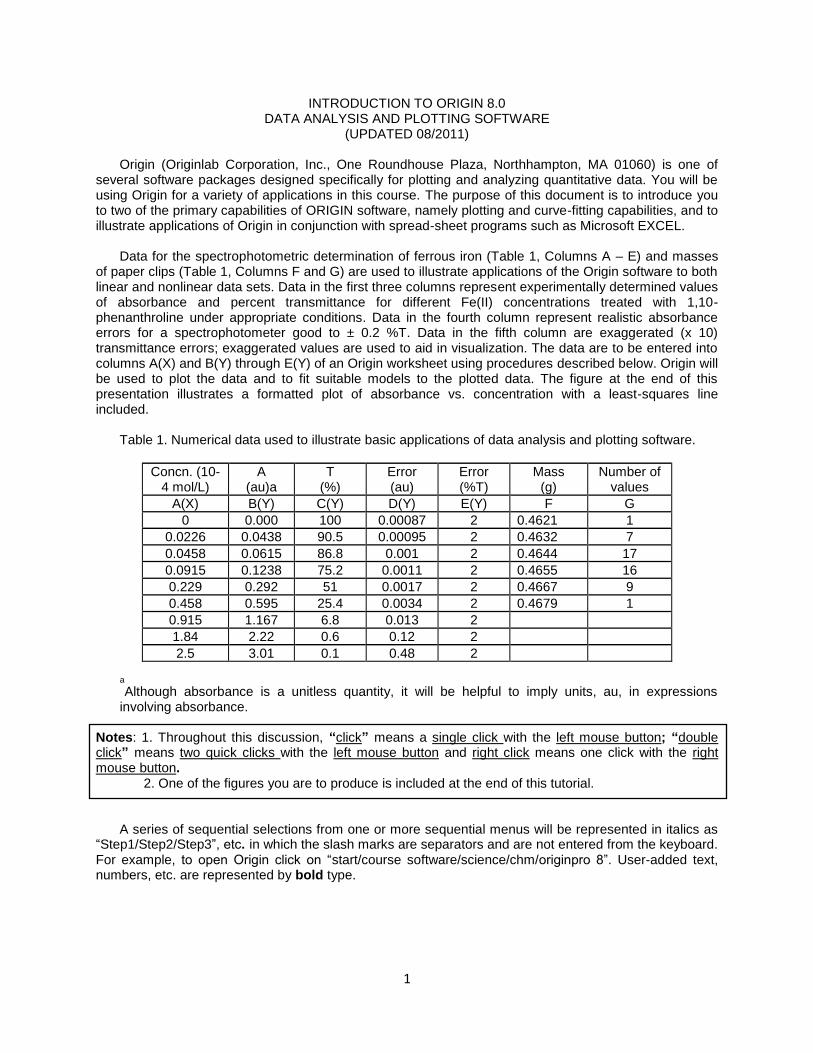
Data for the spectrophotometric determination of ferrous iron (Table 1, Columns A – E) and masses
of paper clips (Table 1, Columns F and G) are used to illustrate applications of the Origin software to both linear and nonlinear data sets. Data in the first three columns represent experimentally determined values of absorbance and percent transmittance for different Fe(II) concentrations treated with 1,10-phenanthroline under appropriate conditions. Data in the fourth column represent realistic absorbance errors for a spectrophotometer good to ± 0.2 %T. Data in the fifth column are exaggerated (x 10) transmittance errors; exaggerated values are used to aid in visualization. The data are to be entered into columns A(X) and B(Y) through E(Y) of an Origin worksheet using procedures described below. Origin will be used to plot the data and to fit suitable models to the plotted data. The figure at the end of this presentation illustrates a formatted plot of absorbance vs. concentration with a least-squares line included.
Table 1. Numerical data used to illustrate basic applications of data analysis and plotting software.
Concn. (10-4 mol/L)
A (au)a
T (%)
Error (au)
Error (%T)
Mass (g)
Number of values
A(X) B(Y) C(Y) D(Y) E(Y) F G
0 0.000 100 0.00087 2 0.4621 1
0.0226 0.0438 90.5 0.00095 2 0.4632 7
0.0458 0.0615 86.8 0.001 2 0.4644 17
0.0915 0.1238 75.2 0.0011 2 0.4655 16
0.229 0.292 51 0.0017 2 0.4667 9
0.458 0.595 25.4 0.0034 2 0.4679 1
0.915 1.167 6.8 0.013 2
1.84 2.22 0.6 0.12 2
2.5 3.01 0.1 0.48 2
a
Although absorbance is a unitless quantity, it will be helpful to imply units, au, in expressions involving absorbance.
Notes: 1. Throughout this discussion, “click” means a single click with the left mouse button; “double click” means two quick clicks with the left mouse button and right click means one click with the right mouse button.
2. One of the figures you are to produce is included at the end of this tutorial. A series of sequential selections from one or more sequential menus will be represented in italics as
“Step1/Step2/Step3”, etc. in which the slash marks are separators and are not entered from the keyboard. For example, to open Origin click on “start/course software/science/chm/originpro 8”. User-added text, numbers, etc. are represented by bold type.

2
I. OPENING ORIGIN/ENTERING DATA
You don‟t need to install Origin 8.0 on your local computer. Use Software Remote Access to Origin 8.0 https://goremote.ics.purdue.edu. When the screen pops up, type your Purdue Career account and password to log on. Select Main > Course Software > science > chm > OriginPro 8
When Origin opens on screen, you should see a “menu” bar (in light gray) and two rows of toolbars (to which we will refer as “toolbars”) at the top of the screen (one row may appear as vertical toolbar as shown below), a worksheet with two empty data columns, A(X) and B(Y), and a toolbar near the middle or bottom of the screen we shall call the “plotting toolbar”.
To enter concentration data in Column A(X), click on cell A-1, type the first concentration value, click the “Down arrow” or “Enter” on the keyboard, type the second concentration value, and repeat the process until all concentration data are entered in column A(X). Repeat the process to enter absorbance data in column B(Y).
It will be necessary to add columns for the other data in Table 1. To add a column, click on
“Column/Add New Columns/OK” from the menu bar at the top of the screen. Enter data from Table 1 in Columns A – E.
Use “File/Save project” as options from the menu bar to save your worksheet onto a flash drive as
“File name” ORIG1_A.OPJ.
Plotting toolbar
toolbar
3
SUGGESTIONS: It is strongly suggested that you save your work on a flash drive after major steps below. This will save you grief in case you accidentally lose a file and it will permit you to explore capabilities of Origin other than the minimum essential features described below. II. PLOTTING DATA (Linear plot)
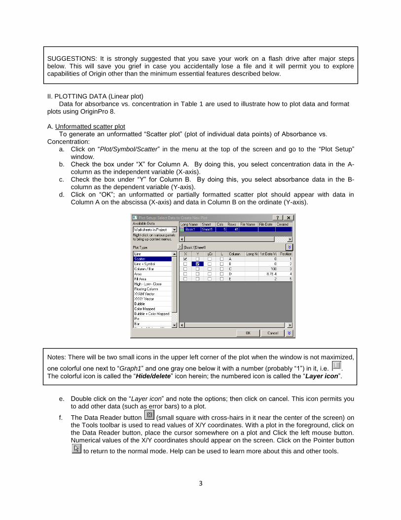
Data for absorbance vs. concentration in Table 1 are used to illustrate how to plot data and format plots using OriginPro 8. A. Unformatted scatter plot
To generate an unformatted “Scatter plot” (plot of individual data points) of Absorbance vs. Concentration:
a. Click on “Plot/Symbol/Scatter” in the menu at the top of the screen and go to the “Plot Setup” window.
b. Check the box under “X” for Column A. By doing this, you select concentration data in the A-column as the independent variable (X-axis).
c. Check the box under “Y” for Column B. By doing this, you select absorbance data in the B-column as the dependent variable (Y-axis).
d. Click on “OK”; an unformatted or partially formatted scatter plot should appear with data in Column A on the abscissa (X-axis) and data in Column B on the ordinate (Y-axis).
Notes: There will be two small icons in the upper left corner of the plot when the window is not maximized,
one colorful one next to “Graph1” and one gray one below it with a number (probably “1”) in it, i.e. . The colorful icon is called the “Hide/delete” icon herein; the numbered icon is called the “Layer icon”.
e. Double click on the “Layer icon” and note the options; then click on cancel. This icon permits you
to add other data (such as error bars) to a plot.
f. The Data Reader button (small square with cross-hairs in it near the center of the screen) on the Tools toolbar is used to read values of X/Y coordinates. With a plot in the foreground, click on the Data Reader button, place the cursor somewhere on a plot and Click the left mouse button. Numerical values of the X/Y coordinates should appear on the screen. Click on the Pointer button
to return to the normal mode. Help can be used to learn more about this and other tools.
4
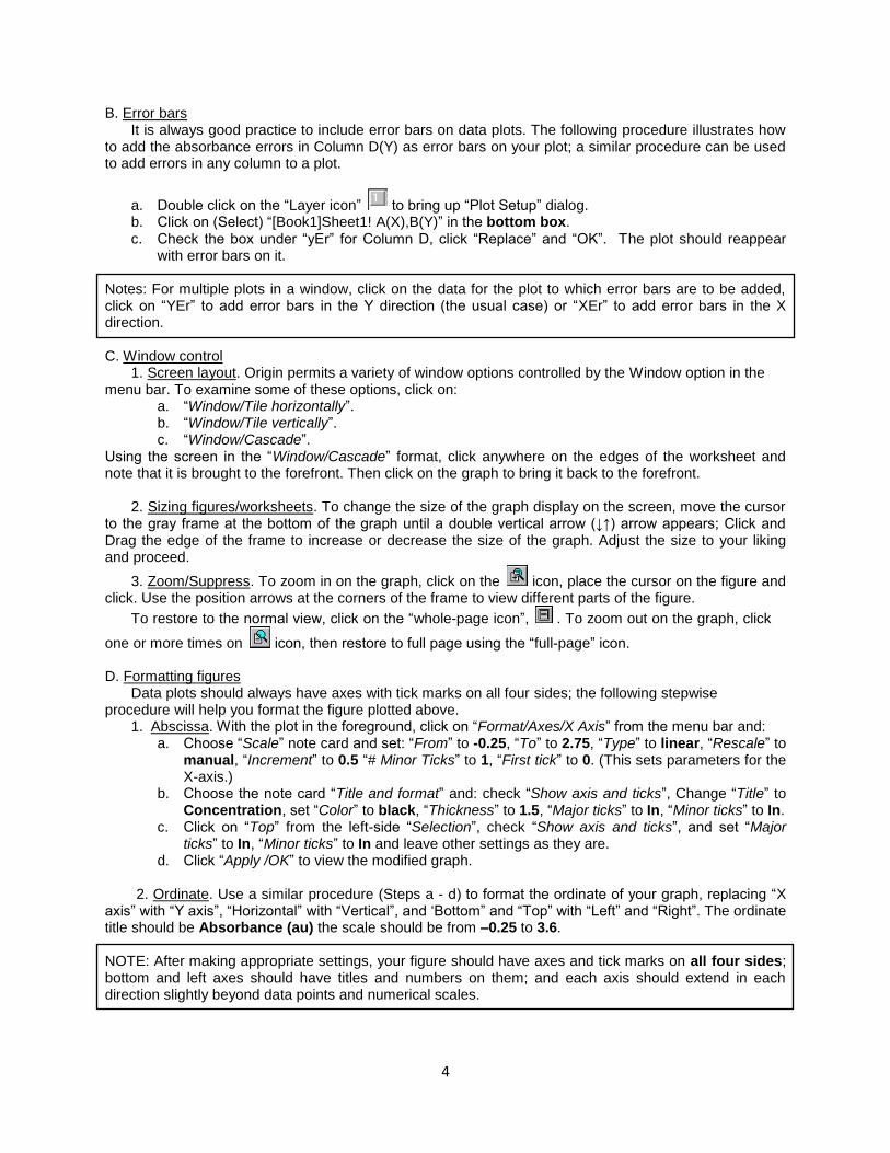
B. Error bars It is always good practice to include error bars on data plots. The following procedure illustrates how
to add the absorbance errors in Column D(Y) as error bars on your plot; a similar procedure can be used to add errors in any column to a plot.
a. Double click on the “Layer icon” to bring up “Plot Setup” dialog. b. Click on (Select) “[Book1]Sheet1! A(X),B(Y)” in the bottom box. c. Check the box under “yEr” for Column D, click “Replace” and “OK”. The plot should reappear
with error bars on it. Notes: For multiple plots in a window, click on the data for the plot to which error bars are to be added, click on “YEr” to add error bars in the Y direction (the usual case) or “XEr” to add error bars in the X direction. C. Window control
1. Screen layout. Origin permits a variety of window options controlled by the Window option in the menu bar. To examine some of these options, click on:
a. “Window/Tile horizontally”. b. “Window/Tile vertically”. c. “Window/Cascade”.
Using the screen in the “Window/Cascade” format, click anywhere on the edges of the worksheet and note that it is brought to the forefront. Then click on the graph to bring it back to the forefront.
2. Sizing figures/worksheets. To change the size of the graph display on the screen, move the cursor to the gray frame at the bottom of the graph until a double vertical arrow (↓↑) arrow appears; Click and Drag the edge of the frame to increase or decrease the size of the graph. Adjust the size to your liking and proceed.
3. Zoom/Suppress. To zoom in on the graph, click on the icon, place the cursor on the figure and click. Use the position arrows at the corners of the frame to view different parts of the figure.
To restore to the normal view, click on the “whole-page icon”, . To zoom out on the graph, click
one or more times on icon, then restore to full page using the “full-page” icon. D. Formatting figures
Data plots should always have axes with tick marks on all four sides; the following stepwise procedure will help you format the figure plotted above.
1. Abscissa. With the plot in the foreground, click on “Format/Axes/X Axis” from the menu bar and: a. Choose “Scale” note card and set: “From” to -0.25, “To” to 2.75, “Type” to linear, “Rescale” to
manual, “Increment” to 0.5 “# Minor Ticks” to 1, “First tick” to 0. (This sets parameters for the X-axis.)
b. Choose the note card “Title and format” and: check “Show axis and ticks”, Change “Title” to Concentration, set “Color” to black, “Thickness” to 1.5, “Major ticks” to In, “Minor ticks” to In.
c. Click on “Top” from the left-side “Selection”, check “Show axis and ticks”, and set “Major ticks” to In, “Minor ticks” to In and leave other settings as they are.
d. Click “Apply /OK” to view the modified graph.
2. Ordinate. Use a similar procedure (Steps a - d) to format the ordinate of your graph, replacing “X axis” with “Y axis”, “Horizontal” with “Vertical”, and „Bottom” and “Top” with “Left” and “Right”. The ordinate title should be Absorbance (au) the scale should be from –0.25 to 3.6. NOTE: After making appropriate settings, your figure should have axes and tick marks on all four sides; bottom and left axes should have titles and numbers on them; and each axis should extend in each direction slightly beyond data points and numerical scales.

5
E. Sizing and positioning
The small square in the top left corner of your figure with a number in it (the Layer icon, ) can be used to adjust the size and position of your figure.
a. Right-click on ; click on “Layer properties” in the pop-up menu and select the “Size/speed” note card.
b. Make sure the “Units” box reads % of page; set both “Left” and “Top” to 20, “Width” to 65 and “Height” to 50; click on “OK”. The figure should be sized and positioned nicely on the page.
F. Relabeling the X axis
The purpose here is to illustrate how to use subscripts/superscripts, etc. and how to control font
sizes. The abscissa is to be relabeled Concentration (10-4
mol/L) and set to “font size” 24.
1. To insert the 10-4
mol/L unit: a. Double click on “Concentration” and you will be able to move the cursor and modify. b. Place the cursor just after Concentration in the top box, insert a space and type (10 mol/L).
c. To insert the -4 power, locate the cursor just after the 10, click on “x2
” at the top right side of the label square and type -4 in the parentheses that appear.
2. To set the font size of the X axis to 24, single click on “Concentration 10-4
mol/L” replace any number in the “Size” box with 24.
3. Follow the same procedure to set the font size of the Y-axis title to 24. Note: B, I, U and Γ correspond to bold, italics, underline and Greek; x2 refers to subscript. G. Numbers on axes
1. To change the font size for the numbers on the abscissa to 24 points, place the point of the cursor carefully on one of the numbers on the X axis, double click and select the “Tick labels” note card from the choices. Change the “Point” setting to 24. Note the “Divide by factor” box on this card before you check “OK” and see the note below.
2. Repeat the process for numbers on the ordinate. Note: The “Divide by factor” feature is used to change very large or very small numbers to small whole numbers on the axes. For example, if the numbers on an axis were in the range of 0.000013, etc., which would clutter the axis, setting the “Divide by factor” to 1e-5 would change the numbers on the axis to 1.3,
etc. The factor should of course be included in the axis label as 10-5
units or units x 105
(not “x 10-5
units”). (Ask if you do not understand this latter point.) H. Data-point format
Origin permits the selection of a wide variety formats for data points and lines. To select a format for data points in the plot just constructed:
a. Use the “Zoom” function described earlier to observe the data symbols used in your plot (Probably closed squares) and use the “View” function to return to the “Whole page” format.
b. Select “Format/Plot” in the menu at the top of the screen and go to the “Plot Details” window.
c. Click and release on the large black “down triangle” (∇) and select the open square option from the many choices.
d. Use the “Size” function to set the point size to 8. e. Click on “Apply/OK”.
f. Use the “Zoom” function described earlier to observe the data symbol.
I. Text All figures should include identifying information; the text feature of Origin makes it easy to add
identifying inform ation to figures. The text function is illustrated by adding a title to the figure prepared above.
a. Click on the “T” (for text) on the toolbar and place the cursor at a point above and slightly to the left of the figure and click one time.
b. Type Figure 1A. Absorbance vs. concentration for spectrophotometric determination of
6
ferrous iron. c. Set the font size to 24 and change the color to black.
NOTES:
1. The text will likely run over the side of the figure. Decide on a place or places to split the title; double click at any point on the text; place the cursor at the point in the text box at which the text is to be split; press the “Enter” key on the keyboard.
2. Text can be moved either by dragging it with the left mouse button held down or by clicking on it and using the “up/down”, “left/right” arrows on the keyboard.
d. Use the “Text” procedure to place an upper-case A in the upper left-hand corner of your
figure and to label the figure in the lower left hand corner of the page as follows: DISK: CHEM XXX ; FILE: ORIG1_A; PLOT1, COLUMNS A AND B in which XXX is your course number.
J. Printing a figure (Figure 1A in the report)
a. Make sure the figure is in the forefront of the screen. b. To format your figure for printing, Click on “File/Page setup/ Portrait/OK”. c. To print your figure, click on “File/Print/OK”.
SAVE YOUR FILE ON A FLASH DRIVE AS ORIG1_A.OPJ BEFORE PROCEEDING WITH THE NEXT PART. K. Preparing a template
This section explains how you can prepare and save a template that will help you avoid having to repeat some of the steps above each time you prepare a new figure.
a. Bring the worksheet to the forefront and double click on the green button for the worksheet and select delete from the menu. The worksheet will disappear and the data will disappear from your figure.
b. Click “File/New/Workbook/OK”; a new worksheet will appear. c. With the figure in the forefront of the screen, select “Save Template As” to save this template
as “Formatted Template” on your disk. Make sure to uncheck “Allow system Theme to Override”. The template is an “otp” file.
d. To illustrate the use of the template, Click “File/Close”. Then Click “File/Open/FORMATTED TEMPLATE”. Enter the numbers 2, 4, 6, 8 in rows 1 – 4 of Columns A and B of the worksheet. Then highlight data in column B, bring the blank figure to the forefront, Click “Graph/Add Plot to Layer/Line +Symbol”; a Line + symbol plot should appear.
e. Close this file without saving changes before proceeding to PART III. Note: You can use the FORMATTED TEMPLATE for any of the plots you will do in the remainder of this tutorial or this course. It will usually be necessary to change ranges of axes, axis labels, titles, etc., but the template should save you significant amounts of time. III. LEAST-SQUARES FIT OF A LINEAR MODEL
The Origin software includes built-in least-squares fitting routines for several types of functions, including linear relationships such as that represented by the absorbance vs. concentration data plotted above. The purpose of this section is to illustrate the use of the linear fitting function and subsequent plotting of results. A. Rationale
The absorbance vs. concentration data are expected to follow a linear relationship of the form
(1a) in which A is absorbance, a and b are the intercept and slope, respectively, and C is concentration. This expression can be written in the more general form
(1b)
7
Either way, the goal of a fitting process is to obtain best-fit values of the intercept, a, and slope, b as well as other statistical quantities to be discussed in class. NOTE: Use a different file name, e.g. ORIG1_B, to save modifications made to this plot in subsequent steps. B. Fitting process - built-in algorithm
There are different ways to use Origin to do a least-squares fit of a linear model to a data set. One of the simpler options is illustrated here.
Numerical values of slopes, intercepts etc. will be displayed on the screen below the “plotting toolbar” near the middle or bottom of the screen. It may be necessary to “drag” the “plotting toolbar” up to free some screen space below it after you complete the fitting process.
1. Linear fit using the “Analysis” menu. The purpose of this section is not only to illustrate how to use the “Analysis menu” to obtain a least-squares fit of a data set but also to illustrate how to format the resulting figure to conform to good scientific and engineering practices.
a. Open the figure saved above as ORIG1_A. (Click “File/Open/ORIG1_A”)
b. Delete the error bars by unchecking yEr. (Go to “Plot Setup” by double-clicking . Uncheck yEr. Click “Replace” and “Apply/ OK”)
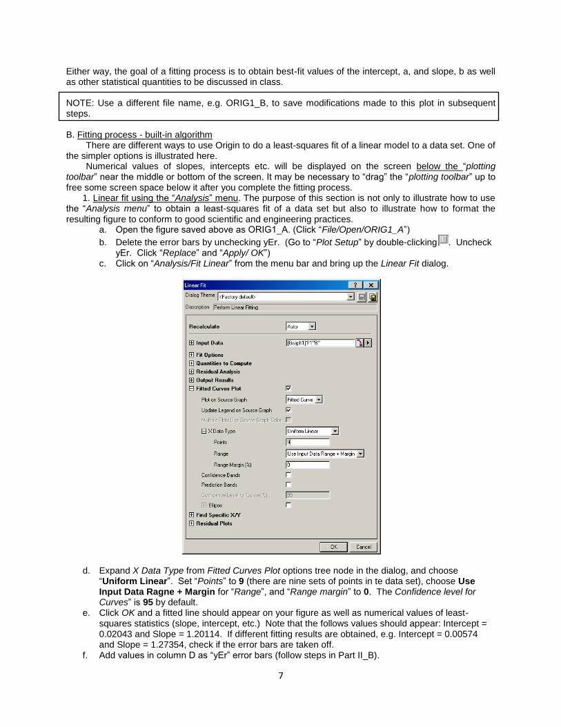
c. Click on “Analysis/Fit Linear” from the menu bar and bring up the Linear Fit dialog.
d. Expand X Data Type from Fitted Curves Plot options tree node in the dialog, and choose “Uniform Linear”. Set “Points” to 9 (there are nine sets of points in te data set), choose Use Input Data Ragne + Margin for “Range”, and “Range margin” to 0. The Confidence level for Curves” is 95 by default.
e. Click OK and a fitted line should appear on your figure as well as numerical values of least-squares statistics (slope, intercept, etc.) Note that the follows values should appear: Intercept = 0.02043 and Slope = 1.20114. If different fitting results are obtained, e.g. Intercept = 0.00574 and Slope = 1.27354, check if the error bars are taken off.
f. Add values in column D as “yEr” error bars (follow steps in Part II_B).
8
g. Change the title and description of the Figure properly (such as “A” to “B”). h. Save the figure on your disk as ORIG1_B. i. After saving the figure, zoom in on it and note that the fitted curve passes through the points; this
is not good form. We will modify the figure later to pass the fitted curve “under” the points. j. Bring the plot to the forefront again.
2. Replotting the figure. It was noted above that it is bad form to have a fitted line overlay
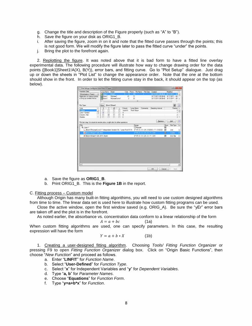
experimental data. The following procedure will illustrate how way to change drawing order for the data points ([Book1]Sheet1!A(X), B(Y)), error bars, and fitting curve. Go to “Plot Setup” dialogue. Just drag up or down the sheets in “Plot List” to change the appearance order. Note that the one at the bottom should show in the front. In order to let the fitting curve stay in the back, it should appear on the top (as below).
a. Save the figure as ORIG1_B. b. Print ORIG1_B. This is the Figure 1B in the report.
C. Fitting process – Custom model
Although Origin has many built-in fitting algorithims, you will need to use custom designed algorithms from time to time. The linear data set is used here to illustrate how custom fitting programs can be used.
Close the active window, open the first window saved (e.g. ORIG_A). Be sure the “yEr” error bars are taken off and the plot is in the forefront.
As noted earlier, the absorbance vs. concentration data conform to a linear relationship of the form (1a)
When custom fitting algorithms are used, one can specify parameters. In this case, the resulting expression will have the form
(1b)
1. Creating a user-designed fitting algorithm. Choosing Tools/ Fitting Function Organizer or pressing F9 to open Fitting Function Organizer dialog box. Click on “Origin Basic Functions”, then choose “New Function” and proceed as follows.
a. Enter “LINFIT” for Function Name. b. Select “User-Defined” for Function Type. c. Select “x” for Independent Variables and “y” for Dependent Variables. d. Type “a, b” for Parameter Names. e. Choose “Equations” for Function Form. f. Type “y=a+b*x” for Function.

9
g. In Parameter Settings, click icon and insert initial values for the fitting parameters, a and b. Clear dashes in the boxes and set “a” to 0.01(see note below) and “b” to 1. Click “OK”.
h. Click on “Save” and “OK” on “Fitting Function Organizer”.
2. Implementing a custom fitting algorithm. a. Click on “Analysis/Nonlinear Curve Fit” from the menu bar and bring up the NLFit dialog. b. Choose “Origin Basic Functions” for Category and select “LINFIT” for Function
c. Click on (1 Iteration) and then “Fit”. Fitting parameters will be pasted onto the figure.
NOTE: It is sometimes desirable to fix one or more parameters. For example, the above fit can be forced through zero by selecting “Fixed” box adjacent to the intercept, a, and inserting zero in the “Value” box. Try it.
This feature is particularly useful when complicated expressions are being fit to complex data sets for the first time.
For complex relationships with poorly defined initial estimates of fitting parameters, it usually is best to do approximate fits initially by clicking on “1 Iter” one or more times before asking for a full fit.
Never set the initial estimate of the intercept to zero (III-C-2-d). Values of some fitting parameters
smaller than about 1 x 10-15
interfere with procedures used to obtain numerical estimates of derivatives.
10
IV. USE OF ORIGIN WITH A SPREAD-SHEET PROGRAM
It is often necessary to use best-fit parameters to compute expected curves to be compared with experimental data or to extend the range of computed data beyond the range represented by the data set. This is easily done using a spreadsheet. The purpose of this section is to illustrate how a spreadsheet can be used in conjunction with Origin to recalculate and replot data with the data points superimposed on the best-fit line. A. Using Excel 1. After doing a linear fit in Origin (Part III-B or III-C), look at the Results log and write down values of A
(should be about a = 0.0204) and b (should be about B = 1.201). These are the slope and intercept of your data.
2. Copy Column A of your origin worksheet, open an Excel worksheet and paste Column A from Origin to Column A of Excel. Type 2.75 after the last entry in Column A. You should have data in rows A1 thru A10.
3. Highlight cells B1 thru B10 of the Excel worksheet. 4. With Excel cells B1 thru B10 highlighted, click in the Excel formula bar and type
=0.0204+1.201*A1:A10. Then press CTRL/Shift/Enter simultaneously. Calculated best-fit values of Absorbance should appear in Cells B1 thru B10.
5. Minimize the Excel worksheet for the time being. B. Plotting data using Origin
The purpose here is to first plot data calculated using Excel as a line and then to superimpose the original data as discrete points on top of the line. We shall use the FORMATTED TEMPLATE (Part II-J) to plot a formatted figure. 1. Preparing the Origin worksheet
a. Highlight and Copy data in Columns A and B of the ORG1_A worksheet and close the file. b. Open the FORMATTED TEMPLATE file and open a new worksheet. (See Part II-K-d). c. Paste data copied from the ORG1_A worksheet into Columns A and B of this worksheet (or type
in the data from Table 1). Type the value 2.75 in Cell A-10 of the origin worksheet. d. Click “Column/Add New Column/OK” to add a new column. e. Deemphasize Origin, reemphasize the Excel worksheet and copy data in Column B of the Excel
worksheet. f. Deemphasize the Excel worksheet, emphasize the Origin worksheet and paste the calculated
data in Column C of the Origin worksheet. 2. Plotting the line
a. Highlight Column C in the Origin worksheet. b. Bring the formatted graph to the forefront and Click “Graph/Add plot to layer/Line/OK”; a line plot
should appear. c. Type the fitted linear function, “line: A= 0.02 +1.2*C (10
-4 mol/L)” on the upper-left corner of the
figure. 3. Adding scatter points
a. Bring the worksheet to the forefront and highlight Column B. b. Bring the formatted graph to the forefront and Click “Graph/Add plot to layer/Scatter/OK”; Data
points should be superimposed on the line plot. c. Change the X/Y scales so that the line and points fall inside the axes. (See Part II-D-1 and 2). d. Change points to open symbols to visualize that points are superimposed on the best-fit line.
(See Part II-H.) e. Modify accordingly for the figure caption and note. f. Save as ORIG1_C and print. This is the Figure 1C in your report.
V. NONLINEAR DATA SET (GAUSSIAN FUNCTION)
An attractive feature of Origin and other data analysis programs is that they permit fits of user-
11
selected models to nonlinear data sets. This section illustrates the use of Origin to fit a Gaussian model to a data set (Table 1, Columns F and G) similar to that obtained for paper clips in the laboratory. A. Mathematical model The data are expected to conform to a model of the form
(2a) in which f is the frequency of occurrence, k is a constant, s is the standard deviation, x represents individual values of the mass and xAv is the average value of the masses. Assigning a = k, b = s and c = xAv. The equation in Origin syntax can be written as
y =(a/(b*(2*pi)^0.5))*Exp(-((x-c)/(2*b))^2) (2b)
(P1/(P2*(2* pi)^0.5)) * Exp(−((x − P3) /(2* P2))^2) (2b) This is the model we shall fit to the data in Columns F and G in Table 1. B. Plotting the data
Open the FORMATTED TEMPLATE file prepared in Part II-K. Bring in a new worksheet (Part II-K) and enter data from columns F and G of Table 1 into Columns A and B of the Origin worksheet. Highlight Column B, bring the formatted graph to the forefront and Click “Graph/Add plot to layer/Scatter/OK”. Change the X/Y scales so that the line and points fall inside the axes. (See Part II-D-1 and 2). A peak-shaped plot should appear.
C. Fitting a model to the data The following is an abbreviated version of the procedure described in more
detail in Part III-C. 1. With the plotted curve in the forefront, Click “Tools/Fitting Function Organizer”. 2. Click “New”, give a name and set the Parameter Names as “a,b,c”. 3. Select “Equations” for Function Form. 3. Type Eq. 2b above into the “Function” box 4. Set a to 0.05 and b to 0.001, c = 0.46. 5. Click “Save” then “OK” and close the dialog window. 6. Click on “Analysis/Nonlinear Curve Fit” from the menu bar and bring up the NLFit dialog.
7. Click on (1 Iteration) and then “Fit”. Fitting parameters will be pasted onto the figure.
8. If there is no error message, Click several times until values of the fitting parameters do not change (or when “Fit converged” shows up).
9. If there is an error message, Click “OK” and check initial estimates of parameters. If initial estimates are as suggested above then Click “Select function”/Edit” and look for errors in the equation entered into the Definition box. Then follow steps 4 – 7 above.
10. Successful completion should give a fitted bell-shaped plot through the data. 11. Label the abscissa (Mass(g)) and ordinate (Number) and change other information in the figure (title,
file name, location…) 12. Compare best-fit values of c and b to the calculated average (0.4649 g) and standard deviation
(0.00116 g). 13. Save and print the figure. This is the Figure 1D in your report.
VI. NONLINEAR DATA SET (TRANSMITANCE) Data for percent transmittance vs. concentration (Columns A and C) will be used to illustrate application of the curve-fitting process to a nonlinear data set.
Based on the following relationships among absorbance, A, concentration, C, and percent transmittance, T (%),
(3a)
it follows that percent transmittance is related to concentration as follows
12
(3b) Use the following steps to illustrate the use of Origin software to fit this nonlinear relationship.
1. Close the current Origin file and open FORMATTED TEMPLATE. 2. Bring in a new worksheet (Part II-K). Enter data from columns A and C of Table 1 into Columns A
and B of the Origin worksheet. Highlight Column B, bring the formatted graph to the forefront and Click “Graph/Add plot to layer/Scatter/OK”. A scatter plot of Transmittance vs. Concentration should appear. (Transmittance should decrease nonlinearly with concentration.)
3. Use procedures described in Part V to fit the two-parameter model in Eq. 3b to the plot of percent transmittance vs. concentration. You can use a and b (or any other symbols you choose) as the parameter names.
4. Add values in Column E of Table 1 as error bars (Section II B). 5. The fitted graph is shown at the end of the document (Figure 1E).
NOTES:
The expression in the “Equation box” should be y = 100 *10^(-(a+b*x)) if you use user-defined symbols.
Use values close to the intercept (a ≅ 0.02) and slope (b = ≅ 1.2) values obtained from the linear fit of absorbance vs. concentration as initial estimates of the fitting parameters. (For some unknown reason, the version of Origin used to write this tutorial does not like “0” as an initial estimate.)
Best-fit values of a and b are not expected to be exactly the same for the linear and nonlinear fits because these are experimental rather than ideal data.
VII. USING “HELP”
Origin includes an excellent “Help” section; you should learn to use it. For example, to get information about adding error bars to a graph:
1. Click on “Help/Search” and type “error” in the dialog box. 2. Select “Error bars dialog box/Display”. 3. Click on the double arrows right, “>>” until you find “Adding Error Bars using the Select
Columns for Plotting Dialog Box” which gives the procedure summarized in the tutorial. You will probably need to use “Help/Layer” to learn how to use the “Layer n” dialog box. *The current version is based on H. Pardue‟s “Introduction to Origin”.
REPORT No narrative report is required. You should print and turn in four figures, Figures to be turned in are
those associated with: Part II-J for Figure 1A Part III-B-2-b for Figure 1B Part IV-B-3-f for Figure 1C Part V-C-13 for Figure 1D.
13
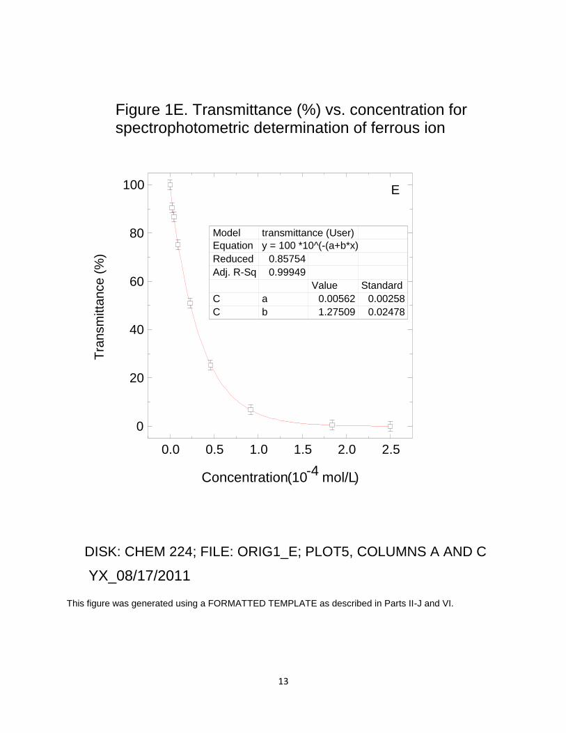
This figure was generated using a FORMATTED TEMPLATE as described in Parts II-J and VI.
0.0 0.5 1.0 1.5 2.0 2.5
0
20
40
60
80
100
Tra
nsm
itta
nce (
%)
Concentration ( 10 -4
mol/L )
Figure 1E. Transmittance (%) vs. concentration for
spectrophotometric determination of ferrous ion
E
DISK: CHEM 224; FILE: ORIG1_E; PLOT5, COLUMNS A AND C
YX_08/17/2011
Model transmittance (User) Equation y = 100 *10^(-(a+b*x)
Reduced 0.85754
Adj. R-Sq 0.99949
Value Standard
C a 0.00562 0.00258
C b 1.27509 0.02478