lightning aura components developer guide · • lightning app builder empowers admins to build...
TRANSCRIPT
Lightning Aura ComponentsDeveloper Guide
Version 46.0, Summer ’19
@salesforcedocsLast updated: May 29, 2019

© Copyright 2000–2019 salesforce.com, inc. All rights reserved. Salesforce is a registered trademark of salesforce.com, inc.,as are other names and marks. Other marks appearing herein may be trademarks of their respective owners.
CONTENTS
Chapter 1: What Is the Lightning Component Framework? . . . . . . . . . . . . . . . . . . . . . . 1
What is Salesforce Lightning? . . . . . . . . . . . . . . . . . . . . . . . . . . . . . . . . . . . . . . . . . . . . . . 2Why Use the Aura Components Programming Model? . . . . . . . . . . . . . . . . . . . . . . . . . . . . 2Aura Components . . . . . . . . . . . . . . . . . . . . . . . . . . . . . . . . . . . . . . . . . . . . . . . . . . . . . 2Events . . . . . . . . . . . . . . . . . . . . . . . . . . . . . . . . . . . . . . . . . . . . . . . . . . . . . . . . . . . . . 3Browser Support for Aura Components . . . . . . . . . . . . . . . . . . . . . . . . . . . . . . . . . . . . . . . 3My Domain Is Required to Use Lightning Components in Your Salesforce Org . . . . . . . . . . . . . 4Using the Developer Console . . . . . . . . . . . . . . . . . . . . . . . . . . . . . . . . . . . . . . . . . . . . . . 4Online Content . . . . . . . . . . . . . . . . . . . . . . . . . . . . . . . . . . . . . . . . . . . . . . . . . . . . . . . 5
Chapter 2: Quick Start . . . . . . . . . . . . . . . . . . . . . . . . . . . . . . . . . . . . . . . . . . . . . . . . . 6
Before You Begin . . . . . . . . . . . . . . . . . . . . . . . . . . . . . . . . . . . . . . . . . . . . . . . . . . . . . . 7Trailhead: Explore Lightning Components Resources . . . . . . . . . . . . . . . . . . . . . . . . . . . . . . 7Create a Component for Lightning Experience and the Salesforce Mobile App . . . . . . . . . . . . . 8
Load the Contacts . . . . . . . . . . . . . . . . . . . . . . . . . . . . . . . . . . . . . . . . . . . . . . . . . 11Fire the Events . . . . . . . . . . . . . . . . . . . . . . . . . . . . . . . . . . . . . . . . . . . . . . . . . . . . 15
Chapter 3: Creating Components . . . . . . . . . . . . . . . . . . . . . . . . . . . . . . . . . . . . . . . 17
Component Names . . . . . . . . . . . . . . . . . . . . . . . . . . . . . . . . . . . . . . . . . . . . . . . . . . . 19Create Aura Components in the Developer Console . . . . . . . . . . . . . . . . . . . . . . . . . . . . . . 19
Lightning Bundle Configurations Available in the Developer Console . . . . . . . . . . . . . . . 20Component Markup . . . . . . . . . . . . . . . . . . . . . . . . . . . . . . . . . . . . . . . . . . . . . . . . . . . 22Component Namespace . . . . . . . . . . . . . . . . . . . . . . . . . . . . . . . . . . . . . . . . . . . . . . . . 22
Using the Default Namespace in Organizations with No Namespace Set . . . . . . . . . . . . 23Using Your Organization’s Namespace . . . . . . . . . . . . . . . . . . . . . . . . . . . . . . . . . . 23Using a Namespace in or from a Managed Package . . . . . . . . . . . . . . . . . . . . . . . . . 24Creating a Namespace in Your Organization . . . . . . . . . . . . . . . . . . . . . . . . . . . . . . 24Namespace Usage Examples and Reference . . . . . . . . . . . . . . . . . . . . . . . . . . . . . . 24
Component Bundles . . . . . . . . . . . . . . . . . . . . . . . . . . . . . . . . . . . . . . . . . . . . . . . . . . . 27Component IDs . . . . . . . . . . . . . . . . . . . . . . . . . . . . . . . . . . . . . . . . . . . . . . . . . . . . . . 28HTML in Components . . . . . . . . . . . . . . . . . . . . . . . . . . . . . . . . . . . . . . . . . . . . . . . . . . 29
Supported HTML Tags . . . . . . . . . . . . . . . . . . . . . . . . . . . . . . . . . . . . . . . . . . . . . . 30CSS in Components . . . . . . . . . . . . . . . . . . . . . . . . . . . . . . . . . . . . . . . . . . . . . . . . . . . . 31Component Attributes . . . . . . . . . . . . . . . . . . . . . . . . . . . . . . . . . . . . . . . . . . . . . . . . . . 33
Supported aura:attribute Types . . . . . . . . . . . . . . . . . . . . . . . . . . . . . . . . . . . . . . . . 34Basic Types . . . . . . . . . . . . . . . . . . . . . . . . . . . . . . . . . . . . . . . . . . . . . . . . . . . . . 35Function Type . . . . . . . . . . . . . . . . . . . . . . . . . . . . . . . . . . . . . . . . . . . . . . . . . . . . 36Object Types . . . . . . . . . . . . . . . . . . . . . . . . . . . . . . . . . . . . . . . . . . . . . . . . . . . . 37Standard and Custom Object Types . . . . . . . . . . . . . . . . . . . . . . . . . . . . . . . . . . . . . 37
Collection Types . . . . . . . . . . . . . . . . . . . . . . . . . . . . . . . . . . . . . . . . . . . . . . . . . . 37Custom Apex Class Types . . . . . . . . . . . . . . . . . . . . . . . . . . . . . . . . . . . . . . . . . . . 39Framework-Specific Types . . . . . . . . . . . . . . . . . . . . . . . . . . . . . . . . . . . . . . . . . . . 40
Using Expressions . . . . . . . . . . . . . . . . . . . . . . . . . . . . . . . . . . . . . . . . . . . . . . . . . . . . 42Dynamic Output in Expressions . . . . . . . . . . . . . . . . . . . . . . . . . . . . . . . . . . . . . . . . 43Conditional Expressions . . . . . . . . . . . . . . . . . . . . . . . . . . . . . . . . . . . . . . . . . . . . . 44Data Binding Between Components . . . . . . . . . . . . . . . . . . . . . . . . . . . . . . . . . . . . 44Value Providers . . . . . . . . . . . . . . . . . . . . . . . . . . . . . . . . . . . . . . . . . . . . . . . . . . 49Expression Evaluation . . . . . . . . . . . . . . . . . . . . . . . . . . . . . . . . . . . . . . . . . . . . . . 56Expression Operators Reference . . . . . . . . . . . . . . . . . . . . . . . . . . . . . . . . . . . . . . . 57Expression Functions Reference . . . . . . . . . . . . . . . . . . . . . . . . . . . . . . . . . . . . . . . 60
Component Composition . . . . . . . . . . . . . . . . . . . . . . . . . . . . . . . . . . . . . . . . . . . . . . . 63Component Body . . . . . . . . . . . . . . . . . . . . . . . . . . . . . . . . . . . . . . . . . . . . . . . . . . . . . 66Component Facets . . . . . . . . . . . . . . . . . . . . . . . . . . . . . . . . . . . . . . . . . . . . . . . . . . . . 67Controlling Access . . . . . . . . . . . . . . . . . . . . . . . . . . . . . . . . . . . . . . . . . . . . . . . . . . . . 68
Application Access Control . . . . . . . . . . . . . . . . . . . . . . . . . . . . . . . . . . . . . . . . . . . 71Interface Access Control . . . . . . . . . . . . . . . . . . . . . . . . . . . . . . . . . . . . . . . . . . . . . 71Component Access Control . . . . . . . . . . . . . . . . . . . . . . . . . . . . . . . . . . . . . . . . . . . 71Attribute Access Control . . . . . . . . . . . . . . . . . . . . . . . . . . . . . . . . . . . . . . . . . . . . . 71Event Access Control . . . . . . . . . . . . . . . . . . . . . . . . . . . . . . . . . . . . . . . . . . . . . . . 72
Using Object-Oriented Development . . . . . . . . . . . . . . . . . . . . . . . . . . . . . . . . . . . . . . . . 72Favor Composition Over Inheritance . . . . . . . . . . . . . . . . . . . . . . . . . . . . . . . . . . . . . 73What is Inherited? . . . . . . . . . . . . . . . . . . . . . . . . . . . . . . . . . . . . . . . . . . . . . . . . . 73Inherited Component Attributes . . . . . . . . . . . . . . . . . . . . . . . . . . . . . . . . . . . . . . . . 74Abstract Components . . . . . . . . . . . . . . . . . . . . . . . . . . . . . . . . . . . . . . . . . . . . . . 75Interfaces . . . . . . . . . . . . . . . . . . . . . . . . . . . . . . . . . . . . . . . . . . . . . . . . . . . . . . 76Inheritance Rules . . . . . . . . . . . . . . . . . . . . . . . . . . . . . . . . . . . . . . . . . . . . . . . . . 77
Best Practices for Conditional Markup . . . . . . . . . . . . . . . . . . . . . . . . . . . . . . . . . . . . . . . 78Aura Component Versioning . . . . . . . . . . . . . . . . . . . . . . . . . . . . . . . . . . . . . . . . . . . . . 79Components with Minimum API Version Requirements . . . . . . . . . . . . . . . . . . . . . . . . . . . 80Validations for Aura Component Code . . . . . . . . . . . . . . . . . . . . . . . . . . . . . . . . . . . . . . . 81
Validation When You Save Code Changes . . . . . . . . . . . . . . . . . . . . . . . . . . . . . . . . 82Validation During Development Using the Salesforce CLI . . . . . . . . . . . . . . . . . . . . . . . 83Review and Resolve Validation Errors and Warnings . . . . . . . . . . . . . . . . . . . . . . . . . . 86Aura Component Validation Rules . . . . . . . . . . . . . . . . . . . . . . . . . . . . . . . . . . . . . . 87Salesforce Lightning CLI (Deprecated) . . . . . . . . . . . . . . . . . . . . . . . . . . . . . . . . . . . . 93
Using Labels . . . . . . . . . . . . . . . . . . . . . . . . . . . . . . . . . . . . . . . . . . . . . . . . . . . . . . . . 94Using Custom Labels . . . . . . . . . . . . . . . . . . . . . . . . . . . . . . . . . . . . . . . . . . . . . . . 95Input Component Labels . . . . . . . . . . . . . . . . . . . . . . . . . . . . . . . . . . . . . . . . . . . . 95Dynamically Populating Label Parameters . . . . . . . . . . . . . . . . . . . . . . . . . . . . . . . . 96Getting Labels in JavaScript . . . . . . . . . . . . . . . . . . . . . . . . . . . . . . . . . . . . . . . . . . 96Getting Labels in Apex . . . . . . . . . . . . . . . . . . . . . . . . . . . . . . . . . . . . . . . . . . . . . . 98Setting Label Values via a Parent Attribute . . . . . . . . . . . . . . . . . . . . . . . . . . . . . . . . . 99
Localization . . . . . . . . . . . . . . . . . . . . . . . . . . . . . . . . . . . . . . . . . . . . . . . . . . . . . . . . 100
Contents
Providing Component Documentation . . . . . . . . . . . . . . . . . . . . . . . . . . . . . . . . . . . . . . 101Working with Base Lightning Components . . . . . . . . . . . . . . . . . . . . . . . . . . . . . . . . . . . 103
Base Lightning Components Considerations . . . . . . . . . . . . . . . . . . . . . . . . . . . . . . . 110Event Handling in Base Lightning Components . . . . . . . . . . . . . . . . . . . . . . . . . . . . . 112Lightning Design System Considerations . . . . . . . . . . . . . . . . . . . . . . . . . . . . . . . . . 114
Working with UI Components . . . . . . . . . . . . . . . . . . . . . . . . . . . . . . . . . . . . . . . . . . . . 135Event Handling in UI Components . . . . . . . . . . . . . . . . . . . . . . . . . . . . . . . . . . . . . 138Using the UI Components . . . . . . . . . . . . . . . . . . . . . . . . . . . . . . . . . . . . . . . . . . . 139
Supporting Accessibility . . . . . . . . . . . . . . . . . . . . . . . . . . . . . . . . . . . . . . . . . . . . . . . . 140Button Labels . . . . . . . . . . . . . . . . . . . . . . . . . . . . . . . . . . . . . . . . . . . . . . . . . . . 140Audio Messages . . . . . . . . . . . . . . . . . . . . . . . . . . . . . . . . . . . . . . . . . . . . . . . . . 141Forms, Fields, and Labels . . . . . . . . . . . . . . . . . . . . . . . . . . . . . . . . . . . . . . . . . . . 141Events . . . . . . . . . . . . . . . . . . . . . . . . . . . . . . . . . . . . . . . . . . . . . . . . . . . . . . . . 142Menus . . . . . . . . . . . . . . . . . . . . . . . . . . . . . . . . . . . . . . . . . . . . . . . . . . . . . . . . 142
Chapter 4: Using Components . . . . . . . . . . . . . . . . . . . . . . . . . . . . . . . . . . . . . . . . 143
Aura Component Bundle Design Resources . . . . . . . . . . . . . . . . . . . . . . . . . . . . . . . . . . 144Use Aura Components in Lightning Experience and the Salesforce Mobile App . . . . . . . . . . 146
Configure Components for Custom Tabs . . . . . . . . . . . . . . . . . . . . . . . . . . . . . . . . . 147Add Lightning Components as Custom Tabs in a Lightning Experience App . . . . . . . . . 148Add Lightning Components as Custom Tabs in the Salesforce App . . . . . . . . . . . . . . . 149Lightning Component Actions . . . . . . . . . . . . . . . . . . . . . . . . . . . . . . . . . . . . . . . . 150Override Standard Actions with Aura Components . . . . . . . . . . . . . . . . . . . . . . . . . . 157
Navigate Across Your Apps with Page References . . . . . . . . . . . . . . . . . . . . . . . . . . . . . . 161Basic Navigation . . . . . . . . . . . . . . . . . . . . . . . . . . . . . . . . . . . . . . . . . . . . . . . . . 162Add Links to Lightning Pages from Your Custom Components . . . . . . . . . . . . . . . . . . . 162Add Query Parameters . . . . . . . . . . . . . . . . . . . . . . . . . . . . . . . . . . . . . . . . . . . . . 163Navigate to a Web Page . . . . . . . . . . . . . . . . . . . . . . . . . . . . . . . . . . . . . . . . . . . . 163Migrate to lightning:isUrlAddressable from force:navigateToComponent . . . . . . . . . . . 164pageReference Types . . . . . . . . . . . . . . . . . . . . . . . . . . . . . . . . . . . . . . . . . . . . . . 165
Get Your Aura Components Ready to Use on Lightning Pages . . . . . . . . . . . . . . . . . . . . . . 173Configure Components for Lightning Pages and the Lightning App Builder . . . . . . . . . . 174Configure Components for Lightning Experience Record Pages . . . . . . . . . . . . . . . . . . 176Create Components for the Outlook and Gmail Integrations . . . . . . . . . . . . . . . . . . . . 176Create Dynamic Picklists for Your Custom Components . . . . . . . . . . . . . . . . . . . . . . . 181Create a Custom Lightning Page Template Component . . . . . . . . . . . . . . . . . . . . . . . 183Lightning Page Template Component Best Practices . . . . . . . . . . . . . . . . . . . . . . . . . 186Make Your Lightning Page Components Width-Aware withlightning:flexipageRegionInfo . . . . . . . . . . . . . . . . . . . . . . . . . . . . . . . . . . . . . . . . 187Tips and Considerations for Configuring Components for Lightning Pages and the LightningApp Builder . . . . . . . . . . . . . . . . . . . . . . . . . . . . . . . . . . . . . . . . . . . . . . . . . . . . 188
Use Aura Components in Community Builder . . . . . . . . . . . . . . . . . . . . . . . . . . . . . . . . . 189Configure Components for Communities . . . . . . . . . . . . . . . . . . . . . . . . . . . . . . . . . 190Create Custom Theme Layout Components for Communities . . . . . . . . . . . . . . . . . . . . 191
Contents

Create Custom Component for Guest User Flows . . . . . . . . . . . . . . . . . . . . . . . . . . . 193Create Custom Search and Profile Menu Components for Communities . . . . . . . . . . . . 197Create Custom Content Layout Components for Communities . . . . . . . . . . . . . . . . . . . 198
Use Aura Components with Flows . . . . . . . . . . . . . . . . . . . . . . . . . . . . . . . . . . . . . . . . 200Considerations for Configuring Components for Flows . . . . . . . . . . . . . . . . . . . . . . . 200Customize Flow Screens Using Aura Components . . . . . . . . . . . . . . . . . . . . . . . . . . 204Create Flow Local Actions Using Aura Components . . . . . . . . . . . . . . . . . . . . . . . . . . 214Embed a Flow in a Custom Aura Component . . . . . . . . . . . . . . . . . . . . . . . . . . . . . . 218Display Flow Stages with an Aura Component . . . . . . . . . . . . . . . . . . . . . . . . . . . . . 224
Add Components to Apps . . . . . . . . . . . . . . . . . . . . . . . . . . . . . . . . . . . . . . . . . . . . . . 229Integrate Your Custom Apps into the Chatter Publisher . . . . . . . . . . . . . . . . . . . . . . . . . . . 229Using Background Utility Items . . . . . . . . . . . . . . . . . . . . . . . . . . . . . . . . . . . . . . . . . . . 234Use Lightning Components in Visualforce Pages . . . . . . . . . . . . . . . . . . . . . . . . . . . . . . . 235Add Aura Components to Any App with Lightning Out (Beta) . . . . . . . . . . . . . . . . . . . . . . . 237
Lightning Out Requirements . . . . . . . . . . . . . . . . . . . . . . . . . . . . . . . . . . . . . . . . . 238Lightning Out Dependencies . . . . . . . . . . . . . . . . . . . . . . . . . . . . . . . . . . . . . . . . . 238Lightning Out Markup . . . . . . . . . . . . . . . . . . . . . . . . . . . . . . . . . . . . . . . . . . . . . 239Authentication from Lightning Out . . . . . . . . . . . . . . . . . . . . . . . . . . . . . . . . . . . . . 241Share Lightning Out Apps with Non-Authenticated Users . . . . . . . . . . . . . . . . . . . . . . 242Lightning Out Considerations and Limitations . . . . . . . . . . . . . . . . . . . . . . . . . . . . . 243
Lightning Container . . . . . . . . . . . . . . . . . . . . . . . . . . . . . . . . . . . . . . . . . . . . . . . . . . 244Using a Third-Party Framework . . . . . . . . . . . . . . . . . . . . . . . . . . . . . . . . . . . . . . . 244Lightning Container Component Limits . . . . . . . . . . . . . . . . . . . . . . . . . . . . . . . . . . 251The Lightning Realty App . . . . . . . . . . . . . . . . . . . . . . . . . . . . . . . . . . . . . . . . . . . 253lightning-container NPM Module Reference . . . . . . . . . . . . . . . . . . . . . . . . . . . . . . 256
Chapter 5: Communicating with Events . . . . . . . . . . . . . . . . . . . . . . . . . . . . . . . . . . 262
Actions and Events . . . . . . . . . . . . . . . . . . . . . . . . . . . . . . . . . . . . . . . . . . . . . . . . . . . 263Handling Events with Client-Side Controllers . . . . . . . . . . . . . . . . . . . . . . . . . . . . . . . . . . 264Component Events . . . . . . . . . . . . . . . . . . . . . . . . . . . . . . . . . . . . . . . . . . . . . . . . . . . 266
Component Event Propagation . . . . . . . . . . . . . . . . . . . . . . . . . . . . . . . . . . . . . . . 267Create Custom Component Events . . . . . . . . . . . . . . . . . . . . . . . . . . . . . . . . . . . . . 268Fire Component Events . . . . . . . . . . . . . . . . . . . . . . . . . . . . . . . . . . . . . . . . . . . . 268Handling Component Events . . . . . . . . . . . . . . . . . . . . . . . . . . . . . . . . . . . . . . . . 269Component Event Example . . . . . . . . . . . . . . . . . . . . . . . . . . . . . . . . . . . . . . . . . . 275
Application Events . . . . . . . . . . . . . . . . . . . . . . . . . . . . . . . . . . . . . . . . . . . . . . . . . . . 277Application Event Propagation . . . . . . . . . . . . . . . . . . . . . . . . . . . . . . . . . . . . . . . 278Create Custom Application Events . . . . . . . . . . . . . . . . . . . . . . . . . . . . . . . . . . . . . 279Fire Application Events . . . . . . . . . . . . . . . . . . . . . . . . . . . . . . . . . . . . . . . . . . . . . 280Handling Application Events . . . . . . . . . . . . . . . . . . . . . . . . . . . . . . . . . . . . . . . . . 281Application Event Example . . . . . . . . . . . . . . . . . . . . . . . . . . . . . . . . . . . . . . . . . . 283
Event Handling Lifecycle . . . . . . . . . . . . . . . . . . . . . . . . . . . . . . . . . . . . . . . . . . . . . . . 285Advanced Events Example . . . . . . . . . . . . . . . . . . . . . . . . . . . . . . . . . . . . . . . . . . . . . . 287Firing Events from Non-Aura Code . . . . . . . . . . . . . . . . . . . . . . . . . . . . . . . . . . . . . . . . . 291
Contents
Events Best Practices . . . . . . . . . . . . . . . . . . . . . . . . . . . . . . . . . . . . . . . . . . . . . . . . . 292Events Anti-Patterns . . . . . . . . . . . . . . . . . . . . . . . . . . . . . . . . . . . . . . . . . . . . . . 293
Events Fired During the Rendering Lifecycle . . . . . . . . . . . . . . . . . . . . . . . . . . . . . . . . . . 293Events Handled in the Salesforce Mobile App and Lightning Experience . . . . . . . . . . . . . . . 295System Events . . . . . . . . . . . . . . . . . . . . . . . . . . . . . . . . . . . . . . . . . . . . . . . . . . . . . . 297
Chapter 6: Creating Apps . . . . . . . . . . . . . . . . . . . . . . . . . . . . . . . . . . . . . . . . . . . . 299
App Overview . . . . . . . . . . . . . . . . . . . . . . . . . . . . . . . . . . . . . . . . . . . . . . . . . . . . . . 300Designing App UI . . . . . . . . . . . . . . . . . . . . . . . . . . . . . . . . . . . . . . . . . . . . . . . . . . . . 300Creating App Templates . . . . . . . . . . . . . . . . . . . . . . . . . . . . . . . . . . . . . . . . . . . . . . . 301Using the AppCache . . . . . . . . . . . . . . . . . . . . . . . . . . . . . . . . . . . . . . . . . . . . . . . . . . 301Distributing Applications and Components . . . . . . . . . . . . . . . . . . . . . . . . . . . . . . . . . . . 301
Chapter 7: Styling Apps . . . . . . . . . . . . . . . . . . . . . . . . . . . . . . . . . . . . . . . . . . . . . 303
Using the Salesforce Lightning Design System in Apps . . . . . . . . . . . . . . . . . . . . . . . . . . . 304Using External CSS . . . . . . . . . . . . . . . . . . . . . . . . . . . . . . . . . . . . . . . . . . . . . . . . . . . 304More Readable Styling Markup with the join Expression . . . . . . . . . . . . . . . . . . . . . . . . . . 306Tips for CSS in Components . . . . . . . . . . . . . . . . . . . . . . . . . . . . . . . . . . . . . . . . . . . . . 307Vendor Prefixes . . . . . . . . . . . . . . . . . . . . . . . . . . . . . . . . . . . . . . . . . . . . . . . . . . . . . 307Styling with Design Tokens . . . . . . . . . . . . . . . . . . . . . . . . . . . . . . . . . . . . . . . . . . . . . . 308
Tokens Bundles . . . . . . . . . . . . . . . . . . . . . . . . . . . . . . . . . . . . . . . . . . . . . . . . . 309Create a Tokens Bundle . . . . . . . . . . . . . . . . . . . . . . . . . . . . . . . . . . . . . . . . . . . . 309Defining and Using Tokens . . . . . . . . . . . . . . . . . . . . . . . . . . . . . . . . . . . . . . . . . . 309Using Expressions in Tokens . . . . . . . . . . . . . . . . . . . . . . . . . . . . . . . . . . . . . . . . . 310Extending Tokens Bundles . . . . . . . . . . . . . . . . . . . . . . . . . . . . . . . . . . . . . . . . . . . 311Using Standard Design Tokens . . . . . . . . . . . . . . . . . . . . . . . . . . . . . . . . . . . . . . . 312
Chapter 8: Developing Secure Code . . . . . . . . . . . . . . . . . . . . . . . . . . . . . . . . . . . . 324
What is Lightning Locker? . . . . . . . . . . . . . . . . . . . . . . . . . . . . . . . . . . . . . . . . . . . . . . 325JavaScript Strict Mode Enforcement . . . . . . . . . . . . . . . . . . . . . . . . . . . . . . . . . . . . 326DOM Access Containment . . . . . . . . . . . . . . . . . . . . . . . . . . . . . . . . . . . . . . . . . . 326Secure Wrappers . . . . . . . . . . . . . . . . . . . . . . . . . . . . . . . . . . . . . . . . . . . . . . . . 328eval() Function is Limited by Lightning Locker . . . . . . . . . . . . . . . . . . . . . . . . . . . . . . 330MIME Types Permitted . . . . . . . . . . . . . . . . . . . . . . . . . . . . . . . . . . . . . . . . . . . . . 331Access to Supported JavaScript API Framework Methods Only . . . . . . . . . . . . . . . . . . 332What Does Lightning Locker Affect? . . . . . . . . . . . . . . . . . . . . . . . . . . . . . . . . . . . . 332Lightning Locker Tools . . . . . . . . . . . . . . . . . . . . . . . . . . . . . . . . . . . . . . . . . . . . . 332Disabling Lightning Locker for a Component . . . . . . . . . . . . . . . . . . . . . . . . . . . . . . 337Don’t Mix Component API Versions . . . . . . . . . . . . . . . . . . . . . . . . . . . . . . . . . . . . 338Lightning Locker Disabled for Unsupported Browsers . . . . . . . . . . . . . . . . . . . . . . . . 339
Content Security Policy Overview . . . . . . . . . . . . . . . . . . . . . . . . . . . . . . . . . . . . . . . . . . 339Stricter CSP Restrictions . . . . . . . . . . . . . . . . . . . . . . . . . . . . . . . . . . . . . . . . . . . . 340
Freeze JavaScript Prototypes . . . . . . . . . . . . . . . . . . . . . . . . . . . . . . . . . . . . . . . . . . . . . 341
Chapter 9: Using JavaScript . . . . . . . . . . . . . . . . . . . . . . . . . . . . . . . . . . . . . . . . . . 342
Contents
Supported JavaScript . . . . . . . . . . . . . . . . . . . . . . . . . . . . . . . . . . . . . . . . . . . . . . . . . 344Invoking Actions on Component Initialization . . . . . . . . . . . . . . . . . . . . . . . . . . . . . . . . . 344Sharing JavaScript Code in a Component Bundle . . . . . . . . . . . . . . . . . . . . . . . . . . . . . . 345Sharing JavaScript Code Across Components . . . . . . . . . . . . . . . . . . . . . . . . . . . . . . . . . 347Using External JavaScript Libraries . . . . . . . . . . . . . . . . . . . . . . . . . . . . . . . . . . . . . . . . 349Dynamically Creating Components . . . . . . . . . . . . . . . . . . . . . . . . . . . . . . . . . . . . . . . . 350Detecting Data Changes with Change Handlers . . . . . . . . . . . . . . . . . . . . . . . . . . . . . . . 353Finding Components by ID . . . . . . . . . . . . . . . . . . . . . . . . . . . . . . . . . . . . . . . . . . . . . . 354Working with Attribute Values in JavaScript . . . . . . . . . . . . . . . . . . . . . . . . . . . . . . . . . . . 354Working with a Component Body in JavaScript . . . . . . . . . . . . . . . . . . . . . . . . . . . . . . . . 356Working with Events in JavaScript . . . . . . . . . . . . . . . . . . . . . . . . . . . . . . . . . . . . . . . . . 357Modifying the DOM . . . . . . . . . . . . . . . . . . . . . . . . . . . . . . . . . . . . . . . . . . . . . . . . . . 360
Modifying DOM Elements Managed by the Aura Components Programming Model . . . 360Modifying DOM Elements Managed by External Libraries . . . . . . . . . . . . . . . . . . . . . 364
Checking Component Validity . . . . . . . . . . . . . . . . . . . . . . . . . . . . . . . . . . . . . . . . . . . 364Modifying Components Outside the Framework Lifecycle . . . . . . . . . . . . . . . . . . . . . . . . . 366Validating Fields . . . . . . . . . . . . . . . . . . . . . . . . . . . . . . . . . . . . . . . . . . . . . . . . . . . . . 367Throwing and Handling Errors . . . . . . . . . . . . . . . . . . . . . . . . . . . . . . . . . . . . . . . . . . . 369Calling Component Methods . . . . . . . . . . . . . . . . . . . . . . . . . . . . . . . . . . . . . . . . . . . . 371
Return Result for Synchronous Code . . . . . . . . . . . . . . . . . . . . . . . . . . . . . . . . . . . . 373Return Result for Asynchronous Code . . . . . . . . . . . . . . . . . . . . . . . . . . . . . . . . . . . 375
Dynamically Adding Event Handlers To a Component . . . . . . . . . . . . . . . . . . . . . . . . . . . 377Dynamically Showing or Hiding Markup . . . . . . . . . . . . . . . . . . . . . . . . . . . . . . . . . . . . 379Adding and Removing Styles . . . . . . . . . . . . . . . . . . . . . . . . . . . . . . . . . . . . . . . . . . . . 380Which Button Was Pressed? . . . . . . . . . . . . . . . . . . . . . . . . . . . . . . . . . . . . . . . . . . . . . 381Formatting Dates in JavaScript . . . . . . . . . . . . . . . . . . . . . . . . . . . . . . . . . . . . . . . . . . . 382Using JavaScript Promises . . . . . . . . . . . . . . . . . . . . . . . . . . . . . . . . . . . . . . . . . . . . . . 385Making API Calls from Components . . . . . . . . . . . . . . . . . . . . . . . . . . . . . . . . . . . . . . . 387Create CSP Trusted Sites to Access Third-Party APIs . . . . . . . . . . . . . . . . . . . . . . . . . . . . . 387
Chapter 10: Working with Salesforce Data . . . . . . . . . . . . . . . . . . . . . . . . . . . . . . . . 389
Lightning Data Service . . . . . . . . . . . . . . . . . . . . . . . . . . . . . . . . . . . . . . . . . . . . . . . . . 390Loading a Record . . . . . . . . . . . . . . . . . . . . . . . . . . . . . . . . . . . . . . . . . . . . . . . . 391Editing a Record . . . . . . . . . . . . . . . . . . . . . . . . . . . . . . . . . . . . . . . . . . . . . . . . . 395Creating a Record . . . . . . . . . . . . . . . . . . . . . . . . . . . . . . . . . . . . . . . . . . . . . . . . 400Deleting a Record . . . . . . . . . . . . . . . . . . . . . . . . . . . . . . . . . . . . . . . . . . . . . . . . 405Record Changes . . . . . . . . . . . . . . . . . . . . . . . . . . . . . . . . . . . . . . . . . . . . . . . . . 407Handling Errors . . . . . . . . . . . . . . . . . . . . . . . . . . . . . . . . . . . . . . . . . . . . . . . . . 408Changing the Display Density . . . . . . . . . . . . . . . . . . . . . . . . . . . . . . . . . . . . . . . . 410Considerations . . . . . . . . . . . . . . . . . . . . . . . . . . . . . . . . . . . . . . . . . . . . . . . . . . 413Lightning Action Example Using force:recordData . . . . . . . . . . . . . . . . . . . . . . . . . . . 416SaveRecordResult . . . . . . . . . . . . . . . . . . . . . . . . . . . . . . . . . . . . . . . . . . . . . . . . 420Displaying the Create and Edit Record Modals . . . . . . . . . . . . . . . . . . . . . . . . . . . . . 420
Using Apex to Work with Salesforce Records . . . . . . . . . . . . . . . . . . . . . . . . . . . . . . . . . . 421
Contents
CRUD and Field-Level Security (FLS) . . . . . . . . . . . . . . . . . . . . . . . . . . . . . . . . . . . . . 424
Chapter 11: Using Apex . . . . . . . . . . . . . . . . . . . . . . . . . . . . . . . . . . . . . . . . . . . . . . 426
Creating Server-Side Logic with Controllers . . . . . . . . . . . . . . . . . . . . . . . . . . . . . . . . . . . 427Apex Server-Side Controller Overview . . . . . . . . . . . . . . . . . . . . . . . . . . . . . . . . . . . 428AuraEnabled Annotation . . . . . . . . . . . . . . . . . . . . . . . . . . . . . . . . . . . . . . . . . . . 428Creating an Apex Server-Side Controller . . . . . . . . . . . . . . . . . . . . . . . . . . . . . . . . . 430Calling a Server-Side Action . . . . . . . . . . . . . . . . . . . . . . . . . . . . . . . . . . . . . . . . . 430Passing Data to an Apex Controller . . . . . . . . . . . . . . . . . . . . . . . . . . . . . . . . . . . . 433Returning Data from an Apex Server-Side Controller . . . . . . . . . . . . . . . . . . . . . . . . . 437Returning Errors from an Apex Server-Side Controller . . . . . . . . . . . . . . . . . . . . . . . . 439Queueing of Server-Side Actions . . . . . . . . . . . . . . . . . . . . . . . . . . . . . . . . . . . . . . 439Foreground and Background Actions . . . . . . . . . . . . . . . . . . . . . . . . . . . . . . . . . . . 440Storable Actions . . . . . . . . . . . . . . . . . . . . . . . . . . . . . . . . . . . . . . . . . . . . . . . . . 441Abortable Actions . . . . . . . . . . . . . . . . . . . . . . . . . . . . . . . . . . . . . . . . . . . . . . . . 445
Testing Your Apex Code . . . . . . . . . . . . . . . . . . . . . . . . . . . . . . . . . . . . . . . . . . . . . . . 445Making API Calls from Apex . . . . . . . . . . . . . . . . . . . . . . . . . . . . . . . . . . . . . . . . . . . . . 446Make Long-Running Callouts with Continuations . . . . . . . . . . . . . . . . . . . . . . . . . . . . . . . 447
@AuraEnabled Annotations for Continuations . . . . . . . . . . . . . . . . . . . . . . . . . . . . . 449Aura Component Continuations Example . . . . . . . . . . . . . . . . . . . . . . . . . . . . . . . . 450Continuation-Specific Limits . . . . . . . . . . . . . . . . . . . . . . . . . . . . . . . . . . . . . . . . . . 451
Creating Components in Apex . . . . . . . . . . . . . . . . . . . . . . . . . . . . . . . . . . . . . . . . . . . 452
Chapter 12: Testing Components with Lightning Testing Service . . . . . . . . . . . . . . . . 453
How Lightning Testing Service Works . . . . . . . . . . . . . . . . . . . . . . . . . . . . . . . . . . . . . . . 454Install Lightning Testing Service . . . . . . . . . . . . . . . . . . . . . . . . . . . . . . . . . . . . . . . . . . . 455Get Started with Lightning Testing Service . . . . . . . . . . . . . . . . . . . . . . . . . . . . . . . . . . . . 457Explore the Example Test Suites . . . . . . . . . . . . . . . . . . . . . . . . . . . . . . . . . . . . . . . . . . 458Write Your Own Tests . . . . . . . . . . . . . . . . . . . . . . . . . . . . . . . . . . . . . . . . . . . . . . . . . 459Use Other Frameworks . . . . . . . . . . . . . . . . . . . . . . . . . . . . . . . . . . . . . . . . . . . . . . . . 461
Chapter 13: Debugging . . . . . . . . . . . . . . . . . . . . . . . . . . . . . . . . . . . . . . . . . . . . . . 462
Enable Debug Mode for Lightning Components . . . . . . . . . . . . . . . . . . . . . . . . . . . . . . . 463Disable Caching Setting During Development . . . . . . . . . . . . . . . . . . . . . . . . . . . . . . . . . 463Salesforce Lightning Inspector Chrome Extension . . . . . . . . . . . . . . . . . . . . . . . . . . . . . . 464
Install Salesforce Lightning Inspector . . . . . . . . . . . . . . . . . . . . . . . . . . . . . . . . . . . 464Salesforce Lightning Inspector . . . . . . . . . . . . . . . . . . . . . . . . . . . . . . . . . . . . . . . . 464
Log Messages . . . . . . . . . . . . . . . . . . . . . . . . . . . . . . . . . . . . . . . . . . . . . . . . . . . . . . 478
Chapter 14: Performance . . . . . . . . . . . . . . . . . . . . . . . . . . . . . . . . . . . . . . . . . . . . 479
Performance Settings . . . . . . . . . . . . . . . . . . . . . . . . . . . . . . . . . . . . . . . . . . . . . . . . . 480Enable Secure Browser Caching . . . . . . . . . . . . . . . . . . . . . . . . . . . . . . . . . . . . . . 480Enable CDN to Load Applications Faster . . . . . . . . . . . . . . . . . . . . . . . . . . . . . . . . . 480
Fixing Performance Warnings . . . . . . . . . . . . . . . . . . . . . . . . . . . . . . . . . . . . . . . . . . . . 481<aura:if>—Clean Unrendered Body . . . . . . . . . . . . . . . . . . . . . . . . . . . . . . . . . . . . 481
Contents
<aura:iteration>—Multiple Items Set . . . . . . . . . . . . . . . . . . . . . . . . . . . . . . . . . . . 483
Chapter 15: Reference . . . . . . . . . . . . . . . . . . . . . . . . . . . . . . . . . . . . . . . . . . . . . . 486
Component Library . . . . . . . . . . . . . . . . . . . . . . . . . . . . . . . . . . . . . . . . . . . . . . . . . . . 487Aura Reference Doc App . . . . . . . . . . . . . . . . . . . . . . . . . . . . . . . . . . . . . . . . . . . 487Differences Between Documentation Sites . . . . . . . . . . . . . . . . . . . . . . . . . . . . . . . 488
System Tag Reference . . . . . . . . . . . . . . . . . . . . . . . . . . . . . . . . . . . . . . . . . . . . . . . . . 488aura:application . . . . . . . . . . . . . . . . . . . . . . . . . . . . . . . . . . . . . . . . . . . . . . . . . 489aura:dependency . . . . . . . . . . . . . . . . . . . . . . . . . . . . . . . . . . . . . . . . . . . . . . . . 490aura:event . . . . . . . . . . . . . . . . . . . . . . . . . . . . . . . . . . . . . . . . . . . . . . . . . . . . . 491aura:interface . . . . . . . . . . . . . . . . . . . . . . . . . . . . . . . . . . . . . . . . . . . . . . . . . . 492aura:method . . . . . . . . . . . . . . . . . . . . . . . . . . . . . . . . . . . . . . . . . . . . . . . . . . . 492aura:set . . . . . . . . . . . . . . . . . . . . . . . . . . . . . . . . . . . . . . . . . . . . . . . . . . . . . . 494
INDEX . . . . . . . . . . . . . . . . . . . . . . . . . . . . . . . . . . . . . . . . . . . . . . . . . . . . . . . . . . 497
Contents
CHAPTER 1 What Is the Lightning Component Framework?
The Lightning Component framework is a UI framework for developing single page applications formobile and desktop devices.
In this chapter ...
• What is SalesforceLightning? As of Spring ’19 (API version 45.0), you can build Lightning components using two programming models:
the Lightning Web Components model, and the original Aura Components model. Lightning web• Why Use the Aura
Componentscomponents are custom HTML elements built using HTML and modern JavaScript. Lightning webcomponents and Aura components can coexist and interoperate on a page.
ProgrammingModel? Configure Lightning web components and Aura components to work in Lightning App Builder and
Community Builder. Admins and end users don’t know which programming model was used to developthe components. To them, they’re simply Lightning components.
• Aura Components
• EventsThis developer guide covers how to develop custom Aura components. The Lightning Web ComponentsDeveloper Guide covers how to develop custom Lightning web components.
• Browser Support forAura Components
• My Domain IsRequired to UseLightningComponents in YourSalesforce Org
• Using the DeveloperConsole
• Online Content
1
What is Salesforce Lightning?
Lightning includes the Lightning Component Framework and some exciting tools for developers. Lightning makes it easier to buildresponsive applications for any device.
Lightning includes these technologies:
• Lightning components accelerate development and app performance. Develop custom components that other developers andadmins can use as reusable building blocks to customize Communities, the Salesforce mobile app, and Lightning Experience.
• Lightning App Builder empowers admins to build Lightning pages visually, without code, using off-the-shelf and custom-builtLightning components. Make your Lightning components available in the Lightning App Builder so administrators can build customuser interfaces without code.
• Community Builder empowers admins to build communities visually, without code, using Lightning templates and components.Make your Lightning components available in Community Builder so administrators can build community pages without code.
Using these technologies, you can seamlessly customize and easily deploy new apps to mobile devices running Salesforce. In fact, theSalesforce mobile app and Salesforce Lightning Experience are built with Lightning components.
This guide teaches you to create your own custom Aura components and apps. You also learn how to package applications andcomponents and distribute them in the AppExchange.
To learn how to develop Lightning web components, see Lightning Web Components Developer Guide.
Why Use the Aura Components Programming Model?
The benefits include an out-of-the-box set of components, event-driven architecture, and a framework optimized for performance.
Out-of-the-box ComponentsComes with an out-of-the-box set of components to kick start building apps. You don't have to spend your time optimizing yourapps for different devices as the components take care of that for you.
Rich Component EcosystemCreate business-ready components and make them available in the Salesforce app, Lightning Experience, and Communities. Salesforceapp users access your components via the navigation menu. Customize Lightning Experience or Communities using drag-and-dropcomponents on a Lightning Page in the Lightning App Builder or using Community Builder. Additional components are availablefor your org in the AppExchange. Similarly, you can publish your components and share them with other users.
Fast DevelopmentEmpowers teams to work faster with out-of-the-box components that function seamlessly with desktop and mobile devices. Buildingan app with components facilitates parallel design, improving overall development efficiency.
Components are encapsulated and their internals stay private, while their public shape is visible to consumers of the component.This strong separation gives component authors freedom to change the internal implementation details and insulates componentconsumers from those changes.
Device-aware and Cross Browser CompatibilityApps use responsive design and support the latest in browser technology such as HTML5, CSS3, and touch events.
Aura Components
Aura components are the self-contained and reusable units of an app. They represent a reusable section of the UI, and can range ingranularity from a single line of text to an entire app.
2
What is Salesforce Lightning?What Is the Lightning Component Framework?

The framework includes a set of prebuilt components. For example, components that come with the Lightning Design System stylingare available in the lightning namespace. These components are also known as the base Lightning components. You can assembleand configure components to form new components in an app. Components are rendered to produce HTML DOM elements within thebrowser.
A component can contain other components, as well as HTML, CSS, JavaScript, or any other Web-enabled code. This enables you tobuild apps with sophisticated UIs.
The details of a component's implementation are encapsulated. This allows the consumer of a component to focus on building theirapp, while the component author can innovate and make changes without breaking consumers. You configure components by settingthe named attributes that they expose in their definition. Components interact with their environment by listening to or publishingevents.
SEE ALSO:
Creating Components
Working with Base Lightning Components
Events
Event-driven programming is used in many languages and frameworks, such as JavaScript and Java Swing. The idea is that you writehandlers that respond to interface events as they occur.
A component registers that it may fire an event in its markup. Events are fired from JavaScript controller actions that are typically triggeredby a user interacting with the user interface.
There are two types of events in the framework:
• Component events are handled by the component itself or a component that instantiates or contains the component.
• Application events are handled by all components that are listening to the event. These events are essentially a traditionalpublish-subscribe model.
You write the handlers in JavaScript controller actions.
SEE ALSO:
Communicating with Events
Handling Events with Client-Side Controllers
Browser Support for Aura Components
Aura Components support the same browsers as Lightning Experience.
For more information, see Supported Browsers for Lightning Experience.
SEE ALSO:
Salesforce Help: Recommendations and Requirements for All Browsers
Lightning Locker Disabled for Unsupported Browsers
Content Security Policy Overview
3
EventsWhat Is the Lightning Component Framework?
My Domain Is Required to Use Lightning Components in Your SalesforceOrg
You must deploy My Domain in your org if you want to use Lightning components in Lightning tabs, Lightning pages, as standaloneapps, as actions and action overrides, as custom Lightning page templates, or elsewhere in your org.
When My Domain isn’t deployed in your org, user interface controls related to Lightning components may be hidden or inactive. Lightningcomponents added to pages, tabs, and so on, don’t run and may be omitted, or display a placeholder error message.
SEE ALSO:
Salesforce Help: My Domain
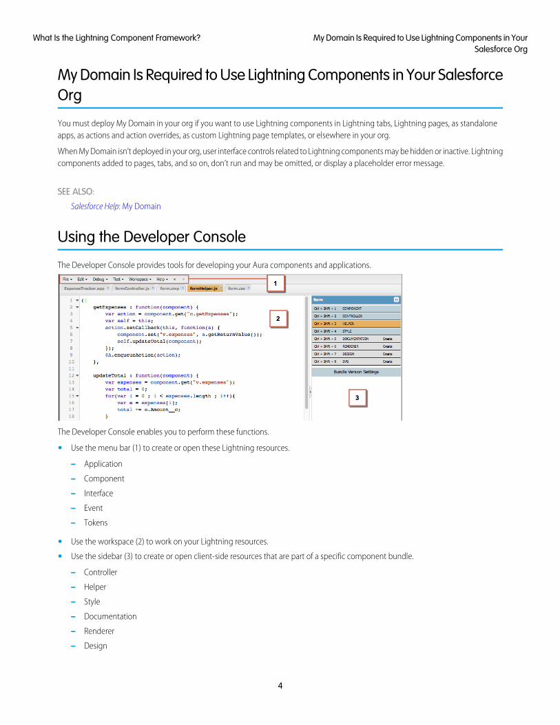
Using the Developer Console
The Developer Console provides tools for developing your Aura components and applications.
The Developer Console enables you to perform these functions.
• Use the menu bar (1) to create or open these Lightning resources.
– Application
– Component
– Interface
– Event
– Tokens
• Use the workspace (2) to work on your Lightning resources.
• Use the sidebar (3) to create or open client-side resources that are part of a specific component bundle.
– Controller
– Helper
– Style
– Documentation
– Renderer
– Design
4
My Domain Is Required to Use Lightning Components in YourSalesforce Org
What Is the Lightning Component Framework?
– SVG
For more information on the Developer Console, see The Developer Console User Interface.
SEE ALSO:
Salesforce Help: Open the Developer Console
Create Aura Components in the Developer Console
Component Bundles
Online Content
This guide is available online. To view the latest version, go to:
https://developer.salesforce.com/docs/atlas.en-us.lightning.meta/lightning/
Go beyond this guide with exciting Trailhead content. To explore more of what you can do with Lightning Components, go to:
Trailhead Module: Lightning Components BasicsLink: https://trailhead.salesforce.com/module/lex_dev_lc_basics
Learn with a series of hands-on challenges on how to use Lightning Components to build modern web apps.
Quick Start: Lightning ComponentsLink: https://trailhead.salesforce.com/project/quickstart-lightning-components
Create your first component that renders a list of Contacts from your org.
Project: Build an Account Geolocation AppLink: https://trailhead.salesforce.com/project/account-geolocation-app
Build an app that maps your Accounts using Lightning Components.
Project: Build a Restaurant-Locator Lightning ComponentLink: https://trailhead.salesforce.com/project/workshop-lightning-restaurant-locator
Build a Lightning component with Yelp’s Search API that displays a list of businesses near a certain location.
Project: Build a Lightning App with the Lightning Design SystemLink: https://trailhead.salesforce.com/project/slds-lightning-components-workshop
Design a Lightning component that displays an Account list.
5
Online ContentWhat Is the Lightning Component Framework?
CHAPTER 2 Quick Start
The quick start provides Trailhead resources for you to learn core Aura components concepts, and ashort tutorial that builds an Aura component to manage selected contacts in the Salesforce app and
In this chapter ...
• Before You Begin Lightning Experience. You’ll create all components from the Developer Console. The tutorial uses severalevents to create or edit contact records, and view related cases.• Trailhead: Explore
LightningComponentsResources
• Create a Componentfor LightningExperience and theSalesforce MobileApp
6
Before You Begin
To work with Lightning apps and components , follow these prerequisites.
1. Create a Developer Edition organization
2. Define a Custom Salesforce Domain Name
Note: For this quick start tutorial, you don’t need to create a Developer Edition organization or register a namespace prefix. Butyou want to do so if you’re planning to offer managed packages. You can create Lightning components using the UI in Enterprise,Performance, Unlimited, Developer Editions, or a sandbox. If you don’t plan to use a Developer Edition organization, you cango directly to Define a Custom Salesforce Domain Name.
Create a Developer Edition OrganizationYou need an org to do this quick start tutorial, and we recommend you don’t use your production org. You only need to create a DeveloperEdition org if you don’t already have one.
1. In your browser, go to https://developer.salesforce.com/signup?d=70130000000td6N.
2. Fill in the fields about you and your company.
3. In the Email field, make sure to use a public address you can easily check from a Web browser.
4. Type a unique Username. Note that this field is also in the form of an email address, but it does not have to be the same as youremail address, and in fact, it’s usually better if they aren’t the same. Your username is your login and your identity ondeveloper.salesforce.com, so you’re often better served by choosing a username such [email protected].
5. Read and then select the checkbox for the Master Subscription Agreement and then click Submit Registration.
6. In a moment you’ll receive an email with a login link. Click the link and change your password.
Define a Custom Salesforce Domain NameA custom domain name helps you enhance access security and better manage login and authentication for your organization. If yourcustom domain is universalcontainers, then your login URL would behttps://universalcontainers.lightning.force.com. For more information, see My Domain in the Salesforce Help.
Trailhead: Explore Lightning Components Resources
Get up to speed with the fundamentals of Lightning components with Trailhead resources.
Whether you’re a new Salesforce developer or a seasoned Visualforce developer, we recommend that you start with the followingTrailhead resources.
Lightning Components BasicsUse Lightning components to build modern web apps with reusable UI components. You’ll learn core Lightning componentsconcepts and build a simple expense tracker app that can be run in a standalone app, Salesforce app, or Lightning Experience.
Quick Start: Lightning ComponentsCreate your first component that renders a list of contacts from your org.
Build an Account Geolocation AppBuild an app that maps your accounts using Lightning components.
7
Before You BeginQuick Start
Build a Lightning App with the Lightning Design SystemDesign a Lightning component that displays an account list.
Build a Restaurant-Locator Lightning ComponentBuild a Lightning component with Yelp’s Search API that displays a list of businesses near a certain location.
Create a Component for Lightning Experience and the Salesforce MobileApp
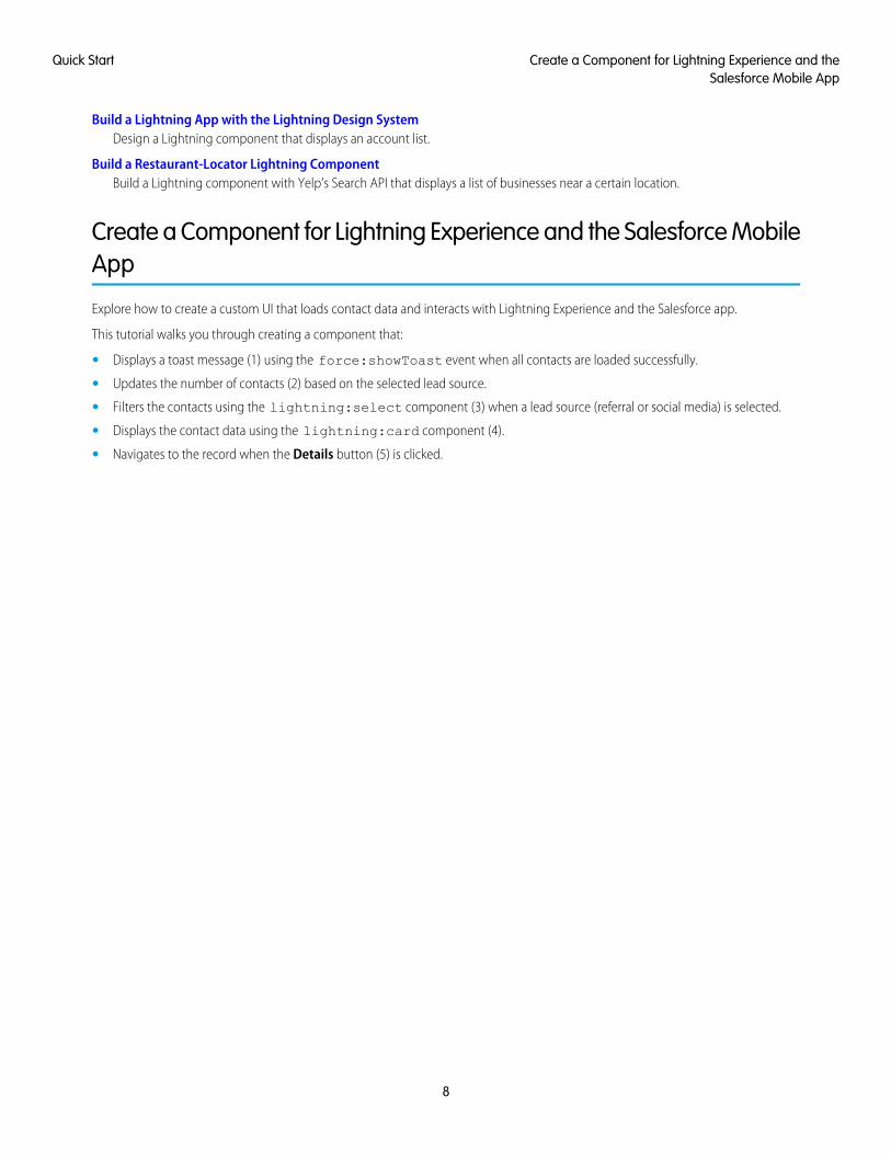
Explore how to create a custom UI that loads contact data and interacts with Lightning Experience and the Salesforce app.
This tutorial walks you through creating a component that:
• Displays a toast message (1) using the force:showToast event when all contacts are loaded successfully.
• Updates the number of contacts (2) based on the selected lead source.
• Filters the contacts using the lightning:select component (3) when a lead source (referral or social media) is selected.
• Displays the contact data using the lightning:card component (4).
• Navigates to the record when the Details button (5) is clicked.
8
Create a Component for Lightning Experience and theSalesforce Mobile App
Quick Start
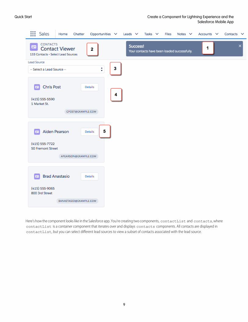
Here’s how the component looks like in the Salesforce app. You’re creating two components, contactList and contacts, wherecontactList is a container component that iterates over and displays contacts components. All contacts are displayed incontactList, but you can select different lead sources to view a subset of contacts associated with the lead source.
9
Create a Component for Lightning Experience and theSalesforce Mobile App
Quick Start
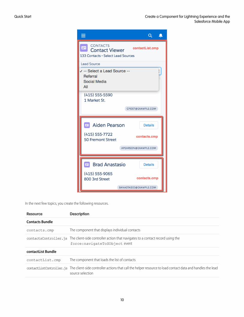
In the next few topics, you create the following resources.
DescriptionResource
Contacts Bundle
The component that displays individual contactscontacts.cmp
The client-side controller action that navigates to a contact record using theforce:navigateToSObject event
contactsController.js
contactList Bundle
The component that loads the list of contactscontactList.cmp
The client-side controller actions that call the helper resource to load contact data and handles the leadsource selection
contactListController.js
10
Create a Component for Lightning Experience and theSalesforce Mobile App
Quick Start
DescriptionResource
The helper function that retrieves contact data, displays a toast message on successful loading of contactdata, displays contact data based on lead source, and update the total number of contacts
contactListHelper.js
Apex Controller
The Apex controller that queries all contact records and those records based on different lead sourcesContactController.apxc
Load the ContactsCreate an Apex controller and load your contacts. An Apex controller is the bridge that connects your components and your Salesforcedata.
Your organization must have existing contact records for this tutorial.
1. Click File > New > Apex Class, and then enter ContactController in the New Class window. A new Apex class,ContactController.apxc, is created. Enter this code and then save.
public with sharing class ContactController {@AuraEnabled
public static List<Contact> getContacts() {List<Contact> contacts =
[SELECT Id, Name, MailingStreet, Phone, Email, LeadSource FROM Contact];
//Add isAccessible() checkreturn contacts;
}}
ContactController contains methods that return your contact data using SOQL statements. This Apex controller is wiredup to your component in a later step. getContacts() returns all contacts with the selected fields.
2. Click File > New > Lightning Component, and then enter contacts for the Name field in the New Lightning Bundle popupwindow. This creates a component, contacts.cmp. Enter this code and then save.
<aura:component><aura:attribute name="contact" type="Contact" />
<lightning:card variant="Narrow" title="{!v.contact.Name}"iconName="standard:contact">
<aura:set attribute="actions"><lightning:button name="details" label="Details" onclick="{!c.goToRecord}"
/></aura:set><aura:set attribute="footer">
<lightning:badge label="{!v.contact.Email}"/></aura:set><p class="slds-p-horizontal_small">
{!v.contact.Phone}</p><p class="slds-p-horizontal_small">
{!v.contact.MailingStreet}</p>
11
Load the ContactsQuick Start
</lightning:card>
</aura:component>
This component creates the template for your contact data using the lightning:card component, which simply creates avisual container around a group of information. This template gets rendered for every contact that you have, so you have multipleinstances of a component in your view with different data. The onclick event handler on the lightning:button componentcalls the goToRecord client-side controller action when the buton is clicked. Notice the expression {!v.contact.Name}?v represents the view, which is the set of component attributes, and contact is the attribute of type Contact. Using this dotnotation, you can access the fields in the contact object, like Name and Email, after you wire up the Apex controller to thecomponent in the next step.
3. Click File > New > Lightning Component, and then enter contactList for the Name field in the New Lightning Bundlepopup window, which creates the contactList.cmp component. Enter this code and then save. If you’re using a namespacein your organization, replace ContactController with myNamespace.ContactController. You wire up the Apexcontroller to the component by using the controller="ContactController" syntax.
<aura:component implements="force:appHostable" controller="ContactController"><!-- Handle component initialization in a client-side controller --><aura:handler name="init" value="{!this}" action="{!c.doInit}"/>
<!-- Dynamically load the list of contacts --><aura:attribute name="contacts" type="Contact[]"/><aura:attribute name="contactList" type="Contact[]"/><aura:attribute name="totalContacts" type="Integer"/>
<!-- Page header with a counter that displays total number of contacts --><div class="slds-page-header slds-page-header_object-home">
<lightning:layout><lightning:layoutItem>
<lightning:icon iconName="standard:contact" /></lightning:layoutItem><lightning:layoutItem class="slds-m-left_small">
<p class="slds-text-title_caps slds-line-height_reset">Contacts</p><h1 class="slds-page-header__title slds-p-right_x-small">Contact
Viewer</h1></lightning:layoutItem>
</lightning:layout>
<lightning:layout><lightning:layoutItem>
<p class="slds-text-body_small">{!v.totalContacts} Contacts • ViewContacts Based on Lead Sources</p>
</lightning:layoutItem></lightning:layout>
</div>
<!-- Body with dropdown menu and list of contacts --><lightning:layout>
<lightning:layoutItem padding="horizontal-medium" ><!-- Create a dropdown menu with options --><lightning:select aura:id="select" label="Lead Source" name="source"
onchange="{!c.handleSelect}" class="slds-m-bottom_medium">
12
Load the ContactsQuick Start
<option value="">-- Select a Lead Source --</option><option value="Referral" text="Referral"/><option value="Social Media" text="Social Media"/><option value="All" text="All"/>
</lightning:select>
<!-- Iterate over the list of contacts and display them --><aura:iteration var="contact" items="{!v.contacts}">
<!-- If you’re using a namespace, replace with myNamespace:contacts--><c:contacts contact="{!contact}"/>
</aura:iteration></lightning:layoutItem>
</lightning:layout></aura:component>
Let’s dive into the code. We added the init handler to load the contact data during initialization. The handler calls the client-sidecontroller code in the next step. We also added two attributes, contacts and totalContacts, which stores the list of contactsand a counter to display the total number of contacts respectively. Additionally, the contactList component is an attributeused to store the filtered list of contacts when an option is selected on the lead source dropdown menu. The lightning:layoutcomponents simply create grids to align your content in the view with Lightning Design System CSS classes.
The page header contains the {!v.totalContacts} expression to dynamically display the number of contacts based on thelead source you select. For example, if you select Referral and there are 30 contacts whose Lead Source fields are set toReferral, then the expression evaluates to 30.
Next, we create a dropdown menu with the lightning:select component. When you select an option in the dropdownmenu, the onchange event handler calls your client-side controller to update the view with a subset of the contacts. You createthe client-side logic in the next few steps.
In case you’re wondering, the force:appHostable interface enables your component to be surfaced in Lightning Experienceand the Salesforce mobile app as tabs, which we are getting into later.
4. In the contactList sidebar, click CONTROLLER to create a resource named contactListController.js. Replace theplaceholder code with the following code and then save.
({doInit : function(component, event, helper) {
// Retrieve contacts during component initializationhelper.loadContacts(component);
},
handleSelect : function(component, event, helper) {var contacts = component.get("v.contacts");var contactList = component.get("v.contactList");
//Get the selected option: "Referral", "Social Media", or "All"var selected = event.getSource().get("v.value");
var filter = [];var k = 0;for (var i=0; i<contactList.length; i++){
var c = contactList[i];if (selected != "All"){
if(c.LeadSource == selected) {filter[k] = c;
13
Load the ContactsQuick Start
k++;}
}else {
filter = contactList;}
}//Set the filtered list of contacts based on the selected optioncomponent.set("v.contacts", filter);helper.updateTotal(component);
}})
The client-side controller calls helper functions to do most of the heavy-lifting, which is a recommended pattern to promote codereuse. Helper functions also enable specialization of tasks, such as processing data and firing server-side actions, which is what weare covering next. Recall that the onchange event handler on the lightning:select component calls the handleSelectclient-side controller action, which is triggered when you select an option in the dropdown menu. handleSelect checks theoption value that’s passed in using event.getSource().get("v.value"). It creates a filtered list of contacts by checkingthat the lead source field on each contact matches the selected lead source. Finally, update the view and the total number of contactsbased on the selected lead source.
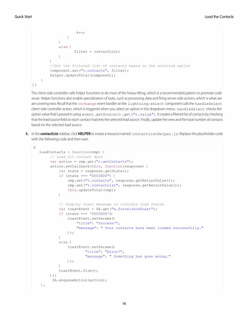
5. In the contactList sidebar, click HELPER to create a resource named contactListHelper.js. Replace the placeholder codewith the following code and then save.
({loadContacts : function(cmp) {
// Load all contact datavar action = cmp.get("c.getContacts");action.setCallback(this, function(response) {
var state = response.getState();if (state === "SUCCESS") {
cmp.set("v.contacts", response.getReturnValue());cmp.set("v.contactList", response.getReturnValue());this.updateTotal(cmp);
}
// Display toast message to indicate load statusvar toastEvent = $A.get("e.force:showToast");if (state === 'SUCCESS'){
toastEvent.setParams({"title": "Success!","message": " Your contacts have been loaded successfully."
});}else {
toastEvent.setParams({"title": "Error!","message": " Something has gone wrong."
});}toastEvent.fire();
});$A.enqueueAction(action);
},
14
Load the ContactsQuick Start
updateTotal: function(cmp) {var contacts = cmp.get("v.contacts");cmp.set("v.totalContacts", contacts.length);
}})
During initialization, the contactList component loads the contact data by:
• Calling the Apex controller method getContacts, which returns the contact data via a SOQL statement
• Setting the return value via cmp.set("v.contacts", response.getReturnValue()) in the action callback,which updates the view with the contact data
• Updating the total number of contacts in the view, which is evaluated in updateTotal
You must be wondering how your component works in Lightning Experience and the Salesforce app. Let’s find out next!
6. Make the contactList component available via a custom tab in Lightning Experience and the Salesforce app.
• Add Lightning Components as Custom Tabs in a Lightning Experience App
• Add Lightning Components as Custom Tabs in the Salesforce App
For this tutorial, we recommend that you add the component as a custom tab in Lightning Experience.
When your component is loaded in Lightning Experience or the Salesforce app, a toast message indicates that your contacts are loadedsuccessfully. Select a lead source from the dropdown menu and watch your contact list and the number of contacts update in the view.
Next, wire up an event that navigates to a contact record when you click a button in the contact list.
Fire the EventsFire the events in your client-side controller or helper functions. The force events are handled by Lightning Experience and theSalesforce mobile app, but let’s view and test the components in Lightning Experience to simplify things.
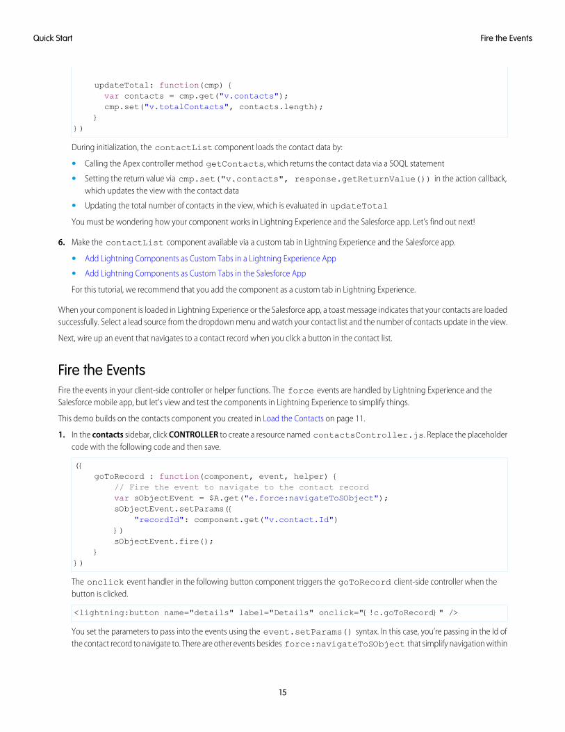
This demo builds on the contacts component you created in Load the Contacts on page 11.
1. In the contacts sidebar, click CONTROLLER to create a resource named contactsController.js. Replace the placeholdercode with the following code and then save.
({goToRecord : function(component, event, helper) {
// Fire the event to navigate to the contact recordvar sObjectEvent = $A.get("e.force:navigateToSObject");sObjectEvent.setParams({
"recordId": component.get("v.contact.Id")})sObjectEvent.fire();
}})
The onclick event handler in the following button component triggers the goToRecord client-side controller when thebutton is clicked.
<lightning:button name="details" label="Details" onclick="{!c.goToRecord}" />
You set the parameters to pass into the events using the event.setParams() syntax. In this case, you’re passing in the Id ofthe contact record to navigate to. There are other events besides force:navigateToSObject that simplify navigation within
15
Fire the EventsQuick Start
Lightning Experience and the Salesforce app. For more information, see Events Handled in the Salesforce Mobile App and LightningExperience.
2. To test the event, refresh your custom tab in Lightning Experience, and click the Details button.
The force:navigateToSObject is fired, which updates the view to display the contact record page.
We stepped through creating a component that loads contact data using a combination of client-side controllers and Apex controllermethods to create a custom UI with your Salesforce data. The possibilities of what you can do with Aura components are endless. Whilewe showed you how to surface a component via a tab in Lightning Experience and the Salesforce app, you can take this tutorial furtherby surfacing the component on record pages via the Lightning App Builder and even Communities. To explore the possibilities, blazethe trail with the resources available at Trailhead: Explore Lightning Components Resources.
16
Fire the EventsQuick Start
CHAPTER 3 Creating Components
Components are the functional units of the Lightning Component framework.In this chapter ...A component encapsulates a modular and potentially reusable section of UI, and can range in granularityfrom a single line of text to an entire application.
• Component Names
• Create AuraComponents in theDeveloper Console
• Component Markup
• ComponentNamespace
• Component Bundles
• Component IDs
• HTML in Components
• CSS in Components
• ComponentAttributes
• Using Expressions
• ComponentComposition
• Component Body
• Component Facets
• Controlling Access
• UsingObject-OrientedDevelopment
• Best Practices forConditional Markup
• Aura ComponentVersioning
• Components withMinimum API VersionRequirements
• Validations for AuraComponent Code
• Using Labels
• Localization
17
• ProvidingComponentDocumentation
• Working with BaseLightningComponents
• Working with UIComponents
• SupportingAccessibility
18
Creating Components
Component Names
A component name must follow the naming rules for Lightning components.
A component name must follow these naming rules:
• Must begin with a letter
• Must contain only alphanumeric or underscore characters
• Must be unique in the namespace
• Can’t include whitespace
• Can’t end with an underscore
• Can’t contain two consecutive underscores
SEE ALSO:
Create Aura Components in the Developer Console
Component Markup
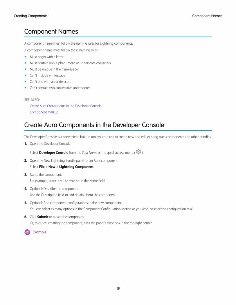
Create Aura Components in the Developer Console
The Developer Console is a convenient, built-in tool you can use to create new and edit existing Aura components and other bundles.
1. Open the Developer Console.
Select Developer Console from the Your Name or the quick access menu ( ).
2. Open the New Lightning Bundle panel for an Aura component.
Select File > New > Lightning Component.
3. Name the component.
For example, enter helloWorld in the Name field.
4. Optional: Describe the component.
Use the Description field to add details about the component.
5. Optional: Add component configurations to the new component.
You can select as many options in the Component Configuration section as you wish, or select no configuration at all.
6. Click Submit to create the component.
Or, to cancel creating the component, click the panel’s close box in the top right corner.
Example:
19
Component NamesCreating Components
IN THIS SECTION:
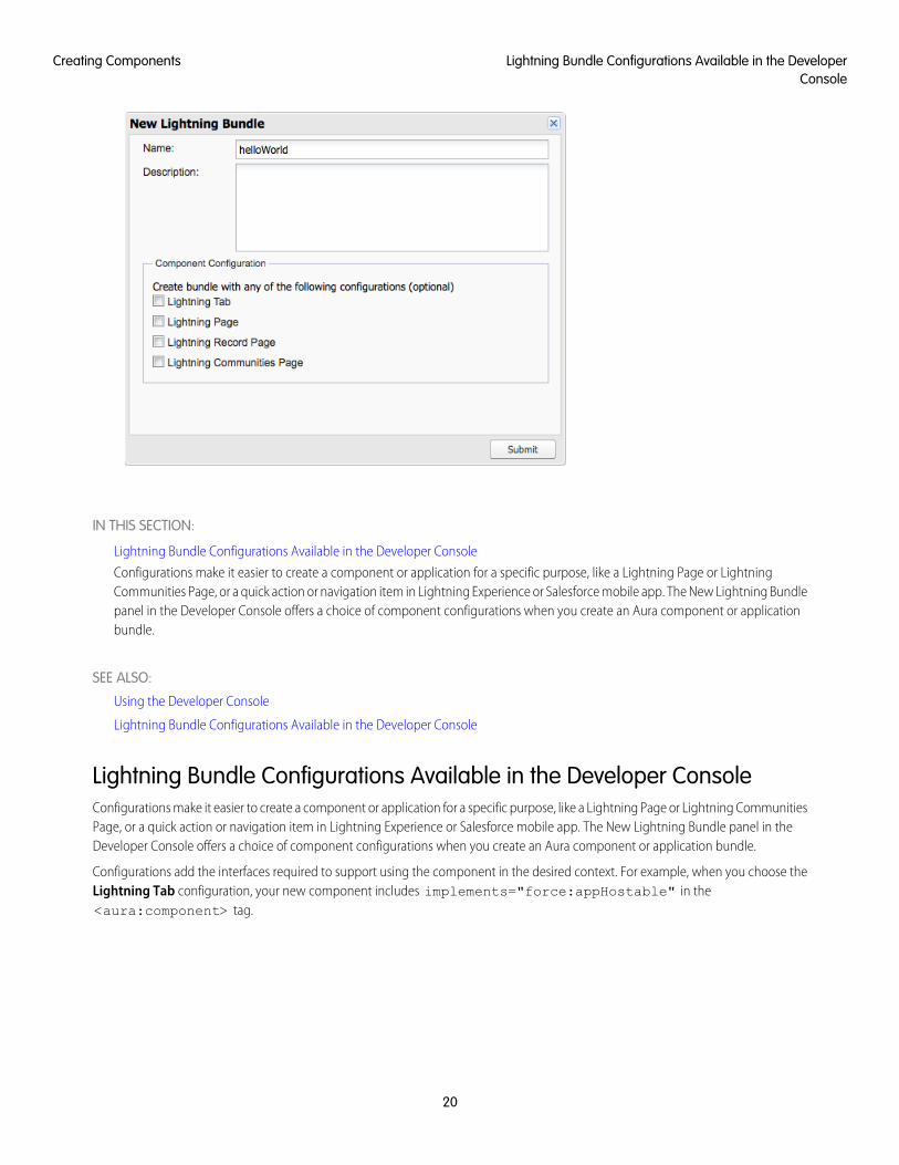
Lightning Bundle Configurations Available in the Developer Console
Configurations make it easier to create a component or application for a specific purpose, like a Lightning Page or LightningCommunities Page, or a quick action or navigation item in Lightning Experience or Salesforce mobile app. The New Lightning Bundlepanel in the Developer Console offers a choice of component configurations when you create an Aura component or applicationbundle.
SEE ALSO:
Using the Developer Console
Lightning Bundle Configurations Available in the Developer Console
Lightning Bundle Configurations Available in the Developer ConsoleConfigurations make it easier to create a component or application for a specific purpose, like a Lightning Page or Lightning CommunitiesPage, or a quick action or navigation item in Lightning Experience or Salesforce mobile app. The New Lightning Bundle panel in theDeveloper Console offers a choice of component configurations when you create an Aura component or application bundle.
Configurations add the interfaces required to support using the component in the desired context. For example, when you choose theLightning Tab configuration, your new component includes implements="force:appHostable" in the<aura:component> tag.
20
Lightning Bundle Configurations Available in the DeveloperConsole
Creating Components
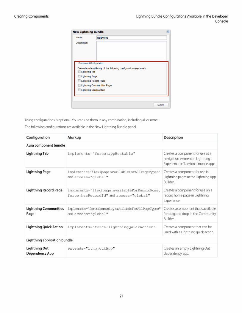
Using configurations is optional. You can use them in any combination, including all or none.
The following configurations are available in the New Lightning Bundle panel.
DescriptionMarkupConfiguration
Aura component bundle
Creates a component for use as anavigation element in LightningExperience or Salesforce mobile apps.
implements="force:appHostable"Lightning Tab
Creates a component for use inLightning pages or the Lightning AppBuilder.
implements="flexipage:availableForAllPageTypes"and access="global"
Lightning Page
Creates a component for use on arecord home page in LightningExperience.
implements="flexipage:availableForRecordHome,force:hasRecordId" and access="global"
Lightning Record Page
Creates a component that’s availablefor drag and drop in the CommunityBuilder.
implements="forceCommunity:availableForAllPageTypes"and access="global"
Lightning CommunitiesPage
Creates a component that can beused with a Lightning quick action.
implements="force:lightningQuickAction"Lightning Quick Action
Lightning application bundle
Creates an empty Lightning Outdependency app.
extends="ltng:outApp"Lightning OutDependency App
21
Lightning Bundle Configurations Available in the DeveloperConsole
Creating Components
Note: For details of the markup added by each configuration, see the respective documentation for those features.
SEE ALSO:
Create Aura Components in the Developer Console
Configure Components for Custom Tabs
Configure Components for Custom Actions
Configure Components for Lightning Pages and the Lightning App Builder
Configure Components for Lightning Experience Record Pages
Configure Components for Communities
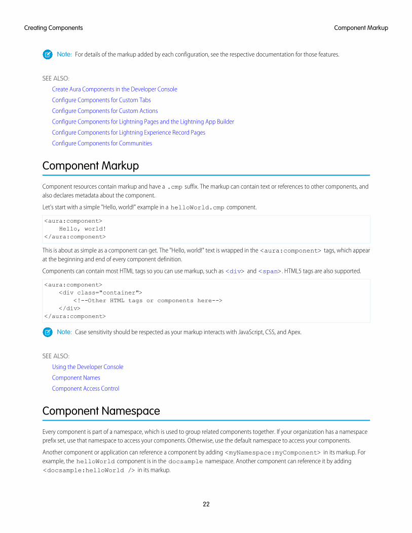
Component Markup
Component resources contain markup and have a .cmp suffix. The markup can contain text or references to other components, andalso declares metadata about the component.
Let's start with a simple "Hello, world!" example in a helloWorld.cmp component.
<aura:component>Hello, world!
</aura:component>
This is about as simple as a component can get. The "Hello, world!" text is wrapped in the <aura:component> tags, which appearat the beginning and end of every component definition.
Components can contain most HTML tags so you can use markup, such as <div> and <span>. HTML5 tags are also supported.
<aura:component><div class="container">
<!--Other HTML tags or components here--></div>
</aura:component>
Note: Case sensitivity should be respected as your markup interacts with JavaScript, CSS, and Apex.
SEE ALSO:
Using the Developer Console
Component Names
Component Access Control
Component Namespace
Every component is part of a namespace, which is used to group related components together. If your organization has a namespaceprefix set, use that namespace to access your components. Otherwise, use the default namespace to access your components.
Another component or application can reference a component by adding <myNamespace:myComponent> in its markup. Forexample, the helloWorld component is in the docsample namespace. Another component can reference it by adding<docsample:helloWorld /> in its markup.
22
Component MarkupCreating Components

Lightning components that Salesforce provides are grouped into several namespaces, such as aura, ui, and force. Componentsfrom third-party managed packages have namespaces from the providing organizations.
In your organization, you can choose to set a namespace prefix. If you do, that namespace is used for all of your Lightning components.A namespace prefix is required if you plan to offer managed packages on the AppExchange.
If you haven’t set a namespace prefix for your organization, use the default namespace c when referencing components that you’vecreated.
Namespaces in Code SamplesThe code samples throughout this guide use the default c namespace. Replace c with your namespace if you’ve set a namespaceprefix.
Using the Default Namespace in Organizations with No Namespace SetIf your organization hasn’t set a namespace prefix, use the default namespace c when referencing Lightning components that you’vecreated.
The following items must use the c namespace when your organization doesn’t have a namespace prefix set.
• References to components that you’ve created
• References to events that you’ve defined
The following items use an implicit namespace for your organization and don’t require you to specify a namespace.
• References to custom objects
• References to custom fields on standard and custom objects
• References to Apex controllers
See Namespace Usage Examples and Reference on page 24 for examples of all of the preceding items.
Using Your Organization’s NamespaceIf your organization has set a namespace prefix, use that namespace to reference Lightning components, events, custom objects andfields, and other items in your Lightning markup.
The following items use your organization’s namespace when your organization has a namespace prefix set.
• References to components that you’ve created
• References to events that you’ve defined
• References to custom objects
• References to custom fields on standard and custom objects
• References to Apex controllers
• References to static resources
Note: Support for the c namespace in organizations that have set a namespace prefix is incomplete. The following items canuse the c namespace if you prefer to use the shortcut, but it’s not currently a recommended practice.
• References to components that you’ve created when used in Lightning markup, but not in expressions or JavaScript
• References to events that you’ve defined when used in Lightning markup, but not in expressions or JavaScript
• References to custom objects when used in component and event type and default system attributes, but not inexpressions or JavaScript
23
Using the Default Namespace in Organizations with NoNamespace Set
Creating Components
See Namespace Usage Examples and Reference on page 24 for examples of the preceding items.
Using a Namespace in or from a Managed PackageAlways use the complete namespace when referencing items from a managed package, or when creating code that you intend todistribute in your own managed packages.
Creating a Namespace in Your OrganizationCreate a namespace for your organization by registering a namespace prefix.
If you’re not creating managed packages for distribution then registering a namespace prefix isn’t required, but it’s a best practice forall but the smallest organizations.
Your namespace prefix must:
• Begin with a letter
• Contain one to 15 alphanumeric characters
• Not contain two consecutive underscores
For example, myNp123 and my_np are valid namespaces, but 123Company and my__np aren’t.
To register a namespace prefix:
1. From Setup, enter Packages in the Quick Find box. Under Create, select Packages.
Note: This item is only available in Salesforce Classic.
2. In the Developer Settings panel, click Edit.
Note: This button doesn’t appear if you’ve already configured your developer settings.
3. Review the selections that are required for configuring developer settings, and then click Continue.
4. Enter the namespace prefix you want to register.
5. Click Check Availability to determine if the namespace prefix is already in use.
6. If the namespace prefix that you entered isn’t available, repeat the previous two steps.
7. Click Review My Selections.
8. Click Save.
Namespace Usage Examples and ReferenceThis topic provides examples of referencing components, objects, fields, and so on in Aura components code.
Examples are provided for the following.
• Components, events, and interfaces in your organization
• Custom objects in your organization
• Custom fields on standard and custom objects in your organization
• Server-side Apex controllers in your organization
• Dynamic creation of components in JavaScript
• Static resources in your organization
24
Using a Namespace in or from a Managed PackageCreating Components
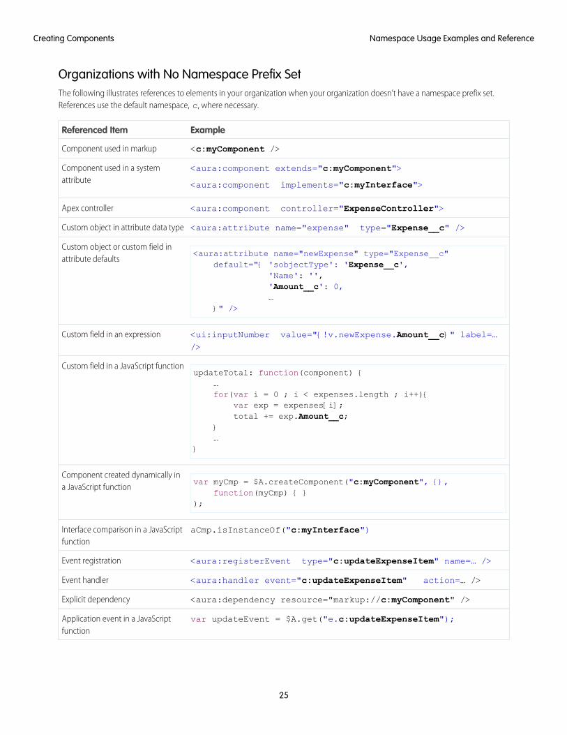
Organizations with No Namespace Prefix SetThe following illustrates references to elements in your organization when your organization doesn’t have a namespace prefix set.References use the default namespace, c, where necessary.
ExampleReferenced Item
<c:myComponent />Component used in markup
<aura:component extends="c:myComponent">
<aura:component implements="c:myInterface">
Component used in a systemattribute
<aura:component controller="ExpenseController">Apex controller
<aura:attribute name="expense" type="Expense__c" />Custom object in attribute data type
<aura:attribute name="newExpense" type="Expense__c"default="{ 'sobjectType': 'Expense__c',
Custom object or custom field inattribute defaults
'Name': '','Amount__c': 0,…
}" />
<ui:inputNumber value="{!v.newExpense.Amount__c}" label=…/>
Custom field in an expression
updateTotal: function(component) {…
Custom field in a JavaScript function
for(var i = 0 ; i < expenses.length ; i++){var exp = expenses[i];total += exp.Amount__c;
}…
}
var myCmp = $A.createComponent("c:myComponent", {},function(myCmp) { }
);
Component created dynamically ina JavaScript function
aCmp.isInstanceOf("c:myInterface")Interface comparison in a JavaScriptfunction
<aura:registerEvent type="c:updateExpenseItem" name=… />Event registration
<aura:handler event="c:updateExpenseItem" action=… />Event handler
<aura:dependency resource="markup://c:myComponent" />Explicit dependency
var updateEvent = $A.get("e.c:updateExpenseItem");Application event in a JavaScriptfunction
25
Namespace Usage Examples and ReferenceCreating Components
ExampleReferenced Item
<ltng:require scripts="{!$Resource.resourceName}"styles="{!$Resource.resourceName}" />
Static resources
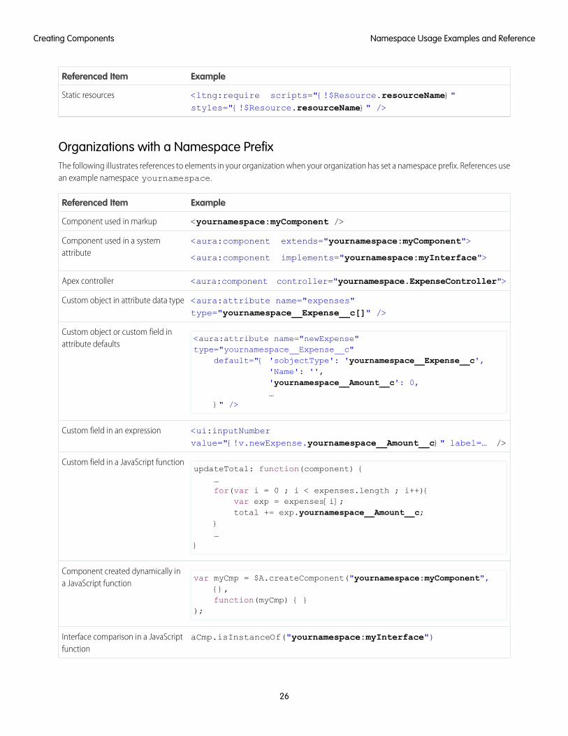
Organizations with a Namespace PrefixThe following illustrates references to elements in your organization when your organization has set a namespace prefix. References usean example namespace yournamespace.
ExampleReferenced Item
<yournamespace:myComponent />Component used in markup
<aura:component extends="yournamespace:myComponent">
<aura:component implements="yournamespace:myInterface">
Component used in a systemattribute
<aura:component controller="yournamespace.ExpenseController">Apex controller
<aura:attribute name="expenses"type="yournamespace__Expense__c[]" />
Custom object in attribute data type
<aura:attribute name="newExpense"type="yournamespace__Expense__c"
Custom object or custom field inattribute defaults
default="{ 'sobjectType': 'yournamespace__Expense__c','Name': '','yournamespace__Amount__c': 0,…
}" />
<ui:inputNumbervalue="{!v.newExpense.yournamespace__Amount__c}" label=… />
Custom field in an expression
updateTotal: function(component) {…
Custom field in a JavaScript function
for(var i = 0 ; i < expenses.length ; i++){var exp = expenses[i];total += exp.yournamespace__Amount__c;
}…
}
var myCmp = $A.createComponent("yournamespace:myComponent",{},
Component created dynamically ina JavaScript function
function(myCmp) { });
aCmp.isInstanceOf("yournamespace:myInterface")Interface comparison in a JavaScriptfunction
26
Namespace Usage Examples and ReferenceCreating Components
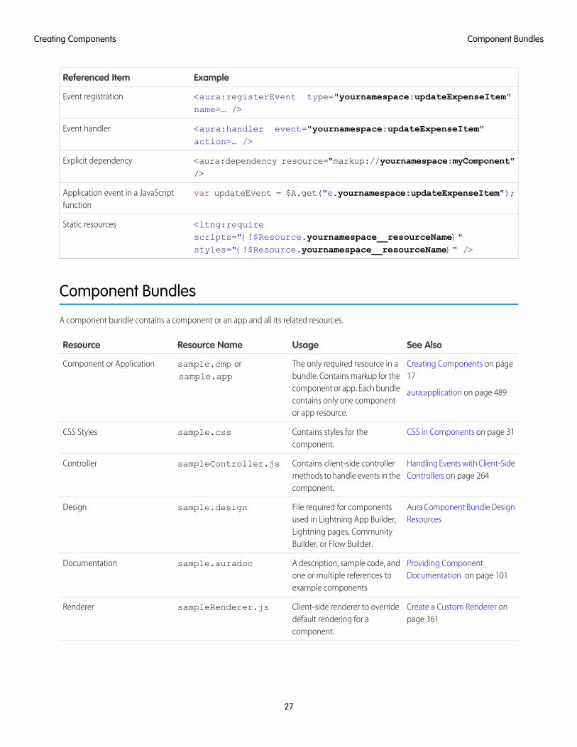
ExampleReferenced Item
<aura:registerEvent type="yournamespace:updateExpenseItem"name=… />
Event registration
<aura:handler event="yournamespace:updateExpenseItem"action=… />
Event handler
<aura:dependency resource="markup://yournamespace:myComponent"/>
Explicit dependency
var updateEvent = $A.get("e.yournamespace:updateExpenseItem");Application event in a JavaScriptfunction
<ltng:requirescripts="{!$Resource.yournamespace__resourceName}"styles="{!$Resource.yournamespace__resourceName}" />
Static resources
Component Bundles
A component bundle contains a component or an app and all its related resources.
See AlsoUsageResource NameResource
Creating Components on page17
aura:application on page 489
The only required resource in abundle. Contains markup for thecomponent or app. Each bundlecontains only one componentor app resource.
sample.cmp orsample.app
Component or Application
CSS in Components on page 31Contains styles for thecomponent.
sample.cssCSS Styles
Handling Events with Client-SideControllers on page 264
Contains client-side controllermethods to handle events in thecomponent.
sampleController.jsController
Aura Component Bundle DesignResources
File required for componentsused in Lightning App Builder,Lightning pages, CommunityBuilder, or Flow Builder.
sample.designDesign
Providing ComponentDocumentation on page 101
A description, sample code, andone or multiple references toexample components
sample.auradocDocumentation
Create a Custom Renderer onpage 361
Client-side renderer to overridedefault rendering for acomponent.
sampleRenderer.jsRenderer
27
Component BundlesCreating Components
See AlsoUsageResource NameResource
Sharing JavaScript Code in aComponent Bundle on page 345
JavaScript functions that can becalled from any JavaScript codein a component’s bundle
sampleHelper.jsHelper
Configure Components forLightning Pages and the
Custom icon resource forcomponents used in the
sample.svgSVG File
Lightning App Builder on page174
Lightning App Builder orCommunity Builder.
All resources in the component bundle follow the naming convention and are auto-wired. For example, a controller<componentName>Controller.js is auto-wired to its component, which means that you can use the controller within thescope of that component.
Component IDs
A component has two types of IDs: a local ID and a global ID. You can retrieve a component using its local ID in your JavaScript code. Aglobal ID can be useful to differentiate between multiple instances of a component or for debugging purposes.
Local IDsA local ID is an ID that is only scoped to the component. A local ID is often unique but it’s not required to be unique.
Create a local ID by using the aura:id attribute. For example:
<lightning:button aura:id="button1" label="button1"/>
Note: aura:id doesn't support expressions. You can only assign literal string values to aura:id.
Find the button component by calling cmp.find("button1") in your client-side controller, where cmp is a reference to thecomponent containing the button.
find() returns different types depending on the result.
• If the local ID is unique, find() returns the component.
• If there are multiple components with the same local ID, find() returns an array of the components.
• If there is no matching local ID, find() returns undefined.
To find the local ID for a component in JavaScript, use cmp.getLocalId().
Global IDsEvery component has a unique globalId, which is the generated runtime-unique ID of the component instance. A global ID (1) isnot guaranteed to be the same beyond the lifetime of a component, so it should never be relied on. A global ID can be useful todifferentiate between multiple instances of a component or for debugging purposes.
28
Component IDsCreating Components
To create a unique ID for an HTML element, you can use the globalId as a prefix or suffix for your element. For example:
<div id="{!globalId + '_footer'}"></div>
In your browser’s developer console, retrieve the element using document.getElementById("<globalId>_footer"),where <globalId> is the generated runtime-unique ID.
To retrieve a component’s global ID in JavaScript, use the getGlobalId() function.
var globalId = cmp.getGlobalId();
SEE ALSO:
Finding Components by ID
Which Button Was Pressed?
HTML in Components
An HTML tag is treated as a first-class component by the framework. Each HTML tag is translated into an <aura:html> component,allowing it to enjoy the same rights and privileges as any other component.
For example, the framework automatically converts a standard HTML <div> tag to this component:
<aura:html tag="div" />
You can add HTML markup in components. Note that you must use strict XHTML. For example, use <br/> instead of <br>. You canalso use HTML attributes and DOM events, such as onclick.
Warning: Some tags, like <applet> and <font>, aren’t supported.
Unescaping HTMLTo output pre-formatted HTML, use aura:unescapedHTML. For example, this is useful if you want to display HTML that is generatedon the server and add it to the DOM. You must escape any HTML if necessary or your app might be exposed to security vulnerabilities.
You can pass in values from an expression, such as in <aura:unescapedHtml value="{!v.note.body}"/>.
{!expression} is the framework's expression syntax. For more information, see Using Expressions on page 42.
29
HTML in ComponentsCreating Components
IN THIS SECTION:
Supported HTML Tags
The framework supports most HTML tags, including the majority of HTML5 tags.
SEE ALSO:
Supported HTML Tags
CSS in Components
Supported HTML TagsThe framework supports most HTML tags, including the majority of HTML5 tags.
We recommend that you use components in preference to HTML tags. For example, use lightning:button instead of <button>.
Components are designed with accessibility in mind so users with disabilities or those who use assistive technologies can also use yourapp. When you start building more complex components, the reusable out-of-the-box components can simplify your job by handlingsome of the plumbing that you would otherwise have to create yourself. Also, these components are secure and optimized for performance.
Note that you must use strict XHTML. For example, use <br/> instead of <br>.
Some HTML tags are unsafe or unnecessary. The framework doesn’t support these tags.
The HtmlTag enum in this Aura file lists the supported HTML tags. Any tag followed by (false) is not supported. For example,applet(false) means the applet tag isn't supported.
IN THIS SECTION:
Anchor Tag: <a>
Don’t hard code or dynamically generate Salesforce URLs in the href attribute of an <a> tag. Use events, such asforce:navigateToSObject or force:navigateToURL, instead.
SEE ALSO:
Supporting Accessibility
Anchor Tag: <a>Don’t hard code or dynamically generate Salesforce URLs in the href attribute of an <a> tag. Use events, such asforce:navigateToSObject or force:navigateToURL, instead.
Avoid the href Attribute
Using the href attribute of an <a> tag leads to inconsistent behavior in different apps and shouldn’t be relied on. For example, don’tuse this markup to link to a record:
<a href="/XXXXXXXXXXXXXXXXXX">Salesforce record ID (DON'T DO THIS)</a>
If you use # in the href attribute, a secondary issue occurs. The hash mark (#) is a URL fragment identifier and is often used in Webdevelopment for navigation within a page. Avoid # in the href attribute of anchor tags in Lightning components as it can causeunexpected navigation changes, especially in the Salesforce app. That’s another reason not to use href.
30
Supported HTML TagsCreating Components
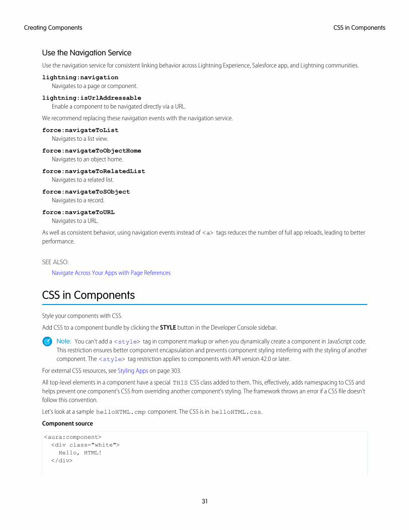
Use the Navigation ServiceUse the navigation service for consistent linking behavior across Lightning Experience, Salesforce app, and Lightning communities.
lightning:navigationNavigates to a page or component.
lightning:isUrlAddressableEnable a component to be navigated directly via a URL.
We recommend replacing these navigation events with the navigation service.
force:navigateToListNavigates to a list view.
force:navigateToObjectHomeNavigates to an object home.
force:navigateToRelatedListNavigates to a related list.
force:navigateToSObjectNavigates to a record.
force:navigateToURLNavigates to a URL.
As well as consistent behavior, using navigation events instead of <a> tags reduces the number of full app reloads, leading to betterperformance.
SEE ALSO:
Navigate Across Your Apps with Page References
CSS in Components
Style your components with CSS.
Add CSS to a component bundle by clicking the STYLE button in the Developer Console sidebar.
Note: You can’t add a <style> tag in component markup or when you dynamically create a component in JavaScript code.This restriction ensures better component encapsulation and prevents component styling interfering with the styling of anothercomponent. The <style> tag restriction applies to components with API version 42.0 or later.
For external CSS resources, see Styling Apps on page 303.
All top-level elements in a component have a special THIS CSS class added to them. This, effectively, adds namespacing to CSS andhelps prevent one component's CSS from overriding another component's styling. The framework throws an error if a CSS file doesn'tfollow this convention.
Let's look at a sample helloHTML.cmp component. The CSS is in helloHTML.css.
Component source
<aura:component><div class="white">Hello, HTML!
</div>
31
CSS in ComponentsCreating Components

<h2>Check out the style in this list.</h2>
<ul><li class="red">I'm red.</li><li class="blue">I'm blue.</li><li class="green">I'm green.</li>
</ul></aura:component>
CSS source
.THIS {background-color: grey;
}
.THIS.white {background-color: white;
}
.THIS .red {background-color: red;
}
.THIS .blue {background-color: blue;
}
.THIS .green {background-color: green;
}
Output
The top-level elements, h2 and ul, match the THIS class and render with a grey background. Top-level elements are tags wrappedby the HTML body tag and not by any other tags. In this example, the li tags are not top-level because they are nested in a ul tag.
The <div class="white"> element matches the .THIS.white selector and renders with a white background. Note thatthere is no space in the selector as this rule is for top-level elements.
The <li class="red"> element matches the .THIS .red selector and renders with a red background. Note that this is adescendant selector and it contains a space as the <li> element is not a top-level element.
SEE ALSO:
Adding and Removing Styles
HTML in Components
32
CSS in ComponentsCreating Components
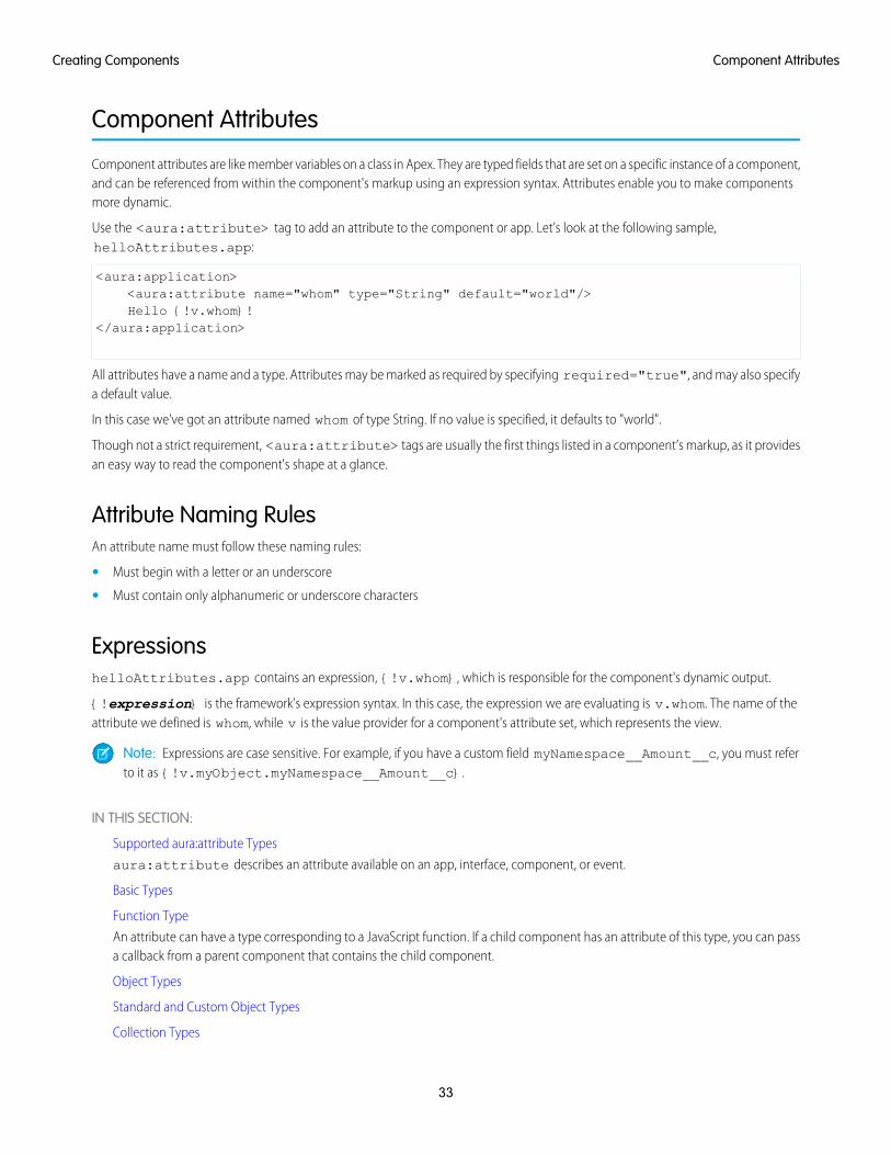
Component Attributes
Component attributes are like member variables on a class in Apex. They are typed fields that are set on a specific instance of a component,and can be referenced from within the component's markup using an expression syntax. Attributes enable you to make componentsmore dynamic.
Use the <aura:attribute> tag to add an attribute to the component or app. Let’s look at the following sample,helloAttributes.app:
<aura:application><aura:attribute name="whom" type="String" default="world"/>Hello {!v.whom}!
</aura:application>
All attributes have a name and a type. Attributes may be marked as required by specifying required="true", and may also specifya default value.
In this case we've got an attribute named whom of type String. If no value is specified, it defaults to "world".
Though not a strict requirement, <aura:attribute> tags are usually the first things listed in a component’s markup, as it providesan easy way to read the component's shape at a glance.
Attribute Naming RulesAn attribute name must follow these naming rules:
• Must begin with a letter or an underscore
• Must contain only alphanumeric or underscore characters
ExpressionshelloAttributes.app contains an expression, {!v.whom}, which is responsible for the component's dynamic output.
{!expression} is the framework's expression syntax. In this case, the expression we are evaluating is v.whom. The name of theattribute we defined is whom, while v is the value provider for a component's attribute set, which represents the view.
Note: Expressions are case sensitive. For example, if you have a custom field myNamespace__Amount__c, you must referto it as {!v.myObject.myNamespace__Amount__c}.
IN THIS SECTION:
Supported aura:attribute Types
aura:attribute describes an attribute available on an app, interface, component, or event.
Basic Types
Function Type
An attribute can have a type corresponding to a JavaScript function. If a child component has an attribute of this type, you can passa callback from a parent component that contains the child component.
Object Types
Standard and Custom Object Types
Collection Types
33
Component AttributesCreating Components
Custom Apex Class Types
Framework-Specific Types
SEE ALSO:
Supported aura:attribute Types
Using Expressions
Supported aura:attribute Typesaura:attribute describes an attribute available on an app, interface, component, or event.
DescriptionTypeAttribute Name
Indicates whether the attribute can be used outside of its own namespace.Possible values are public (default), and global, and private.
Stringaccess
Required. The name of the attribute. For example, if you set<aura:attribute name="isTrue" type="Boolean" />
Stringname
on a component called aura:newCmp, you can set this attribute when youinstantiate the component; for example,<aura:newCmpisTrue="false" />.
Required. The type of the attribute. For a list of basic types supported, see BasicTypes.
Stringtype
The default value for the attribute, which can be overwritten as needed. Whensetting a default value, expressions using the $Label, $Locale, and
Stringdefault
$Browser global value providers are supported. Alternatively, to set adynamic default, use an init event. See Invoking Actions on ComponentInitialization on page 344.
Determines if the attribute is required. The default is false.Booleanrequired
A summary of the attribute and its usage.Stringdescription
All <aura:attribute> tags have name and type values. For example:
<aura:attribute name="whom" type="String" />
Note: Although type values are case insensitive, case sensitivity should be respected as your markup interacts with JavaScript,CSS, and Apex.
SEE ALSO:
Component Attributes
34
Supported aura:attribute TypesCreating Components
Basic TypesHere are the supported basic type values. Some of these types correspond to the wrapper objects for primitives in Java. Since theframework is written in Java, defaults, such as maximum size for a number, for these basic types are defined by the Java objects thatthey map to.
DescriptionExampletype
Valid values are true or false. To set a default valueof true, add default="true".
<aura:attributename="showDetail"type="Boolean" />
Boolean
A date corresponding to a calendar day in the formatyyyy-mm-dd. The hh:mm:ss portion of the date is not stored.To include time fields, use DateTime instead.
<aura:attributename="startDate" type="Date"/>
Date
A date corresponding to a timestamp. It includes date andtime details with millisecond precision.
<aura:attributename="lastModifiedDate"type="DateTime" />
DateTime
Decimal values can contain fractional portions (digits tothe right of the decimal). Maps to java.math.BigDecimal.
Decimal is better than Double for maintainingprecision for floating-point calculations. It’s preferable forcurrency fields.
<aura:attributename="totalPrice"type="Decimal" />
Decimal
Double values can contain fractional portions. Maps tojava.lang.Double. Use Decimal for currency fields instead.
<aura:attributename="widthInchesFractional"type="Double" />
Double
Integer values can contain numbers with no fractionalportion. Maps to java.lang.Integer, which defines its limits,such as maximum size.
<aura:attributename="numRecords"type="Integer" />
Integer
Long values can contain numbers with no fractionalportion. Maps to java.lang.Long, which defines its limits,such as maximum size.
Use this data type when you need a range of values widerthan those provided by Integer.
<aura:attributename="numSwissBankAccount"type="Long" />
Long
A sequence of characters.<aura:attribute name="message"type="String" />
String
You can use arrays for each of these basic types. For example:
<aura:attribute name="favoriteColors" type="String[]" default="['red','green','blue']" />
35
Basic TypesCreating Components
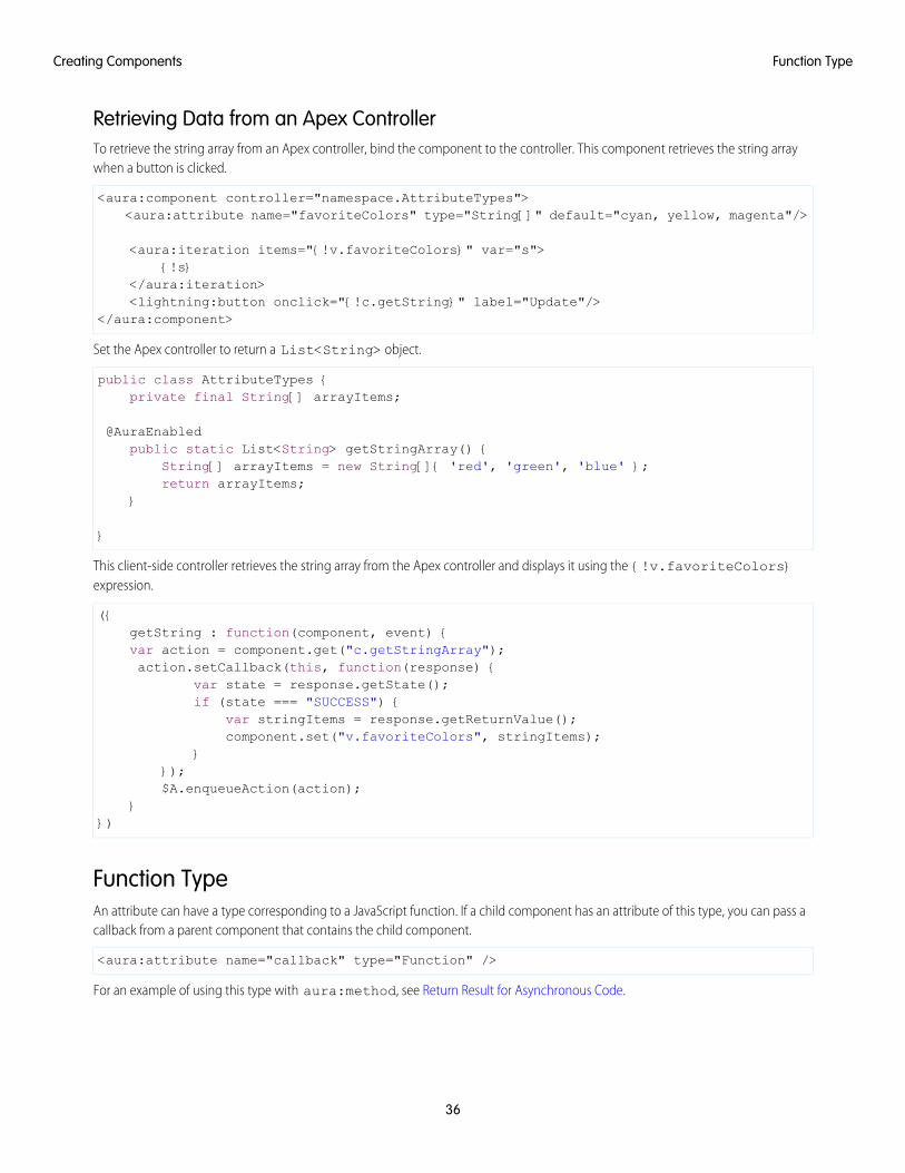
Retrieving Data from an Apex ControllerTo retrieve the string array from an Apex controller, bind the component to the controller. This component retrieves the string arraywhen a button is clicked.
<aura:component controller="namespace.AttributeTypes"><aura:attribute name="favoriteColors" type="String[]" default="cyan, yellow, magenta"/>
<aura:iteration items="{!v.favoriteColors}" var="s">{!s}
</aura:iteration><lightning:button onclick="{!c.getString}" label="Update"/>
</aura:component>
Set the Apex controller to return a List<String> object.
public class AttributeTypes {private final String[] arrayItems;
@AuraEnabledpublic static List<String> getStringArray() {
String[] arrayItems = new String[]{ 'red', 'green', 'blue' };return arrayItems;
}
}
This client-side controller retrieves the string array from the Apex controller and displays it using the {!v.favoriteColors}expression.
({getString : function(component, event) {var action = component.get("c.getStringArray");action.setCallback(this, function(response) {
var state = response.getState();if (state === "SUCCESS") {
var stringItems = response.getReturnValue();component.set("v.favoriteColors", stringItems);
}});$A.enqueueAction(action);
}})
Function TypeAn attribute can have a type corresponding to a JavaScript function. If a child component has an attribute of this type, you can pass acallback from a parent component that contains the child component.
<aura:attribute name="callback" type="Function" />
For an example of using this type with aura:method, see Return Result for Asynchronous Code.
36
Function TypeCreating Components
Note: Don’t send attributes with type="Function" to the server. These attributes are intended to only be used on theclient side.
The most robust way to communicate between components is to use an event. If you get an error in a component with an attributeof type Function, fire an event in the child component instead and handle it in the parent component.
Object TypesAn attribute can have a type corresponding to an Object. For example:
<aura:attribute name="data" type="Object" />
Warning: We recommend using type="Map" instead of type="Object" to avoid some deserialization issues on theserver. For example, when an attribute of type="Object" is serialized to the server, everything is converted to a string. Deepexpressions, such as v.data.property can throw an exception when they are evaluated as a string on the server. Usingtype="Map" avoids these exceptions for deep expressions, and other deserialization issues.
Checking for TypesTo determine a variable type, use typeof or a standard JavaScript method instead. The instanceof operator is unreliable due tothe potential presence of multiple windows or frames.
SEE ALSO:
Using Apex to Work with Salesforce Records
Using Apex to Work with Salesforce Records
Standard and Custom Object TypesAn attribute can have a type corresponding to a standard or custom object. For example, this is an attribute for a standard Accountobject:
<aura:attribute name="acct" type="Account" />
This is an attribute for an Expense__c custom object:
<aura:attribute name="expense" type="Expense__c" />
Note: A user must have at least Read access to the object specified in the attribute type. Otherwise, the component doesn't load.
SEE ALSO:
Using Apex to Work with Salesforce Records
Using Apex to Work with Salesforce Records
Collection TypesHere are the supported collection type values.
37
Object TypesCreating Components
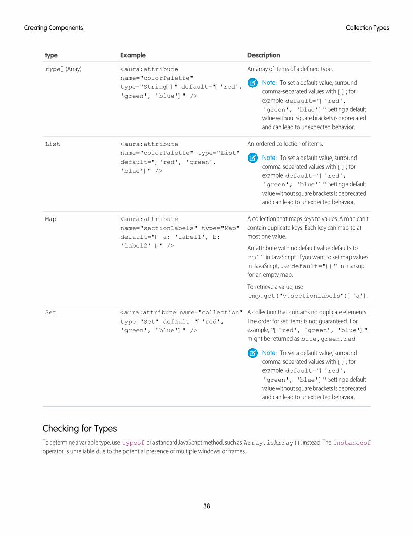
DescriptionExampletype
An array of items of a defined type.<aura:attributename="colorPalette"
type[] (Array)
Note: To set a default value, surroundcomma-separated values with []; for
type="String[]" default="['red','green', 'blue']" />
example default="['red','green', 'blue']". Setting a defaultvalue without square brackets is deprecatedand can lead to unexpected behavior.
An ordered collection of items.<aura:attributename="colorPalette" type="List"
List
Note: To set a default value, surroundcomma-separated values with []; for
default="['red', 'green','blue']" />
example default="['red','green', 'blue']". Setting a defaultvalue without square brackets is deprecatedand can lead to unexpected behavior.
A collection that maps keys to values. A map can’tcontain duplicate keys. Each key can map to atmost one value.
An attribute with no default value defaults tonull in JavaScript. If you want to set map values
<aura:attributename="sectionLabels" type="Map"default="{ a: 'label1', b:'label2' }" />
Map
in JavaScript, use default="{}" in markupfor an empty map.
To retrieve a value, usecmp.get("v.sectionLabels")['a'].
A collection that contains no duplicate elements.The order for set items is not guaranteed. For
<aura:attribute name="collection"type="Set" default="['red','green', 'blue']" />
Set
example, "['red', 'green', 'blue']"might be returned as blue,green,red.
Note: To set a default value, surroundcomma-separated values with []; forexample default="['red','green', 'blue']". Setting a defaultvalue without square brackets is deprecatedand can lead to unexpected behavior.
Checking for TypesTo determine a variable type, use typeof or a standard JavaScript method, such as Array.isArray(), instead. The instanceofoperator is unreliable due to the potential presence of multiple windows or frames.
38
Collection TypesCreating Components
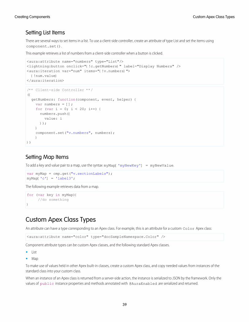
Setting List ItemsThere are several ways to set items in a list. To use a client-side controller, create an attribute of type List and set the items usingcomponent.set().
This example retrieves a list of numbers from a client-side controller when a button is clicked.
<aura:attribute name="numbers" type="List"/><lightning:button onclick="{!c.getNumbers}" label="Display Numbers" /><aura:iteration var="num" items="{!v.numbers}">{!num.value}
</aura:iteration>
/** Client-side Controller **/({getNumbers: function(component, event, helper) {var numbers = [];for (var i = 0; i < 20; i++) {numbers.push({value: i
});}component.set("v.numbers", numbers);}
})
Setting Map ItemsTo add a key and value pair to a map, use the syntax myMap['myNewKey'] = myNewValue.
var myMap = cmp.get("v.sectionLabels");myMap['c'] = 'label3';
The following example retrieves data from a map.
for (var key in myMap){//do something
}
Custom Apex Class TypesAn attribute can have a type corresponding to an Apex class. For example, this is an attribute for a custom Color Apex class:
<aura:attribute name="color" type="docSampleNamespace.Color" />
Component attribute types can be custom Apex classes, and the following standard Apex classes.
• List
• Map
To make use of values held in other Apex built-in classes, create a custom Apex class, and copy needed values from instances of thestandard class into your custom class.
When an instance of an Apex class is returned from a server-side action, the instance is serialized to JSON by the framework. Only thevalues of public instance properties and methods annotated with @AuraEnabled are serialized and returned.
39
Custom Apex Class TypesCreating Components
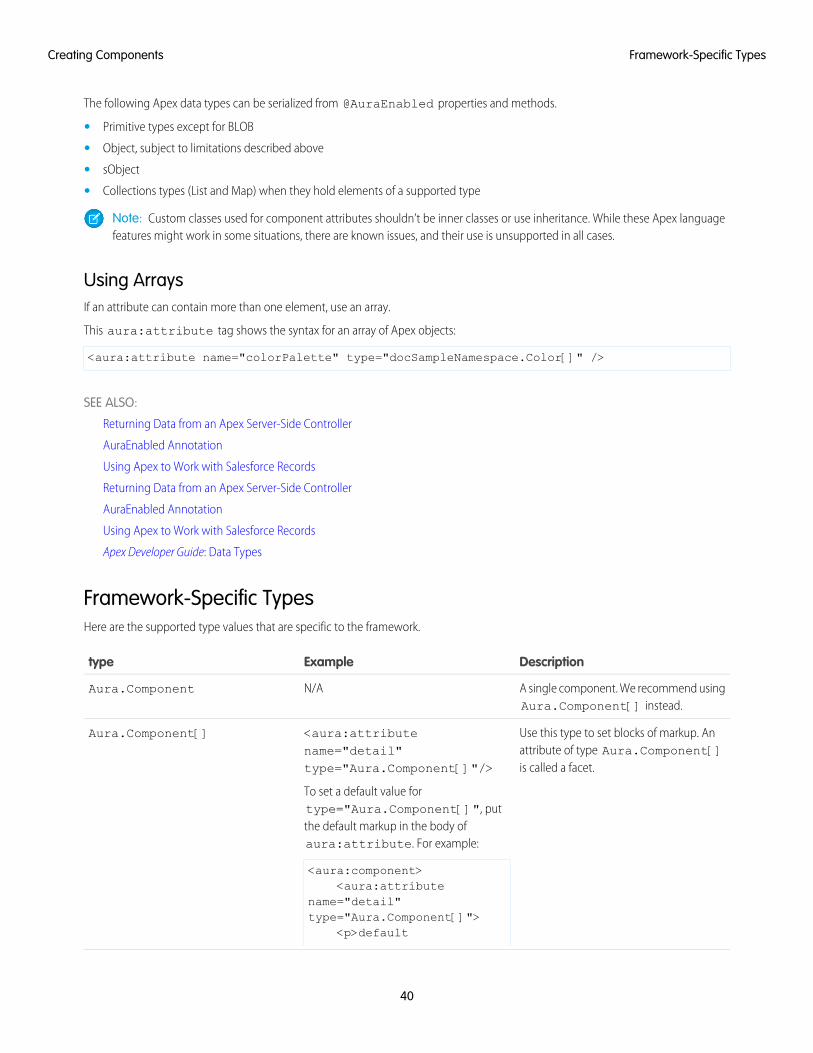
The following Apex data types can be serialized from @AuraEnabled properties and methods.
• Primitive types except for BLOB
• Object, subject to limitations described above
• sObject
• Collections types (List and Map) when they hold elements of a supported type
Note: Custom classes used for component attributes shouldn’t be inner classes or use inheritance. While these Apex languagefeatures might work in some situations, there are known issues, and their use is unsupported in all cases.
Using ArraysIf an attribute can contain more than one element, use an array.
This aura:attribute tag shows the syntax for an array of Apex objects:
<aura:attribute name="colorPalette" type="docSampleNamespace.Color[]" />
SEE ALSO:
Returning Data from an Apex Server-Side Controller
AuraEnabled Annotation
Using Apex to Work with Salesforce Records
Returning Data from an Apex Server-Side Controller
AuraEnabled Annotation
Using Apex to Work with Salesforce Records
Apex Developer Guide: Data Types
Framework-Specific TypesHere are the supported type values that are specific to the framework.
DescriptionExampletype
A single component. We recommend usingAura.Component[] instead.
N/AAura.Component
Use this type to set blocks of markup. Anattribute of type Aura.Component[]is called a facet.
<aura:attributename="detail"type="Aura.Component[]"/>
To set a default value fortype="Aura.Component[]", put
Aura.Component[]
the default markup in the body ofaura:attribute. For example:
<aura:component><aura:attribute
name="detail"type="Aura.Component[]">
<p>default
40
Framework-Specific TypesCreating Components
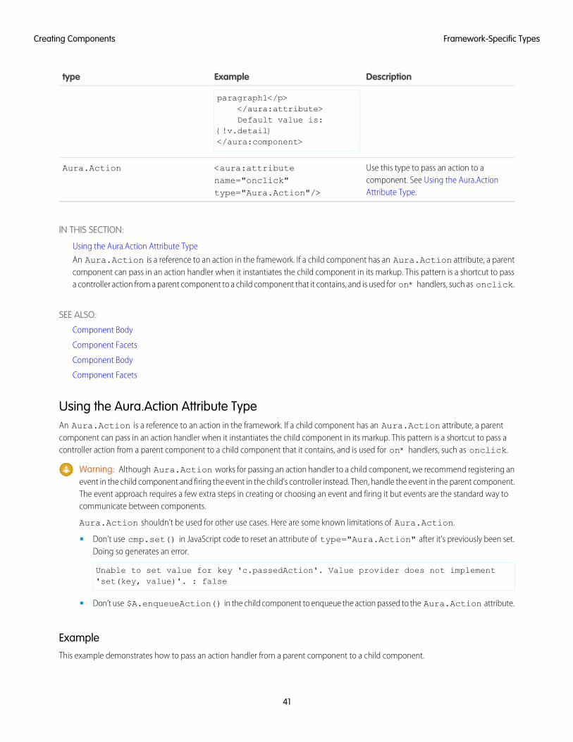
DescriptionExampletype
paragraph1</p></aura:attribute>Default value is:
{!v.detail}</aura:component>
Use this type to pass an action to acomponent. See Using the Aura.ActionAttribute Type.
<aura:attributename="onclick"type="Aura.Action"/>
Aura.Action
IN THIS SECTION:
Using the Aura.Action Attribute Type
An Aura.Action is a reference to an action in the framework. If a child component has an Aura.Action attribute, a parentcomponent can pass in an action handler when it instantiates the child component in its markup. This pattern is a shortcut to passa controller action from a parent component to a child component that it contains, and is used for on* handlers, such as onclick.
SEE ALSO:
Component Body
Component Facets
Component Body
Component Facets
Using the Aura.Action Attribute TypeAn Aura.Action is a reference to an action in the framework. If a child component has an Aura.Action attribute, a parentcomponent can pass in an action handler when it instantiates the child component in its markup. This pattern is a shortcut to pass acontroller action from a parent component to a child component that it contains, and is used for on* handlers, such as onclick.
Warning: Although Aura.Action works for passing an action handler to a child component, we recommend registering anevent in the child component and firing the event in the child’s controller instead. Then, handle the event in the parent component.The event approach requires a few extra steps in creating or choosing an event and firing it but events are the standard way tocommunicate between components.
Aura.Action shouldn’t be used for other use cases. Here are some known limitations of Aura.Action.
• Don’t use cmp.set() in JavaScript code to reset an attribute of type="Aura.Action" after it’s previously been set.Doing so generates an error.
Unable to set value for key 'c.passedAction'. Value provider does not implement'set(key, value)'. : false
• Don’t use $A.enqueueAction() in the child component to enqueue the action passed to the Aura.Action attribute.
ExampleThis example demonstrates how to pass an action handler from a parent component to a child component.
41
Framework-Specific TypesCreating Components

Here’s the child component with the Aura.Action attribute. The onclick handler for the button uses the value of the onclickattribute, which has type of Aura.Action.
<!-- child.cmp --><aura:component>
<aura:attribute name="onclick" type="Aura.Action"/>
<p>Child component with Aura.Action attribute</p><lightning:button label="Execute the passed action" onclick="{!v.onclick}"/>
</aura:component>
Here’s the parent component that contains the child component in its markup.
<!-- parent.cmp --><aura:component>
<p>Parent component passes handler action to c:child</p><c:child onclick="{!c.parentAction}"/>
</aura:component>
When you click the button in c:child, the parentAction action in the controller of c:parent is executed.
Instead of an Aura.Action attribute, you could use <aura:registerEvent> to register an onclick event in the childcomponent. You’d have to define the event and create an action in the child’s controller to fire the event. This event-based approachrequires a few extra steps but it’s more in line with standard practices for communicating between components.
SEE ALSO:
Framework-Specific Types
Handling Events with Client-Side Controllers
Framework-Specific Types
Handling Events with Client-Side Controllers
Using Expressions
Expressions allow you to make calculations and access property values and other data within component markup. Use expressions fordynamic output or passing values into components by assigning them to attributes.
An expression is any set of literal values, variables, sub-expressions, or operators that can be resolved to a single value. Method calls arenot allowed in expressions.
The expression syntax is: {!expression}
expression is a placeholder for the expression.
Anything inside the {! } delimiters is evaluated and dynamically replaced when the component is rendered or when the value isused by the component. Whitespace is ignored.
Note: If you're familiar with other languages, you may be tempted to read the ! as the “bang” operator, which negates booleanvalues in many programming languages. In the Aura Components programming model, {! is simply the delimiter used to beginan expression.
If you're familiar with Visualforce, this syntax will look familiar.
Here’s an example in component markup.
{!v.firstName}
42
Using ExpressionsCreating Components
In this expression, v represents the view, which is the set of component attributes, and firstName is an attribute of the component.The expression outputs the firstName attribute value for the component.
The resulting value of an expression can be a primitive, such as an integer, string, or boolean. It can also be a JavaScript object, a componentor collection, a controller method such as an action method, and other useful results.
There is a second expression syntax: {#expression}. For more details on the difference between the two forms of expressionsyntax, see Data Binding Between Components.
Identifiers in an expression, such as attribute names accessed through the view, controller values, or labels, must start with a letter orunderscore. They can also contain numbers or hyphens after the first character. For example, {!v.2count} is not valid, but{!v.count} is.
Important: Only use the {! } syntax in markup in .app or .cmp files. In JavaScript, use string syntax to evaluate an expression.For example:
var theLabel = cmp.get("v.label");
If you want to escape {!, use this syntax:
<aura:text value="{!"/>
This renders {! in plain text because the aura:text component never interprets {! as the start of an expression.
IN THIS SECTION:
Dynamic Output in Expressions
The simplest way to use expressions is to output dynamic values.
Conditional Expressions
Here are examples of conditional expressions using the ternary operator and the <aura:if> tag.
Data Binding Between Components
When you add a component in markup, you can use an expression to initialize attribute values in the component based on attributevalues of the container component. There are two forms of expression syntax, which exhibit different behaviors for data bindingbetween the components.
Value Providers
Value providers are a way to access data. Value providers encapsulate related values together, similar to how an object encapsulatesproperties and methods.
Expression Evaluation
Expressions are evaluated much the same way that expressions in JavaScript or other programming languages are evaluated.
Expression Operators Reference
The expression language supports operators to enable you to create more complex expressions.
Expression Functions Reference
The expression language contains math, string, array, comparison, boolean, and conditional functions. All functions are case-sensitive.
Dynamic Output in ExpressionsThe simplest way to use expressions is to output dynamic values.
Values used in the expression can be from component attributes, literal values, booleans, and so on. For example:
{!v.desc}
43
Dynamic Output in ExpressionsCreating Components
In this expression, v represents the view, which is the set of component attributes, and desc is an attribute of the component. Theexpression is simply outputting the desc attribute value for the component that contains this markup.
If you're including literal values in expressions, enclose text values within single quotes, such as {!'Some text'}.
Include numbers without quotes, for example, {!123}.
For booleans, use {!true} for true and {!false} for false.
SEE ALSO:
Component Attributes
Value Providers
Conditional ExpressionsHere are examples of conditional expressions using the ternary operator and the <aura:if> tag.
Ternary OperatorThis expression uses the ternary operator to conditionally output one of two values dependent on a condition.
<a class="{!v.location == '/active' ? 'selected' : ''}" href="#/active">Active</a>
The {!v.location == '/active' ? 'selected' : ''} expression conditionally sets the class attribute of an HTML<a> tag, by checking whether the location attribute is set to /active. If true, the expression sets class to selected.
Using <aura:if> for Conditional MarkupThis snippet of markup uses the <aura:if> tag to conditionally display an edit button.
<aura:attribute name="edit" type="Boolean" default="true"/><aura:if isTrue="{!v.edit}">
<lightning:button label="Edit"/><aura:set attribute="else">
You can’t edit this.</aura:set>
</aura:if>
If the edit attribute is set to true, a ui:button displays. Otherwise, the text in the else attribute displays.
SEE ALSO:
Best Practices for Conditional Markup
Data Binding Between ComponentsWhen you add a component in markup, you can use an expression to initialize attribute values in the component based on attributevalues of the container component. There are two forms of expression syntax, which exhibit different behaviors for data binding betweenthe components.
This concept is a little tricky, but it will make more sense when we look at an example. Consider a c:parent component that has aparentAttr attribute. c:parent contains a c:child component with a childAttr attribute that’s initialized to the value
44
Conditional ExpressionsCreating Components
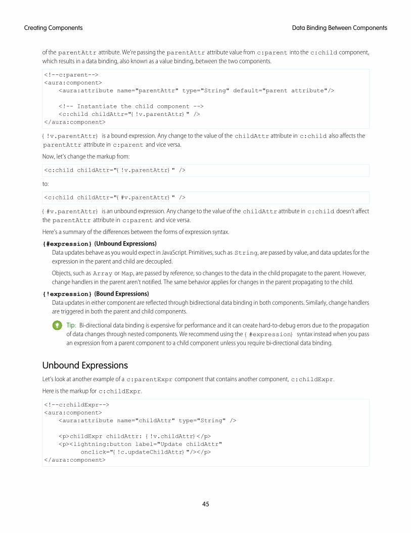
of the parentAttr attribute. We’re passing the parentAttr attribute value from c:parent into the c:child component,which results in a data binding, also known as a value binding, between the two components.
<!--c:parent--><aura:component>
<aura:attribute name="parentAttr" type="String" default="parent attribute"/>
<!-- Instantiate the child component --><c:child childAttr="{!v.parentAttr}" />
</aura:component>
{!v.parentAttr} is a bound expression. Any change to the value of the childAttr attribute in c:child also affects theparentAttr attribute in c:parent and vice versa.
Now, let's change the markup from:
<c:child childAttr="{!v.parentAttr}" />
to:
<c:child childAttr="{#v.parentAttr}" />
{#v.parentAttr} is an unbound expression. Any change to the value of the childAttr attribute in c:child doesn’t affectthe parentAttr attribute in c:parent and vice versa.
Here’s a summary of the differences between the forms of expression syntax.
{#expression} (Unbound Expressions)Data updates behave as you would expect in JavaScript. Primitives, such as String, are passed by value, and data updates for theexpression in the parent and child are decoupled.
Objects, such as Array or Map, are passed by reference, so changes to the data in the child propagate to the parent. However,change handlers in the parent aren’t notified. The same behavior applies for changes in the parent propagating to the child.
{!expression} (Bound Expressions)Data updates in either component are reflected through bidirectional data binding in both components. Similarly, change handlersare triggered in both the parent and child components.
Tip: Bi-directional data binding is expensive for performance and it can create hard-to-debug errors due to the propagationof data changes through nested components. We recommend using the {#expression} syntax instead when you passan expression from a parent component to a child component unless you require bi-directional data binding.
Unbound ExpressionsLet’s look at another example of a c:parentExpr component that contains another component, c:childExpr.
Here is the markup for c:childExpr.
<!--c:childExpr--><aura:component>
<aura:attribute name="childAttr" type="String" />
<p>childExpr childAttr: {!v.childAttr}</p><p><lightning:button label="Update childAttr"
onclick="{!c.updateChildAttr}"/></p></aura:component>
45
Data Binding Between ComponentsCreating Components
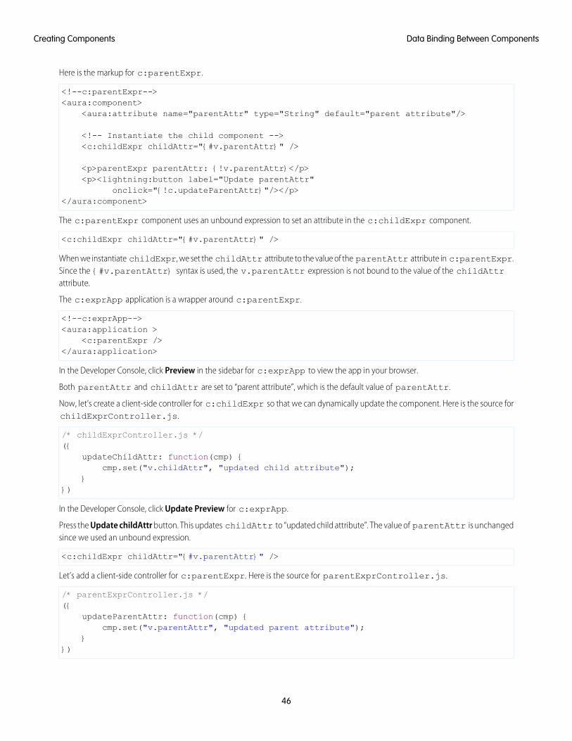
Here is the markup for c:parentExpr.
<!--c:parentExpr--><aura:component>
<aura:attribute name="parentAttr" type="String" default="parent attribute"/>
<!-- Instantiate the child component --><c:childExpr childAttr="{#v.parentAttr}" />
<p>parentExpr parentAttr: {!v.parentAttr}</p><p><lightning:button label="Update parentAttr"
onclick="{!c.updateParentAttr}"/></p></aura:component>
The c:parentExpr component uses an unbound expression to set an attribute in the c:childExpr component.
<c:childExpr childAttr="{#v.parentAttr}" />
When we instantiate childExpr, we set the childAttr attribute to the value of the parentAttr attribute in c:parentExpr.Since the {#v.parentAttr} syntax is used, the v.parentAttr expression is not bound to the value of the childAttrattribute.
The c:exprApp application is a wrapper around c:parentExpr.
<!--c:exprApp--><aura:application >
<c:parentExpr /></aura:application>
In the Developer Console, click Preview in the sidebar for c:exprApp to view the app in your browser.
Both parentAttr and childAttr are set to “parent attribute”, which is the default value of parentAttr.
Now, let’s create a client-side controller for c:childExpr so that we can dynamically update the component. Here is the source forchildExprController.js.
/* childExprController.js */({
updateChildAttr: function(cmp) {cmp.set("v.childAttr", "updated child attribute");
}})
In the Developer Console, click Update Preview for c:exprApp.
Press the Update childAttr button. This updates childAttr to “updated child attribute”. The value of parentAttr is unchangedsince we used an unbound expression.
<c:childExpr childAttr="{#v.parentAttr}" />
Let’s add a client-side controller for c:parentExpr. Here is the source for parentExprController.js.
/* parentExprController.js */({
updateParentAttr: function(cmp) {cmp.set("v.parentAttr", "updated parent attribute");
}})
46
Data Binding Between ComponentsCreating Components
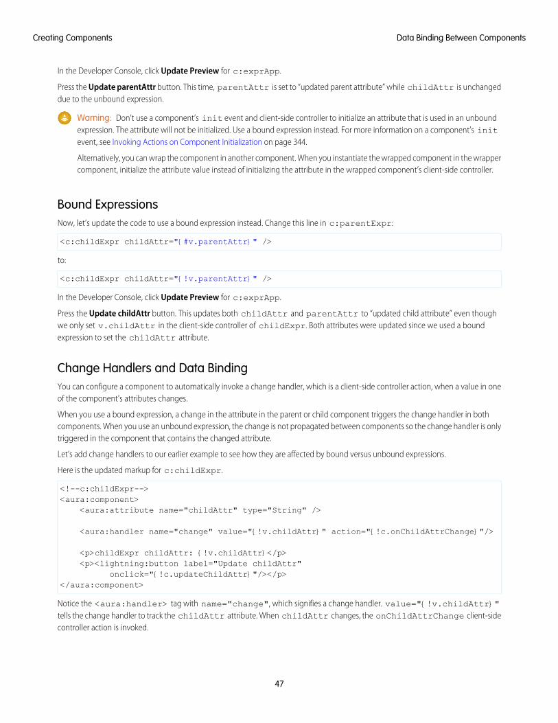
In the Developer Console, click Update Preview for c:exprApp.
Press the Update parentAttr button. This time, parentAttr is set to “updated parent attribute” while childAttr is unchangeddue to the unbound expression.
Warning: Don’t use a component’s init event and client-side controller to initialize an attribute that is used in an unboundexpression. The attribute will not be initialized. Use a bound expression instead. For more information on a component’s initevent, see Invoking Actions on Component Initialization on page 344.
Alternatively, you can wrap the component in another component. When you instantiate the wrapped component in the wrappercomponent, initialize the attribute value instead of initializing the attribute in the wrapped component’s client-side controller.
Bound ExpressionsNow, let’s update the code to use a bound expression instead. Change this line in c:parentExpr:
<c:childExpr childAttr="{#v.parentAttr}" />
to:
<c:childExpr childAttr="{!v.parentAttr}" />
In the Developer Console, click Update Preview for c:exprApp.
Press the Update childAttr button. This updates both childAttr and parentAttr to “updated child attribute” even thoughwe only set v.childAttr in the client-side controller of childExpr. Both attributes were updated since we used a boundexpression to set the childAttr attribute.
Change Handlers and Data BindingYou can configure a component to automatically invoke a change handler, which is a client-side controller action, when a value in oneof the component's attributes changes.
When you use a bound expression, a change in the attribute in the parent or child component triggers the change handler in bothcomponents. When you use an unbound expression, the change is not propagated between components so the change handler is onlytriggered in the component that contains the changed attribute.
Let’s add change handlers to our earlier example to see how they are affected by bound versus unbound expressions.
Here is the updated markup for c:childExpr.
<!--c:childExpr--><aura:component>
<aura:attribute name="childAttr" type="String" />
<aura:handler name="change" value="{!v.childAttr}" action="{!c.onChildAttrChange}"/>
<p>childExpr childAttr: {!v.childAttr}</p><p><lightning:button label="Update childAttr"
onclick="{!c.updateChildAttr}"/></p></aura:component>
Notice the <aura:handler> tag with name="change", which signifies a change handler. value="{!v.childAttr}"tells the change handler to track the childAttr attribute. When childAttr changes, the onChildAttrChange client-sidecontroller action is invoked.
47
Data Binding Between ComponentsCreating Components
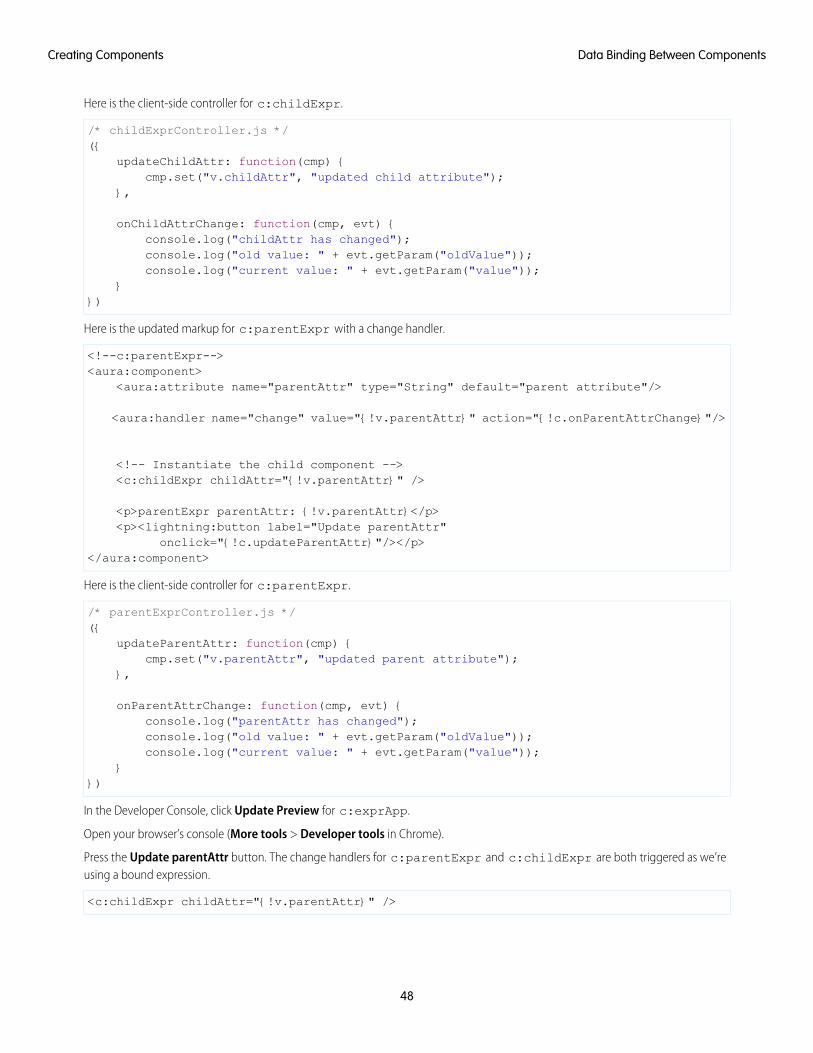
Here is the client-side controller for c:childExpr.
/* childExprController.js */({
updateChildAttr: function(cmp) {cmp.set("v.childAttr", "updated child attribute");
},
onChildAttrChange: function(cmp, evt) {console.log("childAttr has changed");console.log("old value: " + evt.getParam("oldValue"));console.log("current value: " + evt.getParam("value"));
}})
Here is the updated markup for c:parentExpr with a change handler.
<!--c:parentExpr--><aura:component>
<aura:attribute name="parentAttr" type="String" default="parent attribute"/>
<aura:handler name="change" value="{!v.parentAttr}" action="{!c.onParentAttrChange}"/>
<!-- Instantiate the child component --><c:childExpr childAttr="{!v.parentAttr}" />
<p>parentExpr parentAttr: {!v.parentAttr}</p><p><lightning:button label="Update parentAttr"
onclick="{!c.updateParentAttr}"/></p></aura:component>
Here is the client-side controller for c:parentExpr.
/* parentExprController.js */({
updateParentAttr: function(cmp) {cmp.set("v.parentAttr", "updated parent attribute");
},
onParentAttrChange: function(cmp, evt) {console.log("parentAttr has changed");console.log("old value: " + evt.getParam("oldValue"));console.log("current value: " + evt.getParam("value"));
}})
In the Developer Console, click Update Preview for c:exprApp.
Open your browser’s console (More tools > Developer tools in Chrome).
Press the Update parentAttr button. The change handlers for c:parentExpr and c:childExpr are both triggered as we’reusing a bound expression.
<c:childExpr childAttr="{!v.parentAttr}" />
48
Data Binding Between ComponentsCreating Components
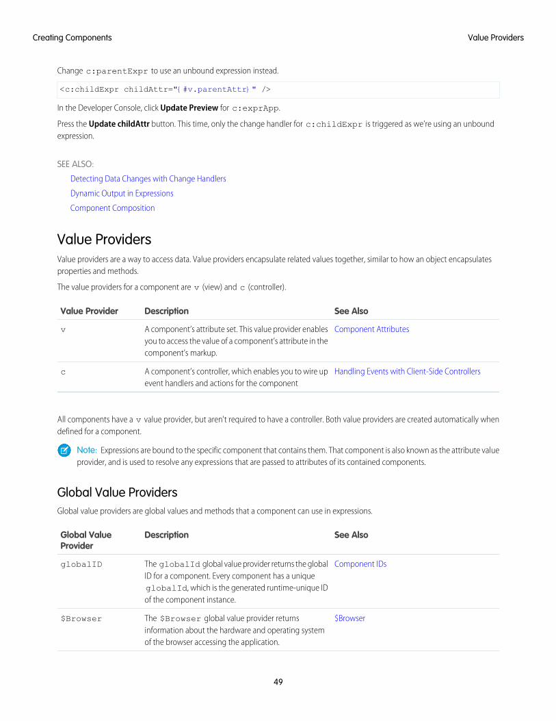
Change c:parentExpr to use an unbound expression instead.
<c:childExpr childAttr="{#v.parentAttr}" />
In the Developer Console, click Update Preview for c:exprApp.
Press the Update childAttr button. This time, only the change handler for c:childExpr is triggered as we’re using an unboundexpression.
SEE ALSO:
Detecting Data Changes with Change Handlers
Dynamic Output in Expressions
Component Composition
Value ProvidersValue providers are a way to access data. Value providers encapsulate related values together, similar to how an object encapsulatesproperties and methods.
The value providers for a component are v (view) and c (controller).
See AlsoDescriptionValue Provider
Component AttributesA component’s attribute set. This value provider enablesyou to access the value of a component’s attribute in thecomponent’s markup.
v
Handling Events with Client-Side ControllersA component’s controller, which enables you to wire upevent handlers and actions for the component
c
All components have a v value provider, but aren't required to have a controller. Both value providers are created automatically whendefined for a component.
Note: Expressions are bound to the specific component that contains them. That component is also known as the attribute valueprovider, and is used to resolve any expressions that are passed to attributes of its contained components.
Global Value ProvidersGlobal value providers are global values and methods that a component can use in expressions.
See AlsoDescriptionGlobal ValueProvider
Component IDsThe globalId global value provider returns the globalID for a component. Every component has a unique
globalID
globalId, which is the generated runtime-unique IDof the component instance.
$BrowserThe $Browser global value provider returnsinformation about the hardware and operating systemof the browser accessing the application.
$Browser
49
Value ProvidersCreating Components
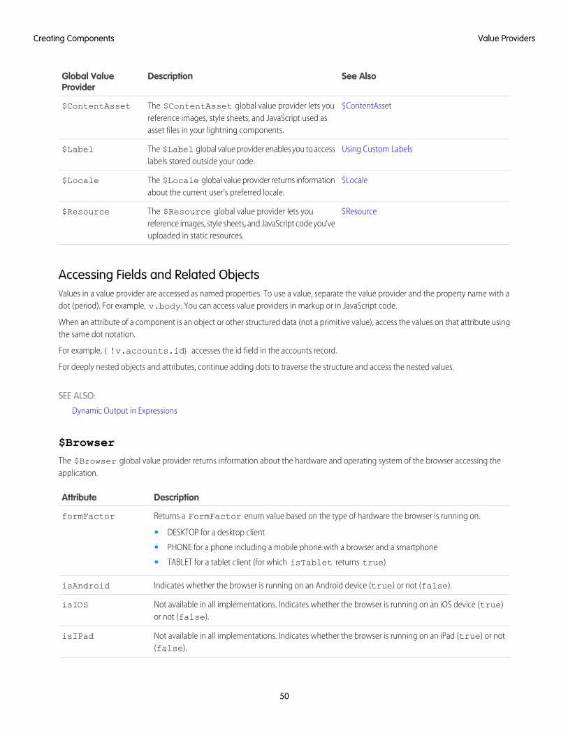
See AlsoDescriptionGlobal ValueProvider
$ContentAssetThe $ContentAsset global value provider lets youreference images, style sheets, and JavaScript used asasset files in your lightning components.
$ContentAsset
Using Custom LabelsThe $Label global value provider enables you to accesslabels stored outside your code.
$Label
$LocaleThe $Locale global value provider returns informationabout the current user’s preferred locale.
$Locale
$ResourceThe $Resource global value provider lets youreference images, style sheets, and JavaScript code you’veuploaded in static resources.
$Resource
Accessing Fields and Related ObjectsValues in a value provider are accessed as named properties. To use a value, separate the value provider and the property name with adot (period). For example, v.body. You can access value providers in markup or in JavaScript code.
When an attribute of a component is an object or other structured data (not a primitive value), access the values on that attribute usingthe same dot notation.
For example, {!v.accounts.id} accesses the id field in the accounts record.
For deeply nested objects and attributes, continue adding dots to traverse the structure and access the nested values.
SEE ALSO:
Dynamic Output in Expressions
$Browser
The $Browser global value provider returns information about the hardware and operating system of the browser accessing theapplication.
DescriptionAttribute
Returns a FormFactor enum value based on the type of hardware the browser is running on.formFactor
• DESKTOP for a desktop client
• PHONE for a phone including a mobile phone with a browser and a smartphone
• TABLET for a tablet client (for which isTablet returns true)
Indicates whether the browser is running on an Android device (true) or not (false).isAndroid
Not available in all implementations. Indicates whether the browser is running on an iOS device (true)or not (false).
isIOS
Not available in all implementations. Indicates whether the browser is running on an iPad (true) or not(false).
isIPad
50
Value ProvidersCreating Components
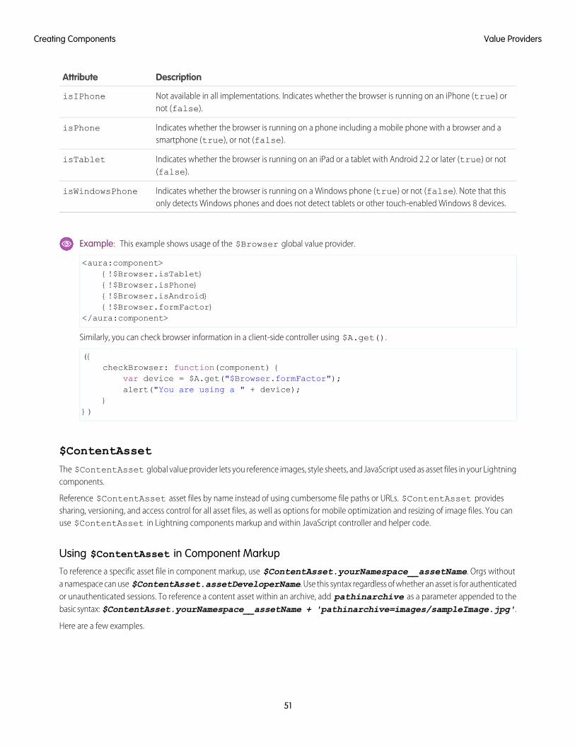
DescriptionAttribute
Not available in all implementations. Indicates whether the browser is running on an iPhone (true) ornot (false).
isIPhone
Indicates whether the browser is running on a phone including a mobile phone with a browser and asmartphone (true), or not (false).
isPhone
Indicates whether the browser is running on an iPad or a tablet with Android 2.2 or later (true) or not(false).
isTablet
Indicates whether the browser is running on a Windows phone (true) or not (false). Note that thisonly detects Windows phones and does not detect tablets or other touch-enabled Windows 8 devices.
isWindowsPhone
Example: This example shows usage of the $Browser global value provider.
<aura:component>{!$Browser.isTablet}{!$Browser.isPhone}{!$Browser.isAndroid}{!$Browser.formFactor}
</aura:component>
Similarly, you can check browser information in a client-side controller using $A.get().
({checkBrowser: function(component) {
var device = $A.get("$Browser.formFactor");alert("You are using a " + device);
}})
$ContentAsset
The $ContentAsset global value provider lets you reference images, style sheets, and JavaScript used as asset files in your Lightningcomponents.
Reference $ContentAsset asset files by name instead of using cumbersome file paths or URLs. $ContentAsset providessharing, versioning, and access control for all asset files, as well as options for mobile optimization and resizing of image files. You canuse $ContentAsset in Lightning components markup and within JavaScript controller and helper code.
Using $ContentAsset in Component Markup
To reference a specific asset file in component markup, use $ContentAsset.yourNamespace__assetName. Orgs withouta namespace can use $ContentAsset.assetDeveloperName. Use this syntax regardless of whether an asset is for authenticatedor unauthenticated sessions. To reference a content asset within an archive, add pathinarchive as a parameter appended to thebasic syntax: $ContentAsset.yourNamespace__assetName + 'pathinarchive=images/sampleImage.jpg'.
Here are a few examples.
51
Value ProvidersCreating Components
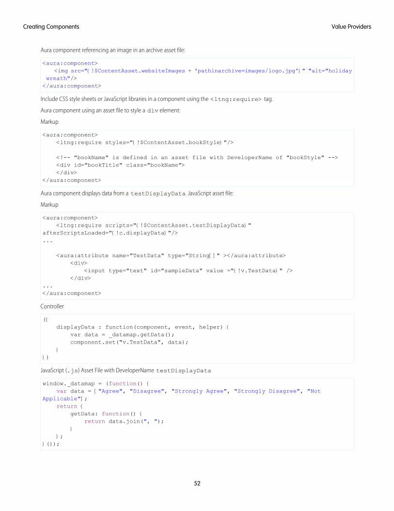
Aura component referencing an image in an archive asset file:
<aura:component><img src="{!$ContentAsset.websiteImages + 'pathinarchive=images/logo.jpg'}" "alt="holiday
wreath"/></aura:component>
Include CSS style sheets or JavaScript libraries in a component using the <ltng:require> tag.
Aura component using an asset file to style a div element:
Markup
<aura:component><ltng:require styles="{!$ContentAsset.bookStyle}"/>
<!-- "bookName" is defined in an asset file with DeveloperName of "bookStyle" --><div id="bookTitle" class="bookName"></div>
</aura:component>
Aura component displays data from a testDisplayData JavaScript asset file:
Markup
<aura:component><ltng:require scripts="{!$ContentAsset.testDisplayData}"
afterScriptsLoaded="{!c.displayData}"/>...
<aura:attribute name="TestData" type="String[]" ></aura:attribute><div>
<input type="text" id="sampleData" value ="{!v.TestData}" /></div>
...</aura:component>
Controller
({displayData : function(component, event, helper) {
var data = _datamap.getData();component.set("v.TestData", data);
}})
JavaScript (.js) Asset File with DeveloperName testDisplayData
window._datamap = (function() {var data = ["Agree", "Disagree", "Strongly Agree", "Strongly Disagree", "Not
Applicable"];return {
getData: function() {return data.join(", ");
}};
}());
52
Value ProvidersCreating Components
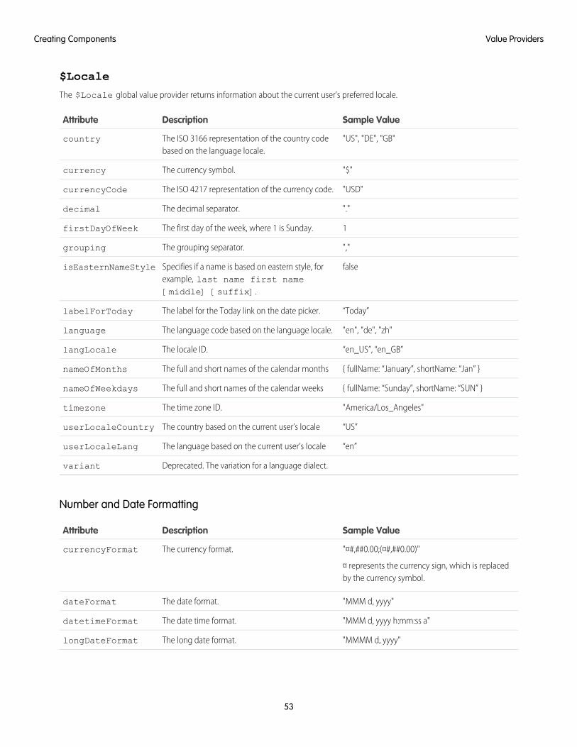
$Locale
The $Locale global value provider returns information about the current user’s preferred locale.
Sample ValueDescriptionAttribute
"US", "DE", "GB"The ISO 3166 representation of the country codebased on the language locale.
country
"$"The currency symbol.currency
"USD"The ISO 4217 representation of the currency code.currencyCode
"."The decimal separator.decimal
1The first day of the week, where 1 is Sunday.firstDayOfWeek
","The grouping separator.grouping
falseSpecifies if a name is based on eastern style, forexample, last name first name[middle] [suffix].
isEasternNameStyle
“Today”The label for the Today link on the date picker.labelForToday
"en", "de", "zh"The language code based on the language locale.language
“en_US”, “en_GB”The locale ID.langLocale
{ fullName: “January”, shortName: “Jan” }The full and short names of the calendar monthsnameOfMonths
{ fullName: “Sunday”, shortName: “SUN” }The full and short names of the calendar weeksnameOfWeekdays
"America/Los_Angeles"The time zone ID.timezone
“US”The country based on the current user’s localeuserLocaleCountry
“en”The language based on the current user’s localeuserLocaleLang
Deprecated. The variation for a language dialect.variant
Number and Date Formatting
Sample ValueDescriptionAttribute
"¤#,##0.00;(¤#,##0.00)"
¤ represents the currency sign, which is replacedby the currency symbol.
The currency format.currencyFormat
"MMM d, yyyy"The date format.dateFormat
"MMM d, yyyy h:mm:ss a"The date time format.datetimeFormat
"MMMM d, yyyy"The long date format.longDateFormat
53
Value ProvidersCreating Components
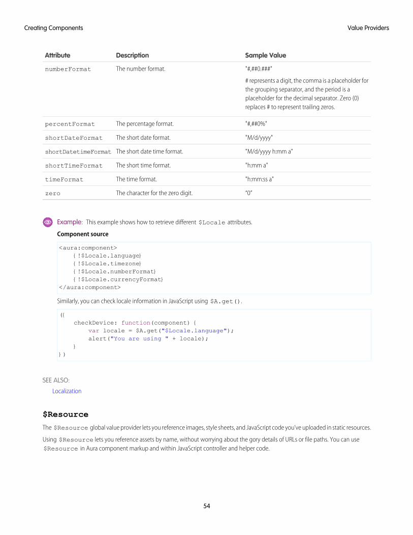
Sample ValueDescriptionAttribute
"#,##0.###"
# represents a digit, the comma is a placeholder forthe grouping separator, and the period is a
The number format.numberFormat
placeholder for the decimal separator. Zero (0)replaces # to represent trailing zeros.
"#,##0%"The percentage format.percentFormat
"M/d/yyyy"The short date format.shortDateFormat
"M/d/yyyy h:mm a"The short date time format.shortDatetimeFormat
"h:mm a"The short time format.shortTimeFormat
"h:mm:ss a"The time format.timeFormat
“0”The character for the zero digit.zero
Example: This example shows how to retrieve different $Locale attributes.
Component source
<aura:component>{!$Locale.language}{!$Locale.timezone}{!$Locale.numberFormat}{!$Locale.currencyFormat}
</aura:component>
Similarly, you can check locale information in JavaScript using $A.get().
({checkDevice: function(component) {
var locale = $A.get("$Locale.language");alert("You are using " + locale);
}})
SEE ALSO:
Localization
$Resource
The $Resource global value provider lets you reference images, style sheets, and JavaScript code you’ve uploaded in static resources.
Using $Resource lets you reference assets by name, without worrying about the gory details of URLs or file paths. You can use$Resource in Aura component markup and within JavaScript controller and helper code.
54
Value ProvidersCreating Components
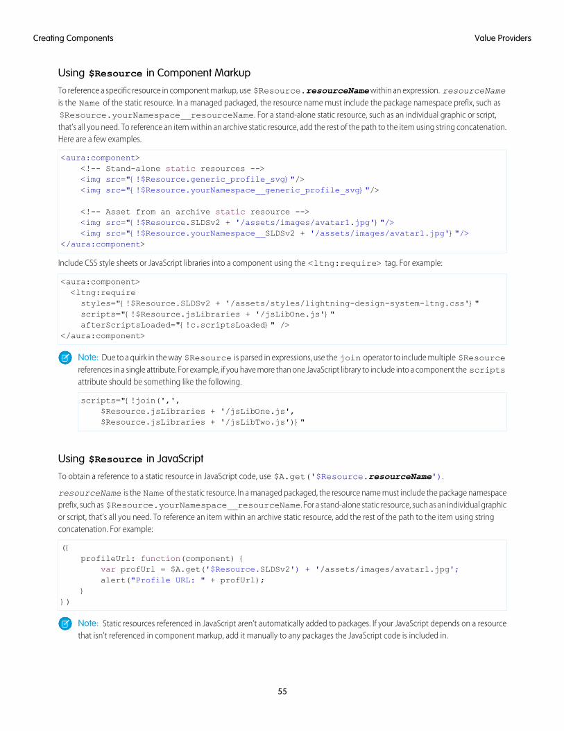
Using $Resource in Component Markup
To reference a specific resource in component markup, use $Resource.resourceName within an expression. resourceNameis the Name of the static resource. In a managed packaged, the resource name must include the package namespace prefix, such as$Resource.yourNamespace__resourceName. For a stand-alone static resource, such as an individual graphic or script,that’s all you need. To reference an item within an archive static resource, add the rest of the path to the item using string concatenation.Here are a few examples.
<aura:component><!-- Stand-alone static resources --><img src="{!$Resource.generic_profile_svg}"/><img src="{!$Resource.yourNamespace__generic_profile_svg}"/>
<!-- Asset from an archive static resource --><img src="{!$Resource.SLDSv2 + '/assets/images/avatar1.jpg'}"/><img src="{!$Resource.yourNamespace__SLDSv2 + '/assets/images/avatar1.jpg'}"/>
</aura:component>
Include CSS style sheets or JavaScript libraries into a component using the <ltng:require> tag. For example:
<aura:component><ltng:requirestyles="{!$Resource.SLDSv2 + '/assets/styles/lightning-design-system-ltng.css'}"scripts="{!$Resource.jsLibraries + '/jsLibOne.js'}"afterScriptsLoaded="{!c.scriptsLoaded}" />
</aura:component>
Note: Due to a quirk in the way $Resource is parsed in expressions, use the join operator to include multiple $Resourcereferences in a single attribute. For example, if you have more than one JavaScript library to include into a component the scriptsattribute should be something like the following.
scripts="{!join(',',$Resource.jsLibraries + '/jsLibOne.js',$Resource.jsLibraries + '/jsLibTwo.js')}"
Using $Resource in JavaScript
To obtain a reference to a static resource in JavaScript code, use $A.get('$Resource.resourceName').
resourceName is the Name of the static resource. In a managed packaged, the resource name must include the package namespaceprefix, such as $Resource.yourNamespace__resourceName. For a stand-alone static resource, such as an individual graphicor script, that’s all you need. To reference an item within an archive static resource, add the rest of the path to the item using stringconcatenation. For example:
({profileUrl: function(component) {
var profUrl = $A.get('$Resource.SLDSv2') + '/assets/images/avatar1.jpg';alert("Profile URL: " + profUrl);
}})
Note: Static resources referenced in JavaScript aren’t automatically added to packages. If your JavaScript depends on a resourcethat isn’t referenced in component markup, add it manually to any packages the JavaScript code is included in.
55
Value ProvidersCreating Components
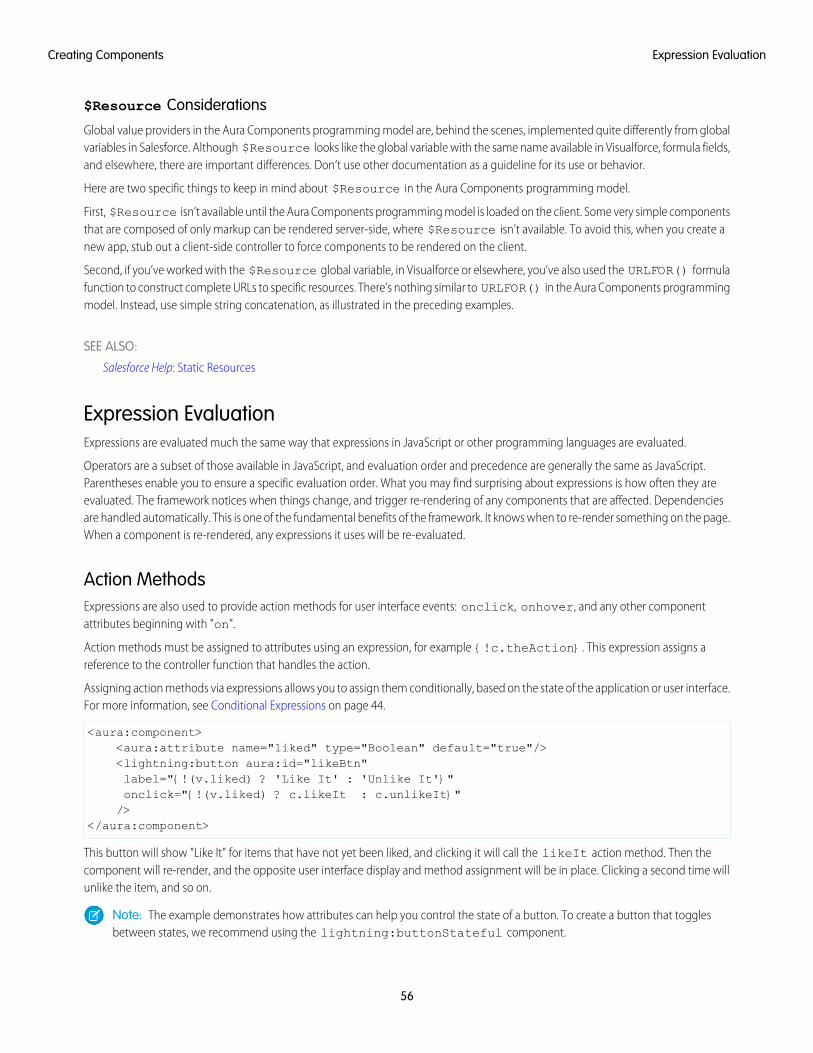
$Resource Considerations
Global value providers in the Aura Components programming model are, behind the scenes, implemented quite differently from globalvariables in Salesforce. Although $Resource looks like the global variable with the same name available in Visualforce, formula fields,and elsewhere, there are important differences. Don’t use other documentation as a guideline for its use or behavior.
Here are two specific things to keep in mind about $Resource in the Aura Components programming model.
First, $Resource isn’t available until the Aura Components programming model is loaded on the client. Some very simple componentsthat are composed of only markup can be rendered server-side, where $Resource isn’t available. To avoid this, when you create anew app, stub out a client-side controller to force components to be rendered on the client.
Second, if you’ve worked with the $Resource global variable, in Visualforce or elsewhere, you’ve also used the URLFOR() formulafunction to construct complete URLs to specific resources. There’s nothing similar to URLFOR() in the Aura Components programmingmodel. Instead, use simple string concatenation, as illustrated in the preceding examples.
SEE ALSO:
Salesforce Help: Static Resources
Expression EvaluationExpressions are evaluated much the same way that expressions in JavaScript or other programming languages are evaluated.
Operators are a subset of those available in JavaScript, and evaluation order and precedence are generally the same as JavaScript.Parentheses enable you to ensure a specific evaluation order. What you may find surprising about expressions is how often they areevaluated. The framework notices when things change, and trigger re-rendering of any components that are affected. Dependenciesare handled automatically. This is one of the fundamental benefits of the framework. It knows when to re-render something on the page.When a component is re-rendered, any expressions it uses will be re-evaluated.
Action MethodsExpressions are also used to provide action methods for user interface events: onclick, onhover, and any other componentattributes beginning with "on".
Action methods must be assigned to attributes using an expression, for example {!c.theAction}. This expression assigns areference to the controller function that handles the action.
Assigning action methods via expressions allows you to assign them conditionally, based on the state of the application or user interface.For more information, see Conditional Expressions on page 44.
<aura:component><aura:attribute name="liked" type="Boolean" default="true"/><lightning:button aura:id="likeBtn"label="{!(v.liked) ? 'Like It' : 'Unlike It'}"onclick="{!(v.liked) ? c.likeIt : c.unlikeIt}"/>
</aura:component>
This button will show "Like It" for items that have not yet been liked, and clicking it will call the likeIt action method. Then thecomponent will re-render, and the opposite user interface display and method assignment will be in place. Clicking a second time willunlike the item, and so on.
Note: The example demonstrates how attributes can help you control the state of a button. To create a button that togglesbetween states, we recommend using the lightning:buttonStateful component.
56
Expression EvaluationCreating Components
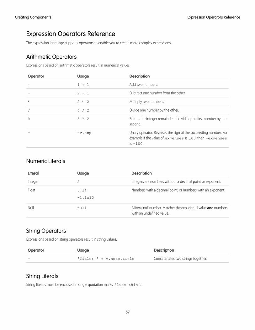
Expression Operators ReferenceThe expression language supports operators to enable you to create more complex expressions.
Arithmetic OperatorsExpressions based on arithmetic operators result in numerical values.
DescriptionUsageOperator
Add two numbers.1 + 1+
Subtract one number from the other.2 - 1-
Multiply two numbers.2 * 2*
Divide one number by the other.4 / 2/
Return the integer remainder of dividing the first number by thesecond.
5 % 2%
Unary operator. Reverses the sign of the succeeding number. Forexample if the value of expenses is 100, then -expensesis -100.
-v.exp-
Numeric Literals
DescriptionUsageLiteral
Integers are numbers without a decimal point or exponent.2Integer
Numbers with a decimal point, or numbers with an exponent.3.14
-1.1e10
Float
A literal null number. Matches the explicit null value and numberswith an undefined value.
nullNull
String OperatorsExpressions based on string operators result in string values.
DescriptionUsageOperator
Concatenates two strings together.'Title: ' + v.note.title+
String LiteralsString literals must be enclosed in single quotation marks 'like this'.
57
Expression Operators ReferenceCreating Components
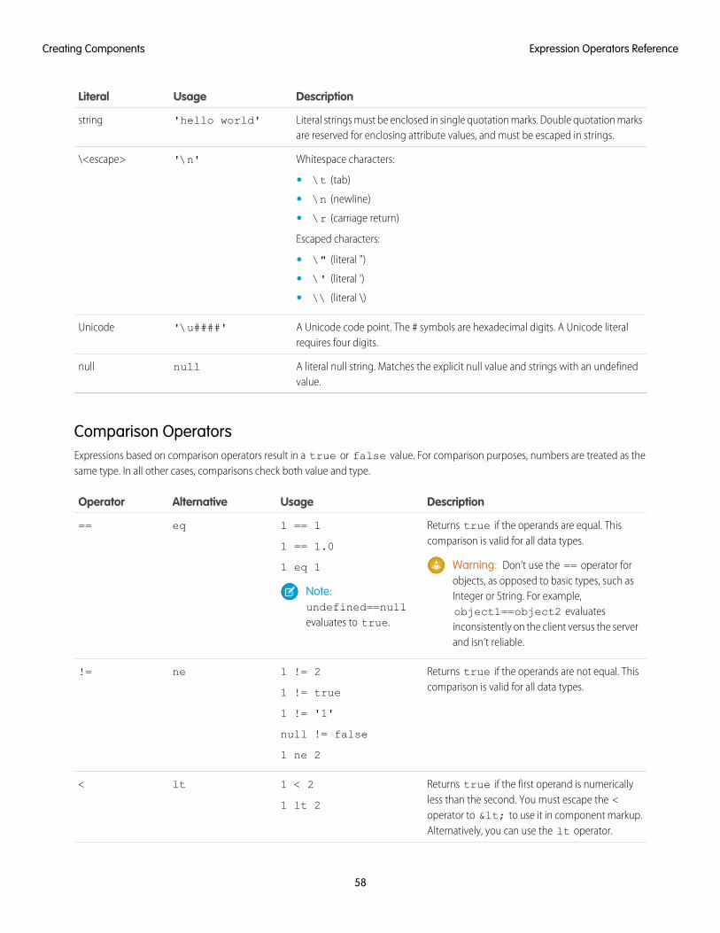
DescriptionUsageLiteral
Literal strings must be enclosed in single quotation marks. Double quotation marksare reserved for enclosing attribute values, and must be escaped in strings.
'hello world'string
Whitespace characters:'\n'\<escape>
• \t (tab)
• \n (newline)
• \r (carriage return)
Escaped characters:
• \" (literal ")
• \' (literal ')
• \\ (literal \)
A Unicode code point. The # symbols are hexadecimal digits. A Unicode literalrequires four digits.
'\u####'Unicode
A literal null string. Matches the explicit null value and strings with an undefinedvalue.
nullnull
Comparison OperatorsExpressions based on comparison operators result in a true or false value. For comparison purposes, numbers are treated as thesame type. In all other cases, comparisons check both value and type.
DescriptionUsageAlternativeOperator
Returns true if the operands are equal. Thiscomparison is valid for all data types.
1 == 1
1 == 1.0
eq==
Warning: Don’t use the == operator forobjects, as opposed to basic types, such as
1 eq 1
Note:undefined==nullevaluates to true.
Integer or String. For example,object1==object2 evaluatesinconsistently on the client versus the serverand isn’t reliable.
Returns true if the operands are not equal. Thiscomparison is valid for all data types.
1 != 2
1 != true
ne!=
1 != '1'
null != false
1 ne 2
Returns true if the first operand is numericallyless than the second. You must escape the <
1 < 2
1 lt 2
lt<
operator to < to use it in component markup.Alternatively, you can use the lt operator.
58
Expression Operators ReferenceCreating Components
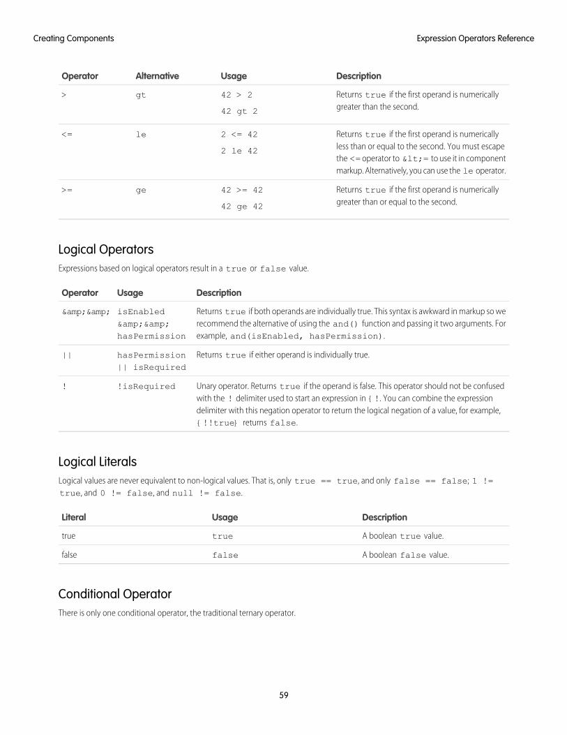
DescriptionUsageAlternativeOperator
Returns true if the first operand is numericallygreater than the second.
42 > 2
42 gt 2
gt>
Returns true if the first operand is numericallyless than or equal to the second. You must escape
2 <= 42
2 le 42
le<=
the <= operator to <= to use it in componentmarkup. Alternatively, you can use the le operator.
Returns true if the first operand is numericallygreater than or equal to the second.
42 >= 42
42 ge 42
ge>=
Logical OperatorsExpressions based on logical operators result in a true or false value.
DescriptionUsageOperator
Returns true if both operands are individually true. This syntax is awkward in markup so werecommend the alternative of using the and() function and passing it two arguments. Forexample, and(isEnabled, hasPermission).
isEnabled&&hasPermission
&&
Returns true if either operand is individually true.hasPermission|| isRequired
||
Unary operator. Returns true if the operand is false. This operator should not be confusedwith the ! delimiter used to start an expression in {!. You can combine the expression
!isRequired!
delimiter with this negation operator to return the logical negation of a value, for example,{!!true} returns false.
Logical LiteralsLogical values are never equivalent to non-logical values. That is, only true == true, and only false == false; 1 !=true, and 0 != false, and null != false.
DescriptionUsageLiteral
A boolean true value.truetrue
A boolean false value.falsefalse
Conditional OperatorThere is only one conditional operator, the traditional ternary operator.
59
Expression Operators ReferenceCreating Components
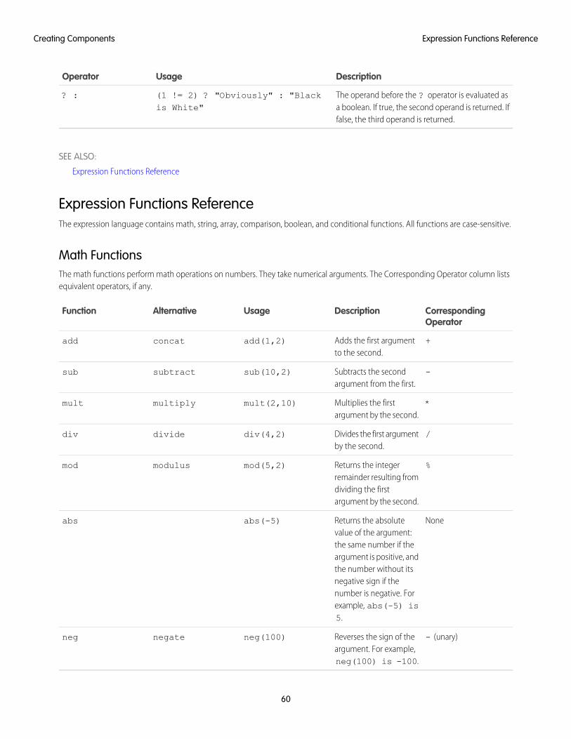
DescriptionUsageOperator
The operand before the ? operator is evaluated asa boolean. If true, the second operand is returned. Iffalse, the third operand is returned.
(1 != 2) ? "Obviously" : "Blackis White"
? :
SEE ALSO:
Expression Functions Reference
Expression Functions ReferenceThe expression language contains math, string, array, comparison, boolean, and conditional functions. All functions are case-sensitive.
Math FunctionsThe math functions perform math operations on numbers. They take numerical arguments. The Corresponding Operator column listsequivalent operators, if any.
CorrespondingOperator
DescriptionUsageAlternativeFunction
+Adds the first argumentto the second.
add(1,2)concatadd
-Subtracts the secondargument from the first.
sub(10,2)subtractsub
*Multiplies the firstargument by the second.
mult(2,10)multiplymult
/Divides the first argumentby the second.
div(4,2)dividediv
%Returns the integerremainder resulting from
mod(5,2)modulusmod
dividing the firstargument by the second.
NoneReturns the absolutevalue of the argument:
abs(-5)abs
the same number if theargument is positive, andthe number without itsnegative sign if thenumber is negative. Forexample, abs(-5) is5.
- (unary)Reverses the sign of theargument. For example,neg(100) is -100.
neg(100)negateneg
60
Expression Functions ReferenceCreating Components

String Functions
CorrespondingOperator
DescriptionUsageAlternativeFunction
+Concatenates the twoarguments.
concat('Hello ','world')
add('Walk ', 'the dog')
addconcat
Replaces anyparameter
format($Label.ns.labelName,v.myVal)
format
placeholders withNote: This function works forarguments of type String,
comma-separatedattribute values.
Decimal, Double,Integer, Long, Array,String[], List, and Set.
Joins the substringsadding the separator
join(separator, subStr1,subStr2, subStrN)
join(' ','class1','class2', v.class)
join
String (first argument)between eachsubsequent argument.
Label Functions
DescriptionUsageFunction
Outputs a label and updates it.Replaces any parameter
format($Label.np.labelName,v.attribute1 , v.attribute2)
format($Label.np.hello, v.name)
format
placeholders withcomma-separated attribute values.Supports ternary operators inlabels and attributes.
Informational Functions
DescriptionUsageFunction
Returns the length of an array or a string.myArray.lengthlength
Returns true if the argument is empty. An emptyargument is undefined, null, an empty array, or an
empty(v.attributeName)empty
Note: This function works for argumentsof type String, Array, Object,List, Map, or Set.
empty string. An object with no properties is not consideredempty.
Tip: {! !empty(v.myArray)} evaluatesfaster than {!v.myArray &&
61
Expression Functions ReferenceCreating Components
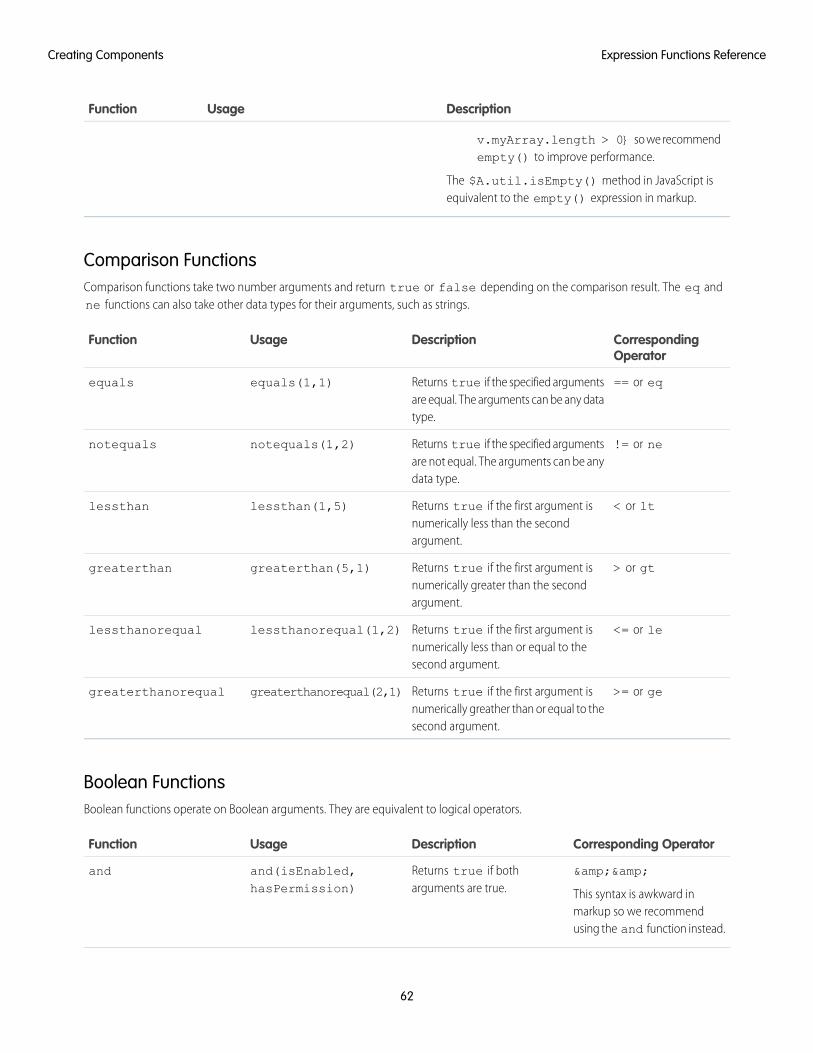
DescriptionUsageFunction
v.myArray.length > 0} so we recommendempty() to improve performance.
The $A.util.isEmpty() method in JavaScript isequivalent to the empty() expression in markup.
Comparison FunctionsComparison functions take two number arguments and return true or false depending on the comparison result. The eq andne functions can also take other data types for their arguments, such as strings.
CorrespondingOperator
DescriptionUsageFunction
== or eqReturns true if the specified argumentsare equal. The arguments can be any datatype.
equals(1,1)equals
!= or neReturns true if the specified argumentsare not equal. The arguments can be anydata type.
notequals(1,2)notequals
< or ltReturns true if the first argument isnumerically less than the secondargument.
lessthan(1,5)lessthan
> or gtReturns true if the first argument isnumerically greater than the secondargument.
greaterthan(5,1)greaterthan
<= or leReturns true if the first argument isnumerically less than or equal to thesecond argument.
lessthanorequal(1,2)lessthanorequal
>= or geReturns true if the first argument isnumerically greather than or equal to thesecond argument.
greaterthanorequal(2,1)greaterthanorequal
Boolean FunctionsBoolean functions operate on Boolean arguments. They are equivalent to logical operators.
Corresponding OperatorDescriptionUsageFunction
&&
This syntax is awkward inmarkup so we recommendusing the and function instead.
Returns true if botharguments are true.
and(isEnabled,hasPermission)
and
62
Expression Functions ReferenceCreating Components
Corresponding OperatorDescriptionUsageFunction
||Returns true if either one ofthe arguments is true.
or(hasPermission,hasVIPPass)
or
!Returns true if the argumentis false.
not(isNew)not
Conditional Function
Corresponding OperatorDescriptionUsageFunction
?: (ternary)Evaluates the first argument asa boolean. If true, returns the
if(isEnabled,'Enabled', 'Notenabled')
if
second argument. Otherwise,returns the third argument.
Component Composition
Composing fine-grained components in a larger component enables you to build more interesting components and applications.
Let's see how we can fit components together. We will first create a few simple components: c:helloHTML andc:helloAttributes. Then, we’ll create a wrapper component, c:nestedComponents, that contains the simple components.
Here is the source for helloHTML.cmp.
<!--c:helloHTML--><aura:component><div class="white">Hello, HTML!
</div>
<h2>Check out the style in this list.</h2>
<ul><li class="red">I'm red.</li><li class="blue">I'm blue.</li><li class="green">I'm green.</li>
</ul></aura:component>
CSS source
.THIS {background-color: grey;
}
.THIS.white {background-color: white;
}
.THIS .red {
63
Component CompositionCreating Components
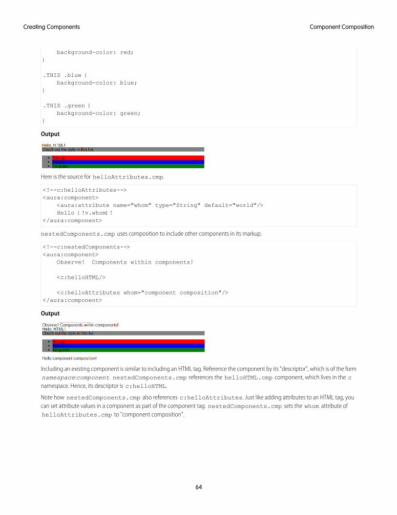
background-color: red;}
.THIS .blue {background-color: blue;
}
.THIS .green {background-color: green;
}
Output
Here is the source for helloAttributes.cmp.
<!--c:helloAttributes--><aura:component>
<aura:attribute name="whom" type="String" default="world"/>Hello {!v.whom}!
</aura:component>
nestedComponents.cmp uses composition to include other components in its markup.
<!--c:nestedComponents--><aura:component>
Observe! Components within components!
<c:helloHTML/>
<c:helloAttributes whom="component composition"/></aura:component>
Output
Including an existing component is similar to including an HTML tag. Reference the component by its "descriptor", which is of the formnamespace:component. nestedComponents.cmp references the helloHTML.cmp component, which lives in the cnamespace. Hence, its descriptor is c:helloHTML.
Note how nestedComponents.cmp also references c:helloAttributes. Just like adding attributes to an HTML tag, youcan set attribute values in a component as part of the component tag. nestedComponents.cmp sets the whom attribute ofhelloAttributes.cmp to "component composition".
64
Component CompositionCreating Components
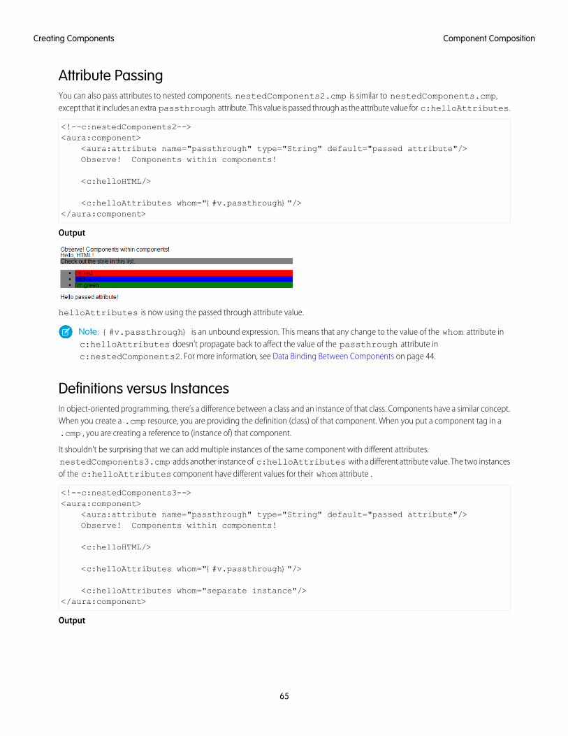
Attribute PassingYou can also pass attributes to nested components. nestedComponents2.cmp is similar to nestedComponents.cmp,except that it includes an extra passthrough attribute. This value is passed through as the attribute value for c:helloAttributes.
<!--c:nestedComponents2--><aura:component>
<aura:attribute name="passthrough" type="String" default="passed attribute"/>Observe! Components within components!
<c:helloHTML/>
<c:helloAttributes whom="{#v.passthrough}"/></aura:component>
Output
helloAttributes is now using the passed through attribute value.
Note: {#v.passthrough} is an unbound expression. This means that any change to the value of the whom attribute inc:helloAttributes doesn’t propagate back to affect the value of the passthrough attribute inc:nestedComponents2. For more information, see Data Binding Between Components on page 44.
Definitions versus InstancesIn object-oriented programming, there’s a difference between a class and an instance of that class. Components have a similar concept.When you create a .cmp resource, you are providing the definition (class) of that component. When you put a component tag in a.cmp , you are creating a reference to (instance of) that component.
It shouldn't be surprising that we can add multiple instances of the same component with different attributes.nestedComponents3.cmp adds another instance of c:helloAttributes with a different attribute value. The two instancesof the c:helloAttributes component have different values for their whom attribute .
<!--c:nestedComponents3--><aura:component>
<aura:attribute name="passthrough" type="String" default="passed attribute"/>Observe! Components within components!
<c:helloHTML/>
<c:helloAttributes whom="{#v.passthrough}"/>
<c:helloAttributes whom="separate instance"/></aura:component>
Output
65
Component CompositionCreating Components
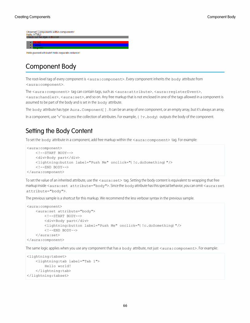
Component Body
The root-level tag of every component is <aura:component>. Every component inherits the body attribute from<aura:component>.
The <aura:component> tag can contain tags, such as <aura:attribute>, <aura:registerEvent>,<aura:handler>, <aura:set>, and so on. Any free markup that is not enclosed in one of the tags allowed in a component isassumed to be part of the body and is set in the body attribute.
The body attribute has type Aura.Component[]. It can be an array of one component, or an empty array, but it's always an array.
In a component, use “v” to access the collection of attributes. For example, {!v.body} outputs the body of the component.
Setting the Body ContentTo set the body attribute in a component, add free markup within the <aura:component> tag. For example:
<aura:component><!--START BODY--><div>Body part</div><lightning:button label="Push Me" onclick="{!c.doSomething}"/><!--END BODY-->
</aura:component>
To set the value of an inherited attribute, use the <aura:set> tag. Setting the body content is equivalent to wrapping that freemarkup inside <aura:set attribute="body">. Since the body attribute has this special behavior, you can omit <aura:setattribute="body">.
The previous sample is a shortcut for this markup. We recommend the less verbose syntax in the previous sample.
<aura:component><aura:set attribute="body">
<!--START BODY--><div>Body part</div><lightning:button label="Push Me" onclick="{!c.doSomething}"/><!--END BODY-->
</aura:set></aura:component>
The same logic applies when you use any component that has a body attribute, not just <aura:component>. For example:
<lightning:tabset><lightning:tab label="Tab 1">
Hello world!</lightning:tab>
</lightning:tabset>
66
Component BodyCreating Components

This is a shortcut for:
<lightning:tabset><lightning:tab label="Tab 1">
<aura:set attribute="body">Hello World!
</aura:set></lightning:tab>
</lightning:tabset>
Accessing the Component BodyTo access a component body in JavaScript, use component.get("v.body").
SEE ALSO:
aura:set
Working with a Component Body in JavaScript
Component Facets
A facet is any attribute of type Aura.Component[]. The body attribute is an example of a facet.
To define your own facet, add an aura:attribute tag of type Aura.Component[] to your component. For example, let'screate a new component called facetHeader.cmp.
<!--c:facetHeader--><aura:component>
<aura:attribute name="header" type="Aura.Component[]"/>
<div><span class="header">{!v.header}</span><br/><span class="body">{!v.body}</span>
</div></aura:component>
This component has a header facet. Note how we position the output of the header using the v.header expression.
The component doesn't have any output when you access it directly as the header and body attributes aren't set. Let’s create anothercomponent, helloFacets.cmp, that sets these attributes.
<!--c:helloFacets--><aura:component>
See how we set the header facet.<br/>
<c:facetHeader>
Nice body!
<aura:set attribute="header">Hello Header!
</aura:set>
67
Component FacetsCreating Components
</c:facetHeader>
</aura:component>
Note that aura:set sets the value of the header attribute of facetHeader.cmp, but you don’t need to use aura:set ifyou’re setting the body attribute.
SEE ALSO:
Component Body
Controlling Access
The framework enables you to control access to your applications, attributes, components, events, interfaces, and methods via theaccess system attribute. The access system attribute indicates whether the resource can be used outside of its own namespace.
Use the access system attribute on these tags:
• <aura:application>
• <aura:attribute>
• <aura:component>
• <aura:event>
• <aura:interface>
• <aura:method>
Access ValuesYou can specify these values for the access system attribute.
privateAvailable within the component, app, interface, event, or method and can’t be referenced outside the resource. This value can onlybe used for <aura:attribute> or <aura:method>.
Marking an attribute as private makes it easier to refactor the attribute in the future as the attribute can only be used within theresource.
Accessing a private attribute returns undefined unless you reference it from the component in which it’s declared. You can’taccess a private attribute from a sub-component that extends the component containing the private attribute.
publicAvailable within your org only. This is the default access value.
globalAvailable in all orgs.
Note: Mark your resources, such as a component, with access="global" to make the resource usable outside of yourown org. For example, if you want a component to be usable in an installed package or by a Lightning App Builder user or aCommunity Builder user in another org.
68
Controlling AccessCreating Components
ExampleThis sample component has global access.
<aura:component access="global">...
</aura:component>
Access ViolationsIf your code accesses a resource, such as a component, that doesn’t have an access system attribute allowing you to access theresource:
• Client-side code doesn’t execute or returns undefined. If you enabled debug mode, you see an error message in your browserconsole.
• Server-side code results in the component failing to load. If you enabled debug mode, you see a popup error message.
Anatomy of an Access Check Error MessageHere is a sample access check error message for an access violation.
Access Check Failed ! ComponentService.getDef():'markup://c:targetComponent' is notvisible to 'markup://c:sourceComponent'.
An error message has four parts:
1. The context (who is trying to access the resource). In our example, this is markup://c:sourceComponent.
2. The target (the resource being accessed). In our example, this is markup://c:targetComponent.
3. The type of failure. In our example, this is not visible.
4. The code that triggered the failure. This is usually a class method. In our example, this is ComponentService.getDef(),which means that the target definition (component) was not accessible. A definition describes metadata for a resource, such as acomponent.
Fixing Access Check ErrorsTip: If your code isn’t working as you expect, enable debug mode to get better error reporting.
You can fix access check errors using one or more of these techniques.
• Add appropriate access system attributes to the resources that you own.
• Remove references in your code to resources that aren’t available. In the earlier example, markup://c:targetComponentdoesn’t have an access value allowing markup://c:sourceComponent to access it.
• Ensure that an attribute that you’re accessing exists by looking at its <aura:attribute> definition. Confirm that you’re usingthe correct case-sensitive spelling for the name.
Accessing an undefined attribute or an attribute that is out of scope, for example a private attribute, triggers the same access violationmessage. The access context doesn’t know whether the attribute is undefined or inaccessible.
69
Controlling AccessCreating Components
Example: is not visible to 'undefined'
ComponentService.getDef():'markup://c:targetComponent' is not visible to 'undefined'
The key word in this error message is undefined, which indicates that the framework has lost context. This happens when your codeaccesses a component outside the normal framework lifecycle, such as in a setTimeout() or setInterval() call or in an ES6Promise.
Fix this error by wrapping the code in a $A.getCallback() call. For more information, see Modifying Components Outside theFramework Lifecycle.
Example: Cannot read property 'Yb' of undefined
Action failed: c$sourceComponent$controller$doInit [Cannot read property 'Yb' of undefined]
This error message happens when you reference a property on a variable with a value of undefined. The error can happen in manycontexts, one of which is the side-effect of an access check failure. For example, let’s see what happens when you try to access anundefined attribute, imaginaryAttribute, in JavaScript.
var whatDoYouExpect = cmp.get("v.imaginaryAttribute");
This is an access check error and whatDoYouExpect is set to undefined. Now, if you try to access a property onwhatDoYouExpect, you get an error.
Action failed: c$sourceComponent$controller$doInit [Cannot read property 'Yb' of undefined]
The c$sourceComponent$controller$doInit portion of the error message tells you that the error is in the doInitmethod of the controller of the sourceComponent component in the c namespace.
IN THIS SECTION:
Application Access Control
The access attribute on the aura:application tag controls whether the app can be used outside of the app’s namespace.
Interface Access Control
The access attribute on the aura:interface tag controls whether the interface can be used outside of the interface’snamespace.
Component Access Control
The access attribute on the aura:component tag controls whether the component can be used outside of the component’snamespace.
Attribute Access Control
The access attribute on the aura:attribute tag controls whether the attribute can be used outside of the attribute’snamespace.
Event Access Control
The access attribute on the aura:event tag controls whether the event can be used outside of the event’s namespace.
SEE ALSO:
Enable Debug Mode for Lightning Components
70
Controlling AccessCreating Components
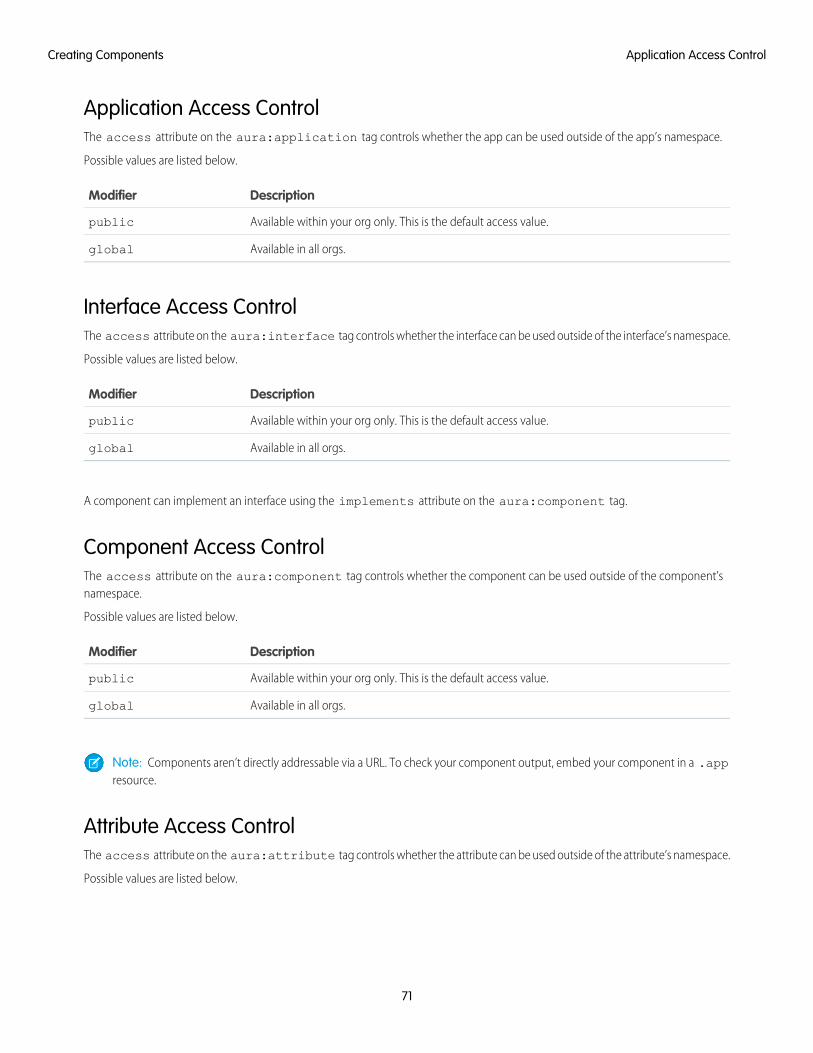
Application Access ControlThe access attribute on the aura:application tag controls whether the app can be used outside of the app’s namespace.
Possible values are listed below.
DescriptionModifier
Available within your org only. This is the default access value.public
Available in all orgs.global
Interface Access ControlThe access attribute on the aura:interface tag controls whether the interface can be used outside of the interface’s namespace.
Possible values are listed below.
DescriptionModifier
Available within your org only. This is the default access value.public
Available in all orgs.global
A component can implement an interface using the implements attribute on the aura:component tag.
Component Access ControlThe access attribute on the aura:component tag controls whether the component can be used outside of the component’snamespace.
Possible values are listed below.
DescriptionModifier
Available within your org only. This is the default access value.public
Available in all orgs.global
Note: Components aren’t directly addressable via a URL. To check your component output, embed your component in a .appresource.
Attribute Access ControlThe access attribute on the aura:attribute tag controls whether the attribute can be used outside of the attribute’s namespace.
Possible values are listed below.
71
Application Access ControlCreating Components
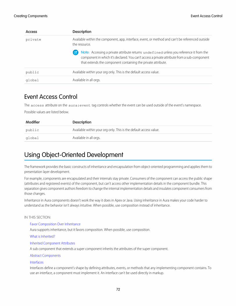
DescriptionAccess
Available within the component, app, interface, event, or method and can’t be referenced outsidethe resource.
private
Note: Accessing a private attribute returns undefined unless you reference it from thecomponent in which it’s declared. You can’t access a private attribute from a sub-componentthat extends the component containing the private attribute.
Available within your org only. This is the default access value.public
Available in all orgs.global
Event Access ControlThe access attribute on the aura:event tag controls whether the event can be used outside of the event’s namespace.
Possible values are listed below.
DescriptionModifier
Available within your org only. This is the default access value.public
Available in all orgs.global
Using Object-Oriented Development
The framework provides the basic constructs of inheritance and encapsulation from object-oriented programming and applies them topresentation layer development.
For example, components are encapsulated and their internals stay private. Consumers of the component can access the public shape(attributes and registered events) of the component, but can't access other implementation details in the component bundle. Thisseparation gives component authors freedom to change the internal implementation details and insulates component consumers fromthose changes.
Inheritance in Aura components doesn’t work the way it does in Apex or Java. Using inheritance in Aura makes your code harder tounderstand as the behavior isn’t always intuitive. When possible, use composition instead of inheritance.
IN THIS SECTION:
Favor Composition Over Inheritance
Aura supports inheritance, but it favors composition. When possible, use composition.
What is Inherited?
Inherited Component Attributes
A sub component that extends a super component inherits the attributes of the super component.
Abstract Components
Interfaces
Interfaces define a component’s shape by defining attributes, events, or methods that any implementing component contains. Touse an interface, a component must implement it. An interface can’t be used directly in markup.
72
Event Access ControlCreating Components
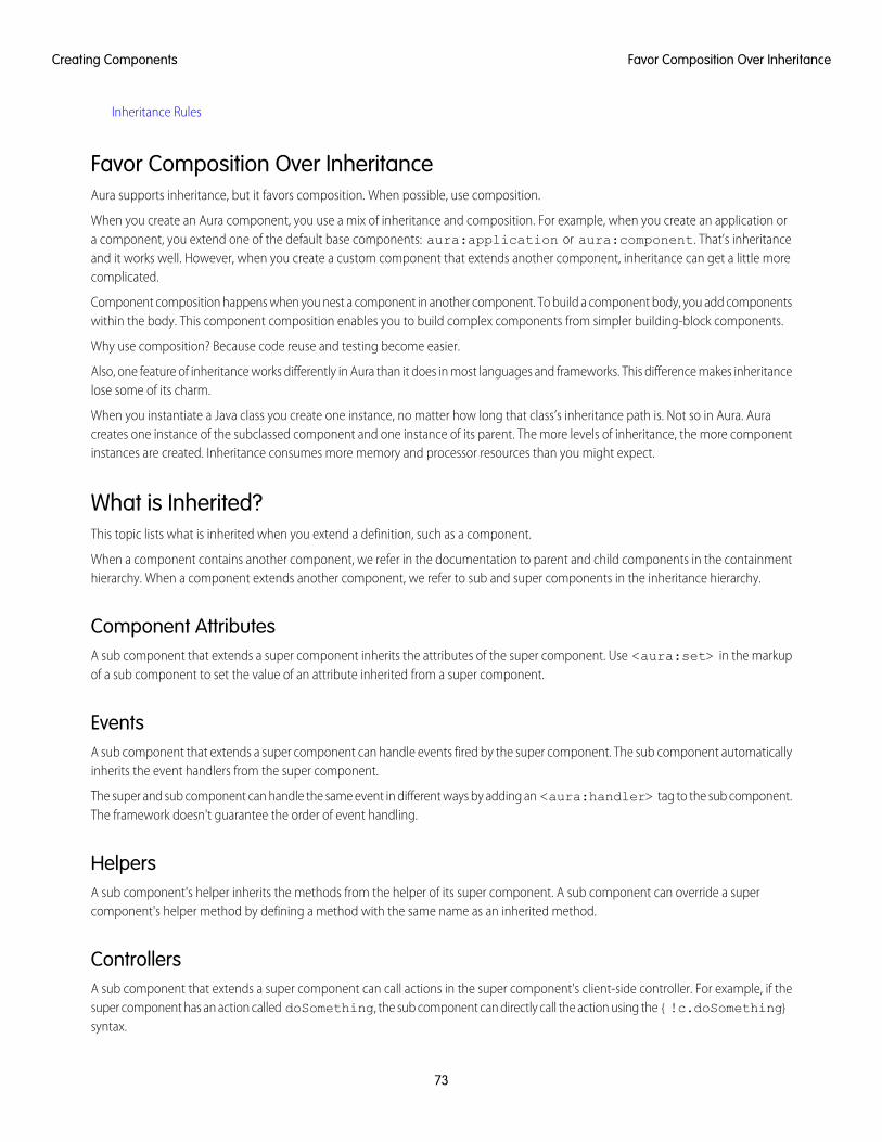
Inheritance Rules
Favor Composition Over InheritanceAura supports inheritance, but it favors composition. When possible, use composition.
When you create an Aura component, you use a mix of inheritance and composition. For example, when you create an application ora component, you extend one of the default base components: aura:application or aura:component. That’s inheritanceand it works well. However, when you create a custom component that extends another component, inheritance can get a little morecomplicated.
Component composition happens when you nest a component in another component. To build a component body, you add componentswithin the body. This component composition enables you to build complex components from simpler building-block components.
Why use composition? Because code reuse and testing become easier.
Also, one feature of inheritance works differently in Aura than it does in most languages and frameworks. This difference makes inheritancelose some of its charm.
When you instantiate a Java class you create one instance, no matter how long that class’s inheritance path is. Not so in Aura. Auracreates one instance of the subclassed component and one instance of its parent. The more levels of inheritance, the more componentinstances are created. Inheritance consumes more memory and processor resources than you might expect.
What is Inherited?This topic lists what is inherited when you extend a definition, such as a component.
When a component contains another component, we refer in the documentation to parent and child components in the containmenthierarchy. When a component extends another component, we refer to sub and super components in the inheritance hierarchy.
Component AttributesA sub component that extends a super component inherits the attributes of the super component. Use <aura:set> in the markupof a sub component to set the value of an attribute inherited from a super component.
EventsA sub component that extends a super component can handle events fired by the super component. The sub component automaticallyinherits the event handlers from the super component.
The super and sub component can handle the same event in different ways by adding an <aura:handler> tag to the sub component.The framework doesn't guarantee the order of event handling.
HelpersA sub component's helper inherits the methods from the helper of its super component. A sub component can override a supercomponent's helper method by defining a method with the same name as an inherited method.
ControllersA sub component that extends a super component can call actions in the super component's client-side controller. For example, if thesuper component has an action called doSomething, the sub component can directly call the action using the {!c.doSomething}syntax.
73
Favor Composition Over InheritanceCreating Components
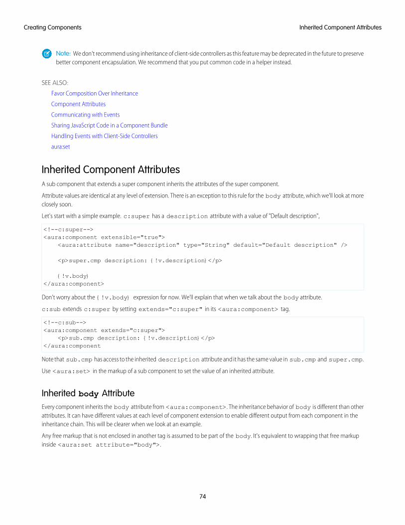
Note: We don't recommend using inheritance of client-side controllers as this feature may be deprecated in the future to preservebetter component encapsulation. We recommend that you put common code in a helper instead.
SEE ALSO:
Favor Composition Over Inheritance
Component Attributes
Communicating with Events
Sharing JavaScript Code in a Component Bundle
Handling Events with Client-Side Controllers
aura:set
Inherited Component AttributesA sub component that extends a super component inherits the attributes of the super component.
Attribute values are identical at any level of extension. There is an exception to this rule for the body attribute, which we'll look at moreclosely soon.
Let's start with a simple example. c:super has a description attribute with a value of "Default description",
<!--c:super--><aura:component extensible="true">
<aura:attribute name="description" type="String" default="Default description" />
<p>super.cmp description: {!v.description}</p>
{!v.body}</aura:component>
Don’t worry about the {!v.body} expression for now. We’ll explain that when we talk about the body attribute.
c:sub extends c:super by setting extends="c:super" in its <aura:component> tag.
<!--c:sub--><aura:component extends="c:super">
<p>sub.cmp description: {!v.description}</p></aura:component
Note that sub.cmp has access to the inherited description attribute and it has the same value in sub.cmp and super.cmp.
Use <aura:set> in the markup of a sub component to set the value of an inherited attribute.
Inherited body AttributeEvery component inherits the body attribute from <aura:component>. The inheritance behavior of body is different than otherattributes. It can have different values at each level of component extension to enable different output from each component in theinheritance chain. This will be clearer when we look at an example.
Any free markup that is not enclosed in another tag is assumed to be part of the body. It's equivalent to wrapping that free markupinside <aura:set attribute="body">.
74
Inherited Component AttributesCreating Components
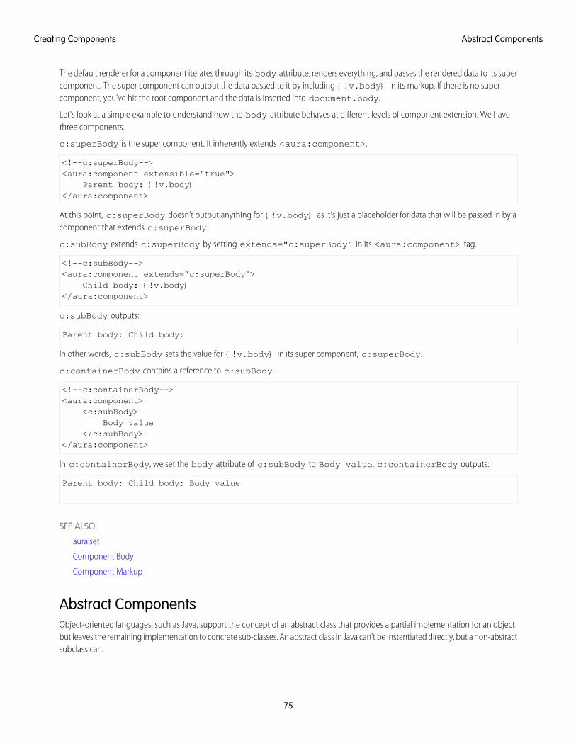
The default renderer for a component iterates through its body attribute, renders everything, and passes the rendered data to its supercomponent. The super component can output the data passed to it by including {!v.body} in its markup. If there is no supercomponent, you've hit the root component and the data is inserted into document.body.
Let's look at a simple example to understand how the body attribute behaves at different levels of component extension. We havethree components.
c:superBody is the super component. It inherently extends <aura:component>.
<!--c:superBody--><aura:component extensible="true">
Parent body: {!v.body}</aura:component>
At this point, c:superBody doesn’t output anything for {!v.body} as it’s just a placeholder for data that will be passed in by acomponent that extends c:superBody.
c:subBody extends c:superBody by setting extends="c:superBody" in its <aura:component> tag.
<!--c:subBody--><aura:component extends="c:superBody">
Child body: {!v.body}</aura:component>
c:subBody outputs:
Parent body: Child body:
In other words, c:subBody sets the value for {!v.body} in its super component, c:superBody.
c:containerBody contains a reference to c:subBody.
<!--c:containerBody--><aura:component>
<c:subBody>Body value
</c:subBody></aura:component>
In c:containerBody, we set the body attribute of c:subBody to Body value. c:containerBody outputs:
Parent body: Child body: Body value
SEE ALSO:
aura:set
Component Body
Component Markup
Abstract ComponentsObject-oriented languages, such as Java, support the concept of an abstract class that provides a partial implementation for an objectbut leaves the remaining implementation to concrete sub-classes. An abstract class in Java can't be instantiated directly, but a non-abstractsubclass can.
75
Abstract ComponentsCreating Components
Similarly, the Aura Components programming model supports the concept of abstract components that have a partial implementationbut leave the remaining implementation to concrete sub-components.
To use an abstract component, you must extend it and fill out the remaining implementation. An abstract component can't be useddirectly in markup.
The <aura:component> tag has a boolean abstract attribute. Set abstract="true" to make the component abstract.
SEE ALSO:
Interfaces
InterfacesInterfaces define a component’s shape by defining attributes, events, or methods that any implementing component contains. To usean interface, a component must implement it. An interface can’t be used directly in markup.
An interface starts with the <aura:interface> tag, and can contain only these tags:
<aura:attribute>This tag defines an attribute. An interface can have zero or more attributes.
Note: To set the value of an attribute inherited from an interface, redefine the attribute in the sub component using<aura:attribute> and set the value in its default attribute. When you extend a component, you can use <aura:set>in a sub component to set the value of any attribute that’s inherited from the super component. However, this usage of<aura:set> doesn’t work for attributes inherited from an interface.
<aura:registerEvent>This tag registers an event that can be fired by a component that implements the interface. There’s no logic in the interface for firingthe event. A component that implements the interface contains the code to fire the event.
<aura:method>This tag defines a method as part of the API of a component that implements the interface. There’s no logic for the method in theinterface. A component that implements the interface contains the method logic.
You can’t use markup, renderers, controllers, or anything else in an interface.
Implement an InterfaceTo implement an interface, set the implements system attribute in the <aura:component> tag to the name of the interfacethat you are implementing. For example:
<aura:component implements="mynamespace:myinterface" >
A component can implement an interface and extend another component.
<aura:component extends="ns1:cmp1" implements="ns2:intf1" >
An interface can extend multiple interfaces using a comma-separated list.
<aura:interface extends="ns:intf1,ns:int2" >
Since there are fewer restrictions on the content of abstract components, they are more common than interfaces. A component canimplement multiple interfaces but can only extend one abstract component, so interfaces can be more useful for some design patterns.
76
InterfacesCreating Components
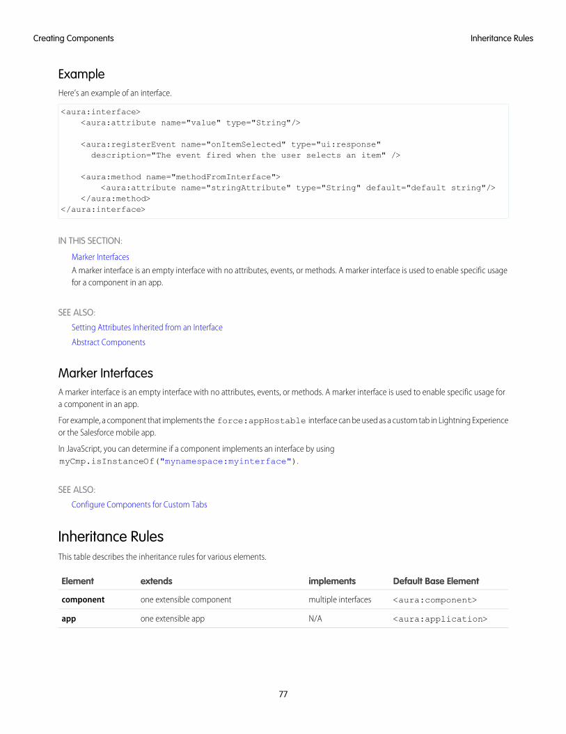
ExampleHere’s an example of an interface.
<aura:interface><aura:attribute name="value" type="String"/>
<aura:registerEvent name="onItemSelected" type="ui:response"description="The event fired when the user selects an item" />
<aura:method name="methodFromInterface"><aura:attribute name="stringAttribute" type="String" default="default string"/>
</aura:method></aura:interface>
IN THIS SECTION:
Marker Interfaces
A marker interface is an empty interface with no attributes, events, or methods. A marker interface is used to enable specific usagefor a component in an app.
SEE ALSO:
Setting Attributes Inherited from an Interface
Abstract Components
Marker InterfacesA marker interface is an empty interface with no attributes, events, or methods. A marker interface is used to enable specific usage fora component in an app.
For example, a component that implements the force:appHostable interface can be used as a custom tab in Lightning Experienceor the Salesforce mobile app.
In JavaScript, you can determine if a component implements an interface by usingmyCmp.isInstanceOf("mynamespace:myinterface").
SEE ALSO:
Configure Components for Custom Tabs
Inheritance RulesThis table describes the inheritance rules for various elements.
Default Base ElementimplementsextendsElement
<aura:component>multiple interfacesone extensible componentcomponent
<aura:application>N/Aone extensible appapp
77
Inheritance RulesCreating Components
Default Base ElementimplementsextendsElement
N/AN/Amultiple interfaces using a comma-separated list(extends="ns:intf1,ns:int2")
interface
SEE ALSO:
Interfaces
Best Practices for Conditional Markup
Using the <aura:if> tag is the preferred approach to conditionally display markup but there are alternatives. Consider the performancecost and code maintainability when you design components. The best design choice depends on your use case.
Conditionally Create Elements with <aura:if>Let’s look at a simple example that shows an error message when an error occurs.
<aura:if isTrue="{!v.isError}"><div>{!v.errorMessage}</div>
</aura:if>
The <div> component and its contents are only created and rendered if the value of the isTrue expression evaluates to true. Ifthe value of the isTrue expression changes and evaluates to false, all the components inside the <aura:if> tag are destroyed.The components are created again if the isTrue expression changes again and evaluates to true.
The general guideline is to use <aura:if> because it helps your components load faster initially by deferring the creation andrendering of the enclosed element tree until the condition is fulfilled.
Toggle Visibility Using CSSYou can use CSS to toggle visibility of markup by calling $A.util.toggleClass(cmp, 'class') in JavaScript code.
Elements in markup are created and rendered up front, but they’re hidden. For an example, see Dynamically Showing or Hiding Markup.
The conditional markup is created and rendered even if it’s not used, so <aura:if> is preferred.
Dynamically Create Components in JavaScriptYou can dynamically create components in JavaScript code. However, writing code is usually harder to maintain and debug than usingmarkup. Again, using <aura:if> is preferred but the best design choice depends on your use case.
SEE ALSO:
Conditional Expressions
Dynamically Creating Components
78
Best Practices for Conditional MarkupCreating Components
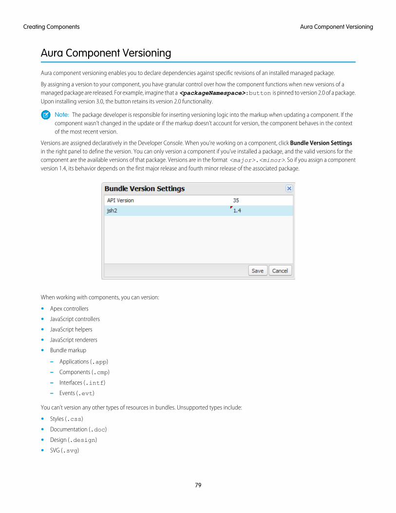
Aura Component Versioning
Aura component versioning enables you to declare dependencies against specific revisions of an installed managed package.
By assigning a version to your component, you have granular control over how the component functions when new versions of amanaged package are released. For example, imagine that a <packageNamespace>:button is pinned to version 2.0 of a package.Upon installing version 3.0, the button retains its version 2.0 functionality.
Note: The package developer is responsible for inserting versioning logic into the markup when updating a component. If thecomponent wasn’t changed in the update or if the markup doesn’t account for version, the component behaves in the contextof the most recent version.
Versions are assigned declaratively in the Developer Console. When you’re working on a component, click Bundle Version Settingsin the right panel to define the version. You can only version a component if you’ve installed a package, and the valid versions for thecomponent are the available versions of that package. Versions are in the format <major>.<minor>. So if you assign a componentversion 1.4, its behavior depends on the first major release and fourth minor release of the associated package.
When working with components, you can version:
• Apex controllers
• JavaScript controllers
• JavaScript helpers
• JavaScript renderers
• Bundle markup
– Applications (.app)
– Components (.cmp)
– Interfaces (.intf)
– Events (.evt)
You can’t version any other types of resources in bundles. Unsupported types include:
• Styles (.css)
• Documentation (.doc)
• Design (.design)
• SVG (.svg)
79
Aura Component VersioningCreating Components
Once you’ve assigned versions to components, or if you’re developing components for a package, you can retrieve the version in severalcontexts.
ExpressionReturn TypeResource
System.requestVersion()VersionApex
cmp.getVersion()StringJavaScript
{!Version}StringAura component markup
You can use the retrieved version to add logic to your code or markup to assign different functionality to different versions. Here’s anexample of using versioning in an <aura:if> statement.
<aura:component><aura:if isTrue="{!Version > 1.0}"><c:newVersionFunctionality/></aura:if><c:oldVersionFunctionality/>...</aura:component>
SEE ALSO:
Components with Minimum API Version Requirements
Don’t Mix Component API Versions
Components with Minimum API Version Requirements
Some built-in components require that custom components that use them are set to a minimum API version. A custom componentmust be equal to or later than the latest API version required by any of the components it uses.
There are several different ways a custom component can use another component that has a minimum version requirement, and becomesubject to that requirement.
• The custom component can extend from the component with the minimum version requirement.
• The custom component can add another component as a child component in markup.
• The custom component can dynamically create and add a child component in JavaScript.
In cases where the relationship between components can be determined by static analysis, the version dependency is checked whenthe component is saved. If a custom component has an API version earlier than a minimum version required by any of the componentsused, an error is reported, and the component isn’t saved. Depending on the tool you’re using, this error is presented in different ways.
If a component is created dynamically, it isn’t possible to determine the relationship between it and its parent component at save time.Instead, the minimum version requirement is checked at run time, and if it fails a run-time error is reported to the current user.
Set the API version for your component in the Developer Console, the Force.com IDE, or via API.
80
Components with Minimum API Version RequirementsCreating Components
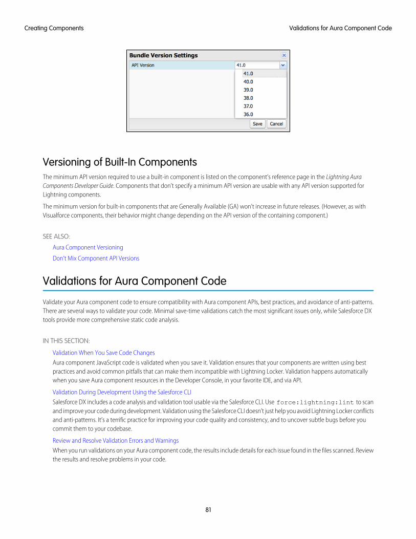
Versioning of Built-In ComponentsThe minimum API version required to use a built-in component is listed on the component’s reference page in the Lightning AuraComponents Developer Guide. Components that don’t specify a minimum API version are usable with any API version supported forLightning components.
The minimum version for built-in components that are Generally Available (GA) won’t increase in future releases. (However, as withVisualforce components, their behavior might change depending on the API version of the containing component.)
SEE ALSO:
Aura Component Versioning
Don’t Mix Component API Versions
Validations for Aura Component Code
Validate your Aura component code to ensure compatibility with Aura component APIs, best practices, and avoidance of anti-patterns.There are several ways to validate your code. Minimal save-time validations catch the most significant issues only, while Salesforce DXtools provide more comprehensive static code analysis.
IN THIS SECTION:
Validation When You Save Code Changes
Aura component JavaScript code is validated when you save it. Validation ensures that your components are written using bestpractices and avoid common pitfalls that can make them incompatible with Lightning Locker. Validation happens automaticallywhen you save Aura component resources in the Developer Console, in your favorite IDE, and via API.
Validation During Development Using the Salesforce CLI
Salesforce DX includes a code analysis and validation tool usable via the Salesforce CLI. Use force:lightning:lint to scanand improve your code during development. Validation using the Salesforce CLI doesn’t just help you avoid Lightning Locker conflictsand anti-patterns. It’s a terrific practice for improving your code quality and consistency, and to uncover subtle bugs before youcommit them to your codebase.
Review and Resolve Validation Errors and Warnings
When you run validations on your Aura component code, the results include details for each issue found in the files scanned. Reviewthe results and resolve problems in your code.
81
Validations for Aura Component CodeCreating Components

Aura Component Validation Rules
Rules built into Aura component code validations cover restrictions under Lightning Locker, correct use of Lightning APIs, and anumber of best practices for writing Aura component code. Each rule, when triggered by your code, points to an area where yourcode might have an issue.
Salesforce Lightning CLI (Deprecated)
Lightning CLI was a Heroku Toolbelt plugin to scan your code for general JavaScript coding issues and Lightning-specific issues.Lightning CLI is deprecated in favor of the force:lightning:lint tool available in the Salesforce DX CLI.
Validation When You Save Code ChangesAura component JavaScript code is validated when you save it. Validation ensures that your components are written using best practicesand avoid common pitfalls that can make them incompatible with Lightning Locker. Validation happens automatically when you saveAura component resources in the Developer Console, in your favorite IDE, and via API.
Validation failures are treated as errors and block changes from being saved. Error messages explain the failures. Depending on the toolyou’re using, these errors are presented in different ways. For example, the Developer Console shows an alert for the first error it encounters(1), and lists all of the validation errors discovered in the Problems tab (2).
82
Validation When You Save Code ChangesCreating Components
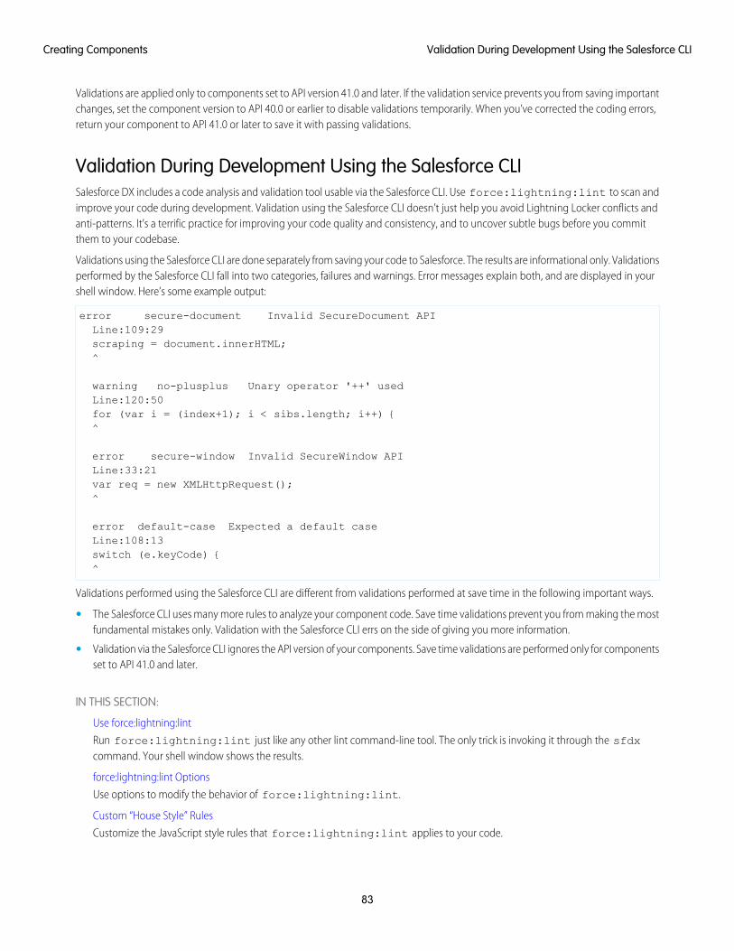
Validations are applied only to components set to API version 41.0 and later. If the validation service prevents you from saving importantchanges, set the component version to API 40.0 or earlier to disable validations temporarily. When you’ve corrected the coding errors,return your component to API 41.0 or later to save it with passing validations.
Validation During Development Using the Salesforce CLISalesforce DX includes a code analysis and validation tool usable via the Salesforce CLI. Use force:lightning:lint to scan andimprove your code during development. Validation using the Salesforce CLI doesn’t just help you avoid Lightning Locker conflicts andanti-patterns. It’s a terrific practice for improving your code quality and consistency, and to uncover subtle bugs before you committhem to your codebase.
Validations using the Salesforce CLI are done separately from saving your code to Salesforce. The results are informational only. Validationsperformed by the Salesforce CLI fall into two categories, failures and warnings. Error messages explain both, and are displayed in yourshell window. Here’s some example output:
error secure-document Invalid SecureDocument APILine:109:29scraping = document.innerHTML;^
warning no-plusplus Unary operator '++' usedLine:120:50for (var i = (index+1); i < sibs.length; i++) {^
error secure-window Invalid SecureWindow APILine:33:21var req = new XMLHttpRequest();^
error default-case Expected a default caseLine:108:13switch (e.keyCode) {^
Validations performed using the Salesforce CLI are different from validations performed at save time in the following important ways.
• The Salesforce CLI uses many more rules to analyze your component code. Save time validations prevent you from making the mostfundamental mistakes only. Validation with the Salesforce CLI errs on the side of giving you more information.
• Validation via the Salesforce CLI ignores the API version of your components. Save time validations are performed only for componentsset to API 41.0 and later.
IN THIS SECTION:
Use force:lightning:lint
Run force:lightning:lint just like any other lint command-line tool. The only trick is invoking it through the sfdxcommand. Your shell window shows the results.
force:lightning:lint Options
Use options to modify the behavior of force:lightning:lint.
Custom “House Style” Rules
Customize the JavaScript style rules that force:lightning:lint applies to your code.
83
Validation During Development Using the Salesforce CLICreating Components

Use force:lightning:lintRun force:lightning:lint just like any other lint command-line tool. The only trick is invoking it through the sfdx command.Your shell window shows the results.
Normal UseYou can run the force:lightning:lint lint tool on any folder that contains Aura components:
sfdx force:lightning:lint ./path/to/lightning/components/
Note: force:lightning:lint runs only on local files. Use Salesforce DX or third-party tools to download your componentcode to your machine. Options include Salesforce CLI commands like force:mdapi:retrieve and force:source:pull,or other tools such as the Force.com IDE, the Ant Migration Tool, or various third-party options.
The default output only shows errors. To see warnings too, use the verbose mode option.
See “Review and Resolve Validation Errors and Warnings” for what to do with the output of running force:lightning:lint.
SEE ALSO:
force:lightning:lint Options
force:lightning:lint OptionsUse options to modify the behavior of force:lightning:lint.
Common OptionsFiltering Files
Sometimes, you just want to scan a particular kind of file. The --files argument allows you to set a pattern to match files against.
For example, the following command allows you to scan controllers only:
sfdx force:lightning:lint ./path/to/lightning/components/ --files **/*Controller.js
Verbose Mode
The default output shows only errors so you can focus on bigger issues. The --verbose argument allows you to see both warningmessages and errors during the linting process.
For a complete list of command line parameters and how they affect tool behavior, see the Salesforce CLI Command Reference.
force:lightning:lint has built-in help, which you can access with the following command:
sfdx force:lightning:lint --help
SEE ALSO:
Use force:lightning:lint
Custom “House Style” RulesCustomize the JavaScript style rules that force:lightning:lint applies to your code.
84
Validation During Development Using the Salesforce CLICreating Components
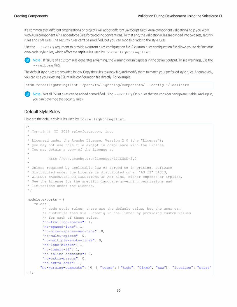
It’s common that different organizations or projects will adopt different JavaScript rules. Aura component validations help you workwith Aura component APIs, not enforce Salesforce coding conventions. To that end, the validation rules are divided into two sets, securityrules and style rules. The security rules can’t be modified, but you can modify or add to the style rules.
Use the --config argument to provide a custom rules configuration file. A custom rules configuration file allows you to define yourown code style rules, which affect the style rules used by force:lightning:lint.
Note: If failure of a custom rule generates a warning, the warning doesn’t appear in the default output. To see warnings, use the--verbose flag.
The default style rules are provided below. Copy the rules to a new file, and modify them to match your preferred style rules. Alternatively,you can use your existing ESLint rule configuration file directly. For example:
sfdx force:lightning:lint ./path/to/lightning/components/ --config ~/.eslintrc
Note: Not all ESLint rules can be added or modified using --config. Only rules that we consider benign are usable. And again,you can’t override the security rules.
Default Style RulesHere are the default style rules used by force:lightning:lint.
/** Copyright (C) 2016 salesforce.com, inc.** Licensed under the Apache License, Version 2.0 (the "License");* you may not use this file except in compliance with the License.* You may obtain a copy of the License at** http://www.apache.org/licenses/LICENSE-2.0** Unless required by applicable law or agreed to in writing, software* distributed under the License is distributed on an "AS IS" BASIS,* WITHOUT WARRANTIES OR CONDITIONS OF ANY KIND, either express or implied.* See the License for the specific language governing permissions and* limitations under the License.*/
module.exports = {rules: {
// code style rules, these are the default value, but the user can// customize them via --config in the linter by providing custom values// for each of these rules."no-trailing-spaces": 1,"no-spaced-func": 1,"no-mixed-spaces-and-tabs": 0,"no-multi-spaces": 0,"no-multiple-empty-lines": 0,"no-lone-blocks": 1,"no-lonely-if": 1,"no-inline-comments": 0,"no-extra-parens": 0,"no-extra-semi": 1,
"no-warning-comments": [0, { "terms": ["todo", "fixme", "xxx"], "location": "start"}],
85
Validation During Development Using the Salesforce CLICreating Components
"block-scoped-var": 1,"brace-style": [1, "1tbs"],"camelcase": 1,"comma-dangle": [1, "never"],"comma-spacing": 1,"comma-style": 1,"complexity": [0, 11],"consistent-this": [0, "that"],"curly": [1, "all"],"eol-last": 0,"func-names": 0,"func-style": [0, "declaration"],"generator-star-spacing": 0,"indent": 0,"key-spacing": 0,"keyword-spacing": [0, "always"],"max-depth": [0, 4],"max-len": [0, 80, 4],"max-nested-callbacks": [0, 2],"max-params": [0, 3],"max-statements": [0, 10],"new-cap": 0,"newline-after-var": 0,"one-var": [0, "never"],"operator-assignment": [0, "always"],"padded-blocks": 0,"quote-props": 0,"quotes": 0,"semi": 1,"semi-spacing": [0, {"before": false, "after": true}],"sort-vars": 0,"space-after-function-name": [0, "never"],"space-before-blocks": [0, "always"],"space-before-function-paren": [0, "always"],"space-before-function-parentheses": [0, "always"],"space-in-brackets": [0, "never"],"space-in-parens": [0, "never"],"space-infix-ops": 0,"space-unary-ops": [1, { "words": true, "nonwords": false }],"spaced-comment": [0, "always"],"vars-on-top": 0,"valid-jsdoc": 0,"wrap-regex": 0,"yoda": [1, "never"]
}};
Review and Resolve Validation Errors and WarningsWhen you run validations on your Aura component code, the results include details for each issue found in the files scanned. Reviewthe results and resolve problems in your code.
86
Review and Resolve Validation Errors and WarningsCreating Components
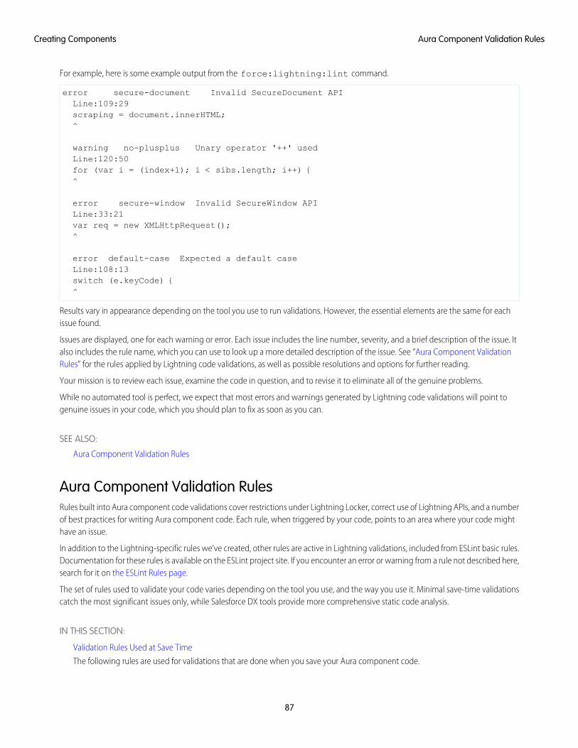
For example, here is some example output from the force:lightning:lint command.
error secure-document Invalid SecureDocument APILine:109:29scraping = document.innerHTML;^
warning no-plusplus Unary operator '++' usedLine:120:50for (var i = (index+1); i < sibs.length; i++) {^
error secure-window Invalid SecureWindow APILine:33:21var req = new XMLHttpRequest();^
error default-case Expected a default caseLine:108:13switch (e.keyCode) {^
Results vary in appearance depending on the tool you use to run validations. However, the essential elements are the same for eachissue found.
Issues are displayed, one for each warning or error. Each issue includes the line number, severity, and a brief description of the issue. Italso includes the rule name, which you can use to look up a more detailed description of the issue. See “Aura Component ValidationRules” for the rules applied by Lightning code validations, as well as possible resolutions and options for further reading.
Your mission is to review each issue, examine the code in question, and to revise it to eliminate all of the genuine problems.
While no automated tool is perfect, we expect that most errors and warnings generated by Lightning code validations will point togenuine issues in your code, which you should plan to fix as soon as you can.
SEE ALSO:
Aura Component Validation Rules
Aura Component Validation RulesRules built into Aura component code validations cover restrictions under Lightning Locker, correct use of Lightning APIs, and a numberof best practices for writing Aura component code. Each rule, when triggered by your code, points to an area where your code mighthave an issue.
In addition to the Lightning-specific rules we’ve created, other rules are active in Lightning validations, included from ESLint basic rules.Documentation for these rules is available on the ESLint project site. If you encounter an error or warning from a rule not described here,search for it on the ESLint Rules page.
The set of rules used to validate your code varies depending on the tool you use, and the way you use it. Minimal save-time validationscatch the most significant issues only, while Salesforce DX tools provide more comprehensive static code analysis.
IN THIS SECTION:
Validation Rules Used at Save Time
The following rules are used for validations that are done when you save your Aura component code.
87
Aura Component Validation RulesCreating Components
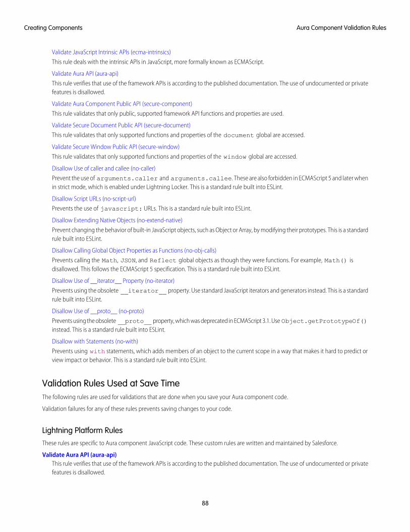
Validate JavaScript Intrinsic APIs (ecma-intrinsics)
This rule deals with the intrinsic APIs in JavaScript, more formally known as ECMAScript.
Validate Aura API (aura-api)
This rule verifies that use of the framework APIs is according to the published documentation. The use of undocumented or privatefeatures is disallowed.
Validate Aura Component Public API (secure-component)
This rule validates that only public, supported framework API functions and properties are used.
Validate Secure Document Public API (secure-document)
This rule validates that only supported functions and properties of the document global are accessed.
Validate Secure Window Public API (secure-window)
This rule validates that only supported functions and properties of the window global are accessed.
Disallow Use of caller and callee (no-caller)
Prevent the use of arguments.caller and arguments.callee. These are also forbidden in ECMAScript 5 and later whenin strict mode, which is enabled under Lightning Locker. This is a standard rule built into ESLint.
Disallow Script URLs (no-script-url)
Prevents the use of javascript: URLs. This is a standard rule built into ESLint.
Disallow Extending Native Objects (no-extend-native)
Prevent changing the behavior of built-in JavaScript objects, such as Object or Array, by modifying their prototypes. This is a standardrule built into ESLint.
Disallow Calling Global Object Properties as Functions (no-obj-calls)
Prevents calling the Math, JSON, and Reflect global objects as though they were functions. For example, Math() isdisallowed. This follows the ECMAScript 5 specification. This is a standard rule built into ESLint.
Disallow Use of __iterator__ Property (no-iterator)
Prevents using the obsolete __iterator__ property. Use standard JavaScript iterators and generators instead. This is a standardrule built into ESLint.
Disallow Use of __proto__ (no-proto)
Prevents using the obsolete __proto__ property, which was deprecated in ECMAScript 3.1. Use Object.getPrototypeOf()instead. This is a standard rule built into ESLint.
Disallow with Statements (no-with)
Prevents using with statements, which adds members of an object to the current scope in a way that makes it hard to predict orview impact or behavior. This is a standard rule built into ESLint.
Validation Rules Used at Save TimeThe following rules are used for validations that are done when you save your Aura component code.
Validation failures for any of these rules prevents saving changes to your code.
Lightning Platform RulesThese rules are specific to Aura component JavaScript code. These custom rules are written and maintained by Salesforce.
Validate Aura API (aura-api)This rule verifies that use of the framework APIs is according to the published documentation. The use of undocumented or privatefeatures is disallowed.
88
Aura Component Validation RulesCreating Components
Validate Secure Document Public API (secure-document)This rule validates that only supported functions and properties of the document global are accessed.
Validate Secure Window Public API (secure-window)This rule validates that only supported functions and properties of the window global are accessed.
General JavaScript RulesThese rules are general JavaScript rules, which enforce basic correct use of JavaScript required for Lightning components. These rulesare built into the ESLint tool.
Disallow Use of caller and callee (no-caller)Prevent the use of arguments.caller and arguments.callee. These are also forbidden in ECMAScript 5 and later whenin strict mode, which is enabled under Lightning Locker.
Disallow Extending Native Objects (no-extend-native)Prevent changing the behavior of built-in JavaScript objects, such as Object or Array, by modifying their prototypes.
Disallow Use of __iterator__ Property (no-iterator)Prevents using the obsolete __iterator__ property. Use standard JavaScript iterators and generators instead.
Disallow Calling Global Object Properties as Functions (no-obj-calls)Prevents calling the Math, JSON, and Reflect global objects as though they were functions. For example, Math() isdisallowed. This follows the ECMAScript 5 specification.
Disallow Use of __proto__ (no-proto)Prevents using the obsolete __proto__ property, which was deprecated in ECMAScript 3.1. Use Object.getPrototypeOf()instead.
Disallow Script URLs (no-script-url)Prevents the use of javascript: URLs.
Disallow with Statements (no-with)Prevents using with statements, which adds members of an object to the current scope in a way that makes it hard to predict orview impact or behavior.
Validate JavaScript Intrinsic APIs (ecma-intrinsics)This rule deals with the intrinsic APIs in JavaScript, more formally known as ECMAScript.
When Lightning Locker is enabled, the framework prevents the use of unsupported API objects or calls. That means your Aura componentscode is allowed to use:
• Features built into JavaScript (“intrinsic” features)
• Published, supported features built into the Aura Components programming model.
• Published, supported features built into Lightning Locker SecureObject objects
What exactly are these “intrinsic APIs”? They’re the APIs defined in the ECMAScript Language Specification. That is, things built intoJavaScript. This includes Annex B of the specification, which deals with legacy browser features that aren’t part of the “core” of JavaScript,but are nevertheless still supported for JavaScript running inside a web browser.
Note that some features of JavaScript that you might consider intrinsic—for example, the window and document global variables—aresuperceded by SecureObject objects, which offer a more constrained API.
89
Aura Component Validation RulesCreating Components
Rule DetailsThis rule verifies that use of the intrinsic JavaScript APIs is according to the published specification. The use of non-standard, deprecated,and removed language features is disallowed.
Further Reading
• ECMAScript specification
• Annex B: Additional ECMAScript Features for Web Browsers
• Intrinsic Objects (JavaScript)
SEE ALSO:
Validate Aura API (aura-api)
Validate Aura Component Public API (secure-component)
Validate Secure Document Public API (secure-document)
Validate Secure Window Public API (secure-window)
Validate Aura API (aura-api)This rule verifies that use of the framework APIs is according to the published documentation. The use of undocumented or privatefeatures is disallowed.
When Lightning Locker is enabled, the framework prevents the use of unsupported API objects or calls. That means your Aura componentscode is allowed to use:
• Features built into JavaScript (“intrinsic” features)
• Published, supported features built into the Aura Components programming model.
• Published, supported features built into Lightning Locker SecureObject objects
This rule deals with the supported, public framework APIs, for example, those available through the framework global $A.
Why is this rule called “Aura API”? Because the core of the Aura Components programming model is the open source Aura Framework.And this rule verifies permitted uses of that framework, rather than anything specific to Lightning Components.
Rule DetailsThe following patterns are considered problematic:
Aura.something(); // Use $A instead$A.util.fake(); // fake is not available in $A.util
90
Aura Component Validation RulesCreating Components
Further ReadingFor details of all of the methods available in the framework, including $A, see the JavaScript API athttps://myDomain.lightning.force.com/auradocs/reference.app, where myDomain is the name of yourcustom Salesforce domain.
SEE ALSO:
Validate Aura Component Public API (secure-component)
Validate Secure Document Public API (secure-document)
Validate Secure Window Public API (secure-window)
Validate Aura Component Public API (secure-component)This rule validates that only public, supported framework API functions and properties are used.
When Lightning Locker is enabled, the framework prevents the use of unsupported API objects or calls. That means your Aura componentscode is allowed to use:
• Features built into JavaScript (“intrinsic” features)
• Published, supported features built into the Aura Components programming model.
• Published, supported features built into Lightning Locker SecureObject objects
Prior to Lightning Locker, when you created or obtained a reference to a component, you could call any function and access any propertyavailable on that component, even if it wasn’t public. When Lightning Locker is enabled, components are “wrapped” by a newSecureComponent object, which controls access to the component and its functions and properties. SecureComponent restricts you tousing only published, supported component API.
Rule DetailsThe reference doc app lists the API for SecureComponent. Access the reference doc app at:
https://<myDomain>.lightning.force.com/docs/component-library, where <myDomain> is the name ofyour custom Salesforce domain.
The API for SecureComponent is listed at JavaScript API > Component.
SEE ALSO:
Validate Aura API (aura-api)
Validate Secure Document Public API (secure-document)
Validate Secure Window Public API (secure-window)
Validate Secure Document Public API (secure-document)This rule validates that only supported functions and properties of the document global are accessed.
When Lightning Locker is enabled, the framework prevents the use of unsupported API objects or calls. That means your Aura componentscode is allowed to use:
• Features built into JavaScript (“intrinsic” features)
• Published, supported features built into the Aura Components programming model.
• Published, supported features built into Lightning Locker SecureObject objects
91
Aura Component Validation RulesCreating Components
Prior to Lightning Locker, when you accessed the document global, you could call any function and access any property available.When Lightning Locker is enabled, the document global is “wrapped” by a new SecureDocument object, which controls access todocument and its functions and properties. SecureDocument restricts you to using only “safe” features of the document global.
SEE ALSO:
Validate Aura API (aura-api)
Validate Aura Component Public API (secure-component)
Validate Secure Window Public API (secure-window)
Validate Secure Window Public API (secure-window)This rule validates that only supported functions and properties of the window global are accessed.
When Lightning Locker is enabled, the framework prevents the use of unsupported API objects or calls. That means your Aura componentscode is allowed to use:
• Features built into JavaScript (“intrinsic” features)
• Published, supported features built into the Aura Components programming model.
• Published, supported features built into Lightning Locker SecureObject objects
Prior to Lightning Locker, when you accessed the window global, you could call any function and access any property available. WhenLightning Locker is enabled, the window global is “wrapped” by a new SecureWindow object, which controls access to window andits functions and properties. SecureWindow restricts you to using only “safe” features of the window global.
SEE ALSO:
Validate Aura API (aura-api)
Validate Aura Component Public API (secure-component)
Validate Secure Document Public API (secure-document)
Disallow Use of caller and callee (no-caller)Prevent the use of arguments.caller and arguments.callee. These are also forbidden in ECMAScript 5 and later whenin strict mode, which is enabled under Lightning Locker. This is a standard rule built into ESLint.
For complete details about this rule, including examples, see the corresponding ESLint documentation, Disallow Use of caller/callee(no-caller).
Disallow Script URLs (no-script-url)Prevents the use of javascript: URLs. This is a standard rule built into ESLint.
For complete details about this rule, including examples, see the corresponding ESLint documentation, Disallow Script URLs (no-script-url).
Disallow Extending Native Objects (no-extend-native)Prevent changing the behavior of built-in JavaScript objects, such as Object or Array, by modifying their prototypes. This is a standardrule built into ESLint.
For complete details about this rule, including examples, see the corresponding ESLint documentation, Disallow Extending of NativeObjects (no-extend-native).
92
Aura Component Validation RulesCreating Components
Disallow Calling Global Object Properties as Functions (no-obj-calls)Prevents calling the Math, JSON, and Reflect global objects as though they were functions. For example, Math() is disallowed.This follows the ECMAScript 5 specification. This is a standard rule built into ESLint.
For complete details about this rule, including examples, see the corresponding ESLint documentation, disallow calling global objectproperties as functions (no-obj-calls).
Disallow Use of __iterator__ Property (no-iterator)Prevents using the obsolete __iterator__ property. Use standard JavaScript iterators and generators instead. This is a standardrule built into ESLint.
For complete details about this rule, including examples, see the corresponding ESLint documentation, Disallow Iterator (no-iterator).
Disallow Use of __proto__ (no-proto)Prevents using the obsolete __proto__ property, which was deprecated in ECMAScript 3.1. Use Object.getPrototypeOf()instead. This is a standard rule built into ESLint.
For complete details about this rule, including examples, see the corresponding ESLint documentation, Disallow Use of __proto__(no-proto).
Disallow with Statements (no-with)Prevents using with statements, which adds members of an object to the current scope in a way that makes it hard to predict or viewimpact or behavior. This is a standard rule built into ESLint.
For complete details about this rule, including examples, see the corresponding ESLint documentation, disallow with statements (no-with).
Salesforce Lightning CLI (Deprecated)Lightning CLI was a Heroku Toolbelt plugin to scan your code for general JavaScript coding issues and Lightning-specific issues. LightningCLI is deprecated in favor of the force:lightning:lint tool available in the Salesforce DX CLI.
For more information about code validation using Salesforce DX, see the Salesforce CLI Command Reference.
IN THIS SECTION:
Install Salesforce Lightning CLI (Deprecated)
Lightning CLI was a Heroku Toolbelt plugin to scan your code for general JavaScript coding issues and Lightning-specific issues.Lightning CLI is deprecated in favor of the force:lightning:lint tool available in the Salesforce DX CLI.
Install Salesforce Lightning CLI (Deprecated)Lightning CLI was a Heroku Toolbelt plugin to scan your code for general JavaScript coding issues and Lightning-specific issues. LightningCLI is deprecated in favor of the force:lightning:lint tool available in the Salesforce DX CLI.
For instructions on how to install the Salesforce DX CLI, see “Install the Salesforce CLI” in the Salesforce DX Setup Guide.
93
Salesforce Lightning CLI (Deprecated)Creating Components
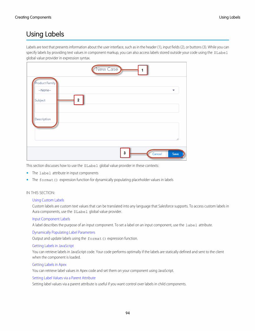
Using Labels
Labels are text that presents information about the user interface, such as in the header (1), input fields (2), or buttons (3). While you canspecify labels by providing text values in component markup, you can also access labels stored outside your code using the $Labelglobal value provider in expression syntax.
This section discusses how to use the $Label global value provider in these contexts:
• The label attribute in input components
• The format() expression function for dynamically populating placeholder values in labels
IN THIS SECTION:
Using Custom Labels
Custom labels are custom text values that can be translated into any language that Salesforce supports. To access custom labels inAura components, use the $Label global value provider.
Input Component Labels
A label describes the purpose of an input component. To set a label on an input component, use the label attribute.
Dynamically Populating Label Parameters
Output and update labels using the format() expression function.
Getting Labels in JavaScript
You can retrieve labels in JavaScript code. Your code performs optimally if the labels are statically defined and sent to the clientwhen the component is loaded.
Getting Labels in Apex
You can retrieve label values in Apex code and set them on your component using JavaScript.
Setting Label Values via a Parent Attribute
Setting label values via a parent attribute is useful if you want control over labels in child components.
94
Using LabelsCreating Components
Using Custom LabelsCustom labels are custom text values that can be translated into any language that Salesforce supports. To access custom labels in Auracomponents, use the $Label global value provider.
Custom labels enable developers to create multilingual applications by automatically presenting information (for example, help text orerror messages) in a user's native language.
Note: Label translations require the Translation Workbench is enabled.
To create custom labels, from Setup, enter Custom Labels in the Quick Find box, then select Custom Labels.
Use the following syntax to access custom labels in Aura components.
• $Label.c.labelName for the default namespace
• $Label.namespace.labelName if your org has a namespace, or to access a label in a managed package
You can reference custom labels in component markup and in JavaScript code. Here are some examples.
Label in a markup expression using the default namespace{!$Label.c.labelName}
Note: Label expressions in markup are supported in .cmp and .app resources only.
Label in JavaScript code if your org has a namespace$A.get("$Label.namespace.labelName")
Note: Updates to a label locale or translation are not immediately in the application. To verify the change immediately, log outand in.
SEE ALSO:
Value Providers
Input Component LabelsA label describes the purpose of an input component. To set a label on an input component, use the label attribute.
This example shows how to use labels using the label attribute on an input component.
<lightning:input type="number" name="myNumber" label="Pick a Number:" value="54" />
The label is placed on the left of the input field and can be hidden by setting variant="label-hidden", which applies theslds-assistive-text class to the label to support accessibility.
Using $LabelUse the $Label global value provider to access labels stored in an external source. For example:
<lightning:input type="number" name="myNumber" label="{!$Label.Number.PickOne}" />
95
Using Custom LabelsCreating Components
To output a label and dynamically update it, use the format() expression function. For example, if you have np.labelName setto Hello {0}, the following expression returns Hello World if v.name is set to World.
{!format($Label.np.labelName, v.name)}
SEE ALSO:
Supporting Accessibility
Dynamically Populating Label ParametersOutput and update labels using the format() expression function.
You can provide a string with placeholders, which are replaced by the substitution values at runtime.
Add as many parameters as you need. The parameters are numbered and are zero-based. For example, if you have three parameters,they will be named {0}, {1}, and {2}, and they will be substituted in the order they're specified.
Let's look at a custom label, $Label.mySection.myLabel, with a value of Hello {0} and {1}, where $Label is theglobal value provider that accesses your labels.
This expression dynamically populates the placeholder parameters with the values of the supplied attributes.
{!format($Label.mySection.myLabel, v.attribute1, v.attribute2)}
The label is automatically refreshed if one of the attribute values changes.
Note: Always use the $Label global value provider to reference a label with placeholder parameters. You can't set a stringwith placeholder parameters as the first argument for format(). For example, this syntax doesn't work:
{!format('Hello {0}', v.name)}
Use this expression instead.
{!format($Label.mySection.salutation, v.name)}
where $Label.mySection.salutation is set to Hello {0}.
Getting Labels in JavaScriptYou can retrieve labels in JavaScript code. Your code performs optimally if the labels are statically defined and sent to the client whenthe component is loaded.
Static LabelsStatic labels are defined in one string, such as "$Label.c.task_mode_today". The framework parses static labels in markupor JavaScript code and sends the labels to the client when the component is loaded. A server trip isn’t required to resolve the label.
Use $A.get() to retrieve static labels in JavaScript code. For example:
var staticLabel = $A.get("$Label.c.task_mode_today");component.set("v.mylabel", staticLabel);
You can also retrieve label values using Apex code and send them to the component via JavaScript code. For more information, seeGetting Labels in Apex.
96
Dynamically Populating Label ParametersCreating Components
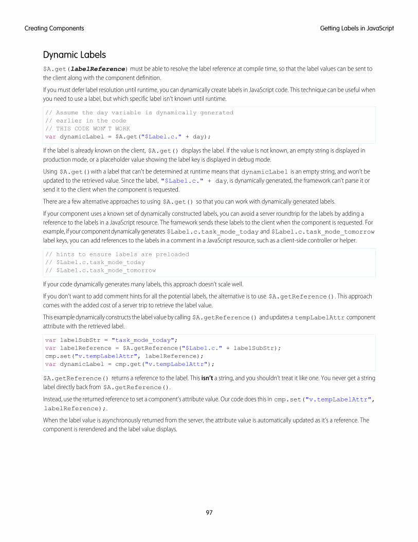
Dynamic Labels$A.get(labelReference) must be able to resolve the label reference at compile time, so that the label values can be sent tothe client along with the component definition.
If you must defer label resolution until runtime, you can dynamically create labels in JavaScript code. This technique can be useful whenyou need to use a label, but which specific label isn’t known until runtime.
// Assume the day variable is dynamically generated// earlier in the code// THIS CODE WON’T WORKvar dynamicLabel = $A.get("$Label.c." + day);
If the label is already known on the client, $A.get() displays the label. If the value is not known, an empty string is displayed inproduction mode, or a placeholder value showing the label key is displayed in debug mode.
Using $A.get()with a label that can't be determined at runtime means that dynamicLabel is an empty string, and won’t beupdated to the retrieved value. Since the label, "$Label.c." + day, is dynamically generated, the framework can’t parse it orsend it to the client when the component is requested.
There are a few alternative approaches to using $A.get() so that you can work with dynamically generated labels.
If your component uses a known set of dynamically constructed labels, you can avoid a server roundtrip for the labels by adding areference to the labels in a JavaScript resource. The framework sends these labels to the client when the component is requested. Forexample, if your component dynamically generates $Label.c.task_mode_today and $Label.c.task_mode_tomorrowlabel keys, you can add references to the labels in a comment in a JavaScript resource, such as a client-side controller or helper.
// hints to ensure labels are preloaded// $Label.c.task_mode_today// $Label.c.task_mode_tomorrow
If your code dynamically generates many labels, this approach doesn’t scale well.
If you don’t want to add comment hints for all the potential labels, the alternative is to use $A.getReference(). This approachcomes with the added cost of a server trip to retrieve the label value.
This example dynamically constructs the label value by calling $A.getReference() and updates a tempLabelAttr componentattribute with the retrieved label.
var labelSubStr = "task_mode_today";var labelReference = $A.getReference("$Label.c." + labelSubStr);cmp.set("v.tempLabelAttr", labelReference);var dynamicLabel = cmp.get("v.tempLabelAttr");
$A.getReference() returns a reference to the label. This isn’t a string, and you shouldn’t treat it like one. You never get a stringlabel directly back from $A.getReference().
Instead, use the returned reference to set a component’s attribute value. Our code does this in cmp.set("v.tempLabelAttr",labelReference);.
When the label value is asynchronously returned from the server, the attribute value is automatically updated as it’s a reference. Thecomponent is rerendered and the label value displays.
97
Getting Labels in JavaScriptCreating Components
Note: Our code sets dynamicLabel = cmp.get("v.tempLabelAttr") immediately after getting the reference.This code displays an empty string until the label value is returned from the server. If you don’t want that behavior, use a commenthint to ensure that the label is sent to the client without requiring a later server trip.
SEE ALSO:
Using JavaScript
Input Component Labels
Dynamically Populating Label Parameters
Getting Labels in ApexYou can retrieve label values in Apex code and set them on your component using JavaScript.
Custom LabelsCustom labels have a limit of 1,000 characters and can be accessed from an Apex class. To define custom labels, from Setup, in the QuickFind box, enter Custom Labels, and then select Custom Labels.
In your Apex class, reference the label with the syntax System.Label.MyLabelName.
public with sharing class LabelController {@AuraEnabledpublic static String getLabel() {
String s1 = 'Hello from Apex Controller, ' ;String s2 = System.Label.MyLabelName;return s1 + s2;
}}
Note: Return label values as plain text strings. You can’t return a label expression using the $Label global value provider.
The component loads the labels by requesting it from the server, such as during initialization. For example, the label is retrieved inJavaScript code.
({doInit : function(component, event, helper) {
var action = component.get("c.getLabel");action.setCallback(this, function(response) {
var state = response.getState();if (state === "SUCCESS") {
component.set("v.mylabel", response.getReturnValue());}// error handling when state is "INCOMPLETE" or "ERROR"
});$A.enqueueAction(action);
}})
Finally, make sure you wire up the Apex class to your component. The label is set on the component during initialization.
<aura:component controller="LabelController"><aura:handler name="init" value="{!this}" action="{!c.doInit}" />
98
Getting Labels in ApexCreating Components
<aura:attribute name="mylabel" type="String"/>{!v.mylabel}
</aura:component>
Passing in Label ValuesPass label values into components using the expression syntax {!v.mylabel}. You must provide a default value to the Stringattribute. Depending on your use case, the default value might be the label in the default language or, if the specific label can’t be knownuntil runtime, perhaps just a single space.
<aura:component controller="LabelController"><aura:attribute name="mylabel" type="String" default=" "/><lightning:input name="mytext" label="{!v.mylabel}"/>
</aura:component>
You can also retrieve labels in JavaScript code, including dynamically creating labels that are generated during runtime. For moreinformation, see Getting Labels in JavaScript.
Setting Label Values via a Parent AttributeSetting label values via a parent attribute is useful if you want control over labels in child components.
Let’s say that you have a container component, which contains another component, inner.cmp. You want to set a label value ininner.cmp via an attribute on the container component. This can be done by specifying the attribute type and default value. Youmust set a default value in the parent attribute if you are setting a label on an inner component, as shown in the following example.
This is the container component, which contains a default value My Label for the _label attribute .
<aura:component><aura:attribute name="_label"
type="String"default="My Label"/>
<lightning:button label="Set Label" aura:id="button1" onclick="{!c.setLabel}"/><auradocs:inner aura:id="inner" label="{!v._label}"/>
</aura:component>
This inner component contains a text area component and a label attribute that’s set by the container component.
<aura:component><aura:attribute name="label" type="String"/><lightning:textarea aura:id="textarea"
name="myTextarea"label="{!v.label}"/>
</aura:component>
This client-side controller action updates the label value.
({setLabel:function(cmp) {
cmp.set("v._label", 'new label');}
})
99
Setting Label Values via a Parent AttributeCreating Components
When the component is initialized, you’ll see a button and a text area with the label My Label. When the button in the containercomponent is clicked, the setLabel action updates the label value in the inner component. This action finds the label attributeand sets its value to new label.
SEE ALSO:
Input Component Labels
Component Attributes
Localization
The framework provides client-side localization support on input and output components.
Note: Components in the ui namespace are deprecated as of API version 46.0. We recommend you use components in thelightning namespace instead. For more information, see Working with UI Components.
The following example shows how you can override the default timezone attribute. The output displays the time in the formathh:mm by default.
<aura:component><ui:outputDateTime value="2013-10-07T00:17:08.997Z" timezone="Europe/Berlin" />
</aura:component>
The component renders as Oct 7, 2013 2:17:08 AM.
To customize the date and time formatting, we recommend using lightning:formattedDateTime. This example sets thedate and time using the init handler.
<aura:component><aura:handler name="init" value="{!this}" action="{!c.doInit}"/><aura:attribute name="datetime" type="DateTime"/><lightning:formattedDateTime value="{!v.datetime}" timeZone="Europe/Berlin"
year="numeric" month="short" day="2-digit" hour="2-digit"
minute="2-digit" second="2-digit"/></aura:component>
({doInit : function(component, event, helper) {
var date = new Date();component.set("v.datetime", date)
}})
This example creates a JavaScript Date instance, which is rendered in the format MMM DD, YYYY HH:MM:SS AM.
Although the output for this example is similar to <ui:outputDateTime value="{!v.datetime}"timezone="Europe/Berlin" />, the attributes on lightning:formattedDateTime enable you to control formattingat a granular level. For example, you can display the date using the MM/DD/YYYY format.
<lightning:formattedDateTime value="{!v.datetime}" timeZone="Europe/Berlin" year="numeric"month="numeric" day="numeric"/>
Additionally, you can use the global value provider, $Locale, to obtain the locale information. The locale settings in your organizationoverrides the browser’s locale information.
100
LocalizationCreating Components
Working with Locale InformationIn a single currency organization, Salesforce administrators set the currency locale, default language, default locale, and default timezone for their organizations. Users can set their individual language, locale, and time zone on their personal settings pages.
Note: Single language organizations cannot change their language, although they can change their locale.
For example, setting the time zone on the Language & Time Zone page to (GMT+02:00) returns 28.09.2015 09:00:00when you run the following code.
<ui:outputDateTime value="09/28/2015" />
Running $A.get("$Locale.timezone") returns the time zone name, for example, Europe/Paris. For more information,see "Supported Time Zones" in the Salesforce Help.
Setting the currency locale on the Company Information page to Japanese (Japan) - JPY returns ¥100,000 when yourun the following code.
<ui:outputCurrency value="100000" />
Note: To change between using the currency symbol, code, or name, use lightning:formattedNumber instead.
Similarly, running $A.get("$Locale.currency") returns "¥" when your org’s currency locale is set to Japanese(Japan) - JPY. For more information, see "Supported Currencies" in the Salesforce Help.
SEE ALSO:
Formatting Dates in JavaScript
Providing Component Documentation
Component documentation helps developers use your components effectively. You can provide interactive examples, documentation,and specification descriptions for a component, event, or interface.
A component, event, or interface is also known as a root definition.
Viewing the DocumentationWhen a root definition is marked access="global", it’s surfaced in the Component Library on page 487 in your org. For managedpackages and namespaces you own, components with either access="global" or access="public"(default) are surfacedin the Component Library. Each root definition page can display up to three tabs in the following order.
ExampleDisplays interactive examples denoted by the <aura:example> tag in the .auradoc file. This tab is hidden if no examplesare wired up in your .auradoc file. See the Providing an Example Component section below.
DocumentationDisplays the content of the .auradoc file. This tab is hidden if an .auradoc file is not available for your root definition. Seethe Writing the Documentation section below.
SpecificationDisplays the description of the root definition, attributes, and methods. For managed packages and namespaces you own, attributesand methods with either access="global" or access="public"(default) are surfaced. See the Providing InlineDescriptions section below.
101
Providing Component DocumentationCreating Components
Writing the DocumentationThe main documentation for a root definition is surfaced via the Documentation tab on a root definition page, for example,https://developer.salesforce.com/docs/component-library/bundle/lightning:avatar/documentation.
Provide your content in HTML markup and describe what a component is and what it does. Add code samples to help developers useyour component, event, or interface easily.
To provide documentation, click DOCUMENTATION in the component sidebar of the Developer Console, which creates a .auradocfile. The following example shows the content of avatar.auradoc.
A .auradoc file contains these tags.
DescriptionTag
Required. The top-level definition of the DocDef<aura:documentation>
Required. Describes the component using HTML markup. To include code samples in thedescription, use the <pre> tag, which renders as a code block. Code entered in the <pre> tag
<aura:description>
must be escaped. For example, escape <aura:component> by entering<aura:component>.
Optional. References an example that demonstrates how the component is used. Supports HTMLmarkup, which displays as text preceding the visual output and example component source. The
<aura:example>
example is displayed as interactive output. Multiple examples are supported and should be wrappedin individual <aura:example> tags.
• name: The API name of the example
• ref: The reference to the example component in the format<namespace:exampleComponent>
• label: The label of the title
Providing an Example ComponentThe example component is rendered as an interactive demo in the Example tab of a root definition page when it’s wired up usingaura:example.
<aura:example name="exampleAvatarBasic" ref="lightningcomponentdemo:exampleAvatarBasic"label="Basic Avatar">
<p>The following example creates an avatar with the default size and variant. Theinitials "BW" is displayed if the image path denoted by the <code>src</code> attribute isinvalid or fails to load for any reason, such as when the user is offline.</p></aura:example>
The following is an example component that demonstrates how lightning:avatar can be used.
Supported HTML Tags in .auradoc FilesWe recommend using the following tags in your documentation.
• <a>—Link
• <p>—Paragraph
• <ul>—Bulleted List
102
Providing Component DocumentationCreating Components
• <ol>—Numbered List
• <li>—List item in a bulleted or numbered list
• <code>—Code formatting
• <pre>—Code block
• <h4>—Section heading
• <table>—Table with rows and columns of data
Providing Inline DescriptionsInline descriptions provide a brief overview of what an element is about. HTML markup is not supported in inline descriptions. Thesetags support inline descriptions via the description attribute.
ExampleTag
<aura:component description="Represents a button element"><aura:component>
<aura:attribute name="label" type="String" description="Thetext to be displayed inside the button."/>
<aura:attribute>
<aura:event type="COMPONENT" description="Indicates that akeyboard key has been pressed and released"/>
<aura:event>
<aura:interface description="A common interface for datecomponents"/>
<aura:interface>
<aura:method name="setCustomValidity" description="Sets a customerror message.">
<aura:method>
<aura:attribute name="message" type="String"description="The string that describes the error. If
message is an empty string, the error message is reset."/></aura:method>
<aura:registerEvent name="keydown" type="ui:keydown"description="Indicates that a key is pressed"/>
<aura:registerEvent>
SEE ALSO:
Reference
Working with Base Lightning Components
Base Lightning components are the building blocks that make up the modern Lightning Experience, Salesforce app, and LightningCommunities user interfaces.
Base Lightning components incorporate Lightning Design System markup and classes, providing improved performance and accessibilitywith a minimum footprint.
These base components handle the details of HTML and CSS for you. Each component provides simple attributes that enable variationsin style. This means that you typically don’t need to use CSS at all. The simplicity of the base Lightning component attributes and theirclean and consistent definitions make them easy to use, enabling you to focus on your business logic.
103
Working with Base Lightning ComponentsCreating Components
You can find base Lightning components in the lightning namespace to complement the existing ui namespace components.In instances where there are matching ui and lightning namespace components, we recommend that you use the lightningnamespace component. The lightning namespace components are optimized for common use cases. Beyond being equippedwith the Lightning Design System styling, they handle accessibility, real-time interaction, and enhanced error messages.
In subsequent releases, we intend to provide additional base Lightning components. We expect that in time the lightning namespacewill have parity with the ui namespace and go beyond it. In addition, the base Lightning components will evolve with the LightningDesign System over time. This ensures that your customizations continue to match Lightning Experience and the Salesforce app.
While the base components are visual building blocks and provides minimum functionality out-of-the-box, they can be combinedtogether to build “experience components” with richer capabilities and made accessible via the Lightning App Builder. Admins candrag-and-drop these experience components to build and configure user interfaces easily. For example, the Chatter Feed componentin Lightning App Builder comprises a collection of tabs, a group of buttons, and a rich text editor.
The API version column denotes the minimum API version you must set to use the component in the Developer Console, the Force.comIDE, or via API. Components that don’t specify a minimum API version are usable with any API version 37.0 and later.
Note: Interactive examples for the following components are available in the Component Library.
ButtonsThese components provide different button flavors.
APIVersion
Lightning DesignSystem
DescriptionLightning ComponentName
Type
ButtonsRepresents a button element.lightning:buttonButton
Button GroupsRepresents a group of buttons.lightning:buttonGroupButtonGroup
Button IconsAn icon-only HTML button.lightning:buttonIconButton Icon
41.0Button IconsAn icon-only button that retains state.lightning:buttonIconStatefulButton Icon(Stateful)
MenusA dropdown menu with a list of actions orfunctions.
lightning:buttonMenuButtonMenu
A list item in lightning:buttonMenu.lightning:menuItem
A horizontal line separating menu items inlightning:buttonMenu.
lightning:menuDivider
A subheading for menu items inlightning:buttonMenu.
lightning:menuSubheader
Button StatefulA button that toggles between states.lightning:buttonStatefulButtonStateful
43.0Button IconsA button for inserting images inlightning:inputRichText.
lightning:insertImageButtonInsertImageButton
104
Working with Base Lightning ComponentsCreating Components
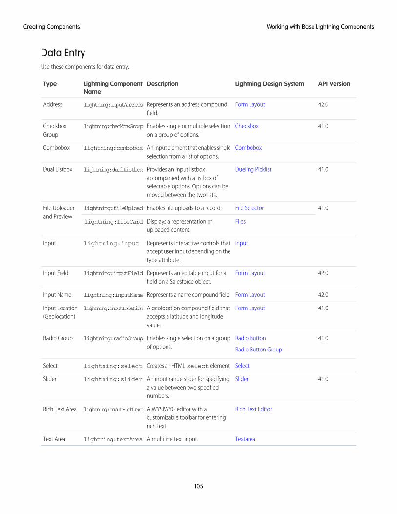
Data EntryUse these components for data entry.
API VersionLightning Design SystemDescriptionLightning ComponentName
Type
42.0Form LayoutRepresents an address compoundfield.
lightning:inputAddressAddress
41.0CheckboxEnables single or multiple selectionon a group of options.
lightning:checkboxGroupCheckboxGroup
ComboboxAn input element that enables singleselection from a list of options.
lightning:comboboxCombobox
41.0Dueling PicklistProvides an input listboxaccompanied with a listbox of
lightning:dualListboxDual Listbox
selectable options. Options can bemoved between the two lists.
41.0File SelectorEnables file uploads to a record.lightning:fileUploadFile Uploaderand Preview
FilesDisplays a representation ofuploaded content.
lightning:fileCard
InputRepresents interactive controls thataccept user input depending on thetype attribute.
lightning:inputInput
42.0Form LayoutRepresents an editable input for afield on a Salesforce object.
lightning:inputFieldInput Field
42.0Form LayoutRepresents a name compound field.lightning:inputNameInput Name
41.0Form LayoutA geolocation compound field thataccepts a latitude and longitudevalue.
lightning:inputLocationInput Location(Geolocation)
41.0Radio Button
Radio Button Group
Enables single selection on a groupof options.
lightning:radioGroupRadio Group
SelectCreates an HTML select element.lightning:selectSelect
41.0SliderAn input range slider for specifyinga value between two specifiednumbers.
lightning:sliderSlider
Rich Text EditorA WYSIWYG editor with acustomizable toolbar for enteringrich text.
lightning:inputRichTextRich Text Area
TextareaA multiline text input.lightning:textAreaText Area
105
Working with Base Lightning ComponentsCreating Components

Displaying DataUse these components to display data.
API VersionLightning Design SystemDescriptionLightning ComponentName
Type
42.0N/ADisplays a formatted address thatprovides a link to the given locationon Google Maps.
lightning:formattedAddressAddress
lightning:clickToDialClick-to-dial
Displays formatted date and time.lightning:formattedDateTimeDate/Time
41.0Displays an email as a hyperlink withthe mailto: URL scheme.
lightning:formattedEmailEmail
41.0Displays a geolocation using theformat latitude,longitude.
lightning:formattedLocationGeolocation
42.0Displays a formatted name that caninclude a salutation and suffix.
lightning:formattedNameName
Displays formatted numbers.lightning:formattedNumberNumber
41.0Displays a label, help text, and valuefor a field on a Salesforce object.
lightning:outputFieldOutput Field
41.0Displays a phone number as ahyperlink with the tel: URLscheme.
lightning:formattedPhonePhone
41.0Displays rich text that’s formattedwith whitelisted tags and attributes.
lightning:formattedRichTextRich Text
41.0Displays text, replaces newlines withline breaks, and linkifies if requested.
lightning:formattedTextText
42.0Displays a formatted time based onthe user’s locale.
lightning:formattedTimeTime
41.0Displays a URL as a hyperlink.lightning:formattedUrlURL
Displays the relative time differencebetween the source date-time andthe provided date-time.
lightning:relativeDateTimeRelativeDate/Time
Formsuse these components to edit and view records
106
Working with Base Lightning ComponentsCreating Components
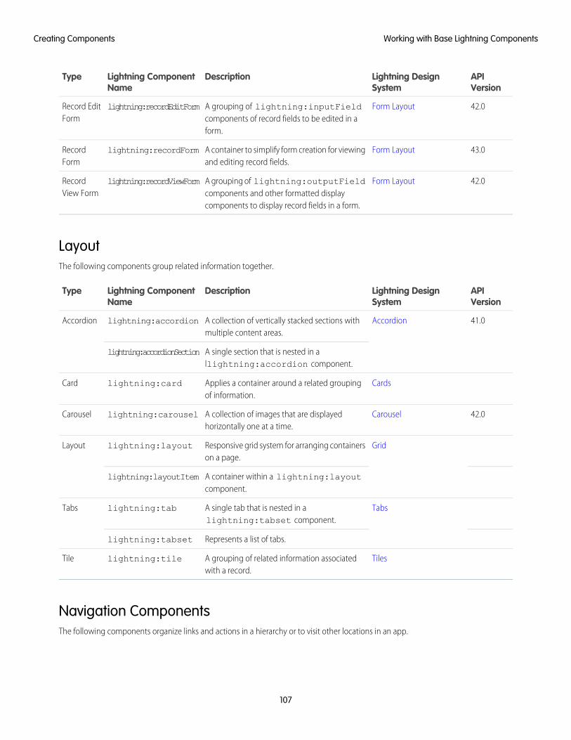
APIVersion
Lightning DesignSystem
DescriptionLightning ComponentName
Type
42.0Form LayoutA grouping of lightning:inputFieldcomponents of record fields to be edited in aform.
lightning:recordEditFormRecord EditForm
43.0Form LayoutA container to simplify form creation for viewingand editing record fields.
lightning:recordFormRecordForm
42.0Form LayoutA grouping of lightning:outputFieldcomponents and other formatted displaycomponents to display record fields in a form.
lightning:recordViewFormRecordView Form
LayoutThe following components group related information together.
APIVersion
Lightning DesignSystem
DescriptionLightning ComponentName
Type
41.0AccordionA collection of vertically stacked sections withmultiple content areas.
lightning:accordionAccordion
A single section that is nested in allightning:accordion component.
lightning:accordionSection
CardsApplies a container around a related groupingof information.
lightning:cardCard
42.0CarouselA collection of images that are displayedhorizontally one at a time.
lightning:carouselCarousel
GridResponsive grid system for arranging containerson a page.
lightning:layoutLayout
A container within a lightning:layoutcomponent.
lightning:layoutItem
TabsA single tab that is nested in alightning:tabset component.
lightning:tabTabs
Represents a list of tabs.lightning:tabset
TilesA grouping of related information associatedwith a record.
lightning:tileTile
Navigation ComponentsThe following components organize links and actions in a hierarchy or to visit other locations in an app.
107
Working with Base Lightning ComponentsCreating Components
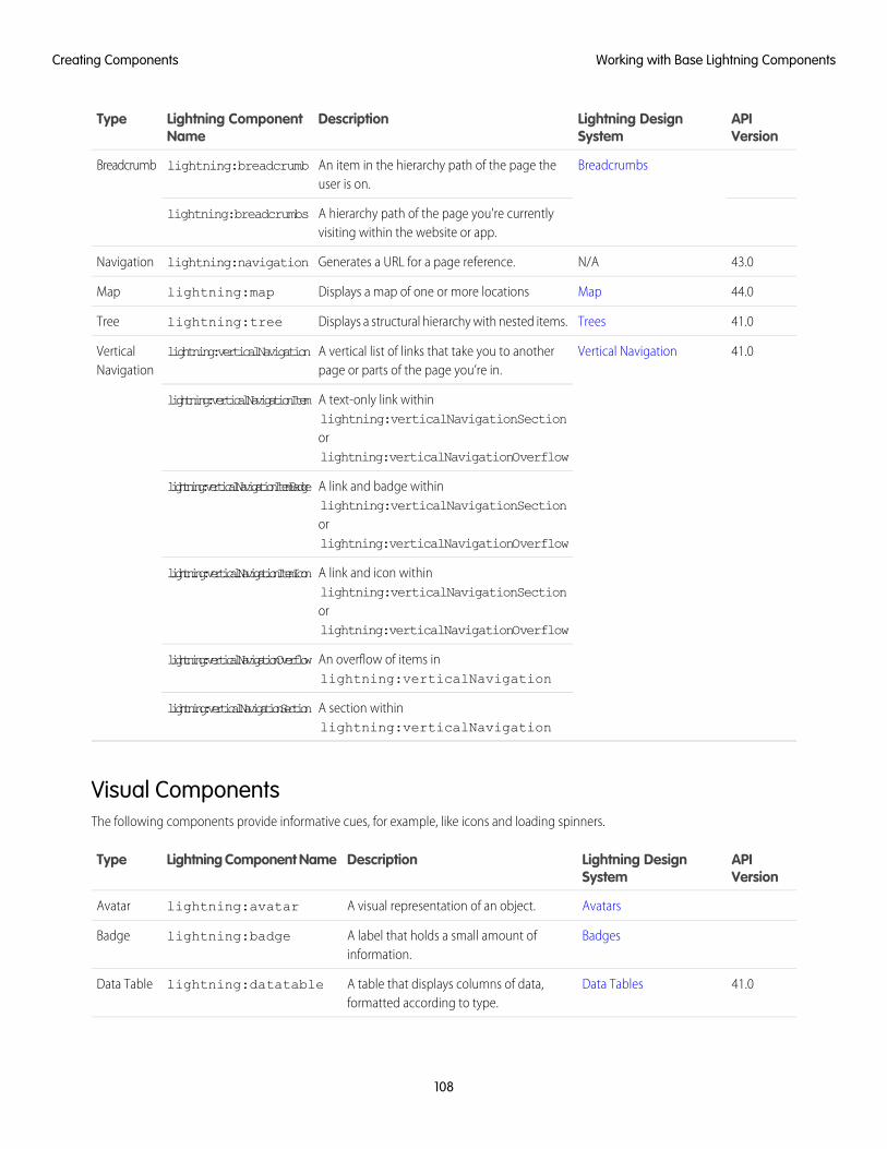
APIVersion
Lightning DesignSystem
DescriptionLightning ComponentName
Type
BreadcrumbsAn item in the hierarchy path of the page theuser is on.
lightning:breadcrumbBreadcrumb
A hierarchy path of the page you're currentlyvisiting within the website or app.
lightning:breadcrumbs
43.0N/AGenerates a URL for a page reference.lightning:navigationNavigation
44.0MapDisplays a map of one or more locationslightning:mapMap
41.0TreesDisplays a structural hierarchy with nested items.lightning:treeTree
41.0Vertical NavigationA vertical list of links that take you to anotherpage or parts of the page you’re in.
lightning:verticalNavigationVerticalNavigation
A text-only link withinlightning:verticalNavigationSection
lightning:verticalNavigationItem
orlightning:verticalNavigationOverflow
A link and badge withinlightning:verticalNavigationSection
lightning:verticalNavigationItemBadge
orlightning:verticalNavigationOverflow
A link and icon withinlightning:verticalNavigationSection
lightning:verticalNavigationItemIcon
orlightning:verticalNavigationOverflow
An overflow of items inlightning:verticalNavigation
lightning:verticalNavigationOverflow
A section withinlightning:verticalNavigation
lightning:verticalNavigationSection
Visual ComponentsThe following components provide informative cues, for example, like icons and loading spinners.
APIVersion
Lightning DesignSystem
DescriptionLightning Component NameType
AvatarsA visual representation of an object.lightning:avatarAvatar
BadgesA label that holds a small amount ofinformation.
lightning:badgeBadge
41.0Data TablesA table that displays columns of data,formatted according to type.
lightning:datatableData Table
108
Working with Base Lightning ComponentsCreating Components
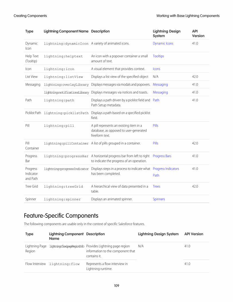
APIVersion
Lightning DesignSystem
DescriptionLightning Component NameType
41.0Dynamic IconsA variety of animated icons.lightning:dynamicIconDynamicIcon
TooltipsAn icon with a popover container a smallamount of text.
lightning:helptextHelp Text(Tooltip)
IconsA visual element that provides context.lightning:iconIcon
42.0N/ADisplays a list view of the specified objectlightning:listViewList View
41.0MessagingDisplays messages via modals and popovers.lightning:overlayLibraryMessaging
41.0MessagingDisplays messages via notices and toasts.lightning:notificationsLibrary
41.0PathDisplays a path driven by a picklist field andPath Setup metadata.
lightning:pathPath
Displays a path based on a specified picklistfield.
lightning:picklistPathPicklist Path
PillsA pill represents an existing item in adatabase, as opposed to user-generatedfreeform text.
lightning:pillPill
42.0PillsA list of pills grouped in a container.lightning:pillContainerPillContainer
41.0Progress BarsA horizontal progress bar from left to rightto indicate the progress of an operation.
lightning:progressBarProgressBar
41.0Progress Indicators
Path
Displays steps in a process to indicate whathas been completed.
lightning:progressIndicatorProgressIndicatorand Path
42.0TreesA hierarchical view of data presented in atable.
lightning:treeGridTree Grid
SpinnersDisplays an animated spinner.lightning:spinnerSpinner
Feature-Specific ComponentsThe following components are usable only in the context of specific Salesforce features.
API VersionLightning Design SystemDescriptionLightning ComponentName
Type
41.0N/AProvides Lightning page regioninformation to the component thatcontains it.
lightning:flexipageRegionInfoLightning PageRegion
41.0Represents a flow interview inLightning runtime.
lightning:flowFlow Interview
109
Working with Base Lightning ComponentsCreating Components
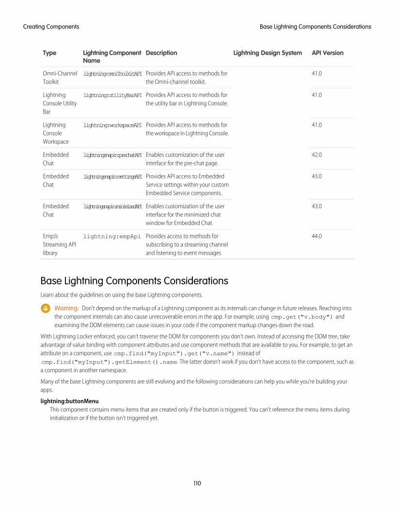
API VersionLightning Design SystemDescriptionLightning ComponentName
Type
41.0Provides API access to methods forthe Omni-channel toolkit.
lightning:omniToolkitAPIOmni-ChannelToolkit
41.0Provides API access to methods forthe utility bar in Lightning Console.
lightning:utilityBarAPILightningConsole UtilityBar
41.0Provides API access to methods forthe workspace in Lightning Console.
lightning:workspaceAPILightningConsoleWorkspace
42.0Enables customization of the userinterface for the pre-chat page.
lightningsnapin:prechatAPIEmbeddedChat
43.0Provides API access to EmbeddedService settings within your customEmbedded Service components.
lightningsnapin:settingsAPIEmbeddedChat
43.0Enables customization of the userinterface for the minimized chatwindow for Embedded Chat.
lightningsnapin:minimizedAPIEmbeddedChat
44.0Provides access to methods forsubscribing to a streaming channeland listening to event messages
lightning:empApiEmpJsStreaming APIlibrary
Base Lightning Components ConsiderationsLearn about the guidelines on using the base Lightning components.
Warning: Don’t depend on the markup of a Lightning component as its internals can change in future releases. Reaching intothe component internals can also cause unrecoverable errors in the app. For example, using cmp.get("v.body") andexamining the DOM elements can cause issues in your code if the component markup changes down the road.
With Lightning Locker enforced, you can’t traverse the DOM for components you don't own. Instead of accessing the DOM tree, takeadvantage of value binding with component attributes and use component methods that are available to you. For example, to get anattribute on a component, use cmp.find("myInput").get("v.name") instead ofcmp.find("myInput").getElement().name. The latter doesn’t work if you don’t have access to the component, such asa component in another namespace.
Many of the base Lightning components are still evolving and the following considerations can help you while you’re building yourapps.
lightning:buttonMenuThis component contains menu items that are created only if the button is triggered. You can’t reference the menu items duringinitialization or if the button isn’t triggered yet.
110
Base Lightning Components ConsiderationsCreating Components
lightning:inputFields for percentage and currency input must specify a step increment of 0.01 as required by the native implementation.
<lightning:input type="number" name="percentVal" label="Enter a percentage value"formatter="percent" step="0.01" /><lightning:input type="number" name="currencyVal" label="Enter a dollar amount"formatter="currency" step="0.01" />
When working with checkboxes, radio buttons, and toggle switches, use aura:id to group and traverse the array of components.Grouping them enables you to use get("v.checked") to determine which elements are checked or unchecked withoutreaching into the DOM. You can also use the name and value attributes to identify each component during the iteration. Thefollowing example groups three checkboxes together using aura:id.
<aura:component><form><fieldset><legend>Select your favorite color:</legend><lightning:input type="checkbox" label="Red"
name="color1" value="1" aura:id="colors"/><lightning:input type="checkbox" label="Blue"
name="color2" value="2" aura:id="colors"/><lightning:input type="checkbox" label="Green"
name="color3" value="3" aura:id="colors"/></fieldset>
<lightning:button label="Submit" onclick="{!c.submitForm}"/></form>
</aura:component>
In your client-side controller, you can retrieve the array using cmp.find("colors") and inspect the checked values.
When working with type="file", you must provide your own server-side logic for uploading files to Salesforce. Read the fileusing the FileReader HTML object, and then encode the file contents before sending them to your Apex controller. In your Apexcontroller, you can use the EncodingUtil methods to decode the file data. For example, you can use the Attachment objectto upload files to a parent object. In this case, you pass in the base64 encoded file to the Body field to save the file as an attachmentin your Apex controller.
Uploading files using this component is subject to regular Apex controller limits, which is 1 MB. To accommodate file size increasedue to base64 encoding, we recommend that you set the maximum file size to 750 KB. You must implement chunking for file sizelarger than 1 MB. Files uploaded via chunking are subject to a size limit of 4 MB. For more information, see the Apex Developer Guide.Alternatively, you can use lightning:fileUpload to upload files directly to records.
lightning:tabThis component creates its body during runtime. You can’t reference the component during initialization. Referencing the componentusing aura:id can return unexpected results, such as the component returning an undefined value when implementingcmp.find("myComponent").
lightning:tabsetWhen you load more tabs than can fit the width of the viewport, the tabset provides navigation buttons that scrolls horizontally todisplay the overflow tabs.
Methods with Limited Support on Some ComponentsSome methods have limited support or no support on these components:
• lightning:avatar
111
Base Lightning Components ConsiderationsCreating Components
• lightning:badge
• lightning:breadcrumb
• lightning:formattedDateTime
• lightning:formattedNumber
• lightning:icon
• lightning:input
• lightning:inputField
• lightning:outputField
• lightning:relativeDateTime
• lightning:textarea
getDef()getDef() can’t get API methods or attach change handlers in the specified components. The correct way to work with baseLightning components is to work with the instances, and not attempt to access the component or its definition.
getReference()getReference() method support is limited. You can’t use it with controllers with these components. For example,getReference('v.value') works but getReference('c.myFunc') doesn’t work.
afterRender()afterRender() isn’t supported by the specified components. You shouldn’t call afterRender() on Lightning basecomponents directly. For example, component.find('lightning:input').afterRender() doesn’t work.
No nested component accessYou can’t access sub-components inside a base Lightning component. You can only use the exposed API. For example,cmp.find('mylightning:inputField').find('innercomponent') doesn’t work.
Event Handling in Base Lightning ComponentsBase components are lightweight and closely resemble HTML markup. They follow standard HTML practices by providing event handlersas attributes, such as onfocus, instead of registering and firing Lightning component events, like components in the ui namespace.
Because of their markup, you might expect to access DOM elements for base components via event.target orevent.currentTarget. However, this type of access breaks encapsulation because it provides access to another component’sDOM elements, which are subject to change.
Lightning Locker enforces encapsulation. Use the methods described here to make your code compliant with Lightning Locker.
To retrieve the component that fired the event, use event.getSource().
<aura:component><lightning:button name="myButton" onclick="{!c.doSomething}"/>
</aura:component>
({doSomething: function(cmp, event, helper) {
var button = event.getSource();
//The following patterns are not supported//when you’re trying to access another component’s//DOM elements.var el = event.target;var currentEl = event.currentTarget;
112
Event Handling in Base Lightning ComponentsCreating Components
}})
Note: For events fired by standard HTML elements, you can use event.currentTarget and event.target. For eventsfired by base Lightning components, use event.getSource() instead.
Retrieve a component attribute that’s passed to the event by using this syntax.
event.getSource().get("v.name")
Reusing Event Handlersevent.getSource() helps you determine which component fired an event. Let’s say you have several buttons that reuse thesame onclick handler. To retrieve the name of the button that fired the event, use event.getSource().get("v.name").
<aura:component><lightning:button label="New Record" name="new" onclick="{!c.handleClick}"/><lightning:button label="Edit" name="edit" onclick="{!c.handleClick}"/><lightning:button label="Delete" name="delete" onclick="{!c.handleClick}"/>
</aura:component>
({handleClick: function(cmp, event, helper) {
//returns "new", "edit", or "delete"var buttonName = event.getSource().get("v.name");
}})
Retrieving the Active Component Using the onactive HandlerWhen working with tabs, you want to know which one is active. The lightning:tab component enables you to obtain a referenceto the target component when it becomes active using the onactive handler . Clicking the component multiple times invokes thehandler once only.
<aura:component><lightning:tabset><lightning:tab onactive="{! c.handleActive }" label="Tab 1" id="tab1" /><lightning:tab onactive="{! c.handleActive }" label="Tab 2" id="tab2" />
</lightning:tabset></aura:component>
({handleActive: function (cmp, event) {
var tab = event.getSource();switch (tab.get('v.id')) {
case 'tab1'://do something when tab1 is clickedbreak;
case 'tab2'://do something when tab2 is clickedbreak;
}
113
Event Handling in Base Lightning ComponentsCreating Components
}})
Retrieving the ID and Value Using the onselect HandlerSome components provide event handlers to pass in events to child components, such as the onselect event handler on thefollowing components.
• lightning:buttonMenu
• lightning:tabset
Although the event.detail syntax continues to be supported, we recommend that you update your JavaScript code to use thefollowing patterns for the onselect handler as we plan to deprecate event.detail in a future release.
• event.getParam("id")
• event.getParam("value")
For example, you want to retrieve the value of a selected menu item in a lightning:buttonMenu component from a client-sidecontroller.
//Beforevar menuItem = event.detail.menuItem;var itemValue = menuItem.get("v.value");//Aftervar itemValue = event.getParam("value");
Similarly, to retrieve the ID of a selected tab in a lightning:tabset component:
//Beforevar tab = event.detail.selectedTab;var tabId = tab.get("v.id");//Aftervar tabId = event.getParam("id");
Note: If you need a reference to the target component, use the onactive event handler instead.
Lightning Design System ConsiderationsAlthough the base Lightning components provide Salesforce Lightning Design System styling out-of-the-box, you may still want towrite some CSS depending on your requirements.
If you're using the components outside of the Salesforce app and Lightning Experience, such as in standalone apps and Lightning Out,extend force:slds to apply Lightning Design System styling to your components. Here are several guidelines for using LightningDesign System in base components.
Using Utility Classes in Base ComponentsLightning Design System utility classes are the fundamentals of your component's visual design and promote reusability, such as foralignments, grid, spacing, and typography. Most base components provide a class attribute, so you can add a utility class or customclass to the outer element of the components. For example, you can apply a spacing utility class to lightning:button.
<lightning:button name="submit" label="Submit" class="slds-m-around_medium"/>
114
Lightning Design System ConsiderationsCreating Components
The class you add is appended to other base classes that are applied to the component, resulting in the following markup.
<button class="slds-button slds-button_neutral slds-m-around_medium"type="button" name="submit">Submit</button>
Similarly, you can create a custom class and pass it into the class attribute.
<lightning:badge label="My badge" class="myCustomClass"/>
You have the flexibility to customize the components at a granular level beyond the CSS scaffolding we provide. Let’s look at thelightning:card component, where you can create your own body markup. You can apply the slds-p-horizontal_smallor slds-card__body_inner class in the body markup to add padding around the body.
<!-- lightning:card example using slds-p-horizontal_small class --><lightning:card><aura:set attribute="title">My Account</aura:set><aura:set attribute="footer">Footer</aura:set><aura:set attribute="actions"><lightning:button label="New"/>
</aura:set><p class="slds-p-horizontal_small">Card Body
</p></lightning:card>
<!-- lightning:card example using slds-card__body_inner --><lightning:card>
<aura:set attribute="title">My Account</aura:set><aura:set attribute="footer">Footer</aura:set><aura:set attribute="actions"><lightning:button label="New"/>
</aura:set><div class="slds-card__body_inner">Card Body
</div></lightning:card>
Block-Element-Modifier (BEM) NotationCSS class names used by Lightning base components match the Block-Element-Modifier (BEM) notation that Salesforce Lightning DesignSystem uses. Class names that previously contained a double dash now use a single underscore in place of the double dash. A CSS classthat used to be slds-p-around--small is now slds-p-around_small, for example. If you have created custom CSS inyour components that reference an SLDS class that contains a double dash, update your selectors to use a single underscore. For moreinformation, see Lightning Design System FAQ.
Applying Custom Component StylingSometimes the utility classes aren’t enough and you want to add custom styling in your component bundle. You saw earlier that youcan create a custom class and pass it into the class attribute. We recommend that you create a class instead of targeting a class nameyou don’t own, since those classes might change anytime. For example, don’t try to target .slds-input or .lightningInput,as they are CSS classes that are available by default in base components. You can also consider using tokens to ensure that your designis consistent across your components. Specify values in the token bundle and reuse them in your components’ CSS resources.
115
Lightning Design System ConsiderationsCreating Components
Showing and Hiding with StylesLightning Design System utility classes include visibility classes that enable you to show and hide elements. These classes are designedas show/hide pairs that you add and remove, or toggle, with JavaScript. Apply only one class at a time. See Lightning Design System:Utilities: Visibility for descriptions of the classes. For information about using JavaScript to toggle markup see Dynamically Showing orHiding Markup.
Using the Grid for Layoutlightning:layout is your answer to a flexible grid system. You can achieve a simple layout by enclosinglightning:layoutItem components within lightning:layout, which creates a div container with the slds-gridclass. To apply additional Lightning Design System grid classes, specify any combination of the lightning:layout attributes. Forexample, specify vertical-align="stretch" to append the slds-grid_vertical-stretch class. You can applyLightning Design System grid classes to the component using the horizontalAlign, verticalAlign, and pullToBoundaryattributes. However, not all grid classes are available through these attributes. To provide additional grid classes, use the class attribute.The following grid classes can be added using the class attribute.
• .slds-grid_frame
• .slds-grid_vertical
• .slds-grid_reverse
• .slds-grid_vertical-reverse
• .slds-grid_pull-padded-x-small
• .slds-grid_pull-padded-xx-small
• .slds-grid_pull-padded-xxx-small
This example adds the slds-grid_reverse class to the slds-grid class.
<lightning:layout horizontalAlign="space" class="slds-grid_reverse"><lightning:layoutItem padding="around-small"><!-- more markup here -->
</lightning:layoutItem><!-- more lightning:layoutItem components here -->
</lightning:layout>
For more information, see Grid utility.
Applying Variants to Base ComponentsVariants on a component refer to design variations for that component, enabling you to change the appearance of the componenteasily. While we try to match base component variants to their respective Lightning Design System variants, it’s not a one-to-onecorrespondence. Most base components provide a variant attribute. For example, lightning:button support manyvariants—base, neutral, brand, destructive, and inverse—to apply different text and background colors on the buttons.
<lightning:button variant="brand" label="Brand" onclick="{! c.handleClick }" />
Notice the success variant is not supported. However, you can add the slds-button_success class to achieve the sameresult.
<lightning:button name="submit" label="Submit" class="slds-button_success"/>
116
Lightning Design System ConsiderationsCreating Components
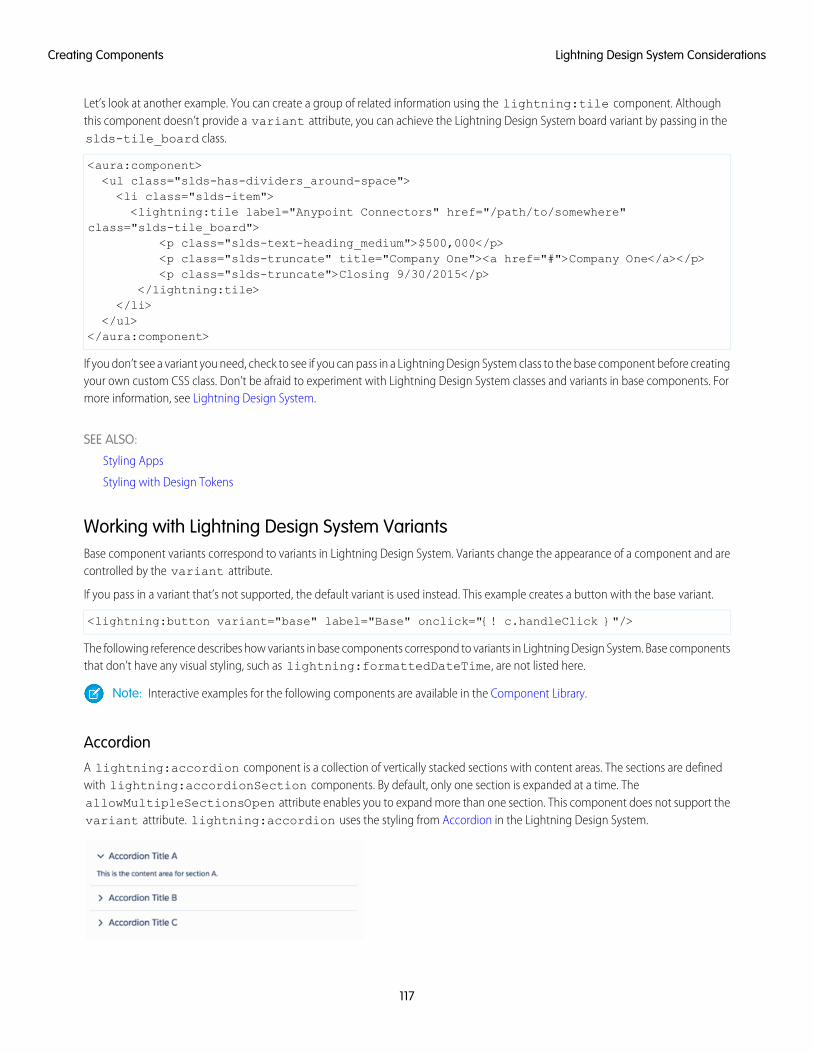
Let’s look at another example. You can create a group of related information using the lightning:tile component. Althoughthis component doesn’t provide a variant attribute, you can achieve the Lightning Design System board variant by passing in theslds-tile_board class.
<aura:component><ul class="slds-has-dividers_around-space"><li class="slds-item"><lightning:tile label="Anypoint Connectors" href="/path/to/somewhere"
class="slds-tile_board"><p class="slds-text-heading_medium">$500,000</p><p class="slds-truncate" title="Company One"><a href="#">Company One</a></p><p class="slds-truncate">Closing 9/30/2015</p>
</lightning:tile></li>
</ul></aura:component>
If you don’t see a variant you need, check to see if you can pass in a Lightning Design System class to the base component before creatingyour own custom CSS class. Don’t be afraid to experiment with Lightning Design System classes and variants in base components. Formore information, see Lightning Design System.
SEE ALSO:
Styling Apps
Styling with Design Tokens
Working with Lightning Design System VariantsBase component variants correspond to variants in Lightning Design System. Variants change the appearance of a component and arecontrolled by the variant attribute.
If you pass in a variant that’s not supported, the default variant is used instead. This example creates a button with the base variant.
<lightning:button variant="base" label="Base" onclick="{! c.handleClick }"/>
The following reference describes how variants in base components correspond to variants in Lightning Design System. Base componentsthat don’t have any visual styling, such as lightning:formattedDateTime, are not listed here.
Note: Interactive examples for the following components are available in the Component Library.
AccordionA lightning:accordion component is a collection of vertically stacked sections with content areas. The sections are definedwith lightning:accordionSection components. By default, only one section is expanded at a time. TheallowMultipleSectionsOpen attribute enables you to expand more than one section. This component does not support thevariant attribute. lightning:accordion uses the styling from Accordion in the Lightning Design System.
117
Lightning Design System ConsiderationsCreating Components
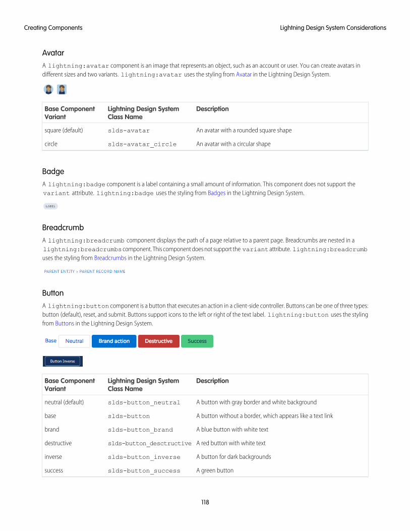
AvatarA lightning:avatar component is an image that represents an object, such as an account or user. You can create avatars indifferent sizes and two variants. lightning:avatar uses the styling from Avatar in the Lightning Design System.
DescriptionLightning Design SystemClass Name
Base ComponentVariant
An avatar with a rounded square shapeslds-avatarsquare (default)
An avatar with a circular shapeslds-avatar_circlecircle
BadgeA lightning:badge component is a label containing a small amount of information. This component does not support thevariant attribute. lightning:badge uses the styling from Badges in the Lightning Design System.
BreadcrumbA lightning:breadcrumb component displays the path of a page relative to a parent page. Breadcrumbs are nested in alightning:breadcrumbs component. This component does not support the variant attribute. lightning:breadcrumbuses the styling from Breadcrumbs in the Lightning Design System.
ButtonA lightning:button component is a button that executes an action in a client-side controller. Buttons can be one of three types:button (default), reset, and submit. Buttons support icons to the left or right of the text label. lightning:button uses the stylingfrom Buttons in the Lightning Design System.
DescriptionLightning Design SystemClass Name
Base ComponentVariant
A button with gray border and white backgroundslds-button_neutralneutral (default)
A button without a border, which appears like a text linkslds-buttonbase
A blue button with white textslds-button_brandbrand
A red button with white textslds-button_desctructivedestructive
A button for dark backgroundsslds-button_inverseinverse
A green buttonslds-button_successsuccess
118
Lightning Design System ConsiderationsCreating Components
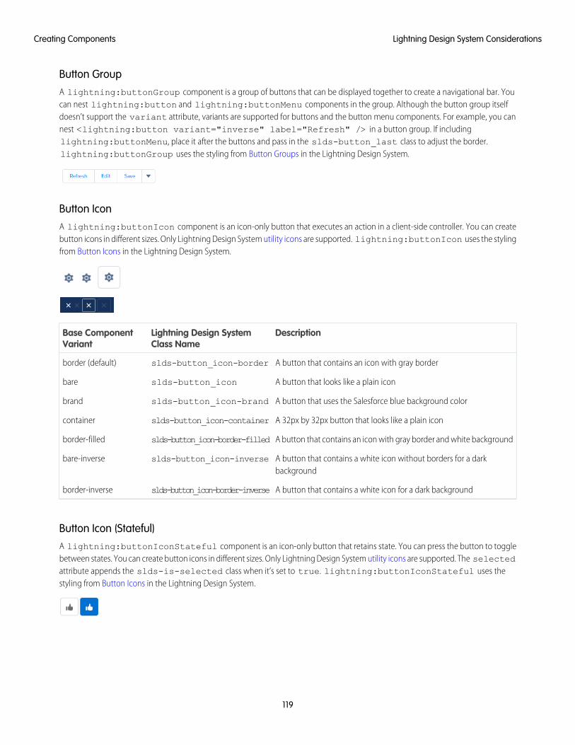
Button GroupA lightning:buttonGroup component is a group of buttons that can be displayed together to create a navigational bar. Youcan nest lightning:button and lightning:buttonMenu components in the group. Although the button group itselfdoesn’t support the variant attribute, variants are supported for buttons and the button menu components. For example, you cannest <lightning:button variant="inverse" label="Refresh" /> in a button group. If includinglightning:buttonMenu, place it after the buttons and pass in the slds-button_last class to adjust the border.lightning:buttonGroup uses the styling from Button Groups in the Lightning Design System.
Button IconA lightning:buttonIcon component is an icon-only button that executes an action in a client-side controller. You can createbutton icons in different sizes. Only Lightning Design System utility icons are supported. lightning:buttonIcon uses the stylingfrom Button Icons in the Lightning Design System.
DescriptionLightning Design SystemClass Name
Base ComponentVariant
A button that contains an icon with gray borderslds-button_icon-borderborder (default)
A button that looks like a plain iconslds-button_iconbare
A button that uses the Salesforce blue background colorslds-button_icon-brandbrand
A 32px by 32px button that looks like a plain iconslds-button_icon-containercontainer
A button that contains an icon with gray border and white backgroundslds-button_icon-border-filledborder-filled
A button that contains a white icon without borders for a darkbackground
slds-button_icon-inversebare-inverse
A button that contains a white icon for a dark backgroundslds-button_icon-border-inverseborder-inverse
Button Icon (Stateful)A lightning:buttonIconStateful component is an icon-only button that retains state. You can press the button to togglebetween states. You can create button icons in different sizes. Only Lightning Design System utility icons are supported. The selectedattribute appends the slds-is-selected class when it’s set to true. lightning:buttonIconStateful uses thestyling from Button Icons in the Lightning Design System.
119
Lightning Design System ConsiderationsCreating Components
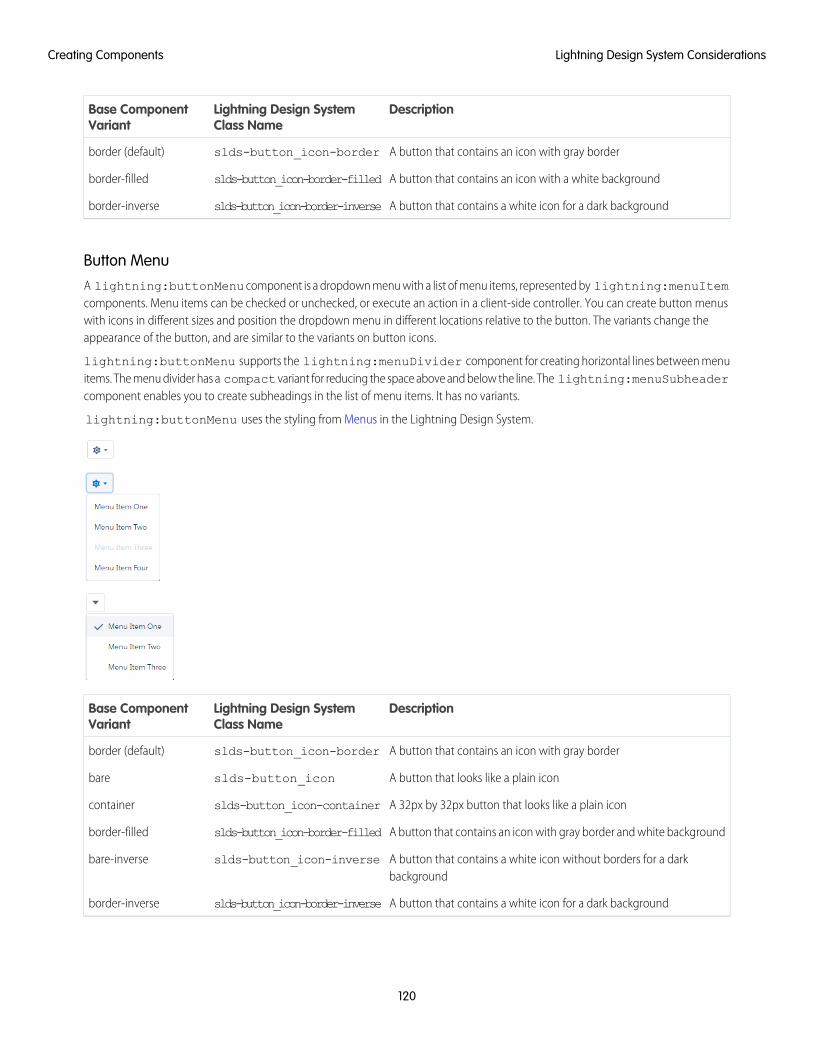
DescriptionLightning Design SystemClass Name
Base ComponentVariant
A button that contains an icon with gray borderslds-button_icon-borderborder (default)
A button that contains an icon with a white backgroundslds-button_icon-border-filledborder-filled
A button that contains a white icon for a dark backgroundslds-button_icon-border-inverseborder-inverse
Button MenuA lightning:buttonMenu component is a dropdown menu with a list of menu items, represented by lightning:menuItemcomponents. Menu items can be checked or unchecked, or execute an action in a client-side controller. You can create button menuswith icons in different sizes and position the dropdown menu in different locations relative to the button. The variants change theappearance of the button, and are similar to the variants on button icons.
lightning:buttonMenu supports the lightning:menuDivider component for creating horizontal lines between menuitems. The menu divider has a compact variant for reducing the space above and below the line. The lightning:menuSubheadercomponent enables you to create subheadings in the list of menu items. It has no variants.
lightning:buttonMenu uses the styling from Menus in the Lightning Design System.
DescriptionLightning Design SystemClass Name
Base ComponentVariant
A button that contains an icon with gray borderslds-button_icon-borderborder (default)
A button that looks like a plain iconslds-button_iconbare
A 32px by 32px button that looks like a plain iconslds-button_icon-containercontainer
A button that contains an icon with gray border and white backgroundslds-button_icon-border-filledborder-filled
A button that contains a white icon without borders for a darkbackground
slds-button_icon-inversebare-inverse
A button that contains a white icon for a dark backgroundslds-button_icon-border-inverseborder-inverse
120
Lightning Design System ConsiderationsCreating Components
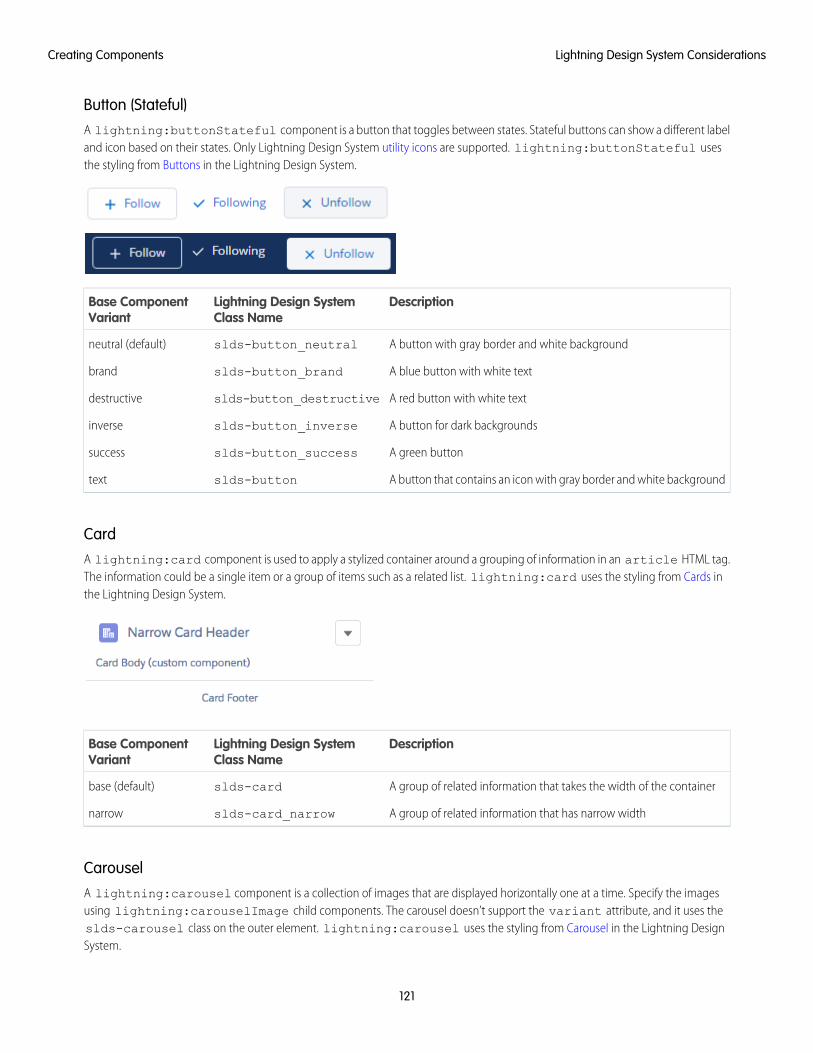
Button (Stateful)A lightning:buttonStateful component is a button that toggles between states. Stateful buttons can show a different labeland icon based on their states. Only Lightning Design System utility icons are supported. lightning:buttonStateful usesthe styling from Buttons in the Lightning Design System.
DescriptionLightning Design SystemClass Name
Base ComponentVariant
A button with gray border and white backgroundslds-button_neutralneutral (default)
A blue button with white textslds-button_brandbrand
A red button with white textslds-button_destructivedestructive
A button for dark backgroundsslds-button_inverseinverse
A green buttonslds-button_successsuccess
A button that contains an icon with gray border and white backgroundslds-buttontext
CardA lightning:card component is used to apply a stylized container around a grouping of information in an article HTML tag.The information could be a single item or a group of items such as a related list. lightning:card uses the styling from Cards inthe Lightning Design System.
DescriptionLightning Design SystemClass Name
Base ComponentVariant
A group of related information that takes the width of the containerslds-cardbase (default)
A group of related information that has narrow widthslds-card_narrownarrow
CarouselA lightning:carousel component is a collection of images that are displayed horizontally one at a time. Specify the imagesusing lightning:carouselImage child components. The carousel doesn’t support the variant attribute, and it uses theslds-carousel class on the outer element. lightning:carousel uses the styling from Carousel in the Lightning DesignSystem.
121
Lightning Design System ConsiderationsCreating Components
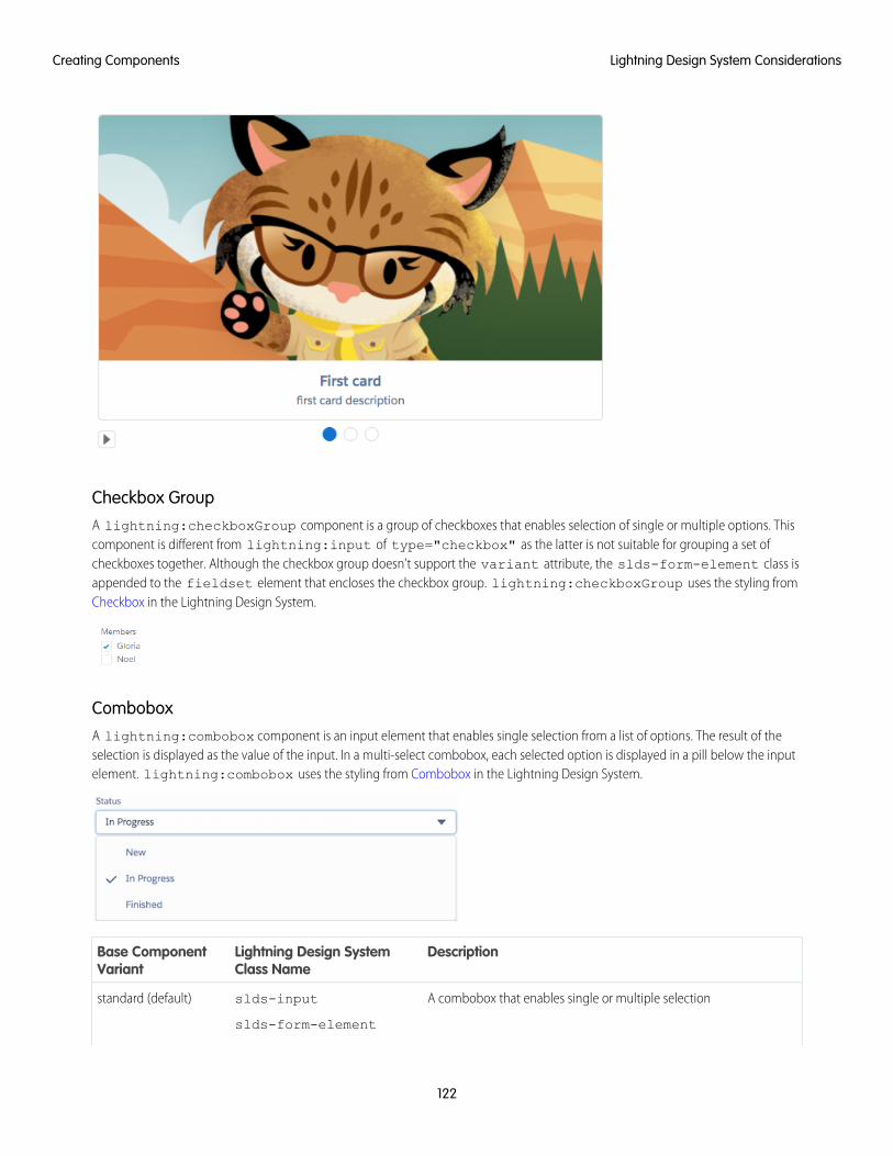
Checkbox GroupA lightning:checkboxGroup component is a group of checkboxes that enables selection of single or multiple options. Thiscomponent is different from lightning:input of type="checkbox" as the latter is not suitable for grouping a set ofcheckboxes together. Although the checkbox group doesn’t support the variant attribute, the slds-form-element class isappended to the fieldset element that encloses the checkbox group. lightning:checkboxGroup uses the styling fromCheckbox in the Lightning Design System.
ComboboxA lightning:combobox component is an input element that enables single selection from a list of options. The result of theselection is displayed as the value of the input. In a multi-select combobox, each selected option is displayed in a pill below the inputelement. lightning:combobox uses the styling from Combobox in the Lightning Design System.
DescriptionLightning Design SystemClass Name
Base ComponentVariant
A combobox that enables single or multiple selectionslds-input
slds-form-element
standard (default)
122
Lightning Design System ConsiderationsCreating Components
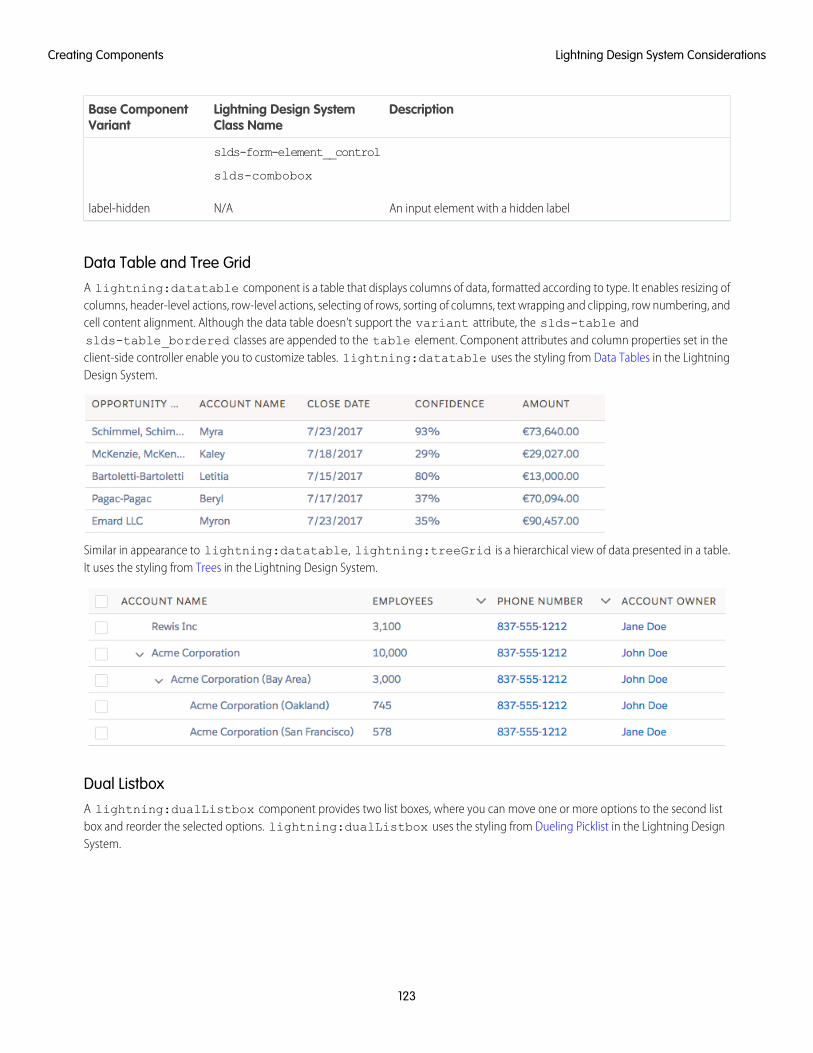
DescriptionLightning Design SystemClass Name
Base ComponentVariant
slds-form-element__control
slds-combobox
An input element with a hidden labelN/Alabel-hidden
Data Table and Tree GridA lightning:datatable component is a table that displays columns of data, formatted according to type. It enables resizing ofcolumns, header-level actions, row-level actions, selecting of rows, sorting of columns, text wrapping and clipping, row numbering, andcell content alignment. Although the data table doesn’t support the variant attribute, the slds-table andslds-table_bordered classes are appended to the table element. Component attributes and column properties set in theclient-side controller enable you to customize tables. lightning:datatable uses the styling from Data Tables in the LightningDesign System.
Similar in appearance to lightning:datatable, lightning:treeGrid is a hierarchical view of data presented in a table.It uses the styling from Trees in the Lightning Design System.
Dual ListboxA lightning:dualListbox component provides two list boxes, where you can move one or more options to the second listbox and reorder the selected options. lightning:dualListbox uses the styling from Dueling Picklist in the Lightning DesignSystem.
123
Lightning Design System ConsiderationsCreating Components
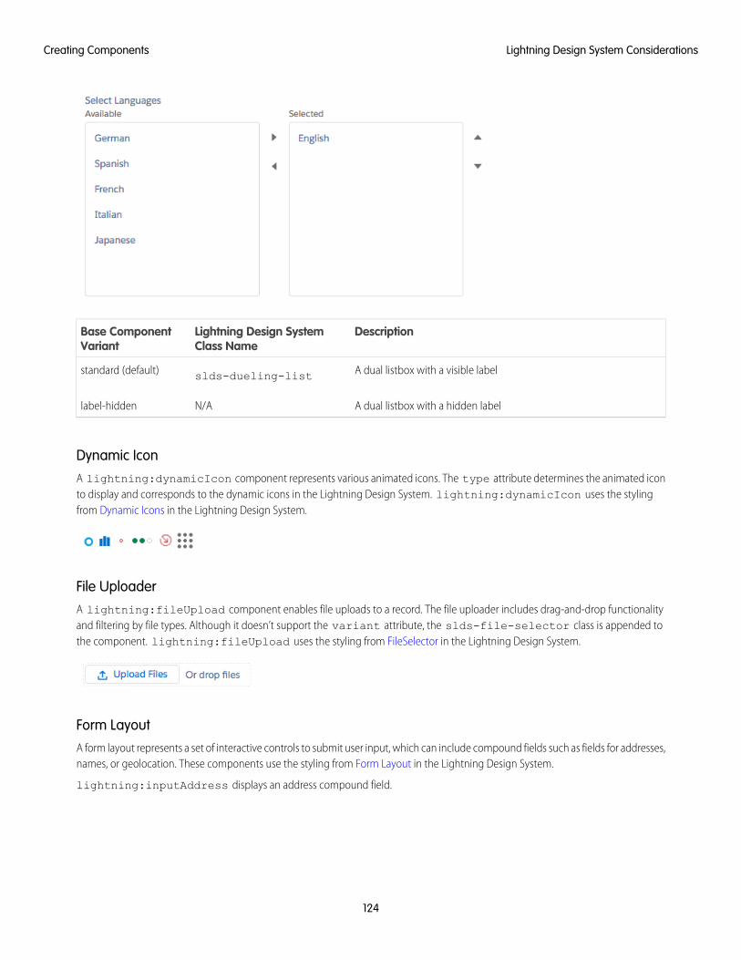
DescriptionLightning Design SystemClass Name
Base ComponentVariant
A dual listbox with a visible labelslds-dueling-liststandard (default)
A dual listbox with a hidden labelN/Alabel-hidden
Dynamic IconA lightning:dynamicIcon component represents various animated icons. The type attribute determines the animated iconto display and corresponds to the dynamic icons in the Lightning Design System. lightning:dynamicIcon uses the stylingfrom Dynamic Icons in the Lightning Design System.
File UploaderA lightning:fileUpload component enables file uploads to a record. The file uploader includes drag-and-drop functionalityand filtering by file types. Although it doesn’t support the variant attribute, the slds-file-selector class is appended tothe component. lightning:fileUpload uses the styling from FileSelector in the Lightning Design System.
Form LayoutA form layout represents a set of interactive controls to submit user input, which can include compound fields such as fields for addresses,names, or geolocation. These components use the styling from Form Layout in the Lightning Design System.
lightning:inputAddress displays an address compound field.
124
Lightning Design System ConsiderationsCreating Components
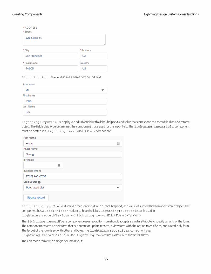
lightning:inputName displays a name compound field.
lightning:inputField displays an editable field with a label, help text, and value that correspond to a record field on a Salesforceobject. The field’s data type determines the component that’s used for the input field. The lightning:inputField componentmust be nested in a lightning:recordEditForm component.
lightning:outputField displays a read-only field with a label, help text, and value of a record field on a Salesforce object. Thecomponent has a label-hidden variant to hide the label. lightning:outputField is used inlightning:recordViewForm and lightning:recordEditForm components.
The lightning:recordForm component eases record form creation. It accepts a mode attribute to specify variants of the form.The component creates an edit form that can create or update records, a view form with the option to edit fields, and a read-only form.The layout of the form is set with other attributes. The lightning:recordForm component useslightning:recordEditForm and lightning:recordViewForm to create the forms.
The edit mode form with a single column layout:
125
Lightning Design System ConsiderationsCreating Components
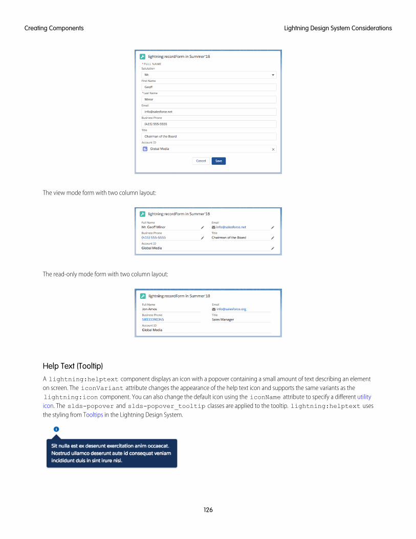
The view mode form with two column layout:
The read-only mode form with two column layout:
Help Text (Tooltip)A lightning:helptext component displays an icon with a popover containing a small amount of text describing an elementon screen. The iconVariant attribute changes the appearance of the help text icon and supports the same variants as thelightning:icon component. You can also change the default icon using the iconName attribute to specify a different utilityicon. The slds-popover and slds-popover_tooltip classes are applied to the tooltip. lightning:helptext usesthe styling from Tooltips in the Lightning Design System.
126
Lightning Design System ConsiderationsCreating Components
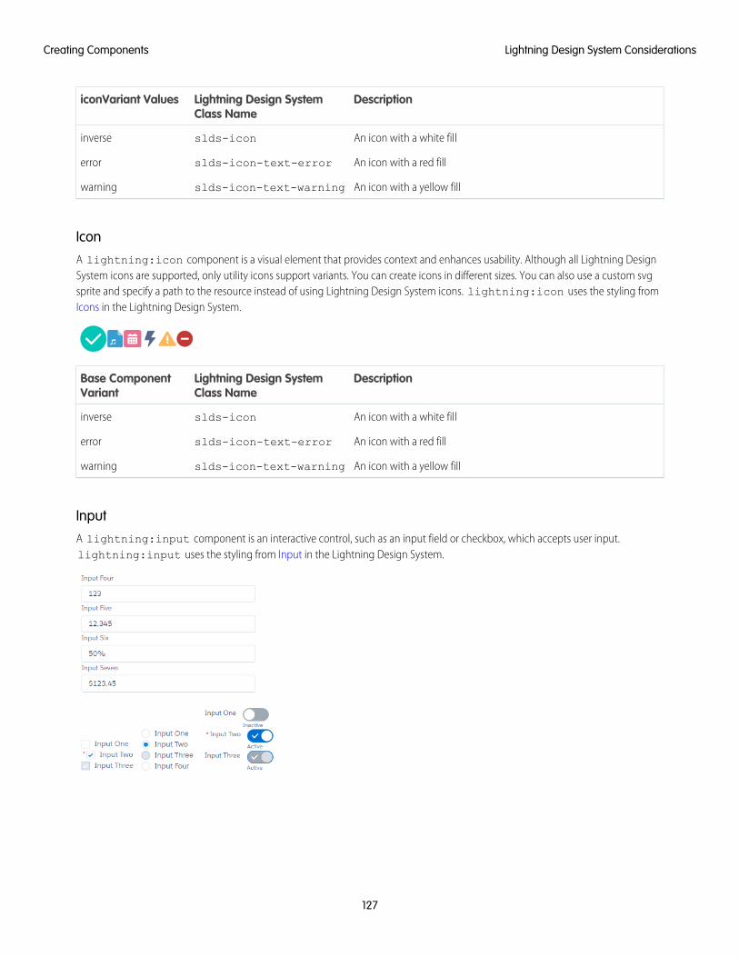
DescriptionLightning Design SystemClass Name
iconVariant Values
An icon with a white fillslds-iconinverse
An icon with a red fillslds-icon-text-errorerror
An icon with a yellow fillslds-icon-text-warningwarning
IconA lightning:icon component is a visual element that provides context and enhances usability. Although all Lightning DesignSystem icons are supported, only utility icons support variants. You can create icons in different sizes. You can also use a custom svgsprite and specify a path to the resource instead of using Lightning Design System icons. lightning:icon uses the styling fromIcons in the Lightning Design System.
DescriptionLightning Design SystemClass Name
Base ComponentVariant
An icon with a white fillslds-iconinverse
An icon with a red fillslds-icon-text-errorerror
An icon with a yellow fillslds-icon-text-warningwarning
InputA lightning:input component is an interactive control, such as an input field or checkbox, which accepts user input.lightning:input uses the styling from Input in the Lightning Design System.
127
Lightning Design System ConsiderationsCreating Components
DescriptionLightning Design SystemClass Name
Base ComponentVariant
An input element, which can be an input field, checkbox, toggle, radiobutton, or other types. The class appended to the element depends onthe input type.
slds-input
slds-form-element
slds-form-element__control
standard (default)
An input element with a hidden labelN/Alabel-hidden
LayoutA lightning:layout component is a flexible grid system for arranging containers within a page or another container. Thelightning:layoutItem component is used to specify the items inside the layout. The component does not support thevariant attribute. Customization of the layout is controlled by horizontalAlign, verticalAlign, pullToBoundary,and multipleRows attributes of lightning:layout. The attributes of lightning:layoutItem enable you to configurethe size of the layout item, and change how the layout is configured on different device sizes.
lightning:layout uses the styling from Grid in the Lightning Design System. For more information, see Lightning Design SystemConsiderations.
List ViewA lightning:listView component represents a list view of records that you own or have read or write access to, and recordsshared with you. Inline edit, row level actions, and the action bar are supported in Lightning Experience, the Salesforce app, andcommunities only. On a desktop, this component renders a full list view. On all other form factors, such as a tablet or mobile devices,the component renders a mobile-friendly alternative.
MapA lightning:map component securely displays a map of one or more locations. The component does not support the variantattribute. It supports attributes that enable you to add a title for a list of locations and a footer. lightning:map uses the styling fromMap in the Lightning Design System.
128
Lightning Design System ConsiderationsCreating Components
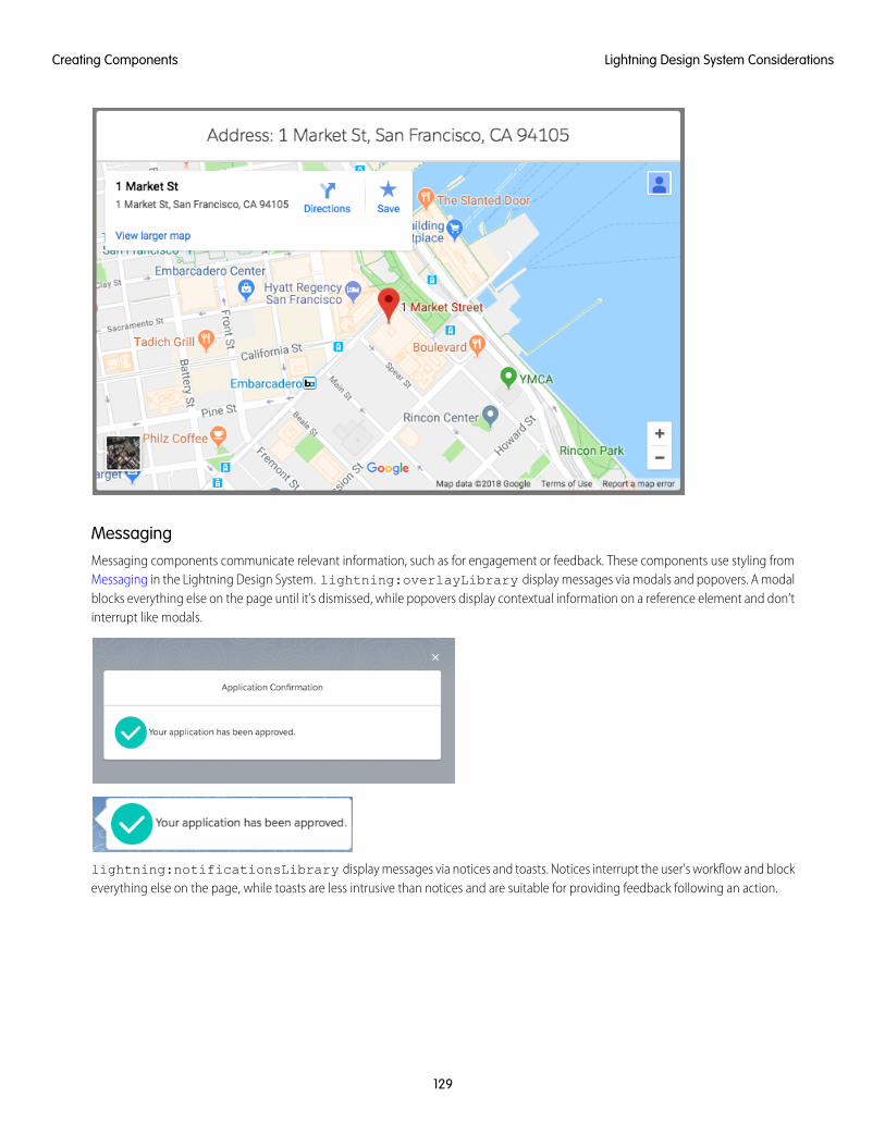
MessagingMessaging components communicate relevant information, such as for engagement or feedback. These components use styling fromMessaging in the Lightning Design System. lightning:overlayLibrary display messages via modals and popovers. A modalblocks everything else on the page until it’s dismissed, while popovers display contextual information on a reference element and don’tinterrupt like modals.
lightning:notificationsLibrary display messages via notices and toasts. Notices interrupt the user's workflow and blockeverything else on the page, while toasts are less intrusive than notices and are suitable for providing feedback following an action.
129
Lightning Design System ConsiderationsCreating Components
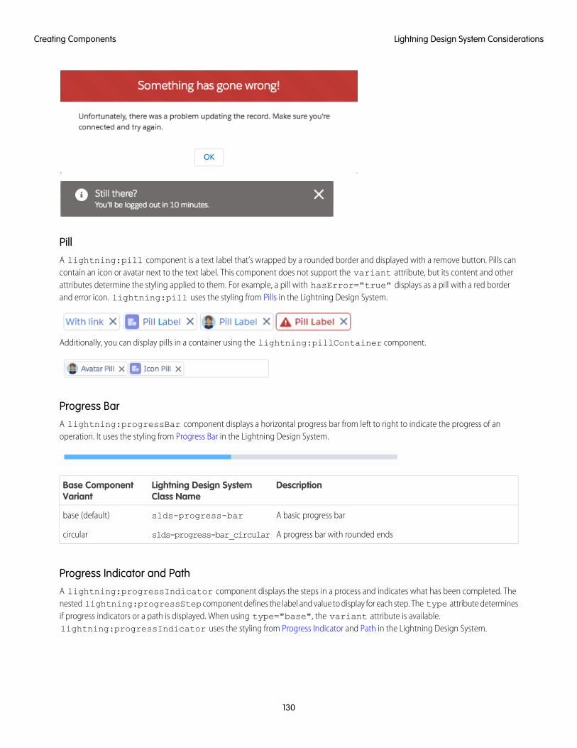
PillA lightning:pill component is a text label that’s wrapped by a rounded border and displayed with a remove button. Pills cancontain an icon or avatar next to the text label. This component does not support the variant attribute, but its content and otherattributes determine the styling applied to them. For example, a pill with hasError="true" displays as a pill with a red borderand error icon. lightning:pill uses the styling from Pills in the Lightning Design System.
Additionally, you can display pills in a container using the lightning:pillContainer component.
Progress BarA lightning:progressBar component displays a horizontal progress bar from left to right to indicate the progress of anoperation. It uses the styling from Progress Bar in the Lightning Design System.
DescriptionLightning Design SystemClass Name
Base ComponentVariant
A basic progress barslds-progress-barbase (default)
A progress bar with rounded endsslds-progress-bar_circularcircular
Progress Indicator and PathA lightning:progressIndicator component displays the steps in a process and indicates what has been completed. Thenested lightning:progressStep component defines the label and value to display for each step. The type attribute determinesif progress indicators or a path is displayed. When using type="base", the variant attribute is available.lightning:progressIndicator uses the styling from Progress Indicator and Path in the Lightning Design System.
130
Lightning Design System ConsiderationsCreating Components
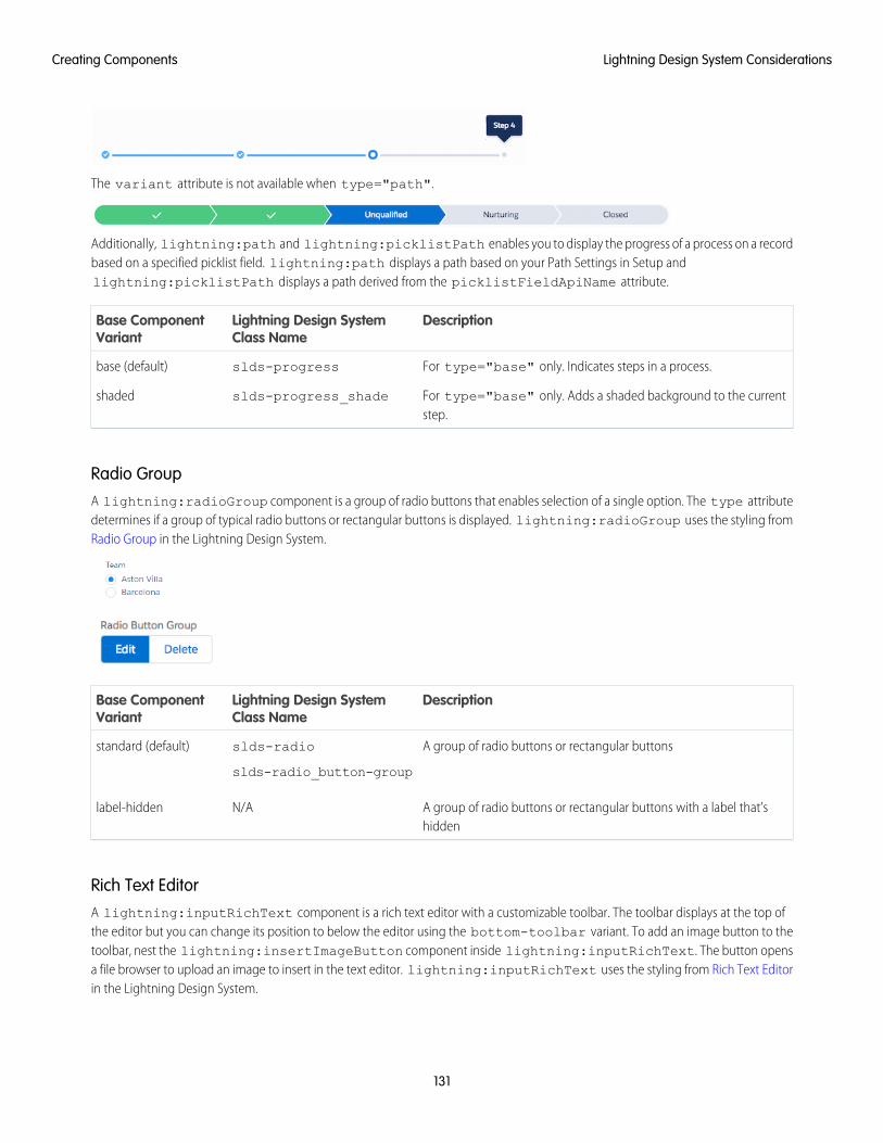
The variant attribute is not available when type="path".
Additionally, lightning:path and lightning:picklistPath enables you to display the progress of a process on a recordbased on a specified picklist field. lightning:path displays a path based on your Path Settings in Setup andlightning:picklistPath displays a path derived from the picklistFieldApiName attribute.
DescriptionLightning Design SystemClass Name
Base ComponentVariant
For type="base" only. Indicates steps in a process.slds-progressbase (default)
For type="base" only. Adds a shaded background to the currentstep.
slds-progress_shadeshaded
Radio GroupA lightning:radioGroup component is a group of radio buttons that enables selection of a single option. The type attributedetermines if a group of typical radio buttons or rectangular buttons is displayed. lightning:radioGroup uses the styling fromRadio Group in the Lightning Design System.
DescriptionLightning Design SystemClass Name
Base ComponentVariant
A group of radio buttons or rectangular buttonsslds-radio
slds-radio_button-group
standard (default)
A group of radio buttons or rectangular buttons with a label that’shidden
N/Alabel-hidden
Rich Text EditorA lightning:inputRichText component is a rich text editor with a customizable toolbar. The toolbar displays at the top ofthe editor but you can change its position to below the editor using the bottom-toolbar variant. To add an image button to thetoolbar, nest the lightning:insertImageButton component inside lightning:inputRichText. The button opensa file browser to upload an image to insert in the text editor. lightning:inputRichText uses the styling from Rich Text Editorin the Lightning Design System.
131
Lightning Design System ConsiderationsCreating Components
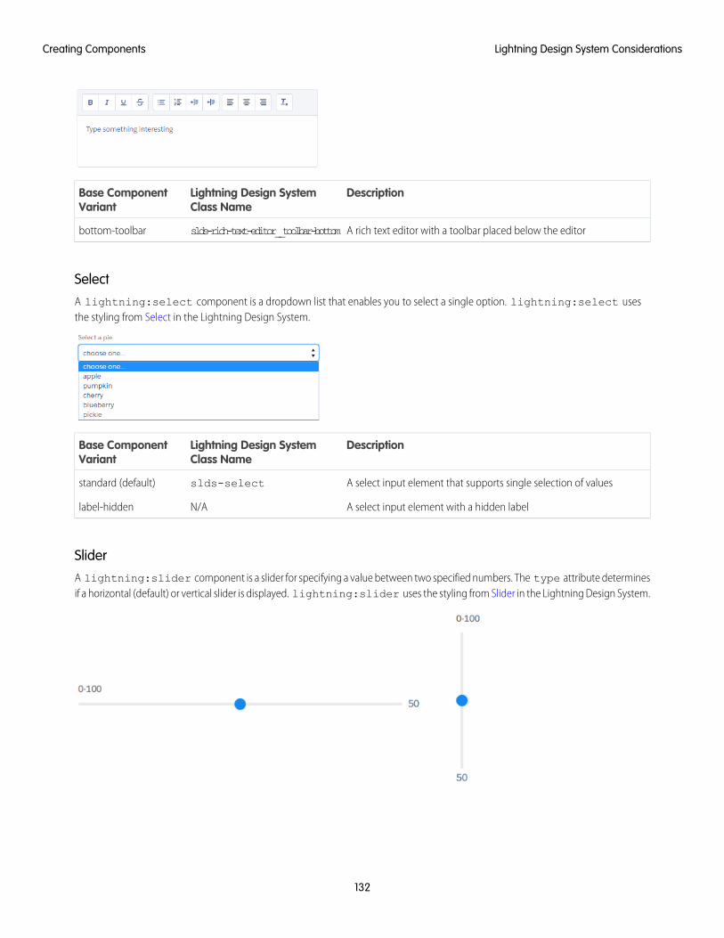
DescriptionLightning Design SystemClass Name
Base ComponentVariant
A rich text editor with a toolbar placed below the editorslds-rich-text-editor__toolbar-bottombottom-toolbar
SelectA lightning:select component is a dropdown list that enables you to select a single option. lightning:select usesthe styling from Select in the Lightning Design System.
DescriptionLightning Design SystemClass Name
Base ComponentVariant
A select input element that supports single selection of valuesslds-selectstandard (default)
A select input element with a hidden labelN/Alabel-hidden
SliderA lightning:slider component is a slider for specifying a value between two specified numbers. The type attribute determinesif a horizontal (default) or vertical slider is displayed. lightning:slider uses the styling from Slider in the Lightning Design System.
132
Lightning Design System ConsiderationsCreating Components

DescriptionLightning Design SystemClass Name
Base ComponentVariant
A slider with an optional visible label.slds-slider-labelstandard (default)
A slider with a hidden labelN/Alabel-hidden
SpinnerA lightning:spinner component is a spinner that indicates data is loading. You can create spinners in different sizes.lightning:spinner uses the styling from Spinners in the Lightning Design System.
DescriptionLightning Design SystemClass Name
Base ComponentVariant
A gray spinnerslds-spinnerbase (default)
A blue spinnerslds-spinner_brandbrand
A white spinner for a dark backgroundslds-spinner_inverseinverse
TabsA lightning:tabset component is a list of tabs with corresponding content areas, represented by lightning:tabcomponents. lightning:tabset uses the styling from Tabs in the Lightning Design System.
DescriptionLightning Design SystemClass Name
Base ComponentVariant
A list of tabs and content areas without bordersslds-tabs_defaultdefault
A list of tabs and content areas with bordersslds-tabs_scopedscoped
A list of tabs that are displayed vertically to the left of the content areasslds-vertical-tabsvertical
TextareaA lightning:textarea component is an input field for multi-line text input. It uses the styling from Textarea in the LightningDesign System.
133
Lightning Design System ConsiderationsCreating Components
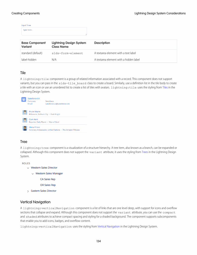
DescriptionLightning Design SystemClass Name
Base ComponentVariant
A textarea element with a text labelslds-form-elementstandard (default)
A textarea element with a hidden labelN/Alabel-hidden
TileA lightning:tile component is a group of related information associated with a record. This component does not supportvariants, but you can pass in the slds-tile_board class to create a board. Similarly, use a definition list in the tile body to createa tile with an icon or use an unordered list to create a list of tiles with avatars. lightning:tile uses the styling from Tiles in theLightning Design System.
TreeA lightning:tree component is a visualization of a structure hierarchy. A tree item, also known as a branch, can be expanded orcollapsed. Although this component does not support the variant attribute, it uses the styling from Trees in the Lightning DesignSystem.
Vertical NavigationA lightning:verticalNavigation component is a list of links that are one level deep, with support for icons and overflowsections that collapse and expand. Although this component does not support the variant attribute, you can use the compactand shaded attributes to achieve compact spacing and styling for a shaded background. The component supports subcomponentsthat enable you to add icons, badges, and overflow content.
lightning:verticalNavigation uses the styling from Vertical Navigation in the Lightning Design System.
134
Lightning Design System ConsiderationsCreating Components
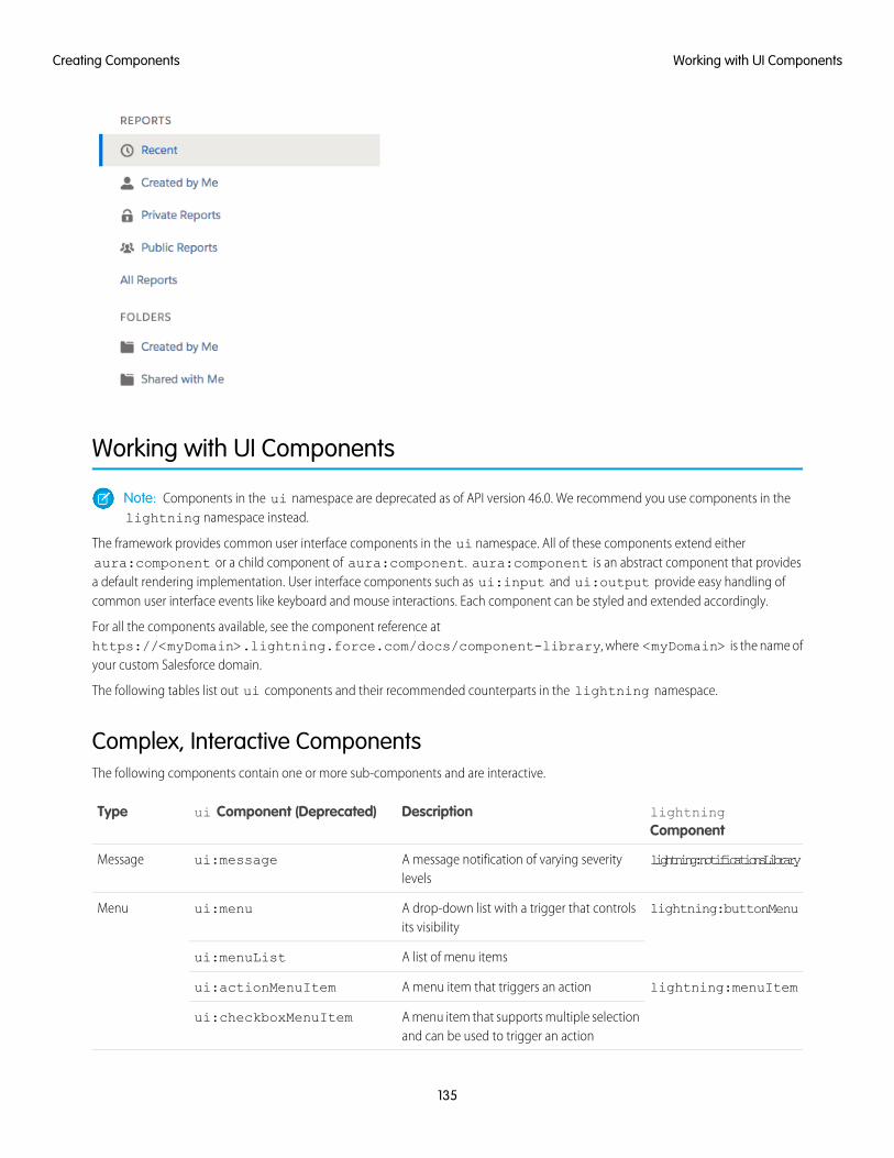
Working with UI Components
Note: Components in the ui namespace are deprecated as of API version 46.0. We recommend you use components in thelightning namespace instead.
The framework provides common user interface components in the ui namespace. All of these components extend eitheraura:component or a child component of aura:component. aura:component is an abstract component that providesa default rendering implementation. User interface components such as ui:input and ui:output provide easy handling ofcommon user interface events like keyboard and mouse interactions. Each component can be styled and extended accordingly.
For all the components available, see the component reference athttps://<myDomain>.lightning.force.com/docs/component-library, where <myDomain> is the name ofyour custom Salesforce domain.
The following tables list out ui components and their recommended counterparts in the lightning namespace.
Complex, Interactive ComponentsThe following components contain one or more sub-components and are interactive.
lightningComponent
Descriptionui Component (Deprecated)Type
lightning:notificationsLibraryA message notification of varying severitylevels
ui:messageMessage
lightning:buttonMenuA drop-down list with a trigger that controlsits visibility
ui:menuMenu
A list of menu itemsui:menuList
lightning:menuItemA menu item that triggers an actionui:actionMenuItem
A menu item that supports multiple selectionand can be used to trigger an action
ui:checkboxMenuItem
135
Working with UI ComponentsCreating Components
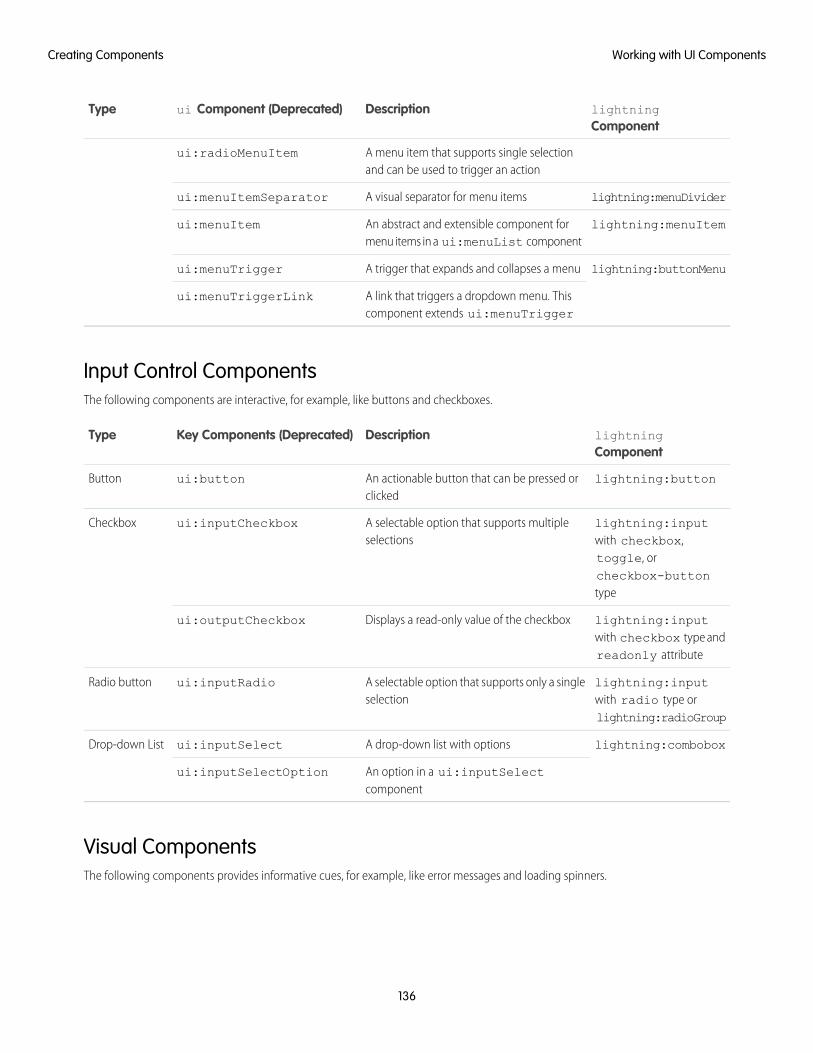
lightningComponent
Descriptionui Component (Deprecated)Type
A menu item that supports single selectionand can be used to trigger an action
ui:radioMenuItem
lightning:menuDividerA visual separator for menu itemsui:menuItemSeparator
lightning:menuItemAn abstract and extensible component formenu items in a ui:menuList component
ui:menuItem
lightning:buttonMenuA trigger that expands and collapses a menuui:menuTrigger
A link that triggers a dropdown menu. Thiscomponent extends ui:menuTrigger
ui:menuTriggerLink
Input Control ComponentsThe following components are interactive, for example, like buttons and checkboxes.
lightningComponent
DescriptionKey Components (Deprecated)Type
lightning:buttonAn actionable button that can be pressed orclicked
ui:buttonButton
lightning:inputwith checkbox,
A selectable option that supports multipleselections
ui:inputCheckboxCheckbox
toggle, orcheckbox-buttontype
lightning:inputwith checkbox type andreadonly attribute
Displays a read-only value of the checkboxui:outputCheckbox
lightning:inputwith radio type orlightning:radioGroup
A selectable option that supports only a singleselection
ui:inputRadioRadio button
lightning:comboboxA drop-down list with optionsui:inputSelectDrop-down List
An option in a ui:inputSelectcomponent
ui:inputSelectOption
Visual ComponentsThe following components provides informative cues, for example, like error messages and loading spinners.
136
Working with UI ComponentsCreating Components

lightningComponent
DescriptionKey Components(Deprecated)
Type
lightning:inputwith field validation
An error message that is displayed when an erroroccurs
ui:inputDefaultErrorField-level error
lightning:spinnerA loading spinnerui:spinnerSpinner
Field ComponentsThe following components enables you to enter or display values.
lightning ComponentDescriptionKey Components(Deprecated)
Type
lightning:input withnumber type andcurrency formatter
An input field for entering currencyui:inputCurrencyCurrency
lightning:formattedNumberwith currency style
Displays currency in a default or specified formatui:outputCurrency
lightning:input withemail type
An input field for entering an email addressui:inputEmailEmail
lightning:formattedEmailDisplays a clickable email addressui:outputEmail
lightning:input withdate type
An input field for entering a dateui:inputDateDate and time
lightning:input withdatetime type
An input field for entering a date and timeui:inputDateTime
lightning:formattedDateTimeDisplays a date in the default or specified formatui:outputDate
lightning:formattedDateTimeorlightning:formattedTime
Displays a date and time in the default or specifiedformat
ui:outputDateTime
lightning:input withpassword type
An input field for entering secret textui:inputSecretPassword
lightning:input withphone type
An input field for entering a telephone numberui:inputPhonePhone Number
lightning:formattedPhoneDisplays a phone numberui:outputPhone
lightning:input withnumber type
An input field for entering a numerical valueui:inputNumberNumber
lightning:formattedNumberDisplays a numberui:outputNumber
lightning:sliderAn input field for entering a value within a rangeui:inputRangeRange
lightning:inputRichTextAn input field for entering rich textui:inputRichTextRich Text
137
Working with UI ComponentsCreating Components

lightning ComponentDescriptionKey Components(Deprecated)
Type
lightning:formattedRichTextDisplays rich textui:outputRichText
lightning:inputAn input field for entering a single line of textui:inputTextText
lightning:formattedTextDisplays textui:outputText
lightning:textareaAn input field for entering multiple lines of textui:inputTextAreaText Area
lightning:formattedTextDisplays a read-only text areaui:outputTextArea
lightning:input withurl type
An input field for entering a URLui:inputURLURL
lightning:formattedUrlDisplays a clickable URLui:outputURL
SEE ALSO:
Using the UI Components
Creating Components
Component Bundles
Event Handling in UI ComponentsUI components provide easy handling of user interface events such as keyboard and mouse interactions. By listening to these events,you can also bind values on UI input components using the updateon attribute, such that the values update when those events arefired.
Note: Components in the ui namespace are deprecated as of API version 46.0. We recommend you use components in thelightning namespace instead. For more information, see Working with UI Components.
Capture a UI event by defining its handler on the component. For example, you want to listen to the HTML DOM event, onblur, on aui:inputTextArea component.
<ui:inputTextArea aura:id="textarea" value="My text area" label="Type something"blur="{!c.handleBlur}" />
The blur="{!c.handleBlur}" listens to the onblur event and wires it to your client-side controller. When you trigger theevent, the following client-side controller handles the event.
handleBlur : function(cmp, event, helper){var elem = cmp.find("textarea").getElement();//do something else
}
For all available events on all components, see the Component Library on page 487.
Value Binding for Browser EventsAny changes to the UI are reflected in the component attribute, and any change in that attribute is propagated to the UI. When youload the component, the value of the input elements are initialized to those of the component attributes. Any changes to the user inputcauses the value of the component variable to be updated. For example, a ui:inputText component can contain a value that’s
138
Event Handling in UI ComponentsCreating Components
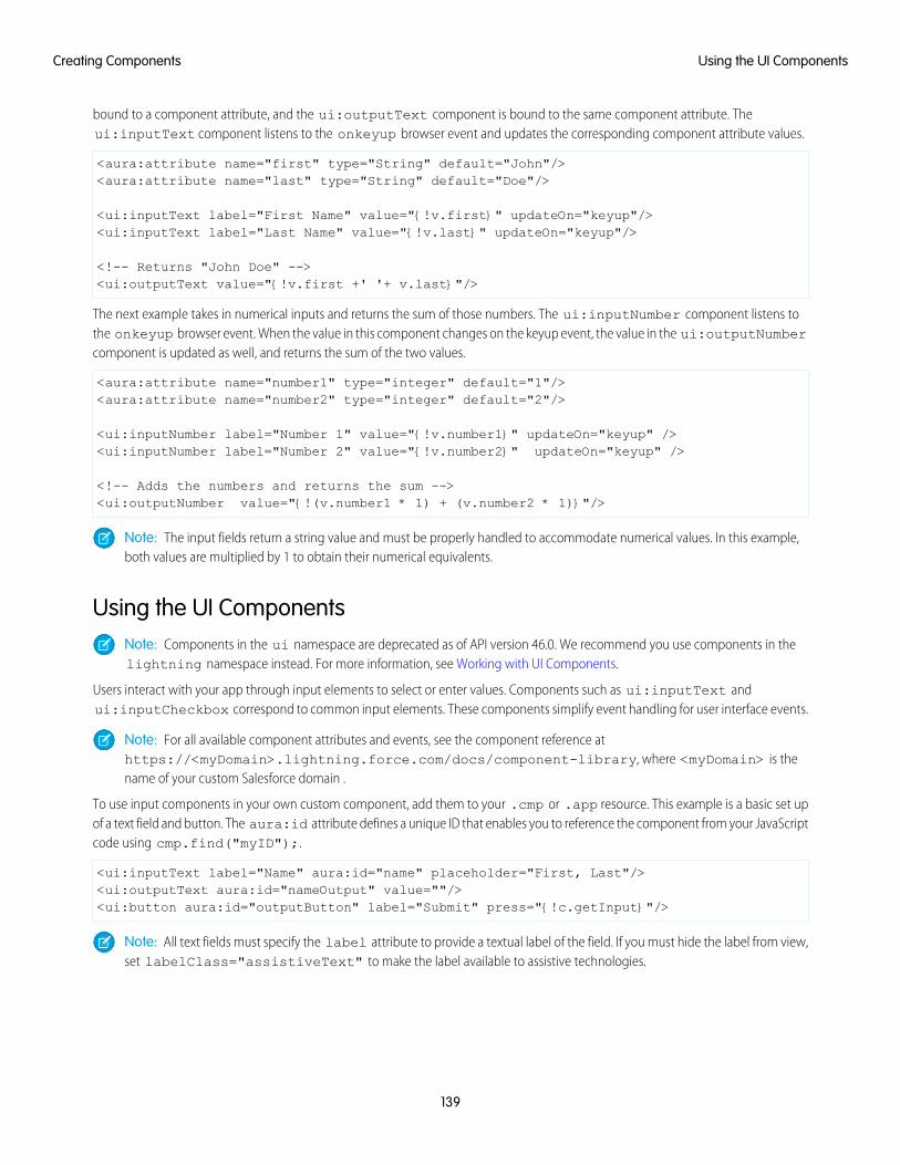
bound to a component attribute, and the ui:outputText component is bound to the same component attribute. Theui:inputText component listens to the onkeyup browser event and updates the corresponding component attribute values.
<aura:attribute name="first" type="String" default="John"/><aura:attribute name="last" type="String" default="Doe"/>
<ui:inputText label="First Name" value="{!v.first}" updateOn="keyup"/><ui:inputText label="Last Name" value="{!v.last}" updateOn="keyup"/>
<!-- Returns "John Doe" --><ui:outputText value="{!v.first +' '+ v.last}"/>
The next example takes in numerical inputs and returns the sum of those numbers. The ui:inputNumber component listens tothe onkeyup browser event. When the value in this component changes on the keyup event, the value in the ui:outputNumbercomponent is updated as well, and returns the sum of the two values.
<aura:attribute name="number1" type="integer" default="1"/><aura:attribute name="number2" type="integer" default="2"/>
<ui:inputNumber label="Number 1" value="{!v.number1}" updateOn="keyup" /><ui:inputNumber label="Number 2" value="{!v.number2}" updateOn="keyup" />
<!-- Adds the numbers and returns the sum --><ui:outputNumber value="{!(v.number1 * 1) + (v.number2 * 1)}"/>
Note: The input fields return a string value and must be properly handled to accommodate numerical values. In this example,both values are multiplied by 1 to obtain their numerical equivalents.
Using the UI ComponentsNote: Components in the ui namespace are deprecated as of API version 46.0. We recommend you use components in thelightning namespace instead. For more information, see Working with UI Components.
Users interact with your app through input elements to select or enter values. Components such as ui:inputText andui:inputCheckbox correspond to common input elements. These components simplify event handling for user interface events.
Note: For all available component attributes and events, see the component reference athttps://<myDomain>.lightning.force.com/docs/component-library, where <myDomain> is thename of your custom Salesforce domain .
To use input components in your own custom component, add them to your .cmp or .app resource. This example is a basic set upof a text field and button. The aura:id attribute defines a unique ID that enables you to reference the component from your JavaScriptcode using cmp.find("myID");.
<ui:inputText label="Name" aura:id="name" placeholder="First, Last"/><ui:outputText aura:id="nameOutput" value=""/><ui:button aura:id="outputButton" label="Submit" press="{!c.getInput}"/>
Note: All text fields must specify the label attribute to provide a textual label of the field. If you must hide the label from view,set labelClass="assistiveText" to make the label available to assistive technologies.
139
Using the UI ComponentsCreating Components
The ui:outputText component acts as a placeholder for the output value of its corresponding ui:inputText component.The value in the ui:outputText component can be set with the following client-side controller action.
getInput : function(cmp, event) {var fullName = cmp.find("name").get("v.value");var outName = cmp.find("nameOutput");outName.set("v.value", fullName);
}
The following example is similar to the previous, but uses value binding without a client-side controller. The ui:outputTextcomponent reflects the latest value on the ui:inputText component when the onkeyup browser event is fired.
<aura:attribute name="first" type="String" default="John"/><aura:attribute name="last" type="String" default="Doe"/>
<ui:inputText label="First Name" value="{!v.first}" updateOn="keyup"/><ui:inputText label="Last Name" value="{!v.last}" updateOn="keyup"/>
<!-- Returns "John Doe" --><ui:outputText value="{!v.first +' '+ v.last}"/>
Tip: To create and edit records in the Salesforce app, use the force:createRecord and force:recordEdit eventsto utilize the built-in record create and edit pages.
Supporting Accessibility
When customizing components, be careful in preserving code that ensures accessibility, such as the aria attributes.
Accessible software and assistive technology enable users with disabilities to use and interact with the products you build. Auracomponents are created according to W3C specifications so that they work with common assistive technologies. While we alwaysrecommend that you follow the WCAG Guidelines for accessibility when developing with the Lightning Component framework, thisguide explains the accessibility features that you can leverage when using components in the ui namespace.
IN THIS SECTION:
Button Labels
Audio Messages
Forms, Fields, and Labels
Events
Menus
Button LabelsButtons can appear with text only, an icon and text, or an icon without text. To create an accessible button, use lightning:buttonand set a textual label using the label attribute.
Note: You can create accessible buttons using ui:button but they don’t come with Lightning Design System styling. Werecommend using lightning:button instead.
140
Supporting AccessibilityCreating Components
Button with text only:
<lightning:button label="Search" onclick="{!c.doSomething}"/>
Button with icon and text:
<lightning:button label="Download" iconName="utility:download" onclick="{!c.doSomething}"/>
Button with icon only:
<lightning:buttonIcon iconName="utility:settings" alternativeText="Settings"onclick="{!c.doSomething}"/>
The alternativeText attribute provides a text label that’s hidden from view and available to assistive technology.
This example shows the HTML generated by lightning:button:
<!-- Good: using span/assistiveText to hide the label visually, but show it to screenreaders --><button>
::before<span class="slds-assistive-text">Settings</span>
</button>
Audio MessagesTo convey audio notifications, use the ui:message component, which has role="alert" set on the component by default.The "alert" aria role will take any text inside the div and read it out loud to screen readers without any additional action by theuser.
<ui:message title="Error" severity="error" closable="true">This is an error message.
</ui:message>
Forms, Fields, and LabelsInput components are designed to make it easy to assign labels to form fields. Labels build a programmatic relationship between a formfield and its textual label. When using a placeholder in an input component, set the label attribute for accessibility.
Use lightning:input to create accessible input fields and forms. You can use lightning:textarea in preference to the<textarea> tag for multi-line text input or lightning:select instead of the <select> tag.
<lightning:input name="myInput" label="Search" />
If your code fails, check the label element during component rendering. A label element should have the for attribute and match thevalue of input control id attribute, OR the label should be wrapped around an input. Input controls include <input>, <textarea>,and <select>.
Here’s an example of the HTML generated by lightning:input.
<!-- Good: using label/for= --><label for="fullname">Enter your full name:</label><input type="text" id="fullname" />
<!-- Good: --using implicit label><label>Enter your full name:
141
Audio MessagesCreating Components
<input type="text" id="fullname"/></label>
SEE ALSO:
Using Labels
EventsAlthough you can attach an onclick event to any type of element, for accessibility, consider only applying this event to elementsthat are actionable in HTML by default, such as <a>, <button>, or <input> tags in component markup. You can use an onclickevent on a <div> tag to prevent event bubbling of a click.
MenusA menu is a dropdown list with a trigger that controls its visibility. You must provide the trigger, which displays a text label, and a list ofmenu items. The dropdown menu and its menu items are hidden by default. You can change this by setting the visible attributeon the ui:menuList component to true. The menu items are shown only when you click the ui:menuTriggerLinkcomponent.
This example code creates a menu with several items:
<ui:menu><ui:menuTriggerLink aura:id="trigger" label="Opportunity Status"/>
<ui:menuList class="actionMenu" aura:id="actionMenu"><ui:actionMenuItem aura:id="item2" label="Open"
click="{!c.updateTriggerLabel}"/><ui:actionMenuItem aura:id="item3" label="Closed"
click="{!c.updateTriggerLabel}"/><ui:actionMenuItem aura:id="item4" label="Closed Won"
click="{!c.updateTriggerLabel}"/></ui:menuList>
</ui:menu>
Different menus achieve different goals. Make sure you use the right menu for the desired behavior. The three types of menus are:
ActionsUse the ui:actionMenuItem for items that create an action, like print, new, or save.
Radio buttonIf you want users to pick only one from a list several items, use ui:radioMenuItem.
Checkbox styleIf users can pick multiple items from a list of several items, use ui:checkboxMenuItem. Checkboxes can also be used to turnone item on or off.
Note: To create a dropdown menu with a trigger that’s a button, use lightning:buttonMenu instead.
142
EventsCreating Components
CHAPTER 4 Using Components
You can use components in many different contexts. This section shows you how.In this chapter ...
• Aura ComponentBundle DesignResources
• Use AuraComponents inLightning Experienceand the SalesforceMobile App
• Navigate Across YourApps with PageReferences
• Get Your AuraComponents Readyto Use on LightningPages
• Use AuraComponents inCommunity Builder
• Use AuraComponents withFlows
• Add Components toApps
• Integrate YourCustom Apps into theChatter Publisher
• Using BackgroundUtility Items
• Use LightningComponents inVisualforce Pages
• Add AuraComponents to AnyApp with LightningOut (Beta)
• Lightning Container
143
Aura Component Bundle Design Resources
Use a design resource to control which attributes are exposed to builder tools like the Lightning App Builder, Community Builder, orFlow Builder. A design resource lives in the same folder as your .cmp resource, and describes the design-time behavior of the Auracomponent—information that visual tools need to display the component in a page or app.
For example, here’s a simple design resource that goes in a bundle with a “Hello World” component. We’ll build on this example as wemove through the supported tags and attributes.
<design:component label="Hello World"><design:attribute name="subject" label="Subject" description="Name of the person you
want to greet" /><design:attribute name="greeting" label="Greeting" />
</design:component>
design:componentThis is the root element for the design resource. It contains the component’s design-time configuration for tools such as the App Builderto use.
DescriptionAttribute
Sets the label of the component when it displays in tools such as App Builder.
When creating a custom Lightning page template component, this text displays as the name of thetemplate in the Lightning App Builder new page wizard.
label
Note: Label expressions in markup are supported in .cmp and .app resources only.
design:attributeTo make an Aura component attribute available for admins to edit in tools such as the App Builder, add a design:attributenode for the attribute into the design resource. An attribute marked as required in the component definition automatically appears,unless it has a default value assigned to it.
For Lightning page interfaces, the design resource supports only attributes of type Integer, String, or Boolean. To see whichattribute types the lightning:availableForFlowScreens interface supports, go to Which Aura Attribute Types AreSupported in Flows?.
Note: In a design:attribute node, Flow Builder supports only the name, label, description, and defaultattributes. The other attributes, like min and max, are ignored.
DescriptionAttribute
Renders a field as a picklist, with static values. Only supported for String attributes.
<design:attribute name="Name" datasource="value1,value2,value3" />
datasource
You can also set the picklist values dynamically using an Apex class. See Create Dynamic Picklists forYour Custom Components on page 181 for more information.
144
Aura Component Bundle Design ResourcesUsing Components
DescriptionAttribute
Any String attribute with a datasource in a design resource is treated as a picklist.
Sets a default value on an attribute in a design resource.
<design:attribute name="Name" datasource="value1,value2,value3"default="value1" />
default
Displays as an i-bubble for the attribute in the tool.description
Attribute label that displays in the tool.label
If the attribute is an Integer, this sets its maximum allowed value. If the attribute is a String,this is the maximum length allowed.
max
If the attribute is an Integer, this sets its minimum allowed value. If the attribute is a String,this is the minimum length allowed.
min
Required attribute. Its value must match the aura:attribute name value in the .cmp resource.name
Input placeholder text for the attribute when it displays in the tool.placeholder
Denotes whether the attribute is required. If omitted, defaults to false.required
Note: Label expressions in markup are supported in .cmp and .app resources only.
<design:suppportedFormFactors> and<design:suppportedFormFactor>Use these tag sets to designate which devices your component supports. The design:suppportedFormFactor subtag supportsthe type attribute. Valid type values are Large (desktop) and Small (phone).
If you don’t declare form factor support for a component, then by default, it supports the same form factors as the page types that it’sassigned to. App pages support the Large and Small form factors. Record and Home pages support only the Large form factor.
Components on app pages can render on both mobile and desktop because the app page supports both phone and desktop. Componentson record and Home pages can render only on desktop because those pages are supported only for desktop.
If you have an app page—which supports both desktop and phone—you can use design:suppportedFormFactor toconfigure a component to render only when that app page is viewed on a particular device. For example, if you restrict form factorsupport for your app page component to Small, the app page drops the component when the page is viewed on desktop. The apppage displays the component when the page is viewed on a phone.
Here’s the “Hello World” component design resource, with both desktop and phone support added.
<design:component label="Hello World"><design:attribute name="subject" label="Subject" description="Name of the person you
want to greet" /><design:attribute name="greeting" label="Greeting" /><design:supportedFormFactors>
<design:supportedFormFactor type="Large"/><design:supportedFormFactor type="Small"/>
145
Aura Component Bundle Design ResourcesUsing Components
</design:supportedFormFactors></design:component>
You can add this tag set to your component design file to create custom page templates that support only desktop, only phone, or both.
Important: If you restrict your component to the phone form factor, then add it to a record page in the Lightning App Builder,when you view that page in desktop mode, the component appears on the canvas with an “unsupported form factor” warning,and it doesn’t render when the record page is viewed on desktop. This is also true for components installed from packages.
<sfdc:objects> and <sfdc:object>Use these tag sets to restrict your component to one or more objects.
Note: <sfdc:objects> and <sfdc:object> aren’t supported in Community Builder or the Flow Builder. They’re alsoignored when setting a component to use as an object-specific action or to override a standard action.
Here’s the same “Hello World” component’s design resource restricted to two objects.
<design:component label="Hello World"><design:attribute name="subject" label="Subject" description="Name of the person you
want to greet" /><design:attribute name="greeting" label="Greeting" /><design:supportedFormFactors>
<design:supportedFormFactor type="Large"/><design:supportedFormFactor type="Small"/>
</design:supportedFormFactors><sfdc:objects>
<sfdc:object>Custom__c</sfdc:object><sfdc:object>Opportunity</sfdc:object>
</sfdc:objects></design:component>
If an object is installed from a package, add the namespace__ string to the beginning of the object name when including it in the<sfdc:object> tag set. For example: objectNamespace__ObjectApiName__c.
See the User Interface API Developer Guide for the list of supported objects.
SEE ALSO:
Configure Components for Lightning Pages and the Lightning App Builder
Tips and Considerations for Configuring Components for Lightning Pages and the Lightning App Builder
Use Aura Components in Lightning Experience and the SalesforceMobile App
Customize and extend Lightning Experience and the Salesforce app with Aura components. Launch components from tabs, apps, andactions.
146
Use Aura Components in Lightning Experience and theSalesforce Mobile App
Using Components

IN THIS SECTION:
Configure Components for Custom Tabs
Add the force:appHostable interface to an Aura component to allow it to be used as a custom tab in Lightning Experienceor the Salesforce mobile app.
Add Lightning Components as Custom Tabs in a Lightning Experience App
Make your Lightning components available for Lightning Experience users by displaying them in a custom tab in a LightningExperience app.
Add Lightning Components as Custom Tabs in the Salesforce App
Make your Lightning components available for Salesforce for Android, Salesforce for iOS, and Salesforce mobile web users by displayingthem in a custom tab.
Lightning Component Actions
Lightning component actions are custom actions that invoke a Lightning component. They support Apex and JavaScript and providea secure way to build client-side custom functionality. Lightning component actions are supported only in the Salesforce mobileapp and Lightning Experience.
Override Standard Actions with Aura Components
Add the lightning:actionOverride interface to an Aura component to enable the component to be used to override astandard action on an object. You can override the View, New, Edit, and Tab standard actions on most standard and all customcomponents. Overriding standard actions allows you to customize your org using Lightning components, including completelycustomizing the way you view, create, and edit records.
Configure Components for Custom TabsAdd the force:appHostable interface to an Aura component to allow it to be used as a custom tab in Lightning Experience orthe Salesforce mobile app.
Components that implement this interface can be used to create tabs in both Lightning Experience and the Salesforce app.
Example: Example Component
<!--simpleTab.cmp--><aura:component implements="force:appHostable">
<!-- Simple tab content -->
<h1>Lightning Component Tab</h1>
</aura:component>
The appHostable interface makes the component available for use as a custom tab. It doesn’t require you to add anythingelse to the component.
147
Configure Components for Custom TabsUsing Components
Add Lightning Components as Custom Tabs in a Lightning Experience App
EDITIONS
Available in: SalesforceClassic (not available in allorgs) and LightningExperience
Available for use in: ContactManager, Group,Professional, Enterprise,Performance, Unlimited,and Developer Editions
Create Lightningcomponents using the UI inEnterprise, Performance,Unlimited, DeveloperEditions, or a sandbox.
USER PERMISSIONS
To create LightningComponent Tabs:• Customize Application
Make your Lightning components available for Lightning Experience users by displaying them ina custom tab in a Lightning Experience app.
In the components you wish to include in Lightning Experience, addimplements="force:appHostable" in the aura:component tag and save yourchanges.
<aura:component implements="force:appHostable">
To create Aura components, use the Developer Console.
To display Lightning components in a custom tab in a Lightning Experience app, you must enable My Domain.
Follow these steps to include your components in Lightning Experience and make them available to users in your organization.
1. Create a custom tab for this component.
a. From Setup, enter Tabs in the Quick Find box, then select Tabs.
b. Click New in the Lightning Component Tabs related list.
c. Select the Lightning component that you want to make available to users.
d. Enter a label to display on the tab.
e. Select the tab style and click Next.
f. When prompted to add the tab to profiles, accept the default and click Save.
2. Add your Lightning components to the App Launcher.
a. From Setup, enter Apps in the Quick Find box, then select App Manager > New Lightning App.
b. Follow the steps in the wizard. On the Select Items page, select the Lightning tab from the Available Items list and move it tothe Selected Items list.
c. Finish the steps in the wizard, and click Save & Finish.
148
Add Lightning Components as Custom Tabs in a LightningExperience App
Using Components
3. To check your output, navigate to the App Launcher in Lightning Experience. Click the custom app to see the components that youadded.
Add Lightning Components as Custom Tabs in the Salesforce App
EDITIONS
Available in: SalesforceClassic (not available in allorgs) and LightningExperience
Available for use in: ContactManager, Group,Professional, Enterprise,Performance, Unlimited,and Developer Editions
Create Lightningcomponents using the UI inEnterprise, Performance,Unlimited, DeveloperEditions, or a sandbox.
USER PERMISSIONS
To create LightningComponent Tabs:• Customize Application
Make your Lightning components available for Salesforce for Android, Salesforce for iOS, andSalesforce mobile web users by displaying them in a custom tab.
Note: To add a Lightning web component as a custom tab, wrap it in an Aura component.See Lightning Web Components Developer Guide.
In the component you wish to add, include implements="force:appHostable" in youraura:component tag and save your changes.
<aura:component implements="force:appHostable">
The appHostable interface makes the component available as a custom tab.
To create Aura components, use the Developer Console.
Include your components in the navigation menu by following these steps.
1. Create a custom Lightning component tab for the component. From Setup, enter Tabs in the Quick Find box, then selectTabs.
Note: You must create a custom Lightning component tab before you can add your component to the navigation menu.Accessing your Lightning component from the full Salesforce site is not supported.
2. Add your Lightning component to the Salesforce app navigation menu.
a. From Setup, enter Navigation in the Quick Find box, then select Salesforce Navigation.
b. Select the custom tab you just created and click Add.
c. Sort items by selecting them and clicking Up or Down.
In the navigation menu, items appear in the order you specify. The first item in the Selected list becomes your users’ landingpage.
149
Add Lightning Components as Custom Tabs in the SalesforceApp
Using Components

3. Check your output by going to Salesforce mobile web. Your new menu item should appear in the navigation menu.
Note: By default, Salesforce mobile web is turned on for your org. For more information on using mobile web, see the SalesforceApp Developer Guide.
Lightning Component Actions
EDITIONS
Available in: both theSalesforce mobile app andLightning Experience
Available in: Essentials,Group, Professional,Enterprise, Performance,Unlimited, ContactManager, and DeveloperEditions
Lightning component actions are custom actions that invoke a Lightning component. They supportApex and JavaScript and provide a secure way to build client-side custom functionality. Lightningcomponent actions are supported only in the Salesforce mobile app and Lightning Experience.
Note: My Domain must be deployed in your org for Lightning component actions to workproperly.
You can add Lightning component actions to an object’s page layout using the page layout editor.If you have Lightning component actions in your org, you can find them in the Mobile & LightningActions category in the page layout editor’s palette.
Lightning component actions can’t call just any Lightning component in your org. For a componentto work as a Lightning component action, it must be configured for that purpose and implementeither the force:LightningQuickAction orforce:LightningQuickActionWithoutHeader interfaces. You must also set a defaultvalue for each component attribute marked as required.
If you plan on packaging a Lightning component action, the component the action invokes must be marked as access=global.
IN THIS SECTION:
Configure Components for Custom Actions
Add the force:lightningQuickAction or force:lightningQuickActionWithoutHeader interface to anAura component to enable it to be used as a custom action in Lightning Experience or the Salesforce mobile app. You can usecomponents that implement one of these interfaces as object-specific or global actions in both Lightning Experience and theSalesforce app.
Configure Components for Record-Specific Actions
Add the force:hasRecordId interface to an Aura component to enable the component to be assigned the ID of the currentrecord. The current record ID is useful if the component is used on a Lightning record page, as an object-specific custom action oraction override in Lightning Experience or the Salesforce app, and so on.
Configure Components for Custom ActionsAdd the force:lightningQuickAction or force:lightningQuickActionWithoutHeader interface to an Auracomponent to enable it to be used as a custom action in Lightning Experience or the Salesforce mobile app. You can use componentsthat implement one of these interfaces as object-specific or global actions in both Lightning Experience and the Salesforce app.
When used as actions, components that implement the force:lightningQuickAction interface display in a panel withstandard action controls, such as a Cancel button. These components can display and implement their own controls in the body of thepanel, but can’t affect the standard controls. It should nevertheless be prepared to handle events from the standard controls.
If instead you want complete control over the user interface, use the force:lightningQuickActionWithoutHeaderinterface. Components that implement force:lightningQuickActionWithoutHeader display in a panel without additionalcontrols and are expected to provide a complete user interface for the action.
150
Lightning Component ActionsUsing Components
These interfaces are mutually exclusive. That is, components can implement either the force:lightningQuickAction interfaceor the force:lightningQuickActionWithoutHeader interface, but not both. This should make sense; a component can’tboth present standard user interface elements and not present standard user interface elements.
Note: For your Aura component to work as a custom action, you must set a default value for each component attribute markedas required.
Example: Example Component
Here’s an example of a component that can be used for a custom action, which you can name whatever you want—perhaps“Quick Add”. (A component and an action that uses it don’t need to have matching names.) This component quickly adds twonumbers together.
<!--quickAdd.cmp--><aura:component implements="force:lightningQuickAction">
<!-- Very simple addition -->
<lightning:input type="number" name="myNumber" aura:id="num1" label="Number 1"/>+
<lightning:input type="number" name="myNumber" aura:id="num2" label="Number 2"/>
<br/><lightning:button label="Add" onclick="{!c.clickAdd}"/>
</aura:component>
The component markup simply presents two input fields, and an Add button.
The component’s controller does all the real work.
/*quickAddController.js*/({
clickAdd: function(component, event, helper) {
// Get the values from the formvar n1 = component.find("num1").get("v.value");var n2 = component.find("num2").get("v.value");
// Display the total in a "toast" status messagevar resultsToast = $A.get("e.force:showToast");resultsToast.setParams({
"title": "Quick Add: " + n1 + " + " + n2,"message": "The total is: " + (n1 + n2) + "."
});resultsToast.fire();
// Close the action panelvar dismissActionPanel = $A.get("e.force:closeQuickAction");dismissActionPanel.fire();
}
})
Retrieving the two numbers entered by the user is straightforward, though a more robust component would check for valid inputs,and so on. The interesting part of this example is what happens to the numbers and how the custom action resolves.
151
Lightning Component ActionsUsing Components
The results of the add calculation are displayed in a “toast,” which is a status message that appears at the top of the page. Thetoast is created by firing the force:showToast event. A toast isn’t the only way you could display the results, nor are actionsthe only use for toasts. It’s just a handy way to show a message at the top of the screen in Lightning Experience or the Salesforceapp.
What’s interesting about using a toast here, though, is what happens afterward. The clickAdd controller action fires theforce:closeQuickAction event, which dismisses the action panel. But, even though the action panel is closed, the toaststill displays. The force:closeQuickAction event is handled by the action panel, which closes. The force:showToastevent is handled by the one.app container, so it doesn’t need the panel to work.
SEE ALSO:
Configure Components for Record-Specific Actions
Configure Components for Record-Specific ActionsAdd the force:hasRecordId interface to an Aura component to enable the component to be assigned the ID of the currentrecord. The current record ID is useful if the component is used on a Lightning record page, as an object-specific custom action or actionoverride in Lightning Experience or the Salesforce app, and so on.
force:hasRecordId is a marker interface. A marker interface is a signal to the component’s container to add the interface’s behaviorto the component.
The recordId attribute is set only when you place or invoke the component in an explicit record context. For example, when youplace the component directly on a record page layout, or invoke it as an object-specific action from a record page or object home. In allother cases, such as when you invoke the component as a global action, or create the component programmatically inside anothercomponent, recordId isn’t set, and your component shouldn’t depend on it.
Example: Example of a Component for a Record-Specific Action
This extended example shows a component designed to be invoked as a custom object-specific action from the detail page ofan account record. After creating the component, you need to create the custom action on the account object, and then add theaction to an account page layout. When opened using an action, the component appears in an action panel that looks like this:
152
Lightning Component ActionsUsing Components
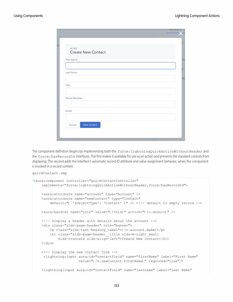
The component definition begins by implementing both the force:lightningQuickActionWithoutHeader andthe force:hasRecordId interfaces. The first makes it available for use as an action and prevents the standard controls fromdisplaying. The second adds the interface’s automatic record ID attribute and value assignment behavior, when the componentis invoked in a record context.
quickContact.cmp
<aura:component controller="QuickContactController"implements="force:lightningQuickActionWithoutHeader,force:hasRecordId">
<aura:attribute name="account" type="Account" /><aura:attribute name="newContact" type="Contact"
default="{ 'sobjectType': 'Contact' }" /> <!-- default to empty record -->
<aura:handler name="init" value="{!this}" action="{!c.doInit}" />
<!-- Display a header with details about the account --><div class="slds-page-header" role="banner">
<p class="slds-text-heading_label">{!v.account.Name}</p><h1 class="slds-page-header__title slds-m-right_small
slds-truncate slds-align-left">Create New Contact</h1></div>
<!-- Display the new contact form --><lightning:input aura:id="contactField" name="firstName" label="First Name"
value="{!v.newContact.FirstName}" required="true"/>
<lightning:input aura:id="contactField" name="lastname" label="Last Name"
153
Lightning Component ActionsUsing Components
value="{!v.newContact.LastName}" required="true"/>
<lightning:input aura:id="contactField" name="title" label="Title"value="{!v.newContact.Title}" />
<lightning:input aura:id="contactField" type="phone" name="phone" label="PhoneNumber"
pattern="^(1?(-?\d{3})-?)?(\d{3})(-?\d{4})$"messageWhenPatternMismatch="The phone number must contain 7, 10,
or 11 digits. Hyphens are optional."value="{!v.newContact.Phone}" required="true"/>
<lightning:input aura:id="contactField" type="email" name="email" label="Email"value="{!v.newContact.Email}" />
<lightning:button label="Cancel" onclick="{!c.handleCancel}"class="slds-m-top_medium" />
<lightning:button label="Save Contact" onclick="{!c.handleSaveContact}"variant="brand" class="slds-m-top_medium"/>
</aura:component>
The component defines the following attributes, which are used as member variables.
• account—holds the full account record, after it’s loaded in the init handler
• newContact—an empty contact, used to capture the form field values
The rest of the component definition is a standard form that displays an error on the field if the required fields are empty or thephone field doesn’t match the specified pattern.
The component’s controller has all of the interesting code, in three action handlers.
quickContactController.js
({doInit : function(component, event, helper) {
// Prepare the action to load account recordvar action = component.get("c.getAccount");action.setParams({"accountId": component.get("v.recordId")});
// Configure response handleraction.setCallback(this, function(response) {
var state = response.getState();if(state === "SUCCESS") {
component.set("v.account", response.getReturnValue());} else {
console.log('Problem getting account, response state: ' + state);}
});$A.enqueueAction(action);
},
handleSaveContact: function(component, event, helper) {if(helper.validateContactForm(component)) {
154
Lightning Component ActionsUsing Components
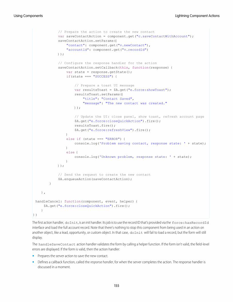
// Prepare the action to create the new contactvar saveContactAction = component.get("c.saveContactWithAccount");saveContactAction.setParams({
"contact": component.get("v.newContact"),"accountId": component.get("v.recordId")
});
// Configure the response handler for the actionsaveContactAction.setCallback(this, function(response) {
var state = response.getState();if(state === "SUCCESS") {
// Prepare a toast UI messagevar resultsToast = $A.get("e.force:showToast");resultsToast.setParams({
"title": "Contact Saved","message": "The new contact was created."
});
// Update the UI: close panel, show toast, refresh account page$A.get("e.force:closeQuickAction").fire();resultsToast.fire();$A.get("e.force:refreshView").fire();
}else if (state === "ERROR") {
console.log('Problem saving contact, response state: ' + state);}else {
console.log('Unknown problem, response state: ' + state);}
});
// Send the request to create the new contact$A.enqueueAction(saveContactAction);
}
},
handleCancel: function(component, event, helper) {$A.get("e.force:closeQuickAction").fire();}
})
The first action handler, doInit, is an init handler. Its job is to use the record ID that’s provided via the force:hasRecordIdinterface and load the full account record. Note that there’s nothing to stop this component from being used in an action onanother object, like a lead, opportunity, or custom object. In that case, doInit will fail to load a record, but the form will stilldisplay.
The handleSaveContact action handler validates the form by calling a helper function. If the form isn’t valid, the field-levelerrors are displayed. If the form is valid, then the action handler:
• Prepares the server action to save the new contact.
• Defines a callback function, called the response handler, for when the server completes the action. The response handler isdiscussed in a moment.
155
Lightning Component ActionsUsing Components
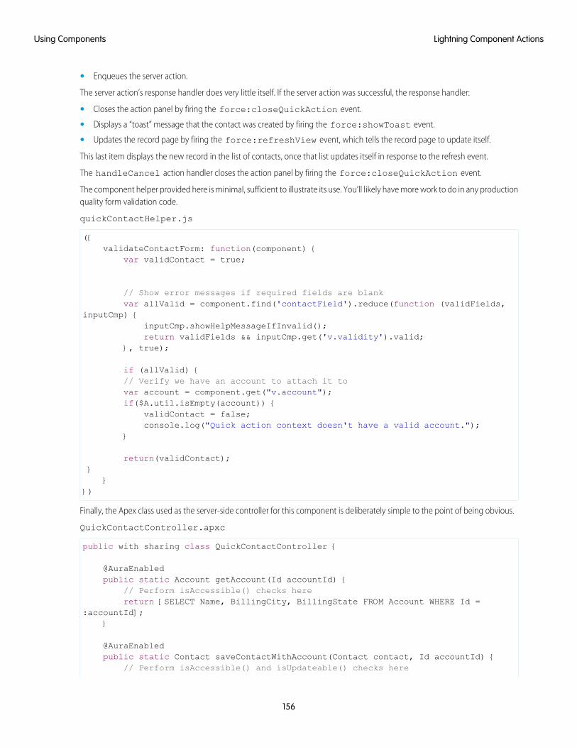
• Enqueues the server action.
The server action’s response handler does very little itself. If the server action was successful, the response handler:
• Closes the action panel by firing the force:closeQuickAction event.
• Displays a “toast” message that the contact was created by firing the force:showToast event.
• Updates the record page by firing the force:refreshView event, which tells the record page to update itself.
This last item displays the new record in the list of contacts, once that list updates itself in response to the refresh event.
The handleCancel action handler closes the action panel by firing the force:closeQuickAction event.
The component helper provided here is minimal, sufficient to illustrate its use. You’ll likely have more work to do in any productionquality form validation code.
quickContactHelper.js
({validateContactForm: function(component) {
var validContact = true;
// Show error messages if required fields are blankvar allValid = component.find('contactField').reduce(function (validFields,
inputCmp) {inputCmp.showHelpMessageIfInvalid();return validFields && inputCmp.get('v.validity').valid;
}, true);
if (allValid) {// Verify we have an account to attach it tovar account = component.get("v.account");if($A.util.isEmpty(account)) {
validContact = false;console.log("Quick action context doesn't have a valid account.");
}
return(validContact);}
}})
Finally, the Apex class used as the server-side controller for this component is deliberately simple to the point of being obvious.
QuickContactController.apxc
public with sharing class QuickContactController {
@AuraEnabledpublic static Account getAccount(Id accountId) {
// Perform isAccessible() checks herereturn [SELECT Name, BillingCity, BillingState FROM Account WHERE Id =
:accountId];}
@AuraEnabledpublic static Contact saveContactWithAccount(Contact contact, Id accountId) {
// Perform isAccessible() and isUpdateable() checks here
156
Lightning Component ActionsUsing Components

contact.AccountId = accountId;upsert contact;return contact;
}
}
One method retrieves an account based on the record ID. The other associates a new contact record with an account, and thensaves it to the database.
SEE ALSO:
Configure Components for Custom Actions
Override Standard Actions with Aura ComponentsAdd the lightning:actionOverride interface to an Aura component to enable the component to be used to override astandard action on an object. You can override the View, New, Edit, and Tab standard actions on most standard and all custom components.Overriding standard actions allows you to customize your org using Lightning components, including completely customizing the wayyou view, create, and edit records.
Overriding an action with an Aura component closely parallels overriding an action with a Visualforce page. Choose a Lightning componentinstead of a Visualforce page in the Override Properties for an action.
157
Override Standard Actions with Aura ComponentsUsing Components
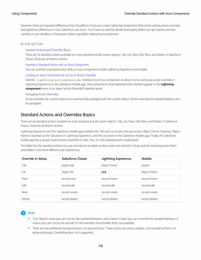
However, there are important differences from Visualforce in how you create Lightning components that can be used as action overrides,and significant differences in how Salesforce uses them. You’ll want to read the details thoroughly before you get started, and testcarefully in your sandbox or Developer Edition org before deploying to production.
IN THIS SECTION:
Standard Actions and Overrides Basics
There are six standard actions available on most standard and all custom objects: Tab, List, View, Edit, New, and Delete. In SalesforceClassic, these are all distinct actions.
Override a Standard Action with an Aura Component
You can override a standard action with an Aura component in both Lightning Experience and mobile.
Creating an Aura Component for Use as an Action Override
Add the lightning:actionOverride interface to an Aura component to allow it to be used as an action override inLightning Experience or the Salesforce mobile app. Only components that implement this interface appear in the Lightningcomponent menu of an object action Override Properties panel.
Packaging Action Overrides
Action overrides for custom objects are automatically packaged with the custom object. Action overrides for standard objects can’tbe packaged.
Standard Actions and Overrides BasicsThere are six standard actions available on most standard and all custom objects: Tab, List, View, Edit, New, and Delete. In SalesforceClassic, these are all distinct actions.
Lightning Experience and the Salesforce mobile app combine the Tab and List actions into one action, Object Home. However, ObjectHome is reached via the Tab action in Lightning Experience, and the List action in the Salesforce mobile app. Finally, the Salesforcemobile app has a unique Search action (reached via Tab). (Yes, it’s a bit awkward and complicated.)
This table lists the standard actions you can override for an object as the actions are named in Setup, and the resulting action that’soverridden in the three different user experiences.
MobileLightning ExperienceSalesforce ClassicOverride in Setup
searchobject homeobject tabTab
object homen/aobject listList
record homerecord homerecord viewView
record editrecord editrecord editEdit
record createrecord createrecord createNew
record deleterecord deleterecord deleteDelete
Note:
• “n/a” doesn’t mean you can’t access the standard behavior, and it doesn’t mean you can’t override the standard behavior. Itmeans you can’t access the override. It’s the override’s functionality that’s not available.
• There are two additional standard actions, Accept and Clone. These actions are more complex, and overriding them is anadvanced project. Overriding them isn’t supported.
158
Override Standard Actions with Aura ComponentsUsing Components

• Action overrides aren’t supported in communities.
How and Where You Can Use Action OverridesAura components can be used to override the View, New, New Event, Edit, and Tab standard actions in Lightning Experience and theSalesforce mobile app. You can use an Aura component as an override in Lightning Experience and mobile, but not Salesforce Classic.
Override a Standard Action with an Aura ComponentYou can override a standard action with an Aura component in both Lightning Experience and mobile.
You need at least one Aura component in your org that implements the lightning:actionOverride interface. You can usea custom component of your own, or a component from a managed package.
Go to the object management settings for the object with the action you plan to override.
1. Select Buttons, Links, and Actions.
2. Select Edit for the action you want to override.
3. Select Lightning component for the area you want to set the override.
4. From the drop-down menu, select the name of the Lightning component to use as the action override.
5. Select Save.
Note: Users won’t see changes to action overrides until they reload Lightning Experience or the Salesforce mobile app.
SEE ALSO:
Salesforce Help: Find Object Management Settings
Salesforce Help: Override Standard Buttons and Tab Home Pages
Creating an Aura Component for Use as an Action OverrideAdd the lightning:actionOverride interface to an Aura component to allow it to be used as an action override in LightningExperience or the Salesforce mobile app. Only components that implement this interface appear in the Lightning component menuof an object action Override Properties panel.
<aura:componentimplements="lightning:actionOverride,force:hasRecordId,force:hasSObjectName">
<article class="slds-card"><div class="slds-card__header slds-grid"><header class="slds-media slds-media_center slds-has-flexi-truncate"><div class="slds-media__body"><h2><span class="slds-text-heading_small">Expense Details</span></h2>
</div></header><div class="slds-no-flex">
<lightning:button label="Edit" onclick="{!c.handleEdit}"/></div>
</div><div class="slds-card__body">(expense details go here)</div>
159
Override Standard Actions with Aura ComponentsUsing Components
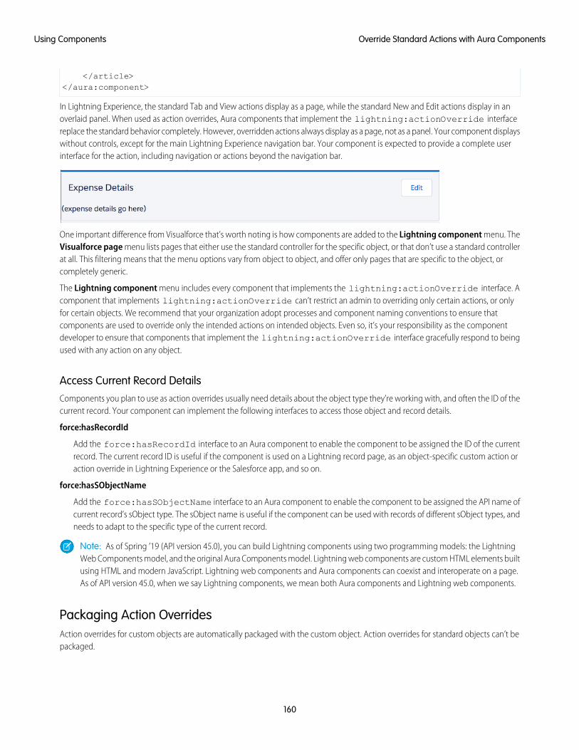
</article></aura:component>
In Lightning Experience, the standard Tab and View actions display as a page, while the standard New and Edit actions display in anoverlaid panel. When used as action overrides, Aura components that implement the lightning:actionOverride interfacereplace the standard behavior completely. However, overridden actions always display as a page, not as a panel. Your component displayswithout controls, except for the main Lightning Experience navigation bar. Your component is expected to provide a complete userinterface for the action, including navigation or actions beyond the navigation bar.
One important difference from Visualforce that’s worth noting is how components are added to the Lightning component menu. TheVisualforce page menu lists pages that either use the standard controller for the specific object, or that don’t use a standard controllerat all. This filtering means that the menu options vary from object to object, and offer only pages that are specific to the object, orcompletely generic.
The Lightning component menu includes every component that implements the lightning:actionOverride interface. Acomponent that implements lightning:actionOverride can’t restrict an admin to overriding only certain actions, or onlyfor certain objects. We recommend that your organization adopt processes and component naming conventions to ensure thatcomponents are used to override only the intended actions on intended objects. Even so, it’s your responsibility as the componentdeveloper to ensure that components that implement the lightning:actionOverride interface gracefully respond to beingused with any action on any object.
Access Current Record DetailsComponents you plan to use as action overrides usually need details about the object type they’re working with, and often the ID of thecurrent record. Your component can implement the following interfaces to access those object and record details.
force:hasRecordId
Add the force:hasRecordId interface to an Aura component to enable the component to be assigned the ID of the currentrecord. The current record ID is useful if the component is used on a Lightning record page, as an object-specific custom action oraction override in Lightning Experience or the Salesforce app, and so on.
force:hasSObjectName
Add the force:hasSObjectName interface to an Aura component to enable the component to be assigned the API name ofcurrent record’s sObject type. The sObject name is useful if the component can be used with records of different sObject types, andneeds to adapt to the specific type of the current record.
Note: As of Spring ’19 (API version 45.0), you can build Lightning components using two programming models: the LightningWeb Components model, and the original Aura Components model. Lightning web components are custom HTML elements builtusing HTML and modern JavaScript. Lightning web components and Aura components can coexist and interoperate on a page.As of API version 45.0, when we say Lightning components, we mean both Aura components and Lightning web components.
Packaging Action OverridesAction overrides for custom objects are automatically packaged with the custom object. Action overrides for standard objects can’t bepackaged.
160
Override Standard Actions with Aura ComponentsUsing Components
When you package a custom object, overrides on that object’s standard actions are packaged with it. This includes any Lightningcomponents used by the overrides. Your experience should be “it just works.”
However, standard objects can’t be packaged. As a consequence, there’s no way to package overrides on the object’s standard actions.
To override standard actions on standard objects in a package, do the following:
• Manually package any Lightning components that are used by the overrides.
• Provide instructions for subscribing orgs to manually override the relevant standard actions on the affected standard objects.
SEE ALSO:
Override a Standard Action with an Aura Component
Metadata API Developer Guide : ActionOverride
Navigate Across Your Apps with Page References
The pageReference JavaScript object represents a URL for a page. You can use a pageReference instead of parsing or creatinga URL directly. This approach helps you avoid broken navigation if Salesforce changes URL formats in the future.
These navigation resources are supported only in Lightning Experience, Lightning Communities, and the Salesforce mobile app. They’renot supported in other containers, such as Lightning Components for Visualforce, or Lightning Out. This is true even if you access thesecontainers inside Lightning Experience or the Salesforce mobile app.
IN THIS SECTION:
Basic Navigation
The pageReference JavaScript object represents a URL for a page. You can use a pageReference instead of parsing orcreating a URL directly. This approach helps you avoid broken navigation if Salesforce changes URL formats in the future.
Add Links to Lightning Pages from Your Custom Components
To link to Lightning Experience pages, use lightning:formattedUrl in your custom component.Thelightning:formattedUrl component displays a URL as a hyperlink.
Add Query Parameters
To add query parameters to the URL, update the PageReference state property. The key-value pairs of the state property areserialized to URL query parameters. The query parameters describe the page and form a more specific URL that the user can save orbookmark.
Navigate to a Web Page
The navigation service supports different kinds of pages in Lightning. Each page reference type supports a different set of attributesand state properties.
Migrate to lightning:isUrlAddressable from force:navigateToComponent
The pageReference JavaScript object represents a URL for a page. You can use a pageReference instead of parsing orcreating a URL directly. This approach helps you avoid broken navigation if Salesforce changes URL formats in the future.
pageReference Types
To navigate in Lightning Experience, Lightning Communities, or the Salesforce mobile app, define a PageReference object.The pageReference type generates a unique URL format and defines attributes that apply to all pages of that type.
161
Navigate Across Your Apps with Page ReferencesUsing Components

Basic NavigationThe pageReference JavaScript object represents a URL for a page. You can use a pageReference instead of parsing or creatinga URL directly. This approach helps you avoid broken navigation if Salesforce changes URL formats in the future.
Use the following resources to simplify navigation across your apps. URLs for components using these resources are case-sensitive. Forexamples, see the Component Library.
lightning:navigation
To navigate to a page or component, use the navigate() method in lightning:navigation. This approach is a substitutefor a navigateTo* event, and both are supported.
To generate a URL in your component, use the generateUrl() method in lightning:navigation to resolve the URL.
Note: generateUrl() returns a promise, which calls back with the resulting URL.
lightning:isUrlAddressableTo enable a component to navigate directly via a URL, add the lightning:isUrlAddressable interface to your component.
Tip: pageReference and lightning:isUrlAddressable replace the force:navigateToComponentevent for navigating directly to a component. Unlike the force:navigateToComponent event information-mappingprotocol, the only attribute populated through the navigation dispatching system is the pageReference attribute.Information is passed to the addressed component through the state properties on the target page reference.lightning:isUrlAddressable doesn’t automatically set attributes on the target component. Get parameters fromv.pageReference.state and manually set them using the target component’s init handler.
pageReference provides a well-defined structure that describes the page type and its corresponding attributes. pageReferencesupports the following properties.
Required?DescriptionTypeProperty
YThe API name of the pageReference type, for example,standard__objectPage.
Stringtype
YValues for each attribute specified by the page definition, for example,objectAPIName or actionName.
Objectattributes
Parameters that are tied to the query string of the URL in LightningExperience, such as filterName. The routing framework doesn’t dependon state to render a page.
Objectstate
Note: Lightning Communities don’t support the state property.
Add Links to Lightning Pages from Your Custom ComponentsTo link to Lightning Experience pages, use lightning:formattedUrl in your custom component.Thelightning:formattedUrl component displays a URL as a hyperlink.
If you use raw anchor tags or the ui:outputUrl component for links, the page does a full reload each time you click the link. Toavoid full page reloads, replace your link components with lightning:formattedUrl.
For examples, see the Component Library.
162
Basic NavigationUsing Components
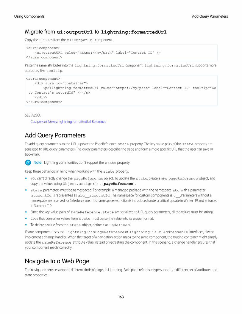
Migrate from ui:outputUrl to lightning:formattedUrlCopy the attributes from the ui:outputUrl component.
<aura:component><ui:outputURL value="https://my/path" label="Contact ID" />
</aura:component>
Paste the same attributes into the lightning:formattedUrl component. lightning:formattedUrl supports moreattributes, like tooltip.
<aura:component><div aura:id="container">
<p><lightning:formattedUrl value="https://my/path" label="Contact ID" tooltip="Goto Contact's recordId" /></p>
</div></aura:component>
SEE ALSO:
Component Library: lightning:formattedUrl Reference
Add Query ParametersTo add query parameters to the URL, update the PageReference state property. The key-value pairs of the state property areserialized to URL query parameters. The query parameters describe the page and form a more specific URL that the user can save orbookmark.
Note: Lightning communities don’t support the state property.
Keep these behaviors in mind when working with the state property.
• You can’t directly change the pageReference object. To update the state, create a new pageReference object, andcopy the values using Object.assign({}, pageReference).
• state parameters must be namespaced. For example, a managed package with the namespace abc with a parameteraccountId is represented as abc__accountId. The namespace for custom components is c__.Parameters without anamespace are reserved for Salesforce use. This namespace restriction is introduced under a critical update in Winter ’19 and enforcedin Summer ’19.
• Since the key-value pairs of PageReference.state are serialized to URL query parameters, all the values must be strings.
• Code that consumes values from state must parse the value into its proper format.
• To delete a value from the state object, define it as undefined.
If your component uses the lightning:hasPageReference or lightning:isUrlAddressable interfaces, alwaysimplement a change handler. When the target of a navigation action maps to the same component, the routing container might simplyupdate the pageReference attribute value instead of recreating the component. In this scenario, a change handler ensures thatyour component reacts correctly.
Navigate to a Web PageThe navigation service supports different kinds of pages in Lightning. Each page reference type supports a different set of attributes andstate properties.
163
Add Query ParametersUsing Components
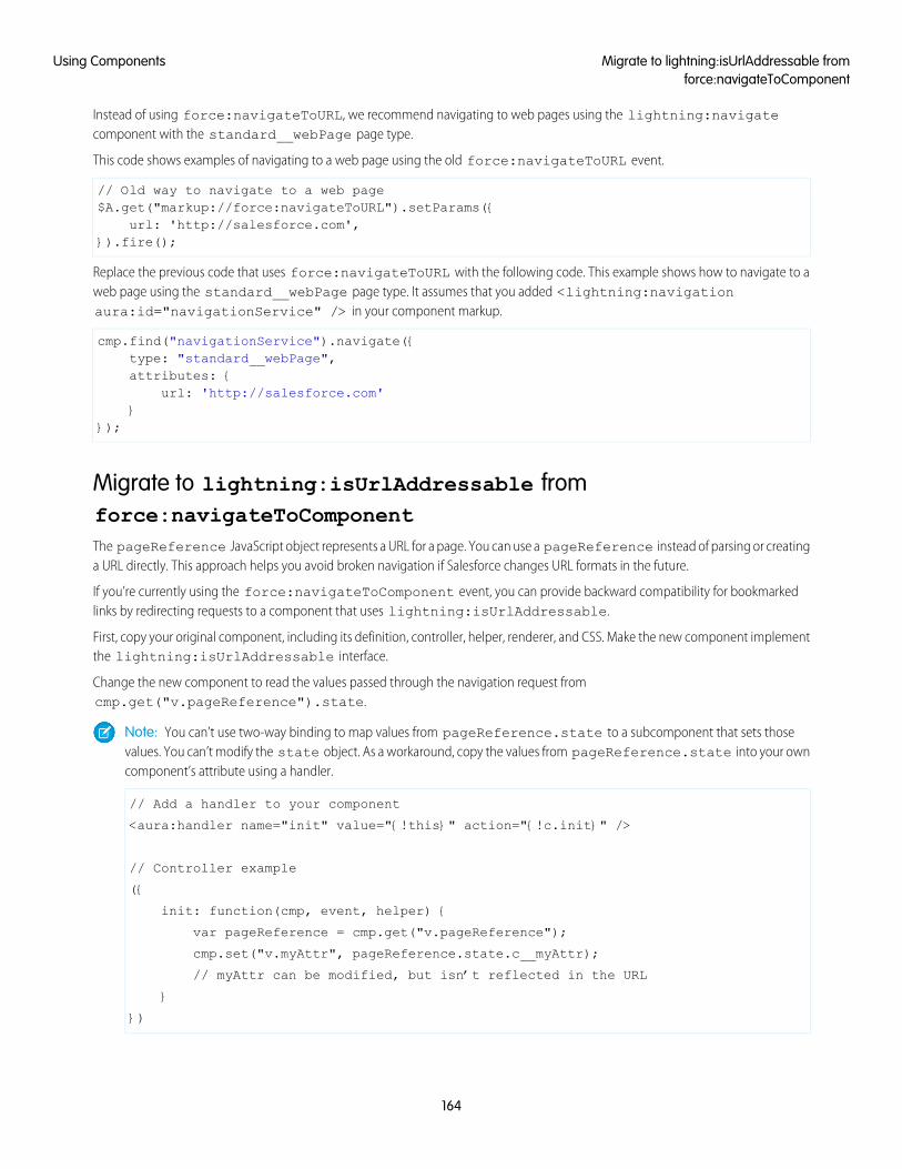
Instead of using force:navigateToURL, we recommend navigating to web pages using the lightning:navigatecomponent with the standard__webPage page type.
This code shows examples of navigating to a web page using the old force:navigateToURL event.
// Old way to navigate to a web page$A.get("markup://force:navigateToURL").setParams({
url: 'http://salesforce.com',}).fire();
Replace the previous code that uses force:navigateToURL with the following code. This example shows how to navigate to aweb page using the standard__webPage page type. It assumes that you added <lightning:navigationaura:id="navigationService" /> in your component markup.
cmp.find("navigationService").navigate({type: "standard__webPage",attributes: {
url: 'http://salesforce.com'}
});
Migrate to lightning:isUrlAddressable fromforce:navigateToComponentThe pageReference JavaScript object represents a URL for a page. You can use a pageReference instead of parsing or creatinga URL directly. This approach helps you avoid broken navigation if Salesforce changes URL formats in the future.
If you’re currently using the force:navigateToComponent event, you can provide backward compatibility for bookmarkedlinks by redirecting requests to a component that uses lightning:isUrlAddressable.
First, copy your original component, including its definition, controller, helper, renderer, and CSS. Make the new component implementthe lightning:isUrlAddressable interface.
Change the new component to read the values passed through the navigation request fromcmp.get("v.pageReference").state.
Note: You can’t use two-way binding to map values from pageReference.state to a subcomponent that sets thosevalues. You can’t modify the state object. As a workaround, copy the values from pageReference.state into your owncomponent’s attribute using a handler.
// Add a handler to your component
<aura:handler name="init" value="{!this}" action="{!c.init}" />
// Controller example
({
init: function(cmp, event, helper) {
var pageReference = cmp.get("v.pageReference");
cmp.set("v.myAttr", pageReference.state.c__myAttr);
// myAttr can be modified, but isn’t reflected in the URL
}
})
164
Migrate to lightning:isUrlAddressable fromforce:navigateToComponent
Using Components
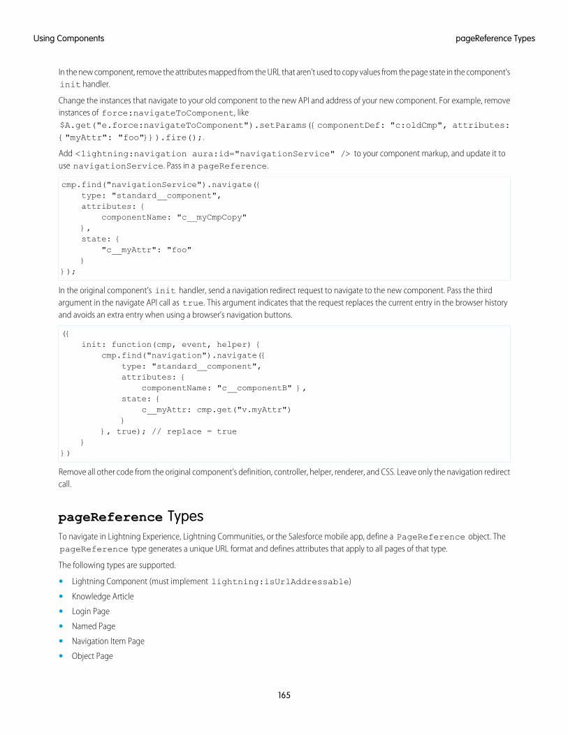
In the new component, remove the attributes mapped from the URL that aren’t used to copy values from the page state in the component’sinit handler.
Change the instances that navigate to your old component to the new API and address of your new component. For example, removeinstances of force:navigateToComponent, like$A.get("e.force:navigateToComponent").setParams({componentDef: "c:oldCmp", attributes:{"myAttr": "foo"}}).fire();.
Add <lightning:navigation aura:id="navigationService" /> to your component markup, and update it touse navigationService. Pass in a pageReference.
cmp.find("navigationService").navigate({type: "standard__component",attributes: {
componentName: "c__myCmpCopy"},state: {
"c__myAttr": "foo"}
});
In the original component’s init handler, send a navigation redirect request to navigate to the new component. Pass the thirdargument in the navigate API call as true. This argument indicates that the request replaces the current entry in the browser historyand avoids an extra entry when using a browser’s navigation buttons.
({init: function(cmp, event, helper) {
cmp.find("navigation").navigate({type: "standard__component",attributes: {
componentName: "c__componentB" },state: {
c__myAttr: cmp.get("v.myAttr")}
}, true); // replace = true}
})
Remove all other code from the original component’s definition, controller, helper, renderer, and CSS. Leave only the navigation redirectcall.
pageReference TypesTo navigate in Lightning Experience, Lightning Communities, or the Salesforce mobile app, define a PageReference object. ThepageReference type generates a unique URL format and defines attributes that apply to all pages of that type.
The following types are supported.
• Lightning Component (must implement lightning:isUrlAddressable)
• Knowledge Article
• Login Page
• Named Page
• Navigation Item Page
• Object Page
165
pageReference TypesUsing Components
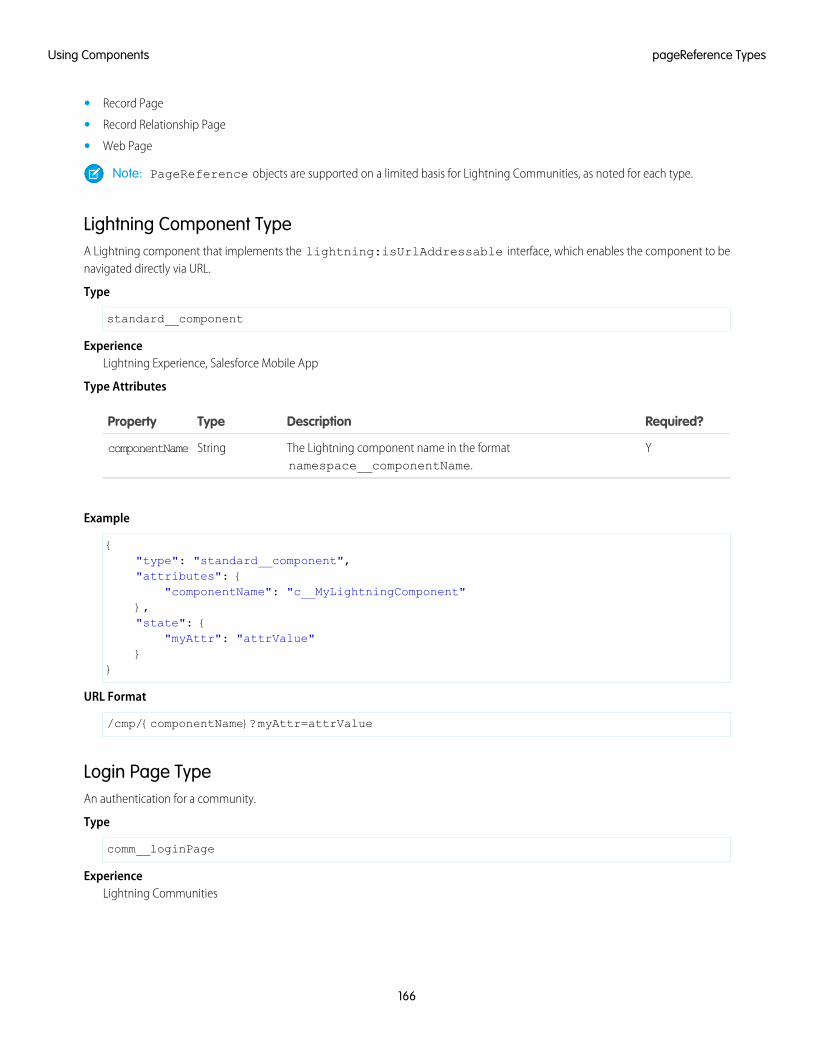
• Record Page
• Record Relationship Page
• Web Page
Note: PageReference objects are supported on a limited basis for Lightning Communities, as noted for each type.
Lightning Component TypeA Lightning component that implements the lightning:isUrlAddressable interface, which enables the component to benavigated directly via URL.
Type
standard__component
ExperienceLightning Experience, Salesforce Mobile App
Type Attributes
Required?DescriptionTypeProperty
YThe Lightning component name in the formatnamespace__componentName.
StringcomponentName
Example
{"type": "standard__component","attributes": {
"componentName": "c__MyLightningComponent"},"state": {
"myAttr": "attrValue"}
}
URL Format
/cmp/{componentName}?myAttr=attrValue
Login Page TypeAn authentication for a community.
Type
comm__loginPage
ExperienceLightning Communities
166
pageReference TypesUsing Components
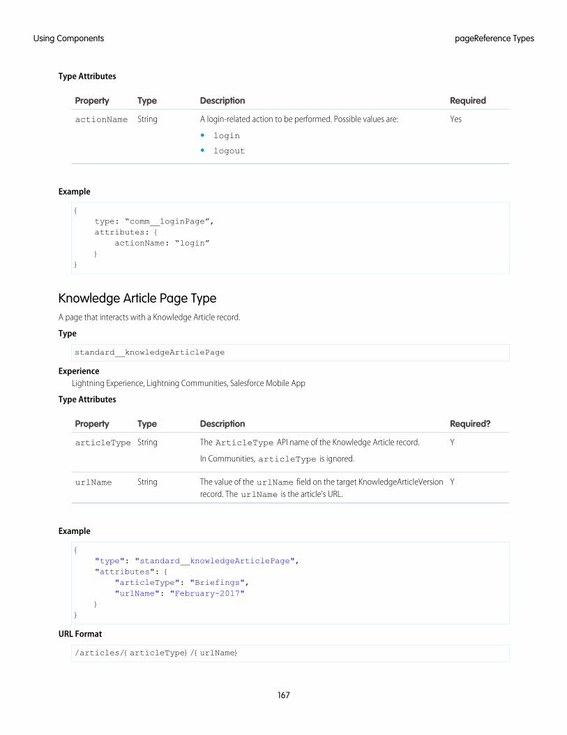
Type Attributes
RequiredDescriptionTypeProperty
YesA login-related action to be performed. Possible values are:StringactionName
• login
• logout
Example
{type: “comm__loginPage”,attributes: {
actionName: “login”}
}
Knowledge Article Page TypeA page that interacts with a Knowledge Article record.
Type
standard__knowledgeArticlePage
ExperienceLightning Experience, Lightning Communities, Salesforce Mobile App
Type Attributes
Required?DescriptionTypeProperty
YThe ArticleType API name of the Knowledge Article record.
In Communities, articleType is ignored.
StringarticleType
YThe value of the urlName field on the target KnowledgeArticleVersionrecord. The urlName is the article's URL.
StringurlName
Example
{"type": "standard__knowledgeArticlePage","attributes": {
"articleType": "Briefings","urlName": "February-2017"
}}
URL Format
/articles/{articleType}/{urlName}
167
pageReference TypesUsing Components

URL Format (Communities)
/article/{urlName}
Named Page TypeA standard page with a unique name. If an error occurs, the error view loads and the URL isn’t updated. .
Type
standard__namedPage
comm__namedPage
ExperienceLightning Experience, Lightning Communities, Salesforce Mobile App
Type Attributes
Required?DescriptionTypeProperty
YThe unique name of the page.
In Lightning Experience and the Salesforce mobile app, possible valuesare:
StringpageName
• home
• chatter
• today
• dataAssessment
• filePreview
In Communities, the value for pageName is the URL value for a supportedpage. For instance, the default URL value for the Account Managementpage is /account-management, so the value for pageName wouldbe account-management.
The value of home is reserved for the landing page of any community inyour org.
However, because pages in communities are different than pages inLightning Experience, we’ve moved them to their own namespace forbetter management and clarity. standard__namedPage isdeprecated in communities. Use comm__namedPage instead.
Supported pages in Communities are:
• Home
• Account management
• Contact support
• Error
• Login
• Top Articles
• Topic Catalog
168
pageReference TypesUsing Components
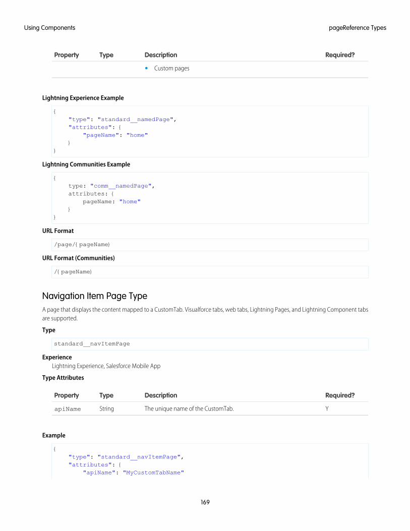
Required?DescriptionTypeProperty
• Custom pages
Lightning Experience Example
{"type": "standard__namedPage","attributes": {
"pageName": "home"}
}
Lightning Communities Example
{type: "comm__namedPage",attributes: {
pageName: "home"}
}
URL Format
/page/{pageName}
URL Format (Communities)
/{pageName}
Navigation Item Page TypeA page that displays the content mapped to a CustomTab. Visualforce tabs, web tabs, Lightning Pages, and Lightning Component tabsare supported.
Type
standard__navItemPage
ExperienceLightning Experience, Salesforce Mobile App
Type Attributes
Required?DescriptionTypeProperty
YThe unique name of the CustomTab.StringapiName
Example
{"type": "standard__navItemPage","attributes": {
"apiName": "MyCustomTabName"
169
pageReference TypesUsing Components
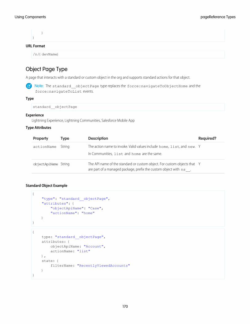
}}
URL Format
/n/{devName}
Object Page TypeA page that interacts with a standard or custom object in the org and supports standard actions for that object.
Note: The standard__objectPage type replaces the force:navigateToObjectHome and theforce:navigateToList events.
Type
standard__objectPage
ExperienceLightning Experience, Lightning Communities, Salesforce Mobile App
Type Attributes
Required?DescriptionTypeProperty
YThe action name to invoke. Valid values include home, list, and new.
In Communities, list and home are the same.
StringactionName
YThe API name of the standard or custom object. For custom objects thatare part of a managed package, prefix the custom object with ns__.
StringobjectApiName
Standard Object Example
{"type": "standard__objectPage","attributes": {
"objectApiName": "Case","actionName": "home"
}}
{type: "standard__objectPage",attributes: {
objectApiName: "Account",actionName: "list"
},state: {
filterName: "RecentlyViewedAccounts"}
}
170
pageReference TypesUsing Components
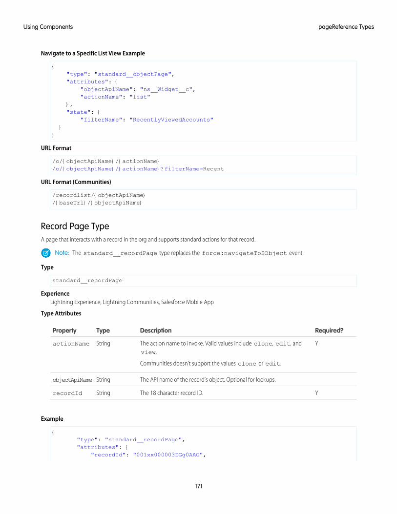
Navigate to a Specific List View Example
{"type": "standard__objectPage","attributes": {
"objectApiName": "ns__Widget__c","actionName": "list"
},"state": {
"filterName": "RecentlyViewedAccounts"}
}
URL Format
/o/{objectApiName}/{actionName}/o/{objectApiName}/{actionName}?filterName=Recent
URL Format (Communities)
/recordlist/{objectApiName}/{baseUrl}/{objectApiName}
Record Page TypeA page that interacts with a record in the org and supports standard actions for that record.
Note: The standard__recordPage type replaces the force:navigateToSObject event.
Type
standard__recordPage
ExperienceLightning Experience, Lightning Communities, Salesforce Mobile App
Type Attributes
Required?DescriptionTypeProperty
YThe action name to invoke. Valid values include clone, edit, andview.
Communities doesn’t support the values clone or edit.
StringactionName
The API name of the record’s object. Optional for lookups.StringobjectApiName
YThe 18 character record ID.StringrecordId
Example
{"type": "standard__recordPage","attributes": {
"recordId": "001xx000003DGg0AAG",
171
pageReference TypesUsing Components
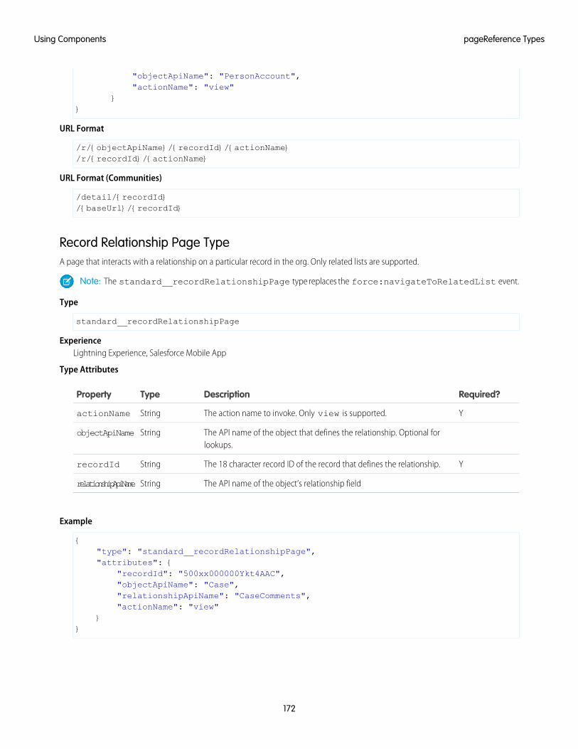
"objectApiName": "PersonAccount","actionName": "view"
}}
URL Format
/r/{objectApiName}/{recordId}/{actionName}/r/{recordId}/{actionName}
URL Format (Communities)
/detail/{recordId}/{baseUrl}/{recordId}
Record Relationship Page TypeA page that interacts with a relationship on a particular record in the org. Only related lists are supported.
Note: The standard__recordRelationshipPage type replaces the force:navigateToRelatedList event.
Type
standard__recordRelationshipPage
ExperienceLightning Experience, Salesforce Mobile App
Type Attributes
Required?DescriptionTypeProperty
YThe action name to invoke. Only view is supported.StringactionName
The API name of the object that defines the relationship. Optional forlookups.
StringobjectApiName
YThe 18 character record ID of the record that defines the relationship.StringrecordId
The API name of the object’s relationship fieldStringrelationshipApiName
Example
{"type": "standard__recordRelationshipPage","attributes": {
"recordId": "500xx000000Ykt4AAC","objectApiName": "Case","relationshipApiName": "CaseComments","actionName": "view"
}}
172
pageReference TypesUsing Components
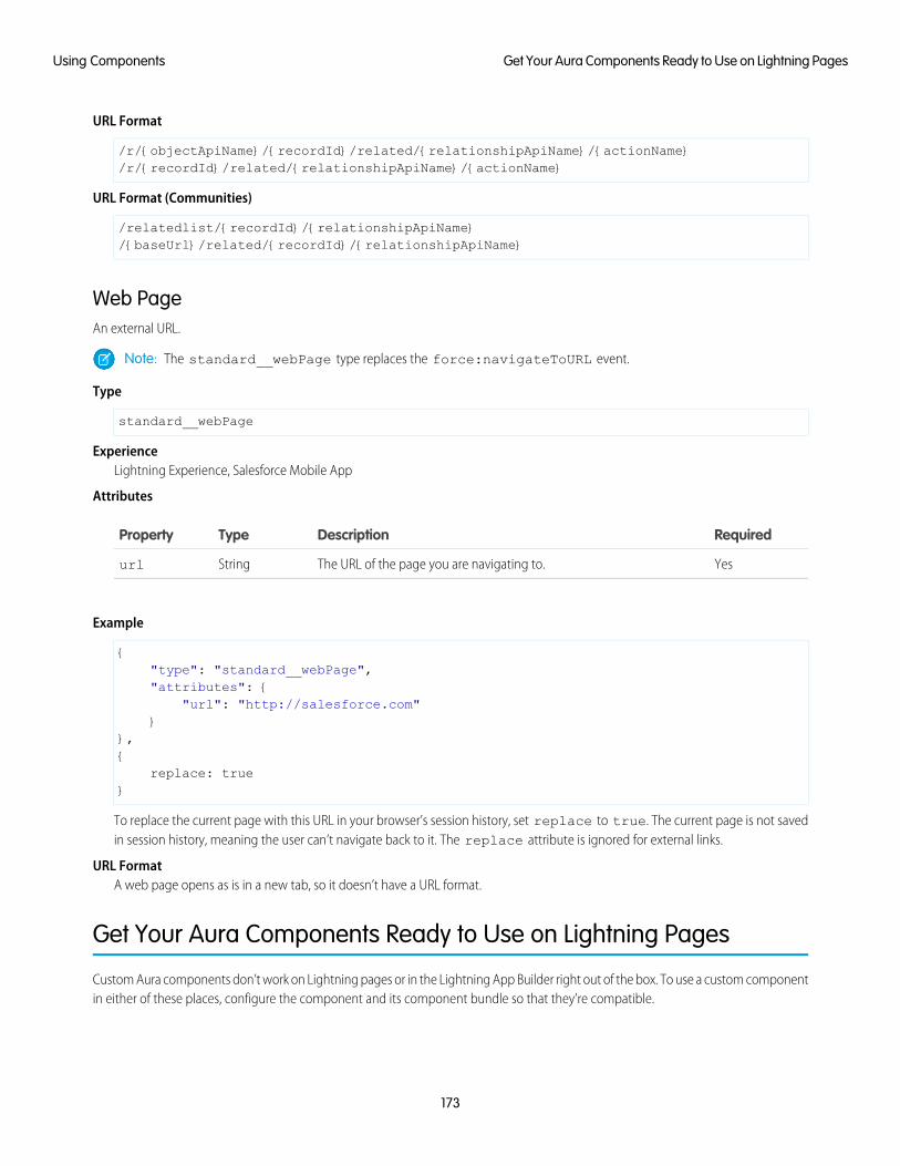
URL Format
/r/{objectApiName}/{recordId}/related/{relationshipApiName}/{actionName}/r/{recordId}/related/{relationshipApiName}/{actionName}
URL Format (Communities)
/relatedlist/{recordId}/{relationshipApiName}/{baseUrl}/related/{recordId}/{relationshipApiName}
Web PageAn external URL.
Note: The standard__webPage type replaces the force:navigateToURL event.
Type
standard__webPage
ExperienceLightning Experience, Salesforce Mobile App
Attributes
RequiredDescriptionTypeProperty
YesThe URL of the page you are navigating to.Stringurl
Example
{"type": "standard__webPage","attributes": {
"url": "http://salesforce.com"}
},{
replace: true}
To replace the current page with this URL in your browser’s session history, set replace to true. The current page is not savedin session history, meaning the user can’t navigate back to it. The replace attribute is ignored for external links.
URL FormatA web page opens as is in a new tab, so it doesn’t have a URL format.
Get Your Aura Components Ready to Use on Lightning Pages
Custom Aura components don’t work on Lightning pages or in the Lightning App Builder right out of the box. To use a custom componentin either of these places, configure the component and its component bundle so that they’re compatible.
173
Get Your Aura Components Ready to Use on Lightning PagesUsing Components
IN THIS SECTION:
Configure Components for Lightning Pages and the Lightning App Builder
There are a few steps to take before you can use your custom Aura components in either Lightning pages or the Lightning AppBuilder.
Configure Components for Lightning Experience Record Pages
After your component is set up to work on Lightning pages and in the Lightning App Builder, use these guidelines to configure thecomponent so it works on record pages in Lightning Experience.
Create Components for the Outlook and Gmail Integrations
Create custom Aura components that are available to add to the email application pane for the Outlook and Gmail integrations.
Create Dynamic Picklists for Your Custom Components
You can expose a component property as a picklist when the component is configured in the Lightning App Builder. The picklist’svalues are provided by an Apex class that you create.
Create a Custom Lightning Page Template Component
Every standard Lightning page is associated with a default template component, which defines the page’s regions and whatcomponents the page includes. Custom Lightning page template components let you create page templates to fit your businessneeds with the structure and components that you define. Once implemented, your custom template is available in the LightningApp Builder’s new page wizard for your page creators to use.
Lightning Page Template Component Best Practices
Keep these best practices and limitations in mind when creating Lightning page template components.
Make Your Lightning Page Components Width-Aware with lightning:flexipageRegionInfo
When you add a component to a region on a page in the Lightning App Builder, the lightning:flexipageRegionInfosub-component passes the width of that region to its parent component. With lightning:flexipageRegionInfo andsome strategic CSS, you can tell the parent component to render in different ways in different regions at runtime.
Tips and Considerations for Configuring Components for Lightning Pages and the Lightning App Builder
Keep these guidelines in mind when creating components and component bundles for Lightning pages and the Lightning AppBuilder.
Configure Components for Lightning Pages and the Lightning App BuilderThere are a few steps to take before you can use your custom Aura components in either Lightning pages or the Lightning App Builder.
1. Deploy My Domain in Your OrgDeploy My Domain in your org if you want to use Aura components in Lightning tabs, Lightning pages, as custom Lightning pagetemplates, or as standalone apps.
For more information about My Domain, see Salesforce Help.
2. Add a New Interface to Your ComponentTo appear in the Lightning App Builder or on a Lightning page, a component must implement one of these interfaces.
DescriptionInterface
Makes your component available for record pages and any othertype of page, including a Lightning app’s utility bar.
flexipage:availableForAllPageTypes
174
Configure Components for Lightning Pages and the LightningApp Builder
Using Components
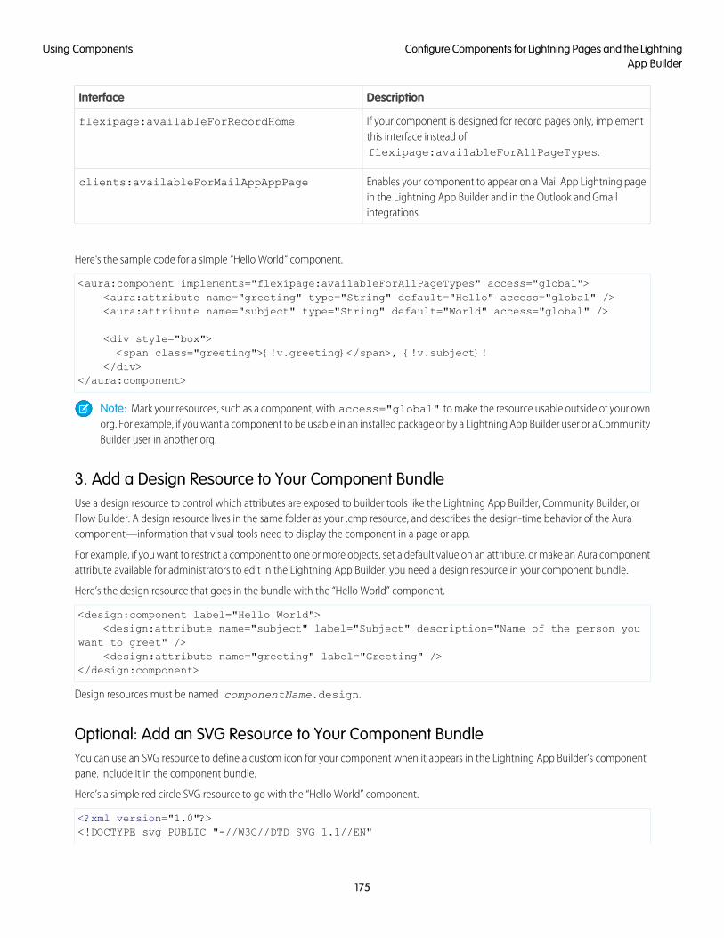
DescriptionInterface
If your component is designed for record pages only, implementthis interface instead offlexipage:availableForAllPageTypes.
flexipage:availableForRecordHome
Enables your component to appear on a Mail App Lightning pagein the Lightning App Builder and in the Outlook and Gmailintegrations.
clients:availableForMailAppAppPage
Here’s the sample code for a simple “Hello World” component.
<aura:component implements="flexipage:availableForAllPageTypes" access="global"><aura:attribute name="greeting" type="String" default="Hello" access="global" /><aura:attribute name="subject" type="String" default="World" access="global" />
<div style="box"><span class="greeting">{!v.greeting}</span>, {!v.subject}!
</div></aura:component>
Note: Mark your resources, such as a component, with access="global" to make the resource usable outside of your ownorg. For example, if you want a component to be usable in an installed package or by a Lightning App Builder user or a CommunityBuilder user in another org.
3. Add a Design Resource to Your Component BundleUse a design resource to control which attributes are exposed to builder tools like the Lightning App Builder, Community Builder, orFlow Builder. A design resource lives in the same folder as your .cmp resource, and describes the design-time behavior of the Auracomponent—information that visual tools need to display the component in a page or app.
For example, if you want to restrict a component to one or more objects, set a default value on an attribute, or make an Aura componentattribute available for administrators to edit in the Lightning App Builder, you need a design resource in your component bundle.
Here’s the design resource that goes in the bundle with the “Hello World” component.
<design:component label="Hello World"><design:attribute name="subject" label="Subject" description="Name of the person you
want to greet" /><design:attribute name="greeting" label="Greeting" />
</design:component>
Design resources must be named componentName.design.
Optional: Add an SVG Resource to Your Component BundleYou can use an SVG resource to define a custom icon for your component when it appears in the Lightning App Builder’s componentpane. Include it in the component bundle.
Here’s a simple red circle SVG resource to go with the “Hello World” component.
<?xml version="1.0"?><!DOCTYPE svg PUBLIC "-//W3C//DTD SVG 1.1//EN"
175
Configure Components for Lightning Pages and the LightningApp Builder
Using Components
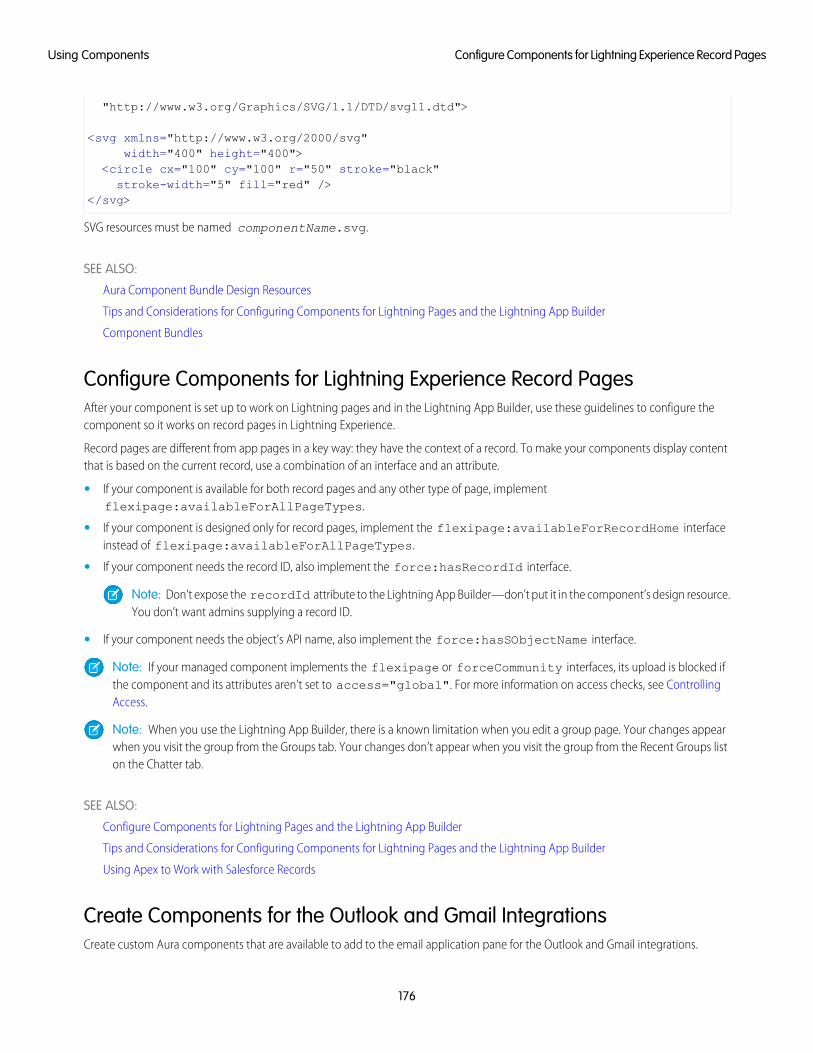
"http://www.w3.org/Graphics/SVG/1.1/DTD/svg11.dtd">
<svg xmlns="http://www.w3.org/2000/svg"width="400" height="400">
<circle cx="100" cy="100" r="50" stroke="black"stroke-width="5" fill="red" />
</svg>
SVG resources must be named componentName.svg.
SEE ALSO:
Aura Component Bundle Design Resources
Tips and Considerations for Configuring Components for Lightning Pages and the Lightning App Builder
Component Bundles
Configure Components for Lightning Experience Record PagesAfter your component is set up to work on Lightning pages and in the Lightning App Builder, use these guidelines to configure thecomponent so it works on record pages in Lightning Experience.
Record pages are different from app pages in a key way: they have the context of a record. To make your components display contentthat is based on the current record, use a combination of an interface and an attribute.
• If your component is available for both record pages and any other type of page, implementflexipage:availableForAllPageTypes.
• If your component is designed only for record pages, implement the flexipage:availableForRecordHome interfaceinstead of flexipage:availableForAllPageTypes.
• If your component needs the record ID, also implement the force:hasRecordId interface.
Note: Don’t expose the recordId attribute to the Lightning App Builder—don’t put it in the component’s design resource.You don’t want admins supplying a record ID.
• If your component needs the object’s API name, also implement the force:hasSObjectName interface.
Note: If your managed component implements the flexipage or forceCommunity interfaces, its upload is blocked ifthe component and its attributes aren’t set to access="global". For more information on access checks, see ControllingAccess.
Note: When you use the Lightning App Builder, there is a known limitation when you edit a group page. Your changes appearwhen you visit the group from the Groups tab. Your changes don’t appear when you visit the group from the Recent Groups liston the Chatter tab.
SEE ALSO:
Configure Components for Lightning Pages and the Lightning App Builder
Tips and Considerations for Configuring Components for Lightning Pages and the Lightning App Builder
Using Apex to Work with Salesforce Records
Create Components for the Outlook and Gmail IntegrationsCreate custom Aura components that are available to add to the email application pane for the Outlook and Gmail integrations.
176
Configure Components for Lightning Experience Record PagesUsing Components
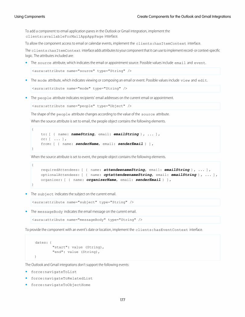
To add a component to email application panes in the Outlook or Gmail integration, implement theclients:availableForMailAppAppPage interface.
To allow the component access to email or calendar events, implement the clients:hasItemContext interface.
The clients:hasItemContext interface adds attributes to your component that it can use to implement record- or context-specificlogic. The attributes included are:
• The source attribute, which indicates the email or appointment source. Possible values include email and event.
<aura:attribute name="source" type="String" />
• The mode attribute, which indicates viewing or composing an email or event. Possible values include view and edit.
<aura:attribute name="mode" type="String" />
• The people attribute indicates recipients’ email addresses on the current email or appointment.
<aura:attribute name="people" type="Object" />
The shape of the people attribute changes according to the value of the source attribute.
When the source attribute is set to email, the people object contains the following elements.
{to: [ { name: nameString, email: emailString }, ... ],cc: [ ... ],from: [ { name: senderName, email: senderEmail } ],
}
When the source attribute is set to event, the people object contains the following elements.
{requiredAttendees: [ { name: attendeenameString, email: emailString }, ... ],optionalAttendees: [ { name: optattendeenameString, email: emailString }, ... ],organizer: [ { name: organizerName, email: senderEmail } ],
}
• The subject indicates the subject on the current email.
<aura:attribute name="subject" type="String" />
• The messageBody indicates the email message on the current email.
<aura:attribute name="messageBody" type="String" />
To provide the component with an event’s date or location, implement the clients:hasEventContext interface.
dates: {"start": value (String),"end": value (String),
}
The Outlook and Gmail integrations don’t support the following events:
• force:navigateToList
• force:navigateToRelatedList
• force:navigateToObjectHome
177
Create Components for the Outlook and Gmail IntegrationsUsing Components
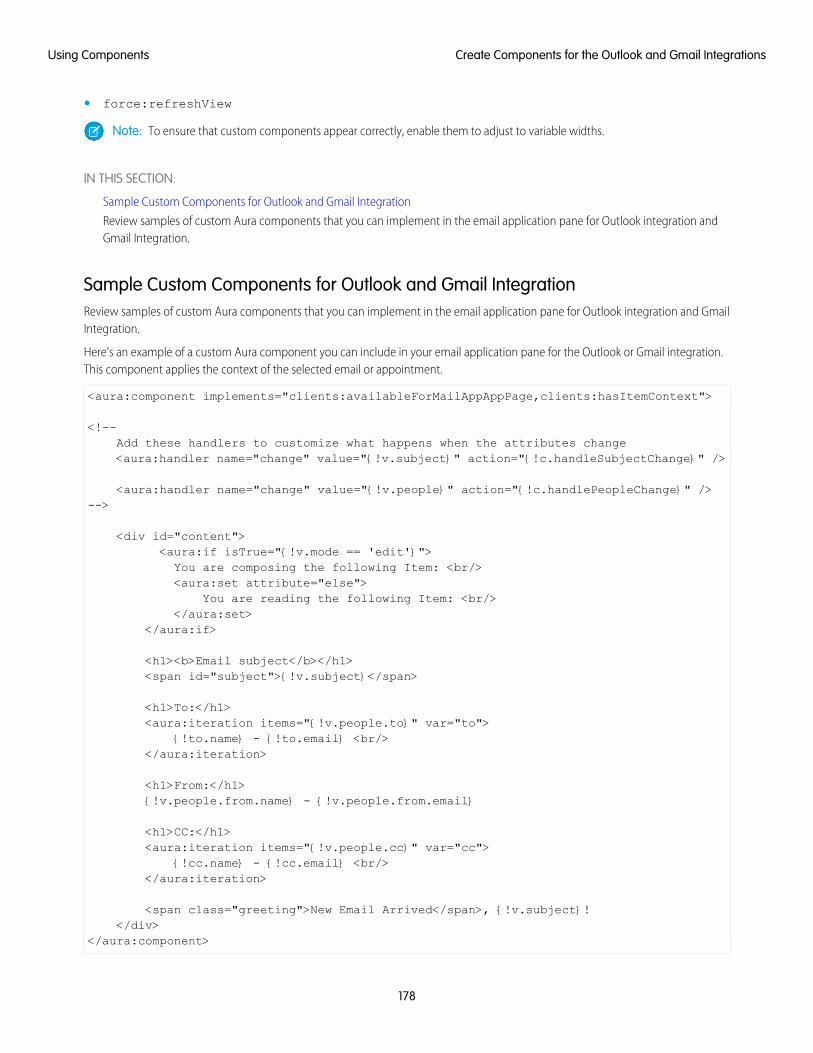
• force:refreshView
Note: To ensure that custom components appear correctly, enable them to adjust to variable widths.
IN THIS SECTION:
Sample Custom Components for Outlook and Gmail Integration
Review samples of custom Aura components that you can implement in the email application pane for Outlook integration andGmail Integration.
Sample Custom Components for Outlook and Gmail IntegrationReview samples of custom Aura components that you can implement in the email application pane for Outlook integration and GmailIntegration.
Here’s an example of a custom Aura component you can include in your email application pane for the Outlook or Gmail integration.This component applies the context of the selected email or appointment.
<aura:component implements="clients:availableForMailAppAppPage,clients:hasItemContext">
<!--Add these handlers to customize what happens when the attributes change<aura:handler name="change" value="{!v.subject}" action="{!c.handleSubjectChange}" />
<aura:handler name="change" value="{!v.people}" action="{!c.handlePeopleChange}" />-->
<div id="content"><aura:if isTrue="{!v.mode == 'edit'}">You are composing the following Item: <br/><aura:set attribute="else">
You are reading the following Item: <br/></aura:set>
</aura:if>
<h1><b>Email subject</b></h1><span id="subject">{!v.subject}</span>
<h1>To:</h1><aura:iteration items="{!v.people.to}" var="to">
{!to.name} - {!to.email} <br/></aura:iteration>
<h1>From:</h1>{!v.people.from.name} - {!v.people.from.email}
<h1>CC:</h1><aura:iteration items="{!v.people.cc}" var="cc">
{!cc.name} - {!cc.email} <br/></aura:iteration>
<span class="greeting">New Email Arrived</span>, {!v.subject}!</div>
</aura:component>
178
Create Components for the Outlook and Gmail IntegrationsUsing Components
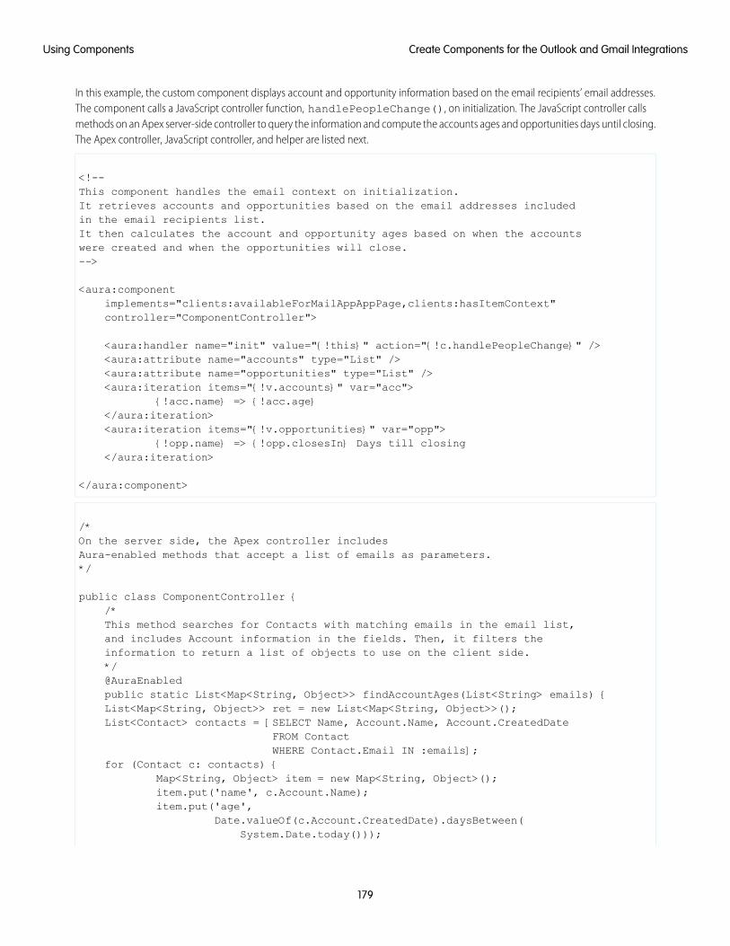
In this example, the custom component displays account and opportunity information based on the email recipients’ email addresses.The component calls a JavaScript controller function, handlePeopleChange(), on initialization. The JavaScript controller callsmethods on an Apex server-side controller to query the information and compute the accounts ages and opportunities days until closing.The Apex controller, JavaScript controller, and helper are listed next.
<!--This component handles the email context on initialization.It retrieves accounts and opportunities based on the email addresses includedin the email recipients list.It then calculates the account and opportunity ages based on when the accountswere created and when the opportunities will close.-->
<aura:componentimplements="clients:availableForMailAppAppPage,clients:hasItemContext"controller="ComponentController">
<aura:handler name="init" value="{!this}" action="{!c.handlePeopleChange}" /><aura:attribute name="accounts" type="List" /><aura:attribute name="opportunities" type="List" /><aura:iteration items="{!v.accounts}" var="acc">
{!acc.name} => {!acc.age}</aura:iteration><aura:iteration items="{!v.opportunities}" var="opp">
{!opp.name} => {!opp.closesIn} Days till closing</aura:iteration>
</aura:component>
/*On the server side, the Apex controller includesAura-enabled methods that accept a list of emails as parameters.*/
public class ComponentController {/*This method searches for Contacts with matching emails in the email list,and includes Account information in the fields. Then, it filters theinformation to return a list of objects to use on the client side.*/@AuraEnabledpublic static List<Map<String, Object>> findAccountAges(List<String> emails) {List<Map<String, Object>> ret = new List<Map<String, Object>>();List<Contact> contacts = [SELECT Name, Account.Name, Account.CreatedDate
FROM ContactWHERE Contact.Email IN :emails];
for (Contact c: contacts) {Map<String, Object> item = new Map<String, Object>();item.put('name', c.Account.Name);item.put('age',
Date.valueOf(c.Account.CreatedDate).daysBetween(System.Date.today()));
179
Create Components for the Outlook and Gmail IntegrationsUsing Components

ret.add(item);}return ret;
}
/*This method searches for OpportunityContactRoles with matching emailsin the email list.Then, it calculates the number of days until closing to return a listof objects to use on the client side.*/@AuraEnabledpublic static List<Map<String, Object>> findOpportunityCloseDateTime(List<String>
emails) {List<Map<String, Object>> ret = new List<Map<String, Object>>();List<OpportunityContactRole> contacts =
[SELECT Opportunity.Name, Opportunity.CloseDateFROM OpportunityContactRoleWHERE isPrimary=true AND Contact.Email IN :emails];
for (OpportunityContactRole c: contacts) {Map<String, Object> item = new Map<String, Object>();item.put('name', c.Opportunity.Name);item.put('closesIn',
System.Date.today().daysBetween(Date.valueOf(c.Opportunity.CloseDate)));
ret.add(item);}return ret;
}}
({/*This JavaScript controller is called on component initialization and relieson the helper functionality to build a list of email addresses from theavailable people. It then makes a caller to the server to run the actions todisplay information.Once the server returns the values, it sets the appropriate values to displayon the client side.*/
handlePeopleChange: function(component, event, helper){var people = component.get("v.people");var peopleEmails = helper.filterEmails(people);var action = component.get("c.findOpportunityCloseDateTime");action.setParam("emails", peopleEmails);
action.setCallback(this, function(response){var state = response.getState();if(state === "SUCCESS"){
component.set("v.opportunities", response.getReturnValue());} else{
component.set("v.opportunities",[]);
180
Create Components for the Outlook and Gmail IntegrationsUsing Components
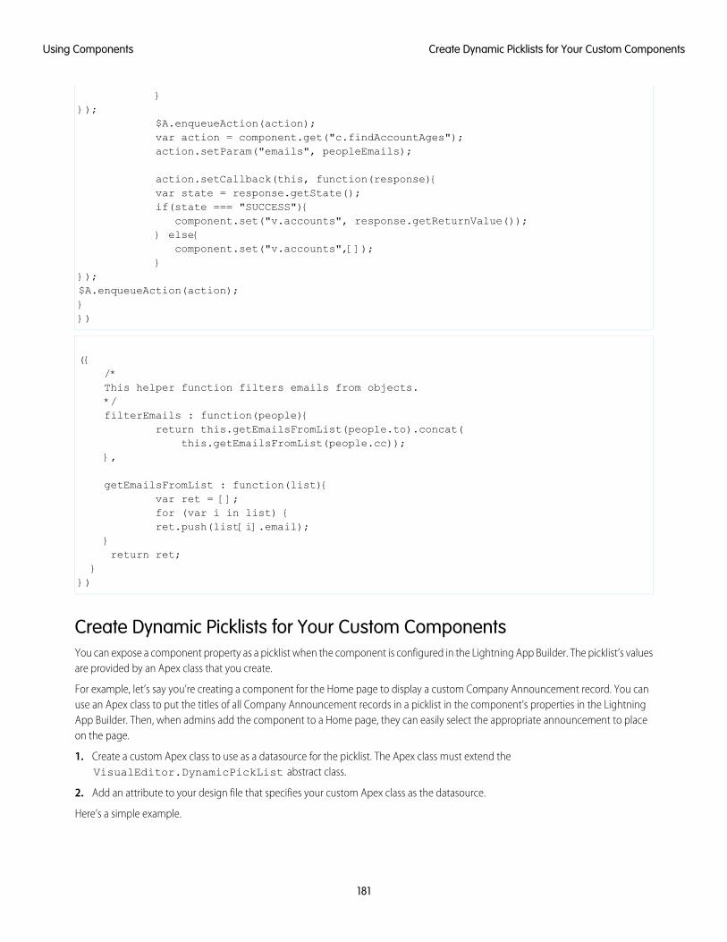
}});
$A.enqueueAction(action);var action = component.get("c.findAccountAges");action.setParam("emails", peopleEmails);
action.setCallback(this, function(response){var state = response.getState();if(state === "SUCCESS"){
component.set("v.accounts", response.getReturnValue());} else{
component.set("v.accounts",[]);}
});$A.enqueueAction(action);}})
({/*This helper function filters emails from objects.*/filterEmails : function(people){
return this.getEmailsFromList(people.to).concat(this.getEmailsFromList(people.cc));
},
getEmailsFromList : function(list){var ret = [];for (var i in list) {ret.push(list[i].email);
}return ret;
}})
Create Dynamic Picklists for Your Custom ComponentsYou can expose a component property as a picklist when the component is configured in the Lightning App Builder. The picklist’s valuesare provided by an Apex class that you create.
For example, let’s say you’re creating a component for the Home page to display a custom Company Announcement record. You canuse an Apex class to put the titles of all Company Announcement records in a picklist in the component’s properties in the LightningApp Builder. Then, when admins add the component to a Home page, they can easily select the appropriate announcement to placeon the page.
1. Create a custom Apex class to use as a datasource for the picklist. The Apex class must extend theVisualEditor.DynamicPickList abstract class.
2. Add an attribute to your design file that specifies your custom Apex class as the datasource.
Here’s a simple example.
181
Create Dynamic Picklists for Your Custom ComponentsUsing Components
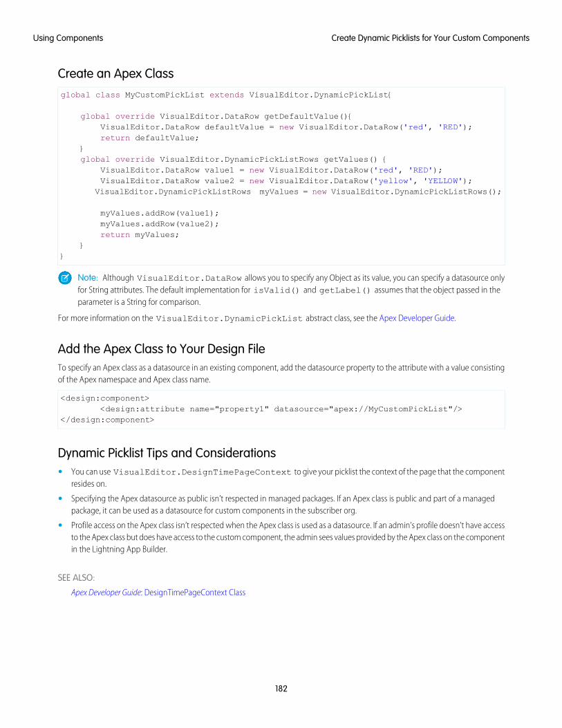
Create an Apex Classglobal class MyCustomPickList extends VisualEditor.DynamicPickList{
global override VisualEditor.DataRow getDefaultValue(){VisualEditor.DataRow defaultValue = new VisualEditor.DataRow('red', 'RED');return defaultValue;
}global override VisualEditor.DynamicPickListRows getValues() {
VisualEditor.DataRow value1 = new VisualEditor.DataRow('red', 'RED');VisualEditor.DataRow value2 = new VisualEditor.DataRow('yellow', 'YELLOW');
VisualEditor.DynamicPickListRows myValues = new VisualEditor.DynamicPickListRows();
myValues.addRow(value1);myValues.addRow(value2);return myValues;
}}
Note: Although VisualEditor.DataRow allows you to specify any Object as its value, you can specify a datasource onlyfor String attributes. The default implementation for isValid() and getLabel() assumes that the object passed in theparameter is a String for comparison.
For more information on the VisualEditor.DynamicPickList abstract class, see the Apex Developer Guide.
Add the Apex Class to Your Design FileTo specify an Apex class as a datasource in an existing component, add the datasource property to the attribute with a value consistingof the Apex namespace and Apex class name.
<design:component><design:attribute name="property1" datasource="apex://MyCustomPickList"/>
</design:component>
Dynamic Picklist Tips and Considerations• You can use VisualEditor.DesignTimePageContext to give your picklist the context of the page that the component
resides on.
• Specifying the Apex datasource as public isn’t respected in managed packages. If an Apex class is public and part of a managedpackage, it can be used as a datasource for custom components in the subscriber org.
• Profile access on the Apex class isn’t respected when the Apex class is used as a datasource. If an admin’s profile doesn’t have accessto the Apex class but does have access to the custom component, the admin sees values provided by the Apex class on the componentin the Lightning App Builder.
SEE ALSO:
Apex Developer Guide: DesignTimePageContext Class
182
Create Dynamic Picklists for Your Custom ComponentsUsing Components

Create a Custom Lightning Page Template ComponentEvery standard Lightning page is associated with a default template component, which defines the page’s regions and what componentsthe page includes. Custom Lightning page template components let you create page templates to fit your business needs with thestructure and components that you define. Once implemented, your custom template is available in the Lightning App Builder’s newpage wizard for your page creators to use.
Note: My Domain must be enabled in your org before you can use custom template components in the Lightning App Builder.
Custom Lightning page template components are supported for record pages, app pages, and Home pages. Each page type has adifferent interface that the template component must implement.
• lightning:appHomeTemplate
• lightning:homeTemplate
• lightning:recordHomeTemplate
Important: Each template component should implement only one template interface. Template components shouldn’t implementany other type of interface, such as flexipage:availableForAllPageTypes or force:hasRecordId. A templatecomponent can’t multi-task as a regular component. It’s either a template, or it’s not.
1. Build the Template Component StructureA custom template is an Aura component bundle that should include at least a .cmp resource and a design resource. The .cmp resourcemust implement a template interface, and declare an attribute of type Aura.Component[] for each template region. TheAura.Component[] type defines the attribute as a collection of components.
Note: The Aura.Component[] attribute is interpreted as a region only if it’s also specified as a region in the design resource.
Here’s an example of a two-column app page template .cmp resource that uses the lightning:layout component and theSalesforce Lightning Design System (SLDS) for styling.
When the template is viewed on a desktop, its right column takes up 30% (4 SLDS columns). The left column takes up the remaining70% of the page width. On non-desktop form factors, the columns display as 50/50.
<aura:component implements="lightning:appHomeTemplate" description="Main columnand right sidebar. On a phone, the regions are of equal width">
<aura:attribute name="left" type="Aura.Component[]" /><aura:attribute name="right" type="Aura.Component[]" />
<div><lightning:layout>
<lightning:layoutItem flexibility="grow"class="slds-m-right_small">
{!v.left}</lightning:layoutItem><lightning:layoutItem size="{! $Browser.isDesktop ? '4' : '6' }"
class="slds-m-left_small">{!v.right}
</lightning:layoutItem></lightning:layout>
</div>
</aura:component>
183
Create a Custom Lightning Page Template ComponentUsing Components
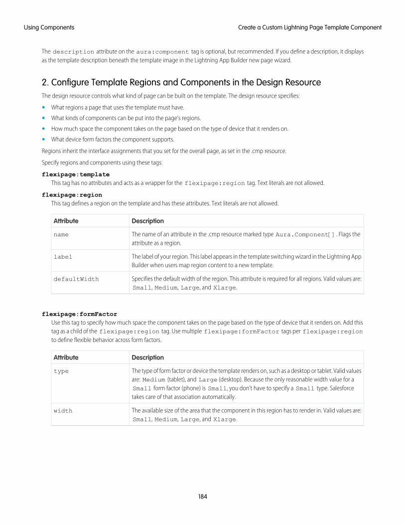
The description attribute on the aura:component tag is optional, but recommended. If you define a description, it displaysas the template description beneath the template image in the Lightning App Builder new page wizard.
2. Configure Template Regions and Components in the Design ResourceThe design resource controls what kind of page can be built on the template. The design resource specifies:
• What regions a page that uses the template must have.
• What kinds of components can be put into the page’s regions.
• How much space the component takes on the page based on the type of device that it renders on.
• What device form factors the component supports.
Regions inherit the interface assignments that you set for the overall page, as set in the .cmp resource.
Specify regions and components using these tags:
flexipage:templateThis tag has no attributes and acts as a wrapper for the flexipage:region tag. Text literals are not allowed.
flexipage:regionThis tag defines a region on the template and has these attributes. Text literals are not allowed.
DescriptionAttribute
The name of an attribute in the .cmp resource marked type Aura.Component[]. Flags theattribute as a region.
name
The label of your region. This label appears in the template switching wizard in the Lightning AppBuilder when users map region content to a new template.
label
Specifies the default width of the region. This attribute is required for all regions. Valid values are:Small, Medium, Large, and Xlarge.
defaultWidth
flexipage:formFactorUse this tag to specify how much space the component takes on the page based on the type of device that it renders on. Add thistag as a child of the flexipage:region tag. Use multiple flexipage:formFactor tags per flexipage:regionto define flexible behavior across form factors.
DescriptionAttribute
The type of form factor or device the template renders on, such as a desktop or tablet. Valid valuesare: Medium (tablet), and Large (desktop). Because the only reasonable width value for a
type
Small form factor (phone) is Small, you don’t have to specify a Small type. Salesforcetakes care of that association automatically.
The available size of the area that the component in this region has to render in. Valid values are:Small, Medium, Large, and Xlarge.
width
184
Create a Custom Lightning Page Template ComponentUsing Components
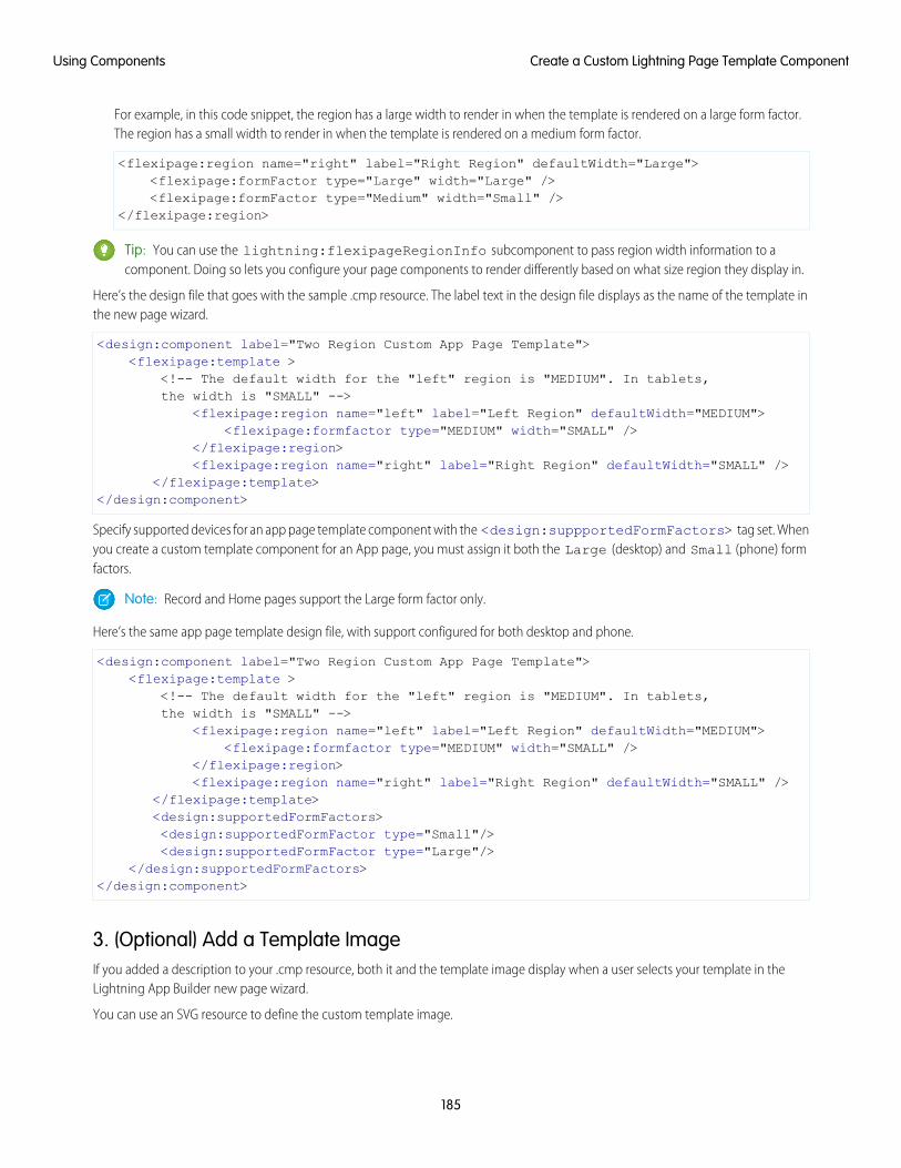
For example, in this code snippet, the region has a large width to render in when the template is rendered on a large form factor.The region has a small width to render in when the template is rendered on a medium form factor.
<flexipage:region name="right" label="Right Region" defaultWidth="Large"><flexipage:formFactor type="Large" width="Large" /><flexipage:formFactor type="Medium" width="Small" />
</flexipage:region>
Tip: You can use the lightning:flexipageRegionInfo subcomponent to pass region width information to acomponent. Doing so lets you configure your page components to render differently based on what size region they display in.
Here’s the design file that goes with the sample .cmp resource. The label text in the design file displays as the name of the template inthe new page wizard.
<design:component label="Two Region Custom App Page Template"><flexipage:template >
<!-- The default width for the "left" region is "MEDIUM". In tablets,the width is "SMALL" -->
<flexipage:region name="left" label="Left Region" defaultWidth="MEDIUM"><flexipage:formfactor type="MEDIUM" width="SMALL" />
</flexipage:region><flexipage:region name="right" label="Right Region" defaultWidth="SMALL" />
</flexipage:template></design:component>
Specify supported devices for an app page template component with the <design:suppportedFormFactors> tag set. Whenyou create a custom template component for an App page, you must assign it both the Large (desktop) and Small (phone) formfactors.
Note: Record and Home pages support the Large form factor only.
Here’s the same app page template design file, with support configured for both desktop and phone.
<design:component label="Two Region Custom App Page Template"><flexipage:template >
<!-- The default width for the "left" region is "MEDIUM". In tablets,the width is "SMALL" -->
<flexipage:region name="left" label="Left Region" defaultWidth="MEDIUM"><flexipage:formfactor type="MEDIUM" width="SMALL" />
</flexipage:region><flexipage:region name="right" label="Right Region" defaultWidth="SMALL" />
</flexipage:template><design:supportedFormFactors><design:supportedFormFactor type="Small"/><design:supportedFormFactor type="Large"/>
</design:supportedFormFactors></design:component>
3. (Optional) Add a Template ImageIf you added a description to your .cmp resource, both it and the template image display when a user selects your template in theLightning App Builder new page wizard.
You can use an SVG resource to define the custom template image.
185
Create a Custom Lightning Page Template ComponentUsing Components
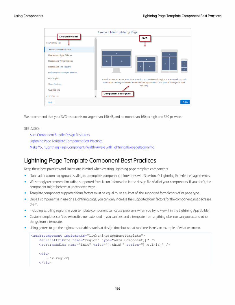
We recommend that your SVG resource is no larger than 150 KB, and no more than 160 px high and 560 px wide.
SEE ALSO:
Aura Component Bundle Design Resources
Lightning Page Template Component Best Practices
Make Your Lightning Page Components Width-Aware with lightning:flexipageRegionInfo
Lightning Page Template Component Best PracticesKeep these best practices and limitations in mind when creating Lightning page template components.
• Don’t add custom background styling to a template component. It interferes with Salesforce’s Lightning Experience page themes.
• We strongly recommend including supported form factor information in the design file of all of your components. If you don’t, thecomponent might behave in unexpected ways.
• Template component supported form factors must be equal to, or a subset of, the supported form factors of its page type.
• Once a component is in use on a Lightning page, you can only increase the supported form factors for the component, not decreasethem.
• Including scrolling regions in your template component can cause problems when you try to view it in the Lightning App Builder.
• Custom templates can’t be extensible nor extended—you can’t extend a template from anything else, nor can you extend otherthings from a template.
• Using getters to get the regions as variables works at design time but not at run time. Here’s an example of what we mean.
<aura:component implements="lightning:appHomeTemplate"><aura:attribute name="region" type="Aura.Component[]" /><aura:handler name="init" value="{!this}" action="{!c.init}" />
<div>{!v.region}
</div>
186
Lightning Page Template Component Best PracticesUsing Components
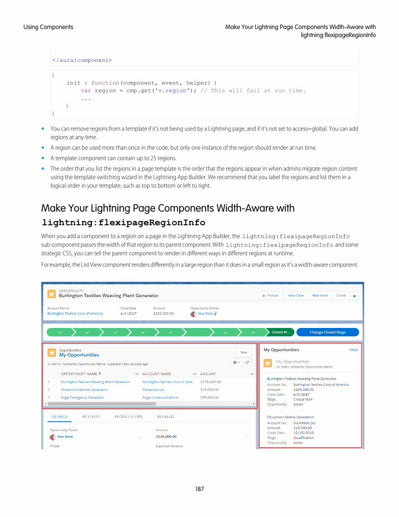
</aura:component>
{init : function(component, event, helper) {
var region = cmp.get('v.region'); // This will fail at run time....
}}
• You can remove regions from a template if it’s not being used by a Lightning page, and if it’s not set to access=global. You can addregions at any time.
• A region can be used more than once in the code, but only one instance of the region should render at run time.
• A template component can contain up to 25 regions.
• The order that you list the regions in a page template is the order that the regions appear in when admins migrate region contentusing the template switching wizard in the Lightning App Builder. We recommend that you label the regions and list them in alogical order in your template, such as top to bottom or left to right.
Make Your Lightning Page Components Width-Aware withlightning:flexipageRegionInfoWhen you add a component to a region on a page in the Lightning App Builder, the lightning:flexipageRegionInfosub-component passes the width of that region to its parent component. With lightning:flexipageRegionInfo and somestrategic CSS, you can tell the parent component to render in different ways in different regions at runtime.
For example, the List View component renders differently in a large region than it does in a small region as it’s a width-aware component.
187
Make Your Lightning Page Components Width-Aware withlightning:flexipageRegionInfo
Using Components

Valid region width values are: Small, Medium, Large, and Xlarge.
You can use CSS to style your component and to help determine how your component renders. Here’s an example.
This simple component has two fields, field1 and field2. The component renders with the fields side by side, filling 50% of the region’savailable width when not in a small region. When the component is in a small region, the fields render as a list, using 100% of the region’swidth.
<aura:component implements="flexipage:availableForAllPageTypes"><aura:attribute name="width" type="String"/><lightning:flexipageRegionInfo width="{!v.width}"/><div class="{! 'container' + (v.width=='SMALL'?' narrowRegion':'')}">
<div class="{! 'eachField f1' + (v.width=='SMALL'?' narrowRegion':'')}"><lightning:input name="field1" label="First Name"/>
</div><div class="{! 'eachField f2' + (v.width=='SMALL'?' narrowRegion':'')}">
<lightning:input name="field2" label="Last Name"/></div>
</div></aura:component>
Here’s the CSS file that goes with the component.
.THIS .eachField.narrowRegion{width:100%;
}.THIS .eachField{
width:50%;display:inline-block;
}
Tips and Considerations for Configuring Components for Lightning Pagesand the Lightning App BuilderKeep these guidelines in mind when creating components and component bundles for Lightning pages and the Lightning App Builder.
Note: Mark your resources, such as a component, with access="global" to make the resource usable outside of your ownorg. For example, if you want a component to be usable in an installed package or by a Lightning App Builder user or a CommunityBuilder user in another org.
Components• Set a friendly name for the component using the label attribute in the element in the design file, such as <design:component
label="foo">.
• Make your components fill 100% of the width (including margins) of the region that they display in.
• Don’t set absolute width values on your components.
• If components require interaction, they must provide an appropriate placeholder behavior in declarative tools.
• A component must never display a blank box. Think of how other sites work. For example, Facebook displays an outline of the feedbefore the actual feed items come back from the server. The outline improves the user’s perception of UI responsiveness.
• If the component depends on a fired event, then give it a default state that displays before the event fires.
• Style components in a manner consistent with the styling of Lightning Experience and consistent with the Salesforce Design System.
188
Tips and Considerations for Configuring Components forLightning Pages and the Lightning App Builder
Using Components
• The Lightning App Builder manages spacing between components automatically. Don't add margins to your component CSS, andavoid adding padding.
• Don’t use float or position: absolute in your CSS properties. These properties break the component out of the pagestructure and, as a result, break the page.
• If your org doesn’t have My Domain enabled and you activate a Lightning page with a custom component, the component isdropped from the page at run time.
Attributes• Use the design file to control which attributes are exposed to the Lightning App Builder.
• Make your attributes easy to use and understandable to an administrator. Don’t expose SOQL queries, JSON objects, or Apex classnames.
• Give your required attributes default values. When a component that has required attributes with no default values is added to theApp Builder, it appears invalid, which is a poor user experience.
• Use basic supported types (string, integer, boolean) for any exposed attributes.
• Specify a min and max attribute for integer attributes in the <design:attribute> element to control the range of acceptedvalues.
• String attributes can provide a data source with a set of predefined values allowing the attribute to expose its configuration as apicklist.
• Give all attributes a label with a friendly display name.
• Provide descriptions to explain the expected data and any guidelines, such as data format or expected range of values. Descriptiontext appears as a tooltip in the Property Editor.
• To delete a design attribute for a component that implements the flexipage:availableForAllPageTypes orforceCommunity:availableForAllPageTypes interface, first remove the interface from the component beforedeleting the design attribute. Then reimplement the interface. If the component is referenced in a Lightning page, you must removethe component from the page before you can change it.
Limitations• The Lightning App Builder doesn’t support the Map, Object, or java:// complex types.
• When you use the Lightning App Builder, there is a known limitation when you edit a group page. Your changes appear when youvisit the group from the Groups tab. Your changes don’t appear when you visit the group from the Recent Groups list on the Chattertab.
SEE ALSO:
Configure Components for Lightning Pages and the Lightning App Builder
Configure Components for Lightning Experience Record Pages
Use Aura Components in Community Builder
To use a custom Aura component in Community Builder, you must configure the component and its component bundle so that they’recompatible.
189
Use Aura Components in Community BuilderUsing Components
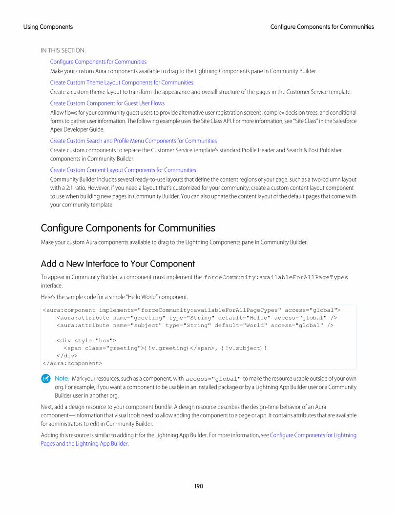
IN THIS SECTION:
Configure Components for Communities
Make your custom Aura components available to drag to the Lightning Components pane in Community Builder.
Create Custom Theme Layout Components for Communities
Create a custom theme layout to transform the appearance and overall structure of the pages in the Customer Service template.
Create Custom Component for Guest User Flows
Allow flows for your community guest users to provide alternative user registration screens, complex decision trees, and conditionalforms to gather user information. The following example uses the Site Class API. For more information, see “Site Class” in the SalesforceApex Developer Guide.
Create Custom Search and Profile Menu Components for Communities
Create custom components to replace the Customer Service template’s standard Profile Header and Search & Post Publishercomponents in Community Builder.
Create Custom Content Layout Components for Communities
Community Builder includes several ready-to-use layouts that define the content regions of your page, such as a two-column layoutwith a 2:1 ratio. However, if you need a layout that’s customized for your community, create a custom content layout componentto use when building new pages in Community Builder. You can also update the content layout of the default pages that come withyour community template.
Configure Components for CommunitiesMake your custom Aura components available to drag to the Lightning Components pane in Community Builder.
Add a New Interface to Your ComponentTo appear in Community Builder, a component must implement the forceCommunity:availableForAllPageTypesinterface.
Here’s the sample code for a simple “Hello World” component.
<aura:component implements="forceCommunity:availableForAllPageTypes" access="global"><aura:attribute name="greeting" type="String" default="Hello" access="global" /><aura:attribute name="subject" type="String" default="World" access="global" />
<div style="box"><span class="greeting">{!v.greeting}</span>, {!v.subject}!
</div></aura:component>
Note: Mark your resources, such as a component, with access="global" to make the resource usable outside of your ownorg. For example, if you want a component to be usable in an installed package or by a Lightning App Builder user or a CommunityBuilder user in another org.
Next, add a design resource to your component bundle. A design resource describes the design-time behavior of an Auracomponent—information that visual tools need to allow adding the component to a page or app. It contains attributes that are availablefor administrators to edit in Community Builder.
Adding this resource is similar to adding it for the Lightning App Builder. For more information, see Configure Components for LightningPages and the Lightning App Builder.
190
Configure Components for CommunitiesUsing Components
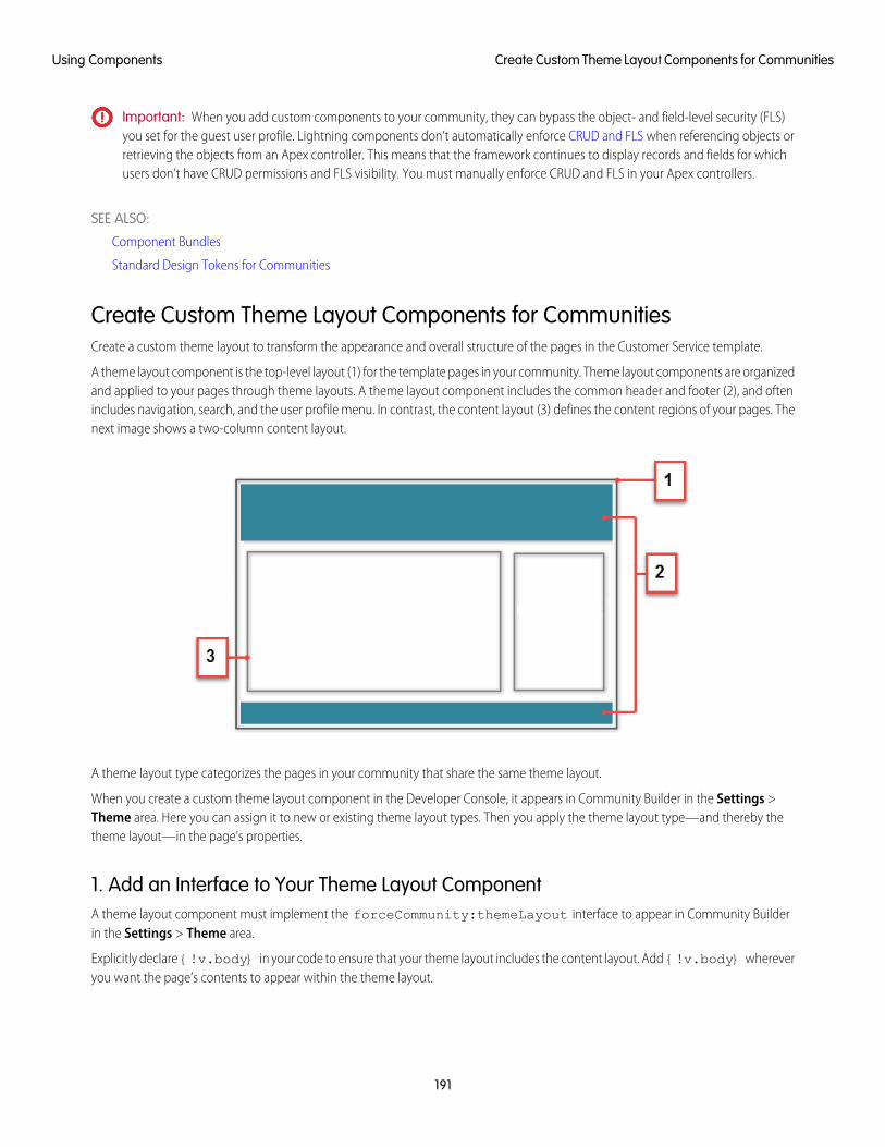
Important: When you add custom components to your community, they can bypass the object- and field-level security (FLS)you set for the guest user profile. Lightning components don’t automatically enforce CRUD and FLS when referencing objects orretrieving the objects from an Apex controller. This means that the framework continues to display records and fields for whichusers don’t have CRUD permissions and FLS visibility. You must manually enforce CRUD and FLS in your Apex controllers.
SEE ALSO:
Component Bundles
Standard Design Tokens for Communities
Create Custom Theme Layout Components for CommunitiesCreate a custom theme layout to transform the appearance and overall structure of the pages in the Customer Service template.
A theme layout component is the top-level layout (1) for the template pages in your community. Theme layout components are organizedand applied to your pages through theme layouts. A theme layout component includes the common header and footer (2), and oftenincludes navigation, search, and the user profile menu. In contrast, the content layout (3) defines the content regions of your pages. Thenext image shows a two-column content layout.
A theme layout type categorizes the pages in your community that share the same theme layout.
When you create a custom theme layout component in the Developer Console, it appears in Community Builder in the Settings >Theme area. Here you can assign it to new or existing theme layout types. Then you apply the theme layout type—and thereby thetheme layout—in the page’s properties.
1. Add an Interface to Your Theme Layout ComponentA theme layout component must implement the forceCommunity:themeLayout interface to appear in Community Builderin the Settings > Theme area.
Explicitly declare {!v.body} in your code to ensure that your theme layout includes the content layout. Add {!v.body} whereveryou want the page’s contents to appear within the theme layout.
191
Create Custom Theme Layout Components for CommunitiesUsing Components
You can add components to the regions in your markup or leave regions open for users to drag-and-drop components into. Attributesdeclared as Aura.Component[] and included in your markup are rendered as open regions in the theme layout that users canadd components to.
In Customer Service, the Template Header consists of these locked regions:
• search, which contains the Search Publisher component
• profileMenu, which contains the User Profile Menu component
• navBar, which contains the Navigation Menu component
To create a custom theme layout that reuses the existing components in the Template Header region, declare search, profileMenu,or navBar as the attribute name value, as appropriate. For example:
<aura:attribute name="navBar" type="Aura.Component[]" required="false" />
Tip: If you create a custom profile menu or a search component, declaring the attribute name value also lets users select thecustom component when using your theme layout.
Here’s the sample code for a simple theme layout.
<aura:component implements="forceCommunity:themeLayout" access="global" description="SampleCustom Theme Layout">
<aura:attribute name="search" type="Aura.Component[]" required="false"/><aura:attribute name="profileMenu" type="Aura.Component[]" required="false"/><aura:attribute name="navBar" type="Aura.Component[]" required="false"/><aura:attribute name="newHeader" type="Aura.Component[]" required="false"/><div>
<div class="searchRegion">{!v.search}
</div><div class="profileMenuRegion">
{!v.profileMenu}</div><div class="navigation">
{!v.navBar}</div><div class="newHeader">
{!v.newHeader}</div><div class="mainContentArea">
{!v.body}</div>
</div></aura:component>
Note: Mark your resources, such as a component, with access="global" to make the resource usable outside of your ownorg. For example, if you want a component to be usable in an installed package or by a Lightning App Builder user or a CommunityBuilder user in another org.
2. Add a Design Resource to Include Theme PropertiesYou can expose theme layout properties in Community Builder by adding a design resource to your bundle.
192
Create Custom Theme Layout Components for CommunitiesUsing Components
This example adds two checkboxes to a theme layout called Small Header.
<design:component label="Small Header"><design:attribute name="blueBackground" label="Blue Background"/><design:attribute name="smallLogo" label="Small Logo"/>
</design:component>
The design resource only exposes the properties. You must implement the properties in the component.
<aura:component implements="forceCommunity:themeLayout" access="global" description="SmallHeader">
<aura:attribute name="blueBackground" type="Boolean" default="false"/><aura:attribute name="smallLogo" type="Boolean" default="false" />...
Design resources must be named componentName.design.
3. Add a CSS Resource to Avoid Overlapping IssuesAdd a CSS resource to your bundle to style the theme layout as needed.
To avoid overlapping issues with positioned elements, such as dialog boxes or hovers:
• Apply CSS styles.
.THIS {position: relative;z-index: 1;
}
• Wrap the elements in your custom theme layout in a div tag.
<div class="mainContentArea">{!v.body}
</div>
Note: For custom theme layouts, SLDS is loaded by default.
CSS resources must be named componentName.css.
SEE ALSO:
Create Custom Search and Profile Menu Components for Communities
Salesforce Help: Custom Theme Layouts and Theme Layout Types
Create Custom Component for Guest User FlowsAllow flows for your community guest users to provide alternative user registration screens, complex decision trees, and conditionalforms to gather user information. The following example uses the Site Class API. For more information, see “Site Class” in the SalesforceApex Developer Guide.
193
Create Custom Component for Guest User FlowsUsing Components
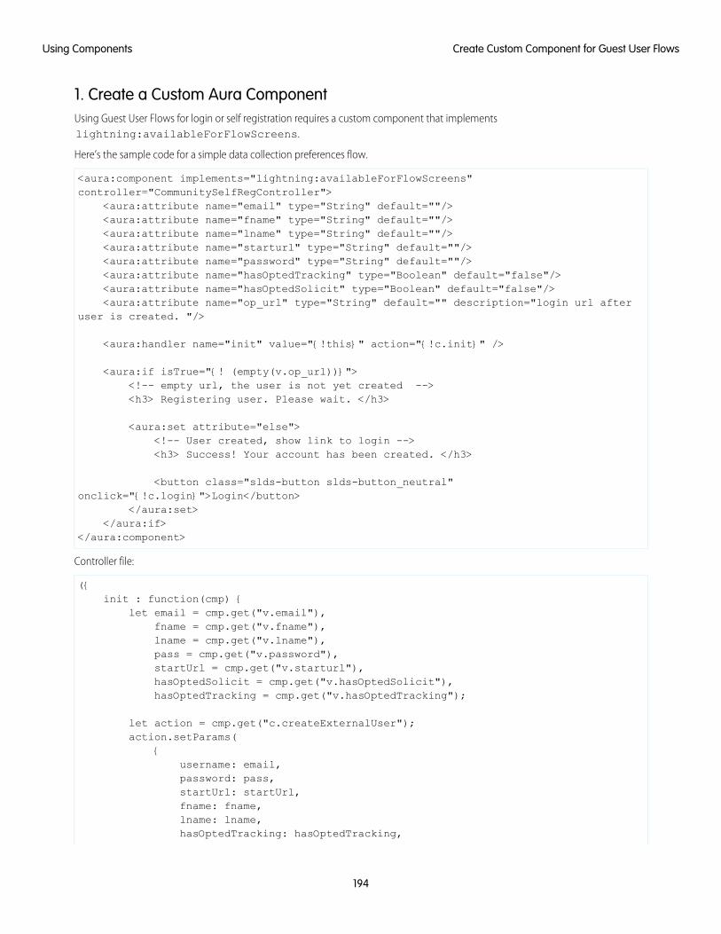
1. Create a Custom Aura ComponentUsing Guest User Flows for login or self registration requires a custom component that implementslightning:availableForFlowScreens.
Here’s the sample code for a simple data collection preferences flow.
<aura:component implements="lightning:availableForFlowScreens"controller="CommunitySelfRegController">
<aura:attribute name="email" type="String" default=""/><aura:attribute name="fname" type="String" default=""/><aura:attribute name="lname" type="String" default=""/><aura:attribute name="starturl" type="String" default=""/><aura:attribute name="password" type="String" default=""/><aura:attribute name="hasOptedTracking" type="Boolean" default="false"/><aura:attribute name="hasOptedSolicit" type="Boolean" default="false"/><aura:attribute name="op_url" type="String" default="" description="login url after
user is created. "/>
<aura:handler name="init" value="{!this}" action="{!c.init}" />
<aura:if isTrue="{! (empty(v.op_url))}"><!-- empty url, the user is not yet created --><h3> Registering user. Please wait. </h3>
<aura:set attribute="else"><!-- User created, show link to login --><h3> Success! Your account has been created. </h3>
<button class="slds-button slds-button_neutral"onclick="{!c.login}">Login</button>
</aura:set></aura:if>
</aura:component>
Controller file:
({init : function(cmp) {
let email = cmp.get("v.email"),fname = cmp.get("v.fname"),lname = cmp.get("v.lname"),pass = cmp.get("v.password"),startUrl = cmp.get("v.starturl"),hasOptedSolicit = cmp.get("v.hasOptedSolicit"),hasOptedTracking = cmp.get("v.hasOptedTracking");
let action = cmp.get("c.createExternalUser");action.setParams(
{username: email,password: pass,startUrl: startUrl,fname: fname,lname: lname,hasOptedTracking: hasOptedTracking,
194
Create Custom Component for Guest User FlowsUsing Components
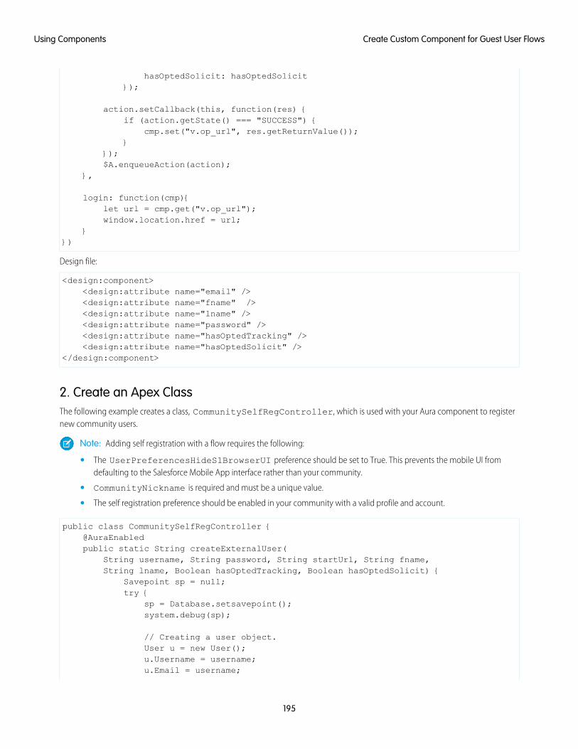
hasOptedSolicit: hasOptedSolicit});
action.setCallback(this, function(res) {if (action.getState() === "SUCCESS") {
cmp.set("v.op_url", res.getReturnValue());}
});$A.enqueueAction(action);
},
login: function(cmp){let url = cmp.get("v.op_url");window.location.href = url;
}})
Design file:
<design:component><design:attribute name="email" /><design:attribute name="fname" /><design:attribute name="lname" /><design:attribute name="password" /><design:attribute name="hasOptedTracking" /><design:attribute name="hasOptedSolicit" />
</design:component>
2. Create an Apex ClassThe following example creates a class, CommunitySelfRegController, which is used with your Aura component to registernew community users.
Note: Adding self registration with a flow requires the following:
• The UserPreferencesHideS1BrowserUI preference should be set to True. This prevents the mobile UI fromdefaulting to the Salesforce Mobile App interface rather than your community.
• CommunityNickname is required and must be a unique value.
• The self registration preference should be enabled in your community with a valid profile and account.
public class CommunitySelfRegController {@AuraEnabledpublic static String createExternalUser(
String username, String password, String startUrl, String fname,String lname, Boolean hasOptedTracking, Boolean hasOptedSolicit) {
Savepoint sp = null;try {
sp = Database.setsavepoint();system.debug(sp);
// Creating a user object.User u = new User();u.Username = username;u.Email = username;
195
Create Custom Component for Guest User FlowsUsing Components
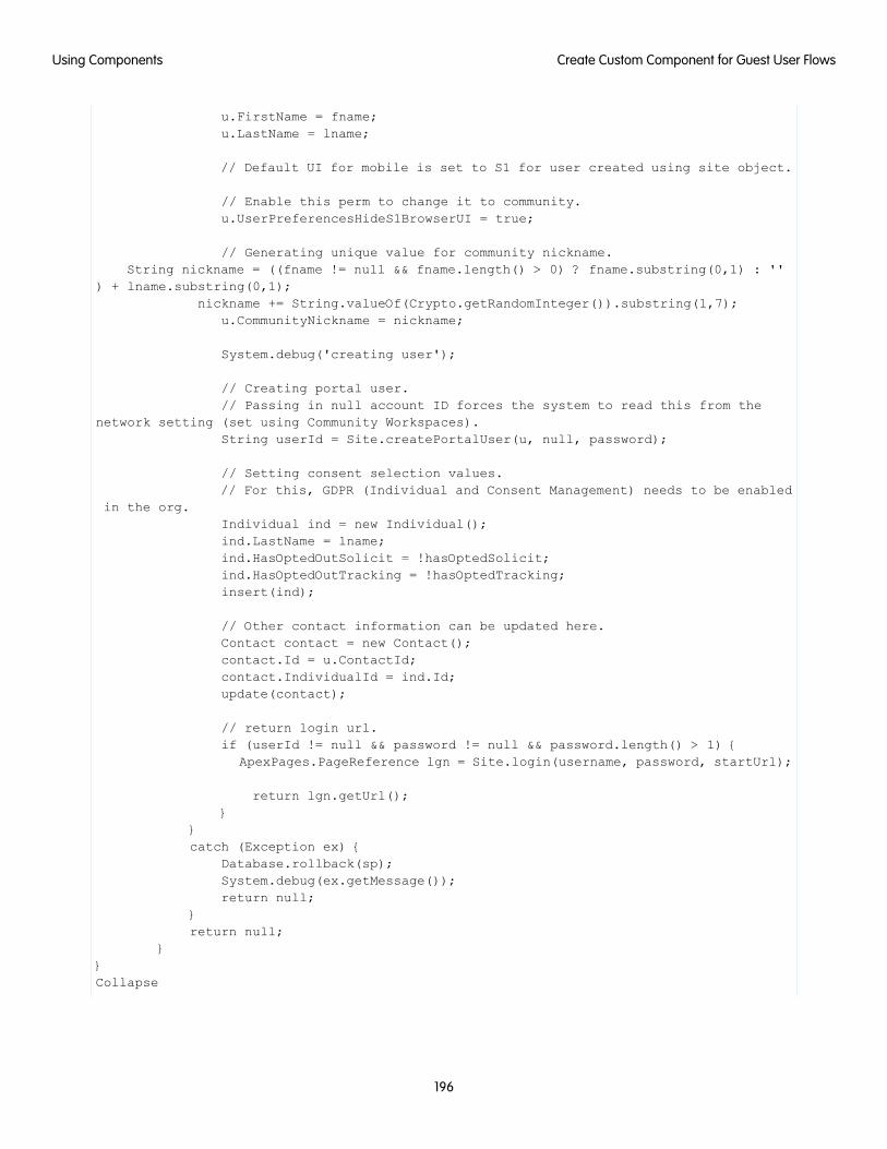
u.FirstName = fname;u.LastName = lname;
// Default UI for mobile is set to S1 for user created using site object.
// Enable this perm to change it to community.u.UserPreferencesHideS1BrowserUI = true;
// Generating unique value for community nickname.String nickname = ((fname != null && fname.length() > 0) ? fname.substring(0,1) : ''
) + lname.substring(0,1);nickname += String.valueOf(Crypto.getRandomInteger()).substring(1,7);
u.CommunityNickname = nickname;
System.debug('creating user');
// Creating portal user.// Passing in null account ID forces the system to read this from the
network setting (set using Community Workspaces).String userId = Site.createPortalUser(u, null, password);
// Setting consent selection values.// For this, GDPR (Individual and Consent Management) needs to be enabled
in the org.Individual ind = new Individual();ind.LastName = lname;ind.HasOptedOutSolicit = !hasOptedSolicit;ind.HasOptedOutTracking = !hasOptedTracking;insert(ind);
// Other contact information can be updated here.Contact contact = new Contact();contact.Id = u.ContactId;contact.IndividualId = ind.Id;update(contact);
// return login url.if (userId != null && password != null && password.length() > 1) {
ApexPages.PageReference lgn = Site.login(username, password, startUrl);
return lgn.getUrl();}
}catch (Exception ex) {
Database.rollback(sp);System.debug(ex.getMessage());return null;
}return null;
}}Collapse
196
Create Custom Component for Guest User FlowsUsing Components
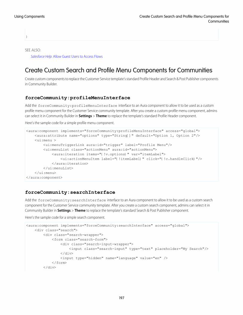
}
SEE ALSO:
Salesforce Help: Allow Guest Users to Access Flows
Create Custom Search and Profile Menu Components for CommunitiesCreate custom components to replace the Customer Service template’s standard Profile Header and Search & Post Publisher componentsin Community Builder.
forceCommunity:profileMenuInterface
Add the forceCommunity:profileMenuInterface interface to an Aura component to allow it to be used as a customprofile menu component for the Customer Service community template. After you create a custom profile menu component, adminscan select it in Community Builder in Settings > Theme to replace the template’s standard Profile Header component.
Here’s the sample code for a simple profile menu component.
<aura:component implements="forceCommunity:profileMenuInterface" access="global"><aura:attribute name="options" type="String[]" default="Option 1, Option 2"/><ui:menu >
<ui:menuTriggerLink aura:id="trigger" label="Profile Menu"/><ui:menuList class="actionMenu" aura:id="actionMenu">
<aura:iteration items="{!v.options}" var="itemLabel"><ui:actionMenuItem label="{!itemLabel}" click="{!c.handleClick}"/>
</aura:iteration></ui:menuList>
</ui:menu></aura:component>
forceCommunity:searchInterface
Add the forceCommunity:searchInterface interface to an Aura component to allow it to be used as a custom searchcomponent for the Customer Service community template. After you create a custom search component, admins can select it inCommunity Builder in Settings > Theme to replace the template’s standard Search & Post Publisher component.
Here’s the sample code for a simple search component.
<aura:component implements="forceCommunity:searchInterface" access="global"><div class="search">
<div class="search-wrapper"><form class="search-form">
<div class="search-input-wrapper"><input class="search-input" type="text" placeholder="My Search"/>
</div><input type="hidden" name="language" value="en" />
</form></div>
197
Create Custom Search and Profile Menu Components forCommunities
Using Components
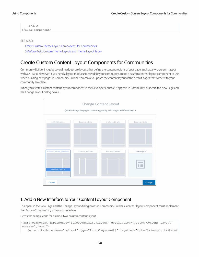
</div></aura:component>
SEE ALSO:
Create Custom Theme Layout Components for Communities
Salesforce Help: Custom Theme Layouts and Theme Layout Types
Create Custom Content Layout Components for CommunitiesCommunity Builder includes several ready-to-use layouts that define the content regions of your page, such as a two-column layoutwith a 2:1 ratio. However, if you need a layout that’s customized for your community, create a custom content layout component to usewhen building new pages in Community Builder. You can also update the content layout of the default pages that come with yourcommunity template.
When you create a custom content layout component in the Developer Console, it appears in Community Builder in the New Page andthe Change Layout dialog boxes.
1. Add a New Interface to Your Content Layout ComponentTo appear in the New Page and the Change Layout dialog boxes in Community Builder, a content layout component must implementthe forceCommunity:layout interface.
Here’s the sample code for a simple two-column content layout.
<aura:component implements="forceCommunity:layout" description=”Custom Content Layout”access="global">
<aura:attribute name="column1" type="Aura.Component[]" required="false"></aura:attribute>
198
Create Custom Content Layout Components for CommunitiesUsing Components
<aura:attribute name="column2" type="Aura.Component[]" required="false"></aura:attribute>
<div class="container"><div class="contentPanel">
<div class="left">{!v.column1}
</div><div class="right">
{!v.column2}</div>
</div></div>
</aura:component>
Note: Mark your resources, such as a component, with access="global" to make the resource usable outside of your ownorg. For example, if you want a component to be usable in an installed package or by a Lightning App Builder user or a CommunityBuilder user in another org.
2. Add a CSS Resource to Your Component BundleNext, add a CSS resource to style the content layout as needed.
Here’s the sample CSS for our simple two-column content layout.
.THIS .contentPanel:before,
.THIS .contentPanel:after {content: " ";display: table;
}.THIS .contentPanel:after {
clear: both;}.THIS .left {
float: left;width: 50%;
}.THIS .right {
float: right;width: 50%;
}
CSS resources must be named componentName.css.
3. Optional: Add an SVG Resource to Your Component BundleYou can include an SVG resource in your component bundle to define a custom icon for the content layout component when it appearsin the Community Builder.
The recommended image size for a content layout component in Community Builder is 170px by 170px. However, if the image hasdifferent dimensions, Community Builder scales the image to fit.
199
Create Custom Content Layout Components for CommunitiesUsing Components
SVG resources must be named componentName.svg.
SEE ALSO:
Component Bundles
Standard Design Tokens for Communities
Use Aura Components with Flows
Customize the look-and-feel and functionality of your flows by adding Lightning components to them. Or wrap a flow in an Auracomponent to configure the flow at runtime, such as to control how a paused flow is resumed.
IN THIS SECTION:
Considerations for Configuring Components for Flows
Before you configure an Aura component for a flow, determine whether it should be available in flow screens or as flow actions andunderstand how to map data types between a flow and an Aura component. Then review some considerations for defining attributesand how components behave in flows at runtime.
Customize Flow Screens Using Aura Components
To customize the look and feel of your flow screen, build a custom Aura component. Configure the component and its designresource so that they’re compatible with flow screens. Then in Flow Builder, add a screen component to the screen.
Create Flow Local Actions Using Aura Components
To execute client-side logic in your flow, build or modify custom Aura components to use as local actions in flows. For example, getdata from third-party systems without going through the Salesforce server, or open a URL in another browser tab. Once you configurethe Aura component’s markup, client-side controller, and design resource, it’s available in Flow Builder as a Core Action element.
Embed a Flow in a Custom Aura Component
Once you embed a flow in an Aura component, use JavaScript and Apex code to configure the flow at run time. For example, passvalues into the flow or to control what happens when the flow finishes. lightning:flow supports only screen flows andautolaunched flows.
Display Flow Stages with an Aura Component
If you’ve added stages to your flow, display them to flow users with an Aura component, such aslightning:progressindicator.
Considerations for Configuring Components for FlowsBefore you configure an Aura component for a flow, determine whether it should be available in flow screens or as flow actions andunderstand how to map data types between a flow and an Aura component. Then review some considerations for defining attributesand how components behave in flows at runtime.
Note:
• Lightning components in flows must comply with Lightning Locker restrictions.
• Flows that include Lightning components are supported only in Lightning runtime.
200
Use Aura Components with FlowsUsing Components
IN THIS SECTION:
Flow Screen Components vs. Flow Action Components
You can make your Aura component available in flow screens or as a flow action. When choosing between the flow interfaces,consider what purpose the component serves in the flow.
Which Aura Attribute Types Are Supported in Flows?
Not all Aura data types are supported in flows. You can map only these types and their associated collection types between flowsand Aura components.
Design Attribute Considerations for Flow Screen Components and Local Actions
To expose an attribute in Flow Builder, define a corresponding design:attribute in the component bundle's design resource.Keep these guidelines in mind when defining design attributes for flows.
Runtime Considerations for Flows That Include Aura Components
Depending on where you run your flow, Aura components may look or behave differently than expected. The flow runtime appthat's used for some distribution methods doesn't include all the necessary resources from the Lightning Component framework.When a flow is run from Flow Builder or a direct flow URL (https://yourDomain.my.salesforce.com/flow/MyFlowName), forceand lightning events aren’t handled.
SEE ALSO:
Component Library: lightning:availableForFlowScreens Interface
Component Library: lightning:availableForFlowActions Interface
What is Lightning Locker?
Flow Screen Components vs. Flow Action ComponentsYou can make your Aura component available in flow screens or as a flow action. When choosing between the flow interfaces, considerwhat purpose the component serves in the flow.
Create a...For this use case...
Flow screen componentProvide UI for the user to interact with
Flow screen componentUpdate the screen in real time
Flow action componentPrevent the flow from continuing until the component is done
Flow action componentMake direct data queries to on-premise or private cloud data
SEE ALSO:
Component Library: lightning:availableForFlowScreens Interface
Component Library: lightning:availableForFlowActions Interface
Which Aura Attribute Types Are Supported in Flows?Not all Aura data types are supported in flows. You can map only these types and their associated collection types between flows andAura components.
201
Considerations for Configuring Components for FlowsUsing Components
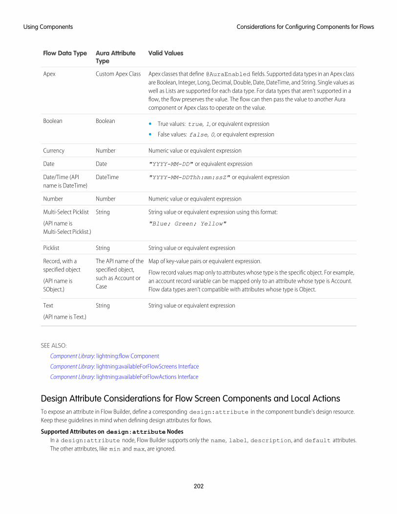
Valid ValuesAura AttributeType
Flow Data Type
Apex classes that define @AuraEnabled fields. Supported data types in an Apex classare Boolean, Integer, Long, Decimal, Double, Date, DateTime, and String. Single values as
Custom Apex ClassApex
well as Lists are supported for each data type. For data types that aren’t supported in aflow, the flow preserves the value. The flow can then pass the value to another Auracomponent or Apex class to operate on the value.
BooleanBoolean • True values: true, 1, or equivalent expression
• False values: false, 0, or equivalent expression
Numeric value or equivalent expressionNumberCurrency
"YYYY-MM-DD" or equivalent expressionDateDate
"YYYY-MM-DDThh:mm:ssZ" or equivalent expressionDateTimeDate/Time (APIname is DateTime)
Numeric value or equivalent expressionNumberNumber
String value or equivalent expression using this format:
"Blue; Green; Yellow"
StringMulti-Select Picklist
(API name isMulti-Select Picklist.)
String value or equivalent expressionStringPicklist
Map of key-value pairs or equivalent expression.
Flow record values map only to attributes whose type is the specific object. For example,an account record variable can be mapped only to an attribute whose type is Account.Flow data types aren’t compatible with attributes whose type is Object.
The API name of thespecified object,such as Account orCase
Record, with aspecified object
(API name isSObject.)
String value or equivalent expressionStringText
(API name is Text.)
SEE ALSO:
Component Library: lightning:flow Component
Component Library: lightning:availableForFlowScreens Interface
Component Library: lightning:availableForFlowActions Interface
Design Attribute Considerations for Flow Screen Components and Local ActionsTo expose an attribute in Flow Builder, define a corresponding design:attribute in the component bundle's design resource.Keep these guidelines in mind when defining design attributes for flows.
Supported Attributes on design:attribute NodesIn a design:attribute node, Flow Builder supports only the name, label, description, and default attributes.The other attributes, like min and max, are ignored.
202
Considerations for Configuring Components for FlowsUsing Components
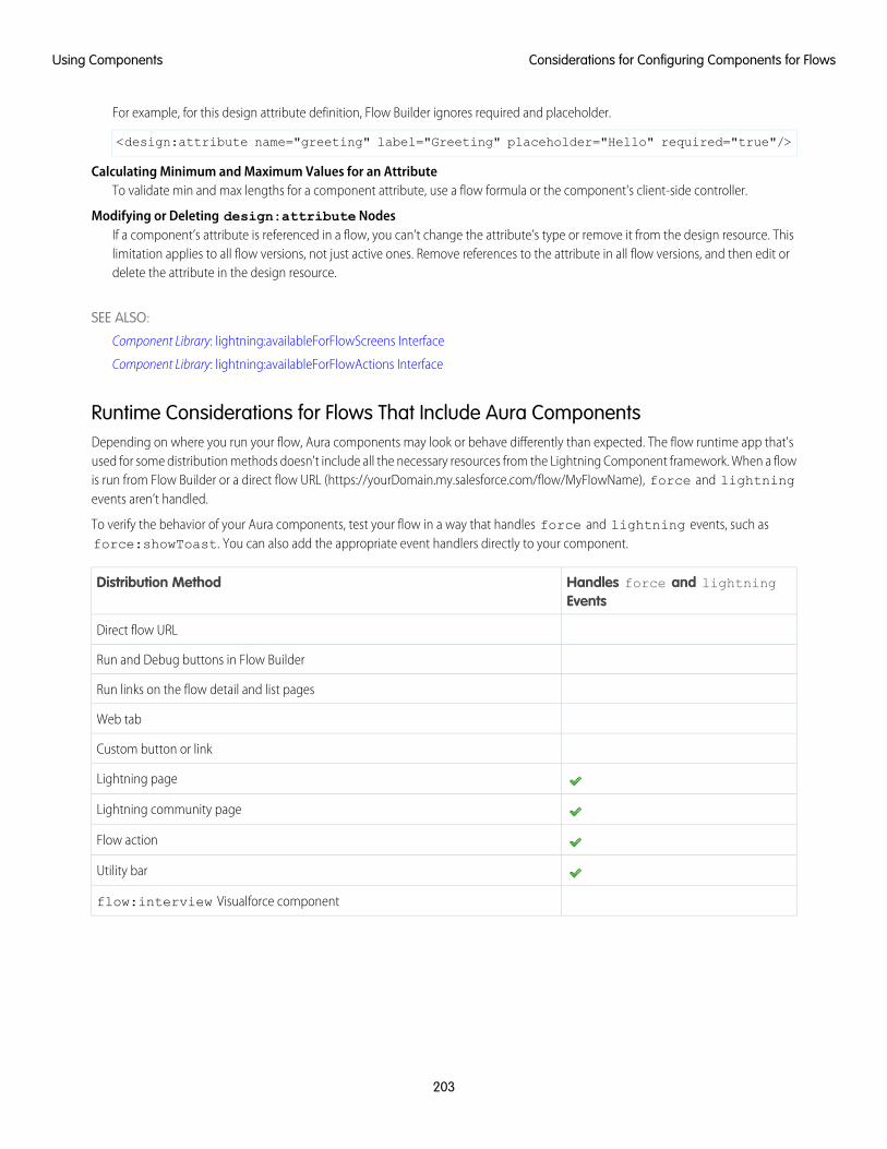
For example, for this design attribute definition, Flow Builder ignores required and placeholder.
<design:attribute name="greeting" label="Greeting" placeholder="Hello" required="true"/>
Calculating Minimum and Maximum Values for an AttributeTo validate min and max lengths for a component attribute, use a flow formula or the component's client-side controller.
Modifying or Deleting design:attribute NodesIf a component’s attribute is referenced in a flow, you can’t change the attribute’s type or remove it from the design resource. Thislimitation applies to all flow versions, not just active ones. Remove references to the attribute in all flow versions, and then edit ordelete the attribute in the design resource.
SEE ALSO:
Component Library: lightning:availableForFlowScreens Interface
Component Library: lightning:availableForFlowActions Interface
Runtime Considerations for Flows That Include Aura ComponentsDepending on where you run your flow, Aura components may look or behave differently than expected. The flow runtime app that'sused for some distribution methods doesn't include all the necessary resources from the Lightning Component framework. When a flowis run from Flow Builder or a direct flow URL (https://yourDomain.my.salesforce.com/flow/MyFlowName), force and lightningevents aren’t handled.
To verify the behavior of your Aura components, test your flow in a way that handles force and lightning events, such asforce:showToast. You can also add the appropriate event handlers directly to your component.
Handles force and lightningEvents
Distribution Method
Direct flow URL
Run and Debug buttons in Flow Builder
Run links on the flow detail and list pages
Web tab
Custom button or link
Lightning page
Lightning community page
Flow action
Utility bar
flow:interview Visualforce component
203
Considerations for Configuring Components for FlowsUsing Components
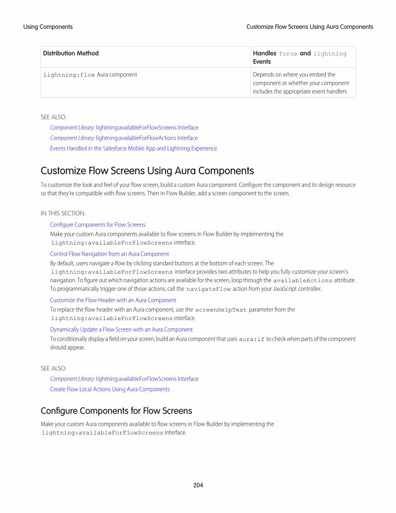
Handles force and lightningEvents
Distribution Method
Depends on where you embed thecomponent or whether your componentincludes the appropriate event handlers
lightning:flow Aura component
SEE ALSO:
Component Library: lightning:availableForFlowScreens Interface
Component Library: lightning:availableForFlowActions Interface
Events Handled in the Salesforce Mobile App and Lightning Experience
Customize Flow Screens Using Aura ComponentsTo customize the look and feel of your flow screen, build a custom Aura component. Configure the component and its design resourceso that they’re compatible with flow screens. Then in Flow Builder, add a screen component to the screen.
IN THIS SECTION:
Configure Components for Flow Screens
Make your custom Aura components available to flow screens in Flow Builder by implementing thelightning:availableForFlowScreens interface.
Control Flow Navigation from an Aura Component
By default, users navigate a flow by clicking standard buttons at the bottom of each screen. Thelightning:availableForFlowScreens interface provides two attributes to help you fully customize your screen'snavigation. To figure out which navigation actions are available for the screen, loop through the availableActions attribute.To programmatically trigger one of those actions, call the navigateFlow action from your JavaScript controller.
Customize the Flow Header with an Aura Component
To replace the flow header with an Aura component, use the screenHelpText parameter from thelightning:availableForFlowScreens interface.
Dynamically Update a Flow Screen with an Aura Component
To conditionally display a field on your screen, build an Aura component that uses aura:if to check when parts of the componentshould appear.
SEE ALSO:
Component Library: lightning:availableForFlowScreens Interface
Create Flow Local Actions Using Aura Components
Configure Components for Flow ScreensMake your custom Aura components available to flow screens in Flow Builder by implementing thelightning:availableForFlowScreens interface.
204
Customize Flow Screens Using Aura ComponentsUsing Components
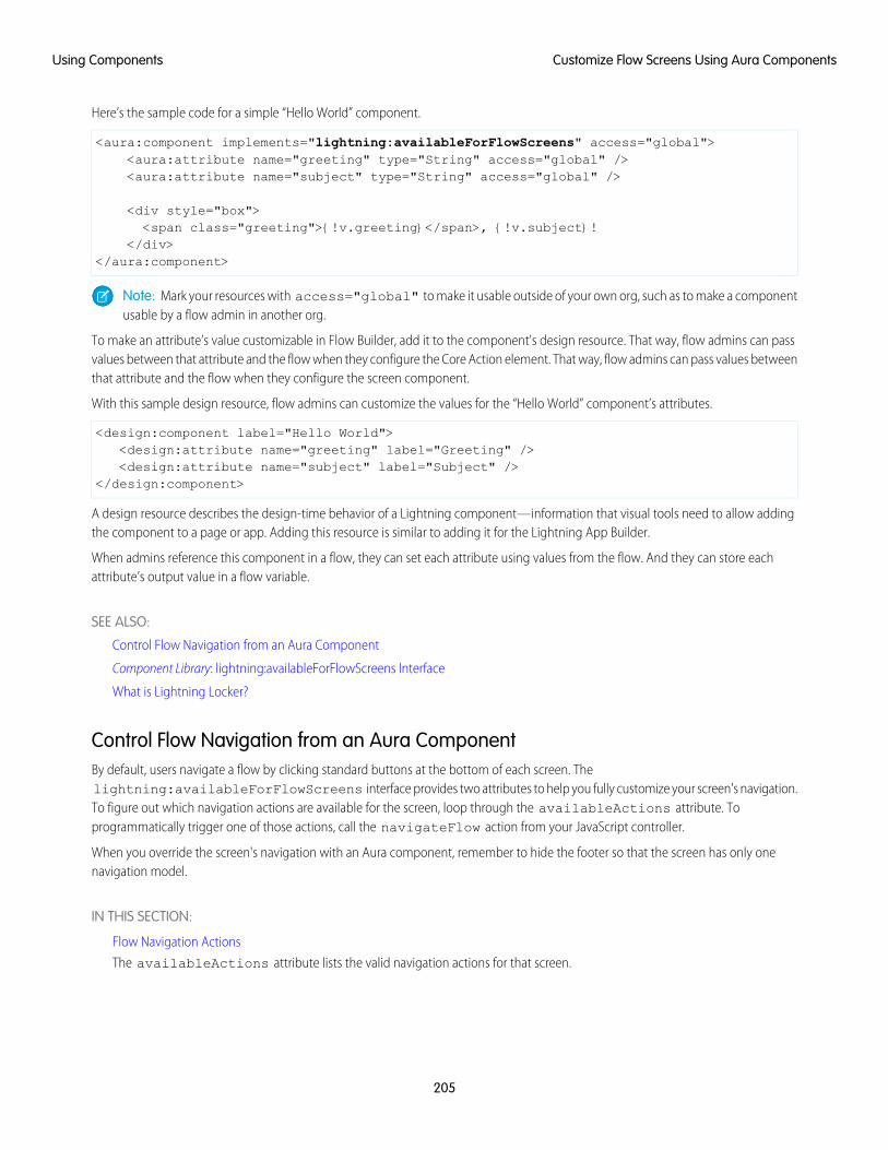
Here’s the sample code for a simple “Hello World” component.
<aura:component implements="lightning:availableForFlowScreens" access="global"><aura:attribute name="greeting" type="String" access="global" /><aura:attribute name="subject" type="String" access="global" />
<div style="box"><span class="greeting">{!v.greeting}</span>, {!v.subject}!
</div></aura:component>
Note: Mark your resources with access="global" to make it usable outside of your own org, such as to make a componentusable by a flow admin in another org.
To make an attribute’s value customizable in Flow Builder, add it to the component's design resource. That way, flow admins can passvalues between that attribute and the flow when they configure the Core Action element. That way, flow admins can pass values betweenthat attribute and the flow when they configure the screen component.
With this sample design resource, flow admins can customize the values for the “Hello World” component’s attributes.
<design:component label="Hello World"><design:attribute name="greeting" label="Greeting" /><design:attribute name="subject" label="Subject" />
</design:component>
A design resource describes the design-time behavior of a Lightning component—information that visual tools need to allow addingthe component to a page or app. Adding this resource is similar to adding it for the Lightning App Builder.
When admins reference this component in a flow, they can set each attribute using values from the flow. And they can store eachattribute’s output value in a flow variable.
SEE ALSO:
Control Flow Navigation from an Aura Component
Component Library: lightning:availableForFlowScreens Interface
What is Lightning Locker?
Control Flow Navigation from an Aura ComponentBy default, users navigate a flow by clicking standard buttons at the bottom of each screen. Thelightning:availableForFlowScreens interface provides two attributes to help you fully customize your screen's navigation.To figure out which navigation actions are available for the screen, loop through the availableActions attribute. Toprogrammatically trigger one of those actions, call the navigateFlow action from your JavaScript controller.
When you override the screen's navigation with an Aura component, remember to hide the footer so that the screen has only onenavigation model.
IN THIS SECTION:
Flow Navigation Actions
The availableActions attribute lists the valid navigation actions for that screen.
205
Customize Flow Screens Using Aura ComponentsUsing Components
Customize the Flow Footer with an Aura Component
To replace the flow footer with an Aura component, use the parameters that the lightning:availableForFlowScreensinterface provides. The availableActions array lists which actions are available for the screen, and the navigateFlowaction lets you invoke one of the available actions.
Build a Custom Navigation Model for Your Flow Screens
Since Aura components have access to a flow screen’s navigation actions, you can fully customize how the user moves betweenscreens. For example, hide the default navigation buttons and have the flow move to the next screen when the user selects a choice.
SEE ALSO:
Component Library: lightning:availableForFlowScreens Interface
Flow Navigation ActionsThe availableActions attribute lists the valid navigation actions for that screen.
A screen’s available actions are determined by:
• Where in the flow the screen is. For example, Previous isn't supported on the first screen in a flow, Finish is supported for only thelast screen in a flow, and you can never have both Next and Finish.
• Whether the flow creator opted to hide any of the actions in the screen's Control Navigation settings. For example, if Pause isde-selected, the Pause action isn't included in availableActions.
Here are the possible actions, their default button label, and what's required for that action to be valid.
DescriptionButton LabelAction
Navigates to the next screenNextNEXT
Navigates to the previous screenPreviousBACK
Saves the interview in its current state to the database, so that the user can resume it laterPausePAUSE
Resumes a paused interviewResumeRESUME
Finishes the interview. This action is available only before the final screen in the flow.FinishFINISH
SEE ALSO:
Component Library: lightning:availableForFlowScreens Interface
Customize the Flow Footer with an Aura ComponentTo replace the flow footer with an Aura component, use the parameters that the lightning:availableForFlowScreensinterface provides. The availableActions array lists which actions are available for the screen, and the navigateFlow actionlets you invoke one of the available actions.
By default, the flow footer displays the available actions as standard buttons. Next and Finish use the brand variant style, and Previousand Pause use the neutral variant. Also, Pause floats left, while the rest of the buttons float right.
Example: This component (c:flowFooter) customizes the default flow footer in two ways.
• It swaps the Pause and Previous buttons, so that Previous floats to the left and Pause floats to the right with Next or Finish.
• It changes the label for the Finish button to Done.
206
Customize Flow Screens Using Aura ComponentsUsing Components
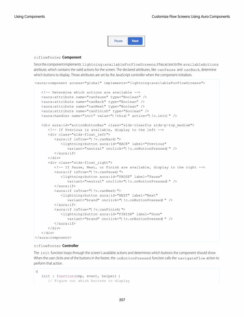
c:flowFooter Component
Since the component implements lightning:availableForFlowScreens, it has access to the availableActionsattribute, which contains the valid actions for the screen. The declared attributes, like canPause and canBack, determinewhich buttons to display. Those attributes are set by the JavaScript controller when the component initializes.
<aura:component access="global" implements="lightning:availableForFlowScreens">
<!-- Determine which actions are available --><aura:attribute name="canPause" type="Boolean" /><aura:attribute name="canBack" type="Boolean" /><aura:attribute name="canNext" type="Boolean" /><aura:attribute name="canFinish" type="Boolean" /><aura:handler name="init" value="{!this}" action="{!c.init}" />
<div aura:id="actionButtonBar" class="slds-clearfix slds-p-top_medium"><!-- If Previous is available, display to the left --><div class="slds-float_left">
<aura:if isTrue="{!v.canBack}"><lightning:button aura:id="BACK" label="Previous"
variant="neutral" onclick="{!c.onButtonPressed}" /></aura:if>
</div><div class="slds-float_right">
<!-- If Pause, Next, or Finish are available, display to the right --><aura:if isTrue="{!v.canPause}">
<lightning:button aura:id="PAUSE" label="Pause"variant="neutral" onclick="{!c.onButtonPressed}" />
</aura:if><aura:if isTrue="{!v.canNext}">
<lightning:button aura:id="NEXT" label="Next"variant="brand" onclick="{!c.onButtonPressed}" />
</aura:if><aura:if isTrue="{!v.canFinish}">
<lightning:button aura:id="FINISH" label="Done"variant="brand" onclick="{!c.onButtonPressed}" />
</aura:if></div>
</div></aura:component>
c:flowFooter Controller
The init function loops through the screen's available actions and determines which buttons the component should show.When the user clicks one of the buttons in the footer, the onButtonPressed function calls the navigateFlow action toperform that action.
({init : function(cmp, event, helper) {
// Figure out which buttons to display
207
Customize Flow Screens Using Aura ComponentsUsing Components
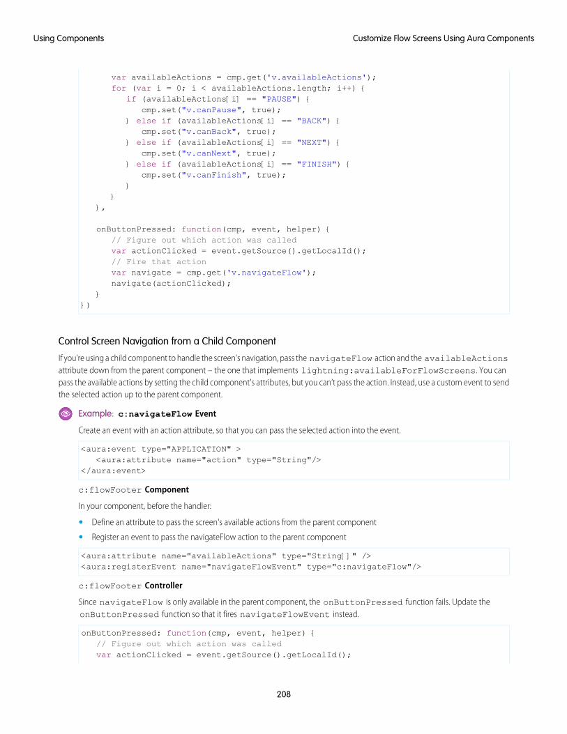
var availableActions = cmp.get('v.availableActions');for (var i = 0; i < availableActions.length; i++) {
if (availableActions[i] == "PAUSE") {cmp.set("v.canPause", true);
} else if (availableActions[i] == "BACK") {cmp.set("v.canBack", true);
} else if (availableActions[i] == "NEXT") {cmp.set("v.canNext", true);
} else if (availableActions[i] == "FINISH") {cmp.set("v.canFinish", true);
}}
},
onButtonPressed: function(cmp, event, helper) {// Figure out which action was calledvar actionClicked = event.getSource().getLocalId();// Fire that actionvar navigate = cmp.get('v.navigateFlow');navigate(actionClicked);
}})
Control Screen Navigation from a Child Component
If you're using a child component to handle the screen's navigation, pass the navigateFlow action and the availableActionsattribute down from the parent component – the one that implements lightning:availableForFlowScreens. You canpass the available actions by setting the child component's attributes, but you can’t pass the action. Instead, use a custom event to sendthe selected action up to the parent component.
Example: c:navigateFlow Event
Create an event with an action attribute, so that you can pass the selected action into the event.
<aura:event type="APPLICATION" ><aura:attribute name="action" type="String"/>
</aura:event>
c:flowFooter Component
In your component, before the handler:
• Define an attribute to pass the screen's available actions from the parent component
• Register an event to pass the navigateFlow action to the parent component
<aura:attribute name="availableActions" type="String[]" /><aura:registerEvent name="navigateFlowEvent" type="c:navigateFlow"/>
c:flowFooter Controller
Since navigateFlow is only available in the parent component, the onButtonPressed function fails. Update theonButtonPressed function so that it fires navigateFlowEvent instead.
onButtonPressed: function(cmp, event, helper) {// Figure out which action was calledvar actionClicked = event.getSource().getLocalId();
208
Customize Flow Screens Using Aura ComponentsUsing Components
// Call that actionvar navigate = cmp.getEvent("navigateFlowEvent");navigate.setParam("action", actionFired);navigate.fire();
}
c:flowParent Component
In the parent component's markup, pass availableActions into the child component's availableActions attributeand the handleNavigate function into the child component's navigateFlowEvent event.
<c:flowFooter availableActions="{!v.availableActions}"navigateFlowEvent="{!c.handleNavigate}"/>
c:flowParent Controller
When navigateFlowEvent fires in the child component, the handleNavigate function calls the parent component’snavigateFlow action, using the action selected in the child component.
handleNavigate: function(cmp, event) {var navigate = cmp.get("v.navigateFlow");navigate(event.getParam("action"));
}
SEE ALSO:
Customize the Flow Header with an Aura Component
Dynamically Update a Flow Screen with an Aura Component
Component Library: lightning:availableForFlowScreens Interface
Build a Custom Navigation Model for Your Flow ScreensSince Aura components have access to a flow screen’s navigation actions, you can fully customize how the user moves between screens.For example, hide the default navigation buttons and have the flow move to the next screen when the user selects a choice.
Example: This component (c:choiceNavigation) displays a script and a choice in the form of buttons.
209
Customize Flow Screens Using Aura ComponentsUsing Components
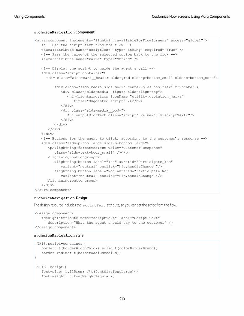
c:choiceNavigation Component
<aura:component implements="lightning:availableForFlowScreens" access="global" ><!-- Get the script text from the flow --><aura:attribute name="scriptText" type="String" required="true" /><!-- Pass the value of the selected option back to the flow --><aura:attribute name="value" type="String" />
<!-- Display the script to guide the agent's call --><div class="script-container">
<div class="slds-card__header slds-grid slds-p-bottom_small slds-m-bottom_none">
<div class="slds-media slds-media_center slds-has-flexi-truncate" ><div class="slds-media__figure slds-align-top">
<h2><lightning:icon iconName="utility:quotation_marks"title="Suggested script" /></h2>
</div><div class="slds-media__body">
<ui:outputRichText class="script" value="{!v.scriptText}"/></div>
</div></div>
</div><!-- Buttons for the agent to click, according to the customer’s response --><div class="slds-p-top_large slds-p-bottom_large">
<p><lightning:formattedText value="Customer Response"class="slds-text-body_small" /></p>
<lightning:buttongroup ><lightning:button label="Yes" aura:id="Participate_Yes"
variant="neutral" onclick="{!c.handleChange}"/><lightning:button label="No" aura:id="Participate_No"
variant="neutral" onclick="{!c.handleChange}"/></lightning:buttongroup>
</div></aura:component>
c:choiceNavigation Design
The design resource includes the scriptText attribute, so you can set the script from the flow.
<design:component><design:attribute name="scriptText" label="Script Text"
description="What the agent should say to the customer" /></design:component>
c:choiceNavigation Style
.THIS.script-container {border: t(borderWidthThick) solid t(colorBorderBrand);border-radius: t(borderRadiusMedium);
}
.THIS .script {font-size: 1.125rem; /*t(fontSizeTextLarge)*/font-weight: t(fontWeightRegular);
210
Customize Flow Screens Using Aura ComponentsUsing Components
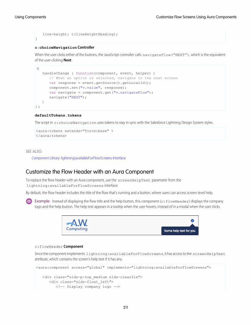
line-height: t(lineHeightHeading);}
c:choiceNavigation Controller
When the user clicks either of the buttons, the JavaScript controller calls navigateFlow(“NEXT”), which is the equivalentof the user clicking Next.
({handleChange : function(component, event, helper) {
// When an option is selected, navigate to the next screenvar response = event.getSource().getLocalId();component.set("v.value", response);var navigate = component.get("v.navigateFlow");navigate("NEXT");
}})
defaultTokens.tokens
The script in c:choiceNavigation uses tokens to stay in sync with the Salesforce Lightning Design System styles.
<aura:tokens extends="force:base" ></aura:tokens>
SEE ALSO:
Component Library: lightning:availableForFlowScreens Interface
Customize the Flow Header with an Aura ComponentTo replace the flow header with an Aura component, use the screenHelpText parameter from thelightning:availableForFlowScreens interface.
By default, the flow header includes the title of the flow that's running and a button, where users can access screen-level help.
Example: Instead of displaying the flow title and the help button, this component (c:flowHeader) displays the companylogo and the help button. The help text appears in a tooltip when the user hovers, instead of in a modal when the user clicks.
c:flowHeader Component
Since the component implements lightning:availableForFlowScreens, it has access to the screenHelpTextattribute, which contains the screen's help text if it has any.
<aura:component access="global" implements="lightning:availableForFlowScreens">
<div class="slds-p-top_medium slds-clearfix"><div class="slds-float_left">
<!-- Display company logo -->
211
Customize Flow Screens Using Aura ComponentsUsing Components
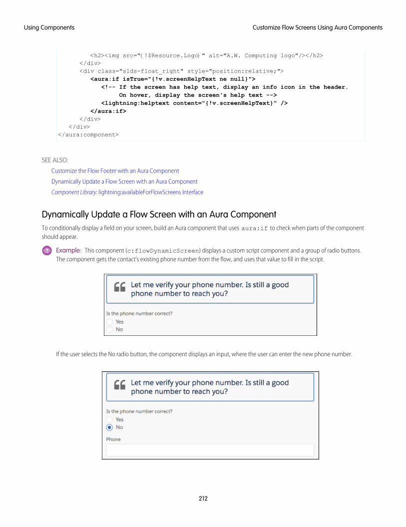
<h2><img src="{!$Resource.Logo}" alt="A.W. Computing logo"/></h2></div><div class="slds-float_right" style="position:relative;">
<aura:if isTrue="{!v.screenHelpText ne null}"><!-- If the screen has help text, display an info icon in the header.
On hover, display the screen's help text --><lightning:helptext content="{!v.screenHelpText}" />
</aura:if></div>
</div></aura:component>
SEE ALSO:
Customize the Flow Footer with an Aura Component
Dynamically Update a Flow Screen with an Aura Component
Component Library: lightning:availableForFlowScreens Interface
Dynamically Update a Flow Screen with an Aura ComponentTo conditionally display a field on your screen, build an Aura component that uses aura:if to check when parts of the componentshould appear.
Example: This component (c:flowDynamicScreen) displays a custom script component and a group of radio buttons.The component gets the contact's existing phone number from the flow, and uses that value to fill in the script.
If the user selects the No radio button, the component displays an input, where the user can enter the new phone number.
212
Customize Flow Screens Using Aura ComponentsUsing Components
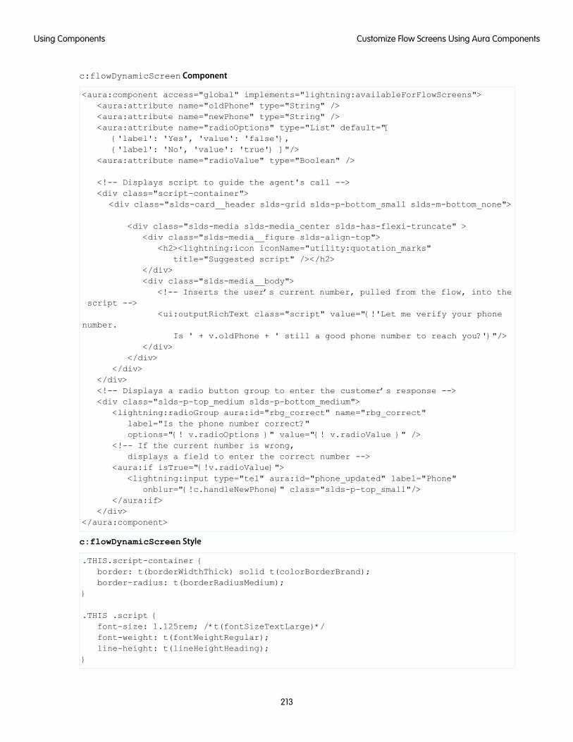
c:flowDynamicScreen Component
<aura:component access="global" implements="lightning:availableForFlowScreens"><aura:attribute name="oldPhone" type="String" /><aura:attribute name="newPhone" type="String" /><aura:attribute name="radioOptions" type="List" default="[
{'label': 'Yes', 'value': 'false'},{'label': 'No', 'value': 'true'} ]"/>
<aura:attribute name="radioValue" type="Boolean" />
<!-- Displays script to guide the agent's call --><div class="script-container">
<div class="slds-card__header slds-grid slds-p-bottom_small slds-m-bottom_none">
<div class="slds-media slds-media_center slds-has-flexi-truncate" ><div class="slds-media__figure slds-align-top">
<h2><lightning:icon iconName="utility:quotation_marks"title="Suggested script" /></h2>
</div><div class="slds-media__body">
<!-- Inserts the user’s current number, pulled from the flow, into thescript -->
<ui:outputRichText class="script" value="{!'Let me verify your phonenumber.
Is ' + v.oldPhone + ' still a good phone number to reach you?'}"/></div>
</div></div>
</div><!-- Displays a radio button group to enter the customer’s response --><div class="slds-p-top_medium slds-p-bottom_medium">
<lightning:radioGroup aura:id="rbg_correct" name="rbg_correct"label="Is the phone number correct?"options="{! v.radioOptions }" value="{! v.radioValue }" />
<!-- If the current number is wrong,displays a field to enter the correct number -->
<aura:if isTrue="{!v.radioValue}"><lightning:input type="tel" aura:id="phone_updated" label="Phone"
onblur="{!c.handleNewPhone}" class="slds-p-top_small"/></aura:if>
</div></aura:component>
c:flowDynamicScreen Style
.THIS.script-container {border: t(borderWidthThick) solid t(colorBorderBrand);border-radius: t(borderRadiusMedium);
}
.THIS .script {font-size: 1.125rem; /*t(fontSizeTextLarge)*/font-weight: t(fontWeightRegular);line-height: t(lineHeightHeading);
}
213
Customize Flow Screens Using Aura ComponentsUsing Components
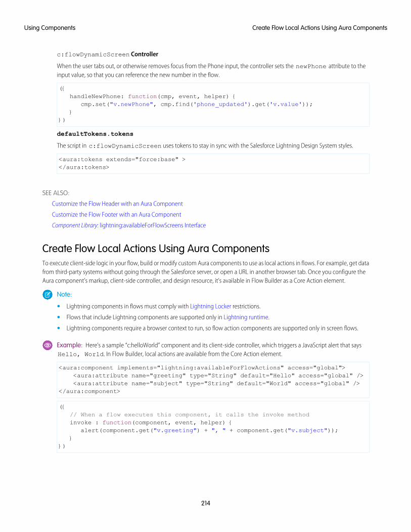
c:flowDynamicScreen Controller
When the user tabs out, or otherwise removes focus from the Phone input, the controller sets the newPhone attribute to theinput value, so that you can reference the new number in the flow.
({handleNewPhone: function(cmp, event, helper) {
cmp.set("v.newPhone", cmp.find('phone_updated').get('v.value'));}
})
defaultTokens.tokens
The script in c:flowDynamicScreen uses tokens to stay in sync with the Salesforce Lightning Design System styles.
<aura:tokens extends="force:base" ></aura:tokens>
SEE ALSO:
Customize the Flow Header with an Aura Component
Customize the Flow Footer with an Aura Component
Component Library: lightning:availableForFlowScreens Interface
Create Flow Local Actions Using Aura ComponentsTo execute client-side logic in your flow, build or modify custom Aura components to use as local actions in flows. For example, get datafrom third-party systems without going through the Salesforce server, or open a URL in another browser tab. Once you configure theAura component’s markup, client-side controller, and design resource, it’s available in Flow Builder as a Core Action element.
Note:
• Lightning components in flows must comply with Lightning Locker restrictions.
• Flows that include Lightning components are supported only in Lightning runtime.
• Lightning components require a browser context to run, so flow action components are supported only in screen flows.
Example: Here’s a sample “c:helloWorld” component and its client-side controller, which triggers a JavaScript alert that saysHello, World. In Flow Builder, local actions are available from the Core Action element.
<aura:component implements="lightning:availableForFlowActions" access="global"><aura:attribute name="greeting" type="String" default="Hello" access="global" /><aura:attribute name="subject" type="String" default="World" access="global" />
</aura:component>
({// When a flow executes this component, it calls the invoke methodinvoke : function(component, event, helper) {
alert(component.get("v.greeting") + ", " + component.get("v.subject"));}
})
214
Create Flow Local Actions Using Aura ComponentsUsing Components
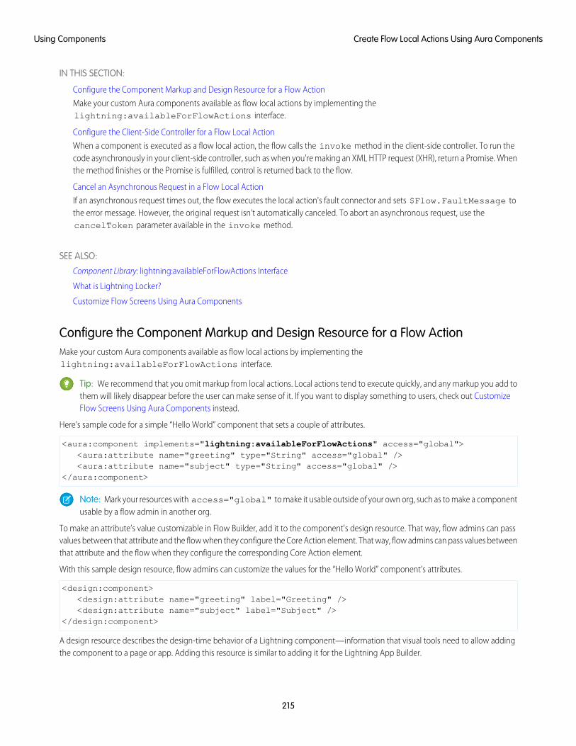
IN THIS SECTION:
Configure the Component Markup and Design Resource for a Flow Action
Make your custom Aura components available as flow local actions by implementing thelightning:availableForFlowActions interface.
Configure the Client-Side Controller for a Flow Local Action
When a component is executed as a flow local action, the flow calls the invoke method in the client-side controller. To run thecode asynchronously in your client-side controller, such as when you're making an XML HTTP request (XHR), return a Promise. Whenthe method finishes or the Promise is fulfilled, control is returned back to the flow.
Cancel an Asynchronous Request in a Flow Local Action
If an asynchronous request times out, the flow executes the local action's fault connector and sets $Flow.FaultMessage tothe error message. However, the original request isn't automatically canceled. To abort an asynchronous request, use thecancelToken parameter available in the invoke method.
SEE ALSO:
Component Library: lightning:availableForFlowActions Interface
What is Lightning Locker?
Customize Flow Screens Using Aura Components
Configure the Component Markup and Design Resource for a Flow ActionMake your custom Aura components available as flow local actions by implementing thelightning:availableForFlowActions interface.
Tip: We recommend that you omit markup from local actions. Local actions tend to execute quickly, and any markup you add tothem will likely disappear before the user can make sense of it. If you want to display something to users, check out CustomizeFlow Screens Using Aura Components instead.
Here’s sample code for a simple “Hello World” component that sets a couple of attributes.
<aura:component implements="lightning:availableForFlowActions" access="global"><aura:attribute name="greeting" type="String" access="global" /><aura:attribute name="subject" type="String" access="global" />
</aura:component>
Note: Mark your resources with access="global" to make it usable outside of your own org, such as to make a componentusable by a flow admin in another org.
To make an attribute’s value customizable in Flow Builder, add it to the component's design resource. That way, flow admins can passvalues between that attribute and the flow when they configure the Core Action element. That way, flow admins can pass values betweenthat attribute and the flow when they configure the corresponding Core Action element.
With this sample design resource, flow admins can customize the values for the “Hello World” component’s attributes.
<design:component><design:attribute name="greeting" label="Greeting" /><design:attribute name="subject" label="Subject" />
</design:component>
A design resource describes the design-time behavior of a Lightning component—information that visual tools need to allow addingthe component to a page or app. Adding this resource is similar to adding it for the Lightning App Builder.
215
Create Flow Local Actions Using Aura ComponentsUsing Components
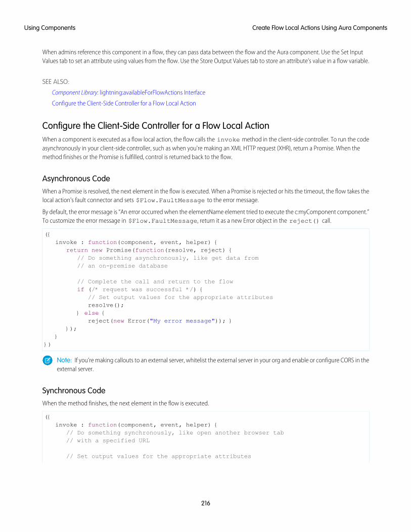
When admins reference this component in a flow, they can pass data between the flow and the Aura component. Use the Set InputValues tab to set an attribute using values from the flow. Use the Store Output Values tab to store an attribute’s value in a flow variable.
SEE ALSO:
Component Library: lightning:availableForFlowActions Interface
Configure the Client-Side Controller for a Flow Local Action
Configure the Client-Side Controller for a Flow Local ActionWhen a component is executed as a flow local action, the flow calls the invoke method in the client-side controller. To run the codeasynchronously in your client-side controller, such as when you're making an XML HTTP request (XHR), return a Promise. When themethod finishes or the Promise is fulfilled, control is returned back to the flow.
Asynchronous CodeWhen a Promise is resolved, the next element in the flow is executed. When a Promise is rejected or hits the timeout, the flow takes thelocal action's fault connector and sets $Flow.FaultMessage to the error message.
By default, the error message is “An error occurred when the elementName element tried to execute the c:myComponent component.”To customize the error message in $Flow.FaultMessage, return it as a new Error object in the reject() call.
({invoke : function(component, event, helper) {
return new Promise(function(resolve, reject) {// Do something asynchronously, like get data from// an on-premise database
// Complete the call and return to the flowif (/* request was successful */) {
// Set output values for the appropriate attributesresolve();
} else {reject(new Error("My error message")); }
});}
})
Note: If you’re making callouts to an external server, whitelist the external server in your org and enable or configure CORS in theexternal server.
Synchronous CodeWhen the method finishes, the next element in the flow is executed.
({invoke : function(component, event, helper) {
// Do something synchronously, like open another browser tab// with a specified URL
// Set output values for the appropriate attributes
216
Create Flow Local Actions Using Aura ComponentsUsing Components
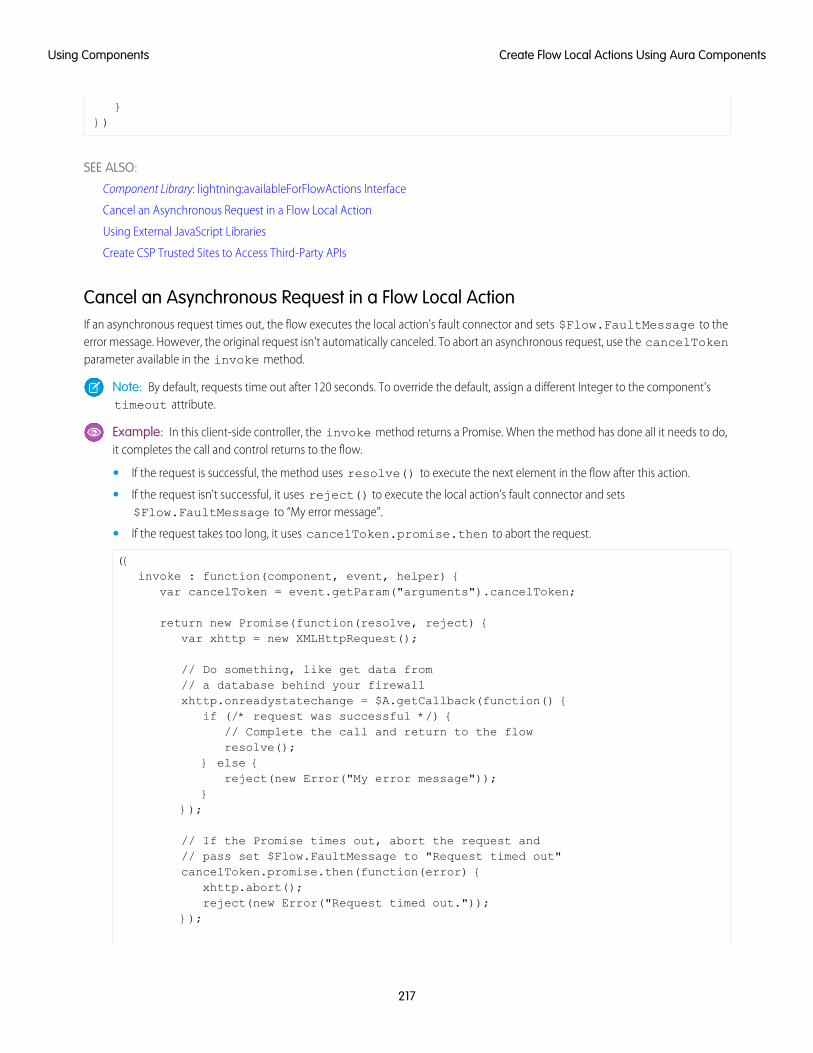
}})
SEE ALSO:
Component Library: lightning:availableForFlowActions Interface
Cancel an Asynchronous Request in a Flow Local Action
Using External JavaScript Libraries
Create CSP Trusted Sites to Access Third-Party APIs
Cancel an Asynchronous Request in a Flow Local ActionIf an asynchronous request times out, the flow executes the local action's fault connector and sets $Flow.FaultMessage to theerror message. However, the original request isn't automatically canceled. To abort an asynchronous request, use the cancelTokenparameter available in the invoke method.
Note: By default, requests time out after 120 seconds. To override the default, assign a different Integer to the component'stimeout attribute.
Example: In this client-side controller, the invoke method returns a Promise. When the method has done all it needs to do,it completes the call and control returns to the flow.
• If the request is successful, the method uses resolve() to execute the next element in the flow after this action.
• If the request isn't successful, it uses reject() to execute the local action’s fault connector and sets$Flow.FaultMessage to “My error message”.
• If the request takes too long, it uses cancelToken.promise.then to abort the request.
({invoke : function(component, event, helper) {
var cancelToken = event.getParam("arguments").cancelToken;
return new Promise(function(resolve, reject) {var xhttp = new XMLHttpRequest();
// Do something, like get data from// a database behind your firewallxhttp.onreadystatechange = $A.getCallback(function() {
if (/* request was successful */) {// Complete the call and return to the flowresolve();
} else {reject(new Error("My error message"));
}});
// If the Promise times out, abort the request and// pass set $Flow.FaultMessage to "Request timed out"cancelToken.promise.then(function(error) {
xhttp.abort();reject(new Error("Request timed out."));
});
217
Create Flow Local Actions Using Aura ComponentsUsing Components
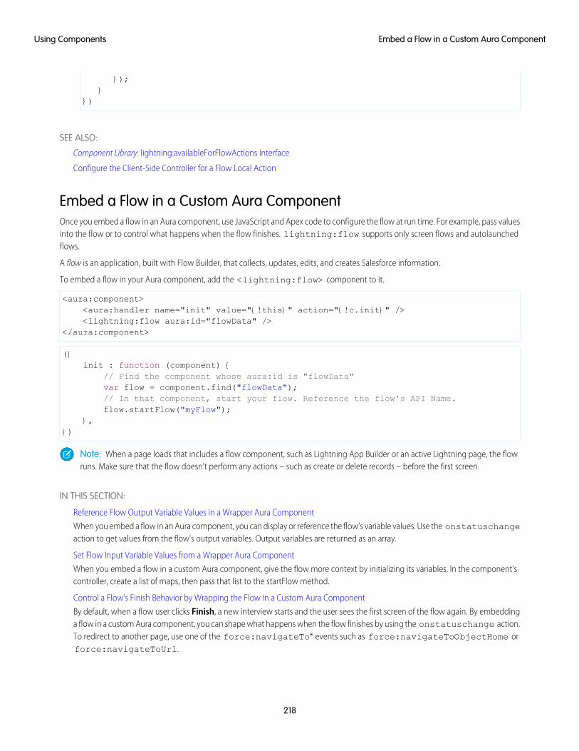
});}
})
SEE ALSO:
Component Library: lightning:availableForFlowActions Interface
Configure the Client-Side Controller for a Flow Local Action
Embed a Flow in a Custom Aura ComponentOnce you embed a flow in an Aura component, use JavaScript and Apex code to configure the flow at run time. For example, pass valuesinto the flow or to control what happens when the flow finishes. lightning:flow supports only screen flows and autolaunchedflows.
A flow is an application, built with Flow Builder, that collects, updates, edits, and creates Salesforce information.
To embed a flow in your Aura component, add the <lightning:flow> component to it.
<aura:component><aura:handler name="init" value="{!this}" action="{!c.init}" /><lightning:flow aura:id="flowData" />
</aura:component>
({init : function (component) {
// Find the component whose aura:id is "flowData"var flow = component.find("flowData");// In that component, start your flow. Reference the flow's API Name.flow.startFlow("myFlow");
},})
Note: When a page loads that includes a flow component, such as Lightning App Builder or an active Lightning page, the flowruns. Make sure that the flow doesn’t perform any actions – such as create or delete records – before the first screen.
IN THIS SECTION:
Reference Flow Output Variable Values in a Wrapper Aura Component
When you embed a flow in an Aura component, you can display or reference the flow’s variable values. Use the onstatuschangeaction to get values from the flow's output variables. Output variables are returned as an array.
Set Flow Input Variable Values from a Wrapper Aura Component
When you embed a flow in a custom Aura component, give the flow more context by initializing its variables. In the component'scontroller, create a list of maps, then pass that list to the startFlow method.
Control a Flow’s Finish Behavior by Wrapping the Flow in a Custom Aura Component
By default, when a flow user clicks Finish, a new interview starts and the user sees the first screen of the flow again. By embeddinga flow in a custom Aura component, you can shape what happens when the flow finishes by using the onstatuschange action.To redirect to another page, use one of the force:navigateTo* events such as force:navigateToObjectHome orforce:navigateToUrl.
218
Embed a Flow in a Custom Aura ComponentUsing Components
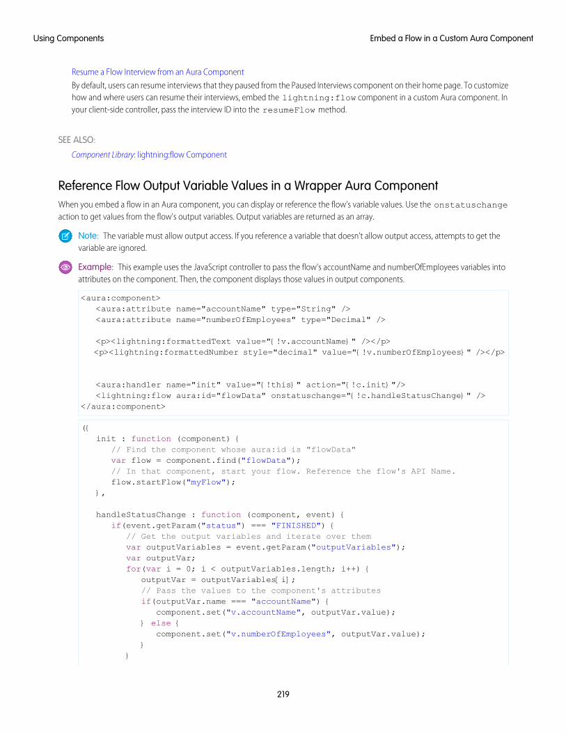
Resume a Flow Interview from an Aura Component
By default, users can resume interviews that they paused from the Paused Interviews component on their home page. To customizehow and where users can resume their interviews, embed the lightning:flow component in a custom Aura component. Inyour client-side controller, pass the interview ID into the resumeFlow method.
SEE ALSO:
Component Library: lightning:flow Component
Reference Flow Output Variable Values in a Wrapper Aura ComponentWhen you embed a flow in an Aura component, you can display or reference the flow’s variable values. Use the onstatuschangeaction to get values from the flow's output variables. Output variables are returned as an array.
Note: The variable must allow output access. If you reference a variable that doesn’t allow output access, attempts to get thevariable are ignored.
Example: This example uses the JavaScript controller to pass the flow's accountName and numberOfEmployees variables intoattributes on the component. Then, the component displays those values in output components.
<aura:component><aura:attribute name="accountName" type="String" /><aura:attribute name="numberOfEmployees" type="Decimal" />
<p><lightning:formattedText value="{!v.accountName}" /></p><p><lightning:formattedNumber style="decimal" value="{!v.numberOfEmployees}" /></p>
<aura:handler name="init" value="{!this}" action="{!c.init}"/><lightning:flow aura:id="flowData" onstatuschange="{!c.handleStatusChange}" />
</aura:component>
({init : function (component) {
// Find the component whose aura:id is "flowData"var flow = component.find("flowData");// In that component, start your flow. Reference the flow's API Name.flow.startFlow("myFlow");
},
handleStatusChange : function (component, event) {if(event.getParam("status") === "FINISHED") {
// Get the output variables and iterate over themvar outputVariables = event.getParam("outputVariables");var outputVar;for(var i = 0; i < outputVariables.length; i++) {
outputVar = outputVariables[i];// Pass the values to the component's attributesif(outputVar.name === "accountName") {
component.set("v.accountName", outputVar.value);} else {
component.set("v.numberOfEmployees", outputVar.value);}
}
219
Embed a Flow in a Custom Aura ComponentUsing Components
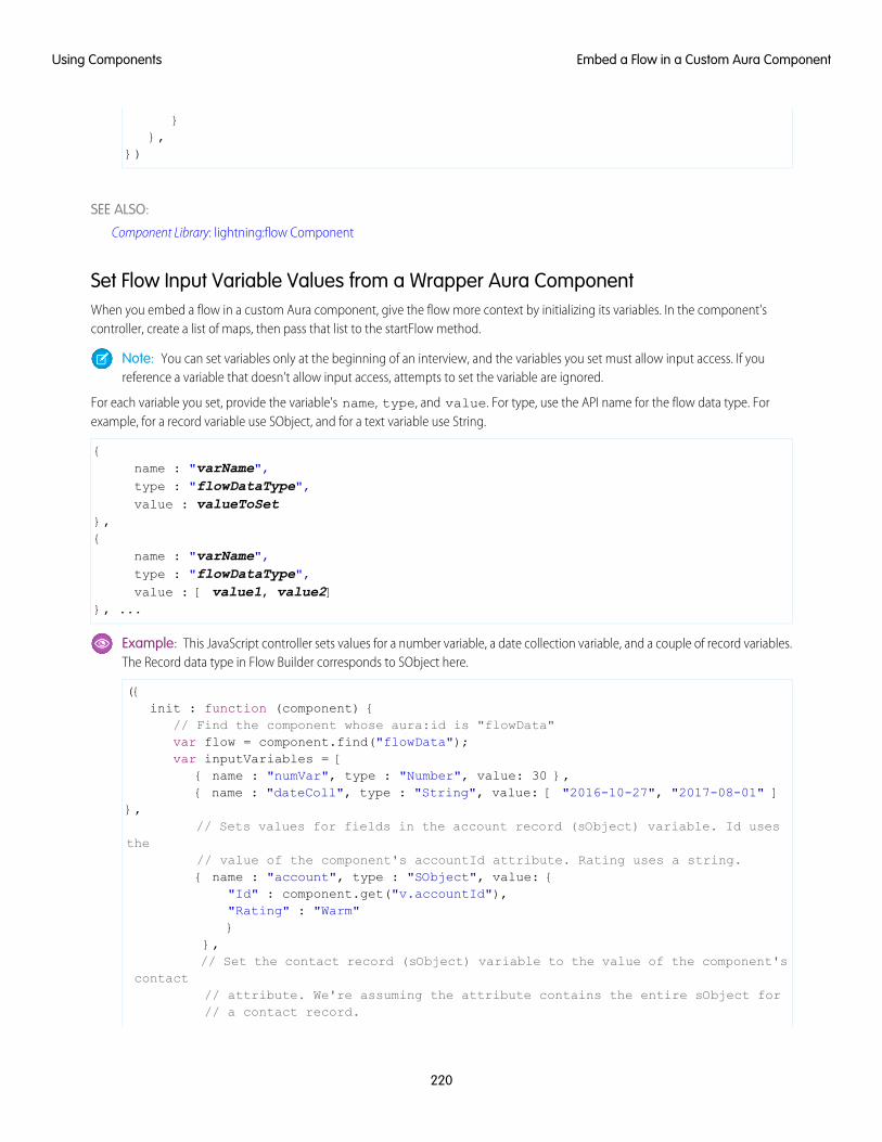
}},
})
SEE ALSO:
Component Library: lightning:flow Component
Set Flow Input Variable Values from a Wrapper Aura ComponentWhen you embed a flow in a custom Aura component, give the flow more context by initializing its variables. In the component'scontroller, create a list of maps, then pass that list to the startFlow method.
Note: You can set variables only at the beginning of an interview, and the variables you set must allow input access. If youreference a variable that doesn’t allow input access, attempts to set the variable are ignored.
For each variable you set, provide the variable's name, type, and value. For type, use the API name for the flow data type. Forexample, for a record variable use SObject, and for a text variable use String.
{name : "varName",type : "flowDataType",value : valueToSet
},{
name : "varName",type : "flowDataType",value : [ value1, value2]
}, ...
Example: This JavaScript controller sets values for a number variable, a date collection variable, and a couple of record variables.The Record data type in Flow Builder corresponds to SObject here.
({init : function (component) {
// Find the component whose aura:id is "flowData"var flow = component.find("flowData");var inputVariables = [
{ name : "numVar", type : "Number", value: 30 },{ name : "dateColl", type : "String", value: [ "2016-10-27", "2017-08-01" ]
},// Sets values for fields in the account record (sObject) variable. Id uses
the// value of the component's accountId attribute. Rating uses a string.{ name : "account", type : "SObject", value: {
"Id" : component.get("v.accountId"),"Rating" : "Warm"}
},// Set the contact record (sObject) variable to the value of the component's
contact// attribute. We're assuming the attribute contains the entire sObject for// a contact record.
220
Embed a Flow in a Custom Aura ComponentUsing Components
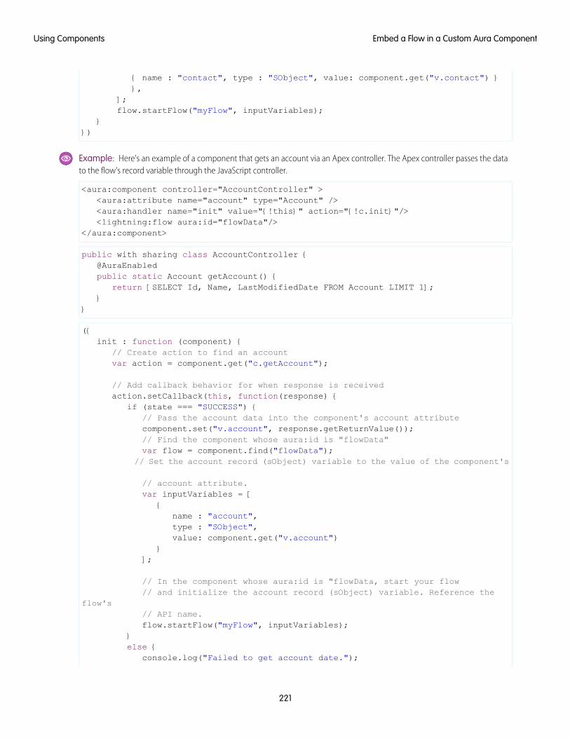
{ name : "contact", type : "SObject", value: component.get("v.contact") }},
];flow.startFlow("myFlow", inputVariables);
}})
Example: Here's an example of a component that gets an account via an Apex controller. The Apex controller passes the datato the flow's record variable through the JavaScript controller.
<aura:component controller="AccountController" ><aura:attribute name="account" type="Account" /><aura:handler name="init" value="{!this}" action="{!c.init}"/><lightning:flow aura:id="flowData"/>
</aura:component>
public with sharing class AccountController {@AuraEnabledpublic static Account getAccount() {
return [SELECT Id, Name, LastModifiedDate FROM Account LIMIT 1];}
}
({init : function (component) {
// Create action to find an accountvar action = component.get("c.getAccount");
// Add callback behavior for when response is receivedaction.setCallback(this, function(response) {
if (state === "SUCCESS") {// Pass the account data into the component's account attributecomponent.set("v.account", response.getReturnValue());// Find the component whose aura:id is "flowData"var flow = component.find("flowData");
// Set the account record (sObject) variable to the value of the component's
// account attribute.var inputVariables = [
{name : "account",type : "SObject",value: component.get("v.account")
}];
// In the component whose aura:id is "flowData, start your flow// and initialize the account record (sObject) variable. Reference the
flow's// API name.flow.startFlow("myFlow", inputVariables);
}else {
console.log("Failed to get account date.");
221
Embed a Flow in a Custom Aura ComponentUsing Components
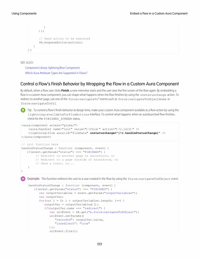
}});
// Send action to be executed$A.enqueueAction(action);
}})
SEE ALSO:
Component Library: lightning:flow Component
Which Aura Attribute Types Are Supported in Flows?
Control a Flow’s Finish Behavior by Wrapping the Flow in a Custom Aura ComponentBy default, when a flow user clicks Finish, a new interview starts and the user sees the first screen of the flow again. By embedding aflow in a custom Aura component, you can shape what happens when the flow finishes by using the onstatuschange action. Toredirect to another page, use one of the force:navigateTo* events such as force:navigateToObjectHome orforce:navigateToUrl.
Tip: To control a flow’s finish behavior at design time, make your custom Aura component available as a flow action by using thelightning:availableForFlowActions interface. To control what happens when an autolaunched flow finishes,check for the FINISHED_SCREEN status.
<aura:component access="global"><aura:handler name="init" value="{!this}" action="{!c.init}" /><lightning:flow aura:id="flowData" onstatuschange="{!c.handleStatusChange}" />
</aura:component>
// init function herehandleStatusChange : function (component, event) {
if(event.getParam("status") === "FINISHED") {// Redirect to another page in Salesforce, or// Redirect to a page outside of Salesforce, or// Show a toast, or...
}}
Example: This function redirects the user to a case created in the flow by using the force:navigateToSObject event.
handleStatusChange : function (component, event) {if(event.getParam("status") === "FINISHED") {
var outputVariables = event.getParam("outputVariables");var outputVar;for(var i = 0; i < outputVariables.length; i++) {
outputVar = outputVariables[i];if(outputVar.name === "redirect") {
var urlEvent = $A.get("e.force:navigateToSObject");urlEvent.setParams({
"recordId": outputVar.value,"isredirect": "true"
});urlEvent.fire();
222
Embed a Flow in a Custom Aura ComponentUsing Components
}}
}}
SEE ALSO:
Component Library: lightning:flow Component
Create Flow Local Actions Using Aura Components
Resume a Flow Interview from an Aura ComponentBy default, users can resume interviews that they paused from the Paused Interviews component on their home page. To customizehow and where users can resume their interviews, embed the lightning:flow component in a custom Aura component. In yourclient-side controller, pass the interview ID into the resumeFlow method.
({init : function (component) {
// Find the component whose aura:id is "flowData"var flow = component.find("flowData");
// In that component, resume a paused interview. Provide the method with// the ID of the interview that you want to resume.flow.resumeFlow("pausedInterviewId");
},})
Example: This example shows how you can resume an interview—or start a new one. When users click Survey Customer froma contact record, the Aura component does one of two things.
• If the user has any paused interviews for the Survey Customers flow, it resumes the first one.
• If the user doesn’t have any paused interviews for the Survey Customers flow, it starts a new one.
<aura:component controller="InterviewsController"><aura:handler name="init" value="{!this}" action="{!c.init}" /><lightning:flow aura:id="flowData" />
</aura:component>
This Apex controller gets a list of paused interviews by performing a SOQL query. If nothing is returned from the query,getPausedId() returns a null value, and the component starts a new interview. If at least one interview is returned from thequery, the component resumes the first interview in that list.
public class InterviewsController {@AuraEnabledpublic static String getPausedId() {
// Get the ID of the running userString currentUser = UserInfo.getUserId();// Find all of that user's paused interviews for the Survey customers flowList<FlowInterview> interviews =
[ SELECT Id FROM FlowInterviewWHERE CreatedById = :currentUser AND InterviewLabel LIKE '%Survey
customers%'];
223
Embed a Flow in a Custom Aura ComponentUsing Components
if (interviews == null || interviews.isEmpty()) {return null; // early out
}// Return the ID for the first interview in the listreturn interviews.get(0).Id;
}}
If the Apex controller returned an interview ID, the client-side controller resumes that interview. If the Apex controller returned anull interview ID, the component starts a new interview.
({init : function (component) {
//Create request for interview IDvar action = component.get("c.getPausedId");action.setCallback(this, function(response) {
var interviewId = response.getReturnValue();// Find the component whose aura:id is "flowData"var flow = component.find("flowData");// If an interview ID was returned, resume it in the component// whose aura:id is "flowData".if ( interviewId !== null ) {
flow.resumeFlow(interviewID);}// Otherwise, start a new interview in that component. Reference// the flow's API Name.else {
flow.startFlow("Survey_customers");}
});//Send request to be enqueued$A.enqueueAction(action);
},})
SEE ALSO:
Component Library: lightning:flow Component
Display Flow Stages with an Aura ComponentIf you’ve added stages to your flow, display them to flow users with an Aura component, such as lightning:progressindicator.
To add a progress indicator component to your flow, you have two options:
• Wrap the progress indicator with a lightning:flow component in a parent component.
<aura:component><lightning:progressindicator/><lightning:flow/>
</aura:component>
• Add the progress indicator to your flow screen directly, by using a screen component.
224
Display Flow Stages with an Aura ComponentUsing Components
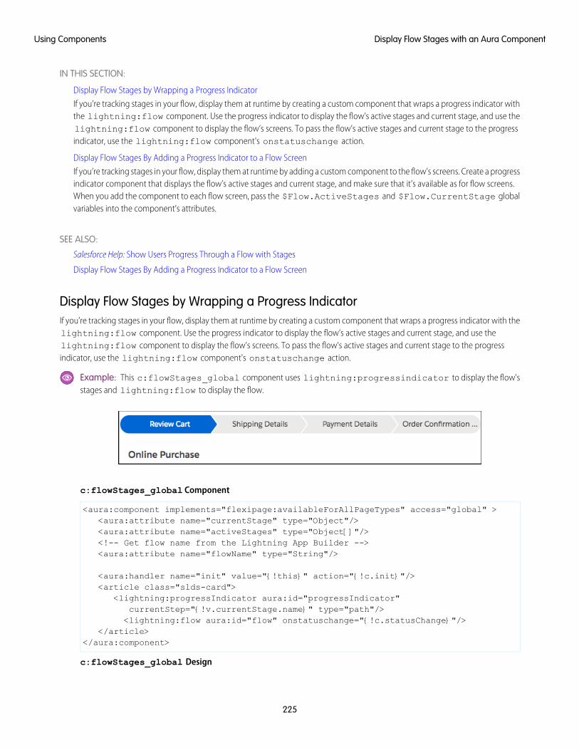
IN THIS SECTION:
Display Flow Stages by Wrapping a Progress Indicator
If you’re tracking stages in your flow, display them at runtime by creating a custom component that wraps a progress indicator withthe lightning:flow component. Use the progress indicator to display the flow’s active stages and current stage, and use thelightning:flow component to display the flow’s screens. To pass the flow’s active stages and current stage to the progressindicator, use the lightning:flow component's onstatuschange action.
Display Flow Stages By Adding a Progress Indicator to a Flow Screen
If you’re tracking stages in your flow, display them at runtime by adding a custom component to the flow’s screens. Create a progressindicator component that displays the flow’s active stages and current stage, and make sure that it’s available as for flow screens.When you add the component to each flow screen, pass the $Flow.ActiveStages and $Flow.CurrentStage globalvariables into the component’s attributes.
SEE ALSO:
Salesforce Help: Show Users Progress Through a Flow with Stages
Display Flow Stages By Adding a Progress Indicator to a Flow Screen
Display Flow Stages by Wrapping a Progress IndicatorIf you’re tracking stages in your flow, display them at runtime by creating a custom component that wraps a progress indicator with thelightning:flow component. Use the progress indicator to display the flow’s active stages and current stage, and use thelightning:flow component to display the flow’s screens. To pass the flow’s active stages and current stage to the progressindicator, use the lightning:flow component's onstatuschange action.
Example: This c:flowStages_global component uses lightning:progressindicator to display the flow’sstages and lightning:flow to display the flow.
c:flowStages_global Component
<aura:component implements="flexipage:availableForAllPageTypes" access="global" ><aura:attribute name="currentStage" type="Object"/><aura:attribute name="activeStages" type="Object[]"/><!-- Get flow name from the Lightning App Builder --><aura:attribute name="flowName" type="String"/>
<aura:handler name="init" value="{!this}" action="{!c.init}"/><article class="slds-card">
<lightning:progressIndicator aura:id="progressIndicator"currentStep="{!v.currentStage.name}" type="path"/><lightning:flow aura:id="flow" onstatuschange="{!c.statusChange}"/>
</article></aura:component>
c:flowStages_global Design
225
Display Flow Stages with an Aura ComponentUsing Components
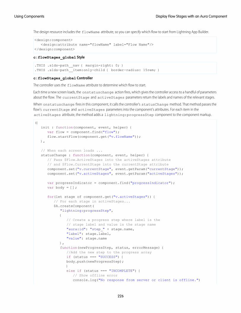
The design resource includes the flowName attribute, so you can specify which flow to start from Lightning App Builder.
<design:component><design:attribute name="flowName" label="Flow Name"/>
</design:component>
c:flowStages_global Style
.THIS .slds-path__nav { margin-right: 0; }
.THIS .slds-path__item:only-child { border-radius: 15rem; }
c:flowStages_global Controller
The controller uses the flowName attribute to determine which flow to start.
Each time a new screen loads, the onstatuschange action fires, which gives the controller access to a handful of parametersabout the flow. The currentStage and activeStages parameters return the labels and names of the relevant stages.
When onstatuschange fires in this component, it calls the controller's statusChange method. That method passes theflow's currentStage and activeStages parameters into the component's attributes. For each item in theactiveStages attribute, the method adds a lightning:progressStep component to the component markup.
({init : function(component, event, helper) {
var flow = component.find("flow");flow.startFlow(component.get("v.flowName"));
},
// When each screen loads ...statusChange : function(component, event, helper) {
// Pass $Flow.ActiveStages into the activeStages attribute// and $Flow.CurrentStage into the currentStage attributecomponent.set("v.currentStage", event.getParam("currentStage"));component.set("v.activeStages", event.getParam("activeStages"));
var progressIndicator = component.find("progressIndicator");var body = [];
for(let stage of component.get("v.activeStages")) {// For each stage in activeStages...$A.createComponent(
"lightning:progressStep",{
// Create a progress step where label is the// stage label and value is the stage name"aura:id": "step_" + stage.name,"label": stage.label,"value": stage.name
},function(newProgressStep, status, errorMessage) {
//Add the new step to the progress arrayif (status === "SUCCESS") {body.push(newProgressStep);}else if (status === "INCOMPLETE") {
// Show offline errorconsole.log("No response from server or client is offline.")
226
Display Flow Stages with an Aura ComponentUsing Components
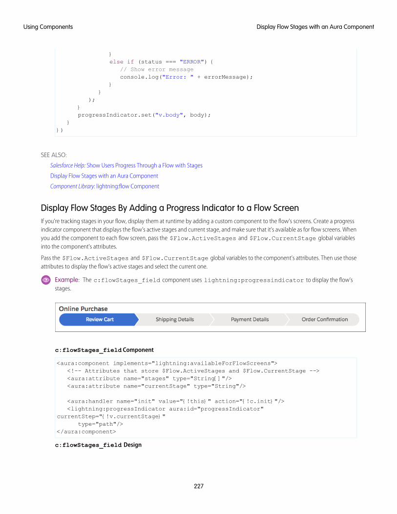
}else if (status === "ERROR") {
// Show error messageconsole.log("Error: " + errorMessage);
}}
);}progressIndicator.set("v.body", body);
}})
SEE ALSO:
Salesforce Help: Show Users Progress Through a Flow with Stages
Display Flow Stages with an Aura Component
Component Library: lightning:flow Component
Display Flow Stages By Adding a Progress Indicator to a Flow ScreenIf you’re tracking stages in your flow, display them at runtime by adding a custom component to the flow’s screens. Create a progressindicator component that displays the flow’s active stages and current stage, and make sure that it’s available as for flow screens. Whenyou add the component to each flow screen, pass the $Flow.ActiveStages and $Flow.CurrentStage global variablesinto the component’s attributes.
Pass the $Flow.ActiveStages and $Flow.CurrentStage global variables to the component’s attributes. Then use thoseattributes to display the flow’s active stages and select the current one.
Example: The c:flowStages_field component uses lightning:progressindicator to display the flow’sstages.
c:flowStages_field Component
<aura:component implements="lightning:availableForFlowScreens"><!-- Attributes that store $Flow.ActiveStages and $Flow.CurrentStage --><aura:attribute name="stages" type="String[]"/><aura:attribute name="currentStage" type="String"/>
<aura:handler name="init" value="{!this}" action="{!c.init}"/><lightning:progressIndicator aura:id="progressIndicator"
currentStep="{!v.currentStage}"type="path"/>
</aura:component>
c:flowStages_field Design
227
Display Flow Stages with an Aura ComponentUsing Components
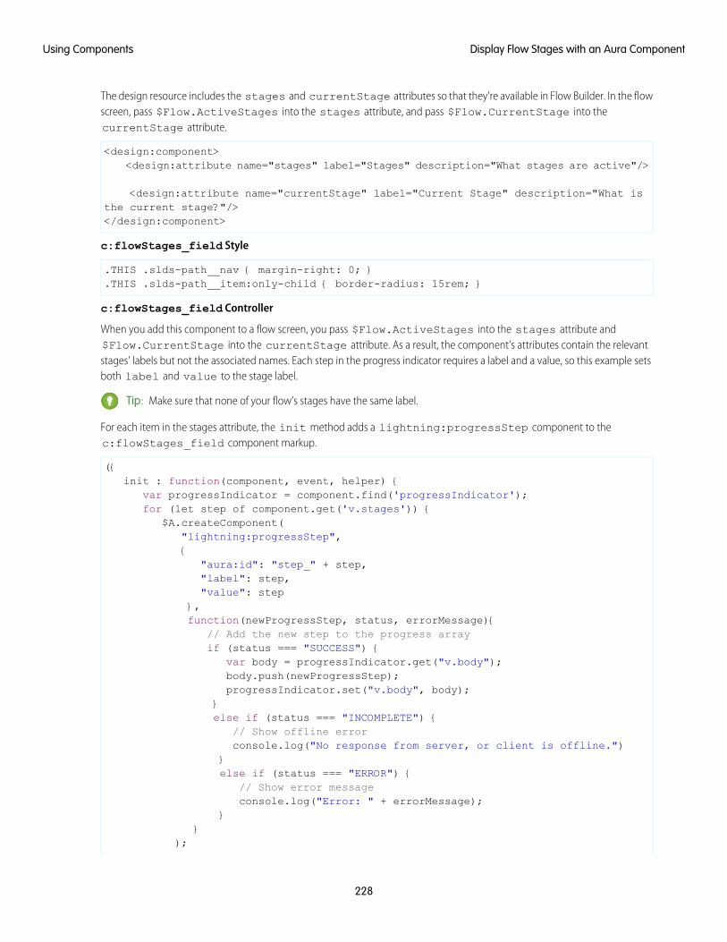
The design resource includes the stages and currentStage attributes so that they’re available in Flow Builder. In the flowscreen, pass $Flow.ActiveStages into the stages attribute, and pass $Flow.CurrentStage into thecurrentStage attribute.
<design:component><design:attribute name="stages" label="Stages" description="What stages are active"/>
<design:attribute name="currentStage" label="Current Stage" description="What isthe current stage?"/></design:component>
c:flowStages_field Style
.THIS .slds-path__nav { margin-right: 0; }
.THIS .slds-path__item:only-child { border-radius: 15rem; }
c:flowStages_field Controller
When you add this component to a flow screen, you pass $Flow.ActiveStages into the stages attribute and$Flow.CurrentStage into the currentStage attribute. As a result, the component's attributes contain the relevantstages' labels but not the associated names. Each step in the progress indicator requires a label and a value, so this example setsboth label and value to the stage label.
Tip: Make sure that none of your flow’s stages have the same label.
For each item in the stages attribute, the init method adds a lightning:progressStep component to thec:flowStages_field component markup.
({init : function(component, event, helper) {
var progressIndicator = component.find('progressIndicator');for (let step of component.get('v.stages')) {
$A.createComponent("lightning:progressStep",{
"aura:id": "step_" + step,"label": step,"value": step
},function(newProgressStep, status, errorMessage){
// Add the new step to the progress arrayif (status === "SUCCESS") {
var body = progressIndicator.get("v.body");body.push(newProgressStep);progressIndicator.set("v.body", body);
}else if (status === "INCOMPLETE") {
// Show offline errorconsole.log("No response from server, or client is offline.")
}else if (status === "ERROR") {
// Show error messageconsole.log("Error: " + errorMessage);
}}
);
228
Display Flow Stages with an Aura ComponentUsing Components
}}
})
SEE ALSO:
Salesforce Help: Show Users Progress Through a Flow with Stages
Display Flow Stages with an Aura Component
Display Flow Stages with an Aura Component
Component Library: lightning:availableForFlowScreens Interface
Add Components to Apps
When you’re ready to add components to your app, you should first look at the out-of-the-box components that come with the framework.You can also leverage these components by extending them or using composition to add them to custom components that you’rebuilding.
Note: For all the out-of-the-box components, see the Components folder athttps://<myDomain>.lightning.force.com/docs/component-library, where <myDomain> is thename of your custom Salesforce domain. The ui namespace includes many components that are common on Web pages.
Components are encapsulated and their internals stay private, while their public shape is visible to consumers of the component. Thisstrong separation gives component authors freedom to change the internal implementation details and insulates component consumersfrom those changes.
The public shape of a component is defined by the attributes that can be set and the events that interact with the component. Theshape is essentially the API for developers to interact with the component. To design a new component, think about the attributes thatyou want to expose and the events that the component should initiate or respond to.
Once you have defined the shape of any new components, developers can work on the components in parallel. This is a useful approachif you have a team working on an app.
To add a new custom component to your app, see Using the Developer Console on page 4.
SEE ALSO:
Component Composition
Using Object-Oriented Development
Component Attributes
Communicating with Events
Integrate Your Custom Apps into the Chatter Publisher
Use the Chatter Rich Publisher Apps API to integrate your custom apps into the Chatter publisher. The Rich Publisher Apps API enablesdevelopers to attach any custom payload to a feed item. Rich Publisher Apps uses Lightning components for composition and rendering.We provide two Lightning interfaces and a Lightning event to assist with integration. You can package your apps and upload them toAppExchange. A community admin page provides a selector for choosing which five of your apps to add to the Chatter publisher forthat community.
229
Add Components to AppsUsing Components
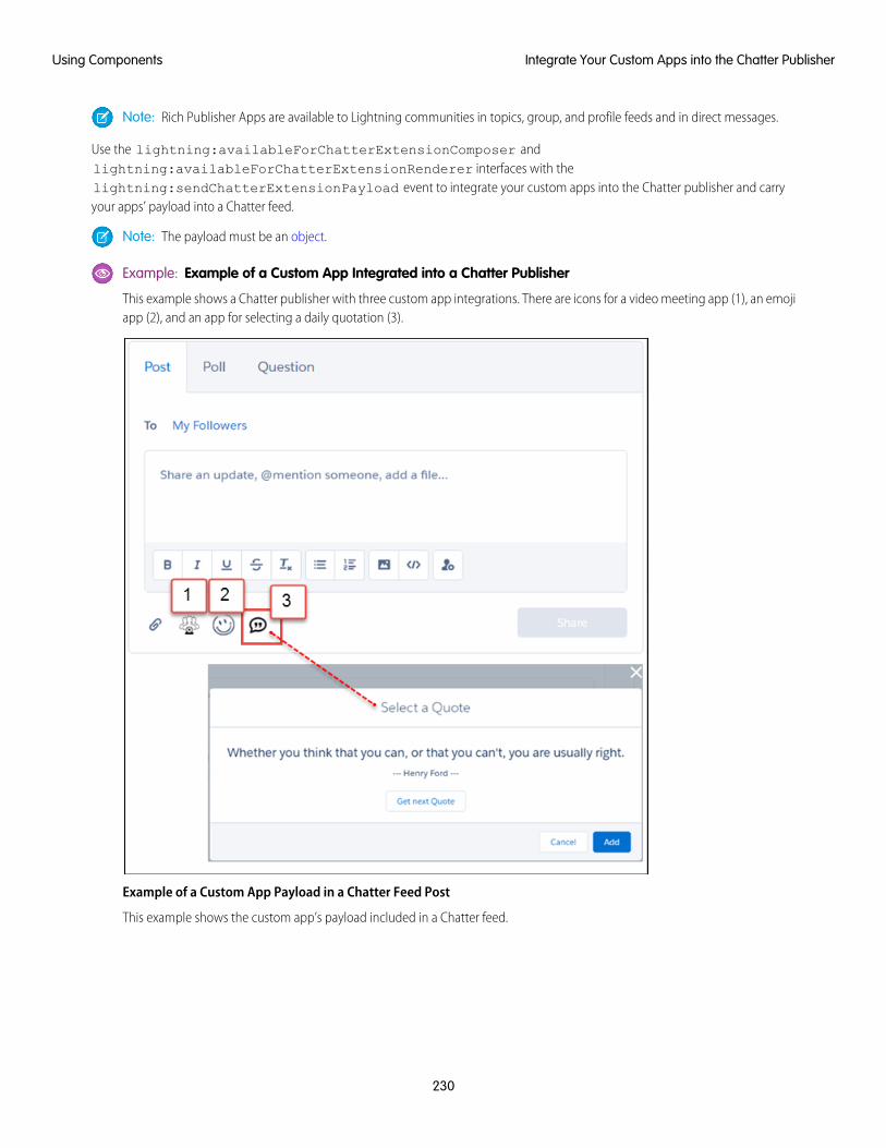
Note: Rich Publisher Apps are available to Lightning communities in topics, group, and profile feeds and in direct messages.
Use the lightning:availableForChatterExtensionComposer andlightning:availableForChatterExtensionRenderer interfaces with thelightning:sendChatterExtensionPayload event to integrate your custom apps into the Chatter publisher and carryyour apps’ payload into a Chatter feed.
Note: The payload must be an object.
Example: Example of a Custom App Integrated into a Chatter Publisher
This example shows a Chatter publisher with three custom app integrations. There are icons for a video meeting app (1), an emojiapp (2), and an app for selecting a daily quotation (3).
Example of a Custom App Payload in a Chatter Feed Post
This example shows the custom app’s payload included in a Chatter feed.
230
Integrate Your Custom Apps into the Chatter PublisherUsing Components
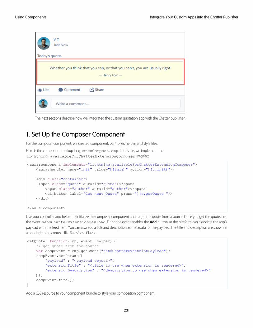
The next sections describe how we integrated the custom quotation app with the Chatter publisher.
1. Set Up the Composer ComponentFor the composer component, we created component, controller, helper, and style files.
Here is the component markup in quotesCompose.cmp. In this file, we implement thelightning:availableForChatterExtensionComposer interface.
<aura:component implements="lightning:availableForChatterExtensionComposer"><aura:handler name="init" value="{!this}" action="{!c.init}"/>
<div class="container"><span class="quote" aura:id="quote"></span>
<span class="author" aura:id="author"></span><ui:button label="Get next Quote" press="{!c.getQuote}"/>
</div>
</aura:component>
Use your controller and helper to initialize the composer component and to get the quote from a source. Once you get the quote, firethe event sendChatterExtensionPayload. Firing the event enables the Add button so the platform can associate the app’spayload with the feed item. You can also add a title and description as metadata for the payload. The title and description are shown ina non-Lightning context, like Salesforce Classic.
getQuote: function(cmp, event, helper) {// get quote from the sourcevar compEvent = cmp.getEvent("sendChatterExtensionPayload");compEvent.setParams({
"payload" : "<payload object>","extensionTitle" : "<title to use when extension is rendered>","extensionDescription" : "<description to use when extension is rendered>"
});compEvent.fire();
}
Add a CSS resource to your component bundle to style your composition component.
231
Integrate Your Custom Apps into the Chatter PublisherUsing Components
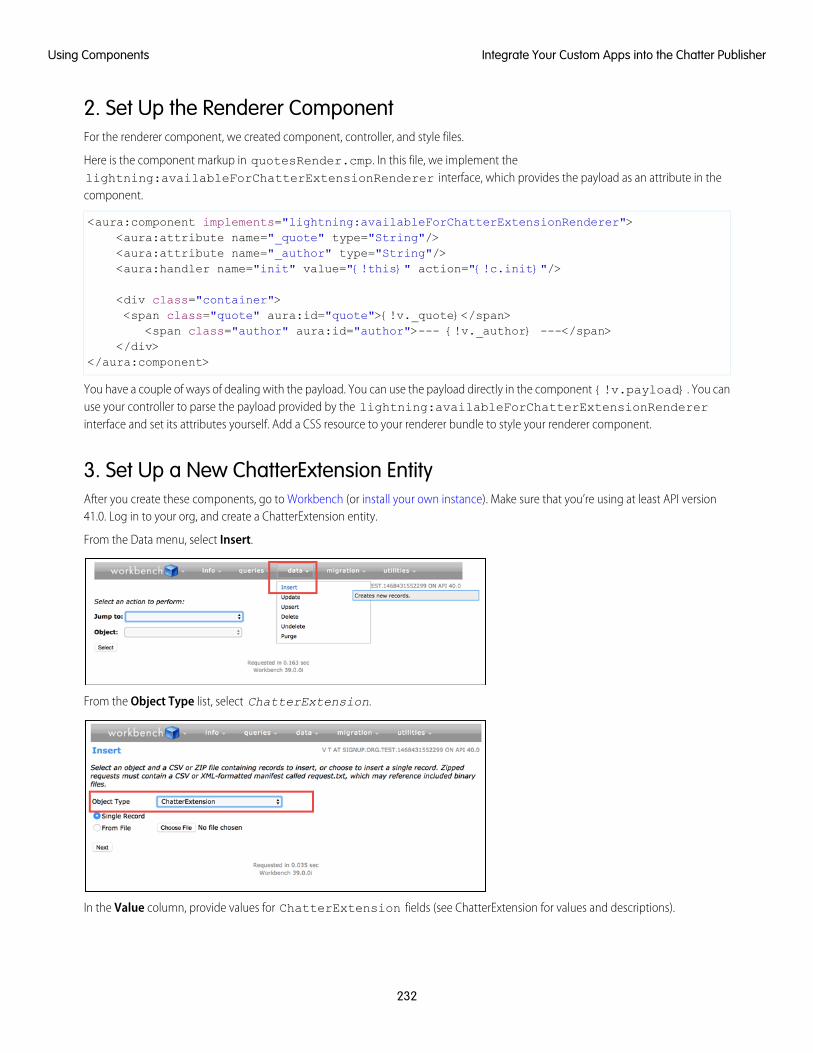
2. Set Up the Renderer ComponentFor the renderer component, we created component, controller, and style files.
Here is the component markup in quotesRender.cmp. In this file, we implement thelightning:availableForChatterExtensionRenderer interface, which provides the payload as an attribute in thecomponent.
<aura:component implements="lightning:availableForChatterExtensionRenderer"><aura:attribute name="_quote" type="String"/><aura:attribute name="_author" type="String"/><aura:handler name="init" value="{!this}" action="{!c.init}"/>
<div class="container"><span class="quote" aura:id="quote">{!v._quote}</span>
<span class="author" aura:id="author">--- {!v._author} ---</span></div>
</aura:component>
You have a couple of ways of dealing with the payload. You can use the payload directly in the component {!v.payload}. You canuse your controller to parse the payload provided by the lightning:availableForChatterExtensionRendererinterface and set its attributes yourself. Add a CSS resource to your renderer bundle to style your renderer component.
3. Set Up a New ChatterExtension EntityAfter you create these components, go to Workbench (or install your own instance). Make sure that you’re using at least API version41.0. Log in to your org, and create a ChatterExtension entity.
From the Data menu, select Insert.
From the Object Type list, select ChatterExtension.
In the Value column, provide values for ChatterExtension fields (see ChatterExtension for values and descriptions).
232
Integrate Your Custom Apps into the Chatter PublisherUsing Components
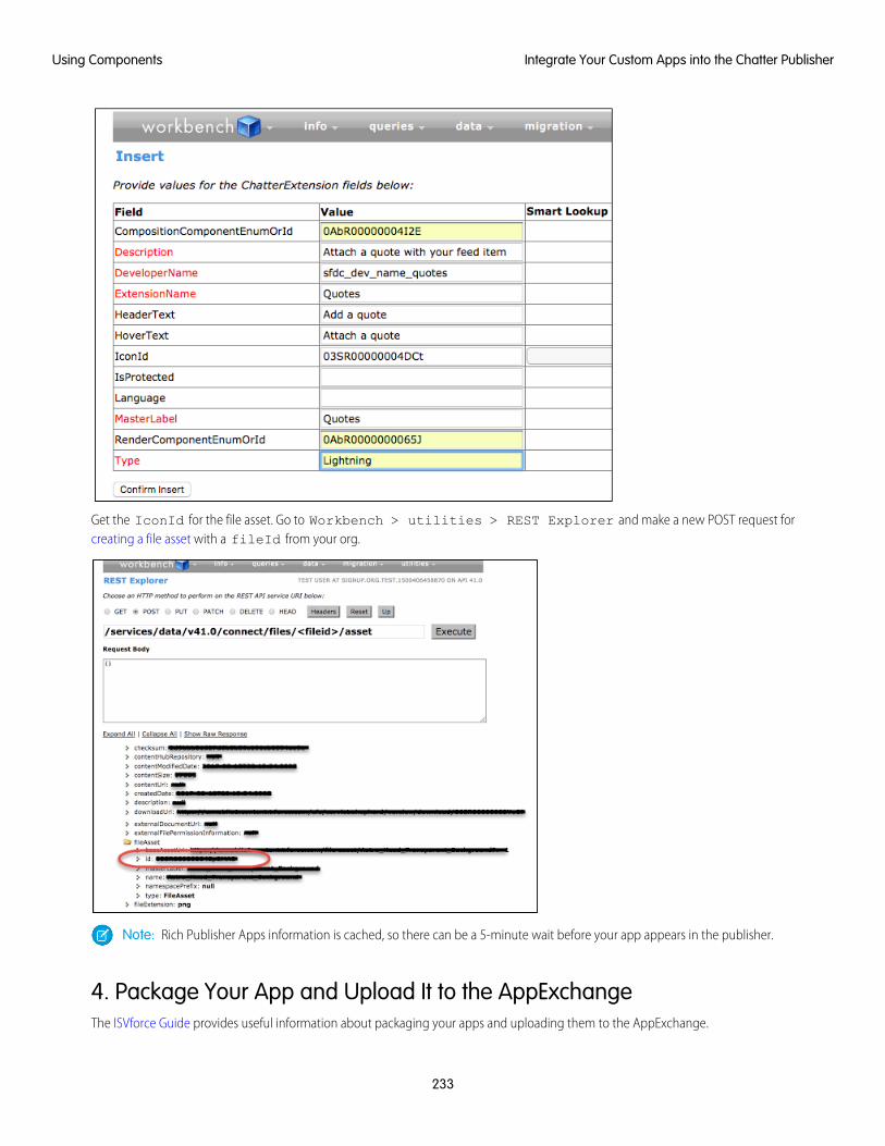
Get the IconId for the file asset. Go to Workbench > utilities > REST Explorer and make a new POST request forcreating a file asset with a fileId from your org.
Note: Rich Publisher Apps information is cached, so there can be a 5-minute wait before your app appears in the publisher.
4. Package Your App and Upload It to the AppExchangeThe ISVforce Guide provides useful information about packaging your apps and uploading them to the AppExchange.
233
Integrate Your Custom Apps into the Chatter PublisherUsing Components
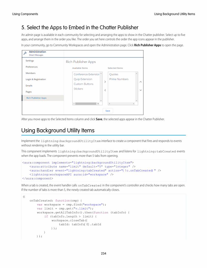
5. Select the Apps to Embed in the Chatter PublisherAn admin page is available in each community for selecting and arranging the apps to show in the Chatter publisher. Select up to fiveapps, and arrange them in the order you like. The order you set here controls the order the app icons appear in the publisher.
In your community, go to Community Workspaces and open the Administration page. Click Rich Publisher Apps to open the page.
After you move apps to the Selected Items column and click Save, the selected apps appear in the Chatter Publisher.
Using Background Utility Items
Implement the lightning:backgroundUtilityItem interface to create a component that fires and responds to eventswithout rendering in the utility bar.
This component implements lightning:backgroundUtilityItem and listens for lightning:tabCreated eventswhen the app loads. The component prevents more than 5 tabs from opening.
<aura:component implements="lightning:backgroundUtilityItem"><aura:attribute name="limit" default="5" type="Integer" /><aura:handler event="lightning:tabCreated" action="{!c.onTabCreated}" /><lightning:workspaceAPI aura:id="workspace" />
</aura:component>
When a tab is created, the event handler calls onTabCreated in the component’s controller and checks how many tabs are open.If the number of tabs is more than 5, the newly created tab automatically closes.
({onTabCreated: function(cmp) {
var workspace = cmp.find("workspace");var limit = cmp.get("v.limit");workspace.getAllTabInfo().then(function (tabInfo) {
if (tabInfo.length > limit) {workspace.closeTab({
tabId: tabInfo[0].tabId});
}});
234
Using Background Utility ItemsUsing Components
}})
Background utility items are added to an app the same way normal utility items are, but they don’t appear in the utility bar. The iconappears next to background utility items on the utility item list.
Use Lightning Components in Visualforce Pages
Add Aura components to your Visualforce pages to combine features you’ve built using both solutions. Implement new functionalityusing Aura components and then use it with existing Visualforce pages.
Important: Lightning Components for Visualforce is based on Lightning Out, a powerful and flexible feature that lets you embedAura components into almost any web page. When used with Visualforce, some of the details become simpler. For example, youdon’t need to deal with authentication, and you don’t need to configure a Connected App.
In other ways using Lightning Components for Visualforce is just like using Lightning Out. Refer to the Lightning Out section ofthis guide for additional details.
There are three steps to add Aura components to a Visualforce page.
1. Add the Lightning Components for Visualforce JavaScript library to your Visualforce page using the<apex:includeLightning/> component.
2. Create and reference a Lightning app that declares your component dependencies.
3. Write a JavaScript function that creates the component on the page using $Lightning.createComponent().
Add the Lightning Components for Visualforce JavaScript LibraryAdd <apex:includeLightning/> at the beginning of your page. This component loads the JavaScript file used by LightningComponents for Visualforce.
Create and Reference a Lightning Dependency AppTo use Lightning Components for Visualforce, define component dependencies by referencing a Lightning dependency app. This appis globally accessible and extends ltng:outApp. The app declares dependencies on any Lightning definitions (like components)that it uses.
Here’s an example of a Lightning app named lcvfTest.app. The app uses the <aura:dependency> tag to indicate that ituses the standard Lightning component, lightning:button.
<aura:application access="GLOBAL" extends="ltng:outApp"><aura:dependency resource="lightning:button"/>
</aura:application>
Note: Extending from ltng:outApp adds SLDS resources to the page to allow your Lightning components to be styled withthe Salesforce Lightning Design System (SLDS). If you don’t want SLDS resources added to the page, extend fromltng:outAppUnstyled instead.
To reference this app on your page, use the following JavaScript code, where theNamespace is the namespace prefix for the app.That is, either your org’s namespace, or the namespace of the managed package that provides the app.
$Lightning.use("theNamespace:lcvfTest", function() {});
235
Use Lightning Components in Visualforce PagesUsing Components
If the app is defined in your org (that is, not in a managed package), you can use the default “c” namespace instead, as shown in thenext example. If your org doesn’t have a namespace defined, you must use the default namespace.
For further details about creating a Lightning dependency app, see Lightning Out Dependencies.
Creating a Component on a PageFinally, add your top-level component to a page using $Lightning.createComponent(String type, Objectattributes, String domLocator, function callback). This function is similar to $A.createComponent(),but includes an additional parameter, domLocator, which specifies the DOM element where you want the component inserted.
Let’s look at a sample Visualforce page that creates a lightning:button using the lcvfTest.app from the previous example.
<apex:page><apex:includeLightning />
<div id="lightning" />
<script>$Lightning.use("c:lcvfTest", function() {$Lightning.createComponent("lightning:button",
{ label : "Press Me!" },"lightning",function(cmp) {console.log("button was created");// do some stuff
});
});</script>
</apex:page>
The $Lightning.createComponent() call creates a button with a “Press Me!” label. The button is inserted in a DOM elementwith the ID “lightning”. After the button is added and active on the page, the callback function is invoked and executes aconsole.log() statement. The callback receives the component created as its only argument. In this simple example, the buttonisn't configured to do anything.
Important: You can call $Lightning.use() multiple times on a page, but all calls must reference the same Lightningdependency app.
For further details about using $Lightning.use() and $Lightning.createComponent(), see Lightning Out Markup.
LimitationsIf a Visualforce page contains an Aura component, you can’t render the Visualforce page as a PDF.
SEE ALSO:
Lightning Out Dependencies
Add Aura Components to Any App with Lightning Out (Beta)
Lightning Out Markup
Share Lightning Out Apps with Non-Authenticated Users
Lightning Out Considerations and Limitations
236
Use Lightning Components in Visualforce PagesUsing Components
Add Aura Components to Any App with Lightning Out (Beta)
Use Lightning Out to run Aura component apps outside of Salesforce servers. Whether it’s a Node.js app running on Heroku, a departmentserver inside the firewall, or even SharePoint, build your custom app with Lightning Platform and run it wherever your users are.
Note: This release contains a beta version of Lightning Out, which means it’s a high quality feature with known limitations. Youcan provide feedback and suggestions for Lightning Out on the IdeaExchange.
Developing Aura components that you can deploy anywhere is for the most part the same as developing them to run within Salesforce.Everything you already know about Aura component development still applies. The only real difference is how you embed your app inthe remote web container, or origin server.
Lightning Out is added to external apps in the form of a JavaScript library you include in the page on the origin server, and markup youadd to configure and activate your Lightning components app. Once initialized, Lightning Out pulls in your Lightning components appover a secure connection, spins it up, and inserts it into the DOM of the page it’s running on. Once it reaches this point, your “normal”Lightning components code takes over and runs the show.
Note: This approach is quite different from embedding an app using an iframe. Aura components running via Lightning Out arefull citizens on the page. If you choose to, you can enable interaction between your Lightning components app and the page orapp you’ve embedded it in. This interaction is handled using Lightning events.
In addition to some straightforward markup, there’s a modest amount of setup and preparation within Salesforce to enable the secureconnection between Salesforce and the origin server. And, because the origin server is hosting the app, you need to manage authenticationwith your own code.
This setup process is similar to what you’d do for an application that connects to Salesforce using the Lightning Platform REST API, andyou should expect it to require an equivalent amount of work.
IN THIS SECTION:
Lightning Out Requirements
Deploying a Lightning components app using Lightning Out has a few modest requirements to ensure connectivity and security.
Lightning Out Dependencies
Create a special Lightning dependency app to describe the component dependencies of a Lightning components app to be deployedusing Lightning Out or Lightning Components for Visualforce.
Lightning Out Markup
Lightning Out requires some simple markup on the page, and is activated using two straightforward JavaScript functions.
Authentication from Lightning Out
Lightning Out doesn’t handle authentication. Instead, you manually provide a Salesforce session ID or authentication token whenyou initialize a Lightning Out app.
Share Lightning Out Apps with Non-Authenticated Users
Add the ltng:allowGuestAccess interface to your Lightning Out dependency app to make it available to users withoutrequiring them to authenticate with Salesforce. This interface lets you build your app with Aura components, and deploy it anywhereand to anyone. If a user is authenticated with the Lightning Out endpoint, the session must be set in $Lightning.use().
237
Add Aura Components to Any App with Lightning Out (Beta)Using Components
Lightning Out Considerations and Limitations
Creating an app using Lightning Out is, for the most part, much like creating any app with Lightning components. However, becauseyour components are running “outside” of Salesforce, there are a few issues you want to be aware of. And it’s possible there arechanges you might need to make to your components or your app.
SEE ALSO:
Idea Exchange: Lightning Components Anywhere / Everywhere
Lightning Out RequirementsDeploying a Lightning components app using Lightning Out has a few modest requirements to ensure connectivity and security.
The remote web container, or origin server, must support the following.
• Ability to modify the markup served to the client browser, including both HTML and JavaScript. You need to be able to add theLightning Out markup.
• Ability to acquire a valid Salesforce session ID. This will most likely require you to configure a Connected App for the origin server.
• Ability to access your Salesforce instance. For example, if the origin server is behind a firewall, it needs permission to access theInternet, at least to reach Salesforce.
Your Salesforce org must be configured to allow the following.
• The ability for the origin server to authenticate and connect. This will most likely require you to configure a Connected App for theorigin server.
• The origin server must be added to the Cross-Origin Resource Sharing (CORS) whitelist.
Finally, you create a special Lightning components app that contains dependency information for the Lightning components to behosted on the origin server. This app is only used by Lightning Out or Lightning Components for Visualforce.
Lightning Out DependenciesCreate a special Lightning dependency app to describe the component dependencies of a Lightning components app to be deployedusing Lightning Out or Lightning Components for Visualforce.
When a Lightning components app is initialized using Lightning Out, Lightning Out loads the definitions for the components in the app.To do this efficiently, Lightning Out requires you to specify the component dependencies in advance, so that the definitions can beloaded once, at startup time.
The mechanism for specifying dependencies is a Lightning dependency app. A dependency app is simply an <aura:application>with a few attributes, and the dependent components described using the <aura:dependency> tag. A Lightning dependencyapp isn’t one you’d ever actually deploy as an app for people to use directly. A Lightning dependency app is used only to specifythe dependencies for Lightning Out. (Or for Lightning Components for Visualforce, which uses Lightning Out under the covers.)
A basic Lightning dependency app looks like the following.
<aura:application access="GLOBAL" extends="ltng:outApp"><aura:dependency resource="c:myAppComponent"/>
</aura:application>
A Lightning dependency app must do the following.
• Set access control to GLOBAL.
• Extend from either ltng:outApp or ltng:outAppUnstyled.
• List as a dependency every component that is referenced in a call to $Lightning.createComponent().
238
Lightning Out RequirementsUsing Components
In this example, <c:myAppComponent> is the top-level component for the Lightning components app you are planning to createon the origin server using $Lightning.createComponent(). Create a dependency for each different component you add tothe page with $Lightning.createComponent().
Note: Don’t worry about components used within the top-level component. The Lightning Component framework handlesdependency resolution for child components.
Defining a Styling DependencyYou have two options for styling your Lightning Out apps: Salesforce Lightning Design System and unstyled. Lightning Design Systemstyling is the default, and Lightning Out automatically includes the current version of the Lightning Design System onto the page that’susing Lightning Out. To omit Lightning Design System resources and take full control of your styles, perhaps to match the styling of theorigin server, set your dependency app to extend from ltng:outAppUnstyled instead of ltng:outApp.
Usage NotesA Lightning dependency app isn’t a normal Lightning app, and you shouldn’t treat it like one. Use it only to specify the dependenciesfor your Lightning Out app.
In particular, note the following.
• You can’t add a template to a Lightning dependency app.
• Content you add to the body of the Lightning dependency app won’t be rendered.
SEE ALSO:
Create a Connected App
Use CORS to Access Salesforce Resources from Web Browsers
aura:dependency
Using the Salesforce Lightning Design System in Apps
Lightning Out MarkupLightning Out requires some simple markup on the page, and is activated using two straightforward JavaScript functions.
The markup and JavaScript functions in the Lightning Out library are the only things specific to Lightning Out. Everything else is theLightning components code you already know and love.
Adding the Lightning Out Library to the PageEnable an origin server for use with Lightning Out by including the Lightning Out JavaScript library in the app or page hosting yourLightning components app. Including the library requires a single line of markup.
<script src="https://myDomain.my.salesforce.com/lightning/lightning.out.js"></script>
Important: Use your custom domain for the host. Don’t copy-and-paste someone else’s instance from example source code. Ifyou do this, your app will break whenever there’s a version mismatch between your Salesforce instance and the instance fromwhich you’re loading the Lightning Out library. This happens at least three times a year, during regular upgrades of Salesforce.Don’t do it!
239
Lightning Out MarkupUsing Components
Loading and Initializing Your Lightning Components AppLoad and initialize the Lightning Component framework and your Lightning components app with the $Lightning.use()function.
The $Lightning.use() function takes four arguments.
DescriptionTypeName
Required. The name of your Lightning dependency app, including thenamespace. For example, "c:expenseAppDependencies".
stringappName
A function to call once the Lightning Component framework and your apphave fully loaded. The callback receives no arguments.
This callback is usually where you call$Lightning.createComponent() to add your app to the page
functioncallback
(see the next section). You might also update your display in other ways, orotherwise respond to your Lightning components app being ready.
The URL for the Lightning domain on your Salesforce instance. For example,https://myDomain.lightning.force.com.
stringlightningEndPointURI
The session ID or OAuth access token for a valid, active Salesforce session.stringauthToken
Note: You must obtain this token in your own code. Lightning Outdoesn’t handle authentication for you. See Authentication fromLightning Out.
appName is required. The other three parameters are optional. In normal use you provide all four parameters.
Note: You can’t use more than one Lightning dependency app on a page. You can call $Lightning.use() more thanonce, but you must reference the same dependency app in every call.
Adding Your Aura Components to the PageAdd to and activate your Aura components on the page with the $Lightning.createComponent() function.
The $Lightning.createComponent() function takes four arguments.
DescriptionTypeName
Required. The name of the Aura component to add to the page, includingthe namespace. For example, "c:newExpenseForm".
stringcomponentName
Required. The attributes to set on the component when it’s created. Forexample, { name: theName, amount: theAmount }. If thecomponent doesn’t require any attributes, pass in an empty object, { }.
Objectattributes
Required. The DOM element or element ID that indicates where on the pageto insert the created component.
Element or stringdomLocator
A function to call once the component is added to and active on the page.The callback receives the component created as its only argument.
functioncallback
240
Lightning Out MarkupUsing Components
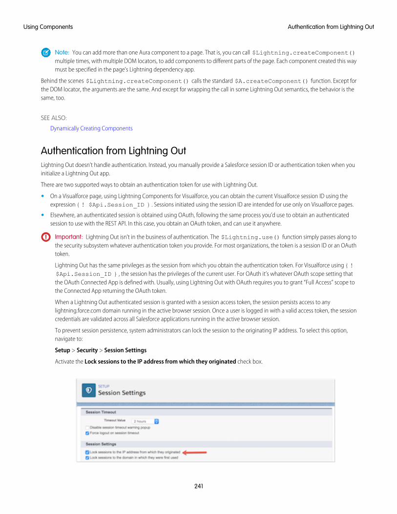
Note: You can add more than one Aura component to a page. That is, you can call $Lightning.createComponent()multiple times, with multiple DOM locators, to add components to different parts of the page. Each component created this waymust be specified in the page’s Lightning dependency app.
Behind the scenes $Lightning.createComponent() calls the standard $A.createComponent() function. Except forthe DOM locator, the arguments are the same. And except for wrapping the call in some Lightning Out semantics, the behavior is thesame, too.
SEE ALSO:
Dynamically Creating Components
Authentication from Lightning OutLightning Out doesn’t handle authentication. Instead, you manually provide a Salesforce session ID or authentication token when youinitialize a Lightning Out app.
There are two supported ways to obtain an authentication token for use with Lightning Out.
• On a Visualforce page, using Lightning Components for Visualforce, you can obtain the current Visualforce session ID using theexpression {! $Api.Session_ID }. Sessions initiated using the session ID are intended for use only on Visualforce pages.
• Elsewhere, an authenticated session is obtained using OAuth, following the same process you’d use to obtain an authenticatedsession to use with the REST API. In this case, you obtain an OAuth token, and can use it anywhere.
Important: Lightning Out isn’t in the business of authentication. The $Lightning.use() function simply passes along tothe security subsystem whatever authentication token you provide. For most organizations, the token is a session ID or an OAuthtoken.
Lightning Out has the same privileges as the session from which you obtain the authentication token. For Visualforce using {!$Api.Session_ID }, the session has the privileges of the current user. For OAuth it’s whatever OAuth scope setting thatthe OAuth Connected App is defined with. Usually, using Lightning Out with OAuth requires you to grant “Full Access” scope tothe Connected App returning the OAuth token.
When a Lightning Out authenticated session is granted with a session access token, the session persists access to anylightning.force.com domain running in the active browser session. Once a user is logged in with a valid access token, the sessioncredentials are validated across all Salesforce applications running in the active browser session.
To prevent session persistence, system administrators can lock the session to the originating IP address. To select this option,navigate to:
Setup > Security > Session Settings
Activate the Lock sessions to the IP address from which they originated check box.
241
Authentication from Lightning OutUsing Components
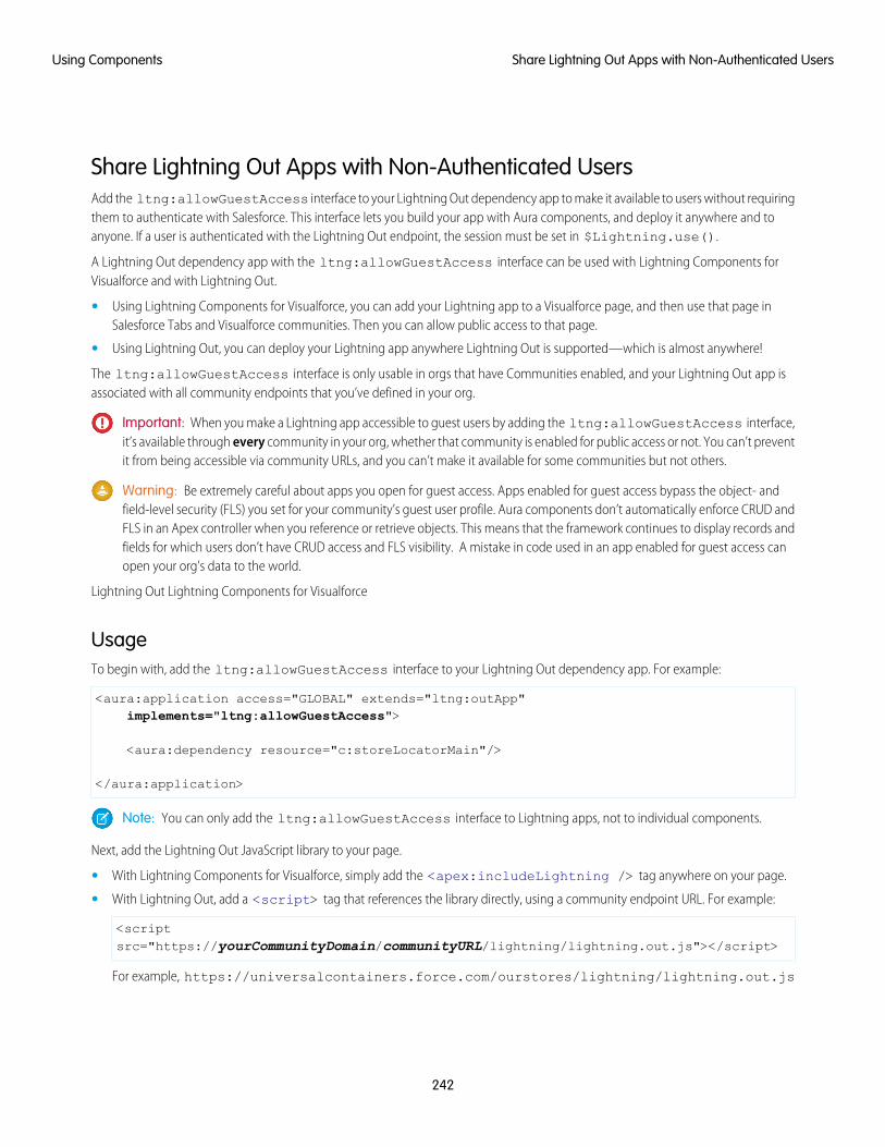
Share Lightning Out Apps with Non-Authenticated UsersAdd the ltng:allowGuestAccess interface to your Lightning Out dependency app to make it available to users without requiringthem to authenticate with Salesforce. This interface lets you build your app with Aura components, and deploy it anywhere and toanyone. If a user is authenticated with the Lightning Out endpoint, the session must be set in $Lightning.use().
A Lightning Out dependency app with the ltng:allowGuestAccess interface can be used with Lightning Components forVisualforce and with Lightning Out.
• Using Lightning Components for Visualforce, you can add your Lightning app to a Visualforce page, and then use that page inSalesforce Tabs and Visualforce communities. Then you can allow public access to that page.
• Using Lightning Out, you can deploy your Lightning app anywhere Lightning Out is supported—which is almost anywhere!
The ltng:allowGuestAccess interface is only usable in orgs that have Communities enabled, and your Lightning Out app isassociated with all community endpoints that you’ve defined in your org.
Important: When you make a Lightning app accessible to guest users by adding the ltng:allowGuestAccess interface,it’s available through every community in your org, whether that community is enabled for public access or not. You can’t preventit from being accessible via community URLs, and you can’t make it available for some communities but not others.
Warning: Be extremely careful about apps you open for guest access. Apps enabled for guest access bypass the object- andfield-level security (FLS) you set for your community’s guest user profile. Aura components don’t automatically enforce CRUD andFLS in an Apex controller when you reference or retrieve objects. This means that the framework continues to display records andfields for which users don’t have CRUD access and FLS visibility. A mistake in code used in an app enabled for guest access canopen your org’s data to the world.
Lightning Out Lightning Components for Visualforce
UsageTo begin with, add the ltng:allowGuestAccess interface to your Lightning Out dependency app. For example:
<aura:application access="GLOBAL" extends="ltng:outApp"implements="ltng:allowGuestAccess">
<aura:dependency resource="c:storeLocatorMain"/>
</aura:application>
Note: You can only add the ltng:allowGuestAccess interface to Lightning apps, not to individual components.
Next, add the Lightning Out JavaScript library to your page.
• With Lightning Components for Visualforce, simply add the <apex:includeLightning /> tag anywhere on your page.
• With Lightning Out, add a <script> tag that references the library directly, using a community endpoint URL. For example:
<scriptsrc="https://yourCommunityDomain/communityURL/lightning/lightning.out.js"></script>
For example, https://universalcontainers.force.com/ourstores/lightning/lightning.out.js
242
Share Lightning Out Apps with Non-Authenticated UsersUsing Components
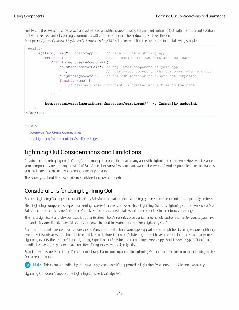
Finally, add the JavaScript code to load and activate your Lightning app. This code is standard Lightning Out, with the important additionthat you must use one of your org’s community URLs for the endpoint. The endpoint URL takes the formhttps://yourCommunityDomain/communityURL/. The relevant line is emphasized in the following sample.
<script>$Lightning.use("c:locatorApp", // name of the Lightning app
function() { // Callback once framework and app loaded$Lightning.createComponent(
"c:storeLocatorMain", // top-level component of your app{ }, // attributes to set on the component when created"lightningLocator", // the DOM location to insert the componentfunction(cmp) {
// callback when component is created and active on the page}
);},'https://universalcontainers.force.com/ourstores/' // Community endpoint
);</script>
SEE ALSO:
Salesforce Help: Create Communities
Use Lightning Components in Visualforce Pages
Lightning Out Considerations and LimitationsCreating an app using Lightning Out is, for the most part, much like creating any app with Lightning components. However, becauseyour components are running “outside” of Salesforce, there are a few issues you want to be aware of. And it’s possible there are changesyou might need to make to your components or your app.
The issues you should be aware of can be divided into two categories.
Considerations for Using Lightning OutBecause Lightning Out apps run outside of any Salesforce container, there are things you need to keep in mind, and possibly address.
First, Lightning components depend on setting cookies in a user’s browser. Since Lightning Out runs Lightning components outside ofSalesforce, those cookies are “third-party” cookies. Your users need to allow third-party cookies in their browser settings.
The most significant and obvious issue is authentication. There’s no Salesforce container to handle authentication for you, so you haveto handle it yourself. This essential topic is discussed in detail in “Authentication from Lightning Out.”
Another important consideration is more subtle. Many important actions your apps support are accomplished by firing various Lightningevents. But events are sort of like that tree that falls in the forest. If no one’s listening, does it have an effect? In the case of many coreLightning events, the “listener” is the Lightning Experience or Salesforce app container, one.app. And if one.app isn’t there tohandle the events, they indeed have no effect. Firing those events silently fails.
Standard events are listed in the Component Library. Events not supported in Lightning Out include text similar to the following in theDocumentation tab:
Note: This event is handled by the one.app container. It’s supported in Lightning Experience and Salesforce app only.
Lightning Out doesn’t support the Lightning Console JavaScript API.
243
Lightning Out Considerations and LimitationsUsing Components
Limitations With Standard ComponentsWhile the core Lightning Out functionality is stable and complete, there are a few interactions with other Salesforce features that we’restill working on.
Chief among these is the standard components built into the Lightning Component framework. Many standard components don’tbehave correctly when used in a stand-alone context, such as Lightning Out, and Lightning Components for Visualforce, which is basedon Lightning Out. This is because the components implicitly depend on resources available in the one.app container.
Avoid this issue with your own components by making all of their dependencies explicit. Use ltng:require to reference all requiredJavaScript and CSS resources that aren’t embedded in the component itself.
If you’re using standard components in your apps, they might not be fully styled, or behave as documented, when they’re used inLightning Out or Lightning Components for Visualforce.
SEE ALSO:
Browser Support for Aura Components
Component Library
Authentication from Lightning Out
Use Lightning Components in Visualforce Pages
Lightning Container
Upload an app developed with a third-party framework as a static resource, and host the content in an Aura component usinglightning:container. Use lightning:container to use third-party frameworks like AngularJS or React within yourLightning pages.
The lightning:container component hosts content in an iframe. You can implement communication to and from the framedapplication, allowing it to interact with the Lightning component. lightning:container provides the message() method,which you can use in the JavaScript controller to send messages to the application. In the component, specify a method for handlingmessages with the onmessage attribute.
IN THIS SECTION:
Lightning Container Component Limits
Understand the limits of lightning:container.
The Lightning Realty App
The Lightning Realty App is a more robust example of messaging between the Lightning Container Component and Salesforce.
lightning-container NPM Module Reference
Use methods included in the lightning-container NPM module in your JavaScript code to send and receive messages to and fromyour custom Aura component, and to interact with the Salesforce REST API.
Using a Third-Party Frameworklightning:container allows you to use an app developed with a third-party framework, such as AngularJS or React, in an Auracomponent. Upload the app as a static resource.
Your application must have a launch page, which is specified with the lightning:container src attribute. By convention, thelaunch page is index.html, but you can specify another launch page by adding a manifest file to your static resource. The following
244
Lightning ContainerUsing Components
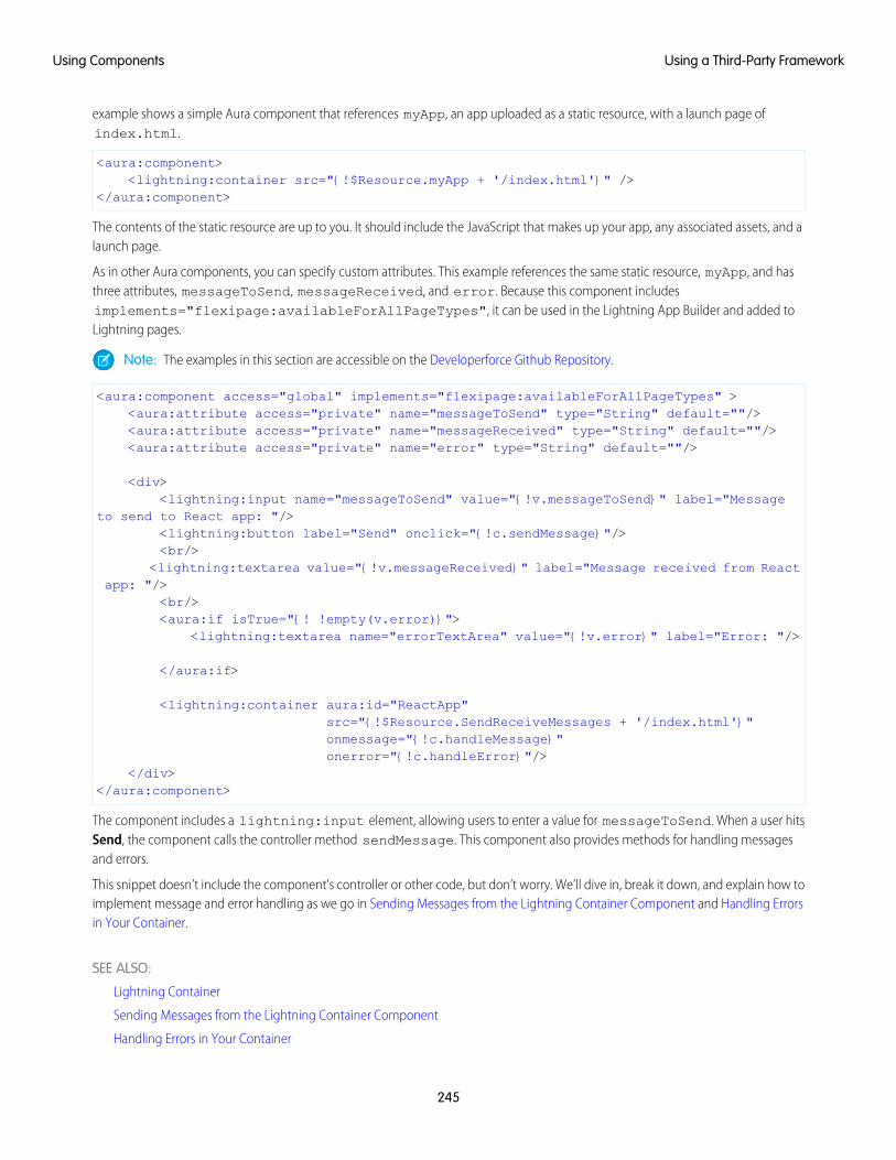
example shows a simple Aura component that references myApp, an app uploaded as a static resource, with a launch page ofindex.html.
<aura:component><lightning:container src="{!$Resource.myApp + '/index.html'}" />
</aura:component>
The contents of the static resource are up to you. It should include the JavaScript that makes up your app, any associated assets, and alaunch page.
As in other Aura components, you can specify custom attributes. This example references the same static resource, myApp, and hasthree attributes, messageToSend, messageReceived, and error. Because this component includesimplements="flexipage:availableForAllPageTypes", it can be used in the Lightning App Builder and added toLightning pages.
Note: The examples in this section are accessible on the Developerforce Github Repository.
<aura:component access="global" implements="flexipage:availableForAllPageTypes" ><aura:attribute access="private" name="messageToSend" type="String" default=""/><aura:attribute access="private" name="messageReceived" type="String" default=""/><aura:attribute access="private" name="error" type="String" default=""/>
<div><lightning:input name="messageToSend" value="{!v.messageToSend}" label="Message
to send to React app: "/><lightning:button label="Send" onclick="{!c.sendMessage}"/><br/>
<lightning:textarea value="{!v.messageReceived}" label="Message received from Reactapp: "/>
<br/><aura:if isTrue="{! !empty(v.error)}">
<lightning:textarea name="errorTextArea" value="{!v.error}" label="Error: "/>
</aura:if>
<lightning:container aura:id="ReactApp"src="{!$Resource.SendReceiveMessages + '/index.html'}"onmessage="{!c.handleMessage}"onerror="{!c.handleError}"/>
</div></aura:component>
The component includes a lightning:input element, allowing users to enter a value for messageToSend. When a user hitsSend, the component calls the controller method sendMessage. This component also provides methods for handling messagesand errors.
This snippet doesn’t include the component’s controller or other code, but don’t worry. We’ll dive in, break it down, and explain how toimplement message and error handling as we go in Sending Messages from the Lightning Container Component and Handling Errorsin Your Container.
SEE ALSO:
Lightning Container
Sending Messages from the Lightning Container Component
Handling Errors in Your Container
245
Using a Third-Party FrameworkUsing Components
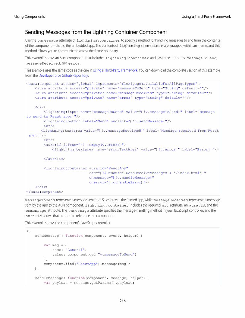
Sending Messages from the Lightning Container ComponentUse the onmessage attribute of lightning:container to specify a method for handling messages to and from the contentsof the component—that is, the embedded app. The contents of lightning:container are wrapped within an iframe, and thismethod allows you to communicate across the frame boundary.
This example shows an Aura component that includes lightning:container and has three attributes, messageToSend,messageReceived, and error.
This example uses the same code as the one in Using a Third-Party Framework. You can download the complete version of this examplefrom the Developerforce Github Repository.
<aura:component access="global" implements="flexipage:availableForAllPageTypes" ><aura:attribute access="private" name="messageToSend" type="String" default=""/><aura:attribute access="private" name="messageReceived" type="String" default=""/><aura:attribute access="private" name="error" type="String" default=""/>
<div><lightning:input name="messageToSend" value="{!v.messageToSend}" label="Message
to send to React app: "/><lightning:button label="Send" onclick="{!c.sendMessage}"/><br/>
<lightning:textarea value="{!v.messageReceived}" label="Message received from Reactapp: "/>
<br/><aura:if isTrue="{! !empty(v.error)}">
<lightning:textarea name="errorTextArea" value="{!v.error}" label="Error: "/>
</aura:if>
<lightning:container aura:id="ReactApp"src="{!$Resource.SendReceiveMessages + '/index.html'}"onmessage="{!c.handleMessage}"onerror="{!c.handleError}"/>
</div></aura:component>
messageToSend represents a message sent from Salesforce to the framed app, while messageReceived represents a messagesent by the app to the Aura component. lightning:container includes the required src attribute, an aura:id, and theonmessage attribute. The onmessage attribute specifies the message-handling method in your JavaScript controller, and theaura:id allows that method to reference the component.
This example shows the component’s JavaScript controller.
({sendMessage : function(component, event, helper) {
var msg = {name: "General",value: component.get("v.messageToSend")
};component.find("ReactApp").message(msg);
},
handleMessage: function(component, message, helper) {var payload = message.getParams().payload;
246
Using a Third-Party FrameworkUsing Components
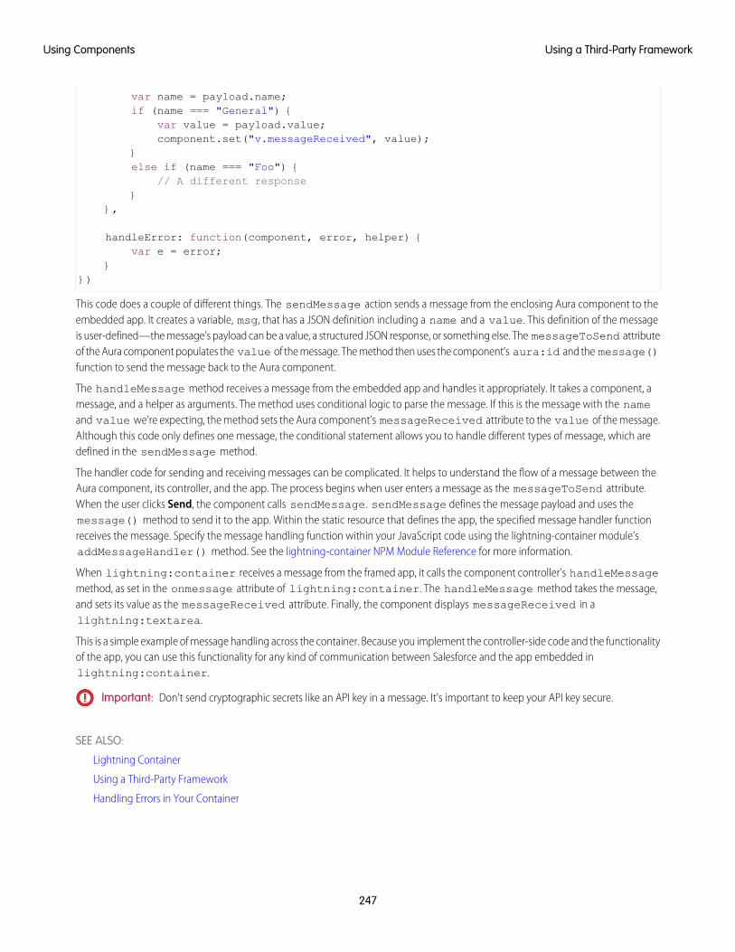
var name = payload.name;if (name === "General") {
var value = payload.value;component.set("v.messageReceived", value);
}else if (name === "Foo") {
// A different response}
},
handleError: function(component, error, helper) {var e = error;
}})
This code does a couple of different things. The sendMessage action sends a message from the enclosing Aura component to theembedded app. It creates a variable, msg, that has a JSON definition including a name and a value. This definition of the messageis user-defined—the message’s payload can be a value, a structured JSON response, or something else. The messageToSend attributeof the Aura component populates the value of the message. The method then uses the component’s aura:id and the message()function to send the message back to the Aura component.
The handleMessage method receives a message from the embedded app and handles it appropriately. It takes a component, amessage, and a helper as arguments. The method uses conditional logic to parse the message. If this is the message with the nameand value we’re expecting, the method sets the Aura component’s messageReceived attribute to the value of the message.Although this code only defines one message, the conditional statement allows you to handle different types of message, which aredefined in the sendMessage method.
The handler code for sending and receiving messages can be complicated. It helps to understand the flow of a message between theAura component, its controller, and the app. The process begins when user enters a message as the messageToSend attribute.When the user clicks Send, the component calls sendMessage. sendMessage defines the message payload and uses themessage() method to send it to the app. Within the static resource that defines the app, the specified message handler functionreceives the message. Specify the message handling function within your JavaScript code using the lightning-container module’saddMessageHandler() method. See the lightning-container NPM Module Reference for more information.
When lightning:container receives a message from the framed app, it calls the component controller’s handleMessagemethod, as set in the onmessage attribute of lightning:container. The handleMessage method takes the message,and sets its value as the messageReceived attribute. Finally, the component displays messageReceived in alightning:textarea.
This is a simple example of message handling across the container. Because you implement the controller-side code and the functionalityof the app, you can use this functionality for any kind of communication between Salesforce and the app embedded inlightning:container.
Important: Don't send cryptographic secrets like an API key in a message. It's important to keep your API key secure.
SEE ALSO:
Lightning Container
Using a Third-Party Framework
Handling Errors in Your Container
247
Using a Third-Party FrameworkUsing Components
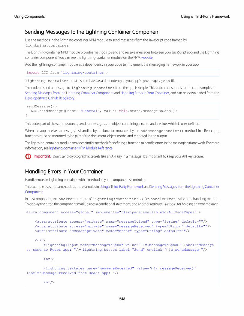
Sending Messages to the Lightning Container ComponentUse the methods in the lightning-container NPM module to send messages from the JavaScript code framed bylightning:container.
The Lightning-container NPM module provides methods to send and receive messages between your JavaScript app and the Lightningcontainer component. You can see the lightning-container module on the NPM website.
Add the lightning-container module as a dependency in your code to implement the messaging framework in your app.
import LCC from 'lightning-container';
lightning-container must also be listed as a dependency in your app’s package.json file.
The code to send a message to lightning:container from the app is simple. This code corresponds to the code samples inSending Messages from the Lightning Container Component and Handling Errors in Your Container, and can be downloaded from theDeveloperforce Github Repository.
sendMessage() {LCC.sendMessage({name: "General", value: this.state.messageToSend});
}
This code, part of the static resource, sends a message as an object containing a name and a value, which is user-defined.
When the app receives a message, it’s handled by the function mounted by the addMessageHandler() method. In a React app,functions must be mounted to be part of the document-object model and rendered in the output.
The lightning-container module provides similar methods for defining a function to handle errors in the messaging framework. For moreinformation, see lightning-container NPM Module Reference
Important: Don't send cryptographic secrets like an API key in a message. It's important to keep your API key secure.
Handling Errors in Your ContainerHandle errors in Lightning container with a method in your component’s controller.
This example uses the same code as the examples in Using a Third-Party Framework and Sending Messages from the Lightning ContainerComponent.
In this component, the onerror attribute of lightning:container specifies handleError as the error handling method.To display the error, the component markup uses a conditional statement, and another attribute, error, for holding an error message.
<aura:component access="global" implements="flexipage:availableForAllPageTypes" >
<aura:attribute access="private" name="messageToSend" type="String" default=""/><aura:attribute access="private" name="messageReceived" type="String" default=""/><aura:attribute access="private" name="error" type="String" default=""/>
<div><lightning:input name="messageToSend" value="{!v.messageToSend}" label="Message
to send to React app: "/><lightning:button label="Send" onclick="{!c.sendMessage}"/>
<br/>
<lightning:textarea name="messageReceived" value="{!v.messageReceived}"label="Message received from React app: "/>
<br/>
248
Using a Third-Party FrameworkUsing Components

<aura:if isTrue="{! !empty(v.error)}"><lightning:textarea name="errorMessage" value="{!v.error}" label="Error: "/>
</aura:if>
<lightning:container aura:id="ReactApp"src="{!$Resource.SendReceiveMessages + '/index.html'}"onmessage="{!c.handleMessage}"onerror="{!c.handleError}"/>
</div>
</aura:component>
This is the component’s controller.
({sendMessage : function(component, event, helper) {
var msg = {name: "General",value: component.get("v.messageToSend")
};component.find("ReactApp").message(msg);
},
handleMessage: function(component, message, helper) {var payload = message.getParams().payload;var name = payload.name;if (name === "General") {
var value = payload.value;component.set("v.messageReceived", value);
}else if (name === "Foo") {
// A different response}
},
handleError: function(component, error, helper) {var description = error.getParams().description;component.set("v.error", description);
}})
If the Lightning container application throws an error, the error handling function sets the error attribute. Then, in the componentmarkup, the conditional expression checks if the error attribute is empty. If it isn’t, the component populates a lightning:textareaelement with the error message stored in error.
SEE ALSO:
Lightning Container
Using a Third-Party Framework
Sending Messages from the Lightning Container Component
249
Using a Third-Party FrameworkUsing Components
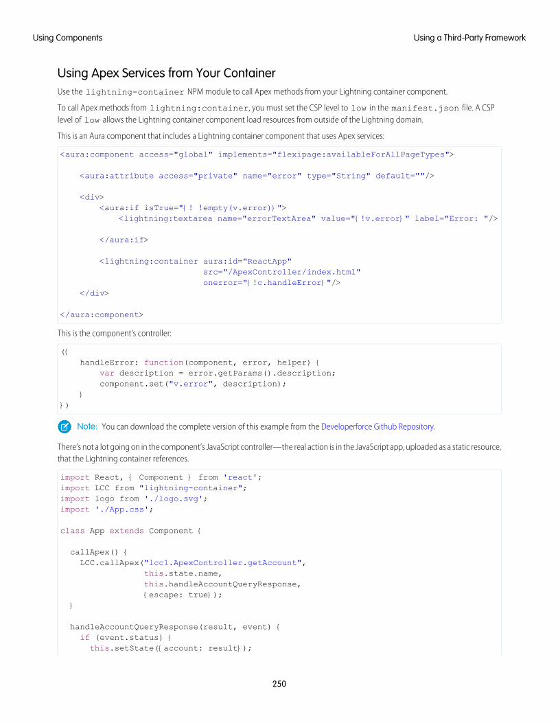
Using Apex Services from Your ContainerUse the lightning-container NPM module to call Apex methods from your Lightning container component.
To call Apex methods from lightning:container, you must set the CSP level to low in the manifest.json file. A CSPlevel of low allows the Lightning container component load resources from outside of the Lightning domain.
This is an Aura component that includes a Lightning container component that uses Apex services:
<aura:component access="global" implements="flexipage:availableForAllPageTypes">
<aura:attribute access="private" name="error" type="String" default=""/>
<div><aura:if isTrue="{! !empty(v.error)}">
<lightning:textarea name="errorTextArea" value="{!v.error}" label="Error: "/>
</aura:if>
<lightning:container aura:id="ReactApp"src="/ApexController/index.html"onerror="{!c.handleError}"/>
</div>
</aura:component>
This is the component’s controller:
({handleError: function(component, error, helper) {
var description = error.getParams().description;component.set("v.error", description);
}})
Note: You can download the complete version of this example from the Developerforce Github Repository.
There’s not a lot going on in the component’s JavaScript controller—the real action is in the JavaScript app, uploaded as a static resource,that the Lightning container references.
import React, { Component } from 'react';import LCC from "lightning-container";import logo from './logo.svg';import './App.css';
class App extends Component {
callApex() {LCC.callApex("lcc1.ApexController.getAccount",
this.state.name,this.handleAccountQueryResponse,{escape: true});
}
handleAccountQueryResponse(result, event) {if (event.status) {this.setState({account: result});
250
Using a Third-Party FrameworkUsing Components
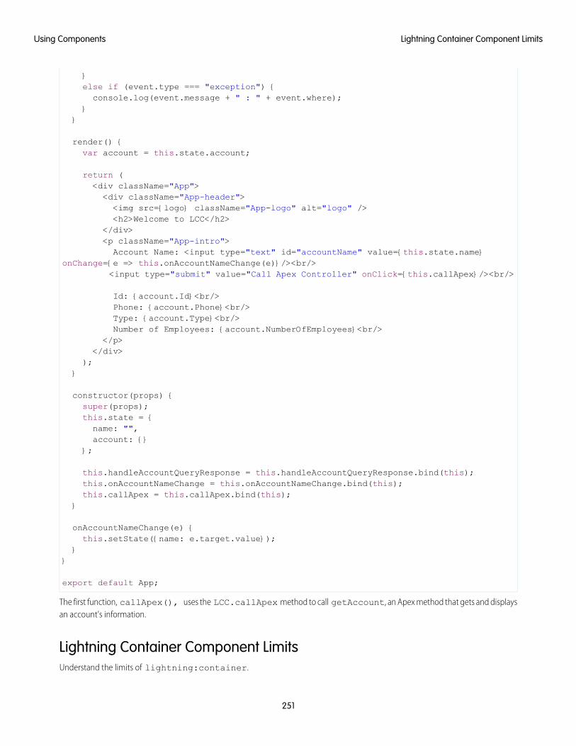
}else if (event.type === "exception") {console.log(event.message + " : " + event.where);
}}
render() {var account = this.state.account;
return (<div className="App"><div className="App-header"><img src={logo} className="App-logo" alt="logo" /><h2>Welcome to LCC</h2>
</div><p className="App-intro">Account Name: <input type="text" id="accountName" value={this.state.name}
onChange={e => this.onAccountNameChange(e)}/><br/><input type="submit" value="Call Apex Controller" onClick={this.callApex}/><br/>
Id: {account.Id}<br/>Phone: {account.Phone}<br/>Type: {account.Type}<br/>Number of Employees: {account.NumberOfEmployees}<br/>
</p></div>
);}
constructor(props) {super(props);this.state = {name: "",account: {}
};
this.handleAccountQueryResponse = this.handleAccountQueryResponse.bind(this);this.onAccountNameChange = this.onAccountNameChange.bind(this);this.callApex = this.callApex.bind(this);
}
onAccountNameChange(e) {this.setState({name: e.target.value});
}}
export default App;
The first function, callApex(), uses the LCC.callApex method to call getAccount, an Apex method that gets and displaysan account’s information.
Lightning Container Component LimitsUnderstand the limits of lightning:container.
251
Lightning Container Component LimitsUsing Components

lightning:container has known limitations. You might observe performance and scrolling issues associated with the use ofiframes. This component isn’t designed for the multi-page model, and it doesn’t integrate with browser navigation history.
If you navigate away from the page and a lightning:container component is on, the component doesn’t automaticallyremember its state. The content within the iframe doesn’t use the same offline and caching schemes as the rest of Lightning Experience.
Creating a Lightning app that loads a Lightning container static resource from another namespace is not supported. If you install apackage, your apps should use the custom Lightning components published by that package, not their static resources directly. Anystatic resource you use as the lightning:container src attribute should have your own namespace.
Previous versions of lightning:container allowed developers to specify the Content Security Policy (CSP) of the iframed content.We removed this functionality for security reasons. The CSP level of all pages is now set to high. This value provides the greatest security,because content can only be loaded from secure, approved domains. When lightning:container is used in Communities, theCSP setting in that community will be respected.
Apps that use lightning:container should work with data, not metadata. Don’t use the session key for your app to managecustom objects or fields. You can use the session key to create and update object records.
Content in lightning:container is served from the Lightning container domain and is available in Lightning Experience,Lightning Communities, and the Salesforce mobile app. lightning:container can’t be used in Lightning pages that aren’tserved from the Lightning domain, such as Visualforce pages or in external apps through Lightning Out.
IN THIS SECTION:
Lightning Container Component Security Requirements
Ensure that your Lightning container components meet security requirements.
SEE ALSO:
Lightning Container
Salesforce Help: Content Security Policy in Communities
Lightning Container Component Security RequirementsEnsure that your Lightning container components meet security requirements.
Namespace ValidityThe Lightning container component’s security measures check the validity of its namespaces. Suppose that you develop a<lightning:container> component with the namespace “vendor1.” The static resource’s namespace must also be “vendor1.”If they don’t match, an error message appears.
<aura:component><lightning:containersrc="{!$Resource.vendor1__resource + '/code_belonging_to_vendor1'}"onmessage="{!c.vendor1__handles}"/>
<aura:component>
252
Lightning Container Component LimitsUsing Components
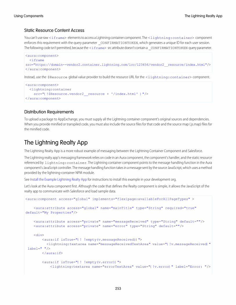
Static Resource Content AccessYou can’t use raw <iframe> elements to access a Lightning container component. The <lightning:container> componentenforces this requirement with the query parameter _CONFIRMATIONTOKEN, which generates a unique ID for each user session.The following code isn’t permitted, because the <iframe> src attribute doesn’t contain a _CONFIRMATIONTOKEN query parameter.
<aura:component><iframe
src="https://domain--vendor2.container.lightning.com/lcc/123456/vendor2__resource/index.html"/></aura:component>
Instead, use the $Resource global value provider to build the resource URL for the <lightning:container> component.
<aura:component><lightning:containersrc="{!$Resource.vendor2__resource + '/index.html' }"/>
</aura:component>
Distribution RequirementsTo upload a package to AppExchange, you must supply all the Lightning container component’s original sources and dependencies.When you provide minified or transpiled code, you must also include the source files for that code and the source map (.js.map) files forthe minified code.
The Lightning Realty AppThe Lightning Realty App is a more robust example of messaging between the Lightning Container Component and Salesforce.
The Lightning realty app’s messaging framework relies on code in an Aura component, the component’s handler, and the static resourcereferenced by lightning:container. The Lightning container component points to the message handling function in the Auracomponent’s JavaScript controller. The message handling function takes in a message sent by the source JavaScript, which uses a methodprovided by the lightning-container NPM module.
See Install the Example Lightning Realty App for instructions to install this example in your development org.
Let’s look at the Aura component first. Although the code that defines the Realty component is simple, it allows the JavaScript of therealty app to communicate with Salesforce and load sample data.
<aura:component access="global" implements="flexipage:availableForAllPageTypes" >
<aura:attribute access="global" name="mainTitle" type="String" required="true"default="My Properties"/>
<aura:attribute access="private" name="messageReceived" type="String" default=""/><aura:attribute access="private" name="error" type="String" default=""/>
<div><aura:if isTrue="{! !empty(v.messageReceived)}">
<lightning:textarea name="messageReceivedTextArea" value="{!v.messageReceived}"label=" "/>
</aura:if>
<aura:if isTrue="{! !empty(v.error)}"><lightning:textarea name="errorTextArea" value="{!v.error}" label="Error: "/>
253
The Lightning Realty AppUsing Components
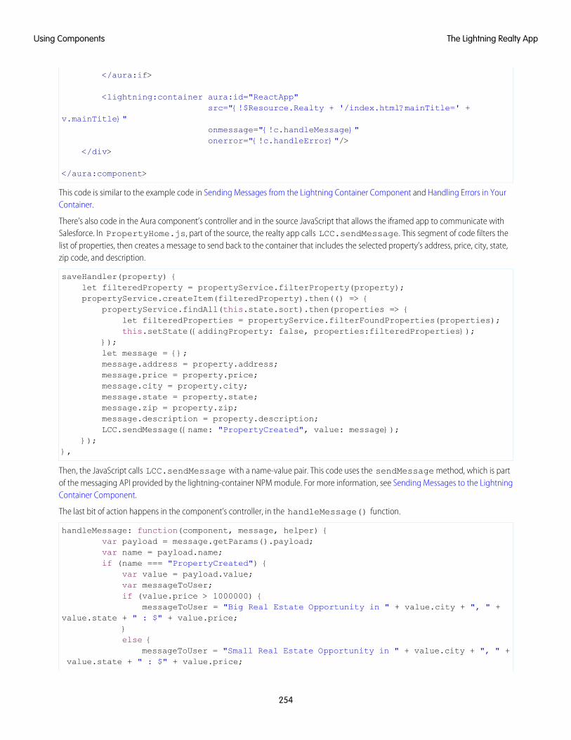
</aura:if>
<lightning:container aura:id="ReactApp"src="{!$Resource.Realty + '/index.html?mainTitle=' +
v.mainTitle}"onmessage="{!c.handleMessage}"onerror="{!c.handleError}"/>
</div>
</aura:component>
This code is similar to the example code in Sending Messages from the Lightning Container Component and Handling Errors in YourContainer.
There’s also code in the Aura component’s controller and in the source JavaScript that allows the iframed app to communicate withSalesforce. In PropertyHome.js, part of the source, the realty app calls LCC.sendMessage. This segment of code filters thelist of properties, then creates a message to send back to the container that includes the selected property’s address, price, city, state,zip code, and description.
saveHandler(property) {let filteredProperty = propertyService.filterProperty(property);propertyService.createItem(filteredProperty).then(() => {
propertyService.findAll(this.state.sort).then(properties => {let filteredProperties = propertyService.filterFoundProperties(properties);this.setState({addingProperty: false, properties:filteredProperties});
});let message = {};message.address = property.address;message.price = property.price;message.city = property.city;message.state = property.state;message.zip = property.zip;message.description = property.description;LCC.sendMessage({name: "PropertyCreated", value: message});
});},
Then, the JavaScript calls LCC.sendMessage with a name-value pair. This code uses the sendMessage method, which is partof the messaging API provided by the lightning-container NPM module. For more information, see Sending Messages to the LightningContainer Component.
The last bit of action happens in the component’s controller, in the handleMessage() function.
handleMessage: function(component, message, helper) {var payload = message.getParams().payload;var name = payload.name;if (name === "PropertyCreated") {
var value = payload.value;var messageToUser;if (value.price > 1000000) {
messageToUser = "Big Real Estate Opportunity in " + value.city + ", " +value.state + " : $" + value.price;
}else {
messageToUser = "Small Real Estate Opportunity in " + value.city + ", " +value.state + " : $" + value.price;
254
The Lightning Realty AppUsing Components
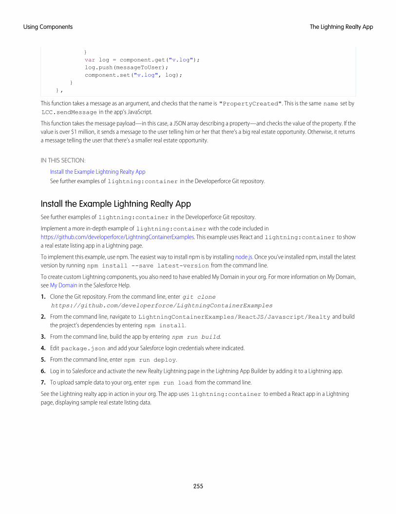
}var log = component.get("v.log");log.push(messageToUser);component.set("v.log", log);
}},
This function takes a message as an argument, and checks that the name is "PropertyCreated". This is the same name set byLCC.sendMessage in the app’s JavaScript.
This function takes the message payload—in this case, a JSON array describing a property—and checks the value of the property. If thevalue is over $1 million, it sends a message to the user telling him or her that there’s a big real estate opportunity. Otherwise, it returnsa message telling the user that there’s a smaller real estate opportunity.
IN THIS SECTION:
Install the Example Lightning Realty App
See further examples of lightning:container in the Developerforce Git repository.
Install the Example Lightning Realty AppSee further examples of lightning:container in the Developerforce Git repository.
Implement a more in-depth example of lightning:container with the code included inhttps://github.com/developerforce/LightningContainerExamples. This example uses React and lightning:container to showa real estate listing app in a Lightning page.
To implement this example, use npm. The easiest way to install npm is by installing node.js. Once you’ve installed npm, install the latestversion by running npm install --save latest-version from the command line.
To create custom Lightning components, you also need to have enabled My Domain in your org. For more information on My Domain,see My Domain in the Salesforce Help.
1. Clone the Git repository. From the command line, enter git clonehttps://github.com/developerforce/LightningContainerExamples
2. From the command line, navigate to LightningContainerExamples/ReactJS/Javascript/Realty and buildthe project’s dependencies by entering npm install.
3. From the command line, build the app by entering npm run build.
4. Edit package.json and add your Salesforce login credentials where indicated.
5. From the command line, enter npm run deploy.
6. Log in to Salesforce and activate the new Realty Lightning page in the Lightning App Builder by adding it to a Lightning app.
7. To upload sample data to your org, enter npm run load from the command line.
See the Lightning realty app in action in your org. The app uses lightning:container to embed a React app in a Lightningpage, displaying sample real estate listing data.
255
The Lightning Realty AppUsing Components
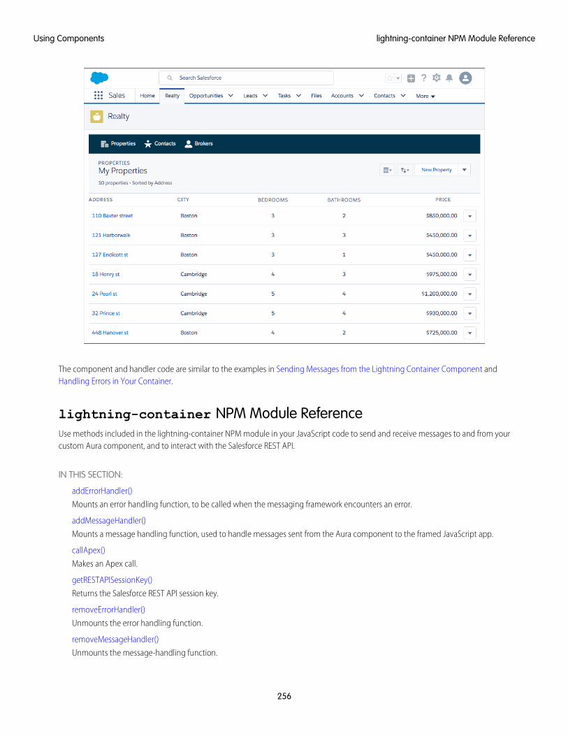
The component and handler code are similar to the examples in Sending Messages from the Lightning Container Component andHandling Errors in Your Container.
lightning-container NPM Module ReferenceUse methods included in the lightning-container NPM module in your JavaScript code to send and receive messages to and from yourcustom Aura component, and to interact with the Salesforce REST API.
IN THIS SECTION:
addErrorHandler()
Mounts an error handling function, to be called when the messaging framework encounters an error.
addMessageHandler()
Mounts a message handling function, used to handle messages sent from the Aura component to the framed JavaScript app.
callApex()
Makes an Apex call.
getRESTAPISessionKey()
Returns the Salesforce REST API session key.
removeErrorHandler()
Unmounts the error handling function.
removeMessageHandler()
Unmounts the message-handling function.
256
lightning-container NPM Module ReferenceUsing Components
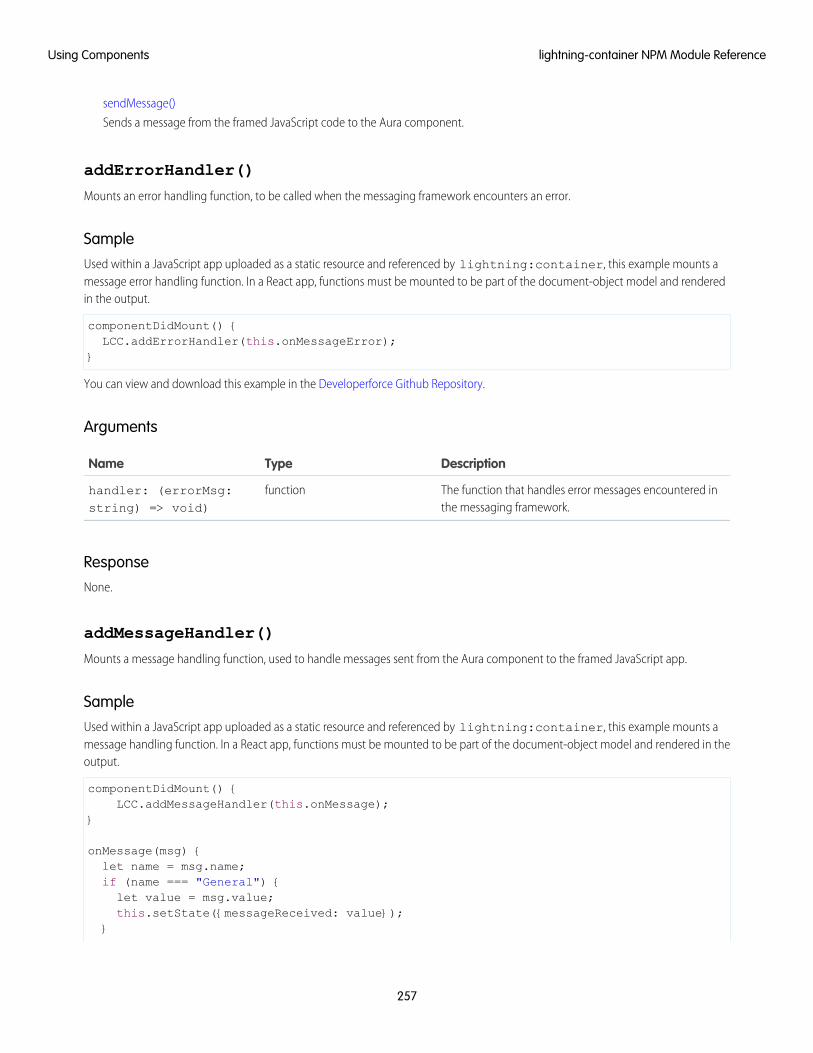
sendMessage()
Sends a message from the framed JavaScript code to the Aura component.
addErrorHandler()
Mounts an error handling function, to be called when the messaging framework encounters an error.
SampleUsed within a JavaScript app uploaded as a static resource and referenced by lightning:container, this example mounts amessage error handling function. In a React app, functions must be mounted to be part of the document-object model and renderedin the output.
componentDidMount() {LCC.addErrorHandler(this.onMessageError);
}
You can view and download this example in the Developerforce Github Repository.
Arguments
DescriptionTypeName
The function that handles error messages encountered inthe messaging framework.
functionhandler: (errorMsg:string) => void)
ResponseNone.
addMessageHandler()
Mounts a message handling function, used to handle messages sent from the Aura component to the framed JavaScript app.
SampleUsed within a JavaScript app uploaded as a static resource and referenced by lightning:container, this example mounts amessage handling function. In a React app, functions must be mounted to be part of the document-object model and rendered in theoutput.
componentDidMount() {LCC.addMessageHandler(this.onMessage);
}
onMessage(msg) {let name = msg.name;if (name === "General") {let value = msg.value;this.setState({messageReceived: value});
}
257
lightning-container NPM Module ReferenceUsing Components
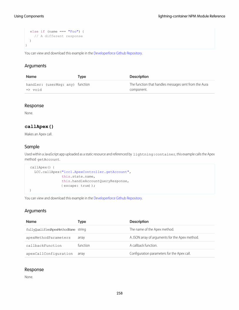
else if (name === "Foo") {// A different response
}}
You can view and download this example in the Developerforce Github Repository.
Arguments
DescriptionTypeName
The function that handles messages sent from the Auracomponent.
functionhandler: (userMsg: any)=> void
ResponseNone.
callApex()
Makes an Apex call.
SampleUsed within a JavaScript app uploaded as a static resource and referenced by lightning:container, this example calls the Apexmethod getAccount.
callApex() {LCC.callApex("lcc1.ApexController.getAccount",
this.state.name,this.handleAccountQueryResponse,{escape: true});
}
You can view and download this example in the Developerforce Github Repository.
Arguments
DescriptionTypeName
The name of the Apex method.stringfullyQualifiedApexMethodName
A JSON array of arguments for the Apex method.arrayapexMethodParameters
A callback function.functioncallbackFunction
Configuration parameters for the Apex call.arrayapexCallConfiguration
ResponseNone.
258
lightning-container NPM Module ReferenceUsing Components
getRESTAPISessionKey()
Returns the Salesforce REST API session key.
Use this method when your embedded app needs to interact with the Salesforce REST API, such as executing a SOQL query.
Don’t use the session key to manage custom objects or fields. You can use the session key to create and update object records. Appsthat use lightning:container should work with data, not metadata.
Important: It's important to keep your API key secure. Don't give this key to code you don't trust, and don't include it in URLs orhyperlinks, even to another page in your app.
Salesforce uses the no-referrer policy to protect against leaking your app's URL to outside servers, such as image hosts. However,this policy doesn't protect some browsers, meaning your app's URLs could be included in outside requests.
SampleUsed within a JavaScript app uploaded as a static resource and referenced by lightning:container, this example gets the RESTAPI session key and uses it to execute a SOQL query.
componentDidMount() {let sid = LCC.getRESTAPISessionKey();let conn = new JSForce.Connection({accessToken: sid});conn.query("SELECT Id, Name from Account LIMIT 50", this.handleAccountQueryResponse);
}
You can view and download this example in the Developerforce Github Repository.
ArgumentsNone.
Response
DescriptionTypeName
The REST API session key.stringkey
removeErrorHandler()
Unmounts the error handling function.
When using React, it’s necessary to unmount functions to remove them from the DOM and perform necessary cleanup.
SampleUsed within a JavaScript app uploaded as a static resource and referenced by lightning:container, this example unmounts amessage error handling function. In a React app, functions must be mounted to be part of the document-object model and renderedin the output.
componentWillUnmount() {LCC.removeErrorHandler(this.onMessageError);
}
259
lightning-container NPM Module ReferenceUsing Components
You can view and download this example in the Developerforce Github Repository.
Arguments
DescriptionTypeName
The function that handles error messages encountered inthe messaging framework.
functionhandler: (errorMsg:string) => void)
ResponseNone.
removeMessageHandler()
Unmounts the message-handling function.
When using React, it’s necessary to unmount functions to remove them from the DOM and perform necessary cleanup.
SampleUsed within a JavaScript app uploaded as a static resource and referenced by lightning:container, this example unmounts amessage handling function.
componentWillUnmount() {LCC.removeMessageHandler(this.onMessage);
}
You can view and download this example in the Developerforce Github Repository.
Arguments
DescriptionTypeName
The function that handles messages sent from the Auracomponent.
functionhandler: (userMsg: any)=> void
ResponseNone.
sendMessage()
Sends a message from the framed JavaScript code to the Aura component.
260
lightning-container NPM Module ReferenceUsing Components
SampleUsed within a JavaScript app uploaded as a static resource and referenced by lightning:container, this example sends amessage from the app to lightning:container.
sendMessage() {LCC.sendMessage({name: "General", value: this.state.messageToSend});
}
You can view and download this example in the Developerforce Github Repository.
Arguments
DescriptionTypeName
While the data sent in the message is entirely under yourcontrol, by convention it’s an object with name and valuefields.
anyuserMsg
ResponseNone.
261
lightning-container NPM Module ReferenceUsing Components
CHAPTER 5 Communicating with Events
The framework uses event-driven programming. You write handlers that respond to interface events asthey occur. The events may or may not have been triggered by user interaction.
In this chapter ...
• Actions and EventsIn the Aura Components programming model, events are fired from JavaScript controller actions. Eventscan contain attributes that can be set before the event is fired and read when the event is handled.• Handling Events with
Client-SideControllers Events are declared by the aura:event tag in a .evt resource, and they can have one of two types:
component or application.• Component EventsComponent Events
A component event is fired from an instance of a component. A component event can be handledby the component that fired the event or by a component in the containment hierarchy that receivesthe event.
• Application Events
• Event HandlingLifecycle
• Advanced EventsExample Application Events
Application events follow a traditional publish-subscribe model. An application event is fired froman instance of a component. All components that provide a handler for the event are notified.
• Firing Events fromNon-Aura Code
Note: Always try to use a component event instead of an application event, if possible. Componentevents can only be handled by components above them in the containment hierarchy so their
• Events Best Practices
• Events Fired Duringthe RenderingLifecycle
usage is more localized to the components that need to know about them. Application eventsare best used for something that should be handled at the application level, such as navigatingto a specific record. Application events allow communication between components that are inseparate parts of the application and have no direct containment relationship.
• Events Handled inthe Salesforce MobileApp and LightningExperience
• System Events
262
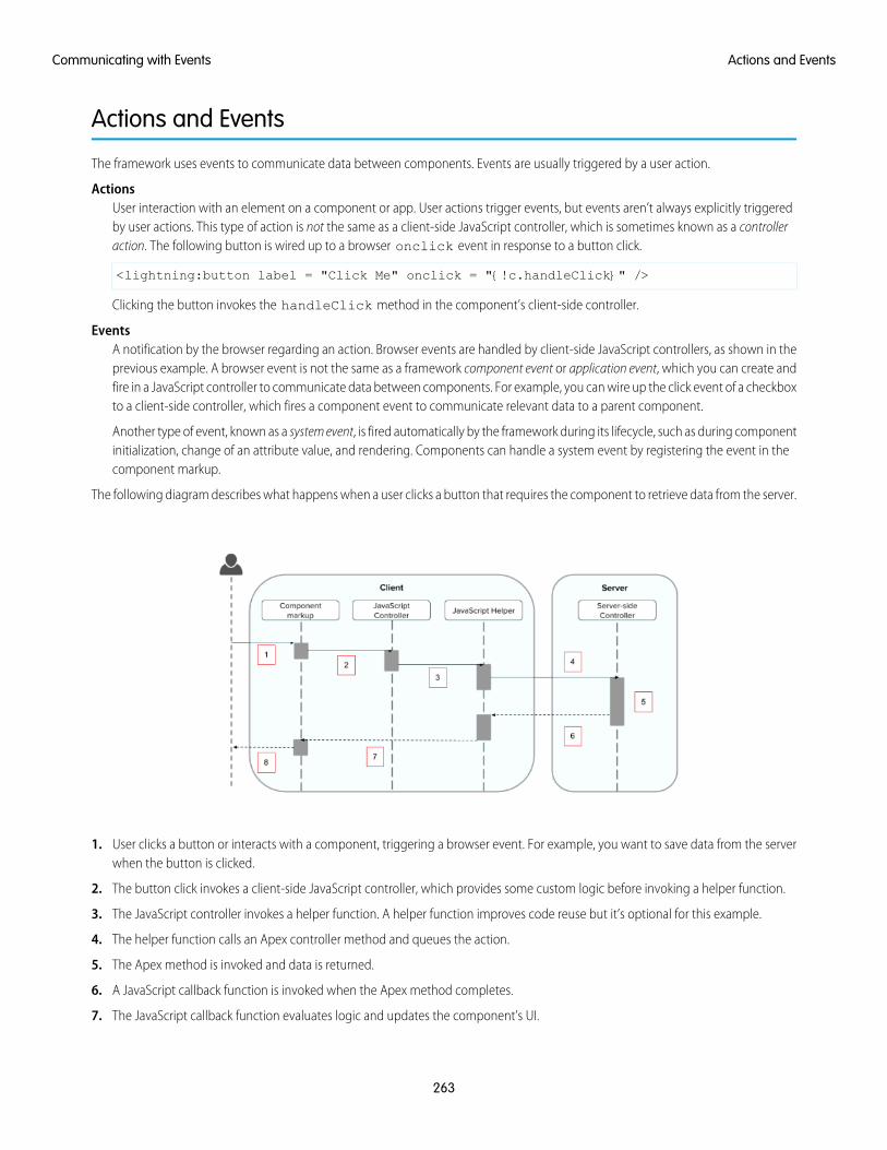
Actions and Events
The framework uses events to communicate data between components. Events are usually triggered by a user action.
ActionsUser interaction with an element on a component or app. User actions trigger events, but events aren’t always explicitly triggeredby user actions. This type of action is not the same as a client-side JavaScript controller, which is sometimes known as a controlleraction. The following button is wired up to a browser onclick event in response to a button click.
<lightning:button label = "Click Me" onclick = "{!c.handleClick}" />
Clicking the button invokes the handleClick method in the component’s client-side controller.
EventsA notification by the browser regarding an action. Browser events are handled by client-side JavaScript controllers, as shown in theprevious example. A browser event is not the same as a framework component event or application event, which you can create andfire in a JavaScript controller to communicate data between components. For example, you can wire up the click event of a checkboxto a client-side controller, which fires a component event to communicate relevant data to a parent component.
Another type of event, known as a system event, is fired automatically by the framework during its lifecycle, such as during componentinitialization, change of an attribute value, and rendering. Components can handle a system event by registering the event in thecomponent markup.
The following diagram describes what happens when a user clicks a button that requires the component to retrieve data from the server.
1. User clicks a button or interacts with a component, triggering a browser event. For example, you want to save data from the serverwhen the button is clicked.
2. The button click invokes a client-side JavaScript controller, which provides some custom logic before invoking a helper function.
3. The JavaScript controller invokes a helper function. A helper function improves code reuse but it’s optional for this example.
4. The helper function calls an Apex controller method and queues the action.
5. The Apex method is invoked and data is returned.
6. A JavaScript callback function is invoked when the Apex method completes.
7. The JavaScript callback function evaluates logic and updates the component’s UI.
263
Actions and EventsCommunicating with Events
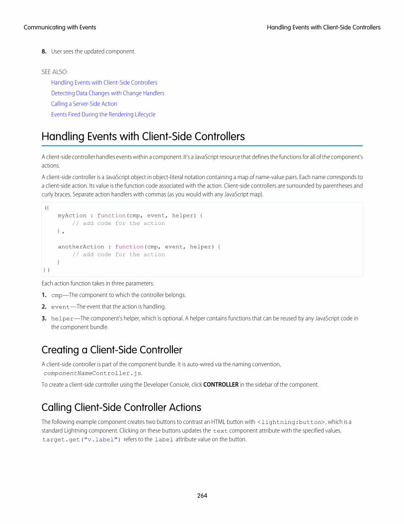
8. User sees the updated component.
SEE ALSO:
Handling Events with Client-Side Controllers
Detecting Data Changes with Change Handlers
Calling a Server-Side Action
Events Fired During the Rendering Lifecycle
Handling Events with Client-Side Controllers
A client-side controller handles events within a component. It’s a JavaScript resource that defines the functions for all of the component’sactions.
A client-side controller is a JavaScript object in object-literal notation containing a map of name-value pairs. Each name corresponds toa client-side action. Its value is the function code associated with the action. Client-side controllers are surrounded by parentheses andcurly braces. Separate action handlers with commas (as you would with any JavaScript map).
({myAction : function(cmp, event, helper) {
// add code for the action},
anotherAction : function(cmp, event, helper) {// add code for the action
}})
Each action function takes in three parameters:
1. cmp—The component to which the controller belongs.
2. event—The event that the action is handling.
3. helper—The component’s helper, which is optional. A helper contains functions that can be reused by any JavaScript code inthe component bundle.
Creating a Client-Side ControllerA client-side controller is part of the component bundle. It is auto-wired via the naming convention,componentNameController.js.
To create a client-side controller using the Developer Console, click CONTROLLER in the sidebar of the component.
Calling Client-Side Controller ActionsThe following example component creates two buttons to contrast an HTML button with <lightning:button>, which is astandard Lightning component. Clicking on these buttons updates the text component attribute with the specified values.target.get("v.label") refers to the label attribute value on the button.
264
Handling Events with Client-Side ControllersCommunicating with Events
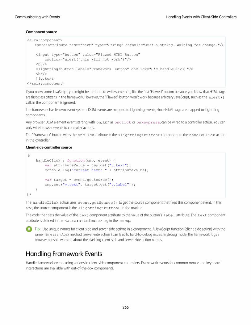
Component source
<aura:component><aura:attribute name="text" type="String" default="Just a string. Waiting for change."/>
<input type="button" value="Flawed HTML Button"onclick="alert('this will not work')"/>
<br/><lightning:button label="Framework Button" onclick="{!c.handleClick}"/><br/>{!v.text}
</aura:component>
If you know some JavaScript, you might be tempted to write something like the first "Flawed" button because you know that HTML tagsare first-class citizens in the framework. However, the "Flawed" button won't work because arbitrary JavaScript, such as the alert()call, in the component is ignored.
The framework has its own event system. DOM events are mapped to Lightning events, since HTML tags are mapped to Lightningcomponents.
Any browser DOM element event starting with on, such as onclick or onkeypress, can be wired to a controller action. You canonly wire browser events to controller actions.
The "Framework" button wires the onclick attribute in the <lightning:button> component to the handleClick actionin the controller.
Client-side controller source
({handleClick : function(cmp, event) {
var attributeValue = cmp.get("v.text");console.log("current text: " + attributeValue);
var target = event.getSource();cmp.set("v.text", target.get("v.label"));
}})
The handleClick action uses event.getSource() to get the source component that fired this component event. In thiscase, the source component is the <lightning:button> in the markup.
The code then sets the value of the text component attribute to the value of the button’s label attribute. The text componentattribute is defined in the <aura:attribute> tag in the markup.
Tip: Use unique names for client-side and server-side actions in a component. A JavaScript function (client-side action) with thesame name as an Apex method (server-side action ) can lead to hard-to-debug issues. In debug mode, the framework logs abrowser console warning about the clashing client-side and server-side action names.
Handling Framework EventsHandle framework events using actions in client-side component controllers. Framework events for common mouse and keyboardinteractions are available with out-of-the-box components.
265
Handling Events with Client-Side ControllersCommunicating with Events
Accessing Component AttributesIn the handleClick function, notice that the first argument to every action is the component to which the controller belongs. Oneof the most common things you'll want to do with this component is look at and change its attribute values.
cmp.get("v.attributeName") returns the value of the attributeName attribute.
cmp.set("v.attributeName", "attribute value") sets the value of the attributeName attribute.
Invoking Another Action in the ControllerTo call an action method from another method, put the common code in a helper function and invoke it usinghelper.someFunction(cmp).
SEE ALSO:
Sharing JavaScript Code in a Component Bundle
Event Handling Lifecycle
Creating Server-Side Logic with Controllers
Component Events
A component event is fired from an instance of a component. A component event can be handled by the component that fired theevent or by a component in the containment hierarchy that receives the event.
IN THIS SECTION:
Component Event Propagation
The framework supports capture and bubble phases for the propagation of component events. These phases are similar to DOMhandling patterns and provide an opportunity for interested components to interact with an event and potentially control thebehavior for subsequent handlers.
Create Custom Component Events
Create a custom component event using the <aura:event> tag in a .evt resource. Events can contain attributes that canbe set before the event is fired and read when the event is handled.
Fire Component Events
Fire a component event to communicate data to another component. A component event can be handled by the component thatfired the event or by a component in the containment hierarchy that receives the event.
266
Component EventsCommunicating with Events
Handling Component Events
A component event can be handled by the component that fired the event or by a component in the containment hierarchy thatreceives the event.
SEE ALSO:
aura:method
Application Events
Handling Events with Client-Side Controllers
Advanced Events Example
What is Inherited?
Component Event PropagationThe framework supports capture and bubble phases for the propagation of component events. These phases are similar to DOM handlingpatterns and provide an opportunity for interested components to interact with an event and potentially control the behavior forsubsequent handlers.
The component that fires an event is known as the source component. The framework allows you to handle the event in different phases.These phases give you flexibility for how to best process the event for your application.
The phases are:
CaptureThe event is captured and trickles down from the application root to the source component. The event can be handled by a componentin the containment hierarchy that receives the captured event.
Event handlers are invoked in order from the application root down to the source component that fired the event.
Any registered handler in this phase can stop the event from propagating, at which point no more handlers are called in this phaseor the bubble phase.
BubbleThe component that fired the event can handle it. The event then bubbles up from the source component to the application root.The event can be handled by a component in the containment hierarchy that receives the bubbled event.
Event handlers are invoked in order from the source component that fired the event up to the application root.
Any registered handler in this phase can stop the event from propagating, at which point no more handlers are called in this phase.
Here’s the sequence of component event propagation.
1. Event fired—A component event is fired.
2. Capture phase—The framework executes the capture phase from the application root to the source component until all componentsare traversed. Any handling event can stop propagation by calling stopPropagation() on the event.
3. Bubble phase—The framework executes the bubble phase from the source component to the application root until all componentsare traversed or stopPropagation() is called.
Note: Application events have a separate default phase. There’s no separate default phase for component events. The defaultphase is the bubble phase.
267
Component Event PropagationCommunicating with Events
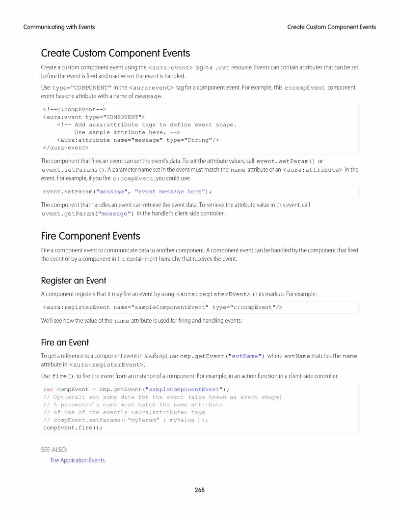
Create Custom Component EventsCreate a custom component event using the <aura:event> tag in a .evt resource. Events can contain attributes that can be setbefore the event is fired and read when the event is handled.
Use type="COMPONENT" in the <aura:event> tag for a component event. For example, this c:compEvent componentevent has one attribute with a name of message.
<!--c:compEvent--><aura:event type="COMPONENT">
<!-- Add aura:attribute tags to define event shape.One sample attribute here. -->
<aura:attribute name="message" type="String"/></aura:event>
The component that fires an event can set the event’s data. To set the attribute values, call event.setParam() orevent.setParams(). A parameter name set in the event must match the name attribute of an <aura:attribute> in theevent. For example, if you fire c:compEvent, you could use:
event.setParam("message", "event message here");
The component that handles an event can retrieve the event data. To retrieve the attribute value in this event, callevent.getParam("message") in the handler’s client-side controller.
Fire Component EventsFire a component event to communicate data to another component. A component event can be handled by the component that firedthe event or by a component in the containment hierarchy that receives the event.
Register an EventA component registers that it may fire an event by using <aura:registerEvent> in its markup. For example:
<aura:registerEvent name="sampleComponentEvent" type="c:compEvent"/>
We’ll see how the value of the name attribute is used for firing and handling events.
Fire an EventTo get a reference to a component event in JavaScript, use cmp.getEvent("evtName") where evtName matches the nameattribute in <aura:registerEvent>.
Use fire() to fire the event from an instance of a component. For example, in an action function in a client-side controller:
var compEvent = cmp.getEvent("sampleComponentEvent");// Optional: set some data for the event (also known as event shape)// A parameter’s name must match the name attribute// of one of the event’s <aura:attribute> tags// compEvent.setParams({"myParam" : myValue });compEvent.fire();
SEE ALSO:
Fire Application Events
268
Create Custom Component EventsCommunicating with Events
Handling Component EventsA component event can be handled by the component that fired the event or by a component in the containment hierarchy that receivesthe event.
Use <aura:handler> in the markup of the handler component. For example:
<aura:handler name="sampleComponentEvent" event="c:compEvent"action="{!c.handleComponentEvent}"/>
The name attribute in <aura:handler> must match the name attribute in the <aura:registerEvent> tag in thecomponent that fires the event.
The action attribute of <aura:handler> sets the client-side controller action to handle the event.
The event attribute specifies the event being handled. The format is namespace:eventName.
In this example, when the event is fired, the handleComponentEvent client-side controller action is called.
Event Handling PhasesComponent event handlers are associated with the bubble phase by default. To add a handler for the capture phase instead, use thephase attribute.
<aura:handler name="sampleComponentEvent" event="ns:eventName"action="{!c.handleComponentEvent}" phase="capture" />
Get the Source of an EventIn the client-side controller action for an <aura:handler> tag, use evt.getSource() to find out which component fired theevent, where evt is a reference to the event. To retrieve the source element, use evt.getSource().getElement().
IN THIS SECTION:
Component Handling Its Own Event
A component can handle its own event by using the <aura:handler> tag in its markup.
Handle Component Event of Instantiated Component
A parent component can set a handler action when it instantiates a child component in its markup.
Handling Bubbled or Captured Component Events
Event propagation rules determine which components in the containment hierarchy can handle events by default in the bubble orcapture phases. Learn about the rules and how to handle events in the bubble or capture phases.
Handling Component Events Dynamically
A component can have its handler bound dynamically via JavaScript. This is useful if a component is created in JavaScript on theclient-side.
SEE ALSO:
Component Event Propagation
Handling Application Events
269
Handling Component EventsCommunicating with Events
Component Handling Its Own EventA component can handle its own event by using the <aura:handler> tag in its markup.
The action attribute of <aura:handler> sets the client-side controller action to handle the event. For example:
<aura:registerEvent name="sampleComponentEvent" type="c:compEvent"/><aura:handler name="sampleComponentEvent" event="c:compEvent"
action="{!c.handleSampleEvent}"/>
Note: The name attributes in <aura:registerEvent> and <aura:handler> must match, since each event isdefined by its name.
SEE ALSO:
Handle Component Event of Instantiated Component
Handle Component Event of Instantiated ComponentA parent component can set a handler action when it instantiates a child component in its markup.
Let’s a look at an example. c:child registers that it may fire a sampleComponentEvent event by using<aura:registerEvent> in its markup.
<!-- c:child --><aura:component>
<aura:registerEvent name="sampleComponentEvent" type="c:compEvent"/></aura:component>
c:parent sets a handler for this event when it instantiates c:child in its markup.
<!-- parent.cmp --><aura:component>
<c:child sampleComponentEvent="{!c.handleChildEvent}"/></aura:component>
Note how c:parent uses the following syntax to set a handler for the sampleComponentEvent event fired by c:child.
<c:child sampleComponentEvent="{!c.handleChildEvent}"/>
The syntax looks similar to how you set an attribute called sampleComponentEvent. However, in this case,sampleComponentEvent isn’t an attribute. sampleComponentEvent matches the event name declared in c:child.
<aura:registerEvent name="sampleComponentEvent" type="c:compEvent"/>
The preceding syntax is a convenient shortcut for the normal way that a component declares a handler for an event. The parent componentcan only use this syntax to handle events from a direct descendent. If you want to be more explicit in c:parent that you’re handlingan event, or if the event might be fired by a component further down the component hierarchy, use an <aura:handler> taginstead of declaring the handler within the <c:child> tag.
<!-- parent.cmp --><aura:component>
<aura:handler name="sampleComponentEvent" event="c:compEvent"action="{!c.handleSampleEvent}"/>
<c:child /></aura:component>
270
Handling Component EventsCommunicating with Events
The two versions of c:parent markup behave the same. However, using <aura:handler> makes it more obvious that you’rehandling a sampleComponentEvent event.
SEE ALSO:
Component Handling Its Own Event
Handling Bubbled or Captured Component Events
Handling Bubbled or Captured Component EventsEvent propagation rules determine which components in the containment hierarchy can handle events by default in the bubble orcapture phases. Learn about the rules and how to handle events in the bubble or capture phases.
The framework supports capture and bubble phases for the propagation of component events. These phases are similar to DOM handlingpatterns and provide an opportunity for interested components to interact with an event and potentially control the behavior forsubsequent handlers. The capture phase executes before the bubble phase.
Default Event Propagation RulesBy default, every parent in the containment hierarchy can’t handle an event during the capture and bubble phases. Instead, the eventpropagates to every owner in the containment hierarchy.
A component’s owner is the component that is responsible for its creation. For declaratively created components, the owner is theoutermost component containing the markup that references the component firing the event. For programmatically created components,the owner component is the component that invoked $A.createComponent to create it.
The same rules apply for the capture phase, although the direction of event propagation (down) is the opposite of the bubble phase(up).
Confused? It makes more sense when you look at an example in the bubbling phase.
c:owner contains c:container, which in turn contains c:eventSource.
<!--c:owner--><aura:component>
<c:container><c:eventSource />
</c:container></aura:component>
If c:eventSource fires an event, it can handle the event itself. The event then bubbles up the containment hierarchy.
c:container contains c:eventSource but it’s not the owner because it’s not the outermost component in the markup, so itcan’t handle the bubbled event.
c:owner is the owner because c:container is in its markup. c:owner can handle the event.
Propagation to All Container ComponentsThe default behavior doesn’t allow an event to be handled by every parent in the containment hierarchy. Some components containother components but aren’t the owner of those components. These components are known as container components. In the example,c:container is a container component because it’s not the owner for c:eventSource. By default, c:container can’thandle events fired by c:eventSource.
271
Handling Component EventsCommunicating with Events
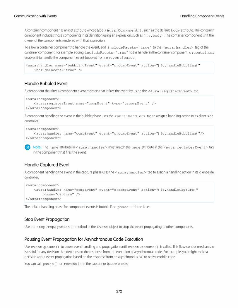
A container component has a facet attribute whose type is Aura.Component[], such as the default body attribute. The containercomponent includes those components in its definition using an expression, such as {!v.body}. The container component isn’t theowner of the components rendered with that expression.
To allow a container component to handle the event, add includeFacets="true" to the <aura:handler> tag of thecontainer component. For example, adding includeFacets="true" to the handler in the container component, c:container,enables it to handle the component event bubbled from c:eventSource.
<aura:handler name="bubblingEvent" event="c:compEvent" action="{!c.handleBubbling}"includeFacets="true" />
Handle Bubbled EventA component that fires a component event registers that it fires the event by using the <aura:registerEvent> tag.
<aura:component><aura:registerEvent name="compEvent" type="c:compEvent" />
</aura:component>
A component handling the event in the bubble phase uses the <aura:handler> tag to assign a handling action in its client-sidecontroller.
<aura:component><aura:handler name="compEvent" event="c:compEvent" action="{!c.handleBubbling}"/>
</aura:component>
Note: The name attribute in <aura:handler> must match the name attribute in the <aura:registerEvent> tagin the component that fires the event.
Handle Captured EventA component handling the event in the capture phase uses the <aura:handler> tag to assign a handling action in its client-sidecontroller.
<aura:component><aura:handler name="compEvent" event="c:compEvent" action="{!c.handleCapture}"
phase="capture" /></aura:component>
The default handling phase for component events is bubble if no phase attribute is set.
Stop Event PropagationUse the stopPropagation() method in the Event object to stop the event propagating to other components.
Pausing Event Propagation for Asynchronous Code ExecutionUse event.pause() to pause event handling and propagation until event.resume() is called. This flow-control mechanismis useful for any decision that depends on the response from the execution of asynchronous code. For example, you might make adecision about event propagation based on the response from an asynchronous call to native mobile code.
You can call pause() or resume() in the capture or bubble phases.
272
Handling Component EventsCommunicating with Events
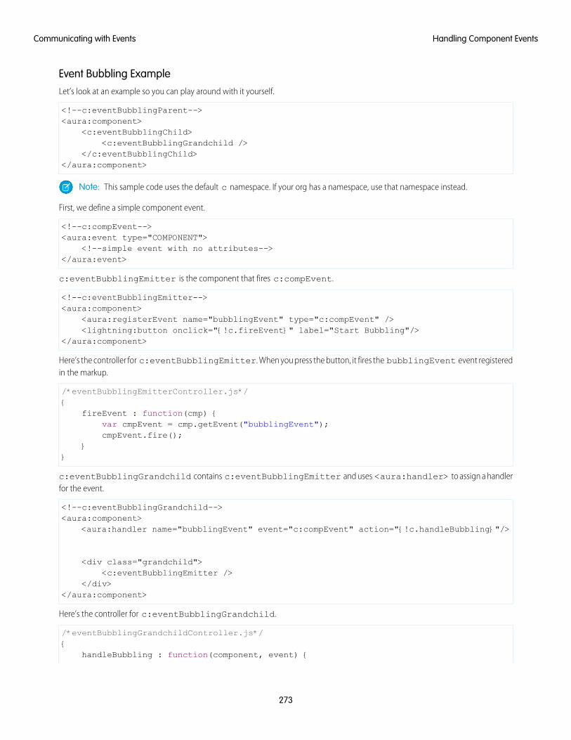
Event Bubbling ExampleLet’s look at an example so you can play around with it yourself.
<!--c:eventBubblingParent--><aura:component>
<c:eventBubblingChild><c:eventBubblingGrandchild />
</c:eventBubblingChild></aura:component>
Note: This sample code uses the default c namespace. If your org has a namespace, use that namespace instead.
First, we define a simple component event.
<!--c:compEvent--><aura:event type="COMPONENT">
<!--simple event with no attributes--></aura:event>
c:eventBubblingEmitter is the component that fires c:compEvent.
<!--c:eventBubblingEmitter--><aura:component>
<aura:registerEvent name="bubblingEvent" type="c:compEvent" /><lightning:button onclick="{!c.fireEvent}" label="Start Bubbling"/>
</aura:component>
Here’s the controller for c:eventBubblingEmitter. When you press the button, it fires the bubblingEvent event registeredin the markup.
/*eventBubblingEmitterController.js*/{
fireEvent : function(cmp) {var cmpEvent = cmp.getEvent("bubblingEvent");cmpEvent.fire();
}}
c:eventBubblingGrandchild contains c:eventBubblingEmitter and uses <aura:handler> to assign a handlerfor the event.
<!--c:eventBubblingGrandchild--><aura:component>
<aura:handler name="bubblingEvent" event="c:compEvent" action="{!c.handleBubbling}"/>
<div class="grandchild"><c:eventBubblingEmitter />
</div></aura:component>
Here’s the controller for c:eventBubblingGrandchild.
/*eventBubblingGrandchildController.js*/{
handleBubbling : function(component, event) {
273
Handling Component EventsCommunicating with Events

console.log("Grandchild handler for " + event.getName());}
}
The controller logs the event name when the handler is called.
Here’s the markup for c:eventBubblingChild. We will pass c:eventBubblingGrandchild in as the body ofc:eventBubblingChild when we create c:eventBubblingParent later in this example.
<!--c:eventBubblingChild--><aura:component>
<aura:handler name="bubblingEvent" event="c:compEvent" action="{!c.handleBubbling}"/>
<div class="child">{!v.body}
</div></aura:component>
Here’s the controller for c:eventBubblingChild.
/*eventBubblingChildController.js*/{
handleBubbling : function(component, event) {console.log("Child handler for " + event.getName());
}}
c:eventBubblingParent contains c:eventBubblingChild, which in turn contains c:eventBubblingGrandchild.
<!--c:eventBubblingParent--><aura:component>
<aura:handler name="bubblingEvent" event="c:compEvent" action="{!c.handleBubbling}"/>
<div class="parent"><c:eventBubblingChild>
<c:eventBubblingGrandchild /></c:eventBubblingChild>
</div></aura:component>
Here’s the controller for c:eventBubblingParent.
/*eventBubblingParentController.js*/{
handleBubbling : function(component, event) {console.log("Parent handler for " + event.getName());
}}
Now, let’s see what happens when you run the code.
1. In your browser, navigate to c:eventBubblingParent. Create a .app resource that contains<c:eventBubblingParent />.
2. Click the Start Bubbling button that is part of the markup in c:eventBubblingEmitter.
274
Handling Component EventsCommunicating with Events

3. Note the output in your browser’s console:
Grandchild handler for bubblingEventParent handler for bubblingEvent
The c:compEvent event is bubbled to c:eventBubblingGrandchild and c:eventBubblingParent as they areowners in the containment hierarchy. The event is not handled by c:eventBubblingChild as c:eventBubblingChildis in the markup for c:eventBubblingParent but it’s not an owner as it’s not the outermost component in that markup.
Now, let’s see how to stop event propagation. Edit the controller for c:eventBubblingGrandchild to stop propagation.
/*eventBubblingGrandchildController.js*/{
handleBubbling : function(component, event) {console.log("Grandchild handler for " + event.getName());event.stopPropagation();
}}
Now, navigate to c:eventBubblingParent and click the Start Bubbling button.
Note the output in your browser’s console:
Grandchild handler for bubblingEvent
The event no longer bubbles up to the c:eventBubblingParent component.
SEE ALSO:
Component Event Propagation
Handle Component Event of Instantiated Component
Handling Component Events DynamicallyA component can have its handler bound dynamically via JavaScript. This is useful if a component is created in JavaScript on the client-side.
For more information, see Dynamically Adding Event Handlers To a Component on page 377.
Component Event ExampleHere’s a simple use case of using a component event to update an attribute in another component.
1. A user clicks a button in the notifier component, ceNotifier.cmp.
2. The client-side controller for ceNotifier.cmp sets a message in a component event and fires the event.
3. The handler component, ceHandler.cmp, contains the notifier component, and handles the fired event.
4. The client-side controller for ceHandler.cmp sets an attribute in ceHandler.cmp based on the data sent in the event.
Note: The event and components in this example use the default c namespace. If your org has a namespace, use that namespaceinstead.
275
Component Event ExampleCommunicating with Events
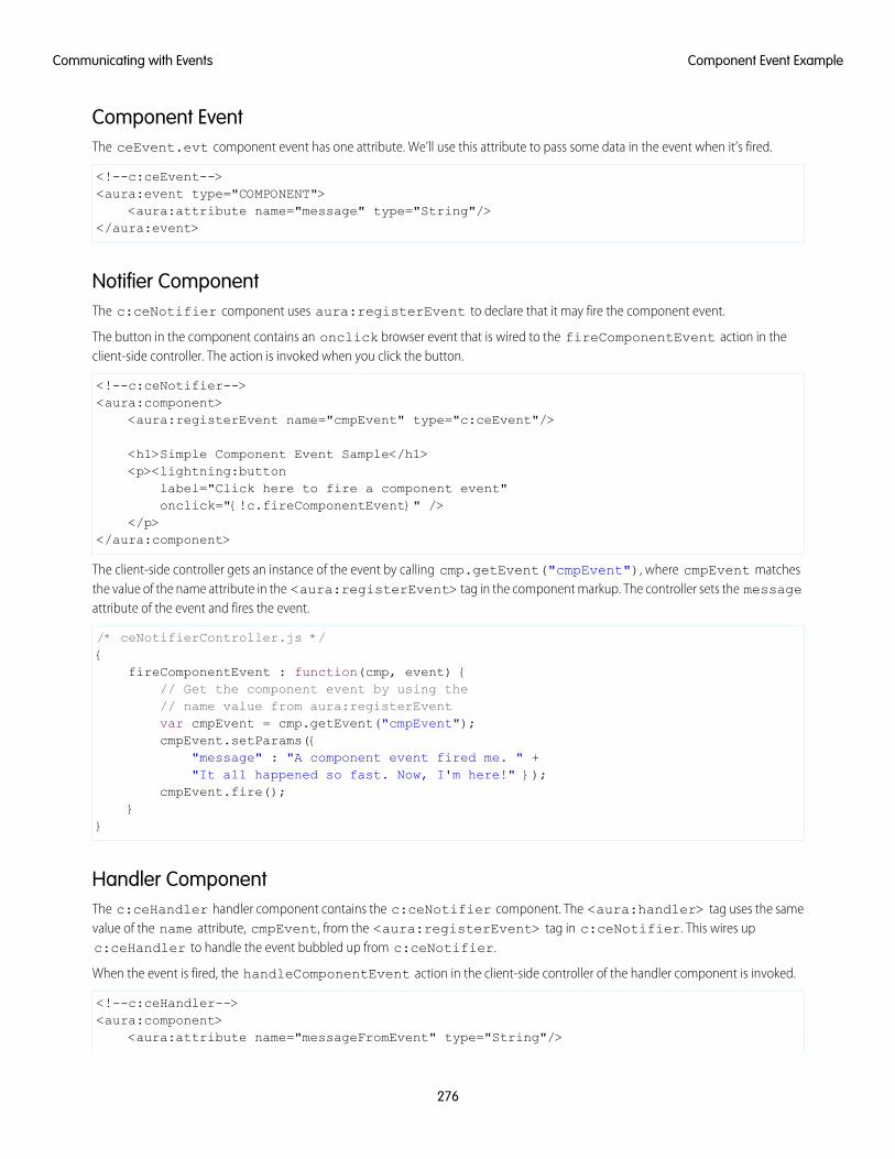
Component EventThe ceEvent.evt component event has one attribute. We’ll use this attribute to pass some data in the event when it’s fired.
<!--c:ceEvent--><aura:event type="COMPONENT">
<aura:attribute name="message" type="String"/></aura:event>
Notifier ComponentThe c:ceNotifier component uses aura:registerEvent to declare that it may fire the component event.
The button in the component contains an onclick browser event that is wired to the fireComponentEvent action in theclient-side controller. The action is invoked when you click the button.
<!--c:ceNotifier--><aura:component>
<aura:registerEvent name="cmpEvent" type="c:ceEvent"/>
<h1>Simple Component Event Sample</h1><p><lightning:button
label="Click here to fire a component event"onclick="{!c.fireComponentEvent}" />
</p></aura:component>
The client-side controller gets an instance of the event by calling cmp.getEvent("cmpEvent"), where cmpEvent matchesthe value of the name attribute in the <aura:registerEvent> tag in the component markup. The controller sets the messageattribute of the event and fires the event.
/* ceNotifierController.js */{
fireComponentEvent : function(cmp, event) {// Get the component event by using the// name value from aura:registerEventvar cmpEvent = cmp.getEvent("cmpEvent");cmpEvent.setParams({
"message" : "A component event fired me. " +"It all happened so fast. Now, I'm here!" });
cmpEvent.fire();}
}
Handler ComponentThe c:ceHandler handler component contains the c:ceNotifier component. The <aura:handler> tag uses the samevalue of the name attribute, cmpEvent, from the <aura:registerEvent> tag in c:ceNotifier. This wires upc:ceHandler to handle the event bubbled up from c:ceNotifier.
When the event is fired, the handleComponentEvent action in the client-side controller of the handler component is invoked.
<!--c:ceHandler--><aura:component>
<aura:attribute name="messageFromEvent" type="String"/>
276
Component Event ExampleCommunicating with Events
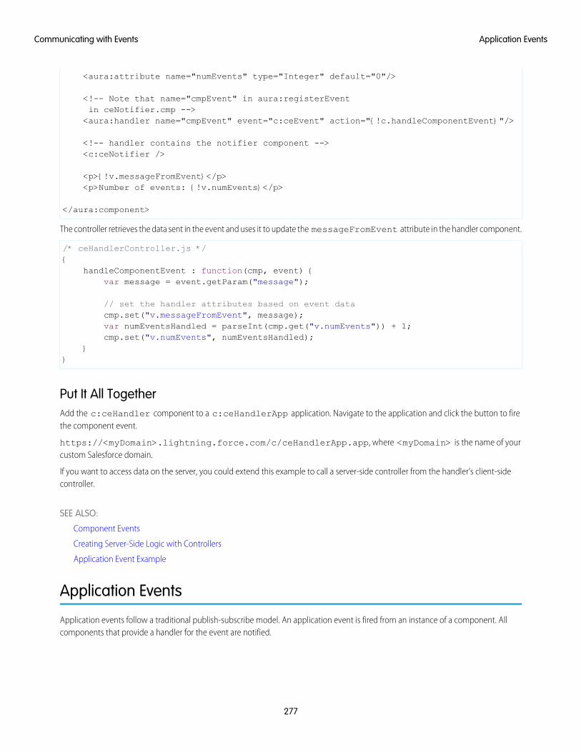
<aura:attribute name="numEvents" type="Integer" default="0"/>
<!-- Note that name="cmpEvent" in aura:registerEventin ceNotifier.cmp --><aura:handler name="cmpEvent" event="c:ceEvent" action="{!c.handleComponentEvent}"/>
<!-- handler contains the notifier component --><c:ceNotifier />
<p>{!v.messageFromEvent}</p><p>Number of events: {!v.numEvents}</p>
</aura:component>
The controller retrieves the data sent in the event and uses it to update the messageFromEvent attribute in the handler component.
/* ceHandlerController.js */{
handleComponentEvent : function(cmp, event) {var message = event.getParam("message");
// set the handler attributes based on event datacmp.set("v.messageFromEvent", message);var numEventsHandled = parseInt(cmp.get("v.numEvents")) + 1;cmp.set("v.numEvents", numEventsHandled);
}}
Put It All TogetherAdd the c:ceHandler component to a c:ceHandlerApp application. Navigate to the application and click the button to firethe component event.
https://<myDomain>.lightning.force.com/c/ceHandlerApp.app, where <myDomain> is the name of yourcustom Salesforce domain.
If you want to access data on the server, you could extend this example to call a server-side controller from the handler’s client-sidecontroller.
SEE ALSO:
Component Events
Creating Server-Side Logic with Controllers
Application Event Example
Application Events
Application events follow a traditional publish-subscribe model. An application event is fired from an instance of a component. Allcomponents that provide a handler for the event are notified.
277
Application EventsCommunicating with Events
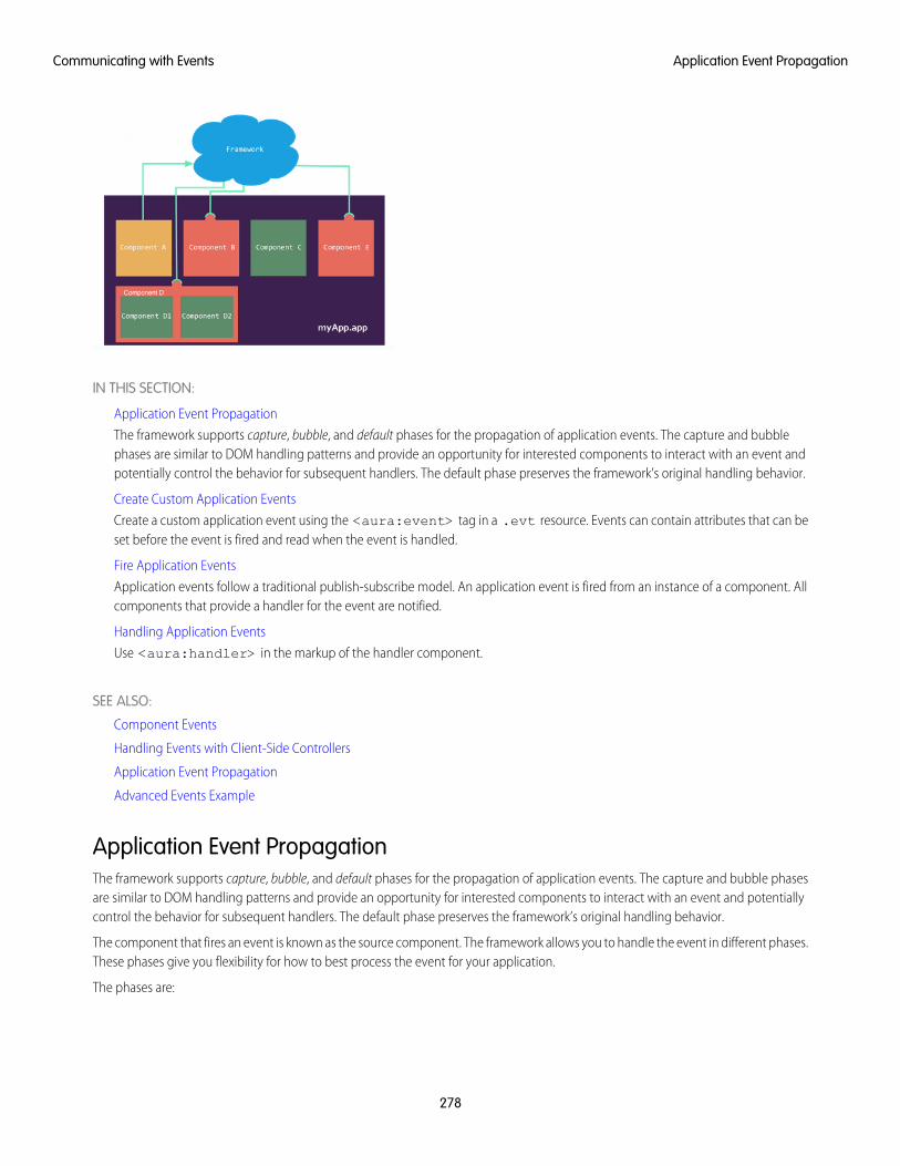
IN THIS SECTION:
Application Event Propagation
The framework supports capture, bubble, and default phases for the propagation of application events. The capture and bubblephases are similar to DOM handling patterns and provide an opportunity for interested components to interact with an event andpotentially control the behavior for subsequent handlers. The default phase preserves the framework’s original handling behavior.
Create Custom Application Events
Create a custom application event using the <aura:event> tag in a .evt resource. Events can contain attributes that can beset before the event is fired and read when the event is handled.
Fire Application Events
Application events follow a traditional publish-subscribe model. An application event is fired from an instance of a component. Allcomponents that provide a handler for the event are notified.
Handling Application Events
Use <aura:handler> in the markup of the handler component.
SEE ALSO:
Component Events
Handling Events with Client-Side Controllers
Application Event Propagation
Advanced Events Example
Application Event PropagationThe framework supports capture, bubble, and default phases for the propagation of application events. The capture and bubble phasesare similar to DOM handling patterns and provide an opportunity for interested components to interact with an event and potentiallycontrol the behavior for subsequent handlers. The default phase preserves the framework’s original handling behavior.
The component that fires an event is known as the source component. The framework allows you to handle the event in different phases.These phases give you flexibility for how to best process the event for your application.
The phases are:
278
Application Event PropagationCommunicating with Events

CaptureThe event is captured and trickles down from the application root to the source component. The event can be handled by a componentin the containment hierarchy that receives the captured event.
Event handlers are invoked in order from the application root down to the source component that fired the event.
Any registered handler in this phase can stop the event from propagating, at which point no more handlers are called in this phaseor the bubble phase. If a component stops the event propagation using event.stopPropagation(), the componentbecomes the root node used in the default phase.
Any registered handler in this phase can cancel the default behavior of the event by calling event.preventDefault(). Thiscall prevents execution of any of the handlers in the default phase.
BubbleThe component that fired the event can handle it. The event then bubbles up from the source component to the application root.The event can be handled by a component in the containment hierarchy that receives the bubbled event.
Event handlers are invoked in order from the source component that fired the event up to the application root.
Any registered handler in this phase can stop the event from propagating, at which point no more handlers will be called in thisphase. If a component stops the event propagation using event.stopPropagation(), the component becomes the rootnode used in the default phase.
Any registered handler in this phase can cancel the default behavior of the event by calling event.preventDefault(). Thiscall prevents execution of any of the handlers in the default phase.
DefaultEvent handlers are invoked in a non-deterministic order from the root node through its subtree. The default phase doesn’t have thesame propagation rules related to component hierarchy as the capture and bubble phases. The default phase can be useful forhandling application events that affect components in different sub-trees of your app.
If the event’s propagation wasn’t stopped in a previous phase, the root node defaults to the application root. If the event’s propagationwas stopped in a previous phase, the root node is set to the component whose handler invoked event.stopPropagation().
Here is the sequence of application event propagation.
1. Event fired—An application event is fired. The component that fires the event is known as the source component.
2. Capture phase—The framework executes the capture phase from the application root to the source component until all componentsare traversed. Any handling event can stop propagation by calling stopPropagation() on the event.
3. Bubble phase—The framework executes the bubble phase from the source component to the application root until all componentsare traversed or stopPropagation() is called.
4. Default phase—The framework executes the default phase from the root node unless preventDefault() was called in thecapture or bubble phases. If the event’s propagation wasn’t stopped in a previous phase, the root node defaults to the applicationroot. If the event’s propagation was stopped in a previous phase, the root node is set to the component whose handler invokedevent.stopPropagation().
Create Custom Application EventsCreate a custom application event using the <aura:event> tag in a .evt resource. Events can contain attributes that can be setbefore the event is fired and read when the event is handled.
Use type="APPLICATION" in the <aura:event> tag for an application event. For example, this c:appEvent applicationevent has one attribute with a name of message.
<!--c:appEvent--><aura:event type="APPLICATION">
279
Create Custom Application EventsCommunicating with Events
<!-- Add aura:attribute tags to define event shape.One sample attribute here. -->
<aura:attribute name="message" type="String"/></aura:event>
The component that fires an event can set the event’s data. To set the attribute values, call event.setParam() orevent.setParams(). A parameter name set in the event must match the name attribute of an <aura:attribute> in theevent. For example, if you fire c:appEvent, you could use:
event.setParam("message", "event message here");
The component that handles an event can retrieve the event data. To retrieve the attribute in this event, callevent.getParam("message") in the handler’s client-side controller.
Fire Application EventsApplication events follow a traditional publish-subscribe model. An application event is fired from an instance of a component. Allcomponents that provide a handler for the event are notified.
Register an EventA component registers that it may fire an application event by using <aura:registerEvent> in its markup. The name attributeis required but not used for application events. The name attribute is only relevant for component events. This example usesname="appEvent" but the value isn’t used anywhere.
<aura:registerEvent name="appEvent" type="c:appEvent"/>
Fire an EventUse $A.get("e.myNamespace:myAppEvent") in JavaScript to get an instance of the myAppEvent event in themyNamespace namespace.
Note: The syntax to get an instance of an application event is different than the syntax to get a component event, which iscmp.getEvent("evtName").
Use fire() to fire the event.
var appEvent = $A.get("e.c:appEvent");// Optional: set some data for the event (also known as event shape)// A parameter’s name must match the name attribute// of one of the event’s <aura:attribute> tags//appEvent.setParams({ "myParam" : myValue });appEvent.fire();
Events Fired on App RenderingSome events are automatically fired when an app is rendering. For more information, see Events Fired During the Rendering Lifecycleon page 293.
SEE ALSO:
Fire Component Events
280
Fire Application EventsCommunicating with Events
Handling Application EventsUse <aura:handler> in the markup of the handler component.
For example:
<aura:handler event="c:appEvent" action="{!c.handleApplicationEvent}"/>
The event attribute specifies the event being handled. The format is namespace:eventName.
The action attribute of <aura:handler> sets the client-side controller action to handle the event.
Note: The handler for an application event won’t work if you set the name attribute in <aura:handler>. Use the nameattribute only when you’re handling component events.
In this example, when the event is fired, the handleApplicationEvent client-side controller action is called.
Event Handling PhasesThe framework allows you to handle the event in different phases. These phases give you flexibility for how to best process the eventfor your application.
Application event handlers are associated with the default phase. To add a handler for the capture or bubble phases instead, use thephase attribute.
Get the Source of an EventIn the client-side controller action for an <aura:handler> tag, use evt.getSource() to find out which component fired theevent, where evt is a reference to the event. To retrieve the source element, use evt.getSource().getElement().
IN THIS SECTION:
Handling Bubbled or Captured Application Events
Event propagation rules determine which components in the containment hierarchy can handle events by default in the bubble orcapture phases. Learn about the rules and how to handle events in the bubble or capture phases.
SEE ALSO:
Handling Component Events
Handling Bubbled or Captured Application EventsEvent propagation rules determine which components in the containment hierarchy can handle events by default in the bubble orcapture phases. Learn about the rules and how to handle events in the bubble or capture phases.
The framework supports capture, bubble, and default phases for the propagation of application events. The capture and bubble phasesare similar to DOM handling patterns and provide an opportunity for interested components to interact with an event and potentiallycontrol the behavior for subsequent handlers. The default phase preserves the framework’s original handling behavior.
Default Event Propagation RulesBy default, every parent in the containment hierarchy can’t handle an event during the capture and bubble phases. Instead, the eventpropagates to every owner in the containment hierarchy.
281
Handling Application EventsCommunicating with Events
A component’s owner is the component that is responsible for its creation. For declaratively created components, the owner is theoutermost component containing the markup that references the component firing the event. For programmatically created components,the owner component is the component that invoked $A.createComponent to create it.
The same rules apply for the capture phase, although the direction of event propagation (down) is the opposite of the bubble phase(up).
Confused? It makes more sense when you look at an example in the bubbling phase.
c:owner contains c:container, which in turn contains c:eventSource.
<!--c:owner--><aura:component>
<c:container><c:eventSource />
</c:container></aura:component>
If c:eventSource fires an event, it can handle the event itself. The event then bubbles up the containment hierarchy.
c:container contains c:eventSource but it’s not the owner because it’s not the outermost component in the markup, so itcan’t handle the bubbled event.
c:owner is the owner because c:container is in its markup. c:owner can handle the event.
Propagation to All Container ComponentsThe default behavior doesn’t allow an event to be handled by every parent in the containment hierarchy. Some components containother components but aren’t the owner of those components. These components are known as container components. In the example,c:container is a container component because it’s not the owner for c:eventSource. By default, c:container can’thandle events fired by c:eventSource.
A container component has a facet attribute whose type is Aura.Component[], such as the default body attribute. The containercomponent includes those components in its definition using an expression, such as {!v.body}. The container component isn’t theowner of the components rendered with that expression.
To allow a container component to handle the event, add includeFacets="true" to the <aura:handler> tag of thecontainer component. For example, adding includeFacets="true" to the handler in the container component, c:container,enables it to handle the component event bubbled from c:eventSource.
<aura:handler name="bubblingEvent" event="c:compEvent" action="{!c.handleBubbling}"includeFacets="true" />
Handle Bubbled EventTo add a handler for the bubble phase, set phase="bubble".
<aura:handler event="c:appEvent" action="{!c.handleBubbledEvent}"phase="bubble" />
The event attribute specifies the event being handled. The format is namespace:eventName.
The action attribute of <aura:handler> sets the client-side controller action to handle the event.
282
Handling Application EventsCommunicating with Events
Handle Captured EventTo add a handler for the capture phase, set phase="capture".
<aura:handler event="c:appEvent" action="{!c.handleCapturedEvent}"phase="capture" />
Stop Event PropagationUse the stopPropagation() method in the Event object to stop the event propagating to other components.
Pausing Event Propagation for Asynchronous Code ExecutionUse event.pause() to pause event handling and propagation until event.resume() is called. This flow-control mechanismis useful for any decision that depends on the response from the execution of asynchronous code. For example, you might make adecision about event propagation based on the response from an asynchronous call to native mobile code.
You can call pause() or resume() in the capture or bubble phases.
Application Event ExampleHere’s a simple use case of using an application event to update an attribute in another component.
1. A user clicks a button in the notifier component, aeNotifier.cmp.
2. The client-side controller for aeNotifier.cmp sets a message in a component event and fires the event.
3. The handler component, aeHandler.cmp, handles the fired event.
4. The client-side controller for aeHandler.cmp sets an attribute in aeHandler.cmp based on the data sent in the event.
Note: The event and components in this example use the default c namespace. If your org has a namespace, use that namespaceinstead.
Application EventThe aeEvent.evt application event has one attribute. We’ll use this attribute to pass some data in the event when it’s fired.
<!--c:aeEvent--><aura:event type="APPLICATION">
<aura:attribute name="message" type="String"/></aura:event>
Notifier ComponentThe aeNotifier.cmp notifier component uses aura:registerEvent to declare that it may fire the application event. Thename attribute is required but not used for application events. The name attribute is only relevant for component events.
The button in the component contains a onclick browser event that is wired to the fireApplicationEvent action in theclient-side controller. Clicking this button invokes the action.
<!--c:aeNotifier--><aura:component>
<aura:registerEvent name="appEvent" type="c:aeEvent"/>
283
Application Event ExampleCommunicating with Events
<h1>Simple Application Event Sample</h1><p><lightning:button
label="Click here to fire an application event"onclick="{!c.fireApplicationEvent}" />
</p></aura:component>
The client-side controller gets an instance of the event by calling $A.get("e.c:aeEvent"). The controller sets the messageattribute of the event and fires the event.
/* aeNotifierController.js */{
fireApplicationEvent : function(cmp, event) {// Get the application event by using the// e.<namespace>.<event> syntaxvar appEvent = $A.get("e.c:aeEvent");appEvent.setParams({
"message" : "An application event fired me. " +"It all happened so fast. Now, I'm everywhere!" });
appEvent.fire();}
}
Handler ComponentThe aeHandler.cmp handler component uses the <aura:handler> tag to register that it handles the application event.
Note: The handler for an application event won’t work if you set the name attribute in <aura:handler>. Use the nameattribute only when you’re handling component events.
When the event is fired, the handleApplicationEvent action in the client-side controller of the handler component is invoked.
<!--c:aeHandler--><aura:component>
<aura:attribute name="messageFromEvent" type="String"/><aura:attribute name="numEvents" type="Integer" default="0"/>
<aura:handler event="c:aeEvent" action="{!c.handleApplicationEvent}"/>
<p>{!v.messageFromEvent}</p><p>Number of events: {!v.numEvents}</p>
</aura:component>
The controller retrieves the data sent in the event and uses it to update the messageFromEvent attribute in the handler component.
/* aeHandlerController.js */{
handleApplicationEvent : function(cmp, event) {var message = event.getParam("message");
// set the handler attributes based on event datacmp.set("v.messageFromEvent", message);var numEventsHandled = parseInt(cmp.get("v.numEvents")) + 1;cmp.set("v.numEvents", numEventsHandled);
284
Application Event ExampleCommunicating with Events

}}
Container ComponentThe aeContainer.cmp container component contains the notifier and handler components. This is different from the componentevent example where the handler contains the notifier component.
<!--c:aeContainer--><aura:component>
<c:aeNotifier/><c:aeHandler/>
</aura:component>
Put It All TogetherYou can test this code by adding <c:aeContainer> to a sample aeWrapper.app application and navigating to the application.
https://<myDomain>.lightning.force.com/c/aeWrapper.app, where <myDomain> is the name of your customSalesforce domain.
If you want to access data on the server, you could extend this example to call a server-side controller from the handler’s client-sidecontroller.
SEE ALSO:
Application Events
Creating Server-Side Logic with Controllers
Component Event Example
Event Handling Lifecycle
The following chart summarizes how the framework handles events.
285
Event Handling LifecycleCommunicating with Events
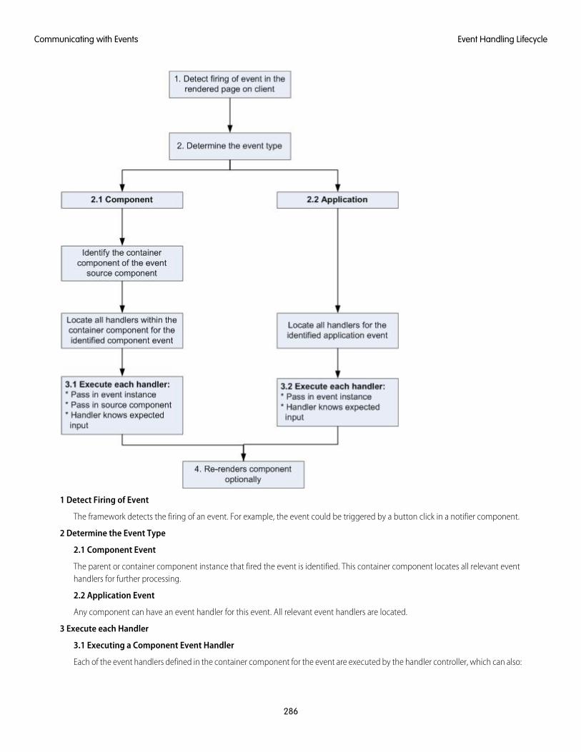
1 Detect Firing of Event
The framework detects the firing of an event. For example, the event could be triggered by a button click in a notifier component.
2 Determine the Event Type
2.1 Component Event
The parent or container component instance that fired the event is identified. This container component locates all relevant eventhandlers for further processing.
2.2 Application Event
Any component can have an event handler for this event. All relevant event handlers are located.
3 Execute each Handler
3.1 Executing a Component Event Handler
Each of the event handlers defined in the container component for the event are executed by the handler controller, which can also:
286
Event Handling LifecycleCommunicating with Events
• Set attributes or modify data on the component (causing a re-rendering of the component).
• Fire another event or invoke a client-side or server-side action.
3.2 Executing an Application Event Handler
All event handlers are executed. When the event handler is executed, the event instance is passed into the event handler.
4 Re-render Component (optional)
After the event handlers and any callback actions are executed, a component might be automatically re-rendered if it was modifiedduring the event handling process.
SEE ALSO:
Create a Custom Renderer
Advanced Events Example
This example builds on the simpler component and application event examples. It uses one notifier component and one handlercomponent that work with both component and application events. Before we see a component wired up to events, let's look at theindividual resources involved.
This table summarizes the roles of the various resources used in the example. The source code for these resources is included after thetable.
UsageResource NameResource
Defines the component and application events inseparate resources. eventsContainer.cmp
Component event (compEvent.evt)and application event (appEvent.evt)
Event files
shows how to use both component and applicationevents.
The notifier contains an onclick browser event toinitiate the event. The controller fires the event.
Component (eventsNotifier.cmp)and its controller(eventsNotifierController.js)
Notifier
The handler component contains the notifiercomponent (or a <aura:handler> tag for
Component (eventsHandler.cmp)and its controller(eventsHandlerController.js)
Handler
application events), and calls the controller action thatis executed after the event is fired.
Displays the event handlers on the UI for the completedemo.
eventsContainer.cmpContainer Component
The definitions of component and application events are stored in separate .evt resources, but individual notifier and handlercomponent bundles can contain code to work with both types of events.
The component and application events both contain a context attribute that defines the shape of the event. This is the data that ispassed to handlers of the event.
287
Advanced Events ExampleCommunicating with Events
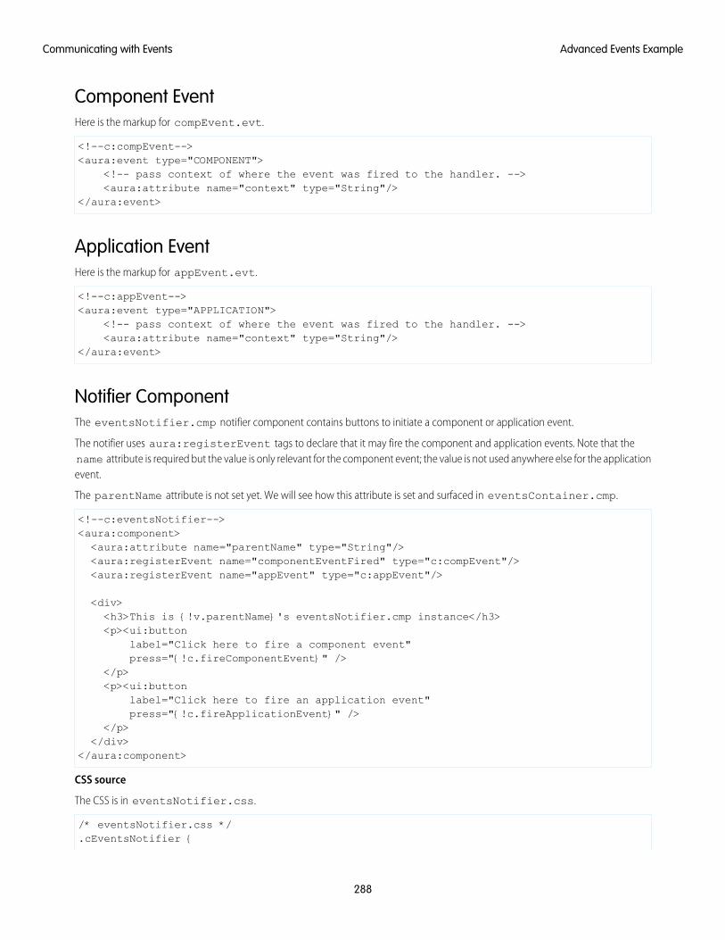
Component EventHere is the markup for compEvent.evt.
<!--c:compEvent--><aura:event type="COMPONENT">
<!-- pass context of where the event was fired to the handler. --><aura:attribute name="context" type="String"/>
</aura:event>
Application EventHere is the markup for appEvent.evt.
<!--c:appEvent--><aura:event type="APPLICATION">
<!-- pass context of where the event was fired to the handler. --><aura:attribute name="context" type="String"/>
</aura:event>
Notifier ComponentThe eventsNotifier.cmp notifier component contains buttons to initiate a component or application event.
The notifier uses aura:registerEvent tags to declare that it may fire the component and application events. Note that thename attribute is required but the value is only relevant for the component event; the value is not used anywhere else for the applicationevent.
The parentName attribute is not set yet. We will see how this attribute is set and surfaced in eventsContainer.cmp.
<!--c:eventsNotifier--><aura:component><aura:attribute name="parentName" type="String"/><aura:registerEvent name="componentEventFired" type="c:compEvent"/><aura:registerEvent name="appEvent" type="c:appEvent"/>
<div><h3>This is {!v.parentName}'s eventsNotifier.cmp instance</h3><p><ui:button
label="Click here to fire a component event"press="{!c.fireComponentEvent}" />
</p><p><ui:button
label="Click here to fire an application event"press="{!c.fireApplicationEvent}" />
</p></div>
</aura:component>
CSS source
The CSS is in eventsNotifier.css.
/* eventsNotifier.css */.cEventsNotifier {
288
Advanced Events ExampleCommunicating with Events
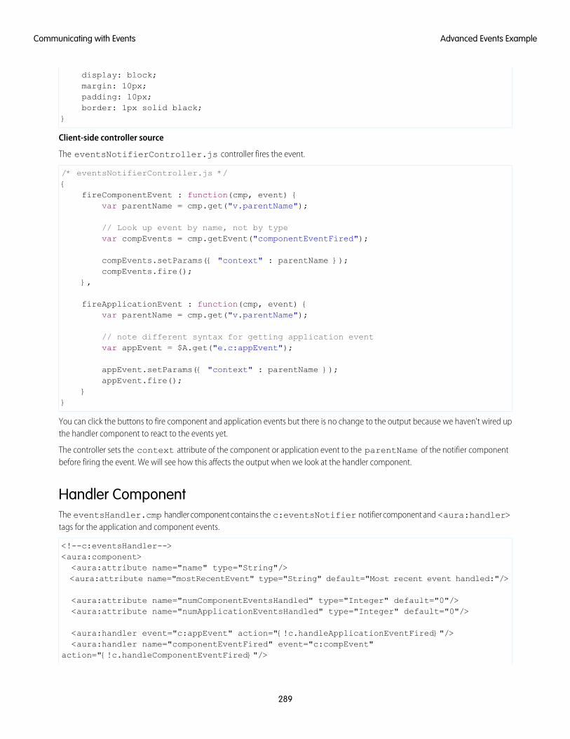
display: block;margin: 10px;padding: 10px;border: 1px solid black;
}
Client-side controller source
The eventsNotifierController.js controller fires the event.
/* eventsNotifierController.js */{
fireComponentEvent : function(cmp, event) {var parentName = cmp.get("v.parentName");
// Look up event by name, not by typevar compEvents = cmp.getEvent("componentEventFired");
compEvents.setParams({ "context" : parentName });compEvents.fire();
},
fireApplicationEvent : function(cmp, event) {var parentName = cmp.get("v.parentName");
// note different syntax for getting application eventvar appEvent = $A.get("e.c:appEvent");
appEvent.setParams({ "context" : parentName });appEvent.fire();
}}
You can click the buttons to fire component and application events but there is no change to the output because we haven't wired upthe handler component to react to the events yet.
The controller sets the context attribute of the component or application event to the parentName of the notifier componentbefore firing the event. We will see how this affects the output when we look at the handler component.
Handler ComponentThe eventsHandler.cmp handler component contains the c:eventsNotifier notifier component and <aura:handler>tags for the application and component events.
<!--c:eventsHandler--><aura:component><aura:attribute name="name" type="String"/><aura:attribute name="mostRecentEvent" type="String" default="Most recent event handled:"/>
<aura:attribute name="numComponentEventsHandled" type="Integer" default="0"/><aura:attribute name="numApplicationEventsHandled" type="Integer" default="0"/>
<aura:handler event="c:appEvent" action="{!c.handleApplicationEventFired}"/><aura:handler name="componentEventFired" event="c:compEvent"
action="{!c.handleComponentEventFired}"/>
289
Advanced Events ExampleCommunicating with Events
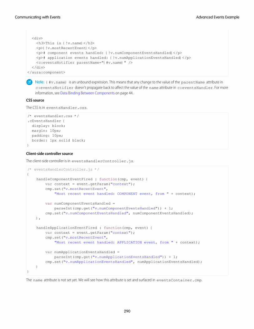
<div><h3>This is {!v.name}</h3><p>{!v.mostRecentEvent}</p><p># component events handled: {!v.numComponentEventsHandled}</p><p># application events handled: {!v.numApplicationEventsHandled}</p><c:eventsNotifier parentName="{#v.name}" />
</div></aura:component>
Note: {#v.name} is an unbound expression. This means that any change to the value of the parentName attribute inc:eventsNotifier doesn’t propagate back to affect the value of the name attribute in c:eventsHandler. For moreinformation, see Data Binding Between Components on page 44.
CSS source
The CSS is in eventsHandler.css.
/* eventsHandler.css */.cEventsHandler {display: block;margin: 10px;padding: 10px;border: 1px solid black;
}
Client-side controller source
The client-side controller is in eventsHandlerController.js.
/* eventsHandlerController.js */{
handleComponentEventFired : function(cmp, event) {var context = event.getParam("context");cmp.set("v.mostRecentEvent",
"Most recent event handled: COMPONENT event, from " + context);
var numComponentEventsHandled =parseInt(cmp.get("v.numComponentEventsHandled")) + 1;
cmp.set("v.numComponentEventsHandled", numComponentEventsHandled);},
handleApplicationEventFired : function(cmp, event) {var context = event.getParam("context");cmp.set("v.mostRecentEvent",
"Most recent event handled: APPLICATION event, from " + context);
var numApplicationEventsHandled =parseInt(cmp.get("v.numApplicationEventsHandled")) + 1;
cmp.set("v.numApplicationEventsHandled", numApplicationEventsHandled);}
}
The name attribute is not set yet. We will see how this attribute is set and surfaced in eventsContainer.cmp.
290
Advanced Events ExampleCommunicating with Events
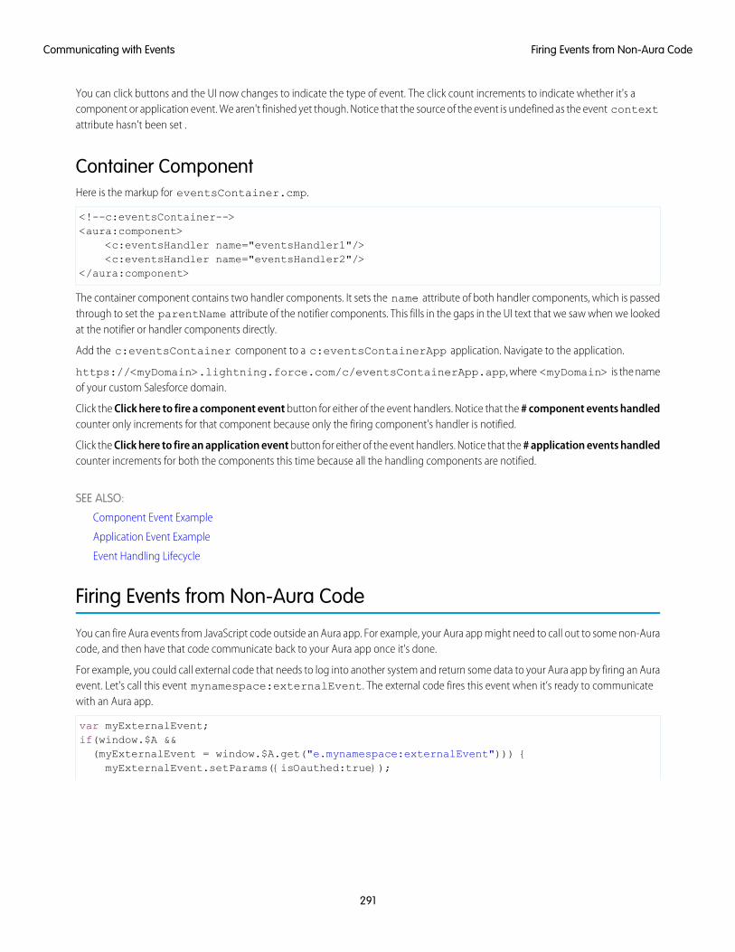
You can click buttons and the UI now changes to indicate the type of event. The click count increments to indicate whether it's acomponent or application event. We aren't finished yet though. Notice that the source of the event is undefined as the event contextattribute hasn't been set .
Container ComponentHere is the markup for eventsContainer.cmp.
<!--c:eventsContainer--><aura:component>
<c:eventsHandler name="eventsHandler1"/><c:eventsHandler name="eventsHandler2"/>
</aura:component>
The container component contains two handler components. It sets the name attribute of both handler components, which is passedthrough to set the parentName attribute of the notifier components. This fills in the gaps in the UI text that we saw when we lookedat the notifier or handler components directly.
Add the c:eventsContainer component to a c:eventsContainerApp application. Navigate to the application.
https://<myDomain>.lightning.force.com/c/eventsContainerApp.app, where <myDomain> is the nameof your custom Salesforce domain.
Click the Click here to fire a component event button for either of the event handlers. Notice that the # component events handledcounter only increments for that component because only the firing component's handler is notified.
Click the Click here to fire an application event button for either of the event handlers. Notice that the # application events handledcounter increments for both the components this time because all the handling components are notified.
SEE ALSO:
Component Event Example
Application Event Example
Event Handling Lifecycle
Firing Events from Non-Aura Code
You can fire Aura events from JavaScript code outside an Aura app. For example, your Aura app might need to call out to some non-Auracode, and then have that code communicate back to your Aura app once it's done.
For example, you could call external code that needs to log into another system and return some data to your Aura app by firing an Auraevent. Let's call this event mynamespace:externalEvent. The external code fires this event when it’s ready to communicatewith an Aura app.
var myExternalEvent;if(window.$A &&(myExternalEvent = window.$A.get("e.mynamespace:externalEvent"))) {myExternalEvent.setParams({isOauthed:true});
291
Firing Events from Non-Aura CodeCommunicating with Events
myExternalEvent.fire();}
SEE ALSO:
Application Events
Modifying Components Outside the Framework Lifecycle
Events Best Practices
Here are some best practices for working with events.
Use Component Events Whenever PossibleAlways try to use a component event instead of an application event, if possible. Component events can only be handled by componentsabove them in the containment hierarchy so their usage is more localized to the components that need to know about them. Applicationevents are best used for something that should be handled at the application level, such as navigating to a specific record. Applicationevents allow communication between components that are in separate parts of the application and have no direct containmentrelationship.
Separate Low-Level Events from Business Logic EventsIt's a good practice to handle low-level events, such as a click, in your event handler and refire them as higher-level events, such as anapprovalChange event or whatever is appropriate for your business logic.
Dynamic Actions based on Component StateIf you need to invoke a different action on a click event depending on the state of the component, try this approach:
1. Store the component state as a discrete value, such as New or Pending, in a component attribute.
2. Put logic in your client-side controller to determine the next action to take.
3. If you need to reuse the logic in your component bundle, put the logic in the helper.
For example:
1. Your component markup contains <ui:button label="do something" press="{!c.click}" />.
2. In your controller, define the click function, which delegates to the appropriate helper function or potentially fires the correctevent.
292
Events Best PracticesCommunicating with Events
Using a Dispatcher Component to Listen and Relay EventsIf you have a large number of handler component instances listening for an event, it may be better to identify a dispatcher componentto listen for the event. The dispatcher component can perform some logic to decide which component instances should receive furtherinformation and fire another component or application event targeted at those component instances.
SEE ALSO:
Handling Events with Client-Side Controllers
Events Anti-Patterns
Events Anti-PatternsThese are some anti-patterns that you should avoid when using events.
Don't Fire an Event in a RendererFiring an event in a renderer can cause an infinite rendering loop.
Don’t do this!
afterRender: function(cmp, helper) {this.superAfterRender();$A.get("e.myns:mycmp").fire();
}
Instead, use the init hook to run a controller action after component construction but before rendering. Add this code to yourcomponent:
<aura:handler name="init" value="{!this}" action="{!c.doInit}"/>
For more details, see .Invoking Actions on Component Initialization on page 344.
Don’t Use onclick and ontouchend EventsYou can’t use different actions for onclick and ontouchend events in a component. The framework translates touch-tap eventsinto clicks and activates any onclick handlers that are present.
SEE ALSO:
Create a Custom Renderer
Events Best Practices
Events Fired During the Rendering Lifecycle
A component is instantiated, rendered, and rerendered during its lifecycle. A component is rerendered only when there’s a programmaticor value change that would require a rerender, such as when a browser event triggers an action that updates its data.
293
Events Anti-PatternsCommunicating with Events
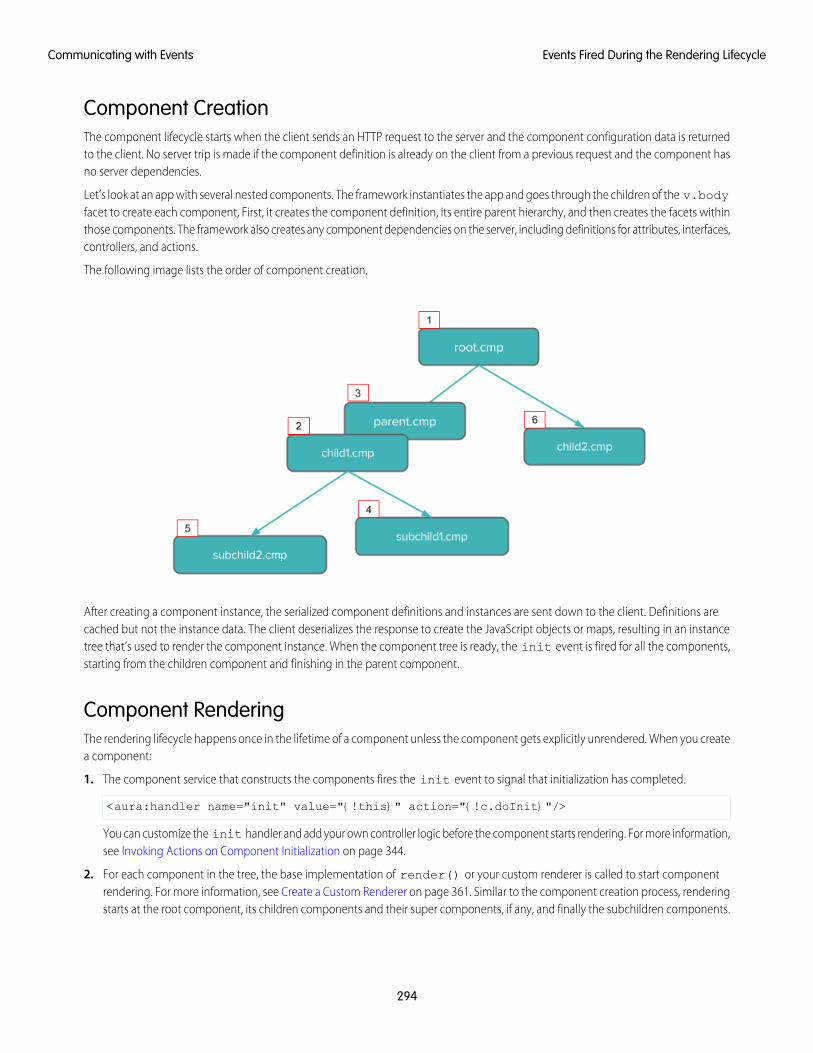
Component CreationThe component lifecycle starts when the client sends an HTTP request to the server and the component configuration data is returnedto the client. No server trip is made if the component definition is already on the client from a previous request and the component hasno server dependencies.
Let’s look at an app with several nested components. The framework instantiates the app and goes through the children of the v.bodyfacet to create each component, First, it creates the component definition, its entire parent hierarchy, and then creates the facets withinthose components. The framework also creates any component dependencies on the server, including definitions for attributes, interfaces,controllers, and actions.
The following image lists the order of component creation.
After creating a component instance, the serialized component definitions and instances are sent down to the client. Definitions arecached but not the instance data. The client deserializes the response to create the JavaScript objects or maps, resulting in an instancetree that’s used to render the component instance. When the component tree is ready, the init event is fired for all the components,starting from the children component and finishing in the parent component.
Component RenderingThe rendering lifecycle happens once in the lifetime of a component unless the component gets explicitly unrendered. When you createa component:
1. The component service that constructs the components fires the init event to signal that initialization has completed.
<aura:handler name="init" value="{!this}" action="{!c.doInit}"/>
You can customize the init handler and add your own controller logic before the component starts rendering. For more information,see Invoking Actions on Component Initialization on page 344.
2. For each component in the tree, the base implementation of render() or your custom renderer is called to start componentrendering. For more information, see Create a Custom Renderer on page 361. Similar to the component creation process, renderingstarts at the root component, its children components and their super components, if any, and finally the subchildren components.
294
Events Fired During the Rendering LifecycleCommunicating with Events

3. Once your components are rendered to the DOM, afterRender() is called to signal that rendering is completed for each ofthese component definitions. It enables you to interact with the DOM tree after the framework rendering service has created theDOM elements.
4. To indicate that the client is done waiting for a response to the server request XHR, the aura:doneWaiting event is fired. Youcan handle this event by adding a handler wired to a client-side controller action.
Note: The aura:doneWaiting event is deprecated. The aura:doneWaiting application event is fired for everyserver response, even for responses from other components in your app. Unless your component is running in completeisolation in a standalone app and not included in Lightning Experience or the Salesforce app, the container app may triggeryour event handler multiple times. This behavior makes it difficult to handle each event appropriately.
5. The framework fires a render event, enabling you to interact with the DOM tree after the framework’s rendering service hasinserted DOM elements. Handling the render event is preferred to creating a custom renderer and overriding afterRender().For more information, see Handle the render Event.
6. Finally, the aura:doneRendering event is fired at the end of the rendering lifecycle.
Note: The aura:doneRendering event is deprecated. Unless your component is running in complete isolation in astandalone app and not included in complex apps, such as Lightning Experience or the Salesforce app, the container app maytrigger your event handler multiple times. This behavior makes it difficult to handle each event appropriately.
Rendering Nested ComponentsLet’s say that you have an app myApp.app that contains a component myCmp.cmp with a ui:button component.
During initialization, the init() event is fired in this order: ui:button, ui:myCmp, and myApp.app.
SEE ALSO:
Create a Custom Renderer
Events Handled in the Salesforce Mobile App and Lightning Experience
The Salesforce mobile app and Lightning Experience handle some events, which you can fire in your Aura component.
If you fire one of these force or lightning events in your Lightning apps or components outside of the Salesforce app or LightningExperience:
• You must handle the event by using the <aura:handler> tag in the handling component.
295
Events Handled in the Salesforce Mobile App and LightningExperience
Communicating with Events
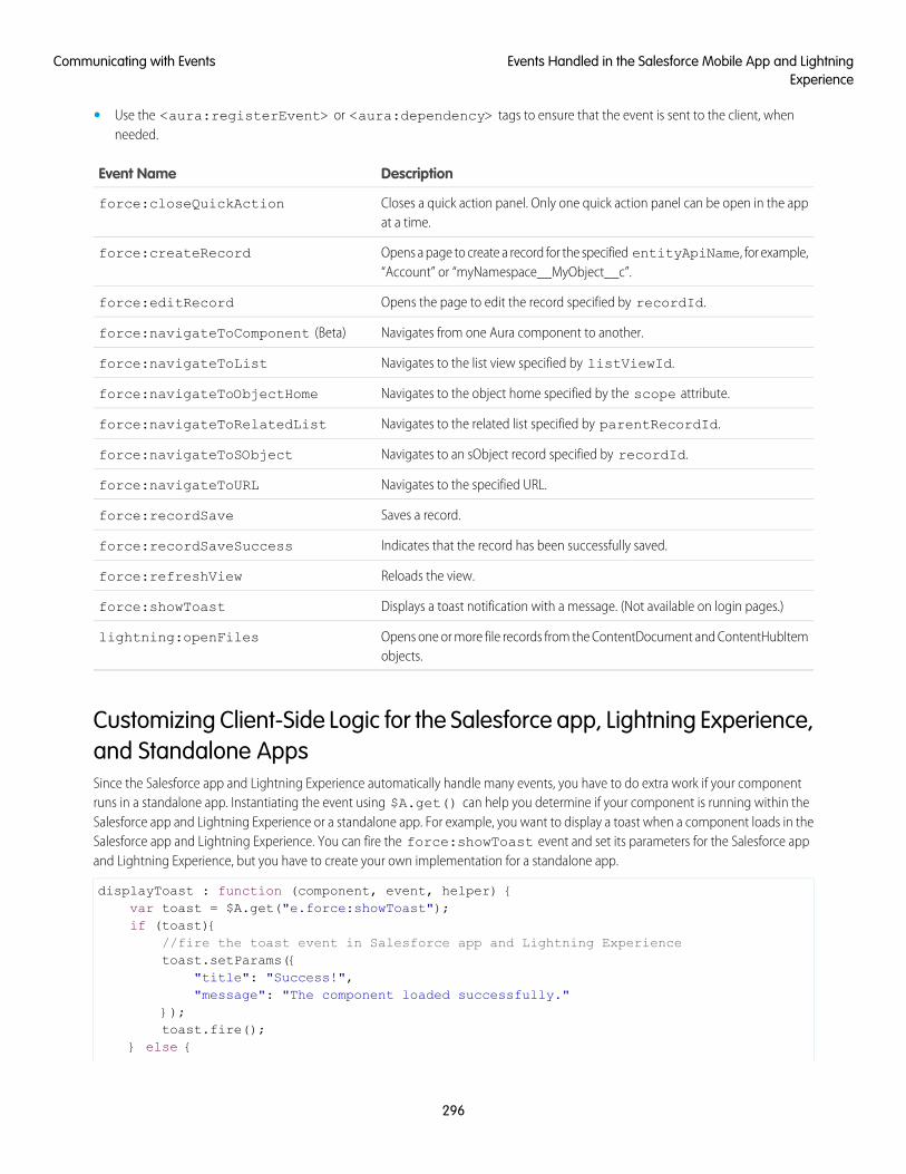
• Use the <aura:registerEvent> or <aura:dependency> tags to ensure that the event is sent to the client, whenneeded.
DescriptionEvent Name
Closes a quick action panel. Only one quick action panel can be open in the appat a time.
force:closeQuickAction
Opens a page to create a record for the specified entityApiName, for example,“Account” or “myNamespace__MyObject__c”.
force:createRecord
Opens the page to edit the record specified by recordId.force:editRecord
Navigates from one Aura component to another.force:navigateToComponent (Beta)
Navigates to the list view specified by listViewId.force:navigateToList
Navigates to the object home specified by the scope attribute.force:navigateToObjectHome
Navigates to the related list specified by parentRecordId.force:navigateToRelatedList
Navigates to an sObject record specified by recordId.force:navigateToSObject
Navigates to the specified URL.force:navigateToURL
Saves a record.force:recordSave
Indicates that the record has been successfully saved.force:recordSaveSuccess
Reloads the view.force:refreshView
Displays a toast notification with a message. (Not available on login pages.)force:showToast
Opens one or more file records from the ContentDocument and ContentHubItemobjects.
lightning:openFiles
Customizing Client-Side Logic for the Salesforce app, Lightning Experience,and Standalone AppsSince the Salesforce app and Lightning Experience automatically handle many events, you have to do extra work if your componentruns in a standalone app. Instantiating the event using $A.get() can help you determine if your component is running within theSalesforce app and Lightning Experience or a standalone app. For example, you want to display a toast when a component loads in theSalesforce app and Lightning Experience. You can fire the force:showToast event and set its parameters for the Salesforce appand Lightning Experience, but you have to create your own implementation for a standalone app.
displayToast : function (component, event, helper) {var toast = $A.get("e.force:showToast");if (toast){
//fire the toast event in Salesforce app and Lightning Experiencetoast.setParams({
"title": "Success!","message": "The component loaded successfully."
});toast.fire();
} else {
296
Events Handled in the Salesforce Mobile App and LightningExperience
Communicating with Events
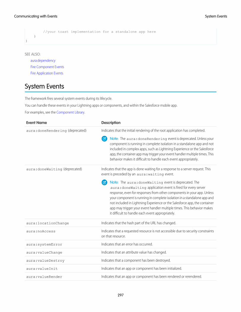
//your toast implementation for a standalone app here}
}
SEE ALSO:
aura:dependency
Fire Component Events
Fire Application Events
System Events
The framework fires several system events during its lifecycle.
You can handle these events in your Lightning apps or components, and within the Salesforce mobile app.
For examples, see the Component Library.
DescriptionEvent Name
Indicates that the initial rendering of the root application has completed.aura:doneRendering (deprecated)
Note: The aura:doneRendering event is deprecated. Unless yourcomponent is running in complete isolation in a standalone app and notincluded in complex apps, such as Lightning Experience or the Salesforceapp, the container app may trigger your event handler multiple times. Thisbehavior makes it difficult to handle each event appropriately.
Indicates that the app is done waiting for a response to a server request. Thisevent is preceded by an aura:waiting event.
aura:doneWaiting (deprecated)
Note: The aura:doneWaiting event is deprecated. Theaura:doneWaiting application event is fired for every serverresponse, even for responses from other components in your app. Unlessyour component is running in complete isolation in a standalone app andnot included in Lightning Experience or the Salesforce app, the containerapp may trigger your event handler multiple times. This behavior makesit difficult to handle each event appropriately.
Indicates that the hash part of the URL has changed.aura:locationChange
Indicates that a requested resource is not accessible due to security constraintson that resource.
aura:noAccess
Indicates that an error has occurred.aura:systemError
Indicates that an attribute value has changed.aura:valueChange
Indicates that a component has been destroyed.aura:valueDestroy
Indicates that an app or component has been initialized.aura:valueInit
Indicates that an app or component has been rendered or rerendered.aura:valueRender
297
System EventsCommunicating with Events
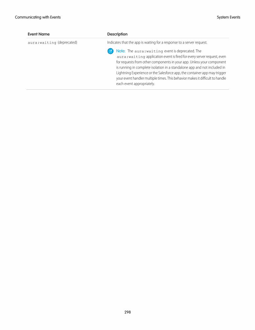
DescriptionEvent Name
Indicates that the app is waiting for a response to a server request.aura:waiting (deprecated)
Note: The aura:waiting event is deprecated. Theaura:waiting application event is fired for every server request, evenfor requests from other components in your app. Unless your componentis running in complete isolation in a standalone app and not included inLightning Experience or the Salesforce app, the container app may triggeryour event handler multiple times. This behavior makes it difficult to handleeach event appropriately.
298
System EventsCommunicating with Events
CHAPTER 6 Creating Apps
Components are the building blocks of an app. This section shows you a typical workflow to put thepieces together to create a new app.
In this chapter ...
• App OverviewFirst, you should decide whether you’re creating a component for a standalone app or for Salesforceapps, such as Lightning Experience or Salesforce for Android, iOS, and mobile web. Both components• Designing App UI
• Creating AppTemplates
can access your Salesforce data, but only a component created for Lightning Experience or Salesforcefor Android, iOS, and mobile web can automatically handle Salesforce events that take advantage ofrecord create and edit pages, among other benefits.• Using the AppCache
• DistributingApplications andComponents
The Quick Start on page 6 walks you through creating components for a standalone app andcomponents for Salesforce for Android, iOS, and mobile web to help you determine which one you need.
299
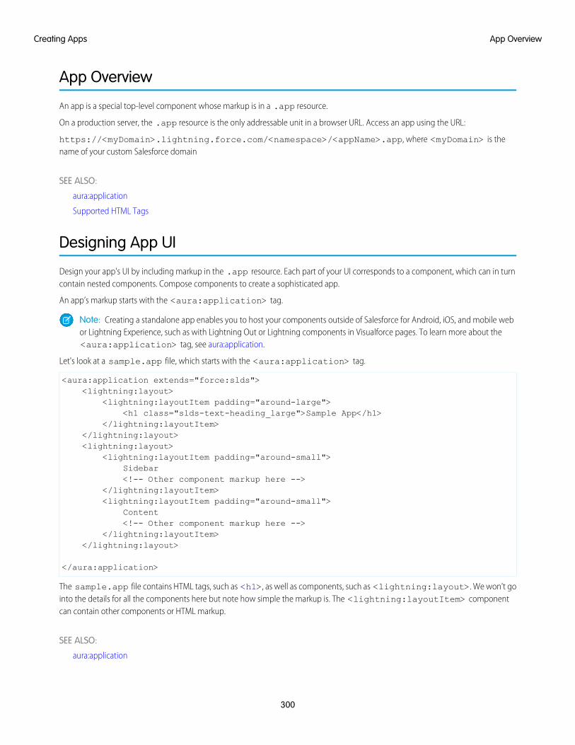
App Overview
An app is a special top-level component whose markup is in a .app resource.
On a production server, the .app resource is the only addressable unit in a browser URL. Access an app using the URL:
https://<myDomain>.lightning.force.com/<namespace>/<appName>.app, where <myDomain> is thename of your custom Salesforce domain
SEE ALSO:
aura:application
Supported HTML Tags
Designing App UI
Design your app's UI by including markup in the .app resource. Each part of your UI corresponds to a component, which can in turncontain nested components. Compose components to create a sophisticated app.
An app’s markup starts with the <aura:application> tag.
Note: Creating a standalone app enables you to host your components outside of Salesforce for Android, iOS, and mobile webor Lightning Experience, such as with Lightning Out or Lightning components in Visualforce pages. To learn more about the<aura:application> tag, see aura:application.
Let's look at a sample.app file, which starts with the <aura:application> tag.
<aura:application extends="force:slds"><lightning:layout>
<lightning:layoutItem padding="around-large"><h1 class="slds-text-heading_large">Sample App</h1>
</lightning:layoutItem></lightning:layout><lightning:layout>
<lightning:layoutItem padding="around-small">Sidebar<!-- Other component markup here -->
</lightning:layoutItem><lightning:layoutItem padding="around-small">
Content<!-- Other component markup here -->
</lightning:layoutItem></lightning:layout>
</aura:application>
The sample.app file contains HTML tags, such as <h1>, as well as components, such as <lightning:layout>. We won't gointo the details for all the components here but note how simple the markup is. The <lightning:layoutItem> componentcan contain other components or HTML markup.
SEE ALSO:
aura:application
300
App OverviewCreating Apps
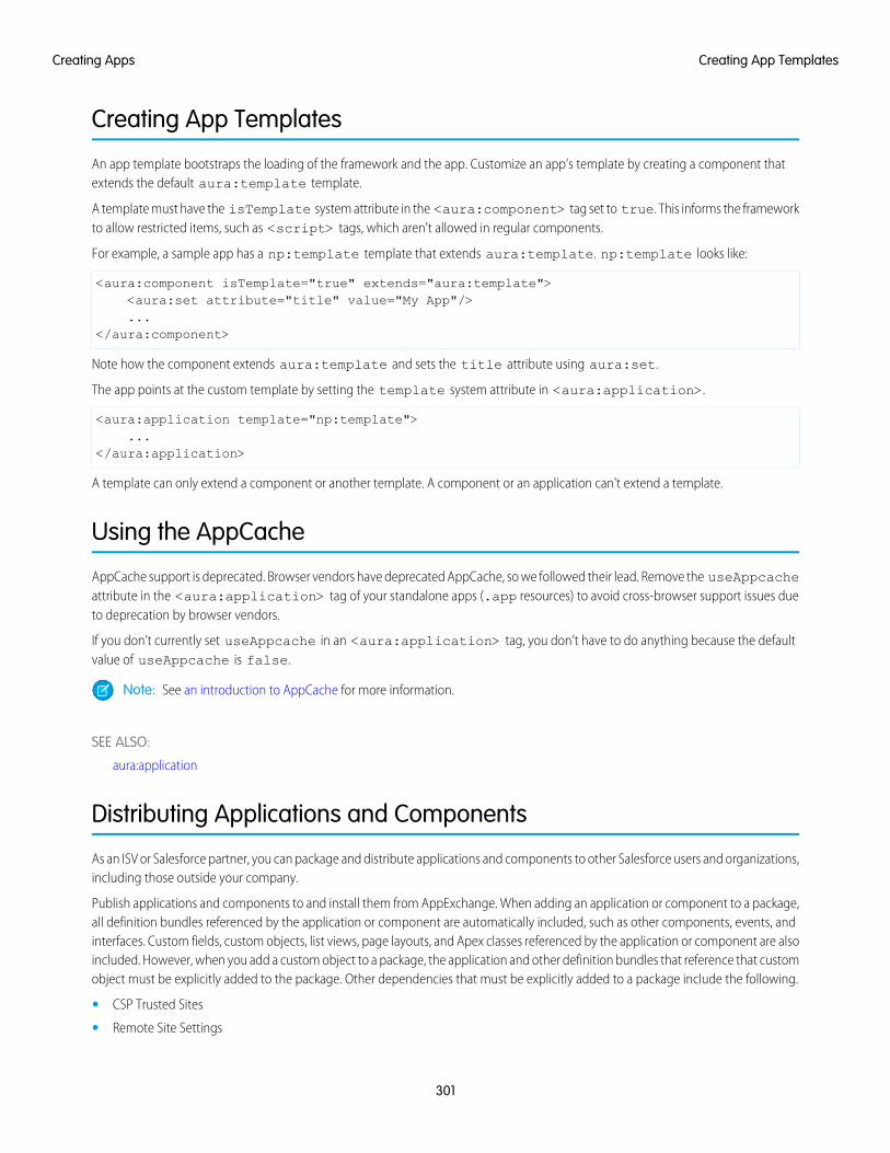
Creating App Templates
An app template bootstraps the loading of the framework and the app. Customize an app’s template by creating a component thatextends the default aura:template template.
A template must have the isTemplate system attribute in the <aura:component> tag set to true. This informs the frameworkto allow restricted items, such as <script> tags, which aren't allowed in regular components.
For example, a sample app has a np:template template that extends aura:template. np:template looks like:
<aura:component isTemplate="true" extends="aura:template"><aura:set attribute="title" value="My App"/>...
</aura:component>
Note how the component extends aura:template and sets the title attribute using aura:set.
The app points at the custom template by setting the template system attribute in <aura:application>.
<aura:application template="np:template">...
</aura:application>
A template can only extend a component or another template. A component or an application can't extend a template.
Using the AppCache
AppCache support is deprecated. Browser vendors have deprecated AppCache, so we followed their lead. Remove the useAppcacheattribute in the <aura:application> tag of your standalone apps (.app resources) to avoid cross-browser support issues dueto deprecation by browser vendors.
If you don’t currently set useAppcache in an <aura:application> tag, you don’t have to do anything because the defaultvalue of useAppcache is false.
Note: See an introduction to AppCache for more information.
SEE ALSO:
aura:application
Distributing Applications and Components
As an ISV or Salesforce partner, you can package and distribute applications and components to other Salesforce users and organizations,including those outside your company.
Publish applications and components to and install them from AppExchange. When adding an application or component to a package,all definition bundles referenced by the application or component are automatically included, such as other components, events, andinterfaces. Custom fields, custom objects, list views, page layouts, and Apex classes referenced by the application or component are alsoincluded. However, when you add a custom object to a package, the application and other definition bundles that reference that customobject must be explicitly added to the package. Other dependencies that must be explicitly added to a package include the following.
• CSP Trusted Sites
• Remote Site Settings
301
Creating App TemplatesCreating Apps
A managed package ensures that your application and other resources are fully upgradeable. To create and work with managed packages,you must use a Developer Edition organization and register a namespace prefix. A managed package includes your namespace prefixin the component names and prevents naming conflicts in an installer’s organization. An organization can create a single managedpackage that can be downloaded and installed by other organizations. After installation from a managed package, the application orcomponent names are locked, but the following attributes are editable.
• API Version
• Description
• Label
• Language
• Markup
Any Apex that is included as part of your definition bundle must have at least 75% cumulative test coverage. When you upload yourpackage to AppExchange, all tests are run to ensure that they run without errors. The tests are also run when the package is installed.
For more information on packaging and distributing, see the ISVforce Guide.
SEE ALSO:
Testing Your Apex Code
302
Distributing Applications and ComponentsCreating Apps
CHAPTER 7 Styling Apps
An app is a special top-level component whose markup is in a .app resource. Just like any othercomponent, you can put CSS in its bundle in a resource called <appName>.css.
In this chapter ...
• Using the SalesforceLightning DesignSystem in Apps
For example, if the app markup is in notes.app, its CSS is in notes.css.
When viewed in Salesforce for Android, iOS, and mobile web and Lightning Experience, the UI componentsinclude styling that matches those visual themes. For example, the ui:button includes the• Using External CSSbutton--neutral class to display a neutral style. The input components that extend ui:input• More Readable
Styling Markup withthe join Expression
include the uiInput--input class to display the input fields using a custom font in addition toother styling.
Note: Styles added to UI components in Salesforce for Android, iOS, and mobile web and LightningExperience don’t apply to components in standalone apps.
• Tips for CSS inComponents
• Vendor Prefixes
SEE ALSO:
CSS in Components
Add Lightning Components as Custom Tabs in the Salesforce App
• Styling with DesignTokens
303
Using the Salesforce Lightning Design System in Apps
The Salesforce Lightning Design System (SLDS) provides a look and feel that’s consistent with Lightning Experience. Use LightningDesign System styles to give your custom stand-alone Lightning applications a UI that is consistent with Salesforce, without having toreverse-engineer our styles.
Your application automatically gets Lightning Design System styles and design tokens if it extends force:slds. This method is theeasiest way to stay up to date and consistent with Lightning Design System enhancements.
To extend force:slds:
<aura:application extends="force:slds"><!-- customize your application here -->
</aura:application>
Using a Static ResourceWhen you extend force:slds, the version of Lightning Design System styles is automatically updated whenever the CSS changes.If you want to use a specific Lightning Design System version, download the version and add it to your org as a static resource.
Note: We recommend extending force:slds instead so that you automatically get the latest Lightning Design System styles.If you stick to a specific Lightning Design System version, your app’s styles will gradually start to drift from later versions in LightningExperience or incur the cost of duplicate CSS downloads.
To download a version of Lightning Design System that doesn’t exceed the maximum size for a static resource, go to the LightningDesign System downloads page.
Salesforce recommends that you name the Lightning Design System archive static resource using the name format SLDS###, where### is the Lightning Design System version number (for example, SLDS252). This lets you have multiple versions of the LightningDesign System installed, and manage version usage in your components.
To use the static version of the Lightning Design System in a component, include it using <ltng:require/>. For example:
<aura:component><ltng:require
styles="{!$Resource.SLDS252 +'/styles/salesforce-lightning-design-system.min.css'}" />
</aura:component>
SEE ALSO:
Styling with Design Tokens
Using External CSS
To reference an external CSS resource, upload it as a static resource and use a <ltng:require> tag in your .cmp or .app markup.
ltng:require enables you to load external CSS and JavaScript libraries for your component or app.
Important: You can’t load JavaScript resources from a third-party site, even if it’s a CSP Trusted Site. To use a JavaScript libraryfrom a third-party site, add it to a static resource, and then add the static resource to your component. After the library is loadedfrom the static resource, you can use it as normal.
304
Using the Salesforce Lightning Design System in AppsStyling Apps
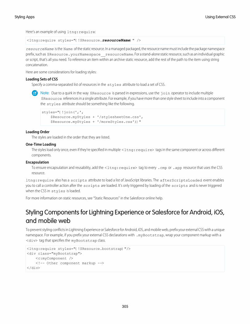
Here’s an example of using ltng:require:
<ltng:require styles="{!$Resource.resourceName}" />
resourceName is the Name of the static resource. In a managed packaged, the resource name must include the package namespaceprefix, such as $Resource.yourNamespace__resourceName. For a stand-alone static resource, such as an individual graphicor script, that’s all you need. To reference an item within an archive static resource, add the rest of the path to the item using stringconcatenation.
Here are some considerations for loading styles:
Loading Sets of CSSSpecify a comma-separated list of resources in the styles attribute to load a set of CSS.
Note: Due to a quirk in the way $Resource is parsed in expressions, use the join operator to include multiple$Resource references in a single attribute. For example, if you have more than one style sheet to include into a componentthe styles attribute should be something like the following.
styles="{!join(',',$Resource.myStyles + '/stylesheetOne.css',$Resource.myStyles + '/moreStyles.css')}"
Loading OrderThe styles are loaded in the order that they are listed.
One-Time LoadingThe styles load only once, even if they’re specified in multiple <ltng:require> tags in the same component or across differentcomponents.
EncapsulationTo ensure encapsulation and reusability, add the <ltng:require> tag to every .cmp or .app resource that uses the CSSresource.
ltng:require also has a scripts attribute to load a list of JavaScript libraries. The afterScriptsLoaded event enablesyou to call a controller action after the scripts are loaded. It's only triggered by loading of the scripts and is never triggeredwhen the CSS in styles is loaded.
For more information on static resources, see “Static Resources” in the Salesforce online help.
Styling Components for Lightning Experience or Salesforce for Android, iOS,and mobile webTo prevent styling conflicts in Lightning Experience or Salesforce for Android, iOS, and mobile web, prefix your external CSS with a uniquenamespace. For example, if you prefix your external CSS declarations with .myBootstrap, wrap your component markup with a<div> tag that specifies the myBootstrap class.
<ltng:require styles="{!$Resource.bootstrap}"/><div class="myBootstrap">
<c:myComponent /><!-- Other component markup -->
</div>
305
Using External CSSStyling Apps
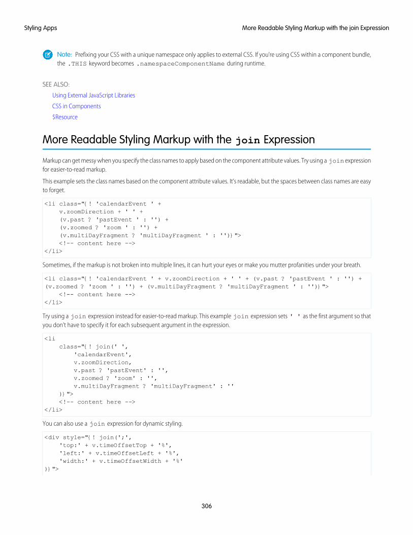
Note: Prefixing your CSS with a unique namespace only applies to external CSS. If you’re using CSS within a component bundle,the .THIS keyword becomes .namespaceComponentName during runtime.
SEE ALSO:
Using External JavaScript Libraries
CSS in Components
$Resource
More Readable Styling Markup with the join Expression
Markup can get messy when you specify the class names to apply based on the component attribute values. Try using a join expressionfor easier-to-read markup.
This example sets the class names based on the component attribute values. It’s readable, but the spaces between class names are easyto forget.
<li class="{! 'calendarEvent ' +v.zoomDirection + ' ' +(v.past ? 'pastEvent ' : '') +(v.zoomed ? 'zoom ' : '') +(v.multiDayFragment ? 'multiDayFragment ' : '')}"><!-- content here -->
</li>
Sometimes, if the markup is not broken into multiple lines, it can hurt your eyes or make you mutter profanities under your breath.
<li class="{! 'calendarEvent ' + v.zoomDirection + ' ' + (v.past ? 'pastEvent ' : '') +(v.zoomed ? 'zoom ' : '') + (v.multiDayFragment ? 'multiDayFragment ' : '')}">
<!-- content here --></li>
Try using a join expression instead for easier-to-read markup. This example join expression sets ' ' as the first argument so thatyou don’t have to specify it for each subsequent argument in the expression.
<liclass="{! join(' ',
'calendarEvent',v.zoomDirection,v.past ? 'pastEvent' : '',v.zoomed ? 'zoom' : '',v.multiDayFragment ? 'multiDayFragment' : ''
)}"><!-- content here -->
</li>
You can also use a join expression for dynamic styling.
<div style="{! join(';','top:' + v.timeOffsetTop + '%','left:' + v.timeOffsetLeft + '%','width:' + v.timeOffsetWidth + '%'
)}">
306
More Readable Styling Markup with the join ExpressionStyling Apps
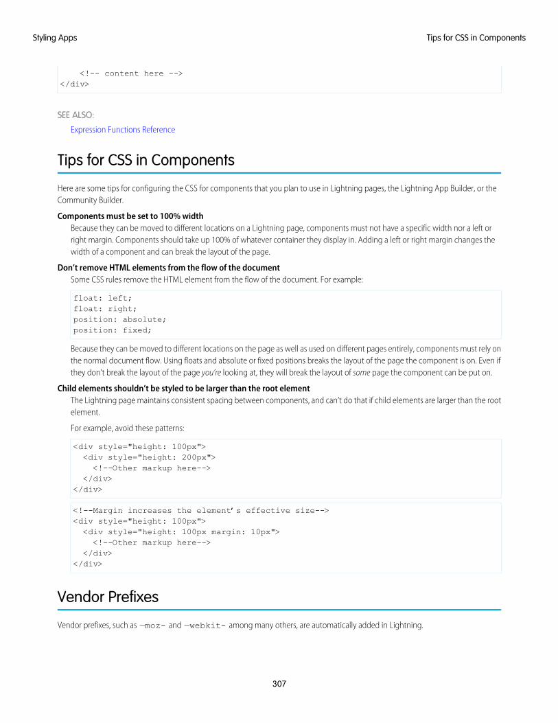
<!-- content here --></div>
SEE ALSO:
Expression Functions Reference
Tips for CSS in Components
Here are some tips for configuring the CSS for components that you plan to use in Lightning pages, the Lightning App Builder, or theCommunity Builder.
Components must be set to 100% widthBecause they can be moved to different locations on a Lightning page, components must not have a specific width nor a left orright margin. Components should take up 100% of whatever container they display in. Adding a left or right margin changes thewidth of a component and can break the layout of the page.
Don’t remove HTML elements from the flow of the documentSome CSS rules remove the HTML element from the flow of the document. For example:
float: left;float: right;position: absolute;position: fixed;
Because they can be moved to different locations on the page as well as used on different pages entirely, components must rely onthe normal document flow. Using floats and absolute or fixed positions breaks the layout of the page the component is on. Even ifthey don’t break the layout of the page you’re looking at, they will break the layout of some page the component can be put on.
Child elements shouldn’t be styled to be larger than the root elementThe Lightning page maintains consistent spacing between components, and can’t do that if child elements are larger than the rootelement.
For example, avoid these patterns:
<div style="height: 100px"><div style="height: 200px"><!--Other markup here-->
</div></div>
<!--Margin increases the element’s effective size--><div style="height: 100px"><div style="height: 100px margin: 10px"><!--Other markup here-->
</div></div>
Vendor Prefixes
Vendor prefixes, such as —moz- and —webkit- among many others, are automatically added in Lightning.
307
Tips for CSS in ComponentsStyling Apps
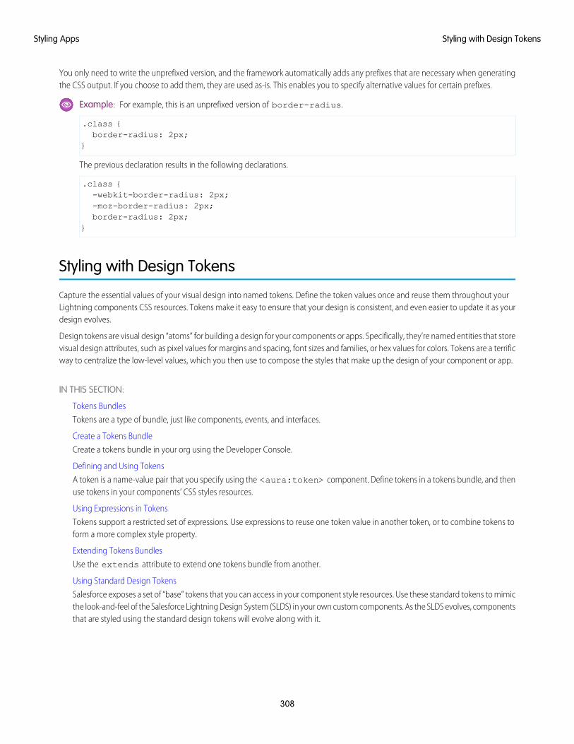
You only need to write the unprefixed version, and the framework automatically adds any prefixes that are necessary when generatingthe CSS output. If you choose to add them, they are used as-is. This enables you to specify alternative values for certain prefixes.
Example: For example, this is an unprefixed version of border-radius.
.class {border-radius: 2px;
}
The previous declaration results in the following declarations.
.class {-webkit-border-radius: 2px;-moz-border-radius: 2px;border-radius: 2px;
}
Styling with Design Tokens
Capture the essential values of your visual design into named tokens. Define the token values once and reuse them throughout yourLightning components CSS resources. Tokens make it easy to ensure that your design is consistent, and even easier to update it as yourdesign evolves.
Design tokens are visual design “atoms” for building a design for your components or apps. Specifically, they’re named entities that storevisual design attributes, such as pixel values for margins and spacing, font sizes and families, or hex values for colors. Tokens are a terrificway to centralize the low-level values, which you then use to compose the styles that make up the design of your component or app.
IN THIS SECTION:
Tokens Bundles
Tokens are a type of bundle, just like components, events, and interfaces.
Create a Tokens Bundle
Create a tokens bundle in your org using the Developer Console.
Defining and Using Tokens
A token is a name-value pair that you specify using the <aura:token> component. Define tokens in a tokens bundle, and thenuse tokens in your components’ CSS styles resources.
Using Expressions in Tokens
Tokens support a restricted set of expressions. Use expressions to reuse one token value in another token, or to combine tokens toform a more complex style property.
Extending Tokens Bundles
Use the extends attribute to extend one tokens bundle from another.
Using Standard Design Tokens
Salesforce exposes a set of “base” tokens that you can access in your component style resources. Use these standard tokens to mimicthe look-and-feel of the Salesforce Lightning Design System (SLDS) in your own custom components. As the SLDS evolves, componentsthat are styled using the standard design tokens will evolve along with it.
308
Styling with Design TokensStyling Apps
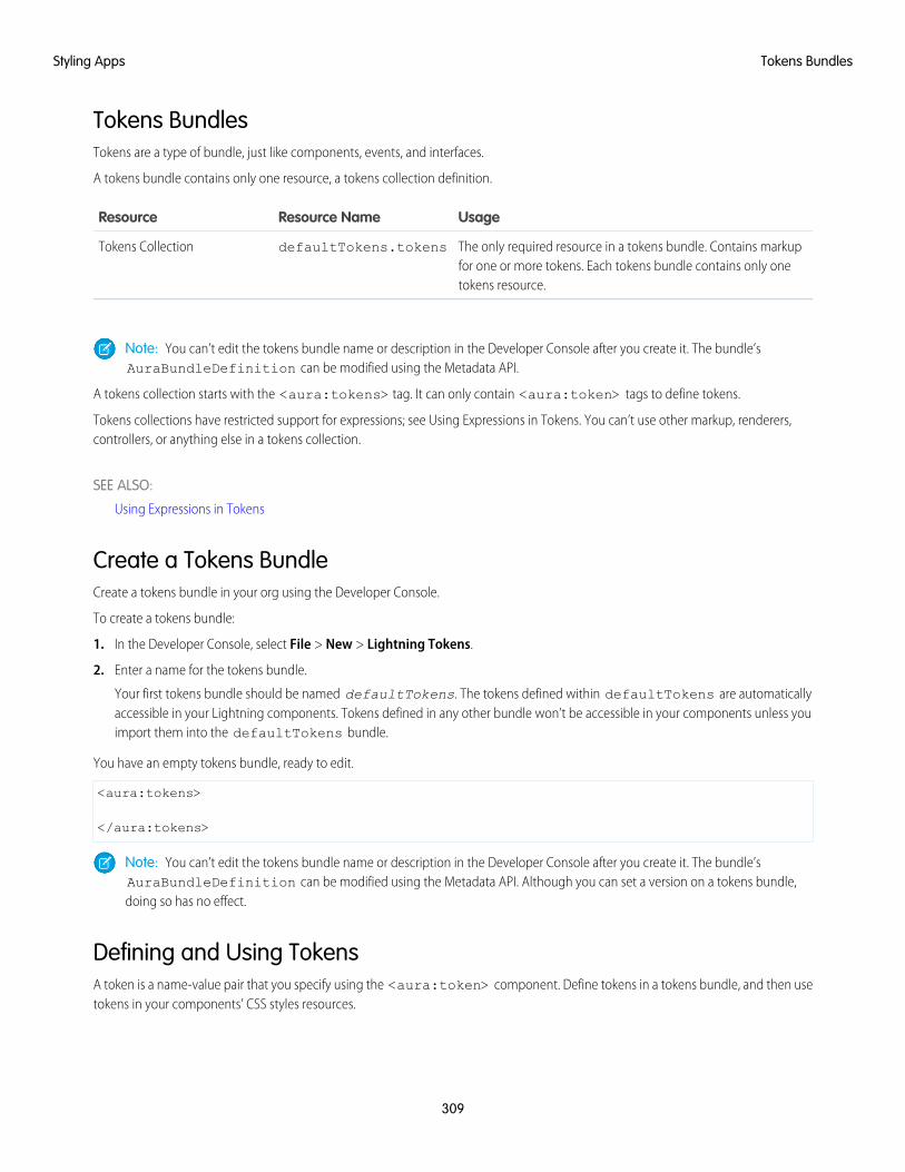
Tokens BundlesTokens are a type of bundle, just like components, events, and interfaces.
A tokens bundle contains only one resource, a tokens collection definition.
UsageResource NameResource
The only required resource in a tokens bundle. Contains markupfor one or more tokens. Each tokens bundle contains only onetokens resource.
defaultTokens.tokensTokens Collection
Note: You can’t edit the tokens bundle name or description in the Developer Console after you create it. The bundle’sAuraBundleDefinition can be modified using the Metadata API.
A tokens collection starts with the <aura:tokens> tag. It can only contain <aura:token> tags to define tokens.
Tokens collections have restricted support for expressions; see Using Expressions in Tokens. You can’t use other markup, renderers,controllers, or anything else in a tokens collection.
SEE ALSO:
Using Expressions in Tokens
Create a Tokens BundleCreate a tokens bundle in your org using the Developer Console.
To create a tokens bundle:
1. In the Developer Console, select File > New > Lightning Tokens.
2. Enter a name for the tokens bundle.
Your first tokens bundle should be named defaultTokens. The tokens defined within defaultTokens are automaticallyaccessible in your Lightning components. Tokens defined in any other bundle won’t be accessible in your components unless youimport them into the defaultTokens bundle.
You have an empty tokens bundle, ready to edit.
<aura:tokens>
</aura:tokens>
Note: You can’t edit the tokens bundle name or description in the Developer Console after you create it. The bundle’sAuraBundleDefinition can be modified using the Metadata API. Although you can set a version on a tokens bundle,doing so has no effect.
Defining and Using TokensA token is a name-value pair that you specify using the <aura:token> component. Define tokens in a tokens bundle, and then usetokens in your components’ CSS styles resources.
309
Tokens BundlesStyling Apps
Defining TokensAdd new tokens as child components of the bundle’s <aura:tokens> component. For example:
<aura:tokens><aura:token name="myBodyTextFontFace"
value="'Salesforce Sans', Helvetica, Arial, sans-serif"/><aura:token name="myBodyTextFontWeight" value="normal"/><aura:token name="myBackgroundColor" value="#f4f6f9"/><aura:token name="myDefaultMargin" value="6px"/>
</aura:tokens>
The only allowed attributes for the <aura:token> tag are name and value.
Using TokensTokens created in the defaultTokens bundle are automatically available in components in your namespace. To use a design token,reference it using the token() function and the token name in the CSS resource of a component bundle. For example:
.THIS p {font-family: token(myBodyTextFontFace);font-weight: token(myBodyTextFontWeight);
}
If you prefer a more concise function name for referencing tokens, you can use the t() function instead of token(). The two areequivalent. If your token names follow a naming convention or are sufficiently descriptive, the use of the more terse function namewon’t affect the clarity of your CSS styles.
Using Expressions in TokensTokens support a restricted set of expressions. Use expressions to reuse one token value in another token, or to combine tokens to forma more complex style property.
Cross-Referencing TokensTo reference one token’s value in another token’s definition, wrap the token to be referenced in standard expression syntax.
In the following example, we’ll reference tokens provided by Salesforce in our custom tokens. Although you can’t see the standard tokensdirectly, we’ll imagine they look something like the following.
<!-- force:base tokens (SLDS standard tokens) --><aura:tokens>...<aura:token name="colorBackground" value="rgb(244, 246, 249)" /><aura:token name="fontFamily" value="'Salesforce Sans', Arial, sans-serif" />...
</aura:tokens>
With the preceding in mind, you can reference the standard tokens in your custom tokens, as in the following.
<!-- defaultTokens.tokens (your tokens) --><aura:tokens extends="force:base"><aura:token name="mainColor" value="{! colorBackground }" /><aura:token name="btnColor" value="{! mainColor }" />
310
Using Expressions in TokensStyling Apps
<aura:token name="myFont" value="{! fontFamily }" /></aura:tokens>
You can only cross-reference tokens defined in the same file or a parent.
Expression syntax in tokens resources is restricted to references to other tokens.
Combining TokensTo support combining individual token values into more complex CSS style properties, the token() function supports stringconcatenation. For example, if you have the following tokens defined:
<!-- defaultTokens.tokens (your tokens) --><aura:tokens><aura:token name="defaultHorizonalSpacing" value="12px" /><aura:token name="defaultVerticalSpacing" value="6px" />
</aura:tokens>
You can combine these two tokens in a CSS style definition. For example:
/* myComponent.css */.THIS div.notification {margin: token(defaultVerticalSpacing + ' ' + defaultHorizonalSpacing);/* more styles here */
}
You can mix tokens with strings as much as necessary to create the right style definition. For example, use margin:token(defaultVerticalSpacing + ' ' + defaultHorizonalSpacing + ' 3px'); to hard code the bottomspacing in the preceding definition.
The only operator supported within the token() function is “+” for string concatenation.
SEE ALSO:
Defining and Using Tokens
Extending Tokens BundlesUse the extends attribute to extend one tokens bundle from another.
To add tokens from one bundle to another, extend the “child” tokens bundle from the “parent” tokens, like this.
<aura:tokens extends="yourNamespace:parentTokens"><!-- additional tokens here -->
</aura:tokens>
Overriding tokens values works mostly as you’d expect: tokens in a child tokens bundle override tokens with the same name from aparent bundle. The exception is if you’re using standard tokens. You can’t override standard tokens in Lightning Experience or theSalesforce app.
311
Extending Tokens BundlesStyling Apps
Important: Overriding standard token values is undefined behavior and unsupported. If you create a token with the same nameas a standard token, it overrides the standard token’s value in some contexts, and has no effect in others. This behavior will changein a future release. Don’t use it.
SEE ALSO:
Using Standard Design Tokens
Using Standard Design TokensSalesforce exposes a set of “base” tokens that you can access in your component style resources. Use these standard tokens to mimicthe look-and-feel of the Salesforce Lightning Design System (SLDS) in your own custom components. As the SLDS evolves, componentsthat are styled using the standard design tokens will evolve along with it.
To add the standard tokens to your org, extend a tokens bundle from the base tokens, like so.
<aura:tokens extends="force:base"><!-- your own tokens here -->
</aura:tokens>
Once added to defaultTokens (or another tokens bundle that defaultTokens extends) you can reference tokens fromforce:base just like your own tokens, using the token() function and token name. For example:
.THIS p {font-family: token(fontFamily);font-weight: token(fontWeightRegular);
}
You can mix-and-match your tokens with the standard tokens. It’s a best practice to develop a naming system for your own tokens tomake them easily distinguishable from standard tokens. Consider prefixing your token names with “my”, or something else easilyidentifiable.
IN THIS SECTION:
Overriding Standard Tokens (Developer Preview)
Standard tokens provide the look-and-feel of the Lightning Design System in your custom components. You can override standardtokens to customize and apply branding to your Lightning apps.
Standard Design Tokens—force:base
The standard tokens available are a subset of the design tokens offered in the Salesforce Lightning Design System (SLDS). Thefollowing tokens are available when extending from force:base.
Standard Design Tokens for Communities
Use a subset of the standard design tokens to make your components compatible with the Theme panel in Community Builder. TheTheme panel enables administrators to quickly style an entire community using these properties. Each property in the Theme panelmaps to one or more standard design tokens. When an administrator updates a property in the Theme panel, the system automaticallyupdates any Lightning components that use the tokens associated with that branding property.
SEE ALSO:
Extending Tokens Bundles
312
Using Standard Design TokensStyling Apps

Overriding Standard Tokens (Developer Preview)Standard tokens provide the look-and-feel of the Lightning Design System in your custom components. You can override standardtokens to customize and apply branding to your Lightning apps.
Note: Overriding standard tokens is available as a developer preview. This feature isn’t generally available unless or until Salesforceannounces its general availability in documentation or in press releases or public statements. You can provide feedback andsuggestions for this feature on the IdeaExchange.
To override a standard token for your Lightning app, create a tokens bundle with a unique name, for example myOverrides. In thetokens resource, redefine the value for a standard token:
<aura:tokens><aura:token name="colorTextBrand" value="#8d7d74"/>
</aura:tokens>
In your Lightning app, specify the tokens bundle in the tokens attribute:
<aura:application tokens="c:myOverrides"><!-- Your app markup here -->
</aura:application>
Token overrides apply across your app, including resources and components provided by Salesforce and components of your own thatuse tokens.
Packaging apps that use the tokens attribute is unsupported.
Important: Overriding standard token values within defaultTokens.tokens, a required resource in a tokens bundle, isunsupported. If you create a token with the same name as a standard token, it overrides the standard token’s value in some contexts,and has no effect in others. Overrides should only be done in a separate resource as described above.
SEE ALSO:
Standard Design Tokens—force:base
Standard Design Tokens—force:base
The standard tokens available are a subset of the design tokens offered in the Salesforce Lightning Design System (SLDS). The followingtokens are available when extending from force:base.
Available Tokens
Important: The standard token values evolve along with SLDS. Available tokens and their values can change without notice.Token values presented here are for example only.
Example ValueToken Name
1pxborderWidthThin
2pxborderWidthThick
0.125remspacingXxxSmall
0.25remspacingXxSmall
0.5remspacingXSmall
313
Using Standard Design TokensStyling Apps
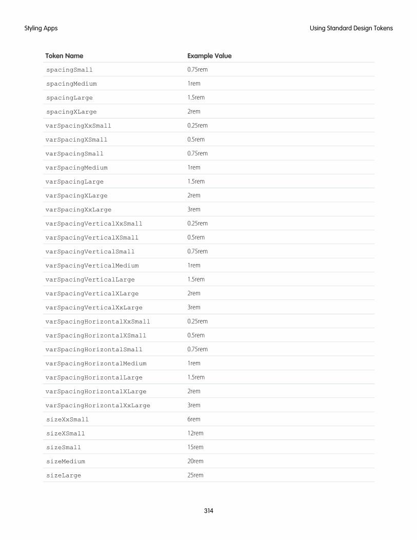
Example ValueToken Name
0.75remspacingSmall
1remspacingMedium
1.5remspacingLarge
2remspacingXLarge
0.25remvarSpacingXxSmall
0.5remvarSpacingXSmall
0.75remvarSpacingSmall
1remvarSpacingMedium
1.5remvarSpacingLarge
2remvarSpacingXLarge
3remvarSpacingXxLarge
0.25remvarSpacingVerticalXxSmall
0.5remvarSpacingVerticalXSmall
0.75remvarSpacingVerticalSmall
1remvarSpacingVerticalMedium
1.5remvarSpacingVerticalLarge
2remvarSpacingVerticalXLarge
3remvarSpacingVerticalXxLarge
0.25remvarSpacingHorizontalXxSmall
0.5remvarSpacingHorizontalXSmall
0.75remvarSpacingHorizontalSmall
1remvarSpacingHorizontalMedium
1.5remvarSpacingHorizontalLarge
2remvarSpacingHorizontalXLarge
3remvarSpacingHorizontalXxLarge
6remsizeXxSmall
12remsizeXSmall
15remsizeSmall
20remsizeMedium
25remsizeLarge
314
Using Standard Design TokensStyling Apps
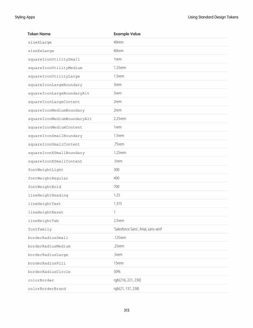
Example ValueToken Name
40remsizeXLarge
60remsizeXxLarge
1remsquareIconUtilitySmall
1.25remsquareIconUtilityMedium
1.5remsquareIconUtilityLarge
3remsquareIconLargeBoundary
5remsquareIconLargeBoundaryAlt
2remsquareIconLargeContent
2remsquareIconMediumBoundary
2.25remsquareIconMediumBoundaryAlt
1remsquareIconMediumContent
1.5remsquareIconSmallBoundary
.75remsquareIconSmallContent
1.25remsquareIconXSmallBoundary
.5remsquareIconXSmallContent
300fontWeightLight
400fontWeightRegular
700fontWeightBold
1.25lineHeightHeading
1.375lineHeightText
1lineHeightReset
2.5remlineHeightTab
'Salesforce Sans', Arial, sans-seriffontFamily
.125remborderRadiusSmall
.25remborderRadiusMedium
.5remborderRadiusLarge
15remborderRadiusPill
50%borderRadiusCircle
rgb(216, 221, 230)colorBorder
rgb(21, 137, 238)colorBorderBrand
315
Using Standard Design TokensStyling Apps
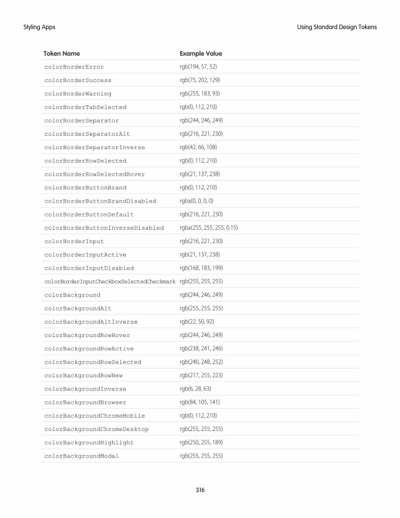
Example ValueToken Name
rgb(194, 57, 52)colorBorderError
rgb(75, 202, 129)colorBorderSuccess
rgb(255, 183, 93)colorBorderWarning
rgb(0, 112, 210)colorBorderTabSelected
rgb(244, 246, 249)colorBorderSeparator
rgb(216, 221, 230)colorBorderSeparatorAlt
rgb(42, 66, 108)colorBorderSeparatorInverse
rgb(0, 112, 210)colorBorderRowSelected
rgb(21, 137, 238)colorBorderRowSelectedHover
rgb(0, 112, 210)colorBorderButtonBrand
rgba(0, 0, 0, 0)colorBorderButtonBrandDisabled
rgb(216, 221, 230)colorBorderButtonDefault
rgba(255, 255, 255, 0.15)colorBorderButtonInverseDisabled
rgb(216, 221, 230)colorBorderInput
rgb(21, 137, 238)colorBorderInputActive
rgb(168, 183, 199)colorBorderInputDisabled
rgb(255, 255, 255)colorBorderInputCheckboxSelectedCheckmark
rgb(244, 246, 249)colorBackground
rgb(255, 255, 255)colorBackgroundAlt
rgb(22, 50, 92)colorBackgroundAltInverse
rgb(244, 246, 249)colorBackgroundRowHover
rgb(238, 241, 246)colorBackgroundRowActive
rgb(240, 248, 252)colorBackgroundRowSelected
rgb(217, 255, 223)colorBackgroundRowNew
rgb(6, 28, 63)colorBackgroundInverse
rgb(84, 105, 141)colorBackgroundBrowser
rgb(0, 112, 210)colorBackgroundChromeMobile
rgb(255, 255, 255)colorBackgroundChromeDesktop
rgb(250, 255, 189)colorBackgroundHighlight
rgb(255, 255, 255)colorBackgroundModal
316
Using Standard Design TokensStyling Apps
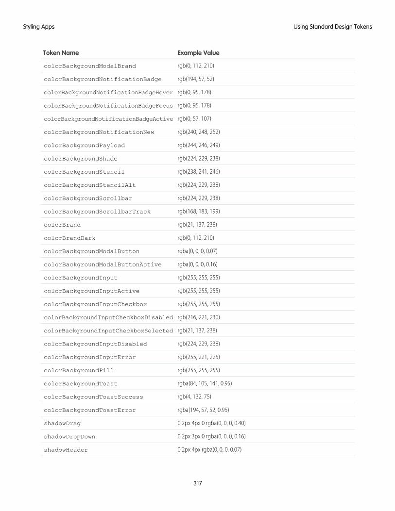
Example ValueToken Name
rgb(0, 112, 210)colorBackgroundModalBrand
rgb(194, 57, 52)colorBackgroundNotificationBadge
rgb(0, 95, 178)colorBackgroundNotificationBadgeHover
rgb(0, 95, 178)colorBackgroundNotificationBadgeFocus
rgb(0, 57, 107)colorBackgroundNotificationBadgeActive
rgb(240, 248, 252)colorBackgroundNotificationNew
rgb(244, 246, 249)colorBackgroundPayload
rgb(224, 229, 238)colorBackgroundShade
rgb(238, 241, 246)colorBackgroundStencil
rgb(224, 229, 238)colorBackgroundStencilAlt
rgb(224, 229, 238)colorBackgroundScrollbar
rgb(168, 183, 199)colorBackgroundScrollbarTrack
rgb(21, 137, 238)colorBrand
rgb(0, 112, 210)colorBrandDark
rgba(0, 0, 0, 0.07)colorBackgroundModalButton
rgba(0, 0, 0, 0.16)colorBackgroundModalButtonActive
rgb(255, 255, 255)colorBackgroundInput
rgb(255, 255, 255)colorBackgroundInputActive
rgb(255, 255, 255)colorBackgroundInputCheckbox
rgb(216, 221, 230)colorBackgroundInputCheckboxDisabled
rgb(21, 137, 238)colorBackgroundInputCheckboxSelected
rgb(224, 229, 238)colorBackgroundInputDisabled
rgb(255, 221, 225)colorBackgroundInputError
rgb(255, 255, 255)colorBackgroundPill
rgba(84, 105, 141, 0.95)colorBackgroundToast
rgb(4, 132, 75)colorBackgroundToastSuccess
rgba(194, 57, 52, 0.95)colorBackgroundToastError
0 2px 4px 0 rgba(0, 0, 0, 0.40)shadowDrag
0 2px 3px 0 rgba(0, 0, 0, 0.16)shadowDropDown
0 2px 4px rgba(0, 0, 0, 0.07)shadowHeader
317
Using Standard Design TokensStyling Apps
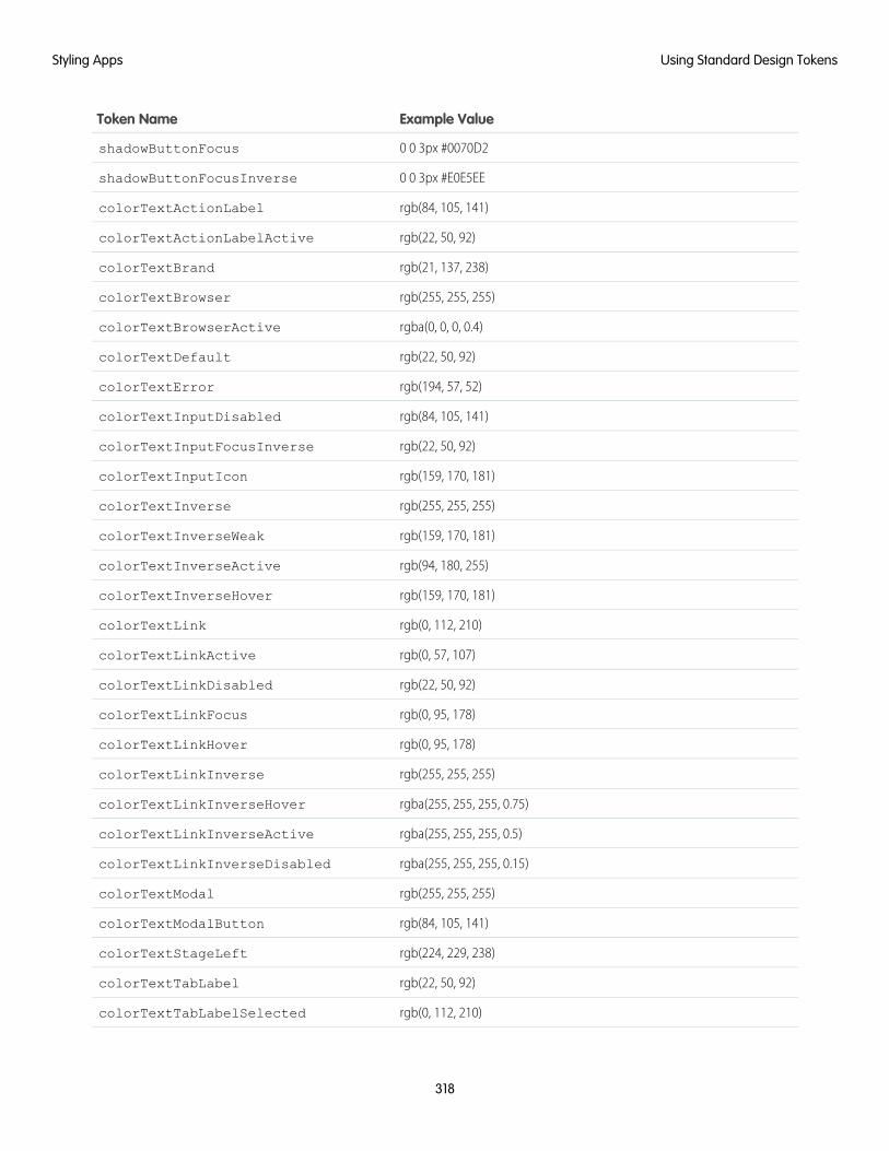
Example ValueToken Name
0 0 3px #0070D2shadowButtonFocus
0 0 3px #E0E5EEshadowButtonFocusInverse
rgb(84, 105, 141)colorTextActionLabel
rgb(22, 50, 92)colorTextActionLabelActive
rgb(21, 137, 238)colorTextBrand
rgb(255, 255, 255)colorTextBrowser
rgba(0, 0, 0, 0.4)colorTextBrowserActive
rgb(22, 50, 92)colorTextDefault
rgb(194, 57, 52)colorTextError
rgb(84, 105, 141)colorTextInputDisabled
rgb(22, 50, 92)colorTextInputFocusInverse
rgb(159, 170, 181)colorTextInputIcon
rgb(255, 255, 255)colorTextInverse
rgb(159, 170, 181)colorTextInverseWeak
rgb(94, 180, 255)colorTextInverseActive
rgb(159, 170, 181)colorTextInverseHover
rgb(0, 112, 210)colorTextLink
rgb(0, 57, 107)colorTextLinkActive
rgb(22, 50, 92)colorTextLinkDisabled
rgb(0, 95, 178)colorTextLinkFocus
rgb(0, 95, 178)colorTextLinkHover
rgb(255, 255, 255)colorTextLinkInverse
rgba(255, 255, 255, 0.75)colorTextLinkInverseHover
rgba(255, 255, 255, 0.5)colorTextLinkInverseActive
rgba(255, 255, 255, 0.15)colorTextLinkInverseDisabled
rgb(255, 255, 255)colorTextModal
rgb(84, 105, 141)colorTextModalButton
rgb(224, 229, 238)colorTextStageLeft
rgb(22, 50, 92)colorTextTabLabel
rgb(0, 112, 210)colorTextTabLabelSelected
318
Using Standard Design TokensStyling Apps

Example ValueToken Name
rgb(0, 95, 178)colorTextTabLabelHover
rgb(0, 95, 178)colorTextTabLabelFocus
rgb(0, 57, 107)colorTextTabLabelActive
rgb(224, 229, 238)colorTextTabLabelDisabled
rgb(224, 229, 238)colorTextToast
rgb(84, 105, 141)colorTextWeak
rgb(0, 112, 210)colorTextIconBrand
rgb(255, 255, 255)colorTextButtonBrand
rgb(255, 255, 255)colorTextButtonBrandHover
rgb(255, 255, 255)colorTextButtonBrandActive
rgb(255, 255, 255)colorTextButtonBrandDisabled
rgb(0, 112, 210)colorTextButtonDefault
rgb(0, 112, 210)colorTextButtonDefaultHover
rgb(0, 112, 210)colorTextButtonDefaultActive
rgb(216, 221, 230)colorTextButtonDefaultDisabled
rgb(159, 170, 181)colorTextButtonDefaultHint
rgb(224, 229, 238)colorTextButtonInverse
rgba(255, 255, 255, 0.15)colorTextButtonInverseDisabled
rgb(84, 105, 141)colorTextIconDefault
rgb(159, 170, 181)colorTextIconDefaultHint
rgb(0, 112, 210)colorTextIconDefaultHover
rgb(0, 57, 107)colorTextIconDefaultActive
rgb(216, 221, 230)colorTextIconDefaultDisabled
rgb(255, 255, 255)colorTextIconInverse
rgb(255, 255, 255)colorTextIconInverseHover
rgb(255, 255, 255)colorTextIconInverseActive
rgba(255, 255, 255, 0.15)colorTextIconInverseDisabled
rgb(84, 105, 141)colorTextLabel
rgb(84, 105, 141)colorTextPlaceholder
rgb(224, 229, 238)colorTextPlaceholderInverse
319
Using Standard Design TokensStyling Apps
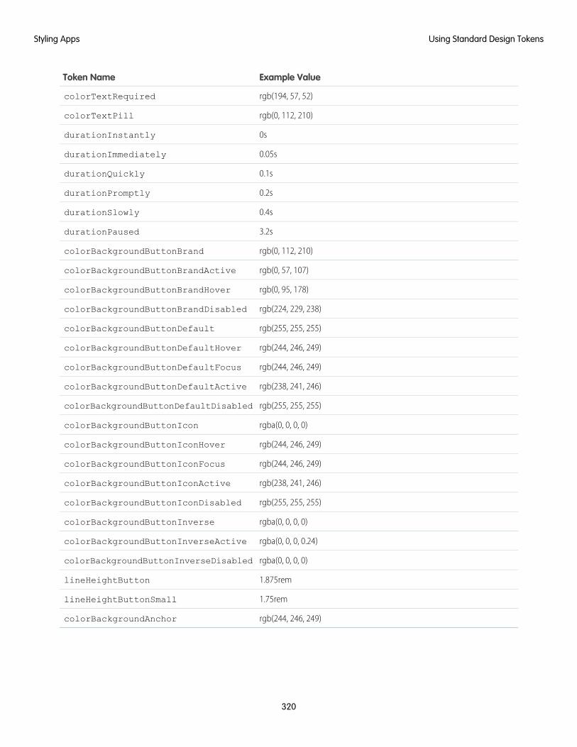
Example ValueToken Name
rgb(194, 57, 52)colorTextRequired
rgb(0, 112, 210)colorTextPill
0sdurationInstantly
0.05sdurationImmediately
0.1sdurationQuickly
0.2sdurationPromptly
0.4sdurationSlowly
3.2sdurationPaused
rgb(0, 112, 210)colorBackgroundButtonBrand
rgb(0, 57, 107)colorBackgroundButtonBrandActive
rgb(0, 95, 178)colorBackgroundButtonBrandHover
rgb(224, 229, 238)colorBackgroundButtonBrandDisabled
rgb(255, 255, 255)colorBackgroundButtonDefault
rgb(244, 246, 249)colorBackgroundButtonDefaultHover
rgb(244, 246, 249)colorBackgroundButtonDefaultFocus
rgb(238, 241, 246)colorBackgroundButtonDefaultActive
rgb(255, 255, 255)colorBackgroundButtonDefaultDisabled
rgba(0, 0, 0, 0)colorBackgroundButtonIcon
rgb(244, 246, 249)colorBackgroundButtonIconHover
rgb(244, 246, 249)colorBackgroundButtonIconFocus
rgb(238, 241, 246)colorBackgroundButtonIconActive
rgb(255, 255, 255)colorBackgroundButtonIconDisabled
rgba(0, 0, 0, 0)colorBackgroundButtonInverse
rgba(0, 0, 0, 0.24)colorBackgroundButtonInverseActive
rgba(0, 0, 0, 0)colorBackgroundButtonInverseDisabled
1.875remlineHeightButton
1.75remlineHeightButtonSmall
rgb(244, 246, 249)colorBackgroundAnchor
320
Using Standard Design TokensStyling Apps
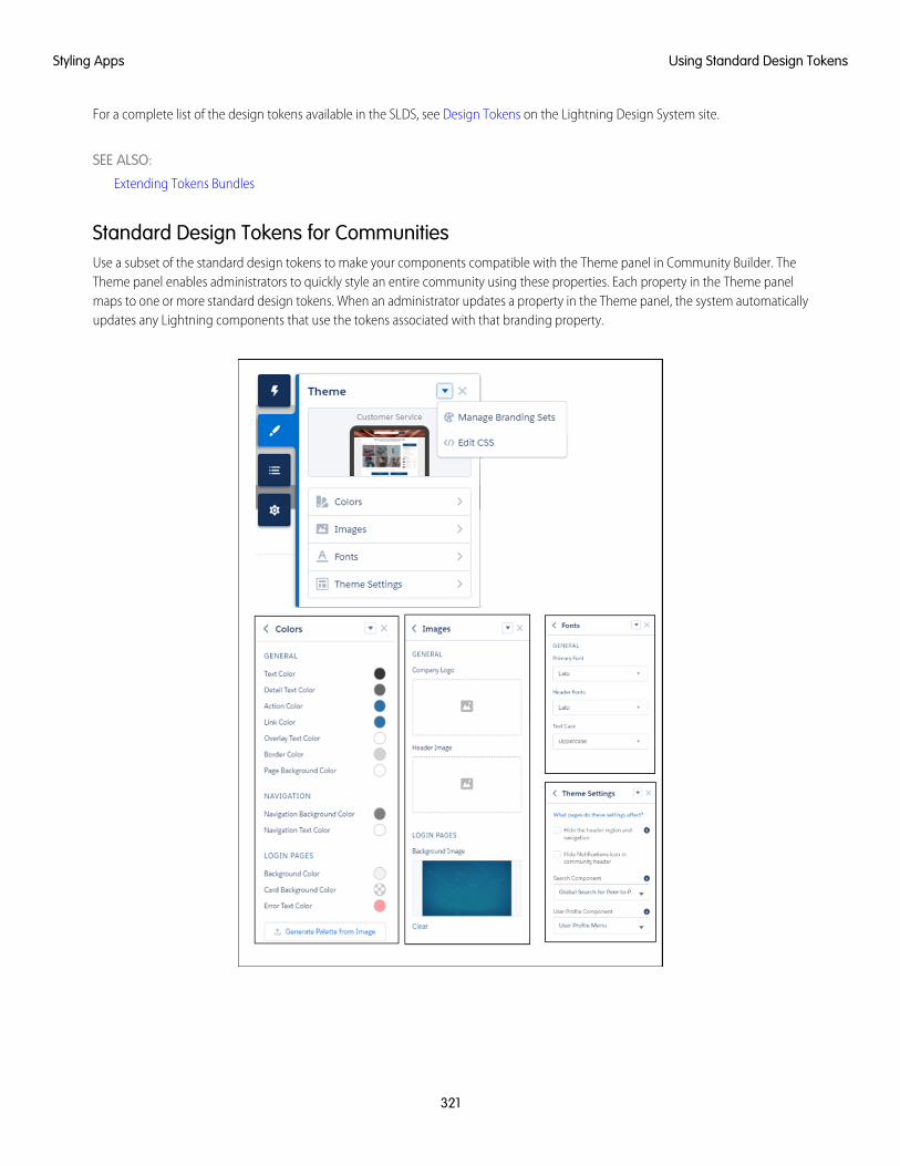
For a complete list of the design tokens available in the SLDS, see Design Tokens on the Lightning Design System site.
SEE ALSO:
Extending Tokens Bundles
Standard Design Tokens for CommunitiesUse a subset of the standard design tokens to make your components compatible with the Theme panel in Community Builder. TheTheme panel enables administrators to quickly style an entire community using these properties. Each property in the Theme panelmaps to one or more standard design tokens. When an administrator updates a property in the Theme panel, the system automaticallyupdates any Lightning components that use the tokens associated with that branding property.
321
Using Standard Design TokensStyling Apps
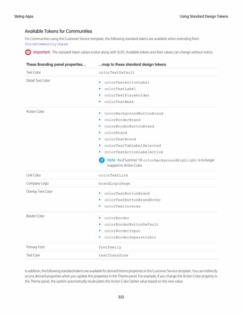
Available Tokens for CommunitiesFor Communities using the Customer Service template, the following standard tokens are available when extending fromforceCommunity:base.
Important: The standard token values evolve along with SLDS. Available tokens and their values can change without notice.
...map to these standard design tokensThese Branding panel properties...
colorTextDefaultText Color
Detail Text Color • colorTextActionLabel
• colorTextLabel
• colorTextPlaceholder
• colorTextWeak
Action Color • colorBackgroundButtonBrand
• colorBorderBrand
• colorBorderButtonBrand
• colorBrand
• colorTextBrand
• colorTextTabLabelSelected
• colorTextActionLabelActive
Note: As of Summer ‘18 colorBackgroundHighlight is no longermapped to Action Color.
colorTextLinkLink Color
brandLogoImageCompany Logo
Overlay Text Color • colorTextButtonBrand
• colorTextButtonBrandHover
• colorTextInverse
Border Color • colorBorder
• colorBorderButtonDefault
• colorBorderInput
• colorBorderSeparatorAlt
fontFamilyPrimary Font
textTransformText Case
In addition, the following standard tokens are available for derived theme properties in the Customer Service template. You can indirectlyaccess derived properties when you update the properties in the Theme panel. For example, if you change the Action Color property inthe Theme panel, the system automatically recalculates the Action Color Darker value based on the new value.
322
Using Standard Design TokensStyling Apps
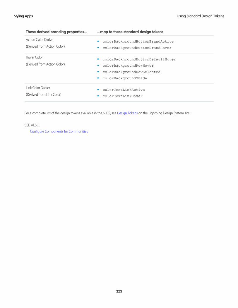
...map to these standard design tokensThese derived branding properties...
Action Color Darker
(Derived from Action Color)• colorBackgroundButtonBrandActive
• colorBackgroundButtonBrandHover
Hover Color
(Derived from Action Color)• colorBackgroundButtonDefaultHover
• colorBackgroundRowHover
• colorBackgroundRowSelected
• colorBackgroundShade
Link Color Darker
(Derived from Link Color)• colorTextLinkActive
• colorTextLinkHover
For a complete list of the design tokens available in the SLDS, see Design Tokens on the Lightning Design System site.
SEE ALSO:
Configure Components for Communities
323
Using Standard Design TokensStyling Apps
CHAPTER 8 Developing Secure Code
The Lightning Locker architectural layer enhances security by isolating individual Lightning namespacesin their own containers and enforcing coding best practices.
In this chapter ...
• What is LightningLocker? The framework also uses JavaScript Strict mode to turn on native security features in the browser, and
Content Security Policy (CSP) rules to control the source of content that can be loaded on a page.• Content Security
Policy Overview
• Freeze JavaScriptPrototypes
324
What is Lightning Locker?
Lightning Locker is a powerful security architecture for Lightning components. Lightning Locker enhances security by isolating Lightningcomponents that belong to one namespace from components in a different namespace. Lightning Locker also promotes best practicesthat improve the supportability of your code by only allowing access to supported APIs and eliminating access to non-publishedframework internals.
IN THIS SECTION:
JavaScript Strict Mode Enforcement
Lightning Locker implicitly enables JavaScript strict mode. You don’t need to specify "use strict" in your code. JavaScriptstrict mode makes code more secure, robust and supportable.
DOM Access Containment
A component can only traverse the DOM and access elements created by a component in the same namespace. This behaviorprevents the anti-pattern of reaching into DOM elements owned by components in another namespace.
Secure Wrappers
For security, Lightning Locker restricts the use of global objects by hiding an object or by wrapping it in a secure version of the object.For example, the secure version of window is SecureWindow. Locker intercepts calls to window and uses SecureWindowinstead. Some methods and properties have different behavior or aren’t available on the secure objects.
eval() Function is Limited by Lightning Locker
In Lightning Locker, use of the eval() function is supported to enable use of third-party libraries that evaluate code dynamically.However, it is limited to work only in the global scope of the namespace. The eval() function can’t access the local variableswithin the scope in which it’s called.
MIME Types Permitted
Lightning Locker analyzes the MIME types of files sent through the browser. Locker permits some MIME types, sanitizes some MIMEtypes, and blocks the rest.
Access to Supported JavaScript API Framework Methods Only
You can access published, supported JavaScript API framework methods only. These methods are published in the reference docapp at https://<myDomain>.lightning.force.com/docs/component-library, where <myDomain> isthe name of your custom Salesforce domain. Previously, unsupported methods were accessible, which exposed your code to therisk of breaking when unsupported methods were changed or removed.
What Does Lightning Locker Affect?
Find out what’s affected and what’s not affected by Lightning Locker.
Lightning Locker Tools
Lightning Locker tools help you develop more secure code that is compatible and runs efficiently with Lightning Locker.
Disabling Lightning Locker for a Component
You can disable Lightning Locker for an Aura component by setting API version 39.0 or lower for the component. If a component isset to at least API version 40.0, Lightning Locker is enabled.
Don’t Mix Component API Versions
For consistency and ease of debugging, we recommend that you set the same API version for all custom components in your app,containment hierarchy (component within component), or extension hierarchy (component extending component).
325
What is Lightning Locker?Developing Secure Code
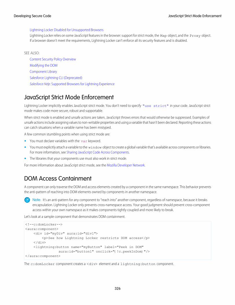
Lightning Locker Disabled for Unsupported Browsers
Lightning Locker relies on some JavaScript features in the browser: support for strict mode, the Map object, and the Proxy object.If a browser doesn’t meet the requirements, Lightning Locker can’t enforce all its security features and is disabled.
SEE ALSO:
Content Security Policy Overview
Modifying the DOM
Component Library
Salesforce Lightning CLI (Deprecated)
Salesforce Help: Supported Browsers for Lightning Experience
JavaScript Strict Mode EnforcementLightning Locker implicitly enables JavaScript strict mode. You don’t need to specify "use strict" in your code. JavaScript strictmode makes code more secure, robust and supportable.
When strict mode is enabled and unsafe actions are taken, JavaScript throws errors that would otherwise be suppressed. Examples ofunsafe actions include assigning values to non-writable properties and using a variable that hasn’t been declared. Reporting these actionscan catch situations when a variable name has been mistyped.
A few common stumbling points when using strict mode are:
• You must declare variables with the var keyword.
• You must explicitly attach a variable to the window object to create a global variable that’s available across components or libraries.For more information, see Sharing JavaScript Code Across Components.
• The libraries that your components use must also work in strict mode.
For more information about JavaScript strict mode, see the Mozilla Developer Network.
DOM Access ContainmentA component can only traverse the DOM and access elements created by a component in the same namespace. This behavior preventsthe anti-pattern of reaching into DOM elements owned by components in another namespace.
Note: It’s an anti-pattern for any component to “reach into” another component, regardless of namespace, because it breaksencapsulation. Lightning Locker only prevents cross-namespace access. Your good judgment should prevent cross-componentaccess within your own namespace as it makes components tightly coupled and more likely to break.
Let’s look at a sample component that demonstrates DOM containment.
<!--c:domLocker--><aura:component>
<div id="myDiv" aura:id="div1"><p>See how Lightning Locker restricts DOM access</p>
</div><lightning:button name="myButton" label="Peek in DOM"
aura:id="button1" onclick="{!c.peekInDom}"/></aura:component>
The c:domLocker component creates a <div> element and a lightning:button component.
326
JavaScript Strict Mode EnforcementDeveloping Secure Code
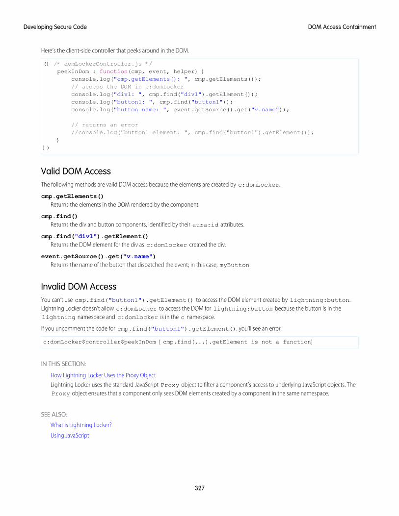
Here’s the client-side controller that peeks around in the DOM.
({ /* domLockerController.js */peekInDom : function(cmp, event, helper) {
console.log("cmp.getElements(): ", cmp.getElements());// access the DOM in c:domLockerconsole.log("div1: ", cmp.find("div1").getElement());console.log("button1: ", cmp.find("button1"));console.log("button name: ", event.getSource().get("v.name"));
// returns an error//console.log("button1 element: ", cmp.find("button1").getElement());
}})
Valid DOM AccessThe following methods are valid DOM access because the elements are created by c:domLocker.
cmp.getElements()Returns the elements in the DOM rendered by the component.
cmp.find()Returns the div and button components, identified by their aura:id attributes.
cmp.find("div1").getElement()Returns the DOM element for the div as c:domLocker created the div.
event.getSource().get("v.name")Returns the name of the button that dispatched the event; in this case, myButton.
Invalid DOM AccessYou can’t use cmp.find("button1").getElement() to access the DOM element created by lightning:button.Lightning Locker doesn’t allow c:domLocker to access the DOM for lightning:button because the button is in thelightning namespace and c:domLocker is in the c namespace.
If you uncomment the code for cmp.find("button1").getElement(), you’ll see an error:
c:domLocker$controller$peekInDom [cmp.find(...).getElement is not a function]
IN THIS SECTION:
How Lightning Locker Uses the Proxy Object
Lightning Locker uses the standard JavaScript Proxy object to filter a component’s access to underlying JavaScript objects. TheProxy object ensures that a component only sees DOM elements created by a component in the same namespace.
SEE ALSO:
What is Lightning Locker?
Using JavaScript
327
DOM Access ContainmentDeveloping Secure Code
How Lightning Locker Uses the Proxy ObjectLightning Locker uses the standard JavaScript Proxy object to filter a component’s access to underlying JavaScript objects. The Proxyobject ensures that a component only sees DOM elements created by a component in the same namespace.
You can interact with a Proxy object in the same way as you interact with the raw JavaScript object, but the object shows up in thebrowser’s console as a Proxy. It’s useful to understand Lightning Locker’s usage of Proxy if you drop into your browser’s debuggerand start poking around.
When a component creates a JavaScript object, Lightning Locker returns the raw JavaScript object. When Lightning Locker filters theobject, it returns a Proxy object. Some scenarios where Lightning Locker filters an object and returns a Proxy object are:
• Passing an object to a component in a different namespace.
• Passing an object from a component on API version less than 40.0 to the method of a component on API version greater than orequal to 40.0.
• Calling cmp.get() to retrieve an attribute value that you set with the value of a native JavaScript object or array. The object orarray isn’t filtered when it’s originally created.
When you access these objects, Lightning Locker returns a Proxy object.
• Any object that implements the HTMLCollection interface
• A SecureElement object, which represents an HTML element.
For more information about standard JavaScript Proxy object, see the Mozilla Developer Network.
SEE ALSO:
DOM Access Containment
Secure Wrappers
Don’t Mix Component API Versions
Secure WrappersFor security, Lightning Locker restricts the use of global objects by hiding an object or by wrapping it in a secure version of the object.For example, the secure version of window is SecureWindow. Locker intercepts calls to window and uses SecureWindowinstead. Some methods and properties have different behavior or aren’t available on the secure objects.
Lightning Locker also replaces instances of other objects, such as components and events, with secure wrapped versions. Here’s a listof the most common wrappers that you encounter.
SecureAuraSecure wrapper for $A, which is the entry point for using the framework in JavaScript code.
SecureComponentSecure wrapper for the Component object inside the same namespace.
SecureComponentRefSecureComponentRef is a subset of SecureComponent that provides the external API for a component in a differentnamespace.
When you’re in a controller or helper, you have access to a SecureComponent, essentially the this object. If you reference acomponent in a different namespace, you get a SecureComponentRef instead. For example, if your markup includes alightning:button and you call cmp.find("buttonAuraId"), you get a SecureComponentRef aslightning:button is in a different namespace from the component containing the button markup.
328
Secure WrappersDeveloping Secure Code
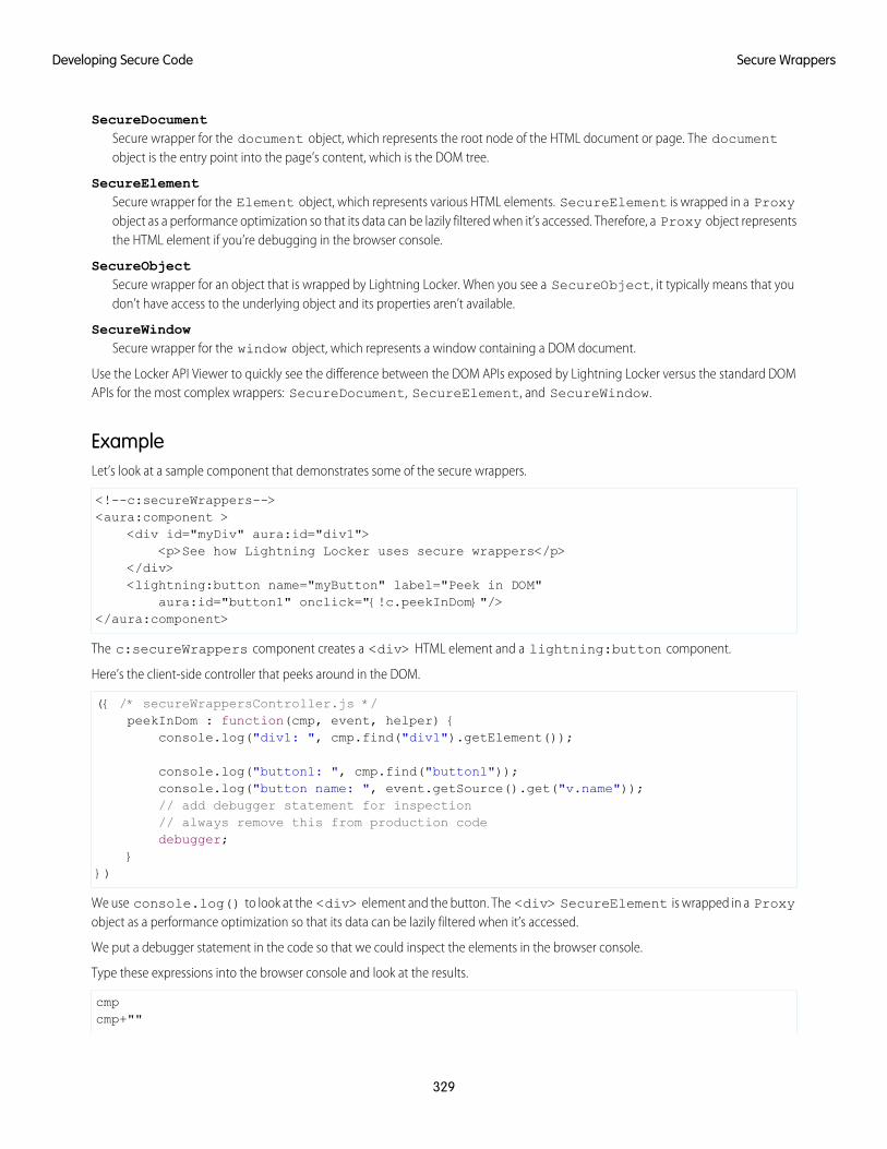
SecureDocumentSecure wrapper for the document object, which represents the root node of the HTML document or page. The documentobject is the entry point into the page’s content, which is the DOM tree.
SecureElementSecure wrapper for the Element object, which represents various HTML elements. SecureElement is wrapped in a Proxyobject as a performance optimization so that its data can be lazily filtered when it’s accessed. Therefore, a Proxy object representsthe HTML element if you’re debugging in the browser console.
SecureObjectSecure wrapper for an object that is wrapped by Lightning Locker. When you see a SecureObject, it typically means that youdon’t have access to the underlying object and its properties aren’t available.
SecureWindowSecure wrapper for the window object, which represents a window containing a DOM document.
Use the Locker API Viewer to quickly see the difference between the DOM APIs exposed by Lightning Locker versus the standard DOMAPIs for the most complex wrappers: SecureDocument, SecureElement, and SecureWindow.
ExampleLet’s look at a sample component that demonstrates some of the secure wrappers.
<!--c:secureWrappers--><aura:component >
<div id="myDiv" aura:id="div1"><p>See how Lightning Locker uses secure wrappers</p>
</div><lightning:button name="myButton" label="Peek in DOM"
aura:id="button1" onclick="{!c.peekInDom}"/></aura:component>
The c:secureWrappers component creates a <div> HTML element and a lightning:button component.
Here’s the client-side controller that peeks around in the DOM.
({ /* secureWrappersController.js */peekInDom : function(cmp, event, helper) {
console.log("div1: ", cmp.find("div1").getElement());
console.log("button1: ", cmp.find("button1"));console.log("button name: ", event.getSource().get("v.name"));// add debugger statement for inspection// always remove this from production codedebugger;
}})
We use console.log() to look at the <div> element and the button. The <div> SecureElement is wrapped in a Proxyobject as a performance optimization so that its data can be lazily filtered when it’s accessed.
We put a debugger statement in the code so that we could inspect the elements in the browser console.
Type these expressions into the browser console and look at the results.
cmpcmp+""
329
Secure WrappersDeveloping Secure Code
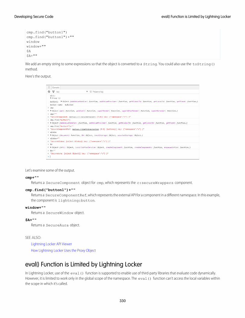
cmp.find("button1")cmp.find("button1")+""windowwindow+""$A$A+""
We add an empty string to some expressions so that the object is converted to a String. You could also use the toString()method.
Here’s the output.
Let’s examine some of the output.
cmp+""Returns a SecureComponent object for cmp, which represents the c:secureWrappers component.
cmp.find("button1")+""Returns a SecureComponentRef, which represents the external API for a component in a different namespace. In this example,the component is lightning:button.
window+""Returns a SecureWindow object.
$A+""Returns a SecureAura object.
SEE ALSO:
Lightning Locker API Viewer
How Lightning Locker Uses the Proxy Object
eval() Function is Limited by Lightning LockerIn Lightning Locker, use of the eval() function is supported to enable use of third-party libraries that evaluate code dynamically.However, it is limited to work only in the global scope of the namespace. The eval() function can’t access the local variables withinthe scope in which it’s called.
330
eval() Function is Limited by Lightning LockerDeveloping Secure Code
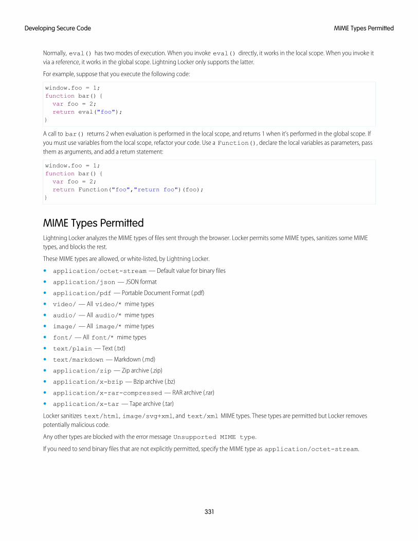
Normally, eval() has two modes of execution. When you invoke eval() directly, it works in the local scope. When you invoke itvia a reference, it works in the global scope. Lightning Locker only supports the latter.
For example, suppose that you execute the following code:
window.foo = 1;function bar() {var foo = 2;return eval("foo");
}
A call to bar() returns 2 when evaluation is performed in the local scope, and returns 1 when it’s performed in the global scope. Ifyou must use variables from the local scope, refactor your code. Use a Function(), declare the local variables as parameters, passthem as arguments, and add a return statement:
window.foo = 1;function bar() {var foo = 2;return Function("foo","return foo")(foo);
}
MIME Types PermittedLightning Locker analyzes the MIME types of files sent through the browser. Locker permits some MIME types, sanitizes some MIMEtypes, and blocks the rest.
These MIME types are allowed, or white-listed, by Lightning Locker.
• application/octet-stream — Default value for binary files
• application/json — JSON format
• application/pdf — Portable Document Format (.pdf)
• video/ — All video/* mime types
• audio/ — All audio/* mime types
• image/ — All image/* mime types
• font/ — All font/* mime types
• text/plain — Text (.txt)
• text/markdown — Markdown (.md)
• application/zip — Zip archive (.zip)
• application/x-bzip — Bzip archive (.bz)
• application/x-rar-compressed — RAR archive (.rar)
• application/x-tar — Tape archive (.tar)
Locker sanitizes text/html, image/svg+xml, and text/xml MIME types. These types are permitted but Locker removespotentially malicious code.
Any other types are blocked with the error message Unsupported MIME type.
If you need to send binary files that are not explicitly permitted, specify the MIME type as application/octet-stream.
331
MIME Types PermittedDeveloping Secure Code

Access to Supported JavaScript API Framework Methods OnlyYou can access published, supported JavaScript API framework methods only. These methods are published in the reference doc appat https://<myDomain>.lightning.force.com/docs/component-library, where <myDomain> is the nameof your custom Salesforce domain. Previously, unsupported methods were accessible, which exposed your code to the risk of breakingwhen unsupported methods were changed or removed.
What Does Lightning Locker Affect?Find out what’s affected and what’s not affected by Lightning Locker.
Lightning Locker enforces security and best practices for custom Lightning components you use in:
• Lightning Experience
• Salesforce app
• Lightning Communities
• Flows
• Standalone apps that you create (for example, myApp.app)
• Any other app where you can add a custom Lightning component, such as Salesforce Console in Lightning Experience
• Lightning Out
Lightning Locker doesn’t affect the following except for usage of Lightning components in Visualforce in these contexts:
• Salesforce Classic
• Visualforce-based communities
• Any apps for Salesforce Classic, such as Salesforce Console in Salesforce Classic
Lightning Locker ToolsLightning Locker tools help you develop more secure code that is compatible and runs efficiently with Lightning Locker.
IN THIS SECTION:
Lightning Locker API Viewer
The Lightning Locker API Viewer shows the DOM APIs exposed by Locker versus the standard DOM APIs for the most complexwrappers: SecureDocument, SecureElement, and SecureWindow.
Locker Console Overview
Use Locker Console to check your JavaScript code’s compatibility with Lightning Locker, and compare how it runs with LightningLocker enabled and disabled.
Lightning Locker API ViewerThe Lightning Locker API Viewer shows the DOM APIs exposed by Locker versus the standard DOM APIs for the most complex wrappers:SecureDocument, SecureElement, and SecureWindow.
Access Locker API Viewer in the Component Library.
Locker API Viewer lets you quickly see the difference between the standard DOM APIs and the Locker APIs.
• A white row indicates an API that behaves the same in Lightning Locker.
• An orange row indicates an API that behaves differently in Lightning Locker.
332
Access to Supported JavaScript API Framework Methods OnlyDeveloping Secure Code
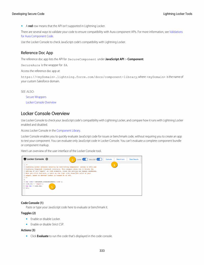
• A red row means that the API isn’t supported in Lightning Locker.
There are several ways to validate your code to ensure compatibility with Aura component APIs. For more information, see Validationsfor Aura Component Code.
Use the Locker Console to check JavaScript code’s compatibility with Lightning Locker.
Reference Doc AppThe reference doc app lists the API for SecureComponent under JavaScript API > Component.
SecureAura is the wrapper for $A.
Access the reference doc app at:
https://<myDomain>.lightning.force.com/docs/component-library, where <myDomain> is the name ofyour custom Salesforce domain.
SEE ALSO:
Secure Wrappers
Locker Console Overview
Locker Console OverviewUse Locker Console to check your JavaScript code’s compatibility with Lightning Locker, and compare how it runs with Lightning Lockerenabled and disabled.
Access Locker Console in the Component Library.
Locker Console enables you to quickly evaluate JavaScript code for issues or benchmark code, without requiring you to create an appto test your component. You can evaluate only JavaScript code in Locker Console. You can't evaluate a complete component bundleor component markup.
Here's an overview of the user interface of the Locker Console tool.
Code Console (1)Paste or type your JavaScript code here to evaluate or benchmark it.
Toggles (2)
• Enable or disable Locker.
• Enable or disable Strict CSP.
Actions (3)
• Click Evaluate to run the code that’s displayed in the code console.
333
Lightning Locker ToolsDeveloping Secure Code
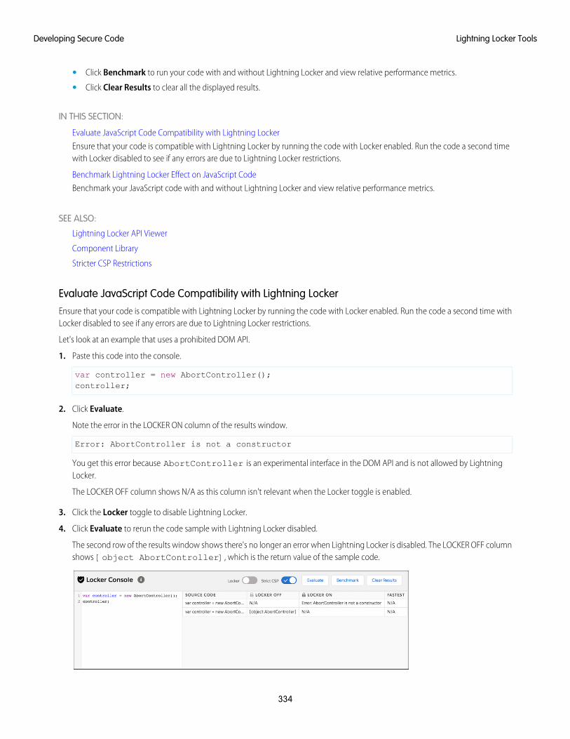
• Click Benchmark to run your code with and without Lightning Locker and view relative performance metrics.
• Click Clear Results to clear all the displayed results.
IN THIS SECTION:
Evaluate JavaScript Code Compatibility with Lightning Locker
Ensure that your code is compatible with Lightning Locker by running the code with Locker enabled. Run the code a second timewith Locker disabled to see if any errors are due to Lightning Locker restrictions.
Benchmark Lightning Locker Effect on JavaScript Code
Benchmark your JavaScript code with and without Lightning Locker and view relative performance metrics.
SEE ALSO:
Lightning Locker API Viewer
Component Library
Stricter CSP Restrictions
Evaluate JavaScript Code Compatibility with Lightning LockerEnsure that your code is compatible with Lightning Locker by running the code with Locker enabled. Run the code a second time withLocker disabled to see if any errors are due to Lightning Locker restrictions.
Let's look at an example that uses a prohibited DOM API.
1. Paste this code into the console.
var controller = new AbortController();controller;
2. Click Evaluate.
Note the error in the LOCKER ON column of the results window.
Error: AbortController is not a constructor
You get this error because AbortController is an experimental interface in the DOM API and is not allowed by LightningLocker.
The LOCKER OFF column shows N/A as this column isn't relevant when the Locker toggle is enabled.
3. Click the Locker toggle to disable Lightning Locker.
4. Click Evaluate to rerun the code sample with Lightning Locker disabled.
The second row of the results window shows there's no longer an error when Lightning Locker is disabled. The LOCKER OFF columnshows [object AbortController], which is the return value of the sample code.
334
Lightning Locker ToolsDeveloping Secure Code
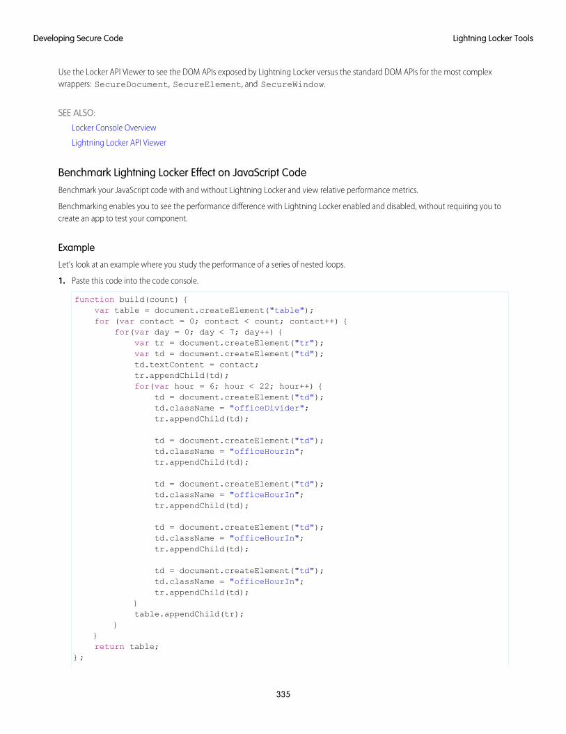
Use the Locker API Viewer to see the DOM APIs exposed by Lightning Locker versus the standard DOM APIs for the most complexwrappers: SecureDocument, SecureElement, and SecureWindow.
SEE ALSO:
Locker Console Overview
Lightning Locker API Viewer
Benchmark Lightning Locker Effect on JavaScript CodeBenchmark your JavaScript code with and without Lightning Locker and view relative performance metrics.
Benchmarking enables you to see the performance difference with Lightning Locker enabled and disabled, without requiring you tocreate an app to test your component.
Example
Let’s look at an example where you study the performance of a series of nested loops.
1. Paste this code into the code console.
function build(count) {var table = document.createElement("table");for (var contact = 0; contact < count; contact++) {
for(var day = 0; day < 7; day++) {var tr = document.createElement("tr");var td = document.createElement("td");td.textContent = contact;tr.appendChild(td);for(var hour = 6; hour < 22; hour++) {
td = document.createElement("td");td.className = "officeDivider";tr.appendChild(td);
td = document.createElement("td");td.className = "officeHourIn";tr.appendChild(td);
td = document.createElement("td");td.className = "officeHourIn";tr.appendChild(td);
td = document.createElement("td");td.className = "officeHourIn";tr.appendChild(td);
td = document.createElement("td");td.className = "officeHourIn";tr.appendChild(td);
}table.appendChild(tr);
}}return table;
};
335
Lightning Locker ToolsDeveloping Secure Code
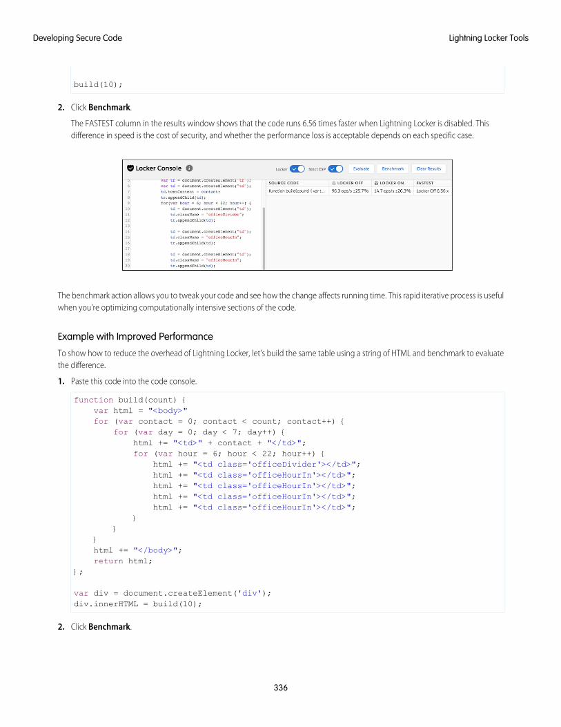
build(10);
2. Click Benchmark.
The FASTEST column in the results window shows that the code runs 6.56 times faster when Lightning Locker is disabled. Thisdifference in speed is the cost of security, and whether the performance loss is acceptable depends on each specific case.
The benchmark action allows you to tweak your code and see how the change affects running time. This rapid iterative process is usefulwhen you're optimizing computationally intensive sections of the code.
Example with Improved Performance
To show how to reduce the overhead of Lightning Locker, let's build the same table using a string of HTML and benchmark to evaluatethe difference.
1. Paste this code into the code console.
function build(count) {var html = "<body>"for (var contact = 0; contact < count; contact++) {
for (var day = 0; day < 7; day++) {html += "<td>" + contact + "</td>";for (var hour = 6; hour < 22; hour++) {
html += "<td class='officeDivider'></td>";html += "<td class='officeHourIn'></td>";html += "<td class='officeHourIn'></td>";html += "<td class='officeHourIn'></td>";html += "<td class='officeHourIn'></td>";
}}
}html += "</body>";return html;
};
var div = document.createElement('div');div.innerHTML = build(10);
2. Click Benchmark.
336
Lightning Locker ToolsDeveloping Secure Code
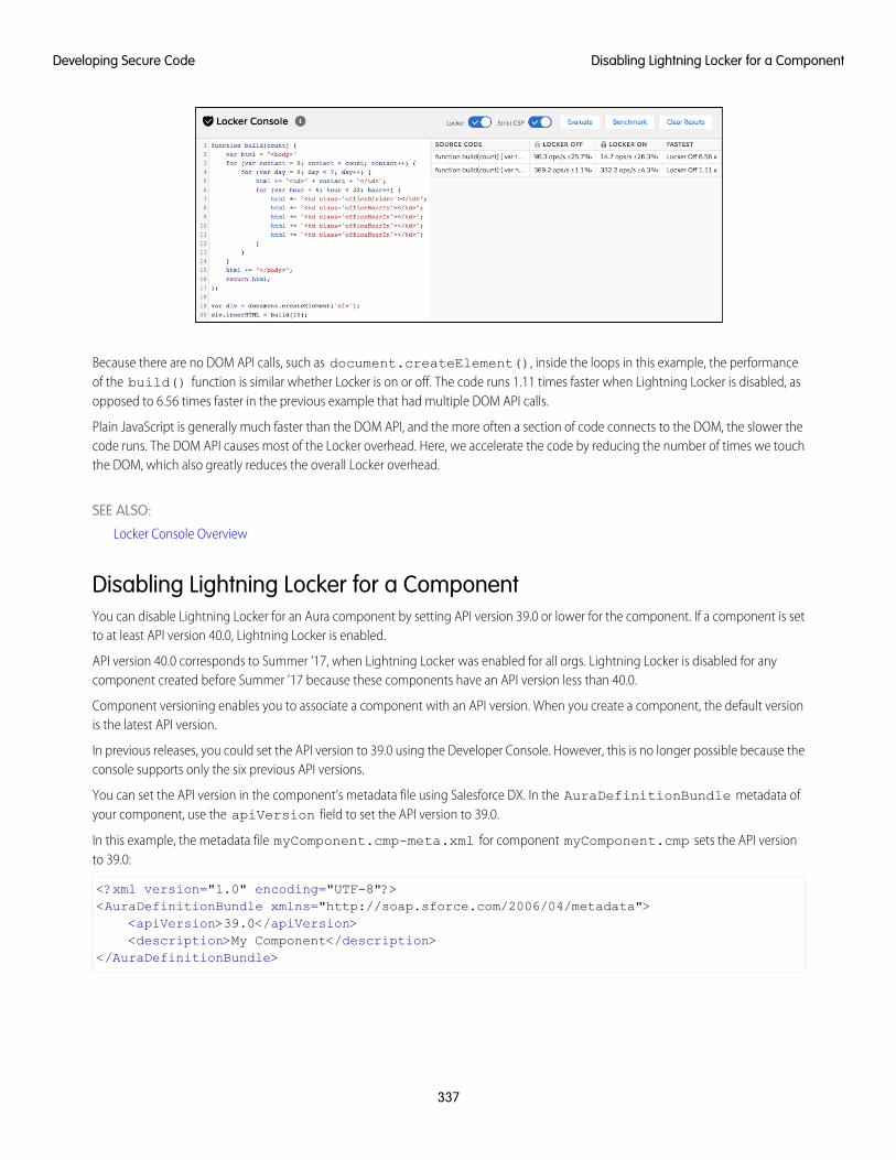
Because there are no DOM API calls, such as document.createElement(), inside the loops in this example, the performanceof the build() function is similar whether Locker is on or off. The code runs 1.11 times faster when Lightning Locker is disabled, asopposed to 6.56 times faster in the previous example that had multiple DOM API calls.
Plain JavaScript is generally much faster than the DOM API, and the more often a section of code connects to the DOM, the slower thecode runs. The DOM API causes most of the Locker overhead. Here, we accelerate the code by reducing the number of times we touchthe DOM, which also greatly reduces the overall Locker overhead.
SEE ALSO:
Locker Console Overview
Disabling Lightning Locker for a ComponentYou can disable Lightning Locker for an Aura component by setting API version 39.0 or lower for the component. If a component is setto at least API version 40.0, Lightning Locker is enabled.
API version 40.0 corresponds to Summer ’17, when Lightning Locker was enabled for all orgs. Lightning Locker is disabled for anycomponent created before Summer ’17 because these components have an API version less than 40.0.
Component versioning enables you to associate a component with an API version. When you create a component, the default versionis the latest API version.
In previous releases, you could set the API version to 39.0 using the Developer Console. However, this is no longer possible because theconsole supports only the six previous API versions.
You can set the API version in the component’s metadata file using Salesforce DX. In the AuraDefinitionBundle metadata ofyour component, use the apiVersion field to set the API version to 39.0.
In this example, the metadata file myComponent.cmp-meta.xml for component myComponent.cmp sets the API versionto 39.0:
<?xml version="1.0" encoding="UTF-8"?><AuraDefinitionBundle xmlns="http://soap.sforce.com/2006/04/metadata">
<apiVersion>39.0</apiVersion><description>My Component</description>
</AuraDefinitionBundle>
337
Disabling Lightning Locker for a ComponentDeveloping Secure Code

For consistency and ease of debugging, we recommend that you set the same API version for all components in your app, when possible.
SEE ALSO:
Tooling API: AuraDefinitionBundle
Salesforce DX Developer Guide
Don’t Mix Component API Versions
Aura Component Versioning
Create Aura Components in the Developer Console
Don’t Mix Component API VersionsFor consistency and ease of debugging, we recommend that you set the same API version for all custom components in your app,containment hierarchy (component within component), or extension hierarchy (component extending component).
If you mix API versions in your containment or extension hierarchy and Lightning Locker is enabled for some components and disabledfor other components, your app will be harder to debug.
Extension HierarchyLightning Locker is enabled for a component or an application purely based on component version. The extension hierarchy for acomponent doesn’t factor into Lightning Locker enforcement.
Let’s look at an example where a Car component extends a Vehicle component. Car has API version 39.0 so Lightning Locker isdisabled. Vehicle has API version 40.0 so Lightning Locker is enabled.
Now, let’s say that Vehicle adds an expando property, _counter, to the window object by assigning a value towindow._counter. Since Lightning Locker is enabled for Vehicle, the _counter property is added to SecureWindow,the secure wrapper for window for the component’s namespace. The property isn’t added to the native window object.
Lightning Locker is disabled for Car so the component has access to the native window object. Car can’t see the _counterproperty as it’s only available in the SecureWindow object.
This subtle behavior can cause much gnashing of teeth when your code doesn’t work as you expect. You’ll never get that debuggingtime back! Save yourself some grief and use the same API version for all components in an extension hierarchy.
Containment HierarchyThe containment hierarchy within an application or a component doesn’t factor into Lightning Locker enforcement.
Let’s look at an example where a Bicycle component contains a Wheel component. If Bicycle has API version 40.0, LightningLocker is enabled. If Wheel has API version 39.0, Lightning Locker is disabled for Wheel even though it’s contained in a component,Bicycle, that has Lightning Locker enabled.
338
Don’t Mix Component API VersionsDeveloping Secure Code
Due to the mix of component API versions, you’re likely to run into issues similar to those for the extension hierarchy. We recommendthat you set the same API version for all components in your app or component hierarchy, when possible.
SEE ALSO:
Aura Component Versioning
Disabling Lightning Locker for a Component
Secure Wrappers
Sharing JavaScript Code Across Components
Lightning Locker Disabled for Unsupported BrowsersLightning Locker relies on some JavaScript features in the browser: support for strict mode, the Map object, and the Proxy object. Ifa browser doesn’t meet the requirements, Lightning Locker can’t enforce all its security features and is disabled.
Lightning Locker is disabled for unsupported browsers. If you use an unsupported browser, you’re likely to encounter issues that won’tbe fixed. Make your life easier and your browsing experience more secure by using a supported browser.
Note: The Lightning Locker requirements align with the supported browsers for Lightning Experience, except for IE11. LightningLocker is disabled for IE11. We recommend using supported browsers other than IE11 for enhanced security.
SEE ALSO:
Browser Support for Aura Components
Salesforce Help: Supported Browsers for Lightning Experience
Content Security Policy Overview
The Lightning Component framework uses Content Security Policy (CSP) to impose restrictions on content. The main objective is to helpprevent cross-site scripting (XSS) and other code injection attacks.
CSP is a W3C standard that defines rules to control the source of content that can be loaded on a page. All CSP rules work at the pagelevel, and apply to all components and libraries.
The framework enables these specific CSP rules:
JavaScript LibrariesAll JavaScript libraries must be uploaded to your org as static resources. For more information, see Using External JavaScript Librarieson page 349.
HTTPS Connections for Resources
All external fonts, images, frames, and CSS must use an HTTPS URL.
You can change the CSP policy and expand access to third-party resources by adding CSP Trusted Sites.
Inline JavaScript
Script tags can’t be used to load JavaScript, and event handlers can’t use inline JavaScript. For more details, see Stricter CSP Restrictions.
Browser SupportCSP isn’t enforced by all browsers. For a list of browsers that enforce CSP, see caniuse.com.
339
Lightning Locker Disabled for Unsupported BrowsersDeveloping Secure Code
Note: IE11 doesn’t support CSP, so we recommend using other supported browsers for enhanced security.
Finding CSP ViolationsCSP policy violations are logged in the browser’s developer console. The violations look like the following message.
Refused to load the script 'https://externaljs.docsample.com/externalLib.js'because it violates the following Content Security Policy directive: ...
If your app’s functionality isn’t affected, you can ignore the CSP violation.
IN THIS SECTION:
Stricter CSP Restrictions
The Lightning Component framework already uses Content Security Policy (CSP), which is a W3C standard, to control the source ofcontent that can be loaded on a page. The “Enable Stricter Content Security Policy” org setting tightens CSP to further mitigate therisk of cross-site scripting attacks. The CSP rules work at the page level, and apply to all components and libraries, whether LightningLocker is enabled or not.
SEE ALSO:
Browser Support for Aura Components
Making API Calls from Components
Create CSP Trusted Sites to Access Third-Party APIs
Salesforce Help: Supported Browsers for Lightning Experience
Salesforce Help: Script Level Security in Communities
Stricter CSP RestrictionsThe Lightning Component framework already uses Content Security Policy (CSP), which is a W3C standard, to control the source ofcontent that can be loaded on a page. The “Enable Stricter Content Security Policy” org setting tightens CSP to further mitigate the riskof cross-site scripting attacks. The CSP rules work at the page level, and apply to all components and libraries, whether Lightning Lockeris enabled or not.
Stricter CSP disallows unsafe-inline for script-src. Script tags can’t be used to load JavaScript, and event handlers can’tuse inline JavaScript. For example, this attempt to use an event handler to run an inline script is prevented:
<button onclick="doSomething()"></button>
When stricter CSP is enabled, you must ensure that all your code, including third-party libraries, respects the stricter CSP restrictions.
What Does Stricter CSP Affect?Stricter CSP affects:
• Lightning Experience
• Salesforce app
• Standalone apps that you create (for example, myApp.app)
Stricter CSP doesn’t affect:
340
Stricter CSP RestrictionsDeveloping Secure Code
• Salesforce Classic
• Any apps for Salesforce Classic, such as Salesforce Console in Salesforce Classic
• Communities
• Lightning Out, which allows you to run Lightning components in a container outside of Lightning apps, such as Lightning componentsin Visualforce and Visualforce-based Communities. The container defines the CSP rules.
Note: CSP in Communities is controlled separately through each community’s settings.
Disable Stricter CSPStricter CSP is enabled by default. To disable it:
1. From Setup, enter Session in the Quick Find box, and then select Session Settings.
2. Deselect the checkbox for “Enable Stricter Content Security Policy”.
3. Click Save.
Freeze JavaScript Prototypes
Freeze JavaScript prototypes to prevent Aura component authors from modifying JavaScript prototypes of global objects that are sharedbetween namespaces. This restriction enables better code separation between components and prevents malicious or inadvertenttampering of shared objects, such as the JavaScript APIs or DOM APIs.
In JavaScript, each object has a prototype object. An object inherits methods and properties from its prototype object. Prototypes enablea JavaScript object to inherit features from another object. If a component author modifies a JavaScript prototype of a shared object, itcan introduce unexpected behavior and potential security issues. Freezing JavaScript prototypes eliminates this risk.
This setting is supported only in Lightning Experience and is disabled by default.
1. From Setup, enter Session in the Quick Find box, and then select Session Settings.
2. Select the checkbox for “Freeze JavaScript Prototypes”.
Note: Cisco Webex Teams and Meetings features aren't compatible with the Freeze JavaScript Prototypes setting. If you haveone of these Webex features enabled, you can’t enable this setting.
3. Click Save.
341
Freeze JavaScript PrototypesDeveloping Secure Code
CHAPTER 9 Using JavaScript
Use JavaScript for client-side code. The $A namespace is the entry point for using the framework inJavaScript code.
In this chapter ...
• Supported JavaScriptFor all the methods available in $A, see the JavaScript API athttps://<myDomain>.lightning.force.com/docs/component-library, where<myDomain> is the name of your custom Salesforce domain.
• Invoking Actions onComponentInitialization
A component bundle can contain JavaScript code in a client-side controller, helper, or renderer. Client-sidecontrollers are the most commonly used of these JavaScript resources.
• Sharing JavaScriptCode in aComponent Bundle
Expressions in JavaScript Code
In JavaScript, use string syntax to evaluate an expression. For example, this expression retrieves thelabel attribute in a component.
var theLabel = cmp.get("v.label");
• Sharing JavaScriptCode AcrossComponents
• Using ExternalJavaScript Libraries
• Dynamically CreatingComponents
Note: Only use the {! } expression syntax in markup in .app or .cmp resources.• Detecting DataChanges withChange Handlers SEE ALSO:
Handling Events with Client-Side Controllers• Finding Components
by ID
• Working withAttribute Values inJavaScript
• Working with aComponent Body inJavaScript
• Working with Eventsin JavaScript
• Modifying the DOM
• CheckingComponent Validity
• ModifyingComponents Outsidethe FrameworkLifecycle
• Validating Fields
• Throwing andHandling Errors
342
• Calling ComponentMethods
• Dynamically AddingEvent Handlers To aComponent
• Dynamically Showingor Hiding Markup
• Adding andRemoving Styles
• Which Button WasPressed?
• Formatting Dates inJavaScript
• Using JavaScriptPromises
• Making API Callsfrom Components
• Create CSP TrustedSites to AccessThird-Party APIs
343
Using JavaScript
Supported JavaScript
The Aura Components programming model supports ES5 syntax and ES6 Promises.
For the most reliable experience, use ES5 to develop Aura components because the pipeline from authoring to serialization to executionwas built for ES5. Promises from ES6 are also available. Using any other syntax or feature is not supported, and does not work in IE11.
This developer guide explains how to develop Aura components and documents the JavaScript usage that's unique to the AuraComponents programming model.
If you want to use ES6 or later for development, use the Lightning Web Components programming model, which has been architectedfor modern JavaScript development.
SEE ALSO:
Browser Support for Aura Components
Invoking Actions on Component Initialization
Use the init event to initialize a component or fire an event after component construction but before rendering.
If a component is contained in another component or app, the inner component is initialized first.
Let’s look at an example.
Component source
<aura:component><aura:attribute name="setMeOnInit" type="String" default="default value" /><aura:handler name="init" value="{!this}" action="{!c.doInit}"/>
<p>This value is set in the controller after the component initializes and beforerendering.</p>
<p><b>{!v.setMeOnInit}</b></p>
</aura:component>
Client-side controller source
({doInit: function(cmp) {
// Set the attribute value.// You could also fire an event here instead.cmp.set("v.setMeOnInit", "controller init magic!");
}})
Let's look at the Component source to see how this works. The magic happens in this line.
<aura:handler name="init" value="{!this}" action="{!c.doInit}"/>
This registers an init event handler for the component. init is a predefined event sent to every component. After the componentis initialized, the doInit action is called in the component's controller. In this sample, the controller action sets an attribute value, butit could do something more interesting, such as firing an event.
344
Supported JavaScriptUsing JavaScript
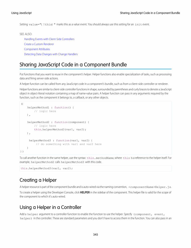
Setting value="{!this}" marks this as a value event. You should always use this setting for an init event.
SEE ALSO:
Handling Events with Client-Side Controllers
Create a Custom Renderer
Component Attributes
Detecting Data Changes with Change Handlers
Sharing JavaScript Code in a Component Bundle
Put functions that you want to reuse in the component’s helper. Helper functions also enable specialization of tasks, such as processingdata and firing server-side actions.
A helper function can be called from any JavaScript code in a component’s bundle, such as from a client-side controller or renderer.
Helper functions are similar to client-side controller functions in shape, surrounded by parentheses and curly braces to denote a JavaScriptobject in object-literal notation containing a map of name-value pairs. A helper function can pass in any arguments required by thefunction, such as the component it belongs to, a callback, or any other objects.
({helperMethod1 : function() {
// logic here},
helperMethod2 : function(component) {// logic herethis.helperMethod3(var1, var2);
},
helperMethod3 : function(var1, var2) {// do something with var1 and var2 here
}})
To call another function in the same helper, use the syntax: this.methodName, where this is a reference to the helper itself. Forexample, helperMethod2 calls helperMethod3 with this code.
this.helperMethod3(var1, var2);
Creating a HelperA helper resource is part of the component bundle and is auto-wired via the naming convention, <componentName>Helper.js.
To create a helper using the Developer Console, click HELPER in the sidebar of the component. This helper file is valid for the scope ofthe component to which it’s auto-wired.
Using a Helper in a ControllerAdd a helper argument to a controller function to enable the function to use the helper. Specify (component, event,helper) in the controller. These are standard parameters and you don't have to access them in the function. You can also pass in an
345
Sharing JavaScript Code in a Component BundleUsing JavaScript
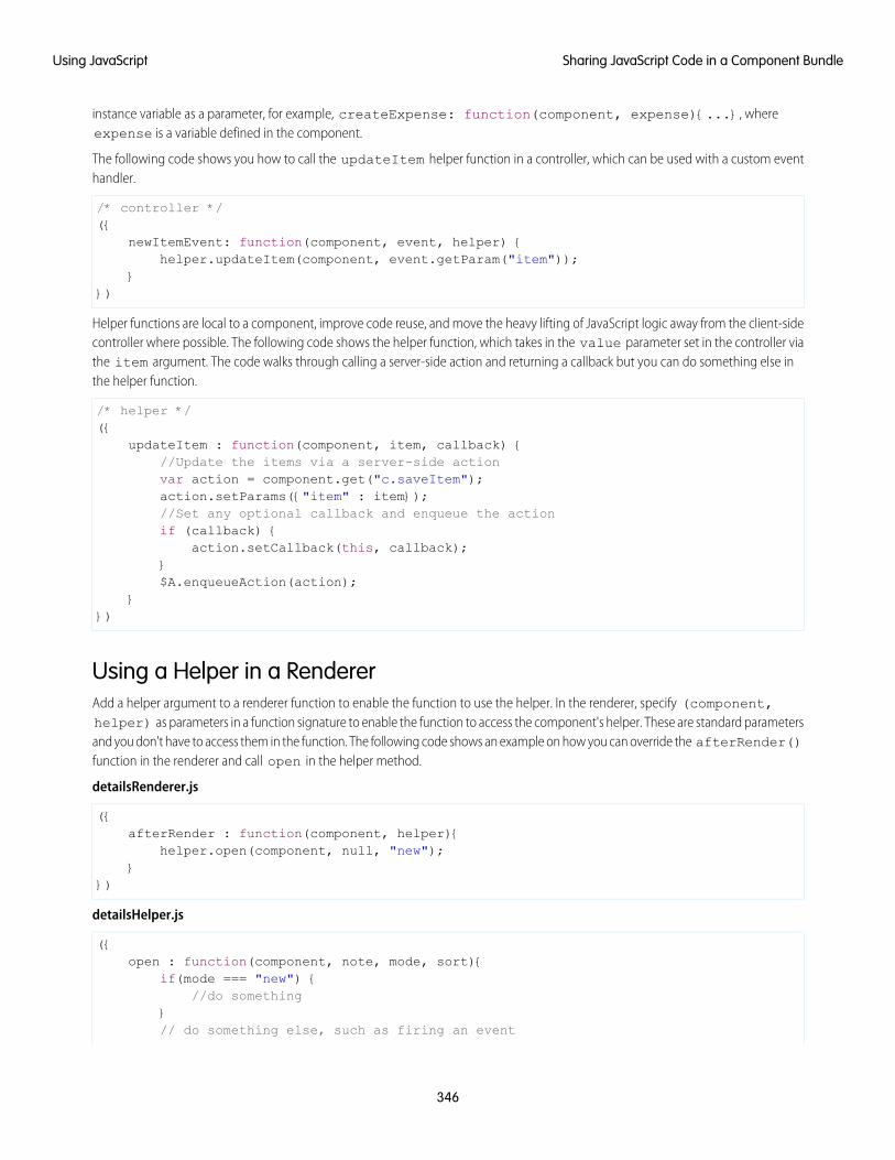
instance variable as a parameter, for example, createExpense: function(component, expense){...}, whereexpense is a variable defined in the component.
The following code shows you how to call the updateItem helper function in a controller, which can be used with a custom eventhandler.
/* controller */({
newItemEvent: function(component, event, helper) {helper.updateItem(component, event.getParam("item"));
}})
Helper functions are local to a component, improve code reuse, and move the heavy lifting of JavaScript logic away from the client-sidecontroller where possible. The following code shows the helper function, which takes in the value parameter set in the controller viathe item argument. The code walks through calling a server-side action and returning a callback but you can do something else inthe helper function.
/* helper */({
updateItem : function(component, item, callback) {//Update the items via a server-side actionvar action = component.get("c.saveItem");action.setParams({"item" : item});//Set any optional callback and enqueue the actionif (callback) {
action.setCallback(this, callback);}$A.enqueueAction(action);
}})
Using a Helper in a RendererAdd a helper argument to a renderer function to enable the function to use the helper. In the renderer, specify (component,helper) as parameters in a function signature to enable the function to access the component's helper. These are standard parametersand you don't have to access them in the function. The following code shows an example on how you can override the afterRender()function in the renderer and call open in the helper method.
detailsRenderer.js
({afterRender : function(component, helper){
helper.open(component, null, "new");}
})
detailsHelper.js
({open : function(component, note, mode, sort){
if(mode === "new") {//do something
}// do something else, such as firing an event
346
Sharing JavaScript Code in a Component BundleUsing JavaScript
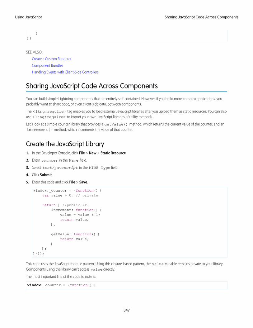
}})
SEE ALSO:
Create a Custom Renderer
Component Bundles
Handling Events with Client-Side Controllers
Sharing JavaScript Code Across Components
You can build simple Lightning components that are entirely self-contained. However, if you build more complex applications, youprobably want to share code, or even client-side data, between components.
The <ltng:require> tag enables you to load external JavaScript libraries after you upload them as static resources. You can alsouse <ltng:require> to import your own JavaScript libraries of utility methods.
Let’s look at a simple counter library that provides a getValue() method, which returns the current value of the counter, and anincrement() method, which increments the value of that counter.
Create the JavaScript Library1. In the Developer Console, click File > New > Static Resource.
2. Enter counter in the Name field.
3. Select text/javascript in the MIME Type field.
4. Click Submit.
5. Enter this code and click File > Save.
window._counter = (function() {var value = 0; // private
return { //public APIincrement: function() {
value = value + 1;return value;
},
getValue: function() {return value;
}};
}());
This code uses the JavaScript module pattern. Using this closure-based pattern, the value variable remains private to your library.Components using the library can’t access value directly.
The most important line of the code to note is:
window._counter = (function() {
347
Sharing JavaScript Code Across ComponentsUsing JavaScript
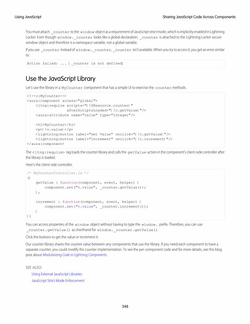
You must attach _counter to the window object as a requirement of JavaScript strict mode, which is implicitly enabled in LightningLocker. Even though window._counter looks like a global declaration, _counter is attached to the Lightning Locker securewindow object and therefore is a namespace variable, not a global variable.
If you use _counter instead of window._counter, _counter isn’t available. When you try to access it, you get an error similarto:
Action failed: ... [_counter is not defined]
Use the JavaScript LibraryLet’s use the library in a MyCounter component that has a simple UI to exercise the counter methods.
<!--c:MyCounter--><aura:component access="global">
<ltng:require scripts="{!$Resource.counter}"afterScriptsLoaded="{!c.getValue}"/>
<aura:attribute name="value" type="Integer"/>
<h1>MyCounter</h1><p>{!v.value}</p><lightning:button label="Get Value" onclick="{!c.getValue}"/><lightning:button label="Increment" onclick="{!c.increment}"/>
</aura:component>
The <ltng:require> tag loads the counter library and calls the getValue action in the component’s client-side controller afterthe library is loaded.
Here’s the client-side controller.
/* MyCounterController.js */({
getValue : function(component, event, helper) {component.set("v.value", _counter.getValue());
},
increment : function(component, event, helper) {component.set("v.value", _counter.increment());
}})
You can access properties of the window object without having to type the window. prefix. Therefore, you can use_counter.getValue() as shorthand for window._counter.getValue().
Click the buttons to get the value or increment it.
Our counter library shares the counter value between any components that use the library. If you need each component to have aseparate counter, you could modify the counter implementation. To see the per-component code and for more details, see this blogpost about Modularizing Code in Lightning Components.
SEE ALSO:
Using External JavaScript Libraries
JavaScript Strict Mode Enforcement
348
Sharing JavaScript Code Across ComponentsUsing JavaScript
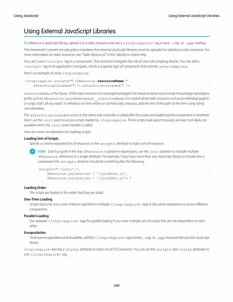
Using External JavaScript Libraries
To reference a JavaScript library, upload it as a static resource and use a <ltng:require> tag in your .cmp or .app markup.
The framework’s content security policy mandates that external JavaScript libraries must be uploaded to Salesforce static resources. Formore information on static resources, see “Static Resources” in the Salesforce online help.
You can’t use a <script> tag in a component. This restriction mitigates the risk of cross-site scripting attacks. You can add a<script> tag to an application’s template, which is a special type of component that extends aura:template.
Here’s an example of using ltng:require.
<ltng:require scripts="{!$Resource.resourceName}"afterScriptsLoaded="{!c.afterScriptsLoaded}" />
resourceName is the Name of the static resource. In a managed packaged, the resource name must include the package namespaceprefix, such as $Resource.yourNamespace__resourceName. For a stand-alone static resource, such as an individual graphicor script, that’s all you need. To reference an item within an archive static resource, add the rest of the path to the item using stringconcatenation.
The afterScriptsLoaded action in the client-side controller is called after the scripts are loaded and the component is rendered.Don’t use the init event to access scripts loaded by ltng:require. These scripts load asynchronously and are most likely notavailable when the init event handler is called.
Here are some considerations for loading scripts:
Loading Sets of ScriptsSpecify a comma-separated list of resources in the scripts attribute to load a set of resources.
Note: Due to a quirk in the way $Resource is parsed in expressions, use the join operator to include multiple$Resource references in a single attribute. For example, if you have more than one JavaScript library to include into acomponent the scripts attribute should be something like the following.
scripts="{!join(',',$Resource.jsLibraries + '/jsLibOne.js',$Resource.jsLibraries + '/jsLibTwo.js')}"
Loading OrderThe scripts are loaded in the order that they are listed.
One-Time LoadingScripts load only once, even if they’re specified in multiple <ltng:require> tags in the same component or across differentcomponents.
Parallel LoadingUse separate <ltng:require> tags for parallel loading if you have multiple sets of scripts that are not dependent on eachother.
EncapsulationTo ensure encapsulation and reusability, add the <ltng:require> tag to every .cmp or .app resource that uses the JavaScriptlibrary.
ltng:require also has a styles attribute to load a list of CSS resources. You can set the scripts and styles attributes inone <ltng:require> tag.
349
Using External JavaScript LibrariesUsing JavaScript
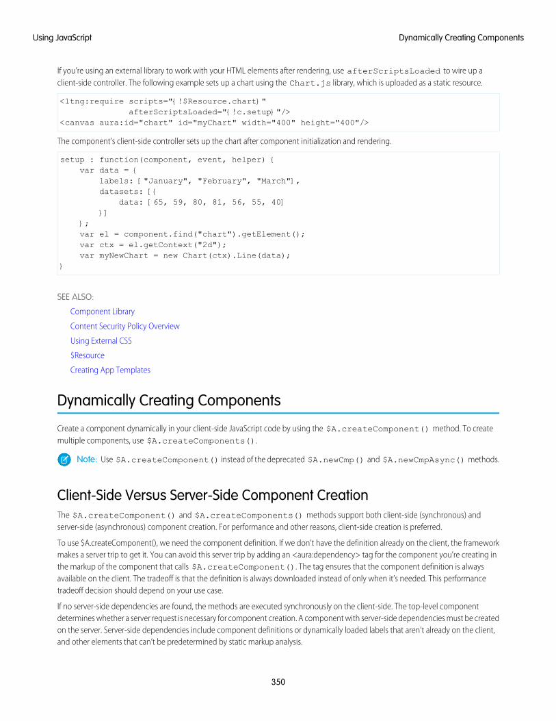
If you’re using an external library to work with your HTML elements after rendering, use afterScriptsLoaded to wire up aclient-side controller. The following example sets up a chart using the Chart.js library, which is uploaded as a static resource.
<ltng:require scripts="{!$Resource.chart}"afterScriptsLoaded="{!c.setup}"/>
<canvas aura:id="chart" id="myChart" width="400" height="400"/>
The component’s client-side controller sets up the chart after component initialization and rendering.
setup : function(component, event, helper) {var data = {
labels: ["January", "February", "March"],datasets: [{
data: [65, 59, 80, 81, 56, 55, 40]}]
};var el = component.find("chart").getElement();var ctx = el.getContext("2d");var myNewChart = new Chart(ctx).Line(data);
}
SEE ALSO:
Component Library
Content Security Policy Overview
Using External CSS
$Resource
Creating App Templates
Dynamically Creating Components
Create a component dynamically in your client-side JavaScript code by using the $A.createComponent() method. To createmultiple components, use $A.createComponents().
Note: Use $A.createComponent() instead of the deprecated $A.newCmp() and $A.newCmpAsync() methods.
Client-Side Versus Server-Side Component CreationThe $A.createComponent() and $A.createComponents() methods support both client-side (synchronous) andserver-side (asynchronous) component creation. For performance and other reasons, client-side creation is preferred.
To use $A.createComponent(), we need the component definition. If we don’t have the definition already on the client, the frameworkmakes a server trip to get it. You can avoid this server trip by adding an <aura:dependency> tag for the component you’re creating inthe markup of the component that calls $A.createComponent(). The tag ensures that the component definition is alwaysavailable on the client. The tradeoff is that the definition is always downloaded instead of only when it’s needed. This performancetradeoff decision should depend on your use case.
If no server-side dependencies are found, the methods are executed synchronously on the client-side. The top-level componentdetermines whether a server request is necessary for component creation. A component with server-side dependencies must be createdon the server. Server-side dependencies include component definitions or dynamically loaded labels that aren’t already on the client,and other elements that can’t be predetermined by static markup analysis.
350
Dynamically Creating ComponentsUsing JavaScript
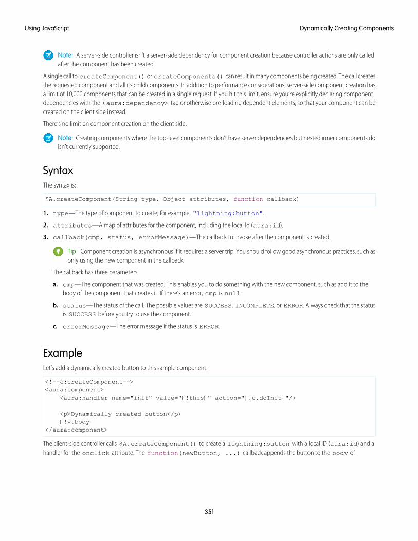
Note: A server-side controller isn’t a server-side dependency for component creation because controller actions are only calledafter the component has been created.
A single call to createComponent() or createComponents() can result in many components being created. The call createsthe requested component and all its child components. In addition to performance considerations, server-side component creation hasa limit of 10,000 components that can be created in a single request. If you hit this limit, ensure you’re explicitly declaring componentdependencies with the <aura:dependency> tag or otherwise pre-loading dependent elements, so that your component can becreated on the client side instead.
There’s no limit on component creation on the client side.
Note: Creating components where the top-level components don’t have server dependencies but nested inner components doisn’t currently supported.
SyntaxThe syntax is:
$A.createComponent(String type, Object attributes, function callback)
1. type—The type of component to create; for example, "lightning:button".
2. attributes—A map of attributes for the component, including the local Id (aura:id).
3. callback(cmp, status, errorMessage)—The callback to invoke after the component is created.
Tip: Component creation is asynchronous if it requires a server trip. You should follow good asynchronous practices, such asonly using the new component in the callback.
The callback has three parameters.
a. cmp—The component that was created. This enables you to do something with the new component, such as add it to thebody of the component that creates it. If there’s an error, cmp is null.
b. status—The status of the call. The possible values are SUCCESS, INCOMPLETE, or ERROR. Always check that the statusis SUCCESS before you try to use the component.
c. errorMessage—The error message if the status is ERROR.
ExampleLet’s add a dynamically created button to this sample component.
<!--c:createComponent--><aura:component>
<aura:handler name="init" value="{!this}" action="{!c.doInit}"/>
<p>Dynamically created button</p>{!v.body}
</aura:component>
The client-side controller calls $A.createComponent() to create a lightning:button with a local ID (aura:id) and ahandler for the onclick attribute. The function(newButton, ...) callback appends the button to the body of
351
Dynamically Creating ComponentsUsing JavaScript
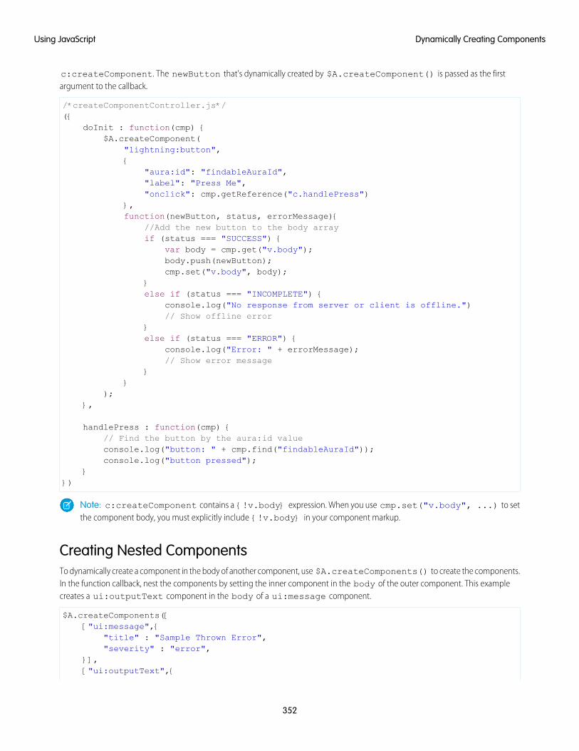
c:createComponent. The newButton that’s dynamically created by $A.createComponent() is passed as the firstargument to the callback.
/*createComponentController.js*/({
doInit : function(cmp) {$A.createComponent(
"lightning:button",{
"aura:id": "findableAuraId","label": "Press Me","onclick": cmp.getReference("c.handlePress")
},function(newButton, status, errorMessage){
//Add the new button to the body arrayif (status === "SUCCESS") {
var body = cmp.get("v.body");body.push(newButton);cmp.set("v.body", body);
}else if (status === "INCOMPLETE") {
console.log("No response from server or client is offline.")// Show offline error
}else if (status === "ERROR") {
console.log("Error: " + errorMessage);// Show error message
}}
);},
handlePress : function(cmp) {// Find the button by the aura:id valueconsole.log("button: " + cmp.find("findableAuraId"));console.log("button pressed");
}})
Note: c:createComponent contains a {!v.body} expression. When you use cmp.set("v.body", ...) to setthe component body, you must explicitly include {!v.body} in your component markup.
Creating Nested ComponentsTo dynamically create a component in the body of another component, use $A.createComponents() to create the components.In the function callback, nest the components by setting the inner component in the body of the outer component. This examplecreates a ui:outputText component in the body of a ui:message component.
$A.createComponents([["ui:message",{
"title" : "Sample Thrown Error","severity" : "error",
}],["ui:outputText",{
352
Dynamically Creating ComponentsUsing JavaScript
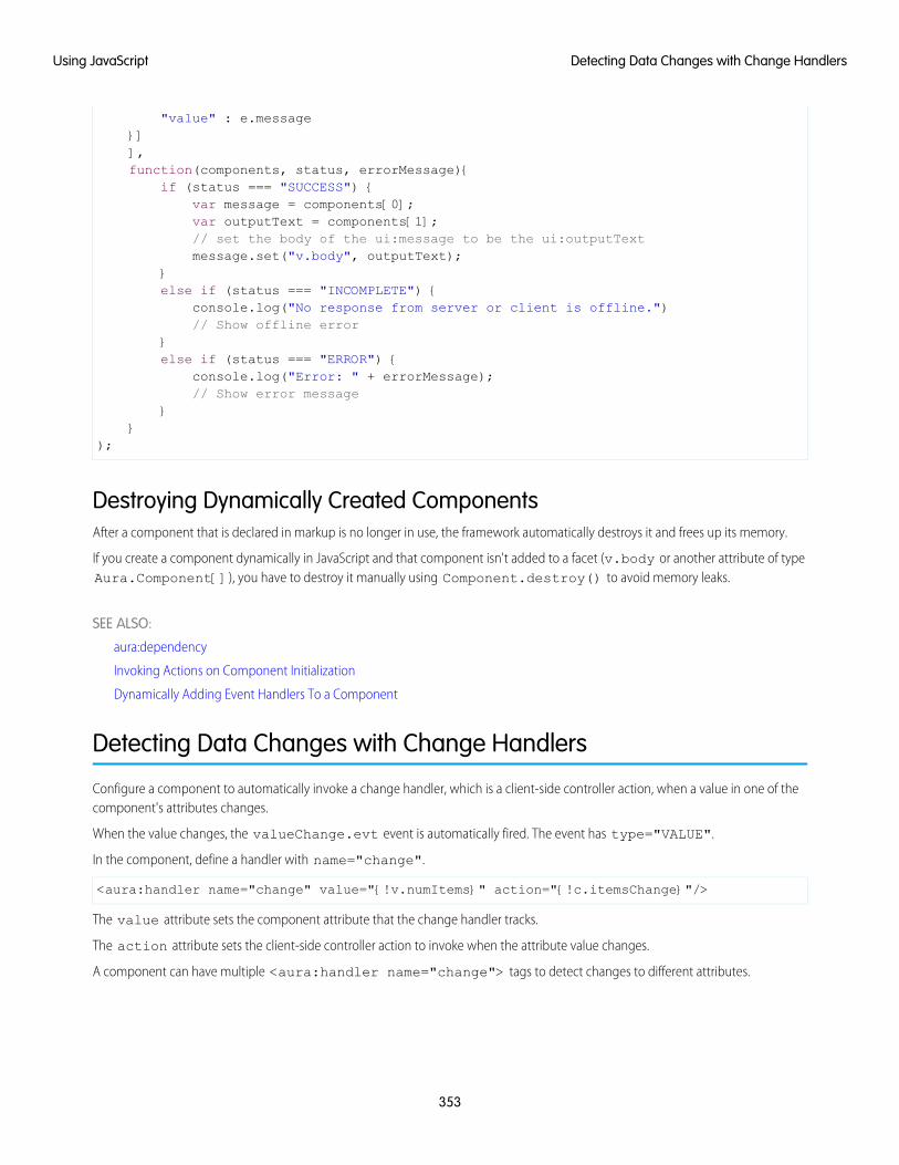
"value" : e.message}]],function(components, status, errorMessage){
if (status === "SUCCESS") {var message = components[0];var outputText = components[1];// set the body of the ui:message to be the ui:outputTextmessage.set("v.body", outputText);
}else if (status === "INCOMPLETE") {
console.log("No response from server or client is offline.")// Show offline error
}else if (status === "ERROR") {
console.log("Error: " + errorMessage);// Show error message
}}
);
Destroying Dynamically Created ComponentsAfter a component that is declared in markup is no longer in use, the framework automatically destroys it and frees up its memory.
If you create a component dynamically in JavaScript and that component isn't added to a facet (v.body or another attribute of typeAura.Component[]), you have to destroy it manually using Component.destroy() to avoid memory leaks.
SEE ALSO:
aura:dependency
Invoking Actions on Component Initialization
Dynamically Adding Event Handlers To a Component
Detecting Data Changes with Change Handlers
Configure a component to automatically invoke a change handler, which is a client-side controller action, when a value in one of thecomponent's attributes changes.
When the value changes, the valueChange.evt event is automatically fired. The event has type="VALUE".
In the component, define a handler with name="change".
<aura:handler name="change" value="{!v.numItems}" action="{!c.itemsChange}"/>
The value attribute sets the component attribute that the change handler tracks.
The action attribute sets the client-side controller action to invoke when the attribute value changes.
A component can have multiple <aura:handler name="change"> tags to detect changes to different attributes.
353
Detecting Data Changes with Change HandlersUsing JavaScript
In the controller, define the action for the handler.
({itemsChange: function(cmp, evt) {
console.log("numItems has changed");console.log("old value: " + evt.getParam("oldValue"));console.log("current value: " + evt.getParam("value"));
}})
The valueChange event gives you access to the previous value (oldValue) and the current value (value) in the handler action.
When a change occurs to a value that is represented by the change handler, the framework handles the firing of the event andrerendering of the component.
SEE ALSO:
Invoking Actions on Component Initialization
Finding Components by ID
Retrieve a component by its ID in JavaScript code.
Use aura:id to add a local ID of button1 to the lightning:button component.
<lightning:button aura:id="button1" label="button1"/>
You can find the component by calling cmp.find("button1"), where cmp is a reference to the component containing thebutton. The find() function has one parameter, which is the local ID of a component within the markup.
find() returns different types depending on the result.
• If the local ID is unique, find() returns the component.
• If there are multiple components with the same local ID, find() returns an array of the components.
• If there is no matching local ID, find() returns undefined.
SEE ALSO:
Component IDs
Value Providers
Working with Attribute Values in JavaScript
These common patterns are useful for working with attribute values in JavaScript.
component.get(String key) and component.set(String key, Object value) retrieves and assigns valuesassociated with the specified key on the component. Keys are passed in as an expression, which represents an attribute value.
To retrieve an attribute value of a component reference, use component.find("cmpId").get("v.value").
Similarly, to set the attribute value of a component reference, use component.find("cmpId").set("v.value", myValue).
354
Finding Components by IDUsing JavaScript
This example shows how you can retrieve and set attribute values on a component reference, represented by the button with an ID ofbutton1.
<aura:component><aura:attribute name="buttonLabel" type="String"/><lightning:button aura:id="button1" label="Button 1"/>{!v.buttonLabel}<lightning:button label="Get Label" onclick="{!c.getLabel}"/>
</aura:component>
This controller action retrieves the label attribute value of a button in a component and sets its value on the buttonLabelattribute.
({getLabel : function(component, event, helper) {
var myLabel = component.find("button1").get("v.label");component.set("v.buttonLabel", myLabel);
}})
In the following examples, cmp is a reference to a component in your JavaScript code.
Get an Attribute ValueTo get the value of a component’s label attribute:
var label = cmp.get("v.label");
Set an Attribute ValueTo set the value of a component’s label attribute:
cmp.set("v.label","This is a label");
Deep Set an Attribute ValueIf an attribute has an object or collection type, such as Map, you can deep set properties in the attribute value using the dot notationfor expressions. For example, this code sets a value for the firstName property in the user attribute.
component.set("v.user.firstName", "Nina");
For deeply nested objects and attributes, continue adding dots to traverse the structure and access the nested values.
Let’s look at a component with a user attribute of type Map.
<aura:component ><aura:attribute name="user" type="Map"default="{'id': 99,'firstName': 'Eunice','lastName': 'Gomez'}" />
<p>First Name: {!v.user.firstName}</p>
355
Working with Attribute Values in JavaScriptUsing JavaScript
<lightning:button onclick="{!c.deepSet}" label="Deep Set" /></aura:component>
When you click the button in the component, you call the deepSet action in the client-side controller.
({deepSet : function(component, event, helper) {
console.log(component.get("v.user.firstName"));component.set("v.user.firstName", "Nina");console.log(component.get("v.user.firstName"));
}})
The component.set("v.user.firstName", "Nina") line sets a value for the firstName property in the userattribute.
Validate That an Attribute Value Is DefinedTo determine if a component’s label attribute is defined:
var isDefined = !$A.util.isUndefined(cmp.get("v.label"));
Validate That an Attribute Value Is EmptyTo determine if a component’s label attribute is empty:
var isEmpty = $A.util.isEmpty(cmp.get("v.label"));
SEE ALSO:
Working with a Component Body in JavaScript
Working with a Component Body in JavaScript
These are useful and common patterns for working with a component’s body in JavaScript.
In these examples, cmp is a reference to a component in your JavaScript code. It’s usually easy to get a reference to a component inJavaScript code. Remember that the body attribute is an array of components, so you can use the JavaScript Array methods on it.
Note: When you use cmp.set("v.body", ...) to set the component body, you must explicitly include {!v.body}in your component markup.
Replace a Component's BodyTo replace the current value of a component’s body with another component:
// newCmp is a reference to another componentcmp.set("v.body", newCmp);
356
Working with a Component Body in JavaScriptUsing JavaScript
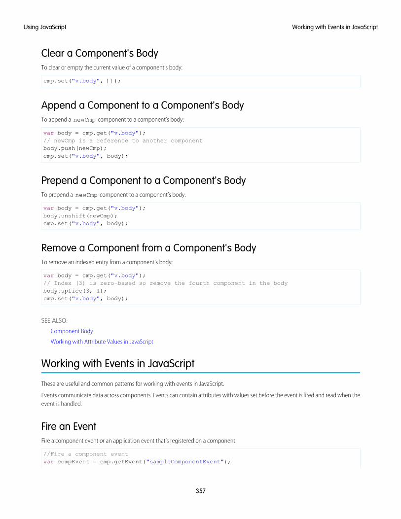
Clear a Component's BodyTo clear or empty the current value of a component’s body:
cmp.set("v.body", []);
Append a Component to a Component's BodyTo append a newCmp component to a component’s body:
var body = cmp.get("v.body");// newCmp is a reference to another componentbody.push(newCmp);cmp.set("v.body", body);
Prepend a Component to a Component's BodyTo prepend a newCmp component to a component’s body:
var body = cmp.get("v.body");body.unshift(newCmp);cmp.set("v.body", body);
Remove a Component from a Component's BodyTo remove an indexed entry from a component’s body:
var body = cmp.get("v.body");// Index (3) is zero-based so remove the fourth component in the bodybody.splice(3, 1);cmp.set("v.body", body);
SEE ALSO:
Component Body
Working with Attribute Values in JavaScript
Working with Events in JavaScript
These are useful and common patterns for working with events in JavaScript.
Events communicate data across components. Events can contain attributes with values set before the event is fired and read when theevent is handled.
Fire an EventFire a component event or an application event that’s registered on a component.
//Fire a component eventvar compEvent = cmp.getEvent("sampleComponentEvent");
357
Working with Events in JavaScriptUsing JavaScript
compEvent.fire();
//Fire an application eventvar appEvent = $A.get("e.c:appEvent");appEvent.fire();
For more information, see:
• Fire Component Events
• Fire Application Events
Get an Event NameTo get the name of the event that’s fired:
event.getSource().getName();
Get an Event ParameterTo get an attribute that’s passed into an event:
event.getParam("value");
Get Parameters on an EventTo get all attributes that are passed into an event:
event.getParams();
event.getParams() returns an object containing all event parameters.
Get the Current Phase of an EventTo get the current phase of an event:
event.getPhase();
If the event hasn’t been fired, event.getPhase() returns undefined. Possible return values for component and applicationevents are capture, bubble, and default. Value events return default. For more information, see:
• Component Event Propagation
• Application Event Propagation
Get the Source ComponentTo get the component that fired the event:
event.getSource();
To retrieve an attribute on the component that fired the event:
event.getSource().get("v.myName");
358
Working with Events in JavaScriptUsing JavaScript
Pause the EventTo pause the fired event:
event.pause();
If paused, the event is not handled until event.resume() is called. You can pause an event in the capture or bubble phaseonly. For more information, see:
• Handling Bubbled or Captured Component Events
• Handling Bubbled or Captured Application Events
Prevent the Default Event ExecutionTo cancel the default action on the event:
event.preventDefault();
For example, you can prevent a lightning:button component from submitting a form when it’s clicked.
Resume a Paused EventTo resume event handling for a paused event:
event.resume();
You can resume a paused event in the capture or bubble phase only. For more information, see:
• Handling Bubbled or Captured Component Events
• Handling Bubbled or Captured Application Events
Set a Value for an Event ParameterTo set a value for an event parameter:
event.setParam("name", cmp.get("v.myName"));
If the event has already been fired, setting a parameter value has no effect on the event.
Set Values for Event ParametersTo set values for parameters on an event:
event.setParams({key : value
});
If the event has already been fired, setting the parameter values has no effect on the event.
359
Working with Events in JavaScriptUsing JavaScript
Stop Event PropagationTo prevent further propagation of an event:
event.stopPropagation();
You can stop event propagation in the capture or bubble phase only.
Modifying the DOM
The Document Object Model (DOM) is the language-independent model for representing and interacting with objects in HTML andXML documents. It’s important to know how to modify the DOM safely so that the framework’s rendering service doesn’t stomp on yourchanges and give you unexpected results.
IN THIS SECTION:
Modifying DOM Elements Managed by the Aura Components Programming Model
The framework creates and manages the DOM elements owned by a component. If you want to modify these DOM elements createdby the framework, modify the DOM elements in the handler for the component’s render event or in a custom renderer. Otherwise,the framework will override your changes when the component is rerendered.
Modifying DOM Elements Managed by External Libraries
You can use different libraries, such as a charting library, to create and manage DOM elements. You don’t have to modify these DOMelements within the render event handler or a renderer because they are managed by the external library.
Modifying DOM Elements Managed by the Aura Components ProgrammingModelThe framework creates and manages the DOM elements owned by a component. If you want to modify these DOM elements createdby the framework, modify the DOM elements in the handler for the component’s render event or in a custom renderer. Otherwise,the framework will override your changes when the component is rerendered.
For example, if you modify DOM elements directly from a client-side controller, the changes may be overwritten when the componentis rendered.
You can read from the DOM outside a render event handler or a custom renderer.
The simplest approach is to leave DOM updates to the framework. Update a component’s attribute and use an expression in the markup.The framework’s rendering service takes care of the DOM updates.
You can modify CSS classes for a component outside a renderer by using the $A.util.addClass(), $A.util.removeClass(),and $A.util.toggleClass() methods.
There are some use cases where you want to perform post-processing on the DOM or react to rendering or rerendering of a component.For these use cases, there are a few options.
IN THIS SECTION:
Handle the render Event
When a component is rendered or rerendered, the aura:valueRender event, also known as the render event, is fired.Handle this event to perform post-processing on the DOM or react to component rendering or rerendering. The event is preferredand easier to use than the alternative of creating a custom renderer.
360
Modifying the DOMUsing JavaScript
Create a Custom Renderer
The framework’s rendering service takes in-memory component state and creates and manages the DOM elements owned by thecomponent. If you want to modify DOM elements created by the framework for a component, you can modify the DOM elementsin the component’s renderer. Otherwise, the framework will override your changes when the component is rerendered.
SEE ALSO:
Modifying DOM Elements Managed by External Libraries
Using Expressions
Dynamically Showing or Hiding Markup
Handle the render EventWhen a component is rendered or rerendered, the aura:valueRender event, also known as the render event, is fired. Handlethis event to perform post-processing on the DOM or react to component rendering or rerendering. The event is preferred and easierto use than the alternative of creating a custom renderer.
The render event is fired after all methods in a custom renderer are invoked. For more details on the sequence in the rendering orrerendering lifecycles, see Create a Custom Renderer.
Handling the aura:valueRender event is similar to handling the init hook. Add a handler to your component's markup.
<aura:handler name="render" value="{!this}" action="{!c.onRender}"/>
In this example, the onRender action in your client-side controller handles initial rendering and rerendering of the component. Youcan choose any name for the action attribute.
SEE ALSO:
Invoking Actions on Component Initialization
Create a Custom Renderer
Create a Custom RendererThe framework’s rendering service takes in-memory component state and creates and manages the DOM elements owned by thecomponent. If you want to modify DOM elements created by the framework for a component, you can modify the DOM elements inthe component’s renderer. Otherwise, the framework will override your changes when the component is rerendered.
The DOM is the language-independent model for representing and interacting with objects in HTML and XML documents. The frameworkautomatically renders your components so you don’t have to know anything more about rendering unless you need to customize thedefault rendering behavior for a component.
Note: It’s preferred and easier to handle the render event rather than the alternative of creating a custom renderer.
Base Component RenderingThe base component in the framework is aura:component. Every component extends this base component.
The renderer for aura:component is in componentRenderer.js. This renderer has base implementations for the four phasesof the rendering and rerendering cycles:
• render()
• rerender()
361
Modifying DOM Elements Managed by the Aura ComponentsProgramming Model
Using JavaScript
• afterRender()
• unrender()
The framework calls these functions as part of the rendering and rerendering lifecycles and we will learn more about them soon. Youcan override the base rendering functions in a custom renderer.
Rendering LifecycleThe rendering lifecycle happens once in the lifetime of a component unless the component gets explicitly unrendered. When you createa component:
1. The framework fires an init event, enabling you to update a component or fire an event after component construction but beforerendering.
2. The render() method is called to render the component’s body.
3. The afterRender() method is called to enable you to interact with the DOM tree after the framework’s rendering service hasinserted DOM elements.
4. The framework fires a render event, enabling you to interact with the DOM tree after the framework’s rendering service hasinserted DOM elements. Handling the render event is preferred to creating a custom renderer and overriding afterRender().
Rerendering LifecycleThe rerendering lifecycle automatically handles rerendering of components whenever the underlying data changes. Here is a typicalsequence.
1. A browser event triggers one or more Lightning events.
2. Each Lightning event triggers one or more actions that can update data. The updated data can fire more events.
3. The rendering service tracks the stack of events that are fired.
4. The framework rerenders all the components that own modified data by calling each component’s rerender() method.
5. The framework fires a render event, enabling you to interact with the DOM tree after the framework rerenders a component.Handling the render event is preferred to creating a custom renderer and overriding rerender().
The component rerendering lifecycle repeats whenever the underlying data changes as long as the component is valid and not explicitlyunrendered.
For more information, see Events Fired During the Rendering Lifecycle .
Custom RendererYou don’t normally have to write a custom renderer, but it’s useful when you want to interact with the DOM tree after the framework’srendering service has inserted DOM elements. If you want to customize rendering behavior and you can’t do it in markup or by usingthe init event, you can create a client-side renderer.
A renderer file is part of the component bundle and is auto-wired if you follow the naming convention,<componentName>Renderer.js. For example, the renderer for sample.cmp would be in sampleRenderer.js.
Note: These guidelines are important when you customize rendering.
• Only modify DOM elements that are part of the component. Never break component encapsulation by reaching in to anothercomponent and changing its DOM elements, even if you are reaching in from the parent component.
• Never fire an event as it can trigger new rendering cycles. An alternative is to use an init event instead.
• Don’t set attribute values on other components as these changes can trigger new rendering cycles.
362
Modifying DOM Elements Managed by the Aura ComponentsProgramming Model
Using JavaScript
• Move as much of the UI concerns, including positioning, to CSS.
Customize Component RenderingCustomize rendering by creating a render() function in your component’s renderer to override the base render() function,which updates the DOM.
The render() function returns a DOM node, an array of DOM nodes, or nothing. The base HTML component expects DOM nodeswhen it renders a component.
You generally want to extend default rendering by calling superRender() from your render() function before you add yourcustom rendering code. Calling superRender() creates the DOM nodes specified in the markup.
This code outlines a custom render() function.
render : function(cmp, helper) {var ret = this.superRender();// do custom rendering herereturn ret;
},
Rerender ComponentsWhen an event is fired, it may trigger actions to change data and call rerender() on affected components. The rerender()function enables components to update themselves based on updates to other components since they were last rendered. This functiondoesn’t return a value.
If you update data in a component, the framework automatically calls rerender().
You generally want to extend default rerendering by calling superRerender() from your renderer() function before youadd your custom rerendering code. Calling superRerender() chains the rerendering to the components in the body attribute.
This code outlines a custom rerender() function.
rerender : function(cmp, helper){this.superRerender();// do custom rerendering here
}
Access the DOM After RenderingThe afterRender() function enables you to interact with the DOM tree after the framework’s rendering service has inserted DOMelements. It’s not necessarily the final call in the rendering lifecycle; it’s simply called after render() and it doesn’t return a value.
You generally want to extend default after rendering by calling superAfterRender() function before you add your custom code.
This code outlines a custom afterRender() function.
afterRender: function (component, helper) {this.superAfterRender();// interact with the DOM here
},
363
Modifying DOM Elements Managed by the Aura ComponentsProgramming Model
Using JavaScript
Unrender ComponentsThe base unrender() function deletes all the DOM nodes rendered by a component’s render() function. It is called by theframework when a component is being destroyed. Customize this behavior by overriding unrender() in your component’s renderer.This method can be useful when you are working with third-party libraries that are not native to the framework.
You generally want to extend default unrendering by calling superUnrender() from your unrender() function before youadd your custom code.
This code outlines a custom unrender() function.
unrender: function () {this.superUnrender();// do custom unrendering here
}
SEE ALSO:
Modifying the DOM
Invoking Actions on Component Initialization
Component Bundles
Modifying Components Outside the Framework Lifecycle
Sharing JavaScript Code in a Component Bundle
Modifying DOM Elements Managed by External LibrariesYou can use different libraries, such as a charting library, to create and manage DOM elements. You don’t have to modify these DOMelements within the render event handler or a renderer because they are managed by the external library.
A render event handler or a renderer are used only to customize DOM elements created and managed by the Aura Componentsprogramming model.
To use external libraries, use <ltng:require>. The afterScriptsLoaded attribute enables you to interact with the DOMafter your libraries have loaded and the DOM is ready. <ltng:require> tag orchestrates the loading of your library of choice withthe rendering cycle of the Aura Components programming model to ensure that everything works in concert.
SEE ALSO:
Using External JavaScript Libraries
Modifying DOM Elements Managed by the Aura Components Programming Model
Checking Component Validity
If you navigate elsewhere in the UI while asynchronous code is executing, the framework unrenders and destroys the component thatmade the asynchronous request. You can still have a reference to that component, but it is no longer valid. The cmp.isValid()call returns false for an invalid component.
If you call cmp.get() on an invalid component, cmp.get() returns null.
If you call cmp.set() on an invalid component, nothing happens and no error occurs. It’s essentially a no op.
364
Modifying DOM Elements Managed by External LibrariesUsing JavaScript

In many scenarios, the cmp.isValid() call isn’t necessary because a null check on a value retrieved from cmp.get() issufficient. The main reason to call cmp.isValid() is if you’re making multiple calls against the component and you want to avoida null check for each result.
Inside the Framework LifecycleYou don’t need a cmp.isValid() check in the callback in a client-side controller when you reference the component associatedwith the client-side controller. The framework automatically checks that the component is valid. Similarly, you don’t need acmp.isValid() check during event handling or in a framework lifecycle hook, such as the init event.
Let’s look at a sample client-side controller.
({"doSomething" : function(cmp) {
var action = cmp.get("c.serverEcho");action.setCallback(this, function(response) {
var state = response.getState();if (state === "SUCCESS") {
if (cmp.get("v.displayResult)) {alert("From server: " + response.getReturnValue());
}}// other state handling omitted for brevity
});
$A.enqueueAction(action);}
})
The component wired to the client-side controller is passed into the doSomething action as the cmp parameter. Whencmp.get("v.displayResult) is called, we don’t need a cmp.isValid() check.
However, if you hold a reference to another component that may not be valid despite your component being valid, you might need acmp.isValid() check for the other component. Let’s look at another example of a component that has a reference to anothercomponent with a local ID of child.
({"doSomething" : function(cmp) {
var action = cmp.get("c.serverEcho");var child = cmp.find("child");action.setCallback(this, function(response) {
var state = response.getState();if (state === "SUCCESS") {
if (child.get("v.displayResult)) {alert("From server: " + response.getReturnValue());
}}// other state handling omitted for brevity
});
$A.enqueueAction(action);}
})
365
Checking Component ValidityUsing JavaScript
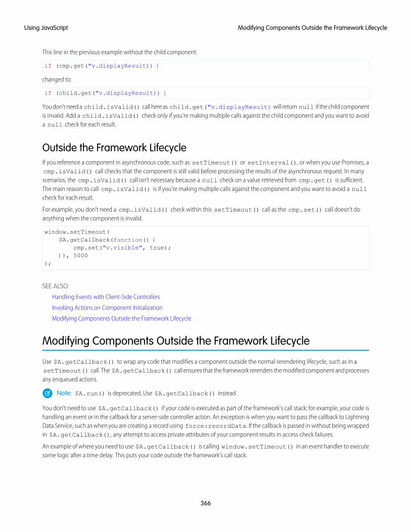
This line in the previous example without the child component:
if (cmp.get("v.displayResult)) {
changed to:
if (child.get("v.displayResult)) {
You don’t need a child.isValid() call here as child.get("v.displayResult) will return null if the child componentis invalid. Add a child.isValid() check only if you’re making multiple calls against the child component and you want to avoida null check for each result.
Outside the Framework LifecycleIf you reference a component in asynchronous code, such as setTimeout() or setInterval(), or when you use Promises, acmp.isValid() call checks that the component is still valid before processing the results of the asynchronous request. In manyscenarios, the cmp.isValid() call isn’t necessary because a null check on a value retrieved from cmp.get() is sufficient.The main reason to call cmp.isValid() is if you’re making multiple calls against the component and you want to avoid a nullcheck for each result.
For example, you don’t need a cmp.isValid() check within this setTimeout() call as the cmp.set() call doesn’t doanything when the component is invalid.
window.setTimeout($A.getCallback(function() {
cmp.set("v.visible", true);}), 5000
);
SEE ALSO:
Handling Events with Client-Side Controllers
Invoking Actions on Component Initialization
Modifying Components Outside the Framework Lifecycle
Modifying Components Outside the Framework Lifecycle
Use $A.getCallback() to wrap any code that modifies a component outside the normal rerendering lifecycle, such as in asetTimeout() call. The $A.getCallback() call ensures that the framework rerenders the modified component and processesany enqueued actions.
Note: $A.run() is deprecated. Use $A.getCallback() instead.
You don't need to use $A.getCallback() if your code is executed as part of the framework's call stack; for example, your code ishandling an event or in the callback for a server-side controller action. An exception is when you want to pass the callback to LightningData Service, such as when you are creating a record using force:recordData. If the callback is passed in without being wrappedin $A.getCallback(), any attempt to access private attributes of your component results in access check failures.
An example of where you need to use $A.getCallback() is calling window.setTimeout() in an event handler to executesome logic after a time delay. This puts your code outside the framework's call stack.
366
Modifying Components Outside the Framework LifecycleUsing JavaScript

This sample sets the visible attribute on a component to true after a five-second delay.
window.setTimeout($A.getCallback(function() {
cmp.set("v.visible", true);}), 5000
);
Note how the code updating a component attribute is wrapped in $A.getCallback(), which ensures that the framework rerendersthe modified component.
Note: You don't need a cmp.isValid() check within this setTimeout() call as the cmp.set() call doesn't doanything when the component is invalid.
Warning: Don't save a reference to a function wrapped in $A.getCallback(). If you use the reference later to send actions,the saved transaction state will cause the actions to be aborted.
SEE ALSO:
Creating a Record
Handling Events with Client-Side Controllers
Checking Component Validity
Firing Events from Non-Aura Code
Communicating with Events
Validating Fields
Validate user input, handle errors, and display error messages on input fields.
Built-in field validation is available for the following components:
• lightning:checkboxGroup
• lightning:combobox
• lightning:input
• lightning:inputField
• lightning:radioGroup
• lightning:select
• lightning:slider
• lightning:textarea
• ui:input*
Note: Components in the ui namespace are deprecated as of API version 46.0. We recommend you use components in thelightning namespace instead. For more information, see Working with UI Components.
Components in the lightning namespace simplify input validation by providing attributes to define error conditions, enabling youto handle errors by checking the component’s validity state. For example, you can set a minimum length for a field, display an errormessage when the condition is not met, and handle the error based on the given validity state. For more information, see the lightningnamespace components in the https://developer.salesforce.com/docs/component-library.
Alternatively, input components in the ui namespace let you define and handle errors in a client-side controller, enabling you to iteratethrough a list of errors.
367
Validating FieldsUsing JavaScript
The following sections discuss error handling for ui:input* components in API version 45.0 and earlier.
Default Error HandlingThe framework can handle and display errors using the default error component, ui:inputDefaultError. This component isdynamically created when you set the errors using the inputCmp.set("v.errors",[{message:"my errormessage"}]) syntax. The following example shows how you can handle a validation error and display an error message. Here is themarkup.
<!--c:errorHandling--><aura:component>
Enter a number: <ui:inputNumber aura:id="inputCmp"/> <br/><lightning:button label="Submit" onclick="{!c.doAction}"/>
</aura:component>
Set and clear the error in your client-side controller.
/*errorHandlingController.js*/{
doAction : function(component) {var inputCmp = component.find("inputCmp");var value = inputCmp.get("v.value");
// Is input numeric?if (isNaN(value)) {
// Set errorinputCmp.set("v.errors", [{message:"Input not a number: " + value}]);
} else {// Clear errorinputCmp.set("v.errors", null);
}}
}
When you enter a value and click Submit, doAction in the controller validates the input and displays an error message if the inputis not a number. Entering a valid input clears the error. Add error messages to the input component using the errors attribute.
Custom Error Handlingui:input and its child components can handle errors using the onError and onClearErrors events, which are wired toyour custom error handlers defined in a controller. onError maps to a ui:validationError event, and onClearErrorsmaps to ui:clearErrors.
The following example shows how you can handle a validation error using custom error handlers and display the error message usingthe default error component. Here is the markup.
<!--c:errorHandlingCustom--><aura:component>
Enter a number: <ui:inputNumber aura:id="inputCmp" onError="{!c.handleError}"onClearErrors="{!c.handleClearError}"/> <br/>
<ui:button label="Submit" press="{!c.doAction}"/></aura:component>
368
Validating FieldsUsing JavaScript
Here is the client-side controller.
/*errorHandlingCustomController.js*/{
doAction : function(component, event) {var inputCmp = component.find("inputCmp");var value = inputCmp.get("v.value");
// is input numeric?if (isNaN(value)) {
inputCmp.set("v.errors", [{message:"Input not a number: " + value}]);} else {
inputCmp.set("v.errors", null);}
},
handleError: function(component, event){/* do any custom error handling* logic desired here */// get v.errors, which is an Object[]var errorsArr = event.getParam("errors");for (var i = 0; i < errorsArr.length; i++) {
console.log("error " + i + ": " + JSON.stringify(errorsArr[i]));}
},
handleClearError: function(component, event) {/* do any custom error handling* logic desired here */
}}
When you enter a value and click Submit, doAction in the controller executes. However, instead of letting the framework handlethe errors, we define a custom error handler using the onError event in <ui:inputNumber>. If the validation fails, doActionadds an error message using the errors attribute. This automatically fires the handleError custom error handler.
Similarly, you can customize clearing the errors by using the onClearErrors event. See the handleClearError handler inthe controller for an example.
SEE ALSO:
Handling Events with Client-Side Controllers
Component Events
Throwing and Handling Errors
The framework gives you flexibility in handling unrecoverable and recoverable app errors in JavaScript code. For example, you can throwthese errors in a callback when handling an error in a server-side response.
369
Throwing and Handling ErrorsUsing JavaScript
Unrecoverable ErrorsUse throw new Error("error message here") for unrecoverable errors, such as an error that prevents your app fromstarting successfully. The error message is displayed.
Note: $A.error() is deprecated. Throw the native JavaScript Error object instead by using throw new Error().
This example shows you the basics of throwing an unrecoverable error in a JavaScript controller.
<!--c:unrecoverableError--><aura:component>
<lightning:button label="throw error" onclick="{!c.throwError}"/></aura:component>
Here is the client-side controller source.
/*unrecoverableErrorController.js*/({
throwError : function(component, event){throw new Error("I can’t go on. This is the end.");
}})
Recoverable ErrorsTo handle recoverable errors, use a component, such as ui:message, to tell users about the problem.
This sample shows you the basics of throwing and catching a recoverable error in a JavaScript controller.
<!--c:recoverableError--><aura:component>
<p>Click the button to trigger the controller to throw an error.</p><div aura:id="div1"></div>
<lightning:button label="Throw an Error" onclick="{!c.throwErrorForKicks}"/></aura:component>
Here is the client-side controller source.
/*recoverableErrorController.js*/({
throwErrorForKicks: function(cmp) {// this sample always throws an error to demo try/catchvar hasPerm = false;try {
if (!hasPerm) {throw new Error("You don't have permission to edit this record.");
}}catch (e) {
$A.createComponents([["ui:message",{
"title" : "Sample Thrown Error","severity" : "error",
}],["ui:outputText",{
370
Throwing and Handling ErrorsUsing JavaScript
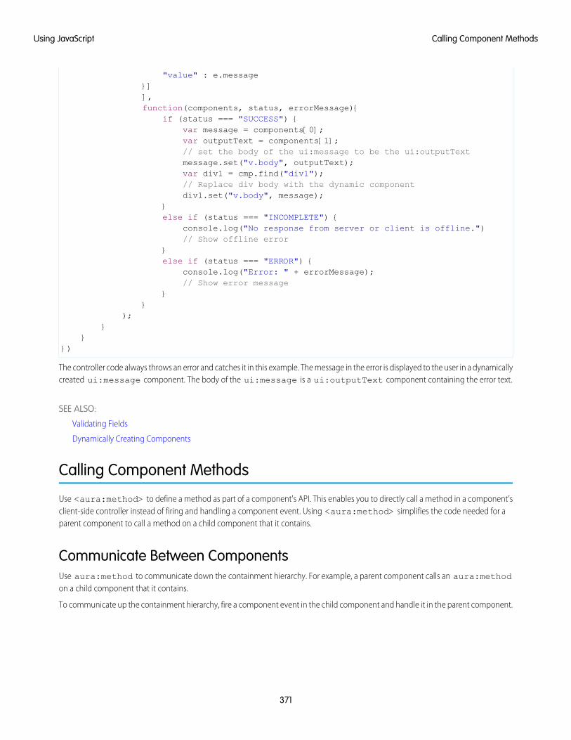
"value" : e.message}]],function(components, status, errorMessage){
if (status === "SUCCESS") {var message = components[0];var outputText = components[1];// set the body of the ui:message to be the ui:outputTextmessage.set("v.body", outputText);var div1 = cmp.find("div1");// Replace div body with the dynamic componentdiv1.set("v.body", message);
}else if (status === "INCOMPLETE") {
console.log("No response from server or client is offline.")// Show offline error
}else if (status === "ERROR") {
console.log("Error: " + errorMessage);// Show error message
}}
);}
}})
The controller code always throws an error and catches it in this example. The message in the error is displayed to the user in a dynamicallycreated ui:message component. The body of the ui:message is a ui:outputText component containing the error text.
SEE ALSO:
Validating Fields
Dynamically Creating Components
Calling Component Methods
Use <aura:method> to define a method as part of a component's API. This enables you to directly call a method in a component’sclient-side controller instead of firing and handling a component event. Using <aura:method> simplifies the code needed for aparent component to call a method on a child component that it contains.
Communicate Between ComponentsUse aura:method to communicate down the containment hierarchy. For example, a parent component calls an aura:methodon a child component that it contains.
To communicate up the containment hierarchy, fire a component event in the child component and handle it in the parent component.
371
Calling Component MethodsUsing JavaScript
SyntaxUse this syntax to call a method in JavaScript code.
cmp.sampleMethod(arg1, … argN);
cmp is a reference to the component.
sampleMethod is the name of the aura:method.
arg1, … argN is an optional comma-separated list of arguments passed to the method. Each argument corresponds to anaura:attribute defined in the aura:method markup.
Using Inherited MethodsA sub component that extends a super component has access to any methods defined in the super component.
An interface can also include an <aura:method> tag. A component that implements the interface can access the method.
ExampleLet's look at an example app.
<!-- c:auraMethodCallerWrapper.app --><aura:application >
<c:auraMethodCaller /></aura:application>
c:auraMethodCallerWrapper.app contains a c:auraMethodCaller component.
<!-- c:auraMethodCaller.cmp --><aura:component >
<p>Parent component calls aura:method in child component</p><c:auraMethod aura:id="child" />
...</aura:component>
c:auraMethodCaller is the parent component. c:auraMethodCaller contains the child component, c:auraMethod.
We'll show how c:auraMethodCaller calls an aura:method defined in c:auraMethod.
We'll use c:auraMethodCallerWrapper.app to see how to return results from synchronous and asynchronous code.
IN THIS SECTION:
Return Result for Synchronous Code
aura:method executes synchronously. A synchronous method finishes executing before it returns. Use the return statementto return a value from synchronous JavaScript code.
372
Calling Component MethodsUsing JavaScript
Return Result for Asynchronous Code
aura:method executes synchronously. Use the return statement to return a value from synchronous JavaScript code. JavaScriptcode that calls a server-side action is asynchronous. Asynchronous code can continue to execute after it returns. You can’t use thereturn statement to return the result of an asynchronous call because the aura:method returns before the asynchronouscode completes. For asynchronous code, use a callback instead of a return statement.
SEE ALSO:
aura:method
Component Events
Return Result for Synchronous Codeaura:method executes synchronously. A synchronous method finishes executing before it returns. Use the return statement toreturn a value from synchronous JavaScript code.
An asynchronous method can continue to execute after it returns. JavaScript code often uses the callback pattern to return a result afterasynchronous code completes. We’ll describe later how to return a result for an asynchronous action.
Step 1: Define aura:method in MarkupLet’s look at a logParam aura:method that executes synchronous code. We’ll use the c:auraMethodCallerWrapper.appand components outlined in Calling Component Methods. Here’s the markup that defines the aura:method.
<!-- c:auraMethod --><aura:component>
<aura:method name="logParam"description="Sample method with parameter"><aura:attribute name="message" type="String" default="default message" />
</aura:method>
<p>This component has an aura:method definition.</p></aura:component>
The logParam aura:method has an aura:attribute with a name of message. This attribute enables you to set amessage parameter when you call the logParam method.
The name attribute of logParam configures the aura:method to invoke logParam() in the client-side controller.
An aura:method can have multiple aura:attribute tags. Each aura:attribute corresponds to a parameter that youcan pass into the aura:method. For more details on the syntax, see aura:method.
You don’t explicitly declare a return value in the aura:method markup. You just use a return statement in the JavaScript controller.
Step 2: Implement aura:method Logic in ControllerThe logParam aura:method invokes logParam() in auraMethodController.js. Let’s look at that source.
/* auraMethodController.js */({
logParam : function(cmp, event) {var params = event.getParam('arguments');if (params) {
var message = params.message;
373
Return Result for Synchronous CodeUsing JavaScript
console.log("message: " + message);return message;
}},
})
logParam() simply logs the parameter passed in and returns the parameter value to demonstrate how to use the return statement.If your code is synchronous, you can use a return statement; for example, you’re not making an asynchronous server-side action call.
Step 3: Call aura:method from Parent ControllercallAuraMethod() in the controller for c:auraMethodCaller calls the logParam aura:method defined in its childcomponent, c:auraMethod. Here’s the controller for c:auraMethodCaller.
/* auraMethodCallerController.js */({
callAuraMethod : function(component, event, helper) {var childCmp = component.find("child");// call the aura:method in the child componentvar auraMethodResult =childCmp.logParam("message sent by parent component");
console.log("auraMethodResult: " + auraMethodResult);},
})
callAuraMethod() finds the child component, c:auraMethod, and calls its logParam aura:method with an argumentfor the message parameter of the aura:method.
childCmp.logParam("message sent by parent component");
auraMethodResult is the value returned from logParam.
Step 4: Add Button to Initiate Call to aura:methodThe c:auraMethodCaller markup contains a lightning:button that invokes callAuraMethod() inauraMethodCallerController.js. We use this button to initiate the call to aura:method in the child component.
<!-- c:auraMethodCaller.cmp --><aura:component >
<p>Parent component calls aura:method in child component</p><c:auraMethod aura:id="child" />
<lightning:button label="Call aura:method in child component"onclick="{! c.callAuraMethod}" />
</aura:component>
SEE ALSO:
Return Result for Asynchronous Code
Calling Component Methods
aura:method
374
Return Result for Synchronous CodeUsing JavaScript
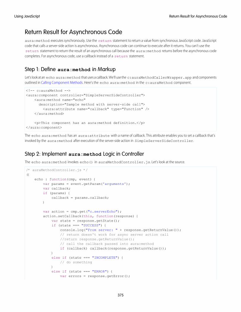
Return Result for Asynchronous Codeaura:method executes synchronously. Use the return statement to return a value from synchronous JavaScript code. JavaScriptcode that calls a server-side action is asynchronous. Asynchronous code can continue to execute after it returns. You can’t use thereturn statement to return the result of an asynchronous call because the aura:method returns before the asynchronous codecompletes. For asynchronous code, use a callback instead of a return statement.
Step 1: Define aura:method in MarkupLet’s look at an echo aura:method that uses a callback. We’ll use the c:auraMethodCallerWrapper.app and componentsoutlined in Calling Component Methods. Here’s the echo aura:method in the c:auraMethod component.
<!-- c:auraMethod --><aura:component controller="SimpleServerSideController">
<aura:method name="echo"description="Sample method with server-side call"><aura:attribute name="callback" type="Function" />
</aura:method>
<p>This component has an aura:method definition.</p></aura:component>
The echo aura:method has an aura:attribute with a name of callback. This attribute enables you to set a callback that’sinvoked by the aura:method after execution of the server-side action in SimpleServerSideController.
Step 2: Implement aura:method Logic in ControllerThe echo aura:method invokes echo() in auraMethodController.js. Let’s look at the source.
/* auraMethodController.js */({
echo : function(cmp, event) {var params = event.getParam('arguments');var callback;if (params) {
callback = params.callback;}
var action = cmp.get("c.serverEcho");action.setCallback(this, function(response) {
var state = response.getState();if (state === "SUCCESS") {
console.log("From server: " + response.getReturnValue());// return doesn't work for async server action call//return response.getReturnValue();// call the callback passed into aura:methodif (callback) callback(response.getReturnValue());
}else if (state === "INCOMPLETE") {
// do something}else if (state === "ERROR") {
var errors = response.getError();
375
Return Result for Asynchronous CodeUsing JavaScript

if (errors) {if (errors[0] && errors[0].message) {
console.log("Error message: " +errors[0].message);
}} else {
console.log("Unknown error");}
}});$A.enqueueAction(action);
},})
echo() calls the serverEcho() server-side controller action, which we’ll create next.
Note: You can’t return the result with a return statement. The aura:method returns before the asynchronous server-sideaction call completes. Instead, we invoke the callback passed into the aura:method and set the result as a parameter in thecallback.
Step 3: Create Apex Server-Side ControllerThe echo aura:method calls a server-side controller action called serverEcho. Here’s the source for the server-side controller.
public with sharing class SimpleServerSideController {@AuraEnabledpublic static String serverEcho() {
return ('Hello from the server');}
}
The serverEcho() method returns a String.
Step 4: Call aura:method from Parent ControllerHere’s the controller for c:auraMethodCaller. It calls the echo aura:method in its child component, c:auraMethod.
/* auraMethodCallerController.js */({
callAuraMethodServerTrip : function(component, event, helper) {var childCmp = component.find("child");// call the aura:method in the child componentchildCmp.echo(function(result) {
console.log("callback for aura:method was executed");console.log("result: " + result);
});},
})
callAuraMethodServerTrip() finds the child component, c:auraMethod, and calls its echo aura:method. echo()passes a callback function into the aura:method.
376
Return Result for Asynchronous CodeUsing JavaScript
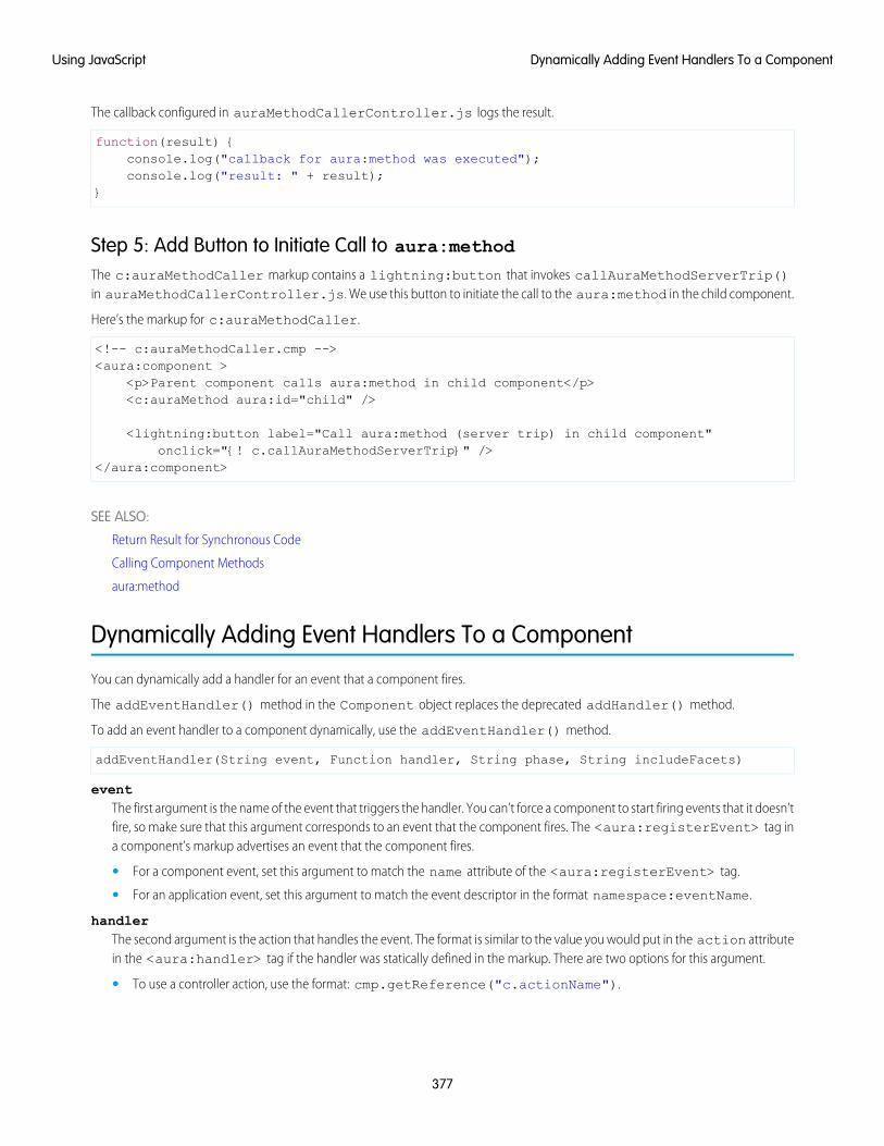
The callback configured in auraMethodCallerController.js logs the result.
function(result) {console.log("callback for aura:method was executed");console.log("result: " + result);
}
Step 5: Add Button to Initiate Call to aura:methodThe c:auraMethodCaller markup contains a lightning:button that invokes callAuraMethodServerTrip()in auraMethodCallerController.js. We use this button to initiate the call to the aura:method in the child component.
Here’s the markup for c:auraMethodCaller.
<!-- c:auraMethodCaller.cmp --><aura:component >
<p>Parent component calls aura:method in child component</p><c:auraMethod aura:id="child" />
<lightning:button label="Call aura:method (server trip) in child component"onclick="{! c.callAuraMethodServerTrip}" />
</aura:component>
SEE ALSO:
Return Result for Synchronous Code
Calling Component Methods
aura:method
Dynamically Adding Event Handlers To a Component
You can dynamically add a handler for an event that a component fires.
The addEventHandler() method in the Component object replaces the deprecated addHandler() method.
To add an event handler to a component dynamically, use the addEventHandler() method.
addEventHandler(String event, Function handler, String phase, String includeFacets)
eventThe first argument is the name of the event that triggers the handler. You can’t force a component to start firing events that it doesn’tfire, so make sure that this argument corresponds to an event that the component fires. The <aura:registerEvent> tag ina component’s markup advertises an event that the component fires.
• For a component event, set this argument to match the name attribute of the <aura:registerEvent> tag.
• For an application event, set this argument to match the event descriptor in the format namespace:eventName.
handlerThe second argument is the action that handles the event. The format is similar to the value you would put in the action attributein the <aura:handler> tag if the handler was statically defined in the markup. There are two options for this argument.
• To use a controller action, use the format: cmp.getReference("c.actionName").
377
Dynamically Adding Event Handlers To a ComponentUsing JavaScript
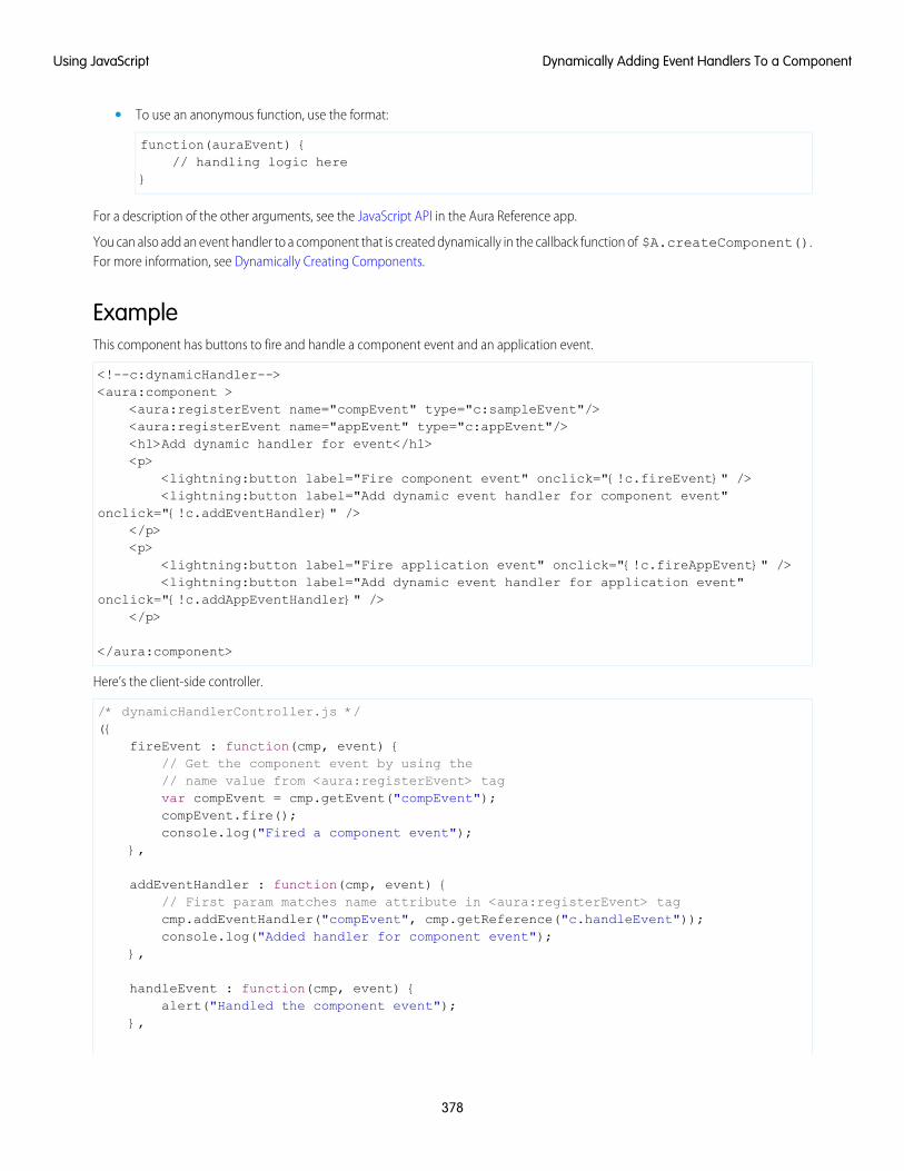
• To use an anonymous function, use the format:
function(auraEvent) {// handling logic here
}
For a description of the other arguments, see the JavaScript API in the Aura Reference app.
You can also add an event handler to a component that is created dynamically in the callback function of $A.createComponent().For more information, see Dynamically Creating Components.
ExampleThis component has buttons to fire and handle a component event and an application event.
<!--c:dynamicHandler--><aura:component >
<aura:registerEvent name="compEvent" type="c:sampleEvent"/><aura:registerEvent name="appEvent" type="c:appEvent"/><h1>Add dynamic handler for event</h1><p>
<lightning:button label="Fire component event" onclick="{!c.fireEvent}" /><lightning:button label="Add dynamic event handler for component event"
onclick="{!c.addEventHandler}" /></p><p>
<lightning:button label="Fire application event" onclick="{!c.fireAppEvent}" /><lightning:button label="Add dynamic event handler for application event"
onclick="{!c.addAppEventHandler}" /></p>
</aura:component>
Here’s the client-side controller.
/* dynamicHandlerController.js */({
fireEvent : function(cmp, event) {// Get the component event by using the// name value from <aura:registerEvent> tagvar compEvent = cmp.getEvent("compEvent");compEvent.fire();console.log("Fired a component event");
},
addEventHandler : function(cmp, event) {// First param matches name attribute in <aura:registerEvent> tagcmp.addEventHandler("compEvent", cmp.getReference("c.handleEvent"));console.log("Added handler for component event");
},
handleEvent : function(cmp, event) {alert("Handled the component event");
},
378
Dynamically Adding Event Handlers To a ComponentUsing JavaScript
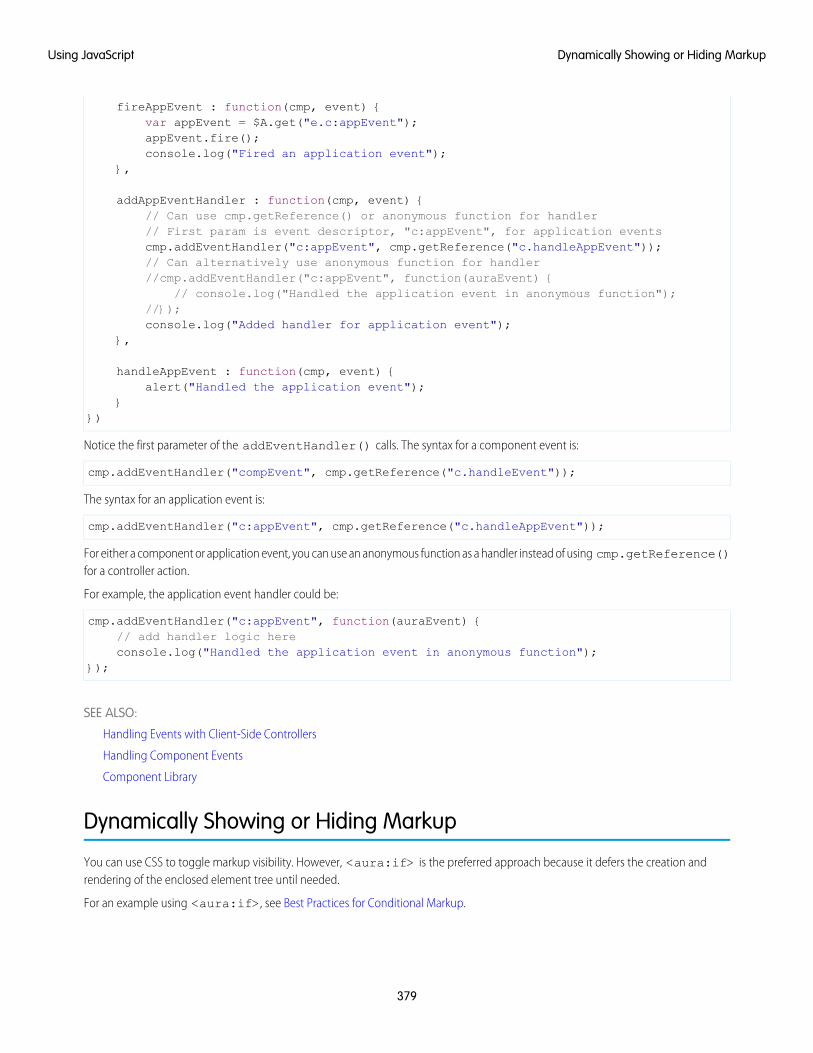
fireAppEvent : function(cmp, event) {var appEvent = $A.get("e.c:appEvent");appEvent.fire();console.log("Fired an application event");
},
addAppEventHandler : function(cmp, event) {// Can use cmp.getReference() or anonymous function for handler// First param is event descriptor, "c:appEvent", for application eventscmp.addEventHandler("c:appEvent", cmp.getReference("c.handleAppEvent"));// Can alternatively use anonymous function for handler//cmp.addEventHandler("c:appEvent", function(auraEvent) {
// console.log("Handled the application event in anonymous function");//});console.log("Added handler for application event");
},
handleAppEvent : function(cmp, event) {alert("Handled the application event");
}})
Notice the first parameter of the addEventHandler() calls. The syntax for a component event is:
cmp.addEventHandler("compEvent", cmp.getReference("c.handleEvent"));
The syntax for an application event is:
cmp.addEventHandler("c:appEvent", cmp.getReference("c.handleAppEvent"));
For either a component or application event, you can use an anonymous function as a handler instead of using cmp.getReference()for a controller action.
For example, the application event handler could be:
cmp.addEventHandler("c:appEvent", function(auraEvent) {// add handler logic hereconsole.log("Handled the application event in anonymous function");
});
SEE ALSO:
Handling Events with Client-Side Controllers
Handling Component Events
Component Library
Dynamically Showing or Hiding Markup
You can use CSS to toggle markup visibility. However, <aura:if> is the preferred approach because it defers the creation andrendering of the enclosed element tree until needed.
For an example using <aura:if>, see Best Practices for Conditional Markup.
379
Dynamically Showing or Hiding MarkupUsing JavaScript
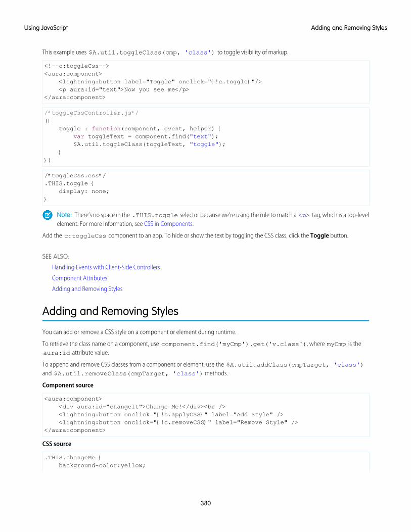
This example uses $A.util.toggleClass(cmp, 'class') to toggle visibility of markup.
<!--c:toggleCss--><aura:component>
<lightning:button label="Toggle" onclick="{!c.toggle}"/><p aura:id="text">Now you see me</p>
</aura:component>
/*toggleCssController.js*/({
toggle : function(component, event, helper) {var toggleText = component.find("text");$A.util.toggleClass(toggleText, "toggle");
}})
/*toggleCss.css*/.THIS.toggle {
display: none;}
Note: There’s no space in the .THIS.toggle selector because we’re using the rule to match a <p> tag, which is a top-levelelement. For more information, see CSS in Components.
Add the c:toggleCss component to an app. To hide or show the text by toggling the CSS class, click the Toggle button.
SEE ALSO:
Handling Events with Client-Side Controllers
Component Attributes
Adding and Removing Styles
Adding and Removing Styles
You can add or remove a CSS style on a component or element during runtime.
To retrieve the class name on a component, use component.find('myCmp').get('v.class'), where myCmp is theaura:id attribute value.
To append and remove CSS classes from a component or element, use the $A.util.addClass(cmpTarget, 'class')and $A.util.removeClass(cmpTarget, 'class') methods.
Component source
<aura:component><div aura:id="changeIt">Change Me!</div><br /><lightning:button onclick="{!c.applyCSS}" label="Add Style" /><lightning:button onclick="{!c.removeCSS}" label="Remove Style" />
</aura:component>
CSS source
.THIS.changeMe {background-color:yellow;
380
Adding and Removing StylesUsing JavaScript
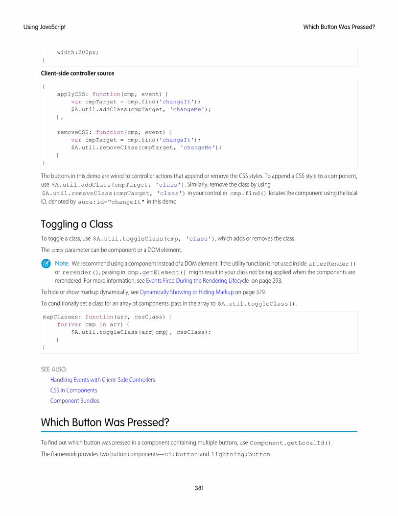
width:200px;}
Client-side controller source
{applyCSS: function(cmp, event) {
var cmpTarget = cmp.find('changeIt');$A.util.addClass(cmpTarget, 'changeMe');
},
removeCSS: function(cmp, event) {var cmpTarget = cmp.find('changeIt');$A.util.removeClass(cmpTarget, 'changeMe');
}}
The buttons in this demo are wired to controller actions that append or remove the CSS styles. To append a CSS style to a component,use $A.util.addClass(cmpTarget, 'class'). Similarly, remove the class by using$A.util.removeClass(cmpTarget, 'class') in your controller. cmp.find() locates the component using the localID, denoted by aura:id="changeIt" in this demo.
Toggling a ClassTo toggle a class, use $A.util.toggleClass(cmp, 'class'), which adds or removes the class.
The cmp parameter can be component or a DOM element.
Note: We recommend using a component instead of a DOM element. If the utility function is not used inside afterRender()or rerender(), passing in cmp.getElement() might result in your class not being applied when the components arererendered. For more information, see Events Fired During the Rendering Lifecycle on page 293.
To hide or show markup dynamically, see Dynamically Showing or Hiding Markup on page 379.
To conditionally set a class for an array of components, pass in the array to $A.util.toggleClass().
mapClasses: function(arr, cssClass) {for(var cmp in arr) {
$A.util.toggleClass(arr[cmp], cssClass);}
}
SEE ALSO:
Handling Events with Client-Side Controllers
CSS in Components
Component Bundles
Which Button Was Pressed?
To find out which button was pressed in a component containing multiple buttons, use Component.getLocalId().
The framework provides two button components—ui:button and lightning:button.
381
Which Button Was Pressed?Using JavaScript
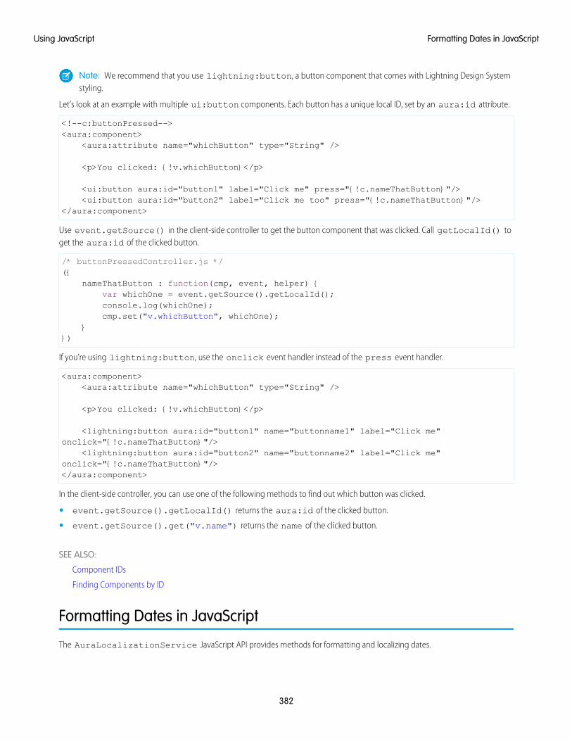
Note: We recommend that you use lightning:button, a button component that comes with Lightning Design Systemstyling.
Let’s look at an example with multiple ui:button components. Each button has a unique local ID, set by an aura:id attribute.
<!--c:buttonPressed--><aura:component>
<aura:attribute name="whichButton" type="String" />
<p>You clicked: {!v.whichButton}</p>
<ui:button aura:id="button1" label="Click me" press="{!c.nameThatButton}"/><ui:button aura:id="button2" label="Click me too" press="{!c.nameThatButton}"/>
</aura:component>
Use event.getSource() in the client-side controller to get the button component that was clicked. Call getLocalId() toget the aura:id of the clicked button.
/* buttonPressedController.js */({
nameThatButton : function(cmp, event, helper) {var whichOne = event.getSource().getLocalId();console.log(whichOne);cmp.set("v.whichButton", whichOne);
}})
If you’re using lightning:button, use the onclick event handler instead of the press event handler.
<aura:component><aura:attribute name="whichButton" type="String" />
<p>You clicked: {!v.whichButton}</p>
<lightning:button aura:id="button1" name="buttonname1" label="Click me"onclick="{!c.nameThatButton}"/>
<lightning:button aura:id="button2" name="buttonname2" label="Click me"onclick="{!c.nameThatButton}"/></aura:component>
In the client-side controller, you can use one of the following methods to find out which button was clicked.
• event.getSource().getLocalId() returns the aura:id of the clicked button.
• event.getSource().get("v.name") returns the name of the clicked button.
SEE ALSO:
Component IDs
Finding Components by ID
Formatting Dates in JavaScript
The AuraLocalizationService JavaScript API provides methods for formatting and localizing dates.
382
Formatting Dates in JavaScriptUsing JavaScript
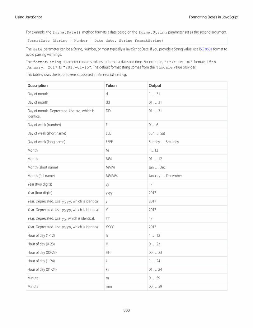
For example, the formatDate() method formats a date based on the formatString parameter set as the second argument.
formatDate (String | Number | Date date, String formatString)
The date parameter can be a String, Number, or most typically a JavaScript Date. If you provide a String value, use ISO 8601 format toavoid parsing warnings.
The formatString parameter contains tokens to format a date and time. For example, "YYYY-MM-DD" formats 15thJanuary, 2017 as "2017-01-15". The default format string comes from the $Locale value provider.
This table shows the list of tokens supported in formatString.
OutputTokenDescription
1 … 31dDay of month
01 … 31ddDay of month
01 … 31DDDay of month. Deprecated. Use dd, which isidentical.
0 … 6EDay of week (number)
Sun … SatEEEDay of week (short name)
Sunday … SaturdayEEEEDay of week (long name)
1 ... 12MMonth
01 … 12MMMonth
Jan … DecMMMMonth (short name)
January … DecemberMMMMMonth (full name)
17yyYear (two digits)
2017yyyyYear (four digits)
2017yYear. Deprecated. Use yyyy, which is identical.
2017YYear. Deprecated. Use yyyy, which is identical.
17YYYear. Deprecated. Use yy, which is identical.
2017YYYYYear. Deprecated. Use yyyy, which is identical.
1 … 12hHour of day (1-12)
0 … 23HHour of day (0-23)
00 … 23HHHour of day (00-23)
1 … 24kHour of day (1-24)
01 … 24kkHour of day (01-24)
0 … 59mMinute
00 … 59mmMinute
383
Formatting Dates in JavaScriptUsing JavaScript
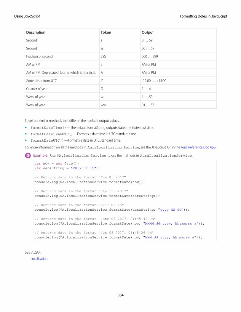
OutputTokenDescription
0 … 59sSecond
00 … 59ssSecond
000 … 999SSSFraction of second
AM or PMaAM or PM
AM or PMAAM or PM. Deprecated. Use a, which is identical.
-12:00 … +14:00ZZone offset from UTC
1 … 4QQuarter of year
1 … 53wWeek of year
01 … 53wwWeek of year
There are similar methods that differ in their default output values.
• formatDateTime()—The default formatString outputs datetime instead of date.
• formatDateTimeUTC()—Formats a datetime in UTC standard time.
• formatDateUTC()—Formats a date in UTC standard time.
For more information on all the methods in AuraLocalizationService, see the JavaScript API in the Aura Reference Doc App.
Example: Use $A.localizationService to use the methods in AuraLocalizationService.
var now = new Date();var dateString = "2017-01-15";
// Returns date in the format "Jun 8, 2017"console.log($A.localizationService.formatDate(now));
// Returns date in the format "Jan 15, 2017"console.log($A.localizationService.formatDate(dateString));
// Returns date in the format "2017 01 15"console.log($A.localizationService.formatDate(dateString, "yyyy MM dd"));
// Returns date in the format "June 08 2017, 01:45:49 PM"console.log($A.localizationService.formatDate(now, "MMMM dd yyyy, hh:mm:ss a"));
// Returns date in the format "Jun 08 2017, 01:48:26 PM"console.log($A.localizationService.formatDate(now, "MMM dd yyyy, hh:mm:ss a"));
SEE ALSO:
Localization
384
Formatting Dates in JavaScriptUsing JavaScript
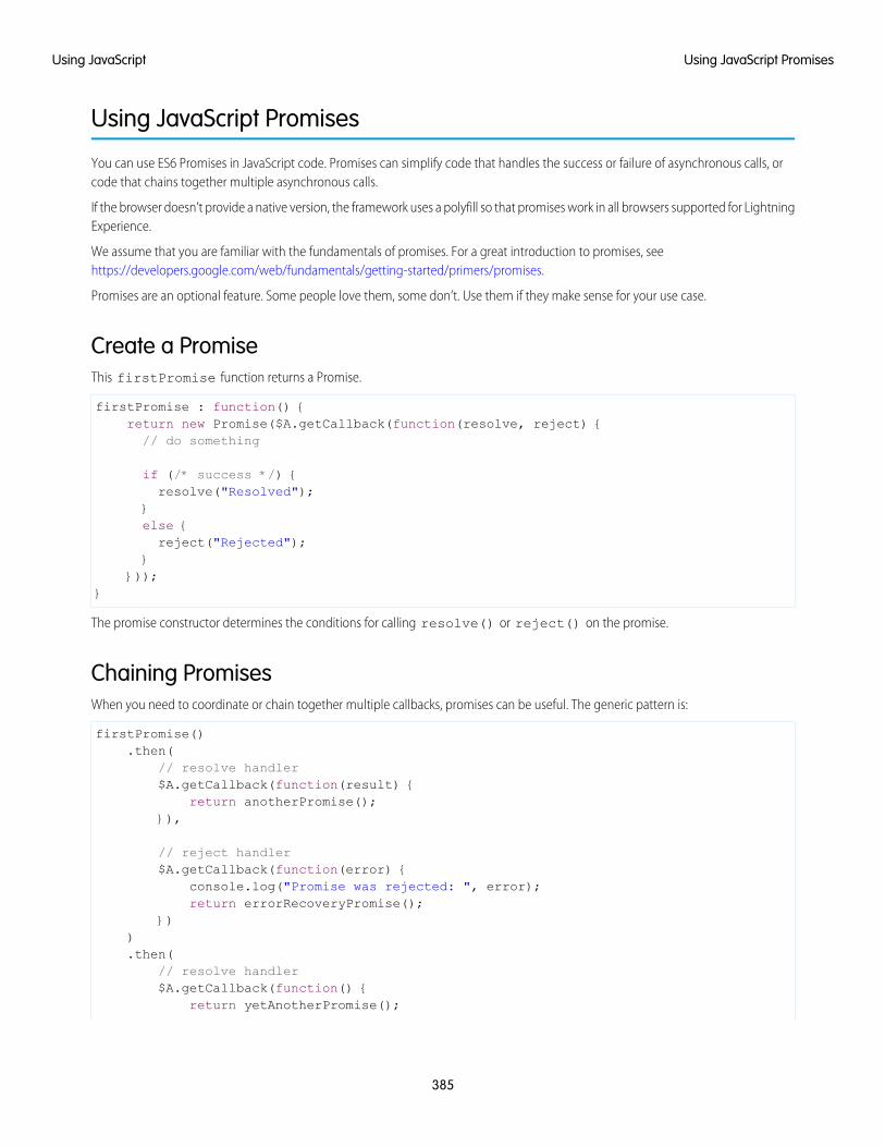
Using JavaScript Promises
You can use ES6 Promises in JavaScript code. Promises can simplify code that handles the success or failure of asynchronous calls, orcode that chains together multiple asynchronous calls.
If the browser doesn’t provide a native version, the framework uses a polyfill so that promises work in all browsers supported for LightningExperience.
We assume that you are familiar with the fundamentals of promises. For a great introduction to promises, seehttps://developers.google.com/web/fundamentals/getting-started/primers/promises.
Promises are an optional feature. Some people love them, some don’t. Use them if they make sense for your use case.
Create a PromiseThis firstPromise function returns a Promise.
firstPromise : function() {return new Promise($A.getCallback(function(resolve, reject) {// do something
if (/* success */) {resolve("Resolved");
}else {reject("Rejected");
}}));
}
The promise constructor determines the conditions for calling resolve() or reject() on the promise.
Chaining PromisesWhen you need to coordinate or chain together multiple callbacks, promises can be useful. The generic pattern is:
firstPromise().then(
// resolve handler$A.getCallback(function(result) {
return anotherPromise();}),
// reject handler$A.getCallback(function(error) {
console.log("Promise was rejected: ", error);return errorRecoveryPromise();
})).then(
// resolve handler$A.getCallback(function() {
return yetAnotherPromise();
385
Using JavaScript PromisesUsing JavaScript
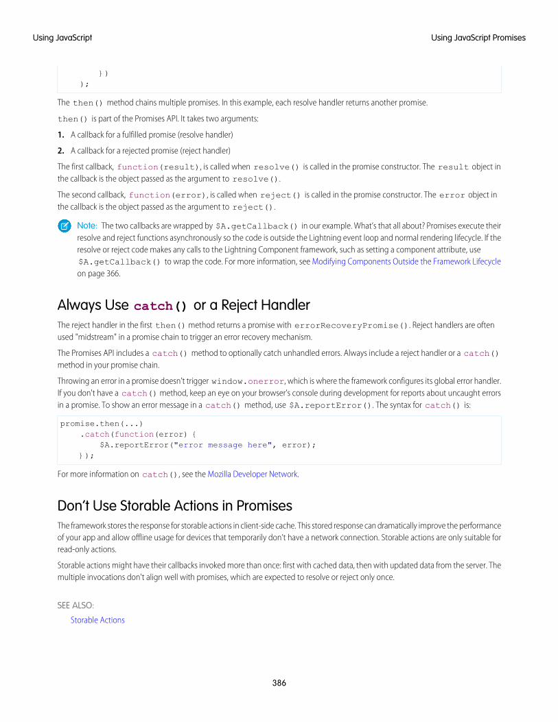
}));
The then() method chains multiple promises. In this example, each resolve handler returns another promise.
then() is part of the Promises API. It takes two arguments:
1. A callback for a fulfilled promise (resolve handler)
2. A callback for a rejected promise (reject handler)
The first callback, function(result), is called when resolve() is called in the promise constructor. The result object inthe callback is the object passed as the argument to resolve().
The second callback, function(error), is called when reject() is called in the promise constructor. The error object inthe callback is the object passed as the argument to reject().
Note: The two callbacks are wrapped by $A.getCallback() in our example. What’s that all about? Promises execute theirresolve and reject functions asynchronously so the code is outside the Lightning event loop and normal rendering lifecycle. If theresolve or reject code makes any calls to the Lightning Component framework, such as setting a component attribute, use$A.getCallback() to wrap the code. For more information, see Modifying Components Outside the Framework Lifecycleon page 366.
Always Use catch() or a Reject HandlerThe reject handler in the first then() method returns a promise with errorRecoveryPromise(). Reject handlers are oftenused "midstream" in a promise chain to trigger an error recovery mechanism.
The Promises API includes a catch() method to optionally catch unhandled errors. Always include a reject handler or a catch()method in your promise chain.
Throwing an error in a promise doesn’t trigger window.onerror, which is where the framework configures its global error handler.If you don't have a catch() method, keep an eye on your browser’s console during development for reports about uncaught errorsin a promise. To show an error message in a catch() method, use $A.reportError(). The syntax for catch() is:
promise.then(...).catch(function(error) {
$A.reportError("error message here", error);});
For more information on catch(), see the Mozilla Developer Network.
Don’t Use Storable Actions in PromisesThe framework stores the response for storable actions in client-side cache. This stored response can dramatically improve the performanceof your app and allow offline usage for devices that temporarily don’t have a network connection. Storable actions are only suitable forread-only actions.
Storable actions might have their callbacks invoked more than once: first with cached data, then with updated data from the server. Themultiple invocations don't align well with promises, which are expected to resolve or reject only once.
SEE ALSO:
Storable Actions
386
Using JavaScript PromisesUsing JavaScript
Making API Calls from Components
By default, you can’t make calls to third-party APIs from client-side code. Add a remote site as a CSP Trusted Site to allow client-sidecomponent code to load assets from and make API requests to that site’s domain.
The Lightning Component framework uses Content Security Policy (CSP) to impose restrictions on content. The main objective is to helpprevent cross-site scripting (XSS) and other code injection attacks. Lightning apps are served from a different domain than SalesforceAPIs, and the default CSP policy doesn’t allow API calls from JavaScript code. You change the policy, and the content of the CSP header,by adding CSP Trusted Sites.
Important: You can’t load JavaScript resources from a third-party site, even if it’s a CSP Trusted Site. To use a JavaScript libraryfrom a third-party site, add it to a static resource, and then add the static resource to your component. After the library is loadedfrom the static resource, you can use it as normal.
Sometimes, you have to make API calls from server-side controllers rather than client-side code. In particular, you can’t make calls toSalesforce APIs from client-side Aura component code. For information about making API calls from server-side controllers, see MakingAPI Calls from Apex on page 446.
SEE ALSO:
Content Security Policy Overview
Create CSP Trusted Sites to Access Third-Party APIs
Create CSP Trusted Sites to Access Third-Party APIs
EDITIONS
Available in: SalesforceClassic and LightningExperience
Available in: Developer,Enterprise, Performance,and Unlimited
USER PERMISSIONS
To create, read, update, anddelete:• Customize Application
or Modify All Data
The Lightning Component framework uses Content Security Policy (CSP) to impose restrictions oncontent. The main objective is to help prevent cross-site scripting (XSS) and other code injectionattacks. To use third-party APIs that make requests to an external (non-Salesforce) server or to usea WebSocket connection, add a CSP Trusted Site.
CSP is a W3C standard that defines rules to control the source of content that can be loaded on apage. All CSP rules work at the page level, and apply to all components and libraries. By default,the framework’s headers allow content to be loaded only from secure (HTTPS) URLs and forbid XHRrequests from JavaScript.
When you define a CSP Trusted Site, the site’s URL is added to the list of allowed sites for the followingdirectives in the CSP header.
• connect-src
• frame-src
• img-src
• style-src
• font-src
• media-src
This change to the CSP header directives allows Lightning components to load resources, such as images, styles, and fonts, from thesite. It also allows client-side code to make requests to the site.
Important: You can’t load JavaScript resources from a third-party site, even if it’s a CSP Trusted Site. To use a JavaScript libraryfrom a third-party site, add it to a static resource, and then add the static resource to your component. After the library is loadedfrom the static resource, you can use it as normal.
387
Making API Calls from ComponentsUsing JavaScript
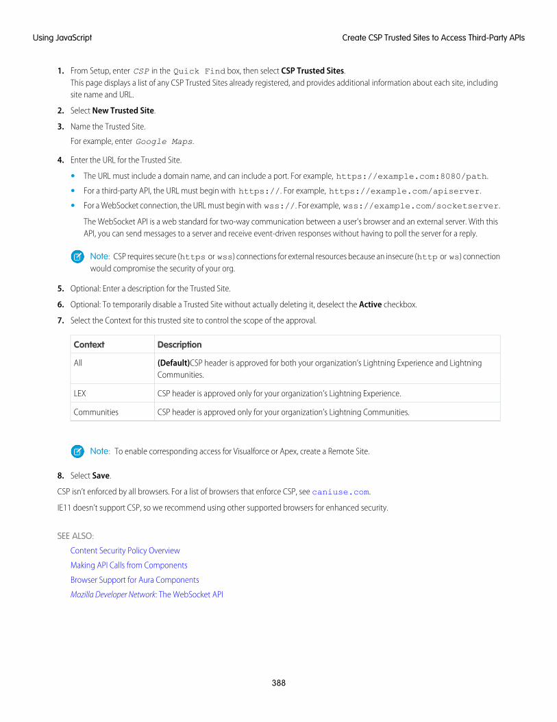
1. From Setup, enter CSP in the Quick Find box, then select CSP Trusted Sites.This page displays a list of any CSP Trusted Sites already registered, and provides additional information about each site, includingsite name and URL.
2. Select New Trusted Site.
3. Name the Trusted Site.
For example, enter Google Maps.
4. Enter the URL for the Trusted Site.
• The URL must include a domain name, and can include a port. For example, https://example.com:8080/path.
• For a third-party API, the URL must begin with https://. For example, https://example.com/apiserver.
• For a WebSocket connection, the URL must begin with wss://. For example, wss://example.com/socketserver.
The WebSocket API is a web standard for two-way communication between a user's browser and an external server. With thisAPI, you can send messages to a server and receive event-driven responses without having to poll the server for a reply.
Note: CSP requires secure (https or wss) connections for external resources because an insecure (http or ws) connectionwould compromise the security of your org.
5. Optional: Enter a description for the Trusted Site.
6. Optional: To temporarily disable a Trusted Site without actually deleting it, deselect the Active checkbox.
7. Select the Context for this trusted site to control the scope of the approval.
DescriptionContext
(Default)CSP header is approved for both your organization’s Lightning Experience and LightningCommunities.
All
CSP header is approved only for your organization’s Lightning Experience.LEX
CSP header is approved only for your organization’s Lightning Communities.Communities
Note: To enable corresponding access for Visualforce or Apex, create a Remote Site.
8. Select Save.
CSP isn’t enforced by all browsers. For a list of browsers that enforce CSP, see caniuse.com.
IE11 doesn’t support CSP, so we recommend using other supported browsers for enhanced security.
SEE ALSO:
Content Security Policy Overview
Making API Calls from Components
Browser Support for Aura Components
Mozilla Developer Network: The WebSocket API
388
Create CSP Trusted Sites to Access Third-Party APIsUsing JavaScript
CHAPTER 10 Working with Salesforce Data
To create, read, and update Salesforce data from an Aura component, use Lightning Data Service via theform-based components or force:recordData. To delete Salesforce data, useforce:recordData.
In this chapter ...
• Lightning DataService
• Using Apex to Workwith SalesforceRecords
389
Lightning Data Service
Use Lightning Data Service to load, create, edit, or delete a record in your component without requiring Apex code. Lightning DataService handles sharing rules and field-level security for you. In addition to simplifying access to Salesforce data, Lightning Data Serviceimproves performance and user interface consistency.
At the simplest level, you can think of Lightning Data Service as the Lightning components version of the Visualforce standard controller.While this statement is an over-simplification, it serves to illustrate a point. Whenever possible, use Lightning Data Service to read andmodify Salesforce data in your components.
Data access with Lightning Data Service is simpler than the equivalent using a server-side Apex controller. Read-only access can beentirely declarative in your component’s markup. For code that modifies data, your component’s JavaScript controller is roughly thesame amount of code, and you eliminate the Apex entirely. All your data access code is consolidated into your component, whichsignificantly reduces complexity.
Lightning Data Service provides other benefits aside from the code. It’s built on highly efficient local storage that’s shared across allcomponents that use it. Records loaded in Lightning Data Service are cached and shared across components.
Note: Working with Lightning Data Service in Lightning Web Components? See the Lightning Web Components DeveloperGuide.
Components accessing the same record see significant performance improvements, because a record is loaded only once, no matterhow many components are using it. Shared records also improve user interface consistency. When one component updates a record,the other components using it are notified, and in most cases, refresh automatically.
Creating Components that Use Lightning Data ServiceLightning Data Service is available through several base components. To create a form for working with records, uselightning:recordForm, lightning:recordEditForm, or lightning:recordViewForm. If you need morecustomization than those components allow, consider the force:recordData component.
One advantage of using the form-based components is that you can achieve many of your record display needs entirely in markupwithout JavaScript. Another powerful feature of the form-based components is automatic field mapping with field-level validation. Theform-based components use a base component that’s appropriate for the field type to render the field automatically.
force:recordData doesn’t include any UI elements; it’s simply logic and a way to communicate to the server. Here are thecomponents that use Lightning Data Service.
lightning:recordFormDisplay, create, or edit records
lightning:recordViewFormDisplay records with lightning:outputField
lightning:recordEditFormCreate or edit records with lightning:inputField
force:recordDataDisplay, create, edit, or delete records with granular customization
390
Lightning Data ServiceWorking with Salesforce Data

IN THIS SECTION:
Loading a Record
Loading a record can be accomplished entirely in markup using lightning:recordForm. If you need a custom layout, uselightning:recordViewForm. If you need more customization than the form-based components allow for viewing recorddata, use force:recordData.
Editing a Record
The simplest way to create a form that enables you to edit a record is to use the lightning:recordForm component. If youwant to customize the form layout or preload custom values, use lightning:recordEditForm. If you want to customizea form more than the form-based components allow, use force:recordData.
Creating a Record
The simplest way to create a form that enables users create a record is to use lightning:recordForm. If you want to customizethe form layout or preload custom values, use lightning:recordEditForm. If you need more customization than theform-based components allow, use force:recordData.
Deleting a Record
To delete a record using Lightning Data Service, call deleteRecord on the force:recordData component, and pass ina callback function to be invoked after the delete operation completes. The form-based components, such aslightning:recordForm, don’t currently support deleting a record.
Record Changes
To perform more advanced tasks using force:recordData when the record changes, handle the recordUpdated event.You can handle record loaded, updated, and deleted changes, applying different actions to each change type.
Handling Errors
Lightning Data Service returns an error when a resource, such as a record or an object, is inaccessible on the server.
Changing the Display Density
In Lightning Experience, the display density setting determines how densely content is displayed and where field labels are located.Display density is controlled for the org in Setup, and users can also set display density to their liking from their profile menu.
Considerations
Lightning Data Service is powerful and simple to use. However, it’s not a complete replacement for writing your own data accesscode. Here are some considerations to keep in mind when using it.
Lightning Action Example Using force:recordData
Here’s a longer, more detailed example of using force:recordData to create a Quick Contact action panel.
SaveRecordResult
Represents the result of a Lightning Data Service operation that makes a persistent change to record data.
Displaying the Create and Edit Record Modals
You can take advantage of built-in events to display modals that let you create or edit records via an Aura component.
Loading a RecordLoading a record can be accomplished entirely in markup using lightning:recordForm. If you need a custom layout, uselightning:recordViewForm. If you need more customization than the form-based components allow for viewing record data,use force:recordData.
391
Loading a RecordWorking with Salesforce Data
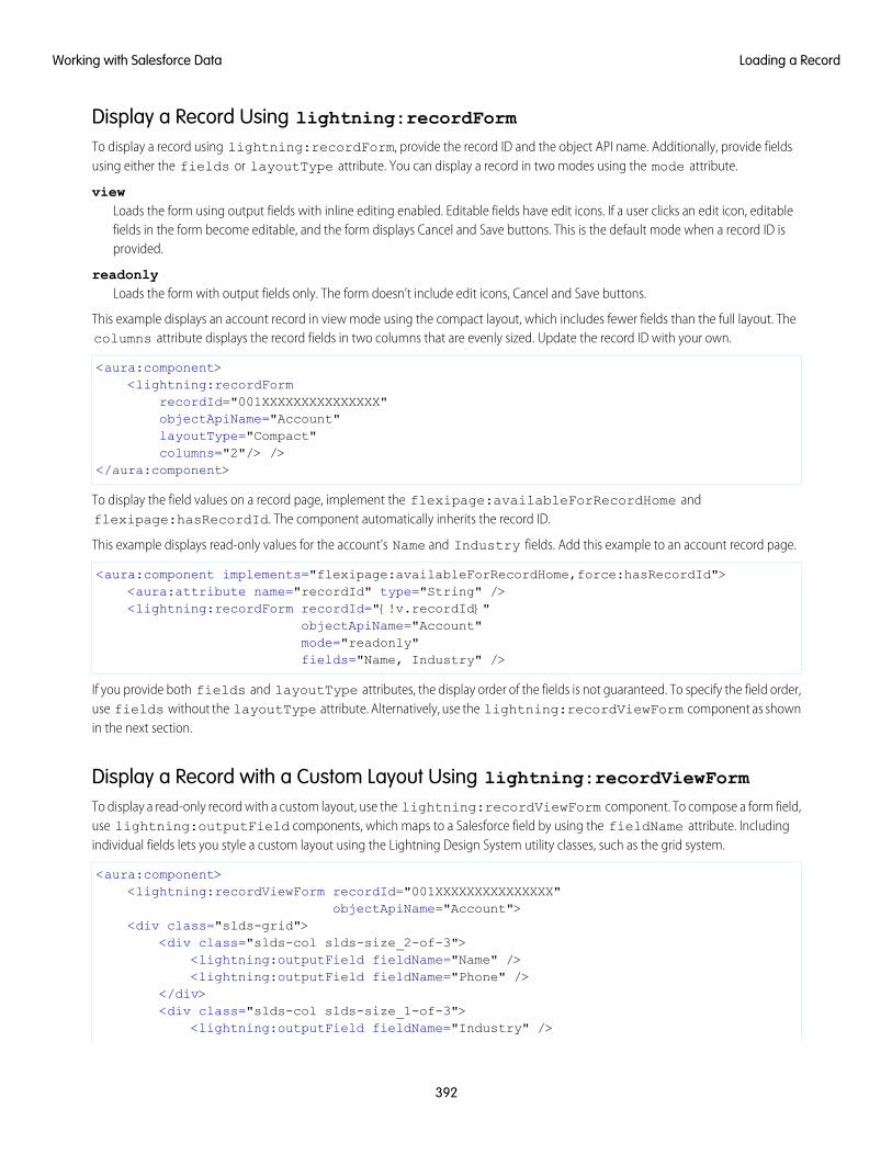
Display a Record Using lightning:recordFormTo display a record using lightning:recordForm, provide the record ID and the object API name. Additionally, provide fieldsusing either the fields or layoutType attribute. You can display a record in two modes using the mode attribute.
viewLoads the form using output fields with inline editing enabled. Editable fields have edit icons. If a user clicks an edit icon, editablefields in the form become editable, and the form displays Cancel and Save buttons. This is the default mode when a record ID isprovided.
readonlyLoads the form with output fields only. The form doesn’t include edit icons, Cancel and Save buttons.
This example displays an account record in view mode using the compact layout, which includes fewer fields than the full layout. Thecolumns attribute displays the record fields in two columns that are evenly sized. Update the record ID with your own.
<aura:component><lightning:recordForm
recordId="001XXXXXXXXXXXXXXX"objectApiName="Account"layoutType="Compact"columns="2"/> />
</aura:component>
To display the field values on a record page, implement the flexipage:availableForRecordHome andflexipage:hasRecordId. The component automatically inherits the record ID.
This example displays read-only values for the account’s Name and Industry fields. Add this example to an account record page.
<aura:component implements="flexipage:availableForRecordHome,force:hasRecordId"><aura:attribute name="recordId" type="String" /><lightning:recordForm recordId="{!v.recordId}"
objectApiName="Account"mode="readonly"fields="Name, Industry" />
If you provide both fields and layoutType attributes, the display order of the fields is not guaranteed. To specify the field order,use fields without the layoutType attribute. Alternatively, use the lightning:recordViewForm component as shownin the next section.
Display a Record with a Custom Layout Using lightning:recordViewFormTo display a read-only record with a custom layout, use the lightning:recordViewForm component. To compose a form field,use lightning:outputField components, which maps to a Salesforce field by using the fieldName attribute. Includingindividual fields lets you style a custom layout using the Lightning Design System utility classes, such as the grid system.
<aura:component><lightning:recordViewForm recordId="001XXXXXXXXXXXXXXX"
objectApiName="Account"><div class="slds-grid">
<div class="slds-col slds-size_2-of-3"><lightning:outputField fieldName="Name" /><lightning:outputField fieldName="Phone" />
</div><div class="slds-col slds-size_1-of-3">
<lightning:outputField fieldName="Industry" />
392
Loading a RecordWorking with Salesforce Data
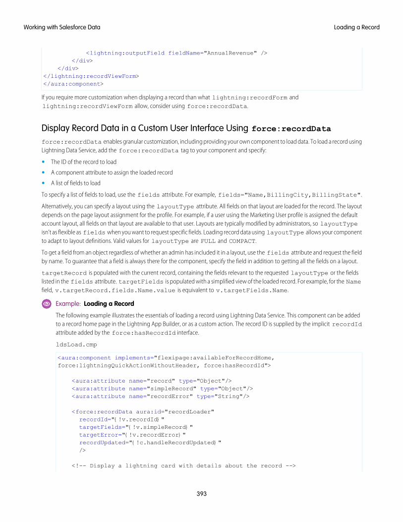
<lightning:outputField fieldName="AnnualRevenue" /></div>
</div></lightning:recordViewForm></aura:component>
If you require more customization when displaying a record than what lightning:recordForm andlightning:recordViewForm allow, consider using force:recordData.
Display Record Data in a Custom User Interface Using force:recordDataforce:recordData enables granular customization, including providing your own component to load data. To load a record usingLightning Data Service, add the force:recordData tag to your component and specify:
• The ID of the record to load
• A component attribute to assign the loaded record
• A list of fields to load
To specify a list of fields to load, use the fields attribute. For example, fields="Name,BillingCity,BillingState".
Alternatively, you can specify a layout using the layoutType attribute. All fields on that layout are loaded for the record. The layoutdepends on the page layout assignment for the profile. For example, if a user using the Marketing User profile is assigned the defaultaccount layout, all fields on that layout are available to that user. Layouts are typically modified by administrators, so layoutTypeisn’t as flexible as fields when you want to request specific fields. Loading record data using layoutType allows your componentto adapt to layout definitions. Valid values for layoutType are FULL and COMPACT.
To get a field from an object regardless of whether an admin has included it in a layout, use the fields attribute and request the fieldby name. To guarantee that a field is always there for the component, specify the field in addition to getting all the fields on a layout.
targetRecord is populated with the current record, containing the fields relevant to the requested layoutType or the fieldslisted in the fields attribute. targetFields is populated with a simplified view of the loaded record. For example, for the Namefield, v.targetRecord.fields.Name.value is equivalent to v.targetFields.Name.
Example: Loading a Record
The following example illustrates the essentials of loading a record using Lightning Data Service. This component can be addedto a record home page in the Lightning App Builder, or as a custom action. The record ID is supplied by the implicit recordIdattribute added by the force:hasRecordId interface.
ldsLoad.cmp
<aura:component implements="flexipage:availableForRecordHome,force:lightningQuickActionWithoutHeader, force:hasRecordId">
<aura:attribute name="record" type="Object"/><aura:attribute name="simpleRecord" type="Object"/><aura:attribute name="recordError" type="String"/>
<force:recordData aura:id="recordLoader"recordId="{!v.recordId}"targetFields="{!v.simpleRecord}"targetError="{!v.recordError}"recordUpdated="{!c.handleRecordUpdated}"/>
<!-- Display a lightning card with details about the record -->
393
Loading a RecordWorking with Salesforce Data
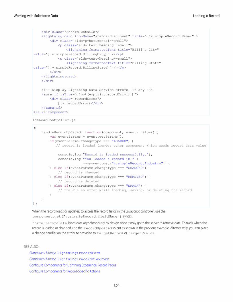
<div class="Record Details"><lightning:card iconName="standard:account" title="{!v.simpleRecord.Name}" >
<div class="slds-p-horizontal--small"><p class="slds-text-heading--small">
<lightning:formattedText title="Billing City"value="{!v.simpleRecord.BillingCity}" /></p>
<p class="slds-text-heading--small"><lightning:formattedText title="Billing State"
value="{!v.simpleRecord.BillingState}" /></p></div>
</lightning:card></div>
<!-- Display Lightning Data Service errors, if any --><aura:if isTrue="{!not(empty(v.recordError))}">
<div class="recordError">{!v.recordError}</div>
</aura:if></aura:component>
ldsLoadController.js
({handleRecordUpdated: function(component, event, helper) {
var eventParams = event.getParams();if(eventParams.changeType === "LOADED") {
// record is loaded (render other component which needs record data value)
console.log("Record is loaded successfully.");console.log("You loaded a record in " +
component.get("v.simpleRecord.Industry"));} else if(eventParams.changeType === "CHANGED") {
// record is changed} else if(eventParams.changeType === "REMOVED") {
// record is deleted} else if(eventParams.changeType === "ERROR") {
// there’s an error while loading, saving, or deleting the record}
}})
When the record loads or updates, to access the record fields in the JavaScript controller, use thecomponent.get("v.simpleRecord.fieldName") syntax.
force:recordData loads data asynchronously by design since it may go to the server to retrieve data. To track when therecord is loaded or changed, use the recordUpdated event as shown in the previous example. Alternatively, you can placea change handler on the attribute provided to targetRecord or targetFields.
SEE ALSO:
Component Library: lightning:recordForm
Component Library: lightning:recordViewForm
Configure Components for Lightning Experience Record Pages
Configure Components for Record-Specific Actions
394
Loading a RecordWorking with Salesforce Data
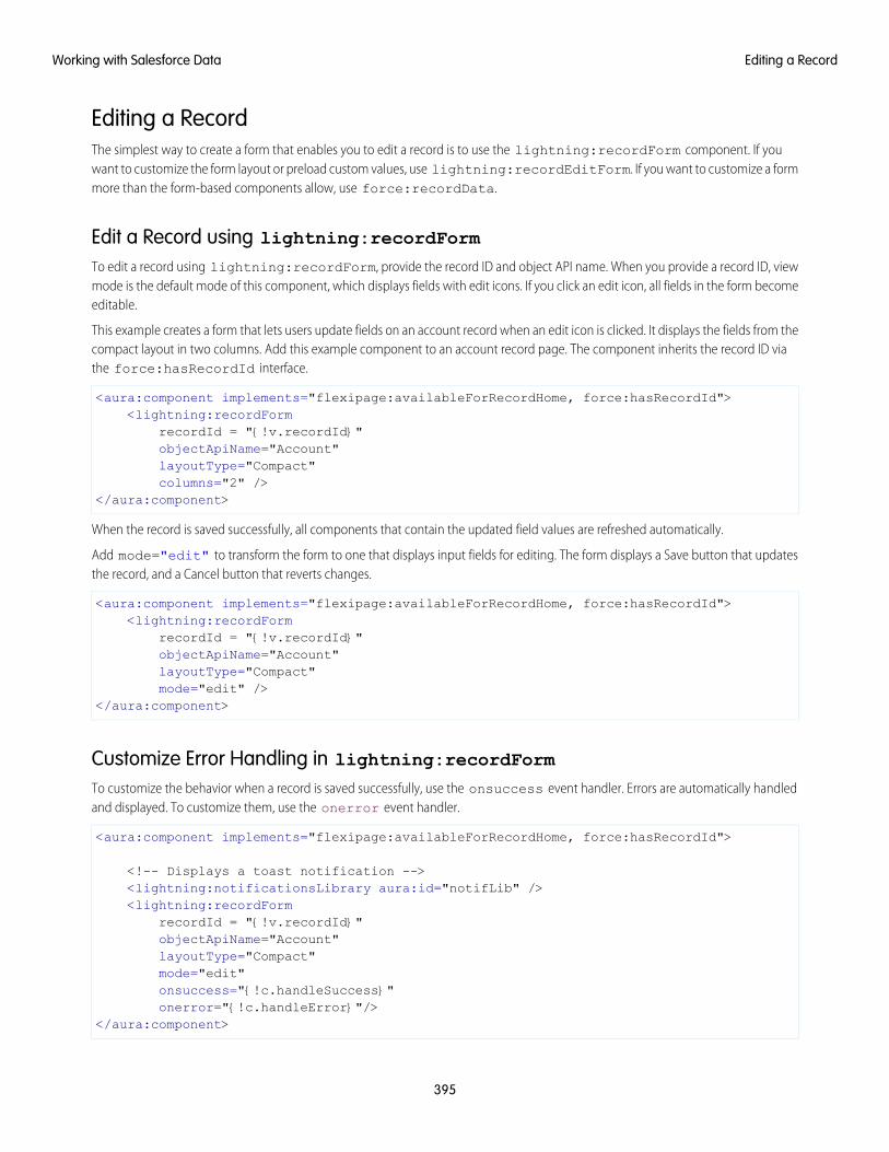
Editing a RecordThe simplest way to create a form that enables you to edit a record is to use the lightning:recordForm component. If youwant to customize the form layout or preload custom values, use lightning:recordEditForm. If you want to customize a formmore than the form-based components allow, use force:recordData.
Edit a Record using lightning:recordFormTo edit a record using lightning:recordForm, provide the record ID and object API name. When you provide a record ID, viewmode is the default mode of this component, which displays fields with edit icons. If you click an edit icon, all fields in the form becomeeditable.
This example creates a form that lets users update fields on an account record when an edit icon is clicked. It displays the fields from thecompact layout in two columns. Add this example component to an account record page. The component inherits the record ID viathe force:hasRecordId interface.
<aura:component implements="flexipage:availableForRecordHome, force:hasRecordId"><lightning:recordForm
recordId = "{!v.recordId}"objectApiName="Account"layoutType="Compact"columns="2" />
</aura:component>
When the record is saved successfully, all components that contain the updated field values are refreshed automatically.
Add mode="edit" to transform the form to one that displays input fields for editing. The form displays a Save button that updatesthe record, and a Cancel button that reverts changes.
<aura:component implements="flexipage:availableForRecordHome, force:hasRecordId"><lightning:recordForm
recordId = "{!v.recordId}"objectApiName="Account"layoutType="Compact"mode="edit" />
</aura:component>
Customize Error Handling in lightning:recordFormTo customize the behavior when a record is saved successfully, use the onsuccess event handler. Errors are automatically handledand displayed. To customize them, use the onerror event handler.
<aura:component implements="flexipage:availableForRecordHome, force:hasRecordId">
<!-- Displays a toast notification --><lightning:notificationsLibrary aura:id="notifLib" /><lightning:recordForm
recordId = "{!v.recordId}"objectApiName="Account"layoutType="Compact"mode="edit"onsuccess="{!c.handleSuccess}"onerror="{!c.handleError}"/>
</aura:component>
395
Editing a RecordWorking with Salesforce Data
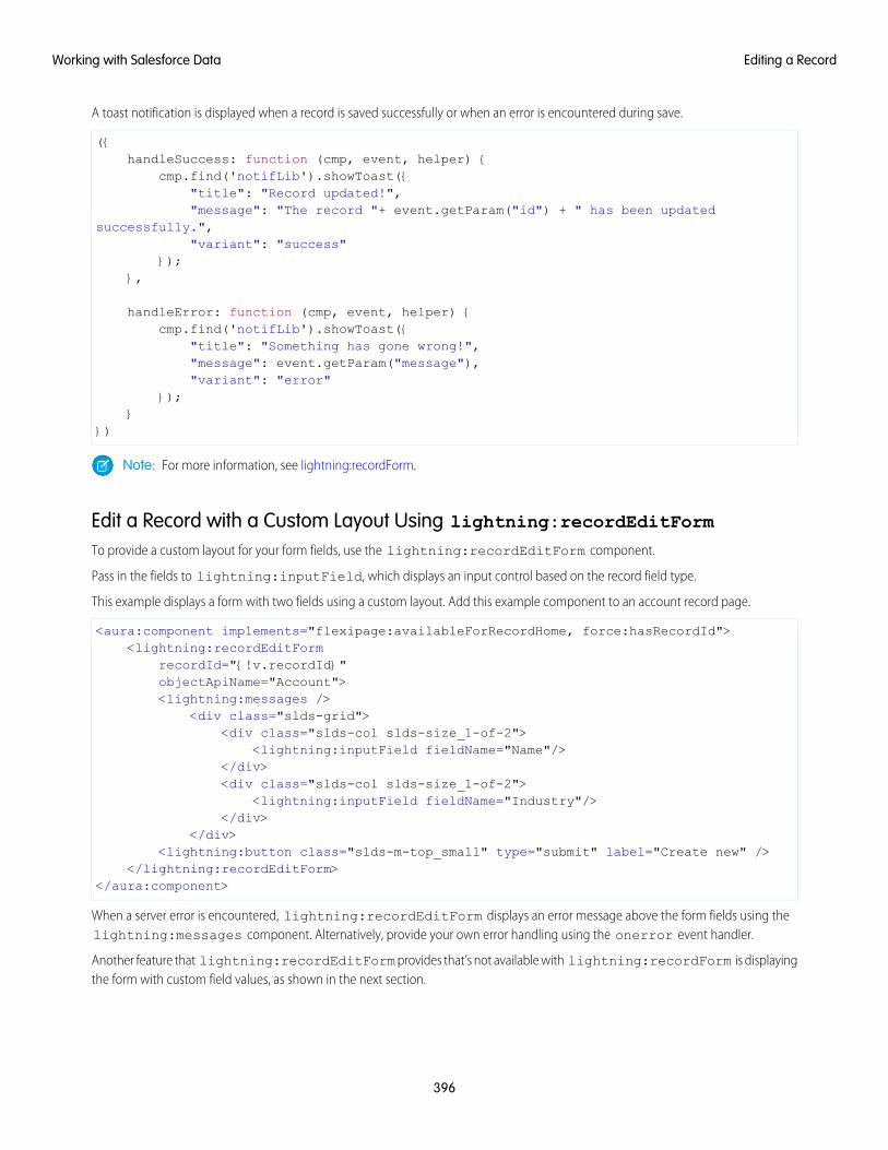
A toast notification is displayed when a record is saved successfully or when an error is encountered during save.
({handleSuccess: function (cmp, event, helper) {
cmp.find('notifLib').showToast({"title": "Record updated!","message": "The record "+ event.getParam("id") + " has been updated
successfully.","variant": "success"
});},
handleError: function (cmp, event, helper) {cmp.find('notifLib').showToast({
"title": "Something has gone wrong!","message": event.getParam("message"),"variant": "error"
});}
})
Note: For more information, see lightning:recordForm.
Edit a Record with a Custom Layout Using lightning:recordEditFormTo provide a custom layout for your form fields, use the lightning:recordEditForm component.
Pass in the fields to lightning:inputField, which displays an input control based on the record field type.
This example displays a form with two fields using a custom layout. Add this example component to an account record page.
<aura:component implements="flexipage:availableForRecordHome, force:hasRecordId"><lightning:recordEditForm
recordId="{!v.recordId}"objectApiName="Account"><lightning:messages />
<div class="slds-grid"><div class="slds-col slds-size_1-of-2">
<lightning:inputField fieldName="Name"/></div><div class="slds-col slds-size_1-of-2">
<lightning:inputField fieldName="Industry"/></div>
</div><lightning:button class="slds-m-top_small" type="submit" label="Create new" />
</lightning:recordEditForm></aura:component>
When a server error is encountered, lightning:recordEditForm displays an error message above the form fields using thelightning:messages component. Alternatively, provide your own error handling using the onerror event handler.
Another feature that lightning:recordEditForm provides that’s not available with lightning:recordForm is displayingthe form with custom field values, as shown in the next section.
396
Editing a RecordWorking with Salesforce Data
Prepopulate Field ValuesTo provide a custom field value when the form displays, use the value attribute on lightning:inputField. If you're providinga record ID, the value returned by the record on load does not override this custom value.
Alternatively, set the field value using this syntax.
cmp.find("nameField").set("v.value", "My New Account Name");
Note: For more information, see lightning:recordEditForm.
If you require more customization when creating a record than what lightning:recordForm andlightning:recordEditForm allow, consider using force:recordData.
Edit a Record via a Custom User Interface Using force:recordDataTo edit and save a record using force:recordData, call saveRecord and pass in a callback function to be invoked after thesave operation completes. The save operation is used in two cases.
• To save changes to an existing record
• To create and save a new record
To save changes to an existing record, load the record in EDIT mode and call saveRecord on the force:recordData component.
To save a new record, and thus create it, create the record from a record template, as described in Creating a Record. Then callsaveRecord on the force:recordData component.
Load a Record in EDIT ModeTo load a record that might be updated, set the force:recordData tag’s mode attribute to “EDIT”. Other than explicitly settingthe mode, loading a record for editing is the same as loading it for any other purpose.
Note: Since Lightning Data Service records are shared across multiple components, loading records provides the componentwith a copy of the record instead of a direct reference. If a component loads a record in VIEW mode, Lightning Data Serviceautomatically overwrites that copy with a newer copy of the record when the record is changed. If a record is loaded in EDIT mode,the record is not updated when the record is changed. This prevents unsaved changes from appearing in components thatreference the record while the record is being edited, and prevents any edits in progress from being overwritten. Notifications arestill sent in both modes.
Call saveRecord to Save Record ChangesTo perform the save operation, call saveRecord on the force:recordData component from the appropriate controller actionhandler. The saveRecord method takes one argument—a callback function to be invoked when the operation completes. Thiscallback function receives a SaveRecordResult as its only parameter. SaveRecordResult includes a state attribute thatindicates success or error, and other details you can use to handle the result of the operation.
Example: Saving a Record
The following example illustrates the essentials of saving a record using Lightning Data Service. It’s intended for use on a recordpage. The record ID is supplied by the implicit recordId attribute added by the force:hasRecordId interface.
ldsSave.cmp
<aura:component implements="flexipage:availableForRecordHome,force:hasRecordId">
397
Editing a RecordWorking with Salesforce Data
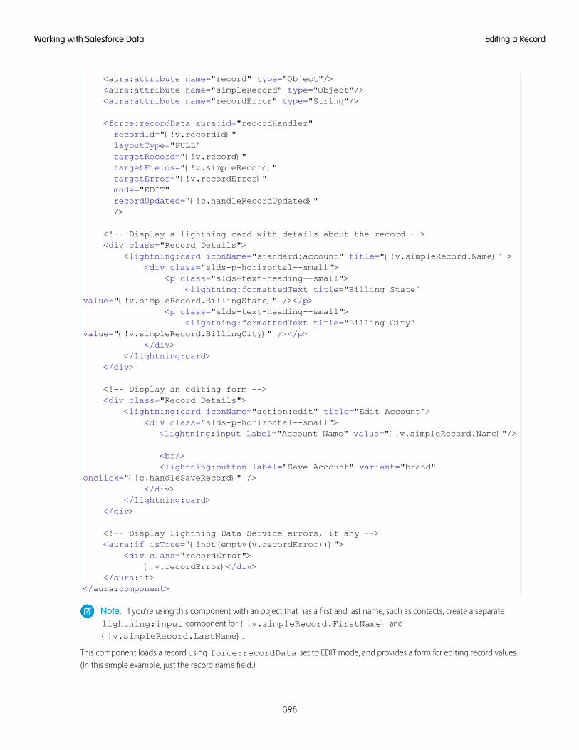
<aura:attribute name="record" type="Object"/><aura:attribute name="simpleRecord" type="Object"/><aura:attribute name="recordError" type="String"/>
<force:recordData aura:id="recordHandler"recordId="{!v.recordId}"layoutType="FULL"targetRecord="{!v.record}"targetFields="{!v.simpleRecord}"targetError="{!v.recordError}"mode="EDIT"recordUpdated="{!c.handleRecordUpdated}"/>
<!-- Display a lightning card with details about the record --><div class="Record Details">
<lightning:card iconName="standard:account" title="{!v.simpleRecord.Name}" ><div class="slds-p-horizontal--small">
<p class="slds-text-heading--small"><lightning:formattedText title="Billing State"
value="{!v.simpleRecord.BillingState}" /></p><p class="slds-text-heading--small">
<lightning:formattedText title="Billing City"value="{!v.simpleRecord.BillingCity}" /></p>
</div></lightning:card>
</div>
<!-- Display an editing form --><div class="Record Details">
<lightning:card iconName="action:edit" title="Edit Account"><div class="slds-p-horizontal--small">
<lightning:input label="Account Name" value="{!v.simpleRecord.Name}"/>
<br/><lightning:button label="Save Account" variant="brand"
onclick="{!c.handleSaveRecord}" /></div>
</lightning:card></div>
<!-- Display Lightning Data Service errors, if any --><aura:if isTrue="{!not(empty(v.recordError))}">
<div class="recordError">{!v.recordError}</div>
</aura:if></aura:component>
Note: If you’re using this component with an object that has a first and last name, such as contacts, create a separatelightning:input component for {!v.simpleRecord.FirstName} and{!v.simpleRecord.LastName}.
This component loads a record using force:recordData set to EDIT mode, and provides a form for editing record values.(In this simple example, just the record name field.)
398
Editing a RecordWorking with Salesforce Data
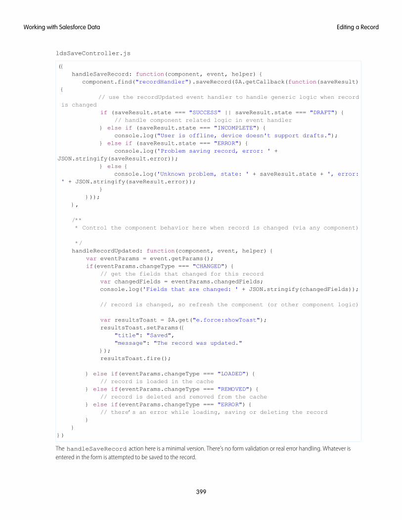
ldsSaveController.js
({handleSaveRecord: function(component, event, helper) {
component.find("recordHandler").saveRecord($A.getCallback(function(saveResult){
// use the recordUpdated event handler to handle generic logic when recordis changed
if (saveResult.state === "SUCCESS" || saveResult.state === "DRAFT") {// handle component related logic in event handler
} else if (saveResult.state === "INCOMPLETE") {console.log("User is offline, device doesn't support drafts.");
} else if (saveResult.state === "ERROR") {console.log('Problem saving record, error: ' +
JSON.stringify(saveResult.error));} else {
console.log('Unknown problem, state: ' + saveResult.state + ', error:' + JSON.stringify(saveResult.error));
}}));
},
/*** Control the component behavior here when record is changed (via any component)
*/handleRecordUpdated: function(component, event, helper) {
var eventParams = event.getParams();if(eventParams.changeType === "CHANGED") {
// get the fields that changed for this recordvar changedFields = eventParams.changedFields;console.log('Fields that are changed: ' + JSON.stringify(changedFields));
// record is changed, so refresh the component (or other component logic)
var resultsToast = $A.get("e.force:showToast");resultsToast.setParams({
"title": "Saved","message": "The record was updated."
});resultsToast.fire();
} else if(eventParams.changeType === "LOADED") {// record is loaded in the cache
} else if(eventParams.changeType === "REMOVED") {// record is deleted and removed from the cache
} else if(eventParams.changeType === "ERROR") {// there’s an error while loading, saving or deleting the record
}}
})
The handleSaveRecord action here is a minimal version. There’s no form validation or real error handling. Whatever isentered in the form is attempted to be saved to the record.
399
Editing a RecordWorking with Salesforce Data
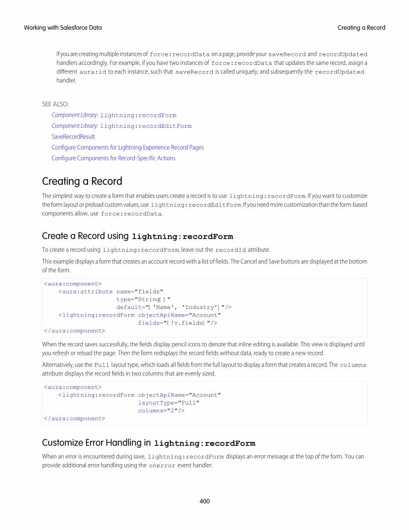
If you are creating multiple instances of force:recordData on a page, provide your saveRecord and recordUpdatedhandlers accordingly. For example, if you have two instances of force:recordData that updates the same record, assign adifferent aura:id to each instance, such that saveRecord is called uniquely, and subsequently the recordUpdatedhandler.
SEE ALSO:
Component Library: lightning:recordForm
Component Library: lightning:recordEditForm
SaveRecordResult
Configure Components for Lightning Experience Record Pages
Configure Components for Record-Specific Actions
Creating a RecordThe simplest way to create a form that enables users create a record is to use lightning:recordForm. If you want to customizethe form layout or preload custom values, use lightning:recordEditForm. If you need more customization than the form-basedcomponents allow, use force:recordData.
Create a Record using lightning:recordFormTo create a record using lightning:recordForm, leave out the recordId attribute.
This example displays a form that creates an account record with a list of fields. The Cancel and Save buttons are displayed at the bottomof the form.
<aura:component><aura:attribute name="fields"
type="String[]"default="['Name', 'Industry']"/>
<lightning:recordForm objectApiName="Account"fields="{!v.fields}"/>
</aura:component>
When the record saves successfully, the fields display pencil icons to denote that inline editing is available. This view is displayed untilyou refresh or reload the page. Then the form redisplays the record fields without data, ready to create a new record.
Alternatively, use the Full layout type, which loads all fields from the full layout to display a form that creates a record. The columnsattribute displays the record fields in two columns that are evenly sized.
<aura:component><lightning:recordForm objectApiName="Account"
layoutType="Full"columns="2"/>
</aura:component>
Customize Error Handling in lightning:recordFormWhen an error is encountered during save, lightning:recordForm displays an error message at the top of the form. You canprovide additional error handling using the onerror event handler.
400
Creating a RecordWorking with Salesforce Data
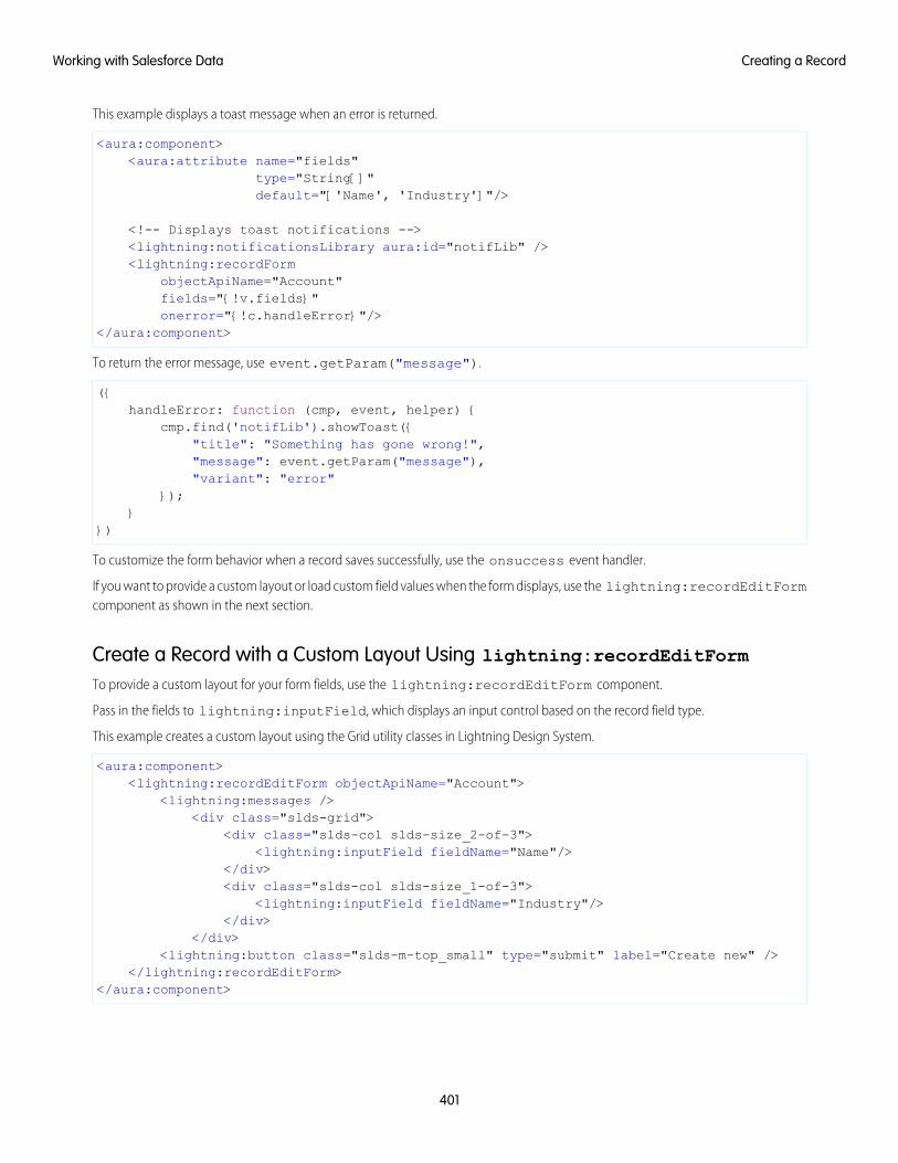
This example displays a toast message when an error is returned.
<aura:component><aura:attribute name="fields"
type="String[]"default="['Name', 'Industry']"/>
<!-- Displays toast notifications --><lightning:notificationsLibrary aura:id="notifLib" /><lightning:recordForm
objectApiName="Account"fields="{!v.fields}"onerror="{!c.handleError}"/>
</aura:component>
To return the error message, use event.getParam("message").
({handleError: function (cmp, event, helper) {
cmp.find('notifLib').showToast({"title": "Something has gone wrong!","message": event.getParam("message"),"variant": "error"
});}
})
To customize the form behavior when a record saves successfully, use the onsuccess event handler.
If you want to provide a custom layout or load custom field values when the form displays, use the lightning:recordEditFormcomponent as shown in the next section.
Create a Record with a Custom Layout Using lightning:recordEditFormTo provide a custom layout for your form fields, use the lightning:recordEditForm component.
Pass in the fields to lightning:inputField, which displays an input control based on the record field type.
This example creates a custom layout using the Grid utility classes in Lightning Design System.
<aura:component><lightning:recordEditForm objectApiName="Account">
<lightning:messages /><div class="slds-grid">
<div class="slds-col slds-size_2-of-3"><lightning:inputField fieldName="Name"/>
</div><div class="slds-col slds-size_1-of-3">
<lightning:inputField fieldName="Industry"/></div>
</div><lightning:button class="slds-m-top_small" type="submit" label="Create new" />
</lightning:recordEditForm></aura:component>
401
Creating a RecordWorking with Salesforce Data
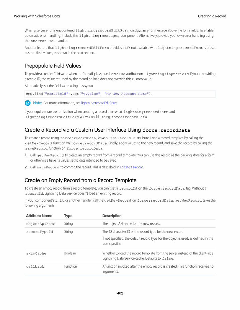
When a server error is encountered,lightning:recordEditForm displays an error message above the form fields. To enableautomatic error handling, include the lightning:messages component. Alternatively, provide your own error handling usingthe onerror event handler.
Another feature that lightning:recordEditForm provides that’s not available with lightning:recordForm is presetcustom field values, as shown in the next section.
Prepopulate Field ValuesTo provide a custom field value when the form displays, use the value attribute on lightning:inputField. If you're providinga record ID, the value returned by the record on load does not override this custom value.
Alternatively, set the field value using this syntax.
cmp.find("nameField").set("v.value", "My New Account Name");
Note: For more information, see lightning:recordEditForm.
If you require more customization when creating a record than what lightning:recordForm andlightning:recordEditForm allow, consider using force:recordData.
Create a Record via a Custom User Interface Using force:recordDataTo create a record using force:recordData, leave out the recordId attribute. Load a record template by calling thegetNewRecord function on force:recordData. Finally, apply values to the new record, and save the record by calling thesaveRecord function on force:recordData.
1. Call getNewRecord to create an empty record from a record template. You can use this record as the backing store for a formor otherwise have its values set to data intended to be saved.
2. Call saveRecord to commit the record. This is described in Editing a Record.
Create an Empty Record from a Record TemplateTo create an empty record from a record template, you can’t set a recordId on the force:recordData tag. Without arecordId, Lightning Data Service doesn’t load an existing record.
In your component’s init or another handler, call the getNewRecord on force:recordData. getNewRecord takes thefollowing arguments.
DescriptionTypeAttribute Name
The object API name for the new record.StringobjectApiName
The 18 character ID of the record type for the new record.
If not specified, the default record type for the object is used, as defined in theuser’s profile.
StringrecordTypeId
Whether to load the record template from the server instead of the client-sideLightning Data Service cache. Defaults to false.
BooleanskipCache
A function invoked after the empty record is created. This function receives noarguments.
Functioncallback
402
Creating a RecordWorking with Salesforce Data
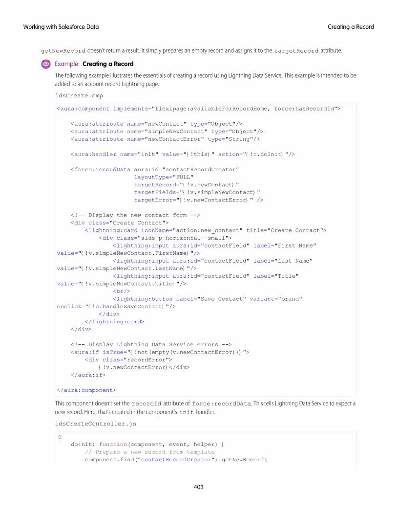
getNewRecord doesn’t return a result. It simply prepares an empty record and assigns it to the targetRecord attribute.
Example: Creating a Record
The following example illustrates the essentials of creating a record using Lightning Data Service. This example is intended to beadded to an account record Lightning page.
ldsCreate.cmp
<aura:component implements="flexipage:availableForRecordHome, force:hasRecordId">
<aura:attribute name="newContact" type="Object"/><aura:attribute name="simpleNewContact" type="Object"/><aura:attribute name="newContactError" type="String"/>
<aura:handler name="init" value="{!this}" action="{!c.doInit}"/>
<force:recordData aura:id="contactRecordCreator"layoutType="FULL"targetRecord="{!v.newContact}"targetFields="{!v.simpleNewContact}"targetError="{!v.newContactError}" />
<!-- Display the new contact form --><div class="Create Contact">
<lightning:card iconName="action:new_contact" title="Create Contact"><div class="slds-p-horizontal--small">
<lightning:input aura:id="contactField" label="First Name"value="{!v.simpleNewContact.FirstName}"/>
<lightning:input aura:id="contactField" label="Last Name"value="{!v.simpleNewContact.LastName}"/>
<lightning:input aura:id="contactField" label="Title"value="{!v.simpleNewContact.Title}"/>
<br/><lightning:button label="Save Contact" variant="brand"
onclick="{!c.handleSaveContact}"/></div>
</lightning:card></div>
<!-- Display Lightning Data Service errors --><aura:if isTrue="{!not(empty(v.newContactError))}">
<div class="recordError">{!v.newContactError}</div>
</aura:if>
</aura:component>
This component doesn’t set the recordId attribute of force:recordData. This tells Lightning Data Service to expect anew record. Here, that’s created in the component’s init handler.
ldsCreateController.js
({doInit: function(component, event, helper) {
// Prepare a new record from templatecomponent.find("contactRecordCreator").getNewRecord(
403
Creating a RecordWorking with Salesforce Data
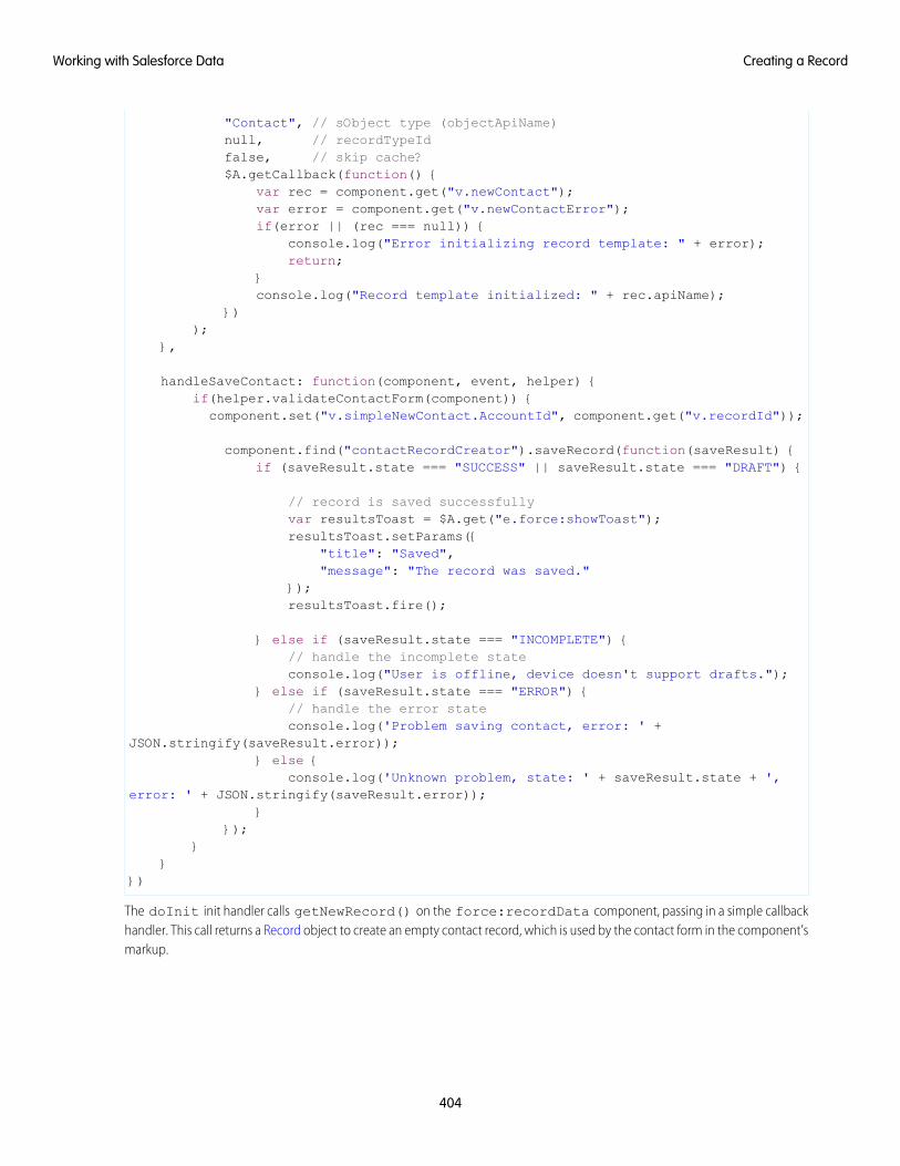
"Contact", // sObject type (objectApiName)null, // recordTypeIdfalse, // skip cache?$A.getCallback(function() {
var rec = component.get("v.newContact");var error = component.get("v.newContactError");if(error || (rec === null)) {
console.log("Error initializing record template: " + error);return;
}console.log("Record template initialized: " + rec.apiName);
}));
},
handleSaveContact: function(component, event, helper) {if(helper.validateContactForm(component)) {
component.set("v.simpleNewContact.AccountId", component.get("v.recordId"));
component.find("contactRecordCreator").saveRecord(function(saveResult) {if (saveResult.state === "SUCCESS" || saveResult.state === "DRAFT") {
// record is saved successfullyvar resultsToast = $A.get("e.force:showToast");resultsToast.setParams({
"title": "Saved","message": "The record was saved."
});resultsToast.fire();
} else if (saveResult.state === "INCOMPLETE") {// handle the incomplete stateconsole.log("User is offline, device doesn't support drafts.");
} else if (saveResult.state === "ERROR") {// handle the error stateconsole.log('Problem saving contact, error: ' +
JSON.stringify(saveResult.error));} else {
console.log('Unknown problem, state: ' + saveResult.state + ',error: ' + JSON.stringify(saveResult.error));
}});
}}
})
The doInit init handler calls getNewRecord() on the force:recordData component, passing in a simple callbackhandler. This call returns a Record object to create an empty contact record, which is used by the contact form in the component’smarkup.
404
Creating a RecordWorking with Salesforce Data
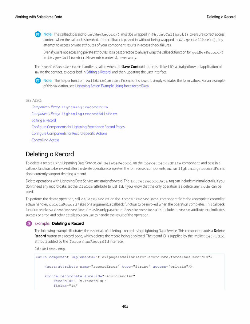
Note: The callback passed to getNewRecord() must be wrapped in $A.getCallback() to ensure correct accesscontext when the callback is invoked. If the callback is passed in without being wrapped in $A.getCallback(), anyattempt to access private attributes of your component results in access check failures.
Even if you’re not accessing private attributes, it’s a best practice to always wrap the callback function for getNewRecord()in $A.getCallback(). Never mix (contexts), never worry.
The handleSaveContact handler is called when the Save Contact button is clicked. It’s a straightforward application ofsaving the contact, as described in Editing a Record, and then updating the user interface.
Note: The helper function, validateContactForm, isn’t shown. It simply validates the form values. For an exampleof this validation, see Lightning Action Example Using force:recordData.
SEE ALSO:
Component Library: lightning:recordForm
Component Library: lightning:recordEditForm
Editing a Record
Configure Components for Lightning Experience Record Pages
Configure Components for Record-Specific Actions
Controlling Access
Deleting a RecordTo delete a record using Lightning Data Service, call deleteRecord on the force:recordData component, and pass in acallback function to be invoked after the delete operation completes. The form-based components, such as lightning:recordForm,don’t currently support deleting a record.
Delete operations with Lightning Data Service are straightforward. The force:recordData tag can include minimal details. If youdon’t need any record data, set the fields attribute to just Id. If you know that the only operation is a delete, any mode can beused.
To perform the delete operation, call deleteRecord on the force:recordData component from the appropriate controlleraction handler. deleteRecord takes one argument, a callback function to be invoked when the operation completes. This callbackfunction receives a SaveRecordResult as its only parameter. SaveRecordResult includes a state attribute that indicatessuccess or error, and other details you can use to handle the result of the operation.
Example: Deleting a Record
The following example illustrates the essentials of deleting a record using Lightning Data Service. This component adds a DeleteRecord button to a record page, which deletes the record being displayed. The record ID is supplied by the implicit recordIdattribute added by the force:hasRecordId interface.
ldsDelete.cmp
<aura:component implements="flexipage:availableForRecordHome,force:hasRecordId">
<aura:attribute name="recordError" type="String" access="private"/>
<force:recordData aura:id="recordHandler"recordId="{!v.recordId}"fields="Id"
405
Deleting a RecordWorking with Salesforce Data
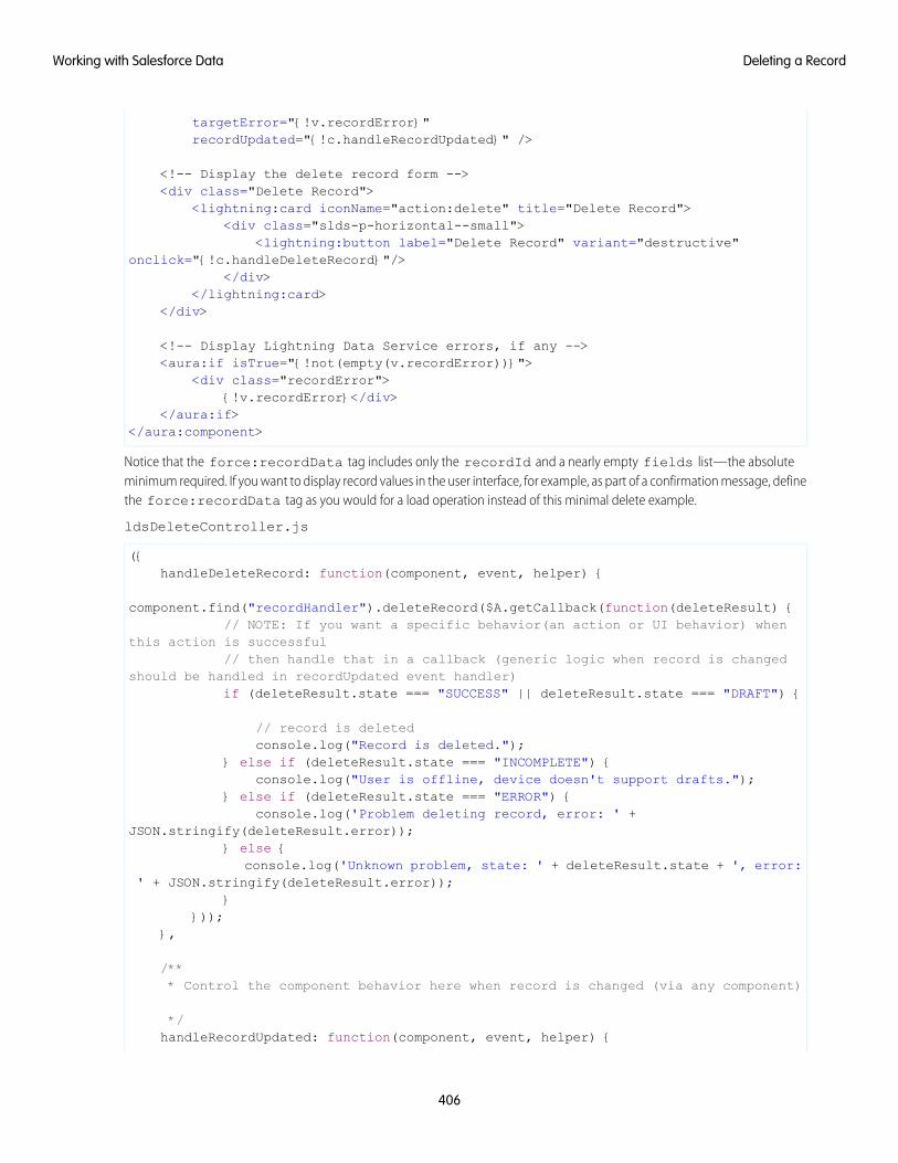
targetError="{!v.recordError}"recordUpdated="{!c.handleRecordUpdated}" />
<!-- Display the delete record form --><div class="Delete Record">
<lightning:card iconName="action:delete" title="Delete Record"><div class="slds-p-horizontal--small">
<lightning:button label="Delete Record" variant="destructive"onclick="{!c.handleDeleteRecord}"/>
</div></lightning:card>
</div>
<!-- Display Lightning Data Service errors, if any --><aura:if isTrue="{!not(empty(v.recordError))}">
<div class="recordError">{!v.recordError}</div>
</aura:if></aura:component>
Notice that the force:recordData tag includes only the recordId and a nearly empty fields list—the absoluteminimum required. If you want to display record values in the user interface, for example, as part of a confirmation message, definethe force:recordData tag as you would for a load operation instead of this minimal delete example.
ldsDeleteController.js
({handleDeleteRecord: function(component, event, helper) {
component.find("recordHandler").deleteRecord($A.getCallback(function(deleteResult) {// NOTE: If you want a specific behavior(an action or UI behavior) when
this action is successful// then handle that in a callback (generic logic when record is changed
should be handled in recordUpdated event handler)if (deleteResult.state === "SUCCESS" || deleteResult.state === "DRAFT") {
// record is deletedconsole.log("Record is deleted.");
} else if (deleteResult.state === "INCOMPLETE") {console.log("User is offline, device doesn't support drafts.");
} else if (deleteResult.state === "ERROR") {console.log('Problem deleting record, error: ' +
JSON.stringify(deleteResult.error));} else {
console.log('Unknown problem, state: ' + deleteResult.state + ', error:' + JSON.stringify(deleteResult.error));
}}));
},
/*** Control the component behavior here when record is changed (via any component)
*/handleRecordUpdated: function(component, event, helper) {
406
Deleting a RecordWorking with Salesforce Data
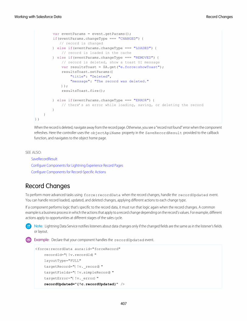
var eventParams = event.getParams();if(eventParams.changeType === "CHANGED") {
// record is changed} else if(eventParams.changeType === "LOADED") {
// record is loaded in the cache} else if(eventParams.changeType === "REMOVED") {
// record is deleted, show a toast UI messagevar resultsToast = $A.get("e.force:showToast");resultsToast.setParams({
"title": "Deleted","message": "The record was deleted."
});resultsToast.fire();
} else if(eventParams.changeType === "ERROR") {// there’s an error while loading, saving, or deleting the record
}}
})
When the record is deleted, navigate away from the record page. Otherwise, you see a “record not found” error when the componentrefreshes. Here the controller uses the objectApiName property in the SaveRecordResult provided to the callbackfunction, and navigates to the object home page.
SEE ALSO:
SaveRecordResult
Configure Components for Lightning Experience Record Pages
Configure Components for Record-Specific Actions
Record ChangesTo perform more advanced tasks using force:recordData when the record changes, handle the recordUpdated event.You can handle record loaded, updated, and deleted changes, applying different actions to each change type.
If a component performs logic that’s specific to the record data, it must run that logic again when the record changes. A commonexample is a business process in which the actions that apply to a record change depending on the record’s values. For example, differentactions apply to opportunities at different stages of the sales cycle.
Note: Lightning Data Service notifies listeners about data changes only if the changed fields are the same as in the listener’s fieldsor layout.
Example: Declare that your component handles the recordUpdated event.
<force:recordData aura:id="forceRecord"
recordId="{!v.recordId}"
layoutType="FULL"
targetRecord="{!v._record}"
targetFields="{!v.simpleRecord}"
targetError="{!v._error}"
recordUpdated="{!c.recordUpdated}" />
407
Record ChangesWorking with Salesforce Data
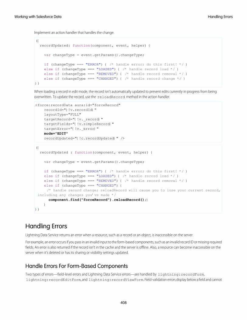
Implement an action handler that handles the change.
({recordUpdated: function(component, event, helper) {
var changeType = event.getParams().changeType;
if (changeType === "ERROR") { /* handle error; do this first! */ }else if (changeType === "LOADED") { /* handle record load */ }else if (changeType === "REMOVED") { /* handle record removal */ }else if (changeType === "CHANGED") { /* handle record change */ }
})
When loading a record in edit mode, the record isn’t automatically updated to prevent edits currently in progress from beingoverwritten. To update the record, use the reloadRecord method in the action handler.
<force:recordData aura:id="forceRecord"recordId="{!v.recordId}"layoutType="FULL"targetRecord="{!v._record}"targetFields="{!v.simpleRecord}"targetError="{!v._error}"mode="EDIT"recordUpdated="{!c.recordUpdated}" />
({recordUpdated : function(component, event, helper) {
var changeType = event.getParams().changeType;
if (changeType === "ERROR") { /* handle error; do this first! */ }else if (changeType === "LOADED") { /* handle record load */ }else if (changeType === "REMOVED") { /* handle record removal */ }else if (changeType === "CHANGED") {/* handle record change; reloadRecord will cause you to lose your current record,
including any changes you’ve made */component.find("forceRecord").reloadRecord();}
}})
Handling ErrorsLightning Data Service returns an error when a resource, such as a record or an object, is inaccessible on the server.
For example, an error occurs if you pass in an invalid input to the form-based components, such as an invalid record ID or missing requiredfields. An error is also returned if the record isn’t in the cache and the server is offline. Also, a resource can become inaccessible on theserver when it’s deleted or has its sharing or visibility settings updated.
Handle Errors For Form-Based ComponentsTwo types of errors—field-level errors and Lightning Data Service errors—are handled by lightning:recordForm,lightning:recordEditForm, and lightning:recordViewForm. Field-validation errors display below a field and cannot
408
Handling ErrorsWorking with Salesforce Data
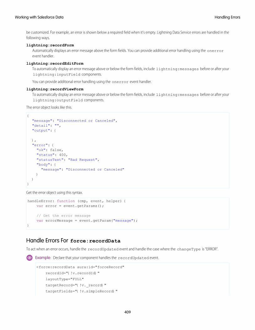
be customized. For example, an error is shown below a required field when it’s empty. Lightning Data Service errors are handled in thefollowing ways.
lightning:recordFormAutomatically displays an error message above the form fields. You can provide additional error handling using the onerrorevent handler.
lightning:recordEditFormTo automatically display an error message above or below the form fields, include lightning:messages before or after yourlightning:inputField components.
You can provide additional error handling using the onerror event handler.
lightning:recordViewFormTo automatically display an error message above or below the form fields, include lightning:messages before or after yourlightning:outputField components.
The error object looks like this.
{"message": "Disconnected or Canceled","detail": "","output": {
},"error": {"ok": false,"status": 400,"statusText": "Bad Request","body": {"message": "Disconnected or Canceled"
}}
}
Get the error object using this syntax.
handleError: function (cmp, event, helper) {var error = event.getParams();
// Get the error messagevar errorMessage = event.getParam("message");
}
Handle Errors For force:recordDataTo act when an error occurs, handle the recordUpdated event and handle the case where the changeType is “ERROR”.
Example: Declare that your component handles the recordUpdated event.
<force:recordData aura:id="forceRecord"
recordId="{!v.recordId}"
layoutType="FULL"
targetRecord="{!v._record}"
targetFields="{!v.simpleRecord}"
409
Handling ErrorsWorking with Salesforce Data
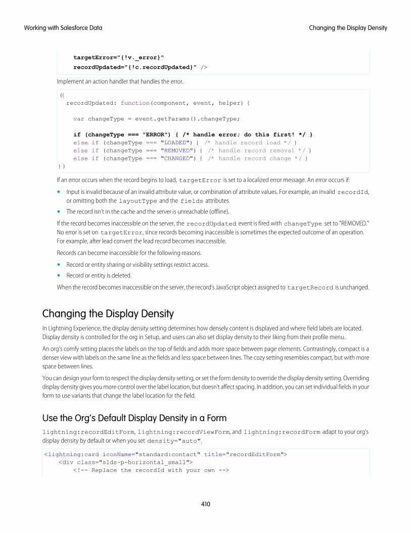
targetError="{!v._error}"
recordUpdated="{!c.recordUpdated}" />
Implement an action handler that handles the error.
({recordUpdated: function(component, event, helper) {
var changeType = event.getParams().changeType;
if (changeType === "ERROR") { /* handle error; do this first! */ }else if (changeType === "LOADED") { /* handle record load */ }else if (changeType === "REMOVED") { /* handle record removal */ }else if (changeType === "CHANGED") { /* handle record change */ }
})
If an error occurs when the record begins to load, targetError is set to a localized error message. An error occurs if:
• Input is invalid because of an invalid attribute value, or combination of attribute values. For example, an invalid recordId,or omitting both the layoutType and the fields attributes.
• The record isn’t in the cache and the server is unreachable (offline).
If the record becomes inaccessible on the server, the recordUpdated event is fired with changeType set to "REMOVED."No error is set on targetError, since records becoming inaccessible is sometimes the expected outcome of an operation.For example, after lead convert the lead record becomes inaccessible.
Records can become inaccessible for the following reasons.
• Record or entity sharing or visibility settings restrict access.
• Record or entity is deleted.
When the record becomes inaccessible on the server, the record’s JavaScript object assigned to targetRecord is unchanged.
Changing the Display DensityIn Lightning Experience, the display density setting determines how densely content is displayed and where field labels are located.Display density is controlled for the org in Setup, and users can also set display density to their liking from their profile menu.
An org’s comfy setting places the labels on the top of fields and adds more space between page elements. Contrastingly, compact is adenser view with labels on the same line as the fields and less space between lines. The cozy setting resembles compact, but with morespace between lines.
You can design your form to respect the display density setting, or set the form density to override the display density setting. Overridingdisplay density gives you more control over the label location, but doesn’t affect spacing. In addition, you can set individual fields in yourform to use variants that change the label location for the field.
Use the Org’s Default Display Density in a Formlightning:recordEditForm, lightning:recordViewForm, and lightning:recordForm adapt to your org'sdisplay density by default or when you set density="auto".
<lightning:card iconName="standard:contact" title="recordEditForm"><div class="slds-p-horizontal_small">
<!-- Replace the recordId with your own -->
410
Changing the Display DensityWorking with Salesforce Data
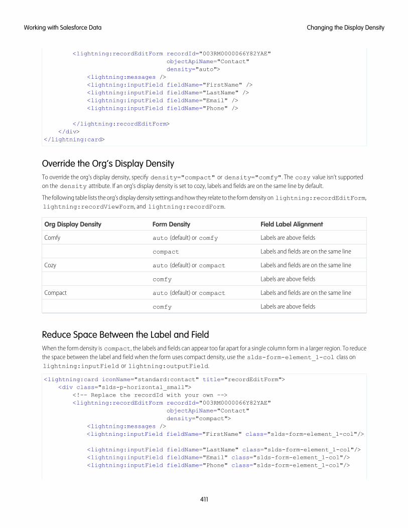
<lightning:recordEditForm recordId="003RM0000066Y82YAE"objectApiName="Contact"density="auto">
<lightning:messages /><lightning:inputField fieldName="FirstName" /><lightning:inputField fieldName="LastName" /><lightning:inputField fieldName="Email" /><lightning:inputField fieldName="Phone" />
</lightning:recordEditForm></div>
</lightning:card>
Override the Org’s Display DensityTo override the org's display density, specify density="compact" or density="comfy". The cozy value isn’t supportedon the density attribute. If an org's display density is set to cozy, labels and fields are on the same line by default.
The following table lists the org’s display density settings and how they relate to the form density on lightning:recordEditForm,lightning:recordViewForm, and lightning:recordForm.
Field Label AlignmentForm DensityOrg Display Density
Labels are above fieldsauto (default) or comfyComfy
Labels and fields are on the same linecompact
Labels and fields are on the same lineauto (default) or compactCozy
Labels are above fieldscomfy
Labels and fields are on the same lineauto (default) or compactCompact
Labels are above fieldscomfy
Reduce Space Between the Label and FieldWhen the form density is compact, the labels and fields can appear too far apart for a single column form in a larger region. To reducethe space between the label and field when the form uses compact density, use the slds-form-element_1-col class onlightning:inputField or lightning:outputField.
<lightning:card iconName="standard:contact" title="recordEditForm"><div class="slds-p-horizontal_small">
<!-- Replace the recordId with your own --><lightning:recordEditForm recordId="003RM0000066Y82YAE"
objectApiName="Contact"density="compact">
<lightning:messages /><lightning:inputField fieldName="FirstName" class="slds-form-element_1-col"/>
<lightning:inputField fieldName="LastName" class="slds-form-element_1-col"/><lightning:inputField fieldName="Email" class="slds-form-element_1-col"/><lightning:inputField fieldName="Phone" class="slds-form-element_1-col"/>
411
Changing the Display DensityWorking with Salesforce Data
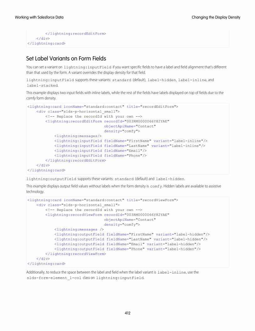
</lightning:recordEditForm></div>
</lightning:card>
Set Label Variants on Form FieldsYou can set a variant on lightning:inputField if you want specific fields to have a label and field alignment that’s differentthan that used by the form. A variant overrides the display density for that field.
lightning:inputField supports these variants: standard (default), label-hidden, label-inline, andlabel-stacked.
This example displays two input fields with inline labels, while the rest of the fields have labels displayed on top of fields due to thecomfy form density.
<lightning:card iconName="standard:contact" title="recordEditForm"><div class="slds-p-horizontal_small">
<!-- Replace the recordId with your own --><lightning:recordEditForm recordId="003RM0000066Y82YAE"
objectApiName="Contact"density="comfy">
<lightning:messages/><lightning:inputField fieldName="FirstName" variant="label-inline"/><lightning:inputField fieldName="LastName" variant="label-inline"/><lightning:inputField fieldName="Email"/><lightning:inputField fieldName="Phone"/>
</lightning:recordEditForm></div>
</lightning:card>
lightning:outputField supports these variants: standard (default) and label-hidden.
This example displays output field values without labels when the form density is comfy. Hidden labels are available to assistivetechnology.
<lightning:card iconName="standard:contact" title="recordViewForm"><div class="slds-p-horizontal_small">
<!-- Replace the recordId with your own --><lightning:recordViewForm recordId="003RM0000066Y82YAE"
objectApiName="Contact"density="comfy">
<lightning:messages /><lightning:outputField fieldName="FirstName" variant="label-hidden"/><lightning:outputField fieldName="LastName" variant="label-hidden"/><lightning:outputField fieldName="Email" variant="label-hidden"/><lightning:outputField fieldName="Phone" variant="label-hidden"/>
</lightning:recordViewForm></div>
</lightning:card>
Additionally, to reduce the space between the label and field when the label variant is label-inline, use theslds-form-element_1-col class on lightning:inputField.
412
Changing the Display DensityWorking with Salesforce Data
Usage ConsiderationsAdmins can set the default display density for the org on the Density Settings setup page. Users can choose their own display densityat any time. Admins can’t override a user’s display density setting. The org’s default display setting depends on the Salesforce edition.Density changes don’t apply to Salesforce Classic, Communities, or the Salesforce mobile app. For more information, see Configure UserInterface Settings.
SEE ALSO:
Component Library: lightning:recordEditForm
Component Library: lightning:recordViewForm
ConsiderationsLightning Data Service is powerful and simple to use. However, it’s not a complete replacement for writing your own data access code.Here are some considerations to keep in mind when using it.
Lightning Data Service is available in the following containers:
• Lightning Experience
• Salesforce app
• Lightning Communities
• Lightning Out
• Lightning Components for Visualforce
• Standalone Lightning apps
• Lightning for Gmail
• Lightning for Outlook
Lightning Data Service supports primitive DML operations—create, read, update, and delete. It operates on one record at a time, whichyou retrieve or modify using the record ID. Lightning Data Service supports spanned fields with a maximum depth of five levels. Supportfor working with collections of records or for querying for a record by anything other than the record ID isn’t available. If you must supporthigher-level operations or multiple operations in one transaction, use standard @AuraEnabled Apex methods.
Lightning Data Service shared data storage provides notifications to all components that use a record whenever a component changesthat record. It doesn’t notify components if that record is changed on the server, for example, if someone else modifies it. Recordschanged on the server aren’t updated locally until they’re reloaded. Lightning Data Service notifies listeners about data changes only ifthe changed fields are the same as in the listener’s fields or layout.
Supported ObjectsLightning Data Service supports custom objects and the following.
• Account
• AccountContactRelation
• AccountPartner
• AccountTeamMember
• ActionCadence
• Asset
• AssetRelationship
413
ConsiderationsWorking with Salesforce Data
• AssignedResource
• AttachedContentNote
• BusinessAccount
• Campaign
• CampaignMember
• CareBarrier
• CareBarrierType
• Case
• Contact
• ContactRequest
• ContentDocument
• ContentNote
• ContentVersion
• ContentWorkspace
• Contract
• ContractContactRole
• ContractLineItem
• Custom Object
• Entitlement
• EntityArchivingSetup
• EnvironmentHubMember
• Image
• Lead
• LicensingRequest
• MaintenanceAsset
• MaintenancePlan
• MarketingAction
• MarketingResource
• Note
• OperatingHours
• Opportunity
• OpportunityLineItem
• OpportunityPartner
• OpportunityTeamMember
• Order
• OrderItem
• OrderSummary
• Partner
• PersonAccount
• Pricebook2
414
ConsiderationsWorking with Salesforce Data
• PricebookEntry
• Product2
• Quote
• QuoteDocument
• QuoteLineItem
• RecordType
• ResourceAbsence
• ResourcePreference
• RetailVisitKpi
• RetailVisitWorkTask
• ServiceAppointment
• ServiceContract
• ServiceCrew
• ServiceCrewMember
• ServiceResource
• ServiceResourceCapacity
• ServiceResourceSkill
• ServiceTerritory
• ServiceTerritoryLocation
• ServiceTerritoryMember
• Shift
• Shipment
• SkillRequirement
• SocialPost
• SurveyInvitation
• SurveyResponse
• SurveySubject
• Tenant
• TimeSheet
• TimeSheetEntry
• TimeSlot
• UsageEntitlement
• UsageEntitlementPeriod
• User
• Visit
• WorkOrder
• WorkOrderLineItem
• WorkType
415
ConsiderationsWorking with Salesforce Data
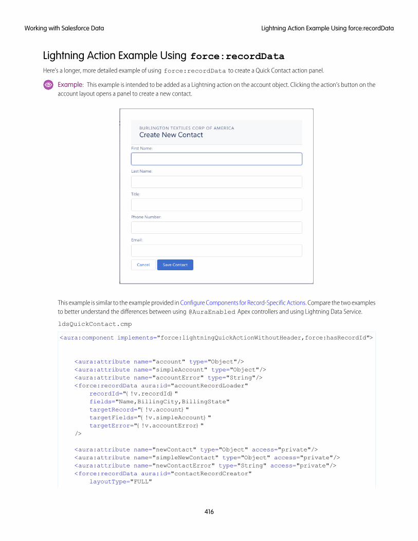
Lightning Action Example Using force:recordDataHere’s a longer, more detailed example of using force:recordData to create a Quick Contact action panel.
Example: This example is intended to be added as a Lightning action on the account object. Clicking the action’s button on theaccount layout opens a panel to create a new contact.
This example is similar to the example provided in Configure Components for Record-Specific Actions. Compare the two examplesto better understand the differences between using @AuraEnabled Apex controllers and using Lightning Data Service.
ldsQuickContact.cmp
<aura:component implements="force:lightningQuickActionWithoutHeader,force:hasRecordId">
<aura:attribute name="account" type="Object"/><aura:attribute name="simpleAccount" type="Object"/><aura:attribute name="accountError" type="String"/><force:recordData aura:id="accountRecordLoader"
recordId="{!v.recordId}"fields="Name,BillingCity,BillingState"targetRecord="{!v.account}"targetFields="{!v.simpleAccount}"targetError="{!v.accountError}"
/>
<aura:attribute name="newContact" type="Object" access="private"/><aura:attribute name="simpleNewContact" type="Object" access="private"/><aura:attribute name="newContactError" type="String" access="private"/><force:recordData aura:id="contactRecordCreator"
layoutType="FULL"
416
Lightning Action Example Using force:recordDataWorking with Salesforce Data
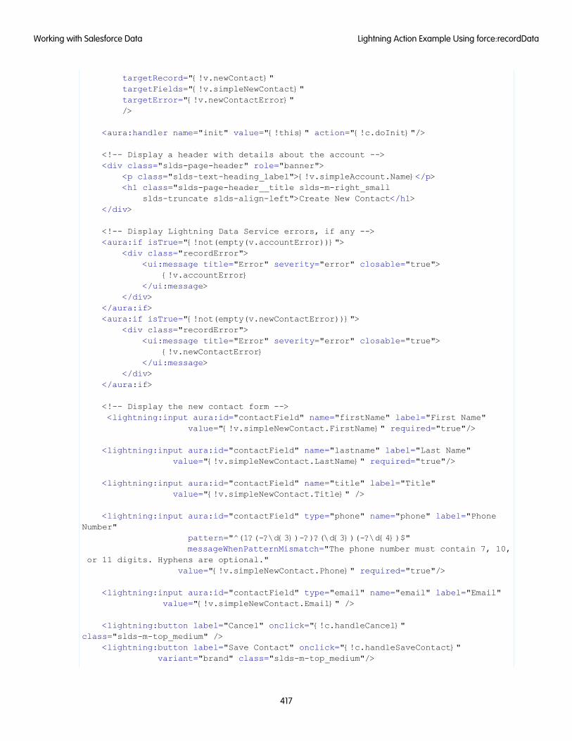
targetRecord="{!v.newContact}"targetFields="{!v.simpleNewContact}"targetError="{!v.newContactError}"/>
<aura:handler name="init" value="{!this}" action="{!c.doInit}"/>
<!-- Display a header with details about the account --><div class="slds-page-header" role="banner">
<p class="slds-text-heading_label">{!v.simpleAccount.Name}</p><h1 class="slds-page-header__title slds-m-right_small
slds-truncate slds-align-left">Create New Contact</h1></div>
<!-- Display Lightning Data Service errors, if any --><aura:if isTrue="{!not(empty(v.accountError))}">
<div class="recordError"><ui:message title="Error" severity="error" closable="true">
{!v.accountError}</ui:message>
</div></aura:if><aura:if isTrue="{!not(empty(v.newContactError))}">
<div class="recordError"><ui:message title="Error" severity="error" closable="true">
{!v.newContactError}</ui:message>
</div></aura:if>
<!-- Display the new contact form --><lightning:input aura:id="contactField" name="firstName" label="First Name"
value="{!v.simpleNewContact.FirstName}" required="true"/>
<lightning:input aura:id="contactField" name="lastname" label="Last Name"value="{!v.simpleNewContact.LastName}" required="true"/>
<lightning:input aura:id="contactField" name="title" label="Title"value="{!v.simpleNewContact.Title}" />
<lightning:input aura:id="contactField" type="phone" name="phone" label="PhoneNumber"
pattern="^(1?(-?\d{3})-?)?(\d{3})(-?\d{4})$"messageWhenPatternMismatch="The phone number must contain 7, 10,
or 11 digits. Hyphens are optional."value="{!v.simpleNewContact.Phone}" required="true"/>
<lightning:input aura:id="contactField" type="email" name="email" label="Email"value="{!v.simpleNewContact.Email}" />
<lightning:button label="Cancel" onclick="{!c.handleCancel}"class="slds-m-top_medium" />
<lightning:button label="Save Contact" onclick="{!c.handleSaveContact}"variant="brand" class="slds-m-top_medium"/>
417
Lightning Action Example Using force:recordDataWorking with Salesforce Data
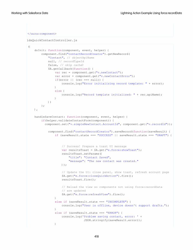
</aura:component>
ldsQuickContactController.js
({doInit: function(component, event, helper) {
component.find("contactRecordCreator").getNewRecord("Contact", // objectApiNamenull, // recordTypeIdfalse, // skip cache?$A.getCallback(function() {
var rec = component.get("v.newContact");var error = component.get("v.newContactError");if(error || (rec === null)) {
console.log("Error initializing record template: " + error);}else {
console.log("Record template initialized: " + rec.apiName);}
}));
},
handleSaveContact: function(component, event, helper) {if(helper.validateContactForm(component)) {
component.set("v.simpleNewContact.AccountId", component.get("v.recordId"));
component.find("contactRecordCreator").saveRecord(function(saveResult) {if (saveResult.state === "SUCCESS" || saveResult.state === "DRAFT") {
// Success! Prepare a toast UI messagevar resultsToast = $A.get("e.force:showToast");resultsToast.setParams({
"title": "Contact Saved","message": "The new contact was created."
});
// Update the UI: close panel, show toast, refresh account page$A.get("e.force:closeQuickAction").fire();resultsToast.fire();
// Reload the view so components not using force:recordData// are updated$A.get("e.force:refreshView").fire();
}else if (saveResult.state === "INCOMPLETE") {
console.log("User is offline, device doesn't support drafts.");}else if (saveResult.state === "ERROR") {
console.log('Problem saving contact, error: ' +JSON.stringify(saveResult.error));
}
418
Lightning Action Example Using force:recordDataWorking with Salesforce Data
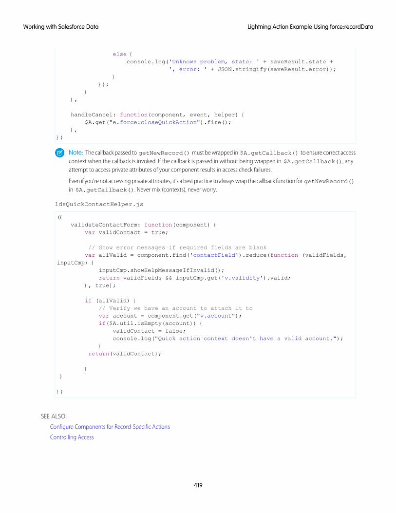
else {console.log('Unknown problem, state: ' + saveResult.state +
', error: ' + JSON.stringify(saveResult.error));}
});}
},
handleCancel: function(component, event, helper) {$A.get("e.force:closeQuickAction").fire();
},})
Note: The callback passed to getNewRecord() must be wrapped in $A.getCallback() to ensure correct accesscontext when the callback is invoked. If the callback is passed in without being wrapped in $A.getCallback(), anyattempt to access private attributes of your component results in access check failures.
Even if you’re not accessing private attributes, it’s a best practice to always wrap the callback function for getNewRecord()in $A.getCallback(). Never mix (contexts), never worry.
ldsQuickContactHelper.js
({validateContactForm: function(component) {
var validContact = true;
// Show error messages if required fields are blankvar allValid = component.find('contactField').reduce(function (validFields,
inputCmp) {inputCmp.showHelpMessageIfInvalid();return validFields && inputCmp.get('v.validity').valid;
}, true);
if (allValid) {// Verify we have an account to attach it tovar account = component.get("v.account");if($A.util.isEmpty(account)) {
validContact = false;console.log("Quick action context doesn't have a valid account.");
}return(validContact);
}}
})
SEE ALSO:
Configure Components for Record-Specific Actions
Controlling Access
419
Lightning Action Example Using force:recordDataWorking with Salesforce Data
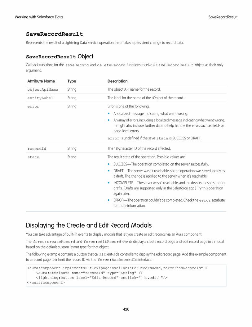
SaveRecordResultRepresents the result of a Lightning Data Service operation that makes a persistent change to record data.
SaveRecordResult ObjectCallback functions for the saveRecord and deleteRecord functions receive a SaveRecordResult object as their onlyargument.
DescriptionTypeAttribute Name
The object API name for the record.StringobjectApiName
The label for the name of the sObject of the record.StringentityLabel
Error is one of the following.Stringerror
• A localized message indicating what went wrong.
• An array of errors, including a localized message indicating what went wrong.It might also include further data to help handle the error, such as field- orpage-level errors.
error is undefined if the save state is SUCCESS or DRAFT.
The 18-character ID of the record affected.StringrecordId
The result state of the operation. Possible values are:Stringstate
• SUCCESS—The operation completed on the server successfully.
• DRAFT—The server wasn’t reachable, so the operation was saved locally asa draft. The change is applied to the server when it’s reachable.
• INCOMPLETE—The server wasn’t reachable, and the device doesn’t supportdrafts. (Drafts are supported only in the Salesforce app.) Try this operationagain later.
• ERROR—The operation couldn’t be completed. Check the error attributefor more information.
Displaying the Create and Edit Record ModalsYou can take advantage of built-in events to display modals that let you create or edit records via an Aura component.
The force:createRecord and force:editRecord events display a create record page and edit record page in a modalbased on the default custom layout type for that object.
The following example contains a button that calls a client-side controller to display the edit record page. Add this example componentto a record page to inherit the record ID via the force:hasRecordId interface.
<aura:component implements="flexipage:availableForRecordHome,force:hasRecordId" ><aura:attribute name="recordId" type="String" /><lightning:button label="Edit Record" onclick="{!c.edit}"/>
</aura:component>
420
SaveRecordResultWorking with Salesforce Data
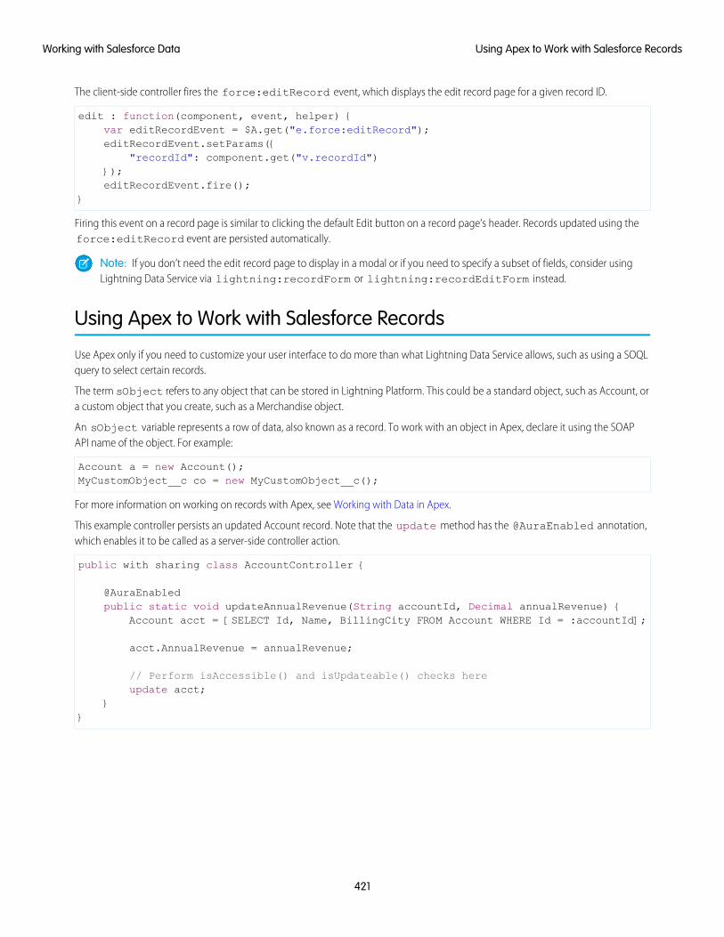
The client-side controller fires the force:editRecord event, which displays the edit record page for a given record ID.
edit : function(component, event, helper) {var editRecordEvent = $A.get("e.force:editRecord");editRecordEvent.setParams({
"recordId": component.get("v.recordId")});editRecordEvent.fire();
}
Firing this event on a record page is similar to clicking the default Edit button on a record page’s header. Records updated using theforce:editRecord event are persisted automatically.
Note: If you don’t need the edit record page to display in a modal or if you need to specify a subset of fields, consider usingLightning Data Service via lightning:recordForm or lightning:recordEditForm instead.
Using Apex to Work with Salesforce Records
Use Apex only if you need to customize your user interface to do more than what Lightning Data Service allows, such as using a SOQLquery to select certain records.
The term sObject refers to any object that can be stored in Lightning Platform. This could be a standard object, such as Account, ora custom object that you create, such as a Merchandise object.
An sObject variable represents a row of data, also known as a record. To work with an object in Apex, declare it using the SOAPAPI name of the object. For example:
Account a = new Account();MyCustomObject__c co = new MyCustomObject__c();
For more information on working on records with Apex, see Working with Data in Apex.
This example controller persists an updated Account record. Note that the update method has the @AuraEnabled annotation,which enables it to be called as a server-side controller action.
public with sharing class AccountController {
@AuraEnabledpublic static void updateAnnualRevenue(String accountId, Decimal annualRevenue) {
Account acct = [SELECT Id, Name, BillingCity FROM Account WHERE Id = :accountId];
acct.AnnualRevenue = annualRevenue;
// Perform isAccessible() and isUpdateable() checks hereupdate acct;
}}
421
Using Apex to Work with Salesforce RecordsWorking with Salesforce Data
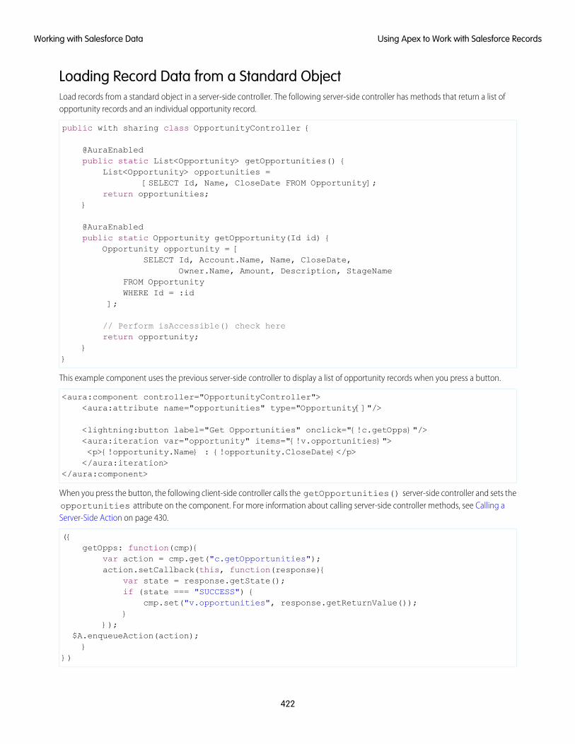
Loading Record Data from a Standard ObjectLoad records from a standard object in a server-side controller. The following server-side controller has methods that return a list ofopportunity records and an individual opportunity record.
public with sharing class OpportunityController {
@AuraEnabledpublic static List<Opportunity> getOpportunities() {
List<Opportunity> opportunities =[SELECT Id, Name, CloseDate FROM Opportunity];
return opportunities;}
@AuraEnabledpublic static Opportunity getOpportunity(Id id) {
Opportunity opportunity = [SELECT Id, Account.Name, Name, CloseDate,
Owner.Name, Amount, Description, StageNameFROM OpportunityWHERE Id = :id
];
// Perform isAccessible() check herereturn opportunity;
}}
This example component uses the previous server-side controller to display a list of opportunity records when you press a button.
<aura:component controller="OpportunityController"><aura:attribute name="opportunities" type="Opportunity[]"/>
<lightning:button label="Get Opportunities" onclick="{!c.getOpps}"/><aura:iteration var="opportunity" items="{!v.opportunities}"><p>{!opportunity.Name} : {!opportunity.CloseDate}</p></aura:iteration>
</aura:component>
When you press the button, the following client-side controller calls the getOpportunities() server-side controller and sets theopportunities attribute on the component. For more information about calling server-side controller methods, see Calling aServer-Side Action on page 430.
({getOpps: function(cmp){
var action = cmp.get("c.getOpportunities");action.setCallback(this, function(response){
var state = response.getState();if (state === "SUCCESS") {
cmp.set("v.opportunities", response.getReturnValue());}
});$A.enqueueAction(action);}
})
422
Using Apex to Work with Salesforce RecordsWorking with Salesforce Data
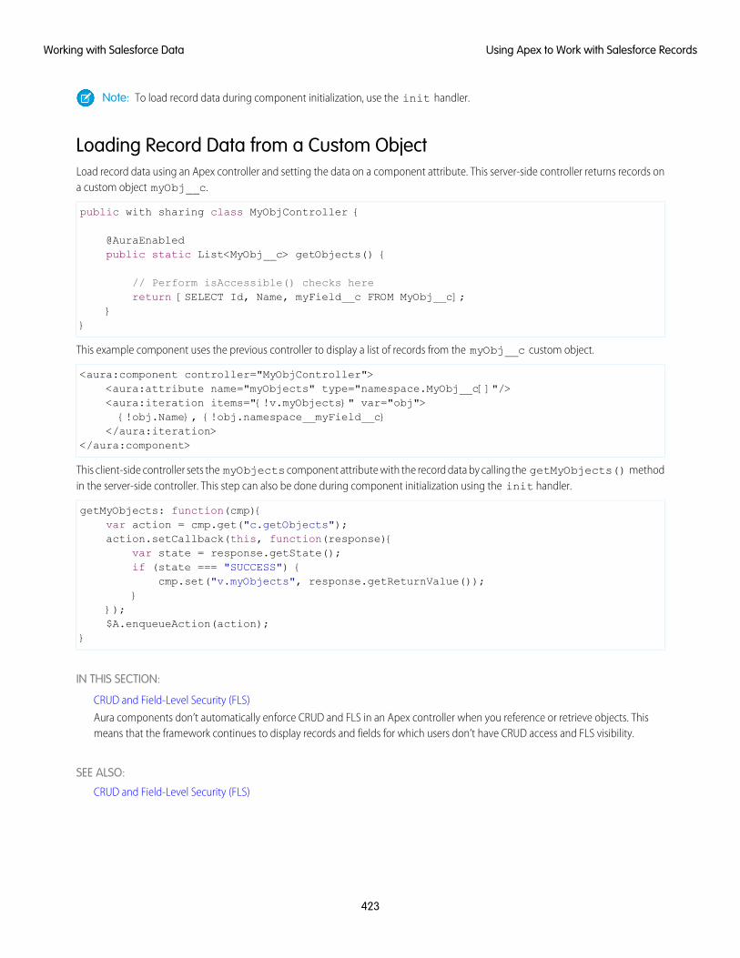
Note: To load record data during component initialization, use the init handler.
Loading Record Data from a Custom ObjectLoad record data using an Apex controller and setting the data on a component attribute. This server-side controller returns records ona custom object myObj__c.
public with sharing class MyObjController {
@AuraEnabledpublic static List<MyObj__c> getObjects() {
// Perform isAccessible() checks herereturn [SELECT Id, Name, myField__c FROM MyObj__c];
}}
This example component uses the previous controller to display a list of records from the myObj__c custom object.
<aura:component controller="MyObjController"><aura:attribute name="myObjects" type="namespace.MyObj__c[]"/><aura:iteration items="{!v.myObjects}" var="obj">{!obj.Name}, {!obj.namespace__myField__c}
</aura:iteration></aura:component>
This client-side controller sets the myObjects component attribute with the record data by calling the getMyObjects() methodin the server-side controller. This step can also be done during component initialization using the init handler.
getMyObjects: function(cmp){var action = cmp.get("c.getObjects");action.setCallback(this, function(response){
var state = response.getState();if (state === "SUCCESS") {
cmp.set("v.myObjects", response.getReturnValue());}
});$A.enqueueAction(action);
}
IN THIS SECTION:
CRUD and Field-Level Security (FLS)
Aura components don’t automatically enforce CRUD and FLS in an Apex controller when you reference or retrieve objects. Thismeans that the framework continues to display records and fields for which users don’t have CRUD access and FLS visibility.
SEE ALSO:
CRUD and Field-Level Security (FLS)
423
Using Apex to Work with Salesforce RecordsWorking with Salesforce Data
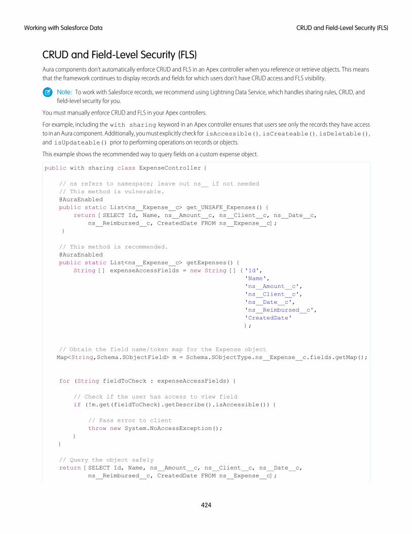
CRUD and Field-Level Security (FLS)Aura components don’t automatically enforce CRUD and FLS in an Apex controller when you reference or retrieve objects. This meansthat the framework continues to display records and fields for which users don’t have CRUD access and FLS visibility.
Note: To work with Salesforce records, we recommend using Lightning Data Service, which handles sharing rules, CRUD, andfield-level security for you.
You must manually enforce CRUD and FLS in your Apex controllers.
For example, including the with sharing keyword in an Apex controller ensures that users see only the records they have accessto in an Aura component. Additionally, you must explicitly check for isAccessible(), isCreateable(), isDeletable(),and isUpdateable() prior to performing operations on records or objects.
This example shows the recommended way to query fields on a custom expense object.
public with sharing class ExpenseController {
// ns refers to namespace; leave out ns__ if not needed// This method is vulnerable.@AuraEnabledpublic static List<ns__Expense__c> get_UNSAFE_Expenses() {
return [SELECT Id, Name, ns__Amount__c, ns__Client__c, ns__Date__c,ns__Reimbursed__c, CreatedDate FROM ns__Expense__c];
}
// This method is recommended.@AuraEnabledpublic static List<ns__Expense__c> getExpenses() {
String [] expenseAccessFields = new String [] {'Id','Name','ns__Amount__c','ns__Client__c','ns__Date__c','ns__Reimbursed__c','CreatedDate'};
// Obtain the field name/token map for the Expense objectMap<String,Schema.SObjectField> m = Schema.SObjectType.ns__Expense__c.fields.getMap();
for (String fieldToCheck : expenseAccessFields) {
// Check if the user has access to view fieldif (!m.get(fieldToCheck).getDescribe().isAccessible()) {
// Pass error to clientthrow new System.NoAccessException();
}}
// Query the object safelyreturn [SELECT Id, Name, ns__Amount__c, ns__Client__c, ns__Date__c,
ns__Reimbursed__c, CreatedDate FROM ns__Expense__c];
424
CRUD and Field-Level Security (FLS)Working with Salesforce Data
}}
Note: For more information, see Lightning Security.
425
CRUD and Field-Level Security (FLS)Working with Salesforce Data
CHAPTER 11 Using Apex
Use Apex to write server-side code, such as controllers and test classes.In this chapter ...Server-side controllers handle requests from client-side controllers. For example, a client-side controllermight handle an event and call a server-side controller action to persist a record. A server-side controllercan also load your record data.
• Creating Server-SideLogic with Controllers
• Testing Your ApexCode
• Making API Callsfrom Apex
• Make Long-RunningCallouts withContinuations
• CreatingComponents in Apex
426
Creating Server-Side Logic with Controllers
The framework supports client-side and server-side controllers. An event is always wired to a client-side controller action, which can inturn call a server-side controller action. For example, a client-side controller might handle an event and call a server-side controller actionto persist a record.
Server-side actions need to make a round trip, from the client to the server and back again, so they usually complete more slowly thanclient-side actions.
For more details on the process of calling a server-side action, see Calling a Server-Side Action on page 430.
IN THIS SECTION:
Apex Server-Side Controller Overview
Create a server-side controller in Apex and use the @AuraEnabled annotation to enable access to the controller method.
AuraEnabled Annotation
The AuraEnabled annotation enables Lightning components to access Apex methods and properties.
Creating an Apex Server-Side Controller
Use the Developer Console to create an Apex server-side controller.
Calling a Server-Side Action
Call a server-side controller action from a client-side controller. In the client-side controller, you set a callback, which is called afterthe server-side action is completed. A server-side action can return any object containing serializable JSON data.
Passing Data to an Apex Controller
Use action.setParams() in JavaScript to set data to pass to an Apex controller.
Returning Data from an Apex Server-Side Controller
Return results from a server-side controller to a client-side controller using the return statement. Results data must be serializableinto JSON format.
Returning Errors from an Apex Server-Side Controller
Create and throw a System.AuraHandledException from your server-side controller to return a custom error message.
Queueing of Server-Side Actions
The framework queues up actions before sending them to the server. This mechanism is largely transparent to you when you’rewriting code but it enables the framework to minimize network traffic by batching multiple actions into one request (XHR).
Foreground and Background Actions
Foreground actions are the default. An action can be marked as a background action. This is useful when you want your app toremain responsive to a user while it executes a low priority, long-running action. A rough guideline is to use a background action ifit takes more than five seconds for the response to return from the server.
Storable Actions
Enhance your component’s performance by marking actions as storable (cacheable) to quickly show cached data from client-sidestorage without waiting for a server trip. If the cached data is stale, the framework retrieves the latest data from the server. Cachingis especially beneficial for users on high latency, slow, or unreliable connections such as 3G networks.
Abortable Actions
Mark an action as abortable to make it potentially abortable while it's queued to be sent to the server. An abortable action in thequeue is not sent to the server if the component that created the action is no longer valid, that is cmp.isValid() == false.A component is automatically destroyed and marked invalid by the framework when it is unrendered.
427
Creating Server-Side Logic with ControllersUsing Apex
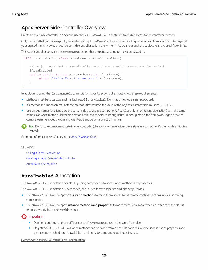
Apex Server-Side Controller OverviewCreate a server-side controller in Apex and use the @AuraEnabled annotation to enable access to the controller method.
Only methods that you have explicitly annotated with @AuraEnabled are exposed. Calling server-side actions aren’t counted againstyour org’s API limits. However, your server-side controller actions are written in Apex, and as such are subject to all the usual Apex limits.
This Apex controller contains a serverEcho action that prepends a string to the value passed in.
public with sharing class SimpleServerSideController {
//Use @AuraEnabled to enable client- and server-side access to the method@AuraEnabledpublic static String serverEcho(String firstName) {
return ('Hello from the server, ' + firstName);}
}
In addition to using the @AuraEnabled annotation, your Apex controller must follow these requirements.
• Methods must be static and marked public or global. Non-static methods aren’t supported.
• If a method returns an object, instance methods that retrieve the value of the object’s instance field must be public.
• Use unique names for client-side and server-side actions in a component. A JavaScript function (client-side action) with the samename as an Apex method (server-side action ) can lead to hard-to-debug issues. In debug mode, the framework logs a browserconsole warning about the clashing client-side and server-side action names.
Tip: Don’t store component state in your controller (client-side or server-side). Store state in a component’s client-side attributesinstead.
For more information, see Classes in the Apex Developer Guide.
SEE ALSO:
Calling a Server-Side Action
Creating an Apex Server-Side Controller
AuraEnabled Annotation
AuraEnabled AnnotationThe AuraEnabled annotation enables Lightning components to access Apex methods and properties.
The AuraEnabled annotation is overloaded, and is used for two separate and distinct purposes.
• Use @AuraEnabled on Apex class static methods to make them accessible as remote controller actions in your Lightningcomponents.
• Use @AuraEnabled on Apex instance methods and properties to make them serializable when an instance of the class isreturned as data from a server-side action.
Important:
• Don’t mix-and-match these different uses of @AuraEnabled in the same Apex class.
• Only static @AuraEnabled Apex methods can be called from client-side code. Visualforce-style instance properties andgetter/setter methods aren’t available. Use client-side component attributes instead.
Component Security Boundaries and Encapsulation
428
Apex Server-Side Controller OverviewUsing Apex
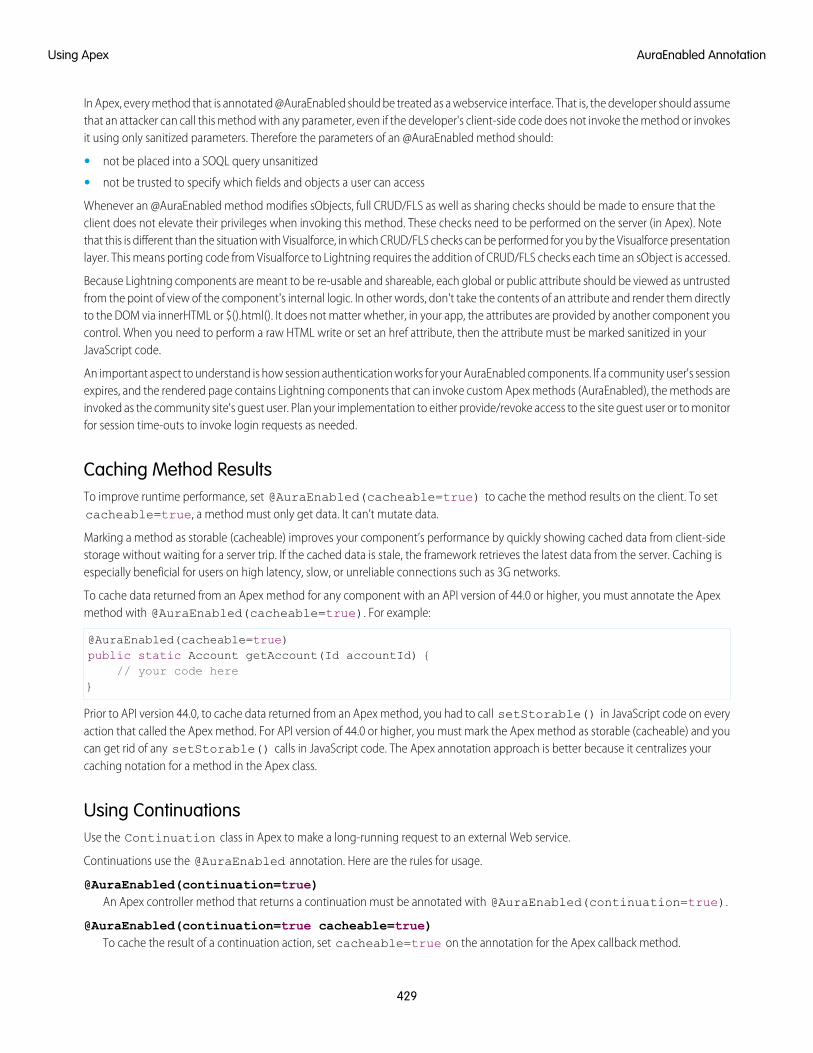
In Apex, every method that is annotated @AuraEnabled should be treated as a webservice interface. That is, the developer should assumethat an attacker can call this method with any parameter, even if the developer's client-side code does not invoke the method or invokesit using only sanitized parameters. Therefore the parameters of an @AuraEnabled method should:
• not be placed into a SOQL query unsanitized
• not be trusted to specify which fields and objects a user can access
Whenever an @AuraEnabled method modifies sObjects, full CRUD/FLS as well as sharing checks should be made to ensure that theclient does not elevate their privileges when invoking this method. These checks need to be performed on the server (in Apex). Notethat this is different than the situation with Visualforce, in which CRUD/FLS checks can be performed for you by the Visualforce presentationlayer. This means porting code from Visualforce to Lightning requires the addition of CRUD/FLS checks each time an sObject is accessed.
Because Lightning components are meant to be re-usable and shareable, each global or public attribute should be viewed as untrustedfrom the point of view of the component's internal logic. In other words, don't take the contents of an attribute and render them directlyto the DOM via innerHTML or $().html(). It does not matter whether, in your app, the attributes are provided by another component youcontrol. When you need to perform a raw HTML write or set an href attribute, then the attribute must be marked sanitized in yourJavaScript code.
An important aspect to understand is how session authentication works for your AuraEnabled components. If a community user's sessionexpires, and the rendered page contains Lightning components that can invoke custom Apex methods (AuraEnabled), the methods areinvoked as the community site's guest user. Plan your implementation to either provide/revoke access to the site guest user or to monitorfor session time-outs to invoke login requests as needed.
Caching Method ResultsTo improve runtime performance, set @AuraEnabled(cacheable=true) to cache the method results on the client. To setcacheable=true, a method must only get data. It can’t mutate data.
Marking a method as storable (cacheable) improves your component’s performance by quickly showing cached data from client-sidestorage without waiting for a server trip. If the cached data is stale, the framework retrieves the latest data from the server. Caching isespecially beneficial for users on high latency, slow, or unreliable connections such as 3G networks.
To cache data returned from an Apex method for any component with an API version of 44.0 or higher, you must annotate the Apexmethod with @AuraEnabled(cacheable=true). For example:
@AuraEnabled(cacheable=true)public static Account getAccount(Id accountId) {
// your code here}
Prior to API version 44.0, to cache data returned from an Apex method, you had to call setStorable() in JavaScript code on everyaction that called the Apex method. For API version of 44.0 or higher, you must mark the Apex method as storable (cacheable) and youcan get rid of any setStorable() calls in JavaScript code. The Apex annotation approach is better because it centralizes yourcaching notation for a method in the Apex class.
Using ContinuationsUse the Continuation class in Apex to make a long-running request to an external Web service.
Continuations use the @AuraEnabled annotation. Here are the rules for usage.
@AuraEnabled(continuation=true)An Apex controller method that returns a continuation must be annotated with @AuraEnabled(continuation=true).
@AuraEnabled(continuation=true cacheable=true)To cache the result of a continuation action, set cacheable=true on the annotation for the Apex callback method.
429
AuraEnabled AnnotationUsing Apex
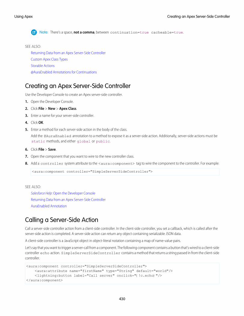
Note: There’s a space, not a comma, between continuation=true cacheable=true.
SEE ALSO:
Returning Data from an Apex Server-Side Controller
Custom Apex Class Types
Storable Actions
@AuraEnabled Annotations for Continuations
Creating an Apex Server-Side ControllerUse the Developer Console to create an Apex server-side controller.
1. Open the Developer Console.
2. Click File > New > Apex Class.
3. Enter a name for your server-side controller.
4. Click OK.
5. Enter a method for each server-side action in the body of the class.
Add the @AuraEnabled annotation to a method to expose it as a server-side action. Additionally, server-side actions must bestatic methods, and either global or public.
6. Click File > Save.
7. Open the component that you want to wire to the new controller class.
8. Add a controller system attribute to the <aura:component> tag to wire the component to the controller. For example:
<aura:component controller="SimpleServerSideController">
SEE ALSO:
Salesforce Help: Open the Developer Console
Returning Data from an Apex Server-Side Controller
AuraEnabled Annotation
Calling a Server-Side ActionCall a server-side controller action from a client-side controller. In the client-side controller, you set a callback, which is called after theserver-side action is completed. A server-side action can return any object containing serializable JSON data.
A client-side controller is a JavaScript object in object-literal notation containing a map of name-value pairs.
Let’s say that you want to trigger a server-call from a component. The following component contains a button that’s wired to a client-sidecontroller echo action. SimpleServerSideController contains a method that returns a string passed in from the client-sidecontroller.
<aura:component controller="SimpleServerSideController"><aura:attribute name="firstName" type="String" default="world"/><lightning:button label="Call server" onclick="{!c.echo}"/>
</aura:component>
430
Creating an Apex Server-Side ControllerUsing Apex
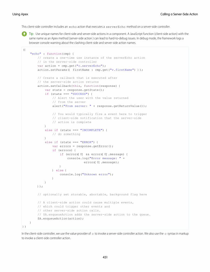
This client-side controller includes an echo action that executes a serverEcho method on a server-side controller.
Tip: Use unique names for client-side and server-side actions in a component. A JavaScript function (client-side action) with thesame name as an Apex method (server-side action ) can lead to hard-to-debug issues. In debug mode, the framework logs abrowser console warning about the clashing client-side and server-side action names.
({"echo" : function(cmp) {
// create a one-time use instance of the serverEcho action// in the server-side controllervar action = cmp.get("c.serverEcho");action.setParams({ firstName : cmp.get("v.firstName") });
// Create a callback that is executed after// the server-side action returnsaction.setCallback(this, function(response) {
var state = response.getState();if (state === "SUCCESS") {
// Alert the user with the value returned// from the serveralert("From server: " + response.getReturnValue());
// You would typically fire a event here to trigger// client-side notification that the server-side// action is complete
}else if (state === "INCOMPLETE") {
// do something}else if (state === "ERROR") {
var errors = response.getError();if (errors) {
if (errors[0] && errors[0].message) {console.log("Error message: " +
errors[0].message);}
} else {console.log("Unknown error");
}}
});
// optionally set storable, abortable, background flag here
// A client-side action could cause multiple events,// which could trigger other events and// other server-side action calls.// $A.enqueueAction adds the server-side action to the queue.$A.enqueueAction(action);
}})
In the client-side controller, we use the value provider of c to invoke a server-side controller action. We also use the c syntax in markupto invoke a client-side controller action.
431
Calling a Server-Side ActionUsing Apex
The cmp.get("c.serverEcho") call indicates that we’re calling the serverEcho method in the server-side controller. Themethod name in the server-side controller must match everything after the c. in the client-side call. In this case, that’s serverEcho.
The implementation of the serverEcho Apex method is shown in Apex Server-Side Controller Overview.
Use action.setParams() to set data to be passed to the server-side controller. The following call sets the value of the firstNameargument on the server-side controller’s serverEcho method based on the firstName attribute value.
action.setParams({ firstName : cmp.get("v.firstName") });
action.setCallback() sets a callback action that is invoked after the server-side action returns.
action.setCallback(this, function(response) { ... });
The server-side action results are available in the response variable, which is the argument of the callback.
response.getState() gets the state of the action returned from the server.
Note: You don’t need a cmp.isValid() check in the callback in a client-side controller when you reference the componentassociated with the client-side controller. The framework automatically checks that the component is valid.
response.getReturnValue() gets the value returned from the server. In this example, the callback function alerts the userwith the value returned from the server.
$A.enqueueAction(action) adds the server-side controller action to the queue of actions to be executed. All actions that areenqueued will run at the end of the event loop. Rather than sending a separate request for each individual action, the frameworkprocesses the event chain and batches the actions in the queue into one request. The actions are asynchronous and have callbacks.
Tip: If your action is not executing, make sure that you’re not executing code outside the framework’s normal rerendering lifecycle.For example, if you use window.setTimeout() in an event handler to execute some logic after a time delay, wrap yourcode in $A.getCallback(). You don't need to use $A.getCallback() if your code is executed as part of the framework'scall stack; for example, your code is handling an event or in the callback for a server-side controller action.
Client Payload Data LimitUse action.setParams() to set data for an action to be passed to a server-side controller.
The framework batches the actions in the queue into one server request. The request payload includes all of the actions and their dataserialized into JSON. The request payload limit is 4 MB.
IN THIS SECTION:
Action States
Call a server-side controller action from a client-side controller. The action can have different states during processing.
SEE ALSO:
Handling Events with Client-Side Controllers
Passing Data to an Apex Controller
Queueing of Server-Side Actions
Action States
Checking Component Validity
432
Calling a Server-Side ActionUsing Apex
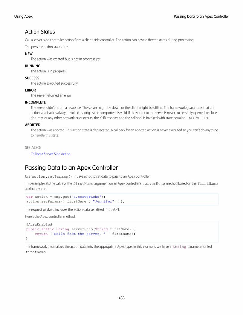
Action StatesCall a server-side controller action from a client-side controller. The action can have different states during processing.
The possible action states are:
NEWThe action was created but is not in progress yet
RUNNINGThe action is in progress
SUCCESSThe action executed successfully
ERRORThe server returned an error
INCOMPLETEThe server didn’t return a response. The server might be down or the client might be offline. The framework guarantees that anaction’s callback is always invoked as long as the component is valid. If the socket to the server is never successfully opened, or closesabruptly, or any other network error occurs, the XHR resolves and the callback is invoked with state equal to INCOMPLETE.
ABORTEDThe action was aborted. This action state is deprecated. A callback for an aborted action is never executed so you can’t do anythingto handle this state.
SEE ALSO:
Calling a Server-Side Action
Passing Data to an Apex ControllerUse action.setParams() in JavaScript to set data to pass to an Apex controller.
This example sets the value of the firstName argument on an Apex controller’s serverEcho method based on the firstNameattribute value.
var action = cmp.get("c.serverEcho");action.setParams({ firstName : "Jennifer") });
The request payload includes the action data serialized into JSON.
Here's the Apex controller method.
@AuraEnabledpublic static String serverEcho(String firstName) {
return ('Hello from the server, ' + firstName);}
The framework deserializes the action data into the appropriate Apex type. In this example, we have a String parameter calledfirstName.
433
Passing Data to an Apex ControllerUsing Apex
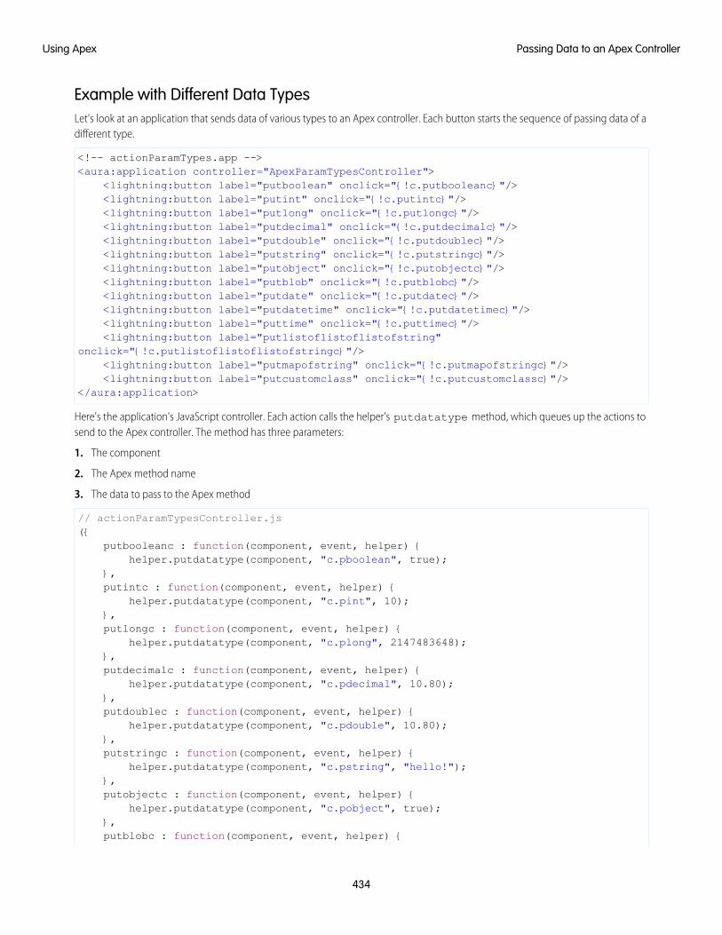
Example with Different Data TypesLet's look at an application that sends data of various types to an Apex controller. Each button starts the sequence of passing data of adifferent type.
<!-- actionParamTypes.app --><aura:application controller="ApexParamTypesController">
<lightning:button label="putboolean" onclick="{!c.putbooleanc}"/><lightning:button label="putint" onclick="{!c.putintc}"/><lightning:button label="putlong" onclick="{!c.putlongc}"/><lightning:button label="putdecimal" onclick="{!c.putdecimalc}"/><lightning:button label="putdouble" onclick="{!c.putdoublec}"/><lightning:button label="putstring" onclick="{!c.putstringc}"/><lightning:button label="putobject" onclick="{!c.putobjectc}"/><lightning:button label="putblob" onclick="{!c.putblobc}"/><lightning:button label="putdate" onclick="{!c.putdatec}"/><lightning:button label="putdatetime" onclick="{!c.putdatetimec}"/><lightning:button label="puttime" onclick="{!c.puttimec}"/><lightning:button label="putlistoflistoflistofstring"
onclick="{!c.putlistoflistoflistofstringc}"/><lightning:button label="putmapofstring" onclick="{!c.putmapofstringc}"/><lightning:button label="putcustomclass" onclick="{!c.putcustomclassc}"/>
</aura:application>
Here's the application's JavaScript controller. Each action calls the helper's putdatatype method, which queues up the actions tosend to the Apex controller. The method has three parameters:
1. The component
2. The Apex method name
3. The data to pass to the Apex method
// actionParamTypesController.js({
putbooleanc : function(component, event, helper) {helper.putdatatype(component, "c.pboolean", true);
},putintc : function(component, event, helper) {
helper.putdatatype(component, "c.pint", 10);},putlongc : function(component, event, helper) {
helper.putdatatype(component, "c.plong", 2147483648);},putdecimalc : function(component, event, helper) {
helper.putdatatype(component, "c.pdecimal", 10.80);},putdoublec : function(component, event, helper) {
helper.putdatatype(component, "c.pdouble", 10.80);},putstringc : function(component, event, helper) {
helper.putdatatype(component, "c.pstring", "hello!");},putobjectc : function(component, event, helper) {
helper.putdatatype(component, "c.pobject", true);},putblobc : function(component, event, helper) {
434
Passing Data to an Apex ControllerUsing Apex
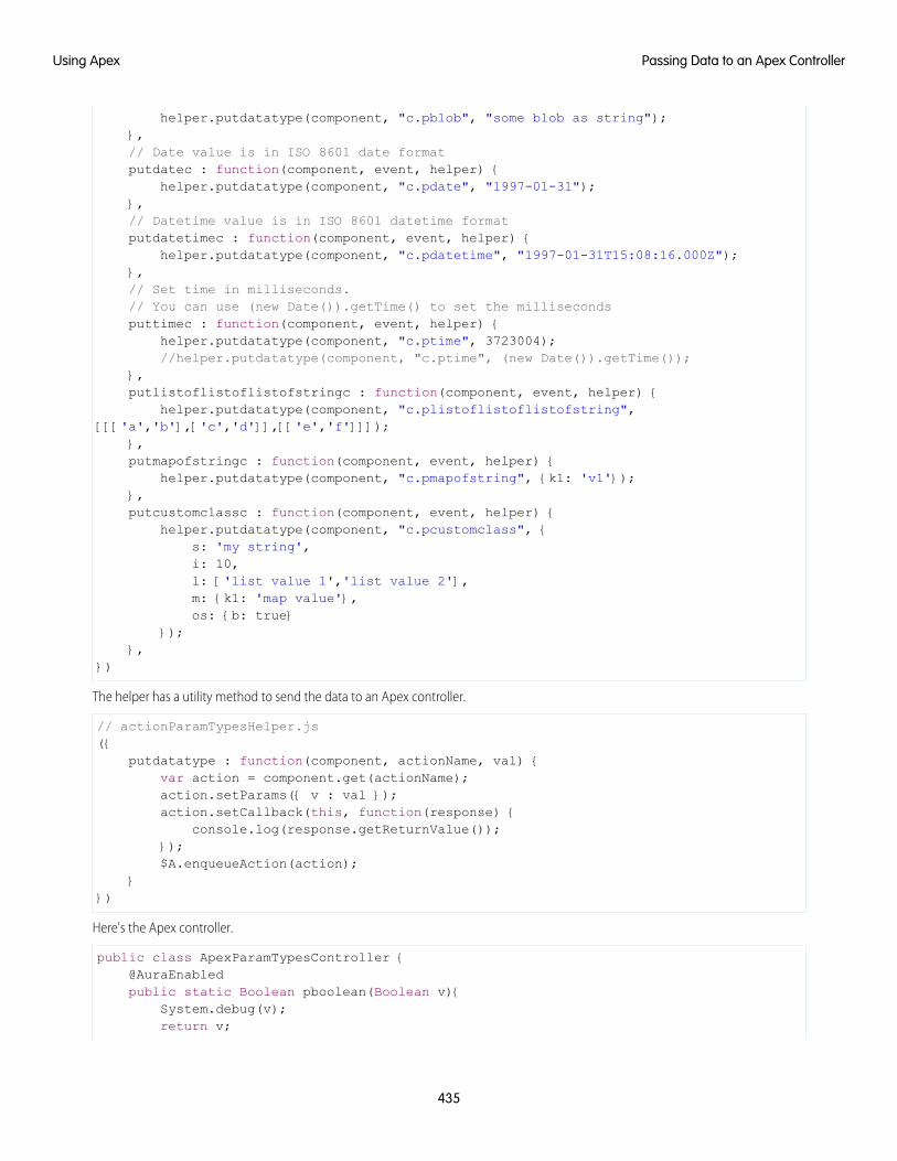
helper.putdatatype(component, "c.pblob", "some blob as string");},// Date value is in ISO 8601 date formatputdatec : function(component, event, helper) {
helper.putdatatype(component, "c.pdate", "1997-01-31");},// Datetime value is in ISO 8601 datetime formatputdatetimec : function(component, event, helper) {
helper.putdatatype(component, "c.pdatetime", "1997-01-31T15:08:16.000Z");},// Set time in milliseconds.// You can use (new Date()).getTime() to set the millisecondsputtimec : function(component, event, helper) {
helper.putdatatype(component, "c.ptime", 3723004);//helper.putdatatype(component, "c.ptime", (new Date()).getTime());
},putlistoflistoflistofstringc : function(component, event, helper) {
helper.putdatatype(component, "c.plistoflistoflistofstring",[[['a','b'],['c','d']],[['e','f']]]);
},putmapofstringc : function(component, event, helper) {
helper.putdatatype(component, "c.pmapofstring", {k1: 'v1'});},putcustomclassc : function(component, event, helper) {
helper.putdatatype(component, "c.pcustomclass", {s: 'my string',i: 10,l: ['list value 1','list value 2'],m: {k1: 'map value'},os: {b: true}
});},
})
The helper has a utility method to send the data to an Apex controller.
// actionParamTypesHelper.js({
putdatatype : function(component, actionName, val) {var action = component.get(actionName);action.setParams({ v : val });action.setCallback(this, function(response) {
console.log(response.getReturnValue());});$A.enqueueAction(action);
}})
Here's the Apex controller.
public class ApexParamTypesController {@AuraEnabledpublic static Boolean pboolean(Boolean v){
System.debug(v);return v;
435
Passing Data to an Apex ControllerUsing Apex
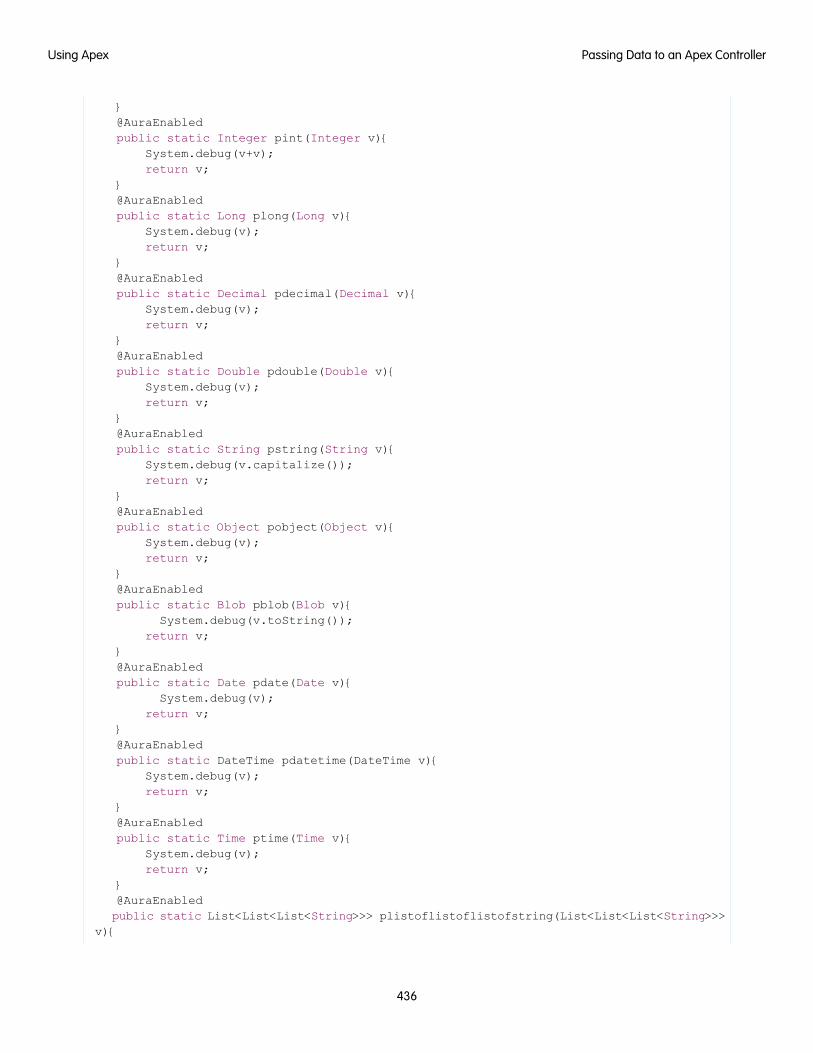
}@AuraEnabledpublic static Integer pint(Integer v){
System.debug(v+v);return v;
}@AuraEnabledpublic static Long plong(Long v){
System.debug(v);return v;
}@AuraEnabledpublic static Decimal pdecimal(Decimal v){
System.debug(v);return v;
}@AuraEnabledpublic static Double pdouble(Double v){
System.debug(v);return v;
}@AuraEnabledpublic static String pstring(String v){
System.debug(v.capitalize());return v;
}@AuraEnabledpublic static Object pobject(Object v){
System.debug(v);return v;
}@AuraEnabledpublic static Blob pblob(Blob v){
System.debug(v.toString());return v;
}@AuraEnabledpublic static Date pdate(Date v){
System.debug(v);return v;
}@AuraEnabledpublic static DateTime pdatetime(DateTime v){
System.debug(v);return v;
}@AuraEnabledpublic static Time ptime(Time v){
System.debug(v);return v;
}@AuraEnabledpublic static List<List<List<String>>> plistoflistoflistofstring(List<List<List<String>>>
v){
436
Passing Data to an Apex ControllerUsing Apex
System.debug(v);return v;
}@AuraEnabledpublic static Map<String, String> pmapofstring(Map<String, String> v){
System.debug(v);return v;
}@AuraEnabledpublic static MyCustomApexClass pcustomclass(MyCustomApexClass v){
System.debug(v);return v;
}}
The pcustomclass() Apex method has a parameter that's a custom Apex type, MyCustomApexClass. Each property in theApex class must have an @AuraEnabled annotation, as well as a getter and setter.
public class MyCustomApexClass {@AuraEnabledpublic String s {get; set;}@AuraEnabledpublic Integer i {get; set;}@AuraEnabledpublic List<String> l {get; set;}@AuraEnabledpublic Map <String, String> m {get; set;}@AuraEnabledpublic MyOtherCustomApexClass os {get; set;}
}
The MyCustomApexClass Apex class has a property with a type of another custom Apex class, MyOtherCustomApexClass.
public class MyOtherCustomApexClass {@AuraEnabledpublic Boolean b {get; set;}
}
SEE ALSO:
Queueing of Server-Side Actions
Apex Server-Side Controller Overview
Returning Data from an Apex Server-Side ControllerReturn results from a server-side controller to a client-side controller using the return statement. Results data must be serializableinto JSON format.
Return data types can be any of the following.
• Simple—String, Integer, and so on. See Basic Types for details.
• sObject—standard and custom sObjects are both supported. See Standard and Custom Object Types.
• Apex—an instance of an Apex class. (Most often a custom class.) See Custom Apex Class Types.
• Collection—a collection of any of the other types. See Collection Types.
437
Returning Data from an Apex Server-Side ControllerUsing Apex

Returning Apex ObjectsHere’s an example of a controller that returns a collection of custom Apex objects.
public with sharing class SimpleAccountController {
@AuraEnabledpublic static List<SimpleAccount> getAccounts() {
// Perform isAccessible() check here
// SimpleAccount is a simple "wrapper" Apex class for transportList<SimpleAccount> simpleAccounts = new List<SimpleAccount>();
List<Account> accounts = [SELECT Id, Name, Phone FROM Account LIMIT 5];for (Account acct : accounts) {
simpleAccounts.add(new SimpleAccount(acct.Id, acct.Name, acct.Phone));}
return simpleAccounts;}
}
When an instance of an Apex class is returned from a server-side action, the instance is serialized to JSON by the framework. Only thevalues of public instance properties and methods annotated with @AuraEnabled are serialized and returned.
For example, here’s a simple “wrapper” Apex class that contains a few details for an account record. This class is used to package a fewdetails of an account record in a serializable format.
public class SimpleAccount {
@AuraEnabled public String Id { get; set; }@AuraEnabled public String Name { get; set; }public String Phone { get; set; }
// Trivial constructor, for server-side Apex -> client-side JavaScriptpublic SimpleAccount(String id, String name, String phone) {
this.Id = id;this.Name = name;this.Phone = phone;
}
// Default, no-arg constructor, for client-side -> server-sidepublic SimpleAccount() {}
}
When returned from a remote Apex controller action, the Id and Name properties are defined on the client-side. However, because itdoesn’t have the @AuraEnabled annotation, the Phone property isn’t serialized on the server side, and isn’t returned as part of theresult data.
SEE ALSO:
AuraEnabled Annotation
Custom Apex Class Types
438
Returning Data from an Apex Server-Side ControllerUsing Apex
Returning Errors from an Apex Server-Side ControllerCreate and throw a System.AuraHandledException from your server-side controller to return a custom error message.
Errors happen. Sometimes they’re expected, such as invalid input from a user, or a duplicate record in a database. Sometimes they’reunexpected, such as... Well, if you’ve been programming for any length of time, you know that the range of unexpected errors is nearlyinfinite.
When your server-side controller code experiences an error, two things can happen. You can catch it there and handle it in Apex.Otherwise, the error is passed back in the controller’s response.
If you handle the error Apex, you again have two ways you can go. You can process the error, perhaps recovering from it, and return anormal response to the client. Or, you can create and throw an AuraHandledException.
The benefit of throwing AuraHandledException, instead of letting a system exception be returned, is that you have a chanceto handle the exception more gracefully in your client code. System exceptions have important details stripped out for security purposes,and result in the dreaded “An internal server error has occurred…” message. Nobody likes that. When you use anAuraHandledException you have an opportunity to add some detail back into the response returned to your client-side code.More importantly, you can choose a better message to show your users.
Here’s an example of creating and throwing an AuraHandledException in response to bad input. However, the real benefit ofusing AuraHandledException comes when you use it in response to a system exception. For example, throw anAuraHandledException in response to catching a DML exception, instead of allowing that to propagate down to your clientcomponent code.
public with sharing class SimpleErrorController {
static final List<String> BAD_WORDS = new List<String> {'bad','words','here'
};
@AuraEnabledpublic static String helloOrThrowAnError(String name) {
// Make sure we're not seeing something naughtyfor(String badWordStem : BAD_WORDS) {
if(name.containsIgnoreCase(badWordStem)) {// How rude! Gracefully return an error...throw new AuraHandledException('NSFW name detected.');
}}
// No bad word found, so...return ('Hello ' + name + '!');
}
}
Queueing of Server-Side ActionsThe framework queues up actions before sending them to the server. This mechanism is largely transparent to you when you’re writingcode but it enables the framework to minimize network traffic by batching multiple actions into one request (XHR).
439
Returning Errors from an Apex Server-Side ControllerUsing Apex

The batching of actions is also known as boxcar’ing, similar to a train that couples boxcars together.
The framework uses a stack to keep track of the actions to send to the server. When the browser finishes processing events and JavaScripton the client, the enqueued actions on the stack are sent to the server in a batch.
Tip: If your action is not executing, make sure that you’re not executing code outside the framework’s normal rerendering lifecycle.For example, if you use window.setTimeout() in an event handler to execute some logic after a time delay, wrap yourcode in $A.getCallback().
There are some properties that you can set on an action to influence how the framework manages the action while it’s in the queuewaiting to be sent to the server. For more information, see:
• Foreground and Background Actions on page 440
• Storable Actions on page 441
• Abortable Actions on page 445
SEE ALSO:
Modifying Components Outside the Framework Lifecycle
Foreground and Background ActionsForeground actions are the default. An action can be marked as a background action. This is useful when you want your app to remainresponsive to a user while it executes a low priority, long-running action. A rough guideline is to use a background action if it takes morethan five seconds for the response to return from the server.
Batching of ActionsMultiple queued foreground actions are batched in a single request (XHR) to minimize network traffic. The batching of actions is alsoknown as boxcar’ing, similar to a train that couples boxcars together.
The server sends the XHR response to the client when all actions have been processed on the server. If a long-running action is in theboxcar, the XHR response is held until that long-running action completes. Marking an action as background results in that action beingsent separately from any foreground actions. The separate transmission ensures that the background action doesn’t impact the responsetime of the foreground actions.
When the server-side actions in the queue are executed, the foreground actions execute first and then the background actions execute.Background actions run in parallel with foreground actions and responses of foreground and background actions may come back ineither order.
We don’t make any guarantees for the order of execution of action callbacks. XHR responses may return in a different order than theorder in which the XHR requests were sent due to server processing time.
Note: Don’t rely on each background action being sent in its own request as that behavior isn’t guaranteed and it can lead toperformance issues. Remember that the motivation for background actions is to isolate long-running requests into a separaterequest to avoid slowing the response for foreground actions.
If two actions must be executed sequentially, the component must orchestrate the ordering. The component can enqueue the firstaction. In the first action’s callback, the component can then enqueue the second action.
Framework-Managed Request ThrottlingThe framework throttles foreground and background requests separately. This means that the framework can control the number offoreground requests and the number of background actions running at any time. The framework automatically throttles requests and
440
Foreground and Background ActionsUsing Apex

it’s not user controlled. The framework manages the number of foreground and background XHRs, which varies depending on availableresources.
Even with separate throttling, background actions might affect performance in some conditions, such as an excessive number of requeststo the server.
Setting Background ActionsTo set an action as a background action, call the setBackground() method on the action object in JavaScript.
// set up the server-action actionvar action = cmp.get("c.serverEcho");// optionally set actions params//action.setParams({ firstName : cmp.get("v.firstName") });// set as a background actionaction.setBackground();
Note: A background action can’t be set back to a foreground action. In other words, calling setBackground to set it tofalse will have no effect.
SEE ALSO:
Queueing of Server-Side Actions
Calling a Server-Side Action
Storable ActionsEnhance your component’s performance by marking actions as storable (cacheable) to quickly show cached data from client-side storagewithout waiting for a server trip. If the cached data is stale, the framework retrieves the latest data from the server. Caching is especiallybeneficial for users on high latency, slow, or unreliable connections such as 3G networks.
Warning:
• A storable action might result in no call to the server. Never mark as storable an action that updates or deletes data.
• For storable actions in the cache, the framework returns the cached response immediately and also refreshes the data if it’sstale. Therefore, storable actions might have their callbacks invoked more than once: first with cached data, then with updateddata from the server.
Most server requests are read-only and idempotent, which means that a request can be repeated or retried as often as necessary withoutcausing data changes. The responses to idempotent actions can be cached and quickly reused for subsequent identical actions. Forstorable actions, the key for determining an identical action is a combination of:
• Apex controller name
• Method name
• Method parameter values
441
Storable ActionsUsing Apex
Marking an Action as StorableTo cache data returned from an Apex method for any component with an API version of 44.0 or higher, you must annotate the Apexmethod with @AuraEnabled(cacheable=true). For example:
@AuraEnabled(cacheable=true)public static Account getAccount(Id accountId) {
// your code here}
Prior to API version 44.0, to cache data returned from an Apex method, you had to call setStorable() in JavaScript code on everyaction that called the Apex method. For API version of 44.0 or higher, you can mark the Apex method as storable (cacheable) and getrid of any setStorable() calls in JavaScript code. The Apex annotation approach is better because it centralizes your cachingnotation for a method in the Apex class.
Call setStorable() on an action in JavaScript code, as follows.
action.setStorable();
The setStorable function takes an optional argument, which is a configuration map of key-value pairs representing the storageoptions and values to set. You can only set the following property:
ignoreExistingSet to true to bypass the cache. The default value is false.
This property is useful when you know that any cached data is invalid, such as after a record modification. This property should beused rarely because it explicitly defeats caching.
To set the storage options for the action response, pass this configuration map into setStorable(configObj).
IN THIS SECTION:
Lifecycle of Storable Actions
This image describes the sequence of callback execution for storable actions.
Enable Storable Actions in an Application
Storable actions are automatically configured in Lightning Experience and the Salesforce mobile app. To use storable actions in astandalone app (.app resource), you must configure client-side storage for cached action responses.
Storage Service Adapters
The Storage Service supports multiple implementations of storage and selects an adapter at runtime based on browser support andspecified characteristics of persistence and security. Storage can be persistent and secure. With persistent storage, cached data ispreserved between user sessions in the browser. With secure storage, cached data is encrypted.
Lifecycle of Storable ActionsThis image describes the sequence of callback execution for storable actions.
Note: An action might have its callback invoked more than once:
• First with the cached response, if it’s in storage.
• Second with updated data from the server, if the stored response has exceeded the time to refresh entries.
442
Storable ActionsUsing Apex
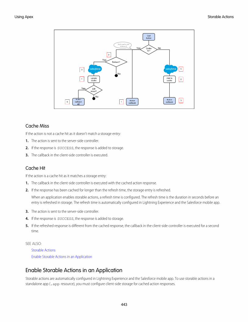
Cache MissIf the action is not a cache hit as it doesn’t match a storage entry:
1. The action is sent to the server-side controller.
2. If the response is SUCCESS, the response is added to storage.
3. The callback in the client-side controller is executed.
Cache HitIf the action is a cache hit as it matches a storage entry:
1. The callback in the client-side controller is executed with the cached action response.
2. If the response has been cached for longer than the refresh time, the storage entry is refreshed.
When an application enables storable actions, a refresh time is configured. The refresh time is the duration in seconds before anentry is refreshed in storage. The refresh time is automatically configured in Lightning Experience and the Salesforce mobile app.
3. The action is sent to the server-side controller.
4. If the response is SUCCESS, the response is added to storage.
5. If the refreshed response is different from the cached response, the callback in the client-side controller is executed for a secondtime.
SEE ALSO:
Storable Actions
Enable Storable Actions in an Application
Enable Storable Actions in an ApplicationStorable actions are automatically configured in Lightning Experience and the Salesforce mobile app. To use storable actions in astandalone app (.app resource), you must configure client-side storage for cached action responses.
443
Storable ActionsUsing Apex
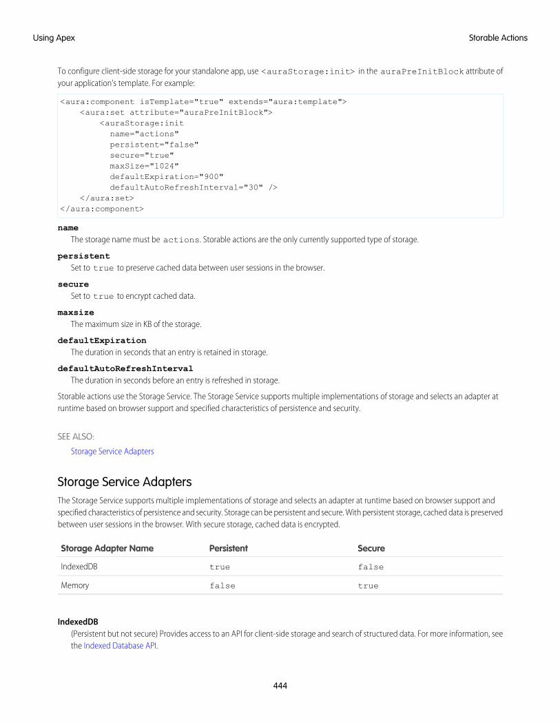
To configure client-side storage for your standalone app, use <auraStorage:init> in the auraPreInitBlock attribute ofyour application’s template. For example:
<aura:component isTemplate="true" extends="aura:template"><aura:set attribute="auraPreInitBlock">
<auraStorage:initname="actions"persistent="false"secure="true"maxSize="1024"defaultExpiration="900"defaultAutoRefreshInterval="30" />
</aura:set></aura:component>
nameThe storage name must be actions. Storable actions are the only currently supported type of storage.
persistentSet to true to preserve cached data between user sessions in the browser.
secureSet to true to encrypt cached data.
maxsizeThe maximum size in KB of the storage.
defaultExpirationThe duration in seconds that an entry is retained in storage.
defaultAutoRefreshIntervalThe duration in seconds before an entry is refreshed in storage.
Storable actions use the Storage Service. The Storage Service supports multiple implementations of storage and selects an adapter atruntime based on browser support and specified characteristics of persistence and security.
SEE ALSO:
Storage Service Adapters
Storage Service AdaptersThe Storage Service supports multiple implementations of storage and selects an adapter at runtime based on browser support andspecified characteristics of persistence and security. Storage can be persistent and secure. With persistent storage, cached data is preservedbetween user sessions in the browser. With secure storage, cached data is encrypted.
SecurePersistentStorage Adapter Name
falsetrueIndexedDB
truefalseMemory
IndexedDB(Persistent but not secure) Provides access to an API for client-side storage and search of structured data. For more information, seethe Indexed Database API.
444
Storable ActionsUsing Apex

Memory(Not persistent but secure) Provides access to JavaScript memory for caching data. The stored cache persists only per browser page.Browsing to a new page resets the cache.
The Storage Service selects a storage adapter on your behalf that matches the persistent and secure options you specify when initializingthe service. For example, if you request a persistent and insecure storage service, the Storage Service returns the IndexedDB storage ifthe browser supports it.
Abortable ActionsMark an action as abortable to make it potentially abortable while it's queued to be sent to the server. An abortable action in the queueis not sent to the server if the component that created the action is no longer valid, that is cmp.isValid() == false. A componentis automatically destroyed and marked invalid by the framework when it is unrendered.
Note: We recommend that you only use abortable actions for read-only operations as they are not guaranteed to be sent to theserver.
An abortable action is sent to the server and executed normally unless the component that created the action is invalid before the actionis sent to the server.
A non-abortable action is always sent to the server and can't be aborted in the queue.
If an action response returns from the server and the associated component is now invalid, the logic has been executed on the serverbut the action callback isn’t executed. This is true whether or not the action is marked as abortable.
Marking an Action as AbortableMark a server-side action as abortable by using the setAbortable() method on the Action object in JavaScript. For example:
var action = cmp.get("c.serverEcho");action.setAbortable();
SEE ALSO:
Creating Server-Side Logic with Controllers
Queueing of Server-Side Actions
Calling a Server-Side Action
Testing Your Apex Code
Before you can upload a managed package, you must write and execute tests for your Apex code to meet minimum code coveragerequirements. Also, all tests must run without errors when you upload your package to AppExchange.
To package your application and components that depend on Apex code, the following must be true.
• Unit tests must cover at least 75% of your Apex code, and all of those tests must complete successfully.
Note the following.
– When deploying Apex to a production organization, each unit test in your organization namespace is executed by default.
– Calls to System.debug are not counted as part of Apex code coverage.
– Test methods and test classes are not counted as part of Apex code coverage.
445
Abortable ActionsUsing Apex
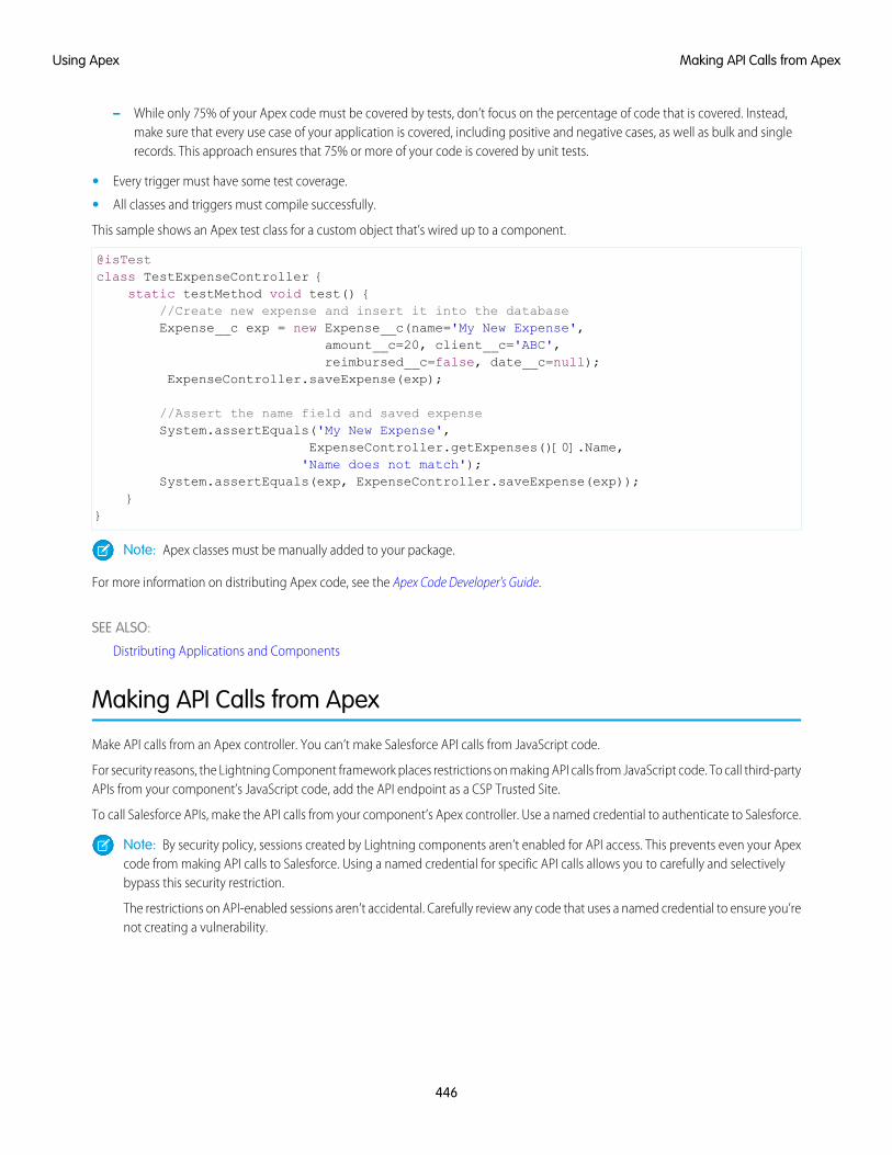
– While only 75% of your Apex code must be covered by tests, don’t focus on the percentage of code that is covered. Instead,make sure that every use case of your application is covered, including positive and negative cases, as well as bulk and singlerecords. This approach ensures that 75% or more of your code is covered by unit tests.
• Every trigger must have some test coverage.
• All classes and triggers must compile successfully.
This sample shows an Apex test class for a custom object that’s wired up to a component.
@isTestclass TestExpenseController {
static testMethod void test() {//Create new expense and insert it into the databaseExpense__c exp = new Expense__c(name='My New Expense',
amount__c=20, client__c='ABC',reimbursed__c=false, date__c=null);
ExpenseController.saveExpense(exp);
//Assert the name field and saved expenseSystem.assertEquals('My New Expense',
ExpenseController.getExpenses()[0].Name,'Name does not match');
System.assertEquals(exp, ExpenseController.saveExpense(exp));}
}
Note: Apex classes must be manually added to your package.
For more information on distributing Apex code, see the Apex Code Developer's Guide.
SEE ALSO:
Distributing Applications and Components
Making API Calls from Apex
Make API calls from an Apex controller. You can’t make Salesforce API calls from JavaScript code.
For security reasons, the Lightning Component framework places restrictions on making API calls from JavaScript code. To call third-partyAPIs from your component’s JavaScript code, add the API endpoint as a CSP Trusted Site.
To call Salesforce APIs, make the API calls from your component’s Apex controller. Use a named credential to authenticate to Salesforce.
Note: By security policy, sessions created by Lightning components aren’t enabled for API access. This prevents even your Apexcode from making API calls to Salesforce. Using a named credential for specific API calls allows you to carefully and selectivelybypass this security restriction.
The restrictions on API-enabled sessions aren’t accidental. Carefully review any code that uses a named credential to ensure you’renot creating a vulnerability.
446
Making API Calls from ApexUsing Apex
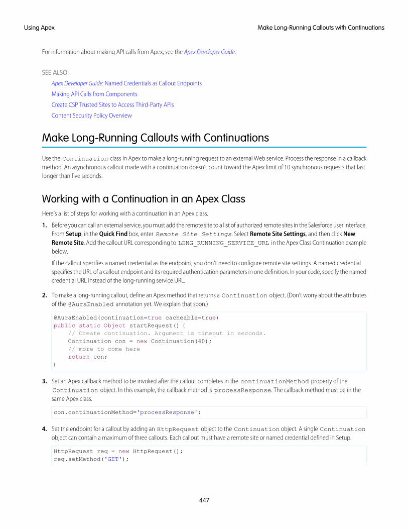
For information about making API calls from Apex, see the Apex Developer Guide.
SEE ALSO:
Apex Developer Guide: Named Credentials as Callout Endpoints
Making API Calls from Components
Create CSP Trusted Sites to Access Third-Party APIs
Content Security Policy Overview
Make Long-Running Callouts with Continuations
Use the Continuation class in Apex to make a long-running request to an external Web service. Process the response in a callbackmethod. An asynchronous callout made with a continuation doesn’t count toward the Apex limit of 10 synchronous requests that lastlonger than five seconds.
Working with a Continuation in an Apex ClassHere’s a list of steps for working with a continuation in an Apex class.
1. Before you can call an external service, you must add the remote site to a list of authorized remote sites in the Salesforce user interface.From Setup, in the Quick Find box, enter Remote Site Settings. Select Remote Site Settings, and then click NewRemote Site. Add the callout URL corresponding to LONG_RUNNING_SERVICE_URL in the Apex Class Continuation examplebelow.
If the callout specifies a named credential as the endpoint, you don’t need to configure remote site settings. A named credentialspecifies the URL of a callout endpoint and its required authentication parameters in one definition. In your code, specify the namedcredential URL instead of the long-running service URL.
2. To make a long-running callout, define an Apex method that returns a Continuation object. (Don’t worry about the attributesof the @AuraEnabled annotation yet. We explain that soon.)
@AuraEnabled(continuation=true cacheable=true)public static Object startRequest() {
// Create continuation. Argument is timeout in seconds.Continuation con = new Continuation(40);// more to come herereturn con;
}
3. Set an Apex callback method to be invoked after the callout completes in the continuationMethod property of theContinuation object. In this example, the callback method is processResponse. The callback method must be in thesame Apex class.
con.continuationMethod='processResponse';
4. Set the endpoint for a callout by adding an HttpRequest object to the Continuation object. A single Continuationobject can contain a maximum of three callouts. Each callout must have a remote site or named credential defined in Setup.
HttpRequest req = new HttpRequest();req.setMethod('GET');
447
Make Long-Running Callouts with ContinuationsUsing Apex

req.setEndpoint(LONG_RUNNING_SERVICE_URL);con.addHttpRequest(req);
5. Set data to pass to the callback method in the state property of the Continuation object. The state property has anObject type so you can pass in any data type that’s supported in Apex.
con.state='Hello, World!';
6. Code the logic in the Apex callback. When all the callouts set in the Continuation object have completed, the Apex callbackmethod, processResponse, is invoked. The callback method has two parameters that you can access.
public static Object processResponse(List<String> labels, Object state)
a. labels—A list of labels, one for each request in the continuation. These labels are automatically created.
b. state—The state that you set in the state property in your Continuation object.
7. Get the response for each request in the continuation. For example:
HttpResponse response = Continuation.getResponse(labels[0]);
8. Return the results to the JavaScript controller.
Complete Apex Class Example with ContinuationHere’s a complete Apex class that ties together all the earlier steps.
public with sharing class SampleContinuationClass {// Callout endpoint as a named credential URL// or, as shown here, as the long-running service URLprivate static final String LONG_RUNNING_SERVICE_URL =
'<insert your callout URL here>';
// Action method@AuraEnabled(continuation=true cacheable=true)public static Object startRequest() {// Create continuation. Argument is timeout in seconds.Continuation con = new Continuation(40);// Set callback methodcon.continuationMethod='processResponse';// Set statecon.state='Hello, World!';// Create callout requestHttpRequest req = new HttpRequest();req.setMethod('GET');req.setEndpoint(LONG_RUNNING_SERVICE_URL);// Add callout request to continuationcon.addHttpRequest(req);// Return the continuationreturn con;
}
// Callback method@AuraEnabled(cacheable=true)public static Object processResponse(List<String> labels, Object state) {
448
Make Long-Running Callouts with ContinuationsUsing Apex
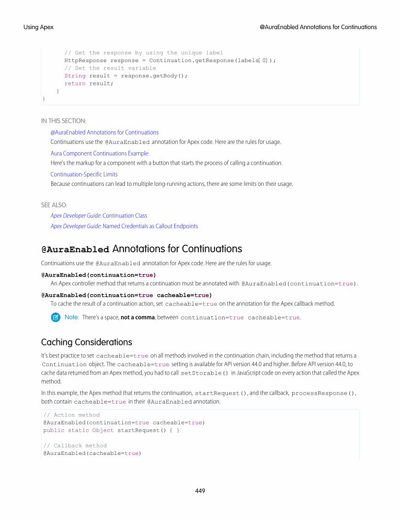
// Get the response by using the unique labelHttpResponse response = Continuation.getResponse(labels[0]);// Set the result variableString result = response.getBody();return result;
}}
IN THIS SECTION:
@AuraEnabled Annotations for Continuations
Continuations use the @AuraEnabled annotation for Apex code. Here are the rules for usage.
Aura Component Continuations Example
Here’s the markup for a component with a button that starts the process of calling a continuation.
Continuation-Specific Limits
Because continuations can lead to multiple long-running actions, there are some limits on their usage.
SEE ALSO:
Apex Developer Guide: Continuation Class
Apex Developer Guide: Named Credentials as Callout Endpoints
@AuraEnabled Annotations for ContinuationsContinuations use the @AuraEnabled annotation for Apex code. Here are the rules for usage.
@AuraEnabled(continuation=true)An Apex controller method that returns a continuation must be annotated with @AuraEnabled(continuation=true).
@AuraEnabled(continuation=true cacheable=true)To cache the result of a continuation action, set cacheable=true on the annotation for the Apex callback method.
Note: There’s a space, not a comma, between continuation=true cacheable=true.
Caching ConsiderationsIt's best practice to set cacheable=true on all methods involved in the continuation chain, including the method that returns aContinuation object. The cacheable=true setting is available for API version 44.0 and higher. Before API version 44.0, tocache data returned from an Apex method, you had to call setStorable() in JavaScript code on every action that called the Apexmethod.
In this example, the Apex method that returns the continuation, startRequest(), and the callback, processResponse(),both contain cacheable=true in their @AuraEnabled annotation.
// Action method@AuraEnabled(continuation=true cacheable=true)public static Object startRequest() { }
// Callback method@AuraEnabled(cacheable=true)
449
@AuraEnabled Annotations for ContinuationsUsing Apex
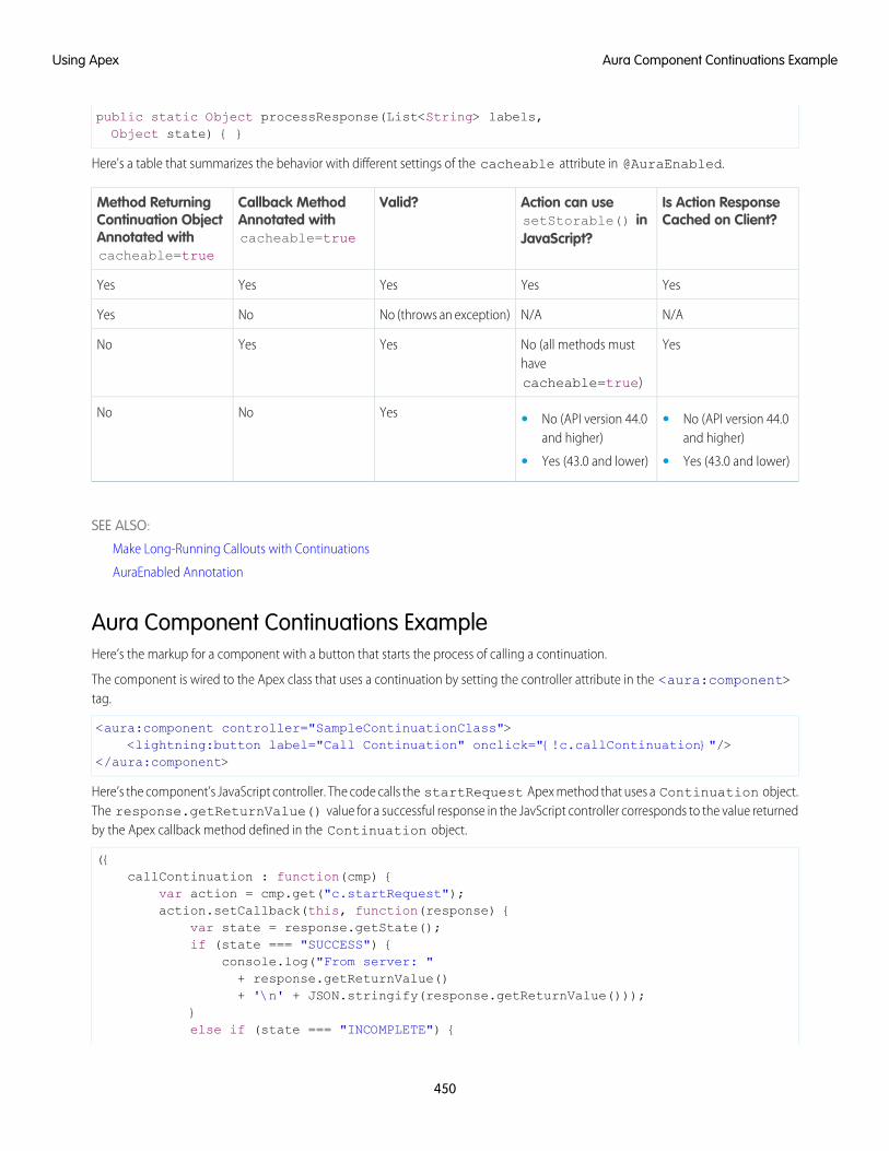
public static Object processResponse(List<String> labels,Object state) { }
Here's a table that summarizes the behavior with different settings of the cacheable attribute in @AuraEnabled.
Is Action ResponseCached on Client?
Action can usesetStorable() inJavaScript?
Valid?Callback MethodAnnotated withcacheable=true
Method ReturningContinuation ObjectAnnotated withcacheable=true
YesYesYesYesYes
N/AN/ANo (throws an exception)NoYes
YesNo (all methods musthavecacheable=true)
YesYesNo
YesNoNo • No (API version 44.0and higher)
• No (API version 44.0and higher)
• •Yes (43.0 and lower) Yes (43.0 and lower)
SEE ALSO:
Make Long-Running Callouts with Continuations
AuraEnabled Annotation
Aura Component Continuations ExampleHere’s the markup for a component with a button that starts the process of calling a continuation.
The component is wired to the Apex class that uses a continuation by setting the controller attribute in the <aura:component>tag.
<aura:component controller="SampleContinuationClass"><lightning:button label="Call Continuation" onclick="{!c.callContinuation}"/>
</aura:component>
Here’s the component’s JavaScript controller. The code calls the startRequest Apex method that uses a Continuation object.The response.getReturnValue() value for a successful response in the JavScript controller corresponds to the value returnedby the Apex callback method defined in the Continuation object.
({callContinuation : function(cmp) {
var action = cmp.get("c.startRequest");action.setCallback(this, function(response) {
var state = response.getState();if (state === "SUCCESS") {
console.log("From server: "+ response.getReturnValue()+ '\n' + JSON.stringify(response.getReturnValue()));
}else if (state === "INCOMPLETE") {
450
Aura Component Continuations ExampleUsing Apex
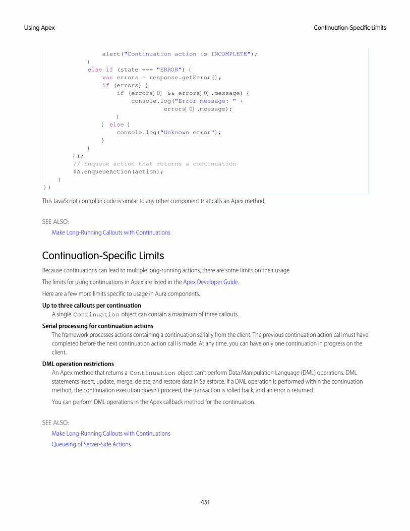
alert("Continuation action is INCOMPLETE");}else if (state === "ERROR") {
var errors = response.getError();if (errors) {
if (errors[0] && errors[0].message) {console.log("Error message: " +
errors[0].message);}
} else {console.log("Unknown error");
}}
});// Enqueue action that returns a continuation$A.enqueueAction(action);
}})
This JavaScript controller code is similar to any other component that calls an Apex method.
SEE ALSO:
Make Long-Running Callouts with Continuations
Continuation-Specific LimitsBecause continuations can lead to multiple long-running actions, there are some limits on their usage.
The limits for using continuations in Apex are listed in the Apex Developer Guide.
Here are a few more limits specific to usage in Aura components.
Up to three callouts per continuationA single Continuation object can contain a maximum of three callouts.
Serial processing for continuation actionsThe framework processes actions containing a continuation serially from the client. The previous continuation action call must havecompleted before the next continuation action call is made. At any time, you can have only one continuation in progress on theclient.
DML operation restrictionsAn Apex method that returns a Continuation object can’t perform Data Manipulation Language (DML) operations. DMLstatements insert, update, merge, delete, and restore data in Salesforce. If a DML operation is performed within the continuationmethod, the continuation execution doesn’t proceed, the transaction is rolled back, and an error is returned.
You can perform DML operations in the Apex callback method for the continuation.
SEE ALSO:
Make Long-Running Callouts with Continuations
Queueing of Server-Side Actions
451
Continuation-Specific LimitsUsing Apex
Creating Components in Apex
Creating components on the server side in Apex, using the Cmp.<myNamespace>.<myComponent> syntax, is deprecated. Use$A.createComponent() in client-side JavaScript code instead.
SEE ALSO:
Dynamically Creating Components
452
Creating Components in ApexUsing Apex
CHAPTER 12 Testing Components with Lightning Testing Service
Use Lightning Testing Service (LTS) to ensure your components perform as expected. LTS is a full suiteof tools and services integrated with Salesforce DX to make testing easy.
In this chapter ...
• How LightningTesting Service Works Automated tests are the best way to achieve predictable, repeatable assessments of the quality of your
custom code. Writing automated tests for your custom components gives you confidence that they• Install Lightning
Testing Servicework as designed, and allows you to evaluate the impact of changes, such as refactoring, or of newversions of Salesforce or third-party JavaScript libraries.
• Get Started withLightning TestingService
LTS supports testing with standard JavaScript test frameworks. It provides easy-to-use wrappers for usingJasmine and Mocha. If you prefer to use an alternative test framework, you can wrap it yourself.
• Explore the ExampleTest Suites
• Write Your Own Tests
• Use OtherFrameworks
453
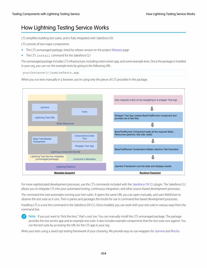
How Lightning Testing Service Works
LTS simplifies building test suites, and is fully integrated with Salesforce DX.
LTS consists of two major components:
• The LTS unmanaged package, listed by release version on the project Releases page
• The LTS install command for the Salesforce CLI
The unmanaged package includes LTS infrastructure, including a test runner app, and some example tests. Once the package is installedin your org, you can run the example tests by going to the following URL:
yourInstance/c/jasmineTests.app
When you run tests manually in a browser, you’re using only the pieces of LTS provided in the package.
For more sophisticated development processes, use the LTS commands included with the Salesforce DX CLI plugin. The Salesforce CLIallows you to integrate LTS into your automated testing, continuous integration, and other source-based development processes.
The command line tool automates running your test suites. It opens the same URL you can open manually, and uses WebDriver toobserve the test suite as it runs. Then it parses and packages the results for use in command line-based development processes.
Installing LTS is a one line command in the Salesforce DX CLI. Once installed, you can work with your test suite in various ways from thecommand line.
Note: If you just want to “kick the tires,” that's cool, too. You can manually install the LTS unmanaged package. The packageprovides the test service app and an example test suite. It also includes example components that the test suite runs against. Yourun the test suite by accessing the URL for the LTS app in your org.
Write your tests using a JavaScript testing framework of your choosing. We provide easy-to-use wrappers for Jasmine and Mocha.
454
How Lightning Testing Service WorksTesting Components with Lightning Testing Service
A simple Jasmine test spec looks like the following:
/*** This is a 'hello world' Jasmine test spec*/describe("A simple passing test", function() {
it("checks that true is always true", function() {expect(true).toBe(true);
});});
A Mocha test looks similar.
/*** This is a 'hello world' Mocha test*/var assert = require('assert');
describe('A simple passing test', function() {it('checks that true is always true', function() {
assert.equal(true, true);});
});
You can write your own wrapper if you prefer a different testing framework. It's not hard, but plan on half a day to a day of work.
LTS also provides utilities specific to the Lightning Component framework, which let you test behavior specific to Lightning components.Details are explained in comments in the example tests.
Your test suite is deployed in the form of an archive (zip) static resource. Once LTS is installed and configured, you make changes to yourtest suite, create the archive, and upload it to your org. Once uploaded you can run the test suite via the command line or via URL.
Warning: Don't run tests in your production org. LTS doesn't provide an isolated test context or transaction wrapper. DMLoperations you perform in your tests won't be rolled back at the end of the test. We recommend that you run your LTStest suites only in scratch orgs, using data provided by the test suite itself.
Install Lightning Testing Service
You have two ways to install LTS. The simplest way is to use the Salesforce DX CLI. If you're not using Salesforce DX, you can manuallyinstall the unmanaged package.
Use Salesforce DX to Install Lightning Testing ServiceSalesforce DX includes a one line command for automatically installing the LTS unmanaged package. The Salesforce DX CLI also allowsyou to use the sfdx command line tool to perform automated testing as part of your development process, including automatedprocess, such as continuous integration.
1. If you haven’t already, enable Dev Hub in your org.
2. Install the Salesforce CLI and verify your installation.
3. Verify that the Salesforce DX CLI plug-in is updated.
sfdx update
455
Install Lightning Testing ServiceTesting Components with Lightning Testing Service
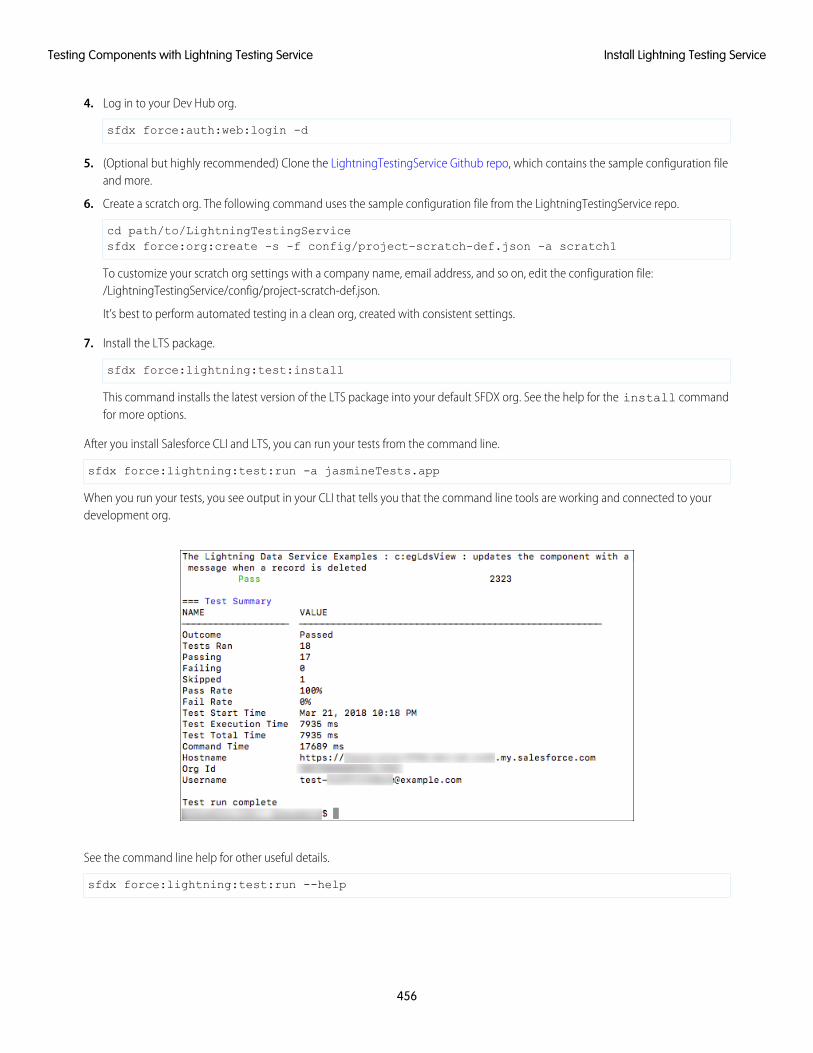
4. Log in to your Dev Hub org.
sfdx force:auth:web:login -d
5. (Optional but highly recommended) Clone the LightningTestingService Github repo, which contains the sample configuration fileand more.
6. Create a scratch org. The following command uses the sample configuration file from the LightningTestingService repo.
cd path/to/LightningTestingServicesfdx force:org:create -s -f config/project-scratch-def.json -a scratch1
To customize your scratch org settings with a company name, email address, and so on, edit the configuration file:/LightningTestingService/config/project-scratch-def.json.
It’s best to perform automated testing in a clean org, created with consistent settings.
7. Install the LTS package.
sfdx force:lightning:test:install
This command installs the latest version of the LTS package into your default SFDX org. See the help for the install commandfor more options.
After you install Salesforce CLI and LTS, you can run your tests from the command line.
sfdx force:lightning:test:run -a jasmineTests.app
When you run your tests, you see output in your CLI that tells you that the command line tools are working and connected to yourdevelopment org.
See the command line help for other useful details.
sfdx force:lightning:test:run --help
456
Install Lightning Testing ServiceTesting Components with Lightning Testing Service
Install Lightning Testing Service as an Unmanaged PackageIf you're not using Salesforce DX, you're missing a lot, but you can still use LTS. Installing the LTS package is just like installing any otherunmanaged package.
1. Log in to your org. We recommend that you use a new DE org for evaluating LTS.
2. Go to the project Releases page, and click the package installation URL for the latest release.
3. Authenticate again with the credentials for your DE org.
4. Follow the normal package installation prompts. We recommend installing the package for admins only.
LTS Package ContentsHowever you install it, the LTS package includes the following items:
1. Example test suites
• Jasmine JavaScript files in archive static resources
• Mocha JavaScript files in archive static resources
2. Example components to be tested
• Components, an Apex class, and a custom label
3. LTS infrastructure
• Jasmine framework and wrapper
• Mocha framework and wrapper
• LTS test utilities
• Test runner component
• Wrapper test app
Get Started with Lightning Testing Service
Let’s see LTS in action.
These steps assume you’ve already followed the Install Lightning Testing Service instructions.
1. From your project directory, create another scratch org using the configuration file from the cloned LightningTestingService repo.
sfdx force:org:create -s -f config/project-scratch-def.json -a scratch1
2. Push metadata to the scratch org.
sfdx force:source:push
3. Run tests.
sfdx force:org:open -p /c/jasmineTests.app
You see a screen that looks something like the following.
457
Get Started with Lightning Testing ServiceTesting Components with Lightning Testing Service
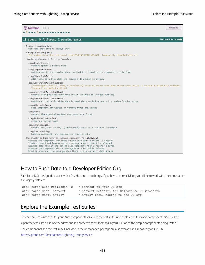
How to Push Data to a Developer Edition OrgSalesforce DX is designed to work with a Dev Hub and scratch orgs. If you have a normal DE org you’d like to work with, the commandsare slightly different.
sfdx force:auth:web:login -s # connect to your DE orgsfdx force:mdapi:convert # convert metadata for Salesforce DX projectssfdx force:mdapi:deploy # deploy local source to the DE org
Explore the Example Test Suites
To learn how to write tests for your Aura components, dive into the test suites and explore the tests and components side-by-side.
Open the test suite file in one window, and in another window (perhaps in your IDE) open the simple components being tested.
The components and the test suites included in the unmanaged package are also available in a repository on GitHub.
https://github.com/forcedotcom/LightningTestingService
458
Explore the Example Test SuitesTesting Components with Lightning Testing Service
Components for TestingAll of the testable components have names beginning with “eg” (from the abbreviation “e.g.”, meaning for example). They containextensive comments to guide you through each one. Access the components provided in the package as you would access any Auracomponent.
• In the Developer Console
• In the Force.com IDE, in the /aura/ directory
• By converting your org’s metadata into a format that you can work with locally, using Salesforce DX
• Directly from the LightningTestingService repo in the lightning-component-tests/main/default/aura directory.
We include more than a dozen components, designed to be used in illustrative tests. Each of the components has a description of itsbehavior in its .auradoc documentation file.
Test SuitesThe example tests are included in static resources. You can also review them directly in the LightningTestingService repo, in thelightning-component-tests/test/default/staticresources directory.
The LTS package includes four test suites, three for Jasmine and one for Mocha:
• jasmineHelloWorldTests.resource—A very simple Jasmine example including one passing and one failing test.
• jasmineExampleTests.resource—The main Jasmine example test suite.
• jasmineLightningDataServiceTests.resource—Some Jasmine examples specific to testing Lightning DataService-based components.
• mochaExampleTests.resource—The Mocha example test suite, which provides examples parallel to the main Jasminetest suite.
The jasmineExampleTests.resource and mochaExampleTests.resource files are each a single JavaScript filecontaining a complete test suite. These are single files for convenience in delivery and exploration. Your own test suites can includemany such files. The test suites are copiously commented to help you learn.
This directory also exposes the $T utility object. This object has methods that simplify routine testing operations. Notice that thesemethods are used throughout the example test scripts in the repo.
The remaining static resources are infrastructure used by LTS. They’re briefly described in Use Other Frameworks.
Write Your Own Tests
Lightning Testing Service guides you through broad testing coverage of a component’s expected behavior using the Jasmine or Mochatest frameworks.
While working with Aura components, consider writing tests for the following.
DOM renderingValidate that components are added where and when they should be.
Component stateEnsure that components respond as expected.
Server-side callback responseGet the right response from a call to another service or resource.
459
Write Your Own TestsTesting Components with Lightning Testing Service
Validation of variablesDo you have variable values that load from other sources, especially remote ones? Make sure that they do.
Conditional UI renderingVerify what users see when you want them to see it.
Event HandlingTest responses to events.
Fortunately, the LightningTestingService Github repo contains examples of all of these cases in the staticresources directory for bothJasmine and Mocha testing frameworks.
Jasmine is well documented here: https://jasmine.github.io and provides a simple setup.
Mocha is well documented here: https://mochajs.org. Mocha is newer and might require some plugins to get the results you want. Bothtest frameworks use a describe...it block structure.
Use an it function to define what you’re testing, and what you expect (or explicitly don’t expect) to happen. To provide a name forthe test, wrap each function in a describe block. Group it functions together within the block. Grouped functions can sharevariables and other values within the block.
describe("A suite that passes", function() {it("spec that verifies that true is true", function() {expect(true).toBe(true);
});it("spec that verifies that false is false", function() {expect(false).toBe(false);
});});
You could rearrange the test to have both it functions within the one describe function, or also test for the negative case:expect(true).not.toBe(false);
You have several options to get similar results. The key is to focus on the outcome of the it function.
For example, the jasmineHelloWorldTests.resource contains a unit test that validates a state change.
describe('c:egComponentMethod', function() {it("updates an attribute value when a method is invoked on the component's interface",
function(done) {$T.createComponent("c:egComponentMethod", null).then(function(component) {
component.sampleMethod();expect(component.get("v.status")).toBe("sampleMethod invoked");done();
}).catch(function(e) {done.fail(e);
});});
});
When you’ve written your test suite, use the CLI to push and run the tests.
460
Write Your Own TestsTesting Components with Lightning Testing Service
Use the $T Utility ObjectLTS includes the $T utility object. This object has methods that simplify routine testing operations. In the example above, the$T.createComponent() method creates the component with the descriptor c:egComponentMethod with no specific attributes.However, you can use the $T.createComponent() method to add attributes or insert the component into the DOM.
Learn moreThe LightningTestingService Github repo has ongoing solutions and discussions of known issues.
Use Other Frameworks
Create Aura component wrappers to use testing frameworks other than Jasmine or Mocha.
LTS provides a way to use standard JavaScript test frameworks with your Lightning components. We’ve provided the example test suitesimplemented in Jasmine and Mocha. These are well-regarded test frameworks, and if you haven’t chosen one already, we recommendyou start with one of them.
If you’d prefer to use another test framework, either because you’ve already selected one, or because you find something more to yourtaste, you can use it with LTS instead.
All of the packaged pieces of LTS are included in the project repository, in the lightning-component-tests/test/default directory. Tocreate a wrapper for another test framework, modify or replace these items from the Jasmine wrapper.
• aura/jasmineTests—The front end of LTS.is simple app includes the test runner component, and a list of test suites to feedit.
• aura/lts_jasmineRunnerthe test runner component for Jasmine. It includes references to the required Jasmine library,which it loads along with the test spec resources, and then fires the test runner.
• lts_jasmine.resourcethe Jasmine library, unmodified.
• lts_jasmineboot.resource JavaScript IIFE that launches Jasmine in the LTS context.
• lts_testutil.resource—A collection of utilities for use within your test specs, and by the test framework wrappers. Theyprovide Lightning component-specific functions that make it easier to test your custom components from a test context.
The Mocha version of the framework wrapper provides similar files. You might find the similarities and differences instructive in creatingyour own adapter for other frameworks.
461
Use Other FrameworksTesting Components with Lightning Testing Service
CHAPTER 13 Debugging
There are a few basic tools and techniques that can help you to debug applications.In this chapter ...Use Chrome DevTools to debug your client-side code.• Enable Debug Mode
for LightningComponents
• To open DevTools on Windows and Linux, press Control-Shift-I in your Google Chrome browser. OnMac, press Option-Command-I.
• Disable CachingSetting DuringDevelopment
• To quickly find which line of code is failing, enable the Pause on all exceptions option beforerunning your code.
To learn more about debugging JavaScript on Google Chrome, refer to the Google Chrome's DevToolswebsite.• Salesforce Lightning
Inspector ChromeExtension
• Log Messages
462
Enable Debug Mode for Lightning Components
EDITIONS
Available in: SalesforceClassic (not available in allorgs) and LightningExperience
Available for use in: ContactManager, Group,Professional, Enterprise,Performance, Unlimited,and Developer Editions
Create Lightningcomponents using the UI inEnterprise, Performance,Unlimited, DeveloperEditions, or a sandbox.
Enable debug mode to make it easier to debug JavaScript code from Lightning components. Onlyenable debug mode for users who are actively debugging JavaScript. Salesforce is slower for userswho have debug mode enabled.
The Lightning Component framework executes in one of two modes: production and debug.
Production Mode
By default, the framework runs in production mode. This mode is optimized for performance.Framework code is optimized and “minified” to reduce the size of the JavaScript code. As a resultof this process, the JavaScript code served to the browser is obfuscated.
Optimization and minification are performed on framework code only. Custom component codeis not minified or obfuscated. Untouched custom component code includes both componentsyou create yourself, and components installed as part of a managed package.
Important: Minification is a performance optimization, not intellectual property protection.Code that’s minified is hard to read, but it’s not encrypted or otherwise prevented from beingviewed.
Debug Mode
When you enable debug mode, framework JavaScript code isn’t minified and is easier to read anddebug. Debug mode also adds more detailed output for some warnings and errors. As with production mode, custom component codeis not optimized or minified.
Important: Debug mode has a significant performance impact. Salesforce is slower for any user who has debug mode enabled.For this reason, we recommend using it only when actively debugging JavaScript code, and only for users involved in debuggingactivity. Don’t leave debug mode on permanently. Users who have debug mode enabled see a banner notification once a weekwhile it’s enabled.
To enable debug mode for users in your org:
1. From Setup, enter Debug Mode in the Quick Find box, then select Debug Mode Users.
Users with debug mode enabled have a check mark in the Debug Mode column.
2. In the user list, locate any users who need debug mode enabled. If necessary, use the standard list view controls to filter your org’susers.
3. Enable the selection checkbox next to users for whom you want to enable debug mode.
4. Click Enable.
To disable debug mode for a user, follow the preceding steps and click Disable instead of Enable.
Disable Caching Setting During Development
Disable the secure and persistent browser caching setting during development in a sandbox or Developer Edition org to see the effectof any code changes without needing to empty the cache.
The caching setting improves page reload performance by avoiding extra round trips to the server.
Warning: Disabling secure and persistent browser caching has a significant negative performance impact on Lightning Experience.Always enable the setting in production orgs.
1. From Setup, enter Session in the Quick Find box, and then select Session Settings.
463
Enable Debug Mode for Lightning ComponentsDebugging
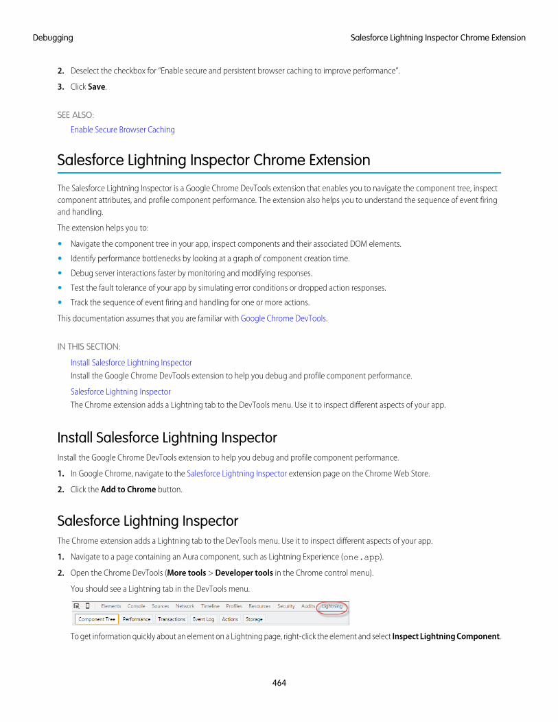
2. Deselect the checkbox for “Enable secure and persistent browser caching to improve performance”.
3. Click Save.
SEE ALSO:
Enable Secure Browser Caching
Salesforce Lightning Inspector Chrome Extension
The Salesforce Lightning Inspector is a Google Chrome DevTools extension that enables you to navigate the component tree, inspectcomponent attributes, and profile component performance. The extension also helps you to understand the sequence of event firingand handling.
The extension helps you to:
• Navigate the component tree in your app, inspect components and their associated DOM elements.
• Identify performance bottlenecks by looking at a graph of component creation time.
• Debug server interactions faster by monitoring and modifying responses.
• Test the fault tolerance of your app by simulating error conditions or dropped action responses.
• Track the sequence of event firing and handling for one or more actions.
This documentation assumes that you are familiar with Google Chrome DevTools.
IN THIS SECTION:
Install Salesforce Lightning Inspector
Install the Google Chrome DevTools extension to help you debug and profile component performance.
Salesforce Lightning Inspector
The Chrome extension adds a Lightning tab to the DevTools menu. Use it to inspect different aspects of your app.
Install Salesforce Lightning InspectorInstall the Google Chrome DevTools extension to help you debug and profile component performance.
1. In Google Chrome, navigate to the Salesforce Lightning Inspector extension page on the Chrome Web Store.
2. Click the Add to Chrome button.
Salesforce Lightning InspectorThe Chrome extension adds a Lightning tab to the DevTools menu. Use it to inspect different aspects of your app.
1. Navigate to a page containing an Aura component, such as Lightning Experience (one.app).
2. Open the Chrome DevTools (More tools > Developer tools in the Chrome control menu).
You should see a Lightning tab in the DevTools menu.
To get information quickly about an element on a Lightning page, right-click the element and select Inspect Lightning Component.
464
Salesforce Lightning Inspector Chrome ExtensionDebugging
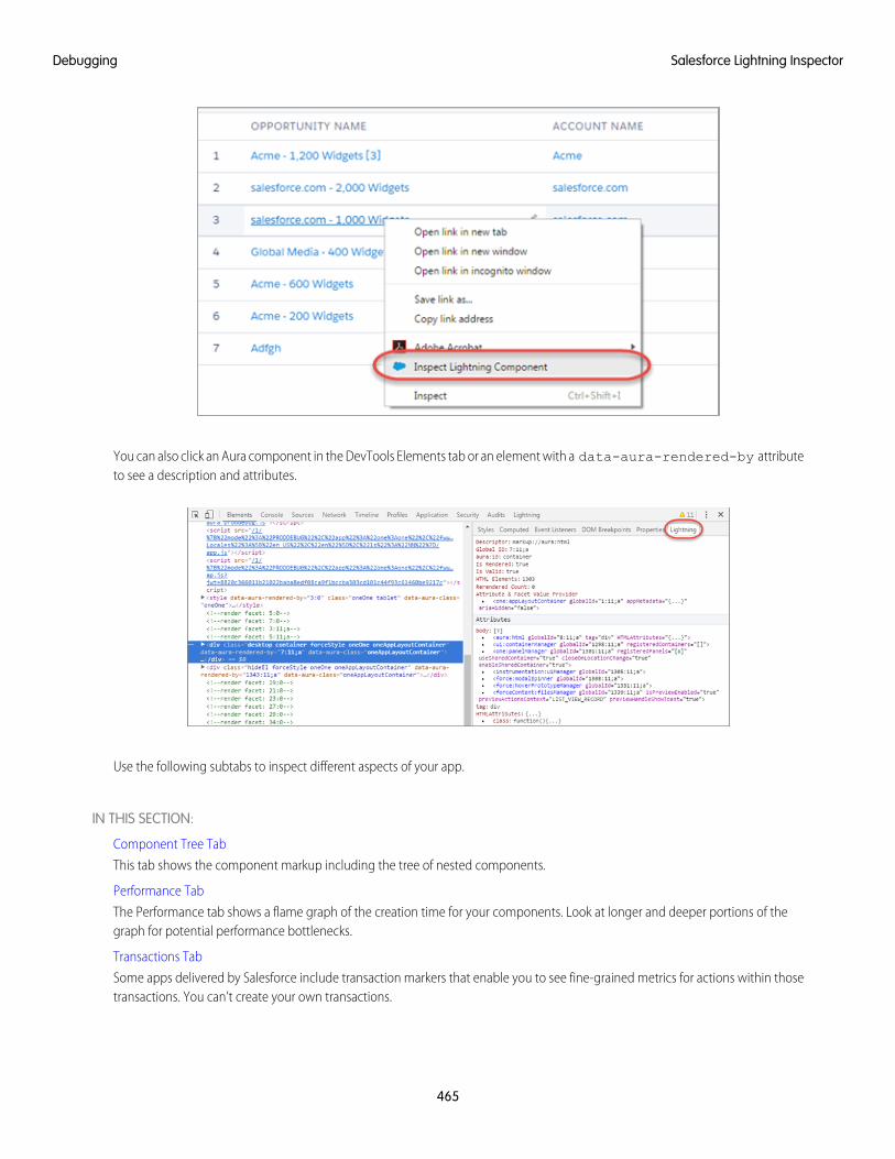
You can also click an Aura component in the DevTools Elements tab or an element with a data-aura-rendered-by attributeto see a description and attributes.
Use the following subtabs to inspect different aspects of your app.
IN THIS SECTION:
Component Tree Tab
This tab shows the component markup including the tree of nested components.
Performance Tab
The Performance tab shows a flame graph of the creation time for your components. Look at longer and deeper portions of thegraph for potential performance bottlenecks.
Transactions Tab
Some apps delivered by Salesforce include transaction markers that enable you to see fine-grained metrics for actions within thosetransactions. You can’t create your own transactions.
465
Salesforce Lightning InspectorDebugging
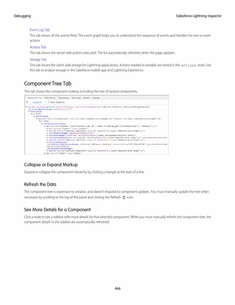
Event Log Tab
This tab shows all the events fired. The event graph helps you to understand the sequence of events and handlers for one or moreactions.
Actions Tab
This tab shows the server-side actions executed. The list automatically refreshes when the page updates.
Storage Tab
This tab shows the client-side storage for Lightning applications. Actions marked as storable are stored in the actions store. Usethis tab to analyze storage in the Salesforce mobile app and Lightning Experience.
Component Tree TabThis tab shows the component markup including the tree of nested components.
Collapse or Expand MarkupExpand or collapse the component hierarchy by clicking a triangle at the start of a line.
Refresh the DataThe component tree is expensive to serialize, and doesn't respond to component updates. You must manually update the tree when
necessary by scrolling to the top of the panel and clicking the Refresh icon.
See More Details for a ComponentClick a node to see a sidebar with more details for that selected component. While you must manually refresh the component tree, thecomponent details in the sidebar are automatically refreshed.
466
Salesforce Lightning InspectorDebugging
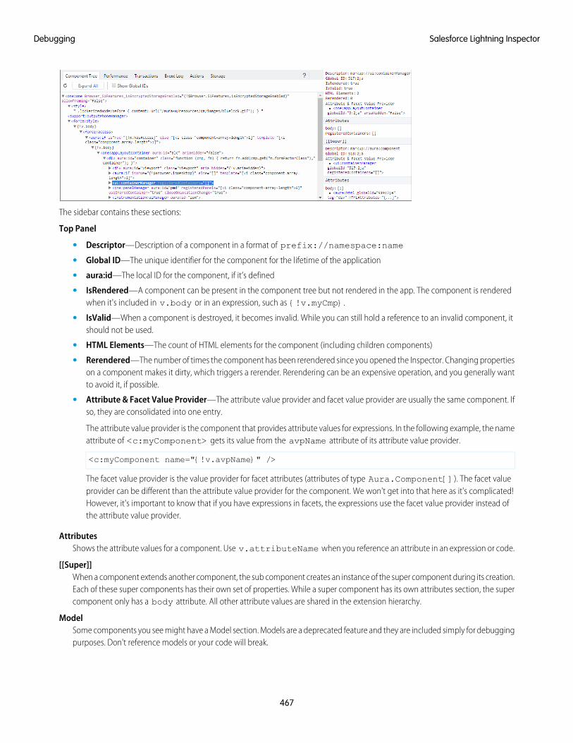
The sidebar contains these sections:
Top Panel
• Descriptor—Description of a component in a format of prefix://namespace:name
• Global ID—The unique identifier for the component for the lifetime of the application
• aura:id—The local ID for the component, if it’s defined
• IsRendered—A component can be present in the component tree but not rendered in the app. The component is renderedwhen it's included in v.body or in an expression, such as {!v.myCmp}.
• IsValid—When a component is destroyed, it becomes invalid. While you can still hold a reference to an invalid component, itshould not be used.
• HTML Elements—The count of HTML elements for the component (including children components)
• Rerendered—The number of times the component has been rerendered since you opened the Inspector. Changing propertieson a component makes it dirty, which triggers a rerender. Rerendering can be an expensive operation, and you generally wantto avoid it, if possible.
• Attribute & Facet Value Provider—The attribute value provider and facet value provider are usually the same component. Ifso, they are consolidated into one entry.
The attribute value provider is the component that provides attribute values for expressions. In the following example, the nameattribute of <c:myComponent> gets its value from the avpName attribute of its attribute value provider.
<c:myComponent name="{!v.avpName}" />
The facet value provider is the value provider for facet attributes (attributes of type Aura.Component[]). The facet valueprovider can be different than the attribute value provider for the component. We won't get into that here as it's complicated!However, it's important to know that if you have expressions in facets, the expressions use the facet value provider instead ofthe attribute value provider.
AttributesShows the attribute values for a component. Use v.attributeName when you reference an attribute in an expression or code.
[[Super]]When a component extends another component, the sub component creates an instance of the super component during its creation.Each of these super components has their own set of properties. While a super component has its own attributes section, the supercomponent only has a body attribute. All other attribute values are shared in the extension hierarchy.
ModelSome components you see might have a Model section. Models are a deprecated feature and they are included simply for debuggingpurposes. Don't reference models or your code will break.
467
Salesforce Lightning InspectorDebugging
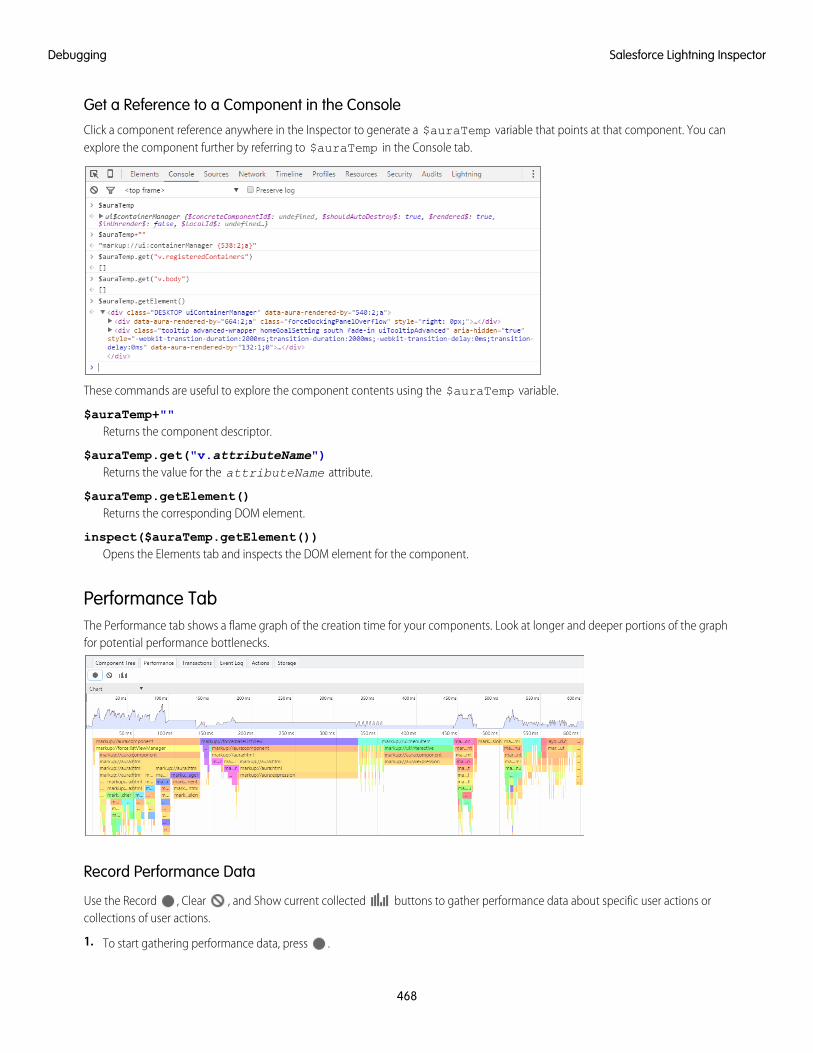
Get a Reference to a Component in the ConsoleClick a component reference anywhere in the Inspector to generate a $auraTemp variable that points at that component. You canexplore the component further by referring to $auraTemp in the Console tab.
These commands are useful to explore the component contents using the $auraTemp variable.
$auraTemp+""Returns the component descriptor.
$auraTemp.get("v.attributeName")Returns the value for the attributeName attribute.
$auraTemp.getElement()Returns the corresponding DOM element.
inspect($auraTemp.getElement())Opens the Elements tab and inspects the DOM element for the component.
Performance TabThe Performance tab shows a flame graph of the creation time for your components. Look at longer and deeper portions of the graphfor potential performance bottlenecks.
Record Performance Data
Use the Record , Clear , and Show current collected buttons to gather performance data about specific user actions orcollections of user actions.
1. To start gathering performance data, press .
468
Salesforce Lightning InspectorDebugging
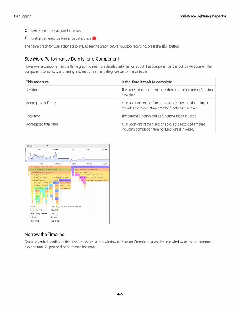
2. Take one or more actions in the app.
3. To stop gathering performance data, press .
The flame graph for your actions displays. To see the graph before you stop recording, press the button.
See More Performance Details for a ComponentHover over a component in the flame graph to see more detailed information about that component in the bottom-left corner. Thecomponent complexity and timing information can help diagnose performance issues.
Is the time it took to complete...This measure...
The current function. It excludes the completion time for functionsit invoked.
Self time
All invocations of the function across the recorded timeline. Itexcludes the completion time for functions it invoked.
Aggregated self time
The current function and all functions that it invoked.Total time
All invocations of the function across the recorded timeline,including completion time for functions it invoked.
Aggregated total time
Narrow the TimelineDrag the vertical handles on the timeline to select a time window to focus on. Zoom in on a smaller time window to inspect componentcreation time for potential performance hot spots.
469
Salesforce Lightning InspectorDebugging
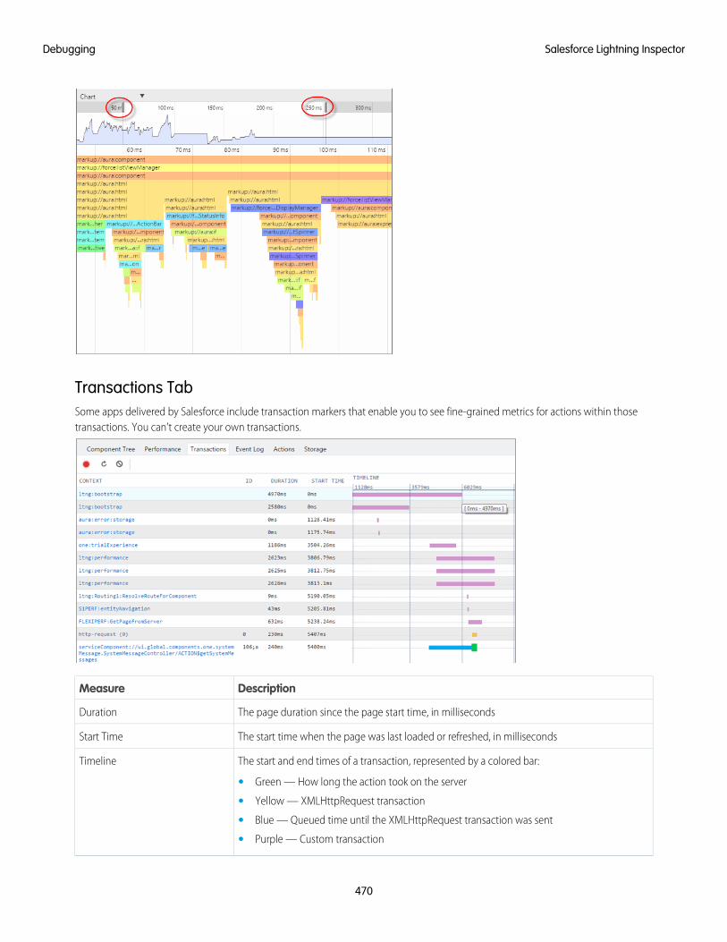
Transactions TabSome apps delivered by Salesforce include transaction markers that enable you to see fine-grained metrics for actions within thosetransactions. You can’t create your own transactions.
DescriptionMeasure
The page duration since the page start time, in millisecondsDuration
The start time when the page was last loaded or refreshed, in millisecondsStart Time
The start and end times of a transaction, represented by a colored bar:Timeline
• Green — How long the action took on the server
• Yellow — XMLHttpRequest transaction
• Blue — Queued time until the XMLHttpRequest transaction was sent
• Purple — Custom transaction
470
Salesforce Lightning InspectorDebugging
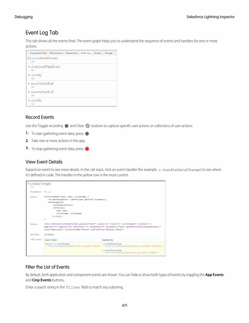
Event Log TabThis tab shows all the events fired. The event graph helps you to understand the sequence of events and handlers for one or moreactions.
Record Events
Use the Toggle recording and Clear buttons to capture specific user actions or collections of user actions.
1. To start gathering event data, press .
2. Take one or more actions in the app.
3. To stop gathering event data, press .
View Event DetailsExpand an event to see more details. In the call stack, click an event handler (for example, c.handleDataChange) to see whereit’s defined in code. The handler in the yellow row is the most current.
Filter the List of EventsBy default, both application and component events are shown. You can hide or show both types of events by toggling the App Eventsand Cmp Events buttons.
Enter a search string in the Filter field to match any substring.
471
Salesforce Lightning InspectorDebugging
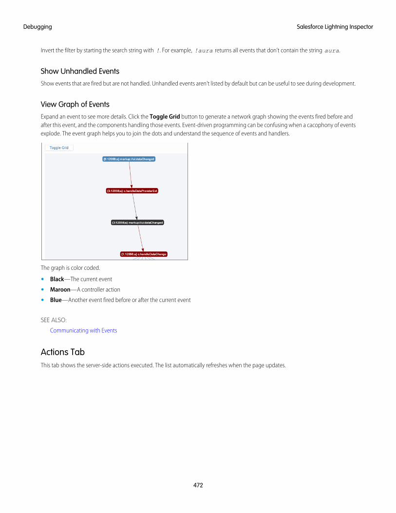
Invert the filter by starting the search string with !. For example, !aura returns all events that don’t contain the string aura.
Show Unhandled EventsShow events that are fired but are not handled. Unhandled events aren't listed by default but can be useful to see during development.
View Graph of EventsExpand an event to see more details. Click the Toggle Grid button to generate a network graph showing the events fired before andafter this event, and the components handling those events. Event-driven programming can be confusing when a cacophony of eventsexplode. The event graph helps you to join the dots and understand the sequence of events and handlers.
The graph is color coded.
• Black—The current event
• Maroon—A controller action
• Blue—Another event fired before or after the current event
SEE ALSO:
Communicating with Events
Actions TabThis tab shows the server-side actions executed. The list automatically refreshes when the page updates.
472
Salesforce Lightning InspectorDebugging
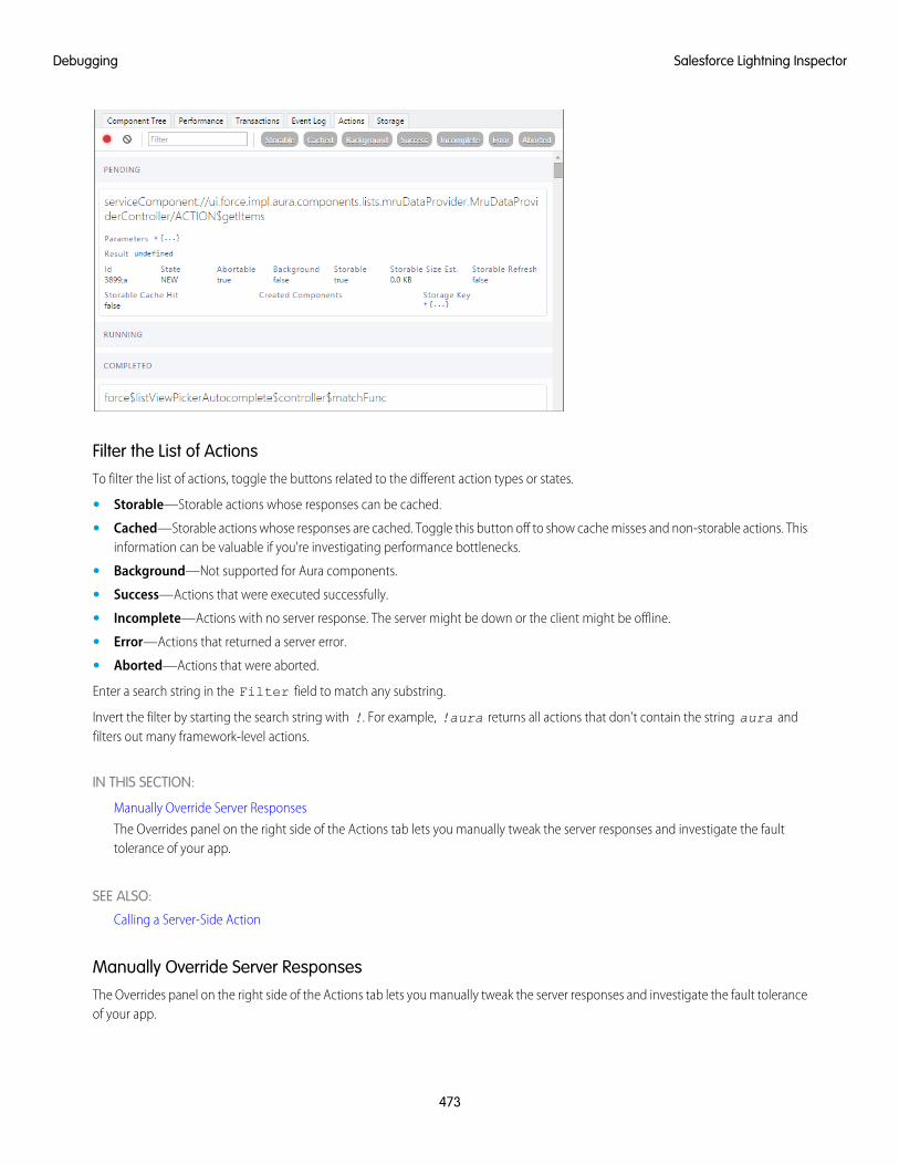
Filter the List of ActionsTo filter the list of actions, toggle the buttons related to the different action types or states.
• Storable—Storable actions whose responses can be cached.
• Cached—Storable actions whose responses are cached. Toggle this button off to show cache misses and non-storable actions. Thisinformation can be valuable if you're investigating performance bottlenecks.
• Background—Not supported for Aura components.
• Success—Actions that were executed successfully.
• Incomplete—Actions with no server response. The server might be down or the client might be offline.
• Error—Actions that returned a server error.
• Aborted—Actions that were aborted.
Enter a search string in the Filter field to match any substring.
Invert the filter by starting the search string with !. For example, !aura returns all actions that don't contain the string aura andfilters out many framework-level actions.
IN THIS SECTION:
Manually Override Server Responses
The Overrides panel on the right side of the Actions tab lets you manually tweak the server responses and investigate the faulttolerance of your app.
SEE ALSO:
Calling a Server-Side Action
Manually Override Server ResponsesThe Overrides panel on the right side of the Actions tab lets you manually tweak the server responses and investigate the fault toleranceof your app.
473
Salesforce Lightning InspectorDebugging
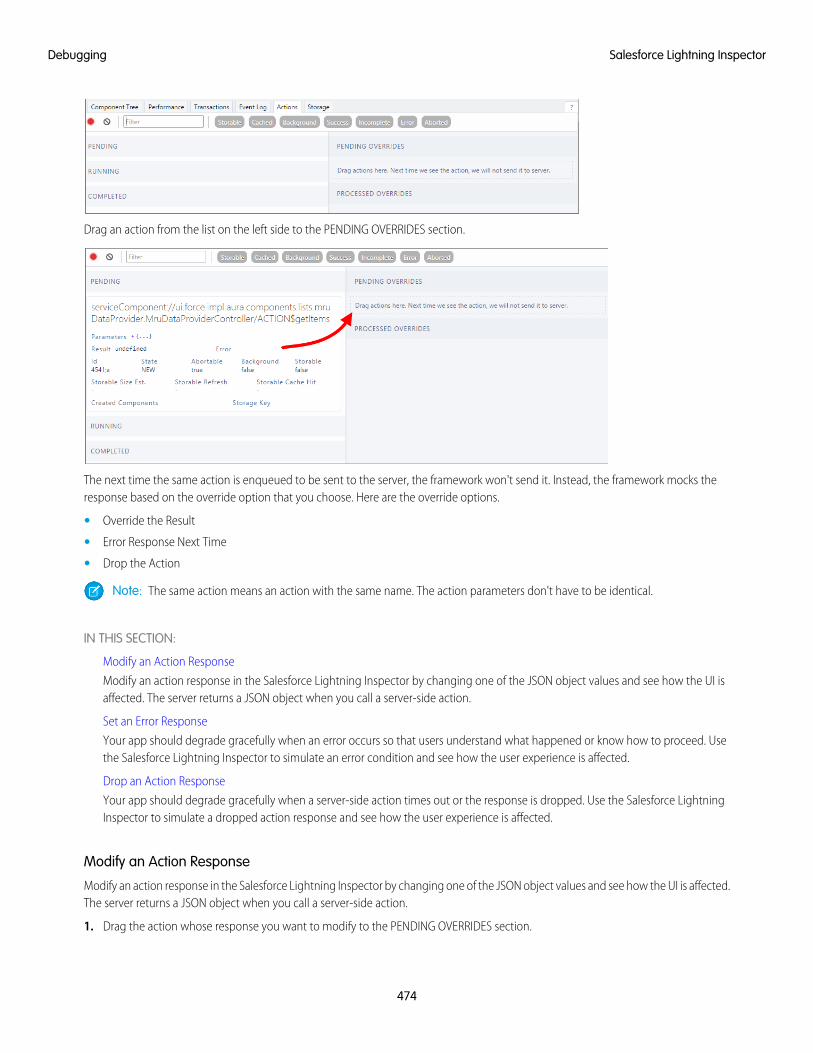
Drag an action from the list on the left side to the PENDING OVERRIDES section.
The next time the same action is enqueued to be sent to the server, the framework won't send it. Instead, the framework mocks theresponse based on the override option that you choose. Here are the override options.
• Override the Result
• Error Response Next Time
• Drop the Action
Note: The same action means an action with the same name. The action parameters don't have to be identical.
IN THIS SECTION:
Modify an Action Response
Modify an action response in the Salesforce Lightning Inspector by changing one of the JSON object values and see how the UI isaffected. The server returns a JSON object when you call a server-side action.
Set an Error Response
Your app should degrade gracefully when an error occurs so that users understand what happened or know how to proceed. Usethe Salesforce Lightning Inspector to simulate an error condition and see how the user experience is affected.
Drop an Action Response
Your app should degrade gracefully when a server-side action times out or the response is dropped. Use the Salesforce LightningInspector to simulate a dropped action response and see how the user experience is affected.
Modify an Action Response
Modify an action response in the Salesforce Lightning Inspector by changing one of the JSON object values and see how the UI is affected.The server returns a JSON object when you call a server-side action.
1. Drag the action whose response you want to modify to the PENDING OVERRIDES section.
474
Salesforce Lightning InspectorDebugging
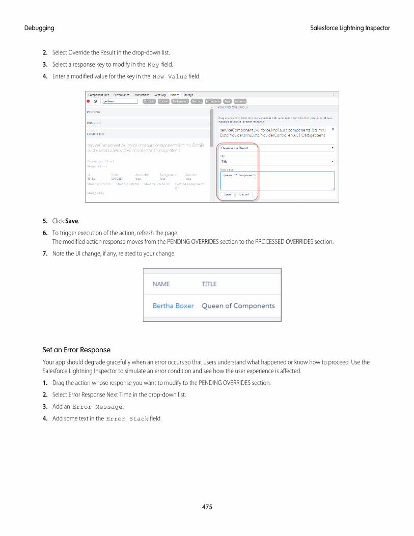
2. Select Override the Result in the drop-down list.
3. Select a response key to modify in the Key field.
4. Enter a modified value for the key in the New Value field.
5. Click Save.
6. To trigger execution of the action, refresh the page.The modified action response moves from the PENDING OVERRIDES section to the PROCESSED OVERRIDES section.
7. Note the UI change, if any, related to your change.
Set an Error Response
Your app should degrade gracefully when an error occurs so that users understand what happened or know how to proceed. Use theSalesforce Lightning Inspector to simulate an error condition and see how the user experience is affected.
1. Drag the action whose response you want to modify to the PENDING OVERRIDES section.
2. Select Error Response Next Time in the drop-down list.
3. Add an Error Message.
4. Add some text in the Error Stack field.
475
Salesforce Lightning InspectorDebugging
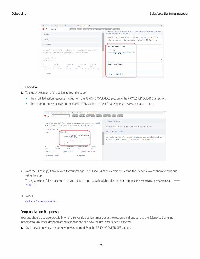
5. Click Save.
6. To trigger execution of the action, refresh the page.
• The modified action response moves from the PENDING OVERRIDES section to the PROCESSED OVERRIDES section.
• The action response displays in the COMPLETED section in the left panel with a State equals ERROR.
7. Note the UI change, if any, related to your change. The UI should handle errors by alerting the user or allowing them to continueusing the app.
To degrade gracefully, make sure that your action response callback handles an error response (response.getState() ==="ERROR").
SEE ALSO:
Calling a Server-Side Action
Drop an Action Response
Your app should degrade gracefully when a server-side action times out or the response is dropped. Use the Salesforce LightningInspector to simulate a dropped action response and see how the user experience is affected.
1. Drag the action whose response you want to modify to the PENDING OVERRIDES section.
476
Salesforce Lightning InspectorDebugging
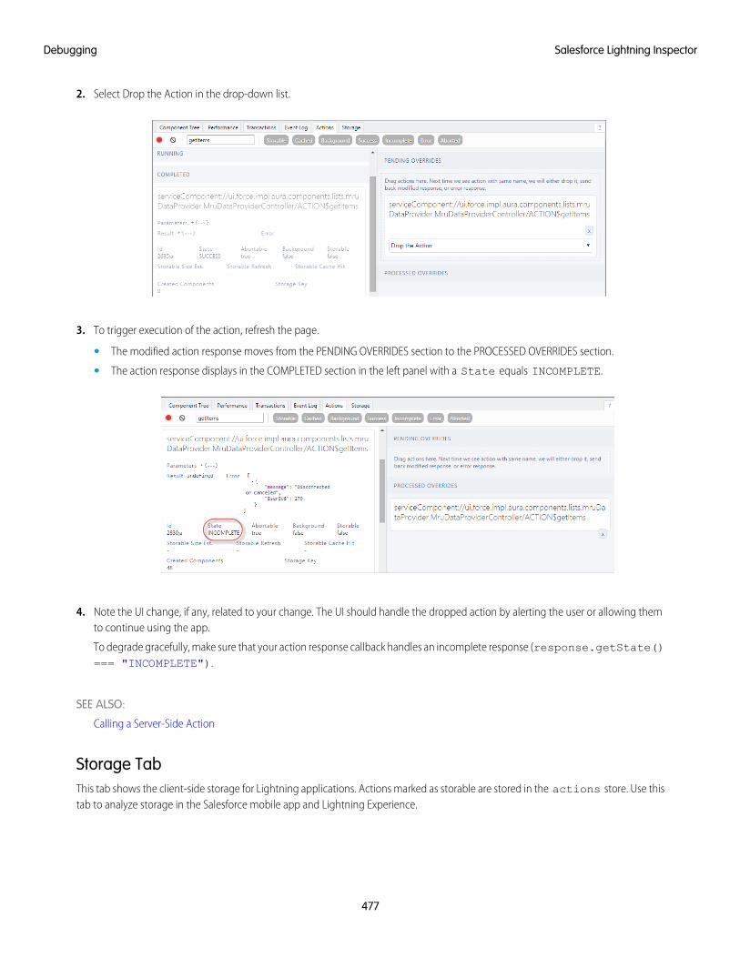
2. Select Drop the Action in the drop-down list.
3. To trigger execution of the action, refresh the page.
• The modified action response moves from the PENDING OVERRIDES section to the PROCESSED OVERRIDES section.
• The action response displays in the COMPLETED section in the left panel with a State equals INCOMPLETE.
4. Note the UI change, if any, related to your change. The UI should handle the dropped action by alerting the user or allowing themto continue using the app.
To degrade gracefully, make sure that your action response callback handles an incomplete response (response.getState()=== "INCOMPLETE").
SEE ALSO:
Calling a Server-Side Action
Storage TabThis tab shows the client-side storage for Lightning applications. Actions marked as storable are stored in the actions store. Use thistab to analyze storage in the Salesforce mobile app and Lightning Experience.
477
Salesforce Lightning InspectorDebugging
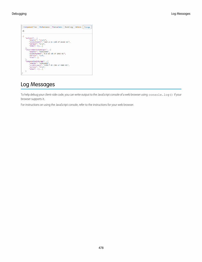
Log Messages
To help debug your client-side code, you can write output to the JavaScript console of a web browser using console.log() if yourbrowser supports it..
For instructions on using the JavaScript console, refer to the instructions for your web browser.
478
Log MessagesDebugging
CHAPTER 14 Performance
There are a few settings and techniques that can help you to improve application performance.In this chapter ...Only enable debug mode for users who are actively debugging JavaScript. Salesforce is slower for userswho have debug mode enabled.
SEE ALSO:
Enable Debug Mode for Lightning Components
• Performance Settings
• Fixing PerformanceWarnings
479
Performance Settings
There are a few Setup settings that can help you to improve application performance.
IN THIS SECTION:
Enable Secure Browser Caching
Enable secure data caching in the browser to improve page reload performance by avoiding extra round trips to the server.
Enable CDN to Load Applications Faster
Load Lightning Experience and other apps faster by enabling Akamai’s content delivery network (CDN) to serve the static contentfor Lightning Component framework. A CDN generally speeds up page load time, but it also changes the source domain that servesthe files. If your company has IP range restrictions for content served from Salesforce, test thoroughly before enabling this setting.
Enable Secure Browser CachingEnable secure data caching in the browser to improve page reload performance by avoiding extra round trips to the server.
This setting is selected by default.
Warning: Disabling secure and persistent browser caching has a significant negative performance impact on Lightning Experience.Only disable in the following scenarios:
• Your company’s policy doesn’t allow browser caching, even if the data is encrypted.
• During development in a sandbox or Developer Edition org to see the effect of any code changes without needing to emptythe secure cache.
To disable secure date caching:
1. From Setup, enter Session in the Quick Find box, and then select Session Settings.
2. Deselect the checkbox for “Enable secure and persistent browser caching to improve performance”.
3. Click Save.
Enable CDN to Load Applications FasterLoad Lightning Experience and other apps faster by enabling Akamai’s content delivery network (CDN) to serve the static content forLightning Component framework. A CDN generally speeds up page load time, but it also changes the source domain that serves thefiles. If your company has IP range restrictions for content served from Salesforce, test thoroughly before enabling this setting.
CDNs improve the load time of static content by storing cached versions in multiple geographic locations. This setting turns on CDNdelivery for the static JavaScript and CSS in the Lightning Component framework. It doesn’t distribute your org’s data or metadata in aCDN.
This setting is disabled by default for orgs created before the Winter ’19 release, and enabled by default for new orgs and all new andexisting communities. Lightning CDN for Communities can’t be turned off and isn’t configurable.
To enable the CDN:
1. From Setup, enter Session in the Quick Find box, and then select Session Settings.
2. Select the checkbox for “Enable Content Delivery Network (CDN) for Lightning Component framework”.
3. Click Save.
480
Performance SettingsPerformance
If you experience any issues, ensure that https://static.lightning.force.com is added to any whitelist or firewall thatyour company operates and ask your IT department if your company’s firewall blocks any Akamai CDN content.Do not use IP addressesfor egress filtering as that can cause connection issues with https://static.lightning.force.com. IP addresses forhttps://static.lightning.force.com are dynamic and are not maintained in Salesforce's list of IP addresses to whitelist.
SEE ALSO:
Salesforce Help: Options to Serve a Custom Domain
Knowledge Article: What are the Salesforce IP Addresses & Domains to whitelist?
Fixing Performance Warnings
A few common performance anti-patterns in code prompt the framework to log warning messages to the browser console. Fix thewarning messages to speed up your components!
The warnings display in the browser console only if you enabled debug mode.
IN THIS SECTION:
<aura:if>—Clean Unrendered Body
This warning occurs when you change the isTrue attribute of an <aura:if> tag from true to false in the same renderingcycle. The unrendered body of the <aura:if> must be destroyed, which is avoidable work for the framework that slows downrendering time.
<aura:iteration>—Multiple Items Set
This warning occurs when you set the items attribute of an <aura:iteration> tag multiple times in the same renderingcycle.
SEE ALSO:
Enable Debug Mode for Lightning Components
<aura:if>—Clean Unrendered BodyThis warning occurs when you change the isTrue attribute of an <aura:if> tag from true to false in the same renderingcycle. The unrendered body of the <aura:if> must be destroyed, which is avoidable work for the framework that slows downrendering time.
ExampleThis component shows the anti-pattern.
<!--c:ifCleanUnrendered--><aura:component>
<aura:attribute name="isVisible" type="boolean" default="true"/><aura:handler name="init" value="{!this}" action="{!c.init}"/>
<aura:if isTrue="{!v.isVisible}"><p>I am visible</p>
</aura:if></aura:component>
481
Fixing Performance WarningsPerformance

Here’s the component’s client-side controller.
/* c:ifCleanUnrenderedController.js */({
init: function(cmp) {/* Some logic */cmp.set("v.isVisible", false); // Performance warning trigger
}})
When the component is created, the isTrue attribute of the <aura:if> tag is evaluated. The value of the isVisible attributeis true by default so the framework creates the body of the <aura:if> tag. After the component is created but before rendering,the init event is triggered.
The init() function in the client-side controller toggles the isVisible value from true to false. The isTrue attributeof the <aura:if> tag is now false so the framework must destroy the body of the <aura:if> tag. This warning displays inthe browser console only if you enabled debug mode.
WARNING: [Performance degradation] markup://aura:if ["5:0"] in c:ifCleanUnrendered ["3:0"]needed to clear unrendered body.
Click the expand button beside the warning to see a stack trace for the warning.
Click the link for the ifCleanUnrendered entry in the stack trace to see the offending line of code in the Sources pane of thebrowser console.
How to Fix the WarningReverse the logic for the isTrue expression. Instead of setting the isTrue attribute to true by default, set it to false. Set theisTrue expression to true in the init() method, if needed.
Here’s the fixed component:
<!--c:ifCleanUnrenderedFixed--><aura:component>
<!-- FIX: Change default to false.Update isTrue expression in controller instead. -->
<aura:attribute name="isVisible" type="boolean" default="false"/><aura:handler name="init" value="{!this}" action="{!c.init}"/>
<aura:if isTrue="{!v.isVisible}"><p>I am visible</p>
</aura:if></aura:component>
482
<aura:if>—Clean Unrendered BodyPerformance
Here’s the fixed controller:
/* c:ifCleanUnrenderedFixedController.js */({
init: function(cmp) {// Some logic// FIX: set isVisible to true if logic criteria metcmp.set("v.isVisible", true);
}})
SEE ALSO:
Enable Debug Mode for Lightning Components
<aura:iteration>—Multiple Items SetThis warning occurs when you set the items attribute of an <aura:iteration> tag multiple times in the same rendering cycle.
There’s no easy and performant way to check if two collections are the same in JavaScript. Even if the old value of items is the sameas the new value, the framework deletes and replaces the previously created body of the <aura:iteration> tag.
ExampleThis component shows the anti-pattern.
<!--c:iterationMultipleItemsSet--><aura:component>
<aura:attribute name="groceries" type="List"default="[ 'Eggs', 'Bacon', 'Bread' ]"/>
<aura:handler name="init" value="{!this}" action="{!c.init}"/>
<aura:iteration items="{!v.groceries}" var="item"><p>{!item}</p>
</aura:iteration></aura:component>
Here’s the component’s client-side controller.
/* c:iterationMultipleItemsSetController.js */({
init: function(cmp) {var list = cmp.get('v.groceries');// Some logiccmp.set('v.groceries', list); // Performance warning trigger
}})
When the component is created, the items attribute of the <aura:iteration> tag is set to the default value of the groceriesattribute. After the component is created but before rendering, the init event is triggered.
483
<aura:iteration>—Multiple Items SetPerformance
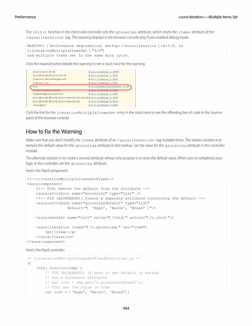
The init() function in the client-side controller sets the groceries attribute, which resets the items attribute of the<aura:iteration> tag. This warning displays in the browser console only if you enabled debug mode.
WARNING: [Performance degradation] markup://aura:iteration [id:5:0] inc:iterationMultipleItemsSet ["3:0"]had multiple items set in the same Aura cycle.
Click the expand button beside the warning to see a stack trace for the warning.
Click the link for the iterationMultipleItemsSet entry in the stack trace to see the offending line of code in the Sourcespane of the browser console.
How to Fix the WarningMake sure that you don’t modify the items attribute of an <aura:iteration> tag multiple times. The easiest solution is toremove the default value for the groceries attribute in the markup. Set the value for the groceries attribute in the controllerinstead.
The alternate solution is to create a second attribute whose only purpose is to store the default value. When you’ve completed yourlogic in the controller, set the groceries attribute.
Here’s the fixed component:
<!--c:iterationMultipleItemsSetFixed--><aura:component>
<!-- FIX: Remove the default from the attribute --><aura:attribute name="groceries" type="List" /><!-- FIX (ALTERNATE): Create a separate attribute containing the default --><aura:attribute name="groceriesDefault" type="List"
default="[ 'Eggs', 'Bacon', 'Bread' ]"/>
<aura:handler name="init" value="{!this}" action="{!c.init}"/>
<aura:iteration items="{!v.groceries}" var="item"><p>{!item}</p>
</aura:iteration></aura:component>
Here’s the fixed controller:
/* c:iterationMultipleItemsSetFixedController.js */({
init: function(cmp) {// FIX (ALTERNATE) if need to set default in markup// use a different attribute// var list = cmp.get('v.groceriesDefault');// FIX: Set the value in codevar list = ['Eggs', 'Bacon', 'Bread'];
484
<aura:iteration>—Multiple Items SetPerformance

// Some logiccmp.set('v.groceries', list);
}})
SEE ALSO:
Enable Debug Mode for Lightning Components
485
<aura:iteration>—Multiple Items SetPerformance
CHAPTER 15 Reference
This section contains links to reference documentation.In this chapter ...
• Component Library
• System TagReference
486

Component Library
Explore the look and feel of components to speed up your app development.
To see the complete collection of Lightning components available in your Salesforce organization, log in and navigate to the ComponentLibrary.
• https://<myDomain>.lightning.force.com/componentReference/suite.app
You can also use the Component Library without logging in to Salesforce.
• https://developer.salesforce.com/docs/component-library
For JavaScript API documentation, see the Aura Reference app at:
https://<myDomain>.lightning.force.com/auradocs/reference.app
Only use the Aura Reference app for information about the JavaScript API.
IN THIS SECTION:
Aura Reference Doc App
Only use the Aura Reference app for information about the JavaScript API.
Differences Between Documentation Sites
Here’s a breakdown of the differences between the Component Library, the reference section of this developer guide, and the AuraReference app.
Aura Reference Doc AppOnly use the Aura Reference app for information about the JavaScript API.
Explore the look and feel of Lightning components in the Component Library athttps://<myDomain>.lightning.force.com/docs/component-library where <myDomain> is the nameof your custom Salesforce domain.
487
Component LibraryReference
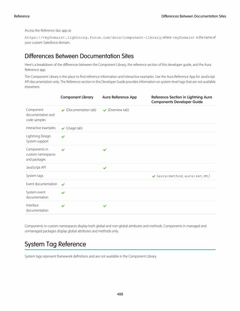
Access the Reference doc app at:
https://<myDomain>.lightning.force.com/docs/component-library, where <myDomain> is the name ofyour custom Salesforce domain.
Differences Between Documentation SitesHere’s a breakdown of the differences between the Component Library, the reference section of this developer guide, and the AuraReference app.
The Component Library is the place to find reference information and interactive examples. Use the Aura Reference App for JavaScriptAPI documentation only. The Reference section in this Developer Guide provides information on system-level tags that are not availableelsewhere.
Reference Section in Lightning AuraComponents Developer Guide
Aura Reference AppComponent Library
(Overview tab) (Documentation tab)Componentdocumentation andcode samples
(Usage tab)Interactive examples
Lightning DesignSystem support
Components incustom namespacesand packages
JavaScript API
(aura:method, aura:set, etc.)System tags
Event documentation
System eventdocumentation
Interfacedocumentation
Components in custom namespaces display both global and non-global attributes and methods. Components in managed andunmanaged packages display global attributes and methods only.
System Tag Reference
System tags represent framework definitions and are not available in the Component Library.
488
Differences Between Documentation SitesReference
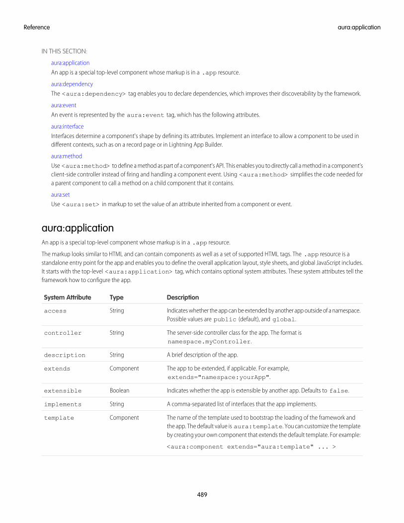
IN THIS SECTION:
aura:application
An app is a special top-level component whose markup is in a .app resource.
aura:dependency
The <aura:dependency> tag enables you to declare dependencies, which improves their discoverability by the framework.
aura:event
An event is represented by the aura:event tag, which has the following attributes.
aura:interface
Interfaces determine a component's shape by defining its attributes. Implement an interface to allow a component to be used indifferent contexts, such as on a record page or in Lightning App Builder.
aura:method
Use <aura:method> to define a method as part of a component's API. This enables you to directly call a method in a component’sclient-side controller instead of firing and handling a component event. Using <aura:method> simplifies the code needed fora parent component to call a method on a child component that it contains.
aura:set
Use <aura:set> in markup to set the value of an attribute inherited from a component or event.
aura:applicationAn app is a special top-level component whose markup is in a .app resource.
The markup looks similar to HTML and can contain components as well as a set of supported HTML tags. The .app resource is astandalone entry point for the app and enables you to define the overall application layout, style sheets, and global JavaScript includes.It starts with the top-level <aura:application> tag, which contains optional system attributes. These system attributes tell theframework how to configure the app.
DescriptionTypeSystem Attribute
Indicates whether the app can be extended by another app outside of a namespace.Possible values are public (default), and global.
Stringaccess
The server-side controller class for the app. The format isnamespace.myController.
Stringcontroller
A brief description of the app.Stringdescription
The app to be extended, if applicable. For example,extends="namespace:yourApp".
Componentextends
Indicates whether the app is extensible by another app. Defaults to false.Booleanextensible
A comma-separated list of interfaces that the app implements.Stringimplements
The name of the template used to bootstrap the loading of the framework andthe app. The default value is aura:template. You can customize the templateby creating your own component that extends the default template. For example:
<aura:component extends="aura:template" ... >
Componenttemplate
489
aura:applicationReference
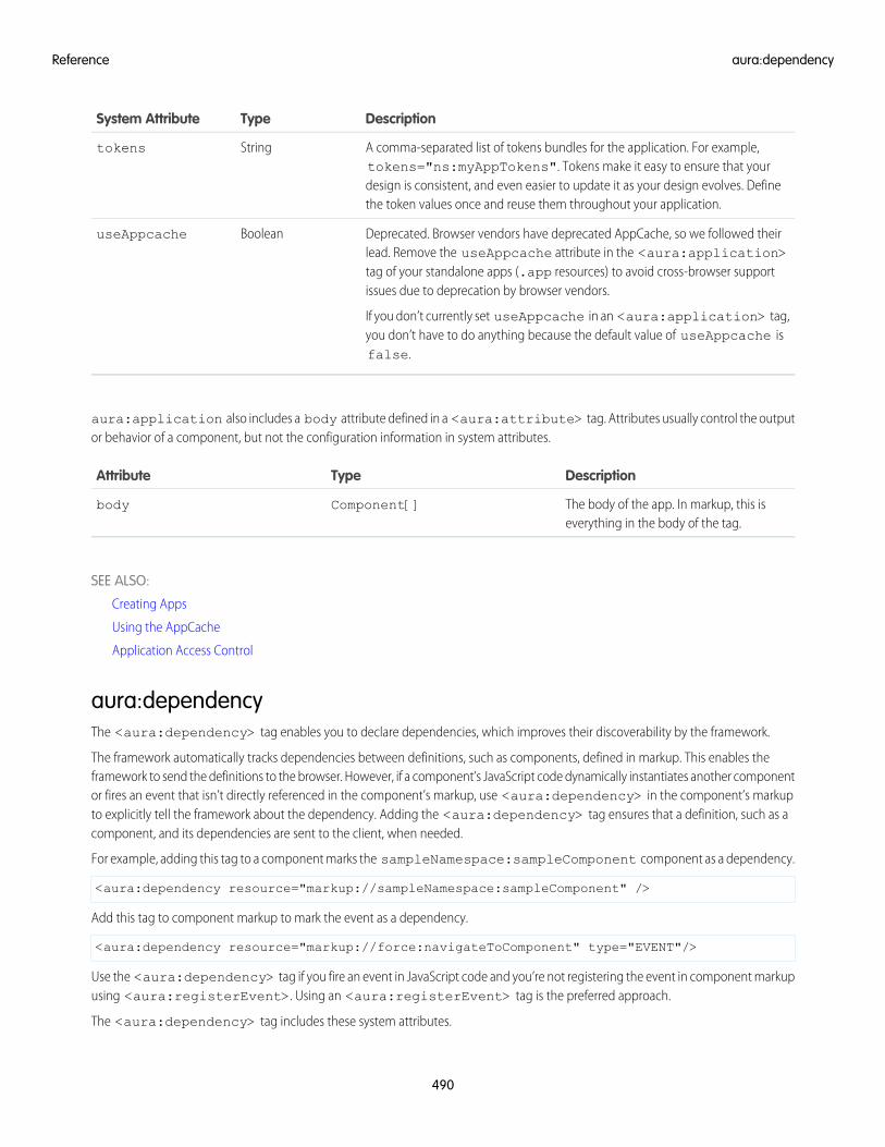
DescriptionTypeSystem Attribute
A comma-separated list of tokens bundles for the application. For example,tokens="ns:myAppTokens". Tokens make it easy to ensure that your
Stringtokens
design is consistent, and even easier to update it as your design evolves. Definethe token values once and reuse them throughout your application.
Deprecated. Browser vendors have deprecated AppCache, so we followed theirlead. Remove the useAppcache attribute in the <aura:application>
BooleanuseAppcache
tag of your standalone apps (.app resources) to avoid cross-browser supportissues due to deprecation by browser vendors.
If you don’t currently set useAppcache in an <aura:application> tag,you don’t have to do anything because the default value of useAppcache isfalse.
aura:application also includes a body attribute defined in a <aura:attribute> tag. Attributes usually control the outputor behavior of a component, but not the configuration information in system attributes.
DescriptionTypeAttribute
The body of the app. In markup, this iseverything in the body of the tag.
Component[]body
SEE ALSO:
Creating Apps
Using the AppCache
Application Access Control
aura:dependencyThe <aura:dependency> tag enables you to declare dependencies, which improves their discoverability by the framework.
The framework automatically tracks dependencies between definitions, such as components, defined in markup. This enables theframework to send the definitions to the browser. However, if a component’s JavaScript code dynamically instantiates another componentor fires an event that isn’t directly referenced in the component’s markup, use <aura:dependency> in the component’s markupto explicitly tell the framework about the dependency. Adding the <aura:dependency> tag ensures that a definition, such as acomponent, and its dependencies are sent to the client, when needed.
For example, adding this tag to a component marks the sampleNamespace:sampleComponent component as a dependency.
<aura:dependency resource="markup://sampleNamespace:sampleComponent" />
Add this tag to component markup to mark the event as a dependency.
<aura:dependency resource="markup://force:navigateToComponent" type="EVENT"/>
Use the <aura:dependency> tag if you fire an event in JavaScript code and you’re not registering the event in component markupusing <aura:registerEvent>. Using an <aura:registerEvent> tag is the preferred approach.
The <aura:dependency> tag includes these system attributes.
490
aura:dependencyReference
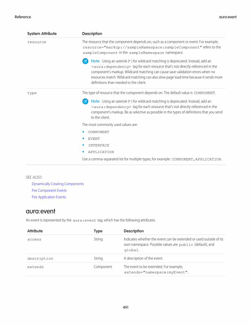
DescriptionSystem Attribute
The resource that the component depends on, such as a component or event. For example,resource="markup://sampleNamespace:sampleComponent" refers to thesampleComponent in the sampleNamespace namespace.
resource
Note: Using an asterisk (*) for wildcard matching is deprecated. Instead, add an<aura:dependency> tag for each resource that’s not directly referenced in thecomponent’s markup. Wildcard matching can cause save validation errors when noresources match. Wildcard matching can also slow page load time because it sends moredefinitions than needed to the client.
The type of resource that the component depends on. The default value is COMPONENT.type
Note: Using an asterisk (*) for wildcard matching is deprecated. Instead, add an<aura:dependency> tag for each resource that’s not directly referenced in thecomponent’s markup. Be as selective as possible in the types of definitions that you sendto the client.
The most commonly used values are:
• COMPONENT
• EVENT
• INTERFACE
• APPLICATION
Use a comma-separated list for multiple types; for example: COMPONENT,APPLICATION.
SEE ALSO:
Dynamically Creating Components
Fire Component Events
Fire Application Events
aura:eventAn event is represented by the aura:event tag, which has the following attributes.
DescriptionTypeAttribute
Indicates whether the event can be extended or used outside of itsown namespace. Possible values are public (default), andglobal.
Stringaccess
A description of the event.Stringdescription
The event to be extended. For example,extends="namespace:myEvent".
Componentextends
491
aura:eventReference
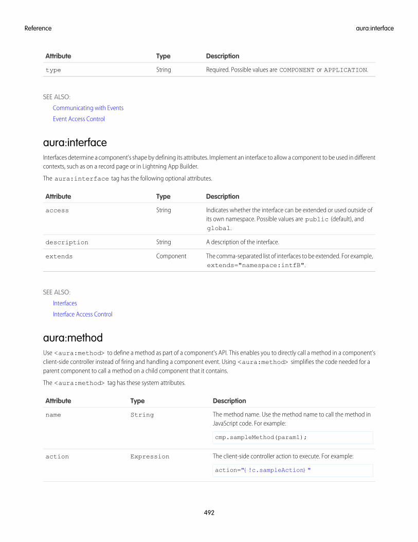
DescriptionTypeAttribute
Required. Possible values are COMPONENT or APPLICATION.Stringtype
SEE ALSO:
Communicating with Events
Event Access Control
aura:interfaceInterfaces determine a component's shape by defining its attributes. Implement an interface to allow a component to be used in differentcontexts, such as on a record page or in Lightning App Builder.
The aura:interface tag has the following optional attributes.
DescriptionTypeAttribute
Indicates whether the interface can be extended or used outside ofits own namespace. Possible values are public (default), andglobal.
Stringaccess
A description of the interface.Stringdescription
The comma-separated list of interfaces to be extended. For example,extends="namespace:intfB".
Componentextends
SEE ALSO:
Interfaces
Interface Access Control
aura:methodUse <aura:method> to define a method as part of a component's API. This enables you to directly call a method in a component’sclient-side controller instead of firing and handling a component event. Using <aura:method> simplifies the code needed for aparent component to call a method on a child component that it contains.
The <aura:method> tag has these system attributes.
DescriptionTypeAttribute
The method name. Use the method name to call the method inJavaScript code. For example:
cmp.sampleMethod(param1);
Stringname
The client-side controller action to execute. For example:
action="{!c.sampleAction}"
Expressionaction
492
aura:interfaceReference
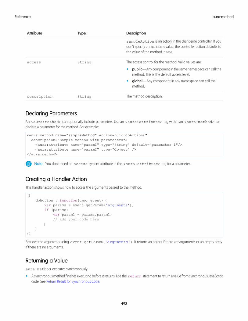
DescriptionTypeAttribute
sampleAction is an action in the client-side controller. If youdon’t specify an action value, the controller action defaults tothe value of the method name.
The access control for the method. Valid values are:Stringaccess
• public—Any component in the same namespace can call themethod. This is the default access level.
• global—Any component in any namespace can call themethod.
The method description.Stringdescription
Declaring ParametersAn <aura:method> can optionally include parameters. Use an <aura:attribute> tag within an <aura:method> todeclare a parameter for the method. For example:
<aura:method name="sampleMethod" action="{!c.doAction}"description="Sample method with parameters"><aura:attribute name="param1" type="String" default="parameter 1"/><aura:attribute name="param2" type="Object" />
</aura:method>
Note: You don’t need an access system attribute in the <aura:attribute> tag for a parameter.
Creating a Handler ActionThis handler action shows how to access the arguments passed to the method.
({doAction : function(cmp, event) {
var params = event.getParam('arguments');if (params) {
var param1 = params.param1;// add your code here
}}
})
Retrieve the arguments using event.getParam('arguments'). It returns an object if there are arguments or an empty arrayif there are no arguments.
Returning a Valueaura:method executes synchronously.
• A synchronous method finishes executing before it returns. Use the return statement to return a value from synchronous JavaScriptcode. See Return Result for Synchronous Code.
493
aura:methodReference
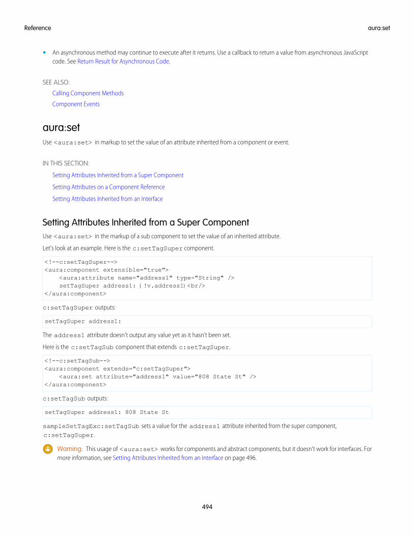
• An asynchronous method may continue to execute after it returns. Use a callback to return a value from asynchronous JavaScriptcode. See Return Result for Asynchronous Code.
SEE ALSO:
Calling Component Methods
Component Events
aura:setUse <aura:set> in markup to set the value of an attribute inherited from a component or event.
IN THIS SECTION:
Setting Attributes Inherited from a Super Component
Setting Attributes on a Component Reference
Setting Attributes Inherited from an Interface
Setting Attributes Inherited from a Super ComponentUse <aura:set> in the markup of a sub component to set the value of an inherited attribute.
Let's look at an example. Here is the c:setTagSuper component.
<!--c:setTagSuper--><aura:component extensible="true">
<aura:attribute name="address1" type="String" />setTagSuper address1: {!v.address1}<br/>
</aura:component>
c:setTagSuper outputs:
setTagSuper address1:
The address1 attribute doesn't output any value yet as it hasn't been set.
Here is the c:setTagSub component that extends c:setTagSuper.
<!--c:setTagSub--><aura:component extends="c:setTagSuper">
<aura:set attribute="address1" value="808 State St" /></aura:component>
c:setTagSub outputs:
setTagSuper address1: 808 State St
sampleSetTagExc:setTagSub sets a value for the address1 attribute inherited from the super component,c:setTagSuper.
Warning: This usage of <aura:set> works for components and abstract components, but it doesn’t work for interfaces. Formore information, see Setting Attributes Inherited from an Interface on page 496.
494
aura:setReference
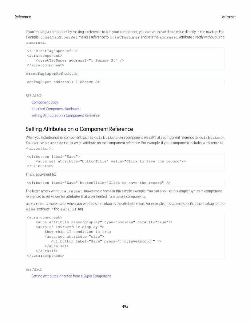
If you’re using a component by making a reference to it in your component, you can set the attribute value directly in the markup. Forexample, c:setTagSuperRef makes a reference to c:setTagSuper and sets the address1 attribute directly without usingaura:set.
<!--c:setTagSuperRef--><aura:component>
<c:setTagSuper address1="1 Sesame St" /></aura:component>
c:setTagSuperRef outputs:
setTagSuper address1: 1 Sesame St
SEE ALSO:
Component Body
Inherited Component Attributes
Setting Attributes on a Component Reference
Setting Attributes on a Component ReferenceWhen you include another component, such as <ui:button>, in a component, we call that a component reference to <ui:button>.You can use <aura:set> to set an attribute on the component reference. For example, if your component includes a reference to<ui:button>:
<ui:button label="Save"><aura:set attribute="buttonTitle" value="Click to save the record"/>
</ui:button>
This is equivalent to:
<ui:button label="Save" buttonTitle="Click to save the record" />
The latter syntax without aura:set makes more sense in this simple example. You can also use this simpler syntax in componentreferences to set values for attributes that are inherited from parent components.
aura:set is more useful when you want to set markup as the attribute value. For example, this sample specifies the markup for theelse attribute in the aura:if tag.
<aura:component><aura:attribute name="display" type="Boolean" default="true"/><aura:if isTrue="{!v.display}">
Show this if condition is true<aura:set attribute="else">
<ui:button label="Save" press="{!c.saveRecord}" /></aura:set>
</aura:if></aura:component>
SEE ALSO:
Setting Attributes Inherited from a Super Component
495
aura:setReference
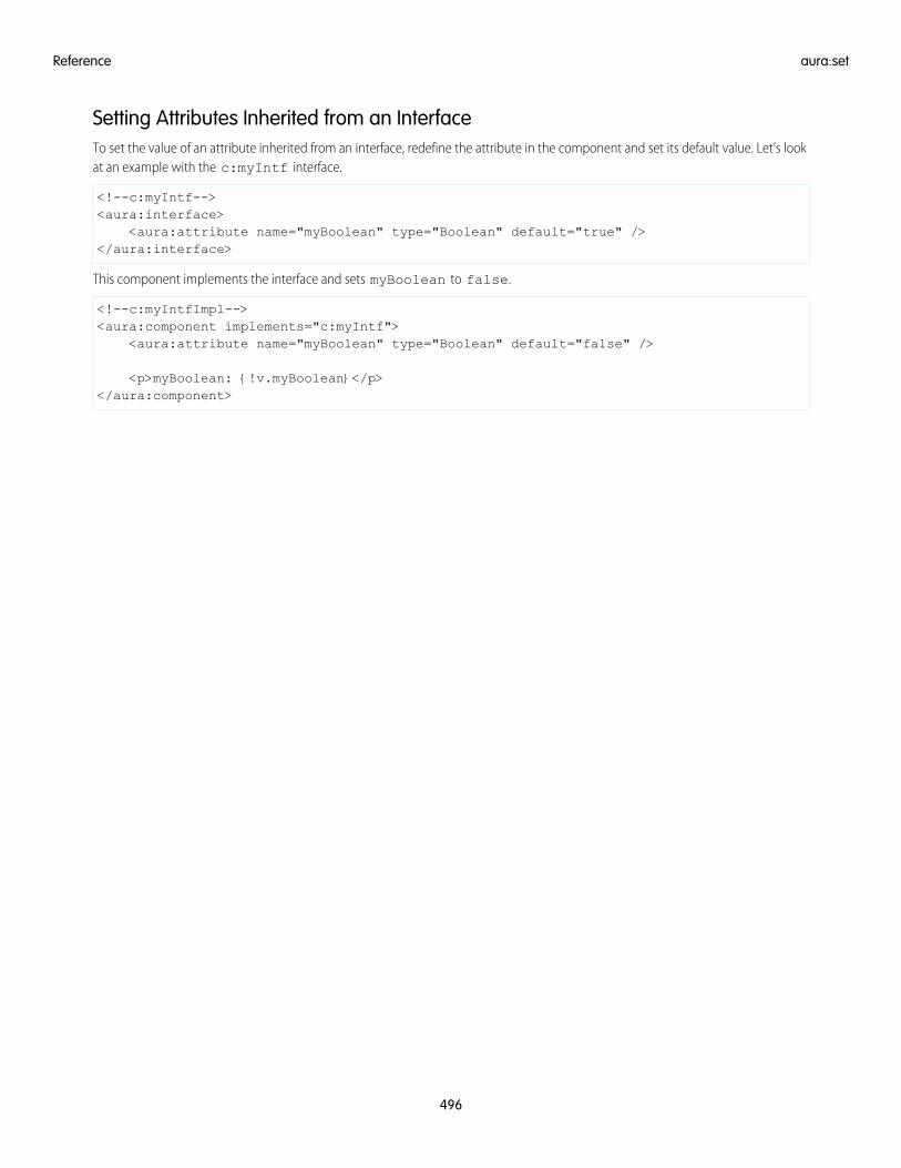
Setting Attributes Inherited from an InterfaceTo set the value of an attribute inherited from an interface, redefine the attribute in the component and set its default value. Let’s lookat an example with the c:myIntf interface.
<!--c:myIntf--><aura:interface>
<aura:attribute name="myBoolean" type="Boolean" default="true" /></aura:interface>
This component implements the interface and sets myBoolean to false.
<!--c:myIntfImpl--><aura:component implements="c:myIntf">
<aura:attribute name="myBoolean" type="Boolean" default="false" />
<p>myBoolean: {!v.myBoolean}</p></aura:component>
496
aura:setReference
INDEX
AApex
API calls 446custom objects 421Lightning components 452records 421saving records 420standard objects 421
API calls 446application, creating 7Aura components
action override 157–160interfaces 159Lightning Experience 157–159markup 159packaging 160Salesforce 157–159
Aura components interfacesforce:hasRecordId 159force:hasSObjectName 159lightning:actionOverride 159
authenticationguest access 242
CCDN 480change handling 407Communities 242Communities Lightning components
overview 189Community Builder
Aura components overview 189configuring custom components 190content layouts 198profile menu 197search 197theme layouts 191
Component bundlesconfiguring design resources for Lightning Pages 181configuring for Community Builder 190configuring for Lightning App Builder 174, 176, 188configuring for Lightning Experience Record Home pages
188configuring for Lightning Experience record pages 176configuring for Lightning pages 174, 176, 188
Component bundles (continued)create dynamic picklists for components on Lightning Pages
181tips for configuring for Lightning App Builder 188
Componentsaction override 157–160actions 146, 150, 152custom app integration 229flow, finish behavior 222flow, resume 223markup 159packaging 160tabs 146–147using 143, 146–147, 150, 152, 157, 200, 453
CRUD access 424Custom Actions
components 150, 152custom content layouts
creating for Community Builder 198Custom Lightning page template component
best practices 186custom profile menu
creating for Community Builder 197custom search
creating for Community Builder 197Custom Tabs
components 147custom theme layouts
creating for Community Builder 191
Ddata access 390, 408, 413, 416, 420Debug
JavaScript 463deleteRecord 405dependency 238, 242Developer Edition organization, sign up 7
Eerror handling 408errors 248, 251, 253, 256, 408eval() function limitations 330Events
Salesforce mobile and Lightning Experience demo 8Salesforce mobile demo 11, 15
example 416
497
FField-level security 424
GgetNewRecord 400guest access 242guest user flows 193
LLightning App Builder
configuring custom components 174, 176, 188configuring design resources 181create dynamic picklists for components 181creating a custom page template 183, 186creating a width-aware component 187
Lightning componentscustom app integration 229Lightning Experience 146–148, 150, 152overview 173Salesforce 146–147, 150, 152Salesforce app 149
Lightning Components for Visualforce 238, 242Lightning Container
javascript 244messaging 246, 250, 255
Lightning Data Servicecreate record 400delete record 405force:recordData 389form display density 410handling record changes 407lightning:recordEditForm 389lightning:recordForm 389lightning:recordViewForm 389load record 391saveRecord 395
Lightning Experienceadd Lightning components 148
Lightning Outbeta 243considerations 243events 243limitations 243SLDS 243styling 243
lightning:flexipageRegionInfo 187lightning:formattedUrl 162lightning:hasPageReference 161–162lightning:isUrlAddressable 161–162, 164
lightning:navigation 161–164lightning:ui:outputUrl 162
MMIME types permitted 331
NNavigation
Page Definitions 165Node.js 237
OOAuth 241
PPackaging
action override 160Performance
caching 480CDN 480settings 480
Prerequisites 7
RRich Publisher Apps 229
SSalesforce app
add Lightning components 149SaveRecordResult 420SharePoint 237Standard Actions
Lightning components 157–160override 157–160packaging 160
standard controller 390, 408, 413, 416, 420supported objects 413
TTesting
components 454–455, 457–459, 461mode 455, 457
troubleshooting 248, 251, 253, 256
VVisualforce 235
WWidth-aware Aura component 187
498
Index