paper sas1444-2015 taking the path more travelled sas...
TRANSCRIPT
1
Paper SAS1444-2015
Taking the Path More Travelled – SAS Visual Analytics® and Path Analysis
Falko Schulz, Brisbane, Australia and Olaf Kratzsch, Cary, NC, SAS Institute Inc.
ABSTRACT
Understanding the behavior of your customers is key to improving and maintaining revenue streams. It is a critical requirement in the crafting of successful marketing campaigns. Using SAS Visual Analytics®, you can analyze and explore user behavior, click paths, and other event-based scenarios. Flow visualizations
help you to better understand hotspots, highlight common trends, and find insights in individual user or aggregated paths. This paper explains the basic concepts of path analysis as well as provides detailed background information about how to use flow visualizations within SAS Visual Analytics.
INTRODUCTION
Understanding the behavior of your customers is key to improving and maintaining revenue streams. It is
an important part when crafting successful marketing campaigns. With SAS Visual Analytics 7.1 you can analyze, explore, and visualize user behavior, click paths, and other event-based scenarios. Monitoring the customer journey by visualizing all touch-points in your organization helps you to identify gaps and
improve the overall customer experience. Flow visualizations help you to better understand hotspots, highlight common trends, and find insights in individual user or aggregated paths.
ABOUT PATH ANALYSIS
In path analysis, you are typically trying to determine a sequence of events in a particular time window.
For example, you pay attention to paths more frequently used than others in order to understand what path prospects take before they become new customers. Path analysis works best with linear event streams such as a customer life cycle (1. prospect, 2. trial subscription, 3. customer, 4. product upgrade,
and so on) but is also commonly used for web usage analysis. As a data scientist you can look for optimal paths to compare with paths customers have actually taken. This often reveals interesting insight and opportunities for revenue improvements.
ABOUT SANKEY VISUALIZATION
Sankey diagrams are a specific type of flow diagram in which the width of the arrows is shown
proportionally to the flow quantity [Sankey2014]. This graphical illustration of flow helps to trace through a series of events or steps.
SANKEY VISUALIZATION IN SAS VISUAL ANALYTICS
SAS Visual Analytics is a high-performance, interactive application for visualizing and exploring large
amounts of data. Exploratory data analysis is done through an intuitive graphical user interface that enables manipulation of graphs in real time. Visualization techniques enable users to detect patterns and extract information of interest. Visualizing path data in SAS Visual Analytics gives the user additional
insights about the underlying associations between events and entities. For example, analyzing web usage data can show the frequency and paths people took when visiting a particular website. It can show details about the path that lead to purchasing a product, or it can show the steps involved when people
left the website.
Note: In the current release (7.2) of SAS Visual Analytics, Sankey visualization is supported only in the SAS Visual Analytics Explorer.
EXAMPLE
Let’s start with a very basic example about path analysis to explain the basic steps. Consider the following simple data set:

2
Figure 1 - Sample Path Data Set
The table structure shows our customers (John, Jane, and Bob) and the visited web pages (item column)
per session (transId column). As you can see the customer John visited our web page twice at different times. The sequence column is just used to maintain the order of the events. Typically you would use a date or timestamp here.
Since this is very simple data set you can easily see what paths each customer has taken:
John: ABC, ADE
Jane: BDEED
Bob: AFD
Visualizing this example in SAS Visual Analytics provides the following Sankey diagram:
Figure 2 - Sankey Diagram by Path
The diagram is colored by path indicating that there are 5 different paths including a drop off (path 2, red). This already gives interesting insights such as partly shared paths (John/green and Jane/turquoise share
event D &E) as well as a common start event (A).
As part of the path analysis in SAS Visual Analytics you can also change the link aggregation and colorization. Switching the aggregation to color links by event shows the following:
3
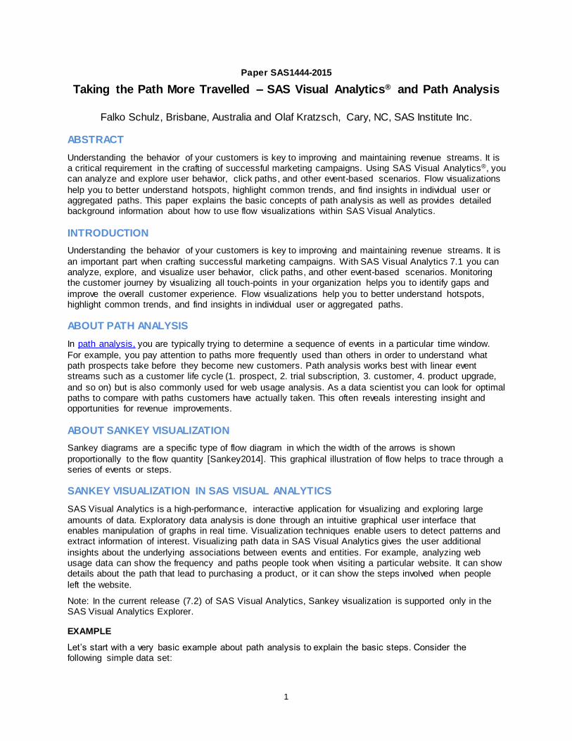
Figure 3 - Sankey Diagram by Event
Again highlighting the common partial path in yellow. By default the diagram uses the sequence count or frequency as default link width. However, you may want to weigh paths by a given measure, such as purchases or revenue as this better reflects the impact a path may have. The following example shows a
currency measure assigned as path weight:
Figure 4 - Sankey Diagram Using Path Weights
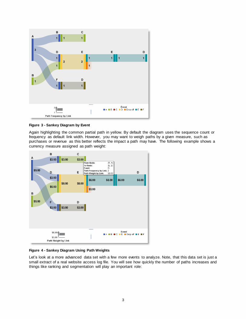
Let’s look at a more advanced data set with a few more events to analyze. Note, that this data set is just a
small extract of a real website access log file. You will see how quickly the number of paths increases and things like ranking and segmentation will play an important role:
4
Figure 5 – Web Clickstream Data
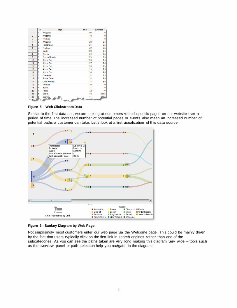
Similar to the first data set, we are looking at customers visited specific pages on our website over a period of time. The increased number of potential pages or events also mean an increased number of potential paths a customer can take. Let’s look at a first visualization of this data source:
Figure 6 - Sankey Diagram by Web Page
Not surprisingly most customers enter our web page via the Welcome page. This could be mainly driven
by the fact that users typically click on the first link in search engines rather than one of the subcategories. As you can see the paths taken are very long making this diagram very wide – tools such as the overview panel or path selection help you navigate in the diagram:
5
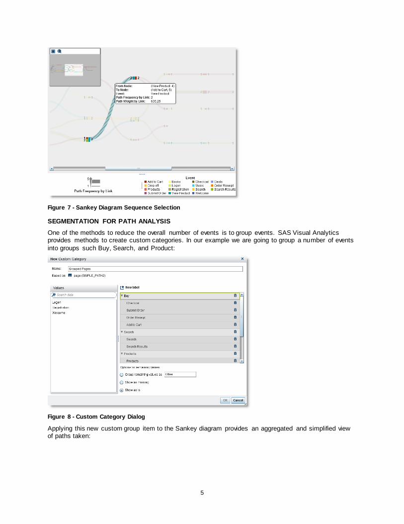
Figure 7 - Sankey Diagram Sequence Selection
SEGMENTATION FOR PATH ANALYSIS
One of the methods to reduce the overall number of events is to group events. SAS Visual Analytics provides methods to create custom categories. In our example we are going to group a number of events
into groups such Buy, Search, and Product:
Figure 8 - Custom Category Dialog
Applying this new custom group item to the Sankey diagram provides an aggregated and simplified view of paths taken:

6
Figure 9 - Aggregated Sankey Diagram
Once you have determined a particular path of interest, you often want to further analyze the related
group of customers who have taken this path. For instance, you might include the group of individuals in your next marketing campaign. SAS Visual Analytics allows you to narrow down the selection by either filtering or merging into a new visualization.
PATH FILTERING
Path filtering is done by selecting one or more events. You then either include or exclude items based on various conditions:
Figure 10 - Applying Path Filters
In this example, we are only interested in paths starting with the Welcome page:
7
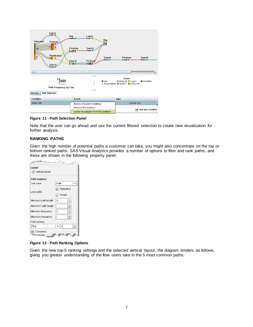
Figure 11 - Path Selection Panel
Note that the user can go ahead and use the current filtered selection to create new visualization for further analysis.
RANKING PATHS
Given the high number of potential paths a customer can take, you might also concentrate on the top or bottom ranked paths. SAS Visual Analytics provides a number of options to filter and rank paths , and these are shown in the following property panel.
Figure 12 - Path Ranking Options
Given the new top-5 ranking settings and the selected vertical layout, the diagram renders as follows, giving you greater understanding of the flow users take in the 5 most common paths.
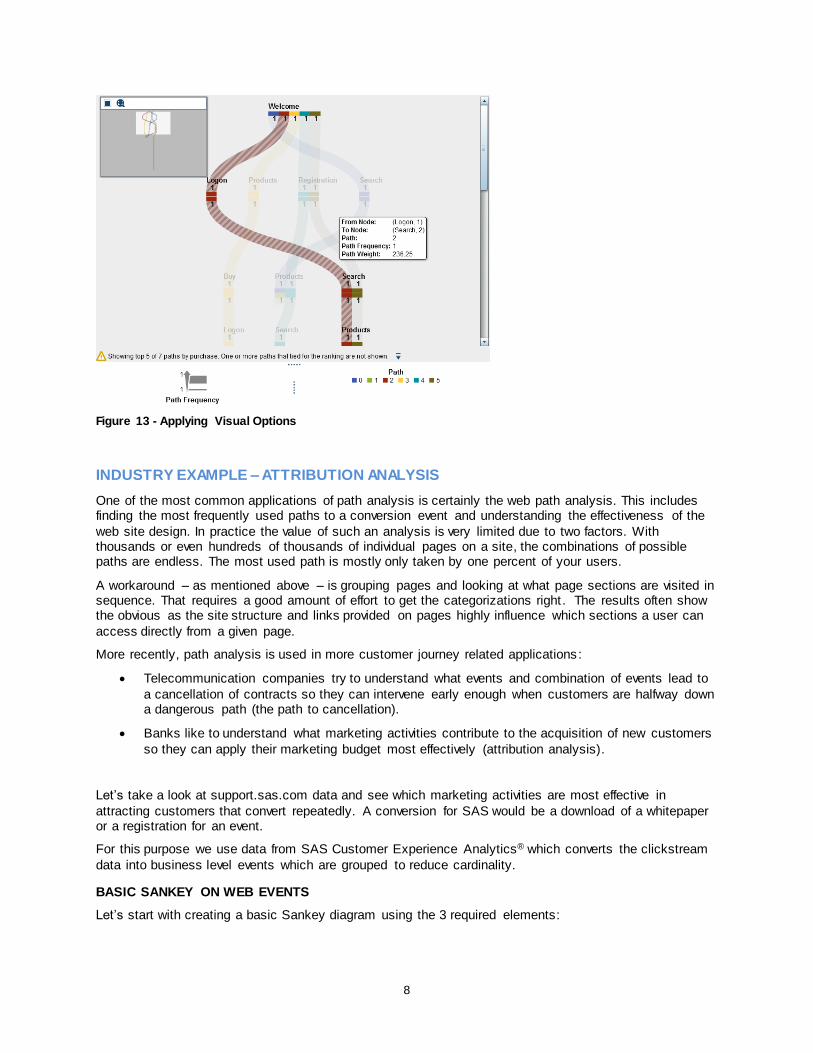
8
Figure 13 - Applying Visual Options
INDUSTRY EXAMPLE – ATTRIBUTION ANALYSIS
One of the most common applications of path analysis is certainly the web path analysis. This includes finding the most frequently used paths to a conversion event and understanding the effectiveness of the
web site design. In practice the value of such an analysis is very limited due to two factors. With thousands or even hundreds of thousands of individual pages on a site, the combinations of possible paths are endless. The most used path is mostly only taken by one percent of your users.
A workaround – as mentioned above – is grouping pages and looking at what page sections are visited in sequence. That requires a good amount of effort to get the categorizations right . The results often show the obvious as the site structure and links provided on pages highly influence which sections a user can
access directly from a given page.
More recently, path analysis is used in more customer journey related applications :
Telecommunication companies try to understand what events and combination of events lead to
a cancellation of contracts so they can intervene early enough when customers are halfway down a dangerous path (the path to cancellation).
Banks like to understand what marketing activities contribute to the acquisition of new customers
so they can apply their marketing budget most effectively (attribution analysis).
Let’s take a look at support.sas.com data and see which marketing activities are most effective in
attracting customers that convert repeatedly. A conversion for SAS would be a download of a whitepaper or a registration for an event.
For this purpose we use data from SAS Customer Experience Analytics® which converts the clickstream
data into business level events which are grouped to reduce cardinality.
BASIC SANKEY ON WEB EVENTS
Let’s start with creating a basic Sankey diagram using the 3 required elements:

9
Event: The ACTIVITY on the site (arrival from a specific source, visit to s site section, achievement
of a goal/conversion, usage of internal search, completion and abandonement of business processes, product views, etc.)
Sequence Order:
The ACTIVITY_DTTM (date timestamp down to the millisecond when the given activity happened)
Transaction Identifier:
The VISITOR_ID (persistant cookie that identifies returning visitors as we are interested in repeated visits, not only what happens in a single visit. Alternatively we could use the CUSTOMER_ID, which is a generated ID to identify individuals across devices, e.g. via a
login or email address)
Figure 14 - Basic Sankey on Web Events
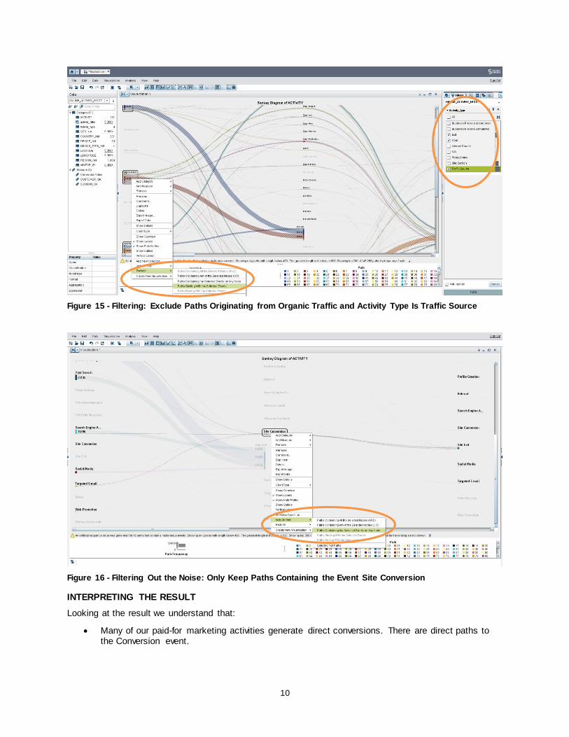
FILTERING OUT THE NOISE
We are interested in how our campaigns work and which sequences are generating long lasting
relationships and returning visitors. To see only relevant data for our exercise, we are going to filter out data to include only the events that describe the traffic sources and the goal events, which describe the conversions.
On top of that, we filter out all paths that start with any of the organic traffic as we are interested in the effectiveness of our paid marketing activities.
10
Figure 15 - Filtering: Exclude Paths Originating from Organic Traffic and Activity Type Is Traffic Source
Figure 16 - Filtering Out the Noise: Only Keep Paths Containing the Event Site Conversion
INTERPRETING THE RESULT
Looking at the result we understand that:
Many of our paid-for marketing activities generate direct conversions. There are direct paths to the Conversion event.

11
Online advertisement, Search Engine Advertisement, and Targeted e-Mails are the biggest contributors.
Most visitors (~90%) exit after the conversion and are never seen again. Only a tiny fraction shows repeated visits via other traffic sources.
So we don’t really have an attribution problem where we need to understand which combination or
sequence of marketing contacts works best. We need to understand who these people are who never come back and what we can do about it.
Figure 17 - Attribution Analysis Result
Most path analysis solutions, especially the ones in your SAS Web Analytics® package, work on aggregated data and don’t allow you to access the underlying sessions, cookies, and individuals. SAS
Visual Analytics works on detailed data so that you can continue your analysis and extract the interesting population. Use this data to create further visualizations to understand their locations or even export the individual IDs into your campaign management solution for a follow up.

12
Figure 18 - Using the Detailed Data for Further Analysis
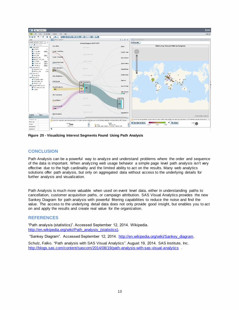
Figure 19 - Accessing Detailed Data
The detail data extracted gives us access to each visitor ID contributing to the selected event. Starting a
new visualization lets us merge additional visitor or customer attributes , such as city or country. The following example uses a geographic map visualization to highlight where most of our visitors are located. You may use additional information such as email addresses and export data for follow up campaigns,
further analysis, or reporting.
13
Figure 20 - Visualizing Interest Segments Found Using Path Analysis
CONCLUSION
Path Analysis can be a powerful way to analyze and understand problems where the order and sequence of the data is important. When analyzing web usage behavior a simple page level path analysis isn’t very
effective due to the high cardinality and the limited ability to act on the results. Many web analytics solutions offer path analysis, but only on aggregated data without access to the underlying details for further analysis and visualization.
Path Analysis is much more valuable when used on event level data, either in understanding paths to cancellation, customer acquisition paths, or campaign attribution. SAS Visual Analytics provides the new
Sankey Diagram for path analysis with powerful filtering capabilities to reduce the noise and find the value. The access to the underlying detail data does not only provide good insight, but enables you to act on and apply the results and create real value for the organization.
REFERENCES
“Path analysis (statistics)”. Accessed September 12, 2014. Wikipedia.
http://en.wikipedia.org/wiki/Path_analysis_(statistics).
“Sankey Diagram”. Accessed September 12, 2014. http://en.wikipedia.org/wiki/Sankey_diagram.
Schulz, Falko. “Path analysis with SAS Visual Analytics”. August 19, 2014. SAS Institute, Inc.
http://blogs.sas.com/content/sascom/2014/08/19/path-analysis-with-sas-visual-analytics .
14
ACKNOWLEDGMENTS
We would like to thank Xiaozheng Ma for his assistance with details of path analysis, Karsten Winkler for helping with data preparation, and Bill Yakowenko for his critical role in improving the Sankey
visualization component and associated path layout algorithms.
RECOMMENDED READING
The following titles are available at support.sas.com/documentation:
Base SAS® 9.4 Procedures Guide, Third Edition
SAS® For Dummies®, Second Edition
CONTACT INFORMATION
Your comments and questions are valued and encouraged. Contact the author at:
Falko Schulz SAS Institute Australia 1 Eagle St
Brisbane, QLD, 4001 Phone: +61 7-3233 320 [email protected]
http://au.linkedin.com/in/falkoschulz Olaf Kratzsch
SAS Institute Inc SAS Campus Drive Cary, NC 27513-2414, USA
Phone: (919) 531- 0365 [email protected]
SAS and all other SAS Institute Inc. product or service names are registered trademarks or trademarks of SAS Institute Inc. in the USA and other countries. ® indicates USA registration.
Other brand and product names are trademarks of their respective companies.