research and planning presentation 3
TRANSCRIPT
AS MEDIA
AS UNIT G321FOUNDATION PORTFOLIO IN MEDIA
RESEARCH AND PLANNING
Candidate Name
Candidate Number
Centre Name
Centre Number
Samantha Ryder
4191
The Leigh Academy
61101

Main image Draws attention to the magazine and catches peoples eye. It fills the whole cover, to show the importance of it.
MastheadThe logo for Q magazine is placed at the top, and creates awareness of the brand. Shows that the magazine is unique as the logo is exclusive to the brand.
Main coverline/anchorage textTells you what the magazine is about and shows what the main image is about. It clearly states who is in the image.
Colour schemeThe magazine consists of mainly three colours which makes it seem simple, but effective. The use of these colours make the magazine seem more professional as they stay constant throughout the cover.
CoverlineTells you about what else is in the magazine by giving extra information. Showing articles that can be found within the magazine.
PuffsIt takes a quote or piece of information that is taken from inside the magazine and it is directed straight at the audience.
SloganIt is located near the magazine logo and it makes the magazine seem more professional.
Identifying magazine conventions

This magazine follows the conventions of a magazine with a colour scheme is because everything matches, as they don’t use many different colours. The title follows conventions of a magazine as it is located right at the top of the magazine.
The skyline on this magazine develops convention as it is in different colours and it is not in one shape. It may have been designed this way to make it more interesting to the customer buying it also it could be to make a certain statement stand out more.
This magazine challenges the conventions of the proportion of text to image because you can see more of the people in the picture than you normally would and the text is mainly in one place.
How magazines follow, develop and challenge conventions
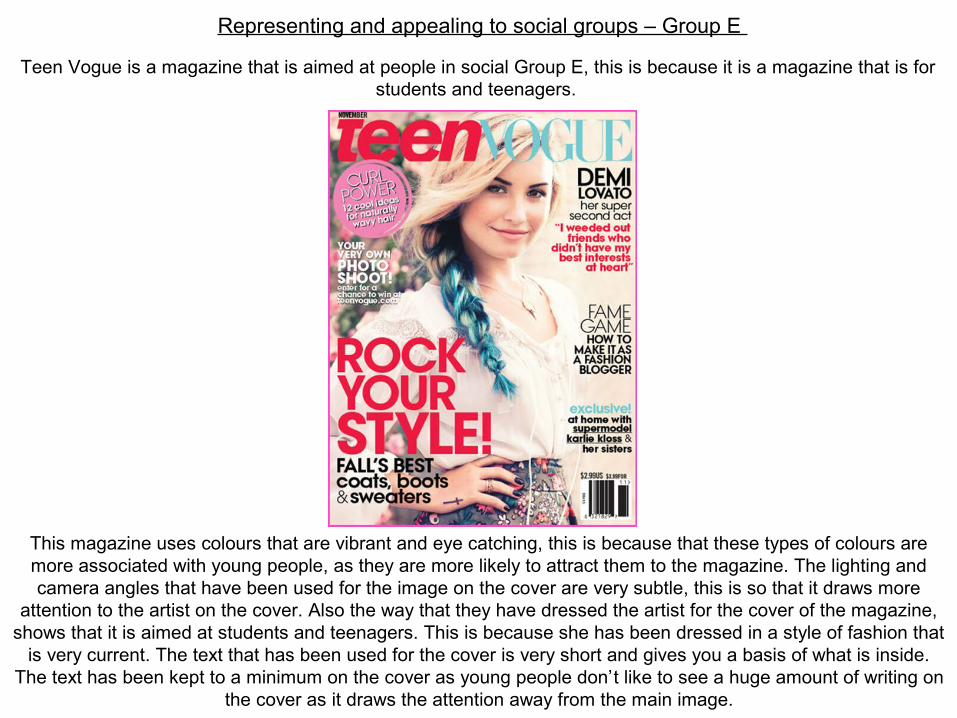
Representing and appealing to social groups – Group E
This magazine uses colours that are vibrant and eye catching, this is because that these types of colours are more associated with young people, as they are more likely to attract them to the magazine. The lighting and camera angles that have been used for the image on the cover are very subtle, this is so that it draws more
attention to the artist on the cover. Also the way that they have dressed the artist for the cover of the magazine, shows that it is aimed at students and teenagers. This is because she has been dressed in a style of fashion that
is very current. The text that has been used for the cover is very short and gives you a basis of what is inside. The text has been kept to a minimum on the cover as young people don’t like to see a huge amount of writing on
the cover as it draws the attention away from the main image.
Teen Vogue is a magazine that is aimed at people in social Group E, this is because it is a magazine that is for students and teenagers.

Identifying music magazine forms and conventions
Record Collector is published by Diamond Publishing.
Mixmag is published by Development Hell ltd and the editor is Nick Decosemo.
Kerrang is distributed by Bauer Media Group and it is published by Emap.
DJ is distributed by Thrush Magazine and it is edited by Ben Murphy.

Technologies and processes
Physical technology
Modern cameras have a large amount of storage depending on memory cards storage size. They can take high quality photos and can clearly zoom in on images to make the picture clear.
Studios are very equipped and use advanced technologies such as light, monitors and screens which help to produce high quality pictures.
Digital technology
Computer hardware is very advanced and many new computers are equipped with the best software to help with editing.
Memory cards can hold up to 512GB, all in different sizes for the storage you require.
Software
The main piece of software that is used, is called Photoshop. Photoshop is used to merge images together and to edit the images so that they are left with the picture that they want. The editing involves using colours and cropping pictures to create your image.
Some examples of promotional software are electronic billboards, that advertise different products.
Printing
Printing hardware is what we use to print out images from computers. There are different sized printers depending on the size of the mage you want to print out.
Printing press is a printing process that is generally used for large scale jobs, such as magazines.
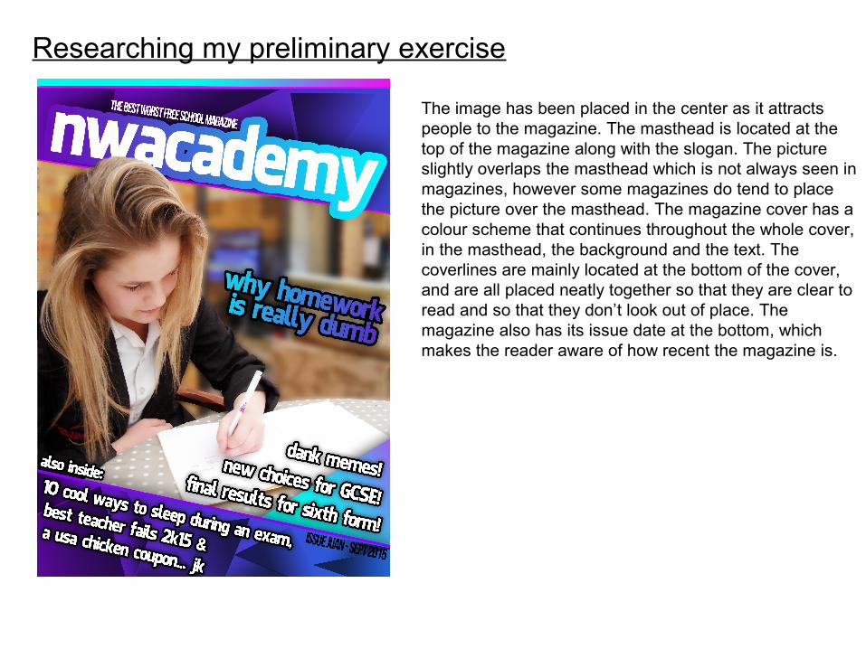
Researching my preliminary exercise
The image has been placed in the center as it attracts people to the magazine. The masthead is located at the top of the magazine along with the slogan. The picture slightly overlaps the masthead which is not always seen in magazines, however some magazines do tend to place the picture over the masthead. The magazine cover has a colour scheme that continues throughout the whole cover, in the masthead, the background and the text. The coverlines are mainly located at the bottom of the cover, and are all placed neatly together so that they are clear to read and so that they don’t look out of place. The magazine also has its issue date at the bottom, which makes the reader aware of how recent the magazine is.

Researching my preliminary exercise
The masthead has been placed at the top of the magazine cover, with the main cover image placed below it. The picture and the masthead do not overlap as they are completely separate to each other. The magazine cover does not have a main cover line or a skyline and they also have not included any puffs. The text that has been included is all over the place in different fonts and colours. The magazine does not have a main colour scheme as multiple colours have been used.
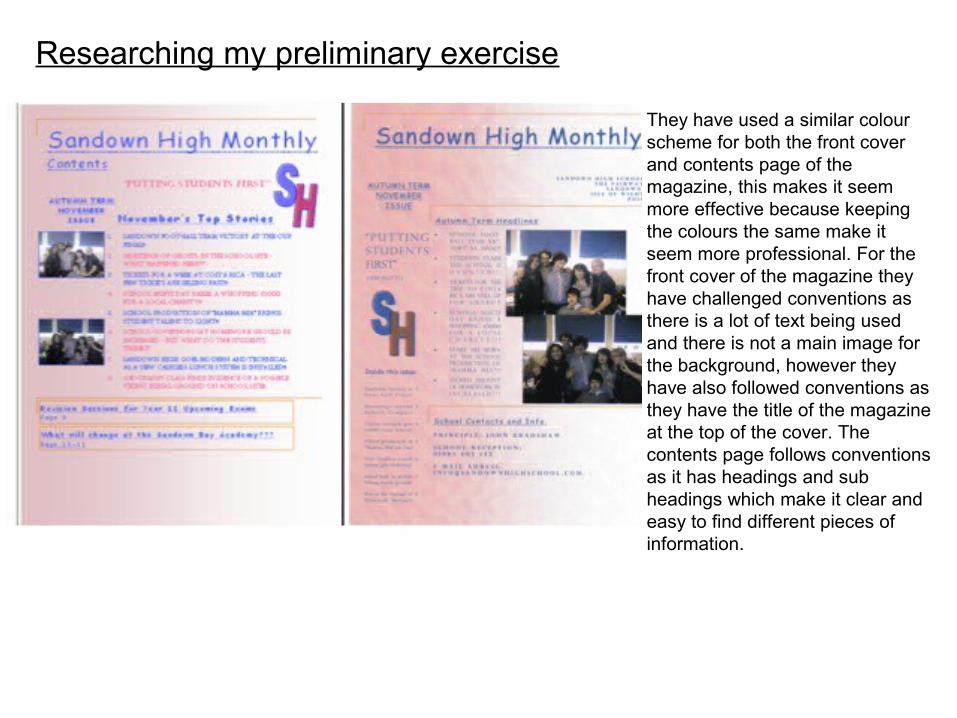
Researching my preliminary exercise
They have used a similar colour scheme for both the front cover and contents page of the magazine, this makes it seem more effective because keeping the colours the same make it seem more professional. For the front cover of the magazine they have challenged conventions as there is a lot of text being used and there is not a main image for the background, however they have also followed conventions as they have the title of the magazine at the top of the cover. The contents page follows conventions as it has headings and sub headings which make it clear and easy to find different pieces of information.
Which forms and conventions will be used in my school magazine design and why?
-I will use a masthead at the top of my page and it will be above the image, possibly overlapping it.
-I will have a colour scheme for my magazine cover, mainly consisting of black, white purple and pink.
-I will have my main coverline over the top of the main image.
-The main image will be the background for the whole front cover of the magazine. The main image will involve one of the schools students.
-I will also use puffs to make specific information more noticeable.
-I will also include the schools logo on the cover.
I have chosen these specific design elements for my magazine because I feel that they will all work well together which will make the cover seem more professional also I have decided to have a main colour scheme so that everything is consistent. The reason that I will use one of the schools students for my
covers main image is because I want to make the magazine as relatable as I can towards the students who will read it. I will include the schools logo on the cover so that it is clear to whoever reads it that all
information is related to the school and that it clearly shows who the magazine is aimed at.

There are subheadings linked to every page to tell you what articles they are talking about on which page.
Researching my main task
The picture is a full shot of one of the bands featured within the magazine so that you can see there hole bodies.
The main heading for the contents page are in different colours than the main text as it shows that the text are about different things.
There is also a small review on the page to fill up space as it is not a main article. However it gives opinions and information on a chosen artist about either a new song, music video or album that they have recently released.
They have stuck to a colour scheme of mainly black, white and red as they are colours used in the magazines logo also the have used this colour scheme as it keeps it simple and they are colours that work well together.
The text borders around the image making it look neat and professional as everything is organised on the page in a particular way.

Researching my main task
They are advertising the magazine to try and fill up space and to catch your attention as it is located right at the front of the magazine this is because it is in a place where people are most likely to see it.
The headings and subheadings are in bold to make them noticeable as they stand out more.
The heading gives information about the image above it and there is also a little paragraph relating to the image and heading to explain what is happening.
The image shows a shot of the band ‘Kasabian’ who are mentioned in the heading and paragraph below. It shows an image of what happened to make the reader more aware of what has gone on.
The colour scheme mainly consists of the colours black, red and white as they are the colours that are used within the logo, also its because these colours mix well together and make the magazine seem more professional.
They have laid the information out about different pages under subheadings so that the reader can easily find out what page number the article is on.
Researching my main task
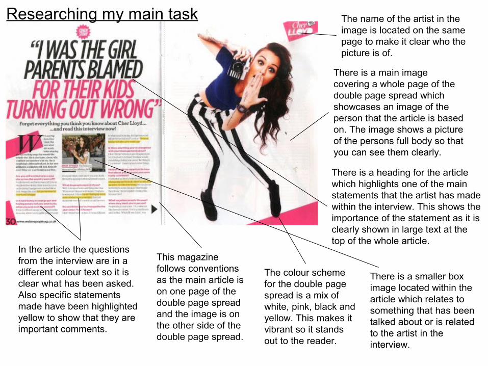
There is a main image covering a whole page of the double page spread which showcases an image of the person that the article is based on. The image shows a picture of the persons full body so that you can see them clearly.
The name of the artist in the image is located on the same page to make it clear who the picture is of.
In the article the questions from the interview are in a different colour text so it is clear what has been asked. Also specific statements made have been highlighted yellow to show that they are important comments.
There is a heading for the article which highlights one of the main statements that the artist has made within the interview. This shows the importance of the statement as it is clearly shown in large text at the top of the whole article.
There is a smaller box image located within the article which relates to something that has been talked about or is related to the artist in the interview.
The colour scheme for the double page spread is a mix of white, pink, black and yellow. This makes it vibrant so it stands out to the reader.
This magazine follows conventions as the main article is on one page of the double page spread and the image is on the other side of the double page spread.
Researching my main task
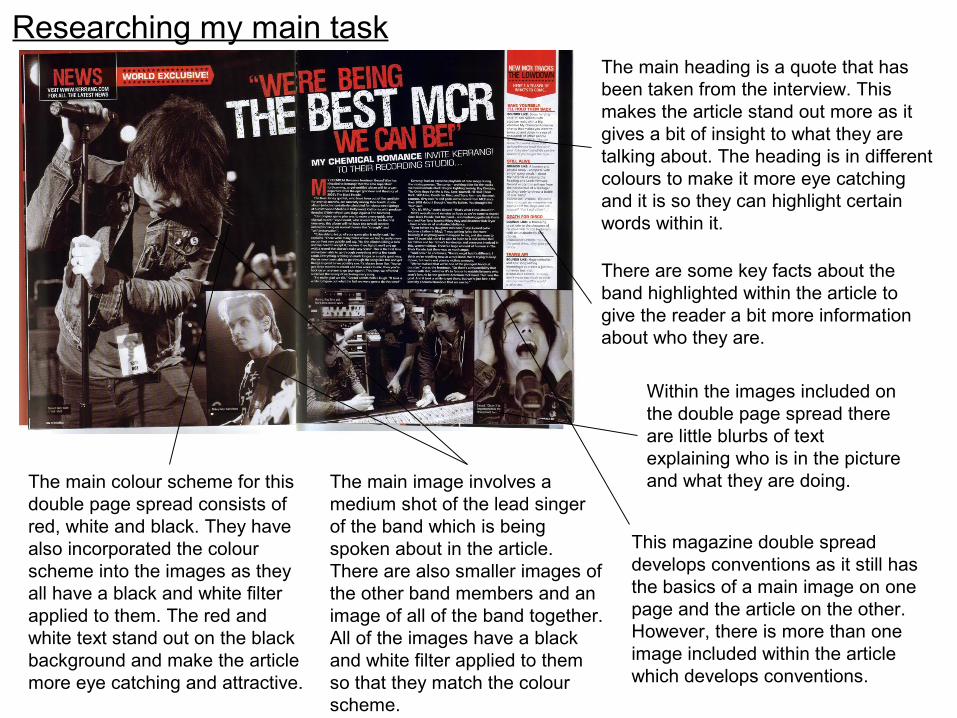
The main colour scheme for this double page spread consists of red, white and black. They have also incorporated the colour scheme into the images as they all have a black and white filter applied to them. The red and white text stand out on the black background and make the article more eye catching and attractive.
The main image involves a medium shot of the lead singer of the band which is being spoken about in the article. There are also smaller images of the other band members and an image of all of the band together. All of the images have a black and white filter applied to them so that they match the colour scheme.
The main heading is a quote that has been taken from the interview. This makes the article stand out more as it gives a bit of insight to what they are talking about. The heading is in different colours to make it more eye catching and it is so they can highlight certain words within it.
There are some key facts about the band highlighted within the article to give the reader a bit more information about who they are.
This magazine double spread develops conventions as it still has the basics of a main image on one page and the article on the other. However, there is more than one image included within the article which develops conventions.
Within the images included on the double page spread there are little blurbs of text explaining who is in the picture and what they are doing.
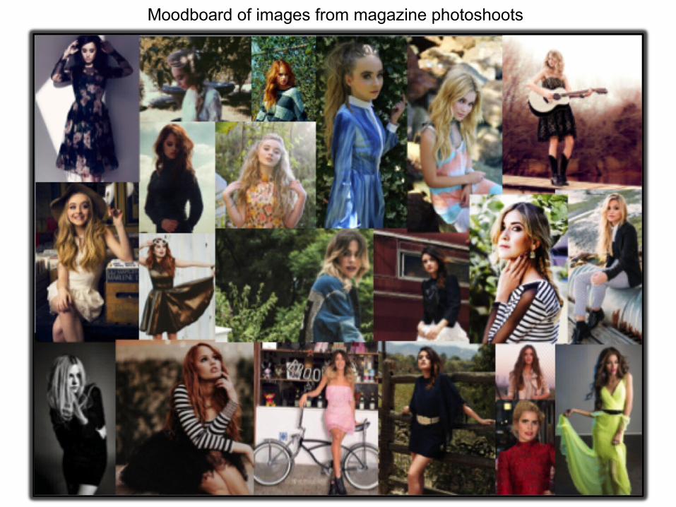
Moodboard of images from magazine photoshoots
Magazine photoshoot image ideas
I created a moodboard of images from magazine photoshoots, as I wanted to look at the styles of photos that are used for magazine covers and articles. I found that in most images the artist was placed in the middle of the image as it showed that they were the focus of the picture. I also noticed that most images had either a plain background or they had a natural background as they had been taken outside in front of nature. Most of the images I looked at from photoshoots had their artists in some kind of pose.
From looking at these photoshoot images, I know that for my magazine I should make sure that in my images I have my artist doing some sort of pose and I should make sure that they are the focus of the picture. I have also decided to choose a natural location for the backdrop of my images, as they seem to be the most interesting images to look at compared to the ones with a plain background.
Which forms and conventions will be used in my music magazine design and why?
-I will use a masthead at the top of my page and it will be on top of the main image, so that it is overlapping it.
-I will have a colour scheme throughout my magazine, that will consist of black and dark pink. I have chosen these colours as they work well together and they will make the magazine seem more
professional.
-I will have my main coverline at the bottom of my front cover and it will be over the top of my main image.
-The main image will be the background for the whole front cover of the magazine. The main image will be a close up image of my artist.
-I will also use puffs to make specific information stand out on the front cover, so that the reader has some insight into what will be in the magazine.
-For my contents page I will have a small picture of my chosen artist and I will have a list of all the pages in the magazine with their page numbers.
- For my double page spread I have decided that on one page I will have my article and on the other page I will have images from my artists photoshoot.
I have chosen these specific design elements for my magazine because I feel that they will all work well together which will make the cover seem more professional. I have also decided to have a main colour
scheme throughout my magazine design as it will keep everything consistent. For my double page spread I decided that I would have my article on one side and my images on the other as I think it would
be an effective layout and would make my magazine seem professional.