rgd caseselect
TRANSCRIPT
select case studies
case study 1 I packaging
trinity vintners I turning point sangria
scope of engagement:
market research
consumer profiling and insightsdesign strategy & packaging design
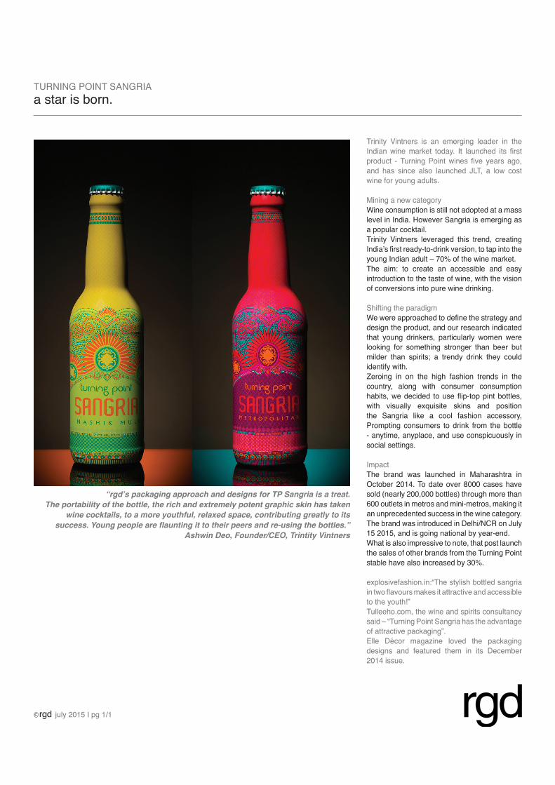
Trinity Vintners is an emerging leader in the
Indian wine market today. It launched its first product - Turning Point wines five years ago, and has since also launched JLT, a low cost wine for young adults.
Mining a new category
Wine consumption is still not adopted at a mass
level in India. However Sangria is emerging as a popular cocktail.
Trinity Vintners leveraged this trend, creating India’s first ready-to-drink version, to tap into the young Indian adult – 70% of the wine market.
The aim: to create an accessible and easy
introduction to the taste of wine, with the vision of conversions into pure wine drinking.
Shifting the paradigmWe were approached to define the strategy and design the product, and our research indicated that young drinkers, particularly women were looking for something stronger than beer but
milder than spirits; a trendy drink they could
identify with.
Zeroing in on the high fashion trends in the
country, along with consumer consumption habits, we decided to use flip-top pint bottles, with visually exquisite skins and position the Sangria like a cool fashion accessory, Prompting consumers to drink from the bottle
- anytime, anyplace, and use conspicuously in social settings.
Impact
The brand was launched in Maharashtra in
October 2014. To date over 8000 cases have sold (nearly 200,000 bottles) through more than 600 outlets in metros and mini-metros, making it an unprecedented success in the wine category.
The brand was introduced in Delhi/NCR on July
15 2015, and is going national by year-end.What is also impressive to note, that post launch the sales of other brands from the Turning Point
stable have also increased by 30%.
explosivefashion.in:“The stylish bottled sangria in two flavours makes it attractive and accessible to the youth!”
Tulleeho.com, the wine and spirits consultancy said – “Turning Point Sangria has the advantage of attractive packaging”.Elle Décor magazine loved the packaging designs and featured them in its December
2014 issue.
TURNING POINT SANGRIAa star is born.
july 2015 I pg 1/1
“rgd’s packaging approach and designs for TP Sangria is a treat.
The portability of the bottle, the rich and extremely potent graphic skin has taken
wine cocktails, to a more youthful, relaxed space, contributing greatly to its
success. Young people are flaunting it to their peers and re-using the bottles.”
Ashwin Deo, Founder/CEO, Trintity Vintners
case study 4 I identity - retail
good earth I sustainable luxury & lifestyle
scope of engagement:
brand positioning
design strategy and development of brand markapplication of the brand visual language across all stakeholder touch-points including in store
event communication & collateral
case study 2 I identity - education ( vocational)true school of music I india’s first contemporary western music school
scope of engagement:
articulation of mission, vision and brand positioning
design strategy and development of corporate mark.
application of the brand visual language across all stakeholder touch-points.
locational, way finding and statutory signage
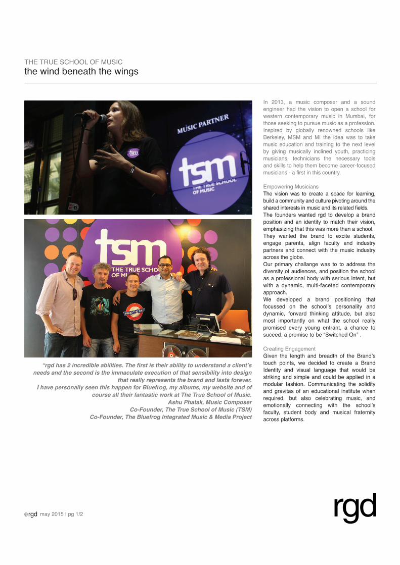
In 2013, a music composer and a sound engineer had the vision to open a school for western contemporary music in Mumbai, for those seeking to pursue music as a profession.
Inspired by globally renowned schools like
Berkeley, MSM and MI the idea was to take music education and training to the next level by giving musically inclined youth, practicing musicians, technicians the necessary tools and skills to help them become career-focused
musicians - a first in this country.
Empowering Musicians
The vision was to create a space for learning, build a community and culture pivoting around the shared interests in music and its related fields. The founders wanted rgd to develop a brand position and an identity to match their vision, emphasizing that this was more than a school.
They wanted the brand to excite students, engage parents, align faculty and industry partners and connect with the music industry
across the globe.
Our primary challange was to to address the
diversity of audiences, and position the school as a professional body with serious intent, but with a dynamic, multi-faceted contemporary approach.
We developed a brand positioning that focussed on the school’s personality and
dynamic, forward thinking attitude, but also most importantly on what the school really
promised every young entrant, a chance to suceed, a promise to be “Switched On” .
Creating Engagement
Given the length and breadth of the Brand’s touch points, we decided to create a Brand Identity and visual language that would be striking and simple and could be applied in a
modular fashion. Communicating the solidity
and gravitas of an educational institute when required, but also celebrating music, and emotionally connecting with the school’s
faculty, student body and musical fraternity across platforms.
THE TRUE SCHOOL OF MUSICthe wind beneath the wings
may 2015 I pg 1/2
“rgd has 2 incredible abilities. The first is their ability to understand a client’s
needs and the second is the immaculate execution of that sensibility into design
that really represents the brand and lasts forever.
I have personally seen this happen for Bluefrog, my albums, my website and of
course all their fantastic work at The True School of Music.
Ashu Phatak, Music Composer
Co-Founder, The True School of Music (TSM)
Co-Founder, The Bluefrog Integrated Music & Media Project
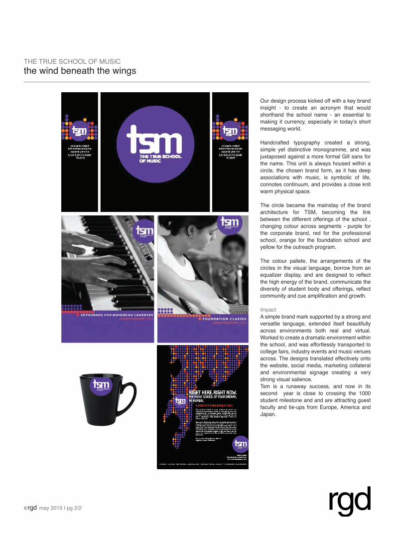
Our design process kicked off with a key brand
insight - to create an acronym that would
shorthand the school name - an essential to
making it currency, especially in today’s short messaging world.
Handcrafted typography created a strong, simple yet distinctive monogramme, and was juxtaposed against a more formal Gill sans for the name. This unit is always housed within a
circle, the chosen brand form, as it has deep associations with music, is symbolic of life, connotes continuum, and provides a close knit warm physical space.
The circle became the mainstay of the brand
architecture for TSM, becoming the link between the different offerings of the school , changing colour across segments - purple for
the corporate brand, red for the professional school, orange for the foundation school and yellow for the outreach program.
The colour pallete, the arrangements of the circles in the visual language, borrow from an equalizer display, and are designed to reflect the high energy of the brand, communicate the diversity of student body and offerings, reflect community and cue amplification and growth.
Impact
A simple brand mark supported by a strong and versatile language, extended itself beautifully across environments both real and virtual. Worked to create a dramatic environment within the school, and was effortlessly transported to college fairs, industry events and music venues across. The designs translated effectively onto the website, social media, marketing collateral and environmental signage creating a very strong visual salience. Tsm is a runaway success, and now in its second year is close to crossing the 1000
student milestone and and are attracting guest
faculty and tie-ups from Europe, America and Japan.
THE TRUE SCHOOL OF MUSICthe wind beneath the wings
may 2015 I pg 2/2
case study 3 I identity - non profitmagic bus I non–profit organization for mentoring under-privileged children
scope of engagement:
articulation of mission and vision internal research and perception study of brand.
brand position and essence
communication and design strategy and
re-staging of corporate mark and tagline.
application of the brand visual language across all stakeholder touch-points.
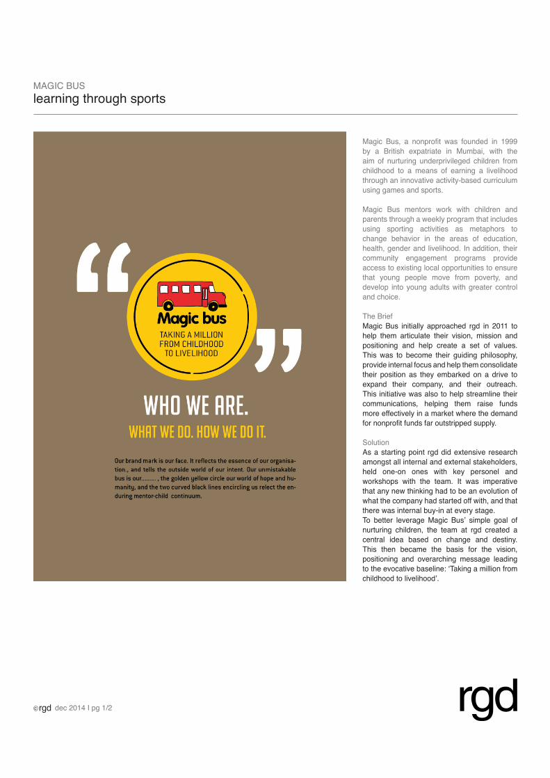
Magic Bus, a nonprofit was founded in 1999 by a British expatriate in Mumbai, with the aim of nurturing underprivileged children from childhood to a means of earning a livelihood through an innovative activity-based curriculum using games and sports.
Magic Bus mentors work with children and
parents through a weekly program that includes
using sporting activities as metaphors to change behavior in the areas of education, health, gender and livelihood. In addition, their community engagement programs provide access to existing local opportunities to ensure that young people move from poverty, and develop into young adults with greater control and choice.
The Brief
Magic Bus initially approached rgd in 2011 to
help them articulate their vision, mission and positioning and help create a set of values. This was to become their guiding philosophy, provide internal focus and help them consolidate their position as they embarked on a drive to expand their company, and their outreach. This initiative was also to help streamline their communications, helping them raise funds more effectively in a market where the demand for nonprofit funds far outstripped supply.
SolutionAs a starting point rgd did extensive research amongst all internal and external stakeholders, held one-on ones with key personel and
workshops with the team. It was imperative that any new thinking had to be an evolution of what the company had started off with, and that there was internal buy-in at every stage.To better leverage Magic Bus’ simple goal of nurturing children, the team at rgd created a central idea based on change and destiny.
This then became the basis for the vision, positioning and overarching message leading to the evocative baseline: ‘Taking a million from childhood to livelihood’.
MAGIC BUSlearning through sports
dec 2014 I pg 1/2
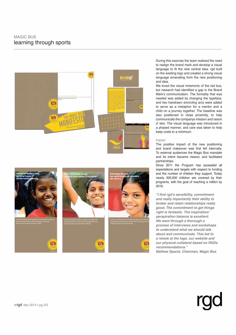
During this exercise the team realized the need to realign the brand mark and develop a visual language to fit the new central idea. rgd built on the existing logo and created a strong visual language emanating from the new positioning
and idea.
We loved the visual mnemonic of the red bus, but research had identified a gap in the Brand Mark’s communication. The formality that was
needed was added by changing the typeface, and two handrawn encircling arcs were added
to serve as a metaphor for a mentor and a child on a journey together. The baseline was
also positioned in close proximity, to help communicate the companys mission and raison
d’ etre. The visual language was introduced in a phased manner, and care was taken to help keep costs to a minimum.
Impact
The positive impact of the new positioning and brand makeover was first felt internally. To external audiences the Magic Bus mandate and its intent became clearer, and facilitated partnerships.
Since 2011 the Program has exceeded all expectations and targets with respect to funding and the number of children they support. Today
nearly 300,000 children are covered by their programs, with the goal of reaching a million by 2016.
MAGIC BUSlearning through sports
dec 2014 I pg 2/2
“I find rgd’s sensibility, commitment
and really importantly their ability to
broker and retain relationships really
good. The commitment to get things
right is fantastic. The inspiration/
perspiration balance is excellent.
We went through a thorough a
process of interviews and workshops
to understand what we should talk
about and communicate. This led to
a relook at the logo, our website and
our physical collateral based on RGDs
recommendations.”
Mathew Spacie, Chairman, Magic Bus
case study 4 I identity - retail
good earth I sustainable luxury & lifestyle
scope of engagement:
brand positioning
design strategy and development of brand markapplication of the brand visual language across all stakeholder touch-points including in store
event communication & collateral
case study 2 I identity - education ( vocational)true school of music I india’s first contemporary western music school
scope of engagement:
articulation of mission, vision and brand positioning
design strategy and development of corporate mark.
application of the brand visual language across all stakeholder touch-points.
locational, way finding and statutory signage
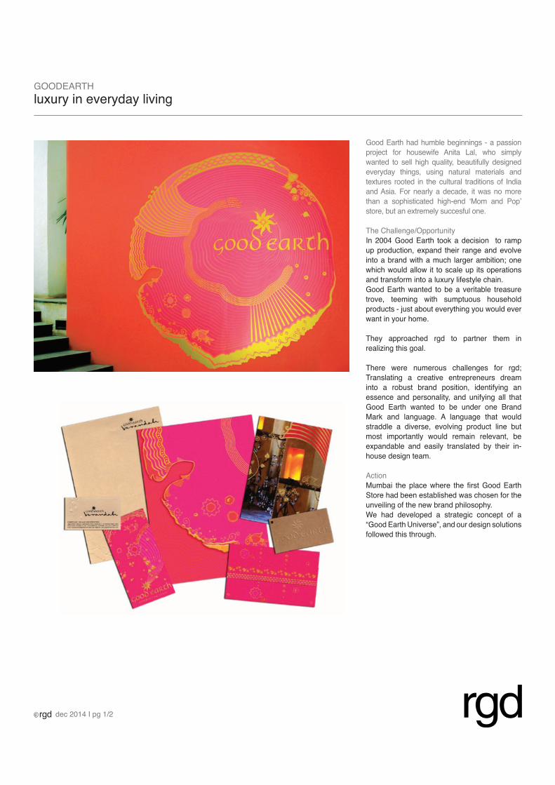
Good Earth had humble beginnings - a passion
project for housewife Anita Lal, who simply wanted to sell high quality, beautifully designed everyday things, using natural materials and textures rooted in the cultural traditions of India and Asia. For nearly a decade, it was no more than a sophisticated high-end ‘Mom and Pop’
store, but an extremely succesful one.
The Challenge/Opportunity
In 2004 Good Earth took a decision to ramp
up production, expand their range and evolve into a brand with a much larger ambition; one
which would allow it to scale up its operations
and transform into a luxury lifestyle chain. Good Earth wanted to be a veritable treasure trove, teeming with sumptuous household products - just about everything you would ever want in your home.
They approached rgd to partner them in
realizing this goal.
There were numerous challenges for rgd;
Translating a creative entrepreneurs dream into a robust brand position, identifying an essence and personality, and unifying all that Good Earth wanted to be under one Brand
Mark and language. A language that would straddle a diverse, evolving product line but most importantly would remain relevant, be expandable and easily translated by their in-house design team.
ActionMumbai the place where the first Good Earth Store had been established was chosen for the unveiling of the new brand philosophy.We had developed a strategic concept of a “Good Earth Universe”, and our design solutions followed this through.
GOODEARTHluxury in everyday living
dec 2014 I pg 1/2
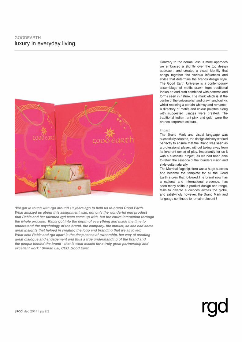
Contrary to the normal less is more approach
we embraced a slightly over the top design approach, and created a visual identity that brings together the various influences and styles that determine the brands design style.
The Good Earth Universe is a contemporary assemblage of motifs drawn from traditional
Indian art and craft combined with patterns and
forms seen in nature. The mark which is at the
centre of the universe is hand drawn and quirky, whilst retaining a certain whimsy and romance.
A directory of motifs and colour palettes along with suggested usages were created. The
traditional Indian rani pink and gold, were the brands corporate colours.
Impact
The Brand Mark and visual language was succesfully adopted, the design delivery worked perfectly to ensure that the Brand was seen as
a professional player, without taking away from its inherent sense of play. Importantly for us it
was a succesful project, as we had been able to retain the essence of the founders vision and style quite naturally.The Mumbai flagship store was a huge success and became the template for all the Good
Earth stores that followed.The brand now has
a national and International presence, has seen many shifts in product design and range, talks to diverse audiences across the globe, and satisfyingly however, the Brand Mark and language continues to remain relevant !
GOODEARTHluxury in everyday living
dec 2014 I pg 2/2
‘We got in touch with rgd around 10 years ago to help us re-brand Good Earth.
What amazed us about this assignment was, not only the wonderful end product
that Rabia and her talented rgd team came up with, but the entire interaction through
the whole process. Rabia got into the depth of everything and made the time to
understand the psychology of the brand, the company, the market, so she had some
great insights that helped in creating the logo and branding that we all loved.
What sets Rabia and rgd apart is the deep sense of ownership, her way of creating
great dialogue and engagement and thus a true understanding of the brand and
the people behind the brand - that is what makes for a truly great partnership and
excellent work.’ Simran Lal, CEO, Good Earth