simulation - hadley wickhamhad.co.nz/stat480/lectures/15-simulation.pdf · outline • basics of...
TRANSCRIPT

SimulationHadley Wickham

Aims
• Learn how to simulate data to:
• Test your statistical intuition
• Perform power tests
• Experiment with a new technique on known data
• Learn how to use functions to reduce duplication

Outline
• Basics of simulation
• Don’t repeat yourself
• Exploring some theorem you should have seen before
• Exploring the behaviour of a t-test

Basics of simulation
• Want to:
• generate random numbers from known distribution
• want to repeat the simulation multiple times

Generating random numbers
• runif (uniform), rpois (poisson), rnorm (normal), rbinom (binomial), rgamma (gamma), rbeta (beta)
• First argument for all is n, number of samples to generate
• Then parameters of the distribution (always check that the distribution is parameterised the way you expect)

Your turn
• Generate 100 numbers ~ N(0, 1)
• Generate 50 numbers ~ N(10, 5)
• Generate 1000 numbers ~ Poisson(50)
• Generate 10 numbers ~ Beta(0.1, 0.1)
• Generate 30 numbers ~ Uniform(0, 10)

Repetition
• Use the replicate function
• replicate(n, expression)
• replicate(10, mean(rnorm(100)))
• qplot(replicate(100, mean(rnorm(10))), type="histogram")

Your turn
• Plot histogram of:
• 100 x mean of 10 N(0,1)
• 1000 x mean of 10 Unif(0, 10)
• 1000 x mean of 100 Unif(0, 10)
• 100 x mean of 1000 Unif(0, 10)
• What do last three examples show? Experiment with the number of samples

What your code might have looked like
• qplot(replicate(100, mean(norm(10))), type="histogram")
• qplot(replicate(10, mean(norm(10))), type="histogram")
• qplot(replicate(1000, mean(norm(10))), type="histogram")
• qplot(replicate(10000, mean(norm(10))), type="histogram")
• qplot(replicate(100, mean(norm(100))), type="histogram")
• qplot(replicate(100, mean(norm(1000))), type="histogram")
• qplot(replicate(1000, mean(norm(1))), type="histogram")
• qplot(replicate(10000 mean(norm(1000))), type="histogram")

Do not repeat yourself

Dry rule
Why?
• Increases the difficulty of change
• May decrease clarity
• Leads to opportunities for inconsistency
• http://en.wikipedia.org/wiki/Don't_repeat_yourself

Functions
• Let us avoid repetition
functionname <- function(argument1,...) {
# do stuff here
}

Building up a function
• Start simple
• Do it outside of the function
• Test as you go
• Give it a good name

Your turn
• Create a function that draws a histogram of n draws of mean(rnorm(100))
• Modify your function to draw a histogram of n draws of mean(rnorm(m))
• Modify your function to allow the user to choose which distribution function, d, to use
Next task
• We know (hopefully) that a t test works best on normally distributed data
• How can we test that?

Your turn
• Figure out how to do a t.test in R
• Figure out how to extract the p-value from that object (use str and your subsetting skills)
• Write a function to generate two vectors of n random normals, compare them with a t.test and return the p-value

Your turn
• Repeat several thousand times and draw a histogram for various values of n
• Try varying the parameters of the two normals. What happens when you vary the mean? What happens when you vary the standard deviation?
• What happens if you use non-normal data? Eg. uniform, or poisson data

Another exploration
• How does our sample estimate compare to the true unknown
• eg., when calculating the mean of a sample of random normals, how many do we need to draw to be reasonably certain we got the right value?

What do we want to see?
• A plot of the different estimates, vs. number of sample points?
• So we need a data.frame with columns n, and sample mean (and sample sd. as well)
• How can we do this?
• Can’t just use replicate
New function
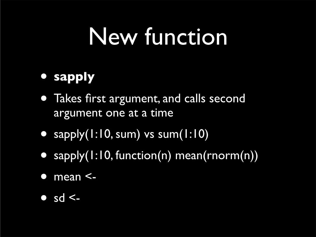
• sapply
• Takes first argument, and calls second argument one at a time
• sapply(1:10, sum) vs sum(1:10)
• sapply(1:10, function(n) mean(rnorm(n))
• mean <-
• sd <-

Create the data
• n <- rep(seq(1, 1000, by=10), each=10)
• mean <- sapply(n, function(x) mean(rnorm(x)))
• qplot(n, mean)
Your turn
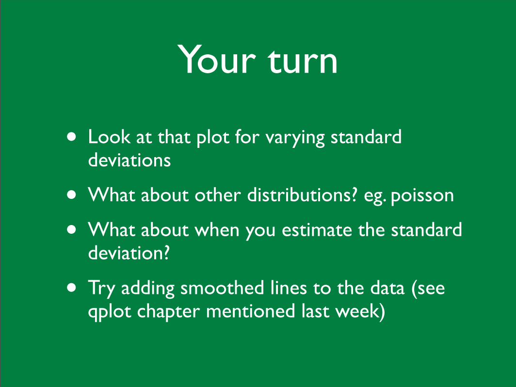
• Look at that plot for varying standard deviations
• What about other distributions? eg. poisson
• What about when you estimate the standard deviation?
• Try adding smoothed lines to the data (see qplot chapter mentioned last week)