staff style guide for the vermont cynic
DESCRIPTION
Staff Style Guide for the Vermont Cynic.TRANSCRIPT

STYL
E G
UID
E

Style Guide
Here is an example of the main text elements found in a typical layout, regardless of the section.
A
B
C
D
Text Elements
E

Style Guide
A). Headline: A headline is the label for an article. It tells the reader what the article is about. Every headline needs to have an active verb. Headlines stretch all the way across an article. A headline is absolutely necessary for every single article in the paper. The formatting for a main headline is: Helvetica Neue (T1) 77 Bold Condensed, 45-60 pt.
B). Sub-headline, or Subhead: A subhead goes under the headline, and it is meant to further explain the headline to the reader. The subhead, like the headline, stretches all the way across an article. A subhead is generally about half the point size as the headline. Depending on the space that is available, a subhead is not always necessary but it is preferred. Words that are in the headline should not repeat in the subhead. The formatting for a subhead is: Helvetica Neue (T1) 55 Roman, half the size of the headline (20-40 pt.)
C). Byline: A byline credits the writer of the piece. This is absolutely necessary for every single article. It is extremely important is to double and triple check the byline before printing. The byline consists of the writer’s name and their position at The Cynic. The formatting for the byline is: Name: Georgia, Bold, 9.5 pt, 10 pt, leading. Position: Georgia, Italic, 9.5 pt, 10 pt leading.
D). Cutline: A cutline explains what is going on in the photo and why it is relevant. The cutline, like the byline, credits the photographer to the photo. The cutline is made up of the photographer’s name, the words “The Vermont Cynic”, and two to three sentences describing what is going on in the photo and why it is relevant. The formatting for the cutline is: Name: Helvetica Neue (T1), 75 Bold, 8.5 pt, 10.2 pt leading. The Vermont Cynic: Helvetica Neue (T1), 45 Light Italic 8.5 pt, 10.2 pt. leading. Cutline: Georgia, Italic, 9.5 pt, 10.5 pt leading.
E). Text (also known as copy): The text of the article is exactly what it sounds like - the who, what, when, where, why and how. Articles are the reason people read the paper. When formatting an article, the un-copyedited version should be in italics and the copyedited version should be regular. The formatting for text is: Georgia 9.5 pt font size 10.5 pt. leading -20 tracking Justified,lastlineleftaligned Aligned to baseline grid 0.2infirstlineindent
Text Elements

Style Guide
A
B
C
Text Elements

Style Guide
A). Secondary Headline: A secondary headline has all of the same rules as a regular headline, but with one exception. A secondary headline is used to help establish dominance on the page. The most important story is given a regular headline and, in order of descending importance, the rest of the stories receive secondary headlines. The formatting for a secondary headline is: Helvetica Neue (T1) 67 Bold Condensed, 36-50 pt.
B). Pull Quote: A pull quote is an interesting quote from an article that provides a point of entry to an article. A pull quote is made up of the quote, the person who said it and why they matter/why it matters to the story.
C). Spacing: Spacing is very important in good design. Between each “package” on a page (a package is made up of a headline, subhead, byline, article, art and cutline) there is a spacing of 1p6. Between each element in a package (headline, subhead, article) there is a space of p8. P8 is half of 1p6. This spacing is very important to bring a consistent look to the paper. However, it is not always completely possible to maintain this spacing. When it isn’t possible, strive to keep the spacing even and consistent.
D). Section Header: The section header goes at the top of every page of the paper. Each section has their own header built into the template - just watch to make sure that the page numbers and date are correct. Remember: even numbered pages are on the left, odd number pages are on the right, and the page numbers go on the outside of the page.
D
Text Elements

Style GuideArt/Graphic Elements
Photo: A photo accompanies an article to provide another point of entry, depth and more credibility. Because photos add credibility, the more photos that can be used in the paper, the better. The formatting for a photo is:
0.5 pt stroke, blackFit Content Proportionately*Use the direct selection tool to move the photo within the frame.
Without art or graphics, a paper would be extremely boring and very dull to look at. We use a variety of different art and graphics to make the paper look visually appealing.

Style GuideArt/Graphic Elements
Illustration:An illustration is often used when getting a photo of someone is out of the question. In the example above, a review was written about the artist Cee Lo Green. Because getting a photo of him would have been extremely time consuming and we work on a short time schedule, we had an illustrator draw a portrait of the artist.
Illustrations are often used in Life and Arts, and sometimes Sports. Comics is entirely illustrations. The Opinion section has a weekly editorial cartoon that is done by an illustrator. Illustrations are rarely, if ever, used in the News section.

Style GuideArt/Graphic Elements
A part of designing pages is making graphic elements. There is an unlimited amount of different graphics that can be made, ranging frommapsandsidebarstographsandsnowflakes.Belowareafewexamples of different graphic elements that page designers have created.

Style GuideArt/Graphic Elements

Style GuideArt/Graphic Elements
Here are a few more examples of graphic elements that page designers have created.
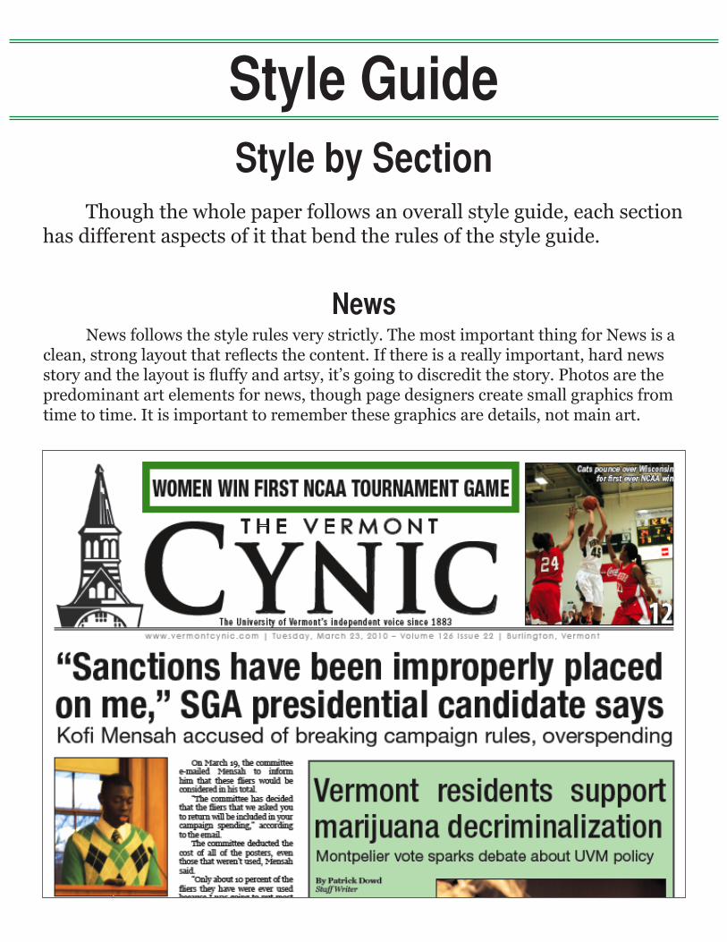
Style GuideStyle by Section
Though the whole paper follows an overall style guide, each section has different aspects of it that bend the rules of the style guide.
News follows the style rules very strictly. The most important thing for News is a clean,stronglayoutthatreflectsthecontent.Ifthereisareallyimportant,hardnewsstoryandthelayoutisfluffyandartsy,it’sgoingtodiscreditthestory.Photosarethepredominant art elements for news, though page designers create small graphics from time to time. It is important to remember these graphics are details, not main art.
News

Style GuideStyle by Section
Opinioncolumnsareleftaligned,notjustified.Eachcolumnisthasaheadshot,and under the headshot is the columnist’s name. The columnist also has an extended byline that goes at the end of their column. This extended byline says the columnist’s year, major and how long they have been writing for The Cynic. Pull quotes in Opinion do not need attribution because they are an opinion, not fact. The disturbing quote of the week always has to be attributed. Quick Opinions are put in a box and each quick opinion is titled with the columnist’s name. Letters to the editor all have headlines, written by the Opinion editor. The editorial cartoon always goes along with the staff editorial. Occasionally, an editorial cartoon is drawn for a different column. Point/Counterpoint has a circle graphic, and the rules for pull quotes, extended bylines and headshots all still apply. All headshots, extended bylines and graphics are saved in the Opinion template.
Opinion

Style GuideStyle by Section
The style rules for Arts and Life are interchangeable. Though the sections still followthebasicrulesaboutheadlinesandtext,thereismuchmoreflexibilitywithartand the layout of the page. The layout does not have to be as stiff as News. Different fonts can be used to change up a headline if it is appropriate. For example, this Arts article was about a woman who made dolls that were out of the ordinary, so the headline was changed to a different font to make it more interesting and appealing.
Arts/Life

Style GuideStyle by Section
Though feature isn’t a weekly part of the paper, it is still used periodically. With the exception of the rules about text, feature breaks almost every style rule. It is an opportunity to do something out of the ordinary and give an article a special treatment. For example, this is a feature that was about professors using Facebook, so the page wasmadetolooklikeaFacebookprofilepage.
Feature

Style GuideStyle by Section
ThestylerulesforSportsfloatsomewherebetweenNewsandArts/Life.Sportscan either be designed with a clean, strong layout or be designed with more graphics and illustrations. Both can be equally effective if done correctly.
Sports

Style GuideAdvertisements
Advertisements are an integral part of the paper. They play a huge roll in funding the paper and make it possible for the paper to be printed each week. There are 6 different sizes of ads:
• TextAd/Classified(nomorethan75words,nobiggerthanafifthpage)• 4” x 3” (Coupon)• 4” x 7.5” (Fifth page)• 6” x 7.5” (Quarter page)• 10” x 7.5” (Half page)• 10” x 15” (Full page)
Sometimes, there are custom-sized ads depending on the needs and wants of the client. There are also house ads in all of the sizes listed above. A house ad is an advertisement for the paper.
For more information about advertising and rates, see the rate card or talk to the Ad Manager.