stash
DESCRIPTION
FIDM Logo Design FinalTRANSCRIPT

WATERMENORIG INAL
Logo Development

WATERMENORIG INAL
Domino Records represents various indie band. The direction I went with for this logo was to create a bold symbol that acknowledg-es what the company is about. Being that the record company is called “Domino” records I wanted to bring forth the action of actual dominoes falling. Applicable to the discovery of independent bands the metaphor for when things are in a domino effect is the key element I wanted to emphasize in this symbol. The “d” is incorporated with the falling dominoes to add individuality. I chose to bring forth the negative space of the symbol so that the over-all logo is legible where ever it may be ap-plied to. In regards to I chose red to represent strength and energy that indie bands have.
The main focus for the Original Water-men logo was to make it memorable, legible, and welcoming. For this logo I have created an iconic symbol where I have combined the “O” in orginal and the “W” in Watermen. The way I have it represented is in a 3-D effect as if there were different dimensions to each side of the letter. Instead of emphasizing the front of the letters I chose to bring forth the the side dimensions and knock the front out as nega-tive space. The symbol can be read as the two letters or an abstract man. Relevant to what the company is about I have chosen masculine letters and a soft color scheme for balance.
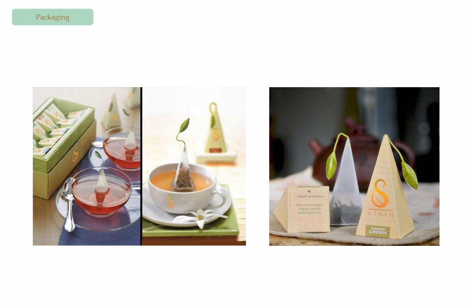
The logo that I have created is more of an iconic symbol. It has an open picture plain where the “S” symbol stands for “stash” and has a tea leaf stowed in the negative space of the “S”. To support the imagaery I added the name of the company so the “S” is under-standable on what it stands for. The color I have chosen is warm and bright and reflects the color of tea. I chose a gradient to show the soft side and fluidity of tea. The type I chose are all in capital letters and has a few descend-er letters that go beneath the baseline. I chose this masculine type so that it can sit in contrast with the feeling of the “S” symbol and add balance to the overall logo.
Mission Statement

Logo Sizes

16655 SW 72nd Ave Suite 200 • Tigard, Oregon 97224 • 503-684-4482W W W . S T A S H T E A . C O M
16655 SW 72nd Ave Suite 200 • Tigard, Oregon 97224 • 503-684-4482
16655 SW 72nd Ave Sui te 200
Tigard , Oregon 97224
W W W . S T A S H T E A . C O M
5 0 3 - 6 8 4 - 4 4 8 2
Stationary

c-27 m-55 y-93 k-15
c-0 m-33 y-100 k-0
c-0 m-48 y-88 k-0
c-19 m-73 y-95 k-6
c-81 m-41 y-78 k-36
CAFE & BREWERY
PALANTINO
1 2 3 4 5 6 7 8 9 10
a b c d e f g h i j k l m n o p q r s t u v w x y z
A B C D E F G H I J K L M N O P Q R S T U V W X Y Z
1 2 3 4 5 6 7 8 9 10a b c d e f g h i j k l m n o p q r s t u v w x y zA B C D E F G H I J K L M N O P Q R S T U V W X Y Z
Style Sheet

Apparel

Storefront

Merchandising

Website
Packaging

Advertising