tiny fonts. big words. bored audiences. a practical guide for delivering your best presentation,...
TRANSCRIPT

Tiny Fonts. Big Words.
Bored Audiences.
A practical guide for delivering your best presentation, well, ever.
GPA Conference, Sept. 2012

#1 Brevity
You can only digest so much information at one time.

• Poor graphic resolution
• Illegible graphic text
• Too small charts
• Too small text
• Too much text
Conferences Cause Blindness

Slides for you
Bad

• Too much stuff
• No point
• Crowded
Or Confusion…

Slides for you
Bad

#2 KISS• Keep
• It
• Simple
• Stupid

Go
od

#3 It’s About Them

Goal: Avoid This

• Yellow cartoon guy
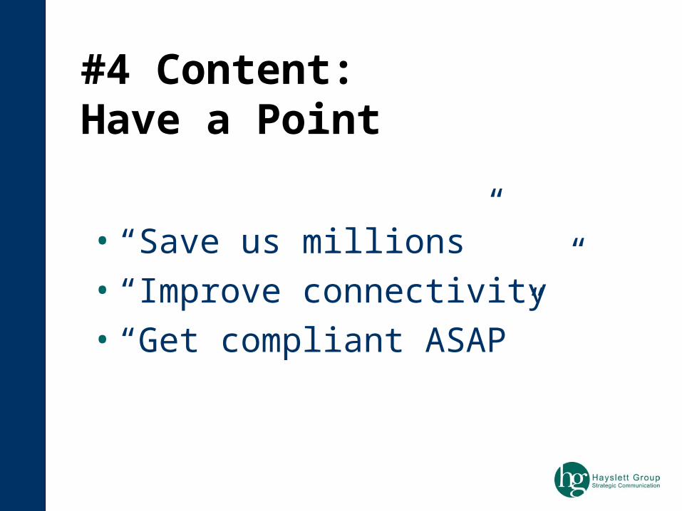
• “Save us millions”
• “Improve connectivity”
• “Get compliant ASAP”
#4 Content: Have a Point

Beginning, Middle & End

When in Doubt, Leave it Out

• Save $$
• Be environmentally responsible
• Good ROI for tax-payers
What’s In It for Me? Er, Them.

Ask Good Questions
• Make it relevant
• Make it personal

• Rule #1 – not too long, observe time
• Rule #2 – simple to understand
• Rule #3 – It’s about THEM!
• Rule #4 – the Main point
Pop Quiz

Coming Soon

Go
od

Slides for you
Bad

Slides for you
Ug
ly

The Power of Images


• Color – use red/yellow sparingly
• Background – light
• Graphics – clean, high quality
• Fonts – sans serif & not too many
• Animation/Transitions – simple & few
Visual Aids

Go
od

Go
od

The Standing O

Practice!
• In the mirror
• Time yourself
• Practice animations

Ask for Help!
• Graphics
• Practice
• Tech support
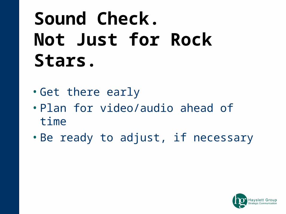
• Get there early
• Plan for video/audio ahead of time
• Be ready to adjust, if necessary
Sound Check. Not Just for Rock Stars.

The Ideal
http://labnol.blogspot.com/2007/05/best-powerpoint-presentations-in-world.html

(Here’s where you raise your hand to participate.)
What’s Your Struggle?