typography - witty.ca · pdf file"wanted" poster and those used for a traditional...
TRANSCRIPT
1
http://www.nhsdesigns.com/graphic/typography
TYPOGRAPHY
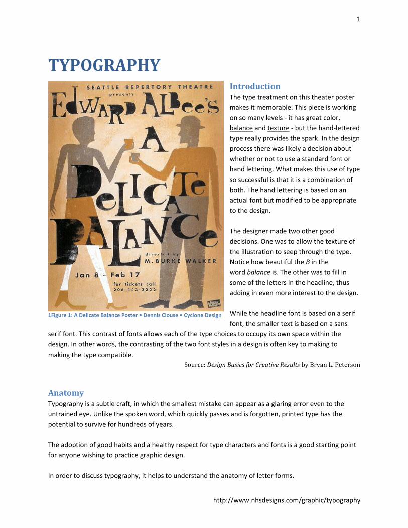
Introduction The type treatment on this theater poster
makes it memorable. This piece is working
on so many levels - it has great color,
balance and texture - but the hand-lettered
type really provides the spark. In the design
process there was likely a decision about
whether or not to use a standard font or
hand lettering. What makes this use of type
so successful is that it is a combination of
both. The hand lettering is based on an
actual font but modified to be appropriate
to the design.
The designer made two other good
decisions. One was to allow the texture of
the illustration to seep through the type.
Notice how beautiful the B in the
word balance is. The other was to fill in
some of the letters in the headline, thus
adding in even more interest to the design.
While the headline font is based on a serif
font, the smaller text is based on a sans
serif font. This contrast of fonts allows each of the type choices to occupy its own space within the
design. In other words, the contrasting of the two font styles in a design is often key to making to
making the type compatible.
Source: Design Basics for Creative Results by Bryan L. Peterson
Anatomy Typography is a subtle craft, in which the smallest mistake can appear as a glaring error even to the
untrained eye. Unlike the spoken word, which quickly passes and is forgotten, printed type has the
potential to survive for hundreds of years.
The adoption of good habits and a healthy respect for type characters and fonts is a good starting point
for anyone wishing to practice graphic design.
In order to discuss typography, it helps to understand the anatomy of letter forms.
1Figure 1: A Delicate Balance Poster • Dennis Clouse • Cyclone Design
2
http://www.nhsdesigns.com/graphic/typography
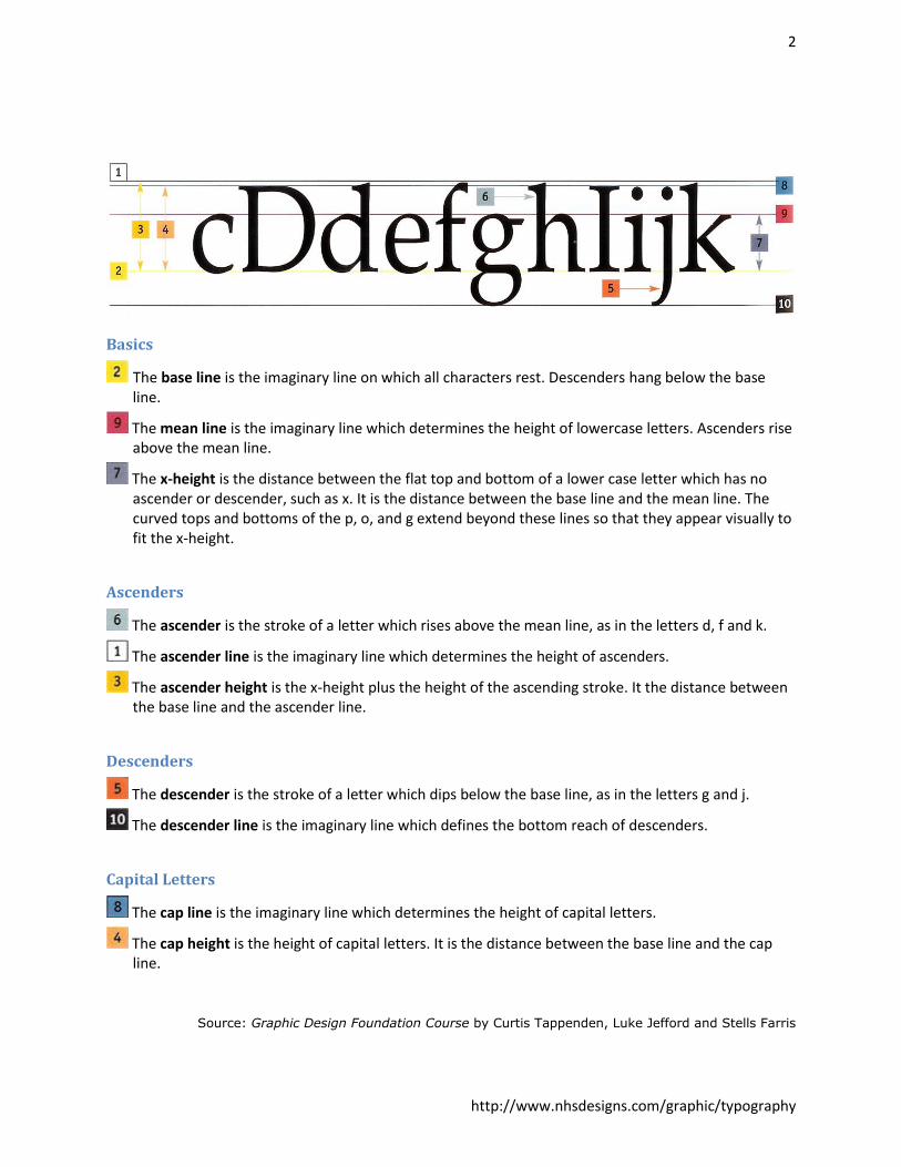
Basics
The base line is the imaginary line on which all characters rest. Descenders hang below the base line.
The mean line is the imaginary line which determines the height of lowercase letters. Ascenders rise above the mean line.
The x-height is the distance between the flat top and bottom of a lower case letter which has no ascender or descender, such as x. It is the distance between the base line and the mean line. The curved tops and bottoms of the p, o, and g extend beyond these lines so that they appear visually to fit the x-height.
Ascenders
The ascender is the stroke of a letter which rises above the mean line, as in the letters d, f and k.
The ascender line is the imaginary line which determines the height of ascenders.
The ascender height is the x-height plus the height of the ascending stroke. It the distance between the base line and the ascender line.
Descenders
The descender is the stroke of a letter which dips below the base line, as in the letters g and j.
The descender line is the imaginary line which defines the bottom reach of descenders.
Capital Letters
The cap line is the imaginary line which determines the height of capital letters.
The cap height is the height of capital letters. It is the distance between the base line and the cap line.
Source: Graphic Design Foundation Course by Curtis Tappenden, Luke Jefford and Stells Farris
3
http://www.nhsdesigns.com/graphic/typography
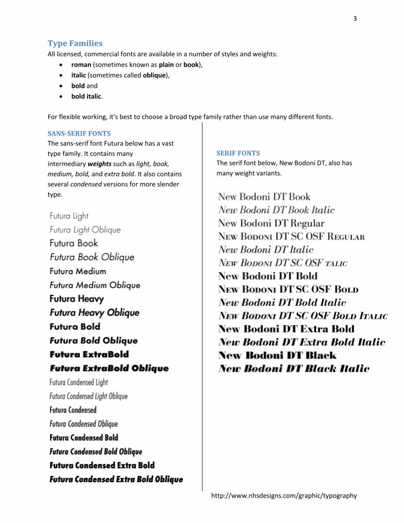
Type Families All licensed, commercial fonts are available in a number of styles and weights:
roman (sometimes known as plain or book),
italic (sometimes called oblique),
bold and
bold italic.
For flexible working, it's best to choose a broad type family rather than use many different fonts.
SANS-SERIF FONTS
The sans-serif font Futura below has a vast
type family. It contains many
intermediary weights such as light, book,
medium, bold, and extra bold. It also contains
several condensed versions for more slender
type.
SERIF FONTS
The serif font below, New Bodoni DT, also has
many weight variants.
4
http://www.nhsdesigns.com/graphic/typography
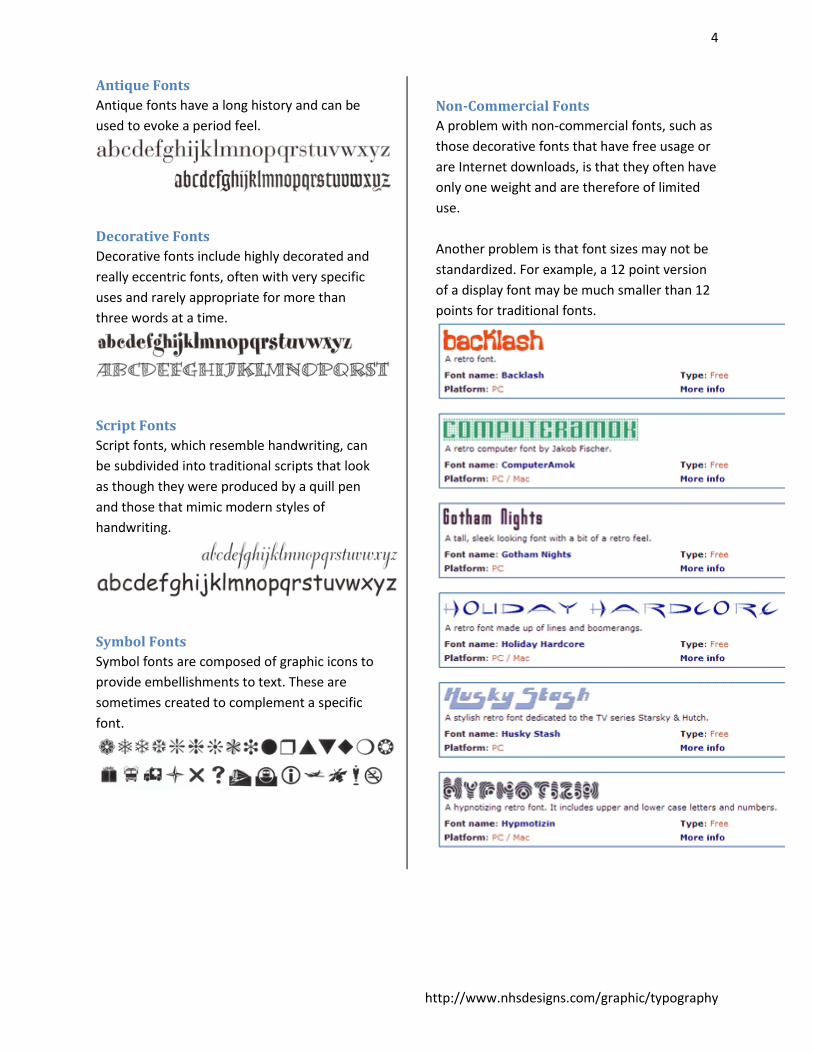
Antique Fonts
Antique fonts have a long history and can be
used to evoke a period feel.
Decorative Fonts
Decorative fonts include highly decorated and
really eccentric fonts, often with very specific
uses and rarely appropriate for more than
three words at a time.
Script Fonts
Script fonts, which resemble handwriting, can
be subdivided into traditional scripts that look
as though they were produced by a quill pen
and those that mimic modern styles of
handwriting.
Symbol Fonts
Symbol fonts are composed of graphic icons to
provide embellishments to text. These are
sometimes created to complement a specific
font.
Non-Commercial Fonts
A problem with non-commercial fonts, such as
those decorative fonts that have free usage or
are Internet downloads, is that they often have
only one weight and are therefore of limited
use.
Another problem is that font sizes may not be
standardized. For example, a 12 point version
of a display font may be much smaller than 12
points for traditional fonts.
5
http://www.nhsdesigns.com/graphic/typography
Type Families All licensed, commercial fonts are available in a number of styles and weights:
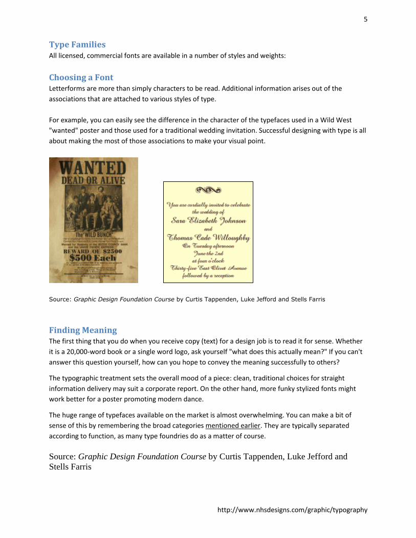
Choosing a Font Letterforms are more than simply characters to be read. Additional information arises out of the
associations that are attached to various styles of type.
For example, you can easily see the difference in the character of the typefaces used in a Wild West
"wanted" poster and those used for a traditional wedding invitation. Successful designing with type is all
about making the most of those associations to make your visual point.
Source: Graphic Design Foundation Course by Curtis Tappenden, Luke Jefford and Stells Farris
Finding Meaning The first thing that you do when you receive copy (text) for a design job is to read it for sense. Whether
it is a 20,000-word book or a single word logo, ask yourself "what does this actually mean?" If you can't
answer this question yourself, how can you hope to convey the meaning successfully to others?
The typographic treatment sets the overall mood of a piece: clean, traditional choices for straight
information delivery may suit a corporate report. On the other hand, more funky stylized fonts might
work better for a poster promoting modern dance.
The huge range of typefaces available on the market is almost overwhelming. You can make a bit of
sense of this by remembering the broad categories mentioned earlier. They are typically separated
according to function, as many type foundries do as a matter of course.
Source: Graphic Design Foundation Course by Curtis Tappenden, Luke Jefford and
Stells Farris
6
http://www.nhsdesigns.com/graphic/typography
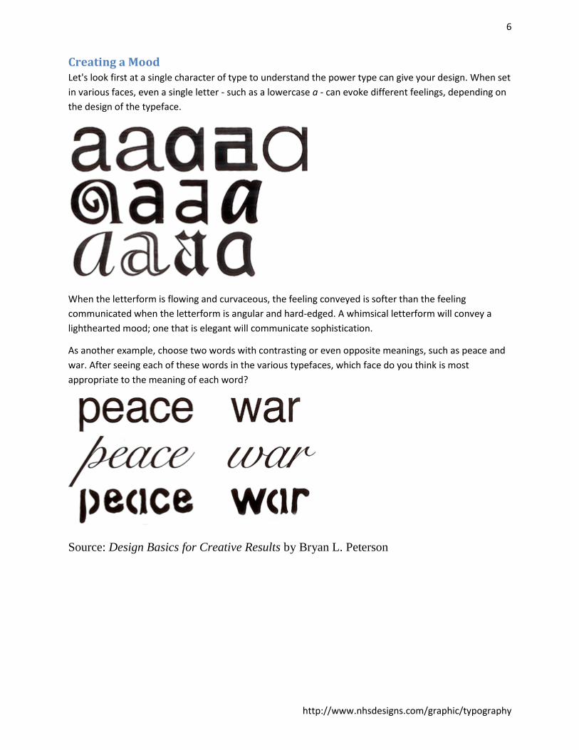
Creating a Mood Let's look first at a single character of type to understand the power type can give your design. When set
in various faces, even a single letter - such as a lowercase a - can evoke different feelings, depending on
the design of the typeface.
When the letterform is flowing and curvaceous, the feeling conveyed is softer than the feeling
communicated when the letterform is angular and hard-edged. A whimsical letterform will convey a
lighthearted mood; one that is elegant will communicate sophistication.
As another example, choose two words with contrasting or even opposite meanings, such as peace and
war. After seeing each of these words in the various typefaces, which face do you think is most
appropriate to the meaning of each word?
Source: Design Basics for Creative Results by Bryan L. Peterson
7
http://www.nhsdesigns.com/graphic/typography
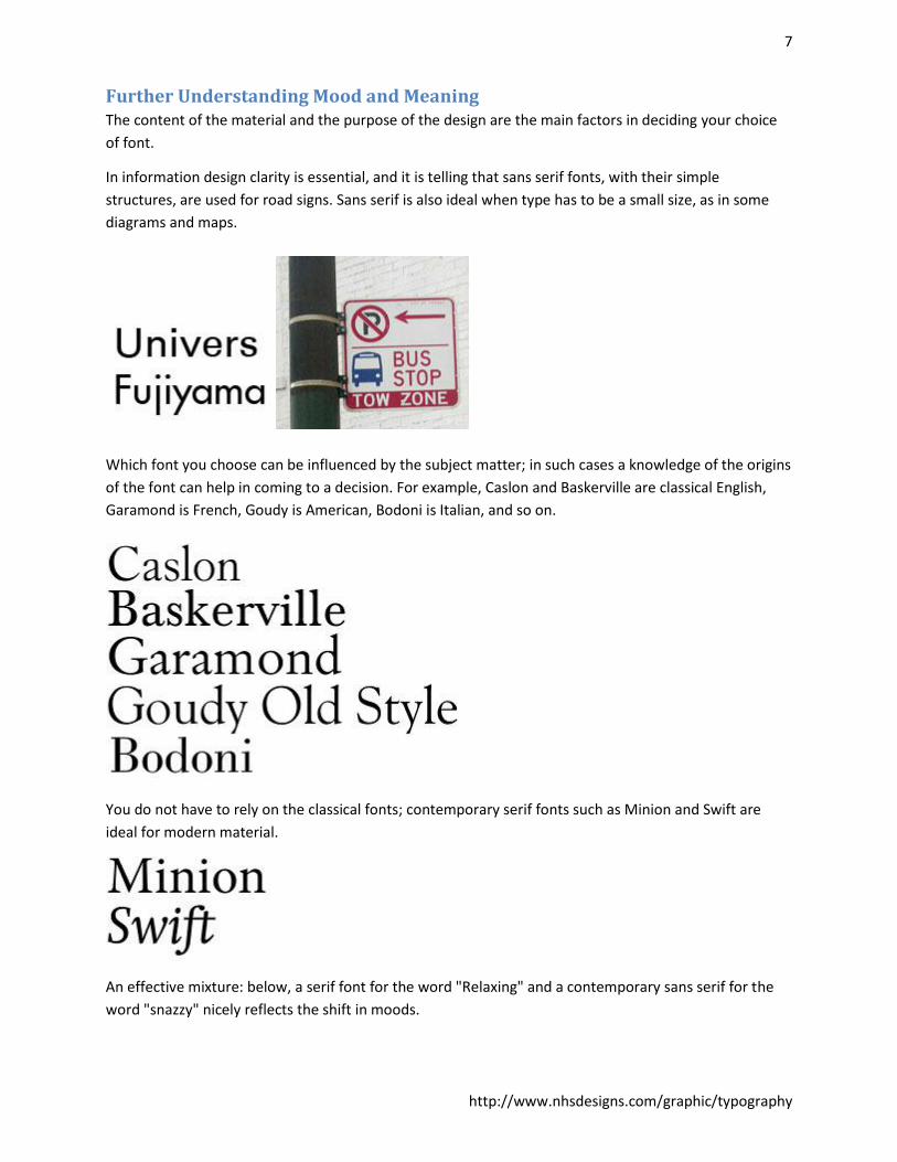
Further Understanding Mood and Meaning The content of the material and the purpose of the design are the main factors in deciding your choice
of font.
In information design clarity is essential, and it is telling that sans serif fonts, with their simple
structures, are used for road signs. Sans serif is also ideal when type has to be a small size, as in some
diagrams and maps.
Which font you choose can be influenced by the subject matter; in such cases a knowledge of the origins
of the font can help in coming to a decision. For example, Caslon and Baskerville are classical English,
Garamond is French, Goudy is American, Bodoni is Italian, and so on.
You do not have to rely on the classical fonts; contemporary serif fonts such as Minion and Swift are
ideal for modern material.
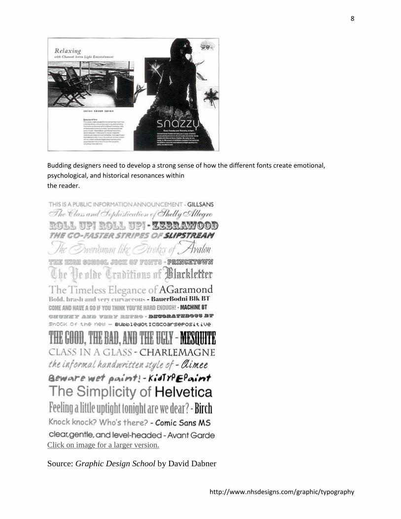
An effective mixture: below, a serif font for the word "Relaxing" and a contemporary sans serif for the
word "snazzy" nicely reflects the shift in moods.
8
http://www.nhsdesigns.com/graphic/typography
Budding designers need to develop a strong sense of how the different fonts create emotional,
psychological, and historical resonances within
the reader.
Click on image for a larger version.
Source: Graphic Design School by David Dabner
9
http://www.nhsdesigns.com/graphic/typography
Quick Tips: What to Consider when Using Type What font will best communicate the feeling of your message? Does your font harmonize with
or detract from your message?
Will two or more different fonts be more effective in displaying the concept than one? Consider
using a serif face with a sans serif face, for example.
What type size will best convey the idea of the design? Is the size appropriate for the audience?
Does it complement the other elements?
Is the type properly placed in the format to have the most impact on the reader? Are the shapes
of the body copy pleasing or are they unattractive?
Is the font one that needs to hold up well over a period of time (a classic), or is a more current,
trendy font a better choice?
Source: Design Basics for Creative Results by Bryan L. Peterson
To Buy or Not to Buy, and a Legal Consideration Adobe products such as Photoshop and Illustrator come preconfigured with many fonts for free, so long
as you don't copy them to another computer.
Others you can obtain online for free or for a price. Fonts for sale usually cost around $20-30 for a set of
roman, italic, bold and bold italic. Complete families like those for Futura and Bodoni can cost hundreds
of dollars. The price includes a license to use the font.
Be careful "borrowing" commercial fonts from friends! If you use a particular font in a printed piece and
you don't own the license for it, you may be violating copyright laws and could get into legal trouble.
Fonts are a type of software. Using a commercial font for which you do not own a license is called
"typeface piracy".
Typographers are artists who put a lot of time and effort into creating fonts. It is their right to determine
whether they will share their copyrighted work freely with others, or will require a purchased license.
Be sure you are on the right side of the law.
To Buy or Not to Buy, and a Legal Consideration
10
http://www.nhsdesigns.com/graphic/typography
Styling & Formatting Good typography, especially within body copy, often passes unnoticed as the information leaps from the
page quickly and cleanly. However, this does not mean that your efforts are wasted; the reader's ease of
reading demonstrates that you have done your job well.
Conversely, bad typography is memorable and intrusive. You will over time develop your own
typographic preferences, but your choices need to be founded on a clear understanding of underlying
principles.
Type Size Body copy forms the main bulk of any text. Its primary function is to deliver information, so legibility is
the most crucial consideration. A point (pt) is the usual measurement for type and is equal to 1/72 of an
inch. Type that is smaller than 7pt is difficult to read and type that is smaller than 3pt is utterly illegible.
The size range for body copy in a book or magazine article should be between 8pt and 14pt. In general,
9pt and 10pt are the most practical choices.
Serif or Sans Serif? A serif font is easier to read over long passages (blocks of text) than a sans serif font. It is therefore often
chosen for designs incorporating high quantities of body copy, such as novels and newspapers.
However, a sans serif font is frequently perceived as being more modern.
Body copy should always be set in upper- and lower-case because the irregular shapes are rich with cues
that improve legibility. Upper case (capital) letters are uniform in height and lack diversity of form,
which impairs reading. upper-case text also consumes about a third more space than the equivalent in
lower-case.
Leading Leading is the vertical space separating baselines in text and is traditionally measured in points. The
term is derived from the days of setting type in hot metal, when strips of lead were used to add space
between lines.
Where leading is set to the same point size of the copy, it is referred to as "set solid." Although text set
solid is often entirely legible, large blocks of copy set solid are tiring to read. Where possible, you should
add at least 2 points of leading to your body copy. For example, for 9pt type choose 11pt leading.
Leading of more than this amount is often aesthetically pleasing if your design can accommodate it.
11
http://www.nhsdesigns.com/graphic/typography
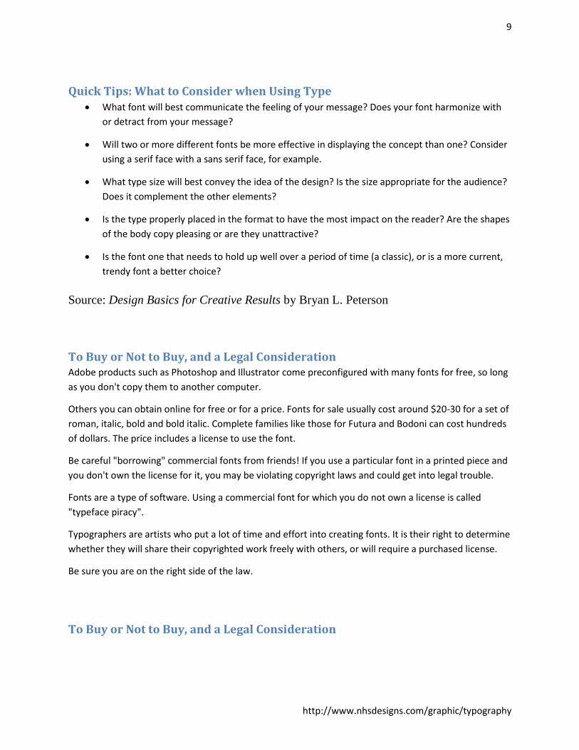
Text as Image Typographic illustration - or shaping text - is essentially lighthearted and fun. It turns straight typography
into graphic configurations with a degree of legibility, informing and entertaining the reader in an
emotive way, as well as relieving the formality of conventional text.
Christmas Tree. Two typographic interpretations of Christmas tree shapes, one seemingly random and one carefully controlled. Each captures the festive spirit in its individual way.
Experiment with both symmetrical and asymmetrical text arrangements to give a variety of different
meanings. Although you should be primarliy concerned with legibility, you can, through careful selection
of justified, centered, ranged-left, or ranged-right setting styles, hint at the mood and echo the content
of the text.

12
http://www.nhsdesigns.com/graphic/typography
T. In this design by TotalDesign, the architectural
character and size of the "T" is underlined in the
arrangement of the main body of text. A dynamic contrast
in the curving line of text adds movement and depth.
You can set text into regular shapes such as squares, triangles, diamonds, and circles, or format more
irregular (organic) shapes. The text need not cover the entire surface, for words, or letters, or numbers
can be used in a linear fashion - bending and curving to describe the contours of a particular form.
13
http://www.nhsdesigns.com/graphic/typography
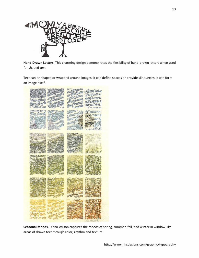
Hand-Drawn Letters. This charming design demonstrates the flexibility of hand-drawn letters when used
for shaped text.
Text can be shaped or wrapped around images; it can define spaces or provide silhouettes. It can form
an image itself.
Seasonal Moods. Diana Wilson captures the moods of spring, summer, fall, and winter in window-like
areas of drawn text through color, rhythm and texture.
14
http://www.nhsdesigns.com/graphic/typography
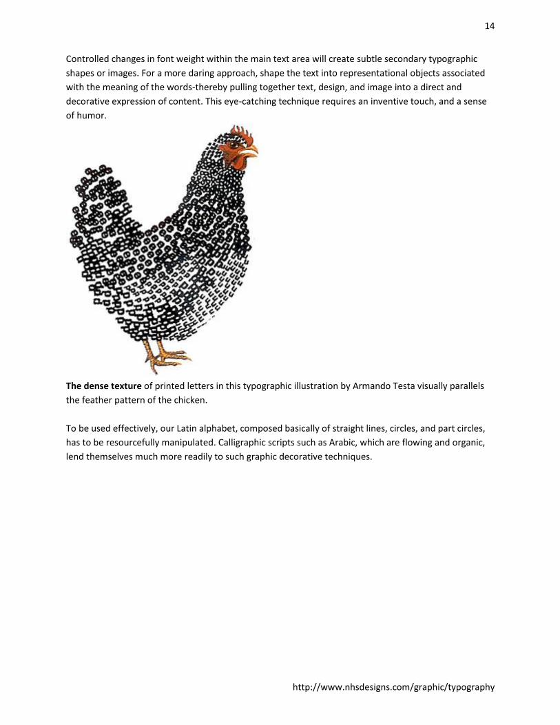
Controlled changes in font weight within the main text area will create subtle secondary typographic
shapes or images. For a more daring approach, shape the text into representational objects associated
with the meaning of the words-thereby pulling together text, design, and image into a direct and
decorative expression of content. This eye-catching technique requires an inventive touch, and a sense
of humor.
The dense texture of printed letters in this typographic illustration by Armando Testa visually parallels
the feather pattern of the chicken.
To be used effectively, our Latin alphabet, composed basically of straight lines, circles, and part circles,
has to be resourcefully manipulated. Calligraphic scripts such as Arabic, which are flowing and organic,
lend themselves much more readily to such graphic decorative techniques.
15
http://www.nhsdesigns.com/graphic/typography
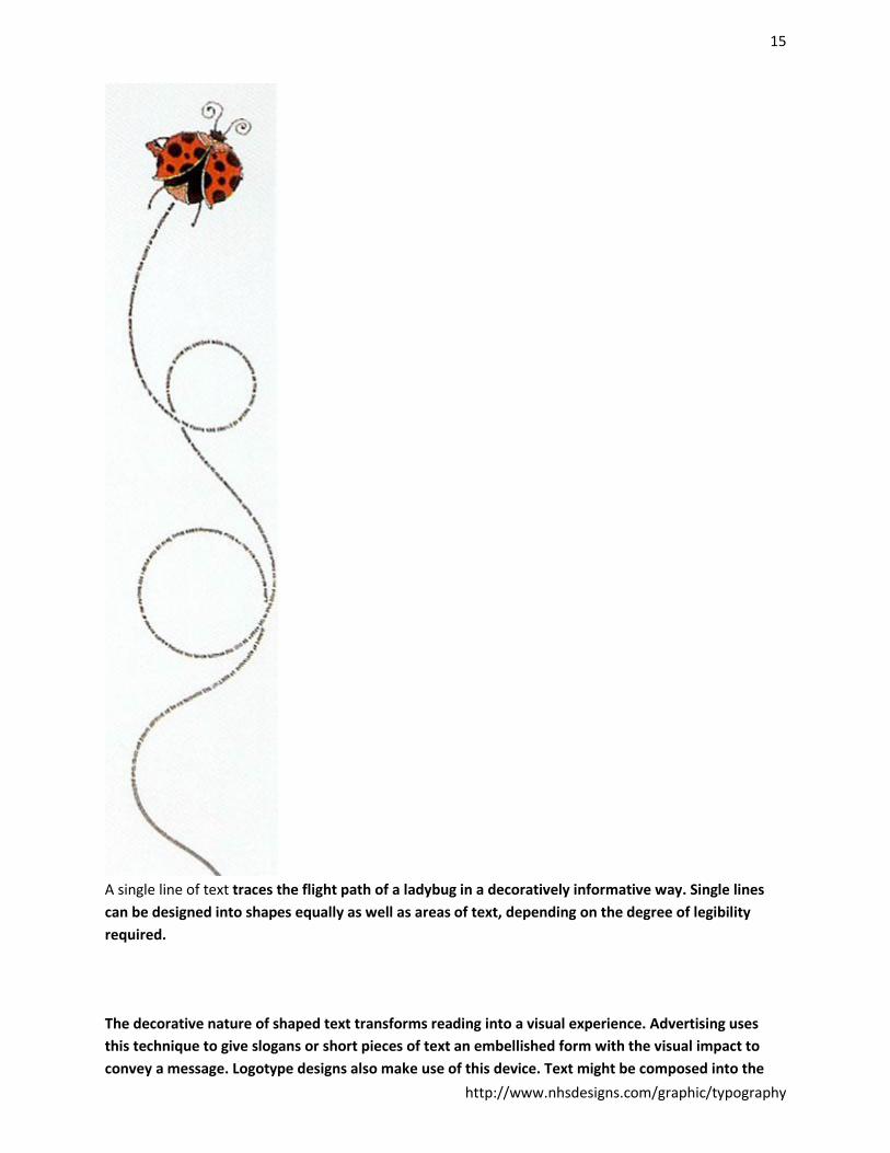
A single line of text traces the flight path of a ladybug in a decoratively informative way. Single lines
can be designed into shapes equally as well as areas of text, depending on the degree of legibility
required.
The decorative nature of shaped text transforms reading into a visual experience. Advertising uses
this technique to give slogans or short pieces of text an embellished form with the visual impact to
convey a message. Logotype designs also make use of this device. Text might be composed into the
16
http://www.nhsdesigns.com/graphic/typography
shapes of shoes, wine glasses, bottles, heads, complete bodies, animals, birds, fish, trees, or whole
town landscapes. Usually, the particular form in which text is shaped stems from the content.
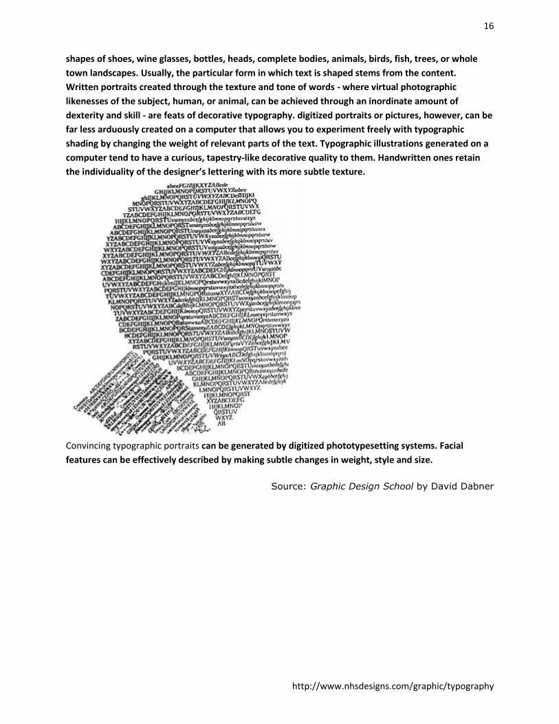
Written portraits created through the texture and tone of words - where virtual photographic
likenesses of the subject, human, or animal, can be achieved through an inordinate amount of
dexterity and skill - are feats of decorative typography. digitized portraits or pictures, however, can be
far less arduously created on a computer that allows you to experiment freely with typographic
shading by changing the weight of relevant parts of the text. Typographic illustrations generated on a
computer tend to have a curious, tapestry-like decorative quality to them. Handwritten ones retain
the individuality of the designer’s lettering with its more subtle texture.
Convincing typographic portraits can be generated by digitized phototypesetting systems. Facial
features can be effectively described by making subtle changes in weight, style and size.
Source: Graphic Design School by David Dabner