visual analytics: empower your organization … by visual analytics: empower your organization...
TRANSCRIPT
Sponsored by
Visual Analytics: Empower Your Organization through Interactive Data
Heather Campbell Suzanne Franzino
Alison Sommers-Sayre
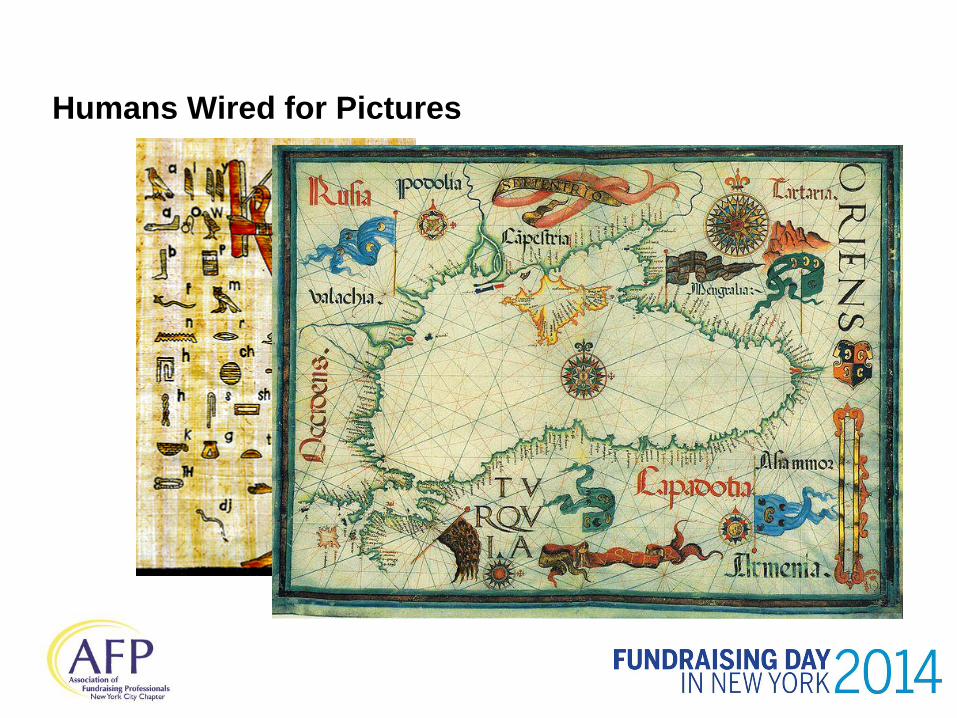
Humans Wired for Pictures
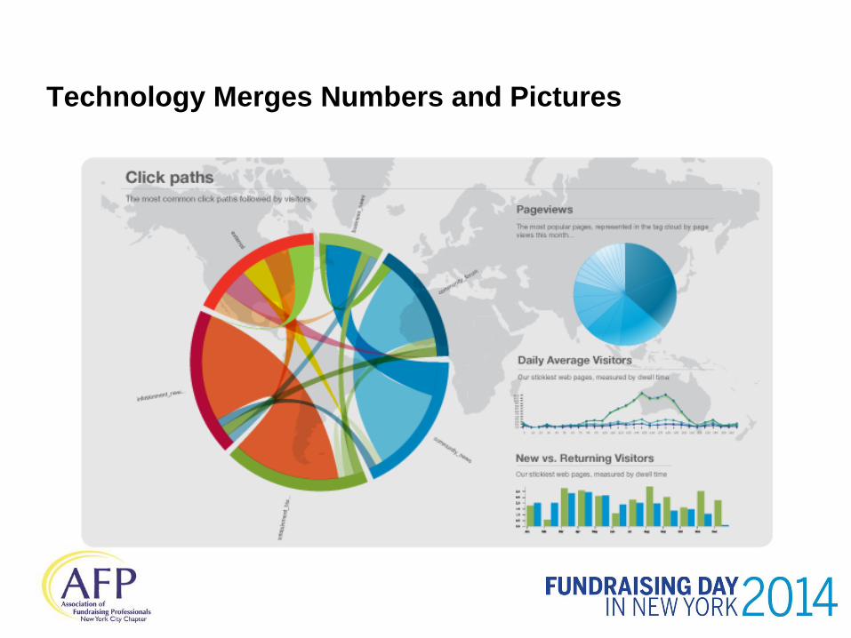
Technology Merges Numbers and Pictures
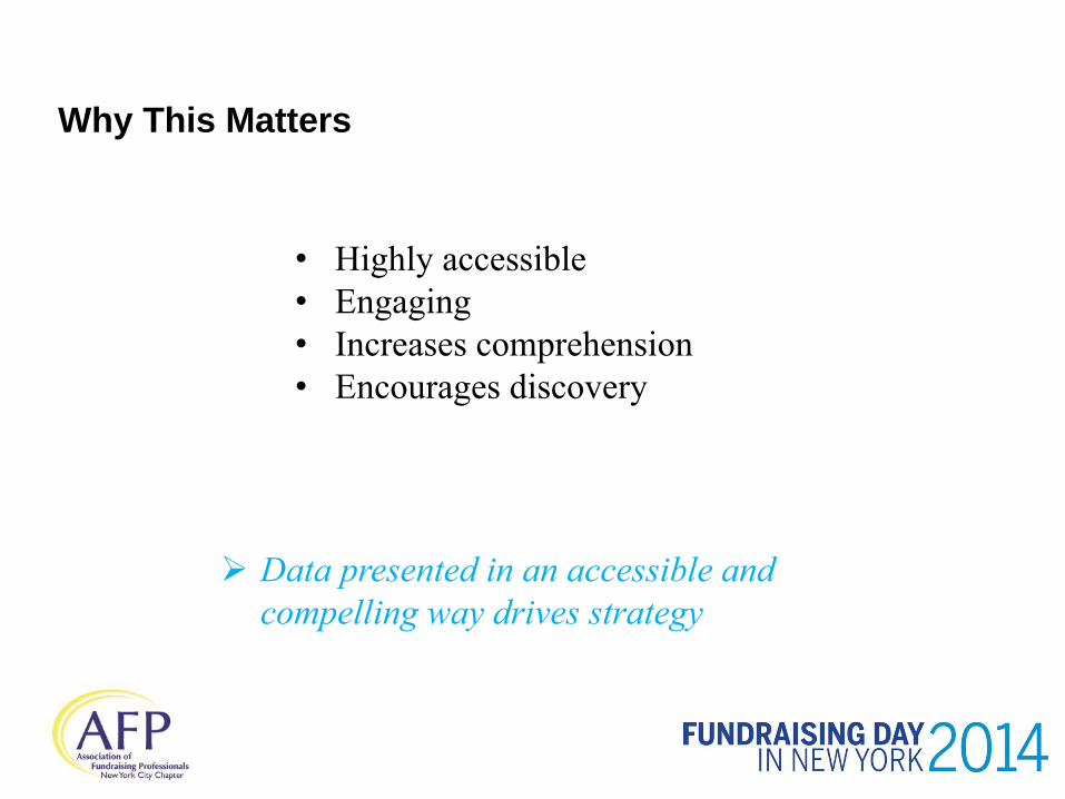
• Highly accessible
• Engaging
• Increases comprehension
• Encourages discovery
Data presented in an accessible and
compelling way drives strategy
Why This Matters

History of Visualization
William Playfair, The Commercial and Political Atlas, 1786
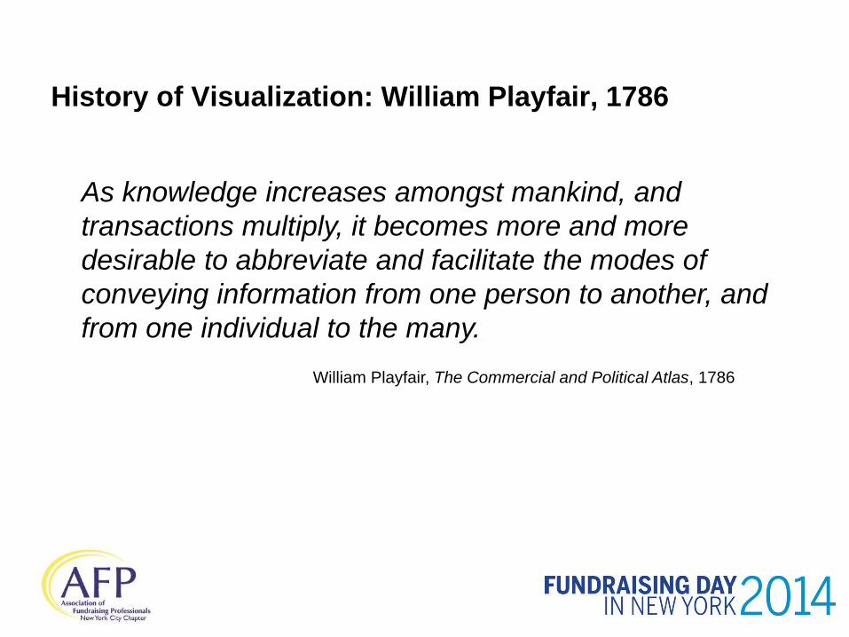
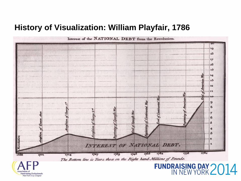
History of Visualization: William Playfair, 1786
As knowledge increases amongst mankind, and
transactions multiply, it becomes more and more
desirable to abbreviate and facilitate the modes of
conveying information from one person to another, and
from one individual to the many.
William Playfair, The Commercial and Political Atlas, 1786
History of Visualization: William Playfair, 1786
As knowledge increases amongst mankind, and
transactions multiply, it becomes more and more
desirable to abbreviate and facilitate the modes of
conveying information from one person to another, and
from one individual to the many.
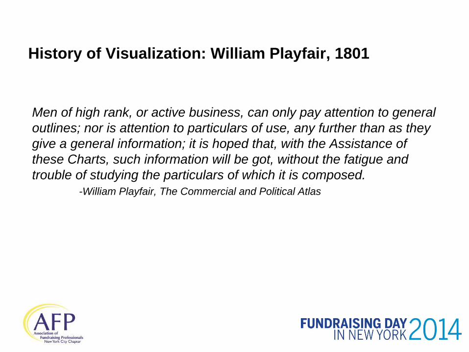
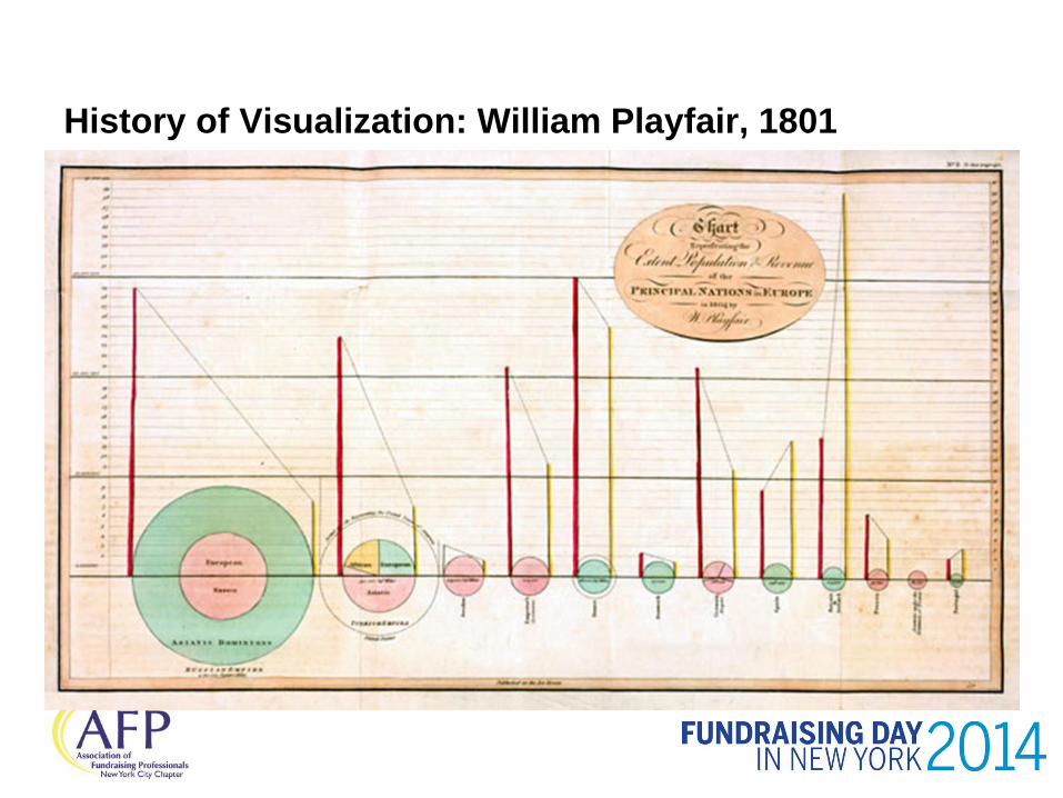
History of Visualization: William Playfair, 1801
Men of high rank, or active business, can only pay attention to general
outlines; nor is attention to particulars of use, any further than as they
give a general information; it is hoped that, with the Assistance of
these Charts, such information will be got, without the fatigue and
trouble of studying the particulars of which it is composed.
-William Playfair, The Commercial and Political Atlas
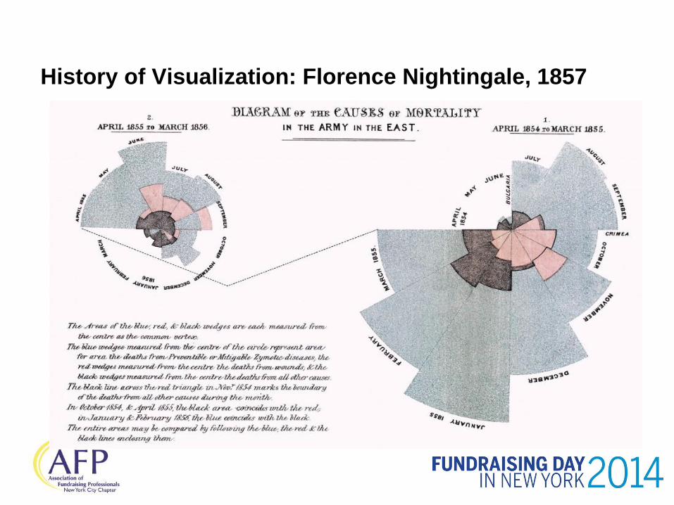
History of Visualization: Florence Nightingale, 1857
What is Driving Visualization
Information overload
Business leaders require
key information to make
faster decisions
Dynamic data requires
dynamic analysis
Create efficiencies and find the
competitive edge
Widespread adoption of mobile technology and
social computing has driven interest in
visualization capabilities and real-time analytics.
–Forrester
Technology has arrived to take
better advantage of our
cognitive abilities
Business users want to ask
their own questions
Short attention spans
Value of Visualization
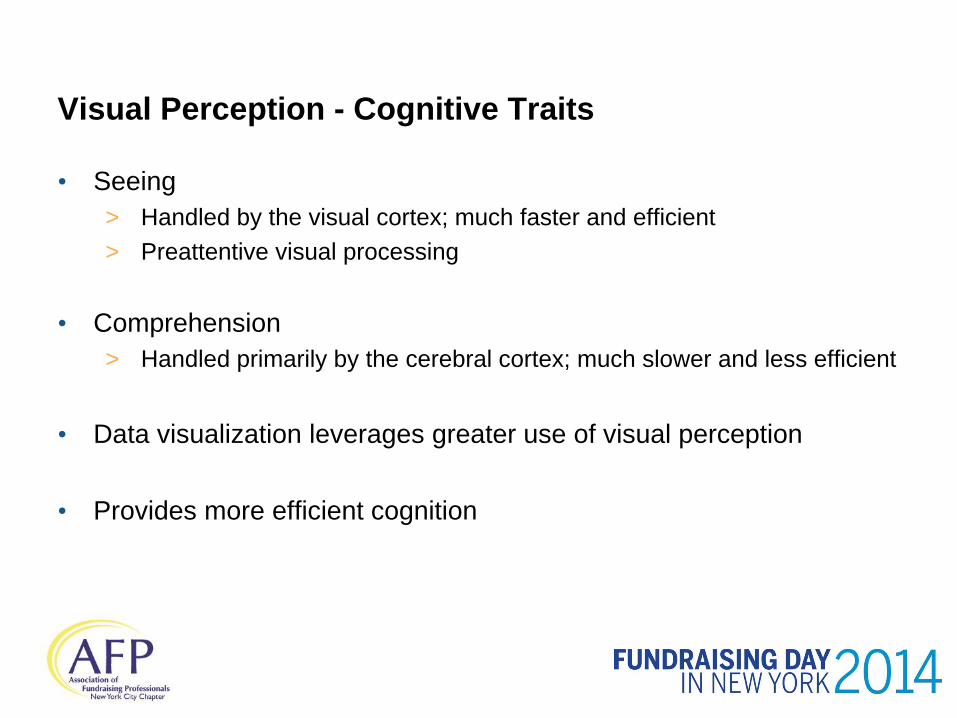
Visual Perception - Cognitive Traits
• Seeing
> Handled by the visual cortex; much faster and efficient
> Preattentive visual processing
• Comprehension
> Handled primarily by the cerebral cortex; much slower and less efficient
• Data visualization leverages greater use of visual perception
• Provides more efficient cognition


What Do You See?
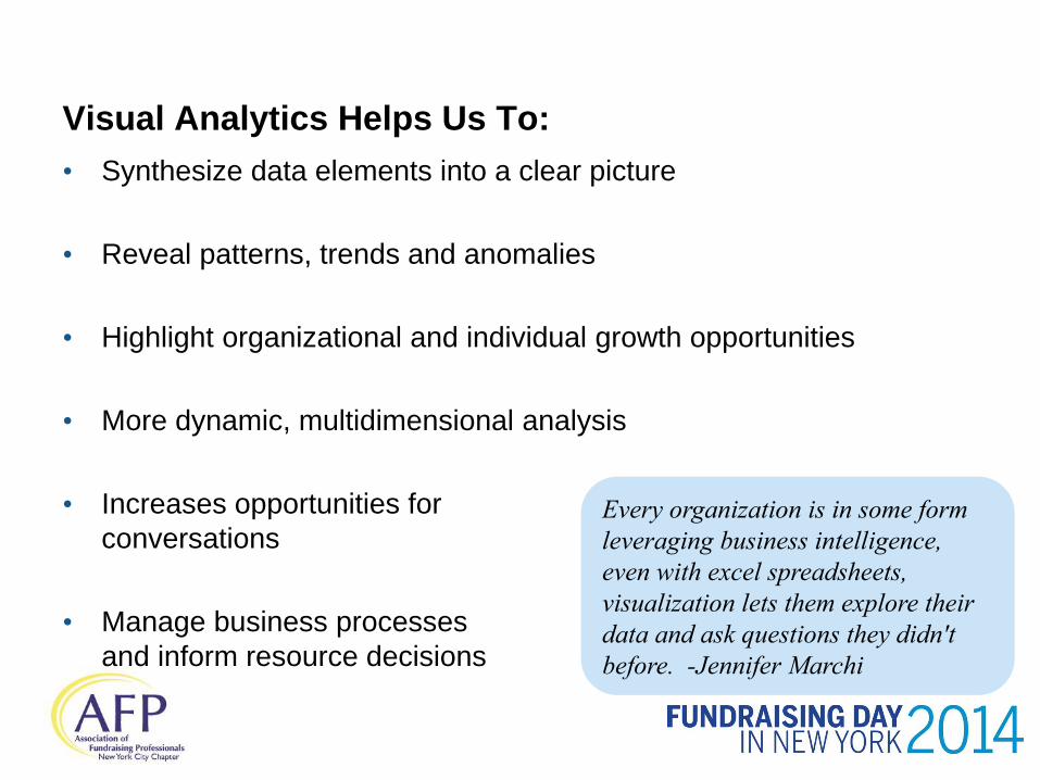
Visual Analytics Helps Us To:
• Synthesize data elements into a clear picture
• Reveal patterns, trends and anomalies
• Highlight organizational and individual growth opportunities
• More dynamic, multidimensional analysis
• Increases opportunities for
conversations
• Manage business processes
and inform resource decisions
Every organization is in some form
leveraging business intelligence,
even with excel spreadsheets,
visualization lets them explore their
data and ask questions they didn't
before. -Jennifer Marchi
Visualization Strategies
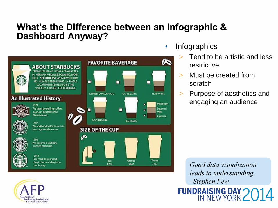
• Infographics
> Tend to be artistic and less
restrictive
> Must be created from
scratch
> Purpose of aesthetics and
engaging an audience
What’s the Difference between an Infographic & Dashboard Anyway?
Good data visualization
leads to understanding.
–Stephen Few
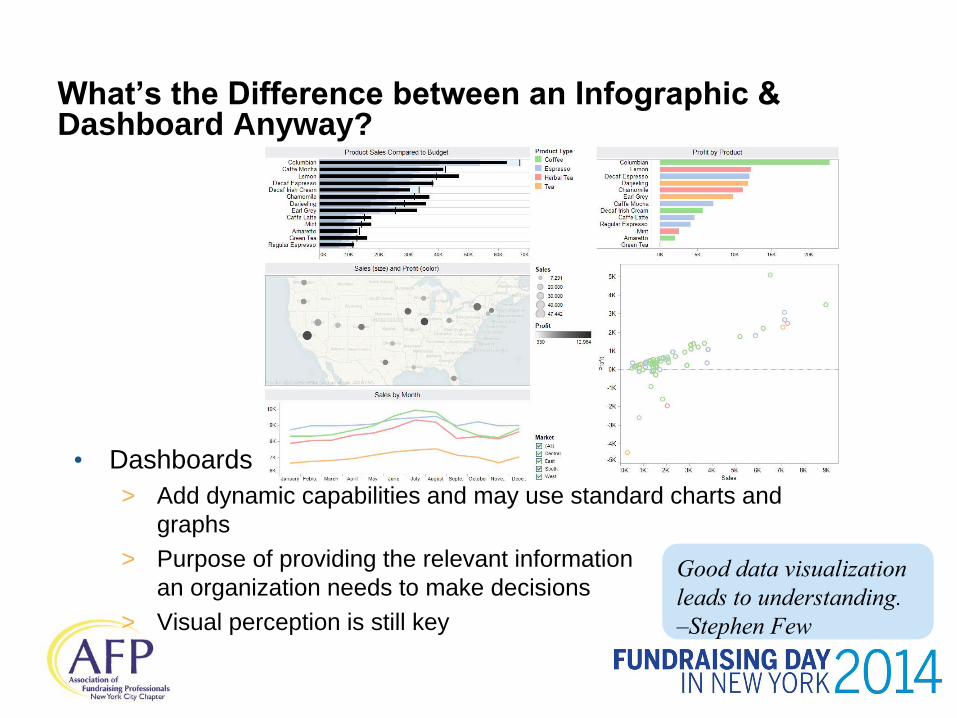
• Dashboards
> Add dynamic capabilities and may use standard charts and
graphs
> Purpose of providing the relevant information
an organization needs to make decisions
> Visual perception is still key
What’s the Difference between an Infographic & Dashboard Anyway?
Good data visualization
leads to understanding.
–Stephen Few
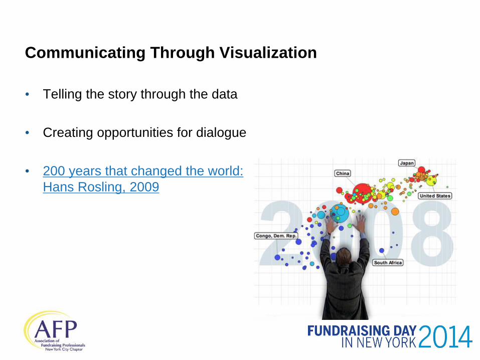
Communicating Through Visualization
• Telling the story through the data
• Creating opportunities for dialogue
• 200 years that changed the world:
Hans Rosling, 2009
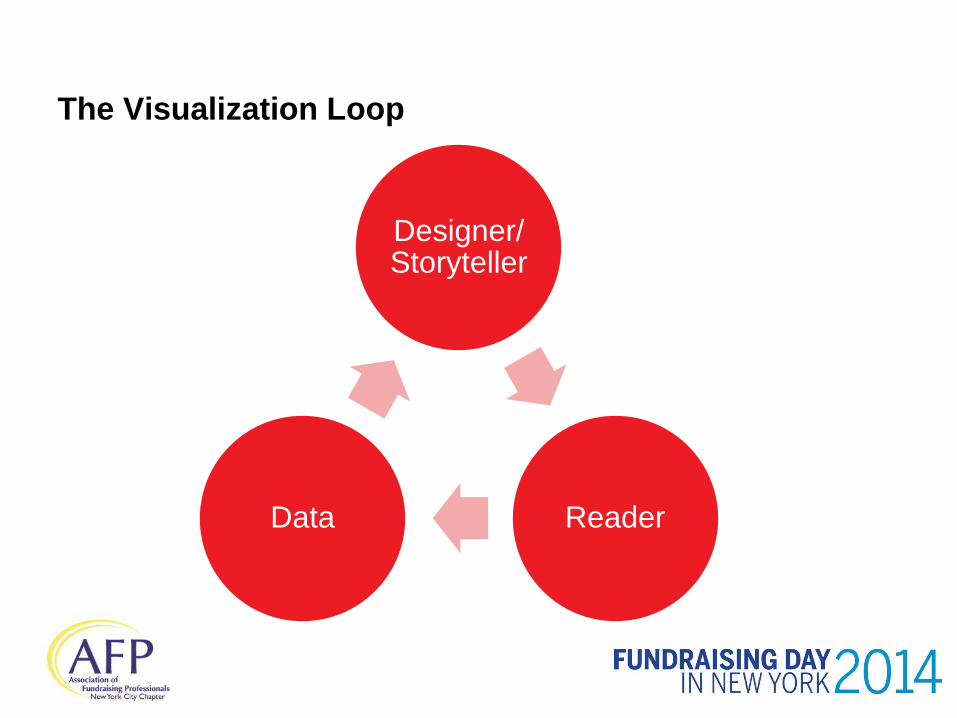
The Visualization Loop
Designer/ Storyteller
Reader Data
Considerations for the Designer/Storyteller
• Decide whether the analysis is exploratory vs. explanatory
• Allow reader to see only what is important - get past the design to
the information and SIMPLIFY
• Highlight patterns and connections that matter
• Let your data do the talking – sometimes (beware of “earth is flat”)
• Visualization provides a bridge between the art and the science
Style and aesthetics cannot rescue failed content.
-Edward Tufte
Implementing Visualization

Definitions
• Data visualization
> visual representation of data
> information in some schematic form
> includes attributes or graphics for the units of information
• Visual analytics
> outgrowth of data visualization
> focuses on facilitating analytical reasoning through interactive visual
interfaces
Effective visualizations reveal patterns
and communicate ideas using power of
perception to offload cognition.
–Hanspeter Pfister
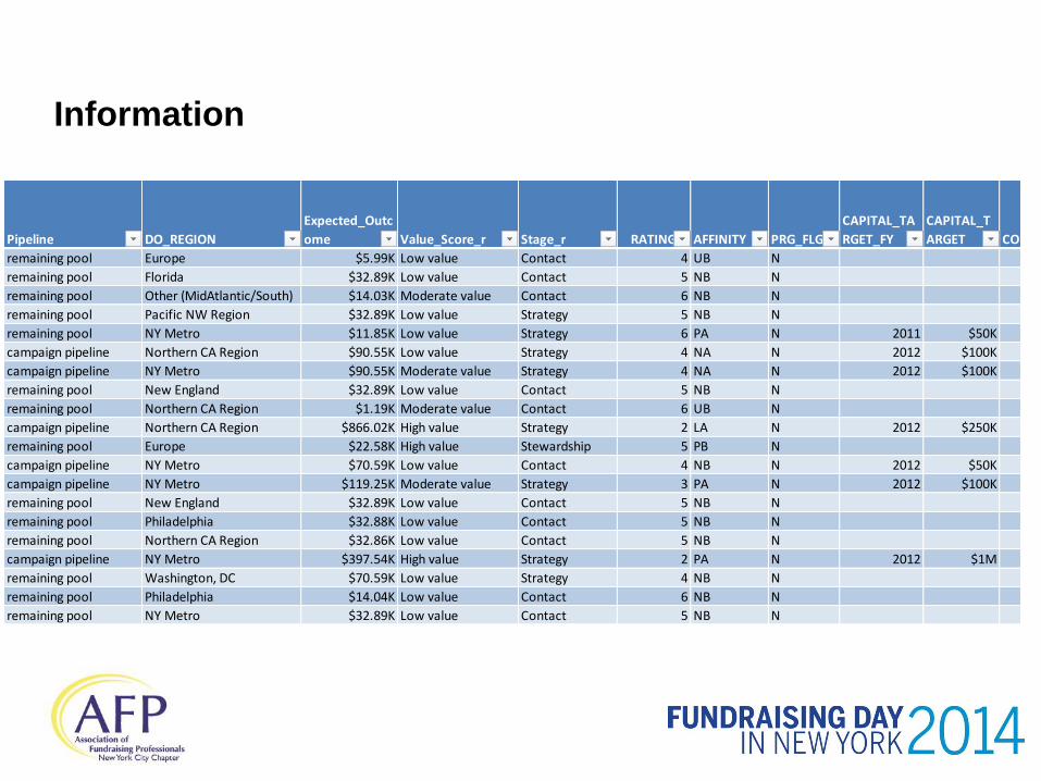
Information
Pipeline DO_REGION
Expected_Outc
ome Value_Score_r Stage_r RATING AFFINITY PRG_FLG
CAPITAL_TA
RGET_FY
CAPITAL_T
ARGET CONTACT VISIT
SOLICITATIO
N
remaining pool Europe $5.99K Low value Contact 4 UB N
remaining pool Florida $32.89K Low value Contact 5 NB N
remaining pool Other (MidAtlantic/South) $14.03K Moderate value Contact 6 NB N
remaining pool Pacific NW Region $32.89K Low value Strategy 5 NB N
remaining pool NY Metro $11.85K Low value Strategy 6 PA N 2011 $50K 4 2 1
campaign pipeline Northern CA Region $90.55K Low value Strategy 4 NA N 2012 $100K
campaign pipeline NY Metro $90.55K Moderate value Strategy 4 NA N 2012 $100K
remaining pool New England $32.89K Low value Contact 5 NB N
remaining pool Northern CA Region $1.19K Moderate value Contact 6 UB N
campaign pipeline Northern CA Region $866.02K High value Strategy 2 LA N 2012 $250K 3 1
remaining pool Europe $22.58K High value Stewardship 5 PB N 1 1
campaign pipeline NY Metro $70.59K Low value Contact 4 NB N 2012 $50K
campaign pipeline NY Metro $119.25K Moderate value Strategy 3 PA N 2012 $100K 9 4
remaining pool New England $32.89K Low value Contact 5 NB N
remaining pool Philadelphia $32.88K Low value Contact 5 NB N
remaining pool Northern CA Region $32.86K Low value Contact 5 NB N
campaign pipeline NY Metro $397.54K High value Strategy 2 PA N 2012 $1M 8 6
remaining pool Washington, DC $70.59K Low value Strategy 4 NB N 1 1
remaining pool Philadelphia $14.04K Low value Contact 6 NB N
remaining pool NY Metro $32.89K Low value Contact 5 NB N
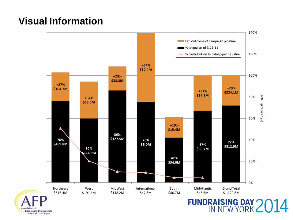
Information Visual
76%$469.8M
60%$114.9M
86%$127.5M 76%
36.0M
42%$34.0M
67%$30.7M
72%$812.9M
+27%$164.7M
+34%$65.5M
+23%$33.3M
+64%$30.4M
+19%$15.4M
+32%$14.8M
+29%$324.1M
0%
20%
40%
60%
80%
100%
120%
140%
Northeast$616.4M
West$191.4M
MidWest$148.2M
International$47.6M
South$80.7M
MidAtlantic$45.6M
Grand Total$1,129.8M
% t
o c
amp
aign
go
al
Est. outcome of campaign pipeline
% to goal as of 3.21.11
% contribution to total pipeline value
Evolution of the Analytical Process
• Visual Information
> One cut at a time
> Explanatory
> Static
> Details are often gathered from the bottom up
• Senior management are used to this type of reporting
• The role of the analyst changes as this process changes
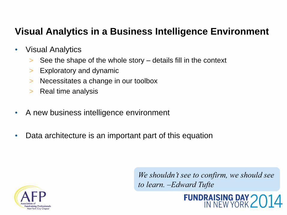
Visual Analytics in a Business Intelligence Environment
• Visual Analytics
> See the shape of the whole story – details fill in the context
> Exploratory and dynamic
> Necessitates a change in our toolbox
> Real time analysis
• A new business intelligence environment
• Data architecture is an important part of this equation
We shouldn’t see to confirm, we should see
to learn. –Edward Tufte

Visual Analytics
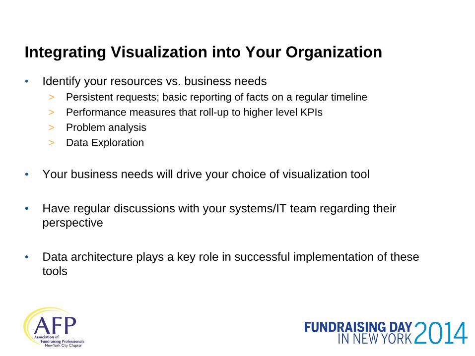
Integrating Visualization into Your Organization
• Identify your resources vs. business needs
> Persistent requests; basic reporting of facts on a regular timeline
> Performance measures that roll-up to higher level KPIs
> Problem analysis
> Data Exploration
• Your business needs will drive your choice of visualization tool
• Have regular discussions with your systems/IT team regarding their
perspective
• Data architecture plays a key role in successful implementation of these
tools
Change Management & Challenges
• Need leadership support
• New tools, new technology and data architecture impacts
• Need to find bridge between analysts and fundraisers
• Process change
> Incorporating analytic and visualization tools into daily activities
> New skills required
• Not all staff natural adopters
What Makes a Successful Visual Analyst
• Well-placed curiosity
• Background in social sciences
or social research is valuable
• Ability to partner with and understand S/systems
• Ability to partner with and understand Relationship Managers
• Ability to communicate with Senior Managers
• Motivated by moving day to day operations forward not the flash
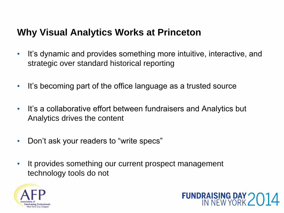
Why Visual Analytics Works at Princeton
• It’s dynamic and provides something more intuitive, interactive, and
strategic over standard historical reporting
• It’s becoming part of the office language as a trusted source
• It’s a collaborative effort between fundraisers and Analytics but
Analytics drives the content
• Don’t ask your readers to “write specs”
• It provides something our current prospect management
technology tools do not
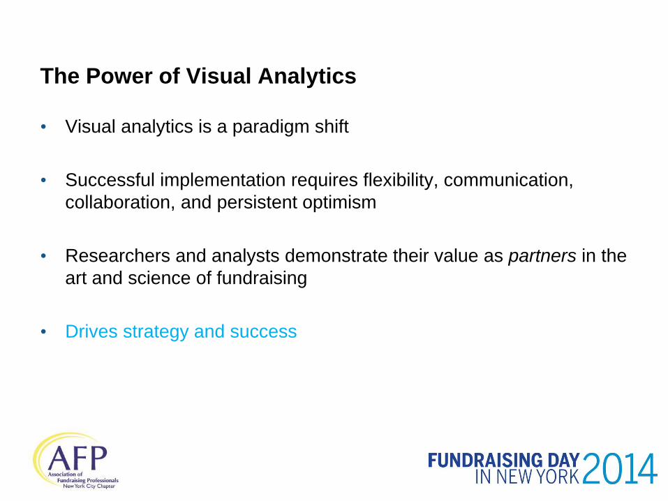
The Power of Visual Analytics
• Visual analytics is a paradigm shift
• Successful implementation requires flexibility, communication,
collaboration, and persistent optimism
• Researchers and analysts demonstrate their value as partners in the
art and science of fundraising
• Drives strategy and success
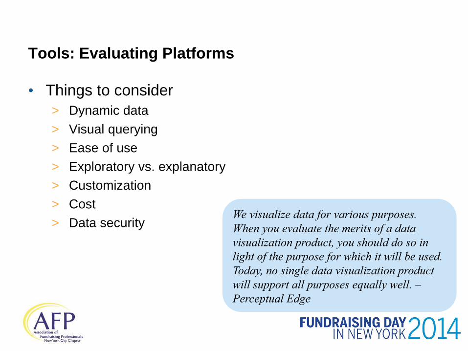
Tools: Evaluating Platforms
• Things to consider
> Dynamic data
> Visual querying
> Ease of use
> Exploratory vs. explanatory
> Customization
> Cost
> Data security
We visualize data for various purposes.
When you evaluate the merits of a data
visualization product, you should do so in
light of the purpose for which it will be used.
Today, no single data visualization product
will support all purposes equally well. –
Perceptual Edge
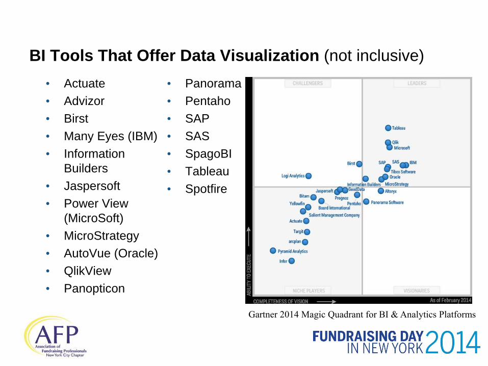
BI Tools That Offer Data Visualization (not inclusive)
• Actuate
• Advizor
• Birst
• Many Eyes (IBM)
• Information
Builders
• Jaspersoft
• Power View
(MicroSoft)
• MicroStrategy
• AutoVue (Oracle)
• QlikView
• Panopticon
• Panorama
• Pentaho
• SAP
• SAS
• SpagoBI
• Tableau
• Spotfire
Gartner 2014 Magic Quadrant for BI & Analytics Platforms
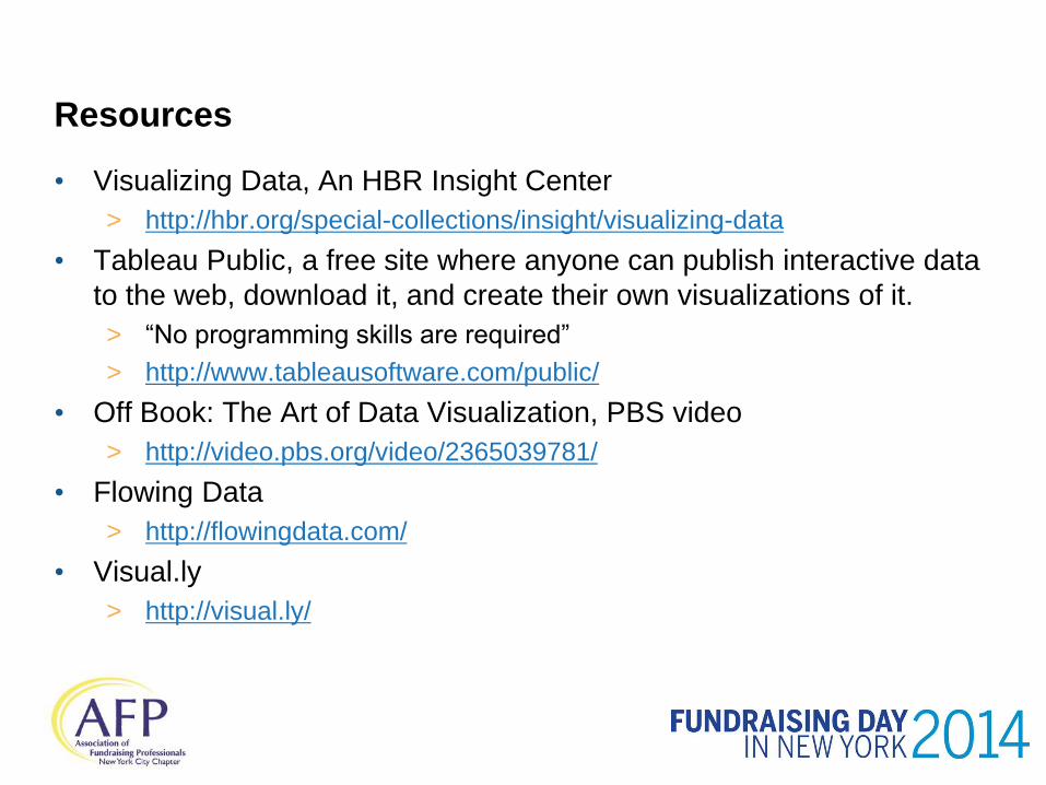
Resources
• Visualizing Data, An HBR Insight Center
> http://hbr.org/special-collections/insight/visualizing-data
• Tableau Public, a free site where anyone can publish interactive data
to the web, download it, and create their own visualizations of it.
> “No programming skills are required”
> http://www.tableausoftware.com/public/
• Off Book: The Art of Data Visualization, PBS video
> http://video.pbs.org/video/2365039781/
• Flowing Data
> http://flowingdata.com/
• Visual.ly
> http://visual.ly/

Questions?
• Heather Campbell
• Suzanne Franzino
• Alison Sommers-Sayre