cleveland ar t w alk - redland city · cleveland is a traditional ... a poetry trail weaves text...
TRANSCRIPT

CL
EV
EL
AN
D
AR
T
WA
LK
Cleveland is a traditional
coastal town centre near
Brisbane in the heart of a
diverse landscape of islands,
mangrove-fringed bushland
and historic promontories.
In 1993 the towns main street
was developed with a flexible
strategy that allows it to
continue as a main street
whilst embracing its growth
and connection to Moreton
Bay through a harbour.
The process for the award-
winning masterplan and
design by Landscape Architect
John Mongard engaged the
community in the creation
of a civic heart, and became
an exemplar for other
collaborative processes.
The initial design of the
streetscape involved the
creation of a specific theme
to bring the bay into the
town, which is reflected in
every physical component.
The poetics of art,
environment and design now
bring a sense of place to this
public realm. A major
intersection functions as a
shared area with the car
civilised and people given
priority, and the road is closed
every Sunday for a busy arts
and crafts market.
Elements in the street have
been personalised. A Poetry
Trail weaves text throughout
the street including the
evocative words of North
Stradbroke Island indigenous
poet Oodgeroo Noonnuccal.
Clay shells sculpted from
fossils from the Dunwich
Museum are embedded in
tidal forms with a vivid
tapestry of mosaic tiles
threading through a sub
tropical landscape. A town
map scribed in clay pavers
provides a colourful textural
surface with simple
pictograms and artful
linework. The sculptural
playground brings the sound
of children playing into the
town centre and a sculptural
walk provides an outdoor
gallery to compliment the
exhibition spaces in the
Redland Art Gallery.
At the district scale the
project has created a civic
living room - a place where
festivals and cultural rituals
have claimed the space.
Ten years later it still stands
as a testament to the
collaborative processes
which engaged every
community group in the
Cleveland district interested
in changing the face of the
town. These collaborative
ways of working continue to
introduce contemporary art
to the townscape. A second
capital works project for
Council’s Library Square,
various developer-funded
public art components and
the construction of the
Redland Art Gallery precinct
have been influential in the
creation of Cleveland’s
outdoor gallery.
However it is the generation
of social capital that is most
valued with communities
engendered with ownership
and the true value of the
public realm made visible.
The street has become a
metaphor for the everyday
rhythms that bind a
community together with
places to chat and visit, and
familiar forms that take their
cue from the past and nature.

“The tea trees are in bloom againFilling the air with honeyed scent”
ERNEST D A I N T Y

The Poetry Trail THROUGHOUT BLOOMFIELD STREET
MAP REF: 1, 3, 4, 8, 10, 12, 30, 31, 33,
36, 37, 38, 41, 43, 45, 46
Textural references about Cleveland –
the town, the bay and the countryside
were sought from local people in order to
celebrate the spirit of the collective place.
Ten pieces were chosen by Queensland poet
Ross Clarke to be placed in the street.
Evocative words by Zoe Clark are at child
height in the playground cave.
Earlier in the project John Mongard and Jan
Haughton met with the legendary indigenous
poet Oodgeroo Noonuccal (Kath Walker) to
discuss the possibility of including her work
in the street to mark the occasion of 1993
Year of the Indigenous People. They were
thrilled at her generosity and the warmth of
her response. Sadly, she did not live to see it
eventuate. Prophetically her words were
immortalised in stone the day she died
etched on stainless steel ripples and rock
pools on the fountains and scribed onto the
face of the garden bed edges.
“The Bay is the source for much of my poetry,
observed from Macleay Island and travel on
the ferries. Mangroves brim above the high
tides, cormorants periscope up through the
water, waves glitter and there is always the
possibility of dolphins!”
M A R G A R E T M A N S O N
Cleveland LogoON STREET FURNITURE BINS
AND BOLLARDS
The logo was initiated by the design team
in collaboration with the local traders
and business community who invited
participation from the local secondary and
tertiary art students to create an image
to be used to market the town centre.
The selected design by 1993 Alexandra Hills
High School student Leean Goong links
the town, bay and bushland themes and
is featured on the street furniture, and
serves as an identifying symbol for the
town of Cleveland.
t w o
p a g e
CL
EV
EL
AN
D
A
RT
WA
LK
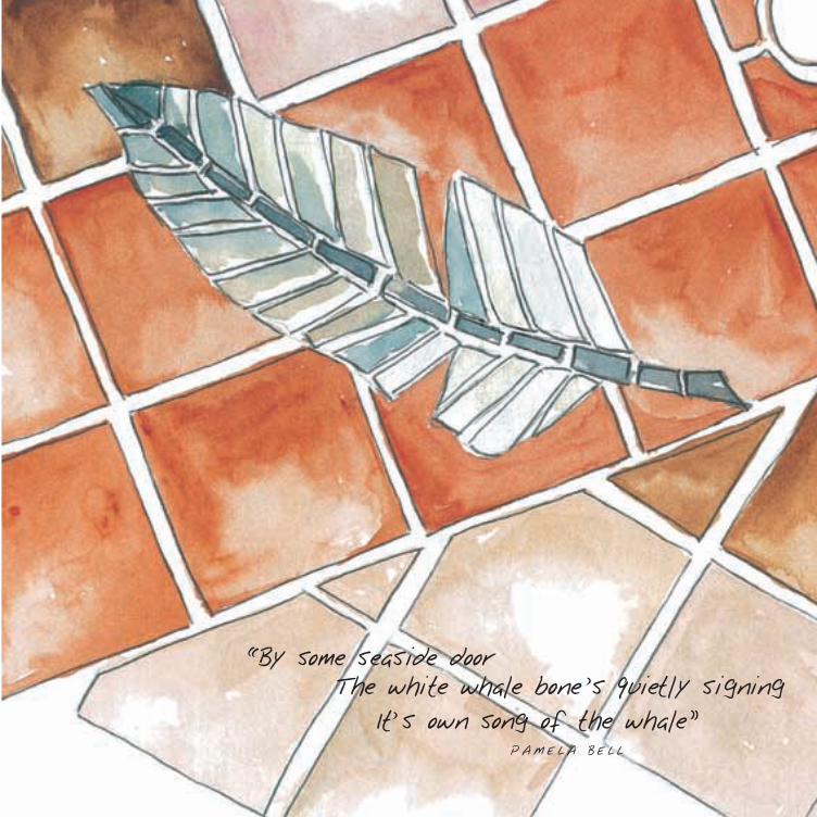
“By some seaside doorThe white whale bone s quietly signing
It s own song of the whale”PAME L A B E L L

‘Bow Spirit’ MAP REF: 11
“I wanted to represent the
sea using natural materials
to identify with the
symbolic characteristics of
the marine environment.”
T R O Y R O B B I N S
‘Tide Line’ MAP REF: 34
“The tide line work is taken from mangrove
pools and their relationship to the ebb
and flow of the tidal movements.“
C A R O L R O C H E
‘Waterworks’ MAP REF: 7
“This work relates to the movement of water
in the district, and I based my designs on
the machinery both natural and agricultural,
which processes or utilises it.”
D A V I D R E N N
‘Still Lives’ MAP REF: 2, 5, 6, 9
“Initially I worked on the concept design
phase of the Bloomfield Street Development.
My role was to provide artistic and
conceptual input into the Streetscape design
and to identify opportunities for the inclusion
of artworks in the project. I was therefore
involved in the initial brainstorming sessions
with the design team. Out of these sessions,
the development of the theme, The Town,
The Bay and The Countryside, emerged.
I was commissioned to create a number of
small-scale sculptures, which were designed
to represent still lives. These were designed
to enhance the sense of intimacy in the
Streetscape, which the landscape architect
desired. They have symbolism, which
reflected the design themes.“
D E N I S M A G E E
Street Sculptures in Planter BedsBLOOMFIELD STREET
f o u r
p a g e
CL
EV
EL
AN
D
A
RT
WA
LK

“The night skyscatters lambent light
as men in boatsFish phosphorescent depths”
BET H ST I C K

The nautilus shell form and water features
of the civic fountain allows the sound of
water to enter Council’s main administration
building. Hand-formed porcelain shells
moulded from ancient fossil shells from the
museum at Dunwich, North Stradbroke Island
and the tidal mangrove areas of Cleveland
are inlaid into the surface of the fountain.
Resting in the top mound is a decorated
piece of polished stainless steel in the form
of a rock pool etched with calligraphic
poetry by Oodgeroo Noonuccal (Kath Walker)
describing the spiritual and tidal movement
of the shells.
The sculpting of the fountain by artists
and designers Carol Roche, Jan Haughton,
and John Mongard provided an opportunity
for artists to work in collaboration with
the construction crews to test sculptural
finishes.
The Civic FountainENTRY TO COUNCIL
ADMINISTRATION BUILDING
s i x
p a g e
CL
EV
EL
AN
D
A
RT
WA
LK

“The gales brought us here”
OODG E R O O N O ON U C C A L
Old SchoolhouseGallery MAP REF: 32
“Working closely together generally strengthened
the unity of the group, highlighted our multi-
disciplinary composition, exposed the various
talents of the members, and gave us all a great
feeling of satisfaction on seeing the project
completed.”
J A C K O U D Y N
Yurara Art Group MAP REF: 13
“As our theme is “Redland from the Air’ we
incorporated the remaining farmlands, the urban
sprawl including the canal sites as well as the
bay with its numerous islands. The aim was to
bring all this together into an interesting
abstract design, which would be a work of art.
The spirit of working together became
contagious as the final design came into being
and was transferred to the rolled slabs from
which the tiles were cut and finally glazed.
The project proved to be an exacting but rewarding
enterprise with many problems to overcome,
a restricted palette, and changing measurements,
not to mention installation difficulties at the last,
to bring the project to an artistic achievement”
Coochie Art Group MAP REF: 29
“Over a period of two months a huge amount of
discussion, testing and cooperation was
undertaken. The Coochie Art Group, potters Viv
and Denise Wright and graphic artist, Shannon
Newman, held a workshop to choose a design for
our Cleveland Sands corner. Many of the designs
would have made very interesting murals, but
our aim was to try and reflect the kaleidoscope
of vibrancy and life, which is the Redlands. Artist
Melva Moore created a superbly joyful stylised
panel showing fields, mangroves, islands and
sailing boats.
Once the design was chosen and approved, the
potters and the Coochie Art Group set to work
making adjoining slabs, transferring the cartoon
to the clay, texturing and cutting the clay into
manageable tiles and firing them, all within the
period of a further three months. It was such a
friendly cooperative group of 17 people who
helped on the project at various stages that it
was a joy to work together.”
e i g h t
p a g e
CL
EV
EL
AN
D
A
RT
WA
LK
Corner Mosaics and Carved PaversMIDDLE STREET INTERSECTION
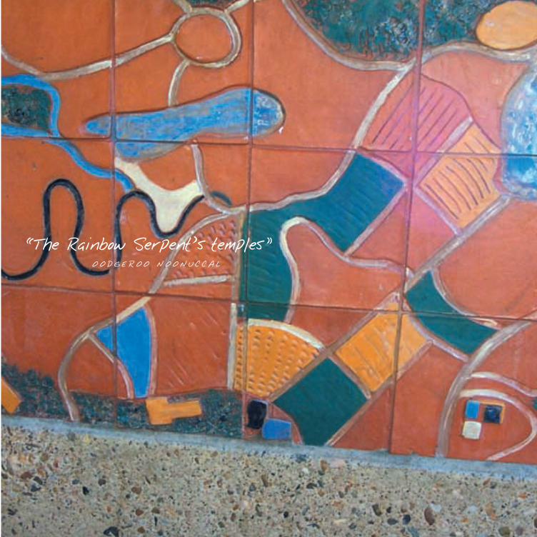
“The Rainbow Serpent s temples”OODG E R O O N O ON U C C A L

‘Beacon’REDLAND ART GALLERY
MIDDLE STREET
MAP REF: 14
“‘Beacon’ is an illuminated sign for the entry
to the Redland Art Gallery and is shaped like
a stylized sail or the prow of a boat, tethered
to the Gallery. The internal illumination
is practical in that it serves to show the
Gallery’s information, but also gives the
work it’s name – a beacon of light like the
night channel markers on the bay.
The design etched onto the surface of the
stainless steel is taken from a photograph
of mud ripples at low tide on
Moreton Bay. The image has
been digitally enhanced and
deconstructed to suggest not
only the iconic mud patterns,
but also the detritus of broken
shells, pebbles, twigs and leaves
at the water’s edge and the
marks left by soldier crabs in
the mud. As the pattern thins
towards the top of the work,
it calls to mind the micro-
organisms that feed on the
decomposing mangrove leaves
and form the bottom of the
food chain.
The pixilation of the image has been enlarged
and enhanced to reveal the design process as
well as reiterating the ripple pattern on a
smaller scale.
‘Beacon’ has been designed to display the
logo of the Gallery as well as changing
exhibition information on its two faces
by both day and night.“
B E V E R L E Y B L O X H A M
BannersREDLAND ART GALLERY
MIDDLE STREET
MAP REF: 14
“The canvas and vinyl banners
designed for the Redland Art Gallery
serve as markers on the streets
outside the Gallery. Designed as
artworks rather than signage, the
words ‘ART’ and ‘GALLERY’ are
manipulated to form the artwork.
The banners are made from
architectural vinyl and acrylic
canvas. The designs are hand cut,
using a hot knife to seal the edges of
the canvas, and then sewn together
as a collage of fabric and colour.“
B E V E R L E Y B L O X H A M
t e n
p a g e
CL
EV
EL
AN
D
A
RT
WA
LK

“Threaded by vesselsBearing buried
treasures”KATH L E EN M C G R E G O R

‘Colours’ PLANTER BED CERAMIC TILES
LIBRARY SQUARE
MAP REF: 16
“The design of these tiles was not to be
pictorial, but to blend in with the overall
organic approach to the landscape design.
We looked at the Redlands area in general
and saw a wide range of varying land and
seascapes. To capture this we chose to see
the design as an overall map, as if looking
from above - from sky to earth. Here we
could travel from the ploughed red soil,
through the Tea Tree swamps to the
mangroves and on to the bay.
Using the rich glazes with a myriad of
colours we were able to create an abstract
image of these areas and hopefully a
timeless work of art that not only are
we proud of but we hope the people
of Redlands will also be.”
P A U L A N D G L E N Y S F O R M A N
‘Mangrove Tracks’BRONZE SERVICE PIT COVERS
LIBRARY SQUARE
MAP REF: 17
“Often taken for granted, disregarded or even
destroyed in the name of development the
mangrove tree is nevertheless an integral
part of the foreshore ecosystem.
Providing habitats and food supplies for
many coastal animals - from the crabs that
live amongst the roots to birds which nest or
roost in the branches and feed on the small
animals that live on the mudflats - the
mangrove tree is an essential part of the Bay.
In consultation with the local community it
was decided that the mangrove image was
important to portray, however the need for
something extra was suggested and the
concept of depicting the local birds via
footprints left in the mud was formed.
As you can see the risers of the mangroves
with the odd mangrove seedling scattered
amongst them provides a patterned border
around a watermarked mud centre in which
the bird imprints are visible. The aim of these
artworks is to help reinforce the local
community spirit of protecting their
foreshore and bay.”
M A T T H E W T O B I N
U R B A N A R T P R O J E C T S
t w e l v e
p a g e
CL
EV
EL
AN
D
A
RT
WA
LK

“Island jewelsupon Quandamooka s breast
Threaded by vesselsBearing ferried treasures”
KATH L E EN M C G R E G O R
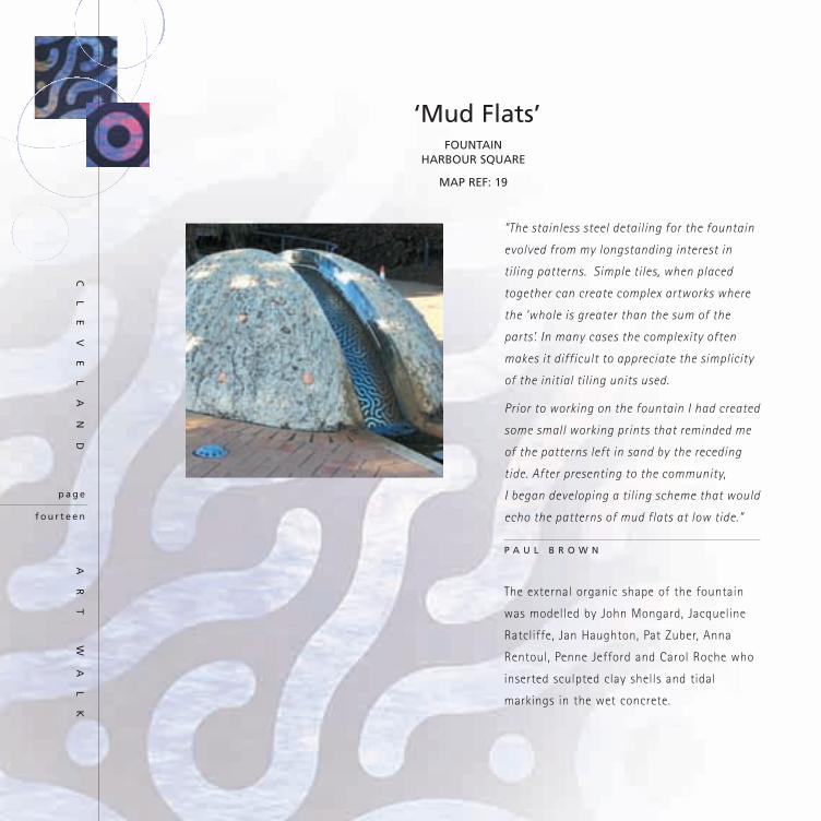
“The stainless steel detailing for the fountain
evolved from my longstanding interest in
tiling patterns. Simple tiles, when placed
together can create complex artworks where
the ‘whole is greater than the sum of the
parts’. In many cases the complexity often
makes it difficult to appreciate the simplicity
of the initial tiling units used.
Prior to working on the fountain I had created
some small working prints that reminded me
of the patterns left in sand by the receding
tide. After presenting to the community,
I began developing a tiling scheme that would
echo the patterns of mud flats at low tide.”
P A U L B R O W N
The external organic shape of the fountain
was modelled by John Mongard, Jacqueline
Ratcliffe, Jan Haughton, Pat Zuber, Anna
Rentoul, Penne Jefford and Carol Roche who
inserted sculpted clay shells and tidal
markings in the wet concrete.
‘Mud Flats’ FOUNTAIN
HARBOUR SQUARE
MAP REF: 19
f o u r t e e n
p a g e
CL
EV
EL
AN
D
A
RT
WA
LK

“I will bring you the still moonlight on the lagoon”
OODG E R O O N O ON U C C A L

‘Seagrass’MOSAIC PATHWAY
RABY BAY HARBOUR PARK
MAP REF: 21
Scott Harower created a dynamic form
through the ground plane to evoke the
movement of sea grasses. It serves as an
introduction into the park, weaving through
the pavers to entice the visitor and their
sensory perceptions.
‘Marine Sail’SCULPTURE
RABY BAY HARBOUR PARKCAROL ROCHE AND TROY ROBBINS
MAP REF: 20
“The artwork is about simple forms,
the reflection of the sky in the
stainless steel sail. The feeling of
the islands and the mud flats carved
in the yellow sandstone.
The bronze collages stem from
nautical imagery of boating, fishing
and other marine objects. The carved
sandstone shell brings to the
sculpture beauty and balance.”
C A R O L R O C H E
‘Pathways’MOSAICS
AMPHITHEATRE, RABY BAY HARBOUR PARK
MAP REF: 22
“A journey over lands, a narrative of song and
dance. An opportunity to perform. The circle
suggests movement, the spinning of the
planets, the stirring of the waters and the
spiralling steps of ceremony worship and play.
The circle is a ring.
The feather symbol represents the adornment
or costume. It touches the spirit of flight and
ease of movement, floating in space. A feather
floats and dances to earth, softly, lightly.
The woven fibres of basket designs play an
integral part here as it hints at the interwoven
cultural nature of modern society. The basket
carries shared food for the picnic on the lawn
to watch the performance. The criss-cross of
the interlocking fibre resembles roads and
paths within a city and they way they cross
over each other, forming a woven-like pattern.
I propose that the after the performance that
the feathers and dots drop and fall to the
ground forming another pattern by the
placement they contain in the design. It
symbolises that a part of the performer
remains on stage long after the event.”
S C O T T H A R R O W E R
s i x t e e n
p a g e
CL
EV
EL
AN
D
A
RT
WA
LK

“A Flint that Fits my hand and links me to another past”
N I C O L A I N E J O R D AN

BannersRABY BAY HARBOUR PARK
MAP REF: 23
“The gentle imagery on hard metal brings the
softness of the natural elements to the built
environment. Using the contemporary
technology of computer perforations and
translucent artwork allows overlapping vistas
and reflections on water and ship hardware
on the metallic surface. The photographically
derived designs reflect the delicacy of the
littoral region, coastal activities and
communication.”
B E V E R L E Y B L O X H A M
BannersMASTHEAD PARK
MAP REF: 24
“The perforations create
a photographic design
in different tones and the
images create a dialogue
with Carols channel
marker sculpture.”
B E V E R L E Y B L O X H A M
‘Fiddlers Green’ENTRY SCULPTUREMASTHEAD PARK
MAP REF: 25
“I have used my experience in public art to
respond to the brief and create a sculpture
that has a direct and meaningful relationship
with the bay, the harbourside, and the local
community. The artwork is quite a strong
presence in the site and a challenge to the
architecture. It makes reference to the
navigational aids, tidal influences and local
ecology. The colour choice is provoking
comment, which I consider is what public art
is supposed to do. It has that responsibility.
This is a sculpture that actually says something
about this place called Cleveland, what it was
before and most of all what it is now.
I agree with the Irish artist Jack B Yeats
who said,
“The artist always begins by expressing
himself with line - that is, by the most
obvious means; then he becomes aware
that line, once so necessary, is in fact
hemming him in, and as soon as he feels
strong enough, he breaks out of its
confines.”
C A R O L R O C H E
e i g h t e e n
p a g e
CL
EV
EL
AN
D
A
RT
WA
LK

“Dolphins curve in the island ferry s wake
. . . coming home”MARGAR ET MANSON

“The concept grew from a community
workshop where ideas of what would be
appropriate for the site were discussed.
The overriding ideas were for visual elements
that would reflect an aspect of the bayside
lifestyle or environment and that would have
a playful nature. With this in mind I worked
through multiple ideas utilising references
to the bayside: mangroves, historical
farming equipment, irrigation spraying
systems, islands, boating and the joy of
playing with water.
My art practice is concerned with a sense
of place. In working terms, this translates
into spending time at a site, gaining an
understanding and feel for the area then,
in my imagination, creating and visualising
possible artworks. The ideas go through
multiple transformations until one surfaces
as the resolution. It must be physically
possible, within the budget and within
the bounds of public safety.
The final idea that arose for Library Square
was a water garden where the flowers would
be boat propellers. The propellers were chosen
because of their association with bayside
leisure activities and their potential to be
transformed by resiting and use, from
familiar objects into an artwork. As part of
the project I wanted to reproduce the delight
we feel as children when splashed or squirted
with water so another familiar object, the
exhaust pipe, was utilised to create a simple
plant form that squirted water at the
propellers. The relationship between the two
elements is playful delight: the intermittent
water squirt of the pipe and the response of
the spin and splash of the propeller.
Like many Australians I have an affinity
with the coastline so it’s been particularly
enjoyable to produce an artwork that
addresses the pleasure we feel concerning
our interaction with that environment.”
W E N D Y M I L L S
Water SculptureLIBRARY SQUARE
MAP REF: 26
t w e n t y
p a g e
CL
EV
EL
AN
D
A
RT
WA
LK

“Water runs over the ancient rocks”OODG E R O O N O ON U C C A L

“At the start of this project I was very much
aware that the work I produced must fit in
visually with the existing paver design and
also take some of its reason from the mud
flat theme represented by the dark brown
pavers.
So I got down in the mud! Looked at it,
walked in it, photographed it, researched it,
felt it, smelt it and just stopped short of
tasting it.
Slowly the research began to reveal the
beauty, forms and functions of its inner life.
The remarkable synergies of the food chain
starts right there in Redland mud; the
microscopic bacteria metabolising the fallen
mangrove leaves, the single cell diatoms
feeding off the detritus and the protozoan
feeding off them and so the sequence of
interchange progresses. (An astonishing 75%
of all fish are connected to the mangrove
food chain).
The other extraordinary aspect of this process
is that the mangroves prospering in the
nutrients produced along the way, drops more
leaves and expands to provide the
groundwork for Redlands new land. For me
this previously marginal landscape has
become a manifestation of the pattern that
connects, and an inspiration for this artwork.“
K A R E N T Y L E R
‘Groundwork for the Redlands’
MOSAICSLIBRARY SQUARE
MAP REF: 27
t w e n t yt w o
p a g e
CL
EV
EL
AN
D
A
RT
WA
LK

“Mangroves wait, patient like Fishermen,
knee deep where the waters Flow”ANNE R E I D

“A piece of the past is scooped up and
relocated into the present”
The Cleveland jetty and its use by the
community as a fishing spot is the theme
for the sculpture at the entrance way to the
new development. Like the original jetty, it
symbolises a place that brings the community
together in a leisure activity.
I researched the history of the original jetty
at Cleveland Point and found it had been
rebuilt and extended three times. The jetty
was used regularly by the community and
became an important location marker in the
lives of the local and extended community.
It was a place to fish from, to stroll along,
as a place to gather and meet friends. It had
significant social, historical and leisure roles
for the community.
Using original wharf timber, the posts are
placed at the same angle as the jetty.
From the top of the “jetty”, fishing lines
are cast, forming an archway or gateway
that acts as an entry point to the new mall
and signifies that you are now entering a
pedestrian area. On the fishing lines are four
fish, which are placed to catch the wind and
spin like a fish caught on the line or fishing
lures.
Designed to engage the viewer from all
angles, the sculpture offers exciting details
to be discovered at closer inspection -
periwinkle patterns on the top of the posts
and with closer inspection of the spinning
fish.
From the distance, flashes of iridescent colour
on the spinning fish resemble fishing lures
on the stainless steel “line” to draw the
viewer’s attention. The four fish are modelled
to symbolise fish caught in Moreton Bay –
yellowfin bream, cobia, snapper and
trevalley.”
C H E T A N A A N D A R Y
‘Jetty Fishing’ ENTRY SCULPTURELIBRARY SQUARE
MAP REF: 28
t w e n t yf o u r
p a g e
CL
EV
EL
AN
D
A
RT
WA
LK

“The swing of high tideNeath gnarled dark mangrove caverns
Home to jewelled Fish”DO L L Y O L S S ON
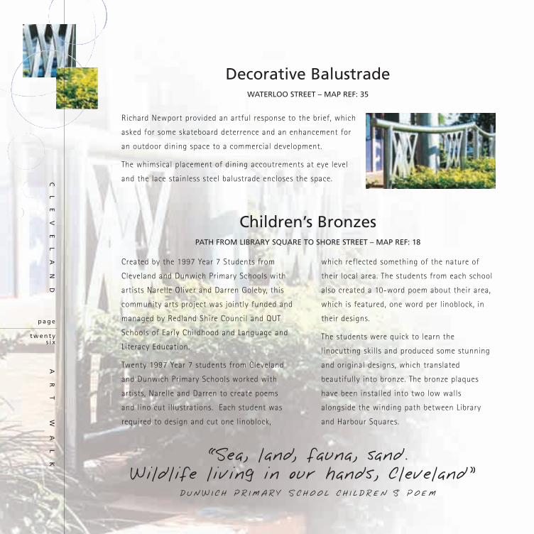
Decorative BalustradeWATERLOO STREET – MAP REF: 35
Richard Newport provided an artful response to the brief, which
asked for some skateboard deterrence and an enhancement for
an outdoor dining space to a commercial development.
The whimsical placement of dining accoutrements at eye level
and the lace stainless steel balustrade encloses the space.
t w e n t ys i x
p a g e
CL
EV
EL
AN
D
A
RT
WA
LK “Sea, land, fauna, sand.
Wildlife living in our hands, Cleveland”DUNW I C H P R I M A R Y S C H O O L C H I L D R EN S P O EM
Children’s BronzesPATH FROM LIBRARY SQUARE TO SHORE STREET – MAP REF: 18
Created by the 1997 Year 7 Students from
Cleveland and Dunwich Primary Schools with
artists Narelle Oliver and Darren Goleby, this
community arts project was jointly funded and
managed by Redland Shire Council and QUT
Schools of Early Childhood and Language and
Literacy Education.
Twenty 1997 Year 7 students from Cleveland
and Dunwich Primary Schools worked with
artists, Narelle and Darren to create poems
and lino cut illustrations. Each student was
required to design and cut one linoblock,
which reflected something of the nature of
their local area. The students from each school
also created a 10-word poem about their area,
which is featured, one word per linoblock, in
their designs.
The students were quick to learn the
linocutting skills and produced some stunning
and original designs, which translated
beautifully into bronze. The bronze plaques
have been installed into two low walls
alongside the winding path between Library
and Harbour Squares.

“From Straddie we come,and love life in the sun”
CLE V E L AN D P R I M A R Y S C H O O L C H I L D R EN S P O EM

Sculptural PlaygroundBLOOMFIELD PARK – MAP REF: 36
“We enjoyed our involvement with students,
both primary and secondary in conducting
model making and drawing workshops,
which were highly successful and productive.
A casting workshop was also during the
Strawberry Festival much to the delight of
all participants with eager enquires as to
whether it would be an annual event.”
T R O Y R O B B I N S & C A R O L R O C H E
“Nearly always finding children playing
on the sculpture is the best judgement on
how successful the project is.”
D I X I E L A M B E R T
“Being a great believer in the practical value
of models, I first created a design maquette
of the playground as an accurate guide for
construction and placement. The overall
theme was loosely based on local
agriculture, but many other local influences
were mixed in, some due to the uninhabited
ideas from local schoolchildren. We
finished up with two main play structures,
as well as individually inspired totems.
I wanted the largest structure to be
useable from every angle, to be climbed
over, slid down, hidden under, crawled
through, so that children could explore the
structure and find something new at every
turn. I wanted the shape to reflect local
influences, as well as being mysterious and
ambiguous so children could imagine it to be
whatever they wished, from a dinosaur to a
secret hideout.“
D A V I D R E N N
Playground TotemsBLOOMFIELD PARK – MAP REF: 36
“I drew inspiration from man made objects
and how they are reconstituted by the natural
elements of wind and water.“
T R O Y R O B B I N S
“The totems monumental scale acts as a
marker in the street and reflects the tidal
marks, mangrove patterns and shells of
the mud flats.“
C A R O L R O C H E
“I imagined an assortment of round
organic shapes plopped on top of
each other in a precarious fashion,
and embellished with curious buttons,
bumps, inscriptions and textures.
I wanted to give it an animated
“huggable” quality. The larger totem,
standing on its own, is another
unpredictable stack of curious bits
and pieces, reflecting some marine,
bush, and urban influences.”
D A V I D R E N N
t w e n t ye i g h t
p a g e
CL
EV
EL
AN
D
A
RT
WA
LK

“I lay in the grass and look up There are pictures in the cloud
I wonder why”ZOE C L A R K E

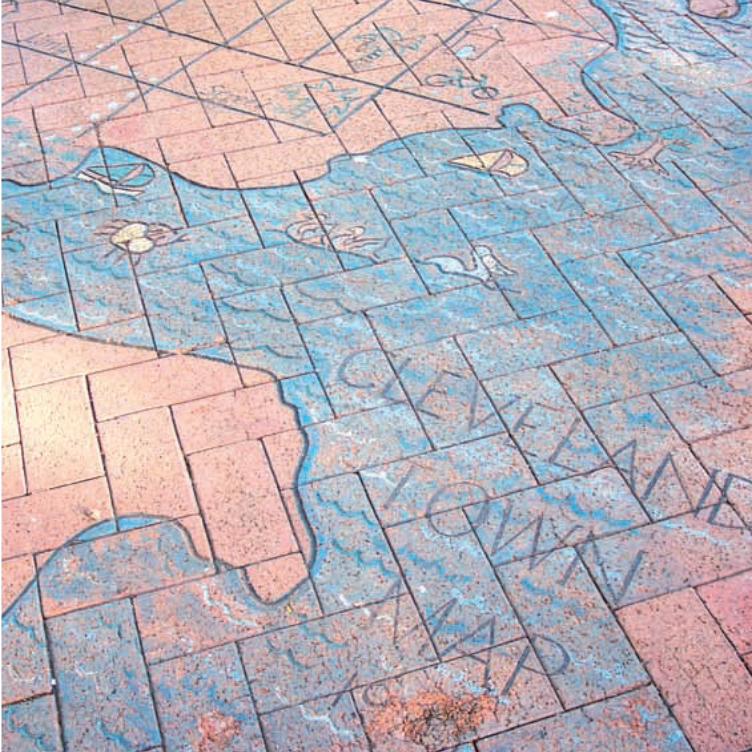
A year in the making, the Cleveland town
map emerged from earlier research and
cognitive mapping and is based on
interpretations of the residents images and
values of the town and surrounding district.
The map was designed and fabricated by a
team of artists, Jan Haughton (cartographer
and potter), Rosemary Jones (artist and
sculptor), Barry Kidd (artist, specialising in
pen and ink drawings of historic buildings in
the Redland Shire), Pauline Keneally (potter)
and Peter Gillan (architect and artist) to
combine skills to formalise the map content,
carve the pattern and inlay chemical
colorants into the unfired pavers. Simple
pictograms and linework allowing easy
interpretation were used to indicate the
features of Cleveland and several test pavers
were fired by Austral Pavers in order to
ensure the best possible results. Fired in an
industrial kiln over 6 days the pavers were
then laid like a giant jigsaw puzzle by
Council Works staff in the park precinct
providing a colourful ground plane to mark
the transition between the sculptural forms
of the park fountain and the children’s
playground.
“The dynamics of studio time at my house
became a blur of clay, colour, coffee, food and
wine blended in an artful discourse.”
J A N H A U G H T O N
The Town MapBLOOMFIELD PARK
MAP REF: 40
t h i r t y
p a g e
CL
EV
EL
AN
D
A
RT
WA
LK
“Further down where coral growsBeautiful blue water Flows”
CA I T L Y N ST O C K E R

NATIONAL AWARDS
1992 Royal Australian Planning Institute (RAPI) Queensland URBAN PLANNING ACHIEVEMENT
Cleveland Town Centre Streetscape Strategy
1994 Australia Council’s, Community, Environment, Art and Design (CEAD) AWARD FOR INNOVATIVE APPROACHES TO ENVIRONMENTAL DESIGN
The Bloomfield Street Project
STATE AWARDS
1991 Royal Australian Planning Institute (RAPI) QueenslandQUEENSLAND STRATEGIC PLANNING AWARDCleveland Development Control Plan
1991 Royal Australian Planning Institute (RAPI) Queensland AWARD FOR URBAN DESIGN
Cleveland Streetscape Strategy
1991 Royal Australian Planning Institute (RAPI) QueenslandAWARD FOR STRATEGIC & POLICY PLANNING
Cleveland Town Centre Development Control Plan
1991 Royal Australian Planning Institute (RAPI) QueenslandQUEENSLAND STRATEGIC PLANNING AWARDCleveland Development Control Plan
1993 Royal Australian Planning Institute (RAPI) QueenslandAWARD FOR EXCELLENCE
The Bloomfield Streetscape Project
1994 Redland Shire Council Australia Day AwardsCULTURAL AWARD
Bloomfield Streetscape Community Arts Project
1999 Australian Institute of Landscape Architects (AILA) QueenslandLANDSCAPE ART
The Bloomfield Streetscape Project
Awards
t h i r t yt w o
p a g e
CL
EV
EL
AN
D
A
RT
WA
LK

“In the sand of this loved land
The shells of middens cast”N I C O L A I N E J O R D AN

Art Walk Cleveland(INDEX TO MAP)
1. Poetry by Odgeroo Noonuccal
2. Sculpture by Denis Magee
3. Poetry by Nicolaine Jordan
4. Poetry by Dolly Olsen
5. Sculpture by Denis Magee
6. Sculpture by Denis Magee
7. Sculpture by David Renn
8. Poetry by Ann Reid
9. Sculpture by Denis Magee
10. Civic Fountain detailing by John Mongard, Carol Roche, Jan Haughton. Poetry byOodgeroo Noonuccal
11. Sculpture by Troy Robbins
12. Poetry by Caitlin Stocker
13. Street corner mosaics by Yulara Art Group
14. Banners and Beacon Gallery sign by Beverley Bloxham
15. Street corner mosaics by Victoria Point Potters Group
16. Planter bed ceramic tiles (24) by Paul and Glenys Forman
17. Bronze service pit covers byMatthew Tobin Urban Artists
18. Bronze plaques by 1997 Year 7students of Cleveland andDunwich primary state schools,Narelle Oliver and Darren Goleby.
19. Harbour Square Fountain by PaulBrown, John Mongard,Jacqueline Ratcliffe, Pat Zuber,Jan Haughton, Anna Rentoul,and Penne Jessord
20. Sculpture by Carol Roche and Troy Robbins
21. Mosaics in pathway throughRaby Bay Harbour Park by Scott Harrower
22. Mosaics in amphitheatre Raby Bay Harbour Park by Scott Harrower
23. Banners in Raby Bay HarbourPark by Beverley Bloxham
24. Banners in Masthead Park by Beverley Bloxham
25. Sculpture in Masthead Park by Carol Roche
26. Water feature by Wendy Mills
27. Mosaic by Karen Tyler
28. Entry sculpture by Chetana Andary
29. Street corner mosaics by Coochie Potters and Artists
30. Poetry by Kathleen Mc Gregor
31. Poetry by Odgeroo Noonuccal
32. Street corner mosaics by the Old Schoolhouse Gallery
33. Poetry by Pamela Bell
34. Sculpture by Carol Roche
35. Decorative balustradeby Richard Newport
36. Sculptural playground andTotems by Carol Roche, DavidRenn, Dixie Lambert and TroyRobbins. Poetry by Zoe Clarke.
37. Poetry by Margaret Mason
38. Poetry by Odgeroo Noonuccal(on fountain)
39. Bronze plaques by Carol Roche
40. Town Map by John Mongard, Jan Haughton, Pauline Keneally,Peter Gillan, Barry Kidd andRosemary Jones.
41. Poetry by Beth Stick
42. Sculpture by Dixie Lambert
43. Poetry by Oodgeroo Noonuccal
44. Cleveland Logo (on all street-scape bins and bollards)
45. Poetry by Irene Stephen
46. Poetry by Ernest Dainty
Graphic Design by Megan Hibberd, Artspot Graphic Design
Inside Cover image and editorial by Jan Haughton
Photographs by Pat and Charles Zuber, Jan Haughton
Produced by Corporate Communications, Redland Shire Council
For further information about the Redland Art Gallery, public art and guided art walks contact;
Cultural Development Redland Shire Council
PO Box 21 Cleveland Q 4163Ph 07 3829 8487 • Website www.redland.qld.gov.au