data and interfaces for advanced building operations · pdf filedata and interfaces for...
TRANSCRIPT

1
Data and Interfaces for Advanced Building Operations
and Maintenance - RP 1633 Final Report
Submitted to:
ASHRAE
1791 Tullie Circle, N.E.
Atlanta, GA 30329
Contributors:
Nicholas Gayeski, PhD
Sian Kleindienst, PhD
Jaime Gagne, PhD
Bradley Werntz
Ryan Cruz
Stephen Samouhos, PhD
KGS Buildings, LLC
66 Union Square Suite 300
Somerville, MA 02143
June 2015

2
Acknowledgements Thank you to the project monitoring subcommittee including Reinhard Seidl, Steve Taylor, Chariti Young,
Jim Kelsey, and Kristin Heinemeier for their guidance, feedback, and patience throughout this research
project. Thank you to all of our participants for committing time to participate in interviews, review
information, and share their experiences. Thank you to the sponsoring technical committees, ASHRAE
staff, and ASHRAE membership for their ongoing efforts to advance the state of the industry.

3
Executive Summary Analyzing and interpreting building performance data to inform operations and maintenance is critical
to the realization of energy efficient, high performance buildings. With the advance of technology
hardware and software for buildings, there is an increasing amount of available data to inform building
operations, maintenance and management. However, facility management personnel have limited time
and resources and need concise metrics, visualizations, and information in order to support their daily
operations and decision-making. Recent works, such as ASHRAE’s Performance Measurement Protocols
in Commercial Buildings, have focused attention on the metrics relevant to tracking building
performance. The research described in this report seeks to expand such investigations to consider
visualization of operational metrics focused on an audience including facility managers, control
technicians, heating ventilation and air conditioning (HVAC) technicians, facilities service providers, and
commissioning engineers.
The ultimate goal is to provide recommendations about data-driven metrics and interfaces so that they
clearly quantify and communicate building operational performance for a diverse set of building
stakeholders. This report provides these recommendations and summarizes the activities conducted to
arrive at them. These activities included: surveying relevant metrics, visualizations and software
interfaces; interviewing building operations staff and supporting personnel; and creating mock up
interfaces that research participants reviewed. The body of the report goes into detail about each task
and how these tasks informed the recommendations. This executive summary describes the core
recommendations of the research with only a brief overview of how these recommendations were
arrived at through the project tasks.
Before presenting recommendations, notable resources available through this project include the
following:
A compendium of available metrics and interfaces examples is included in Appendix A. Use this database to review operational metric options and to see examples of visualizations from real applications.
Feedback from interview participants and survey respondents are included in Appendices B, C, and E. This includes anecdotal feedback, such as anonymous comments from participants about what they want in an operational interface, and survey feedback with statistics about interviewee preferences.
Mock-up visualizations of metrics are available through the mock interface site, https://sites.google.com/a/kgsbuildings.com/rp1633/, and screen shots are available in Appendix D.
For the reader interested in scanning the example interfaces reviewed in this research, we recommend
jumping ahead to Section 5, Appendix A, or the website listed above.
Advanced Operations and Maintenance Interface Recommendations
The old adage attributed to Henry Ford, “If I had asked people what they wanted, they would have said
faster horses” applies to this research in that building operations and maintenance personnel do not

4
necessarily know what to ask for to get better metrics and visualizations through which to manage,
operate and maintain buildings. We have condensed the preferences expressed by interviewees and
best practices found in the industry into a set of recommendations that reflect the predominant needs
underlying the expressed preferences. Specifying engineers, product designers, and facilities personnel
may consider these recommendations as they specify, design or adopt operations and maintenance
interfaces.
The feedback we collected was from a diverse set of stakeholders which was at the same time broad - in
that we talked to many different people, in different roles, and in different types of facilities - and
limited in that the stakeholders represent only a tiny portion of the industry. We recognize that the
feedback we gathered does not constitute a statistically significant sample from which to claim,
definitively, that these recommendations are precisely what every operations and maintenance
stakeholder wants in an advanced interface. With such caveats in mind, our recommendations are
presented below.
At the most basic level, we recommend the ability to view and drill down into different scales of
information because facility management and operations personnel need the ability to assess
performance at multiple scales. These scales include the following:
Enterprise or portfolio scale, presenting performance of multiple facilities,
Building scale, presenting overall building performance information,
System scale, at which systems like heating, cooling, ventilation, lighting, generation and others may be drilled into and assessed from a systems perspective, and at
Equipment and Zone scale, at which specific equipment like an air handler, pump, boiler, Fan Coil Unit, VAV box, or others may be assessed, and finally
Project scale, at which the performance of the building or systems related to specific projects, such as a re-commissioning project or a chiller replacement, can be assessed. Many research participants indicated a strong need to be able to view information at this scale in order to assess the effectiveness of their investments and initiatives.
We recommend including certain types of information across all scales, including the following:
Cost information, such as how much energy cost a building or equipment consuming.
Utility information, such as how much electric, gas or water a building or equipment consuming, their carbon equivalents, progress related to utility consumptions goals.
Operating characteristics, such as visualizations and graphics of how buildings, systems or equipment are performing now or over time. This can include characteristics such as runtimes, expected occupied hours, average operating temperatures, pressures, flows or other characteristics indicative of performance.
Diagnostic information, such as automated fault detection and diagnostic outputs which can detect when buildings, systems or equipment have faults or opportunities for higher efficiency. This might include, for example, when mechanical or control faults such as valves leaking by, but also opportunities for more efficient operation such as installing variable speed drives, cleaning heat exchangers, programming reset schedules, or optimizing a chilled water loop.

5
Data visualization tools. This spans all scales and reflects an underlying need for the ability to create charts, scatter plots, and other views in multiple formats using any data from any scale. It also presumes data is gathered and stored for later use.
We recommend software interfaces allow users to navigate from each of these scales into each of these
types of information, with associated metrics and visualizations for each category. The specific design,
user experience, or workflows within these interfaces is a product design and user experience challenge
outside the scope of this research. Within each of these scales certain metrics or visualizations stand
out based on the interviewees responses, and these are listed below.
Enterprise scale
Metrics o Daily and monthly operating costs for utilities, like energy and water o Daily, monthly and real time consumption for utilities, like energy and water o Utility peak demand use and time o Greenhouse gas emissions in carbon equivalents o Current and recent whole building operating modes for heating, cooling, or both o Diagnostic metrics including number of faults, rise or fall in fault counts, avoidable cost
associated with faults and opportunities, and savings achieved o Normalization of all metrics by building area and weather conditions
Visualizations o Maps allowing users to compare and select buildings for deeper investigation, with multiple
layers to display the metrics listed above o Line charts to view portfolio performance over time o Bar charts to compare buildings, benchmarks, and goals o Pie charts to show building or utility contributions to overall use o Tabular views of buildings, sortable by the metrics above
Building scale
Metrics o All of the metrics at the enterprise scale listed above, but for each specific building o End-use breakdowns presented both by utility type, for example by electric, gas, steam, and
chilled water consumption, as well as by end use type, for example by cooling, heating, ventilation, lighting, plug loads, and other uses
o For demand response applications, projected future consumption and the timing of demand response events
o Operating characteristics such as building expected occupancy, measured occupancy, and whole building comfort indices
o Major system and equipment operating characteristics such as major equipment run time hours or overall plant performance
o Major system and equipment diagnostic metrics rollups such as total avoidable cost associated with faults, impact of faults on occupant comfort, and fault severity
Visualizations o All visualizations listed at the enterprise scale o Calendar plots or time series overlays to compare performance under similar conditions or
day types over time
6
o Tabular views of operating characteristics and diagnostic information
System scale
Metrics o Current operating conditions for key variables, such as supply temperatures or pressures
relative to setpoints for major systems, temperature differences on major hydronic loops, statistics on valve positions served by loops or damper positions served by ventilation systems
o Run-time hours for major systems and equipment o Fault indicators showing system-level faults such as simultaneous heating and cooling or
competing systems or suboptimal controls like lack of staging or suboptimal start/stop o Fault metrics for each system such as the number of faults, the avoidable cost associated
with faults, and the impact of faults on occupant comfort conditions.
Visualizations o Time series plots of conditions for each system with representations of allowable operating
ranges and setpoints o Tables showing statistics about major equipment, such as run time hours, current operating
conditions, fault counts, fault impacts, and cost impact. o Color coded graphics illustrating systems deviating from expected performance, in alarm, or
with diagnostic faults, with multiple layers of information overlayed in a systems diagram. Layers may include, for example, deviations from setpoints, alarms, and fault severity measured by cost impact, comfort impact, or equipment maintenance priority
o Drill down capabilities into textual and graphical information about a fault describing and illustrating the nature of the fault, root causes of the fault, suggested resolution, and impact of the fault on operating cost, energy consumption, occupant comfort, or equipment lifetime
o Co-presented graphs of supply side and load side conditions, such as a time series of hydronic loop temperature differences over time relative to the mean, minimum and maximum hydronic loop load side valve positions over time. Similar visualizations can be created for ventilation system dampers and air handler supply air conditions.
o Histograms for major point compliance deviations (e.g. number of hours deviating from setpoint by one, two, or three degrees) or damper and valve positions (e.g. number of hours during each valves or dampers were positioned at 10%, 20%, 30%, etc. open)
Equipment and zone scale
Metrics o Equipment and zone deviations from setpoints or thermal comfort conditions, related to for
example temperature, humidity, carbon dioxide, and light levels o Fault information such as equipment operating off schedule, stuck dampers, leak-by on
valves, simultaneous heating and cooling, or suboptimal equipment controls o Fault metrics such as the number of faults, the avoidable cost associated with each fault, the
impact of faults on zone comfort conditions or equipment lifetime, and duration of faults
Visualizations o Time series plots of conditions for each equipment with representations of allowable
operating ranges and setpoints o Color coded equipment graphics illustrating equipment deviating from expected
performance with multiple layers such as deviations from setpoints, alarms, component

7
faults, or fault severity measured by cost impact, comfort impact, or equipment maintenance priority
o Color-coded floorplans with multiple layers representing metrics, such as deviation from comfort or supply conditions, and faults, such as zones or components with specific faults and their fault metrics above
o Animations of floorplans or equipment graphics illustrating performance metrics over time o Floorplans illustrating groups of zones served by common plant or ventilation systems o Drill down capabilities into textual and graphical information about a fault describing and
illustrating the nature of the fault, root causes of the fault, suggested resolution, and impact of the fault on cost, energy, comfort, and equipment lifetime
Project scale
Metrics o Expected project cost o Expected energy and cost savings and projected payback o Actual project cost o Achieved energy and cost savings and payback
Visualizations o Time series, such as line or bar charts, of project-related utility consumption with an
indication of project start date and completion date o Tabular views of all projects, with the ability to sort projects by the metrics listed above
Here are a few considerations for consulting engineers:
Many of the metrics and visualizations above presume the underlying data is available from sensors and systems in the building, that the building automation and metering systems’ capabilities are sufficient to collect this data, and that the data is trended somewhere in a scalable database.
Many of the metrics and visualizations demonstrate the need to be able to represent data in many ways, such as time series, bar charts, or scatter plots and with the flexibility to allow users to create their own views of the data. Do not specify a fixed set of graphics or metrics, but rather the ability to represent data and metrics at different scales and for different purpose and stakeholders. This requires flexible tools and configurability of components or interfaces for different stakeholders.
Anticipate the need to integrate building data with other data sets and systems by specifying integration capabilities such as webservices. Common systems with other relevant data include maintenance management systems, integrated workplace management systems, complaints software, space management software, and accounting tools.
For graphical system representations, where they exist, enforce accurate representations of systems, e.g. heating plants, air handlers, in automation system graphics or other representations
It is unlikely that a single software package will provide all of the recommended functionality, because the metrics and visualizations contain data and information that cut across different types of software applications and building systems. Therefore, interoperability of software packages through technologies like webservices and single-sign-on authentication becomes important to fulfill the requirements through multiple software packages. Customers with requirements for a ‘single pane of glass’ type interface presenting all of the metrics and visualizations may require a higher level of integration, typically at a higher cost.

8
From this research it is clear that concisely presenting information for operations and maintenance
personnel is critical to managing building performance, and will be accomplished as much by good
design of user interfaces as by presenting specific metrics and visualizations. In summary, interfaces
should present information at multiple scales, across an enterprise, for specific buildings, within building
zones or for specific systems and equipment, and for facility projects with clear indicators from metrics
and visualizations representing overall performance and where to drill down. When drilling down,
interfaces should provide sufficient information to indicate not just current conditions, but whether
those conditions are within appropriate ranges, how those conditions compare to past performance,
how those conditions relate to other system components, and whether those conditions represent
faulty or suboptimal performance. Lastly, interfaces should provide flexibility in viewing data in many
formats, with different charting types, allowing users to switch between views, and to easily overlay
data or switch to related data sets.
Research Tasks
The research was conducted in six major tasks. These began with a scoping and review phase, in which
we conducted a review of available technologies and an initial set of scoping interviews. Based on this
initial research, we developed a stakeholder interview questionnaire to focus on specific metrics and
graphics and conducted a second set of interviews. Then, interactive dashboard prototypes embedded
in a web-based survey were created for participants to test the interfaces and communicate interface
preferences. Finally, recommendations for advanced building operations and maintenance interfaces
were developed based on the results of all of these tasks.
Review of Metrics and Interfaces
Section three of this report includes a literature review of previous research, a compilation of existing
tools, and a summary of existing types of data, metrics, and graphical methods of representation used to
assess building performance. Relevant research and publications are reviewed including the
Performance Measurement Protocols in Commercial Buildings, the Performance Metrics Project through
the U.S. Dept. of Energy’s Commercial Building Initiative, ASHRAE’s Building Energy Quotient, and
ASHRAE Guideline 13, Specifying Building Automation Systems. These catalogue many relevant metrics,
such as basic building energy use intensity (EUI), which are widely used and a foundation for assessing
building performance.
A database of metrics and graphics used to evaluate building performance and aid in operational and
financial decision-making is available as Appendix E. The metrics database provides an overview of the
types of data, metrics, and other information that is or could be made available in building automation
systems, energy dashboards, and other analytics systems. The graphics database summarizes the types
of graphical representations that can be used to present these metrics and information to the user from
within an interface or dashboard. The graphics database includes examples of various types of visual

9
Interviewees had widely varying
views on the most useful
metrics and visualizations, and it
was clear that an inflexible, fixed
set of metrics and visualizations
would not serve the needs of all
stakeholders.
representation for data that are currently found in commercial tools such as calendar plots, floor plan
views, rating system visualizations, and equipment graphic overlays.
Participant Interviews
Section four of this report describes the results of interviews with project participants, which solicited
their preferences for data, metrics and visualizations for operations and maintenance. The interview
questionnaires were structured into a set of 7 focused categories spanning an enterprise portfolio,
building and equipment or system level, and covering topics such as consumption, cost, emissions for
various utilities, and operating characteristics and
diagnostics about equipment and systems.
Interviewees were presented with example metrics and
visualizations across these categories and asked whether
they found them useful or not. Notably, interviewees had
widely varying views on the most useful metrics and
visualizations, and it was clear that an inflexible, fixed set
of metrics and visualizations would not serve the needs of
all stakeholders. Instead, widely varying needs demand
flexible interfaces, which allow for different metrics to be
presented in a variety of visualizations and configurations
for each stakeholder. Some participant preferences were
heavily influenced by negative past experiences, including inaccurate data, unintuitive metrics, and non-
transparent dashboards. Such experiences erode trust in more complex system outputs, such as fault
diagnostics and avoidable costs. Many participants, especially those with engineering knowledge,
preferred simple, verifiable information such as time-series graphs of key performance data and the
ability to plot data from different systems on the same charts. These desires seem to be an immediate
response to current pain points with existing building automation systems that have limited trending
and graphing capabilities, or lack of trust in existing diagnostic information.
The types of information that participants most frequently indicated were useful included metrics
related to equipment fault detection, potential for LEED or other certification, system or equipment
efficiency metrics, and benchmarks comparing the building performance to an ideal or simulated model.
The most commonly preferred graphic visualizations included equipment and system level graphics,
floor plans, and graphs showing live or historical time series data. Although participants were provided
examples of the various types of graphics, it is possible that participants chose those graphics they were
already most comfortable with as the most useful. Next most frequently preferred graphics included
graphs showing performance data overlaid with weather data, heat maps of performance (such as zone
temperature deviations) overlaid on a floor plan, energy end use icons or graphics, and performance
over time overlaid on a clock or calendar.

10
Less useful types of representation included performance equivalents (for example, energy use
represented using numbers of light bulbs), temporal maps (heat maps of performance over time), and
report cards. The least popular visualizations among those who manage and operate buildings were the
gauge and the scatterplot, but for different reasons. Many operational staff felt that a gauge was flashy
but without substance, and many participants did not seem comfortable with the scatterplots. Two of
the most popular visualization types for both portfolio and building-level management were the
benchmark (visually comparing current values with historical performance or goals) and the time series.
For cross-building information, participants liked color-coded portfolio or campus maps as a way to
communicate high-level information only if they allowed away to drill down to detailed information. Bar
charts or time series graphs of utility consumption, comparisons to past performance, and pie charts of
end use breakdown over selected periods of time were predictably highly ranked. Portfolio and
financial decision-makers generally had little interest in or understanding of detailed operational
information, but instead preferred common financial metrics such as spending, budgets, and project or
maintenance ROI. Utility consumption presented as a time-series graph, with benchmarking against
goals or historical values, was a highly ranked way of viewing building performance. Facility managers
generally gave high rankings to energy consumption time series, energy breakdown pie charts and time
series, and energy comparison benchmarking (% different from benchmark). Understanding energy
breakdowns by end use, building, tenant, or other metric was routinely ranked high by managerial
stakeholders, however many were skeptical about the cost effectiveness of using metering and sub-
metering to produce the breakdowns or other advanced metrics.
Operations and engineering personnel, such as technicians, building engineers, and commissioning
agents, preferred to have detailed information on equipment operation and data. Some of these
technical stakeholders complained of the lack of trending and graphing capability (or flexibility) in their
current systems, and they expressed a desire to see time series of operational data and simple operating
state graphics condensed into one screen. Many desired to view raw data from different BAS and
metering systems in one interface and to have options to view any data using multiple visualization
methods. Presenting this data and related calculations on system graphics, equipment graphics, or zone
graphics was well-received.
Many technical stakeholders expressed a need for the ability to drill down from high level building
performance metrics into system operations and diagnostics. Most participants gave high ranking to
basic operating information such as current operating conditions, recent trends in operations,
equipment runtimes, and setpoint compliance. Participants did express interest in diagnostic findings,
which would illustrate which equipment and systems were underperforming or had faults causing
performance issues, such as a leaking air handler valve causing simultaneous heating and cooling. On
the other hand, many of the same participants expressed skepticism that these diagnostics could be
accurate in either accurately finding faults or the projecting the energy costs of these issues.
Example Data, Metrics and Visualizations for Advanced Operations

11
Based on feedback from the interview participants, examples of advanced operations and maintenance
interfaces were created and are available to the general public at the following location:
https://sites.google.com/a/kgsbuildings.com/rp1633/.
This interface includes the most commonly identified ‘useful’ metrics and visualizations from the
participant interviews, and some additional ones beyond interviewee preferences. Interview
participants were asked to survey the mock interface and to rank each metric and visualization on a
scale of one to five, from least to most useful. Participation in this follow up survey has been very
limited, with only 16.5% of participants responding to this final survey, but it is still open to participants
and to the general public. The results of these surveys are presented in section five of this report.
Common metrics ranked highly. These included basic information such as a simple cost table of building
expenditures and building energy use intensities plotted over time and relative to other buildings in the
portfolio or established benchmarks. Participants regularly expressed a preference for visualizations
that clearly indicated what aspect of building operations to attend to whether in time, location, or
within a system. For example this might include: a campus map showing color coded buildings based on
deviations from expected performance or operations; a system graphic showing the component
exhibiting a fault and the nature of the fault; a table of projects or equipment prioritized by potential for
savings; or calendar plots and time series indicating the points in time when issues worth investigating
occurred.
Participants were also asked to provide additional feedback following the ranked survey responses.
Managers expressed a consistent preference for summary information about the success of energy
projects. For example, one participant said “The most useful section would be tracking of energy and
cost savings projects.” This may reflect the role of most participants, as facility managers, and their
need to communicate the effectiveness of facility investments. Many participants responded that the
operations and diagnostics sections are important for day-to-day operations, and often missing from
available interfaces today. For example, one participant stated that “the diagnostics portion of this
survey would be the most useful area to identify quickly issues in the field and get them corrected. This
is lacking in the industry and is now becoming the best method for continuous commissioning,” while
another added that it would be “Even better if this [interface] is overlaid on BAS user interface.”
Providing clear indications of equipment operational characteristics, and importantly equipment
deviating from normal or outliers, was also important. For example, one participant noted, “For zone
operations, would be very useful to know which zone is the worst (especially in worst-zone control
schemes.”

12
Table of Contents Acknowledgements ....................................................................................................................................... 2
Executive Summary ....................................................................................................................................... 3
Table of Contents ........................................................................................................................................ 12
Tables .......................................................................................................................................................... 14
Figures ......................................................................................................................................................... 14
1. Project Objectives ............................................................................................................................... 16
2. Project Tasks and Report Structure .................................................................................................... 18
3. State of the Technology ...................................................................................................................... 20
3.1 Literature Review .............................................................................................................................. 20
3.1.1 Data, Metrics, and Information for Building Performance ........................................................ 20
3.1.2 Visualizing Building Performance Data and Information ........................................................... 24
3.1.3 Interfaces and Dashboards for Building Operations, Monitoring, and Controls ....................... 24
3.2 Existing Tools ..................................................................................................................................... 25
3.3 Existing Metrics and Graphics ........................................................................................................... 29
3.3.1 Metrics Database ....................................................................................................................... 29
3.3.2 Graphics Database ..................................................................................................................... 30
4. Participant Interviews ......................................................................................................................... 32
4.1 Scoping Interviews ...................................................................................................................... 32
4.1.1 Interview Format and Questionnaire .................................................................................. 32
4.1.2 Profile of Buildings Visited ................................................................................................. 33
4.1.3 Profile of Stakeholders Interviewed .......................................................................................... 34
4.1.4 Profiles of Control Systems and Dashboards ............................................................................. 37
4.1.5 Potential Value of New Information .......................................................................................... 42
4.1.6 Discussion of Participant Feedback ........................................................................................... 44
4.2 Interface Component Interviews ................................................................................................ 46

13
4.2.1 Interface Component Interview metrics and visualizations ............................................... 47
4.2.2 Interface Component Interview results .............................................................................. 51
5. Data, Metrics and Visualizations for Operations and Maintenance ................................................... 57
5.1 Example Interfaces ...................................................................................................................... 57
5.2 Participant Surveys ..................................................................................................................... 70
6. Recommendations for Advanced Operations and Maintenance Interfaces ...................................... 93
References .................................................................................................................................................. 99
Appendices:
A. Database of Existing Tools and Graphics
B. Scoping Interviews – Survey and Responses
C. Interface Component Interviews – Survey and Responses
D. Example Interface Screenshots
E. Example Interface – Survey and Responses

14
Tables Table 1 Tools in Existing Tools Database
Table 2 Data visualizations in Graphics Database
Figures Figure 1 Scoping interviews – Building types visited
Figure 2 Scoping interviews – Range of building sizes visited
Figure 3 Scoping interviews - Types of stakeholders interviewed
Figure 4 Financial decision-making processes
Figure 5 Participant sources of information about building performance
Figure 6 Frequency of participant use of control systems and dashboards
Figure 7 Data and information available from participant tools
Figure 8 Functionalities available in participant tools
Figure 9 Tasks performed by participants using control systems and dashboards
Figure 10 Participant utilization of control systems and dashboards
Figure 11 Participant satisfaction with existing control system and dashboards
Figure 12 Rated usefulness of new metrics and information
Figure 13 Rated usefulness of new graphical information
Figure 14 Sample calendar plot page from Interface Component interviews
Figure 15 Participant profile for Interface Component interviews
Figure 16 Percent of participant approval of specific visualizations
Figure 17 Energy metrics preferences for portfolio and financial managers in Questionnaire 1
Figure 18 Benchmarking options preferences for portfolio and financial managers in Questionnaire 1
Figure 19 Visualization options preferred by managerial stakeholders for specific categories in
Questionnaires 1, 3, and 4

15
Figure 20 Visualizations preferred by operations stakeholders for all categories in Questionnaires 5, 6,
and 7
Figure 21 Early prototype example interface design
Figure 22 Example interface section organization
Figure 23 Typical example interface page organization and navigation
Figure 24 Example interface main homepage
Figure 25 Example interface Costs homepage
Figure 26 Example graphics from Costs page
Figure 27 Example interface Utilities homepage
Figure 28 Example graphics from Utilities page
Figure 29 Example interface Operations homepage
Figure 30 Example graphics from the Operations page
Figure 31 Example interface Diagnostics homepage
Figure 32 Example graphics from the Diagnostics page
Figure 33 Example content from the Data page

16
1. Project Objectives Analyzing and interpreting building performance data to inform operations and maintenance is critical
to the proliferation, retrofit and success of higher performance buildings [1] [2]9/11/2015 1:04:00 AM.
Despite the growing ease in collecting building data [3], and increasing attention to performance
measurement in buildings [4], there has been little research of metrics and interfaces that best serve
building operations and maintenance stakeholders. There now exists a significant amount of guidance
and standards on measuring the performance of buildings, primarily for bulk energy information, but
with limited depth on metrics and visualizations to inform daily aspects of building operation or the
unique needs of various building types [5] [6].
Recent ASHRAE research on Performance Measurement Protocols in Commercial Buildings [4] [7] has
focused attention on the metrics relevant to tracking building performance. The research described in
this report seeks to expand such investigations to consider graphical visualization of operational metrics
and their arrangement within interfaces. This research seeks to focus attention on operations and
maintenance stakeholders, including control technicians, heating ventilation and air conditioning (HVAC)
technicians, service providers, commissioning agents, and facility managers. The goal of this project was
to create guidance about data-driven metrics and visualization that clearly quantify and communicate
building operational performance to a diverse set of building stakeholders.
The objective of the first part of this research was to obtain an understanding of the current state of the
technology by evaluating building automation and control systems, energy dashboards, and other
analytics systems that are available in buildings today. This study included a review of relevant research,
creating a compendium of known building performance metrics, and a summary of existing commercial
interfaces. In addition, interviews were conducted with over 80 stakeholders with various roles
responsible for managing hundreds of buildings across the U.S. During these interviews, we reviewed
the types of systems and interfaces currently available to the participants, the types of data, metrics,
and graphics presented in these systems, and how (or if) this information is being used. We also
assessed which performance metrics and graphical representations would be most relevant to each type
of participant based on their reactions to a series of example visualizations. Based on the interview
responses, we determined what types of metrics and graphical methods of presentation are most useful
for building operation and financial decision-making for different types of buildings and by stakeholders
with different sets of needs.
During the second part of this project, we used the sets of metrics and graphical visualizations selected
in the first half of the project to create example interfaces. These interfaces were customized to meet
the needs of several main types of stakeholders, including those with operational, energy, and financial
interests. The dashboards were made available online so they could be surveyed and ranked by a group
of volunteers from the original participants. This stage of the research moved beyond the static
graphical examples used in the original interviews by providing participants with an interactive
environment that emulated a working building performance or operations interface.

17
This report concludes with recommendations for the data, metrics and visualizations for interfaces that
best serve the needs of advanced operations and maintenance in buildings. These recommendations
are made based on the results of the state of the technology review, the initial sets of stakeholder
interviews, and responses to the example interface survey.

18
2. Project Tasks and Report Structure This research project was conducted in six major tasks. These began with a scoping and review phase, in
which we completed a review of the state of the technology and an initial set of scoping interviews.
Based on our initial results, we then revised the stakeholder interview questionnaire to focus on more
specific metrics and graphics and conducted a second set of interviews using the revised protocol. We
then developed a series of wireframes for example interfaces based on the results of the interviews and
the state of the technology review. These later evolved to become interactive dashboard prototypes,
embedded in a web-based survey. We concluded the project by recruiting participants to review these
interfaces and complete the survey, and by finalizing a list of recommendations based on the results of
all six tasks.
During Task 1 of this research project, we began gathering information about the current state of the
technology, including an assessment of the type of information, data driven metrics, and dashboard
interfaces currently used in building monitoring and control systems. To obtain this information, we
conducted a literature review of previous research as well as a review of existing tools, including Energy
Information Systems (EIS), building automation systems (BAS), energy management and control systems
(EMCS), energy monitoring dashboards, and other analytics products. We also developed a database of
known building performance metrics and a library of example graphics from existing tools. Once we had
established the state of the technology, we used this information to develop an initial interview
questionnaire and protocol for the stakeholder interviews. During Task 1, we aimed to complete
roughly one half of the proposed total set of stakeholder interviews. For the first set of interviews, we
met with 39 participants who worked in or managed a combined total of 23 different buildings, located
primarily in the Northeast. This first round of interviews was more general in nature than later rounds
and helped establish a baseline for the types of tools and metrics that participants currently had access
to. The results of Task 1 are presented in Section 3: State of the Technology, and Section 4.1: Scoping
Interviews.
In Task 2 of the project, we developed a more detailed questionnaire and a compendium of graphics to
present specific types of metrics and example visualizations to interviewees. With the project
monitoring subcommittee’s guidance, these were reduced to a minimal set in order to facilitate 2 hour
interviews. In Task 3, interviews with a second set of 40 stakeholders were conducted using the new
questionnaire to collect preferences and ideas for example interfaces. The second set of interviews took
place across the U.S. and again included stakeholders in a variety of roles in building operations and
decision-making. The results of Tasks 2 and 3 are presented in Section 4.2: Interface Component
Interviews.
During Task 4, the results of Tasks 1 through 3 were compiled and used to inform the development of
interactive example interfaces with metrics and visualizations. These example interfaces were made
available to participants on an online site, in which surveys were embedded to rank and collect
subjective information about user preferences. The interfaces were divided into sections on costs,
utilities, operations, diagnostics, and data visualization, and subdivided into portfolio, building, plant,

19
ventilation, and zone scale information. The goal of this project was not to determine the optimal user
experience or interface design for operations and maintenance, but rather to assess which specific
metrics and visualizations were useful to operations and maintenance personnel, facilities managers,
and financial stakeholders. In Task 5, these interfaces were made available to participants who were
requested to complete a one hour survey to provide feedback on these interfaces. The results of Tasks
4 and 5 are presented in Section 5: Data, Metrics and Visualizations for Operations and Maintenance.
The final task of this project is to report on the findings of the research. This research report
summarizes the work performed and resources created. It also provides recommendations from across
this work on data, metrics, and visualizations considered useful specifically from an operations and
maintenance perspective.

20
3. State of the Technology Because energy and building performance systems and dashboards are a rapidly growing and changing
aspect of the building understanding, assessing the current state of available technology was critical to
this research project. It is important to note, however, that this review only represents a snapshot in
time for a fast-changing technology. For this study, we focused on three main areas: metrics and
information for building performance, graphical representation and visualization of this information, and
the use of building automation and controls systems, energy monitoring systems, and other types of
dashboards for building maintenance and operations.
As many of the advancements in this area are occurring directly in the marketplace, it was necessary to
gather information about the tools and dashboards that are available in buildings today as well as to
examine previous research. This section includes a literature review of previous research, a compilation
of existing tools (initially conducted in 2012 and updated in fall 2014), and a summary of existing types
of data, metrics, and graphical methods of representation used to assess building performance.
3.1 Literature Review
There have been a variety of previous studies that have examined data and interfaces for building
operation, particularly in the areas of metrics for measuring building performance and dashboards for
visualizing performance. This section includes a summary of this research.
3.1.1 Data, Metrics, and Information for Building Performance
As buildings become more complex and technology improves, building stakeholders have access to an
increasing amount of data and information directly from the building itself. Information about a
building’s performance may be available as data, metrics, or ratings. For this study, we consider “data”
to be numerical, Boolean, or multi-state values that are obtained directly from a meter, sensor, or
control system. Examples of data include room temperature, valve position, supply air flow, chiller
power consumption, and whole building electricity consumption. Data may be available from a wide
variety of meters and sensors located throughout the building, and an individual building may have
thousands of available data points. Data may be accessed in numerous ways, including direct readings
from meters or sensors on individual pieces of equipment, through building automation and control
systems, through on-site workstations and kiosks, and through web-based and remote interfaces. We
also consider “information” about a building useful in characterizing performance for operators, such as
building floor area, mechanical system types, heating degree days or other climate data, and mechanical
schedule information.
Performance metrics, also called performance indicators, differ from data and information in that they
are generally not directly available from a sensor or meter but are instead calculated using combinations
of data and other building information. Examples of metrics include Energy Use Intensity (EUI, or energy
per building area), chiller kW/ton, photovoltaic cell efficiency, and occupant complaints per day.
Hitchcock [8] defines performance metrics as representing “the performance objectives for a building

21
project, using quantitative criteria, in a dynamic, structured format.” Hitchcock lists a variety of
objectives that may be considered using metrics, including: energy efficiency; environmental impact;
life-cycle economics; occupant health, comfort and productivity; and building functionality, adaptability,
durability, and sustainability. As a part of ASHRAE Special Project 115: Performance Monitoring
Protocols, MacNeill et al. [9] completed a comprehensive review of literature relevant to building
performance measurements. They identified the most relevant methods for quantifying building
performance in several areas, including energy performance, indoor air quality, thermal comfort,
acoustics and vibration, and lighting quality. They also developed an “Evaluation Matrix” that
categorizes over 200 documents related to building performance measurements.
Although a wide range of metrics exists, it is clear from MacNeill et al’s research that there is currently
no consensus on which metrics or sets of metrics should be used to define building performance.
However, there is an ongoing effort to develop frameworks of standardized metrics, particularly for
energy-related performance. The Performance Metrics Project through the U.S. Dept. of Energy’s
Commercial Building Initiative, the National Renewable Energy Laboratory (NREL), and Pacific Northwest
National Lab (PNNL) has defined a set of performance metrics with the goal of standardizing the
“measurement and characterization of building energy performance” [10] [11] [12]. Such metrics are
highly specific and clearly defined, as the researchers involved in this study believed that reducing the
possible levels of interpretation would thereby reduce the disparity among assessment results. The
metrics are also organized by tier, which correspond roughly to stakeholder interest: Tier 1 includes a
smaller number of more general metrics such as Net Facility Energy Use which are of interest to building
owners or rating system sponsors, while Tier 2 metrics include a larger number of more specific metrics
such as DHW System Efficiency, which are of interest to stakeholders involved in daily building
operations. In total, the metrics were divided into six categories (energy, water, operations/
maintenance, purchasing/waste/recycling, indoor environmental quality, transportation), and 4 levels of
standard performance metrics are listed with increasing granularity. For example, the metrics for
energy range from monthly total building energy use and cost (and total per square foot) at level 1 to
monthly individual equipment energy per square foot and per occupant at level 4. The recommended
operations and maintenance metrics revolve around total annual expenditures at level 1 and move to an
accounting of work orders and individual procedural costs at level 4, and the indoor environmental
quality metrics similarly revolve around space temperatures, CO2, and occupant satisfaction reports.
Through this project, a set of procedures was also defined to outline how to set up the scope of a
project, how to select metrics to be measured, how to identify the data and equipment required to
obtain each metric, and how to analyze the metrics over time [11].
Around the time that the DOE Performance Metrics Project results were released, ASHRAE published a
book on Performance Measurement Protocols, or PMP (the end result of Special Project 115 referenced
above), in an effort to standardize building performance claims and measurement practices [4]. The
earlier book identifies the metrics and appropriate measurement practices for building performance for
six types of building information (energy, water, thermal comfort, indoor air quality, lighting, acoustics)
from basic to advanced levels. At all levels, the energy metrics recommended include energy
consumption and cost by source, energy use intensity (EUI), and energy normalized by weather and/or

22
occupancy. Intermediate and advanced performance metrics are characterized by higher frequency
and more granular data, although these recommendations are accompanied by the caveat that they
might be cost prohibitive for the owner. The advanced level recommendations include self-referential
energy use benchmark models, such as calibrated simulations or multi-parameter regression models,
and a system-level granularity of energy consumption sub-metering at hourly or daily frequencies. A
second book, published in 2012, acts as a best practices implementation guide for managing and
improving the performance of buildings [7]. Although the basic level recommendations can be
completed without reference to the BAS, the intermediate and advanced level recommendations
require a moderate to complex BAS or EIS and a certain level of utility and other sub-metering.
Several other studies have considered the use of metrics for building performance assessment. Lee and
Norford considered the use of energy performance metrics to benchmark a set of 49 schools in a school
district in California [13]. Hitchcock’s research involved the development of a model for building
performance metrics that is consistent with the Industry Foundation Classes (IFC), for use across a
building’s life cycle [8]. O’Sullivan et al. [14] used an IFC-based model of a building at University College
Cork as a case study for a building energy monitoring, analyzing and controlling (BEMAC) framework for
life cycle building performance assessment, and Morrissey et al. [15] proposed a Building Information
Model (BIM) to support this BEMAC framework. Neumann and Jacob defined the performance metrics
that would be required for different steps or levels of continuous commissioning, including
benchmarking (operational rating), certification (asset rating), optimization, standard analysis, and
regular inspection [16].
Building performance rating systems provide an additional way of assessing building performance.
Unlike most available data and metrics, rating systems are generally used to rate or rank performance
on a whole building level. Performance can be assessed as an aggregate of multiple categories of
sustainability (such as with the LEED system) or it can be considered in only one category. Energy
consumption or efficiency performance systems are probably the most common types of rating system.
Given the many ways in which building performance is communicated, the US Department of Energy has
adopted the Building Energy Data Exchange Specification (BEDES) which helps to facilitate exchange of
building characteristics and consumption through a common dictionary of terms, definitions and field
formats for use by software tools and or rating systems.
At present, there exist several different approaches to producing a rating or score for a building. Glazer
[17] evaluated a wide variety of energy rating systems and identified three broad categories of
protocols: statistical (the building is rated based on where it falls in a statistical distribution of actual
buildings), points (the building is rated based on how many points it gets in a long list of criteria), and
prototypical (the building is rated based on comparison with good conceptual buildings, using
simulations). Similarly, Olofsson et al. [18] describe three approaches for generating ratings: the
simulated data approach (SDA) which compares real energy consumption to an ideal simulated version
of the same building, the aggregated statistics approach (ASA) which looks at a wide population of
buildings, and the expert knowledge approach (EKA) which is based on “expert surveys of well-
documented buildings.” A more recent examination of rating systems focused on benchmarking, rating,

23
and labeling as the three different types of ratings classifications, where labeling is defined as the
equivalent to assigning percentile intervals to energy classes (ratings), i.e. buildings get ranked A, B, C,
etc. based on where their energy performance falls [19].
One of the most popular statistical benchmarking rating systems is the ENERGY STAR Label for Buildings
[20], which allows building owners and managers to compare the energy consumption in their building
to that of similar buildings across the United States on a 100 point scale. To earn the Energy Star, a
building must earn an Energy Star rating of 75 or higher, which indicates that it outperforms at least 75%
of similar buildings. LBNL’s Cal-Arch system is a similar benchmarking system that is only applicable to
buildings in California [21]. The EnergyIQ tool is an updated version of Cal-Arch which provides “action-
oriented benchmarking”, providing guidance about the potential energy impact of a set of suggested
actions (for example “install EMS lighting controls”) which have been generated based on the
benchmarking results [22]. Although statistical benchmarking systems may be more commonly used
than prototypical or simulation-based systems, the statistical databases used for such ratings may not
be available for specialized buildings types such as laboratories. Labs21 is an example of a rating system
that uses a simulation-based benchmarking approach to overcome this challenge [23].
Points systems are also common among rating systems, and include high-profile programs such as LEED
[24] and BREEAM [25]. In the United States, LEED is possibly the most well-known rating system,
although other systems include BOMA 360 [26], Green Globes [27], and CHPS [28]. Ratings systems such
as LEED generally assess building performance in multiple categories to determine overall performance,
and in each category, credits or points are awarded based on fulfillment of various strategies for energy
efficiency or sustainability. A rating or certification is then awarded to the building based on the
number of points that the building is able to achieve. For example, the LEED system has four levels of
certification (Certified, Silver, Gold, and Platinum) with Platinum requiring a building to achieve at least
80% of the possible credits. For this research project, the LEED rating system was found to be important
in two ways. LEED EBOM (Existing Building Operations and Management) is of particular relevance to
this study, as credits are available to a building which has a building automation system, energy meters,
and/or more advanced building energy management systems. Additionally, during our review of
existing tools, we found that new dashboard products are being offered which track LEED points for a
building attempting to achieve or maintain a LEED certification (see section 3.2). The LEED rating system
may ultimately be greatly influential to the use and development of control systems and dashboards.
In addition to statistical benchmarking and points-based systems, labeling systems are gaining
popularity. These types of systems tend to use simple schemes to denote performance, such as report
card letter grades. For example, ASHRAE’s Building Energy Quotient or bEQ [29] is a letter-based
grading system based on the actual and/or designed building EUI vs the median EUI for similar buildings.
In additional to operational ratings, labeling systems may also be used to rate building assets, i.e. the
energy potential of a building, such as that which is currently being developed for the state of
Massachusetts [30].

24
3.1.2 Visualizing Building Performance Data and Information
While building data, metrics, and ratings all provide extremely valuable information about a building’s
operations and performance, the way in which this information is provided to a building stakeholder
may be equally important. A building with a modern control system may have hundreds or thousands of
data points that are updated at frequent intervals, and it would be difficult or impossible for a building
operator or manager to process that much raw data in a useful or efficient way. While building
performance metrics and rating systems offer ways in which raw data can be processed into more
condensed non-graphical forms, display of both raw data and metrics in graphical formats such as
scatter plots and daily or weekly profiles can help a building stakeholder view and analyze large amounts
of building data very efficiently [31]. Graphical display of data in plots and graphs can also be helpful for
diagnosing building equipment faults [32].
One important consideration for the visualization of building information is the target audience of the
tool. Marini et al. [33] conducted a study in which a dashboard was installed in a federal building. Five
different user categories were considered, with different granularity of information available to the
different user groups. Some of the lessons learned included: information should match the user,
dashboards should transform data to information, and dashboards can help knowledge lead to action.
While most control system interfaces are geared towards building operators and engineers, other types
of dashboards have emerged which are aimed towards different stakeholders, such as regional
managers and financial stakeholders. Additionally, the term “eco-visualization” has been used to
describe visual displays aimed at promoting sustainable behavior in building occupants. These have
been proposed as public displays of information and may exist in two forms: pragmatic, which use
formal elements from scientific visualization; and artistic, which may use more ambiguous imagery [34].
An example of an artistic representation is found in [35], in which visualizations of trees are used to
represent carbon emissions. In existing tools today, a wide variety of plots and graphs may be used for
visualizing building data and metrics (discussed further in section 3.3).
3.1.3 Interfaces and Dashboards for Building Operations, Monitoring, and Controls
Interfaces and dashboards provide interactive settings in which data, metrics, and graphical information
about a building may all be displayed to a building stakeholder. Building automation and controls
systems (or similarly energy management and control systems, building automation systems, energy
management systems, and other names) represent one of the more common types of systems that
building operators, engineers, and managers may interact with regularly in buildings today. However, a
variety of other systems, such as energy monitoring dashboards, enterprise energy management
systems, energy information systems (EIS), advanced analytics or fault detection and diagnostic systems,
and other types of tools have emerged in recent years. The tools that are currently available will be
discussed further in section 3.2.
In 2014, ASHRAE released an updated version of Guideline 13, Specifying Building Automation Systems
[36]. This guideline is meant to help someone construct an effective specification for a Building
Automation system, and it promotes capabilities such as open protocols, system interoperability,

25
custom reporting, data trending and trend visualization (both time series and scatterplot), remote or
portable terminals, and applications like demand limiting, energy calculations, and anti-short cycling, as
well as more traditional BAS features. In Annex D, Guideline 13 also points out the management and
energy saving benefits of building performance monitoring on both the building and equipment levels,
either as part of the BAS, or as a separate EIS . It identifies three levels of performance monitoring, from
simple data trending to sophisticated diagnostics of equipment faults, operational issues, and power
quality, and calls fault detection “a natural enhancement to monitoring the performance of an HVAC
system.” Annex D references the recent ASHRAE Performance Measurement Protocols for Commercial
Buildings: Best Practices Guide [7].
In a recent cost-benefit analysis of 26 EIS case studies (23 of which were in-depth), Granderson et al.
found that 21 of 23 in-depth cases attributed significant savings to the installation of an EIS [37]. Among
the factors associated with greater energy savings were pre-EIS site EUI (how wasteful the building was
before the EIS), length of time since EIS installation, higher-granularity instrumentation, consumption
benchmarking, regular load profiling, and consumption anomaly detection. Also, on the list of
operational efficiency best-practices were the use of time series visualizations to study load profiles and
the use of x-y scatterplots to asses load vs outdoor temperature.
Much of the past research that has been done in the area of building systems and interfaces has focused
on EIS, which typically include building automation and control systems in addition to tools with related
functionalities such as demand response management and enterprise energy management. Granderson
et al. [38] created a framework to characterize and classify EIS tools. From an overview of existing tools,
they found that visualization and analytical features are distinguished by their flexibility, and that
rigorous energy analyses (baselining, forecasting, anomaly detection) are not universal. They also
conducted a small number of case studies in which the use of EIS tools in real buildings was evaluated.
Some of the conclusions from the case studies were that data quality has significant impact on EIS
usability and that while EIS may offer a wide range of features, actual use of those features may be
limited. Other case studies of EIS use in real buildings include Motegi et al. [37] and Kircher et al. [39].
In addition to EISs, energy monitoring dashboards are a growing trend. Lehrer and Vasudev [40]
interviewed building managers and design professionals and found that such tools are currently being
used in similar ways to BAS/EMCSs. The authors found that some of the users’ key needs were: High-
level overview with drill-down capabilities, integration of energy visualization features with data
analysis, and compatibility with existing BASs. We will discuss the results of our stakeholder interviews,
in which both BAS/EMCS and dashboard systems were evaluated, in section 4.
3.2 Existing Tools
A significant aspect of this research was to identify and compile a list of existing tools for building
operations, maintenance, and decision-making. These tools included general building automation and
control systems, energy or resource monitoring systems, enterprise energy management systems, and

26
systems with more advanced analytics, such as optimization, fault detection, or demand response
functionalities.
The current database contains information about 70 different tools, compiled between December 2011
and November 2014 (Table 1). These tools were identified using previous studies [34] [35] [36] [37],
recommendations by the PMS and others in industry, internet searches, building visits, and stakeholder
interviews.
For each existing tool, the database entry includes a short summary, categorization by intended
audience, categorization by content or functionality, a link to a folder of example interface graphics (if
available), and a website link. The database is constructed in Microsoft Excel. The excel file must reside
in the same main folder as the folder of example graphics for the links to function properly. Tools were
categorized based on publicly available information, some of which consisted only of marketing
material, or based on feedback gathered in stakeholder interviews. All attempts were made to correctly
categorize each tool; although in some cases it was not possible to fully determine what functionalities
were available based on the available information.
Because we were interested in the variety of tools available to different stakeholders, it was important
to try to understand the audience(s) towards which each tool was targeted. The possible categories for
intended audience that we considered were: financial or enterprise manager, facilities manager, field
personnel, and occupants or general public. We found that most tools were relevant for facilities
managers (94%), with many tools available for financial or enterprise managers (76%) and field
personnel (64%). Tools for occupants and the general public were the least common (15%).
In addition to intended audience, we also attempted to categorize each existing tool by content or
functionality (if such information was available). The categories we considered were: educational
content or public display (such as energy monitoring kiosks), enterprise or campus level views (data or
information over multiple buildings available at once), energy or utilities monitoring, ENERGY STAR or
LEED information, real-time equipment data (such as that typically available in a building controls
system), optimization features, equipment fault detection and diagnosis (FDD), demand response (DR),
and retrofit recommendations or calculated ROI.
We found that the most common feature in the tools and dashboards we considered was energy or
utilities monitoring (90%). While such systems are typically found only in high performance buildings
today, it remains to be seen if such tools will eventually become commonplace for building operations.
Other common features offered by existing tools were real-time equipment data (57%), and enterprise
or campus level information (56%). The least common features were educational/public content and
retrofits or ROI (both 14%), followed by FDD and DR (both 17%).

27
Table 1 Tools in Existing Tools Database
Vendor Product Name(s)
Agilewaves (now SeriousEnergy) Building Optimization System and Resource Monitor
AirAdvice BuildingAdvice, Energy Kiosk
Apogee Interactive Progress Insights
AtSite InSite
Automated Building Systems Energy Dashboard
Automated Logic WebCTRL
BCM Controls BAS and Energy Dashboards
BuildingIQ BuildingIQ
C3 Energy Resource Management C3 Enterprise Energy Management Platform
Carrier Building Control Systems with iVu
Chevron Energy Solutions UtilityVision
Cimetrics Energy Kiosks and Displays, Analytika
CISCO Building Network Mediator
Computrols Computrols Building Automation System (CBAS)
CopperTree Analytics Kaizen
Di Mi Di Mi Speaks
DEXMA DEXCell Energy Manager
EcoDomus EcoDomus Facilities Management (FM)
Ecova Building Monitoring and Alerting, Continuous Building
Optimization
ELUTIONS ELUTIONS Energy Management
EnergyICT EIServer and EIDashboard
EnergyPrint EnergyPrint
EnerNOC DemandSMART, EfficiencySMART Insight
EnVINTA One2Five Energy, Energy Callenger, EnterprizeEM(?)
Envizi Envizi
ESI Building Performance Manager (powered by SkyFoundry)
eSight eSight Energy
Ezenics Ezenics
Facilities Dynamics PACRAT
FactoryIQ EnergyPoint
Field Diagnostics Synergy
FirstFuel (formerly iBLogix) FirstFuel Rapid Building Assessment platform
GridPoint GridPoint
HARA EEM EEM Suite: Discover, Plan, Act, Innovate
Honeywell Energy Management Solutions, Enterprise Buildings
Integrator, Attune

28
IBM TRIRIGA
Iconics Facility Analytix, Energy Analytix
Intelligent Energy Solutions Eniscope
IFCS Corp. and NRCan DABO
Integrated Building Systems Intelligent Building Interface System (IBIS)
Interval Data Systems EnergyWitness
Johnson Controls (EnergyConnect) GridConnect
Johnson Controls Metasys and Sustainability Manager
Johnson Controls Panoptix
KGSBuildings Clockworks
LBNL EnergyIQ
Lucid Design Building Dashboard Network & Building Dashboard Kiosk,
BuildingOS
NorthWrite/Energy WorkSite/Onset Energy WorkSite
Novar Opus Energy Management System
Noveda Monitors, Facilimetrix, Portfolio Operator's Portal
NStar EnergyLink
Opendiem (by Building Clouds) Opendiem Energy Manager
Panoramic Power Energy Management Solutions
Periscope (ActiveLogix) Periscope Dashboard
PNNL/Honeywell/Univ. Colorado Whole Building Diagnostician (WBD)
Powerit Solutions Spara EMS, Demand Control, Demand Response, and
Price Response
Pulse Energy (now EnerNOC) Pulse Energy Dashboard
QA Graphics Energy Efficiency Education Dashboard
Quality Attributes Software (QAS) IBBuilding, IBCampus, IBEnterprise Apps
Retroficiency Retroficiency Dashboard
SAIC Enterprise Energy Dashboard (E2D)
Selex ES DiBoss
Schneider Electric Struxureware, Resource Advisor, Energy Operations,
Vista and Continuum
SCIenergy (formerly Scientific Conservation ) EnergyScape
Serious Energy Serious Energy Manager
Siemens APOGEE and TALON products, Siemens Advantage
Navigator
SkyFoundry SkySpark
Teletrol (Phillips) eBuilding
Trane Light Commercial System Controls, Tracer Building
Management Controls
Tridium Vykon Energy Suite (VESAX)
Verisae vxCONSERVE, vxMAINTAIN
Vizelia (Schneider France) Vizelia Energy Module

29
Wegowise Wegowise
It is important to note that, at the time of writing the initial list, the industry was changing rapidly, and
this list of tools grew and changed as this final version was actively updated. During 2011 to 2014 while
this project was underway, several new systems were introduced into the market and a few companies
merged their products. More new tools emerged as interest and demand in energy management tools
with dashboards and interfaces for different stakeholders grew. This list has been updated and included
in this final version of the report. Even so, this updated list of tools serves to illustrate the wide variety
of products that are currently available to buildings today and the general trend towards energy and
performance monitoring that has emerged over the past decade.
3.3 Existing Metrics and Graphics
In addition to identifying existing tools, we developed databases of metrics and graphics used to
evaluate building performance and aid in operational and financial decision-making. The metrics
database attempts to provide a comprehensive overview of the types of data, metrics, and other
information that is or could be made available in building automation systems, energy dashboards, and
other analytics systems. The graphics database summarizes the types of graphical representations that
can be used to present these metrics and information to the user from within an interface or dashboard.
3.3.1 Metrics Database
The existing metrics database includes ten different categories of performance data, metrics, and
information. These categories include
General weather or temperature
Whole facility (including utilities)
Renewable energy systems
Energy end use or system
Cooling system components and equipment
Heating system components and equipment
Ventilation system components and equipment
Lights and plug load components and equipment
Benchmarking and standards
Facilities and maintenance
Within each category, different types of metrics were identified based on previous research in building
performance metrics [8] [10] as well as the information available about existing tools.
Each metric identified was categorized based on type (for ex., raw data, normalized, or calculated
metric), relevant measurement interval(s), relevant unit(s), possible normalizations, and context (site,
source, or cost). For each metric, example units were also given. For example, Energy Intensity (total
building energy consumption) can exist as raw data or as a normalized metric, can be collected at
intervals such as daily, weekly, monthly, or annually, can be presented in units of energy or cost, can be

30
normalized by building area, by time, or by number of occupants, and can be reported for site or source.
Example units are kBtu/ft2-yr, kWh/ft2-yr, $/ft2-yr.
3.3.2 Graphics Database
The graphics database includes examples of various types of visual data representations that are
currently found in EMCS and databases. A list of graphics types and descriptions is shown in Table 2.
This list of existing graphics was formed based on the literature review [31] [32] [35] [40], knowledge of
existing tools, and stakeholder interviews. The graphics database includes links to example images of
each graphics type in addition to the information shown in Table 3. The database is available in
Microsoft Excel and must reside in the same main folder as the folder of example graphics for the links
to function properly. The example images were culled from screenshots, websites, and marketing
materials for existing tools and metrics. We used a small subset of these images to demonstrate
different types of graphical representation during our stakeholder interviews.
Table 2 Data visualizations in Graphics Database
TYPE DESCRIPTION
Benchmarking
Graphic displaying performance of a building (or system) when
compared to similar buildings, ideal scenarios, or previous
performance. EnergyStar is a common example of benchmarking in
energy systems and dashboards.
Calendar or Clock
Displays performance for a week or month (raw data or calculated
metrics) overlaid on a calendar or clock graphic. May be combined
with color codes for "good" or "bad" performance.
Checklist For LEED or other program. Displays a checklist of possible and
achieved points for a given building.
Educational Educational content about the building.
Enterprise/Campus Representation of energy consumption or other metric across
multiple buildings in an enterprise or campus. May appear overlaid
on a map or as a bar graph. May be used for energy competitions.
Equipment Graphic
Graphic displaying a piece of equipment with values of sensors or
meters associated with that equipment. Common in general
control systems.
Equivalents
Representation of energy or water consumption, or of GHG
emissions or waste using equivalents. For example, heating energy
use may be represented as "number of houses heated in a year" or
emissions may be represented as "number of cars on the road"
Floorplan (and heat maps)
Displays performance (for example, room temperature) overlaid on
a floorplan view of each floor of a building. Often combined with
stoplight color representation of performance.
Temporal map Displays performance (for example, building energy consumption)
on a 2d image on which time of day is the Y axis and date is the X
axis. Color is used to denote magnitude of performance, and

31
stoplight color representation is often used.
Icons of consumption/waste
type
Icon or graphic representation of types of energy or water
consumption, or of GHG emissions or waste. For example, energy
end use graphics may display icons representative of lights, plug
loads, servers, and HVAC.
Odometers
Displays performance (for example, chiller efficiency or whole
building energy use) on an odometer or dial representation, often
combined with stoplight color representations.
Report card or Grade
Performance represented as a number or letter "grade", typically
where 100% or A denotes excellent performance. Can appear as a
single grade or a report card of multiple grades (for example, by
system or by equipment).
Stoplight Colors
Representation of performance using colors, typically "stoplight"
colors: Red = alarm or poor performance, yellow = normal or
average performance, green = good performance or no alarms. Can
be combined with other graphic representations (e.g. Floorplan or
calendar).
System Graphic
Graphic displaying a schematic of a system (for example, cooling
plant) with all relevant equipment shown along with values or
statuses of associated sensors or meters. Common in general
control systems.
Trending Line, bar, or other chart displaying performance trends. May be
real-time or historical data.
Weather Overlay
Graphic displaying performance (for example, building energy use)
with weather information overlayed, either in numerical or
graphical (icon) form.

32
4. Participant Interviews
4.1 Scoping Interviews The first set of interviews conducted for this project were scoping interviews, intended to complement
the state of the technology review by helping to define what types of tools, metrics, and graphic
visualizations are currently used by various building stakeholders today. We solicited participation in
the research project from a range of facility owners spanning commercial office, healthcare, education,
government or national laboratories, and large multifamily buildings. Within these sectors, we targeted
facilities spanning a range of climates, across the western, mid-western, southern, southeastern, and
northeastern United States. Facility owners opting to participate in the project worked with us to
identify key operational stakeholders within their organizations to participate in the interview process.
During Task 1 of the project, we visited 23 buildings to conduct the scoping interviews. Based on
recommendations from the PMS, we attempted to interview several different people in each individual
building if possible. In total, we met with 39 individuals and were able to obtain 36 separate responses.
4.1.1 Interview Format and Questionnaire
During each interview, we visited the participating building or campus to meet with one or more
individuals. The interview consisted of two parts: first, we asked interviewees to provide general
information about the building, to describe the mechanical systems if possible, and to describe the
typical daily or weekly tasks that the interviewee was responsible for; next, we asked the interviewee to
fill out the interview questionnaire. While the participant filled out the questionnaire, we also asked
him or her to provide us with any comments or anecdotes that seemed relevant to the interview
questions. We recorded these comments and anecdotes separately.
The interview questionnaire was designed to determine the following information: what system(s) are
available in the building, what type of information is currently available to the participant from the
system(s), how the participant currently uses this information, and what types of information (in terms
of raw data, metrics, and graphical display methods) would be most useful to the participant. We also
tried to determine if the participant was responsible for making or informing major financial decisions
and what information he or she uses to make those decisions or recommendations. During the
interviews, participants were also allowed to browse a booklet of sample graphics from existing tools
that served as examples of the various graphical display methods referred to in the questionnaire. The
full list of interview questions and example graphics are available in Appendix A.
This section presents data from the interview questionnaires. Please note that not all participants
responded to every question; therefore, some sets of responses do not sum to the total number of
participants interviewed. A few people chose to respond as a pair or group, therefore the total number
of individual responses (36) did not match the total number of participants (39).

33
4.1.2 Profile of Buildings Visited
Twenty three buildings were visited during Task 1. During the initial phase of the project, most of the
buildings visited were located in or close to Boston, MA. As Task 1 progressed, we were also able to visit
buildings in CT, NY, NJ, and NC. In total, we were able to visit 21 buildings in the Northeast and 2
buildings in the South. In Task 3, we concentrated on visiting buildings in other parts of the United
States.
Figure 1 Scoping interviews – Building types visited
Office
Restaurant
Retail
Bank
K-12
Higher Education
Laboratory
Health Care Facility
Residential
Performance/Auditorium
Fitness and Recreation
Other
0 2 4 6 8 10 12 14 16 18
Number of Buildings Visited
Task 1 Interviews - Building Types
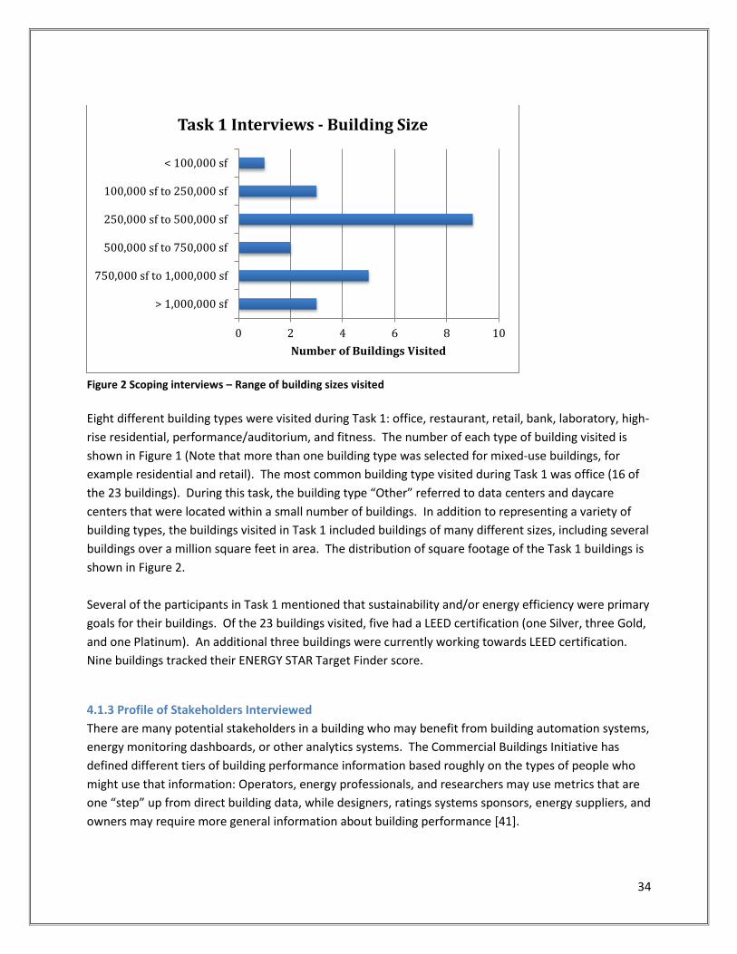
34
Figure 2 Scoping interviews – Range of building sizes visited
Eight different building types were visited during Task 1: office, restaurant, retail, bank, laboratory, high-
rise residential, performance/auditorium, and fitness. The number of each type of building visited is
shown in Figure 1 (Note that more than one building type was selected for mixed-use buildings, for
example residential and retail). The most common building type visited during Task 1 was office (16 of
the 23 buildings). During this task, the building type “Other” referred to data centers and daycare
centers that were located within a small number of buildings. In addition to representing a variety of
building types, the buildings visited in Task 1 included buildings of many different sizes, including several
buildings over a million square feet in area. The distribution of square footage of the Task 1 buildings is
shown in Figure 2.
Several of the participants in Task 1 mentioned that sustainability and/or energy efficiency were primary
goals for their buildings. Of the 23 buildings visited, five had a LEED certification (one Silver, three Gold,
and one Platinum). An additional three buildings were currently working towards LEED certification.
Nine buildings tracked their ENERGY STAR Target Finder score.
4.1.3 Profile of Stakeholders Interviewed
There are many potential stakeholders in a building who may benefit from building automation systems,
energy monitoring dashboards, or other analytics systems. The Commercial Buildings Initiative has
defined different tiers of building performance information based roughly on the types of people who
might use that information: Operators, energy professionals, and researchers may use metrics that are
one “step” up from direct building data, while designers, ratings systems sponsors, energy suppliers, and
owners may require more general information about building performance [41].
0 2 4 6 8 10
< 100,000 sf
100,000 sf to 250,000 sf
250,000 sf to 500,000 sf
500,000 sf to 750,000 sf
750,000 sf to 1,000,000 sf
> 1,000,000 sf
Number of Buildings Visited
Task 1 Interviews - Building Size

35
In all parts of this research project, we attempted to interview a variety of stakeholders who are
interested in different levels and types of information and use this information in different ways. We
also attempted to interview people who were involved in more general building oversight in addition to
those who were responsible for daily operations and maintenance. Where possible, multiple
stakeholders were interviewed for the same building, campus, or organization.
Figure 3 Scoping interviews - Types of stakeholders interviewed
During the scoping interviews, the majority of the participants identified themselves as a facilities
manager or lead engineer, a facilities technician or engineer, or a building or property manager. In
general, the facilities managers, lead engineers, engineers, and technicians were those who used the
building automation and control system on a daily basis. The property managers generally did not have
access to building automation and control systems, but instead were responsible for monitoring energy
consumption and were more likely to use energy monitoring systems and dashboards. In addition to
those stakeholders, we were also able to interview several people who identified themselves as building
owners or representatives of building owners and one HVAC contractor. The total distribution of
stakeholder job functions is shown in Figure 3 (note that some interviewees identified themselves as
having two job functions). The response “Other” refers to a stakeholder who identified himself as a VP
of Real Estate.
Although several different types of stakeholders were interviewed, the majority of the participants were
responsible for either recommending or directly making financial decisions. 91% of the participants
responded that they recommended or made decisions about replacing equipment, and 78% of
participants responded that they recommended or made decisions about capital projects for energy
efficiency. Of those participants who were responsible for such decisions, all responded that experience
and intuition were used to aid in making such decisions, and a large number of them also followed
0 2 4 6 8 10 12 14
Building owner
Facilities manager/Lead engineer
Facilities technician/Engineer
Building/property manager
HVAC contractor
Other
Number of Stekeholders Interviewed
Task 1 Interviews - Stakeholder Types

36
recommendations from external contractors and engineers. Other sources of information used to make
financial decisions included O&M manuals, control systems, dashboards, or other sources such as the
online web searches and advice from colleagues (Figure 4).
Figure 4 Financial decision-making processes
One major goal of the scoping interviews was to determine what types of data, metrics, and information
were available to different stakeholders in their existing setup. Figure 5 indicates the variety of
information sources that the participants have access to in addition to control systems and dashboards,
including utility bills, benchmarking tools (such as EnergyStar), reports from others, and feedback from
occupants. Those who responded “Other” referred primarily to non-written communication with
others, either informally or in meetings, or additional computerized programs, such as work-order
and/or occupant complaint systems. Although this study did not focus on these additional sources of
information, they are important because we found that they often provide information that is identical
or analogous to the data or information that a control system or dashboard might provide (for example,
a building manager may have access to utility bills instead of or in addition to an energy monitoring
dashboard).

37
Figure 5 Participant sources of information about building performance
4.1.4 Profiles of Control Systems and Dashboards
Although all participating buildings in Task 1 had a building automation or energy management and
control system, some were relatively simple while others were highly customized with many features
and functionalities. Within the 23 buildings, we found 7 different control systems and 6 different
dashboards. While the control systems mainly included well-known systems developed by large
national or international controls companies, the dashboards we found were primarily either custom-
made for the building or developed by smaller regional groups such as utilities companies. The control
systems found included systems by Siemens, Johnson Controls, Schneider Electric, Honeywell,
Automated Logic, Trane, and Teletrol. The dashboards encountered included NSTAR EnergyLink, iES
Energy Desk, Cimetrics Infometrics, GE Energy Aggregator, Duke Energy Energy Profiler Online (EPO),
and Ecova Performance IQ. In general, almost all of the dashboards that we encountered fell into the
category of energy or utility monitoring systems.
0 5 10 15 20 25 30
Utility bills and consumption information
Automation and control system
Energy visualization or dashboard
Benchmarking tools
Administrative reports from others
Occupant feedback
Other
Number of Responses
Building Information Available
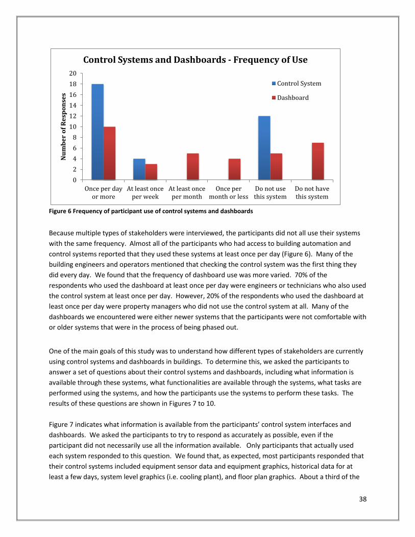
38
Figure 6 Frequency of participant use of control systems and dashboards
Because multiple types of stakeholders were interviewed, the participants did not all use their systems
with the same frequency. Almost all of the participants who had access to building automation and
control systems reported that they used these systems at least once per day (Figure 6). Many of the
building engineers and operators mentioned that checking the control system was the first thing they
did every day. We found that the frequency of dashboard use was more varied. 70% of the
respondents who used the dashboard at least once per day were engineers or technicians who also used
the control system at least once per day. However, 20% of the respondents who used the dashboard at
least once per day were property managers who did not use the control system at all. Many of the
dashboards we encountered were either newer systems that the participants were not comfortable with
or older systems that were in the process of being phased out.
One of the main goals of this study was to understand how different types of stakeholders are currently
using control systems and dashboards in buildings. To determine this, we asked the participants to
answer a set of questions about their control systems and dashboards, including what information is
available through these systems, what functionalities are available through the systems, what tasks are
performed using the systems, and how the participants use the systems to perform these tasks. The
results of these questions are shown in Figures 7 to 10.
Figure 7 indicates what information is available from the participants’ control system interfaces and
dashboards. We asked the participants to try to respond as accurately as possible, even if the
participant did not necessarily use all the information available. Only participants that actually used
each system responded to this question. We found that, as expected, most participants responded that
their control systems included equipment sensor data and equipment graphics, historical data for at
least a few days, system level graphics (i.e. cooling plant), and floor plan graphics. About a third of the
0
2
4
6
8
10
12
14
16
18
20
Once per dayor more
At least onceper week
At least onceper month
Once permonth or less
Do not usethis system
Do not havethis system
Nu
mb
er
of
Re
spo
nse
s Control Systems and Dashboards - Frequency of Use
Control System
Dashboard

39
respondents reported that their control systems included meter or sub-meter data, graphical metrics or
visualizations (such as general line or bar graphs), or fault detection advice. We note that almost all
participants referred to general alarms as “fault detection” in this category, not advanced fault
detection and diagnosis (FDD). For dashboard systems, the most common information available was
found to be historical data, utility bills, main meter data, graphs, and simplified building performance
ratings (Energy Star was cited often). In general, we found that the controls systems mainly offered raw
data from sensors or meters and trending for that data, while the dashboards offered a wider variety of
information, including performance metrics and ratings, financial information and bills, and more
advanced analytics in some cases.
Figure 7 Data and information available from participant tools
The responses to a related question, “what functionalities are available in each system?”, are shown in
Figure 8. We found that most of the control systems and dashboards generally offered basic data
collection and storage functionalities and trending options for raw data, and many of them offered
remote capabilities (such as emailing alerts or web-based access) as well. The dashboards tended to
offer additional functionalities over the control systems, such as basic energy analysis (averages,
highs/lows), energy use broken down by sub-meters where available, and financial information (such as
energy costs). While none of the systems offered occupant comfort reporting, we note that many of the
participants had access to additional work-order and occupant complaint systems that did offer this
functionality; however, none of the work-order systems were integrated with the dashboards or control
systems. Educational content was not available in any system that we encountered.
0 5 10 15 20 25 30
Equipment graphics
Floor plan graphics
Occupant complaints or comments
Historical data
Sub-meter data
Meter data
Benchmark or comparative information
Financial information
Simplified building performance ratings
Number of Responses
Information Available from Systems
Control System
Dashboard

40
Figure 8 Functionalities available in participant tools
Figure 9 Tasks performed by participants using control systems and dashboards
In addition to determining what information and functionalities were available to the participants, we
were also interested in determining what tasks the participants use their controls systems and
dashboards to perform and how the systems aid them in doing so. Figure 9 indicates that the control
systems are used primarily for alarm notification and to troubleshoot alarms (i.e. the participants use
the system to view data related to the alarm that might help them diagnose the problem). Participants
also responded that they used control systems to optimize system settings (such as scheduling and
setpoints) and create reports. The dashboards were used primarily for determining building
0 5 10 15 20 25 30
Basic data collection, transmission, storage, and…
Display and visualization (raw data trends)
Energy analysis (avgs, highs/lows, normalization,…
Energy end use information (sub-meter data)
Advanced analysis (forecasting, FDD, statistics,…
Financial analysis (energy costs, savings…
Demand response
Remote functionalities (mobile or web-based)
Occupant comfort reporting
Educational content for occupants or visitors
Do not have/use this system
Number of Responses
Functionalities Available In Systems
Control System
Dashboard
0 5 10 15 20 25
Alarm notification
Troubleshoot alarms or equipment faults
Keep track of scheduled maintenance tasks
Determine or benchmark overall building…
Compare buildings across a portfolio or campus
Feasibility studies for capital projects
Demand response
Optimize system settings
Create reports
Get occupant feedback
Educate or engage occupants or visitors
Number of Responses
Tasks Enabled by Systems
ControlSystem

41
performance and for creating reports. They were also used in some cases to compare buildings over a
campus or portfolio as well as to optimize system settings (primarily to meet energy targets). The ways
in which the participants used the systems are shown in Figure 10. Most of the participants reported
interpreting raw data from both types of systems using their own experience and intuition to complete
tasks (such as diagnosing alarms). Many participants reported using the control system to view
equipment alarms directly and to trend historical data directly in the control system interface. The
dashboards were used to view performance metrics, trend data, benchmark performance, and view
alarms. A small number of participants also reported downloading data from the systems to manipulate
manually.
Figure 10 Participant utilization of control systems and dashboards
Finally, we asked each participant to rate their satisfaction with their control system and/or dashboard.
The responses are shown in Figure 11 and we found that for both types of systems, about a third of the
respondents were very satisfied, about a third were somewhat satisfied, and the final third were
ambivalent, with few dissatisfied. Based on the responses from Task 1, there does not seem to be a
large difference between the levels of satisfaction regarding the two different types of systems.

42
Figure 11 Participant satisfaction with existing control system and dashboards
4.1.5 Potential Value of New Information
An additional major goal of this part of the study was to determine what new types of information
would be valuable to the participants. This information was particularly informative to the development
of the revised questionnaire used for the Task 3 interviews. To get at this information, we gave the
participants lists of non-graphical data, metrics, and rankings as well as graphical visualizations, and we
asked them to rate each one by how useful they believed this information would be to them in
performing their expected job responsibilities. Participants were told to rate each item on the list by
how useful that information currently is to them (if they already have this information available) or by
how useful it might potentially be (if this information were to become available to them in a control
system or dashboard). The responses are shown in Figures 12 and 13.
Figure 12 indicates the participants’ responses regarding the usefulness of non-graphical data, metrics,
and ratings. The types of information that would be most useful to participants were equipment fault
detection, potential for LEED or other certification, system or equipment efficiency metrics, and
benchmarks comparing the building performance to an ideal or simulated model. We note that this
type of information was not found to be available in the systems that most participants currently had
access to. Other types of helpful information included estimated payback on capital projects,
normalized metrics, energy end use metrics, whole building efficiency, benchmarks comparing building
performance to similar buildings, and occupant comfort metrics. The least helpful information included
ecological footprint, carbon emissions, energy generation by on-site renewables (none of the buildings
visited had these types of systems on-site), and simple building ratings or report cards. It is interesting
to note that many of the participants rated suggested capital projects as less useful information, even

43
though estimated paybacks were considered helpful. We found that the reason that many of the
participants rated this information as less useful was that they did not believe that they could trust a
computer system to generate such information for them; however, they did feel that they could trust
information such as automated fault detection and diagnosis.
Figure 12 Rated usefulness of new metrics and information
In addition to non-graphical information, participants were also asked to rate various types of graphical
displays and visualizations. Figure 13 indicates the participant responses. We found that the most
useful graphical information included information that the participants already had access to, such as
equipment and system level graphics, floor plans, graphs showing live data, and historical trending.
Although participants were provided examples of the various types of graphics, it is possible that
participants chose those graphics that they were already most comfortable with as the most useful.
Other potentially useful types of graphics included graphs showing performance data overlaid with
weather data, heat map of performance (such as zone temperatures) overlaid on a floor plan, energy
end use icons or graphics, performance over time overlaid on a clock or calendar, and checklists for LEED
or other certification. Less useful types of representation included performance as equivalents (for
example, energy use represented using numbers of light bulbs), temporal maps (heat maps of
performance over time), and report cards.

44
Figure 13 Rated usefulness of new graphical information
4.1.6 Discussion of Participant Feedback
During the Task 1 interviews, we encouraged the participants to explain the reasoning behind their
questionnaire responses and to add any anecdotes that they thought would be relevant to our study.
We found that even among participants with the same job title, their responsibilities and experiences
varied quite widely.
During the portion of the interview that dealt with currently available systems and dashboards,
participants had very different opinions about useful metrics and interfaces even when they had access
to similar systems. This variation seemed to be due largely to job responsibilities and how much support
the participant had in his or her role. For example, we encountered:
A building engineer who was responsible for overseeing the operations of four very large buildings alone with a few part-time technicians. He spent most of his time responding to occupant complaints. His use of the control system was primarily to track zone temperatures and diagnose alarms. Although he had ideas regarding energy efficiency projects, he was not allowed access to meter or utility data. He also believed that his staff did not receive enough training in how to use the control system.

45
A team of engineers, contractors, and technicians responsible for 24/7 oversight of a large set of buildings. This team included one member whose only responsibility was to monitor the control system. In these buildings, energy use was closely monitored, and at least one building was awarded LEED certification. Alarms from the control system were text messaged to the team during all hours, and some were expected to respond to problems overnight if necessary.
A building engineer whose 10 year old control system had no graphics and only a subset of sensor data integrated into the system. He often needed to visit individual pieces of equipment in order to read sensor data. He only used the control system to make sure equipment was on.
A building engineer who had access to a highly customized and graphical control system. He programmed it to automatically create reports of trends of log points to use for diagnosis and feasibility studies (data only, no graphs). He would also print out tables of log points and use them directly to diagnose problems.
A building manager who downloaded meter and weather data into spreadsheets to manipulate them manually to determine if building performance was adequate compared to the previous year.
A building manager whose building’s Energy Star rating was incorrectly calculated by another member of the staff who was not fully aware of how the utility data was collected. In this case, meter data was collected for a whole campus but incorrectly reported for a single building.
In addition to these experiences, we learned a great deal from the reactions of the participants as they
rated how potentially useful the various types of metrics, information, and graphics would be for their
jobs. For example, we found:
One engineer did not want to see any occupant complaints or comfort metrics because he believed that it would add to his workload.
One building manager mentioned that he used ten different tools on a weekly basis (including the control system, dashboard, work order system, and other custom systems) and he wished that some of the information could become integrated so he could use fewer systems.
One engineer had reprogrammed all of his dashboard’s odometer graphics to display as trend lines, as he did not like that the odometers showed only instantaneous information and not historical information. He also believed that the equipment and system graphics available in many control systems were not helpful or necessary, as he was familiar enough with the equipment in his building that he did not require a picture of it.
Many building operators and engineers expressed preference for traditional graphs (real-time and historical trends, using line or bar graphs), while some managers and financial stakeholders believed that the odometer graphics would be most useful to the operators and engineers.
Many participants were most interested in information that would help them achieve LEED certification.
Several participants expressed distrust of information that required the system to have some intelligence, such as equipment fault detection and diagnosis, optimization, suggested capital projects, or predicted ROI.
During these scoping interviews, it was striking that we encountered so many different opinions and
experiences during the building visits and stakeholder interviews. Very early in the research process it
became clear that an inflexible, fixed set of metrics and visualizations would not serve the needs of all
operations and maintenance stakeholders. Instead, widely varying needs demand flexible interfaces,

46
which allow for different metrics to be presented in a variety of visualizations and configurations for a
variety of stakeholders.
4.2 Interface Component Interviews
Following the scoping phase of the research, a detailed set of interview questionnaires were created to
solicit specific feedback from participants. The goal of these interviews was to gather specific results
identifying precisely which data, metrics and visualizations that specific types of operations,
maintenance, and management stakeholders prefer. Because different stakeholders were likely to have
very different goals when using an energy management dashboard, the questionnaires were structured
into a set of 7 focused on data, metrics and visualizations in the following areas:
1) Portfolio – energy consumption and cost 2) Portfolio – budgets, expenditures, projections, and project M&V 3) Building – energy consumption and cost 4) Building – water consumption, cost, and carbon emissions 5) Equipment – heating and cooling plant information 6) Equipment – ventilation and air handler information 7) Equipment – zone and occupant comfort information
Each participant completed 1 to 4 of the above questionnaires, chosen based on their job description.
As a companion to these questionnaires, a compendium of example visualizations was created to help
participants provide feedback on graphical representations of data. To see the questionnaires
themselves, see Appendix B.
In addition to the questionnaires, the participants were engaged in conversation and asked a series of
targeted questions meant to elicit more detailed and anecdotal reactions to their current relationship
with BAS systems and energy dashboards. Participants were also asked their opinions on the most
important elements of a BAS or energy dashboard and what would be required for them to trust
calculations and diagnostics made by the dashboard. As in the scoping interviews, there was a diversity
of answers, however some themes were surprisingly consistent across the board, and these qualitative
responses also contributed to the interface designs in Task 4. For example, when asked what aspects of
a potential dashboard were important to them, the two most common answers were drilldown
capabilities from high level summaries to detailed exportable numerical data, and the integration of
multiple control systems and dashboards into one location. Also, nearly all participants had to provide
raw data to third parties or government agencies at some point, and yet system limitations on data
trending was a common technical complaint. Finally, when asked what it would take to trust automated
diagnostics, nearly all answers mentioned transparency and extensive commissioning. At the end of
Task 3, the interviewers summarized the most common responses to these questions, which can be
found in Appendix B.

47
4.2.1 Interface Component Interview metrics and visualizations
For each focused questionnaire, the participant was asked to choose one or more specific metrics and
visualizations that were useful in conveying information in the following categories:
1) Portfolio – energy consumption and cost
Energy use and cost over time
Energy use and cost breakdowns
Energy use and cost comparisons
Energy and cost savings due to energy conservation measures (ECM)
Energy use correlations
Portfolio energy diagnostics
2) Portfolio – budgets, expenditures, projections, and project M&V
Projected energy and cost savings due to capital projects or targeted O&M
Payback period and ROI for capital projects and O&M
Measurement and Verification (M&V)
O&M budgeting
Expenditures
3) Building – energy consumption and cost
Energy use and cost over time
Energy use and cost breakdowns
Energy use and cost comparisons
Energy use and cost forecasts
Building energy and cost savings due to energy conservations measures (ECM)
Energy use correlations
Building energy diagnostics
Specialized energy metrics for facility types
4) Building – water consumption, cost, and carbon emissions
Water use and cost over time
Water use and cost breakdowns
Water use and cost comparisons
Emissions over time
Emissions breakdowns
Emissions comparisons
Emission equivalents
Water use and emissions diagnostics
5) Equipment – heating and cooling plant information

48
Plant efficiency
Compliance with setpoints, thresholds or schedules
Heating and cooling loads and heat loss
Equipment runtime, cycling, and on/off schedules
Equipment performance correlations
System and equipment diagnostics
6) Equipment – ventilation and air handler information
Outdoor air and Indoor Air Quality
Compliance with setpoints, thresholds and schedules
Equipment runtime, cycling and on/off schedules
Equipment performance correlations
System and equipment diagnostics
7) Equipment – zone and occupant comfort information
Thermal comfort conditions
Outdoor air and Indoor Air Quality
Lighting
Acoustics
Occupant feedback and complaints
Equipment runtime, cycling, and on/off schedules
Equipment performance correlations
Zone and equipment diagnostics
For example, the metrics choices in questionnaire 3 under “Energy use and cost over time” were:
Electric energy in kWh per day
Electric energy in kWh per sqft-day
Heating energy (in therms, MMBTU, or lbs steam) per day
Heating energy per sqft-day
Cooling energy (in MMBTU or ton-hrs) per day
Cooling energy per sqft-day
Peak daily electric in kW
Peak daily heating or cooling rate
Daily electric use profile in kW
Daily heating or cooling rate profile
Heating energy per sqft-heating degree day
Cooling energy per sqft-cooling degree day
Total cost per day
Cost per sqft-day
Peak cost rate
Other (please describe) ___________________________________

49
After the choice of metrics, the questionnaires focused on different types of tabular or graphical
formats, such as raw data tables, time series graphs, or gauges. For each format, the participant was
asked which general categories of information (i.e. “energy use and cost over time”) would be most
useful when displayed in that format. Every format page included topically appropriate and anonymized
screenshots from real energy dashboards to illustrate the possibilities, and every questionnaire included
sections on nearly all of the following formats:
Time series (including line graphs, point graphs, and bar charts)
Benchmarks (including rankings and bar chart comparisons with goals or historical data)
Scatter plots/Correlations (i.e. energy use vs outdoor air temperature)
Pie charts (including breakdowns by building or tenant or utility)
Calendar plots (including color codes or time series line graphs arranged on a calendar)
Dials/Gauges (including absolute value dials and “normal range” dials)
Diagrams/Maps (including color coded street maps, zone layout maps, and equipment schematics)
Tables and text (including tabulated data, other numerical values, or text outputs)
Figure 14 is an example of the page layout for the questions about data format. To view all format
pages in the questionnaires, see Appendix B.

50
Figure 14 Sample calendar plot page from Interface Component interviews

51
4.2.2 Interface Component Interview results
Interviews with 40 additional participants from 9 different organizations were conducted for the
interface component interview phase. These interviews were performed with a wide range of
stakeholders with influence on building budgets, operations, and maintenance. The breakdown of
stakeholders by type, presented below, was fairly balanced. The stakeholders interviewed include
technicians, lead building engineers, building or facility managers, energy or sustainability managers,
commissioning agents, and financial decision makers. Participating organizations include two
universities, two national labs, two offices, one hospital, one high school, and one government building
(courthouse). All organizations were located in the continental United States: two in the Northeast,
three in the Southeast, three in the Northwest, and one in the Midwest. In total, 87 focused
questionnaires were completed, with each participant filling out between 1 and 4 questionnaires.
Figure 15 Participant profile for Interface Component interviews
Technician
Lead Engineer
Building Manager
Energy or Sustainability
Manager
Commissioning Agent
Financial Decision Maker
Breakdown of Participants by Job Function
0 2 4 6 8 10 12 14 16
7) Zone
6) Ventilation
5) Plant
4) Buidling Water/Emissions
3) Building Energy
2) Financial
1) Portfolio Energy
Number of Participant Responses by Questionnaire

52
Similar to the findings from the scoping interviews, feedback from participants varied greatly by stakeholder roles and responsibilities. The results emphasize the need for intuitive and flexible interfaces with data presented in a variety of visual formats. Some participant preferences were heavily influenced by negative past experiences, including inaccurate data, unintuitive metrics, and non-transparent dashboards. Such experiences erode trust in more complex system outputs, such as fault diagnostics and avoidable costs. Many participants, especially those with engineering knowledge, preferred simple, verifiable information such as time-series graphs of key performance data and the ability to plot data from different systems on the same charts. These desires seem to be an immediate response to current pain points with existing building automation systems that have limited trending and graphing capabilities. Figure 16 shows the percent of participants who were in favor of different types of visualizations. The gaps indicate visualizations that did not appear on certain questionnaires (The questionnaire numbers are defined in Section 4.2.1). The high percentages across the board indicate a desire for choice. Many of the participants checked off every visualization type, and a few explicitly stated their desire to switch between visualizations at will. There are a few notable results. The least popular visualizations among those who manage and operate buildings were the gauge and the scatterplot, but for different reasons. The attitude seemed to be that the gauge was flashy but without substance, and many participants did not seem comfortable with the scatterplots. Two of the most popular visualization types for both portfolio and building-level management were the benchmark (visually comparing current values with historical performance or goals) and the time series. The most popular equipment-level management tools were the time series and tabular raw data. Tabular values had about 80% approval across the board, and many participants commented that it would be important to them to be able to drill down to or export numerical values from any graphic on an interface.
Figure 16 Percent of participant approval of specific visualizations
0%
10%
20%
30%
40%
50%
60%
70%
80%
90%
100%
Percent Approval of Visualizations by Questionnaire Type
ALL
Portfolio (Q 1,2)
Building (Q 3,4)
O&M (Q 5-7)

53
On the multi-building level, participants liked color-coded portfolio or campus maps as a way to communicate high-level information only if they allowed away to drill down to detailed information. Bar charts or time series graphs of utility consumption, comparisons to past performance, and pie charts of end use breakdown over selected periods of time were predictably highly ranked. Surprisingly high ranked were scatterplots, whereas they were low-ranked in every other place. One explanation may be that scatterplots of energy use vs. outdoor conditions were familiar to many participants, whereas other uses of scatterplots were less well understood. Portfolio and financial decision-makers generally had little interest in or understanding of detailed operational information, but instead preferred common financial metrics such as spending, budgets, and project or maintenance ROI. They liked both current and forecasted versions of this data. ‘Dashboards’ with gauges presenting basic consumption information sometimes appealed to the financial decision-makers, not for themselves, but for the technical stakeholders (although as mentioned above, many technical stakeholders never actively used these visualizations, and a few were openly disparaging toward them). Real-time utility consumption presented as a time-series graph, with benchmarking against goals or historical values, was a highly ranked way of viewing building performance. Similarly popular was the idea of viewing the calculated energy savings due to complete energy conservation measures (see Figures 17 and 18).
Figure 17 Energy metrics preferences for portfolio and financial managers in Questionnaire 1
0%
10%
20%
30%
40%
50%
60%
70%
80%
90%
100%
Q 1 - Energy Metrics Preference Total or per Building
Building
Portfolio

54
Figure 18 Benchmarking options preferences for portfolio and financial managers in Questionnaire 1
Managerial stakeholders generally gave high rankings to energy consumption time series, energy breakdown pie charts and time series, and energy comparison benchmarking (% different from benchmark) (see Figure 19). Simple tables scored surprisingly high at the building level in all categories. Understanding energy breakdowns by end use, building, tenant, or other metric was routinely ranked high by managerial stakeholders, however many were skeptical about the cost effectiveness of using metering and sub-metering to produce the breakdowns or other advanced metrics. Note that maps were only offered as an option in Questionnaire 1.
0%10%20%30%40%50%60%70%80%90%
100%
+/- % of goal +/- % of forecast +/- % of historical
Q 1 - Portfolio Benchmarking Options
Portfolio Energy Portfolio Costs
0%
10%
20%
30%
40%
50%
60%
70%
80%
90%
100%
+/- % ofportfolio avg.
kWh/sf-month
+/- % ofportfolio avg.thermal/sf-
month
+/- % ofportfolio avg.$/sf-month
Portfoliorankings
Energy Starratings
LEED ratings Other ratings
Q 1 - Building Benchmarking options

55
Figure 19 Visualization options preferred by managerial stakeholders for specific categories in Questionnaires 1, 3, and 4
Operations and engineering personnel, such as technicians, building engineers, and commissioning agents, preferred to have detailed information on equipment operation and data. Some of these technical stakeholders complained of the lack of trending and graphing capability (or flexibility) in their current systems, and they expressed a desire to see time series of operational data and simple operating state graphics condensed into one screen. Many desired to view raw data from different BAS and metering systems in one interface and to have options to view any data using different visualization methods (see Figure 20 for the most popular visualizations). In addition, the idea of correlating historical data to events like complaints, work orders, and alarms was appealing to these stakeholders, although most did not like the idea of correlation scatterplots, preferring time series. Lastly, the idea of visually presenting this data or related calculations on system graphics, equipment graphics, or zone graphics was well-received.
0%10%20%30%40%50%60%70%80%90%
100%
Q 1,3,4 - Breakdown Visualizations
0%10%20%30%40%50%60%70%80%90%
100%
Q 1,3,4 - Comparison Visualizations
0%10%20%30%40%50%60%70%80%90%
100%
Q 1,3,4 - Consumption Visualizations
Building Energy
Building Water
Building Emissions
Portfolio Energy/Cost

56
Figure 20 Visualizations preferred by operations stakeholders for all categories in Questionnaires 5, 6, and 7
Many technical stakeholders expressed a need for the ability to drill down from high level building
performance metrics into system operations and diagnostics. Most participants gave high ranking to
basic operating information such as current operating conditions, recent trends in operations,
equipment runtimes, and setpoint compliance. Participants did express interest in diagnostic findings,
which would illustrate which equipment and systems were underperforming or had faults causing
performance issues, such as a leaking air handler valve causing simultaneous heating and cooling. On
the other hand, many of the same participants expressed skepticism that these diagnostics could be
accurate in either the findings or the associated costs. They also expressed concerns that such a system
would result in unmanageable false alarms. These stakeholders agreed that time and resource
commitment from both operations and management personnel, as well as incorporation into a simple
work process, would determine whether or not diagnostics were useful and effective.
Detailed findings from Interface Component Interviews are presented in Appendix B.
0%10%20%30%40%50%60%70%80%90%
100%
Q 5,6,7 - General Visualization Preferences
Plant (Q 5)
Ventilation (Q6)
Zones (Q7)

57
5. Data, Metrics and Visualizations for Operations and Maintenance
Having conducted a literature review, an assessment of existing interfaces, and interviews with over 80
operations and maintenance stakeholders, the project team compiled real, but anonymous data from
buildings and crated a set of metrics and visualizations in an online interface to present to stakeholders
for feedback. This section describes the components of the interfaces, survey feedback, and
recommendations for future interface design.
5.1 Example Interfaces
The exact design and user experience of the interface for advanced operations and maintenance was
not evaluated as part of this research project. However, it is expected that these components will be
critical to success of any interfaces for operations and maintenance. The focus of this work is to identify
which metrics and visualization should be presented within these interfaces. Because it was required to
create a mock interface to present these examples, a structured interface was created which presented
information in two tiers. Primary sections include categories such as costs, utilities, operating
characteristics, diagnostics, and raw data presentation and while secondary subsections are broken
down by scale, from the portfolio level, to buildings, plant, ventilation and air handlers and zones. An
early prototype for the design of the example interface is shown in Figure 21. Section organization is
shown in Figure 22.
Figure 21 Early prototype example interface design

58
Figure 22 Example interface section organization
Within this framework, the project team compiled actual building automation system and utility meter data from an existing performance management platform to create an example interface. This interface is available to the general public at the following location:
https://sites.google.com/a/kgsbuildings.com/rp1633/
The example interface was constructed and presented using Google Sites. This platform was chosen as it
allowed us to create an interface which simulated the flow and content of a live interactive tool. Using
Google Sites, we were able to incorporate the following important features and functionality:
- Ability to provide the external link to all intended participants
- Embedded tables, images and multiple types of graphs/charts including those that were
presented in previous sections
- Interactivity with the charts and tables, for example allowing visitors to “hover-over” to see
point values
- Linkable pages to map the flow and structure found in a “Live” tool
- Embeddable surveys with the ability to track responses
During the initial research for this project, the project team identified that most building monitoring
systems used by respondents could be categorized as either control systems or dashboards. The
example interface created for Task 4 bridges the gap between these two categories and provides
content from both as well as features that the team felt were equally informative to stake holders yet
lacking from existing tools. For example, none of the work-order systems used by participants

59
interviewed in Task 1 were integrated with the dashboards or control systems. To provide an example of
this integrated functionality, a section for project tracking was integrated into the Costs section of the
interface. Most of the charts, graphs, tables, and metrics provided in this interface were taken or
adapted from the Interface Component Interviews (Section 4.2). The purpose of creating this example
interface was not to focus on the flow or specific metrics displayed, but rather to provide an interactive
and realistic medium for the data, metrics, and visualizations that were identified as most useful by
stakeholders to be reviewed.
When first accessing the example interface, participants are asked to answer a brief survey regarding
their background and experience with building operation and metrics tools. After completing the survey,
users are then led through a “tour” of the site via Previous and Next page navigation arrows. The
navigation arrows were provided to ensure that respondents viewed all metrics on the site and did so in
organized manner. Please note that to mimic an actual tool, all navigational links on the site are live and
mapped to the appropriate pages. Respondents are informed that they are able to navigate around the
site freely after they complete the tour. To make the interface more user-friendly, a status bar was
added to each page and instructions were provided to allow respondents to take a break and finish their
review later, without having to start over. A help section was also provided in the top navigational bar
that included survey instructions, Frequently Asked Questions, and an email address for personal
support.
To record participant feedback, surveys were embedded in the mock interface to collect information
about each individual graphic, table, or visualization and its corresponding metrics. An additional survey
was presented after each of the primary sections to provide more detailed feedback. Below is an
example of a typical page layout from the interface. The example below is a look at the main page of the
Ventilation subsection under the Operations main section. It includes the following sections: (1) Help
Section, (2) Main Section Navigation, (3) Subsection Navigation, (4) Typical Example Interface, (5) Typical
1-5 Rating Survey, (6) Button Submitting All Ratings, (7) Previous/Next Page Navigation Bar, (8) Tour
Progress Bar.
Screenshots from the home page, select graphics from each section, and descriptions of the content of each sub-section are provided in this section. Please refer to Appendix C for organized screenshots of the entire example interface. The site is still available to view here: https://sites.google.com/a/kgsbuildings.com/rp1633/.

60
Figure 23 Typical example interface page organization and navigation. 1. Help section to explain survey navigation. 2. Type of Metrics and Visualizations. 3. Scale or system level. 4. Visualization. 5. Participant ranking option. 6. Form submission. 7. Page navigation. 8. Progress Bar.

61
Home Page
After answering a survey regarding their background and experience with similar tools, respondents land on the home page to begin their review of the example interface. The home page contains graphics and metrics that provide the user with a portfolio level view of the information contained in each of the main sections.
Figure 24 Example interface main homepage
Costs Section
The Costs section contains the following sub-sections:
Portfolio: Compare energy costs of all buildings across the portfolio. Energy costs are broken out
by type and normalized by square foot. Compare quarterly costs of water consumption of all
buildings across the portfolio.
Building: View monthly spending on electricity and gas for each building over the past year.
Projects: Track the cost and savings of maintenance projects across the portfolio.

62
Figure 25 Example interface Costs homepage
a. b.
Figure 26 Example graphics from Costs page
Metrics are displayed in multiple ways within the interface. For example, the figures above show the
monthly net cost of utilities as well as the cost of utilities normalized by building area.

63
Utilities Section:
The Utilities section contains the following sub-sections:
Portfolio: View a comparison of the utility consumption of all buildings in your portfolio Monitor
gas and electrical usage as well as CO2 emissions.
Building: View the performance of the individual buildings within your portfolio. Compare the
performance of each building to the rest of the portfolio. Track how each building is performing
compared to previous years.
Figure 27 Example interface Utilities homepage
Similar to the graphics presented during the interface component interviews, metrics displayed on this
example interface using multiple chart types. An example of some of these presentation methods from
the Utilities Section can be seen above in in Figure 28.

64
a.
b.
c.
d.
Figure 28 Example graphics from Utilities page
Operations Section:
The Operations section contains the following sub-sections:
Portfolio: Monitor past and present heating and cooling modes of all buildings within the
portfolio.
Building: View current and weekly operating runtimes by building. Monitor key heating, cooling
and ventilation performance and statistics.
Plant: View current and weekly runtimes of equipment in a specific plant.
Ventilation: Overview of current and weekly performances of all AHUs by building.
Zones: View current and weekly performance of terminal units within each zone.

65
Figure 29 Example interface Operations homepage

66
a.
b.
Figure 30 Example graphics from the Operations page

67
Diagnostics Section
The Diagnostics section contains the following sub-sections:
Plant: Overview of current and weekly faults for each plant. Navigate to a specific plant for
detailed information of fault types and time that faults occurred.
Ventilation: Overview of current and weekly faults for each AHU. Navigate to specific building
for detailed information of fault types and time that faults occurred for all AHUs within the
building.
Zones: Overview of current and weekly faults for each zone within a building. Navigate to a
specific zone for detailed information of fault types and time that faults occurred.
Figure 31 Example interface Diagnostics homepage
Many of the existing dashboards and control systems investigated were able to do simple calculations and alarm generation. The Diagnostics Section incorporates similar features as well as provides advanced fault detection and diagnosis (FDD), which was only found in a very small portion (less than 20%) of the existing tools that were surveyed in Task 1. Figure 31 is one example of how an FDD finding of Simultaneous Heating and Cooling on an air handling unit was incorporated into the Diagnostics Section of the example interface.

68
Figure 32 Example graphics from the Diagnostics page
Data Section
The Data section contains the following sub-sections:
Portfolio: Access raw data for the whole portfolio. Use the chart view to graph multiple data
series over any data range.
Building: Access raw data for each building. Use the chart view to graph multiple data series
over a specified date range. Use the table view to access the data in spreadsheet format.
Plant: Access raw data for each heating and cooling plant. Use the chart view to graph multiple
data series over a specified date range. Use the table view to access the data in spreadsheet
format.
Ventilation: Access raw data for each zone. Use the cart view to graph multiple data series over a specified date range. Use the table view to access the data in spreadsheet format.
The data section incorporates the popularity of producing trends of raw data (Figure 32a) as well as maintaining the ability to view raw data in a tabular format (Figure 32b).

69
a.
b.
Figure 33 Example content from the Data page

70
5.2 Participant Surveys Interview participants for RP1633 were asked to complete a survey of the mock interfaces and rank graphics and metrics on a 1-5 scale while reviewing each individual graphic, with 5 being a most useful rating and 1 being a least useful rating. In addition rating each individual graphic or metric, participants were also asked to provide brief feedback after each major section. Within these surveys, participants are asked how to identify which of the sections were the most useful and whether they had suggestions or comments to improve what was presented.
Participation in the mock interface survey was low. Only seventeen of the original 79 interview participants completed the mock interface survey. This does not constitute a statistically significant survey of the mock interface components, and therefore their feedback has been incorporated into recommendation from this research along with the participant interview feedback, literature reviews, and existing tool reviews. The findings from these surveys are presented below.
Highest Ranked Metrics and Graphics Overall The top twenty individual graphics or metrics are listed below. A complete summary of the graphics and metrics rankings are included as an appendix. The difference in ranking among the top 20 is very small, ranging from a score of 2.5 to 3.07, while the full rankings ranged from 1.44 to 3.07. 1. Summary and breakdown of building expenditures
Survey score: 3.07/5

71
2. Weekly Calendar View of Major Faults and Severity for each Plant Survey Score: 2.9/5
3. Histogram of VAV box reheat valve operations (Percent-Hours Open) over a period of time Survey score: 2.89/5
4. Weekly Calendar View of Major Faults and Severity by Equipment Type Survey Score: 2.89/5

72
5. Calendar plot of energy consumption over time Survey score: 2.83/5
6. Building Summary and Energy Star Rating Survey score: 2.82/5

73
7. Histogram of Zone Deviations from Setpoint Over a Period of Time Survey Score: 2.78/5
8. Summary of utility Costs and Projected Spending Survey Score: 2.75/3

74
9. Text Summary of Fault Occurrences Survey Score: 2.75/3

75
10. Animated Visualization of Building Modes over Time on a Map
Survey Score: 2.73/5
11. Building Annual Utility Consumption Breakdown
Survey Score: 2.67/5

76
12. Histogram of VAV damper position (percent-hours opens) Over a Period of Time
Survey Score: 2.67/5
13. Time Series of VAV box operational trends organized by supply air handler
Survey Score: 2.67/5

77
14. Diagnostic List with Priority Rankings
Survey Score: 2.67/5
15. Time Series of Fault Occurrence for a Piece of Equipment
Survey Score: 2.67/5

78
16. Time Series of Major Project Capital Expenditures Survey Score: 2.62/5
17. Summary of major capital projects and savings to date Survey Score: 2.62/5

79
18. Time Series of plant equipment operating modes Survey Score: 2.55/5
19. Monthly Calendar Plot of Building Energy Performance Relative to Baseline Survey Score: 2.54/5

80
20. Time Series of Annual Greenhouse Gas Emissions Survey Score: 2.5/5

81
Most Useful Pages In addition to the individual rankings of each graphic and metric, users were asked to recall the most useful components at the end of each section. The top three views from each section, Costs, Utilities, Operations, and Diagnostics are shown below. Costs
1. Track energy and cost savings from active projects

82
2. Comparison of building energy costs across the portfolio, normalized by area

83
3. Dedicated page for energy cost of each building
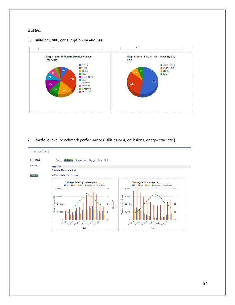
84
Utilities
1. Building utility consumption by end use
2. Portfolio level benchmark performance (utilities cost, emissions, energy star, etc.)

85
3. Live gas and electricity use trends

86
Operations
1. Time series of when major equipment is on/off

87
2. Time series of building heating, cooling and occupancy

88
3. Heating plant diagram and operations summary

89
Diagnostics
1. Plant graphic highlighting current faults
2. Explanation of faults and possible causes

90
3a. Time series highlighting time, location and duration of all faults on a given air handler

91
3b. Floor plan indicating which zones currently have faults

92
Anecdotal Survey Responses
In addition to the ranked sections listed above, participants were asked for general feedback on what information is useful to them. Across all participants, the value of being able to view underlying data in both tabular and graphical form, the ability to plot any selected points over any date range, and export the data to other tools such as Excel was paramount. It was not clear that any individual graphic or metric, or even set of those, would meet the needs of all participants, but rather than flexibility to view information in a concise format tailored to meet that participants preferences. For most participants, viewing cost and energy metrics were ranked highly, but not as essential to day-to-day operations. From a management perspective, there was consistent preference for summary information about the success of energy projects, for example one participant said “The most useful section would be tracking of energy and cost savings projects. Not sure if this can be done without sufficient submetering but this would be useful.” This may reflect the role of most participants, as facility managers, and their need to communicate the effectiveness of facility investments.
Many participants responded that the operations and diagnostics sections are more important for day-to-day operations, and often missing from commercially available interfaces today. For example, one participant stated that “the diagnostics portion of this survey would be the most useful area to identify quickly issues in the field and get them corrected. This is lacking in the industry and is now becoming the best method for continuous commissioning,” while another added that it would be “Even better if this [interface] is overlaid on BAS user interface.” Providing clear indications of equipment operational characteristics, and importantly equipment deviating from normal or outliers, was also important. For example, one participant noted, “For zone operations, would be very useful to know which zone is the worst (especially in worst-zone control schemes).”

93
6. Recommendations for Advanced Operations and Maintenance Interfaces The goal of this research has been to produce guidance about data-driven metrics and visualizations to
support advanced operations and maintenance. The amount of data available to building operations
personnel is growing fast, but their time and resources are not. Data must be made into information,
through metrics and visualizations presented clearly and concisely which direct attention towards issues
which will help people manage building performance.
As a foundation, levels one and two performance monitoring described in ASHRAE Guideline 13-2014
Informative Annex D are the basis for presenting more informative data-driven metrics and
visualizations to guide operations and maintenance. Easy access to any data from the building
automation system, utility metering infrastructure, lighting, or other building systems is essential.
Hardware and software should support the aggregation, storage and charting of all data from within the
building as a starting point. The reason is very simple, metrics and visualizations are based on these
data, which are condensed into more palatable information focused on issues facility management
teams ought to know. Having the data available is a prerequisite for advanced interfaces.
In addition to simply trending the data and making it available, facility management personnel need
tools to view the data in whatever format is useful for the particular issue at hand. Level two
performance monitoring, from Guideline 13 Annex D, which includes flexible visualization of raw data
such as X-Y scatter plots and export to advanced visualization tools are core functionality. This research
has shown that flexibility to view any data as time series, bar charts, pie charts and scatter plots over
whatever time period the user desires is important to meet the needs and variations among all
stakeholders. The right visualization of data best to inform a person about a specific issue will vary by
person, by building, by system, and by the issue at hand. Therefore, the flexibility to view data, and to
save those views, in all of these ways is important.
The availability of data and the ability to view data in a multitude of ways alone is not enough to enable
operations and maintenance personnel to effectively use data to manage buildings. They do not have
the time or the staff to view all of the data in all possible ways regularly in day to day operations. It is at
this point, in level three performance monitoring from Guideline 13 and beyond, where succinct, data-
driven metrics and visualizations have a significant role to play in effective operations.
First, it is important to consider that measured data is more useful in context with other information,
such as asset information, system diagrams, or campus maps, and effective visualization of data and
metrics often require such additional information. Many participants complained that their BAS
graphics inaccurately represented the buildings’ systems, which was problematic for interpreting data
and performance, erodes confidence in these systems, and complicated training new staff. As such,
accurate information about building and equipment assets to combine with data and metrics is
important. Basic information such as building physical locations, building areas, and building functions
inform the highest level metrics and visualizations. More detailed information such as building floor
plans, equipment locations, system relationships (such as which air handlers serve each VAV box),

94
system and equipment diagrams and graphics, and equipment parameters typical of a mechanical
schedule are invaluable for putting data and metrics into context, though not always available and
accurate.
At the most basic level, whole building metrics like energy cost and energy use intensity are essential
calculated metrics which can be produced from metered usage, utility rates, and building areas. Whole
building metrics should include overall operating costs, energy and water costs, energy and water
consumption, peak demand, and greenhouse gas emissions with options for each to normalize by area,
normalize by weather, compare buildings to each other, and compare to benchmarks (e.g. ENERGY
STAR). For all of these metrics, we recommend providing the ability to view basic time-series charts
(both line and bar charts) and pie charts showing the contribution of each building or utility to the total.
Calculating these metrics, storing them, and making them available to view over any period of time
through the visualization tools described above will allow users to view overall building performance
across many categories, compare it properly normalized to historical performance or comparable
buildings, and identify outliers.
Overlaying these whole building metrics, especially energy use intensity, on color-coded campus maps
draws attention to outliers. Operations and maintenance personnel also appreciated the value of color-
coding maps with whole building operating statistics and diagnostic metrics. For example, showing
building current operating modes (e.g. heating, cooling or mixed) and diagnostic information (e.g.
building fault counts or fault metrics like potential cost savings from faults) can also draw attention to
important issues. We recommend that portfolio maps include the ability not just to display metrics, but
also current operating modes, buildings with critical alarms, and buildings with faults severe enough
(e.g. in cost, energy, comfort, carbon, or maintenance impact) to merit investigation.
Across all of these metrics and visualizations, it is important that a viewer can drill down into more
detailed information. When a building is shown on a map as having a below expected EUI, or that
diagnostics indicate it has substantial opportunity for savings, participants expressed the need to be able
to drill into that building to investigate the issues more deeply, determine the root cause, and be able to
troubleshoot and respond. Drill-down capabilities are needed so that users can navigate from the
portfolio level across multiple buildings, to the individual building level summary information, into
specific systems and floor areas, down to an individual piece of equipment or component. The drill-
down exploration should be driven by cues showing the user where to direct their attention.
At the whole building level, one layer of information should summarize the buildings overall
performance, with the same metrics described above around cost, consumption, and emissions
viewable in annual, monthly, daily or even real time charts. Putting this information in context using
multiple benchmarks is also important. These benchmarks can include comparing to historical
performance (e.g. comparing each year to a baseline year), to a commercial benchmark (e.g. Energy
Star), to designed and modeled energy consumption, and to consumption goals.

95
Also at the whole building level, end-use breakdowns should be presented both by utility type (e.g.
electric, gas, steam, chilled water) and by end use type (e.g. cooling, heating, ventilation, lighting, plug
loads, etc.). Participants in the research widely acknowledged the value of these breakdowns, although
rightly expressed skepticism about the ability to generate them due to lack of sufficient submetering.
Participants also typically liked calendar plots showing whole building energy consumption, formatted
using a monthly calendar layout, as a method to identify outliers from normal daily operations. Real-
time consumption time-series are especially necessary for demand response applications, preferably
with supplemental information such as projected future consumption and the timing of demand
response events.
Despite the importance of whole building metrics like EUI, participants responsible for day-to-day
operations clearly expressed that while useful, whole building metrics do not necessarily inform daily
decision making. Operators want an indication of which equipment, systems, or areas of a building need
their attention and why. For example, participants showed preferences toward simple tables of
building systems prioritized by systems had faults and cost, comfort, maintenance or other
corresponding metrics. This tabular view allowed them to determine which systems to drill into further.
Participants also liked calendar and time-series plots, indicating times when systems or zones had issues
and the severity of the issue, especially if they could drill down into data, metrics and visualizations
spanning that time period for that equipment. The ability to navigate between rolled up metrics, tables,
or graphics displaying information about the entire building or its systems and drilldown views specific
to areas or systems should provide both clear cues on where to look and sufficient tools through which
to investigate issues. We also suggest that whole building visualizations may be used to visualize,
through color coding, which equipment or systems require further attention, although this capability is
beyond what is generally achievable for most buildings today.
In order to offer the ability to drill down into a system, equipment or floor plan, new types of
information are needed. Our study investigated the information necessary to drill down into heating
and cooling plant equipment, ventilation systems including major air handlers, and zones and their
equipment.
When drilling into a heating or cooling plant, accurate system diagrams are useful to display along with
data and metrics information. For example, current compliance with setpoints or operating schedules
can be presented numerically, with bar charts or dial gauges illustrating operating range and current
value, then color-coded and overlayed on system graphics at each setpoint location. Color-coded
compliance can also be displayed in tabular format with a list of major systems. A further drill-down
should allow users to see historical compliance or run-hours over time, through time series of setpoint
compliance or equipment operation. Runtimes for major plant equipment like chillers, boilers, and
pumps are also key parameters which can be summarized in tabular format or displayed as layer within
a graphic.
Diagnostic information can also be color-coded, highlighting components of the system with faults and
illustrating the severity of the fault, on both tables and in system graphics. Drilling into a fault should

96
provide textual information about what has been detected with the system, graphs illustrating the
nature of the problem, and metrics such as calculated savings potential. Time series of fault occurrences
for the plant, by fault and by equipment, should be made available both in summary form at the whole
system level and in detail for each fault with supplemental data.
Another important aspect to conveying plant performance is providing information about the systems
served by the plant. Much like the VAV histograms presented in the participant surveys, statistics on the
current and historical operating ranges are important to display. For example, the operating ranges of
heating coils and cooling coils served by the plant are important for determining whether supply and
demand for heating or cooling is being matched. Similarly, presenting hydronic loop setpoint
compliance and loading conditions in the form of loop temperature differences and histograms of
current or historical valve positions can illustrate whether the supply is efficiently meeting demand. This
presumes the user interface knows which coils are served by specific hydronic loops. Similar principles
apply to ventilation systems and air handling equipment; operational and diagnostic information should
be presented both using accurate system graphics and in tabular form.
Conveying supply and demand conditions for ventilation and air handlers is also important. For
example, displaying histograms of VAV box damper or reheat valve percent-hours (i.e. the sum product
of the damper position in percent and the duration of operation in hours) conveys the overall
performance of the zones served by the system. Combining these histograms with graphs of
temperature and pressure setpoint compliance for the same period of time demonstrates the
relationship between supply and load side conditions. Some of the more experienced research
participants strongly recommended that such supply versus load side visualizations were the most
useful type of interfaces. Similar supply and demand visualizations could be presented extended other
various system types. It was clear from the research that lack of information about which zones were
served by which plant or ventilation systems, and the lack of visualization of data about performance on
both the zone side and the plant or air handler side, confounded understanding of overall system
performance.
For zones and related equipment, floorplan visualizations are a highly effective way to convey
information about zone performance. Color coding floor plans to indicate issues such as deviation from
zone setpoints or the presence of faults was very popular among research participants. We recommend
that floorplans be capable of illustrating many layers of information, with basic information like
temperature, humidity, carbon dioxide levels and lighting levels, but also with color-scaled setpoint
compliance layers, zones operating off schedule, zones with stuck dampers, leakby on valves, or
simultaneous heating and cooling. In addition, presenting supplemental information on the floorplan
about which systems serve the zones is useful. For example, the ability to display how zones are
grouped and served by the same system, e.g. with a bold outline, may help in determining the root
cause of issues caused by upstream systems.
Because some of the more technical participants saw value in it, we also recommend interfaces have the
ability to aggregate zone diagnostic and compliance information into bar charts and pie charts

97
illustrating the number or percentage of zones with specific types of issues. For example, histograms of
degree-hours off setpoint across zones, bar charts of the number of zones with specific faults, and pie
charts illustrating the percentage of zones with faults or specific types of faults may be important in
communicating to upper management the impact of operations and maintenance issues. While day-to-
day technicians may not use these metrics and visualizations to immediately respond to specific issues,
they provide facility management with consolidated information about zone performance without
reviewing each of potentially hundreds or thousands of zones.
For all of the graphical system or floor plan representations described above, the ability to animate the
graphics to display changing conditions of any parameters over time is useful to illustrate dynamic
performance. Time series charts, histograms of data over time, and scatter plots can present useful
representations of systemic performance over time, but many operations and maintenance personnel
indicated that an animated graphic was useful, probably because it made it easy to understand changing
conditions.
Another metric that is useful to operators is the achieved savings associated with individual projects or
the comparison between current and baseline building energy costs. Many facility managers indicated a
desire to see a list of energy efficiency projects, along with their calculated savings to date relative to
the expected savings. To achieve this in a data-driven manner, interfaces need both a list of ongoing
projects and their implementation status, but also automated measurement and verification
calculations from data, be it utility submeters, building automation data, or both, in order to determine
the achieved savings.
The previous example illustrates the increasing convergence of information across historically disparate
management interfaces in the built environment. Maintenance management systems, integrated
workplace management systems, complaints systems, accounting and financial tools all have relevant
information for operations, maintenance and management personnel to put building automation and
metering data into context. With this in mind, we recommend that interfaces include data exchange
protocols in order to serve information to other platforms, such as a calculated energy savings relative
to a baseline for a specific asset, or consume information from other platforms, such as the date of
resolution for a work order. Enabling data and metadata exchange to share metrics and information
will help to avoid the problem that no single interface or platform contains all of the data, metadata, or
other contextual information useful to operators, despite their desire not to have to view multiple
different platforms.
From this research it is clear that concisely presenting information for operations and maintenance
personnel is critical, and will be accomplished as much by good design of user interfaces as by
presenting specific metrics and visualizations. In summary, interfaces should present information at
multiple scales, across a portfolio, for specific buildings, within building areas and zones, and into
specific systems and equipment with clear indicators from metrics and visualizations on where to drill
down. When drilling down, interfaces should provide sufficient information to indicate not just current
conditions, but whether those conditions are within appropriate ranges, how those conditions compare
to past performance, and how those conditions relate to other system components. Lastly, interfaces

98
should provide flexibility to view data in many formats, switching between views, and switching to view
related data sets.

99
References
[1] S. Mendler and R. Bannon, "Green building confessions: Findings from the HOK post-occupancy
evaluation process," 2006.
[2] C. Turner and M. Frankel, "Energy performance of LEED for new contruction buildings," New
Buildings Institute, Washington D.C., 2008.
[3] N. Gershenfeld, S. Samouhos and B. Nordman, "Intelligent infrastructure for energy efficiency,"
Science, vol. 327, no. 5969, p. 1086, 2010.
[4] ASHRAE, Performance Measurement Protocols for Commercial Buildings, Atlanta: ASHRAE, 2010.
[5] "CalArch Energy Benchmarking Tool," LBNL, [Online]. Available: http://poet.lbl.gov/cal-arch/.
[Accessed 11 2014].
[6] "Cisco EnergyWise," CISCO, [Online]. Available:
http://www.cisco.com/c/en/us/products/switches/energywise-technology/index.html. [Accessed
11 2014].
[7] ASHRAE, Performance Measurement Protocols for Commercial Buildings: Bet Practices Guide,
Atlanta: ASHRAE, 2012.
[8] R. Hitchcock, "Standardized Building Performance Metrics," LBNL No. 53072, June, 2003.
[9] J. McNeill, J. Zhai, G. Tan and M. Stetz, "Protocols for Measuring and Reporting the On-site
Performance of Buildings except Low-Rise Residential Buildings," ASHRAE Special Project 115,
August, 2007.
[10] M. Deru and P. Torcellini, "Performance Metrics Research Project," NREL Technical Report NREL/TP-
550-38700, October, 2005.
[11] D. Barley, M. Deru, S. Pless and P. Torcellini, "Procedure for Measuring and Reporting Commercial
Building Energy Performance," NREL Technical Report NREL/TP-550-38601, Oct, 2005.
[12] K. Fowler, N. Wang, M. Deru and R. Romero, "Performance Metrics for Commercial Buildings,"
PNNL, NREL, Richland, Washington, 2010.
[13] L. Lee and L. Norford, "Report on metrics appropriate for small commercial customers," CEC PIER,
HPCBS #E2P2.1T3a, October, 2001.
[14] D. O'Sullivan, M. Keane, D. Kelliher and R. Hitchcock, "Improving building operation by tracking

100
performance metrics throughout the building lifecycle (BLC)," Energy and Buildings, vol. 36, no. 11,
pp. 1075-1090, November, 2004.
[15] E. Morrissey, J. O'Donnell, M. Keane and V. Bazjanac, "Specification and implementation of IFC
based performance metrics to support building life cycle assessment of hybrid energy systems," in
SimBuild, 2004.
[16] C. Neumann and D. Jacob, "Guidelines for the Evaluation of Building Performance," Building EQ
Report, February, 2008.
[17] J. Glazer, "Evaluation of Building Energy Performance Rating Protocols," ASHRAE 1286, 2006.
[18] T. Olofsson, A. Meier and R. Lamberts, "Rating the energy performance of buildings," The
International Journal of Low Energy and Sustainable Buildings, vol. 3, 2004.
[19] L. Pérez-Lombard, J. Ortiz, R. González and I. Maestre, "A review of benchmarking, rating and
labelling concepts within the framework of building energy certification schemes," Energy and
Buildings, vol. 41, no. 3, pp. 272-278, March, 2009.
[20] "Energy Star Rating System," U.S. Environmental Protection Agency, [Online]. Available:
http://www.energystar.gov/about. [Accessed 11 2014].
[21] N. Matson and M. Piette, "Review of California and national methods for energy-performance
benchmarking of commercial buildings," LBNL No. 57364, September, 2005.
[22] E. Mills, P. Mathew and M. Piette, "Action-Oriented Benchmarking: Concepts and Tools," Energy
Engineering, vol. 105, no. 4, pp. 21-40, 2008.
[23] P. Mathew, D. Sartor, O. Van Geet and S. Reilly, "Rating energy efficiency and sustainability in
laboratories: Results and lessons from the Labs21 program," 2004.
[24] "LEED Rating System," U.S. Green Building Council, [Online]. Available: http://www.usgbc.org/leed.
[Accessed 11 2014].
[25] "BRE Environmental Assessment Method (BREEAM)," Building Research Establishment, [Online].
Available: http://www.breeam.org/. [Accessed 11 2014].
[26] "BOMA 360 Performance Program," BOMA International, [Online]. Available:
http://www.boma.org/awards/360-program/Pages/default.aspx. [Accessed 11 2014].
[27] "Green Globes," The Green Building Initiative, [Online]. Available:
http://www.greenglobes.com/home.asp. [Accessed 11 2014].
101
[28] "The CHPS Criteria," Collaborative for High Performance Schools (CHPS), [Online]. Available:
http://www.chps.net/dev/Drupal/node/212. [Accessed 11 2014].
[29] "Building Energy Quotient: ASHRAE's Building Energy Labeling Program," ASHRAE, [Online].
Available: http://buildingenergyquotient.org/. [Accessed 11 2014].
[30] "An MPG Rating for Commercial Buildings: Establishing a Building Energy Asset Labeling Program in
Massachusetts," Massachusetts DOER, 2010.
[31] M. Abbas and J. Haberl, "Development of Graphical Indices for Displaying Large Scale Building
Energy Data Sets," in Ninth Symposium on Improving Building Systems in Hot and Humid Climates,
1994.
[32] S. Meyers, E. Mills, A. Chen and L. Demsets, "Building data visualization for diagnostics," ASHRAE
Journal, vol. 38, no. 6, pp. 63-73, 1996.
[33] K. Marini, G. Ghatikar and R. Diamond, "Using Dashboards to Improve Energy and Comfort in
Federal Buildings," LBNL-4283E, February, 2011.
[34] J. Pierce, W. Odom and E. Blevis, "Energy aware dwelling: a critical survey of interaction design for
eco-visualizations," in Proceedings of the 20th Australasian Conference on Computer-Human
Interaction: Designing for Habitus and Habitat, 2008.
[35] T. Holmes, "Eco-visualization: combining art and technology to reduce energy consumption," in
Proceedings of the 6th ACM SIGCHI conference on Creativity & cognition, 2007.
[36] ASHRAE, "Guideline 13-2014: Specifying Building Automation Systems," ASHRAE, Atlanta, 2014.
[37] J. Granderson, G. Lin and M. Piette, "Energy information systems (EIS): Technology costs, benefits,
and best practice uses," LBNL, 2013.
[38] J. Granderson, M. Piette, G. Ghatikar and P. Price, "Building Energy Information Systems: State of
the technology and user case studies," LBNL-2899E, November, 2009.
[39] K. Kircher and e. al., "Toward the Holy Grail of Perfect Information: Lessons Learned Implementing
an Energy Information System in a Commercial Building," in ACEEE Summer Study on Energy
Efficiency in Buildings, 2010.
[40] D. Lehrer and J. Vasudev, "Visualizing information to improve building performance: a study of
expert users," in ACEEE Summer Study on Energy Efficiency in Buildings, 2010.
[41] "Performance Metric Tiers," Commercial Building Initiative, Office of Energy Efficiency and
Renewable Energy, [Online]. Available: http://energy.gov/eere/buildings/performance-metrics-

102
tiers. [Accessed 11 2014].