deconstruction of double page spread for music magazine
TRANSCRIPT
Deconstruction of Double Page Spread for Music Magazine
By Rachel Black
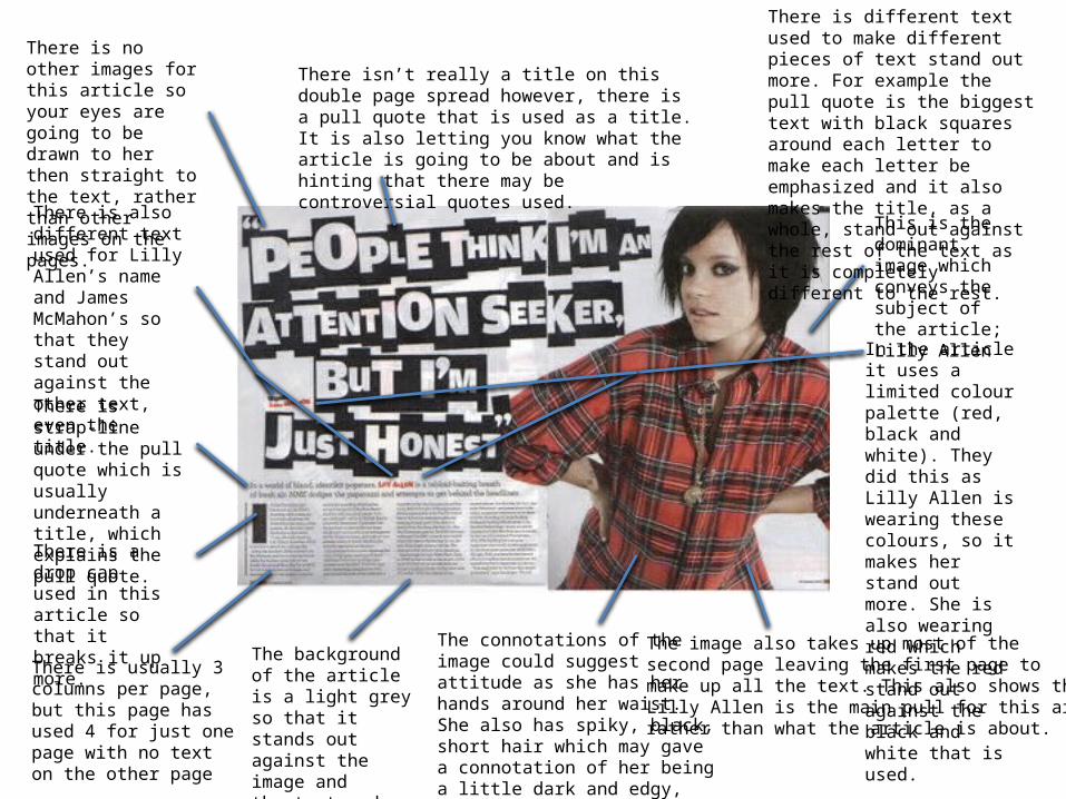
There isn’t really a title on this double page spread however, there is a pull quote that is used as a title. It is also letting you know what the article is going to be about and is hinting that there may be controversial quotes used.
There is usually 3 columns per page, but this page has used 4 for just one page with no text on the other page
There is a drop cap used in this article so that it breaks it up more.
This is the dominant image which conveys the subject of the article; Lilly Allen
In the article it uses a limited colour palette (red, black and white). They did this as Lilly Allen is wearing these colours, so it makes her stand out more. She is also wearing red which makes the red stand out against the black and white that is used.
The image also takes up most of the second page leaving the first page tomake up all the text. This also shows that Lilly Allen is the main pull for this article,rather than what the article is about.
There is no other images for this article so your eyes are going to be drawn to her then straight to the text, rather than other images on the pages.
There is strap-line under the pull quote which is usually underneath a title, which explains the pull quote.
There is different text used to make different pieces of text stand out more. For example the pull quote is the biggest text with black squares around each letter to make each letter be emphasized and it also makes the title, as a whole, stand out against the rest of the text as it is completely different to the rest.
There is also different text used for Lilly Allen’s name and James McMahon’s so that they stand out against the other text, even the title.
The background of the article is a light greyso that it stands out against the image and the text and keeps with the limited colour palette.
The connotations of the image could suggest attitude as she has her hands around her waist. She also has spiky, black, short hair which may gave a connotation of her being a little dark and edgy, especially with her eye make-up and gold chain necklace.
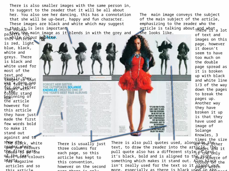
There is usually just three columns for each page, so this article has kept to this convention, however on the second page there is only one, two if you count the pull image.
The main image conveys the subject of the main subject of the article, emphasizing to the reader who the article is talking about and what she looks like.
There is also smaller images with the same person in, to suggest to the reader that it will be all about her. You also see her dancing, this has a connotation that she will be up-beat, happy and fun character. These images are black and white which may suggest that it is less important than the main image as it blends in with the grey and white colour palette.
There is a lot of text and images on this page, however it doesn’t seem to have too much on the double page spread as it is broken up with black and white line 1/3 of the way down the pages to break the pages up. Another way they have broken it up is that they have used an image of Solange Knowles, 3 times the size of the other images and it is the only real source of colour on the pages which makes it stand out even more and breaks the page up more too.
There is also pull quotes used, alongside the text, to draw the reader into the article. The pull quote also has a different style of text, it’s black, bold and is aligned to the right, something which makes it stand out. Also black isn’t really used for the text so it stands out more, especially as there is black used in the images, your eyes will be drawn first to the images then the text.
Usually they use a drop cap for one letter a the beginning of the article however for this article they have just made the first few words bold to make it stand out against and to show the reader where the first part of the text starts.
The colour palette for this article is red, light blue, black, white and greys. There is black and white used for most of the text and images so that the text and images with colour stand out.
The black, white and red colours seems to be the most used colours for magazine articles and so this article sticks to those conventions.
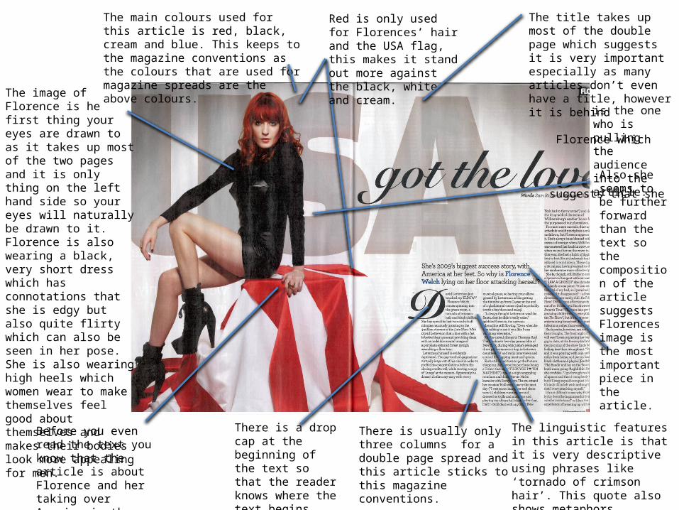
The main colours used for this article is red, black, cream and blue. This keeps to the magazine conventions as the colours that are used for magazine spreads are the above colours.
Red is only used for Florences’ hair and the USA flag, this makes it stand out more against the black, white and cream.
The image of Florence is he first thing your eyes are drawn to as it takes up most of the two pages and it is only thing on the left hand side so your eyes will naturally be drawn to it. Florence is also wearing a black, very short dress which has connotations that she is edgy but also quite flirty which can also be seen in her pose. She is also wearing high heels which women wear to make themselves feel good about themselves and makes their bodies look more appealing for men.
Before you even read the text you know that the article is about Florence and her taking over America in the charts.
There is usually only three columns for a double page spread and this article sticks to this magazine conventions.
There is a drop cap at the beginning of the text so that the reader knows where the text begins also it breaks up the text and the image.
The title takes up most of the double page which suggests it is very important especially as many articles don’t even have a title, however it is behind Florence which suggests that she
The linguistic features in this article is that it is very descriptive using phrases like ‘tornado of crimson hair’. This quote also shows metaphors.
Also she seems to be further forward than the text so the composition of the article suggests Florences image is the most important piece in the article.
is the one who is pulling the audience into the article.