evaluation powerpoint (branding) by evie
TRANSCRIPT
How effective is the combination of our main products and ancillary
texts?

• A brand is the specific identity a product/ company creates for itself.
• This can be developed through all things used in media language e.g. colour, costume, fonts, mise-en-scene etc.
• A brand puts forth certain ideologies/ connotations which people associate with a product/ company e.g the apple brand is quality of design and ease of use.
• A brand can be specific to a group of
products which all represent the same
thing e.g Films have posters and
soundtracks which are all part of the
same thing and share the same brand
identity.
What is a brand?
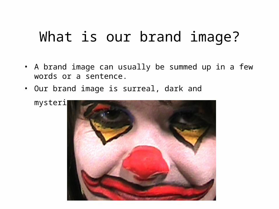
What is our brand image?
• A brand image can usually be summed up in a few words or a sentence.
• Our brand image is surreal, dark and mysterious.
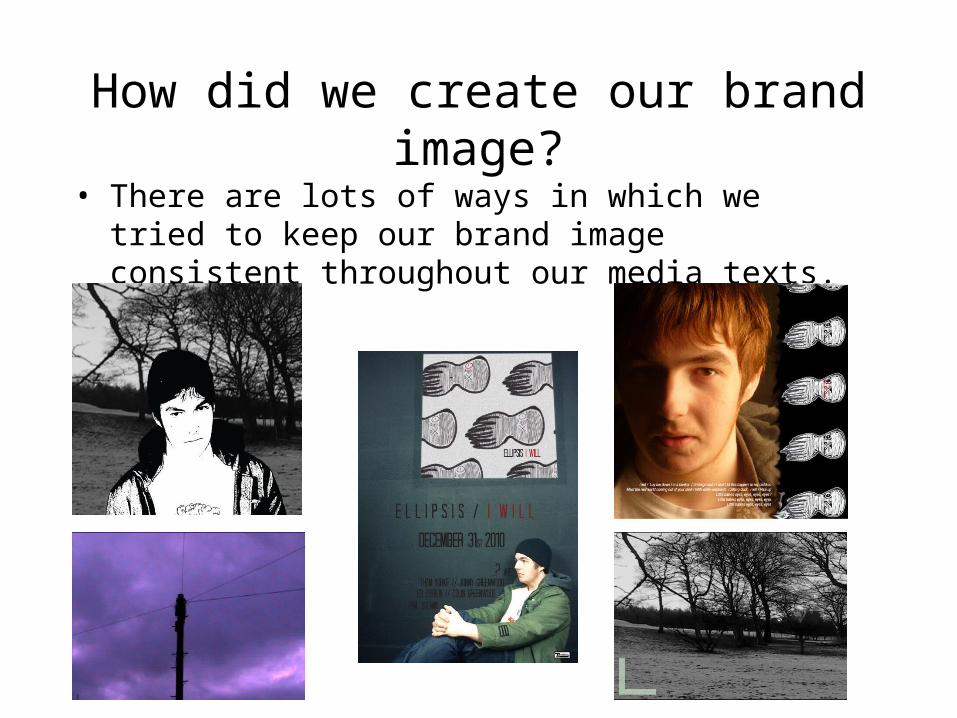
How did we create our brand image?
• There are lots of ways in which we tried to keep our brand image consistent throughout our media texts.

Colour schemes - video
• One of the main ways in which we tried to keep our brand consistent through all of the products was via the colours used.
• In our video to fit in with the surreal element of our brand image we used lots of bright colours, which were perhaps not so fitting with the usual verisimilitude.
• In the door sequence we used a dark green colour, in the sequence with the demolition site, using colour grading we tinted all the shots to a purple shade giving it a weird apocalyptic feel, the shots at the beginning and the end were in black and white. We also had colourful face paints for the lion and the clown.

Colour schemes - ancillary• When creating our ancillaries, we had to think about the colour
schemes used in our video as well.• We focused mainly on the black and white theme which we
used at the beginning and end of the clip and the black and white used in the octopus theme behind the clown.
• We also used the octopus theme as a way of joining our ancillary products together.

Mise - en scene
• We used similar elements in the pictures of our artist to those which we used throughout our video.• We linked our images together by means of a symbol of an octopus/ squid, which we used in our video as a background in the sections of greenscreen involving the clown.• We used the same font on all of our ancillaries except for the CD insert with the lyrics on, which when we tried it in that font was too difficult to read properly.• We did however try to vary the images in our CD inserts as in the booklets inside CD cases they usually have a varied range of images of the artist.