green day album advert deconstruction
TRANSCRIPT

GREEN DAY ALBUM ADVERT
DECONSTRUCTIONELLIE EDWARDS
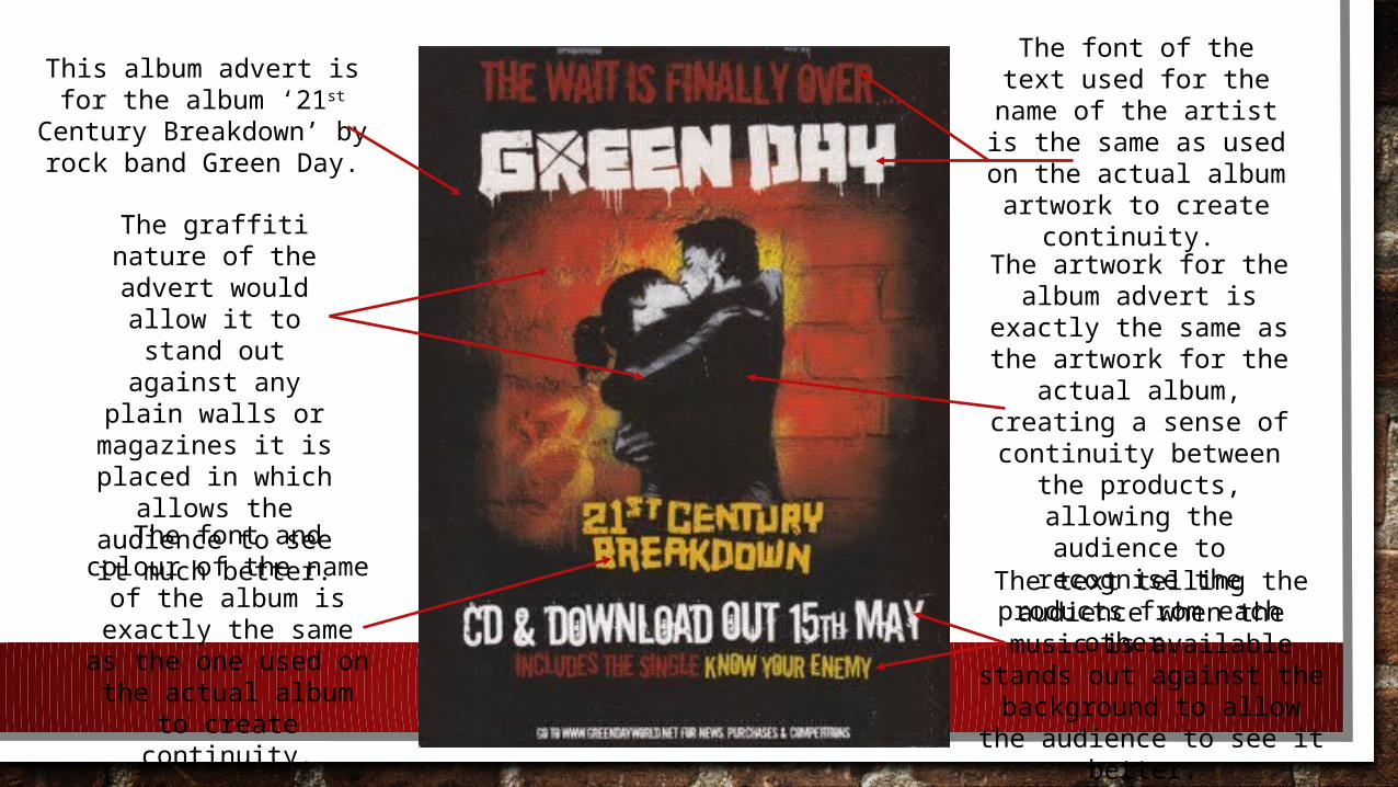
This album advert is for the album ‘21st Century
Breakdown’ by rock band Green Day.
The artwork for the album advert is exactly
the same as the artwork for the actual
album, creating a sense of continuity
between the products, allowing the audience
to recognise the products from each
other.
The font of the text used for the name of the artist is the same as used on the actual
album artwork to create continuity.
The font and colour of the name of the
album is exactly the same as the one
used on the actual album to create
continuity.
The text telling the audience when the music
is available stands out against the background to allow the audience to see
it better.
The graffiti nature of the advert
would allow it to stand out against any plain walls or magazines it is placed in which
allows the audience to see it
much better.