magazine front cover - design stages
DESCRIPTION
Design stages of my magazine front cover.TRANSCRIPT
Magazine Front Cover
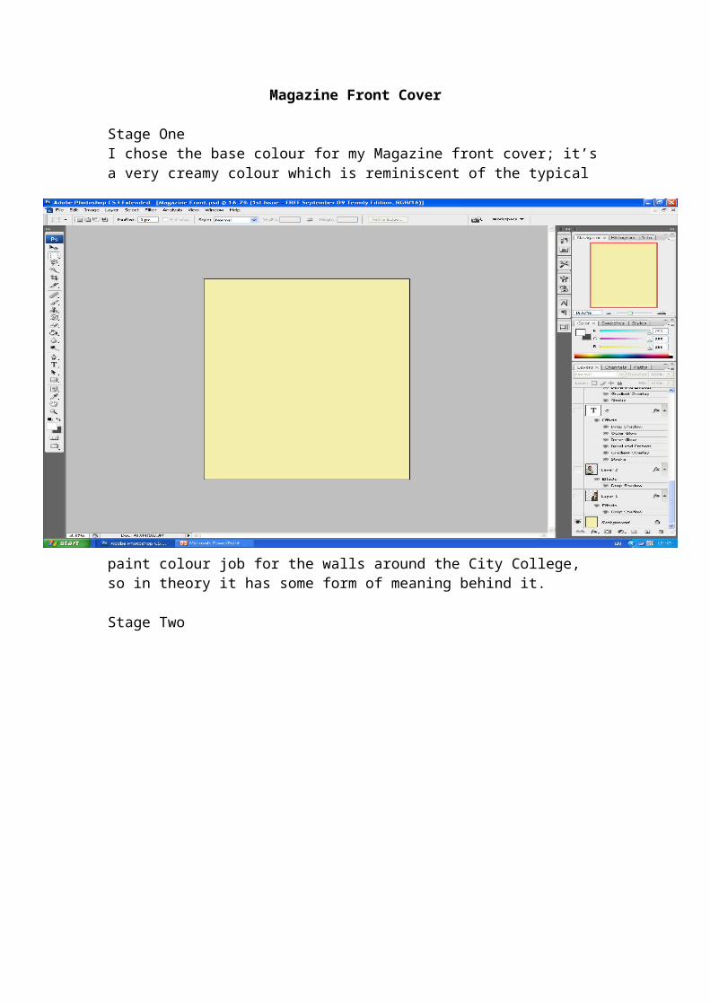
Stage OneI chose the base colour for my Magazine front cover; it’s a very creamy colour which is reminiscent of the typical paint colour job for the walls around the City College, so in theory it has some form of meaning behind it.
Stage TwoThe second stage was uploading my medium shots for the front cover. I took two pictures on two separate layers and then placed them on opposing sides.
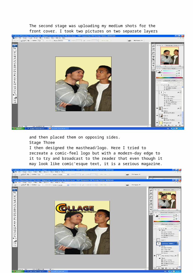
Stage ThreeI then designed the masthead/logo. Here I tried to recreate a comic-feel logo but with a modern-day edge to it to try and broadcast to the reader that even though it may look like comic’esque text, it is a serious magazine.
Stage FourI added a selling line underneath the masthead to get across the point of what the magazine is about, its purpose and genre.
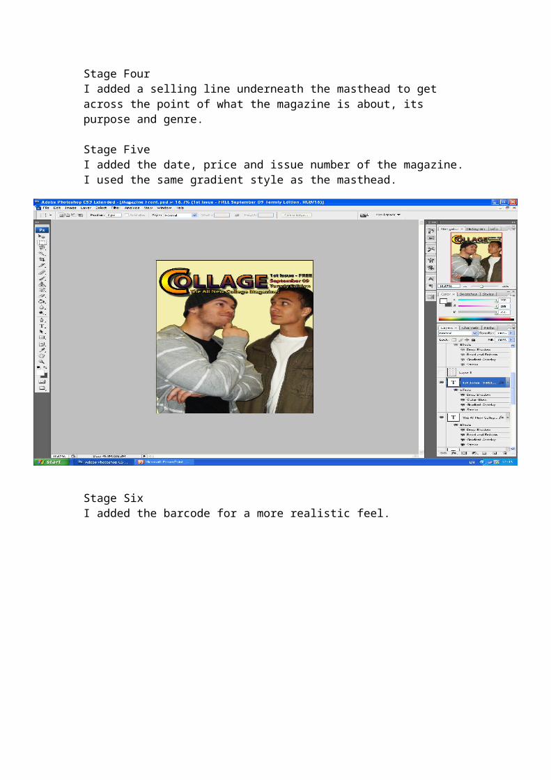
Stage FiveI added the date, price and issue number of the magazine. I used the same gradient style as the masthead.
Stage SixI added the barcode for a more realistic feel.
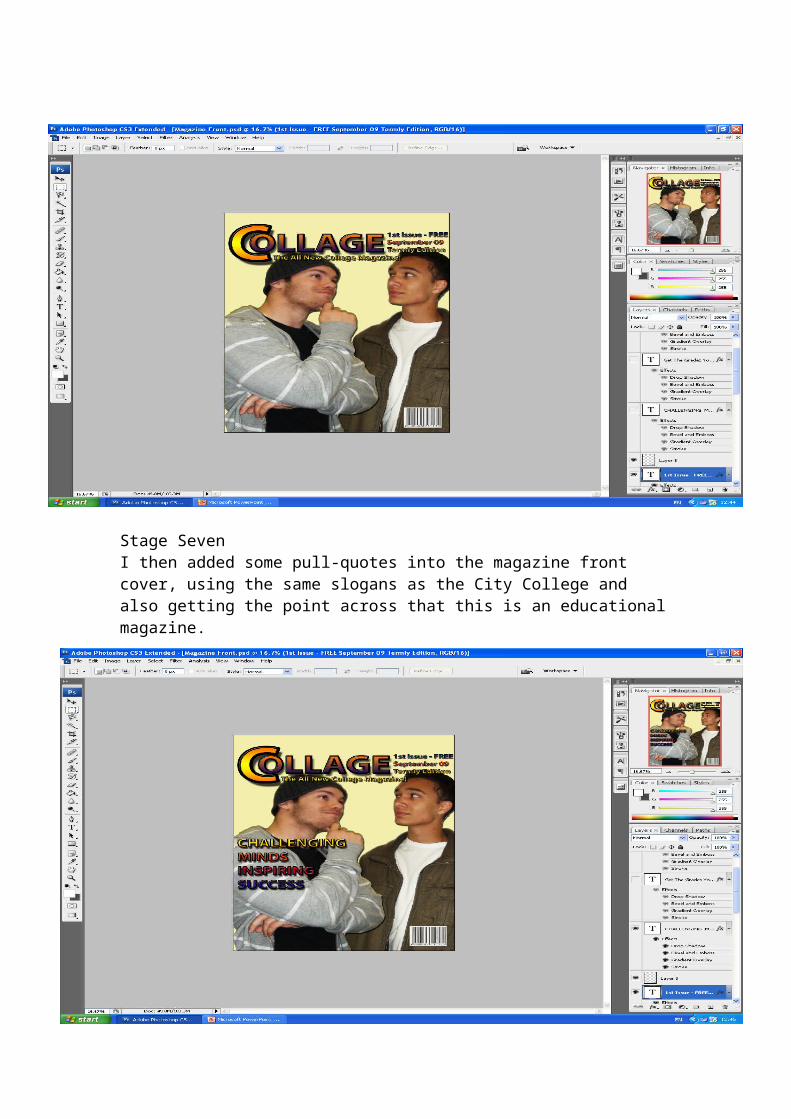
Stage SevenI then added some pull-quotes into the magazine front cover, using the same slogans as the City College and also getting the point across that this is an educational magazine.
Stage EightI then used some cover lines underneath the pull quotes which advertise a little more of what is inside the magazine.
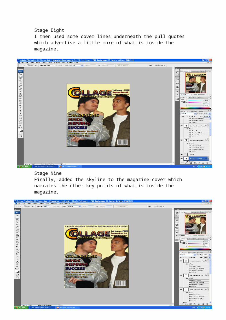
Stage NineFinally, added the skyline to the magazine cover which narrates the other key points of what is inside the magazine.