organizing - lukew ideation + design | digital product
TRANSCRIPT

1
MOBILE WEB EXPERIENCESORGANIZING
LUKE WROBLEWSKI EXTENSION LEARN
@lukew
2
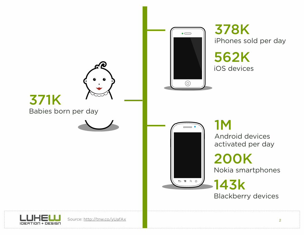
378KiPhones sold per day
1MAndroid devices activated per day
562KiOS devices
Source: http://tnw.co/yUafAx
371KBabies born per day
Nokia smartphones200K
Blackberry devices143k

3Source: http://tnw.co/yUafAx
ATARI
TRS-80
COMMODORE
AMIGAANDROID
1975 1977 1979 1981 1983 1985 1987 1989 1991 1993 1995 1997 1999 2001 2003 2005 2007 2009 2011
WINTEL
APPLE
Source: http://bit.ly/xDzag2
Share of Personal Computing
4
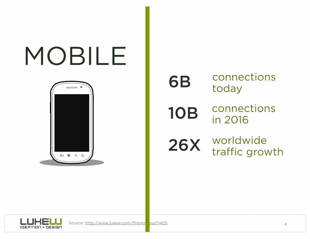
MOBILE
Source: http://www.lukew.com/!/entry.asp?1405
6B connections today
10B connections in 2016
26X worldwide tra"c growth

5
Page/CanvasGrid LayoutsTypographyGraphical Ads
THE WEB IS NOT PRINT.

6
MOBILEIS NOT A DESKTOPPC.

7
Power Supply
Consistent Network
Keyboard
Mouse
Big Screen
Desk
Chair

8
Small Screen
Battery
Inconsistent Network
Fingers
Sensors

9
WHERE ARE WE MOBILE?
84% at home80% during misc. times74% waiting in lines64% at work
EVERYWHERE & ANYWHERE
Photo by Steve Rhodes

10
When are we mobile?Mobile 3G Tra!c Patterns
Source: http://bit.ly/qL5NdX
9 12 15 18 21 24
Laptop
Tablet
Smartphone

11
“...copy, extend, and finally, discovery of a new form. It takes a while to shed old
paradigms.” -Scott Jenson
Source: http://oreil.ly/w1INmt Flickr Photo: by Gilles San Martin

12
MOBILE
Source: http://bit.ly/zZgrKu
MOBILE PAYMENTS
$141M 20092010$750M
$4B 2011

13
MOBILE PURCHASES
MOBILE$600M 2009
2010$2B $5B 2011

14
MOBILE
Source: http://bit.ly/x0ZVZMSource: http://bit.ly/sV01WV
3X engagement on mobile
2X more likely to buy on mobile
2.5X more likely to subscribe
Source: http://bit.ly/tv0KnK

15
MOBILE
Source: http://bit.ly/zR92VlSource: http://www.lukew.com/!/entry.asp?1463
55% of users are on mobile
70% of usage on mobile
800% mobile growth
“We're doing a complete relaunch [...] inspired by our mobile experience” -CEO
Garrett Camp

16
ORGANIZATION
1. Mobile Behaviors2. Content First
3. Navigation Elements 4.Clarity & Focus

17PHOTO BY HELLO TURKEY TOE
MICRO-TASKINGLOCALBORED
JOSH CLARK -TAPWORTHY
URGENTREPETITIVEBORED
GOOGLE MOBILE

18
Lookup/Find
Explore/Play
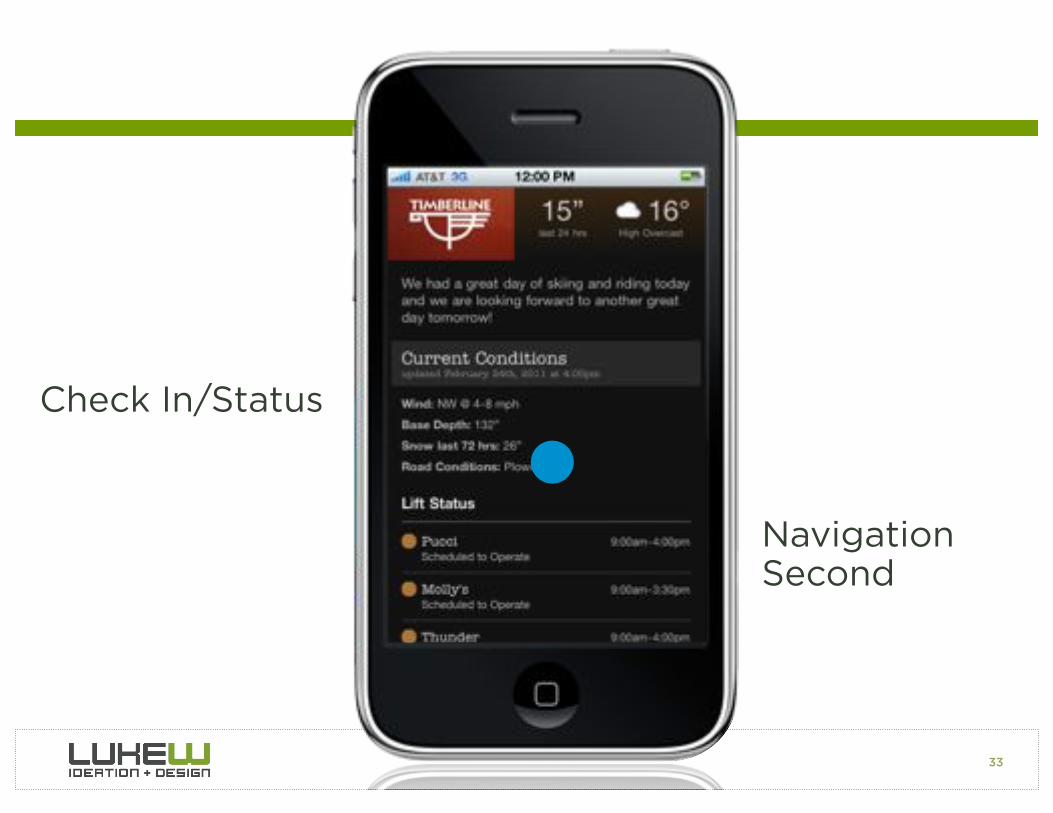
Check In/Status
Edit/Create

19
Explore/Play
Check In/Status

20
Check In/Status
Edit/Create

21
Marketing
Menu

22

23Source: XKCD http://xkcd.com/773/ & http://www.dmolsen.com/mobile-in-higher-ed/?p=197
“I was looking at the right side of the Venn diagram I thought, ‘That looks like a lot of the current and planned content for our mobile site.’ I think the only thing we don’t have are the admissions application.”

24
MOBILE FIRST1. GROWTH2. CONSTRAINTS3. CAPABILITIES
= OPPORTUNITY = FOCUS = INNOVATION

25
MOBILE BEHAVIORS
• Know what mobile is uniquely good at• Adjust site organization accordingly

26
ORGANIZATION
1. Mobile Behaviors2. Content First
3. Navigation Elements 4.Clarity & Focus

27
Navigation First, Content Second

28
Skip Intro

29
Minimal Navigation
MaximumContent

30
Minimal Navigation
MaximumContent

31

32
“In the new app, we present relevant content up-front and instantly notify users of new invitations and messages. In other words, we remove the friction of a dashboard and provide immediate value on app launch.”
33
Check In/Status
NavigationSecond

34

35

36
Safari Accelerometer Access

37
Top Pages by Visit
TOP PAGES BY VISITS20,000
15,000
10,000
5,000
0
1 2 3 4 5 6 7 8 9 10 11 12 13 14 15 16 17 18 19

38
Top Pages by Visit
“Kayak is now consciously taking design cues from its recently updated iPad and
iPhone apps”

39
“The goal in making the site more like a mobile app is to shed unnecessary details
and simplify”
Source: http://gigaom.com/2012/01/30/why-kayak-prefers-mobile/

40Source: http://gigaom.com/2012/01/30/why-kayak-prefers-mobile/
“If something is on the screen and people aren’t clicking on, we remove it”

41
Mobile Unfolding
1. Nested Doll2. Hub & Spoke3. Bento Box4. Filtered View
Source: http://slidesha.re/yNf7Qw
“How do you gradually reveal mobile experiences?”

42
1. Nested Doll
Source: http://slidesha.re/yNf7Qw

43
2. Hub & Spoke
Source: http://slidesha.re/yNf7Qw

44
3. Bento Box
Source: http://slidesha.re/yNf7Qw

45
4. Filtered View
Source: http://slidesha.re/yNf7Qw

46
CONTENT FIRST, NAV 2ND
• Minimal navigation, maximum content• Focus on what matters most • Gradually reveal experiences

47
ORGANIZATION
1. Mobile Behaviors2. Content First
3. Navigation Elements 4.Clarity & Focus
48
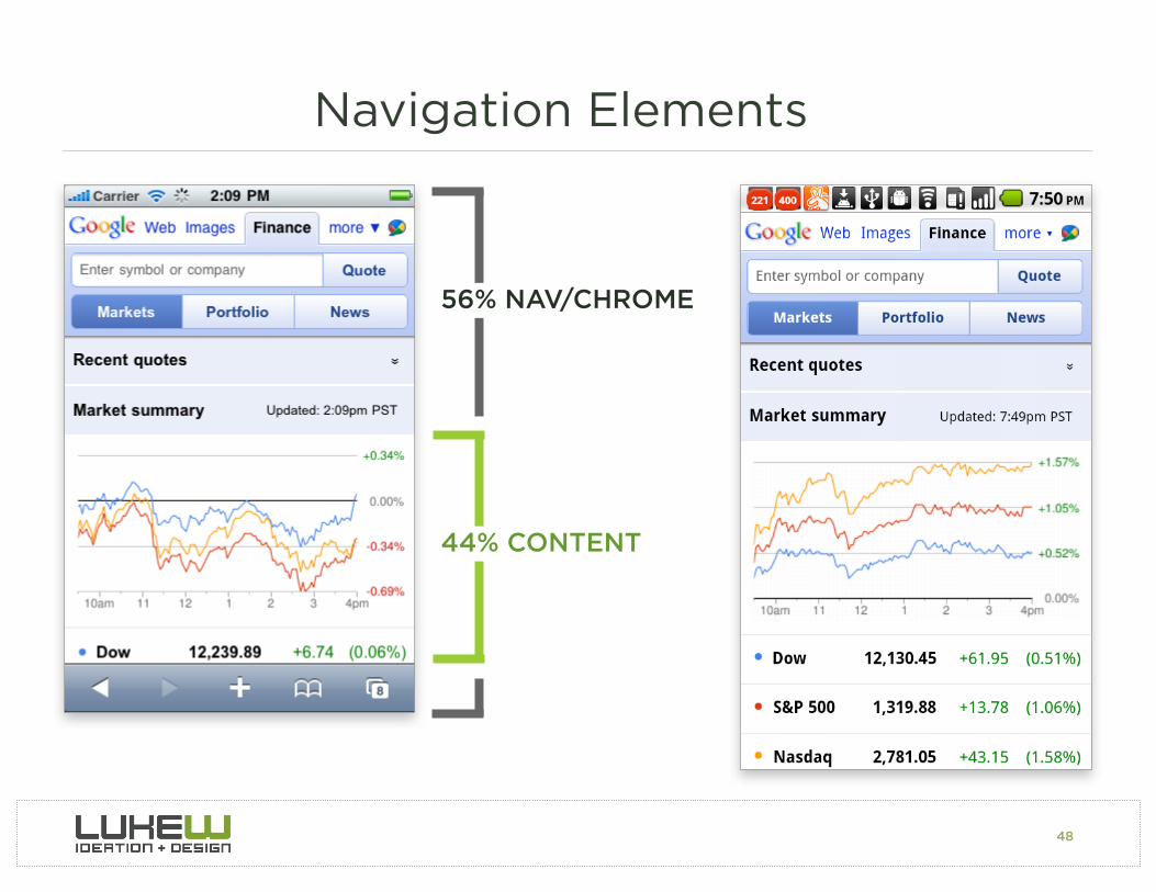
Navigation Elements
44% CONTENT
56% NAV/CHROME

55% NAV OPTIONS

50
90% NAV OPTIONS

51
90% RESULTS
52
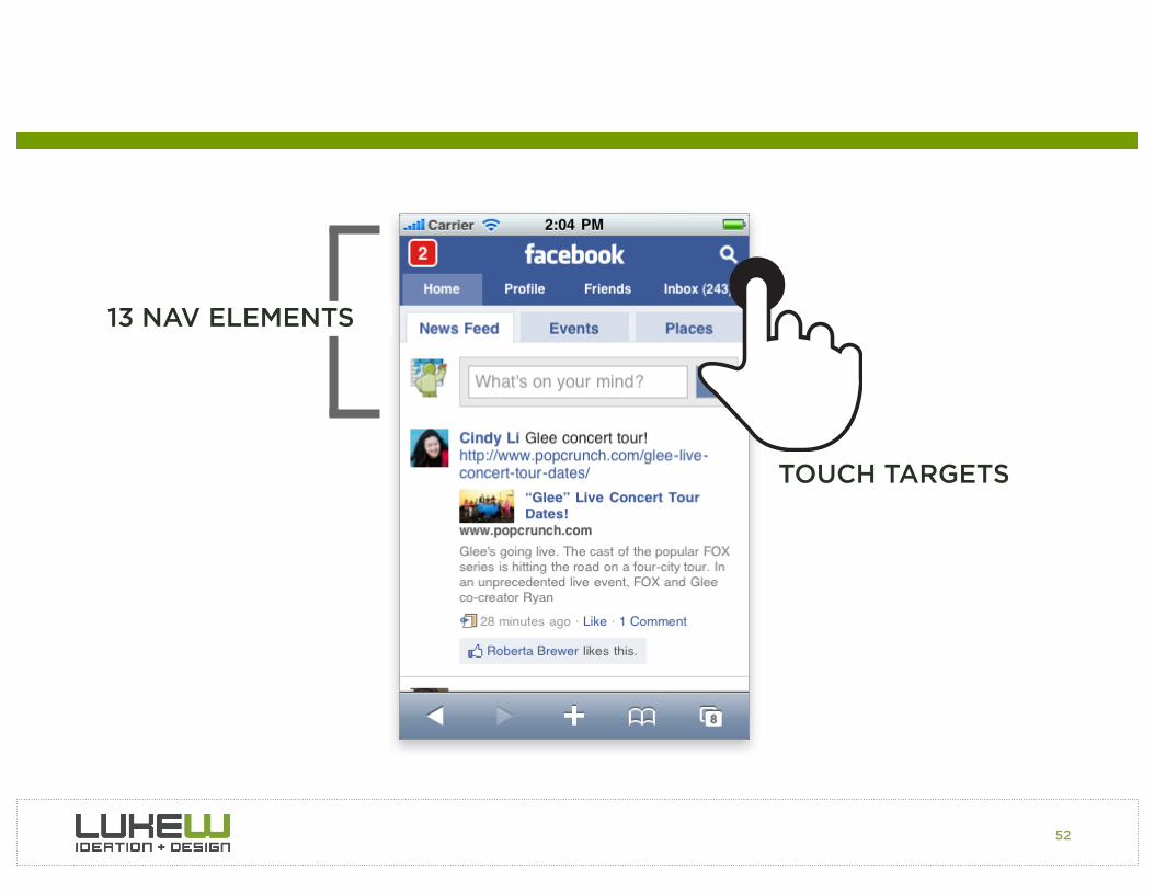
13 NAV ELEMENTS
TOUCH TARGETS

53
5 NAV ELEMENTS

54
4 NAV ELEMENTS

55
Full NavigationPage

56
Top NavigationOverlay

57
Side NavigationExpand

58
Top NavigationExpand

59
BottomNavigationMenu
Pivot & Explore

60
Dead End

61
Duplicative Menus

62
Bottom Navigation Menu
Top NavigationLink
63
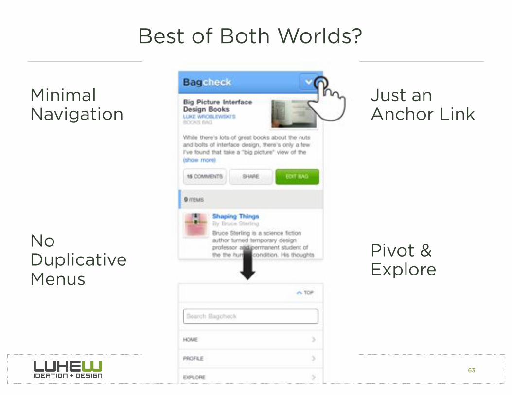
Best of Both Worlds?
Minimal Navigation
Pivot & Explore
No DuplicativeMenus
Just anAnchor Link

64Source: Tapworthy: Designing Great IPhone Apps By Josh ClarkSource: http://www.kickerstudio.com/blog/2011/01/activity-zones-for-touchscreen-tablets-and-phones/
80-90% of people are right handed

65
Responsive Web Design
Fluid grids • Flexible images • Media queries

66

67
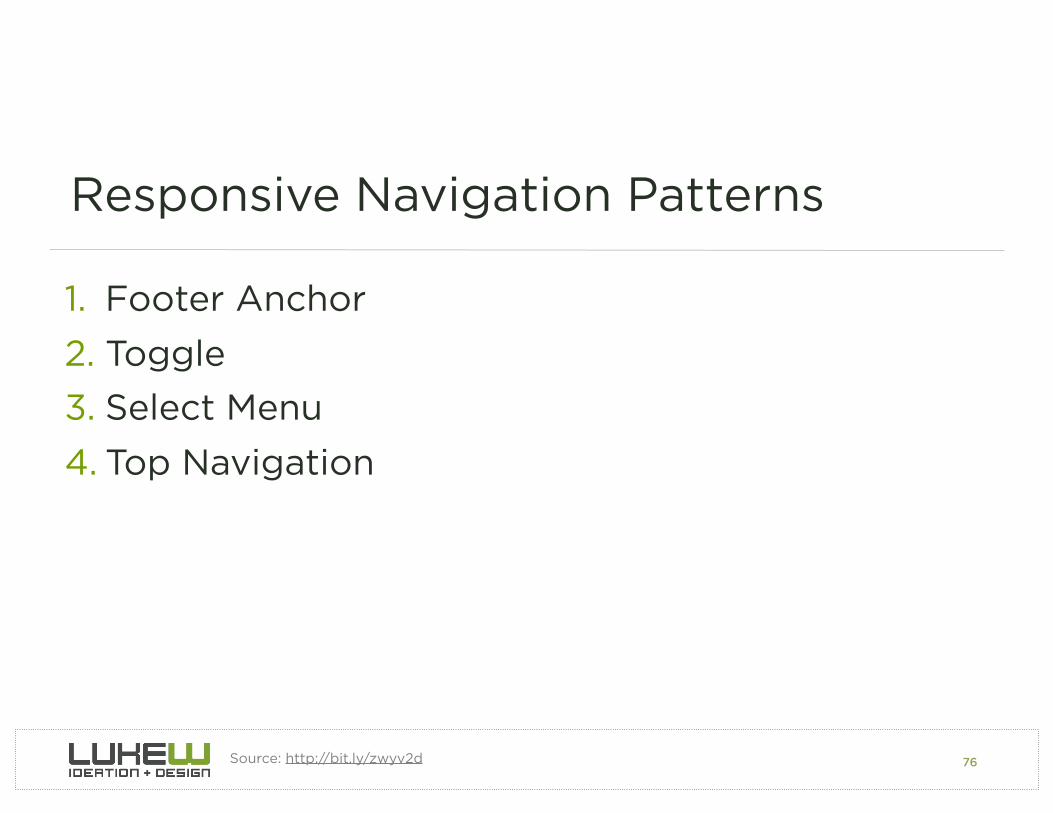
Responsive Navigation Patterns
1. Footer Anchor2. Toggle Menu3. Select Menu4. Top Navigation
Source: http://bit.ly/zwyv2d

68

69
• Minimal navigation at top• One tap access to
navigation• No dead ends• Comfortable for touch• No Javascript
dependency• Scalable (high)
• Anchor jump can be awkward
• No smooth motion (might be expected on mobile)
PROS CONS
Source: http://bit.ly/zwyv2d
1. Footer Anchor

70

71
• Keeps user in context• Smooth animation• Minimal navigation at top• One tap access to
navigation• Scalable (med)
• Animation performance• Javascript dependency• Potential dead ends• Less optimized for
touch
PROS CONS
Source: http://bit.ly/zwyv2d
2. Toggle Menu

72

73
• Minimal navigation at top
• Pulls up native controls• Scalable (med)
• Lack of styling • Handling second-level
navigation• Javascript dependency• Multi-tap operation
PROS CONS
Source: http://bit.ly/zwyv2d
3. Select Menu

74

75
• Easy to implement• No Javascript
dependencies• Single source order • Scalability (low/med)
• Navigation first, content second (height issues)
• Touch target proximity• Cross-device line-
breaking issues
PROS CONS
Source: http://bit.ly/zwyv2d
4. Top Navigation
76
Responsive Navigation Patterns
1. Footer Anchor2. Toggle3. Select Menu4. Top Navigation
Source: http://bit.ly/zwyv2d

77
In-ContextActions

78
In ContextNavigation
GlobalNavigation

79
In ContextNavigation

80
What About Fixed Position Menus?

81Source: Tapworthy: Designing Great IPhone Apps By Josh ClarkSource: http://www.kickerstudio.com/blog/2011/01/activity-zones-for-touchscreen-tablets-and-phones/
80-90% of people are right handed

82
Fixed Bottom
• Requires Javascript• Eats up Screen Space

83
Mobile Safari iOS4 iOS5
treats as static elements & scrolls with rest of page
strong support
Source: http://bit.ly/svHYGn
Android 2.1 2.2 2.3 3 & 4
no support awkwardly snaps fixed elements back when scrolled
supported but disabling page scaling is required
supported with decent performance
Fixed Position Support

84
Blackberry 5.0 7.0 Playbook
supported but fixed elements are jittery
supported supported but text is jagged in fixed position elements
Other Browsers Opera Mobile Opera Mini Firefox Mobile
Windows Phone
Amazon Silk
awkward snap & miscalc
no support supported on version 6.0+
Ignore & treat elements as static
supported but disabling page scaling is required
Source: http://bit.ly/svHYGn
Fixed Position Support

85
Fixed Bottom
• Requires Javascript• Eats up Screen Space• Physical Control Proximity

86
Physical Controls Below Screen

87
System Controls
“I’m always hitting that home key by mistake rather than the space bar and so exit out of what I’m typing.”
Source: http://bit.ly/ttmqIg

88
Android Design
Don't use bottom tab bars1. Other platforms use the
bottom tab bar
2. Android's tabs for view control are shown in action bars at the top of the screen
Source: http://developer.android.com/design/patterns/pure-android.html

89
Getting Back
Back Button
Back Button

90
Getting Back
Back Button
Back Button

91
Android Design
Don't use labeled back buttons on action bars1. Other platforms use an explicit
back button with label
2. Android uses the main action bar for hierarchical navigation & the navigation bar for temporal navigation
Source: http://developer.android.com/design/patterns/pure-android.html

92
Getting Back

93
Getting Back

94
Getting Back
Source: http://bit.ly/raZcON

95
NAVIGATION ELEMENTS
• Avoid excessive navigation menus• Top navigation links for quick access• Bottom menu for pivoting & exploring• In context actions & navigation• Avoid back buttons & fixed bottom positioning
96
ORGANIZATION
1. Mobile Behaviors2. Content First
3. Navigation Elements 4.Clarity & Focus

ONE THUMB
ONE EYEBALL
Partial attention requires focused design
PHOTO BY STEVE RHODES

98
Maintain Clarity
Single Navigation Action

99
Minimize Errors
Content
Content
“47% of mobile users tap on ads by mistake.”
SOURCE: HARRIS INTERACTIVE, DECEMBER 2010

100
CLARITY & FOCUS
• Minimize amount of navigation required• Focus on task at hand

101
Exercise
How do mobile use cases intersect with?
• Your customer’s needs
• Your business goals
Sketch out your mobile Web experience start screen. Focus on:
• Lookup/Find, Check In/Status, Explore/Play, Edit/Create
• Content first, navigation second
• Navigation elements
• Clarity & focus

102
ORGANIZATION
1. Mobile Behaviors2. Content First
3. Navigation Elements 4.Clarity & Focus

103
THANKS
@LUKEW LUKEW.COM

104