page 1 graphical visualisation of a website's structure · page 1 graphical visualisation of a...
TRANSCRIPT

Page 1
Graphical Visualisation of a
Website's Structure
Graphical Visualisation of a Website's Structure
Author: Greg J Preece
Project Period: Sept 2007 – May 2008
Department: School of Computing
Project Supervisor: Dr Roy Ruddle
The candidate confirms that the work submitted is their own and the appropriate credit has been given
where reference has been made to the work of others.
I understand that failure to attribute material which is obtained from another source may be
considered as plagiarism.
(Signature of Student)_______________________________________________

Page 2
Contents
1. Research and Investigation Page 4
1.1 Aim Page 5
1.2 Objectives Page 5
1.3 Minimum Requirements Page 5
1.4 Possible Extensions Page 6
1.5 Project Schedule Page 6
1.5.1 Milestones Page 6
1.6 Background Research Page 7
1.7 2D Visualisations Page 7
1.7.1 Vertical Trees Page 7
1.7.2 Horizontal Trees Page 9
1.7.3 Expandable Trees Page 9
1.7.4 Circular Trees Page 9
1.8 3D Visualisations Page 10
1.8.1 3D “Molecular” Trees Page 10
1.8.2 3D Cone Trees Page 11
1.9 Visualisation Techniques Page 11
1.9.1 Picture-in-picture Page 11
1.9.2 Fish-eye diagrams Page 11
1.10 Chosen Method Page 12
2. Software Implementation Page 13
2.1 Requirements of System Page 14
2.1.1 Technical Requirements Page 14
2.1.2 Empirical Requirements Page 14
2.2 Programming Language/Platform Page 15
2.3 Visualisation Methodologies Page 16
2.3.1 Manual Creation Page 16
2.3.2 The Java Universal Network/Graph Framework Page 16
2.3.3 The Prefuse Visualisation Toolkit Page 17
2.4 Design Methodology Page 17
2.4.1 First Iteration – Prototype Page 18
2.4.2 Second Iteration – Production Page 18

Page 3
2.4.3 Third Iteration – Extension Page 18
3. First Iteration – Development of Prototype Page 20
3.1 Aim Page 20
3.2 Key Design Elements Page 20
3.2.1 Use of the Factory Pattern in FileParserFactory Page 20
3.3 Utility Libraries Page 21
3.3.1 Log4J Page 21
3.3.2 Junit Page 22
3.3.3 jMimeMagic Page 22
3.4 Evaluation Page 22
3.5 Tagging Page 23
4. Second Iteration: Development of Production System Page 24
4.1 Aim Page 24
4.2 Key Design Changes Page 24
4.2.1 Use of BalloonTreeLayout Page 24
4.2.2 Overview Window Page 24
4.2.3 Parse Status Observers/Multi-threading Page 25
4.3 Evaluation Page 26
5. Evaluation Page 27
5.1 Technical Evaluation Page 28
5.2 Empirical Evaluation Page 32
6. Bibliography and References Page 34
7. Appendix A: Personal Reflection Page 36

Page 4
Phase 1:
Research and
Investigation

Page 5
1. Introduction
1.1 Aim
The aim of this project is to create a piece of software that is capable of clearly and accurately
visualising the structure of a large website. A website's structure can be defined as the layout of the
hyperlinks that connect all its pages together into a cohesive entity. These links can be both
unidirectional and bi-directional, and link structures often loop back on themselves. Also, these links
can sometimes be grouped according to purpose or subject matter by analysing the filenames and/or
content of the pages they link. Once these links have been catalogued and categorised accordingly,
they form an interconnecting network-like structure, similar to that of a computer network. My goal
is to create an effective visualisation of this structure that is both useful in the information it provides,
as well as being easy to view and navigate.
1.2 Objectives
The objectives of the project are to:
1. Develop a technique for accurately and effectively graphically visualising the link structure of
a website, such that it can be navigated by a user.
2. Build a piece of software based on this technique that can read in the link structure of a
website from a data source, and render an appropriate visualisation of that structure.
(Please note that the objectives/minimum requirements outlined here will have changed from the
initial submission, as the original version assumed the use of a three-dimensional interface, along with
OpenGL, which was an error. The type of interface used, as well as the languages/libraries with
which it will be constructed, are to be decided during the course of the project.)
1.3 Minimum Requirements
The minimum requirements of this project are:
1. To find an effective technique for visualising a website's link structure.
2. To develop a piece of software that can read in link data for a website and create a
visualisation for it.

Page 6
3. To accurately assess the effectiveness of my developed software
1.4 Extensions
Possible extensions for this project include:
1. The creation of an XML spider/parser that can take a Uniform Resource Indicator, go to the
website at that URI, and fetch the link data itself, which will then be read in by the second
stage software.
2. User controls to allow different types of user to display different information according to
their interest. For example, a developer might want page load times, number of inbound
links, etc, to be displayed, whereas a browsing user might simply want to see the structure and
use external linking to visit the pages on the web.
3. Page preview functionality, where the contents of a page within the visualisation are
represented alongside its entry within the visualisation.
1.5 Project Schedule
Task Task Dates Time Elapsed
Preliminary Investigation/Research 22/10/2007 - 22/11/2007 4 Weeks
Write Initial Project Report 16/11/2007 - 22/11/2007 1 Week
Write Final Mid-Project Report 22/11/2007 – 06/12/2007 2 Weeks
Personal Training for Software Development 22/10/2007 – 26/11/2007 5 Weeks
Planning for Prototype Development 26/11/2007 – 30/11/2007 5 Days
Prototype Development (1st Iteration) 01/12/2007 – 14/12/2007 2 Weeks
Prototype Testing and Evaluation 15/12/2007 – 07/01/2008 3 ½ Weeks
2nd Iteration Planning 19/01/2007 – 01/02/2008 2 Weeks
2nd Iteration Development 01/02/2008 – 01/03/2008 1 Month
2nd Iteration Evaluation 01/03/2008 – 14/03/2008 2 Weeks
Final Write-Up 14/03/2008 - 14/04/2008 1 Month
1.5.1 Milestones
Mid Project Report Submitted: 7th December 2007
Begin Development of First Iteration: 1st December 2007
Finish Prototype: 14th December 2007

Page 7
Begin Development of Second Iteration: 1st February 2008
Finish Second Iteration: 1st March 2008
Finish Write-up: 14th April 2008
1.6 Background Research
1.6.1Basis for Comparison
In order to effectively judge different visualisation techniques by their strengths and weaknesses, it is
necessary to first note the criteria on which these judgements will be made. There are several
important aims that a visualisation must strive towards in order to be effective, and these are noted
below:
1. The visualisation must strive for clarity from all perspectives as often as possible. Where
there are multiple nodes/symbols in a 2D or 2.5D visualisation, they should not overlap each
other, especially if there is associated text. In 3D diagrams, it should be possible at all times
for an observer to discern one node, symbol or link from another.
2. If the visualisation is interactive, it must be easy to navigate. This is especially difficult in 3D
spaces, as a lack of outside points of reference can make orienting a viewpoint difficult, and
returning to a particular spot is not always easy.
3. The visualisation should preferably show some clear definition between different types of
symbol, link etc. Colour coding is often a good way to achieve this. A user should be
immediately able to discern between internal and external webpages, for example (assuming
that this separation has been made).
With these loose criteria in mind, I began to
investigate previous attempts to solve the problem.
1.7 2D Visualisations
1.7.1 Vertical Trees
Vertical tree systems are a once-common method of
visualising website structures. By organising the Diagram 1: An example of a Balloon Tree graph layout, from [12]

Page 8
web pages in this hierarchical fashion, it is possible to quickly see the parent pages and their child
links. This form of tree is normally good for navigational work, as the quickest path to a child page
can be easily discerned.
However, this form of tree has its problems. While the conceptual structure of many websites is
hierarchical, with the index page leading out to child pages, and so on, the actual link structure does
not mirror this, with navigational controls causing many links to become bi-directional. If bi-
directional links are represented on this kind of visualisation, they are often not immediately apparent.
If they are not represented, then that structural information is lost.
One more fundamental and obvious problem, however, comes when a page “layer” becomes too wide
for the available space. As noted in [1], as websites grow in size, and the number of 2nd stage, 3rd
stage etc pages increases in size, the page icons cannot fit alongside each other in the space provided.
There are also many more pages in each layer than there are layers, so the tree tends to grow
horizontally, in the direction it already suffers.
This problem is compounded if the icons feature page names, as they often do, because the text
greatly increases the width of the icons, and they inevitably end up overlaying each other. This leads
to these trees often being rotated into horizontal trees, as detailed below. (Obviously, cultures where
the text is written vertically, such as Japanese Katakana/Hiragana, will do the opposite)
As a tool for finding navigational routes, a tree such as this has its uses, but is almost always better
represented as a horizontal tree.
Diagram 2: An example of a vertical tree, taken from [12]

Page 9
1.7.2 Horizontal Trees
These operate in the same way as vertical trees,
but are shown from left-to-right. This allows a
greater number of pages to be represented in
each layer, as they occupy less space
horizontally. They still suffer from the problem
of there being far more pages in each layer than
there are layers, so vertical scrolling is often a
feature of these trees.
Again, while they are useful for tracing routes, they are too cluttered and vertically expansive for
effective navigation of the visualisation.
1.7.3 Expandable Trees
In an expandable tree, the horizontal tree is modified so that a
given link subset is only expanded at the user's request. This
reduces both the horizontal and the vertical scrolling over the
standard tree structure. This greatly aids navigation of the tree,
and textual labels can usually be displayed in full, so the clarity
of the tree is good.
However, bi-directional links are still difficult to easily
represent, and if the user is deep within the tree, they may lose
orientation within the structure, as they cannot see it all at once.
Also, links between pages in different subsections of the tree
cannot be represented, where they might be on an expanded,
interconnected tree. As a result, the clarity of the structure is at
the cost of some structural data.
1.7.4 Circular Trees
Diagram 4: An example of an expandable tree, taken from the Explorer program, in my own installation Microsoft Windows XP.
Diagram 3: An example of a 3D cone tree, taken from [13]

Page 10
Circular trees are also known as radial trees, with a subset known as “balloon trees.” In a circular
tree, the starting page is placed at the centre, and linked pages are branched out around it. As links are
discovered from these pages, they are branched out in turn, and so on. This creates an initially very
clear structure, where the links between each node are immediately apparent. The layers on a
horizontal/vertical tree become rings in this structure, and interlinking between them is also simple, so
the full link structure is also visible.
However, there are downsides to a circular tree structure. They generally take up a lot of space due to
the spacing between rings, so ease of navigation becomes an issue, as the user could easily lose their
orientation within a structure that is larger than the screen space available. Also, placing textual labels
at nodes inevitably leads to overlay, making this text difficult to read and reducing the diagram's
clarity.
1.8 3D Visualisations
1.8.1 3D “Molecular” Tree
These are a three-
dimensional version of
the Circular Tree
structures discussed
above. By utilising depth
to increase the available
space, three dimensional
structures can display a
larger amount of data at
once, and as such are
often used for large
websites where thousands
of pages are being
spidered. Prime examples
of this can be found in [3]
and [4], where huge
amounts of data are
visualised in a complex
Diagram 5: A molecular graph from WebTracer2
Diagram 6: A screenshot of Astra SiteManager, showing the inset "Pan Window."

Page 11
three-dimensional structure, allowing for users to conceptually visualise massive structures.
However, this ability to display colossal data sizes comes at a cost. Navigation of these structures is
often difficult – a prime example being in WebTracer2, an excellent visualisation tool that is
handicapped by its frankly hideous control system – and a user's orientation with the greater structure
can be easily lost. Also, overlapping of nodes and text is inevitable, and with alpha blending used to
make the presence of a deeper structure apparent, these diagrams can quickly become confusing if not
properly implemented. Finally, 3D visualisations such as this, especially those making use of alpha
blending, require large amounts of processing power/hardware acceleration in order to function.
1.8.2 3D Cone Trees
Cone Trees are a direct mapping of hierarchical 2D tree structures into a 3D space. They were
designed to increase the number of pages that could be displayed within a layer, without changing the
overall design of the tree. They accomplish this well, and many more pages can be represented
onscreen at once. However, because one page will be behind another, data labels will be obscured,
leading to some loss of clarity. Also, as with the trees this structure is based on, links between pages
in different layers are not represented. This said, these cone trees are often easier to navigate than
molecular trees, as they have a tightly ordered structure.
1.9 Visualisation Techniques
1.9,.1 Picture-in-Picture
During my research, I investigated Astra SiteManager. This program utilises a 2D Circular Tree
structure, as detailed above. However, in order to aid in navigation in larger visualisations,
SiteManager features1 a picture-in-picture display, where a small overview of the whole structure is
constantly displayed, along with the user's current viewpoint within it.
By utilising this method, the program effectively prevented users from losing their place in the overall
structure, and greatly improved navigation within a visualisation.
1.9.2 Fish-Eye Diagrams
1 Or rather, “featured” - Astra SiteManager was discontinued several years ago. I have acquired a copy to use in my project evaluation.

Page 12
Fish-eye diagrams are (generally) circular tree visualisations that operate by enlarging the user's
current focus area, along with directly linked pages, in the centre of the screen. Other pages are
pushed to the outer edges. This allows the user to see their currently focused page with much greater
clarity, but might in turn reduce the clarity of page clusters that are not linked to the current focus.
1.10 Chosen Method
After reviewing the different types of visualisation available, I have decided upon a circular tree
structure for displaying my link structures, utilising a picture-in-picture navigational aid, as used in
Astra SiteManager. My initial preference was to a 3D molecular tree structure, as I thought it would
be effective for the large websites I will be displaying. However, after using tools such as
WebTracer2, I realised that navigating in these 3D spaces is often extremely difficult, and returning to
a previously selected node is a challenge in itself.
Other structures are simply unsuitable for the amount of data I will be displaying. With target
websites in excess of 30000 pages, hierarchical trees would simply grow beyond the point where they
are still manageable, growing exponentially in one direction or their other, depending on their
orientation. This also applies to Cone Trees, though they would not suffer as badly.
Naturally, this structure will work much better at higher resolutions, but with the picture-in-picture
navigational aid, it is my hope that it will still be usable at lower resolutions.

Page 13
Phase 2:
Software
Implementation

Page 14
2. Implementation: Key Design Decisions
2.1 Requirements of System
Having now completed my background research, prior to building the software solution, it is
important to lay out several key requirements for the software to meet if it is to be considered a
success. As this is a visualisation solution, it makes sense to break these requirements down into two
sections: technical requirements, which deal with the software's efficiency and ability to provide a
suitable user experience under stress; and empirical requirements, which deal with the program's
visual aspects, such as whether nodes are overlapping onscreen, and so on.
2.1.1 Technical Requirements
I believe that, in order for the system to be considered usable, it must:
1. Be able to parse in data sets at a minimum of 10 000 records per second. Given the
specification of the workstation on which the software will be developed, I believe this to be
an achievable number. Parsing at 10 000 records per second ensures that even very large
graphs load quickly, with half a million nodes being loaded in under a minute. This is
important for user productivity.
2. The software must be able to produce a minimum frame rate of ten frames per second when
rendered.
3. The software must be able to cope with data sets containing half a million nodes. While a
small minority of websites have more nodes than this (a larger percentage than normal in the
education sector), the vast majority of websites will not, and I believe half a million nodes is
an achievable target within the scope of this project.
2.1.2 Empirical Requirements
While my own knowledge allows me to easily define technical requirements for the system, in order
to define empirical requirements I researched the work of others in the field, particularly the writings
of Edward Tufte [15] [16]. In [15] he describes several qualities required for what he calls “graphical
excellence,” which consists of “complex ideas communicated with clarity, precision and efficiency.” I
have utilised his deductions, where relevant, in the creation of my empirical requirements list.

Page 15
1. The display should show the data set loaded as a graph. This is a basic requirement, and
seems to be stating the obvious, but it is of course an essential requirement of the software,
and should not be overlooked.
2. Display many nodes onscreen (“many,” as the size of the screen used may vary) without the
nodes overlapping or node edges crossing, as this could lead to confusion on the part of the
user.
3. The display should allow the user to gain a conceptual overview of the website, including
node clusters/groups, etc.
2.2 Programming Language/Platform
The first and most important decision to be made is what programming language I should use to
develop the program. I have several options available to me from my skillset: PHP, C++ and Java.
Firstly, I have a great deal of experience with the PHP scripting language, having worked with it for 8
years. This would enable me to quickly create the application without needing to learn new
programming skills or techniques, especially if I were to use a pre-written visualisation library, such
as JpGraph [7]. Also, as PHP is an interpreted run-once language, it would be very fast at building
and outputting the visualisation. However, as PHP requires a configured PHP environment or web
server in order to run, this would limit its portability. Also, once displayed, the script-based nature of
PHP may limit user interactivity. It would take a large amount of AJAX coding in order to make the
visualisation as interactive as a desktop equivalent.
C++ is a second option. This language is portable (with a re-compile) across platforms, and as it is a
widely used programming language, pre-built visualisation libraries exist, such as VTK [8]. It would
allow for greater interaction than PHP, and is faster than Java once compiled, as it does not require the
use of a runtime. However, my experience in C++ is not as great as the other two languages, and I am
unsure that my abilities in this language are up to the task.
As a result, Java is the natural option for me when developing this program. It is highly portable by
design, it has many third-party libraries available to assist with development, and its memory
management abilities will help efficiently manage large visualisations whilst keeping performance
loss to a minimum. I also have a good deal of experience in the language, so I can ensure that the
design and structure of the program is appropriate and open to extension.

Page 16
To assist me in authoring the program, I will be using the IntelliJ IDEA Integrated Development
Environment (IDE). This IDE, I believe, is superior to rival IDEs in many ways, not least its
integrated support for Subversion (which I will also be using for version control), Ant and other
development tools.
All the software created will be developed and tested on my custom built workstation. For
comparative purposes, this machine runs on two dual-core Opteron 270s @ 2GHz per core, has 4GB
of DDR-400 RAM, and utilises two nVidia GeForce 7900 GTX graphics cards to power a 3840x1024
super-widescreen desktop.
2.3 Visualisation Methodologies
After a short amount of research, I have identified two possible ways of proceeding with the creation
of the main visualisation. These are manual creation, or utilisation of an existing visualisation
framework.
2.3.1 Manual Creation
Manually creating the code required to output a full visualisation would allow for the greatest level of
control over the final product. It would allow me to create a solution dedicated to a given type of
visualisation. This would likely result in a more efficient, dedicated set of visualisation algorithms
being used, as well as ensuring there are no limitations in the program's capability caused by the
capabilities of a library. However, it would also take a great deal of time and effort to implement such
a solution, and given that 3rd party libraries are likely to have been created over a period of time by a
team of developers, it is possible their implementations would be superior to my own. I have
experimented with several such libraries/frameworks, and have noted my conclusions here:
2.3.2 The Java Universal Network/Graph Framework
The Java Universal Network/Graph Framework (JUNG) [10] is a 3rd party Java framework for
creating graphs from pre-computed data sets. Output display objects are created from pre-written
classes, associated with one of several possible layout objects, each representing a graph type, and
then these layouts have nodes/edges added to them. This allows for a quick, easy creation process, and
additional controls can be added to the visualisation at will from the pool provided.

Page 17
However, as JUNG is an open source project, its documentation is somewhat lacking, and its user
controls are somewhat clunky, with demo applications requiring the user to switch from
“transforming” to “picking” mode in order to select a node for examination. Getting around the latter
of these two problems may be a greater challenge because of the existence of the former.
2.3.3 The Prefuse Visualisation Toolkit
Despite its name, Prefuse [9] is, like JUNG, a framework for quickly developing Java-based
visualisations of collected data. Like JUNG, it features pre-written classes to represent nodes and
edges, as well as implementations of various layout algorithms to create the output.
Where Prefuse differs significantly from JUNG is in its usability. User controls are built directly into
the visualisation engine that are very easy to use with minimal learning required – holding the left
hand mouse key and dragging moves the graph around, and holding the right hand mouse key zooms
the viewpoint in and out. This simplicity in both implementation and use is very appealing.
As well as being superior to JUNG in terms of usability, Prefuse has native support for applying
multiple viewpoints to a single map, which would be very useful for developing the “picture-in-
picture” overview in Iteration 2. It also appears to have far more detailed documentation than the
JUNG framework, which should help reduce the amount of time required to familiarise myself with
its inner workings.
I have decided to utilise the Prefuse framework within my project, to speed development and provide
a good balance between accuracy, speed and usability.
2.4 Design Methodology
Once I had decided on a software platform, frameworks and so forth, the final step was to decide on
the methodology I would be subscribing to in order to develop the software, and produce an
approximate schedule/task list.
The first methodology available to me, and one that I have used in the past, is the waterfall model.
However, the waterfall model is quite static. As noted in [18], “there is no formal way to make
changes to the project as requirements change” - you only have one chance to get the project correct,
and if you fail, there’s no point-of-return.

Page 18
Another possible methodology I am familiar with is the Top-Down model, where functionality is built
into a project incrementally. The downside of this is that vital functionality, rather than peripheral
functionality, could be being built into the project right up to the end of its life. Also, there are no
distinct phases in each cycle for project management and assessment.
To organise my development of the program, I will be using an approximation of the iterative
waterfall development methodology, also known as the spiral model. This methodology allows for
multiple iterations of a solution to be developed, each more advanced than the last, until the software
is complete, much like the top-down model. However, each phase is organised as if it were a self
contained (if somewhat abbreviated) waterfall model. Each iteration will consist of design,
implementation and evaluation phases, with each evaluation forming a basis for the design phase of
the next iteration. The aims of each iteration are shown below:
2.4.1 First Iteration – Prototype
This will be a basic working system, accepting data from a cropped Academic Web Link Database
file, parsing it into the appropriate data structure, and displaying a basic interconnected radial graph.
2.4.2 Second Iteration – Production
This will be a fully featured system, with all the available functionality outlined in the research phase.
It will be able to take an AWLD file of any size, parse it into a data structure, and display a full
interconnected graph. Parsing progress will be reported via the use of a status window, and this will
also allow for benchmarking of the software. An overview window will allow for quick navigation
across large structures.
2.4.3 Third Iteration - Extension
If time allows, I will attempt a third iteration of the software. This third iteration will expand on the
functionality of the production version by allowing users to “spider” their own link database of a
website, and then display that website onscreen.
This will be done by adding a multi-threaded spider program, which will index the pages on a given
website and store the link data using a custom XML schema. A new XML parser will be added to the

Page 19
display program, to read in these data files to the appropriate data structures. From there, the existing
program structure will be able to render the graph in exactly the same way as the AWLD files.

Page 20
3. First Iteration: Development of Prototype
3.1 Aim
The aim of this first iterative cycle is to develop a prototype of the visualisation program. It will
display a small graph based on data extracted from a larger sample, and will have only basic
functionality, featuring no overview window, status information, etc.
3.2 Key Design Elements
Rather than cluttering this report with a full class diagram, UML test cases and so forth, I have elected
to document here only the key design aspects of the system, to show the main considerations and
features of the software's development, as well as outline the division between my own creations and
the Prefuse framework.
3.2.1 Use of the Factory Pattern in FileParserFactory
One of the key design caveats in modern Object Oriented programming is that the code written must
be flexible, and allow for extension. As noted by Freeman and Freeman [11], OO programmers
should “program to an interface, not an implementation,” in order to ease future re-use and extension.
As the program could (and will) be extended to accept data from sources other than the Academic
Web Link Database, it makes sense to create a FileParser interface for file parsers to adhere to, and
use a factory to select the correct parser at runtime based on the characteristics of the target file or
data source. This takes full advantage of Java's polymorphic abilities, allowing new parsers to be
added to the system without changing the rest of the code.
For example, if a plain text file were provided, with the *.txt extension and the text/plain MIME type,
the parser factory would select the WebLinkParser class, as the file is most likely from the Academic
Web Link Database. However, if an invalid file were provided, the factory would attempt to find an
appropriate parser, and throw a NoValidParserException if none were found. If a new file format
needs to be supported, a new parser class can be written, implementing the same FileParser interface,
and added to the FileParserFactory class. The rest of the project code will see the new parser as
simply a FileParser implementation, and will be able to utilise it without modification.By utilising the
factory pattern in this way, I can ensure that, if I have time to complete the third development
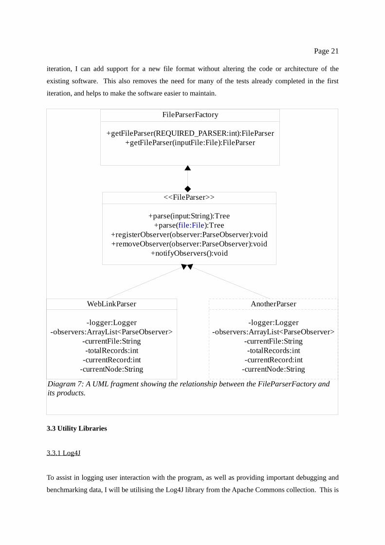
Page 21
iteration, I can add support for a new file format without altering the code or architecture of the
existing software. This also removes the need for many of the tests already completed in the first
iteration, and helps to make the software easier to maintain.
3.3 Utility Libraries
3.3.1 Log4J
To assist in logging user interaction with the program, as well as providing important debugging and
benchmarking data, I will be utilising the Log4J library from the Apache Commons collection. This is
Diagram 7: A UML fragment showing the relationship between the FileParserFactory and its products.
<<FileParser>>
+parse(input:String):Tree+parse(file:File):Tree
+registerObserver(observer:ParseObserver):void+removeObserver(observer:ParseObserver):void
+notifyObservers():void
WebLinkParser
-logger:Logger-observers:ArrayList<ParseObserver>
-currentFile:String-totalRecords:int
-currentRecord:int-currentNode:String
AnotherParser
-logger:Logger-observers:ArrayList<ParseObserver>
-currentFile:String-totalRecords:int
-currentRecord:int-currentNode:String
FileParserFactory
+getFileParser(REQUIRED_PARSER:int):FileParser+getFileParser(inputFile:File):FileParser

Page 22
a logging library that is very easy to set up, utilising its own properties file. It also features several
different pre-defined “levels” of logging, such as “DEBUG” and “WARNING,” that allow me to
utilise the library for more advanced purposes. By switching the logger into debug mode, I can dump
timestamp information to the logs that will allow me to benchmark the software in the evaluation
phase.
(Log4J also requires Apache Commons Lang and Lucene to operate.)
3.3.2 JUnit
As with most projects of this nature, I will be utilising the JUnit testing framework during the
software's construction to ensure that, on a coding level at least, it functions correctly.
3.3.3 jMimeMagic
I will be using the jMimeMagic library within the FileParserFactory to detect the MIME type of files
read into the software. Once this MIME type has been found, it can be used, among other factors, to
find the right parser to return.
3.4 Evaluation
Having constructed a basic version of the software, I am encouraged by the results of the process. By
sticking to my initial design conventions and referencing the Prefuse documentation where necessary,
I was able to quickly construct a working prototype of the final software system.
To facilitate a quick build process and allow myself time to familiarise myself with Prefuse, I initially
used a ForceDirectedLayout layout manager to set out the graph, as suggested in the Prefuse tutorial.
This worked well, and the program accepts a small link sample and displays it correctly. User
controls are as simple as expected, and the entire graph can be easily manipulated via the mouse.
Frame rates are high, and in terms of usability the system works exceedingly well.
However, the ForceDirectedLayout class uses weighted edges within the graph, and then uses a
ForceSimulator class to work out how the nodes repel each other, spring forces present within the
graph, drag co-efficients, etc. These values are then used to animate the graph as the forces move the
nodes around.

Page 23
This is an unnecessary step in my intended design, as all edges within my graph would have the same
weight, making such calculations redundant. The ForceSimulator has minimal effect on the small
data set I used when constructing the software, but an initial test of a full size data set, comprising
3000 records, had the effect of rendering the visualisation unusable. The rendering frame rate
dropped so low that the program stopped responding to user input, and I was forced to terminate the
program via the system process list.
In order to increase the efficiency of the system so that these problems are not encountered in the
production version, I have elected to move away from the ForceDirectedLayout and opt for a
BalloonTreeLayout instead. This still provides the radial graph I desire, with the same level of control
as before, but does not use any kind of animation or force simulation. This unweighted graph should
require far fewer calculations per frame than previously, which will reduce the probability of low
frame rates encountered when attempting to manipulate large graphs.
Note that it will not completely remove the problem of low frame rates – or “lag” - when displaying
large graphs. It is always possible to overload such a system to the point where the processing power
available becomes insufficient to maintain a smooth frame rate. My aim is to reduce the likelihood of
this occurring as much as possible.
3.5 Tagging
The first iteration prototype has been tagged within the Subversion system as version 0.1. This tagged
copy will be used for comparison against later versions, and for archive purposes.

Page 24
4. Second Iteration: Development of Production System
4.1 Aim
In the second iteration, I will attempt to create a fully featured, production version of the required
software, based on my prototype from Iteration One. In addition to the functionality of the first
version of the software, this production version will feature an overview window for ease of
navigation, status reporting, benchmarking, and a more efficient graph rendering system, utilisng the
BalloonTreeLayout class as described previously.
4.2 Key Design Changes
4.2.1 Use of BalloonTreeLayout
The change of layout manager from ForceDirectedLayout to BalloonTreeLayout has already been
documented, but it should be mentioned again here. The BalloonTreeLayout will remove many
unnecessary calculations from the rendering of a single frame, leading to a much higher frame rate.
One impact of this change is that the existing parser code will need to be modified slightly. Where
ForceDirectedLayout could accept any interconnected graph, a BalloonTreeLayout will only accept a
single Tree structure, so the return type of the parsers must be modified.
This has, incidentally, exposed a flaw in my previous parsing code. Due to a mistake in the prototype
code, the parsers were returning many small, separated graph structures instead of one, large structure.
The ForceDirectedLayout had been compensating for this flaw, masking it from view. In the second
iteration this bug will be patched, and the parsers shall return a single Tree structure containing all
subtrees.
4.2.2 Overview Window
As the Prefuse framework allows multiple visualisations of the same data set to be performed
simultaneously, and multiple displays of a visualisation to be rendered simultaneously, the creation of
an overview window is surprisingly simple. By creating a JDialog instance and using the existing
visualisation configuration methods from the prototype to create a new display on it, I can very
quickly create a dialog that contains a copy of the main window's contents at a different zoom level.

Page 25
Of course, the JDialog instance will be extended to provide the different user controls expected in the
overview window.
4.2.3 Parse Status Observers/Multi-threading
One major change within the software structure implements the Observer pattern to provide feedback
on the progress of a file's parsing. Methods will be added to the FileParser interface, forcing parsers
that implement it to allow observers to be registered, and to notify those observers appropriately. A
new interface will then be defined for the observers to follow, though it will have only one method,
allowing observers to receive status updates from the FileParser implementations and act
appropriately.
The main functional purpose of this implementation will be to provide visual feedback to the user on
the progression of a parsing process. A status dialog box, complete with JProgressBar instances, will
show the user the percentage of the process complete and how far there is to go. Visual feedback such
as this is important to the user to assure them that the program is functioning correctly – to simply
display a blank screen while the file is parsed in would inevitably lead to confusion.
There is a second, more covert purpose behind the observer pattern implementation. By utilising
Log4J within an observer, it becomes possible to dump timestamp information to the program's logs,
essentially creating benchmarking data without a great deal of effort. I will use this method to
benchmark the AWLD parser in the evaluation phase, and a similar methodology could be used in the
third iteration to determine the frames-per-second rendering speed of the visualisation under load.
However, creating the ParseObserver interface has lead to a possibly unexpected but necessary
offshoot. Running large tasks within the main Swing event handling thread – such as reading in and
parsing a file – block the thread from performing any other actions until the task is complete. This
prevents the GUI from responding to user requests, and impairs its ability to handle interrupts or
repaint windows (such as the dialog box containing the progress monitor). Obviously, this is not a
situation to be in, so through necessity the parsers will now run within their own thread, reporting
back to status observers in the main thread as the parse progresses. Fortunately, as the thread
separation is only utilised to prevent blocking, there will be none of the problems often associated
with multi-threading, such as deadlock events.
4.3 Evaluation

Page 26
One issue that must be immediately raised concerns the amount of time taken to complete the second
iteration. Unfortunately, this second implementation phase took a lot longer to complete than initially
anticipated. The reason behind this is both simple and frustrating. When researching the Prefuse
framework, and utilising it during the first development iteration, I had noted Prefuse's large
documentation base. It has since transpired that while the content index and first chapter of the
documentation were complete, the rest of the documentation, when accessed, is listed as being under
construction. As a result, I was forced to spend far more time than expected familiarising myself with
the more advanced aspects of the framework in order to complete the software. This in turn led to an
over-run on the project timetable that has removed the possibility of a third development iteration. I
am very disappointed at this, but in future I will ensure that all the documentation on a library or
project is actually present, so I regard the mistake as a learning experience.
Once I had overcome this hurdle, the software's development progressed as before. The final product
works well. Moving to the static layout manager has had the expected increase in efficiency. To
initially test the software, I loaded the same 3000 node link file as I had in the first iteration.
Previously, the software had “locked up,” and I was forced to manually abort the process. I was
extremely pleased, therefore, to see that the second iteration software was not only able to render the
graph, but maintained a usable framerate at about 10-15 frames per second. This is excellent, and
gives me great confidence for later benchmarking.
The overview window was created with all the simplicity expected, and functions well. Now
wherever the user is in the main window, and at whatever zoom level, they can easily move to another
node by selecting it in the overview. The parser status monitor also works as expected, although I did
tweak its operation slightly. When I initially developed the observer implementation, it called the
notifyObservers() method after each node was parsed, and the observers were updated accordingly.
However, the method overhead of updating all the observers with each node was causing the parsing
process to be significantly slower than previously. As a result, I modified the parser to only notify
observers once every five, then ten, and eventually one hundred nodes parsed, rather than at every
node. This freed up processing time to be concentrated on the parsing, and massively increased parse
speed under the observer implementation.

Page 27
Phase 3:
Evaluation

Page 28
5. Evaluation
The aim of this section of the report is to accurately assess the effectiveness of the software created in
achieving the goals of the project. To make a full assessment, the evaluation will be split into several
sections:
1. Technical evaluation, where the ability of the software to quickly read in, parse and render a
graph are tested, along with its ability to maintain a usable frame rate.
2. User/empirical evaluation, where the software's visualisation is judged against a set of pre-
determined criteria to see if it would be useful to an end user.
3. Personal evaluation, where the success of the overall project is assessed.
To re-iterate from the research phase, all tests on the software will be carried out on a quad-core
Opteron system with 4GB RAM, two GeForce 7900GTX graphics cards and a 3840x1024 desktop
area.
5.1 Technical Evaluation
To test how the system copes with increasingly large data sets, I have selected several such sets from
the AWLD sample. I will load each of these sets into the software and observe how the system copes
with the load placed on it – specifically with regard to how quickly the data is parsed in, how much
RAM is used by the program while running, and what frame rate is achieved when navigating the
visualisation. I can then use this collected data to assess the technical merits of the system.
The data sets I have chosen for the assessment are:
Chichester College, at 3980 entries
Harper Adams University College, at 18860 entries
Liverpool Hope University, at 80664 entries
The University of Bournemouth, at 182467 entries
The University of Coventry, at 352143 entries
The University of Glamorgan, at 533613 entries
The University of Exeter, at 722513 entries
The University of Cardiff, at 964995 entries
The University of Edinburgh, at 2011756 entries

Page 29
The University of Cambridge, at 3267262 entries.
These ten data sets should give me a good spread of data over the available range, and allow me to
make a statistical analysis of the program's effectiveness. I have run the initial benchmarking on each
data set, and the results are shown below:
Data Set Entry Count
Parse Time (ms)
Parse Rate(Records per second)
Memory Footprint
(MB)
Frames-per-second
Chichester 3980 250 15920 63.82 25
Harper Adams 18860 750 25147 82.1 20
Liverpool Hope
80664 1875 43021 161.1 21
Bournemouth 182467 3313 55076 258.1 15
Coventry 352143 6407 54962 445.6 14
Glamorgan 533613 9843 54212 448.4 14
Exeter 722513 13485 53579 614.3 10
Cardiff 964995 18140 53197 875.5 7
Edinburgh 2011756 45656 44063 1124.4 3
Cambridge 3267262 - - - -
(Note that the memory footprint of the program when idle is 42MB, running inside the IDE.)
You'll notice that no statistics are shown for the last data set. This is because the file proved to be
simply too big to load, and the Java heap overflowed. Even after increasing the heap size to the
maximum possible under my IDE, this continued to happen. This is a limitation of the software that
should be considered – Java installations with a standard heap size or computers without larger
amounts of available RAM may not be able to use the larger visualisations. However, I do not
consider this a major flaw in the software solution, as it is rooted in the Java Virtual Machine, and
users attempting to parse graphs with over 3 million nodes are likely to understand that a more
powerful machine is required.
At first glance, the statistics appear to progress as expected, with parse time increasing with the
number of records entered. However, to ensure that no anomalies are missed, I have produced several
visual depictions of the data, shown overleaf.

Page 30
Diagram 8: A chart showing the time required to parse a data set given its size
Diagram 9: A chat showing the memory footprint required for each data set
Entry Count 3980 18860 80664 182467 352143 533613 722513 964995 2011756
0
200
400
600
800
1000
1200
Memory Footprint Required
Column B
Number of Entr ies in Fi le
Mem
ory
Foo
tpri
nt (
MB
)
Entry Count 3980 18860 80664 182467 352143 533613 722513 964995 2011756
0
5000
10000
15000
20000
25000
30000
35000
40000
45000
50000
Time Taken to Parse Data
Column B
Number of Entries in File
Tim
e t
ak
en
(m
s)

Page 31
As you can see from the charts, the strain that the visualisation places on the host computer increases
almost linearly with the size of the data file parsed, precisely as one would expect, though a slight
increase in the gradient of diagrams 8 and 10 at the higher end of the scale might suggest that
additional pressures are encountered with very large data sets.
While it is only within the remit of this project for me to speculate on a reason behind this, it is
possible that as the memory footprint of the program becomes very large, around 1GB or so, more
CPU time is required by the operating system to correctly manage the data. The impact of this would
be felt in far greater terms on computers with installed RAM capacities lower than that required by the
Java heap. In these cases, large amounts of virtual memory may be used, and in order to render the
visualisation data would be read back and forth from virtual memory. This would have an impact on
both parse time and FPS rates, as virtual memory is far slower to access than Random Access
Memory, and could lead to “disk thrashing,” which occurs when data is being constantly read from
and written to a hard drive. (For an explanation of disk thrashing, see [14].)
Diagram 10: A chart showing the achieved FPS rate from each data set test
Entry Count 3980 18860 80664 182467 352143 533613 722513 964995 2011756
0
5
10
15
20
25
30
Frames per Second Achieved
Column B
Entries in Data File
Fra
me
s p
er
seco
nd

Page 32
With regards to the technical requirements laid out at the beginning of the implementation phase, the
software is a success. The target parsing rate was 10000 records per second on a high-spec
workstation. This was in fact not only surpassed, but thoroughly beaten, with parse rates hovering
around the 50000 per second mark (very small data sets parsed in under a second, so with the
additional file handling overhead these appear to have lower parse rates – this is not the case).
Again, the minimum FPS rate allowed for the software to be considered useful was set at 10 frames
per second. Thanks to Prefuse's built-in boundary culling, this frame rate was sustained until over
seven hundred thousand nodes were present within the display, at which point the software rendering
system could no longer cope in terms of usability, but continued to produce a displayed graph in
which user interactions still functioned. This also demonstrates that the software passes the third
technical requirement: that the software must be able to parse in and display at least half a million
nodes. I am pleased that the software exceeded the requirements, and as such can be considered a
technical success.
On reflection, were I to run the project again, with more time available to me, I may have decided to
build the software using JOGL/OpenGL after all, to take advantage of the hardware acceleration
capabilities
5.2 Empirical Evaluation
With regards to the empirical/aesthetic aspects of the visualisation, I regard it largely as a success,
with a few points for improvement. Firstly, the system does indeed display the visualisation data in
the expected way, with all the site nodes interconnected. The visualisation can be navigated, panned
and zoomed using the mouse controls.
Utilising the BalloonTreeLayout, the nodes of the graph are laid out appropriately, with enough
distance between them to make distinction of nodes easy. The way in which child nodes are laid out
around their parent allows for easy conceptualisation of node clusters, which relates in physical terms
to the underlying file structure of the website. This enables users to see how the files of the website
relate to each other in terms of a navigational structure, categories/content sections, etc, which would
not be possible with a simple file listing or web page resource.
However, there is a slight flaw in the visualisation as it stands, which means that in some cases it does
not meet the second requirement – that no nodes overlap and no edges cross. As the full file path of a

Page 33
node is being used as its display name, these paths are sometimes quite long, and if a large number of
them are arranged around a single parent node, then display overlap of the nodes and and has
occurred.
But, as it stands, I believe that overlays of this type in graphs of this nature are fairly inevitable, and
that the only way to entirely prevent them in all circumstances would be to increase the distance
between child and parent nodes significantly. Such an increase in distance between child and parent
would lead to a possible visual disassociation of data – ie, the relationship between a parents and its
immediate children may not be as readily apparent as before, and this would break the third
requirement of the visualisation. It would also reduce the amount of data onscreen at a given time –
in essence, wasting screen real estate. This, I believe, would be more unacceptable than occasional
node overlay problems, and so the issue becomes one of compromise for best results.

Page 34
6. Bibliography and References
1. Bajaj, Chandrajit, Data Visualization Techniques, Sussex, John Wiley & Sons (Sept 1999).
2. Chen, Chaomei, Information Visualization: Beyond the Horizon (Second Edition), Springer-
Verlag London Ltd (2004).
3. Dodge, Martin, An Atlas of Cyberspace
(http://www.cybergeography.org/atlas/web_sites.html) (2004).
4. Dodge, Martin & Kitchin, Rob, Mapping Cyberspace, Routledge (Oct 2000)
5. Spence, Robert, Information Visualisation, New York, ACM Press Books (2001).
6. Statistical Cybermetrics Research Group, Academic Web Link Database Project.
Wolverhampton University, England, http://cybermetrics.wlv.ac.uk/database/index.html (17th
Nov 2007).
7. Aditus Consulting, What is JpGraph? (http://www.aditus.nu/jpgraph/) (2007)
8. Martin, Schroeder and Lorensen, What is VTK? (http://public.kitware.com/VTK/what-is-
vtk.php) (2007).
9. Heer, Card and Landay, prefuse: a toolkit for interactive information visualisation, University
of California/ACM Press (2005)
10. Madadhain, Fisher, Nelson, Overview, Java Universal Network/Graph Framework
(http://jung.sourceforge.net/index.html) (2007)
11. Freeman, Freeman, Head First Design Patterns, O'Reilly Media (2004)
12. Herman, Melancon, Marshall, Graph Visualisation and Navigation in Information
Visualisation, Centre of Mathematics and Computer Sciences, Amsterdam (1998)
13. Benelli, Caporali, Rizzo, Rubegni, Design concepts for learning spatial relationships,

Page 35
University of Siena, Italy (Date not recorded)
14. Markatos, Dramitinos, Using Remote Memory to avoid Disk Thrashing: A Simulation Study,
ICS, FORTH, Science and Technology Park of Crete Vassilika Vouton (1996)
15. Tufte, The Visual Display of Quantitative Information, 2nd Edition, Graphics Press,
Connecticut (2002)
16. Tufte, Visual Explanations, Graphics Press, Connecticut (1997)
17. Sorensen, A Comparison of Software Development Methodologies, Software Technology
Support Center (1995)
18. Purcell, Comparison of Software Development Lifecycle Methodologies, The SANS Institute
(2007)

Page 36
Appendix A:
Personal Reflection

Page 37
Appendix A: Reflection
Over the course of my project, I have encountered several challenges and problems, which I have
attempted to overcome to the best of my ability. Some areas of the project progressed well, whereas
in others serious problems arose, which eventually culminated in the project being behind schedule.
Looking back on the experience, I can outline several key failings where improvements would have
helped alleviate some of the scheduling problems.
My key failure, and the one that led to the greatest delay, was in not correctly investigating the Prefuse
framework before attempting to utilise it within my code base. When comparing the various
frameworks that were available for my use, I read through their various websites, checked for the
existence and apparent completeness of documentation, and tried the sample applications available.
However, when later attempting to integrate with the framework, I discovered that the documentation
for Prefuse was fully indexed, but most of it was not present or complete, making the majority of it
useless. By this time, I had already integrated Prefuse to the point where I could not go back and
choose another framework. This led to considerable delay in the implementation phase, as I was
forced to devote time to reading the API documentation, and experimenting with small test
applications in order to complete development of the software.
In future, I would devote more time to the initial investigation, to ensure that such a mistake would
not be repeated. To do this, I could produce small test applications in each available library or
framework, both to familiarise myself with them, and to assess how easy they are to work with. This
would also have prevented more hidden problems, such as the one I encountered with documentation.
I am also displeased with my timekeeping abilities. Several times, due to procrastination or poor
timekeeping, I found myself working close to project deadlines to overrunning the deadlines I set for
myself. I believe that if I had kept to a strict working timetable earlier on in the project, it would have
helped alleviate my problems in the implementation phase.
I was surprised at this change in myself, frankly. I have worked in the industry previously and I do
not normally have such poor timekeeping. In future, I should ensure that it does not happen again,
perhaps by setting out a set time in the week at which to work, rather than working in my spare time.
By creating a set working schedule for myself and ensuring I stick to it, I can improve my
timekeeping and reduce missed deadlines.

Page 38
Overall, I am unsatisfied with my progress on the project. However, I am pleased with the solution
produced. I have learned how to apply recently acquired skills in Java, and I was satisfied with my
ability to look “under the bonnet” of Prefuse despite a lack of full user documentation. I am satisfied
that the code written is efficient, meets the requirements of the project, and is relatively robust,
generally only failing when placed under extreme strain.
In the future, I must learn to place as much emphasis on research and investigation as I do on
implementation. I believe that this character flaw stems from my past experience as a programmer,
which was largely self-taught as a hobbyist. It appears that – at least in part – I have not quite
outgrown my experimental philosophy of “steal it, break it, mend it,” referring to the way in which I
used to learn advanced coding techniques, by acquiring another programmer's code, often at random,
and modifying it until I understood it. While this is all fine and well within the realms of the hobbyist,
in a professional project I must learn to have the patience to fully research a subject before diving in.
With these lessons in mind, I believe that this project has made me a better programmer, if for
no other reason than it has made me appreciate the value of following established guidelines
when developing a software solution, and that patience is as important as productivity.