the continuing growth of poverty and wealth?
DESCRIPTION
The continuing growth of poverty and wealth?. Danny Dorling, Sheffield (Hallam 30/11/5) - PowerPoint PPT PresentationTRANSCRIPT
Danny Dorling, Sheffield (Hallam 30/11/5)
This talk will concentrate on geographical trends in the first years of this decade, arguing that the United Kingdom is experiencing a rapid increase and spatial concentration of affluence (despite the budget of 2001(despite the budget of 2001). This affluence epidemic contributes to rising rates of poverty nationwide and especially in London. The talk includes a few world trends and ends with some thoughts on the value of US-UK comparisons. Can the US serve as a warning for what the UK could become?
There are seven sections that follow – inequality by gender, housing, want, wealth, worldwide, US comparison, end.
The continuing growth of poverty and wealth?
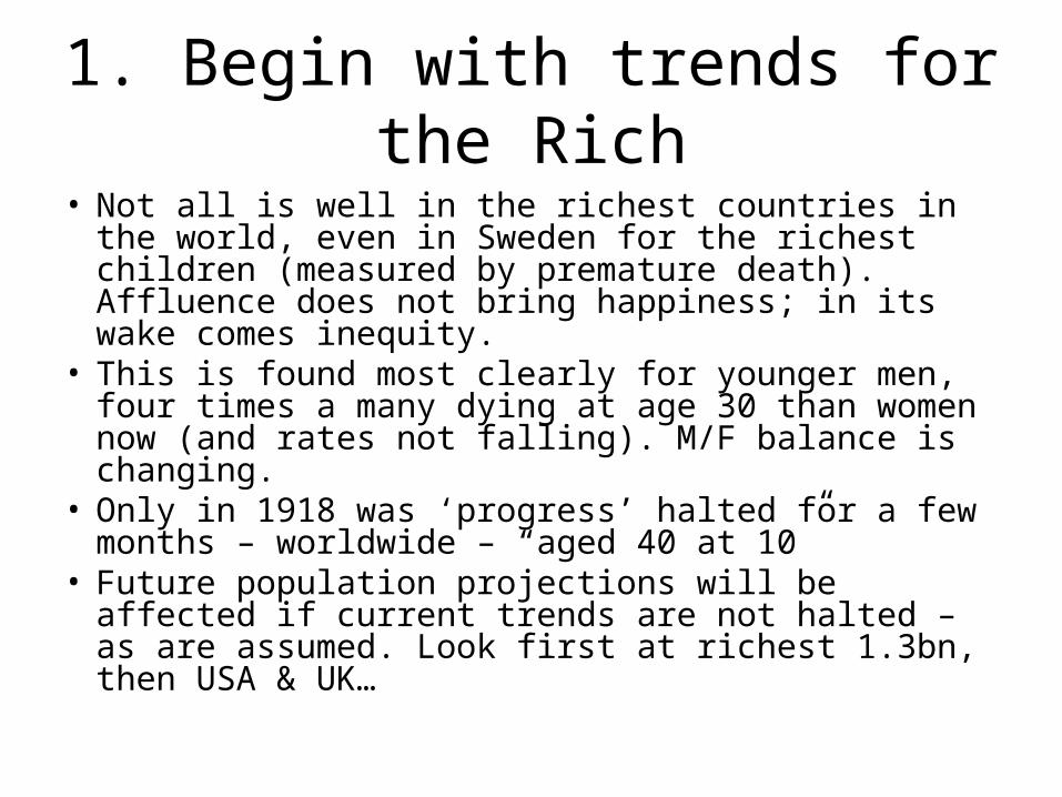
1. Begin with trends for the Rich
• Not all is well in the richest countries in the world, even in Sweden for the richest children (measured by premature death). Affluence does not bring happiness; in its wake comes inequity.
• This is found most clearly for younger men, four times a many dying at age 30 than women now (and rates not falling). M/F balance is changing.
• Only in 1918 was ‘progress’ halted for a few months – worldwide – “aged 40 at 10”
• Future population projections will be affected if current trends are not halted – as are assumed. Look first at richest 1.3bn, then USA & UK…
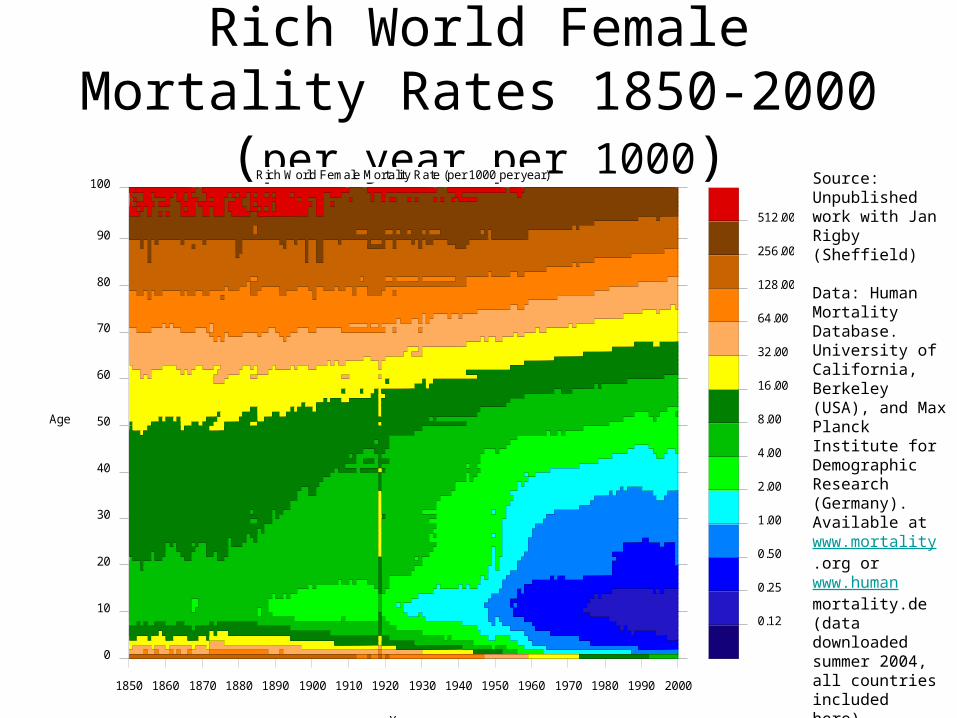
Rich World Female Mortality Rates 1850-2000 (per year per 1000)
0.12
0.25
0.50
1.00
2.00
4.00
8.00
16.00
32.00
64.00
128.00
256.00
512.00
1850 1860 1870 1880 1890 1900 1910 1920 1930 1940 1950 1960 1970 1980 1990 2000
0
10
20
30
40
50
60
70
80
90
100Rich World Female Mortality Rate (per 1000 per year)
Year
Age
Source: Unpublished work with Jan Rigby (Sheffield) Data: Human Mortality Database. University of California, Berkeley (USA), and Max Planck Institute for Demographic Research (Germany). Available at www.mortality.org or www.humanmortality.de (data downloaded summer 2004, all countries included here).

Rich World Male/Female Mortality ratios 1850-2000 (per year per cohort)
1.01.1
1.21.31.4
1.51.6
1.71.81.9
2.02.1
2.22.32.4
2.52.6
2.72.82.9
3.03.13.2
3.33.4
3.4
1850 1860 1870 1880 1890 1900 1910 1920 1930 1940 1950 1960 1970 1980 1990 2000
0
10
20
30
40
50
60
70
80
90
100Sex Ratio of Mortality, Rich World (male rate / female rate)
Year
Age
Source: Unpublished work with Jan Rigby (Sheffield) Data: Human Mortality Database. University of California, Berkeley (USA), and Max Planck Institute for Demographic Research (Germany). Available at www.mortality.org or www.humanmortality.de (data downloaded summer 2004, all countries included here).
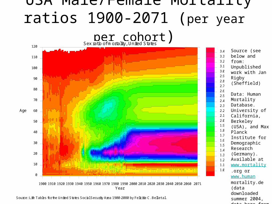
USA Male/Female Mortality ratios 1900-2071 (per year per cohort)
Source (see below and from: Unpublished work with Jan Rigby (Sheffield) Data: Human Mortality Database. University of California, Berkeley (USA), and Max Planck Institute for Demographic Research (Germany). Available at www.mortality.org or www.humanmortality.de (data downloaded summer 2004, data here from associated software).
1.0
1.11.2
1.31.4
1.51.6
1.71.8
1.92.0
2.12.2
2.32.4
2.52.6
2.72.8
2.93.0
3.13.2
3.3
3.4
1900 1910 1920 1930 1940 1950 1960 1970 1980 1990 2000 2010 2020 2030 2040 2050 2060 2071
0
10
20
30
40
50
60
70
80
90
100
110
120Sex ratio of mortality, United States
Year
Age
Source: Life Tables for the United States Social Security Area 1900-2080 by Felicitie C. Bell et al.
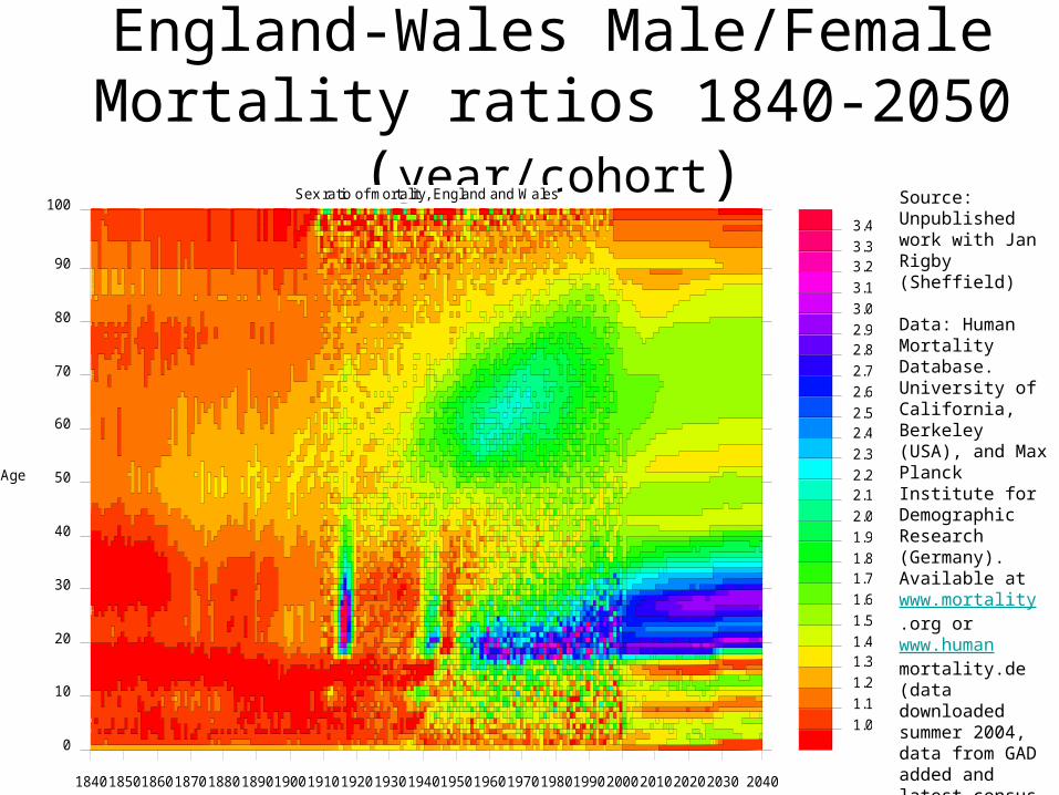
England-Wales Male/Female Mortality ratios 1840-2050 (year/cohort)
Source: Unpublished work with Jan Rigby (Sheffield) Data: Human Mortality Database. University of California, Berkeley (USA), and Max Planck Institute for Demographic Research (Germany). Available at www.mortality.org or www.humanmortality.de (data downloaded summer 2004, data from GAD added and latest census and MYE figures checked).
1.0
1.1
1.2
1.31.4
1.5
1.6
1.71.8
1.9
2.0
2.12.2
2.3
2.42.5
2.6
2.7
2.82.9
3.0
3.1
3.23.3
3.4
18401850186018701880189019001910192019301940195019601970198019902000201020202030 2040
0
10
20
30
40
50
60
70
80
90
100Sex ratio of mortality, England and Wales
Year
Age

2. Housing and Wealth
• Know your placeResearch done in partnership with Shelter
Bethan Thomas & Danny Dorling, Social and Spatial Inequalities Research Group, University of Sheffieldhttp://www.shef.ac.uk/sasi/
“It isn't fair if the only people who can afford their own homes are the children and grandchildren of land- and homeowners before them. “ Yvette Cooper, Minister for Housing and Planning, These Nimbys have gone Bananas, The Guardian, 18 October 2005
Where we are going…..
It is not an exaggeration to claim that we are moving towards a situation in which this country’s children will be divided more by wealth than has been the case since at least Victorian times. For the children of the poor there will be large parts of the country to which they cannot consider moving in the future even if they should wish to. When they have problems in their lives there will not be recourse to family wealth to bail them out, to help with a time when they cannot work or find work, to help pay their way through university studies (for the minority from poor areas who go) without working as well, to help when they have children of their own and so on. For some a government baby bond will mature when they are 18 years old giving them a few thousand pounds that is significant to them but insignificant in the wider context.
For children, wealth and in particular housing wealth is a national lottery of their accident of birth. Increases in direct income taxation, in inheritance tax, in benefits paid to the poor would have little influence on the results of this lottery given the sums of money involved and the abilities of the wealthiest families through trusts and other means to avoid such redistribution. Any action to reduce housing wealth inequality would have to be far more radical than is currently politically acceptable to be effective. Given that, perhaps we should expect the future to be one of 100-fold inequalities in housing wealth. If you are reading this and have children there is a good chance that your children will be among the tenth of the population who can expect, in the future, to have recourse through their wider families to more than 100 times the housing wealth of those children growing up in the poorest parts of the country. Try to imagine the type of society they will be living in when they are your age, or their grandparents’ age.

Inner LondonOuter London
ManchesterLiverpool
Sheffield
Newcastleupon Tyne
Birmingham
Leeds
Bristol
Plymouth
Brighton
Nottingham
Cardiff
EdinburghGlasgow
OuterLondonInner
London
Leeds
Bristol
Birming
ham
Edinburgh
Sheffield
Newcastle upon Tyne
Glasgow
Cardiff
Liverpool
Man
ches
ter
Nottingham
Plymouth Brighton
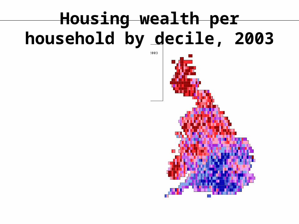
wealth per h/hold 2003331784619058035689878424095428101144113574133513173773
Housing wealth per household by decile, 2003

wealth per child 200311671174642239126993318653695242702494355964782490
Housing wealth per child by decile, 2003
3. From what is exclusion?
• Social exclusion, defined by breadline and PSE surveys, rose in Britain from a low point in 1968 (maybe), to 14% in 1983, 21% in 1990 and 24% by 1999 (Gordon et al. 2000).
• Over the same period affluence rose greatly and a growing proportion of the population, by definition, will have also become excluded from normal society by riches, but this group is largely ignored and unmeasured.
• To understand what the poor in the future may be excluded from we need to consider trends in the affluent – here in access to higher education, to excessive income, to incredible wealth, and to unprecedented levels of health. The affluence epidemic changes the context in which social exclusion is understood.
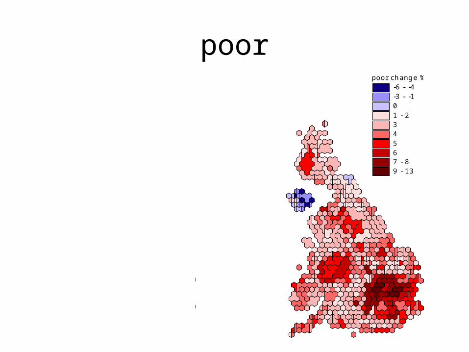
poorpoor 2001 %
13 - 1617 - 1819 - 2122 - 2425 - 2728 - 3132 - 3435 - 3738 - 4041 - 47
poor change %-6 - -4-3 - -101 - 234567 - 89 - 13

What is wealth? – undergraduate student’s definition:
• Q6. Please look at the following list of living standards. Tick box ‘A’ for each that you feel is a necessary requirement to be considered rich, tick box ‘B’ for those that you feel are desirable and tick box ‘C’ if you don’t know.
•
Box A Box B Box C
• • Have hired help
• Own a second home• Eat out whenever you want• Donate regular amount of money to charity• Have a job• Others in the family have a job• Live in rural areas• Have a large, detached house• Have a savings account• Travel first class• Afford to retire early• Have a pension• Afford the latest consumer technology eg.
DVD player, iPod, new computer • Afford for children to participate in as many
extra curricular activities as they want
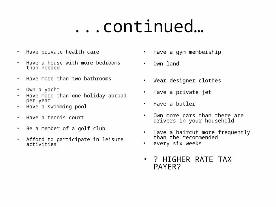
...continued…• Have private health care • Have a house with more bedrooms than
needed
• Have more than two bathrooms
• Own a yacht
• Have more than one holiday abroad per year
• Have a swimming pool
• Have a tennis court
• Be a member of a golf club
• Afford to participate in leisure activities
• Have a gym membership
• Own land
• Wear designer clothes
• Have a private jet
• Have a butler
• Own more cars than there are drivers in your household
• Have a haircut more frequently than the
recommended • every six weeks
• ? HIGHER RATE TAX PAYER?
Wider definition, inequalities in education
• High compared to the past (17+ v 11+)
• Slow changing and, if you believe different universities are of different value then almost certainly widening (as growth as been mostly in the post 1992 group)
• Staring university social scientists in the face (or should be as we are gatekeepers)
• Not yet replicated at 21+; but will be.

Educational divides (wealth) in access to
Higher Education in the UK Young Participation in Higher Education
1997-2001
By constituency
Mark Corver, HEFCE, 2005
Report was published in January

European Constituencies with height proportional to 1/HE entry
Source: Human Geography of the UK, London: Sage, February 2005
The Education Landscape
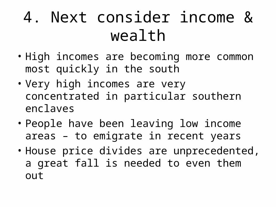
4. Next consider income & wealth
• High incomes are becoming more common most quickly in the south
• Very high incomes are very concentrated in particular southern enclaves
• People have been leaving low income areas – to emigrate in recent years
• House price divides are unprecedented, a great fall is needed to even them out
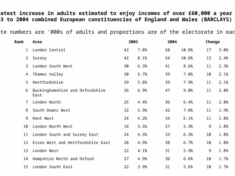
Greatest increase in adults estimated to enjoy incomes of over £60,000 a year by area2003 to 2004 combined European constituencies of England and Wales (BARCLAYS)
(Note numbers are ‘000s of adults and proportions are of the electorate in each year)
Rank Area 2003 2004 Change
1 London Central 42 7.8% 58 10.8% 17 3.0%
2 Surrey 42 8.1% 54 10.6% 13 2.4%
3 London South West 30 6.3% 41 8.6% 11 2.3%
4 Thames Valley 30 5.7% 39 7.8% 10 2.1%
5 Hertfordshire 29 5.8% 39 7.9% 11 2.1%
6 Buckinghamshire and Oxfordshire East 36 6.9% 47 9.0% 11 2.0%
7 London North 25 4.4% 36 6.4% 11 2.0%
8 South Downs West 32 5.9% 42 7.8% 11 1.9%
9 Kent West 24 4.2% 34 6.1% 11 1.8%
10 London North West 18 3.5% 27 5.3% 9 1.8%
11 London South and Surrey East 24 4.5% 33 6.3% 10 1.8%
12 Essex West and Hertfordshire East 28 4.9% 38 6.7% 10 1.8%
13 London West 22 4.1% 31 5.9% 9 1.8%
14 Hampshire North and Oxford 27 4.9% 36 6.6% 10 1.7%
15 London South East 22 3.9% 31 5.6% 10 1.7%
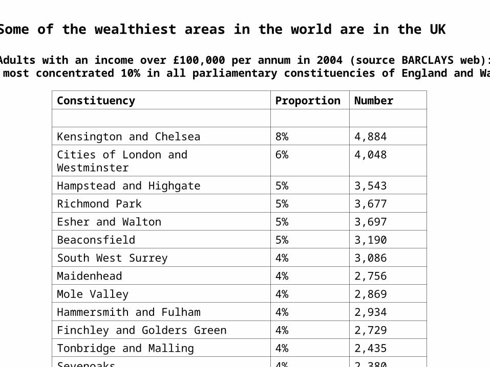
Some of the wealthiest areas in the world are in the UK
Adults with an income over £100,000 per annum in 2004 (source BARCLAYS web): most concentrated 10% in all parliamentary constituencies of England and Wales
Constituency Proportion Number
Kensington and Chelsea 8% 4,884
Cities of London and Westminster 6% 4,048
Hampstead and Highgate 5% 3,543
Richmond Park 5% 3,677
Esher and Walton 5% 3,697
Beaconsfield 5% 3,190
South West Surrey 4% 3,086
Maidenhead 4% 2,756
Mole Valley 4% 2,869
Hammersmith and Fulham 4% 2,934
Finchley and Golders Green 4% 2,729
Tonbridge and Malling 4% 2,435
Sevenoaks 4% 2,380
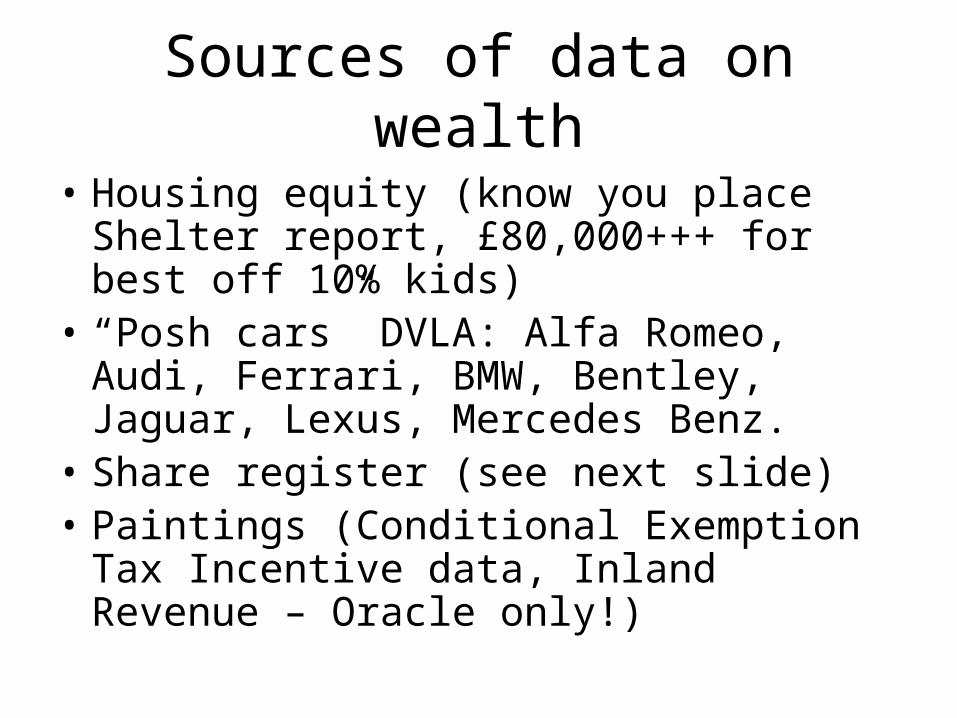
Sources of data on wealth
• Housing equity (know you place Shelter report, £80,000+++ for best off 10% kids)
• “Posh cars” DVLA: Alfa Romeo, Audi, Ferrari, BMW, Bentley, Jaguar, Lexus, Mercedes Benz.
• Share register (see next slide)• Paintings (Conditional Exemption Tax
Incentive data, Inland Revenue – Oracle only!)
Private shares - total ownership (£)
52,656 - 3,258,572
3,258,573 - 5,892,776
5,892,777 - 9,797,060
9,797,061 - 16,399,039
16,399,040 - 38,286,815
Shares 1990
5. Poverty, worldwide and local
• Rising wealth in the UK coincides with absolute increases in poverty in Africa and Eastern Europe, little progress elsewhere
• The greatest rise in poverty in the UK is in London, faster than for perhaps a century
• Across the UK the countryside within commuting distance of cities has been loosing its poor – social exclusion now includes exclusion from city hinterlands.
• First a few world cartograms
Population year 2002
Births 2002

HIV/AIDS 2002

Toys Imported ($)

Sewerage connected

Containers loaded

Crude exported
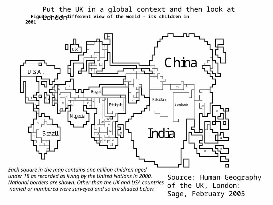
Figure 3.1 A different view of the world - its children in 2001
26
3 17
6 34
2
19
20
U.S.A.
11
12
31
32
33
35
3627
28
29
37
14
18 2221
11India
Bangladesh
Pakistan
11
Nigeria
1
13
10
9
25
8
30
5
23
154
China
Egypt
11
Brazil
u.k
7
24
Ethiopia16
Each square in the map contains one million children aged under 18 as recorded as living by the United Nations in 2000. National borders are shown. Other than the UK and USA countries named or numbered were surveyed and so are shaded below.
Put the UK in a global context and then look at London
Source: Human Geography of the UK, London: Sage, February 2005
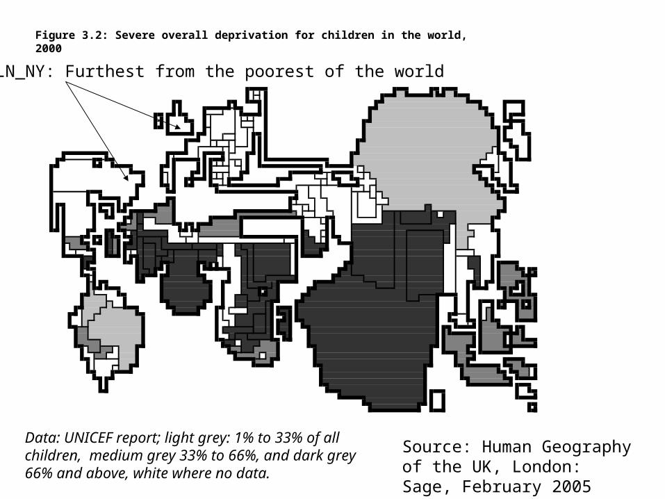
Figure 3.2: Severe overall deprivation for children in the world, 2000
Data: UNICEF report; light grey: 1% to 33% of all children, medium grey 33% to 66%, and dark grey 66% and above, white where no data.
Source: Human Geography of the UK, London: Sage, February 2005
LN_NY: Furthest from the poorest of the world
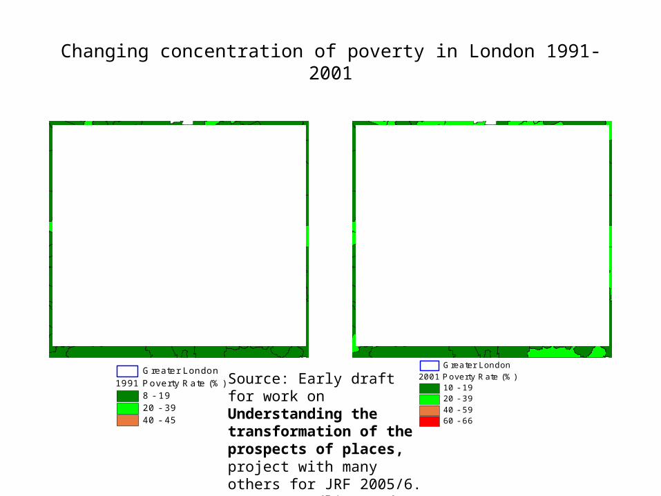
Changing concentration of poverty in London 1991-2001
1991 Poverty Rate (%)8 - 1920 - 3940 - 45
Greater London2001 Poverty Rate (%)
10 - 1920 - 3940 - 5960 - 66
Greater London
Source: Early draft for work on Understanding the transformation of the prospects of places, project with many others for JRF 2005/6. Data: Breadline and PSE surveys + censuses
6. US-UK comparisons – recent comments in several reviews
• I find claims the UK should “look to America” for good policy ideas unconvincing.
• A better case might be made by drawing on recent evidence that the US and the UK are two of the most unequal rich societies in the world and so we should look to each other’s failures rather than what we suppose are our successes in this area (which are few in comparison to say Canadian, Scandinavian or other European, or even Japanese, Australian or New Zealand examples!).
• Its hard to think of any two large countries in the rich world which have a worse recent record in social policy. An outside observer might find their looking at each other for signs of how to improve - a sign that we should expect little to improve in the near future as the UK and US are clearly looking in the wrong places
• Similarly current UK government’s interest in US policy on poverty is bizarre.
Just one example of a comparison
• Many of the comparisons being made between the UK and the US read as a tale of two tragedies.
• For instance, suggesting that it is telling that only 11% of people in the poorest parts of Detroit live on benefit as compared to 40% in similar areas in Liverpool is naïve in the extreme. If the US moves just a little further in the direction that its current administration is taking it then the proportions of people in Detroit living on benefits will fall further still (and even more will die young in Detroit).
• It is thus silly to suggest that, as it least one recent review does “The scale of area deprivation in cities like Liverpool likely relates to their much larger concentrations of social housing…”.
• Social housing does not make people poor.• The decline of Liverpool over the very long term is however linked to
the US (cotton, shipping, empire and slaves).
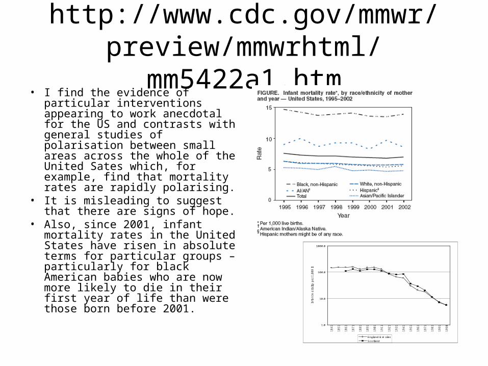
http://www.cdc.gov/mmwr/preview/mmwrhtml/mm5422a1.htm
• I find the evidence of particular interventions appearing to work anecdotal for the US and contrasts with general studies of polarisation between small areas across the whole of the United Sates which, for example, find that mortality rates are rapidly polarising.
• It is misleading to suggest that there are signs of hope.
• Also, since 2001, infant mortality rates in the United States have risen in absolute terms for particular groups – particularly for black American babies who are now more likely to die in their first year of life than were those born before 2001. 1.0
10.0
100.0
1000.0
18
41
18
51
18
61
18
71
18
81
18
91
19
01
19
11
19
21
19
31
19
41
19
51
19
61
19
71
19
81
19
91
19
98
Infa
nt
mo
rta
lity
pe
r 1
,00
0 liv
e b
irth
s
England & Wales
Scotland
For researchers in the UK we need to be careful
• For example even when a bland phrase such as this appears “...in a country like the United States, where housing is generally regarded as a privilege rather than a right”… it is worth stopping and thinking whether that the world contains such a rich nation that behaves in this way should be lamented and challenged not accepted or “understood”.
• I cannot see how the US serves as more than a warning of what we in the UK may become
7. Conclusion
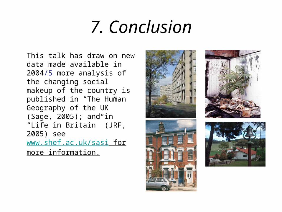
This talk has draw on new data made available in 2004/5 more analysis of the changing social makeup of the country is published in “The Human Geography of the UK” (Sage, 2005); and in “Life in Britain” (JRF, 2005) see www.shef.ac.uk/sasi for more information.