the evolution of blenders user...
TRANSCRIPT

1
The Evolution of
Blenders User Interface
November 2008 ● W i l l iam Reynish ● wi l l [email protected]

Analysis 3
The Good 4
The Bad 7
Design Goals 9
Properties 11
Tools 17
Context Sensitivity 19
Multiple Objects 20
Feedback 21
Drag and Drop 22
Graphic Design 22
Wrap up 25
2

This paper takes a look at Blenders past, present and future evolution. Blenders non-overlapping, single-window design has won many over, and inspired other applications, such as Apple’s Motion and Luxology’s Modo. However, over the years several inconsistencies and problems have risen. The upcoming release of Blender 2.5 is a perfect time to make a clean cut, and implement a more modern, flexible, yet easy to use interface, keeping key advantages of the current UI.
Such a change will increase it’s attractiveness in professional environments, and make it easier to integrate into more workflows. This paper will discuss the challenges ahead, and also provide concrete proposals for solutions going forward.
AnalysisBefore we start making changes to the user interface of Blender, it’s important to thoroughly
understand the current usage model, and how Blenders UI evolved into what it is today. Originally, Blender was designed and built as an in-house tool for artists in a small animation studio in the Netherlands. This influenced the UI design greatly, because the application developers were also the users, and the application was designed to fit the needs ad workflow of a small studio working tightly together. As mentioned on blender.org, these key decisions were part of the original Blender design:
• It should be as non-modal as possible, and let the user access any part of the application instantly - optimal for solo artists and small studios who need to multitask.
• It should employ non-overlapping windows in a subdivision-based structure, to free the artists from moving windows around on the screen, and covering up content.
• It should be fast and efficient, use consistent hotkeys and conventions, that don’t change depending on context.
• It is designed to be an integrated tool, with all aspects of production being handled solely by Blender, thus allowing for optimized workflow that does not require jumping back and forth between several apps.
In other words, right from the start Blenders UI strove to deliver non-modality, flexibility and speed, as well as a sense of thinking different about user interfaces. Since it was an in-house tool, trying new ideas was cheap, an since they themselves were the entire user base, they were able to test for efficiency immediately.
While other applications have chosen to split up the workflow into different modes (see Softimage XSI ‘rooms’, Cinema 4D plugins) or even separate applications (see Lightwave, with its Modeler and Layout modules), Blender was designed to be deeply integrated in both its data structure, and also in the user interface, because it lets the user visualize and edit any part of the content data at any time. This principle is what makes Blender fast, because inter-application communication (importing, exporting, and readjusting to different apps) is a slow process. Once you get everything tightly integrated together, artists can work faster and more efficiently.
3

fig 01: Blender 2.48 multitasking example with animation and rendering happening simultaneously.
The GoodBefore moving on to specific proposals for change, let’s first acknowledge the main aspects of
Blenders UI that really work well, and needn’t be altered.
First is the use of non-overlapping windows. In complex applications like 3D content creation, having multiple views on your data is necessary. Managing that many separate windows would be highly inefficient, because the more time the artist has to spend managing the UI, the less time she has to actually work in the content.
fig 02: showing the convoluted nature of many floating windows compared to the simplicity of a non-overlapping UI.
4

Next is non-modality. Modality in user interfaces is bad for a number of reasons. Jef Raskin, creator of the original Macintosh user interface and author of The Humane Interface, effectively explains why:
“We cannot routinely pay attention to both system state (or mode) and our task at the same time, which leads to performing a gesture appropriate to one mode (for example, in one application) while we are actually in another mode (say, at the desktop). To eliminate this difficulty we must abandon the inherently modal desktop-and-applications style interface that is now prevalent.
[...]
A human-machine interface is modal with respect to a given gesture when (1) the current state of the interface is not the user's locus of attention AND (2) the interface will execute one among several different possible responses to the gesture, depending on the system's current state." (Raskin, The Humane Interface)
In other words, a modal interface forces the user to concentrate on what state the application is in, before she can perform an action. It moves the users locus of attention away from the content she wishes to create, and to the tool itself.
Modality can refer not only to the obvious use of modes within Blender, such as Object, Edit and Pose Mode, but also to how the user interacts with the system at a deeper level. In some 3D applications, changing a material property might force the user to open a separate window that blocks the users view, change some settings, and drop them back into the main application at the end. The changes take effect only after she is finished changing them and presses ‘OK’. This is a modal workflow, because it takes the user out of the current context, and puts her into a different, temporal one, and it is obvious why workflows like this are highly inefficient, because you have to keep switching context, and your locus of attention lies on the program, not the content, and there is significant overhead in the context switching itself.
Right from the start, the Blender user interface was designed to overcome this type of modal interaction. Instead of entering another context or mode to change material properties, you simply go to the Material properties in the Buttons Window, make your changes, and that’s it. Changes take effect immediately. There is no need to switch context, and no need to click ‘OK’ either.
OK
Material Settings
Material
fig 03: The diagram on the left shows what Blender doesn’t do. On the right you can see how changing
material settings happen on the same level as changing other parts of the content.
Because of Blenders modeless approach, it is possible to be doing all of these things at once, without switching applications, or jumping in and out of contexts:
5

Material
Animation
ModelingUV Unwrap
Compositing
Third is consistency. Blender is designed heavily with consistency in mind, which is important because it takes advantage of the basic human ability to develop habits, and user interfaces can exploit that. So once you get into the habit of using one area of the application, you can gracefully move onto another part with minimal hassle, because the user can reuse the knowledge and habits she has already acquired. One example of consistency in Blender is the hotkeys: In the 3d View you use G and S on the keyboard to grab and scale, respectively, and this convention is prevalent throughout Blender: in the UV Editor, the IPO Editor, the Sequence Editor - even the Node Editor. This reuse of conventions is all over the place in Blender and makes it easier to learn, but also faster to use, because the user isn’t switching context, and doesn’t have to re-adapt every time a new editor is used.
The last strong aspect of Blenders UI that is worth mentioning is its cross-platform nature. The UI is coded using the OpenGL graphics APIs, normally reserved for 3d graphics. Since OpenGL is implemented in the system architecture of all the major platforms, it means that Blenders look and feel is exactly the same weather you are using a Mac, running Linux, Windows or even Suns Solaris. This makes Blender the single most portable 3d application, being available on more operating systems than any other.
The benefit for the user is that even if she works in a multi-platform environment, she can count on Blender to always behave the same way. So if the user owns a Linux workstation, a Windows desktop and a Mac laptop, switching between the three will be seamless, again minimizing the need to concentrate on context (in this case operating systems).
Mac OS XLinux Windows
fig 04: Blender running on multiple operating systems, yet looking exactly the same.
6

All of these qualities that have just been covered are ones that make Blender stand out amongst the crowd, and what makes is a great tool for artists. These are the main qualities that must be kept going forward.
The BadThe list of design features we’ve just covered shows that at the very basic level, the user interface
of Blender is very well crafted, and highly efficient. But as we move on to look at the implementation of these basics at higher level in the UI, we start to see some problems. I’m going to use the Editing buttons panel as an example:
fig 05: The Mesh tab in the Buttons Window.
The design and layout of buttons and fields here is absolutely terrible - nothing less can describe it. First of all it is illogical. It is not at all communicated that the Corner Cut drop-down menu (Innervert is currently selected in the screenshot) applies only to Fractal and Subdivide, neither is it communicated that the Limit number field relates to Rem Doubles, nor is it clear that Threshold applies to none of the tools visible in this panel (It applies to the Select Similar command found elsewhere).
Apart from being illogical, it is also inconsistent: Some of the mesh editing tools are only found in this panel, others are found in the mesh editing menu in the 3d window, yet some of these are found both places, and some of them not. Some features accessible from the Mesh menu have settings for it in the Mesh panel.
7

This illogical inconsistency is bad for productivity, because the user cannot count on related features being available in one place. She has to spend time searching around in the interface, finding the tools needed.
The next problem visible in this panel is that it includes a variety of very disconnected entities. First, there are some settings, that let you alter a list of properties on the selected mesh (Auto Smooth, Double Sided etc.). Then there is a collection of tools, that let you modify the mesh itself, and lastly there are some tool settings that let the user change the way tools work.
Settings
Tools
Tool Settings
fig 06: The Mesh tab includes very disconnected items.
Having these different types of items cluttered together is both counter-intuitive and counter-productive, because it makes the Buttons Window exactly what the name says: a collection of buttons, fields and sliders that are arbitrarily collected and dumped in one place. Inconsistent design like this kills productivity, as Jef Raskin nicely explains:
“When we set about learning any interface feature that is new to us, we proceed in two phases, the first of which gradually grades into the second. In the first, or learning, phase we are actively aware of the new feature, and seek to understand and master it. If that feature is well–designed, and if we use it repeatedly, we eventually enter the desirable second, or automatic, phase, in which we have formed a habit, and use the feature habitually, without thought or conscious effort.
Interface features are created to help you accomplish some task. If a feature forces you to stop thinking about your task and begin paying attention to the feature (an egregious case is where the software crashes, but even a momentary difficulty can derail your train of thought) then it is said to interfere with the task, and you have not entered the automatic phase with respect to that feature. Creating interfaces that allow users to develop automaticity across all tasks should be a primary goal of interaction designers. Such interfaces will be easier to learn and use, more productive, and far more pleasant than what we have today.”
It should be our goal to create and clean system where the user can predict where to find features, so that he/she can develop automaticity.
8

The last aspect I wish to cover is an example of something that is unnecessarily complicated: editing multiple objects. I’ll give an example. Let’s say the user decides she would like to view all her objects with a wireframe overlay.
With one object it is simple: The user presses the Wire button under Draw Extra in the Object tab. But with multiple objects it becomes a complicated process. Either the user must select each object in sequence and make the desired changes each time, which is fine if you have three monkeys in your scene, but not practical if you have 300. The other way is that you can copy a set of attributes from the active object to all other selected object, using Ctrl+C, but the problem with that is that only some settings are available for copying, and also that it is an extra step, taking the locus of attention away from changing settings, and instead concentrating on getting the program to copy settings you have already made to other objects.
fig 07: Working the multiple objects - a nightmare if you have too many.
It is actually also inconsistent with Blender itself: It happens that actions already allow you to work in multiple objects at a time. Deleting, duplicating, transforming etc already applies to as many objects as you would like.
The aforementioned items are examples of some of the weakest spots in Blenders user interface. The Buttons Window is often unorganized, inconsistent and illogical, and there are plenty of other improvable areas, such as multi-object editing, and other workflow improvements.
Design GoalsBefore we move on to discuss specific improvements, I’ll list a set of user interface ideals on
which to base the changes on. Blenders user interface should aspire to be:
• Non-modal, ensuring minimal context switching and a smooth workflow.
• Non-linear, so users can perform actions in any order they choose.
• Logical, exploiting human nature to eliminate searching around in the user interface.
• Fast, allowing direct manipulation for speedy workflow without jumping through hoops to accomplish tasks
• Flexible. It’s always better to offer a few flexible tools that do many things than a host of complicated tools to only do one thing.
9

• Innovative, providing solutions out of the ordinary, and not be encumbered by history.
• Simple. The Keep It Simple Stupid mantra very much applies to user interfaces.
With that in mind, Blender 2.5 is the perfect time lay a strong foundation for the future; one that won’t need to change anytime soon, one that can adjust to changes and additions of features. We must also make a clear separation between tools, tool settings and properties, add much clearer visual feedback, so that the user always knows what is going on - especially when she must wait. There also has to be a focus on ease of use. Jef Raskin writes:
“In spite of a commonly-believed myth to the contrary, we are not novices or experts with regard to whole systems or applications, but go through the learning and automatic phases more or less independently with regard to each feature or set of similar features. If learning one of a set of features makes you automatic on the entire set, or greatly decreases the time it takes to become automatic on the rest of the set, we say that the set of features exhibits consistency.”
Through added consistency, and a more logical design, we can improve ease of use at the same time as increasing speed. There has been a notion though, that ease of use is only applicable to so-called ‘noobs’, but as Raskin mentions, that definition is flawed. Also, ease of use is at least as important to professional users as it is to hobbyists. In fact, pros have even less time for searching around for features, and cannot waste time with inconsistent quirks that move their locus of attention away from their work.
Lastly, I’d like to address another misconception, this time about customizability. There has been a notion that the solution to most of the UI problems can be solved with added customizability. The notion goes that if the UI is inefficient, the user can simply customize it herself to suit her needs. This claim is wrong for several reasons:
• It is impossible to customize something you have not fully comprehended yet, so it in no way helps the learning process.
• It makes an application less predictable, because the user cannot rely on the application to always act the same.
• It takes focus away from the users content, and over to managing the application itself, which is what we wanted to avoid in the first place.
• It undermines the portability of Blender, because you cannot rely on Blender functioning the same way across different systems.
• Customizability does not equate to flexibility.
• 99% of Blenders user will use the default setup anyway.
This is not to say that customizability is always bad - having the ability to change the hotkeys from the defaults to match another 3D application such as Maya or Softimage XSI can make it easier for users of those applications to adapt to Blender. But, with any customizability, it is absolutely
10

essential that the defaults are sane. Customizability can be good, but does not solve any fundamental problems.
From here on I will discuss concrete proposals for improvement in the Blender user interface.
PropertiesThe main focus in this documents’ criticizing of Blenders UI has focused on shortcomings of the
Buttons Window, and that is why the primary proposal revolves around it. Let’s revisit the Mesh tab we used as an example earlier:
All of the inconsistent, illogical and counter-intuitive aspects of the design in this panel exist because two things:
1. A lack of focus and attention on UI design among developers.
2. Because all panels must adhere to this rule:
The panels have to be square.
The reason why all panels have had to employ equal dimensions is that they can then be stacked either horizontally or vertically.
11

fig 08: Panels can be stacked either horizontally or vertically.
On the surface it seems like this is nice, but the problem is as follows: Panels are based on groups of controls and related features, and so not all panels require an equal amount of content. That means that some panels are very sparse while others are very dense, with lots of tiny buttons crammed together because of space constraints.
Few controls
Many controls
fig 08: Not all panels have equal amounts of controls.
This is what has led to the catastrophe that is the current Buttons Window, because developers are no longer thinking about what context to put a button in, but rather where there is physical space. And, once buttons are places in the UI, not because of logical reasoning, but because of physical ramifications we get the confusing, inconsistent and illogical layout in panels we have today.
This not only makes it hard for the user to find what he is seeking, but it undermines the entire point of having panels at all. Matt Ebb, main author of the user interface changes in Blender 2.3 writes:
“...buttons are so spread out over the entire window that doing what should be a straightforward task such as setting up a render takes a round trip backwards and forwards all over the buttons window. Not only does this require an excessive amount of mouse-hunting and scan-reading, searching around the screen, but it makes it difficult to hide things that are not interesting. Closing a panel to hide away some
12

buttons that a user's not interested in would also hide away completely unrelated buttons, which a user may have wanted to keep open.“
The solution to all these problems are variable height. By varying the height of panels, they can properly accommodate the content they include, which allows for much more logical, consistent (and therefore fast and efficient) layouts of controls. Variable height also makes Blender more future-proof in that it allows developers to easily expand panels to accommodate growing feature sets.
fig 09: Fixed panels on the left vs variable height on the right.
There is one caveat to having variable height though: It is incompatible with horizontal layouts. There is no good way to put panels of varied height side by side, without either wasting space or spilling content out of the screen space, and in fact you will see that some panels already employ this variable height paradigm in Blender. Content that is dynamic, such as constraints and modifiers, are especially applicable to using variable height, and so already do.
fig 10: Panels with variable height incompatible with horizontal layouts.
13

fig 11: Examples of panels already employing variable height.
In effect it means that horizontal button layouts are already deprecated from the user standpoint - it already is near impossible to work with constraints, modifiers, or lists of bones using horizontal buttons.
The main problem with moving away from horizontal buttons is that some users may have developed automaticity with this layout (they use it habitually), and change means relearning, but in Blender 2.5 so much is changing anyway. Once horizontal button layout is sacrificed, it will allow a cleaner, more consistent and logical design that can carry Blender into the future.
It also happens that stacking lists of items vertically is actually easier to skim through for the user, because you can skim down a list of left-aligned text with ease. Matt Ebb, having studied typography, explains below:
“Words in most European languages are generally shaped rectangularly [=====], which means that the most condensed layout is stacking them one on top of the other. In this situation, the eye can just track down a consistent line on the left, quickly identifying the shapes of the start of words. If these words are next to each other horizontally, the distances between them are inequal, and the eye must skip over each word, reading them all left to right in order to find the next one. It's much faster to skim, especially when you consider word recognition by identifying the word's shape rather than the next stage of deconstructing it into characters. This is pretty fundamental typography/layout theory.“
This is also the reason why columns in newspapers are vertical. It is far quicker to scan through, and easier to read.
Lastly, vertical panels are more fitting to the growing number of widescreen monitors. With a vertical panel layout on the side of the screen, the rest of the view still has a workable aspect ratio, whereas using horizontal panels on widescreen monitors results in the rest of the view becoming super-widescreen, wasting space.
14

View Properties
fig 12: A modern, widescreen display, with Properties on the side.
Next, we’ll look at the content of the Buttons Window. Currently it includes four groups of functionality:
Tools A tool is defined as a feature that needs additional user input. One that does not perform a task by itself, but can be used by the user to do so. As such, a tool may be active for a period of time, until the user is finished using that tool.
(examples: Transform, Extrude, Subdivide, Spin, Bulge, Draw, Bevel, Mirror etc.)
Tool Settings These options relate to the tool currently in use, and let the user set the axis of operation, or the steps in a subdivide, etc.
(examples: Degree:, Steps: etc.)
Actions Actions are commands that take effect immediately, and are never active.
(examples: Delete, Set Smooth, etc)
Properties Properties represent the bulk of the Buttons Window, and are values (radio buttons, checkboxes, number fields and lists) that are store in datablocks for linking and reuse. In 2.5, all properties will become animatable, so each value has a unique IPO-curve.
(examples: Materials, Particles, Constraints, Bones, Modifiers etc.)
Although these groups are very disconnected in their use, they are all dumped in the Buttons Window, and to chaotic effect. By separating out these different entities, we can achieve a much more transparent and clean user interface, again allowing for faster usage and easier learning.
15

This means that the Buttons Window as we know it will cease to exist. Instead, it can be replaced by a Properties Editor.
fig 13: The Properties Editor, showing Object properties.
This new window type will allow users to edit any value in the scene, and include settings for:
• Object transformations and display (stored in the Object datablock)
• Constraints (stored in the Object datablock)
• Modifiers (stored in the Object datablock)
• Mesh settings and UV layers (stored in the Mesh datablock)
• Materials (stored in the Material datablock)
• Textures (stored in the Texture datablock)
• Physics (stored in the Object datablock)
• Particles (stored in the Particles datablock)
• Scriptlinks (stored in the Object datablock)
• World (stored in the World datablock)
• Render (stored in the Scene datablock)
16

In order to remove as much clicking as possible, none of these categories should be made a sub-context of another. This means the tabs can stay fixed in their position, which is optimal for exploitation of human muscle memory, because the user will always know where to click, even without looking.
The exact layout of the buttons should also stay as fixed as possible, without moving around on the screen. Microsoft Word is a example of how moving menu items, that disappear randomly can cause terrible headaches. In order to take advantage of muscle memory, and to ensure a reliable user interface, the panels should never move around or change order (except if the user explicitly wants to do this), and the buttons within them should never pop up or disappear. Instead, they can be grouped logically, with disclosure triangles, so the user can remove panels she is not focusing on.
For information about good practices regarding button layout within the panels, I’ll refer to the Buttons Information Architecture analysis, available here:
http://wiki.blender.org/index.php/ButtonsIAGuidelines
http://wiki.blender.org/index.php/BlenderDev/UIAlignRulesGuides
http://wiki.blender.org/index.php/BlenderDev/DependGuide
Tools
Object
CreateTranslateMirroretc...
Sculpt
DrawBulgeIn!ateetc...
Mesh
TranslateSubdivideExtrudeetc...
Curve
TranslateSubdivideExtrudeTiltetc...
fig 14: Examples of tools available in blender.
Tools are defined as features that are active for a period of time, requiring additional user input, and this is why they need special thought regarding their placement in the UI. The main problem with the tools currently available in Blender today, is that they are highly modal. When using the Loop Cut tool, the user is unable to interact with any other part of the application before she has finished using that tool. This creates an inflexible, linear workflow where the user can only do one thing at a time.
The situation is even worse for some tools that require the user to change the tool settings before she uses the tool. One example is the Spin tool, as well as adding new objects. The workflow goes like this:
17

Object > Setting > Action
The user selects an object, sets the tool settings, and initiates the tool. This creates a very slow and cumbersome workflow, because the user must decide in advance how many vertices a sphere will include, before adding it. This makes it impossible to experiment, but even worse, it forces the user to keep undoing her action, and trying again, until the desired effect is achieved, ultimately wasting lots of time.
fig 15: Examples of tools than enforce a object>setting>action workflow.
In order to fix this problem, the tools inside Blender must always obey a workflow like this:
Object > Action > Setting
Once the user is able to change the tool settings after initiating the tool, she no longer has to go back and adjust settings, and reinitiate the tool. She can simply select the tool, and make adjustments afterwards, with immediate visual feedback. Additionally it means that there is no longer a need to press ‘OK’ or to accept changes, because the tool is completely interactive.
18

Tools
Tool Settings
fig 16: Tools, with interactive tool settings below.
In these examples I’ve mostly used mesh editing tools as examples, but the same system should apply to modeling, object manipulation, sculpting, weight painting etc.
Context SensitivityAlthough modality and changing contexts are seen as counter-productive measures, it is very
important to optimize for those changes of context when they do occur. Examples of these changes of context are switching from object, edit and weight paint mode, and selecting different entities in the Outliner, or object types in the 3D View.
Currently there is a very low degree of context sensitivity: When a mesh is selected, the tab for manipulating lamp properties is still active (clicking it does nothing). This not only adds confusion, but it wastes space and adds unnecessary clutter to the UI.
The Outliner can very effectively be used as a context sensitive selection mechanism, because it includes not only objects, but also mesh datablocks, materials, modifiers and other groups of data.
19
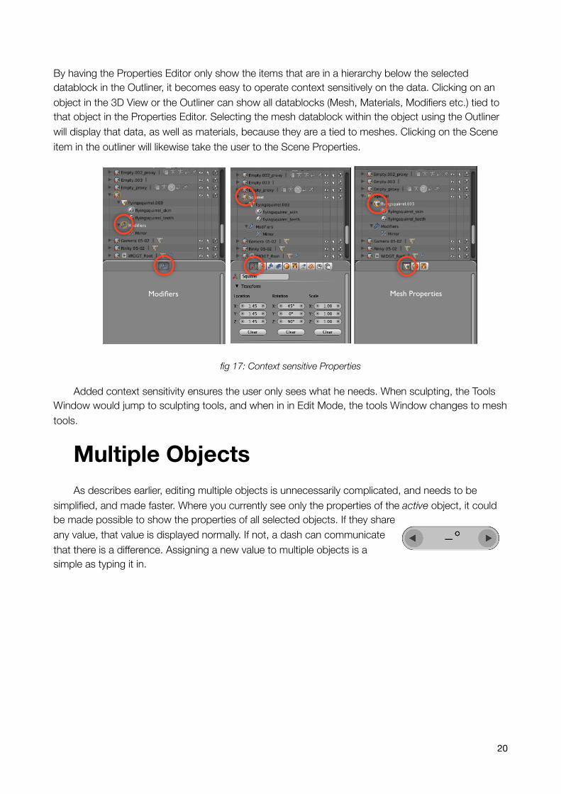
By having the Properties Editor only show the items that are in a hierarchy below the selected datablock in the Outliner, it becomes easy to operate context sensitively on the data. Clicking on an object in the 3D View or the Outliner can show all datablocks (Mesh, Materials, Modifiers etc.) tied to that object in the Properties Editor. Selecting the mesh datablock within the object using the Outliner will display that data, as well as materials, because they are a tied to meshes. Clicking on the Scene item in the outliner will likewise take the user to the Scene Properties.
Mesh PropertiesModifiers
fig 17: Context sensitive Properties
Added context sensitivity ensures the user only sees what he needs. When sculpting, the Tools Window would jump to sculpting tools, and when in in Edit Mode, the tools Window changes to mesh tools.
Multiple ObjectsAs describes earlier, editing multiple objects is unnecessarily complicated, and needs to be
simplified, and made faster. Where you currently see only the properties of the active object, it could be made possible to show the properties of all selected objects. If they share any value, that value is displayed normally. If not, a dash can communicate that there is a difference. Assigning a new value to multiple objects is a simple as typing it in.
20

fig 18: A properties panel with multiple objects selected. The buttons with stripes or dashes mean there is a difference across the selection. Radio buttons can even show which options are set among the selected
objects.
FeedbackThe purpose of a graphical user interface, at the most basic level, is to communicate to the user
what an application is doing. It serves as the communicator between the user and the features it includes. This is why feedback, or user communication, is important, and unfortunately Blender often isn’t very good at this. Feedback is most important whenever the user has to wait - during rendering, baking, physics calculations, mesh binding - and most of these actions fail to tell the user what is going on, how long the user must wait, and how far it has progressed.
fig 19 A simple progress bar, that is clear and easy to identify from across the room, when the user has gone to make coffee.
A standard application-wide progress bar that communicates how long the user must wait, and also what the user is waiting for, will make the periods of waiting less severe and obtrusive. It will also calm the user because she knows the app isn’t hanging or about to crash.
Other examples of areas in need for better feedback is pre-highlighting. Currently in Blender, buttons highlight when the mouse cursor hovers above them. This is good because it adds
21

predictability and a sense if assurance that clicking will indeed engage that button. Taking the same idea and applying it to objects, vertices, edges and faces in the 3d view will similarly improve predictability - especially in very dense areas of geometry where the user may not be sure what she is selecting.
Drag and DropThe great thing about drag and drop is that you take advantage of the physical metaphor of
actually dragging something. The advent of mice and cursors in the 80s made if possible to select something on the screen, not by typing the name, not by picking it from a list, but by clicking on it directly. This type of direct manipulation is far faster than list-selection and assignation because you don’t need to memorize an object’s name, and also because there is less interface needed. You don’t need a list to look up in, for example.
While Blender uses direct mouse clicking for selecting, it does not use this for assigning materials, properties, textures, constraints and modifiers. It makes sense to use the Outliner, but also the 3d View and Properties Editor, so that you can either drag a material from the Outliner to an object in the 3D View, or drag values from the Properties Editor to items in the Outliner, etc. This would make these sorts of assignations far faster.
Drag and drop can also be a great way to establish parent-child relationships: simply drag an object onto another in the outliner to make it a child of that object.
Graphic DesignAlthough the graphical representation of elements on the screen is less important than their
behavior, there are definite improvements to be made. First, many of the button types look completely identical; and as you can see below, it’s all but impossible to distinguish between action buttons and radio buttons, even though they are very different in their behavior. This slows down workflow, because users must do more button hunting and more squinting for to find what they are looking for.
22

fig 20: It’s hard to tell, but these are radio buttons on the left, action buttons on the right.
More distinct designs not only make the UI faster to use, but can make it easier to learn as well, because items can communicate their usage more effectively. We can make an action button look more like something that just performs an action, and radio buttons look like only one item can be selected.
fig 21: These widgets are clearly distinguishable, and also communicate their use better than before: You can visually see that the number field can be increased and decreased using the arrows;
the action button looks like it has depth and can be clicked; the radio buttons look like they are connected and only one item can be selected.
Earlier in this document it is discussed how widgets should never disappear (optimizing for muscle memory and spatial memory), but what if a button is not applicable? This state is very important to communicate, so that the user can see that a button is inactive, but most importantly it makes the hierarchical relationship between buttons clearer, so that you see buttons changing from active to inactive when you deselect their enabling, parent widget. A lowered opacity, essentially greying out, is appropriate here, because it visually makes the widget more faint.
Blender 2.5 also means that everything will be animatable. By default, any value exposed to the user will be animatable; even radio buttons, and check buttons. This means there needs to be a way to insert keyframes, and also visually tell if a button is automated (ie: animated - values cannot be set because the button has an IPO on it), and when it has a keyframe. Colors can be used for this, for example:
23

default static has IPO curve is a keyframe
grey yellow green
fig 22: Variations on widgets depending on their state. The field in the middle is inactive/not applicable, while the field on the right has a keyframe assigned to it on the current frame.
Lastly, there is one element that is underused in Blender: scroll bars. Although they make no sense in the 3D View where there are too many axes of movement, they are very useful whenever you have a long list of information. Whereas the original Blender UI had fixed buttons that almost never moved beyond the screen, Blender now has so many panels and dynamic content, such as constraints and modifiers, that managing long lists needs to be made easier. Apart from letting the user move up and down a list, scroll bars are also useful as a visual indication of what part of a list you are currently viewing, and how much more is off the screen. To maximize space efficiency and minimize clutter, scroll bars can be very thin and minimalist.
24

Wrap upBlender 2.5 represents the biggest opportunity yet for Blender’s user interface. After applying
improvements discussed in this paper, Blender can become much faster, easier, and more flexible at the same time.
I’ll quickly recap the main changes this document proposes below:
✓ There needs to be a clear separation of Properties, Tools and Tool Settings, which can lead to each type on entity acting more cleverly and predictably.
✓ The Object > Setting > Action tool workflow must be changed to Object > Action > Setting for improved workflow.
✓ The Outliner can be used for clever context sensitivity.
✓ Multi-object editing can make complex projects manageable again.
✓ Additional visual feedback can be added to increase usability.
✓ An application-wide drag and drop system can improve speed and ease of use.
✓ Strong graphic design will ease learning, and also at-a-glance-clicking, for added efficiency.
25