data and graph interpretation practices among preservice science teachers
TRANSCRIPT
JOURNAL OF RESEARCH IN SCIENCE TEACHING VOL. 42, NO. 10, PP. 1063–1088 (2005)
Data and Graph Interpretation Practices among Preservice Science Teachers
G. Michael Bowen,1 Wolff-Michael Roth2
1Faculty of Education, University of New Brunswick, Fredricton,
New Brunswick E3B 5A3, Canada
2University of Victoria, Victoria, British Columbia, Canada
Received 24 November 2003; Accepted 22 December 2004
Abstract: The interpretation of data and construction and interpretation of graphs are central practices
in science, which, according to recent reform documents, science and mathematics teachers are expected to
foster in their classrooms. However, are (preservice) science teachers prepared to teach inquiry with the
purpose of transforming and analyzing data, and interpreting graphical representations? That is, are
preservice science teachers prepared to teach data analysis and graph interpretation practices that scientists
use by default in their everyday work? The present study was designed to answer these and related
questions. We investigated the responses of preservice elementary and secondary science teachers to data
and graph interpretation tasks. Our investigation shows that, despite considerable preparation, and for
many, despite bachelor of science degrees, preservice teachers do not enact the (‘‘authentic’’) practices that
scientists routinely do when asked to interpret data or graphs. Detailed analyses are provided of what data
and graph interpretation practices actually were enacted. We conclude that traditional schooling
emphasizes particular beliefs in the mathematical nature of the universe that make it difficult for many
individuals to deal with data possessing the random variation found in measurements of natural phenomena.
The results suggest that preservice teachers need more experience in engaging in data and graph
interpretation practices originating in activities that provide the degree of variation in and complexity of
data present in realistic investigations. � 2005 Wiley Periodicals, Inc. J Res Sci Teach 42: 1063–1088,
2005
Ethnographic research in scientific laboratories and scientific fieldwork have shown that
designing investigations, collecting data, transforming data, and interpreting the resulting
representations are quintessential scientific practices (Latour, 1993). Recent educational reform
documents have drawn on this research and have increasingly called for such authentic
practices—practices that have a family resemblancewith those of scientists—in mathematics and
science classrooms (AAAS, 1993). Thus, the National Science Education Standards state:
‘‘students should experience science in a form that engages them in the active construction of ideas
Correspondence to: G.M. Bowen; E-mail: [email protected]
DOI 10.1002/tea.20086
Published online 31 October 2005 in Wiley InterScience (www.interscience.wiley.com).
� 2005 Wiley Periodicals, Inc.
and explanations’’ (NRC, 1996, p. 121). A detailed list of data-related actions in which students
ought to be competent included:
� Describe and represent relationships with tables, graphs, and rules (NCTM, 1989, p. 98).
� Analyze functional relationships to explain how a change in one quantity results in a
change in another (p. 98).
� Systematically collect, organize, and describe data (p. 105).
� Estimate, make, and use measurements to describe and compare phenomena (p. 116).
� Construct, read, and interpret tables, charts, and graphs (p. 105).
� Make inferences and convincing arguments that are based on data analysis (p. 105).
� Evaluate arguments that are based on data analysis (p. 105).
� Represent situations and number patterns with tables, graphs, verbal rules, and equations
and explore the interrelationships of these representations (p. 102).
� Analyze tables and graphs to identify properties and relationships (p. 102).
Together, these patterned actions represent what scientists do when conducting an
investigation, analyzing data, drawing conclusions, and writing research studies (Roth, 2003,
2004; Roth & Bowen, 1999).
Inscriptions and Investigations in Science
The transformations of nature into mathematical representations by engaging in the listed
practices are central to science and the construction of scientific claims (Latour, 1993); the visual
representations that result from these activities are commonly referred to as inscriptions (Roth &
McGinn, 1998). The transformation of nature into one of a hierarchically ordered chain of inscriptions
is socentral to science that following this hierarchyhasbeenproposedasamethodological paradigm in
science studies (Latour, 1987). Thus, rather than attributing special capabilities at doing science to the
mind, ethnographers of science are asked to follow, document, and theorize the transformation of
scientific inscriptions. In our research, we generally follow this methodological dictum.
Inscriptions are central to the practice of science because they can easily be cleaned,
transformed, superposed, and labeled such that they can be incorporated in written articles
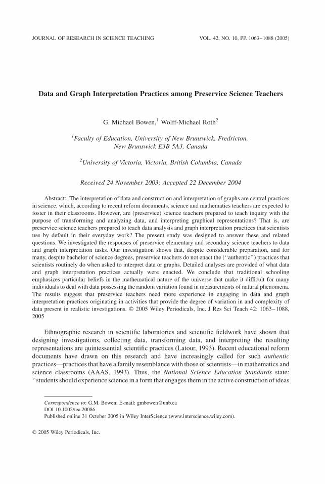
(Latour, 1987). Physical phenomena are translated through consecutive inscriptions that may
include, in increasing order of complexity, such re-representations as maps, lists, tables, totals,
means, graphs, and equations (Figure 1). To use inscriptions in publications and presentations,
scientists transform themuntil they are in a form thatmost convincingly supports the claimsmade.
Figure 1. Relations of inscriptions between world and sign.
1064 BOWEN AND ROTH
In writing, inscriptions ultimately are included as tables or graphs because these can be used to
summarize a lot of data in an economical way and they tend to be the most convincing evidence to
scientists (Latour, 1987). Figure 1 shows that graphs are farther away from the natural world than
the original (raw) data or the tables where they have been entered—graphs are even more
‘‘experience-distant,’’ because they usually depict summations of data (such as averages) but only,
at best, codified examples of sample distribution such as error bars (Roth, 1996).
Scatterplots, best-fit functions, and other graphs in Cartesian coordinates are ideal for
representing the continuous covariation of two variables that would be difficult to express in
words. Because of its typological character, language (e.g., in labels) is well suited to expressing
differences and categorical distinctions; lines have a topological character well suited to
expressing quantity, gradation, continuous change, continuous covariation, varying proportion-
ality, and other complex topological relations of relative nearness and connections (Lemke, 1998).
Graphs have both typological and topological qualities, which make them useful tools in
representing the qualitative and quantitative aspects of nature. Although tables could also be used
to show how the concurrent associations of measures of one quantity vary to that of another, the
relationship across the entire data set is only implicit in tables, whereas graphs make the
association immediately available in visual form (Bastide, 1990).
Inscriptions and Investigations in Science Education
To date, many science teachers have not yet realized the potential that lies in incorporating
students’ self-directed investigations as a way to implement the previously listed and related
suggestions of reform (Tobin, 1990) and gain competency with using inscriptions in the
construction of facts. Given the emphasis on self-directed investigative approaches in science
methods courses since discovery and hands-on science became fashionable in the 1960s, teachers’
resistance to using investigations with their students is a curious phenomenon. Science reform
documents implicitly rely on teachers’ competencies of using investigations in teaching science.
Yet, although there is now a substantial body of research on the practices and outcomes of
engaging middle and high school students conducting investigations (e.g., Fraser & Tobin, 1998),
there are surprisingly few studies that examine preservice secondary science teachers engaging in
investigations with a focus on their own use of inscriptions to represent data or their graph
interpretation skills. Teachers may be reluctant to implement investigative approaches because
they have little experience with conducting investigations on their own. Although most future
teachers in secondary science methods courses have taken undergraduate degrees with a
laboratory component, these all too often follow a strictly prescribed protocol—and students
follow the protocol without understanding what they do and why (Tobin, 1990). The investigation
activities undergraduate students typically do in science may not allow future teachers to be
comfortable in subsequently implementing investigations with their own students. For instance,
there is some evidence that the data and graph interpretation practices science teachers enact
themselves do not adequately meet the standards of the reform documents (Roth, McGinn, &
Bowen, 1998), which would make it difficult for them to scaffold the students they teach in the
associated interpretation practices.
However, too little is known about (preservice) teachers’ own practices in conducting science
investigations in authentic contexts to draw clear conclusions (Roth &Roychoudhury, 1993). Our
review of the literature suggests that there are few studies examining how preservice secondary
teachers enact data interpretation practices during science investigations. One study reported that
having preservice teachers engage in a 9-week inquiry improved their understanding of scientific
inquiry to some degree but did not increase their competencies with those activities during their
DATA AND GRAPHS AMONG PRESERVICE TEACHERS 1065

practicum experiences (Windschitl, 2003, 2004). The few remaining studies examined the impact
of previous experiential investigation activities and concluded that there should be more
opportunities for involvement in such activities to better understand the implications for
classroom practice (e.g., Crawford, 1999; Melear et al., 2000).
The purpose of the present study was to understand the practices preservice teachers enact
when asked to conduct an independent investigation in a science methods course. We were
particularly interested in understanding how preservice science teachers mathematize the results
of their investigations, how theywould transform initialmeasurements into a variety and sequence
of representations, and in what manner they would make claims based on the data they had
collected. In this study we examine the data and graph interpretation practices used in the reports
preservice teachers produced from their own investigations (thereby representing much of the
continuum in Figure 1).We provide details of data and graph interpretation practices as enacted in
a data/graph interpretation paper-and-pencil task to better understand our findings regarding their
practices as evidenced by the reports of the investigations they conducted.
Research Design
Research Participants
This research focuses on activities conducted by preservice teachers from a Canadian
university enrolled in a post-baccalaureate program for secondary science teacher candidates. The
participants were preservice secondary science teachers enrolled in a teacher preparation program
that accepts applicants only after they have completed a degree. All 25 students (10 males, 15
females) had previously completed undergraduate degrees with a major either in science (22
students), mathematics (2 students), or the arts (1 student). These science degrees were completed
at a variety of post-secondary institutions across Canada. Students with a nonscience major had
completed a science minor (and in all cases for the field investigation activity described in what
follows were partnered with science majors). Four students had obtained postgraduate degrees in
veterinary medicine, mechanical engineering, chemistry, and law; they also had work experience
in their respective domains.
Task Context
This study was designed to understand preservice teachers’ scientific practices relative to the
representations and transformations they are expected to teach according to the reform document
guidelines. We investigated these practices in two conditions. First, we presented the preservice
secondary teachers with a task where they had to design their own investigations, collect data,
transform data, and interpret the transformed data (Investigations). Second, the participants were
asked to interpret a set of raw data presented on amap of a research site (Lost Field Notebook); this
task was designed to gain further insights into data and graph analysis practices. The two tasks
differed in terms of the translation processes required for making claims about the relationships
between the relevant quantities (Janvier, 1987). The Investigations require a complete cycle of
activities from situation descriptions that identify the variable categories, through measurement,
the construction of representations, followed by verbal descriptions of the covariation, which can
be related back to the situation. This series of translations are expressed in Figure 1 and represent
components of the chain of ‘‘authentic’’ inquiry activities with which teachers are encouraged to
engage their own students. The Lost Field Notebook requires only a double transformation: first,
the relationship between the measure has to be uncovered (e.g., using a graph, curve-fitting
1066 BOWEN AND ROTH
procedure, statistical analysis, etc.) before the relationship can be translated into a verbal
description of the situation that may have led to the particular data at hand.
The preservice teachers engaged in the self-directed field investigation after participating in
several guided-inquiry activities in their methods course. They were asked to frame the
investigation in the form of two focus questions and include relationships based on some form of
quantitatively measured variables. They were asked to report their results using a scaffolding
device, the Epistemological Vee (Novak & Gowin, 1984), to which they had been introduced
during preceding activities. This device acts as a methodological and conceptual scaffold
explicitly prompting users to state research questions, provide a brief description of their research
method, report data, transform the data, and state claims based on the data. Because users are
required to state their prior knowledge, they can also, after the fact, assess their learning in the
process of the investigation.
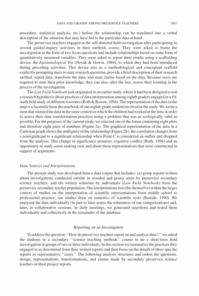
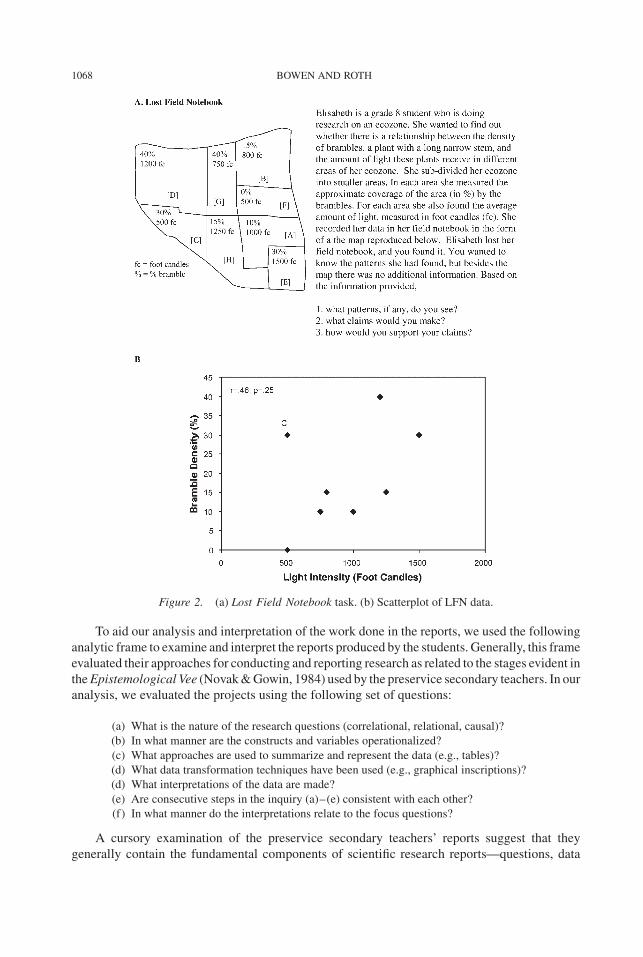
The Lost Field Notebook task originated in an earlier study, where it had been designed to test
a research hypothesis about practices of data interpretation among eighth graders engaged in a 10-
week field study of different ecozones (Roth&Bowen, 1994). The representation of the data in the
map is a facsimile from the notebook of one eighth-grade student involved in the study.Wewrote a
stem that situated the data in the same context inwhich the children hadworked at the time in order
to assess their data transformation practices using a problem that was as ecologically valid as
possible. For the purposes of the current study, we selected one of the forms containing eight plots
and therefore eight pairs of numbers (Figure 2a). The graphical representation of the data in a
Cartesian graph shows the ambiguity of the relationship (Figure 2b); the correlation changes from
a nonsignificant to a significant relationship when Point C is considered an outlier and dropped
from the analysis. This change in significance promises cognitive conflict (Roth, 1996) and an
opportunity to study sense-making over and about those representations that were constructed in
support of arguments.
Data Sources and Interpretations
The present study was developed from a data corpus that includes: (a) group reports written
about investigations conducted outside in wooded and grassy areas by preservice secondary
science teachers; and (b) written solutions by individuals (Lost Field Notebook) from the
preservice secondary teacher population. Our interpretations inscribe themselveswithin the larger
context of studies on the interpretation of scientific representations from middle school to
professional practice; our studies draw on semiotics of scientific texts (Bastide, 1990). We
analyzed the data individually (in part to later assess the robustness of our categorizations) and,
later, in collaborative sessions. In daily meetings, we generated assertions and tested them
individually and collectively in the remainder of the database.
Reporting on an Investigation
To address the question, ‘‘How do preservice teachers report on and analyze data?,’’ we asked
the students in a secondary ‘‘science teaching methods’’ course to do a short-term field
investigation in groups of two or three individuals. In this sectionwe summarize the practices they
engaged in as determined from their written reports and then focus on the details of three specific
reports as representative ‘‘cases.’’ The following analysis structures and orders the questions,
design, representations, transformations, and claims made by secondary preservice science
teachers in their project reports.
DATA AND GRAPHS AMONG PRESERVICE TEACHERS 1067
To aid our analysis and interpretation of the work done in the reports, we used the following
analytic frame to examine and interpret the reports produced by the students. Generally, this frame
evaluated their approaches for conducting and reporting research as related to the stages evident in
theEpistemological Vee (Novak&Gowin, 1984) used by the preservice secondary teachers. In our
analysis, we evaluated the projects using the following set of questions:
(a) What is the nature of the research questions (correlational, relational, causal)?
(b) In what manner are the constructs and variables operationalized?
(c) What approaches are used to summarize and represent the data (e.g., tables)?
(d) What data transformation techniques have been used (e.g., graphical inscriptions)?
(d) What interpretations of the data are made?
(e) Are consecutive steps in the inquiry (a)–(e) consistent with each other?
(f) In what manner do the interpretations relate to the focus questions?
A cursory examination of the preservice secondary teachers’ reports suggest that they
generally contain the fundamental components of scientific research reports—questions, data
Figure 2. (a) Lost Field Notebook task. (b) Scatterplot of LFN data.
1068 BOWEN AND ROTH
tables, graphs, interpretations, and claims/implications are generally all present—as one might
expect them to be given that the Epistemological Vee provided prompts for these elements.
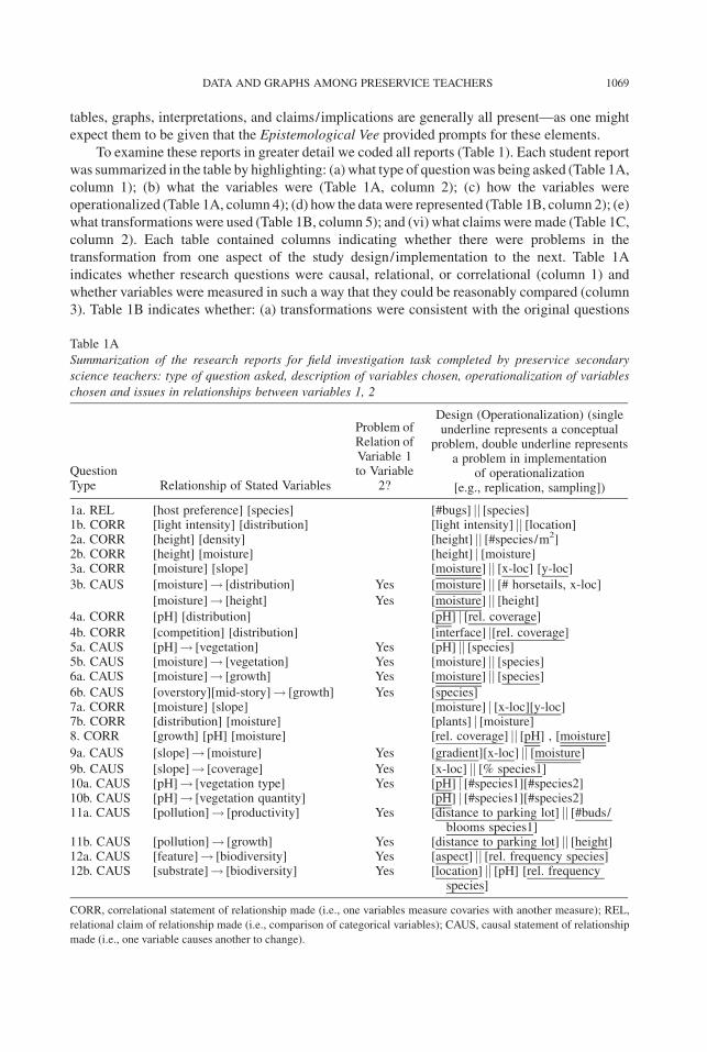
To examine these reports in greater detail we coded all reports (Table 1). Each student report
was summarized in the table by highlighting: (a) what type of questionwas being asked (Table 1A,
column 1); (b) what the variables were (Table 1A, column 2); (c) how the variables were
operationalized (Table 1A, column 4); (d) how the datawere represented (Table 1B, column 2); (e)
what transformations were used (Table 1B, column 5); and (vi) what claims were made (Table 1C,
column 2). Each table contained columns indicating whether there were problems in the
transformation from one aspect of the study design/implementation to the next. Table 1A
indicates whether research questions were causal, relational, or correlational (column 1) and
whether variables were measured in such a way that they could be reasonably compared (column
3). Table 1B indicates whether: (a) transformations were consistent with the original questions
Table 1A
Summarization of the research reports for field investigation task completed by preservice secondary
science teachers: type of question asked, description of variables chosen, operationalization of variables
chosen and issues in relationships between variables 1, 2
QuestionType Relationship of Stated Variables
Problem ofRelation ofVariable 1to Variable
2?
Design (Operationalization) (singleunderline represents a conceptual
problem, double underline representsa problem in implementation
of operationalization[e.g., replication, sampling])
1a. REL [host preference] [species] [#bugs] jj [species]1b. CORR [light intensity] [distribution] [light intensity] jj [location]2a. CORR [height] [density] [height] jj [#species/m2]2b. CORR [height] [moisture] [height] j [moisture]3a. CORR [moisture] [slope] [moisture] jj [x-loc] [y-loc]3b. CAUS [moisture]! [distribution] Yes [moisture] jj [# horsetails, x-loc]
[moisture]! [height] Yes [moisture] jj [height]4a. CORR [pH] [distribution] [pH] j [rel. coverage]4b. CORR [competition] [distribution] [interface] j[rel. coverage]5a. CAUS [pH]! [vegetation] Yes [pH] jj [species]5b. CAUS [moisture]! [vegetation] Yes [moisture] jj [species]6a. CAUS [moisture]! [growth] Yes [moisture] jj [species]6b. CAUS [overstory][mid-story]! [growth] Yes [species]7a. CORR [moisture] [slope] [moisture] j [x-loc][y-loc]7b. CORR [distribution] [moisture] [plants] j [moisture]8. CORR [growth] [pH] [moisture] [rel. coverage] jj [pH] , [moisture]
9a. CAUS [slope]! [moisture] Yes [gradient][x-loc] jj [moisture]
9b. CAUS [slope]! [coverage] Yes [x-loc] jj [% species1]10a. CAUS [pH]! [vegetation type] Yes [pH] j [#species1][#species2]10b. CAUS [pH]! [vegetation quantity] [pH] j [#species1][#species2]11a. CAUS [pollution]! [productivity] Yes [distance to parking lot] jj [#buds/
blooms species1]11b. CAUS [pollution]! [growth] Yes [distance to parking lot] jj [height]12a. CAUS [feature]! [biodiversity] Yes [aspect] jj [rel. frequency species]12b. CAUS [substrate]! [biodiversity] Yes [location] jj [pH] [rel. frequency
species]
CORR, correlational statement of relationship made (i.e., one variables measure covaries with another measure); REL,
relational claim of relationship made (i.e., comparison of categorical variables); CAUS, causal statement of relationship
made (i.e., one variable causes another to change).
DATA AND GRAPHS AMONG PRESERVICE TEACHERS 1069

Table 1B
Summarization of the research reports for field investigation task completed by preservice secondary science teachers: inscribing collected data, representing in
transformations, and issues with the transformations
Question #/Type
DataRepresentation
TransformationNot Related to
originalQuestion
InappropriatelyUsed Graph(e.g., barinstead ofscatterplot) Type of Transformation
1a. REL MAP[plants] SUM[#bugs], AVG[#bugs]TAB([site#][species], [frequency]) WHISKER([AVG],[species])
1b. CORR TAB([row#][column#], [light intensity]) MAP([intensity][isolines], [location])2a. CORR MAP([rel. coverage], [location]) SCATTER([height],[density])
TAB([x-loc] [y-loc], [moisture] [height] [density])2b. CORR TAB([x-loc] [y-loc], [moisture] [height] [density]) AVG[moisture]
SCATTER([height],[moisture])3a. CORR MAP([moisture][plant loc] [plant height], [x-loc][y-loc]) BAR([density],[x-loc])
TRANS([species][location])TAB([x-loc][y-loc], [moisture])
3b. CAUS TAB([x-loc][y-loc], [moisture]) SCATTER([height],[moisture])4a. CORR MAP([rel. coverage], [location])
TAB([species], [% coverage]) <none>TAB([location], [pH])
4b. CORR TAB([location], [pH]) <none>5a. CAUS MAP[plants] AVG[pH]
TAB([trial#][species],[pH]) BAR([AVG],[species])5b. CAUS TAB([trial#][species], [moisture]) AVG[moisture]
BAR([AVG],[species])6a. CAUS MAP([rel. coverage][moisture], [location]) <none>6b. CAUS MAP([rel. coverage][moisture], [location]) <none>
1070
BOWENAND
ROTH

7a. CORR TAB([x-loc] [y-loc], [moisture]) Yes AVG[moisture]Yes BAR([moisture],[x-loc])
Yes BAR([moisture],[y-loc])7b. CORR MAP([plants], [x-loc][y-loc]) <none>8. CORR MAP([plants], [x-loc][y-loc]) Yes lineG[moisture],[rel. coverage]
Yes lineG[pH],[rel. coverage]9a. CAUS <none> Yes AVG[moisture]
Yes SCATTER([x-loc],[AVG])Yes SCATTER([gradient],[Dmoisture])
BAR([x-loc],[% gradient])9b. CAUS MAP([rel. coverage], [location]) Yes Yes BAR([x-loc],[% species1])10a. CAUS MAP([pH] [species1] [species2], [x-loc][y-loc]) Yes BAR([pH][#species1]
[#species2],[location])10b. CAUS MAP([pH] [species1] [species2], [x-loc][y-loc]) Yes BAR([pH][#species1]
[#species2],[location])11a. CAUS MAP([species1],[x-loc][y-loc]) Yes AVG[#buds/blooms]
TAB([row#] [column#],[#buds/blooms])
LINEG([AVG], [x-loc])
11b. CAUS TAB([row#][column#], [height]) Yes AVG[height]LINEG([AVG],[x-loc])
12a. CAUS MAP([plants][pH]) Yes BAR([rel. frequency], [aspect])12b. CAUS MAP([plants][pH]) <none>
TAB, data represented in a table; TRANS, landscapeviewed in a side profile; SCATTER([y][x]), scatterplot graph used;WHISKER([AVG][species]), categorical graph plotting averages
with range in each category used; AVG[variable], average given for a variable; MAP, data represented in a map/drawing; BAR([y][x]), bar graph used; LINEG([y][x]), line graph used.
DATA
AND
GRAPHSAMONG
PRESERVICETEACHERS
1071
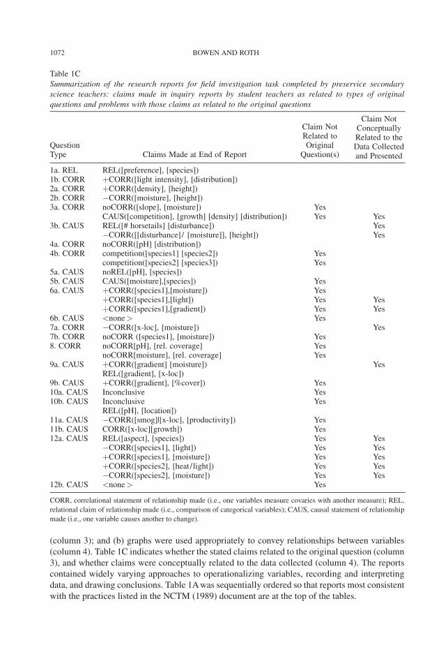
(column 3); and (b) graphs were used appropriately to convey relationships between variables
(column 4). Table 1C indicates whether the stated claims related to the original question (column
3), and whether claims were conceptually related to the data collected (column 4). The reports
contained widely varying approaches to operationalizing variables, recording and interpreting
data, and drawing conclusions. Table 1Awas sequentially ordered so that reports most consistent
with the practices listed in the NCTM (1989) document are at the top of the tables.
Table 1C
Summarization of the research reports for field investigation task completed by preservice secondary
science teachers: claims made in inquiry reports by student teachers as related to types of original
questions and problems with those claims as related to the original questions
QuestionType Claims Made at End of Report
Claim NotRelated toOriginal
Question(s)
Claim NotConceptuallyRelated to theData Collectedand Presented
1a. REL REL([preference], [species])1b. CORR þCORR([light intensity], [distribution])2a. CORR þCORR([density], [height])2b. CORR �CORR([moisture], [height])3a. CORR noCORR([slope], [moisture]) Yes
CAUS([competition], [growth] [density] [distribution]) Yes Yes3b. CAUS REL([# horsetails] [disturbance]) Yes
�CORR([[disturbance]/ [moisture]], [height]) Yes4a. CORR noCORR([pH] [distribution])4b. CORR competition([species1] [species2]) Yes
competition([species2] [species3]) Yes5a. CAUS noREL([pH], [species])5b. CAUS CAUS([moisture],[species]) Yes6a. CAUS þCORR([species1],[moisture]) Yes
þCORR([species1],[light]) Yes YesþCORR([species1],[gradient]) Yes Yes
6b. CAUS <none> Yes7a. CORR �CORR([x-loc], [moisture]) Yes7b. CORR noCORR ([species1], [moisture]) Yes8. CORR noCORR[pH], [rel. coverage] Yes
noCORR[moisture], [rel. coverage] Yes9a. CAUS þCORR([gradient] [moisture]) Yes
REL([gradient], [x-loc])9b. CAUS þCORR([gradient], [%cover]) Yes10a. CAUS Inconclusive Yes10b. CAUS Inconclusive Yes
REL([pH], [location])11a. CAUS �CORR([smog]|[x-loc], [productivity]) Yes11b. CAUS CORR([x-loc][growth]) Yes12a. CAUS REL([aspect], [species]) Yes Yes
�CORR([species1], [light]) Yes YesþCORR([species1], [moisture]) Yes YesþCORR([species2], [heat/light]) Yes Yes�CORR([species2], [moisture]) Yes Yes
12b. CAUS <none> Yes
CORR, correlational statement of relationship made (i.e., one variables measure covaries with another measure); REL,
relational claim of relationship made (i.e., comparison of categorical variables); CAUS, causal statement of relationship
made (i.e., one variable causes another to change).
1072 BOWEN AND ROTH

Structuring Research Questions
When the preservice secondary teachers first entered the research area (located in
undeveloped mixed forest at the edge of the university property) there was considerable
discussion in the different student pairs about what do-able questions they were to investigate.
They started formulating specific questions to address as they noticed more and more specific
details of the zone and reflected about the equipment that was available to them. Many of the
investigationswere framed as causal investigations—of the 24 questions addressed by the students
14 were causal. For example, some of the causal questions asked were, ‘‘How does the moisture
level affect the distribution and height of horsetails in our investigative site?’’ (Table 1A, Question
3b), and ‘‘Do the exhaust gases from the cars parking in Lot C directly affect concentration of field
flowers in front of the lot?’’ (Table 1A, Question 11a). In the first case, two components of the
question indicate that it is intended to address causal relationships. First, asking ‘‘how?’’ indicates
causality and, second, assuming the directionality that it is the moisture that affects the horsetails,
not the horsetails affecting the moisture level (as is the case in some plant species), indicates that
the intent of the question is causal not correlational. The second example is also clearly causal in
intent because of the directionality implicit in the question as field flowers could not affect the
release of ‘‘exhaust gases from the cars,’’ but the exhaust gases might affect the field flowers. Note
that, for both questions, it is not that directionality and causality are not demonstrable, but that the
temporal structure of the activity (two field periods within 8 days) makes a causal investigation
unfeasible.
Operationalization of Variables
Operationalizing variables (Table 1A, column 2) in a research project is a key step in being
able to construct claims from the data collected. Variables that are well operationalized make it
possible to make claims that relate back to the original focus question(s).
An example of operationalization of variables that allow for making claims in response to the
original focus question is found in the first study (Table 1A, Questions 1a and b). To address the
questions, ‘‘Do spittle bugs show host preferences for three dominant plants in the plot?’’ and ‘‘Is
there a relationship between light intensity and the distribution [of plant species] in the plot?,’’ this
group of preservice secondary teachers engaged in six relevant practices. First, they identified
locations of individual plants of the three species. Second, they counted the number of spittlebugs
on ‘‘ten stalks of each plant at five randomly chosen sample sites.’’ Third, they graphed the average
number of spittlebugs found (with error bars) for each type of plant. Fourth, they measured light
intensity in a grid across the entire mapped area. Fifth, they drew a pattern map with the light
intensity indicated over which was laid the locations (of the plant species). Finally, they
constructed claims related to the original focus questions using the data set collected and depicted
in the five other steps. This sequence effectively operationalized the originally stated focus
question. Of the 22 research questions asked in the 11 field projects, 7 questions (found in a total of
5 projects) were operationalized as effectively as was this example (both with what was measured
and with respect to the conduct of sampling). With these questions it was therefore possible to
construct claims that would answer the focus questions.
Representing Data
Datawere represented or depicted in the reports in twomain ways (summarized in Table 1B):
maps (which were requested as part of the assignment) and tables. All reports included a map
DATA AND GRAPHS AMONG PRESERVICE TEACHERS 1073
representation and 14 of the 24 focus questions had data summarized in a table. Data were
expressed in these reports in widely varying ways, only a few of which were ordered or
summarized tables that enabled visual inspection of data. Participants in this study seemingly
viewed tables as a representation or presentation tool and not as an integral part of organizing the
research before and as it was being collected. Themaps that appeared in some reports occasionally
served as surrogates for tables by helping the report-writers relate variables. In three of the reports,
the maps, rather than being sketches of the landscape upon which data sampling sites were
recorded, were instead grids onto which measurements, locations of plants, or counts were
recorded. Three other maps were diagrammatic sketches detailing plant locations and physical
locations ontowhichmeasured data (e.g., light levels,moisture levels)were inscribed. In total, 6 of
the 12 maps reported data in such a fashion that they would permit the researchers to draw
conclusions about their focus questions. The other 6 maps served as iconic representations—
essentially pictures of the site unrelated to the research questions.
Transforming Data: Using Graphical Inscriptions
A variety of approaches were adopted in the reports when using graphical inscriptions to
representmeasured data. Use of graphical representations occurred in 10 of the 12 reports, and in 8
of these reports the graphs could be related to the original research questions (Table 1B). In 4 of the
reports the graphs were structured and labeled such that the reader could identify the variables and
the relationship being discussed and could locate a discussion of the graph(s) in the claims section.
By providing clear cues and pointers between report text, captions, and labels together, each reader
can constitute and construct the claims from the data being presented. The reader’s understanding
derives from reflexively cycling back and forth between the text and the inscriptions relating these
pointers to their own experiences.
Of the remaining six reports representational and textual approaches other than those just
listed were prevalent. One report used line graphs wherein it was possible to use bar graphs, three
reports used bar graphs to represent data where it was possible to draw scatterplots, and one report
used a one-dimensional bar graph when a two-by-three bar graph may have been better suited to
illustrate the data as a whole. In many of these reports the graph labels were absent or were one or
twowords long; in several cases, it was left to the reader to derive an understanding of the units in
use from the ‘‘Methods’’ section or the data tables.
Scatterplots were used to depict five of the variable relationships (in three reports). Two of the
scatterplots had a line of best-fit drawn (one of which lay over the data points). Outliers were
visible on several of the scatterplots, but were only highlighted and discussed by the authors of
one report. In one report (Table 1B, Questions 2a and b) two scatterplots were used to depict the
relationship between one independent (moisture) and two dependent (density, height) variables
(such that one scatterplot depicted an x–y relation and the other an x–z relation).
Interpreting Research Data
Normatively, the ‘‘Conclusion’’ section of a scientific report attempts to draw conclusions
about patterns in the data and discusses data in the context of the original question(s). This is often
followed by a discussion of implications of the data, including any issues arising from the design of
the study being reported on and future questions that might be addressed. In our description of the
claims section of the reports we therefore focus on the interpretations of the data being reported on
(both graphs and tables) and how these interpretations relate to the original question(s) (Table 1C).
1074 BOWEN AND ROTH
Claims were stated in all 12 of the reports. In total, two of the reports stated claims that clearly
extended from the data collected and presented, and 7 of the research reports stated claims related
to the research questions provided in the report. Ten of reports stated claims unrelated to the data
collected. For example, one report concluded ‘‘intraspecific and interspecific competition affects
the growth, density, and distribution of plants,’’ drawing this causal conclusion from a data set that
did not contain measures attributable to competition (a quite abstract ecological concept) or of
growth.
Three Case Studies
To gain further insight into the practices of the preservice secondary teachers holding science
degrees in conducting a field investigation we performed a microanalysis of three reports on this
type of activity. In this analysis we examined the structure of the questions, the recording and
reporting strategies, and the final claims for internal consistency and the methodological
approaches undertaken using the analytic framework just detailed. Table 1 is sequentially ordered
to reflect the recommendations of science and mathematics reform documents regarding data
collection (e.g., NCTM, 1989), such that those reports most consistent with those documents are
found at the top. For this microanalysis we chose one report from near the top, one report from the
middle, and one report from the bottom of Table 1.
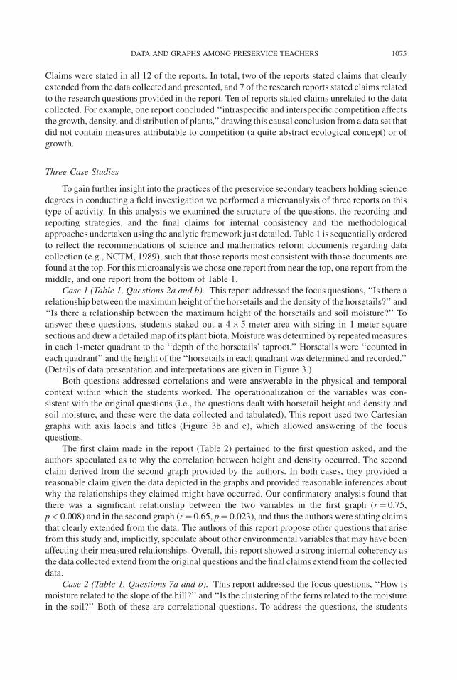
Case 1 (Table 1, Questions 2a and b). This report addressed the focus questions, ‘‘Is there a
relationship between the maximum height of the horsetails and the density of the horsetails?’’ and
‘‘Is there a relationship between the maximum height of the horsetails and soil moisture?’’ To
answer these questions, students staked out a 4� 5-meter area with string in 1-meter-square
sections and drew a detailedmap of its plant biota.Moisturewas determined by repeatedmeasures
in each 1-meter quadrant to the ‘‘depth of the horsetails’ taproot.’’ Horsetails were ‘‘counted in
each quadrant’’ and the height of the ‘‘horsetails in each quadrant was determined and recorded.’’
(Details of data presentation and interpretations are given in Figure 3.)
Both questions addressed correlations and were answerable in the physical and temporal
context within which the students worked. The operationalization of the variables was con-
sistent with the original questions (i.e., the questions dealt with horsetail height and density and
soil moisture, and these were the data collected and tabulated). This report used two Cartesian
graphs with axis labels and titles (Figure 3b and c), which allowed answering of the focus
questions.
The first claim made in the report (Table 2) pertained to the first question asked, and the
authors speculated as to why the correlation between height and density occurred. The second
claim derived from the second graph provided by the authors. In both cases, they provided a
reasonable claim given the data depicted in the graphs and provided reasonable inferences about
why the relationships they claimed might have occurred. Our confirmatory analysis found that
there was a significant relationship between the two variables in the first graph (r¼ 0.75,
p< 0.008) and in the second graph (r¼ 0.65, p¼ 0.023), and thus the authors were stating claims
that clearly extended from the data. The authors of this report propose other questions that arise
from this study and, implicitly, speculate about other environmental variables that may have been
affecting their measured relationships. Overall, this report showed a strong internal coherency as
the data collected extend from the original questions and the final claims extend from the collected
data.
Case 2 (Table 1, Questions 7a and b). This report addressed the focus questions, ‘‘How is
moisture related to the slope of the hill?’’ and ‘‘Is the clustering of the ferns related to the moisture
in the soil?’’ Both of these are correlational questions. To address the questions, the students
DATA AND GRAPHS AMONG PRESERVICE TEACHERS 1075
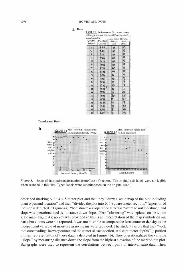
described marking out a 4� 5-meter plot and that they ‘‘drew a scale map of the plot including
plant types and location’’ and then ‘‘divided the plot into 20 1-square-meter sections’’ (a portion of
themap is depicted in Figure 4a). ‘‘Moisture’’was operationalized as ‘‘average soilmoisture,’’ and
slopewas operationalized as ‘‘distance down slope.’’ Fern ‘‘clustering’’was depicted on the iconic
scale map (Figure 4a; no key was provided so this is an interpretation of the map symbols on our
part), but counts were not reported. It was not possible to compare the fern counts or density to the
independent variable of moisture as no means were provided. The students wrote that they ‘‘took
moisture readings in every corner and the center of each section, at 4-centimeter depths’’ (a portion
of their representation of these data is depicted in Figure 4b). They operationalized the variable
‘‘slope’’ by measuring distance down the slope from the highest elevation of the marked-out plot.
Bar graphs were used to represent the correlations between pairs of interval-ratio data. Their
Figure 3. Scans of data and transformation fromCase #1’s report. (The original axis labels were not legible
when scanned to this size. Typed labels were superimposed on the original scan.)
1076 BOWEN AND ROTH

graph, represented in Figure 4c, shows the average moisture readings across the slope (Letters A–
E represent cross-slope coordinates). Theyobtained these by averaging the fourmeasures ‘‘down’’
the slope (e.g., the average moisture reading of ‘‘2’’ at cross-slope indicator ‘‘a’’ was obtained by
obtaining the average of the measures 2.4, 1.8, 1.7, and 2.1; Figure 4e). In Figure 4d, the report
depicts the average moisture ‘‘down’’ the slope (numbers 1–4 represent down-slope coordinates)
from averaging the measures taken ‘‘across’’ the slope at 1-meter distances ‘‘down’’ the slope
(e.g., their plotted value of moisture readings of 2.4 for 1 meter down the slope derives from
averaging 2.4þ 2.2þ 2.2þ 2.7þ 2.3)/5¼ 2.36; Figure 4e). Figure 4e depicts averages derived
from the measures obtained from the moisture sampling regimen (Figure 4b).
The first claim (Table 2) was stated as a ‘‘relation’’ (top, middle, bottom) as opposed to the
correlational framing of the original question. We conducted a confirmatory statistical analysis
that showed a correlation coefficient of r¼ 0.66, p¼ 0.0014; F-tests for the four distance
categories would yield F¼ 7.01, p< 0.004. The third claim in the report, ‘‘Pattern of fern
placement on the slope is not related to moisture content of the soil’’ (#3, Case Study 2; Table 2),
Table 2
Claims made in the reports of the three case studies
Claims in Reports
Case Study 1 1. We found that the area with the highest horsetail density had the horsetails with thetallest height. This could be that the areas with the highest density had the mostfavorable conditions such as nutrients, shade, and light, which allowed them to growtaller.
2. We found that the areas with the least moisture content had the horsetails with thetallest height. This could be that the taller horsetails have absorbed more water(nutrients) thus reducing the moisture content of the soil.
3. Additional questions that might require further investigation might include howcompetition with other plant species affects the height and density of horsetails; howsoil type affects soil moisture; and why the density of horsetails decreased withproximity to the road.
Case Study 2 1. Moisture at the top of the slope on a sunny day is greater than in the middle or bottom.This is probably due to moisture (e.g., rainfall) hitting the soil at the top more oftenthan elsewhere because of how various plants on the slope prevent moisture fromaccessing the soil; that is, there are fewer plants at the top of the slope. Gradually,rainwater at the top would run down the hill because of gravity.
2. Further tests could help determine the effects of plant type versus position on slope.We also might learn more by taking moisture readings in the soil during or aftervarious degrees of rainfall. Presumably, different plant types utilize different amountsof moisture so we could test soil moisture around various types.
3. Pattern of fern placement on the slope is not related to moisture content of the soil.4. Further tests could indicate whether fern placement pattern is due to competition from
other plants, symbiotic relations with other plants, availability of sun versus shade,pH of soil, wind resulting in fertilization and distribution of spores, animal movementresulting in distribution of spores, and animal and human traffic affecting survival ofplants.
Case Study 3 1. It is possible that smog decreases both productivity and growth of lupines.2. Growth shows a more consistent correlation with distance from the parking lot (used
as a measure of concentration) compared with the productivity.3. The fact that a street exists on the opposite side of the parking lot indicates why a
decrease in productivity occurs in quadrants after B.4. One parameter that was not controlled in this investigation was the influence of smog.
DATA AND GRAPHS AMONG PRESERVICE TEACHERS 1077
regarding the relationship between the presence of ferns and moisture levels, addresses one of the
original research questions, but does not have associated inscriptional references or data (no fern
counts, lack of a key). This group did not refer to the inscriptions and therefore they did not directly
support their claims by reference to the data. The group presented a graph, but did notmake claims
based on it (Figure 4c).
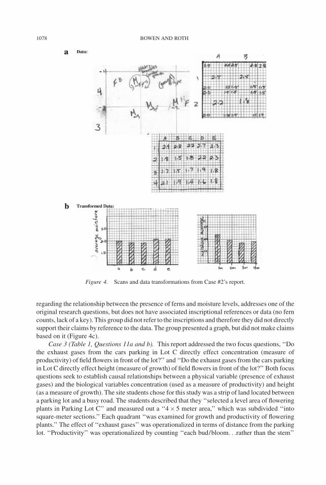
Case 3 (Table 1, Questions 11a and b). This report addressed the two focus questions, ‘‘Do
the exhaust gases from the cars parking in Lot C directly effect concentration (measure of
productivity) of field flowers in front of the lot?’’ and ‘‘Do the exhaust gases from the cars parking
in Lot C directly effect height (measure of growth) of field flowers in front of the lot?’’ Both focus
questions seek to establish causal relationships between a physical variable (presence of exhaust
gases) and the biological variables concentration (used as a measure of productivity) and height
(as a measure of growth). The site students chose for this studywas a strip of land located between
a parking lot and a busy road. The students described that they ‘‘selected a level area of flowering
plants in Parking Lot C’’ and measured out a ‘‘4� 5 meter area,’’ which was subdivided ‘‘into
square-meter sections.’’ Each quadrant ‘‘was examined for growth and productivity of flowering
plants.’’ The effect of ‘‘exhaust gases’’ was operationalized in terms of distance from the parking
lot. ‘‘Productivity’’ was operationalized by counting ‘‘each bud/bloom. . .rather than the stem’’
Figure 4. Scans and data transformations from Case #2’s report.
1078 BOWEN AND ROTH
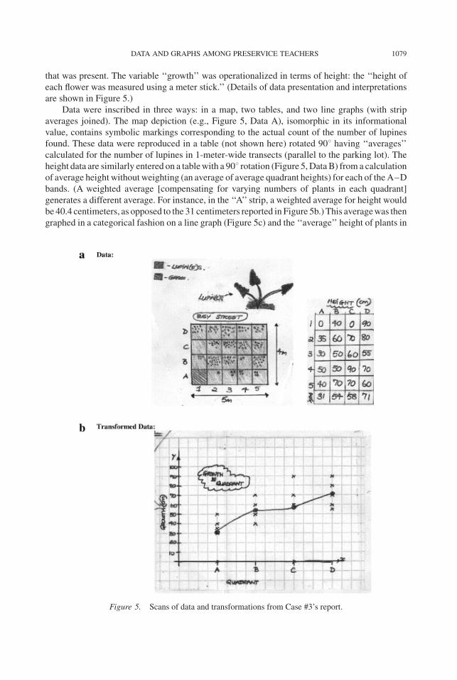
that was present. The variable ‘‘growth’’ was operationalized in terms of height: the ‘‘height of
each flower was measured using a meter stick.’’ (Details of data presentation and interpretations
are shown in Figure 5.)
Data were inscribed in three ways: in a map, two tables, and two line graphs (with strip
averages joined). The map depiction (e.g., Figure 5, Data A), isomorphic in its informational
value, contains symbolic markings corresponding to the actual count of the number of lupines
found. These data were reproduced in a table (not shown here) rotated 908 having ‘‘averages’’
calculated for the number of lupines in 1-meter-wide transects (parallel to the parking lot). The
height data are similarly entered on a tablewith a 908 rotation (Figure 5,DataB) from a calculation
of average height without weighting (an average of average quadrant heights) for each of theA–D
bands. (A weighted average [compensating for varying numbers of plants in each quadrant]
generates a different average. For instance, in the ‘‘A’’ strip, a weighted average for height would
be 40.4 centimeters, as opposed to the 31 centimeters reported in Figure 5b.) This averagewas then
graphed in a categorical fashion on a line graph (Figure 5c) and the ‘‘average’’ height of plants in
Figure 5. Scans of data and transformations from Case #3’s report.
DATA AND GRAPHS AMONG PRESERVICE TEACHERS 1079
each band joined by a line. Variable names did not appear on the abscissa nor were potential
outliers considered.
Claims were based on data that could have established a relationship between a variable such
as the distance from the parking lot and the height and number of plants (Table 2). In their report’s
claims section the students state a claim involving smog, a term which appeared for the first time
and did not appear to be supported by the data. The initially stated causal variable, car exhaust, did
not appear in the claims section; furthermore, the claims appeared unrelated to data and graphical
representations. Claim 3 (Table 2, Case Study 3) acknowledged that the presence of a busy street
on the other side of the research site might have had a mediational effect on the productivity (i.e.,
‘‘total # of buds/blooms’’).
Discussion of Field Investigation Reports
Reform documents have called for ‘‘inferences and convincing arguments that are based on
data analysis’’ (NCTM, 1989, p. 105) and stated that students should be expected to ‘‘represent
situations and number patterns with tables, graphs, verbal rules, and equations to explore the
interrelationships of those representations’’ (NCTM, 1989, p. 102). Both of these are statements
that reflect the coherence found in scientific reports that clearly relate investigation questions to
the outcomes from subsequent actions, data, inscriptions, and claims. Continuity such as this was
present in only a few of reports submitted by the preservice secondary teachers (Table 1). There
were widely varying approaches to recording and reporting data and summary claims in the
reports, as exemplified in the three cases presented. Research questions for the field-biology
project (two 3-hour field sessions) ranged from being correlational to being stated causally. The
majority of the focus questions investigated in these reports focused on causal and not
correlational questions (Table 1). Variables forming the basis of projects were often quite abstract
in relation to what was measurable with the available equipment and time.
A study of eighth-grade students conducting similar (although long-term) field research
suggested that initial investigative questions were often causal (Roth & Bowen, 1993). The
preservice secondary teachers constructed focus questions that resembled those framed by the
eighth-grade students when they first started their outdoor research—addressing issues that were
quite abstract (such as competition between species) and therefore difficult to address in a
single outdoor session without drawing substantial inferences. Some of the research questions
addressed issues that were quite ecologically complex. Relationships such as ‘‘competition,’’
‘‘biodiversity,’’ ‘‘growth,’’ and ‘‘productivity,’’ all of which have specificmeanings in biology that
do not well equate with ‘‘distribution,’’ counts of limited numbers of organisms, or ‘‘height’’ as
they were operationalized in the preservice secondary teacher projects. This meant that even
some of the questions that were stated as a correlation were conceptually actually causal questions
because of the concepts involved in the question and how they would need to be operationalized
to be addressed (e.g., competition and plant distribution [Table 1A, Question 4b]).
Interpreting Raw Data
To increase our understanding of the students’ interpretive work related to raw data, we
conducted a second study wherein the students were provided with raw data and then asked to
make sense of them. A pilot study (N¼ 17) and an initial survey (N¼ 32) based on written tests
showed that only a small fraction of preservice secondary science teachers (5 of 49), despite their
prior bachelor’s of science and master’s of science degrees (most of them in biology), used
1080 BOWEN AND ROTH
graphical and/or statistical analyses (Roth, McGinn, & Bowen, 1998). Statistical comparisons in
that study revealed that a significantly higher proportion of eighth-grade students (who solved the
problem in pairs) than secondary preservice teachers used graphical and statistical analysis
methods. Therewas a lower incidence ofmore abstract representations among preservice teachers
than among pairs of eighth-grade students. Furthermore, therewas a relationship between the type
of analysis and the type of claim that respondents made.
In this study, we had two objectives. First, we wanted to better understand the processes by
means of which preservice teachers arrive at particular claims and in what manner they go about
supporting their arguments. Second, we assumed that preservice teachers in the previous study,
despite their scientific training (and BSc degrees), did not use graphical (or statistical) analysis
because they had not recently engaged in activities in which drawing graphs and doing statistics is
‘‘what is normally done’’ and ‘‘what everyone else does.’’We expected that the frequency of graph
use would increase if the participants were primed. We therefore repeated our earlier studies with
preservice secondary science teachers but in a new condition.Weprimed participants immediately
prior to the Lost Field Notebookwith an activity that required them to answer the question, ‘‘How
does the height from which you drop a ball affect the bounce?’’ Students collected and recorded
data, transforming the data into a Cartesian graph, and drawing conclusions from this graph.
Individual Written Answers by Preservice Secondary Teachers After Priming
Despite the priming, preservice secondary science teachers found the Lost Field Notebook
activity difficult. One of the individuals who produced a data plot with a line of best-fit suggested:
It is very clear to me that I was taught science as a collection of facts, not as an exploration.
This exercise was very difficult for me. I can see its usefulness already. I think it is
important to have this kind of ‘‘thinker’’ exercises included in the curriculum. (Todd)
Another person suggested, ‘‘What was that Lost Field Notebook exercise all about? I couldn’t
make any sense of it. Now I really feel like a non-science type’’ (Tandy).
Drawing onLatour (1987) and our own priorwork, in this studywe categorized answers along
a continuum (no transformation [verbal])! ordered table! ratios, data plots, data plotsþ best-
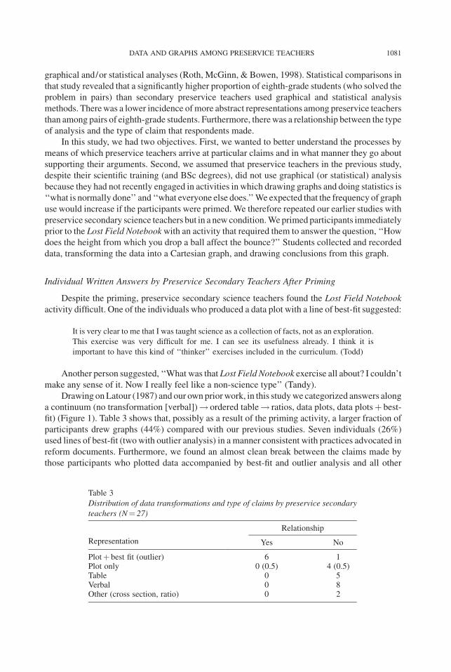
fit) (Figure 1). Table 3 shows that, possibly as a result of the priming activity, a larger fraction of
participants drew graphs (44%) compared with our previous studies. Seven individuals (26%)
used lines of best-fit (twowith outlier analysis) in a manner consistent with practices advocated in
reform documents. Furthermore, we found an almost clean break between the claims made by
those participants who plotted data accompanied by best-fit and outlier analysis and all other
Table 3
Distribution of data transformations and type of claims by preservice secondary
teachers (N¼ 27)
Representation
Relationship
Yes No
Plotþ best fit (outlier) 6 1Plot only 0 (0.5) 4 (0.5)Table 0 5Verbal 0 8Other (cross section, ratio) 0 2
DATA AND GRAPHS AMONG PRESERVICE TEACHERS 1081
solutions. This included individuals who had only plotted the data. Those who claimed that there
was a relationship in the complete set of the data had all used a line of best-fit in their analysis.
Generally, therewas a larger enumeration and discussion of other possible factors that determined
bramble density among those responses that did not use plots and lines of best-fit and, therefore,
claimed that therewas no relationship between the two variables. Therewere seven cases in which
quantitative comparisons between two data points were made, six of which were related to a
comparison of Plots C and F.
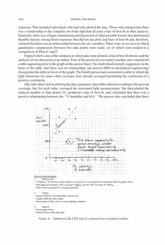
Figure 6 shows one of the solutions inwhich datawere plotted, a line of best-fit drawn, and the
analysis of one data point as an outlier. Four of the preservice secondary teachers also constructed
a table appearing prior to the graph on the answer sheet. Two individuals initially suggested, on the
basis of the table, that there was no relationship; one person (PhD in mechanical engineering)
disregarded the table in favor of the graph. The fourth person had constructed a table in which the
light intensities for same-value coverage were already averaged permitting the conclusion of a
positive correlation.
One individual, before plotting the data, prepared a data table ordered according to the percent
coverage, but, for each value, averaged the associated light measurements. She then plotted the
reduced number of data points (5), produced a line of best-fit, and concluded that there was a
positive relationship between the ‘‘% brambles and # fc.’’ The person who concluded that there
Figure 6. Solution to the LFN task by a (preservice) secondary teacher.
1082 BOWEN AND ROTH
was no relationship, despite having drawn a line of best-fit initially, began with an ordered table.
She argued that the ‘‘variance from the line of best-fit suggests an inconclusive relation-
ship. . .supported by the fact that both 0% and 30% have a value of 500 foot-candles’’ (Tora). In
this, her argument was similar to those by the individuals using data plots, only without
accompanying lines of best-fit and outlier analysis.
Data plots only. When participants used data plots, but without accompanying lines of best-
fit, the claim in all cases was that a relationship did not exist (Table 3). Of the five claims, three
were supported by citing discrepant data points, the remaining two simply by referring to the
scatter of the data that did not permit the attribution of a clear relationship:
It would appear that an increase in foot-candles in and of itself does not consistently result
in an increase in brambles. Rather, it would appear that the amount of outside (presumably
unobstructed access to light) area is indicative of the increased brambles. For example, if
you compare the outside unobstructed light of the one with the smallest amount [F], the
density is 0% versus the one that is in the triangular area [C], which has a larger
unobstructed area having a density of 30%. (Tabby)
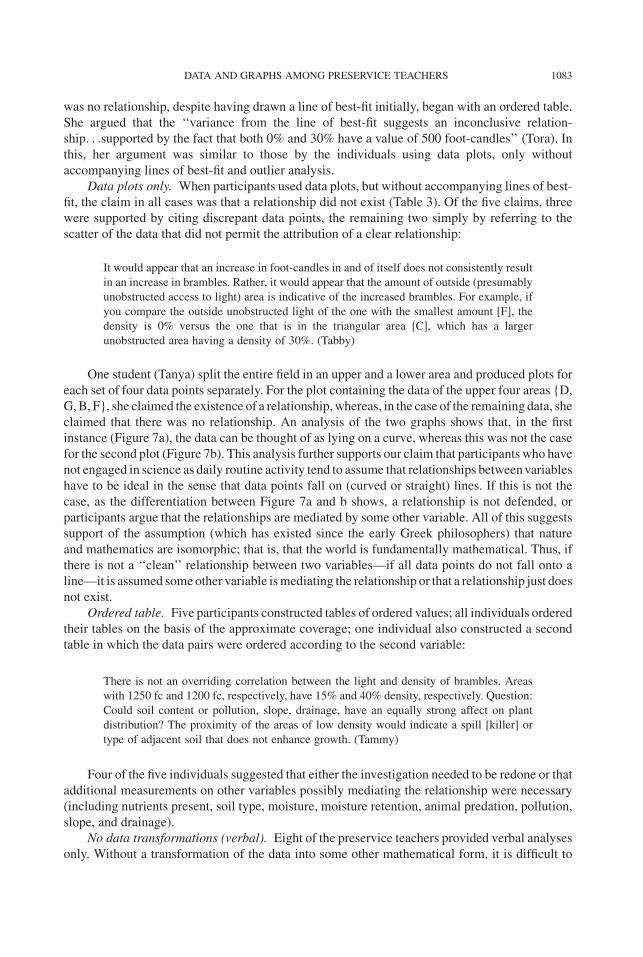
One student (Tanya) split the entire field in an upper and a lower area and produced plots for
each set of four data points separately. For the plot containing the data of the upper four areas {D,
G,B, F}, she claimed the existence of a relationship,whereas, in the case of the remaining data, she
claimed that there was no relationship. An analysis of the two graphs shows that, in the first
instance (Figure 7a), the data can be thought of as lying on a curve, whereas this was not the case
for the second plot (Figure 7b). This analysis further supports our claim that participants who have
not engaged in science as daily routine activity tend to assume that relationships betweenvariables
have to be ideal in the sense that data points fall on (curved or straight) lines. If this is not the
case, as the differentiation between Figure 7a and b shows, a relationship is not defended, or
participants argue that the relationships are mediated by some other variable. All of this suggests
support of the assumption (which has existed since the early Greek philosophers) that nature
and mathematics are isomorphic; that is, that the world is fundamentally mathematical. Thus, if
there is not a ‘‘clean’’ relationship between two variables—if all data points do not fall onto a
line—it is assumed someother variable ismediating the relationship or that a relationship just does
not exist.
Ordered table. Five participants constructed tables of ordered values; all individuals ordered
their tables on the basis of the approximate coverage; one individual also constructed a second
table in which the data pairs were ordered according to the second variable:
There is not an overriding correlation between the light and density of brambles. Areas
with 1250 fc and 1200 fc, respectively, have 15% and 40% density, respectively. Question:
Could soil content or pollution, slope, drainage, have an equally strong affect on plant
distribution? The proximity of the areas of low density would indicate a spill [killer] or
type of adjacent soil that does not enhance growth. (Tammy)
Four of the five individuals suggested that either the investigation needed to be redone or that
additional measurements on other variables possibly mediating the relationship were necessary
(including nutrients present, soil type, moisture, moisture retention, animal predation, pollution,
slope, and drainage).
No data transformations (verbal). Eight of the preservice teachers provided verbal analyses
only. Without a transformation of the data into some other mathematical form, it is difficult to
DATA AND GRAPHS AMONG PRESERVICE TEACHERS 1083

make claims about the relationship between two variables under consideration, and therefore
contribute to the construction of a phenomenon (which here would be that light fosters plant
growth). Respondents who did not transform the data claimed that there was no correlation
between light intensity and bramble density, which contrasts with the results of the pilot study. A
student with an honors bachelor’s of science in biology and environmental science provided the
following answer:
� It is difficult to draw conclusions on patterns from these field notes because she has
broken the data up into small sections—so it is difficult to make conclusions.
� I don’t perceive any patterns between percent of bramble cover and the amount of light.
� The use of percent bramble cover is misleading because it is referring to different area
sizes.
� The highest bramble coverage seems to be along the left and bottom sides of the study
area—perhaps this is an edge of some kind, or perhaps there is a path of bramble
running along this edge. The light is strongest along this edge as well, except for along
the weird slanted side—perhaps this is a building or wall which is blocking the light.
(Tilson)
This participant also argued that the relative coverage is a function of the plot size. However, it
is not clear whether in this case the argument drove the claim or if the argument emerged after a
pattern was not detected. Because many other individuals who claimed that there was no direct
Figure 7. Solution to LFN task by a (preservice) secondary teacher who dealt with the data in two sets: (a)
scatterplot of four locales for which a correlative relationship was claimed; and (b) scatterplot of four locales
for which a claim was made of no relation.
1084 BOWEN AND ROTH
relation between the two variables, he then sought patterns in the geographical distributions and
then hypothesized about possible natural features (i.e., other factors) that might cause such a
distribution.
Other solutions. Two solutions did not fit into our previous scheme andwere, because of their
limited frequency, categorized as ‘‘other.’’ One individual redrew themap to scale, including three
cross-sectional lines and, beneath it, plotted the average bramble coverage against location. In this
way, she engaged in the construction of ‘‘transects,’’ a common practice in ecological fieldwork
related to plant distributions.
Discussion of Lost Field Notebook Interpretations
The Lost Field Notebook problem is consistent with many of the reform document
recommendations requiring students to be able to ‘‘analyze functional relationships to explain
how a change in one quantity results in a change in another’’ (NCTM, 1989, p. 98). A minority
(44%) of the preservice science teachers, primed with a similar activity, dealt with the problem
in this manner where there was transformation of data into a Cartesian plot and a discussion
of relationships. A smaller number (26%) engaged in best-fit or trend analysis. That is, at this
point, most preservice teachers do not enact the data-related practices that reform documents
suggest middle and high school students acquire. The future teachers found it difficult that the
data did not fall onto a neat line but were scattered. Variation of one variable for the same or
similar values of the other was used as evidence in arguing that covariation did not exist in the
data set.
Although this task was more like traditional school tasks, the present participants were not
more effective in their use of inscriptions, although there was more success on this task with
respect to the students using the scatterplots to draw conclusions regarding bivariate relationships
(6 of 27 did so successfully; Table 3). This is a much higher proportion than in the Field
Investigation task, where only 2 of the 12 projects drew conclusions that related to the original
question and that extended from the data collected and represented. Thismight be explained by the
structuring that was provided the data in the Lost Field Notebook task. In science investigations it
is common practice to record measured data in tables—for organizational, process, and
presentation reasons—and then to transform the data into more abstract representations allowing
for the examination of relationships betweenvariables (e.g., Figure 1). In the present task, numbers
were clearly presented in pairs that lent themselves to being depicted in a scatterplot during the
activity. Although in both of the tasks tables did not play an important role (11 for 23 questions; 2
in the present task), data were more obviously structured into pairs here. We suspect that the
difficulties encountered in interpreting data in the Field Investigation task (Investigations) in part
extend from the approaches utilized by the students when structuring their data representations in
tables (which, as Case 2 illustrates, probably impeded further transformation to another, more
abstracted inscription). Clearly, how data are presented influences the resulting graphical
inscriptions.
In both tasks, participants rarely identified outliers that could affect interpretation and exclude
them from the analysis (as shown in Case Study #3) or used a line of best-fit. In the Lost Field
Notebook, lines of best-fit were used in seven graphs (26% of respondents), whereas, in the
Investigations task, two graphs had a line of best-fit applied (in one case seemingly opposite to the
pattern, in the other drawn through values averaged at specific places on the x-axis and not raw
data).
For the Lost Field Notebook, arguments against a relationship between light intensity and
bramble density were based on the comparison of individual data pairs shares similarities with the
DATA AND GRAPHS AMONG PRESERVICE TEACHERS 1085
model-based reasoning employed by college students on algebra story problems (Hall, Kibler,
Wenger, & Truxaw, 1989). Our participants in this category reasoned directly within the situation
glossed by the problem rather than relying on mathematical formalisms. They proposed a
relationship and then used specific instances in which the hypothesized pattern was violated, or
used a specific instance as counterargument for a relationship.
Discussion of Preservice Teacher Analyses
We engaged our research participants in two tasks that reflect those promoted in reform
documents for students of much younger ages. We then investigated the outcomes of their
engagement with these tasks. With regard to inscriptions, we realized that the participants’
difficulties lay not just in knowing if a graph should be used, but rather were embedded in not
knowing how to structure data and choose appropriate inscriptions to address problems in the
first place. Indeed, what graph one uses in part depends on how one has decided to collect
the data and summarize it in the first place. We turned to the Lost Field Notebook task to
understand the practices enacted during the Investigations. The Lost Field Notebook required
participants to transform the data into an inscription to the right (of Figure 1), and then to
reconstruct a natural setting in which the data might have been collected. We found that priming
the participants about the importance of using graphs tomake correlative arguments resulted in an
increase in graphs being used when addressing the Lost Field Notebook. Even with this priming
only a minority of students used scatterplots; however, engaging in priming activities resulted in
improvements in those practices. This suggests that student teachers need to engage in open-
inquiry style activities more than once, or at least in some fashion that allows reflection upon
practices, critique by other participants, and revision of investigationmethodologies and reporting
strategies.
Preservice teachers acted as if a relationship had to be unambiguous, all data points
consistently ‘‘in line’’ with each other to be able to make claims of a relationship between
variables. Here, the belief in a mathematical nature of the universe is inherent in the
explanations—there did not seem to be another way. Thus, variation in one of the two variables
with a constant second variable, or a comparison of a negative relationship between two data pairs,
was sufficient to reject a positive relationship between the twovariables.Wheremight this practice
come from? We venture two comments.
First, our participants’ search for a firm association between variables is not something that
should be attributed to some cognitive deficit, for there are long-standing traditions among
scientists themselves, whereby firm, ideal associations are thought to underlie worldly
phenomena. Early astronomers, and particularly Ptolemy, added an increasing number of circles
(epicycles) in order to maintain a model of the universe based on circles. Just as our participants
introduced additional factors to try and clarify relationships, Ptolemaian astronomers added
additional epicycles to bring their models closer to the data points.
Second, given students’ often considerable experience with science as conveyed in science
textbooks and lectures, and their own mathematics experiences—where they likely would have
been plotting functions—they would have seen predominantly, if not exclusively, line graphs and
data points that fell, in an ideal way, on the line. In these sources there is a didactic use of clean line
graphs; in the few cases where data were plotted these fell exactly on the best-fit line on the graph.
It has been noted that scientists believe in the isomorphism of nature and mathematics (Lynch,
1991). In many cases, and for a historically long period, scientists believed that the world is
inherently mathematical, such that mathematical structures not only describe but also are
responsible for the patterns in the world. This research shows that not only scientists appear to
1086 BOWEN AND ROTH
operate as if nature was inherently mathematical. Furthermore, the very practices of using
graphical representations and the mathematics activities in which functions are plotted may be at
the origin of such default, common-sense, and mundane assumptions about the world.
Our analyses has revealed wide-ranging differences among preservice secondary science
teachers in conducting field investigations and analyzing raw data (in both Investigations and Lost
Field Notebook). Despite their extensive preparation in the subjectmatter, many participants did not
themselves enact the science practices implicit in the reformdocuments, especially those concerning
data analysis and interpretation. Eighth-grade students routinely enacted these practices after
10 weeks of conducting their own investigations, the intentions and results of which they had to
defend in peer groups and to their teacher (Roth, 1996; Roth & Bowen, 1994). However, simply
telling preservice teachers which questions are appropriate or inappropriate outside of the context of
their engagement in laboratory investigations is not likely to increase their competence in helping
students ask appropriate questions. Indeed, to the extent that they have engaged in investigations in
their undergraduate science program, this is what they have already experienced.
At present, preservice teachers do not seem to be ready to teach data collection and analysis in
the way suggested by reform documents. To improve the situation, structural change is needed in
the undergraduate experiences of preservice teachers. Perhaps providing opportunities during
undergraduate studies for preservice teachers to familiarize themselves with representation
practices couched in the rhetorical practices of sciencemight address this issue. Further research is
needed to find out what kind of science experiences would better prepare preservice teachers to
engage in commonly accepted science investigation practices and how these experiences mediate
the learning process.
References
American Association for the Advancement of Science (AAAS). (1993). Benchmarks for
science literacy. New York: Oxford University Press.
Bastide, F. (1990). The iconography of scientific texts: Principles of analysis. In M. Lynch &
S. Woolgar (Eds.), Representation in scientific practice (pp.187–229). Cambridge, MA: MIT
Press.
Crawford, B. (1999). Is it realistic to expect a preservice science teacher to create an inquiry-
based classroom? Journal of Science Teacher Education, 10, 175–194.
Fraser, B.J. & Tobin, K.G. (Eds.) (1998). International handbook of science education.
Dordrecht: Kluwer Academic.
Hall, R., Kibler, D., Wenger, E., & Truxaw, C. (1989). Exploring the episodic structure of
algebra story problem solving. Cognition and Instruction, 6, 223–283.
Janvier, C. (1987). Translation processes in mathematics education. In C. Janvier (Ed.),
Problems of representation in the teaching and learning of mathematics (pp. 27–32). Hillsdale,
NJ: Erlbaum.
Latour, B. (1987). Science in action: How to follow scientists and engineers through society.
Milton Keynes, UK: Open University Press.
Latour, B. (1993). La clef de Berlin et autres lecons d’un amateur de sciences [The key to
Berlin and other lessons of a science lover]. Paris: Editions la Decouverte.
Lemke, J.L. (1998). Multiplying meaning: Visual and verbal semiotics in scientific text. In
J.R. Martin & R. Veel (Eds.), Reading science (pp. 87–113). London: Routledge.
Lynch, M. (1991). Method: Measurement—ordinary and scientific measurement as
ethnomethodological phenomena. In G. Button (Ed.), Ethnomethodology and the human sciences
(pp. 77–108). Cambridge, UK: Cambridge University Press.
DATA AND GRAPHS AMONG PRESERVICE TEACHERS 1087

Melear, C.T., Goodlaxson, J.D., Warne, T.R., & Hickok, L.G. (2000). Teaching preservice
science teachers how to do science: Responses to the research experience. Journal of Science
Teacher Education, 11, 77–90.
National Council of Teachers of Mathematics (NCTM). (1989). Curriculum and evaluation
standards for school mathematics. Reston, VA: NCTM.
National Research Council (NRC). (1996). National science education standards.
Washington, DC: National Academy Press.
Novak, J.D. & Gowin, D.B. (1984). Learning how to learn. Cambridge, UK: Cambridge
University Press.
Roth, W.-M. (1996). Where is the context in contextual word problems? Mathematical
practices and products in Grade 8 students’ answers to story problems. Cognition and Instruction,
14, 487–527.
Roth, W.-M. (2003). Toward an anthropology of graphing. Dordrecht: Kluwer Academic.
Roth, W.-M. (2004). Emergence of graphing practices in scientific research. Journal of
Cognition and Culture, 4, 595–627.
Roth, W.-M. & Bowen, G.M. (1993). An investigation of problem solving in the context of a
Grade 8 open-inquiry science program. The Journal of the Learning Sciences, 3, 165–204.
Roth, W.-M., & Bowen, G.M. (1994). Mathematization of experience in a Grade 8 open-
inquiry environment: An introduction to the representational practices of science. Journal of
Research in Science Teaching, 31, 293–318.
Roth,W.-M.&Bowen, G.M. (1999). Digitizing lizards or the topology of vision in ecological
fieldwork. Social Studies of Science, 29, 719–764.
Roth, W.-M. & McGinn, M.K. (1998). Inscriptions: A social practice approach to
‘‘representations.’’ Review of Educational Research, 68, 35–59.
Roth, W.-M., McGinn, M.K., & Bowen, G.M. (1998). How prepared are preservice teachers
to teach scientific inquiry? Levels of performance in scientific representation practices. Journal
of Science Teacher Education, 9, 25–48.
Roth, W.-M. & Roychoudhury, A. (1993). The development of science process skills in
authentic contexts. Journal of Research in Science Teaching, 30, 127–152.
Tobin, K. (1990). Research on science laboratory activities: In pursuit of better questions and
answers to improve learning. School Science and Mathematics, 90, 403–418.
Windschitl, M. (2003). Inquiry projects in science teacher education: What can investigative
experiences reveal about teacher thinking and eventual classroom practice? Science Education,
87, 112–143.
Windschitl, M. (2004). Folk theories of ‘‘inquiry’’: How preservice teachers reproduce the
discourse and practices of an atheoretical scientific method. Journal of Research in Science
Teaching, 41, 481–512.
1088 BOWEN AND ROTH